perceptions of distributive justice in latin america
TRANSCRIPT

Documento de Trabajo Nro. 209
Abril, 2017
ISSN 1853-0168
www.cedlas.econo.unlp.edu.ar
Perceptions of Distributive Justice in Latin America During a Period of Falling Inequality
Germán Reyes y Leonardo Gasparini
Perceptions of distributive justice in Latin
America during a period of falling inequality*
Germán Reyes† Leonardo Gasparini‡
April 2017
Abstract
In this paper we explore perceptions of distributive justice in Latin America during the 2000s
and its relationship with income inequality. In line with the fall in income inequality in the
region, we document a widespread, although modest, decrease in the share of the population
that believes income distribution is unfair. The fall in the perception of unfairness holds across
very heterogeneous groups of the population. Moreover, perceptions evolved in the same
direction as income inequality for 17 out of the 18 countries for which microdata is available.
Our analysis reveals unfairness perceptions are more correlated with relative measures of
income inequality than absolute ones and that individual characteristics are correlated with
distributive perceptions. On average, individuals that are older, more educated, unemployed,
and left-wing tend to perceive income distribution as more unfair. We show that the decrease in
unfairness perceptions during the last decade was due to changes in inequality, rather than to
composition effects. Finally, we show that individuals that perceive income distribution as very
unfair are more prone to mobilize and protest.
JEL Classification: D31, D63, D83
Keywords: Inequality, Fairness, Distributive Justice, Perceptions, Latin America
* The authors would like to thank Carolina García Domench, Giselle Del Carmen and Rebecca Deranian for their
support and thoughtful comments. The findings, interpretations, and conclusions in this paper are entirely those of
the authors.
† The World Bank and Centro de Estudios Distributivos, Laborales y Sociales (CEDLAS), Facultad de Ciencias
Económicas, Universidad Nacional de La Plata.
‡ Centro de Estudios Distributivos, Laborales y Sociales (CEDLAS), Facultad de Ciencias Económicas,
Universidad Nacional de La Plata and CONICET.

1
1. Introduction
One of the most salient features of the 21st century is the rising concern for economic
inequality, to the point that it is assessed as ‘the defining challenge of our time.’4
Inequality has been observed with concern by multilateral organizations, politicians and
religious leaders.5 The concerns about inequality are not only based on efficiency
arguments, but especially on a moral ground. Anecdotal evidence suggests that concerns
about inequality extend to the general population. For instance, protests such as ‘Occupy
Wall Street’ are manifestations of the discontent with the wide income gaps. However,
research on how the general population thinks about inequality, and how factors like age,
gender, or education relate to our views on what is fair and unfair is still scarce.
Central to this paper is the concept of social justice or fairness and the underlying desire
to live in a just world.6 Since the seminal paper of Rabin (1993), the concept of fairness has
been increasingly important in the field of Economics. Fehr and Schmidt (2003) provide
an extensive review of the experimental evidence related with the desire for fairness. The
authors show how in dictator games, participants share part of their endowments even
though they could keep it all. Similarly, in ultimatum games, participants accept a
monetary loss to penalize behavior that is not considered fair, and in gift exchange games,
participants are averse to inequitable outcomes.
The desire for fairness seems to transcend cultural differences. Throughout Jerusalem,
Ljubljana, Pittsburgh, Tokyo, the Machiguenga of the Peruvian Amazon, and 15 other
small-scale societies, ultimatum game offers are always positive, and payoffs that are not
considered fair are punished by rejecting positive offers at considerable rates.7 Evidence
from psychology suggests the desire for fairness is ingrained in human nature. Children as
young as three years old react negatively to unfair distributions (Loblue et al, 2011),8 and
children’s aversion to inequities also transcends borders (Blake et al., 2015). Insights from
biology suggest preferences for fairness might have evolutionary origins. In their famous
experiment, Brosnan and de Waal (2003) find that capuchin monkeys reject unequal
payoffs, a finding that has been replicated in other species, such as dogs (Range et al.,
2009) and birds (Wascher and Bugnayar, 2015). Bjornskov et al. (2013) show that people
who perceive their society as fairer exhibit higher levels of subjective well-being and, in
4 See, for instance ‘Remarks by the President on Economic Mobility,’ The White House Office of the Press
Secretary, Washington, D.C., December 4, 2013.
5 During a visit to Bolivia in 2015, Pope Francis stated that: “Working for a just distribution of the fruits of the
earth and human labor is not mere philanthropy. It is a moral obligation.” 6 Benabou and Tirole (2005) show that this desire is so strong that people distorts their perceptions of
reality in order to interpret it as fair.
7 Evidence is provided in Roth et al. (1995), Henrich (2000) and Henrich et al. (2001), respectively.
8 See also Fehr et al (2008) and Blake and McAuliffe (2011).

2
the context of distributive justice, Corneo and Fong (2008) find that US households put a
monetary value on social justice of about a fifth of their disposable income.
In this paper we study the general population’s beliefs about distributive justice, i.e.,
the perception of whether income distribution is fairly distributed, in the context of a
pronounced decline in the income inequality in Latin America (LA), a highly unequal
region. Our approach is to combine income microdata originated from household surveys
with perceptions data from opinion polls surveys. We exploit the heterogeneity across
years, countries, and individuals within countries to analyze how our views of fairness
relate to the actual levels of income inequality.
Evidence of the relationship between fairness perceptions and income inequality,
particularly in LA, is rather scarce. In Argentina, Rodriguez (2014) finds that people who
consider their income to be fair tend to perceive lower levels of inequality. The work
closest to this paper is CEPAL (2010), which shows that perceptions of distributive
inequity in LA remained persistently high during the 1997-2007 period, consistent with
the high levels of inequality of the region.
In the first part of the paper we document a series of stylized facts. After a decade of
increasing disparities in LA, the 2000s saw a remarkable decrease in the levels of
inequality. Despite this, the region continues to be one of the least egalitarian in the
world, with levels of inequality comparable to those of Africa (Alvaredo and Gasparini,
2015). To the best of our knowledge, we are the first to show that unfairness perceptions
fell during the 2000s in line with the evolution of income inequality, although we find that
unfairness perceptions are not very responsive to changes in inequality. During the 2002-
13 period, a 1 percentage point decrease in the Gini coefficient was associated with a 1.4
percentage point decrease in the share of the population perceiving the distribution as
unfair or very unfair.
The evolution of unfairness and inequality was consistent across countries:
perceptions moved in the same direction as the Gini coefficient for 17 out of the 18
countries of the region for which microdata is available. We also show that this change
was widespread across very heterogeneous groups of the population, and that the decline
in unfairness perceptions was driven mainly by a reduction in the intensity of such beliefs
(i.e., compared to ten years ago, fewer people perceive the distribution as very unfair).
Next we shed some light on the discussion of whether inequality should be measured
with relative vs. absolute indicators by analyzing which indicators are more correlated
with unfairness perceptions. We show that relative indicators—and in particular, the Gini
coefficient—are the ones mostly correlated with people’s perception of fairness.
In the second part of the paper we explore how individual factors and belief systems
affect how inequality is perceived. We find that older, unemployed and more educated
people are more likely to perceive income distribution as unfair. A decomposition exercise
provides evidence on the relative contribution of composition effects vis-à-vis changes in

3
aggregate inequality trends, to explain the decline in unfairness perceptions during the
last decade. Regarding beliefs and unfairness, consistent with theories of fairness, we find
that people leaning to the right of the political spectrum, Catholics, and optimists are
more likely to believe income distribution is fair. Finally, we analyze the link between
fairness perceptions and propensity to protest, and show some suggestive evidence that
people that believe inequality is very unfair are more prone to mobilize.
The rest of the paper is organized as follows. In section 2 we document some stylized
facts about distributive justice perceptions and the evolution of income inequality. In
section 3, we shed some light on the discussion of whether income inequality should be
measured with absolute or relative measures by studying the relationship between
perceptions data with different indicators of income inequality. In section 4 we analyze
whether individuals’ unique background shape their perception of fairness, by analyzing
how individuals’ characteristics relate with perception of distributive justice; and compare
the relative importance of the demographic variables vis-à-vis aggregate trends of
inequality to explain the observed changes in fairness perceptions. In section 5 we analyze
the relationship between different beliefs systems and unfairness, while in section 6 we
explore the link between fairness perceptions and social cohesion. Section 7 concludes.
2. Income inequality and fairness: some stylized facts
Latin America has long been characterized as a region with high levels of income
inequality, among the least egalitarian regions in the world. Out of the ten most unequal
countries of the world for which household survey data is available eight of them are in
LA, and the rest in Sub-Saharan Africa (World Bank, 2016), probably the most unequal
region in the world (Alvaredo and Gasparini, 2015). Although the disparities between the
poor and rich are still large, after a period of increasing inequality during the 1990s, the
region experienced a ‘turning point’ in the 2000s, when income inequality saw a
widespread decrease across the countries of the region.9 The social gains in terms of
inequality contrasts with what happened in other developing regions in the world, where
the declines in inequality were much more modest (e.g., such as in the Middle East and
North Africa), or even increased (such as in East Asia and Pacific, cf. Alvaredo and
Gasparini, 2015, p. 29), and also contrasted with the increases in inequality experienced by
developed countries (cf., Atkinson, Piketty and Saez, 2011).
In this section we replicate the widespread decrease in income inequality in LA, and
show how perceptions about fairness moved in the same direction. Our primary dataset
for income inequality comes from a regional data harmonization efforts known as
9 See Gasparini, Cruces and Tornarolli (2011), Gasparini and Lustig (2011) and Lustig, López-Calva and
Ortiz-Juárez (2013).

4
SEDLAC (CEDLAS and World Bank), which increase the cross-country comparability
from official household surveys.10
Figure 1 shows a scatterplot of the Gini coefficient of the per capita household income
(in 2005 USD PPP) of 18 LA countries for which comparable data is available both at the
beginning of the 2000s and one decade later (we use years close to 2002 and 2013). The
Figure includes a 45 degree line denoting all the points for which the Gini coefficient is
the same in both years, and points to the right of this line denote decreases in income
inequality.
Figure 1. Gini coefficient circa 2002 and 2013
Note: This figure presents the Gini coefficient for 18 LA countries in 2002 and 2013. Due to household data
unavailability or comparability issues, for some countries we use inequality data from adjacent years. In
2002, we use: Argentina 2004, Chile 2003, Guatemala 2006, and Peru 2004. In 2013 we use: Guatemala
2014, Mexico 2014 and Nicaragua 2014. Due to a break in data comparability, Costa Rica and Panama’s
2002 Gini Coefficient were calculated with a linear interpolation. See Data Appendix for further details.
As is immediately apparent from Figure 1, with the exception of Costa Rica, all
countries of the region experienced a decrease in income inequality. The regional trend is
consistent with the cross-country evidence: the average Gini coefficient has decreased
every year since the beginning of the decade, declining from 0.54 in 2000 to 0.47 in 2014.
Moreover, as Rodríguez-Castelán et al. (2016) note, the decline in income inequality of the
region is robust to the inequality indicator used and to the method of aggregation of the
countries.
We complement the ‘objective’ evolution of income inequality with data from public
opinions polls from Latinobarómetro, which has conducted surveys in 18 Latin American
10 See Data Appendix for more details on the data sources.
5
countries since the 1990s, interviewing about 1,200 individuals per country about
individual socioeconomic background and preferences regarding political and social issues
(including inequality). The surveys are representative at the national level for the
population over 18 years old.11 In every country, Latinobarómetro asks “How fair do you
think income distribution is in [country]? Very fair, fair, unfair or very unfair?” Using this
question we construct dichotomical variables reflecting whether the individual believes
income distribution is unfair or very unfair.12 Our baseline definition of unfairness
perceptions includes all the individuals that perceived income distribution as unfair, i.e.,
we include those that answered both ‘unfair’ and ‘very unfair’, but also show the results
are robust to a more narrow definition of unfairness (i.e., considering only those that
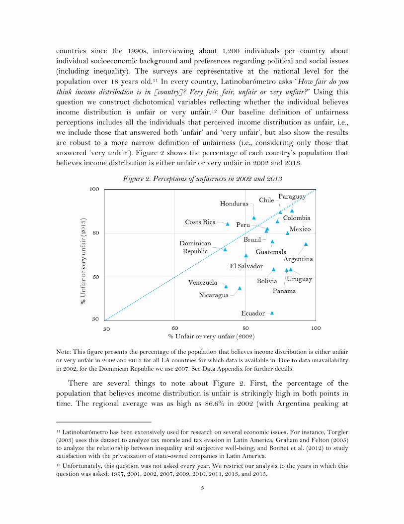
answered ‘very unfair’). Figure 2 shows the percentage of each country’s population that
believes income distribution is either unfair or very unfair in 2002 and 2013.
Figure 2. Perceptions of unfairness in 2002 and 2013
Note: This figure presents the percentage of the population that believes income distribution is either unfair
or very unfair in 2002 and 2013 for all LA countries for which data is available in. Due to data unavailability
in 2002, for the Dominican Republic we use 2007. See Data Appendix for further details.
There are several things to note about Figure 2. First, the percentage of the
population that believes income distribution is unfair is strikingly high in both points in
time. The regional average was as high as 86.6% in 2002 (with Argentina peaking at
11 Latinobarómetro has been extensively used for research on several economic issues. For instance, Torgler
(2003) uses this dataset to analyze tax morale and tax evasion in Latin America; Graham and Felton (2005)
to analyze the relationship between inequality and subjective well-being; and Bonnet et al. (2012) to study
satisfaction with the privatization of state-owned companies in Latin America.
12 Unfortunately, this question was not asked every year. We restrict our analysis to the years in which this
question was asked: 1997, 2001, 2002, 2007, 2009, 2010, 2011, 2013, and 2015.

6
97.7% of the population, in the midst of a severe crisis). Even in Venezuela, the country
with the smallest perception of unfairness in 2002, three out of four individuals (74.5%)
perceived inequality as unfair in 2002. Although lower, the share of the population
unsatisfied with income distribution was still astoundingly high in 2013, when about
72.8% of the population though inequality was unfair or very unfair.
Second, there was a widespread decrease in the share of the population that perceived
income distribution as unfair. Relative to the previous decade, in 2013 fewer people
perceived income distribution as unfair in 16 out of the 18 countries analyzed. The change
in perceptions range from modest decreases, such as in Chile, where the decline was of less
than one percentage point, to remarkable reductions, such as in Ecuador, where
perceptions about unfairness declined from 87.5% to 38.6% in the 2002-13 period.
Lastly, with the exception of Honduras—where, despite falling inequality the
population perceived the distribution as more unjust—in the rest of the countries both
variables moved in the same direction. To see this more clearly, in Figure 3 we show
jointly the change in the perceptions of unfairness (as measured by the percentage point
change in the share of the population reporting income distribution is unfair or very
unfair), and the change in the Gini coefficient during the 2002-13 period. As can be easily
seen from Figure 3, most LA countries lie in the third quadrant, where both inequality
and unfairness perceptions decreased.
Figure 3. Change in fairness perceptions and Gini coefficient between 2002 and 2013
Note: This figure presents the percentage point change in the share of the population that believes income
distribution is either unfair or very unfair between 2002 and 2013 (or close years), and the change in the
Gini coefficient between 2002 and 2013 (or close years) for all LA countries. See Data Appendix for more
detail.

7
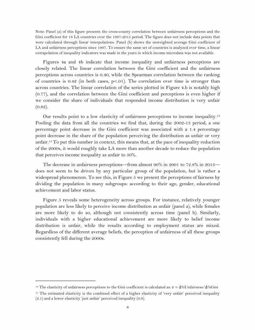
The relation between unfairness perceptions and the Gini coefficient is strong both
across countries and time. In Figure 4 panel (a), we show the cross-country correlation
between unfairness perceptions and income inequality in all the years for which both
indicators are available, while in panel (b) we show the average regional trend over the
1997-2015 period.13
Figure 4.Unfairess perceptions and Gini coefficient in Latin America
a) Across countries (Pooling all the countries and years)
b) Over time (Cross-country average, 1997-2015)
13 In 1997 Latinobarómetro had a low coverage in large countries with high levels of inequality (such as
Brazil and Colombia), and did not survey other countries at all (such as Dominican Republic, see Appendix
B.). The increase in the coverage of the survey could drive part of the change in perceptions between 1997
and 2001.
Unfairness = 93.9 Gini + 31.91 R² = 0.16
30
40
50
60
70
80
90
100
0.35 0.40 0.45 0.50 0.55 0.60
% U
nfa
ir o
r V
ery
Un
fair
Gini
0.40
0.45
0.50
0.55
0.60
60
70
80
90
100
1997 2000 2005 2010 2015
Gini coefficient (RHS)
% Unfair or Very Unfair (LHS)
8
Note: Panel (a) of this figure presents the cross-county correlation between unfairness perceptions and the
Gini coefficient for 18 LA countries over the 1997-2015 period. The figure does not include data points that
were calculated through linear interpolations. Panel (b) shows the unweighted average Gini coefficient of
LA and unfairness perceptions since 1997. To ensure the same set of countries is analyzed over time, a linear
extrapolation of inequality indicators was made in the years in which income microdata was not available.
Figures 4a and 4b indicate that income inequality and unfairness perceptions are
closely related. The linear correlation between the Gini coefficient and the unfairness
perceptions across countries is 0.40, while the Spearman correlation between the ranking
of countries is 0.42 (in both cases, p<.01). The correlation over time is stronger than
across countries. The linear correlation of the series plotted in Figure 4.b is notably high
(0.77), and the correlation between the Gini coefficient and perceptions is even higher if
we consider the share of individuals that responded income distribution is very unfair
(0.82).
Our results point to a low elasticity of unfairness perceptions to income inequality.14
Pooling the data from all the countries we find that, during the 2002-13 period, a one
percentage point decrease in the Gini coefficient was associated with a 1.4 percentage
point decrease in the share of the population perceiving the distribution as unfair or very
unfair.15 To put this number in context, this means that, at the pace of inequality reduction
of the 2000s, it would roughly take LA more than another decade to reduce the population
that perceives income inequality as unfair to 50%.
The decrease in unfairness perceptions—from almost 90% in 2001 to 72.8% in 2013—
does not seem to be driven by any particular group of the population, but is rather a
widespread phenomenon. To see this, in Figure 5 we present the perceptions of fairness by
dividing the population in many subgroups: according to their age, gender, educational
achievement and labor status.
Figure 5 reveals some heterogeneity across groups. For instance, relatively younger
population are less likely to perceive income distribution as unfair (panel a), while females
are more likely to do so, although not consistently across time (panel b). Similarly,
individuals with a higher educational achievement are more likely to belief income
distribution is unfair, while the results according to employment status are mixed.
Regardless of the different average beliefs, the perception of unfairness of all these groups
consistently fell during the 2000s.
14 The elasticity of unfairness perceptions to the Gini coefficient is calculated as: 𝜀 = ∆%Unfairness/∆%Gini
15 The estimated elasticity is the combined effect of a higher elasticity of ‘very unfair’ perceived inequality
(2.1) and a lower elasticity ‘just unfair’ perceived inequality (0.9).

9
Figure 5. Perceptions of unfairness in LA by subgroup, 1997-2015
(a) By age: (b) By gender:
(c) By educational attainment: (d) By labor status:
Note: This figure presents the share of individuals that perceived income distribution as unfair or very unfair
according to four categories of age (18-24; 25-40; 41-64 and 65+), gender, maximum educational achievement and
labor status. Each line refers to the average of 18 LA countries for which data is available.
Not only injustice perceptions fell during the last decade, but the intensity of beliefs
also diminished over time. To see this, Figure 6 shows the evolution of the different
possible answers to the question of unfairness perceptions.
60
70
80
90
100
1997 2000 2005 2010 2015
%
18-24 25-40
41-64 65+
60
70
80
90
100
1997 2000 2005 2010 2015
%
Females Males
60
70
80
90
100
1997 2000 2005 2010 2015
%
Less than PrimaryComplete PrimaryComplete SecondaryComplete Tertiary
60
70
80
90
100
1997 2000 2005 2010 2015
%
Employer
Employee
Self-Employed
Unemployed

10
Figure 6. Intensity of unfairness perceptions in LA, 1997-2015
Note: This figure presents the average across 18 LA countries of the share of individuals that perceived
income distribution as very unfair, unfair, fair, and very fair over the 1997-2015 period.
As can be seen from Figure 6, the decrease in unfairness perceptions was driven
mainly by strong beliefs about unfairness (i.e., people that perceived inequality as very
unfair). While in 2001, 37.4% of the population thought income distribution was very
unfair, this figure decreased to 25% in 2015. In contrast, weak beliefs about unfairness (i.e.,
the population that responded income distribution was only ‘unfair’), have been more
volatile, remaining relatively constant during the 2000s (from 51.4% in 2001 to 49% in
2015). On the other hand, the share of the population believing in a fair distribution
increased from a meager 9.5% in 2001 to a sizable 22.6% in 2015, while strong beliefs on
fairness (i.e., ‘very fair’), have remained under 5% throughout all the 2000s.
3. Is fairness absolute or relative?
In the previous sections we showed that a large, albeit decreasing, share of the population
believes income distribution is unfair, and that such levels and evolution are consistent
with a high, but also declining Gini coefficient. Despite being the most widely used
indicator to measure income inequality, the general population’s views on income
distribution might, in fact, be better captured with other indices.
The literature on inequality measurement makes a crucial distinction between two
types of indicators: the relative (such as the Gini coefficient) and absolute ones (such as the
Variance). The main distinction between them is that relative indicators fulfill the scale-
invariant axiom, while the absolute indicators meet the translation-invariant axiom. In
practical terms, this means that if the income of the entire population increases by the
same percentage, relative indicators will remain unchanged, while absolute indicators
0
20
40
60
1997 2000 2005 2010 2015
%
Unfair
Very Unfair
Fair
Very Fair

11
might increase significantly. The question on which indicator should be used in practice
has led to a heated debate in the literature. Milanovic (2016) provides several arguments
to defend the use of relative indicators in practice, but the fact that they are better from a
technical point of view does not say anything about how the general population perceives
fairness.16
Understanding whether people think about distributive fairness through the lens of
relative or absolute indicators is more than a technical measurement issue or an
economist’s whim. As Ravallion (2003) and Atkinson and Brandolini (2008) note, it has
profound consequences about how we think of important issues such as the distributive
effects of globalization or trade openness. As measured by absolute indicators,
globalization has deteriorated the income distribution since the absolute income
differences between the rich and the poor have increased, but under the lens of relative
measurement, income inequality has been reduced, since the poor have grown
proportionally more than the rich in relative terms.
We take an agnostic approach and let the data show which inequality indicators are
more correlated with the perceptions of distributive justice. To do this, we calculate 13
different measures of income inequality for all the countries in our sample, and correlate
all the indicators with the share of the population that believes income distribution is
unfair over time.17 Table 1 shows the results for the three different ways of calculating the
correlation between the perceptions and inequality indicators at the regional level: (i)
pooling all the data (i.e. taking simultaneously the indicators of all the countries and
calculating the correlations with that pool of data, columns 1-3); (ii) calculating the
average of the indicators across all the countries in every year, and then calculating the
correlation between the average values of the indicators (columns 4-6); and (iii)
calculating the correlations between inequality indicators and perceptions at the country
level and then averaging the results (columns 7-9).
Our results suggest perceptions of unfairness are more correlated with relative
indicators rather than absolute ones (Column 1 of Table 1). In fact, the Gini Coefficient—
probably the most used inequality indicator in the literature—is the one with the highest
16 Perhaps, the most disturbing instance of a mismatch between ‘best practices’ in inequality measurement
theory and general perceptions is given by Amiel and Cowell (1992), who provide experimental evidence
showing that many respondents do not agree with the Dalton-Pigou axiom, the backbone of all inequality
indicators.
17 The indicators are the Gini coefficient, the ratio between the 75th percentile and the 25th percentile, the
ratio between the 90th and 10th percentile, the Atkinson index with an inequality aversion parameter equal to
0.5 and 1, the mean log deviation, the Theil index, the Generalized entropy index, the coefficient of
variation, the absolute Gini, the Kolm index with an inequity aversion parameter equal to 1, and the
variance of the per capita household income (in 2005 PPP). These last three indices correspond to the
absolute measures of inequality, while the other ten are relative measures.

12
explanatory power.18 On average the Gini Coefficient explains about 10 percent of the
variability of the perceptions about unfairness, as measured by the R-squared. On the
other hand, the absolute indicators of inequality correlate negatively with the unfairness
perceptions, and the explanatory power of such indicators is lower than of the relative
indicators. It is interesting to note that indicators often mentioned in the mass media,
such as the ratio between the richest 90% and the poorest 10% exhibit low explanatory
power, although this may be due to mismeasurement of the top incomes. The results of
the high correlation between unfairness perceptions and income inequality seems to be
driven by the population that perceives inequality as very unfair (columns 2, 5, and 8),
rather than just unfair (columns 3, 6, and 9), as the correlations in the latter are close to
zero (<0.1) for almost all indicators.
These results are consistent with experimental evidence from Amiel and Cowell (1992,
1999) who show that support for the scale-invariance axiom was greater than for
translation invariance, reflecting greater support for relative inequality indicators.
Moreover, the results are also consistent with graphical evidence that shows decreasing
relative inequality, but rising absolute inequality during the 2000s in LA (Figure 4 and
Figure 7, respectively). Since unfairness perceptions also declined over time, the relative
indicators do a better job of tracing such evolution.
18
The results are very similar if we exclude the observations with income equal to zero. For example,
pooling all the data and excluding individuals with zero income changes the correlation of the Gini with the
share of the population that perceives income distribution as either unfair or very unfair from 0.412 to 0.417.

13
Table 1. Correlation between Inequality indicators and fairness perceptions, LA 1997-2015
Correlation with… Pooling all the data Averaging indicators Averaging correlations
U. or V.U. V.U. U.
U. or V.U. V.U. U.
U. or V.U. V.U. U. (1) (2) (3)
(4) (5) (6)
(7) (8) (9)
Gini coefficient 0.40 0.37 0.09 0.84 0.83 0.24 0.41 0.30 0.14
(0.07) (0.07) (0.09)
(0.10) (0.16) (0.35)
(0.07) (0.07) (0.09)
Ratio 75/25 0.39 0.40 0.05
0.85 0.83 0.26
0.35 0.22 0.16
(0.07) (0.07) (0.09)
(0.10) (0.16) (0.35)
(0.07) (0.07) (0.09)
Atkinson, A(0.5) 0.39 0.37 0.09
0.84 0.83 0.25
0.40 0.28 0.14
(0.07) (0.07) (0.09)
(0.10) (0.16) (0.35)
(0.07) (0.07) (0.09)
Theil index, GE(1) 0.37 0.32 0.13
0.84 0.82 0.24
0.39 0.29 0.12
(0.07) (0.08) (0.09)
(0.10) (0.16) (0.34)
(0.07) (0.08) (0.09)
Atkinson, A(1) 0.36 0.30 0.13
0.84 0.82 0.24
0.39 0.29 0.12
(0.07) (0.08) (0.09)
(0.10) (0.16) (0.34)
(0.07) (0.08) (0.09)
Mean log deviation, GE(0) 0.33 0.37 -0.01
0.78 0.78 0.19
0.22 0.19 0.11
(0.08) (0.08) (0.09)
(0.13) (0.16) (0.36)
(0.08) (0.08) (0.09)
Generalized entropy, GE(2) 0.32 0.17 0.25
0.80 0.78 0.25
0.37 0.29 0.13
(0.07) (0.09) (0.08)
(0.11) (0.17) (0.34)
(0.07) (0.09) (0.08)
Coefficient Variation 0.30 0.36 -0.05
0.80 0.72 0.35
0.22 0.11 0.19
(0.05) (0.08) (0.08)
(0.12) (0.18) (0.34)
(0.05) (0.08) (0.08)
Ratio 90/10 0.25 0.12 0.21
0.81 0.79 0.24
0.31 0.30 0.07
(0.07) (0.08) (0.08)
(0.11) (0.17) (0.33)
(0.07) (0.08) (0.08)
Variance -0.12 -0.01 -0.17
-0.28 0.05 -0.68
-0.07 0.07 -0.22
(0.08) (0.09) (0.08)
(0.4) (0.43) (0.16)
(0.08) (0.09) (0.08)
Absolute Gini -0.23 -0.10 -0.22
-0.71 -0.47 -0.63
-0.19 -0.06 -0.30
(0.09) (0.1) (0.08)
(0.23) (0.26) (0.32)
(0.09) (0.1) (0.08)
Kolm, K(1) -0.33 -0.18 -0.25
-0.80 -0.65 -0.49
-0.24 -0.13 -0.26 (0.09) (0.11) (0.08) (0.13) (0.18) (0.37) (0.09) (0.11) (0.08) Note: U. or V.U. = % Unfair or Very Unfair; V.U. = % Very Unfair; U. = % Unfair. Standard Errors are reported in parenthesis, and were calculated with
bootstrap (500 iterations).

14
Figure 7.Unfairess perceptions and Absolute Gini coefficient
c) Over countries (Pooling all the countries and years)
d) Over time (Cross country average, 1997-2015)
Note: Panel (a) of this figure presents the cross-county correlation between unfairness perceptions and the
absolute Gini coefficient for all LA countries for which data is available over the 1997-2015 period. The
absolute Gini was normalized so the average over the period is equal to 100 in every country. Figure does
not include data points that were calculated through linear interpolations. Panel (b) shows evolution f the
unweighted average absolute Gini and unfairness perceptions. To ensure the same set of countries is
analyzed over time, a linear extrapolation of inequality indicators was made in the years in which income
microdata was not available.
Unfairness= -0.25*Abs Gini + 104.2 R² = 0.05
40
60
80
100
80 90 100 110 120 130
% U
nfa
ir o
r V
ery
Un
fair
Absolute Gini (index)
60
80
100
120
60
70
80
90
100
1997 2000 2005 2010 2015
%
% Unfair or Very Unfair (LHS)
Absolute Gini coefficient (RHS)

15
4. Fairness through the eyes of people
In this section we explore how individuals' characteristics relate to their views on
inequality. As shown in the previous section, most of the change in perceptions over the
last decade was driven by the share of the population that perceived income distribution as
being very unfair, thus we focus on explaining the correlates of such measure, although
we also show the results for a broader definition of unfairness.
4.1 DATA
Our sample of individuals comes from pooling all LA countries from nine different waves
of Latinobarómetro over the 1997-2015 period. Appendix Tables A1-A3 show basic
descriptive statistics of the sample. Roughly half of respondents are women (50.9%), the
average age was 39.4 (most interviewees—38%—were aged 25-40). Over half of the
sample (57.3%) reported being married or in a civil union, and are adherents to
Catholicism (70.7%).
About 90 percent of the sample are literate, the majority of respondents (76%)
completed at least primary school, while a third of them (32.3%) had secondary education
or more. Almost two thirds of the sample (64%) were part of the labor force, and 9.9% of
them were unemployed. Access to basic services among respondents is relatively high:
87.6% of individuals had access to running water inside their dwelling and over two thirds
(69.7%) reported that their dwellings had access to a flush toilet connected to waste-
removal system (i.e., sewage). Ownership of durable goods ranges from low levels
regarding cars and computers (27.3% and 29.6%, respectively) to high levels regarding
fridges and mobile phones (79.2% and 76.4%).
To assess the differences between Latinobarómetro’s sample and the household
surveys’ sample (SEDLAC), Appendix Table A4 compares a set of summary statistics in
both datasets in 2013. To ensure comparability of the samples, we restrict the calculations
to individuals aged over 18, and to countries with data available in both databases. In
general, the samples are similar in observable characteristics. For instance, the average
age in Latinobarómetro’s reduced sample is 40.6 years, while in SEDLAC it is 42.7 years.
Similarly, the percentage of males is 48.9% in Latinobarómetro and 47.6% in SEDLAC.
The main difference arises from educational attainment. On average, the SEDLAC
subsample is more educated (46.1% of the population has secondary education or more,
while this figure is 38.8% in Latinobarómetro).
4.2 ESTIMATION STRATEGY
To formally assess the relationship between individuals’ characteristics and fairness
perceptions, we run Logit regressions where the dependent variable takes the value 1 if
the individual believes income distribution is very unfair and 0 otherwise. In the baseline
specification, we assume that unfairness perceptions can be characterized according to the
following equation:

16
𝑉𝑒𝑟𝑦 𝑈𝑛𝑓𝑎𝑖𝑟𝑖𝑐𝑡 = 𝛽0 + 𝛽1 𝛾𝑖𝑐𝑡 + 𝛽2 𝐺𝑐𝑡 +∑𝐶𝑐𝑐
+∑𝑇𝑡𝑡
+ 𝜀𝑖𝑐𝑡
where 𝑉𝑒𝑟𝑦 𝑈𝑛𝑓𝑎𝑖𝑟𝑖𝑐𝑡 is the variable of interest, namely, whether the individual 𝑖 of
country 𝑐 during year 𝑡 believes income distribution is very unfair or not; 𝛾 is a vector of
individual characteristics that includes the age, sex, civil status, education, and type of job;
𝐺𝑐𝑡 is the country’s Gini coefficient; 𝐶 is a vector of country and subnational fixed
effects19; 𝑇 is a vector of year fixed effects and 𝜀𝑖𝑐𝑡 is the error term.
We are interested in the sign and magnitude of 𝛽1 and 𝛽2. The first of these
coefficients captures the relationship between the individual’s characteristics and
unfairness perceptions. If unfairness is uncorrelated with observable characteristics, then
this coefficient should not be statistically different from zero. On the other hand, 𝛽2
captures the relationship between the Gini coefficient and the perceived fairness after
controlling for an individual’s covariables. If subjective measures of income inequality are
significantly correlated with their objective counterparts, we would expect this coefficient
to be positive and statistically different from zero.
4.3 RESULTS
Table 2 summarizes the main results of the Logit regressions under different
specifications. Column (1) presents the results controlling only for the Gini coefficient.
Column (2) includes basic demographic indicators: age, age squared and gender. Column
(3) incorporates dummies for civil status and educational variables, namely, literacy and
maximum educational attainment. Column (4) includes dummies for labor market
variables: labor force participation and unemployment. Column (5) incorporates access to
basic services—running water and sewage—and asset ownership, namely ownership of a
computer, washing machine, telephone and car. Column (6) replicates the same
specification as column (5), but with Ordinary Least Squares (OLS). All specifications
include country, subnational and year fixed effects.
Our first result is that the Gini coefficient has a positive and statistically significant
relationship with unfairness perceptions, consistent with the evidence shown in the
previous section. For example, in a country with average characteristics, a decrease of one
point of the Gini coefficient (from 0.496 to 0.486), decreases in about half percentage point
the share of the population that believes income distribution is very unfair. Such
magnitude is quite similar with the Logit (column 5) and OLS (column 6) estimates, and
does not vary much across different specifications (columns 1-5). It is important to stress
that the interpretation is not causal. The relationship between income inequality and
unfairness perceptions can go both ways. On one hand, higher inequality can increase the
share of the population that believes distribution is unfair. But as more people perceive
19 Latinobarómetro’s survey is representative in each country at the subnational level, so we include 380
subnational fixed effects to capture unobservable heterogeneities at this level.
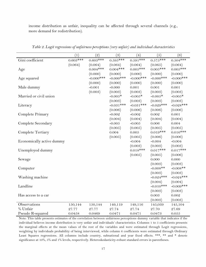
17
income distribution as unfair, inequality can be affected through several channels (e.g.,
more demand for redistribution).
Table 2. Logit regressions of unfairness perceptions (very unfair) and individual characteristics
(1) (2) (3) (4) (5) (6)
Gini coefficient 0.603*** 0.603*** 0.595*** 0.591*** 0.575*** 0.504***
(0.064) (0.064) (0.064) (0.064) (0.065) (0.064)
Age
0.004*** 0.004*** 0.005*** 0.005*** 0.005***
(0.000) (0.000) (0.000) (0.000) (0.000)
Age squared
-0.000*** -0.000*** -0.000*** -0.000*** -0.000***
(0.000) (0.000) (0.000) (0.000) (0.000)
Male dummy
-0.001 -0.000 0.001 0.001 0.001
(0.003) (0.003) (0.003) (0.003) (0.003)
Married or civil union
-0.005* -0.005* -0.005* -0.005*
(0.003) (0.003) (0.003) (0.003)
Literacy
-0.031*** -0.031*** -0.029*** -0.028***
(0.006) (0.006) (0.006) (0.006)
Complete Primary
-0.002 -0.002 0.002 0.001
(0.004) (0.004) (0.004) (0.004)
Complete Secondary
-0.005 -0.005 0.006 0.004
(0.005) (0.005) (0.005) (0.005)
Complete Tertiary
0.004 0.005 0.019*** 0.016***
(0.005) (0.005) (0.006) (0.006)
Economically active dummy
-0.004 -0.004 -0.004
(0.003) (0.003) (0.003)
Unemployed dummy
0.018*** 0.017*** 0.017***
(0.005) (0.005) (0.006)
Sewage
0.000 0.000
(0.003) (0.003)
Computer
-0.008** -0.008**
(0.003) (0.003)
Washing machine
-0.024*** -0.024***
(0.004) (0.004)
Landline
-0.010*** -0.009***
(0.003) (0.003)
Has access to a car
0.003 0.002
(0.003) (0.003)
Observations 150,144 150,144 149,119 149,116 145,039 145,104 % Unfair 27.77 27.77 27.74 27.74 27.70 27.69 Pseudo R-squared 0.0458 0.0469 0.0471 0.0471 0.0473 0.055 Note: This table presents estimates of the correlation between unfairness perceptions dummy variable that indicates if the
individual believes income distribution is very unfair and individuals’ characteristics. Columns 1 to 5 coefficients presents
the marginal effects at the mean values of the rest of the variables and were estimated through Logit regressions,
weighting by individuals probability of being interviewed, while column 6 coefficients were estimated through Ordinary
Least Squares regressions. All columns include country, subnational and year fixed effects. ***, ** and * denote
significance at 10%, 5% and 1% levels, respectively. Heteroskedasticity-robust standard errors in parentheses.

18
Regressions results also suggest that, holding all other variables constant, older
people tend to respond more often that income distribution is very unfair, although the
relationship between age and unfairness perception is not linear. This result is similar to
that of Bellemare et al. (2008), who find that young individuals have lower aversion to
inequity than other groups in an experimental setting.
On average, males are just as likely as females to perceive income distribution as very
unfair, while married individuals are less likely to do so. Education seems to be correlated
with perceptions of unfairness but only at the highest level of education—for those who
have completed primary and secondary school, the coefficients are not statistically
different from zero. Being part of the labor force does not seem to be correlated with
perceptions of unfairness, but being unemployed does. On average, the unemployed
population is more likely to perceive income distribution as unfair. The dummy variables
for access to basic services and asset ownership have negative signs. In household surveys,
these variables tend to be correlated with household income—although the correlations
tend to be low—so a possible interpretation is that relatively richer people (as measured
by access to services and assets), are less likely to perceive income distribution as very
unfair.
Next, we run a similar set of regressions but, instead of considering only the people
that responded that income distribution is ‘very unfair,’ we also consider the ones that
answered only ‘unfair.’ The output of those regressions is reported in Table 3.
When we use the broader definition of unfairness the effect of education on
perceptions of unfairness becomes stronger: in all the specifications, educational
attainment is positively correlated with a sense of distributive unfairness. Moreover, the
magnitude of the coefficient increases with the level of qualification: the coefficient of
those with tertiary education complete is three times larger than those with only primary
education complete. These results are similar to those of Rodriguez (2014), who finds that
more years of education are associated with higher perceptions of inequality. The other
two main differences with respect to the baseline set of regressions is that the civil status
stops being statistically significant, and the male dummy becomes negative and
statistically significant (in both cases consistently so across specifications).
As a robustness check we run the set of regressions reported in column (4), but using
an alternative set of inequality indicators instead of the Gini coefficient. Those results are
reported in Appendix Table A5. The result confirms the story of a positive and
statistically significant correlation between income inequality and unfairness perceptions
across a very different set of relative indicators (columns 1-4). Indeed, both the Gini
coefficient calculated without households with zero income, the Atkinson index, the Theil
index and the Generalized Entropy indicator are consistently correlated with unfairness,
even after controlling for an individual’s characteristics, while the absolute Gini (our
absolute measure of inequality in the table) is negatively correlated with unfairness
perceptions.

19
Table 3. Logit regressions of unfairness perceptions (all unfair) and individual characteristics
(1) (2) (3) (4) (5) (6)
Gini coefficient 0.423*** 0.423*** 0.412*** 0.410*** 0.410*** 0.262***
(0.059) (0.059) (0.059) (0.059) (0.060) (0.053)
Age
0.004*** 0.004*** 0.004*** 0.004*** 0.005***
(0.000) (0.000) (0.000) (0.000) (0.000)
Age squared
-0.000*** -0.000*** -0.000*** -0.000*** -0.000***
(0.000) (0.000) (0.000) (0.000) (0.000)
Male dummy
-0.013*** -0.013*** -0.012*** -0.012*** -0.012***
(0.002) (0.002) (0.002) (0.002) (0.002)
Married or civil union
-0.001 -0.001 0.000 -0.000
(0.002) (0.002) (0.002) (0.002)
Literacy
-0.013*** -0.013*** -0.011** -0.014***
(0.005) (0.005) (0.005) (0.005)
Complete Primary
0.009*** 0.009*** 0.010*** 0.012***
(0.003) (0.003) (0.003) (0.003)
Complete Secondary
0.016*** 0.016*** 0.020*** 0.023***
(0.004) (0.004) (0.004) (0.004)
Complete Tertiary
0.024*** 0.025*** 0.030*** 0.034***
(0.005) (0.005) (0.005) (0.005)
Economically active dummy
-0.003 -0.004 -0.004
(0.003) (0.003) (0.003)
Unemployed dummy
0.018*** 0.019*** 0.018***
(0.005) (0.005) (0.004)
Sewage
0.004 0.003
(0.003) (0.003)
Computer
0.000 0.001
(0.003) (0.003)
Washing machine
-0.017*** -0.019***
(0.003) (0.003)
Landline
0.002 0.000
(0.003) (0.003)
Has access to a car
-0.007*** -0.007**
(0.003) (0.003)
Observations 150,081 150,081 149,056 149,053 144,977 145,104 % Unfair 79.56 79.56 79.57 79.57 79.58 79.60 Pseudo R-squared 0.0674 0.0691 0.0694 0.0695 0.0702 0.070
Note: This table presents estimates of the correlation between unfairness perceptions dummy variable that indicates if the
individual believes income distribution is unfair or very unfair and individuals’ characteristics. Columns 1 to 5 coefficients
presents the marginal effects at the mean values of the rest of the variables and were estimated through Logit regressions,
weighting by individuals probability of being interviewed, while column 6 coefficients were estimated through Ordinary
Least Squares regressions. All columns include country, subnational and year fixed effects. ***, ** and * denote
significance at 10%, 5% and 1% levels, respectively. Heteroskedasticity-robust standard errors in parentheses.

20
4.4 DECOMPOSING CHANGES IN UNFAIRNESS OVER TIME
One of the broad takeaways from the regressions results is that both the aggregate
inequality trends and the individual’s characteristics are associated with unfairness
perceptions. A natural follow-up question is to ask what factors explain to a greater extent
the reduction in the unfairness beliefs over the last decade: the observable characteristics
of the individuals or the aggregate inequality trends. To analyze this point, we perform a
basic Oaxaca-Blinder decomposition, taking 2002 and 2013 as the two ‘groups’ to be
compared (see Appendix C for further detail on the Oaxaca-Blinder decomposition). The
covariables included in the decomposition are analog to those of Column (4) in Table 2.
The results are summarized in Figure 8.
Figure 8. Oaxaca-Blinder decomposition of unfairness perceptions in LA, 2002-2013
Note: This figure presents the estimates of the Oaxaca-Blinder decomposition. The dependent variable is a
dummy that indicates whether the individual believes income distribution if unfair or not, and the regressors
include the Gini coefficient, age, age squared, and dummy variables for: civil status, gender, literacy,
maximum educational attainment, labor force participation and unemployment status. Results were
calculated pooling data for 18 LA countries. The ‘explained’ part of the results refers to the endowment
effects (changes in the value of the covariables), while the ‘unexplained’ refers to changes in the coefficients
and the interaction terms.
During the 2002-13 period, the share of the population perceiving the distribution as
unfair decreased 13.8 percentage points, from 86.8% to 73.0%.20 The decomposition
results suggest that a third of such change (4.5 percentage points) cannot be explained by
20 These figures are slightly different from those presented in the previous section due to some observations
having missing values in the covariables relevant for the decomposition.
86.9
73.0 73.0
9.3
4.5
50
60
70
80
90
2002 2013 Change 2002-13
% U
nfa
ir o
r V
ery
Un
fair
Change in Unfairness Perceptions
2002-13
+9.5 Gini Coefficient
-0.1 Composition Effects
Unexplained
Explained

21
changes in the covariate’s values (i.e., changes in the 𝑋’s of the regression), but rather are
a consequence of changes in the elasticity of perceptions to each covariable (i.e., the 𝛽’s of
the regression), while the other two thirds (9.33 percentage points) can be explained by
changes of the covariables’ values.
Among the covariables included in the decomposition, the one that explains the
decline in the unfairness perceptions is the change in the value of the Gini coefficient, and
not changes in the composition of the groups. In fact, although marginal, the demographic
component actually contributed to an increase in the unfairness perceptions. This is mostly
due to changes in average age and educational attainment. Between 2002 and 2013 both
the average age and the maximum educational attainment saw a modest increase in our
sample, and since older and more educated individuals are more likely to perceive the
distribution as unfair, these changes counteracted part of the decrease in unfairness
perceptions.
5. Fairness and beliefs
Ingrained in any judgement of income distribution as unfair is an assessment of the
sources of the inequalities. Theories of fairness suggests that societies that perceive that
inequality arises from hard work and effort are less likely to perceive distribution as
unfair, while societies that believe luck, connections and corruption are the main
determinants of income are more prone to see inequality as unfair (see Alesina et al.,
2001).21 Understanding why some people perceive outcomes as a consequence of luck
while other think it is due to effort is challenging, although the literature has provided a
few clues.
First, political views matter. One of the clear dividing lines between the political ‘left’
and the ‘right’ is the views of to what extent luck determines incomes (which, in turn,
affect preferences about the extent to which the government should intervene to
redistributive from the rich to the poor as shown by Alesina and Giuliano, 2009). A
second view is that beliefs are shaped by groups of interests (e.g., Glaeser, 2005). In
particular, religion has been identified of a relevant group shaping beliefs (Bénabou and
Tirole, 2005). In LA, we would expect Catholicism—the predominant religion—to affect
fairness perceptions. Finally, sociology suggests that individuals with motivated beliefs are
more likely to perceive hard work and effort as the ultimate determinants of success (e.g.
Hochschild, 1981). In line with this research, we would expect people with a more
optimistic life outlook to perceive income distribution as less unfair. Summarizing, we
identify political views, religion and life outlook as some possible determinants of
distributive justice perceptions. We test empirically whether these variables correlate with
unfairness perceptions.
21 This theory is supported by much experimental and empirical evidence. For a review of relevant
literature, see Fehr and Schmidt (2001).

22
To measure political views, we rely on the question “In politics, people normally speak of
“left” and “right”. On a scale where 0 is left and 10 is right, where would you place yourself?” We
interpret values closer to zero (ten) closer to a liberal (conservative) worldview. We create
a categorical variable for reported religion, coding the rest of the religions (and lack of
religion) as zero. Finally, we proxy life outlook with the question: “In the next 12 months do
you think that, in general, the economic situation of your country will be much better, a little better,
the same, a little worse or much worse than now?” When using these questions we control for
the current assessment of the country’s situation to avoid any spurious correlation.22 We
interpret expectations that the country will be better (conditional on the present situation)
as a positive life outlook.
Table 4 presents the main results. We control for individual characteristics in all the
specifications, and include country and year fixed effects we well.
Table 4. Logit regressions of unfairness perceptions (very unfair) and individual beliefs
(1) (2) (3) (4)
Gini coefficient 0.490*** 0.582*** 0.343*** 0.277***
(0.072) (0.065) (0.074) (0.083)
Self-reported Ideology -0.002***
-0.002***
(0.001)
(0.001)
Catholic religion
-0.008***
-0.008**
(0.003)
(0.004)
Current economic situation of the country
-0.114*** -0.113***
(0.002) (0.003)
Positive Outlook
-0.042*** -0.040***
(0.004) (0.004)
Negative Outlook
0.076*** 0.075***
(0.004) (0.004)
Observations 113,398 143,246 117,591 90,785
% Unfair 26.84 27.66 27.94 27.06
Pseudo R-squared 0.0487 0.0472 0.0874 0.0895
Note: This table presents estimates of the correlation between perception of distribution as very unfair and
measures of individual values. Coefficients present the marginal effects at the mean values of the rest of the
variables and were estimated through Logit regressions, weighting by individuals’ probability of being
interviewed. All regressions control for age, squared age, gender, civil status, maximum educational
attainment, labor force participation, and unemployment status, access to basic services and asset holding, as
well as country, subnational and yearly fixed effects. ***, ** and * denote significance at 10%, 5% and 1%
levels, respectively. Heteroskedasticity-robust standard errors in parentheses.
22 Such assessment comes from the question: “In general, how would you describe the country’s present economic situation? Would you say it is…? (1) Good, (2) About average and (3) Bad.” We recode the variables so larger values correspond to a more positive assessment.

23
Our results suggest that, as expected, ideologically conservative people are, on
average, less likely to perceive income distribution as very unfair (column 1). Catholics are
less likely to perceive income distribution as very unfair, even after controlling for other
observable individual characteristics (column 2). Finally, people with a more positive (and
less negative) future outlook (column 3), are less likely to perceive inequality as unfair,
even controlling for the country’s current situation (as perceived by the individual). These
results are robust to controlling for all the beliefs at the same time (column 4). The Gini
coefficient is positive and statistically different from zero in all specifications, although the
magnitude decreases notably when all the variables are included, suggesting part of the
relationship between the Gini and unfairness perceptions is mediated through other
beliefs.
As a robustness check, we run the same set of regressions, but using as the dependent
variable all unfairness perceptions. These results are shown in Appendix Table A6. We
find that the relationship between Catholicism and unfairness loses its significance, while
the self-reported ideology actually changes its sign, which suggests these two results—
religion and political ideology—are driven by the population with strong beliefs about
unfairness. The rest of the results remain unchanged. As noted previously, we are not
inferring any causal relationship out of these results, but rather establishing strong
empirical associations as stylized facts. For example, it could be the case that a negative
life outlook increases the unfairness perceptions, or that an unfair distribution of income
makes people more negative about life in general, or that both variables are caused by a
third (omitted) variable.
6. Unfairness and Social Unrest
There is a vast literature that relates economic inequality—and more recently, measures
of polarization—to social cohesion, conflict, and activism.23 More recently, some papers
have argued that models that include ‘objective’ measures of inequality to explain social
phenomena such as conflict could be misleading since people do not directly observe the
income distribution (or the Gini coefficient), but rather take decisions based on their
perceptions of it (e.g. Gimpelson and Treisman, 2015). Thus, this evidence suggests
perceived inequality, and not actual inequality, should be the relevant regressor in the
models that relate social unrest with inequality. To understand what this implies from an
empirical point of view, it is useful to take the measurement-error perspective. Let’s
assume perceived inequality is equal to real inequality plus an error term:
Perceived inequality = Inequality + Error
If the population’s perception of inequality corresponds to the actual level of
inequality, then 𝜀 = 0, and the estimations we would obtain of the relationship between
23 For instance, in LA, Gasparini et al. (2008) find a strong empirical correlation between inequality and
conflict, as well as polarization and conflict.

24
conflict and inequality would be unbiased. However, research about how accurately people
perceive income inequality reveals systematic cognitive biases. The seminal paper of this
strand of the literature is Norton and Ariely (2011), who find individuals dramatically
underestimated the current level of inequality.24 Gimpelson and Treisman (2015) show
that ordinary people have little idea about the levels of inequality, its evolution over time,
and their place in the income distribution. Individuals consistently arrive to
misperceptions of inequality, regardless of the data source, operationalization, and
measurement method. In a survey experiment, Cruces et al. (2013) find systematic biases
in perceptions of own income rank: a significant portion of relatively poor individuals
place themselves in higher positions than they actually occupy. This evidence suggests
that the mean of the error term will not necessarily be zero. Thus, if we use the ‘objective
inequality,’ instead of the perceived one as explanatory variable in regressions, the
measurement error becomes part of the error term in the regression equation, creating an
attenuation bias.
In this section we test whether unfairness perceptions are positively correlated with
social unrest, exploiting the fact that both perceptions and stated activism vary at the
individual level.25 We rely on the following question from Latinobarómetro: “On a scale
from 1 to 10 where 1 means “not at all” and 10 “very”, how willing would you be to demonstrate
and protest about…? (a) Higher wages and better working conditions; (b) Improvement in
healthcare and education; (c) Exploitation of natural resources; and (d) To defend democratic
right.”
Figure 9 shows the simple cross-country correlations between unfairness perceptions
at the country level and the average index of the different measures of stated activism in
2015. Visual evidence suggests that unfairness measures tend to be positively correlated
with the social unrest measures, although in some cases the correlation is small.
Figure 9. Perceptions of unfairness (very unfair) and stated activism in LA, 2015 (%)
(a) Better working conditions (b) To defend democratic right
24 Perhaps more interestingly, individuals constructed ideal distributions that were far more equitable than
even their erroneously low estimates of the actual distribution.
25 Most of previous studies linking inequality and conflict are based on cross-country regressions, and
therefore have a notably smaller sample size.

25
(c) Improvement in healthcare and education (d) Exploitation of natural resources
% of the population that perceives income distribution as unfair or very unfair in 2015
To formally assess the relationship between unfairness and activism, we run OLS
regressions, where we use each of the social unrest measures as dependent variables and
unfairness perceptions (as very unfair) as the main regressor, including the usual
individual and fixed effect controls. Table 5 shows the main results.
Table 5 .OLS regressions of unfairness perceptions (very unfair) and stated activism
Higher wages
and better work Democratic
rights Healthcare
and education Natural
resources
(1) (2) (3) (4)
Very Unfair 0.290*** 0.117** 0.247*** 0.149***
(0.045) (0.046) (0.043) (0.046)
Gini coefficient -10.273*** -16.791*** -15.445*** -13.062***
(2.767) (2.673) (2.565) (2.721)
Constant 9.703*** 12.894*** 12.113*** 10.719***
(1.213) (1.182) (1.133) (1.196)
Individual controls
Fixed Effects
Observations 35,534 35,221 35,651 35,268
[CELLRANGE]
[CELLRANGE]
[CELLRANGE]
[CELLRANGE]
[CELLRANGE]
[CELLRANGE]
[CELLRANGE]
[CELLRANGE]
[CELLRANGE]
[CELLRANGE] [CELLR
ANGE]
[CELLRANGE]
[CELLRANGE] [CELLR
ANGE]
[CELLRANGE]
[CELLRANGE]
[CELLRANGE]
[CELLRANGE]
4
5
6
7
8
40 50 60 70 80 90 100
[CELLRANGE]
[CELLRANGE]
[CELLRANGE]
[CELLRANGE]
[CELLRANGE]
[CELLRANGE]
[CELLRANGE]
[CELLRANGE]
[CELLRANGE]
[CELLRANGE]
[CELLRANGE]
[CELLRANGE]
[CELLRANGE]
[CELLRANGE] [CELLR
ANGE]
[CELLRANGE]
[CELLRANGE] [CELLR
ANGE]
4
5
6
7
8
40 50 60 70 80 90 100
[CELLRANGE]
[CELLRANGE]
[CELLRANGE]
[CELLRANGE] [CELLR
ANGE]
[CELLRANGE]
[CELLRANGE]
[CELLRANGE] [CELLR
ANGE]
[CELLRANGE] [CELLR
ANGE] [CELLRANGE]
[CELLRANGE]
[CELLRANGE]
[CELLRANGE]
[CELLRANGE]
4
5
6
7
8
40 50 60 70 80 90 100
[CELLRANGE]
[CELLRANGE]
[CELLRANGE]
[CELLRANGE]
[CELLRANGE]
[CELLRANGE] [CELLR
ANGE]
[CELLRANGE]
[CELLRANGE]
[CELLRANGE]
[CELLRANGE]
[CELLRANGE] [CELLR
ANGE]
[CELLRANGE]
[CELLRANGE] [CELLR
ANGE] [CELLRANGE]
[CELLRANGE]
4
5
6
7
8
40 50 60 70 80 90 100
Av
erag
e in
dex
A
ver
age
ind
ex
26
% Unfair 24.89 24.72 24.85 24.80 Adjusted R-squared 0.101 0.0875 0.113 0.0808 Note: This table presents estimates of the correlation between measures of demonstrations and unfairness
perceptions (very unfair). Coefficients were estimated through OLS. Column (1) presents the results for
higher wages and better working conditions. Column (2) to defend democratic right. Column (3) for
improvement in healthcare and education. Column (4) for exploitation of natural resources. All regressions
control for age, squared age, gender, civil status, maximum educational attainment, labor force participation,
unemployment status, access to basic services and asset holding, as well as country, subnational and yearly
fixed effects. ***, ** and * denote significance at 10%, 5% and 1% levels, respectively. Robust standard
errors in parentheses.
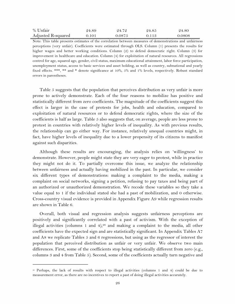
Table 5 suggests that the population that perceives distribution as very unfair is more
prone to actively demonstrate. Each of the four reasons to mobilize has positive and
statistically different from zero coefficients. The magnitude of the coefficients suggest this
effect is larger in the case of protests for jobs, health and education, compared to
exploitation of natural resources or to defend democratic rights, where the size of the
coefficients is half as large. Table 5 also suggests that, on average, people are less prone to
protest in countries with relatively higher levels of inequality. As with previous results,
the relationship can go either way. For instance, relatively unequal countries might, in
fact, have higher levels of inequality due to a lower propensity of its citizens to manifest
against such disparities.
Although these results are encouraging, the analysis relies on ‘willingness’ to
demonstrate. However, people might state they are very eager to protest, while in practice
they might not do it. To partially overcome this issue, we analyze the relationship
between unfairness and actually having mobilized in the past. In particular, we consider
six different types of demonstrations: making a complaint to the media, making a
complaint on social networks, signing a petition, refusing to pay taxes and being part of
an authorized or unauthorized demonstration. We recode these variables so they take a
value equal to 1 if the individual stated she had a past of mobilization, and 0 otherwise.
Cross-country visual evidence is provided in Appendix Figure A9 while regression results
are shown in Table 6.
Overall, both visual and regression analysis suggests unfairness perceptions are
positively and significantly correlated with a past of activism. With the exception of
illegal activities (columns 1 and 4),26 and making a complaint to the media, all other
coefficients have the expected sign and are statistically significant. In Appendix Tables A7
and A8 we replicate Tables 5 and 6 regressions, but using as the regressor of interest the
population that perceived distribution as unfair or very unfair. We observe two main
differences. First, some of the coefficients stop being statistically different from zero (e.g.,
columns 3 and 4 from Table 5). Second, some of the coefficients actually turn negative and
26 Perhaps, the lack of results with respect to illegal activities (columns 1 and 4) could be due to
measurement error, as there are no incentives to report a past of doing illegal activities accurately.

27
statistically significant (e.g., column 2 from Table 5, and columns 1-3 from Table 6).
These two facts together suggest that activism is driven by the population with strong
views about inequality (i.e., very unfair), and not by those who perceive it as just unfair.
Even though a strikingly high share of the population shares the view that income
distribution is unfair, the fight against inequality does not seem to be a top priority among
LA citizens. Every year, Latinobarómetro asks respondents what they think is their
country's most important problem. Although there is a lot of heterogeneity both across
countries and across time, insecurity and unemployment are consistently listed as the top
priorities. In these rankings, reducing the high disparities between the rich and the poor is
usually listed in the bottom half of the priorities, under other issues like 'education’ or
‘corruption.’

28
Table 6. Logit regressions of unfairness perceptions (very unfair) and past activism
Refuse to pay taxes
Signing a petition
Taking part in authorized
demonstrations
Taking part in unauthorized
demonstrations
Make a complaint to
the media
Make a complaint
through the social media
(1) (2) (3) (4) (5) (6)
Very Unfair 0.003 0.012*** 0.008** -0.003 0.004 0.013***
(0.004) (0.004) (0.003) (0.004) (0.004) (0.004)
Gini coefficient 0.098** 0.361*** 0.118 0.139*** 0.251*** 0.287***
(0.045) (0.093) (0.076) (0.042) (0.055) (0.049)
Individual controls
Fixed Effects
Observations 18,141 51,036 51,580 18,422 18,406 18,192
% Unfair 25.89 28.70 28.70 25.94 25.90 25.95
Pseudo R-squared 0.0110 0.0706 0.0705 0.0251 0.0267 0.0733 Note: This table presents estimates of the correlation between measures of past demonstrations and unfairness perceptions (very unfair). Coefficients present
the marginal effects at the mean values of the rest of the variables and were estimated through Logit regressions, weighting by individuals’ probability of being
interviewed. Column (1) presents the results for refusing to pay taxes. Column (2) for signing a petition. Column (3) for unauthorized demonstrations. Column
(4) authorized demonstrations. Column (6) making a complaint to the media and Column (6) complaining in social media. All regressions control for age,
squared age, gender, civil status, maximum educational attainment, labor force participation, and unemployment status, as well as country, and yearly fixed
effects. ***, ** and * denote significance at 10%, 5% and 1% levels, respectively. Heteroskedasticity-robust standard errors in parentheses.

29
A highly speculative reading of this section is that, the way in which this higher
propensity to mobilize could manifest is not with direct demonstrations against inequality
(like in the Occupy Wall Street movement), but rather in demonstrations against other
types of inequalities (such as inequality in access to education or health), or against the
underlying causes of it (such as low wages of some specific segments of the population).
7. Concluding remarks
There is a growing body of evidence showing that many of the decisions agents make are
not based on objective economic indicators, but rather on how these are perceived.
Understanding what people believe about the income distribution is crucial from a policy
perspective—not only from a traditional view, in which a just income distribution is seen
as a pure public good (Thurow, 1971) and is therefore underprovided by unregulated free-
market economy, but also because interventions that make information less costly can
have welfare-improving effects (Roemer, 2003) if there are mismatches between
perceptions and reality.
In this paper we analyzed the perceptions of distributive justice in a context of falling
income inequality. If fairness perceptions are interpreted as preferences for some leveling
of income, our results suggest a striking majority is in favor of reducing the existing
disparities between the rich and the poor, while very few people believe the current
distribution is fair and all incomes should be the same.
The positive news is that beliefs moved in line with the evolution of objective
indicators: both unfairness perceptions and income inequality declined both across
countries and time. The bad news is that three in four LA citizens believe income
distribution is unfair, and such perceptions have proved to be quite inelastic to changes in
income distribution. What happened during the 2000s in terms of inequality reduction
was remarkable, but recent evidence suggests the pace of inequality reduction is not going
to be the same in the near future. As inequality reduction in LA stagnates, one can wonder
if an income distribution that the majority of the population thinks is unfair can be a
steady state in the long run.
We believe that, compared to the vast literature on inequality measurement, as well as
its causes and consequences, relatively little emphasis has been given to how inequality is
perceived by the general population. This paper intends to bridge this gap in the research
agenda. We present the characterization of fairness perceptions in LA not as conclusions
but as a starting point for researchers who are interested in income inequality perceptions.
The results of this paper also raise a number of puzzling questions for future research:
Where do people think the unfairness of income distribution stems from? What has been
the role of mass media in shaping these beliefs? Does the general population think
separately about the ‘micro-justice’ (i.e., the income I receive is fair) and the ‘macro-justice’
of overall patterns of inequality? Would fairness perceptions change if individuals are
30
confronted with accurate information about income distribution? We hope future research
helps to clarify these questions.

31
References
Alesina, A., Glaeser, E. & Sacerdote, B. (2001). “Why doesn't the US have a European-
style welfare system?” Brookings Papers on Economic Activity, vol. 2.
Alesina, A.F. & Giuliano, P. (2011). “Preferences for redistribution”. In Handbook of
Social Economics.
Alvaredo, F., & Gasparini, L. (2015). “Recent Trends in Inequality and Poverty in
Developing Countries.” In Handbook of Income Distribution, vol. 2, edited by Anthony B.
Atkinson and François Bourguignon, 697–805. Amsterdam: North-Holland.
Amiel, Y. & Cowell, F. (1992). “Measurement of income inequality: Experimental test by
questionnaire”. Journal of Public Economics, 47(1), 3-26.
Amiel, Y. and Cowell, F. (1999). Thinking about inequality: Personal judgment and income
distributions. Cambridge University Press.
Atkinson, A.B. & Brandolini, A. (2010). “On analyzing the world distribution of income”.
The World Bank Economic Review, 24 (1), 1–3.
Atkinson, A. B., Piketty, T., & Saez, E. (2011). “Top incomes in the long run of
history”. Journal of economic literature, 49(1), 3-71.
Bellemare, C., Kroger, S. & Van Soest, A. (2009). “Measuring inequity aversion in a
heterogeneous population using experimental decisions and subjective
probabilities”. Econometrica, 76(4), 815-839.
Bénabou, R. & J. Tirole (2006) “Belief in a just world and redistributive politics”. Quarterly
Journal of Economics, 121 (2), 699–746.
Blake PR & McAuliffe K (2011) “I had so much it didn’t seem fair: Eight-year olds reject
two forms of inequity”. Cognition, 120 (2): 215–224.
Blake, P. R., McAuliffe, K., Corbit, J., Callaghan, T. C., Barry, O., Bowie, A., & Wrangham,
R. (2015). “The ontogeny of fairness in seven societies”. Nature, 528 (7581), 258-261.
Bjørnskov, C., Dreher, A., Fischer, J. A., Schnellenbach, J., & Gehring, K. (2013).
“Inequality and happiness: When perceived social mobility and economic reality do not
match”. Journal of Economic Behavior & Organization, 91, 75-92.
Brosnan S.F. & de Waal F.B (2003). “Monkeys reject unequal pay”. Nature, 425, 297–299.
Bonnet, C., P. Dubois, D. Martimort & S. Straub (2012). “Empirical Evidence on
Satisfaction with Privatization in Latin America.” World Bank Economic Review, 26 (1).

32
CEPAL (2010). América Latina frente al espejo: dimensiones objetivas y subjetivas de la
inequidad social y el bienestar en la región. Santiago, CEPAL.
Corneo, G. & Fong, C (2008). “What's the monetary value of distributive justice?” Journal
of Public Economics, 92 (1), 289-308.
Cruces, G., Perez-Truglia, R. & Tetaz M. (2013). “Biased perceptions of income
distribution and preferences for redistribution: Evidence from a survey experiment.”
Journal of Public Economics, 98, 100-112.
Fehr, E. & Schmidt, K. (2003). “Theories of Fairness and Reciprocity-Evidence and
Economic Applications,” in M. Dewatripont, L. Hansen, & S. Turnovsky, eds., Advances
in economics and econometrics: Theory and applications, Cambridge University Press.
Fehr E, Bernhard H & Rockenbach B. (2008) “Egalitarianism in young children”. Nature,
454 (7208), 1079–1083.
Gasparini, L., Cruces, G., & Tornarolli, L. (2011). “Recent trends in income inequality in
Latin America”. Economia 10 (2), 147-201, Spring.
Gasparini, L. & Lustig, A. (2011). “The rise and fall of income inequality in Latin
America”. CEDLAS Working Paper.
Glaeser, E. (2005). “The political economy of hatred”. The Quarterly Journal of Economics,
120 (1). 45-86.
Gimpelson, V. and D. Treisman (2015). “Misperceiving Inequality”. NBER Working
Paper No. 21174.
Graham, C. and A. Felton (2005). “Inequality and happiness: Insights from Latin
America.” The Journal of Economic Inequality. 4 (1), 107–122.
Henrich, J. (2000). “Does culture matter in economic behavior? Ultimatum game
bargaining among the Machiguenga of the Peruvian Amazon”. The American Economic
Review, 90(4), 973-979.
Henrich, J., Boyd, R., Bowles, S., Camerer, C., Fehr, E., Gintis, H., & McElreath, R. (2001).
“In search of homo economicus: behavioral experiments in 15 small-scale societies”. The
American Economic Review, 91 (2), 73-78.
Hochschild, J. (1981) What’s Fair? American Beliefs about Distributive Justice. Cambridge,
MA: Harvard University Press.
LoBue V, Nishida T, Chiong C, DeLoache JS & Haidt J (2011). “When getting something
good is bad: Even three-year-olds react to inequality”. Social Development, 20 (1), 154–170.

33
Lustig, N., López-Calva, L. & E. Ortiz-Juárez (2013). “Declining Inequality in Latin
America in the 2000s: The Cases of Argentina, Brazil, and Mexico.” World Development, 44
(C): 129–41.
Milanovik, B. (2016). Global Inequality A New Approach for the Age of Globalization. Harvard
University Press.
Norton, M. and D. Ariely (2011). “Building a better America— one wealth quintile at a
time”. Perspectives on Psychological Science, 6, 9–12.
Rabin, M. (1993). “Incorporating fairness into game theory and economics”. The American
economic review, 26 (1), 1281-1302.
Range, F., Horn, L., Viranyi, Zs. & Huber, L (2009) “Effort and reward: Inequity aversion
in domestic dogs?” PNAS 106 (1), 340-345.
Ravallion, M., (2003). “The debate on globalization, poverty and inequality: why
measurement matters”. International Affairs, 79 (4), 739-753.
Romer, P. (2003). “Misconceptions and political outcomes”. The Economic Journal. 113
(484), 1–20.
Rodríguez, A. (2014). “Percepciones de desigualdad socioeconómica, un estudio
exploratorio para el caso Argentino”. Revista de Ciencias Sociales, DS-FCS, 27 (34).
Roth, A. E., Prasnikar, V., Okuno-Fujiwara, M., & Zamir, S. (1991). “Bargaining and
market behavior in Jerusalem, Ljubljana, Pittsburgh, and Tokyo: An experimental study”.
The American Economic Review, 81 (5), 1068-1095.
SEDLAC (Socio-Economic Database for Latin America and the Caribbean), Center for
Distributive, Labor, and Social Studies, Universidad de La Plata, La Plata, Argentina;
World Bank, Washington, DC.
Thurow, L. C. (1971). “The income distribution as a pure public good”. The Quarterly
Journal of Economics, 85 (2), 327-336.
Torgler, B. (2003) “Tax Morale in Latin America”. Public Choice, 122 (1), 133-157.
Wascher, C. A., & Bugnyar, T. (2013). “Behavioral responses to inequity in reward
distribution and working effort in crows and ravens”. PLoS One, 8(2), e56885.

34
Appendix A: Additional Figures and Tables
Table A1. Descriptive statistics of the sample pooling data 1997-2015
Variables
Mean Standard Dev. Observations
Sociodemographic variables
Age 39.49 16.18 167,420
Male (%) 49.08 0.50 167,436
Catholic religion (%) 70.70 0.46 165,329
Married or civil union (%) 57.30 0.49 166,121
City > 1 Million Inhabitants. (%) 50.43 0.50 150,224
Education and Labor market
Literate (%) 89.95 0.30 165,925
Secondary education or more (%) 32.38 0.47 165,925
Parents with secondary education (%) 16.77 0.37 132,792
Economically active (%) 64.07 0.48 167,091
Unemployed (% Labor Force) 9.95 0.30 167,091
Access to services
Access to a sewage (%) 69.73 0.46 164,743
Access to running water (%) 87.67 0.33 146,354
Asset ownership
Car (%) 27.29 0.45 164,521
Computer (%) 29.63 0.46 164,719
Fridge (%) 79.22 0.41 146,686
Homeowner (%) 73.65 0.44 165,650
Mobile (%) 76.49 0.42 114,297
Washing machine (%) 51.72 0.50 165,195
Landline (%) 45.14 0.50 165,108
Source: Author’s elaboration based on Latinobarómetro.

35
Table A2. Unfairness perceptions by population group pooling data 1997-2015, in %
Category Perception of income distribution
Very unfair Unfair Fair Very fair Total
All 28.0 51.6 17.5 2.9 100
Gender
Female 28.1 52.2 16.8 2.8 100
Male 27.9 51.0 18.1 3.0 100
Age group
15-24 25.3 52.0 19.6 3.1 100
25-40 28.3 51.3 17.3 3.0 100
41-64 29.2 51.7 16.3 2.8 100
65+ 28.8 51.6 17.1 2.5 100
Civil Status
Married 28.2 51.9 17.1 2.8 100
Not married 27.7 51.3 17.9 3.1 100
Religion
Catholic 28.2 51.7 17.2 2.9 100
Not catholic 27.5 51.5 18.1 2.9 100
Education level
Less than Primary 28.7 50.9 17.3 3.0 100
Complete Primary 27.6 51.6 17.9 3.0 100
Complete Secondary 27.6 52.1 17.7 2.6 100
Complete Tertiary 28.7 52.9 15.6 2.8 100
Type of employment
Employee 28.1 51.5 17.5 2.9 100
Employer 27.1 52.5 17.5 2.8 100
Self-employed 27.9 51.1 17.9 3.2 100
Unemployed 30.6 51.5 14.9 2.9 100
City size
100,000 to 1,000,000 26.2 51.7 19.1 2.9 100
More than 1,000,000 29.4 51.2 16.8 2.6 100
Under 100,000 26.5 52.7 18.5 2.4 100
Source: Author’s elaboration based on Latinobarómetro.

36
Table A3. Unfairness perceptions by geographical location pooling data 1997-2015, in %
Category Perception of about income distribution
Very unfair Unfair Fair Very fair Total
City size Under 100,000 26.5 52.7 18.5 2.4 100
100,000 to 1,000,000 26.2 51.7 19.1 2.9 100
More than 1,000,000 29.4 51.2 16.8 2.6 100
Country Argentina 38.38 50.66 10.14 0.83 100
Bolivia 17.77 55.87 23.88 2.48 100
Brazil 31.81 53.75 12.94 1.50 100
Chile 40.20 49.94 8.42 1.45 100
Colombia 35.13 51.21 11.40 2.26 100
Costa Rica 23.18 53.55 20.12 3.15 100
Dominican Rep. 32.45 46.49 17.51 3.56 100
Ecuador 21.55 47.58 27.38 3.49 100
El Salvador 22.67 53.04 20.58 3.71 100
Guatemala 28.26 51.37 16.70 3.66 100
Honduras 28.86 53.46 14.27 3.41 100
Mexico 32.18 49.86 15.22 2.74 100
Nicaragua 18.94 51.67 24.23 5.16 100
Panama 27.23 48.11 20.29 4.36 100
Paraguay 37.32 48.92 11.91 1.86 100
Peru 24.83 62.01 11.79 1.37 100
Uruguay 18.26 57.50 22.61 1.64 100
Venezuela 23.53 42.89 26.64 6.94 100
Source: Author’s elaboration based on Latinobarómetro.
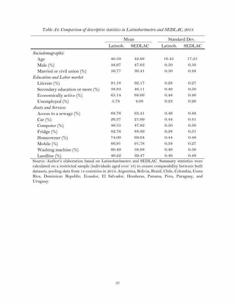
37
Table A4. Comparison of descriptive statistics in Latinobarómetro and SEDLAC, 2013
Mean Standard Dev.
Latinob. SEDLAC Latinob. SEDLAC
Sociodemographic
Age 40.59 42.68
16.43 17.25
Male (%) 48.97 47.63
0.50 0.50
Married or civil union (%) 56.77 36.41
0.50 0.48
Education and Labor market
Literate (%) 91.18 92.17
0.28 0.27
Secondary education or more (%) 38.83 46.11
0.49 0.50
Economically active (%) 65.14 68.66
0.48 0.46
Unemployed (%) 5.78 4.08
0.23 0.20
Assets and Services
Access to a sewage (%) 68.76 63.41
0.46 0.48
Car (%) 26.37 21.09
0.44 0.41
Computer (%) 46.55 47.82
0.50 0.50
Fridge (%) 82.76 88.89
0.38 0.31
Homeowner (%) 74.09 69.64
0.44 0.46
Mobile (%) 86.91 91.78
0.34 0.27
Washing machine (%) 60.49 56.88
0.49 0.50
Landline (%) 40.22 39.47 0.49 0.49
Source: Author’s elaboration based on Latinobarómetro and SEDLAC. Summary statistics were
calculated on a restricted sample (individuals aged over 18) to ensure comparability between both
datasets, pooling data from 14 countries in 2013: Argentina, Bolivia, Brazil, Chile, Colombia, Costa
Rica, Dominican Republic, Ecuador, El Salvador, Honduras, Panama, Peru, Paraguay, and
Uruguay.

38
Table A5. Regressions of unfairness perceptions (very unfair) and different inequality indicators
(1) (2) (3) (4) (5)
Gini coefficient (no zero income) 0.605***
(0.065)
Atkinson, A(1)
0.182***
(0.045)
Theil index, GE(1)
0.165***
(0.023)
Generalized entropy, GE(2)
0.010***
(0.002)
Absolute Gini
-0.000***
(0.000)
Age 0.005*** 0.005*** 0.005*** 0.005*** 0.005***
(0.000) (0.000) (0.000) (0.000) (0.000)
Age squared -0.000*** -0.000*** -0.000*** -0.000*** -0.000***
(0.000) (0.000) (0.000) (0.000) (0.000)
Male dummy 0.001 0.001 0.001 0.001 0.001
(0.003) (0.003) (0.003) (0.003) (0.003)
Married or civil union -0.005* -0.005* -0.005* -0.005* -0.005*
(0.003) (0.003) (0.003) (0.003) (0.003)
Literacy -0.031*** -0.032*** -0.032*** -0.032*** -0.032***
(0.006) (0.006) (0.006) (0.006) (0.006)
Complete Primary -0.002 -0.002 -0.002 -0.002 -0.002
(0.004) (0.004) (0.004) (0.004) (0.004)
Complete Secondary -0.005 -0.004 -0.004 -0.004 -0.003
(0.005) (0.005) (0.005) (0.005) (0.005)
Complete Tertiary 0.005 0.006 0.006 0.007 0.007
(0.005) (0.005) (0.005) (0.005) (0.005)
Economically active dummy -0.004 -0.004 -0.004 -0.004 -0.004
(0.003) (0.003) (0.003) (0.003) (0.003)
Unemployed dummy 0.018*** 0.018*** 0.018*** 0.018*** 0.018***
(0.005) (0.005) (0.005) (0.005) (0.005)
Observations 149,116 149,116 149,116 149,116 149,116
% Unfair 27.74 27.74 27.74 27.74 27.74
Pseudo R-squared 0.0471 0.0467 0.0469 0.0468 0.0466
Note: This table presents estimates of the correlation between a dummy variable that indicates whether the
individual believes income distribution is very unfair and individuals’ characteristics controlling for different
inequality indicators. Coefficients present the marginal effects at the mean values of the rest of the variables
and were estimated through Logit regressions, weighting by individuals’ probability of being interviewed.
All columns include country, subnational and year fixed effects. ***, ** and * denote significance at 10%, 5%
and 1% levels, respectively. Heteroskedasticity-robust standard errors in parentheses.

39
Table A6. Logit regressions of unfairness perceptions (unfair or very unfair) and individual beliefs
(1) (2) (3) (4)
Gini coefficient 0.541*** 0.418*** 0.207*** 0.331***
(0.071) (0.060) (0.060) (0.072)
Self-reported Ideology 0.002***
-0.000
(0.000)
(0.001)
Catholic religion
-0.003
-0.001
(0.002)
(0.003)
Current economic situation of the country
-0.107*** -0.116***
(0.002) (0.002)
Positive Outlook
-0.065*** -0.067***
(0.003) (0.003)
Negative Outlook
0.050*** 0.054***
(0.003) (0.004)
Observations 113,298 143,190 117,532 90,705
% Unfair 78.25 79.56 80.30 79.08
Pseudo R-squared 0.0729 0.0701 0.142 0.146
Note: This table presents estimates of the correlation between perception of distribution as very unfair and
measures of individual values. Coefficients present the marginal effects at the mean values of the rest of the
variables and were estimated through Logit regressions, weighting by individuals’ probability of being
interviewed. All regressions control for age, squared age, gender, civil status, maximum educational
attainment, labor force participation, and unemployment status, access to basic services and asset holding, as
well as country, subnational and yearly fixed effects. ***, ** and * denote significance at 10%, 5% and 1%
levels, respectively. Heteroskedasticity-robust standard errors in parentheses.

40
Table A7. OLS regressions of unfairness perceptions (unfair or very unfair) and stated activism
Higher wages and better work
Democratic rights
Healthcare and education
Natural resources
(1) (2) (3) (4)
Unfair 0.139*** -0.113*** 0.052 -0.036
(0.042) (0.042) (0.040) (0.042)
Gini coefficient -10.347*** -16.790*** -15.498*** -13.082***
(2.771) (2.676) (2.569) (2.724)
Constant 9.687*** 12.981*** 12.136*** 10.771***
(1.215) (1.184) (1.135) (1.198)
Individual controls
Fixed Effects
Observations 35,534 35,221 35,651 35,268
% Unfair 73.57 73.47 73.50 73.49
Adjusted R-squared 0.0998 0.0875 0.112 0.0805
Note: This table presents estimates of the correlation between measures of demonstrations and unfairness
perceptions (unfair or very unfair). Coefficients were estimated through OLS. Column (1) presents the
results for higher wages and better working conditions. Column (2) to defend democratic right. Column (3)
for improvement in healthcare and education. Column (4) for exploitation of natural resources. All
regressions control for age, squared age, gender, civil status, maximum educational attainment, labor force
participation, unemployment status, access to basic services and asset holding, as well as country,
subnational and yearly fixed effects. ***, ** and * denote significance at 10%, 5% and 1% levels,
respectively. Heteroskedasticity-robust standard errors in parentheses.

41
Table A8. Logit regressions of unfairness perceptions (unfair or very unfair) and past activism
Refuse to pay taxes
Signing a petition
Taking part in authorized
demonstrations
Taking part in unauthorized
demonstrations
Make a complaint to
the media
Make a complaint through the social
media
(1) (2) (3) (4) (5) (6)
Unfair -0.009*** -0.015*** -0.014*** -0.004 0.001 0.011**
(0.004) (0.005) (0.004) (0.004) (0.004) (0.004)
Gini coefficient 0.111** 0.389*** 0.139* 0.139*** 0.256*** 0.297***
(0.046) (0.093) (0.076) (0.043) (0.055) (0.049)
Individual controls
Fixed Effects
Observations 18,141 51,036 51,580 18,422 18,406 18,192
% Unfair 75.05 79.70 79.77 75.18 75.23 75.16
Pseudo R-squared 0.0120 0.0706 0.0708 0.0253 0.0266 0.0727 Note: This table presents estimates of the correlation between measures of past demonstrations and unfairness perceptions (unfair or very unfair). Coefficients
present the marginal effects at the mean values of the rest of the variables and were estimated through Logit regressions, weighting by individuals’ probability
of being interviewed. Column (1) presents the results for refusing to pay taxes. Column (2) for signing a petition. Column (3) for unauthorized demonstrations.
Column (4) for authorized demonstrations. Column (5) make a complaint to the media and Column (6) complain in social media. All regressions control for age,
squared age, gender, civil status, maximum educational attainment, labor force participation, and unemployment status, as well as country, and yearly fixed
effects. ***, ** and * denote significance at 10%, 5% and 1% levels, respectively. Heteroskedasticity-robust standard errors in parentheses.
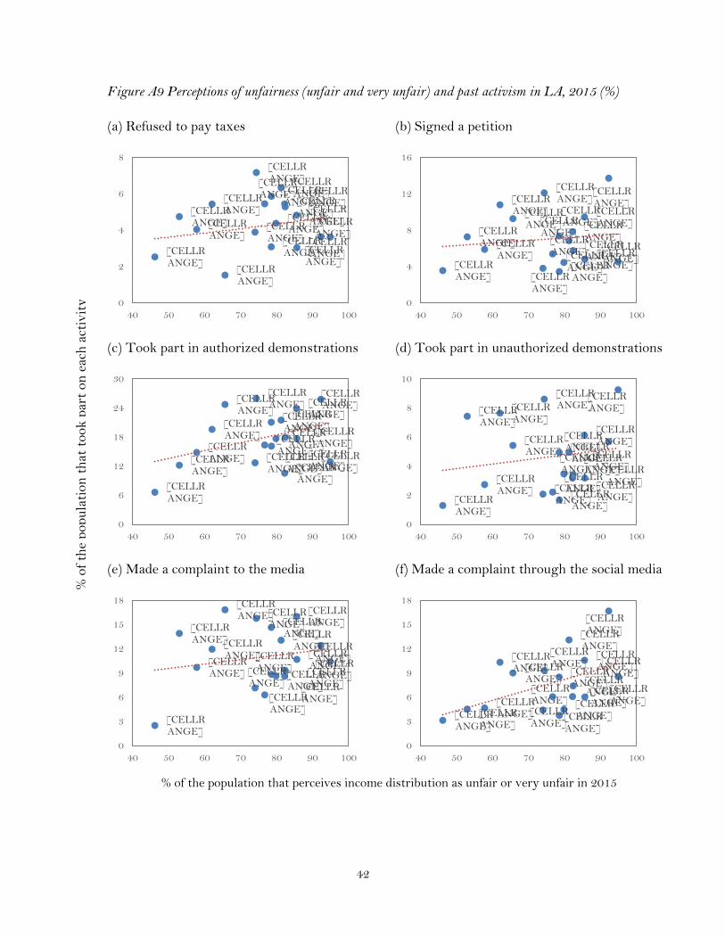
42
Figure A9 Perceptions of unfairness (unfair and very unfair) and past activism in LA, 2015 (%)
(a) Refused to pay taxes (b) Signed a petition
(c) Took part in authorized demonstrations (d) Took part in unauthorized demonstrations
(e) Made a complaint to the media (f) Made a complaint through the social media
% of the population that perceives income distribution as unfair or very unfair in 2015
[CELLRANGE]
[CELLRANGE]
[CELLRANGE]
[CELLRANGE]
[CELLRANGE]
[CELLRANGE]
[CELLRANGE]
[CELLRANGE]
[CELLRANGE]
[CELLRANGE]
[CELLRANGE]
[CELLRANGE]
[CELLRANGE]
[CELLRANGE]
[CELLRANGE]
[CELLRANGE]
[CELLRANGE]
[CELLRANGE]
0
2
4
6
8
40 50 60 70 80 90 100
[CELLRANGE] [CELLR
ANGE]
[CELLRANGE]
[CELLRANGE]
[CELLRANGE] [CELLR
ANGE]
[CELLRANGE]
[CELLRANGE]
[CELLRANGE]
[CELLRANGE]
[CELLRANGE]
[CELLRANGE]
[CELLRANGE] [CELLR
ANGE]
[CELLRANGE]
[CELLRANGE]
[CELLRANGE]
[CELLRANGE]
0
4
8
12
16
40 50 60 70 80 90 100
[CELLRANGE]
[CELLRANGE]
[CELLRANGE]
[CELLRANGE]
[CELLRANGE] [CELLR
ANGE]
[CELLRANGE]
[CELLRANGE]
[CELLRANGE]
[CELLRANGE]
[CELLRANGE] [CELLR
ANGE]
[CELLRANGE]
[CELLRANGE]
[CELLRANGE]
[CELLRANGE]
[CELLRANGE]
[CELLRANGE]
0
6
12
18
24
30
40 50 60 70 80 90 100
[CELLRANGE]
[CELLRANGE]
[CELLRANGE]
[CELLRANGE]
[CELLRANGE]
[CELLRANGE]
[CELLRANGE]
[CELLRANGE]
[CELLRANGE]
[CELLRANGE]
[CELLRANGE]
[CELLRANGE]
[CELLRANGE]
[CELLRANGE] [CELLR
ANGE]
[CELLRANGE]
[CELLRANGE]
[CELLRANGE]
0
2
4
6
8
10
40 50 60 70 80 90 100
[CELLRANGE]
[CELLRANGE]
[CELLRANGE]
[CELLRANGE]
[CELLRANGE]
[CELLRANGE]
[CELLRANGE]
[CELLRANGE]
[CELLRANGE]
[CELLRANGE] [CELLR
ANGE]
[CELLRANGE]
[CELLRANGE]
[CELLRANGE]
[CELLRANGE]
[CELLRANGE]
[CELLRANGE]
[CELLRANGE]
0
3
6
9
12
15
18
40 50 60 70 80 90 100
[CELLRANGE]
[CELLRANGE]
[CELLRANGE]
[CELLRANGE]
[CELLRANGE]
[CELLRANGE]
[CELLRANGE]
[CELLRANGE]
[CELLRANGE]
[CELLRANGE]
[CELLRANGE]
[CELLRANGE]
[CELLRANGE]
[CELLRANGE]
[CELLRANGE]
[CELLRANGE]
[CELLRANGE]
[CELLRANGE]
0
3
6
9
12
15
18
40 50 60 70 80 90 100
% o
f th
e popu
lati
on
th
at t
ook p
art
on
eac
h a
ctiv
ity
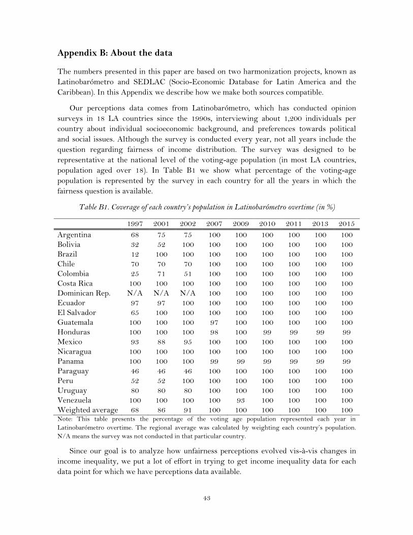
43
Appendix B: About the data
The numbers presented in this paper are based on two harmonization projects, known as
Latinobarómetro and SEDLAC (Socio-Economic Database for Latin America and the
Caribbean). In this Appendix we describe how we make both sources compatible.
Our perceptions data comes from Latinobarómetro, which has conducted opinion
surveys in 18 LA countries since the 1990s, interviewing about 1,200 individuals per
country about individual socioeconomic background, and preferences towards political
and social issues. Although the survey is conducted every year, not all years include the
question regarding fairness of income distribution. The survey was designed to be
representative at the national level of the voting-age population (in most LA countries,
population aged over 18). In Table B1 we show what percentage of the voting-age
population is represented by the survey in each country for all the years in which the
fairness question is available.
Table B1. Coverage of each country’s population in Latinobarómetro overtime (in %)
1997 2001 2002 2007 2009 2010 2011 2013 2015
Argentina 68 75 75 100 100 100 100 100 100
Bolivia 32 52 100 100 100 100 100 100 100
Brazil 12 100 100 100 100 100 100 100 100
Chile 70 70 70 100 100 100 100 100 100
Colombia 25 71 51 100 100 100 100 100 100
Costa Rica 100 100 100 100 100 100 100 100 100
Dominican Rep. N/A N/A N/A 100 100 100 100 100 100
Ecuador 97 97 100 100 100 100 100 100 100
El Salvador 65 100 100 100 100 100 100 100 100
Guatemala 100 100 100 97 100 100 100 100 100
Honduras 100 100 100 98 100 99 99 99 99
Mexico 93 88 95 100 100 100 100 100 100
Nicaragua 100 100 100 100 100 100 100 100 100
Panama 100 100 100 99 99 99 99 99 99
Paraguay 46 46 46 100 100 100 100 100 100
Peru 52 52 100 100 100 100 100 100 100
Uruguay 80 80 80 100 100 100 100 100 100
Venezuela 100 100 100 100 93 100 100 100 100
Weighted average 68 86 91 100 100 100 100 100 100 Note: This table presents the percentage of the voting age population represented each year in
Latinobarómetro overtime. The regional average was calculated by weighting each country’s population.
N/A means the survey was not conducted in that particular country.
Since our goal is to analyze how unfairness perceptions evolved vis-à-vis changes in
income inequality, we put a lot of effort in trying to get income inequality data for each
data point for which we have perceptions data available.

44
Our source for income inequality data is SEDLAC, a joint effort of the World Bank
and CEDLAS at the National University of La Plata in Argentina. SEDLAC increases
cross-country comparability of selected findings from official household surveys. The
welfare indicator used is the total household per capita income in 2005 US$ (PPP) per day.
The inequality measures we use include households with zero incomes unless otherwise
noted (results are similar with the exclusion of these households). For Argentina and
Uruguay, the inequality data corresponds to urban areas only.
Whenever possible, we used comparable annual household surveys to estimate
inequality indicators. However, some countries did not conduct surveys every year, and
some of the household surveys available in certain countries are not comparable across
time, usually due to important methodological changes (for instance, due to changes in the
sampling scheme or in the set of variables available).
To increase the number of observations available (without pushing the data too much),
we made to two partial fixes. First, we filled the data gaps using household surveys of
‘close’ years in which previously unused data was available. For instance, Chile conducts
household surveys on average every two years. We have perceptions data in 1997 but no
income inequality data for the same year. Therefore, we use the inequality data from the
adjacent year (1998) to compare the perceptions data from 1997. As noted previously, we
only do this process of using data from close years if the data from the adjacent year
corresponds to a year in which the perceptions question was not asked (and therefore,
inequality data is not needed in that year).
Table B2. Circa years used to fill data gaps
Country Year without household data Data point used instead
All 2015 2014
Chile 1997 1998
Chile 2001 2000
Chile 2002 2003
Chile 2007 2006
Colombia 2007 2008
Ecuador 2002 2003
El Salvador 1997 1998
Guatemala 2001 2000
Mexico 1997 1998
Mexico 2001 2000
Mexico 2007 2006
Mexico 2009 2008
Mexico 2011 2012
Nicaragua 1997 1998
Nicaragua 2007 2005

45
Venezuela 2013 2012
Finally, for some countries, a few years had perceptions data available but no
comparable household survey overtime and no ‘close year’ available. In this case, and in
order to analyze the same set of countries every year, interpolation was applied to the
inequality indicators.
Table B3. Years in which inequality indicators were calculated with a linear interpolation
Country Years interpolated
Argentina 1997, 2001, and 2002
Bolivia 2010
Brazil 2010
Chile 2010
Colombia 1997
Costa Rica 1997, 2001, 2002, 2007, and 2009
Ecuador 1997, 2001
Guatemala 1997, 2002, 2009, 2010, and 2013
Mexico 2013
Nicaragua 2002, 2010, 2011, and 2013
Panama 1997, 2001, 2002, and 2007
Peru 1997, 2001, 2002
Venezuela 2015
Overall, the years in which income inequality was calculated using linear
interpolations represent a relatively small share of the total data points (about a fifth of
the 161 data points we have available). The majority of our inequality data points (59%)
were calculated using a household surveys from the same year in which the perceptions
polls were conducted (Table B1), while the remaining 21% of our inequality indicators
were calculated using households surveys from adjacent years (Table B2). A summary of
the data sources used in every year in which perceptions data is available is provided in
Figure B1.

46
Figure B1. Summary of the data used in every country/year
1997 2001 2002 2007 2009 2010 2011 2013 2015
Argentina 3 3 3 1 1 1 1 1 2
Bolivia 1 1 1 1 1 3 1 1 2
Brazil 1 1 1 1 1 3 1 1 2
Chile 2 2 2 2 1 3 1 1 2
Colombia 3 1 1 2 1 1 1 1 2
Costa Rica 3 3 3 3 3 1 1 1 2
Dominican Rep. 0 1 1 1 1 1 1 1 2
Ecuador 3 3 2 1 1 1 1 1 2
El Salvador 3 2 3 2 3 3 1 3 2
Guatemala 1 1 1 1 1 1 1 1 2
Honduras 2 2 1 2 2 1 2 3 2
Mexico 2 1 3 2 1 3 3 3 2
Nicaragua 3 3 3 3 1 1 1 1 2
Panama 3 3 3 1 1 1 1 1 2
Paraguay 1 1 1 1 1 1 1 1 2
Peru 2 1 1 1 1 1 1 1 2
Uruguay 1 1 1 1 1 1 1 1 2
Venezuela 1 1 1 1 1 1 1 2 3
Both perceptions and inequality data available
Inequality was calculated with an adjacent year survey
Inequality was estimated with a linear interpolation
Latinobarómetro did not conduct survey in this year

47
Appendix C: The Oaxaca-Blinder Decomposition
The starting point to decompose changes in unfairness perceptions between 2002 and
2013 is the following equation:
𝑈𝑛𝑓𝑎𝑖𝑟𝑡 = 𝛽𝑡 𝑋𝑡 + ε𝑡 ; t ∈ {2002, 2013} (C.1)
Where t indicates the year in which perceptions are captured, and X denotes all the
explanatory variables defined in the regressions (mainly, demographics factors and the
Gini coefficient). Defining 𝐷2013 as a dummy variable that takes the value 1 if the year is
2013, then, the mean difference in unfairness perceptions between both years is given by:
∆𝜇= 𝐸(𝑈𝑛𝑓𝑎𝑖𝑟2013|𝐷2013 = 1) − 𝐸(𝑈𝑛𝑓𝑎𝑖𝑟2002|𝐷2013 = 0) (C.2)
Since the regression line that comes from estimating the parameters in equation C.2
above meets the property of passing through the sampling means, we have:
𝑈𝑛𝑓𝑎𝑖𝑟̅̅ ̅̅ ̅̅ ̅̅ ̅̅2002 = �̂�2002 �̅�2002 & 𝑈𝑛𝑓𝑎𝑖𝑟̅̅ ̅̅ ̅̅ ̅̅ ̅̅
2013 = �̂�2013 �̅�2013 (C.3)
Where �̅�𝑡 is the vector of the average values of the explanatory variables in year t, and
�̂� the vector of estimated coefficients. If the relationship between the explanatory
variables and the perceptions of fairness did not change during the 2002-13 period (i.e.,
the 𝛽 remained constant), then the unfairness perceptions in 2013 could be expressed as:
𝑈𝑛𝑓𝑎𝑖𝑟̅̅ ̅̅ ̅̅ ̅̅ ̅̅2013𝐶 = �̂�2002 �̅�2013
(C.4)
Where the superscript C indicates this value comes from a counterfactual exercise.
Replacing the expected value of the covariables in equation (C.2) by the sample
averages, the difference in the perceptions between both years can be expressed as:
∆𝜇= �̂�2013�̅�2013 − �̂�2002�̅�2002
∆𝜇= �̂�2013�̅�2013 − �̂�2002�̅�2002 + �̂�2002�̅�2013 − �̂�2002�̅�2013
∆𝜇=�̂�2002(�̅�2013 − �̅�2002) ⏟
∆̂𝑋𝜇
+�̅�2013(�̂�2013 − �̂�2002) ⏟
∆̂𝑆𝜇
(C.5)
The first term of equation (C.5.), usually known as the “composition effect,” captures
the difference between the average perceptions in 2002 and the counterfactual perceptions
2013 if the �̂�’s—i.e., the elasticity of perceptions to the different covariables—remained
constant during the 2002-13 period. In other words, this first term captures only

48
differences in the endowments of characteristics that determine unfairness perceptions
(such as the educational attainment, age or income inequality).
In turn, the second term of equation (C.5)—what can be thought of as a “perceptions
structure effect”—reflects the difference between the average perceptions in 2013, and the
counterfactual perceptions in 2002 with the observable attributes of 2013. Therefore, this
component reflects changes in perceptions that are due to changes in the elasticity of the
different covariables between both years.
In the main text of the paper we exploit the additive linearity assumption of the
decomposition, and report the sole effect of changes in the Gini coefficient.