pdf with notes (30.7 mb)
TRANSCRIPT

Web Typographyyou should do now
Richard Rutter, Fontdeck.com
SxSW 2013 #webtype
Thanks for choosing typography as a way to end your first day.Has it stopped raining? I didn’t come all the way back to Austin for British weather.So in the guide it says something about awe-inspiring typography which is a bit hyperbolic for my liking, so we’re going with this.I’m going to show how you can make your web typography better with the tools we have today, and in particular discuss typography in the context of responsive design, which is all the rage.It’s going to be a bit technical here and there, but you can just ignore that stuff if you want.

BillboardsNovels
Typography can be split into two. Billboards & Novels, to borrow from friend and designer Jon Tan.

ImpactImmersion
By immersion we mean reading.

flickr.com/photos/nathanpitman/2377290426/
Much of the web is about reading. Customer reviews, industry reports, social network updates, blog posts, newspapers, magazines, email.
So why would we not strive to make those reading experiences as good as possible?Achieve a flow state

There are important differences between good or poor typography that appear to have little effect on reading speed and comprehension.”
Dr. Kevin Larson (Microsoft)and Dr. Rosalind W. Picard (MIT)
“
Science backs this up. Good typography doesn’t improve speed or understanding. Disappointing.
BUT…!

Good typography induces a good mood.”
Dr. Kevin Larson (Microsoft)and Dr. Rosalind W. Picard (MIT)
“

Good typographyinduces a
good mood!
Now we’re talking. Science has shown that good typography can improve the user experience.So let’s talk about what good typography is. Here’s some tips.

NovelsWe’ll start with novels. Text set for immersive reading.

Responsive typography
Typography in a responsive design context

Clearleft Device LabTypography in a responsive design context.Build once using modern CSS techniques to enable the design to adapt or ‘respond’ to its environment whether a smart phone, a 27” desktop or anywhere in between.

<!DOCTYPE html><html lang="en"><head><meta charset="utf-‐8" /><title>Renegade Diving School</title><meta name="viewport" content="width=device-‐width, initial-‐scale=1.0"/></head>
<body><div id="main">
<header><h1>Explore the oceans</h1><h2>Become a PADI diver</h2></header>
<section class="intro"><p><strong>Learn to dive with our “Discover Scuba Diving” experiences and PADI courses. For top quality tuition in warm crystal-‐clear seas, come to us – Renegade Divers.</strong></p></section>
<section><p>Renegade Divers has been operating since 1998. We offer a range of liveaboard PADI-‐registered diving holidays. Our main destination for PADI training is the Red Sea. We also offer the best Maldives liveaboards and other leading dive vessels in the Indian Ocean, Indonesia and the Galapagos Islands.</p>
<p>Learn to dive and experience the thrill of seeing your first whale shark or hearing the mournful humpback whale. Feel the adrenaline rush as you glide through a throng of a thousand blackfin barracuda, or enjoy the tranquillity and peace whilst floating through secluded underwater coral gardens.</p></section>
<section><h3>Liveaboard dive trips</h3>
<table> <thead> <tr> <th>Depart</th><th>Duration</th><th>Double Cabin</th><th>Twin cabin</th><th>Boat</th> </tr> </thead> <tbody> <tr> <td>28/10/12</td><td>5 nights</td><td>£852</td><td>£550</td><td>Reefmaster</td> </tr> <tr> <td>05/11/12</td><td>2 nights</td><td>£735</td><td>£450</td><td>La Riviera</td> </tr> <tr> <td>08/11/12</td><td>5 nights</td><td>£852</td><td>£550</td><td>Reefmaster</td> </tr> <tr> <td>14/11/12</td><td>2 nights</td><td>£735</td><td>£450</td><td>La Riviera</td> </tr> </tbody></table>
<p class="book"> <a href="#">Book a course online and save 20%</a></p>
</section>
</div></body></html>
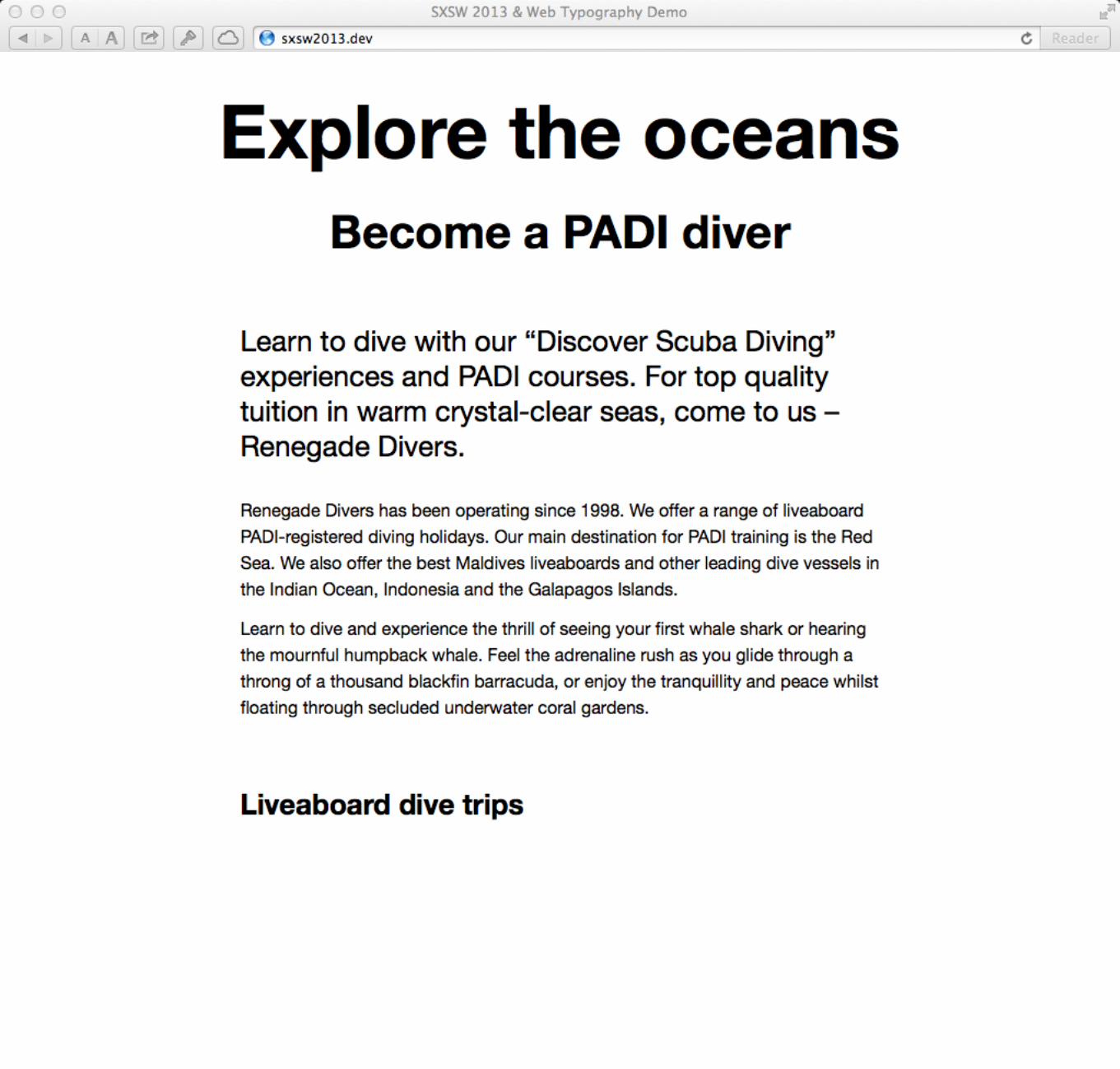
Let’s start with some HTML. Standard stuff. Some headings, paragraphs, a table.Simple one page site for diving holidays which we’ll be using as an example throughout.
I know in real life web sites are usually more complicated than this, but it doesn’t really matter when it comes to typography.

Without any styling added this is what the browser comes up with on an iPhone 4 in Mobile Safari.
Actually all perfectly reasonable and readable, if dull.

On a bigger screen the situation is different. I think we can all concede it’s harder to read. Particularly problematic are the long line lengths of the paragraphs.

45 to 75 characters is widely regarded as a satisfactory length of line for a single-column page.”
Robert Bringhurst in The Elements of Typographic Style (Hartley & Marks, 1999)
“
This quote from Bringhurst is a simple observation and holds true even when the page we’re talking about is a web page.
The important thing about this quote is that it talks about a range.

M
This line has sixty six characters, counting both letters and spaces.It is about 32 ems long and suitable for long-form reading with text set in paragraphs. On average 1 em accounts for two characters, so a satisfactory line length (also known as the measure) is 22 to 38 ems.
M M M
1 em equals 2 characters.

With that in mind, let’s concentrate on the paragraph. It’s where most of the reading is done. Here it is on our phone using the browser defaults again. We can see the lines are about 42 characters long and for my 40 year old eyes, that’s comfortable reading size.
So let’s not touch the defaults line length or font size in our CSS. But...

twitter.com/jontangerine/status/298722082957705216Although as we can see here, some people need their text much bigger.
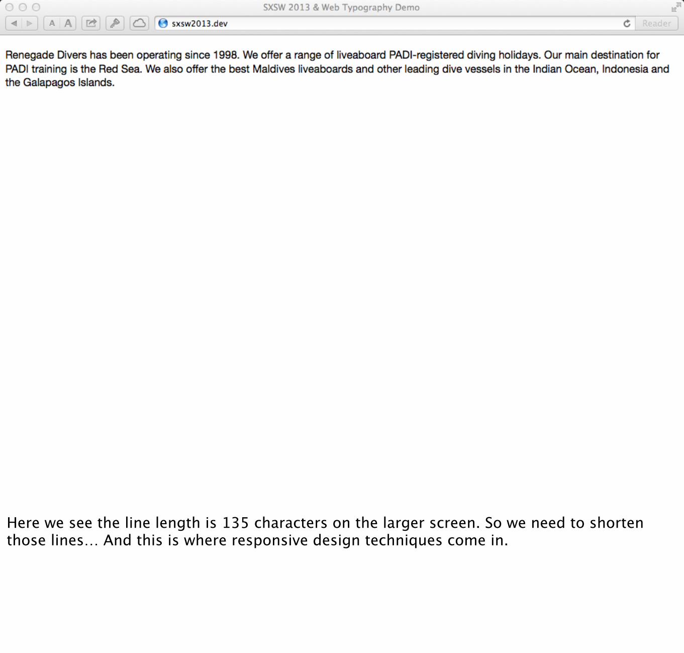
Here we see the line length is 135 characters on the larger screen. So we need to shorten those lines… And this is where responsive design techniques come in.

Typical media query
@media only screen and (min-‐width: 480px) {
<!-‐-‐ styles for larger screens here -‐-‐>
}
In your CSS apply rules only when the media criteria is met, in this case the device must have a screen at least 480px wide for the style to be applied, otherwise they are ignored.
This bit is usually called a break point. It is where styles are added because otherwise the design breaks. Let’s think about how and where the design of the paragraph is breaking.

Renegade Divers has been operating since 1998. We offer a range of liveaboard PADI registered diving holidays. Our main destination for PADI training is the Red Sea. We also offer the best Maldives liveaboards and other leading dive vessels in the Indian Ocean, Indonesia and the Galapagos Islands.
22em
38em
21% 21%Renegade Divers has been operating since 1998. We offer a range of liveaboard PADI registered diving holidays. Our main destination for PADI training is the Red Sea. We also offer
Renegade Divers has been operating since 1998. We offer a range of liveaboard PADI registered diving holidays. Our main destination for PADI training is the Red Sea. We also offer the best Maldives liveaboards and other leading dive vessels in the
51em
29em
21% 21%
Line length is fine until displayed on a screen wider than the equivalent of 38em, at which point it’s too wide for comfortable reading - the design breaks.At that point we apply padding to reduce it back down to the minimum end of the range.
Then on larger screens the percentage padding allows the line length to be proportionally longer.

Media queries
@media only screen and (min-‐width: 38em) {
#main { padding-‐left: 21%; padding-‐right: 21%; }
}
So for screens greater than 38ems wide, add padding. Note ems means layout is completely device independent - not saying on an iPad to this, on a Chromebook do that. Also takes into account when people adjust default font size.


Hyphenation
p, table { hyphens:auto;}
p, table { -‐moz-‐hyphens:auto; -‐ms-‐hyphens:auto; -‐o-‐hyphens:auto; -‐webkit-‐hyphens:auto; hyphens:auto;}
Another enhancement. Can add hyphenation.

Hyphenation
p, table { hyphens:auto;}
@media only screen and (min-‐width: 38em) { p, table { hyphens:none; }}
You might want to remove hyphens from wider screens.

Columns
@media only screen and (min-‐width: 66em) { column-‐count:2; column-‐gap: 1.5em;}
For screens where the main paragraphs are wider than 38em, use columns.

Here’s a wide screen showing two columns.Be careful with columns - must be short due to scrolling effect.

Type size
Type is sized initially for reading. I would argue nowadays you should stick to the default 16px. Certainly no smaller. You may wish to bump up depending on the font.
So why do you have type at different sizes? Really big type for impact, but otherwise to indicate heirarchy. For that you need a type size scale.

He are the defaults in Mobile Safari. Fair to say there’s reasonable contrast between paragraphs and headings to indicate heirarchy.

32 24 19 16 13iOS scale
68 42 26 16 10Golden ratio scale
36 24 18 16 14Classical (diatonic) scale
There are other scales. Here’s just a few. Pick what works for you and stick to it.Note some scales have bigger steps than others. For small devices, use small gaps. For bigger screens, bigger gaps can work.

A modular scale is a sequence of numbers that relate to one another in a meaningful way.”
Tim Brown, More Meaningful Typographyhttp://modularscale.com/
“
Tim Brown’s modular scales

Line heighth1 { font-‐size: 36px; line-‐height: 1;}
h2 { font-‐size: 24px; line-‐height: 1;}
.intro p, h3 { font-‐size: 18px; line-‐height: 1.333;}
p, table { font-‐size: 16px; line-‐height:1.5;}
@media only screen and (min-‐width: 38em) {
h1 { font-‐size: 68px; line-‐height: 1;}
h2 { font-‐size: 42px; line-‐height: 1;}
.intro p, h3 { font-‐size: 26px; line-‐height: 1.231;}
p, table { font-‐size: 16px; line-‐height:1.5;}
}
Tweak line heights. Bigger text needs less line-height.Also tweaked margins.

h1, h2, h3, h4, h5, h6, p, ol, ul, li, dl, dt, dd, blockquote, address { margin: 0; padding: 0;}
Reset
Get rid of the browser defaults. For a start they are differ.This way you know you’re in control.

A typography prototype includes font choices, styles for the basic text content and a typographic scale, but nothing else.”
Viljami Salminen, Prototyping Responsive Typographyhttp://viljamis.com/blog/2013/prototyping-responsive-typography/
“
What we’re building is what Viljami Salminen recently described as a typography prototype.

Microtypography

opening double quoteclosing double quoteopening single quoteclosing single quoteen dashem dashminusmultiplicationellipsis
“”‘’–—−×…
Characters to watch out for.

We’re already doing some things right. Quotes and a proper en dash.But we’ve got some other bits to attend to. PADI acronyms and the 1998.

Treat numbers as letters to make sure they do not stand out.”
Enric Jardí, Twenty-Two Tips on Typography (Actar, 2007)
“

Lining Old Style
Proportional
!"#,%&" 409,280
Proportional ,-.,//% 367,112
Proportional /44,"-& 155,068
Proportional
/./,.#% 171,792
Tabular
678,9:7 ;<=,>?<
Tabular@AB,CC9 DEF,GG>
TabularCHH,7A: GII,<E?
Tabular
CBC,B89 GFG,F=>
Numbers come in three forms. Lining (capitals) old style (lower case) tabular (monospaced).
So when Jardi is saying stop numbers standing out, he means use old style figures.
Designed in modern professional fonts and built right into the font file using OpenType.With CSS 3 we can access those OpenType features.

p { -‐moz-‐font-‐feature-‐settings: "onum" 1, "pnum" 1; -‐ms-‐font-‐feature-‐settings: "onum" 1, "pnum" 1; -‐o-‐font-‐feature-‐settings: "onum" 1, "pnum" 1; -‐webkit-‐font-‐feature-‐settings: "onum" 1, "pnum" 1; font-‐feature-‐settings: "onum" 1, "pnum" 1;}
p { font-‐variant-‐numeric: oldstyle-‐nums proportional-‐nums; font-‐feature-‐settings: "onum" 1, "pnum" 1;}
p { font-‐variant-‐numeric: oldstyle-‐nums proportional-‐nums;}
Support for font-feature-settings is IE10, Firefox, Webkit/Win

Had to change typeface. Helvetica doesn’t have old-style numerals. Now using Source Sans Pro (free open source font) which is fully loaded with OpenType features, as we’ll see.
Proportional old-style in paragraph.

table { font-‐feature-‐settings: "lnum" 1, "tnum" 1;}

Proportional old-style goes to lining tabular.
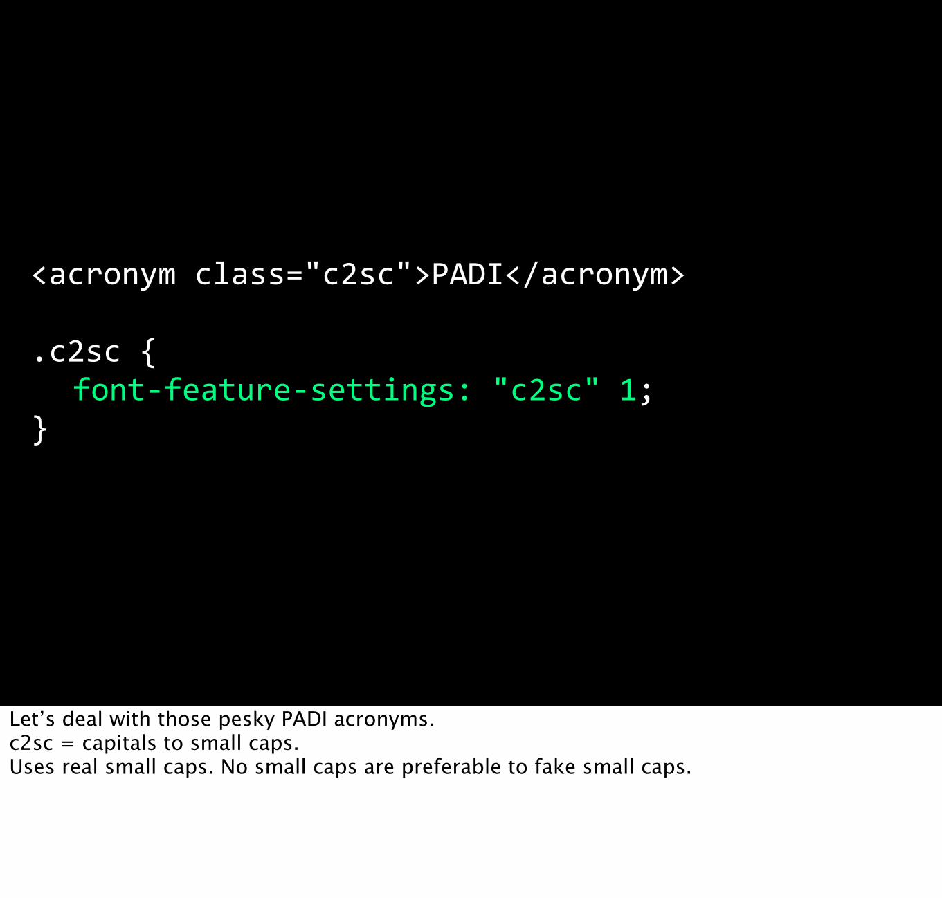
<acronym class="c2sc">PADI</acronym>
.c2sc { font-‐feature-‐settings: "c2sc" 1;}
Let’s deal with those pesky PADI acronyms.c2sc = capitals to small caps.Uses real small caps. No small caps are preferable to fake small caps.

Top is faked small caps. Bottom is real. Relatively subtle, but the characters are slightly squatter (wider) and the stroke is thicker to match the text around it.

Every chapter opens with fake, spindly small caps.

And here we are with our non-shouting acronyms.Don’t have to do this. Matter of style. You might prefer to keep full caps in headings, particularly if you are using Title Case.

Choosing fonts
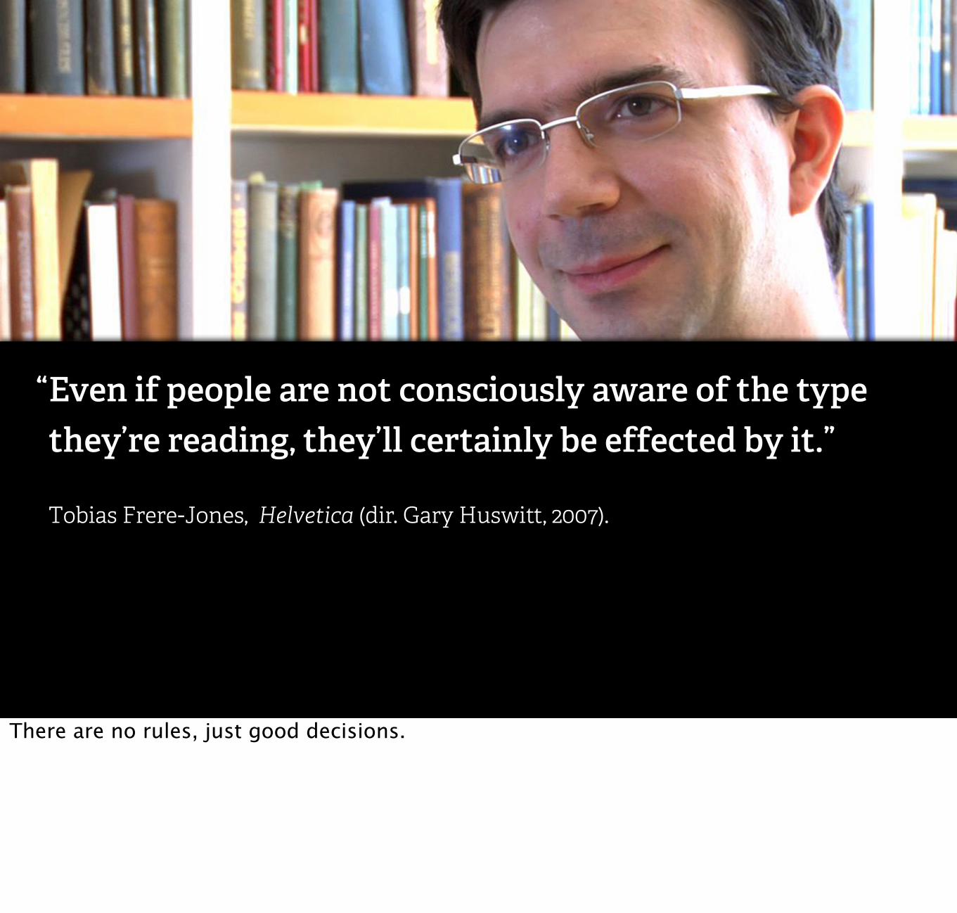
Even if people are not consciously aware of the type they’re reading, they’ll certainly be effected by it.”
Tobias Frere-Jones, Helvetica (dir. Gary Huswitt, 2007).
“
There are no rules, just good decisions.

1. Does the font have the character set your text requires?
2. Does it have enough useful weights and styles?
3. Does it have the features you need?
4. Does it ‘say’ what the text is saying?
Make a shortlist based on practical criteria.

Make a tester to compare side by side. Start with a paragraph.

blog.fontdeck.com/post/23601339698/body-text-tester

Then plug into your prototype.LFT Etica

Akagi

Inuik

This is what I’m going with. Shaker by Jeremy Tankard.It’s got the OpenType features. The bold is quite light. There’s a simplicity but a friendly character to it.

On loading web fontsA rather technical interlude

Who has had this experience? Loading in several web fonts over a slow connection can be… slow. The browser lays out the page but doesn’t display text until the web font loads.
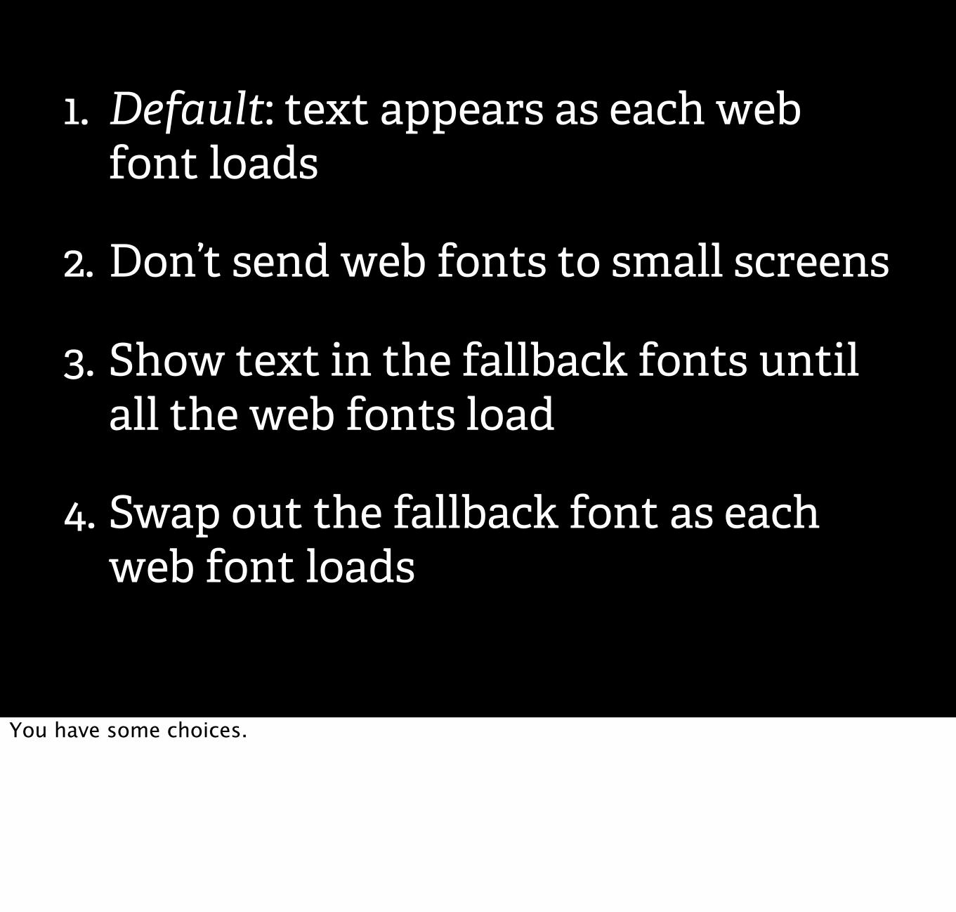
1. Default: text appears as each web font loads
2. Don’t send web fonts to small screens
3. Show text in the fallback fonts until all the web fonts load
4. Swap out the fallback font as each web font loads
You have some choices.
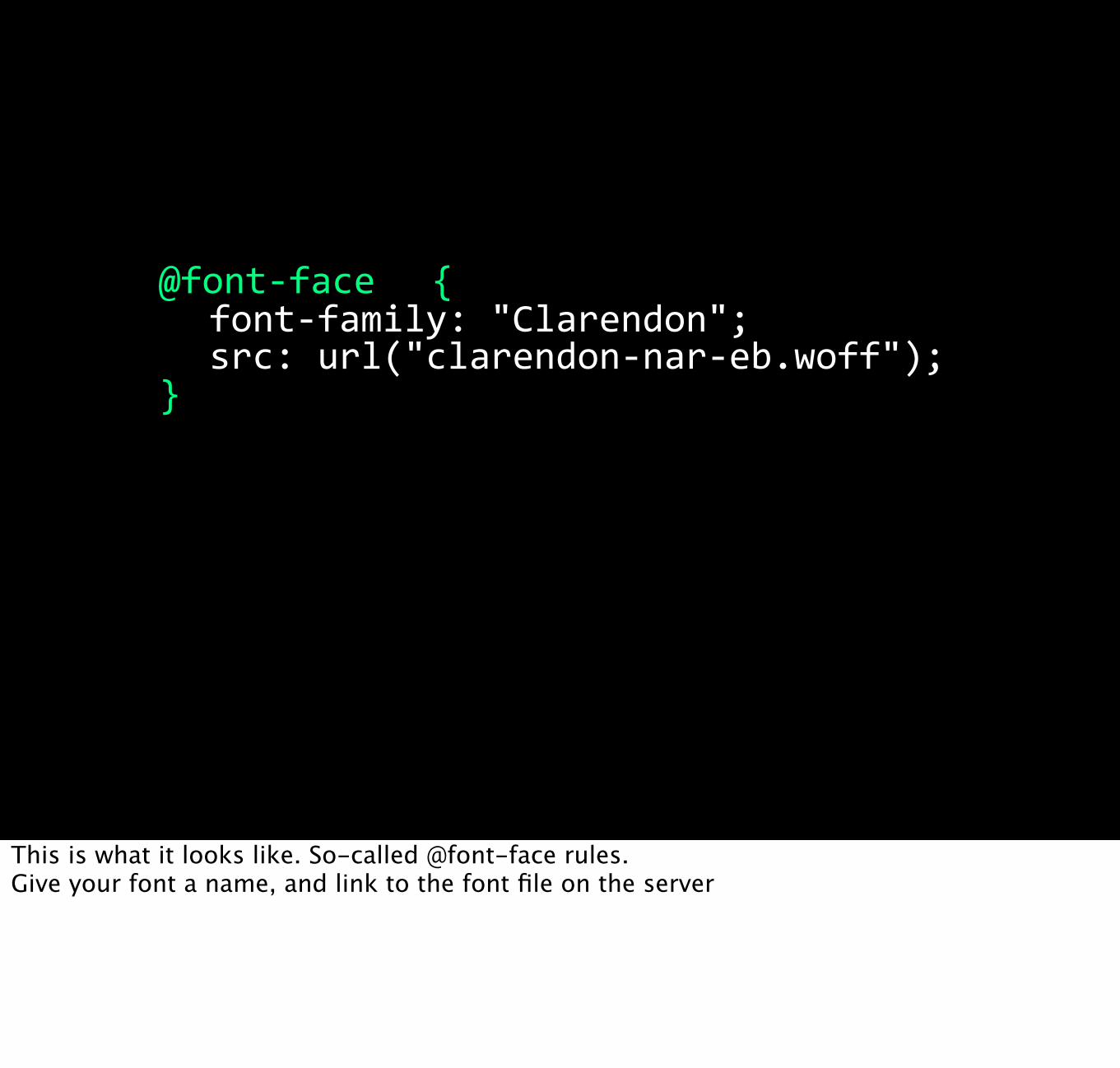
@font-‐face { font-‐family: "Clarendon"; src: url("clarendon-‐nar-‐eb.woff");}
This is what it looks like. So-called @font-face rules.Give your font a name, and link to the font file on the server

Stopping web fonts downloading to small screens
<link href="webfonts.css" rel="stylesheet" media="all and (min-‐width: 569px)"/>
There’s lots of ways to do this. This way assumes that webfonts.css contains your @font-face rules, as if you were using Fontdeck or another webfont service.
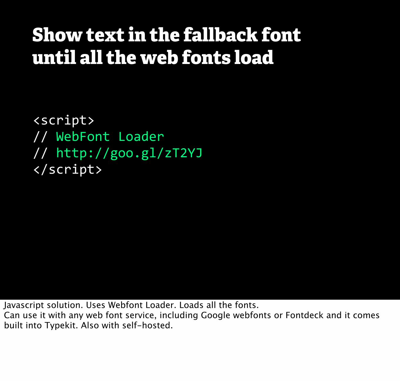
Show text in the fallback font until all the web fonts load
<script>// WebFont Loader// http://goo.gl/zT2YJ</script>
Javascript solution. Uses Webfont Loader. Loads all the fonts.Can use it with any web font service, including Google webfonts or Fontdeck and it comes built into Typekit. Also with self-hosted.

WebFont Loader
<script type="text/javascript">WebFontConfig = { fontdeck: { id: '11761' } };
(function() { var wf = document.createElement('script'); wf.src = ('https:' == document.location.protocol ? 'https' : 'http') + '://ajax.googleapis.com/ajax/libs/webfont/1/webfont.js'; wf.type = 'text/javascript'; wf.async = 'true'; var s = document.getElementsByTagName('script')[0]; s.parentNode.insertBefore(wf, s);})();</script>
Looks like this. But that’s not important right now - it’s just a cut a paste and job.

WebFont Loader
<html class="wf-‐loading">
.wf-‐loading // When the fonts start to load
.wf-‐active // All fonts have loaded (or some timed out)
.wf-‐inactive // If all the fonts failed to load
Sets classes according to status of fonts

p { font-‐family: serif;}
.wf-‐active p { font-‐family: 'Abril Text', serif;}
h1 { font-‐family: sans-‐serif;}
.wf-‐active h1 { font-‐family: 'Tablet Gothic Condensed', sans-‐serif;}
h2 { font-‐family: sans-‐serif;}
.wf-‐active h2 { font-‐family: 'Tablet Gothic Condensed', sans-‐serif;
Swap out fallbacks when allweb fonts have loaded
Swap out fallback fonts for webfonts once all webfonts have loaded.Have to do it everywhere you're specifying a webfont.

<html class="wf-‐loading wf-‐abriltext-‐n4-‐active">
p { font-‐family: serif;}
.wf-‐abriltext-‐n4-‐active p { font-‐family: 'Abril Text', serif;}
h1 { font-‐family: sans-‐serif;}
.wf-‐tabletgothiccondensed-‐active h1 { font-‐family: 'Tablet Gothic Condensed', sans-‐serif;}
h2 { font-‐family: sans-‐serif;
Swap out fallbacks aseach webfont loads
Webfont loader also tells you statuses of each individual font

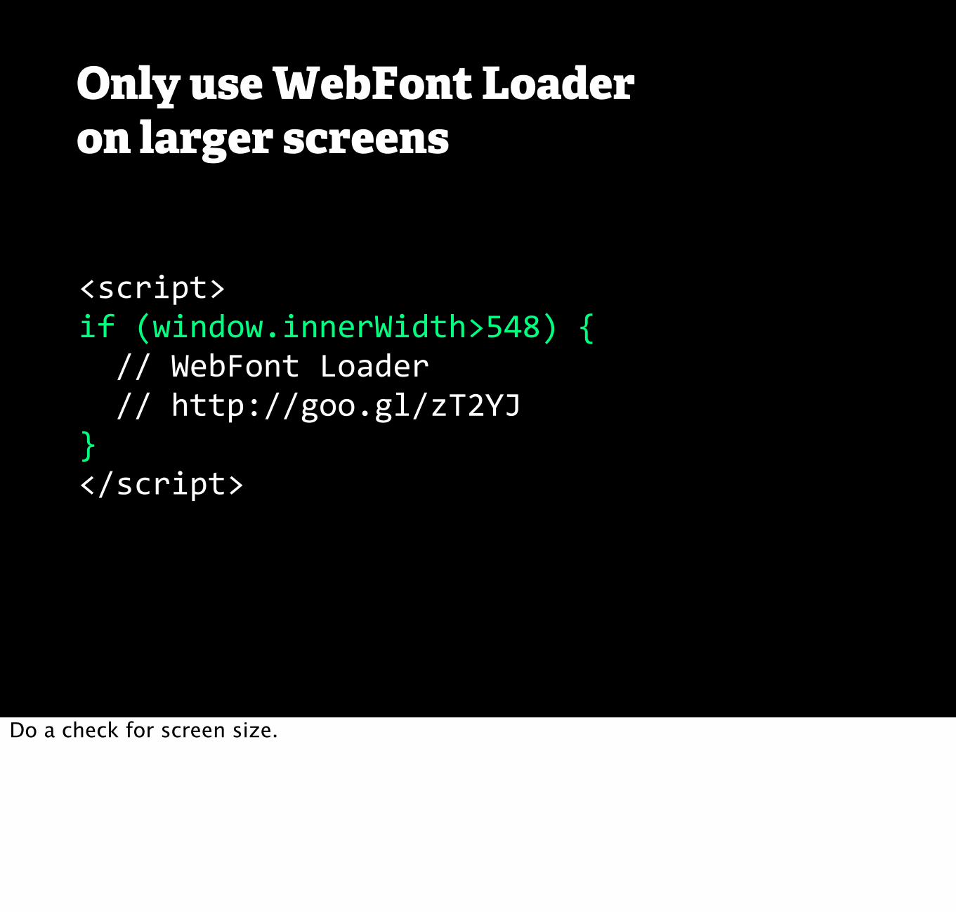
Only use WebFont Loaderon larger screens
<script>if (window.innerWidth>548) { // WebFont Loader // http://goo.gl/zT2YJ}</script>
Do a check for screen size.

Let's look at the fallbacks again.

Fallback fonts
Main Heading Set in the WebfontMain Heading Set in the Fallback
Tablet Gothic Condensed Extra BoldHelvetica Neue Condensed Black
The changes weren't that big, even the main headline font.
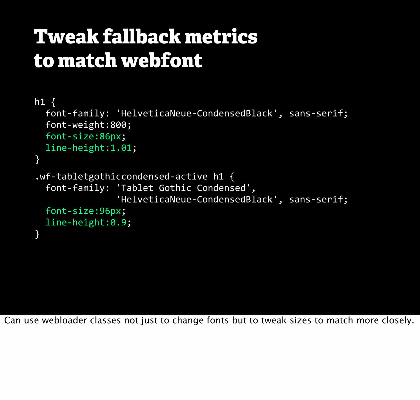
h1 { font-‐family: 'HelveticaNeue-‐CondensedBlack', sans-‐serif; font-‐weight:800; font-‐size:86px; line-‐height:1.01;}
.wf-‐tabletgothiccondensed-‐active h1 { font-‐family: 'Tablet Gothic Condensed', 'HelveticaNeue-‐CondensedBlack', sans-‐serif; font-‐size:96px; line-‐height:0.9;}
Tweak fallback metricsto match webfont
Can use webloader classes not just to change fonts but to tweak sizes to match more closely.

American TypewriterArialAvenir
Avenir Next
Avenir Next Condensed
BaskervilleBodoni 72Bradley Hand
Chalkboard SE
ChalkdusterCochinCopperplate
CourierCourier New
Didot
FuturaGeorgiaGill Sans
HelveticaHelvetica NeueHoefler TextMarionMarker FeltNoteworthyOptima
PalatinoPapyrus
Party LET
Snell RoundhandTimes New RomanTrebuchet MSVerdana
!
Fallback fonts – iOS 6.1
Lots of fonts come with iOS, even more with iOS 6. These are just the Latin ones.
But iPhones aren't the only smartphones.

Windows.We have a problem with heading in particular.

Fallback fonts
Main Heading Set in the WebfontMain Heading Set in the Fallback
Tablet Gothic Condensed Extra BoldSegoe UI Bold
The best we could do is fall back to Segoe UI Bold.

Fallback fonts – Win Phone 7
ArialArial BlackCalibriCambriaComic Sans MSCandaraConsolasConstantiaCorbel
Courier New
GeorgiaLucida GrandeLucida Sans UnicodeSegoe UITahomaTimes New RomanTrebuchet MSVerdana
These are the fonts that ship with Windows Phone 7.Decent selection but nothing narrow or condensed, not even Arial Narrow.

The Android fallback.Of course on Android phones there's even less choice.

Fallback fonts – Android 4
Droid SansDroid Sans Mono Droid SerifRoboto
Most just ship with the three flavours of Droid.Android 4 comes with Roboto (designed for high res screens).

Font stack
.wf-‐active h1 { font-‐family: 'Tablet Gothic Condensed', 'HelveticaNeue-‐CondensedBlack', 'Helvetica Neue', 'Segoe UI', 'Roboto', sans-‐serif; font-‐weight:800; font-‐stretch:condensed;}
Here a potential font stack including fallbacks for iOS, WP7 and Android 4.No need to include Droid Sans (ever).

1. Default: text appears as each web font loads
2. Don’t send web fonts to small screens
3. Show text in the fallback fonts until all the web fonts load
4. Swap out the fallback font as each web font loads
Here are your choices again.
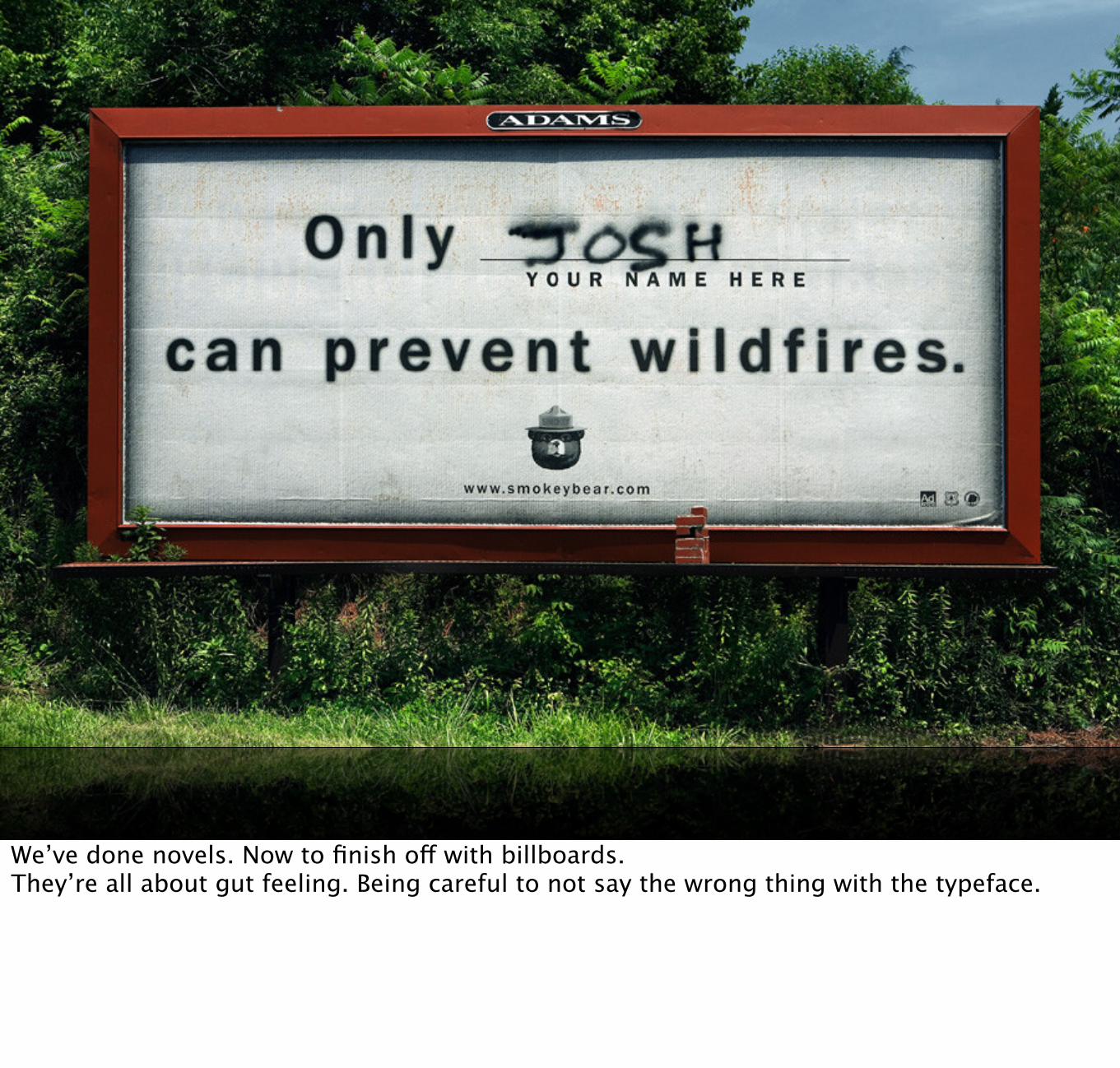
We’ve done novels. Now to finish off with billboards.They’re all about gut feeling. Being careful to not say the wrong thing with the typeface.

Choose faces that can furnish whatever special effects you require.”
Choose faces whose individual spirit and character is in keeping with the text.”
Start with a single typographic family.”
Choose your library of faces slowly and well.”
Robert Bringhurst in The Elements of Typographic Style (Hartley & Marks, 1999)
“
“
“
“
Our friend Mr Bringhurst has some useful advice on the matter, especially when it comes to pairing fonts.
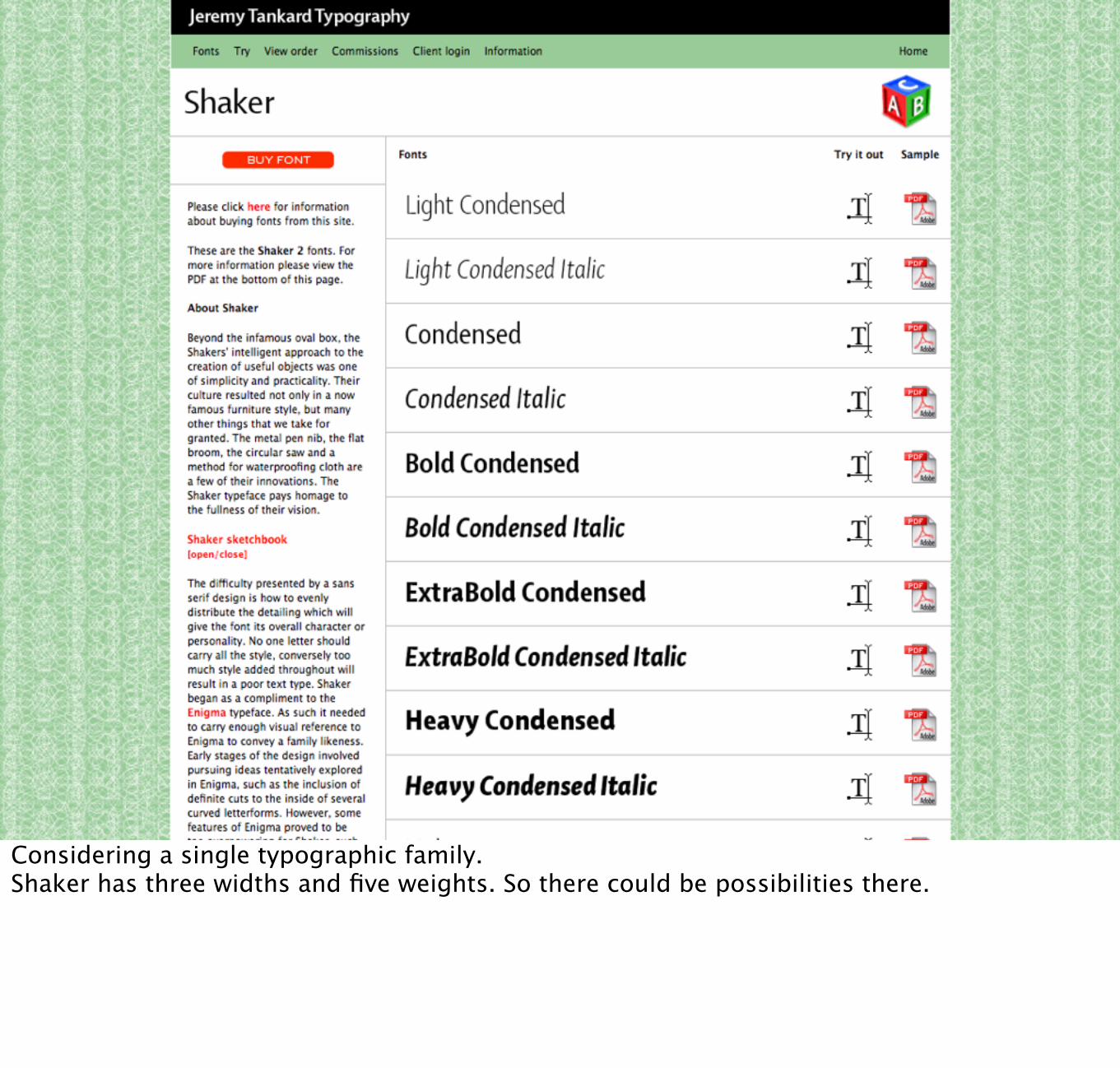
Considering a single typographic family.Shaker has three widths and five weights. So there could be possibilities there.

Karmina SansPairs nicely with Karmina Serif
Abril DisplayIs designed to sit with Abril Text
Tablet Gothic CompressedAlso works rather well with Abril Text
Choose a super family in the first place, eg. Karmina or Abril.
Choose fonts designed to go together, or choose fonts that are significantly different. The trick is for them to be different in a complimentary manner rather than jarringly so.Gut feeling.Look to help from the foundry.

type-together.com

Where we left off.

Want to set the headings in something more attention grabbing.Means pairing a different font with the one we’re using.
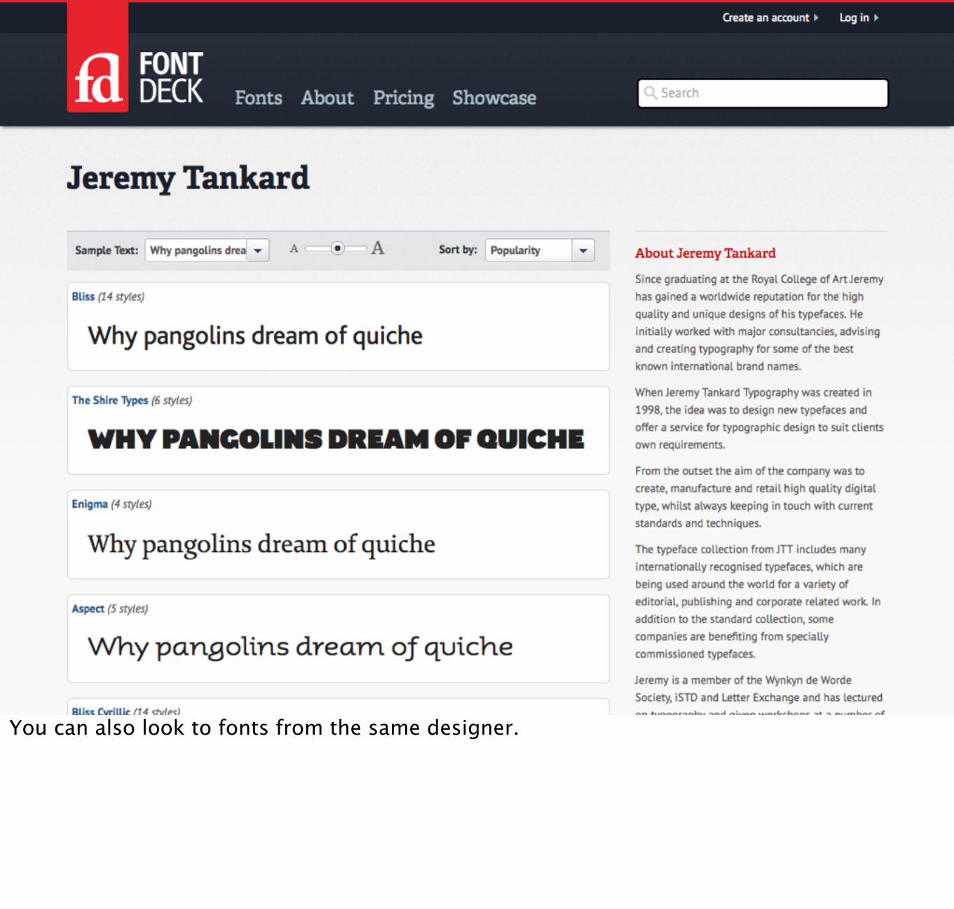
You can also look to fonts from the same designer.

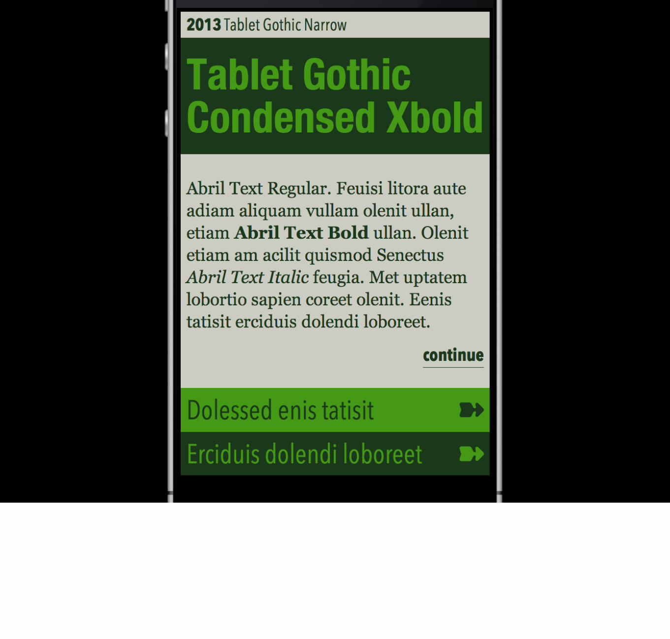
Going to pick Trilogy Fatface for our purposes.It’s a 20th century font but influence is from 19th century like Shaker.History not relative to our holidays, but it’s energetic, somewhat languid. And has some really nice features as we’ll see.


Explor<span class="swsh">e</span>
.swsh { font-‐feature-‐settings: "swsh" 1;}
Another OpenType feature. Swashes.

There they are. Looking like little waves.

fontdeck.com/font/trilogyfatfaceexpertsubset/regularSwashes don’t work in Safari, but there’s a potential solution.Special expert subsets - tiny fonts which just contain the opentype features.

Explor<span class="swsh">e</span>
.swsh { font-‐family: "TrilogFatfacExperSubseRegula", "Trilogy Fatface Regular", Georgia, serif; font-‐feature-‐settings: "swsh" 1;}
Add in the new font family to the rule, remembering to fall back to the regular font.

stylistic(n) salt n
contextual calt, clig
no-contextual calt, clig
historical-forms hist
styleset(01–20) ss01–ss02
character-variant(01–99) cv01–cv99
swash(n) swsh n
contextual-swash(n) cswh n
ornaments(n) ornm n
annotation(n) nalt n
Values for font-variant-alternates mapped to OpenType features
Lots of values paired with pre-defined OpenType features

clagnut.com/sandbox/css3/OpenType features demo.

So here’s the final thing.We talked about starting with the paragraph and choosing a measure which adapts.Choosing a scale and sticking to it.Creating a prototype to test the typography with different fonts.Sweating the small details.Pairing fonts.


Richard Rutter, Fontdeck.com@clagnut
Rate: sxsw.tv/cmqSlides: webtypography.net/talks/sxsw13/
Richard Rutter is cofounder of Fontdeck.com, the professional webfont service.
I thank you.