pbdd.orgpbdd.org/wp-content/uploads/2015/06/xl_2_mod_4_2… · web viewmodule four: creating...
TRANSCRIPT

PRC Student Guide Mod 4: Creating Charts
Module Four: Creating ChartsWelcome to the fourth lesson in the PRC’s Excel Course 2. This lesson introduces you to the creating charts based on data in Excel. You will explore several sample workbooks and make minor modifications to each sample. The workbooks can be found on the accompanying student disk. After completing this lesson, you will be able to create and edit charts.
TopicsCreate a Simple Chart.............................................................................................................4.2Setup the Printed Page.............................................................................................................4.6
ExercisesExercise A - Chart the Stock Portfolio Workbook................................................................4.13Exercise B - Chart a Retirement Plan....................................................................................4.18Summary...............................................................................................................................4.21
Objectives Create simple charts using worksheet information Enhance charts and chart styles, and add custom labels and legends Add and print headers and footers to a worksheet
Excel II 2007 4.1 ©1998-2011 Peoples Resource Center All rights reserved.

PRC Student Guide Mod 4: Creating Charts
Create a Simple Chart
Charting the data in your worksheet is not only fun, but it provides another dimension in analyzing data. If you were tracking daily temperatures in a worksheet, it would be difficult to see the trend or the fluctuations using just the numbers. However, if you turn those numbers into bars on a chart, the picture becomes much clearer. The value of a visual portrayal increases as the amount of data increases. Open the file 2.4Temps on your student disk or as instructed by your teacher.
The worksheet shown in Figure 4.1 is a list of daily temperatures captured in February. Although it is not necessary, it is better for beginning users to select the data that is going to be contained in the chart before inserting the chart.
Figure 4.1 Sample worksheet 2.4Temps
Using the selected area as your referenced cells, Microsoft Excel will automatically use the top row as titles in the legend and the left column as labels along the X (horizontal) axis. If you select the range B5 through C14, which include the column titles, Date and Fahrenheit Temps, Dates will be the labels on the X-axis, Fahrenheit Temps will be the Legend, and the temperatures will be plotted vertically on the Y-axis.
In Excel 2007, charts are created using the Insert tab, Chart group on the Ribbon.
Figure 4.2 The Charts Group on the Insert tab
After selecting the range B5 through C14, begin the chart-making process by clicking on the Column icon. A dropdown display will present you with optional types and configurations of column charts as shown in Figure 4.3 below. Clicking on the icon for the other types of charts (Line, Pie, Bar, Scatter, Other) will present you with a similar dropdown showing the options for that type of chart. Select the first icon under the 2-D Column options.
Excel II 2007 4.2 ©1998-2011 Peoples Resource Center All rights reserved.

PRC Student Guide Mod 4: Creating Charts
Figure 4.3 The Columns chart dropdown menu showing various options for column charts
Once the Chart type is selected and a basic chart is added to your worksheet, the Chart Tool is automatically added to the Excel Ribbon. It contains three new tabs (Design, Layout and Format) which will assist you in fine-tuning your chart. The process is simple at its top-most level, but it can produce sophisticated charts when using all the various options offered. Keep in mind the chart must be selected for editing before the Chart Tools available as shown in Figure 4.4. These additional tabs provide many options for modifying the chart.
Figure 4.4 The chart tool and the chart-specific tabs available when the chart is selected for editing
A simple chart is added to your worksheet as shown in figure 4.5 below. The dates in column B form the horizontal x-axis along the bottom of the chart while the temperatures in column C form the vertical y-axis on the
left side. Note that the double line border around the chart indicates that the chart is active or selected for editing.
Excel II 2007 4.3 ©1998-2011 Peoples Resource Center All rights reserved.
This double border around the chart indicates it is selected for editing. The Chart Tool is

PRC Student Guide Mod 4: Creating Charts
Figure 4.5 A simple chart is added to your worksheet
The simplest chart is created by accepting the default features. However, the Chart Tools offer many options for changing the layout and look of the chart. With the Chart selected (the double outline showing around the chart) click on each tab.
Figure 4.6 The Chart Tool – Design Tab
On the Chart Tools - Design tab:
In the Type group click the Chart Type icon and you’re offered a dropdown to change the chart type In the Data group you can switch the row data to the column and vice versa. In the Chart Layouts group you can select one of 11 different ways to view your chart:
o Chart title is addedo The data point is added to the top of each columno The legend is moved below the datao Same as above with no Titleo A table showing the data is added to the charto A vertical axis title is addedo Horizontal minor grid lines are added to the chart areao The columns are merged together with no spaces betweeno A title, horizontal & vertical axis titles, and legend are showno The temperature point is added within each columno The title is removed
The Chart Styles group allows you to change the color of your columns The Location group allows you to move the chart from the current worksheet where it is now located and
place it in a new worksheet of your choice.
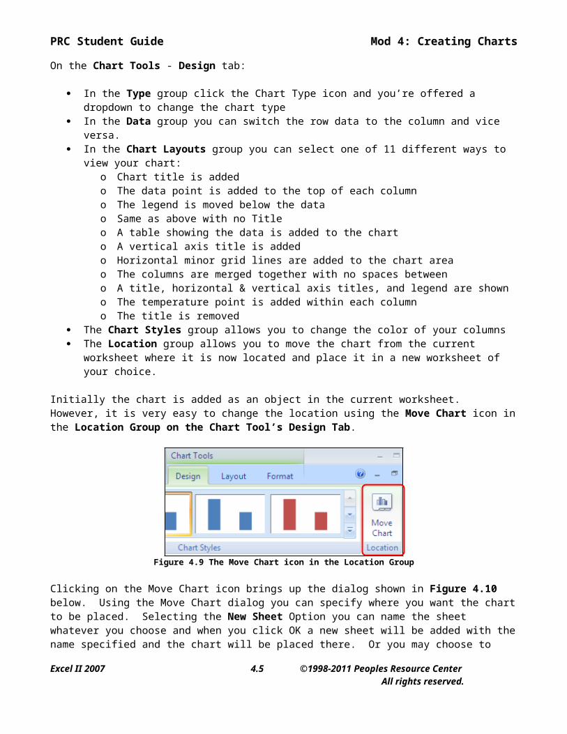
Initially the chart is added as an object in the current worksheet. However, it is very easy to change the location using the Move Chart icon in the Location Group on the Chart Tool’s Design Tab.
Excel II 2007 4.4 ©1998-2011 Peoples Resource Center All rights reserved.
This double border around the chart indicates it is selected for editing. The Chart Tool is
PRC Student Guide Mod 4: Creating Charts
Figure 4.9 The Move Chart icon in the Location Group
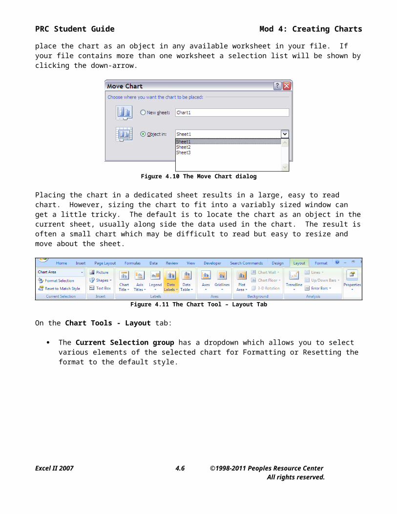
Clicking on the Move Chart icon brings up the dialog shown in Figure 4.10 below. Using the Move Chart dialog you can specify where you want the chart to be placed. Selecting the New Sheet Option you can name the sheet whatever you choose and when you click OK a new sheet will be added with the name specified and the chart will be placed there. Or you may choose to place the chart as an object in any available worksheet in your file. If your file contains more than one worksheet a selection list will be shown by clicking the down-arrow.
Figure 4.10 The Move Chart dialog
Placing the chart in a dedicated sheet results in a large, easy to read chart. However, sizing the chart to fit into a variably sized window can get a little tricky. The default is to locate the chart as an object in the current sheet, usually along side the data used in the chart. The result is often a small chart which may be difficult to read but easy to resize and move about the sheet.
Figure 4.11 The Chart Tool – Layout Tab
On the Chart Tools - Layout tab:
The Current Selection group has a dropdown which allows you to select various elements of the selected chart for Formatting or Resetting the format to the default style.
Excel II 2007 4.5 ©1998-2011 Peoples Resource Center All rights reserved.
PRC Student Guide Mod 4: Creating Charts
Figure 4.12 Formatting various parts of the selected Chart
Setup the Printed Page
In PRC’s first course in Excel 2007, you learned that the printed page in Excel is formatted using the Page Setup group on the Page Layout tab.
Figure 4.13 Page Setup group on the Page Layout tab
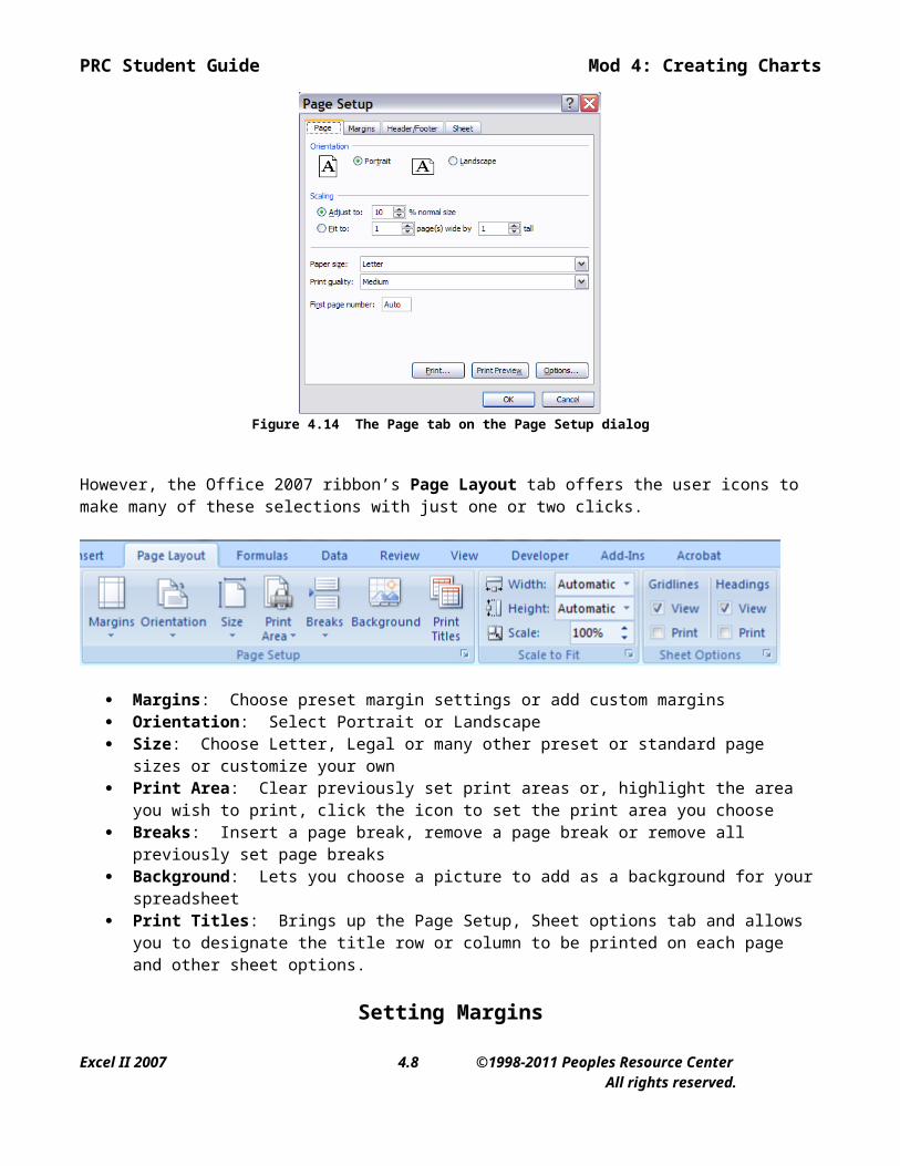
Clicking on the small icon on the lower right side of the group will bring up this familiar Page Setup dialog used in previous versions of Excel.
Figure 4.14 The Page tab on the Page Setup dialog
Excel II 2007 4.6 ©1998-2011 Peoples Resource Center All rights reserved.

PRC Student Guide Mod 4: Creating Charts
However, the Office 2007 ribbon’s Page Layout tab offers the user icons to make many of these selections with just one or two clicks.
Margins: Choose preset margin settings or add custom margins Orientation: Select Portrait or Landscape Size: Choose Letter, Legal or many other preset or standard page sizes or customize your own Print Area: Clear previously set print areas or, highlight the area you wish to print, click the icon to set
the print area you choose Breaks: Insert a page break, remove a page break or remove all previously set page breaks Background: Lets you choose a picture to add as a background for your spreadsheet Print Titles: Brings up the Page Setup, Sheet options tab and allows you to designate the title row or
column to be printed on each page and other sheet options.
Setting Margins
On the Page Layout tab, Page Setup group, margins can be adjusted using the Margins icon.
Several options are available in the dropdown including your last custom settings. If these options don’t suit your needs, there is a Custom Margins option which brings up the familiar Page Setup - Margins tab to allow you to set the margins any way you like.
Excel II 2007 4.7 ©1998-2011 Peoples Resource Center All rights reserved.
PRC Student Guide Mod 4: Creating Charts
Figure 4.15 The Margins tab on the Page Setup dialog
In Figure 4.15, the distance from the edge of the page to the top of the header is 0.5 inches and to the top of the worksheet is 1.0 inches. This creates a header that is 0.5 inches high. If the text you want to put in the header needs more than 0.5 inches, you will have to come back to this tab and adjust the Top margin.
Header and Footer
One of the many changes brought about in Office 2007 is the way you add headers and footers to your worksheet. As you’ll recall a header is text found in the margin at the top of every printed page and it usually contains the title of your report. Likewise the footer is found at the bottom and typically includes the page number or other useful information.
The Header & Footer icon is located on the Insert tab in the Text group.
When you click on the Header & Footer icon the view of your worksheet changes to show you what your worksheet will look like as a printed page. There is an area at the top and bottom of the view for you to actually type in your header or footer and see what it will look like when it’s done. Hover your mouse cursor over the area just above the gridlines and each of the three sections, left, center and right, will be highlighted as you roll over that section. Click on the left, center or right section and type the text where you want it to appear, format it as you would any other text, etc.
Excel II 2007 4.8 ©1998-2011 Peoples Resource Center All rights reserved.

PRC Student Guide Mod 4: Creating Charts
Also notice that when you click on any one of the header or footer typing areas the ribbon changes and makes available to you the Header Footer Toolbar and Design tab:
All of the icons on this tab allow you to easily customize your header and footer in many ways. Adding elements to the header and footer is now as easy as clicking an icon or two.
Once you’ve added and/or edited all the elements you want in your final printed worksheet it is a good idea to Print Preview to see how it all works together. Click on the Office Button, then the Print option on the left. In the list on the right there is a Print Preview option.
Figure 4.19 The Print Preview option on the Office Button dropdown
Excel II 2007 4.9 ©1998-2011 Peoples Resource Center All rights reserved.

PRC Student Guide Mod 4: Creating Charts
If the results of the preview are satisfactory then you are ready to print. To print a worksheet select the Print... command on the Office Button Menu. The appearance of the Print dialog box varies depending on your brand and type of printer, but it should give you an opportunity to choose which pages you would like to print and how many copies you want printed.
Figure 4.20 The Print Options on the Office Button dropdown
____________________________________
The following exercises will help solidify the topics taught in this lesson. The sample workbooks can be found on your computer hard drive. Explore the samples and have fun making changes.
Excel II 2007 4.10 ©1998-2011 Peoples Resource Center All rights reserved.

PRC Student Guide Mod 4: Creating Charts
Exercise A - Chart the Stock Portfolio Workbook
In this exercise you will create a chart based on data in an existing workbook. The workbook can be found in the Excel 2 2007 Files folder as 2.4stock.xlsx. Before making changes to the workbook save it as 2.4stock_rev.xlsx.
1. Open 2.4stock.xlsx on the student disk2. Save the workbook as 2.4stock_rev.xlsx on the student disk
Situation: Create a pie chart of stock holdings.
When you first start creating charts, it’s best to select the cells that are going to be in the chart before initiating the Chart. Later you will see how to include cells in a chart that were not selected beforehand.
3. Click and drag to select the cell range B5 through C114. Click on the Insert tab and, in the Charts group:
Step 1: choose the Pie icon and in the dropdown select the first 2-D Pie option. Your simple chart will be added and will look like this:
Notice that the Chart Tools tabs are now available.
Step 2: On the Chart Tools, Design tab, the Chart Layouts group lets you quickly modify the pie chart layout. Click on the down arrow.
Excel II 2007 4.11 ©1998-2011 Peoples Resource Center All rights reserved.

PRC Student Guide Mod 4: Creating Charts
This brings up this list of 7 options available for this type of chart. Click on the option in the middle of the second row.
Now your chart will look like this:
Step 3: Change the Chart Title to Stock Holdings by double clicking on the title to open it for editing.
5. On the Chart Tools - Layout tab, in the Current Selection group, click on the arrow next to the words Chart Area (the currently selected chart element). In the dropdown list select Plot Area
6. Using the resize handles on the corners of the Plot Area, enlarge the Plot Area.7. After resizing, recenter the Plot Area within the Chart area.8. Click on any cell in the worksheet outside of the chart to deselect the chart.
Your chart should look like the one below in Figure 4.21.
Excel II 2007 4.12 ©1998-2011 Peoples Resource Center All rights reserved.

PRC Student Guide Mod 4: Creating Charts
Figure 4.21 A simple pie chart with title
Enhance the chart with some changes
9. Click anywhere just inside the chart border to select (activate) the chart10. Right-click your mouse to bring up the context menu and then select Change Chart Type.
11. In the Change Chart Type popup, click on Pie in the list on the left. Briefly hover your mouse over the various chart options for a description of that option. Select the Exploded Pie in 3D option and click on OK.
12. On the Chart Tools – Layout tab, in the Labels group select the Data Labels, then select “More Data Label Options”.
Excel II 2007 4.13 ©1998-2011 Peoples Resource Center All rights reserved.

PRC Student Guide Mod 4: Creating Charts
13. In the Label Contains section select Category Name and Percentage and, under Label Position, select Best Fit. Click Close.
14. Right-click on the active chart to bring up the context menu. Click on 3-D Rotation. Click 3-D Rotation on the left side of the Format Chart Area options and change the number for the Y-axis to 20 degrees as shown below. Click Close.
15. Using the resizing handles located at each corner and in the middle of each side of the active chart border, resize the chart to be a little wider than it is tall.
16. Move your mouse pointer away from the border and the cursor will change to a four-headed arrow. Drag the chart straight down until it is just below row 11.
Excel II 2007 4.14 ©1998-2011 Peoples Resource Center All rights reserved.

PRC Student Guide Mod 4: Creating Charts
Your worksheet should look like the one in Figure 4.22
Figure 4.22 Stock Portfolio with Stock Holdings chart
Set up to print your work
17. On the Page Layout tab in the Sheet Options group uncheck the View and Print options for both Gridlines and Headings.
18. Select all of the cells that you want to print including the chart you just created. In the above example you would want to select the range A1:I23.
19. On the Page Layout tab in the Page Setup group: a. Click on the Print Area icon. Select Set Print Area in the dropdown. b. Next click the Orientation icon and select Landscape. c. Now click on the Margins icon and select the Custom Margins option. On the Margins tab
(lower left corner) select Center on Page both Horizontally and Vertically.20. Add a header and footer to the worksheet. On the Insert tab, in the Text group, click on the Header &
Footer icon. 21. Add a Header and Footer to the worksheet:
a. On the Insert tab in the Text group click on the Header and Footer iconb. Center the title “Stock Portfolio with Chart” in the header.c. Go to the bottom of the page and click on the center footer box. d. Type the word Page and add a space. Now click on the Page Number icon on in the Header &
Footer Elements group on the Header and Footer Tools Design tab.22. Click on the View tab and in the Workbook Views group click on the Normal icon.
23. Go to the Office Button and select Print then choose Print Preview to see how your printed worksheet will look.
Excel II 2007 4.15 ©1998-2011 Peoples Resource Center All rights reserved.

PRC Student Guide Mod 4: Creating Charts
Figure 4.23 Exercise A completed print preview
24. Save your work. Exit the worksheet, but do not Exit Excel
Congratulations! You have successfully completed Exercise A
Excel II 2007 4.16 ©1998-2011 Peoples Resource Center All rights reserved.

PRC Student Guide Mod 4: Creating Charts
Exercise B - Chart a Retirement Plan
This is the situation. You save all your life and when you retire you have $500,000 in assets; your home, savings bonds, money in the bank, it all adds up to $500,000. When you retire you have expenses but no income. However, your assets do yield earnings; some interest, some growth, things are not completely flat. The big question is,
“How long will it last?”
The structure of the worksheet has been roughed in for you. Your job is to flesh it out with formulas and then chart the results. Some data has been entered in a Scratch Pad area. Your retirement starts January 1, 2030. The rule is that on January 1 of each year the annual expenses for that year are withdrawn from your assets before any other calculations are made.
In this exercise you will create a chart based on developing information in a workbook. The workbook can be found on the student diskette as 2.4retire.xls. Make changes to the workbook and save it as 2.4retire_rev.xls.
1. Open 2.4retire then save the workbook as 2.4retire_rev.2. Select B2:E2 and on the Home tab click on Merge & Center icon in the Alignment group. This will
center the title of the scratch pad.3. Select A7:F7 and repeat the process in #2 above to center the title of the analysis section.4. Select A10:A11 and use the fill handle to copy these cells down to A12:A25. The last year in the list
should be 2045.5. Select cell B5 and on the Formulas tab in the Defined Names group Click on the Define Name icon and
name this cell Assets. All of the necessary information should be completed for you, just check to see that the name and the “Refers to:” sheet and range are correct.
6. Repeat the process in #5 above to:a. Name the cell C5 Yieldb. Name the cell D5 Expensesc. Name the cell E5 Inflation
7. Click in cell B10. Enter the formula =Assets
Remember that a range name is an absolute reference. The formula simply brings down the value from the Scratch Pad to the working area.
8. Click in cell C10. Enter the formula =Expenses9. Click in cell D10. Enter a formula which calculates what remains after Expenses are subtracted from
Beginning Assets.
Look below the completed exercise for a hint if you’re stumped.
Cell D10 now contains the money which will yield earnings. Suppose you put $100 into a savings account which pays 3% interest per year. At the end of the year your earnings would be $100 times 0.03 or $3.00. That $3.00 is the earnings on your $100 deposit.
10. Click in cell E10. Enter the formula =D10*Yield
Yield, the name of cell C5, is another absolute reference. It will remain the same as the table of information is extended downward.
Excel II 2007 4.17 ©1998-2011 Peoples Resource Center All rights reserved.

PRC Student Guide Mod 4: Creating Charts
11. Click in cell F10. Enter a formula which shows what’s accrued after Earnings are added to Assets after Expenses. Look below the completed exercise for a hint if you’re stumped.
The assets at the end of one year become the assets at the beginning of the next year.
12. Click in cell B11. Enter the formula =F10
It would be nice if Expenses stayed at $50,000 a year for the period of retirement. Unfortunately, inflation erodes buying power. If you want to maintain the buying power of $50,000 then you must plan for Expenses to increase to account for the effects of inflation. Suppose you start a year with $100 in your pocket and inflation is 4%. At the end of the year the money in your pocket will be worth only $96. To maintain the buying power of $100 for the whole year, you would need to start with $104 in your pocket.
13. Click in cell C11. Enter the formula =C10*(1+Inflation)
Inflation, the name of cell E5, is another absolute reference. It will remain the same as the table of information is extended downward.
14. Select rangel D10:F10 and use the auto fill handle to copy and paste the formulas into cells D11:F11.15. Select the range B11:F11. Use the auto fill button to copy these formulas down through the range
B12:F25
Chart the results
16. Select the range B9:C25.17. On the Insert tab in the Charts group
a. Click on the Line icon.b. Hover your mouse cursor over each option to see the title of that option. Select the Line with
Markers option.c. In the Chart Tools, Design tab, Chart Layouts group select Layout #3 which will give you a
Chart Title and other elements to make the chart more readable.d. Change the Chart Title to Retirement Analysis.
18. The chart should be active as indicated by the border around it. If it’s not, click inside the chart, near the top edge of the chart to make it active.
19. Click and hold down the mouse button until the pointer turns into a four-headed arrow. Drag the chart so that the upper left corner is close to the left edge in cell A26.
20. Use the resize handle to align the right edge of the chart to the right edge of column F. The result should be a chart slightly wider than it is high.
At this point your chart should look like Figure 4.24 below
21.
Excel II 2007 4.18 ©1998-2011 Peoples Resource Center All rights reserved.

PRC Student Guide Mod 4: Creating Charts
Figure 4.24 First cut at the chart
22. The chart should be active. If it’s not, click inside the chart, near the top edge of the chart.23. Right click within the active chart and in the context menu select the Select Data option.24. In the left window, Legend Entries (Series), select Expenses. In the right window, Horizontal
(Category) Axis Labels, click the Edit button.25. In the Axis Labels dialog that pops up click on the icon at the right end of the entry box.
26. Now use your mouse cursor to highlight cells A10: A25 then click on the icon again. Click OK to return to the Select Data Source dialog and it should look like this:
The horizontal axis is now labeled with Years.
Excel II 2007 4.19 ©1998-2011 Peoples Resource Center All rights reserved.

PRC Student Guide Mod 4: Creating Charts
27. We need to format the axis values we just added so that they show better. Right click on any of the year numbers and in the context menu select format axis. On the left side select Alignment. Change the Custom angle number to -55 degrees. When you close this dialog your completed chart should look like Figure 4.25 below.
Figure 4.25 Exercise B completed chart
If $500,000 seemed like an enormous amount of money at the beginning of the exercise, why didn’t it last longer? There’s a harsh reality covered by this exercise. The worksheet is set up to allow the values in the Scratch Pad to be played with. Try out some different “what if” for yourself.
Congratulations! You have successfully completed Exercise B
Hints: D10 = B10 – C10F10 = D10 + E10
Summary
Now you can...
Create a simple chart directly from the data in your worksheet Resize graphic objects, like Pie charts, by using resize handles Edit a chart using the Chart Tools. Edit a chart using the commands on various context menus. Set formatting preferences for your worksheet using the Chart tools Add headers and footers to a worksheet
NOTES:
Excel II 2007 4.20 ©1998-2011 Peoples Resource Center All rights reserved.