paired data learning outcomes this work will help you draw a line of best fit on a scatter diagram...
TRANSCRIPT

SMP Interact Intermediate SMP Interact Intermediate SMP Interact SMP Interact Intermediate SMP Interact Intermediate SMP Interact Intermediate SMP Interact Intermediate SMP Interact Intermediate SMP Intermediate SMP Interact Intermediate SMP Interact Intermediate SMP Interact Intermediate SMP Interact Intermediate SMP Interact Intermediate Interact Intermediate SMP Interact Intermediate SMP Interact Intermediate SMP Interact Intermediate SMP Interact Intermediate SMP Interact SMP Interact Intermediate SMP Interact Intermediate SMP Interact Intermediate SMP Interact Intermediate SMP Interact Intermediate SMP Intermediate SMP Interact Intermediate SMP Interact Intermediate SMP Interact Intermediate SMP Interact Intermediate SMP Interact Intermediate Interact Intermediate SMP Interact Intermediate SMP Interact Intermediate SMP Interact Intermediate SMP Interact Intermediate SMP Interact SMP Interact Intermediate SMP Interact Intermediate SMP Interact Intermediate SMP Interact Intermediate SMP Interact Intermediate SMP Intermediate SMP Interact Intermediate SMP Interact Intermediate SMP Interact Intermediate SMP Interact Intermediate SMP Interact Intermediate Interact Intermediate SMP Interact Intermediate SMP Interact Intermediate SMP Interact Intermediate SMP Interact Intermediate SMP Interact SMP Interact Intermediate SMP Interact Intermediate SMP Interact Intermediate SMP Interact Intermediate SMP Interact Intermediate SMP Intermediate SMP Interact Intermediate SMP Interact Intermediate SMP Interact Intermediate SMP Interact Intermediate SMP Interact Intermediate Interact Intermediate SMP Interact Intermediate SMP Interact Intermediate SMP Interact Intermediate SMP Interact Intermediate SMP Interact SMP Interact Intermediate SMP Interact Intermediate SMP Interact Intermediate SMP Interact Intermediate SMP Interact Intermediate SMP Intermediate SMP Interact Intermediate SMP Interact Intermediate SMP Interact Intermediate SMP Interact Intermediate SMP Interact Intermediate Interact Intermediate SMP Interact Intermediate SMP Interact Intermediate SMP Interact Intermediate SMP Interact Intermediate SMP Interact SMP Interact Intermediate SMP Interact Intermediate SMP Interact Intermediate SMP Interact Intermediate SMP Interact Intermediate SMP Intermediate SMP Interact Intermediate SMP Interact Intermediate SMP Interact Intermediate SMP Interact Intermediate SMP Interact Intermediate Interact Intermediate SMP Interact Intermediate SMP Interact Intermediate SMP Interact Intermediate SMP Interact Intermediate SMP Interact SMP Interact Intermediate SMP Interact Intermediate SMP Interact Intermediate SMP Interact Intermediate SMP Interact Intermediate SMP Intermediate SMP Interact Intermediate SMP Interact Intermediate SMP Interact Intermediate SMP Interact Intermediate SMP Interact IntermediateInteract Intermediate SMP Interact Intermediate SMP Interact Intermediate
Paired Data
Learning outcomes
This work will help you
• draw a line of best fit on a scatter diagram
• use a line of best fit to estimate results
You will revise
• how to draw scatter diagrams using pairs of data
• how to recognise the different types of correlation

70
80
90
100
110
120
130
140
150
160
170
180
190
0 500 1000 1500 2000 2500 3000 3500 4000 4500
Engine size (c.c.)
Top s
pee
d (m
.p.h
.)
Engine size and speed of carsConnections
Sheet G42 has a database about a selection of different models of cars. This is a scatter diagram showing the engine size and top speed of the cars.
• Describe the relationship between the engine size and top speed of these cars.
• Are there any cars that have a low top speed for the size of their engine?
• Are there any cars that have a high top speed for the size of their engine?

Previous Slide
This data is available in an Excel file here.

Lines of best fitForensic scientists sometimes have to decide what someone looked like by examining individual bones.
This scatter diagram shows the heights of some males and the length of their femur (thigh bone).
• What correlation is their between femur length and height?
• Roughly how long would you expect a femur to be on a male who is 180 cm tall?
• Police find a male femur in a pit. It is 42 cm long. How tall would you estimate the owner was? How accurate do you think your estimate is?
• What would you estimate the height of a male to be if his femur is 65 cm long? How accurate do you think your estimate is?
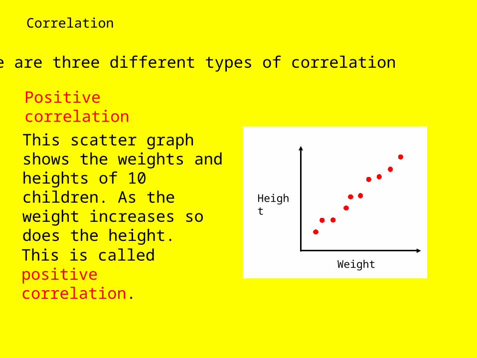
Correlation
There are three different types of correlation
Positive correlation
Weight
Height
This scatter graph shows the weights and heights of 10 children. As the weight increases so does the height.
This is called positive correlation.

Negative correlation
This scatter graph shows the sales of gloves and daily temperatures. As the temperature increases so the sale of gloves decreases
This is called negative correlation.
Temperature
Sales of
gloves

Height of teacher
Salary
No correlation
This scatter graph shows the salaries and heights of teachers. There is no relationship between the two. The points are scattered all over.
There is no correlation.

Correlation can be strong or weak
Strong positive correlation. The points lie in a narrow band.
Weak negative correlation. The points lie in a broad band.

When points on a scatter diagram show strong correlation, it can be useful to draw a straight line through them. This is called a line of best fit.
Strong positive correlation – worth drawing a line of best fit
Weak positive correlation – not worth drawing a line of best fit
Weak negative correlation – not worth drawing a line of best fit
Strong negative correlation – worth drawing a line of best fit
You should draw a line of best fit to look like a ‘spine’ for the points, with roughly the same number of points on each side.
The line can be used to estimate new values. But extending the line beyond the given points to estimate values is less reliable.

Drawing conclusions
This data shows the weight in kilograms and top speed of the cars in the database.
• What type of correlation is there between the top speed and weight of these cars?
• It has been suggested that lighter cars go faster. Does this graph support this hypothesis?
• Can you suggest an explanation for the correlation here?
Weight and top speed of cars
80
100
120
140
160
180
200
600 800 1000 1200 1400 1600 1800
Weight (kg)
Top s
peed (m
.p.h
)

Previous Slide

A likely story!
In a survey in Sweden a researcher found there was a good positive correlation between the number of storks nesting in a village and the number of babies born in the village.
What might explain this?