painting a landscape onto tapped in 2 · design a new tapped in system that we call ... information...
TRANSCRIPT
1
Painting a Landscape onto TAPPED IN 2Patricia Schank, Alexandra Harris, and Mark Schlager
SRI International
The Original TAPPED INFrom 1996-2002, we developed and hosted an online teacher community called the TAPPED IN
Testbed project with NSF funding (http://www.tappedin.org; Schlager & Schank, 1997; Schlager,Fusco, & Schank, 1998 & 2000). Using this testbed, we and our partners have conducted research anddevelopment aimed at understanding the nature and affordances of online communities of practice inthe service of teacher professional development and systemic reform projects. We have been quitesuccessful at cultivating a thriving education community: through TAPPED IN, more than 15,000members, including K-12 teachers, librarians, teacher education faculty, professional developmentstaff, researchers, and other education professionals, attend activities hosted by educationorganizations, conduct their own activities, take online courses, bring their students online, experimentwith new ways to teach, and expand their circle of colleagues by participating in community-wideevents.
TAPPED IN Version 2 (TI2)The TAPPED IN Testbed environment supports some of the key activities of an online
community of practice, but the environment does not support other online structures and activities thatwe know are needed to move forward with our research (Schank, Fenton, Schlager, & Fusco, 1999).Starting in mid-2001, with new NSF funding, we began working with our partners and community todesign a new TAPPED IN system that we call Tapped In Version 2 (TI2). TI2 is a complete rewrite ofthe original TAPPED IN and adds many new features and capabilities, including group creation andmanagement, file sharing, threaded discussion boards, search, membership and place directories,instant messaging and chat, and (soon) calendaring and course management (seehttp://ti2.ctl.sri.com/tappedin).
The Place Metaphor in TAPPED INOur original TAPPED IN environment, shown in Figures 1 and 2, emphasized a place metaphor
with views of rooms, views of a campus with buildings, and a campus map. We explicitly designed theoriginal TAPPED IN to resemble a conference center to evoke the kind of professional atmosphere(and thereby encourage the kinds of discourse) one would find at a conference facility or institute. Webuilt suites of rooms for our partner “tenants” and offered free offices to our members. The physicalmetaphor helped our members (especially teachers new to technology) navigate the environment andenabled us to attract small groups of education professionals (and scouting parties for largerorganizations) looking for an on-line venue to hold group activities.
However, these physical cues (maps, room drawings) also took up a lot of space in our userinterface. With TI2, we planned to make some sweeping changes that would make much moreinformation and many more collaborative tools accessible in the environment. We conjectured thatusers nowadays would be much more web savvy, so we could devote more of the interface toinformation and let the place metaphor fade to the background. So, in our design for TI2, we kept theroom metaphor, but replaced the functional room drawing with a small room thumbnail, and replacedthe graphical campus map with directory listings (see Figures 3 and 4).
Testers’ Reactions to TI2TI2 was released for alpha testing on September 1, 2002. Thirty-two of our “old” TAPPED IN
member volunteered to be alpha testers, which involves exploring the system and running through one

2
or more of five testing scripts (see http://ti2.ctl.sri.com/tappedin/beta_testing.jsp). During the firstmonth of testing, 13 of these volunteers have submitted bug reports (8 volunteers) or generalsuggestions (8 volunteers). Feedback has been overwhelmingly positive. However, the most commoncomplaint has been a lack of understanding of where you are, how to go to other rooms, or that thereeven are other rooms. A sample of these “place-related” comments from alpha testers are shown inTable 1.
Table 1. Sample comments from TI2 alpha testers related to the sense of place (or confusion about thelack thereof). All testers are former TAPPED IN users.
Where are the other offices?Although the new interface has a crisp look, and is undoubtedly useful for moobies, I mustadmit that I’m a bit at a loss regarding the overall architecture. I really liked the way the ‘old’Tapped In had a virtual ‘3D’ presence. 30+ floors with wings, the ability to walk around,browse directories, go up the elevator, walk over to the Pepperdine building, etc. This interfacefeels much too flat (apologies to Monty Python). Although you can build passageways (a goodidea), it doesn’t make sense to me to not have a virtual layout. The feel is very two dimensionalso far.Site map? Would like it back- Without the site map the sense of navigating around (entering, exiting, teleporting, etc.) is lost.The vital feeling that you are in a community, moving around and interacting is lost in thisinterface as I feel like I am simply on an internet site, entering into my web page.- It is hard to get a grasp on where you are. In an online community, that place in space isimportant I think.- I do really miss my office where I had tables, whiteboard, etc, that I could split groups ofstudents into, other rooms for breakouts discussions and just the cozy inviting look. Studentsfelt like they were inside my office and the different the classrooms I had created. The littlephoto on the left becomes an icon instead of a feeling of where you are.3) Is it my imagination, or is there just one room currently implimented? OTOH...4) I really like the isometric view of the scrap of reception area that'svisible. I'm not sure that it is more effective than the top-down map viewcurrently in place, but it looks neat and kinda gamelike (Sim City, etc).I am hoping that there will be a simple way to put the office graphics back.
Based on such comments, we decided to reassess the issue of place in TI2 to determine how wecould provide more helpful cues about location and geography in a minimally invasive way (i.e., nothave the cues take over the interface as they did in the original TAPPED IN) and within our smallremaining budget. Could we paint a geographical landscape onto TI2 in a meaningful and cost-effective way?
Assessment of the ProblemBoth the original TAPPED IN and TI2 are based on place-based models in which (1) you are
always in a room, (2) rooms are grouped in collections, and (3) rooms are connected to each other. Inthe original TAPPED IN, the collections are buildings and floors, and the connections are room exitsdepicted on graphical maps. In TI2, the room collections are by type (e.g., tenant rooms, group rooms,personal offices, course rooms, reception rooms) and connections between rooms are implemented asvirtual “passageways” from one room to another. The word “passageway” was chosen preciselybecause it doesn’t imply a shape or geographical location, as do “street”, “hall”, “road”, etc. Much like

3
many other chat environments, there is no visual or structural sense of place or an overarchinggeography to the TI2 community beyond the look and name of each individual room, aside from theaddition of the passageways. We imagined all the rooms of TI2 as not existing in a particular location,but just floating in space, connected by dynamic passageways which could be created and deleted onthe fly.
There are many ways to move between rooms in TI2, but many of them rely on accessing thedirectory or choosing from a list of favorite places rather than navigating by means of the roominterface itself. The only significant navigational component in the room interface is the Passagewaysmenu item, which lists passageways out of (and sometimes into) the room. Also, “featured”passageways are listed on the “Featured Items” note on the welcome page.
We think that TI2 users were most confused by (1) the conceptual loss of the campus geography,buildings, floors, elevators, with only rooms remaining as a spatial unit, and (2) the absence of visualnavigational cues and functions in the room interface itself. Without immediate maps and other cues,users lost their sense of place and were at a loss for how to move from one room to another. Thetextual cue of the room name (which appears twice in the interface) and the images and colorsassociated with the room seemed to be inadequate in giving users’ a sense of location. It is interestingto note that most of “feeling lost” comments came from members of the original TAPPED IN; theyseemed to a feel a more keen sense of loss and disorientation than did users that were completely newto the TI2 community.
Finding SolutionsOur TI2 team spent about 3 weeks considering these place issues and implementing a solution.
We wanted to help our users, but careful planning and design was required so that we didn’tcompromise the design of our interface by awkwardly retrofitting a place model onto TI2. A number ofneeds had to simultaneously balanced in addition to orienting the user, including managing the limitedscreen real estate, designing for easy expansion, and meeting the needs and requirements of investedtenant partners. For example, our users wanted some kind of graphical campus map, which would needto change whenever a new tenant joined TI2 or an old tenant left. However, as we found with theoriginal TAPPED IN, it is harder maintain, scale, and license a system that requires ongoingmaintenance of often-changing graphics such as room and campus maps. This was one of manymotivations to provide directory listings in place of maps in our original design of TI2. Wherepossible, we needed to design automated, scalable revisions.
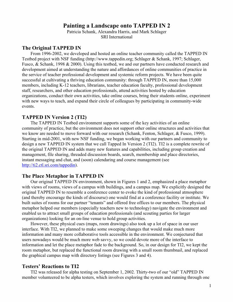
Our easiest decision was to highlight the passageways, our primary existing navigationalcomponent. We moved the featured passageways into a separate note on the welcome page of eachroom. In the future, we may also try to give the passageways note a more distinctive look (see Figure 5item a).
After going back and forth several times, we finally decided to reinstitute a geographicalhierarchy of Building, Floor, Room where each tenant has its own building. Each room is on aparticular floor of a particular building. Other options––such as buildings having wings in addition tofloors or all of TI2 being one building––were discarded since they either didn’t scale well or wereoverly difficult to visualize or conceptualize. For simplicity, each room appears in only one floor, andnever exists in more than one place, even though having a room appear in multiple places wastechnically possible and arguabley even desirable for convenience. Floors serve as both a spatial unit toadd geographical richness as well as a container to spatially group related rooms. At all times, a user isin one particular room; that is, you can never be in a building or on a floor without also being in anactual room in that building or on that floor.
For example, any user who joins TI2 can create a personal office. If that user is affiliated with atenant, such as “Pepperdine,” the user’s office appears only on the Personal Offices floor in the

4
Pepperdine Building. If the user is not affiliated with a particular tenant, his or her room appears in thePersonal Offices floor of the Tapped In Center Building. Technically, if a user is affiliated with atenant, it would be easy to have his or her office appear in the Personal Offices floor in the Tapped InCenter Building in addition to appearing in the tenant building. Indeed, some users may want theconvenience of being able to access any personal office from the Tapped In Center Building. However,this violation of the rules of physical space could confuse other users. Since we have other, redundant“convenience” alternatives for fast teleportation to any place in TI2––such the Favorite Places menus,Passageways, and the “Tapped In: Places” and “Search: Places” tabs––we chose the simplified modelin which a room exists in one and only one floor of one and only one building.
Armed with a consistent physical metaphor, we were able to proceed with designing how theinterface would reflect that geography. Specific interface changes made include:
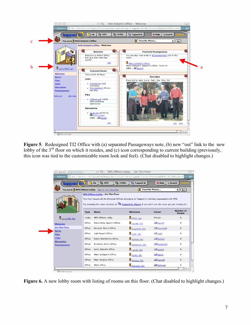
1. Adding to each floor a special “lobby” room where a listing of the rooms on that floor isavailable in the room interface (see Figure 6).
2. Making the tenant’s main reception room the “entry room” on the first floor of their building.This room provides a listing of the floors in the building and the rooms on the first floor insideof the room Welcome note (see Figure 7).
3. Adding an “out” link the interface of a room, just below the room image. Clicking out in aroom takes you to the lobby of the floor you are on; out in a lobby takes you to the receptionroom of the building you are in; out in a reception room takes you to the TI2 reception (seeFigure 5 item b).
4. Changing the building icon to always reflect the building that the room is in, instead of beingtied to the particular room look and feel that is customizable by the user. Clicking on thebuilding icon transports the user to the reception room of that building (see Figure 5 item c)
5. Adding a campus map with graphical representations of all the buildings in TI2. The mapappears in the “Tapped In: About” tab and as a link from on the welcome page of receptionrooms (see Figure 8).
We were able to implement all of these changes in an automated fashion that requires little ongoingmaintenance by TI2 engineers. We believe that these changes will improve the navigability of TI2 andgive users a better mental model of the community structure, but it remains to be seen whether thesechanges will be enough to negate the “two-dimensional” feeling that some testers comment on. At theworkshop, we will report on reactions by our testers and users to our attempt to paint a landscape ontoTI2, and additional modifications we may make based on their reactions.
ReferemcesSchlager, M., Fusco, J. & Schank, P (2002). Evolution of an on-line education community of practice.
In K. A. Renninger and W. Shumar (Eds.), Building virtual communities: Learning and change incyberspace. NY: Cambridge University Press, 129-158.
Schank, P., Fenton, J., Schlager, M., & Fusco, J. (1999). From MOO to MEOW: Domesticatingtechnology for online communities. Proceedings of the Third International Conference onComputer Support for Collaborative Learning, pp. 518-526.
Schlager, M., Fusco, J., & Schank, P. (1998). Cornerstones for an on-line community of educationprofessionals. IEEE Technology and Society Magazine, Special Issue: Wired Classrooms: TheInternet in K-12, 17(4). (Editors: Foster and Ginsberg).
Schlager, M., & Schank, P. (1997). TAPPED IN: A New On-line Teacher Community Concept for theNext Generation of Internet Technology. Proceedings of the Second International Conference onComputer Support for Collaborative Learning, R. Hall, N. Miyake & N. Enyedy (Eds.), pp. 231-240, Hillsdale, NJ: Erlbaum.

5
Figure 1. The user interface to the original TAPPED IN testbed system.
Figure 2. Original TAPPED IN Campus view and campus map.

6
Figure 3. Initial TAPPED IN Version 2 (TI2) interface view of a room, analogous to Figure 1 in theoriginal TAPPED IN. TI2 also uses the metaphor of place, but puts more emphasis on (new) tools andinformation.
Figure 4. In the initial implementation of TI2, the graphical campus map views (shown in Figure 2)were replaced with directory lists that “overlay” the room view.
7
Figure 5. Redesigned TI2 Office with (a) separated Passageways note, (b) new “out” link to the newlobby of the 3rd floor on which it resides, and (c) icon corresponding to current building (previously,this icon was tied to the customizable room look and feel). (Chat disabled to highlight changes.)
Figure 6. A new lobby room with listing of rooms on this floor. (Chat disabled to highlight changes.)
ab
c

8
Figure 7. The TI2 Reception Room showing, in the Welcome note, rooms on this floor, floors of theTAPPED IN Center building, and a link to the campus map. (Chat disabled to highlight changes.)
Figure 8. A new, dynamically-generated campus map showing all tenant buildings on the campus.Click on a building to transport there. (Chat disabled to highlight changes.)