pacs redesign project - dave knightdavewknight.com/docs/gepacs/final_report.pdf · pacs redesign...
TRANSCRIPT
1
PACS Redesign Project GE Healthcare Final Report August 1, 2007
Carnegie Mellon University Human-Computer Interaction Institute
Team Faculty Advisors
Fahd Arshad Brad Myers
Shaelyn Clements Susan Fussell
Jason Cornwell
David Knight
Madhu Prabaker
Nina Shih

2

PACS Redesign Project – CMU HCII
3

4

PACS Redesign Project – CMU HCII
5
Table of Contents
Executive Summary .................................................................................. 9 A Note on Methods...................................................................................................... 10
Themes Guiding Design ...........................................................................13
Themes Arising from the Design .............................................................. 15 Target Hardware Configuration ................................................................................. 17 Basic Functionality ...................................................................................................... 17
Global Interface Elements .......................................................................21 GE Logo System Menu ................................................................................................ 22 Monitor Dedicated to Worklist Browser / Patient Jacket .........................................24 Modal Worklist Browser / Patient Jacket .................................................................. 25 Worklist Browser / Patient Jacket Toggle Buttons ................................................... 27 Current Study Messages (Messages Tab) ..................................................................29 Current Study Notes (Notes Tab) .............................................................................. 30 Current Study Series Preview (Series Preview Tab) .................................................. 32 Current Study Access Log (Access Log Tab) .............................................................. 33 Current Study Demographics (Demographics Tab) .................................................. 35 Current Study Summary (Summary Tab) .................................................................. 37 Top Menu Bar ............................................................................................................. 38 Top Menu Icons ........................................................................................................... 39 Top Menu Study Close ................................................................................................ 41 Current Study Name Dropdown .................................................................................42 Quick Contact Dropdown ...........................................................................................44 Quick Access Toolbar ..................................................................................................46 Progress Meter ........................................................................................................... 48 Message Center .......................................................................................................... 50
Worklist Browser ................................................................................... 55 Worklist Browser Top Menu Bar ................................................................................ 56 Worklist Columns ........................................................................................................ 57 Worklist Right-Click Menu ......................................................................................... 59 Open Study Status ....................................................................................................... 61 High Priority / ER Study ............................................................................................ 63 Open by Another User.................................................................................................64 Study Preview ..............................................................................................................66 Launching Studies ...................................................................................................... 68 Auto-Advance .............................................................................................................. 70 Favorite Worklists ....................................................................................................... 72 Worklist Selector Dropdown Menu ............................................................................ 73 Browse Worklists ......................................................................................................... 75

6
Recent Worklists ......................................................................................................... 77 My Worklists ............................................................................................................... 79 Create New Worklist ................................................................................................... 81 Live Worklists ............................................................................................................. 83 Simple Search.............................................................................................................. 85 Advanced Search ......................................................................................................... 87
Patient Jacket .......................................................................................... 89 Current Study Info Bar ............................................................................................... 90 Patient History ............................................................................................................ 92 Dictation Templates ................................................................................................... 96 Dictation Panel ............................................................................................................ 98
Image Viewer ........................................................................................ 101 Current/Prior Study Dropdown ............................................................................... 102 Series Dropdown ....................................................................................................... 104 Image Layout Dropdown .......................................................................................... 106 Study Data Window .................................................................................................. 108 Unified Layout Window ............................................................................................ 110 Scrollbar ..................................................................................................................... 112 Image Viewer Tool Ribbon ........................................................................................ 113 Right-click (pie) menu ............................................................................................... 117 Monitor Region Toolbar ............................................................................................ 121
Prototype Description ........................................................................... 123 Implementation ........................................................................................................ 124 Capabilities ................................................................................................................ 124 Known Issues .............................................................................................................125 Limitations ................................................................................................................. 127
Prototype Scenarios ............................................................................... 131 Scenario One ............................................................................................................. 132 Scenario Two ............................................................................................................. 134
Future Work ......................................................................................... 135

PACS Redesign Project – CMU HCII
7

8

PACS Redesign Project – CMU HCII
9
Executive Summary
This document presents the results of a usability analysis and redesign project
undertaken by a team of graduate students from Carnegie Mellon University.
We worked with GE Healthcare to improve the user experience of GE‟s
Picture Archiving and Communication Systems (PACS). Our team is
comprised of six human-computer interaction students with combined
backgrounds in psychology, cognitive science, information systems and
technology, computer science, and architecture.
PACS workstations are used primarily to assist radiologists and other
clinicians in creating patient reports and diagnosis based on a variety of
medical imaging modalities. The market for PACS systems is extremely
competitive and PACS vendors are trying to find ways to differentiate
themselves in the market place. Radiologists are frequently paid by the
amount of studies that they diagnose, which makes usability and efficiency of
paramount importance. Workflow optimization and ease of use are therefore
key competitive advantages that can make or break a PACS product.

Executive Summary
10
Our task for this project was to design an improved user experience for GE‟s
PACS systems. This effort was divided into two related tasks: to locate and
suggest improvements that address usability problems uncovered in the
current GE Centricity RA-1000 product, and to develop design prototypes
that can inform and inspire GE developers of the next-generation PACS.
The first phase of the project, which took place from January through May of
2007, involved extensive analytic and empirical user research to advance our
understanding of PACS, digital imaging, and radiology in general. We began
the research process by constructing a representation of our project
stakeholders‟ interests and refined this into a set of foci that guided our initial
research. In order to broaden our understanding of the domain we analyzed a
slice of the relevant and available scientific literature describing PACS use,
conducted phone interviews with medical professionals who had experience
with PACS, performed a heuristic evaluation of Centricity RA-1000, and
conducted two on-site user observations in which we were able to perform a
total of eleven contextual inquires of PACS users in their normal working
environment. The details of this research are available in our Spring Report,
and so will not be repeated here.
This report will detail the results of the design phase of the project, lasting
from May through July of 2007. It details various features of our design,
which we christened Voxel. To facilitate the use of this document by the user
interface and marketing teams at GE, it has been organized by user-interface
features rather than methodology. We describe each design decision along
with the user data that supported that decision to give the reader an
understanding of the user-driven motivations behind each feature. Lastly, we
describe our prototype, Voxel PACS, and lay out possibilities for future
extensions to this project.
A Note on Methods Because this report is organized by feature and not by method, we have
omitted a detailed inline introduction to each of the methods that we have
employed. Descriptions of each method along with references are available in
Appendix A. The following is a brief description of each method referenced in
this report that should be sufficient to allow somebody unfamiliar with
usability testing methodologies to understand where the cited data came
from.

PACS Redesign Project – CMU HCII
11
Heuristic Evaluation (HE)
Heuristic Evaluation is an analysis of an interface based on a set of common-
sense guidelines developed by usability professionals that all usable interfaces
should conform to. The analysis is conducted individually by several
members of a usability team, which then combines the results into an agreed-
upon set of usability violations and positive qualities encountered. For more
details on Heuristic Evaluation please refer to Appendix A.II.
Concept Validation
Concept Validation is a process of using structured interviews with real users
to validate user needs uncovered during background research. In general,
concepts investigated during Concept Validation are high-level and presented
in a cartoon or simple diagrammatic form. For more details on Concept
Validation, please refer to Appendix A.III.
Think-Aloud Protocol
Think-Aloud usability testing is an empirical technique used to uncover
problems and positive design qualities as real users attempt to perform tasks
using an interface. These tasks can be performed either on a real software
interface, a digital prototype, or a paper prototype, as was done in this case. A
videotape of the tasks is analyzed by a usability team, who look for specific
critical incidents representing failures or successes of the interface. For more
details on Think-Aloud protocol, please refer to Appendix A.IV.

Executive Summary
12

PACS Redesign Project – CMU HCII
13
Themes Guiding Design
During our data-gathering phase we were able to talk to and observe multiple
radiologists who worked within disparate environments and used a variety of
PACS. Analysis of this data yielded a set of core needs that were not being met
by existing PACS software. In addition, we collaborated with our clients to
extend and prioritize these needs alongside GEs own internal agenda to arrive
at a set of design goals, which included aesthetic considerations as well as
functional requirements.
After prioritization, “Supporting Conversation between Image Stakeholders”
and “Reduce Visual Clutter and Redundancy of Controls” were determined to
be the most interesting to our clients and our design team. These are briefly
described next. Figure 1 presents our prioritized design themes, with the
detailed explanations for each included in Appendix B. For each of the design
elements we present in the following design specification, we attempt to
address which theme or set of themes motivated the design.

Themes Guiding Design
14
Figure 1: Prioritization of Design Themes
Supporting Conversation between Image Stakeholders
Collaboration between radiologists, technologists, referring physicians, and
other image stakeholders is fundamental to the diagnostic process. However,
supporting meaningful conversation between the various stakeholders can be
a challenge. As groups increasingly link virtually, and there is less face-to-
face communication, it is vital that PACS continue to recognize the
importance for collaboration and support communication among
stakeholders whether or not they are in the same room.
Reducing Visual Clutter and Redundancy of Controls
Throughout our research we uncovered redundancy in both information and
controls. Some of this redundancy is due to the necessity of integrating
disparate systems into a functional whole. For any piece of data or
functionality, there are likely to be multiple methods and systems that could
be used for retrieval or manipulation. However, PACS itself suffers from a
high degree of redundancy that, according to Hick‟s Law, is likely to lead to
reduced task times and higher error rates.1
1 W. E. Hick. “On the rate of gain of information”. Quarterly Journal of
Experimental Psychology, 4:11-26, 1952.

PACS Redesign Project – CMU HCII
15
Themes Arising from the Design
This design specification lays out each design recommendation, along with
the user data that underlies each recommendation and any associated
tradeoffs or potential problems.
The design recommendations contained in this document are highly
interconnected, so it is difficult to assign a strict prioritization to specific
elements. Furthermore, we are reticent to provide a list of the most
important specific contributions for fear that those that did not make it into
the list will simply be ignored. Instead, we bring out the most important
themes in our design and illustrate how some of our design recommendations
fit in to those themes. It is the themes, and the way these manifest across
multiple interface elements, that should be the important take-away message
from this document. This is certainly an instance of the whole being greater
than its parts.
Note that these themes are related to the initial design themes presented in
the previous section, but shifted emphasis somewhat in response to the
Concept Validation and Think-Aloud data.
Themes Arising from the Design
16
Reduction in Visual Clutter
Throughout the design we have attempted to expose PACS functionality
exactly where and when it is necessary and nowhere else. In the existing RA-
1000 system, function buttons are repeated throughout the interface, leading
to visual clutter and increased search time. We have consolidated functional
elements into discrete chunks that are located consistently across the
interface.
One example of this is the Modal Worklist Browser / Patient Jacket (page
25), which cleanly separates the act of searching for a study to diagnose from
the act of diagnosing a study. Another example is the Image Viewer Tool
Ribbon (page 113) that nests tools and commands into functional groups to
present the user with a simple set of categorical options.
Supporting Communication
We have tried to make communication between radiologists, technologists,
and physicians as easy and embedded as possible. Communication tools are
provided in multiple contexts. The Quick Contact Dropdown (page 46)
enables users to find the contact information for or even directly contact any
individual whose name appears in PACS. In the Message Tab (page 29),
located in the preview pane on the Worklist Browser, the Patient Jacket, and
available from every Monitor Region, users can see all messages related to a
given study. The Message Center (page 50) provides a central hub for PACS-
centered email activity.
Powerful Search
Even as we designed with the average user in mind, we observed users
employing sophisticated filtering and search strategies during Think-Aloud
testing. We designed search functionality to be more flexible and responsive
to the average user via Simple Search (page Error! Bookmark not
defined.), while sophisticated users can use Advanced Search (page 87) to
replace worklist functionality altogether, modify worklists on the fly, and to
save a search as worklist for later use.
Simplicity and Efficiency
Wherever we could make frequent tasks faster, clearer, and more efficient, we
did so. The new Right-click Pie Menu (page 117) puts the user‟s favorite tools
and commands within a just a few pixels of the mouse anywhere on the
Image Viewers. The Image Viewer Tool Ribbon (page 113) puts recently
used tools on the edge of the screen for rapid selection, and provides
efficiency improvements when configuring display settings.

PACS Redesign Project – CMU HCII
17
Target Hardware Configuration
Our design is optimized for a three-monitor configuration that does not
require the use of any specialized input hardware, just a standard keyboard
and mouse (see Figure 2). Additional portrait monitors accommodate more
Image Viewers as necessary for other configurations.
We believe there are opportunities for significant gains in efficiency through
the use of specialized and bundled peripheral devices. However, for the
purposes of this project, we deemed the investigation of hardware input
devices out of scope and stuck to the standard mouse and keyboard input.
Figure 2: Overview of Hardware Design Constraints
Basic Functionality
As shown in Figures 3, 4, and 5, our design does not deviate far from the basic
functionality of the existing GE RA-1000 system. The Worklist Browser
displays lists of studies that can be opened and allows for searching /
filtering. The Patient Jacket displays data from an open study along with lists
of relevant prior studies to aid diagnosis. The Image Viewers allow for image
viewing and manipulation.

Themes Arising from the Design
18
Figure 3: Worklist Browser

PACS Redesign Project – CMU HCII
19
Figure 4: Patient Jacket

Themes Arising from the Design
20
Figure 5: Image Viewer

PACS Redesign Project – CMU HCII
21
Global Interface Elements
A number of design elements were replicated between the Worklist Browser,
Patient Jacket, and Image Viewer interfaces. This section includes a
discussion of these elements. Interface elements were used repeatedly in
order to improve consistency within the interface, as a major source of
violated heuristics in the current Centricity RA-1000 interface were directly
attributable to this problem.
For each design element, we will provide the following: the “Goal” that the
element tries to address; a “Description” of the element‟s location in the
design and its intended behavior; the “Rationale” behind this particular
solution; “Think Aloud Results” if the design idea was tested in any user
sessions; and finally, “Potential Problems” that we can foresee with our
approach.

Global Interface Elements
22
GE Logo System Menu
Goal
The goal of the system menu is to integrate a strong brand presence along
with efficient access to system-level functions. Additionally, the system
should support multiple users collaborating during a diagnosis session.
Description
A GE logo is provided at the top left corner of the Worklist Browser and Patient
Jacket interfaces (see
Figure 6). It provides the user with quick access to system-level functionality,
which includes displaying the currently logged-in users, logging off, quitting
the application, or logging in additional users.
Rationale
Applications on both Windows and Mac operating systems provide system-
level functionality in the top left corner menu. This provides a more
conventional quit and logout functionality than the current Centricity PACS
(as captured in the heuristic violations, “HE-067 Unconventional Quit Icon”
and “HE-068 Unconventional Logout Icon”).
Allowing multiple users to be logged into one system simultaneously resulted
from the observation that, especially in teaching facilities, it was common for
an attending and a resident radiologist to collaboratively diagnose a series of
studies together. Currently the system only allows one of them to be logged
for a session. Tracking both as logged in provides more accurate audit trail to
hospital.
Potential Problems
First time users are likely to not recognize the logo as a drop down menu.
Also, this system-level functionality is not provided on the image viewer
displays. However, we feel that this decision is justified because the content of
the menu is not relevant to the act of diagnosis and should not add
unnecessary clutter to the image viewer displays.
Furthermore, we did not fully examine the impact of having the system log in
multiple users simultaneously. Although we believe that this representation is
valuable because it mirrors the way many users actually work, it is still
unclear to us what strategies best address this (e.g. how the system should
combine preferences from the multiple users who are currently logged in,
etc.).

PACS Redesign Project – CMU HCII
23
Figure 6: Expanded System Menu in the upper left
Global Interface Elements
24
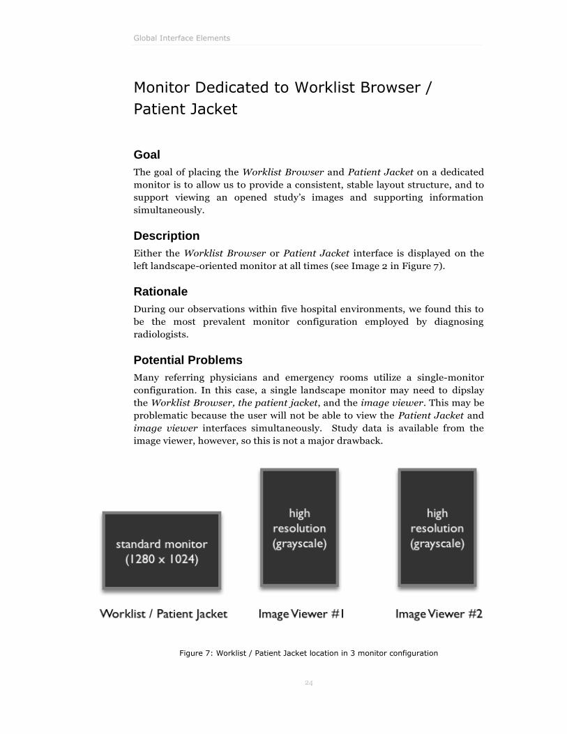
Monitor Dedicated to Worklist Browser /
Patient Jacket
Goal
The goal of placing the Worklist Browser and Patient Jacket on a dedicated
monitor is to allow us to provide a consistent, stable layout structure, and to
support viewing an opened study‟s images and supporting information
simultaneously.
Description
Either the Worklist Browser or Patient Jacket interface is displayed on the
left landscape-oriented monitor at all times (see Image 2 in Figure 7).
Rationale
During our observations within five hospital environments, we found this to
be the most prevalent monitor configuration employed by diagnosing
radiologists.
Potential Problems
Many referring physicians and emergency rooms utilize a single-monitor
configuration. In this case, a single landscape monitor may need to dipslay
the Worklist Browser, the patient jacket, and the image viewer. This may be
problematic because the user will not be able to view the Patient Jacket and
image viewer interfaces simultaneously. Study data is available from the
image viewer, however, so this is not a major drawback.
Figure 7: Worklist / Patient Jacket location in 3 monitor configuration

PACS Redesign Project – CMU HCII
25
Modal Worklist Browser / Patient Jacket
Goal
The goal of swapping screen realestate between the Worklist Browser and
Patient Jacket is to give the user more space to view Patient Jacket
information (prior reports, dictation, etc.) when dictating or performing a
diagnosis.
Description
The Worklist Browser (, left image) and Patient Jacket (, right image)
operate modally, with only one being viewable at any given time. When a
study is opened from the Worklist Browser, the Patient Jacket interface
slides out and images from the current study as well as any relevant priors are
displayed in the image viewer windows according to the specified hanging
protocol. When a study is closed, completed, or dictated, the Patient Jacket
retracts, exposing the worklist. However, when auto-advance is turned on,
the next study in the worklist is automatically opened, so the user remains in
the Patient Jacket view.
Figure 8: Worklist Browser and Patient Jacket occupy the same space – only one can be shown at a time.
Rationale
Searching for a study to open and interpreting a study for dictation are two
exclusive acts. During the former act, the Patient Jacket does not provide
much additional benefit and during the latter act, the worklist does not
provide much additional benefit. We received a lot of very positive feedback
about this idea from users during concept validation – they loved the
additional screen real estate that a modal design affords. One user actually
was already working in a modal worklist fashion by having a GE Healthcare

Global Interface Elements
26
representative set up her worklist on her middle display (left-most image
viewer) while the Patient Jacket and report windows remained active on the
left-most monitor. Lastly, making the Worklist Browser and Patient Jacket
modal supports our primary design theme of reducing visual clutter.
The modal functionality of the worklist addressed several heuristic violations
of the current system:
HE-005 Can Open Case as Two Different Instances
HE-020 Redundant Controls in Work list and Patient Jacket
HE-021 Significant Visual Clutter from Redundant Information and
Controls
HE-024 Inefficient Use of Space in Work list, Patient Jacket, and
Report
Think Aloud Results
All of our Think Aloud sessions exposed this functionality. Users tended to
intuitively understand how it worked and validated that it would benefit their
current workflow – although one user expressed discomfort with the concept
because he was used to viewing the worklist and Patient Jacket
simultaneously.
We explicitly validated that users understood that the Patient Jacket saved its
previous state information when the user moved between the Worklist
Browser and Patient Jacket in Think Aloud 3 (TA 3.2.4).2 This provided
evidence that the user‟s mental model of how this feature worked was aligned
with our design.
Potential Problems
Potential problems exist for use cases in which users need to view
information both in the Patient Jacket and worklist simultaneously. However,
we did not observe this use case during our site visits. Furthermore, while the
user is in the patient jacket, it may take the user longer to switch to a new
worklist than in the current Centricity product because the Worklist Browser
is hidden.
2 We use the abbreviation (TA X.Y.Z) to reference Think Aloud session #X, Scenario #Y, and
Task #Z. Please refer to Appendix A section “Think Aloud Usability Study Results” for a
description of all tasks used in Think Aloud studies.

PACS Redesign Project – CMU HCII
27
Worklist Browser / Patient Jacket Toggle
Buttons
Goal
The goal of these buttons is to provide the user with a fast and easy way to
toggle between the Worklist Browser and the Patient Jacket displays and to
show the user which display they are currently viewing.
Description
Two buttons, „Worklist Browser‟ and „Patient Jacket‟, are located along the
left vertical margin of the landscape monitor. These buttons behave in a
coupled fashion, such that the one which matches the current monitor state is
always selected and can not be clicked on, and the one that doesn‟t match it is
always enabled for selection. While the buttons are visually centered in the
margin, the clickable area on each button extends to the absolute left edge of
the monitor.
Rationale
By presenting these buttons along the absolute left border of the display, we
improve the selection time of both buttons by effectively giving the button
infinite depth.3
Think Aloud Results
In the first and second paper prototypes, the „Worklist Browser‟ button was
labeled „Worklist‟. During the second Think Aloud session, this label caused
confusion for one user. She was viewing the Patient Jacket and wanted to
locate and open a new worklist for All Studies as proscribed by the Think
Aloud task (TA 2.2.5). She thought that the „Worklist‟ button would only
provide access to the worklist she already had open and could not find a way
to access other worklists. To mitigate this confusion we changed the label to
„Worklist Browser‟ – since this change, we have not observed any confusion
with similar tasks.
Potential Problems
When in the Worklist Browser, if a study has not been opened, the Patient
Jacket button will be disabled (since there is no specified Patient Jacket to
toggle to). This breaks the expected toggle behavior. Additionally, when there
is a study open, the user is given no feed-forward from the Worklist Browser
3 This type of increase in efficiency is predicted by Fitts‟ Law, which states that the time to
acquire a target is a function of the distance to and size of the target. Placing targets along
the monitor‟s borders gives a target the impression of infinite depth.

Global Interface Elements
28
as to which Patient Jacket will be displayed when the “Patient Jacket” button
is pressed.
Figure 9: Worklist Browser and Patient Jacket Buttons
PACS Redesign Project – CMU HCII
29
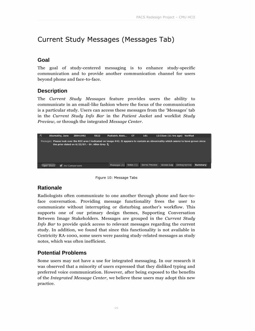
Current Study Messages (Messages Tab)
Goal
The goal of study-centered messaging is to enhance study-specific
communication and to provide another communication channel for users
beyond phone and face-to-face.
Description
The Current Study Messages feature provides users the ability to
communicate in an email-like fashion where the focus of the communication
is a particular study. Users can access these messages from the „Messages‟ tab
in the Current Study Info Bar in the Patient Jacket and worklist Study
Preview, or through the integrated Message Center.
Figure 10: Message Tabs
Rationale
Radiologists often communicate to one another through phone and face-to-
face conversation. Providing message functionality frees the user to
communicate without interrupting or disturbing another's workflow. This
supports one of our primary design themes, Supporting Conversation
Between Image Stakeholders. Messages are grouped in the Current Study
Info Bar to provide quick access to relevant messages regarding the current
study. In addition, we found that since this functionality is not available in
Centricity RA-1000, some users were passing study-related messages as study
notes, which was often inefficient.
Potential Problems
Some users may not have a use for integrated messaging. In our research it
was observed that a minority of users expressed that they disliked typing and
preferred voice communication. However, after being exposed to the benefits
of the Integrated Message Center, we believe these users may adopt this new
practice.

Global Interface Elements
30
Current Study Notes (Notes Tab)
Goal
The goal of maintaining current study notes is to group all study-related
information that is traditionally carried by attached notes in one location.
This would include, for example, the reason why the study was ordered.
Description
The study notes section includes all tech notes and/or clinical notes that are
attached the study in focus. Users can access these notes through the „Notes‟
tab of the Current Study Info Bar in the Patient Jacket and worklist Study
Preview.
Figure 11: Study Notes Tab
Rationale
While notes exist within the current Centricity RA-1000 product, they are not
presented along with other relevant study information in a manner that is
both unobtrusive and accessible. Providing access to these notes from the
Current Study Info Bar will alert users to view study specific notes upon first
opening a study, again sustaining our primary design theme of Supporting
Conversation Between Image Stakeholders.
Think Aloud Results
In Think Aloud 1, one user commented how she would love to have tech notes
included in the preview. Since this type of data is very important in providing
data relevant to the diagnosis, we added this into the preview pane in our next
iteration. In Think Aloud 2 (TA 2.2.3), users were given a task where they had
to locate a note from the tech. Users were able to effectively locate the note
from the both the Current Study Notes on the Patient Jacket as well as on the
worklist Study Preview expansion. However, one user expressed that he
didn‟t like to lose visibility of important demographic information in order to
see the note. This feedback prompted us to include the Current Study
Summary in next iteration of the interface.

PACS Redesign Project – CMU HCII
31
Potential Problems
We define messages as communication between two distinct users, which
may or may not be study-centric; messages that are study-centric are
presented within the Current Study Messages for those involved in the
communication. Notes are communication to anyone viewing a study about
that particular study. This may initially be confusing to new users and will
need to be addressed during initial training to enable accurate usage of the
two communication features.

Global Interface Elements
32
Current Study Series Preview (Series Preview
Tab)
Goal
The goal of Current Study Preview is to provide users the ability to quickly
preview a study‟s series images and to visually identify series of interest.
Description
The Current Study Series Preview tab in the Current Study Info Bar of the
Patient Jacket and worklist Study Preview provides users with a thumbnail
image preview of any series associated with the study.
Figure 12: Study Preview Tab
Rationale
Users may want to preview what they are opening prior to committing to the
act of fully opening a series. Providing this option in the Patient Jacket allows
users to preview various series before opening them individually.
After running this concept through two concept validation sessions, we
decided that using thumbnails for selecting a prior did not effectively
accommodate a core need, primarily due to the loss of screen real estate that
would be incurred. Regardless, since there was some interest, we decided to
further develop the concept during design. The Current Series Preview was
integrated into a tab within the Current Study Info Bar of the Patient Jacket
and worklist Study Preview to mitigate any loss of screen realestate.
Unfortunately, this design concept was not explicitly evaluated during Think
Aloud sessions, so we have little data validating its usability and overall
utility.
Potential Problems
This feature is primarily of benefit to a user previewing the study from the
Worklist Browser; however, we include it in the Patient Jacket to retain
consistency in tabs between the Patient Jacket and worklist Study Preview.

PACS Redesign Project – CMU HCII
33
Current Study Access Log (Access Log Tab)
Goal
The goal of this interface element is provide an audit log to the user. It should
tell the user which other users are currently viewing or have previously
viewed this study or have modified it.
Description
The Current Study Access Log tab in the Current Study Info Bar of the
Patient Jacket and worklist Study Preview provides a detailed list of who has
opened or modified the study in focus. This provides functionality to easily
view what technologist acquired the images or see who is currently viewing
the study.
Figure 13: Study Access Tab
Rationale
When a study is open by another user, radiologists need the ability to know
who is currently viewing the study. Depending on the role of the user, the
radiologist can decide whether to read the study or close it (i.e. if another
radiologist has the study open, the user may not want to continue reading;
however, if a tech has the study open the radiologist can safely continue
reading the study.)
In addition, it is likely that there exist use cases where the radiologist may
need to know which technologist to consult about image acquisition. This
further enhances our design theme of Supporting Conversation Between
Image Stakeholders.
Think Aloud Results
In Think Aloud 3 (TA 3.3.3), users located a study that was open by another
user. In order to expose the access log functionality, we asked these users to
locate the name of the user currently viewing the study. All users were able to
locate the access log without any major difficulties. Most users commented
that this was great information to have available.
Global Interface Elements
34
Potential Problems
Although they didn‟t report this to us, users may feel it is a violation of
privacy for the system to record that they have opened a study; however, we
feel that the benefits of this functionality will override any privacy concerns.

PACS Redesign Project – CMU HCII
35
Current Study Demographics (Demographics
Tab)
Goal
The goal of the Demographics tab is to allow users to quickly access patients‟
demographical information.
Description
The Current Study Demographics tab is located in the Current Study Info
Bar of the Patient Jacket and worklist Study Preview. This information
includes patient demographics information such as reason for study, study
time/date, patient location, etc.
Figure 14: Study Demographics Tab
Rationale
Users require quick access to demographic information about the patient and
the current study. Proving this information in a tabbed format allows for a
Reduction in Visual Clutter since this information does not need to occupy
screen real estate when it‟s not being actively used.
Think Aloud Results
In the first and second paper prototypes we omitted displaying the „Reason‟
field on the Summary and Demographics tabs. This was a huge issue with
users, as they felt this information was critical for initiating a diagnosis. All
users wanted to know “why was the patient even here?” As a result we
included this field in the Demographics tab, as well as the Summary tab, in
the third paper prototype.
Users expressed that the information we included within the demographics
seemed correct. Additionally, during Think Aloud 1, one user commented that
he liked that we show where the patient is in the hospital – not knowing this
is a problem he currently has.

Global Interface Elements
36
Potential Problems
If a user wants to refer to patient demographics that are not included within
the Summary tab while viewing other information about the current study,
they may need to click between multiple tabs, thereby increasing mouse
activity and adding to cognitive load.

PACS Redesign Project – CMU HCII
37
Current Study Summary (Summary Tab)
Goal
Accommodate individual work practices by presenting a configurable high-
level view of the current study.
Description
The Current Study Summary data is the default tab viewed in the Current
Study Info Bar of the Patient Jacket and the worklist‟s Study Preview. This
information can be customized per user to suit individual work practice.
Figure 15: Study Summary Tab
Rationale
Through our research, we‟ve noticed how unique each individual‟s work
practice is. Providing a customizable summary tab allows each user to
determine what information they need to view by default; thereby making
their individual work practice more efficient.
Think Aloud Results
In our first and second Think Aloud sessions, multiple users suggested that
while much of the information shown within the previously-default
Demographics tab was important, much of it was not incredibly useful in
building an initial understanding of the study. It is very clear to us that this
summary information needs to be customizable to support individual work
practices.
Potential Problems
In order to maximize personal benefit, each user will need to customize their
settings. While this is a one-time task, some users that are less tech-savvy
may not undertake the cost to personalize these settings. For this reason,
more work should be performed to better understand what information
presented in this tab would meet the needs of most users.

Global Interface Elements
38
Top Menu Bar
Goal
We want users to be able to easily understand that the Patient Jacket and
Image Viewer displays are connected; they both serve to provide information
about the currently open study. Furthermore, common study-related
functionality should utilize a consistent look and behavior whether it is
accessed from the Patient Jacket or Image Viewer.
Description
On the Image Viewer and Patient Jacket, the top menu bar contains the
Current Study Name Dropdown, Top Menu Icons, and Close Current Study
button.
Figure 16: Top Menu Bar
Rationale
Since the Patient Jacket and Image Viewer displays are all study-centric
displays of information, we decided to align their designs as much as possible.
This decision supports one of the primary design themes of Reducing Visual
Clutter through retaining consistency in the interface. Furthermore, because
the visual design of the top menu on the Patient Jacket and Image Viewer are
similar, we reinforce the idea that the entire interface is unified in its support
of the currently opened study.
Potential Problems
The Worklist Browser contains a similar, but subtly different, top menu bar –
mainly, the Worklist Browser does not display the Current Study Name
Dropdown. Having similar but slightly different top menu bars on the
worklist and other displays might be slightly confusing to first-time users,
though we believe the design supports the different use cases that exist
between the selection of a study and the diagnosis of an opened study.

PACS Redesign Project – CMU HCII
39
Top Menu Icons
Goal
Provide the user with the ability to quickly access system-level functionality
that relates to the currently opened study.
Description
Six buttons that enable „Undo‟, „Redo‟, „Print‟, „Save‟, „Mail/Send‟, and
„Dictate/Mark Study Status‟ are presented along the top row of the Image
Viewer, Patient Jacket, and Worklist Browser.
Figure 17: : Top Menu Icons – „Undo‟, „Redo‟, „Print‟, „Save‟, „Mail/Send‟, and „Dictate/Mark Study Status‟
Rationale
The top menu bar functionality is specific to the currently opened study -- the
Study Name Dropdown is presented on the left side and Close Current Study
button is on the right side. Additionally, since „Print‟, „Save‟, „Mail/Send‟, and
„Dictation/Mark Study Status‟ are all functions that relate to the currently
opened study, it is appropriate to place these on the top menu bar.
Furthermore, we‟ve included „Undo‟ and „Redo‟ because these functions apply
to nearly every element in the system, so it is appropriate for them to always
be available and visible.
The menu icons additionally addressed several heuristics violated in the
current Centricity PACS:
HE-008 Save Button Does Not Reflect Whether or Not a Study was
Modified
HE-012 Set Exam Status Button Does Not Reflect Current Setting
HE-042 Work list Editing Does Not Provide Undo/Redo
HE-043 No Undo Functionality for Leveling
HE-045 Image Annotations Cannot be Undone
HE-054 Widget Labels are Truncated

Global Interface Elements
40
Think Aloud Results
Initiating a dictation was tested in Think Aloud 2 (TA 2.3.6) and Think Aloud
3 (TA 3.1.6). Although all users were able to correctly identify and utilize the
dictation functionality, most commented that they would prefer to just use
the hardware button on their voice dictation microphone. Printing
functionality was tested in Think Aloud 3 (TA 3.2.7). Users did not have any
difficulty locating and using this, but commented that they almost never
printed themselves -- they typically had a secretary do it. We had tested
marking a study as dictated in Think Aloud 1 (TA 1.1.6, 1.2.7, 1.4.5), but found
that users using a transcription system almost exclusively never performed
this task and instead signed the study from their physical transcription
microphone after reviewing their report. We tested „Saving and Closing‟ a
study in Think Aloud 1 (TA 1.3.7). It seemed most users relied on their PACS
settings to automatically save a study upon closing so we removed this from
further testing.
Potential Problems
The „Save‟ and „Dictate/Mark Study Status‟ buttons also function as a
dropdown menu (if held down). It may be unclear to first-time users that
these dropdowns expose related, but different functionality. For example,
users may not immediately understand that the dictation dropdown contains
options for marking the study verified, unverified, etc. Additionally, these
functions are directed towards the currently open study, so users may be
confused when they use them on an Image Viewer that contains monitor
regions showing priors or on the Worklist Browser where multiple studies
are open. However, simply changing these buttons to inactive to prevent
invalid actions may mitigate many of these potential problems (e.g. when no
study is selected on the worklist, the „Save‟ and „Dictate/Mark Study Status‟
buttons would be disabled).
PACS Redesign Project – CMU HCII
41
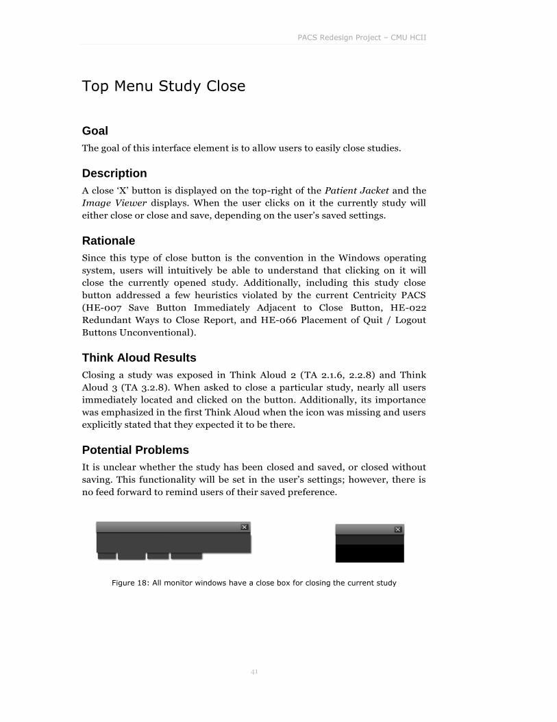
Top Menu Study Close
Goal
The goal of this interface element is to allow users to easily close studies.
Description
A close „X‟ button is displayed on the top-right of the Patient Jacket and the
Image Viewer displays. When the user clicks on it the currently study will
either close or close and save, depending on the user‟s saved settings.
Rationale
Since this type of close button is the convention in the Windows operating
system, users will intuitively be able to understand that clicking on it will
close the currently opened study. Additionally, including this study close
button addressed a few heuristics violated by the current Centricity PACS
(HE-007 Save Button Immediately Adjacent to Close Button, HE-022
Redundant Ways to Close Report, and HE-066 Placement of Quit / Logout
Buttons Unconventional).
Think Aloud Results
Closing a study was exposed in Think Aloud 2 (TA 2.1.6, 2.2.8) and Think
Aloud 3 (TA 3.2.8). When asked to close a particular study, nearly all users
immediately located and clicked on the button. Additionally, its importance
was emphasized in the first Think Aloud when the icon was missing and users
explicitly stated that they expected it to be there.
Potential Problems
It is unclear whether the study has been closed and saved, or closed without
saving. This functionality will be set in the user‟s settings; however, there is
no feed forward to remind users of their saved preference.
Figure 18: All monitor windows have a close box for closing the current study

Global Interface Elements
42
Current Study Name Dropdown
Goal
The goal of this interface element is to enable users to easily identify which
study is currently open by glancing at the top of the Patient Jacket or Image
Viewer displays. Additionally, this dropdown should allow users to easily
switch between open studies without returning to the worklist.
Description
On the Patient Jacket and Image Viewers, the left side of the top menu bar
displays the name of the currently opened patient and study. When the user
hovers the cursor over the name, a rectangular dropdown region appears
around the name, suggesting dropdown functionality to the user. Upon
mouse click, the dropdown expands displaying all the currently opened
studies, allowing the user to switch to another study if desired.
Figure 19: Clicking on the study name opens a menu of open studies.
Rationale
In support of the major design theme of Reducing Visual Clutter, the current
study name was overloaded with functionality to allow for convenient
switching between currently opened patients. This also addresses a violated
heuristic on the current Centricity design (HE-021 Significant Visual Clutter
from Redundant Information and Controls).
Think Aloud Results
This dropdown menu was explicitly tested in Think Aloud 2 (TA 2.2.7) and
Think Aloud 3 (TA 3.3.7). Although new users did not natively understand
that the current study name functioned as a dropdown that allowed them to
switch to other open studies, the design worked well once they understood
the "labels as dropdowns" metaphor.

PACS Redesign Project – CMU HCII
43
Potential Problems
First-time users may not immediately understand that the name has
associated quick-swap functionality. However, after exposure, users should
quickly understand that the presence of an arrow adjacent to a text item
affords the ability to click and get a dropdown. This widget is heavily used in
Office 2007 as well as Visual Studio 2005.

Global Interface Elements
44
Quick Contact Dropdown
Goal
The goal of this interface element is to allow radiologists the ability to quickly
communicate with other image stakeholders.
Description
A contact button is displayed adjacent to an individual's name. Clicking on
this button opens a dropdown that allows the user to view this individual's
contact information (phone number/office location), and also enables the
user to quickly send an email, page, or initiate a phone call.
Figure 20: Click on a doctor‟s name to reveal a quick-contact dropdown menu.
Rationale
This implementation is in direct support of one of our primary design themes,
Supporting Conversation Between Image Stakeholders. We found that a
major inefficiency for radiologists was attempting to contact other
stakeholders such as the referring physician, technician, colleague
radiologists, etc. During concept validation we presented this concept to
radiologists and received overwhelmingly positive feedback.
Similar concepts were tested during concept validation and received a less
positive response. The results of interruption-aware instant messaging were
inconclusive. Based on feedback, it appears that some users like the concept
of instant messaging but many believe that it would increase the amount of

PACS Redesign Project – CMU HCII
45
interruptions they may experience during their work. Many users were also
averse to extensive typing.
Think Aloud Results
The quick contact menu was tested in Think Aloud 1 (TA 1.4.3) and Think
Aloud 2 (TA 2.3.5). We were pleasantly surprised to see how intuitive users
found this feature to be; they were able to use this functionality without any
difficulty and expressed very positive feedback on the availability of this
information. However, at one site users reported that currently they wouldn't
use this functionality because it is easier to have a secretary initiate the
communication for them.
Potential Problems
While this feature provides users with more information and empowers them
to not rely on their secretary, it is inevitable that some users will continue to
rely on assistance to initiate contact with colleagues. For this reason, we
believe that adoption will likely vary by location.

Global Interface Elements
46
Quick Access Toolbar
Goal
Provide the ability to quickly launch applications or tools to support PACS
use. Tools envisioned include: Progress Meter, Message Center, and Web
Browser. The quick access toolbar will provide state information for each
application (such as number of current studies read for Progress Meter and
number of unread messages for Message Center).
Figure 21: Quick Access Toolbar
Description
The Quick Access Toolbar buttons will be located in the bottom left corner of
the Worklist Browser and Patient Jacket monitor. The buttons can be
configured to launch any set of applications, but the default tools include:
Progress Meter: the number of cases read can be visible on the quick
launch button (users can choose to hide this information). Upon
launch more progress statistics and information is available.
Message Center: alerts users to pending messages. The number of
pending messages is visible from the quick launch menu and after
opening the message center the user can read and send messages to
colleagues.

PACS Redesign Project – CMU HCII
47
Web Browser: direct internet access to allow users the ability to
research work related information without leaving the PACS
environment.
Rationale
The lower-left portion of the Worklist Browser and Patient Jacket is an ideal
location for an ambient display; it provides at-a-glance access while
minimizing distraction. Providing the ability to quickly launch supporting
applications and tools supports the design direction of Living on the Network
(supporting and enabling communication between tools and applications).
Think Aloud Results
Users were asked to locate an item on the Quick Access Toolbar in Think
Aloud 3 (TA 3.2.3). Having no exposure to this menu, it understandably took
users some exploration to locate the item. However, after initial exposure,
users were very curious about the toolbar functions and generally expressed
very positive feedback in regards to the functionality it provides.
Potential Problems
The availability of additional information may be distracting for some users.
We advise allowing customization of this toolbar for users who do not wish to
view outside applications or tools.

Global Interface Elements
48
Progress Meter
Goal
The goal of the Progress Meter is to provide users with the ability to monitor
work progress and evaluate their personal work method to improve individual
efficiency.
Description
While viewing the Worklist Browser or Patient Jacket, users can customize
their progress meter icon to display the number of studies read during that
work session, average read time per study, etc.
The Progress Meter is a dashboard of additional work statistics compiled for
the user. This may include:
reading history (list of studies read this session)
number of studies read over the past work session, day, week, or
month
total studies read during each time period
average reading time for a study during each time period
total reading time for each time period
average RVUs (relative value units) for each time period
total RVUs for each time period.
Figure 22: Progress Meter in Quick Access Toolbar
PACS Redesign Project – CMU HCII
49
Rationale
The Progress Meter provides users the ability to improve their individual
efficiency by monitoring work practices over a period of time. Having the
ability to track personal workload and efficiency improvements will hopefully
lead to a higher sense of accomplishment and work satisfaction. This supports
Enhancing Efficiency, a design theme identified in our Contextual Inquiry
data.
During concept validation, the concept of a performance dashboard received
positive feedback from all users. One user even proclaimed that productivity
was so critical that this could become the killer feature for PACS.
Think Aloud Results
This functionality was exposed in Think Aloud 3 (TA 3.2.3). Users were very
positive about this feature. However, one user commented that there needs to
be way to customize the shortcut icon to hide the number of studies read;
some users will be sensitive about displaying their progress to anyone who
passes by.
Potential Problems
Having a primary focus on efficiency may lead to a decrease in reading
accuracy; however, we believe professionals recognize the importance of
accuracy and will not discount this in favor of efficiency. Also, since most
radiologists are not salaried but get paid by performance, they have a
significant interest in self-improvement, both in terms of accuracy and speed.
Users also may view this as a „big brother‟ attempt to track their progress. It is
important that this is presented as a self-monitoring tool and not an attempt
by PACS and hospital administrators to audit individual performance.

Global Interface Elements
50
Message Center
Goal
The goal of the Message Center is to alert users to pending messages without
distracting them from their current task.
Description
The number of pending messages is displayed on the message center icon in
the Quick Access Toolbar. Since the Message Center is located within a quick
glance of the Worklist Browser and Patient Jacket, users are continuously
notified of incoming messages, without forcing them to navigate away from
their current task.
Upon opening the Message Center, users can read messages, reply to
messages, or create new messages. Messages can stand-alone or be attached
to a specific study. This tool enhances communication between users while
maintaining their focus within PACS.
Figure 23: Message Center Icon in Quick Launch Toolbar
displaying two unread messages
Rationale
The Message Center is beneficial as it facilitates communication between
PACS users, supporting one of the primary design themes: Supporting
Conversation Between Image Stakeholders. It will allow users to maintain
their focus within their current task and quickly send related messages to
colleagues who may be busy or unavailable for real-time discussion.
PACS Redesign Project – CMU HCII
51
Think Aloud Results
This feature was exposed to users during a side task of Think Aloud 3. Users
expressed positive affect towards it as a design and mentioned this was not a
feature currently available to them. However, since we didn't test the
Message Center explicitly, it is unclear whether it provides benefit or is
usable.
Potential Problems
Through our research, we have encountered users who dislike typing. These
individuals may have a strong negative reaction to the Message Center, which
promotes exchange of typed messages. Depending on the severity of the
user‟s negative reaction, it might be beneficial to allow users the ability to
turn off messaging functionality and force users to call or page them for
collaboration.

Global Interface Elements
52
Web Access
Goal
The goal of Web Access is to provide users the ability to quickly search for
information online, perform web-based research, or launch radiology
websites from within the PACS application.
Description
Conveniently located within the PACS application, users can click on the web
browser icon within the quick access bar to launch an external web
application.
Figure 24: Internet Explorer icon in Quick Launch Toolbar
Rationale
Through our research we observed users needing to look up information on
the Web when encountering an unusual diagnosis. Allowing the user to query
this information without leaving the PACS environment will improve
efficiency and allow them to easily cite sources.
During concept validation, we tested the concept of a unified search. This
concept tested whether users felt the need for easy access to data from many
sources in a single location. This concept did not validate well, the
overwhelming result was: “I just Google it!” Through this validation, we
determined users do not need a new research tool, just merely access to a
standard web browser.
PACS Redesign Project – CMU HCII
53
Potential Problems
We were not able to adequately explore this functionality. We believe that this
feature can be better integrated within PACS. For example, unknown terms
could be right-clicked and to expose functionality to “look up term”. This
could launch specialized radiological tools, like Yottalook.

Global Interface Elements
54
PACS Redesign Project – CMU HCII
55
Worklist Browser
The following section outlines interface elements that reside on the Worklist
Browser screen.
For each design element, we will provide the following: the “Goal” that the
element tries to address; a “Description” of the element‟s location in the
design and its intended behavior; the “Rationale” behind this particular
solution; “Think Aloud Results” if the design idea was tested in any user
sessions; and finally, “Potential Problems” that we can foresee with our
approach.
Worklist Browser
56
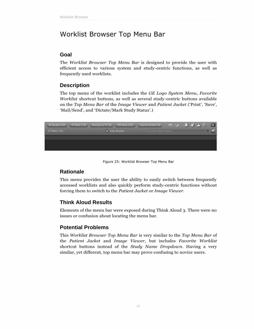
Worklist Browser Top Menu Bar
Goal
The Worklist Browser Top Menu Bar is designed to provide the user with
efficient access to various system and study-centric functions, as well as
frequently used worklists.
Description
The top menu of the worklist includes the GE Logo System Menu, Favorite
Worklist shortcut buttons, as well as several study-centric buttons available
on the Top Menu Bar of the Image Viewer and Patient Jacket („Print‟, „Save‟,
„Mail/Send‟, and „Dictate/Mark Study Status‟.)
Figure 25: Worklist Browser Top Menu Bar
Rationale
This menu provides the user the ability to easily switch between frequently
accessed worklists and also quickly perform study-centric functions without
forcing them to switch to the Patient Jacket or Image Viewer.
Think Aloud Results
Elements of the menu bar were exposed during Think Aloud 3. There were no
issues or confusion about locating the menu bar.
Potential Problems
This Worklist Browser Top Menu Bar is very similar to the Top Menu Bar of
the Patient Jacket and Image Viewer, but includes Favorite Worklist
shortcut buttons instead of the Study Name Dropdown. Having a very
similar, yet different, top menu bar may prove confusing to novice users.

PACS Redesign Project – CMU HCII
57
Worklist Columns
Goal
The goal of the Worklist Columns is to provide users with the data needed to
identify and locate studies.
Description
The worklist displays a list of studies with the following information visible:
Open Status, Priority (routine or high priority), Patient Name, Patient ID,
Last 4 of Social Security Number, Procedure, Modality, Number of Images,
Study Time, and Status. Clicking on any of the column labels will sort the
rows in the worklist in ascending order by that column information. Clicking
on the column label again will sort the worklist items in descending order by
that column information (Figure 26). Right-clicking on any column label will
allow the user to customize which columns are shown (Figure 27). Dragging
column labels will allow the user to rearrange the column order (Figure 28).
Figure 26: Worklist Columns, sorted by Study Time
Figure 27: Right-clicking a column label allows the user to customize the columns displayed
Figure 28: Dragging a column label allows the user to customize the column order
Worklist Browser
58
Rationale
The Worklist Columns represent the primary information needed by users to
locate and identify a specific study. Additionally, the worklist structure and
data addresses usability concerns identified through our heuristic evaluation
(HE-038 Poor Error Prevention on Disabled Column Sort in Work list and
HE-055 No Affordance for Sorting).
Think Aloud Results
We validated that users understand how the worklist is sorted in Think Aloud
1 (TA 1.1.1, 1.1.2). Additionally, multiple users explored sorting to locate
specific studies. This action seemed natural and intuitive to users.
We did not user-test changing the visible columns (Figure 20), or rearranging
the order of the columns (Figure 21), but these modification interactions are
standard for tabular data in most applications.
Potential Problems
Users may require additional information to identify a study; however, in our
research, these columns seem to suffice for the majority (if not all) cases.

PACS Redesign Project – CMU HCII
59
Worklist Right-Click Menu
Goal
The goal of this menu is to allow users the ability to perform study-centric
tasks efficiently from anywhere on the worklist.
Description
When a user right-clicks on a study row in the worklist, they are presented
with a contextual menu that allows them to perform the following functions:
Open Study with Comparisons
Open Study Alone
Print Study
Save Study
Send Study
Mark Study
Bookmark Study
Figure 29: Worklist Right-Click Menu
Rationale
Providing the user the ability to perform study-centric functions from any row
of the worklist will prove more efficient for users, thereby supporting the
design goal of Efficiency. Additionally, since much of this functionality is
available from the context-menu, we can meet our design goal of Reducing
Visual Clutter by eliminating many of the ever-present buttons used in the
Centricity RA-1000.
Worklist Browser
60
Think Aloud Results
No users attempted to right-click on the worklist during Think Aloud 3 (when
this menu was available), so we did not receive any explicit feedback on this
interface element. This result may be due to testing of a paper prototype.
Potential Problems
The menu options are redundant to other functionality found on the Worklist
Browser (e.g. Top Menu Bar); however, since the menu is only presented
upon deliberate action by the user, this should not cause confusion.
Additionally, this makes many actions more efficient since the user can
simply right-click on a previously unselected study and perform an action
upon it instead of first selecting it and then moving to the Top Menu Bar
functionality.

PACS Redesign Project – CMU HCII
61
Open Study Status
Goal
This control provides a visual distinction between open vs. unopened studies.
Description
When a study is open, the eye icon in the first column of the worklist is filled
in and the row text is bolded. Users can click directly on the eye to open the
study in the background (i.e. the study opens, but the worklist stays on top).
Users can also easily view open studies by sorting the worklist by clicking on
the column header.
Also, row background is differentiated to alert users of open studies or
studies open by another user.
Figure 30: Opened Studies are displayed with an eye icon and bold text
Rationale
Users require the ability to differentiate what studies on their worklist are
open, thereby supporting our design theme of enhancing Visibility of Study
State. Also, being able to open multiple studies at once from the worklist
without having to switch back from the Patient Jacket each time better
supports queuing/batching behavior that some users claimed to prefer.
Adding the bold text and eye icon addresses a heuristic violation in the
current version of Centricity (HE-006 There isn‟t a Way to See What Cases
are Open From the Worklist).
Think Aloud Results
This feature was implemented in Think Aloud 2 & Think Aloud 3, but there
wasn't a task that explicitly tested users understanding of it. Despite this,
users seemed to understand implicitly what it was meant to convey. We were
not able to validate that users would understand that clicking directly on the
eye would launch the study in the background without changing the worklist

Worklist Browser
62
view. This type of background loading was done since many users in Think
Aloud 2 commented that they wanted the ability to batch studies to read
through. They felt this would lead to significant gains in efficiency, especially
for plain film studies. On the other hand, this feature is now clearly available
as the Auto-Advance mode.
Potential Problems
Until explained, it may not be obvious to users what the eye icon and bold text
indicate or how the batch opening functionality works.

PACS Redesign Project – CMU HCII
63
High Priority / ER Study
Goal
The goal of this icon is to give users visibility of a study's status and draw
attention to urgent cases.
Description
Including an exclamation point icon in the second column of the worklist
differentiates high priority or ER studies. The user can sort the worklist to
show high priority cases first by clicking on the column header.
Figure 31: High-Priority studies are shown with an exclamation point icon
Rationale
Users need the ability to locate high priority cases and differentiate these
from routine studies; this supports one of our design themes of enhancing
Visibility of Study State.
Think Aloud Results
In our third paper prototype we attempted to assign priority numerically
throughout the list of worklist items. In this design the system would attempt
to automatically determine the optimal order of the studies to be read (i.e.
stat studies would be the highest priority, then in-patients, then out-patients;
within each category they would be weighted by study time, whether pending
messages were attached to it, etc). When we tested this concept in Think
Aloud 3 (TA 3.1.1), we found that for many users worklists had a built-in
priority, which didn‟t need to be explicitly communicated to the user.
Additionally, users espoused that they were fairly good at quickly
understanding which studies were most urgent within any given worklist.
From this feedback, priority was reverted to two categories: high priority (ER)
and routine.
Potential Problems
The exclamation point may not be intuitive to first time users; however, this
should be quickly mitigated with system experience or training.

Worklist Browser
64
Open by Another User
Goal
The goal of this visual treatment is to inform users whether a study is
currently opened by another user before the current user opens it.
Description
When a study is open by another user, the study row in the worklist will have
a unique striped background, like construction tape, to warn other users that
this study is already open and being read by another user.
Figure 32: A study is being actively read by another radiologist
Figure 33: Several studies are being read by other radiologists
Figure 34: When opening a study being ready by another
Radiologist, the top toolbars display the caution stripe in the background on all monitors.
Rationale
Centricity RA-1000 does not alert users that another user is reading a study
until after the study is already open. When this occurs, they are confronted
with multiple warning dialogs that must be individually closed. In order to

PACS Redesign Project – CMU HCII
65
minimize the cost of opening non-available studies, this status should be
displayed to users prior to opening the study. This also supports of the design
goal to enhance “Visibility of Study State”.
In addition, this design decision addresses a heuristic violation in the current
Centricity PACS (HE-004 Warns That Current User Has Currently Open a
Case That the Current User has Opened).
Think Aloud Results
This design treatment was exposed in Think Aloud 3 (TA 3.3.3). This
graphical treatment seemed to be agreeable to our users. One user further
mentioned that it would be nice to see what class of user had opened the file
since users who don't have dictation rights (residents, for example), didn't
actually lock them out. We felt that we didn‟t need to include this information
on the worklist row treatment because it is available within the Access Log
tab of the Current Study Info Bar in the Patient Jacket and worklist Study
Preview.
Potential Problems
Even though a user is aware that a study is open by another user, they are still
permitted to open the study. This could cause problems if two users attempt
to dictate the same study. Additional functionality should be built into the
system to prevent multiple users from dictating the same case and should
warn users from saving changes that may overwrite another users changes.
As long as the system can prevent these errors from occurring, it is beneficial
to allow multiple users to open a study without forcing them to accept
multiple warnings.

Worklist Browser
66
Study Preview
Goal
To provide users with the ability to obtain study related information without
forcing users to open the study.
Description
By single clicking on a study in the worklist, the user receives a preview of
information without committing to opening the study. The preview includes
access to:
study related messages from other users
study related notes
thumbnail preview of series images
access log (users that have accessed the study and who is currently
reading the study if it is open by another user)
patient demographics, and
a summary of this information (each tab is detailed more thoroughly
within Patient Jacket information).
By default the study is opened to display summary data.
From this preview, users have the option to open the study by clicking the
„Open Study‟ button, close the preview (single click on the study again), or
open/preview another study altogether by selecting another item in the
worklist. In addition, from the preview, users have the ability to uncheck the
„Include Comparisons‟ checkbox and open the current study without opening
any prior studies.
Figure 35: An open study preview in the Worklist
PACS Redesign Project – CMU HCII
67
Rationale
Users need the ability to preview study data to view specific information
before committing to opening the study. In most cases it is more efficient to
open studies without viewing the preview information, but providing this
ability will give users an option if information is needed yet opening a study is
not desired.
Think Aloud Results
This functionality was exposed in all Think Aloud sessions (1.1.3, 1.2.1, 1.3.1,
1.3.2, 1.4.1, 2.1.3, 2.2.2, 2.3.1, 3.1.2, 3.3.4). After a short initial exploration,
users were able to understand that single clicking on a study row exposed the
Study Preview pane and that this pane was also replicated on the Patient
Jacket interface. Many users expressed positive affect toward having this
information readily available for each study. The primary feedback received
allowed us to iterate on the default information presented determining that
summary data, which can be customized, should suffice nearly all user‟s
needs.
Potential Problems
The Preview Study data is formatted in tabs, which should contain all
information needed; however, if the desired information is not available in
the summary data, it will take another click for the user to locate the desired
information without fully opening the study.

Worklist Browser
68
Launching Studies
Goal
Users should quickly be able locate the study of interest to them and open it.
Description
Each study is represented as a row in the worklist. When the user hovers over
a row, the background color changes to suggest that it can be manipulated.
When the user single-clicks on a row, the row expands to show the Study
Preview. When the user double-clicks on the study row, the study is opened.
When a study is opened, the study's images are presented on Image Viewers
using a layout determined by the user's hanging protocol. Also, the Patient
Jacket for that particular study replaces the Worklist Browser within the
same physical monitor. (Figure 36, 37).
Rationale
All the PACS we were able to observe represented studies as rows within the
worklist, so we believe this will be a natural concept to existing users.
Additionally, although we understand that there is no explicit affordance for
double-clicking on the study row, we believe that it is a natural action.
Think Aloud Results
Launching studies was exposed in all the Think Aloud sessions we conducted
(TA 1.1.3, 1.2.1, 1.3.1, 1.3.2, 1.4.1, 2.1.3, 2.2.2, 2.3.1, 3.1.2, 3.3.4). For some
users, double-clicking to open the study was very intuitive and the first action
performed without any exploration. Other users first attempted to single-click
on the row, but then were able to launch the study from either double-clicking
(the most common method) or by using the „Open Study‟ button on the Study
Preview pane.
During Think Aloud 1, one user did have some initial difficulty opening a
study; she did not understand that the row was the active element, and not
the individual columns of the row. After a few attempts, she discovered how
to open the study and did not have any further difficulty with this
functionality. The worklist row now changes color to highlight itself when the
mouse is over it. This helps reinforce the idea that the user is selecting an
entire row at a time.
Potential Problems

PACS Redesign Project – CMU HCII
69
There is no explicit affordance for both double and single-click apart from the
hover behavior.
Figure 36: The row highlights on hover
Figure 37: The study preview after a click

Worklist Browser
70
Auto-Advance
Goal
The goal of Auto-Advance is to support more efficient work practices while
minimizing unnecessary RSI-inducing mouse activity.
Description
The Auto-Advance checkbox is located next to the Worklist Selector
Dropdown Menu on the Worklist Browser interface. If it is turned on,
whenever a study is closed, completed, or dictated, the next study in the
active worklist will automatically be opened.
Figure 38: Auto Advance option in the worklist
Rationale
Radiologists often work through a worklist continuously opening the next
available study. Valuable time is lost between reading each study by needing
to familiarize oneself with the worklist and locating the next study to be read.
Opening the next study automatically will save seconds in between each
study, thereby supporting the design goal of enhancing efficiency, and
requiring less mouse movement and clicks from the user.
We attempted to validate this concept during concept validation; however,
the concept „Working Through a Queue‟ did not resonate well with users.
After further research, we confirmed a need for this functionality and altered
the presence of this feature in the design making it an option but not
mandatory.
Think Aloud Results
This functionality was added after Think Aloud 2. Users expressed that this
feature would lead to significant gains in efficiency, especially when
diagnosing plain-film studies and other studies where diagnosis of each study
is relatively fast. This functionality was exposed in Think Aloud 3 (TA 3.2.1,
3.2.2). Two users liked the feature, but one preferred to go through the
studies by selecting each one manually. All liked the ability to turn the feature
off if they didn't want to use it.

PACS Redesign Project – CMU HCII
71
Potential Problems
Initially users may not understand how the Auto-Advance feature works; this
should be explicitly explained during training to allow users to decide
whether the Auto-Advance feature is appropriate for their personal workflow.

Worklist Browser
72
Favorite Worklists
Goal
The goal of these interface elements is to provide the user with the ability to
efficiently jump between their most used worklists. Additionally, these
provide persistent information about how many studies exist within each
worklist.
Description
Five buttons along top edge of the screen provide single-click access to a
user‟s preset favorite worklists. The user can customize these buttons by
right-clicking on them and selecting one of their worklists to replace the
existing favorite.
Figure 39: Favorite Worklist buttons in the Worklist Browser
Rationale
We've observed that for any given day most users have a subset of worklists
that they work on. We chose to limit the number of worklists that can be
added to the favorites bar to allow for maximum visibility of the worklist
name and to keep the clutter to a minimum. All the worklists are still
available from the Worklist Selector Dropdown Menu.
Think Aloud Results
In Think Aloud 2 we asked users to switch to a worklist that was located on
the Favorite Worklists toolbar (TA 2.1.2). The placement and interaction of
this element worked very well. We did not, however, get an opportunity to
validate assigning a new worklist to a button via right-click.
Potential Problems
Some users may utilize more than five worklists frequently and desire
additional worklist shortcuts, which are not available. Also, there is no
affordance to right-clicking a button; conventional buttons are mostly not
customized this way. However, this seems to be another one-time learning
cost, and in any case, we anticipate (based on current work practices that we
observed) that the set of oft-used worklists will remain unchanged.

PACS Redesign Project – CMU HCII
73
Worklist Selector Dropdown Menu
Goal
This menu provides the ability to quickly switch between various worklists,
browse additional worklists, and create new worklists.
Description
The Worklist Selector Dropdown Menu is represented as a persistent
dropdown menu that always displays the currently active worklist (Figure
40Figure 38: Auto Advance option in the worklist. Using the dropdown users
can switch between other worklists that they have saved, access recently used
worklists, browse all worklists, or create a new worklist. If users have a large
number of worklists, a scroll bar appears for scrolling through the list.
Rationale
Users need the ability to easily understand which worklist is currently open,
as well as quickly open a new worklist.
Think Aloud Results
We explicitly asked users to identify the currently open worklist in Think
Aloud 2. All users intuitively understood that this interface element showed
the name of the currently opened worklist. In Think Aloud 2 (TA 2.1.2, 2.2.1)
and Think Aloud 3, we included tasks that tested whether users could switch
to another worklist, browse all worklists, and create a new worklist. We found
that when the user was asked to switch to another worklist that is on their
Favorite Worklists toolbar, they preferred to use these shortcut buttons.
Additionally, most users were able to correctly anticipate that this dropdown
would hold functionality for "Browse All Worklists" and "Create new
Worklists".
Potential Problems
If users create a large number of worklists, the contents of the „My Worklists‟
section may become unmanageable. A solution would be to allow grouping
these into folders, but this would increase the time to select a worklist.

Worklist Browser
74
Figure 40: Worklist Browser with Worklist Selector Dropdown open

PACS Redesign Project – CMU HCII
75
Browse Worklists
Goal
The goal of this element is to provide individuals with the ability to locate
their own worklists, system-wide worklists, and worklists created by other
users.
Description
Users have the ability to locate worklists throughout their institution‟s
network by clicking on the „Browse Work lists‟ option in the Worklist Selector
Dropdown Menu (Figure 41).
Users can search for a specific worklist by name in the search box within the
Browse Worklist box or navigate through the structured menu. The current
structure includes: „Default Worklist for the Facility‟, „Most Used Worklists‟,
„Worklists by User‟, „Worklists by Modality‟, „Worklists by Body Part‟, and
„Worklists by Facility‟. Once users find the worklist they are looking for they
have the option to open the worklist or add it to My Worklists by dragging
and dropping or using the 'Add to My Worklists' button.
Rationale
In each organization, there are often super users who utilize more advanced
features of PACS and work more efficiently than regular users. It is typical for
regular users to learn from these super users and adopt their work practices,
thereby making their own work practices more efficient. Providing the ability
to browse worklists will allow regular users to locate the worklists created by
other users, including super users. Users may choose to add these to their
own worklist or directly utilize them for use. Proving this functionality
supports the design goal of “Learning and Sharing Best Practices”.
This concept of sharing worklists received support during concept validation.
Most users recognized that sharing worklists was a necessary part of their
workflow.
Think Aloud Results
This functionality was initially exposed during Think Aloud 2 (TA 2.2.1). In
this version of the paper prototype design we implemented „Browse Worklists‟
as a sub-menu of the Worklist Selector Dropdown Menu. Although users did
not have too much trouble interacting with the collapsible/expandable
hierarchy, we decided that this was an unnatural element for a dropdown
menu, so we decided to implement it as a floating window. We tested the new
version of this in Think Aloud 3 (TA 3.3.8). The floating window tested well.

Worklist Browser
76
Potential Problems
This feature assumes a general knowledge of the internal hospital‟s worklist
organization structure. In order to fully take advantage of this feature,
individuals will need to name worklists with appropriate names and the PACS
administrator will need to monitor the organizational hierarchy of user-
created worklists.
Figure 41: Browse Worklists Window

PACS Redesign Project – CMU HCII
77
Recent Worklists
Goal
The goal of this interface element is to provide users quick access to, and
support recognition of, recently viewed worklists.
Description
The „Recent Work lists‟ option on the Worklist Selection Dropdown Menu
provides quick access to recently viewed worklists. It further leverages the
principal of “Recognition over Recall”, i.e., users find it much easier to
recognize an item from a set presented to them than being asked to recall it
from scratch.
Figure 42: Worklist Selector Dropdown showing Recent Worklists
Rationale
Users might switch worklists multiple times in a day. Providing a list of
recently viewed worklists will support both recall and access to sporadically
used non-favorite worklists.
Potential Problems
The Recent Worklists feature will contain a limited number of worklists and
may not be as helpful to users who look at many worklists in one day.
Worklist Browser
78
Furthermore, if these worklists are all common to the user, it is likely that
they will more easily accessible through either the My Worklist dropdown or
the Favorite Worklist buttons.

PACS Redesign Project – CMU HCII
79
My Worklists
Goal
The goal of this interface element is to provide users with the ability to create
and manage their own individual worklists 'on the fly' and customize their set
of worklists to meet their workflow practices.
Description
Users have the ability to manage their own worklist options and create
custom worklists specific to their individual needs. From the Worklist
Selector Dropdown Menu, users can click the „Browse Worklists‟ option to
view their list of custom worklists. From this menu users can manage this set
of worklists and add additional worklists or remove worklists as needed.
Additionally, users can select the „Create New Worklist‟ option from the
Worklist Selector Dropdown Menu to create a custom worklist specific to
their individual requirements.
Figure 43: My Worklists in Worklist Selector Dropdown
Rationale
Users have individual needs and often require their PACS administrator to
create custom worklists to meet their specific requirements. Through our
observations, it appeared users did not have enough control to customize

Worklist Browser
80
their worklist selection options. Users complain of 'worklist overload' from
the multitude of selection options across the hospital network. Allowing the
worklist selections to be individual would allow users to self-manage their list
of options and keep the number as reasonable as they would like.
Potential Problems
The burden to appropriately name and manage worklists would fall on the
individual user instead of the PACS administrator. Some users may not want
this responsibility.

PACS Redesign Project – CMU HCII
81
Create New Worklist
Goal
The goal of this interface element is to provide users with more functionality
to individualize their work practice and create the most efficient worklists for
their own needs.
Description
Clicking on the „Create New Worklist‟ item in the Worklist Selection
Dropdown Menu (Figure 44) will open a dialog box for a user to build a new
custom worklist (Figure 45). This dialog box contains the ability to specify a
name for the worklist, indicate text that should be included in the procedure
name, modalities, study date and time range, status, etc.
When the worklist is saved it is added to My Worklists. The worklist can later
be removed in the „Browse Worklist‟ dialog box, which includes a „Remove‟
button.
Rationale
While validating our Sharing Worklist Filters concept, many users
complained that worklists had to be created by PACS administrators. It
became apparent that users need the ability to create and manage their own
worklists without relying on their PACS administrator. This relates directly to
our design goal of Enhancing Customizability.
Think Aloud Results
In Think Aloud 2, users commented that they would really find this feature
useful. We tested this explicitly in Think Aloud 3 (TA 3.3.1). Users were able
to create the worklist requested in the task without any problems. One user
also commented that it was a really nice feature and liked the ability to
customize her set of worklists.
Potential Problems
Some users may not want to learn this functionality and continue to rely on
their PACS administrator to create and manage their worklists. Additionally,
providing this functionality to individual users places the burden to
appropriately name and manage worklists to the users instead of the PACS
administrator. Finally, if radiologists read primarily from their own worklists,
the chance of certain studies falling through the cracks increases. The PACS
administrator would have to ensure that this does not happen.

Worklist Browser
82
Figure 44: Create Worklist item in Worklist Selector Dropdown
Figure 45: Create Worklist Window
PACS Redesign Project – CMU HCII
83
Live Worklists
Goal
The goal of this interface element is to enable the user to quickly access lists
of studies that are bookmarked, open, or have messages attached to them.
Description
By default the user is provided with certain PACS-generated worklists,
including "Opened Studies", "Bookmarked Studies", and "Message Studies"
(Figure 46).
Rationale
The worklist metaphor works very well for browsing and locating specific
studies, so utilizing this concept for Live Worklists obviates the need for users
to learn a new metaphor.
Additionally, the Open Studies live worklist addresses a heuristic violation in
the current Centricity PACS (HE-006 There isn‟t a Way to See What Cases are
Open from the Worklist).
Think Aloud Results
We tested user‟s ability to use the „Open Studies‟ worklist in Think Aloud 3
(TA 3.3.7). Because the task was poorly phrased and was fairly artificial, we
were not able to completely understand whether users could easily find this
worklist. However, when we explained the functionality to users most felt it
was beneficial. One user commented that she would rather access this
information from the Current Study Name Dropdown Menu rather than
move back to the worklist.
Users like the ability to view their currently opened studies from many
locations and wanted the ability to have over 15 studies open at once (15
studies was the administrator-set limit at their location).
Potential Problems
Currently, we do not have a design that allows for managing multiple separate
bookmark worklists, though we observed this need for some users. Also, our
design does not visually differentiate live worklists from other worklists,
which may cause some confusion.

Worklist Browser
84
Figure 46: Worklists update live based on any property,
such as this worklist containing all open studies.

PACS Redesign Project – CMU HCII
85
Simple Search
Goal
The goal of this feature is to allow users to quickly find and access specific
studies by filtering along one data type.
Description
The Live Search box is located in the upper right corner of the Worklist
Browser and provides live filtering of the worklist. This allows users to locate
a study belonging to a specific patient, a study with a certain modality, etc. As
the user types, the worklist filters to display search results in real-time.
Although we have not yet outlined this functionality in detail, we imagine that
a simple syntax can be devised such that power users would be able to use a
specialized, multi-criteria search syntax as with Google searches. This could
possibly include criteria selectors such as “name=xxx” or Boolean operators
such as “-CT“ for inverse searches, etc.
Figure 47: Simple Search finding a study (currently being read by another radiologist)
Rationale
In our research, we observed that users often needed to locate one specific
patient or further filter their worklist to view a group of studies. Providing the
Simple Search feature provides real time feedback to users on search results.
In Centricity RA-1000, users have this ability from the text boxes located
under each column header. In order to simplify the process and Reduce
Visual Clutter, we combined this search functionality into one search box in
the upper right corner of the screen. This is consistent with other applications
and is the standard location for search on many websites. Simple Search is
also very efficient because the user does not have to type the entire search
string; each key they type narrows the results, and in most cases they will
arrive at the desired record before having to type the entire search term.

Worklist Browser
86
Simple Search addresses several heuristic violations in the current Centricity
PACS, including:
HE-021 Significant Visual Clutter from Redundant Information and
Controls
HE-056 Visual Styling of Text Entry Fields is Non-Intuitive
HE-059 Filtering Does Not Work for Substring Searches
Think Aloud Results
In Think Aloud 2 (TA 2.2.5), users had to search through a large worklist to
locate a particular patient (based on the Patient ID#). Many users had
difficulty with this task for two reasons: some users had difficulty
understanding that the search field was a text box, and some users didn't
understand that they could search across column data types from one field
(they were used to entering filter criteria for each worklist column). In our
next iteration we added the text, "enter search terms" into the search text box.
We re-tested this concept in Think Aloud 3 (TA 3.3.2) and found it worked
well for users who needed to filter their worklist using one criterion.
Potential Problems
When users are searching for numerical data, there is likely to be a lot of
'noise' as the system live updates. This noise should be reduced after a few
digits are entered. In addition, this search functionality is not ideal when
searching among multiple parameters, such as modality and patient name –
Advanced Search handles these cases.
Another potential problem with Live Search is that two users expected that,
after they clicked on a worklist column name and clicked a letter, that the
worklist would automatically jump to that row. Currently, we use the
metaphor of “filtering the worklist” rather than the “jump to the item”
metaphor. We believe that the “filtering” action is actually more efficient than
a “jump” action, so this seems to be an acceptable tradeoff.

PACS Redesign Project – CMU HCII
87
Advanced Search
Goal
The goal of Advanced Search is to provide users with the ability to find the
information or study they need when more sophisticated search methods are
required than Simple Search, such as searching among multiple parameters.
Description
In the upper right corner, immediately to the right of the Simple Search box,
there is a button to launch advanced search functionality (Figure 48).
Advanced Search pushes the worklist down and provides the user with the
ability to search among multiple parameters, which have been specialized for
the data type they contain (i.e. patient name is a text field while modalities
are checkboxes).
In addition, Advanced Search allows for an extension of the worklist system.
The fields in Advanced Search are identical to those of worklist creation.
When users activate Advanced Search, the fields are pre-populated with the
search criteria that define the current worklist. As a result, users can expand
the scope of their search as well as refine it. Advanced searches can also be
saved as independent worklist via the ‟Save as a Worklist„ button.
Rationale
The Simple Search box will accommodate most users search needs - allowing
them to quickly and easily locate a specific patient or type of study. However,
Advanced Search provides users the ability to further customize their search
criteria in situations where additional search parameters are required. It
carefully balances customizability and simplicity – a major design goal.
In addition, Advanced Search addresses a heuristic violation in the current
Centricity PACS (HE-059 Filtering Does Not Work for Substring Searches).
Think Aloud Results
This wasn't explicitly tested in a Think Aloud scenario. However, when one
user was performing Think Aloud 3 (TA 3.3.2), she commented on how this
functionality was absolutely critical for her workflow. In particular, she
frequently needed to search along multiple criteria.
Potential Problems
This search feature will take more screen real estate, leaving less room for
worklist items. This is not expected to be an issue since the goal of Advanced
Search is to narrow the number of the items in the worklist.

Worklist Browser
88
Figure 48: Advanced Search

PACS Redesign Project – CMU HCII
89
Patient Jacket
The following section outlines interface elements that reside on the Patient
Jacket screen.
For each design element, we will provide the following: the “Goal” that the
element tries to address; a “Description” of the element‟s location in the
design and its intended behavior; the “Rationale” behind this particular
solution; “Think Aloud Results” if the design idea was tested in any user
sessions; and finally, “Potential Problems” that we can foresee with our
approach.

Patient Jacket
90
Current Study Info Bar
Goal
The goal of this interface eleement is to provide users with relevant
information about the current study while maximizing screen real estate by
utilizing tabs.
Description
The current study information is displayed along the top of the Patient Jacket
screen in a tabbed format (Figure 49). By default, the summary tab displayed,
but users can click among the tab options to view messages related to the
study, notes related to the study, series preview of thumbnail images, access
log, or patient demographics. These tabs exist in the Study Preview pane of
the worklist as well.
Rationale
Users do not need to see every piece of information about the current study at
once. While the summary page contains information typically desired, users
have the ability to view more information without sacrificing additional
screen realestate; this supports the customizability and simplicity design
theme. During design we made sure it was obvious which tab was selected .
This addressed a heuristic violation with the current Centricity RA-1000 (HE-
031 The Selected Tab is Not the Most Prominent).
Think Aloud Results
The tabbed format of the current study info bar was developed in the second
paper prototype. Most users were able to understand that the information for
the current study is presented visually separated from the priors – the current
study information is presented along the top of the screen, while prior
information is presented below it, along the left side. However, a few users
made the mistake of looking at the priors for info about the current study. We
feel the persistence of this type of mistake will be low since once users learn
the change in layout, they are unlikely to make this mistake, and the
additional visual cues provided by a live implementation vs. paper prototypes
should also help.
Potential Problems
If the information sought is not located within the study summary, users
must click another tab to locate this information. To alleviate this issue, we
believe the summary tab should be customized to support individual user
preferences.

PACS Redesign Project – CMU HCII
91
Figure 49: Current Study Info Bar, which contains the same data as the Study Preview
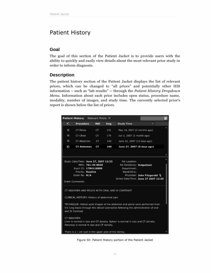
Patient Jacket
92
Patient History
Goal
The goal of this section of the Patient Jacket is to provide users with the
ability to quickly and easily view details about the most relevant prior study in
order to inform diagnosis.
Description
The patient history section of the Patient Jacket displays the list of relevant
priors, which can be changed to “all priors” and potentially other HIS
information – such as “lab results” -- through the Patient History Dropdown
Menu. Information about each prior includes open status, procedure name,
modality, number of images, and study time. The currently selected prior's
report is shown below the list of priors.
Figure 50: Patient History portion of the Patient Jacket

PACS Redesign Project – CMU HCII
93
Rationale
To support diagnosis and dictation, relevant priors and reports must be kept
visible while users view the details about the current study. This information
is located alongside the dictation area to improve the visibility of a prior
report during dictation.
Think Aloud Results
In Think Aloud 1, a user commented that he wanted the ability to view all
priors, even ones the system didn't think were relevant, from the patient
jacket. We heard a similar comment from another user during concept
validation -- “the system thinks it knows what relevant priors are, but it is not
always right.”
During Think Aloud 2 (TA 2.3.3) and Think Aloud 3 (TA 3.2.4), users had to
read the report for one of the open priors. Most users did not have a problem
either locating this report in the Patient Jacket or through the Study Data
Window button on the Image Viewer monitors. However, while not optimal,
one user felt they should be able to detach the report from the Patient Jacket
and drag it over the image viewer to display next to the image.
Potential Problems
Due to screen real-estate limitations, only one report is viewable at a time.
Additionally, if the list of priors is long, users may have to scroll to view all
relevant information.

Patient Jacket
94
Monitor Layout Configuration
Goal
The goal of this interface element is to provide the ability to modify the
display configuration in a simple and affordable manner.
Description
Providing similar functionality as the Image Viewer Unified Layout Palette,
this collapsible section of the Patient Jacket provides visual controls that
enable the user to change the monitor region configuration for each Image
Viewer and the image layout configuration within each monitor region. The
current study and relevant priors are also shown in the Patient Jacket and
can be manipulated in two ways. First, they can be dragged into an existing
monitor region to replace the study shown within that region. Additionally,
they can be dragged to an edge of an image viewer to spawn a new monitor
region with that study shown within it. If the user is not performing much
manual monitor region and image layout configurations, she may choose to
keep this panel collapsed by clicking on the vertical title bar – this will
provide more screen real-estate for the dictation window.
Figure 51: Monitor Layout Configuration Panel
Rationale
We wanted to allow the user to easily reconfigure their entire study display in
a very visual and tangible way. Furthermore, this panel allows for display
reconfiguration sequences to take place (e.g. opening a new monitor region,
displaying a prior within it, and changing the image layout within it).

PACS Redesign Project – CMU HCII
95
This adjustment in design also addresses a heuristic violation in the current
Centricity PACS (HE-030 At the Default Palette Layout, the Image Preview is
Unreadable.)
Think Aloud Results
This functionality was exposed in Think Aloud 3 (TA 3.2.5). Many users found
it more intuitive to use the layout widget on the Patient Jacket than on the
image viewer. Some users also understood that studies could be dragged into
existing regions, which we feel greatly validated that design decision.
Potential Problems
Currently the palette does not have a good way to visually indicate which
monitor regions are linked. Additionally, there is not a way to modify the
linking from the palette.

Patient Jacket
96
Dictation Templates
Goal
The goal of providing Dictation Templates is to expedite dictation for
common reports.
Description
Users have the ability to select from provided dictation templates from the
template dropdown on the upper right corner of the dictation section of the
Patient Jacket.
Figure 52: Dictation Panel with Template Dropdown
Rationale
In our research, it was observed that users often create similar reports
repeatedly. Providing the ability to create, manage, and use templates will
expedite the dictation process in these instances.
During concept validation we tested and received very positive feedback
towards two template concepts, “Templates for Reports as Accelerators” and
“Templates for Reports as Learning Tools”. Additionally, participants

PACS Redesign Project – CMU HCII
97
believed that providing structured reports as learning tools would be
beneficial to other users.
Potential Problems
Unfortunately dictation was out of the scope for our project focus and more
research is needed to adequately develop and implement reporting features,
such as templates.

Patient Jacket
98
Dictation Panel
Goal
The goal of the Dictation Panel is to provide a dictation tool that will work
from within PACS instead of being a stand-alone application.
Description
The Patient Jacket includes a simple dictation section that allows users to
begin dictation, mark study status, mark report status, and view the current
report as it is being dictated. When the user begins dictating, the window will
expand upward, collapsing the Monitor Layout Configuration panel. If
hospital systems choose to purchase a third-party dictation system, that
system will appear in this panel.
Figure 53: Dictation Panel
Rationale
Our CI observations led us to believe that it is very useful to allow users to
view the current report as it is being dictated while concurrently viewing
patient information and prior study information and reports. (During design,
we made sure any buttons did not violate the previously violated heuristic
HE-054 Widget Labels are Truncated.) We placed the window along the
right-side so it would minimize context-switching movements between the
Dictation Window and the Image Viewer monitors.

PACS Redesign Project – CMU HCII
99
Potential Problems
Unfortunately dictation was out of the scope for our project focus and more
user research is needed to adequately design a fully integrated dictation
product.

Patient Jacket
100
PACS Redesign Project – CMU HCII
101
Image Viewer
We use the term Image Viewer to refer to the windows that are dedicated to
displaying study image data. Although we believe our design is amenable to
displaying study images on the Worklist Browser / Patient Jacket monitor,
we have optimized it for the standard high-resolution grayscale portrait
monitor. Our design scales to work for most standard image viewer
configurations we observed during site visits (e.g. one to four image viewer
displays), but we believe it is optimal for the two Image Viewer display
configuration. Studies have shown that the two-image viewer monitor
configuration is optimal for standard radiological diagnosis.4
For each design element, we will provide the following: the “Goal” that the
element tries to address; a “Description” of the element‟s location in the
design and its intended behavior; the “Rationale” behind this particular
solution; “Think Aloud Results” if the design idea was tested in any user
sessions; and finally, “Potential Problems” that we can foresee with our
approach.
4 "PACS: A Guide to the Digital Revolution". By Keith J. Dreyer (Editor), David S. Hirschorn
(Editor), James H. Thrall (Editor), Amit Mehta (Editor). Publisher: Springer; 2 edition
(November 17, 2005).

Image Viewer
102
Current/Prior Study Dropdown
Goal
The goal of this interface element is to effectively communicate whether the
monitor region is displaying the current study or a relevant prior. In addition,
it should allow users to quickly switch between the current study and relevant
priors.
Description
On the left side of the monitor region toolbar the name of the currently
opened study is displayed. When the user hovers the cursor over the name, a
rectangular dropdown region appears around the name. Upon mouse click, a
dropdown appears displaying the current study and all relevant priors,
allowing the user to easily switch the study shown within the selected monitor
region.
Figure 54: Current / Prior Study Dropdown
Rationale
We wanted to simplify the interface and further support our design theme of
Reducing Visual Clutter, so we decided to overload the current study name
with functionality to allow for switching between viewing the current study
and any relevant priors within the selected monitor region. Additionally, this
change addressed the previously violated heuristic (HE-021 Significant Visual
Clutter from Redundant Information and Controls).
Think Aloud Results
The Current/Prior Study Dropdown was tested in Think Aloud 2 (TA 2.2.6).
Overall users did not expect the labels to functions as dropdowns. However,
in the digital prototype we used a mouse hover effect to provide a strong
affordance for this dropdown. Additionally, once a user learns this

PACS Redesign Project – CMU HCII
103
functionality, they will likely not make this mistake again since many
elements in our interface employ the use of this metaphor.
Potential Problems
First-time users may not immediately understand that the study name has
associated quick-swap functionality. However, after initial exposure, users
should understand that the presence of an arrow adjacent to a text item
affords the ability to quick-swap to a similar item.

Image Viewer
104
Series Dropdown
Goal
The goal of this interface element is to allow users to be able to quickly switch
between series.
Description
The name of the image series that is shown within the monitor region is
shown immediately to the right of the Current/Prior Study Name Dropdown.
When the user hovers the cursor over the series name, a rectangular
dropdown region appears around the name. Upon mouse click, a dropdown
appears displaying all the image series within the currently opened study,
allowing the user to switch the set of images shown within the selected
monitor region.
Figure 55: Series Dropdown
Rationale
In order to simplify the interface and reduce visual clutter we decided to
overload the image series name with functionality to allow for switching
between viewing different image series for a given study within the selected
monitor region. This design supports our design theme to Reduce Visual
Clutter and addresses the previously violated heuristic (HE-021 Significant
Visual Clutter from Redundant Information and Controls).
Think Aloud Results
Overall users did not expect the labels to functions as dropdowns. However,
in the digital prototype we have a hover effect, which we believe provides a
strong affordance. Additionally, once a user learns this functionality, they will
likely not make this mistake again since many elements in our interface
employ the use of this interaction technique.

PACS Redesign Project – CMU HCII
105
Potential Problems
First-time users may not immediately understand that the series name has
associated quick-swap functionality. However, after initial exposure, users
should understand that the presence of an arrow adjacent to a text item
affords the ability to quick-swap to a similar item.

Image Viewer
106
Image Layout Dropdown
Goal
Users should be able to easily modify the image layout within a selected monitor
region. If a user accidentally attempts to configure the monitor region layout from
this dropdown, they should be able to easily recover.
Description
The layout dropdown displays the current image layout configuration that is
used in the monitor region. When the user clicks on the name, a dropdown
expands which displays options for selecting other image layout
configurations or launching the Unified Layout Panel.
Figure 56: Image Layout Dropdown
Rationale
Users intuitively understand that the monitor region toolbar contains
controls that alter the monitor region window. Additionally, since the name
has an adjacent arrow, users will understand that by clicking on it, they will
expose functionality that will enable them to modify it. Lastly, the inclusion of
the Unified Layout Panel launch button will allow users to quickly escalate
their layout operations if they determine that they may require more or less
monitor regions for the diagnosis.

PACS Redesign Project – CMU HCII
107
Think Aloud Results
This design element was exposed in Think Aloud 1 (TA 1.3.3), Think Aloud 2
(TA 2.1.4) and Think Aloud 3 (TA 3.1.5). In many Think Aloud sessions users
used this dropdown for configuring the monitor region layout while trying to
modify image layout. Once users made this mistake, they immediately
understood that it did not achieve the desired effect. After either locating it
themselves or being shown where the monitor region configuration tools
reside (on the Patient Jacket Image Viewer Tool Ribbon or Unified Layout
Palette) it seemed to make sense to them. However, no users had any
difficulty or confusion utilizing this dropdown for adjusting the image layout.
Potential Problems
The icon for the unified layout panel may not be immediately obvious to new
users. However after clicking on it, the panel is immediately displayed so
users will quickly build the association.

Image Viewer
108
Study Data Window
Goal
Users should be able to access information relevant to the currently viewed
images from the selected monitor region area.
Description
The Monitor Region Toolbar contains a button that launches the Study Data
Window. This window provides information about the study viewed within
the selected monitor region. The information presented includes the report (if
the study being viewed is a prior) and replicates the relevant information
shown within the Current Study Info Bar in the Patient Jacket. Users can
close this window by clicking the close button in its upper right corner.
Figure 57: Study Data Window
Rationale
By enabling the user to access relevant study information from the monitor
region, we obviate the need for the user to switch their point of reference
between the Patient Jacket display and the Image Viewer. This type of
context switching increases the cognitive burden on the user as well as the
occurrences of errors. We place this information on a floating window, so the
user may move the window to an area that doesn't occlude the relevant
images in the use case where she wants both the study data and images
simultaneously visible.
Think Aloud Results
In Think Aloud 2 (TA 2.2.3), users had an opportunity to use the Study Data
Window to complete the task; no major issues arose during this task. In
Think Aloud 2 (TA 2.3.3) and Think Aloud 3 (TA 3.2.4), users were asked to

PACS Redesign Project – CMU HCII
109
read the report for one of the open priors. Given this task, most users utilized
data in the patient jacket, while only a couple relied on the Study Data
Window. In the first paper prototype, we had previously implemented the
report as a sliding window, which extended from the Monitor Region Toolbar
and could later be detached. During Think Aloud 1 (TA 1.2.4, 1.2.5), we found
that the detaching process was unclear and that the attached state provided
little benefit since it was obscuring the relevant monitor region. Therefore, we
changed the design so that this window is always floating.
Potential Problems
Once opened, users can drag the floating Study Data Window anywhere on
the Image Viewer, potentially within a new monitor region. This might be
confusing for users if the report appears associated with an unrelated prior
study.
Figure 58: Study Data Window Tabs

Image Viewer
110
Unified Layout Window
Goal
Users should be able to easily modify their display configuration in a simple
and affordable way.
Description
This floating window provides visual controls that enable the user to change
the monitor region configuration for each Image Viewer and the image layout
configuration within each monitor region. The current studies and relevant
priors are also shown in the palette and can be manipulated in two ways.
They can be dragged into an existing monitor region to replace the study
shown within that region. Additionally, they can be dragged to an edge of an
image viewer to spawn a new monitor region with that study shown within it.
Figure 59: Unified Layout Window
Rationale
We wanted to allow to user to easily reconfigure their entire study display in a
very visual and tangible way. Furthermore, this unified panel allows for
display reconfiguration sequences to take place (e.g. opening a new monitor
region, displaying a prior within it, and changing the image layout within it).

PACS Redesign Project – CMU HCII
111
Think Aloud Results
This functionality was exposed in Think Aloud 3 (TA 3.2.5). Many users found
it more intuitive to use the layout widget on the Patient Jacket than on the
Image Viewer. Some users also understood that studies could be dragged into
existing regions, which we feel greatly validated that design decision.
Potential Problems
Currently the palette doesn't have a good way to visually indicate which
monitor regions are linked. Additionally, there isn't a way to modifying the
linking from the palette.

Image Viewer
112
Scrollbar
Goal
Users should be able to easily advance through the images contained within a
study series. Users should also be able to quickly understand where the
currently viewed image(s) are within the larger displayed series.
Description
Each monitor region contains a vertical scrollbar along the right-side of the
window.
Rationale
The scrollbar allows the user to easily advance through the images within an
open series. It also affords the user with a visual affordance for where the
current image/ image sheet is located within the larger image series.
Think Aloud Results
During Think Aloud 2 (TA 2.2.4), users needed to scroll through the study
images to locate a specific image; there were no issues with this task.
Potential Problems
For especially large image sets, it may be difficult for a user to use the
scrollbar for fine-grained jumps to a specific image. A solution to this would
be to include a text field where the user could input a specific image number
to jump to, within the currently opened series.
We have implemented the cine using the wrap-around metaphor, so that
when the user gets to the end of the series, the first image is shown. This has
not been user-tested and has the potential to confound users. Also, if this
metaphor is explored further, we must decide what the best way is to mark
the transition from the last image in the series to the first. This solution must
scale nicely to n-up layouts.
PACS Redesign Project – CMU HCII
113
Image Viewer Tool Ribbon
Goal
Provide the user with a static location where tools and commands reside.
Description
The bottom menu of all Image Viewers utilizes an inverted ribbon metaphor.
Each tool icon along the bottom row selects the most recently used tool from
that category, but also exposes both alternate tools and operations that are
related to that tool category. The tools located on the right side of the toolbar,
also expose commands that are relevant for the Image Viewer monitor region
displays.
Rationale
Placing the tools along the bottom allows for improved selection time as
predicted by Fitt's Law. Additionally, by categorizing much of the tools and
tool-related operations together, we can greatly reduce visual clutter from the
interface, one of our primary design goals. Since we preserve one-click
selection of the canonical/most frequently used tool within each tool
category, we do not incur the usual costs associated with pushing
functionality down into the sub menu level.
Additionally, this implementation addresses a few heuristic violations
observed in the current Centricity PACS:
HE-044 Rotation Arrows are Similar to Redo / Undo Icons in
Commonly Used Applications
HE-052 State Information Obscures the Widget Type
HE-072 Modal „Invert‟ Tool Widget
Think Aloud Results
Tool selection was exposed in Think Aloud 2 (TA 2.1.5) and Think Aloud 3
(TA 3.1.3, 3.1.4). Using a state-dependent command – one where the image
had to be selected prior to a command being enabled – was exposed in Think
Aloud 2 (TA 2.2.4); selecting a secondary-tool was tested in Think Aloud 2
(TA 2.3.4) and a secondary-command was tested in Think Aloud 3 (TA 3.3.5).
Some users initially had difficulty understanding that some commands were
disabled, but quickly understood that they needed to select an image first
before these commands became active. This problem may also be attributable
to the fact that our paper prototype printed out with poor contrast so viewing
the "disabled" state of a button may have been difficult. There were no issues
with tool selection. Once users in Think Aloud 3 noticed the groupings of
tools, they commented positively on the affordance this clustering offers.

Image Viewer
114
In previous designs (including the first paper prototype) we had the monitor
region configuration functionality on a top menu bar. We tested this idea in
Think Aloud 1 (TA 1.2.2) and discovered that users had difficulty
distinguishing between the image layout dropdown and the monitor region
configuration. The design was updated to embrace the Ribbons metaphor
introduced by Microsoft Office 2007 and changing monitor region
configuration was tested again in Think Aloud 2 (TA 2.3.2) and Think Aloud 3
(TA 3.2.5). Overall, while users didn't have any problem locating tools along
the bottom of the screen, they often didn't look to the bottom of the screen for
„Monitor Region‟, „Hanging Protocols‟, „Presentation State‟, „Overlays‟, or
„LUT‟ controls. Most users were eventually able to locate this functionality
and were able to use them correctly, but a couple users needed additional
guidance. We feel that learning of the location for system functionality will be
mitigated by an initial training session.
In the first paper prototype much of the functionality (aside from tools) that
currently resides in the lower ribbon (Overlays, LUTs, Presentation State,
etc.) was hidden within an "image" submenu within the monitor region
toolbar. We tested this in Think Aloud 1 (TA 1.3.4) and discovered that users
found it difficult to locate this functionality. This location and icon were not
intuitive and did not efficiently support removing the text overlays from all
open monitor regions (which is a common use case in mammography
diagnosis). This functionality was moved to the lower ribbon in the second
paper prototype design. Manipulating the hanging protocol was tested in
Think Aloud 2 (TA 2.3.2) and Think Aloud 3 (TA 3.2.5) and turning overlays
off was tested in Think Aloud 3 (TA 3.3.5, 3.3.6). While selection of these
elements took longer than for tools or other more common functionality, all
users successfully found the option within the bottom menu ribbon and
comfortable with the design.
In the first paper prototype, the auto-cine tool showed controls that employed
a video player metaphor. One user had difficulty with these tools, so we
subsequently revisited the design; however, the updates to this design have
not been validated.
Finally, many users were unclear what „LUTs‟ and „Presentation State‟ do.
This could be due to the fact that some users commented that they don't use
this functionality frequently.
Potential Problems
It may be difficult for first-time users to understand that the tools along the
bottom region represent categories of tools and operations. Due to lack of
time, we were unable to utilize a technique called card-sorting to perform
label testing. Card-sorting provides empircal data on menu captions and
hierarchy.

PACS Redesign Project – CMU HCII
115
Figure 60: Selection Ribbon Section
Figure 61: Window / Level Ribbon Section
Figure 62: Cine Ribbon Section
Figure 63: Orientation Ribbon Section
Figure 64: Zoom Ribbon Section

Image Viewer
116
Figure 65: Measure Ribbon Section
Figure 66: Annotation Ribbon Section
Figure 67: ROI Ribbon Section
Figure 68: Overlays Ribbon Section
Figure 69: Monitor Region Ribbon Section

PACS Redesign Project – CMU HCII
117
Right-click (pie) menu
Goal
The goal of this interface element is to allow the user to quickly issue
commands and change the tool they are currently using without distracting
them from their current task. Also, it should allow the user to access the full
monitor region functionality from the context-menu.
Description
When the user right-clicks within a monitor region they are shown a "pie"
menu that displays the seven most common modality-specific tools or
commands along with an option to show more tools.
Left-clicking on one of the seven „pie slices‟ or tools selects the tool and closes
the pie menu. Additionally, the user can simply click and hold the right-
mouse button to show the menu, then move it in a direction and release it to
make a selection. If the user selects the "show all" pie slice, a large floating
palette that shows all tools and operations available to the user replaces the
previously visible pie menu.
Certain commands and tools may not be available based on whether images
are selected or not, or based on the current modality. If the user selects the
„Customize Pie Menu‟ button, the current pie menu slides out and the user is
allowed to customize their current modality-specific pie to utilize the tools
and commands the user feels they use the most.
Rationale
Pie menus are advantageous over traditional context-menus because they
allow for more rapid selection and promote building muscle-memory
routines, which lead to more efficient operations, one of our main design
goals. We believe that the seven most contextually relevant tools will be used
an overwhelming percentage of the time, so they should be accessible without
mouse movement and within two clicks (right-click for the menu, then a left-
click for selection) or one click (right-click and hold for menu, release for
selection).
We show all the available tools and commands on the expanded pie menu
because we don't want to force users to guess where specific tools and
commands are categorized. As a side effect, users will be able to understand
how we've categorized the tools and commands, which will enable them to
better learn the categorization on the bottom Image Viewer Tool Inverted
Ribbon. Customization of the pie menu is important because radiologists tend
to be heterogeneous in terms of their tool and command preferences.
Image Viewer
118
Additionally, the pie menu design was supported through our concept
validation for context-sensitive tools. During concept validation, participants
agreed that there was a lot of extraneous information around the sides of
images, including many tools that were rarely used. This design also
addressed several heuristics violated in the current Centricity PACS:
HE-075 Cursor Shows Copy When Reassigning Mouse Buttons to
Tools
HE-076 No Feedback About Unavailable Mouse Button Tool
Assignments When Dragging
HE-077 No Dragging Affordance on Default Mouse Tool
HE-078 Buttons Do Not Indicate Whether They Represent Tools or
Commands
Think Aloud Results
Tool selection was exposed in Think Aloud 1 (TA 1.3.5, 1.3.6), Think Aloud 2
(TA 2.1.5) and Think Aloud 3 (TA 3.1.3, 3.1.4). Users were huge advocates of
being able to access all functionality from the right-click menu. Additionally,
users seem to be highly nuanced in regards to what tools should be accessible
through right-click. For this reason, we attempted to make customization
extremely easy and available from the main interface, and not hidden in a
preference window.
One problem with this design was exposed in Think Aloud 1; it currently does
not support quickly returning to the previously used tool. Also, one user
initially expressed dislike for the pie menu instead of a traditional
hierarchical context-menu. After we explained the benefits of the pie-menu,
he claimed to be okay with it.
Potential Problems
The pie menu limits the number of tools or commands quickly available to
seven options. Users may have an initial negative reaction since not all of the
previous options are available through one click; however, once adapted this
should actually make their work practice more efficient. However, during
concept validation and earlier contextual research, we noticed most users
typically use the same few tools repeatedly.
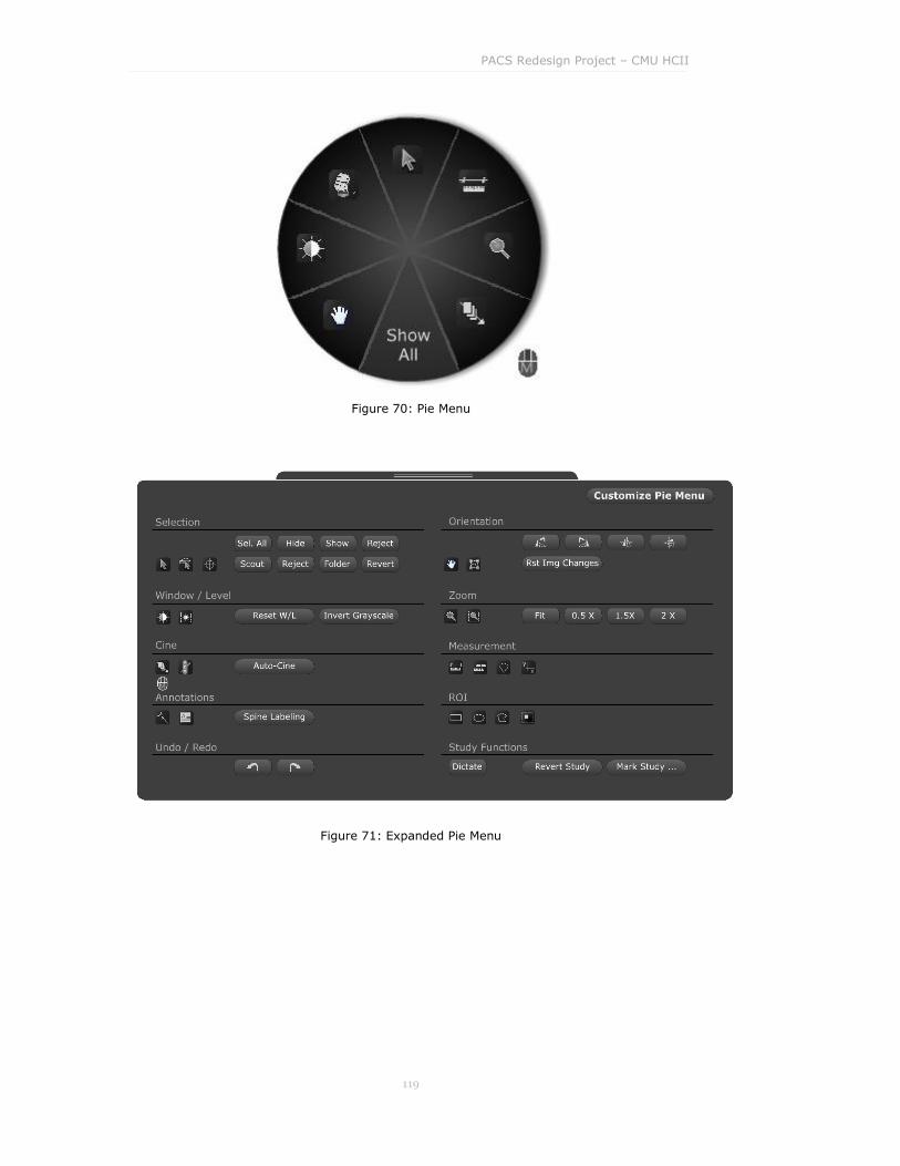
PACS Redesign Project – CMU HCII
119
Figure 70: Pie Menu
Figure 71: Expanded Pie Menu
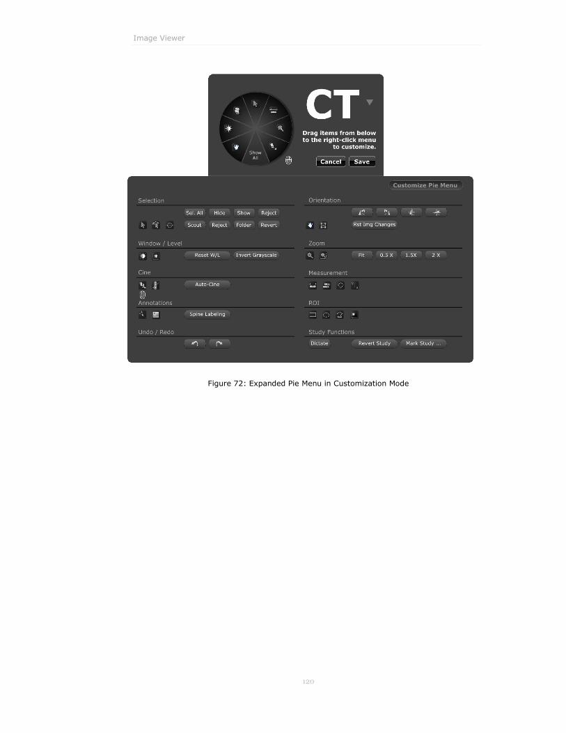
Image Viewer
120
Figure 72: Expanded Pie Menu in Customization Mode

PACS Redesign Project – CMU HCII
121
Monitor Region Toolbar
Goal
The goal of the Monitor Region Toolbar is to allow users to quickly
understand and manipulate the type and presentation of image data shown
within each monitor region window.
Description
Each monitor region that exists within the Image Viewer contains a top
toolbar, which contains a Current/Prior Study Dropdown, Series Dropdown,
Image Layout Dropdown, Link Dropdown, and Study Data window. In the
event that a new monitor region is spawned (via the Monitor Configuration
Tool) the Current/Prior Study Dropdown is automatically expanded to
include the additional study. The monitor region also uses a warning pattern
for studies that other radiologists currently have open.
Figure 73: Monitor Region Toolbar
Rationale
We needed to limit the real-estate dedicated to the monitor region area to
maximize the screen area dedicated to study images. Therefore, we limited
the monitor region toolbar to one row. This inherently supports our design
goal to Reduce Visual Clutter.
In addition, the revised monitor region toolbar addresses several heuristic
violations in the current Centricity product:
HE-033 Scrolling Toolbars When Monitor Region is Narrow
HE-052 State Information Obscures the Widget Type
HE-078 Buttons Do Not Indicate Whether They Represent Tools or
Commands
Think Aloud Results
Previously this toolbar contained tool selection functionality. We tested this
design in Think Aloud 1 (TA 1.1.4, 1.3.5, 1.3.6). It did not seem intuitive to
users to utilize the monitor region toolbar for tool selection and in order to

Image Viewer
122
continue reducing screen clutter and redundancy of controls, tool selection
was moved to the Image Viewer Inverted Ribbon.
Potential Problems
Some monitor region configurations mandate three vertically arranged
monitor regions. Our design may have a potential scaling problem in this
regard since it's likely that all the data on the monitor region toolbar may not
be able to be viewed unobstructed.
PACS Redesign Project – CMU HCII
123
Prototype Description
After reaching a final design through iterative user testing, we created an
interactive prototype. This prototype expresses many of the interactive design
elements which could not be shown in static mock-ups. This section discusses
the implementation of the prototype with respect to its capabilities as they
differ between the prototype and our reference design as presented in the
previous sections.

Prototype Description
124
Implementation
The prototype was implemented using Microsoft Expression Blend and Visual
C# on the Microsoft .NET 3.0 Framework. We found these tools to be very
powerful because they allowed us to take designs from Microsoft Expression
Design and move them directly into the prototype via the Blend application.
The power of C# to control the logic behind our prototype allowed us to
implement many of the features of a real PACS.
Capabilities
Our prototype includes the following functional capabilities:
Extensible study data is read from JPEG and XML files.
Modal worklist, which switches between worklist view and Patient
Jacket instead of displaying them simultaneously.
Worklists update dynamically when studies get marked Dictated.
Real-time worklist searching using a unified search field for all
columns in the worklist.
Study preview tabs in worklist and patient jacket.
List of priors in the Patient Jacket which also shows the report.
Image viewers which display images in multiple monitor regions and
image layouts.
Functional window/level and cine tools.
Functional cine via mouse wheel scrolling.
Pie menu for quick tool selection available via right-click. Tool
selection is synced to ribbons as appropriate
Expanded pie menu showing all tools, with tool selection synced to the
ribbon toolbar.
Inverted ribbons which are synced for those controls that are
appropriate.
Study data is displayed in a multi-tabbed window with live data.

PACS Redesign Project – CMU HCII
125
Known Issues
There are several known issues with our prototype that will prevent it from
running as we intended which are explained below.
Long Startup Time
Upon startup, our system reads study data and images from files. Because
some of the study sets include several hundred images, it can take upwards of
one minute before the application window appears.
Worklist Window Resizing
The main window which contains the worklist and Patient Jacket is not
designed to be resized and should be kept to the dimensions 1280x1024.
Resizing the window to a different dimension will result in items being
clipped from the window or extra space being shown that was not intended.
Image Viewer Window Placement
Upon startup, the image viewer windows are opened without displaying
studies. In order to place these windows perform the following procedure:
1. Right-click on the window in the task bar and select “Move”
2. The mouse cursor changes to a 4-directional move cursor
3. Use the keyboard directional keys to move the window
4. After using the directional keys the window will be attached to the mouse
5. Position the window using the mouse
6. Left-click to set the window‟s place
Although these windows don‟t have title bars they can be resized like other
windows. By default they are each 1200x1600 but can be stretched or shrunk
to fill the second monitor.
Conflicts with Windows Themes
On Windows XP, the Windows Classic theme sometimes changes how our
skinned controls look and makes some of them inoperable. The rounded
“Windows XP” theme should be used. There is a “Sliver” variation that can be
selected which looks better than the default blue one.

Prototype Description
126
Also, there is an add-on theme for Windows called “Zune” that looks very
sharp with our grayscale design. However, using this theme causes
checkboxes to appear invisible.
PACS Redesign Project – CMU HCII
127
Limitations
Not all functionality required for PACS was included in the prototype. In
places where we could, we added non-functional elements which help show
how our design would appear. Each of these functional limitations is
discussed briefly in the sub-sections below.
Opening Priors
When opening a study, our prototype places the current study on the left
monitor and the prior on the right monitor. If no priors exist for a study, the
current study is also displayed on the right monitor. The first series of each of
these is always displayed. We know that a real PACS should be more
intelligent in how priors are displayed. However given that this capability
already exists in the current system, we did not spend effort on this for our
prototype. Additionally, there should be a combo box in the list of Priors that
allows users to view EMR and other medical historical data in the priors list
along with studies if they so choose. This has not been implemented in the
prototype.
Elapsed Time Format
Wherever times are displayed, the text should include not only the absolute
time, but also the relative, or elapsed time. In other words, each time string
should end with a parenthetical “(2 hours ag0),” “(yesterday),” “(1 month
ago),” etc.
Additional Worklist Actions
Aspects of our design that did not get included in our prototype are the
“Recent Worklists”, “Browse Worklists”, and “Create New Worklist” actions
which are available from the dropdown above the worklist. Our design
highlights the dialogs that these actions would present to the user.
Advanced Search
The advanced search button located in the top right of the worklist window
displays an advanced search pane; however in our prototype this pane is
simply a non-functional image. On display, the pane should show search
criteria which match the current worklist. Changes to the advanced search
criteria should cause immediate updates to the studies displayed in the
worklist.

Prototype Description
128
Search Operators
In the simple search box, the users should be able to use a simple operator
syntax to quickly enter advanced search queries, in the same way that Google
and Gmail provide this functionality. For example, “name:Abernath
modality:ct” should filter the worklist down to studies with “Abernath” in the
name field and “ct” in the modality field. Additionally, when users fill in an
advanced search, this search syntax should be automatically inserted in the
simple search box. Neither of these pieces of functionality are implemented.
Column Sorting and Editing
The user should be able to click and drag a column in the Patient Jacket or
Worklist Browser to rearrange columns. Additionally, users should be able to
right-click on the columns to see a list of all available columns that can be
toggled on and off. This functionality is unimplemented.
Changing Exam Status
In our prototype, the user can only close the study without changing it or
“Sign and Close” a study, which marks it “Dictated”. In a real system that
employed speech recognition, this status would probably be “Completed”
since there would be no transcriptionist in the workflow. Also, like the current
PACS, we would support the ability to change exam status to any value via a
split button on the patient jacket.
Series Preview
In our prototype, double-clicking on a thumbnail in the series preview opens
that study in the Patient Jacket and image viewers. When this happens, our
default hanging protocol of current study on the left and first series in the
first prior (if any) is displayed. However as is probably obvious, this action
should display the series that is selected in the image viewers.
Monitor Region Highlighting
The prototype does not include a highlight border for the active monitor
region. We had this implemented for the demonstration we gave in
Barrington, but removed it due to some implementation issues. The purpose
of the active monitor region highlight is to help the user identify the currently
active region so that he knows which region certain commands will operate
on. A user can select the active monitor region by giving a region focus. This
can be done by any type of mouse click on a region.
Monitor Region Widget
The Monitor Region Widget is missing several pieces of functionality. Users
should be able to drag priors from the list onto a monitor region, or onto the

PACS Redesign Project – CMU HCII
129
edge of a monitor region to spawn a new region, but none of this is
implemented. Also, while users can modify the number and arrangements of
monitor regions in a monitor, the ability to change the layout within a given
region from this widget is unimplemented.
Study Data Contents
For prior studies, the Study Data window should contain the prior report. In
our prototype this is missing.
Study Data Window Appearance
In order to save time, the floating window which displays study data on a
monitor region was implemented using the same tabbed control we made for
the worklist and patient jacket. In the real system we envision this window
being squarer in shape so that it better fits on monitor regions that span less
than the entire width of the image viewer screen. Additionally, the window
should include the patient and study name in the title bar to help distinguish
windows when there are multiple open.
Quick Change between Sheet and Stack Views
Another feature of the existing system which we did not implement is the
ability to double-click on an image in a monitor region to quickly change to a
1-up or Stack view. However, we propose that cine should be supported in the
stack view after this operation is performed. This is not possible in the
current PACS.
Non-Functional System Capabilities
Several system capabilities such as Print, Save, Messages, and the Dictation
Options which reside at the top of each monitor are not functional. Likewise,
the icons in the Quick Access bar at the bottom left of the worklist and Patient
Jacket are not functional. Both of these are provided to indicate where these
capabilities would be placed on the interface. Undo and Redo are also omitted
completely.

Prototype Description
130
Keyboard Shortcuts
The system should support single key keyboard shortcuts for all tool
selection, and regular keyboard shortcuts for as many actions as possible.
Although the tools currently have tooltips that suggest what a single key
shortcut could be for that tool, these shortcuts are not implemented.
GE Logo Menu
The GE Logo Menu is currently unimplemented. It should contain a series of
menu items, for exiting the application, signing in new users, etc.

PACS Redesign Project – CMU HCII
131
Prototype Scenarios
In order to best demonstrate the prototype, two scenarios were constructed
which highlight the features of our design that we chose to implement. Our
prototype was designed for our primary persona, Dr. Cliff [Appendix III].
Dr. Cliff‟s main goals are to be extremely efficient and not to let PACS get in
the way of his job. In a demonstration setting, we suggest using these
scenarios to illustrate the features of the prototype.

Prototype Scenarios
132
Scenario One The first scenario shows a radiologist working through a number of studies. It
highlights the efficiency of our design, enabling the radiologist to quickly
diagnose studies. In the scenario, he utilizes basic tools from the right-click
pie menu.
Features Demonstrated:
1. Modal worklist and patient jacket
2. Study preview in worklist
3. Current study information in patient jacket
4. Right-click contextual pie menu
5. Tool selection in pie menu is synced to inverted ribbon
6. Quick contact menu
Scenario Steps:
1. Dr. Cliff begins with his all exams worklist which shows all exams to be
read.
2. He is assigned to read x-rays for the day so he opens his Body CR
worklist.
3. He enables Auto Advance Studies mode. This tells PACS to open the
next study in the worklist when the current one is dictated and closed.
4. He opens the first study on the worklist. The Patient Jacket replaces the
worklist, and study images are opened on two portrait monitors. The current
study is displayed in the left monitor and the first prior (if there is one) is
shown in the right monitor.
5. Dr. Cliff examines the study by performing window/leveling by selecting
the tool from the right-click contextual pie menu.
6. He looks at all images in all the series. He navigates between series via the
drop down at the top of each monitor region. The scroll bar and mouse
wheel provide means to move to the next and previous images.
7. He discovers a serious problem with the patient and wants to alert the
referring physician. Using the contact menu in the Patient Jacket he
calls the doctor.

PACS Redesign Project – CMU HCII
133
8. After talking to the physician, Dr. Cliff continues with his diagnosis. He
selects dictate from the pie menu. Simulate that speech to text would
appear in the dictation window.
9. After finishing his diagnosis, he signs and closes the report. This action
would also be available via shortcut from his dictation microphone. The next
study opens because the system is in Auto Advance Studies mode.

Prototype Scenarios
134
Scenario Two The second scenario shows a radiologist at work when he is interrupted by a
colleague. It illustrates how our design lets him quickly locate and switch to
another study. He uses the inverted ribbon to access tools.
Features Demonstrated:
1. Inverted tool ribbon
2. Worklist search
3. Study preview
4. Current study info bar in patient jacket
5. Image layout
Scenario Steps:
1. Dr. Cliff is in the process of reading an x-ray study.
2. He is interrupted by a phone call from a colleague who wants him to look at
an interesting CT case.
3. Dr. Cliff closes the Patient Jacket and switches to his All Exams
Worklist.
4. He locates the study by searching using the patient’s name in the
search box. All but one study is displayed.
5. He opens the study from the worklist.
6. Dr. Cliff selects the cine tool from the ribbon and scrubs to examine the
current study.
7. He views a different prior on a monitor region on the right monitor.
8. He uses drawing and annotation tools from the ribbon. Tools make
cursor change, simulate drawing.
9. He saves the study and leaves it open. Save button is non-functional,
simulate save.
10. Dr. Cliff opens the previous x-ray study.

PACS Redesign Project – CMU HCII
135
Future Work
During our ideation and concept validation exercises, we were forced to
exclude certain design directions due to project time constraints. However, a
number of concepts that we did not pursue validated well with users and
should serve as a jumping-off point for future exploration. These are
described in the subsequent sections.

Future Work
136
Alternative Input Devices
Our solution uses the standard mouse and keyboard to ensure that it
accommodates Centricity PACS‟s entire installed base. Hence we were unable
to suggest significant ergonomic improvements to common, repetitive actions
such as cine and window / level that are currently mouse-driven. We know
that users are experiencing repetitive-stress injuries due to these particular
mouse commands. We observed specific commercial input devices in use at
several facilities, in particular the Roller-Mouse and Shuttle Pro, which can
improve ergonomics.
We feel that there is a significant opportunity to build a custom input solution
that could improve on the available commercial offerings as well as set GE‟s
PACS apart from its competitors.
Intelligent Mouse Defaults
We are confident that our contextual menu and inverted ribbon designs will
improve tool selection time and reduce cognitive load. However, as a group
we brainstormed a further improvement that we were not able to devote
sufficient resources to develop and user-test: intelligent, contextual use of
multi-button mice.
For any given tool, it might make sense to have a set of related tools or actions
bound to unused mouse buttons or mouse events. For example, when the
user has the selection cursor as their primary tool, mouse dragging
functionality is unused. This event could be tied to window / level, as it is the
most common image manipulation. On a multi-button mouse, additional
mouse buttons could be used to toggle between specific tools or commonly
used sets of tools. The mouse wheel button could be used to go directly to the
“Show All” section of the contextual menu, bypassing the initial radial menu.
Since we did not examine these ideas in think-aloud testing, they are not
included in the design specification. However, we believe it would be
worthwhile to further examine the use of clever mouse-button defaults in the
future.
Keyboard and Dictaphone Shortcuts
Throughout our think-aloud testing, we received consistent feedback that
both the current RA-1000 system and our prototype should have keyboard
shortcuts for all exposed functionality. Like the mouse defaults, this was an
idea that we discussed but did not have the opportunity to test. We would,
however, like to make some un-validated suggestions that could be developed
and tested in the future.
Adobe Photoshop and other heavily tool-driven graphics applications use
single-key shortcuts for tool selection. In other words, they use a single letter
key and do not require a modifier key (ctrl, alt, shift, etc) for activation. This

PACS Redesign Project – CMU HCII
137
makes a great deal of sense for PACS applications. The cost of accidental
shortcut activation is low, as tool-selection makes no data changes and is easy
to reverse. Single-key shortcuts are ideal when users do not expect to have
both hands free. For Photoshop, this allows users to keep their mousing hand
on the mouse. In PACS, this would allow users to hold a dictamic or
Dictaphone and still activate the shortcut. Our prototype shows keyboard
shortcuts when buttons in the toolbar across the bottom are hovered over, but
these shortcuts have not been user-tested.
The use of the Dictaphone when not dictating is another area that we left
unexplored. The Dictaphones that we observed had many unused buttons on
them that could potentially be used for general PACS functions. Additionally,
there is a significant opportunity to use voice commands and multi-modal
input to access shortcuts and minimize mouse use. Both would require
significant additional user-testing prior to implementation, but could
significantly improve efficiency and minimize mouse use.