package ‘shiny.semantic’ - the comprehensive r … at for all possibilities.... other arguments...
TRANSCRIPT

Package ‘shiny.semantic’May 11, 2018
Type Package
Title Semantic UI Support for Shiny
Version 0.2.1
Description Creating a great user interface for your Shiny appscan be a hassle, especially if you want to work purely in Rand don't want to use, for instance HTML templates. Thispackage adds support for a powerful UI library Semantic UI -<http://semantic-ui.com/>. It also supports universal UI inputbinding that works with various DOM elements.
BugReports https://github.com/Appsilon/shiny.semantic/issues
Encoding UTF-8
LazyData TRUE
License MIT + file LICENSE
Imports utils, shiny (>= 0.12.1), htmltools (>= 0.2.6), htmlwidgets(>= 0.8), purrr (>= 0.2.2), magrittr, jsonlite
Suggests dplyr, gapminder, testthat, lintr
RoxygenNote 6.0.1
NeedsCompilation no
Author Filip Stachura [aut, cre]
Maintainer Filip Stachura <[email protected]>
Repository CRAN
Date/Publication 2018-05-11 10:38:06 UTC
R topics documented:CDN_PATH . . . . . . . . . . . . . . . . . . . . . . . . . . . . . . . . . . . . . . . . . 2check_proper_color . . . . . . . . . . . . . . . . . . . . . . . . . . . . . . . . . . . . . 3check_semantic_theme . . . . . . . . . . . . . . . . . . . . . . . . . . . . . . . . . . . 3define_selection_type . . . . . . . . . . . . . . . . . . . . . . . . . . . . . . . . . . . . 4dropdown . . . . . . . . . . . . . . . . . . . . . . . . . . . . . . . . . . . . . . . . . . 4
1

2 CDN_PATH
get_default_semantic_js . . . . . . . . . . . . . . . . . . . . . . . . . . . . . . . . . . 5get_default_semantic_theme . . . . . . . . . . . . . . . . . . . . . . . . . . . . . . . . 6get_dependencies . . . . . . . . . . . . . . . . . . . . . . . . . . . . . . . . . . . . . . 6label . . . . . . . . . . . . . . . . . . . . . . . . . . . . . . . . . . . . . . . . . . . . . 6list_element . . . . . . . . . . . . . . . . . . . . . . . . . . . . . . . . . . . . . . . . . 7menu_divider . . . . . . . . . . . . . . . . . . . . . . . . . . . . . . . . . . . . . . . . 7menu_header . . . . . . . . . . . . . . . . . . . . . . . . . . . . . . . . . . . . . . . . 8menu_item . . . . . . . . . . . . . . . . . . . . . . . . . . . . . . . . . . . . . . . . . 8parse_val . . . . . . . . . . . . . . . . . . . . . . . . . . . . . . . . . . . . . . . . . . 9register_search . . . . . . . . . . . . . . . . . . . . . . . . . . . . . . . . . . . . . . . 9search_field . . . . . . . . . . . . . . . . . . . . . . . . . . . . . . . . . . . . . . . . . 10search_selection_api . . . . . . . . . . . . . . . . . . . . . . . . . . . . . . . . . . . . 11search_selection_choices . . . . . . . . . . . . . . . . . . . . . . . . . . . . . . . . . . 12semanticPage . . . . . . . . . . . . . . . . . . . . . . . . . . . . . . . . . . . . . . . . 13semantic_palette . . . . . . . . . . . . . . . . . . . . . . . . . . . . . . . . . . . . . . 13shiny_input . . . . . . . . . . . . . . . . . . . . . . . . . . . . . . . . . . . . . . . . . 14shiny_text_input . . . . . . . . . . . . . . . . . . . . . . . . . . . . . . . . . . . . . . . 14slider_input . . . . . . . . . . . . . . . . . . . . . . . . . . . . . . . . . . . . . . . . . 15SUPPORTED_THEMES . . . . . . . . . . . . . . . . . . . . . . . . . . . . . . . . . . 15tabset . . . . . . . . . . . . . . . . . . . . . . . . . . . . . . . . . . . . . . . . . . . . 16uicard . . . . . . . . . . . . . . . . . . . . . . . . . . . . . . . . . . . . . . . . . . . . 16uicards . . . . . . . . . . . . . . . . . . . . . . . . . . . . . . . . . . . . . . . . . . . . 17uidropdown . . . . . . . . . . . . . . . . . . . . . . . . . . . . . . . . . . . . . . . . . 17uifield . . . . . . . . . . . . . . . . . . . . . . . . . . . . . . . . . . . . . . . . . . . . 18uifields . . . . . . . . . . . . . . . . . . . . . . . . . . . . . . . . . . . . . . . . . . . . 18uiform . . . . . . . . . . . . . . . . . . . . . . . . . . . . . . . . . . . . . . . . . . . . 19uiheader . . . . . . . . . . . . . . . . . . . . . . . . . . . . . . . . . . . . . . . . . . . 19uiicon . . . . . . . . . . . . . . . . . . . . . . . . . . . . . . . . . . . . . . . . . . . . 20uilabel . . . . . . . . . . . . . . . . . . . . . . . . . . . . . . . . . . . . . . . . . . . . 20uilist . . . . . . . . . . . . . . . . . . . . . . . . . . . . . . . . . . . . . . . . . . . . . 21uimenu . . . . . . . . . . . . . . . . . . . . . . . . . . . . . . . . . . . . . . . . . . . 21uimessage . . . . . . . . . . . . . . . . . . . . . . . . . . . . . . . . . . . . . . . . . . 23uirender . . . . . . . . . . . . . . . . . . . . . . . . . . . . . . . . . . . . . . . . . . . 23uisegment . . . . . . . . . . . . . . . . . . . . . . . . . . . . . . . . . . . . . . . . . . 24%:::% . . . . . . . . . . . . . . . . . . . . . . . . . . . . . . . . . . . . . . . . . . . . 24
Index 25
CDN_PATH Cloudfront path
Description
Cloudfront path
Usage
CDN_PATH
check_proper_color 3
Format
An object of class character of length 1.
check_proper_color Check if color is set from Semanti-UI palette
Description
Check if color is set from Semanti-UI palette
Usage
check_proper_color(color)
Arguments
color character with color name
Value
Error when color does not belong to palette
check_semantic_theme Semantic theme path validator
Description
Semantic theme path validator
Usage
check_semantic_theme(theme_css)
Arguments
theme_css it can be either NULL, character with css path, or theme name
Value
path to theme
Examples
check_semantic_theme(NULL)check_semantic_theme("darkly")

4 dropdown
define_selection_type Define search type if multiple
Description
Define search type if multiple
Usage
define_selection_type(name, multiple)
Arguments
name character with name
multiple multiple flag
dropdown Create dropdown Semantic UI component
Description
This creates a default dropdown using Semantic UI styles with Shiny input. Dropdown is alreadyinitialized and available under input[[name]].
Usage
dropdown(name, choices, choices_value = choices, default_text = "Select",value = NULL)
Arguments
name Input name. Reactive value is available under input[[name]].
choices All available options one can select from.
choices_value What reactive value should be used for corresponding choice.
default_text Text to be visible on dropdown when nothing is selected.
value Pass value if you want to initialize selection for dropdown.

get_default_semantic_js 5
Examples
## Only run examples in interactive R sessionsif (interactive()) {
library(shiny)library(shiny.semantic)ui <- function() {
shinyUI(semanticPage(
title = "Dropdown example",suppressDependencies("bootstrap"),uiOutput("dropdown"),p("Selected letter:"),textOutput("selected_letter")
))
}server <- shinyServer(function(input, output) {
output$dropdown <- renderUI({dropdown("simple_dropdown", LETTERS, value = "A")
})output$selected_letter <- renderText(input[["simple_dropdown"]])
})
shinyApp(ui = ui(), server = server)}
get_default_semantic_js
Get default semantic js
Description
Get default semantic js
Usage
get_default_semantic_js()
Value
path to default js semantic file
6 label
get_default_semantic_theme
Get default semantic css
Description
Get default semantic css
Usage
get_default_semantic_theme()
Value
path to default css semantic file
get_dependencies Add dashboard dependencies to html
Description
Internal function that adds dashboard dependencies to html.
Usage
get_dependencies()
Value
Content with appended dependencies.
label Create HTML label tag
Description
This creates a HTML label tag.
Usage
label(...)
Arguments
... Other arguments to be added as attributes of the tag (e.g. style, class or childrensetc.)
list_element 7
list_element Helper function to render list element
Description
Helper function to render list element
Usage
list_element(data, is_description, icon, row)
Arguments
data data to list
is_description description flag
icon Icon character
row row character
menu_divider Create Semantic UI Divider Item
Description
This creates a menu divider item using Semantic UI.
Usage
menu_divider(...)
Arguments
... Other attributes of the divider such as style.

8 menu_item
menu_header Create Semantic UI Header Item
Description
This creates a dropdown header item using Semantic UI.
Usage
menu_header(..., is_item = TRUE)
Arguments
... Content of the header: text, icons, etc.
is_item If TRUE created header is item of Semantic UI Menu.
menu_item Create Semantic UI Menu Item
Description
This creates a menu item using Semantic UI
Usage
menu_item(..., item_feature = "", style = NULL, href = NULL)
Arguments
... Content of the menu item: text, icons or labels to be displayed.
item_feature If required, add additional item feature like ’active’, ’header’, etc.
style Style of the item, e.g. "text-align: center".
href If NULL (default) menu_item is created with ’div’ tag. Otherwise it is createdwith ’a’ tag, and parameeter defines its href attribute.
parse_val 9
parse_val Parse the ‘shiny_input‘ value from JSON
Description
Parse the ‘shiny_input‘ value from JSON
Usage
parse_val(val)
Arguments
val value to get from JSON
Value
Value of type defined in ‘shiny_input‘
register_search Register search api url
Description
Calls Shiny session’s registerDataObj to create REST API. Publishes any R object as a URL end-point that is unique to Shiny session. search_query must be a function that takes two arguments:data (the value that was passed into registerDataObj) and req (an environment that implements theRook specification for HTTP requests). search_query will be called with these values whenever anHTTP request is made to the URL endpoint. The return value of search_query should be a list of listor a dataframe. Note that different semantic components expect specific JSON fields to be presentin order to work correctly. Check components documentation for details.
Usage
register_search(session, data, search_query)
Arguments
session Shiny server session
data Data (the value that is passed into registerDataObj)
search_query Function providing a response as a list of lists or dataframe of search results.
10 search_field
search_field Create search field Semantic UI component
Description
This creates a default search field using Semantic UI styles with Shiny input. Search field is alreadyinitialized and available under input[[name]]. Search will automatically route to the named APIendpoint provided as parameter. API response is expected to be a JSON with property fields ‘title‘and ‘description‘. See https://semantic-ui.com/modules/search.html#behaviors for more details.
Usage
search_field(name, search_api_url, default_text = "Search", value = "")
Arguments
name Input name. Reactive value is available under input[[name]].
search_api_url Register custom API url with server JSON Response containing fields ‘title‘ and‘description‘.
default_text Text to be visible on serach field when nothing is selected.
value Pass value if you want to initialize selection for search field.
Examples
## Only run examples in interactive R sessions## Not run:if (interactive()) {library(shiny)library(shiny.semantic)library(gapminder)library(dplyr)
ui <- function() {shinyUI(
semanticPage(title = "Dropdown example",uiOutput("search_letters"),p("Selected letter:"),textOutput("selected_letters")
))
}
server <- shinyServer(function(input, output, session) {
search_api <- function(gapminder, q){has_matching <- function(field) {
startsWith(field, q)
search_selection_api 11
}gapminder %>%
mutate(country = as.character(country)) %>%select(country) %>%unique %>%filter(has_matching(country)) %>%head(5) %>%transmute(title = country,
description = country)}
search_api_url <- register_search(session, gapminder, search_api)output$search_letters <- shiny::renderUI(search_field("search_result", search_api_url)
)output$selected_letters <- renderText(input[["search_result"]])
})}
shinyApp(ui = ui(), server = server)
## End(Not run)
search_selection_api Add Semantic UI search selection dropdown based on REST API
Description
Define the (multiple) search selection dropdown input for retrieving remote selection menu contentfrom an API endpoint. API response is expected to be a JSON with property fields ‘name‘ and‘value‘. Using a search selection dropdown allows to search more easily through large lists.
Usage
search_selection_api(name, search_api_url, multiple = FALSE,default_text = "Select")
Arguments
name Input name. Reactive value is available under input[[name]].
search_api_url Register API url with server JSON Response containing fields ‘name‘ and ‘value‘.
multiple TRUE if the dropdown should allow multiple selections, FALSE otherwise (de-fault FALSE).
default_text Text to be visible on dropdown when nothing is selected.#’@examples ## Only run examples in interactive R sessions if (interactive())library(shiny) library(shiny.semantic) library(gapminder) library(dplyr)ui <- function() shinyUI( semanticPage( title = "Dropdown example", uiOut-put("search_letters"), p("Selected letter:"), textOutput("selected_letters") ) )
12 search_selection_choices
server <- shinyServer(function(input, output, session)search_api <- function(gapminder, q) has_matching <- function(field) startsWith(field,q)gapminder mutate(country = as.character(country)) select(country) unique fil-ter(has_matching(country)) head(5) transmute(name = country, value = coun-try)search_api_url <- shiny.semantic::register_search(session, gapminder, search_api)output$search_letters <- shiny::renderUI( search_selection_api("search_result",search_api_url, multiple = TRUE) ) output$selected_letters <- renderText(input[["search_result"]]))shinyApp(ui = ui(), server = server)
search_selection_choices
Add Semantic UI search selection dropdown based on providedchoices
Description
Define the (multiple) search selection dropdown input component serving search options usingprovided choices.
Usage
search_selection_choices(name, choices, value = NULL, multiple = FALSE,default_text = "Select")
Arguments
name Input name. Reactive value is available under input[[name]].
choices Vector or a list of choices to search through.
value String with default values to set when initialize the component. Values shouldbe delimited wirh a comma when multiple to set. Default NULL.
multiple TRUE if the dropdown should allow multiple selections, FALSE otherwise (de-fault FALSE).
default_text Text to be visible on dropdown when nothing is selected.
Examples
## Only run examples in interactive R sessionsif (interactive()) {
library(shiny)library(shiny.semantic)
ui <- function() {shinyUI(
semanticPage 13
semanticPage(title = "Dropdown example",uiOutput("search_letters"),p("Selected letter:"),textOutput("selected_letters")
))
}
server <- shinyServer(function(input, output, session) {choices <- LETTERSoutput$search_letters <- shiny::renderUI(
search_selection_choices("search_result", choices, multiple = TRUE))output$selected_letters <- renderText(input[["search_result"]])
})
shinyApp(ui = ui(), server = server)}
semanticPage Semantic UI page
Description
This creates a Semantic page for use in a Shiny app.
Usage
semanticPage(..., title = "", theme = NULL)
Arguments
... Other arguments to be added as attributes of the main div tag wrapper (e.g. style,class etc.)
title A title to display in the browser’s title bar.
theme Theme name or path
semantic_palette Semantic colors https://github.com/Semantic-Org/Semantic-UI/blob/master/src/themes/default/globals/site.variables
Description
Semantic colors https://github.com/Semantic-Org/Semantic-UI/blob/master/src/themes/default/globals/site.variables

14 shiny_text_input
Usage
semantic_palette
Format
An object of class character of length 13.
shiny_input Create universal Shiny input binding
Description
Universal binding for Shiny input on custom user interface. Using this function one can createvarious inputs ranging from text, numerical, date, dropdowns, etc. Value of this input is extractedvia jQuery using $().val() function and default exposed as serialized JSON to the Shiny server. Ifyou want to change type of exposed input value specify it via type param. Currently list of supportedtypes is "JSON" (default) and "text".
Usage
shiny_input(input_id, shiny_ui, value = NULL, type = "JSON")
Arguments
input_id String with name of this input. Access to this input within server code is normalwith input[[input_id]].
shiny_ui UI of HTML component presenting this input to the users. This UI should allowto extract its value with jQuery $().val() function.
value An optional argument with value that should be set for this input. Can be usedto store persisten input valus in dynamic UIs.
type Type of input value (could be "JSON" or "text").
shiny_text_input Create universal Shiny text input binding
Description
Universal binding for Shiny text input on custom user interface. Value of this input is extracted viajQuery using $().val() function. This function is just a simple binding over shiny_input. Please takea look at shiny_input documentation for more information.
Usage
shiny_text_input(...)
slider_input 15
Arguments
... Possible arguments are the same as in shiny_input() method: input_id, shiny_ui,value. Type is already predefined as "text"
slider_input Add Semantic UI slider component
Description
It implements slider extension provided by: https://github.com/tyleryasaka/semantic-ui-range
Usage
slider_input(name, min, max, value, step = 0.01, n_ticks = 5, color = "")
Arguments
name Input name. Reactive value is available under input[[name]].
min Minimum possible value to set.
max Miaksimum possible value to set.
value Initial value.
step Possible step for slider inputs.
n_ticks Specifies how many ticks the slider should display.
color Possible slider color, see: semantic_palette.
SUPPORTED_THEMES Supported semantic themes
Description
Supported semantic themes
Usage
SUPPORTED_THEMES
Format
An object of class character of length 17.
16 uicard
tabset Create Semantic UI tabs
Description
This creates tabs with content using Semantic UI styles.
Usage
tabset(tabs, id = generate_random_id("menu"),menu_class = "top attached tabular",tab_content_class = "bottom attached segment")
Arguments
tabs A list of tabs. Each tab is a list of two elements - first element defines menuitem, second element defines tab content.
id Id of the menu element (default: randomly generated id)
menu_class Class for the menu element (default: "top attached tabular")
tab_content_class
Class for the tab content (default: "bottom attached segment")
uicard Create Semantic UI card tag
Description
This creates a card tag using Semantic UI styles.
Usage
uicard(..., class = "")
Arguments
... Other arguments to be added as attributes of the tag (e.g. style, class or childrensetc.)
class Additional classes to add to html tag.
uicards 17
uicards Create Semantic UI cards tag
Description
This creates a cards tag using Semantic UI styles.
Usage
uicards(..., class = "")
Arguments
... Other arguments to be added as attributes of the tag (e.g. style, class or childrensetc.)
class Additional classes to add to html tag.
uidropdown Create Semantic UI Dropdown
Description
This creates a dropdown using Semantic UI.
Usage
uidropdown(..., type = "", name, is_menu_item = FALSE,dropdown_specs = list())
Arguments
... Dropdown content.
type Type of the dropdown. Look at https://semantic-ui.com/modules/dropdown.htmlfor all possibilities.
name Unique name of the created dropdown.
is_menu_item TRUE if the dropdown is a menu item. Default is FALSE.
dropdown_specs A list of dropdown functionalities. Look at https://semantic-ui.com/modules/dropdown.html#/settingsfor all possibilities.
18 uifields
Examples
uidropdown("Dropdown menu",uiicon(type = "dropdown"),uimenu(menu_header("Header"),menu_divider(),menu_item("Option 1"),menu_item("Option 2")
),name = "dropdown_menu",dropdown_specs = list("duration: 500")
)
uifield Create Semantic UI field tag
Description
This creates a field tag using Semantic UI styles.
Usage
uifield(..., class = "")
Arguments
... Other arguments to be added as attributes of the tag (e.g. style, class or childrensetc.)
class Additional classes to add to html tag.
uifields Create Semantic UI fields tag
Description
This creates a fields tag using Semantic UI styles.
Usage
uifields(..., class = "")
Arguments
... Other arguments to be added as attributes of the tag (e.g. style, class or childrensetc.)
class Additional classes to add to html tag.
uiform 19
uiform Create Semantic UI form tag
Description
This creates a form tag using Semantic UI styles.
Usage
uiform(..., class = "")
Arguments
... Other arguments to be added as attributes of the tag (e.g. style, class or childrensetc.)
class Additional classes to add to html tag.
uiheader Create Semantic UI header
Description
This creates a header with optional icon using Semantic UI styles.
Usage
uiheader(title, description, icon = NULL)
Arguments
title Header title
description Subheader text
icon Optional icon name

20 uilabel
uiicon Create Semantic UI icon tag
Description
This creates an icon tag using Semantic UI styles.
Usage
uiicon(type = "", ...)
Arguments
type A name of an icon. Look at http://semantic-ui.com/elements/icon.html for allpossibilities.
... Other arguments to be added as attributes of the tag (e.g. style, class etc.)
uilabel Create Semantic UI label tag
Description
This creates a label tag using Semantic UI.
Usage
uilabel(..., type = "", is_link = TRUE)
Arguments
... Other arguments to be added such as content of the tag (text, icons) and/or at-tributes (style)
type Type of the label. Look at https://semantic-ui.com/elements/label.html for allpossibilities.
is_link If TRUE creates label with ’a’ tag, otherwise with ’div’ tag. #’

uilist 21
uilist Create Semantic UI list with header, description and icons
Description
This creates a list with icons using Semantic UI
Usage
uilist(data, icon, is_divided = FALSE, is_description = FALSE)
Arguments
data A dataframe with columns ‘header‘ and/or ‘description‘ containing the list itemsheaders and descriptions. ‘description‘ column is optional and should be pro-vided if ‘is_description‘ parameter TRUE.
icon A string with icon name. Empty string will render list without icons.
is_divided If TRUE created list elements are divided
is_description If TRUE created list will have a description
Examples
list_content <- data.frame(header = paste("Header", 1:5),description = paste("Description", 1:5),stringsAsFactors = FALSE
)
# Create a 5 element divided list with alert icons and descriptionuilist(list_content, "alert", is_divided = TRUE, is_description = TRUE)
uimenu Create Semantic UI Menu
Description
This creates a menu using Semantic UI.
Usage
uimenu(..., type = "")
22 uimenu
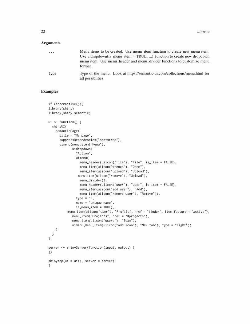
Arguments
... Menu items to be created. Use menu_item function to create new menu item.Use uidropdown(is_menu_item = TRUE, ...) function to create new dropdownmenu item. Use menu_header and menu_divider functions to customize menuformat.
type Type of the menu. Look at https://semantic-ui.com/collections/menu.html forall possiblities.
Examples
if (interactive()){library(shiny)library(shiny.semantic)
ui <- function() {shinyUI(
semanticPage(title = "My page",suppressDependencies("bootstrap"),uimenu(menu_item("Menu"),
uidropdown("Action",uimenu(
menu_header(uiicon("file"), "File", is_item = FALSE),menu_item(uiicon("wrench"), "Open"),menu_item(uiicon("upload"), "Upload"),
menu_item(uiicon("remove"), "Upload"),menu_divider(),menu_header(uiicon("user"), "User", is_item = FALSE),menu_item(uiicon("add user"), "Add"),menu_item(uiicon("remove user"), "Remove")),
type = "",name = "unique_name",is_menu_item = TRUE),
menu_item(uiicon("user"), "Profile", href = "#index", item_feature = "active"),menu_item("Projects", href = "#projects"),menu_item(uiicon("users"), "Team"),uimenu(menu_item(uiicon("add icon"), "New tab"), type = "right"))
))
}
server <- shinyServer(function(input, output) {})
shinyApp(ui = ui(), server = server)}

uimessage 23
uimessage Create Semantic UI Message
Description
Create Semantic UI Message
Usage
uimessage(header, content, type = "", icon, closable = FALSE)
Arguments
header Header of the message
content Content of the message. If it is a vector, creates a list of vector’s elements
type Type of the message. Look at https://semantic-ui.com/collections/message.htmlfor all possibilities.
icon If the message is of the type ’icon’, specify the icon. Look at http://semantic-ui.com/elements/icon.html for all possibilities.
closable Determines whether the message should be closable. Default is FALSE - notclosable
uirender Render semanticui htmlwidget
Description
htmlwidget that adds semanticui dependencies and renders in viewer or rmarkdown.
Usage
uirender(ui, width = NULL, height = NULL, element_id = NULL)
Arguments
ui UI, which will be wraped in an htmlwidget.
width Fixed width for widget (in css units). The default is NULL, which results inintelligent automatic sizing.
height Fixed height for widget (in css units). The default is NULL, which results inintelligent automatic sizing.
element_id Use an explicit element ID for the widget (rather than an automatically generatedone).

24 %:::%
uisegment Create Semantic UI segment
Description
This creates a segment using Semantic UI styles.
Usage
uisegment(..., class = "")
Arguments
... Other arguments to be added as attributes of the tag (e.g. style, class or childrensetc.)
class Additional classes to add to html tag.
%:::% ::: hack solution
Description
::: hack solution
Usage
pkg %:::% name
Arguments
pkg package name
name function name
Value
function
Index
∗Topic datasetsCDN_PATH, 2semantic_palette, 13SUPPORTED_THEMES, 15
%:::%, 24
CDN_PATH, 2check_proper_color, 3check_semantic_theme, 3
define_selection_type, 4dropdown, 4
get_default_semantic_js, 5get_default_semantic_theme, 6get_dependencies, 6
label, 6list_element, 7
menu_divider, 7menu_header, 8menu_item, 8
parse_val, 9
register_search, 9
search_field, 10search_selection_api, 11search_selection_choices, 12semantic_palette, 13, 15semanticPage, 13shiny_input, 14shiny_text_input, 14slider_input, 15SUPPORTED_THEMES, 15
tabset, 16
uicard, 16
uicards, 17uidropdown, 17uifield, 18uifields, 18uiform, 19uiheader, 19uiicon, 20uilabel, 20uilist, 21uimenu, 21uimessage, 23uirender, 23uisegment, 24
25