outreach and scientific communication...
TRANSCRIPT

A.S. Kane- Presentation and Outreach Skills 1
WaterBiology
PHC 6937
Outreach and ScientificOutreach and ScientificCommunication StrategiesCommunication Strategies
Andrew S. Kane, Ph.D.Environmental Health Program
College of Public Health & Health Professions
This PowerPoint presentation will cover basic principles of outreach andscientific communication. These subjects are relevant to our course since it isimportant for toxicologists, healthcare professionals and environmentaloutreach persons to be able to clearly communicate technical information to avariety of different audiences. It will also serve as a model for you as youdevelop your assigned presentation that you will present later in this course.
Emphasis in this PowerPoint presentation will be on developing outreachmaterials using PowerPoint. However, many of the same principles apply todeveloping presentation materials using other outreach methods.

A.S. Kane- Presentation and Outreach Skills 2
This PowerPoint presentation wasdesigned to provide you with
inspiration and a conceptualizedframework from which to develop
well-organized, meaningfultechnical presentations.
The purpose of presenting is to actuate. You want to persuade people to thinkor act in response to your message. Otherwise there is no point in making theeffort of preparing and delivering your presentation. This may soundstraightforward, but good communication of technical information remainsboth an art and a science.
In order to open a dialog with an audience, we need to address the concept ofperception.

A.S. Kane- Presentation and Outreach Skills 3
Perception is often morepowerful than fact.
There is no mistaking the imperative of truth and the importance of unbiasedobservation of people, chemistry and nature. However, a corollary principleof persuasion is perception. How an audience perceives a presenter canpersuade them or dissuade them from listening, interpreting and responding.Effective presenters are aware of this power of perception and deliberatelydesign themselves and their messages accordingly. Although this is a principleof business and marketing, scientists and healthcare providers should notforget that their professions are businesses too. And effective communicationis part of that business.An audience receives, processes and judges your presentation. Presentationsare perceived not only through words, but how you sound vocally (in the caseof an oral presentation), how it looks visually, and the entire package. In manyrespects, presenting is an art. The whole presentation is your canvas; the factsare the fibers of your paintbrush... and brush strokes alone do not make amasterpiece... it's how the brush strokes are applied that richness andcomplexity (of data) come through.. Artful combination of all presentationelements create a product of perceived value.Good presentation skills and the perception of credibility, authority, control,and being on top of the knowledge base may represent 90% of what it takes tomake an excellent presentation. The other 10%, good content, is obviouslyalso very important.

A.S. Kane- Presentation and Outreach Skills 4
Questions to ask yourself whenputting together a presentation
1. How can I limit my presentation content sothat my objectives, methods, results andconclusions can be seen with clarity andease of understanding?
The best way to limit your presentation is to try and address a singularconcept, with a singular take-home message. The reason for this simple-minded notion is that our minds are full of information. All the time. If youcan develop a presentation that revolves a singular message, and be good at it,there is a better likelihood of that message getting through and beingremembered.
Regardless of whether or not you are presenting a scientific paper (with clearobjectives, methods, results and conclusions) or a focused risk communicationseminar to your peers, there are several basic constructs that should befollowed to foster ease of understanding. These include good organization, asingular take-home message, appropriate key supporting points,

A.S. Kane- Presentation and Outreach Skills 5
Questions to ask yourself whenputting together a presentation
2. How can I make my message moremeaningful and memorable?
Repetition is a valuable aid in getting your singular message across.Repetition does not mean “dumbing down” your presentation. However,repetition is an excellent tool for helping your audience “see” your contentframed within your presentation structure. It also helps get your singularmessage “stuck” in your audience’s mind. After all, if your presentation isnot memorable, then what’s the point in presenting?
So, a good ideology for giving a good talk is the Three Ts:
1. Tell them what you are going to tell them (a preview, i.e., a briefintroduction including big picture relevance and an organized preview ofwhat’s coming);
2. Tell them (the body of your talk, delivered with the same organization andorder as mentioned in the preview); and
3. Tell them what you’ve told them (summarize your key points and restatethe take home message).

A.S. Kane- Presentation and Outreach Skills 6
Questions to ask yourself whenputting together a presentation
3. How will I relate my information to thisspecific audience?
Know your audience. Repeat: know your audience (use of repetition toprovide emphasis). Insights about your audience will allow you, the presenter,to appropriately gauge the level of your presentation and the depth ofnecessary content to get your message across. Being informed about youraudiences lends additional credibility to you.
Most importantly, presentations do not necessarily need to be meaningful foryou (the presenter). You already know the meaning of your message. Deliverthe message from the audiences' point of view. Another way to say this: Whatyou want to present is not as important as what the audience needs to hear inorder for your message to come across clearly and simply. Remember that anaudience will judge a presentation on the basis of how meaningful is was forthem.

A.S. Kane- Presentation and Outreach Skills 7
Questions to ask yourself whenputting together a presentation
4. What will get and keep the attention of myaudience?
In the case of delivering an oral presentation, there are many obvious factorsthat will lend to getting and keeping your audience’s attention. These include,but are certainly not limited to, being dynamic, enthusiastic, well-organized,energetic, and using appropriate visual aids. In oral presentations, there are amyriad of other factors, some subtle, that also aid or hinder good presentations.These include manner of dress, posture, vocal projection and intonation, etc.
In an online or PowerPoint presentation, many of the in-person factors nolonger count. But the same concepts about use of space, information transfer,information content and organization, and aesthetics count. Logical orderingof information is helpful for any audience. Take your audience by the hand.Spoon feed them. Nothing should be over their heads. Don’t make them workto glean your information.
A.S. Kane- Presentation and Outreach Skills 8
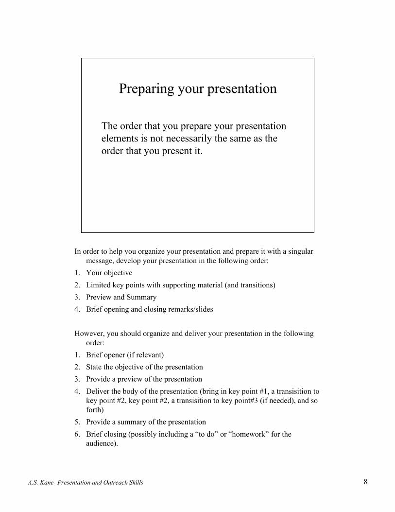
Preparing your presentationPreparing your presentation
The order that you prepare your presentationelements is not necessarily the same as theorder that you present it.
In order to help you organize your presentation and prepare it with a singularmessage, develop your presentation in the following order:
1. Your objective2. Limited key points with supporting material (and transitions)3. Preview and Summary4. Brief opening and closing remarks/slides
However, you should organize and deliver your presentation in the followingorder:
1. Brief opener (if relevant)2. State the objective of the presentation3. Provide a preview of the presentation4. Deliver the body of the presentation (bring in key point #1, a transisition to
key point #2, key point #2, a transisition to key point#3 (if needed), and soforth)
5. Provide a summary of the presentation6. Brief closing (possibly including a “to do” or “homework” for the
audience).

A.S. Kane- Presentation and Outreach Skills 9
Defining your objectiveDefining your objective
Ask yourself:
“What do I want to accomplishby delivering this presentation?”
Literally, prior to going further in developing your presentation, go ahead andfill in the blank for yourself.
By the conclusion of this presentation, my audience should/will:__________________________(what?).
Stating an objective this way helps to focus attention on what you want youraudience to do with the message. Typically, a presentation is geared at gettingpeople to:
Understand something, orBe able to do something, orDo it.
A.S. Kane- Presentation and Outreach Skills 10
Again, simplicityAgain, simplicity
The K-I-S-SK-I-S-S Principle
KISS - Keep it simple, speaker! Again, since our minds are filled with factsand people tend to be quick to forget, use three or fewer key points help tokeep it simple for your listeners. They will be able to retain more of less.Therefore, ask yourself: "What points will best lead to my objective?" and"What points do I most want the audience to remember?" Delete theextraneous.
On the other hand, do not let the KISS principle get in the way of clearlyportraying complex data sets or ideas. Find a creative way of getting the dataacross. GOOD DATA PRESENTATION DESIGN IS CLEAR THINKINGMADE VISIBLE (bad data presentation design is poor thinking made visible).The presentation of data (yours or from the literature) supports your missionstatement with needed facts that help build your argument.

A.S. Kane- Presentation and Outreach Skills 11
Media ElementsMedia Elements
In traditional oral/platform presentation venues,there are many effective media types:• PowerPoint slides• Ektachrome 2 x 2 slides• Overhead transparencies• Video, film• Flip charts, large posters• Handouts, models, props
Supportive media elements should be graphic and creative. They should fit thesetting, support the message, awaken the audience, and be used appropriatelyand in moderation. Visuals which portray data should show causality. Use ofcolor should be used only to help the data speak for itself. Avoid glitz.
Remember, visual aids should be visual and should aid. If the visuals becomethe presentation, rather than supporting elements for key points in thepresentation, they may detract from your message.

A.S. Kane- Presentation and Outreach Skills 12
Media ElementsMedia Elements(some nuts and bolts)(some nuts and bolts)
In PowerPoint there are a variety of media elements thatare typically used. These include but are not limited to:
TextPhotographic images
Other graphicsCharts and graphs
Tables
For many of you, this may be the first time developing a PowerPointpresentation of your own. As such, it may be initially challenging to figure outhow to import media elements, other than text, into your presentation. Textcan be directly generated or copied into PowerPoint. You may want todevelop your text, without formatting, in a word processing program (that hasthe benefits of easier editing) and then copy and past into PowerPoint.Digital images, including photographs, scans of graphs, pictures, etc., can beimported into PowerPoint from other files. JPEG files are a good file type forimporting graphic media elements since they are compressed and take up lessmemory. Also, the file size of imported graphics is important. You want theimage to be of sufficient quality to look good without having “wasted” extraresolution (this can use up additional, unnecessary memory and bog done yourcomputer). For example, a full screen RGB color JPEG image, 10 by 7.5inches at 72dpi could be as large as 350kb. Smaller images should be smallerfile sizes. File size is a function of both image size and resolution. AdobePhotoshop is an excellent software package for adjusting image quality(although it has a steep learning curve).New graphs and tables can be generated in Excel (and imported) or directly inPowerPoint. There are many other software packages that can assist you indeveloping graphs, tables and other graphics. A digital camera or flatbedscanner are good tools with which to obtain digital images of pre-existinggraphics. Adjust image size, resolution and image quality accordingly.

A.S. Kane- Presentation and Outreach Skills 13
Use of slides (1)Use of slides (1)
General Principles for creatingPowerPoint slides
Check for spelling errors. A typo projected onto a large screen is genuinelyavoidable and can be a distraction. Use a spell checker. And, no matter howmany times you proof them, have someone else take a look at them as well.
In the event that you have to go to bat with a slide containing a spelling error,don't point it out to the audience. Chances are that they won't see it. If it's aglaring error, obfuscating the meaning of the slide, don't use it.
Avoid using all upper-or lowercase text, except for titles. Avoid more thantwo colors on any text slide. Avoid mixing more than two fonts or three pointsizes. Avoid extravagant fonts (i.e., use conservative fonts without major flairor serifs such as Helvetica, Arial and Geneva that are easy to read).
Don't use too much text. One rule of thumb is not to exceed 20% of the totalslide area with text. Consider the 5 x 5 rule... Limit the slide to 5 lines with nomore than 5 words per line.
A.S. Kane- Presentation and Outreach Skills 14
Use of slides (2)Use of slides (2)
General Principles for creatingPowerPoint slides
Be consistent with your visuals - try to maintain use of a single template. Forexample, it is distracting to have a series of nicely colored slides, and thenhave several black and white slides thrown in the middle.
In PowerPoint, there are a multitude of different backgrounds and templatesthat you can choose from. Microsoft and Bill Gates even provide you will alittle animated, hyperactive paper clip (or a little computer on the Macintoshplatform) that offers advice! Pay these little animated icons no mind.Although some of the suggestions offered by the PowerPoint software arehandy and provocative, they are not necessarily a “best bet.” For example,PPT “suggests” the use of dark colored backgrounds with light colored text.Although this may have great visual appeal in certain combinations, it isactually more difficult to read on a monitor, and if you are projecting it onto ascreen in a darkened room, dark slides give off much less light! This translatesto less light getting into your audiences eyes. In turn, this literally translates toless stimulation of retinal nerves and the CNS (also, one way to help preventyour audience from falling asleep, particularly after lunchtime, is to not havethe room too dark!). Just food for thought.

A.S. Kane- Presentation and Outreach Skills 15
And now for someAnd now for somepredesigned predesigned templatestemplates
This slide is the first example of one of many templates available inPowerPoint. When initially setting up the presentation file, one may choose toapply a design template, that remains consistent throughout the presentation.
In this example, there are at least two elements to the background design thatare worth considering. First is the left vertical bar. This part of the template isdistracting relative to the larger, central portion of the slide which is where theinformation goes… Also, the vertical bar would likely not get used foranything and therefore it is a waste of your precious space. The other elementis the larger, central area that fades from black on top to bright blue on thebottom. A nice visual effect. This type of color fading works well on mostcomputers (with sufficient video memory) and projectors, but may not so wellon older computers that cannot display millions of colors. Again, with adarker background, light lettering is required to provide contrast. If you decideto use a dark background (for whatever reason) the “two-color fade”conceptcan work if you choose two colors that have similar values (i.e., dark blue toslightly lighter blue). This can be done without a template by defining slide orpresentation color schemes. However, don’t make the background the visualhighlight of the slide.
A.S. Kane- Presentation and Outreach Skills 16
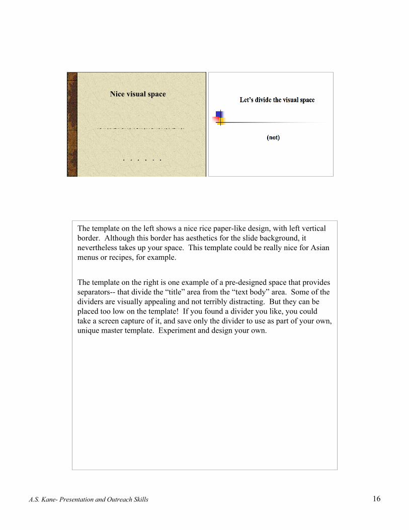
Nice visual space
The template on the left shows a nice rice paper-like design, with left verticalborder. Although this border has aesthetics for the slide background, itnevertheless takes up your space. This template could be really nice for Asianmenus or recipes, for example.
The template on the right is one example of a pre-designed space that providesseparators-- that divide the “title” area from the “text body” area. Some of thedividers are visually appealing and not terribly distracting. But they can beplaced too low on the template! If you found a divider you like, you couldtake a screen capture of it, and save only the divider to use as part of your own,unique master template. Experiment and design your own.

A.S. Kane- Presentation and Outreach Skills 17
Mycobacteriosis in Chesapeake BayMycobacteriosis in Chesapeake BayStriped Bass: Effects on FishStriped Bass: Effects on Fish
and Peopleand People
Andrew S. Kane, Ph.D.Andrew S. Kane, Ph.D.
Here is a template header that was custom-developed to provide a neededsense of place for the title slide of an old presentation. For this presentation,the politics of both the VMRCVM and the University of Maryland College ofAgriculture (little yellow, red and black globe logo) were important. A thinseparator bar below the header text and graphics (composed of yellow, blackand red colors; the colors of the Maryland flag), separated the header from thebody of the slide. This header was used only for the title slide so as not tovisually interfere with the text and pictures of the presentation content in theremaining slides. To maintain continuity throughout the presentation,however, the separator bar alone was used on subsequent slides to separate theslide header text from the body of the slide.
A.S. Kane- Presentation and Outreach Skills 18
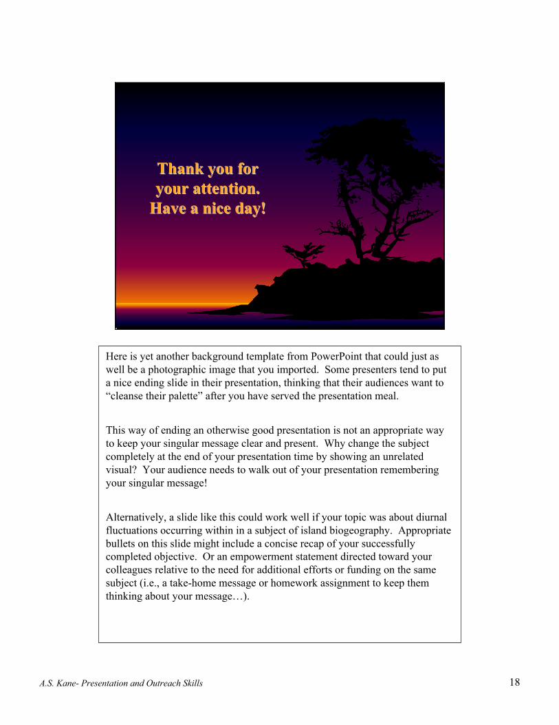
Thank you forThank you foryour attention.your attention.
Have a nice day!Have a nice day!
Here is yet another background template from PowerPoint that could just aswell be a photographic image that you imported. Some presenters tend to puta nice ending slide in their presentation, thinking that their audiences want to“cleanse their palette” after you have served the presentation meal.
This way of ending an otherwise good presentation is not an appropriate wayto keep your singular message clear and present. Why change the subjectcompletely at the end of your presentation time by showing an unrelatedvisual? Your audience needs to walk out of your presentation rememberingyour singular message!
Alternatively, a slide like this could work well if your topic was about diurnalfluctuations occurring within in a subject of island biogeography. Appropriatebullets on this slide might include a concise recap of your successfullycompleted objective. Or an empowerment statement directed toward yourcolleagues relative to the need for additional efforts or funding on the samesubject (i.e., a take-home message or homework assignment to keep themthinking about your message…).

A.S. Kane- Presentation and Outreach Skills 19
Use of slides (3)Use of slides (3)
General Principles for creatingPowerPoint slides
If possible try to have all your slides oriented similarly, i.e., landscape, notportrait (portrait slides, amidst an otherwise landscape slide presentation, willdistractingly go off the screen). We will look at an example portrait slidesshown in the landscape environment of PowerPoint in the next three slides.
A.S. Kane- Presentation and Outreach Skills 20
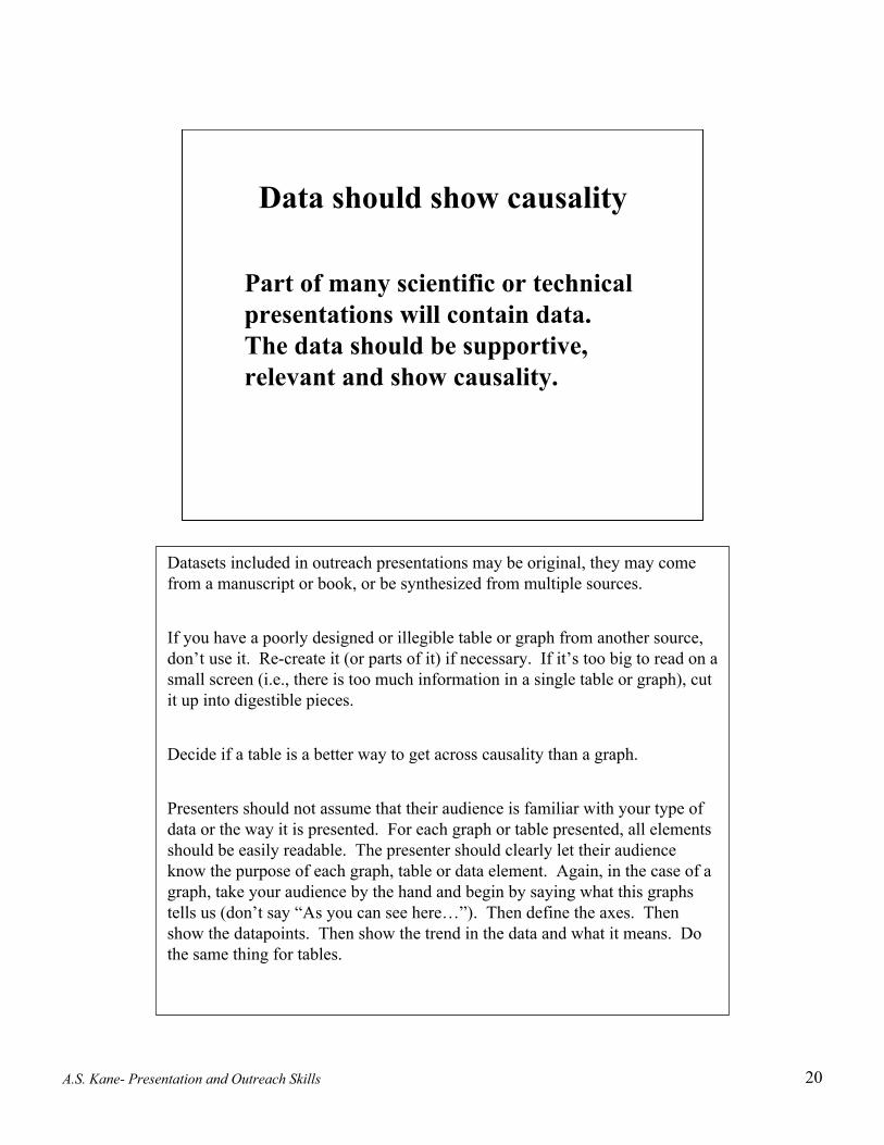
Data should show causality
Part of many scientific or technicalpresentations will contain data.The data should be supportive,relevant and show causality.
Datasets included in outreach presentations may be original, they may comefrom a manuscript or book, or be synthesized from multiple sources.
If you have a poorly designed or illegible table or graph from another source,don’t use it. Re-create it (or parts of it) if necessary. If it’s too big to read on asmall screen (i.e., there is too much information in a single table or graph), cutit up into digestible pieces.
Decide if a table is a better way to get across causality than a graph.
Presenters should not assume that their audience is familiar with your type ofdata or the way it is presented. For each graph or table presented, all elementsshould be easily readable. The presenter should clearly let their audienceknow the purpose of each graph, table or data element. Again, in the case of agraph, take your audience by the hand and begin by saying what this graphstells us (don’t say “As you can see here…”). Then define the axes. Thenshow the datapoints. Then show the trend in the data and what it means. Dothe same thing for tables.

A.S. Kane- Presentation and Outreach Skills 21
Here is an example of a relatively complex graph that is likely not familiar to most audiencesor healthcare professionals. However, with a descriptive introduction and a little handholding, the data can come across:These graphs show liver metabolism for a pesticide, TFM (3-trifluoromethyl-4-nitrophenol),in four species of fish. TFM is a selective pesticide that has been used to control parasiticlamprey in Great Lakes since the 1950’s. TFM is metabolized by the liver enzyme,glucuronyltransferase, to become a TFM-glucuronide. This metabolic product is more polar(water soluble) than the parent compound and hence more readily excreted. Rapid excretionfacilitates reduced toxicity. The inset in the upper left corner shows that the velocity of theconjugation reaction increases (in nanomoles per minute per mg protein; Y-axis) as theconcentration of TFM in micromoles increases (X-axis). The same data is shown in areciprocal plot in the central part of this figure, where the Y-axis is now 1/velocity and theX-axis is 1/TFM concentration. By showing the data in a reciprocal plot the response curvesbecome straight lines, and the Y-axis intercept and the X-axis intercept can be revealed.Mathematically, the inverse of these intercepts represent the maximal velocity and thebinding affinity for the enzyme system in each of the fish species examined. The maximalvelocity and the binding affinity tells us the “relative efficiency” the conjugating enzymesystem in each of the fish species. These data show us that the maximal velocities for eachof the fish species is similar (similar Y-intercepts). However, the binding affinity forbluegill is significantly greater than rainbow trout, which is greater than channel catfish,which is greater than lamprey. These differences in metabolism account for why thispesticide can be used selectively against lamprey without causing notable mortality otherfish species.
Data from Kane et al. 1993

A.S. Kane- Presentation and Outreach Skills 22
This slide illustrates the importance of showing relationships in your data.It is good to format data to make wise and appropriate comparisons.Comparisons to what (you should ask yourself)? Decide best format forpresenting the relationships. Make side-by-side comparisons if possible. Takeyour audience by the hand.
The four datasets above are know as Anscombe’s Quartet. All four data setshave a sample size=11. The mean of each dataset’s Xs=9. The mean ofeach dataset’s Ys=7.5. Y=3+0.5X is the equation for each of the dataset’sregression lines. Each dataset has the same correlation coefficient (0.82) andcan be described by exactly the same linear model.
Yet, by looking at the table of datasets, it is nearly impossible to deciphersimilarities or differences between dataset I, II, III or IV. In the next slide,let’s look at the same data presented graphically as scatter plots.
Data graphs derived from E.R. Tufte, 1983. The Visual Display of Quantitative Information.Graphic Press.

A.S. Kane- Presentation and Outreach Skills 23
Here are the same four datasets graphically presented.
How they differ!
A.S. Kane- Presentation and Outreach Skills 24
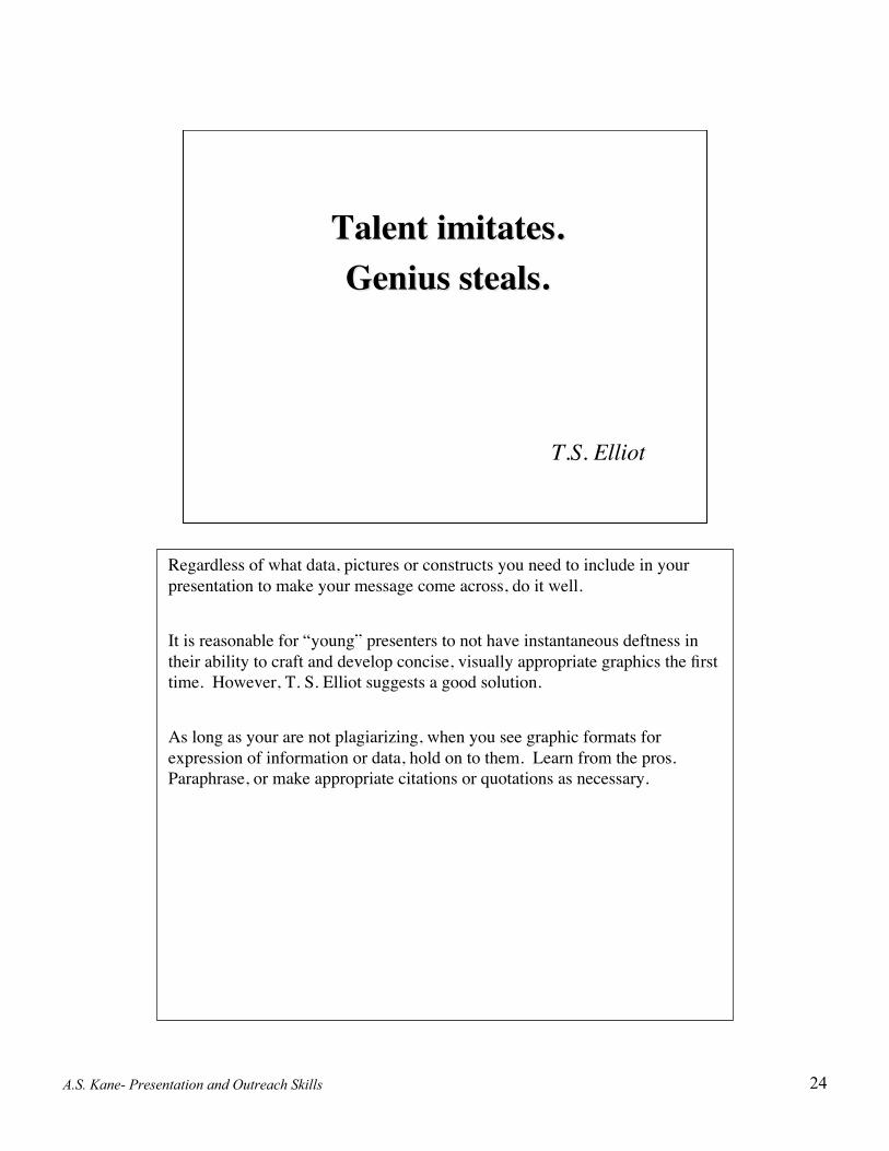
Talent imitates.Talent imitates.Genius steals.Genius steals.
T.S. Elliot
Regardless of what data, pictures or constructs you need to include in yourpresentation to make your message come across, do it well.
It is reasonable for “young” presenters to not have instantaneous deftness intheir ability to craft and develop concise, visually appropriate graphics the firsttime. However, T. S. Elliot suggests a good solution.
As long as your are not plagiarizing, when you see graphic formats forexpression of information or data, hold on to them. Learn from the pros.Paraphrase, or make appropriate citations or quotations as necessary.

A.S. Kane- Presentation and Outreach Skills 25
Final thoughts aboutthe PowerPoint
development platform(1)
Here we are in the new millennium. PowerPoint is the most common andavailable software tool to assist with the delivery of technical informationusing a variety of media elements. It allows for rapid development ofpresentations in short periods of time and the ability to make changes just priorto presenting. There are also disadvantages to using this software, much ofwhich lies in how it is used. Too much glitz, such as slide-to-slide transitions,flying text and sound effects can be major distractions to your audience. Sure,they can show off your digital prowess, but they can also seriously battle forthe mind of your audience. In using PowerPoint with a live audience youobviously need a computer and a projector. There are many cases wheretechnical errors can delay or prevent you from delivering your presentation. Ifyou are using this outreach mode with live audiences, consider bringing yourown equipment that you are familiar with, and arriving early to set up and testit. Or have great trust in your host’s technical personnel and their assistance.Be prepared to be able to deliver your presentation without the PowerPointsupport (heaven forbid!). You can have other backup, such as a handout. Or,in theory, you should be able to deliver your talk with sufficient organizationand verbal imagery to cover yourself. Don’t apologize for it; just do it and doit well. Practice it. Know it. Flight time helps. Take every opportunity togive presentations. This will upgrade your ability to communicate andenhance your professional outreach skills that are integral with manyprofessions.

A.S. Kane- Presentation and Outreach Skills 26
Final thoughts aboutthe PowerPoint
development platform(2)
Take the time to properly develop your presentation. Make bulleted list ofnotes to help you initially organize your presentation content and elements.
For traditional outreach presentations it would not be unreasonable to spend 10or more hours developing and preparing for every hour of presentation time.The development time can get more extensive if you want to have really goodgraphics and other media elements.
Leave sufficient time to develop your presentation. Weeks and month aremuch better than days. This is particularly true when research time is required.Last minute efforts do not allow for adequate development.
Back up your presentation and supporting media files on removable media(CDs, thumbnail drive, external hard drive, etc.) as you develop it. There isnothing like loosing your data mid-stream. That makes for a bad day.
A.S. Kane- Presentation and Outreach Skills 27
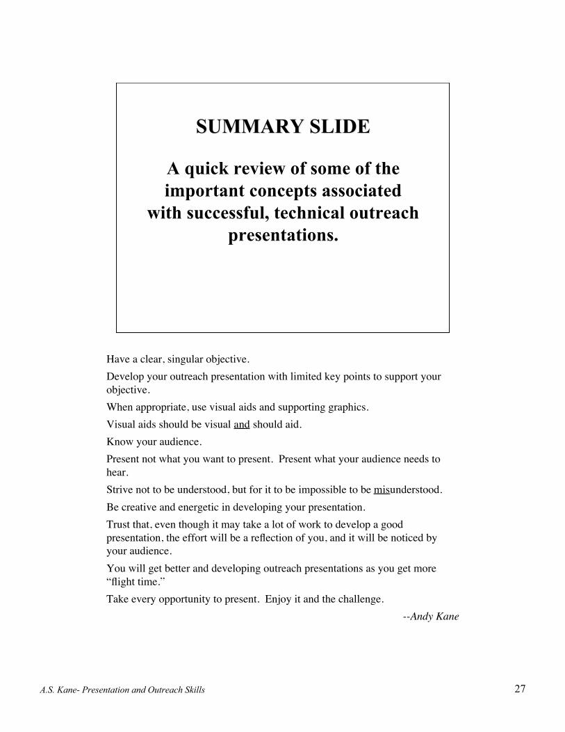
SUMMARY SLIDESUMMARY SLIDE
A quick review of some of theimportant concepts associated
with successful, technical outreachpresentations.
Have a clear, singular objective.Develop your outreach presentation with limited key points to support yourobjective.When appropriate, use visual aids and supporting graphics.Visual aids should be visual and should aid.Know your audience.Present not what you want to present. Present what your audience needs tohear.Strive not to be understood, but for it to be impossible to be misunderstood.Be creative and energetic in developing your presentation.Trust that, even though it may take a lot of work to develop a goodpresentation, the effort will be a reflection of you, and it will be noticed byyour audience.You will get better and developing outreach presentations as you get more“flight time.”Take every opportunity to present. Enjoy it and the challenge.
--Andy Kane

A.S. Kane- Presentation and Outreach Skills 28
Instead of verbally narrating this presentation and delivering it live (or using acomputer interface with Flash or RealPlayer), it was be presented asPowerPoint slides with Notes. The notes substitute for narration. Throughoutthe presentation, observe how the notes generally complemented the slides toprovide associated, necessary information. Also, note the use of transitionsbetween slides (referring to verbiage in the notes, not PowerPoint “slide-to-slide transitions”).
As you deliver your presentation remember that PowerPoint is not presentingyour presentation. You are. You, as the presenter, will look better andmaintain greater credibility when you can deliver your talk to your audiencewith good eye contact and supportive PPT elements.
Notes About This PresentationNotes About This Presentation• Microsoft Word was used to develop much of the text
for this presentation.
• PowerPoint was used as the development platform.
• Adobe Photoshop was used to manipulatethe graphical images.
• PowerPoint was “printed” using Adobe Acrobat (toprovide you with a pdf file for easy downloading) innotes format, to give the feel of a slide presentationwith associated verbal narrative (i.e., the notes).
A.S. Kane- Presentation and Outreach Skills 29
Selected BibliographySelected Bibliography
Arrendondo, Lani. 1991. How to Present Like a Pro (Getting People To See Things Your Way). McGraw Hill, NY.
Beveridge, W.I.B. 1957. The Art of Scientific Investigation. Vintage Books (Random House), New York.
Ciba Foundation. 1987. Communicating Science to the Public. Conference on the Communication of Science, CibaFoundation, London 14-16 October 1986. John Wiley & Sons, Ltd., NY.
Gibaldi, Joseph and Achtert, Walter S. 1988. MLA Handbook for Writers of Research Papers, 3rd Edition. ModernLanguage Association of America, NY.
Kushner, Malcolm. 1996. Successful Presentations for Dummies. IDE Books Worldwide, Inc., Foster City.
Mira, Thomas. 1995. Speak Now or Forever Hold Fall to Pieces. Random House, NY.
Milo, Frank. 1986. How To Get Your Point Across in 30 Seconds Or Less. Pocket Books, NY.
Nelkin, D. 1995. Selling Science: How the press covers science and technology. W.H. Freeman and Co., New York.
Ries, Al and Jack Trout. 1986. Positioning: The Battle for Your Mind, revised 1st Edition. Warner Books, NY.
Sindermann, Carl. 1982. Winning the Games Scientists Play. Plenum Publishing. ISBN: 0306410753
Strunk, W. and White, E.B. 1979. Elements of Style, 3rd Edition. MacMillan, NY.
Tufte, Edward R. 1983. The Visual Display of Quantitative Information. Graphics Press, Cheshire, CT.
Tufte, Edward R. 1990. Envisioning Information. Graphics Press, Cheshire, CT.
Tufte, Edward R. 1997. Visual Explanations: Images and Quantities, Evidence and Narrative. Graphics Press,Cheshire, CT.