open mapping education series - census.gov...a window will open to prompt you to title the new...
TRANSCRIPT

OPEN MAPPING EDUCATION SERIES
GIS MODULES 1-3
Developed By: Maggie Cawley & Steven Johnson

GIS MODULE 3
QGIS BASICS II: CREATE A BASIC MAP

LEARNING OBJECTIVES
In this module, you will learn how to:
● Create a map using U.S. Census TIGER data.
● Style your map and arrange layers for effective display.
● Categorize layers by type for styling and presentation.
● Learn to use the Print Composer tools and interface.
● Export a map as an image file using Print Composer.
● Print a completed map suitable for publication.
● Time Required: 20-25 minutes with self-paced learning breaks and download time.

PART ONE - SYMBOLIZE VECTOR DATA
OPEN QGIS
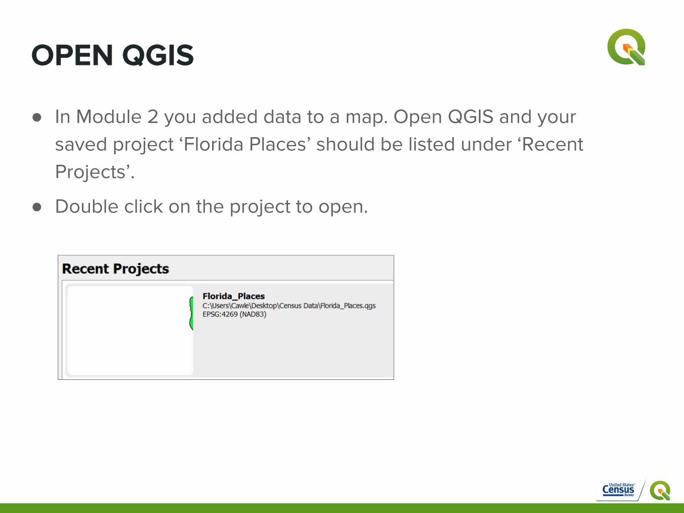
● In Module 2 you added data to a map. Open QGIS and your saved project ‘Florida Places’ should be listed under ‘Recent Projects’.
● Double click on the project to open.

STYLE THE DATA LAYERS
● Three layers should be visible in the Layers Panel.
● Right click on the tl_2017_us_state layer and scroll down to ‘Properties’ OR Double Click on the layer to open Properties. A new window will open.

STYLE THE DATA LAYERS - STATES
● Fill is set to ‘Simple’. Click on ‘Simple fill’ to change the options.
● Click the color square next to ‘Fill’. A new window will open.
● Explore the different options. Choose a light color, to help the roads stand out on the map
● Once you’ve selected a color, click ‘OK’
● You can also choose to change the outline style.
● When you are finished click ‘Apply’ and then ‘Ok. The map will render with your color choice.

STYLE THE DATA LAYERS - FLORIDA ROADS● Before we style the roads, open the
attribute table by selecting tl_2017_12-prisecroad and clicking
● Notice the letters in the column ‘RTTYP’, which stand for ‘Route Type’. The Census uses Route Type Codes to describe the type of road.
● The green table, sourced from the Census, contains the key for the Route Type letter codes.
● The RTTYP category will be used to style the roads according to type, and improve our map.
Source: https://www.census.gov/geo/reference/rttyp.html

STYLE THE DATA LAYERS - FLORIDA ROADS● Double click on
tl_2017_12_prisecroads The Layer Properties will open, this time to style a vector line file.
● Fill is set to ‘Single symbol’. Click to change the options. Select ‘Categorized’
● Next to Column, use the drop down menu to choose ‘RTTYP’
● Under the white box, click ‘Classify’. ● The letter codes will appear. ● For this map, we will keep and style
the I, S, and U road types.

STYLE THE DATA LAYERS - FLORIDA ROADS● Highlight the M row and click the red ‘--’
button to remove the M roads from the map. Do the same with the ‘O’ roads and the empty row.
● If you make a mistake, press ‘Classify’ again and start over.
● Use the table on the previous slide to fill in the Legend text on the right side. Double click in the window to edit the text. Add ‘Interstate Road’, ‘State Road’, and ‘US Road’.
● Change the symbol for each road type by double clicking on the line under ‘Symbol’.
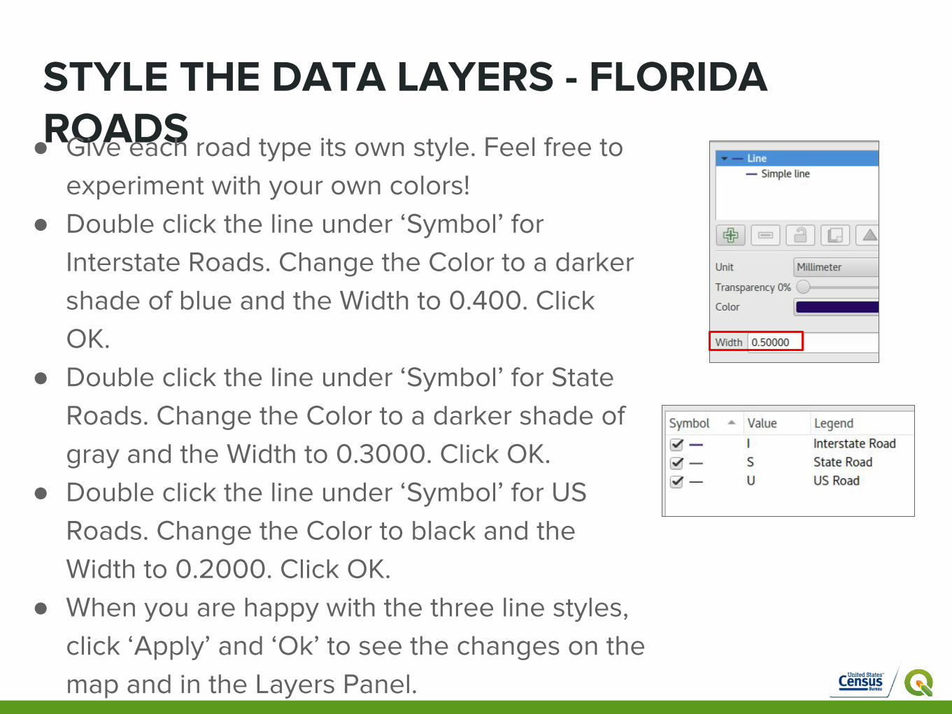
STYLE THE DATA LAYERS - FLORIDA ROADS● Give each road type its own style. Feel free to
experiment with your own colors! ● Double click the line under ‘Symbol’ for
Interstate Roads. Change the Color to a darker shade of blue and the Width to 0.400. Click OK.
● Double click the line under ‘Symbol’ for State Roads. Change the Color to a darker shade of gray and the Width to 0.3000. Click OK.
● Double click the line under ‘Symbol’ for US Roads. Change the Color to black and the Width to 0.2000. Click OK.
● When you are happy with the three line styles, click ‘Apply’ and ‘Ok’ to see the changes on the map and in the Layers Panel.

STYLE THE DATA LAYERS - FLORIDA PLACES
● Double click on tl_2017_12_places. Layer Properties will open, this time to style a vector polygon file.
● Fill is set to ‘Simple’. Click on ‘Simple fill’ to change the options.
● Click the color square next to ‘Fill’. A new window will open.
● Choose a darker color, to help the places stand out on the map
● Once you’ve selected a color, click ‘OK’.
● Remove the outline by changing ‘Outline Style’ to ‘No Pen. Click ‘Apply’ and ‘Ok’ to update the layer. Save your map.
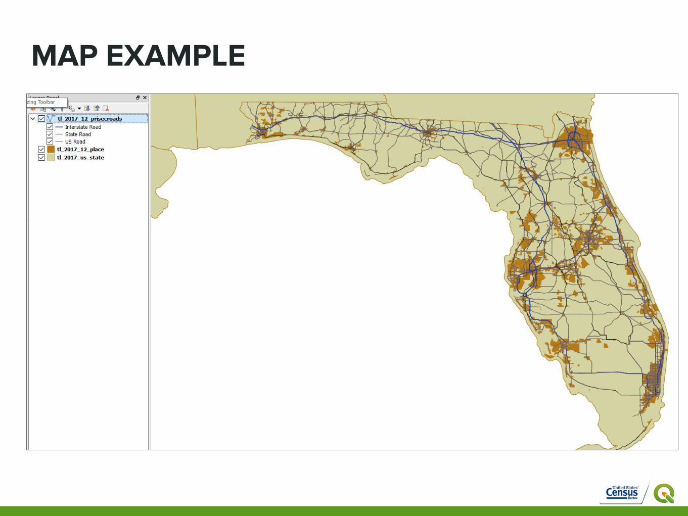
MAP EXAMPLE

PART THREE - PRINT COMPOSER

USING THE PRINT COMPOSER● You’ve just styled your first map layers, and you are close to having
a printed map.
● The QGIS window is where you work behind the scenes. Print Composer enables you to create nice maps and atlases that can be printed or saved as a PDF or image file.
● In Print Composer, you can add key map components such as a Title, Legend, Scalebar and North Arrow that help explain your map.
● You can customize your printed map by adding elements such as text labels, images, legends, scale bars, basic shapes, arrows, attribute tables and HTML frames. You can size, group, align, position and rotate each element and adjust the properties to create your layout.
● NOTE: Saving in the QGIS window does not save your Composer. Save early, save often!

CREATE A PRINTABLE MAP - COMPOSER
● To start a new Print Composer, Click ‘Project > New Print Composer’ OR hold Ctrl + P.
● A window will open to prompt you to title the new Composer.
● Call it ‘Florida Places’. Click ‘OK’.
● A new window will open.
● This window is your blank canvas for turning your visualized, styled vector data into a printed map.

PRINT COMPOSER - INTERFACEMENU BAR
ADD MAPITEMS
NAVIGATION TOOLS
BLANK MAP CANVAS
COMPOSER TITLE
PAGE SETUP
3 PANELSSAVE/PRINT/EXPORT MAP VIEW CONTROLS
Full print composer tutorial: https://docs.qgis.org/2.8/en/docs/user_manual/print_composer/print_composer.html#print-composer
PRINT COMPOSER - RESIZE & ADD MAP
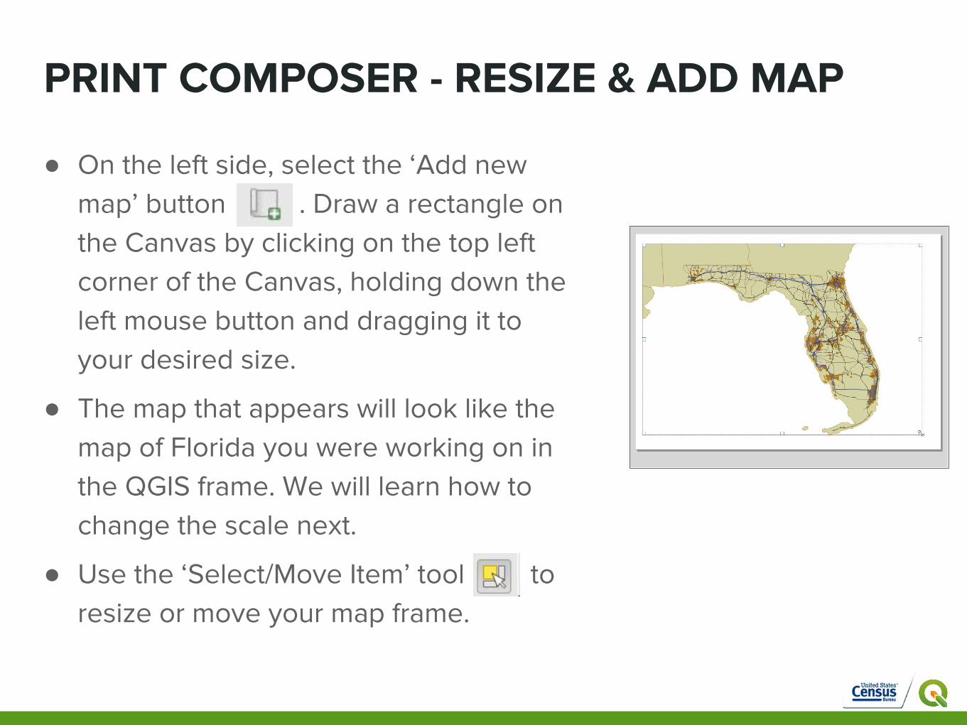
● On the left side, select the ‘Add new map’ button . Draw a rectangle on the Canvas by clicking on the top left corner of the Canvas, holding down the left mouse button and dragging it to your desired size.
● The map that appears will look like the map of Florida you were working on in the QGIS frame. We will learn how to change the scale next.
● Use the ‘Select/Move Item’ tool to resize or move your map frame.
PRINT COMPOSER - RESIZE MAP
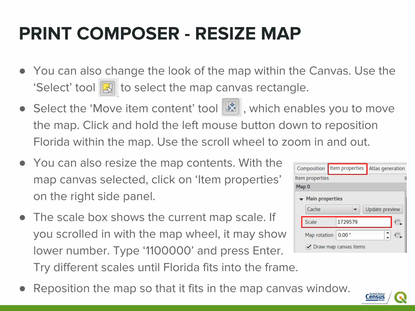
● You can also change the look of the map within the Canvas. Use the ‘Select’ tool to select the map canvas rectangle.
● Select the ‘Move item content’ tool , which enables you to move the map. Click and hold the left mouse button down to reposition Florida within the map. Use the scroll wheel to zoom in and out.
● You can also resize the map contents. With the map canvas selected, click on ‘Item properties’ on the right side panel.
● The scale box shows the current map scale. If you scrolled in with the map wheel, it may show a lower number. Type ‘1100000’ and press Enter. Try different scales until Florida fits into the frame.
● Reposition the map so that it fits in the map canvas window.
PRINT COMPOSER - CHANGE MAIN MAP
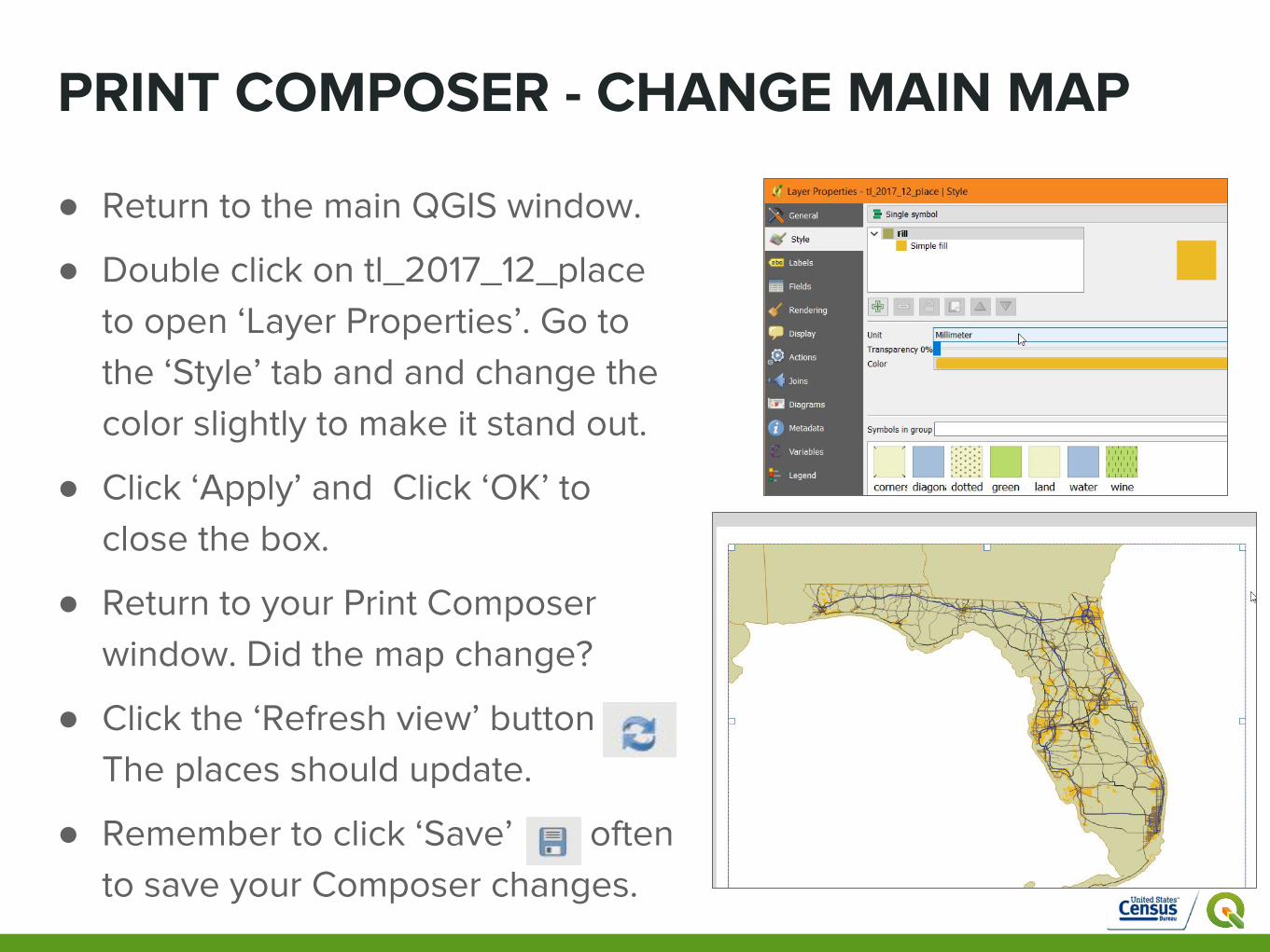
● Return to the main QGIS window.
● Double click on tl_2017_12_place to open ‘Layer Properties’. Go to the ‘Style’ tab and and change the color slightly to make it stand out.
● Click ‘Apply’ and Click ‘OK’ to close the box.
● Return to your Print Composer window. Did the map change?
● Click the ‘Refresh view’ button The places should update.
● Remember to click ‘Save’ often to save your Composer changes.

ADD MAP COMPONENTS - TITLE
● Select the ‘Add new label’ button
● Hold the left mouse button to draw a rectangle in a blank part of the map canvas.
● Change the text in the Item properties panel on the right side. Click where it says ‘QGIS’ and replace it with ‘PLACES IN FLORIDA’
● Increase the size and change the font with the ‘Font’ button under ‘Appearance’
● Click ‘Font’ to open a new window .
● Change the Size from 10 to 35 and Font style to ‘Bold’.
● Click ‘Ok’.

ADD MAP COMPONENTS - TITLE
● Using the ‘Select’ tool, resize the rectangle to fit the text by moving the small white squares.
● Change the alignment of the words in the ‘Item properties’ panel, ‘Appearance’.
● Change the Horizontal alignment to ‘Center’ and the Vertical alignment to ‘Middle’.
● Resize the square if the text no longer fits.● Click outside of the map canvas to
deselect the text box.● Click the ‘Save’ button to save your
changes.

ADD MAP COMPONENTS - LEGEND
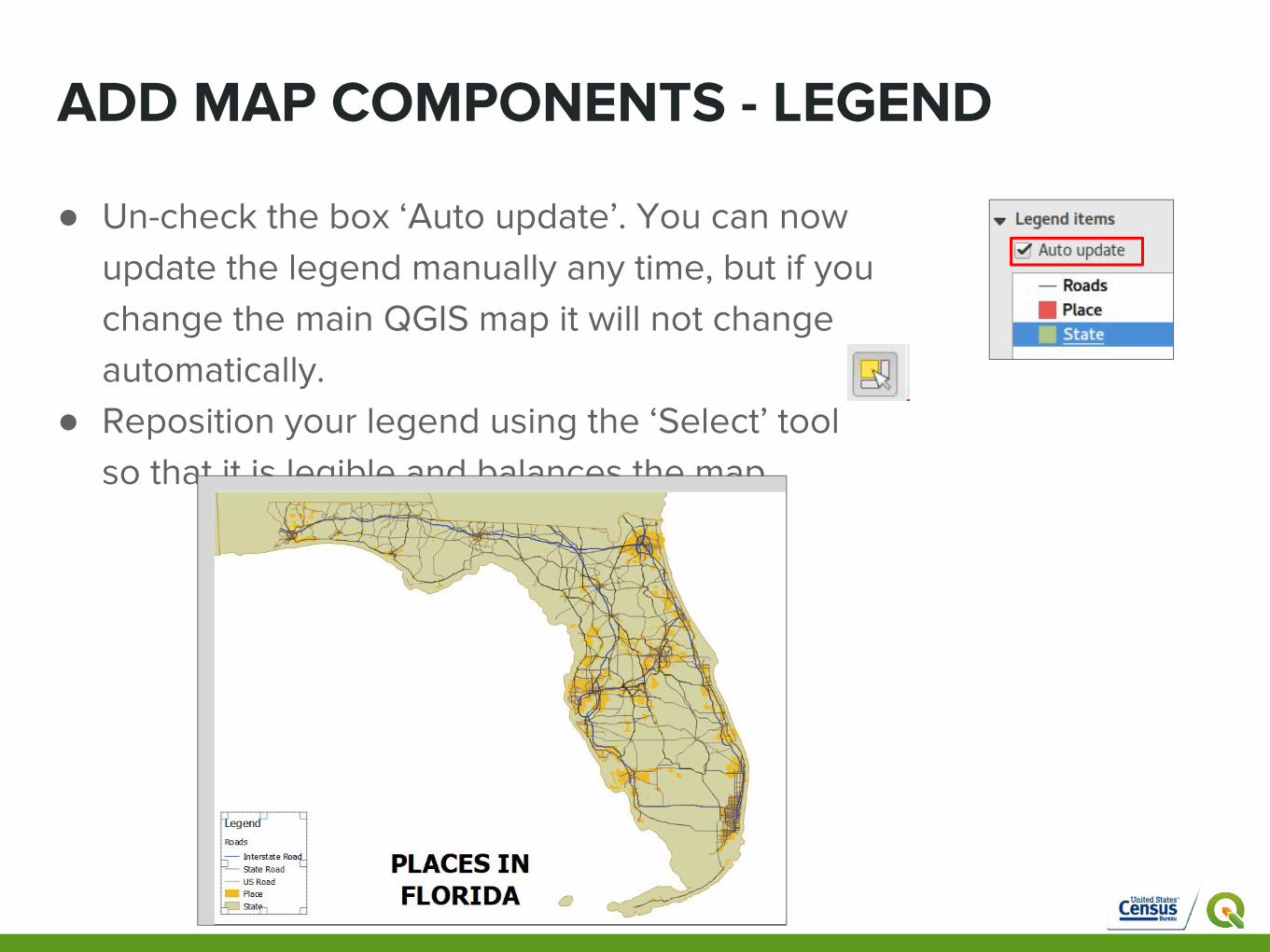
● Select the ‘Add new legend toolbar’ button on the left side toolbar
● Click in a blank area in your map composer window. A legend will appear.
● Use the Item Properties tab > Legend > Main properties on the right side to format and edit your legend. Explore the options.
● Double click on each Legend item to edit. ● Change tl_2017_12_prisecroads to ‘Roads’.
Click ‘Ok’.● Change tl_2017_us_state to ‘State’● Change tl_2017_12_place to ‘Place’
A legend provides information that is essential to understanding the map content. Let’s add one to your map!
ADD MAP COMPONENTS - LEGEND
● Un-check the box ‘Auto update’. You can now update the legend manually any time, but if you change the main QGIS map it will not change automatically.
● Reposition your legend using the ‘Select’ tool so that it is legible and balances the map.

ADD MAP COMPONENTS - SCALEBAR
● Select the ‘Add new scalebar’ toolbar button and click inside the map canvas. A scalebar will be added.
● Edit the scalebar properties in the ‘Item properties’ panel. Be sure that the scalebar is selected. Explore the options.
● Change the ‘Scalebar units’ to ‘Feet’.● Set ‘Segments’ to ‘left 0’ and ‘right 2’ by
using the up and down arrows.● Reposition your scalebar to balance the
map title, legend and canvas.● Save your Print Composer.
A scalebar helps viewers visually understand distances on a map. Let’s add one to your map!

ADD A NORTH ARROWA north arrow provides orientation for viewers of your map. Let’s add one to your map!
● Select the ‘Add image’ button and click to drag a rectangle within the map frame.
● Expand the ‘Search Directories’ box. Choose one of the north arrow image options.
● Reposition your arrow to balance the map title, legend, scalebar and frame.
● Save your Print Composer.

PRINT OR EXPORT YOUR MAP
When you are happy with your map, it is time to print or export.
● To print your map, click the ‘Print’ icon:
● To export your map as a PDF, click . or Composer > Export as PDF in the Menu. A save dialogue box will open. Navigate to your ‘Census Data’ folder and save it as 'yourlastname_Module 3'.
● To export your map as an image, click or Composer > Export as image in the Menu. Choose from 10 different image file formats. There are also options to change the resolution or DPI, and resize the output
● Save your Composer and Click the ‘X’ in the corner to close.
● Check your outputs by navigating to your Census folder and opening the PDF and/or image files. How does your map look?

FINAL MAP EXAMPLE

CONGRATULATIONS!
GIS PATH COMPLETED
HAVE YOU TRIED THE OPENSTREETMAP PATH?