office of developmental programs quality management (qm
TRANSCRIPT

Office of Developmental ProgramsQUALITY MANAGEMENT (QM) CERTIFICATION
Module 102: Data (Collection, Analysis, Visualization)& Quality Improvement (QI) Teams
Welcome to Module 102, Data (Collection, Analysis, Visualization) and Quality Improvement (QI) Teams, the second in a series of three, within ODP’s QM Certification program. Working through this program, ODP staff and stakeholders will continue to expand their understanding of QM, recognize their important role as a member of the ODP team, and learn how to apply their QM skills to support and enhance the lives of individuals ODP serves.
1
Module 102: Data & Quality Improvement (QI) Teams 6/15/2021

2
This module is designed to acquaint the learner to:
Objectives of Module 102
Data usage in decision‐making
Data analysis and visualization
Selecting improvement opportunities
Quality improvement (QI) teams
Module 102 objectives are to acquaint/reacquaint the learner to the following:
• Data usage in decision‐making• Data analysis and visualization• Selecting improvement opportunities• Quality improvement (QI) teams
2
Module 102: Data & Quality Improvement (QI) Teams 6/15/2021

3
DATA COLLECTION & ANALYSIS
An entity must first understand its current status or performance in order to identify areas in need of improvement and allocate resources.
An entity must first understand its current status or performance in order to identify areas in need of improvement and allocate resources. This understanding starts with an examination of existing data and information.
ODP expects all entities to engage in quality management practices and, as previously discussed, the PDCA cycle is a good tool to use for this purpose, as it stresses the importance of collecting data, and studying results over time, to evaluate how well an organization is performing.
3
Module 102: Data & Quality Improvement (QI) Teams 6/15/2021

4
Be a Learning Organization
What kind of organization
do you lead or work for?
Entities need to be learning organizations to make progress towards improving outcomes and
satisfaction and to stay competitive.
DATA HELPSGET YOU THERE!
AnalyzeData
Design/ Modify
Processes
Improve Outcomes/ Customer Satisfaction
Organizations that collect and analyze data about their activities and the results of those activities (including the quality of results and customer satisfaction), then use that information, on a routine and cyclical basis, to improve their business operations, and thus their results, are referred to as learning organizations.
4
Module 102: Data & Quality Improvement (QI) Teams 6/15/2021

5
Information Management is:
A system (set of processes) planned and designed for the collection, organization, and use of information(and data) that has value to the organization for making decisions based on fact/evidence
A cycle of processes that support learning activities
Essential to measurement of quality
Information Management (Part 1 of 2)
Learning organizations tend to have effective information management systems. Generally speaking, information management is a system or set of processes that are planned and designed for the collection, organization, and use of information (and data) that has value to the organization and it's need to make informed decisions based on fact or evidence, as well as it's need to create value for its stakeholders, including those served. It can also be viewed very simply as a cycle of processes that support learning activities.
The field of information management has a broad scope across many industries, and can involve a range of simple, physical components, to complex, virtual ones. In some industries, such as healthcare and technology, there is so much to know that higher level degrees and certifications are required. For the purpose of this training, we will cover basic, key ideas, related to your ODP QM work, since improvement models are dependent on the use of data, information, and performance measurement, and therefore your effective management of data and information is essential to the measurement of quality and decision‐making.
5
Module 102: Data & Quality Improvement (QI) Teams 6/15/2021

6
Who? Is responsible Has access Shared with
What? Do you want to know To collect To share
When? To collect To share
Where? To keep To share
How? To organize
Information Management (Part 2 of 2)
Planning to Manage Your Information?
ASK:
Information management starts with planning. To help you think through a plan for managing your information, here are a few questions to consider:
Who:• Will be responsible? For the overall information management system, the various parts, data
collection, data interpretation (transforming data into information), sharing the information (communicating findings)
• Will have access?• Will information be shared with? ‐ widely shared or targeted audience(s)
What:• Do you want to know?• Data will be collected?• What information will be shared? ‐ all information or only significant findings
When:• Will data be collected?• Will information be shared? ‐monthly, quarterly, annually
Where:• Will data and information be kept? ‐ Filing cabinet (paper), personal computer ‐Microsoft
documents (Excel, Word, and PowerPoint), web‐based storage (SharePoint, OneDrive, Docushare) or systems (HCSIS, EIM, HRST, Data Warehouse)
• Will information be shared? ‐ internal channels, external channels
How:• Will data and information be organized?
6
Module 102: Data & Quality Improvement (QI) Teams 6/15/2021

7
Is there a difference between Data and Information?
DATA is:
Uninterpreted observations, facts or material collected as a result of surveys, assessments or general documentation activities.
INFORMATION is:
Data transformed through analysis and interpretation into a form useful for decision‐making.
Data Versus Information
So, learning organizations have effective information management systems and use data andinformation for improvement activities, but is there really a difference between data and information? Yes, there is.
Data refers to uninterpreted observations, facts or material collected as a result of surveys, assessments or general documentation activities.
Information refers to data transformed through analysis and interpretation into a form useful for decision‐making.
7
Module 102: Data & Quality Improvement (QI) Teams 6/15/2021

Data Types (Part 1 of 2)
Qualitative Data(Quality)
Quantitative Data(Quantity)
Describes characteristics, qualities,
attributes
May require you to take action to
quantify with value assignments that
have no numerical value
Examples – gender, test status
(pass/fail), hair color, levels of
education, attitude towards
something, etc.
Measurable values with unique
numerical value
Examples – height, weight, amount of
money in your wallet, number of
people in a household, etc.
Quality, safety, and performance improvement work involves different types of data and the statistics that are associated with them. This can be a source of confusion for people who are new to data analysis and its use in quality and performance improvement. For this reason, we will define two basic categories of data here.
One way that data is often categorized is by whether it is qualitative or quantitative.
Qualitative Data describes characteristics/qualities/attributes and is also referred to as categorical, nominal or attributes data. It can be collected using surveys, interviews, and observations. Examples include: gender, test status (pass/fail), hair color, levels of education, attitude towards something (strongly agree to strongly disagree), etc. As you can see by the examples, qualitative data can include data with only two values (binary) or data that has more than two values. For qualitative data that has more than two values, numerical values can be assigned to each category as a label to facilitate data analysis (for example – Likert scale), but these assignments have no numerical value.
Quantitative Data, also referred to as continuous data is measurable and each value in the data set has a unique numerical value. Examples include: height, weight, number of cows in the field, amount of money in your wallet, number of people that live in your household, etc.
For your reference, more details about data types and subtypes can be found in the QM Handbook.
8
Module 102: Data & Quality Improvement (QI) Teams 6/15/2021

Data Types (Part 2 of 2)
ODP Qualitative Data
Examples
ODP Quantitative Data
Examples
Are participants happy in their jobs?
What factors contributed to
medication errors?
How satisfied are participants with the
professionalism of staff?
Potential Response Options1 ‐ Very Satisfied
2 ‐ Satisfied3 ‐ Neutral
4 ‐ Unsatisfied
5 ‐ Very Unsatisfied
Number of:
*Participants employed
*Trained staff
*Medication errors per site
Amount spent per individual
Here are some ODP‐related examples of qualitative and quantitative data.
9
Module 102: Data & Quality Improvement (QI) Teams 6/15/2021

10
Sampling (Part 1 of 3)
Sampling:
Process used to estimate characteristics of the entire population (a.k.a. the "N" or sample universe) using a subset of individuals (a.k.a. sample size, "n")
Why use a sample?
Reduces workload Reduces cost of data collection Faster data collection Can improve accuracy of data
No discussion about data collection or data organization is complete without addressing sampling. Sampling is the process of selecting a subset from a population, for the purpose of accurately estimating characteristics of the entire population; also referred to as "representative sampling." The goal is a sample small enough to be manageable by resources, yet large enough to provide statistically significant results. In general, the entire population, also referred to as the "N" or sample universe, is what we’re trying to learn something about and we are using a subset, also referred to as a sample size, or "n" to do it. A population can be anything, e.g., all waiver recipients, service plans or critical incidents.
The advantages of sampling include:
• It reduces the workload• It reduces the cost of collecting data• Data collection is faster• It can improve the accuracy of the data
ODP collects and organizes large amounts of data to monitor compliance with CMS waiver assurances, as well as federal requirements, and ODP standards. There are a variety of sampling methods used in this process. One example is provided on the next slide.
10
Module 102: Data & Quality Improvement (QI) Teams 6/15/2021

11
Sampling (Part 2 of 3)
Sample Universe vs. Sample Size
Data 2017 2018 2019
Sample Universe (entire population from which your sample is
drawn):17,000 22,600 27,400
Numerator (# compliant):295 316 350
Sample Size (denominator):376 378 379
% Compliant:78.5% 83.6% 92.3%
Performance Measure:
Number and percent of out‐patient clients who reported having prompt access to needed medical care
Numerator: Number of out‐patient clients who reported having prompt access to needed medical care
Denominator: Number of out‐patient clients surveyed
As mentioned on the previous slide, it’s important to distinguish between a sample size and a sample universe, especially for reporting purposes.
We start with the sample universe (entire population, "N") and then we randomly select a sample size (subset, "n") from the sample universe.
In this example, we are looking at a fabricated performance measure that addresses out‐patient access to medical care. In 2019, there were 27,400 out‐patient clients (sample universe) during the review period and 379 in the sample size.
11
Module 102: Data & Quality Improvement (QI) Teams 6/15/2021

12
Sampling (Part 3 of 3)
How do we determine a Representative Sample?
ODP uses the online Raosoft sample
calculator to calculate sample sizes.
www.raosoft.com/samplesize.html
Again, a representative sample is a subset of the sample universe that seeks to proportionally reflect specified characteristics exemplified in a target population. Fortunately, you don’t have to be a mathematician or statistician to calculate sample sizes!ODP uses the online Raosoft sample calculator to calculate sample sizes based on established parameters.
Using the Raosoft tool, we calculated a representative sample size for our 2019 fabricated example on the previous slide, based on the following criteria:
∙ Margin of error (amount of error you can tolerate) = 5%∙ Confidence level (estimated range of values likely to include the population parameter you are studying) = 95%∙ Population size (sample universe) = 27,400∙ Response distribution (what you expect the results to be) = 50%
Take time to visit the Raosoft site for a more detailed explanation about how the tool works.www.raosoft.com/samplesize.html
12
Module 102: Data & Quality Improvement (QI) Teams 6/15/2021

13
Data Collection and Review
Existing data that entities could review routinely include:
QA&I – full review and self‐assessment results
Incidents
IM4Q
HCSIS
Satisfaction surveys
Grievances
Ad hoc spreadsheets/logs
Routinely, entities should be accessing available data from existing data sources and organizing it for review and analysis. Data could be reviewed from QA&I full reviews or entity self‐assessments, EIM, HCSIS, IM4Q, etc. It could also be collected through use of ad hoc spreadsheets or logs that an entity develops to track data about a specific topic.
For example, an entity may need to develop a spreadsheet to track:• # of people who have community‐integrated employment, or• # of people who need a communication device and of those, how many have a device
No matter what data is collected, you should always consider taking the next step to display it graphically, as you can often learn more from a graphic visualization than from just looking at a spreadsheet or table of numbers.
Data visualization is coming up a little later in this module.
13
Module 102: Data & Quality Improvement (QI) Teams 6/15/2021
14
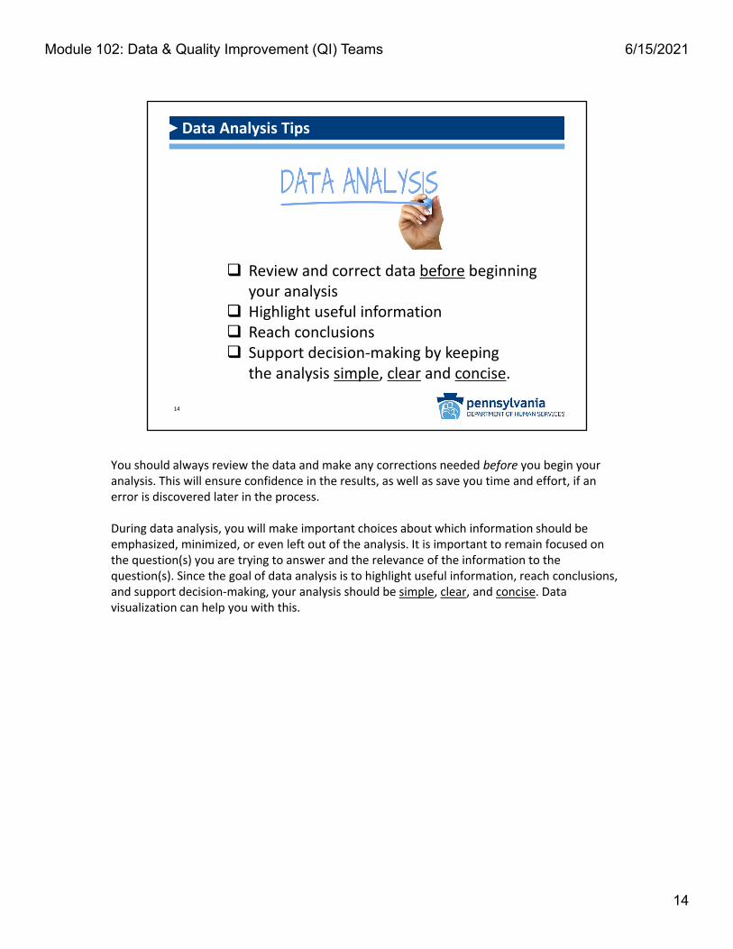
Review and correct data before beginning your analysis
Highlight useful information Reach conclusions Support decision‐making by keeping
the analysis simple, clear and concise.
Data Analysis Tips
You should always review the data and make any corrections needed before you begin your analysis. This will ensure confidence in the results, as well as save you time and effort, if an error is discovered later in the process.
During data analysis, you will make important choices about which information should be emphasized, minimized, or even left out of the analysis. It is important to remain focused on the question(s) you are trying to answer and the relevance of the information to the question(s). Since the goal of data analysis is to highlight useful information, reach conclusions, and support decision‐making, your analysis should be simple, clear, and concise. Data visualization can help you with this.
14
Module 102: Data & Quality Improvement (QI) Teams 6/15/2021

15
DATA VISUALIZATION
No matter what data is collected, you should always consider taking the next step to display it graphically, as you can often learn more from a graphic visualization than from just looking at a spreadsheet or table of numbers. This makes sense for analyzing the data and effectively supporting decision‐making, as it puts the reader(s) in the best position to identify and understand problems, as well as to measure progress on quality improvement activities. However, when displaying data, it is also important to use the right visualization tool, to ensure that you are providing the information accurately and answering the specific question(s) asked.
15
Module 102: Data & Quality Improvement (QI) Teams 6/15/2021

16
Visualization tools:
Summarize data and make complex information easier to absorb
Allow for better detection of trends, patterns, variations, and cycles
Help the reader to remember important facts
Show key relationships between different types of data
Make presentations more impactful
Data Visualization Benefits
Benefits to utilizing data visualization tools include that they:
• Summarize data and make complex information easier to absorb• Allow for better detection of trends, patterns and cycles, compared to a review of raw data alone• Help the reader to remember important facts• Show key relationships between different types of data• Make your presentations more impactful
Charts and graphs are visualization tools frequently used to summarize data and help you and others experience those "AHA!" moments of understanding what the data is telling you. That’s why it’s important to understand the ways charts and graphs display information and thus, how to create them.
16
Module 102: Data & Quality Improvement (QI) Teams 6/15/2021

17
2 Axes:
x‐axis (horizontal)
y‐axis (vertical)
Common Elements of Data Visualization Tools
Common units of measurement:
Counts/Totals
Time/Date ranges
Ages
Percentages (of the whole)
Data:
Labels
Tables
Legends
Sources
Most graphs have two (2) axes, a line that runs across the bottom (horizontally) and a line that runs up the left side (vertically). The line along the bottom is called the x‐axis, and the line up the left side is called the y‐axis. Common units of measurement used on the axes are counts, totals, time ranges (e.g., months, years), ages, percentages, etc. The x‐axis is read across the bottom from left to right and can contain categories or numbers. The y‐axis usually contains numbers and is read starting from the bottom left of the graph and then upwards. The numbers on the y‐axis generally, but not always, start at zero (0).
Common elements frequently used to present information to ensure it can be quickly and accurately understood include data labels, tables, legends and sources. Data labels normally come from the source of the data and are used to define that data in the graph or chart. Both axes of a graph should always be labelled to indicate the type of data that they show. Data tables display information in a tabular, or grid form, with rows and columns labeled. Data legends describe the variables that appear in the graph by distinguishing features such as color, size, etc. Data sources identify the source of the data being used, and often the date that the data was extracted from that source.
17
Module 102: Data & Quality Improvement (QI) Teams 6/15/2021

18
Applications used by ODP include:
• Microsoft Excel
• Microsoft Word
• Tableau
*There is a multitude of data visualization products out there. Choose the best one for you/your organization!
Commonly Used Data Visualization Apps
So, you have your data, now how do you get started with displaying it with data visualization tools? While there are some free applications (apps) to be found by way of a quick Google search, many require a fee to use them. This is a consideration when you or your organization are shopping around for tools to assist with data visualization needs. There is a multitude of products out there. You just need to choose the best one for you and your organization.
The apps most used across ODP to create data visualizations (ODP does not endorse any particular products) include:
Microsoft Excel & Microsoft Word ‐ These programs are pervasive across most business systems, which makes them a good option that may already be available and familiar to you. Additionally, free online tutorials are provided through Microsoft Office support, and guides, that include videos for those who prefer to watch and learn, are easily found on the Internet.
Tableau ‐ A robust program for more seasoned data visualizers and a good tool for creating comprehensive data dashboards. Note that some users might find this program difficult to master.
18
Module 102: Data & Quality Improvement (QI) Teams 6/15/2021

19
There are numerous options for visualizingyour data, but the most used graphs in ODP include:
Commonly Used Graphs/Charts
Line
Bar/Column
Combo
Pie Chart
Stacked Column
Clustered Column
There are numerous options for visualizing your data, but the most commonly used graphs in ODP include:
1. Line Graph2. Bar Graph (Column Graph)3. Combination Line and Bar Graph4. Pie Chart/Graph5. Stacked Column Graph6. Clustered Column Graph
Examples of each of these will be covered next.
19
Module 102: Data & Quality Improvement (QI) Teams 6/15/2021

20
Typically used to: Show trends over time Observe effects of process/quality improvement activities Make predictions about future performance Display/Detect variations
Example ‐ Line Graph
Data Source: HCSIS as of 9/30/2018
UseAt Least 10 Data Pointsfor Statistical Significance!
31
47
79
91
0
10
20
30
40
50
60
70
80
90
100
FY16‐17 FY17‐18 FY18‐19 FY19‐20
Number of Individuals
Number of individuals who received the Enhanced Communication Rate for services‐ID/A Waivers
Line graphs, also known as Run or Trend Charts, compare two or more variables and are typically used to show trends over a period of time, thus time is a common variable used, and the x‐axis should represent a unit of time (e.g., month, quarter, year, etc.). Line graphs are also used to observe effects of process or quality improvement activities or in making predictions about future performance. They provide a very simple way to show an upwards or downwards trend or to display or detect variations in the data. Trends generally represent a statisticallyimportant event that requires further analysis; however you should resist the tendency to see significance in every little variation in the data and instead wait to interpret your results until you have at least 10 data points.
20
Module 102: Data & Quality Improvement (QI) Teams 6/15/2021

21
Typically used to show: Frequency of data distribution/spread, symmetry, skewness, or extreme outliers Distribution of data with multiple categories Grouped data in nominal or ordinal categories Comparison amongst different categories/groups Large changes over time
Source: HCSIS
Example ‐ Bar/Column Graph
4,1254,376
4,8645,327
764 805 842 888
0
1,000
2,000
3,000
4,000
5,000
6,000
FY16‐17 FY17‐18 FY18‐19 FY19‐20
Number of Individuals and Self‐Advocates who use Participant‐Directed Services
Agency with Choice (AWC) Vendor Fiscal/Employer Agent (VF/EA)
Bar graphs, also known as bar, or column charts, are used to show:
• Frequency of data distribution/spread, symmetry, skewness, or extreme outliers• Distribution of data with multiple categories• Grouped data in nominal or ordinal categories• Comparison amongst different categories/groups• Large changes over time
Bar graphs, like the example shown in the slide, can be used to show relationships between different data series that are independent of each other. In the example, the height of the bar represents the measured value or frequency (the percentages), of three categories (blue, orange, green) within the data series (note the total in the series is 100%), over a three year period.
A bar graph's x‐axis consists of discrete values, with each individual bar representing a unique group, within the grouping, and with gaps to separate the bars. The y‐axis will generally show the frequency scale (percentages of the whole grouping or counts). In some cases, like the example shown in the slide, the graph creator, may opt to include the counts or percentages at the tops of the bars instead, and forgo inclusion of the y‐axis.
21
Module 102: Data & Quality Improvement (QI) Teams 6/15/2021

22
Example – Combination Line and Bar Graph
Source: PROMISe Paid Claims / Data Extraction Date: 12/07/2018
Great choice to show in 1 visual:2 different data series with
different scales (expressed in different units)
$62,120,272
$71,240,123$78,562,384
$89,933,282
$108,960,94742154504 4546
4865
5279
‐500
500
1500
2500
3500
4500
5500
$0
$20,000,000
$40,000,000
$60,000,000
$80,000,000
$100,000,000
$120,000,000
$140,000,000
FY13‐14 FY14‐15 FY15‐16 FY16‐17 FY17‐18
Individuals
Expen
ditures
Individuals Self‐Directing Services(Financial Management Services)
Expenditures Individuals
Combination line and bar graphs are a great choice for presenting two different data series that have different scales, expressed in different units, in one visual.
In this example, we are looking at the total amount of paid claims to Financial Management Services (FMS) providers (bars), as presented in millions (left axis), across fiscal years versus the total number of people utilizing FMS (line), as presented in thousands (right axis), in the same fiscal years.
22
Module 102: Data & Quality Improvement (QI) Teams 6/15/2021

23
Example ‐ Pie Chart
Percent of individuals Who Reported They Can Access Necessary Medical Services
92%
4%4%
Percent who reported it was easy, in‐between, or hard to get health care services in their community (n = 2,395)
Represents Proportion and Composition of the Whole Data Set Proportion usually displayed as % All proportions add up to 100% No more than 8 categories
Not an analysis, visual display only
Source: IM4Q 2017‐2018 Survey
Pie charts are used to understand all responses in a complete data set that adds up to 100%. They are designed to visualize how a whole (pie) is divided into it's parts (slices). Each slice of the pie represents a category and the size of the slice represents the proportion of the total, usually displayed as a percentage. It is recommended that no more than 8 categories are represented in a pie chart and sometimes “Other” is used as a category to represent missing or unknown data. Pie charts can be used to display nominal or ordinal categories of data and to compare areas of growth, such as the number of people utilizing a specific service. However, it should be noted that pie charts are not an analysis of the data, only a visual representation of it.
23
Module 102: Data & Quality Improvement (QI) Teams 6/15/2021

24
Example ‐ Stacked Bar/Column Chart
Typically used to:*Compare items in a specific values range *Review individual categories across time
*Show relationships between sub‐items and to the whole
,
A stacked bar/column chart is designed to allow the viewer to compare items in a specific range of values, as well as, to show the relationship of the individual sub‐items to the whole. They are also useful for reviewing individual categories across time units. The bars/columns that represent each category are "stacked" on top of each other, so that together they represent the whole data set.
24
Module 102: Data & Quality Improvement (QI) Teams 6/15/2021

25
Bar chart that: Groups data for side‐by‐side comparison at‐a‐glance Graphically displays data across years, and multiple categories within those years
Example ‐ Clustered Bar/Column Chart
Source: IM4Q
89% 89%
87%
85%
90%
88%
87%
86%
FY15‐16 FY16‐17 FY17‐18 FY18‐19
Relative Satisfaction with Opportunities for Individuals and Self‐Advocates
Percent of respondents that said their relative had enough opportunities to participate in activities in the community
Percent of respondents that said their relative seemed to have the opportunity to learn new things
A clustered bars/columns chart is a bar chart, but it allows for groupings of bars/columns, side‐by‐side, for comparison, at‐a‐glance. Clustered bars/columns are an excellent way to graphically represent data across years and present multiple data categories within those years.
25
Module 102: Data & Quality Improvement (QI) Teams 6/15/2021

26
Cause‐and‐Effect Diagram
Check Sheet
Control Chart
Histogram
Pareto Chart
Scatter Diagram
Stratification Chart
Set of 7 graphical techniques used in troubleshooting quality issues
"7 Basic Tools of Quality"
In addition to the six graphs/charts that ODP generally uses for visualizing data, there is a list of other graphical tools/techniques, known as the “seven basic tools of quality,” that are commonly considered helpful for troubleshooting quality issues.
They include:• Cause‐and‐Effect Diagram, also known as the Fishbone Diagram and the Ishikawa Diagram,
after its creator• Check Sheet• Control Chart• Histogram• Pareto Chart• Scatter Diagram• Stratification Chart
Examples of each of these will be covered next.
*Note: DO NOT PANIC! The 7 Basic Tools of Quality are being covered here only to expose you to them. There may not be a need to use them in most ODP‐related activities, but they are commonly used in the quality management world elsewhere, and you may find one or more of them helpful in addressing a problem within your organization.
26
Module 102: Data & Quality Improvement (QI) Teams 6/15/2021

27
Example ‐ Cause‐and‐Effect Diagram (Fishbone)
People not working in
CIE*
Employment staff turnover Lack funds for work attire
Few entry‐level jobs available OVR guidance unclear
Displays and analyzes potential (root) causesto a problem or variation
Team doesn’t support CIEFamily members nervous Transportation issues
Employer fears of hiring people w/ID Employment goals not in ISP
*Community Integrated Employment
PatronsPatrons
Fear of losing SSI benefits
PeoplePeople ProvisionsProvisions
PlacesPlaces ProceduresProcedures
A cause‐and‐effect diagram, also known as a “fishbone diagram,” is used to display and analyze all potential causes to a problem or to discover the source, or root cause of variation. It's frequently used along with brainstorming, which is a group of people generating a free‐flowing list of ideas. In the case of a fishbone diagram, the list of ideas would be the potential causes of a problem/variation and the fishbone is used as an effective tool for organizing those potential causes into a useful visualization.
For the purpose of standardization, there are generally two healthcare industry standards used to categorize and sort potential causes. They are:
• "The 4 Ms," which are generally used in a manufacturing system: Manpower (workers), Methods (systems and procedures), Machines (equipment), and Materials (raw materials); and
• "The 5 Ps," which are more appropriate for a human services system: Patrons (people using the system), People (workers), Provisions (supplies), Places (work environment), and Procedures (methods and rules)
As you can see by the example on the slide, you would start by naming your problem/variation on the "head" of the fish (to the right) and then, next to each line associated with the "5Ps", you would list out all potential causes related to the problem statement, in that category. This example is limited to 2 potential causes for each "P" only because of limited space on the slide.
***IMPORTANT! For brainstorming to be effective, there should not be any censorship, judgement, or discussion about ideas as they are generated. You want to leave the exercise open to creative ideas, unrestrained by how silly they might be, or how much it might cost. This discussion will occur later in the process. Participants should understand that there are no bad ideas, and they should be encouraged to think outside the box, as sometimes, that is exactly where the problem (or solution) is located.
27
Module 102: Data & Quality Improvement (QI) Teams 6/15/2021

28
Example ‐ Check Sheet
Simple, standardized form to collect and tabulate
data for analysis
Med Error Type
SUN
MON
TUES
WEDS
THURS
FRI
SAT
TYPE TOTAL
Omitted
Transcription
Wrong Dosage
Wrong Med
Wrong Person
Wrong Route
Wrong Time
Other
DAILY TOTAL
Project Name: __________________________Name of Recorder: ______________________Location: ______________________________Collection Dates: ________________________
A check sheet is a simple, standardized, often grid‐like form for collecting and tabulating data for future analysis. It is often used in a production process but is easily adaptable for a human services environment, as you can see by the example on the slide. Before designing your check sheet, decide what event or problem will be observed, the timeframe during which data will be collected, and how long it will be collected. It’s important to test your check sheet for a short trial period to be sure it actually collects the data you are intending to and that it is easy to use.
Check sheets are ideal for:• Observing and collecting data repeatedly by the same person or at the same location• Capturing data on the frequency or patterns of problems
28
Module 102: Data & Quality Improvement (QI) Teams 6/15/2021

Example ‐ Control Chart
Used to detect and monitor process variations over time and to distinguish special causes from common causes
CL=35
UCL=43
LCL=27
20
25
30
35
40
45
50
Jan-2018 Jul-2018 Jan-2019 Jul-2019 Jan-2020
Cou
nt o
f M
edic
atio
n E
rror
s
Medication Errors
Unstable
Unstable
Stable
A control chart is constructed the same way as a line/run/trend chart, but with upper and lower control limits, and is used mostly in industrial settings to provide guidance for ongoing control of a process. Its focus is on detecting and monitoring variations in a process over time and distinguishing special causes from common causes in observed variations. Control charts can be used to assist with eliminating special‐cause variation and to observe effects of process improvement activities. As mentioned, there are two types of variations: common cause (stable, predictable, within control limits, no pattern) and special cause (not stable, not predictable, outside control limits, or inside control limits with a pattern). Generally, no action is needed to address common cause variation, but special cause variation should be investigated.
On this control chart example, you will see the following as they relate to medication errors:• UCL = Upper Control Limit• CL = Control Limit ("average" or "mean"‐ found by adding up all counts/values, then dividing
by the total number of counts/values)• LCL = Lower Control Limit
29
Module 102: Data & Quality Improvement (QI) Teams 6/15/2021

30
Example ‐ Histogram
Used to show Data...Frequency Distribution, Symmetry or Skewness, Extreme Outliers
Waiting List Emergency Category by Age Group
A histogram is used to show data frequency distribution (number of data points that fall within the specified ranges), data symmetry or skewness, and extreme data outliers. It is similar to a vertical bar graph, but better for large data sets and summarizing groups of data. A histogram is generally divided into equally sized ranges of values along the x‐axis and the bars are not separated by gaps.
This example of a histogram shows the number of individuals on the ODP Waiting List in the emergency category, displayed by age groups.
30
Module 102: Data & Quality Improvement (QI) Teams 6/15/2021

31
Example ‐ Pareto Chart
Source: QM Recertification Curriculum Examples
Designed to highlight the most important of a set of factors
Pareto charts combine a bar graph with a line graph, illustrating not only a category’s individual values, but also the cumulative total of the entire set. These charts utilize a series of bars, arranged by descending heights, to display priorities for problem‐solving, as observed by the tallest bars. By displaying the data in this way, we can clearly identify where we need to focus our efforts to make the most impact on solving a problem. In this example, it's clear that QI efforts should be focused on medication errors related to omission, followed by wrong dosages (combined these categories account for 83% of errors).
Note that Pareto charts are related to the Pareto principle, also known as the "80/20 rule." You'll recall this idea; that 80% of the problems, come from 20% of causes. Thus, by focusing priorities on 20% of causes, 80% improvement can be achieved. Pareto charts can help you to do this.
Best uses of Pareto charts:• Analyzing data about the frequency of problems or causes in a process• Focusing on the most significant problems or causes when there are many to consider• Analyzing broad causes by looking at their specific components
31
Module 102: Data & Quality Improvement (QI) Teams 6/15/2021
32
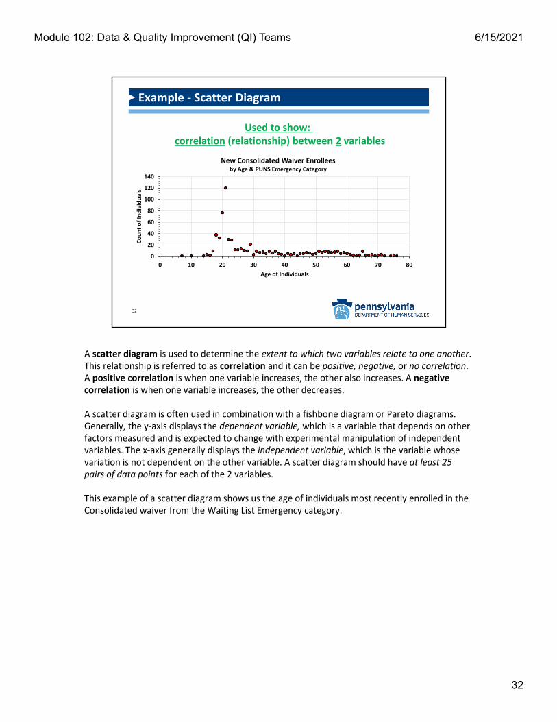
Example ‐ Scatter Diagram
0
20
40
60
80
100
120
140
0 10 20 30 40 50 60 70 80
Count of Individuals
Age of Individuals
New Consolidated Waiver Enrollees by Age & PUNS Emergency Category
Used to show:correlation (relationship) between 2 variables
A scatter diagram is used to determine the extent to which two variables relate to one another. This relationship is referred to as correlation and it can be positive, negative, or no correlation. A positive correlation is when one variable increases, the other also increases. A negative correlation is when one variable increases, the other decreases.
A scatter diagram is often used in combination with a fishbone diagram or Pareto diagrams. Generally, the y‐axis displays the dependent variable, which is a variable that depends on other factors measured and is expected to change with experimental manipulation of independent variables. The x‐axis generally displays the independent variable, which is the variable whose variation is not dependent on the other variable. A scatter diagram should have at least 25 pairs of data points for each of the 2 variables.
This example of a scatter diagram shows us the age of individuals most recently enrolled in the Consolidated waiver from the Waiting List Emergency category.
32
Module 102: Data & Quality Improvement (QI) Teams 6/15/2021

33
Example ‐ Stratification Chart
Used to... Demonstrate underlying patterns
Show where problem does/does not occur
Provider 2
Stratification is the process of classifying a set of data into categories or subgroups based on predetermined criteria. A stratification chart is used to demonstrate underlying patterns or show where a problem does and does not occur based on those categories or subgroups. It is sometimes called the "Is/Is‐not matrix." This type of chart can be used before data collection to better understand what patterns or differences to be looking for or it can be used after data collection to determine factors that affected results.
A stratification chart employs the "divide and conquer" strategy. For example, a table that displays an organization's total number of medication errors over time, with multiple sites' numbers included in that total number, might appear to represent a systemic issue, and not provide you with enough information to address the problem. By separating out and graphing the site‐specific data in a scattergram, you will be able to determine where the problem is occurring and where it is not occurring; showing you where improvement efforts should be focused.
This example of a stratification chart shows us that Provider 1 is in need of assistance and that improvement efforts should first focus there.
33
Module 102: Data & Quality Improvement (QI) Teams 6/15/2021

34
PRIORITIZING YOUR EFFORTS
Now that you have collected, analyzed and used data visualization tools to display your data, it’s time to identify an area in need of improvement and convene a Quality Improvement (QI) Team. You may have identified more than one area in need of improvement however, it may not be realistic to implement improvement activities in all identified areas at the same time. Therefore, you will need to prioritize your efforts to ensure that improvement activities are manageable, effective in enhancing services, supports, and outcomes for individuals, and that available resources are used wisely. With a particular improvement in mind, a QI team, comprised of members who have expertise in the identified area, should be convened to review the data and develop strategies for improvement.
34
Module 102: Data & Quality Improvement (QI) Teams 6/15/2021

35
Data‐based decision‐making helps with effective management of operations by using a
systematic, fact‐based approach
Data‐Based Decision‐Making
A QI Team should always start by reviewing the data, as it will help them focus and prioritize their efforts. As opposed to anecdotal or intuition‐based decision‐making, data‐based decision‐making helps a QI Team (and organizations) effectively manage its operations by using a systematic approach, rooted in facts.
Let’s look at two examples to consider the differences:
Example 1 ‐ A store owner visits one of his many stores and meets with its manager to learn about customer satisfaction with the sales support and the quality of the products. The manager had gathered information by asking customers to describe their experience with the product and the sales support. The manager reports that the customers who were questioned responded positively to the product and the sales support.
Example 2 ‐ A store owner notices there is a decline in revenue by 10%. The owner is concerned that customers are not satisfied with the sales support or the quality of the products. A survey is developed and implemented in all his stores and the information reveals that of his 20 stores, 15 have a greater than 95% satisfaction rate in both areas. Five (5) stores have a satisfaction rate below 85%, in at least one area.
As you can see, where to prioritize efforts and resources becomes much clearer by using a data‐driven approach like described in the second example. Additionally, a data driven approach can help to remove bias from the equation, which could have been a factor in the first example, if the manager intentionally "cherry‐picked" which customers were asked about their experiences, based on what they purchased, if they knew them, etc.
35
Module 102: Data & Quality Improvement (QI) Teams 6/15/2021

36
Selecting Improvement Activities
When prioritizing to focus improvement activities, consider these areas:
High Risk
High Volume
Problem Prone
When selecting improvement activities, it's best to consider these key organizational factors:
• High Risk areas—Have the potential for serious complications or negative outcomes for individuals, the population served, and the organization.
• High Volume areas—Affect a large percentage of the population served and, therefore, have a greater potential to implement positive change in an organization.
• Problem Prone areas— Processes/procedures within the organization that have been known to impede effective and efficient functioning of the organization.
In essence, where can you get the most impact for your efforts ("bang for your buck")?
36
Module 102: Data & Quality Improvement (QI) Teams 6/15/2021

37
Look for improvement opportunities that positively impact the people you serve.
Examples of "person‐centered" or "people outcomes": Increase # of individuals with competitive integrated employment (CIE) Increase # of individuals who are using the Life Course to develop plans Decrease # of medication errors
Person‐Centered Outcomes Focus
ODP specifically looks for improvement projects to be person‐centered with performance data that specifically targets people outcomes, not compliance outcomes. We want to see improvement projects that focus on positive results for the people we serve instead of projects that focus on whether or not a box was checked.
Examples of "person‐centered" or "people outcomes" are:
• Increase # of individuals with competitive integrated employment (CIE)• Increase # of individuals who are using the Life Course to develop plans• Decrease # of medication errors
37
Module 102: Data & Quality Improvement (QI) Teams 6/15/2021

38
ORGANIZING A QUALITY IMPROVEMENT (QI) TEAM
Now that you have identified an area in need of improvement, it's time to convene a Quality Improvement (QI) Team. Successful quality improvement activities are always a team effort and under the right circumstances, a team harnesses the knowledge, skills, experiences, and perspectives of its members to achieve significant and lasting improvements. Because a QI Team’s members are part of the system and know the process well, they generate solutions more likely to succeed.
38
Module 102: Data & Quality Improvement (QI) Teams 6/15/2021
39
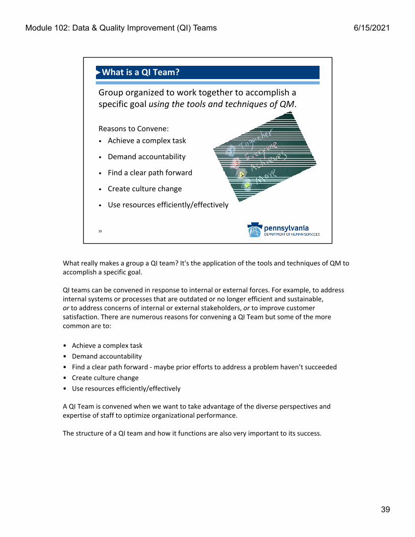
Group organized to work together to accomplish a specific goal using the tools and techniques of QM.
Reasons to Convene:
• Achieve a complex task
• Demand accountability
• Find a clear path forward
• Create culture change
• Use resources efficiently/effectively
What is a QI Team?
What really makes a group a QI team? It's the application of the tools and techniques of QM to accomplish a specific goal.
QI teams can be convened in response to internal or external forces. For example, to address internal systems or processes that are outdated or no longer efficient and sustainable, or to address concerns of internal or external stakeholders, or to improve customer satisfaction. There are numerous reasons for convening a QI Team but some of the more common are to:
• Achieve a complex task
• Demand accountability
• Find a clear path forward ‐maybe prior efforts to address a problem haven’t succeeded
• Create culture change
• Use resources efficiently/effectively
A QI Team is convened when we want to take advantage of the diverse perspectives and expertise of staff to optimize organizational performance.
The structure of a QI team and how it functions are also very important to its success.
39
Module 102: Data & Quality Improvement (QI) Teams 6/15/2021

So, if the structure of a QI team and how it functions are critical to its success, then how do you transform a group of people that may or may not commonly work together into a functionaland effective QI team? This is one of the biggest challenges confronted by organizations. The key to tackling this challenge is to incorporate QM practices into group activities and adapt the culture of the group to one of collaboration and mutual support. A successful QI team optimizes the talents of each member to achieve improvement and sustain it.
A highly practical QM skill is understanding what a QI team is and how it functions. ODP QM certified staff know: when a QI Team needs to be convened, how it functions differently from other groups, how to participate specific to a QI team role, and how to facilitate a QI team. During the 2‐day virtual QM Certification class, participants are assigned to a QI team to experience participation and be introduced to the various stages that QI teams move through. These QI teams are assigned an area in need of improvement, given a data set to use, and will develop QM plans and supporting Action plans to address the improvement project.
Highly functional and effective QI Teams use QM tools, methods and practices in a collaborative effort, and make data‐driven decisions by consensus, to achieve their goal. Note that when making decisions by consensus, each team member agrees. This is in contrast to a vote or compromise, where someone must give up something while other members may not. All members have to agree. QM at its best is a collaborative process that synthesizes the knowledge, experience, expertise, and innovation that each member of the team contributes.
40
Effective, High‐Functioning QI Teams:
• Use QM tools/methods/practices
• Collaborate to achieve goals
• Make decisions by consensus
QI Teams ‐ Best Practices
40
Module 102: Data & Quality Improvement (QI) Teams 6/15/2021

41
ENTITY LEADERSHIP!
Reviews/accepts proposal
Authorizes team
Clarifies purpose
Provides expectations
Sets limits
Provides resources/ support
Who Convenes a QI Team?
QI Team Success!
Leadership Buy‐In & Support
So, who convenes a QI Team? Anyone in an organization can raise the need to convene a QI team, but it is ultimately organizational leadership that authorizes convening a team.
Authorizing the convening of a QI team is not the only responsibility of organizational leadership, however, it must also clarify the work of the team. Specifically, the process or system to be improved needs to be clearly identified, the expected outcomes and timeframe for achieving them need to be defined, limits of the team’s work need to be established, such as the team’s authority for decision‐making, and the team needs to understand what resources are available to them.
Lastly, leadership buy‐in and support for the QI Team’s work is necessary if it is to succeed. This cannot be emphasized enough.
41
Module 102: Data & Quality Improvement (QI) Teams 6/15/2021

42
Purpose of the team
Representatives from different:
o Disciplines
o Organizational levels
o 'Ground‐level' imperative
Subject Matter Experts (SMEs)
Ad hoc members
Team size (Ideal 5‐8)
QI Team Membership ‐ Factors to Consider
The purpose of the QI team guides team membership. For example, if the process to be improved upon is a risk management function, then the agency’s Risk Manager should be a member of the team. If the process to be improved upon involves medication administration errors, then someone who actually administers medications should be a member of the team. It is imperative for QI team success to include “ground‐level” team members who are involved in whatever process or system you are trying to improve. We likely all have experiences receiving directives from upper‐levels of an organization regarding a change in a process that we know is doomed from the start due to something fundamental that was overlooked because the "ground‐level" wasn't included in the decision‐making process. Involving people who will implement a future process or system is essential to ensuring achievement of a positive outcome.
Representatives from all levels of the organization may or may not be considered for inclusion in a QI team. However, if the system or process is cross‐functional or incorporates multiple disciplines, QI team membership should always be representative of each of the functions or disciplines to ensure success.
Subject matter experts (SMEs) and ad hoc members are people whose expertise or input may be needed at some point in the work of the QI team; however, they may not need to attend every meeting. Being included or consulted only when their expertise is required helps to keep the team a more manageable size, which is approximately 5‐8 members ideally; however, having a group with expertise and knowledge of the process takes precedence over limiting the size of the group.
42
Module 102: Data & Quality Improvement (QI) Teams 6/15/2021

43
QI Team ‐ Key Roles
Lead
MembersFacilitator
QI Team Membership Considerations:
Knowledge of problem Are they:
o An effective team playero A good problem solvero An effective communicatoro Reliableo Flexibleo Engaging with others
There are three key roles on a QI team – the QI Team Lead, the QI Team Facilitator, and teammembers. Leadership will name the QI Team Lead when a QI team is convened, based on the purpose of the team and the person’s expertise and knowledge of the process or system to be improved. Leadership and the QI Team Lead will then identify the remaining team members, taking into consideration some of the following factors:
• Their knowledge of the problem, and
• Whether they are:o An effective team playero A good problem solvero An effective communicatoro Reliableo Flexibleo Engaging with others
In some cases, leadership may also choose a QI Team facilitator. This person serves a neutral/objective role in the team process.
43
Module 102: Data & Quality Improvement (QI) Teams 6/15/2021

To help with decision‐making related to who would be a good fit for the QI Team roles of QI Team Lead and QI Team Facilitator, we'll describe the primary duties of each role here in more detail.
The Primary Duties of the QI Team Lead are to: *Educatemembers about the purpose and priorities of the team, *Build consensus (remember this means each team member agrees), *Act as a liaisonbetween the team, other groups and leadership, *Update the team with organizational decisions and activities, *Assess the team’s progress, *Make assignments or ask for volunteers, and *Support team members’ skills development.
The Primary Duties of the QI Team Facilitator are to: *Mentor/model QM best practices, *Facilitatedata collection and analysis, *Help the team develop improvement plans, *Provide feedback and summarize key points, *Solicit input from each member, *Assure the team sticks to the agenda, objectives and timeframe, and *Remain neutral and objective while suggesting/recommending only.
44
QI Team ‐ Key Roles Defined
Educate Members
Build Consensus
Act as Liaison
Update Team
Assess Progress
Make Assignments
Support Skill Development
Mentor & Model
Facilitate Data Analysis
Help Develop Plans
Provide Feedback
Solicit Input
Assure Timelines are Met
Remain Neutral/Objective
QI Team FacilitatorQI Team Lead
Module 102: Data & Quality Improvement (QI) Teams 6/15/2021

A QI Team would not be complete without additional members who have knowledge of the problem and are effective team players and communicators, good problem solvers, reliable, flexible, and engaging with others. Additional QI Team members need to be able to communicate clearly and meaningfully contribute to the team’s activities. They are the ones who identify opportunities for improvement, as well as obstacles or barriers to the team’s work, and are the ones to propose solutions to identified barriers.
Each team member should follow established ground rules and may also volunteer to take on additional tasks such as:• Setting up virtual meetings and keeping track of meeting agendas, minutes, schedules, and
attendance• Completing assignments• Helping with data visualization and reports
45
ADDITIONAL TEAM MEMBERS
Prepare for/Attendmeetings to advance the team's work
Complete assignments and meet timelines
Communicate clearly Meaningfully Contribute to discussion/
analysis/reports Identify opportunities for improvement Identify obstacles/barriers to the team's work Recommend process/system change
QI Team ‐ Additional Team Member Role Defined
GO TEAM!
45
Module 102: Data & Quality Improvement (QI) Teams 6/15/2021

Guiding documents provide structure and organize a QI Team’s work. They are introduced during the initial organizational meeting and referenced throughout the life of the team. They include:
Meeting Agenda ‐ *Ensures the team stays on task during the meeting, *Established by the QI Team Lead, *Shared well in advance of meetings so that team members are prepared, *Can be formal or informal, *Identify clearly stated meeting goals, *Can maximize productivity with a note taker, as they can follow the agenda and fill in notes along the way.
Ground Rules ‐ (example can be found in the QM Certification Handbook) ‐ *Simple guiding principles, *Communicate how to handle situations proactively, *Aid in functioning collaboratively as a team, *Established by QI Team members – ideally in first organizational meeting, *An opportunity to utilize the QM tool “brainstorming,” as all team members have equal standing as each contribute.
Team Purpose Document *Developed with leadership input, *Written clarification of the work of the team, *Specifies the process or system to be improved, the expected outcomes and timeframe for achieving the objective, limits of the team’s work, and resources available.
High‐Level Action Plan ‐ *May be introduced to jumpstart discussion, *Driven by leadership’s specific expectations for outputs and process, *Develops into a living document that can be modified as the team's work progresses and can function as a progress report and give guidance to those responsible for specific action steps.
Meeting Notes/Minutes ‐*Memorialize discussions/decisions and capture action steps
Use of these guiding documents to keep the team's work structured and organized helps the team remain effective and attain its objective.
46
Meeting Agenda: Keeps team on task during meetings
Ground Rules: Aid collaborative team functioning
Team Purpose: Provides clarification of the work of the team
High‐Level Action Plan: Outlines expectations for outputs and processes
Meeting Notes: Memorialize decisions and capture action items
QI Team ‐ Guiding Documents
Guiding Documents structure and organize a QI Team’s work.
46
Module 102: Data & Quality Improvement (QI) Teams 6/15/2021

47
EVOLUTION OF A QI TEAM
Now that we've discussed organizing a QI Team, let's talk about the evolution of a QI Team, or really any team for that matter. For the purpose of this training, we will be discussing team evolution in the context of QI Teams and the quality improvement process.
47
Module 102: Data & Quality Improvement (QI) Teams 6/15/2021

It’s important for QI Team members to be aware that all groups go through stages on their way to effective performance. Additionally, in larger organizations, some QI Team members might not have worked together before, so getting to know one another should start with the first meeting. Under the right circumstances, a team harnesses their collective knowledge, skills, experiences, and perspectives to achieve significant and lasting improvements. For this reason, it is imperative that all team members get to know each other, understand these stages, and take action to work through the stages for the success of the team's mission.
Psychologist Bruce Wayne Tuckman (you read that right) first proposed the Forming–Storming–Norming–Performing model of group development in 1965 with his paper, “Developmental Sequence in Small Groups.” In his paper he indicated that these stages are all inevitable and necessary for a team to grow, face challenges, tackle problems, discover solutions, and deliver results.
Understanding that a QI Team goes through these stages and knowing what occurs during each one, helps the team to be aware, anticipate, and address issues that arise relative to the stage the group is in. It also helps guide the work of the team, as certain activities or outputs are associated with each stage.
The QI Team leader has specific responsibilities related to the evolution of the team and ensuring the team continues to be engaged. These responsibilities include: a) Identification of the current stage of the team, b) Consideration of what needs to be done to move on to the next stage of evolution, and c) Adjustment of their behavior and leadership approach accordingly.
It’s also important to note that teams may go back and forth between stages. For example, disruptions to the group dynamic and workflow can occur when a new team member joins the group, a member that has been absent for a while begins to participate again, or a new business direction occurs. These situations might cause the team to have to reevaluate their roles and objectives and could cause a norming or performing team to slide back to the storming stage.
48
Module 102: Data & Quality Improvement (QI) Teams 6/15/2021
48
FORMING
STORMING
NORMING
PERFORMING
Stages of Evolution of a Team
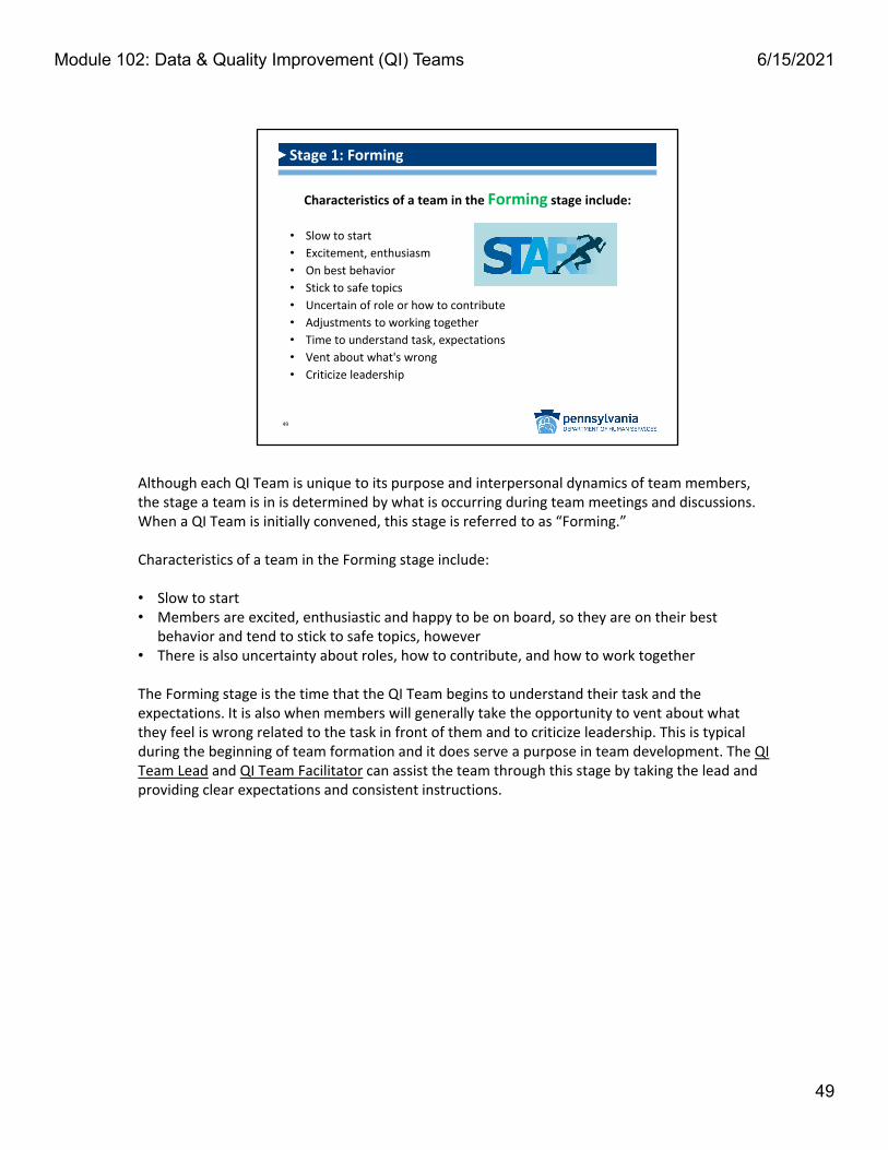
Although each QI Team is unique to its purpose and interpersonal dynamics of team members, the stage a team is in is determined by what is occurring during team meetings and discussions.When a QI Team is initially convened, this stage is referred to as “Forming.”
Characteristics of a team in the Forming stage include:
• Slow to start• Members are excited, enthusiastic and happy to be on board, so they are on their best
behavior and tend to stick to safe topics, however• There is also uncertainty about roles, how to contribute, and how to work together
The Forming stage is the time that the QI Team begins to understand their task and the expectations. It is also when members will generally take the opportunity to vent about what they feel is wrong related to the task in front of them and to criticize leadership. This is typical during the beginning of team formation and it does serve a purpose in team development. The QI Team Lead and QI Team Facilitator can assist the team through this stage by taking the lead and providing clear expectations and consistent instructions.
49
Characteristics of a team in the Forming stage include:
• Slow to start
• Excitement, enthusiasm
• On best behavior
• Stick to safe topics
• Uncertain of role or how to contribute
• Adjustments to working together
• Time to understand task, expectations
• Vent about what's wrong
• Criticize leadership
Stage 1: Forming
49
Module 102: Data & Quality Improvement (QI) Teams 6/15/2021

During the "Storming" stage, individual team members may feel disgruntled and may not look forward to continuing to participate or meet with the team. Some of the progress that was realized during the Forming stage may be lost.
Characteristics of a team in the Storming stage include:
• Lack of consensus
• There is conflict and members are more comfortable expressing disagreement
• Forgetting the ground rules
• Members may express strong emotions and may be frustrated with lack of progress
• Skepticism about the team process and whether they will succeed
• Members might maneuver for more influence, and
• There is more competition between members and emphasis may be more on individualaccomplishments, instead of team collaboration
The QI Team Facilitator needs to anticipate disagreement and be prepared to intervene with a comment/reminder/suggestion, or an activity such as an ice breaker or fun exercise to lighten the mood and refocus the group. There are many resources available on the Internet that the facilitator can explore beforehand, to have something ready, should the need arise. Lastly, the QI Facilitator should remind the team that this is normal progression in their evolution, that they are actually making progress, and that everyone on the team has value to the work of the team. Normalizing matters in this stage and leadership should be encouraged.
50
Characteristics of a team in the Storming stage include:
• Lack of consensus
• Conflict/more comfortable expressing disagreement
• Forget the ground rules
• Strong emotions/frustrated with lack of progress
• Skeptical about team process and success
• Maneuver for more influence
• Competition/emphasize individual accomplishments (instead of team collaboration)
Stage 2: Storming
50
Module 102: Data & Quality Improvement (QI) Teams 6/15/2021

The third stage in the evolution of a QI Team is referred to as "Norming." During this stage, the work of the team begins to take on an easier flow.
Characteristics of a team in the Norming stage include:• Relief/reduced anxiety• Reconciliation/worked through challenges• Productive meetings/Little successes• Cohesion is developing
• Members draw on each other’s strengths and are more:
o Engaged and supportive of each other
o Familiar with everyone’s style
o Patient with others
The QI Team Facilitator supports the team during this stage by recognizing individual and group efforts, providing learning opportunities and feedback, and monitoring the energy of the group. They should also continue to maintain an objective, neutral perspective in order to assure that the team’s work products reflect collaboration and are not influenced by any one person.
51
Characteristics of a team in the Norming stage include:
• Relief/Reduced anxiety
• Reconciliation/Worked through challenges
• Productive meetings/Little successes
• Cohesion is developing
• Members draw on each other's strengths and are more:• Engaged and supportive of each other
• Familiar with everyone's style
• Patient with others
Stage 3: Norming
51
Module 102: Data & Quality Improvement (QI) Teams 6/15/2021
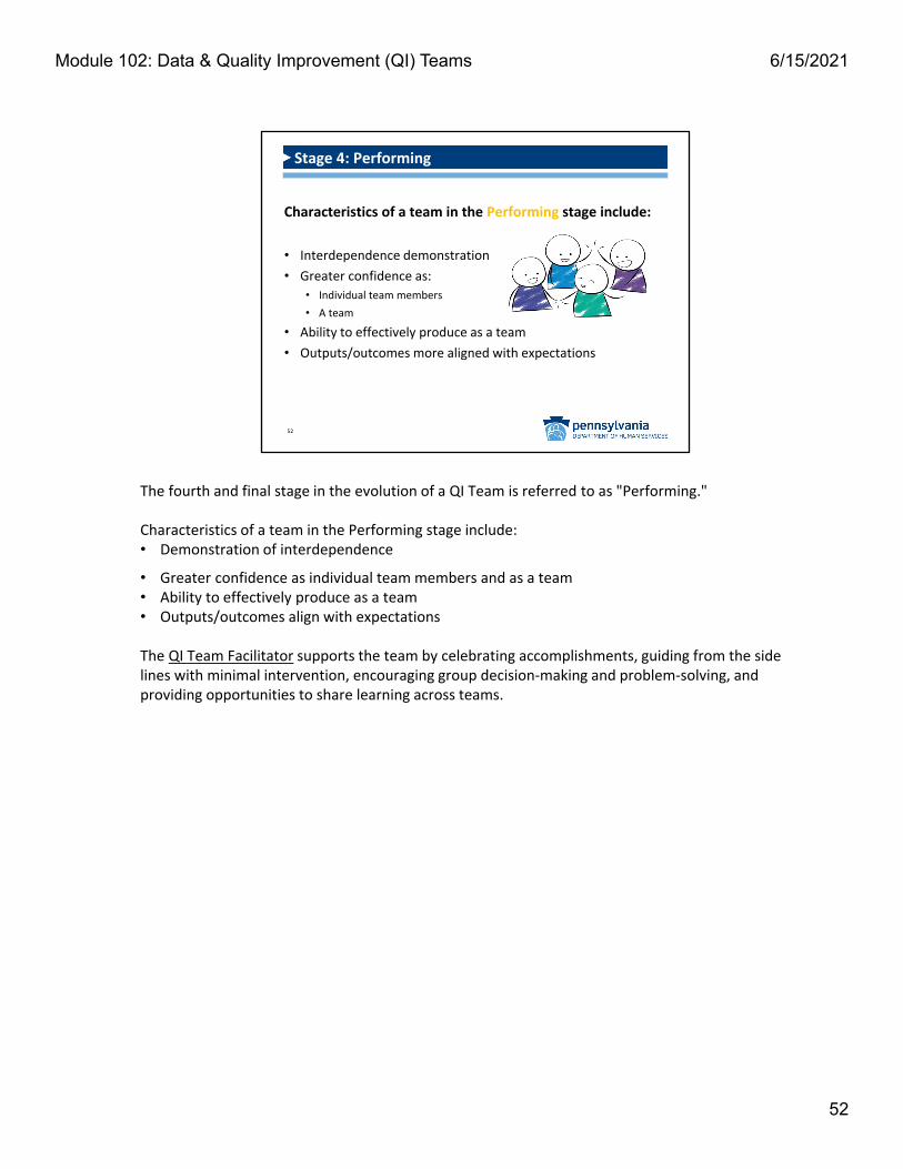
The fourth and final stage in the evolution of a QI Team is referred to as "Performing."
Characteristics of a team in the Performing stage include:• Demonstration of interdependence
• Greater confidence as individual team members and as a team• Ability to effectively produce as a team• Outputs/outcomes align with expectations
The QI Team Facilitator supports the team by celebrating accomplishments, guiding from the side lines with minimal intervention, encouraging group decision‐making and problem‐solving, and providing opportunities to share learning across teams.
52
Characteristics of a team in the Performing stage include:
• Interdependence demonstration
• Greater confidence as:
• Individual team members
• A team
• Ability to effectively produce as a team
• Outputs/outcomes more aligned with expectations
Stage 4: Performing
52
Module 102: Data & Quality Improvement (QI) Teams 6/15/2021

53
What's next? In Module 103…
The development and use of:
• A Quality Management (QM) Plan
• An Action Plan (putting the QM plan into action)
• A Quarterly/Annual Report
• Using the Plan, Do, Check, Act (PDCA) cycle
QM
Now that you've learned about data collection, data analysis, data visualization, and how to organize a successful QI Team, we're going to move on to discuss development of quality management plans, action plans that put QM plans into action, and implementation of the Plan, Do, Check, Act improvement cycle.
53
Module 102: Data & Quality Improvement (QI) Teams 6/15/2021