ocr as and a level mathematics a lesson element -...
TRANSCRIPT

Lesson Element
LDS – Starter Activities
Instructions and answers for teachersThese instructions cover the student activities section which can be found starting on page 8. This Lesson Element supports OCR AS and A Level Mathematics A.
When distributing the activities to the students either as a printed copy or as a Word file you will need to remove the teacher instructions section. Please note that a selection of prompt questions has been given for each activity. You can use all of them, some of them, or add extras as appropriate to your students and intended delivery. Some of the activities include data from a specific region. You may use them as they are, or create similar diagrams or charts from the data for your region if you prefer.
Introduction
Resources for ‘Using the Large Data Set (LDS)’The large data set (LDS) is a pre-released set or sets of data that should be used as teaching material throughout the AS and A Level Mathematics course. This data set is available on the OCR website, under ‘Assessment Materials’.
The purpose of the LDS is that learners experience working with real data in the classroom and explore this data using appropriate technology. It is principally intended to enrich the teaching and learning of statistics, through which learners will become familiar with the context and main features of the data. This resource can be used to embed the OCR large data set (LDS) in the teaching and learning of statistics in the new Maths AS/A Level.
Please note that this version of the resource is currently being trialled by teachers in the classroom. It is intended that any feedback provided will inform the revising and improvement of this resource. If you would like to provide feedback click on ‘Like’ or ‘Dislike’ and when the email template pops up please add your comments.
Resource overview This resource consists of five short starter activities on data presentation and interpretation using data from the Large Data Set.
Activities covered A mix of short discussion activities:1. Small multiples – scatter diagrams2. Small multiples – box plots3. Small multiples – matching bar charts to LAs4. Correlation table5. Comparing 2001 with 2011
Version 1 1 © OCR 2017

RationaleThe Large Data Set is primarily intended to be investigated using techniques from 2.02 Data Presentation and Interpretation. Part of the requirement is that students develop familiarity with the terminology and contexts of the Large Data Set. This is best developed slowly over time with short activities; this resource shows some of the ways in which this can be done through short starter activities which can be used at the beginning of any statistics lesson. Essentially this is a series of “What’s the same, what’s different?” tasks in a variety of contexts aimed at exploratory data analysis, ie using graphs as tools for looking at data and seeing if it suggests any patterns or relationships, rather than using the data to confirm a previously stated hypothesis.
These activities can be presented via a projector or on paper. They do not require students to use technology at all; the intention is to introduce some of the contexts, terminology and ideas without technological barriers and in a way which focusses the time spent on interpretation and discussion.
Activities 1, 2 and 5 use particular regions or local authorities. They may be used as presented here, or adapted to your local region or local authority if you prefer. Working with local authorities that students are familiar with has the advantage that they will know some of the underlying reasons for patterns that they find, but working with unfamiliar local authorities and regions has the advantage of forcing more intuitive and inferential conclusions. Both are useful modes of thinking, but you might find it easier to introduce the LDS through familiar places in the first instance.
Assumed knowledgeFor each activity, it might be helpful for students to be familiar with any measures and forms of presentation, but these activities can work as an introduction to some of the ideas within them, so no assumed knowledge is necessary. For context it might be useful to have copies of the full map of Local Authorities and Unitary Authorities which is available here https://www.arcgis.com/sharing/rest/content/items/6df8fba849ba4226a8ec935752c5f195/data
Teacher notesYou can present any of these activities as a quick look at some aspect of data presentation and interpretation using the Large Data Set. You should encourage your students to make general comparisons and observations in any of these activities, ie not to restrict themselves to the prompt questions that you’ve handed out. All of the activities will work very well for a 10 minute starter, but they can all be extended into full lessons by allowing 10 minutes for individual or group investigation, followed by an open discussion of their findings and hypotheses. Students can then return to the given information to follow up others’ suggestions, to the Large Data Set itself armed with specific questions, to the Large Data Set to produce further graphs, or to the internet to look for evidence of some of their conclusions.
The key message to get across is that these activities are all about informal inference, ie we are looking for patterns, or points of interest, and suggesting what the causes of these might be, or what they might tell us about local authorities. It is good to know whether or not suggestions are correct, and to remember types of relationships and causes, but students are not required to collect specific knowledge about particular regions or local authorities through their work with the Large Data Set.
Version 1 2 © OCR 2017

Starter activity 1: Small multiples – scatter diagrams
This activity consists of looking at 10 related scatter diagrams using data taken from the London Region of Travel to Work 2011. The constant feature between them is that the vertical axis gives the proportion of the population of each Local Authority who travel to work as the Driver of a car or van, while the horizontal axis gives each of the other methods of travel to work.
The type of response from students will depend partly on their knowledge of London, but you will notice that the prompts are fairly open. The list of local authorities will be more use to those who know London well, but some of the more famous local authorities such as Westminster and City of London are possible for more students to engage with. It might be friendly to give students a map of the London Boroughs such as this https://londonmap360.com/london-boroughs-map#.WfhQHFu0Pcs particularly if extending the activity.
If students wish to identify a particular local authority in a scatter diagram, then they should reduce the LDS to just the London Boroughs, find the relevant measures as proportions of the working population and look for values in the right regions. Most local authorities can be identified like this, despite this resource being non-interactive. Alternatively, they/you can reproduce the scatter diagrams.
Some points of interest
Any given local authority will appear at the same vertical height above the horizontal axis (why?) so they can be tracked between the scatter diagrams fairly easily.
Interesting outliers include: Westminster; City of London; Southwark; Hackney; Islington and Kensington & Chelsea.
A scatter diagram showing three clear subpopulations is “on foot”.
It is easy to assume that London Boroughs will all have high use of UMLT because of the Underground network. Look at the local authorities which are in the top-left of the UMLT graph: where are they likely to be on the Train graph? Specific places to look at could include Bexley, Bromley, Croydon, Greenwich, Richmond and Wandsworth. Where are they on the map?
Version 1 3 © OCR 2017

Starter activity 2: Small multiples – box plots
This activity consists of looking at 11 related box plots using data taken from Travel to Work 2011, first with the whole of the population, then with only the regions in the North West.The horizontal axis gives the proportion of the population of each Local Authority who travel to work using each method.These box plots were produced using Geogebra, should you wish to produce further examples in the same style.
Part of the intention of this activity is to prompt students to make comparisons between different modes of transport and to notice global patterns, but the comparisons between the whole population and the single region are also important to pick out.
Some points of interest:
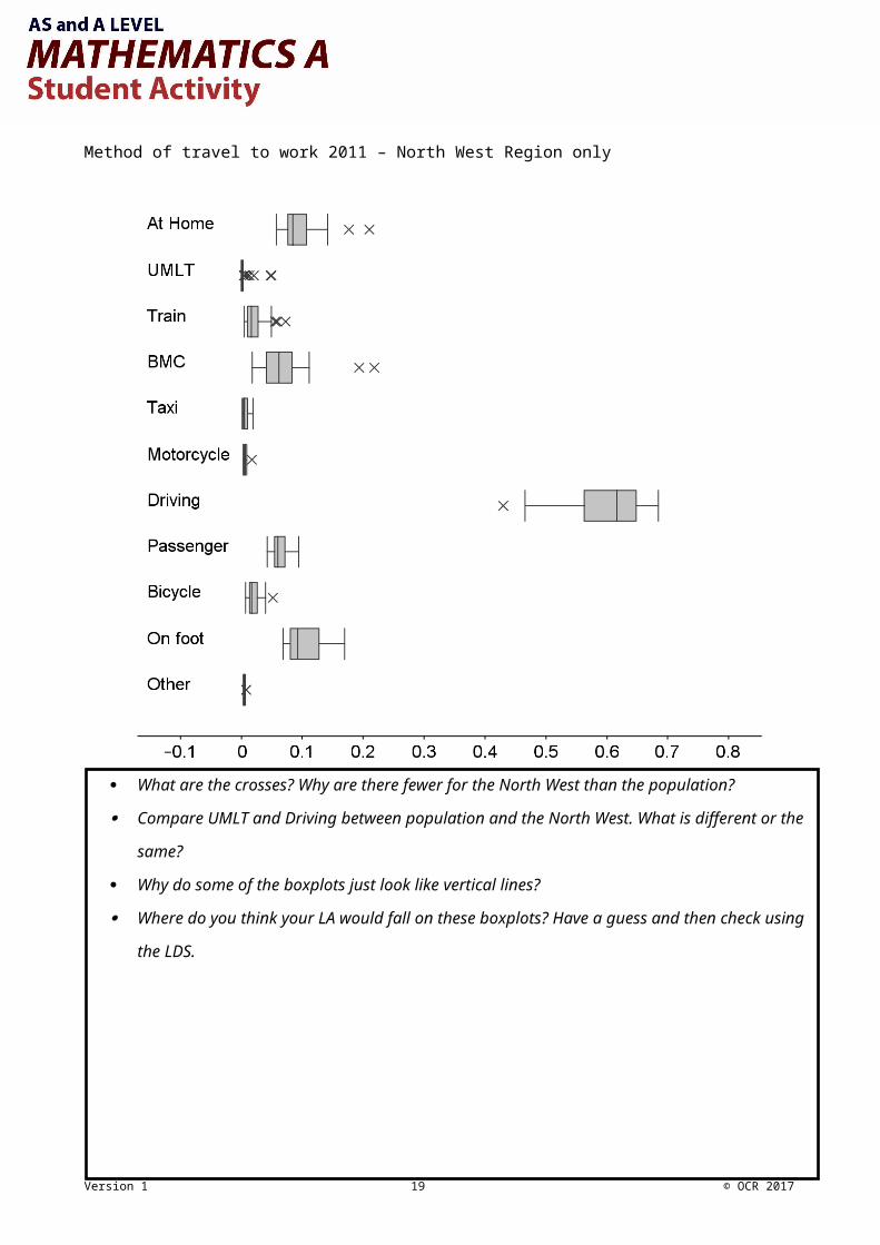
We have chosen the North West because it has relatively little urbanisation and some very rural areas. This makes the differences more stark, but most of the patterns seen here will also be found if using any region other than London.
There are far fewer outliers for the North West region than for the whole population because the local authorities in the North West are less variable. In particular most of the local authorities which are heavily urbanised and have large infrastructure networks are not in the North West (where are they?).
Liverpool and Manchester do feature as outliers on the BMC bar chart for the North West, but other LAs have higher proportions of Train and UMLT use. It is easy to conflate “Manchester” with “Greater Manchester”, so it is important to remember that “Manchester” means that particular local authority only.
The outliers in “At Home” are Eden and South Lakeland, both of which are very rural. The urban areas are at the other end of the box plot, but not so far from the median as to appear as outliers.
Notice the difference in skew in the distributions of “On Foot”, “BMC” and “At Home” between the Region and the whole population. This is the result of there being relatively few urban or metropolitan LAs in this Region.
Version 1 4 © OCR 2017

Starter activity 3: Matching bar charts to local authorities
This activity is based around four bar charts of the age structures of four unidentified local authorities. Some information is given to students about the nature of each of the local authorities, which is enough to work out which is which.
Note that the names of the local authorities have not been given; it would not be reasonable to expect students to know that Eastbourne has a high population of retired people, Cambridge has two universities, the City of London is very compact and mostly lived in by the people who work there or that Barking and Dagenham has a fairly normal suburban population.
This activity could be turned into a research based activity by giving the names, rather than the descriptions if you prefer, but note that students are not required to collect specific knowledge about particular regions or local authorities through their work with the Large Data Set.
Some points of interest:
As the hint suggests, the graphs do not show a very large middle aged population; the issue is that the classes are not of equal widths. This is not a concern for the purpose of making comparison between LAs but it would be if we wanted to compare classes within a LA. A histogram would give a better representation of the distribution of the data, but it does make the comparisons slightly less obvious.
The main features that students are likely to use for identification
o Top left has a high proportion of working age people, but very few children – A central London Borough (City of London)
o Top right has a high proportion of 65 and over – somewhere lots of people retire to (Bournemouth)
o Bottom left has a high proportion of 20 to 24 years olds – a city with two universities (Cambridge)
o Bottom right is the one left over, or the one with a more balanced distribution, or the one with most children – a more suburban London Borough (Barking and Dagenham)
Age classes have been chosen to produce data of particular interest to the ONS, so knowing more fine detail about different groups of children (pre-school, sixth form etc) is more important than fine detail about 30 to 44 year olds.
Try looking for LAs with more 20 to 24 year olds than 25 to 29 year olds, perhaps with conditional formatting. Which LAs are they? Do they all have universities? Multiple universities? You should find that some do, but that small LAs with universities such as Leicester are also included.
Version 1 5 © OCR 2017

Starter activity 4: Correlation table
This activity is based around looking at a correlation table for Method of Travel in 2011. This table gives the values of the Pearson Moment Correlation Coefficient (pmcc) for each pair of categories in the data, and uses conditional formatting to pick out positive (green) and negative (red) correlation with depth of colour showing strength. This task will not work very well if printed in greyscale, though the values will still be visible.
The key message to go with the correlation table is that this is a technique of exploratory data analysis. We are not trying to prove anything about the relationships between these categories, but rather are looking for patterns or connections which might be interesting and could be followed up.This is a nice task to get a feel for some of the obvious relationships and the range of categories without having a large amount of data to work with, though it does of course rely on students having come across the idea of a correlation coefficient.
When discussing the strength of correlation, it is worth remembering that there are 348 LAs in this data set, so the pmcc does not have to be very close to 1 to be showing a significant effect; somewhere in the region of 0.4 or 0.5 is a fairly strong effect and 0.8 is extremely strong.
This might be best used as a class discussion. It could even be used as a plenary for a lesson on correlation. It might be sensible to have scatter graphs organised in advance for some of the more interesting pairs.
Some points of interest:
Clearly there are some very strong effects for “Driving” with strong negative correlation with various forms of public transport and strong positive with “Passenger”.
When you look at scatter graphs for UMLT, you find that most LAs have 0 or very nearly zero, ie most of the data lies on one of the axes. This skews the pmcc considerably, so it is a good motivation for choosing to look only at the subpopulation of LAs that have some form of ULMT.
The short distance forms of transport, ie “Bicycle” and “On foot” have a strong positive correlation, as do “Passenger” and “Taxi” but not “Driving” and “Taxi”. It is worth drawing out the idea that some forms of transport behave in similar ways.
Version 1 6 © OCR 2017

Starter activity 5: Comparing 2001 with 2011
In this activity students are given four graphs, each of which gives Method of Travel to Work data from 2001 and 2011 in a nested bar chart, for either Leeds or Bristol and either number of people or proportion of people in employment.This is a classic “What’s the same, what’s different?” task, and students should mostly be left to their own devices to discuss and spot differences.As with the graphs for activity 4 these will work best in colour, but they will work reasonably well in greyscale if you prefer.
Between 2001 and 2011 the population of Bristol increased from 177 057 to 209 995 and Leeds from 322 831 to 355 225. While the absolute increases are similar, it is a much larger percentage increase for Bristol, which is perhaps reflected in the wider changes seen in the data.
Some points of interest:
In both LAs there is an increase in the number and proportion travelling to work on foot, by train, by bicycle or working at home. This is a general trend seen across (most) LAs.
Similarly, there is a decrease in the use of buses and of being a passenger in a car or van. This is again a general trend, though certainly not true of all LAs.
The detail that students ought to spot is that for Bristol the number of people driving to work has increased, but the proportion has decreased. This indicates that the new population in 2011 (which is more than the difference between the numbers given above – why?) are less likely to be driving to work than the population in 2001.There is a similar, but less dramatic, effect visible in those who travel by bicycle as well, ie that the number has increased by a large percentage, but the proportion of the whole population has not increased as much.
We have intentionally avoided LAs with very large effects because students tend to focus on those effects and not look at the whole graph. Some interesting areas to look at for more obvious effects would be Nottingham, Sunderland, North Norfolk or Tower Hamlets.
Version 1 7 © OCR 2017
We’d like to know your view on the resources we produce. By clicking on ‘Like’ or ‘Dislike’ you can help us to ensure that our resources work for you. When the email template pops up please add additional comments if you wish and then just click ‘Send’. Thank you.
If you do not currently offer this OCR qualification but would like to do so, please complete the Expression of Interest Form which can be found here: www.ocr.org.uk/expression-of-interest
Looking for a resource? There is now a quick and easy search tool to help find free resources for your qualification: www.ocr.org.uk/i-want-to/find-resources/
OCR Resources: the small print
OCR’s resources are provided to support the teaching of OCR specifications, but in no way constitute an endorsed teaching method that is required by the Board, and the
decision to use them lies with the individual teacher. Whilst every effort is made to ensure the accuracy of the content, OCR cannot be held responsible for any errors or omissions
within these resources.
© OCR 2017 - This resource may be freely copied and distributed, as long as the OCR logo and this message remain intact and OCR is acknowledged as the originator of this work.
OCR acknowledges the use of the following content: n/aPlease get in touch if you want to discuss the accessibility of resources we offer to support delivery of our qualifications: [email protected]

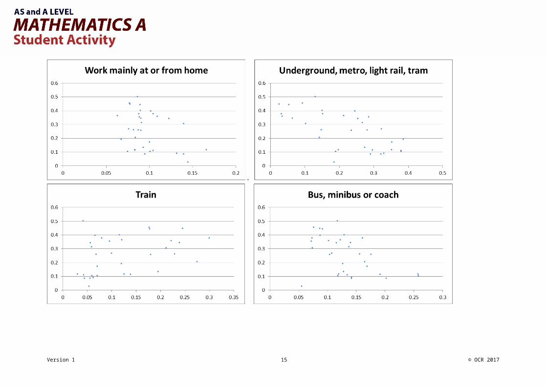
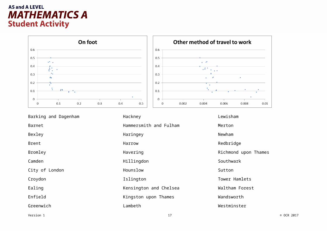
Large Data Set Starter Activity 1Small multiples – scatter diagramsThe small multiples on the next page each show the proportion of people who travel to work by driving a car or van plotted against the proportion who travel to work using each of the other 10 methods.This data is taken from Method of Travel to Work for the London Boroughs in 2011.
Take a moment to look through them for any obvious patterns or outliers, and then answer the questions below.
Do any of the scatter graphs show a correlation? What might be the link?
Do any of the scatter graphs show outliers? What features might that suggest for that LA?
Do any of the scatter graphs look like they might be made up of more than one distinct subpopulation? Can you explain why there might
be more than one type of Local Authority in this region?
Can you identify any LAs? Remember that they will always appear with the same vertical placement.
There is a list of the London Boroughs on the last page to help you.
Where would you expect your LA to lie on these graphs? Have a guess and then check against the LDS.
Version 1 8 © OCR 2017

.
Version 1 9 © OCR 2017

Version 1 10 © OCR 2017

Barking and Dagenham
Barnet
Bexley
Brent
Bromley
Camden
City of London
Croydon
Ealing
Enfield
Greenwich
Hackney
Hammersmith and Fulham
Haringey
Harrow
Havering
Hillingdon
Hounslow
Islington
Kensington and Chelsea
Kingston upon Thames
Lambeth
Lewisham
Merton
Newham
Redbridge
Richmond upon Thames
Southwark
Sutton
Tower Hamlets
Waltham Forest
Wandsworth
Westminster
Version 1 11 © OCR 2017

Large Data Set Starter Activity 2Small multiples – Box plotsMethod of travel to work 2011 - population
These stacked boxplots show data from Method of Travel to Work in 2011 for the whole county on this page and then for one Region on the next page.
Version 1 12 © OCR 2017

Method of travel to work 2011 – North West Region only
What are the crosses? Why are there fewer for the North West than the population?
Compare UMLT and Driving between population and the North West. What is different or the
same?
Why do some of the boxplots just look like vertical lines?
Where do you think your LA would fall on these boxplots? Have a guess and then check
using the LDS.
Version 1 13 © OCR 2017

Large Data Set Starter Activity 3Small multiples – Matching bar charts to Local AuthoritiesOn the next page are four bar charts showing the age structures of four Local Authorities in 2011 by proportion of the population.
These four Local Authorities are, in no particular order:
Somewhere a lots of people choose to retire to. A city with two universities. A central London Borough. A more surburban London Borough
Which graph represents which local authority?
How can you tell?
How sure are you? Is your answer a deduction or an inference?
Why are there so many more middle aged people than children or old people (Hint: there aren’t!)
Why do you think the particular age classes have been chosen?
What might be a better choice of graph if you wanted to make comparisons between age groups in one LA?
Do you reasons for allocating graphs to local authorities work both ways, e.g. do you think that all cities with two (or more)
universities will show the same feature(s) that you spotted?
Version 1 14 © OCR 2017
Version 1 15 © OCR 2017
Large Data Set Starter Activity 4
Correlation TableOn the next page is a correlation table for Method of Travel to Work in 2011 for the whole of England and Wales.
Each cell shows the Person product moment correlation coefficient (pmcc) for the two methods of travel in the row and column.
Cells containing values close to 1 are coloured dark green, those close to -1 are coloured dark red.
Why is there a diagonal line of dark green cells with 1 in?
Which methods of travel show strong positive correlation?
Can you explain this in terms of those types of travel?
Which methods of travel show strong negative correlation?
Why might LAs tend to have only one of these as a popular form of transport?
Are there any pairs of method of travel that show a pmcc very close to 0?
What does this tell you about these forms of travel to work?
Would you expect a similar table for the 2001 data to look similar or not?
What does this tell you about the relationships that you are seeing here?
Why might the pmcc not be appropriate for this data?
How could you verify the patterns you are seeing in this table?
How good is this table for making firm conclusions about the relationships between different methods of travel to work?
Version 1 16 © OCR 2017
Version 1 17 © OCR 2017

Large Data Set Starter Activity 5Comparing 2001 with 2011The graphs given below and on the next page show the number of people and the proportion of all people in employment who travelled to work using each method for 2001 and 2011. The first two graphs show the data for Leeds and the second show data for Bristol.
Version 1 18 © OCR 2017
What do the graphs tell you about the changes in each LA between 2001 and 2011?
What is the same between Leeds and Bristol? What is different?
Do the graphs of number of people and proportion tell different stories?
What other information about these LAs would be useful to help you to interpret these
graphs?
Version 1 19 © OCR 2017