obi 11g data visualization best practicesvlamiscdn.com/papers/collab2012-presentation2.pdf · •bi...
TRANSCRIPT

OBI 11g Data Visualization
Best Practices
Session 854
Tim Vlamis
Vlamis Software Solutions
816-781-2880
http://www.vlamis.com
Copyright © 2012, Vlamis Software Solutions, Inc.
Dan Vlamis
Vlamis Software Solutions
816-781-2880
http://www.vlamis.com

Dan Vlamis and Vlamis Software Solutions
• Vlamis Software founded in 1992 in Kansas City, Missouri
• Developed more than 200 Oracle BI systems
• Specializes in ORACLE-based: • Data Warehousing
• Business Intelligence
• Design and integrated BI and DW solutions
• Training and mentoring
• Expert presenter at major Oracle conferences
• www.vlamis.com (blog, papers, newsletters, services)
• Developer for IRI (former owners of Oracle OLAP)
• Co-author of book “Oracle Essbase & Oracle OLAP”
• Beta tester for OBIEE 11g
• Reseller for Simba and NAVTEQ map data for OBIEE
• HOL Coordinator for 2012 Collaborate Conference
Copyright © 2012, Vlamis Software Solutions, Inc.

Tim Vlamis’ Bio
Copyright © 2012, Vlamis Software Solutions, Inc.
• 20+ years experience in business modeling and valuation, forecasting, and scenario analyses
• Expert in principles and elements of design
• Expert in curriculum development and pedagogical theory
• Professional Certified Marketer (PCM) from AMA
• Active Member of NICO (Northwestern Institute on Complex Systems)
• Adjunct Professor of Business Benedictine College
• MBA Kellogg School of Management (Northwestern)
• BA Economics Yale University
[email protected] 816-781-2880

Highlights from Gartner’s BI Magic
Quadrant Report 2012
• BI and Analytics named as “Top Priority” for 2012
• “Organizations continue to turn to BI as a vital tool for
smarter, more agile, and efficient business.”
• OBI has highest aggregate “Ability to Execute” score.
• Broadest global deployment score
• Average user population nearly 3000
• Average data volumes nearly 5 Terabytes
• Below average complexity scores (mostly used for
static reporting)
• Below average ease of use scores
• OBI has low “data discovery” score

Many BI Systems Can Create
Beautiful Results

OBI Operates at a Different Scale

Data Visualization Usefulness
• Relies on accurate presentations of facts and
comparisons.
• Demands attention to principles of human cognition.
• Dashboards should be designed for effectiveness.
• Dashboards should transparently reveal data
selection.
• Dashboards should be designed around user roles
and needs.

Main Uses of BI Reports & Dashboards
Exploration Explanation
xkcd.com

Visualization Fundamentals
Copyright © 2012, Vlamis Software Solutions, Inc.
• BI reports and dashboards should be viewed primarily as
communication devices.
• Both the principles of human cognition and the needs of
the individual user should help guide their proper use.
• Humans are pattern seeking creatures.
• All perception is relative.
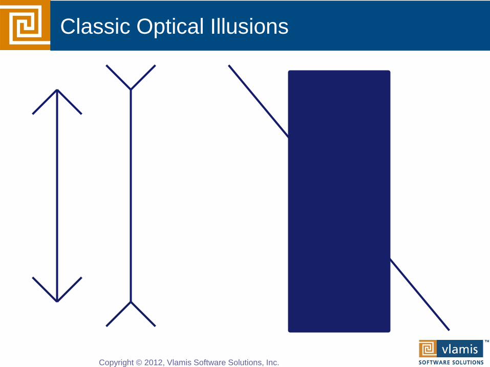
Classic Optical Illusions
Copyright © 2012, Vlamis Software Solutions, Inc.

How many colors do you see?
There are only 3 colors: White, green, and pink.
There seem to be two different shades of pink,
but there is only one pink.
Copyright © 2012, Vlamis Software Solutions, Inc.
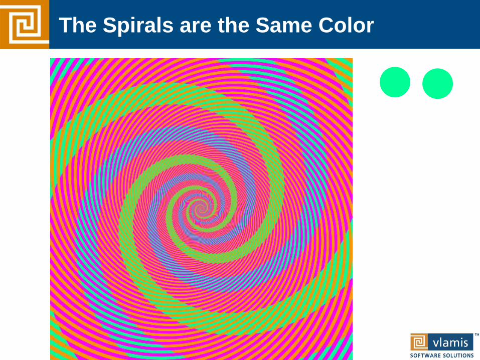
The Spirals are the Same Color
Copyright © 2010, Vlamis Software Solutions, Inc.
Copyright © 2010, Vlamis Software Solutions, Inc.

Which Soldier is tallest?
Copyright © 2012, Vlamis Software Solutions, Inc.

What Attracts Attention
Copyright © 2012, Vlamis Software Solutions, Inc.
1. Motion
2. Color
3. Size

OBIEE Intro Demo

Tufte’s 5 Principles
Copyright © 2012, Vlamis Software Solutions, Inc.
• Above all else show the data.
• Maximize the data to ink ratio.
• Erase non-data ink.
• Erase redundant data ink.
• Revise and edit.

Graphs and Tables
Copyright © 2012, Vlamis Software Solutions, Inc.
• Graphs and Charts depict visual representations and
relationships.
• Tables show data organized for lookup of specific, precise
values or items.
0
10
20
30
40
50
60
70
80
90
100
0.1 6 12 18
Month Number
New Product Market Penetration

Keys to Effective Tables
Copyright © 2012, Vlamis Software Solutions, Inc.
• Enable column and row sorting.
• Use appropriate number format.
• Avoid scrolling if possible.
• Lock titles if do use scrolling (BI Publisher)
• Display significant figures.
• Don’t imply precision that doesn’t exist.
• Judiciously use conditional formatting for data
exploration.
• Avoid putting text in color.
• Alignment, proximity, contrast.

Bad Table
Copyright © 2012, Vlamis Software Solutions, Inc.
WIDGETS TO GADGETS RATIO CALCULATED USING CHECK LEVEL DETAIL
ELECTROMECHANICAL PNEUMATIC
PERIOD IN-STORE WEBSITE DISTRIBUTOR IN-STORE WEBSITE DISTRIBUTOR
INCLUDES ONLY DATES FROM JANUARY THRU
OCT 2007
PERIOD 1 22.36% 11.37% 83.00% 85.34% 20.90% 46.80%
PERIOD 2 21.22% 15.25% 81.00% 81.31% 18.01% 35.39%
PERIOD 3 21.64% 13.22% 82.00% 78.29% 29.94% 41.28%
PERIOD 4 20.89% 13.44% 82.00% 47.82% 16.30% 39.46%
PERIOD 5 21.90% 13.24% 81.00% 84.58% 17.19% 20.52%
PERIOD 6 25.09% 14.78% 80.00% 59.93% 31.08% 35.14%
PERIOD 7 26.23% 14.98% 79.00% 36.35% 32.85% 22.52%
PERIOD 8 26.83% 13.08% 80.00% 82.10% 30.41% 36.10%
PERIOD 9 23.79% 14.27% 81.00% 43.40% 25.17% 23.81%
PERIOD 10 24.39% 12.61% 82.00% 38.21% 17.70% 40.30%

Better Table
Copyright © 2012, Vlamis Software Solutions, Inc.
Widgets to Gadgets Ratio
Electromechanical Pneumatic
Period In-store Website Distributor In-store Website Distributor
1 22% 11% 83% 51% 21% 40%
2 21% 15% 81% 74% 21% 32%
3 22% 13% 82% 48% 22% 23%
4 21% 13% 82% 58% 31% 30%
5 22% 13% 81% 52% 19% 28%
6 25% 15% 80% 87% 15% 22%
7 26% 15% 79% 51% 23% 20%
8 27% 13% 80% 44% 22% 45%
9 24% 14% 81% 54% 17% 31%
10 24% 13% 82% 75% 31% 29%
Ratios calculated using check level detail.
Periods include Jan - Oct 2007

Keys to Effective Graphs
Copyright © 2012, Vlamis Software Solutions, Inc.
• Do not use 3-D effects.
• Avoid “stop light” color palette.
• Prefer pastel color palettes.
• Avoid bright colors.
• Do not use round gauges or dials.
• Eliminate gridlines, drop shadows, and other
graphics.
• Enable interaction for “exploration” graphs
• Prioritize a single message for “explanation” graphs
• Alignment, proximity, contrast.


Using Color Effectively
Copyright © 2012, Vlamis Software Solutions, Inc.
• Consciously choose a color palate.
• ColorBrewer2.org
• Sequential schemes
• Designed for ordered data that progresses from low to high.
• Divergent schemes
• Place equal emphasis on mid-range values and extremes at
both ends of the data range.
• Qualitative schemes
• Used for nominal and categorical data where magnitude
differences between classes should not be emphasized.

Colorbrewer2.org
Copyright © 2012, Vlamis Software Solutions, Inc.

Dashboards Defined
“A dashboard is a visual display of the most important
information needed to achieve one or more
objectives, consolidated or arranged on a single
screen so that the information can be monitored at a
glance.”
• Stephen Few, Intelligent Enterprise
Copyright © 2012, Vlamis Software Solutions, Inc.

Dashboards Defined
A Dashboard is a visual presentation of current
summary information needed to manage and guide an
organization or activity.
Copyright © 2010, Vlamis Software Solutions, Inc.

OBIEE Dashboard Best Practices
• Dashboards should be customized to the needs of
individual users and groups.
• Dashboards should maintain and reflect organizational
standards so that they can be properly understood by
others in the organization.
• Dashboards should reveal their selection and
transformation of data in a transparent manner.
• Dashboards should be purposefully designed and
optimized for effectiveness.

Dashboard Standards
• Determine what colors are used for which products.
• Know the organization’s typical screen size so a
standard number of section columns can be determined.
• Set a standard location for prompts.
• Visually indicate which prompts control which analyses.
• Standards help with:
• Providing professional look and feel, which instill user confidence
• Standards help reduce development time and improve
productivity and consistency.
Copyright © 2012, Vlamis Software Solutions, Inc.

• Integrated toolset in OBIEE
• Follows “Balanced Scorecard” methodology
• Enables corporate goals and objectives to be
monitored and managed
• Includes strategy maps, strategy trees, KPI watch lists,
and cause and effect maps
OBI Scorecard & Strategy Management

Strategy Tree View
Copyright © 2012, Vlamis Software Solutions, Inc.

Strategy Map View

Humans Think Spatially
Copyright © 2012, Vlamis Software Solutions, Inc.

Why Maps are Powerful
Copyright © 2012, Vlamis Software Solutions, Inc.
Maps convey dense, multi-
dimensional relationships in data
faster and more intuitively than any
other graphical display methodology.

What is Spatial Data?
Copyright © 2010, Vlamis Software Solutions, Inc.
• Business data that contains or describes location
• Street and postal address (customers, stores, factory, etc.)
• Sales data (sales territory, customer registration, etc.)
• Assets (cell towers, pipe lines, electrical transformers, etc.)
• Geographic features (roads, rivers, parks, etc.)
• Anything connected to a physical location

Tufte Quote
Copyright © 2012, Vlamis Software Solutions, Inc.
“Clutter is not an attribute of
information, clutter is a failure of
design… fix the design rather than
stripping all the detail out of the map.”
Edward Tufte
The Visualization of Quantitative Information

When Are Map Views Useful?
Copyright © 2012, Vlamis Software Solutions, Inc.
• Visualizing data related to geographic locations.
• Showing or detecting spatial relationships and patterns.
• Showing lots of data in a relatively small area.
• Drilling down from a (map) overview to a detailed report,
chart, or graph.
• When is location important? Can the dimension be
plotted on a map?

Map View Tips
Copyright © 2012, Vlamis Software Solutions, Inc.
• Think about what scale to use. Different map scales will
reveal different patterns and insights.
• Use Variable marker to display two measures on a map
at a point – size and color.
• Avoid overlapping shapes too much.
• Be aware of spatial distortions E.g. Texas is larger than
Connecticut.
• Look at color palette. www.colorbrewer2.org

Map Definitions
• FEATURE • Provide a spatial context: cities, highways, rivers, etc…
• Features of Interest: store location, postal boundaries, pipelines, etc…
• STYLE • Define rendering properties for features
• Can control fill color, border color, line thickness, line style and more
• THEME • Collection of features
• Typically associated with a spatial geometry layer
• County/state boundaries, major highways, etc…
• BASEMAP • A grouping of themes to create a map
• Maps can share themes
• When associating a theme with a map, can specify min scale and max scale (sometimes known as zoom control)
• MAP • Basemap with additional themes overlain

Map Interactivity in OBIEE 11g
• Display BI data on top of maps
• Color fill
• FOI point display
• Interact with other Dashboard Elements
• Drive map content with dashboard prompts
• Drive map content through drilling and navigation
• Drive other dashboard elements through map interactions
• Reveal additional information on maps through mouseovers
• Drill to map detail

Map View Formats
• Color Fill (choropleth)
• Percentile, Value,
Continuous binning
• Dashboard user run-time
slider
• Graphs – Bar, Pie
• Adjustable graph size
• Series by second dimension
• Bubble (variable sized)
• Min-Max size specification
• Color specification
• Variable Shape
• Circle, Triangle, Diamond
• Customizable
• Image
• Imported via MapViewer
• More can be added from
MapBuilder
• Custom Point Layer
• Uses Lat / Long
• Does not require a Layer Def

NAVTEQ Data
• NAVTEQ is the leading global provider of digital map, traffic and location data that enables navigation and location-based platforms around the world.
• NAVTEQ data is licensed direct or through a reseller.
• Licenses are use specific.
• NAVTEQ data resides inside your own Oracle Database.
• NAVTEQ publishes an ODF (Oracle Data Format) version of its data designed specifically for use in an Oracle Database.

Demo of Oracle BI 11g Maps
5
0


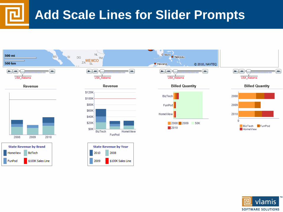
Add Scale Lines for Slider Prompts

Add Layers for Additional Insights

Variable Markers Add Insight

Master Detail Linking
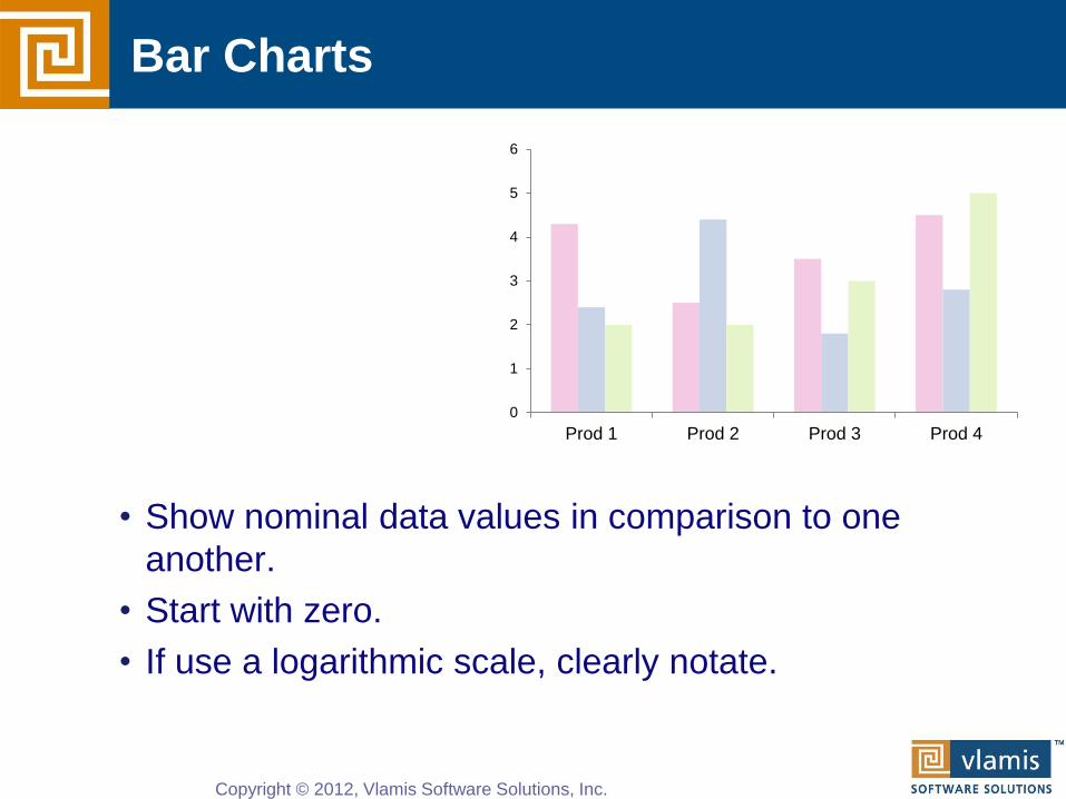
• Show nominal data values in comparison to one
another.
• Start with zero.
• If use a logarithmic scale, clearly notate.
Bar Charts
0
1
2
3
4
5
6
Prod 1 Prod 2 Prod 3 Prod 4
Copyright © 2012, Vlamis Software Solutions, Inc.

• Somewhat confusing, not great for representing
change.
• Total is most clearly represented number.
• Typically stack with largest values on the bottom.
• Single scale can make for interesting intra-bar
comparisons.
Stacked Bar Chart
0
5
10
15
20
25
Prod A Prod B Prod C Prod D
Copyright © 2012, Vlamis Software Solutions, Inc.

• Typically used for showing parts of whole by
percentage.
• Not great for piece to piece comparisons.
• Limit number of pieces.
• Can be interesting to show lots of pies together if
significant differences exist.
• Stephen Few hates them.
• Do not use 3-D.
Pie Charts
Prod A
Prod B
Prod C
Prod D

• Show a pattern or progression over a continuous range
or period.
• Can be valued within a range to highlight a particular
pattern (careful!).
• Maintain a rectangular shape close to golden
proportion.
Line Chart
0
1
2
3
4
5
6
Qtr 1 Qtr 2 Qtr 3 Qtr 4

• Shows single data points at the intersection of two
values.
• Often depict a large number of discrete data points
(hundreds or thousands).
• Useful for seeing the patterns in comparisons of two
variables.
• Trend lines are often added.
• Clearly notate if use logarithmic scale(s).
Scatter Plot
0
1
2
3
4
0 1 2 3

• Special type of scatter plot.
• Size of bubble is related to a third variable.
• Greatly reduces number of points that can be
depicted.
• Best for depicting approximate values and
comparisons.
Bubble Chart
0
1
2
3
4
0 2 4

Data Mashups are important
• Heterogeneous data sources are expanding
• Systems need to handle massive amounts of data
• Need a single “launching pad” for analytical info
• Believability, usability, and Calvin Mooers

Can Bring New Data Sources into OBI

Publish Other Information in OBI
• Creates a single “landing page” for analytic info.
• OBI can publish anything in HTML.
• OBI can interact with other websites either in frame or
in new window.

Questions and Observations
Copyright © 2012, Vlamis Software Solutions, Inc.
www.vlamis.com
816-781-2880

Copyright © 2012, Vlamis Software Solutions, Inc.
http://23.23.195.238:7001/analytics/saw.dll
?Dashboard
http://23.23.195.238:7001/analytics/saw.dll
?BIEEHome&startPage=1