not just fun with typography - texas state university
TRANSCRIPT
NOT JUST FUN WITH TYPOGRAPHY: REMEDIATION OF THE
DIGITAL IN CONTEMPORARY PRINT FICTION
THESIS
Presented to the Graduate Council of
Texas State University-San Marcos
in Partial Fulfillment
of the Requirements
for the Degree
Master of ARTS
by
Jonathan D. Polk
San Marcos, Texas
December 2009

NOT JUST FUN WITH TYPOGRAPHY: REMEDIATION OF THE
DIGITAL IN CONTEMPORARY PRINT FICTION
Committee Members Approved:
Deborah Balzhiser, Chair
Rebecca Jackson
Cindy Royal
Approved:
J. Michael Willoughby
Dean of the Graduate College

For my wife

iv
ACKNOWLEDGEMENTS
The production of such a project is not an isolated affair, and it pleases me to be able to
acknowledge the contributions of those who have helped guide me along the way. Deb
Balzhiser helped me originate this project almost two years ago and has provided
expertise and encouragement, and especially patience, through the false starts and
misfires that have eventually led to a completed project. I cannot imagine how lost I
would have been without her insight and critical eye.
Becky Jackson took a chance on me early on and has never wavered in her
support of my ideas and goals, and her assistance has helped sharpen this argument at the
conceptual and surface level equally. Cindy Royal provided a friendly ear and a fresh
critical perspective from which to view this project, helping me bridge two disciplines by
realizing that they aren‘t that different after all. I also received an abundance of support
from my colleagues in the Rhetoric & Composition and Technical Writing programs, all
of whom have left a collective imprint on my work. My family provided emotional and
financial support through the bulk of the writing, understanding when I skipped dinner or
didn‘t return a phone call for a couple of weeks.
However, not one word of this project would have ever made it on paper without
the support of my wife, Jessica Murry. So it is to her I dedicate this, my first sustained
piece of scholarship, for more than could ever be captured by mere words.

TABLE OF CONTENTS
Page
ACKNOWLEDGEMENTS ............................................................................................... iv
LIST OF FIGURES ........................................................................................................... vi
CHAPTER
I. INTRODUCTION .......................................................................................1
A New Form of Literacy ..............................................................................3
George P. Landow & Hypertext Theory ......................................................8
Methodology ................................................................................................9
II. REMEDIATION ........................................................................................11
Jay David Bolter‘s Theory of New Media .................................................11
N. Katherine Hayles & House of Leaves ...................................................18
III. HYPERTEXT THEORY ...........................................................................27
Four Axes for Analyzing Hypertext Theory ..............................................29
Reader Navigation and Page Construction ................................................37
IV. NOVELS EXISTING IN PRINT AS HYPERTEXTS ..............................41
Hypertext Encroaching on the Transparent ...............................................42
Hypertext Fully Remediated Into Print ......................................................53
V. CONCLUSION ..........................................................................................63
LITERATURE CITED ......................................................................................................67
VITA ..................................................................................................................................69

vi
LIST OF FIGURES
Figure Page
2.1 Remediation of the Digital on a Page of House of Leaves ..........................................23
3.1 Sample Page from Only Revolutions ...........................................................................30
3.2 Image Created by Typography: The Ludovician .........................................................33
3.3 Multilinear Narrative on the Printed Page: Ware‘s Jimmy Corrigan ..........................39
4.1 Explanation of Graphic Design Principles in The Learners ........................................44
4.2 Visual Representation of Screaming in The Learners .................................................47
4.3 Chart Containing Willie‘s Family Tree in The Monsters of Templeton ......................51
4.4 Red Marking Transform Page into a Palimpsest in Extremely Loud and Incredibly
Close ......................................................................................................................60

1
CHAPTER I
INTRODUCTION
In 2006, bestselling author Mark Z. Danielewski was nominated for the National
Book Award, perhaps the most prestigious prize in American literature, for his novel
Only Revolutions. The novel tells the story of two teenagers who are ageless and move
through time in an attempt to meet each other, a plot that itself is rather straightforward.
Yet the way Danielewski constructs his narrative for the reader is anything but: each side
of the book can be considered the beginning, with text on each page being followed with
inverted text that makes up the narration of the narration of the other teenager. Starting
on one side of the book, the text starts very large and is reduced on every page, creating a
balance as the first pages of one story are the last of the other. Compared to the other
nominees in 2006 and previous years, this was surely an unorthodox choice. Public
opinion of the book was highly negative, with many claiming that there was no real story,
only typographical trickery.
In an interview with Edward Champion, Danielewski stated that he didn‘t think
the critical vocabulary existed yet to talk about his book, for the models of critical
analysis traditionally used to critique fiction didn‘t contain the tools examine the layout
of his story (Segundo 79). Throughout the past ten or so years, since the debut of
Danielewski‘s first book, House of Leaves, more books seem to rely on this heightened

2
sense of their own materiality in order create meaning that wouldn‘t be apparent if the
authors had remained within the essayist‘s tradition a transparent text in which the
content of what is being articulated is of importance while the way in which such content
is articulated is not. If Danielewski is correct, then there exists a vacuum in critical
literature for analyzing such works that seemed to be becoming more mainstream and
garnering more and more acclaim.
Certainly some of these texts were being created because of digital technology
that makes the manipulation of images and changes in typography easy to effect. Such
constraints on the ability for authors and publishers to print novels the way they might
first have intended historically have been a recurring issue. Most famously, William
Faulkner suggested using colored ink as a means of delineating the multiple time periods
represented in Benjy's section of The Sound and the Fury rather than simply indicating a
shift in time with italics. Yet the cost of such decision was considered too expensive and
beyond the means of publishing at that time. Years later, Michael Ende had to fight to
have The Neverending Story published with green and red text to signify the switch
between reality and fantasy, and even today the novel is rarely published as anything
other than black ink on white paper.
Yet if the manipulation of images and typography in fiction with a heightened
sense of its own materiality is being effected due to the proliferation of word processing
programs and page maker software, then surely some of the ways in which we critique
electronic literature, literature conceived to be read digitally, can be applied to novels
with images and typographic affectations as well. Perhaps a critical model for their study
already exists; all that is left is for someone to apply it to print fiction.

3
In order to make this argument, I will demonstrate that print fiction with a
heightened sense of its own materiality is remediating the digital and therefore able to be
critiqued using the models developed for hypertext fiction. In exploring the ways in
which such analysis is able to address the physical properties of the text as well as the
meaning contained in the words, it will become apparent that authors of such works are
conceiving them with the digital writing space in mind, making such associations not
incidental, but instead central to the work‘s performance and interpretation.
A New Form of Literacy
Perhaps the most concise explanation of the history of images and text is found in
Scott McCloud‘s seminal work on the art of the graphic narrative, Understanding
Comics. He claims that as of the early 1800s, Western art and writing had drifted to the
opposite ends of the semiotic spectrum: art being ―obsessed with resemblance, light and
color, all things visible,‖ while writing was focused on the intangible representations of
senses, emotions, spirituality, philosophy, and so on (McCloud 145). From the time of
hieroglyphics, pictures and words were together at the intersection of resemblance and
meaning. But at this point in art history, the two were opposites, at least with respect to
the English language.
By following the history of art and literature, as McCloud demonstrates, one
must acknowledge that resemblance and meaning are beginning to become more
synonymous than since the time of hieroglyphs. Impressionism sent Western art towards
the abstract, yet the paintings of Seurat and others were still identifiable as objects one
can see with the naked eye. But afterwards, the rise of expressionism, futurism,
surrealism, cubism, abstract expressionism, and constructivism saw the artist head back

4
toward the intersection of resemblance and meaning with many striving for neither
―resemblance nor external ‗meaning‘‖ in their work (McCloud 147). In a sense, one
could view this move as a shift away from resemblance and back to the realm of the
ideas.
Meanwhile, the written word was also changing. Poets like Whitman began
turning away from the effusive language of Keats and Byron to a more direct and
colloquial style. Prose was becoming quite direct, ―conveying meaning simply and
quickly, more like pictures‖—reflections of the actual world (McCloud 147). Meaning
wasn‘t being abandoned, but authors seemed to be moving back towards the same
intersection between resemblance and meaning by making their prose at least seemingly
more directly representational of specific ideas.
This reintegration of resemblance and meaning simultaneously happening in
both writing and art has been well documented within the art community by artists like
Rene Magritte and others in high art, while popular culture exploited the two without
making any pretensions to being art at all. Though addressing history and making a
compelling argument, McCloud only explores how the art of the graphic narrative grew
from these events. But as any contemporary reader could attest, there has been an
integration of images and variable typographies into what has up to now been the
conservative genre of the novel.
Walter J. Ong provides some insight into this changing dynamic by delineating
the difference created in human thought when cultures move from an oral culture to a
culture based on print. In Orality and Literacy, Ong describes the effects of this change
by comparing it to the current shift our culture is going through in shifting away from a

5
print based system of thought to one of secondary orality in the emergence of the
electrical communication of radio and television. He points out that our understanding of
―the differences between orality and literacy developed only in the electronic age, not
earlier‖ (3). Thus, his insights into the initial change between orality and literacy during
the rise of the printing press and the physical writing space can help shed light on the new
literacy that has emerged in the electronic age.
Using the work of Ong as his foundation, to further examine the history of
writing, Jay David Bolter claims in Writing Space that one should always ask how a
particular writing space refashions its predecessor and how it claims to ―improve on
print‘s ability to make our thoughts visible and to constitute the lines of communication
for our society‖ (13). Bolter is specifically focused in this work on the new electronic
writing space that has emerged with the proliferation of computer technology in the past
thirty years, but is applicable to any new form of communication.
Bolter goes on to suggest that ‗remediation‘ is a shift in ―the sense that a newer
media takes the place of an older one, borrowing and reorganizing the characteristics of
writing in the older medium and reforming its cultural space‖ (23). A simple example of
this practice is to take a look at the hypertextual components that make up the front page
of a daily newspaper, with many ‗links‘ to stories later in the paper printed above the fold
in order to catch the attention of a wider audience in the same way that websites publish a
large amount of content ‗above the fold‘ as well. One might also say that the integration
of images into the texts of contemporary fiction could be seen as remediation, when the
proliferation of blogs in which such writing easily and often takes place influences those
writing and publishing for a wider more conservative audience. Likewise, as audiences

6
have become more familiar with this sort of narrative incorporating visual and textual
elements, they have become more receptive to it showing up in a genre such as the novel.
In Bolter‘s estimation, what is currently happening is a ―readjustment of the ratio
between text and image in various forms of print,‖ something that in the context of
contemporary fiction is quite obvious (48). As the use of graphic elements increases,
further attention will have to be paid to the role this is playing in the way authors are
constructing fictional narratives. For even though the elements included seem to oscillate
between being signs and being images, it is ―rather the reader who oscillates in his or her
perception of the elements‖ (63). Any student of reader response theory would be forced
to admit varying ways such elements can be interpreted and how these interpretations can
lead the reader to create meaning in different ways.
Bolter claims that in ―uniting the verbal and the pictorial, the screen constitutes a
visual unit that depends on but also attempts to surpass the typography of the printed
page‖ (66). However, in texts such as Jonathan Safran Foer‘s Extremely Loud and
Incredibly Close and Lauren Groff‘s The Monsters of Templeton, the verbal and the
pictorial are united in a way that attempts to surpass the average typography on a printed
page as well, quite possibly due to the very remediation that Bolter is arguing for.
Instead of analyzing works of this nature, which he gives only the barest of mentions,
Bolter instead looks into the realm of hypertextual fiction, and the way the electronic
writing space is adopting characteristics of the physical writing space in order to help
orient readers to the new format.
However in reviewing these hypertexts, Bolter writes that ―the links have the
same status as verbal episodes,‖ and therefore it is appropriate ―for the reader to look at

7
the formal arrangement of the text as it is to get lost in the story‖ (185). This dovetails
nicely with John Trimbur‘s assertion that we as scholars should pay attention to delivery,
the overlooked fifth canon of rhetoric, rather than the classical approach of looking at the
text as transparent. Rather than looking through the text to what the author is saying, we
should take time to examine how he or she is saying it as well.
In an earlier work titled Remediation and written with Richard Grusin, Bolter
puts his theory into a greater historical context, giving credence to looking at the novel as
an evolving from that is now incorporating visual elements frequently. Grusin and Bolter
argue that new media is doing exactly what old media has done: present themselves as
refashioned and improved versions of other media. Using such examples as the
photograph‘s more precise capture of reality than the painting, the two point out that ―no
medium today seems to do its cultural work in isolation form other media, any more than
its works are in isolation from other social and economic forces‖ (15). Therefore, it is
imperative that when focusing on the method of delivery, one does not lose context of the
factors surrounding a work‘s creation. In the instance of contemporary fiction
incorporating images into its text, it is necessary to look at the ways that other media are
using the same practices.
Though it seems obvious that the sort of novels containing images and different
typographies would fit well within the current discussion regarding remediation and the
way digital literacy is influencing that of written literacy, a study into the practice has
not, in my knowledge, been attempted. Recent essays on narrative across media have
instead focused on removing the role of media from narratives altogether, claiming that
narrative is instead a cognitive faculty that works independently of the method of

8
delivery (Walsh 860). The need to contextualize these works within the greater studies of
new literacy to create a legitimate new branch of research is necessary.
George P. Landow & Hypertextual Theory
George P. Landow begins the third volume of his work on hypertext, Hypertext
3.0, by claiming that ―critical theory promises to theorize hypertext and hypertext
promises to embody and thereby test aspects of theory‖ (2). For Landow, hypertext is a
boundary object where ―unconnected areas of inquiry, have increasingly converged‖ (1).
It is in this middle space that Landow not only surveys the poststructuralist and
deconstructionist nature of hypertext, but he also examines how hypertext reconfigures
paradigms of writer/reader/text/narrative.
Landow‘s central thesis is that hypertext, which he defines as lexia connected by
links, blurs the borders between reader and writer, thus embodying an ideal textuality
described by Barthes. It is an open textual space where no one thing is given sole
authority. While Landow is reluctant to completely do away with the distinct roles of
author and reader, much of Hypertext 3.0 examines the narrowing space between the two.
Hypertext allows the reader to participate more actively in the text, choosing his/her own
pathways, and thus enabling him/her to connect to the text in more meaningful ways. In
this sense, hypertext fosters collaboration.
Landow notes that many scholars are concerned with the ―disorientation problem‖
(145). They evaluate the quality of hypertext based on its functionality – on how well a
user can navigate through the space without getting frustrated or lost. In this regard,
disorientation ―is presented as such a massive, monolithic problem‖ (146). He suggests
that scholars should instead pay attention to how readers respond to disorientation.

9
Perhaps by learning how readers respond to disorientation, an author can exploit it to his
or her advantage.
Landow does admit that hypertext is not just about linking. A writer cannot
randomly link lexia and create a powerful hypertext just as a writer cannot randomly link
words and create a powerful text. ―Since hypermedia systems predispose users to expect
significant relationships among lexias, those that disappoint these expectations tend to
appear particularly incoherent and without significance‖ (Landow 153). Links need to be
meaningful. There needs to be a rhetorical structure, and he devotes a significant portion
of the book as a how-to, describing specific design and linking strategies and examining
the current body of hypertext. And while he admits that electronic literature is still
evolving, he remains confident that hypertext will have a place within it. However,
Landow does not consider the possibility that hypertext can and quite possibly will be
remediated into print. Electronic fiction has been marginalized by the marketplace and is
not widely read, while books like Only Revolutions or Foer‘s Extremely Loud and
Incredibly Close are bestsellers and have been nominated for prestigious awards.
Landow seems to be unwilling to accept popular culture concerns into his scholarship,
thus ignoring an entire segment of literature that, as we will see, falls directly under his
arguments about hypertext.
Methodology
Contemporary novels with a heightened sense of their own materiality are in fact
hypertexts in print and thus can and should be analyzed as such, for such texts are not
merely marked by digital but instead formed by it. In order to test this idea, I selected

10
novels published since the year 2000 which displayed properties such as images, variable
typographies, and complex page structure.
This thesis demonstrates that the digital is remediated into print using the criteria
established by Bolter and Grusin. Thus, works of fiction containing images and
employing other visual media can be considered a remediation of the digital rather than
merely as a transparent text, as criticism of the novel has historically done. I use the
prominent example of Mark Z. Danielewski‘s House of Leaves to demonstrate how such
remediation is accomplished.
After a justification for the digital being remediated into print in contemporary
fiction has been made, I then employ Landow‘s criteria for hypertext classification in a
discussion of the similarities and differences between two print novels which rely on their
materiality to produce meaning with a prominent hypertextual novel by Geoff Ryman.
This will demonstrate the ways that novels can be analyzed using hypertext theory, which
allows for the critical framework needed in order to evaluate the layout and other material
elements that modern literary criticism fails to address.
Finally, I closely analyze several fictional works in print containing a heightened
sense of their own materiality in order to demonstrate how the digital writing space is
being used by authors and underscoring the necessity of analyzing them using models
developed for the analysis of the digital, for they are conceived as such and digital
elements are not incidental to their structure.

11
CHAPTER II
REMEDIATION
Jay David Bolter‘s Theory of New Media
In Remediation, Jay David Bolter and Richard Grusin‘s study of the influence of
old media on the emerging digital media, the authors argue that not only is the study of
the way new media refashions older media necessary, but of equal importance is to study
―the ways in which older media refashion themselves to answer the challenges of new
media‖ (15). When considering texts using unique page design as well as images and
variable typographies, we can recognize the old medium of print attempting to refashion
itself by adopting techniques used by newer media such as the Internet. Each reader can
form his or her own conclusion about whether such attempts are successful or even
consciously adopted, yet regardless of whether we believe that the ‗challenges of new
media‘ have been answered, it is inarguable that the influence can be seen.
Before getting any further into an analysis, perhaps we should pause and analyze
exactly what Bolter and Grusin mean when they say remediation has been ―present
throughout the last several hundred years of Western visual representation‖ (11).
Pointing out that while a painting, a photograph, and a virtual reality computer system are
different in many important ways, they ―all are attempts to achieve immediacy by
ignoring or denying the presence of the medium and the act of mediation‖ (2 Bolter 11).
12
In other words, the creator of each work is not just trying to create something
representational, perhaps a boat on an ocean for example, but instead attempt to force a
viewer to look through the medium and accept the representation of a boat as the actual
thing.
When using the term ‗remediation,‘ Bolter and Grusin are referring to ―the
representation of one media in another,‖ and argue that this ―is a defining characteristic
of new media‖ (45). This may seem a bit esoteric at first, yet the practice is so
widespread that we rarely realize it because we are exposed to it so frequently. For
example, there are numerous websites that offer pictures or texts for download. In these
instances, the electronic medium is not set in opposition to painting or photography, but
rather offered as a new means of gaining access to these older materials. At times the
creators of the electronic media would like to have the medium be transparent, for it
shouldn‘t really matter whether one sees a photograph in an album, a copy of National
Geographic, or a computer screen, though we know that such transparency is impossible
for these different contexts provoke differences in interpretation for the viewer.
However, other creators may wish to bring the digital medium to the forefront and not
deemphasize its role at all. For example, the creators of online encyclopedia Wikipedia
are practicing remediation as they present a print encyclopedia in a digital writing space,
and gain credibility by staying faithful to the older medium‘s character. But rather than
be a faithful recreation of the older medium, hyperlinks and the ability for users to
instantly edit entries makes the abilities of the digital writing space serve the innovation
of the print one, doing anything but vanishing into transparency.

13
As anyone who grew up without a computer already knows, writing with a piece
of paper and a ballpoint pen is a different skill than writing on a computer with a word
processor, which in turn is different from writing with a printing press. Walter Ong
writes about the technology of writing and the way that new forms, such as the move to
the printing press or the word processor, are natural evolutions of an unnatural act (82).
This of course means that there is no natural process for writing; it is a learned skill and
our alphabet is a means of representation for speech that itself is invented. But what this
basically boils down to is the fact that writing is evolving with the introduction of new
ways in which to compose; with the computer programs available now for authors to
often act as their own typesetters, it logically follows that the process is different from
that of the author who stacks up hundreds of pieces of paper as he pulls them out of a
typewriter. Technology allowing the introduction of visual media into print texts to be
affordable and therefore able to be exploited on a wide scale problematizes Ong‘s idea
that writing is merely a means of representing speech for such visual media often is not
analogous to written words. Such a shift in the production of fiction suggests that the
medium of print is evolving into one that fully exploits the capabilities of print space.
That said, objects are often remediated on any number of levels, and a creator can
highlight or downplay this fact in the way that one media is presented in another. For
example, accompanying the biography of person in an online encyclopedia is often a
photograph. That photograph is a mediation of the actual time in which the person‘s
likeness was captured, and the photograph‘s image on a webpage is a representation of
the photograph, creating (at least) two layers of remediation. In such a case, the
remediation is meant to be transparent, for it is unlikely that a reader will consciously be

14
aware of this fact nor would it matter to them for it wouldn‘t change the manner it which
such an image is read.
Another such example can be found in the work of Kurt Vonnegut, who routinely
inserted his own drawing into the text of his novels, remediating the medium of the
drawing into the medium of the text. In Breakfast of Champions, Vonnegut presents
many images but only as a way to further describe an object that has been narrated: for
example, when the protagonist encounters a chimpanzee wearing a ―little blue blazer with
brass buttons, and with the seal of the President of the United States sewed to the breast
pocket,‖ he then inserts a drawing of a blazer with very long sleeves (90). The
remediation of the image into the text of a novel is downplayed as it acts as further
description of a blazer which has already been described with words, each referring back
to the other. This is a counterpoint to using an image as purely symbolic, leaving the
reader with the ability to interpret it in a variety of ways, a rhetorical move that would
foreground the image as a full component of the words in at text rather than being
subservient to the text‘s description. For example, if Vonnegut would have instead
written that the protagonist saw a chimpanzee ―wearing this,‖ and following with the
image, the referent description wouldn‘t exist anymore and force the reader to conjure up
such a description him or herself, making the image of the blazer purely symbolic rather
than ceding some of its symbolism to the description.
Yet there are other instances in which the process of remediation is meant to be
highlighted, such as the way the front page of newspaper was initially remediated onto
the electronic writing space as a way to familiarize readers with the way to read the
content presented only to itself remediate the electronic writing space years later. For

15
example, as the electronic writing space began to take form, it adopted properties of the
newspaper with the use of columns, multiple headlines, and layout in order to provide the
reader with something familiar as they tried to make sense of the new medium. As web
usage grew, the newspaper started to adopt principles of the electronic writing space,
most noticeably by placing hyperlinks on the front page to stories that are printed later in
the paper by placing a short tagline with the page number on which the story can be read.
In the first case, designers were adopting an older medium‘s principles to provide
familiarity to readers; the latter exhibits how the older medium of the newspaper adopted
principles of and used the reader‘s familiarity with the electronic writing space to
remediate its properties into its layout, allowing the reader to bring along the literacy of
the electronic medium and use it in a print one.
Another way in which the process of remediation is meant to be fore grounded is
in works of fiction that remediate visual media into print in an effort to blend the two
perspectives of looking at a page into a multilayered and complimentary one: the
transparent ideal in which a reader is immersed in a fictional world and scarcely aware of
the page as a material object; and a reader‘s focus on a page as a material object in which
innovative typography and/or images encourage one to focus on the page‘s physical
properties.
Modern art also provides a key example for the way in which remediation is
interpreted by Bolter and Grusin. Classical art, like the portraiture of da Vinci‘s Mona
Lisa or realistically depicted scenes like Brueghel‘s The Fall of Icarus, often was seen by
artists as a reflection of the external world. By eliminating the world as a referent,
modern painters emphasized the reality of painting and its product. In diminishing

16
painting‘s representational function, artists ―sought to achieve an immediacy of
presentation not available‖ to classical painting where immediacy was achieved by
concealing signs of mediation in thinking of the frame as a window a viewer is looking
through to see an actual scene (1 Bolter 58). Refusing to be realistic, modern art
separated the real and the representational but maintained its immediacy by reversing one
of the principles in classical art: the mediation was foregrounded due to the lack of
representation. The works of Picasso conjure visceral emotion in most viewers, yet the
characteristics that make such a reaction possible were due to the artist not trying to
replicate reality as in a standard photograph or a painting by an artist like Brueghel, but
instead attempting to mediate reality by trying to recreate emotion through abstraction
rather than realism. But realism also provides us with an example of remediation in the
sense that any attempt to capture or recreate reality is itself a mediation of reality, and as
media themselves are real, viewing media becomes a remediation of the real on (at least)
one level.
Perhaps the most historically salient point to be divined from their research when
studying page design is the large initial capital letters in medieval manuscripts that may
be elaborately decorated while still constituting a part of the text itself. Usually seen in
bibles, these sorts of designs created a text that functions as merely the transparent
embodiment of the intended meaning of the words while simultaneously acting as a work
of visual art meant to create a certain reaction on their viewing, usually one of awe at the
power of God or the church. This early integration of text and image can be seen today
in new media with such examples as the icons on a computer screen, which often have
explicit or implied text accompanying an image, both contributing more to the user‘s

17
divining meaning that either would separately. As early as medieval times and in modern
art, we can see that the very notion of a transparent text has been called into question,
thus making a study of how a text conveys meaning as valid as the study of what a given
text means.
In the second edition of a work focusing on the way print is being remediated into
the digital writing space, aptly titled Writing Space, Bolter does more than question
whether print can compete with computers, asserting that ―print is associated so strongly
with verbal text‖ that alphabetic texts may not be able to ―compete effectively with the
visual and aural sensorium that surrounds us‖ (6). But what he fails to mention is that
prose texts have incorporated images and colors into their narrative since medieval times
and in fact provided one of the influences for the digital space in its infancy. Authors of
fiction incorporating images and variable typography see what is possible when writing
in the digital space, yet since print remains the dominant method of achieving critical
acceptance and financial remuneration, some of the benefits of that digital space must be
remediated into print. In examining the history of writing, Bolter seeks to show not only
how a writing space refashions its predecessor, but also how an emerging writing space
claims ―to improve on print‘s ability to make our thoughts visible and to constitute the
lines of communication for our society‖ (13). However, he spends more time on
examples like the reflection of newspapers in the digital world as well as the reverse,
neglecting to spend time with how fiction is being affected by these changes. Or rather,
Bolter is more interested in the electronic book and interactive fiction than he is with
what print has been doing in this area for the past ten years or more. That is why my

18
thesis addresses the integration of the digital into print in fiction, giving attention to topic
that has been virtually ignored by scholars in this area.
Bolter notes that remediation is perhaps always mutual and that ―older
technologies remediate new ones out of both enthusiasm and apprehension,‖ which can
be applied to the integration of visual media into print (1 Bolter 48). However, his claims
are addressed to print at large, and while I suppose one might maintain that the
integration of visual media into the print space could be one of apprehension with regards
to media like newspapers and magazines, in the sense that there is fear that old media will
be consumed and discarded with this shift, I do not feel that ‗apprehensive‘ is a word that
should be applied to writers of fiction. He also presents the use of images to combat
ekphrasis, the use of words to describe the visual in an effort to present something with
words that in fact is inherently visual, he fails to really situate this argument into a
specific context when it comes to either the print or digital writing space. That absence
perhaps inadvertently argues for a study of the visual elements in print, for Jonathan
Safran Foer, author of Extremely Loud and Incredibly Close, a work using a variety of
visual media on the printed page, has said that he uses said elements only when it is the
best way to convey his intended meaning to the reader (Segundo 57).
N. Katherine Hayles & House of Leaves
N. Katherine Hayles astutely points out the obvious but overlooked: all literature
in the twenty-first century is digital. Nearly all ―print books are digital files before they
become books; this is the form in which they are composed, edited, composited, and sent
to the computerized machines that make them books‖ (1 Hayles 99). As a result, current
literature should be considered electronic texts in which print is considered the output

19
form. This of course means that while the print tradition influences the way these texts
are conceived and written, the mark of the digital writing space is present as well.
When writing transitions from one medium to another, whether it be from scroll
to codex or mechanically generated print to electronic textuality, it ―does not leave
behind the accumulated knowledge embedded in genres, poetic conventions, narrative
structures, figurative tropes,‖ and so on (1 Hayles 106). Rather, as Bolter argues, this
knowledge is carried forward into the new medium, typically by trying to replicate the
earlier medium‘s effects within the new medium‘s specificities. Perhaps it is a question
of connotation, but Hayles seems to again be overlooking the obverse: if digital text is
influenced by print, then it also influences print. As Bolter and Grusin demonstrate, the
newspaper, to pick a medium at random, shows signs of being influenced by the digital
writing space such as its hyperlinks on the front page to stories inside the paper.
In order to make such arguments concrete within the context of print fiction
incorporating visual media, it will be helpful to analyze a work through this perspective.
Mark Z. Danielewski‘s bestselling novel House of Leaves not only is a prime example of
how one media is remediated into another, most prominently film, but I argue that it also
centralizes the idea of remediation within its narration. Therefore, he is able to collapse
the two perspectives of transparency and physicality of the text on a printed page into one
by presenting a text whose very shape, color, and layout influences the way in which the
content is understood.
The putative subject of the novel is The Navidson Record, a film produced by
world-famous photographer Will Navidson after his family moves into a house which is
revealed to be a shifting labyrinth of enormous proportions, much bigger on the inside

20
than it is outside. This leads to a series of horrors which are recorded onto video cameras
that Will installed throughout the house to record their move. From this video, Will
made The Navidson Record, which then becomes the subject of a sprawling commentary
by an old man named Zampano on all sorts of media, from paper as one would expect to
the back of stamps which one would not. When he is found dead, a trunk containing all
his notes and speculations about the film is delivered to twenty-something Johnny Truant,
who sets about to order them into a commentary to which he provides footnotes, which
become a competing but complimentary narrative of their own. Zampano‘s commentary
is set in Times font and ―occupies the upper portion of the pages while Johnny‘s live
below the line in Courier, but this initial ordering becomes increasingly complex as the
book proceeds‖ (2 Hayles 780). The very synopsis of the story quickly summarizes
many of the appearances of remediation within the narrative. The events of moving into
the house are filmed by Navidson on cameras, which are then remediated when edited
into a film. Zampano‘s commentary on the film remediates it yet again and provides the
eyes through which the reader sees the film. As Johnny‘s commentary remediates
Zampano‘s, creating even more distance from the original, the idea that Danielewski is
purposefully making these remediations transparent is hard to argue, for as he integrates
visual media into the narrative the story becomes of remediation through remediation.
As one might expect from a documentary, events in The Navidson Record aren‘t
presented in chronological order, and while it is possible to construct an approximation of
what happened when, the complex system of remediation detailed above makes such an
attempt problematic. Hayles differs between several different methods by which the
mediation in the plot is narrated, proceeding ―from the narration of the film as a

21
representation of events; to its narration as an artifact, in which editing transforms
meaning; to the narration of different critical views about the film; to Zampano‘s
narration as he often disagrees with and reinterprets these interpretations; and finally to
Johnny‘s commentary on Zampano‘s narration‖ (2 Hayles 783). As the idea of
remediation is central to this novel, I focus on it here in order to show that what the
reader gets is already mediated five times from the actual occurrence (even if only
imagined), and it an be inferred that extended to encompass the changes the editors and
publishers made to Johnny‘s compilation in order to ready it for publishing. The
chronology complexities are varied, but mainly stem from recognition that ―the narration
is not an oral production but a palimpsest of inscriptions on diverse media‖ (2 Hayles
784). Thus the architecture of the story is not envisioned as a sequential narrative, as the
transparent novel necessarily is, but rather as a combination of multiple avenues of within
the space/time of the novel, effected by the reader in his/her decision on how to navigate
from one inscription surface to the next. While narratives that unfold non-sequentially
are anything but rare, a typical layout in a novel keeps time and space linear because the
story shifts in time section by section, meaning that any specific space on the page exists
in a specific time as well. Much of House of Leaves exists as a presentation of
Zampano‘s notes, which were written at a specific moment in time, but were compiled
and are commented upon by Johnny creating a palimpsest in which different times exist
in the same space, causing a reader to make decisions about how he/she is going to
assimilate the information. There are multiple paths available to the reader, for one can
focus on Zampano‘s narrative and only use Johnny‘s notes to contextualize it, or one an
do the opposite and rely on Johnny‘s explanation over the narrative of Zampano. Such

22
choices qualify many sections of this novel to be seen as possessing a multilinear
narrative.
By establishing the impossible house that is bigger on the inside than it is on the
outside, with an interior that is constantly changing, Danielewski renders it as ―a flexible,
topological form capable of infinite and seamless modification; a postvisual figure
immune to the laws governing the phenomenology of photography, cinema, and video; a
logic of transformation whose output is disproportionate from its input‖ (Hansen 608-
609). With such a perspective articulated, one can see the house as a figure for the
digital.
The ninth chapter of the novel recounts ―Exploration #4,‖ in which the adventurer
Holloway and his team encounter further evidence of the house‘s warped expansions and
hear a bestial growl that concretizes the unknown danger present and eventually drives
Holloway insane and eventually to his death. Danielewski is directly comparing the
house with the digital, for when writing in a word processing program, all sorts of
changes take place at the digital level even if the change one can see is negligible.
Interspersed throughout the narration of the exploration and serving to interrupt its
progression are a series of unorthodox typological innovations such as upside down and
horizontal footnotes that ―literally carve into the space of the text‖ (Hansen 609).
Perhaps the highlight of this passage is the footnote marked 144 that is situated within the
page in a blue-lined frame set near the top of the page and containing a necessary partial
list of everything that is not within the house (119). Here the ―outside world punctures
the closure of the fictional world in a particularly destabilizing manner, since it could be
extended indefinitely‖ (Hansen 609). Not only does the list of what is not in the house
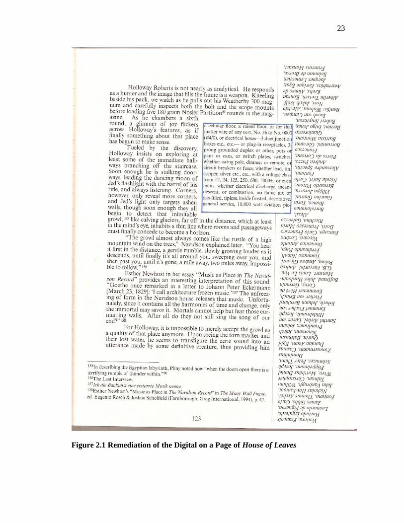
23
Figure 2.1 Remediation of the Digital on a Page of House of Leaves

24
run on for fourteen right-hand pages on the book, but also its appearance through the left
hand pages presents the text in reverse, as if the normally opaque nature of the page was
rendered transparent. This sequence culminates in a blank box still outlined in blue,
followed on the very next page by a solid black box with the blue outline, and then on the
next by a larger unframed box of blank white space imposed directly on and obscuring a
single passage devoted to the capacity of digital technology to manipulate images. In
order to help visualize such a complicated layout, one of the pages has been reproduced
here in Figure 2.1.
The footnote being outlined in blue directly links it with the house, a word which
is written in blue ink each time it appears throughout the text. Hayles compares the blue
color to the digital blue screen that is used as a movie backdrop onto which anything can
be projected (2 Hayles 792). His interpretation would suggest that Danielewski is
remediating the medium of film and using the blue box as a blue screen by projecting into
it ―the linguistic signifiers for everything in the world, as if to make up through verbal
proliferation the absolute emptiness of the house as a physical space‖ (2 Hayles 792). So
not only is the footnote encased in the blue box a remediation of film and digital space, so
too is the house itself, which is likewise indicated in blue ink at each and every time it is
named. The presence of the un-bordered white box obscuring a passage on the
improvements of real-tie recording technology serves to highlight a disjunction between
the text and the media recorded by such devices. In other words, Danielewski designs the
page in order to remind the reader that such recording technology mediates its subject,
presenting it as different due to the medium‘s perspective, just as the text remediates the
digital in the way it is presented. By noting that digital ―manipulation allows for the

25
creation of almost anything the imagination can come up with,‖ Danielewski is
demonstrating how the digital can be used to create things which are impossible yet can
be conceived, like a house that is bigger on the inside than it is on the outside, and thus
establishing that only by remediating the digital into print can the force at the center of
his novel exist (144).
To contrast the densely worded pages in chapter nine, the tenth chapter uses large
amounts of white space to render visual pattern that mimic the narrative action, creating a
mimetic text. For example, when a rope holding a gurney begins stretching as the
staircase suddenly expands, the text itself also stretches, taking three pages to inscribe the
word ‗snaps‘ (294-296). Other passages see the text on the page decreasing as Navidson
crawls into tighter and tighter passages, as if the text were being squeezed along with his
body. Danielewski has pointed out a that such passages can be seen as a subtle
correspondence between reading speed and the emotional pacing of the narrative (2
Hayles 796). He draws an ―analogy with filmmaking techniques that correlate the
intensity of the scene with how much the viewer‘s eye has to move across the screen,‖
which suggests that the use of typography in this manner can create a similar response in
a reader‖ (2 Hayles 796). Thus we can see another way in which Danielewski‘s text
remediates another medium into print and works simultaneously on both the transparent
and physical level with he combination doing more than either could alone.
One will likely find it unsurprising that a house with a huge, shifting interior is
described as a labyrinth and therefore the mythical Minotaur is invoked. Each passage
concerning the Minotaur is marred with an overstrike mark that is often used in the
digital writing space. The device also operates as a hypertext link, for when it appears

26
over text that is not obviously about the Minotaur, it works to connect that text with the
mythological beast.
With a text as ripe with remediation both in theme and execution as House of
Leaves, it becomes obvious that Bolter and Grusin‘s theory can easily be applied to
works which display a heightened sense of their materiality. Though it is odd that Hayles
would detail so much of the remediation in Danielewski‘s book only to seemingly
disregard print novels and move in the direction of works conceived and published in the
electronic writing space with a later paper. Forward thinking in the medium that is likely
to become further dominant in the future is important and justified, as the work of these
and other scholars have proven, yet it is also important to analyze and understand how
authors are remediating the digital space into their printed novels. Such works are prime
examples of an older medium using a newer one to refashion itself in order to replicate
the digital culture in which they are created, and rather than being apprehensive about the
move, authors like Danielewski seem to be freed by this shift, creating and conceiving
works that are almost impossible to comprehend with a pre-digital mindset.

27
CHAPTER III
HYPERTEXT THEORY
As it has become clear that print novels which display a heightened sense of their
materiality are remediating visual media and the digital writing space, it becomes a small
leap to place such works within the tradition of electronic literature. As N. Katherine
Hayles cautions critics to avoid ―applying critical models designed for print‖ to works of
electronic literature in fear that ―the new possibilities opened for literary creation and
interpretation will simply not be seen,‖ she neglects to consider whether the models
conceived for electronic literature might be used on works of print, and whether this
might cause the scholarly community to reevaluate works with this new critical
framework (1 Hayles 121). Therefore, it seems prudent to apply the critical apparatuses
developed for hypertext to works in print that have been demonstrated to remediate the
digital writing space by incorporating visual elements and other characteristics that space
is known for.
George P. Landow seems to understand the lack of significant difference between
literature presented in the electronic space and that presented in print in Hypertext 3.0
where he argues less about the writing space in which a work is conceived and more
about how critical apparatuses can be applied regardless of the manner conceived or the
output generated. In differentiating between texts that display a heightened sense of their

28
own materiality and those that conform to the essayist notion of a transparent text, he
claims that in the former ―a nontrivial effort is required to allow the reader to traverse the
text,‖ implying that in the latter little to no effort must be expended in order to make
one‘s way through the text (Landow 42). While Landow‘s claims are normally seen to
encompass digital works like Michael Joyce‘s Twelve Blue or Geoff Ryman‘s 253, a
nontrivial effort can also be said to apply to similar types of works conceived in print
form as well, such as the Choose Your Own Adventure series of children‘s books in
which a reader navigates to different pages at the end of each passage depending upon a
choice with which he or she is faced.
Therefore, it may be of value to examine ways in which such works in print might
be analyzed using the four axes Landow conceives in which one can analyze a text to
determine if it meets the criteria of hypertext: reader choice, intervention, and
empowerment; inclusion of extralinguistic texts; complexity of network structure; and
degrees of multiplicity and variation in literary elements (217). He implies that works
falling into such categories could be subject to the critical models developed to
investigate hypertextual narratives regardless of the medium in which they are presented,
making a connection to print novels that remediate the digital space apt. In outlining the
principles that Landow has created, I will use Ryman‘s 253 as an example to ground the
analysis within a work that clearly falls under the sphere of electronic literature,
following with examples derived from print works with a heightened sense of materiality
such as Steven Hall‘s The Raw Shark Texts and Mark Z. Danielewski‘s Only Revolutions
to demonstrate how elements in print fall under Landow‘s axes.

29
Four Axes for Analyzing Hypertext
Landow‘s first axis for determining the hypertextual nature of narrative is formed
by ―reader choice, intervention, and empowerment,‖ something which can not only be
applied to the Choose Your Own Adventure series but also is one of the hallmarks of the
current perspective on hypertext narrative (217). Ryman‘s 253 was conceived with the
idea that a subway train in London has 252 seats that can sit 252 people. Add the driver
and that makes 253, each who have their own histories, thoughts about themselves and
about their neighbors. Ryman devotes to each one passage containing exactly 253 words
with connections between the characters addressed in the narrative and by links. While
there are short passages at the start and conclusion of the narrative that serve to orient the
reader and provide the basis for some sort of action and an overall arc, a reader is free to
experience the various characters in any order he or she wishes, by clicking on a model of
the subway car in which each seat is a hyperlink. Thus the reader chooses with sense of
empowerment the way the narrative will unfold, inhabiting the very essence of Landow‘s
first axis.
Such a sense of empowerment in this fashion is also no stranger to printed novels
with a heightened sense of their materiality. For example, in Mark Z. Danielewski‘s
Only Revolutions, a complex system is created that forces the reader to opt for a reading
path that can completely change how the work is conceived. The story alternates
between two different narratives involving Sam and Hailey, two wild teenagers who
never grow old. The novel is printed in such a way that both covers appear to be the front
of the book, and the UPC code is placed twice on the book‘s spine in order to ensure that
neither side is given priority over the other. Every page contains upside-down text in the

30
bottom margin, which is actually later pages of the opposite volume. For example, the
Figure 3.1 Sample Page from Only Revolutions
first page of Hailey's story contains the last several lines of Sam's story, apparently upside
down. When a reader reaches that page while reading Sam's story, those lines will appear
to be the only right-side-up text on the page with the previously encountered lines from

31
Hailey‘s story now being upside down. An example of a page from the book is shown in
Figure 3.1.
Each half page contains exactly ninety words, specifications that remind one of
Ryman‘s work. Therefore, the two halves of the page contain a total of 180 words,
meaning that a two-page spread contains 360, which is the total number of degrees one
must turn to complete a revolution. At eight page intervals, the start of a new section is
indicated by the presence of a large, bold letter. In the hardcover edition of the novel, the
publisher inserted a statement that recommends the book be read in alternating eight page
intervals. In other words, One opts to begin with Hailey‘s first section and upon
completing the first eight pages, flips the book over and starts the first section of Sam‘s
story, moving back to Hailey after completing that section and so on. Curiously, such a
recommendation is absent from the paperback edition. Such a layout provides a great
deal of choice for the reader: one can heed the publisher‘s advice and alternate between
narratives every eight pages, or one forges any number of other paths through the
material. Danielewski has maintained that the text was designed to present no preferred
reading path, which might explain the absence of a ‗preferred‘ reading strategy in the
paperback edition, and has noted that reader‘s have responded enthusiastically to the
story based upon any number of reading options, most noticeably the consumption of one
narrative to the exclusion of the other (Segundo 79).
In addition, each page contains a sidebar with a timeline listing a date and world
events which happened between that date and the one listed on the next page. Dates in
Sam‘s story run from November 22, 1863 to November 22, 1963, while those in Hailey‘s
story run from November 22, 1963 to November 22, 2063, with the two timelines‘

32
demarcation being the date President Kennedy was assassinated. This chronological
sidebar, which offers a variety of historical quotations as it proceeds, becomes blank
when the publication date of the novel is reached. As a result, not only must the reader
make choices on how to consume the two narratives, he or she must also determine the
best way to assimilate the information in the sidebar, for it is rarely referenced in the
primary narrative and can interrupt the flow of the narration if continually noted. Thus
the reader is empowered by choice on the macro level with regards to whether or not to
alternate between the sections of the two narratives, and on the micro level with a choice
on the order in which one will assimilate the narrative and timeline on each page,
conforming to Landow‘s assertion.
In other works, readers can be faced with a choice that does not include the path
of the narrative, such as in The Raw Shark Texts in which Hall creates images out of type
and places them within his complicated tale of conceptual creatures that are hidden from
the public at large by secret organizations. One such conceptual creature is the
Ludovician, a terrifying conceptual shark that the main character releases upon himself at
the novel‘s beginning. When encountering the representation of one of the conceptual
fish in the narrative, such as the example shown in Figure 3.2, the reader is able to
assimilate the image on two different levels. One is to merely view it as a typographic
representation of the creature and view it much as one would a more traditional image,
while the other allows one to actually see the image on the aforementioned level while
reading the text of which the fish is composited and derive additional meaning from its
content. As the beings become more complex, the text with which Hall uses to assemble
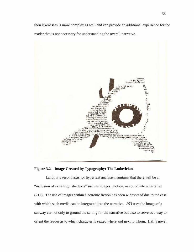
33
their likenesses is more complex as well and can provide an additional experience for the
reader that is not necessary for understanding the overall narrative.
Figure 3.2 Image Created by Typography: The Ludovician
Landow‘s second axis for hypertext analysis maintains that there will be an
―inclusion of extralinguistic texts‖ such as images, motion, or sound into a narrative
(217). The use of images within electronic fiction has been widespread due to the ease
with which such media can be integrated into the narrative. 253 uses the image of a
subway car not only to ground the setting for the narrative but also to serve as a way to
orient the reader as to which character is seated where and next to whom. Hall‘s novel

34
has already been demonstrated to integrate images as well. However, finding an example
of the integration of motion and sound into a printed work is difficult to find, though it is
possible to tease out a few.
Near the climactic encounter with the Ludovician near the end of The Raw Shark
Texts, Hall presents fifty pages that serve as a flipbook showing the conceptual shark
swimming ever closer before attacking, demonstrating one way in which authors have
been able to remediate the hypertext characteristic of motion into their narratives. The
flipbook device is not new by any means, but through the perspective of digital literature,
it becomes an effective way to remediate motion into print. In another, readers of
Danielewski‘s Only Revolutions who subscribe to the publisher‘s recommendation and
read the book in alternating eight-page segments, it is necessary that the book be flipped
and rotated in order to access the opposing narrative at each break. Thus, Danielewski is
able to involve motion into his text by laying it out in such away that the book needs to
be manipulated in a specific way in order to be read.
Other extralinguistic aspects include the use of color rather than just black and
white, as Michael Ende uses to differentiate between the real and the fantastic in The
Neverending Story, and font choice, which often is listed towards the end of novels along
with a justification for why it was selected. And though the inclusion of sound is one for
which I have been unable to find a print analogue, the proliferation of greeting cards with
the ability to play music or record messages makes such a leap in the future of printed
hypertextual narratives a small one.
The third axis identified by Landow includes texts with a ―complexity of network
structure‖ which is embodied in texts like Ryman‘s 253 which link various lexias of the

35
characters in a complex and interrelated fashion so that no single narrative line can be
identified let alone conceived. As a result, no passage is assigned importance or priority
over another, creating 253 passages that all coexist in the same virtual space waiting to be
selected by a reader in whatever order he/she chooses. One sees similar complexity with
regards to Danielewski‘s novel with neither narrative taking precedence over the other,
yet relating to each other based upon what else is on the page in the upside-down
narrative of the other character. The timeline in the sidebar also grounds the narrative in
a historical place and time, referring sometimes to events in the narrative and sometimes
seeming to exist as a separate entity in a shared space. Danielewski has even suggested a
more complicated structure for these elements, claiming that the main narratives of
Hailey and Sam are ―actually voiceover to the historical notes, which would show up on
the movie screen of your mind‖ (Exploration Z). In offering such an extreme
interpretation, Danielewski sheds light on the complexity of the elements that make up
the network of his novel, for so many choices about how to proceed through the narrative
are left up to the reader and are all valid, as re the interpretations that such variable paths
make possible.
Landow‘s fourth axis applying to hypertext narratives includes works in which
exist ―degrees of multiplicity and variation of literary elements, such as plot, setting, and
so forth‖ (217). 253 lists the information about each character in three broad sections:
‗Outward appearance,‘ ‗Inside information,‘ and ‗What he/she is thinking or doing.‘
Rather than having any real narrative within each section, the information is presented is
a clipped manner. For example, here is the description of Mr. Richard Thurlow:
―Delicate face, stringy, tanned, and ruddy. Narrow shouldered but somehow outdoorsy.

36
Wears an suit and body warmer without sleeves. Squashed sideways by the bulk of the
man next to him‖ (Ryman 132). This is obviously a stylistic literary choice, one that is
palatable because narration is ceded to description in a way that would be distracting in a
typically plotted novel. Ryman also inserts advertisements that reflect those available on
the web at the time the work was written, remediating the internet advertisement, such as
a product that helps one make their English more homely in order not to sound too
erudite and turn off women. He also includes footnotes that take on extended narration
unavailable to Ryman in his passages describing characters due to self imposed restraints.
For example, mentioning the name of Hercules Road in one of the character‘s
descriptions, Ryman departs from the subway car to relate a long history of the landmark,
being replete with footnotes itself and referring back to the structure of the entry of each
character by relating the appearance, inside information, and events surrounding William
Blake‘s ghost‘s arrival to Hercules Road.
Only Revolutions contains two separate narrators who race through time without
growing old and inhabit all sorts of different places as their narratives progress,
constantly changing the setting as the story progresses. The prose occasionally mixes in
poetic elements and narration often is related as a stream of consciousness, indicative of
Landow‘s belief that hypertexts have a multiplicity of literary elements. Danielewski
also uses elements such as the timeline to help orient the reader as to when an event is
happening in time and in relation to other events.
The Raw Shark Texts is basically laid out as one would expect a novel relying on
the tradition of a transparent text, but incorporates letters and postcards into its narrative
framework and presents them as artifacts that are inserted rather than transcribed into the

37
conventions of the typography used in the primary sections of the novel. As discussed
above, images are derived from typography and used prominently. Hall explains a
complex code that uses the standard QWERTY keyboard for decryption, which is
explained in an extended series of graphs displaying how the code is derived and thus
decrypted. A piece of paper that the narrator sees under the ocean water is displayed with
wavy lines that are written in bleeding ink, creating a replication of the artifact as it exists
rather than mediating its appearance through traditional narration. In this manner, Hall
uses different literary elements in unorthodox ways to enhance his narrative, firmly
planting the novel within the tradition of hypertext literature as detailed by Landow.
Reader Navigation and Page Construction
Landow goes on to differentiate between informational and fictional hypertext,
where the former ―must employ rhetorics of orientation, navigation, and departure to
orient the reader,‖ while the latter ―does not always do so with the result that its readers
cannot always make particularly informed or empowered choices‖ (222). This would
suggest that while print fiction with a heightened sense of its materiality may be
remediating the digital space in a not dissimilar manner from the way newspapers are as
well, the same sorts of assumptions about how this is done may not apply. Again, in a
work like Only Revolutions, reading paths aren‘t delineated even as a multitude exist, and
even the design of the book‘s cover gives no indication of where a reader is supposed to
begin or how one would go about progressing one he or she had started.
Similarly, Landow addresses the fact that hypertext fiction forces critics to extend
the description of meaning generation put forth by structuralists and poststructuralists
into hypertextual fiction (233). If meaning is generated from the reader as much as from

38
the author, then one can see the text as a blueprint for the construction of meaning. Yet
what differentiates hypertext from text within the transparent tradition is that the
blueprint for hypertext fiction can be built in more than one way and still remain
understandable, and therefore we can see works with complicated layouts and
typographies as complex metaphors for construction.
While complicated blueprints like the one in Only Revolutions can be difficult to
discuss and demonstrate in the linear printed form of a thesis, the work of graphic
novelist Chris Ware also displays evidence of being hypertextual and thus makes an
example that can easily be rendered and explained. In his graphic novel Jimmy
Corrigan: The Smartest Kid on Earth, he uses an entire page, shown in Figure 3.3, to
narrate the history of a photograph, which resides in a drawer beside protagonist Jimmy‘s
chair. At the beginning of the page, the top left corner, the reader sees a zoom-in on a
cityscape, and moving rightward we see the same cityscape through a window. The
window is then revealed to be in an apartment, and in the fourth panel, the reader realizes
it is Jimmy‘s apartment. Following this, the reader is led to a second sequence of smaller
panels, which are connected to one another through a shared background color. The
reader first sees a drawer, and then a photograph he is to assume resides in that drawer.
Moving rightward now, there are increasingly clear drawings of the photograph, one of
which is a double panel showing that the photo has been torn to remove the image of
Jimmy‘s father. An arrow connects the torn portion with its current location in the city
dump. The torn picture is included in a space marked with a set of dotted lines labeled
‗Now.‘ These dotted lines include the first panels at the top of the page, signifying that
all the panels I have discussed thus far exist in the same moment in time.

39
Figure 3.3 Multilinear Narrative on the Printed Page: Ware’s Jimmy Corrigan
The dotted lines also include three panels with a current depiction of Jimmy, his
mother, and his estranged father. All three are part of a series of boxes showing each at a
certain stage in life and can be read chronologically from right to left, just as the panels
dealing with the photograph are to be read. These sequences ―summarize the lives of the
three characters, referencing the moment of the torn photograph, Jimmy‘s conception,
and even Jimmy‘s paternal grandparents‖ (Bredehoft 877-878). The timeline of Jimmy‘s
father ends with a tombstone as the others continue on, foreshadowing the novel‘s future
events.

40
The reader can see that four narrative lines are visible on the page: ―the timeless
narration of place which takes us from cityscape to the photo in Jimmy‘s drawer,‖ as well
as the three timelines showing the lives of Jimmy and his parents (Bredehoft 878). While
the page is drawn to be read mostly from right to left, Ware also allows the reader to read
it from left to right, in the conventional manner. As the reader moves to the right and
thus backwards in time, he is introduced to Jimmy‘s grandparents in the lower right
corner, who for a period beginning on the next page become the primary subject of
Ware‘s narration. This complex architecture forces the reader to build the narrative in
several different ways, prioritizing no single one as proper. Ware provides orientation for
the reader by connecting the panels so that one need merely follow along to understand,
yet simultaneously allows for one to violate these rules and read the page in a standard
left-to-right manner which provides the sensation of moving back in time and arriving at
the setting for the next events in the story, featuring Jimmy‘s grandfather.
Therefore, Jimmy Corrigan appears to possess the same hypertextual principles
that print novels with a heightened sense of their own materiality have as well, meaning
that by the standards set forward by Landow all should be considered as such. And by
heeding Hayles‘s warning not to use critical models for print on hypertexts for fear of
missing essential elements in the narrative, one can see that the only way to approach
such works is to apply the models established for criticizing hypertexts that have been
developed for electronic literature.

41
CHAPTER IV
NOVELS EXISTING IN PRINT AS HYPERTEXTS
Now that we have defined hypertextuality by looking to the criteria set out by
George Landow, it is possible to return to the case of remediation put forward by Jay
David Bolter and Richard Grusin. With desktop publishing and digital media not only
existing but also being predominant for the past fifteen years, it would seem obvious to
assert that the hypertextuality in new media is reflected in works of fictional prose written
over that time span. Yet it isn‘t just works written in the digital space that show signs of
its influence; instead, such media has become so prevalent as to change the way in which
authors think, which changes the way they compose, whether on a typewriter, on a
computer, or even by drawing on paper.
In studying a selection of fictional texts produced in print for the mass audience
over the past decade, the shift from the uniform nature of the transparent text, text whose
font, color, positioning, and other physical elements are not meant to influence the way in
which a reader interprets the work, which has been so prevalent in publications in the
last century, to printed texts incorporating visual media has been affected in stages. With
transparent text, the reader is meant to look through the physicality of the text and only
‗see‘ what is being said. The majority of published works still fall into this category,
whether it be the new bestseller from John Grisham or Dan Brown to the critically
42
acclaimed new work from a writer like Philip Roth. Yet such a conservative medium is
opening up the use of visual media and becoming more accepted in serious work rather
than said works being mostly known for their experimentation.
As the remediation of the digital has been integrated into fictional texts, it has
become apparent to me that said usage falls under two broad categories. The first is the
traditional text that incorporates visual media as text but on the whole maintains the
grammatical rules of the page, works like Lauren Groff‘s The Monsters of Templeton and
Chip Kidd‘s The Learners. Expanding on the devices that previous authors like Kurt
Vonnegut used in the 1960s and 70s, such works can be read easily using the literacy that
has been employed for many years in works operating under the rules of transparency.
The second category contains works that use visual media heavily and often in different
ways, forcing the user to employ the literacy developed by the prevalence of hypertextual
content on computers and the internet in order to make construct meaning from the text,
for these works depend more on digital literacy than the classical literacy represented by
a transparent text. Such works include Jonathan Safran Foer‘s Extremely Loud and
Incredibly Close and previously discussed works like Steven Hall‘s The Raw Shark Texts
and the two novels of Mark Z. Danielewski.
Hypertext Encroaching on the Transparent
Chip Kidd is a graphic designer best known for producing hundreds of book
jackets over the last twenty years. In his sophomore fictional effort, Kidd firmly believes
that readers of The Learners are obligated to follow the stylistic dicta laid out in the novel
(Segundo 185). He sets the novel to be a conversation between form and content, and
claims that content consists of two things: what the narrator is saying and what he means

43
(Segundo 185). Yet how is a reader expected to determine what a character means if it is
not congruent to what it is saying? Kidd provides his readers with the criteria to judge
form v. content in his novel by setting the action primarily in an advertising agency in the
early 1960s and having characters explain principles used in graphic design that can be
applied to the book as a whole. The conflict between form and content as well as the
stylistic tricks that Kidd employs can be evaluated by studying how the main character,
himself a graphic designer, sees the world.
Early in the narrative, the protagonist and narrator, a man named Happy, explains
how the choice of font and size influence the way in which statements are perceived by a
reader, calling typography ―truly the invisible art of the last one hundred years, even
though it is in plain sight, everywhere‖ (58). Thus before the impetus for the bulk of
Kidd‘s story begins, he again is highlighting the way in which form and content are
connected, reminding readers to ‗look‘ rather than ‗read‘ text in order to interpret its
meaning (58). By incorporating principles of graphic design into his narrative, relying on
the experiences with font selection that are available on modern word processing
programs, we see the digital encroaching as the text loses transparency and becomes
opaque. Kidd goes on to give examples of the way in which different fonts can alter the
meaning of the words printed, demonstrating how loopy cursive letters don‘t match the
message when used for phrases like ‗I hate you‘ and ‗You have inoperable cancer‘ (59-
60). The reason so much time is spent on the details of graphic design is two-fold: not
only does it allow Happy to inform the reader of the ways he is going to approach his
assignment, creating a newspaper advertisement meant to recruit volunteers for the
infamous Stanley Milgram experiments, but is also to provide the reader with the tools to

44
Figure 4.1 Explanation of Graphic Design Principles in The Learners

45
not only read an advertisement critically, but to read the novel, with its stylistic
flourishes, critically as well.
In a two-page spread, shown in Figure 4.1, Kidd lays out the completed
advertisement on the left page and then lists eleven ways in which the typography of the
advertisement creates unstated meaning on the right (62-63). For example, the use of all
capital letters in a medium weight font serves to command the center of attention, and by
grouping a list into three column, Happy was not only able to save space, but also ―make
it easer for the eye to process‖ (63). This early breakdown of stylistic elements known to
typographers in the mid-Twentieth century so early in the novel serves as a primer on
how a reader can view the stylistic elements Kidd uses to advance his narrative. For by
this point a reader will already have noticed that the book is not laid out in the typical
manner: the margins are easily over an inch and the title page is lost in the gutter while
the copyright page is bisected and presented on two non-facing pages.
In order to contextualize a certain point in the novel, let me describe the preceding
events briefly. Happy finds himself a participant in the Milgram experiments, where
volunteers are made to believe that they are delivering an electrical shock to another
volunteer when the latter answers a question incorrectly. As the wrong answers add up,
the shocks being delivered become more intense. However, the shocks are nonexistent.
The ‗volunteer‘ being shocked in fact is associated with the study and merely pretending;
in fact, the experiment is meant to examine how long the person administering the shocks
will continue, despite the cries of agony from the person they believe they are shocking.
As the experiment progresses, Kidd alternates his description of the scene
between Happy‘s inner monologue, his dialogue, the screams from his partner in the

46
experiment and the dialogue from a researcher who continues to tell Happy that the
experiment requires him to continue even as he has severe doubts as the screams of
―YOU‘RE KILLING ME!!‖ are gaining in force. As the scene crescendos, Kidd presents
a third of a page of action with much of the same content, yet in a completely different
way. While the buildup to this climax is presented with the stylistic conventions normal
for prose attempting to be transparent, this small portion of the page continues in bold
letters the dialogue between Happy and the scientist administering the experiment, while
the screams of Happy‘s partner are presented in grey letters and form the background of
the entire passage, which can be seen in Figure 4.2.
While it is possible to read the bold print forming the conversation between
Happy and the scientist, the grey background makes it difficult. This causes the reader to
struggle with the ‗noise‘ of the grey letters in the same way That Happy himself struggles
with the screams the grey letters represent. That Kidd allows these grey letters to run all
the way to the edge of the page further reinforced the unceasing nature of the screams,
especially when one considers that to this point the margins have been wide and
generous.
As the passage ends, Happy is told that a lack of response from the person he is
shocking is considered a wrong answer, and as he presses the button to shock again the
grey letters end abruptly in the midst of a line. After a considerable amount of white
space underneath which is analogous to time, the narration resumes with one word:
―Silence‖ (141). One finds it difficult to imagine how such a scene could have been
equaled in power were the narration to follow the typical stylistic conventions of prose.
Kidd uses this brief passage to highlight the basis of his narrative, the difference between

47
Figure 4.2 Visual Representation of Screaming in The Learners
form and content. In fact, it is possible to see the passage as a whole as a pictograph of
that moment in time, providing the reader with a wealth of information simultaneously in
a manner not possible with conventional text, meeting George Landow‘s assertion that

48
including extralinguistic texts is a sign of hypertext and demonstrating how an author can
combat ekphrasis by using a picture or pictogram.
Returning to Kidd‘s assertion that content consists of two things, what a narrator
says and what a narrator means, sections on content are set periodically throughout the
narrative. These five brief interludes are markedly different than the rest of the narrative,
set in italics to differentiate the first person narrative contained with that of Happy‘s
narration in the rest of the novel. The titles of the sections reflect an emotion that can be
conjured by the way in which what is being said and what is meant by a narrator can be
exploited by an author. In the first section, the two match and sincerity is reflected, in the
second they are opposed so deception is intended. Kidd goes on to present sections on
wit, irony, and metaphor. Such passages hearken to linguistic theory of encoding and
decoding, for Kidd as a graphic designer is presenting a complex system of coding with
his use of page design as well as with the content of his narrative, which then must be
successfully decoded by a reader in order to understand his meaning. With such a focus
on advertising and to the physical novel itself with its defiance and manipulation of
stylistic conventions, such a comparison seems apt.
The Learners presents a narrative that hearkens back to Jay David Bolter‘s claim
that it is as ―appropriate for the reader to look at the formal arrangement of the text, as it
is to get lost in the story‖ (185). And while the stylistic devices Kidd uses in his novel to
highlight form‘s essential role in displaying content don‘t seem to contain any technology
that wouldn‘t have been possible sixty years ago, it does demonstrate the ability that
authors now have to serve as their own typographers due to abilities created by the digital
writing space.

49
However, the manipulation of page design is but one way in which the
remediation of the digital is affecting the way authors are composing. In her debut novel,
The Monsters of Templeton, Lauren Groff uses photographs in order to help differentiate
the many narrative devices used to tell the historical story. The frame story surrounds
Willie Upton, a young woman who learns that her father, whom she has never met and
long thought to be one of three unknown men from a hippie commune, shares an ancestor
with her mother. Grounding the mystery is the fact that the ancestor is also the famous
founder of the town in upstate New York in which Willie grew up. As Willie scours
historical records at the library, a variety of material is presented as narrative, from
personal accounts to a set of correspondence. As one would expect from such material,
such as a diary entry or a letter from the 19th
century, none were written with the idea that
some reader from the far future would need relationships or events contextualized, so in
order to orient the readers of her narrative, Groff accompanies many of the historical
accounts with renditions of the people whose stories are related, mostly through
photographs but also with paintings and etchings.
Not only do such visual accompaniments provide context based on their media
and the clothes and hairstyles of those depicted, Groff also includes captions with each
one that provide additional information to the reader. For example, a statue of named
‗Indian Hunter‘ is depicted in a photograph accompanying the passage on Sagamore, an
Indian from a village near the town in the 1800s, and the accompanying caption is able to
provide enhance the feeling that the history presented is factual by relating information
unessential but descriptive. By claiming that ―Templetonians are frequently confused
about who this statue represents,‖ the feeling that one is getting information on a real

50
history is increased, and by then noting that ―Willie has always believed it to be‖
Sagamore, Groff provides the reader with a sense over why such an illustrative device
was chosen (286). In another, a photograph of an African American woman who was
able to pass in white society is presented, helping a reader in the 21st century visualize
how different that woman appears from other relatives listed elsewhere in the novel
(166).
Yet the less obvious example of visual media being used within the structure of
the novel is more striking. With such a complex genealogical mystery unraveling over
the course of 360 pages, Groff includes a small chart at the end of each section in which a
piece of the mystery is revealed to allow the reader to understand how the new piece fits
into the overall puzzle at a glance.
Each chart is essentially a fragmented family tree presented on a full page with a
shaded box. Titled ‗What Willie Upton Understood About Her Family,‘ such charts are
usually accompanied by a subtitle that acknowledges how much variation has occurred.
For example, one subtitle is ―Revised Yet Again and Abridged for Simplicity‘s Sake‖
(164). As the novel progresses and pieces of Willie‘s lineage are revealed to help her and
the reader understand in what way her father is related to her, this family tree is redrawn
and edited to contain all the necessary information without getting bogged own in
extraneous details, such as six of seven grandchildren of the town‘s founder who don‘t
play into the narrative and their offspring.
By choosing what information to include and by placing it at the end of the
relevant chapters, Groff is allowing the reader to parse the information in whatever order
they seem most comfortable with, whether starting from Willie and working their way up

51
Figure 4.3 Chart Containing Willie’s Family Tree in The Monsters of Templeton

52
the family tree or starting with the town‘s founder and working their way down. This also
allows one to easily see the relation between the different characters of the story, who
otherwise are introduced in a haphazard way, and allows for Groff to not waste time on
embedding exposition within the portions of the narrative given to Willie and her search.
An example of the family tree can be found in Figure 4.3.
It is also important to remember that Willie grew up in Averell Cottage, which
has historical significance to the town, as a known descendent of the town‘s founder.
Much of the history of the town is known to its citizens, and especially to those within the
family, so a lot of what is at least initially related in the family‘s history can be assumed
to be common knowledge known to Willie before the story‘s commencement. Therefore,
it would be disingenuous for Groff to have Willie‘s internal monologue be taken up by
taking time to go over things she already knows, even if such details would help orient
the reader. Thus, presenting the content with the help of the family trees avoids straining
the credibility of the narration while providing a place for the reader to orientate himself
or herself within the overall narrative.
And while one might suppose that the depictions of the historical characters and
the depictions of the family tree to be physical things found or sketched by Willie herself
during her search, certain steps are taken by Groff to reduce this as a likelihood. For
example, in the above caption accompanying the photograph of the statue of Sagamore,
the text explicitly reads ―though Willie thought‖ rather than using the first person
pronoun as one might expect (286). The same can been seen with regards to the title of
family tree charts, which read ―What Willie Upton Understood About Her Family,‖
which makes interpreting these charts as representations of her own notes during the

53
investigation problematic. Third person pronouns are also used as notes in the family
tree. And unlike the map of town which is printed on the inside cover in the front and
back of the book, these charts exist within the confines of the narrative and are meant to
be read that way; glancing at a family tree that is depicted later in the novel would alert
one to twists in the narrative that might be upcoming. Their placement is deliberate and
only functions within the generally understood confines of narrative chronology.
So while the visual media in Groff‘s novel help orient the reader, it is possible to
conceive of less effective ways that she could have related the same information using
text conforming to the transparent tradition, by having Willie recount every new fact she
learns about her lineage, for example, rather than relying on the family tree to integrate
the new information within what has been previously known. The remediation of the
hypertextual is a strong component, but not necessarily the central one, for readers need
to rely much less on digital literacy and delivery than they do on the classical literacy
learned from the tradition of transparent text.
Hypertext Fully Remediated Into Print
The same cannot be said for Jonathan Safran Foer‘s second novel, Extremely
Loud and Incredibly Close. Frequently cited as an example of increased visuality within
the form of the novel, the story uses type settings, spaces, blank pages and any number of
other visual media in order to make his novel the ―most simple way of saying what it is I
want to say, being as unstylized as possible‖ (Segundo 57).
Throughout the novel, Foer uses images as a recurrent literary technique, though
in many different ways. Perhaps the most straightforward is the presentation of images
that the narrator, a young boy names Oskar, sees in order to create reader/character

54
identification. For example, Oskar has a scrapbook in which he has pasted pictures that
represent everything that happens to him, titled appropriately ―Stuff That Happened to
Me‖ (42). One night as he has trouble sleeping, Oskar pulls out the scrapbook to flip
through it and Foer represents this by presenting fifteen pages consisting of nothing but a
sequence of images (53-67). Some of the images refer to previous incidents or bits of
related exposition in the story, while others are without context at all and defy any simple
explanation. Where the main portion of Foer‘s narrative involves a key that Oskar finds
and assumes to be a message from his father, who died in the World Trade Center on
September 11th
, the inclusion of a photo depicted thousands of keys hanging on a
pegboard helps conjure the overwhelming task Oskar has set out for himself as he decides
to check every lock in New York City to discover the one that fits his key. The recurring
image of the body falling as a man jumps to his death rather than waiting for the tower to
fall also packs overwhelming emotion for the reader is already aware that he suspects the
man in question very well might be his father. In an image presented several pages
beyond the falling body, Oskar has used his computer to zoom in and enhance the
resolution around the body, yet the best that can be accomplished is a severely blurred
image that would make little sense without the previous context.
Yet just as many images are presented without context. The famous graveyard
scene in Hamlet is depicted with Laurence Olivier holding the skull up to his face and
addressing it. Two turtles are shown copulating, a set of fingerprints as would be taken
by the police, and tennis star Lleyton Hewitt celebrating lying on his back on the court
seem to defy and explanation, yet by this point the character of Oskar has been
established to the degree that we understand these images have a deep meaning to him.

55
By remediating these images into his narrative, Foer creates reader/character
identification, for the reader flips through the images just like Oskar does, and by looking
at the actual image rather than a description with words, each reader is able to interpret
the meaning themselves, creating the sort of reader choice and sense of empowerment
that Landow claimed as one of the axes of hypertextual theory.
Yet this is far from the only time that Foer collapses the narration and allows for
the reader to experience precisely the same thing as Oskar. After discovering the key
inside an envelope in which the word ‗Black‘ was written in red ink, Oskar goes to an art
supply store in order to solicit help from someone he thinks must be an expert on color.
Noting that it is odd that someone would write a the name of a color in another color, the
store employee leads Oskar to a display where paper is set alongside a number of colored
pens and shows him how based on some sort of inherent psychological tic, ―most people
write the name of the color of the pen they‘re writing with‖ (46). Foer presents four
pages representing the paper at the display in full color, and one is able to verify that in
the vast majority of instances, the employee is right, yet we also are able to peruse the
text and notice an important element at virtually the same instant that Oskar does. The
art supply store is down the street from his apartment, and the display contains the name
‗Thomas Schell,‘ the name of Oskar‘s father, written in a red pen similar to the one used
on the envelope. While it is not necessary that a reader is cognizant of the name‘s
appearance as he or she reads the page because it is followed up with standard narration
on the proceeding pages, Foer has made the rhetorical choice to present the entire scene
in this manner not only to make a point about the seeming unnatural state of printing the

56
name of a color in a different colored ink, but also to allow the reader to experience the
same eureka moment as Oskar when discovering the name.
In yet another example, as Oskar walks up to an apartment on his quest for the
lock that matches his key, Foer presents a full page photograph depicting the building‘s
façade, and upon entering the residence and seeing a photograph of an elephant‘s eye on
the wall, that picture is depicted as well. Unlike the previous images, these are presented
outside the flow of the narrative and act as visual aids of the text rather than integral
pieces. Yet the continue to allow for the same reader/character identification displayed
previously.
While it would be possible to represent Oskar flipping through his scrapbook of
images or recognizing his father‘s name at the art supply store using traditional text, it
wouldn‘t meet Foer‘s goal to achieve meaning using the simplest and most immediate
tools possible. One would lose the character/reader identification if standard narration
was used. Unlike The Learners and The Monsters of Templeton, it is difficult to imagine
this narrative without the visual media components with which it is constructed. If Foer
had described the writing at the art supply store purely through verbal text and lost the
reader/character identification, it would add another layer of mediation to the narrative
for the reader. Instead, Foer has remediated the image into his text in an effort to reduce
the remediation between what a character sees and experiences and how that is related to
the reader, creating a sense of immediacy through remediation.
As the apartment‘s façade and elephant photograph above represent, Foer is
wiling to use images that are situated outside the main flow of the narrative. Throughout
the novel, the device is used to represent doorknobs with keyholes in them which are

57
placed within the narrative when Oskar is attempting to try his key and gain some sort of
information. Like one would expect of a collection of doorknobs from New York City,
no two are the same. Though he doesn‘t find the appropriate lock, he does manage to
learn some sort of information necessary for his arc as a character if not for his quest to
discover what message, if any, his father left for him.
Another character in the narrative is Oskar‘s paternal grandfather whom Oskar
has never met. He is a mute who communicates in the narrative primarily through letters
contained is section titled ―Why I‘m Not Where You Are‖ accompanied by the date with
which the letter was written. These sections are a departure from the bulk of the rest of
the narrative as they do not relate the point of view of Oskar nor do they create the
reader/character identification that one would experience if Oskar was reading them. As
a mute, the grandfather Thomas Schell must communicate through writing on a pad of
paper or by displaying the palms of his hands in which the words ‗yes‘ and ‗no‘ are
tattooed. In an early letter written to his son, Oskar‘s father, he describes how at the end
of some nights, he flips through the notebook he writes in and reads ―through the pages
of my life‖ (18).
Foer presents nine pages that consist of only one sentence each, centered on the
page to effect the greatest amount of white space surrounding the statement as possible.
This helps provide the illusion that the reader is looking through the same notebook as
Thomas, again creating reader/character identification, and also to briefly glimpse at how
he has communicated with others throughout the day. As one would expect, only one
side of the conversation is represented, so we have no real context surrounding many of
the statements. By producing the statements over so many pages, Foer is able to give the

58
sense that the events for which they were written themselves took place over time in a
way that might not be apparent were they just to be listed together, perhaps in a bulleted
format.
Returning briefly to the device of the doorknobs, Foer presents two doorknobs
that differ from the others in one small but integral way: neither contains a keyhole. Both
are presented amidst letters that Thomas has written to his son, the first actually being the
first image of a doorknob we encounter during the letter that I have described above, and
the second coming much later in the middle of a letter in which Thomas outlines to his
son the circumstances surrounding his leaving of his wife and unborn child. The absence
of keyholes could have all sorts of interpretations, but I find it interesting that all the
other doorknobs are placed in scenes where there are two characters and a dialogue, no
matter how unenlightening said dialogue might seem. But the two doorknobs without the
keyholes are placed within letters, where there is no dialogue, only information
conveyed. In addition, even were Thomas present a real dialogue would be problematic
if not impossible due to his inability to communicate verbally, and given the fact that his
communication with others, in the form of the notebook, consists of only the sparsest
prose. Yet again, the reader is able to understand how Foer is reaffirming his theme with
the passage by closely reading the visual media he has placed within the scene.
Shortly after Thomas meets Oskar, who reveals to him and the reader the
answering machine messages left by Oskar‘s father after the plane hit the tower yet
before it collapsed, he writes another letter to his son, the first to be written since in the
years after September 11th
. As Thomas recounts the events to his son the reader is
simultaneously informed about their occurrence, and as his narration fills in the holes in

59
the narrative the reader is unable to receive from Oskar‘s unreliable perspective, Foer
reduces the spacing between the lines while decreasing the font size as well. This occurs
gradually over several pages so that the reader experiences it somewhat subliminally.
Yet the reduction in size and spacing is directly tied the emotional content of the story
being related. As the final message from Oskar‘s father is played, Foer displays it at the
bottom of a page in all caps with spaces representing the interference. On the facing
page, as the narrative continues, the spacing and font decreasing becomes readily
apparent, and begins to run together towards the bottom as Thomas has revealed all the
missing information the reader needs in order to understand what Oskar‘s unreliable
narration has omitted. Yet it is possible to parse the words on the first few lines to gain
some insight into the future events of the book, for Thomas is relating the plan that he
and Oskar are going to attempt to come to terms with their shared loss. Yet as much as is
revealed, nearly everything else is obscured into pages in which the type is so close
together on each line that he letters are literally being typed over one another. The reader
is to assume that the whole account of what will transpire afterwards in the novel is
written here, yet in an unreadable fashion, for the superimposed type continues on for
three additional pages, becoming more dense with each one until the reader basically
encounters a large black box where individual letters can barely be imagined let alone
discerned.
By this point in the novel however, the ‗voice‘ of Thomas in the letters he has
written are intimately known by the reader, and hearken back to an earlier passage when
he is invited to read the life story typed by his blind first wife, who was unaware that
there was no ribbon in the typewriter. Foer uses three blank pages to indicate how much

60
Figure 4.4 Red Marking Transform Page into a Palimpsest in Extremely Loud and
Incredibly Close

61
has been lost and uses context to give the absence of words on the page emotional
weight. Likewise, the use of so many letters that a passage becomes unreadable carries
emotional weight due to the context surrounding its use, the letter Thomas is writing to an
already dead son relating the emotional torment his grandson has suffered from over the
past two years.
In yet another letter from Thomas to his son, Foer displays a way that the use of
images along with text can create a palimpsest where a reader can interpret layers of
meaning simultaneously. As established early on by Oskar, his father had a peculiar
habit of reading with a red pen and circling errors or words of interest as he went along.
This letter, in which one of the doorknobs without a keyhole is embedded, relates the
events in Thomas‘s life before he established the relationship with his son‘s mother, most
noticeably his survival during the firebombing of Dresden in World War II. With red
markings throughout the text, as seen in Figure 4.4, Foer is able to allow the reader to not
only read the account by Thomas, but also to read the response by his son at the same
time. There is the story that Thomas is telling and the story of the markings, which lays
over the former to create a palimpsest. Yet there is a deeper thematic reason for
presenting the information in this way: though these two stories overlap and interfere
with one another, that is the way that stories are in real life. The way a son corrects and
interprets a father‘s stories gets in the way of those stories, and immediately precedes a
passage in which Oskar‘s father is telling him a story about a mysterious sixth borough of
New York amidst frequent interruptions by Oskar. This juxtaposition of scenes helps
establish a way in which the method of using the red markings over the text streamlines a
process of a son‘s commenting upon his father‘s story into an experience that can be

62
related simultaneously, rather than merely something that must be related through
dialogue or narrator‘s exhibition as takes place in the latter. Thus we see how Foer is
able to have multiple pathways of reading exist in the same space, much like Danielewski
was able to achieve in House of Leaves, for one can follow the text by assessing
Thomas‘s state at the time of composition separately from Oskar‘s father‘s state at the
time he read the letter, a defining characteristic of hypertext according to Landow.

63
CHAPTER V
CONCLUSION
N. Katherine Hayles is right to cite a ―danger in applying critical models
developed for print‖ to electronic fiction because ―the new possibilities opened for
literary creation and interpretation will simply not be seen‖ (1 Hayles 121). However, as
this examination of works like Mark Z. Danielewski‘s Only Revolutions and Jonathan
Safran Foer‘s Extremely Loud and Incredibly Close have demonstrated, hypertext fiction
does not just exist on computer screens. Rather, these works which are composed
digitally and have their genesis in the digital writing space so well known to their creators
and audience carry the property of hypertextuality with them into print and thus can be
analyzed as such. This thesis suggests that the definition of hypertextuality needs to be
expanded to include such works, lest we miss the same new possibilities that Hayles fears
we will in electronic fiction.
One must also pause and ask why, if all these possibilities are available in the
electronic form already, do authors remediate the digital into print in order to exploit their
properties. For one, a publishing house releasing a new novel still remains the
overwhelming method by which an author‘s work gains cultural prestige and respect. In
a period in which literally anyone with an internet connection can publish anything their
hearts desire, such cultural gatekeepers still command a great deal of respect. Secondly,

64
electronic fiction has never been effectively sold to the reading public, causing the
distribution method of print to be far superior in terms of gaining financial remuneration
as well.
Yet these are marketplace concerns, and while it would be disingenuous to deny
that they affect the artistic decisions made by novelists, they are far from the only
influence on remediating the digital into print. I would suggest that with digital literacy
penetrating more and more of the reading public, the remediation of the digital and the
shift from print literacy to digital literacy may become second nature, something
employed by authors because they have become so used to the advantages of desktop
publishing that the fact that the remediation of the digital becomes a subconscious act.
Another factor may be the supposed short attention spans that the reading public seems to
have when dealing with electronic spaces. While there are certainly places to read fiction
on the internet, it has yet to be proven that the reading public will invest the time to sit
down and read a 120,000 word novel on a computer screen.
Devices such as Amazon‘s Kindle are trying to combat these concerns, and thus
far it seems to have met with real success. The Kindle allows a reader to download a
book and read it digitally on a special device, one with a screen that is not backlit and
thus supposedly easier on the eye than a typical computer screen. While Amazon has
raged about its widespread popularity and success, sales numbers have been closely
guarded and many are skeptical that a true revolution in publishing is actually taking
place.
Currently, the Kindle essentially is a direct remediation of the print space into the
electronic one, with the only real feature of the text that is malleable being the type and

65
size of the font. While such material concerns can affect the content of the text as
perceived by the reader, such effects would be minimal in comparison to the complex use
of images and typographies in a work like House of Leaves. As the current technology
stands, little of this is likely to change, but if the Kindle does become a force in the
marketplace, technological advances may make the differences between the materiality of
the page and the materiality of the screen that is exploited by authors like Danielewski
nearly indistinguishable and thus change the conversation regarding print literature with a
heightened sense of its own materiality. However, a new form of delivery may open up
new possibilities to authors in much of the same way the digital space allowed for
groundbreaking literature in the 1980s, perhaps creating a sort of hybridized version of
the print/digital dynamic. Such changes should be a focus of scholarly attention over the
next few years as the technology develops.
However, as this thesis concerns print fiction with a heightened sense of its own
materiality and demonstrates that such texts should be considered digital in nature due to
their remediation of hypertextual elements, perhaps the greatest conclusion one might
reach is that the previously separate categories of literary studies, technical
communication, and graphic design all need to be harnessed in order to properly critique
what could be called a rising sub-genre of one of our most popular forms of literature.
While graphic design for many years was a skill that few knew how to wield effectively,
today it is used everyday in every commonplace word processing program, where a
writer must choose font, size, color, and dozens of other considerations when composing
a message of any variety, as foregrounded by Chip Kidd in The Learners. With the
majority of the population possessing a fairly sophisticated digital literacy, it becomes

66
necessary for us to look to principles of digitally mediated communication in order to not
only properly evaluate communication taking place in the digital space, but to evaluate all
communication, for as the works here have demonstrated, digital literacy can be exploited
in forms outside our normal categories of what is electronic. And finally, there is no need
to scrap a hundred years of critical tools used to evaluate literature. Instead, it is
necessary to draw from all these categories, and perhaps others as well, in order to
properly critically examine fiction with a heightened sense of its own materiality. While
academic culture thrives on specialization, these works do not nearly fall within the
categories already erected, and therefore their study must bridge these disciplines or
create a new specialization.
The era in which we could look at texts as transparent and examine them without
regards to their materiality is rapidly drawing to a close. These are not just authors
having fun with typography; as we move further into the digital age, the choices made by
these authors with regards to delivery method and style will need to be evaluated just as
strongly as the messages contained within them, for the method by which something is
transmitted is just as important as what that something is.

67
LITERATURE CITED
Bolter, Jay David. Writing Space. 2nd ed. Mahwah, NJ: Lawrence Erlbaum Associates,
Publishers, 2001.
Bolter, Jay David and Richard Grusin. Remediation: Understanding New Media.
Cambridge, MA: MIT Press, 2000.
Bredehoft, Thomas A. ―Comics Architecture, Multidimensionality, and Time: Chris
Ware‘s Jimmy Corrigan: the Smartest Kid on Earth.‖ Modern Fiction Studies
Vol. 52, Issue 4 (2006): 869-890.
Brumberger, Eva R. ―The Rhetoric of Typography: The Persona of Typeface and Text.‖
Technical Communication 50.2 May 2003. 206-223.
―Chip Kidd.‖ March 4, 2008. Podcast. The Bat Segundo Show. 1 May 2008.
<http://www.edrants.com/segundo/chip-kidd-bss-185/>
Danielewski, Mark Z. House of Leaves. New York: Pantheon, 2000.
Danielewski, Mark Z. Only Revolutions. New York: Pantheon, 2006.
Foer, Jonathan Safran. Extremely Loud and Incredibly Close. New York: Houghton
Mifflin Company, 2005.
Groff, Lauren. The Monsters of Templeton. New York: Voice, 2008.
Hall, Steven. The Raw Shark Texts. Edinburgh: Canongate, 2007.
Hansen, Mark B.N. ―The Digital Topography of Mark Z. Danielewski‘s House of
Leaves.‖ Contemporary Literature. 45.4 Winter 2004. 597-636.
Hayles, N. Katherine. ―Intermediation: The Pursuit of a Vision.‖ New Literary History
38.1 Winter 2007. 99-125.
Hayles, N. Katherine. ―Saving the Subject: Remediation in House of Leaves.‖ American
Literature. 74.4 December 2002. 779-806.

68
―Jonathan Safran Foer.‖ August 25, 2006. Podcast. The Bat Segundo Show. 1 May 2008.
<http://www.edrants.com/segundo/the-bat-segundo-show-57-jonathan-safran-
foer/>
Kidd, Chip. The Learners. New York: Scribner, 2008.
Landow, George P. Hypertext 3.0. 3rd ed. Baltimore: The Johns Hopkins University
Press, 2006.
―Mark Z. Danielewski.‖ November 12, 2006. Podcast. The Bat Segundo Show. 1 May
2008. <http://www.edrants.com/segundo/bss-79-mark-z-danielewski/>
McCloud, Scott. Understanding Comics. New York: Harper Perennial, 1993.
Ong, Walter J. Orality and Literacy. London: Methuen, 1982.
―Exploration Z: Only Revolutions.‖ Markzdanielewski.info. Mark Z. Danielewski, n.d.
Web. 19 September 2009.
Ryman, Geoff. 253. 253-Interactive Novel Home. Geoff Ryman. n.d. Web. 17 July,
2009. < http://www.ryman-novel.com/>
Trimbur, John. ―Delivering the Message: Typography and the Materiality of Writing.‖
Rhetoric and Composition as Intellectual Work. Ed. Gary A. Olson. Carbondale,
IL: Southern Illinois University Press, 2002. 188-202.
Vonnegut, Kurt. Breakfast of Champions. New York: Dial Press, 2006.
Walsh, Richard. ―The Narrative Imagination Across Media.‖ Modern Fiction Studies
52.4 Winter 2006. 855-868.
Ware, Chris. Jimmy Corrigan: The Smartest Kid on Earth. New York: Pantheon, 2000.
VITA
Jonathan D. Polk attended Baylor University before transferring to Texas State
University-San Marcos, where he completed his BA in English Literature in 2007. In
June of 2007, he entered the Graduate College of Texas State University-San Marcos to
pursue a MA in Rhetoric & Composition.
E-Mail Address: [email protected].
This thesis was typed by Jonathan D. Polk