navigating mobile design best practices: 6 ways to ...€¦ · navigating mobile design best...
TRANSCRIPT

NAVIGATING MOBILE DESIGN BEST PRACTICES:
6 Ways to Increase Revenue Through a Mobile-First Approach

MOBILE DESIGN: INCREASE CONVERSION WITH SIX BEST PRACTICES commercecloud.com | 1
Mobile shoppers have a completely different set of requirements and challenges than
desktop shoppers. Mobile shoppers browse on the go during “micro-moments” in their
day, are confined to a small touch-screen device, and are often distracted by incoming
phone calls, messages, and notifications.
Nearly 53% of all site traffic comes from phones,1 and by the end of
2017, phones will account for more than 60% of visits.2 In fact, most
customers will interact with a brand for the first time from a mobile
device.2 However, mobile conversion rates, while growing, are still a
fraction of the rates on computers. Why? Many retailers design sites
for desktop shoppers and leave mobile shoppers as an afterthought.
To increase mobile conversion rates across devices and grow revenue,
retailers must create a true mobile-first experience. These six best
practices can help retailers design a site around the unique needs
of mobile users.
1 Commerce Cloud Shopping Index2 Commerce Cloud Mobile Shopping Focus Report
Data-Driven Best Practices
Using the following three-step data-driven
design methodology, the Commerce
Cloud team identified mobile site design
best practices that helped merchants
improve the mobile shopping experience.
Over, 2000 Commerce Cloud
mobile sites were categorized by
shared UX characteristics and
analyzed for performance.
Commerce Cloud sites identified
as having best-in-class shopper
journeys were analyzed to distill
optimal UX approaches.
Qualitative and anecdotal insights
were collected from interviews with
a sample set of clients.
Observations drawn from this process were
blended with the subject matter expertise
from the Commerce Cloud User Experience
team to create a best-of-breed approach to
the mobile-first user experience.
1
Increase Revenue Through a Usability and Mobile-First Approach
of all site traffic comes from mobile.
53%
1
2
3
MOBILE DESIGN: INCREASE CONVERSION WITH SIX BEST PRACTICES commercecloud.com | 2
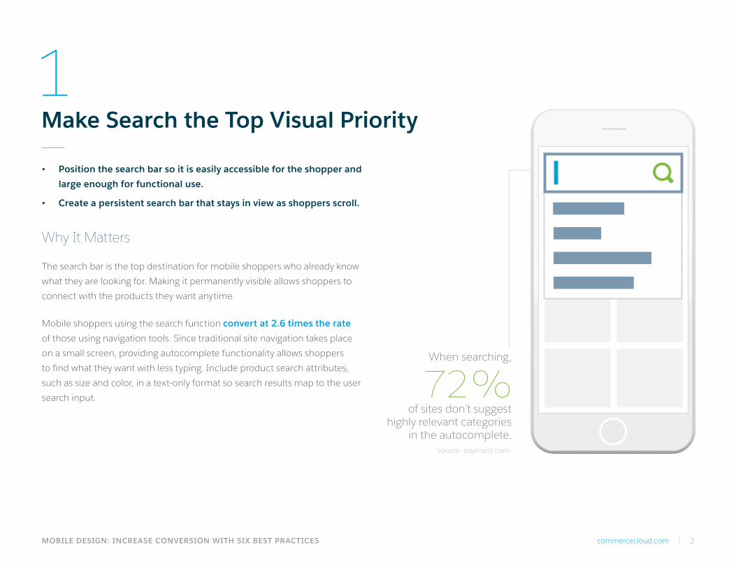
When searching,
of sites don’t suggest highly relevant categories
in the autocomplete.
• Position the search bar so it is easily accessible for the shopper and
large enough for functional use.
• Create a persistent search bar that stays in view as shoppers scroll.
Why It Matters
The search bar is the top destination for mobile shoppers who already know
what they are looking for. Making it permanently visible allows shoppers to
connect with the products they want anytime.
Mobile shoppers using the search function convert at 2.6 times the rate
of those using navigation tools. Since traditional site navigation takes place
on a small screen, providing autocomplete functionality allows shoppers
to find what they want with less typing. Include product search attributes,
such as size and color, in a text-only format so search results map to the user
search input.
Make Search the Top Visual Priority
72%Source: baymard.com
1

MOBILE DESIGN: INCREASE CONVERSION WITH SIX BEST PRACTICES commercecloud.com | 3
Design Simple, Accessible Navigation
• Use touch-friendly menu icons so users can quickly navigate with a finger tap.
The target size should be 44px by 44px to fit the average finger size.
• Include only the most important, or highest selling, categories in the navigation.
Why It Matters
• Offering too many categories is distracting and overwhelming on a small screen and requires shoppers to take additional steps to find what they want.
• Over-categorization is the most severe navigation issue for ecommerce sites.
Navigation is often difficult for mobile users to grasp due to either too deep or too shallow category descriptions or redundant and duplicate categories. Mobile navigation tools must be discoverable, accessible, and efficient. Keep it simple by prioritizing content and product information. Direct consumers to the most popular shopping paths so they can quickly find what they’re looking for. Continually evaluate your navigation usability as your customers and products evolve.
Source: baymard.com
of ecommerce sites suffer from over-categorization.
54%
2
44
44

MOBILE DESIGN: INCREASE CONVERSION WITH SIX BEST PRACTICES commercecloud.com | 4
3Optimize the Product Detail Page
• Create a persistent Add to Cart button that stays in view as the shopper scrolls.
• Make the product price persistent for transparency at all times.
• Add express payment options, such as Apple Pay and Android Pay.
• Use collapsible product descriptions.
Why It Matters
By highlighting critical shopping actions and reducing the number of clicks, retailers ease shopper workload and make it faster to reach checkout. With express payment options, shoppers can checkout directly from the Product Detail Page (PDP) with one-touch for a fast and frictionless checkout experience.
Optimize the product detail page so shoppers can easily add a product to the cart. Reduce shopper scrolling on PDPs by using collapsible descriptions and highlighting the critical actions. To further reduce clicks, pre-select products with only a single available attribute, such as a shoe only available in black.
Only
of mobile sites have a good or
acceptable product page performance.
Source: baymard.com
54%

MOBILE DESIGN: INCREASE CONVERSION WITH SIX BEST PRACTICES commercecloud.com | 5
SHIPPING
PAYMENT
ORDER
XXXX
XXXX XX
4
of checkout flows were
accordion-style.
Simplify the Checkout Process
• Eliminate a long, multi-page checkout process.
• Use a single page accordion style checkout with collapsible summaries to
smooth the checkout flow and eliminate distractions.
• Always offer a guest checkout option.
Why It Matters
• Checkout is the most important component of the mobile shopping experience.
• Poor checkout processes result in low conversion and high abandonment rates.
Mobile checkout success remains elusive for retailers. The checkout completion rate for mobile shoppers is 52% — 11% lower than overall online checkout completion. By reducing clicks and scrolling, and eliminating distractions and frustrations during checkout, retailers can improve their checkout rate. One way to do this is to auto-populate checkout fields wherever possible.
Since it is cumbersome to create an account on a mobile device, always give customers the option to check out as a guest. Use a stackable design to display completed tasks such as shipping information, promotional codes, and billing. This reassures shoppers that the information is correct and clarifies where they are in the process without clicking the back button.
In 2016 only
32%Source: baymard.com
MOBILE DESIGN: INCREASE CONVERSION WITH SIX BEST PRACTICES commercecloud.com | 6
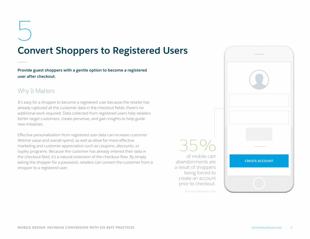
5Convert Shoppers to Registered Users
Provide guest shoppers with a gentle option to become a registered
user after checkout.
Why It Matters
It’s easy for a shopper to become a registered user because the retailer has already captured all the customer data in the checkout fields; there’s no additional work required. Data collected from registered users help retailers better target customers, create personas, and gain insights to help guide new initiatives.
Effective personalization from registered user data can increase customer lifetime value and overall spend, as well as allow for more effective marketing and customer appreciation such as coupons, discounts, or loyalty programs. Because the customer has already entered their data in the checkout field, it’s a natural extension of the checkout flow. By simply asking the shopper for a password, retailers can convert the customer from a shopper to a registered user.
of mobile cart abandonments are
a result of shoppers being forced to
create an account prior to checkout.
Source: baymard.com
35%CREATE ACCOUNT
commercecloud.com | 7
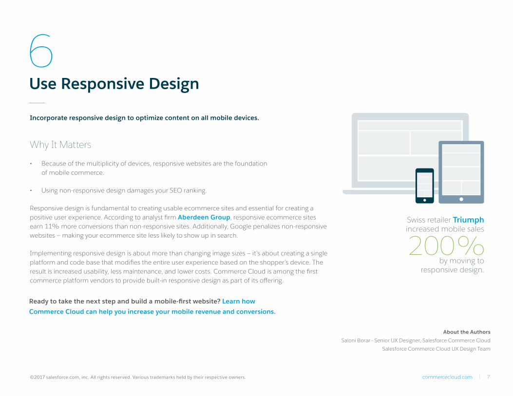
6Use Responsive Design
Incorporate responsive design to optimize content on all mobile devices.
Why It Matters
• Because of the multiplicity of devices, responsive websites are the foundation of mobile commerce.
• Using non-responsive design damages your SEO ranking.
Responsive design is fundamental to creating usable ecommerce sites and essential for creating a positive user experience. According to analyst firm Aberdeen Group, responsive ecommerce sites earn 11% more conversions than non-responsive sites. Additionally, Google penalizes non-responsive websites — making your ecommerce site less likely to show up in search.
Implementing responsive design is about more than changing image sizes — it’s about creating a single platform and code base that modifies the entire user experience based on the shopper’s device. The result is increased usability, less maintenance, and lower costs. Commerce Cloud is among the first commerce platform vendors to provide built-in responsive design as part of its offering.
Ready to take the next step and build a mobile-first website? Learn how
Commerce Cloud can help you increase your mobile revenue and conversions.
Swiss retailer Triumph increased mobile sales
by moving to responsive design.
200%
©2017 salesforce.com, inc. All rights reserved. Various trademarks held by their respective owners.
About the Authors
Saloni Borar - Senior UX Designer, Salesforce Commerce Cloud
Salesforce Commerce Cloud UX Design Team
