my word for 2014 is - amazon web...
TRANSCRIPT
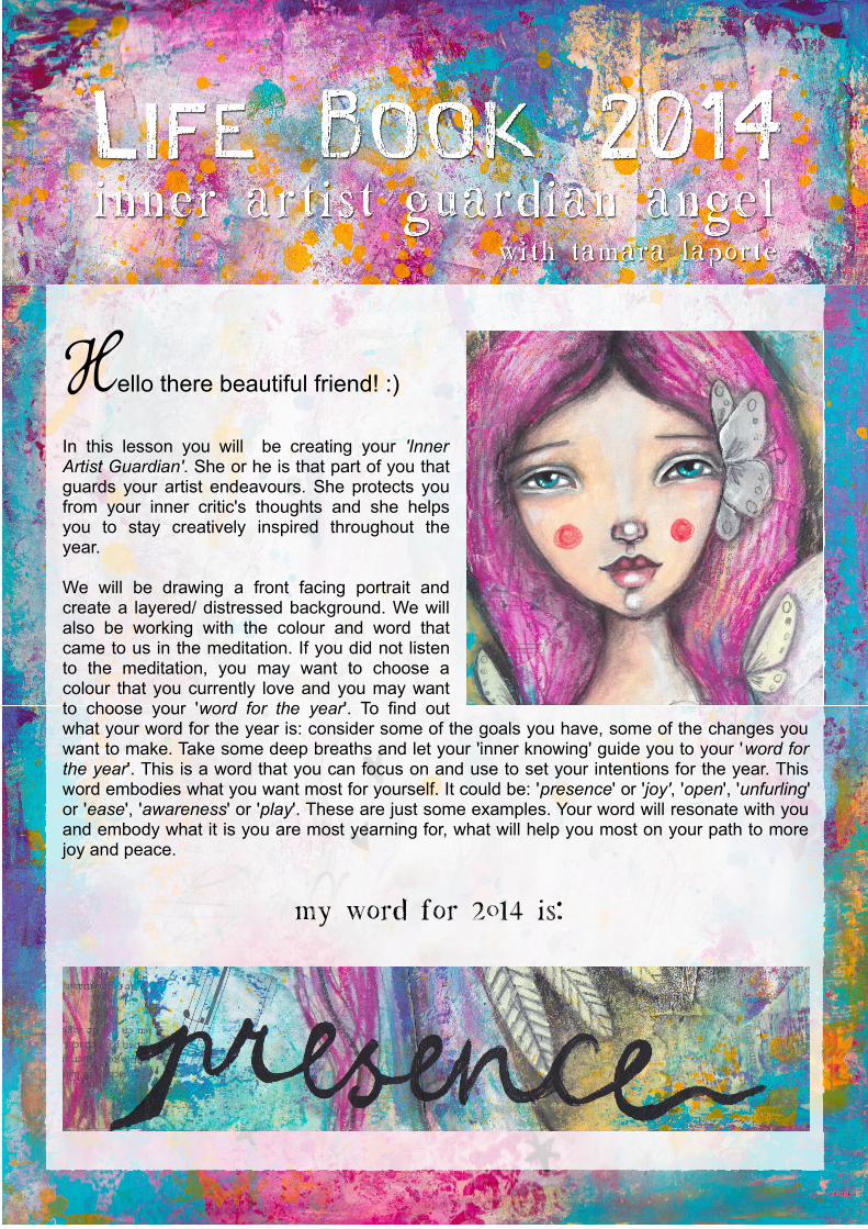
Hello there beautiful friend! :)
In this lesson you will be creating your 'Inner Artist Guardian'. She or he is that part of you that guards your artist endeavours. She protects you from your inner critic's thoughts and she helps you to stay creatively inspired throughout the year.
We will be drawing a front facing portrait and create a layered/ distressed background. We will also be working with the colour and word that came to us in the meditation. If you did not listen to the meditation, you may want to choose a colour that you currently love and you may want to choose your 'word for the year'. To find out what your word for the year is: consider some of the goals you have, some of the changes you want to make. Take some deep breaths and let your 'inner knowing' guide you to your 'word for the year'. This is a word that you can focus on and use to set your intentions for the year. This word embodies what you want most for yourself. It could be: 'presence' or 'joy', 'open', 'unfurling' or 'ease', 'awareness' or 'play'. These are just some examples. Your word will resonate with you and embody what it is you are most yearning for, what will help you most on your path to more joy and peace.
My word for 2014 is:
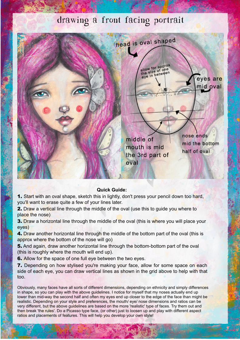
Drawing a front facing portrait
Quick Guide: 1. Start with an oval shape, sketch this in lightly, don't press your pencil down too hard, you'll want to erase quite a few of your lines later.2. Draw a vertical line through the middle of the oval (use this to guide you where to place the nose)3. Draw a horizontal line through the middle of the oval (this is where you will place your eyes)4. Draw another horizontal line through the middle of the bottom part of the oval (this is approx where the bottom of the nose will go)5. And again, draw another horizontal line through the bottom-bottom part of the oval (this is roughly where the mouth will end up).6. Allow for the space of one full eye between the two eyes.
7. Depending on how stylised you're making your face, allow for some space on each side of each eye, you can draw vertical lines as shown in the grid above to help with that too.
Obviously, many faces have all sorts of different dimensions, depending on ethnicity and simply differences in shape, so you can play with the above guidelines. I notice for myself that my noses actually end up lower than mid-way the second half and often my eyes end up closer to the edge of the face than might be realistic. Depending on your style and preferences, the mouth/ eye/ nose dimensions and ratios can be very different, but the above guidelines are based on the more 'realistic' type of faces. Try them out and then break 'the rules'. Do a Picasso type face, (or other) just to loosen up and play with different aspect ratios and placements of features. This will help you develop your own style!
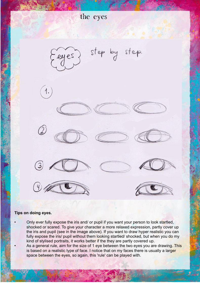
The eyes
Tips on doing eyes.
• Only ever fully expose the iris and/ or pupil if you want your person to look startled, shocked or scared. To give your character a more relaxed expression, partly cover up the iris and pupil (see in the image above). If you want to draw hyper realistic you can fully expose the iris/ pupil without them looking startled/ shocked, but when you do my kind of stylised portraits, it works better if the they are partly covered up.
• As a general rule, aim for the size of 1 eye between the two eyes you are drawing. This is based on a realistic type of face. I notice that on my faces there is usually a larger space between the eyes, so again, this 'rule' can be played with.
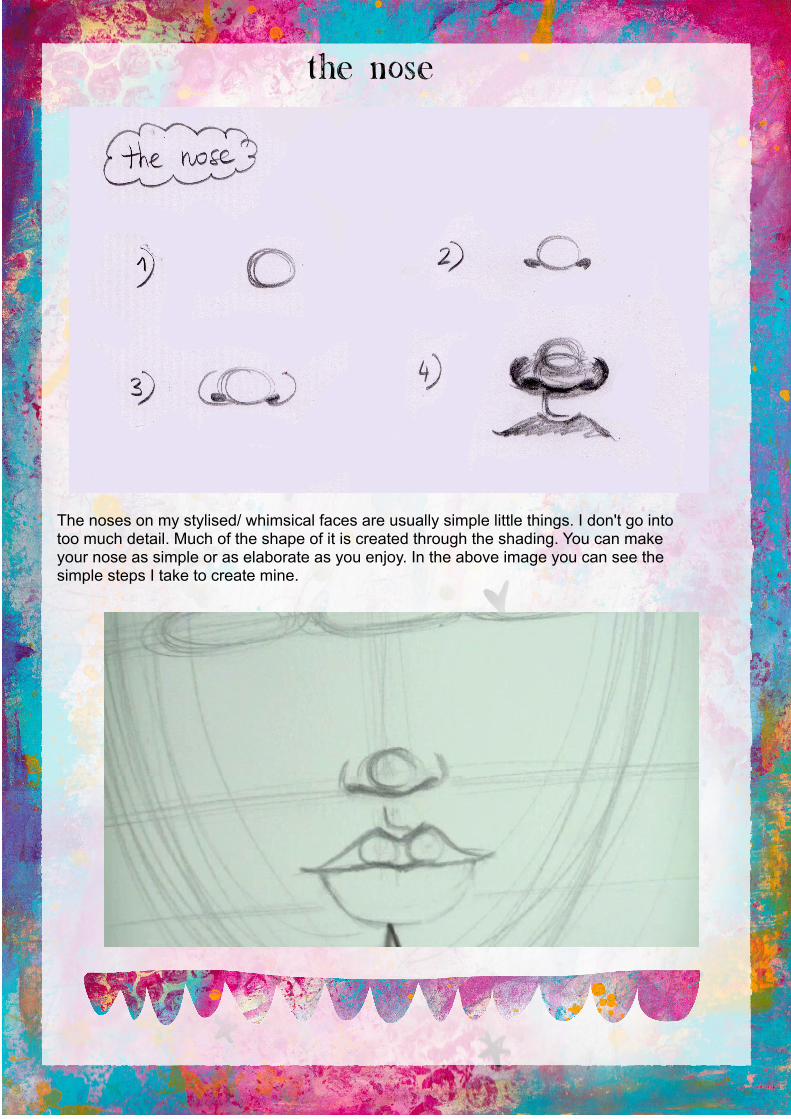
The Nose
The noses on my stylised/ whimsical faces are usually simple little things. I don't go into too much detail. Much of the shape of it is created through the shading. You can make your nose as simple or as elaborate as you enjoy. In the above image you can see the simple steps I take to create mine.
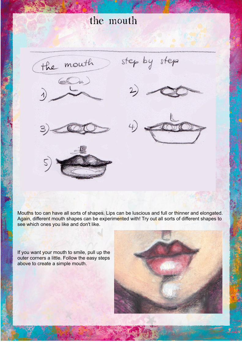
The mouth
Mouths too can have all sorts of shapes. Lips can be luscious and full or thinner and elongated. Again, different mouth shapes can be experimented with! Try out all sorts of different shapes to see which ones you like and don't like.
If you want your mouth to smile, pull up the outer corners a little. Follow the easy steps above to create a simple mouth.

Shading the face
There are many ways that one can shade a face. It all depends on where you assume the light is coming from. In this painting I assume the light comes from the front. Below I've detailed where I tend to place the different shading segments for this kind of face and assumed lighting.

Paying attention to detail
A face really comes to live when you pay attention to the little details. Small additional highlights, subtle gradient blending etc will add depth and intrigue to your face. So, adding little details is not something to gloss over!
Some important details to include to bring your face to live more:
Eyes – the eyeball itself is rounded and will have a small shadow cast onto it from the upper lid. Little reflective highlights in the eyes add sparkle to your eyes. The tear duct often 'bulges out' a little and therefore catches some light, hence there is often a subtle little highlight on it. The bottom and top eyelids both tend to be lighter in the middle than on both outer parts of the lids. Inside the tear-duct too there are sometimes some tiny small reflective highlights.
Nose – Often the bits under the nostrils stick out a little and therefore catch some highlights. Also there can be a highlight right under the tip of the nose which helps with 'shaping the nose', the outer nostrils are darker and sometimes the entire nose casts a shadow onto the part above the upper lip.
Mouth – Assume the upper lip is darker than the lower one, yet there are variations of darker and lighter segments inside both lips. The two 'bulging out parts' on the upper lip that we all have on our lips can be a tad bit lighter and the bit in between them both darker. The bottom lip is lighter in its entirety but tends to be a bit darker in both corners and the bottom of it too is darker. The bottom lip is the one that has more actual bright highlights. Adding those makes your mouth 'glisten' a bit.

Colours I use for shading
I don't always use the same colours, but mostly I tend to go to the following colours in the Caran D'ache Neocolor II crayon range:
• Salmon for the first layer• Darker tones: pink salmon/ orangish yellow (gives a bit of a 'tan')/ cinnamon/ raspberry• Mouth: raspberry/ red or magenta• I also use my graphite pencil a lot for accents and darker shading• For highlights and muting I use white gesso or white acrylics• I sometimes add a layer of acrylics in a wet neocolour layer too. Usually in the salmon/
portrait pink range in the early stages of shading
Blending
2 ways to get some subtle blending going:
1. Use a blending stump, I love these babies! I use them mostly with my graphite, but you can also try them on crayons and even paint here and there though the effect is different.
2. 'Scrub' your paint layer in with a semi damp/ dry brush.
Creating the background
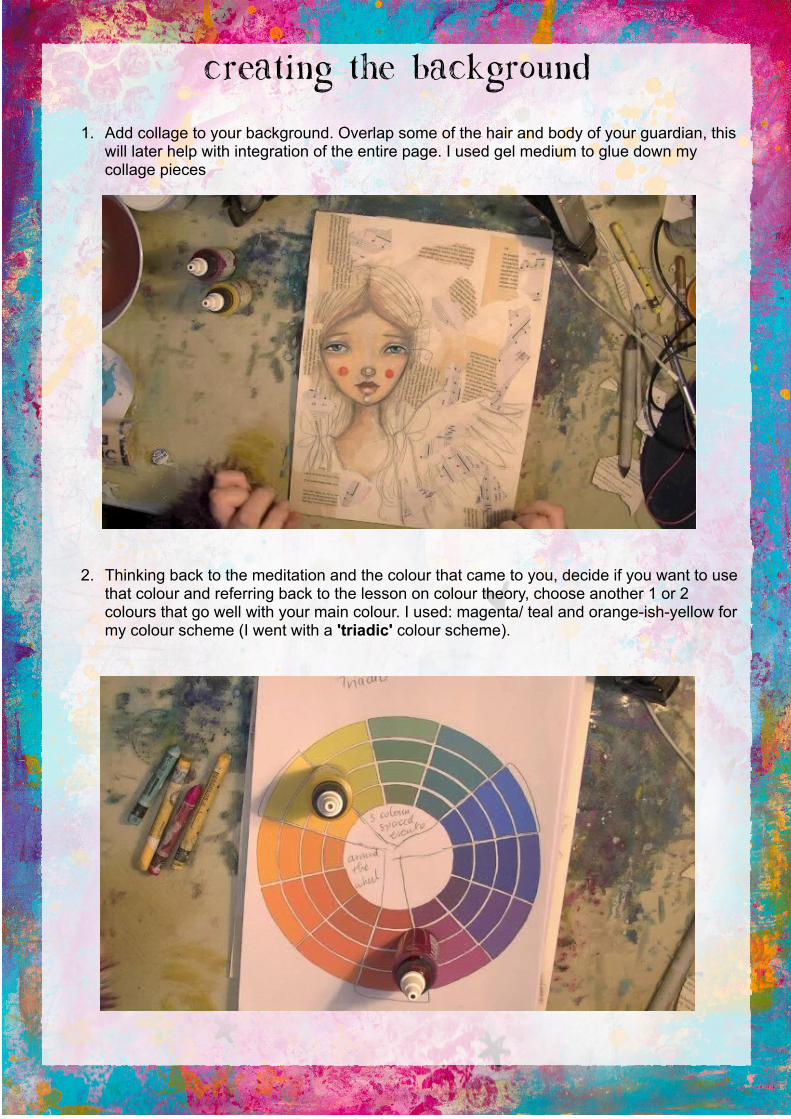
1. Add collage to your background. Overlap some of the hair and body of your guardian, this will later help with integration of the entire page. I used gel medium to glue down my collage pieces
2. Thinking back to the meditation and the colour that came to you, decide if you want to use that colour and referring back to the lesson on colour theory, choose another 1 or 2 colours that go well with your main colour. I used: magenta/ teal and orange-ish-yellow for my colour scheme (I went with a 'triadic' colour scheme).
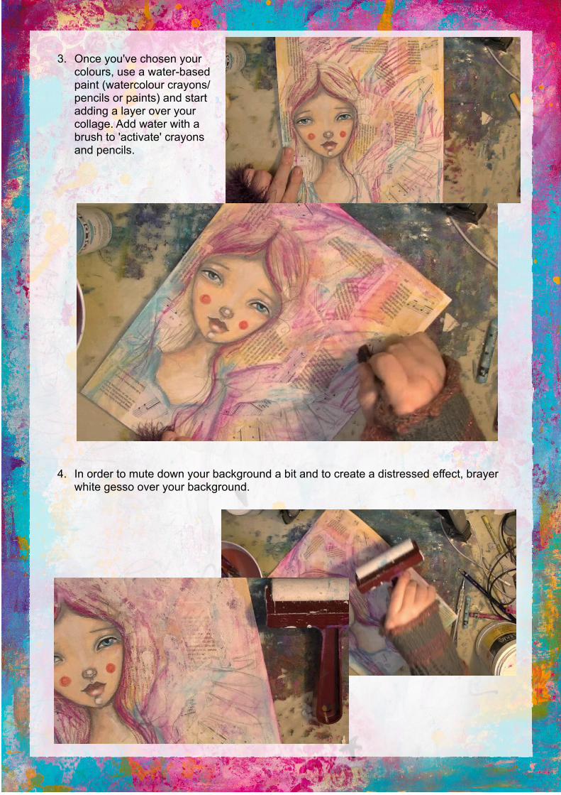
3. Once you've chosen your colours, use a water-based paint (watercolour crayons/ pencils or paints) and start adding a layer over your collage. Add water with a brush to 'activate' crayons and pencils.
4. In order to mute down your background a bit and to create a distressed effect, brayer white gesso over your background.
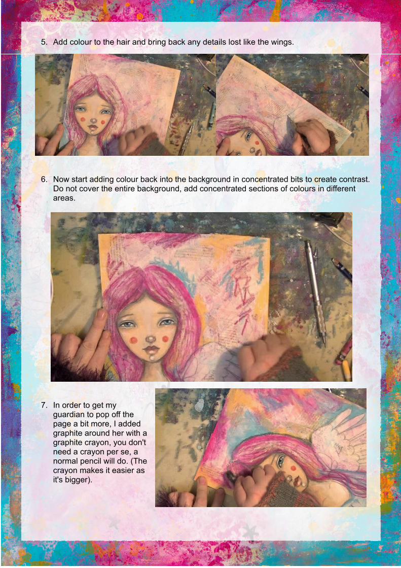
5. Add colour to the hair and bring back any details lost like the wings.
6. Now start adding colour back into the background in concentrated bits to create contrast. Do not cover the entire background, add concentrated sections of colours in different areas.
7. In order to get my guardian to pop off the page a bit more, I added graphite around her with a graphite crayon, you don't need a crayon per se, a normal pencil will do. (The crayon makes it easier as it's bigger).
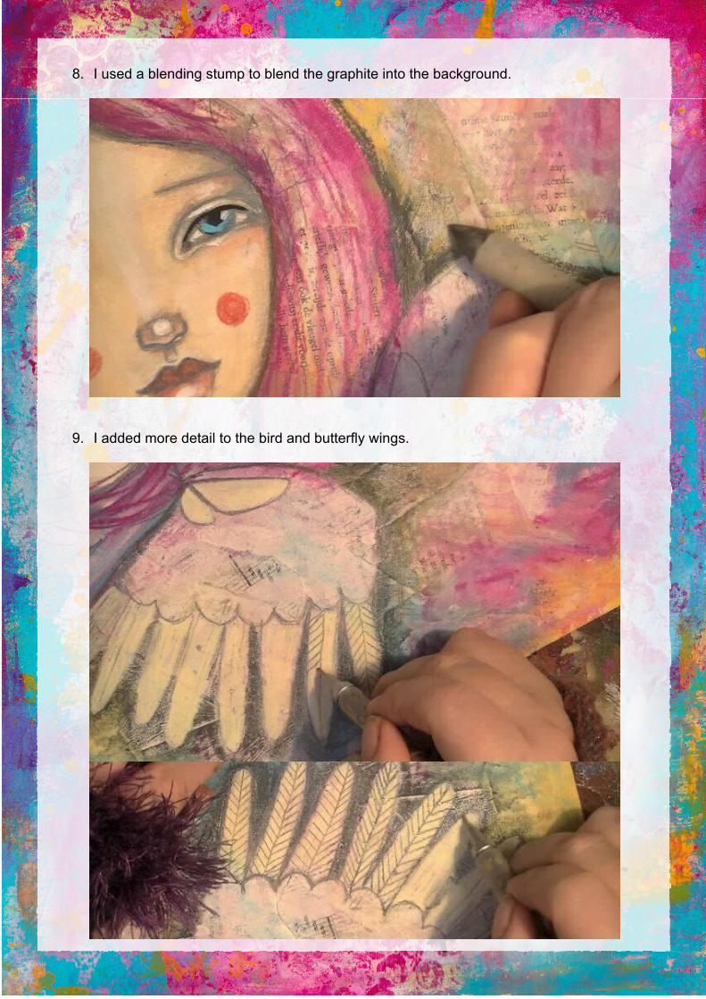
8. I used a blending stump to blend the graphite into the background.
9. I added more detail to the bird and butterfly wings.
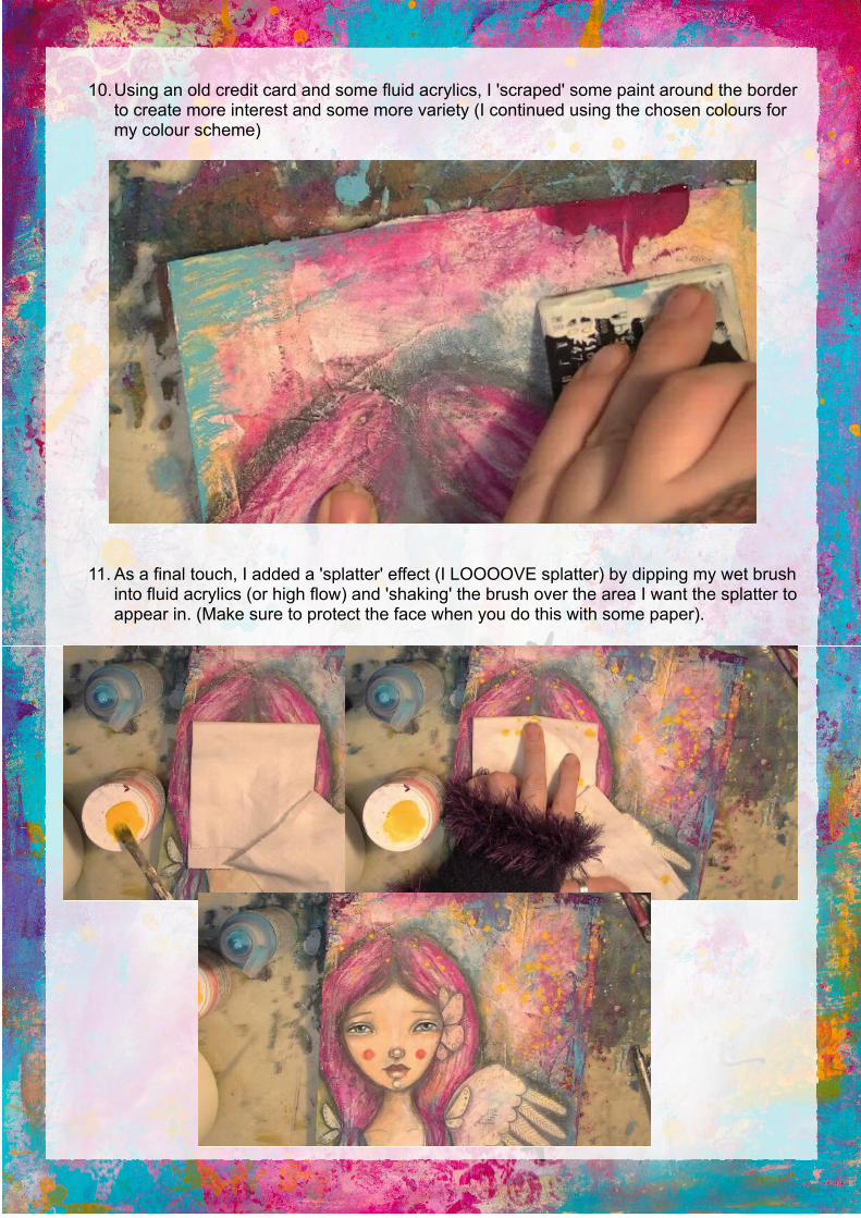
10.Using an old credit card and some fluid acrylics, I 'scraped' some paint around the border to create more interest and some more variety (I continued using the chosen colours for my colour scheme)
11. As a final touch, I added a 'splatter' effect (I LOOOOVE splatter) by dipping my wet brush into fluid acrylics (or high flow) and 'shaking' the brush over the area I want the splatter to appear in. (Make sure to protect the face when you do this with some paper).
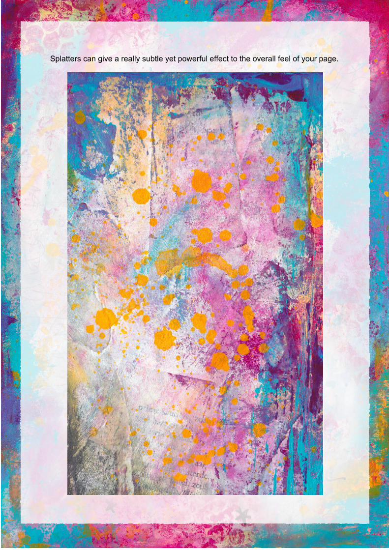
Splatters can give a really subtle yet powerful effect to the overall feel of your page.
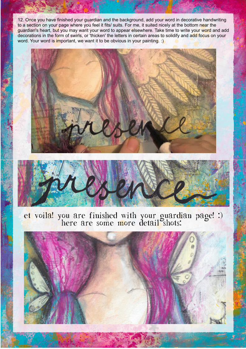
12. Once you have finished your guardian and the background, add your word in decorative handwriting to a section on your page where you feel it fits/ suits. For me, it suited nicely at the bottom near the guardian's heart, but you may want your word to appear elsewhere. Take time to write your word and add decorations in the form of swirls, or 'thicken' the letters in certain areas to solidify and add focus on your word. Your word is important, we want it to be obvious in your painting. :)
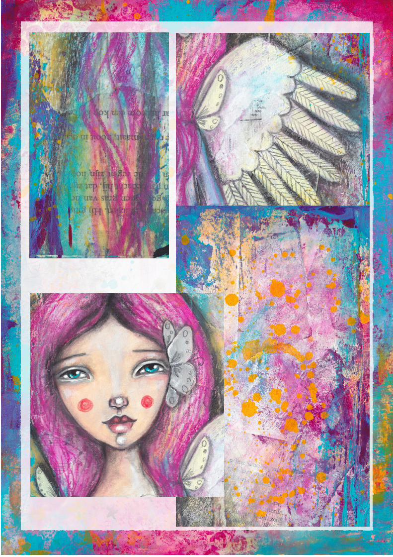
Et voila! You are finished with your Guardian Page! :) Here are some more detail shots:
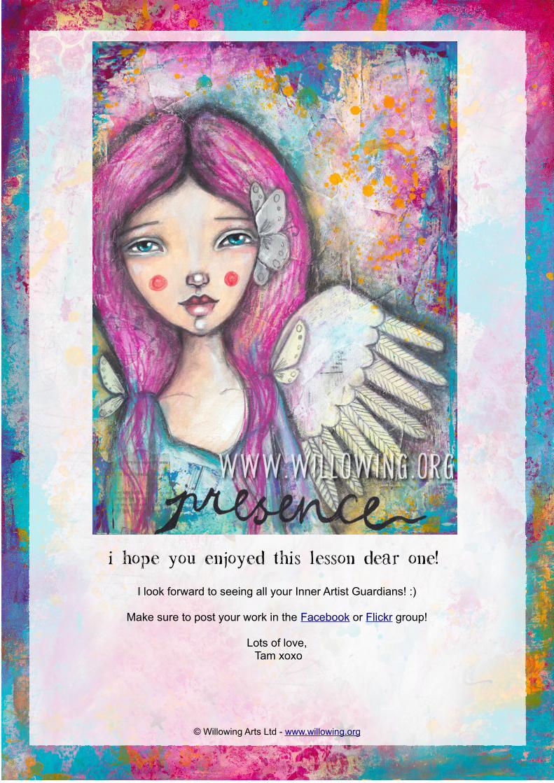
I hope you enjoyed this lesson dear one!
I look forward to seeing all your Inner Artist Guardians! :)
Make sure to post your work in the Facebook or Flickr group!
Lots of love, Tam xoxo
© Willowing Arts Ltd - www.willowing.org