music magazine analysis
TRANSCRIPT

MUSIC MAGAZINE ANALYSIS
George Pierce

FRONT COVER

The Kerrang mast head follows most of the cods and conventions for magazines, by putting it at the top of the page as well as keeping the text width of the overall page. It is also the largest font on the cover so as to make more noticeable, the cracking effect on the text tells the reader that Kerrang is cool and has its own style which is completely different to other magazines; the cracking effect also gives the magazine more of a “ROCK” which helps appeal to its target audience.
The color scheme of this issues of the magazine is predominately orange, black and red; colour’s that would be more appealing to a male audience which is more than likely the target audience this Kerrang issues was set for.
The cover page follows the codes and conventions of magazines, the main image is right in the middle of the cover and therefore is the most eye catching part of the magazine. It shows two of the members of “LINKIN PARK” looking straight forward and into the direction of the reader; this creates a slightly subtle personal attraction between the product and the consumer.
The barcode is placed at the bottom right hand side of the magazine; close to the barcode some brief information about that issues of the magazine is given so the reader has a little insight of what the issues is going to be about.

The NME magazine does not really follow the traditional codes and convections of magazines, the title is off to the left and is not directly at the top of the page like most other magazines. This will give the readers the impression that this particular magazine is a rebel and does not abide by the rules and is therefore much cooler than any of it competitors
The color scheme on this issues is mainly red and yellow and white; the dominant color being red (as the background). These types of colors are more appealing to the male audience and would attract them more to the magazine.
The cover page however does follow the codes and conventions more than the masthead, the image of the “FOO FIGHTERS” member “DAVID GROHL” is the most dominant part of the front cover as he takes up most of the space on the magazine; his appearance is angry which also gives a little hint to what the story will be about. The size of the cover lines that are specific to “FOO FIGHTERS” is very large and is in-fact larger than the masthead; which would indicate that this issues is going to be heavily “FOO FIGHTERS” driven and would also entice fans of the band to buy and read the magazine.
In the bottom right hand corner above the barcode is a flash that gives the audience some information about something they could win, having this could make other people want to buy the magazine so they can try and win the prize.

The masthead for the “MOJO” magazine fits the basic codes and conventions for magazines, it fits across the width of the cover and is also has the largest font size; which makes it very eye catching to a passer by. The font that is used also gives the reader that the magazine is quite laid back and quite mellow and chilled.
The color scheme for this issues of the magazine is quite clearly green, black and white, these colors seem to lean towards a more male audience than female, also giving the reader another hint at how laid back the magazine is; the use of the color green also adds to this as it is a more relaxing color and is saying that you will be relaxed while reading the magazine.
The cover page also leans away from the common codes and conventions and instead of using the natural color for the main image which is also the most eye catching, they have used a black and white color correctness to it to make the image look more laid back which seems to be a main point this particular issues of the magazine is trying to create. Also because of how different the main image is compared to other music magazines (color wise) makes it stand out and may be eve more appealing to the audience as they may want to see what is so different with the magazine and because of the color scheme may even be tempted to buy it. It is quite clear from the cover lines which one is going to be the most dominant through out the magazine “KINGS OF LEON” has the largest font size of all of the cover lines and would instantly attract the reader to it, it is placed in the centre of the cover and in front of the image; this shows the reader what this issues is mainly going to be talking about.
GIVE AWAY’S
In the top left hand corner there is a flash for a free CD giveaway, this would help in the sales as people may be interested in what CD it is and may even only buy the magazine just for the CD

The masthead for Q magazine does not follow the common coeds and conventions, for a starters its names is short and simple and is quite easy to remember, but also where the masthead is placed, it is placed in the right hand corner and is not very dominant; the only part that makes it noticeable is its red background.
The colors on this issue are quite basic and only mainly consist of red and white, which once more are slightly more appealing to a male audience than it is to a female one.
The cover page for this issue also aims more at the male audience, the image used is quite odd and strange and will almost instantly grasp the eye of anyone walking past it and may even bring them to pick up the magazine and buy it. The image follows the common codes and conventions and sits in the centre; where the audience is bound to look first. The dominant cover line is going for the shock value to gain the audiences attention and also show them what this issues is mainly going to be talking about. “DAVE GROHL SAVES ROCL. AGAIN.” will grip the readers attention and may even make them carry on reading and buy the magazine; simply because of how dramatic the magazine is making the story sound.
The barcode here is not following the common cods and conventions too closely and instead of being at it’s usual place at the bottom of the cover, it has been placed above the main cover line; this will show to the audience how big the main story of the magazine is (that it has to move the barcode from it usual place ) it could also hint to them how Q magazine likes to be different and go against the common rules
The give away flash in the top right hand corner shows the audience what else they will get if they purchase the magazine. “FREE UNHEARD FOOS ALBUM” this would entice them in to buy it more (especially if they are a fan of Foo Fighters.

CONTENTS PAGE

The layout for this “KERRANG” contents page is quite basic. For each of the pictures used very little text is used and only give a very brief statement on that particular article so then the readers are forced to flick through the pages and may even find some more interesting things that will make them want to buy the magazine. The layout of the page numbers goes against the common codes and conventions as in the majority of the time the page numbers are placed on the left, but in this one they have been placed on the right; which also shows how slightly rebellious Kerrang is. The images used take up the majority of the space on this page, the reason for this is, is people prefer to look at images than read large chunks of text; especially if they just to have a little read of something they like and want to realx.
The colour scheme is very basic, it mainly consists of a very light blue background and black and yellow; the colour yellow is used to highlight certain articles that hold some importance or are exclusive; this makes them stick out so the reader can easily see which ones they would want to read about.

The layout of this “MOJO” contents page does not follow the common codes and conventions as the magazines name is at the top instead of a “CONTENTS PAGE”. Having this in bald will attract the readers eye to it; also underneath the title there is a small list of cities in which some of the music from this issues come from. The main image stands out the most as it is the biggest notable thing on the page , it stands to the right of the page and stretches all most the entire length of the page; the way in which he is displayed (being so noticeable) it hints to the reader that he is going to be one of the main stories of that issue of the magazine.
The colour scheme to the contents page is quite basic and only mainly consists of the light blue background and black and orange for the text. The orange to make the page numbers and some of the more important words to stand out; so the reader will easily be able to pick up on them and continue through the magazine. The colour used for the image is in direct contraction to the light blue (or) faded green; making it much more eye catching to the reader.

The layout is very basic and consists of the usual image to the right which takes up the majority of the contents page’s page. The image shows the reader who is going to be the main focus of this particular issue of Q magazine. The main articles are placed on the left hand side and also give a brief description of what that particular story is about so the reader can decide if they want to continue on to that page.
The colour scheme is fairly basic and only consists of white and black and red for the text as well as for the borders. The “Q” is in the same place as it was on the front cover but this time its red background stretches across the entire width of the page, the red makes it almost instantly eye catching in comparison of the white back ground.

The name of the magazine is at the top of the page as well as “THIS WEEK” which is very different to the traditional codes and conventions, where it would normally say Contents page. It’s appearance resembles that of a tabloid news paper; the main story in the centre further shows this by looking like an article from a news paper, especially with its bald tag line. The page numbers also are not really following the common codes and conventions as they are on the right side of the titles for the pages, instead of the traditional left. Also the way they are set out is actually hard to see and shows that these are really not the important stories that need to be seen; this makes the main story they are trying to show that much more appealing to the audience and might get them to buy the magazine.
The colour scheme for this issue of NME is basic and the only main colours are the white fro the background and the black and red for the text; the red being used to highlight the separates stories as well as a few of the key words; so then it would stand out to the reader and make it slightly more noticeable.

DOUBLE PAGE SPREAD
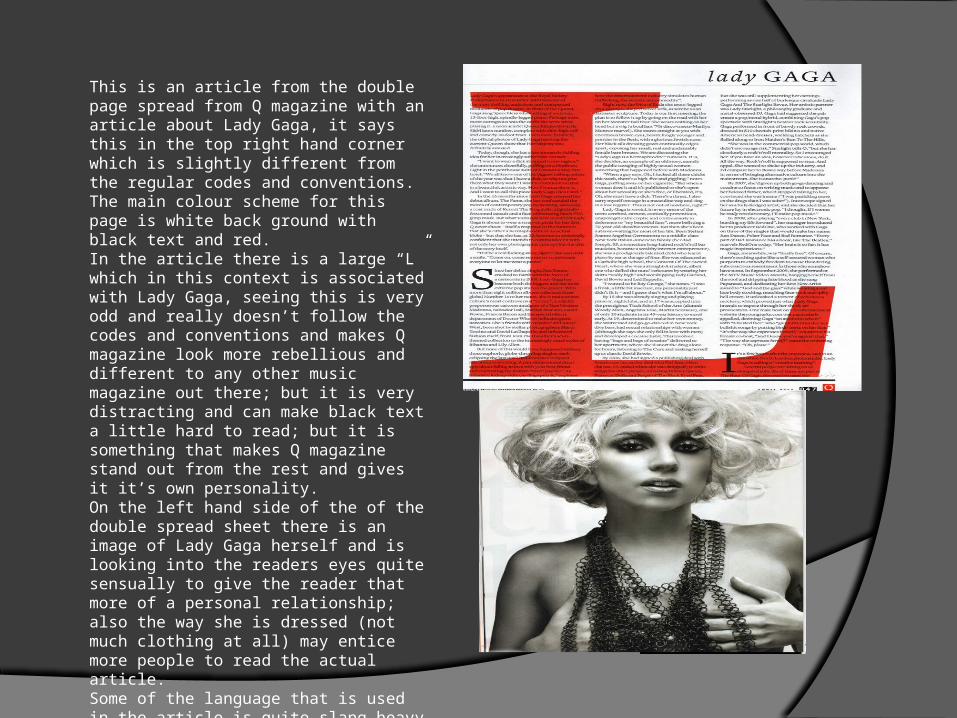
This is an article from the double page spread from Q magazine with an article about Lady Gaga, it says this in the top right hand corner which is slightly different from the regular codes and conventions. The main colour scheme for this page is white back ground with black text and red.In the article there is a large “L” which in this context is associated with Lady Gaga, seeing this is very odd and really doesn’t follow the codes and conventions and makes Q magazine look more rebellious and different to any other music magazine out there; but it is very distracting and can make black text a little hard to read; but it is something that makes Q magazine stand out from the rest and gives it it’s own personality.On the left hand side of the of the double spread sheet there is an image of Lady Gaga herself and is looking into the readers eyes quite sensually to give the reader that more of a personal relationship; also the way she is dressed (not much clothing at all) may entice more people to read the actual article.Some of the language that is used in the article is quite slang heavy and would suit Lady Gaga’s fans quite well and they also understand a little better too.

In this double page spread of an interview with Hayley Williams from the magazine Kerrang; her name is highlighted orange to make sure the reader see’s this very clearly and knows what the article is about . “IT HURT ME” they have used this in the biggest font to grasp the readers attention and make the article more dramatic and appealing and therefore make the reader want to carry on reading and may even buy the magazine.The colour scheme is quite dark and the reason for this is to make the article look more dire and even more dramatic as the colour black usually symbolizes something bad and something hurtful too; also with the white writing it looks more appealing to read and looks new and fresh compared to black writing on a white back ground. The woman on the right (Hayley Williams) is shown here to show the reader who the article is about; but in the way she is positioned and her facial features are trying to show that she is strong and is trying not to let the issue bring her down and she will try to keep up her music; and even says that she is still trying to work hard and is “looking to the future.”

In this double page spread of and article about “HAIM” from the magazine NME. The masthead takes up the majority of the space and uses a (really bad) pun to gain the readers attention and draw them in to read the article.The colour scheme to this article is quite basic and uses the traditional white background and black text, but the colours blue and pink highlight some of the important quotes/names. “If you fuck with my sisters I will kill you.” has been highlighted because of its nature and use a taboo language; seeing this may grasp the readers attention more as there eyes would be drawn to the text because of its colour and size and might be intrigued to read it from the start to find out why that was said and even make them buy the magazine. On the left hand side the picture used is quite personal and shows all three band members (who are also sisters) leaning on one another showing how laid back they are and quite cool; also because they are looking straight towards the reader will give them a more of a personal relationship and may even subconsciously force the reader to read/buy the magazine.

In this article from MOJO magazine about “ALEX TURNER” and “MILES KANE” and their music they want to record. “BEST OF BOTH WORLDS” is the masthead which stretches across both pages, the image used is also spread across both pages which show the reader that this article is one of the main ones and is definitely worth the read.The colour scheme for it is mainly black and white with orange for the words that need to be highlighted to indicate to the reader who certain people are or just simply key words.The fact that one of them is looking away from the audience gives them that more sense of mystery and may egg them on to carry on reading to find out why he is looking away and why the other one is; and may make the reader want to buy the magazine to find out more

WHAT DO THE ARTICLES HAVE IN COMMON? One of the common things I saw in the articles were that they all used
different colours to highlight certain words and facts and names so that the reader would be able to know what were the key features and who the article was about.
Another common attribute I saw was that all of the pictures had someone looking out towards the audience to make the reading of the magazine more personal; which would more than likely make them want to read that particular article.