module six: examining current demographic features of...
TRANSCRIPT
1
Module Six: Examining Current Demographic Features of Your Region Module Six will focus on refining your regional goals through the use of primary and secondary data.
Using the Workbook The participant workbook contains worksheets designed to assist participants in planning their economic development effort.
Group Exercises There is one group exercise in this Session. The exercise – will help the participants understand the materials, and will provide a break from listening to presenter and allow the participants to get to know each other a little. A summary of the group discussions and exercises: Slide #1: Group introductions; use ice-breaker if desired Slide #12: Regional Planning Variables Slide #14: Population Change Slide #15: Population – Sources of Change Slide #18: Population – Your Region Slide #20: Population – high School Graduate or Less Slide #26: Location – Natural Amenities Slide #39: How to Measure Experience? Slide #43: U.S. Labor Force Participation Slide #45: Training Slide #47: Regional Workforce – Your Region Slide #48: Refining Regional Goals Slide #49: Revising Regional Goals Worksheet Slide #50: Final Reflections

2
References
ACCRA Cost of Living Index
http://www.coli.org/
Census Bureau:
Current Population Survey - Annual Social and Economic
http://www.census.gov/hhes/www/hlthins/data/historical/index.html
Educational Attainment by State
http://www.census.gov/prod/2003pubs/c2kbr-24.pdf (for the year 2000)
http://www.census.gov/prod/2009pubs/p20-560.pdf (for the year 2007)
Population Change Data
http://www.census.gov/popest/states/NST-comp-chg.html
Population Changes by County Over the 2000-09 Period
http://www.census.gov/popest/counties/CO-EST2009-popchg2000_2009.html
Population projections by State (along with changes by age)
http://www.census.gov/population/www/projections/projectionsagesex.html
Resident Population by Age, Sex, Race, and Hispanic Origin for Counties
http://www.census.gov/popest/counties/asrh/CC-EST2009-alldata.html
AND
http://www.census.gov/popest/counties/asrh/CC-EST2009-agesex.html
Total Population Data
http://www.census.gov/popest/states/NST-ann-est.html
Economic Research Service - Natural Amenities Scale
http://ers.usda.gov/Data/NaturalAmenities/
Food and Nutrition Service/USDA
http://www.fns.usda.gov/pd/16SNAPpartHH.htm
Missouri Economic Research and Information Center
http://www.missourieconomy.org/indicators/cost_of_living/index.stm

3
National Assessment of Educational Progress Information
http://nces.ed.gov/nationsreportcard/states/
National Telecommunications and Information Administration
http://www.ntia.doc.gov/data/index.html
Social Security Administration - SSI Data by State and County
http://socialsecurity.gov/policy/docs/statcomps/ssi_sc/2009/index.html#table3alt
Social Security Administration - SSI Recipients by State and County
http://socialsecurity.gov/policy/docs/statcomps/ssi_sc/2009/ssi_sc09.pdf
STATSAmerica - Occupational Clusters
http://www.statsamerica.org/innovation
The Economic Research Service - SNAP Participation by States and Counties/Parishes
http://maps.ers.usda.gov/snap/Default.aspx
The Rural Assistance Center (The poverty maps are created from data published by the U.S.
Census Bureau Small Area Income and Poverty Estimates.)
http://www.raconline.org/maps/#poverty
U.S. Department of Labor - Bureau of Labor Statistics
http://www.bls.gov/opub/working/page3b.htm
US Department of Labor/Employment and Training Administration (USDOL/ETA) - O*Net
http://www.onetcenter.org/

4
Instructions: Please have this slide showing as people enter the meeting room. This session relies heavily on secondary data. The slides themselves provide maps and illustrations of data for the entire country. If instructors do not want to focus on national trends, the maps on these slides can be replaced with data on the specific region in which the participants are most interested. Prior to the beginning of this session, the region should have been provided a copy of the regional and county/parish profiles prepared by the SRDC for use with the participants. Each individual should have had ample time to browse through the data. Allow for a few minutes to be dedicated at the beginning of this module for the group to discuss some data on their region that surprised them, or ask them if any of the data did not seem to accurately reflect the conditions within the region. Note that you’ll have other time throughout this session to discuss different types of data. Script: “We are going to begin Module Six, which explores demographic features of the region, by discussing the regional profiles you each received prior to today. Hopefully, you have had an opportunity to review the basic demographic characteristics of your region, such as population, age, poverty, housing, education, and more. Are there specific data items or trends that surprised you? We are going to spend our time today exploring in greater detail some of the important demographic features of the region. We are going to do so by taking a careful look at a variety of secondary data. By secondary data we mean information that has been collected already either in a published or unpublished format by some other entity (such as data available from the U.S. Census Bureau). The presentation will start with national trends but will then move into a closer examination of data for this region. In addition, we will explore features of the regional workforce. At the conclusion of this session, we’ll try to identify how the results of our data analysis might require us to re-examine (and perhaps refine) our regional goals.”
Slide: 1 Time: 15+ Minutes Have this slide showing as people enter the meeting room

5
Instructions:
Take the next five minutes or so of the session to discuss some of the activities that the group decided it
was going to pursue after the session on “Assets and Barriers.” Ask for updates from those in
attendance.
Script:
“We discussed a number of topics when we reviewed regional assets and barriers (Module Five). There
were several items that we proposed be undertaken as an outgrowth of that session. Let’s take about
five minutes to discuss the work your team may have undertaken related to the different asset mapping
tools. Did you come up with some modifications you want to recommend in any of the tools? Did you
administer any of these tools to individuals, voluntary organizations or formal institutions? If so, did the
tools generate some valuable information? Are there any thoughts about the value of these tools in
terms of advancing/supporting your regional efforts?”
Slide: 2 Time: 5 Minutes
6
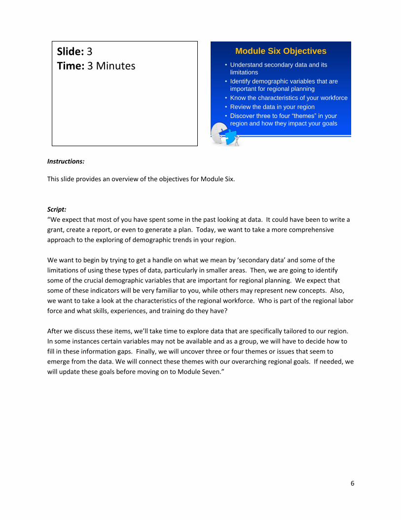
Instructions: This slide provides an overview of the objectives for Module Six.
Script:
“We expect that most of you have spent some in the past looking at data. It could have been to write a
grant, create a report, or even to generate a plan. Today, we want to take a more comprehensive
approach to the exploring of demographic trends in your region.
We want to begin by trying to get a handle on what we mean by ‘secondary data’ and some of the
limitations of using these types of data, particularly in smaller areas. Then, we are going to identify
some of the crucial demographic variables that are important for regional planning. We expect that
some of these indicators will be very familiar to you, while others may represent new concepts. Also,
we want to take a look at the characteristics of the regional workforce. Who is part of the regional labor
force and what skills, experiences, and training do they have?
After we discuss these items, we’ll take time to explore data that are specifically tailored to our region.
In some instances certain variables may not be available and as a group, we will have to decide how to
fill in these information gaps. Finally, we will uncover three or four themes or issues that seem to
emerge from the data. We will connect these themes with our overarching regional goals. If needed, we
will update these goals before moving on to Module Seven.”
Slide: 3 Time: 3 Minutes
Module Six Objectives
• Understand secondary data and its
limitations
• Identify demographic variables that are
important for regional planning
• Know the characteristics of your workforce
• Review the data in your region
• Discover three to four “themes” in your
region and how they impact your goals

7
Instructions: This is a basic overview to secondary data. The amount of time you spend on this section will depend on your team. If the team has a good bit of experience with data, this will be likely serve as a quick refresher for them. If many members of the team have not used data very extensively in the past, then spend some more time on this slide and the next slide, potentially giving examples of differences between primary and secondary data, qualitative and quantitative data, etc. Script: “Secondary data are information resources that already exist either in published or unpublished format. They are collected by someone else and are being re-used by others, such as researchers, grant writers, policy makers or agency leaders. Primary data are those that you have collected yourself. Primary data can be gathered through observation or from surveys (such as telephone or mail surveys). Secondary data can be either qualitative or quantitative in nature. ‘Quantitative,’ in simple terms, refers to things you can count, or ‘quantify.’ Qualitative allows for more open-ended responses that may not be ‘countable.’ For instance, you might construct a survey that asks respondents to indicate whether or not they have participated in post-high school training. The answer choices would be ‘yes’ or ‘no.’ You can count, or quantify, the number of yes and no responses. However, if you follow that question with, ‘Why did you choose to participate or not participate in additional training?,’ you will get a wealth of responses that cannot be boiled down to numbers. These responses would be qualitative in nature.” Option One for Beginners: ‘What are some examples of secondary data?’ [Most likely first answer: Census] ‘What about other sources of data that may have been collected by other organizations or agencies that we tend to use often to gain a pulse of what is happening in our communities/counties or regions?’ ”
Slide: 4 Time: 3 Minutes

8
Instructions: There are a variety of ways in which secondary data can be analyzed. Share with the team the three more common ways in which such data are examined by researchers, agency representatives, and others. Script: “There are three approaches that are commonly used when it comes to analyzing secondary data. The first is to conduct a cross-sectional analysis of data you’ve collected on your region (or county). What does that mean? It’s pretty straightforward. We are talking about examining data at one point in time. For example, let’s assume the Census Bureau just released its latest report on population and you’ve secured a copy for your regional team to examine. The latest report paints a picture of the number of people in each county by age, race, education, marital status, and what not. When you are examining data for a specific year, then you are doing a cross-sectional analysis of those data. Now, let’s assume you are interested in seeing how your region is doing relative to another region in your state. So, you want to see what the occupational make-up is of your regional workforce relative to another region in your state (or relative to the state as a whole). When you examine data in this manner, you are conducting a comparative analysis. A third option is to examine data over multiple periods of time. So, if you want to see whether your regional workforce has a higher level of education today than it did in 1990 and 2000, then you would be undertaking a longitudinal analysis.”
Slide: 5 Time: 3 Minutes

9
Instructions: The slide provides some of the important items participants should try to examine when carrying our secondary data analyses. Script: “We sometimes assume that everyone knows how to interpret secondary data. In reality, you could be staring at a bunch of numbers and not know how to begin to dissect the data. We want to offer you a few clues on what you should focus on whenever you are studying an array of secondary data. For one, try to get a sense of what conditions the data are describing – such as the level of poverty, the high school completion rates, the growth or decline in jobs, and so on. Next, if doing a longitudinal analysis of your data, keep a close eye on the direction of the change. Are you gaining or losing population? Is your region experiencing growth of its elderly population? Is the high school graduation rate going up? Is the number of jobs declining? Third, carefully study the intensity of the changes. For example, you may find that you’ve lost jobs over the past 10 years, but when you compare your rate of job losses to what occurred in the 1980s or 1990s, you may note that your job losses are much less severe than they were in the prior decades. So, it’s always a good idea to determine the extent to which things are getting better or worse for your region. Finally, after using the strategies and techniques outlined on this slide and our previous slide to analyze your data, step back as a regional team and try to get a handle on the overall picture that the data are painting about your region (or its counties). It’s important to spend time thinking about the ‘big picture’ issues that the information seems to be uncovering about your region.”
Slide: 6 Time: 3 Minutes

10
Instructions: It is important for the group to understand the limitations of secondary data. Drawing conclusions from the data is something that has to be done with some care since you have no be certain you have a handle on how the data were collected and some of the assumptions that are associated with such data collection. Script: “While some data sources are better than others, no single data source is perfect. The Census is often considered the most reliable data source, but there are even possible errors associated with those data. What could those errors be?”
Slide: 7 Time: 1 Minute

11
Instructions: This slide summarizes some of the advantages of using secondary data over primary data collection activities. Script: “There are obvious benefits to using secondary data, particularly when contrasted with primary data. First, these data already exist. Second, in many instances the data are less expensive to access than the more costly primary data collection strategy. Third, secondary data take less time to collect. There are some instances where the data sets you could collect would be so large that it could take months to understand the data and how they are organized. Thus, using secondary data allows an individual to get a quick handle on current and emerging issues. Finally, usually secondary data saves you the trouble of launching a more extensive primary data collection effort.”
Slide: 8 Time: 2 Minutes

12
Instructions:
This slide reviews the shortcomings associated with the use of secondary data.
• Inconsistencies in definitions (i.e., urban/rural, metro/non-metro, farm size, family size,
industry classifications)
• Data may be inaccurate or incomplete; biased
• Potential problems with “reliability” (i.e., sample size, response rate, questionnaire design)
• Data are usually only indirect measures of the issues you are interested in
• Data can be old
• Interpretation of the data must be done with caution (i.e., estimating impacts are difficult to
determine directly; more likely to be indirect
Script:
“There are several potential limitations associated with the use of secondary data. Often,
inconsistencies in definitions across data sources can create confusion. For example, let’s think about
how we define the ‘size’ of a region. In some instances, regions are defined as urban or rural, in other
data sets, they are defined as metro or non-metro. The criteria used to define rural and non-metro are
not the same even though to the casual observer the two terms seem to be synonymous.
Data may be inaccurate, incomplete, or biased. For example, if data are collected from a survey, it is
possible that those who responded to the survey really cared about the issue whereas those who
weren’t that interested in the topic may have opted not to respond to the survey. In this case, the data
could paint the wrong picture of what people thought about the issue because the results are biased
(since a representative group of people did not respond to the survey). Furthermore, in rural areas,
data are often incomplete or undisclosed to protect the privacy of individuals or businesses. These
concerns lead to questions of reliability.
Data are usually only indirect measures of the issues in which you are interested. They often only serve
as proxies. For example, let’s say we want to examine the population aged 65 years old and older in our
Slide: 9 Time: 5 Minutes
13
region. Our interest in more than just trying to determine what percent of our population is made up of
retirement-aged people. We also want to look at the data to see if there are important services that our
region may want to provide for our elderly residents. When you think about it, we don’t know from the
data what services elderly people may need, but we are assuming that since there is a large elderly
population, then there are needs that this group has that your regional group may need to address.
Data can be old. The Census historically has been conducted every ten years. So, it’s possible you could
be examine data on the educational attainment levels of adults 25 years old and over that are getting
outdated (for example, education data collected in 2000). So, these data may not offer an accurate
snapshot of the current state of the educational profile of the adult population in your region.
Finally, interpretation of the data must be done with caution. So many times the data themselves may
be fine but the interpretation may be wrong because they’re being analyzed by people who lack
experience using data, or who may be purposely misinterpreting the data for personal gain.”
Additional Comments:
[NOTE: This would be a good time to discuss the change in the way the Census Bureau is now collecting
information on the U.S. population. These changes could affect your team’s thinking about collecting
data in the future or about the value of using secondary data to monitor the impact of the team’s
regional initiative. Here is some background information you might want to share with the group.]
“While Census data products were not always released to the public in as timely a fashion as we would
have like in years past, there are some important changes taking place in how information about the
U.S. population is now being collected. In particular, the Census Bureau is now gathering data on an
annual basis as part of its American Community Survey (or what is often called ACS). Information is
being assembled on a core set of variables – such as age, sex, race, family structure, income, education,
and where you work. What this means is that data will be available to us on a more frequent basis, but
the timelines for the release of such data will be linked to the size of the county, parish, or community in
which you live in. What do we mean? Here are some guidelines regarding the availability of ACS data:
1. Counties or geographic areas having a population of 65,000 or more will have annual estimates
available;
2. Geographic areas (such as counties or places) having a total population of 20,000 or more will
have 3-year estimates released;
3. Geographic areas (those of under 20,000) will have 5-year estimates released.
So, as you can see, smaller populated areas will have to use data that have been collected over a 5-year
period in order to ensure the precision and reliability of the information. So, this means that regions
that are composed of counties with small populations may have to wait a few years before they can
secure accurate secondary data on their specific geographic area (i.e., county, parish, place).”

14
Instructions: These are questions the team should ask before using data to guide their regional goals. Touch upon each item listed on the slide and ask the team to think about these questions as they consider the use of various secondary data sources to guide their planning efforts. Script: “As we work together in gathering and exploring data for the region, it’s important that we consider and document the following: What is the source of the data? – Mounds of information are available at our fingertips via the Internet and other published sources. However, we must consider the source of the information. Are the data from a trusted, reliable source? If not, keep digging for a more trusted source of information. Does it cover the geographic region the team wants to consider? Since these regional initiatives cross traditional boundaries, care needs to be given to the geographic span of data to ensure that it matches the region’s target area. Likewise, does it consider the team’s target audience? For instance, if the team is particularly concerned with young adults just entering the workforce, focusing on adults in the 18-25 year range may be more appropriate than considering the entire adult population. Next, does the data tell the team something meaningful about the issue or topic of concern? Again, a lot of information may be available, but none of it may deal specifically with the issue the team wants to address. So, focus on data that can offer the best insights on the issue that your team is interested in examining. Are the data current? As discussed earlier, up-to-date data are not always available. Caution should always be taken in interpreting data that have been collected several years ago since they may not reflect current realities. On a related note, trends are sometimes very helpful to consider. However, when tracking data across time, care needs to be taken in ensuring that the data are collected from a similar population or during a similar time period (for example, April of each year). In addition, it’s important to be sure that the
Slide: 10 Time: 5 Minutes

15
variables you are examining are defined in the same way. For example, if one data source in 2000 reports on individuals under 18 years old and the most recent data reports on individuals less than 25 years of age, then you aren’t able to compare the data from these two points in time because the age groups are defined differently.”

16
Instructions: This slide should explain to the participants why trends in the region should matter. We want to emphasize that we are not collecting data just to collect data. Instead, knowing historical trends and current conditions is very useful for evaluating what has or has not worked in the past, as well as identifying what might work in the future. Script: “Why are we spending an entire session exploring demographic data in our region? Here are some important reasons. We are moving in the direction of identifying a region’s competitive advantage. To do that, we must first explore the features of the region that can offer a better understanding and insights of the current conditions and trends in the region – for residents, businesses and industries. These trends can provide some clues to what has or has not worked in the past. For example, if the region has invested a significant amount of money over the past ten years in hopes of increasing local job opportunities, you may find that little job growth took place over the past few years. By analyzing key population data, you might discover that the available labor pool has shrunk over the past decade, so you have very fewer people available to fill new jobs. Or, you could find that the educational status of your adult workforce may not be high enough to attract the types of businesses or industries that might want to locate to your region.”
Slide: 11 Time: 2 Minutes

17
Instructions: This slide organizes the variables that are typically collected for planning purposes. This is not an exhaustive list but represents a good starting point. The team should either be provided this information or be asked to collect it themselves. Several data sources are offered at the end of this section that the team can tap to examine many of the indicators being discussed in this module. Go through each category and ask for suggestions about variables that are not listed that the group feels should be added to the list of useful data items. Write these variables where everyone can see them and revisit them later to determine the possibility of collecting these data or figuring out potential proxies in the event that some of the data aren’t available. Assign responsibility to the person(s) who will take the lead role in collecting the data, if necessary or feasible. Script: “We are going to look at four categories of variables that are very useful for planning purposes. Note there are some variables that might be economic in nature, but for the most part, all economic data will be explored in Module Seven. For this session, we want to give greater focus in Module Six to population, education, location and social variables. Take a look at the list of data that can be secured on each of these categories. What other information might be important for the team to consider under each of these four groupings?” [Allow for discussion]
Slide: 12 Time: 5-10 Minutes Activity: Group Discussion

18
Instruction: The next four slides (14 thru 17) offer some useful ways to examine population data. The illustrations are not intended to be exhaustive but simply a demonstration of the variety of ways that population information can be explores and some of the helpful ways to display such data (through the use of maps, charts, and tables). Script: “Let’s start by looking at some overall population characteristics. These are the types of data that individuals, agencies, and organizations often highlight when examining local, county or regional population features.”
Slide: 13 Time: 1 Minute
19
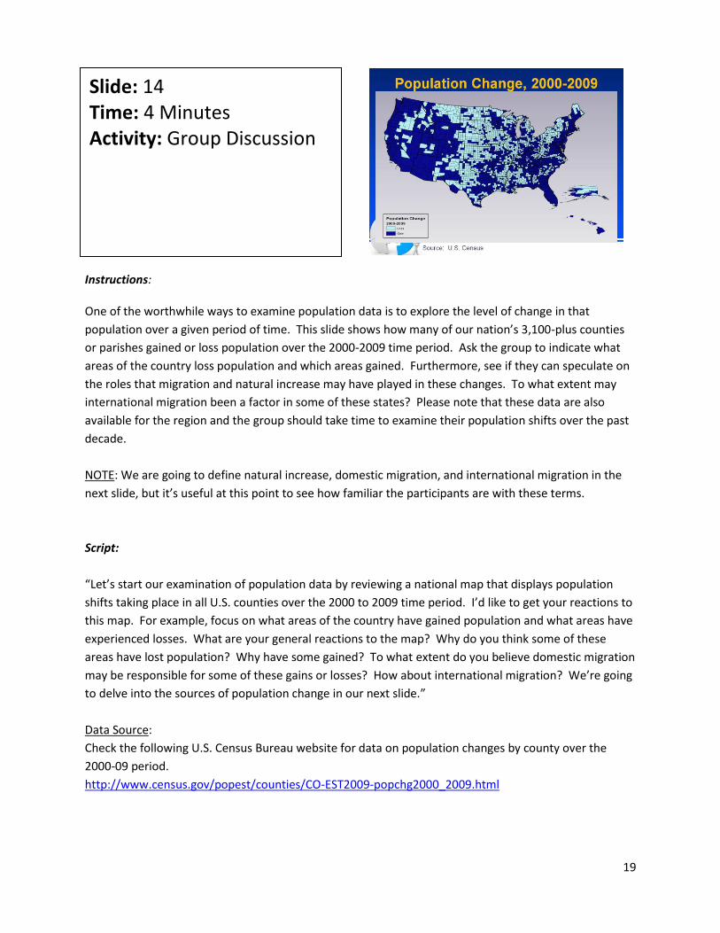
Instructions: One of the worthwhile ways to examine population data is to explore the level of change in that
population over a given period of time. This slide shows how many of our nation’s 3,100-plus counties
or parishes gained or loss population over the 2000-2009 time period. Ask the group to indicate what
areas of the country loss population and which areas gained. Furthermore, see if they can speculate on
the roles that migration and natural increase may have played in these changes. To what extent may
international migration been a factor in some of these states? Please note that these data are also
available for the region and the group should take time to examine their population shifts over the past
decade.
NOTE: We are going to define natural increase, domestic migration, and international migration in the
next slide, but it’s useful at this point to see how familiar the participants are with these terms.
Script:
“Let’s start our examination of population data by reviewing a national map that displays population
shifts taking place in all U.S. counties over the 2000 to 2009 time period. I’d like to get your reactions to
this map. For example, focus on what areas of the country have gained population and what areas have
experienced losses. What are your general reactions to the map? Why do you think some of these
areas have lost population? Why have some gained? To what extent do you believe domestic migration
may be responsible for some of these gains or losses? How about international migration? We’re going
to delve into the sources of population change in our next slide.”
Data Source:
Check the following U.S. Census Bureau website for data on population changes by county over the
2000-09 period.
http://www.census.gov/popest/counties/CO-EST2009-popchg2000_2009.html
Slide: 14 Time: 4 Minutes Activity: Group Discussion
20
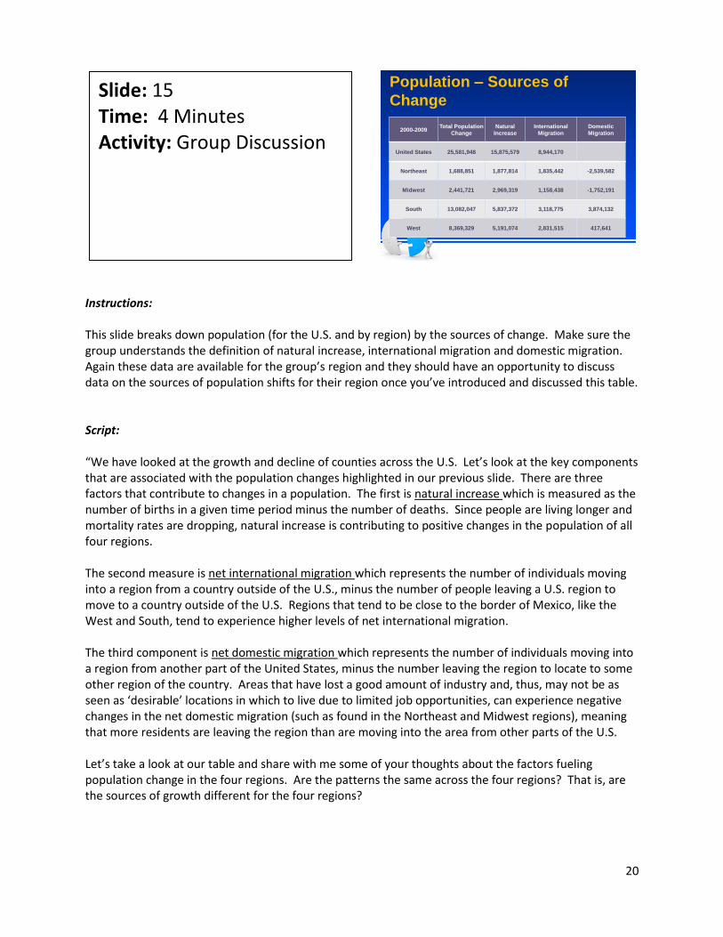
Instructions: This slide breaks down population (for the U.S. and by region) by the sources of change. Make sure the group understands the definition of natural increase, international migration and domestic migration. Again these data are available for the group’s region and they should have an opportunity to discuss data on the sources of population shifts for their region once you’ve introduced and discussed this table. Script: “We have looked at the growth and decline of counties across the U.S. Let’s look at the key components that are associated with the population changes highlighted in our previous slide. There are three factors that contribute to changes in a population. The first is natural increase which is measured as the number of births in a given time period minus the number of deaths. Since people are living longer and mortality rates are dropping, natural increase is contributing to positive changes in the population of all four regions. The second measure is net international migration which represents the number of individuals moving into a region from a country outside of the U.S., minus the number of people leaving a U.S. region to move to a country outside of the U.S. Regions that tend to be close to the border of Mexico, like the West and South, tend to experience higher levels of net international migration. The third component is net domestic migration which represents the number of individuals moving into a region from another part of the United States, minus the number leaving the region to locate to some other region of the country. Areas that have lost a good amount of industry and, thus, may not be as seen as ‘desirable’ locations in which to live due to limited job opportunities, can experience negative changes in the net domestic migration (such as found in the Northeast and Midwest regions), meaning that more residents are leaving the region than are moving into the area from other parts of the U.S. Let’s take a look at our table and share with me some of your thoughts about the factors fueling population change in the four regions. Are the patterns the same across the four regions? That is, are the sources of growth different for the four regions?
Slide: 15 Time: 4 Minutes Activity: Group Discussion
Population – Sources of
Change
2000-2009Total Population
Change
Natural
Increase
International
Migration
Domestic
Migration
United States 25,581,948 15,875,579 8,944,170
Northeast 1,688,851 1,877,814 1,835,442 -2,539,582
Midwest 2,441,721 2,969,319 1,158,438 -1,752,191
South 13,082,047 5,837,372 3,118,775 3,874,132
West 8,369,329 5,191,074 2,831,515 417,641

21
[Share the data on the region that your participants are part of and ask them to see how the components of population change either consistent with, or are at odds with, the trends found in the four U.S. regions.] It might be valuable at this point to zero-in on the data for your specific region. Tell me what your thoughts are about the factors associated with the population changes in your region. Do any of the results surprise you or are the data pretty consistent with your feel has been responsible for the population shifts in this region?” Data Sources: Total Population data: “Annual Estimates of the Resident Population for the United States, Regions, States, and Puerto Rico” http://www.census.gov/popest/states/NST-ann-est.html Population Change data: “Cumulative Estimates of the Components of Resident Population Change for the United States, Regions, States, and Puerto Rico” http://www.census.gov/popest/states/NST-comp-chg.html
22
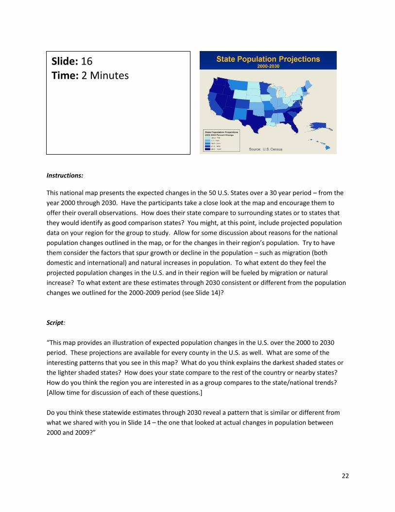
Instructions: This national map presents the expected changes in the 50 U.S. States over a 30 year period – from the
year 2000 through 2030. Have the participants take a close look at the map and encourage them to
offer their overall observations. How does their state compare to surrounding states or to states that
they would identify as good comparison states? You might, at this point, include projected population
data on your region for the group to study. Allow for some discussion about reasons for the national
population changes outlined in the map, or for the changes in their region’s population. Try to have
them consider the factors that spur growth or decline in the population – such as migration (both
domestic and international) and natural increases in population. To what extent do they feel the
projected population changes in the U.S. and in their region will be fueled by migration or natural
increase? To what extent are these estimates through 2030 consistent or different from the population
changes we outlined for the 2000-2009 period (see Slide 14)?
Script:
“This map provides an illustration of expected population changes in the U.S. over the 2000 to 2030
period. These projections are available for every county in the U.S. as well. What are some of the
interesting patterns that you see in this map? What do you think explains the darkest shaded states or
the lighter shaded states? How does your state compare to the rest of the country or nearby states?
How do you think the region you are interested in as a group compares to the state/national trends?
[Allow time for discussion of each of these questions.]
Do you think these statewide estimates through 2030 reveal a pattern that is similar or different from
what we shared with you in Slide 14 – the one that looked at actual changes in population between
2000 and 2009?”
Slide: 16 Time: 2 Minutes

23
Data Source:
Check the following U.S. Census Bureau site for more information on population projections by state
(along with changes by age):
http://www.census.gov/population/www/projections/projectionsagesex.html
24
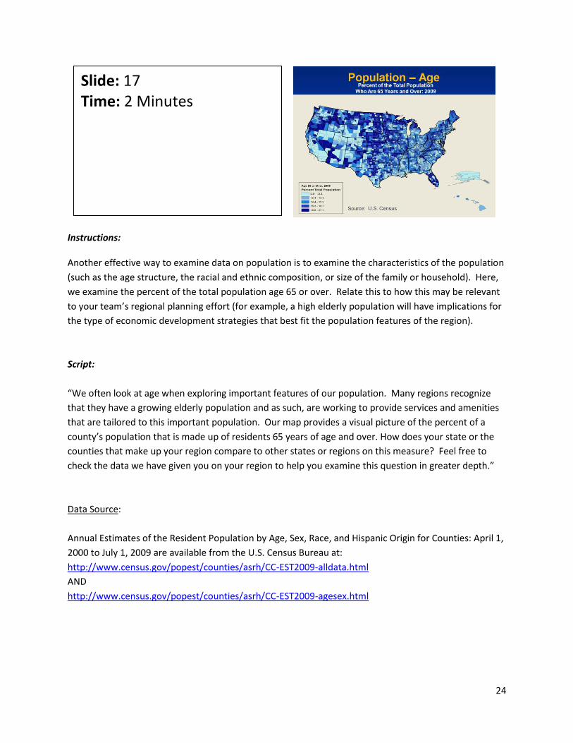
Instructions: Another effective way to examine data on population is to examine the characteristics of the population
(such as the age structure, the racial and ethnic composition, or size of the family or household). Here,
we examine the percent of the total population age 65 or over. Relate this to how this may be relevant
to your team’s regional planning effort (for example, a high elderly population will have implications for
the type of economic development strategies that best fit the population features of the region).
Script:
“We often look at age when exploring important features of our population. Many regions recognize
that they have a growing elderly population and as such, are working to provide services and amenities
that are tailored to this important population. Our map provides a visual picture of the percent of a
county’s population that is made up of residents 65 years of age and over. How does your state or the
counties that make up your region compare to other states or regions on this measure? Feel free to
check the data we have given you on your region to help you examine this question in greater depth.”
Data Source:
Annual Estimates of the Resident Population by Age, Sex, Race, and Hispanic Origin for Counties: April 1,
2000 to July 1, 2009 are available from the U.S. Census Bureau at:
http://www.census.gov/popest/counties/asrh/CC-EST2009-alldata.html
AND
http://www.census.gov/popest/counties/asrh/CC-EST2009-agesex.html
Slide: 17 Time: 2 Minutes

25
Instructions:
This might be a good opportunity to give the team the time it needs to discuss and summarize the maps
and tables highlighted in this PowerPoint along with the data that may have shared with them on their
region. Be sure to record the “overarching opportunities and concerns” so that they observations can
be revisited at the end of this module.
Script:
“Let’s take some time to re-examine or summarize the data that we’ve examined on the U.S. and on
your region. How does your region compare to the rest of the state and/or the nation?
What can you conclude about the data and trends we explored on population?
What do you feel are some overarching opportunities and concerns that you would identify after
studying data on your region’s population?”
[Allow time for discussion]
Slide: 18 Time: 5 Minutes Activity: Group Discussion

26
Instructions:
We want to turn our attention to the educational characteristics of the U.S. and of the specific region (as
well as counties/parishes) of interest to your participants.
Script:
“Now, let’s look at how secondary data can be used to develop an educational profile of residents – in
the U.S. and in your region – through the use of secondary data.”
Slide: 19 Time: 1 Minute

27
Instructions:
Slides 20-22 give attention to education-related data. We begin with an examination of the percent of
adults 25 years old and over with a high school education or less. Note the color coded legend which
divides all counties/parishes in the nation into quintiles – with the highest quintile (20% of the nation’s
counties/parishes having the largest percentage of adults with a high school degree or less) being
shaded darkest and the lightest shaded counties/parishes representing the top one-fifth of the
counties/parishes in the nation with the lowest percent of people with a high school education or less
(and thus, areas with the best proportion of adults 25 and over with a post-high school education).
Script:
“High levels of education are usually a pretty good predictor of economic growth. Our map highlights
the proportion of adults 25 years old and older with a high school education or less for all
counties/parishes in the nation. The map divides these counties into quintiles with each quintile made
up of about one-fifth of the nation’s counties/parishes. As you can see, the darkest shaded areas
represent the top 20 percent of all counties/parishes having the highest proportion of adults with a high
school degree or less. Where do we find the largest concentration of counties/parishes with the least
education? Do they tend to be in metropolitan or nonmetropolitan areas?
Most of the lighter shaded areas – counties/parishes with low shares of adults with a high graduate
educator or less, are located in selected regions outside of the South, many in metropolitan counties.
Bottom line is that these areas tend to have a higher proportion of adults with higher levels of
educational attainment.”
[Note: Have them examine the education data on their region and counties/parishes. Have them share
their observations about their regional data and see how it compares to the other regions shown on this
map.]
Slide: 20 Time: 5 Minutes Activity: Group Discussion

28
Data Sources:
Check out the following brief reports on educational attainment by state at:
http://www.census.gov/prod/2003pubs/c2kbr-24.pdf (for the year 2000)
http://www.census.gov/prod/2009pubs/p20-560.pdf (for the year 2007)
29
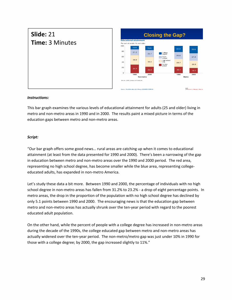
Instructions: This bar graph examines the various levels of educational attainment for adults (25 and older) living in
metro and non-metro areas in 1990 and in 2000. The results paint a mixed picture in terms of the
education gaps between metro and non-metro areas.
Script:
“Our bar graph offers some good news… rural areas are catching up when it comes to educational
attainment (at least from the data presented for 1990 and 2000). There’s been a narrowing of the gap
in education between metro and non-metro areas over the 1990 and 2000 period. The red area,
representing no high school degree, has become smaller while the blue area, representing college-
educated adults, has expanded in non-metro America.
Let’s study these data a bit more. Between 1990 and 2000, the percentage of individuals with no high
school degree in non-metro areas has fallen from 31.2% to 23.2% - a drop of eight percentage points. In
metro areas, the drop in the proportion of the population with no high school degree has declined by
only 5.1 points between 1990 and 2000. The encouraging news is that the education gap between
metro and non-metro areas has actually shrunk over the ten-year period with regard to the poorest
educated adult population.
On the other hand, while the percent of people with a college degree has increased in non-metro areas
during the decade of the 1990s, the college educated gap between metro and non-metro areas has
actually widened over the ten-year period. The non-metro/metro gap was just under 10% in 1990 for
those with a college degree; by 2000, the gap increased slightly to 11%.”
Slide: 21 Time: 3 Minutes
Closing the Gap?

30
Instructions: Ask the group how they might evaluate the quality of the school system(s) in their region. This slide depicts one commonly used measure of school quality. These charts represent test scores for 4th and 8th grade students in New Mexico. We use New Mexico just for purposes of showing the value of this type of state data. Other indicators that one could examine to determine school success or effectiveness are teacher-to-pupil ratios, percent of high school graduates that are accepted into college, scores on SAT and ACT tests administered to high school aged youth, etc. Script: “Measuring the quality of education is no easy task. Test scores provide one way to gauge success. But, we have read or heard enough in the news to know that these indicators may not always be viewed as reliable. The National Center for Education Statistics provides test data by state, county, or school system. This slide presents test scores in New Mexico for 4th and 8th graders in reading and math over four different points in time. We offer these data as an example of the type of secondary data that might prove useful to you as you try to gauge the quality of your local elementary, educational system. At the same time, you may want to take a careful look at other relevant data on your region’s universities, community colleges and tech schools (such as how many students enter college prepared for school?) in order to gain a more accurate picture of the quality and effectiveness of your region’s school systems.” Data Source: Check the National Assessment of Educational Progress information on your state at the following web site: http://nces.ed.gov/nationsreportcard/states/
Slide: 22 Time: 2 Minutes
In-School Success
Source: National Assessment of Education Progress, 2010
http://www.nces.ed.gov/nationsreportcard/naepdata

31
Instructions: Provide the group with maps and data on their region. Follow the same process you used earlier in the section on population. Be sure to record the “overarching opportunities and concerns” so that they can be revisited at the end of this module. Script: “Let’s try to synthesize our thoughts about the education data we’ve examined on your region. How do you we compare to the rest of the state and the nation in terms of key education characteristics? What are the education trends in the region? What can you conclude about these trends? What are some overarching opportunities and concerns associated with the educational credentials of the region?”
Slide: 23 Time: 3 Minutes

32
Instructions: This next section focuses on characteristics associated with location.
Script:
“Location, location, location. Cost and amenity characteristics associated with different locations are
driving forces behind residents and businesses moving into or out of these regions. We want to
examine a few ways to characterize geographic locations, recognizing that many variables can be used
to describe the important features of a location.”
Slide: 24 Time: 1 Minute
33
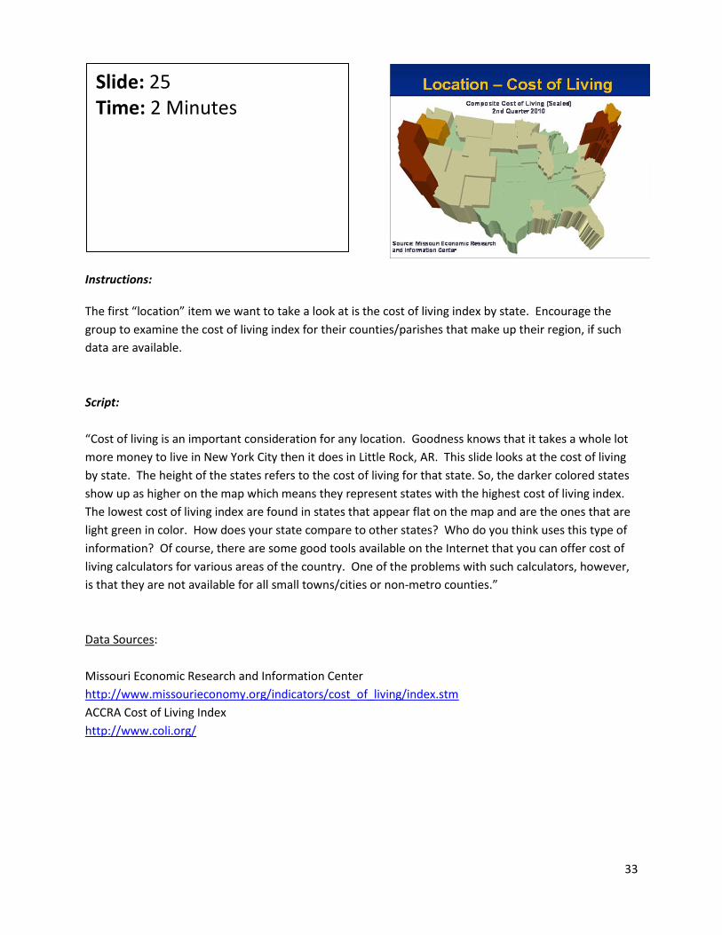
Instructions: The first “location” item we want to take a look at is the cost of living index by state. Encourage the
group to examine the cost of living index for their counties/parishes that make up their region, if such
data are available.
Script:
“Cost of living is an important consideration for any location. Goodness knows that it takes a whole lot
more money to live in New York City then it does in Little Rock, AR. This slide looks at the cost of living
by state. The height of the states refers to the cost of living for that state. So, the darker colored states
show up as higher on the map which means they represent states with the highest cost of living index.
The lowest cost of living index are found in states that appear flat on the map and are the ones that are
light green in color. How does your state compare to other states? Who do you think uses this type of
information? Of course, there are some good tools available on the Internet that you can offer cost of
living calculators for various areas of the country. One of the problems with such calculators, however,
is that they are not available for all small towns/cities or non-metro counties.”
Data Sources:
Missouri Economic Research and Information Center
http://www.missourieconomy.org/indicators/cost_of_living/index.stm
ACCRA Cost of Living Index
http://www.coli.org/
Slide: 25 Time: 2 Minutes
34
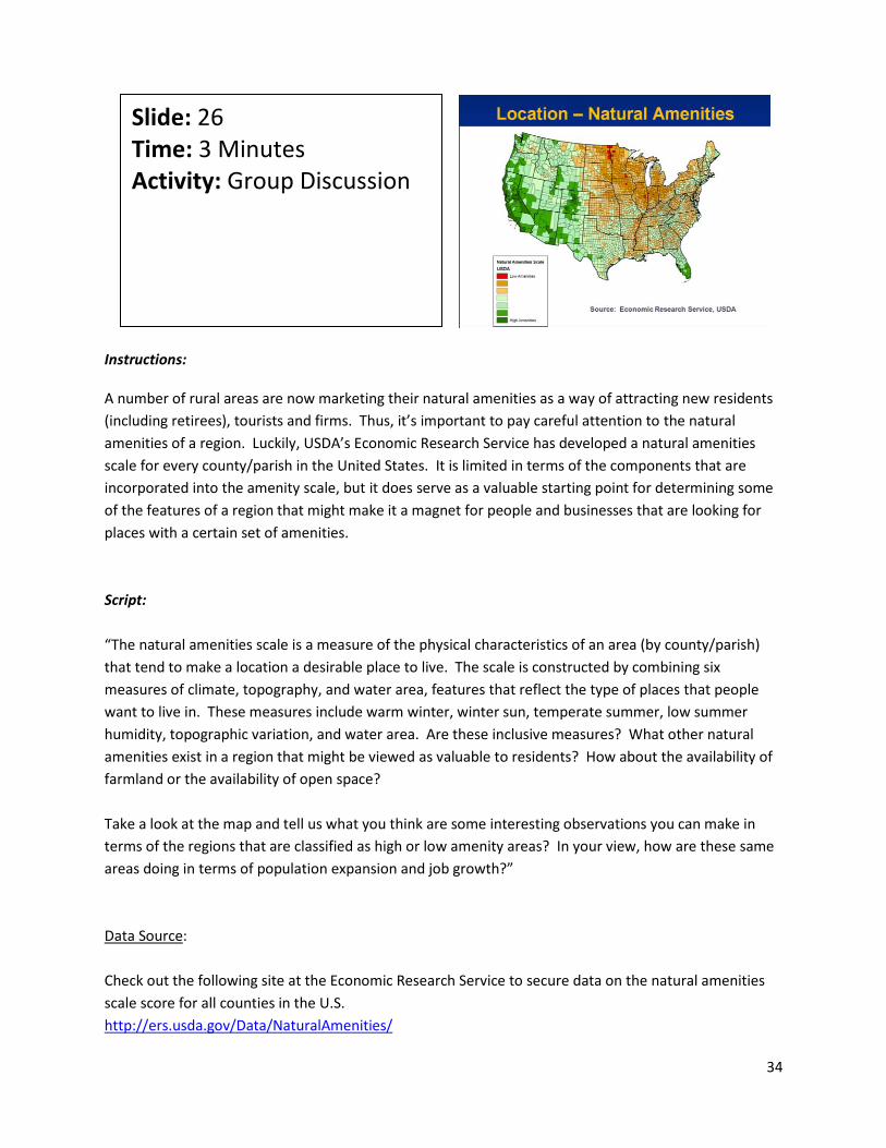
Instructions: A number of rural areas are now marketing their natural amenities as a way of attracting new residents
(including retirees), tourists and firms. Thus, it’s important to pay careful attention to the natural
amenities of a region. Luckily, USDA’s Economic Research Service has developed a natural amenities
scale for every county/parish in the United States. It is limited in terms of the components that are
incorporated into the amenity scale, but it does serve as a valuable starting point for determining some
of the features of a region that might make it a magnet for people and businesses that are looking for
places with a certain set of amenities.
Script:
“The natural amenities scale is a measure of the physical characteristics of an area (by county/parish)
that tend to make a location a desirable place to live. The scale is constructed by combining six
measures of climate, topography, and water area, features that reflect the type of places that people
want to live in. These measures include warm winter, winter sun, temperate summer, low summer
humidity, topographic variation, and water area. Are these inclusive measures? What other natural
amenities exist in a region that might be viewed as valuable to residents? How about the availability of
farmland or the availability of open space?
Take a look at the map and tell us what you think are some interesting observations you can make in
terms of the regions that are classified as high or low amenity areas? In your view, how are these same
areas doing in terms of population expansion and job growth?”
Data Source:
Check out the following site at the Economic Research Service to secure data on the natural amenities
scale score for all counties in the U.S.
http://ers.usda.gov/Data/NaturalAmenities/
Slide: 26 Time: 3 Minutes Activity: Group Discussion
35
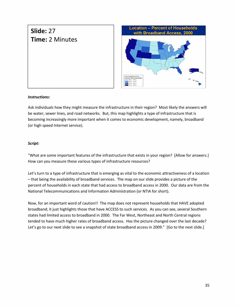
Instructions: Ask individuals how they might measure the infrastructure in their region? Most likely the answers will
be water, sewer lines, and road networks. But, this map highlights a type of infrastructure that is
becoming increasingly more important when it comes to economic development, namely, broadband
(or high speed Internet service).
Script:
“What are some important features of the infrastructure that exists in your region? [Allow for answers.]
How can you measure these various types of infrastructure resources?
Let’s turn to a type of infrastructure that is emerging as vital to the economic attractiveness of a location
– that being the availability of broadband services. The map on our slide provides a picture of the
percent of households in each state that had access to broadband access in 2000. Our data are from the
National Telecommunications and Information Administration (or NTIA for short).
Now, for an important word of caution!! The map does not represent households that HAVE adopted
broadband; it just highlights those that have ACCESS to such services. As you can see, several Southern
states had limited access to broadband in 2000. The Far West, Northeast and North Central regions
tended to have much higher rates of broadband access. Has the picture changed over the last decade?
Let’s go to our next slide to see a snapshot of state broadband access in 2009.” [Go to the next slide.]
Slide: 27 Time: 2 Minutes

36
Instructions: Note the changes that have taken place in broadband access across the U.S. over the 2000-09 period. Script: “It’s pretty clear that broadband access has expanded in all states over the past decade. At the same time, households in some states continue to be disadvantaged when it comes to broadband availability. States with the lowest levels of access continue to be in the South, but the situation is less severe than it was in 2000. To be honest, access to high speed Internet is no longer a luxury in many communities (of course, along with more traditional infrastructure resources water, sewer lines, electricity, and good quality road systems). Take a look at the data for your state. How is your state doing today relative to the situation in 2000? How does your state stack up relative to nearby states or states that represent some of your major economic development competitors?” Data Source: National Telecommunications and Information Administration. “Internet and Computer Use Studies and Data Files” are available for several years. You can access these studies at: http://www.ntia.doc.gov/data/index.html
Slide: 28 Time: 2 Minutes

37
Instructions: Provide the groups with location-related maps and data on their region. Follow the same process you
followed for population and education. Be sure to record the “overarching opportunities and concerns”
so that they can be revisited at the end of this module.
Script:
“Let’s take some time to explore the location-related data for your region. How does your region
compare to the rest of the state and/or nation on important infrastructure services, such as broadband?
What can you conclude about the data/trends?”
Slide: 29 Time: 2 Minutes

38
Instructions: Introduce the fourth major category of data to be examined by the group – in this case, social
characteristics.
Script:
“Our last category of secondary data variables we want to examine is social characteristics. Social
characteristics include measures of health access, health status, crime rates, poverty levels, eligibility for
food assistance programs, and quality and quantity of housing.”
Slide: 30 Time: 1 Minute

39
Instructions: Poverty is one of the most frequently used indicators to describe the social conditions of a region. Script: “Poverty is often used to describe the overall socioeconomic situation of a region. The distribution of poverty across geographic areas reflects social inequities that exist across states, regions, and the nation. The map showcased on this slide provides a powerful visual view of poverty across the America. As you can see, pockets of deep-seeded poverty are in evidence in Appalachia (particularly Kentucky), in the Mississippi Delta region, in the Rio Grande Valley area of Texas, and in regions having high concentrations of Native Americans. What does the map indicate about the poverty situation in your region?” Data Source: The Rural Assistance Center has several maps on poverty available at http://www.raconline.org/maps/#poverty . The poverty maps are created from data published by the U.S. Census Bureau Small Area Income and Poverty Estimates.
Slide: 31 Time: 2 Minutes
Social - Poverty in Rural America, 2008
Source: raconline.org

40
Instructions: It’s timely to talk about health insurance in light of the attention that it has commanded at the federal
and state levels in recent years. The health care bill approved by Congress in 2010 is a response, in part,
to the number of Americans who are uninsured. So, it’s quite possible that these numbers will change
over time. But, the group might want to discuss how they think the bill will impact their region when it
comes to health insurance coverage.
Script:
“The health care reform approved by the U.S. Congress and signed by President Obama was designed to
partially address the number of uninsured individuals in the country. How the bill will affect the access
to quality health care is currently unknown. The map outlined in this slide indicates the percent of
people in the various states that did not have health insurance. Where was the largest share of
uninsured individuals? What states had the highest number of people without health insurance
coverage? Why do you think there is such a large discrepancy in these percentages across the 50
states?
Our next slide indicates the most recent data on the percent of people without health insurance across
our 50 states. Let’s see what that map looks like.”
Slide: 32 Time: 2 Minutes

41
Instructions: Have the group review this slide and compare it to the prior slide. Ask them to discuss some of the reasons why the number of individuals without health insurance has increased between 2000 and 2009. Script: “The most recent map of percent of people lacking health insurance is quite informative. What we find is that the percent that lack health insurance has grown pretty significantly in several parts of the U.S. Look at the North Central region of the U.S. While nine states had the lowest rates of uninsured persons in 2000, today it’s only two states. Why did the number of people without health insurance grow in this region of the U.S.? To what extent may industrial restructuring in this region play a role (that is, the decline of the auto industry or other major manufacturing companies)? What other observations do you have about this map, especially when contrasted with the map on our previous slide?” Data Source: U.S. Census Bureau, Current Population Survey. Annual Social and Economic Supplements. Check out the following site to gain access to the most recent information on health insurance coverage for your state, as well as the historical rate of coverage for every year since 1999. http://www.census.gov/hhes/www/hlthins/data/historical/index.html
Slide: 33 Time: 2 Minutes

42
Instructions: Enrollment in social programs designed to assist low-income families can either be moving upward or downward depending on the health of the national and state economy. One of the key indicators used to measure the level of government assistance being targeted to those in need is the food stamp program, which is now called the “Supplemental Nutrition Assistance Program,” or SNAPS for short. Script: “What kind of social programs are available in the state? We typically use food stamp beneficiaries as a way to gauge the level of government assistance being targeted to those in need. (The Food Stamp program is now called the Supplemental Nutrition Assistance Program – SNAP for short.) The map provides a state-level overview of the percent change in the number of households receiving SNAP benefits in fiscal year 2005 versus fiscal year 2009. Where has the growth in SNAP enrollments taken place and where has the growth been much smaller? What might be some of the factors behind these different rates of growth across the states? One state experienced a decline in SNAP participation. Why?” *Note: Clearly, the massive departure of many low income households from Louisiana as a result of Hurricane Katrina may be partly responsible for this drop]. Data Source: The Economic Research Service has an excellent site that allows you to map SNAP participation by states and counties/parishes. The data may not be the most recent available, but may still prove valuable to you. Check it out at: http://maps.ers.usda.gov/snap/Default.aspx This map is based on the average monthly participation of households in each state for the 2005 to 2009 fiscal years. The data are collected fro the Food and Nutrition Service/USDA, and can be accessed at: http://www.fns.usda.gov/pd/16SNAPpartHH.htm
Slide: 34 Time: 2 Minutes

43
Instructions: Provide the groups with the maps and data that are designed for their region. Follow the same process
you followed for population and education. Be sure to record the “overarching opportunities and
concerns” so that they can be revisited at the end of this module.
NOTE: Distribute data and maps provided at the county level or regional level on some of the social
characteristics
Script:
“Let’s take some time to look at the data that have been assembled in our region. Keep a careful look at
how do we compare to the rest of the state and the nation?
What are some overarching opportunities and concerns that seem to percolate to the top in terms of
your list in light of these social data?”
Slide: 35 Time: 2 Minutes

44
Instruction: You should now have four separate sets of opportunities and challenges related to population,
education, location and social. First, have the group identify any overlapping themes and consolidate
them, making sure not to drop key phrases or ideas. Then, if there are more than three opportunities
and challenges, ask the group to prioritize their top three. Ask them what criteria they are using to
prioritize, i.e. largest group of stakeholders, most likely to reduce the gap between the “haves” and
“have not’s,” etc.
Script:
“Now that we’ve taken a look at secondary data in four key areas – population, education, location and
social characteristics – are there areas of concern that the data seem to point to? Are there areas of
opportunity? Are there common themes that seem to cut across these four areas? Let’s discuss your
thoughts on these important questions.
[Allow time for discussion and consolidation of ideas.]
We are going to give some thought at the end of Module Six on how our discussion and analysis might
impact our regional goals. Start giving thought to how our key list of concerns and opportunities might
impact the regional goals that the team has developed. Are the goals in line with these
concerns/opportunities? It’s a question that we want to tackle at the end of this module.”
Slide: 36 Time: 3 Minutes

45
Instructions: It might be an opportune time to take a 10-15 minute break as we move to the topic of the regional workforce. It’s expected that in my most regions, there will be a great deal of emphasis on improving the quality and quantity of the regional workforce. This section is meant to be an introduction of how the group might begin assessing the strengths and weaknesses of the region’s workforce. Script: “Most rural regions struggle with having in place a strong, vibrant workforce. It is one of the key reasons why attracting industry to an area has been so tough. Prospective businesses usually take the time to research the quality of the local workforce. We want to share with you some of the key indicators they use to gain insights on the area’s workforce. Let me ask you this question: What do you think makes an attractive workforce?”
Slide: 37 Time: 1 Minute

46
Instructions:
This slide identifies the four major factors that are used to characterize the quality of the local labor
force.
Script:
“We have already looked at variables that describe the population, such as age or the components of
population change (natural increase and migration). In addition, we looked at ways to characterize
education. Are we doomed if we lag behind in education? Certainly not. Businesses consider other
components that help provide a more complete picture of workforce quality. They include:
1. The kinds of experience that workers have;
2. The specific skills of workers. Are they mostly blue-collar or white-collar skills?
3. Willingness to work. Do the people living in our region want to work?
4. The type and variety of training programs that help keep workers current.
Let’s take a few minutes to look at each of these in more detail.”
Slide: 38 Time: 2 Minutes

47
Instructions:
This slide focuses on how to measure the experience of the workforce. Data that accurately measure
experience are hard to come by. Ask the group to think about the data that could help us get a better
handle on job-related experiences.
Script:
“It is clear that experience is an important factor associated with the workforce. More experience often
translates into higher earnings. Is it possible to capture experience? We could use factors like age and
education, but these might not correlate very well with number of years on a job. Data are collected
that measure the number of years an individual has worked in an occupation. Is this a good measure of
job experiences? Do you have other thoughts on how to get a handle on the type of experiences
individuals in your regional workforce may have had? Would workforce investment boards or
community colleges have some of this information? If so, how can we find out more about these data?”
Slide: 39 Time: 3 Minutes Activity: Group Discussion

48
Instructions: This slide describes workforce skills, examining occupation clusters within the region. Depending on
your region, you might handpick a few clusters to see how your region compares to the state and the
nation.
Script:
“How can we classify skills? There are two ways we can examine the types of skills we have in the
region. First, we can look at clusters of occupations. This graphic is provided at STATSamerica.org. You
can map out clusters for about 20 different classes of occupations, including health care, professional
services, agriculture and the arts. Such maps give us some indication about the number of people within
the region with certain occupation-related skill.”
Data Source:
Check the STATSAmerica’s site on Innovation in American Regions to generate occupational clusters like
that shown in this map. The site is:
http://www.statsamerica.org/innovation/
Slide: 40 Time: 2 Minutes
Skills
Source: http://www.statsamerica.org/innovation
49
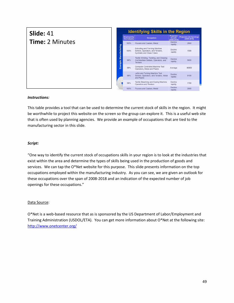
Instructions: This table provides a tool that can be used to determine the current stock of skills in the region. It might
be worthwhile to project this website on the screen so the group can explore it. This is a useful web site
that is often used by planning agencies. We provide an example of occupations that are tied to the
manufacturing sector in this slide.
Script:
“One way to identify the current stock of occupations skills in your region is to look at the industries that
exist within the area and determine the types of skills being used in the production of goods and
services. We can tap the O*Net website for this purpose. This slide presents information on the top
occupations employed within the manufacturing industry. As you can see, we are given an outlook for
these occupations over the span of 2008-2018 and an indication of the expected number of job
openings for these occupations.”
Data Source:
O*Net is a web-based resource that as is sponsored by the US Department of Labor/Employment and
Training Administration (USDOL/ETA). You can get more information about O*Net at the following site:
http://www.onetcenter.org/
Slide: 41 Time: 2 Minutes

50
Instructions: The next few slides look at willingness (or capacity) to work. The concept can be captured through the
use of two measures – labor force participation and the percentage of individuals receiving
SSI/Disability.
Script:
“We often consider the unemployment rate as the number of underutilized workers in the region.
While this represents a commonly used approach for describing a key feature of the local work force, we
would encourage you to examine other relevant variables, such as the labor force participation rate of
persons 16 and over (that is, the proportion of working age population in the labor force). In addition,
check out the percentage of individuals receiving disability/SSI since this identifies people who are of
working age but who are unable to work because of some disability. With the proper support systems in
place, it is possible that some of these individuals could enter into the work force.”
Slide: 42 Time: 2 Minutes

51
Instructions: We examine labor force participation rates at the national level over the span of more than three decades – for men and women 16 years of age and over. Labor participation rates for the group’s region will be available for the group to discuss as well. Script: “How is labor force participation measured? It’s measured as the number of individuals that are working along with the number of individuals who are actively looking for work but are currently unemployed. As expected, our graph shows that the percentage of woman participating in the labor force has been steadily increasing. On the other hand, the percentage of men participating in the labor force has remained fairly stable over the course of several years. It’s important to note (although not shown on this chart) that rural regions tend to have much lower male labor force participation rates (in the 45-60% range). Why do you think that is the case? Let’s look at labor participation rates for your region and the counties/parishes that make up that region. What are some of your initial thoughts and reactions about this information?” Data Source: U.S. Department of Labor. Bureau of Labor Statistics. This chart is form the report, “Working in the 21st Century” and ca be accessed at: http://www.bls.gov/opub/working/page3b.htm
Slide: 43 Time: 3 Minutes Activity: Group Discussion

52
Instructions:
Supplemental Security Income (SSI) is a cash assistance program that is managed by the Social Security
Administration. It is designed to provide monthly benefits to low-income people who are aged, blind or
disabled persons. The map highlights federal SSI payments for 2009. It does not include any additional
SSI payments that states may provide to SSI recipients. Ask the group to share their observations about
the map and to discuss how the size of SSI recipients might have an impact on the pool of individuals
that are able to work.
Script:
“This map shows the percentage of each state’s population receiving Supplemental Security Income (SSI)
payments. Our map classifies the states into quintiles – with the darkest color representing states with
the highest proportion of people receiving SSI. SSI provides benefits to low income people who are
aged, blind or disabled. We offer this as an example of how data can be on all states to provide a nice
visual portrayal of how SSI enrollments vary across the country. The larger the portion of the population
receiving these payments, the smaller – in theory -- the available workforce. In 2009, about 58% of all
SSI recipients were 18-64 years of age, so you can quickly see how states and counties that have large
SSI enrollments can find themselves with a much smaller number of individuals who are available to
work (unless jobs that are specifically created for blind and disabled individuals are created). An
important opportunity (and challenge) for your regional team may be to explore ways to help transition
SSI recipients into the workforce, especially if the SSI numbers for your region end up being sizable
enough to warrant your team’s attention.”
Slide: 44 Time: 3 Minutes

53
Data Source:
Social Security Administration. SSI Recipients by State and County, SSA Publication No. 13-11976. May
2010. For electronic access to this publication, go to
http://socialsecurity.gov/policy/docs/statcomps/ssi_sc/2009/ssi_sc09.pdf.
In addition, access to SSI data by state and county can be accessed at the following site:
http://socialsecurity.gov/policy/docs/statcomps/ssi_sc/2009/index.html#table3alt

54
Instructions: This slide considers the different training opportunities within the region. If possible, it might be
valuable to have a representative or two from the regional Workforce Investment Board, trade schools,
and community colleges give an overview of how they activities might be integrated into your team’s
regional goals/strategies.
Script:
“Having access to places that provide workforce training is quite important. Training is likely to be
available at major state and regional universities. But, more rural regions are less likely to have these
types of institutions of higher education physically close to them (with the exception of the county
Extension offices, which are tied to your state’s land-grant institution). Instead, rural regions are more
likely to rely on training programs provided by community colleges and technical schools. In many
areas, these colleges and schools are engaged in direct and ongoing communications with major
businesses and industries in the region, helping to ensure that relevant and needed workforce
training/skill building is being offered.
Finally, there are often workforce training programs offered by small business development centers,
local firms, nonprofit organizations, chambers of commerce, and others in your state or local area.
What workforce training programs are available in your region?”
Slide: 45 Time: 3 Minutes Activity: Group Discussion

55
Instructions: Use the questions on this slide to help participants consider potential workforce influences that may help shed light on the direction of their regional initiative. Script: “Several additional questions can help us grasp the nature of our workforce within the region. For instance:
1. Is your region retaining the skills it creates? Or do you battle ‘brain drain,’ the term often used to describe the out-migration of educated youth leaving a region in search of better career opportunities.
2. What type of skills does your region attract? High tech, white collar, blue collar? 3. Does your region attract retirees? How does that influence your workforce?”
Slide: 46 Time: 2 Minutes

56
Instructions: Provide data related to labor force participation, disability/SSI payments, occupation clusters, and available skills within the region. Refer back to the asset mapping work done on formal institutions to highlight the organizations and programs that are available to provide workforce training and skills enhancement. Script: “In reviewing this information on your region, what trends, opportunities and concerns do you see?” [Record these on flip charts as you have done for previous segments during this module.]
Slide: 47 Time: 3 Minutes Activity: Group Discussion

57
Instructions: The point of this Module is to ensure that regional goals and plans align with the current situation and trends of the region. At this time, allow the group the opportunity to revisit their regional goals in light of what they have explored during this session. Should the goals be changed? Maybe it’s just the adjustment of a word or two, but allows the group to redefine their goals. Script: We have explored a vast amount of information today that describes both the region’s current situation and some possible future trends. As we have looked at each section of the data, we’ve taken time to examine themes, opportunities, and potential concerns. Now, we need to step back and reflect on the ‘so what’ of what we have discovered. Does any of the data we have discussed today change your views on the regional goals that you’ve been developing? Do the goals build on the characteristics (good or bad) of the region? If not, what revisions are needed to more realistically align with your region’s characteristics?” [Allow time for discussion and revision. The next slide, taken from Module Four, can serve as a template for the revisions, if needed.]
Slide: 48 Time: 3 Minutes Activity: Group Discussion

58
Instructions: Have the regional team use this format to make any adjustments that might be needed to its regional goals in light of the analyses that have been conducted on the four categories of secondary data. There are a variety of ways for you to carry out this activity. Here are a couple of possibilities for your consideration:
1. You can have the group break up into smaller groups, assigning a different goal to each of the groups. After 10-15 minutes, each group will share their revised goal with the entire team. Ask the whole group to offer final comments on each goal. Make sure there is overall agreement with the changes.
2. Introduce one goal at a time and have an open discussion of what changes should be made to the goals.
Script: “We will use this format that we saw in Module Four to make any changes that we feel may be needed in light of the extensive data we have examined in our region.”
Slide: 49 Time: 20-25 Minutes Activity: Small Group Activity Workbook: Revising Regional Goals Worksheet
Refining Regional Goals
Current Revised
Goal 1
Goal 2
Goal 3
Goal 4

59
Instructions: Use the questions on the slide to undertake a debriefing of today’s session: Script: “What are the takeaways from our session? That is . . .
• What topics did you find most helpful? • What did you find confusing? • What do you hope to implement as part of your regional team’s activities? • Other items you want to mention?”
Slide: 50 Time: 5 Minutes Activity: Group Discussion
Final Reflections
What are the takeaways from this module? What topics did you find most helpful?
What did you find confusing?
What do you hope to implement as part of your
regional team’s activities?
Other items you want to mention?

60
Instructions:
Share with the participants a preview of Module Seven.
If any of the work from this module is not finished, discuss with the team how they will work between
this session and the next to finalize those elements.
Script:
“We have some exciting work in store for you in Module Seven. The next module is going to dig deeper
into data that can help us get a better handle of our regional economy.”
Slide: 51 Time: 2 Minutes
61
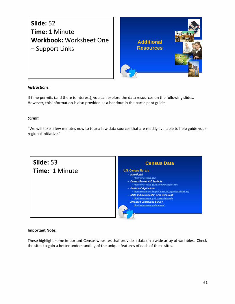
Instructions: If time permits (and there is interest), you can explore the data resources on the following slides. However, this information is also provided as a handout in the participant guide. Script: “We will take a few minutes now to tour a few data sources that are readily available to help guide your regional initiative.”
Important Note: These highlight some important Census websites that provide a data on a wide array of variables. Check the sites to gain a better understanding of the unique features of each of these sites.
Slide: 52 Time: 1 Minute Workbook: Worksheet One – Support Links
Slide: 53 Time: 1 Minute
Additional
Resources
Census Data
U.S. Census Bureau– Main Portal
• http://www.census.gov/
– Census Bureau A-Z Subjects• http://www.census.gov/main/www/subjects.html
– Census of Agriculture• http://www.nass.usda.gov/Census_of_Agriculture/index.asp
– State and Metropolitan Area Data Book• http://www.census.gov/compendia/smadb/
– American Community Survey• http://www.census.gov/acs/www/

62
Important Note: Check this web site if you want to get a quick overview of key secondary data that have been assembled for all counties and states in the U.S.
Important Note:
Data from the SRDC are available for all states, counties and parishes located in the 13 states that are
part of the SRDC region.
Slide: 54 Time: 1 Minute
Slide: 55 Time: 1 Minute

63
Important Note: The site is an outstanding window into the variety of secondary data available through the U.S. Census Bureau
Important Note: This site provides excellent information on states, counties/parishes across the nation.
Slide: 56 Time: 1 Minute
Slide: 57 Time: 1 Minute

64
Important Note: This site is another component of the STATSAmerica site that offers information on industry and occupational clusters.
Slide: 58 Time: 1 Minute