mobile user experience infographic
TRANSCRIPT
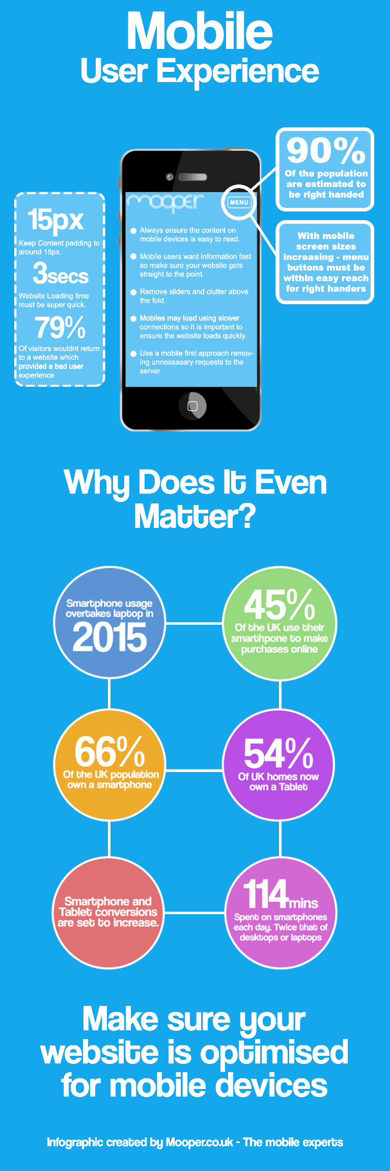
With mobile screen sizes
increasing - menu buttons must be within easy reach for right handers
Of the population are estimated to be right handed
90%
Keep Content padding to around 15px.
Website Loading time must be super quick.
Of visitors wouldnt return to a website which provided a bad user provided a bad user experience
15px
3secs
79%
Always ensure the content on mobile devices is easy to read.
Mobile users want information fast so make sure your website gets straight to the point.
Remove sliders and clutter above the fold.
Mobiles may load using slower Mobiles may load using slower connections so it is important to ensure the website loads quickly.
Use a mobile first approach remov-ing unnessasary requests to the server
Mobile User Experience
Make sure your website is optimised for mobile devices
Infographic created by Mooper.co.uk - The mobile experts
Why Does It Even Matter?