march 2016 photoshop magazine
DESCRIPTION
Photoshop, Lightroom,TRANSCRIPT

®®
T H E A D O B E ® P H O T O S H O P ® “ H O W - T 0 ” M A G A Z I N E › › M a r c h 2 0 1 6
Order matters when it comes to adjustment
layers and blend modes
Learn how to add depth and dimension to your portraits in Photoshop
PROVING GROUND
DYNAMICRANGE
THE OFFICIAL PUBLICATION OF
PHOTOSHOP WORLD 2016THE CONFERENCE THAT WILL CARRY YOU AWAY TO NEW WORLDS OF CREATIVITY, INSPIRATION, AND FUN
Visit our website at kelbyone.com


TABLE OF CONTENTS › › March 2016
FEATURE
34
DOWNLOADABLE CONTENT Whenever you see this symbol at the end of an article, it means there are either downloadable practice files or additional content for KelbyOne members at http: //kelbyone.com/magazine.
066 LIGHT ITFilm Noir: A Classic Style with a Modern Twist
020 DOWN & DIRTY TRICKSLight Bulb Brush Effect
From the Editor 006 Contributing Writers 009 About Photoshop User Magazine 010 KelbyOne Community 012 Exposed: Industry News 016
028 DOWN & DIRTY TRICKSNesting Heads
How-ToDepartments
Photoshop World: The Conference Created for KelbyOne Members
048 BEGINNERS’ WORKSHOPHow to Smooth Skin Realistically
064 PHOTOSHOP TIPSBoost Your Productivity and Creativity
104 FROM THE ADVICE DESKAnswers to Photoshop & gear-related questions
060 PHOTOSHOP PROVING GROUNDLayers, Part 2: Blend Modes & Adjustment Layers
Every year as Photoshop World draws nearer, Scott Kelby gets more and more excited. In this feature article, he explains why he gets so excited and why attendees love this show so much that they keep coming back year after year. This 3-day educational conference is created for KelbyOne members, and if you’ve never attended one before, be sure to read Scott’s article to learn all the reasons why you shouldn’t miss it this year. Scott Kelby
Kev
in N
ewso
me
All lighting diagrams courtesy of Sylights
Click this symbol below to access the Table of Contents.

› › KELBYONE.COM
Portraits with Depth & DimensionManipulating the light, contrast, and sharpness in Photoshop can help you create portrait images with a three-dimensional look and feel, as if the subject is coming toward you from the canvas. Glyn Dewis shares all of his techniques for retouching portraits to achieve these incredible results. Glyn Dewis
Sco
tt K
elby
075 LIGHTROOM WORKSHOPRetouching Portraits
096 DSC Labs ChromaMatch Pro
080 UNDER THE LOUPEFixing Family Photos in Lightroom
097 Affordable Cyc Wall SystemsEpson SureColor P400 Printer
086 MAXIMUM WORKFLOWImagenomic Portraiture
098 Phase One 100MP Digital BackVAIO Z Canvas
092 LIGHTROOM Q&A
099 Epson PictureMate PM-400 Personal Photo LabStrata Design 3D CX 8.1
094 LIGHTROOM TIPS & TRICKS
100 Photoshop Book Reviews
Lightroom Magazine
Reviews
52DYNAMIC RANGE

› ›
ph
ot
os
ho
p u
se
r ›
ma
rc
h 2
016
006
It’s been about a month, so I wanted to update you on some of the cool stuff happening at KelbyOne, and in the magazine. Of course,
the big news is that registration is now open for the 2016 Photoshop World Conference in Las Vegas, where you can meet and learn
from the same KelbyOne online instructors. But, it’s different classes, it’s all live, and you’re right there in the middle of it. Thousands of
KelbyOne members will come together for this event from all around the world. This conference was created for you, so you’ve gotta
be there.
More on that in a minute, because first I want to jump into some other cool stuff, starting with the KelbyOne app update. When we
launched our new Web experience back in November, it created kind of an unexpected, well, I think “disaster” wouldn’t be too strong a
word. While it didn’t affect all members, even if it affects two, that’s too many. The good news is the app’s completely fixed and running
better and faster than ever, which is awesome (and long overdue).
The next phase, updating the Android version, has already begun. In the meantime, we aired a live, members-only webcast to do
two things: (1) teach people how to use the app (it’s incredibly easy), and (2) get direct member feedback on what they want to see
in it, because now that it’s updated, we can start adding cool features again (you can see the webcast replay here). One thing we’re
working on is including the magazine right in the app, making it really convenient to read. I’ll let you know when that feature goes live,
so stay tuned.
Also, I hope you’re enjoying the new platform we’re serving up the magazine in now. It’s a huge upgrade from what we were using.
We can add all sorts of new and cool interactive features, like the interactive polls and quizzes you’ll find throughout this very issue. This is
just the beginning, and an important step in making the digital version of Photoshop User magazine the very best it can be. My hat’s off
to our Managing Editor, Chris Main, who worked tirelessly to find just the right fit of features, ease-of-use, and a platform that addressed
what our members were asking for most (high-five, Chris!).
I just alluded to another thing we’re focusing on this year, which are live, private members-only webcasts, where we bring you people
and topics you won’t find anywhere else. We kicked this off with a special broadcast featuring two of Canon’s top tech gurus, Brent
Ramsey and Rudy Winston, in a live Q&A about Canon’s just-released EOS-1DX Mark II. Brent and Rudy fielded questions on all sorts
of topics, and they totally crushed it. We’re archiving these webcasts, so if you miss one, you can still catch the replay. I hope you’ll take
advantage of them.
One more thing I’m sure you’ll notice is some of the improvements we’ve made to the backend of our new site. In particular, I hope
you’re digging the improved overall speed, where pages load faster, videos load faster and are smoother, and it’s just a much more
enhanced experience overall. We’re working on lots of new things to make your membership more valuable and more useful, and to
make you more productive and creative all without raising the cost. Not only are we glad you’re here with us, we’re working hard to
make your experience even better, here in the magazine, and on the site.
Lots of cool classes are coming up, as well as lots of great tutorials and articles here in the magazine, including our cover story on the
2016 Photoshop World Conference in Las Vegas (starting on page 34). As a KelbyOne member, you get $100 off a full-conference pass.
Plus, if you register now, you can save $100 on the early-bird special. So, you can get a full-conference pass, for the full three-days, for
just $599 (if you’ve ever attended a three-day conference of any kind, in any industry, you know that’s an incredible steal)! We’ve also
negotiated special room rates at Mandalay Bay (our host hotel, and where the conference is held). All the details are at Photoshopworld
.com. So, come join us July 19–21. You’ll learn more in three days than you have in three years!
All my best,
Scott Kelby
KelbyOne President & CEO
Editor & Publisher, Photoshop User
From the Editor from photoshop world to member-only webcasts
A F E W W O R D S F R O M › › S C O T T K E L B Y
EDITORIAL: Scott Kelby, Editor-in-Chief Chris Main, Managing Editor Kim Doty, Associate Editor
Contributing Writers Ajna Adams • Steve Baczewski • Corey Barker • Peter Bauer Tom Bol • Pete Collins • Michael Corsentino • Glyn Dewis Seán Duggan • Daniel East • Sean McCormack • Colin Smith Lesa Snider • Rob Sylvan • Scott Valentine • Erik Vlietinck
GRAPHICS: Jessica Maldonado, Art Director Margie Rosenstein, Senior Graphic Designer Angela Naymick, Graphic Designer
MARKETING: Ajna Adams • Kleber Stephenson • Lindell Stover
WEB: Brandon Nourse • Yojance Rabelo • Aaron Westgate
PUBLISHING: Scott Kelby, Publisher Kalebra Kelby, Executive V.P. Jean A. Kendra, Business Manager
ADVERTISING: Jeanne Jilleba, Advertising Coordinator 800-738-8513 ext. 152 Veronica (Ronni) O’Neil, Director of Circulation/Distribution 800-738-8513 ext. 235
HOW TO CONTACT KELBYONE: U.S. Mail: 118 Douglas Road East • Oldsmar, FL 34677-2922 Voice: 813-433-5000 • Fax: 813-433-5015 Customer Service: [email protected] Letters to the Editor: [email protected] Letters to the Lightroom Editor: [email protected] Advice Desk: http://kelbyone.com/my-account/helpdesk
COLOPHON: Photoshop User was produced using Adobe Photoshop CC 2015 and Adobe InDesign CC 2015. Roboto was used for headlines and subheads. Frutiger LT Std for text.
The official publication of KelbyOne
MARCH 2016 • Volume 19 • Number 3
This seal indicates that all content provided herein is produced by KelbyOne, LLC and follows the most stringent standards for educational resources. KelbyOne is the premier source for instructional books, DVDs, online classes, and live seminars for creative professionals.
All contents ©COPYRIGHT 2016 KelbyOne, LLC. All rights reserved. Any use of the contents of this publication without the written permission of the publisher is strictly prohibited. Photoshop User is an independent journal, not affiliated in any way with Adobe Systems, Inc. Adobe, the Adobe logo, Acrobat, Illustrator, InDesign, Lightroom, and Photoshop are registered trademarks or trademarks of Adobe Systems, Inc. in the United States and/or other countries. All other trademarks mentioned belong to their respective owners. Some of the views expressed by contributors may not be the representative views of the publisher. ISSN 2470-7031 (online)| fuel for creativity

› ›
ke
lb
yo
ne
.co
m
009
STEVE BACZEWSKI is a freelance writer, professional photographer, graphic designer, and
con sultant. He also teaches classes in traditional and digital fine arts photo graphy. His company, Sore Tooth Productions, is based in Albany, California
COREY BARKER is an award-winning designer and illustrator. A featured instructor at the Photoshop
World Conference and an Adobe MAX Master Instructor, he has produced numerous training titles for KelbyOne. Look for his upcoming The Photoshop for Designers Book.
PETER BAUER is an Adobe Certified Expert that does computer graphics consulting for a select
group of corporate clients. His latest book is Photoshop CC for Dummies. He was inducted into the Photoshop Hall of Fame in 2010.
TOM BOL is an editorial and commercial photographer specializing in adventure sports, portraits, and outdoor lifestyle photography. His images and stories are used
worldwide. You can see more of his work at www.tombolphoto.com.
PETE COLLINS is an education and curriculum developer and website overseer for KelbyOne.
He is one of the Photoshop Guys and co-hosts Photoshop User TV. With a fine arts background, Pete is well versed in photography, graphic design, and illustration.
MICHAEL CORSENTINO is an award-winning wedding and portrait photographer, Photoshop and Lightroom expert, author, columnist for Shutter Magazine and Resource Magazine, and speaker
and international workshop leader. Learn more at www.michaelcorsentino.com.
GLYN DEWIS is a photographer, retoucher, trainer, and author based in Oxford, UK. His clients range
from athletes to the BBC. An Adobe Influencer and Photoshop World Dream Team Instructor, he teaches around the world, including at his own series of workshops.
SEÁN DUGGAN is the co-author of Photoshop Masking & Compositing, Real World Digital
Photography, and The Creative Digital Darkroom. He leads workshops on digital photography, Photoshop, and Lightroom (SeanDuggan.com).
DANIEL EAST is an author, free lance writer, presenter/trainer, and consultant with more than 20 years’ experience in photography, pro-audio, and marketing. Daniel is also founder and president of The Apple Groups Team support network for user groups.
SEAN McCORMACK is the author of Essential Development: 20 Great Techniques for Lightroom 5. Based in Galway, Ireland, he shoots subjects from musicians, models, and actors to landscapes and architecture. Learn more at http://lightroom-blog.com.
COLIN SMITH is an award-winning digital artist, photographer, and lecturer who has authored 18 books and has created a series of training videos. Colin is also the founder of the online resource PhotoshopCAFE.com and president of Software-Cinema.com.
LESA SNIDER is the author of Photoshop CC: The Missing Manual, Photos for Mac and iOS: The Missing Manual, several eBooks, and more than 40 video courses. She also writes a weekly column for Macworld. For more info, visit PhotoLesa.com.
ROB SYLVAN is the Lightroom Help Desk Specialist for KelbyOne, on staff at the Digital Photo Workshops, and the author of Lightroom 5: Streamlining Your Digital Photography Process. You can learn more at www.lightroomers.com.
SCOTT VALENTINE is an Adobe Community Professional and Photoshop author. His latest book is The Hidden Power of Adjustment Layers (Adobe Press). Keep up with him at scoxel.com.
ERIK VLIETINCK founded IT Enquirer in 1999 (http://it-enquirer.com). A J.D. by education, Erik has been a freelance technology editor for more than 20 years. He has written for Macworld, Computer Arts, Windows NT Magazine, and many others.
P H O T O S H O P ’ S M O S T W A N T E D › ›
Contributing Writers
› › A B O U T P H O T O S H O P U S E R
› ›
ph
ot
os
ho
p u
se
r ›
Ma
rc
h 2
016
010
Pho
to &
Com
posi
ting:
Dom
Qui
chot
te; S
tock
Imag
es: F
otol
ia
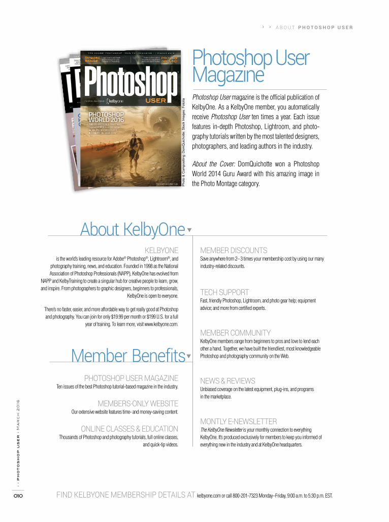
Photoshop User MagazinePhotoshop User magazine is the official publication of KelbyOne. As a KelbyOne member, you automatically receive Photoshop User ten times a year. Each issue features in-depth Photoshop, Lightroom, and photo-graphy tutorials written by the most talented designers, photographers, and leading authors in the industry.
About the Cover: DomQuichotte won a Photoshop World 2014 Guru Award with this amazing image in the Photo Montage category.
KELBYONE is the world’s leading resource for Adobe® Photoshop®, Lightroom®, and
photography training, news, and education. Founded in 1998 as the National Association of Photoshop Professionals (NAPP), KelbyOne has evolved from
NAPP and KelbyTraining to create a singular hub for creative people to learn, grow, and inspire. From photographers to graphic designers, beginners to professionals,
KelbyOne is open to everyone.
There’s no faster, easier, and more affordable way to get really good at Photoshop and photography. You can join for only $19.99 per month or $199 U.S. for a full
year of training. To learn more, visit www.kelbyone.com.
PHOTOSHOP USER MAGAZINE Ten issues of the best Photoshop tutorial-based magazine in the industry.
MEMBERS-ONLY WEBSITE Our extensive website features time- and money-saving content.
ONLINE CLASSES & EDUCATION Thousands of Photoshop and photography tutorials, full online classes,
and quick-tip videos.
MEMBER DISCOUNTS Save anywhere from 2–3 times your membership cost by using our many industry-related discounts.
TECH SUPPORT Fast, friendly Photoshop, Lightroom, and photo gear help; equipment advice; and more from certified experts.
MEMBER COMMUNITY KelbyOne members range from beginners to pros and love to lend each other a hand. Together, we have built the friendliest, most knowledgeable Photoshop and photography community on the Web.
NEWS & REVIEWS Unbiased coverage on the latest equipment, plug-ins, and programs in the marketplace.
MONTLY E-NEWSLETTER The KelbyOne Newsletter is your monthly connection to everything KelbyOne. It’s produced exclusively for members to keep you informed of everything new in the industry and at KelbyOne headquarters.
FIND KELBYONE MEMBERSHIP DETAILS AT kelbyone.com or call 800-201-7323 Monday–Friday, 9:00 a.m. to 5:30 p.m. EST.
About KelbyOne
Member Benefits


› › Inspiration, information, and member musings to fuel your creative think tankBy Ajna Adams
KelbyOne Community›
› p
ho
to
sh
op
us
er
› m
ar
ch
20
16
012
Peter Hurley in the House
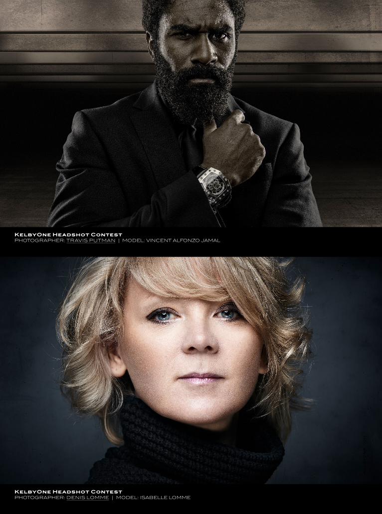
We were beyond thrilled when Peter Hurley, author of The Headshot, stopped by our headquarters on February 18 to guest-host our weekly photography show, The Grid, alongside Scott Kelby. Before The Grid aired, we took the opportunity to host a fun social-media contest with Peter as our judge. We asked our community to submit their favor-ite headshot or profile pics, and the engagement was spectacular! After receiving hundreds of submissions across Facebook, Twitter, and Instagram, we sat down with Peter and our Periscope community for a live judging session that was both fun and educational. While critiqu-ing your submissions, Peter gave us some great tips on how to create amazing headshots.
During our live broadcast of The Grid, Scott announced the winners, hand-selected by Peter himself, and each one received a signed copy of The Headshot. Congratulations to our winners: Mike Carrigan, Mads Peter Iversen, Travis Putman, Denis Lomme, and Jeff Rease! Check out some of their images on the next two pages, and then be sure to join
us on The Grid each Wednesday, at 4 p.m. EST.
Happy Birthday, Ansel!On February 20, we took to Facebook to honor legendary photographer Ansel Adams with a short-and-sweet happy birthday message that really resonated with our community. With more than 400 Shares and 1,300+ Likes later, all organic, we heard how important this iconic photographer is to the photography community as a whole and to you as individuals. We heard stories that both inspired and motivated us to keep doing what we love. “I was lucky enough to take his class on the zone method in Yosemite in ’73,” Michael Long shared. Paul Bardotz wrote, “When learning about photography, I read every book he had published. Love learning!”
Make Your Magazine Even Better!Click on the Member Input logo (below) to vote on what topics you’d like to see covered in future issues of Photoshop User, plus take our quiz on page 101 to test what you learned in this issue!
Jeremy Cowart’s I’m Possible Video Goes Viral with Nearly 2 Million Views
He’s one of the most influential photographers in the world, and also one of our instructors! In a video posted to Facebook on February 16, Jeremy Cowart shares his story. “Here it is…my past, present and future,” he writes. “To every single human in the world who thinks they can’t do something…this one is for you.”
“Growing up, I was never smart,” he says in the video.” I couldn’t pay atten-tion for more than 3 minutes. I was a terrible listener, and I made bad grades. I was quiet, shy, and really just average. I remember always telling my mom and my dad, ‘I can’t do this.’ Everything I did ended with those words. That’s when my dad started reprogramming my brain….”
Watch the video here and be sure to check out Jeremy’s KelbyOne courses!
Ajn
a A
dam
s
› ›
ke
lb
yo
ne
.co
m
013
KelbyOne Headshot ContestPHOTOGRAPHER: TRAVIS PUTMAN | MODEL: VINCENT ALFONZO JAMAL
KelbyOne Headshot ContestPHOTOGRAPHER: DENIS LOMME | MODEL: ISABELLE LOMME
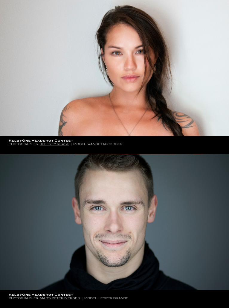
KelbyOne Headshot ContestPHOTOGRAPHER: JEFFREY REASE | MODEL: WANNETTA CORDER
KelbyOne Headshot ContestPHOTOGRAPHER: MADS PETER IVERSEN | MODEL: JESPER BRANDT

KelbyOne Community
› ›
ke
lb
yo
ne
.co
m
015
Dave Williams hides behind the alias “Hybrid Dave.” He’s a travel and wedding photographer based in London. His professional affiliations are with the Guild of Photographers, the Society of Wedding and Portrait Photographers, the Society of International Travel and Tourism Photographers, and he’s a proud contributor for Getty Images. He loves a photographic challenge, and to say that he’s a travel photographer is a clear sign that he shoots a huge range of styles.
his bodybuilder classes, which translate to weddings. There are just too many to choose a favorite!
What are you most proud of, personally and professionally? What an open question. I have to say that on a personal level, mostly because I’m such a klutz, I’m proud of keeping my pho-tography business running for nearly 5 years now. Go me! (And Peter, obviously.) On a professional level, I’m lucky enough to have gotten through to the final round of the Wildlife Photog-rapher of the Year and of the Times Travel Photographer of the Year recently. It’s no win, but it’s a win for me! I’m always game for a challenge, and this just sets a bar for me to go forward and beat myself and realize some dreams.
So, you’re going to Photoshop World this year. What do you hope to gain from the conference? I’ve never been; it just kept being one of those things on the bucket list, until this year. Peter and I are seriously looking for-ward to it, and of course I’ve planned a whole photography mis-sion around it whereby I’ll be flying into Vancouver and heading down the west coast through Seattle, San Francisco, and driving into Vegas to hit the show before a hop over to New York City to unwind until I head back home. I can’t wait to meet a whole bunch of people; I think that’s what I’m looking forward to the most. Second to that, you can watch a class online and learn a lot, but there’s no substitute for being there in front of a teacher telling it like it is.
What would we be surprised to know about you? Tough one. How about this? When I’m not behind the lens (or in front of a Mac), I spend time developing kids into tomorrow’s adults. I’m a Royal Air Force Air Cadets Sergeant. I’m the training officer at a Squadron in Hampstead, London, where I teach a variety of skills and lessons, including History of Flight, Principles of Flight, Pilot Navigation, and First Aid. I’m a range officer so I take them shooting with full-bore small arms. How about that? It’s my inner geek really.
Who are your greatest professional inspirations? To be nonspecific, anyone who shoots regularly for the likes of
Lonely Planet. That’s where I want to be, and that’s where I often seek inspiration. To be a bit of a suck up, it’s Scott. The man is a legend, let’s be honest. To be in a place where you can profit from doing what you love and helping others is inspirational, and if I was there, I’d be a very happy man.
To see more of Dave’s work, visit Facebook.com/hybrid.dave
and hybriddave.com. ■
Dav
e W
illia
ms
How and when were you introduced to KelbyOne?I’ve been into photography since I was 14 and my parents got me a Nikon F40 for my birthday. Back in the day, it was difficult to practice because you never knew what had happened until the prints came back, and by then it was often too late to remem-ber what you’d done right and wrong. With the evolution of the digital age I stepped up with a Sony a200 and was using Scott
Kelby’s Digital Photography Books. In the UK, there isn’t much of a KelbyOne presence, but I stumbled on it a few years ago and it’s such a wealth of inspiration and information that I maintain its incredible worth and tell my photog friends about it all the time.
How has KelbyOne helped you grow in your creative endeavors? My main focus in photography is travel, but I run Hybrid Photog-raphy in partnership with my best friend Peter Treadway (Hybrid Peter). Together, we’re always striving to up our portrait game, and KelbyOne is a massive source of knowledge in that respect. You’re literally learning from the best in the business—that makes it an invaluable resource.
Tell us about a favorite course that you’ve watched recently.
I’m a big fan of any of Scott’s courses. He has such an incred-ible bank of knowledge, but for its sheer fun factor I have to say
Kaylee Greer! The dog portraits she gets are stunning. Having
said that, I’m a big Glyn Dewis fan and I’ve learned a lot from
Who’s Who in the KelbyOne Community

› › The latest news about photography gear, software, and servicesBy Chris Main
Topaz Announces DeNoise 6
Topaz Labs recently announced the availability of DeNoise 6, their application for eliminating noise in digital images. The latest version can now run as a standalone application, but it still works as a plug-in for both Photoshop and Lightroom. It includes dozens of new camera-specific presets based on various camera profiles, with multiple ISO presets for each camera. These presets can help remove noise in just one click. DeNoise 6 now also supports High-DPI monitors, and batch process-ing is available in the standalone edition. For more information, click on the blue product name above or visit www.topazlabs.com.
› ›
ph
ot
os
ho
p u
se
r ›
ma
rc
h 2
016
016
Exp sed: Industry News
The New EOS 80D and other Products from Canon
Canon U.S.A., Inc., recently announced the new Canon EOS 80D Digital SLR. Features in the 80D include: a new 45-point all cross-type AF system; an intelligent Viewfinder with approximately 100% viewfinder coverage; a newly developed 24.2-megapixel (APS-C) CMOS sensor; a DIGIC 6 image pro-cessor; improved Dual Pixel CMOS AF for smooth, fast, and accurate autofocus with video and stills; built-in Wi-Fi and NFC; 1080/60p full HD video; and a vari-angle touch screen 3.0" Clear View LCD II monitor that enables flexible position-ing and clear viewing.
Canon also announced a new lens, the EF-S 18–35mm f/3.5–5.6 IS USM, which will serve as a kit lens for the new 80D. This the first Canon lens equipped with Nano USM, a new type of focusing motor that combines the benefits of a ring USM (ultrasonic motor) for high-speed AF during still
photo shooting and lead-screw type STM (stepping motor) for smooth and quiet movie AF, and a faster driving speed of the focusing lens than the previous model.
To make it even easier to shoot movies with a Canon DSLR or Cinema EOS cameras, Canon also introduced the Power Zoom Adapter PZ-E1. Specifically constructed to be compatible with the new Canon 18–135mm lens, the PZ-E1 is the world’s first detachable zoom adapter that provides silent and smooth zoom and can be adjusted incrementally to 10 different levels of zoom speed. Additionally, the PZ-E1 can be controlled remotely using the Canon Camera Connect app.
Canon also announced the Canon Directional Stereo Microphone DM-E1. This is the first Canon-branded external microphone for the EOS system. The new microphone can be rotated up and down from 90–120°. And finally, Canon also launched two new compact cameras: the PowerShot G7 X Mark II and the PowerShot SX720 HS.
Just as we were wrapping up this issue, Canon also announced the EOS Rebel T6, their newest entry-level DSLR. The T6 features an 18-megapixel CMOS (APS-C) image sen-sor, a DIGIC 4+ image processor, an ISO range of 100–6400 (expandable to H: 12800), a 9-point AF system (including one
center cross-type AF point) and AI Servo AF for impressive and accurate results, and built-in Wi-Fi and NFC. For informa-tion on each of these new products from Canon, click on the blue product names above or visit www.usa.canon.com.
› › e x p o s e d : i n d u st r y n e w s
› ›
ke
lb
yo
ne
.co
m
017
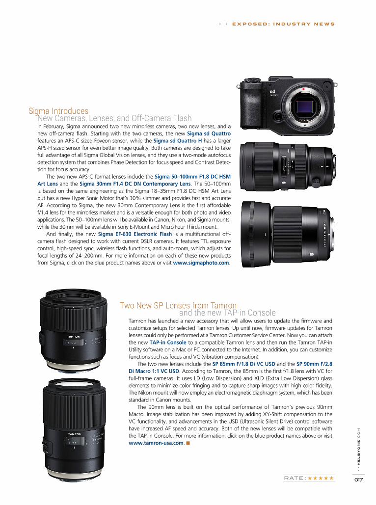
Sigma Introduces New Cameras, Lenses, and Off-Camera Flash
In February, Sigma announced two new mirrorless cameras, two new lenses, and a new off-camera flash. Starting with the two cameras, the new Sigma sd Quattro features an APS-C sized Foveon sensor, while the Sigma sd Quattro H has a larger APS-H sized sensor for even better image quality. Both cameras are designed to take full advantage of all Sigma Global Vision lenses, and they use a two-mode autofocus detection system that combines Phase Detection for focus speed and Contrast Detec-tion for focus accuracy.
The two new APS-C format lenses include the Sigma 50–100mm F1.8 DC HSM Art Lens and the Sigma 30mm F1.4 DC DN Contemporary Lens. The 50–100mm is based on the same engineering as the Sigma 18–35mm F1.8 DC HSM Art Lens but has a new Hyper Sonic Motor that’s 30% slimmer and provides fast and accurate AF. According to Sigma, the new 30mm Contemporary Lens is the first affordable f/1.4 lens for the mirrorless market and is a versatile enough for both photo and video applications. The 50–100mm lens will be available in Canon, Nikon, and Sigma mounts, while the 30mm will be available in Sony E-Mount and Micro Four Thirds mount.
And finally, the new Sigma EF-630 Electronic Flash is a multifunctional off-camera flash designed to work with current DSLR cameras. It features TTL exposure control, high-speed sync, wireless flash functions, and auto-zoom, which adjusts for focal lengths of 24–200mm. For more information on each of these new products from Sigma, click on the blue product names above or visit www.sigmaphoto.com.
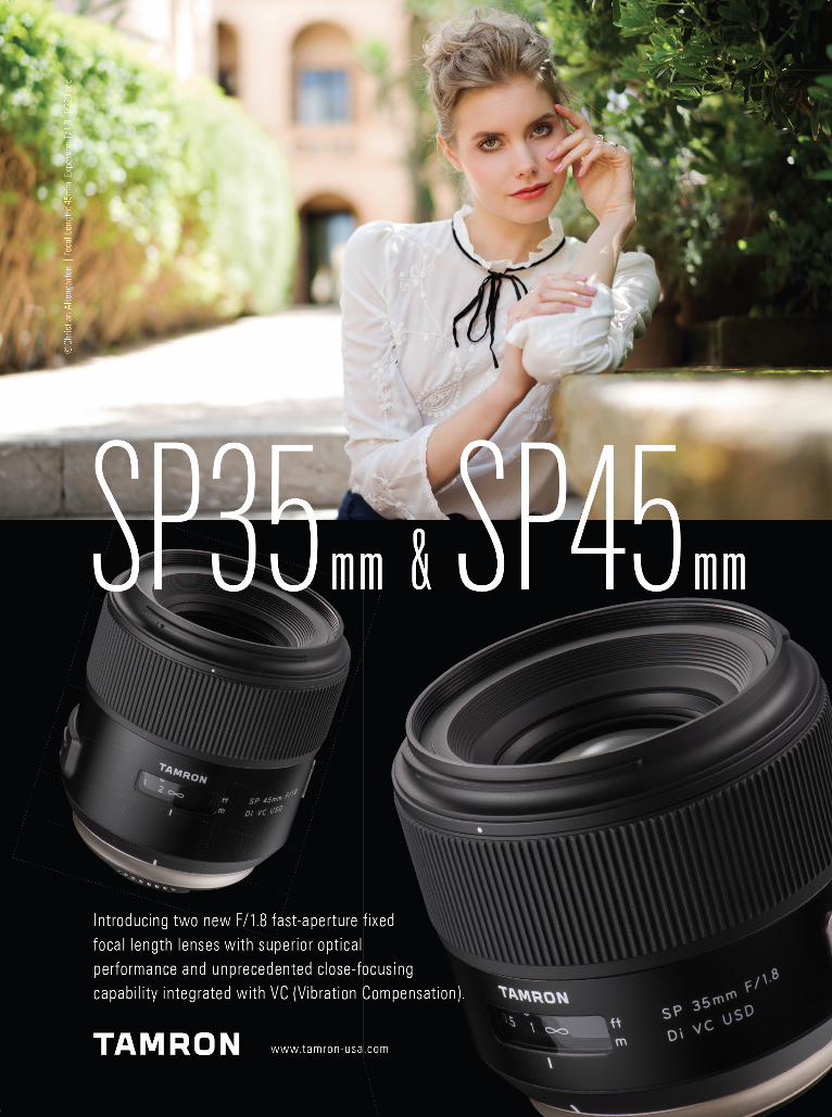
Two New SP Lenses from Tamron and the new TAP-in Console
Tamron has launched a new accessory that will allow users to update the firmware and customize setups for selected Tamron lenses. Up until now, firmware updates for Tamron lenses could only be performed at a Tamron Customer Service Center. Now you can attach the new TAP-in Console to a compatible Tamron lens and then run the Tamron TAP-in Utility software on a Mac or PC connected to the Internet. In addition, you can customize functions such as focus and VC (vibration compensation).
The two new lenses include the SP 85mm F/1.8 Di VC USD and the SP 90mm F/2.8 Di Macro 1:1 VC USD. According to Tamron, the 85mm is the first f/1.8 lens with VC for full-frame cameras. It uses LD (Low Dispersion) and XLD (Extra Low Dispersion) glass elements to minimize color fringing and to capture sharp images with high color fidelity. The Nikon mount will now employ an electromagnetic diaphragm system, which has been standard in Canon mounts.
The 90mm lens is built on the optical performance of Tamron’s previous 90mm Macro. Image stabilization has been improved by adding XY-Shift compensation to the VC functionality, and advancements in the USD (Ultrasonic Silent Drive) control software have increased AF speed and accuracy. Both of the new lenses will be compatible with the TAP-in Console. For more information, click on the blue product names above or visit www.tamron-usa.com. ■


H O W T O › ›
&Down
DirtyTricks
I’ve seen this effect done a number of different ways in Photoshop. In this tutorial, we’ll re-create the effect using brushes and layer styles. I like to do it this way because brushes and styles can be saved so you can use them over and over again, plus it’s easy to modify them for numerous configurations. And, it just looks cool!
light bulb brush effectB Y C O R E Y B A R K E R

› › D O W N A N D D I R T Y T R I C K S
› ›
ke
lb
yo
ne
.co
m
021
Step One: Start by opening the image of the light bulb that’s
part of the exercise download. This image has good detail in the
round area of the bulb, which will make for a good brush.
[KelbyOne members may download the files used in this
tutorial at http://kelbyone.com/magazine. All files are for per-
sonal use only.]
Step Two: First, remove the color in the image by using the
Gradient Map method: Press D to set the default colors, then
go under the Image menu to Adjustments and choose Gradi-
ent Map. The black to white gradient should automatically be
selected, so just click OK.
Step Three: Press Command-I (PC: Ctrl-I) to invert the image
to a negative. Then, choose the Elliptical Marquee tool (nested
under the Rectangular Marquee tool [M] in the Toolbox). Hold
down Option-Shift (PC: Alt-Shift), click in the center of the bulb,
and drag out a circular selection that includes just the round area
of the bulb. Once the selection is made, press Shift-Command-I
(PC: Shift-Ctrl-I) to inverse the selection. Press Command-Delete
(PC: Ctrl-Backspace) to fill the selected area with white, and then
press Command-D (PC: Ctrl-D) to deselect.
Step Four: Press Command-L (PC: Ctrl-L) to open the Levels dia-
log. Push both the white and midtone sliders to the left quite a
bit to make the background around the bulb pure white and
to boost the contrast in the bulb. Click OK. Finally, we used the
Eraser tool (E) set to Brush in the Options Bar to remove some of
the stem near the bottom right of the bulb.
Step One
Step Three
Step Two
Step Four
©A
dobe
Sto
ck/B
eboy

D O W N A N D D I R T Y T R I C K S › ››
› p
ho
to
sh
op
us
er
› m
ar
ch
20
16
022
Step Five: Go under the Edit menu and choose Define Brush
Preset. Give the new brush a name when prompted and click OK.
Step Five
Step Six
Step Seven
Step Eight
Step Six: Create a new document (File>New) that’s 2500x1000
pixels at 300 ppi. Then, open the wood texture file from the exer-
cise download. This will be the base texture for the final effect.
Switch to the Move tool (V) and click-and-drag this image over
to the new document. Press Command-T (PC: Ctrl-T) for Free
Transform, scale it to fit in the canvas area, and press Enter to
commit the transformation.
Step Seven: Press D to set the Foreground color to black, select
the Type tool (T) in the Toolbox, and click on the canvas to set a
text layer. Type whatever word you want to dress in lights. Here,
we just typed, well, “LIGHTS.” Make sure you use a bold font to
contain the bulbs; we’re using a font called Swiss Black Extended.
Step Eight: Click on the wood texture layer in the Layers panel
to make it active, and make a duplicate of it by pressing Com-
mand-J (PC: Ctrl-J). Place this duplicate layer above the text layer
in the Layers panel. Press Option-Command-G (PC: Alt-Ctrl-G)
to clip the wood texture layer inside the text layer. Activate Free
Transform and then press Command-0 (PC: Ctrl-0) to expand
the window so you can see the entire bounding box. Hold down
Shift and click-and-drag outside the bounding box to rotate the
wood texture 90° inside the text. Then, hold down Option (PC:
Alt), grab one of the side control points, and scale the texture out
horizontally to fill the text. Press Enter when done.
©A
dobe
Sto
ck/Z
bysz
ek N
owak
› ›
ke
lb
yo
ne
.co
m
023
› › D O W N A N D D I R T Y T R I C K S
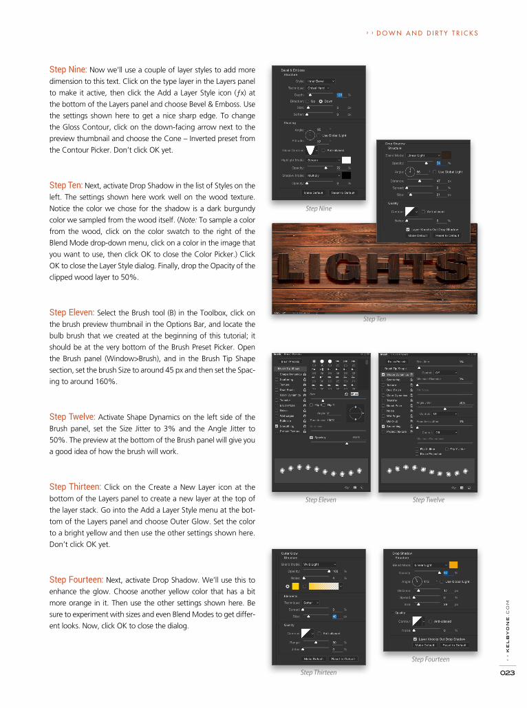
Step Nine: Now we’ll use a couple of layer styles to add more
dimension to this text. Click on the type layer in the Layers panel
to make it active, then click the Add a Layer Style icon (ƒx) at
the bottom of the Layers panel and choose Bevel & Emboss. Use
the settings shown here to get a nice sharp edge. To change
the Gloss Contour, click on the down-facing arrow next to the
preview thumbnail and choose the Cone – Inverted preset from
the Contour Picker. Don’t click OK yet.
Step Ten: Next, activate Drop Shadow in the list of Styles on the
left. The settings shown here work well on the wood texture.
Notice the color we chose for the shadow is a dark burgundy
color we sampled from the wood itself. (Note: To sample a color
from the wood, click on the color swatch to the right of the
Blend Mode drop-down menu, click on a color in the image that
you want to use, then click OK to close the Color Picker.) Click
OK to close the Layer Style dialog. Finally, drop the Opacity of the
clipped wood layer to 50%.
Step Eleven: Select the Brush tool (B) in the Toolbox, click on
the brush preview thumbnail in the Options Bar, and locate the
bulb brush that we created at the beginning of this tutorial; it
should be at the very bottom of the Brush Preset Picker. Open
the Brush panel (Window>Brush), and in the Brush Tip Shape
section, set the brush Size to around 45 px and then set the Spac-
ing to around 160%.
Step Twelve: Activate Shape Dynamics on the left side of the
Brush panel, set the Size Jitter to 3% and the Angle Jitter to
50%. The preview at the bottom of the Brush panel will give you
a good idea of how the brush will work.
Step Thirteen: Click on the Create a New Layer icon at the
bottom of the Layers panel to create a new layer at the top of
the layer stack. Go into the Add a Layer Style menu at the bot-
tom of the Layers panel and choose Outer Glow. Set the color
to a bright yellow and then use the other settings shown here.
Don’t click OK yet.
Step Fourteen: Next, activate Drop Shadow. We’ll use this to
enhance the glow. Choose another yellow color that has a bit
more orange in it. Then use the other settings shown here. Be
sure to experiment with sizes and even Blend Modes to get differ-
ent looks. Now, click OK to close the dialog.
Step Nine
Step Ten
Step TwelveStep Eleven
Step Thirteen
Step Fourteen

D O W N A N D D I R T Y T R I C K S › ››
› p
ho
to
sh
op
us
er
› m
ar
ch
20
16
024
Step Fifteen: Press D then X to set the Foreground color to white,
and then just paint the bulbs in the area of the letters as you see
here. The layer style will give the effect of the bulbs emitting light.
Again, you can adjust the intensity of the layer styles at any time by
simply double-clicking on their names in the Layers panel.
Step Sixteen: Once you have the lights done, load the flare
brush that’s also provided in the download files, or you can use
your own custom brush. To load the brush, simply double-click
the Flare Brush.abr file in the Finder (PC: Windows Explorer).
Once loaded, you’ll find it at the bottom of the Brush Preset
Picker. Just dab the flares on a few random bulbs on the same
layer. This will add a little variance to the lights.
Step Seventeen: Click on the original background wood layer
in the Layers panel to make it active, and press Command-L (PC:
Ctrl-L) to open the Levels dialog. Push the highlight Output Levels
slider near the bottom to the left to darken the overall texture,
and click OK.
Step Eighteen: Next, add a Gradient Overlay layer style to
enhance the lighting. Click on the Gradient preview; select the
Black, White preset; click OK to close the Gradient Editor; check on
the Reverse box; and set the Style drop-down menu to Reflected.
You can use the other settings shown here or experiment to get
different looks. Click-and-drag directly in the document to posi-
tion the brightest part of the gradient over the letters. Click OK
when done.
Step Nineteen: Create a new blank layer and place it between
the clipped wood layer and the bulb layer. Set the layer blend
mode near the top left of the Layers panel to Hard Light and the
Opacity to 75%. Next, grab the Gradient tool (G) in the Toolbox.
In the Options Bar, click the Radial Gradient icon, then click on the
gradient preview thumbnail, choose the Foreground to Transpar-
ent preset, and click OK to close the Gradient Editor. Click on the
Foreground color swatch near the bottom of the Toolbox, choose
an orange color like the one shown here, and click OK.
Step Fifteen
Step Sixteen Step Seventeen
Step Eighteen
Step Nineteen

› ›
ke
lb
yo
ne
.co
m
025
› › D O W N A N D D I R T Y T R I C K S
Step Twenty: Now just draw a few gradients starting in the
bright areas where you added the flares and dragging out a little
ways. This puts an enhanced glow around the text as if it’s com-
ing from the bulbs.
Step Twenty-One: At this point you could call the effect done,
but why stop here? Here we have an image of sparks (in the
download files) that would look cool if they were added to the
bulbs as if there were some kind of power overload. Since the
sparks are on a black background, they’ll be easy to extract. Just
open the Channels panel (Window>Channels) and Command-
click (PC: Ctrl-click) on the Red channel thumbnail to load the
bright areas as a selection. Then, press Command-J (PC: Ctrl-J)
to copy the selected area to a new layer.
Step Twenty-Two: Go under the Layer menu to Matting and
choose Remove Black Matte to clear the dark edge around
the sparks.
Step Twenty-Three: Using the Move tool (V) click-and-drag the
sparks into the bulb image. Then, use Free Transform to scale
and rotate them around one of the bulbs as you see here. Now
you have an old wood lighted sign with a bad short. ■
Step Twenty
Step Twenty-One
Step Twenty-Two
Final
©A
dobe
Sto
ck/V
idad
y

H O W T O › ›
&Down
DirtyTricks
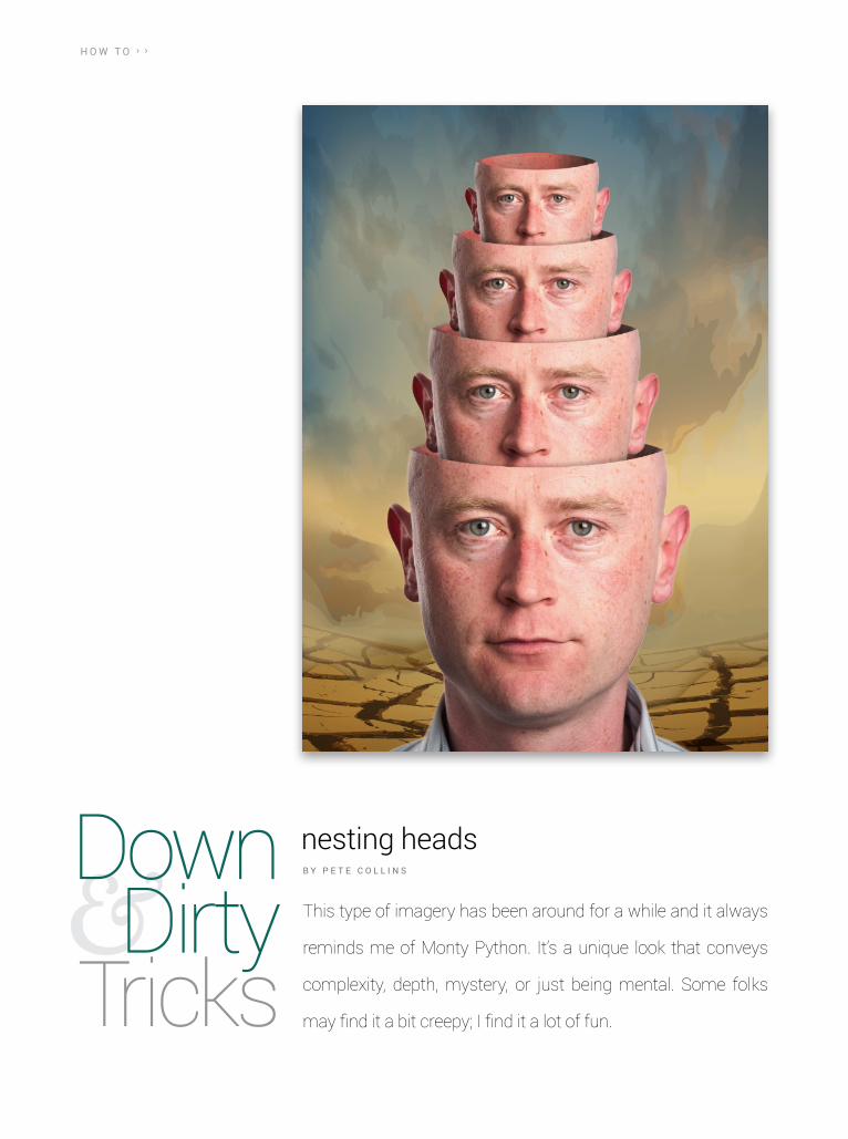
This type of imagery has been around for a while and it always
reminds me of Monty Python. It’s a unique look that conveys
complexity, depth, mystery, or just being mental. Some folks
may find it a bit creepy; I find it a lot of fun.
nesting heads B Y P E T E C O L L I N S
› › D O W N A N D D I R T Y T R I C K S
› ›
ke
lb
yo
ne
.co
m
029
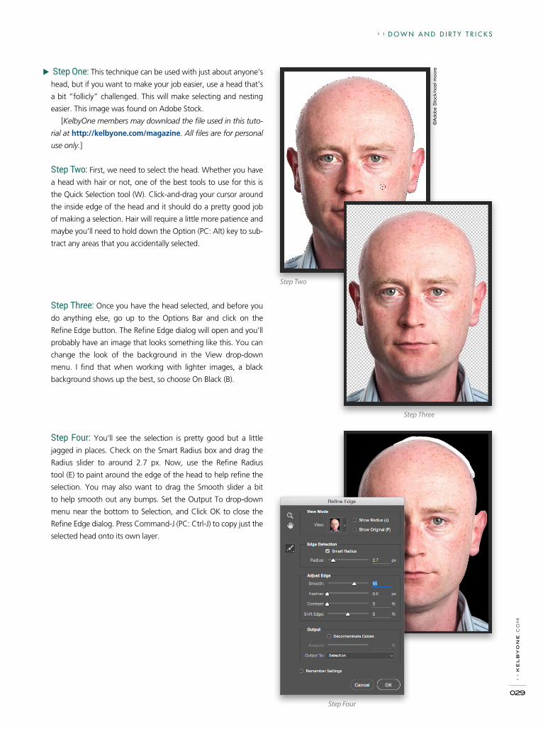
Step One: This technique can be used with just about anyone’s
head, but if you want to make your job easier, use a head that’s
a bit “follicly” challenged. This will make selecting and nesting
easier. This image was found on Adobe Stock.
[KelbyOne members may download the file used in this tuto-
rial at http://kelbyone.com/magazine. All files are for personal
use only.]
Step Two: First, we need to select the head. Whether you have
a head with hair or not, one of the best tools to use for this is
the Quick Selection tool (W). Click-and-drag your cursor around
the inside edge of the head and it should do a pretty good job
of making a selection. Hair will require a little more patience and
maybe you’ll need to hold down the Option (PC: Alt) key to sub-
tract any areas that you accidentally selected.
Step Three
Step Two
©A
do
be
Sto
ck/n
oel
mo
ore
Step Four
Step Three: Once you have the head selected, and before you
do anything else, go up to the Options Bar and click on the
Refine Edge button. The Refine Edge dialog will open and you’ll
probably have an image that looks something like this. You can
change the look of the background in the View drop-down
menu. I find that when working with lighter images, a black
background shows up the best, so choose On Black (B).
Step Four: You’ll see the selection is pretty good but a little
jagged in places. Check on the Smart Radius box and drag the
Radius slider to around 2.7 px. Now, use the Refine Radius
tool (E) to paint around the edge of the head to help refine the
selection. You may also want to drag the Smooth slider a bit
to help smooth out any bumps. Set the Output To drop-down
menu near the bottom to Selection, and Click OK to close the
Refine Edge dialog. Press Command-J (PC: Ctrl-J) to copy just the
selected head onto its own layer.

D O W N A N D D I R T Y T R I C K S › ››
› p
ho
to
sh
op
us
er
› m
ar
ch
20
16
030
Step Five: Now grab the Elliptical Marquee tool (nested under
the Rectangular Marquee tool [M] in the Toolbox) and drag across
the forehead where you would like to make the cut. This will give
you a clean cut, so if you want a more organic look, you could
freehand it with the Lasso tool (L). The ellipse you drag out will
probably be too small to cover the entire top section of the head,
so hold the Shift key and drag out a second ellipse to include
everything above the cutline. Command-X (PC: Ctrl-X) will now
cut off that part of the head, and Command-V (PC: Ctrl-V)
will paste the cut section on a new layer.
Step Six
Step Five
Step Six: You’ll want to use the cutoff section as the back area
of the head. To better see what you’re doing, click the Eye icon
next to the original Background layer to hide it, click the Create
a New Layer icon at the bottom of the Layers panel, drag this
new layer above the Background layer, press D then X to set the
Foreground color to white, and then press Option-Delete (PC:
Alt-Backspace) to fill the layer with the Foreground color.
Now, simply drag that cutout (or skull) layer below the head
layer in the Layers panel, press Command-T (PC: Ctrl-T) for Free
Transform, Right-click inside the bounding box, and choose
Rotate 180°. You’ll want to rotate it instead of flipping so that the
shadowing matches up (the light from the right causes shadows
on the left side of the face and vice versa for the inside of the
head). Now drag the skull layer into place so that it matches the
edges of the front scalp. Press Enter to commit the transformation.
› › D O W N A N D D I R T Y T R I C K S
› ›
ke
lb
yo
ne
.co
m
031
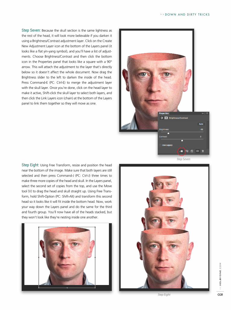
Step Seven: Because the skull section is the same lightness as
the rest of the head, it will look more believable if you darken it
using a Brightness/Contrast adjustment layer. Click on the Create
New Adjustment Layer icon at the bottom of the Layers panel (it
looks like a flat yin-yang symbol), and you’ll have a list of adjust-
ments. Choose Brightness/Contrast and then click the bottom
icon in the Properties panel that looks like a square with a 90°
arrow. This will attach the adjustment to the layer that’s directly
below so it doesn’t affect the whole document. Now drag the
Brightness slider to the left to darken the inside of the head.
Press Command-E (PC: Ctrl-E) to merge the adjustment layer
with the skull layer. Once you’re done, click on the head layer to
make it active, Shift-click the skull layer to select both layers, and
then click the Link Layers icon (chain) at the bottom of the Layers
panel to link them together so they will move as one.
Step Eight
Step Seven
Step Eight: Using Free Transform, resize and position the head
near the bottom of the image. Make sure that both layers are still
selected and then press Command-J (PC: Ctrl-J) three times to
make three more copies of the head and skull. In the Layers panel,
select the second set of copies from the top, and use the Move
tool (V) to drag the head and skull straight up. Using Free Trans-
form, hold Shift-Option (PC: Shift-Alt) and transform this second
head so it looks like it will fit inside the bottom head. Now, work
your way down the Layers panel and do the same for the third
and fourth group. You’ll now have all of the heads stacked, but
they won’t look like they’re nesting inside one another.

› ›
ph
ot
os
ho
p u
se
r ›
ma
rc
h 2
016
032
D O W N A N D D I R T Y T R I C K S › ›
Step Nine: Once all four sets of
heads are in place, click through
the layers in the Layers panel, and
click the Link Layers icon for each
linked layer to unlink the heads
from the skulls. Drag each skull
layer down below all the head
layers in the stack of layers so
they appear behind the heads.
Now grab the Brush tool (B), set
it to a soft round brush, press D
to set it to black, and set the
Opacity to 20% in the Options
Bar. Create a new layer below
each of the head layers, except
for the layer that contains the
smallest head at the very top. On
each blank layer, paint so it looks
like the head in front is casting
a shadow on the head nested
inside it. Do that for each head so
they look like they’re interact ing
with each other. When you’re
done, the layers should look
something like this.
Step Ten: Now you’ll want to add a background that fits with
what you’re trying to convey. Since this image is pretty surreal,
we’ll give a little nod to Salvador Dali with this desert image. The
sign was taken out in the final image. You can use any image
you’d like for the background.
Step Nine
Step Ten
©F
oto
lia/c
sp_
Alk
estid
a

› › D O W N A N D D I R T Y T R I C K S
› ›
ke
lb
yo
ne
.co
m
033
› › D O W N A N D D I R T Y T R I C K S
› ›
ke
lb
yo
ne
.co
m
033
Step Eleven: Once we had this background in place, the heads
seemed to be a little too blue. So, we selected all the layers that
made up the nested heads and pressed Command-G (PC: Ctrl-G)
to place them into a single layer group. From the adjustment
layer icon menu, we chose Photo Filter. The default Warming
filter did just fine after adjusting the Density to around 18%. This
affected the entire scene, so we clicked on the square with the
90° arrow to clip the adjustment to only the layer group. And
there you have it!
Once you have this simple technique down, you can add more
stuff like plants, tentacles, or anything you can think of coming
out of the top head—or even all of the heads. This can be espe-
cially fun when you find a picture of that girl in high school who
broke your heart and you create your own totem of her that will
make you feel just a little bit better. Enjoy! ■
Step Eleven

OKAY, DRUMROLL PLEASE (WAIT FOR IT, WAIT FOR IT)—the 2016 Photoshop World Conference (in Las Vegas, July 19–21, 2016, at the Mandalay Bay Resort & Casino) is on! And, official registration is now open! That’s right, we’re back in Vegas, baby! Awwwww, yeah!
Now that I have that out of my system, welcome to this quick look at Photoshop World. Since we have so many new KelbyOne members out there (whoo-hoo!), I wanted to put this together so you’d know what it’s all about it, and most importantly, that you’re invited!
Photoshop World is the world’s largest Photoshop training event (but it’s more than just Photoshop) and members come from all over the world to learn from an extraordinary roster of instructors (but
034
› ›
ph
ot
os
ho
p u
se
r ›
Ma
rc
h 2
016

it’s also way more than just education). Everybody’s here—from beginners to seasoned pros, from students to educators, from amateurs to wizards—and we all come together to share, connect, and engage.
I guess if there’s any one thing I’d want all of you awesome new members to know it’s this: this is your conference. It was created for KelbyOne members to have a place to come together once a year to learn all the latest stuff; make new friends and connections; meet the instructors; get inspired, faster, better, and more efficient; and just have the best time ever doing it all. If you’re a KelbyOne member, we really want you to be there—we built this for you.
035
› ›
ke
lb
yo
ne
.co
m
PHOTOSHOP WORLDCONFERENCE 2016
L A S V E G A S
I’ll keep this short, because this is just the nuts-and-bolts stuff you’ll need to know: We have more than 80 class sessions over three days (well, you can come a day early and take some in-depth work-shops, but I wasn’t counting those). To make it easy, we put them into tracks, like the Photoshop track, the Creative Cloud track, the Lightroom track, the Lighting track and stuff like that. We’re even working with Adobe (the official Photoshop World sponsor) to create an entire 3-day track dedicated to learning Adobe’s new mobile apps, such as Photoshop Fix, Photoshop Sketch, Adobe Comp, Adobe Capture, and Photoshop Mix, among others. You’ll find the full schedule on the Photoshopworld.com site.
One more thing about the sessions that I think is particularly cool is that you create your own custom training experience. We don’t make you register for your sessions in advance—you can attend any class, or any track, at any time, and change classes whenever you like. You just show up at the class you want to take so you can focus on exactly the topics that interest you most.
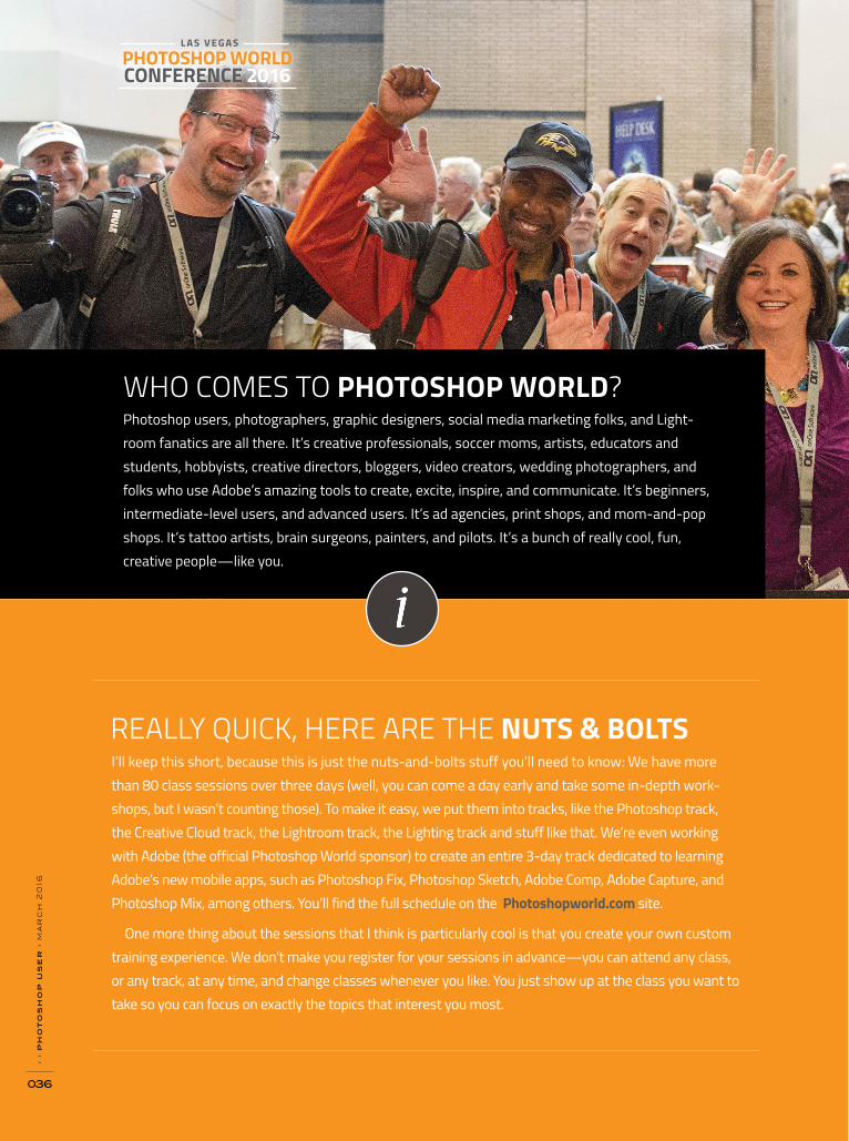
Photoshop users, photographers, graphic designers, social media marketing folks, and Light-room fanatics are all there. It’s creative professionals, soccer moms, artists, educators and students, hobbyists, creative directors, bloggers, video creators, wedding photographers, and folks who use Adobe’s amazing tools to create, excite, inspire, and communicate. It’s beginners, intermediate-level users, and advanced users. It’s ad agencies, print shops, and mom-and-pop shops. It’s tattoo artists, brain surgeons, painters, and pilots. It’s a bunch of really cool, fun, creative people—like you.
REALLY QUICK, HERE ARE THE NUTS & BOLTS
WHO COMES TO PHOTOSHOP WORLD?
036
› ›
ph
ot
os
ho
p u
se
r ›
ma
rc
h 2
016

The conference kicks off with a really exciting, high-energy opening keynote, and each year we pick a fun theme to build our “look and feel” around. Our themes have run the gamut from Top Gun to Star Trek, from auto racing to rock n’ roll, and there are always lots of laughs and surprises. We do this to set the tone for the entire conference. Yes, we’re here to learn, and we’re all going to learn so much our heads will hurt, but this opening keynote lets you know that we’re going to have a lot of fun doing it.
Of course, when Adobe takes the stage, it gets really interesting because they often use this opening keynote to give us a sneak peek at new technology, new software, and sometimes they even launch new products. So, it’s a really fun way to kick off the conference (and you don’t want to miss it).
After the keynote, it’s time to head to class. We have a free downloadable app for your smart-phones that makes picking your classes easy (available soon). It has the full conference schedule, as well as lots of info on times and places for events, so you’ll know right where to go (luckily, the classes are all in the same area this year). Also, we have these giant 8’ high boards with the full class schedule, if you want to go “old school.” The class sessions are 1 hour each (that keeps your head from exploding with too much info), and we take a 30-minute break in between sessions.
Imagine getting your portfolio reviewed by some of the industry’s best-known names. They’re there to help you tweak your presentation, advance your career, and help you stand out from the crowd (and this is one thing we do year after year because our attendees have told us this was a life-changing, career-changing experience).
OKAY, HERE’S MORE OF A PLAY-BY-PLAY OF THE EVENT
THEN WE’RE OFF TO CLASSES
WE OFFER ONE-ON-ONE PORTFOLIO REVIEWS
› ›
ke
lb
yo
ne
.co
m
037
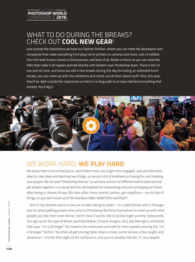
Just outside the classrooms we have our Partner Pavilion, where you can meet the developers and companies that make everything from plug-ins to printers to cameras and more. Lots of exhibits from the best-known names in the business, and best of all, Adobe is there, so you can meet the folks that make it all happen and talk directly with Adobe’s own Photoshop team. There’s lots to see and do here, and since we add a few breaks during the day (including an extended lunch break), you can meet up with the exhibitors and check out all their latest stuff. Plus, this year, they’ll be right outside the classrooms so there’s no long walk to an expo hall (and everything that entails). You’ll dig it.
We know that if you’re having fun, you’ll learn more, you’ll get more engaged, and you’ll be more open to new ideas and learning new things, so we put a lot of emphasis on having fun and meeting new people. We all need “Photoshop friends,” so we have a bunch of different events planned that get people together in a casual and fun atmosphere for networking and just recharging our brains after being in classes all day. We have after-hours events, parties, get-togethers—we do lots of things, so you don’t wind up at the blackjack table. (Wait! Who said that?)
One of my favorite events is one we’ve been doing for years—it’s called Dinner with a Stranger, and it’s about getting people who come to Photoshop World by themselves to meet up with other people just like them over dinner. Here’s how it works: We’ve picked eight yummy restaurants. You sign up for the type of dinner you’d like (Italian, Chinese, burgers, etc.), and then get a red button that says, “I’m a Stranger.” You head to the restaurant and look for other people wearing the “I’m a Stranger” button. You then all get one big table, share a meal, some stories, a few laughs and whammo!—it’s the first night of the conference, and you’ve already met like 11 new people.
WHAT TO DO DURING THE BREAKS? CHECK OUT COOL NEW GEAR!
WE WORK HARD; WE PLAY HARD
PHOTOSHOP WORLDCONFERENCE 2016
L A S V E G A S›
› p
ho
to
sh
op
us
er
› m
ar
ch
20
16
038

This has been a tradition at Photoshop World for about 16 years and our attendees love it, because this is where we let our hair down, play a bunch of silly games, give away a bunch of cool prizes, and well, you just have to experience it for yourself (though, seating is limited, and you have to get a special free ticket in advance). The first few years we did it, it literally started at midnight. Then, over the years, we moved it back to 11 p.m. Now, it starts at 10 p.m. If this keeps up, soon we’ll be starting at 5:30 p.m., and we’ll call it “Early Bird Dinner Madness.”
Anyway, there’s lots of other fun stuff, all throughout the conference, from our famous Meet Up the night before the conference at the Eyecandy Sound Lounge to our Evening Inspiration session with Gregory Heisler (it’s going to be a very special night) to our attendee party that’s always loads of fun.
Okay, let’s do it! It’s new this year, and the plan is to go to some of the best bars in Mandalay Bay and the Shops at Mandalay Bay (yes, it has its very own mall), and you’re invited to come along, have a fine lager, and meet some new people.
MIDNIGHT MADNESS
HOW ‘BOUT A PUB CRAWL?

We wrap up the conference with the presentation of the prestigious Photoshop World Guru Awards. This competition is open to any full-conference attendee (in fact, it’s only open to our attendees—only people at the conference can enter), and you can submit images in all sorts of categories from retouching to photography, from illustration to compositing, among others. Our panel of judges picks the winners who then come onstage to accept their Guru Award trophy. So many careers have been launched from winning a Guru award—the stories we hear are just amazing, and we want you to enter. Hey, ya never know.
One of the things that we hear again and again from our past attendees is that they’re amazed at the access they have to the instructors, and how helpful, gracious, and just plain nice they are. I really take that as a compliment because my job at Photoshop World (besides teaching sessions) is to choose the instructor roster each year. I work really hard to ensure that not only are the instruc-tors at Photoshop World the very best in the industry, but I choose those who are in it for the right reasons—instructors who really care about the success of their students and who are genuinely there to help and make a difference. Our instructors make themselves very available the entire conference, and you’ll see them at the parties and after-hour events, or just chatting with attend-ees in the halls. It’s really refreshing, fun, and it’s something that definitely helps make Photoshop World something very special.
IT’S TIME TO GET YOUR WORK RECOGNIZED
CONNECTING WITH INSTRUCTORS
PHOTOSHOP WORLDCONFERENCE 2016
L A S V E G A S›
› p
ho
to
sh
op
us
er
› m
ar
ch
20
16
040

One of the things we’ve always done is to keep the event really affordable. As a KelbyOne member, you get $100 off the registration price, and if you register now (before June 11, 2016), you can use the Early Bird Discount and save another $100. So, you can attend the entire three-day conference, including all the classes, and get the massive workbook for just $599, which is just an incredible value. You’ll see conferences of this scale with registration fees around the $2,000 range all day long, but we want Photoshop World to be accessible to everyone.
DID I MENTION YOU SAVE $100
If you want to come a day early, we offer a series of optional in-depth workshops, where you can really dig in to a particular topic, or go on location with your instructor for a live shoot. These are hugely popular with our attendees and most of these pre-conference workshops sell out way in advance. (These optional workshops are the day before and have a separate registration fee.) To see a listing of this year’s workshops, as well as the full conference schedule, just turn the page.>>
COME A DAY EARLY AND DIG IN DEEP!
› ›
ke
lb
yo
ne
.co
m
041

CREATE YOUR OWN CUSTOM LEARNING EXPERIENCE
PRE CONFERENCE DAY (07.18.16): SCHEDULE
One of the best things about Photoshop World is that you can build a custom training experience that’s just right for you, choosing from nearly 100 sessions in seven different training tracks—they’re all open to you with a full conference pass. You choose your own schedule, and even change tracks or sessions any time you want. This allows you to maximize your experience and focus just on the topics you really want to master.
The day prior to the kick-off of the conference our in-depth workshops are held. These work-shops provide a deep dive into the topics you want to learn most with small class sizes, live shoots and hands-on training. Separate registration fee required.
Red Rock Landscape Shoot Moose Peterson | In-Depth Workshop
A Photographic Project From Concept to Execution | Julieanne Kost | In-Depth Workshop
Wow-Worthy Creative Studio LightingLindsay Adler | In-Depth Workshop
Hands-On Portfolio PrepDaniel Gregory | In-Depth Workshop
First Time Attendee Orientation | Larry Becker
Dog Photography: Sit, Stay, SnapKaylee Greer | In-Depth Workshop
Fashion Photography Frank Doorhof | In-Depth Workshop
The Art of Inspired BusinessTim Wallace | In-Depth Workshop
Lightpainting the TownDave Black | In-Depth Workshop
› ›
ph
ot
os
ho
p u
se
r ›
ma
rc
h 2
016
042

DAY 1 (07.19.16): SCHEDULE
Bryan O’Neil Hughes
Dave Black
Daniel Gregory
Alan Hess
Corey Barker
Joe McNally
Getting the Most Out of The Creative Cloud Photog-raphy Plan (LR +PS+Mobile) | Creative Cloud Track
Sports Action with High Speed Sync FlashLighting Track
Tack Sharp! Sharpening in Lightroom Lightroom Track
Night & Low Light Photography Photography Track
Master FX Live Photoshop Track
The Moment It ClicksInspiration Track
12:00pm -1:00pm
Corey Barker
Frank Doorhof
Julieanne Kost
Moose Peterson
Scott Kelby
Kaylee Greer
Terry White
Joel Grimes
TBA
Dave Black
Katrin Eismann
Daniel Gregory
Improv Photoshop & Illustrator HourCreative Cloud Track
Creating Magic with LightingLighting Track
What’s New in Lightroom Lightroom Track
Setting the Wildlife Loose Photography Track
Essentials of Designing with TypePhotoshop Track
Never Say Never: A Journey into Inspiration and Redefining “Impossible” | Inspiration Track
Intro to Adobe Muse CCCreative Cloud Track
Dramatic Portraits Using SpeedlitesLighting Track
Organizing Your Images with Lightroom Lightroom Track
Think Before You Press the Shutter Photography Track
RAW Image RestorationPhotoshop Track
4 Steps to Meaningful WorkInspiration Track
3:00pm -4:00pm
4:30pm -5:30pm
to register visit photoshopworld.com or call 1-800-201-7323
› ›
ke
lb
yo
ne
.co
m
043

DAY 2 (07.20.16): SCHEDULE
Terry White
Katrin Eismann
Dave Black
Kristina Sherk
Glyn Dewis
Stacy Pearsall
Dave Cross
Katrin Eismann
Kaylee Greer
Bryan O’Neil Hughes
Dave Cross
Jay Maisel
TBA
Daniel Gregory
Joe McNally
Corey Barker
Richard Harrington
Jay Maisel
Adobe Muse CC Tips & TricksCreative Cloud Track
Lightroom Develop Module Lightroom Track
Lightpainting—Light up The World Photography Track
Masters In Skin: Part 1Photoshop Track
Photoshop Lighting Effects for PhotographersPhotoshop Track
Combat From Behind the CameraInspiration Track
Using Photoshop, Illustrator and InDesignCreative Cloud Track
The Creative Power of Selective ToolsLightroom Track
Dog Photography Photography Track
Black & White in Photoshop, Lightroom, and Beyond | Photoshop Track
Photoshop Textures, Borders, Edges and MorePhotoshop Track
Light, Gesture & Color (hour 1 of 2)Inspiration Track
Intro to IllustratorCreative Cloud Track
Dial It Up: Advanced Lightroom TechniquesLightroom Track
Hot Shoe Flash—The First Steps Photography Track
More Photoshop 3DPhotoshop Track
Expert Selections in Adobe PhotoshopPhotoshop Track
Light, Gesture & Color (hour 2 of 2)Inspiration Track
8:30am-9:30am
10:00am -11:00am
11:30am -12:30pm
› ›
ph
ot
os
ho
p u
se
r ›
ma
rc
h 2
016
044

Terry White
Scott Kelby
Joe McNally
Glyn Dewis
TBA
Joel Grimes
Dave Cross
Scott Kelby
Alan Hess
Corey Barker
TBA
Peter Hurley
Julieanne Kost
Terry White
Moose Peterson
Kristina Sherk
Bryan O’Neil Hughes
Frank Doorhof
How to Take Advantage of Adobe’s Creative Cloud | Creative Cloud Track
Creating Beautiful Photo Books in LightroomLightroom Track
Big Flash Done Fast Photography Track
Compositing: Don’t Get Stuck, Get Creating!Photoshop Track
Video in Photoshop CCPhotoshop Track
The Power of Creating a Signature BrandInspiration Track
Smart Objects, Layer Comps and Libraries, Oh My!Creative Cloud Track
Unlocking the Power of Lightroom MobileLightroom Track
Concert PhotographyPhotography Track
Getting that Cinematic Wow Factor! Hollywood FX That You Can Use! | Photoshop Track
Camera Raw BasicsPhotoshop Track
From Zero to Shabang! Inspiration Track
Showcasing Your Work with Adobe Creative Cloud | Creative Cloud Track
Lightroom for Absolute BeginnersLightroom Track
Start Your EnginesPhotography Track
Masters In Skin: Part 2Photoshop Track
The Photoshop PlaybookPhotoshop Track
How to Get Your Model to Work It! Inspiration Track
2:30pm -3:30pm
4:00pm -5:00pm
6:15pm -7:15pm
to register visit photoshopworld.com or call 1-800-201-7323
› ›
ke
lb
yo
ne
.co
m
045

Attend conference sessions in any track and move between them as you like. Instructors, classes and class materials may change without prior notice. Visit www.Photoshop®world.com for the latest schedule and information. Adobe, The Adobe Logo, The Creative Cloud, Photoshop, Lightroom, InDesign, Illustrator, Premiere Pro, and Muse are registered trademarks of Adobe Systems, Incorporated.
DAY 3 (07.21.16): SCHEDULE
TBA
Tim Wallace
RichardHarrington
Moose Peterson
Katrin Eismann
TBA
Julieanne Kost
Lindsay Adler
TBA
Roberto Valenzuela
Glyn Dewis
TBA
Terry White
Lindsay Adler
Scott Kelby
Roberto Valenzuela
TBA
RichardHarrington
Illustrator Tips & TricksCreative Cloud Track
Live Car ShootLighting Track
Triple Exposure in Lightroom—Panoramics, HDR, & Time Lapse Post Processing Tips | Lightroom Track
Invite the Landscape Into The Photograph Photography Track
Small, Medium, Large Photoshop Track
Add Sizzle: 3 Ways to Make Your Videos Stand out | Video Track
Mobile Apps: Adobe Slate, Capture, Post, & Photoshop Mix | Creative Cloud Track
Drama Queen of Lighting: Lighting for Mood & Dramatic Effect | Lighting Track
Printing in Lightroom CC Lightroom Track
Picture Perfect Posing Photography Track
How to Bring Portraits to Life with Photoshop & Lightroom | Photoshop Track
Shooting to Sharing, DSLR Video BasicsVideo Track
Intro to InDesign CC Creative Cloud Track
5 Fashion Lighting Setups to WOW your Portrait Clients | Lighting Track
Lightroom Killer Tips!Lightroom Track
Lighting & Posing Simplified and Working Seamlessly Together | Photography Track
Printing in Photoshop CC Photoshop Track
Get Started with Premiere ProVideo Track
9:00 am -10:00 am
10:30am -11:30am
1:00pm -2:00pm
› ›
ph
ot
os
ho
p u
se
r ›
ma
rc
h 2
016
046

Photography courtesy of Kevin Newsome Brad Moore, Kathy Porupski and Jeff Liembach
Our home for Photoshop World is the awesome Mandalay Bay Resort & Casino right on the Vegas Strip. It has lots of shopping (heck, as I mentioned earlier it has its own mall), lots of yummy eateries, exciting nightclubs (such as the House of Blues), along with shows and entertainment, plus an amazing 11-acre beach/pool aquatic wonderland. It’s the ideal location for a conference like ours. You’ll super dig it.
Best of all, you can stay right there—where the conference is held (it’s where our instructors and staff stay, as well), and we negotiated special discount room rates just for our conference attendees at either the Mandalay Bay or the trendy Delano (both are attached to the convention center). So, stay where we stay, get a great room rate, and be right in the middle of it all.
Click here to learn more and to make your hotel reservation online.
To make your hotel reservation by phone please dial: 877-632-7000 or 702-632-7000 (To receive the special event room rate, attendees must identify themselves as a Photoshop World Conference attendee.)
I hope this gives you a little insight to what your Photoshop World experience will be like, but to really get a feel for it, head over the Photoshopworld.com site and watch the video on the homepage, and you’ll see what I mean. There’s really no conference like it anywhere in the world. It has its own vibe—it has a real “we’re-all-family-here” kind of feel that just sweeps over you. When you go, you’ll see some attendees wearing a long row of ribbons along the bottom of their badges for all the times they’ve been to Photoshop World. Some have 20 or more. They keep coming, they keep learning, they keep laughing, and so can you. See you in Vegas this summer! ■
STAY RIGHT IN THE MIDDLE OF IT ALL, AND GET A GREAT ROOM RATE
PACK YOUR BAGS; WE’RE GOING TO VEGAS!
› ›
ke
lb
yo
ne
.co
m
047

H O W T O › ››
› p
ho
to
sh
op
us
er
› m
ar
ch
20
16
048
LESA SNIDERBeginners' Workshop how to smooth skin realistically
©A
dobe
Sto
ck/d
ubov
aStep One: If your document consists of a
single layer, press Command-J (PC: Ctrl-J)
to duplicate it. If it consists of many lay-
ers, say that you used adjustment layers
to correct the image as we’ve done here,
activate the topmost layer and then press
Shift-Option-Command-E (PC: Shift-Alt-
Ctrl-E) to create a new “stamped” layer
that contains the content of all the other
layers that have their layer visibility turned
on. Either way, double-click the new lay-
er’s name and enter “skin smooth.”
[KelbyOne members may download the
file used in this tutorial at http://kelbyone
.com/magazine. All files are for personal
use only.]
Step Two
Step One
If your subject has an uneven complexion, acne scarring, wrinkling, or excessive freckling, then that can be the first thing you notice in a portrait. Sure you could use the healing tools in Photoshop to remove problematic areas, but that takes time and may result in unnatural-looking skin. In this column, you’ll learn how to quickly smooth skin while retaining texture.
Step Two: Using the drop-down menu
near the top of the Layers panel, change
the blend mode of the skin smooth layer
to Overlay. This mode boosts contrast by
making dark areas darker and light areas
lighter. Now let’s invert the information
on that layer by pressing Command-I
(PC: Ctrl-I).

› › B E G I N N E R S ' W O R K S H O P
› ›
ke
lb
yo
ne
.co
m
049
Step Three: Just like a high pass filter in the audio world can
be used to remove high frequencies (the treble) in an audio track,
the High Pass filter in Photoshop can be used to remove high
frequencies (fine, small, and sharp details) in an image, which
produces a blurring (smoothing) effect. Choose Filter>Other>
High Pass, and in the resulting dialog, enter 10 pixels into the
Radius field, and click OK.
Step Five
Step Three
Step Four
Step Four: Choose Filter>Blur>Gaussian Blur and in the result-
ing dialog, drag the Radius slider all the way to the left and then
slowly drag it rightward until you’re happy with the way the skin
looks (3 pixels was used here, but if you’re using the practice file,
try 1.5 pixels).
Step Five: Now let’s use a layer mask to hide the blurring
(smoothing) from everywhere except the skin. Since we want to
hide the blur from the majority of the image, Option-click (PC:
Alt-click) the circle-within-a-square icon at the bottom of your
Layers panel to add a layer mask filled with black. Photoshop
hides the blurring from the image—remember, in the realm of
the layer mask, black conceals and white reveals.
B E G I N N E R S ' W O R K S H O P › ››
› p
ho
to
sh
op
us
er
› m
ar
ch
20
16
050
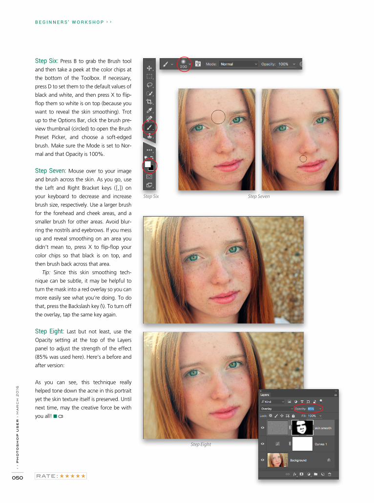
Step Six: Press B to grab the Brush tool
and then take a peek at the color chips at
the bottom of the Toolbox. If necessary,
press D to set them to the default values of
black and white, and then press X to flip-
flop them so white is on top (because you
want to reveal the skin smoothing). Trot
up to the Options Bar, click the brush pre-
view thumbnail (circled) to open the Brush
Preset Picker, and choose a soft-edged
brush. Make sure the Mode is set to Nor-
mal and that Opacity is 100%.
Step Seven: Mouse over to your image
and brush across the skin. As you go, use
the Left and Right Bracket keys ([,]) on
your keyboard to decrease and increase
brush size, respectively. Use a larger brush
for the forehead and cheek areas, and a
smaller brush for other areas. Avoid blur-
ring the nostrils and eyebrows. If you mess
up and reveal smoothing on an area you
didn’t mean to, press X to flip-flop your
color chips so that black is on top, and
then brush back across that area.
Tip: Since this skin smoothing tech-
nique can be subtle, it may be helpful to
turn the mask into a red overlay so you can
more easily see what you’re doing. To do
that, press the Backslash key (\). To turn off
the overlay, tap the same key again.
Step Eight: Last but not least, use the
Opacity setting at the top of the Layers
panel to adjust the strength of the effect
(85% was used here). Here’s a before and
after version:
As you can see, this technique really
helped tone down the acne in this portrait
yet the skin texture itself is preserved. Until
next time, may the creative force be with
you all! ■
Step Six Step Seven
Step Eight


› ›
ph
ot
os
ho
p u
se
r ›
ma
rc
h 2
016
052
GLYN DEWISDynamic Range portraits with depth & dimension
H O W T O › ›
As photographers and retouchers, we know that there are three main elements to a picture that draw the viewer’s atten-tion: light, contrast, and sharpness. When it comes to the light, which is much like dodging and burning in Photoshop, the brighter areas of a picture appear to come forward toward the viewer, whereas the darker areas give the feeling of pulling
In this tutorial, I want to take you through the retouching steps that I currently use to give my portraits added depth and dimension, almost as if the face of the person is coming forward from the screen or page.
away from the viewer. Areas that contain more contrast also draw the viewer’s attention, as do areas of sharpness.
So throughout these retouching steps, you’ll see how light, contrast, and sharpness can be used in combination to boost the depth and dimension in a portrait and give a very distinctive look.
Before
After

› ›
ke
lb
yo
ne
.co
m
053
› › D Y N A M I C R A N G E
Step One: RAW ConversionStarting off in Lightroom, we’ll change the white balance, as the out-of-camera shot is a little on the warm side. With the White Balance Selector (W), click on an area of the back-ground to the right of the man’s head; then reduce the magenta by adding in some green in the Tint slider: around –22 should be enough. With the Spot Removal tool (Q) in the Heal mode, remove some of the blemishes and the hot spot on the man’s nose.
[KelbyOne members may download the file used in this tutorial at http://kelbyone.com/magazine. All files are for personal use only.]
Sharpening to around 55, and then restricting the sharpening to the face by increasing the Masking slider to around 80.
Step Two: Eyes plus SharpeningWhat I love these days about Lightroom, or indeed Camera Raw, is what used to take several steps in Photoshop can be completed in a fraction of the time using the Adjustment Brush (K). So zoom into the eyes and select the Adjustment Brush. Reset all the sliders by double-clicking on the word “Effect” near the top of the Adjustment Brush panel, and increase the Exposure a small amount. Tick the Show Selected Mask Overlay checkbox below the image preview so you can see exactly where you’re painting and, consequently, what areas are going to be adjusted. Use the Bracket keys on your keyboard to quickly change the size of your brush, and then paint over the eyes to select them. Turn off the overlay and then increase the Exposure to around 1.25. Also, add in some Clarity and Sharpness to add punch to the eyes. Press K to deactivate the Adjustment Brush. Finally, zoom out and add some overall sharpening by going to the Detail tab, increasing
Step Three: Dodge & BurnThis is where we start to give our portrait that almost 3D kind of feel rather than being flat and two dimensional. We’ll use dodging and burning, contrast, etc. to add depth and dimension. So, go to Photo>Edit In>Edit in Adobe Pho to shop to export the image to Photoshop and then go
Step One
Step Two

D Y N A M I C R A N G E › ››
› p
ho
to
sh
op
us
er
› m
ar
ch
20
16
054
to Layer>New>Layer. In the New Layer dialog, name the layer “D&B.” In the Mode drop-down menu, choose Soft Light, tick the Fill with Soft-Light-Neutral Color (50% Gray) checkbox, and click OK. Choose the Dodge tool (O) from the Toolbox, and in the Options Bar at the top of the screen, set the Range to Highlights and Exposure to between 5 and 10%. With the Dodge tool, work around the image brightening highlight areas and any other areas you wish to appear closer to the viewer. With the Burn tool (nested under the Dodge tool in the Toolbox), darken the midtone and shadow areas. In the image shown here, I’ve turned off the Background layer so you can better see the areas I dodged and burned.
Step Four: Contrast and SharpeningAdd a merged/stamped layer to the top of the layer stack by pressing Shift-Command-Option-E (PC: Shift-Ctrl-Alt-E). Dou-ble-click the name of this new layer, and rename it “C&S” for contrast and sharpening. Then, go to Filter>Camera Raw Filter and choose the Adjustment Brush. Click on the plus icon to the right of Clarity to set it to +25 and to reset all the other adjustment sliders to zero. Activate the Mask near the bottom of the panel, then paint over the center part of the face. Turn off the Mask overlay, increase the Sharpness to around +10, and Click OK.
Step Three
Step Four

› › D Y N A M I C R A N G E
› ›
ke
lb
yo
ne
.co
m
055
Step Five: DesaturatePress D to set the Foreground and Background colors to their defaults of black and white, respectively, and then click the Cre-ate New Adjustment Layer icon (half-white, half-black circle) at the bottom of the Layers panel to add a Gradient Map adjust-ment layer. Within the Properties panel, click on the gradient ramp to open the Gradient Editor. Drag the white color stop in toward the center. You’ll see a midtone point appear (small diamond) after you drag the white color stop. Drag that mid-tone point to the left a small amount until you get the desired black-and-white conversion. Click OK then reduce the Opacity of this adjustment layer to 30% in the Layers panel.
Step Five
Step Six: Fake Depth of FieldOf course there’s nothing that beats photographing a shal-low depth of field in camera, but we can do a pretty good job faking it using blur in Photoshop. To add to this depth and dimension, add another merged/stamped layer to the top of the layer stack and rename it “IRIS BLUR.” Then, go to Filter>Blur Gallery>Iris Blur and position the oval so that it fills the main face area and extends just beyond the chin. Click on the small dots on the outer circle to rotate the oval, and click-and-drag the white line to resize the oval. Adjust the transition points (the four larger dots inside the oval) individually by holding down the Option (PC: Alt) key and clicking-and-dragging them to ensure that none of the areas you want to be in focus have any blur over them. Increase the Blur amount to around 16 px in the Blur Tools panel and click OK in the Options Bar.
Step Six
Step Seven: Adding TextureNow create two copies of the uppermost layer in the layer stack by holding down the Command (PC: Ctrl) key and pressing J twice. Rename the first copy “Texture” and the second copy (the uppermost layer) “Sharpness.” Click on the Eye icon for the Sharpness layer to turn it off, and with the Texture layer active, go to Filter>Noise>Reduce Noise. Increase the Strength to 10, decrease all of the other sliders
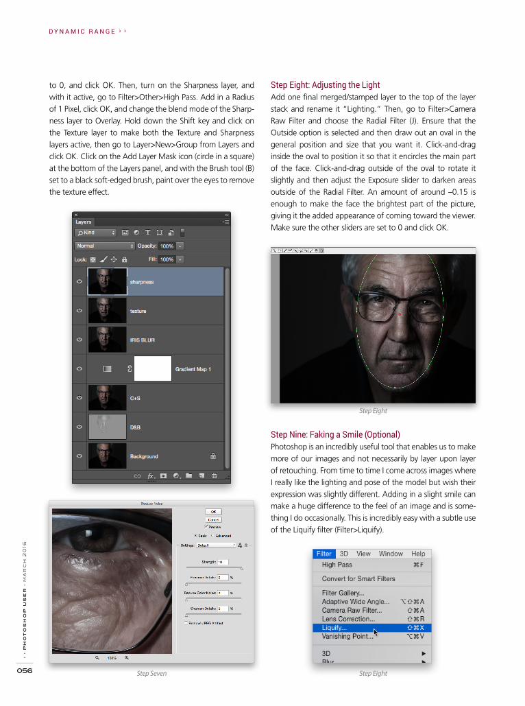
D Y N A M I C R A N G E › ››
› p
ho
to
sh
op
us
er
› m
ar
ch
20
16
056
Step Eight: Adjusting the LightAdd one final merged/stamped layer to the top of the layer stack and rename it “Lighting.” Then, go to Filter>Camera Raw Filter and choose the Radial Filter (J). Ensure that the Outside option is selected and then draw out an oval in the general position and size that you want it. Click-and-drag inside the oval to position it so that it encircles the main part of the face. Click-and-drag outside of the oval to rotate it slightly and then adjust the Exposure slider to darken areas outside of the Radial Filter. An amount of around –0.15 is enough to make the face the brightest part of the picture, giving it the added appearance of coming toward the viewer. Make sure the other sliders are set to 0 and click OK.
to 0, and click OK. Then, turn on the Sharpness layer, and with it active, go to Filter>Other>High Pass. Add in a Radius of 1 Pixel, click OK, and change the blend mode of the Sharp-ness layer to Overlay. Hold down the Shift key and click on the Texture layer to make both the Texture and Sharpness layers active, then go to Layer>New>Group from Layers and click OK. Click on the Add Layer Mask icon (circle in a square) at the bottom of the Layers panel, and with the Brush tool (B) set to a black soft-edged brush, paint over the eyes to remove the texture effect.
Step Nine: Faking a Smile (Optional)Photoshop is an incredibly useful tool that enables us to make more of our images and not necessarily by layer upon layer of retouching. From time to time I come across images where I really like the lighting and pose of the model but wish their expression was slightly different. Adding in a slight smile can make a huge difference to the feel of an image and is some-thing I do occasionally. This is incredibly easy with a subtle use of the Liquify filter (Filter>Liquify).
Step Eight
Step EightStep Seven

› › D Y N A M I C R A N G E
› ›
ke
lb
yo
ne
.co
m
057
ALL IMAGES BY GLYN DEWIS
Tip/Technique: Aperture and Shutter SpeedI’ve always been one for trying to get as many different looks as I can when using the same lighting setup. This can often be achieved by a simple control of the shutter speed. When we’re using off-camera flash, it’s the shutter speed that controls how much ambient light is in our picture, and the aperture that controls the power of the light coming from the flash. Therefore, if we slow the shutter speed down (commonly referred to as dragging the shutter), we can increase the amount of ambient light in our pictures with-out affecting the exposure from the flash. In this example, I wanted more of the background to show through to give greater separation. ■
Before/After
If you have any questions or comments please don’t hesitate to drop me a line at [email protected]. To check out more of my work, visit my blog over at www.glyndewis.com which I update up to five times each week with lots of behind-the-scenes information. There’s also my YouTube channel over at www.youtube.com/glyndewis.


› ›
ph
ot
os
ho
p u
se
r ›
ma
rc
h 2
016
060
H O W T O › ›
SCOTT VALENTINEPhotoshop Proving Ground layers, part 2: blend modes and adjustment layersLast issue, we got into some technical details about layers and how Photoshop passes information through the layer stack from bottom to top. We also introduced Opacity, Blend If, and masks as alpha channels. Whew!
Step Three: Now, change the blending mode of Layer 2 to Subtract using the drop-down menu near the top left of the Layers panel. The pattern should not be symmetric. In my case, I ended up with a black zigzag pattern.
Now let’s put blending modes and adjustment layers in the mix. A major theme from the previous article is “order mat-ters,” so I want you to build a little experiment.
Step One: Start with two blank layers in a new, square docu-ment. Grab your Gradient tool (G) and choose a Spectrum style of gradient from the Gradient Picker in the Options Bar. Also make sure that you have the Linear Gradient icon selected in the Options Bar.
Step Two: On the bottom layer (name it Layer 1), drag from the upper-left corner down to the lower right (hold Shift once you start dragging to constrain it to 45°). On the top layer (name it Layer 2), do the same thing from the upper right to the lower left.
Step Four: Press Shift-Command-Option-E (PC: Shift-Ctrl-Alt-E) to stamp a copy of the results to a new layer, then click its Eye icon to turn it off (I named it “A” in my example). Finally, set Layer 2’s blending mode back to Normal.
Step Five: Drag Layer 1 above Layer 2, and now set it to Sub-tract blending. You should get essentially a mirror image of the previous result!

› ›
ke
lb
yo
ne
.co
m
061
› › P H O T O S H O P P R O V I N G G R O U N D
Step Six: Repeat the stamp copy shortcut to capture the results, and name the new layer “B.” Toggle the visibility of A on and off to see the difference.
Remember that Photoshop is actually doing math. Blend-ing modes are functions that take in values from the lower layer, combine them with the values on the current layer according to some math, and show you a result on the can-vas. Subtract does just what it implies: It subtracts the current layer’s value from the lower layer’s value. When two values are similar, the result is black, or at least very dark.
If you remember basic subtraction, order matters because 100–25=75 (in this example, 100 is a value on the lower layer, and 25 is a value on the blended layer). But 25–100= –75, which is what you get if you reverse the order of the layers.
Now a pixel value of, say, 75 is dark, but not black; how-ever, –75 is tricky. Photoshop doesn’t know how to display negative color values, so anything less than zero becomes black: 0, –75, or –255 all show up as black on the canvas.
Not all of the blending modes behave this way, though. One way to tell which ones don’t care about order is to look at their names. Multiply is a good example. Both 10*20 and 20*10 give you 200. But you can prove this in Photoshop itself. Repeat the above experiment with the Multiply blend mode. What do you notice right away? Now try Hard Mix.
Blend Modes on Adjustment LayersSo how do you use this in real life? To be honest, this is mostly a Photoshop party trick when used by itself. The reason you should know it, however, is because it can play a part in more advanced techniques that use lots of adjust-ment layers and composited elements. You may recall that adjustment layers can have blending modes applied. If you make use of this ability, knowing that some blend modes behave differently can help you troubleshoot or focus in on very specific changes.
The order of your adjustment layers depends on what you want to achieve, and how you use the adjustments. Remem-bering that the output of one layer is the input to the next, you can easily clip or oversaturate your image even when making small changes to sliders. Or, you may remove the function of an adjustment layer altogether. Let’s say you add a Black & White adjustment layer to your image. Putting a Hue/Saturation adjustment layer above that won’t have any effect except with the Lightness slider. The Black & White adjustment has removed the color input for the Hue and Saturation sliders.
But if you swap them, putting the Hue/Saturation layer first, it absolutely controls how the Black & White adjustment behaves. In fact, it gives you much more control over your final output. Alternatively, one of my favorite black-and-white conversion techniques involves using Black & White adjustment layers set to Luminosity blending mode, which brings me to my final point.
When you change the blending mode of an adjustment layer, you’re getting a twofer! As I mentioned above, you get the control of the adjustment along with the math of the blending mode. And you do it on a single layer!
I can hear you thinking now, “But, Scott! Which happens first—the blend mode or the adjustment layer?” Excellent question, you sly dog.
It turns out that the blend mode is applied first. The results of the blend are sent to the adjustment. You can’t change this, but you can add multiple adjustment layers.
Contrast and ColorIn this example layer stack (see next page), I have two Curves adjustments. The one in the middle (Curves 1) is meant to bring out detail in the sky. Notice that there’s a Color Balance layer above it, and a Black & White adjustment below it. Both the
You should get a symmetrical pattern. If you swap layers, you get the same result. Of course not every image will give you a pattern like this. The gradients are set up specifically to demonstrate the difference between blending modes that care about layer order and those that don’t.

› ›
ph
ot
os
ho
p u
se
r ›
ma
rc
h 2
016
062
P H O T O S H O P P R O V I N G G R O U N D › ›
ALL IMAGES BY SCOTT VALENTINE
Curves 1 and Black & White 1 layers are set to Luminosity blend mode. (Note: Luminosity blend mode allows the adjustment layer to ignore color information and only look at brightness.)
adjustment. Since Curves can shift colors around, I wanted to minimize the number of color changes to deal with, so that layer is also set to Luminosity.
Once I had the contrast set up mostly the way I wanted it, Color Balance let me remove a yellow cast from the original image. The Curves adjustment at the top is masked to affect only the sky, and it’s set to Color Burn blending mode, with 65% Opacity.
Moving these layers around would give me a very different look, and require different settings in order to get the result I wanted; however, if you like to work with color before con-trast, your layer order would be different than mine, and you’d probably have more color controls than I used (see below).
And that’s perfectly fine! As with most things in Photo-shop, there’s no right way; there’s only the way that gets you the results you want along the path you know.
To wrap things up, layers are the foundation of Photo-shop’s power. They have some special properties that let you control how they interact with each other, so it’s vital to understand that they’re more than little pixel buckets. Think of them as another kind of control, a physical way to work on your images. ■
The reason for this is that I prefer to work by adjusting contrast before color. The Black & White layer set to Luminos-ity allows me to adjust the relative values of each color range without actually shifting the color. That feeds into the Curves

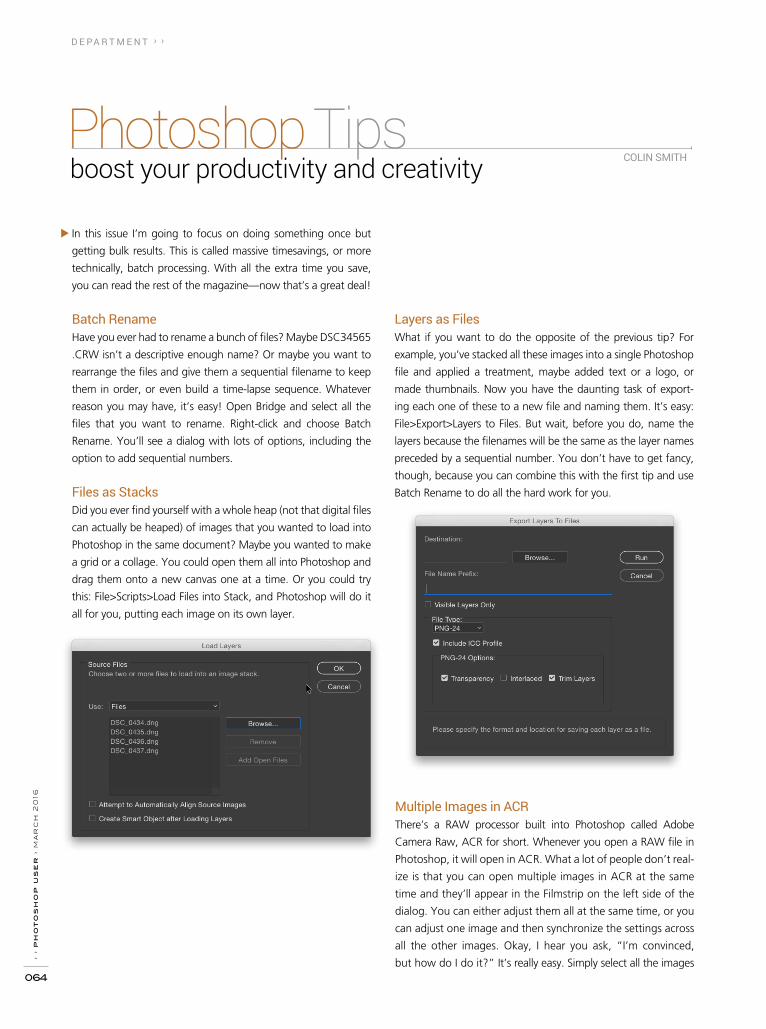
› ›
ph
ot
os
ho
p u
se
r ›
ma
rc
h 2
016
064
D E PA R T M E N T › ›
Photoshop Tips boost your productivity and creativity
In this issue I’m going to focus on doing something once but
getting bulk results. This is called massive timesavings, or more
technically, batch processing. With all the extra time you save,
you can read the rest of the magazine—now that’s a great deal!
Batch RenameHave you ever had to rename a bunch of files? Maybe DSC34565
.CRW isn’t a descriptive enough name? Or maybe you want to
rearrange the files and give them a sequential filename to keep
them in order, or even build a time-lapse sequence. Whatever
reason you may have, it’s easy! Open Bridge and select all the
files that you want to rename. Right-click and choose Batch
Rename. You’ll see a dialog with lots of options, including the
option to add sequential numbers.
Files as StacksDid you ever find yourself with a whole heap (not that digital files
can actually be heaped) of images that you wanted to load into
Photoshop in the same document? Maybe you wanted to make
a grid or a collage. You could open them all into Photoshop and
drag them onto a new canvas one at a time. Or you could try
this: File>Scripts>Load Files into Stack, and Photoshop will do it
all for you, putting each image on its own layer.
Layers as FilesWhat if you want to do the opposite of the previous tip? For
example, you’ve stacked all these images into a single Photoshop
file and applied a treatment, maybe added text or a logo, or
made thumbnails. Now you have the daunting task of export-
ing each one of these to a new file and naming them. It’s easy:
File>Export>Layers to Files. But wait, before you do, name the
layers because the filenames will be the same as the layer names
preceded by a sequential number. You don’t have to get fancy,
though, because you can combine this with the first tip and use
Batch Rename to do all the hard work for you.
Multiple Images in ACRThere’s a RAW processor built into Photoshop called Adobe
Camera Raw, ACR for short. Whenever you open a RAW file in
Photo shop, it will open in ACR. What a lot of people don’t real-
ize is that you can open multiple images in ACR at the same
time and they’ll appear in the Filmstrip on the left side of the
dialog. You can either adjust them all at the same time, or you
can adjust one image and then synchronize the settings across
all the other images. Okay, I hear you ask, “I’m convinced,
but how do I do it?” It’s really easy. Simply select all the images
COLIN SMITH

› › P H O T O S H O P T I P S
› ›
ke
lb
yo
ne
.co
m
065
in Bridge that you want to open (RAW, JPEG, TIFF, PNG, or a
combination of any of these file formats), Right-click on one of
the selected images, and choose Open in Camera RAW. At the
top of the Filmstrip in ACR there’s a flyout menu where you can
choose Select All so all the images will change together in real
time. You can also adjust one of the images to your liking and
then, from the same flyout menu, choose Select All, followed by
Sync Settings. You can also click on any of the thumbnails on the
Filmstrip to make it the active image.
Apply Settings in BridgeWhat if I told you that there’s a way to apply ACR presets to
images without even launching Photoshop or Lightroom? Would
you think I’m nuts? Quick, before you answer that, let me show
you how. Open your image in Bridge and Right-click on it. Do
you see the Develop Settings option in the contextual menu?
If you hover over Develop Settings, you’ll see a list of all the pre-
sets currently loaded into ACR. Click one to apply it to the image.
You can select multiple images and apply the preset to all of
them at once just as easily as a single image, all without launch-
ing Photoshop.
Change All FontsHave you ever worked on a document that had multiple blocks
of type in it? If you’ve worked with type, the answer is probably
yes. Second question: Have you ever changed the font in all the
blocks one at a time? Bad typesetter, bad typesetter! You can
change all the blocks of type at the same time. Select all the type
layers in the Layers panel, then change the font, the size, or any
property, such as color, and you’ll see that all the text changes at
the same time. That’s not only handy, that’s fast!
Double RAW ProcessingHave you ever applied an adjustment in Camera Raw and
wished the slider went further? For example, you’re recovering
high lights with the High-
lights slider, but it’s all the
way to the left, and you
know there’s more detail
that you just can’t get
to. Here’s a sneaky way
around that: Make your
adjustment, then create a
Radial Filter (J) adjustment,
and make the oval large
enough to cover the entire
image. Now you have a
whole array of sliders all
ready for you to push the
boundaries. Call it turbo
processing if you like.
Duplicating Multiple Layers at OnceYou may already be aware that you can duplicate a layer right
onscreen by activating the Move tool (V), holding down the
Option (PC: Alt) key, and dragging out a duplicate. What you
may not have known is this: You can duplicate multiple layers
at one time. Let me explain. Go to the Layers panel, hold down
the Command (PC: Ctrl) key, and click on different layers to
select them. With multiple layers selected, hold down Option
(PC: Alt) and drag on the page. All the selected layers will now
be duplicated. ■
ALL IMAGES BY COLIN SMITH

>>LIGHT IT
OKAY, I’LL ADMIT I WASN’T EVEN BORN WHEN FILM NOIR WAS IN
ITS HEYDAY; BUT AFTER WATCHING CURRENT FILMS INFLUENCED
BY FILM NOIR SUCH AS NIGHTCRAWLER, THE DARK NIGHT, AND
SIN CITY, I WAS HOOKED. THERE’S SOMETHING ABOUT THAT
BLACK-AND-WHITE CINEMATIC STYLE OF THE 1940S AND 50S THAT
INSPIRES BOTH FILMMAKERS AND PHO TOGRAPHERS. DON’T GET
ME WRONG; I LOVE SHOOTING IN COLOR. BUT ONCE IN A WHILE IT’S GOOD TO GO
BACK TO YOUR ROOTS TO GET PERSPECTIVE ON YOUR FUTURE. MY ROOTS ARE
IN BLACK-AND-WHITE PHOTOGRAPHY, AND FILM NOIR WAS BASED IN GRITTY,
HARD-EDGED BLACK-AND-WHITE IMAGERY.
FILM NOIR: A CLASSIC STYLE WITH A MODERN TWIST
By Tom Bol

› ›
ke
lb
yo
ne
.co
m
067
› › L I G H T I T› › L I G H T I T
W hat is film noir? French for “black film,” film noir
is a cinematic style characterized by stark shadows,
gloomy urban scenes, alleys, femme fatales, cig-
arettes, and lurking figures—all shot at night. Storylines often
revolved around doomed romance and crime drama. Women
wore elegant dresses and heavy lipstick. Men were often in
trench coats and fedoras. With all these elements and moods at
play, photographing a film noir scene takes a little preparation
and planning. But the results are worth it.
I wanted to create photographs inspired by film noir, but
with a modern twist. Rather than shoot strictly in black and
white, I planned to photograph in color, convert to black and
white, and then bring back subtle color tones to the images.
This is more along the lines of neo-noir: films that were shot in
color but inspired by classic black-and-white film noir.
STEP ONE: FIND THE GRITTY ALLEYIntegral to film noir is a gritty urban backdrop, and more often
than not, an ominous alley is the scene setter. You can’t say
enough about how important a gritty urban scene is to creating
a successful film noir shot. I live in a city that has an old-town
district where many aged brick buildings still stand, and find-
ing a dark alley isn’t too hard. One important tip for scouting
film noir scenes is to scout them at night. During the day, this
alley looked great; but when I went back at night, it looked
even better. Overhead streetlights illuminated the alley. I could
easily overpower these lights with my strobes, but also let them
render in the final image to add some ambience to the scene.
I loved the depth of this alley; it would create a tunnel effect
and leading lines in the final image.

› ›
ph
ot
os
ho
p u
se
r ›
ma
rc
h 2
016
068
L I G H T I T › ›
STEP TWO: TAKE THE FIRST SHOTOn just about every shoot I do, nothing seems right until I take
the first shot. But once I take that image, then the photo shoot
flows smoothly. I decided the best packs for this shoot were
Elinchrom ELB 400s. These compact battery-powered packs
have more than 424Ws of power, are lightweight, and can be
easily controlled at the camera using the EL-Skyport Plus HS.
This transmitter shows each unit on the LCD, allowing intuitive
power control of multiple packs.
To illuminate the lurking gangster in the background,
I placed another ELB 400 to his side and attached a 20° grid
onto a Quadra Action flash head. Once again, I only wanted
light on the model, and not all over the alley walls. The over-
head streetlight added a warm glow to the scene. This image
was looking good (see next page), but the models were far
apart, so we moved to the second location I had scouted.
Another important thing to consider when shooting at
night is the minimum power output of your strobes. I took a
test shot of the alley and realized I needed an exposure of f/4,
1/30, at ISO 800. To get the correct amount of light out of my
flash, I needed a very low power setting. The ELB 400s can go
all the way down to 7Ws, plenty low enough to shoot at night
with a high ISO setting.
To start things off, I positioned my femme fatale model, Lily,
close to the camera and had my male “gangster” model in the
back of the alley. Another characteristic of film noir is the use
of wide-angle lenses and low angles, both of which I planned
to use with this image. I used my Nikon D810 and a NIKKOR 24–70mm F2.8 the entire shoot. My main light on Lily was a
14x35" Elinchrom Rotalux Strip Softbox with a Lighttools 40° egg crate grid. The grid kept the light from spilling onto the
alley walls, and gave the light strong direction and shadow.
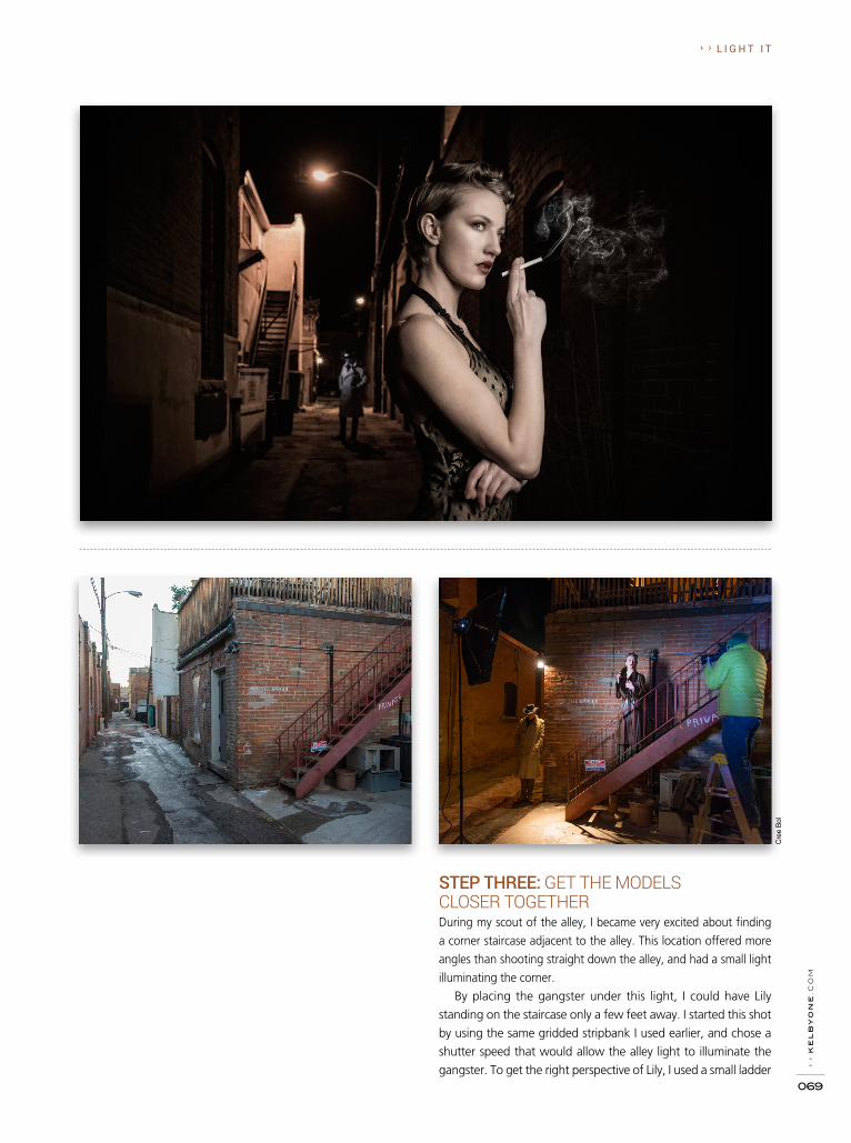
› ›
ke
lb
yo
ne
.co
m
069
› › L I G H T I T
Cre
e B
ol
STEP THREE: GET THE MODELS CLOSER TOGETHERDuring my scout of the alley, I became very excited about finding
a corner staircase adjacent to the alley. This location offered more
angles than shooting straight down the alley, and had a small light
illuminating the corner.
By placing the gangster under this light, I could have Lily
standing on the staircase only a few feet away. I started this shot
by using the same gridded stripbank I used earlier, and chose a
shutter speed that would allow the alley light to illuminate the
gangster. To get the right perspective of Lily, I used a small ladder
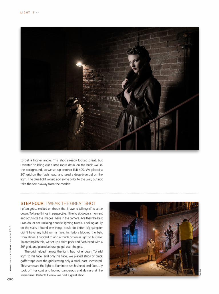
› ›
ph
ot
os
ho
p u
se
r ›
ma
rc
h 2
016
070
L I G H T I T › ›
Cre
e B
ol
STEP FOUR: TWEAK THE GREAT SHOTI often get so excited on shoots that I have to tell myself to settle
down. To keep things in perspective, I like to sit down a moment
and scrutinize the images I have in the camera. Are they the best
I can do, or am I missing a subtle lighting tweak? Looking at Lily
on the stairs, I found one thing I could do better: My gangster
didn’t have any light on his face; his fedora blocked the light
from above. I decided to add a touch of warm light to his face.
To accomplish this, we set up a third pack and flash head with a
20° grid, and placed an orange gel over the grid.
The grid helped narrow the light, but not enough. To add
light to his face, and only his face, we placed strips of black
gaffer tape over the grid leaving only a small part uncovered.
This narrowed the light to illuminate just his head and face. Lily
took off her coat and looked dangerous and demure at the
same time. Perfect! I knew we had a great shot.
to get a higher angle. This shot already looked great, but
I wanted to bring out a little more detail on the brick wall in
the background, so we set up another ELB 400. We placed a
20° grid on the flash head, and used a deep-blue gel on the
light. The blue light would add some color to the wall, but not
take the focus away from the models.

› ›
ke
lb
yo
ne
.co
m
071
› › L I G H T I T
Cre
e B
ol
STEP FIVE: EXPECT THE UNEXPECTEDIf you asked me what one of the most important things is about
shooting on location, I’d tell you to roll with the punches. Photo
shoots are fluid, and sometimes the best shots are unscripted
moments and unexpected locations. The temperature was in
the teens, so everyone was getting cold and ready to head to
the local pub. But just as we were wrapping up, I noticed an
amazing side alley I’d missed earlier. What was so appealing
about this alley were the tall brick walls, which would be perfect
for projecting a menacing shadow in the background.
Working quickly, we set up the same main light (gridded
stripbox) and placed it close to Lily. To create the shadow, we
placed a 20° gridded light off to the side and aimed it at the
gangster standing about 10' away. This hard-edged light pro-
duced a nice ominous shadow on the wall behind Lily. This
was a bonus shot for the night. I loved the shadow element—
classic film noir.
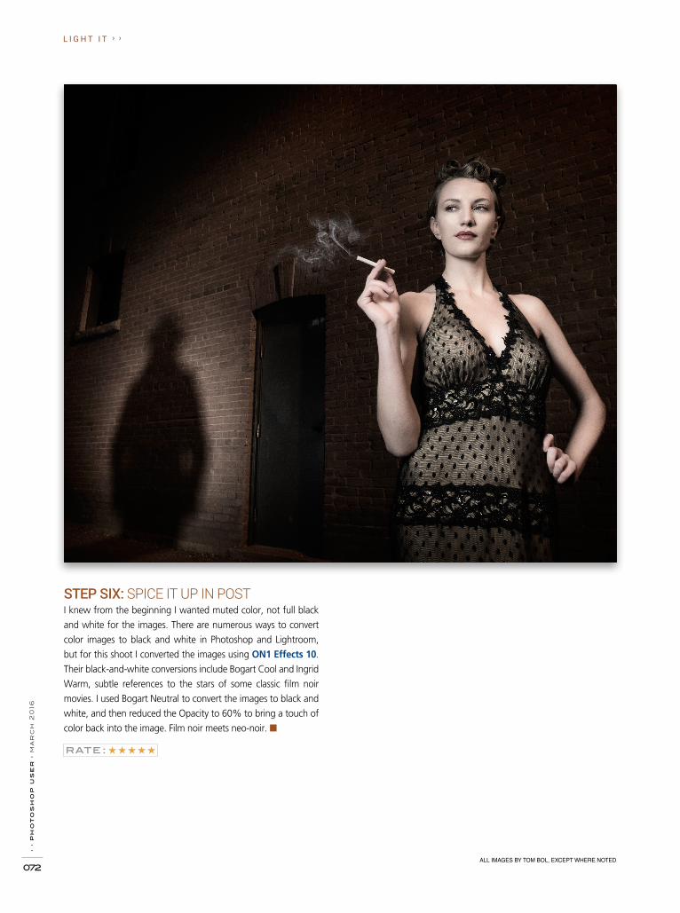
› ›
ph
ot
os
ho
p u
se
r ›
ma
rc
h 2
016
072
L I G H T I T › ›
ALL IMAGES BY TOM BOL, EXCEPT WHERE NOTED
STEP SIX: SPICE IT UP IN POSTI knew from the beginning I wanted muted color, not full black
and white for the images. There are numerous ways to convert
color images to black and white in Photoshop and Lightroom,
but for this shoot I converted the images using ON1 Effects 10.
Their black-and-white conversions include Bogart Cool and Ingrid
Warm, subtle references to the stars of some classic film noir
movies. I used Bogart Neutral to convert the images to black and
white, and then reduced the Opacity to 60% to bring a touch of
color back into the image. Film noir meets neo-noir. ■

DO YOU HAVE THOUSANDS OF OLDER, LESS-THAN-STELLAR FAMILY PHOTOS SITTING IN YOUR LIGHTROOM CATALOG? WE’LL SHOW YOU HOW TO CORRECT SOME OF THE MOST
COMMON PROBLEMS FOUND IN THESE TYPES OF PHOTOS. p80
UNDER THE LOUPE
LIGHTROOMTHE ADOBE
®
PHOTOSHOP®
LIGHTROOM®
HOW-TO MAGAZINE ISSUE 19MAGAZINE
LIGHTROOM WORKSHOPLearn how to quickly retouch portraits using the powerful Adjustment Brush & Spot Removal tool in Lightroom. p75
MAXIMUM WORKFLOWPortraiture from Imagenomic can help you quickly smooth & enhance the skin in all of your portraits in Lightroom. p86
PHOTO BY SCOTT KELBY

Seán D
uggan
Rob S
ylvan
Under the Loupefixing fam
ily photos in lightroomB
Y R
OB
SY
LV
AN
80
Scott K
elby
Lightroom W
orkshopretouching portraitsB
Y S
CO
TT
KE
LB
Y
75S
ean McC
ormack
Maxim
um W
orkflowim
agenomic portraiture
BY
SE
AN
Mc
CO
RM
AC
K
86
Rob S
ylvan
&
Questions Answers
BY
SC
OT
T K
EL
BY
92 94
&
Tips Tricks
BY
SE
ÁN
DU
GG
AN
lightroom magazine › contents › ›

retouching portraitsLightroom Workshop
B Y S C O T T K E L B Y
When it comes to detailed retouching, I generally
jump over to Adobe Photoshop, but if you just
need to do a quick retouch, it’s amazing how
many things you can do right in Lightroom
using the Adjustment Brush and the Spot Re-
moval tool, with its healing power. Here’s a quick
retouch using just those two tools.Excerpted from The Adobe Photoshop
Lightroom CC Book for Digital Photographers
› › l i g h t r o o m m a g a z i n e › ›

› ›
ph
ot
os
ho
p u
se
r ›
ma
rc
h 2
016
076
step one: Here are the things we’re going to retouch in this image: (1) remove any major blem-ishes and wrink les, (2) soften her skin, (3) brighten the whites of her eyes, (4) add contrast to her eyes and sharpen them, and (5) add some highlights to her hair. Although we’re see ing the full image here, for retouching, it’s best to zoom in quite a bit. So, go ahead and zoom in nice and tight to start the next step. By the way, I thought her skin looked a little too warm in the original image, so here I reduced the Vibrance to –21 (just so you know).
step two: Here, I’ve zoomed in to a 1:2 view, so we can really see what we’re doing (just select this zoom ratio from the pop-up menu at the top right of the Navigator panel, at the top of the left side Panels area). Click on the Spot Removal tool (in the tool-box near the top of the right side Panels area or just press the letter Q). This tool works with just a single click, but you don’t want to retouch any more than is necessary, so make the brush Size of the tool just a little bit larger than the blem-
ish you’re going to remove. Move your brush cursor over the blemish and then just click once. A second circle will appear showing you from where it sampled a clean skin texture. Of course, it’s not always 100% right, and if for some reason it chose a bad area of skin to sample from, just click on that second circle, drag it to a clean patch, and it will update your blemish removal. Go ahead and remove any blemishes now using this tool (as shown here).
› › l i g h t r o o m m a g a z i n e › ›
SC
OT
T K
ELB
Y

› ›
ke
lb
yo
ne
.co
m
077
step three: Now, let’s remove some wrinkles under her eyes. Zoom in tighter (this is a 1:1 view), then take the same Spot Removal tool we’ve been using (make sure it’s set to Heal) and paint a stroke over the wrin-kles under her eye on the right (as shown here). The area you’ve painted over turns white (as seen here), so you can see the area you’re affecting.
step four: Lightroom analyzes the area and picks a spot somewhere else in the image to use to repair those wrinkles. It usually picks something nearby, but in this case it chose an area across the bridge of her nose, which, of course, created a bad retouch. Luckily, if you don’t like where Lightroom chose to sample from, you can simply have it sample somewhere else by clicking on that second outline (the thin-ner one of the two) and dragging it some-where on her face where you think the texture and tone will match better (here, I moved it right up under the original area where the wrinkles used to be, as shown in the bottom image). Also, don’t forget to remove the wrinkles from beneath the other eye (it’s easier to forget than you’d think). Note: If your subject is at an age where fully removing the wrinkles would be un realistic, we would instead need to “reduce” the wrinkles, so we would decrease the Opacity slider to lower the strength of the removal, bringing back some of the original wrinkles.
› › l i g h t r o o m m a g a z i n e › ›

› ›
ph
ot
os
ho
p u
se
r ›
ma
rc
h 2
016
078
step five:Now that the blemishes and wrinkles are removed, let’s do some skin softening. Switch to the Adjustment Brush (also in the toolbox near the top of the right side Panels area, or just press the letter K), then choose Soften Skin from the Effect pop-up menu. Now paint over her face, but be careful to avoid any areas that you don’t want softened, like her eyelashes, eyebrows, lips, nostrils, hair, the edges of her face, and so on. This softens the skin by giving you a negative Clarity setting (it’s set at –100). Here, I’ve only painted over the right si de of her face, so you can see the difference. This is quite a lot of softening, so once you’re done, back off the Clarity amount so you can still see skin detail (I raised my amount to –55).
step six:Next, let’s work on her eyes, and we’ll start by making the whites brighter. First, click the New button in the top right of the panel, then double-click on the word “Effect” to reset all the sliders to zero. Now, drag the Exposure slider to the right a little bit (here, I dragged it over to +1.04) and paint over the whites of her eyes. If you accidentally paint outside the whites, just press-and-hold the Option (PC: Alt) key to switch to the Erase tool and erase away any spillover. Do the same for the other eye and, when you’re done, adjust the Exposure slider, as needed, to where the whitening looks natural. Next, let’s brighten her irises. Click the New but-ton, and increase the Exposure amount to +1.36 and paint over both irises. Then, to add some contrast, increase the Contrast slider to +33. Lastly, to make those eyes really nice and sharp, increase the Sharp-ness slider to +22, so the irises get brighter, more contrasty, and sharper all at the same time.
› › l i g h t r o o m m a g a z i n e › ›
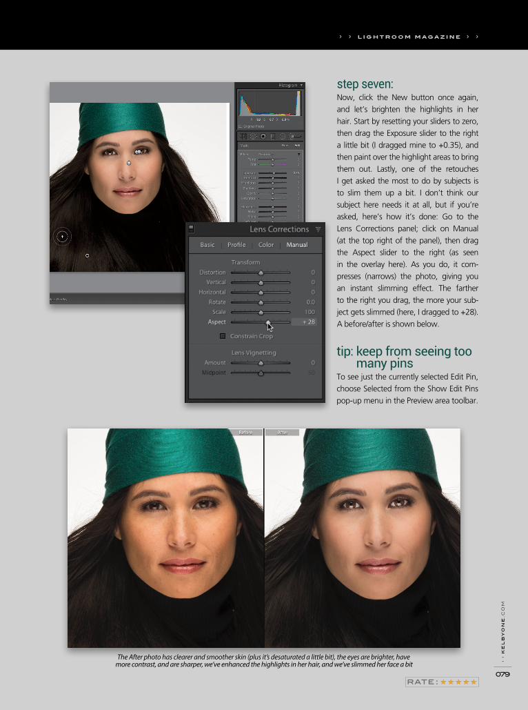
› ›
ke
lb
yo
ne
.co
m
079
step seven:Now, click the New button once again, and let’s brighten the highlights in her hair. Start by resetting your sliders to zero, then drag the Exposure slider to the right a little bit (I dragged mine to +0.35), and then paint over the highlight areas to bring them out. Lastly, one of the retouches I get asked the most to do by subjects is to slim them up a bit. I don’t think our subject here needs it at all, but if you’re asked, here’s how it’s done: Go to the Lens Corrections panel; click on Manual (at the top right of the panel), then drag the Aspect slider to the right (as seen in the overlay here). As you do, it com-presses (narrows) the photo, giving you an instant slimming effect. The farther to the right you drag, the more your sub-ject gets slimmed (here, I dragged to +28). A before/after is shown below.
tip: keep from seeing too many pins
To see just the currently selected Edit Pin, choose Selected from the Show Edit Pins pop-up menu in the Preview area toolbar.
› › l i g h t r o o m m a g a z i n e › ›
The After photo has clearer and smoother skin (plus it’s desaturated a little bit), the eyes are brighter, have more contrast, and are sharper, we’ve enhanced the highlights in her hair, and we’ve slimmed her face a bit

Under the
LoupeThe objects we’re most likely to grab on the way out of a burning building are our family photos. Here are some tips to help you get the most out of Lightroom when trying to make corrections to the most common issues you’ll encounter with older digital photos.
fixing family photos in LightroomB Y R O B S Y L V A N
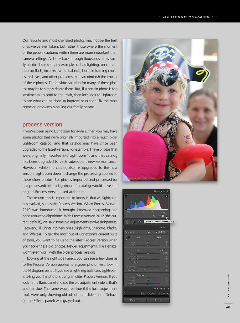
› ›
ke
lb
yo
ne
.co
m
081
Our favorite and most cherished photos may not be the best
ones we’ve ever taken, but rather those where the moment
or the people captured within them are more important than
camera settings. As I look back through thousands of my fam-
ily photos, I see so many examples of bad lighting, on-camera
pop-up flash, incorrect white balance, horrible framing choic-
es, red eyes, and other problems that can diminish the impact
of these photos. The obvious solution for many of these pho-
tos may be to simply delete them. But, if a certain photo is too
sentimental to send to the trash, then let’s look to Lightroom
to see what can be done to improve or outright fix the most
common problems plaguing our family photos.
process versionIf you’ve been using Lightroom for awhile, then you may have
some photos that were originally imported into a much older
Lightroom catalog, and that catalog may have since been
upgraded to the latest version. For example, I have photos that
were originally imported into Lightroom 1, and that catalog
has been upgraded to each subsequent new version since.
However, while the catalog itself is upgraded to the new
version, Lightroom doesn’t change the processing applied to
these older photos. So, photos imported and processed (or
not processed) into a Lightroom 1 catalog would have the
original Process Version used at the time.
The reason this is important to know is that as Lightroom
has evolved, so has the Process Version. When Process Version
2010 was introduced, it brought improved sharpening and
noise reduction algorithms. With Process Version 2012 (the cur-
rent default), we saw some old adjustments evolve (Brightness,
Recovery, Fill Light) into new ones (Highlights, Shadows, Blacks,
and Whites). To get the most out of Lightroom’s current suite
of tools, you want to be using the latest Process Version when
you tackle these old photos. Newer adjustments, like Dehaze,
won’t even work with the older process versions.
Looking at the right side Panels, you can see a few clues as
to the Process Version applied to a given photo. First, look in
the Histogram panel. If you see a lightning bolt icon, Lightroom
is telling you this photo is using an older Process Version. If you
look in the Basic panel and see the old adjustment sliders, that’s
another clue. The same would be true if the local adjustment
tools were only showing old adjustment sliders, or if Dehaze
(in the Effects panel) was grayed out.
› › l i g h t r o o m m a g a z i n e › ›
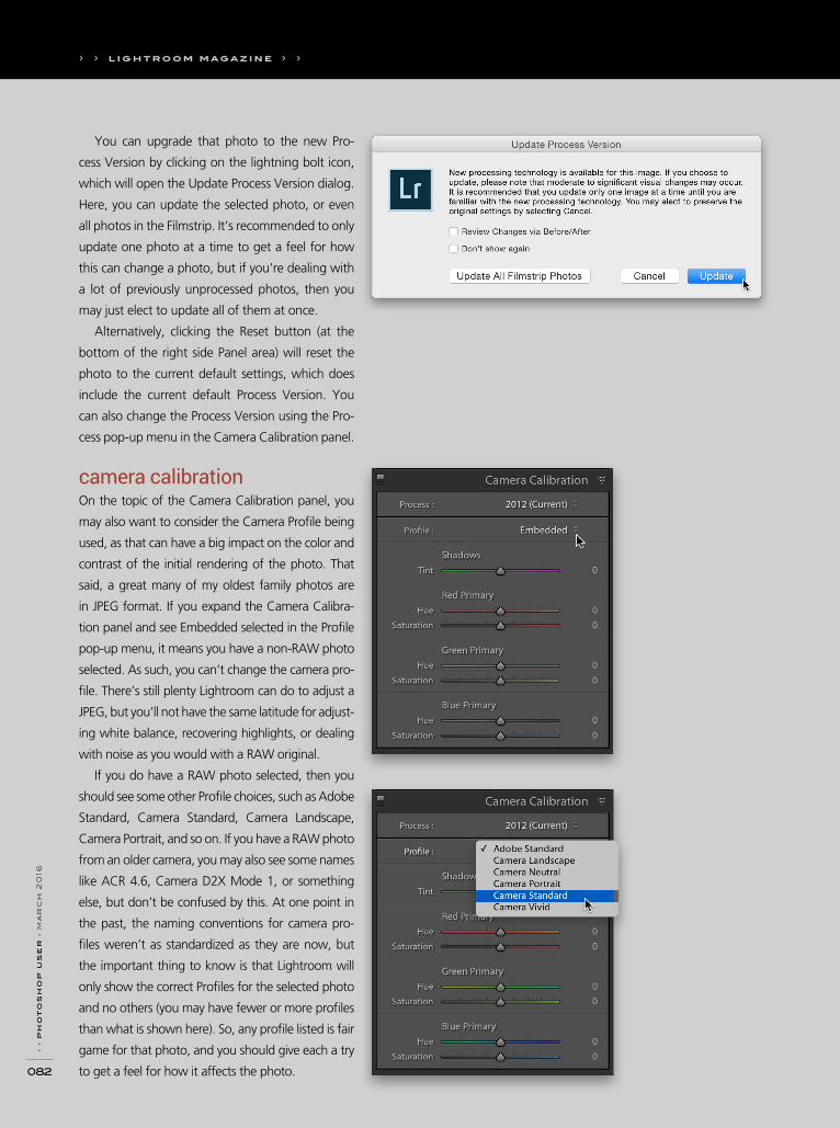
› ›
ph
ot
os
ho
p u
se
r ›
ma
rc
h 2
016
082
You can upgrade that photo to the new Pro-
cess Version by clicking on the lightning bolt icon,
which will open the Update Process Version dialog.
Here, you can update the selected photo, or even
all photos in the Filmstrip. It’s recommended to only
update one photo at a time to get a feel for how
this can change a photo, but if you’re dealing with
a lot of previously unprocessed photos, then you
may just elect to update all of them at once.
Alternatively, clicking the Reset button (at the
bottom of the right side Panel area) will reset the
photo to the current default settings, which does
include the current default Process Version. You
can also change the Process Version using the Pro-
cess pop-up menu in the Camera Calibration panel.
camera calibrationOn the topic of the Camera Calibration panel, you
may also want to consider the Camera Profile being
used, as that can have a big impact on the color and
contrast of the initial rendering of the photo. That
said, a great many of my oldest family photos are
in JPEG format. If you expand the Camera Calibra-
tion panel and see Embedded selected in the Profile
pop-up menu, it means you have a non-RAW photo
selected. As such, you can’t change the camera pro-
file. There’s still plenty Lightroom can do to adjust a
JPEG, but you’ll not have the same latitude for adjust-
ing white balance, recovering highlights, or dealing
with noise as you would with a RAW original.
If you do have a RAW photo selected, then you
should see some other Profile choices, such as Adobe
Standard, Camera Standard, Camera Landscape,
Camera Portrait, and so on. If you have a RAW photo
from an older camera, you may also see some names
like ACR 4.6, Camera D2X Mode 1, or something
else, but don’t be confused by this. At one point in
the past, the naming conventions for camera pro-
files weren’t as standardized as they are now, but
the important thing to know is that Lightroom will
only show the correct Profiles for the selected photo
and no others (you may have fewer or more profiles
than what is shown here). So, any profile listed is fair
game for that photo, and you should give each a try
to get a feel for how it affects the photo.
› › l i g h t r o o m m a g a z i n e › ›
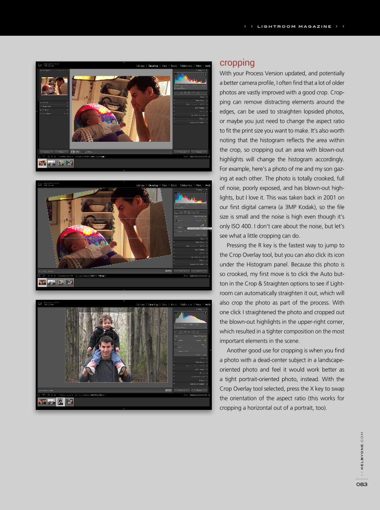
› ›
ke
lb
yo
ne
.co
m
083
croppingWith your Process Version updated, and potentially
a better camera profile, I often find that a lot of older
photos are vastly improved with a good crop. Crop-
ping can remove distracting elements around the
edges, can be used to straighten lopsided photos,
or maybe you just need to change the aspect ratio
to fit the print size you want to make. It’s also worth
noting that the histogram reflects the area within
the crop, so cropping out an area with blown-out
highlights will change the histogram accordingly.
For example, here’s a photo of me and my son gaz-
ing at each other. The photo is totally crooked, full
of noise, poorly exposed, and has blown-out high-
lights, but I love it. This was taken back in 2001 on
our first digital camera (a 3MP Kodak), so the file
size is small and the noise is high even though it’s
only ISO 400. I don’t care about the noise, but let’s
see what a little cropping can do.
Pressing the R key is the fastest way to jump to
the Crop Overlay tool, but you can also click its icon
under the Histogram panel. Because this photo is
so crooked, my first move is to click the Auto but-
ton in the Crop & Straighten options to see if Light-
room can automatically straighten it out, which will
also crop the photo as part of the process. With
one click I straightened the photo and cropped out
the blown-out highlights in the upper-right corner,
which resulted in a tighter composition on the most
important elements in the scene.
Another good use for cropping is when you find
a photo with a dead-center subject in a landscape-
oriented photo and feel it would work better as
a tight portrait-oriented photo, instead. With the
Crop Overlay tool selected, press the X key to swap
the orientation of the aspect ratio (this works for
cropping a horizontal out of a portrait, too).
› › l i g h t r o o m m a g a z i n e › ›

› ›
ph
ot
os
ho
p u
se
r ›
ma
rc
h 2
016
084
rotatingThese days, digital cameras have a built-in means
to determine which orientation the camera was held
when the photo was taken. The information is writ-
ten into the photo’s metadata so that programs like
Lightroom can automatically rotate the photo to
display it correctly; however, this was not true of
early digital cameras. If you scan through Grid view
in the Library module, and come across photos lying
on their sides, you can easily rotate them all together.
Just select all of the photos that need to be rotated
the same amount in the same direction while in
Grid view (press-and-hold the Command [PC: Ctrl]
key to select non-contiguous photos, or press-and-
hold the Shift key to select the first and last photo in
a continuous row). Then, click the correct rotational
arrow that appears on the thumbnail, or choose
the desired option from the Photo menu, to quickly
rotate them all at once.
red eye reductionThe only time I seem to reach for the Red Eye Correc-
tion tool is with those old family photos taken
during parties and holidays when the camera just
gets passed around to family members. Over time,
these can be some of the most fun photos you
have. Lightroom’s Red Eye Correction tool doesn’t
have a keyboard shortcut, so you’ll have to click its
icon under the Histogram panel to enable it. Once
enabled, click-and-drag from the center of the red
eye, and then release your mouse once you get
outside the eye. Lightroom automatically attempts
to detect the red and apply a correction. You can
then use the Pupil Size and Darken sliders to refine
the adjustment. Once I’ve done the first eye, I usu-
ally just click on the second eye to use the same
size circle I created previously.
› › l i g h t r o o m m a g a z i n e › ›

› ›
ke
lb
yo
ne
.co
m
085
Our pets are people, too, so don’t let a demonic
dog or cat ruin an otherwise memorable keepsake.
With the Red Eye Correction tool enabled, click
the Pet Eye tab in the tool options to switch over
to the new feature added in Lightroom CC. The
original Red Eye Correction tool doesn’t work on
the yellow/green eyes we see in our dogs and cats,
but this new addition can improve the situation.
It isn’t perfect, so don’t expect miracles, but it can
tone down a laser yellow eye to save the photo. The
Pet Eye option will only let you adjust the Pupil Size
after the correction is made, so you can’t darken
it any further; however, it does have the option
to add a catchlight, which can give life to what
otherwise may look like a dead black hole after
the correction. ■
› › l i g h t r o o m m a g a z i n e › ›
ALL IMAGES BY ROB SYLVAN

B Y S E A N M c C O R M A C K
imagenomic portraiture
While Photoshop is definitely the king of high-end
retouching, it’s possible to do quite a lot of beauty
retouching in Lightroom and get a professional
result. It does take a lot of time and care, though.
Often, you may need to get photos out quickly, or
process a lot of images, be it for a client, or even
for friends and family, so you don’t have the time.
This is where a product such as Portraiture from
Imagenomic excels.
Maximum Workflow

› ›
ke
lb
yo
ne
.co
m
087
As well as offering a lot of control over
the amount of smoothing of skin, Portrai-
ture provides an effective masking system,
meaning only the skin itself is being worked
on, leaving the rest of the image alone.
Portraiture is available for both Photoshop
and Lightroom. The main difference with
the Photoshop version is that it allows the
plug-in results to be saved to a layer with a
transparency mask, something not possible
with Lightroom because Lightroom doesn’t
handle layers directly. With a little care, this
isn’t an issue; it just means refining the
mask more inside the plug-in.
installationPortraiture has a straightforward installa-
tion process. You begin with Lightroom
closed (this is so the Export presets and
Edit In plug-ins are active when Lightroom
is launched). Run the installer, select the
installation location, and off you go.
When you launch Lightroom, Portraiture
now appears as an option in the Photo>Edit
In menu, as well as in the Export To drop-
down menu in the Export dialog. Using the
Edit In menu is best for automatically return-
ing to Lightroom and stacking the edited
image with the original. Portraiture will
work with TIFFs or JPEGs, as well as 16-bit
or 8-bit files (note that JPEG is always 8 bit).
getting started with portraiturePortraiture is great for skin smoothing and
provides a fast way of improving portraits.
What it’s not is a magic bullet. Before going
to Portraiture, you need to do general
cleanup on the skin in Lightroom—remove
major blemishes and do any basic correc-
tions to the image, like Exposure and Con-
trast, giving Portraiture the best file possible
to work with.
› › l i g h t r o o m m a g a z i n e › ›

› ›
ph
ot
os
ho
p u
se
r ›
ma
rc
h 2
016
088
layoutAs with most plug-ins, Portraiture has a central
image area surrounded by panels. The left panel
area is where the settings and presets reside, while
the right panel area shows the mask preview,
images in a batch process, and the Navigator panel.
Use the Navigator panel to move around the image
once zoomed in. At the top, there are Preview con-
trols (which we’ll cover later) and, at the bottom,
there’s a Zoom slider and a drop-down menu with
fixed zoom levels. Use these to zoom into the image.
presetsAt the top of the left panel area, under Settings,
is the Preset drop-down menu. From here, you can
choose from a range of predefined settings based
on their descriptions. Default or Smoothing: Normal
make for a good start when you’re getting familiar
with the plug-in. To create your own preset (which
will appear in the Preset menu, under Custom Pre-
sets), click Save (above the menu).
Click on the Presets button (to the right of
Save) to open the Preset Manager. Here, you can
delete, rename, add notes, or even import and
export presets.
detail smoothingIn this panel, you decide how the skin is processed.
There are three sliders that split the skin into dif-
ferent ranges: Fine, Medium, and Large. Fine
controls pores and skin detail, Large controls the
low frequency detail—the general skin tone and
evenness—and Medium controls the features in
the middle. Threshold controls the strength of the
effect—0 does nothing, while 40 applies the most.
You can reset each to 0 by double-clicking on the
slider name. You can also use the Portrait Size drop-
down menu to change the strength of the effect.
Different output sizes have different requirements.
What looks good for a large print might be far too
smooth at a smaller size.
If you want to retain good skin detail, use the
Default preset, but bring the Fine slider back to
› › l i g h t r o o m m a g a z i n e › ›

› ›
ke
lb
yo
ne
.co
m
089
around –6 to –8 so it’s not as strong on pores. The best way
to get a feel for each slider is to view them at minimum and
maximum levels (which can be done with Preview Bracketing,
which we’ll look at later).
skin tones maskThe plug-in applies adjustments to the whole image, but uses
a mask to prevent areas from being affected. By and large,
you only want Portraiture to work on just the subject’s skin.
Click the On button (at the top of the panel) to activate the
mask. Auto (to the left of the On button) is used by default
and includes all areas that fit into the range of tones covered
by skin. If you look at the figure for Detail Smoothing, you can
see that this can often include hair, so you may need to refine
the mask manually.
In the middle of the Skin Tones Mask panel are two gradi-
ent boxes. The larger one shows the range of skin colors in the
current photo, with the white outline representing the mask
colors. The smaller box below is a slider that contains a larger
map of skin colors from pink to yellow. You can drag this
slider manually, or use the Hue slider to change it.
The best way to set the skin is to use the Pick Mask Color
eyedropper (the first eyedropper to the right of the smaller
box) to select the skin. As a general rule, the area between the
eyebrows is a good representation of the face color. Watch the
Mask Preview panel on the right, as you hover the eyedropper
over the skin to find the best selection point. You may not
be able to get the entire skin range, but that’s okay. You can
add more tones to the selection by choosing the Expand Mask
Color eyedropper (the second eyedropper). Avoid getting hair
or the eyes in the selection, if possible.
You can also use the sliders at the bottom of the panel to
refine the colors further. Saturation refines by intensity of color,
Luminance by the brightness (so it can be used to exclude dark
hair), while Latitude controls the size of the outline in the box.
At the top of the panel, there are three other sliders: Feath-
ering, Opacity, and Fuzziness. Feathering controls the edge of
the mask. Opacity controls the mask transparency—at 0%, no
mask is applied, and the whole image is processed; at 100%,
the mask is used. Generally, you want this at 100%. Fuzziness
controls the range of colors around the selected colors that get
included in the mask. If you’re having issues with too many
colors being selected, reduce Fuzziness to decrease these.
Once you start to make mask changes, the menu at the top
of the panel will change from Auto to Custom. There’s one
other option in this menu, Last Used, which uses the settings
from the previously processed image. Finally, the Show Mask
options in the middle of the panel are used to change the main
Preview area to a black or white mask. Personally, I use neither
and rely on the visual feedback in the Mask Preview panel.
› › l i g h t r o o m m a g a z i n e › ›

› ›
ph
ot
os
ho
p u
se
r ›
ma
rc
h 2
016
090
enhancementsThe final panel on the left is Enhancements. You
apply these only to the skin by turning on the Use
Mask checkbox. Sharpness and Softness are global
and ignore the mask. Sharpness sharpens the
whole image; Softness adds a glow to the image,
not unlike the old tights-in-front-of-the-lens trick.
This look isn’t as popular as it once was, though.
Warmth will warm, or cool, the skin tone. Tint adds
magenta to the left, or green to the right to coun-
teract the opposite color in the skin. For pink skin,
adding a slight green tint can help it. Brightness will
lighten or darken the skin, and Contrast will define
the skin edges more or flatten out the tones.
previews and bracketingAt the top center, there are Preview options. From
here, you can choose a single after view, a top/
bottom before/after view, or a left/right before/
after view. That’s not all, though. By clicking Add
Preview, you can add a new preview tab based on
the current settings. You can then change these
settings and compare it to the first preview, which
will have retained its settings. This is great if you’re
not sure about a particular setting—you can create
a new preview, change the settings, and then com-
pare them. Use the arrow buttons to move between
previews, or click on the down-facing arrow to see
the settings that are changed between the current
preview and the others. You can have up to 100
pre views at a time.
Bracketing is a variation on this. Click on Brack-
eting to bring up the Parameter Bracketing dialog.
Here, select a parameter you want to see in different
setting amounts, select the number of previews you
want, and the step gap between each one (i.e., the
amount of the Parameter setting you want changed
with each preview). The final options here are Fast
Preview or Accurate. Fast Preview is good enough
for general use.
› › l i g h t r o o m m a g a z i n e › ›
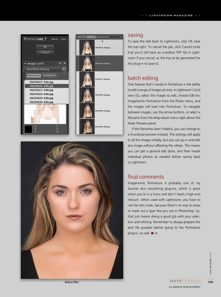
› ›
ke
lb
yo
ne
.co
m
091
savingTo save the edit back to Lightroom, click OK near
the top right. To cancel the job, click Cancel (note
that you’ll still have an unedited TIFF file in Light-
room if you cancel, as this has to be generated for
the plug-in to save it).
batch editingOne feature that’s handy in Portraiture is the ability
to edit a range of images at once. In Lightroom’s Grid
view (G), select the images to edit, choose Edit In>
Imagenomic Portraiture from the Photo menu, and
the images will load into Portraiture. To navigate
between images, use the arrow buttons, or select a
filename from the drop-down menu right above the
Mask Preview panel.
If the filenames aren’t helpful, you can change to
a thumbnail preview instead. The settings will apply
to all the images initially, but you can go in and edit
any image without affecting the others. This means
you can get a general edit done, and then tweak
individual photos as needed before saving back
to Lightroom.
final commentsImagenomic Portraiture is probably one of my
favorite skin smoothing plug-ins, which is great
when you’re in a hurry and don’t need a high-end
retouch. When used with Lightroom, you have to
nail the skin mask, because there’s no way to erase
or mask out a layer like you can in Photoshop. So,
that just means doing a good job with your selec-
tion and refining. Remember to always prepare the
best file possible before going to the Portraiture
plug-in, as well. ■
› › l i g h t r o o m m a g a z i n e › ›
ALL IMAGES BY SEAN McCORMACK
Before/After

› ›
ph
ot
os
ho
p u
se
r ›
ma
rc
h 2
016
092
SCOTT KELBY& Questions Answersthat stuff to Lightroom 6, but they never said they would. In
fact, they said from the start that the only way to have all the
new features is to subscribe, and you get new features as soon
as they’re released. That’s the whole advantage of the Creative
Cloud. Not to mention that the $10 a month isn’t just for Light-
room—you the get full, most-current version of Photoshop, too.
That’s no small thing.
If I convert an image to black and white, and then make some edits to it, when I do a before/after, the Before image returns to the color image instead of the black and white. So, it’s hard for me to compare my black-and-white edits to the original black-and-white conversion. Is there a way around this? There sure is. Go to the History panel, Right-click on the Convert
to Black & White state and, from the pop-up menu that appears,
choose Copy History Step Settings to Before. Now, your original
black-and-white conversion becomes the Before image.
I know you can easily see a before/after of all your changes to an image, but is there a way to see a before/after of just a particular set of changes? Like if I use the Adjustment Brush, is there a way I can see what the image looked like before I used it?You bet. When you have the Adjustment Brush active, scroll
down to the very bottom of the panel, and you’ll see a little
toggle switch on the left. It’s in the up (on) position. Click on it
to toggle it off, and it only turns off the visibility of the changes
you made with the Adjustment Brush—everything else you did
up until that point will still be visible, just the Adjustment Brush
edits will all be hidden. When you’re done, click it again to toggle
the visibility back on.
Is there a way to see my image full screen with-out having to hide all the panels manually?Yes, there is. Just press the letter F on your keyboard and Light-
room will hide all of the panels for you and take your image full
screen. Press F, again, to return back to normal.
I have a long list of collections in my Collections panel, but I use the same few collections most of the time. Is there a way to have easier access to them without scrolling through a long list, or changing their names to put them at the top of the list?You can mark your most-used collections as Favorites, and then
you can jump directly to them from the pop-up menu at the top
left of the Filmstrip. You add them in the same place—click on
the collection you want to set as a favorite, and then click on
that menu and choose Add to Favorites. Now that collection will
appear in this pop-up menu, in the Favorite Sources section, so
it’s always just one click away.
ALL IMAGES BY SCOTT KELBY
I’m thinking of switching from Elements to Lightroom, but I did the math and it makes more sense for me to buy Lightroom 6, instead of subscribing to Lightroom for $10 a month, right?Well, that depends on what’s important to you. I personally
wouldn’t recommend that you buy Lightroom 6 because it’s
already pretty outdated software (missing all the latest features),
and after you get a little bit into it, you’ll start asking things like,
“Where’s the Dehaze feature,” or “Why can’t I sync my images
to LR mobile,” or “Where’s the Pano Boundary Wrap feature?”
People get pretty upset that Adobe doesn’t go back and add
› › l i g h t r o o m m a g a z i n e › ›

› ›
ke
lb
yo
ne
.co
m
093
How can I find the images in my Library that don’t have my copyright info embedded into them and, once I do, how would I add it now after the fact?It’s a simple two-step process: (1) In the Library module, first go
to the Catalog panel and click on All Photographs, so you’re
searching your entire photo catalog. Then, hit the \ (Backslash)
key on your keyboard, so the Filter Bar appears at the top of the
thumbnail grid. Click on Metadata, and then click directly on the
title at the top of the first column (it probably says “Date”) to
bring up a pop-up menu of choices. Choose Copyright Status
from this pop-up menu, and now in that first column it displays
how many images you have, how many are copyrighted, and
how many are unknown. Click on Unknown to have just your
images that don’t have copyright embedded into them visible.
Next, (2) press Command-A (PC: Ctrl-A) to Select All the images,
then go to the Metadata panel and, from the Preset pop-up
menu, choose your copyright. Instantly, all those selected images
now have your copyright info embedded right into them.
In the Print module, I’m working on some pages for a wedding album, and I want to backscreen an image so I can put some text over it. I know there’s a way it can be done in Photoshop (everything can be done in Photoshop, right?), but is there a way to do that in Lightroom? Absolutely, and it’s easier than you’d think. First, I’d recommend
making a virtual copy of the image you want to backscreen
(press Command-‘ [apostrophe; PC: Ctrl-‘]) so the original is
separate. Then, go to the Develop module, to the Tone Curve
panel, and click on the little icon in the bottom-right corner until
you no longer see the three triangles under the curve grid. Now,
click on the bottom left of the curve and drag straight upward
(as shown here) and it backscreens the image. The higher you
drag, the lighter the backscreen becomes. Now you can take
that backscreened image over to the Print module and add text
over it there. ■
› › l i g h t r o o m m a g a z i n e › ›

› ›
ph
ot
os
ho
p u
se
r ›
ma
rc
h 2
016
094
& TipsTricks
on the card. Then, once the images are imported into your cata-
log, you can add additional keywords to further identify specific
locations and events.
post-import keywordingOnce images have been imported, you can then apply more
image-specific keywords. Let’s say you have a card full of
images taken at several locations in California. The basic loca-
tion keyword of “California” would have been applied on
import. Now you can apply more specific location keywords to
the rest of the images. Start broad, with keywords that can be
added at the same time to larger groups of images, and then
narrow the focus, working with progressively smaller groups of
images. The idea here is to apply a keyword to as many images
as you can before moving on to the next group of images and
the next keyword.
batch apply keywords in grid viewIn Grid view, select all the thumbnails that are from the same
place, such as San Francisco, for example, and then use the short-
cut Command-K (PC: Ctrl-K) to activate the keyword field in the
Library module’s Keywording panel. Type in a relevant keyword,
and that single keyword will be applied to all the selected images.
Then, move on to the next batch of images taken at a different
location. For some locations, you may be able to enter several
keywords at once to both identify the location and describe some
of its primary characteristics (i.e., Golden Gate Bridge, landmark).
Once the different locations have been keyworded, you can apply
any other relevant keywords that might help you both identify
and find the images in the future (i.e., San Francisco Bay, ocean,
shipping, transportation, etc.).
keywords for future useAs previously mentioned, how you use and search for your
images (or how potential clients might search for them) should
be something to keep in mind when it comes to how detailed to
get with your keywording. If you photograph for stock, or just
The metadata associated with our images can be a powerful
tool for working with our image archive. Although camera-
generated metadata can provide interesting ways to search
your image catalog, it’s the metadata that you add to your
images that has the most meaning in terms of the value that
you attach to images (i.e., star ratings and flags), as well as
how they might be useful for future projects (keywords and
collections). Keywords can be some of the most important
user-added metadata and this issue, we’ll take a look at some
essential keyword strategy and functionality in Lightroom.
in the beginning: basic keywordsAt the most basic level, keywords can help you find images, so
you should think about what words or terms come to mind for
an image or group of photos and use those as a starting point. At
a minimum, you should add keywords for the location where an
image was made, the event it portrays, or, if you’re photograph-
ing people, the name of the subjects. You might also consider
tagging files with the client name or job number if that makes
sense for your business.
The number of keywords, and what type of keywords, you apply to your photos depends on how you use your images. Wedding and portrait photographers might only need the names of the clients, or the location of the event venue. Stock photographers, or those who supply photos for edito-rial purposes, or use their images for illustrations, may find that more detailed keywords add more value to their image catalog. This value can be measured in personal terms (i.e., keywords make it much easier to find the images you want), as well as potential future financial value (a keyworded image is more likely to be found in the future if you’re searching for a specific type of shot for an assignment).
apply keywords on import Good keywording practices can be implemented at the very
beginning of the Lightroom workflow by applying keywords in
the Apply During Import panel on the right side of the Import
dialog. There are likely to be only a few keywords that will work
for all of the images you’re importing from a single card, such
as those that reference a general location or an event, but any
information applied here can be useful in locating photos down
the road. Even if there are several locations or shooting days on
the card, you might be able to apply a couple of very general
location keywords (i.e., city, state) that work for all the images
SEÁN DUGGAN
› › l i g h t r o o m m a g a z i n e › ›
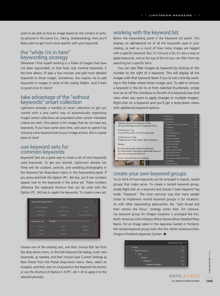
› ›
ke
lb
yo
ne
.co
m
095
working with the keyword listBelow the Keywording panel is the Keyword List panel. This
displays an alphabetical list of all the keywords used in your
catalog, as well as a count of how many images are tagged
with a specific keyword. But, it’s not just a list, it’s also a way to
apply keywords, and at the top of the list you can filter them by
searching for a specific term.
You can also filter images by keyword by clicking on the number to the right of a keyword. This will display all the images with that keyword (even if you’re not currently work-ing in the folder where those images are). To add or remove a keyword in the list to or from selected thumbnails, simply turn on or off the checkbox to the left of a keyword (use Grid view when you want to apply changes to multiple images). Right-click on a keyword and you’ll get a drop-down menu with additional keyword options.
ALL IMAGES BY SÉAN DUGGAN
want to be able to find an image based on the content or activ-
ity pictured in the scene (i.e., hiking, skateboarding), then you’ll
likely want to get much more specific with your keywords.
the “while i’m in here” keywording strategyWhenever I find myself working in a folder of images that have
not been keyworded, or that have only minimal keywords, if
the time allows, I’ll take a few minutes and add more detailed
keywords to those images. Sometimes, this inspires me to add
keywords to images in some of the nearby folders. And it feels
so good once it’s done!
take advantage of the “without keywords” smart collectionLightroom provides a handful of smart collections to get you
started with a very useful way of automatically organizing
images (smart collections are populated when certain metadata
criteria are met). One option is for images that do not have any
keywords. If you have some extra time, and want to spend it by
showing some keyword love to your image archive, this is a great
place to start!
use keyword sets for common keywordsKeywords Sets are a great way to create a set of nine frequently
used keywords. To get you started, Lightroom already has
three sets for outdoor, portrait, and wedding photography in
the Keyword Set drop-down menu in the Keywording panel. If
you press-and-hold the Option (PC: Alt) key, you’ll see numbers
appear next to the keywords in the active set. These numbers
reference the keyboard shortcut that can be used with the
Option (PC: Alt) key to apply the keywords. To create a new set,
choose one of the existing sets, and then choose Edit Set from
the drop-down menu. In the Edit Keyword Set dialog, enter new
keywords, as needed, and then choose Save Current Settings as
New Preset from the Preset drop-down menu. Now, select an
image(s), and then click on a keyword in the Keyword Set section
or use the shortcut of Option-1–9 (PC: Alt-1–9) to apply it to the
selected photo(s).
create your own keyword groupsTry to think of how keywords can be arranged in logical, nested
groups that make sense. To create a nested keyword group,
simply Right-click on a keyword and choose Create Keyword Tag
Inside “Keyword.” The most common way that many people
chose to implement nested keyword groups is for locations.
As with other keywording approaches, the “start broad and
then narrow the focus” strategy works here. For instance,
my keyword group for Oregon locations is arranged like this:
North America>USA>Oregon>Place Name>More Detailed Place
Name. For an image taken in the Japanese Garden in Portland,
the nested keyword group looks like this: North America>USA>
Oregon>Portland>Japanese Garden. ■
› › l i g h t r o o m m a g a z i n e › ›
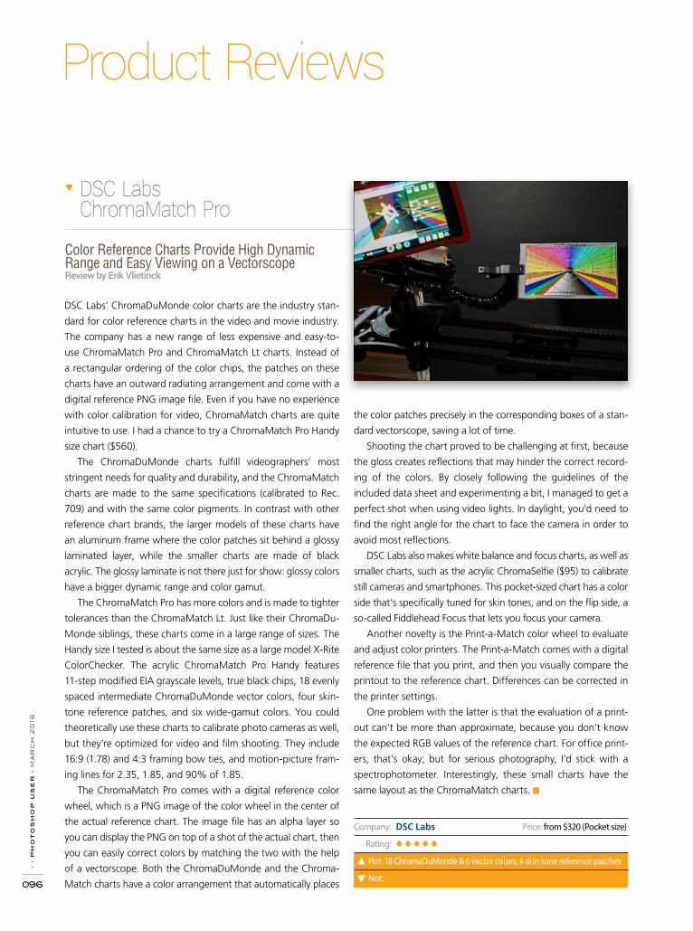
› ›
ph
ot
os
ho
p u
se
r ›
ma
rc
h 2
016
096
Product Reviews
Color Reference Charts Provide High Dynamic Range and Easy Viewing on a VectorscopeReview by Erik Vlietinck
DSC Labs’ ChromaDuMonde color charts are the industry stan-
dard for color reference charts in the video and movie industry.
The company has a new range of less expensive and easy-to-
use ChromaMatch Pro and ChromaMatch Lt charts. Instead of
a rectangular ordering of the color chips, the patches on these
charts have an outward radiating arrangement and come with a
digital reference PNG image file. Even if you have no experience
with color calibration for video, ChromaMatch charts are quite
intuitive to use. I had a chance to try a ChromaMatch Pro Handy
size chart ($560).
The ChromaDuMonde charts fulfill videographers’ most
stringent needs for quality and durability, and the ChromaMatch
charts are made to the same specifications (calibrated to Rec.
709) and with the same color pigments. In contrast with other
reference chart brands, the larger models of these charts have
an aluminum frame where the color patches sit behind a glossy
laminated layer, while the smaller charts are made of black
acrylic. The glossy laminate is not there just for show: glossy colors
have a bigger dynamic range and color gamut.
The ChromaMatch Pro has more colors and is made to tighter
tolerances than the ChromaMatch Lt. Just like their ChromaDu-
Monde siblings, these charts come in a large range of sizes. The
Handy size I tested is about the same size as a large model X-Rite
ColorChecker. The acrylic ChromaMatch Pro Handy features
11-step modified EIA grayscale levels, true black chips, 18 evenly
spaced intermediate ChromaDuMonde vector colors, four skin-
tone reference patches, and six wide-gamut colors. You could
theoretically use these charts to calibrate photo cameras as well,
but they’re optimized for video and film shooting. They include
16:9 (1.78) and 4:3 framing bow ties, and motion-picture fram-
ing lines for 2.35, 1.85, and 90% of 1.85.
The ChromaMatch Pro comes with a digital reference color
wheel, which is a PNG image of the color wheel in the center of
the actual reference chart. The image file has an alpha layer so
you can display the PNG on top of a shot of the actual chart, then
you can easily correct colors by matching the two with the help
of a vectorscope. Both the ChromaDuMonde and the Chroma-
Match charts have a color arrangement that automatically places
the color patches precisely in the corresponding boxes of a stan-
dard vectorscope, saving a lot of time.
Shooting the chart proved to be challenging at first, because
the gloss creates reflections that may hinder the correct record-
ing of the colors. By closely following the guidelines of the
included data sheet and experimenting a bit, I managed to get a
perfect shot when using video lights. In daylight, you’d need to
find the right angle for the chart to face the camera in order to
avoid most reflections.
DSC Labs also makes white balance and focus charts, as well as
smaller charts, such as the acrylic ChromaSelfie ($95) to calibrate
still cameras and smartphones. This pocket-sized chart has a color
side that’s specifically tuned for skin tones, and on the flip side, a
so-called Fiddlehead Focus that lets you focus your camera.
Another novelty is the Print-a-Match color wheel to evaluate
and adjust color printers. The Print-a-Match comes with a digital
reference file that you print, and then you visually compare the
printout to the reference chart. Differences can be corrected in
the printer settings.
One problem with the latter is that the evaluation of a print-
out can’t be more than approximate, because you don’t know
the expected RGB values of the reference chart. For office print-
ers, that’s okay; but for serious photography, I’d stick with a
spectrophotometer. Interestingly, these small charts have the
same layout as the ChromaMatch charts. ■
DSC Labs ChromaMatch Pro
Company: DSC Labs Price: from $320 (Pocket size)
Rating: ◆◆◆◆◆
Hot: 18 ChromaDuMonde & 6 vector colors; 4 skin-tone reference patches
Not:
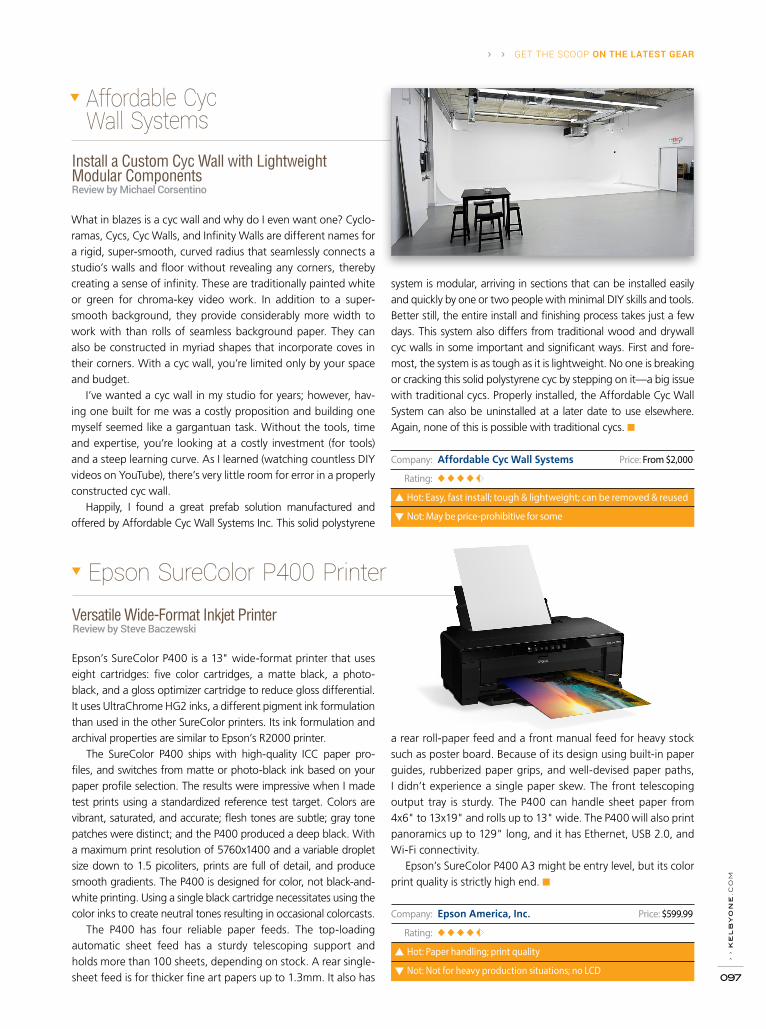
› ›
ke
lb
yo
ne
.co
m
097
› › GET THE SCOOP ON THE LATEST GEAR
Company: Epson America, Inc. Price: $599.99
Rating: ◆◆◆◆
Hot: Paper handling; print quality
Not: Not for heavy production situations; no LCD
Versatile Wide-Format Inkjet Printer Review by Steve Baczewski
Epson’s SureColor P400 is a 13" wide-format printer that uses eight cartridges: five color cartridges, a matte black, a photo-black, and a gloss optimizer cartridge to reduce gloss differential. It uses UltraChrome HG2 inks, a different pigment ink formulation than used in the other SureColor printers. Its ink formulation and archival properties are similar to Epson’s R2000 printer.
The SureColor P400 ships with high-quality ICC paper pro-files, and switches from matte or photo-black ink based on your paper profile selection. The results were impressive when I made test prints using a standardized reference test target. Colors are vibrant, saturated, and accurate; flesh tones are subtle; gray tone patches were distinct; and the P400 produced a deep black. With a maximum print resolution of 5760x1400 and a variable droplet size down to 1.5 picoliters, prints are full of detail, and produce smooth gradients. The P400 is designed for color, not black-and-white printing. Using a single black cartridge necessitates using the color inks to create neutral tones resulting in occasional colorcasts.
The P400 has four reliable paper feeds. The top-loading automatic sheet feed has a sturdy telescoping support and holds more than 100 sheets, depending on stock. A rear single-sheet feed is for thicker fine art papers up to 1.3mm. It also has
a rear roll-paper feed and a front manual feed for heavy stock such as poster board. Because of its design using built-in paper guides, rubberized paper grips, and well-devised paper paths, I didn’t experience a single paper skew. The front telescoping output tray is sturdy. The P400 can handle sheet paper from 4x6" to 13x19" and rolls up to 13" wide. The P400 will also print panoramics up to 129" long, and it has Ethernet, USB 2.0, and Wi-Fi connectivity.
Epson’s SureColor P400 A3 might be entry level, but its color print quality is strictly high end. ■
Epson SureColor P400 Printer
Install a Custom Cyc Wall with Lightweight Modular ComponentsReview by Michael Corsentino
Affordable Cyc Wall Systems
What in blazes is a cyc wall and why do I even want one? Cyclo-ramas, Cycs, Cyc Walls, and Infinity Walls are different names for a rigid, super-smooth, curved radius that seamlessly connects a studio’s walls and floor without revealing any corners, thereby creating a sense of infinity. These are traditionally painted white or green for chroma-key video work. In addition to a super-smooth background, they provide considerably more width to work with than rolls of seamless background paper. They can also be constructed in myriad shapes that incorporate coves in their corners. With a cyc wall, you’re limited only by your space and budget.
I’ve wanted a cyc wall in my studio for years; however, hav-ing one built for me was a costly proposition and building one myself seemed like a gargantuan task. Without the tools, time and expertise, you’re looking at a costly investment (for tools) and a steep learning curve. As I learned (watching countless DIY videos on YouTube), there’s very little room for error in a properly constructed cyc wall.
Happily, I found a great prefab solution manufactured and offered by Affordable Cyc Wall Systems Inc. This solid polystyrene
system is modular, arriving in sections that can be installed easily and quickly by one or two people with minimal DIY skills and tools. Better still, the entire install and finishing process takes just a few days. This system also differs from traditional wood and drywall cyc walls in some important and significant ways. First and fore-most, the system is as tough as it is lightweight. No one is breaking or cracking this solid polystyrene cyc by stepping on it—a big issue with traditional cycs. Properly installed, the Affordable Cyc Wall System can also be uninstalled at a later date to use elsewhere. Again, none of this is possible with traditional cycs. ■
Company: Affordable Cyc Wall Systems Price: From $2,000
Rating: ◆◆◆◆
Hot: Easy, fast install; tough & lightweight; can be removed & reused
Not: May be price-prohibitive for some

› ›
ph
ot
os
ho
p u
se
r ›
ma
rc
h 2
016
098
R E V I E W S › ›
Company: VAIO Corporation Price: from $2,199
Rating: ◆◆◆
Hot: Screen clarity; performance; connectivity
Not: Bulky; small screen for design/photo
It’s the Details That Count!Review by Michael Corsentino
I recently had the opportunity to shoot Phase One’s brand-new 100MP digital back during a fashion shoot in Los Angeles. I can tell you first-hand that the files are nothing short of stunning. You just can’t argue with 100 megapixels of detail, a full-frame CMOS medium-format sensor, 15 stops of dynamic range, and 16-bit color. Combined with Phase One’s also recently released XF Camera body (reviewed in Photoshop User, September 2015), this system represents the pinnacle of drool-worthy gear.
This full-frame, CMOS-based, medium-format digital back is a first-of-its-kind in many respects: resolution, sensor size, and ISO. One might expect that capturing and writing 100-mega-pixel files would make for potentially sluggish performance, but in my experience that was anything but true. The Phase One 100MP digital back is positively zippy! I certainly never had to wait around for it to catch up with my fast-paced shooting.
Because the 100MP is CMOS, it enjoys all the benefits and modern digital capture conveniences we’ve come to know and love with DSLRs. Except now they’re in a medium-format body with a sensor nearly twice the size and the phenomenal image quality that medium format is known for. The ISO range is an amazing 50–12,800, another first for a medium-format digital back, while capture, buffer, and write speeds are all lickety-split.
You might question whether 100 megapixels is overkill, but it’s kind of like being too rich or too skinny. Whether you need it or not, everybody wants it. What I do wonder is where Phase One goes from here? Does anyone really need more than 100 megapixels? Moreover, are the available lens optics up to snuff once the 100-megapixel threshold is crossed? Knowing Phase One, they’ve got it covered. It will certainly be interesting to see what’s next. I’m hopeful in time that we’ll see 50-, 60-, and 80-megapixel options from Phase One to round out their full-frame CMOS offerings. ■
Phase One 100MP Digital Back
Tablet Windows PCReview by Daniel M. East
Sure, an all-in-one tablet and computer combination device may be a great idea for some design and photo professionals who work in the field, but to be useful, it requires a balance of the most appropriate size, features, weight, and durability. Most importantly, it requires an accurate and easy-to-see display to ensure that your images look their best. Enter the VAIO Z Canvas (formerly from Sony) that boasts a lot of power and features, but with a heavier weight and a higher price tag.
While performance is impressive, it’s on par with other Intel i7-based systems running Windows 10. Its Iris Pro graphics chip stands up well to CC applications, and the display has the supe-rior Sony quality that’s a favorite of many professionals. Unfortu-nately, in spite of the wide HD 3:2 aspect ratio, the 2560x1704 resolution on this 12.3" display is only that of a small laptop. The only real difference is that, like a tablet, the keyboard is remov-able and it has a touch screen.
Another stumbling point is that, in spite of having many ports (SD, HDMI, USB, etc.), the network RJ-45 port requires a flimsy pull-down hatch that doesn’t feel at all secure with the cable. The upside is impressive Wi-Fi reception from the Canvas Z. Also,
the power cable connector is large and doesn’t sit well in the power port, and you’ll find that you’ll need to charge this pow-erhouse PC more frequently than most tablets.
At what point is the hybrid PC better than a small laptop? They’re nearly the same. If you need the full power of a PC, you may find that this display size, in spite of its quality, is not adequate for professional applications. The VAIO Canvas Z is as heavy as many full-size laptops and the responsiveness of the touch screen isn’t as good as the competition. ■
VAIO Z Canvas
Company: Phase One
Price: $48,900 (body with Schneider Kreuznach 80mm LS lens)
Rating: ◆◆◆◆
Hot: 100 megapixels; ISO from 50–12,800
Not: Pricey tool; however, you can finance or rent
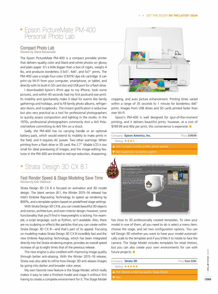
› ›
ke
lb
yo
ne
.co
m
099
› › GET THE SCOOP ON THE LATEST GEAR › › GET THE SCOOP ON THE LATEST GEAR
Company: Strata 3D Price: from $595
Rating: ◆◆◆◆◆
Hot: Speed; rendering quality; Stage Model
Not:
Fast Render Speed & Stage Modeling Save TimeReview by Erik Vlietinck
Strata Design 3D CX 8 is focused on animation and 3D model design. The latest version (8.1, the Winter 2015–16 release) has Intel’s Embree Raycasting Technology to speed up rendering by 800%, and a template system based on predefined stage settings.
With Strata Design 3D CX 8, you can create beautiful 3D objects and scenes, architecture, and even interior design; however, some functionality that you’ll find in heavyweights is lacking. For exam-ple, a script language, such as Python, isn’t available. Also, there are no sculpting or effects like particles that you can create within Strata Design 3D CX 8—and that’s part of its appeal. Focusing on modeling makes Strata Design 3D CX 8 incredibly fast and the new Embree Raycasting Technology, which has been integrated directly into the Strata rendering engine, provides an overall speed increase of up to eight times that of the previous release.
The new engine is also credited with improving image quality through better anti-aliasing. With the Winter 2015–16 release, Strata was also able to refine how Design 3D anti-aliases images by going into darker and broader color areas.
My own favorite new feature is the Stage Model, which really makes it easy to take a finished model and stage it without first having to create a complete environment for it. The Stage Model
has close to 30 professionally created templates. To view your model in one of them, all you need to do is select a menu item, choose the stage, and set two configuration options. You can tell Design 3D whether you want to have your model automati-cally scale to the template and if you’d like it to rotate to face the camera. The Stage Model includes templates for retail shelves, but you can also create your own environments for use with future projects. ■
Strata Design 3D CX 8.1
Compact Photo LabReview by Steve Baczewski
Epson PictureMate PM-400 Personal Photo Lab
The Epson PictureMate PM-400 is a compact portable printer that delivers quality color and black-and-white photos on glossy and plain paper. It’s a little bigger than a box of cigars, weighs 4 lbs, and produces borderless 3.5x5", 4x6", and 5x7" prints. The PM-400 uses a single four-color (CMYK) dye ink cartridge. It can print via Wi-Fi from your computer, smartphone, or tablet, and directly with its built-in SD card slot and USB port for a flash drive.
I downloaded Epson’s iPrint app to my iPhone, took some pictures, and within 40 seconds had my first postcard-size print. Its mobility and spontaneity make it ideal for events like family gatherings and holidays, and to fill family photo albums, refriger-ator doors, and scrapbooks. The instant gratification is seductive but also very practical as a tool for professional photographers to quickly assess composition and lighting in the studio. In the 1970s, professional photographers commonly shot a 4x5 Pola-roid before committing to 4x5 film on a shoot.
Sadly, the PM-400 has no carrying handle or an optional battery pack, which would extend its mobility to make prints in the field, and it requires AC power. Two other warnings: When printing from a flash drive or SD card, the 2.7" tiltable LCD is too small for ideal previewing of images; and the image-editing fea-tures in the PM-400 are limited to red-eye reduction, sharpening,
cropping, and auto picture enhancement. Printing times varied within a range of 35 seconds to 1 minute for borderless 4x6" prints. Images from USB drives and SD cards printed faster than over Wi-Fi.
Epson’s PM-400 is well designed for spur-of-the-moment printing, and it delivers beautiful prints; however, at a cost of $199.99 and 40¢ per print, this convenience is expensive. ■
› › GET THE SCOOP ON THE LATEST GEAR
Company: Epson America, Inc. Price: $199.99
Rating: ◆◆◆
Hot: Compact mobile printer; photo quality
Not: Expensive; no battery option

Nicely illustrated with many of the author’s own photos, mostly of
children, this book is definitely aimed at portrait photographers.
That’s not to say that an architectural or landscape photographer
won’t find some good common sense advice here. Much of the
book is devoted to establishing relationships with clients and
marketing. Repeat business as children grow depends almost
entirely on your relationship with the parents. On the same side
of the coin, having a great relationship with a real estate agent
is critical for a real estate photographer to count on repeat busi-
ness from that client. The author also has some specific advice on
pricing and budgeting. This book is best for photographers just
starting out and for those having trouble maintaining profitabil-
ity. (The Kindle version was read for this review. Kindle books can
now be read on Apple iPads and computers, using an app from
the Apple App Store.)
A very short, quick read, the author touches on and briefly explains
most of the basics of photography. This is a great book to give to
someone just starting to make photographic images or someone
who has been taking images for years, but never takes the cam-
era setting off Auto. The author writes in a clear and comfortable
voice, never making any subject seem too complicated. (Some
subjects probably could have used an additional sentence or two,
but nothing is really left hanging.) The author has also included a
link to a website that includes a downloadable PDF that contains
the 36 summary points from the eight sections (I can’t quite call
them “chapters”) of the book. The PDF “Quick Reference Guide”
can be printed or loaded onto a smart phone for easy, portable
access to the author’s advice. (The Kindle version, which I recom-
mend, was read for this review.)
The Simple Guide to Great Photography: Easy Tips & Tricks for Photographing Children, Family, Pets, Cars, & More!
Maximizing Profits: A Practical Guide for Portrait Photographers
By April BryantBy Lori Nordstrom
Publisher: HPP Media & Design Pages: 72
Price: $14.99 (paperback); $4.99 (Kindle)
Rating: ◆◆◆◆
Publisher: Amherst Media Pages: 128
Price: $34.95 (paperback); $13.49 (Kindle, Nook)
Rating: ◆ ◆ ◆ ◆ ◆
B O O K R E V I E W S P E T E R B A U E R › ›
› ›
ph
ot
os
ho
p u
se
r ›
ma
rc
h 2
016
100

POP QUIZ!p h o t o s h o p u s e r › › M A R C H 2 0 1 6
Test what you learned in this issue
Take Quiz
| fuel for creativity


› ›
ph
ot
os
ho
p u
se
r ›
ma
rc
h 2
016
104
To: LarryFrom: KelbyOne Advice Desk
Use a tripod and set your camera to shoot in burst
mode, using the highest number of shots available.
And, shoot several times, as quickly as your camera
can reload (save the images to the card and be ready
to shoot again). In one of the shots, you may have
everything just right. Or, far more likely, you’ll find
the image that has the fewest things wrong and elect
to use it as your working document. Remember, that
since you’re using a tripod, you can work with the best
(or “least bad”) image, along with one or more images
that don’t have the specific problems you see in the
working document.
You can, for example, use the Clone Stamp tool (S)
to copy open eyes from another shot over closed eyes
in the working document. Option-click (PC: Alt-click)
on one eye in the second photo, switch to the working
document, add a new layer, and then drag the Clone
Stamp tool over the closed eye. You can even copy/
paste or clone entire heads between images. Put each
eye or other fixes on separate layers in order to manipu-
late them individually. Or, assuming the pixels on the
new layer don’t overlap, you can fine-tune the adjust-
ments using the Lasso tool (L) to select the element on
the layer that you need to tweak.
If a head in either the working document or the
image from which you’re adding a fix is turned or tilted
slightly, use the Edit>Transform commands to properly
align the fix with the problem area. Using a tripod, you’ll
From The Advice Desk › ›
likely not have to scale the fix much—if at all—because
both shots were taken from the same distance.
If the working image has multiple flaws, you can add
fixes from a variety of other images—you don’t need to
find one specific secondary image that has repairs for all
of the flaws in your working document.
Keep in mind, too, that if the final destination for
the image is a relatively small print or the Web, you
might want to shoot video. If your DSLR (or even cam-
era phone) can shoot high-definition video, you have
even more images to choose from than you do when
shooting in burst mode. In Photoshop, you can open
the video, view it frame by frame in the Timeline panel,
and then select a frame to use as your working docu-
ment. One way to create that working document from a
selected frame is to use File>New to create a new image
measuring 1280x720 pixels at 72 ppi, select the Move
tool (V), then Shift-drag the frame from the video file to
the new document.
Assuming you have a good camera and lens, and
the original video is properly focused, a single HD video
frame can be cropped as large as 8x10" at 250 ppi. Keep
in mind that 1280x720 natively scales to 10x5.625"
or 14.222x8", so some of the image will need to be
cropped to create an 8x10 print. If you know you’ll want
to create an 8x10 (or 4x6) print from a video, make sure
to allow excess imagery around the subject, so that you
can crop to the desired size. ■
I photograph a lot of groups, mostly kids and teens in groups of a half dozen to twenty something. No image has every element perfect—someone’s eyes are closed or another is yawning. Any advice?—Larry
C O L U M N › ›
BY PETER BAUER
Answers to Photoshop and gear-related questions
The KelbyOne Member ADVICE DESK
Are you taking advantage of the Advice Desk at the KelbyOne member website? This is the place where you can get all of your
Photoshop and Lightroom questions answered by our Advice Desk experts. Not only that, you can get photo and computer gear
help and advice, as well. What are you waiting for? Visit the Advice Desk section under My Account on the KelbyOne member
site today! ■


Photoshop User magazine is the official publication of KelbyOne.
Each issue features in-depth Photoshop tutorials written by the most talented
designers, photographers, and leading authors in the industry.
As a KelbyOne member, you automatically receive Photoshop User
delivered digitally ten times a year.
FIND KELBYONE MEMBERSHIP DETAILS AT
www.kelbyone.com