making a pie chart
TRANSCRIPT

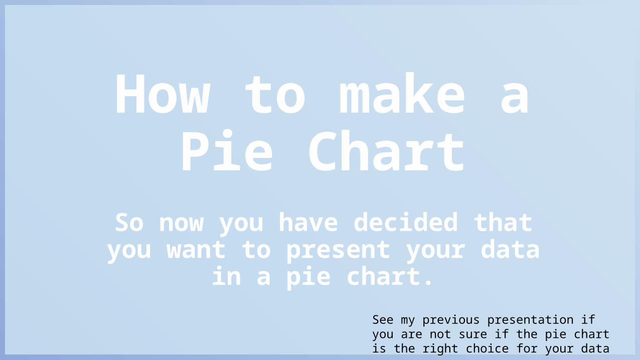
How to make a Pie Chart
Daksha Bhat
How to make a Pie Chart
So now you have decided that you want to present your data
in a pie chart.See my previous presentation if you are not sure if the pie chart is the right choice for your data

How to make a Pie Chart
These instructions are for making a chart in Microsoft Excel. If you don’t have that you can try alternatives such as
Free OfficeOpen OfficeWPS Office Libre Office
There may be a slight difference in the way these applications work.
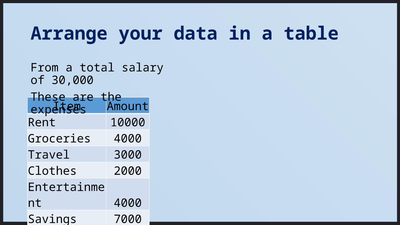
Arrange your data in a table
Item AmountRent 10000Groceries 4000Travel 3000Clothes 2000Entertainment 4000Savings 7000
From a total salary of 30,000These are the expenses
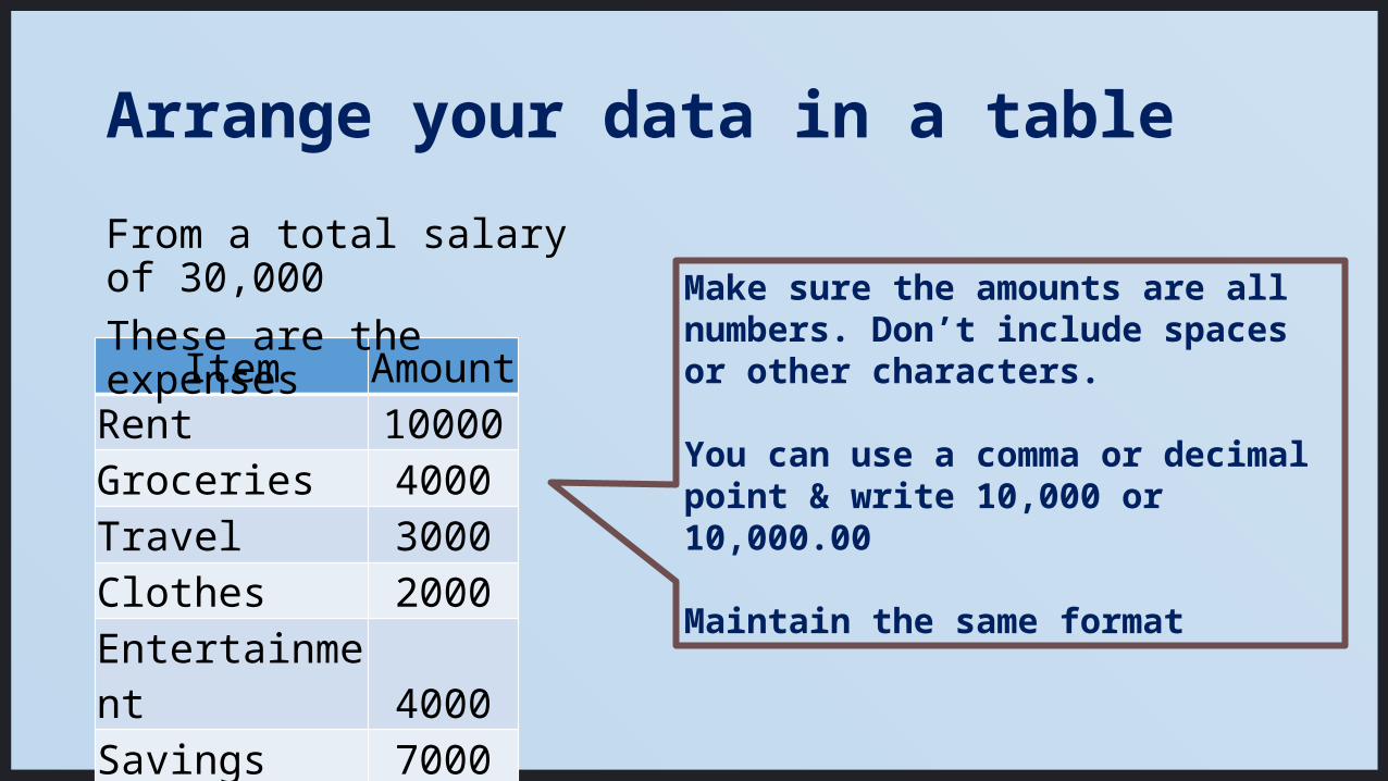
Arrange your data in a table
Item AmountRent 10000Groceries 4000Travel 3000Clothes 2000Entertainment 4000Savings 7000
From a total salary of 30,000These are the expenses Make sure the amounts are all
numbers. Don’t include spaces or other characters.
You can use a comma or decimal point & write 10,000 or 10,000.00
Maintain the same format
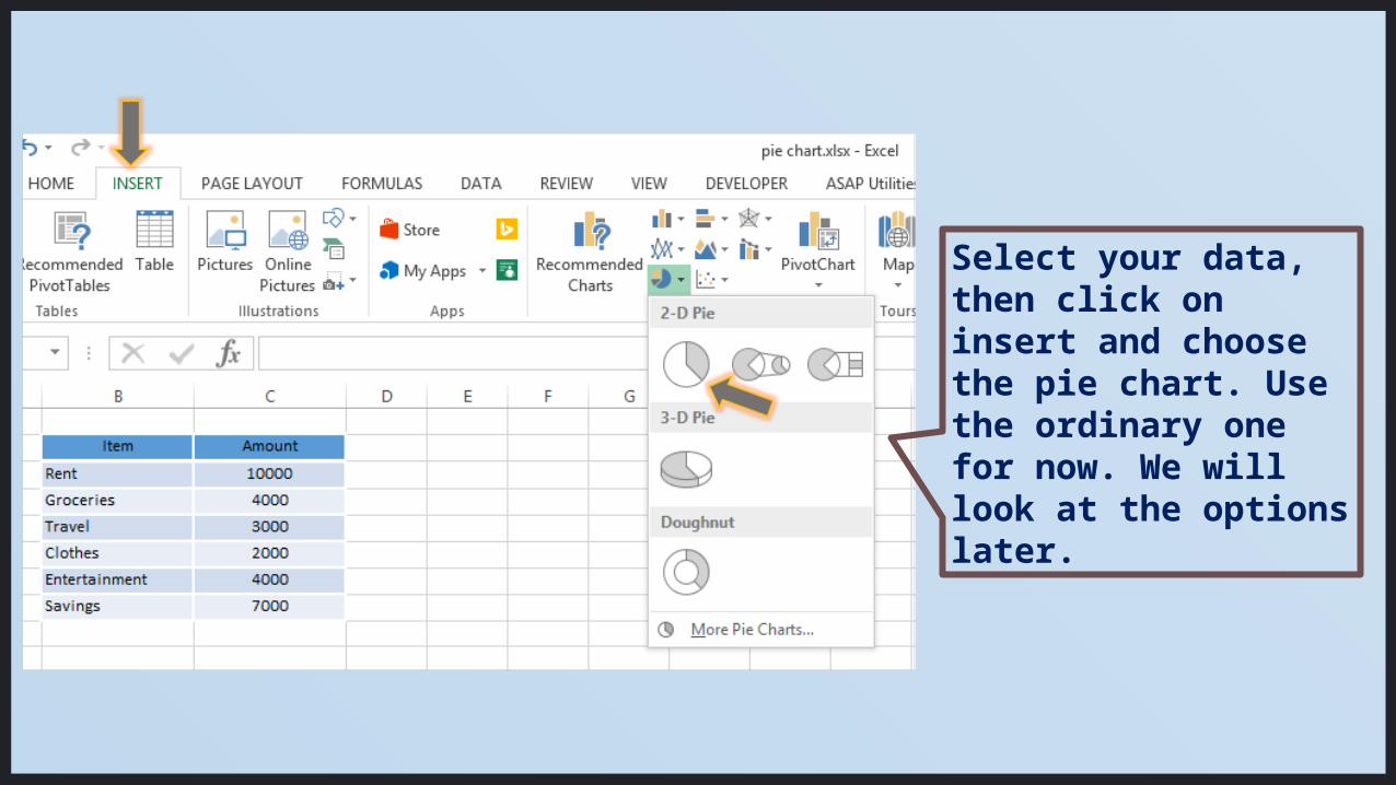
Select your data, then click on insert and choose the pie chart. Use the ordinary one for now. We will look at the options later.
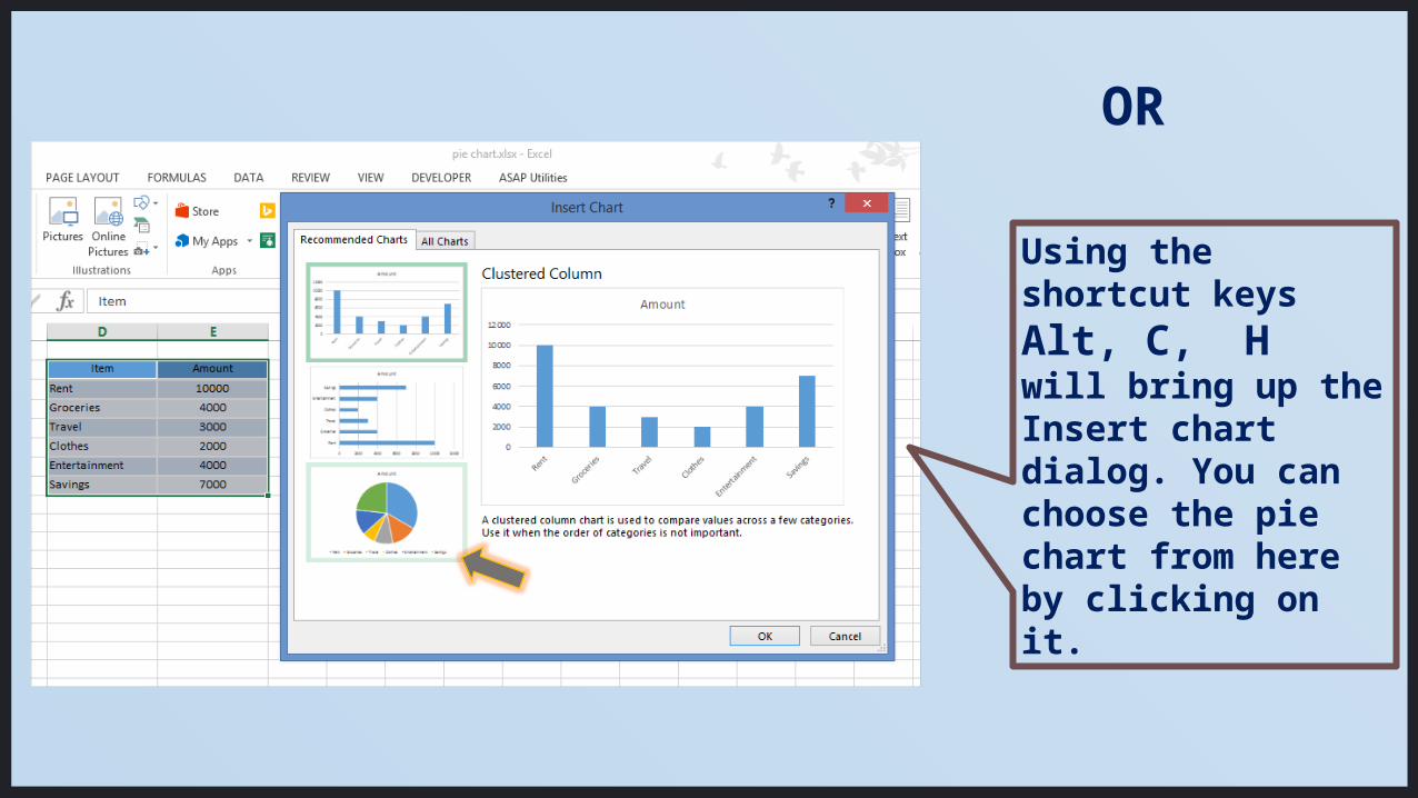
Using the shortcut keys Alt, C, H will bring up the Insert chart dialog. You can choose the pie chart from here by clicking on it.
OR
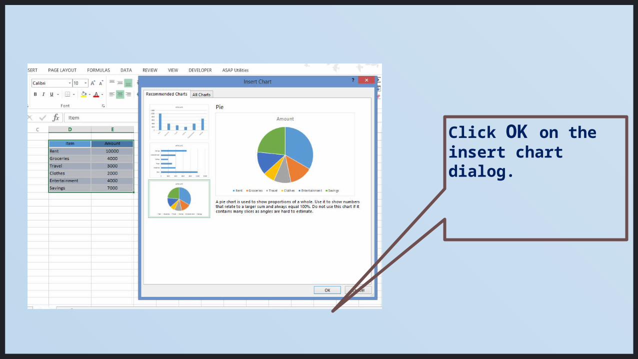
Click OK on the insert chart dialog.
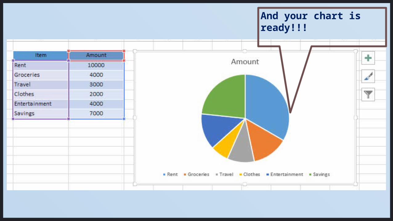
And your chart is ready!!!

BUT
Is this what you really want? Let’s see how to customize this and make it better.
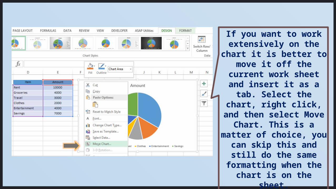
If you want to work extensively on the chart it is better to
move it off the current work sheet
and insert it as a tab. Select the chart, right click, and then select Move Chart. This is a matter of choice, you can skip this and still
do the same formatting when the chart is on the sheet.
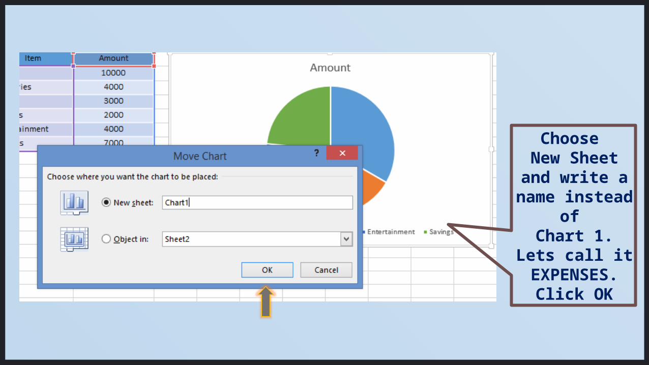
Choose New Sheet and write a
name instead of
Chart 1.Lets call it EXPENSES.
Click OK
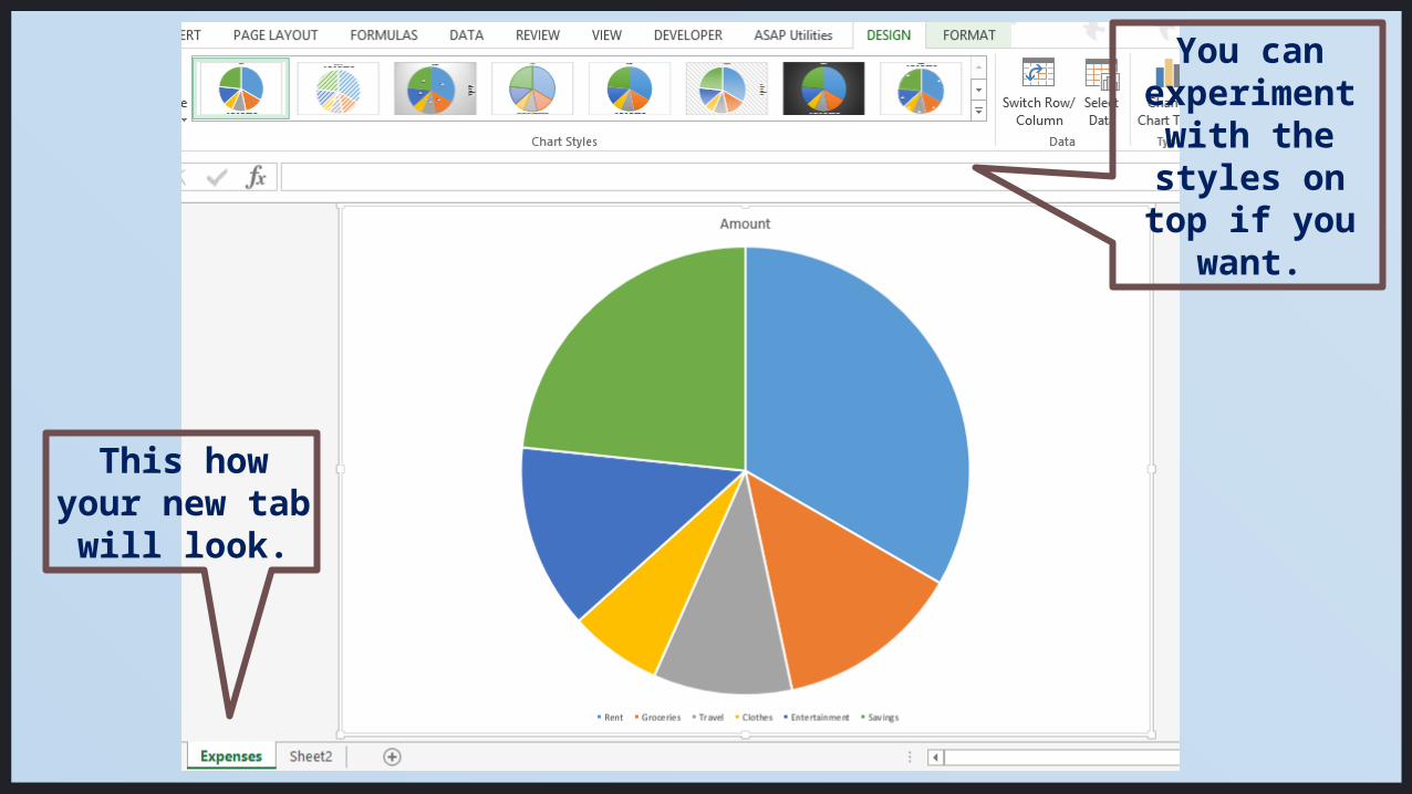
This how your new
tab will look.
You can experiment
with the styles on top if you
want.
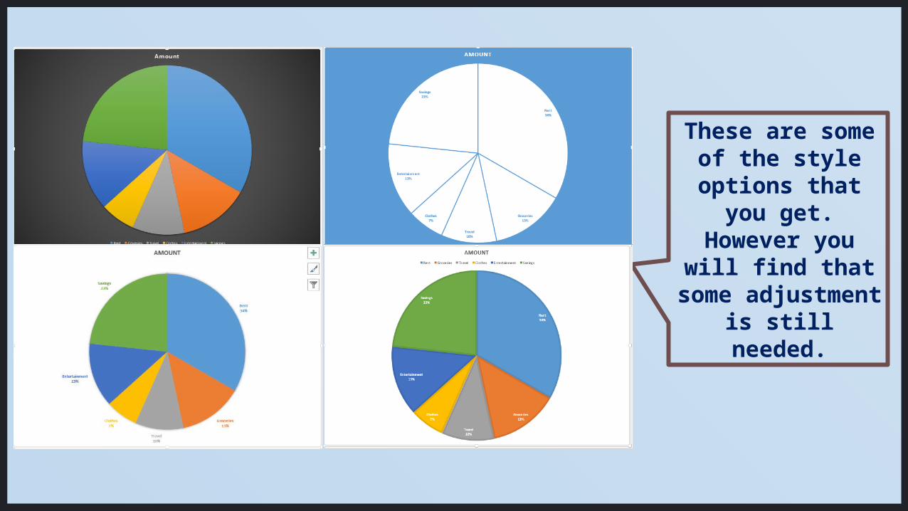
These are some of the style options that
you get. However you will find that
some adjustment is still needed.
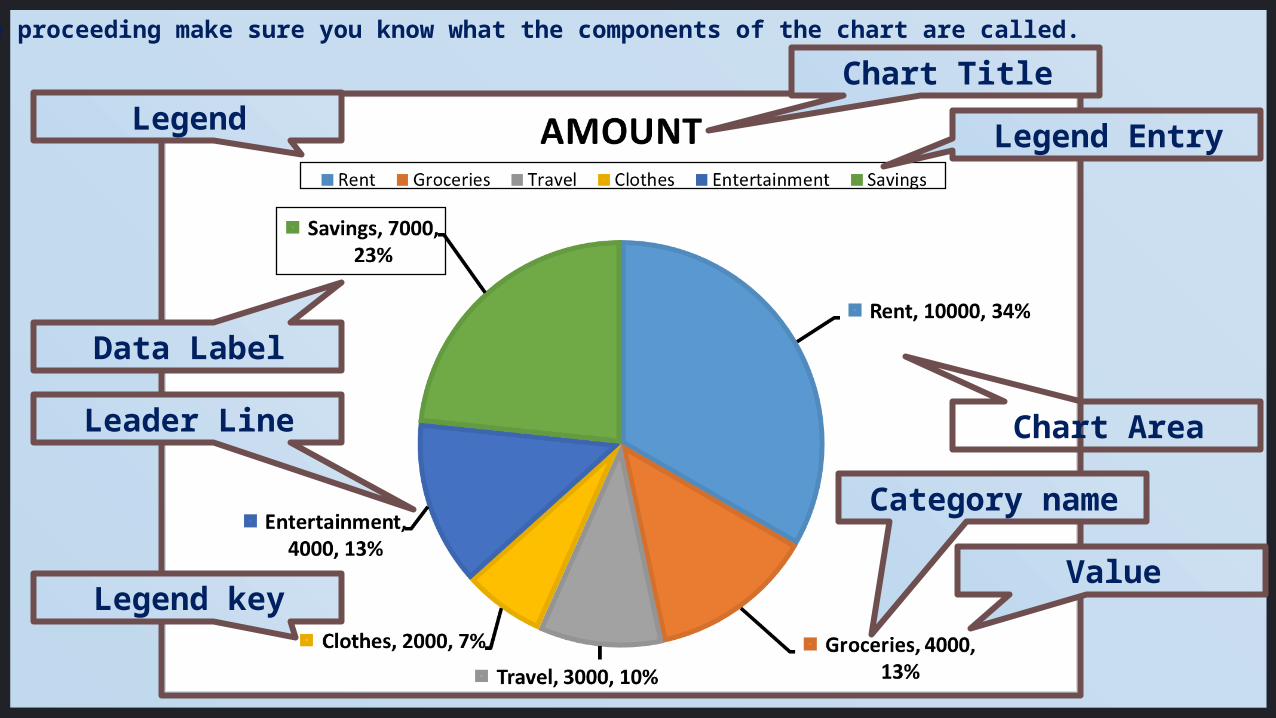
Chart Title
Before proceeding make sure you know what the components of the chart are called.
Legend
Data Label
Leader Line Chart Area
Legend Entry
Legend key
Category name
Value
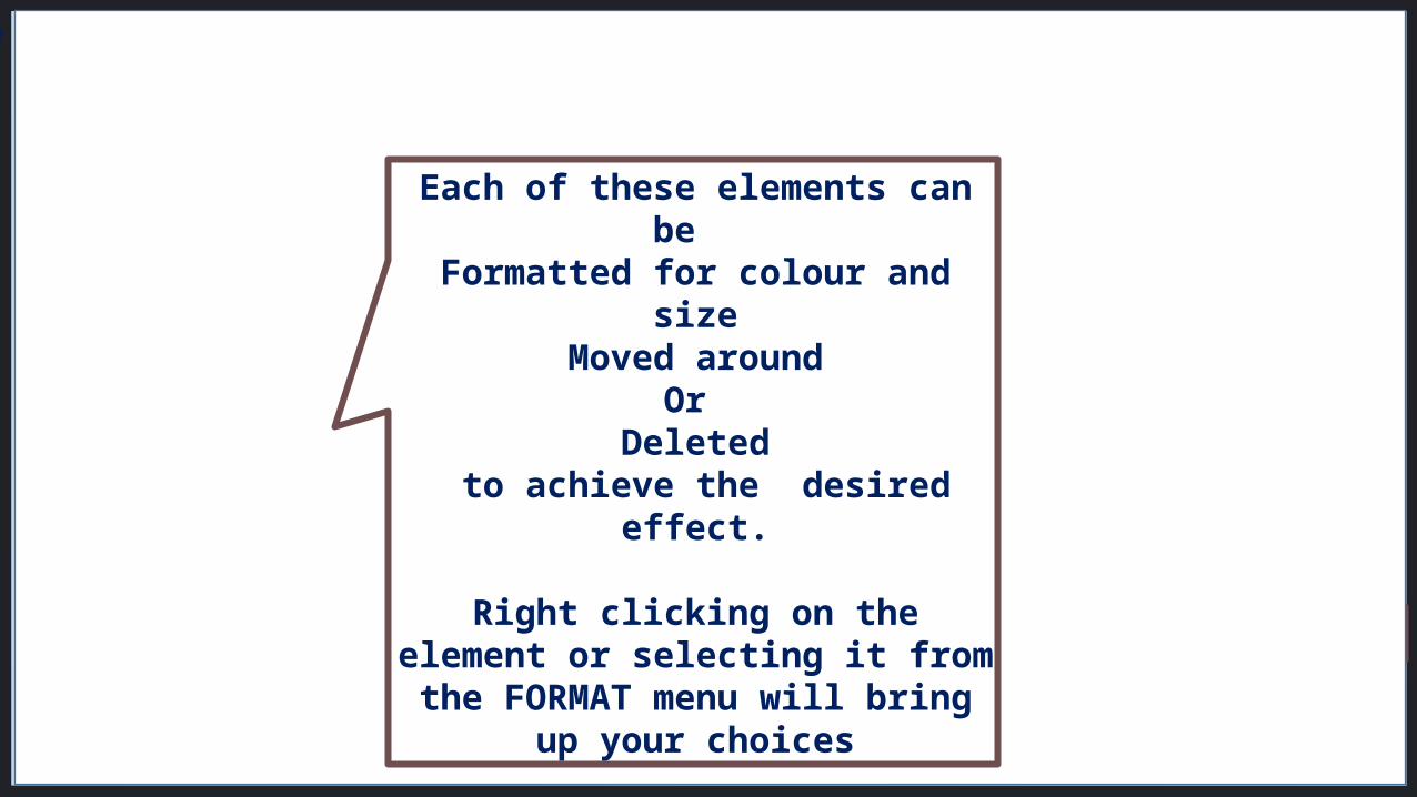
Chart Title
Before proceeding make sure you know what the components of the chart are called.
Legend
Data Label
Leader Line Chart Area
Legend Entry
Legend key
Category name
Value
Each of these elements can be
Formatted for colour and sizeMoved around
Or Deleted
to achieve the desired effect.
Right clicking on the element or selecting it from the
FORMAT menu will bring up your choices

First we will format the CHART TITLE
I have dragged the title to one side
Changed it from “Amount” to “Expenses”
Selected the text and then changed the font to Graphite
Std Wide 28Text Fill- Blue
Text Outline – Light greenText Shadow- Black lighter
25%
This kind of formatting can be done with any text in the
chart.

The category name should either be in the legend or in the data label. Keeping it in both places may not be such a good idea. See how ‘Savings’ is repeated here.
Choose according to your vision of what your final chart should look like.You can change the placement of the legend, and change the font too.
Legend
Data Label
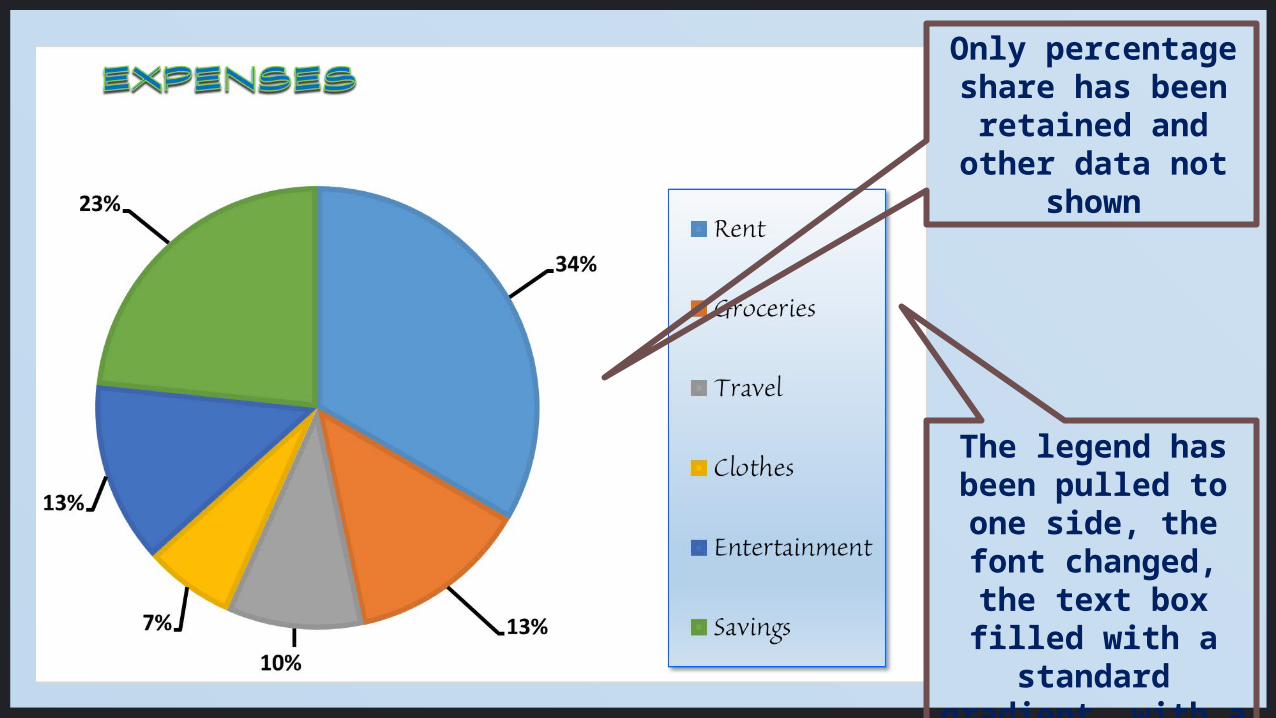
The legend has been pulled to one side, the font changed, the text box filled with a
standard gradient, with a shadow added.
Only percentage share has been retained and
other data not shown

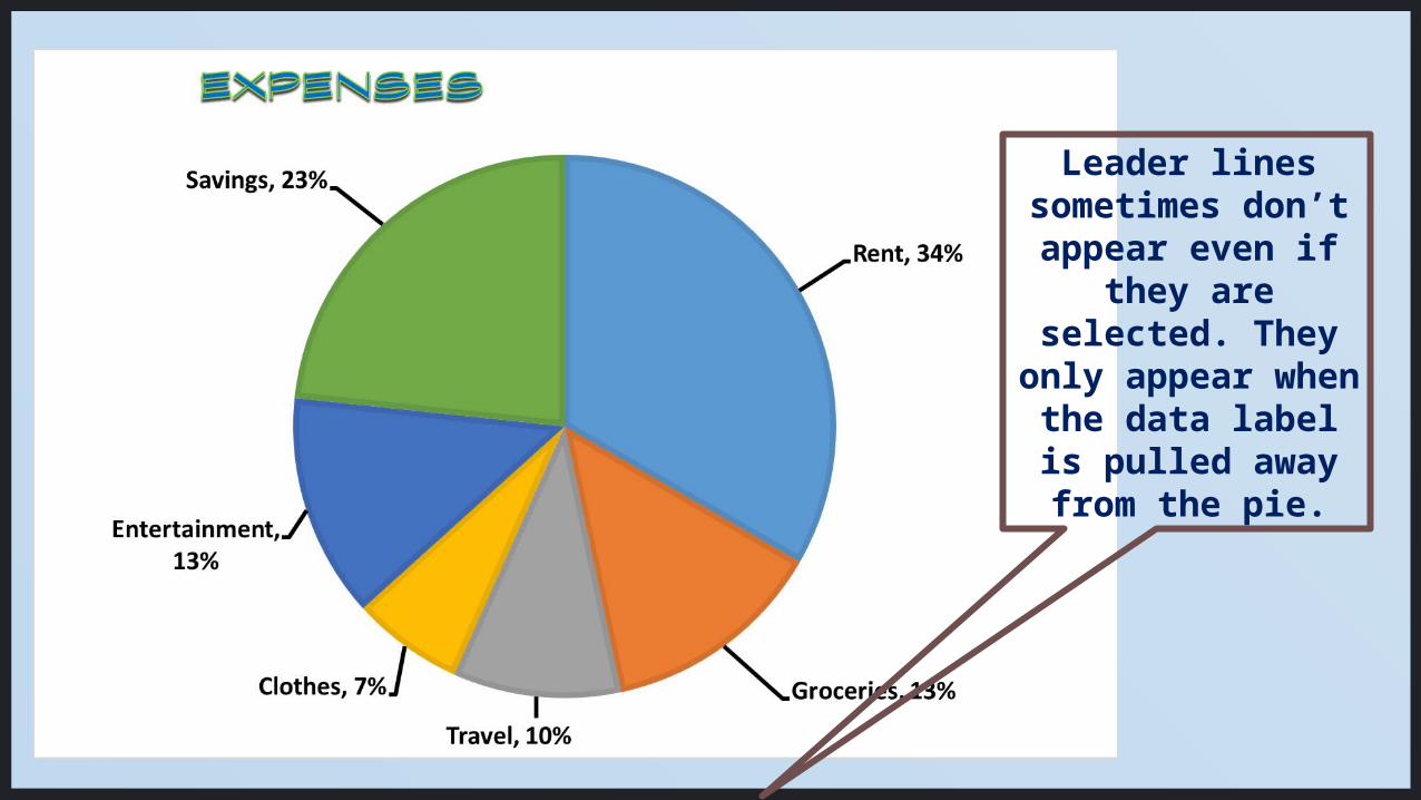
In this example,
The legend has been deleted, and category
name added to the data label.

Leader lines sometimes don’t appear even if
they are selected. They
only appear when the data label is pulled away from the
pie.
Leader lines sometimes don’t appear even if
they are selected. They
only appear when the data label is pulled away from the
pie.
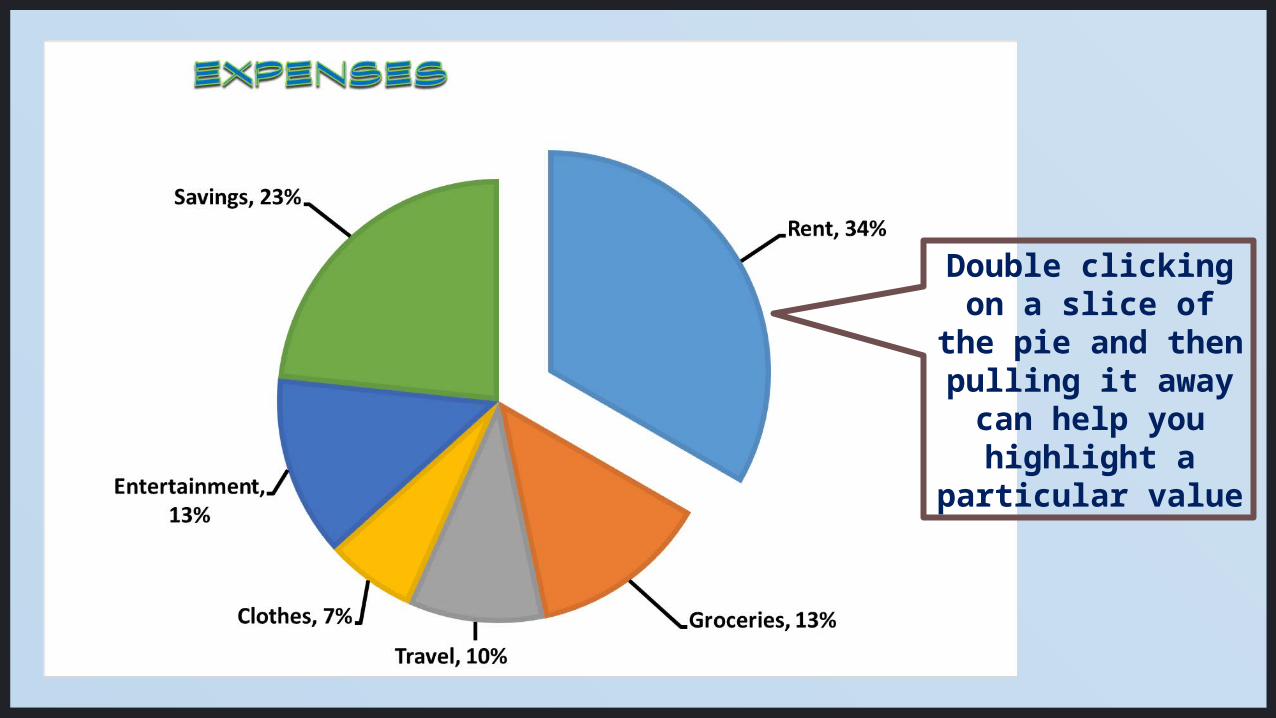
Double clicking on a slice of the
pie and then pulling it away can help you highlight a
particular value

Filling the slices with gradients is the easiest way
to add interest to your chart.
Select each slice and once you have selected the colour and
gradient you like, change the angle of the gradient
to suit the circle.
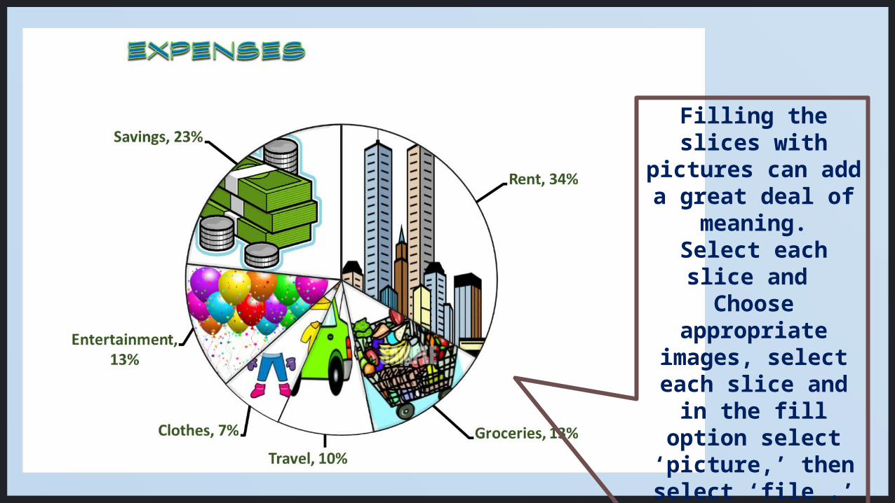
Filling the slices with pictures can add a great deal
of meaning.Select each slice
and Choose
appropriate images, select
each slice and in the fill option
select ‘picture,’ then select ‘file .’Navigate to the
folder where you stored the image
and select it.

Perfecting the Pie ChartSome more things you
need to know…
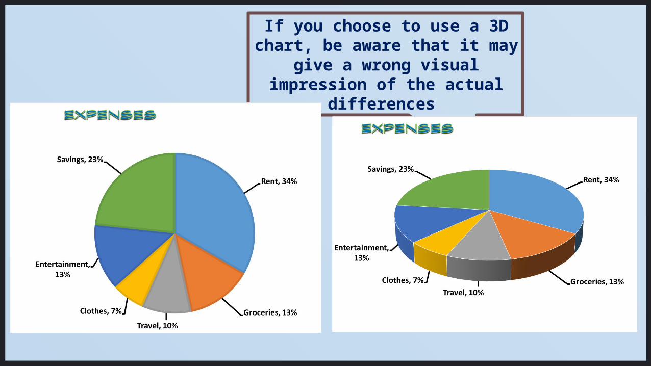
If you choose to use a 3D chart, be aware that it may
give a wrong visual impression of the actual
differences

If you choose to use a 3D chart, be aware that it may
give a wrong visual impression of the actual
differences
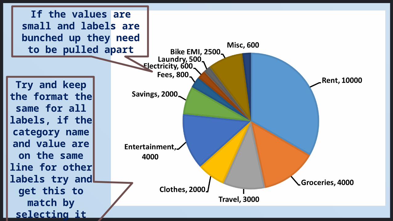
If the values are small and labels are bunched
up they need to be pulled apart
Try and keep the format the
same for all labels, if the
category name and value are on the same line for other labels try and
get this to match by
selecting it and changing the size of the
text box.
You can edit all the fonts and text boxes in the chart. But don’t get carried away and overdo the decorating!Remember the purpose is to enhance the understanding and the message of the chart, not to show off all the formatting you know! If in doubt choose to be simple.
There are many more creative and elaborate ways of displaying your data in pie charts… in the next installment…
Thanks!!!Images used from free image sources:www.clipartist.info/www.clipartbest.com/www.clipartpanda.comwww.clipartlord.com/
Daksha Bhat