maintaining diversity in america’s transit-rich neighborhoodsresidents with poor public transit or...
TRANSCRIPT

Dukakis Center for Urban and Regional Policy
Maintaining Diversity In America’s Transit-Rich Neighborhoods:Tools for Equitable Neighborhood Change
Stephanie Pollack Barry Bluestone Chase Billingham
A Report Prepared by the Dukakis Center for Urban and Regional Policy at Northeastern University
With the Generous Support of
OC
TO
BE
R 2
010

3 DUKAKIS CENTER FOR URBAN AND REGIONAL POLICY
AcknowledgmentsWe gratefully acknowledge the funding support of the Rockefeller
Foundation’s Promoting Equitable, Sustainable Transportation
initiative and, in particular, the insights and patience of Managing
Director Nick Turner.
We also acknowledge the invaluable research support of Jessica
Herrmann and Marc Horne for their work constructing the transit
station geographies used in this study and the equally invaluable
efforts of Ishwar Khatiwada and Mykhaylo Trubskyy of Northeastern
University’s Center for Labor Market Studies in constructing the
database of 1990 and 2000 Census data. Additional thanks go to
research associate Anna Gartsman and interns Gabriella Paiella and
Dan Drazen for their research assistance.
Finally, we wish to thank Diana Williams at the Funders' Network for
Smart Growth and Livable Communities and Mary Skelton Roberts
at the Barr Foundation for organizing two roundtable convenings
at which we were able to present our initial research findings and
conclusions; we similarly thank the many researchers, funders
and advocates who participated in the two sessions and provided
valuable feedback and insights.
While the authors are grateful to all of the aforementioned
individuals and organizations, the report’s research and conclusions
are solely the responsibility of the authors.
CreditsDesign: one[visual]mind • www.onevisualmind.com
Photos Courtesy of:
Reconnecting America • front cover, p.3, p.5, p.8, p.14, p.16, p.17,
p.43, p.44, p.49; Willamor Media • inside front cover, p.1, p.21, p.33
METRO • p.36; Alliance for Regional Transit–Cincinnati • p.38, p.51
k.beck • p.50
Kitty and Michael Dukakis Center for Urban and Regional PolicyThe Kitty and Michael Dukakis Center for Urban and Regional
Policy conducts interdisciplinary research, in collaboration with
civic leaders and scholars both within and beyond Northeastern
University, to identify and implement real solutions to the critical
challenges facing urban areas throughout Greater Boston, the
Commonwealth of Massachusetts, and the nation. Founded in
1999 as a “think and do” tank, the Dukakis Center’s collaborative
research and problem-solving model applies powerful data analysis,
a bevy of multidisciplinary research and evaluation techniques,
and a policy-driven perspective to address a wide range of issues
facing cities and towns. These include affordable housing, local
economic development, workforce development, transportation,
public finance, and environmental sustainability. The staff of the
Dukakis Center works to catalyze broad-based efforts to solve urban
problems, acting as both a convener and a trusted and committed
partner to local, state, and national agencies and organizations.
The Center is housed within Northeastern University’s innovative
School of Public Policy and Urban Affairs.

Contents
Executive Summary 1 CHAPTER 1 WhyDiversityMatters:TransitandNeighborhoodDiversity 5
CHAPTER 2 NeighborhoodChangeandTransit:WhatWeKnow 16
CHAPTER 3 NeighborhoodChangeandTransit:WhatWeLearned 21
CHAPTER 4 AToolkitforEquitableNeighborhoodChangeinTransit-RichNeighborhoods 35
Appendices APPEndix A Methodology 55
APPEndix B NewTransitStationsSelectedforAnalysis 58
List of Figures and Tables
BreakingtheCycleofUnintendedConsequencesinTransit-RichNeighborhoods 4
FiGURE 1.1 Transit-ServedMetropolitanAreas 6
TABLE 1.1 TransitinAmerica’sLargestMetropolitanAreas 7
TABLE 1.2 CategoriesofTransit-ServedMetropolitanAreas 9
FiGURE 1.2 EconomicImportanceofTransit-ServedMetropolitanAreas 10
FiGURE 1.3 DiversityinTransit-ServedMetropolitanAreas 10
FiGURE 1.4 HousinginTransit-ServedMetropolitanAreas 10
FiGURE 1.5 DiversityinDifferentTypesofTransit-ServedMetropolitanAreas—Blacks 11
FiGURE 1.6 DiversityinDifferentTypesofTransit-ServedMetropolitanAreas—Hispanics 11
FiGURE 1.7 EthnicityofTransitPassengers 13
FiGURE 1.8 HouseholdIncomeofTransitPassengers 13
FiGURE 3.1 PopulationGrowth(Initial Analysis) 23
FiGURE 3.2 TotalHousingUnits(Initial Analysis) 23
FiGURE 3.3 Non-HispanicWhitePopulationGrowth(Initial Analysis) 23
FiGURE 3.4 MedianHouseholdIncome(Initial Analysis) 23
FiGURE 3.5 MedianGrossRent(Initial Analysis) 24
FiGURE 3.6 In-Migration(Initial Analysis) 24
FiGURE 3.7 PublicTransitUseforCommuting(Initial Analysis) 24
FiGURE 3.8 MotorVehicleOwnership(Initial Analysis) 24
FiGURE 3.9 PopulationGrowth(Large Differences Analysis) 26
FiGURE 3.10 TotalHousingUnits(Large Differences Analysis) 26
FiGURE 3.11 RacialandEthnicComposition(Large Differences Analysis) 27

Contents continued
FiGURE 3.12 HouseholdIncome(Large Differences Analysis) 27
FiGURE 3.13 HousingCosts(Large Differences Analysis) 28
FiGURE 3.14 In-Migration(Large Differences Analysis) 28
FiGURE 3.15 PublicTransitUseforCommuting(Large Differences Analysis) 28
FiGURE 3.16 MotorVehicleOwnership(Large Differences Analysis) 28
FiGURE 3.17 PopulationGrowth(Transit Type Analysis) 30
FiGURE 3.18 TotalHousingUnits(Transit Type Analysis) 30
FiGURE 3.19 RacialandEthnicComposition(Transit Type Analysis) 30
FiGURE 3.20 MedianHouseholdIncome(Transit Type Analysis) 30
FiGURE 3.21 HousingCosts(Transit Type Analysis) 31
FiGURE 3.22 In-Migration(Transit Type Analysis) 31
FiGURE 3.23 PublicTransitUseforCommuting(Transit Type Analysis) 31
FiGURE 3.25 MotorVehicleOwnership(Transit Type Analysis) 31
TABLE 3.1 ComparisonofMeans(Light Rail TRNs vs. Heavy Rail and Commuter Rail TRNs) 32
BreakingtheCycleofUnintendedConsequencesinTransit-RichNeighborhoods 34
References 62

Maintaining DiVERSitY in aMERica’S tRanSit-Rich nEighboRhooDS 1
Executive Summary
More than 3,000 transit-rich neighborhoods (TRns)
in U.S. metropolitan areas have fixed-guideway transit
stations and hundreds more such neighborhoods could
be created over the next decade if current plans for new
transit systems and stations are realized. Americans are increasingly using transit and showing more interest in living in transit-rich neighborhoods. For neighborhood and equity advocates from Atlanta to Seattle and Minneapolis to Houston, however, this good news is tempered by a growing concern about gentrification and displacement. Will current neighborhood residents, many of them low income and/or people of color, benefit from planned transit stations? Or will they be displaced by wealthier and less diverse residents lured not only by transit but also by the other amenities that come with transit-induced neighborhood revitalization?
Planners and policymakers would appear to face a Hobson’s choice if transit investment and expansion inevitably lead to gentrification and displacement: either make the transit investment and accept loss of neighborhood diversity as col-lateral damage, or avoid transit expansion projects serving diverse, lower-income neighborhoods and leave those residents with poor public transit or none at all.
This report is based on research that was designed to address this dilemma. We wanted to understand whether gentrifica-tion and displacement are actually occurring in transit-rich
neighborhoods. To the extent that undesirable patterns of neighborhood change were found, we also wanted to under-stand the underlying mechanisms in order to propose policy tools that could be used to shape equitable neighborhood change in both old and new TRNs.
Our research found that transit investment frequently changes the surrounding neighborhood. While patterns of neighborhood change vary, the most predominant pattern is one in which housing becomes more expensive, neigh-borhood residents become wealthier and vehicle ownership becomes more common. And in some of the newly transit-rich neighborhoods, the research reveals how a new transit station can set in motion a cycle of unintended consequences in which core transit users—such as renters and low income households—are priced out in favor of higher-income, car-owning residents who are less likely to use public transit for commuting. We believe that the risk that transit investment could catalyze undesirable neighborhood change is substan-tial enough that it needs to be managed whenever transit investments or improvements are being planned. We therefore present a toolkit of policy tools for shaping equitable neigh-borhood change in TRNs, tools that are increasingly available and in use across the country.
This report is divided into four parts. The first chapter documents the diversity of the transit-served metropoli-tan areas and TRNs in the United States and explores the symbiotic relationship between diverse neighborhoods and successful transit. The second chapter reviews the most recent literature on neighborhood change, gentrification and displacement, both in general and in TRNs, and highlights the different ways in which gentrification can occur and the importance of understanding who moves into gentrify-ing neighborhoods. The third chapter presents the results of our new research on patterns of neighborhood change in 42 neighborhoods in 12 metropolitan areas first served by rail transit between 1990 and 2000, and draws conclusions about the likely mechanisms underlying the observed patterns of change in those neighborhoods. The final chapter summa-

2 DUKaKiS cEntER FoR URban anD REgionaL PoLicY
rizes a new web-based Policy Toolkit for Equitable Transit-Rich Neighborhoods designed to directly address the most likely drivers of undesirable neighborhood change in TRNs in order to help planners, policymakers and advocates shape equitable neighborhood change and ensure that the many benefits of transit investment are shared by all.
Why diversity Matters: Transit and neighborhood diversityConcerns about gentrification and displacement associated with transit have traditionally been framed as issues of equity: will neighborhood change in TRNs adversely affect people of color and lower-income residents? These equity concerns emanate from the fact that transit-rich neighborhoods, and the larger metropolitan areas in which they are located, are extraordinarily diverse and home to a disproportionate share of lower-income households and people of color.
In 2010, there were 36 transit systems in the United States providing what transportation planners call fixed-guideway (rail rather than bus) transit, with one additional such system scheduled to open in 2011. These 37 regional transit systems serve a total of 41 Metropolitan Statistical Areas (MSAs) as defined by the U.S. Census. Using 2000 Census data, we calculate that nearly half of all Americans and more than two-thirds of all U.S. workers live in those 41 transit-served metros, as do over half of all blacks, 60 percent of all Hispanics and 70 percent of all immigrants in the United States. In addition, slightly more than half of all U.S. rental housing is located in transit-served metros.
People of color, low-income households and renters share two related characteristics that may explain their concentra-tion in transit-served metropolitan areas. First, in a country where over 95 percent of all households own at least one car, these three groups are disproportionately likely to live in households without vehicles. In addition, people of color, low-income households and renters are all more likely to use transit than the average American. These three groups represent the majority of what we refer to as core transit riders, those most likely to regularly use transit.
Even as they work to attract a broader range of riders, transit systems need to maintain their core ridership to ensure that total ridership continues to grow. Transit planners frequently speak of the need for transit-oriented development to support ridership, but what transit stations need is transit-oriented
neighbors who will regularly use the system. There is a symbiotic relationship between diverse neighborhoods and successful transit: transit systems benefit from and depend on the racial and economic diversity of the neighborhoods that they serve, just as low-income households and people of color depend on and benefit from living in neighborhoods served by transit.
neighborhood Change and Transit: What We KnowNeighborhoods change over time, in ways that both benefit and harm those who have been living there. Researchers, policymakers and advocates have long been concerned about patterns of neighborhood change that reduce the racial and/or economic diversity of neighborhoods. The second chapter of this report explores prior studies that can help us understand how the presence of new or improved transit can change the surrounding neighborhood.
While the terms gentrification and displacement are fre-quently used interchangeably, recent research highlights the importance of distinguishing between these two related patterns of neighborhood change. Gentrification is a pattern of neighborhood change in which a previously low-income neighborhood experiences reinvestment and revitalization, accompanied by increasing home values and/or rents. Gen-trification, while frequently controversial, can be either good or bad for a neighborhood, depending on who benefits from the reinvestment and revitalization.
Gentrification may or may not be associated with displace-ment, a pattern of change in which current residents are invol-untarily forced to move out because they cannot afford to stay in the gentrified neighborhood. Recent studies indicate that displacement may not be the sole mechanism driving change in gentrifying neighborhoods. The demographic composi-tion of gentrifying neighborhoods can be altered through a process of succession or replacement driven by acceler-ated turnover of the housing stock. This housing turnover is marked both by unequal retention of existing residents (with wealthier and/or better-educated residents more likely to remain) and in-migration of wealthier, better-educated residents. This pattern of change, while differing from the traditional model of involuntary displacement, nevertheless raises serious equity concerns as the result is much the same: the resulting neighborhood is more expensive and populated by higher-income residents.

Maintaining DiVERSitY in aMERica’S tRanSit-Rich nEighboRhooDS 3
Few studies have been done on gentrification in TRNs and those report varying results: in some cases new transit is put in place with little neighborhood change, while other TRNs experience extensive gentrification. When this literature is supplemented with studies of changing travel behavior in specific transit-oriented development projects in those neighborhoods, however, important insights emerge. Certain demographic groups—including core transit riders who traditionally use transit, and also potential riders who may choose to use transit—are attracted to well-planned TRNs in a self-selection process that may contribute to the process of replacement recently observed in gentrifying neighborhoods. Understanding neighborhood change in TRNs therefore requires a detailed understanding of both who lived in those neighborhoods before the transit was built and who lives there afterward.
neighborhood Change and Transit: What We LearnedTo better understand patterns of neighborhood change in newly transit-rich neighborhoods, the third chapter of the report analyzes socioeconomic changes in 42 neighborhoods in 12 metropolitan areas first served by rail transit between 1990 and 2000. Because prior research on gentrification and TRNs had looked at only a few characteristics, we explore a broad range of population, housing and transportation characteristics. For each of the 42 neighborhoods analyzed, we studied changes between 1990 and 2000 in population, racial and ethnic composition, and in-migration; the number of housing units, tenure, housing value and rent; household income; and the use of public transit for commuting purposes and automobile ownership. We then compared the neighbor-hood level changes to those in each neighborhood’s corre-sponding metropolitan area to see if patterns of neighborhood change in the TRNs differed from corresponding changes in the region.
As in prior studies, we found that patterns of neighborhood change varied across the transit-rich neighborhoods we inves-tigated. Many of the TRNs changed in ways that were roughly similar to the underlying pattern of change in their larger metro areas. We focused, however, on those TRNs where changes were more pronounced than those in the surround-ing metropolitan area. In these neighborhoods, a predomi-nant pattern of neighborhood change could be discerned: with the addition of transit, housing stock became more
expensive, neighborhood residents wealthier and vehicle ownership more common. We found evidence of gentrifica-tion in the majority of newly transit-served neighborhoods, if gentrification is defined as a pattern of neighborhood change marked by rising housing costs and incomes.
Our research also provides support for the conclusion that neighborhoods with a large number of renters are more sus-ceptible to gentrification. Indeed, when we specifically looked at the neighborhoods where the new stations were light rail —neighborhoods which, in our study, were more likely to be dominated pre-transit by low-income, renter households than those in the heavy rail and commuter rail neighborhoods—almost every aspect of neighborhood change was magnified: rents rose faster and owner-occupied units became more prevalent.
Our research did not, however, find that a new transit station automatically leads to fundamental change in a neighbor-hood's racial composition. Perhaps, as other recent studies of gentrification have found, the relatively higher retention of higher-income black and Hispanic households and/or the in-migration of racially mixed, higher income residents results in a wealthier neighborhood but one with a racial composition similar to that of the pre-transit neighborhood.
Gentrification can be a positive form of neighborhood change but can also have adverse consequences. Our analysis found evidence of at least two gentrification-related concerns. Even if no displacement can be proven to occur in TRNs, rapidly increasing rents mean that those renter households who choose to remain and take advantage of the new transit will experience higher housing cost burdens. In addition, neigh-borhood revitalization sometimes attracts not only higher-income residents but also car-owning residents.

4 DUKaKiS cEntER FoR URban anD REgionaL PoLicY
In some of the neighborhoods studied, the new transit station seems to have set in motion a cycle of unintended consequences that reduced neighborhood residency by those groups most likely to use transit in favor of groups more likely to drive. Utilization of public transit for commuting in this problematic subset of newly transit-served neighborhoods actually rose more slowly (or, in some cases, declined faster) than in the corresponding metropolitan area as a whole. Whether by displacement or replacement, or a combination of the two, in some transit-rich neighborhoods the pattern of change is working against the goal of attracting transit-oriented neighbors: the most likely potential transit riders are being crowded out by car owners less likely to be regular users of transit. This cycle, illustrated above, raises concerns about both equity, because core transit riders are predomi-nantly people of color and/or low income, and about the success of new transit investments in attracting desired levels of ridership.
A Toolkit for Equitable neighborhood Change in Transit-Rich neighborhoodsOur research reveals that transit investment can sometimes lead to undesirable forms of neighborhood change. Under-standing the mechanisms behind such neighborhood change can, however, allow policymakers, planners and advocates to implement policies and programs designed to produce more equitable patterns of neighborhood change. The final chapter
of the report summarizes a new web-based Policy Toolkit for Equitable Transit-Rich Neighborhoods which describes three types of policy tools, as illustrated above.
Planning ToolS: Because neighborhood change can happen quickly, particularly in neighborhoods dominated by rental housing, policymakers need to get ahead of potential problems by using coordinated and community-responsive planning tools that begin at the same time as transit planning, explicitly consider the risks of gentrification and include everyone with a stake in the neighborhood’s future.
HoUSing MaRKET ToolS: Because one of the most noticeable and damaging signs of transit-induced gentrifica-tion is rapidly rising rents and housing values, policies that address housing are critical. The Toolkit focuses on three cat-egories of housing market tools:
• Funding for land and property acquisition;
• Preservation of existing affordable rental housing; and
• Affordable housing production.
TRanSPoRTaTion ManagEMEnT ToolS: Because one characteristic of gentrifying TRNs is an increase in wealthier households who are also more likely to own and use private vehicles and less likely to use transit for commuting, policies must be designed to attract core and potential transit riders to transit-rich neighborhoods, particularly non-vehicle owning households.
Breaking the Cycle of Unintended Consequences in Transit-Rich neighborhoods
acquisition
funds
Preservation of affordable
rental housing
affordable housing
production
Planning Tools
Transportation Management
Tools
Transit station planned
Rents and home values increase
Neighborhood income rises
Transit commuting fails to rise as expected
Land values increase
Accelerated housing turnover
Motor vehicle ownership increases
Housing Market Tools

Maintaining DiVERSitY in aMERica’S tRanSit-Rich nEighboRhooDS 5
CH
AP
TER
1
Why Diversity Matters: Transit and neighborhood Diversity
Americans are increasingly using transit and showing
more interest in living near transit, in what we call transit-
rich neighborhoods (TRns). After decades of flat growth alternating with declines, transit ridership in the United States began rising in 1995 and has been growing steadily for more than a decade. Public transportation ridership grew 36 percent between 1995 and 2008, almost three times the 14 percent growth rate of the U.S. population. In 2008, U.S. transit systems carried passengers on 10.5 billion trips, the largest number of trips taken on transit since 1956. Despite a recession-induced ridership drop of 3.8 percent in 2009, the year closed out as the fourth year in a row in which ridership exceeded 10 billion trips (American Public Transportation Association [APTA], 2010).
Transit systems—not just transit ridership—are also growing, with new stations and even entire systems being planned and built. There are already more than 3,300 fixed-guide-way transit stations in the United States, according to the Center for Transit-Oriented Development (CTOD, 2006)1,
and hundreds more transit-rich neighborhoods could be created over the next decade if current plans for new transit systems and stations are realized. Two dozen new light rail
lines and extensions to existing systems began operation between 2003 and 2007 (CTOD, 2009a) and 175 new fixed-guideway transit lines entered the New Starts Program, the federal funding source for transit, between 1998 and 2008. More than 80 cities and regions throughout the country are currently planning more than $250 billion in transit projects (Belzer & Poticha, 2009). This public investment in transit infrastructure has, in turn, catalyzed billions of dollars in private investment in housing and commercial development near new transit stations and, in some cases, near decades-old existing stations (CTOD, 2008).
Good news or Bad?For neighborhood and equity advocates from Atlanta to Seattle and Minneapolis to Houston, however, this good news is tempered by a growing concern about gentrifica-tion and displacement. Will current neighborhood residents, many of them low income and/or people of color, benefit from planned transit stations? Or will they be displaced by wealthier and less diverse residents lured not only by transit but also by the other amenities that come with transit-induced neighborhood revitalization?
Planners and policymakers would appear to face a Hobson’s choice if transit investment and expansion inevitably lead to gentrification and displacement: either make the transit investment and accept loss of neighborhood diversity as collateral damage, or avoid transit expansion projects serving diverse, lower-income neighborhoods and leave those residents with poor public transit or none at all.
This report is based on research that was designed to address this dilemma. We wanted to understand whether gentrifica-tion and displacement is actually occurring in transit-rich neighborhoods. And, to the extent that undesirable patterns of neighborhood change were found, we wanted to under-stand the underlying mechanisms in order to propose policy
1 CTOD defines fixed-guideway transit as including light rail, heavy rail (subways), commuter rail, streetcars, trolley buses, bus rapid transit and cable cars. Buses, although an important type of transit, do not operate on fixed guideways (CTOD, 2006). We define a transit-rich neighborhood as one that is served by such fixed-guideway transit.
6 DUKaKiS cEntER FoR URban anD REgionaL PoLicY
tools that could be used to shape equitable neighborhood change in both old and new TRNs. Before presenting this new research and an accompanying Policy Toolkit, however, we provide some context by documenting the extraordinary reservoir of diversity currently found in America’s transit-served metropolitan areas and transit-rich neighborhoods, and exploring the symbiotic relationship that exists between those diverse neighborhoods and successful transit.
Where is the Transit?Transit-rich neighborhoods are concentrated in the nation’s largest and most economically important metropolitan areas. As defined by the federal Office of Management and Budget, a metropolitan area is a region with “at least one urbanized area of 50,000 or more population, plus adjacent territory that has a high degree of social and economic integration with the core as measured by commuting ties.” The United States currently has 366 metropolitan statistical areas (MSAs). The Brookings Institution’s Metropolitan Policy Program has demonstrated
that the United States is a metropolitan nation, with its met-ropolitan areas containing 83 percent of the U.S. population and 85 percent of the nation’s jobs.2
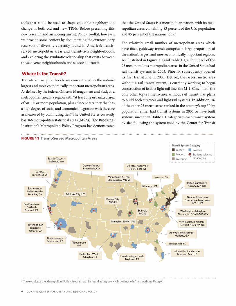
The relatively small number of metropolitan areas which have fixed-guideway transit comprise a large proportion of the nation’s largest and most economically important regions. As illustrated in Figure 1.1 and Table 1.1, all but three of the 25 most populous metropolitan areas in the United States had rail transit systems in 2005. Phoenix subsequently opened its first transit line in 2008; Detroit, the largest metro area without a rail transit system, is currently working to begin construction of its first light rail line, the M-1. Cincinnati, the only other top-25 metro area without rail transit, has plans to build both streetcar and light rail systems. In addition, 16 of the other 25 metro areas ranked in the country’s top 50 by population either had transit systems in 2005 or have built systems since then. Table 1.1 categorizes each transit system by size following the system used by the Center for Transit
2 The web site of the Metropolitan Policy Program can be found at http://www.brookings.edu/metro/About-Us.aspx.
FiGURE 1.1 Transit-Served Metropolitan areas
Legacy
Modest
Emerging
Transit System Category
Evolving
Stations selected for analysisSeattle-tacoma-
bellevue, Wa
Salt Lake city, Ut
albuquerque, nM
Denver-aurora-broomfield, co
Eugene-Springfield, oR
Sacramento-arden-arcade-Roseville, ca
San Francisco-oakland-
Fremont, ca
Phoenix-Mesa-Scottsdale, aZ
Dallas-Fort Worth-arlington, tX houston-Sugar Land-
baytown, tX
Riverside-San bernadino-ontario, ca
new York-northern new Jersey-Long island,
nY-nJ-Pa
Washington-arlington-alexandria, Dc-Va-MD-WV
Miami-Fort Lauderdale-Pompano beach, FL
Virginia beach-norfolk-newport news, Va-nc
atlanta-Sandy Springs-Marietta, ga
Minneapolis-St. Paul-bloomington, Mn-Wi
boston-cambridge-Quincy, Ma-nh
chicago-naperville- Joliet, iL-in-Wi
Kansas city, Mo-KS
Memphis, tn-MS-aR
St. Louis, Mo-iL
Pittsburgh, Pa
Syracuse, nY
Jacksonville, FL

Maintaining DiVERSitY in aMERica’S tRanSit-Rich nEighboRhooDS 7
Rank by Population Metropolitan Statistical Area Population 2005 Transit System 2005
1 new York-northern new Jersey-Long island, nY-nJ-Pa 18,747,320 Extensive
2 Los angeles-Long beach-Santa ana, ca 12,923,547 Large
3 chicago-naperville-Joliet, iL-in-Wi 9,443,356 Extensive
4 Philadelphia-camden-Wilmington, Pa-nJ-DE-MD 5,823,233 Extensive
5 Dallas-Fort Worth-arlington, tX 5,819,475 Medium
6 Miami-Fort Lauderdale-Miami beach, FL 5,422,200 Medium
7 houston-baytown-Sugar Land, tX 5,280,077 Small
8 Washington-arlington-alexandria, Dc-Va-MD-WV 5,214,666 Large
9 atlanta-Sandy Springs-Marietta, ga 4,917,717 Medium
10 Detroit-Warren-Livonia, Mi 4,488,335 none (in Planning)
11 boston-cambridge-Quincy, Ma-nh 4,411,835 Extensive
12 San Francisco-oakland-Fremont, ca 4,152,688 Extensive
13 Riverside-San bernardino-ontario, ca 3,909,954 Large (part of La)
14 Phoenix-Mesa-Scottsdale, aZ 3,865,077 to open in 2008
15 Seattle-tacoma-bellevue, Wa 3,203,314 Medium
16 Minneapolis-St. Paul-bloomington, Mn-Wi 3,142,779 Small
17 San Diego-carlsbad-San Marcos, ca 2,933,462 Medium
18 St. Louis, Mo-iL 2,778,518 Medium
19 baltimore-towson, MD 2,655,675 Medium
20 tampa-St. Petersburg-clearwater, FL 2,647,658 Small
21 Pittsburgh, Pa 2,386,074 Medium
22 Denver-aurora, co 2,359,994 Small
23 cleveland-Elyria-Mentor, oh 2,126,318 Medium
24 Portland-Vancouver-beaverton, oR-Wa 2,095,861 Large
25 cincinnati-Middletown, oh-KY-in 2,070,441 none (in Planning)
26 Sacramento--arden-arcade--Roseville, ca 2,042,283 Medium
27 Kansas city, Mo-KS 1,947,694 Small
28 orlando, FL 1,933,255 none (in Planning)
29 San antonio, tX 1,889,797 none
30 San Jose-Sunnyvale-Santa clara, ca 1,754,988 Extensive (part of SF)
31 Las Vegas-Paradise, nV 1,710,551 Small (private)
32 columbus, oh 1,708,625 none
33 Virginia beach-norfolk-newport news, Va-nc 1,647,346 to open in 2011
34 indianapolis, in 1,640,591 none
35 Providence-new bedford-Fall River, Ri-Ma 1,622,520 Extensive (part of boston)
36 charlotte-gastonia-concord, nc-Sc 1,521,278 Small
37 Milwaukee-Waukesha-West allis, Wi 1,512,855 none
38 austin-Round Rock, tX 1,452,529 to open in 2010
39 nashville-Davidson--Murfreesboro, tn 1,422,544 to open in 2006
40 new orleans-Metairie-Kenner, La 1,319,367 Small
41 Memphis, tn-MS-aR 1,260,905 Small
42 Jacksonville, FL 1,248,371 Small
43 Louisville, KY-in 1,208,452 none
44 hartford-West hartford-East hartford, ct 1,188,241 none (in Planning)
45 Richmond, Va 1,175,654 none
46 oklahoma city, oK 1,156,812 none
47 buffalo-niagara Falls, nY 1,147,711 Small
48 birmingham-hoover, aL 1,090,126 none
49 Rochester, nY 1,039,028 none
50 Salt Lake city, Ut 1,034,484 Medium
TABLE 1.1 Transit in america's largest Metropolitan areas

8 DUKaKiS cEntER FoR URban anD REgionaL PoLicY
3 Two transit systems included in the Center for Transit Oriented Development’s database of transit systems and stations are not included in our calculations. Island Transit in Galveston, Texas, has been omitted both because Galveston is included in the Houston MSA and because the six-mile trolley service originally opened in 1988 has been suspended since being severely damaged by Hurricane Ike in 2005. Las Vegas has only a privately owned transit service, a monorail, with seven stops but no fixed-guideway public transit as yet.
4 The Boston metropolitan area combines three MSAs which are served by the Massachusetts Bay Transportation Authority’s commuter rail network; the San Francisco metropolitan area combines the San Francisco and San Jose MSAs, which are linked by the Caltrain commuter rail system; and the Los Angeles metropolitan area combines the Los Angeles and Riverside MSAs, which are linked by the Metrolink commuter rail system.
Oriented Development: extensive systems are those that have 201 or more stations, large systems have 70-200 stations, medium systems have 25-69 stations and small systems have 24 or fewer stations.
As of 2010, there were 36 fixed-guideway transit systems in the United States, with one more (in the Virginia Beach-Norfolk-Newport News, Virginia, metropolitan area) under construction and scheduled to open in 2011.3 These 37 fixed-guideway transit systems serve a total of 41 Metropolitan Sta-tistical Areas (MSAs), as shown in Figure 1.1 and Table 1.2. While most of the transit-served metropolitan areas are coin-cident with a single MSA, in three cases we combine several MSAs in order to define a transit-served metropolitan area that is geographically matched to the region’s transit system.4
The geographic distribution of transit in the United States has changed in recent decades as new transit systems have begun service and older ones have expanded. In order to understand and assess the different types of transit-served metropolitan areas in the country, we grouped the transit-served metros into four categories based on (1) the transit system’s age, (2) its size and transit expansion plans, (3) the surrounding metro area’s projected population growth rate and (4) the projected employment-growth rate for the area. As shown in Table 1.2, we have divided U.S. transit systems and the metropolitan areas they serve into four categories: legacy, evolving, emerging and modest systems. The legacy transit systems are the five oldest and largest transit systems in the United States: Boston, Chicago, New York, Philadelphia and San Francisco. All have transit systems that are more than a century old and these five systems alone
account for more than two-thirds of all transit-rich neigh-borhoods in the nation. But a large and growing number of TRNs are located beyond these five legacy systems. A second group of 14 metros —including Atlanta, Los Angeles and Washington, D.C.—was categorized as having evolving transit systems because both the metro areas and their transit systems (originally constructed starting in the 1970s, through the 1990s) are generally growing at a more rapid pace than those in the legacy systems. A third set of metros was cat-egorized as having emerging transit systems because none had rail transit until after 2000 and all have plans to grow their new transit system to at least medium size (25 or more stations) by 2030; these include many fast-growing Sun Belt metros such as Phoenix, Houston and Albuquerque. Finally, a handful of modest transit systems exist in smaller metros with limited or no plans to grow their transit systems; most (with the exception of Jacksonville) expect little job or popu-lation growth over the next two decades.
To better understand these different transit-served metropol-itan areas and their economic importance and socioeconomic composition, we aggregated data from the 2000 Census to create a composite profile of transit-served metropolitan areas in the United States.
The geographic distribution of transit in the
United States has changed in recent decades as
new transit systems have begun service and
older ones have expanded.

Maintaining DiVERSitY in aMERica’S tRanSit-Rich nEighboRhooDS 9
Transit-Served Metro Areas Year of initial Operation
Transit System Size in 2005
Anticipated Transit System Size in 2030*
Metropolitan Statistical Area(s)
5 Legacy Systems
boston Ma 1897 Extensive Extensive+ boston-cambridge-Quincy Ma-nhWorcester MaProvidence-new bedford-Fall River Ri-MaProvidence-new bedford-Fall River Ri-Ma
chicago iL 1893 Extensive Extensive+ chicago-naperville-Joliet iL-in-Wi
new York nY 1904 Extensive Extensive+ new York-northern new Jersey-Long island nY-nJ-Pa
Philadelphia Pa 1907 Extensive Extensive+ Philadelphia-camden-Wilmington Pa-nJ-DE-MD
San Francisco ca 1878 Extensive Extensive+ San Francisco-oakland-Fremont ca San Jose-Sunnyvale-Santa clara ca
14 Evolving Systems
atlanta ga 1979 Medium Large atlanta-Sandy Springs-Marietta ga
baltimore MD 1983 Medium Large baltimore-towson MD
Dallas-Fort Worth tX 1996 Medium Large Dallas-Fort Worth-arlington tX
Denver co 1994 Small Large Denver-aurora-broomfield co
Los angeles ca 1990 Large Extensive Los angeles-Long beach-Santa ana caRiverside-San bernardino-ontario ca
Memphis tn 1993 Small Medium Memphis tn-aR-MS
Miami FL 1984 Medium Large Miami-Fort Lauderdale-Pompano beach FL
new orleans La 1835 Small Medium new orleans-Metarrie-Kenner La
Portland oR 1986 Large Extensive Portland-Vancouver-beaverton oR-Wa
Sacramento ca 1987 Medium Large Sacramento—arden-arcade—Roseville ca
Salt Lake city Ut 1999 Medium Large Salt Lake city Ut
San Diego ca 1995 Medium Large San Diego-carlsbad-San Marcos ca
Seattle Wa 1982 Medium Large Seattle-tacoma-bellevue Wa
Washington Dc 1976 Large Extensive Washington-arlington-alexandria Dc-Va-MD-WV
12 Emerging Systems
albuquerque nM 2006 Small Medium albuquerque nM
austin tX 2010 Small Medium austin-Round Rock tX
charlotte nc 2007 Small Large charlotte-gastonia-concord nc-Sc
Eugene oR 2007 Small Medium Eugene-Springfield oR
houston tX 2004 Small Medium houston-Sugar Land-baytown tX
Kansas city Mo-KS 2005 Small Medium Kansas city Mo-KS
Little Rock aK 2004 Small Medium Little Rock-north Little Rock-conway aR
Minneapolis-St. Paul Mn 2004 Small Medium Minneapolis-St. Paul-bloomington Mn-Wi
nashville tn 2006 Small Medium nashville-Davidson—Murfreesboro—Franklin tn
norfolk Va 2011 Under construction
Medium Virginia beach-norfolk-newport news Va-nc
Phoenix aZ 2008 Small Medium Phoenix-Mesa-Scottsdale aZ
tampa FL 2002 Small Medium tampa-St. Petersburg-clearwater FL
6 Modest Systems
buffalo nY 1984 Small Small buffalo-niagara Falls nY
cleveland oh 1913 Medium Medium cleveland-Elyria-Mentor oh
Jacksonville FL 1971 Small Unknown Jacksonville FL
Pittsburgh Pa 1897 Medium Medium Pittsburgh Pa
St. Louis Mo 1993 Medium Medium St. Louis Mo-iL
Syracuse nY 1970 Small Small Syracuse nY
TABLE 1.2 Categories of Transit-Served Metropolitan areas
*based on projections by the center for transit-oriented Development, 2006.

10 DUKaKiS cEntER FoR URban anD REgionaL PoLicY
diversity in Transit-Rich Metropolitan Areas and neighborhoodsIn compiling data from the 2000 Census for the 41 MSAs served by fixed-guideway transit, we created two aggregate data sets, one for the principal cities in each of the transit-served metro areas and one for the metropolitan areas as a whole. Transit systems tend to be constructed in a spoke-and-hub pattern designed to move trips to the central business district in the principal city of a metropolitan area; transit stations tend to be concentrated in or near the principal city rather than spread throughout entire MSA. Because regional transit systems serve principal cities more intensively than the region as a whole, transit use for commuting, as reported on the American Community Survey, is more than 11 percent-age points higher in the principal cities than in the suburban portions of America’s metropolitan areas (Istrate, Puentes & Tomer, 2010). For this reason, we looked at both the MSAs as a whole and at their principal cities.
Constituting just over 10 percent of all U.S. metropolitan areas, transit-served metros are economically important and extraor-dinarily diverse. As of 2000, as shown in Figure 1.2, transit-served metropolitan areas were home to nearly half of the country’s residents and over 70 percent of its workforce. The principal cities in these metro areas alone contained 19 percent of the nation’s population and 29 percent of its workforce.
Transit-served metropolitan areas are also places of concen-trated racial and ethnic diversity. As shown in Figure 1.3,
transit-served metropolitan areas are home to half of the black population, over 60 percent of the Hispanic population, and over 70 percent of the nation’s immigrants. About two-thirds of the blacks and one-half of the Hispanics in the U.S. live in the principal cities of these metros.
Finally, transit-served metropolitan areas include a dispro-portionate share of U.S. rental housing. In 2000, as shown in Figure 1.4, transit-served metro areas accounted for slightly more than half of the nation’s rental housing; the principal cities of these 41 metro areas alone accounted for nearly 30
10
30
60
0
Per
cent
age
of U
.S. T
otal
in (
20
00
)
20
50
40
70
80
Population 2000
Workforce 2000
Principal cities Metro areas
FiGURE 1.2Economic importance of Transit-Served Metropolitan areas
10
30
60
0
Per
cent
age
of U
.S. T
otal
in (
20
00
)
20
50
40
70
80
Black HispanicWhite Foreign-Born
Other (Race)
Principal cities Metro areas
FiGURE 1.3 Diversity in Transit-Served Metropolitan areas
10
30
60
0
Per
cent
age
of U
.S. T
otal
in (
20
00
)
Housing Type
20
50
40
Housing Units
Owner Occupied
Renter Occupied
Principal cities Metro areas
FiGURE 1.4 Housing in Transit-Served Metropolitan areas

Maintaining DiVERSitY in aMERica’S tRanSit-Rich nEighboRhooDS 11
percent of all rental units. Rental housing is even more con-centrated in those portions of transit-served metropolitan areas closest to transit stations: an analysis of 2000 Census data found that renters made up nearly two-thirds of those living in the 3,300 transit zones (areas within a one-half mile radius of fixed guideway transit stations) in the Center for Transit Oriented Development’s database (CTOD, 2006). Similarly, a recent analysis of federally subsidized affordable rental apartments in 20 metropolitan areas identified nearly 200,000 such units within one-quarter mile of transit stations (Harrell, Brooks & Nedwick, 2009).
These high concentrations of people of color, immigrants and renters could be attributed to the inclusion of a handful of particularly large and diverse regions among the transit-served metropolitan areas. Our analysis did find that the met-ropolitan areas served by the five large legacy transit systems (Boston, Chicago, New York, Philadelphia and San Francisco) are home to one in five blacks and Hispanics in the United States. But, as shown in Figures 1.5 and 1.6, the 14 evolving transit systems are also diverse, with nearly one-third of all the nation’s Hispanics and one-fifth of all U.S. blacks living in these faster-growing metros, including Atlanta, Dallas, Miami, Salt Lake City and Washington, D.C. These metros are also home to over one-third of all foreign-born residents; another 30 percent of immigrants live in the five metros served by legacy systems. Metro areas served by the dozen evolving systems also have significant populations of black, Hispanic and immigrant residents.
Our findings about the diversity of transit-served metro-politan areas are consistent with other analyses of diversity in TRNs. The Center for Transit-Oriented Development, for example, analyzed the demographics of more than 3,300 transit zones (similar but not identical to our TRNs) and found that 86 percent were either more economically diverse, more racially diverse, or both, than the average census tract in the same metropolitan area. Nearly 60 percent of those living in the transit zones were non-white and 65 percent were renters (CTOD, 2007).
Transit-rich neighborhoods and the larger metropolitan areas in which they are located are extraordinarily diverse places and are home to a disproportionate share of people of color, immigrants and renters in the United States.
These are among the groups that neighborhood and equity advocates are concerned about when they worry about gen-trification and displacement in transit-rich neighborhoods. But is equity the only concern if neighborhood diversity is put at risk by transit? Should transit planners and supporters be concerned as well?
10
30
60
0
Per
cent
age
of U
.S. T
otal
in (
20
00
)
Transit System Category
20
50
40
70
Mature/Extensive
Mature/Modest
Evolving All Transit Metros
Emerging
FiGURE 1.6 Diversity in Different Types of Transit- Served Metropolitan areas —Hispanics
Principal cities Metro areas
10
30
60
0
Per
cent
age
of U
.S. T
otal
in (
20
00
)
Transit System Category
20
50
40
Mature/Extensive
Mature/Modest
Evolving All Transit Metros
Emerging
FiGURE 1.5 Diversity in Different Types of Transit- Served Metropolitan areas —Blacks
Principal cities Metro areas

12 DUKaKiS cEntER FoR URban anD REgionaL PoLicY
Transit and neighborhood diversityPutting issues of equity aside, there are reasons to be concerned if transit-rich neighborhoods gentrify and their diversity is reduced. One potential concern is that neigh-borhood change could affect transit ridership, since nearby neighborhoods would seem to be vital sources of transit pas-sengers.5 Changing neighborhoods, and changing neighbors, could affect transit use and thus the very reason for the transit investment.
In order to evaluate the importance of neighborhood diversity to transit success, we reviewed the available data and literature on the demographics of transit users and on the travel behavior of diverse populations. One important source of data was published in 2007 by the American Public Transportation Association in its report A Profile of Public Transportation Passenger Demographics and Travel Charac-teristics Reported in On-Board Surveys. That report compiled information from questionnaires completed by over 496,000 public transit riders sampled between 2000 and 2005 by transit systems that carry 60 percent of all transit trips. These data present the most complete picture to date of the demo-graphics and travel behavior of the people who use transit in the United States (APTA, 2007). Another key source of data is the 2001 National Household Travel Survey (NHTS)6, a U.S. Department of Transportation effort sponsored by the Bureau of Transportation Statistics and the Federal Highway Admin-istration to collect data on long-distance and local travel by the American public. NHTS survey data are collected from a sample of households and expanded to provide national estimates of trips and miles by travel mode, trip purpose and a host of household attributes. The data allow analysis of daily travel by all modes, including characteristics of the people traveling, their household and their vehicles. While the decennial Census and American Community Survey data include information only on commuting trips, which consti-tute less than one-fifth of all trips, the NHTS provides more comprehensive data on trips made for all purposes (Pucher & Renne, 2003).
Our review of the literature identified three demographic groups who are more likely to use transit and more likely to live near transit than other Americans: people of color, low-income households and renters. In a country where over 95 percent of all households own at least one car, these three groups are also disproportionately likely to live in house-holds without vehicles. Vehicle ownership—or, rather, lack of ownership—is a strong predictor of transit use. While only 4.3 percent of U.S. households lack a car, according to 2006-2008 American Community Survey data, 36 percent of all workers 16 years and older who report that they commute to work using public transportation live in households without a vehicle available. The APTA on-board survey data (2007) similarly found that only 45 percent of transit riders had a vehicle available to them to make the trip for which they chose transit. Residents of households without vehicles use transit for 19.1 percent of trips, while the addition of even a single vehicle to a household drops transit use to 2.7 percent of all trips. Many households “abandon public transportation as soon as they own their first car” (Pucher & Renne, 2003 at 57). Transit users are far less likely to own cars then other Americans—and those without cars are far more likely to use transit.
People of color follow this pattern of owning fewer motor vehicles and using more transit. Blacks, Hispanics and Asians all rely more heavily on transit than whites, even after con-trolling for income (Blumenberg et al., 2007). Blacks are almost six times as likely as whites to travel by public transit; Hispanics use transit less than blacks but still about three times more than whites (Pucher & Renne, 2003). Other analyses have similarly found that minorities are several times more likely to use public transit than whites (Lin & Long, 2008). The APTA data from on-board surveys (2007) found that the majority of transit riders in America are non-white, as shown in Figure 1.7. An analysis of the 2001 NHTS data found that blacks and Hispanics comprise 54 percent of all transit users (Pucher & Renne, 2003). Similarly, the 2006-2008 American Community Survey data indicates that, of all those who report using public transportation to commute to work, only 40 percent are non-Hispanic whites.
5 Since nearly 60 percent of transit riders walk to transit (APTA, 2007), they are presumably coming from locations relatively close to the transit station.6 Initial data from the 2009 version of the National Household Travel Survey (NHTS) was released in January 2010. Shortly afterwards, however, the Federal
Highway Administration announced that it would be releasing enhanced data later in 2010, in part due to conflicting data on transit utilization in the NHTS as compared to the Federal Transit Administration’s National Transit Database. Given these concerns specifically about transit-related data, and the in-depth analyses of the 2001 NHTS data already undertaken, this report relies on the 2001 rather than 2009 NHTS data. The web site for the 2001 and 2009 National Household Travel Surveys and previous Nationwide Personal Transportation Surveys can be found at http://nhts.ornl.gov/index.shtml.

Maintaining DiVERSitY in aMERica’S tRanSit-Rich nEighboRhooDS 13
People of color also concentrate in transit-rich neighbor-hoods. For example, CTOD has calculated that while blacks were only 12 percent of the U.S. population and 14 percent of the population in transit-served metro areas in 2000, they made up 23 percent of all residents living within one-half mile of transit stations in 2000. Similarly, Hispanics made up 24 percent of all transit zone residents, even though they were only 18 percent of residents throughout the transit-served metropolitan areas and 13 percent of the U.S. population. Asians, representing 4 percent of U.S. residents, were 8 percent of the residents of transit zones. As a result, whites were only 41 percent of transit zone residents even though they made up 69 percent of the U.S. population in 2000 (CTOD, 2006).
The traditional explanation for increased transit use and concentration of people of color in TRNs is that they are disproportionately low income and low-income households are more likely to use and live near transit. Giuliano (2000), however, analyzed the 1995 NHTS data and rejected the con-clusion that racial/ethnic differences can be explained solely by income and other household characteristics. She found that different racial/ethnic groups exhibit “fundamental dif-ferences in what motivates travel choices.” (Giuliano, 2000 at 130). Race and ethnicity, she concludes, play a significant and complex role in travel behavior independent of income and residential location characteristics.
Like people of color, lower-income households are also more likely to use transit, more likely to live near transit and less likely to own a car. While transit is used by Americans of all incomes, those from lower income and working-class house-holds use transit far more than upper income Americans. The APTA transit passenger survey data (2007) found that the majority of transit riders live in households with an annual income of $50,000 or less, as shown in Figure 1.8. The median income of transit passengers (in 2004 dollars) was $39,000, about 12 percent lower than the U.S. median income at the time the surveys were done between 2000 and 2005.
Lower-income households are also less likely to own a car. As Pucher and Renne (2003 at 55) summarize in their analysis of the 2001 NHTS data, “[i]ncome is the primary determinant of auto ownership, which, in turn, is the main determinant of modal choice.” While automobile ownership has become near universal in the United States among higher-income house-holds, 26.5 percent of households with incomes less than $20,000 do not own a motor vehicle, a figure which drops to 5 percent for households with incomes in the $20,000-$39,999 range and even lower levels for higher-income groups. They note that “it is probably unique to the United States that three-fourths of even its poorest households own a car. This reflects the extent to which the car has become a virtual necessity for even the most basic transportation needs in most American metropolitan areas” (Pucher and Renne, 2003 at 55).
Source: aPta, 2007
FiGURE 1.8Household income of Transit Passengers
$25,000–$49,999
$50,000–$74,999
$75,000– $99,999
more than$150,000 under $15,000
$15,000–$24,999
$100,000– $149,999
30.8%
20.1%
7.2%
9.0%
15.8%
14.8
2.3%
Source: aPta, 2007
FiGURE 1.7Ethnicity of Transit Passengers
White/caucasian
black/african american5.5%
6.6% 33.1%
40.6%
14.3%other or Multi-Ethnic
asian/Pacific islander
hispanic/Latino

14 DUKaKiS cEntER FoR URban anD REgionaL PoLicY
Unfortunately, the need for low-income households to own a vehicle imposes economic hardship on many of them. The average American family spends 19 percent of its monthly budget on transportation, the second highest item after housing. Using transit can create substantial savings: living in location-efficient neighborhoods (with a good mix of uses and access to public transportation) can provide a 16 percent cost savings compared to living in an automobile-dependent exurban neighborhood (CTOD, 2007). A recent Brookings Institution analysis similarly found that the working poor (those with incomes less than twice the federal poverty threshold, with a median income of $20,280 in 2003) spent 8.4 percent of their income just on commuting to work, if they commuted by driving, compared to 5.8 percent if they used public transit (Roberto, 2008).
A final important group when assessing transit ridership is renters. With a disproportionate amount of rental housing located in transit-served metros and transit-rich neighbor-hoods, it should come as no surprise that renters are dispro-portionately represented among transit riders. While only 29 percent of all workers 16 years and older live in rental house-
holds, according to 2006-2008 American Community Survey data, 58 percent of those who report that they commute to work using public transportation are renters. A recent Brookings analysis of this data found that two-thirds of transit commuters in the principal cities of the 100 largest U.S. met-ropolitan areas, as well as more than 40 percent of those living in the suburban portions of those metros, are renters (Istrate, Puentes & Tomer, 2010). Like members of low-income households and people of color, renters are far less likely than homeowners to own a car. The 2006-2008 American Community Survey data indicates that while 95 percent of American homeowners own one or more motor vehicles, nearly 20 percent of renter households own no motor vehicle.
Historically, these three demographic groups—people of color, low-income households and renters—have been able to find housing in transit-rich neighborhoods. As a result, TRNs are more racially diverse, less wealthy and contain a higher proportion of rental housing than other neighborhoods. But current residents of both existing and new transit-rich neigh-borhoods find themselves increasingly concerned as growing numbers of Americans consider whether to take advantage of the many benefits of living in transit-rich neighborhoods. Demand for housing near transit is expected to far outstrip supply over the next two decades (CTOD, 2007). Those groups who want to live near transit and benefit from proximity to transit stations may not be able to compete successfully for the limited supply of housing, especially affordable housing, in transit-rich neighborhoods. If these TRN residents are displaced from their neighborhoods and replaced by higher-income, less diverse residents, the transit systems that rely on them may suffer as well.
Transit and diverse neighborhoods need Each OtherWhen evaluating how best to maximize future ridership of both existing and new transit, planners sometimes distin-guish between two types of transit riders: those who use transit by necessity, sometimes disparagingly referred to as captive riders, and those who could use a vehicle for their trip but nonetheless choose to use transit, often referred to as choice riders (Krizek & El-Geneidy, 2007). Such planners often assume that the captive riders will remain transit users indefinitely and therefore the key to increasing ridership is to attract more choice riders.
Historically, these three demographic groups—
people of color, low-income households and
renters—have been able to find housing in
transit-rich neighborhoods. As a result, TRNs
are more racially diverse, less wealthy and
contain a higher proportion of rental housing
than other neighborhoods.

Maintaining DiVERSitY in aMERica’S tRanSit-Rich nEighboRhooDS 15
For total transit ridership to increase, however, transit systems need to both keep the riders that they already have and to attract new riders. Rather than dividing transit users into captive or choice riders, transit planners should instead focus on those we refer to as “core riders”, as well as those who have been called “potential riders”. (Krizek & El-Geneidy, 2007).
By core riders we mean those people who are known to be the most frequent and regular users of transit. Such regular users make the vast majority of transit trips. More than 80 percent of transit trips are taken by people who ride three or more days per week, and nearly two-thirds by passengers who use transit five or more days per week (APTA, 2007).
As the data in this chapter demonstrate, transit systems rely heavily on three groups for their core ridership: low-income households, people of color and renters. Based on 2001 National Household Travel Survey data, Pucher & Renne (2003) calculated that low-income white households and people of color together account for a full 63 percent of the nation’s transit riders (Pucher & Renne, 2003). The American Public Transportation Association’s on-board survey data gathered between 2000 and 2005 similarly finds that typical transit riders have lower incomes, greater racial and ethnic diversity and lower rates of car ownership than other Americans (APTA, 2007).
While keeping these core riders is critical, so is attract-ing new transit riders. Krizek and El-Geneidy (2007 at 74) coined the term “potential riders” to describe people who are “not currently using transit for a variety of reasons and/or concerns but may consider the idea of using transit”. They distinguish between such potential riders and those they refer to as “auto captives”, who cannot or will not consider using transit or live in places where transit is not even available.
One of the most important sources of potential transit riders is households that do not have—either by choice or by neces-sity—a personal vehicle. Cervero, for example, has found that the probability of using rail to commute is highest “when the worker lives in a zero-car household. Adding one car results in probabilities plummeting” (2007 at 2082). Transit planners looking for potential riders could start by looking in zero-car households. And, as we have seen, low income households, people of color and renters are more likely to live in such zero-car households.
While diverse neighborhoods and their residents, who are disproportionately low-income, people of color and/or renters, benefit from access to transit, transit systems also benefit from proximity to economically and racially diverse neighborhoods. Low-income households, people of color and renters are critical populations for transit systems seeking to maintain their core ridership and increase their total ridership. These are the people who most need high-quality, affordable transit—and the ones most likely to use such transit when it is provided.
Planners frequently speak of the need for transit-oriented development to support ridership, but what transit stations really need is transit-oriented neighbors who will regularly use the system. There is a symbiotic relationship between diverse neighborhoods and successful transit: transit systems benefit from and depend on the racial and economic diversity of the neighborhoods that they serve, just as low-income households, people of color and renters depend on and benefit from living in neighborhoods served by transit. Transit agencies and planners should therefore be as concerned as equity advocates about any potential displacement of people of color, low-income households or renters from transit-rich neighborhoods.
Transit planners looking for potential riders
could start by looking in zero-car households.
And, as we have seen, low income households,
people of color and renters are more likely to
live in such zero-car households.

16 DUKaKiS cEntER FoR URban anD REgionaL PoLicY
neighborhood Change and Transit: What We Know
CH
AP
TER
2
neighborhoods change over time, in ways that both
benefit and harm those who have been living there.
Understanding the process of neighborhood change is always challenging.
Researchers, policymakers and advocates have long been concerned about patterns of neighborhood change that reduce the racial and/or economic diversity of neighbor-hoods. The good news is that a growing share of U.S. neigh-borhoods are becoming more racially and ethnically diverse, both because fewer neighborhoods deliberately exclude minorities entirely and because recent immigration has made the population as a whole more diverse (Turner & Rawlings, 2009). But progress in creating racially and economically diverse neighborhoods has been slow, so forces that threaten to bring gentrification and displacement to neighborhoods that are currently racially and economically diverse are of particular concern.
One set of diverse neighborhoods that appear to be under pressure are the more than 3,300 neighborhoods that have a fixed-guideway transit station and the hundreds more where new transit is being planned. The desirability of these transit-rich neighborhoods (TRNs) may change because a new transit station is added, because an existing station is upgraded or service frequency is increased, or even because a decades-old transit-rich neighborhood close to the central
business district becomes more attractive as gasoline prices rise and traffic congestion worsens.
If understanding neighborhood change is complicated, then understanding neighborhood change in TRNs is very compli-cated. Two sets of literature can, taken together, help us under-stand how the presence of new or improved transit might change the surrounding neighborhood. First, we review recent studies on neighborhood change, gentrification and displacement in general to better understand the processes that drive neighborhood change. Then, to understand how such change plays out in TRNs, we look at studies of changing demographic and travel patterns in transit-served neighbor-hoods and transit-oriented developments.
Patterns of neighborhood Change: Gentrification and displacementWhile the terms gentrification and displacement are fre-quently used interchangeably, recent research highlights the importance of distinguishing between these two related patterns of neighborhood change.
Gentrification is a neighborhood change process charac-terized by increasing property values and incomes. Some researchers include the process of displacement within the definition of gentrification, defining gentrification as occurring when wealthier residents move into a neighbor-hood. Others define gentrification in economic, rather than demographic, terms by focusing on a neighborhood’s revi-talization (Chapple, 2009). Kolko (2007 at 1), for example, defines gentrification as “the upgrading of urban neighbor-hoods, especially neighborhoods starting from low average income, low housing values, or high poverty rates.” Defined in such economic terms, gentrification can be a positive or destructive form of neighborhood change, depending on who benefits from the reinvestment and revitalization.
Displacement, whether considered as an inevitable part of gentrification or not, is a pattern of change in which current residents are involuntarily forced to move out because

Maintaining DiVERSitY in aMERica’S tRanSit-Rich nEighboRhooDS 17
they cannot afford to stay in the gentrified neighborhood (Freeman, 2005). Displacement may be immediate or occur over time, with the prior residents departing as their housing cost burden increases due to rising rents and housing values caused by gentrification and they can no longer afford to live in their old neighborhood (Chapple, 2009).
Recent studies indicate that displacement, as traditionally understood, may not be the sole or even primary mechanism driving change in gentrifying neighborhoods. These research-ers distinguish between neighborhood change processes that involve the forced departure of lower-income residents and those that occur through the normal processes of housing turnover and succession. Several recent studies demonstrate that the demographic composition of gentrifying neigh-borhoods can be altered through a process of succession or replacement driven by accelerated turnover of the housing stock. This housing turnover is marked both by unequal retention of existing residents (with wealthier and/or better-educated residents more likely to remain) and in-migration of wealthier, better-educated residents (Freeman, 2005). One
recent study, for example, looks at demographic processes in gentrifying census tracts between the 1990 and 2000 Census—an investigation similar to that we describe in the next chapter, but with the benefit of confidential data from the long form that allowed the researchers to investigate the underlying mechanism driving the gentrification. The study concluded that, during the 1990s, the process of gentrifica-tion was distinguished by the disproportionate retention and income gains of black high school graduates living in the gen-trifying neighborhoods combined with in-migration by white college graduates (McKinnish, Walsh & White, 2008).
This pattern of change, while differing from the traditional model of involuntary displacement, nevertheless raises serious equity concerns. Whether caused by displacement or replace-ment or some combination of the two, the result is much the same: the gentrified neighborhood is more expensive and populated by higher-income residents. Understanding the drivers of these changes, however, is important in order to shape policy interventions that best address the neighborhood change processes associated with gentrification.

18 DUKaKiS cEntER FoR URban anD REgionaL PoLicY
Transit and neighborhood ChangeIn an urban setting, virtually any large public infrastructure project is likely to have at least some impact on the demog-raphy of surrounding neighborhoods. New transportation infrastructure simultaneously creates disamenities, such as noise and traffic congestion, and amenities, such as increased mobility and accessibility (Kilpatrick et al., 2007).
The interstate highway system provides one example of how transportation investment impacts metropolitan demogra-phy. From the 1950s through the 1990s, the extension of the U.S. interstate system into the central business districts of many cities displaced thousands of households and commer-cial businesses in adjoining neighborhoods while enhancing the value of the downtown office towers that were made more accessible from the suburbs. The existence of inner-city inter-states made it more convenient for downtown workers to live in the suburbs and commute to work, often making it possible for middle-class families to leave the city (Jackson, 1985).
Although once considered to be a disamenity and even a poverty magnet, transit is increasingly viewed as a desirable amenity for an urban neighborhood. Households may prefer transit-rich neighborhoods because of the added ease of commuting or traveling to other parts of the city or metro-politan area. The area adjacent to the new transit stop often experiences blossoming commercial activity with the intro-duction of shops, restaurants and night spots that attract even those who do not use public transit for commuting (Bluestone, Stevenson & Williams, 2008). In recent studies, access to transit has increased the value of nearby property, with prop-erties in TRNs experiencing a premium effect compared to similar properties without transit access (CTOD, 2008).
Such an increase in property values can, of course, trigger gentrification. While noting that “[n]o research to date has explicitly examined the relationship between transit invest-ment and gentrification,” Chapple (2009, at 2) expresses concern “that the area around rail transit stations may be
particularly susceptible to gentrification—and potentially displacement as well.”
The studies that have been done on gentrification and transit-rich neighborhoods report varying results. Some TRNs seem to experience little change, others gentrify, and some attract poorer rather than wealthier residents. One widely cited example of transit-driven gentrification is the Davis Square transit station in Somerville, Massachusetts, which opened in 1984 as part of an extension of the MBTA’s Red Line in metro-politan Boston. Before the station was built in 1970, only 8.2 percent of Davis Square adult residents were college graduates, far lower than the 14.7 percent share in metropolitan Boston. By 2000, 49.7 percent of Davis Square’s adult population had a college degree, higher than the metro area’s 39.6 percent share (Kahn 2007), a classic indicator of gentrification. In Chicago, Lin (2002) found evidence of gentrification in the form of rising property values closer to transit stations between 1975 and 1980 and again from 1985 to 1991, but concedes that the pattern was interrupted between 1980 and 1985.
Other studies have found different patterns of neighbor-hood change in different transit-rich neighborhoods and metropolitan areas. Baum-Snow and Kahn examined transit utilization in sixteen metropolitan areas that expanded their transit systems between 1970 and 2000 and, as part of their analysis, analyzed mean household income trends. They found that income in the newly transit-served areas was lower than that in other areas within the same metro and that this income gap widened between 1970 and 2000 in all but two of the cities studied. Because the newly transit-served neigh-borhoods became poorer, relative to other areas within their regions, after the new transit opened, Baum-Snow and Kahn concluded that public transit remains a poverty magnet rather than a catalyst for gentrification (Baum-Snow & Kahn, 2005 at 25).
Kahn subsequently analyzed fourteen of the cities in which new rail transit was built between 1970 and 2000 specifically to better understand gentrification trends. He looked at two
Whether caused by displacement or
replacement or some combination of the two,
the result is much the same: the gentrified
neighborhood is more expensive and populated
by higher-income residents.
Although once considered to be a disamenity
and even a poverty magnet, transit is increas-
ingly viewed as a desirable amenity for an urban
neighborhood.

Maintaining DiVERSitY in aMERica’S tRanSit-Rich nEighboRhooDS 19
indications of gentrification—changes in home values and the share of community residents with college degrees—in census tracts in 14 different metropolitan areas where new transit stations were built between 1970 and 2000. He dif-ferentiated between stations with parking and those without, hypothesizing that park-and-ride stations would generate less gentrification because the parking garage “creates a ‘lose/lose’ for wealthy incumbent members of the tract. They do not want to use this rail transit mode and the quality of life in their community will fall due to congestion, traffic and rising crime exposure” (Kahn, 2007 at 170). But even accounting for the two types of transit stations failed to produce a consistent pattern of neighborhood change. Kahn found some but not all walk-and-ride stations (those without parking) had a sta-tistically significant, positive effect on home prices and were associated with a statistically significant increase in the share of adults who are college graduates. Neighborhoods close to new park-and-ride communities, Kahn found, often expe-rienced increases in poverty. Kahn concluded that “[a]cross the 14-city sample, new transit’s local impacts differ signifi-cantly” with signs of gentrification around walk-to stations in metropolitan areas like Boston and Washington, D.C., but no evidence of gentrification around such neighborhoods in Los Angeles and Portland (Kahn, 2007 at 181).
A recent study of neighborhood change in the Bay Area between 1990 and 2000 by the University of California at Berkeley’s Center for Community Innovation identified only 102 gentrifying census tracts (7.3 percent of all tracts in the Bay Area). Of these, however, 85 census tracts included transit stations, with about half having BART rapid transit (subway) stations and others having commuter rail, Muni Metro, and even cable car stops. However, some of the tracts that were classified as becoming more middle income, becoming lower income and becoming “bipolar” (with growth of households at both the lowest and highest of income groups) were also home to transit stations (Chapple, 2009). In short, in this study many but not all gentrifying neighborhoods were transit-rich and while some transit-rich neighborhoods were gentrifying, others were experiencing very different patterns of change.
Even fewer studies address the issue of displacement in transit-rich neighborhoods. Citing three studies indicating that some neighborhoods around some rail transit stations had been attracting increasing numbers of higher income households and experiencing rising property values, Pucher
and Renne (2003, at 61) conclude that “[t]he gentrification of working class neighborhoods has helped revitalize many inner cities and older suburbs, while increasing transit use among the affluent. Unfortunately, it has reduced the accessi-bility of low-income households to rail transit.” They support this conclusion with data from the 2001 National Household Travel Survey, which found a modest increase in transit trips made by the highest income group between the 1995 and 2001 surveys and a modest decrease in rail transit trips made by the lowest income group during the same period.
One flaw in many of these studies is the tendency to look at only a few potential indicia of gentrification: housing values but not rents, or proportion of college-educated residents but not income. With so few variables to analyze, researchers are often at a loss to explain the different patterns of neighborhood change observed in different neighborhoods or over different periods of time. The addition of a new transit station—and perhaps even the continuing attraction of an older transit station—can catalyze a process of neighborhood change that produces gentrification and, potentially, displacement of prior residents by higher-income and potentially more racially homogeneous residents with the ability to pay higher rents and buy more expensive homes. Such gentrification and displacement does occur in some TRNs. But it is equally clear that transit does not inevitably lead to gentrification and displacement: some neighborhoods see little change, while others actually experience increased poverty. More research is needed—beginning with that presented in the next chapter—to help sort out which TRNs are most likely to experience gentrification and displacement.
One flaw in many of these studies is the
tendency to look at only a few potential indicia
of gentrification: housing values but not rents,
or proportion of college-educated residents but
not income. With so few variables to analyze,
researchers are often at a loss to explain the
different patterns of neighborhood change
observed in different neighborhoods or over
different periods of time.

20 DUKaKiS cEntER FoR URban anD REgionaL PoLicY
neighborhood Change and Change in Travel BehaviorThe limited literature on gentrification and displacement in TRNs frequently overlooks one critical characteristic of such neighborhoods: whether or not residents are using the transit. As discussed in the previous chapter and succinctly stated by Pucher and Renne (2003, at 11), “[i]ncome is the primary determinant of automobile ownership, which, in turn, is the main determinant of whether people drive or use transit.” In transit-rich neighborhoods in particular, one obvious indicator of undesirable gentrification would seem to be rising automobile ownership associated with the increase in incomes that accompanies gentrification. Yet studies of gentrification rarely consider trends in vehicle ownership or transit use for commuting, even though such data is included in the Census and American Community Survey data so fre-quently used in the studies.
One recent study examined commuting choices in gentrified neighborhoods in three Canadian cities. Danyluk and Ley (2006) investigated the relationship between gentrification and the mode of transportation that the neighborhood’s wealthier residents chose for commuting trips. They found, unfor-tunately, that neighborhood residents were less likely to use transit and slightly more likely to drive (although more likely to bicycle) than residents of similar, non-gentrified districts.
Another tool for understanding how travel behavior changes in TRNs, then, is recent studies in the transportation and travel behavior literature which examine changing travel patterns in TRNs—or at least in specific developments, usually called transit-oriented developments (TODs)—in those neighbor-hoods. A review of this literature by the Transit Cooperative Research Project, for example, found that “TOD residents are generally associated with lower automobile ownership rates” and that residents “without access to an automobile are more likely to forego travel or to make trips on foot or by transit.” (Evans & Pratt, 2007 at 17-18).
Perhaps the most useful insights come from the literature on the role of self-selection among those living in TODs. Certain demographic groups—including low-income and minority core transit riders as well as wealthier riders who choose to use transit—are disproportionately attracted to well-planned transit-oriented developments. Cervero (2007), for example, concludes that a combination of a lifestyle preference for living near transit and public policies shape travel behavior in TODs (and, perhaps, TRNs). The model he developed predicts that Asian-American and Hispanics tend to be more attracted than whites to live near transit stations, as do lower-income households (those making less than $40,000). Perhaps most tellingly, his model demonstrates that the most transit-oriented neighbors are those from households without cars: the probability of using transit for commuting drops sharply when one car is added to a zero-car household and sharply again for workers from two-car households. Cervero notes that this is consistent with his earlier survey work, which found that station-area residents from zero-car households were 14 times more likely to commute on rail transit than those from three-car households.
The self-selection process that Cervero and others describe in TRNs may contribute to the process of replacement observed in recent studies of gentrifying neighborhoods. Freeman (2005), for example, notes that to understand gentrification requires looking not only at who is moving out of a neigh-borhood but also at who is moving into the neighborhood. He concludes (at 487) that researchers overlook “the extent to which changes in the characteristics of in-movers could be the more important force [than those moving out] in deter-mining the way that neighborhoods change.” Similarly, the demographics of those who self-select residence in a TRN may influence neighborhood change in TRNs. The types of in-movers in gentrifying TRNs are also important to under-stand. If the in-movers own two or more cars, for example, they may be far less likely to use the transit available in their new neighborhood.
Understanding neighborhood change in TRNs therefore requires a detailed understanding of both who lived in those neighborhoods before the transit was built, who lives there afterwards and how any changes came about. In the next chapter, we undertake just such an exploration.
In transit-rich neighborhoods in particular, one
obvious indicator of undesirable gentrification
would seem to be rising automobile ownership
associated with the increase in incomes that
accompanies gentrification.

Maintaining DiVERSitY in aMERica’S tRanSit-Rich nEighboRhooDS 21
neighborhood Change and Transit: What We learned
CH
AP
TER
3
To better understand patterns of neighborhood change in
newly transit-rich neighborhoods, this chapter presents
the results of new research analyzing socioeconomic
change in 42 neighborhoods in 12 metropolitan areas
first served by rail transit between 1990 and 2000.
Because prior research on gentrification and TRNs has looked at only a limited number of neighborhood character-istics, we decided to explore a much broader range of factors related to population, housing and transportation across a variety of different transit systems. After explaining how the research was accomplished and what was learned, we present our conclusions about the likely mechanisms underlying the observed patterns of change in transit-rich neighborhoods.
Methods and dataWe began this research by identifying 12 metropolitan areas in which one or more new heavy, light or commuter rail stations had opened between the 1990 Census and the 2000 Census. We chose to focus on those that opened by 1997 to allow time for demographic changes to emerge before the 2000 Census. Having divided U.S. transit systems into four categories based on their age and number of stations served as explained in Chapter 1, we made certain to include new stations added to the oldest and most extensive legacy transit systems (Chicago and San Francisco) as well as stations added to smaller and slower-growing modest transit systems (Cleveland and St. Louis). Not
surprisingly, the largest number of new stations was found in evolving transit systems, the growing transit systems in growing metropolitan areas. We identified new stations built between 1990 and 1997 in the three largest evolving transit systems in Los Angeles, Portland, and Washington, D.C.; in the medium-sized evolving systems in Atlanta, Baltimore, Dallas and San Diego; and in the small but fast-growing transit system in Denver. (The fourth category of transit systems, which we call emerging transit systems, are those which first opened rail transit stations after 2000 and so could not be included in our analysis of neighborhood change that occurred between 1990 and 2000). We selected a subset of stations that avoided data limitations and complications, where the census informa-tion for 1990 and 2000 could be compared to geographies that covered roughly the same half-mile radius around each station as explained below. We also made certain to include station areas with different kinds of rail, stations with and without parking and stations in various types of neighborhoods. The resulting set of 42 stations in 12 different metropolitan areas, detailed in Appendix B, is sufficiently robust and heteroge-neous to provide important insights into the difficult question of whether and how neighborhoods in different metropolitan areas change due to the presence of transit.
For each of the new stations identified for consideration, we examined census block group maps to construct approxima-tions of the station’s surrounding neighborhood. A census block group contains a number of census tracts including between 600 and 3,000 individuals with an ideal number of about 1,500 residents. A block group was included in the defined transit-rich neighborhood if the majority of its land area was within a one-half mile radius of the station. With the proper block groups identified, we collected data from Summary Files 1 and 3 of the 1990 and 2000 U.S. Census for each selected block group and aggregated the block-group-level data into TRN-level data.
Since prior research had frequently looked at only a few variables—such as housing values but not rents, or pro-portion of college-educated residents but not household

22 DUKaKiS cEntER FoR URban anD REgionaL PoLicY
income—and often could not explain why some neighbor-hoods gentrified while others did not, we decided to explore a broad range of potential factors. For each of the 42 transit station areas to be analyzed, we decided to examine changes between 1990 and 2000 in population growth, housing units (both total number and tenure), racial and ethnic composi-tion, household income (both median income and house-holds with incomes above $100,000), housing costs (both gross rents and home values), in-migration, public transit use for commuting and motor vehicle ownership. We collected data on the same variables at the level of the metropolitan statistical area (MSA) for each of the 12 MSAs where the new transit stations were located.
We analyzed the data in three stages. First, we calculated per-centage changes on each variable for each station and its corre-sponding MSA. For comparison, we measured the 1990-2000 demographic change in each TRN against the corresponding change in the surrounding MSA. Researchers frequently use the MSA in which a neighborhood is embedded as a reference area when studying neighborhood change (Freeman, 2005). This comparison is designed to control for any systemic fixed effects, which are changes that occurred throughout the metro-politan area for reasons presumably unrelated to the siting of a new transit station. The numerical difference between the per-centage change on each variable in each TRN and the percent-age change on each variable in the MSA is used to determine whether there has been a significant change in a demographic factor that might be due to the siting of a transit stop.
Second, after examining the raw differences in the rate of change between each station area and the surrounding MSA in our first analysis, we re-analyzed all of the data using a more conservative approach because small differences in the results between TRNs and their metro areas may not truly reflect real differences due to the small size of the samples. This “large differences” approach considered a transit station difference from its MSA to be meaningful where the value for the 1990-2000 percentage change in a station neighborhood is 20 percentage points higher or lower than the 1990-2000 percentage change in the MSA variable.
Third, to determine whether patterns of neighborhood change vary depending on the type of transit built (light rail, heavy rail or commuter rail), we divided the 42 stations into three groups based on transit types and all of the data were re-analyzed for these three categories of TRNs.
For a more detailed explanation of the methods and data, see Appendix A.
initial Analysis and ConclusionsOur first analysis involved determining how much and in what direction a particular demographic change in each of the 42 transit-rich neighborhoods differs from that of each TRN’s metropolitan area. The numerical difference between the per-centage change on each variable in each TRN and the percent-age change on each variable in the MSA is used to determine whether there has been a change that might be due to the siting of a transit station.
Population Growth (see Figure 3.1)
For nearly two-thirds (64 percent) of the 42 transit stations in this study, the population grew more quickly between 1990 and 2000 in the TRN than in its metropolitan area as a whole. This disproportionate increase in population was seen in 27 out of the 42 TRNs.
Housing Units (see Figure 3.2)
Not surprisingly, an increase in population requires a boost in housing production. In 55 percent of the TRNs, housing production increased more dramatically in the neighbor-hood than in the metropolitan area as a whole. Similarly, in the neighborhoods around 62 percent of the stations the pro-portion of owner-occupied units increased more than in the surrounding metropolitan area.
Racial and Ethnic Composition (see Figure 3.3)
One measure of gentrification is a change in the racial com-position of a TRN. If an area becomes more attractive because of a new station and the amenities it brings, the population in the TRN might become more non-Hispanic white with a decline in the ranks of black and Hispanic households. But this does not always seem to be the case in the 42 TRNs in our study. Roughly half of the TRNs experienced an increase in the proportion of non-Hispanic white households relative to the change for the TRN’s metro area. The other half, however, saw their non-Hispanic white population either decline between 1990 and 2000 or increase but more slowly than the rate of increase in their metro areas.
Household income (see Figure 3.4)
While the racial and ethnic composition does not seem to have changed in any consistent way within the new TRNs, the economic composition of those neighborhoods did. Median household income increased more than in the surround-

Maintaining DiVERSitY in aMERica’S tRanSit-Rich nEighboRhooDS 23
CH
AP
TER
3
ing metro area in more than three-fifths (62 percent) of the TRNs. The proportion of households with incomes exceeding $100,000 a year also rose more sharply than their metro areas in 60 percent of the TRNs.
Housing Costs (see Figure 3.5)
The increase in incomes in these neighborhoods is reflected in the cost of housing. Median gross rent increased faster than in their metro areas in nearly three-quarters (74 percent) of the TRNs. The impact on home prices was even more dramatic, with nearly nine out of ten (88 percent) TRNs experiencing an increase in median housing values greater than the increase in home prices in the metro area.
in-Migration (see Figure 3.6)
That new transit stations attract new residents is shown by both the increase in population in these neighborhoods and by in-migration trends (the rate of people reporting that they did not live in their current home five years earlier). In more than seven out of ten (71 percent of) TRNs, the percentage of neighborhood residents who had lived in a different house five years earlier exceeded the in-migration rate increase for the associated metro area. For most TRNs, this would seem to reflect both absolute growth in population and, potentially, the substitution of new households for ones that had previ-ously lived in these neighborhoods.
FiGURE 3.1 Population growth(Initial Analysis)
greater change in Station area
greater change in MSa
36%
64%
greater change in MSa
FiGURE 3.2Total Housing Units(Initial Analysis)
greater change in Station area
45%
55%
FiGURE 3.3 non-Hispanic White Population growth(Initial Analysis)
greater change in Station area
greater change in MSa
50%50%
FiGURE 3.4 Median Household income(Initial Analysis)
greater change in Station area
greater change in MSa
38%
62%

24 DUKaKiS cEntER FoR URban anD REgionaL PoLicY
FiGURE 3.7 Public Transit Use for Commuting(Initial Analysis)
greater change in Station area
greater change in MSa
n/a
40%
2%
57%
FiGURE 3.8Motor Vehicle ownership(Initial Analysis)
greater change in Station area
greater change in MSa
29%
71%
FiGURE 3.6 in-Migration(Initial Analysis)
greater change in Station area
greater change in MSa
29%
71%
FiGURE 3.5 Median gross Rent(Initial Analysis)
greater change in Station area
greater change in MSa
26%
74%
Public Transit Use for Commuting (see Figure 3.7)
One would expect that with a new transit station, the propor-tion of nearby residents using public transit for their commutes would increase. In fact, this is not always the case. In 17 of the 42 TRNs (40 percent), public transit use for commuting actually declined relative to the change in transit use in the metro area once the new station opened. As discussed in chapter 1, to the extent that increased housing costs drive out lower income families who are more likely to use public transit, a new transit station can reduce the percentage of the neighborhood population using public transit. Total transit boardings may still increase, however, if the neighborhood population rises fast enough or if neighborhood residents use transit for trips other than commuting trips.
Motor Vehicle Ownership (see Figure 3.8)
The relative reduction in the proportion of the TRN households using public transit in 40 percent of the neighborhoods studied is consistent with the finding that automobile ownership increased faster in nearly three-quarters (71 percent) of these neighborhoods, with ownership of two or more autos increas-ing in nearly three in five (57 percent). When upper income households move into an area, they are more likely to own motor vehicles and to use them for their commute.
A number of important conclusions can be drawn from this first round of analysis. The first is that a new transit station frequently catalyzes neighborhood growth and in-migration of new neighborhood residents. In two-thirds of the station areas, the population grew faster in the TRN than in the

Maintaining DiVERSitY in aMERica’S tRanSit-Rich nEighboRhooDS 25
metro as a whole. In more than 70 percent of the TRNs, the number of people reporting that they did not live in their current home five years earlier is higher in the TRN than in the corresponding metro.
Newly transit-served neighborhoods not only grow—they change. The most predominant pattern of change is that after a transit station goes into operation, the typical neighborhood resident is wealthier and the housing stock more expensive, two indicators of gentrification. In more than 60 percent of the TRNs, median household income rose faster than in the surrounding metros; in nearly two-thirds of the TRNs, the proportion of households with annual incomes exceeding $100,000 rose more sharply than in their metro areas. We also found a stunningly high incidence of disproportionately rising rents and housing values. Rents increased faster than in their metro areas in nearly three-quarters of the TRNs. The impact on home prices was even more dramatic, with nearly nine out of ten TRNs experiencing an increase in median housing values greater than the increase in home prices in their metropolitan area. Hence, gentrification occurred in an overwhelming majority of the newly transit-served neigh-borhoods that we studied, if gentrification is defined (as discussed in Chapter 2) as a neighborhood change process characterized by increasing property values and incomes.
Given these findings, we wanted to explore whether neigh-borhoods that began with a larger number of renters were more susceptible to gentrification, as other studies have found (Chapple, 2009). To discern whether gentrification occurs more often in neighborhoods with initially high pro-portions of renters rather than homeowners, we looked for a correlation between the rate of homeownership in 1990 (before the transit station opened) on the one hand and both the percentage change in the non-Hispanic white population between 1990 and 2000 and the percentage change in median household income between 1990 and 2000 on the other. In both cases we found that a higher initial proportion of renters was correlated with a larger change in racial and ethnic com-position and larger increases in median household income.1 This provides plausible evidence that neighborhoods with a large number of renters are more susceptible to gentrification.
While we can confidently say that our analysis found evidence of gentrification in the majority of newly transit-served neighborhoods, it is more difficult to determine whether this gentrification was accompanied by involuntary displace-ment of former neighborhood residents. Displacement can be difficult to detect and document, even with far more sophis-ticated data than were available for our analysis (Freeman, 2005; McKinnish, Walsh & White, 2008). In this initial round of analysis, the data indicate that a new transit station does not automatically lead to a fundamental change in the racial or ethnic composition of the TRN. On the other hand, the higher in-migration rate and rapid increase in incomes in a majority of TRNs suggest that lower income residents may be leaving the area.
Displacement is not, however, the only problem associated with gentrification. Another negative consequence of gentri-fication involves not those neighborhood residents who leave but those who remain behind. We found larger increases in both rents and home values in the newly transit-served neighborhoods than in the corresponding metropolitan areas in roughly three-quarters of the TRNs studied. For existing homeowners in these TRNs, this was a boon. For existing renters, however, this likely caused many to pay a higher pro-portion of their income for shelter and could eventually force them to seek housing elsewhere. Our findings therefore raise the concern that new transit is associated with higher housing cost burdens for renters who remain in the neighborhood.
Another troubling finding from the first round of analysis was that the placement of a new transit station did not consistently increase the number of neighborhood residents reporting that they used public transit for their commute. Indeed, in over half of the TRNs we studied, public transit use for commuting by neighborhood residents actually declined relative to the change in transit use in the metro area after the new station opened. This was perhaps not surprising since automobile ownership increased more than in the corresponding metro area in nearly three-quarters of these newly transit-served neighborhoods, with ownership of two or more autos increas-ing in nearly three in five. Another adverse consequence of the gentrification observed in newly transit-served neighbor-hoods is that the higher income households living in the TRN
1 We ran simple zero-order correlations between the rate of homeownership in 1990 in the TRNs in each city with the percentage change in the non-Hispanic white population between 1990 and 2000 and separately with the 1990-2000 percentage change in median household income. Across all 42 TRNs in the 12 MSAs in the study, there was a negative correlation (-.596) between the initial homeownership rate and racial/ethnic change and a nearly identical negative correlation (-.580) with the change in median household income.

26 DUKaKiS cEntER FoR URban anD REgionaL PoLicY
bring and use more vehicles and may therefore undermine efforts to shift commuting trips to the newly-built transit.
Gentrification, as discussed in Chapter 2, can be a positive or destructive form of neighborhood change. This initial round of analysis found evidence of gentrification and of at least two negative consequences of such gentrification in TRNs: higher housing cost burdens for renters and an influx of automobile-owning households less likely to use transit for commuting.
Large differences AnalysisThe preceding analysis was based on simple point estimate dif-ferences in each of the factors under investigation. However, the demographic data used in this analysis come from a 5 percent sample of the U.S. Census of population for 1990 and 2000. Because of the sample size, small differences in the results between TRNs and their metro areas may not truly reflect real differences. To provide more confidence in our results, we re-analyzed all of the data under the condition that a large difference between demographic changes in the TRN and those experienced in the metro area as a whole would be said to exist only where there was at least a 20 percentage point difference between the TRN and its surrounding metro area. If we were to discover only a few such cases, we would have to conclude that—while there were theoretical reasons that new transit has an impact on the surrounding neighbor-hood’s demographics—there was not sufficient evidence that a new transit station in fact contributes to such neighborhood change. If, however, we were to discover many cases in which such large differences existed between the changes seen in TRNs and those in the corresponding metros, such a finding would reinforce the results of our initial analysis.
Population Growth (see Figure 3.9)
Using this criterion, in about half of the TRNs the growth in population in the TRN was within 20 percentage points of that in the surrounding metro area during the decade in which the transit station opened. However, in nearly a third of the TRNs, the population grew at least 20 percentage points more than in the metro area as a whole, while in only one-eighth of the cases did it grow substantially less.
Housing Units (see Figure 3.10)
Unsurprisingly, given the population growth, in nearly three-quarters of all cases (74 percent), the change in the number of housing units in the TRN was within 20 percentage points of that of its MSA. However, in nearly one-fourth (10 TRNs, or
24 percent) of the new TRNs, the percentage increase in new housing units constructed between 1990 and 2000 exceeded the percentage increase in the MSA by at least 20 percent-age points. By contrast, in only one TRN was the increase in housing units at least 20 percentage points lower than in the surrounding MSA.
Changes were also seen in the tenure of neighborhood housing stock. A full third of the TRNs experienced an increase in homeownership that was at least 20 percentage points greater than the surrounding metro area. In only one case did a TRN experience a rise in homeownership rate at least 20 percent lower than its MSA.
Racial and Ethnic Composition (see Figure 3.11)
In about half (52 percent) of the TRNs we did not find a dif-ference of 20 percentage points or more between the TRN
FiGURE 3.10Total Housing Units(Large Differences Analysis)
Greater than MSA
Similar to MSA
Less than MSA
total housing Units
owner-occupied Units
10%
30%
60%
0%
20%
50%
40%
70%
80%
Greater than MSA
Similar to MSA
Less than MSA
FiGURE 3.9 Population growth(Large Differences Analysis)
10%
30%
60%
0%
20%
50%
40%

Maintaining DiVERSitY in aMERica’S tRanSit-Rich nEighboRhooDS 27
and its metro area in the relative rate of change in the non-Hispanic white population. Indeed, where the relative change was substantial, the non-Hispanic white population in the new TRNs was nearly twice as likely (31 percent versus 17 percent) to experience a much larger decrease in its represen-tation in these new transit-rich neighborhoods (or a much lower increase) than the surrounding MSA. The results for non-Hispanic blacks appear to confirm this finding. Relative to their MSAs, the non-Hispanic black populations in the new TRNs were actually a bit more likely to experience an increase (29 percent) in their ranks than a decrease (19 percent). Three-fourths (75 percent) of the TRNs experienced a sub-stantial percentage change in their Hispanic representation, but the number experiencing a substantial growth relative to their MSAs was about the same as the number experiencing a relatively lower growth rate (38 percent versus 36 percent). These results are consistent with the findings of the initial analysis that, whatever else a new transit station may portend for its neighborhood, neighborhood racial and ethnic com-position does not change substantially.
Household income (see Figure 3.12)
As was true in the initial round of analysis, greater change was seen in neighborhood economic composition than in racial and ethnic composition. Over half (57 percent) of the 42 TRNs experienced change in their median household income that was within 20 percentage points of the change in their respective MSAs. But of the remaining 18 TRNs, 13 (31 percent) saw incomes rise much faster than their surrounding metro areas, while only five (12 percent) experienced incomes that increased much slower. Further, 55 percent of the TRNs experienced a substantial increase in the proportion of families earning at least $100,000 per year; in only about a quarter (26 percent) of the TRNs did median household income rise by substantially less than the surrounding metro area.
Housing Costs (see Figure 3.13)
Nowhere did we find a more pronounced difference between TRNs and their metro areas than in the data on increasing median housing value. In more than two-thirds (29) of the 42 TRNs, home values increased at least 20 percentage points faster between 1990 and 2000 than in their surrounding metro areas. In only four did home values increase at a much slower rate than their surrounding MSAs.
Although the evidence for rising rents is not quite so strong as for rising home values, more than a third of the TRNs in the study experienced median gross rent increases in excess of 20
percentage points more than their surrounding MSAs while only one TRN out of the 42 experienced a substantially lower increase than its metro area.
in-Migration (see Figure 3.14)
In the initial analysis a substantial majority of TRNs were more likely to experience more rapid in-migration (the rate of people reporting that they did not live in their current home five years earlier) than their surrounding metro areas, but the large differences analysis found that in four-fifths of the cases the in-migration rate in the TRN was within 20 percentage points of the rate in the corresponding MSA. In seven of the remaining TRNs (17 percent), the TRN in-migration rate exceeded the MSA in-migration rate by at least 20 percent-
Greater than MSA
Similar to MSA
Less than MSA
N/A
FiGURE 3.11Racial and Ethnic Composition(Large Differences Analysis)
10%
30%
60%
0%
20%
50%
40%
FiGURE 3.12 Household income(Large Differences Analysis)
Greater than MSA
Similar to MSA
Less than MSA
N/A
Median household income
Percent household income > $100,000
10%
30%
60%
0%
20%
50%
40%
Percent non-hispanic White Percent non-hispanic black Percent hispanic

28 DUKaKiS cEntER FoR URban anD REgionaL PoLicY
Greater than MSA
Similar to MSA
Less than MSA
FiGURE 3.15 Public Transit Use for Commuting(Large Differences Analysis)
N/A
10%
30%
0%
20%
50%
40%
10%
30%
60%
0%
20%
50%
40%
70%
80%
FiGURE 3.13Housing Costs(Large Differences Analysis)
Greater than MSA
Similar to MSA
Less than MSA
Median housing Value
Median gross Rent
Greater than MSA
Similar to MSA
Less than MSA
FiGURE 3.14 in-Migration(Large Differences Analysis)
10%
30%
60%
70%
80%
90%
0%
20%
50%
40%
Greater than MSA
Similar to MSA
Less than MSA
FiGURE 3.16 Motor Vehicle ownership(Large Differences Analysis)
10%
30%
60%
70%
80%
0%
20%
50%
40%
age points, and in only one case out of 42 was the TRN in-migration rate at least 20 percentage points lower than the overall MSA rate.
Public Transit Use for Commuting (see Figure 3.15)
The results of this more strenuous +20 /-20 percent test for public transit use by commuters found that transit utiliza-tion rates in the TRNs were not substantially different from those for the entire metro about half of the time. In about one-third (31 percent) of the TRNs, reported use of transit for commuting rose substantially faster than in the surrounding metro area, with the new transit station apparently succeed-ing in attracting residents who were also transit commuters. However, in one-fifth (19 percent) of the TRNs the use
of public transit rose substantially less than in the MSA or fell by more.
Motor Vehicle Ownership (see Figure 3.16)
In 70 percent of the cases, the increase in household car ownership is within 20 percentage points of that in the cor-responding MSA. However, motor vehicle ownership rates rose substantially faster in the TRN than in the correspond-ing MSA in more than one-quarter of TRNs (26 percent) and rose by substantially less than their surrounding metro areas in only one case.
As expected, the +20/-20 percent test produces a smaller number of TRNs in which substantial demographic shifts are

Maintaining DiVERSitY in aMERica’S tRanSit-Rich nEighboRhooDS 29
observed. For almost all of the factors studied, at least half of the time the change in a given variable is within 20 percentage points of the same changes seen throughout the metro area. But focusing on those cases in which the TRN experiences substantially greater change than its metropolitan area, the direction of change is consistent with the findings from our initial round of analysis, with most of the TRNs experiencing the same type of change seen in the initial analysis and only a handful of TRNs experiencing a different pattern of change. So even this very conservative method of analysis, in which change in the newly-transit served area must exceed that in the metro area by 20 or more percentage points to be consid-ered meaningful, provides further support for many of our initial conclusions.
While cause and effect are always difficult to prove conclu-sively, the large-differences analysis strongly suggests that gentrification concerns are well-founded. New transit stations are associated with a pattern of neighborhood change marked by sizeable increases in population and household income, particularly at the high end of the income spectrum, and by rising homeownership rates, housing values and residential rents. In more than two-thirds of the TRNs, home values increased at least 20 percentage points faster between 1990 and 2000 than in their surrounding metro areas. More than a third of the TRNs experienced median gross rent increases in excess of 20 percentage points more than their surrounding MSAs. Three out of every five TRNs saw the proportion of families earning at least $100,000 per year grow more than 20 percentage points faster than in the metro as a whole. In line with rising income, a full third of the TRNs experienced an increase in homeownership which was at least 20 percentage points greater than the surrounding metro area.
The large-differences analysis also reinforces the concern that neighborhood gentrification in too many newly transit-served neighborhoods is associated with undesirable changes in travel behavior. In more than one-quarter of the TRNs, automobile ownership rose at a rate more than 20 percentage points greater than that in the surrounding metro. Similarly, in roughly one-fifth of the TRNs the use of public transit rose substantially less than in the MSA or fell by more. The good news is that reported use of transit for commuting rose sub-stantially faster than in the surrounding metro area in nearly one-third of the TRNs, with the new transit station appar-ently succeeding in attracting residents who were also transit
commuters. However, given the recent investment in new transit, the finding that use of public transit for commuting in one-fifth of TRNs was substantially less than that in the corresponding metro area is troubling.
The large-differences analysis, like the initial analysis, did not find clear evidence of involuntary displacement. In-migration rates in most of the TRNs were within 20 percentage points of those for the corresponding metros. And while household income rose faster in many of the TRNs, this did not seem to correlate with a displacement of non-Hispanic black families or Hispanic households. We cannot conclude that rising household incomes or rising property values are due to wealthy households moving into TRNs and directly displac-ing lower income families. Instead, as other recent studies of gentrification have found (McKinnish, Walsh & White, 2008), the mechanism may be one of succession or replacement rather than displacement. Rents rise in the existing rental stock and are higher in the new housing stock, more for-sale housing is built, and higher income residents join their lower-income predecessors in the newly transit-served neighbor-hood. The result, however, is similar: on average, the changed neighborhood post-transit is wealthier, rents are higher and residents are more likely to own cars.
Transit Type AnalysisThe first two rounds of analysis were designed to evaluate whether the construction of new transit stations of any type could cause changes in neighborhood demographics including gentrification and displacement. But it is possible that certain types of transit lead to a much higher potential for both gen-trification and displacement. By separately studying heavy rail, commuter rail, and light rail transit stations, we were able to dig deeper into the gentrification and displacement phenom-enon. Hence, a third and final round of analysis, in which we sorted the 42 TRNs by their types of stations, helps explain where gentrification is most likely to occur. The results of this transit type analysis demonstrate that neighborhoods sur-rounding new light rail stations experience considerably more substantial demographic shifts than those surrounding new heavy rail and commuter rail stations.
Population Growth (see Figure 3.17)
Light rail neighborhoods saw their populations increase at a rate that exceeded their metro areas by 21 percentage points, on average. Meanwhile, heavy rail neighborhoods outpaced

30 DUKaKiS cEntER FoR URban anD REgionaL PoLicY
their MSAs by an average of only five percentage points and commuter rail neighborhoods actually lagged their MSAs in population growth.
Housing Units (see Figure 3.18)
A similar finding emerged from an analysis of added housing units. On average, the growth in housing around light rail transit stations exceeded housing construction in surround-ing metro areas by 82 percentage points; the corresponding figures for heavy rail and commuter rail neighborhoods were 11 and four percentage points, respectively.
Moreover, owner-occupied units became much more prevalent in light rail TRNs. Owner occupancy increased at a rate that exceeded the surrounding metro areas by 146 per-centage points, on average, where light rail was developed. In heavy rail and commuter rail neighborhoods, the differential was negligible.
Racial and Ethnic Composition (see Figure 3.19)
In both commuter rail and heavy rail neighborhoods, the growth in the white population trailed that of the metro area as a whole. By contrast, light rail neighborhoods became slightly whiter, on average, than their metro areas. The growth in the black popula-tion in heavy rail neighborhoods substantially exceeded that of their surrounding metro areas (although the increase is only 74 percent when 2 stations are eliminated as outliers). For commuter rail neighborhoods, the differential was 18 percentage points. By comparison, light rail neighborhoods became less black, on average, than their metro areas between 1990 and 2000.
Median Household income (see Figure 3.20)
On average, light rail neighborhoods saw their median income rise by 77 more percentage points than their metro areas; for heavy rail neighborhoods, the difference was 18 percentage points, and for commuter rail neighborhoods it was just two percentage points.
FiGURE 3.17 Population growth(Transit Type Analysis)
-5%
5%
20%
25%
Same as MSa
15%
10%
Commuter Rail Heavy Rail Light Rail
FiGURE 3.18 Total Housing Units(Transit Type Analysis)
Commuter Rail Heavy Rail Light Rail
total housing Units
owner occupancy
Same as MSa
50%
150%
100%
FiGURE 3.19 Racial and Ethnic Composition(Transit Type Analysis)
Percent White
Percent black
Commuter Rail Heavy Rail Light Rail
Same as MSa
50%
200%
250%
300%
-50%
150%
100%
FiGURE 3.20 Median Household income(Transit Type Analysis)
Commuter Rail Heavy Rail Light Rail
Same as MSa
60%
80%
20%
40%

Maintaining DiVERSitY in aMERica’S tRanSit-Rich nEighboRhooDS 31
Housing Costs (see Figure 3.21)
While the median value of owner-occupied homes rose by 24 more percentage points in commuter rail neighborhoods than in their metro areas, the differential was 217 percent-age points for heavy rail neighborhoods, and a staggering 500 percentage points for light rail neighborhoods.
Median rent rose by 50 percentage points more in light rail neighborhoods than in their metro areas. By comparison, rents in the new heavy rail TRNs exceeded the increase in rents in their MSAs by just 30 percentage points, and in commuter rail neighborhoods by just 10 percentage points.
in-Migration (see Figure 3.22)
Neighborhoods served by different types of transit experi-enced different patterns of in-migration (the rate of people reporting that they did not live in their current home five years earlier). Both light rail and commuter rail neighborhoods saw
increases in in-migration that exceeded rates in their MSAs, by 4 percentage points for light rail and more than 15 per-centage points for heavy rail. Commuter rail neighborhoods, by contrast, experienced slightly less in-migration than their corresponding metro areas.
Public Transit Use for Commuting (see Figure 3.23)
Where heavy rail and commuter rail stations were placed, the increase in public transit use exceeded that in their MSAs. But use of public transportation for commuting in light rail neighborhoods actually declined in 12 of the 16 light rail TRNs after the transit station went into operation.
Motor Vehicle Ownership (see Figure 3.24)
The percentage of households owning no car fell dramatically in the light rail TRNs, while the growth in the percentage of households owning two or more cars outpaced the metro areas by 52 percentage points, on average. In the heavy rail
Same as MSa
Same as MSa
FiGURE 3.23 Public Transit Use for Commuting(Transit Type Analysis)
Commuter Rail Heavy Rail Light Rail-20%
20%
80%
60%
40%
-20%
20%
80%
60%
40%
Commuter Rail Heavy Rail Light Rail
FiGURE 3.24 Motor Vehicle ownership(Transit Type Analysis)
Percent of households with no cars
Percent of households with 2+ cars
Same as MSa
FiGURE 3.21 Housing Costs(Transit Type Analysis)
Commuter Rail Heavy Rail Light Rail
Median housing Value
Median gross Rent
100%
300%
600%
200%
500%
400%
FiGURE 3.22 in-Migration(Transit Type Analysis)
Commuter Rail Heavy Rail Light Rail
Same as MSa
-5%
5%
20%
15%
10%

32 DUKaKiS cEntER FoR URban anD REgionaL PoLicY
Total Population
Total Housing Units
Percent White
Percent Black
Percent Hispanic
Median Household income
Median Gross Rent
Mean S.E. Mean S.E. Mean S.E. Mean S.E. Mean S.E. Mean S.E. Mean S.E.
all others 0.022 0.056 0.089 0.08 -0.086 0.051 1.91 1.071 0.278 0.211 0.125 0.076 0.237 0.088
Light Rail 0.206 0.066 0.822 0.491 0.083 0.094 -0.156 0.071 0.114 0.249 0.769 0.293 0.503 0.213
t-statistic -2.06 * -1.94 + -1.71 + 1.46 0.48 -2.69 * -1.35
TABLE 3.1 Comparison of Means (Light Rail TRNs vs. Heavy Rail and Commuter Rail TRNs)
+ p<.10 * p<.05 ** p<.01
Median Housing Value
Percent Owner-Occupied
Percent of Residents Living in a different House 5 Years Ago
Percent of Workers Taking Public Transit to Work
Percent of Households with 0 Cars
Percent of Households with 2+ Cars
Mean S.E. Mean S.E. Mean S.E. Mean S.E. Mean S.E. Mean S.E.
all others 1.523 1.066 0.057 0.052 0.093 0.039 0.341 0.121 0.319 0.229 0.076 0.059
Light Rail 4.996 2.147 1.461 0.658 0.042 0.031 -0.047 0.099 -0.177 0.066 0.524 0.524
t-statistic -1.62 -2.86 ** 0.89 2.19 * 1.58 -3.39 **
+ p<.10 * p<.05 ** p<.01
and commuter rail neighborhoods, however, the percent-age of households owning no car increased. The percent-age of households owning two or more cars increased more modestly in the heavy rail than in the light rail neighborhoods and declined slightly in the commuter rail neighborhoods. These changes in the commuter rail and light rail neighbor-hoods may reflect a process of self-selection in which some new residents choose to live near transit and reduce their car ownership and/or use (Cervero, 2007). In the light rail neighborhoods, car ownership patterns—fewer households without a vehicle and more households with two or more—may instead reflect the neighborhood’s higher income levels.
This final round of analysis revealed significant differences in neighborhood change patterns associated with different types of transit. A new light rail station (as opposed to heavy rail or commuter rail) magnifies almost every aspect of neighborhood change. To confirm this finding, we conducted additional statistical analyses. We conducted a series of two-tailed t-tests on all of these variables, comparing the neigh-borhood-metro area differentials of light rail TRNs to those of TRNs surrounding all other types of transit stations. The results are displayed in Table 3.1. Light rail neighborhoods experienced statistically significant changes in many of the
variables compared to neighborhoods with new commuter rail or subway stations. The most striking differences included greater increases in median income and in the proportion of owner-occupied homes, as well as increases in the percentage of households with two or more cars.3
These differences in neighborhood change patterns between 1990 and 2000 likely reflect differences in where light rail, heavy rail and commuter rail stations are located. In the light rail neighborhoods, nearly three-fourths (74 percent) of the households were renters and they had an average median household income of only $14,028, less than 40 percent of the commuter rail station average. Median household income in the nine commuter rail station neighborhoods averaged $36,825 in 1990 and only 53 percent of the housing units in these neighborhoods were renter-occupied. Rental occupancy and median household income in the heavy rail station neighborhoods fell in between that in light rail and commuter rail neighborhoods, but closer to the latter. Nearly 58 percent of the households in heavy rail neighborhoods were renters and they averaged $29,791 in median income. As the light rail neighborhoods were initially dominated by lower income renters, the addition of higher income families to these neighborhoods apparently magnified patterns of
3 For the differences between light rail neighborhoods and all others on the change in median income, t=-2.69. For the change in percent owner occupied housing, t=-2.86. For the change in the percentage of households with two or more cars, t=-3.39. The differences are large enough in many cases that, despite the relatively small sample size, they are statistically significant at p<.05.

Maintaining DiVERSitY in aMERica’S tRanSit-Rich nEighboRhooDS 33
neighborhood change and accelerated gentrification and some of its adverse consequences.
ConclusionsAs in prior studies, we found that patterns of neighbor-hood change varied across the transit-rich neighborhoods we studied. Many of the TRNs changed in ways that were roughly similar to the underlying pattern of change in their larger metro areas. Taking into account all of the informa-tion provided in the three sets of analyses, however, we conclude that there are substantial shifts in demographic and economic characteristics associated with the siting of a new public transit station. Focusing particularly on TRNs where changes were more pronounced than those in the surround-ing metropolitan area, a predominant pattern of neighbor-hood change could be discerned: with the addition of transit, housing became more expensive, neighborhood residents wealthier and vehicle ownership more common. Many TRNs therefore experience gentrification, a pattern of neighbor-hood change marked by rising housing costs and incomes.
Our research also supports the conclusion that neighbor-hoods with a large number of renters are more susceptible to gentrification. Indeed, when we specifically looked at the neighborhoods where the new stations were light rail—neighborhoods which, in our study, were more likely to be dominated pre-transit by low-income, renter households than those in the heavy rail and commuter rail neighbor-hoods—almost every aspect of neighborhood change was magnified: rents rose faster and owner-occupied units became more prevalent, for example. In these TRNs, with their high population of low-income renters before the light rail station opened, in-migration by higher-income families
appears to have disproportionately changed the demographic structure and substantially increased the risk and pace of gentrification.
While we can confidently say we found some evidence of gentrification in the majority of newly transit-served neigh-borhoods, it is more difficult to determine whether this gen-trification was accompanied by involuntary displacement of former neighborhood residents. Our research did not find strong evidence of disproportionate changes in the racial/ethnic composition of the newly transit-served neighbor-hoods. Despite evidence of gentrification based on housing values, rents and incomes, we did not find that new transit stations led to a reduction in the proportion of blacks and Hispanics or a substantial increase in the proportion of non-Hispanic white households in most TRNs. Perhaps the rela-tively higher retention of higher-income black and Hispanic households and/or the in-migration of racially mixed, higher-income residents results in a wealthier neighborhood, but one with a racial composition similar to that of the pre-transit neighborhood.
Displacement is not, however, the only problem associated with gentrification. Gentrification can be a positive form of neighborhood change, one associated with neighborhood revitalization, better amenities for all neighborhood residents and rising home values that benefit existing homeowners. But gentrification can also have adverse consequences and our analysis found evidence of at least two negative conse-quences of gentrification in transit-rich neighborhoods: higher housing cost burdens for renters and an influx of automobile-owning households less likely to use transit for commuting.

34 DUKaKiS cEntER FoR URban anD REgionaL PoLicY
New transit brings with it rising rents and home values, par-ticularly when light rail is located in previously lower-income neighborhoods dominated by rental housing. While neigh-borhood incomes also increase, the income of individual households will not necessarily change. As landlords raise rents, households that choose to remain and take advantage of the new transit may suffer from higher housing cost burdens.
A new transit station may also set in motion a cycle of unin-tended consequences that reduces neighborhood residency by those groups most likely to use transit in favor of groups more likely to drive. In some newly transit-served neigh-borhoods, rising rents and home values attract not only higher-income residents but also car-owning residents. Use of public transit for commuting in this problematic subset of
newly transit-served neighborhoods actually rose slower (or, in some cases, declined faster) than in the metropolitan area as a whole. Whether by displacement or replacement, or a combination of the two, in some transit-rich neighborhoods the pattern of change is working against the goal of attracting transit-oriented neighbors: the most likely potential transit riders are being crowded out by car owners less likely to be regular users of transit. This cycle raises concerns both about equity, because core transit riders are predominantly people of color and/or low income, and about the success of new transit investments in attracting desired levels of ridership. But, as illustrated below and detailed in the next chapter, policy tools can be deployed to produce more equitable patterns of neighborhood change.
A new transit station may also set in motion a
cycle of unintended consequences that reduces
neighborhood residency by those groups most
likely to use transit in favor of groups more
likely to drive.
Breaking the Cycle of Unintended Consequences in Transit-Rich neighborhoods
acquisition
funds
Preservation of affordable
rental housing
affordable housing
production
Planning Tools
Transportation Management
Tools
Transit station planned
Rents and home values increase
Neighborhood income rises
Transit commuting fails to rise as expected
Land values increase
Accelerated housing turnover
Motor vehicle ownership increases
Housing Market Tools
Maintaining DiVERSitY in aMERica’S tRanSit-Rich nEighboRhooDS 35
CH
AP
TER
4
a Toolkit for Equitable neighborhood Change in Transit-Rich neighborhoods
Gentrification and its associated adverse consequences
are not an inevitable consequence of transit invest-
ment, but undesirable patterns of neighborhood change
can and do occur in transit-rich neighborhoods. While not every TRN will experience increases in the number of higher income residents, rising rents and higher rates of car ownership some—perhaps most—will. Our findings, however, provide a framework for better understanding the mechanisms behind such changes, one which can inform efforts by policymakers, planners and advocates to shape more equitable patterns of neighborhood change.
This policy framework is based on three of the most important findings from our research. First, gentrification can happen quickly, particularly in neighborhoods initially dominated by rental housing and lower-income renters. Our research found rapid increases in home values and rents within a few years after transit stations opened, perhaps in part because transit stations are planned and built over many years and so land-owners and landlords begin to anticipate higher values even before the new station opens its doors. Planning tools should explicitly consider the risks of gentrification and the goals of equitable neighborhood development and be designed to involve current neighborhood residents and all those with a stake in the neighborhood’s future.
Second, changes in housing markets are key drivers of gentri-fication in transit-rich neighborhoods. Neighborhood change appears to involve the rapid turnover of rental properties, accompanied by higher rents that in turn attract wealthier households to the neighborhood. But while neighborhood incomes increase, the income of individual households does not necessarily change. Therefore, as landlords raise rents those lower- and moderate-income households that choose to remain in the neighborhood to take advantage of the new transit may suffer from higher housing cost burdens. Housing market tools should be used to maximize the amount of affordable housing, particularly affordable rental housing, near transit stations.
Finally, in some newly transit-served neighborhoods rising rents and home values attract not only higher-income residents but also car-owning residents. In such TRNs the pattern of neighborhood change works against the goal of attracting transit-oriented neighbors: the most likely potential transit riders are crowded out by car owners less likely to be regular users of transit. This pattern of neighbor-hood change raises concerns both about equity and about the success of new transit investments in attracting desired levels of ridership. Transportation management tools should work to concentrate core transit riders—particularly non-vehicle owning households—in TRNs in order to maximize the number of neighbors likely to use transit.
The good news is that such policy tools that are increasingly available and in use across the country. In conjunction with this report, the Kitty and Michael Dukakis Center for Urban and Regional Policy at Northeastern University has launched a web-based Policy Toolkit for Equitable Transit-Rich Neigh-borhoods (http://www.dukakiscenter.org/TRNEquity). The remainder of this chapter presents some of the tools included in the online toolkit, which includes links to additional infor-mation about each of the tools and will be updated periodi-cally with new tools.
Residents of economically and racially diverse transit-rich neighborhoods need and deserve the mobility and other benefits that transit brings. With these tools, planners, poli-cymakers and advocates can work together to reduce the risks and adverse consequences of gentrification in transit-rich neighborhoods and ensure that the many benefits of transit investment are shared by all.

Planning for new transit stations and for enhancements in existing transit-rich neighborhoods should bedesignedtoaddressthepotentialforgentrificationandtomitigateundesirableformsofneighborhoodchange.Planningeffortsshould:
• Begin early: Landvaluesandrentscanrisequickly,evenbeforeatransitstationbecomesoperational,sotheplanningprocessforanticipatingandmitigatingundesirableneighborhoodchangemustbeginasearlyaspossible,preferablyattheoutsetofthetransitplanningprocess.
• Be intentional: The risks of gentrification and displacement, and the importance of economic and racialdiversityintransit-richneighborhoods,willnotautomaticallybeconsideredinconventionaltransitplanning,soplanningprocessesneedbedesignedfromtheoutsettoaddressissuesofequitableneighborhoodchange.
• include all stakeholders: Everyonewithastakeinatransit-richneighborhood’sfuturemusthavetheoppor-tunitytoparticipate,particularlythosewhohavethemostatriskbutcanbedifficulttobringtothetable,suchasrenters,low-incomehouseholds,peopleofcolorandimmigrants.
• Coordinate across agencies: ComprehensiveplanningforneighborhoodchangeinTRNscaninvolvetrans-portation,housingandothergovernmentagenciesatthelocal,regional,stateandsometimesfederallevel;theseagencies’planningprocessesshouldbecoordinatedratherthandisjointed,becausemultipleoverlap-pingprocessescandrainparticipants’energyandresourcesandallowcriticalissues,suchasequity,tofallbetweenthecracks.
• Be implemented: Planningmattersonlyiftheresultingplansarecarriedout,soimplementationstepsneedtobebuiltintoallcomprehensiveandcoordinatedplanningprocessesforaddressinggentrificationandneigh-borhoodchangeintransit-richneighborhoods.
Planning Tools
PLA
nn
inG
36 DUKaKiS cEntER FoR URban anD REgionaL PoLicY

Maintaining DiVERSitY in aMERica’S tRanSit-Rich nEighboRhooDS 37
PLA
nn
inG
Policy Tool: Comprehensive Transit-oriented Development Strategy
Example:SanLeandroCADowntownTransit-OrientedDevelopmentStrategy
Summary:Communitiescandevelopcomprehensivestrategiestopreserveexistingaffordablehousingandproduceadditionalaffordablehousinginneigh-borhoodsnearexistingorplannedtransitstationsandthenfollowuptoensuretheirimplementation.
While transit stations are operated by transit agencies,
land use and economic development planning for the
neighborhoods around those stations is controlled by the
municipality. Comprehensive planning for transit-oriented development (TOD) therefore requires the active engagement of local government.
In 2007, the Bay Area city of San Leandro, California completed a Downtown Transit-Oriented Development (TOD) Strategy designed to foster transit-oriented development and revitalize downtown San Leandro. Grants to support the planning process were made by the regional metropolitan planning organization, the Metropolitan Transportation Commission, and the Alameda County Transportation Improvement Authority. The extensive community engagement process included a Downtown TOD Citizen Advisory Committee appointed by the City Council and community meetings that ultimately involved hundreds of residents.
Almost two-thirds of all rental housing in San Leandro is located within a half mile of the local Bay Area Rapid Transit (BART) station. Residents were concerned that, as the properties near transit increase in value, owners would increase rents and displace current renters. San Leandro’s strategy for mixed-use and mixed-income transit-oriented development therefore emphasizes rental housing preservation and identifies sites for future development of as many as 3,000 housing units over the next twenty years, including both market-rate and affordable housing.
The San Leandro strategy includes a number of efforts to increase affordable housing near the downtown BART station. For example, the city will use dollars from in-lieu fees paid
by developers within the downtown TOD zone under its inclusionary zoning ordinance to subsidize affordable housing adjacent to the BART rail station. The city has also lowered parking ratios for the entire TOD to a maximum of one space per unit to make new affordable housing development more feasible. In addition, the plan identifies specific sites for future housing development and commits the city to both target existing resources to the area near the transit station and aggressively pursue additional resources for affordable housing production.
In March 2009, the San Leandro City Council unanimously approved the first new for-rent affordable housing project under the TOD zone strategy. The 100-unit Alameda will be developed by nonprofit Bridge Housing as part of a larger project called The Crossings, which will also include 200 units of market-rate apartments developed by Westlake Development. The Alameda will be the first new apartments in San Leandro geared toward low-income families built in over twenty years; 40 percent of the units will have 3 bedrooms to accommodate larger families.
For additional information: www.sanleandro.org/depts/cd/plan/polplanstudies/downtownplan/todoview.asp

38 DUKaKiS cEntER FoR URban anD REgionaL PoLicY
PLA
nn
inG
Policy Tool: Community Benefits agreements
Example: LongfellowStationCommunityBenefitsAgreement(Minneapolis,MN)
Summary:Whencommunitycoalitionsnegotiatecommunitybenefitagreementswithdevelopersoftransit-orientedandotherdevelopmentprojects,citiesoftenincorporatethetermsintotheirdevelopmentapprovalsandthereforeensurethatthedealislegallybinding.
As defined by the Partnership for Working Families, a
community benefit agreement is “a project-specific,
negotiated agreement between a developer and a broad
community coalition that outlines the project’s contribu-
tions to the community and ensures community support
for the project.” CBAs were developed to ensure that devel-opers receiving government benefits, such as tax increment financing, could be held accountable to generate the project benefits that were promised. Benefits addressed in CBAs may include living wages, local hiring and training programs, affordable housing, environmental remediation and funds for community programs.
Perhaps the best example of a CBA focused on ensuring both affordable housing and transit orientation is that negotiated by the Longfellow Community Council (a citizen participa-tion group for the Longfellow, Cooper, Howe and Hiawatha neighborhoods) in Minneapolis for a mixed-use complex called Longfellow Station. The project’s being developed by Capital Growth Real Estate for the abandoned Purina Mills site across from the 38th Street light rail station on the Hiawatha Line and would consist of 197 housing units and 10,000 square feet of retail space.
The Longfellow Station CBA was signed in February 2008 after two years of negotiations. While the affected neighbor-hood is largely middle-class, the portion of the neighborhood along the transit corridor is the most economically disadvan-taged part and contains the highest concentration of rental units. The CBA requires at least 30 percent of the Longfel-low Station housing units to be affordable, which exceeds
the city’s 20 percent requirement. A mix of unit sizes will be provided, with family-size units having access to green space (Soursourian, 2010).
The Longfellow CBA is notable for focusing on reducing vehicle use and promoting alternative transportation. For example, the CBA requires the developer to provide free one-month transit passes to residential tenants and offer on-site transit fare purchase. The development must also include bicycle storage and parking as well as dedicated parking for car sharing. The development will have limited parking for personal automobiles and those spaces will be leased separately from residential units.
For additional information: www.communitybenefits.org/section.php?id=155http://communitybenefits.blogspot.com/2008/03/longfellow-cba.html

Maintaining EQUitY in aMERica’S tRanSit-Rich nEighboRhooDS 39
PLA
nn
inG
Policy Tool: Broad-based Community Engagement
Example:GreatCommunitiesCollaborative(SanFranciscoBayArea,CA)
Summary:Community-basedorganizationsandnonprofitscanworktogethertoensurethatabroadcross-sectionofcommunityresidentsparticipateeffectivelyinlocallanduseplanningeffortsaroundtransitstations.
The Great Communities Collaborative was formed in
response to plans to add up to 100 new public transit
stations in the San Francisco Bay Area by 2015. The goal of this collaboration among local and national non-profit organizations is for all people in the Bay Area to live in “great communities” by 2030, which are communities with a mix of jobs, shops, homes and community services that are affordable across all incomes and have access to quality transit.
The Collaborative works to help citizens better understand, participate in and influence plans for transit oriented develop-ment. They want to ensure that people, particularly low-income people and people of color, are deeply engaged in local land use
planning for transit stations so they can shape future growth. As part of its efforts, the Collaborative provides technical assis-tance to local leaders to ensure that residents participate effec-tively in local government processes.
The Collaborative has also developed the Great Communities Toolkit, a free, downloadable compendium of resources to help those advocating for sound transit station development. Their toolkit helps community groups shape transit-oriented devel-opment opportunities, ensuring affordable homes, local shops, access to job centers and improved community service.
For additional information: http://www.greatcommunities.org/
PLA
nn
inG
Policy Tool: Broad-based Community Engagement
Example:BeltLineCommunityEngagementFramework(Atlanta,GA)
Summary:Governmentagenciescanputinplacemultiplemechanismstoensurebroad-basedcommunityparticipationinplanningforbothtransitandfuturedevelopmentinneighborhoodsalongthetransitcorridor.
The BeltLine Project, an initiative of the Atlanta develop-
ment Authority, is a 25-year, $2.8 billion effort to create a
network of public parks, multi-use trails and transit along
a historic 22-mile railroad corridor circling downtown
Atlanta and connecting 45 neighborhoods directly to each
other. The BeltLine Project includes green space, affordable housing, brownfields remediation, historic preservation and public art.
Atlanta BeltLine Inc., an affiliate of the Atlanta Development Authority tasked with planning and implementing the BeltLine project, has developed a community engagement framework “to keep Atlanta residents informed and actively engaged in the BeltLine’s creation so that the BeltLine reflects the aspira-
tions of its many neighborhoods and communities.” There are quarterly public briefings for the general public, which are recorded and shown on Atlanta’s cable channel. Two advisory bodies have been established, one focused on housing and one for the 6,500 acre tax allocation district created to help finance the project. Five study groups were created to provide community input for each of the five geographic sections of the BeltLine corridor. Finally, the Community Engagement Advocate Office was created to inform the community about current BeltLine issues and ensure active and meaningful community engagement in BeltLine matters.
For additional information:www.beltline.org/home/tabid/1672/Default.aspx
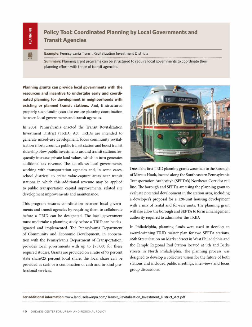
40 DUKaKiS cEntER FoR URban anD REgionaL PoLicY
PLA
nn
inG
Policy Tool: Coordinated Planning by Local Governments and Transit Agencies
Example: PennsylvaniaTransitRevitalizationInvestmentDistricts
Summary:Planninggrantprogramscanbestructuredtorequirelocalgovernmentstocoordinatetheirplanningeffortswiththoseoftransitagencies.
Planning grants can provide local governments with the
resources and incentive to undertake early and coordi-
nated planning for development in neighborhoods with
existing or planned transit stations. And, if structured properly, such funding can also ensure planning coordination between local governments and transit agencies.
In 2004, Pennsylvania enacted the Transit Revitalization Investment District (TRID) Act. TRIDs are intended to generate mixed-use development, focus community revital-ization efforts around a public transit station and boost transit ridership. New public investments around transit stations fre-quently increase private land values, which in turn generates additional tax revenue. The act allows local governments, working with transportation agencies and, in some cases, school districts, to create value-capture areas near transit stations in which this additional revenue may be applied to public transportation capital improvements, related site development improvements and maintenance.
This program ensures coordination between local govern-ments and transit agencies by requiring them to collaborate before a TRID can be designated. The local government must undertake a planning study before a TRID can be des-ignated and implemented. The Pennsylvania Department of Community and Economic Development, in coopera-tion with the Pennsylvania Department of Transportation, provides local governments with up to $75,000 for these required studies. Grants are provided on a ratio of 75 percent state share/25 percent local share; the local share can be provided as cash or a combination of cash and in-kind pro-fessional services.
One of the first TRID planning grants was made to the Borough of Marcus Hook, located along the Southeastern Pennsylvania Transportation Authority’s (SEPTA’s) Northeast Corridor rail line. The borough and SEPTA are using the planning grant to evaluate potential development in the station area, including a developer’s proposal for a 120-unit housing development with a mix of rental and for-sale units. The planning grant will also allow the borough and SEPTA to form a management authority required to administer the TRID.
In Philadelphia, planning funds were used to develop an award-winning TRID master plan for two SEPTA stations, 46th Street Station on Market Street in West Philadelphia and the Temple Regional Rail Station located at 9th and Berks streets in North Philadelphia. The planning process was designed to develop a collective vision for the future of both stations and included public meetings, interviews and focus group discussions.
For additional information: www.landuselawinpa.com/transit_Revitalization_investment_District_act.pdf

Maintaining DiVERSitY in aMERica’S tRanSit-Rich nEighboRhooDS 41
PLA
nn
inG
PLA
nn
inG
Policy Tool: Transit Corridor Planning
Policy Tool: Transit Corridor Planning
Example:TheFairmountLineCDCCollaborative(Boston,MA)
Summary:Communitydevelopmentcorporations(CDCs)canplayacriticalroleinplanningforequitabletransit-orienteddevelopmentaroundexistingandplannedtransitstationsalongatransitcorridorandtheninimplementingtheplannedtransit-orienteddevelopment.
Example:TheCorridorDevelopmentInitiative(TwinCities,MN)
Summary:Aproactive,facilitatedprocesscanbeusedtobringallinterestedpartiestogethertoshapedevelopmentprojectsalongtransitcorridorsbeforetheyaresubmittedtoamunicipalagencyforapproval.
Planning for transit and accompanying transit-oriented
development should occur at different scales, for both
specific station areas but also for entire transit corridors.
In Boston, four community development corporations (CDCs) worked together to create their own vision for the Fairmount Line, the only commuter rail line entirely within city limits. The four share contiguous boundaries along the line and serve over 175,000 largely low- and moderate-income and minority residents. The Massachusetts Bay Transportation Authority, is investing $100 million to expand transit service in the corridor by upgrading two existing stations and constructing four addi-tional stations.
The Collaborative’s two major goals are to bring transit equity to the residents in the distressed neighborhoods along the Fairmount line and to spearhead smart-growth, transit-ori-ented development. The collaborative has successfully pushed for smart-growth, transit-oriented-development urban villages and created a vision document, entitled Boston’s Newest Smart Growth Corridor, that outlines their urban village concept. The four CDCs collectively are working to develop a pipeline of 1,500 new and preserved housing units and 780,000 square feet of new commercial space in the Fairmount Line corridor.
For additional information: www.dbedc.org/fairmount.html
The Corridor development initiative (Cdi) fosters a
partnership among neighborhoods, city government,
developers and a technical team of development consul-
tants, design experts and facilitators to raise the level
of dialogue around redevelopment opportunities along
major transit corridors. CDI takes citizens out of the role that they usually play—reacting to development proposals made by others—and puts them into a proactive role of shaping development in their community.
A typical initiative lasts six months and is overseen by an advisory group. CDI brings together all interested parties to learn, discuss, analyze, and grow to understand market realities that face a particular development site, all before any proposal
is submitted to a governing agency. The heart of the program is an “interactive block exercise” facilitated by a team of design and development experts in which participants develop their own housing or mixed-use development proposals and test them for financial viability. The process concludes with the preparation of design principles that articulate how the community partners would like development to occur in their neighborhoods while balancing community values, city goals, development realities, and design opportunities.
Corridor development initiatives have been conducted in 16 communities in the Twin Cities metropolitan area since 2002.
For additional information: www.corridordevelopment.org/aspx

Changesinhousingmarketsareakeyindicatorofneighborhoodchangeintransit-richneighborhoods.Inmanynewly transit-served neighborhoods both rents and housing values rise sharply and additional market-rateownershiphousingisbuilt.Inordertoaddresstheunderlyingcausesofgentrificationandundesirablepatternsofneighborhoodchangeintransit-richneighborhoods,housingmarkettoolsshouldinclude:
• Funding for land and property acquisition:Becausetransitstationsareplannedandbuiltovermanyyears,landandpropertyvaluesoftenbegintoriseevenbeforethenewstationopensitsdoors.Tokeepprojectsaffordable,developersmusthaveaccesstofinancingbeforelandandpropertiesbecometooexpensive.Suchfundingisneededbothtopreserveexistingaffordablehousingandtoacquire(and,insomecases,landbank)vacantorcommerciallandforsubsequenthousingproduction.
• Preservation of existing affordable rental housing: Many TRNs are dominated by renters rather thanhomeownersandoneofthemechanismsbywhichgentrificationoccurs isthroughtheturnoverofrentalunits, accompanied by higher rents that only wealthier households can afford. Existing affordable rentalhousinginneighborhoodswheretransitisplannedshouldbepreserved,preferablywellbeforethetransitisoperational.Preservationstrategiesshouldtargetbothsubsidizedaffordablehousing(especiallythatinneedofrehabilitationorsubjecttotheexpirationofaffordabilityrestrictions)andunsubsidizedhousingthathashistoricallybeenaffordableforneighborhoodresidentsbutisatriskofbecomingunaffordableasmarketrentsrise.
• Production of affordable housing:IncreasedproductionofaffordableandworkforcehousinginTRNscanhelpslowtherateofrisingrentsandhousingprices.Suchhousingcanbebuiltbothasstand-aloneresidentialprojectsandaspartofmixed-incomeandmixed-usetransit-orienteddevelopmentprojects.
Manyofthepoliciesinthissectionofthetoolkitcanbeusedformorethanoneofthesepurposes(forexample,foreitherpreservationorproduction)andcanbecombinedtocreatecomprehensivestrategiesformaintain-inghousingaffordabilityintransit-richneighborhoods.
Housing Market ToolsC
HA
PT
ER 4
42 DUKaKiS cEntER FoR URban anD REgionaL PoLicY

Maintaining EQUitY in aMERica’S tRanSit-Rich nEighboRhooDS 43
HO
US
inG Policy Tool: Transit-oriented Development acquisition Funds
Examples:SouthCorridorLandAcquisitionFund(Charlotte,NC) DenverTransitOrientedDevelopmentFund(CO) BayAreaAffordableTransit-OrientedDevelopmentFund(CA)
Summary:Acquisitionfundsfortransit-orienteddevelopmentcanbeusedtoacquiresitesneartransitforfuturedevelopmentofaffordablehousingortoacquireandpreserveexistingaffordablehousingbeforeplannedtransitprojectsdriveuplandandpropertyvalues.
in 2005 the Charlotte, north Carolina City Council appro-
priated $5 million to the South Corridor Land Acquisition
Fund to purchase land near planned transit stations along
its South Corridor Light Rail for future transit-oriented
development (TOd) and specifically development of
transit-served affordable housing. In 2006, the city began a joint development project with the transit authority at the Scaleybark Station to establish a flagship mixed-use, mixed-income village. Using money from the South Corridor Land Acquisition Fund and several other sources, the city eventu-ally purchased 17 acres of land for $9.2 million. The planned project will include 80 affordable housing units, which will be built by the Charlotte Mecklenburg Housing Partnership, as well as 820 market-rate housing units, retail space, a hotel and park land (CTOD, 2008b).
Denver has taken the concept of TOD acquisition funds to a new level with the creation of its Transit Oriented Devel-opment fund as a tool for supporting transit-oriented devel-opment in connection with the region’s ambitious FasTracks transit expansion which will ultimately create 70 new rail transit stations throughout the region. Initially capitalized with $2.5 million in city funding to match a grant from the MacArthur Foundation, the fund has grown to $15 million as other investors have joined the project. Enterprise Community Partners serves as the financial manager of the fund while the Urban Land Conservancy (ULC), a Denver nonprofit, oversees land purchases and acts as the sole
borrower. The Fund’s goal is to create or preserve over 1,200 affordable housing units by buying property in current and future transit corridor (Soursourian, 2010). Early in 2010, the Urban Land Conservancy (ULC) used the Fund’s resources to purchase and preserve 36 affordable homes in the 50-year-old Dahlia Street Apartments.
A new San Francisco Affordable Transit-Oriented Develop-ment Fund is expected to begin making investments in 2011 after the Metropolitan Transportation Commission approved a commitment of up to $10 million. MTC staff estimate that a $40 million TOD Fund could be used to help finance the acquisition of at least 20 to 30 acres around the region, which, depending on the density of build-out, would support devel-opment of anywhere from 1,100 to 3,800 units of affordable housing.
For additional information: www.denvergov.org/DenverofficeofStrategicPartnerships/Partnerships/DenvertransitorientedDevelopmentFund/tabid/436574/Default.aspxwww.mtc.ca.gov/news/press_releases/rel490.htm

44 DUKaKiS cEntER FoR URban anD REgionaL PoLicY
HO
US
inG Policy Tool: Housing Trust Funds and other acquisition Funds
Examples:AffordableHousingTrustFund(Charlotte,NC) LandAcquisitionforAffordableNewDevelopmentInitiative(MN)
Summary:Housingtrustfundsandotherlandacquisitionresourcesnotexclusivelytargetedtotransit-orienteddevelopmentcanbeusedtoacquiresitesforaffordablehousingdevelopmentsnearexistingandplannedtransitstations.
Housing trust funds are distinct funds established by
city, county or state governments that receive ongoing
dedicated sources of public funding to support the pres-
ervation and production of affordable housing. Currently 38 states and more than 500 city and counties have housing trust funds, which may choose to use some of their resources to support preservation of affordable rental housing near transit and/or production of such housing.
Charlotte, North Carolina’s City Council established a Housing Trust Fund in 2001 with an initial $10 million to provide financing for affordable housing. Voters later approved an additional $35 million for the HTF. The trust fund provides public financing to private developers in exchange for afford-able units, using a competitive bid process. The funding can be either a loan or grant and can be used either for land acqui-sition or for construction.
Charlotte has been using its affordable Housing Trust Fund at the same time as it has been building and expanding its transit system. One HTF-supported transit station project is South Oak Crossing. Developed by the Charlotte Meck-lenburg Housing Partnership and completed at the end of 2007, this was the first mixed-income housing project in the South Corridor, Charlotte’s recently opened light rail system. The complex is on a 10-acre site within walking distance of the Arrowood Station, and includes 100 affordable and 92 market-rate two- and three-bedroom rental units. The $18 million project used $4.3 million from the HTF in addition to low-income housing tax credits, bonds and other funding.
Minnesota recently established a revolving loan fund to support the acquisition of land for affordable housing called the Land Acquisition for Affordable New Development (LAAND) initiative. Sites accorded priority include those within one-half mile of a transitway included in the region’s planned 2030 transitway system or within one-half mile of a local bus route. The program is funded by Minnesota Housing, the Metropolitan Council and the Family Housing Fund. One of the four projects awarded LAAND funding in 2008 was the Seward Commons mixed-use, transit-oriented development project near the Franklin Avenue light rail station on Minne-apolis’ Hiawatha Line. The planned development on this four acre site includes 187 units of rental and ownership housing, with nearly 30 percent of the housing affordable.
For additional information: www.communitychange.org/our-projects/htf/housing-trust-fundswww.charmeck.org/city/charlotte/nbs/housing/Pages/housingtrustFund.aspxwww.metrocouncil.org/services/LaanDdescription.pdf

Maintaining EQUitY in aMERica’S tRanSit-Rich nEighboRhooDS 45
HO
US
inG Policy Tool: low-income Housing Tax Credits
Examples:CaliforniaLIHTCallocation GeorgiaLIHTCallocation
Summary: BothpreservationandproductionofaffordablehousingcanbefinancedinpartthroughtheLow-IncomeHousingTaxCredit(LIHTC)program,particularlyinstatesthatfavortransit-accessibleprojectsintheirqualifiedallocationplans.
The federal Low-income Housing Tax Credit (LiHTC)
program provides tax credits that developers can use
to raise capital for the acquisition, rehabilitation or con-
struction of affordable housing. State housing agencies allocate housing tax credits through a competitive process, specifying how they will allocate their LIHTCs in a Qualified Allocation Plan and implementing regulations that may award “points” for certain kinds of projects, state preferences (without awarding points) or set aside a specified portion of tax credits for certain kinds of projects.
A recent report on Preserving Affordable Housing Near Transit published by Enterprise Community Partners found that 32 states (and Washington, D.C.) award points to projects near transit in their scoring criteria (Quigley, 2010). Cali-fornia, for example, has a category of amenities points, and projects can be awarded up to 15 amenities points. Projects near transit can qualify for up to seven of these points, all of which are awarded if a project is part of a transit-oriented development strategy, is within a quarter-mile of a transit or bus station that receives frequent service during peak hours and its density exceeds 25 units per acre. Other projects are awarded from three to six points depending on the site’s proximity to different types of transit services (COTD, 2009b).
The Enterprise report focused specifically on preservation of affordable housing near transit and found that 21 states include set-asides for affordable housing preservation and an addi-tional 25 states award points in their scoring criteria for preser-vation. The Georgia Department of Community Affairs’ 2010 plan for awarding LIHTCs reserves a portion of its tax credits for preservation and also awards three points to projects within one-half mile of a rapid transit system and one point to projects within one mile of transportation and services. Oglethorpe Place apartments, located only blocks from the Metropolitan Atlanta Rapid Transit Authority’s West End station (and well served by bus routes) is one example of a project that benefited from an allocation of LIHTCs. A for-profit developer financed the preservation of this 144-unit property with tax credits in return for reserving 20 percent of the units for families earning less than 50 percent of median income; affordability is protected through 2027 (Quigley, 2010).
For additional information: www.treasurer.ca.gov/ctcac/tax.aspwww.practitionerresources.org/cache/documents/674/67410.pdf

46 DUKaKiS cEntER FoR URban anD REgionaL PoLicY
Policy Tool: Corridor-Based Tax increment Financing Districts
Policy Tool: Corridor-Based Tax increment Financing Districts
Example:DallasTODTaxIncrementFinancingDistrict(TX)
Summary:InsteadofconventionalTaxIncrementFinancingdistrictsthatapplytoasinglegeographicareaaroundonetransitstation,citiescancreatecorridor-baseddistrictsdesignedtoallowrevenuesharingamongneighborhoodsinthetransitcorridor.
Example:BeltLineAffordableHousingTrustFund(Atlanta,GA)
Summary:TaxIncrementFinancingdistrictscanbecreatedonacorridor-widebasisandaportionoftherevenuesgeneratedcanbededicatedspecificallytothepreservationanddevelopmentofaffordablehousingthroughoutthecorridor.
Cities use tax increment financing (TiF) to finance economic
development within a targeted geographic area without
raising taxes. The city or a partner developer makes capital improvements in the area which lead to rising property values and therefore higher property tax receipts; the incremental tax revenue increases over a predetermined base are then captured by the TIF district as revenue and used to reimburse the city or partner developer for the cost of the initial (and any subse-quent) improvements in the district.
In 2008, after four years of negotiations between the City of Dallas, developers and multiple stakeholder groups, the Dallas City Council approved a 558-acre Tax Increment Financing district linking the neighborhoods around seven Dallas Area
Rapid Transit stations. The corridor-based Transit Oriented Development TIF will allow for revenue sharing from more pros-perous neighborhoods in the northern portion of the corridor to less-developed areas in the Lancaster corridor area south of the Trinity River. While 40 percent of the new tax dollars from the two northern sub-districts around Mockingbird and Lovers Lane stations will go back into those districts, 40 percent will be allocated to improvements in the Lancaster corridor and 20 percent to affordable housing development anywhere within the TIF district.
For additional information:www.housingpolicy.org/toolbox/strategy/policies/tif.htmlwww.dallas-ecodev.org/business/tifs/todtiF.htm
HO
US
inG
HO
US
inG
When public investment leads to rising property values,
incremental tax revenue increases over a predetermined
base can be captured and used to further improve the area.
The BeltLine Project will create a network of public parks, multi-use trails and transit along a historic 22-mile railroad corridor circling downtown Atlanta. The primary mechanism for financing this 25-year, $2.8 billion effort a Tax Allocation District (TAD). While the TAD was being shaped, Georgia STAND-UP, a community think-and-act tank, raised concerns about gentrification and the displacement of current residents and worked to ensure that the TAD resolution recognized “the importance of balanced and equitable development of the city in a manner that preserves the dignity of existing residents”.
In addition to financing part of the transit project, the 6,500 acre TAD will support the development of as many as 5,600 affordable/workforce housing units through the BeltLine Affordable Housing Trust Fund, which receives 15 percent of TAD proceeds. The Atlanta City Council has also allocated $8.3 million to the trust fund to provide grants to developers for acquisition, renovation or construction of single and mul-tifamily housing affordable to families at or below 60 percent of median income.
For additional information: www.housingpolicy.org/toolbox/strategy/policies/tif.htmlwww.beltline.org/home/tabid/1672/Default.aspx

Maintaining DiVERSitY in aMERica’S tRanSit-Rich nEighboRhooDS 47
HO
US
inG Policy Tool: inclusionary Zoning
Examples: MontgomeryCounty,MD Carlsbad,CA
Summary: Communitieswithtransitstationscanadoptinclusionaryzoningrequirementstoensurethatamodestshareofnewly-constructedrentalandhomeownershipunitsintheareaaroundthestationareaffordable.
inclusionary zoning helps create privately-financed
affordable housing when communities attract new
housing construction, as is often the case in newly tran-
sit-served communities. Most inclusionary requirements are enacted as a zoning ordinance and require that a modest proportion (usually between 10 and 25 percent) of units in a housing development be affordable. Some inclusion-ary zoning ordinances compensate developers by providing density bonuses.
Montgomery County, Maryland adopted its Moderately Priced Dwelling Unit Ordinance, the first inclusionary zoning requirement in the US, in 1976. The ordinance requires devel-opers of mixed-use projects with 20 or more residential units to make 12.5 percent to 15 percent affordable for lower-income households in exchange for a 22 percent density bonus. To date, this ordinance has resulted in the construction of more than 11,800 affordable units. The ordinance applies to all developments including those near Metro transit stations. A garden apartment community across the street from the Glenmont Metro station in Silver Spring, for example, was redeveloped with a mix of 1,550 apartments, condominiums, live-work units and townhomes—12.5 percent of which are “moderately priced” workforce housing (CTOD, 2009b).
Many California communities, empowered by state autho-rizing legislation, have adopted inclusionary requirements. The Carlsbad, California Inclusionary Housing Ordinance
requires that no less than 15 percent of all residential units in any residential subdivision with more than 7 homes must be affordable to households below 70 percent of median income; rental units must remain income-restricted for at least 55 years. As a result of this inclusionary zoning require-ment, the Poinsettia Station transit-oriented development in Carlsbad provides 92 affordable rental homes within walking distance of the commuter train station. Nonprofit developer Bridge Housing worked with Benchmark Pacific, developer of a larger master-planned community, to create these units in order to satisfy affordability requirements.
For additional information: www.mitod.org/inclusionaryzoning.php?tab=1&return=listpos12www.housingpolicy.org/toolbox/strategy/policies/inclusionary_zoning.html

48 DUKaKiS cEntER FoR URban anD REgionaL PoLicY
Policy Tool: incentive Programs for Housing Production
Policy Tool: incentive Programs for Housing Production
Example:Chapter40RSmartGrowthHousingDistricts(MA)
Summary:Inordertoovercomelocalresistancetozoningallowingforconstructionofdense,affordablehousing,statescancreateincentiveprogramswhichrewardlocalcommunitiesthatcreatesuchzoningneartransit.
Example:HousingIncentiveProgram(SanFrancisco,CA)
Summary:Federaltransportationfundscanbeusedbymetropolitanplanningorganizationstoencouragetheproductionofdenseaffordablehousingneartransitandtherebyboosttransitridership.
Adopted in 2004, Massachusetts’s Smart Growth Zoning
and Housing Production Act, known as Chapter 40R,
rewards municipalities that adopt zoning allowing as-of-
right construction of housing in smart growth locations,
including near transit stations. Chapter 40R encourages cities and towns to zone for compact residential and mixed-use development, creating zones pre-approved for higher-density development that will attract developers.
The district overlay must allow housing to be built as of right at densities of at least eight to 20 units per acre, depending on the type of housing. It also must require at least 20 percent of the new units to be affordable. If a municipality adopts zoning that meets these and other standards, Chapter 40R provides
for direct cash payments. Localities receive a zoning incentive payment when they adopt the overlay, plus a density bonus payment of $3,000 per unit if and when units are built. A related program reimburses the town’s increased education costs for K-12 students who move into 40R housing.
To date, 28 Smart Growth Zoning Districts have been adopted by Massachusetts communities allowing as-of-right develop-ment of over 9,800 housing units in smart growth locations. The first 40R district was created adjacent to a commuter rail station in Plymouth.
For additional information:www.mapc.org/sites/default/files/chapter_40R_Report.pdf
HO
US
inG
HO
US
inG
The metropolitan planning organization in the San
Francisco Bay Area, the Metropolitan Transportation
Commission, established the Housing incentive Program
(HiP) to fund transportation-related livability infrastruc-
ture in qualifying affordable housing projects. The program is funded with two types of federal transportation funds, from the Congestion Mitigation and Air Quality (CMAQ) program and Transportation Enhancements program.
HIP rewards local governments that build housing near transit, thereby helping to establish the residential density and ridership markets necessary to support high-quality transit service. The maximum grant per jurisdiction is $3 million and the exact dollar amount is determined by the density of the qualifying housing development and the number of affordable
and market rate bedrooms. Qualifying housing projects must be located either within a half mile of a rail station or one-third mile of a bus stop, and the transit must be relatively frequent (every 15 minutes or less during peak hours). The housing project must have a density of at least 30 units per acre.
Grant amounts increase to encourage both greater density and greater affordability. The grants start at $1,000 per bedroom for any housing built at a density of 30 units per acre. The grant amount increases to up to $2,000 per bedroom at densities of 60 units per acre. Grants are increased by $500 per bedroom if the unit is affordable.
For additional information:www.mtc.ca.gov/planning/smart_growth/hip.htm

Maintaining DiVERSitY in aMERica’S tRanSit-Rich nEighboRhooDS 49
HO
US
inG Policy Tool: incorporating affordable Housing in Joint Development
Examples: WashingtonMetropolitanAreaTransitAuthority(DC) PortlandTriMet(OR) DenverRegionalTransitDistrict(C0)
Summary: Transitagenciescanleveragetheproductionofaffordablehousingneartransitandincreasetheirridershipbyadoptingjointdevelopmentandtransit-orienteddevelopmentpoliciesthatencourageproductionofaffordablehousingaspartofjointdevelopmentefforts.
While transit agencies are not generally in the real estate
development business, they frequently become involved
in development efforts near their stations if they own
surplus land. The sale or lease of transit authority property for development is called “joint development” because the process involves a partnership between transit agencies and developers. Such joint development may represent an excellent opportunity to spur the production of affordable housing near transit.
Many transit agencies’ joint development policies and programs are designed primarily to maximize revenue to the transit agency by leveraging real estate assets for the most profitable use. But a growing number of transit agencies have worked to incorporate affordable housing into their joint development projects, spurred in part by the realization that the residents of such housing are more likely to ride the transit system and generate fare revenue for the agency. A recent survey conducted by Denver non-profit FRESC found that at least nine transit agencies have joint development policies with provisions designed to spur production of affordable housing and six others have practices of including affordable units in projects even in the absence of written policy (Kneich & Pollack, 2009).
The Washington Metropolitan Area Transit Authority or Metro has long required inclusion of affordable housing for joint development projects on land it controls, even before
Washington, D.C. adopted an inclusionary zoning ordinance. The disposition agreements issued in connection with rede-velopment around the Columbia Heights metro station, for example, required that a minimum of 20 percent affordable housing be included on all seven parcels (Quigley, 2010).
In Portland, Oregon,Tri-Met worked in a public-private part-nership to redevelop an odd-shaped parcel formed by a light rail alignment that proved unsuitable for mixed-use develop-ment. The Goose Hollow Stadium Station apartment project, built in 1998, ended up as a 100 percent affordable, 115-unit project with ground floor retail that required only 69 parking spaces because so few residents own cars.
In Denver, the Regional Transit District is in the process of adopting a new policy that would require considering whether surplus land should be used for affordable housing before surplus land is sold or subject to joint development (Quigley, 2010).
For additional information: www.practitionerresources.org/cache/documents/673/67333.pdf
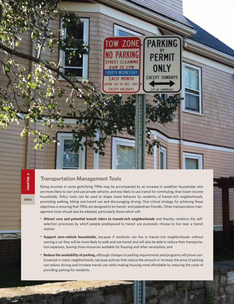
RisingincomesinsomegentrifyingTRNsmaybeaccompaniedbyanincreaseinwealthierhouseholdswhoaremorelikelytoownanduseprivatevehicles,andlesslikelytousetransitforcommuting,thanlower-incomehouseholds. Policy tools can be used to shape travel behavior by residents of transit-rich neighborhoods,promotingwalking,bikingandtransituseanddiscouragingdriving.OnecriticalstrategyforachievingtheseobjectivesisensuringthatTRNsaredesignedtobetransit-andpedestrian-friendly.Othertransportationman-agementtoolsshouldalsobeadopted,particularlythosewhichwill:
• Attract core and potential transit riders to transit-rich neighborhoods and thereby reinforce the self-selection processes by which people predisposed to transit use purposely choose to live near a transitstation;
• Support zero-vehicle households, because if residents can live in transit-rich neighborhoods withoutowningacartheywillbemorelikelytowalkandusetransitandwillalsobeabletoreducetheirtransporta-tionexpenses,leavingmoreresourcesavailableforhousingandothernecessities;and
• Reduce the availability of parking,althoughchangestoparkingrequirementsandprogramswillprovecon-troversialinmanyneighborhoods,becausepoliciesthatreducetheamountorincreasethepriceofparkingcanreducedrivingandincreasetransitusewhilemakinghousingmoreaffordablebyreducingthecostsofprovidingparkingforresidents.
Transportation Management Tools
CH
AP
TER
4
50 DUKaKiS cEntER FoR URban anD REgionaL PoLicY

Maintaining DiVERSitY in aMERica’S tRanSit-Rich nEighboRhooDS 51
Policy Tool: Transit incentives for Housing Developments
Examples: SantaClaraValleyTransportationAuthorityECOpassprogram(CA) PilotTODPassProgramsinPortland,ORandContraCosta,CA
Summary: Transitagenciesmaybeabletoincreaseridershipbyresidentsoftransit-richneighborhoodsandtransit-orienteddevelopmentsbysellingdiscountedtransitpassestohousingdevelopersfordistributiontotheirresidents.
While many transit authorities offer monthly or annual
pass programs to large employers, a few also offer pass
programs to residential developments such as apart-
ments, condominiums or homeowner associations. The Santa Clara Valley Transportation Authority (VTA) offers a residential version of its Eco Pass at a deep discount to housing developers in order to increase ridership and expose people to public transit. The residential Eco Pass provides unlimited rides on VTA bus and light rail seven days a week.
Any residential community with 25 units or more that is defined by a geographical boundary, such as an apartment building or condominium complex, may join Residential Eco Pass. Eco Passes must be purchased for all residents five years of age or older. Discounted pass prices are based on the number of residents and the level of VTA services at a given residential community.
One residential developer that takes advantage of the Resi-dential Eco Pass program is First Community Housing (FCH), is a non-profit affordable housing developer. By both locating its developments adjacent to transit and providing free, annual Eco Passes to all of its tenants, FCH was able to reduce the parking requirements at each of its properties. Jeff Oberdorfer, Executive Director of FCH, notes that “an urban structured parking space can cost from $22,000 to $40,000 per space. Saving the construction cost of two parking spaces pays for our entire Eco Pass program.”
Both Portland, Oregon and Contra Costa, California have piloted universal pass programs for transit-oriented devel-opment (TOD) residents. When Portland piloted a free pass program for residents of new TODs including the Orenco project on the Westside light rail line, the percentage of residents reporting use of transit increased from 30 percent (before passes) to 83 percent (Evans & Pratt, 2007). In a pilot project beginning in June 2008, the Metropolitan Transporta-tion Commission partnered with the Alameda-Contra Costa Transit District (AC Transit) to provide free transit passes to residents of select transit-oriented developments (TODs) in the East Bay. Participants received passes providing unlimited free access on the AC Transit bus system for six months to one year. MTC found that bus ridership increased, participants made on average one fewer automobile trip per week and one-quarter of the participants continued to use the passes at their own expense after the free usage period ended.
For additional information: www.vta.org/ecopass/ecopass_resi/index.htmlwww.firsthousing.com/wp-content/uploads/2009/05/ecopass1.pdf www.mtc.ca.gov/planning/smart_growth/tod/t4t/t4t_summary.pdf
TR
An
SP
OR
TAT
iOn

52 DUKaKiS cEntER FoR URban anD REgionaL PoLicY
Policy Tool: Reduced Parking Requirements for Residential Development
Examples:ZoningcodesinSanFrancisco,CA,Portland,ORandSeattle,WA
Summary: Reducingoreliminatingoff-streetparkingrequirementsforhousingdevelopmentsintransit-richneighborhoodsbothhelpsreducevehicleownershipanduseandmakeshousingmoreaffordable.
Most local zoning codes require residential and other
developments to include a minimum amount of parking
for each unit. Such provisions guarantee that all housing will have parking readily available, preventing spillover parking on neighborhood streets but also encouraging automobile ownership and use. Requiring housing developers to provide parking increases development costs and makes the resulting housing less affordable. In order to reduce vehicle use and housing costs, a handful of cities have moved to reduce or eliminate off-street parking requirements for housing devel-opment, particularly in locations well-served by transit and for affordable housing developments whose residents are less likely to own cars.
According to the Institute for Transportation and Develop-ment Policy, “San Francisco has evolved over the last half century from a municipality that once required one parking space for every new dwelling to one of the most innovative examples of parking management in the country” (Wein-berger, Kaehny & Rufo, 2010 at 50). The city has eliminated zoning requirements for a minimum number of parking spaces for residential, commercial or other projects in the downtown. In addition, the city established maximum allowable amounts of parking; for example, a maximum of one space is permitted for every four downtown residential housing units. Outside of downtown, neighborhoods can eliminate residential minimum parking requirements by adopting neighborhood plans; the 1997 Mission Bay Redevelopment Plan eliminated parking minimums for housing. More recently, the 2005 Rincon Hill Plan was the first to eliminate minimum parking
requirements for all uses in a residential neighborhood (Wein-berger, Kaehny & Rufo, 2010).
In Portland, Oregon, parking minimums do not apply to developments in the densest commercial neighborhoods, including downtown, neighborhood commercial districts and central residential districts. As part of its strategy to promote transit-oriented development, Portland does not apply parking minimums to any sites within 500 feet of a transit line that provides service at least every 20 minutes during peak hours (EPA, 2006). Portland has also established maximum parking requirements at such sites; downtown, for example, no more than 0.7 spaces per 1,000 square feet can be provided at sites within walking distance of frequent transit service (MTC, 2007).
Seattle’s zoning code reduces minimum parking require-ments for affordable housing, senior housing and housing for people with disabilities. Parking requirements are also reduced for multi-family developments that allow on-site parking for car sharing. Parking minimums have been elimi-nated for downtown locations and reduced for mixed-use, dense neighborhoods (EPA, 2006).
For additional information: www.mtc.ca.gov/planning/smart_growth/parking_seminar/toolbox-handbook.pdfwww.itdp.org/documents/itDP_US_Parking_Report.pdf
TR
An
SP
OR
TAT
iOn

Residential parking is generally provided as an insepara-
ble part of housing arrangements: a parking space is part
of the apartment lease or condominium purchase. The price of parking can, however, be separated or “unbundled” from that of the housing either if developers and landlords choose to do so or if municipal regulators so require. As San Francisco’s Metropolitan Transportation Commission has explained, “Unbundling parking is an essential first step towards getting people to understand the economic cost of parking and providing users with the opportunity to opt out of parking and make alternative travel decisions. Without unbundled parking, tenants experience parking as free, while transit costs them money” (MTC, 2007 at 31).
Beginning in 2005, San Francisco began requiring that devel-opers in some neighborhoods unbundle accessory parking spaces from the sale of a residential unit. The city’s logic was that by including a parking space as part of a residential unit, a seller prevents a buyer from deciding whether or not he or she needs a parking space. The pilot program began in a single neighborhood and was subsequently extended to other neighborhoods. In 2008, San Francisco made unbundled residential parking a requirement throughout the city (Wein-berger, Kaehny & Rufo, 2010). While this requirement does not apply to rental housing, the city has also encouraged the unbundling of parking in rentals. The 141-unit Symphony Towers apartments development was granted a variance and allowed to construct only 51 spaces (rather than the 141 that would have been required) because of its use of unbundled parking (and provision of two car sharing parking spaces) (MTC, 2007).
The developer of the Buckman Heights mixed-use develop-ment and Buckman Terrace Apartments in Portland, Oregon unbundled the price of parking as part of a comprehensive strategy to reduce the number of parking spaces that had to be provided. Prendergast & Associates built the development on a site adjacent to the central city Lloyd District, nine blocks from light rail and near high-frequency bus routes. Buckman Heights is a 144-unit mixed-income apartment building with 58 on-site parking spaces (0.4 spaces/unit); tenants pay $15-30/month for parking. Buckman Terrace is a 122-unit apartment building with 70 structured parking spaces (0.57/unit); tenants pay $50/month for parking (as of 2006 when this information was collected). The developers also took advantage of a Portland zoning provision that allowed them to eliminate 14 required on-site parking spaces at Buckman Heights apartments and substitute 56 secure, covered bike parking spaces (EPA, 2006).
Maintaining EQUitY in aMERica’S tRanSit-Rich nEighboRhooDS 53
Policy Tool: Unbundling the Price of Parking
Examples: SanFrancisco,CAunbundlingrequirements BuckmanHeightsandBuckmanTerrace,PortlandOR
Summary: Encouragingorrequiringtheseparatepricingofresidentialparking,oftencalledunbundling,canreducedemandforparkingaswellascombinedhousing/transportationcostsforresidents.
For additional information: www.mtc.ca.gov/planning/smart_growth/parking_seminar/toolbox-handbook.pdfwww.itdp.org/documents/itDP_US_Parking_Report.pdf
TR
An
SP
OR
TAT
iOn

54 DUKaKiS cEntER FoR URban anD REgionaL PoLicY
Car sharing organizations, which may be non- or for-
profit, distribute cars around a city or region for the use of
their members. Members have access to a fleet of vehicles for short term use, allowing them to either supplement their own vehicles or choose not to own an automobile. Studies show that car sharing reduces vehicle travel and ownership. One study of San Francisco’s City CarShare program found that nearly two-third of members lived in zero-vehicle households and nearly 29 percent had gotten rid of one or more of their cars (Cervero, 2009). Zipcar, the largest car sharing company in the US, reports that 90 percent of members drove 5,500 miles or less per year and that its members report a 47 percent increase in public transit trips after joining.
Several transit-served cities encourage provision of parking spaces for car sharing in residential developments and some even allow the developer to reduce the required amount of parking to be provided for residents. As part of the develop-ment review process in Boston, Massachusetts, for example, the number of parking spaces that can be provided in ownership developments near transit is frequently restricted and the developer is required to provide parking for one or more car sharing vehicles to reduce the risk that resident house-holds with more than one vehicle will park on neighborhood streets. Seattle’s zoning code grants reductions in minimum parking requirements for multi-family developments that allow dedicated, on-site parking for the city’s recognized car-sharing operator. Rich Sorro Commons in San Francisco’s Mission Bay was permitted to provide only 85 parking spaces for its 100 affordable housing units due to a combination of its excellent proximity to transit, provision of below-market
units to tenants less likely to own a car and provision of two parking spaces for City CarShare (EPA, 2006).
The City of Boston may soon move forward with a compre-hensive proposal, developed by the mayor’s Climate Action Leadership Committee, to maximize car sharing by Boston residents. The goal is to “ensure that every Boston resident lives within one-quarter mile of a shared car by 2020.” The Boston area is home to Zipcar, which has more than 18,000 members and 450 cars in Boston. The committee decided that “ensuring citywide access to shared cars is, therefore, a potentially powerful way of reducing vehicle miles traveled while ensuring that Boston residents have access to cars when needed.” The strategy for citywide access to shared cars involves actively promoting car sharing through a partner-ship with one or more shared-car companies; working with community-based organizations to promote car sharing, par-ticularly in neighborhoods where market demand may not yet exist; revising zoning laws as necessary to allow for shared car parking as of right throughout the city; and creating opportunities for placing shared cars on municipal property.
Policy Tool: Car Sharing
Example:Boston’sProposedComprehensiveCarSharingStrategy
Summary: Theeasyavailabilityofsharedcarsintransit-richneighborhoodsandtransit-orienteddevelopmentsmayreduceautomobileusageandownershipandallowresidentialdevelopmentstobebuiltwithfewerparkingspaces.
For additional information: www.cityofboston.gov/images_Documents/bca_full_rprt_r5_tcm3-19558.pdf
TR
An
SP
OR
TAT
iOn

Maintaining DiVERSitY in aMERica’S tRanSit-Rich nEighboRhooDS 55
This Appendix provides more detail on the methods and
data underlying the research presented in Chapter 3
analyzing neighborhood change in neighborhoods first
served by rail transit at some time between the 1990 and
2000 Census.
identifying the neighborhoods to be AnalyzedThe first task was to identify a set of transit-rich neigh-borhoods for analysis. At the time of the 2000 Census, 26 metropolitan areas in the United States were served by fixed-guideway transit: light rail (streetcars), heavy rail (subways), or commuter rail. Since Salt Lake City’s entire rail transit system did not begin operation until 1999, at the very end of our study period, it was excluded.
We then researched transit station expansion projects during this decade, with a goal of identifying projects involving a variety of different transit types (light rail, heavy rail, and commuter rail) across a variety of different categories of transit systems. Having divided U.S. transit systems into four categories (based on age, number of stations served, and the extent to which they are or are not expanding), the goal was to include at least two systems from each category if possible. We identified San Francisco’s and Chicago’s transit systems as two legacy systems that had added new stations in the study time frame. Cleveland’s and St. Louis’s transit systems were two modest systems that had added new stations. As expected, the largest number of new stations were found to be in evolving systems, those that are growing and where the findings from this study can most directly impact future expansion plans. We wanted to ensure that the analysis included some of the country’s fastest growing metropolitan areas; unfortunately, many of these have emerging (post-2000) transit systems or systems that are still being planned. From the set of evolving systems, we included new stations in both Atlanta and Dallas, the only two of the nation’s fastest-
growing metropolitan areas with transit systems that were at least medium-sized in 2005 and growing. The remaining stations are from slower-growing metropolitan areas with evolving transit systems: Baltimore, Denver, Los Angeles, Portland, San Diego, and Washington, D.C. This analysis produced a list of 12 transit-served metros with new stations that could be included.1
Data limitations and complications made it impossible to include every new station that opened during the decade in each of those 12 metropolitan areas in our analysis. Some expansions, for example, involved multiple stations serving common census tracts or the addition of a new line to an existing station that had previously served other lines. In order to provide some time for neighborhood change effects to become apparent, we chose to focus primarily on new stations that were in operation by 1997. From the station expansions in these 12 different metro areas and transit systems that occurred between 1990 and 1997, we selected a subset of stations that avoided data limitations and compli-cations while ensuring that the station areas to be analyzed included:
• Heavy (subway), light (streetcar), and commuter rail stations;
• Stations with parking (park and ride) and without (walk to);
• Stations that represented the terminus of new lines and new intermediate stations;
• Stations that served only one transit line and stations that represented more than one line or type of transit; and
• Stations in different types of neighborhoods (central business district, urban mixed-use, and suburban locations).
This produced a list of 49 potential stations for our analysis.
Methodology
AP
PEn
dix
A
1 This set of metros may not represent every U.S. transit system in which a new heavy, light, or commuter rail station was added during this decade.

56 DUKaKiS cEntER FoR URban anD REgionaL PoLicY
Constructing Transit Station GeographiesFor each of the 49 stations, we examined Census block group maps to construct approximations of the station’s sur-rounding neighborhood. A block group was included in the analysis if the majority of its land area lay within a one-half mile radius of the station. Following this strategy, we con-structed neighborhoods for each station according to the Census Bureau’s block group designations in 1990 and 2000.
For the majority of stations, block group boundaries shifted between the two decennial censuses. We selected for analysis only those stations around which the surrounding block groups’ boundaries did not shift, or shifted in a way that allowed for identical or near-identical neighborhoods to be constructed. We excluded seven transit stations because we were unable to construct adequate block group neighbor-hoods for them. Of these seven, five were excluded because the boundaries of block groups had shifted so radically that approximating the same perimeter for the 1990 and 2000 data proved impossible; the other two were excluded because the block group that surrounded them was so large the majority of land in any block group was not within a half-mile radius of the station. Of the 42 remaining transit-rich neighbor-hoods near new stations, 23 had identical boundaries in 1990 and 2000, while 19 had near-identical boundaries. To form identical neighborhoods for both years, a few block groups were included despite the fact that somewhat less than 50 percent of their territory lay within a half mile of the station.
The resulting set of 42 stations in 12 different metropoli-tan areas is robust and heterogeneous enough to provide important insights into the difficult question of whether, and, if so, how, neighborhoods in different metropolitan areas change due to the presence of transit. Of the total number of stations, 18 serve heavy rail (subway), 15 serve light rail (streetcar), and the remaining nine serve commuter rail lines. Thirty of the stations went into operation between 1990 and 1995 with the remaining 12 between 1996 and 1999.2
Table A at the end of this Appendix provides data for the 42 stations in this study on the transit authority, the line or lines involved, the type of transit (heavy, light, or commuter rail), the date when the station officially opened, the station type (inter-mediate or terminus), parking status (walk only, park and ride)
local parking, number of parking spaces, and station neighbor-hood type (urban, suburban, commercial, mixed use).
Collecting Census data on Transit-Rich neighborhoods Since prior research frequently found inconstant patterns of neighborhood change and often could not explain why some neighborhoods gentrified while others did not, we decided to explore a broad range of potential explanations. For each of the 42 transit station areas to be analyzed, we decided to examine changes between 1990 and 2000 in population growth, housing units (both total number and tenure), racial and ethnic composition, household income (both median income and households with incomes above $100,000), housing costs (both gross rents and home values), in-migra-tion, public transit use for commuting, and motor vehicle ownership.
We collected this data from Summary Files 1 and 3 of the 1990 and 2000 U.S. Census for each selected block group, and aggregated the block group-level data into data sets for each of the 42 transit rich neighborhoods. Simultaneously, we collected data on the same variables at the level of the met-ropolitan statistical area (MSA) for each of the twelve MSAs where the new transit stations were located. This extensive database, with values for these variables for every transit-rich neighborhood and its MSA in both 1990 and 2000, is available to researchers and others, and can be found online at http://www.dukakiscenter.org/TRNEquity.
The Three Rounds of AnalysisOur analysis of this dataset proceeded in three stages. First, we calculated percentage changes on each variable for each station and its corresponding metropolitan statistical area. For comparison, we measured the 1990-2000 demographic change in each TRN against the same change in the sur-rounding MSA. Researchers frequently use the MSA in which a neighborhood is embedded as a reference area when studying neighborhood change (Freeman, 2005). This com-parison is designed to control for any systemic fixed effects, which are changes that occurred throughout the metropoli-tan area for reasons presumably unrelated to the siting of a new transit station. The numerical difference between the
2 All but 2 stations in this group opened in 1996 and 1997; two stations in Washington, D.C. whose openings were repeatedly delayed until 1999 were included.

Maintaining DiVERSitY in aMERica’S tRanSit-Rich nEighboRhooDS 57
percentage change on each variable in each TRN and the percentage change on each variable in the MSA is used to compare transit stations across MSAs. In our initial analysis, we only examined raw differences in the rate of change between each station area and the surrounding MSA.
In our second analysis, because small differences in the results between TRNs and their metro areas may not truly reflect real differences due to the small size of the samples, we re-ana-lyzed all of the data using a more conservative approach. This large differences approach considered a transit station differ-ence from its MSA to be meaningful only where the value for the 1990-2000 percentage change in a station neighborhood is 20 percentage points higher or lower than the 1990-2000 percentage change in the MSA variable.
To determine whether patterns of neighborhood change vary depending on the type of transit built (light rail, heavy rail, or commuter rail), we conducted a third round of analysis. In this round, the 42 stations were divided into three groups based on transit types and all of the data was re-analyzed for these three categories of transit rich neighborhoods.

58 DUKaKiS cEntER FoR URban anD REgionaL PoLicY
Station name Transit Authority Line(s) Type of Transit date Opened Station Type Parking Status # Parking Spaces Station neighborhood Additional notes
buckhead MaRta Red Line heavy rail June-96 intermediate Walk to only 0 Suburban mixed-use (retail) Part of 7-mile north Line expansion from city of atlanta up to Fulton county and DeKalb county
Dunwoody MaRta Red Line heavy rail June-96 intermediate Park and Ride 1,048 commercial/Retail Part of 7-mile north Line expansion from city of atlanta up to Fulton county and DeKalb county
indian creek MaRta blue Line heavy rail June-93 terminus of line Park and Ride 2,350 Suburban residential Part of extension of East Line, the first time the rail line went beyond the i-285 perimeter.
Kensington MaRta blue Line heavy rail June-93 intermediate Park and Ride 1,946 Suburban residential Part of extension of East Line, the first time the rail line went beyond the i-285 perimeter; MaRta owns 6 acres for future dev't
John hopkins hospital Maryland transit administration
Metro Subway heavy rail June-95 terminus of line Walk to only 0 Urban mixed-use one of two stops added in 1995 extension; blighted neighborhood being redeveloped
Shot tower/ Market Place
Maryland transit administration
Metro Subway heavy rail June-95 intermediate Walk to only 0 Urban mixed-use one of two stops added in 1995 extension
35/archer chicago transit authority
orange heavy rail october-93 intermediate (in middle)
Park and Ride 70 Urban residential Part of new orange Line (7 stations) added to extend service to Southwest Side neighborhood; construction began in 1985
ashland chicago transit authority
orange heavy rail october-93 intermediate (2d closest to Loop)
Walk to only 0 Urban mixed-use Part of new orange Line (7 stations) added to extend service to Southwest Side neighborhood; construction began in 1985
halsted chicago transit authority
orange heavy rail october-93 intermediate (closest to Loop)
Park and Ride 31 Urban industrial Part of new orange Line (7 stations) added to extend service to Southwest Side neighborhood; construction began in 1985
Kedzie chicago transit authority
orange heavy rail october-93 intermediate (2d from terminus)
Park and Ride 157 Urban mixed-use Part of new orange Line (7 stations) added to extend service to Southwest Side neighborhood; construction began in 1985
Pulaski chicago transit authority
orange heavy rail october-93 intermediate (1st in from terminus)
Park and Ride 390 Urban mixed-use Part of new orange Line (7 stations) added to extend service to Southwest Side neighborhood; construction began in 1985
Western chicago transit authority
orange heavy rail october-93 intermediate (3d from terminus)
Park and Ride 200 Urban mixed-use Part of new orange Line (7 stations) added to extend service to Southwest Side neighborhood; construction began in 1985
Flats East bank greater cleveland Regional transit authority
blue/green/ Waterfront
Light rail July-96 intermediate Walk to only 0 Urban mixed-use blue/green light rail extended 2.2 miles from tower city through the Flats to waterfront
tower city greater cleveland Regional transit authority
Red/blue/ green/Waterfront
heavy (Red) and light rail
December-90 central business District
nearby Paid Parking 0 central business District completely rebuilt station opened inside tower city center shopping complex in 1990 serving pre-existing but previously separate transit lines, 4000+ paid parking spaces but no free transit parking
Ledbetter DaRt blue Line Light rail May-97 terminus of line Park and Ride 368 Lower density mixed-use Southern terminus (in South Dallas) of blue Line, part of which opened in 1996, extended south to Ledbetter in 1997 and further north in 2001
Pearl DaRt Red, blue, green Lines Light rail June-96 intermediate (originally terminus)
Walk to only 0 central business District originally the northern terminus when Red and blue Lines opened in 1996, w/Red beyond in 1997, blue extended in 2001 and green added in 2009
St. Paul DaRt Red, blue, green Lines Light rail June-96 intermediate Walk to only 0 central business District Part of opening of Red and blue lines serving cbD in 1996, first 11.2 miles of 20-mile light rail transit starter system since completed
Va Medical center DaRt blue Line Light rail May-97 intermediate (1st in from terminus)
Walk to only 0 Mixed-use (hospital/residential)
blue Line station prior to terminus at Ledbetter, with huge Va hospital on one side and residential neighborhood on other
Westmoreland DaRt Red Line Light rail June-96 terminus of line Park and Ride 700 Lower density mixed-use Southern terminus of Red Line, part of initial segment opened in 1996 (extended further north in 1997 and again in 2007)
16th and california Regional transportation District
Red F/blue h/green D Light rail october-94 intermediate (paired) Walk to only 0 central business District Part of original system opened in 1994; one block from 16th/Stout and is served only by northbound trains
16th and Stout Regional transportation District
Red F/blue h/green D Light rail october-94 intermediate (paired) Walk to only 0 central business District Part of original system opened in 1994; one block from 16th/california and is served only by southboundbound trains
18th and Stout Regional transportation District
Red F/blue h/green D Light rail october-94 intermediate (transfer station)
Walk to only 0 central business District Part of original system opened in 1994; one block from 18th/california and is served only by southboundbound trains
27th and Welton Regional transportation District
green D Light rail october-94 intermediate Walk to only 0 Urban mixed-use Part of original system opened in 1994, farther from cbD than other stations in study
Downtown Pomona Metrolink Riverside Line (purple) commuter rail June-93 intermediate Park and Ride 300 Urban mixed-use Station on Riverside Line, the fourth Metrolink line added to system in June 1993
Montebello/commerce Metrolink Riverside Line (purple) commuter rail June-93 intermediate (1st from La end)
Park and Ride 250 Urban industrial Station on Riverside Line, the fourth Metrolink line added to system in June 1993
Moorpark Metrolink Ventura county Line (yellow)
commuter rail 1992 intermediate Park and Ride 240 Lower density mixed-use one of original stations on Ventura county (Yellow) Line of Metrolink, also an amtrak station, in Moorpark, a suburban “city” in Ventura county, with about 38,000 residents
APPEndix Bnew Transit Stations Selected for analysis

Maintaining DiVERSitY in aMERica’S tRanSit-Rich nEighboRhooDS 59
Station name Transit Authority Line(s) Type of Transit date Opened Station Type Parking Status # Parking Spaces Station neighborhood Additional notes
buckhead MaRta Red Line heavy rail June-96 intermediate Walk to only 0 Suburban mixed-use (retail) Part of 7-mile north Line expansion from city of atlanta up to Fulton county and DeKalb county
Dunwoody MaRta Red Line heavy rail June-96 intermediate Park and Ride 1,048 commercial/Retail Part of 7-mile north Line expansion from city of atlanta up to Fulton county and DeKalb county
indian creek MaRta blue Line heavy rail June-93 terminus of line Park and Ride 2,350 Suburban residential Part of extension of East Line, the first time the rail line went beyond the i-285 perimeter.
Kensington MaRta blue Line heavy rail June-93 intermediate Park and Ride 1,946 Suburban residential Part of extension of East Line, the first time the rail line went beyond the i-285 perimeter; MaRta owns 6 acres for future dev't
John hopkins hospital Maryland transit administration
Metro Subway heavy rail June-95 terminus of line Walk to only 0 Urban mixed-use one of two stops added in 1995 extension; blighted neighborhood being redeveloped
Shot tower/ Market Place
Maryland transit administration
Metro Subway heavy rail June-95 intermediate Walk to only 0 Urban mixed-use one of two stops added in 1995 extension
35/archer chicago transit authority
orange heavy rail october-93 intermediate (in middle)
Park and Ride 70 Urban residential Part of new orange Line (7 stations) added to extend service to Southwest Side neighborhood; construction began in 1985
ashland chicago transit authority
orange heavy rail october-93 intermediate (2d closest to Loop)
Walk to only 0 Urban mixed-use Part of new orange Line (7 stations) added to extend service to Southwest Side neighborhood; construction began in 1985
halsted chicago transit authority
orange heavy rail october-93 intermediate (closest to Loop)
Park and Ride 31 Urban industrial Part of new orange Line (7 stations) added to extend service to Southwest Side neighborhood; construction began in 1985
Kedzie chicago transit authority
orange heavy rail october-93 intermediate (2d from terminus)
Park and Ride 157 Urban mixed-use Part of new orange Line (7 stations) added to extend service to Southwest Side neighborhood; construction began in 1985
Pulaski chicago transit authority
orange heavy rail october-93 intermediate (1st in from terminus)
Park and Ride 390 Urban mixed-use Part of new orange Line (7 stations) added to extend service to Southwest Side neighborhood; construction began in 1985
Western chicago transit authority
orange heavy rail october-93 intermediate (3d from terminus)
Park and Ride 200 Urban mixed-use Part of new orange Line (7 stations) added to extend service to Southwest Side neighborhood; construction began in 1985
Flats East bank greater cleveland Regional transit authority
blue/green/ Waterfront
Light rail July-96 intermediate Walk to only 0 Urban mixed-use blue/green light rail extended 2.2 miles from tower city through the Flats to waterfront
tower city greater cleveland Regional transit authority
Red/blue/ green/Waterfront
heavy (Red) and light rail
December-90 central business District
nearby Paid Parking 0 central business District completely rebuilt station opened inside tower city center shopping complex in 1990 serving pre-existing but previously separate transit lines, 4000+ paid parking spaces but no free transit parking
Ledbetter DaRt blue Line Light rail May-97 terminus of line Park and Ride 368 Lower density mixed-use Southern terminus (in South Dallas) of blue Line, part of which opened in 1996, extended south to Ledbetter in 1997 and further north in 2001
Pearl DaRt Red, blue, green Lines Light rail June-96 intermediate (originally terminus)
Walk to only 0 central business District originally the northern terminus when Red and blue Lines opened in 1996, w/Red beyond in 1997, blue extended in 2001 and green added in 2009
St. Paul DaRt Red, blue, green Lines Light rail June-96 intermediate Walk to only 0 central business District Part of opening of Red and blue lines serving cbD in 1996, first 11.2 miles of 20-mile light rail transit starter system since completed
Va Medical center DaRt blue Line Light rail May-97 intermediate (1st in from terminus)
Walk to only 0 Mixed-use (hospital/residential)
blue Line station prior to terminus at Ledbetter, with huge Va hospital on one side and residential neighborhood on other
Westmoreland DaRt Red Line Light rail June-96 terminus of line Park and Ride 700 Lower density mixed-use Southern terminus of Red Line, part of initial segment opened in 1996 (extended further north in 1997 and again in 2007)
16th and california Regional transportation District
Red F/blue h/green D Light rail october-94 intermediate (paired) Walk to only 0 central business District Part of original system opened in 1994; one block from 16th/Stout and is served only by northbound trains
16th and Stout Regional transportation District
Red F/blue h/green D Light rail october-94 intermediate (paired) Walk to only 0 central business District Part of original system opened in 1994; one block from 16th/california and is served only by southboundbound trains
18th and Stout Regional transportation District
Red F/blue h/green D Light rail october-94 intermediate (transfer station)
Walk to only 0 central business District Part of original system opened in 1994; one block from 18th/california and is served only by southboundbound trains
27th and Welton Regional transportation District
green D Light rail october-94 intermediate Walk to only 0 Urban mixed-use Part of original system opened in 1994, farther from cbD than other stations in study
Downtown Pomona Metrolink Riverside Line (purple) commuter rail June-93 intermediate Park and Ride 300 Urban mixed-use Station on Riverside Line, the fourth Metrolink line added to system in June 1993
Montebello/commerce Metrolink Riverside Line (purple) commuter rail June-93 intermediate (1st from La end)
Park and Ride 250 Urban industrial Station on Riverside Line, the fourth Metrolink line added to system in June 1993
Moorpark Metrolink Ventura county Line (yellow)
commuter rail 1992 intermediate Park and Ride 240 Lower density mixed-use one of original stations on Ventura county (Yellow) Line of Metrolink, also an amtrak station, in Moorpark, a suburban “city” in Ventura county, with about 38,000 residents

60 DUKaKiS cEntER FoR URban anD REgionaL PoLicY
Station name Transit Authority Line(s) Type of Transit date Opened Station Type Parking Status # Parking Spaces Station neighborhood Additional notes
orange Station Metrolink orange county Line, iEoc Line
commuter rail March-94 intermediate Park and Ride 225 Urban mixed-use orange county Line began as Metrolink's fifth line in March 1994, inland Empire-orange county line opened in oct 1996, amtrak service added 2007
Rialto Metrolink San bernadino line commuter rail 1993 intermediate (1st in from terminus)
Park and Ride 165 Lower density mixed-use Part of 1993 extension of San bernadino Metrolink line from Pomona to San bernadino
tustin Station Metrolink orange county Line, iEoc Line
commuter rail March-94 intermediate Park and Ride 310 Mixed-use orange county Line began as Metrolink's fifth line in March 1994, inland Empire-orange county line opened oct 1996, station located in shopping plaza adj. to Marine base
Mall/Southwest 4th avenue and Mall/Southwest 5th avenue stations
triMet MaX blue, red Light rail March-90 intermediate (paired) Walk to only 0 central business District added to MaX, along transit mall (free transit zone) as part of construction of Pionner Place Mall (which does have 200 parking spaces)
Encinitas north county transit District
coaster commuter rail February-95 intermediate Park and Ride ? Residential one of 8 stations on new coaster commuter rail service connecting San Diego to northern coastal (eg beach) communities opened in 1995
old town transit center
north county transit District
coaster commuter rail February-95 intermediate (1st from terminus)
Park and Ride 787 Urban mixed-use ottc opened in mid-1990s and in addition to coaster serves amtrak and San Diego trolley (beg'g in 1996)
Solana beach north county transit District
coaster commuter rail February-95 intermediate Park and Ride ? Lower density mixed-use one of 8 stations on new coaster commuter rail service connecting San Diego to northern coastal (eg beach) communities, also serves amtrak
colma bay area Rapid transit Red and Yellow lines heavy rail February-96 intermediate (originally terminus)
Park and Ride 2238 Small town terminus of baRt on SF peninsula until service extended south in 2003, remote airport pkg, colma is a town w/pop of 2000 & many cemeteries but land for housing avail on one side
castro Valley bay area Rapid transit blue line heavy rail May-97 intermediate (1st from terminus)
Park and Ride 1123 Lower density residential built as part of bay area Rapid transit's Dublin/Pleasanton extension, and service began on May 10, 1997.
8th and Pine Metrolink Rail Red, blue Light rail July-93 intermediate Walk to only 0 central business District blue Line opened in 2006
Delmar Station Metrolink Rail Red Light rail July-93 intermediate Park and Ride 362 Lower density mixed-use blue Line opened in 2006
Stadium Station Metrolink Rail Red, blue Light rail July-93 intermediate Walk to only 0 Urban commercial (nearby stadium)
blue Line opened in 2006
Union Station Metrolink Rail Red, blue Light rail July-93 intermediate Walk to only 0 Urban commercial (nearby stadium)
blue Line opened in 2006
columbia heights Washington Metropolitan area transit authority
green/Yellow heavy rail September-99 intermediate Walk to only 0 Urban residential green Line (final in Metro) built in pieces, with 1991 scheduled opening repeatedly delayed and last of stations finished in 2001
georgia ave-Petworth Washington Metropolitan area transit authority
green/Yellow heavy rail September-99 intermediate Walk to only 0 Urban mixed-use green Line (final in Metro) built in pieces, with 1991 scheduled opening repeatedly delayed and last of stations finished in 2001
Shaw-howard U Washington Metropolitan area transit authority
green/Yellow heavy rail May-91 intermediate Walk to only 0 Urban residential green Line (final in Metro) built in pieces, with this and 2 stations opened in 1991 while others were repeatedly delayed
APPEndix Bcontinued

Maintaining DiVERSitY in aMERica’S tRanSit-Rich nEighboRhooDS 61
Station name Transit Authority Line(s) Type of Transit date Opened Station Type Parking Status # Parking Spaces Station neighborhood Additional notes
orange Station Metrolink orange county Line, iEoc Line
commuter rail March-94 intermediate Park and Ride 225 Urban mixed-use orange county Line began as Metrolink's fifth line in March 1994, inland Empire-orange county line opened in oct 1996, amtrak service added 2007
Rialto Metrolink San bernadino line commuter rail 1993 intermediate (1st in from terminus)
Park and Ride 165 Lower density mixed-use Part of 1993 extension of San bernadino Metrolink line from Pomona to San bernadino
tustin Station Metrolink orange county Line, iEoc Line
commuter rail March-94 intermediate Park and Ride 310 Mixed-use orange county Line began as Metrolink's fifth line in March 1994, inland Empire-orange county line opened oct 1996, station located in shopping plaza adj. to Marine base
Mall/Southwest 4th avenue and Mall/Southwest 5th avenue stations
triMet MaX blue, red Light rail March-90 intermediate (paired) Walk to only 0 central business District added to MaX, along transit mall (free transit zone) as part of construction of Pionner Place Mall (which does have 200 parking spaces)
Encinitas north county transit District
coaster commuter rail February-95 intermediate Park and Ride ? Residential one of 8 stations on new coaster commuter rail service connecting San Diego to northern coastal (eg beach) communities opened in 1995
old town transit center
north county transit District
coaster commuter rail February-95 intermediate (1st from terminus)
Park and Ride 787 Urban mixed-use ottc opened in mid-1990s and in addition to coaster serves amtrak and San Diego trolley (beg'g in 1996)
Solana beach north county transit District
coaster commuter rail February-95 intermediate Park and Ride ? Lower density mixed-use one of 8 stations on new coaster commuter rail service connecting San Diego to northern coastal (eg beach) communities, also serves amtrak
colma bay area Rapid transit Red and Yellow lines heavy rail February-96 intermediate (originally terminus)
Park and Ride 2238 Small town terminus of baRt on SF peninsula until service extended south in 2003, remote airport pkg, colma is a town w/pop of 2000 & many cemeteries but land for housing avail on one side
castro Valley bay area Rapid transit blue line heavy rail May-97 intermediate (1st from terminus)
Park and Ride 1123 Lower density residential built as part of bay area Rapid transit's Dublin/Pleasanton extension, and service began on May 10, 1997.
8th and Pine Metrolink Rail Red, blue Light rail July-93 intermediate Walk to only 0 central business District blue Line opened in 2006
Delmar Station Metrolink Rail Red Light rail July-93 intermediate Park and Ride 362 Lower density mixed-use blue Line opened in 2006
Stadium Station Metrolink Rail Red, blue Light rail July-93 intermediate Walk to only 0 Urban commercial (nearby stadium)
blue Line opened in 2006
Union Station Metrolink Rail Red, blue Light rail July-93 intermediate Walk to only 0 Urban commercial (nearby stadium)
blue Line opened in 2006
columbia heights Washington Metropolitan area transit authority
green/Yellow heavy rail September-99 intermediate Walk to only 0 Urban residential green Line (final in Metro) built in pieces, with 1991 scheduled opening repeatedly delayed and last of stations finished in 2001
georgia ave-Petworth Washington Metropolitan area transit authority
green/Yellow heavy rail September-99 intermediate Walk to only 0 Urban mixed-use green Line (final in Metro) built in pieces, with 1991 scheduled opening repeatedly delayed and last of stations finished in 2001
Shaw-howard U Washington Metropolitan area transit authority
green/Yellow heavy rail May-91 intermediate Walk to only 0 Urban residential green Line (final in Metro) built in pieces, with this and 2 stations opened in 1991 while others were repeatedly delayed

62 DUKaKiS cEntER FoR URban anD REgionaL PoLicY
American Public Transportation Association. (2007). A profile of public transportation passenger demographics and travel characteristics reported in on-board surveys. Washing-ton, D.C.: Neff, J. & Pham, L.
American Public Transportation Association. (2010). 2010 Public transportation fact book (61st ed.). Washington, DC: Dickens, M. & Neff, J.
Baum-Snow, N., & Kahn, M. (2005). Effects of urban rail transit expansions: Evidence from sixteen cities, 1970-2000. Washington, DC: Brookings-Wharton Papers on Urban Affairs.
Belzer, D. & Poticha, S. (2009). Understanding transit- oriented development: Lessons learned 1999-2009. In Fostering equitable and sustainable transit-oriented develop-ment (a briefing paper for a convening held by the Center for Transit-Oriented Development, Living Cities and Boston College’s Institute for Responsible Investment, available at www.livingcities.org/leadership/trends/transit).
Blumenberg, E., Donahue, M., Handy, S., Lovejoy, K., Rodier, C., Shaheen, S. & Volker, J. (2007). Travel of diverse populations: Literature review. Berkeley, CA: California PATH Program of the University of California.
Bluestone, B., Stevenson M.H.& Williams, R. (2008). The urban experience: Economics, society, and public policy. New York: Oxford University Press.
Center for Transit Oriented Development. (2008a). Capturing the value of transit. Oakland, CA: Fogarty, N., Eaton, N., Belzer, D. & Ohland, G.
Center for Transit Oriented Development. (2008b). Realizing the potential: One year later – Housing opportunities near transit in a changing market. Oakland, CA: Thorne-Lyman, A., Nemirow, A., Wood, J. & Hickey, R.
Center for Transit Oriented Development. (2009a). Destina-tions matter: Building transit success. Oakland, CA.
Center for Transit Oriented Development. (2009b). Mixed-Income housing near transit: Increasing affordability with location efficiency.
Center for Transit Oriented Development. (2006). Preserving and promoting diverse transit-oriented neighborhoods. Oakland, CA: Heffernan, K. (ed.).
Center for Transit Oriented Development. 2007. Realizing the potential: Expanding housing opportunities near transit. Oakland, CA.
Cervero, R. (2007). Transit-Oriented development’s ridership bonus: A product of self-selection and public policies. Environment and Planning, 39, 2068-2085.
Cervero, R. (2009). TOD and carsharing: A natural marriage. Access, 35, 25-29.
Chapple, K. (2009). Mapping susceptibility to gentrification: The early warning toolkit. Berkeley, CA: University of Cali-fornia Berkeley Center for Community Innovation.
Danyluk, M. & Ley, D. (2006). Modalities of the new middle class: Ideology and behaviour in the journey to work from gentrified neighbourhoods in Canada. Urban Studies, 44 (11), 2195-2210.
Environmental Protection Agency. (2006). Parking spaces/Community places: Finding the balance through smart growth solutions.
Evans, J.E. & Pratt, R.H. (2007). Traveler response to trans-portation system changes: Transit-oriented development. Washington, DC: Transportation Research Board (Transit Cooperative Research Program Report 95).
Freeman, L. (2005). Displacement or succession? Residential mobility in gentrifying neighborhoods. Urban Affairs Review 40 (4), 463-491.
Giuliano, G. (2000). Residential location differences in people of color. In Travel patterns of people of color. Columbus, OH: Battelle (Prepared for the US Department of Transportation, Federal Highway Administration).
Harrell, R., Brooks, A. & Nedwick, T. (2009). Preserving affordability and access in livable communities: Subsidized housing opportunities near transit and the 50+ population. Washington, DC: AARP Public Policy Institute.
Istrate, E., Puentes, R. & Tomer, A. (2010). Commuting. In State of metropolitan America: On the front lines of demographic transformation. Washington, DC: Metropolitan Policy Program at Brookings.
Jackson, K. (1985). Crabgrass Frontier. New York: Oxford University Press.
References

The Dukakis Center’s Policy Toolkit for Equitable Transit-Rich Neighborhoods builds on (and links to) several excellent policy resources that have been developed to deal with various aspects of affordable housing, transit-oriented development and equitable development. These include:
• The Center for Housing Policy’s Housingpolicy.org Toolbox for Increasing the Availability of Affordable Homes;www.housingpolicy.org/toolbox/affordability.html
• The Center for Transit-Oriented Development’s Tools section in its Mixed-Income Transit-Oriented Development Action Guide; and www.mitod.org/tools.php
• PolicyLink’s Transit-Oriented Development section in its Equitable Development Toolkit.www.policylink.org/site/c.lkIXLbMNJrE/b.5137373/k.E65E/
REs
OU
RC
Es
Kahn, M., (2007). Gentrification trends in new transit- oriented communities: Evidence from 14 cities that expanded and built rail transit systems. Real Estate Economics, 35 (2), 155-182.
Kilpatrick, J.A., Throupe, R.L., Carruthers, J.I. & Krause, A. (2007). The impact of transit corridors on residential property values. Journal of Real Estate Research, 29 (3), 303-320.
Kneich, R. and Pollack, M.. 2009. Making Affordable Housing at Transit a Reality: Best Practices in Transit Agency Joint Development. Denver, CO (FRESC).
Kolko, J. (2007). The determinants of gentrification. San Francisco, CA: Public Policy Institute of California.
Krizek, K. J. & El-Geneidy, A. (2007) Segmenting prefer-ences and habits of transit users and non-users. Journal of Public Transportation, 10 (3), 71-94.
Lin, J. (2000). Gentrification and Transit in Northwest Chicago. Transportation Research Quarterly, 56 (4), 175-191.
Lin, J. & Liang K. (2008). What neighborhood are you in? Empirical findings of relationships between household travel and neighborhood characteristics. Transportation, 35, 739-758.
McKinnish, T, Walsh, R. & White, K. (2008). Who gentrifies low-income neighborhoods? Cambridge, MA: National Bureau of Economic Research (Working Paper 14026).
Metropolitan Transportation Commission. (2007). Reforming parking policies to support smart growth. Oakland, CA: Metropolitan Transporation Commission.
Pucher, J, & Renne, J. (2003). Socioeconomics of urban travel: Evidence from the 2001 NHTS. Transportation Quarterly, 57 (3), 49-77.
Quigley, L. (2010). Preserving affordable housing near transit: Case studies from Atlanta, Denver, Seattle and Washington, D.C.. Columbia, MD: Enterprise Community Partners.
Roberto, E. (2008). Commuting to opportunity: The working poor and commuting in the United States. Washington, DC: Metropolitan Policy Program at Brookings.
Soursourian, M. (2010). Equipping communities to achieve equitable transit-oriented development. Community Invest-ments, 22 (2), 22-27.
Turner, M. A.& Rawlings, L. (2009). Promoting neighborhood diversity: Benefits, barriers and strategies. Washington, D.C.: The Urban Institute.
Weinberger, R., Kaehny, J., & Rufo, M., 2010. U.S. parking policies: An overview of management strategies (Institute for Transportation and Development Policy).

Dukakis Center for Urban and Regional Policy343 Holmes Hall360 Huntington AvenueBoston, MA 02115www.neu.edu/dukakiscenter
With the generous support of the Rockefeller Foundation.