magazine of the eastern suburbs photographic society inc ... · magazine of the eastern suburbs...
TRANSCRIPT

‘Emma’ by Paul Ewins
FORMATMagazine of the Eastern Suburbs Photographic Society Inc • No A19507Y
Volume 47 • Issue 8 • August 2014
Page 2 ESPS FORMAT • Volume. 47 • Issue 8 • August 2014
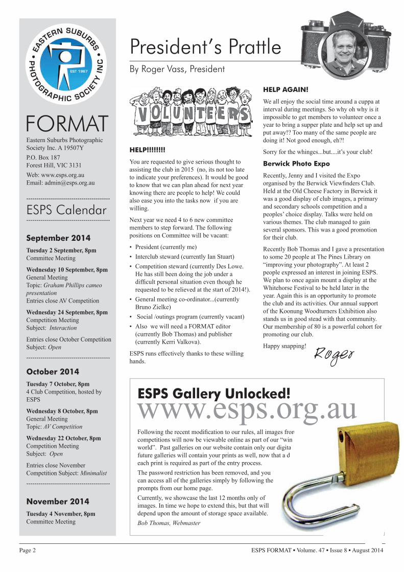
HELP!!!!!!!!
You are requested to give serious thought to assisting the club in 2015 (no, its not too late to indicate your preferences). It would be good to know that we can plan ahead for next year knowing there are people to help! We could also ease you into the tasks now if you are willing.
Next year we need 4 to 6 new committee members to step forward. The following positions on Committee will be vacant:
• President (currently me)• Interclub steward (currently Ian Stuart)• Competition steward (currently Des Lowe.
He has still been doing the job under a difficult personal situation even though he requested to be relieved at the start of 2014!).
• General meeting co-ordinator...(currently Bruno Zielke)
• Social /outings program (currently vacant)• Also we will need a FormAT editor
(currently Bob Thomas) and publisher (currently Kerri Valkova).
ESPS runs effectively thanks to these willing hands.
HELP AGAIN!
We all enjoy the social time around a cuppa at interval during meetings. So why oh why is it impossible to get members to volunteer once a year to bring a supper plate and help set up and put away!? Too many of the same people are doing it! Not good enough, eh?!
Sorry for the whinges...but....it’s your club!
Berwick Photo Expo
recently, Jenny and I visited the Expo organised by the Berwick Viewfinders Club. Held at the old Cheese Factory in Berwick it was a good display of club images, a primary and secondary schools competition and a peoples’ choice display. Talks were held on various themes. The club managed to gain several sponsors. This was a good promotion for their club.
recently Bob Thomas and I gave a presentation to some 20 people at The Pines Library on “improving your photography”. At least 2 people expressed an interest in joining ESPS. We plan to once again mount a display at the Whitehorse Festival to be held later in the year. Again this is an opportunity to promote the club and its activities. our annual support of the Koonung Woodturners Exhibition also stands us in good stead with that community. our membership of 80 is a powerful cohort for promoting our club.
Happy snapping!
ESPS Calendar
Eastern Suburbs Photographic Society Inc. A 19507YP.o. Box 187 Forest Hill, VIC 3131Web: www.esps.org.au Email: [email protected]
FORMAT
-----------------------------------------
September 2014 Tuesday 2 September, 8pmCommittee meeting
Wednesday 10 September, 8pm General meeting Topic: Graham Phillips cameo presentation Entries close AV Competition
Wednesday 24 September, 8pm Competition meeting Subject: Interaction
Entries close october Competition Subject: Open-----------------------------------------
October 2014 Tuesday 7 October, 8pm4 Club Competition, hosted by ESPS
Wednesday 8 October, 8pm General meeting Topic: AV Competition
Wednesday 22 October, 8pm Competition meeting Subject: Open
Entries close November Competition Subject: Minimalist -----------------------------------------
November 2014 Tuesday 4 November, 8pmCommittee meeting
President’s PrattleBy Roger Vass, President
pres report - 800 words maxHow They Did It - 200 words max
ESPS Gallery Unlocked!
Following the recent modification to our rules, all images from our competitions will now be viewable online as part of our “window to the world”. Past galleries on our website contain only our digital images, but future galleries will contain your prints as well, now that a digital copy of each print is required as part of the entry process.The password restriction has been removed, and you can access all of the galleries simply by following the prompts from our home page.Currently, we showcase the last 12 months only of images. In time we hope to extend this, but that will depend upon the amount of storage space available.Bob Thomas, Webmaster
-----------------------------------------
Roger
www.esps.org.au

ESPS FORMAT • Volume. 47 • Issue 8 • August 2014 Page 3
How not to photograph weddings
My wife is a Quaker, which somehow fits with her supremely moral, ethical and wholesome personality. It also provides convincing and incontrovertible proof that opposites do indeed attract! As a Quaker, she naturally knows other Quakers, and recently one of them discovered that I volunteered for a camera club, and instantly assumed I was an expert in the field. I’m just glad that I don’t volunteer for the local STD clinic instead! Anyway, I suddenly found myself in the position of official photographer for a Quaker wedding conducted between a local Quaker and a Ukrainian bride. The bride spoke little English and had only recently arrived from Ukraine. Fortunately she arrived in better condition than her wedding dress which was in transit through the war zone in Ukraine when the train was attacked by local combatants. Alas, the wedding dress did not survive, and so a replacement was required, which subsequently arrived unscathed. This promised to be a wedding with a difference!
Since becoming interested in photography I have studiously avoided wedding photography on the basis that such things are better left to those who know what they’re doing. This wedding was also unlike any I have attended before, and I very quickly learned that when you take on this sort of challenge you cease to have any identity other than “The Photographer”. This cry was repeated many times as in “where’s The Photographer”?! I was called at short notice to photograph everything from the food to the bride, bridesmaids, groom, guests, documents etc etc. including a group shot of everyone who attended! I managed to do a multi-shot photostitch of that, and only had to “re-locate” one of the large crowd in post processing.
I snapped away at everything ….. everything, that is except the actual wedding. Photographs were not permitted during the service which consisted primarily of a lot of silences
interspersed by the occasional random comment from the assembled masses. A Quaker wedding lasts around 40 minutes, 30 of which are spent contemplating one’s navel, very much the same as one of our competition meetings. I must admit I don’t cope well with either sitting still or being quiet, and so this posed a bit of a challenge.
Arranging the bridal party was also a challenge. The first set of images was required to be taken in a small bedroom, with a bed and mountains
of clutter, ironing board and a group of miscellaneous bridesmaids some
of whom spoke no English. It was almost impossible to
frame the group let alone do so in isolation from their surroundings. Lighting was hopeless, preparation time was approximately 30 seconds, sign
language replaced verbal directions and most of my
work was silently observed by a small Ukrainian boy
whose eyes seemed to be saying “my name is Inigo montoya. You killed
my father. Prepare to die.”
Just about everything else proved to be a photographic nightmare, but somehow I managed to produce an A/V, a book of photographs and a CD to record the event. All in all it wasn’t so bad, and I can tick this one off as part of life’s rich tapestry. However I must admit that having sole responsibility for photographs of one-off events such as this are not my favourite pastime, and certainly stretch your photographic skills to the limit! oh yes, just in case anyone reads the Ukrainian version of this article …. my name isn’t Inigo montoya, so please don’t kill me.
Cheers,
* Those who are unfamiliar with the Inigo Montoya reference clearly missed out on seeing the classic “Princess Bride”.
** My wife wants me to re-assure my readership that the little boy is actually very nice indeed and was not plotting against me (but if my body washes up on the banks of the Yarra, you’ll know why!)
2014 ESPS Office Bearers
President roger Vass
Deputy President Wim van Eijk
Secretary Joseph maher
Treasurer Wim van Eijk
Competition Steward Des Lowe
[email protected] (for submitting digital
competition entries)
Interclub Comp Steward Ian Stuart
General Meetings Coordinator Bruno Zielke
Librarian Sandra Ireland
Membership Officer roger Vass
Meet and Greet Joseph maher
Social Secretary position vacant
Minute Secretary position vacant
Webmaster Bob Thomas
FORMAT Editor Bob Thomas
FORMAT Designer Kerri Valkova
Disclaimer: The opinions expressed in this journal are not necessarily
those of the Society. The Society does not accept responsibility for those opinions nor the accuracy of any
statements appearing in this journal.
Editorial ElucidationsBy Bob Thomas, Format Editor
FORMAT DEADLINE
Material for the September edition of FORMAT is due Wednesday 10 September 2014
Bob

Page 4 ESPS FORMAT • Volume. 47 • Issue 8 • August 2014
my presentation at our meeting in July only briefly touched on Bolivia. It is a fascinating country and well worth including in any trip to South America. Lucy and I began our trip to Bolivia from San Pedro de Atacama in northern Chile, located at 2,400 m. The road to the border took us up higher onto the altiplano. A ditch in the dust defined the border. We stepped over it and into a more basic way of life. We got our passports stamped at the remote, windswept Bolivian outpost, then with our friendly Bolivian driver and guide we headed off into the desert along rudimentary tracks. The altiplano is 3,500 – 5,000 m high and the air is thin, as was confirmed when I ran up a hill to get photos of shards of ice in the desert at 4,900 m. Virtually no one lives in this south west corner, but by 5 pm we had passed stark white, green and red lagoons and dramatic scenery to reach the small town of mallku Cueva and an amazingly good hotel. The following day we passed about 50 km of dramatic weathered rock formations which anywhere else would be in a national park. Later it became positively civilised with semi-arid fields where Quinoa is grown, a valley where Llamas are farmed and the odd small town. And then on to (and onto) the Salar de Uyuni, the world’s largest salt flat, about 100 km square. It’s as hard as a rock, which I discovered when I over-balanced while looking for that artistic low-level photo. That evening we stayed at a hotel made entirely of salt (except for the walls between adjoining bathrooms which were made of rice paper). We spent another day exploring the salar and nearby villages. The chief attraction of the town of Uyuni (at the south east corner of the salar) is a ‘train cemetery’. In the 19th century it was a railway hub and locos were cannibalised to keep others running. our delay heading to Potosi (due to a general strike there) turned out to be a bonus: the road from Uyuni to Potosi is through a geological wonderland and we saw it in late afternoon and evening light. At turn after turn along the road I was reminded of the paintings of Albert Namatjira – though without the gum trees, which have been introduced elsewhere in Bolivia and Peru.
A mountain behind Potosi, the ‘Cerro rico’ or rich mountain was the single biggest source of silver to bankroll the Spanish Empire. Thousands of lives were lost mining it. Then for us it was on to Sucre, the constitutional Capital of Bolivia and helpfully located at a lower altitude than the other parts of our travels in Bolivia and Peru. It’s a cosmopolitan university town with a fascinating colonial central area. The next leg of our journey was a mid-morning flight to La Paz. We had been warned to keep our luggage right down to 20
kg for this flight. We needn’t have worried as no one else was and anyway the airline had no intention of taking our bags on that plane. They put them on another airline’s afternoon flight as it was a larger plane (a Boeing 727).
La Paz is full on. The city is in a wide valley/canyon, with great views to the snow-capped Andean mount Illimani (6,438 m) and other peaks. The slopes of the canyon are a sea of apartments and houses. our hotel in La Paz was by far the best designed and best run of all the places we stayed in South America. And then there is El Alto, the ‘city above the city’, spread out on the altiplano above La Paz. From the air it looks organised with straight, wide streets. Down amongst it, it’s a bustling mega-city of over one million people. It looks dusty and dry, though its annual rainfall (570 mm) is 85% of melbourne’s. And virtually none of El Alto existed before the 1950s. Almost all of its residents are indigenous. one day we had to wait for an hour while a bicycle race passed through; it was fascinating to see how many older (and not so old) women prefer traditional Andean clothing of layered skirts and bowler hat.
Lake Titicaca, the world’s highest navigable lake (3,800 m) is split between Bolivia and Peru. We explored the Bolivian part, including Copacabana with its 400 year old Basilica and Sun and moon Islands, with their Inca ruins, legends and history. We stayed on Sun Island and were treated to beautiful sunset-lit clouds over the lake. And did I mention the food? Throughout Bolivia the variety of fresh food was a highlight.
BoliviaBy Rob Morgan Photos by Rob Morgan
Passing Locals in El Alto
Valley of RocksCross Roads on the Uyuni Salt Flats
White & Green Lakes & Mt Licancabur
Church at San Juan

ESPS FORMAT • Volume. 47 • Issue 8 • August 2014 Page 5
COLOuR PRINT - AHD Wim van Eijk - Mother and ChildHD Peter Williams - Ladybug’s Day OutD Jenny Vass - Aussie BushD robert morgan - Rusty Pipe DreamingC Thomas Lyons - Class GlamourC Anna Berger - My Best Oil PaintingCOLOuR PRINT - BHD Serkan Duzler - Toy SoldierD Paul Ewins - EmmaC Tania Luders - Coming Out of
MelbourneC marie Bartlett - In a WhirlCOLOuR PROjECTED IMAGE-AHD Don Stott - FusionD Jenny Vass - Downgraded To A BarnD Graham Phillips - Cracked It
C Graeme Edwards - Painted GardenC Bill Botterill - Three Green BottlesC Graham Phillips - Speed CameraC Peter Williams - SkyroadC robert morgan - Global Warming Eco TourCOLOuR PROjECTED IMAGE-BHD David Simcox - A Rose By Any Other
NameD ros osborne - Resting PlaceC Tania Luders - M&M&M&MC Paul Nador - Melbourne Star MeltdownC Ian Stuart - SpeedieC Ken Gosbell - Pelicans in a spinMONOChROME PRINTD Tania Luders - Puddle IceC Anna Berger - The Mysterious Land of
the Wolves
C Paul Nador - In the Year 2525MONOChROME PROjECTED
IMAGE-AHD Thomas Lyons - InstrumentsD Thomas Lyons - SegmentsC rafael Sanchez - Detail (1)C David Edwards - Dead UndergrowthMONOChROME PROjECTED
IMAGE-BC Astrid Weise - TwiggyC Ken Gosbell - Out of the shadowsSMALL PRINTD Betty Luders - Photography for
DummiesC ros osborne - Seeing RedC ros osborne - All Buttoned Up
Image Awards for July Competition Theme: Creative • Judge: Robert McKayWINNERS
This month’s judge is one of our own members, robert morgan. As well as being one of the most successful photographers in ESPS competitions rob is on the VAPS list of judges and has experience judging for other clubs. The committee felt it was appropriate that we should use his expertise for one of our own competitions. of course this means that rob will not have any entries of his own in this competition. We are grateful that rob is willing not only to judge but to miss out on competing himself. I believe that this will be the first time since joining ESPS that he has not had a full complement of entries in a monthly competition (but asking him to judge was not a subtle way of the Comp Steward imposing a handicap)!
The Set Subject competition “Interaction” closes tonight Wednesday 27th August. The next “open” competition closes on Wednesday 24th September.
The final competition for the year is the Set Subject “A minimalist Image” and closes on Wednesday 22nd october. Several members have had images in competitions during the year that could qualify as minimalist. Definitions of a minimalist photograph are many and varied. one that I like is “a minimalist photograph is one that conveys an idea or a scene using as few elements as necessary.” As a rule the more elements and the greater the detail, the less minimalist the image will be. Here are a few ways
to achieve a minimalist image: include just a few elements; use a few distinctive colours indulgently; place small objects on a relatively plain background; use simple geometric shapes or repeating shapes; close in on parts of a whole; go low on details but infuse with texture.
The Berris Stokes Memorial Award (Nature).
Following the discussion about changes to the Nature competition the committee has reviewed the changes and modified them to allow the inclusion of flora in the General Nature section, but not in the Wild Nature section. The limit of two entries in a section has been removed leaving a simple overall limit of three entries per member. If you have not received a copy of the amended rules for Berris Stokes please let me know.
N.B. Entries for the Berris Stokes Nature competition close at the general meeting Wednesday 8th october. The competition will be judged at the general meeting on the 12th November.
File Names for Entries
With the introduction of the requirement to submit a digital copy of all Print entries it is necessary to modify the file name convention so that DPI and Print entries can be processed together using our competition database application. The new file name includes an additional letter to designate the
entry media, either D for a DPI or P for a Print entry. options for the letter designating the entry Category or Section have been added to allow for Small Prints (S) and for Berris Stokes (G/W).
The file size and image dimensions remain unchanged at 1000 Kb and 1400 pixels Wide by 1050 pixels High. The same size and dimensions should be used for digital copies of Print entries. As already happens with DPIs, digital copies of Print entries will be automatically forwarded to the Interclub Steward and to Format.
Getting Your File Name Right...
Comp CapersBy Des Lowe, Competition Steward
2014 Set SubjectsSeptember Interaction November A minimalist Image

Page 6 ESPS FORMAT • Volume. 47 • Issue 8 • August 2014
July Competition High Distinctions Theme: Creative Judge: Robert McKay
Colour Print - Grade A Peter Williams - Ladybug’s Day Out
Colour Print - Grade BSerkan Duzler - Toy Soldier
Colour Digital Projected Image - Grade A Don Stott - Fusion
Monochrome Digital Projected Image - Grade A Thomas Lyons - Instruments
Colour Digital Projected Image - Grade BDavid Simcox - A Rose By Any Other Name
“Mother and Child” by Wim van Eijk high Distinction, Colour Print (Grade A) and Winner of the Koonung Woodturners Trophy for 2013
much to my surprise I won the 2014 Woodturners Award for Creative photography. The following are the technical details. olympus om-D E-m1, Lens Leica Elmarit 45mm, 1/250 at
f/2.8, ISO 200, Nissin DI466 Fill in flash at 45 deg angle off reflector panel. RAW image imported into Lightroom 5, synchronised processing of the images of the feet and of the hands. Exported as JPG and combined and blended
together using layers in Photoshop Elements. Final image, processed in Lightroom 5 and vignette added to make the
hands coming out of the dark. our new grand-daughter didn’t wanted to keep her feet in the right position in her
mother’s hands directly, so I needed to make a photo of the feet and hands separately. I took four images of the hands and feet and used the best ones.

ESPS FORMAT • Volume. 47 • Issue 8 • August 2014 Page 7
July Competition Distinctions
Colour Print - Grade A Jenny Vass - Aussie Bush
Colour Print - Grade A robert morgan - Rusty Pipe Dreaming
Monochrome Print Tania Luders - Puddle Ice
Small Print Betty Luders Photography for Dummies
Colour Digital Projected Image - Grade A Jenny Vass - Downgraded To A Barn
Colour Digital Projected Image - Grade A Graham Phillips - Cracked It
Monochrome Digital Projected Image - Grade A Thomas Lyons - Segments
Colour Print - Grade BPaul Ewins - Emma (as seen on cover)
Monochrome Digital Projected Image - Grade Bros osborne - Resting Place

Page 8 ESPS FORMAT • Volume. 47 • Issue 8 • August 2014
This started with 3 macro images of a ladybug in my back yard, using my Sigma 17/70 lens which has excellent macro ability for an all-purpose lens. I then took inspiration from the books for little children about the day in the life of an animal or some fictional child, often called [name]’s Day out. my ladybug, of course, is an adult and presumably a bloke (how does one tell?), which is why, incidentally, I used the American name rather than the English “ladybird”. So his Day Out is to the city and finishes with a cooling ale in a beer garden.
Three separate ladybug photos were used; he was extracted and enlarged (even a giant ladybug isn’t scary!) with Photoshop while the location photos were worked in Lightroom. I chose location photos where his pose and the light source matched, and burnt ladybug-shaped shadows to suit. The horse photo was a small crop so I added noise to the ladybug to match the reduced clarity of the image. The beer garden photo colours were tuned to accent the ladybug-orange throughout with contrasting blue, and he’s even drinking with a man in a (real) orange shirt on which I emphasized shadows suggestive of ladybug markings. A beer was cloned before him and some detailed Photoshop masking located him in behind the plants at the front of the garden. It was fun working out the story of the ladybug’s day – distracted by flowers, of course, and did he ride in on the Vespa? What other details can you spot? The arcade and beer garden photos: Sony rX100, with the beer garden in low light at ISo 3200. All others were Canon 450D and Sigma 17/70 lens with unexceptional settings. The ladybug photos are at 70mm, so I was at max zoom but still able to get close enough to focus with the ladybug filling a good portion of the image.
‘Aussie Bush’ was taken using deliberate Vertical Blur technique. As you press the shutter you move the camera up and down. The image remains sharp but blurs with a painting effect. You need fairly evenly spaced straight trees for this to work well and move the camera in even up and down movements. To increase the painting effect I ran an artistic palette knife filter over the image and gave it a luminosity layer to increase the intensity of colour. Details Canon EoS7D f/11 ISo 100. ‘Downgraded to a Barn’: Travelling down to Portsea this old Farm house, now a converted Barn, always captures my attention. The photo entered was a cropped version of a broader general Landscape (as it is a long way off the freeway with no access) I made it a panorama format to eliminate some of the bright sky then ran the photoshop Artistic filter “Dry Brush’ over it to give it a more rundown old world effect – a simple process to match my simple creative skills! Details Canon 30D f/13 ISo 400
I took a close up shot of some long grass while on holiday at Point Lonsdale. I then cropped the image to a square format. I adjusted the photo in CS5 using curves and boosted the saturation and contrast. I sharpened using the high pass filter. Finally, I added a watercolour filter and border. (Fujifilm X20, 7.1mm focal length, f2.8 , ISO200)
Image was captured using a black plastic background, a stacked skull candle holder, a desktop lamp up right corner and a hand torch facing directly to the face of the toy soldier from left. Contrast, levels and crop in Lightroom.
This image arose as an error when I was first digitising slides and I used the wrong settings (prints instead of slides). When I saw what the outcome was I thought I will save those images (there were a few) as they may come in handy. So when “Creativity” came along I thought I can turn a pig’s ear into hopefully a silk purse. So I sharpened this image a little using “Smart Editor”. The background of the original was just plain white so I then sought a background from the same program that added something to the image and you have the result. I am afraid there is not much magic used to create the image but I liked it and it would appear so did the judge.
This image is actually two images taken at the music Farm near moe. The farm is a museum of musical instruments but suffers from over-crowding. I took two images of a piano and a xylophone cutting out the “keys” on each. I flipped one image and cut out the major part and combined them into a V shape using Picture Publisher 7.0. The resulting image was desaturated into a black and white and then the “Graphic Pen” tool was used for the special effect.
Ladybug’s Day Out – Peter Williams
Aussie Bush and Downgraded To A Barn – Jenny Vass
Fusion – Don Stott
Toy Soldier – Serkan Duzler
A Rose by any other Name – David Simcox
Instruments – Thom Lyons
How I Did It... We welcome contributions from placegetters. Email up to 200 words to [email protected]

ESPS FORMAT • Volume. 47 • Issue 8 • August 2014 Page 9
Yep that’s right… the weight of a colour. I don’t normally think about colour having weight but psychologically it does. It depends on its relativity to the other colours in the image. A warm object is heavier than a cool object (judges comment on warm colours advancing and cool colours receding), bright objects are heavier than dark ones (again judges comment on the eye being drawn to a light object) and patterned objects are heavier than a plain colour. It is the contrast between it and the other colours that makes something heavy.
Colour has a tremendous impact on our photographs and to create worthwhile images we need to understand colour during the shoot and in post-processing. The concept is that in each photograph some element will demand or grab our attention more than others. Having fewer colours may actually be good for your photographs.
Colours that dominate your image will set the mood.
• Blues and greens – coolness, calmness.• oranges and Yellows – warmth and energy.• Dark colours – mysterious.• Dull colours – sombre.• Vivid colours – joy, hope, excitement.
So how can this colour weight help your photos? Ask yourself these questions when you are taking the photo.
• Do all the colours play a role within the story?• Does anything standout that shouldn’t?• Does anything less important stand out more than something more
important?• Do the colours form a cohesive pattern?
Based on these questions you may have to remove something from your photo. Perhaps that is just a matter of changing your viewing point or perhaps it is to physically remove it.
If you can’t eliminate the distractions when taking the photo you can deal with them in post processing. Look at you image and determine what mood you want to convey and what objects you want to be important, then adjust the image to give this hierarchy
• most important is visually heaviest.• Supporting elements are next.• Fade to black the rest (ie minimise the number of competing
colours in the image)
So let’s see this in action - here is my original image, it was a grab shot from a bus while speeding through the English countryside. There was no opportunity to consider my position, the composition or adjust my camera not bad considering but it could be better.
ok so what is my story? It is the castle nestled in a valley (priority 1) surrounded by autumn colours (priority 2).
The heaviest object in the image is the reflection of the sun on the vehicles (2) and the castle windows (1). Because the image is relatively dark these light areas immediately grab your attention. I increased the exposure and used the recovery slider to deal with the castle window reflections then cloned out the vehicles. This was better but it introduced other issues – the autumn colours (particularly the orange tree (3) and the sky (4) were now visually heavier and competed with the Castle, plus it made a power pylon (5) visible.
ok more balancing required – I used the adjustment brush to decrease the exposure of the sky and the orange foliage and cloned out the power pylon.
The final adjustment was an increase in contrast to the whole image.
Colour WeightBy Graham Phillips Photos by Graham Phillips
Original image
Final image
Areas for adjustment

Page 10 ESPS FORMAT • Volume. 47 • Issue 8 • August 2014
By Graham Phillips
Moving House
As some of you may know we recently put our house on the market. As part of that process we needed to stage the house ready for the photographer. Well what a task, you don’t realize how much “stuff” you have scattered around or secreted in cupboards. Once we finally dealt with this issue there was the question of how to present the rooms. We have both been involved in photography for some time and so our thoughts took on the feel of a photo shoot. We looked at making each room unique, having a complimentary colour palate and a point of focus. The intent being to allow potential buyers to refer to the various rooms later by saying “remember the house with the ……..” and so differentiate our house from others they may have visited that day.
I was talking to a club member and mentioned that the photographer was due to take the house photos the next week and they said “I was thinking about doing this as a job, it would be easy as the photos all look the same. They use a wide angle lens, wait until early evening, turn on all the lights, drop in a
different sky and pump up the saturation”. It was therefore interesting for me to observe the photographer at work and see the final images. The photographer arrived at 4pm (early evening – tick), all the lights were turned on (tick), wide angle lens (tick) but that was about the end of the comparison. The photographer had two flashes and a mini umbrella to diffuse the flash, every photo was taken using a tripod set about chest height. The camera (a Canon, by the way) was set to manual and the saturation was achieved in camera by altering the exposure. The eye for detail that this photographer had was brilliant. Each room was studied to determine the best angle for the image then each element in the room was looked at to see if they were adding or detracting from the image and furniture was re-positioned or removed to enhance the photograph. We were very happy with the photos taken.
Then there is the other side of selling a house – finding another one to live in. I now realise that we were very lucky with our photographer as there are some
terrible photos on the real estate web sites – inadequate lighting, poor composition, objects (or junk) in the room detracting from the image, time and date stamps on the image, out of focus images and multiple shots of the same room from slightly different positions.
This is an example of a poor image that could have easily been enhanced with some fill flash and repositioning of the furniture.
So yes, the club member I was talking to has a point that you could set yourself up to take house photos for a job. With the experiences gained at the club listening to the judge’s comments you could produce photos in the top bracket of those on the real estate sites. I may even consider this after my move.
Nifty upcoming events that you might be interested in24th Eastern Interclub: The 24th Eastern Interclub is hosted by maroondah Camera Club this year, and is on Wednesday 17 September at 8:00pm. Venue: maroondah Federation Estate, Greenwood Ave, ringwood.
4-Club Competition: It is ESPS’s turn to host this bi-annual interclub comp between Berwick, maroondah, Waverley and ourselves. Please make a note in your diaries... it’s TuESDAY 7 OCTOBER. We would like a strong turn up from ESPS members! Also please volunteer to bring a plate for supper. Let roger know at club or to [email protected]
Educational Photo Exhibition: Victoria University will stage an Educational Photo Exhibition 9.30-5.45 on 6th September. www.educationalphotoexpo.com.au/speaker-program-melbourne
Tarkine Art Photo Tour: Tasmanian Expeditions is conducting a Tarkine ArtPhoto tour from 30 November to 5 December. The photo leader will be Peter Walton (who spoke at the club last year) Go to www.tasmanianexpeditions.com.au
Naming your competition entries: Get it riGht!members will have been advised of various changes to our competition rules, including alterations to the naming structure which is required when entering our images. If you are one of those who, like me, find this naming convention somewhat laborious and complicated, I suggest that you download the latest copy of “Entry maker”. Entry maker is a small, user friendly program created by our own Ian Arnott. It is designed, among other things, to make naming our competition entries an easier, less painful process. Entry maker has been upgraded to accommodate these latest changes, and can be downloaded from our website. Enter the following address into your browser http://tinyurl.com/mgm6uy9 . If nothing seems to happen, just check your normal download folder where you should find a copy of the program as a rar archive. Failing this, just go to our website and choose the “Downloads” page from the “Useful Resources” tab. Once downloaded, clicking on the “rar” file should provide access to the EntryMaker program files including instructions. Feel free to email me if you experience difficulties in downloading this useful program.Bob Thomas, Webmaster
Dodgy real estate photo!

ESPS FORMAT • Volume. 47 • Issue 8 • August 2014 Page 11
Competition meetings are held at the Pines Senior Citizens Centre, 25 Central Road, Blackburn (melway map 48 A10) on the fourth Wednesday of each month (excluding December), with Club meetings held on the second Wednesday (except in January). All meetings commence at 8.00 pm. Complete details may be found in the Society’s published program on our website, with updates published in this magazine from time to time. Further information about the Society may also be found on our website at www.esps.org.au, by email at [email protected] or by contacting the appropriate Officer from the list of contacts provided elsewhere in this magazine.
Eastern Suburbs Photographic Society Inc. P.O. Box 187, Forest hill, Victoria 3131 Web: www.esps.org.au • Email: [email protected]
By Bruno Zielke, General Meeting Manager
General Meeting Report August
Portraiture Workshop by David Purdue with Em Baxter as the Model
The essence of this workshop was to demonstrate how to set up the backdrop, the lights and to demonstrate what effect the lighting has on the image. The portable gear which David used, costs about $10,000 with an additional cost of the camera.
I was interested to see that the flashes were the same that we use on top of the camera, but set to manual mode, as was the camera. The radio trigger in the camera hot shoe fired the flashes for about 1/1000th of a second, so care needs to be taken to correlate the aperture and shutter for desired effect. The flash hot shoe he used is available from Flash Zebra shop on-line.
David demonstrated the effects of a shutter speed that was too fast and too slow to synchronise. For the modelling light David used a soft box with a directional grid. No more need for bulky electronic flashes and brollies of the traditional studio set up. For the filler light, he set up a smaller similar soft box with diffusing material inside.
Here are some of the hints David passed onto us.
• Use a longer focal length say 120-140mm, aperture set at f5.6 and ISo 200.
• Spot focus on the eye(s)• Zoom in from afar to give the model
some space and stay within the backdrop boundary.
• To relax an inexperienced model, take a few dozen shots and converse while directing. Try to make the experience an enjoyable one for the model. This will show in the images.
• The backdrop need not be ironed, the creases will not show if the model stands far enough forward.
• Use either a white, gray or black backdrop and illuminate with a diffused light to
give the model space and dimension. To change the colour of the backdrop put a filter in front of the modelling light and change the camera setting to Preset (on Nikon).
• To enhance this you may wish to add another light suspended from a boom stand to illuminate the model’s head and shoulders. Experiment with ratios of lights for blond to dark hair.
Following the tea break David projected and reviewed some of the images he took of Em and commented on the undesired effects and enhancements. Several members stepped up and took images of the model. From the few I had seen, it appeared that the position of the model, her face, lighting ratios or the position of the lights and their strengths needed some adjustment.
It was good fun and even though the studio set up is complex, the lessons are simple even when using outdoor.
Upcoming General Meeting - Wednesday 10 September, 8pm
Member Presentation: Graham Phillips
Graham’s adventure into photography began at 14 when his father trusted him with his camera for a month while he was in NZ for a Scout Jamboree. At high school Graham joined the photography club, but it was not until much later that a work colleague convinced him to purchase a Canon SLr. Graham does not believe he has a special talent for the artistic element in photography - perhaps we can judge this ourselves from his images. However he has a knack for modifying things to make them better. His background in computers and drawing packages plus the digital photography
revolution has resulted in most of his images being altered in some way. This presentation is a celebration of Graham’s images before and after they have passed through his computer.
Photos by Bob Thomas, except where noted
Roger Vass

Page 12 ESPS FORMAT • Volume. 47 • Issue 8 • August 2014
ESPS Member GalleryIf you would like to share one of your own special images, or to nominate another member’s image for inclusion, let us know at [email protected]
WELL DONE!Download FORMAT from the ESPS website to see full colour!
Graham Phillips - Speed Camera
Peter Williams - Skyroad Ian Stuart - Speedie
Paul Nador - Melbourne Star Meltdown
David Edwards - Dead Undergrowth
Bill Botterill - Three Green BottlesGraeme Edwards - Painted Garden
robert morgan - Global Warming Eco Tour