magazine analysis
TRANSCRIPT
Magazine Analysis(3 front covers, 3 contents pages and 3 double
page spreads)
Madelaine Gee
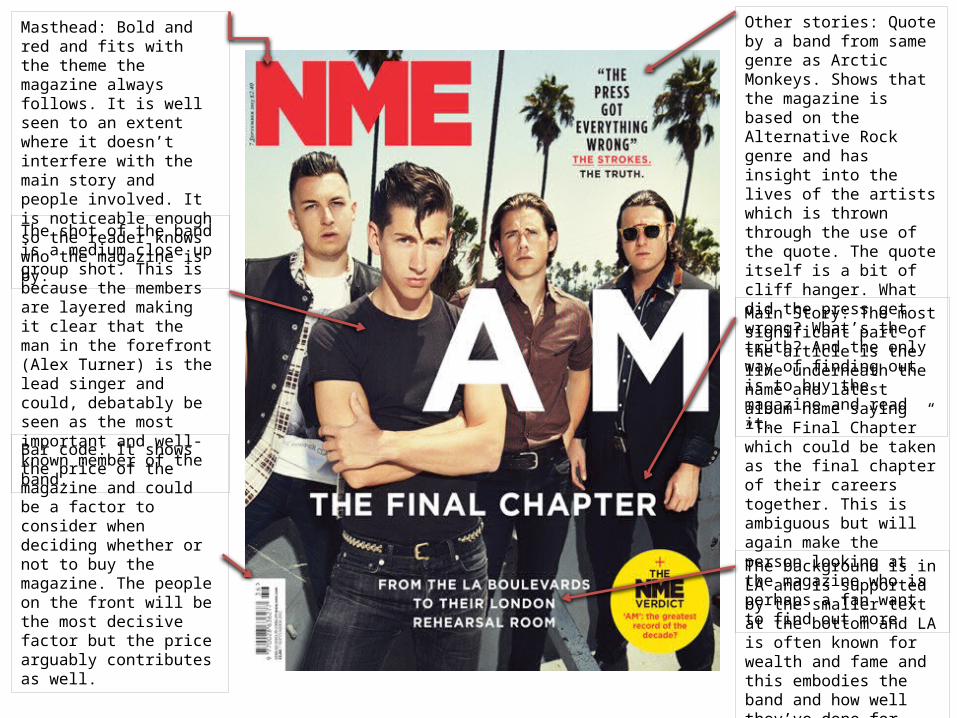
Masthead: Bold and red and fits with the theme the magazine always follows. It is well seen to an extent where it doesn’t interfere with the main story and people involved. It is noticeable enough so the reader knows who the magazine is by.
Other stories: Quote by a band from same genre as Arctic Monkeys. Shows that the magazine is based on the Alternative Rock genre and has insight into the lives of the artists which is thrown through the use of the quote. The quote itself is a bit of cliff hanger. What did the press get wrong? What’s the truth? And the only way of finding out is to buy the magazine and read it.
The shot of the band is a medium close up group shot. This is because the members are layered making it clear that the man in the forefront (Alex Turner) is the lead singer and could, debatably be seen as the most important and well-known member of the band.
Bar code: It shows the price of the magazine and could be a factor to consider when deciding whether or not to buy the magazine. The people on the front will be the most decisive factor but the price arguably contributes as well.
Main Story: The most significant part of the article is the line underneath the name and latest album name saying “The Final Chapter” which could be taken as the final chapter of their careers together. This is ambiguous but will again make the person looking at the magazine who is perhaps a fan want to find out more
The background is in LA and is supported by the smaller text at the bottom and LA is often known for wealth and fame and this embodies the band and how well they’ve done for themselves.
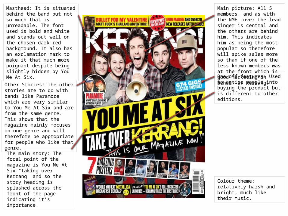
Masthead: It is situated behind the band but not so much that is unreadable. The font used is bold and white and stands out well on the chosen dark red background. It also has an exclamation mark to make it that much more poignant despite being slightly hidden by You Me At Six.
Other Stories: The other stories are to do with bands like Paramore which are very similar to You Me At Six and are from the same genre. This shows that the magazine mainly focuses on one genre and will therefore be appropriate for people who like that genre.
The main story: The focal point of the magazine is You Me At Six “taking over Kerrang” and so the story heading is splashed across the front of the page indicating it’s importance.
One off features: Used to entice people into buying the product but is different to other editions.
Main picture: All 5 members, and as with the NME cover the lead singer is central and the others are behind him. This indicates him as being the most popular so therefore will spike sales more so than if one of the less known members was at the front which is good marketing on behalf of Kerrang!
Colour theme: relatively harsh and bright, much like their music.
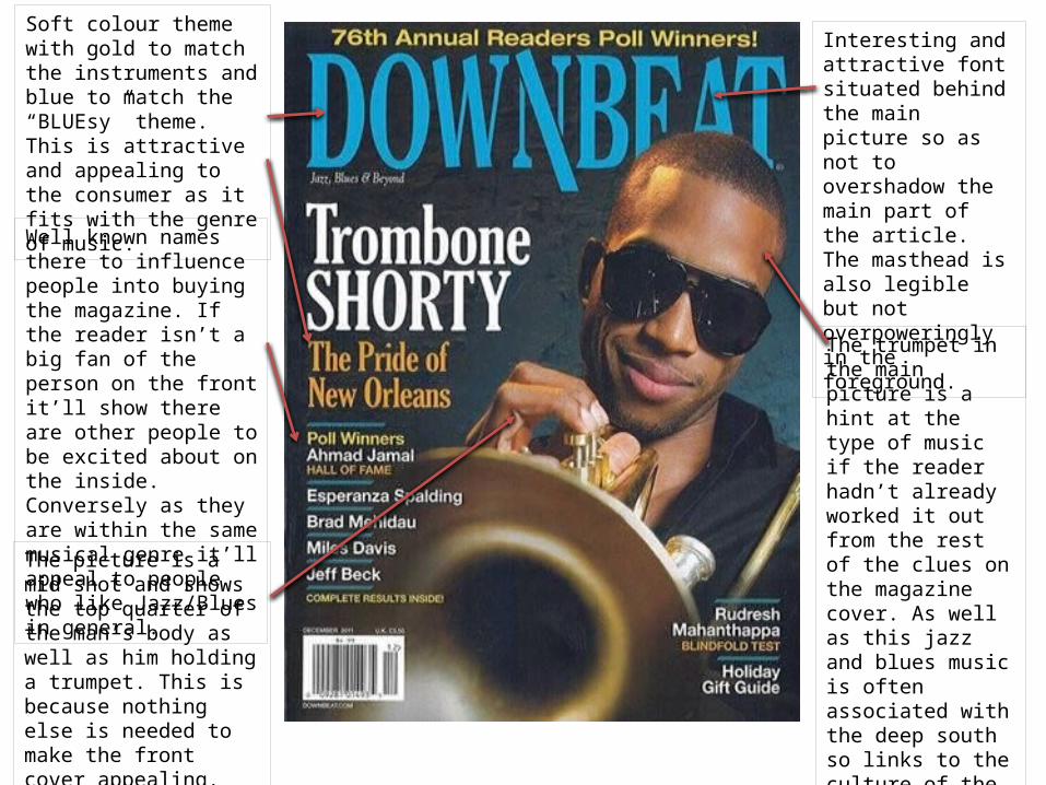
Soft colour theme with gold to match the instruments and blue to match the “BLUEsy” theme. This is attractive and appealing to the consumer as it fits with the genre of music.
Well known names there to influence people into buying the magazine. If the reader isn’t a big fan of the person on the front it’ll show there are other people to be excited about on the inside. Conversely as they are within the same musical genre it’ll appeal to people who like Jazz/Blues in general.
Interesting and attractive font situated behind the main picture so as not to overshadow the main part of the article. The masthead is also legible but not overpoweringly in the foreground.
The trumpet in the main picture is a hint at the type of music if the reader hadn’t already worked it out from the rest of the clues on the magazine cover. As well as this jazz and blues music is often associated with the deep south so links to the culture of the person pictured.
The picture is a mid shot and shows the top quarter of the man’s body as well as him holding a trumpet. This is because nothing else is needed to make the front cover appealing. Its simplicity is pleasing in itself.
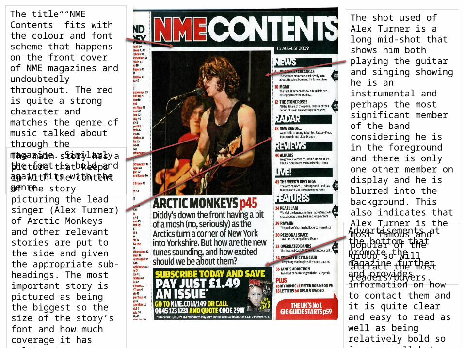
The title “NME Contents” fits with the colour and font scheme that happens on the front cover of NME magazines and undoubtedly throughout. The red is quite a strong character and matches the genre of music talked about through the magazine. Similarly the font is bold and again fits with the genre.
The main story has a picture that keeps in with the content of the story picturing the lead singer (Alex Turner) of Arctic Monkeys and other relevant stories are put to the side and given the appropriate sub-headings. The most important story is pictured as being the biggest so the size of the story’s font and how much coverage it has relates to importance.The other stories are also to do with bands and people that are within the same genre as the main story.
The shot used of Alex Turner is a long mid-shot that shows him both playing the guitar and singing showing he is an instrumental and perhaps the most significant member of the band considering he is in the foreground and there is only one other member on display and he is blurred into the background. This also indicates that Alex Turner is the most famous and popular of the group so will attract the most readers/buyers.
Advertisements at the bottom that promote the magazine further and provides information on how to contact them and it is quite clear and easy to read as well as being relatively bold so is seen well but doesn’t overpower the main focus of the page.

A band is pictured with, again, the lead singer in the middle of the shot with them all holding a Union Jack. This could indicate they are a British band or that they are a foreign band doing a tour in Britain. The name of the band is subtle and just noticeable that people who don’t know them can easily find out.
The other stories featured in the magazine are listed below the main story and image clearly indicating they aren’t the main selling point of the magazine. The bands and artists listed are of the same genre as Framing Hanley so fits well with the magazines target audience.
The colour scheme fits the rest of the magazine as it is bold and the complimentary colours are appealing as the black backgrounds allow the yellow text to pop.
There is also 5 free posters within this issue which is a feature that doesn’t usually appear so is a one off making it a good reason to buy the magazine. There will most likely be a different offer with each issue which is a good marketing technique.
There is also a note from the editor which is a nice touch in terms of keeping in touch with the fans of the magazine on a more personal level.

Like with all the other contents pages the main and most important story that the magazine thinks will sell the magazine is the largest. It also has a picture that takes up most of the page illustrating its importance.
The issue date is in the top left which is a relatively prominent placement so shows how in date the magazine is.
Adele, is a very famous singer who has done very well for herself so makes a good impression on the magazine in that they can get interviews with such a popular and current artist.
The other stories are situated away from and not as big as the main story. They are in an organised list and have bold headings drawing the reader to see what they’re going to read about more quickly than reading the whole thing.
The extra features in the magazine are mentioned bottom right so again don’t interfere with the more important story but show the reader what they can look forward to.

There are different pictures of Pixie Lott that show different sides to her. One being a soft smile showing she’s sensitive as well as a more sensual hair grabbing shot. They show she can appeal to men and woman making her a versatile artist.
The colours are bright and compliment each other well and mix well with the pop genre she’s a part of.
The writing is spaced out and easy to read and has things placed around the page to make it interesting to look at.
At the top left there is an advertisement for her new album. There is also comments on the right hand side as well as scores out of 5 for the album and an overall score of 21/25. This is meant to show that the quality of the album is very high.
The pictures of Pixie Lott are all the same shot so don’t show much variety.
There is a running theme of “perfection” throughout the spread. There is a question as the title asking how perfect she is and it is answered on the other side saying she is pretty much perfect”.
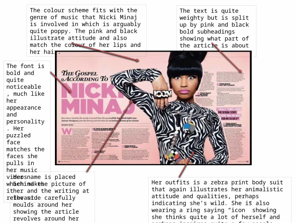
The colour scheme fits with the genre of music that Nicki Minaj is involved in which is arguably quite poppy. The pink and black illustrate attitude and also match the colour of her lips and her hair.
Her outfits is a zebra print body suit that again illustrates her animalistic attitude and qualities, perhaps indicating she’s wild. She is also wearing a ring saying “icon” showing she thinks quite a lot of herself and perhaps inspires quite a few people.
The text is quite weighty but is split up by pink and black bold subheadings showing what part of the article is about what.
The font is bold and quite noticeable , much like her appearance and personality. Her puzzled face matches the faces she pulls in her music videos which makes it relevant.
Her name is placed behind the picture of her and the writing at the side carefully moulds around her showing the article revolves around her quite literally.
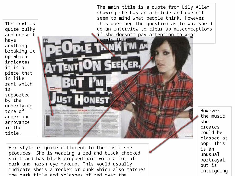
The main title is a quote from Lily Allen showing she has an attitude and doesn’t seem to mind what people think. However this does beg the question as to why she’d do an interview to clear up misconceptions if she doesn’t pay attention to what people think.
Her style is quite different to the music she produces. She is wearing a red and black checked shirt and has black cropped hair with a lot of dark and harsh eye makeup. This would usually indicate she’s a rocker or punk which also matches the dark title and splashes of red over the article.
The text is quite bulky and doesn’t have anything breaking it up which indicates it is a piece that is like rant which is supported by the underlying tone of anger and annoyance in the title.
However the music she creates could be classed as pop. This is an unusual portrayal but is intriguing.