magazine analysis
TRANSCRIPT

College magazine analysis
Louie Clark

What worked : CoverGeneral layout of the magazine cover I think worked well, I tried not to make the cover too busy as this can be the downfall of many magazine designs.
The tried and tested colour scheme of black and red I also like, it gives you a blend of light dark and strong colour , and has a professional air to it.

What didn’t : Cover
I don’t know how well the lead line works, the overall placement is ok I think, but the colour might not be easy to red, or catch the readers eye.

What was easy? : cover
The cover lines were easy to create and position as it employed techniques I had used on the previous project which were getting text from dafont grouping different fonts and free transforming them.
What was difficult?: cover
The was fairly difficult to cut out and separate from the original background, as it required intricate selection of edges.

What did I learn?: coverI learned new industry terminology that I didn’t learn for gcse, such as cover line ,lead line and left third.
Left third is the section of the magazine visible on the shelf
The lead line is the main feature the magazine is based on.
Cover lines are less in depth features and show what else is in the magazine

If I had all the money in the world what would I change?
I would probably change the image, with more time I could probably achieve a more professional looking cover, and the main image would play a big part in that.

What is it comparable with?:contentsThe masthead has a similar affect, with the logo visible on the left third.
House style is similar with this magazine and mine, the layout of the cover lines is also similar
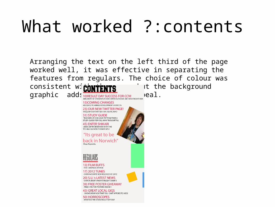
What worked ?:contents
Arranging the text on the left third of the page worked well, it was effective in separating the features from regulars. The choice of colour was consistent with the cover but the background graphic adds to its eye appeal.

What didn’t work?:contents
The incorporation of the image into the layout of the contents page seems somewhat clunky and dispositional , it may look more at home with more pictures though I ran out of room. I would of left more photo space for other imagery if I was to redesign it.

What was easy?:contents
The easiest part of this task was the design, I had a concept in my head from the start, incorporating the city college logo in the bottom right hand corner of the page
What was difficult?:contents
The most difficult part of this task was creating the feature and regular titles, and coming up with relevant content for my magazine.

What did I learn?: contents
I learned how to use the grid to create a false border and make my contents look more professional using photo shop.
False boarder

If I had all the money in the world what would I change?:contents
I would get a better quality image for the lead line on the contents page. I would probably involve more images in the design.

What is it comparable with?:contents
It is comparable with Q and other magazines who put the majority of text on the left third, and make use of a consistent colour scheme and white space.