los angeles county metropolitan transportation …€¦ · los angeles county metropolitan...
TRANSCRIPT

Los Angeles County Metropolitan Transportation Authority
Bicycle Travel Demand Model
Phase IIModel Description
Staff Working PaperUpdate 2014 March
Los Angeles County Metropolitan Transportation Authority
Countywide Planning and Development Division
Staff: Chaushie Chu, Robert Calix, Robert Farley, Ying Zhu, Falan Guan, Jim Zhang, John Stesney, Owen Mo.
3/26/2014 1
Cambridge Systematics, Inc. (Consultant)
Staff: Tom Rossi, Michael Snavely, Kimon Proussaloglou, Feng Liu, Monique Urban

Please use two‐sided printing
This page is a blank page
3/26/2014 2

3/26/2014 3
Acknowledgement:
The Los Angeles Metro Bicycle Model Development Team wishes to thank members of the Advisory Panel for their advice and time they invested in helping us develop the scope of work for Phase II of the Bicycle Model Development Project.
Specifically, we would like to thank Jennifer Dill for her input on choice set labeling and inclusion of terrain variables in utility specification; Peter Furth for his behavioral insight in “low‐stress bicycling”; Susan Handy (and Kevin Krizek) for their findings through stated preference surveys; Thomas Gotschi for his advice on developing a model that is sensitive to the full spectrum of bicycle investment policies; Jeremy Raw for his personal encouragement and discussions on model structure and path building; David Ory for his recommendation to prioritize our limited resources on relevant data collection tasks and exploring the opportunities of model transfer from other municipalities; and Bill Stein for his conceptual advancement of the model run‐stream.
In addition, we also like to thank Elizabeth Sall and her colleagues at San Francisco County who shared their most recent findings on choice set generation, utility specification, Cycle Tracks database applications and model validation with us. We are also indebted to Peter Vovsha and Shlomo Bekhor for their insightful discussions on mathematical structures to overcome path overlapping in path choice modeling.
Note:
The Los Angeles Metro Bicycle Model is currently under development. The statements in this document represent a “snapshot in time” of the intentions for that model. Further research may uncover information that might change the mechanics or even the approach of the model. The final model could differ substantially from the examples in this document.

Please use two‐sided printing
This page is a blank page
3/26/2014 4

Table of Contents
3/26/2014 5
A. Flow Chart
B. Supply Side Inputs
C. Demand Side Inputs
D. Path Options ‐‐ Rider Archetypes
E. Bicycle Path Choice Model
F. Integration with Motorized Travel Demand Model – Aggregation Process
G. Validation
H. Next Steps

3/26/2014 6
2. Summarize Paths
(R)
(i) ASCII files of 5 paths for each trip
interchange[MD, MT,
PF, PT, MS paths]
(ii) Utility function
attributes for five paths
(I) System User
Benefit, maximum
biking utility (log SUM)
1. Generate Bicycle Paths (Cube)
[5 path types: Minimize Distance (MD), Minimize Turns (MT), Prefer Bike Facilities (PF), Prefer
Bike Trails (PT), Minimize Stress (MS).
3. Path Choice Model
(R)[Cross Nested
Logit with 5 paths & max of
31 nests]
(III) Bicycle volumes
in roadway network
(II) TAZ level Mode
shares : auto,
transit, walk and bicycle
trip tables
(iii) Path Overlap
Matrix (up to 31 cells)
5. TAZ Level Mode Choice
Model (Nested Logit)
(v) Path shares for
each interchange
6. Load Bicycle Trips to Network
END
(iv) Path-Link
Sequence Table
4. Aggregation Model
[Intra-zonal, Short Distance Inter-zonal, Long Distance Inter-zonal, Pseudo zone.]
(vi) TAZ level
aggregate bicycle utility
(log SUM)
Back to #1 if bicycle
trip assignment
required
‐‐‐ External inputs
‐‐‐ Internal data files
‐‐‐ Computational modules
Modules in Times Roman Italic font only apply to bicycle trip assignment.
Five Modules in shaded area are data & computations on TAZ level.
Notes:
A. Flow Chart
A. Supply Data: TeleAtlas Network
in Generalized Cost Measurement
(ESRI Database)
B. Demand Data: 2,268 TAZ, 500 Pseudo
zones, 109,572 Split blocks, TAZ level trip
tables
C. Utility Functionfor path choice
D. Utility Functionfor mode
choice
E. TAZ Level Motorized
Mode ChoiceModel Inputs
On
ly f
or tr
ip
assi
gnm
ent
‐‐‐ Output files
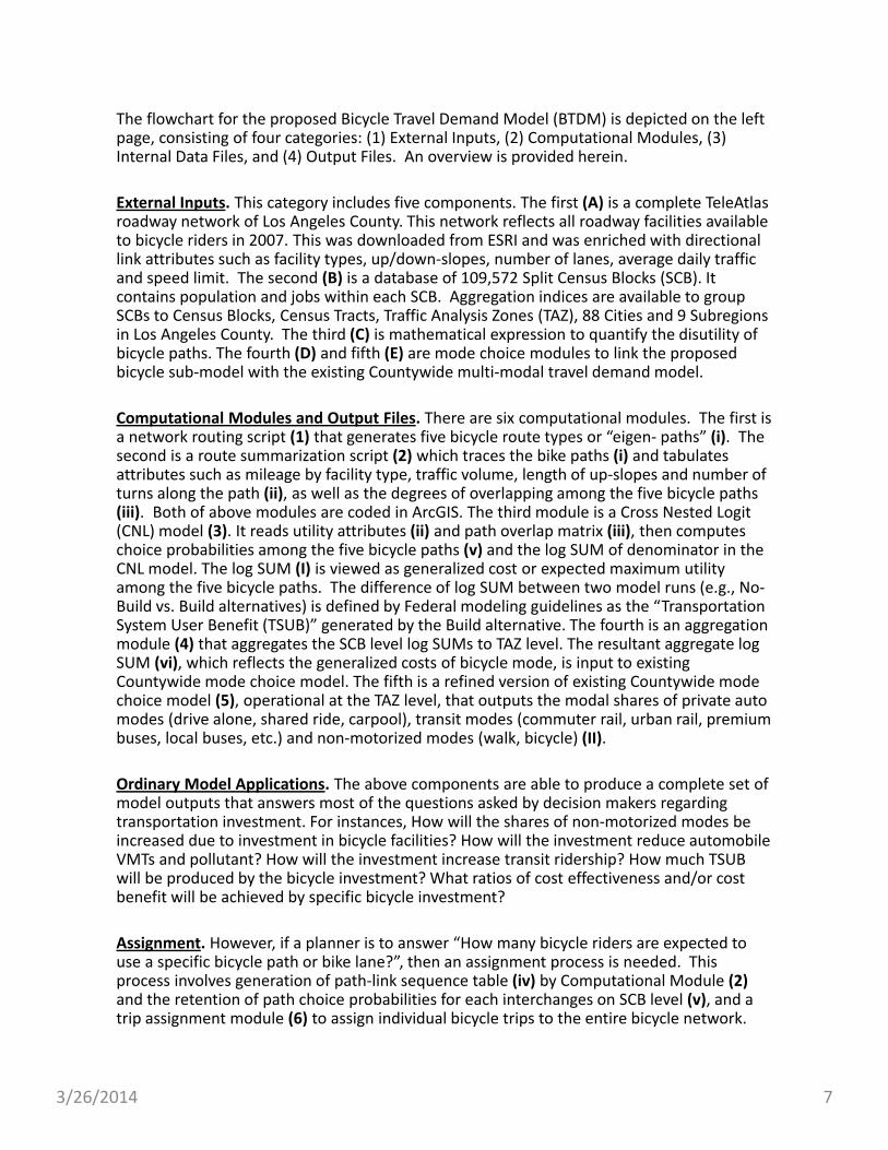
The flowchart for the proposed Bicycle Travel Demand Model (BTDM) is depicted on the left page, consisting of four categories: (1) External Inputs, (2) Computational Modules, (3) Internal Data Files, and (4) Output Files. An overview is provided herein.
External Inputs. This category includes five components. The first (A) is a complete TeleAtlas roadway network of Los Angeles County. This network reflects all roadway facilities available to bicycle riders in 2007. This was downloaded from ESRI and was enriched with directional link attributes such as facility types, up/down‐slopes, number of lanes, average daily traffic and speed limit. The second (B) is a database of 109,572 Split Census Blocks (SCB). It contains population and jobs within each SCB. Aggregation indices are available to group SCBs to Census Blocks, Census Tracts, Traffic Analysis Zones (TAZ), 88 Cities and 9 Subregions in Los Angeles County. The third (C) is mathematical expression to quantify the disutility of bicycle paths. The fourth (D) and fifth (E) are mode choice modules to link the proposed bicycle sub‐model with the existing Countywide multi‐modal travel demand model.
Computational Modules and Output Files. There are six computational modules. The first is a network routing script (1) that generates five bicycle route types or “eigen‐ paths” (i). The second is a route summarization script (2) which traces the bike paths (i) and tabulates attributes such as mileage by facility type, traffic volume, length of up‐slopes and number of turns along the path (ii), as well as the degrees of overlapping among the five bicycle paths (iii). Both of above modules are coded in ArcGIS. The third module is a Cross Nested Logit (CNL) model (3). It reads utility attributes (ii) and path overlap matrix (iii), then computes choice probabilities among the five bicycle paths (v) and the log SUM of denominator in the CNL model. The log SUM (I) is viewed as generalized cost or expected maximum utility among the five bicycle paths. The difference of log SUM between two model runs (e.g., No‐Build vs. Build alternatives) is defined by Federal modeling guidelines as the “Transportation System User Benefit (TSUB)” generated by the Build alternative. The fourth is an aggregation module (4) that aggregates the SCB level log SUMs to TAZ level. The resultant aggregate log SUM (vi), which reflects the generalized costs of bicycle mode, is input to existing Countywide mode choice model. The fifth is a refined version of existing Countywide mode choice model (5), operational at the TAZ level, that outputs the modal shares of private auto modes (drive alone, shared ride, carpool), transit modes (commuter rail, urban rail, premium buses, local buses, etc.) and non‐motorized modes (walk, bicycle) (II).
Ordinary Model Applications. The above components are able to produce a complete set of model outputs that answers most of the questions asked by decision makers regarding transportation investment. For instances, How will the shares of non‐motorized modes be increased due to investment in bicycle facilities? How will the investment reduce automobile VMTs and pollutant? How will the investment increase transit ridership? How much TSUB will be produced by the bicycle investment? What ratios of cost effectiveness and/or cost benefit will be achieved by specific bicycle investment?
Assignment. However, if a planner is to answer “How many bicycle riders are expected to use a specific bicycle path or bike lane?”, then an assignment process is needed. This process involves generation of path‐link sequence table (iv) by Computational Module (2)and the retention of path choice probabilities for each interchanges on SCB level (v), and a trip assignment module (6) to assign individual bicycle trips to the entire bicycle network.
3/26/2014 7

3/26/2014 8
B. Supply Side InputsExhibit B‐1
Exhibit B‐2

3/26/2014 9
The fundamental element for the supply side inputs is a detailed network that reflects all the facilities that are relevant to bicycle riders in the County of Los Angeles. This database should contain not only the main roads and local streets, but also the back alleys and trails. We initially considered the Thomas Brothers Maps (TBM) database. However, after a series of tests, we determined that the TBM database was not accurate enough for route modeling. It often connects roadways of different elevations into an erroneous path, which is why we explored alternatives.
TeleAtlas Base Network. The 2007 version of TeleAtlas network was downloaded from ESRI. It is a highly accurate and detailed “routable network” being used by TomTom for real time GPS navigations. This database contains six general categories of roadway facilities. The mileage of these six categories are listed below:
1. Freeways and freeway access ramps (2,160 miles) 5%
2. State highways (444 miles) 1%
3. Surface street ramps (891 miles) 2%
4. Primary roads (5,245 miles) 13%
5. Secondary roads (1,537 miles) 4%
6. Minor streets (29,625 miles) 75%
Total (39,902 miles) 100%
Exhibit B‐1 shows the 39,902 miles of roadway network for the entire County of Los Angeles. Exhibit B‐2 shows the same map zoomed in to the Westside subregion. In Exhibit B‐2, we can see that the highest densities of minor streets are found in areas of (1) vicinity of Wilshire Boulevard, between Robertson Boulevard and Santa Monica Boulevard; (2) South Los Angeles, southwest of Freeway I‐110 and I‐10 near University of Southern California; and (3) the entire City of Santa Monica. These areas are shaded in yellow.
Enhancement: Bicycle Facilities. The TeleAtlas database is enhanced with bicycle facilities in three different types of treatments: 313 miles of bicycle trails (Class 1), 762 miles of bicycle lanes (Class 2), and 572 miles of bicycle routes (Class 3). Other emerging designs of bicycle treatment, such as cycle tracks, currently operational in Long Beach, will be added to future updates of the database.
Besides freeways and freeway ramps, all roadway facilities and bicycle treatments in the database are made available to the Bicycle Model for path building and path assignment procedures.

3/26/2014 10
B. Supply Side Inputs
Roadway Slopes to Reflect Pedaling Effort
Exhibit B‐3
3/26/2014 11
Westside
Exhibit B‐4 Exhibit B‐5San Gabriel Valley
a
d
c b
ab
c,d
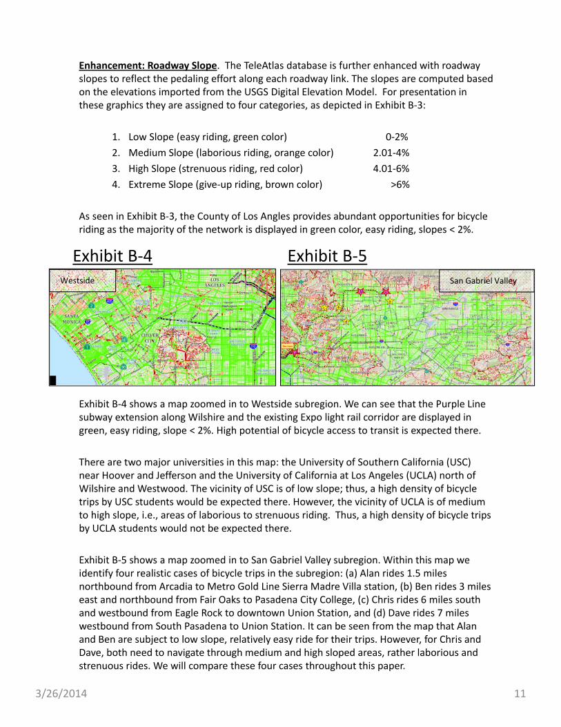
Enhancement: Roadway Slope. The TeleAtlas database is further enhanced with roadway slopes to reflect the pedaling effort along each roadway link. The slopes are computed based on the elevations imported from the USGS Digital Elevation Model. For presentation in these graphics they are assigned to four categories, as depicted in Exhibit B‐3:
1. Low Slope (easy riding, green color) 0‐2%
2. Medium Slope (laborious riding, orange color) 2.01‐4%
3. High Slope (strenuous riding, red color) 4.01‐6%
4. Extreme Slope (give‐up riding, brown color) >6%
As seen in Exhibit B‐3, the County of Los Angles provides abundant opportunities for bicycle riding as the majority of the network is displayed in green color, easy riding, slopes < 2%.
Exhibit B‐4 shows a map zoomed in to Westside subregion. We can see that the Purple Line subway extension along Wilshire and the existing Expo light rail corridor are displayed in green, easy riding, slope < 2%. High potential of bicycle access to transit is expected there.
There are two major universities in this map: the University of Southern California (USC) near Hoover and Jefferson and the University of California at Los Angeles (UCLA) north of Wilshire and Westwood. The vicinity of USC is of low slope; thus, a high density of bicycle trips by USC students would be expected there. However, the vicinity of UCLA is of medium to high slope, i.e., areas of laborious to strenuous riding. Thus, a high density of bicycle trips by UCLA students would not be expected there.
Exhibit B‐5 shows a map zoomed in to San Gabriel Valley subregion. Within this map we identify four realistic cases of bicycle trips in the subregion: (a) Alan rides 1.5 miles northbound from Arcadia to Metro Gold Line Sierra Madre Villa station, (b) Ben rides 3 miles east and northbound from Fair Oaks to Pasadena City College, (c) Chris rides 6 miles south and westbound from Eagle Rock to downtown Union Station, and (d) Dave rides 7 miles westbound from South Pasadena to Union Station. It can be seen from the map that Alan and Ben are subject to low slope, relatively easy ride for their trips. However, for Chris and Dave, both need to navigate through medium and high sloped areas, rather laborious and strenuous rides. We will compare these four cases throughout this paper.
3/26/2014 12
Roadway ADT to Reflect Stress Level
B. Supply Side InputsExhibit B‐6

3/26/2014 13
Westside West San Gabriel Valley
Exhibit B‐7 Exhibit B‐8
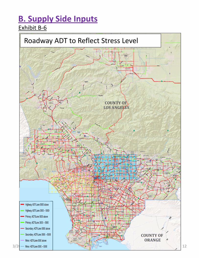
Enhancement: Traffic Volumes. To incorporate the concept of bicycle riding stress researched by Peter Furth, we have imported the 2008 and 2035 Average Daily Traffic (ADT) data from SCAG regional model. We generated a link attribute “ADT per lane” as a proxy for measuring the stress in bicycle riding. Exhibit B‐6 shows ADT per lane in three categories:
1. High stress roads ‐‐‐ ADT per lane greater than 5,000, shown in red for State Highways, Primary and Secondary roads, but in purple color for minor roads;
2. Medium stress roads ‐‐‐ ADT per lane between 3,000 and 5,000, shown in green for State Highways, Primary and Secondary roads, but in blue color for minor roads; and
3. Low stress roads ‐‐‐ ADT per lane less than 3,000, shown in light grey color.
Exhibit B‐7 shows the map zoomed in to Westside subregion. When examining the map closely, we can see that a heavy traffic primary road sometimes presents less stress than a secondary and/or minor road. For instance, between Fairfax and La Brea, the ADT per lane along Wilshire Boulevard is less than that along the parallel minor road, 6th Street. Actually, 6th Street is a high stress road from Crescent Heights all the way to Downtown L.A.
Exhibit B‐8 shows the map zoomed in to San Gabriel Valley subregion. With this map we continue comparing the four realistic cases mentioned before. (a) Alan will experience a relatively low stress route. He only needs to cross one heavy traffic State Highway SR‐19, probably at a signalized intersection, to reach Sierra Madre Villa station. The rest can be low stress. (b) Ben has numerous choices of minor roads to reach the City College. However, he will need to cross a handful intersections that have heavy traffic. (c) Chris will have limited choices through the steep terrain to downtown. He will need to ride along the high stress roads along Figueroa Street and Pasadena Roads into Downtown Union Station. And finally, (d) Dave might have the most stressful situation. He would encounter the heavy traffic along Huntington Drive and Mission Boulevard.
a
a
d
a
ab
b
c
c,d

3/26/2014 14
C. Demand Side InputsExhibit C‐1

3/26/2014 15
Spatial Unit. The majority of spatial units on the demand side of Metro Bicycle Demand Model are Census Blocks designated by 2010 Census. Since some of the blocks were crossed by city boundaries in the County of Los Angeles, they were split into Split Blocks (SB). In total, the fundamental layer of the bicycle model contains 109,571 SBs. These SBs can be aggregated into 2,268 traffic analysis zones (TAZ), 88 Cities, and nine subregions in the County. Exhibit C‐1 depicts the boundaries of SB, TAZ, cities and subregions in Los Angeles County.
Enhancement. For each SB, population and employment in 2008 and 2035 were generated based on block level database adopted by SCAG 2008 RTP. It was due to the existence of SCAG’s high resolution database that allowed Metro to implement the bicycle demand model on the detailed SB level. In addition to SBs, we also carried 500 Pseudo zones from Metro motorized travel demand model to the bicycle model. These Pseudo zones represent the existing and planned rail stations and park‐and‐ride bus stations in the Metro transit network. These pseudo zones are essential to connect bicycles as an access mode to transit.
Exhibit C‐2 shows the map zoomed in to the San Gabriel Valley subregion. With this map we can visualize the relative densities among SB and TAZ within a subregion. In general, there are on average approximately 100 residents (or 30 households) per SB, 50 SBs per TAZ, and 250 TAZs per subregion. The locations of the four realistic cases mentioned previously are also noted in Exhibit C‐2.
Exhibit C‐2San Gabriel Valley Subregion
a
a
b
b
c
d
c,d
3/26/2014 16
Note [1]. Up Slope of roadway segment is computed as elevation gain divided by horizontal distance. For example, a 500 feet segment with 35 feet elevation gain, S=7, the up slope effect for this example would be 0.25*min{S=7, 6}^2 = 9 minutes/mile. Multiplying it with segment length leads to total effect of 0.85 extra minutes for the segment.
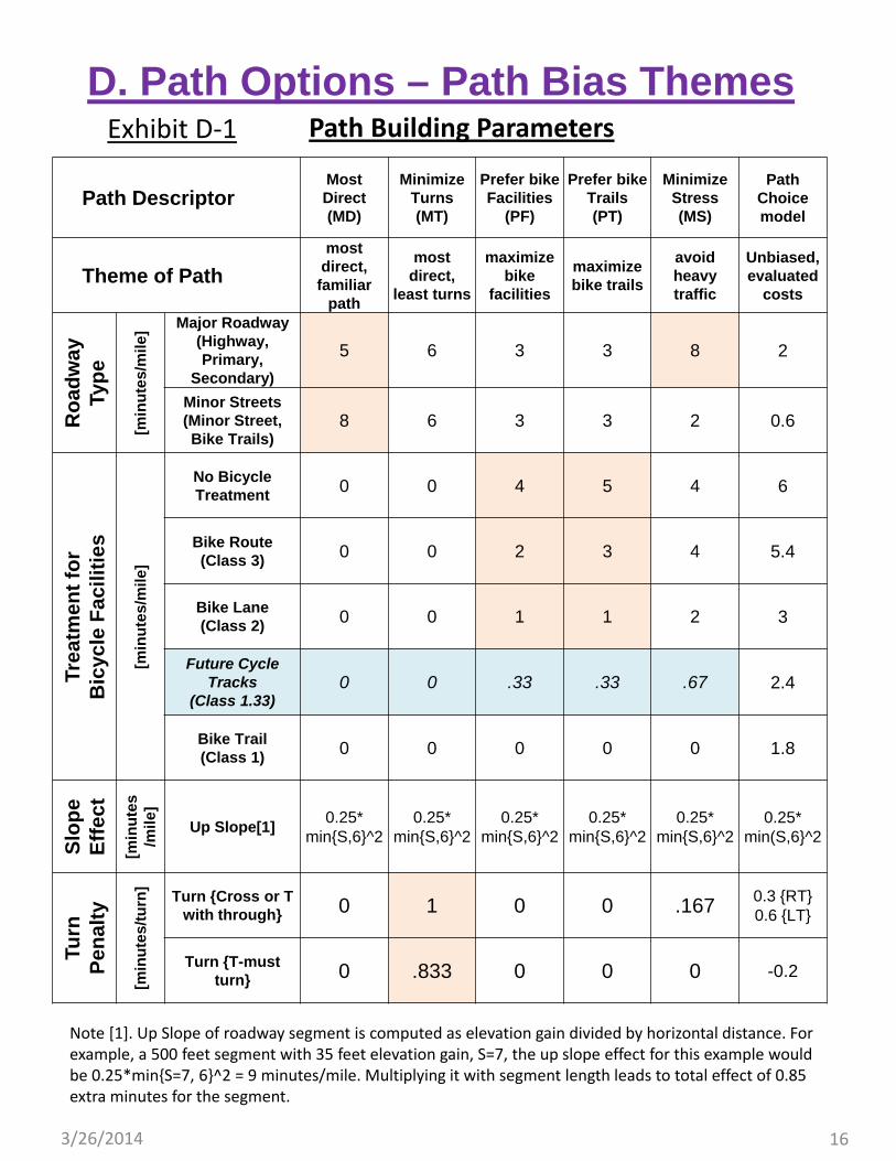
Path Building Parameters
D. Path Options – Path Bias ThemesExhibit D‐1
Path DescriptorMost Direct (MD)
Minimize Turns (MT)
Prefer bike Facilities
(PF)
Prefer bike Trails (PT)
Minimize Stress (MS)
Path Choice model
Theme of Path
most direct,
familiar path
most direct,
least turns
maximize bike
facilities
maximize bike trails
avoid heavy traffic
Unbiased, evaluated
costs
Ro
adw
ay
Typ
e
[min
ute
s/m
ile] Major Roadway
(Highway, Primary,
Secondary)
5 6 3 3 8 2
Minor Streets (Minor Street, Bike Trails)
8 6 3 3 2 0.6
Trea
tmen
t fo
r B
icyc
le F
acili
ties
[min
ute
s/m
ile]
No Bicycle Treatment 0 0 4 5 4 6
Bike Route (Class 3) 0 0 2 3 4 5.4
Bike Lane (Class 2) 0 0 1 1 2 3
Future Cycle Tracks
(Class 1.33)0 0 .33 .33 .67 2.4
Bike Trail (Class 1) 0 0 0 0 0 1.8
Slo
pe
Eff
ect
[min
ute
s /m
ile]
Up Slope[1]0.25*
min{S,6}^20.25*
min{S,6}^20.25*
min{S,6}^20.25*
min{S,6}^20.25*
min{S,6}^20.25*
min(S,6}^2
Turn
P
enal
ty
[min
ute
s/tu
rn]
Turn {Cross or T with through} 0 1 0 0 .167 0.3 {RT}
0.6 {LT}
Turn {T-must turn} 0 .833 0 0 0 -0.2

3/26/201417
Path Archetypes. This grouping of bicycle paths is intended to sample paths representing a variety of potential riders and path choices. This effort will not stratify riders by type as there are not sufficient data to support the identification of rider sub‐types or to generate their populations as a function of facility supply.
Characterizing Choice Set. Recent sensitivity tests conducted by the San Francisco CTA have found that a choice set consisting of five bicycle paths appears to be a practical size of choice set. This sized set does not demand extensive computation effort. This also produces results that are close to other model runs based on a large number of paths. Based on this finding, the Los Angeles Metro modeling unit proposes to adopt a choice set of five paths. We propose to designate these five paths to be MD (most direct, familiar path), MT (most direct minimum turns path), PF (prefer bike facilities), PT (prefer bike trails) and MS (minimize stress). Note that “Most direct” has a preference for larger streets. These paths select “familiar” albeit slightly auto centric paths.
Path Building Parameters. Through a series of trials using ArcGIS and reasonableness checks, we have tentatively concluded that the weight parameters listed in Exhibit D‐1 would generate a reasonable set of 5 paths. The weights are on 10 variables: 2 for Roadway Types (major vs. minor), 5 for Treatment of Bicycle Facilities (no treatment, bike route, bike lane, cycle track and bike trail), 1 for Slope Effect and 2 for Turn Penalty.
For example, when searching for the best MD path in the network, only the mileage of the roadway type and roadway slope matter. Each mile of major road weighs 5 minutes (12 MPH) but each mile of minor road weighs 8 minutes (7.5 MPH). The slope effect increases non‐linearly with grade, but capped* at 6%. When searching for the best MT path, all road types are weighed equally at 6 minutes per mile (10 MPH). But each turn will add 1 minute at cross intersection, and 0.833 minutes at T‐intersection. When searching for the best paths for PF, PT, and MS, combinations of road type and treatment type are involved. Each mile of a bike route on a major road will be weighed 5, 6 and 12 minutes respectively.
3/26/2014 18
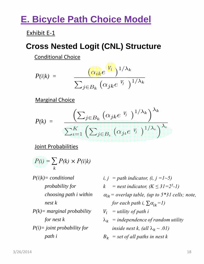
Cross Nested Logit (CNL) Structure
P(k) =
Conditional Choice
Marginal Choice
Joint Probabilities
P(i|k) =
k
P(i|k)= conditional
probability for
choosing path i within
nest k
P(k)= marginal probability
for nest k
P(i)= joint probability for
path i
E. Bicycle Path Choice ModelExhibit E‐1

3/26/2014 19
Discussion on Model Structures. Discrete choice models have been researched since the 1970’s. However, there have been only three tractable formulations that are relevant to tackling the unique situation where path alternatives overlap with one another in a complex manner. These are Path Size Logit (PSL), Paired Combinatorial Logit (PCL) and Cross Nested Logit (CNL). PSL is the simplest among the three. It was applied to San Francisco and Portland. PSL adds only one path size coefficient to the multinomial logit function. That path size parameter attempts to capture the “average overlap” among all possible paths in the choice set. This treatment is quite crude and often over‐simplifies the overlapping conditions. PCL is more complex than PSL, it introduces overlap parameter for all possible pairs of paths in the choice set. If a choice set has 5 paths, there could be 10 overlapping parameters specified in the PCL model. Unlike PSL and PCL, the CNL model breaks each path into segments (also called nests) and each segment corresponds to one of the 2^N‐1 possible overlapping conditions in the path set. If a choice set has 5 paths, CNL formulation could include as many as 31 overlapping parameters. CNL addresses the overlapping problem without simplification, much more accurate than PSL and PCL.
Basics for CNL Model. Exhibit E‐1 shows how a CNL model can be computed through three submodels: conditional choice, marginal choice and joint probabilities. There are two inputs to the CNL model: Vi , the vector of path utilities and ik , the rectangular matrix of overlap. Both of these inputs are highlighted in yellow in the numerator term of the conditional choice submodel. The exponent term k in the same numerator is dissimilarity among alternatives in nest k. In CNL model each k must be set very close to zero, provisionally we will start with 0.01.
There are two outputs from a CNL model that are of interest to transportation planners: P(i), the joint choice path probabilities and log SUM, the denominator of the marginal choice submodel. The term log SUM represents the expected maximum utility among all paths in the choice set. It is being used by the FTA to quantify transportation system user benefit (TSUB) of transit investment, especially under the Section 5337 New Starts Funding Program. The same concept can be applied here to quantify the TSUB of bicycle investment. The two outputs are highlighted in green in Exhibit E‐1.
To understand how a 5‐path choice set could involve as many as 31 overlapping conditions (nests), we enumerate 31 conditions as follows: 1, 2, 3, 4, 5, 12, 13, 14, 15, 23, 24, 25, 34, 35, 45, 123, 124, 125, 134, 135, 145, 234, 235, 245, 345, 1234, 1235, 1245, 1345, 2345, 12345. Nest 12345 would include all links that are used by all 5 paths, whereas Nest 1 would include those links only used by path 1, and so forth. Suppose ik is a matrix of 5 columns and 31 rows (i=1‐5, k=1‐31), then each cell (i,k) in the matrix is obtained by computing the proportion of path i that is contained in nest k. Each column must sum up to one.
CNL was described by two papers in Transportation Research Records (TRR): Peter Vovsha (1997), “Application of Cross‐Nested Logit Model to Mode Choice in Tel Aviv, Israel, Metropolitan Area”, TRR 1607, pp. 6‐15; and Peter Vovsha and Shlomo Bekhor (1998), “Link‐Nested Logit Model of Route Choice, Overcoming Route Overlapping Problem”, TRR 1645, pp. 133‐142.

3/26/2014 20
Utility FunctionPath Attributes
Roadway Class
[miles]
Treatment for Bicycle Facilities[miles]
Traffic Volume [miles]
Slope Effect[slope* miles]
Turn Penalty[number of turns]
Major (Highway, Primary,
Secon-dary)
Minor Streets, Alleys
No Bicycle Treat-ment
Bike Route
(Class 3)
Bike Lane
(Class 2)
Cycle Track (Class 1.33)
Bike Trail (Class 1)
Heavy (ADT > 5,000 vplpd)
Moderate (ADT = 3,000 ~ 5,000 vplpd)
Riding Opposite to Traffic
Up Slope[(.25*
min{S,6}^2*Segment Mileage)]
Number of Right Turns
Number of Left Turns
Number of T-
Turns
Los Angeles Model
-0.2 -0.06 -0.6 -0.54 -0.3 -0.24 -0.18 -0.3 -0.15 n.a. -0.22 -0.03 -0.06 0.02
San Francisco
Model [1,7]
n.a. n.a. -1 -0.92 -0.49 n.a. -0.57 n.a. n.a. -4.02-59.14
[2]-0.11 -0.11 -
Portland Model [3,6,7]
-4.82 [4]
-4.82 [4]
0 0.639 1.68 1.76 2.97 -0.137 -0.137 n.a.-0.949
[5]-0.041 -0.227 -
Note 1. San Francisco Model is reported in the paper: Neema Nassir, Jennifer Ziebarth, Elizabeth Sall, and Lisa Zorn, "A Choice Set Generation Algorithm Suitable for Measuring Route Choice Accessibility”, paper submitted to TRB 93rd Annual Meeting Conference, 2014.
Note 2. This variable is defined in San Francisco Model as cumulative non‐negative elevation gains in miles for the entire path.Note 3. Portland Model is reported in the paper: Joseph Broach, John Gliebe and Jennifer Dill (2010), "Calibrated Modeling Method for Generating Bicyclist Route
Choice Sets Incorporating Unbiased Attribute Variation”, Transportation Research Records 2197, pp. 89‐97. Note 4. This variable is defined in Portland Model as ln(Distance) in miles for the entire path regardless of roadway class.Note 5. This variable is defined in Portland Model as upslope in m/100m.Note 6. Portland Model includes a "number of stop signs en route" variable. Each stop sign incurs ‐.045 disutility. Note 7. Both San Francisco and Portland models were based a Path Size Logit formulation, which is simpler but more restricted than Cross Nested Logit
formulation.
E. Bicycle Path Choice ModelExhibit E‐2
Exhibit E‐3 Exhibit E‐4

3/26/2014 21
Utility Function Development. Due to the constraints of time and monetary resources, we adopted the advice from the Advisory Panel to look into opportunities to transfer existing working models from elsewhere to Los Angeles Metro. Having conducted literature reviews on stated preference surveys and successful examples of model estimation, we were pleased to find similar achievements by San Francisco CTA and Portland. As a result, we adopted a hybrid specification of the San Francisco and Portland models as the base, added essential refinements to address Metro’s own needs for policy responsiveness, and came up with a proposed specification for Los Angeles.
Exhibit E‐2 shows the variables and coefficients in utility functions applied by Portland and San Francisco, as well as those in the proposed Los Angeles model. We have learned from Portland that the model should reflect the distinctive effects of various bicycle treatments, traffic volumes, slopes and turn penalties. We established the set of coefficients based on the coefficients and marginal rate of substitutions derived from the San Francisco model.
Comparisons. Exhibit E‐3 compares the per mile disutility between the San Francisco and Los Angeles models. In this Exhibit, the four bars colored in gold represent per mile disutility assumed by San Francisco. The other bars (colored in green and blue) represent the per mile disutilities assumed by the Los Angeles model. There are three differences between the two models. First, the Los Angeles model assumes less utiles per mile than the San Francisco model in order to allow ‐0.15~‐0.30 per mile utiles to reflect the traffic effect. Second, the Los Angeles model differentiates disutilities per mile between major and minor roadways. Third, the Los Angeles model reduced the per mile disutilities of bike trails and cycle tracks to make these more desirable than bike lanes. This reduction was agreed to by San Francisco CTA staff considering the maintenance of bike trails might be better in Los Angeles.
Exhibit E‐4 shows how the slope effect is assumed differently. For instance, at 3% slope, the Los Angeles model assumes each mile of pedaling is equivalent to 1.75 miles on a flat terrain. But the San Francisco model assumes it equivalent to 2.75 miles. At a slope of over 6%, the Los Angeles model assumes that bicycle riders will give up riding but the San Francisco model continues its effect in a linear fashion. Overall, the proposed Los Angeles model treats slope effects more conservatively.
To compare the sensitivity between the San Francisco model and the Los Angeles model, a simple example will do. Suppose there is a 2‐mile trip, with the first mile on a major road under heavy traffic and the second mile on a minor road under moderate traffic. For simplicity, we assume the path is level with only one right turn and one left turn. Applying the San Francisco model, we would estimate a utility of ‐2.22 for this 2‐mile trip. Applying the Los Angeles model, we would estimate a utility of ‐2.00, which includes (‐.2‐.6‐.3) for the first mile, (‐.06‐.6‐.15) for the second mile, and ‐0.09 for turns. Now, suppose a bike lane is built for the entire path, then the utility will be improved to ‐1.20 using the San Francisco model (45% improvement), and ‐1.40 [=(‐.2‐.3‐.3)+(‐.06‐.3‐.15)+(‐.03‐.06)] using the Los Angeles model (30% improvement). For this particular example, the proposed Los Angeles model is less sensitive (more conservative) than the San Francisco model.
3/26/2014 22
E. Bicycle Path Choice Model
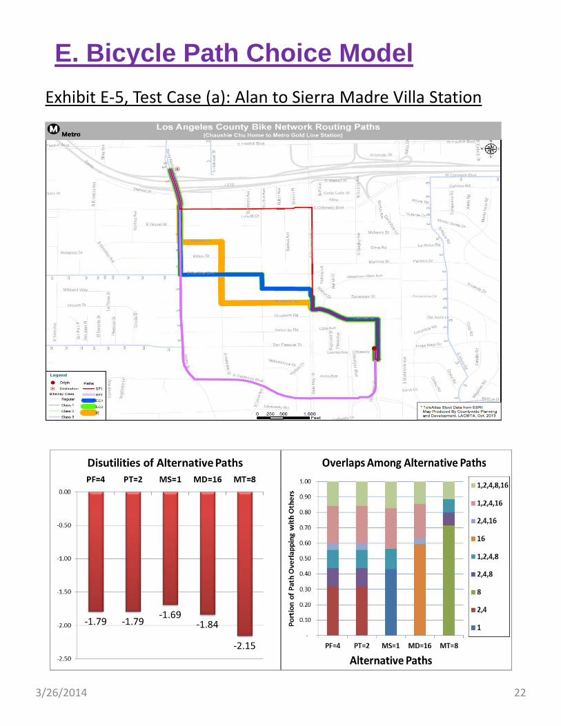
Exhibit E‐5, Test Case (a): Alan to Sierra Madre Villa Station

3/26/2014 23
In the remainder of Section E, we demonstrate how the proposed Metro Bicycle Demand Model will work on the trip interchange level through four hypothetical test cases.
Exhibit E‐5, on the left, shows Case (a) that Alan bikes 1.5 miles every morning from Arcadia to the Sierra Madre Villa station to take the Metro Gold Line to work.
On top portion of Exhibit E‐5, we can see four paths displayed. MD and MT are traversing through primary roads, Rosemead, Colorado, California and Madre. PF and PT are identical due to lack of bicycle trails in the vicinity. MS avoids traffic by going through local streets; Thorndale, Halstead and Brandon.
The lower left chart of Exhibit E‐5 shows the disutilities computed for each path. They are in the range of ‐1.69 ~ ‐2.15.
To its right, the lower right chart shows how these five paths overlap with one another. Although there can be as many as 31 overlapping conditions (nests) in this example, we only have 9 distinct overlapping conditions. On the top portion of this chart, labeled (1,2,4,8,16), are the segments near trip origin and destination that are shared by all paths. On the bottom portions of the chart, labeled as (1) (2,4) (8) (16), are the segments that are used exclusively by a certain path. In between, (1,2,4,16), (2,4,16), (1,2,4,8), (2,4,8) are other combinations of overlapping.
On the left portion of this page, a spreadsheet for CNL computation is shown. The areas colored in yellow are model inputs, i.e., path utilities and overlapping matrix. The areas colored in green are model outputs, i.e., choice probabilities and log SUM, the expect maximum utility among all alternative paths. Note the two identical paths, PF and PT, each shares half of the total share of the two paths.

3/26/2014 24
Exhibit E‐6, Test Case (b): Ben to Pasadena City College
E. Bicycle Path Choice Model
3/26/2014 25
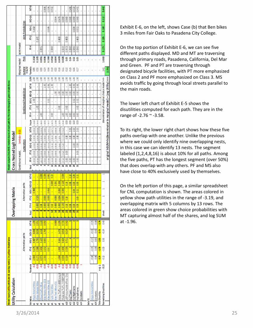
Exhibit E‐6, on the left, shows Case (b) that Ben bikes 3 miles from Fair Oaks to Pasadena City College.
On the top portion of Exhibit E‐6, we can see five different paths displayed. MD and MT are traversing through primary roads, Pasadena, California, Del Mar and Green. PF and PT are traversing through designated bicycle facilities, with PT more emphasized on Class 2 and PF more emphasized on Class 3. MS avoids traffic by going through local streets parallel to the main roads.
The lower left chart of Exhibit E‐5 shows the disutilities computed for each path. They are in the range of ‐2.76 ~ ‐3.58.
To its right, the lower right chart shows how these five paths overlap with one another. Unlike the previous where we could only identify nine overlapping nests, in this case we can identify 13 nests. The segment labeled (1,2,4,8,16) is about 10% for all paths. Among the five paths, PT has the longest segment (over 50%) that does overlap with any others. PF and MS also have close to 40% exclusively used by themselves.
On the left portion of this page, a similar spreadsheet for CNL computation is shown. The areas colored in yellow show path utilities in the range of ‐3.19, and overlapping matrix with 5 columns by 13 rows. The areas colored in green show choice probabilities with MT capturing almost half of the shares, and log SUM at ‐1.96.

3/26/2014 26
Exhibit E‐7, Test Case (c): Chris to Downtown Union Station
E. Bicycle Path Choice Model

3/26/2014 27
Exhibit E‐7, on the left, shows Case (c) that Chris bikes 5 miles from Eagle Rock to Downtown Union Station, through laborious and strenuous terrain.
On the top portion of Exhibit E‐7, we can see four paths displayed. MD and MT are traversing through primary roads, Figueroa, Pasadena, and Spring. PF and PT are identical with the northern portion being a bike trail (Class 1), and southern portion a bike route (Class 3). MS uses the same bike trail initially, then diverts to local streets to avoid traffic on the main roads.
The lower left chart of Exhibit E‐7 shows the disutilities computed for each path. The paths containing a bike trail (PF, PT, MS) have favorable utilities, ‐5.7. The other two paths (MD, MT) suffer worse path utilities due to not using the bike trail. The initial two miles of these paths, instead of using bike trail, followed primary roads with moderate traffic, these resulted in substantial reductions in path utilities.
To its right, the lower right chart shows how these paths overlap with one another. The segment being shared by all five paths is less than 1%. Considering PF and PT as one path, then each of the four paths have about 60% on its own, and the other 40% overlaps with others.
On the left portion of this page, the spreadsheet for this case is shown. The input areas colored in yellow show path utilities in the range of ‐5.7 to ‐6.6, and overlapping matrix in the range of 0 to 62%. The output areas colored in green show choice probabilities in the range of 10% to 43%, and log SUM, the expect maximum utility among all alternative paths, at ‐4.81. Note the two identical paths, PF and PT, each shares half of their total share.

3/26/2014 28
Exhibit E‐8, Test Case (d): Dave to Downtown Union Station
E. Bicycle Path Choice Model
3/26/2014 29
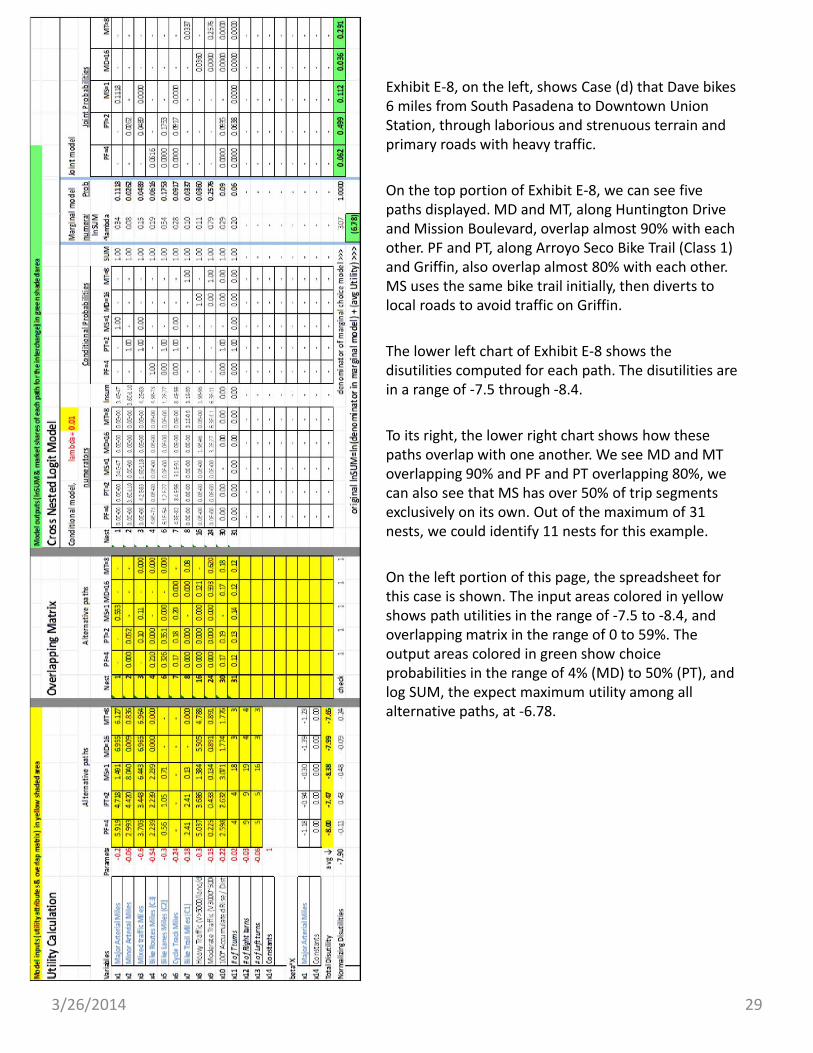
Exhibit E‐8, on the left, shows Case (d) that Dave bikes 6 miles from South Pasadena to Downtown Union Station, through laborious and strenuous terrain and primary roads with heavy traffic.
On the top portion of Exhibit E‐8, we can see five paths displayed. MD and MT, along Huntington Drive and Mission Boulevard, overlap almost 90% with each other. PF and PT, along Arroyo Seco Bike Trail (Class 1) and Griffin, also overlap almost 80% with each other. MS uses the same bike trail initially, then diverts to local roads to avoid traffic on Griffin.
The lower left chart of Exhibit E‐8 shows the disutilities computed for each path. The disutilities are in a range of ‐7.5 through ‐8.4.
To its right, the lower right chart shows how these paths overlap with one another. We see MD and MT overlapping 90% and PF and PT overlapping 80%, we can also see that MS has over 50% of trip segments exclusively on its own. Out of the maximum of 31 nests, we could identify 11 nests for this example.
On the left portion of this page, the spreadsheet for this case is shown. The input areas colored in yellow shows path utilities in the range of ‐7.5 to ‐8.4, and overlapping matrix in the range of 0 to 59%. The output areas colored in green show choice probabilities in the range of 4% (MD) to 50% (PT), and log SUM, the expect maximum utility among all alternative paths, at ‐6.78.
3/26/2014 30
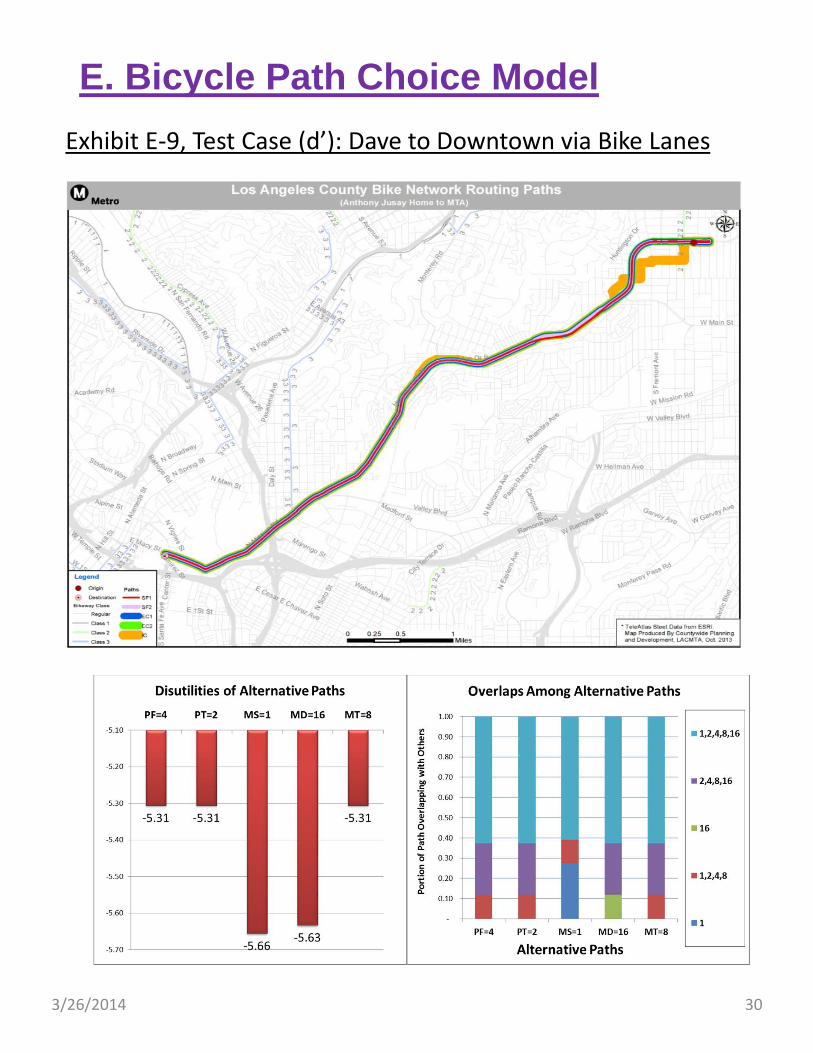
Exhibit E‐9, Test Case (d’): Dave to Downtown via Bike Lanes
E. Bicycle Path Choice Model

3/26/2014 31
Exhibit E‐9, on the left, shows Case (d’), a hypothetical situation where the Long Beach style Cycle Tracks are assumed to be built along Huntington Drive and Mission Boulevard. Under this situation, we can see that all five paths are diverted to Huntington and Mission. MS is the only exception, which include a short one mile segment along an adjacent local street.
Comparing the computational spreadsheets between Exhibit E‐9 and E‐8, we can see that introduction of cycle tracks tends to reduce the overall average disutility from ‐7.90 to ‐5.44 (i.e., 31% improvement). It also reduces the expected maximum disutility, log SUM, from ‐6.78 to ‐5.05 (i.e., 25% improvement). The share of bicycle volumes along Huntington and Mission is increased from 33% to 100%.

3/26/2014 32
Exhibit E‐10
E. Bicycle Path Choice ModelExhibit E‐11
-0.54 -0.65 -0.96 -0.97 -0.72Util/mile
> d1 <‐ date();d1
[1] "Mon Dec 30 12:53:33 2013"> #test ‐‐ repeat model run 100,000 times 1111111111111111111
> for (kount in 1:100000) {
+ ######### Cross Nested Logit Model (Peter Vovsha, 1997) ###
+ ######### (Chaushie Chu, 2013.10.31) ############
+ #1a define number of paths and set S (lambda) close to zero
+ nalt<‐5
+ s<‐.01
+ #1b read utilities for each path
+ v<‐c(‐1.7915,‐1.7915,‐1.6895,‐1.8359,‐2.1546)
+ #1c read allocation (overlap) matrix: AM(nalt, nnest)
+ am<‐cbind(
+ c(0.0000,0.0000,0.4316,0.0000,0.0000),
+ c(0.3190,0.3190,0.0000,0.0000,0.0000),
+ c(0.0000,0.0000,0.0000,0.0000,0.7140),
+ c(0.1182,0.1182,0.0000,0.0000,0.0853),
+ c(0.1196,0.1196,0.1305,0.0000,0.0864),
+ c(0.0000,0.0000,0.0000,0.5940,0.0000),
+ c(0.0418,0.0418,0.0000,0.0383,0.0000),
+ c(0.2431,0.2431,0.2652,0.2227,0.0000),
+ c(0.1583,0.1583,0.1727,0.1450,0.1143))
+ #end of program inputs
+ #1d check input data
+ #determine no. of nest, check if row‐sum of overlap matrix equals 1
+ nnest<‐ncol(am)
+ amchk <‐ rowSums(am, nalt)
+ one<‐matrix(1,nrow=nalt)
+ t<‐match (amchk, one, nomatch=0)
+ if (sum(t)<nalt)cat("*** WARNING: allocation not sum to 1 for paths [",
+ which(t<1),"]***","\n")
+ if (sum(t)<nalt)cat("*** WARNING: check alloc matrix [", amchk,"]","\n")
+ #2 ‐‐‐‐‐‐ Conditional Probabilities ‐‐‐
+ #2a normalize path utility
+ av<‐mean(v)
+ v<‐v‐av
+ #2b Compute exp utilities for each path j in nest m, sum them up
+ aev<‐matrix(0,nrow=nalt,ncol=nnest)
+ pcond<‐matrix(0,nrow=nalt,ncol=nnest)
+ den<‐matrix(0,nrow=nnest)
+ ev<‐exp(v)
+ for (m in 1:nnest) {
+ den[m]<‐0
+ for (j in 1:nalt) {
+ aev[j,m]<‐(am[j,m]*ev[j])^(1/s)
+ den[m]<‐den[m]+aev[j,m] }
+ #2c compute conditional probabilities
+ for (i in 1:nalt) {
+ pcond[i,m]<‐aev[i,m]/den[m] }
+ }
+ pcond[is.na(pcond)]<‐0
+ #3 ‐‐‐‐‐‐‐Marginal Probabilities ‐‐‐
+ pmarg<‐matrix(0,nrow=nnest)
+ num<‐matrix(0,nrow=nnest)
+ num<‐den^s
+ snum<‐sum(num)
+ pmarg<‐num/snum
+ logsum<‐log(snum)+(av)
+ #4 ‐‐‐‐‐‐‐ compute joint prob, sum up for all pairs
+ prob<‐pcond%*%pmarg
+ }
> cat ("prob = ",prob,"\n")
prob = 0.0908511 0.0908511 0.4171694 0.2140515 0.187077 > cat ("logsum = ", logsum,"\n")
logsum = ‐0.8152371 > d2 <‐ date();d2
[1] "Mon Dec 30 12:55:06 2013"
Exhibit E‐12 R Script to Run CNL 100,000 times takes 90 seconds

3/26/2014 33
Sensitivities of Proposed Model. Exhibit E‐10 shows how the choice probabilities of the five paths vary among the four tested cases.
Exhibit E‐11 compares the magnitude of log SUM for the four cases. In general, the log SUM increases with travel distance. Alan has the shortest trip. His trip is associated with the least negative log SUM. Dave has the longest trips, thus has the highest negative log SUM. The bottom row in Exhibit E‐11 shows the log SUM per mile for the four cases. It is reasonable to see that Alan rides in the flat terrain with light traffic, thus his path has the lowest disutilities per mile. Ben also rides in easy terrain, but with more crossings over the roads with heavy and moderate traffic. His per mile disutilities are slightly higher. Chris and Dave suffer heavy traffic en route and steep terrain; their per mile disutilities are the highest. However, a Cycle Track project would reduce the disutilities of Dave by about 25%.
R‐Script. Due to the mathematical complexity of the CNL model, we have written a script in R (Exhibit E‐12) to explore how long a computer would take to undertake a CNL computation. R is a quite powerful programming language and very efficient in programming matrix operations. This script was tested to run Alan’s case 100,000 times. It took 90 seconds to run and came up with identical results as reported in Exhibit E‐5.
This result indicates that the proposed model structure could be feasible.
3/26/2014 34
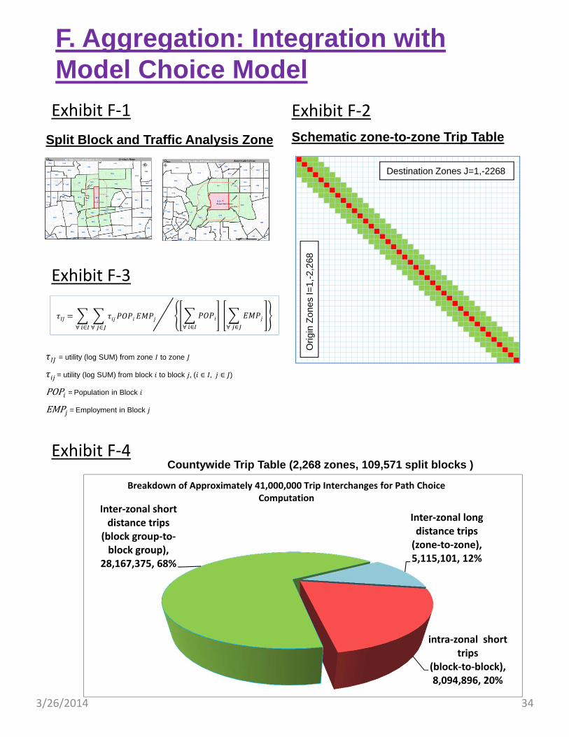
Exhibit F‐1
F. Aggregation: Integration with Model Choice Model
Exhibit F‐2
Schematic zone-to-zone Trip Table
Exhibit F‐3
Destination Zones J=1,-2268
Orig
in Z
ones
I=1,
-2,2
68
∀ ∈∀ ∈
= utility (log SUM) from zone to zone
= utility (log SUM) from block to block , ( ∈ , ∈ )
POP = Population in Block
EMP = Employment in Block
∀ ∈
∀ ∈
Split Block and Traffic Analysis Zone
Exhibit F‐4
intra‐zonal short trips
(block‐to‐block), 8,094,896, 20%
Inter‐zonal short distance trips
(block group‐to‐block group),
28,167,375, 68%
Inter‐zonal long distance trips(zone‐to‐zone), 5,115,101, 12%
Breakdown of Approximately 41,000,000 Trip Interchanges for Path Choice Computation
Countywide Trip Table (2,268 zones, 109,571 split blocks )

3/26/2014 35
As seen in the Flowchart on Page 6 of this paper, the Bicycle Travel Demand Model is designed to operate on Census Split Block (SB) level. However, the existing Regional Multi‐modal Demand model works on Traffic Analysis Zones (TAZ). Each TAZ is usually a Census Tract. To integrate the bicycle demand model with the regional multi‐modal model, an aggregation process is required. This aggregation is explained below.
Resolution Levels. Exhibit F‐1 depict the spatial units between TAZ and SB, for the cases of Alan and Ben. Alan resides in an SB inside TAZ 1962, whereas Ben resides in an SB inside TAZ 1929. Consider a bicycle trip originated from either of these two example residences, depending on the trip destination and trip distance, the trip can be:
1. An intra‐zonal short distance trip – we need model it on block‐to‐block level;
2. An inter‐zonal short distance trip – we need model it on block group‐to‐block group level; and
3. An inter‐zonal long distance trip – we will model it on zone‐to‐zone level.
The territories for above three categories are distinguished by red, green and white colors respectively in Exhibit F‐1. In practical sense, the territory of the second category, “inter‐zonal short distance trips” (area shaded in green) includes all zones touched by the 0.5‐mile buffer extended from the trip origin zone. The average trip distance for all interchanges within the green area is about 2.5 miles. This is similar to the average trip distance of all utilitarian bicycle trips in the County of Los Angeles, according to 2009 National Household Travel Survey.
Aggregation to TAZ. Exhibit F‐2 shows a schematic zone‐to‐zone (2268x2268) trip table for Los Angeles County. The diagonal elements (shaded in red) represent the combination of all intra‐zonal bicycle trips, that are to be modeled on block‐to‐block level then aggregated to individual zones. The adjacent cells (shaded in green) are those short distance inter‐zonal trips that also will be modeled on block‐to‐block level, then aggregate to a specific zone pairs. The remainders (in white cells) are the long distance inter‐zonal trips that can be modeled on zone‐to‐zone level.
The formula to aggregate block level data (that are log SUM’s in this particular application) into TAZ level is shown in Exhibit F‐3. We use block level population and employment as weighting factors to achieve this needed aggregation.
Computation Time. Exhibit F‐4 summarizes the numbers of interchanges involved in this aggregation process. For intra‐zonal short trips, there will be about 8 million block‐to‐block interchanges involved. This estimate is reasonable since each TAZ contains on average 50 split blocks and we have 2,268 zones in the County. For the inter‐zonal short trips, we estimate over 28 million trip interchanges will be involved. The remaining inter‐zonal long trips will involve over 5 million TAZ to TAZ interchanges. In total, over 41 million trip interchanges will be aggregated into a TAZ matrix compatible to existing Metro Travel Demand Model. Given the results reported in the previous section (i.e., 100,000 CNL computations requires 90 seconds), 41 million CNL computations probably would take 10 hours of computer run time plus the time to generate the paths, costs, and overlap matrix ‐ which may be substantial.

3/26/2014 36
Exhibit F‐5
F. Aggregation: Integration with Model Choice Model
Schematic zone-to-zone Trip Table
Destination Zones J=1,-2268
Orig
in Z
ones
I=1,
-2,2
68
}
City of Santa Monica contains 23 traffic analysis zones, 1,474 split blocks ---
Interchanges Inside Santa Monica• Intra-zonal (blocks pairs) – 113,310• Inter-zonal (blocks pairs) – 457,350• Inter-zonal (zonal pairs) – 314
Interchanges Outside Santa Monica• Intra-zonal (blocks pairs) – 0• Inter-zonal (blocks pairs) – 96,862• Inter-zonal (zonal pairs) – 51,599
Total for Santa Monica• All Interchanges – 719,435
All trips from Santa Monica
All
trip
s to
S
anta
M
onic
a

3/26/2014 37
Interim Implementation: City of Santa Monica Model. The previous sections have specified the supply side and demand side inputs, the path builder and utility functions, a cross nested logitmodel structure, and aggregation process. However, prior to implementing it to a countywide level, it would be prudent to develop a smaller scale model and test with it first.
Due to the extensive bicycle facilities, bicycle riding population, and observed bicycle count data available for the City of Santa Monica, we plan to implement the model to the City of Santa Monica first before extending it to the entire county.
The City of Santa Monica contains 23 TAZs, 1147 split blocks. There are in total of 719,435 trip interchanges to be analyzed for a model of the City of Santa Monica. Exhibit F‐5 summarizes these interchanges.
It is understood that this test model would not be a complete representation for all the bicycle trips in Santa Monica as the pass‐by trips, such as those originated from Malibu through Santa Monica to Maria Del Rey would not be included in the model. However, it is believed that developing a small scale model as an interim step will allow us to debug, test run, and explore model sensitivities more efficiently.

3/26/2014 38
Exhibit G‐1
G. Model ValidationBicycle Counts for Validation
SCAG Bike Data Clearing House (Weekday AM, 450 Count Stations)

3/26/2014 39
Validation Data. The bicycle count data for model validation is not readily available yet. The SCAG Clearinghouse Bicycle Volume Counts database has compiled available bicycle counts representing three time periods at 450 count stations in the County, as follows:
1. Weekday AM,
2. Weekday PM, and
3. Weekend Daily.
However, there is not a clear rationale for why these 450 locations were chosen and the definitions for AM and PM periods were inconsistently applied among these count stations. The statistical reliability of these report volumes is yet to be confirmed.
Despite the issues mentioned above, these Clearinghouse data can be useful to identify the top ten, top twenty or even top fifty locations where the highest bicycle volumes are expected in the County. Exhibits G‐1 through G‐3 depict the locations of the top 50 bicycle volume counts for the three time periods, zoomed in to the Westside subregion.
From both Exhibits G‐1 and G‐2, we can see that the areas near the University of Southern California would have the highest bicycle volumes during both morning and evening peaks on weekdays. The Ballona Creek Bike Path between National Boulevard and the Pacific Ocean also attracts extensive bicycle riders during both AM and PM peaks. The junction between Venice and Lincoln, as well as that between Washington and Pacific are also among the top 10 bicycle counts in the County.
Exhibit G‐3 shows the locations of the highest bicycle volumes during the weekend. We can see that the highest weekend volumes occur along the bike path by the Pacific Ocean, from Santa Monica, Venice, Marina Del Rey, Manhattan Beach to Hermosa Beach, as well as the Ballona Creek Bike Path. The bicycle trips along these two bike paths are expected to be weekend recreational trips.
NEXT STEPS
Our next steps would involve four aspects of model development. First, on the model implementation, we will continue working with our Advisory Panel and the consultant to verify/refine the proposed modeling approach, then implement it on a small scale, such as a prototype model for the City of Santa Monica. Second, we need to refine the specifications in the existing mode choice model so that the mode choice step is sensitive to the aggregated log SUM from the bicycle travel demand model. Third, we need to establish a new module for recreational trip purposes. This can be a multi‐modal model, or a single‐mode model only for bicycles riders. Fourth, a well thought‐out comprehensive data collection program needs to be established. This database will provide a solid foundation for model parameter verifications and model validations.

3/26/2014 40
Exhibit G‐2
G. Model ValidationBicycle Counts for Validation
SCAG Bike Data Clearing House (Weekday PM, 450 Count Stations)

3/26/2014 41
Exhibit G‐3
G. Model ValidationBicycle Counts for Validation
SCAG Bike Data Clearing House (Weekends Daily, 450 Count Stations)