looking back at the preliminary product, what
TRANSCRIPT

Looking back at the preliminary product, what do you feel you have learnt in the progression from it to the full
product?
The brief in which I was given for my Preliminary task was to create a front cover and a contents page for a school magazine. We completed a preliminary task in order to gain knowledge and confidence with the software we would have to use for our main task, (E.G Photoshop). As a result of completing the set brief I was able to create significantly more professional and better standard magazine pages for my main task.
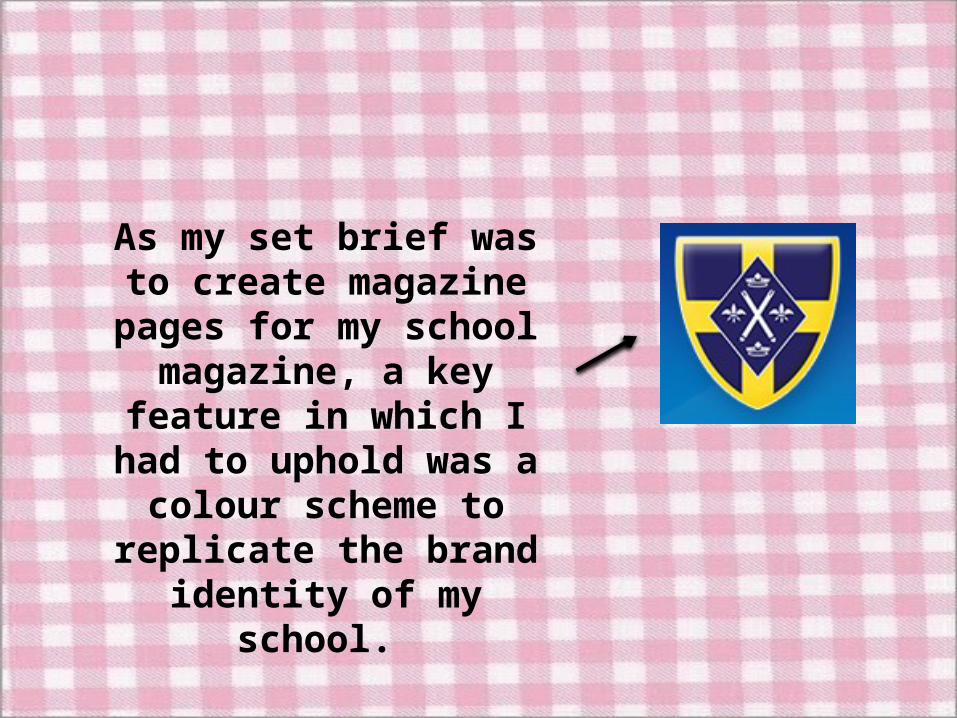
As my set brief was to create magazine pages for my school magazine, a key
feature in which I had to uphold was a colour scheme
to replicate the brand identity of my school.

The colour scheme I had to use for this task was Navy and yellow,
these two colours were particularly complex to work with
as when it came to editing my main image and the images for my contents page, no extreme effects
could be added as they clashed with a saturation and intensity of
the background colours.

In order to portray the school’s brand identity
throughout my magazine I used the eyedropper tool and selected both the yellow and navy colour and saved it into
my swatches so that when creating the contents page
the colours would be identical.

Exact same shades of Yellow and Navy
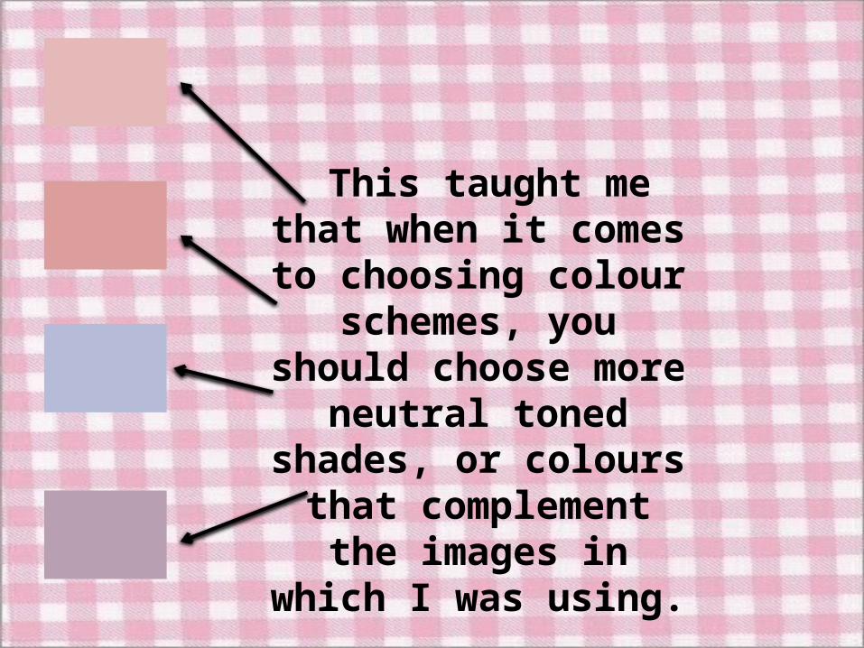
This taught me that when it comes to
choosing colour schemes, you should choose more neutral toned shades, or colours that complement the images in which I was
using.
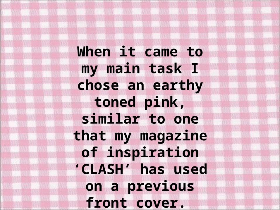
When it came to my main task I chose an earthy toned pink,
similar to one that my magazine of
inspiration ‘CLASH’ has used on a previous
front cover.

This tone of pink was very easy to work with as it allowed me to edit my
main image of Jess without it clashing; this
colour also enhanced her skin tone.

When choosing my font styles for my preliminary
task, I learnt that in order to produce an eye – catching
front cover, as well as contents page; you have to use a bold and vibrant font.
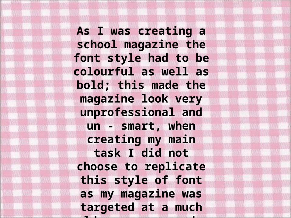
As I was creating a school magazine the font style had
to be colourful as well as bold; this made the magazine look very unprofessional and un - smart, when creating my main task I did not choose to replicate this style of font as my magazine was targeted at a much older age group who
would appreciate a professional look rather that
a ‘Fun’ one.
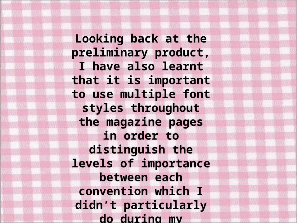
Looking back at the preliminary product, I have
also learnt that it is important to use multiple font styles throughout the magazine pages in order to
distinguish the levels of importance between each convention which I didn’t particularly do during my
preliminary task.
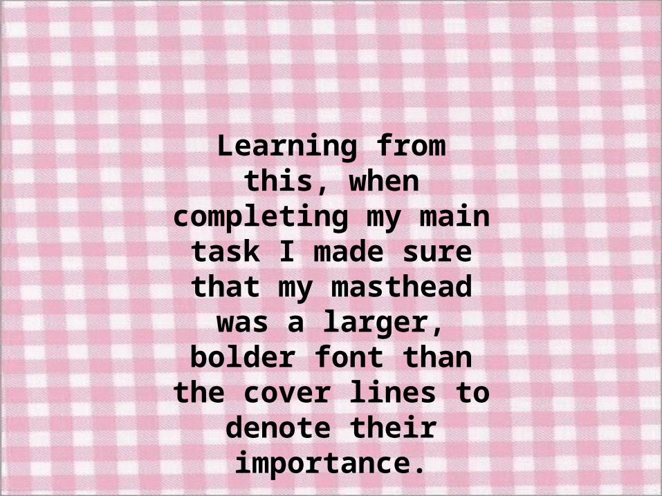
Learning from this, when completing my main task
I made sure that my masthead was a larger,
bolder font than the cover lines to denote
their importance.
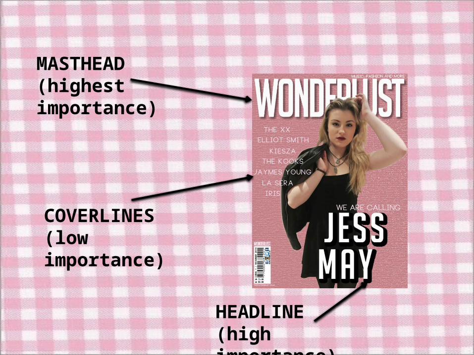
MASTHEAD(highest importance)
COVERLINES(low importance)
HEADLINE (high importance)

I also learnt that ‘STAR APPEAL’ (Dyer) was also crucial when creating a
magazine, this is because makes a wider interest and appeal for the magazine as
the fans of the ‘star’ will feel obliged to buy the magazine
if their favourite star features on the front cover.

When creating my preliminary front cover I decided to use the deputy head teacher Miss Archer to be
the ‘star’ as she is a very well – liked, popular member of staff at my school. By featuring her on
the front of the magazine it will attract a wide range of students to pick up ‘INSPIRE’ because they will
want to know what she has to say.

After completing my preliminary task I discovered that the use of ‘Star Appeal’ is effective due the popularity and interest it brought to my preliminary pages. After being
enlightened of this, I decided that I would repeat the use of ‘Star Appeal’ on my main task by placing a large image of
‘JESS MAY’ on the front cover.

Completing a preliminary task was also a very useful step to take because it helped me to know how to organise my pages effectively
and professionally. Before completing my planning and research I had very little knowledge on how I wanted my magazine pages to be
structured. I decided I would keep a similar appearance and structure in my main task pages as I did for my preliminary task (mainly front covers). I did this by keeping the same layout, E.G position of main
image, masthead, cover-lines)

Changes I Made:-
• The first change I made was the amount of cover-lines in which appeared on my main task front cover. After completing the preliminary front cover I decided that more cover-lines would look more aesthetically pleasing and professional.
• Another feature I changed was the position of the barcode.
• I also decided to alter the shot type of the main image, instead of it being a medium-close up, I decided that it would look more effective if my ‘star’ was shown at mid-shot so that her outfit could be shown to its full extent.

After gaining sufficient experience with Photoshop CS5.1, I learnt the importance of staying organised when creating my different magazine pages. When creating my preliminary front cover and contents page, I
was very messy with the layers and things were made very complicated and it was extremely difficult to find certain features on my magazine
pages as I also did not name things properly.
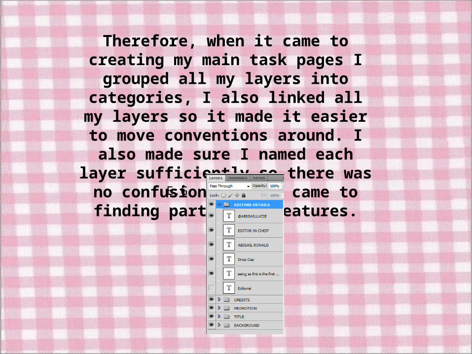
Therefore, when it came to creating my main task pages I grouped all my layers into
categories, I also linked all my layers so it made it easier to move conventions around. I
also made sure I named each layer sufficiently so there was no confusion when it
came to finding particular features.
E.G

• As I did not use the software INDESIGN throughout my preliminary task, I was unable to gain any experience before completing my main task.
• However, throughout the process of making the preliminary pages in Photoshop I picked up many keyboard shortcuts that could be used in INDESIGN too, for example Ctrl + R to bring up the ruler tool, and Ctrl + H to hide ruler lines.

To conclude, completing the Preliminary brief was extremely effective because it allowed me to gain several needed skills as well as knowledge that I needed in order to create
sleek, professional content for my main task.