logo and brand identity guidelines -...
TRANSCRIPT

LOGO AND BRAND IDENTITY GUIDELINES

SHARON PRESBYTERIAN CHURCH | BRAND GUIDELINES
CONTENTS
01 LOGO SPACING 02 COLORS03 LOGO STYLES04 LOGO CONSISTENCIES05 TYPOGRAPHY06 USING PHOTOS07 USING ICONS08 EMAIL TEMPLATES09 WRITING TIPS
Quick Checklist. Did you:__ Use the appropriate Print or Web logo version?__ Use the appropriate logo color on a light or dark background?__ Scale the logo proportionately? __ Space the logo correctly? __ Use a brand color? __ Use the correct font for a headline or body copy?
NOTE: All communications on behalf of SPC – emails from staff, letters from committee, powerpoint docs, flyers, banners, poster etc – must include the new brand and comply with guidelines unless approval for variation is given from the Brand Communications Liaison, Tawanda Brown, in the office.

SHARON PRESBYTERIAN CHURCH | BRAND GUIDELINES
1
01 LOGO SPACING
Yellow area indicates Safe Zone. Other graphical and visual elements can be safely positioned up to the adjoining Blue area.
Gray indicates Clear Space. This area must be kept free of all other graphical and visual elements.

SHARON PRESBYTERIAN CHURCH | BRAND GUIDELINES
2
SECONDARY COLORS
02 COLORS
CMYK (PRINT): 99 74 40 29 RGB (WEB): 8 63 94
HEX#: 083F5E
HEX#: EDB91D
HEX#: C01E59
HEX#: 33669A
HEX#: 732984
HEX#: 00A79D
HEX#: 2AB673
CMYK (PRINT): 7 27 100 0 RGB (WEB): 237 185 29
PRIMARY COLORS
CMYK (PRINT): 20 100 50 4RGB (WEB): 192 30 89
CMYK (PRINT): 67 100 8 2RGB (WEB): 115 41 132
CMYK (PRINT): 86 60 17 2RGB (WEB): 51 102 154
CMYK (PRINT): 80 10 45 0RGB (WEB): 0 167 157
CMYK (PRINT): 75 0 75 0RGB (WEB): 43 182 115
Colors used for print materials throughout the brand. Colors may be used when creating new print materials.
These colors can be used minimally in spots, and
with a variety of opacities as background overlays.

SHARON PRESBYTERIAN CHURCH | BRAND GUIDELINES
3
For consistent brand use, use black or white logo colors on off-brand colors.
GradientMain Logo
Preferred Use
For
use
on
Wh
ite
or
Lig
ht
For
use
on
Bla
ck o
r D
ark
FlatAlternative if a gradient
can’t be used
03 LOGO STYLES
Flat BW Alternative if a gradient
can’t be used
Gradient BW Main Logo
Preferred Use

SHARON PRESBYTERIAN CHURCH | BRAND GUIDELINES
4
04 LOGO CONSISTENCIES
SCALE LOGOS EVENLY. DO NOT STRETCH OR DISTORT
NAME REMOVALDO NOT REMOVE THE NAME
DO NOT CHANGE COLORS.KEEP BRAND CONSISTENT.
APPLY LOGOS CORRECTLY. USE VERSION WITH NAME IN WHITE FOR DARK BACKGROUNDS
NOTE: All communications on behalf of SPC – emails from staff, letters from committee, powerpoint docs, flyers, banners, poster etc – must include the new brand and comply with guidelines unless approval for variation is given from the Brand Commu-nications Liaison, Tawanda Brown, in the office.

SHARON PRESBYTERIAN CHURCH | BRAND GUIDELINES
5
05 TYPOGRAPHYFont to be used with any and all print materials created in house where Templates and Style Sheets have not been created.
All other print materials have style sheets built into InDesign, with each element labeled.
Headlines will have this kind of typography
Headlines will have this kind of typography
Headlines or Subheads will have this
Body copy will look like this and should be no smaller than 9.5 for reading, no larger than 10.5 or 11 points in size.
Alternate body copy preferred for PRINT ONLY will look like this and should be no smaller than 9.5 for reading, no larger than 10.5 or 11 points.
ROBOTO SLAB REGULAR
ROBOTO SLAB BOLD
OPEN SANS REGULAR
OPEN SANS REGULAR
OPEN SANS REGULAR
Preferred Font Color 80% Black
SHARON PRESBYTERIAN CHURCH | BRAND GUIDELINES
6
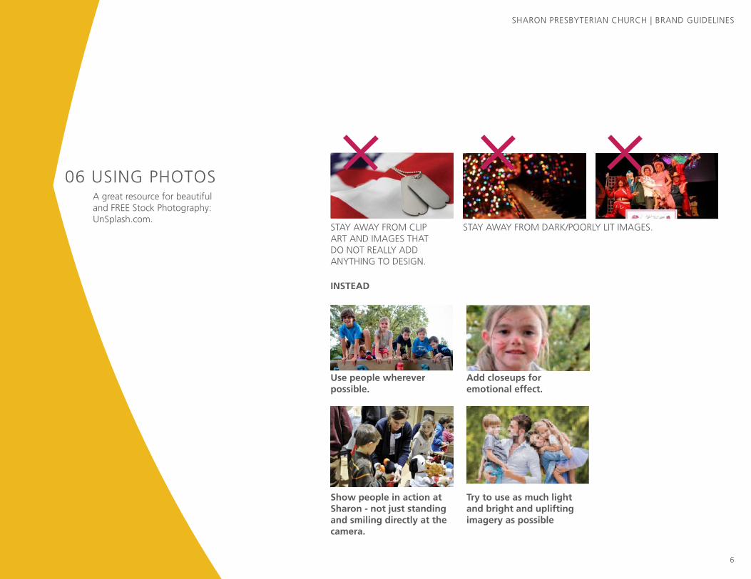
06 USING PHOTOS
STAY AWAY FROM CLIP ART AND IMAGES THAT DO NOT REALLY ADD ANYTHING TO DESIGN.
Use people wherever possible.
Show people in action at Sharon - not just standing and smiling directly at the camera.
Try to use as much light and bright and uplifting imagery as possible
Add closeups for emotional effect.
INSTEAD
STAY AWAY FROM DARK/POORLY LIT IMAGES.
A great resource for beautiful and FREE Stock Photography: UnSplash.com.

SHARON PRESBYTERIAN CHURCH | BRAND GUIDELINES
7
07 USING ICONSTheNounProject.com
Select icons that are solid, not just oulines or line drawings.
Look for icons that have a little bit of character. The Icon on the left looks more interesting the blocky one on the right.
Colors: When using icons, keep the colors simple and, most importantly, on brand. Also use sparingly.
If using on one of the banners: Use White. (See Christmas Example in the folder). If there are multiple icons–like falling leaves–try different opacities for each leaf.
SHARON PRESBYTERIAN CHURCH | BRAND GUIDELINES
8
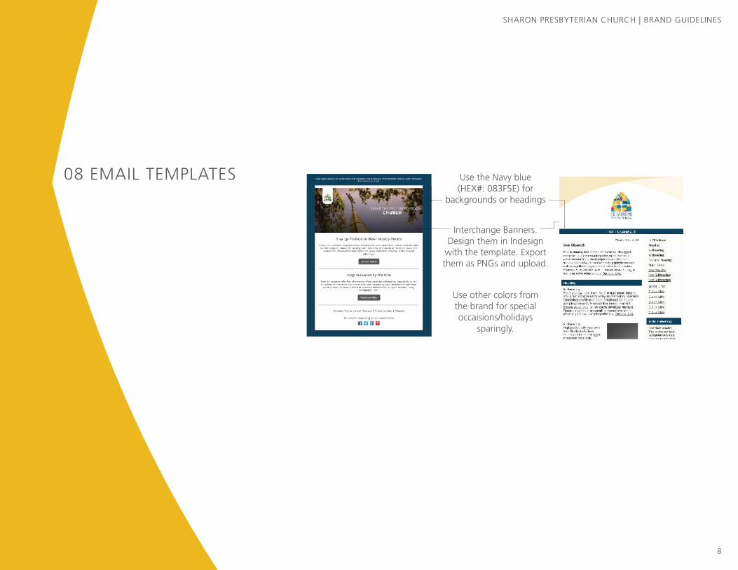
08 EMAIL TEMPLATES Use the Navy blue (HEX#: 083F5E) for
backgrounds or headings
Interchange Banners. Design them in Indesign
with the template. Export them as PNGs and upload.
Use other colors from the brand for special occaisions/holidays
sparingly.

SHARON PRESBYTERIAN CHURCH | BRAND GUIDELINES
9
09 WRITING TIPS Top 10 Copywriting Tips“The first draft of everything is sh*t.” – Earnest Hemmingway“If writing seems hard, it’s because it is hard.“ – William Zinsser
Interest: Headline or first words must be eyecatching, irresistible, enticing. 5 times as many people read the headline as the copy and make an immediate decision.
• WRONG: “Congratulations to our Eagle Scouts” • RIGHT: “Eagles Fly”
Desire: Stress the benefit, solve a problem, address a need – of the reader. What value are you giving the reader; why should they personally care? What’s in it for me?
• WRONG: “Knit blankets for stillborn babies in need.”• RIGHT: “Knitting & Coffee Klatch.”
Proof: Testimonials, statistics, accolades – provide evidence of the claim. Be specific. Is what you’re saying really as compelling as you say?
•WRONG: “Scouts serve the needy collecting cans for Loaves & fishes each year.”• RIGHT: “Scouts collect 250,000 cans a year for Loaves & Fishes – that’s a living room filled to the roof.”
Tone: Use vibrant, familiar, comfortable, unstilted language – the way you might naturally talk to someone out loud. Have personality - pretend SPC is a person, and say it how that person would say it.
• “If it sounds like writing, I rewrite it.” – Elmore Leonard
• WRONG: “We welcome visitors to sign the ritual of friendship pad. Please note new names so that you may greet them after the service.” • RIGHT: “Welcome, visitors! Sign the friendship pad so your pew neighbor can say hello.”
Desire: Use descriptive words, make the reader feel or see something. Make it personal, create a connection, encourage an emotional reaction, paint a picture.
• Don’t tell me the moon is shining. Show me the glint of light on broken glass.” - Anton Chekhov• “I’m always pretending I’m sitting across from somebody. I’m telling them a story, and I don’t want them to get up until it’s finished.” - James Patterson
Jail words: Never use exclamation points. Avoid adverbs – never use “Very”, “good”, “somewhat”, etc . Avoid tentative or colorless verbs like “am”, “will be”, “seem”, “said”, “had” – Focus on descriptive and action words.
•“Substitute ‘damn’ every time you’re inclined to write ‘very;’ your editor will delete it and the writing will be just as it should be.” – Mark Twain• WRONG: “The concert will be very fun for everyone!” • RIGHT: “Fun for every age.”
CONTINUED...

SHARON PRESBYTERIAN CHURCH | BRAND GUIDELINES
10
09 WRITING TIPS Shortcuts: Don’t shy from shortcuts – “&” instead of “and”, “7” instead of “seven”. Short words, not long ones. But be to the point with call to action and headline. Use as few words as possible. This isn’t a book, it is a quick announcement.
“If it is possible to cut a word out, always cut it out.” - George Orwell•WRONG: “Top ten writing tips and why they’re important. Join us at 7:30pm on Thursday March 10 in the Sanctuary.”” •RIGHT: “10 writing tips & why - 7:30pm Thursday March 10, Sanctuary”
Action: Pull the reader toward a specific action/resolution. OK, so what?
• Jargon: Eliminate words or abbreviations every person won’t know. Use those they will. Don’t make people feel stupid or excluded.• WRONG: “SPY, 8:30 in the CLAB.”• RIGHT: “Sharon Presbyterian Youth, 8:30pm Activity Bldg.
Next Step: Provides the necessary order form, address, website, and/or telephone number to allow the reader to move forward. If you give a name to contact but no number, or say “call the office”, you are forcing the reader to go through another step to act. Or worse, you are telling me if they don’t know, then they are essentially uninvited.
• WRONG: “Call Rebecka Nelli to sign up.”• RIGHT: “Contact Rebecka Nelli 704-552-0805 or [email protected].”
QUICK COPY CHECKLIST Does it…
Grab attention?
Fix my problem?
Prove it?
Have personality?
Make me feel, see, connect, want?
Use no-no words?
Use extra words?
Create an action?
Use jargon?
Give phone/email/web address?