jide common layer developer guide - jide software · jide common layer developer guide ......
TRANSCRIPT

JIDE Common Layer Developer Guide (Open Source Project) Contents PURPOSE OF THIS DOCUMENT ............................................................................................................ 4
WHY USING COMPONENTS ................................................................................................................. 4
WHY DO WE OPEN SOURCE ................................................................................................................ 5
HOW TO LEARN JIDE COMMON LAYER ................................................................................................ 5
PACKAGE STRUCTURE......................................................................................................................... 6
LIST OF COMPONENTS ........................................................................................................................ 7
LAYOUT MANAGERS ......................................................................................................................... 12
JIDEBOXLAYOUT ........................................................................................................................................... 12 Code Example 1: ................................................................................................................................... 12 Code Example 2: ................................................................................................................................... 13
JIDEBORDERLAYOUT ...................................................................................................................................... 13
BORDERS ......................................................................................................................................... 15
PARTIALETCHEDBORDER ................................................................................................................................. 15 PARTIALLINEBORDER ..................................................................................................................................... 15 PARTIALGRADIENTLINEBORDER ....................................................................................................................... 15 TITLEDSEPARATOR ......................................................................................................................................... 16
STYLEDLABEL ................................................................................................................................... 17
FEATURES OF STYLEDLABEL ............................................................................................................................. 17 CLASSES, INTERFACES AND DEMOS ................................................................................................................... 18 HOW TO USE STYLEDLABEL ............................................................................................................................. 18
StyleRange ........................................................................................................................................... 19 StyledLabel ........................................................................................................................................... 20
CODE EXAMPLES ........................................................................................................................................... 21
RANGESLIDER .................................................................................................................................. 22
FEATURES OF RANGESLIDER ............................................................................................................................ 22 CLASSES, INTERFACES AND DEMOS ................................................................................................................... 23 HOW TO USE RANGESLIDER............................................................................................................................. 23 CODE EXAMPLES ........................................................................................................................................... 23
TRISTATECHECKBOX ......................................................................................................................... 24
FEATURES OF TRISTATECHECKBOX .................................................................................................................... 24 CLASSES, INTERFACES AND DEMOS ................................................................................................................... 24

COPYRIGHT © 2002-2012 J IDE SOFTWARE. ALL RIGHTS RESERVED
2
HOW TO USE TRISTATECHECKBOX .................................................................................................................... 24 CODE EXAMPLES ........................................................................................................................................... 24
JIDESPLITPANE ................................................................................................................................. 25
CLASSES, INTERFACES AND DEMOS ................................................................................................................... 27 UI DEFAULTS USED BY JIDESPLITPANE ............................................................................................................... 27
JIDETABBEDPANE ............................................................................................................................. 27
CLASSES, INTERFACES AND DEMOS ................................................................................................................... 31 UI DEFAULTS USED BY JIDETABBEDPANE ........................................................................................................... 31
JIDESCROLLPANE .............................................................................................................................. 32
FEATURES OF JIDESCROLLPANE ........................................................................................................................ 32 CLASSES, INTERFACES AND DEMOS ................................................................................................................... 33 HOW TO USE JIDESCROLLPANE ........................................................................................................................ 33
MARQUEEPANE ............................................................................................................................... 33
FEATURES OF MARQUEEPANE ......................................................................................................................... 33 CLASSES, INTERFACES AND DEMOS ................................................................................................................... 34 HOW TO USE MARQUEEPANE .......................................................................................................................... 34 CODE EXAMPLES ........................................................................................................................................... 34
SIMPLESCROLLPANE ......................................................................................................................... 35
FEATURES OF SIMPLESCROLLPANE .................................................................................................................... 35 CLASSES, INTERFACES AND DEMOS ................................................................................................................... 35
CHECKBOXLIST ................................................................................................................................. 36
FEATURES OF CHECKBOXLIST ........................................................................................................................... 36 CLASSES, INTERFACES AND DEMOS ................................................................................................................... 36 CODE EXAMPLES ........................................................................................................................................... 37
CHECKBOXTREE ................................................................................................................................ 39
FEATURES OF CHECKBOXTREE ......................................................................................................................... 39 CLASSES, INTERFACES AND DEMOS ................................................................................................................... 39 CODE EXAMPLES ........................................................................................................................................... 40
FOLDERCHOOSER ............................................................................................................................. 41
FEATURES OF FOLDERCHOOSER........................................................................................................................ 41 CLASSES, INTERFACES AND DEMOS ................................................................................................................... 41 HOW TO USE FOLDERCHOOSER ........................................................................................................................ 42 CODE EXAMPLES ........................................................................................................................................... 42
STANDARD DIALOG .......................................................................................................................... 43
BANNER PANEL ................................................................................................................................ 44
BUTTON PANEL ................................................................................................................................ 46

COPYRIGHT © 2002-2012 J IDE SOFTWARE. ALL RIGHTS RESERVED
3
BUTTON WIDTH ............................................................................................................................................ 46 PLATFORM DIFFERENCE ON BUTTON ORDER ...................................................................................................... 47 BUTTON TYPES AND ORDERS ........................................................................................................................... 47
UIDEFAULT IN LOOK AND FEEL .......................................................................................................... 48
JIDEBUTTON .................................................................................................................................... 49
JIDESPLITBUTTON ............................................................................................................................ 50
JIDELABEL ........................................................................................................................................ 50
SEARCHABLE COMPONENTS ............................................................................................................. 50
FEATURES .................................................................................................................................................... 52 HOW TO EXTEND SEARCHABLE ......................................................................................................................... 54
RESIZABLE COMPONENTS ................................................................................................................. 55
RESIZABLE .................................................................................................................................................... 56 SEVERAL RESIZEABLE EXAMPLES ....................................................................................................................... 57
POPUP ............................................................................................................................................. 58
OPTIONS ..................................................................................................................................................... 59
INTELLIHINTS ................................................................................................................................... 60
AUTOCOMPLETION .......................................................................................................................... 63
CLASSES, INTERFACES AND DEMOS ................................................................................................................... 63
OVERLAYABLE .................................................................................................................................. 63
HOW TO USE THE API .................................................................................................................................... 65 Comparing the code change ................................................................................................................ 65 Adding multiple overlay components .................................................................................................. 66 Putting overlay components beyond the component .......................................................................... 66
ADVANTAGES AND DISADVANTAGES .................................................................................................................. 66
IMAGES AND ICONS RELATED CLASSES .............................................................................................. 67
COLORFILTER, GRAYFILTER AND TINTFILTER ....................................................................................................... 67 ICONSFACTORY ............................................................................................................................................. 68
INTERNATIONALIZATION SUPPORT ................................................................................................... 70

COPYRIGHT © 2002-2012 J IDE SOFTWARE. ALL RIGHTS RESERVED
4
Purpose of This Document Welcome to the JIDE Common Layer (or JCL is short). This module was the foundation for all
JIDE commercial products. It was delivered as jide-common.jar in all former releases. In April of 2007, JIDE Software open sourced the module under GPL+classpath exception, hoping more and more people will join the project and push it to the next level.
In addition to GPL, JIDE Common Layer is dual-licensed. Commercial companies who need to build proprietary software can use the same commercial license under which all other JIDE products are released. Except for JIDE Common Layer, the commercial license is free of charge.
This developer guide is for those who want to develop applications using the JIDE Common Layer and for those who want to contribute to this project.
Why using Components Thousands and thousands of valuable development hours are wasted on rebuilding
components that have been built elsewhere. Why not let us build those components for you, so you can focus on the most value-added part of your application?
What kind of components do we build and how do we choose them?
First of all, those components that are commonly and widely used. Our components provide a foundation to build any Java desktop application. You’ve probably seen them in some other well-known applications. People are familiar with them. When you see them in our component demo, most likely you will say “Hmm, I can use this component in my application”.
Secondly, they are extensible: we never assume our components will satisfy all your requirements. Therefore, in addition, to what we provide, we always leave extension points so that you can write your own code to extend the component. Believe it or not, our whole product strategy is based on the extensibility of each component we are building. We try to cover all the requirements we can find and to build truly general, useful components. At some point, users will likely find a need we didn’t address, but that’s fine! Our components allow you to “help yourselves”.
Last, but not least, they will save the end user time. You use a 3rd party component because you think it will be faster to build on top of it than to start from scratch. If the 3rd party component is very simple, you probably rather building it yourself so that you have full control of the code. If you find the 3rd party component is way too complex and way too hard to configure, you probably also want to build it yourself to avoid the hassle of understanding other people’s code. With those in mind, we carefully chose what components to include in our products. We are very “picky” about what components to build. Our pickiness guaranteed that all those components will be useful thus save your valuable time.
All components in this JIDE Common Layer are general components built on top of Swing. We built them mainly because we found they are missing from Swing. Many of the components simply extend an existing Swing classes to add more features. They probably should be included in Swing anyway. Thousands of engineers developing various applications had used all

COPYRIGHT © 2002-2012 J IDE SOFTWARE. ALL RIGHTS RESERVED
5
components from this project commercially. They are already in production quality when they are included in this open source project.
Why do we open source JIDE Software was founded back in 2002. Within four years, JIDE became a well-known
Swing component provider. We used commercial license term for our products from the very beginning. It was essential for us because it provides the financial support that we needed as a start-up. On the other hand, being commercial is no question a roadblock for many developers who either cannot afford or are prohibited to use the commercial license. In the past couple of years, we saw many emails, blogs and forum posts suggesting us to open source our products. It is the time now.
In this release, we will open source over 30 components, which is about 1/3 of our source code (roughly 100K lines out of 300k+ lines). We will have dedicated people to maintain this project to fix bugs and add enhancements. We will also add more components or move components from our commercial offerings to this project. Of course, we welcome people to contribute this project. The source code can be downloaded from https://jide-oss.java.net.
One of main issues in open source project is the lack of technical support. To address this issue, here is our support policy:
v All source code contains detailed JavaDoc.
v A developer guide is provided to describe how to use each component.
v For bug reports, we will have dedicated resource to work on them based on the priority we decide.
v For technical support, there are two ways. The first way is the community support. We will provide a forum so that you can get help from other people in the community. The second way is the paid technical support provided by JIDE support team. That is, if you think it is critical to get the high quality support in a timely fashion, you can always purchase the annual maintenance renewal for JIDE Common Layer.
Open source JIDE Common Layer does not mean we will open source all our other components. We still believe high quality software deserves license fee. The open source community would not have existed without the participation of millions of professional developers whose salaries are paid by commercial companies. Therefore, we will continue to market our other products commercially and use part of the license revenue to sponsor this open source project.
How to learn JIDE Common Layer The source code of JIDE Common Layer can be downloaded from https://jide-oss.java.net.
However, in order to evaluate JCL, you should still download the evaluation package following the instruction at http://www.jidesoft.com/evaluation/. The evaluation package is for all JIDE components. Most importantly, it includes over 100 demos with source code. The demo for JCL

COPYRIGHT © 2002-2012 J IDE SOFTWARE. ALL RIGHTS RESERVED
6
components are part of it too. After you read this developer guide, you can dive into the demo and the demo source code to learn more about JCL and see JCL in action.
Package Structure The table below lists the packages in the JIDE Common Layer. All packages are in jide-oss-
<version>.jar or jide-common.jar if you are a paid JIDE user1.
Packages Description
com.jidesoft.swing Common components.
com.jidesoft.icon Icon related classes
com.jidesoft.comparator Various Comparators. They all implement interface java.util.Comparator. ObjectComparatorManager provides a central place to register those comparators.
com.jidesoft.converter Various ObjectConverters which can convert an object to/from String. ObjectConverterManager provides a central place to register those converters.
com.jidesoft.grouper Various ObjectGroupers which can group several values into a named group. ObjectGrouperManager provides a central place to register those groupers.
com.jidesoft.popup Popup component
com.jidesoft.animation Animation related classes
com.jidesoft.hints IntelliHints related classes
com.jidesoft.dialog Dialog related classes
com.jidesoft.range A new data type of Range which is used in JIDE Gantt Charts and JIDE TreeMap
com.jidesoft.validation Validation related classes
com.jidesoft.spinner Several spinner components
A general comment on our naming convention: If the class is modified from or based on an existing Swing/AWT class, and serve the same purpose of the existing Swing component, we prefix the original Swing/AWT class name with Jide - for example, JideTabbedPane (you can tell that it is based on JTabbedPane from the name). If it’s a completely new component that
1 If you are a paid JIDE product user, you should use jide-common.jar instead of the jide-oss-xxx.jar for JCL portion. The jide-common.jar includes everything inside jide-oss-xxx.jar and a few more classes that are not public APIs but are used by other JIDE products.

COPYRIGHT © 2002-2012 J IDE SOFTWARE. ALL RIGHTS RESERVED
7
doesn’t exist in Swing/AWT then we don’t prefix anything - for example, Calculator etc. There are also cases that a class extends an existing Swing component but the purpose is changed, if so, we will not use Jide- prefix either, for example, RangeSlider.
We will add more and more components to JIDE Common Layer in the future and we will keep the same package organization. If the component is complex enough or there are a group of components which share a common feature, there will be a separate package for it. If it is a very small component, we probably will put it under com.jidesoft.swing.
List of Components In the tables below, we listed all the components and utility classes in JIDE Common Layer.
The bold classes below are the ones that are covered in details in this developer guide.
LAYOUT MANAGERS
JIDE Class Name Related Swing Class Note
JideBorderLayout BorderLayout JideBorderLayout extends BorderLayout by changing the width of the NORTH and SOUTH components to be the same as the CENTER component.
JideBoxLayout BoxLayout JideBoxLayout enhances BoxLayout by allowing three resizing options for the child components.
BORDERS
JIDE Class Name Related Swing Class Note
PartialEtchedBorder EtchedBorder PartialEtchedBorder extends EtchedBorder to support etched border on partial sides.
PartialGradientLineBorder AbstractBorder PartialLineBorder supports gradient line border on partial sides.
PartialLineBorder LineBorder PartialLineBorder extends LineBorder to support line border on partial sides.
JideTitledBorder AbstractBorder JideTitledBorder doesn't extend TitledBorder but it is the same code as the TitledBorder except the title has no gap to the left so that it looks good when being used with PartialLineBorder or PartialEtchedBorder.
SWING COMPONENT EXTENSION
JIDE Class Name Related Swing Class Note
ClickThroughLabel JLabel ClickThroughLabel is a JLabel that can re-target mouse event to a specified parent container.
StyledLabel JLabel StyledLabel is a JLabel that supports styles and multiple

COPYRIGHT © 2002-2012 J IDE SOFTWARE. ALL RIGHTS RESERVED
8
lines.
RangeSlider JSlider RangeSlider enhances JSlider to support two thumbs on one slider.
TristateCheckBox JCheckBox TristateCheckBox extends JCheckBox to support a third state on the check box.
DateSpinner JSpinner A JSpinner for Date data type.
PointSpinner JSpinner A JSpinner for Point data type.
LabeledTextField JTextField LabeledTextField doesn't extend JTextField but looks like a JTextField but it has an icon at the beginning.
JideSplitPane JSplitPane JideSplitPane doesn't extend JSplitPane but it is an enhanced JSplitPane which supports more than 2 splits.
JideTabbedPane JTabbedPane JideTabbedPane is an enhancement of JTabbedPane by providing different tab shapes, tab resize mode, tab leading component, tab trailing component etc.
JideScrollPane JScrollPane JideScrollPane builts on top of JScrollPane to support RowFooter, ColumnFooter as well as new corner components on either side of the scroll bars.
MarqueePane JScrollPane MarqueePane is a JScrollPane without scroll bars but it automatically scrolls.
SimpleScrollPane JScrollPane SimpleScrollPane is also a JScrollPane without scroll bars. It uses four buttons on four sides to scroll.
MeterProgressBar JProgressBar MeterProgressBar extends JProgressBar to provide a different progress bar style.
AutoResizingTextArea JTextArea AutoResizingTextArea is a JTextArea that resizes vertically when user types more text.
MultilineLabel JTextArea MultilineLabel changes JTextArea to make it look like a label so that it can support multiple lines. However StyledLabel supports multiple lines since 3.3 release so we recommend using StyledLabel over MultilineLabel.
CheckBoxList JList A JList that supports check boxes as the list cell.
CheckBoxTree JTree A JTree that supports check boxes as the tree cell.
FolderChooser JFileChooser A JFileChooser that chooses a folder.
JidePopupMenu JPopupMenu JidePopupMenu enhanced JPopupMenu. It will make sure the content of the popup menu to be inside the screen boundary. If the popup menu is very long, it will add scroll button to the top and bottom so that user can scroll it up and down
PaintPanel JPanel PaintPanel is a JPanel which supports using Paint (such as GradientPaint, TexturePaint) as the background.
TitledSeparator JComponent TitledSeparator is a component used for separating components on a panel.

COPYRIGHT © 2002-2012 J IDE SOFTWARE. ALL RIGHTS RESERVED
9
Gripper JComponent Gripper is a component that can be used on any other component so that it can be dragged.
StandardDialog JDialog StandardDialog builds on top of JDialog to support commonly used dialog standards.
ButtonPanel JPanel ButtonPanel supports a panel for buttons in an OS-aware way.
BannerPanel JPanel BannerPanel supports a panel that can be used as a banner.
Calculator JPanel A component for calculator.
JidePopup JComponent JidePopup is a popup window that can be resized, dragged, attached and automatically hidden.
REPLACEMENTS FOR COMPONENTS on JTOOLBAR and COMMANDBAR
JIDE Class Name To Replace Note
JideButton JButton JideButton is a replacement for JButton when it is used on toolbar (or command bar in the case of JIDE Action Framework).
JideToggleButton JToggleButton JideToggleButton is a replacement for JToggleButton when it is used on toolbar (or command bar in the case of JIDE Action Framework).
JideSplitButton JMenu JideSplitButton is a button- dropDownMenu combination when it is used on toolbar (or command bar in the case of JIDE Action Framework).
JideSplitToggleButton JMenu JideToggleSplitButton is a toggleButton-dropDownMenu combination when it is used on toolbar (or command bar in the case of JIDE Action Framework).
JideComboBox JComboBox JideComboBox is a replacement for JComboBox when it is used on toolbar (or command bar in the case of JIDE Action Framework).
JideLabel JLabel JideLabel is a replacement for JLabel when it is used on toolbar (or command bar in the case of JIDE Action Framework).
JideMenu JMenu JideMenu is a replacement for JMenu when it is used on toolbar (or command bar in the case of JIDE Action Framework). It also allows lazily creation of menu items and allows specifying the popup menu’s alignment.
FEATURES TO ADD ONTO EXISTING SWING COMPONENTS
JIDE Class Name Note
AutoCompletion AutoCompletion implements auto-complete feature for JComboBox and

COPYRIGHT © 2002-2012 J IDE SOFTWARE. ALL RIGHTS RESERVED
10
JTextComponent.
Flashable Flashable is an interface that be used to implement flashing effect on any component. Right now TableFlashable and TabbedPaneFlashable implements this interface.
Searchable Searchable implements the quick search feature on JList, JTable, JTree and many other components.
IntelliHints IntelliHints is an interface that defines all necessary methods to implement showing a hint popup depending on a context and allows user to pick from a list of hints. There are both abstract and concrete implementations for it in JIDE Common Layer and JIDE Code Editor.
Resizable Resizable can be used to make a component resizable. Right now we have it implemented for JDialog (undecorated), JWindow and JFrame (undecorated).
Sticky Sticky is a helper class to make JList or JTree or JTable changing selection when mouse moves
IMAGEs and ICONS RELATED CLASSES
JIDE Class Name Note
IconsFactory IconsFactory is a collection of methods related to ImageIcons.
ColorFilter ColorFilter is an image filter that brightens or darkens an existing image.
TintFilter TintFilter is an image filter that tints the image with a color.
MaskFilter MaskFilter is an image filter that replaces one color in an image with another color.
RolloverIcon RolloverIcon provides the expanded and collapsed tree icons that has rollover and fade effect. However it can be used to implement icon for any other purpose, not just the tree icons.
IconSetManager IconSetManager makes it easy to switch between different icon sets that are in JIDE Basic and Network Icon Sets.
IconSet IconSet is a class which works with JIDE Basic Icon Set. It defines 141 icons in 12 sections in this class.
NetworkIconSet NetworkIconSet is a class which works with JIDE Network Icon Set. It defines 72 icons in 6 sections in this class.
INTERFACES
JIDE Class Name Note
Alignable Implemented by JideButton, JideLabel etc. components to indicate those components support horizontal and vertical orientation
ButtonStyle Implemented by JideButton, JideSplitButton to indicate those components support different button styles
Selectable To indicate something is selectable. Right now it is only used by

COPYRIGHT © 2002-2012 J IDE SOFTWARE. ALL RIGHTS RESERVED
11
CheckBoxListWithSelectable.
DraggableHandle To indicate a component can be draggable. Right now it is only implemented by Gripper and CommandTitleBar.
NavigationComponent To indicate a component is used for the navigation purpose. It is implemented by NavigationList/Tree/Table etc. components.
Overlayable To indicate a component can add additional components as overlays which can be used for error indicator, validation warning etc purposes. It is very similar to JLayer that was introduced in JDK7. We would recommend you to use JLayer instead if you are using JDK7.
Prioritized To indicate a data type that has priority. It is only implemented by CellStyle in JIDE Grids
WildcardSupport A common interface for the wildcard support. It is used in many components related to searching and filtering.
MISC. UTILITIES and CLASSES
JIDE Class Name Note
DelayUndoManager DelayUndoManager enhanced the default UndoManager to combine several UndoableEdit's into one UndoableEdit if they happen within a specified short period of time (500 ms by default).
DelegateAction DelegateAction is an Action class that can be implemented then it can replace the action on a component. DelegateAction will be triggered first then the original action will be triggered depending on the return value from DelegateAction.
SortedList SortedList is a List that will sort automatically.
SwingWorker SwingWorker is an abstract class to perform lengthy GUI-interacting tasks in a dedicated thread.
SystemInfo SystemInfo is a collection of methods to retrieve system information such as OS type and version, JDK version etc.
ShadowFactory ShadowFactory creates a shadow image from a BufferedImage.
FontUtils FontUtils is a collection of methods that caches the derived fonts.
SelectAllUtils SelectAllUtils is a utility class to select all the text in a text component when the component first time receives focus.
ColorUtils ColorUtils is a collection of methods related to Color.
DateUtils DateUtils is a collection of methods related to Date and Calendar.
StringUtils StringUtils is a collection of methods related to String
LoggerUtils LoggerUtils is a collection of methods related to Logger.
MathUtils MathUtils is a collection of methods related to stats such as
ReflectionUtils ReflectionUtils is a collection of methods that use reflection to call methods
TimeUtils

COPYRIGHT © 2002-2012 J IDE SOFTWARE. ALL RIGHTS RESERVED
12
TypeUtils TypeUtils is a collection of methods related to primitive types.
Layout Managers
JideBoxLayout As its name indicates, the JideBoxLayout class is similar to Swing’s BoxLayout.
Similar to BoxLayout, JideBoxLayout lays components out either vertically or horizontally. Unlike BoxLayout however, there is a constraint associated with each component, set to either FIX, FLEXIBLE, or VARY. If the constraint is set to FIX then the component’s width (or height if the JideBoxLayout is vertical) will always be the preferred width. By contrast, although FLEXIBLE components try to keep the preferred width, they will shrink proportionally if there is not enough space. Finally, VARY components will expand in size to fill whatever width is left. Although you can add multiple FIX or FLEXIBLE components, only one VARY component is allowed.
Code Example 1:
This sample has three buttons; the first one is FIX and the second and third ones are FLEXIBLE.
JPanel panel = new JPanel(); panel.setLayout(new JideBoxLayout(panel, 0, 6)); JButton button = new JButton("FIX"); button.setPreferredSize(new Dimension(60, 60)); button.setMaximumSize(new Dimension(Integer.MAX_VALUE, Integer.MAX_VALUE)); panel.add(button, JideBoxLayout.FIX); button = new JButton("FLEX1"); button.setPreferredSize(new Dimension(120, 60)); button.setMaximumSize(new Dimension(Integer.MAX_VALUE, Integer.MAX_VALUE)); panel.add(button, JideBoxLayout.FLEXIBLE); button = new JButton("FLEX2"); button.setPreferredSize(new Dimension(120, 60)); button.setMaximumSize(new Dimension(Integer.MAX_VALUE, Integer.MAX_VALUE)); panel.add(button, JideBoxLayout.FLEXIBLE);
Original:
After resizing:

COPYRIGHT © 2002-2012 J IDE SOFTWARE. ALL RIGHTS RESERVED
13
Code Example 2:
This example has one FIX button, one FLEXIBLE button, and one VARY button.
JPanel panel = new JPanel(); panel.setLayout(new JideBoxLayout(panel, 0, 6)); JButton button = new JButton("FIX"); button.setPreferredSize(new Dimension(60, 60)); button.setMaximumSize(new Dimension(Integer.MAX_VALUE, Integer.MAX_VALUE)); panel.add(button, JideBoxLayout.FIX); button = new JButton("FLEX"); button.setPreferredSize(new Dimension(120, 60)); button.setMaximumSize(new Dimension(Integer.MAX_VALUE, Integer.MAX_VALUE)); panel.add(button, JideBoxLayout.FLEXIBLE); button = new JButton("VARY"); button.setPreferredSize(new Dimension(120, 60)); button.setMaximumSize(new Dimension(Integer.MAX_VALUE, Integer.MAX_VALUE)); panel.add(button, JideBoxLayout.VARY);
Original:
After resizing, the VARY component gets all the extra width:
After resizing to make it smaller, when the VARY component reaches its minimum width,
the FLEX component will start to resize and the FIX component will never resize:
JideBorderLayout JideBorderLayout is almost the same as the standard Swing BorderLayout except that the
NORTH and SOUTH component’s width is the same as the CENTER component, as shown overleaf. Please note the difference between BorderLayout and JideBorderLayout.

COPYRIGHT © 2002-2012 J IDE SOFTWARE. ALL RIGHTS RESERVED
14
In AWT BorderLayout, the north and south components take all of the horizontal space that is available.
By contrast, in JideBorderLayout the north and south components only take the same
horizontal space as the center component.

COPYRIGHT © 2002-2012 J IDE SOFTWARE. ALL RIGHTS RESERVED
15
Borders
PartialEtchedBorder PartialEtchedBorder is an EtchedBorder that only paints the etched border on the partial
sides. The screenshot below paints only on the north side.
The screenshot below paints three sides.
PartialLineBorder PartialLineBorder is a LineBorder that only paints the line border on the partial sides. The
screenshot below paints only on the north side.
PartialGradientLineBorder PartialGradientLineBorder is a border that only paints a gradient line border on the partial
sides. The screenshot below paints only on the north side.

COPYRIGHT © 2002-2012 J IDE SOFTWARE. ALL RIGHTS RESERVED
16
TitledSeparator
The TitledSeparator is not a Border. The reason we included it here is it can archive the same effect as PartialEtchedBorder, PartialLineBorder and PartialGradientLineBorder. You can decide which one to use depending on if you want to implement the feature as border or as a separate component.

COPYRIGHT © 2002-2012 J IDE SOFTWARE. ALL RIGHTS RESERVED
17
StyledLabel
Features of StyledLabel
StyledLabel is an enhanced version of JLabel to display text in different colors and styles with
several line decorations. It also supports automatic line wrapping.
JLabel is simple and fast but has very limited features. For example, you can't use different colors to draw the text. Changing the foreground will affect the whole text. You may argue JLabel can use HTML tag to display text in different colors. Sure, but there are two drawbacks. First it is very slow2. Secondly, it is buggy3. Comparing with HTML JLabel, StyledLabel is 20 to 40 times faster based on our performance test. Another solution is to use JTextPane. JTextPane is powerful and can display text in different colors. But in the cases like cell renderers, JTextPane is obviously an overkill.
Here is the list of features that StyledLabel support.
v Uses different font styles to display the text.
v Uses different colors to display the text
2 You can see StyledLabelPerformanceDemo.java in examples\B15. StyledLabel folder to see a performace test of HTML JLabel and StyledLabel.
3 See bug report at http://bugs.sun.com/bugdatabase/view_bug.do?bug_id=4373575. Sun claimed it is fixed but it is not as another user pointed it out at the end. If you run the test case provided by original submitter, you will immediately notice the tree node disappeared when you click on the tree nodes. This bug is actually one of the main reasons we decided to create StyledLabel.

COPYRIGHT © 2002-2012 J IDE SOFTWARE. ALL RIGHTS RESERVED
18
v Subscript and superscript
v Line decorations including solid line, dotted line, waved line, double solid line or any arbitrary line style that can be defined by Java2D’s Stroke class.
v Two line locations – underlined or strikethrough or both.
v Can line wrapping. You can specify the default, minimum, maximum row count, and preferred width.
v Can be used as cell renderers for JList, JTable, or JTree.
v Annotation support using StyledLabelBuilder so that you can use annotated string to defined a StyledLabel.
Classes, Interfaces and Demos
Classes
StyledLabel (com.jidesoft.swing)
The main class for StyledLabel.
StyleRange (com.jidesoft.swing)
This is the class to define the style. Since the style is defined based for a range of text in StyledLabel, that’s why it is called StyleRange.
StyledLabelBuilder (com.jidesoft.swing)
This is the class to support annotation for StyledLabel.
StyledListCellRenderer (com.jidesoft.list)
A list cell renderer which uses StyledLabel instead of JLabel.
StyledTableCellRenderer (com.jidesoft.grid)
A table cell renderer which uses StyledLabel instead of JLabel.
NOTE: this class resides in jide_grids.jar.
StyledTreeCellRenderer (com.jidesoft.tree)
A tree cell renderer which uses StyledLabel instead of JLabel.
Demos
StyledLabelDemo (examples\B15.StyledLabel)
A demo to demonstrate the StyledLabel used as standalone labels as well as used in JTree, JList and JTable.
How to use StyledLabel The design of StyledLabel is very similar to the StyledText class in SWT. It even has a
StyleRange class just like SWT. StyledLabel can have zero, one or many StyleRanges.

COPYRIGHT © 2002-2012 J IDE SOFTWARE. ALL RIGHTS RESERVED
19
StyleRange
StyleRange describes a style for a range of text. For example, to display a StyledLabel like “JavaTM”, the StyleRange will be
new StyleRange(4, 2, Font.PLAIN, StyleRange.STYLE_SUPERSCRIPT)
It means “starting from the 4th characters, for the next 2 characters, use PLAIN font to draw the text and apply superscript style”.
If StyledLabel has no StyleRange set, StyledLabel will behave exactly the same as JLabel. You can also add multiple StyleRanges as long as those ranges don’t overlap with each other. If you add a new StyleRange that overlaps with previously set StyleRanges, the new StyleRange will be ignored.
Here is the information you can set to StyleRange.
int start The start index of the range.
int length The length of the range
int fontStyle The font style. The valid values are Font.PLAIN, Font.BOLD, Font.ITALIC, or Font.BOLD | Font.ITALIC.
Color fontColor The text color.
Color lineColor The line color
Stroke lineStroke The line stroke. If there are lines in the additional style, the line stroke will be used to paint the line.
int additionalStyle The additional style. This is the property you set to get all kinds of styles. The valid values are
STYLE_STRIKE_THROUGH
STYLE_DOUBLE_STRIKE_THROUGH
STYLE_WAVED
STYLE_UNDERLINED
STYLE_DOTTED
STYLE_SUPERSCRIPT
STYLE_SUBSCRIPT
They are all defined in StyleRange as constants. You can even use a combination of several styles by using “|” as long as they make sense. For example, you can use both strike through and

COPYRIGHT © 2002-2012 J IDE SOFTWARE. ALL RIGHTS RESERVED
20
underlined. However, you cannot use both superscript and subscript.
StyledLabel
StyledLabel has several methods to change StyleRange. The most used one is
This method will set one StyleRange to StyledLabel while keeping any other StyleRanges if
they are set earlier.
There are also two methods to allow you quickly add several StyleRanges at once. The only difference is the first one will clear StyleRanges that was set earlier.
There are of course two methods to help you clear StyleRanges.
All the methods above will fire property change event on property “styleRange”. The
property name is defined as StyleRange.PROPERTY_STYLE_RANGE.
StyledLabel only has one new property called “ignoreColorSettings”. If this property is true, the color setting defined StyleRange will be ignored and the default foreground will be used to paint the text and color. The color settings include font color and line color. The reason we need this property is for cell renderer. Cell renderer, when selected, need to use selection background. Selection background is usually defined by specific LookAndFeel, there is no way you can guarantee the color you used in StyleRange works well with the selection background. To avoid color confliction, we will set this property to true if the cell is selected.
You will know exactly what this property is for by looking at the two screenshots below. Although we use red and gray color in the first cell, they become white (the default selection foreground) when the cell is selected. You can imagine the gray color won’t look good on a blue background.
Almost all the features provided by JLabel still work with StyledLabel. You can add icon. You
can set the alignment of the icon or the text or set text position. You can even set mnemonic just like in JLabel. However, you need to be aware that if you also use certain underlined line style, the mnemonic indicator might be conflict with the underline.

COPYRIGHT © 2002-2012 J IDE SOFTWARE. ALL RIGHTS RESERVED
21
Code Examples 1. Display “TM” as superscript in string “JavaTM”.
StyledLabel javaTM = new StyledLabel("JavaTM"); javaTM.addStyleRange(new StyleRange(4, 2, Font.PLAIN, StyleRange.STYLE_SUPERSCRIPT));
Here is the result.
Another way is to use StyledLabelBuilder.
StyledLabel javaTM = StyledLabelBuilder.createStyledLabel("Java{TM:sp}");
2. Display several line styles in the same StyledLabel.
StyledLabel mixed = new StyledLabel("Mixed Underlined Strikethrough Styles"); mixed.addStyleRange(new StyleRange(0, 5, Font.BOLD, Color.BLUE)); mixed.addStyleRange(new StyleRange(6, 10, Font.PLAIN, Color.BLACK, StyleRange.STYLE_UNDERLINED)); mixed.addStyleRange(new StyleRange(17, 13, Font.PLAIN, Color.RED,
StyleRange.STYLE_STRIKE_THROUGH));
Here is the result.
Again, here is how to do it using StyledLabelBuilder.
StyledLabel javaTM = StyledLabelBuilder.createStyledLabel("{Mixed:f:blue, b} {Underlined:f:black, u} {Strikethrough:f:red, s} Styles");
3. Display a customized underline style.
StyledLabel customizedUnderlined = new StyledLabel("Customized Underlined"); customizedUnderlined.addStyleRange(new StyleRange(Font.PLAIN, Color.BLACK,
StyleRange.STYLE_UNDERLINED, Color.BLACK, new BasicStroke(1.0f, BasicStroke.CAP_SQUARE, BasicStroke.JOIN_ROUND, 1.0f, new float[]{6, 3, 0, 3}, 0)));
Here is the result.
4. Uses StyledTreeCellRenderer. Here is how to set the renderer onto tree.
tree.setCellRenderer(new StyledTreeCellRenderer() {

COPYRIGHT © 2002-2012 J IDE SOFTWARE. ALL RIGHTS RESERVED
22
protected void customizeStyledLabel(JTree tree, Object value, boolean sel, boolean expanded, boolean leaf, int row, boolean hasFocus) {
super.customizeStyledLabel(tree, value, sel, expanded, leaf, row, hasFocus); String text = getText(); // here is the code to customize she StyledLabel for each tree node } });
Here is the result.
RangeSlider
Features of RangeSlider
RangeSlider extends JSlider but it allows user to choose two values to form a range.
Here is the list of features that RangeSlider support.
COPYRIGHT © 2002-2012 J IDE SOFTWARE. ALL RIGHTS RESERVED
23
v Allow to choose lower value and upper value separately to form a range
v Allow to move both lower value and upper value at the same time
v Support both horizontal and vertical orientation
v Support several L&Fs (Metal, Windows, Aqua, Synth, GTK etc.) and can be extended to support other L&Fs.
Classes, Interfaces and Demos
Classes
RangeSlider (com.jidesoft.swing)
The main class for RangeSlider.
Demos
RangeSliderDemo (examples\B17.RangeSlider)
A demo to demonstrate the RangeSlider.
How to use RangeSlider RangeSlider extends JSlider, so the usage of it is almost the same as JSlider. For example, you
can set min and max value; you can set the major tick and minor spacing; you can set tick/label/track visibility. In addition, RangeSlider allows you to set lower value and upper value. Please see code examples below to find out how to use it.
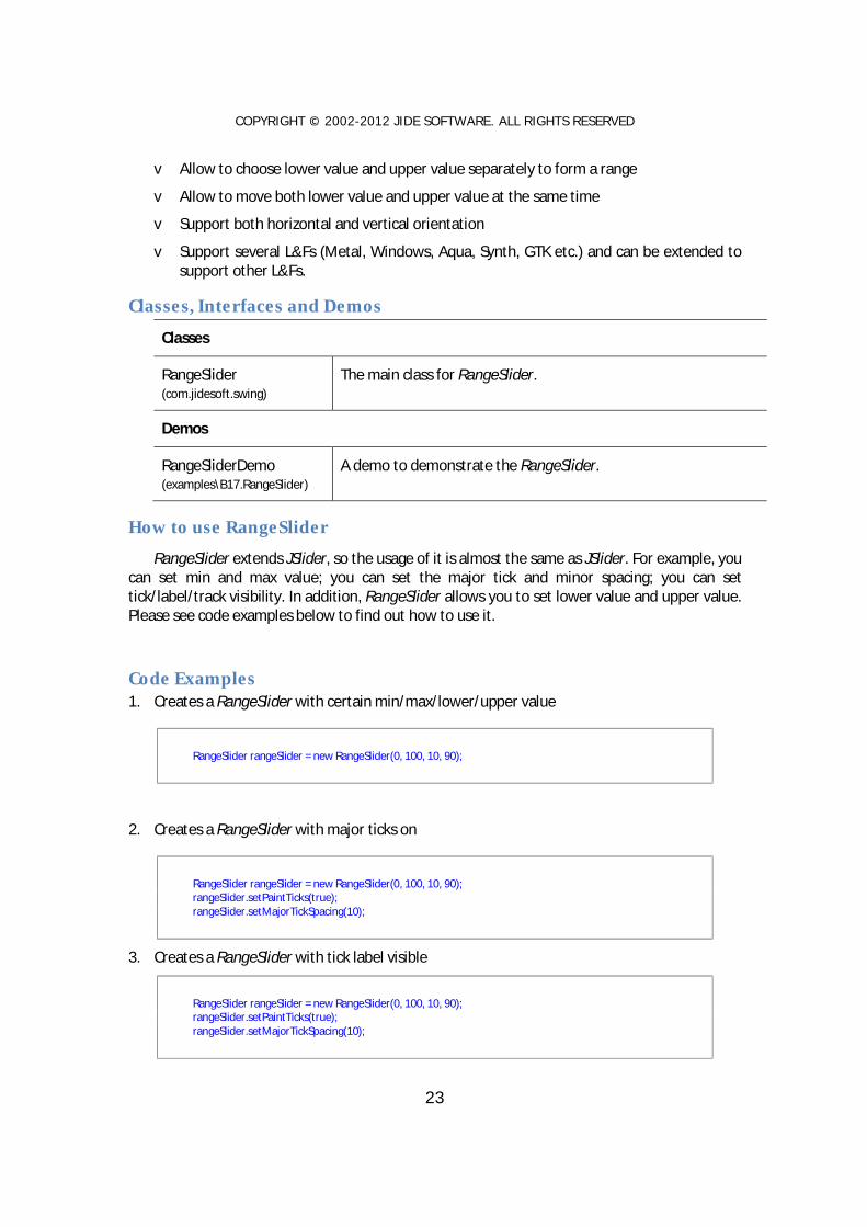
Code Examples 1. Creates a RangeSlider with certain min/max/lower/upper value
RangeSlider rangeSlider = new RangeSlider(0, 100, 10, 90);
2. Creates a RangeSlider with major ticks on
RangeSlider rangeSlider = new RangeSlider(0, 100, 10, 90); rangeSlider.setPaintTicks(true); rangeSlider.setMajorTickSpacing(10);
3. Creates a RangeSlider with tick label visible
RangeSlider rangeSlider = new RangeSlider(0, 100, 10, 90); rangeSlider.setPaintTicks(true); rangeSlider.setMajorTickSpacing(10);

COPYRIGHT © 2002-2012 J IDE SOFTWARE. ALL RIGHTS RESERVED
24
rangeSlider.setPaintLabels(true);
4. Creates a vertical RangeSlider
RangeSlider rangeSlider = new RangeSlider(SwingConstants.VERTICAL);
TristateCheckBox
Features of TristateCheckBox
TristateCheckBox extends JCheckBox to add a 3rd state to indicate the check box is partially
selected.
Here is the list of features that TristateCheckBox support.
v Allow a 3rd state for the check box
v Can be used as a cell renderer in a JList, JTree or JTable
v Support several L&Fs (Metal, Windows, Aqua, Synth, GTK etc.) and can be extended to support other L&Fs.
Classes, Interfaces and Demos
Classes
TristateCheckBox (com.jidesoft.swing)
The main class for TristateCheckBox.
Demos
RangeSliderDemo (examples\B16.CheckBoxTree)
A demo to demonstrate the TristateCheckBox.
How to use TristateCheckBox TristateCheckBox extends JCheckBox, so the usage of it is almost the same as JSlider. For
example, you can select or unselect. In addition, TristateCheckBox has setState method that you can call it to set it to the 3rd state. Please see code examples below to find out how to use it.
Code Examples 1. Creates a TristateCheckBox and set it to the 3rd state.

COPYRIGHT © 2002-2012 J IDE SOFTWARE. ALL RIGHTS RESERVED
25
TristateCheckBox checkBox = new TristateCheckBox("Tristate Check Box"); checkBox.setState(TristateCheckBox.STATE_MIXED);
2. Listen to TristateCheckBox state change
checkBox.addActionListener(new ActionListener() { public void actionPerformed(ActionEvent e) { int state = checkBox.getState(); switch (state) { case TristateCheckBox.STATE_MIXED: // mixed state break; case TristateCheckBox.STATE_UNSELECTED: // unselected state break; case TristateCheckBox.STATE_SELECTED: // selected state break; } } });
JideSplitPane JSplitPane is a useful Swing component but it has one major limitation: it can only split into
two panes. If you want to split into three panes, you have to use two JSplitPanes. That may be OK in most cases, but if you want to split it into four or five or more panes then you will quickly get into trouble, maintaining so many JSplitPanes. As you can see in JIDE Docking Framework, we need to be able to split a panel into any number of panes4. JSplitPane obviously cannot meet this need gracefully, so we developed JideSplitPane.
4 You can refer to a bug in Java website for information on this particular issue. http://developer.java.sun.com/developer/bugParade/bugs/4155064.html
COPYRIGHT © 2002-2012 J IDE SOFTWARE. ALL RIGHTS RESERVED
26
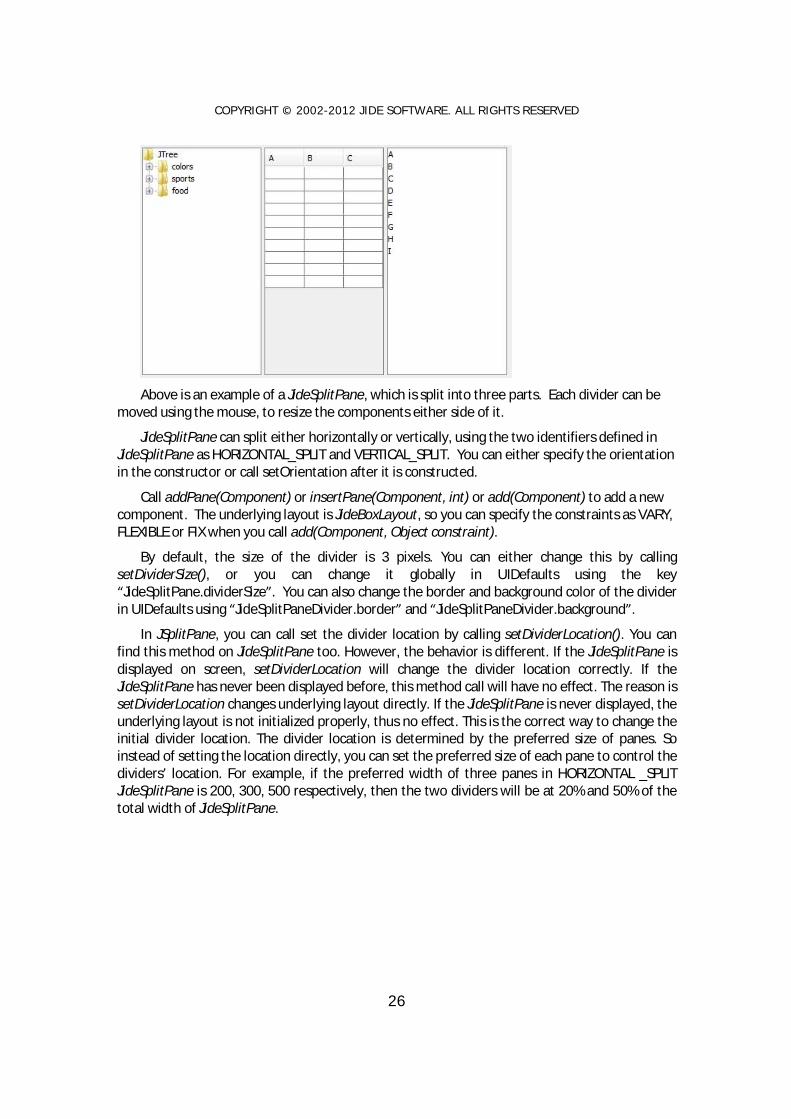
Above is an example of a JideSplitPane, which is split into three parts. Each divider can be
moved using the mouse, to resize the components either side of it.
JideSplitPane can split either horizontally or vertically, using the two identifiers defined in JideSplitPane as HORIZONTAL_SPLIT and VERTICAL_SPLIT. You can either specify the orientation in the constructor or call setOrientation after it is constructed.
Call addPane(Component) or insertPane(Component, int) or add(Component) to add a new component. The underlying layout is JideBoxLayout, so you can specify the constraints as VARY, FLEXIBLE or FIX when you call add(Component, Object constraint).
By default, the size of the divider is 3 pixels. You can either change this by calling setDividerSize(), or you can change it globally in UIDefaults using the key “JideSplitPane.dividerSize”. You can also change the border and background color of the divider in UIDefaults using “JideSplitPaneDivider.border” and “JideSplitPaneDivider.background”.
In JSplitPane, you can call set the divider location by calling setDividerLocation(). You can find this method on JideSplitPane too. However, the behavior is different. If the JideSplitPane is displayed on screen, setDividerLocation will change the divider location correctly. If the JideSplitPane has never been displayed before, this method call will have no effect. The reason is setDividerLocation changes underlying layout directly. If the JideSplitPane is never displayed, the underlying layout is not initialized properly, thus no effect. This is the correct way to change the initial divider location. The divider location is determined by the preferred size of panes. So instead of setting the location directly, you can set the preferred size of each pane to control the dividers’ location. For example, if the preferred width of three panes in HORIZONTAL _SPLIT JideSplitPane is 200, 300, 500 respectively, then the two dividers will be at 20% and 50% of the total width of JideSplitPane.

COPYRIGHT © 2002-2012 J IDE SOFTWARE. ALL RIGHTS RESERVED
27
Continuous Layout refers to painting during drag and drop actions. If this is set to true, then the child components are continuously redisplayed and laid out while moving a window. The default value of this property is false, meaning that only an outline is displayed, which provides much better performance. You can change this with setContinuousLayout(boolean).
Classes, Interfaces and Demos
Classes
JideSplitPane (com.jidesoft.swing)
The main class for JideSplitPane.
Demos
JideSplitPaneDemo (examples\B5.JideSplitPane)
A demo to demonstrate the JideSplitPane.
UI Defaults used by JideSplitPane Name Type Description
JideSplitPane.dividerSize Integer The divider width or height
JideSplitPaneDivider.border Border The border of the dividers
JideSplitPaneDivider.background Color The background of the dividers
JideSplitPaneDivider.gripperPainter Painter The painter for the gripper
JideTabbedPane JideTabbedPane is similar to JTabbedPane; the differences are that JideTabbedPane:
• Has many tab shapes you can choose from. Currently it has
o SHAPE_WINDOWS
o SHAPE_VSNET
o SHAPE_BOX
o SHAPE_OFFICE2003

COPYRIGHT © 2002-2012 J IDE SOFTWARE. ALL RIGHTS RESERVED
28
o SHAPE_FLAT
o SHAPE_ECLIPSE
o SHAPE_ECLIPSE3x
o SHAPE_EXCEL
o SHAPE_ROUNDED_VSNET
o SHAPE_ROUNDED_FLAT
o SHAPE_WINDOWS_SELECTED.
• Has different color themes to choose from. Currently it supports four different themes.
o COLOR_THEME_WIN2K
o COLOR_THEME_OFFICE2003
o COLOR_THEME_VSNET
o COLOR_THEME_WINXP
It even has a special OneNote color theme which is available as part of COLOR_THEME_OFFICE2003.

COPYRIGHT © 2002-2012 J IDE SOFTWARE. ALL RIGHTS RESERVED
29
• Supports all four sides as tab placement.
• Has four tab resize layouts.
o RESIZE_MODE_NONE: it doesn’t change tab size when there isn’t enough space to hold all tabs. So it uses scroll left and right button to scroll the tabs. There is also a tab list button to show all tabs in popup menu so that you can select the tab even it is not visible.
o RESIZE_MODE_FIT: it shrinks tab size so that all tabs can fit in one row.
o RESIZE_MODE_FIXED: All tabs have a fixed size which you can define it yourself.
Each tab, no matter how long the title is, has the same size. It will not change its size when tabbed pane size changes. So in order to select any tab, you still get scroll left/right and tab list button as in RESIZE_MODE_NONE.

COPYRIGHT © 2002-2012 J IDE SOFTWARE. ALL RIGHTS RESERVED
30
o RESIZE_MODE_COMPRESSED: This resize mode only shows the selected tab’s
title. For all unselected tabs, only icons are visible. So if you want to use this mode, you need to make sure you set icons for all tabs.
• Has an option to hide the tab area if there is only one component in a tabbed pane. This
is a feature used by JIDE Docking Framework.
• Has an option to show a “close" button on the corner, on the tab, or on the selected tab. This is very useful especially each tab is a document in DocumentPane. To use this option, you need to call the following two calls. If you never call setShowCloseButtonOnTab, a default value will be used by reading it from L&F. For example, in VSNET L&F, the value is false. In Eclipse L&F, the value is true. So if you want to set it freely, you must disable the L&F by setUseDefaultShowCloseButtonOnTab to false. Then whatever value you set to setShowCloseButtonOnTab will be used.
tabbedPane.setUseDefaultShowCloseButtonOnTab(false); tabbedPane.setShowCloseButtonOnTab(true);
• Can show the selected tab’s title in bold font.
• JideTabbedPane also supports inline tab title editing. By default, this feature is disabled.
You need to enable it by calling setTabEditingAllowed(true). If enabled, user can double click on any tab to start editing the title. See below.

COPYRIGHT © 2002-2012 J IDE SOFTWARE. ALL RIGHTS RESERVED
31
• Allow tabLeadingComponent and tabTrailingComponent. This feature allows you to add
your own component to the area before tabs and after tabs.
Since JideTabbedPane extends JTabbedPane, the usage of it is exactly the same as
JTabbedPane, except for the differences in appearance, noted above.
Classes, Interfaces and Demos
Classes
JideTabbedPane (com.jidesoft.swing)
The main class for JideTabbedPane.
Demos
JideTabbedPaneDemo (examples\B6.JideTabbedPane)
A demo to demonstrate the JideTabbedPane.
UI Defaults used by JideTabbedPane Name Type Description
JideTabbedPane.border Border The border of tabbed pane
JideTabbedPane.background Color The background of tabbed pane
JideTabbedPane.foreground Color The foreground of tabbed pane
JideTabbedPane.light Color One of the colors used to paint the tab border
JideTabbedPane.highlight Color One of the colors used to paint the tab border
JideTabbedPane.shadow Color One of the colors used to paint the tab border
JideTabbedPane.darkShadow Color One of the colors used to paint the tab border
JideTabbedPane.tabInsets Insets The insets of each tab
JideTabbedPane.contentBorderInsets Insets The insets of tab content
JideTabbedPane.tabAreaInsets Insets The insets of the area where all the tabs are
JideTabbedPane.tabAreaBackground Color The tab area background
JideTabbedPane.font Font The font used by tabbed pane
JideTabbedPane.selectedTabFont Font The font used to draw the text of the selected tab
JideTabbedPane.unselectedTabTextForeground Color The default text color of unselected tabs.

COPYRIGHT © 2002-2012 J IDE SOFTWARE. ALL RIGHTS RESERVED
32
If setForegroundAt() is call to set a new color, the new color will be used.
The selected tab foreground is whatever color returned from getForegroundAt().
JideTabbedPane.selectedTabBackground Color The selected tab background. The unselect tab background is tabAreaBackground
JideTabbedPane.textIconGap Integer The gap between icon and text
JideTabbedPane.showIconOnTab Boolean Whether to show icon on tabs
JideTabbedPane.showCloseButtonOnTab Boolean Whether to show close button on tabs
JideTabbedPane.closeButtonAlignment Integer If the close button is on tab, what is the alignment. It could be LEADING or TRAILING defined in SwingConstants.
JideScrollPane
Features of JideScrollPane
Figure 1 JideScrollPane
Figure 2 JScrollPane

COPYRIGHT © 2002-2012 J IDE SOFTWARE. ALL RIGHTS RESERVED
33
JideScrollPane extends JScrollPane. It supports additional areas than what a JScrollPane supports. As you can see from the two screenshots above, JScrollPane only supports the row header, the column header, the upper left corner and the upper right corner.
Here is the list of features that JideScrollPane supports.
v Supports ROW_FOOTER, COLUMN_FOOTER, SUB_COLUMN_HEADER, which can be used to implement freeze rows/columns feature in a table.
v Supports additional corners such as SUB_UPPER_LEFT, SUB_UPPER_RIGHT.
v Supports scroll bar corners such as HORIZONTAL_LEFT, HORIZONTAL_RIGHT, HORIZONTAL_LEADING, HORIZONTAL_TRAILING, VERTICAL_TOP, VERTICAL_BOTTOM.
Classes, Interfaces and Demos
Classes
JideScrollPane (com.jidesoft.swing)
The main class for JideScrollPane.
Demos
JideScrollPaneDemo (examples\B8.JideScrollPane)
A demo to demonstrate the JideScrollPane.
How to use JideScrollPane JideScrollPane extends JScrollPane, so the usage of it is almost the same as JScrollPane
except a few additional methods you can set the scroll pane areas, corners and scroll bar corners.
MarqueePane
Features of MarqueePane
MarqueePane extends JScrollPane and it automatically scrolls the content.
Here is the list of features that MarqueePane supports.
v Changes the scroll direction. It can scroll up, down, right or left.
v Changes the scroll amount. The number of pixels it scrolls every loop. The smaller, the smoother it appears.

COPYRIGHT © 2002-2012 J IDE SOFTWARE. ALL RIGHTS RESERVED
34
v Scrolls and stays. For example, when you scroll a text, it can scroll line by line and stay for a while on each line so that the full text on that line can be read.
Classes, Interfaces and Demos
Classes
MarqueePane (com.jidesoft.swing)
The main class for MarqueePane.
Demos
MarqueePaneDemo (examples\B21.MarqueePane)
A demo to demonstrate the MarqueePane.
How to use MarqueePane MarqueePane extends JScrollPane, so the usage of it is almost the same as JScrollPane
except a few additional methods you can customize the scroll behavior. Please see code examples below to find out how to use it.
Code Examples 1. Scroll a long label horizontally when there isn’t enough size to show the full content
MarqueePane horizonMarqueeLeft = new MarqueePane(longLabel); horizonMarqueeLeft.setPreferredSize(new Dimension(250, 40));
2. Scroll several status messages line by line and it stays on each line
MultilineLabel textArea = new MultilineLabel(…); MarqueePane verticalMarqueeUp = new MarqueePane(textArea); verticalMarqueeUp.setScrollDirection(MarqueePane.SCROLL_DIRECTION_UP); verticalMarqueeUp.setPreferredSize(new Dimension((int)
horizonMarqueeLeft.getPreferredSize().getWidth(), 38)); verticalMarqueeUp.setScrollAmount(1); verticalMarqueeUp.setStayPosition(14);

COPYRIGHT © 2002-2012 J IDE SOFTWARE. ALL RIGHTS RESERVED
35
SimpleScrollPane
Features of SimpleScrollPane
SimpleScrollPane extends JScrollPane. There is no scroll bar. It just uses four scroll buttons to
do the scrolling.
Here is the list of features that SimpleScrollPane supports.
v No more scroll bars. It uses four buttons to scroll the content.
v Instead of clicking on the scroll buttons, user can put mouse over the button and it will scroll automatically.
v The scroll buttons can be customized to always show, show as needed or never show.
Classes, Interfaces and Demos
Classes
SimpleScrollPane (com.jidesoft.swing)
The main class for SimpleScrollPane.
Demos
SimpleScrollPaneDemo (examples\B8.JideScrollPane)
A demo to demonstrate the SimpleScrollPane.

COPYRIGHT © 2002-2012 J IDE SOFTWARE. ALL RIGHTS RESERVED
36
CheckBoxList
Features of CheckBoxList
CheckBoxList is a special JList which uses JCheckBox as the list cell renderer. In addition to
regular JList's features, it also allows you select any number of rows in the list by selecting the check boxes.
To select an element, user can mouse click on the check box, or select one or several rows and press SPACE key to toggle the check box selection for all selected rows.
Here is the list of features that CheckBoxList support.
v Check or uncheck each row.
v Check or uncheck multiple rows by selecting them first
v Still supports customized cell renderer as before. The cell renderer will be the part to the left of the check box (when it’s left-to-right orientation).
Classes, Interfaces and Demos
Classes
The first implementation 5
5 Due to a design change, there are currently two working versions for CheckBoxList. The first one is just called CheckBoxList. This one used the same design as CheckBoxTree and uses a DefaultListSelectionModel as the selection model to keep track of which check boxes are checked. The second implementation is called CheckBoxListWithSelectable. It stored the check box state information in ListModel by converting the element in the ListModel to Selectable.

COPYRIGHT © 2002-2012 J IDE SOFTWARE. ALL RIGHTS RESERVED
37
CheckBoxList (com.jidesoft.swing)
The main class for CheckBoxList.
CheckBoxListCellRenderer (com.jidesoft.swing)
The list cell renderer which uses check box as cell renderer.
The second implementation
CheckBoxListWithSelectable (com.jidesoft.swing)
Selectable (com.jidesoft.swing)
This is an interface to indicate something can be selected.
DefaultSelectable (com.jidesoft.swing)
Default implementation of Selectable.
Demos
CheckBoxListDemo (examples\B10.CheckBoxList)
A demo to demonstrate the CheckBoxList.
Code Examples 1. To create a CheckBoxList. There is no difference from creating a regular JList.
CheckBoxList checkBoxList = new CheckBoxList(Object[] or Vector); or CheckBoxListWithSelectable checkBoxList = new CheckBoxListWithSelectable(Object[] or Vector);
2. To find out when the check box state changes in CheckBoxList.
checkBoxList. getCheckBoxListSelectionModel().addListSelectionListener(new ListSelectionListener () { void valueChanged(ListSelectionEvent e) { // your code here. } });
3. To find out all selected objects
Object[] objects = checkBoxList.getSelectedObjects(); // or getCheckBoxListSelectedValues()
The objects will be the array of objects that are checked.
4. To select all the rows or to clear all the selected rows

COPYRIGHT © 2002-2012 J IDE SOFTWARE. ALL RIGHTS RESERVED
38
checkBoxList.selectAll(); checkBoxList.selectNone();
5. Change the cell renderer for CheckBoxList.
checkBoxList.setCellRenderer(a new cell renderer);
CheckBoxList has its cell renderer which has check box. However, it doesn’t prevent you from setting your own cell renderer. As you can see from the code above, the way to set a new cell renderer is just like before. CheckTreeList will use the new cell renderer and add check box before it. The difference is if you call getCellRenderer(), you will not get the cell renderer you set but get the check box cell renderer. You can use getActualCellRenderer(), which is a new method we added, to get the actual cell renderer you set.
6. Define your own ListModel that works with CheckBoxList.
ListModel listModel = new AbstractListModel () { public Object getElementAt(int row) { //make sure you return an element which is instance of Selectable. In most case, you can // DefaultSelectable and wraps your object into it. Or you can make your // object implementing Selectable. } public int getSize() { // return whatever size } }; CheckBoxList checkBoxList = new CheckBoxList(listModel);
CheckBoxList doesn’t keep the check box selection state in itself. All the selection information is kept in Selectable object in the ListModel. Good thing about this approach is the selection model will never go out of sync with data model. Bad thing is the data model needs to be changed to support it. However, this change should be trivial in most cases.

COPYRIGHT © 2002-2012 J IDE SOFTWARE. ALL RIGHTS RESERVED
39
CheckBoxTree
Features of CheckBoxTree
CheckBoxTree is a special JTree which uses JCheckBox as the tree renderer. In addition to
regular JTree's features, it also allows you select any number of tree nodes in the tree by selecting the check boxes.
To select an element, user can mouse click on the check box, or select one or several tree nodes and press SPACE key to toggle the check box selection for all selected tree nodes.
Here is the list of features that CheckBoxTree support.
v Check or uncheck each tree node.
v Check or uncheck multiple tree nodes by selecting them first
v Supports dig-in mode
v Still supports customized cell renderer as before. The cell renderer will be the part to the left of the check box (when it’s left-to-right orientation).
Classes, Interfaces and Demos
Classes
CheckBoxTree (com.jidesoft.swing)
The main class for CheckBoxTree.
CheckBoxTreeSelectionModel (com.jidesoft.swing)
This is the selection model to keep track of the check/uncheck state of check boxes.

COPYRIGHT © 2002-2012 J IDE SOFTWARE. ALL RIGHTS RESERVED
40
CheckBoxTreeCellRenderer (com.jidesoft.swing)
The tree cell renderer which uses check box as cell renderer.
TristateCheckBox (com.jidesoft.swing)
A check box can display three states. We used it to show a parent tree node to indicate three different states. The three states are all children are selected, none of the children are selected, and some of the children are selected.
Demos
CheckBoxTreeDemo (examples\B16.CheckBoxTree)
A demo to demonstrate the CheckBoxTree.
Code Examples 7. To create a CheckBoxTree. There is no difference from creating a regular JTree.
CheckBoxTree checkBoxTree = new CheckBoxTree(treeModel);
8. To find out when the check box state changes in CheckBoxTree.
checkBoxTree.getCheckBoxTreeSelectionModel().addTreeSelectionListener(new TreeSelectionListener() { public void valueChanged(TreeSelectionEvent e) { // your code here. } });
9. To find out which tree nodes are checked
TreePath[] treePaths = checkBoxTree.getCheckBoxTreeSelectionModel().getSelectionPaths();
The treePaths will be the list of tree path that are checked.
10. Change the dig-in mode.
checkBoxTree.getCheckBoxTreeSelectionModel().setDigIn(true/false);
If the CheckBoxTree is in dig-in mode, checking the parent node will check all the children. Correspondingly, getSelectionPaths() will only return the parent tree path. If not in dig-in mode, each tree node can be checked or unchecked independently.
11. Change the cell renderer for CheckBoxTree.
COPYRIGHT © 2002-2012 J IDE SOFTWARE. ALL RIGHTS RESERVED
41
checkBoxTree.setCellRenderer(a new cell renderer);
CheckBoxTree has its cell renderer which has check box. However, it doesn’t prevent you from setting your own cell renderer. As you can see from the code above, the way to set a new cell renderer is just like before. The checkBoxTree object will use the new cell renderer and add check box before it. The difference is if you call getCellRenderer(), you will not get the cell renderer you set but get the check box cell renderer. You can use getActualCellRenderer(), which is a new method we added, to get the actual cell renderer you set.
FolderChooser
Features of FolderChooser
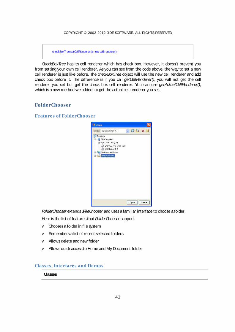
FolderChooser extends JFileChooser and uses a familiar interface to choose a folder.
Here is the list of features that FolderChooser support.
v Chooses a folder in file system
v Remembers a list of recent selected folders
v Allows delete and new folder
v Allows quick access to Home and My Document folder
Classes, Interfaces and Demos
Classes

COPYRIGHT © 2002-2012 J IDE SOFTWARE. ALL RIGHTS RESERVED
42
FolderChooser (com.jidesoft.swing)
The main class for FolderChooser.
Demos
FolderChooserDemo (examples\B18.FolderChooser)
A demo to demonstrate the FolderChooser.
How to use FolderChooser FolderChooser extends JFileChooser, so the usage of it is almost the same as JFileChooser.
Please see code examples below to find out how to use it.
Code Examples 1. Show an Open folder chooser dialog
FolderChooser folderChooser = new FolderChooser(); int result = folderChooser.showOpenDialog(button.getTopLevelAncestor()); if (result == FolderChooser.APPROVE_OPTION) { // call folderChooser.getSelectedFile() to get selected folder }
2. Show a Save folder chooser dialog
FolderChooser folderChooser = new FolderChooser(); int result = folderChooser.showSaveDialog(button.getTopLevelAncestor()); if (result == FolderChooser.APPROVE_OPTION) { // call folderChooser.getSelectedFile() to get selected folder }
3. Set recent list to folder chooser
List recentList = new ArrayList(); // create recent list // add File to recent list FolderChooser folderChooser = new FolderChooser(); folderChooser.setRecentList(recentList); int result = folderChooser.showOpenDialog(button.getTopLevelAncestor()); if (result == FolderChooser.APPROVE_OPTION) { // call folderChooser.getSelectedFile() to get selected folder }
4. Display hidden folder in folder chooser
COPYRIGHT © 2002-2012 J IDE SOFTWARE. ALL RIGHTS RESERVED
43
FolderChooser folderChooser = new FolderChooser(); folderChooser.setFileHidingEnabled(true); // show hidden folders int result = folderChooser.showOpenDialog(button.getTopLevelAncestor()); if (result == FolderChooser.APPROVE_OPTION) { // call folderChooser.getSelectedFile() to get selected folder }
Standard Dialog StandardDialog extends JDialog. In addition to JDialog, it can handle a couple of things that
all dialogs must handle anyway, such as layout, escape and enter key, initial focused component etc.
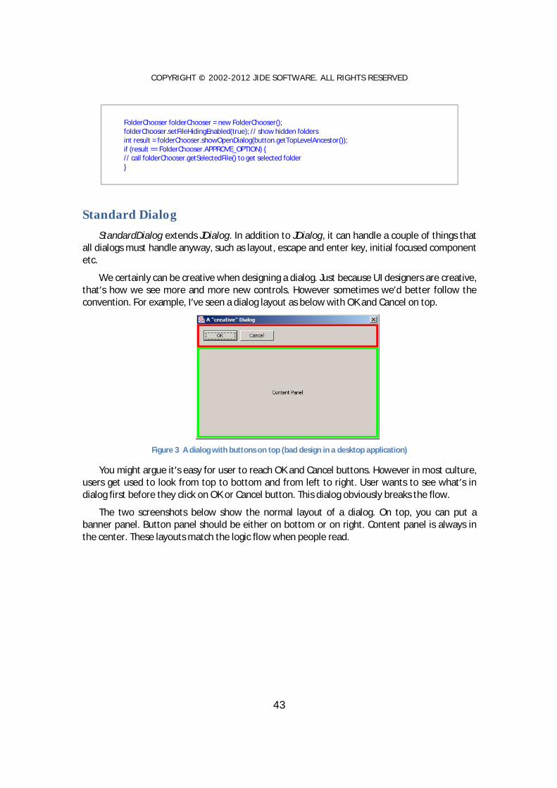
We certainly can be creative when designing a dialog. Just because UI designers are creative, that’s how we see more and more new controls. However sometimes we’d better follow the convention. For example, I’ve seen a dialog layout as below with OK and Cancel on top.
Figure 3 A dialog with buttons on top (bad design in a desktop application)
You might argue it’s easy for user to reach OK and Cancel buttons. However in most culture, users get used to look from top to bottom and from left to right. User wants to see what’s in dialog first before they click on OK or Cancel button. This dialog obviously breaks the flow.
The two screenshots below show the normal layout of a dialog. On top, you can put a banner panel. Button panel should be either on bottom or on right. Content panel is always in the center. These layouts match the logic flow when people read.

COPYRIGHT © 2002-2012 J IDE SOFTWARE. ALL RIGHTS RESERVED
44
It might be tedious to layout those three panels every time creating a dialog. StandardDialog
will layout automatically for you.
StandardDialog is an abstract class; you implement three methods. After you implemented these three methods, StandardDialog will put them at the right places.
abstract public JComponent createBannerPanel(); abstract public JComponent createContentPanel(); abstract public ButtonPanel createButtonPanel();
Almost all UI guidelines require dialog to handle ESC key and ENTER key correctly. In modal dialog, ESC key should trigger the Cancel button and ENTER should trigger the default button. StandardDialog also make this easier by allowing you to set default action and cancel action.
Usually when a dialog is shown, a component in that dialog should have focus. By default, Swing doesn’t set any component focus. It is not that straightforward if you try to do it yourself because you can set focus to a component only when a component is visible. With the help of StandardDialog, it’s never being easier. All you need to do is during createContentPanel(), call setInitFocusedComponent() to set the initial focused component to whatever you want.
We promise that whenever we find some interesting or useful stuffs, we will continuously enhance StandardDialog. That’s all about StandardDialog so far. Simple, right? Yes. Even though it’s simple, when you code using simple StandardDialog, your code will become more organized and all your dialogs will look more consistent. Not only that, we also provide several components to make it creation of each methods easier.
Banner Panel BannerPanel is very useful to display a title, a description and an icon. It can be used in
dialog to show some help information or display a product logo in a nice way. You can also set background of BannerPanel using Paint.
This screenshot below shows three examples that banner panel can do.

COPYRIGHT © 2002-2012 J IDE SOFTWARE. ALL RIGHTS RESERVED
45
Figure 4 BannerPanel examples

COPYRIGHT © 2002-2012 J IDE SOFTWARE. ALL RIGHTS RESERVED
46
Button Panel We created ButtonPanel class in order to lay out buttons easily in any dialogs. It looks like a
very easy thing to do, but when you really think about it, it turns out not so easy. There are two issues ButtonPanel try to solve – button width and button order.
Button Width The problem arose when someone designed a panel like this. Notices the button widths are
different.
Figure 5 Yes, No and Cancel with different widths
I hope we all agree that this screenshot above doesn’t look good. Not only it doesn’t look good, but also the small size button is hard to click on. People realized that and argued that all buttons in the same button panel should have the same width. See below for the result. Most existing implementation of button panel did in this way.
Figure 6 Yes, No and Cancel with the same width
With buttons at the same width, the panel certainly looks much better. However, when dealing with several buttons with text of one of them is much longer than other’s, the problem comes up. See below for an example. This one is from GNOME design document [GHIG].
Figure 7 Same button width
“Close without Saving” is much longer than the other two buttons. Since all buttons should have the same width, the “Cancel” and “Save” are forced to have the same width even though it’s not really necessary. You can see the screen gets really crowd and will soon run out of spaces. It might get worse after localization if “Close with Saving” is even longer in certain some languages.
Mac OS X takes a different approach to handle this. See below. [AHIG]
Figure 8 Different button widths on Mac OS X
Even though buttons have different width, this one looks better than the GNOME one.

COPYRIGHT © 2002-2012 J IDE SOFTWARE. ALL RIGHTS RESERVED
47
It seems there are some contradictions here, isn’t it? It’s not necessary that all buttons should have the same width. However all buttons should have the same minimum width. In fact, this convention is followed on several OS. On Windows, the minimum button width is 75 pixels. On Mac OS X, it is 69 pixels. If the preferred width of button is less than the minimum, minimum width should be used.
To implement this requirement in ButtonPanel, we added setSizeContraint() method. If you pass in ButtonPanel.SAME_SIZE, all buttons will have the same width. If you pass in ButtonPanel.NO_LESS_THAN, the button width will be no less than the minimum width. The actual minimum width is different with different LookAndFeel.
Please note, ButtonPanel allows you to layout button horizontally and vertically. The setSizeContraint() method only has effect when the buttons are laid out horizontally. If buttons are laid out vertically, the setSizeContraint() will be ignored and ButtonPanel.SAME_SIZE is always used. Knowing this drawback of vertical button panel, we suggest you use horizontal button panel as possible as you can. On Mac OS X, it is very rare to see a vertical button panel. On Windows, vertical button panels are used in some dialogs design but are much fewer than horizontal ones.
Platform Difference on Button Order The second problem we try to solve is the platform difference. To be more specific, how to
layout the buttons in the right order on different platform?
On Windows, the OK button comes first, then Cancel. However on Mac OS, the Cancel button comes first, then OK button. People have different opinion on it. You would think that you could choose one of the two ways and follow it as a guide line in your application. But you can’t. Since Java application is cross platform, no matter which way you follow, it’s wrong on other platform. If you choose the Windows way and button order will look strange on Mac OS. If you choose the Mac way, Windows user will get confused because all other Windows applications’ OK button is the first one. So this gives us a hint – should the button order be part of LookAndFeel which can be changed on fly on different LookAndFeels? The answer is yes. ButtonPanel will do it for you.
Button Types and Orders In order to solve the button order problem, we divide buttons into four categories based on
the purpose of the button – Affirmative buttons, Cancel buttons, Help buttons and all other buttons. Please refer to GNOME Human User Interface Guidelines [GHIG] for details. Except we call other button rather than alternative buttons, we pretty much follow their naming convention of those categories so that people can understand it easily.
Affirmative buttons are buttons like OK or Yes, which represent an affirmative action to the dialog. Cancel buttons usually cancel out from the dialog. It is usually Cancel or Close. Help button is a button which provide help information. See below for several examples of button types.
To make it simple, we use one character to represent each type – they are A, C, O, and H – representing Affirmative, Cancel, Other and Help respectively. The order will be a permutation of those four letters.

COPYRIGHT © 2002-2012 J IDE SOFTWARE. ALL RIGHTS RESERVED
48
Figure 9 Button Order on Windows
Taking the screenshot above as an example, if the button panel is left-alignment, the order is “ACO”. This is a typical order of buttons on Windows.
Figure 10 Button Order on Mac OS X
On Mac OS X, the order is “CA” with right alignment and “HO” on the opposite side. So in this case, the order “CA” and the opposite order is “HO”.
UIDefault in Look And Feel Below is a list of UIDefault keys and values on different L&F.
Windows LookAndFeel
"ButtonPanel.order", "ACO", "ButtonPanel.oppositeOrder", "H", "ButtonPanel.buttonGap", new Integer(6), "ButtonPanel.groupGap", new Integer(6), "ButtonPanel.defaultButtonWidth", new Integer(75),
Java LookAndFeel
"ButtonPanel.order", "ACO", "ButtonPanel.oppositeOrder", "H", "ButtonPanel.buttonGap", new Integer(5), "ButtonPanel.groupGap", new Integer(5), "ButtonPanel.defaultButtonWidth", new Integer(57),
Mac AquaLookAndFeel
"ButtonPanel.order", "CA", "ButtonPanel.oppositeOrder", "HO", "ButtonPanel.buttonGap", new Integer(6), "ButtonPanel.groupGap", new Integer(12), "ButtonPanel.defaultButtonWidth", new Integer(69),

COPYRIGHT © 2002-2012 J IDE SOFTWARE. ALL RIGHTS RESERVED
49
So if you want to use ButtonPanel, you just need to add buttons to it and specify the category while adding. The ButtonPanel will use values from UIDefault to layout the button correctly.
You can also change those values for a particular button panel instance. Those methods are available to you. It will overwrite the value from UIDefaults.
setButtonOrder(String order) setOppositeButtonOrder(String order) setSizeContraint(SAME_SIZE / NO_LESS_THAN) setGroupGap(int gap) setButtonGap(int gap)
Example of ButtonPanel is in “examples/W4. ButtonPanel”.
JideButton JideButton was introduced to give JButton different styles. The main usage of the JideButton
is for the JToolBar or the CommandBar (from JIDE Action Framework).
The screenshot above shows what JideButtons look like under TOOLBAR_STYLE. There are three more styles as shown above. They are TOOLBOX_STYLE, FLAT_STYLE and HYPERLINK_STYLE respectively.

COPYRIGHT © 2002-2012 J IDE SOFTWARE. ALL RIGHTS RESERVED
50
JideButton can be used on JToolBar or CommandBar. It supports vertical orientation. When it is used on a CommandBar, it will automatically toggle to vertical orientation when the CommandBar is docked to the east or west side.
Even though JideButton was designed for the CommandBar, it can still be used to replace JButton when appropriate.
JideSplitButton JideSplitButton is a combination of button and menu. There is a line in the middle of the
button that splits the button into two portions. The portion before the line is a button. User can click on it and trigger an action. The portion after the line is a menu. User can click on it to show a normal menu.
The screenshot below shows what JideSplitButtons look like under different styles. They are TOOLBAR_STYLE, TOOLBOX_STYLE and FLAT_STYLE respectively.
JideSplitButton can be used on JToolBar or CommandBar. It supports vertical orientation.
When it is used on a CommandBar, it will automatically toggle to vertical orientation when the CommandBar is docked to the east or west side.
JideLabel JideLabel is a JLabel that can be used on JToolBar or CommandBar. It supports vertical
orientation. When it is used on a CommandBar, it will automatically toggle to vertical orientation when the CommandBar is docked to the east or west side.
Searchable Components JList, JComboBox, JTable, JTree, JTextComponent are five data-rich components. They can
be used to display a huge amount of data so searching function will be a very useful feature in

COPYRIGHT © 2002-2012 J IDE SOFTWARE. ALL RIGHTS RESERVED
51
those components. By default, JList kind of supports searching. User can type in a key and the list will automatically select that row whose first character matches with the typed key. However, it can only match the first character. Therefore, the goal of this component is to make all five components searchable6.
Searchable is such a class that makes it possible. An end user can simply type in any string they want to search for and use arrow keys to navigate to next or previous occurrence. We implement ListSearchable, ComboBoxSearchable, TableSearchable, TreeSearchable, TextComponentSearchable to make JList, JComboBox, JTable, JTree, and JTextComponent searchable respectively. In addition, we create SearchableUtils encapsulate different classes into one utility class.
It is very easy to use those classes. For example, if you have a JList, all you need to do is:
JList list = new JList(); SearchableUtils.installSearchable(list);
The same type of implementation is used to make JTable or JTree searchable – just replace ListSearchable with the corresponding ComboBoxSearchable, TableSearchable, TreeSearchable or TextComponentSearchable.
If you need to further configure the searchable, for example make your search criteria case sensitive, you could do the following:
JList list = new JList(); ListSearchable searchable = SearchableUtils.installSearchable(list); // further configure it searchable.setCaseSensitive(true);
Usually you do not need to uninstall the searchable from the component. But if for some reason, you need to disable the searchable feature of the component, you can call uninstallSearchable():
Searchable searchable = SearchableUtils.installSearchable(component); // … // Now disable it SearchableUtils.uninstallSearchable(searchable);
Below are examples of a searchable JList and JTable.
6 The idea for the searchable feature really came from IntelliJ IDEA. In IDEA, all the trees and lists are searchable. We found this feature to be very useful and consider it as one of the key features to improve the usability of a user interface. As a result, we further extended this idea and make JTable searchable too. We also added several more features such as multiple select and select all that IDEA does not have.

COPYRIGHT © 2002-2012 J IDE SOFTWARE. ALL RIGHTS RESERVED
52
Figure 11 Searchable JList – use up/down arrow key to navigate to next or previous occurrence
Figure 12 Searchable JTable – use up/down/left/right to navigate to next or previous occurrence
For JComboBox, we can only make non-editable combo box searchable. So make sure you call comboBox.setEditable(false) before you pass it into SearchableUtils7.
For JTextComponent, the searchable popup will not be displayed unless user types in Ctrl-F. The reason is obvious – because the JTextComponent is usually editable. If the JTextComponent is not editable, typing any key will show the popup just like other components.
Features The main purpose of searchable is to make the searching for a particular string easier in a
component having a lot of information. All features are related to how to make it quicker and easier to identify the matching text.
Navigation feature - After user types in a text and presses the up or down arrow keys, only items that match with the typed text will be selected. User can press the up and down keys to
7 You may wonder why we only support searchable on non-editable combo box. The “searchable” feature on editable combo box is called auto-completion.

COPYRIGHT © 2002-2012 J IDE SOFTWARE. ALL RIGHTS RESERVED
53
quickly look at what those items are. In addition, end users can use the home key in order to navigate to the first occurrence. Likewise, the end key will navigate to the last occurrence. The navigation keys are fully customizable. The next section will explain how to customize them.
Multiple selection feature - If you press and hold CTRL key while pressing up and down arrow, it will find next/previous occurrence while keeping existing selections. See the screenshot below. This way one can easily find several occurrences and apply an action to all of them later.
Figure 13 Multiple Selections
Select all feature – Further extending the multiple selections feature, you can even select all. If you type in a searching text and press CTRL+A, all the occurrences matching the searching text will be selected. This is a very handy feature. For example, you want to delete all rows in a table whose “name” column begins with “old”. You can type in “old” and press CTRL+A, now all rows beginning with “old” will be selected. If you hook up delete key with the table, pressing delete key will delete all selected rows. Imagine without this searchable feature, users will have to hold CTRL key, look through each row, and click on the row they want to delete. In case they forgot to hold tight the CTRL key while clicking, they have to start over again.
Basic regular expression support - It allows '?' to match any character and '*' to match any number of characters. For example “a*c” will match “ac”, “abc”, “abbbc”, or even “a b c” etc. “a?c” will only match “abc” or “a c”.
Recursive search (only in TreeSearchable) – In the case of TreeSearchable, there is an option called recursive. You can call TreeSearchable#setRecursive(true/false) to change it. If TreeSearchable is recursive, it will search all tree nodes including those, which are not visible to find the matching node. Obviously, if your tree has unlimited number of tree nodes or a potential huge number of tree nodes (such as a tree to represent file system), the recursive attribute should be false. To avoid this potential problem in this case, we default it to false.

COPYRIGHT © 2002-2012 J IDE SOFTWARE. ALL RIGHTS RESERVED
54
How to extend Searchable Searchable is a base abstract class. For each subclass of Searchable, there are at least five
methods need to be implemented.
protected abstract int getSelectedIndex() protected abstract void setSelectedIndex(int index, boolean incremental) protected abstract int getElementCount() protected abstract Object getElementAt(int index) protected abstract String convertElementToString(Object element)
The keys used by this class are fully customizable. The subclass can override the methods to customize the keys. For example, isActivateKey() is defined as below.
protected boolean isActivateKey(KeyEvent e) { char keyChar = e.getKeyChar(); return Character.isLetterOrDigit(keyChar) || keyChar == '*' || keyChar == '?'; }
In your case, you might need additional characters such as ‘_’, ‘+’ etc. So you can override the isActivateKey() method to provide additional keys to activate the search pop up. In order to override a method, you cannot use SearchableUtils anymore. You have to do create a Searchable yourself. However, it is still very easy. See below.
ListSearchable listSearchable = new ListSearchable(list) { protected boolean isActivateKey(KeyEvent e) { return ...; } };
The other methods (belonging to abstract Searchable) that a subclass can override are isDeactivateKey(), isFindFirstKey(), isFindLastKey(), isFindNextKey(), isFindPreviousKey()
We provide basic regular expression support. It is possible to implement full regular expression support. We did not do that because not many users are familiar with complex regular expression grammar. However, if your user base is very familiar with regular expression, you can add the feature to Searchable. All you need to do is override the compare(String text, String searchingText) method and implement the comparison algorithm by yourself. This task is very easy by leveraging the javax.regex package.

COPYRIGHT © 2002-2012 J IDE SOFTWARE. ALL RIGHTS RESERVED
55
Resizable Components In Swing, almost all lightweight components are not resizable8. Heavyweight components,
such as JWindow and the undecorated JDialog, are not resizable either. The main reason for this is that the component size is determined by layout managers in Swing. If the parent container size changes, the component size will change accordingly. However, this does not mean there is no need for resizable components. A typical usage of a resizable panel is in icon or form designer. See the picture below for an example. While designing the icon, you want to control the icon size as well. You can do it by resizing the canvas. In this case, the icon size will be the canvas size.
Figure 14 Usage of a Resizable component
In addition, to the canvas case above, we also find the need for resizable JWindow or resizable undecorated JDialog. A typical use case for a resizable window is the combo box. In Swing’s JComboBox, the pop up is not resizable. However, you can see a resizable popup in IE (see Figure 5 below). The only way to implement this in Swing is to put the JList in a resizable JWindow. As a result, we do need a resizable JWindow.
Figure 15 Resizable Window in IE
8 The only exception is JInternalFrame which is light-weight and resizable.
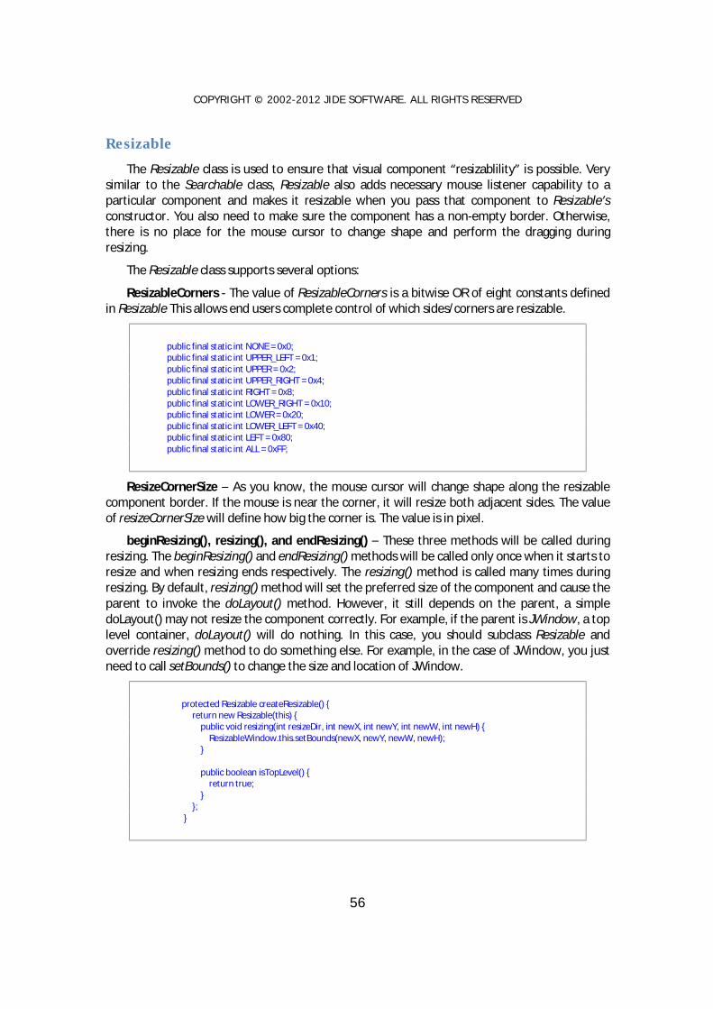
COPYRIGHT © 2002-2012 J IDE SOFTWARE. ALL RIGHTS RESERVED
56
Resizable The Resizable class is used to ensure that visual component “resizablility” is possible. Very
similar to the Searchable class, Resizable also adds necessary mouse listener capability to a particular component and makes it resizable when you pass that component to Resizable’s constructor. You also need to make sure the component has a non-empty border. Otherwise, there is no place for the mouse cursor to change shape and perform the dragging during resizing.
The Resizable class supports several options:
ResizableCorners - The value of ResizableCorners is a bitwise OR of eight constants defined in Resizable This allows end users complete control of which sides/corners are resizable.
public final static int NONE = 0x0; public final static int UPPER_LEFT = 0x1; public final static int UPPER = 0x2; public final static int UPPER_RIGHT = 0x4; public final static int RIGHT = 0x8; public final static int LOWER_RIGHT = 0x10; public final static int LOWER = 0x20; public final static int LOWER_LEFT = 0x40; public final static int LEFT = 0x80; public final static int ALL = 0xFF;
ResizeCornerSize – As you know, the mouse cursor will change shape along the resizable component border. If the mouse is near the corner, it will resize both adjacent sides. The value of resizeCornerSize will define how big the corner is. The value is in pixel.
beginResizing(), resizing(), and endResizing() – These three methods will be called during resizing. The beginResizing() and endResizing() methods will be called only once when it starts to resize and when resizing ends respectively. The resizing() method is called many times during resizing. By default, resizing() method will set the preferred size of the component and cause the parent to invoke the doLayout() method. However, it still depends on the parent, a simple doLayout() may not resize the component correctly. For example, if the parent is JWindow, a top level container, doLayout() will do nothing. In this case, you should subclass Resizable and override resizing() method to do something else. For example, in the case of JWindow, you just need to call setBounds() to change the size and location of JWindow.
protected Resizable createResizable() { return new Resizable(this) { public void resizing(int resizeDir, int newX, int newY, int newW, int newH) { ResizableWindow.this.setBounds(newX, newY, newW, newH); } public boolean isTopLevel() { return true; } }; }

COPYRIGHT © 2002-2012 J IDE SOFTWARE. ALL RIGHTS RESERVED
57
Several Resizeable Examples In order to make Resizable easy to use, we created a ResizablePanel. It extends JPanel
except it is resizable. In addition, we also create two top level Resizables – ResizableWindow and ResizableDialog. It makes sense to have ResizableWindow because JWindow is not resizable by default. However, you may wonder why ResizableDialog? The reason for this is that JDialog is resizable by default, but not when it is undecorated. Because of this, the ResizableDialog is actually an resizable undecorated JDialog.
The usage of these classes is the same as JPanel, JWindow, or JDialog respectively. All of them have the getResizable() method to get the underlying Resizable. You can get it and tweak some options such as ResizeCornerSize or ResizableCorners.
We heavily used the Resizable class in other part of our products and in our demos. For example, the floating window in JIDE Docking Framework is using ResizableWindow. JidePopup/Alert is also using ResizableWindow, as well. In the JIDE webstart demo, ResizablePanel is used inside DocumentComponent to make the demo area resizable. See the figure below for an example of ResizablePanel inside DocumentComponent.
Figure 16 Resizable Panel

COPYRIGHT © 2002-2012 J IDE SOFTWARE. ALL RIGHTS RESERVED
58
Popup The intention of developing the JidePopup9 component is to address the common features
of any types of popup. Popup is something that appears above any other windows. However, it is transient; meaning that when you click outside the popup, the popup is gone. There are many examples of popup, such as tool tips, combo box popup, and popup menu. If further expanding the popup concept, there are even more examples, such as new email alert, the famous IntelliJ IDEA Ctrl-N popup10.
Except the common feature of popup, each popup might have its own characters. For example, some could be resizable such as the combo box popup (there is an example in Resizable components section). Some could be movable. Some support time out – it will hide automatically after several seconds for example. Some are always attached to the invoking component, such as the combo box. Some are standalone such as email alert. Others might be attached to the invoking component at the beginning but can be detached by dragging, such as color split button you can see in MSOffice product. There is also a special category of popups that support animation when entrancing and exiting – either using fade effect, or flying in/out effect or using whatever animation effect you can think of. The JidePopup is trying to capture all those different requirements and provide one solution for you.
JidePopup extends JComponent. You just used it as using any other JComponent by adding child components to it. JidePopup also supports RootPane which means you can also set a menu bar on it or use JLayeredPane or GlassPane. The only thing is you don’t want to do is to add JidePopup to a container. To show it, you just call one of the showPopup() method. See below for an example. It will create a popup with an empty text area and a sample menu bar, then it will display the popup.
JidePopup popup = new JidePopup(); popup.setMovable(true); popup.getContentPane().setLayout(new BorderLayout()); JTextArea view = new JTextArea(); view.setRows(10); view.setColumns(40); popup.getContentPane().add(new JScrollPane(view)); JMenuBar menuBar = new JMenuBar(); JMenu menu = menuBar.add(new JMenu("File")); menu.add("<< Example >>"); menuBar.add(new JMenu("Edit")); menuBar.add(new JMenu("Help")); popup.setJMenuBar(menuBar);
9 We named JidePopup just to avoid the name conflict with Swing’s Popup, although these two are not quite related. 10 You will understand what this means only if you use IntelliJ IDEA. For those who don’t use IntelliJ IDEA, here is a short explanation. Ctrl-N in IDEA is hotkey for “Go to Class” where a “dialog” will popup. You can type in part of the class name and it will list all matches with that name so that you can quickly pick it and go to the class you want to go. This is probably the most used hotkey in the whole IntelliJ IDEA. When I said “dialog”, it’s not really a dialog although it looks like one. The difference from dialog is that it doesn’t block. When mouse clicks anywhere outside, the “dialog” is gone. This is exactly the “unstable” behavior of a popup. By the way, Alt-F1 is another popup example.

COPYRIGHT © 2002-2012 J IDE SOFTWARE. ALL RIGHTS RESERVED
59
popup.setOwner(attachedButton); popup.setResizable(true); popup.setDetachable(true); popup.setDefaultFocusComponent(view); popup.showPopup();
Options Owner: The owner or the invoker of this popup. If you show a popup in the actionPerformed
of a button, the button should be the owner of this popup. If the popup is for a combo box, the combo box should be the owner. There are several reasons we need this owner. In attached mode, the owner is the component that popup attaches to. When you call showPopup() without any parameter, it will place the popup just below the owner.
Resizable: Resizable option is on by default. Depending on the detached/attached mode, the resizing behavior may be different. If a popup is detached to a component, it only allows you to resize from bottom, bottom right and right. It obviously doesn’t make sense to resize from top and top side is aligned with the attached component.
Movable: If a popup is movable, it will show a gripper so that user can grab it and move the popup. If the popup is attached to its owner, moving it will detach from the owner first.
Detached: Detached is a flag to indicate if the popup is detached from owner or not. You shouldn’t need to call setDetached() directly. If you call showPopup(), the detached will be true.
DefaultFocusComponent: DefaultFocusComponent is a component on popup. It will receive keyboard focus when popup is shown.
Timeout: JidePopup can hide itself after certain time. This can be controlled by setTimeOut(). You can pass in a value, which is taken in millisecond format. If you don't want the popup to hide after the time out, set the value to 0. By default it's 0 , which means it will never time out.

COPYRIGHT © 2002-2012 J IDE SOFTWARE. ALL RIGHTS RESERVED
60
IntelliHints IntelliHints is a new name we invented to capture a collection of new features we
introduced in the 1.8.3 release. Similar features (in other developer related tools) are called “code completion” or “intelli-sense” in the context of a text editor or IDE. Without getting into too much detail, we encourage you to run the B14 example to see different flavors of IntelliHints. IntelliHints is designed to be extensible. You can easily extend one of existing base IntelliHints classes such as AbstractIntelliHints or AbstractListIntelliHints or even implement IntelliHints directly to create your own IntelliHints.
See below for the class hierarchy of IntelliHints related class.
The base IntelliHints is an interface. It has four very basic methods about hints.
/** * Creates the component which contains hints. At this moment, the content should be empty. Following
call * {@link #updateHints(Object)} will update the content. * * @return the component which will be used to display the hints. */ JComponent createHintsComponent(); /** * Update hints depending on the context. * * @param context the current context * @return true or false. If it is false, hint popup will not be shown. */ boolean updateHints(Object context); /** * Gets the selected value. This value will be used to complete the text component. * * @return the selected value. */ Object getSelectedHint(); /** * Accepts the selected hint. * * @param hint */ void acceptHint(Object hint);
AbstractIntelliHints implements IntelliHints. It assumes the hints are for a JTextComponent and provides a popup using JidePopup to show the hints. However, it has no idea what

COPYRIGHT © 2002-2012 J IDE SOFTWARE. ALL RIGHTS RESERVED
61
components the popup contains. Since in most cases, the hints can be represented by a JList, here comes the AbstractListIntelliHints. This class assumes JList is used to display hints in the popup and implements most of the methods in IntelliHints except updateHints() methods. That’s why it is still abstract. Whatever classes that extend AbstractListIntelliHints should implement updateHints() method and set the list data to the JList.
There are two concrete implementations included in the current release: FileIntelliHints and ListDataIntelliHints. FileIntelliHints provides hints based on a file system. ListDataIntelliHints provides the hints based on a known list. Take a look at the following figures below… The first one is FileIntelliHints. The list contains the files and folders that match what user typed in so far.
Figure 17 FileIntelliHints
It is very easy to create one:
JTextField pathTextField = new JTextField(); FileIntelliHints intelliHints = new FileIntelliHints(pathTextField); intelliHints.setFolderOnly(true);
Below is an example of ListDataIntelliHints. It provides hints based on what you typed in so far to filter a known list, and only shows those that match what you typed in.

COPYRIGHT © 2002-2012 J IDE SOFTWARE. ALL RIGHTS RESERVED
62
Figure 18 ListDataIntelliHints
Here is the code to create the ListDataIntelliHints above.
JTextField urlTextField = new JTextField("http://"); ListDataIntelliHints intellihints = new ListDataIntelliHints(urlTextField, urls); intellihints.setCaseSensitive(false);
Like previously mentioned, IntelliHints can easily be extended. If you can use a JList to represent the hints, you can extend AbstractListIntelliHints. For example, if you want to implement code completion as in any IDE like below, AbstractListIntelliHints should be good enough for you. Like to do what’s in the screenshot below, all you need to do is to override createList() method in AbstractListIntelliHints and set a special list cell renderer.
If your hints are more complex and cannot be represented by a JList, you will have to extend
AbstractIntelliHints and create your own content for the popup.
IntelliHints is very useful usability feature. If you use it at the right places, it will increase the usability of your application significantly. Just imagine how dependent you are on the code-completion feature provided by your Java IDE, why not provide a similar feature to your end users as well? They will appreciate it. With the help of IntelliHints, it's not far away.

COPYRIGHT © 2002-2012 J IDE SOFTWARE. ALL RIGHTS RESERVED
63
AutoCompletion AutoCompletion is a helper class to make JTextComponent or JComboBox auto-complete
based on a list of known items.
There are three constructors. The simplest one is AutoCompletion(JComboBox). It takes any combobox and make it auto completion. If you are looking for an auto-complete combobox solution, this is all you need. However AutoCompletion can do more than that. There are two more constructors. One is AutoCompletion(JTextComponent, Searchable). It will use Searchable which is another component available in JIDE to make the JTextCompoent auto-complete. We used Searchable here because it provides a common interface to access the element in JTree, JList or JTable. In the other word, the known list item we used to auto-complete can be got from JTree or JList or even JTable or any other component as long as it has Searchable interface implemented. The last constructor takes any java.util.List and use it as auto completion list.
AutoCompletion has a couple options
v setStrict(boolean). Sets the strict property. If true, it will not allow user to type in anything that is not in the known item list. If false, user can type in whatever he/she wants. If the text can match with a item in the known item list, it will still auto-complete.
v setStrictCompletion(boolean). If true, in case insensitive searching, it will always use the exact item in the Searchable to replace whatever user types. For example, when Searchable has an item "Arial" and user types in "AR", if this flag is true, it will auto-completed as "Arial". If false, it will be auto-completed as "ARial". Of course, this flag will only make a difference if Searchable is case insensitive.
Classes, Interfaces and Demos
Classes
AutoCompletion (com.jidesoft.swing)
The main class for AutoCompletion.
AutoCompletionComboBox (com.jidsoft.swing)
A JComboBox that has auto-completion feature.
Demos
AutoCompletionDemo (examples\B13.AutoCompletion)
A demo to demonstrate the AutoCompletion.
Overlayable The overlayable feature provides a way to put a component on top of another component.
A typical usage is to display a small "x" icon on the corner of the component to indicate a validation error. However, the overlayable feature is much more useful than this.
Here is a screenshot of overlay component on several Swing controls.

COPYRIGHT © 2002-2012 J IDE SOFTWARE. ALL RIGHTS RESERVED
64
The overlay is a real component, not just a painted image. It supports tooltip, mouse listener
etc just like a regular component. This is very important, as developer always want to associate an action with the overlay component.
To make it easy for you, we included the following icons as part of the package. You just
need to call OverlayableIconsFactory.getImageIcon(FULL_CONSTANT_NAME) to get the icon.
Here is a way to provide a description to a JTextArea (or JTable, JTree etc) using Overlayable.
The label “Enter description here” is an overlay component. You can control when to show and hide the overlay component. In this example, when the JTextArea gains focus, we will hide the overlay component.
Here is one more way to use this feature. See screenshot below, we put a progress spin
(marked with the red arrow) over a JTextArea (picture on the left). You can add a real JProgressBar as the overlay component (picture on the right).

COPYRIGHT © 2002-2012 J IDE SOFTWARE. ALL RIGHTS RESERVED
65
How to use the API Overlayable is the interface to make something overlayable. Instead of making every
component overlayable, which will change too many classes, we decide to create a default implement that makes a JPanel overlayable. For example, you want to add an overlay component to a check box. You can simply add the check box to this overlayable panel, and then add overlay components to this overlayable panel. It looks like the overlay component is on the check box although it is actually on the check box parent.
Here is an example of an overlay component on a radio button.
The top one shows what it looks like. The icon seems like part of the radio button but it is
not. As you can see from the bottom screenshot, the green rectangle is the boundary of the radio button. The red rectangle (plus the green rectangle as the green paints over the red) is the boundary of the overlayable panel. The icon is on the bottom right corner of the overlayable panel, not the radio button.
Comparing the code change
Before adding the overlay component, we have code like below. The controlPanel is the panel that contains the radio button.
controlPanel.add(new JRadioButton("Radio Button"));
If you want to add an icon as overlay component, we need to create a label first.
JLabel info = new JLabel(OverlayableUtils.getPredefinedOverlayIcon(OverlayableIconsFactory.INFO));
Next, we need to wrap the radio button to a DefaultOverlayable. We also need to override a method in radio button to repaint the overlay component correctly. The code will be like below.
controlPanel.add(new DefaultOverlayable(new JRadioButton("Radio Button"){ public void repaint(long tm, int x, int y, int width, int height) { super.repaint(tm, x, y, width, height); OverlayableUtils.repaintOverlayable(this);

COPYRIGHT © 2002-2012 J IDE SOFTWARE. ALL RIGHTS RESERVED
66
} }, info, DefaultOverlayable.SOUTH_EAST));
Alternatively, if you use one of the pre-build radio buttons, you can save the overridden method. OverlayRadioButton is nothing but a JRadioButton that overrides the repaint method as shown above.
controlPanel.add(new DefaultOverlayable(new OverlayRadioButton("Radio Button"), info,
DefaultOverlayable.SOUTH_EAST));
The code is still more complex than the original code. Nevertheless, considering the powerful feature it added, it is worth the added complexity.
Adding multiple overlay components
Overlayable supports multiple overlay components. DefaultOverlayable’s constructor can take one overlay component. You can still add more by calling addOverlayComponent(). For each overlay component, you can control the position, the order relative to other overlay components and visibility independently. The removeOverlayComponent() method will remove it and getOverlayComponents() will return all the overlay components.
Putting overlay components beyond the component
Overlayable also has the setOverlayLocationInsets() method. We noticed many other implementations has the limitation that the overlay component must be within the boundary of the component itself. This is annoying as the overlay component might cover portion of the component. That is why we added this overlayLocationInsets concept. If you want to place the overlay component outside the east border, you just give a positive number on the east edge of the insets.
See below for an example. The first one has 0 on the east edge; 5 for the second one and 10 for the last one.
Advantages and disadvantages When we designed the overlayable components, we had the following goals in mind.
1. API ease of use – least code change to add an overlay component
2. API easy to understand

COPYRIGHT © 2002-2012 J IDE SOFTWARE. ALL RIGHTS RESERVED
67
3. The overlay component is a real component, not just a painted image so that user can add mouse listener to it or set tooltip etc.
4. Can be placed beyond the component boundary
5. Handle scroll pane well11
6. Support any LookAndFeels without extra code.
7. Can add overlay component to any component
8. Can use any component as the overlay component
We knew many different ways12 to implement this feature. However, after we look at the criteria above, we ruled out many of the alternatives. JLayeredPane/GlassPane is ruled out because of bullet 5. Overriding paint method approach is ruled out because of bullet 3 and 4. Extending or multiplex L&F approach is ruled out because of bullet 6 and 7. Finally, we come up with this design. I want to point out, although it satisfies almost all the criteria, it is still not perfect especially we still have to override repaint method. One way to solve it is to provide our own RepaintManager but it will probably make API harder to understand. If Swing provided a hook into RepaintManager, it would be perfect. In conclusion, if we would give a rating to this design from 1 to 5 with 5 being the best, we would give 5 for bullet 3 to bullet 8 and give 3 to bullet 1 and 2. There is still room for improvement in these two bullets.
IMAGES and ICONS Related CLASSES
ColorFilter, GrayFilter and TintFilter A disabled button will normally display a disabled icon. However, it’s a pain to create two
icons for each button. Why not just pass in the normal icon and use Java code to create a disabled icon for you?
Image ColorFilter.createDimmedImage(Image i)
11 The screenshot below shows how it should behave inside a scroll pane. If you use using JLayerPane, you will see the error icon is painted above the scroll bar, which is wrong.
12 It is worth reading the blog of Kirill Grouchnikov at http://www.pushing-pixels.org/?p=110. He has a series of blogs on how to support validation overlay.

COPYRIGHT © 2002-2012 J IDE SOFTWARE. ALL RIGHTS RESERVED
68
Image ColorFilter.createBrighterImage(Image i)
Image GrayFilter.createDisabledImage(Image i)
Image TintFilter.createTintedImage(Image i, Color color, Insets insets)
See below for the effect of above methods.
IconsFactory In Java/Swing, you can load an image file as a disk file or as a resource. We found that it’s
easier and faster to load image files as resources. This class is designed to encourage the use of images and icons as resources.
The IconsFactory acts as a cache manager for ImageIcons and has three static methods:
public static ImageIcon getImageIcon(Class clazz, String fileName); public static ImageIcon getDisabledImageIcon(Class clazz, String fileName); public static ImageIcon getBrighterImageIcon (Class clazz, String fileName);
Each time you call the method, the icon that is returned will be kept in a cache.
Creating overlay icon is a feature of IconsFactory. Imaging you have a “File” icon and a “New” icon, you want to create a create-a-new-file icon. Of course, you can use Photoshop to create one. But to make it easy to create those kinds of compound icons on the fly, it’d better you can use getOverlayIcon(…) method at IconsFactory.

COPYRIGHT © 2002-2012 J IDE SOFTWARE. ALL RIGHTS RESERVED
69
Another useful method is getIcon(…) method, which takes a portion of a large icon to create
small icons. You can use this method to split a larger into several small icons.
In addition, to the points mentioned above, IconsFactory also has a special usage: applications typically use hundreds of icons and images. Management of these objects can easily get out of control. In addition, you might have issues such as duplicate icons, inconsistent use of icons, difficulty in locating the right icon etc. However with the help of IconsFactory, these issues become much less of a problem.
In the release, there is a class called VsnetIconsFactory.java13, which looks like this:
…….
If you follow this pattern to create your own Icons Factory, you will get two benefits:
• The first is the handy display you see below. Looking at the listing of VsnetIconsFactory above, notice that there is a ‘main’ method. Run it and an html file will be generated in the current directory, as shown in the example below. It will have a list of all icons in the factory, organized into different sections as a table. In the table, you can see what the icons look like, what the actual image file names are, and how to use them in the code. Developers should never get lost!
13 VsnetIconsFactory is just for tutorial purpose to teach you how to create an IconsFactory. Please do not use any icons from VsnetIconsFactory in your applications because they are copyrighted by Microsoft.

COPYRIGHT © 2002-2012 J IDE SOFTWARE. ALL RIGHTS RESERVED
70
…….
• The second benefit is that with the help of IntelliSense in most Java IDEs, you can easily locate an icon right in your editor. See overleaf for a screenshot from IntelliJ IDEA when using IconsFactory.
Internationalization Support All of the Strings used in JIDE Common Layer are contained in properties files
Note that we have not done any localization: if you want to support languages other than English, just extract the properties file, translate it to the language you want, add the correct language postfix and then jar it back into the jide jars. You are welcome to send the translated properties file back to us if you want to share it!