investigating levels of graphical comprehension using the
TRANSCRIPT
Numeracy Numeracy Advancing Education in Quantitative Literacy Advancing Education in Quantitative Literacy
Volume 12 Issue 1 Article 8
2019
Investigating Levels of Graphical Comprehension Using the Investigating Levels of Graphical Comprehension Using the
LOCUS Assessments LOCUS Assessments
Charlotte A. Bolch University of Florida, [email protected] Tim Jacobbe University of Florida, [email protected]
Follow this and additional works at: https://scholarcommons.usf.edu/numeracy
Part of the Scholarship of Teaching and Learning Commons, and the Science and Mathematics
Education Commons
Recommended Citation Recommended Citation Bolch, Charlotte A., and Tim Jacobbe. "Investigating Levels of Graphical Comprehension Using the LOCUS Assessments." Numeracy 12, Iss. 1 (2019): Article 8. DOI: https://doi.org/10.5038/1936-4660.12.1.8
Authors retain copyright of their material under a Creative Commons Non-Commercial Attribution 4.0 License.

Investigating Levels of Graphical Comprehension Using the LOCUS Assessments Investigating Levels of Graphical Comprehension Using the LOCUS Assessments
Abstract Abstract Statistical literacy refers to two interrelated components: people’s ability to interpret and critically evaluate statistical information, and their ability to discuss or communicate their reactions to statistical information. The ability to read and interpret graphical displays is part of statistical literacy because much of the statistical information people encounter in their everyday lives are graphical displays or tables of data. The purpose of this study was to investigate college-level students’ graphical comprehension. Students’ graphical comprehension was assessed using items from the Levels of Conceptual Understanding in Statistics (LOCUS) assessments. Much can be learned about students’ graphical comprehension based on this study. Results from this study can be used to highlight the importance of incorporating graphical comprehension and/or data visualization into introductory statistics courses.
Keywords Keywords Graphical displays, Graphical comprehension, Statistical literacy, Assessments
Creative Commons License Creative Commons License
This work is licensed under a Creative Commons Attribution-Noncommercial 4.0 License
Cover Page Footnote Cover Page Footnote Charlotte Bolch is a doctoral student in Statistics Education at the University of Florida. Her current research focus is on students’ understanding and application of data visualization skills. Tim Jacobbe is an Associate Professor of Mathematics and Statistics Education at the University of Florida. His research currently focuses on the assessment of students' and teachers' statistical literacy.
This article is available in Numeracy: https://scholarcommons.usf.edu/numeracy/vol12/iss1/art8
Introduction and Review of Literature
What is the difference between a bar chart and a histogram? This is a question that
some students struggle with answering correctly at the end of their semester- long
introductory statistics course. Personally, I teach summary statistics and graphical
displays during the second and third weeks of my introductory statistics course. I
walk the students through the concept that numerical data can be summarized using
histograms and that categorical data can be summarized using bar charts. I walk
through examples of each graph explaining what the data looks like in a table and
then how that data is used to create the graphical displays making sure to clarify
the differences in the y-axis for each plot. However, I didn’t realize that until the
end of semester that some of my students could not differentiate between the two
graphical displays. Friel et al. define graphical comprehension as composed of three different
behaviors: translation, interpretation, and extrapolation/interpolation (2001).
Translation is the ability to interpret data in graphs and tables at a descriptive level.
Interpretation focuses on being able to sort or rearrange components of a graph
from the most to least important aspects. The behavior of extrapolation is a
continuation of interpretation such as identifying trends within the data or
implications (Wood 1968; Jolliffe 1991). In the literature, graphical comprehension
has been looked at from many different perspectives with some examples focusing
more on cognitive ability (Nicolaou et al. 2007; Lowrie et al. 2012; Lem et al.
2015), the graph as a singular entity (Shah and Hoeffner 2002; Selva and Lima
2010), or a student’s ability to translate information between multiple modes
(Kosslyn 1985; Espinel Febles and Carrion Perez 2006).
To understand and develop data visualization and graphical comprehension
skills, students need to first develop a foundation of statistical literacy skills. There
has been a shift in the focus of statistics education from teaching statistics as a
discipline focused on techniques to a method of thinking/perspective (Rossman et
al. 2013). Statistical literacy is the ability to understand statistical information or
research results not only with statistical knowledge, but also with literacy skills,
mathematical knowledge, context knowledge, and critical questions (Gal 2004).
One aspect of literacy skills is document literacy which requires people to be able
to identify, interpret, and use information from lists, tables, charts, and graphical
displays (Gal 2004). Gal defined five key parts of the statistical knowledge base
that is required for statistical literacy. Two of the five parts of the statistical
knowledge component involve familiarity with basic terms and ideas related to data
representations such as graphical and tabular displays (Gal 2004). Graphs are often
found in media sources such as online or print newspapers and magazines.
Individuals need to have the graph comprehension skills to make sense of the
1
Bolch and Jacobbe: Levels of Graphical Comprehension
Published by Scholar Commons, 2019

information presented and communicated from these external sources (Friel et al.
2001). In the past, before students started college the instruction they received
during their K–12 education was usually focused on constructing graphs and
identifying the shape, trend, and potential outliers in the graphs (Cooper and Shore
2010). With the implementation of the Common Core Mathematics Standards,
specifically the Statistics & Probability standards for grades 6–12, hopefully there
will be a shift in overall understanding of statistical concepts such as center and
variability, and how the interpretation of these concepts change based on various
graphical displays (National Governors Association Center for Best Practices and
Council of Chief State School Officers 2010). However, it is possible that current
college students could not have experienced statistics (graphical displays in
particular) in a way that leads to a deeper understanding of the discipline. Therefore,
graphical comprehension skills need to be understood within the larger context of
statistical literacy.
Understanding graphical displays is important not only for students at the
college-level, but also for adults given that statistical literacy skills can benefit them
in their daily life. Adults should understand graphical and tabular displays of data
which allow for multiple pieces of information to be organized and facilitate the
comparison of trends (Tufte 1997). Graphical displays are pervasive in our society,
and adults should be aware that graphs can be created to intentionally misinform or
feature/obscure specific trends or differences (Friel et al. 2001; Gal 2004). The
importance of graphical comprehension skills in statistical literacy is that everyone
needs to be able to read the data values in tables or graphs, understand the
conventions of creating graphs and charts, and recognize violations of those
conventions (Bright and Friel 1998). Therefore, the ability to understand and
interpret graphical displays is an aspect of creating a well-rounded citizen.
Graphical comprehension is a component of all citizens acquiring statistical literacy
skills and increases their ability to become statistically literate and informed
democratic citizens (Ben-Zvi and Garfield 1997; Philip et al. 2016).
There has been a limited amount of research conducted on students’ graphical
comprehension in relation to statistics compared to research on student graph
choice and construction in areas of mathematics, science, and psychology. Curcio
(1987) introduced three levels of graphical comprehension questions defined as
“read the data,” “read between the data,” and “read beyond the data.” Friel et al.
(2001) further explored Curcio’s three levels and looked at skills needed to answer
questions at each of the levels. “Read the data” involves “lifting information from
the graph to answer explicit questions for which the obvious answer is in the graph.”
“Read between the data” includes the “interpretation and integration of information
that is presented in a graph—the reader completes at least one step of logical or
pragmatic inferring to get from the question to the answer.” Finally, “read beyond
the data” requires “extending, predicting, or inferring from the representation to
2
Numeracy, Vol. 12 [2019], Iss. 1, Art. 8
https://scholarcommons.usf.edu/numeracy/vol12/iss1/art8DOI: https://doi.org/10.5038/1936-4660.12.1.8

answer questions—the reader gives an answer that requires prior knowledge about
a question that is related to the graph” (Friel et al. 2001, 130). Other frameworks
have been proposed that focus on graphical comprehension in terms of graphical
interpretations with constructed-response questions rather than just multiple-choice
questions (Pfannkuch 2006; Kemp and Kissane 2010; Boote 2014).
Given the importance of statistical literacy and graphical comprehension in
society today, guidelines for teaching statistics to students at the postsecondary
education level have been developed with this goal in mind. At the college-level,
students need to cultivate statistical literacy and thinking skills to have a deeper
conceptual understanding of statistics (GAISE College Report ASA Revision
Committee 2016). Students can use those methods to apply what they have learned
to problems and issues they encounter with data, analysis, and inference in their
everyday lives (Pfannkuch and Wild 2004).
To develop statistical literacy and thinking skills, students must understand
Curcio’s three levels of graphical comprehension, so the purpose of this study was
to explore college students’ level of understanding. Curcio’s three levels of
graphical comprehension (“read the data,” “read between the data,” and “read
beyond the data”) were used as a framework to categorize the questions that
included graphs on the beginning/intermediate assessment of the Levels of
Conceptual Understanding in Statistics (LOCUS). This framework was used to
answer the following research question: What is college students’ understanding of
graphical comprehension?
Methods
The sample group for the study was college-level students enrolled in an
introductory statistics course. All students took the beginning/intermediate
assessment of the National Science Foundation-funded LOCUS project (Grant No.
DRL-1118168). The LOCUS project was first funded on September 1, 2011. The
pilot assessments occurred in 2013 and the operational assessments took place
during 2014. The sample of students for this study was first collected starting in
2015 when the LOCUS assessments first became available through the website.
The LOCUS project focused on developing statistical assessments in the spirit of
the Guidelines for Assessment and Instruction in Statistics Education (GAISE)
framework. Evidence Centered Design (ECD) was used to create a
beginning/intermediate and an intermediate/advanced statistical literacy
assessment. The ECD process begins with the analysis of the domain of interest
and adds the following layers of domain modeling, conceptual assessment
framework, assessment implementation, and assessment delivery (Jacobbe et al.
2014; Riconscente et al. 2015). Three separate teams of experts (an advisory board
and two test development committees) carried out the five layers of the ECD
3
Bolch and Jacobbe: Levels of Graphical Comprehension
Published by Scholar Commons, 2019
process. The test development committees went through several iterations of
writing and revisions of the assessments. As part of this process, the American
Statistical Association and National Council of Teachers of Mathematics also
reviewed and endorsed the assessments through the Joint ASA/NCTM Committee
on Curriculum in Statistics and Probability. Validation and reliability studies have
been done with the final report currently under review (Whitaker et al. 2015).
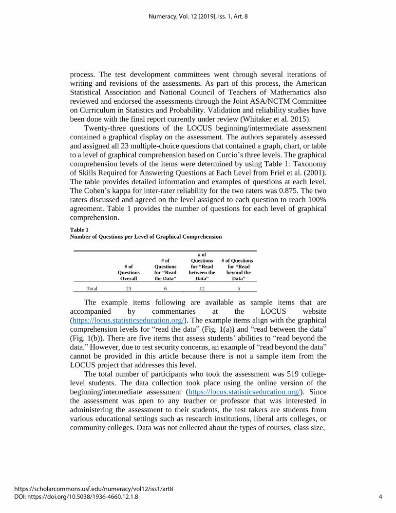
Twenty-three questions of the LOCUS beginning/intermediate assessment
contained a graphical display on the assessment. The authors separately assessed
and assigned all 23 multiple-choice questions that contained a graph, chart, or table
to a level of graphical comprehension based on Curcio’s three levels. The graphical
comprehension levels of the items were determined by using Table 1: Taxonomy
of Skills Required for Answering Questions at Each Level from Friel et al. (2001).
The table provides detailed information and examples of questions at each level.
The Cohen’s kappa for inter-rater reliability for the two raters was 0.875. The two
raters discussed and agreed on the level assigned to each question to reach 100%
agreement. Table 1 provides the number of questions for each level of graphical
comprehension.
Table 1
Number of Questions per Level of Graphical Comprehension
The example items following are available as sample items that are
accompanied by commentaries at the LOCUS website
(https://locus.statisticseducation.org/). The example items align with the graphical
comprehension levels for “read the data” (Fig. 1(a)) and “read between the data”
(Fig. 1(b)). There are five items that assess students’ abilities to “read beyond the
data.” However, due to test security concerns, an example of “read beyond the data”
cannot be provided in this article because there is not a sample item from the
LOCUS project that addresses this level.
The total number of participants who took the assessment was 519 college-
level students. The data collection took place using the online version of the
beginning/intermediate assessment (https://locus.statisticseducation.org/). Since
the assessment was open to any teacher or professor that was interested in
administering the assessment to their students, the test takers are students from
various educational settings such as research institutions, liberal arts colleges, or
community colleges. Data was not collected about the types of courses, class size,
# of
Questions
Overall
# of
Questions
for “Read
the Data”
# of
Questions
for “Read
between the
Data”
# of Questions
for “Read
beyond the
Data”
Total 23 6 12 5
4
Numeracy, Vol. 12 [2019], Iss. 1, Art. 8
https://scholarcommons.usf.edu/numeracy/vol12/iss1/art8DOI: https://doi.org/10.5038/1936-4660.12.1.8

Figure 1. Representative example of a LOCUS question categorized as Curcio’s (a) “read the data”
and (b) “read between the data”
(a) The table below shows the number (to the nearest ten thousand) of cars of different colors in
Denmark.
Color of Car Number
Silver 860,000
Black 600,000
White 370,000
All other colors 620,000
Which of the following is appropriate for representing the data in the
table above?
(A) Bar graph
(B) Scatterplot
(C) Histogram
(D) Dotplot
(b) The dotplots below show the distribution of the number of pockets on clothing for a group of 12
boys and for a group of 13 girls.
Based on the graphs, which of the following statements is true?
(A) The data vary more for the boys than for the girls.
(B) The median number of pockets for boys is larger than the median for girls.
(C) The mode for the boys and for girls is 4.
(D) The maximum number of pockets for boys is larger than the maximum number of pockets for
girls.
5
Bolch and Jacobbe: Levels of Graphical Comprehension
Published by Scholar Commons, 2019

or the teaching methods the teacher or professor used. The demographics collected
on the assessment before the student began the assessment were gender, Hispanic
or Latino background, race, and whether or not English is the most common
language spoken at home. The “typical” respondent was female, Mexican,
Mexican-American, or Chicano, self-identified their race as “other,” and English
was the most common language spoken at home. See Table 2 for the breakdown of
demographic variables for the sample. A graphical comprehension score was
calculated for each student at each graphical comprehension level as well as an
overall graphical comprehension score. A student’s response was counted as
correct if the answer given matched the answer key. If the answer did not match or
no answer was provided, then the student got the question wrong, so the question
for that student was labeled as incorrect. The graphical comprehension score at each
level (“read the data,” “read between the data,” and “read beyond the data”) was
the sum of the number of correct responses for each subscale. The overall graphical
comprehension score was the sum of the correct responses on all graphical
comprehension items. Counts, means, and percentages were recorded for the entire
sample. All statistical analyses were performed using R (R Core Team 2016).
Table 2
Demographics of the Sample
Characteristics Count Percentage
Gender
Female 334 64.35% Male 185 35.65% Hispanic or Latino Background
Not Hispanic or Latino 115 22.16%
Mexican, Mexican-American, or Chicano 270 52.02% Other 134 25.82% Race
Black or African American 62 11.95%
White 80 15.41% Other 377 72.64% Is English the most common language spoken at home?
No 185 35.65%
Yes 334 64.35%
Results
Boxplots including median graphical comprehension scores for each level and
overall are provided in Figure 2. Looking at graphical comprehension scores by
level allowed the researchers to assess whether students answered the majority of
questions correctly in “read the data,” “read between the data,” or “read beyond the
data” levels. The boxplots for “read the data” and “read between the data” levels
overlap and the median graphical comprehension scores for those two levels are
equal (1 out of 6 and 2 out of 12, respectively). The boxplots for “read the data”
and “read beyond the data” overlap as well with the median graphical
6
Numeracy, Vol. 12 [2019], Iss. 1, Art. 8
https://scholarcommons.usf.edu/numeracy/vol12/iss1/art8DOI: https://doi.org/10.5038/1936-4660.12.1.8

comprehension scores for each of those levels being similar (1 out of 6 and 1 out
of 5, respectively). The range of overall graphical comprehension scores for
students in this study was from 0 to 10 (possible range of scores is 0 to 23). A
frequency table of overall graphical comprehension scores is provided in Table 3.
Figure 2. Boxplot of median graphical comprehension scores by level
Max score for Overall is 23; max score for “read the data” is 6; max score for “read between the
data” is 12; max score for “read beyond the data” is 5.
Table 3.
Frequency Table of Overall Graphical Comprehension Scores
Overall Graphical
Comprehension Score Count
0 8
1 33
2 75
3 94
4 98
5 89
6 53
7 41
8 19
9 7
10 2
On a “read the data” question from the LOCUS assessment, less than half of
the college-level students that took the assessment answered the question correctly
(about 40% of students). The question has a frequency table with time intervals in
minutes for the amount of time it takes for a student to get to school in the morning
along with the number of students that fall into each of the time intervals out of the
sample of 51 students. The question required students to assess the histogram along
7
Bolch and Jacobbe: Levels of Graphical Comprehension
Published by Scholar Commons, 2019
with a frequency table of the data and recognize the graphical error that was made
in making the histogram. The graphical error that the students needed to recognize
in order to answer the question correctly was that the y-axis of the histogram should
not start at 10 but rather 0.
The percentage of students that incorrectly answered that histograms should
not be used with numerical data was about 21%. About 13% of students answered
that the histogram should not have been created using intervals that were the same
width, which indicates a lack of understanding in how to create a histogram from a
frequency table. Other college-level students (about 27%) answered that the
numerical variable on the x-axis should not be grouped into intervals, which
indicates that some students have difficulty with translating data from a frequency
table to a histogram.
One item on the LOCUS assessment classified as “read between the data”
provided students three dotplots for the top three scorers in a summer basketball
league. The dotplots showed the points scored in eleven games for each player. The
students were asked which statement best describes additional information about
the player’s performances based on the comparison of the dotplots. The correct
answer, chosen by about 48% of the students, described the player that had the most
variation in their scores and the player that was the least variable. The second most
selected answer, chosen by about 25% of students, was that the dotplots do not
provide any additional information. This answer choice may indicate that about
one-fourth of students in the sample are not able to make comparisons between
graphs regarding variability in distributions. Another answer option describes that
one player’s distribution of scores had a smaller median but was more variable,
which was selected by about 17% of students. This option indicates that students
struggle with understanding how medians compared to means are more stable
measures of center when a distribution has large variation or is skewed. The last
answer choice is a statement that one player always scores more points per game
than either of the other two players. This answer choice is an incorrect statement
given that the player has a few points on the dotplot below the minimum of the
other two players. About 11% of students selected this last option, which suggests
that these students had difficulties interpreting and comparing the dotplots in terms
of minimum values for the three players.
For the “read beyond the data” question, students were asked to look at a
scatterplot that showed the number of games local high school football teams won
on the y-axis and the number of points scored by the opposing football teams on
the x-axis. There was a negative association between the two variables. There is a
single point that was an outlier of the dataset that has zero games won by a football
team. The question asks what the effect would be on the association between the
two variables if this data point were removed. The majority of students did not
select the correct answer that removing the data point would weaken the association
8
Numeracy, Vol. 12 [2019], Iss. 1, Art. 8
https://scholarcommons.usf.edu/numeracy/vol12/iss1/art8DOI: https://doi.org/10.5038/1936-4660.12.1.8

between the number of games won and the total points scored (about 16% of
students answered the question correctly). About 21% of the students said that the
effect cannot be determined and about 27% of students answered that the
association would stay the same if the outlier was removed from the scatterplot.
The most common answer was that the association would become stronger between
the two variables (about 36% of students). This answer choice indicates that
college-level students struggle with predicting how an association between two
variables would change when a data point is removed. The students were more
likely to answer the question with the association changing in the opposite way.
Discussion
The results suggest that regardless of the level of graphical comprehension, college-
level students struggle on questions that contain a graphical display. Students seem
to struggle with basic “read the data” questions along with questions that require
comparisons between graphical displays. Given that the Common Core
Mathematics Standards for grades 6–12 (National Governors Association Center
for Best Practices and Council of Chief State School Officers 2010) involve only a
few standards regarding graphical comprehension, this suggests that instructors of
college-level courses should be cautious assuming students already comprehend
graphical displays based on prior learning experiences. Since students had
difficulty with “read the data” graphical comprehension questions, instructors
should not assume that students are able to read and interpret the information
presented in a graphical display. Instructors may need to change their instruction
for mathematics and statistics at the college level to review basic concepts of
graphical displays. For example, instructors may need to review concepts such as
how to create graphical displays from a table, the difference between the various
displays, or what type of data uses a bar chart compared to a histogram. Instructors
also may need to focus their instruction on comparing different graphical displays
and teaching students about making correct predictions or inferences from a
graphical display. To teach those higher-level concepts, students first need to be
able to read the data presented in a graph or table.
The results of this study highlight the importance of incorporating both
graphical comprehension skills and data visualization skills into the introductory
statistics curriculum. The term data visualization is a more recent term that
developed to encompass graphical displays that are used for complex datasets and
are sometimes interactive. During the literature review search for this article, the
term graphical comprehension was used rather than data visualization, likely due
to the advances in technology of the past ten years. There is a potential shift in the
statistics curriculum moving from graphical comprehension with Curcio’s
9
Bolch and Jacobbe: Levels of Graphical Comprehension
Published by Scholar Commons, 2019
foundational definition to data visualization skills with an emphasis on data science
literacy.
Technological advances have had a universal impact on the ability of various
industries and research fields to collect, store, visualize, and analyze large amounts
of data (Forbes et al. 2014). As a result, data visualization tools have developed
over the past ten years to present complex data and information in a succinct way
to foster data interpretation in order to discover new relationships or patterns (Keim
et al. 2010; Forbes et al. 2014; Mirel et al. 2016). Data visualizations facilitate
communication and exploration of the statistical information that saturates daily
life (Koparan and Güven 2015; Philip et al. 2016). Data visualizations also build
upon traditional graphical displays like the histogram by presenting data in a way
that makes the data stand out, provides comparisons between multiple variables or
subgroups, may allow the user to interact with the graphic or use words or pictures
to create infographics (Nolan and Perrett 2016). Data visualization skills involve
what currently have been labeled as information literacy and data literacy practices
(Philip et al. 2016). Information literacy involves identifying the need for
information, understanding how to access the information, critically evaluating the
validity and quality of information, identifying the purpose for the information, and
understanding the social, legal, and economic policies and possible consequences
of using the information (Philip et al. 2016). Data literacy is a part of information
literacy that involves understanding how to use data and the appropriate data
representations to support evidence-based thinking that aims to communicate
solutions to authentic problems (Calzada Prado and Marzal Miguel 2013; Vahey et
al. 2012).
In regards to teaching students about graphical comprehension and data
visualization, educators’ time might be well spent helping students anticipate how
raw information and data will be displayed, what type of data visualization would
work best to answer the question of interest, and what modifications may need to
be made to the raw data or data visualization to achieve the end result of a clear and
concise visualization. One way that educators can improve student graphical
comprehension is by applying these concepts to open source data sets that may be
of interest to students such as Netflix recommendations, Twitter hashtags, baseball
statistics, or marketing information from popular clothing stores. Using data
visualization tools, educators can assist students in learning about the different
types of data, the purpose of creating graphs, why certain data visualizations are
used for certain data types, and how they can judge which visualizations are more
useful given the type of data and the purpose of the analysis. In taking this approach
to teaching data visualization by incorporating information and data literacy skills,
students will hopefully be able to understand the three levels of graphical
comprehension in terms of reading information from the graphical display,
10
Numeracy, Vol. 12 [2019], Iss. 1, Art. 8
https://scholarcommons.usf.edu/numeracy/vol12/iss1/art8DOI: https://doi.org/10.5038/1936-4660.12.1.8
understanding comparisons between graphical displays, and generalizing,
predicting, and identifying trends from graphical displays.
One limitation of this study is that the LOCUS assessments were not created
with Curcio’s levels of graphical comprehension in mind, so there was not a
balanced number of questions within each level. Since the students answered the
graphical comprehension questions while completing the entire assessment rather
than only the questions that contained a graphical display, this factor may or may
not have influenced their overall graphical comprehension score. Also, the LOCUS
beginning/intermediate assessment was provided as an online resource for any
teacher or professor to use, meaning that information about the institution and the
course was not collected. Future research about data visualization and graphical
comprehension could be done involving a pre-test/post-test study that includes a
specific intervention including teaching students about data visualizations. In
addition, the intervention could focus on creating data visualizations using previous
research about common graphical comprehension errors in order address those
common misconceptions. Then, the pre-test/post-test study could involve a task that
requires students to create a graphical display. This change would allow researchers
to understand how students learned or did not learn how to address common errors
when creating graphical displays.
Conclusion
It should not be assumed that college-level students have a solid understanding of
graphical comprehension skills. Statistics education research needs to focus on
defining how learning graphical comprehension and data visualization skills can be
incorporated into introductory statistics courses. Instructors should be encouraged
to incorporate more graphical comprehension at all three levels into their statistics
courses along with data visualizations. These graphical comprehension skills can
benefit students’ ability to read information in the media. The skills taught can
improve students’ ability to read and understand what is presented to them in the
data visualizations used in online magazine articles or other media sources. The
students will also be able to question the types of statements made and understand
when the media is misinterpreting a visualization. Instructors should not assume
that students in their introductory statistics course(s) understand how to “read the
data,” “read between the data,” or “read beyond the data” from their high school
courses.
The first few chapters of introductory statistics textbooks usually focus on how
to create and read graphical displays involving quantitative and categorical data.
Instructors might consider spending adequate time on these chapters to make sure
that their students can master the first level of graphical comprehension (“read the
data”) before moving on in the course to comparing distributions and making
11
Bolch and Jacobbe: Levels of Graphical Comprehension
Published by Scholar Commons, 2019

informal inferences, which are components of “read between the data” and “read
beyond the data.” Building a solid foundation of graphical comprehension skills
starting with the “read the data” level allows students to develop statistical literacy
skills that will benefit them in their everyday lives.
Acknowledgments
Thank you to all the LOCUS study participants and the LOCUS project team.
References
Ben-Zvi, Dani, and Joan Garfield. 1997. “Statistical Literacy, Reasoning, and
Thinking: Goals, Definitions, and Challenges” In The Assessment Challenge
in Statistics Education, edited by Iddo Gal and Joan Garfield, 3–15.
Amsterdam, Netherlands: IOS Press and the International Statistical Institute.
Boote, Stacy K. 2014. “Assessing and Understanding Line Graph Interpretations
Using a Scoring Rubric of Organized Cited Factors.” Journal of Science
Teacher Education 25(3): 333–354. doi: http://dx.doi.org/10.1007/s10972-
012-9318-8.
Bright, George W., and Susan N. Friel. 1998. “Graphical Representations:
Helping Students Interpret Data.” In Reflections on Statistics: Learning,
Teaching, and Assessment in Grades K–12, edited by Susanne P. Lajoie, 63–
88. Mahwah, New Jersey: Lawrence Erlbaum Associates.
Calzada Prado, Javier, and Ángel Marzal Miguel. 2013. “Incorporating Data
Literacy into Information Literacy Programs: Core Competencies and
Contents. ” Libri 63(2): 123-134. https://doi.org/10.1515/libri-2013-0010.
Cooper, Linda L., and Felice S. Shore. 2010. “The Effects of Data and Graph
Type on Concepts and Visualizations of Variability.” Journal of Statistics
Education 18(2): 1–16. https://doi.org/10.1080/10691898.2010.11889487.
Curcio, Frances R. 1987. “Comprehension of Mathematical Relationships
Expressed in Graphs.” Journal for Research in Mathematics Education
18(5): 382–393. https://doi.org/10.2307/749086.
Espinel Febles, Maria C., and Jose C. Carrion Perez. 2006. “An Investigation
about Translation and Interpretation of Statistical Graphs and Tables by
Students of Primary Education.” Seventh International Conference on
Teaching Statistics, Salvador, Bahia, Brazil.
Forbes, Sharleen, Jeanette Chapman, John Harraway, Doug Stirling, and Chris
Wild. 2014. “Use of Data Visualizations in the Teaching of Statistics: A New
Zealand Perspective.” Statistics Education Research Journal 13(2) :187–201.
Friel, Susan N., Frances R. Curcio, and George W. Bright. 2001. “Making Sense
of Graphs: Critical Factors Influencing Comprehension and Instructional
12
Numeracy, Vol. 12 [2019], Iss. 1, Art. 8
https://scholarcommons.usf.edu/numeracy/vol12/iss1/art8DOI: https://doi.org/10.5038/1936-4660.12.1.8

Implications.” Journal for Research in Mathematics Education 32(2): 124–
158. https://doi.org/10.2307/749671.
GAISE College Report ASA Revision Committee. 2016. “Guidelines for
Assessment and Instruction in Statistics Education College Report 2016,”
http://www.amstat.org/education/gaise.
Gal, Iddo. 2004. “Statistical Literacy: Meanings, Components, Responsibilities.”
In The Challenge of Developing Statistical Literacy, Reasoning, and
Thinking, edited by Joan Garfield and Dani Ben-Zvi, 47–78. The
Netherlands: Kluwer Academic Publishers. https://doi.org/10.1007/1-4020-
2278-6_3.
Jacobbe, Timothy, Catherine Case, Douglas Whitaker, and Steve Foti. 2014.
“Establishing The Validity of LOCUS Assessments Through An Evidenced-
Centered Design Approach.” Ninth International Conference on Teaching
Statistics Flagstaff, Arizona.
Jolliffe, Flavia R. 1991. “Assessment of the Understanding of Statistical
Concepts.” In Proceedings of the Third International Conference on
Teaching Statistics, edited by D. Vere-Jones, 461–466. Voorburg, The
Netherlands: International Statistical Institute.
Keim, Daniel A., Jörn Kohlammer, Florian Mansmann, Thorsten May, and Franz
Wanner. 2010. “Visual Analytics.” In Mastering the Information Age:
Solving Problems with Visual Analytics, edited by Daniel A. Keim, Jörn
Kohlhammer, and Geoffrey Ellis. Goslar: Eurographics Association.
http://citeseerx.ist.psu.edu/viewdoc/summary?doi=10.1.1.363.2661.
Kemp, Marian, and Barry Kissane. 2010. “A Five Step Framework for
Interpreting Tables and Graphs in Their Contexts.” Eighth International
Conference on Teaching Statistics, Ljubljana, Slovenia.
Koparan, Timur, and Bülent Güven. 2015. “The Effect of Project-Based Learning
on Students’ Statistical Literacy Levels for Data Representation.”
International Journal of Mathematical Education in Science & Technology
46(5): 658–686. https://doi.org/10.1080/0020739X.2014.995242.
Kosslyn, Stephen M. 1985. “Graphics and Human Information Processing: A
Review of Five Books.” Journal of the American Statistical Association
80(391): 499–512. https://doi.org/10.1080/01621459.1985.10478147.
Lem, Stephanie, Goya Kempen, Eva Ceulemans, Patrick Onghena, Lieven
Verschaffel, and Wim Van Dooren. 2015. “Combining Multiple External
Representations and Refutational Text: An Intervention on Learning to
Interpret Box Plots.” International Journal of Science and Mathematics
Education 13(4): 909–926. https://doi.org/10.1007/s10763-014-9604-3.
Lowrie, Tom, Carmel M. Diezmann, and Tracy Logan. 2012. “A Framework for
Mathematics Graphical Tasks: The Influence of the Graphic Element on
13
Bolch and Jacobbe: Levels of Graphical Comprehension
Published by Scholar Commons, 2019
Student Sense Making.” Mathematics Education Research Journal 24(2):
169–187. https://doi.org/10.1007/s13394-012-0036-5.
Mirel, Barbara, Anuj Kumar, Paige Nong, Gang Su, and Fan Meng. 2016. “Using
Interactive Data Visualizations for Exploratory Analysis in Undergraduate
Genomics Coursework: Field Study Findings and Guidelines.” Journal of
Science Education and Technology 25: 91–110.
https://doi.org/10.1007/s10956-015-9579-z.
National Governors Association Center for Best Practices and Council of Chief
State School Officers. 2010. Common Core State Standards for Mathematics.
National Governors Association Center for Best Practices, Council of Chief
State School Officers, Washington, D.C.
Nicolaou, Christiana T., Iolie A. Nicolaidou, Zacharias C. Zacharia, and
Constantinos P. Constantinou. 2007. “Enhancing Fourth Graders’ Ability to
Interpret Graphical Representations Through the Use of Microcomputer-
Based Labs Implemented Within an Inquiry-Based Activity Sequence.” The
Journal of Computers in Mathematics and Science Teaching 26(1): 75–99.
Nolan, Deborah, and Jamis Perrett. 2016. “Teaching and Learning Data
Visualization: Ideas and Assignments.” American Statistician 70(3): 260–
269. https://doi.org/10.1080/00031305.2015.1123651.
Pfannkuch, Maxine. 2006. “Comparing Box Plot Distributions: A Teacher’s
Reasoning.” Statistics Education Research Journal 5(2): 27–45.
Pfannkuch, Maxine, and Chris Wild. 2004. “Towards An Understanding of
Statistical Thinking.” In The Challenge of Developing Statistical Literacy,
Reasoning and Thinking, edited by Dani Ben-Zvi and Joan Garfield, 17–46.
Dordrecht, Netherlands: Kluwer Academic Publishers.
https://doi.org/10.1007/1-4020-2278-6_2.
Philip, Thomas M., Maria C. Olivares-Pasillas, and Janet Rocha. 2016.
“Becoming Racially Literate About Data and Data-Literate About Race: Data
Visualizations in the Classroom as a Site of Racial-Ideological Micro-
Contestations.” Cognition & Instruction 34(4): 361–388.
https://doi.org/10.1080/07370008.2016.1210418.
R Core Team (2014). “R: A Language and Environment for Statistical
Computing.” R Foundation for Statistical Computing, Vienna, Austria.
http://www.R-project.org/.
Riconscente, M. M., R. J. Mislevy, and S. Corrigan. 2015. “Evidence-Centered
Design.” In Handbook of Test Development, edited by S. Lane, M. Raymond,
and T. Haladyna, 40–63. London, UK: Routledge.
Rossman, Allan, E. J. Dietz, and David Moore. 2013. Interview with David
Moore, edited by Allan Rossman, E. J. Dietz, and David Moore. Journal of
Statistics Education 21(2): 1-18.
14
Numeracy, Vol. 12 [2019], Iss. 1, Art. 8
https://scholarcommons.usf.edu/numeracy/vol12/iss1/art8DOI: https://doi.org/10.5038/1936-4660.12.1.8

Selva, Ana, and Izauriana Lima. 2010. “Youth And Adults Students Interpreting
Bar And Line Graphs.” Eighth International Conference On Teaching
Statistics, Ljubljana, Slovenia.
Shah, Priti, and James Hoeffner. 2002. “Review of Graph Comprehension
Research: Implications for Instruction.” Educational Psychology Review
14(1): 47–69. https://doi.org/10.1023/A:1013180410169.
Tufte, Edward R. 1997. Visual Explanations: Images and Quantities, Evidence
and Narrative: Graphics Press.
Vahey, Philip, Ken Rafanan, Charles Patton, Karen Swan, Mark van ‘t Hooft,
Annette Kratcoski, and Tina Stanford. 2012. “A Cross-disciplinary Approach
to Teaching Data Literacy and Proportionality.” Educational Studies in
Mathematics 81(2): 179–205. https://doi.org/10.1007/s10649-012-9392-z.
Whitaker, Douglas, Steve Foti, and Tim Jacobbe. 2015. “The Levels of
Conceptual Understanding in Statistics (LOCUS) Project: Results of the Pilot
Study.” Numeracy 8(2): Article 3. https://doi.org/10.5038/1936-4660.8.2.3.
Wood, R. 1968. “Objectives in the Teaching of Mathematics.” Educational
Research 10(2): 83–98. https://doi.org/10.1080/0013188680100201.
15
Bolch and Jacobbe: Levels of Graphical Comprehension
Published by Scholar Commons, 2019