introduction - transferware collectors club introduction for most of the 19th century, millions upon...
TRANSCRIPT

2
Introduction For most of the 19th century, millions upon millions of items of
transfer-printed earthenware made in British factories were exported to
virtually every corner of the planet. In terms of sheer bulk, probably the
country which imported more than any other was the United States. There
were a number of other ‘hot spots’ around the world, though only recently
has it become clear that one of these regions was South-East Asia.
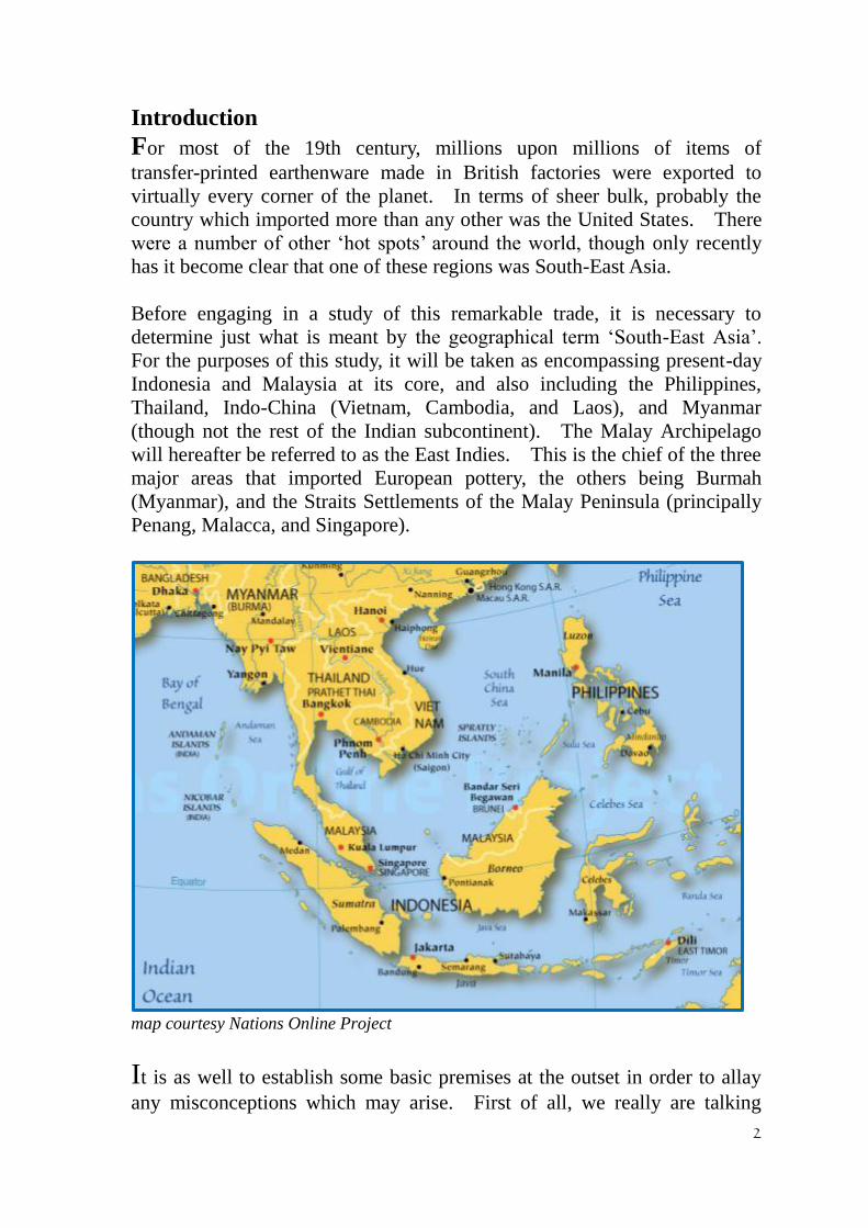
Before engaging in a study of this remarkable trade, it is necessary to
determine just what is meant by the geographical term ‘South-East Asia’.
For the purposes of this study, it will be taken as encompassing present-day
Indonesia and Malaysia at its core, and also including the Philippines,
Thailand, Indo-China (Vietnam, Cambodia, and Laos), and Myanmar
(though not the rest of the Indian subcontinent). The Malay Archipelago
will hereafter be referred to as the East Indies. This is the chief of the three
major areas that imported European pottery, the others being Burmah
(Myanmar), and the Straits Settlements of the Malay Peninsula (principally
Penang, Malacca, and Singapore).
map courtesy Nations Online Project
It is as well to establish some basic premises at the outset in order to allay
any misconceptions which may arise. First of all, we really are talking

3
about Western ceramics being exported to a part of the world previously
dominated by the potteries of China, and, to a lesser extent, some other
countries of the region. A reversal of the centuries-long flow of ceramics
from East to West is surprising enough; what makes it remarkable is that it
depended, to an extent at least, on utilising two Oriental artistic traditions.
One was Chinoiserie, essentially the Westernisation of Chinese motifs
designed for Western consumption, and the other was the wholesale
adoption of Chinese compositions virtually intact, for re-export back out
Easti It must also be borne in mind that the height of this trade took place in
the 1870-1910 period.
Another important fact is that the great majority of such wares were made
for the mass markets provided by the native populations of these countries,
not for the expatriate communities living there. This can be established in
a number of ways: (i) the quantity of wares involved was quite enormous,
judging by what remains a century and more after the trade was at its peak;
(ii) many of the designs are far too busy, even frenetic, to appeal to Western
taste; (iii) quite a number of the pattern names are rendered not in English
but in the Malay language, and some in Hokkien Chinese; (iv) inscriptions
occasionally appear in Eastern writing such as Javanese, Arabic, Chinese,
and Lontara; and (v) makers’ marks sometimes incorporate Eastern scripts
like Jawi (Malay Arabic), Javanese, Burmese, and Chinese. For an
example of a mark which includes both (iii) and (v), see Figure 1.below.
Figure 1 A highly informative mark by Bell’s Pottery,
Glasgow. It shows:
(i) Bell’s standard trade mark of a bell in a belt and
buckle, introduced about 1870
(ii) the initials “J&MPB” for the proprietors, brothers
John and Matthew Perston Bell;
(iii) “Ld” following “& Co”, indicating a date post
1880
(iv) “Glasgow” on a ribbon, showing the place of
manufacture;
(v) the pattern’s Design Registration number, 102258,
issued on 20th
June 1888;
(vi) the pattern name, Tarlalu Bagus (Malay, meaning ‘Exceedingly Good’)
(vii) the pattern name repeated in Jawi script (Malay Arabic)
There is also an impressed B in a bell, large size, which is Bell’s standard impressed
mark on export wares to the East Indies.
An obvious question immediately arises, and that is — why? Why there,
and why then? The answer is complex and multi-faceted, and not easily
determined, but it would seem to reflect a fundamental change in the
mercantile life of the region. For centuries, several of its constituent

4
countries had been producing pottery of merit. One of the premier nations
was Siam, with notable centres at Sukhothai and Sawankalok; others also
made their mark, with some of the Khmer and Vietnamese wares reaching
high standards. Above all there was China, whose wares circulated
throughout South-East Asia in large numbers. Then in the mid-19th century
the ceramic balance of power changed dramatically. In China, the Qing
dynasty went into a state of terminal decline, and many of the kiln sites were
destroyed by the civil war. No longer were Chinese ceramics exported as
before, and production in the other nations of that part of the world likewise
slumped. Meantime, in Europe, a number of large factories were gearing
up for mass production on a huge scale, and suddenly the South-East Asian
market was opened up to them, and they readily moved in to fill the vacuum
left by China.
This account is undoubtedly too simplistic to be properly regarded as
providing the complete answer, but it serves at least to indicate one of the
major planks upon which the success of the European potteries was based.
There were three main centres of production:
(i) Staffordshire in central England, centred on Stoke-upon-Trent;
(ii) the central belt of Scotland, with Glasgow as the principal city;
(iii) the ‘Belgian circle’, a ring of potteries in and around Belgium with a
number lying in France and Germany, chief among them being those of
Maastricht in Holland. The traditional Dutch pottery towns, such as Delft,
were by now past their prime, and it was Maastricht which was the coming
power in the Dutch and European ceramics industry.
Despite Holland’s possession of the East Indies, a considerable part of the
region was within the British Empire, and so it is no surprise to find
Staffordshire (and some other places of production in England) making a
showing. If there is a surprise, then it must be Scotland, for not only did it
play its part, but it came to prominence before the others, and then went on
to secure a position of something approaching dominance. In terms of
novelty of design, inventiveness of production, and sheer marketing acumen,
the potteries of Scotland, particularly some of those in Glasgow, achieved a
rare level of distinction in the field of world ceramic production.
Overview of Ceramics exported from Europe to South-East Asia
The type of industrially-produced ceramics exported from Europe to
South-East Asia consisted almost exclusively of white earthenware; there
was some porcelain, and also a little stoneware, but the quantities involved
were inconsequential. Two methods of decoration were used to embellish
the white earthenware — one was transfer printing, and the other was hand
5
decoration in a variety of forms, including painting, sponge printing, and
stenciling, sometimes in combination. As might be expected, the principal
method was transfer printing, which accounted for the majority of items.
As this trade did not get under way for well over a century after the Treaty of
Union of 1707 between Scotland and England, it is politically correct to use
the term ‘British’. It is also an established fact that during the early period
of the Scottish pottery industry (the decades following 1750), it was highly
dependent on incoming skilled English workers. So should export
production from Britain be regarded as the combined output of the English
and Scottish potteries, or should they be kept separate? An argument can
be made for the latter, for as the 19th century wore on, the ceramic industry
in Scotland became much more self-sufficient and self-confident, no longer
dependent upon English expertise. The Scottish workforce demonstrated
an aptitude to learn new skills, to adapt them to its own needs, and
ultimately to realize its potential for inventiveness.ii Nowhere is this more
evident than in the production of transfer ware for export to South-East Asia.
As a consequence, it may be recognized that a total of six European
countries and Japan engaged in this trade.
England can claim the distinction of supporting more potteries involved in
the South-East Asian trade than any other European country, and not all of
them were in Staffordshire, yet only two were major-league players:
Adams of Tunstall for the East Indies, and Johnson Bros. of Hanley for
Burmah and the Straits Settlements. In contrast to that is the case of
Scotland; although fewer potteries were involved, several were of major
importance, including some at the highest level: J&MP Bell and Robert
Cochran & Co. (Britannia Pottery), both of Glasgow, for the East Indies; and
Bell (again) and Robert Cochran & Co. (Verreville Pottery) for Burmah,
with some others like David Methven of the Links Pottery in Kirkcaldy
making a significant contribution in both places. Clearly Staffordshire had
the potential to dominate this trade, and it is something of a mystery why it
failed to do so. A shift in its export priorities to nations like Greece and
Russia might be part of the answer.
British Pottery for South-East Asia
One of the most intriguing factors in the production of goods for the
South-East Asian market was that this was by no means a case of large
quantities of mass-produced European wares simply being dumped on
overseas colonies. It is true that quite a number of familiar patterns, were
exported in significant amounts — Willow, Wild Rose, and Oriental provide
three such examples. While it would be a mistake to deny the importance
6
of this element of the trade that is not what makes it so special. Rather, it is
the blue-sky thinking of those pottery proprietors who had the vision to see
the tremendous opportunity afforded to them, the courage to grasp it, and the
entrepreneurship to see it through to fruition. This could only be achieved
by departing from the norm and developing a range of patterns which were
novel in terms both of their design and their execution, the crucial ingredient
in the mix being to make them attractive and desirable to the native
populations in the countries to which they were being sent. Scottish
potteries led the field in this endeavour. In the furtherance of this
commercial imperative, the use of pattern names in Eastern tongues was a
shrewd marketing tactic. Bell of Glasgow produced at least a dozen in
Malay, while Adams of Tunstall had two in Malay and another four in
Hokkien Chinese. Going a step further was to render some of the pattern
names in Eastern scripts as well. Bell did this in Jawi (Malay Arabic) for
seven patterns, plus one in Burmese; Johnson of Hanley employed the
names of at least five Burmese folk heroes, wholly unconnected with the
nondescript patterns with which they were linked; while Methven of
Kirkcaldy in Fife incorporated a motto in Javanese into at least four of their
marks.
The emphasis of these new transfer designs moved from the Chinese/
Chinoiserie mode to something quite different, combining more localised
subject matter and art-forms in a way which was more relevant and
meaningful to the peoples of the region. A multiplicity of dragons, a weird
menagerie of fabulous beasts and birds, and a cornucopia of exotic fruits
now spilled forth from a number of European potteries and swept across the
oceans to amaze and delight the native populations of South-East Asia.
Their effect was enhanced by the stunning use of dual-colour printing. The
technique was not exactly novel, having been used, for example, by
Davenport of Longport earlier in the 19th century, by Enoch Wood & Sons
of Burslem (181846), and by W. Smith & Co. of the South Stockton
Pottery from 1842 if not earlier. William Adams & Sons of Stoke was
another exponent; their products may be dated to the period 182961, most
probably to the earlier part of that span for the majority. Five different
colours (black, blue, green, pink, and purple) were used in at least half a
dozen paired combinations, utilizing seven patternsiii
but none have the
slightest appearance of being intended as export wares (and doubtless
predate their East Indies venture). Most are of Romantic landscapes, plus
others like Caledonia reflecting the wild scenery of the Scottish Highlands,
and Palestine depicting a view of the Middle East. There is little common
ground between these patterns and the bulk of those dual-colour prints
produced later for the South-East Asian market. In terms of the latter,
standing head and shoulders clear of the competition, was the Glasgow
Pottery of J&MP Bell & Co. Ld.

7
Figure 2 Plate printed with the Borneo pattern by Bell’s Pottery,
Glasgow, a registered design of 1890 (No.149158). It shows frenetic
activity involving a dragon and a phoenix.

8
It would seem that in the major area of the East Indies, it was the dual-colour
printing which was the first of the novel practices to be employed by Bell’s
Pottery. Apparently starting with some Chinoiserie patterns such as Willow
and Chusan, they then went on to apply it to geometric patterns like
Amboina and Sexagon, before unleashing it with gay abandon on a host of
breath-taking patterns. The combination of twin colours with shock-and-awe
content produced a startling effect, which no doubt propelled Bell’s wares to
the top position in terms of the market share of this new trade. Patterns like
Borneo (see Figure 2) and Keeling Hong (see later) generate an excitement
factor which is seldom experienced in the world of industrial ceramics.
Bell’s Pottery was clearly aware the success they were generating, and
between 1887 and 1892, in just half a dozen years, they registered a
staggering total of 25 patterns for the East Indies trade, and they added five
more over the next 15 years. Their standard range of single colours was
fairly limited: strong blue, dark red, dark green, and a brown closer to russet
than sepia. The dual-colour combinations (indicated here by a linking
ampersand without spaces, rather than by a conjunction) were likewise
restricted, usually red & blue or red & green, plus the reverse of both,
though occasionally utilising less usual colours such as gray and dark
yellow.
Dual-colour printing now accounted for a major proportion of all transfer
ware exported from Britain to the East Indies. Bell’s Pottery was the
acknowledged leader, but it was not alone. Adams of Tunstall also
produced similar wares if on a much lesser scale, and they occasionally
employed different colour combinations, such as blue & brown. Robert
Cochran & Co. did likewise at their two Glasgow potteries, Verreville and
Britannia. It should be noted that the technique was also employed by the
mighty Sphinx Pottery of Petrus Regout in Maastricht, though they seem to
have experienced some technical difficulties in controlling the
differently-coloured “inks” in a single firing. Although not to the same
extent, Burmah was also the recipient of some dual-coloured transfer-printed
wares, almost all from Scotland. Again Bell’s Pottery assumed the lead
role, most notably with the hugely-popular Pegu pattern, while Cochran’s
Verreville Pottery and Methven of Kirkcaldy made similar products; one
also came from England, produced by the Dale Hall Pottery in Burslem.
The Burmese trade seems to have got under way in earnest a little earlier
than that to the East Indies, though the wares sent by the likes of Thomas
9
Shirley & Co. of Greenock were simply European products shipped halfway
around the world. Two other potteries earned distinctions for their
transfer-printed exports to Burmah. One was David Lockhart of the
Victoria Pottery at Pollockshaws just outside Glasgow, with an extensive
series of patterns, enhanced by colourful painted decoration; most of them
were European in style, but some examples, such as Watercarrier (see later),
were reflective of Burmese society. The other was Johnson Bros. Pottery at
Hanley, whose formal patterns were often enhanced by sayings written in
Burmese; even some of the pattern names were rendered in Burmese script
as well as in English. A dominant element in the overall trade to Burmah
was the production of earthenware with flow-blue decoration, and while this
was almost exclusively hand applied, by brush or sponge, the occasional
piece was transfer-printed, for instance by John Marshall of Bo’ness Pottery
in West Lothian. Very much out on its own was a curiously formal and
formulaic set of floral patterns made for the Malay Straits Settlements by a
number of English factories; Johnson Bros. were dominant among them, and
registered four of these patterns.
The above is a broad overview of the subject, though it does not constitute
more than a brief summary of the available evidence. Rather than continue
in generalisations, it might be instructive at this point to consider three
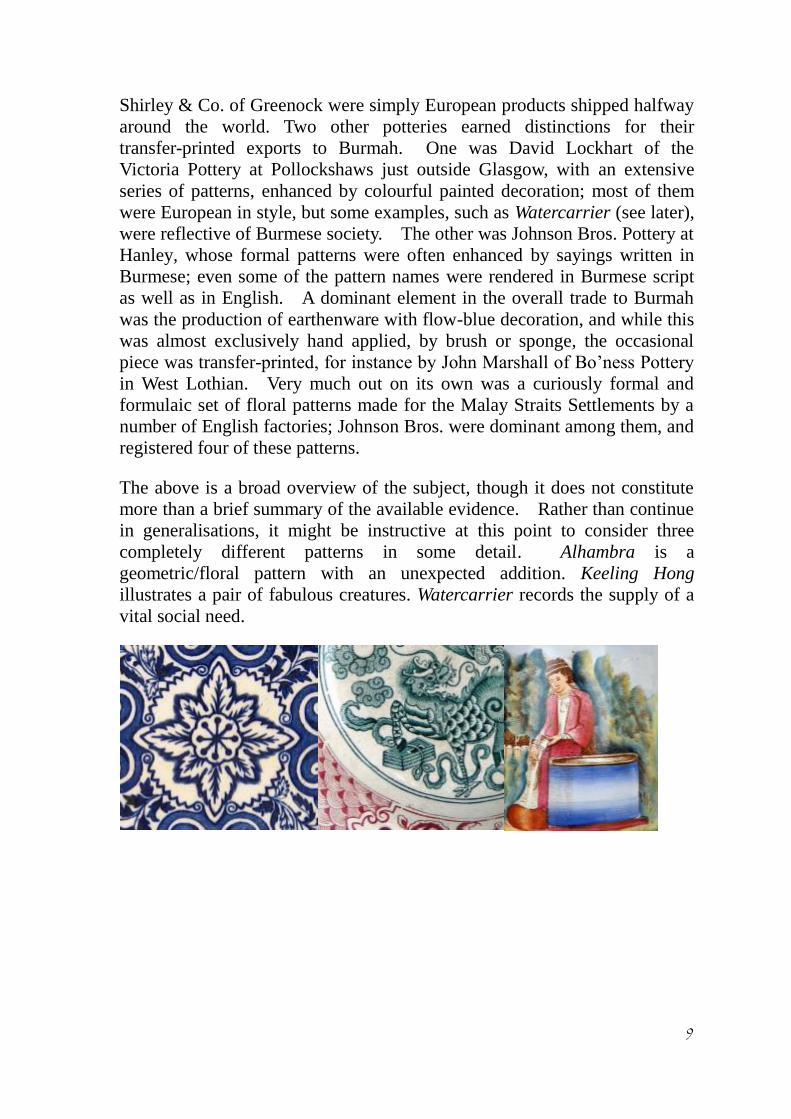
completely different patterns in some detail. Alhambra is a
geometric/floral pattern with an unexpected addition. Keeling Hong
illustrates a pair of fabulous creatures. Watercarrier records the supply of a
vital social need.

10
Alhambra
This pattern derived its name from what is generally reckoned to be the
most outstanding architectural survivor of the Moorish occupation of Spain.
It is a combined palace and fortress, situated on a hill overlooking Granada.
The name comes from the Arabic for ‘the red one’, being a contraction of
Calat Alhambra meaning ‘the red fortress’, a reference to the red brick used
in the construction of its outer walls. The building of the Alhambra took
over a century; begun in 1248, it was not completed until about 1354.
Today, only remnants of its former glory remain, including the main
entrance gateway: the so-called Gate of Judgment, because an informal court
of justice met in the massive square tower which surmounts the gateway.
Not surprisingly, the Alhambra was to become a source of artistic
inspiration. A key element in this process was The Arabian Antiquities of
Spain by James Murphy, published in London in 1815. According to the
Introduction, it took Murphy seven years to record the details of selected
buildings (180209), and nearly seven more to prepare the work for
publication. The great majority of its 97 Plates show the Alhambra,
concentrating on the intricacies of internal decoration of several of its
principal structures.
Details of plates in The Arabian Antiquities of Spain.
Murphy’s book proved to be highly influential, ceramics being one of the
artistic fields to benefit, and it led directly to the creation of the ‘Alhambra
jug’, produced by Ridgway & Abingdon of the Church Bank Pottery,
Hanley, in 1845. The ornament might well be taken from the wall
decoration in the Tower of Comares and/or the Golden Saloon. Its every

11
detail was scrutinised by the Art-Union Journal and commented upon with
their characteristic candour: “The whole of the design is traceable to the
work mentioned, though it would be exceedingly difficult to detect an
unaltered plagiarism; it is more the spirit than the letter which has been
copied, and, after all, this is the only legitimate mode of copying” iv. The
same sentiments might equally apply when it came to the creation of an
Alhambra-inspired transfer print.
The arch of the Gate of Judgment, and also some of the internal architecture
of the Alhambra (the colonnade in the Hall of the Baths, for instance), finds
an echo in the main element of the Alhambra transfer-printed pattern, a
Figure 3 Plate printed with the Alhambra pattern, made by at least six
British potteries for export (five from Scotland to the East Indies, and one
from England to Turkey and beyond).
12
round-headed arch of crescentic shape, i.e. slightly more than semicircular
(See Figure 3). This print proved popular with a number of British potteries,
though this does not necessarily mean that it was all that popular with British
customers, and the evidence suggests that a large proportion of the wares
went for export. Although it is unusual, it is not one of those patterns
which could only have been produced with the South-East Asian market in
mind ~ yet that is where a great many pieces were sent. Which factory first
made it is a moot point; the style of makers’ marks may be of assistance with
dating. The producers which have been recorded so far are considered here
in alphabetical order. All were engaged in the export trade, and the
majority of them are known to have shipped this pattern to the East Indies.
(Note — This list should not be regarded as being exhaustive.)
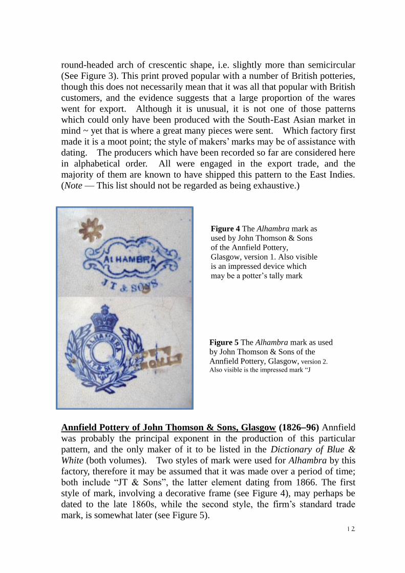
Annfield Pottery of John Thomson & Sons, Glasgow (182696) Annfield
was probably the principal exponent in the production of this particular
pattern, and the only maker of it to be listed in the Dictionary of Blue &
White (both volumes). Two styles of mark were used for Alhambra by this
factory, therefore it may be assumed that it was made over a period of time;
both include “JT & Sons”, the latter element dating from 1866. The first
style of mark, involving a decorative frame (see Figure 4), may perhaps be
dated to the late 1860s, while the second style, the firm’s standard trade
mark, is somewhat later (see Figure 5).
Figure 4 The Alhambra mark as
used by John Thomson & Sons
of the Annfield Pottery,
Glasgow, version 1. Also visible
is an impressed device which
may be a potter’s tally mark
Figure 5 The Alhambra mark as used
by John Thomson & Sons of the
Annfield Pottery, Glasgow, version 2.
Also visible is the impressed mark “J
Thomson & Sons”, though it is inverted in

13
Britannia Pottery of Robert Cochran & Co., Glasgow (18561935)
Marks feature a picture of Britannia though without the Pottery name.
The Alhambra style of mark is the earliest of the Britannia series, being
registered under the Trade Marks Registration Act of 1875, but was probably
in use from the start. It shows a seated figure of Britannia holding a trident
and Union Jack shield; the Imperial lion is in close attendance, while
behind there appears (faintly) a ship under full sail, representing Commerce
(see Figure 6). The same mark was re-registered in 1889 and used on the
vast bulk of items made for the home market throughout the tenure of Robert
Cochran & Co. at the Britannia Pottery, but it seems to have gone out of use
fairly quickly on East Indies export goods. As five different versions were
used on such wares before the end of the century, this one is unlikely to have
remained in vogue for much longer than a
decade, approximately 185666.
Figure 6 The registered trade mark of the
Britannia Pottery, Glasgow (No.86480).
Reproduced from the Trades Marks Journal.
British Anchor Pottery of Malkin, Walker & Hulse, Longton 1858-83
After 1853 it became a Limited company; this partnership, which was the
founding one, ceased in 1864. Recorded examples of this pattern do not
give it a name. It is associated with a registered design of 1864, the final
year of operation of this partnership. (See later for a discussion of its
marks.)
Clyde Pottery, Greenock (18161905)
Their Alhambra pattern is marked “C.P.Co.”, which dates it to the period
18631900. The style of mark is the same as that of the earlier Annfield
example, and therefore probably dates from the first decade of this phase of
the Pottery’s production. The printing is unusually strong for what is a
fairly complex pattern.
14
Glasgow Pottery of J&MP Bell (1841/2ca.1912)
Known examples of Alhambra carry the fourth-phase Bell’s mark i.e. the
firm’s standard trade mark of a bell inside a belt and buckle (as in Figure 1),
small size, which was introduced around 1870. It is here lacking the
addition of “Ld.” to “& Co.” and therefore predates 1881.
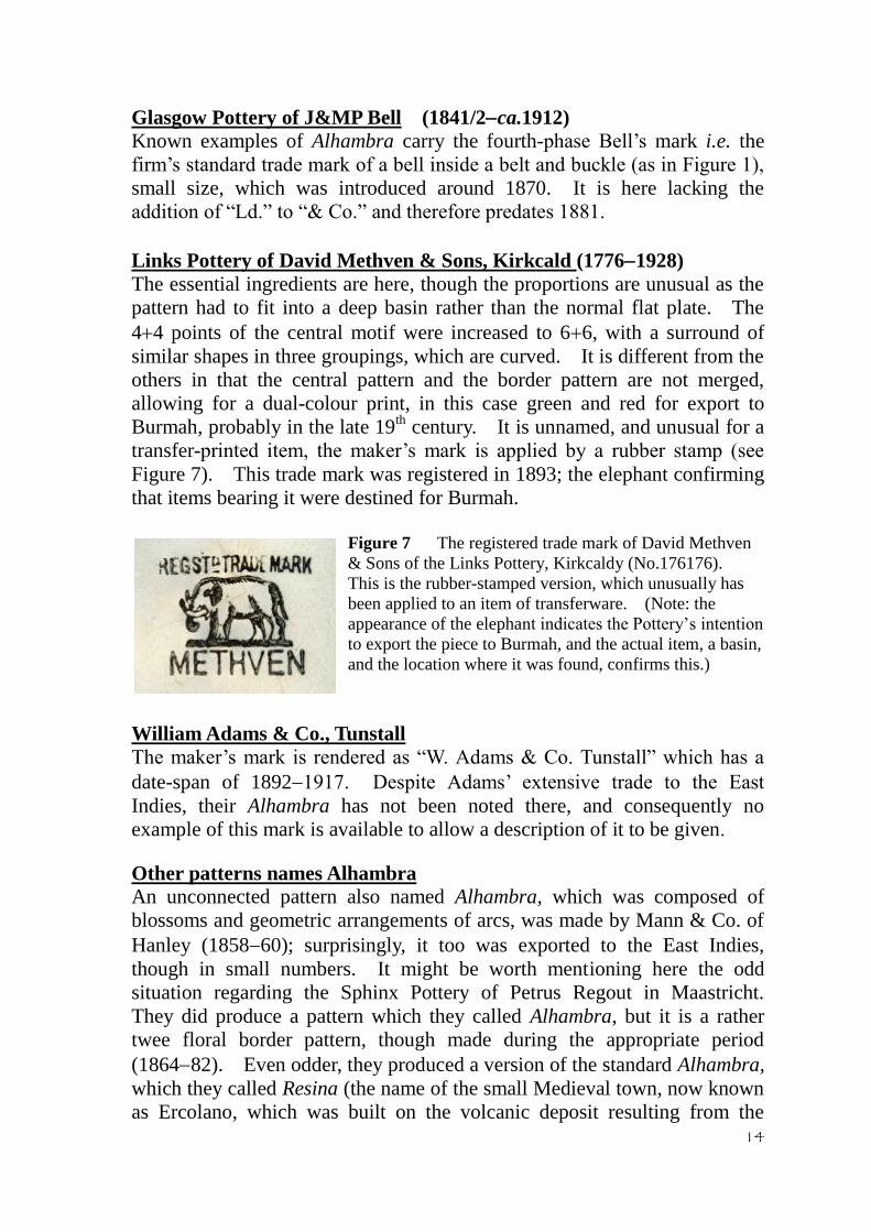
Links Pottery of David Methven & Sons, Kirkcald (17761928)
The essential ingredients are here, though the proportions are unusual as the
pattern had to fit into a deep basin rather than the normal flat plate. The
44 points of the central motif were increased to 66, with a surround of
similar shapes in three groupings, which are curved. It is different from the
others in that the central pattern and the border pattern are not merged,
allowing for a dual-colour print, in this case green and red for export to
Burmah, probably in the late 19th century. It is unnamed, and unusual for a
transfer-printed item, the maker’s mark is applied by a rubber stamp (see
Figure 7). This trade mark was registered in 1893; the elephant confirming
that items bearing it were destined for Burmah.
Figure 7 The registered trade mark of David Methven
& Sons of the Links Pottery, Kirkcaldy (No.176176).
This is the rubber-stamped version, which unusually has
been applied to an item of transferware. (Note: the
appearance of the elephant indicates the Pottery’s intention
to export the piece to Burmah, and the actual item, a basin,
and the location where it was found, confirms this.)
William Adams & Co., Tunstall
The maker’s mark is rendered as “W. Adams & Co. Tunstall” which has a
date-span of 18921917. Despite Adams’ extensive trade to the East
Indies, their Alhambra has not been noted there, and consequently no
example of this mark is available to allow a description of it to be given.
Other patterns names Alhambra
An unconnected pattern also named Alhambra, which was composed of
blossoms and geometric arrangements of arcs, was made by Mann & Co. of
Hanley (185860); surprisingly, it too was exported to the East Indies,
though in small numbers. It might be worth mentioning here the odd
situation regarding the Sphinx Pottery of Petrus Regout in Maastricht.
They did produce a pattern which they called Alhambra, but it is a rather
twee floral border pattern, though made during the appropriate period
(186482). Even odder, they produced a version of the standard Alhambra,
which they called Resina (the name of the small Medieval town, now known
as Ercolano, which was built on the volcanic deposit resulting from the
15
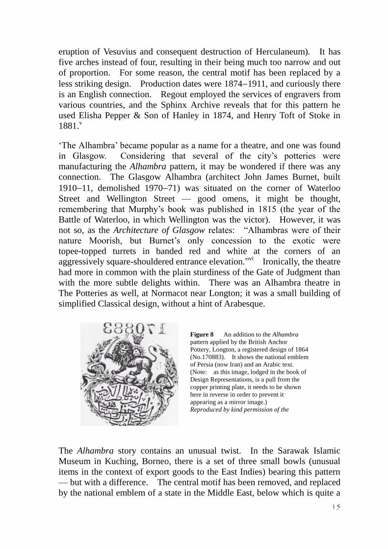
Figure 8 An addition to the Alhambra
pattern applied by the British Anchor
Pottery, Longton, a registered design of 1864
(No.170883). It shows the national emblem
of Persia (now Iran) and an Arabic text.
(Note: as this image, lodged in the book of
Design Representations, is a pull from the
copper printing plate, it needs to be shown
here in reverse in order to prevent it
appearing as a mirror image.)
Reproduced by kind permission of the
National Archives of the UK.
eruption of Vesuvius and consequent destruction of Herculaneum). It has
five arches instead of four, resulting in their being much too narrow and out
of proportion. For some reason, the central motif has been replaced by a
less striking design. Production dates were 18741911, and curiously there
is an English connection. Regout employed the services of engravers from
various countries, and the Sphinx Archive reveals that for this pattern he
used Elisha Pepper & Son of Hanley in 1874, and Henry Toft of Stoke in
1881.v
‘The Alhambra’ became popular as a name for a theatre, and one was found
in Glasgow. Considering that several of the city’s potteries were
manufacturing the Alhambra pattern, it may be wondered if there was any
connection. The Glasgow Alhambra (architect John James Burnet, built
191011, demolished 197071) was situated on the corner of Waterloo
Street and Wellington Street — good omens, it might be thought,
remembering that Murphy’s book was published in 1815 (the year of the
Battle of Waterloo, in which Wellington was the victor). However, it was
not so, as the Architecture of Glasgow relates: “Alhambras were of their
nature Moorish, but Burnet’s only concession to the exotic were
topee-topped turrets in banded red and white at the corners of an
aggressively square-shouldered entrance elevation.”vi Ironically, the theatre
had more in common with the plain sturdiness of the Gate of Judgment than
with the more subtle delights within. There was an Alhambra theatre in
The Potteries as well, at Normacot near Longton; it was a small building of
simplified Classical design, without a hint of Arabesque.
The Alhambra story contains an unusual twist. In the Sarawak Islamic
Museum in Kuching, Borneo, there is a set of three small bowls (unusual
items in the context of export goods to the East Indies) bearing this pattern
— but with a difference. The central motif has been removed, and replaced
by the national emblem of a state in the Middle East, below which is quite a

16
lengthy inscription in Arabic. The items are marked, but they carry neither
the maker’s name nor the pattern name. Instead, both the emblem and the
script are repeated, at a reduced size. They are clearly of European
manufacture, but who could have made them? Fortunately, one of the
bowls offers a clue in the form of a registration diamond. It had not been
applied perfectly, but it is sufficient to date the design to 11th
January 1864,
Rd. No. 170883 (1st series). This allowed the maker to be identified: it
was the British Anchor Pottery at Longton during the period of Malkin,
Walker & Hulse, who comprised the founding partnership in 1858, and
ceasing a few months after registering the curious Middle Eastern design
which they added to Alhambra (see Figure 8). The national emblem is that of
Persia. It shows a lion (symbolising power, decisiveness, and strong
leadership) holding a sword (symbolising strength, resilience, and ultimate
triumph); over its shoulder rises the sun (symbolizing energy, enlightenment,
permanence, and life itself). Superimposed upon the sun is a man’s head
(representing Mithra, the son of the sun), above hovers a crown
(representing the institution of monarchy).
Although there were many variations over the centuries, these were the core
components of the Persian flag, until replaced by a simpler device following
the Iranian revolution in 1979. It is worth noting that the Sphinx Pottery of
Petrus Regout in Maastricht used this same device at the centre of a pattern
produced in 1902, which they called Cashmere (an archaic spelling of
Kashmir, situated on the North-West Frontier of India). The Arabic text,
composed in the Persian language, which sits below the Persian national
emblem on the British Anchor version of Alhambra, refers to Naser al-Din,
who ruled Persia as Shah from 1848 to 1896.
This same composite pattern has also been found on dishes, one of which
replaces the small quasi-mark and the registration diamond with what is
probably an importer’s name, despite its claim:
“Th. Stefanidi & Son, Manufacturer, Istanbul”, plus the British royal coat of
Figure 9 The mark of British
Anchor Pottery on their version of
the Alhambra pattern, with
additions which indicate that this
piece was made for export to
Turkey.

17
arms and the word “Patent”vii
for no apparent reason other than to appear
impressive to potential customers (see Figure 9). There is one more
element in the transfer mark, and this time it is significant — an anchor,
presumably indicating that this item too is a product of the British Anchor
Pottery. The dish also has an impressed device: another anchor! It is
accompanied by the word “London”, a mark of questionable provenance,
though as it has also been noted on a plate bearing the same registration
details as discussed above,viii
there is no doubt that this item too was made
by the British Anchor Pottery.
Figure 10 Plate printed with the Keeling Hong pattern by Bell’s Pottery, Glasgow, a
registered design of 1889 (No.139291). It shows a Qulin and a phoenix.

18
Keeling Hong
This is a truly astonishing pattern (see Figure 10), one of a large group
produced by the Glasgow Pottery of J&MP Bell (1841/2ca.1912) following
its rebirth as a Limited company in 1881. For the reasons discussed earlier
in this paper, such patterns are instantly recognisable as having been
manufactured for export only, their destination being the East Indies. The
great majority were registered with the Patent Office, Keeling Hong being
Rd. No. 139291 (seventeenth in Bell’s series of thirty), and its date of
registration being 29th November 1889.
This pattern features a pair of fabulous creatures taken from the world of
Chinese art — but neither appears here in its regular form. Both have been
given exotic tails, but it is the twists in their tales which makes this pattern
so remarkable. Each of them, the quadruped and the bird, are anatomical
composites with dual-word names representing not just separate creatures
but also male and female entities. The keeling (normal spelling: Qulin) is a
combination of ki (male) and lin (female) to give an animal which is part
deer and part dragon, plus other parts, while the hong (more fully
feng-huang, male/female) is a combination of a peacock and a pheasant,
giving a bird which is sometimes referred to as the Chinese phoenix.
The Qulin is truly remarkable, even for a creature of myth and legend. It
has the body of a deer, with cloven hooves, a spiky spinal ridge, a
powder-puff tail, and, most strikingly, a dragon’s head (see Figure 12). The
lin element in its name (which is indicative of an auspicious animal) is a
homophone of the Chinese word for ‘scaly’; this may account for the scales
which extend virtually all over its body. It is occasionally known,
erroneously, as the Chinese unicorn most illustrations (except for modern
renditions) clearly show it with two horns. Despite its ferocious
appearance, it was the gentlest of creatures; it was said that it would never
do the least hurt to any living thing, not even a blade of grass, so that when it
walked across a lawn it did so with such a light tread that it left no
footprints. It was regarded as one of the most auspicious of animals, as
indicated by the second syllable of its name. However, it was said to
appear only in a place controlled by a wise and beneficent leader, be that a
whole nation or a single house.
The earliest references to the Qulin appear in a Chinese book of the 5th
century BC. Two millennia later, when two giraffes were taken from East
Africa to China (along with ostriches, zebras, and camels) by the explorer
Zheng He, they were hailed as being quoins, despite being so hugely out of
proportion. The giraffe, of course, does not have a dragon’s head, but there
are some similarities ~ it has a pair of horn-like protrusions on its head, a
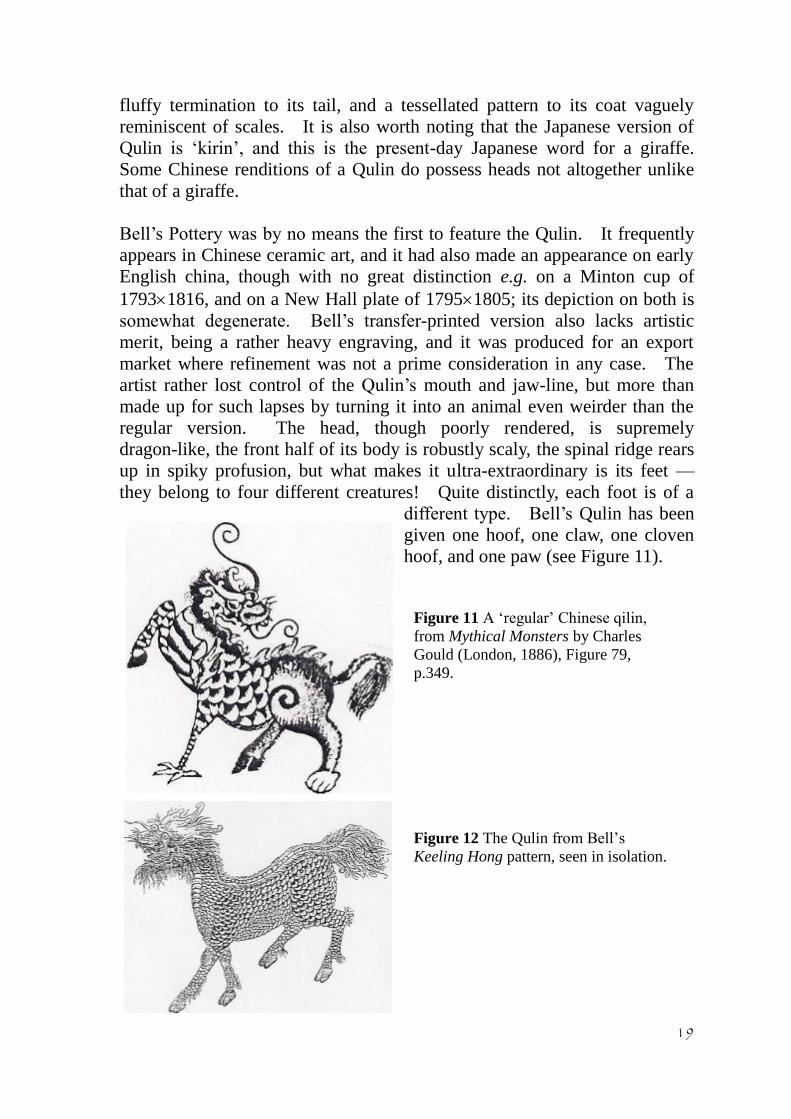
19
fluffy termination to its tail, and a tessellated pattern to its coat vaguely
reminiscent of scales. It is also worth noting that the Japanese version of
Qulin is ‘kirin’, and this is the present-day Japanese word for a giraffe.
Some Chinese renditions of a Qulin do possess heads not altogether unlike
that of a giraffe.
Bell’s Pottery was by no means the first to feature the Qulin. It frequently
appears in Chinese ceramic art, and it had also made an appearance on early
English china, though with no great distinction e.g. on a Minton cup of
17931816, and on a New Hall plate of 17951805; its depiction on both is
somewhat degenerate. Bell’s transfer-printed version also lacks artistic
merit, being a rather heavy engraving, and it was produced for an export
market where refinement was not a prime consideration in any case. The
artist rather lost control of the Qulin’s mouth and jaw-line, but more than
made up for such lapses by turning it into an animal even weirder than the
regular version. The head, though poorly rendered, is supremely
dragon-like, the front half of its body is robustly scaly, the spinal ridge rears
up in spiky profusion, but what makes it ultra-extraordinary is its feet —
they belong to four different creatures! Quite distinctly, each foot is of a
different type. Bell’s Qulin has been
given one hoof, one claw, one cloven
hoof, and one paw (see Figure 11).
Figure 11 A ‘regular’ Chinese qilin,
from Mythical Monsters by Charles
Gould (London, 1886), Figure 79,
p.349.
Figure 12 The Qulin from Bell’s
Keeling Hong pattern, seen in isolation.

20
No English pottery is known to have produced anything like this, though at
least three on the Continent of Europe did, coming from three different
countries. In Europe this pattern was known as Bima (the name of a town
on Sumbawa, the third island east of Java). The mainland European quoins
totally fail to match Bell’s inventiveness, and the likes of Regout of
Maastricht (Holland), and Memmel of Bonn (Germany), seem to have lost
their nerve and allowed their creatures’ feet to stray beyond the circular
frame of the scene, thus obviating the need to decide what sort of feet to give
them. At least the version from Longwy (France) shows the feet, and
although they are all the same, they are different from the Chinese standard
cloven hooves ~ they are all claws. This raises the question of how Bell’s
Pottery came to acquire their extraordinary Qulin. In the weird world of
fabulous animals, there are many examples of hybrids and quite a number of
instances of multi-composite creatures, and one in particular has some
marked similarities.
Moving now to the hong, or Chinese phoenix: it was somewhat different
from its western counterpart. It was partly a peacock, a bird much favoured
by Bell’s Pottery, which featured in slightly stylised form on some of their
other export patterns to the East Indies such as Peacock & Lilies and
Makasser, in Art Nouveau splendour on their amazing Burong Merak (which
is Malay for ‘peacock bird’), and in more natural form in the border pattern
of Bangkok and on several of their patterns for Burmah. The most
eye-catching feature of the hong is its group of large tail feathers, which
includes a truly gigantic one (and this likewise appears on all the Continental
versions of this pattern). This may represent a borrowing from another
bird, the argus pheasant, which had a distribution right across eastern Asia
from China to Malaya; the great argus was to found chiefly in Borneo,
Sumatra, and the Malay jungles. Its enormous ‘tail’ is actually a
combination of its two broad and exceptionally long secondary wing
feathers, which can attain a length of 6½ feet (2 metres). In Chinese art,
the hong is sometimes rendered with wording on various parts of its body:
virtue on its head, duty on its wings, ritual on its back, humaneness on its
breast, and trust on its stomach.
The hong features in several other patterns made by British potteries for
export to the East Indies, but although its impressive tail feathers are always
well to the fore, its spectacular secondary-wing pairing is consistently
absent. Perhaps these birds represent ‘ordinary’ argus pheasants rather than
the ‘great argus’ variety. Bell’s themselves used such a bird in their
spectacular pattern Borneo (see Figure 2), paired with a dragon (though
quite a different type of creature from the Qulin). The other pairings of the
hong are all with large flowers of the peony type, the principal example
21
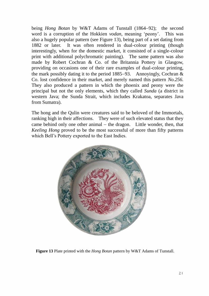
being Hong Botan by W&T Adams of Tunstall (186492); the second
word is a corruption of the Hokkien vodan, meaning ‘peony’. This was
also a hugely popular pattern (see Figure 13), being part of a set dating from
1882 or later. It was often rendered in dual-colour printing (though
interestingly, when for the domestic market, it consisted of a single-colour
print with additional polychromatic painting). The same pattern was also
made by Robert Cochran & Co. of the Britannia Pottery in Glasgow,
providing on occasions one of their rare examples of dual-colour printing,
the mark possibly dating it to the period 188593. Annoyingly, Cochran &
Co. lost confidence in their market, and merely named this pattern No.256.
They also produced a pattern in which the phoenix and peony were the
principal but not the only elements, which they called Sunda (a district in
western Java; the Sunda Strait, which includes Krakatoa, separates Java
from Sumatra).
The hong and the Qulin were creatures said to be beloved of the Immortals,
ranking high in their affections. They were of such elevated status that they
came behind only one other animal the dragon. Little wonder, then, that
Keeling Hong proved to be the most successful of more than fifty patterns
which Bell’s Pottery exported to the East Indies.
Figure 13 Plate printed with the Hong Botan pattern by W&T Adams of Tunstall.

22
Figure 14 Jug printed with the Watercarrier pattern by David Lockhart &
Sons of the Victoria Pottery at Pollockshaws, near Glasgow (plus additional
polychrome painting).
Figure 15 The Watercarrier mark of David Lockhart & Sons. (Note:
This device was used by quite a number of potteries throughout Britain — see
e.g. Figure 5 above — so attention must be paid to the maker’s initials.)
Watercarrier While plates and dishes were the main items of European pottery exported to
the East Indies, the trade to Burmah dealt mainly in basins and jugs.
Basins were the principal product, but huge numbers of jugs were also sent
there, the overwhelming majority having been manufactured in Scotland.
The principal factory involved was the Victoria Pottery of David Lockhart
(18551952) at Pollockshaws, just
outside Glasgow (until absorbed by
the city in 1912), and one shape of
jug which they made is to be found
far more commonly than any other.
The Pottery produced a wide range
of transfer-printed patterns to go on
these jugs, many of them having
been designed with the domestic
market primarily in mind, but there were also a number aimed specifically
and exclusively at a Burmese clientele. One such is Watercarrier (see
Figure 14), bearing the maker’s mark “DL & S” (see Figure 15); the firm
changed its name from David Lockhart & Co. to David Lockhart & Sons in
1899.
The choice of name is hardly inspired, and applies to only one of the three
scenes portrayed. In truth, it must be said that the quality of these jugs is
rather poor in all respects. The body is of an inferior type of quite coarse

23
earthenware, the design of which is aesthetically unappealing, meaning that
such an item is heavy both to the hand and to the eye. The engraving lacks
any semblance of refinement, and the hand painting which enlivens it has
not been applied by anyone deserving of being called an artist, having been
slapped on with crude strokes of the brush, a technique known colloquially
by a well-deserved if somewhat insulting epithet — ‘clobbering’. In a
league table of technically accomplished ceramics, Lockhart’s Watercarrier
jugs would surely find themselves languishing near the bottom rung.
However, their obvious technical deficiencies are more than compensated
for by the intense interest of their social content. The pattern, which runs
round the jug in a continuous band, tells a developing story in three parts.
1. A Burmese woman is seen emptying a small jar of water into a large
globular water pot. The reservoir from which
she has drawn the water would seem to be a
substantial circular cistern which stands
adjacent — but that is not what it is.
Although depicted here as having rather thin
walls, this is actually the top section of a well,
driven deep into the ground and lined (latterly
at least) with a stack of concrete cylinders.
They are to be seen to this day all over rural
Burmah, though the blue coloration existed
only in the mind of the Scottish decorator. At
the time when these illustrations were produced, it was women in the main
who were the potters making such water pots as shown, a practice which
pertains unto the present day.
2. Another Burmese woman (her attire is substantially different from the
first) is seen walking along a roadway, balancing
on her head a globular water pot, presumably full
(see Figure 18). She deports herself with a
serene sense of poise, an attribute seemingly
acquired innately by the female population of
Burmah and displayed from an early age.
Indeed, the majority of these water carriers today
would seem to be girls rather than grown women.
She is aided in her balancing act by a cranial pad
comprised of a twisted scarf, which softens the
weight pressing down on her skull and also
provides a more secure resting place for the pot.

24
3. No human figure appears in the final scene; instead, it is the water pots
themselves which have become the focus of attention (see Figure 19). A
cluster of them sit upon a roadside platform, unattended, beneath a placard
carrying a word written in Burmese characters, painted in a bronzy colour
against a purple background. It speaks the
sound sa-doo-dee-ta; if the meaning can be
rendered in English by a single word, then
‘charity’ would fit the bill quite well. The
inference is that the water has been put out
for the benefit of any thirsty traveller. Stalls
similar to this one are still widespread
throughout Burmah, enhanced for modern
sanitation purposes, and perhaps containing
the name of a commercial sponsor. Just
where the Victoria Pottery obtained this piece
of Burmese script from is an intriguing
question, the more so in that it has been
provided, or engraved, with less than
complete accuracy. (The source was surely not the same as used by
Johnson Bros. of Hanley, who employed an extensive range of Burmese
proverbs on their wares, composed of convincing Burmese characters.)
There remains a twist to the story of the Watercarrier pattern, for although
jugs carrying it were widely and plentifully distributed all over Burmah,
another type of object also bore this pattern, but made for the home market ~
the punch bowl. The punch popular at the time was a warm, alcoholic
beverage hardly suitable for consumption in Burmah. The punch bowl is a
large enough, to include the complete Watercarrier pattern sequence four
times over, inside and out and thus not a realistic export because of its size
and weight. It is worth noting that several changes were made in the
painting applied to these punch bowls: the women’s hair and the trunks
and branches of the trees appear as black as coal, the water pot being filled
has turned from russet brown to bright orange, while the other pots have all
become fawn, a colour which now pervades the roadway, the fencing, and
most significantly the placard. The Burmese writing is still there, though
somewhat masked by a monochrome wash. It may also be noted that the
standard of both the engraving and the painting is inferior to that on the jugs,
which is a reversal of the expected ‘domestic versus export’ comparison.
Most odd of all, these punch bowls, characteristically deep-bodied as such
Pollockshaws products were, are not known with any markings, neither a
maker’s mark nor a pattern name. It was as if an overtly export pattern had
to remain anonymous when made for the domestic market.

25
These three patterns, Alhambra, Keeling Hong, and Watercarrier, reflect,
each in a different way, the very special nature of transferware patterns made
for export to South-East Asia ~ and they represent only a tiny fraction of this
truly remarkable venture in the field of international trade ceramics.
Previous articles on the subject by Graeme Cruickshank
1992 ‘Scottish Pottery in Indonesia’ in
Book of the Jakarta Highland Gathering, pp.7274.
1993 do., reprinted in the Directory of the Himpanum Keramik Indonesia
{Ceramic Society of Indonesia, Jakarta}, pp.5357.
1995 ‘Crossing Cultural Frontiers: the Chinese Dragons of Scotland and Thailand’
in Siam Araya {‘Thai Civilisation’, Bangkok ~ in Thai},
No. 28, May, pp.8486, and April following, p.119.
1997 ‘Scottish Export Pottery in South-East Asia: report on the Gunning Victoria
Jubilee travelling fellowship’ in
Society of Antiquaries of Scotland Newsletter, No. 8.2, pp.45.
1997 ‘Ceramics in Perspective: Illustrious Eastern Past’ in
Artwork {Scotland} No.89, p.7.
1999 ‘Tracking down Scottish Export Pottery in South-East Asia’ {lecture
summary} in Proceedings of the Society of Antiquaries of Scotland for
1998,
vol.128, pp.11221124.
Acknowledgements
With a general paucity of documentary evidence and very little published information on
the subject (and such as there is, being for the most part inaccurate and misleading), the
above summary could only have been written with the benefit of extensive field work.
The author has visited the region fifteen times in less than two decades with trips lasting
for up to seven months, staying there for a total of around five years. This would not
have been possible without the generous financial assistance of a number of grant-aiding
organisations: the Carnegie Trust for the Universities of Scotland, the British Academy,
the Society of Antiquaries of Scotland (Gunning Victoria Jubilee travelling fellowship),
and the Scottish International Education Trust (all more than once); also the
Leverhulme Trust, for assisting with the costs of writing up and photography. I would
also like to express my gratitude to the Transferware Collectors Club for an award made
from the Paul and Gladys Richards research fund which has enabled this paper to be
written, which may be seen as a curtain-raiser for the major study which is currently in
the course of preparation.
Captions
Figure 1 A highly informative mark by Bell’s Pottery, Glasgow. It shows:
(i) Bell’s standard trade mark of a bell in a belt and buckle, introduced ca. 1870;
(ii) the initials “J&MPB” for the proprietors, brothers John and Matthew Perston Bell;
(iii) “Ld” following “& Co”, indicating a date post 1880;
(iv) “Glasgow” on a ribbon, showing the place of manufacture;
(v) the pattern’s Design Registration number, 102258, issued on 20th
June 1888;
(vi) the pattern name, Tarlalu Bagus (Malay, meaning ‘Exceedingly Good’);

26
(vii) the pattern name repeated in Jawi script (Malay Arabic).
There is also an impressed B in a bell, large size, which is Bell’s standard impressed
mark on export wares to the East Indies.
Figure 2 Plate printed with the Borneo pattern by Bell’s Pottery, Glasgow, a
registered design of 1890 (No.149158). It shows frenetic activity involving a dragon
and a phoenix.
Figure 3 Plate printed with the Alhambra pattern, made by at least six British potteries
for export (five from Scotland to the East Indies, and one from England to Turkey and
beyond).
Figure 4 The Alhambra mark as used by John Thomson & Sons of the Annfield
Pottery, Glasgow, version 1. Also visible is an impressed device which may be a
potter’s tally mark.
Figure 5 The Alhambra mark as used by John Thomson & Sons of the Annfield
Pottery, Glasgow, version 2. Also visible is the impressed mark “J Thomson & Sons”,
though it is inverted in relation to the printed mark.
Figure 6 The registered trade mark of the Britannia Pottery, Glasgow (No.86480).
Reproduced from the Trades Marks Journal.
Figure 7 The registered trade mark of David Methven & Sons of the Links Pottery,
Kirkcaldy (No.176176). This is the rubber-stamped version, which unusually has been
applied to an item of transferware. (Note: the appearance of the elephant indicates the
Pottery’s intention to export the piece to Burmah, and the actual item, a basin, and the
location where it was found, confirms this.)
Figure 8 An addition to the Alhambra pattern applied by the British Anchor Pottery,
Longton, a registered design of 1864 (No.170883). It shows the national emblem of
Persia (now Iran) and an Arabic text. (Note: as this image, lodged in the book of
Design Representations, is a pull from the copper printing plate, it needs to be shown
here in reverse in order to prevent it appearing as a mirror image.)
Reproduced by kind permission of the National Archives of the UK.
Figure 9 The mark of British Anchor Pottery on their version of the Alhambra pattern,
with additions which indicate that this piece was made for export to Turkey.
Figure 10 Plate printed with the Keeling Hong pattern by Bell’s Pottery, Glasgow, a
registered design of 1889 (No.139291). It shows a Qulin and a phoenix.
Figure 11 A ‘regular’ Chinese Qulin, from Mythical Monsters by Charles Gould
(London, 1886), Figure 79, p.349.
Figure 12 The Qulin from Bell’s Keeling Hong pattern, seen in isolation.
Figure 13 Plate printed with the Hong Botan pattern by W&T Adams of Tunstall.
Figure 14 Jug printed with the Watercarrier pattern by David Lockhart & Sons of the

27
Victoria Pottery at Pollockshaws, near Glasgow (plus additional polychrome painting).
Figure 15 The Watercarrier mark of David Lockhart & Sons. (Note: This device
was used by quite a number of potteries throughout Britain ~ see e.g. Figure 5 above ~ so
attention must be paid to the maker’s initials.)
Endnotes i This curious game of ‘cultural ping-pong’ has prompted the author to compose a lecture entitled ‘East to
West then East again ~ Chinese influences on European pottery exports to South-East Asia’. It has been
delivered to the Scotland-China Association in Edinburgh and in Glasgow, and to several decorative arts
groups in England; and in more general terms within the broad context of the ceramic trade under
discussion, to ceramic societies and interest groups in Jakarta, Kuala Lumpur, Singapore, Bangkok,
Rangoon, and Hong Kong. ii For an overview of this subject, see Graeme Cruickshank, Scottish Pottery (Shire Publications, Princes
Risborough, England, 1987; 2nd
edition, considerably enlarged, 2005; reprinted with some additions,
2010). A brief selection of export wares made by Bell’s Pottery in Glasgow for the East Indies is shown
in colour on p.37 of the 2nd
edition. iii
All of these patterns are illustrated, in colour, in Adams Ceramics by David Furniss and Richard and
Judith Wagner (Atglen, Pennsylvania, USA, 1999). iv Art-Union Journal Vol. VII, no. 80, May 1845, p.135.
vMarie-Rose Bogaers, Drukdecors op Maastrichts Aardewerk {Printed Designs on Maastricht
Earthenware}, 18501900 (Lochem, Nederland, 1992), pp. 35 & 133. vi Andor Gomme and David Walker, Architecture in Glasgow (London, 1968 and 1987), p.266.
vii Friends of Blue Bulletin No.143, April 2009, p.10 (note by Gerard Ledger).
viii Geoffrey Godden, Encyclopaedia of British Pottery and Porcelain Marks (London, 1964 and 1991),
mark no. 2497, p.411.