introduction to human geography using arcgis...
TRANSCRIPT

Introduction to Human Geography Using ArcGIS Online
Chapter 9 Exercises
Exercise 9.1: The Human Development report: patterns of human well-being
Introduction
The United Nations measures human development for the majority of countries of the
world, combining their rankings in life expectancy, income, and education. This gives a simple
means of measuring what could be considered the overall health, wealth, and opportunity of a
state’s population. In this exercise you will begin by mapping changes in human development
between 1990 and 2015. You will then explore how the United States compares to countries
that rank higher and consider reasons for the ranking. Lastly, you will compare human
development by gender, identifying countries where women do better than men, and countries
where they do not.
Objectives
▪ Determine which countries rank higher than the United States and why.
▪ Evaluate the role that income distribution plays in HDI scores.
▪ Compare countries where female human development is higher than male human
development and explore the variables that account for these differences.

1. Open the Chapter 9 HDI 2016 Exercise map and sign in to your account:
https://arcg.is/TTaLW
The map contains the following layers:
a. Human Development Index – 1990-2015. This layer contains the
HDI scores for countries between the years 1990 and 2015.
b. Human Development Index – Detailed Scores. This layer
contained detailed scores for life expectancy, education, and
income in 2015.
c. GINI Score. This layer contains values for the GINI index of income
distribution between 2010 and 2015.
d. Gender Inequality Index. This layer contains human development
data broken down by male and female.
2. Map the difference in HDI scores between 1990 and 2015.
• Make sure that the Human Development Index – 1990-2015 layer is turned
on and all other layers are turned off.
• Hover your cursor over the Human Development Index – 1990-2015 layer
and click Change Styles.
• In the Change Style window, in the first step, click the drop-down arrow
and scroll all the way to the bottom. Select New Expression.

• In the Custom window, scroll down on the right and click the link under
Field: HDI2015.
• Click the minus sign and scroll up until you see Field: HDI1990.
• Click on the link under Field: HDI1990.
The expression in the box to the left should appear as follows:
▪ $feature.Table_2__HDI2015-$feature.Table_2__HDI1990

• Click OK, then Done.
3. View the map. You can see the legend by hovering your cursor over the layer
name and selecting Show Legend.
Question 9.1.1
Has human development increased or decreased? Is there a clear pattern or are the trends
inconclusive?
4. Compare HDI scores for the United States and other top ranked countries.
5. Turn the Human Development Index – Detailed Scores layer on and all other
layers off.
6. Hover your cursor over the Human Development Index – Detailed Scores layer
and click Show Table.
In the attribute table, click on the Human Development Level field and Sort
Descending.
This show countries from most developed to least developed.
7. In the following table (question 9.1.2), write the country names in order, from
highest to lowest, through the United States.
In the last row, values for the United States have been included.
8. In columns B, C, and D, place an “X” in the cell next to each country if its value
is higher than that of the United States.

Question 9.1.2
A. Country B. Life
Expectancy
C. Expected
Years of
Schooling
D. GNI per
Capita
E. GINI score
United States 79.22 16.54 $53,245
Question 9.1.3
Based on your table above, which two variables in columns B, C, and D are greater than that of
the US for the majority of countries? Why might this be?
Question 9.1.4
Of the variables in columns B, C, and D in the table above, which does the United States do
better in? Why may this be?
9. Compare GINI scores for the highest-ranking countries.
• Turn on the GINI Score layer and turn all other layers off.
• Hover your cursor over the GINI Score layer and click Show Table.
• In the table, click the HDI2015 field and Sort Descending. This sorts
countries the same as in the previous layer.

• Write the value from the Gini 2010-15 field in column E of the preceding
table (question 9.1.2).
Question 9.1.5
Explain how income distribution may impact values in the columns B, C, and D.
10. Compare the difference between female and male human development.
• Turn the Gender Inequality Index layer on and all other layers off.
• Hover your cursor over the Gender Inequality Index layer and click
Change Style.
• In the Change Style window, in the first step, click the drop-down arrow
and scroll all the way to the bottom. Select New Expression.
• In the Custom window, scroll down on the right and click the link under
Field: HDI_Female.
• Type a minus sign and click on the link under Field: HDI_Male.
The expression in the box to the left should appear as follows:
▪ $feature.Table_4_5__HDI_Female-$feature.Table_4_5__HDI_Male
11. Click OK, but do not click Done.
12. In the Change Style window, click Select under Counts and Amounts (Color).
13. Click Options under Counts and Amounts (Color).

14. Click the drop-down arrow by the Theme box and select Above and Below.
15. Click the middle number in the legend and set it to zero.
16. Click OK, then Done.
Your map now shows countries where female human development is higher than male
human development and where it is lower. You can see the legend by hovering your cursor
over the layer name and selecting Show Legend.
17. Click on four countries, two with higher female human development and two
with lower female development. From the pop-up windows, fill in the
following table.

Question 9.1.6
Life Expectancy
F M
Expected Years
of Schooling
F M
GNI per Capita
F M
Country with
higher female
HDI:
Country with
higher female
HDI:
Country with
lower female
HDI:
Country with
lower female
HDI:
Question 9.1.7
Which variables account for the differences in human development by gender? What might
explain the observed differences?
Conclusion
The good news is that human development has improved in nearly all countries in
recent decades. But while this is news to celebrate, there is still much work to be done. Human
development lags substantially in some regions of the world, and there are too often significant
differences in human development by gender, as well as by other demographic and geographic
categories.

Exercise 9.2: The invisible hand: How do market forces impact development?
Introduction
In chapter 7, you were introduced to the World Bank’s Doing Business survey, which
ranks countries according to the ease in which one can start and grow a business. From a
manufacturing site selection perspective, countries with business-friendly laws and regulations
are often attractive places to locate new facilities. The neoliberal development theory states
that countries that are friendly to business will facilitate greater domestic and foreign
investment, more job growth, and ultimately a higher level of development. In this exercise you
will filter countries by their Human Development Index scores and compare them to their Doing
Business rankings to test the correlation between development and business-friendly policies.
Objectives
▪ Compare HDI scores to Doing Business rankings.
▪ Argue how the data support or refute neoliberal development theory.
▪ Evaluate why outliers in the data may exist.
1. Open the Chapter 9 The Invisible Hand map and sign in to your account:
https://arcg.is/1bHX8P
The map contains the following layer:
a. Doing Business and Human Development. This layer contains
data from the World Bank Doing Business report and the United
Nation’s Human Development Index for 2015.
The map opens showing Human Development Index scores by quintile.

2. Compare Human Development Index scores to Doing Business rankings.
• Hover your cursor over the Doing Business and Human Development layer
and select Filter.
• In the Filter window, set the expression so that HDI2015 is at least 0.846.
This is the cutoff value for the top quintile of most developed countries. The value of
0.846 can be obtained by viewing the map legend.
• Click Apply Filter.
• Hover your cursor over the Doing Business and Human Development layer
and Show Table.
• In the attribute table, click the Doing_Business_Rank field name and select
Statistics. Write the Average value in the table (question 9.2.1). This is the
average Doing Business rank of the most developed countries.
• Close the Statistics window.
• Hover your cursor over the Doing Business and Human Development layer
and select Filter.
• Edit the filter expression so that HDI2015 is at most 0.53. This is the cutoff
value for the bottom quintile of most developed countries.
The value of 0.53 can be obtained by viewing the map legend.
• Click Apply Filter.
• Hover your cursor over the Doing Business and Human Development layer
and Show Table.
• In the attribute table, click the Doing_Business_Rank field name and select
Statistics.
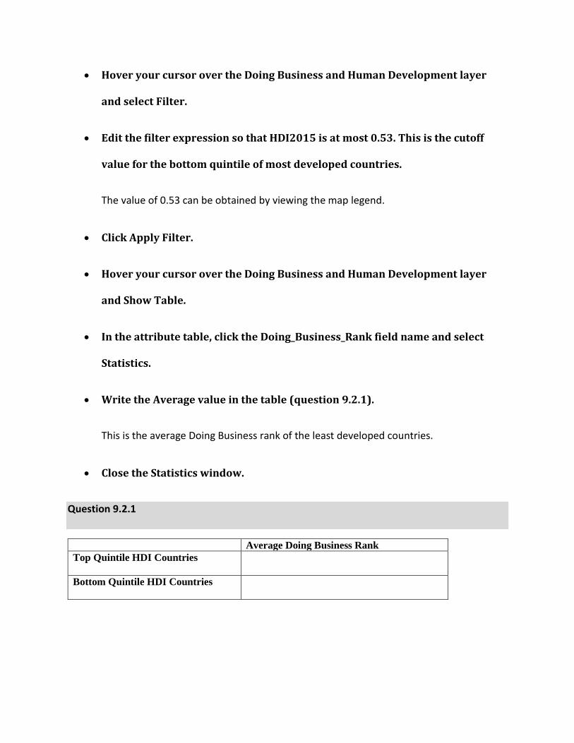
• Write the Average value in the table (question 9.2.1).
This is the average Doing Business rank of the least developed countries.
• Close the Statistics window.
Question 9.2.1
Average Doing Business Rank
Top Quintile HDI Countries
Bottom Quintile HDI Countries

Question 9.2.2
If you see a correlation between the two, do you believe ease of business causes greater
development as per neoliberal development theory? Or does a high level of development allow
governments to streamline and lower costs for getting permits, paying taxes, settling contract
disputes, and so on? Explain your reasoning.
The patterns seem clear at a global scale. Now explore the pattern at a regional scale by
looking at Latin America.
3. Hover your cursor over the Doing Business and Human Development layer
and select Filter.
4. Edit the filter expression so that Region is Latin America & Caribbean (you can
select this region by clicking the Unique radio button and using the drop-down
arrow).
5. Click Apply Filter.

6. Hover your cursor over the Doing Business and Human Development layer
and Show Table.
7. Sort countries by their HDI 2015 score, as you did previously at a global scale.
• In the attribute table, scroll over until you see the HDI2015 field.
• Click the field heading and Sort Descending. This sorts countries from most
developed to least.
In the table (question 9.2.3), four larger or more significant countries were selected
from the top of the list and four from the bottom.
• Fill in the table with their corresponding values from the
Doing_Business_Rank field.
Question 9.2.3
High HDI Score Doing Business
Rank
Low HDI Score Doing Business
Rank
Chile
Nicaragua
Argentina
Guatemala
Uruguay
Honduras
Panama
Haiti
Question 9.2.4
Does this provide evidence supporting or refuting the idea that the most developed countries
are also those that are most business friendly? Why or why not.

Question 9.2.5
Argentina is an outlier in that it ranks high on the HDI but scores poorly on being business
friendly. This seems to contradict the neoliberal development theory. How can a country such
as Argentina score poorly on doing business, yet still have relatively high human development?
In other words, how can it earn high scores on years of education, life expectancy, and income
per capita while being hard on businesses at the same time? You can consider ideas such as
government spending priorities, import substitution policies, Argentina’s export-oriented
agriculture, and other factors.
• Sort by Doing Business Rank.
This is a slightly different way of looking at the relationship: will countries that are most
business friendly also be the most developed?
• In the attribute table, click the field heading Doing_Business_Rank and Sort
Descending. This sorts countries from most business friendly to least.
In the table, four larger or more significant countries were selected from the top of the
list and four from the bottom.
• Fill in the table with their corresponding values from the HDI2015 field.

Question 9.2.6
Business
Friendly
HDI 2015 Not Business
Friendly
HDI 2015
Mexico
Nicaragua
Colombia
Bolivia
Peru
Haiti
Chile
Venezuela
Question 9.2.7
Do countries that rank higher on ease of doing business have higher HDI scores than those that
rank lower? Does this support or refute neoliberal development theory?
Question 9.2.8
Venezuela appears to be an outlier in that it is difficult to do business there, but its human
development score was relatively high in 2015. In recent years, Venezuela has taken a sharp
turn toward state-heavy involvement in the economy and a weakening of the private sector,
giving it a low Doing Business score. According to neoliberal theory, what should happen to
Venezuela’s HDI over time as it moves away from being business friendly?
8. Repeat the preceding steps for another region if instructed by your teacher.
Conclusion
In this exercise, you explored the neoliberal theory of development through the
relationship between the ease of doing business and levels of human development. As you
have found, there does seem to be an overall positive correlation, but outliers indicate that

development is a complex issue. No single variable can explain why some countries are
developed and others are not, although some policies appear to increase the odds of
improvements.
Exercise 9.3: Density: the rural-urban divide in the United States
Introduction
Globally, there is a strong relationship between population density and development.
People in cities are typically wealthier and have more opportunities for education and
employment than lower density rural areas. Likewise, countries with higher levels of
urbanization are usually richer than countries with large rural populations. In this exercise you
will examine the relationship between density and development in the United States,
comparing income, poverty, and education by census tract population density.
Objectives
▪ Compare development indicators for urban and non-urban areas in the US.
▪ Evaluate results in relation to the theory that population density leads to greater
development.
1. Open the Chapter 9 Density and Development map and sign in to your account:
https://arcg.is/1Oz1uP
The map contains the following layer:

a. Social Vulnerability, Urban and Non-Urban. This layer contains
data from the US Centers for Disease Control (CDC) on poverty,
income, education, racial/ethnic minorities, and English language
ability. It also identifies census tracts identified by the US Census
Bureau as “urban areas”—places that are densely populated with
50,000 people or more.
The map opens showing urban and non-urban areas. Since there are thousands of
census tracts in the US, if you zoom out too much they may not all draw on your screen.
If the global relationship between population density and level of development holds
true for the United States, people living in urban areas should be better off than those in non-
urban areas.
2. Use the Filter function to test this idea, filling in the following table.
• Hover your cursor over the Social Vulnerability, Urban and Non-Urban
layer and select Filter.
• In the Filter window, set the expression so that UrbanArea is Y. This Filters
for census tracts identified as “Yes” for being urban areas.
• Click Apply Filter.
You will now see only urban area census tracts on your map.
• Hover your cursor over the Social Vulnerability, Urban and Non-Urban
layer and select Show Table.

• In the attribute table, click the EP_POV field heading, then Statistics. This is
the estimated percent in poverty.
• Write the Average value in the Urban Area column of the table (question
9.3.1).
• Repeat this process for EP_PCI (estimated per capita income), EP_NoHSDp
(estimated percent with no high school diploma), EP_MIN (estimated
percent of racial/ethnic minorities), and EP_LIMENG (estimated percent of
limited English speakers).
3. Filter for Non-Urban areas and fill in the table.
• Hover your cursor over the Social Vulnerability, Urban and Non-Urban
layer and select Filter.
• In the Filter window, set the expression so that UrbanArea is blank. This
Filters for census tracts identified as not being urban areas.
• Hover your cursor over the Social Vulnerability, Urban and Non-Urban
layer and select Show Table.
• Click the filed headings and fill in the Not Urban Area column.

Question 9.3.1
Urban Area Not Urban Area
EP_POV
EP_PCI
EP_NOHSDP
EP_MINRTY
EP_LIMENG
Question 9.3.2
Based on the textbook, describe how agglomeration benefits can lead to higher levels of
development in denser urban areas than in less dense non-urban areas.
Question 9.3.3
From the table, which has the highest per capita income?
Question 9.3.4
Which has the lowest poverty rate?
Question 9.3.5
What do poverty and per capita income levels say about income inequality in urban areas?
Question 9.3.6
Which has the highest proportion without a high school education?

Question 9.3.7
How could the proportion of those with limited English have an impact on average urban wages
and poverty levels? Who are those with limited English skills?
Question 9.3.8
Based on your data table, is there a clear pattern of US Census Bureau urban areas being more
developed than non-urban areas? Why or why not?
Conclusion
Population density often results in higher levels of development in cities than in the
countryside. In this exercise you tested this idea by comparing development indicators for
census tracts in the United States. The relationship between urban density and development
appears to be somewhat mixed when comparing US Census Bureau urban areas versus non-
urban areas. Therefore, you will continue your research by comparing development and
distance.
Exercise 9.4: Distance: How does proximity to urban areas impact development?
Introduction
In the previous exercise, you saw that the relationship between development and
density is not perfectly clear when comparing urban and non-urban areas as defined by the US
Census Bureau. One reason for this may be that people with the highest levels of education and
income do not live in the densest parts of the city, but rather they commute in from medium
density suburban areas. To test this idea, you will observe how development indicators vary by
distance from US Census identified urban areas.
Objectives
▪ Compare development indicators for census tracts by distance from urban areas.
▪ Evaluate results in relation to the theory that close proximity to urban areas leads to
greater development.
1. Open the Chapter 9 Distance and Development map and sign in to your
account: https://arcg.is/0Le4TP
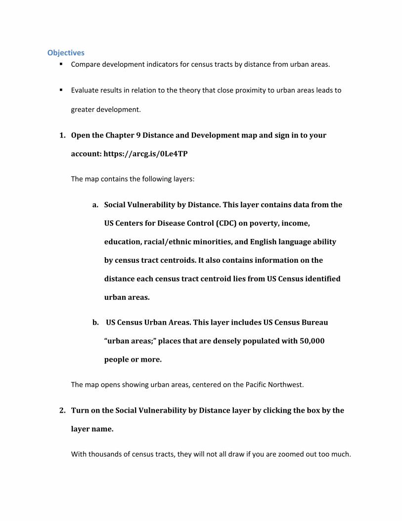
The map contains the following layers:
a. Social Vulnerability by Distance. This layer contains data from the
US Centers for Disease Control (CDC) on poverty, income,
education, racial/ethnic minorities, and English language ability
by census tract centroids. It also contains information on the
distance each census tract centroid lies from US Census identified
urban areas.
b. US Census Urban Areas. This layer includes US Census Bureau
“urban areas;” places that are densely populated with 50,000
people or more.
The map opens showing urban areas, centered on the Pacific Northwest.
2. Turn on the Social Vulnerability by Distance layer by clicking the box by the
layer name.
With thousands of census tracts, they will not all draw if you are zoomed out too much.

Since there are nearly 73,000 tracts, some analysis work has already been completed for
you. In ArcGIS Online, the Summarize Nearby or Find Existing Locations analysis tools could be
used to identify tracts within varying distances from urban areas. However, this would use a
substantial number of credits, making it impractical for a student exercise.
The Social Vulnerability by Distance layer includes development indicators as in the
previous exercise, as well as fields identifying tracts by distance from urban areas. Each tract
within a certain distance is identified with “Y” for Yes. Tracts not within the distance are blank.
Given that tracts have already been identified by distance, you will use the Filter tool to
complete the following table.
3. Hover your cursor over the Social Vulnerability by Distance layer and select
Filter.
4. In the Filter window, set the express so that ZeroTo15Miles is Y.
5. Click Apply Filter.
This filters for all tracts within what many would consider a close range for working in or
doing business with an urban area. In most areas, this allows for drive times of one-half hour or
less.
6. Hover your cursor over the Social Vulnerability by Distance layer and click
Show Table.
7. As in the previous exercise, click the field headings and select Statistics. Write
down the Average values in the table (question 9.4.1).

8. Hover your cursor over the Social Vulnerability by Distance layer and select
Filter.
9. Edit the filter so that ZeroTo30miles is Y.
This filters for tracts within drive times of one-half hour to one hour or less from urban
areas. Spatial interaction with the urban area should still be strong but may be somewhat less
than for tracts that lie closer in.
10. Hover your cursor over the Social Vulnerability by Distance layer and Show
Table.
11. Click the field headings and write the Average values in the table.
12. Repeat the preceding steps to edit the filter and get the Average value under
Statistics for the remaining two columns.
Tracts within zero to 60 miles include those that are often one hour or more from an
urban area. Spatial interaction between tracts further from the urban areas will be lower than
for tracts closer in.
Tracts beyond 60 miles from an urban area are those with much weaker connections to
the city. People and businesses at this distance are more likely to interact with other rural areas
and are less likely to benefit from proximity to urban areas.

Question 9.4.1
Zero to 15 miles Zero to 30 miles Zero to 60 miles Beyond 60 miles
EP_POV
EP_PCI
EP_NOHSDP
EP_MINRTY
EP_LIMENG
Question 9.4.2
Based on the table, where is poverty the highest?
Question 9.4.3
What is the trend in per capita income as one moves farther from urban areas?
Question 9.4.4
Are there any patterns by lack of a high school education?
Question 9.4.5
What are the trends in terms of minorities and immigrants (non-English speaking variable) with
distance?

Question 9.4.6
Recently there has been much talk of the plight of the white working class in the United States.
Does this show any spatial pattern as to where that group is disproportionately found?
Question 9.4.7
From previous chapters on urban and economic geography, what do these results tell you?
What types of changes in agriculture, manufacturing, and services in the US may account for
these patterns? Think about how employment opportunities in each has changed.
Conclusion
When measuring distance from urban areas more clear patterns are discernable than
when using urban areas as a surrogate for density. This illustrates the role of distance decay, as
places that lie further from the dynamism of urban areas are less likely to benefit from their
economic and social development.
Exercise 9.5: Division: globalization or protectionism? Trade and development
Introduction
Globally, population density and distance to large urban areas correlate with higher
levels of development. Likewise, a lack of division between countries promotes development.
When divisions, in trade restrictions or censuring of the media, cut places off from interaction
with the world, economic activity, knowledge, and cultural exchanges become restricted. This
lack of interaction stifles economic growth, innovation, and cultural openness. On the other
hand, a lack of division, through economic exchange and a sharing of knowledge and ideas,

spurs development. In this exercise, you will test the idea that places more open to trade have
higher average incomes and levels of economic growth compared to places that restrict trade.
Objectives
▪ Select countries by their ease of trading across borders.
▪ Analyze the relationship between trade, average income, and economic growth rates.
▪ Explain how trade restrictions relate to economic development.
1. Open the Chapter 9 Trade and Development map and sign in to your account:
https://arcg.is/1aqzTv
The map contains the following layer:
a. Trade, Income, and Growth. This layer includes rankings for ease
of trading across borders from the Doing Business report, GDP
per capita (PPP), and compound average rate of growth in GDP
per capita (PPP) from 2011 to 2016.
The map opens showing the ease of trading across borders. Darker shades represent
countries that are more open to trade, where the cost in money and time to move goods in and
out of the country are relatively low, while lighter shades reflect countries that are less open to
trade. Begin by looking at the map and making a mental note as to which regions are more
open to trade and which are less.
As in the previous exercises, you will use the Filter tool to identify the countries that are
most open to trade and those that area least open.

2. Hover your cursor over the Trade, Income, and Growth layer and select Filter.
3. In the Filter window, set the expression so that Trading_across_Borders is at
most 37.
4. Click Apply Filter.
This selects the top quintile of countries in terms of the east of trading across borders.
5. Hover your cursor over the Trade, Income, and Growth layer and Show Table.
6. In the attribute table, click the field headings for GDPperCap2015 and
CAGR2011to2016, select Statistics, and write the Average value in the Top
Quintile row of the table (question 9.5.1).
7. Open the Filter window again and edit so that the expression is
Trading_across_Borders is at least 154. Apply Filter.
This selects the bottom quintile of countries in terms of the east of trading across
borders.
8. Hover your cursor over the Trade, Income, and Growth layer and click Show
Table.
9. In the attribute table, click the field headings for GDPperCap2015 and
CAGR2011to2016, select Statistics, and write the Average value in the Bottom
Quintile row of the table. (If necessary, close the attribute table and Show
Table again to refresh the values.)

Question 9.5.1
World
GDP Per Capita 2015 CAGR
Top Quintile (easiest to trade)
Bottom Quintile
(hardest to trade)
When a country or region is already affluent, it is more difficult to achieve fast annual
growth rates, so for this reason, countries of Europe and North America are rarely among the
fastest growing. Regions that are less affluent often grow more quickly in percentage terms.
Next, look at the developing regions of Latin America and Sub-Saharan Africa to see if open
trade is still correlated with higher incomes and growth rates.
10. Hover your cursor over the Trade, Income, and Growth layer and select Filter.
11. In the Filter window, set the expression so that Region is Latin America &
Caribbean (click the Unique radio button and use the drop-down arrow to
select the region).
Do not click Apply Filter yet.
12. Still in the Filter window, click Add another expression.
13. Set the second expression so that Trading_across_Borders is at most 65.
This filters for the top quintile of countries that promote free trade in Latin America.
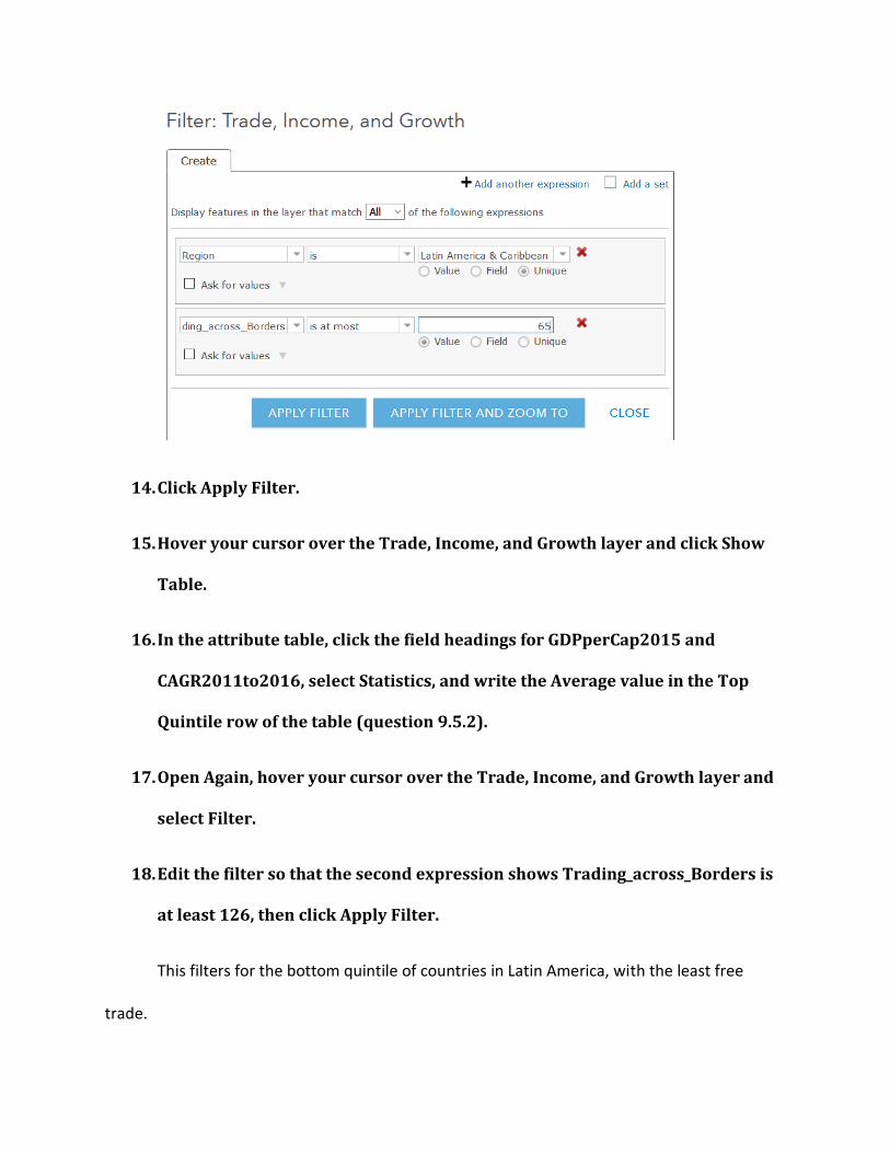
14. Click Apply Filter.
15. Hover your cursor over the Trade, Income, and Growth layer and click Show
Table.
16. In the attribute table, click the field headings for GDPperCap2015 and
CAGR2011to2016, select Statistics, and write the Average value in the Top
Quintile row of the table (question 9.5.2).
17. Open Again, hover your cursor over the Trade, Income, and Growth layer and
select Filter.
18. Edit the filter so that the second expression shows Trading_across_Borders is
at least 126, then click Apply Filter.
This filters for the bottom quintile of countries in Latin America, with the least free
trade.

19. Once again, in the attribute table, click the field headings for GDPperCap2015
and CAGR2011to2016, select Statistics, and write the Average value in the
Bottom Quintile row of the table. (If necessary, close the attribute table and
click Show Table again to refresh the values.)
Question 9.5.2
Latin America
GDP Per Capita 2015 CAGR 2011 to 2016
Top Quintile (easiest to trade)
Bottom Quintile (hardest to
trade)
20. Repeat the preceding steps, setting the first filter expression so that Region is
Sub-Saharan Africa.
21. Set the second expression so that Trading_across_Borders is at most 106, then
set it so that Trading_across_Borders is at least 177.
22. Complete the table (question 9.5.3).
Question 9.5.3
Sub-Saharan Africa
GDP Per Capita 2015 CAGR
Top Quintile (easiest to trade)
Bottom Quintile (hardest to
trade)

Question 9.5.4
Which group of countries has a higher average GDP per capita and higher compound annual
growth rates, those in the top quintile of east of trade, or those in the bottom quintile?
Question 9.5.5
Based on these results, should countries impost trade tariffs (import taxes) to protect local
industries, or should they allow for the free movement of goods based on their comparative
advantage?
Question 9.5.6
Do you think there are any instances when trade restrictions can benefit a country? Explain
your reasoning.
Question 9.5.7
From the book, explain how more open flows of people and ideas can also lead to growth.
Conclusion
In this exercise, you analyzed the relationship between ease of trade and development.
It sometimes seems contradictory that foreign competition in producing goods and services can
lead to better development outcomes for all countries, but the theory and evidence is largely
clear that it does.