interactive visualization for system log analysis
TRANSCRIPT
Interactive Visualization for System Log Analysis
Armin Samii and Woojong Koh∗
University of California, Berkeley
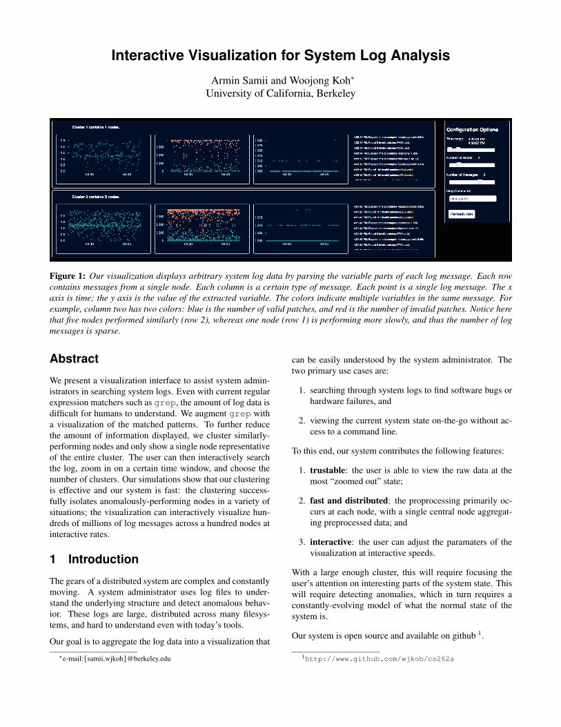
Figure 1: Our visualization displays arbitrary system log data by parsing the variable parts of each log message. Each rowcontains messages from a single node. Each column is a certain type of message. Each point is a single log message. The xaxis is time; the y axis is the value of the extracted variable. The colors indicate multiple variables in the same message. Forexample, column two has two colors: blue is the number of valid patches, and red is the number of invalid patches. Notice herethat five nodes performed similarly (row 2), whereas one node (row 1) is performing more slowly, and thus the number of logmessages is sparse.
Abstract
We present a visualization interface to assist system admin-istrators in searching system logs. Even with current regularexpression matchers such as grep, the amount of log data isdifficult for humans to understand. We augment grep witha visualization of the matched patterns. To further reducethe amount of information displayed, we cluster similarly-performing nodes and only show a single node representativeof the entire cluster. The user can then interactively searchthe log, zoom in on a certain time window, and choose thenumber of clusters. Our simulations show that our clusteringis effective and our system is fast: the clustering success-fully isolates anomalously-performing nodes in a variety ofsituations; the visualization can interactively visualize hun-dreds of millions of log messages across a hundred nodes atinteractive rates.
1 Introduction
The gears of a distributed system are complex and constantlymoving. A system administrator uses log files to under-stand the underlying structure and detect anomalous behav-ior. These logs are large, distributed across many filesys-tems, and hard to understand even with today’s tools.
Our goal is to aggregate the log data into a visualization that
∗e-mail:{samii,wjkoh}@berkeley.edu
can be easily understood by the system administrator. Thetwo primary use cases are:
1. searching through system logs to find software bugs orhardware failures, and
2. viewing the current system state on-the-go without ac-cess to a command line.
To this end, our system contributes the following features:
1. trustable: the user is able to view the raw data at themost “zoomed out” state;
2. fast and distributed: the proprocessing primarily oc-curs at each node, with a single central node aggregat-ing preprocessed data; and
3. interactive: the user can adjust the paramaters of thevisualization at interactive speeds.
With a large enough cluster, this will require focusing theuser’s attention on interesting parts of the system state. Thiswill require detecting anomalies, which in turn requires aconstantly-evolving model of what the normal state of thesystem is.
Our system is open source and available on github 1.
1http://www.github.com/wjkoh/cs262a
2 Related Work
Given the wide range of distributed applications, system loganalysis has been a prominent research area for decades. Un-fortunately, given the available visualization tools in the past,none are adequate for off-the-shelf use. We divide the relatedwork into two sections: system state analysis and system loganalysis. The system state refers to aggregating data aboutthe statistics of resource usage in a system, agnostic to theapplication. System logs are arbitrary print statements in apiece of code, distributed across one or more nodes.
2.1 System State Analysis
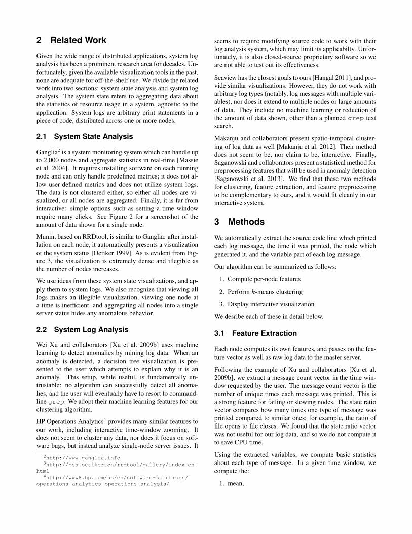
Ganglia2 is a system monitoring system which can handle upto 2,000 nodes and aggregate statistics in real-time [Massieet al. 2004]. It requires installing software on each runningnode and can only handle predefined metrics; it does not al-low user-defined metrics and does not utilize system logs.The data is not clustered either, so either all nodes are vi-sualized, or all nodes are aggregated. Finally, it is far frominteractive: simple options such as setting a time windowrequire many clicks. See Figure 2 for a screenshot of theamount of data shown for a single node.
Munin, based on RRDtool, is similar to Ganglia: after instal-lation on each node, it automatically presents a visualizationof the system status [Oetiker 1999]. As is evident from Fig-ure 3, the visualization is extremely dense and illegible asthe number of nodes increases.
We use ideas from these system state visualizations, and ap-ply them to system logs. We also recognize that viewing alllogs makes an illegible visualization, viewing one node ata time is inefficient, and aggregating all nodes into a singleserver status hides any anomalous behavior.
2.2 System Log Analysis
Wei Xu and collaborators [Xu et al. 2009b] uses machinelearning to detect anomalies by mining log data. When ananomaly is detected, a decision tree visualization is pre-sented to the user which attempts to explain why it is ananomaly. This setup, while useful, is fundamentally un-trustable: no algorithm can successfully detect all anoma-lies, and the user will eventually have to resort to command-line grep. We adopt their machine learning features for ourclustering algorithm.
HP Operations Analytics4 provides many similar features toour work, including interactive time-window zooming. Itdoes not seem to cluster any data, nor does it focus on soft-ware bugs, but instead analyze single-node server issues. It
2http://www.ganglia.info3http://oss.oetiker.ch/rrdtool/gallery/index.en.
html4http://www8.hp.com/us/en/software-solutions/
operations-analytics-operations-analysis/
seems to require modifying source code to work with theirlog analysis system, which may limit its applicabilty. Unfor-tunately, it is also closed-source proprietary software so weare not able to test out its effectiveness.
Seaview has the closest goals to ours [Hangal 2011], and pro-vide similar visualizations. However, they do not work witharbitrary log types (notably, log messages with multiple vari-ables), nor does it extend to multiple nodes or large amountsof data. They include no machine learning or reduction ofthe amount of data shown, other than a planned grep textsearch.
Makanju and collaborators present spatio-temporal cluster-ing of log data as well [Makanju et al. 2012]. Their methoddoes not seem to be, nor claim to be, interactive. Finally,Saganowski and collaborators present a statistical method forpreprocessing features that will be used in anomaly detection[Saganowski et al. 2013]. We find that these two methodsfor clustering, feature extraction, and feature preprocessingto be complementary to ours, and it would fit cleanly in ourinteractive system.
3 Methods
We automatically extract the source code line which printedeach log message, the time it was printed, the node whichgenerated it, and the variable part of each log message.
Our algorithm can be summarized as follows:
1. Compute per-node features
2. Perform k-means clustering
3. Display interactive visualization
We desribe each of these in detail below.
3.1 Feature Extraction
Each node computes its own features, and passes on the fea-ture vector as well as raw log data to the master server.
Following the example of Xu and collaborators [Xu et al.2009b], we extract a message count vector in the time win-dow requested by the user. The message count vector is thenumber of unique times each message was printed. This isa strong feature for failing or slowing nodes. The state ratiovector compares how many times one type of message wasprinted compared to similar ones; for example, the ratio offile opens to file closes. We found that the state ratio vectorwas not useful for our log data, and so we do not compute itto save CPU time.
Using the extracted variables, we compute basic statisticsabout each type of message. In a given time window, wecompute the:
1. mean,
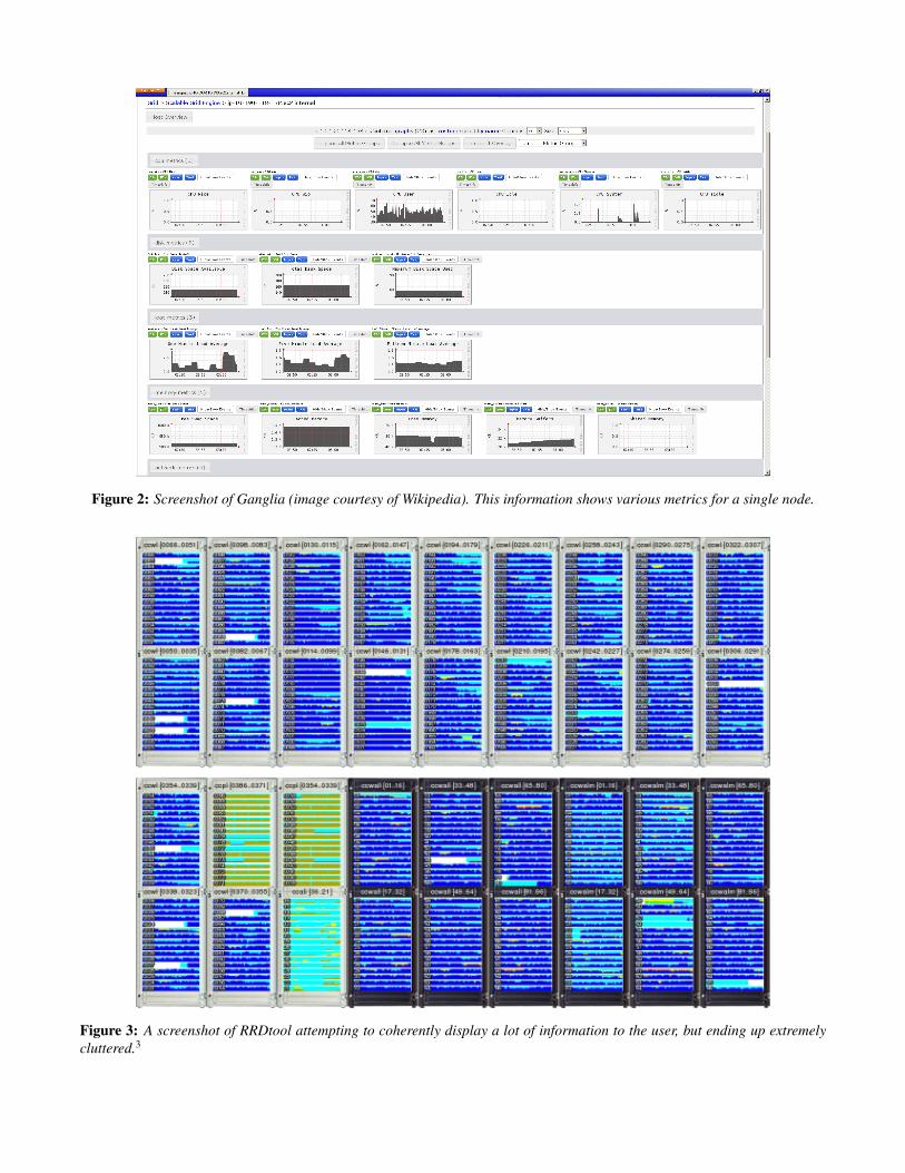
Figure 2: Screenshot of Ganglia (image courtesy of Wikipedia). This information shows various metrics for a single node.
Figure 3: A screenshot of RRDtool attempting to coherently display a lot of information to the user, but ending up extremelycluttered.3
2. standard deviation,
3. slope of a linear regression,
4. z-score, and
5. r-value.
These would indicate anomalies involving, for example, a di-verging residual in a machine learning application, a sectionof code which takes too long to run, and a message whichkeeps working on the same file rather than working on newfiles.
3.2 Clustering
We perform k-means clustering in the feature vectorspace [MacQueen 1967; Lloyd 1982]. With a small num-ber of nodes (on the order of tens), the clustering can beperformed on a single machine quickly. On more nodes, adistributed k-means algorithm is required, which can eitherbe exact and slower [Jin et al. 2006] or approximate [Ka-nungo et al. 2002]. Since the clustering will occur each timethe user updates the parameters of the visualization, it is es-sential that it is fast.
Once the desired number of centroids are found, we computethe node which is closest to the centroid in a least-squaressense and display only that node. Therefore, the visualiza-tion master server need only receive O(k) data to pass on tothe user, linear with the number of centroids, instead of withthe total number of nodes.
3.3 Visualization
The master server collects the data from each node and usesan HTTP Apache Server to pass the data on to the client. Weuse d3.js to visualize the data [Bostock et al. 2011]. We use ascatterplot where each point is a raw log message, the x axisis time, and the y axis is the parsed variables (see Figure 1).Mousing over a scatter point displays the text of the raw logmessage. Each row in the visualization is the nearest nodeto the centroid of the k-means clustering. Each column isa specific type of log message, identified by its line in thesource code.
The user can interactively change the time window, the num-ber of desired clusters, and the regular expression pattern.With each change, the clusters are recomputed and new datais shown. Clustering is only performed on the log messageswhich match the regular expression pattern in the given timewindow.
Because the visualization gets cluttered if there are too manyscatter points in a single graph, each graph at most shows5,000 messages, each one evenly spaced in time. Zoomingin (narrowing the time range) allows finer sampling of thelog messages.
4 Implementation
We identify each log message by the node and source codeline that generated it. We assume that all logs are gener-ated using the Google Logging Library (GLOG)5 in order toknow which source line generated which log message. Thisassumption can be dropped using the mining algorithm ofXu and collaborators [Xu et al. 2009a].
4.1 Log Parser
GLOG provides a consistent log format so we were able tobuild a parser easily using Python’s regular expression li-brary. After parsing we need to group every log message byits message type and extract nominal and quantitative datafrom the messages.
First, we group log messages by its source file name andline number. We then separate dynamic parts of messagesfrom static parts using Ratcliff/Obershelp pattern recognition[Ratcliff and Metzener 1988]. If the dynamic part is a stringinstead of number (such as a filename), we simply discretizethe value. This will succeed in detecting if an anomalousnode is opening the same file repeatedly, and other similarissues, but will fail on text data that is semantically mean-ingful.
4.2 Feature Extraction and Clustering
The parameters requested by a user affect the input to theclustering, so we need to be able to compute feature extrac-tion at interactive rates. Our current implementation onlyuses the message count vector [Xu et al. 2009b] for our fea-ture vector to achieve such rates. Our message count vectorcomputation uses prefix sums, where each message at timet = T knows the message count in the range t ∈ [0, T ].To find the message count vector in a certain timeranget ∈ [t0, t1], we find the closest message after t = t0 and theclosest message before t = t1, and subtract the prefix sum ateach of those times. This results in t ∈ [0, t1]− [0, t0] = t ∈[t0, t1], the exact range we want. Similar optimizations canbe performed for the simple statistical features.
4.3 Visualization
We used d3.js [Bostock et al. 2011] and jQuery UI librariesfor our user interfaces. The front end of our framework isa web-based dashboard, enabling easy viewing from a mo-bile device while on-the-go. However, in our experience, theinteraction is much simpler on a large display.
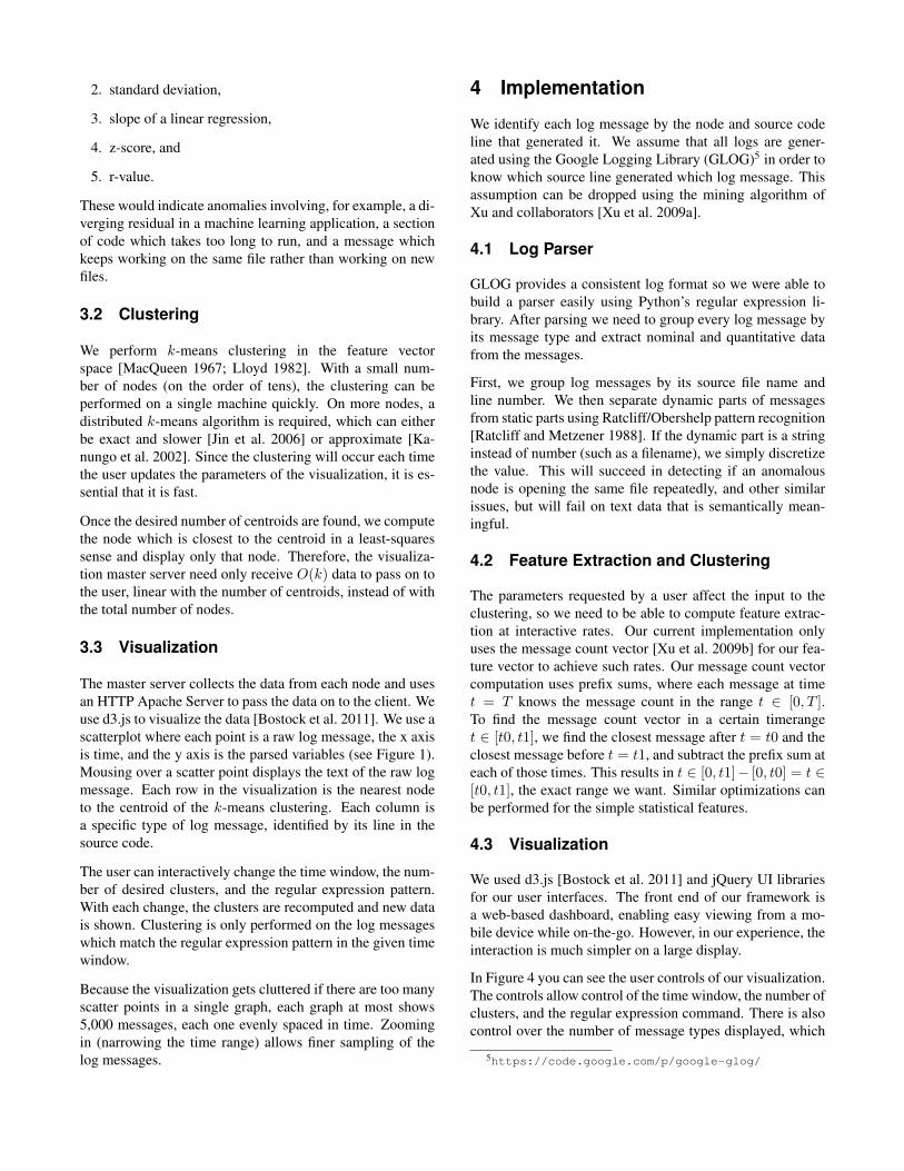
In Figure 4 you can see the user controls of our visualization.The controls allow control of the time window, the number ofclusters, and the regular expression command. There is alsocontrol over the number of message types displayed, which
5https://code.google.com/p/google-glog/
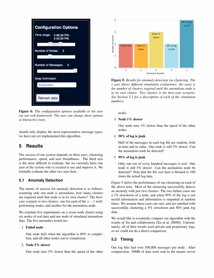
Figure 4: The configuration options available to the uservia our web framework. The user can change these optionsat interactive rates.
should only display the most representative message types;we have not yet implemented this algorithm.
5 Results
The success of our system depends on three axes: clusteringperformance, speed, and user friendliness. The third axisis the most difficult to evaluate, but we currently have oneuser of the system who is excited to use and improve it. Weformally evaluate the other two axes here.
5.1 Anomaly Detection
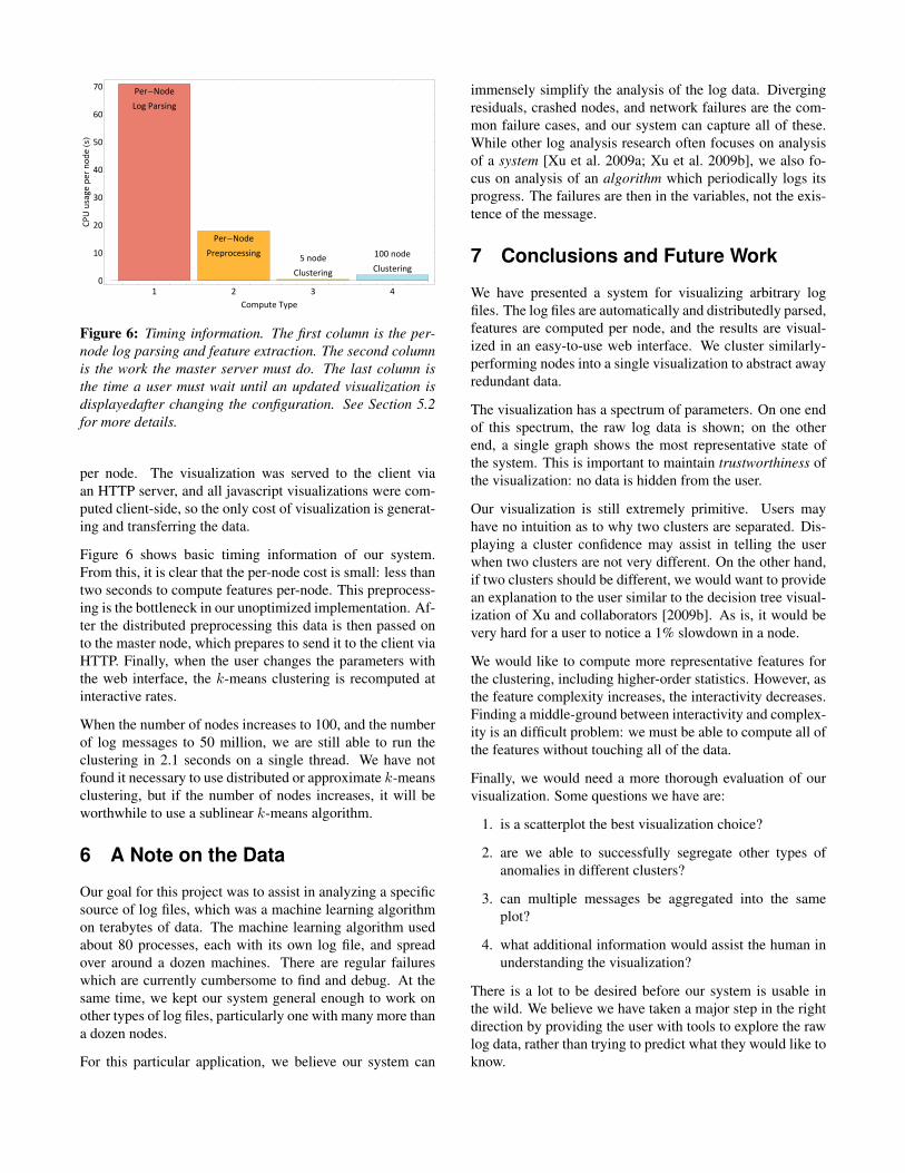
The metric of success for anomaly detection is as follows:assuming only one node is anomalous, how many clustersare required until that node is in its own cluster? The best-case scenario is two clusters: one for each of the n− 1 well-performing nodes, and another for the anomalous node.
We simulate five experiments on a seven node cluster usingsix nodes of real data and one node of simulated anomalousdata. The five anomalies tested are:
1. Failed node
One node fails when the algorithm is 80% to comple-tion, and all other nodes run to completion.
2. Node 5% slower
One node runs 5% slower than the speed of the other
Failed node Node 5%
slower
Node 1%
slower
50% of log
is junk
99% of log
is junk
1 2 3 4 5
0
1
2
3
4
Simulation Number
Num
ber
ofClu
sters
Figure 5: Results for anomaly detection via clustering. Thex axis shows different simulation evaluations; the yaxis isthe number of clusters required until the anomalous node isin its own cluster. Two clusters is the best-case scenario.See Section 5.1 for a description of each of the simulationnumbers.
nodes
3. Node 1% slower
One node runs 1% slower than the speed of the othernodes
4. 50% of log is junk
Half of the messages in each log file are random, bothin time and in value. One node is still 5% slower. Canthe anomalous node be detected?
5. 99% of log is junk
Only one out of every hundred messages is real. Onenode is still 5% slower. Can the anomalous node bedetected? Note that the file size here is bloated to 100times the actual log data.
Figure 5 shows the performance of our clustering on each ofthe above tests. Most of the clustering successfully detectsan anomaly with just two clusters. The two failure cases area 1% slowdown of a node, and when 99% of the log is notuseful information and information is outputted at randomtimes. We assume these cases are rare, and are satisfied withsuccessfully clustering a 5% slowdown and 50% junk logdata.
We would like to eventually compare our algorithm with theresults of Xu and collaborators [Xu et al. 2009b]. Unfortu-nately, all of their results used private and proprietary logs,so we could not do a direct comparison.
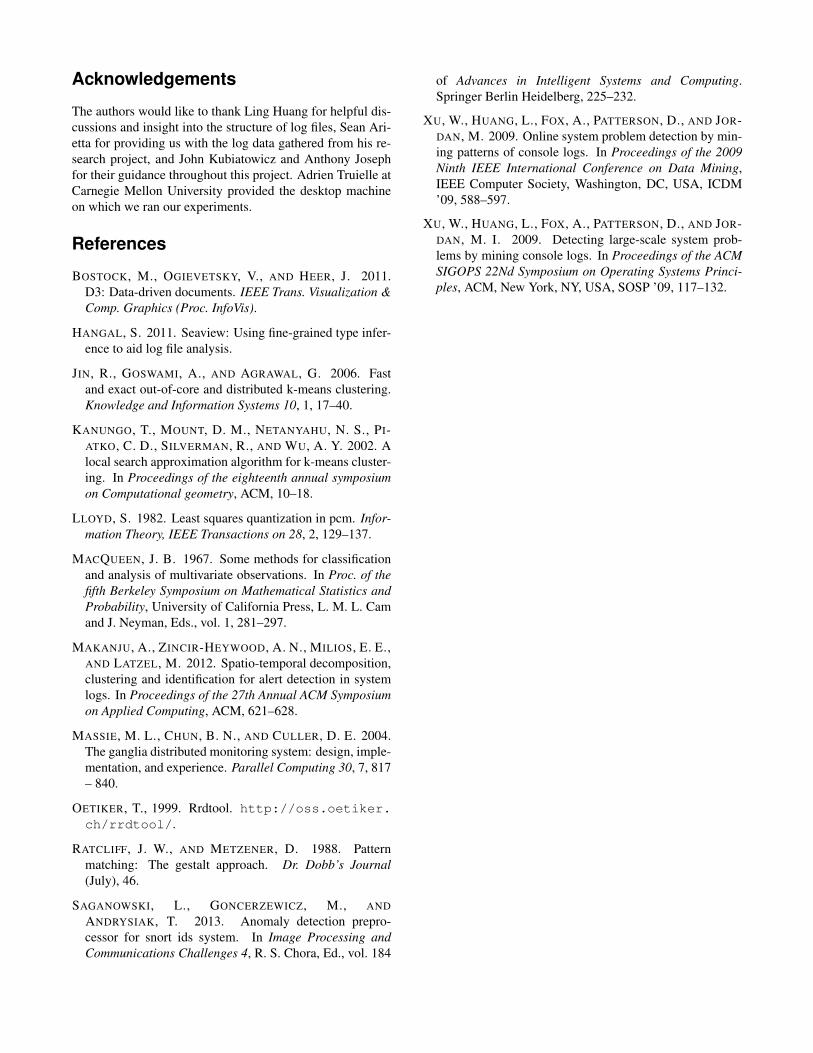
5.2 Timing
Our log files had over 500,000 messages per node. Aftercompression, 30MB of data were sent to the master server
Per-Node
Log Parsing
Per-Node
Preprocessing5 node
Clustering
100 node
Clustering
1 2 3 4
0
10
20
30
40
50
60
70
Compute Type
CPU
usa
ge
per
node
HsL
Figure 6: Timing information. The first column is the per-node log parsing and feature extraction. The second columnis the work the master server must do. The last column isthe time a user must wait until an updated visualization isdisplayedafter changing the configuration. See Section 5.2for more details.
per node. The visualization was served to the client viaan HTTP server, and all javascript visualizations were com-puted client-side, so the only cost of visualization is generat-ing and transferring the data.
Figure 6 shows basic timing information of our system.From this, it is clear that the per-node cost is small: less thantwo seconds to compute features per-node. This preprocess-ing is the bottleneck in our unoptimized implementation. Af-ter the distributed preprocessing this data is then passed onto the master node, which prepares to send it to the client viaHTTP. Finally, when the user changes the parameters withthe web interface, the k-means clustering is recomputed atinteractive rates.
When the number of nodes increases to 100, and the numberof log messages to 50 million, we are still able to run theclustering in 2.1 seconds on a single thread. We have notfound it necessary to use distributed or approximate k-meansclustering, but if the number of nodes increases, it will beworthwhile to use a sublinear k-means algorithm.
6 A Note on the Data
Our goal for this project was to assist in analyzing a specificsource of log files, which was a machine learning algorithmon terabytes of data. The machine learning algorithm usedabout 80 processes, each with its own log file, and spreadover around a dozen machines. There are regular failureswhich are currently cumbersome to find and debug. At thesame time, we kept our system general enough to work onother types of log files, particularly one with many more thana dozen nodes.
For this particular application, we believe our system can
immensely simplify the analysis of the log data. Divergingresiduals, crashed nodes, and network failures are the com-mon failure cases, and our system can capture all of these.While other log analysis research often focuses on analysisof a system [Xu et al. 2009a; Xu et al. 2009b], we also fo-cus on analysis of an algorithm which periodically logs itsprogress. The failures are then in the variables, not the exis-tence of the message.
7 Conclusions and Future Work
We have presented a system for visualizing arbitrary logfiles. The log files are automatically and distributedly parsed,features are computed per node, and the results are visual-ized in an easy-to-use web interface. We cluster similarly-performing nodes into a single visualization to abstract awayredundant data.
The visualization has a spectrum of parameters. On one endof this spectrum, the raw log data is shown; on the otherend, a single graph shows the most representative state ofthe system. This is important to maintain trustworthiness ofthe visualization: no data is hidden from the user.
Our visualization is still extremely primitive. Users mayhave no intuition as to why two clusters are separated. Dis-playing a cluster confidence may assist in telling the userwhen two clusters are not very different. On the other hand,if two clusters should be different, we would want to providean explanation to the user similar to the decision tree visual-ization of Xu and collaborators [2009b]. As is, it would bevery hard for a user to notice a 1% slowdown in a node.
We would like to compute more representative features forthe clustering, including higher-order statistics. However, asthe feature complexity increases, the interactivity decreases.Finding a middle-ground between interactivity and complex-ity is an difficult problem: we must be able to compute all ofthe features without touching all of the data.
Finally, we would need a more thorough evaluation of ourvisualization. Some questions we have are:
1. is a scatterplot the best visualization choice?
2. are we able to successfully segregate other types ofanomalies in different clusters?
3. can multiple messages be aggregated into the sameplot?
4. what additional information would assist the human inunderstanding the visualization?
There is a lot to be desired before our system is usable inthe wild. We believe we have taken a major step in the rightdirection by providing the user with tools to explore the rawlog data, rather than trying to predict what they would like toknow.
Acknowledgements
The authors would like to thank Ling Huang for helpful dis-cussions and insight into the structure of log files, Sean Ari-etta for providing us with the log data gathered from his re-search project, and John Kubiatowicz and Anthony Josephfor their guidance throughout this project. Adrien Truielle atCarnegie Mellon University provided the desktop machineon which we ran our experiments.
References
BOSTOCK, M., OGIEVETSKY, V., AND HEER, J. 2011.D3: Data-driven documents. IEEE Trans. Visualization &Comp. Graphics (Proc. InfoVis).
HANGAL, S. 2011. Seaview: Using fine-grained type infer-ence to aid log file analysis.
JIN, R., GOSWAMI, A., AND AGRAWAL, G. 2006. Fastand exact out-of-core and distributed k-means clustering.Knowledge and Information Systems 10, 1, 17–40.
KANUNGO, T., MOUNT, D. M., NETANYAHU, N. S., PI-ATKO, C. D., SILVERMAN, R., AND WU, A. Y. 2002. Alocal search approximation algorithm for k-means cluster-ing. In Proceedings of the eighteenth annual symposiumon Computational geometry, ACM, 10–18.
LLOYD, S. 1982. Least squares quantization in pcm. Infor-mation Theory, IEEE Transactions on 28, 2, 129–137.
MACQUEEN, J. B. 1967. Some methods for classificationand analysis of multivariate observations. In Proc. of thefifth Berkeley Symposium on Mathematical Statistics andProbability, University of California Press, L. M. L. Camand J. Neyman, Eds., vol. 1, 281–297.
MAKANJU, A., ZINCIR-HEYWOOD, A. N., MILIOS, E. E.,AND LATZEL, M. 2012. Spatio-temporal decomposition,clustering and identification for alert detection in systemlogs. In Proceedings of the 27th Annual ACM Symposiumon Applied Computing, ACM, 621–628.
MASSIE, M. L., CHUN, B. N., AND CULLER, D. E. 2004.The ganglia distributed monitoring system: design, imple-mentation, and experience. Parallel Computing 30, 7, 817– 840.
OETIKER, T., 1999. Rrdtool. http://oss.oetiker.ch/rrdtool/.
RATCLIFF, J. W., AND METZENER, D. 1988. Patternmatching: The gestalt approach. Dr. Dobb’s Journal(July), 46.
SAGANOWSKI, L., GONCERZEWICZ, M., ANDANDRYSIAK, T. 2013. Anomaly detection prepro-cessor for snort ids system. In Image Processing andCommunications Challenges 4, R. S. Chora, Ed., vol. 184
of Advances in Intelligent Systems and Computing.Springer Berlin Heidelberg, 225–232.
XU, W., HUANG, L., FOX, A., PATTERSON, D., AND JOR-DAN, M. 2009. Online system problem detection by min-ing patterns of console logs. In Proceedings of the 2009Ninth IEEE International Conference on Data Mining,IEEE Computer Society, Washington, DC, USA, ICDM’09, 588–597.
XU, W., HUANG, L., FOX, A., PATTERSON, D., AND JOR-DAN, M. I. 2009. Detecting large-scale system prob-lems by mining console logs. In Proceedings of the ACMSIGOPS 22Nd Symposium on Operating Systems Princi-ples, ACM, New York, NY, USA, SOSP ’09, 117–132.