information dashboard...
TRANSCRIPT
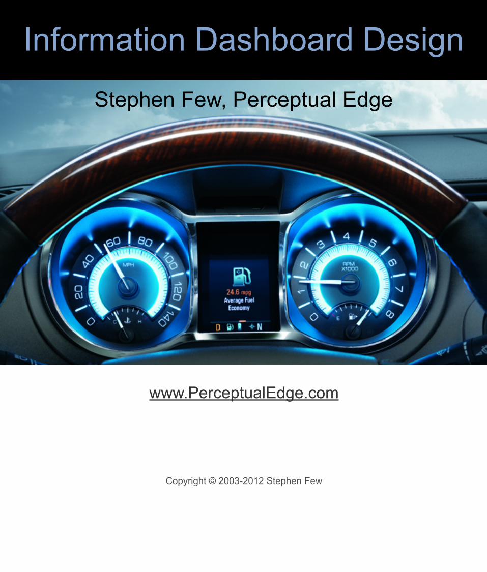
Information Dashboard Design
Stephen Few, Perceptual Edge
www.PerceptualEdge.com
Copyright © 2003-2012 Stephen Few

Upon this gifted age, in its dark hour,rains from the sky a meteoric showerof facts…they lie, unquestioned, uncombined.Wisdom enough to leach us of our illis daily spun; but there exists no loomto weave it into a fabric.
“Huntsman, What Quarry?”, 1939, Edna St. Vincent Millay
The amount of information that is available to businesses has increased dramatically in the last few years, but the ability to make use of it has increased little, if any.
Our networks are awash in data. A little of it is information. A smidgen of this shows up as knowledge. Combined with ideas, some of that is actually useful. Mix in experience, context, compassion, discipline, humor, tolerance, and humility, and perhaps knowledge becomes wisdom. (Turning Numbers into Knowledge, Jonathan G. Koomey, 2001, Analytics Press: Oakland, CA page 5, quoting Clifford Stoll)

We are awash in data. Everyone is scrambling for metrics, key performance indicators (KPIs), scorecards, and digital dashboards. Quantitative data is what we rely on most to measure the health of our organizations, to identify opportunities, and to anticipate the future.Despite great progress in our ability to gather and warehouse data, we’re still missing the boat if we don’t communicate the numbers effectively. Contrary to popular wisdom, information cannot always speak for itself.You can spend millions of dollars to build the most robust and pristine data warehouse in the world, running on the most powerful hardware, and accessed by state-of-the-art Business Intelligence software, but if the people who work with the data don’t know how to make sense of it or how to present it clearly to decision makers, your investment is wasted.

Performance dashboards were inevitable.
Given our love for the automobile in America, I suppose it was inevitable that something called a business dashboard would eventually emerge. This did not occur without precedent. In many respects, the dashboard is the rebirth of the Executive Information Systems (EIS) of the 1980s, which never quite got off the ground. Following that, in the 1990s, the introduction of the Balanced Scorecard by Kaplan and Norton, with its emphasis on key performance indicators (KPIs) as a means to measure what’s going on in the business opened the door for the dashboard display. What really boosted the popularity of dashboards in the early 21st century, however, was the Enron scandal in 2001, which made companies desperate for new ways to monitor the business and to demonstrate to their shareholders that they were in control of what was happening.
Now that they are here and have been become popular, the question that we ought to be asking is “Are they doing the job?” In other words, do they communicate what people need to do their jobs clearly and efficiently?

They’re everywhere today!
Dashboards are extremely popular today. Everyone assumes that dashboards are useful. Like all aspects of business intelligence, however, they can be done well or they can be done poorly.

But most dashboards fail.
Dashboards like this are typical. You can find them on the websites of most business intelligence vendors. In their attempt to dazzle us visually, they fail entirely to present information is a way that can be understood at a glance.

The fundamental problems?
• They say too little• What they do say, they say poorly
This failure is not rooted primarily in technology; it is a failure of communication, rooted in poor design. The main problem that plagues dashboards today is that they say too little and what they do say they don’t say very well. In other words, they are not very informative. When designed properly, a dashboard provides an overview of what’s going on, clearly and rapidly.
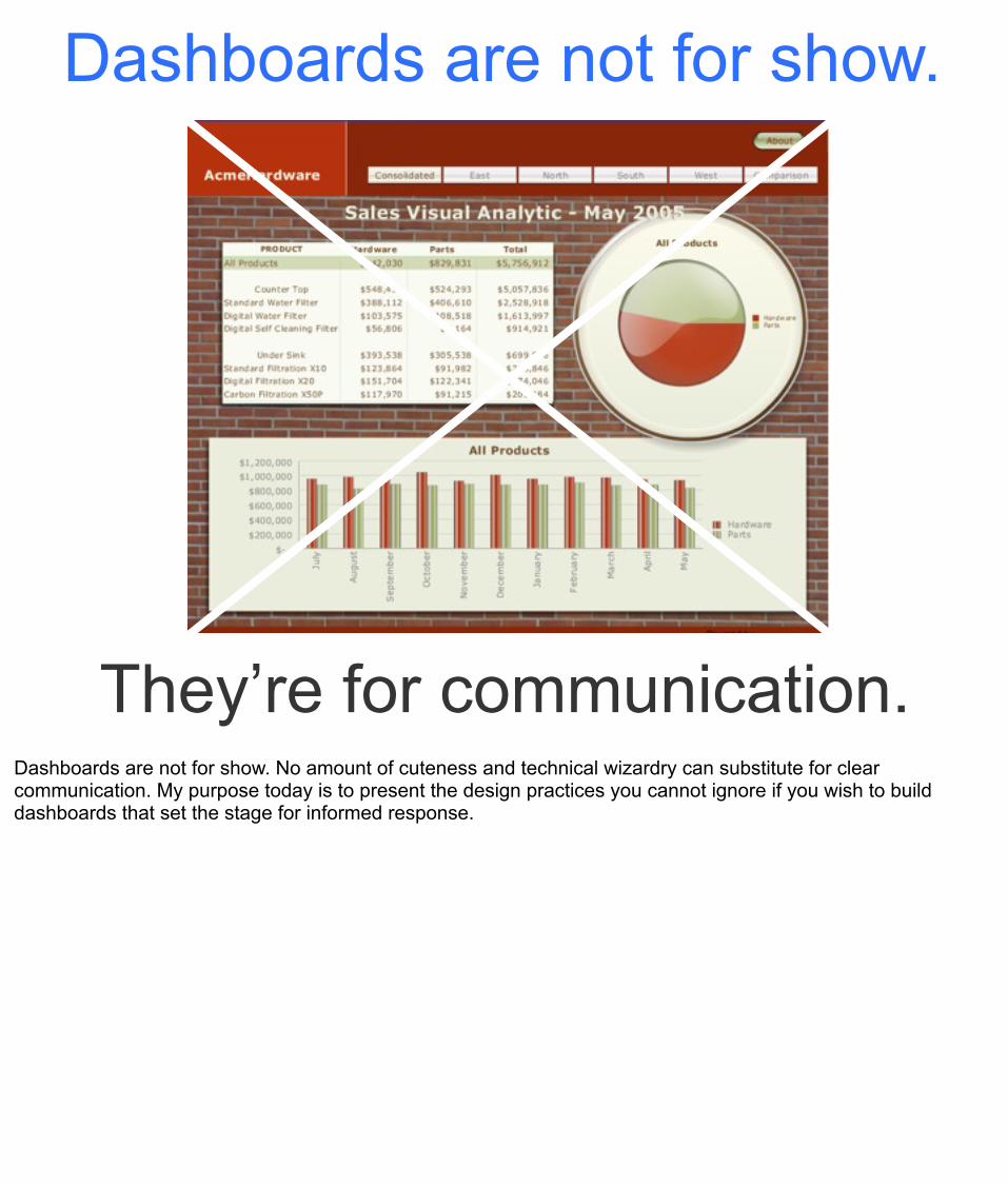
Dashboards are not for show.
They’re for communication.Dashboards are not for show. No amount of cuteness and technical wizardry can substitute for clear communication. My purpose today is to present the design practices you cannot ignore if you wish to build dashboards that set the stage for informed response.

Dashboard
?Everyone defines dashboards differently, if at all, including the vendors who sell them. Before proceeding, we need a definition.
The examples that follow in the next few slides are all screen prints of displays that their creators call “dashboards” (or in one case a “cockpit”). See if you can come up with a definition of “dashboard” based on these examples.

(Source: Website of Business Objects.)

(Source: Website of Cognos Incorporated.)

(Source: Website of Infommersion Incorporated, which has been acquired by Business Objects.)

(Source: Website of Axiom Systems.)
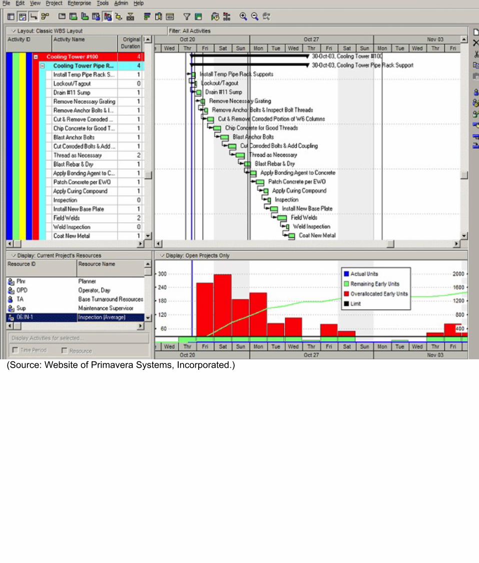
(Source: Website of Primavera Systems, Incorporated.)

(Source: Website of MIT.)
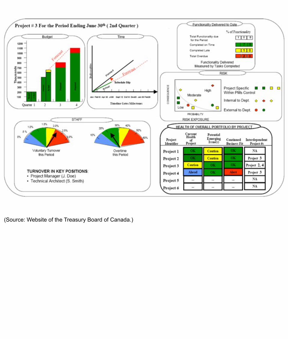
(Source: Website of the Treasury Board of Canada.)

(Source: Website of Business Gauges)

(Source: Website of the Indianapolis Museum of Art.)
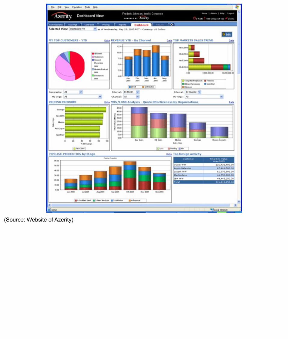
(Source: Website of Azerity)

(Source: Website of the Virginia Department of Transportation.)

(Source: Website of BMC)

(Source: Website of Bristol Technology)

(Source: Website of FushionCharts.)

(Source: Website of QlikTech.)

(Source: Website of ExcelUser.com)

(Source: Website of iDashboards.)
(Source: Website of SAS.)

(Source: Michael Moore, created using Tableau.)

(Source: An anonymous Internet dater who posted this dashboard-like display of his vital statistics on www.Craigslist.com.)

DashboardA visual display
of
the most important information neededto achieve one or more objectives
that has been
consolidated on a single computer screenso it can be
monitored and understood at a glance
A dashboard is a visual display of the most importantinformation needed to achieve one or more objectives;consolidated and arranged on a single screen so theinformation can be monitored at a glance.
This definition first appeared in the March 20, 2004 issue of Intelligent Enterprise magazine in an article written by Stephen Few entitled “Dashboard Confusion.”
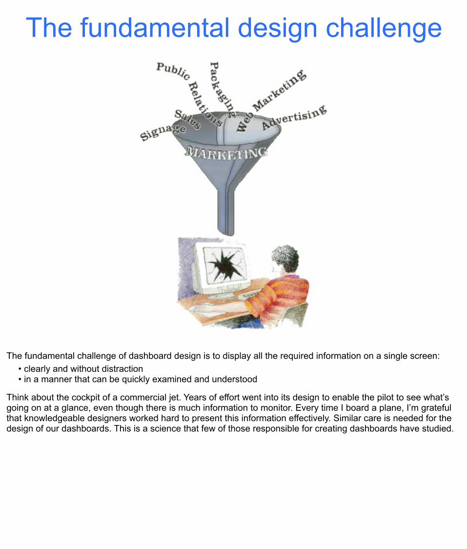
The fundamental design challenge
The fundamental challenge of dashboard design is to display all the required information on a single screen:• clearly and without distraction• in a manner that can be quickly examined and understood
Think about the cockpit of a commercial jet. Years of effort went into its design to enable the pilot to see what’s going on at a glance, even though there is much information to monitor. Every time I board a plane, I’m grateful that knowledgeable designers worked hard to present this information effectively. Similar care is needed for the design of our dashboards. This is a science that few of those responsible for creating dashboards have studied.

It is because of these unique design requirements that I wrote the book Information Dashboard Design. The principles are not difficult to learn, but they aren’t obvious until someone points them out.

1. Scan the big picture
2. Zoom in on important specifics
3. Link to supporting details
The monitoring process
The process of visual monitoring involves a series of sequential steps that the dashboard should be designed to support. The user should begin be getting an overview of what’s going on and quickly identifying what needs attention. Next, the user should look more closely at each of those areas that need attention to be able to understand them well enough to determine if something should be done about them. Lastly, if additional details are needed to complete the user’s understanding before deciding how to respond, the dashboard should serve as a seamless launch pad to that information, and perhaps even provide the means to initiate automated responses, such as sending emails to those who should take action.

Monitoring is most efficiently done with our eyes.
70% 30%
Monitoring is a cognitive activity that receives input primarily through the visual channel because this is our most powerful sense, working at high speeds of parallel input, able to detect subtle distinctions and complex patterns. Seventy percent of the sense receptors in the human body reside in our eyes.
It’s sometimes appropriate to use auditory signals to get people’s attention when they aren’t looking at the screen, but we must make use of their eyes to perceive the rest.
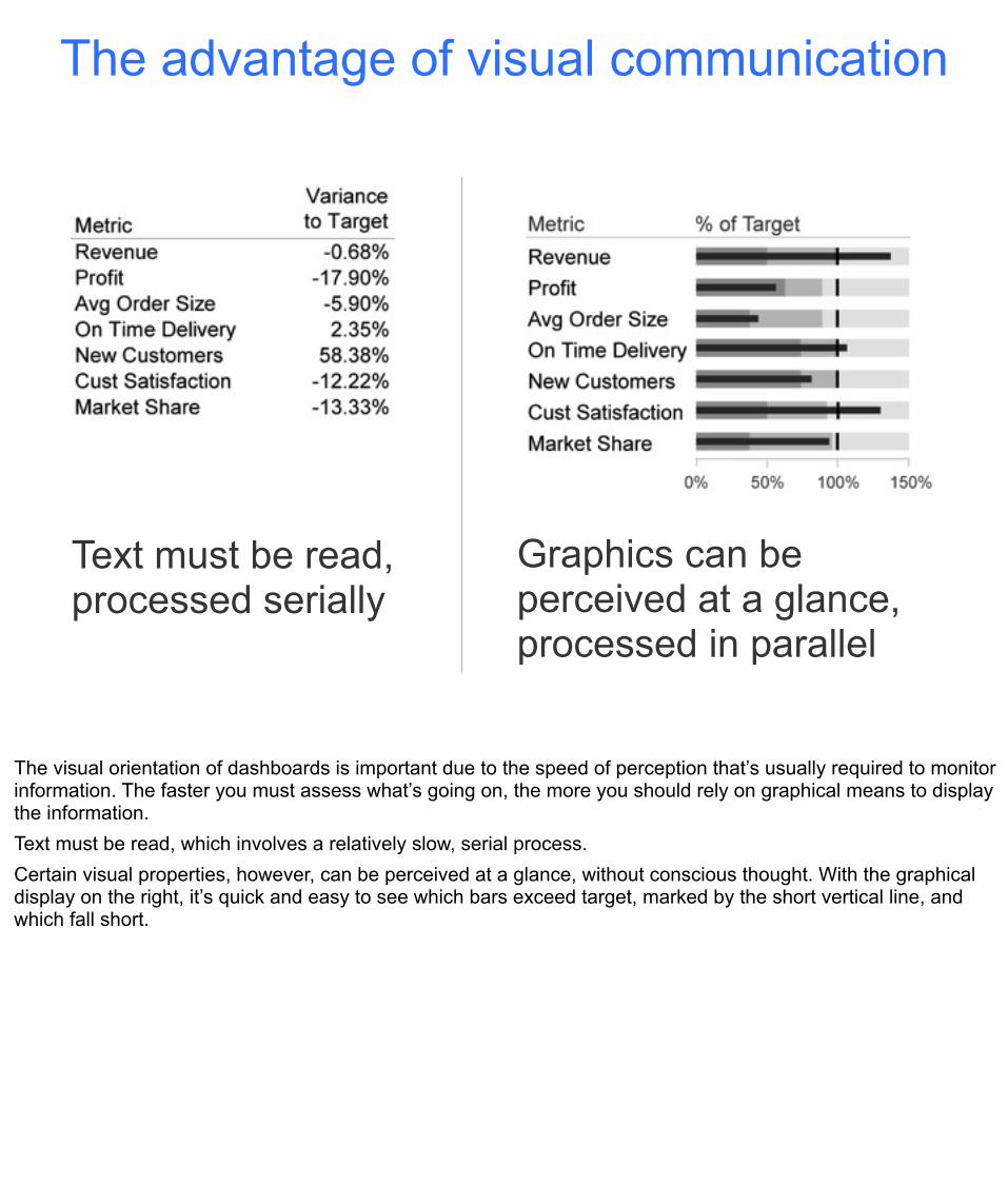
The advantage of visual communication
Text must be read,processed serially
Graphics can be perceived at a glance, processed in parallel
The visual orientation of dashboards is important due to the speed of perception that’s usually required to monitor information. The faster you must assess what’s going on, the more you should rely on graphical means to display the information. Text must be read, which involves a relatively slow, serial process. Certain visual properties, however, can be perceived at a glance, without conscious thought. With the graphical display on the right, it’s quick and easy to see which bars exceed target, marked by the short vertical line, and which fall short.

13 common mistakes in dashboard design6

1. Exceeding the boundaries of a single screen
My insistence that a dashboard confine its display to a single screen with no need for scrolling might seem arbitrary, but it is based on the findings of perceptual and cognitive research. Something powerful happens when you see things together, all within eye span. You are able to make comparisons, spot relationships, and see the big picture. This ability is lost when you must lose sight of some data in order to scroll down or over to see other data. Part of the problem is that we can only hold a few chunks of information at a time in short-term memory. Relying on the mind’s eye to retain a visualization that is no longer visible is a limited venture. One of the great benefits of a dashboard is the simultaneity of vision, the ability to see everything that you need at once. This enables comparisons that lead to insights that might not occur in any other way.
The dashboard shown above not only leaves us wondering what lies below the bottom of the screen, we’re also only given immediate visual access to the first of many metrics that appear at the top right, under the heading “No. of transactions”. Don’t force your viewers to scroll around to see what they need. I’d prefer a printed report that extends across multiple pages, because at least then I could lay out all of the pages at once for simultaneous viewing.
(Source: Website of Business Objects.)
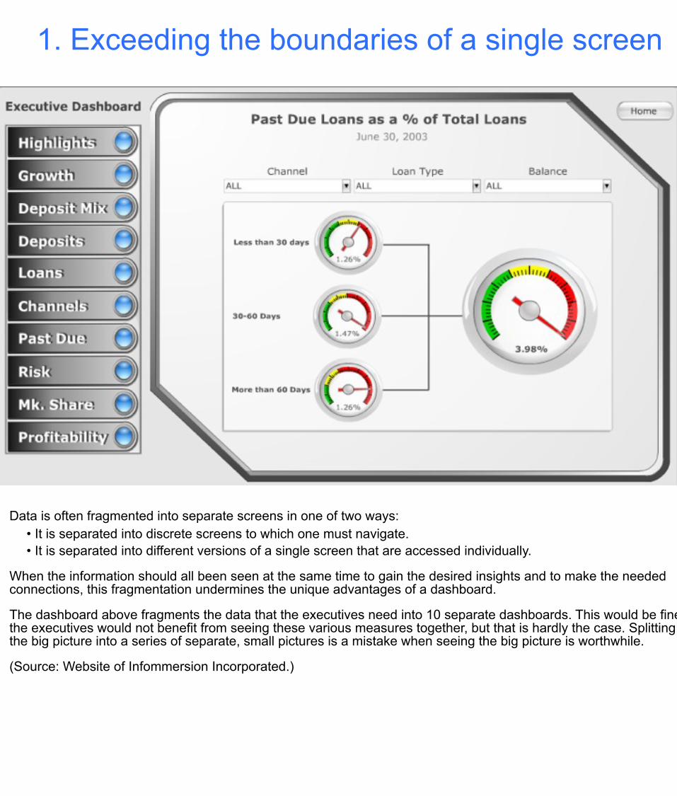
1. Exceeding the boundaries of a single screen
Data is often fragmented into separate screens in one of two ways:• It is separated into discrete screens to which one must navigate.• It is separated into different versions of a single screen that are accessed individually.
When the information should all been seen at the same time to gain the desired insights and to make the needed connections, this fragmentation undermines the unique advantages of a dashboard.
The dashboard above fragments the data that the executives need into 10 separate dashboards. This would be fine if the executives would not benefit from seeing these various measures together, but that is hardly the case. Splitting the big picture into a series of separate, small pictures is a mistake when seeing the big picture is worthwhile.
(Source: Website of Infommersion Incorporated.)

2. Supplying inadequate context for the data
YTD Units: 7,822
Measures of what’s going on in the business rarely do well as solo acts; they need a good supporting cast to get their message across. To state that quarter-to-date sales total $736,502 without any context means little. Compared to what? Is this good or bad? How good or bad? Are we on track? Is this better than before? The right context for the key measures makes the difference between numbers that just sit there on the screen and those that enlighten and inspire action.
The gauges above could have easily incorporated useful context, but they fall short of their potential. The center gauge tells us only that 7,822 units have sold year to date and that this number is good, indicated by the green arrow.
Quantitative scales on a graphic, such as those suggested by the tick marks around these gauges, are meant to help us interpret the measures, but they can only do so when scales are labeled with numbers, which these gauges lack. A great deal of the space that is used by these gauges tells us nothing whatsoever.
(Source: Website of Informmersion Incorporated.)

3. Choosing inappropriate display media
Bad
Good
This is one of the most common design mistakes made, not just on dashboards, but in all forms of data presentation. Using a graph when a table of numbers would work better and vice versa is a frequent mistake, but the one that stands out as the most common and egregious is using the wrong type of graphic.
Without the value labels on the pie chart above, you would conclude that all of the slices are roughly equal in size. The bar graph below it, however, tells the story clearly and quickly, because it is a better medium of display for this information.
(Source: Website of Corda Technologies Incorporated.)
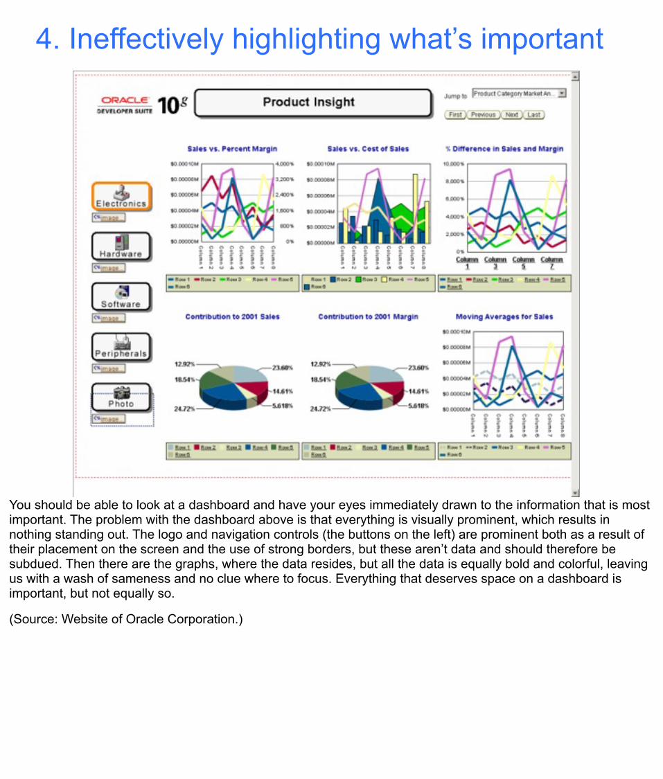
4. Ineffectively highlighting what’s important
You should be able to look at a dashboard and have your eyes immediately drawn to the information that is most important. The problem with the dashboard above is that everything is visually prominent, which results in nothing standing out. The logo and navigation controls (the buttons on the left) are prominent both as a result of their placement on the screen and the use of strong borders, but these aren’t data and should therefore be subdued. Then there are the graphs, where the data resides, but all the data is equally bold and colorful, leaving us with a wash of sameness and no clue where to focus. Everything that deserves space on a dashboard is important, but not equally so.
(Source: Website of Oracle Corporation.)

5. Cluttering it with useless decoration
One of the most common problems on dashboards that are found on vendor websites is the abundance of useless decoration. They either hope that we will be drawn in by the artistry or assume that the decorative flourishes are necessary to keep us entertained. I assure you, however, that even people who enjoy the decoration upon first sight will grow weary of it in a short time.
The makers of the dashboard above did an exceptional job of making it look like an electronic control panel. If the purpose were to train people in the use of equipment that actually looks like this by simulating it, then this would be great, but that isn’t the purpose of a dashboard. The graphics dedicated to this end are pure decoration, visual content that the viewer must process to get to the data.
(Source: Website of Axiom Systems.)

6. Misusing or overusing color
Color can be used to highlight data, encode data, and create a relationship between individual items on the screen. Color choices should be made thoughtfully, based on an understanding of how we perceive color and the significance of color differences. Some colors are hot and demand our attention while others are cooler and less demanding. When any color appears as a contrast to the norm, our eyes pay attention and our brains attempt to assign meaning to that difference. When colors in two different displays are the same we are tempted to relate them to one another. We merrily assume that we can use colors like red, yellow and green to assign important meanings to data, but in doing so we exclude the 10% of males and 1% of females who are colorblind.Using too many colors is a common problem, especially bright colors. Because dashboards are often densely packed with information, the visual content must be kept as simple as possible. Using of too many colors can be visually assaulting.The graph above, taken from a dashboard, misuses color in several ways, but one problem stands out as most egregious. What is the meaning of the separate color for each bar? The correct answer is that the colors mean nothing. There is no reason to assign different colors to the bars for they are already labeled along the Y axis. Nevertheless, time is wasted as our brains—whether consciously or unconsciously—search for the meaning of these differences which isn’t there. It is best to keep colors subdued and neutral, except when you are using color to highlight something as especially important.(Source: Website of Corda Technologies.)
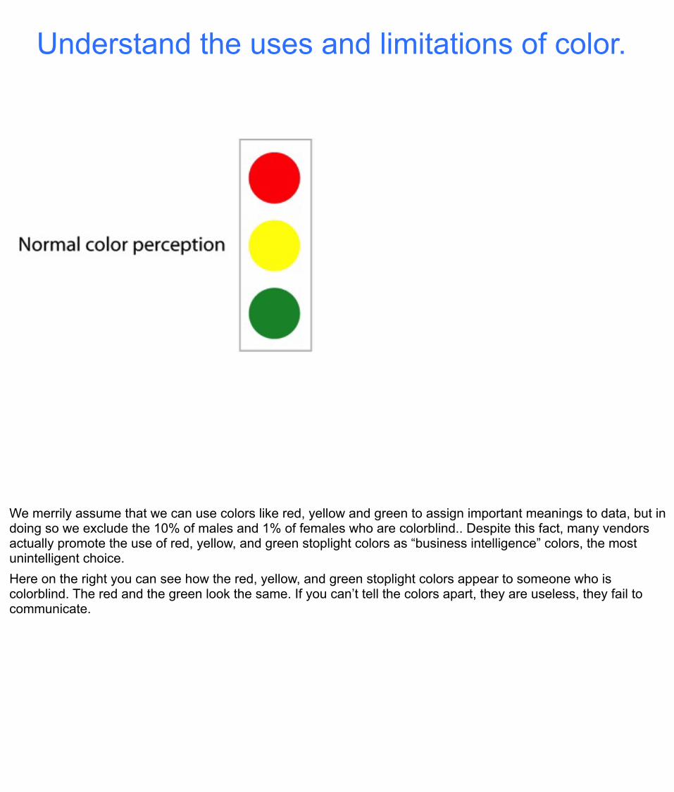
Understand the uses and limitations of color.
We merrily assume that we can use colors like red, yellow and green to assign important meanings to data, but in doing so we exclude the 10% of males and 1% of females who are colorblind.. Despite this fact, many vendors actually promote the use of red, yellow, and green stoplight colors as “business intelligence” colors, the most unintelligent choice. Here on the right you can see how the red, yellow, and green stoplight colors appear to someone who is colorblind. The red and the green look the same. If you can’t tell the colors apart, they are useless, they fail to communicate.

Too much color undermines its potential.
People tend to overuse color on dashboards, assuming that the brighter and more colorful they are, the better they work, but the opposite is true. People who understand color and how it can be used to display information use it sparingly. Too much color is visually overwhelming; it tires our eyes. Also, if you use color gratuitously, you undermine its ability to be used to make things stand out. Notice how the red alerts clearly stand out in the bottom display in contrast to the neutral grays and blacks that been used elsewhere, rather than being lost in the meaninglessly colorful display above.

Eloquence through simplicity
To clearly present everything on a single screen, even the slightest lack of organization will result in a confusing mess. You must condense the information, you must include only what you absolutely need, and you must use display media that can be easily read and understood even when they are small, which is often necessary.Elegance in communication can be achieved through simplicity of design. Too often we smear a thick layer of gaudy makeup on top of the data in an effort to impress, rather than to communicate the truth in the clearest possible way.
“Simplify, simplify, simplify.”Henry David Thoreau

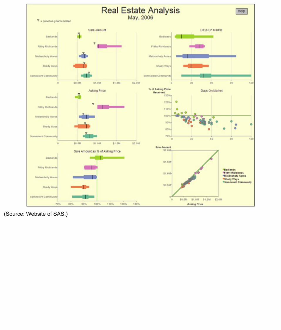
We finish up now with an example of a well-designed dashboard. Notice the way that all of the principles that we’ve covered in this workshop have been combined to create a data-rich, yet simple and accessible sales dashboard.
Notice the following characteristics:• Color has been used sparingly.• The prime real estate on the screen has been used for the most important data.• Small, concise display media have been used to support the display of a dense set of data in a small
amount of space.• Some measures have been presented both graphically and as text when precise values are frequently
needed.• Subtle means have been used to delineate and group data.• The dashboard has not been cluttered with instructions and descriptions that will seldom be needed.