indiana's housing market 2013 - indiana business research center
TRANSCRIPT
A Report for the Indiana Association of REALTORS®
Indiana’s Housing Market2013: On the Rise

Indiana’s Housing Market 2013: On the Rise
November 2013
Prepared for Indiana Association of REALTORS®
By Matt Kinghorn, Economic Analyst Indiana Business Research Center, Kelley School of Business, Indiana University
ii
Table of Contents EXECUTIVE SUMMARY ..................................................................................... 1
Key Findings .............................................................................................................................................. 2
MARKET CONDITIONS ...................................................................................... 3
Home Sales Off to a Strong Start in 2013 ................................................................................................. 3 Indiana’s Median Sales Price Makes a Large Leap in 2012 ......................................................................................................... 5
Indiana House Prices in Perspective ........................................................................................................ 6 Foreclosure Wave Begins to Recede...................................................................................................... 10
Implications of High Foreclosure Rates ...................................................................................................................................... 14 Looking Ahead ........................................................................................................................................ 16
DEMOGRAPHIC FUNDAMENTALS ..................................................................... 19 Sluggish Population Growth in Indiana ................................................................................................... 19 Has the Homeownership Rate Stabilized? ............................................................................................. 22 Looking Ahead ........................................................................................................................................ 23
HOUSING AND THE ECONOMY ........................................................................ 26 Residential Construction Improving, but Still Weak ................................................................................ 26 Housing’s Impact on Employment ........................................................................................................... 27
The Economic Impact of Home Sales ......................................................................................................................................... 27 Looking Ahead ........................................................................................................................................ 28
CONCLUSION ................................................................................................ 31
APPENDIX .................................................................................................... 32 Home Sales and Median Sales Price by County, Year-over-Year Change, July 2011 to June 2013 ......................................... 32 Number of Units and Value of Residential Building Permits by County, 2011 to 2012 ............................................................... 34 Housing Affordability Index Methodology .................................................................................................................................... 37

iii
Index of Figures Figure 1: Indiana Home Sales by Quarter, 2008:1 to 2013:2 ................................................................................................................. 3 Figure 2: Total Home Sales by Metro Area, Year-over-Year Change, July 2012 to June 2013 ............................................................. 3 Figure 3: Indiana Median Sales Price, 2005 to 2012 .............................................................................................................................. 5 Figure 4: Median Sales Price and Months' Supply, 12-Month Moving Average, January 2007 to January 2013 .................................. 6 Figure 5: Change in House Price Index by State, 2012:1 to 2013:1 ....................................................................................................... 7 Figure 6: Comparison of House Price Changes before and after the Housing Bust, 1999 to 2007 ....................................................... 8 Figure 7: House Price Index Compared to Pre-Bubble Trend, 1991 to 2013 ......................................................................................... 9 Figure 8: Ratio of Median Sales Price to Median Household Income, Indiana and Select States, 1991 to 2013 ................................ 10 Figure 9: Share of Mortgages in Foreclosure, 1979:1 to 2013:2 .......................................................................................................... 11 Figure 10: FHA and Subprime Loans as a Share of All Mortgages and Foreclosure Inventory, 2013:2 .............................................. 12 Figure 11: Share of Mortgages in Foreclosure by State, 2013:2 .......................................................................................................... 13 Figure 12: Share of Indiana Mortgages That Are 90+ Days Past Due or in Foreclosure, 2000 to 2013 .............................................. 14 Figure 13: Indiana Homeowner Vacancy Rate and Annual Change in House Price Index, 1992 to 2012 ........................................... 15 Figure 14: Indiana Existing Home Sales and Single-Family Housing Permits, 1988 to 2012 .............................................................. 16 Figure 15: Mortgage Interest Rates and Indiana Housing Affordability Index, January 1979 to June 2013 ......................................... 17 Figure 16: Indiana Annual Population Change, 1982 to 2012 .............................................................................................................. 19 Figure 17: Comparison of Net Migration Estimates for Suburban Counties of Select Metro Areas ..................................................... 20 Figure 18: Indiana Headship Rate, 2005 to 2012 ................................................................................................................................. 21 Figure 19: Average Annual Household Formation Rates, 1990 to 2011 .............................................................................................. 22 Figure 20: Indiana Homeownership Rates by Age, 1990 to 2011 ........................................................................................................ 23 Figure 21: Indiana Population Projections by Age, 2010 to 2020 ......................................................................................................... 24 Figure 22: U.S. Residential Fixed Investment and Indiana Value of Building Permits, 1990 to 2012 .................................................. 27 Figure 23: Estimates of the Impact of Existing Home Sales on Indiana Employment, 2006 to 2012 ................................................... 28 Figure 24: U.S. Total Home Equity Cashed Out and Personal Savings Rate, 1993:1 to 2013:1 ......................................................... 29
Index of Tables Table 1: Indiana Housing Market by the Numbers .................................................................................................................................. 1 Table 2: Indiana Existing Home Sales, 2006 to 2012 ............................................................................................................................. 3
Contact Information For more information about this report, contact the Indiana Business Research Center at (812) 855-5507 or email [email protected].
1
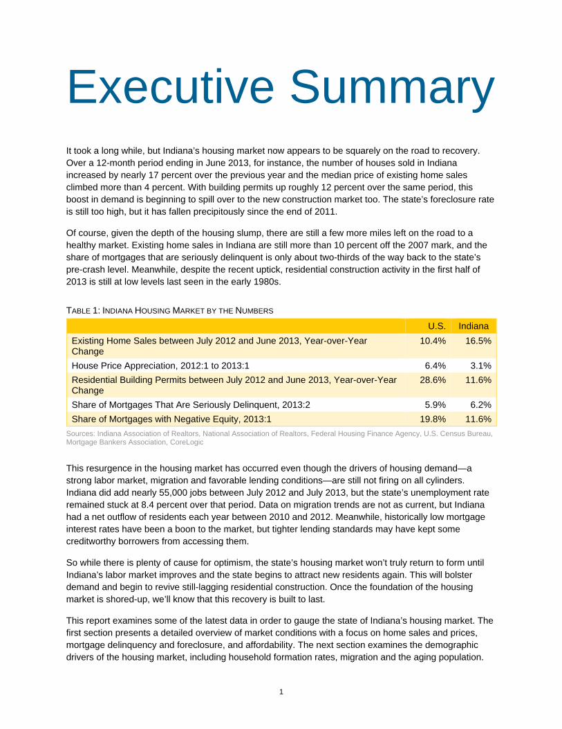
Executive Summary It took a long while, but Indiana’s housing market now appears to be squarely on the road to recovery. Over a 12-month period ending in June 2013, for instance, the number of houses sold in Indiana increased by nearly 17 percent over the previous year and the median price of existing home sales climbed more than 4 percent. With building permits up roughly 12 percent over the same period, this boost in demand is beginning to spill over to the new construction market too. The state’s foreclosure rate is still too high, but it has fallen precipitously since the end of 2011.
Of course, given the depth of the housing slump, there are still a few more miles left on the road to a healthy market. Existing home sales in Indiana are still more than 10 percent off the 2007 mark, and the share of mortgages that are seriously delinquent is only about two-thirds of the way back to the state’s pre-crash level. Meanwhile, despite the recent uptick, residential construction activity in the first half of 2013 is still at low levels last seen in the early 1980s.
TABLE 1: INDIANA HOUSING MARKET BY THE NUMBERS
U.S. Indiana Existing Home Sales between July 2012 and June 2013, Year-over-Year Change
10.4% 16.5%
House Price Appreciation, 2012:1 to 2013:1 6.4% 3.1%Residential Building Permits between July 2012 and June 2013, Year-over-Year Change
28.6% 11.6%
Share of Mortgages That Are Seriously Delinquent, 2013:2 5.9% 6.2%Share of Mortgages with Negative Equity, 2013:1 19.8% 11.6%
Sources: Indiana Association of Realtors, National Association of Realtors, Federal Housing Finance Agency, U.S. Census Bureau, Mortgage Bankers Association, CoreLogic
This resurgence in the housing market has occurred even though the drivers of housing demand—a strong labor market, migration and favorable lending conditions—are still not firing on all cylinders. Indiana did add nearly 55,000 jobs between July 2012 and July 2013, but the state’s unemployment rate remained stuck at 8.4 percent over that period. Data on migration trends are not as current, but Indiana had a net outflow of residents each year between 2010 and 2012. Meanwhile, historically low mortgage interest rates have been a boon to the market, but tighter lending standards may have kept some creditworthy borrowers from accessing them.
So while there is plenty of cause for optimism, the state’s housing market won’t truly return to form until Indiana’s labor market improves and the state begins to attract new residents again. This will bolster demand and begin to revive still-lagging residential construction. Once the foundation of the housing market is shored-up, we’ll know that this recovery is built to last.
This report examines some of the latest data in order to gauge the state of Indiana’s housing market. The first section presents a detailed overview of market conditions with a focus on home sales and prices, mortgage delinquency and foreclosure, and affordability. The next section examines the demographic drivers of the housing market, including household formation rates, migration and the aging population.
2
Finally, we consider the role of housing in Indiana’s economy with a look at construction activity, the impact of home sales and mortgage refinancing trends.
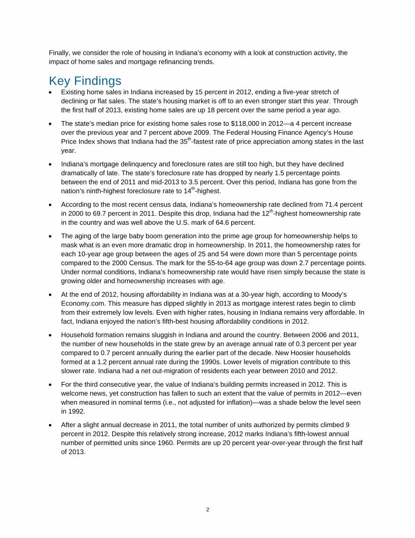
Key Findings • Existing home sales in Indiana increased by 15 percent in 2012, ending a five-year stretch of
declining or flat sales. The state’s housing market is off to an even stronger start this year. Through the first half of 2013, existing home sales are up 18 percent over the same period a year ago.
• The state’s median price for existing home sales rose to $118,000 in 2012—a 4 percent increase over the previous year and 7 percent above 2009. The Federal Housing Finance Agency’s House Price Index shows that Indiana had the 35th-fastest rate of price appreciation among states in the last year.
• Indiana’s mortgage delinquency and foreclosure rates are still too high, but they have declined dramatically of late. The state’s foreclosure rate has dropped by nearly 1.5 percentage points between the end of 2011 and mid-2013 to 3.5 percent. Over this period, Indiana has gone from the nation’s ninth-highest foreclosure rate to 14th-highest.
• According to the most recent census data, Indiana’s homeownership rate declined from 71.4 percent in 2000 to 69.7 percent in 2011. Despite this drop, Indiana had the 12th-highest homeownership rate in the country and was well above the U.S. mark of 64.6 percent.
• The aging of the large baby boom generation into the prime age group for homeownership helps to mask what is an even more dramatic drop in homeownership. In 2011, the homeownership rates for each 10-year age group between the ages of 25 and 54 were down more than 5 percentage points compared to the 2000 Census. The mark for the 55-to-64 age group was down 2.7 percentage points. Under normal conditions, Indiana’s homeownership rate would have risen simply because the state is growing older and homeownership increases with age.
• At the end of 2012, housing affordability in Indiana was at a 30-year high, according to Moody’s Economy.com. This measure has dipped slightly in 2013 as mortgage interest rates begin to climb from their extremely low levels. Even with higher rates, housing in Indiana remains very affordable. In fact, Indiana enjoyed the nation’s fifth-best housing affordability conditions in 2012.
• Household formation remains sluggish in Indiana and around the country. Between 2006 and 2011, the number of new households in the state grew by an average annual rate of 0.3 percent per year compared to 0.7 percent annually during the earlier part of the decade. New Hoosier households formed at a 1.2 percent annual rate during the 1990s. Lower levels of migration contribute to this slower rate. Indiana had a net out-migration of residents each year between 2010 and 2012.
• For the third consecutive year, the value of Indiana’s building permits increased in 2012. This is welcome news, yet construction has fallen to such an extent that the value of permits in 2012—even when measured in nominal terms (i.e., not adjusted for inflation)—was a shade below the level seen in 1992.
• After a slight annual decrease in 2011, the total number of units authorized by permits climbed 9 percent in 2012. Despite this relatively strong increase, 2012 marks Indiana’s fifth-lowest annual number of permitted units since 1960. Permits are up 20 percent year-over-year through the first half of 2013.
3
Market Conditions Home Sales Off to a Strong Start in 2013 After five years of flagging home sales numbers, Indiana finally had a breakout year in 2012. The state’s sales tally in 2012 was up nearly 15 percent over the previous year and was its strongest annual figure since 2007 (see Table 2). Sales totals are still well below the peak years of the mid-2000s, but it seems unlikely (and undesirable) that Indiana will reach these heights again anytime soon. After all, it was the overheated housing market during this period that helped fuel the state’s foreclosure crisis that began in 2006.
TABLE 2: INDIANA EXISTING HOME SALES, 2006 TO 2012
2006 2007 2008 2009 2010 2011 2012 Existing Home Sales 86,142 79,545 66,505 61,826 57,765 57,985 66,516Annual Percent Change n/a -7.7% -16.4% -7.0% -6.6% 0.4% 14.7%
Source: Indiana Association of Realtors
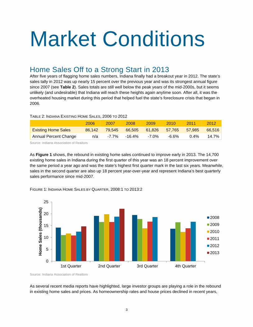
As Figure 1 shows, the rebound in existing home sales continued to improve early in 2013. The 14,700 existing home sales in Indiana during the first quarter of this year was an 18 percent improvement over the same period a year ago and was the state’s highest first quarter mark in the last six years. Meanwhile, sales in the second quarter are also up 18 percent year-over-year and represent Indiana’s best quarterly sales performance since mid-2007.
FIGURE 1: INDIANA HOME SALES BY QUARTER, 2008:1 TO 2013:2
Source: Indiana Association of Realtors
As several recent media reports have highlighted, large investor groups are playing a role in the rebound in existing home sales and prices. As homeownership rates and house prices declined in recent years,
0
5
10
15
20
25
1st Quarter 2nd Quarter 3rd Quarter 4th Quarter
Hom
e Sa
les
(thou
sand
s)
2008
2009
2010
2011
2012
2013
4
more and more real estate investment trusts (REIT) have been purchasing single-family homes and converting them into rental properties. This trend first emerged in some of the country’s housing crash hot spots but now appears to be more widespread. As of July 2013, for instance, the REIT American Homes 4 Rent (AHR) reportedly holds a portfolio of more than 1,700 homes in the Indianapolis area—most of which were purchased in the last year.1 A check of AHR’s website shows that they also have properties in Bloomington, Columbus, Lafayette and Northwest Indiana.
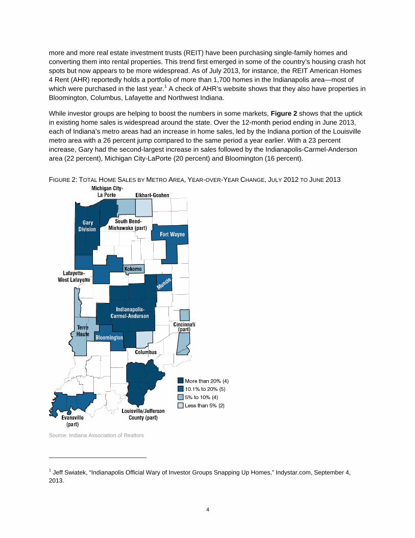
While investor groups are helping to boost the numbers in some markets, Figure 2 shows that the uptick in existing home sales is widespread around the state. Over the 12-month period ending in June 2013, each of Indiana’s metro areas had an increase in home sales, led by the Indiana portion of the Louisville metro area with a 26 percent jump compared to the same period a year earlier. With a 23 percent increase, Gary had the second-largest increase in sales followed by the Indianapolis-Carmel-Anderson area (22 percent), Michigan City-LaPorte (20 percent) and Bloomington (16 percent).
FIGURE 2: TOTAL HOME SALES BY METRO AREA, YEAR-OVER-YEAR CHANGE, JULY 2012 TO JUNE 2013
Source: Indiana Association of Realtors
1 Jeff Swiatek, “Indianapolis Official Wary of Investor Groups Snapping Up Homes,” Indystar.com, September 4, 2013.
5
Columbus and Elkhart-Goshen registered the lowest growth rates over this period but that does not necessarily indicate that these markets are underperforming. In the case of Columbus, at least, its housing market was already relatively strong heading into this period so it didn’t have much ground to make up.
The 48 counties that are outside of metro areas combined to post a 10 percent increase in sales. Among counties with at least 100 sales, Tipton County had the largest increase at 46 percent followed by Ripley (36 percent), Jackson (31 percent) and Dubois (27 percent) counties.2 Statewide, sales are up roughly 17 percent over this period.
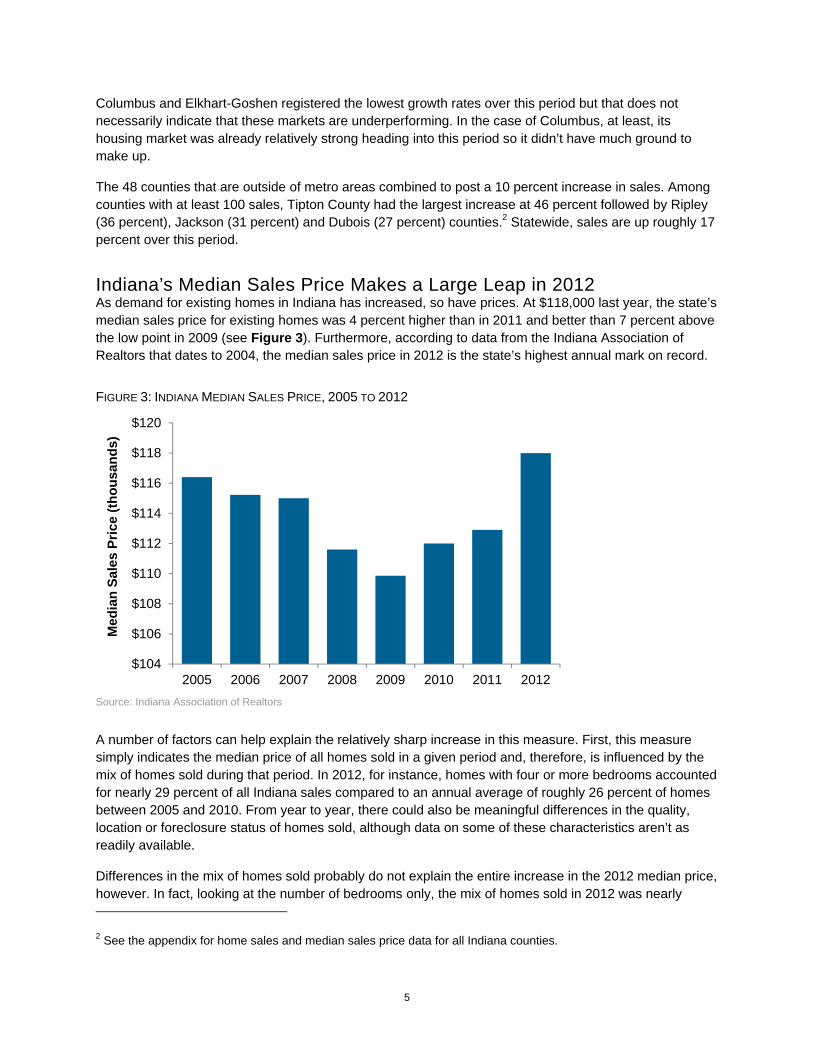
Indiana’s Median Sales Price Makes a Large Leap in 2012 As demand for existing homes in Indiana has increased, so have prices. At $118,000 last year, the state’s median sales price for existing homes was 4 percent higher than in 2011 and better than 7 percent above the low point in 2009 (see Figure 3). Furthermore, according to data from the Indiana Association of Realtors that dates to 2004, the median sales price in 2012 is the state’s highest annual mark on record.
FIGURE 3: INDIANA MEDIAN SALES PRICE, 2005 TO 2012
Source: Indiana Association of Realtors
A number of factors can help explain the relatively sharp increase in this measure. First, this measure simply indicates the median price of all homes sold in a given period and, therefore, is influenced by the mix of homes sold during that period. In 2012, for instance, homes with four or more bedrooms accounted for nearly 29 percent of all Indiana sales compared to an annual average of roughly 26 percent of homes between 2005 and 2010. From year to year, there could also be meaningful differences in the quality, location or foreclosure status of homes sold, although data on some of these characteristics aren’t as readily available.
Differences in the mix of homes sold probably do not explain the entire increase in the 2012 median price, however. In fact, looking at the number of bedrooms only, the mix of homes sold in 2012 was nearly
2 See the appendix for home sales and median sales price data for all Indiana counties.
$104
$106
$108
$110
$112
$114
$116
$118
$120
2005 2006 2007 2008 2009 2010 2011 2012
Med
ian
Sale
s Pr
ice
(thou
sand
s)

6
identical to that in 2011, yet the median price in 2012 was 4 percent higher. Another key factor in the rise in prices is the shrinking inventory of homes for sale. As of March 2013, the inventory of homes for sale in Indiana was slightly greater than 40,000. This mark is 10 percent lower than for the same month in 2012 and is more than 40 percent lower than the inventory in March 2007.
The decline in inventory coupled with the uptick in demand has led to a six-year low in the estimated months’ supply of existing homes for sale in Indiana. The months’ supply measure is an estimate of how long it would take to work through the inventory of homes for sale in a given month at the average monthly sales rate over the previous year. As one would expect, there is a strong negative relationship between months’ supply and prices (correlation = -0.76), with prices increasing as supply began to drop steadily in 2011 (see Figure 4).
FIGURE 4: MEDIAN SALES PRICE AND MONTHS' SUPPLY, 12-MONTH MOVING AVERAGE, JANUARY 2007 TO JANUARY 2013
Source: Indiana Association of Realtors
Indiana’s median sales price climbed to $120,000 over the 12-month period ending in June 2013—a 4.3 percent increase year-over-year. Looking around the state over the same period, the median sales price held steady or increased in 62 of Indiana’s 92 counties. Among the state’s larger markets, Shelby (13 percent increase), LaPorte (12 percent), Elkhart (12 percent), Hancock (9 percent) and Madison (8 percent) counties posted the largest increases over this 12-month period. Bartholomew (-3 percent), Grant (-2 percent), and Clark (-1 percent) counties were the only communities with at least 500 existing home sales to show a decline in median sales price.
Indiana House Prices in Perspective Other measures show that Indiana’s house prices are improving as well. According to the Federal Housing Finance Agency’s (FHFA) House Price Index (HPI), Indiana has seen price appreciation for seven consecutive quarters dating back to mid-2011 and the state’s home prices in the first quarter of
0
2
4
6
8
10
12
$102
$104
$106
$108
$110
$112
$114
$116
$118
$120
2007 2008 2009 2010 2011 2012 2013M
onth
s
In T
hous
ands
Median Price (left axis)
Months' Supply of Inventory (right axis)
7
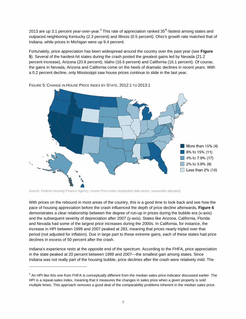
2013 are up 3.1 percent year-over-year.3 This rate of appreciation ranked 35th-fastest among states and outpaced neighboring Kentucky (2.3 percent) and Illinois (0.5 percent). Ohio’s growth rate matched that of Indiana, while prices in Michigan were up 9.4 percent.
Fortunately, price appreciation has been widespread around the country over the past year (see Figure 5). Several of the hardest-hit states during the crash posted the greatest gains led by Nevada (21.2 percent increase), Arizona (20.8 percent), Idaho (16.6 percent) and California (16.1 percent). Of course, the gains in Nevada, Arizona and California come on the heels of dramatic declines in recent years. With a 0.2 percent decline, only Mississippi saw house prices continue to slide in the last year.
FIGURE 5: CHANGE IN HOUSE PRICE INDEX BY STATE, 2012:1 TO 2013:1
Source: Federal Housing Finance Agency, House Price Index (expanded data series, seasonally adjusted)
With prices on the rebound in most areas of the country, this is a good time to look back and see how the pace of housing appreciation before the crash influenced the depth of price decline afterwards. Figure 6 demonstrates a clear relationship between the degree of run-up in prices during the bubble era (x-axis) and the subsequent severity of depreciation after 2007 (y-axis). States like Arizona, California, Florida and Nevada had some of the largest price increases during the 2000s. In California, for instance, the increase in HPI between 1999 and 2007 peaked at 283, meaning that prices nearly tripled over that period (not adjusted for inflation). Due in large part to these extreme gains, each of these states had price declines in excess of 50 percent after the crash.
Indiana’s experience rests at the opposite end of the spectrum. According to the FHFA, price appreciation in the state peaked at 20 percent between 1999 and 2007—the smallest gain among states. Since Indiana was not really part of the housing bubble, price declines after the crash were relatively mild. The
3 An HPI like this one from FHFA is conceptually different from the median sales price indicator discussed earlier. The HPI is a repeat-sales index, meaning that it measures the changes in sales price when a given property is sold multiple times. This approach removes a good deal of the comparability problems inherent in the median sales price.

8
state’s HPI value declined 11 percent from its peak in mid-2007 to its trough in the second quarter of 2011. Only 14 other states—many of them in the Great Plains region—had smaller declines after the crash.
The fact that Indiana’s decline was as large as it was likely reflects the economic difficulties in the larger industrial Midwest. Price gains in neighboring Ohio and Michigan were only slightly better than they were in Indiana, yet both experienced far more severe price declines after the bust. The situation in Michigan is so dire, in fact, that house prices in the first quarter of 2013 are 20 percent lower than they were at the beginning of 1999. With a 4 percent difference, Ohio is the only other state with an HPI value that is lower today than it was in 1999. Over the same period, house prices in Indiana are up nearly 12 percent.
FIGURE 6: COMPARISON OF HOUSE PRICE CHANGES BEFORE AND AFTER THE HOUSING BUST, 1999 TO 2007
Source: Federal Housing Finance Agency
With all the talk of great booms and busts in house prices, it’s helpful to step back to gain some historical perspective. As Figure 7 illustrates, the five-year free fall in prices at the national level was really a reversion to the mean. That is, the national HPI value in the first quarter of 2013 was just about at its “pre-bubble” trend, meaning that house prices at the national level are about where one would expect had the run-up in prices never occurred. In this sense, the decline in prices—though painful for many homeowners and an economic drag for the nation—has been a necessary correction.
-70%
-60%
-50%
-40%
-30%
-20%
-10%
0%
10%
100 150 200 250 300
Cha
nge
in H
PI fr
omPe
ak to
Tro
ugh
Peak HPI Value, 1999 to 2007
Indiana
Ohio
MichiganArizona
Nevada
Florida California
HawaiiU.S.
Illinois

9
FIGURE 7: HOUSE PRICE INDEX COMPARED TO PRE-BUBBLE TREND, 1991 TO 2013
Source: Federal Housing Finance Agency, House Price Index (expanded data series, seasonally adjusted)
Obviously, the experience in Indiana has been far different. The Hoosier state saw relatively strong price gains during the 1990s but the pace of increase began to slow soon after values elsewhere started to take off. Indiana’s home prices today sit well below the trend set during the 1990s. So while the HPI data for the U.S. clearly demonstrates the magnitude of the bubble, it also shows that Indiana had no price bubble at all. Instead, changes in Hoosier house prices have been glued to the state’s economic performance.
A look at the ratio of median sales prices to median household income best illustrates this point. Among the states that headlined the housing bubble, the price-to-income ratios in Florida and Nevada more or less doubled between 2000 and 2005 while prices in California soared to nine times its median household income (see Figure 8). Looking at some of Indiana’s neighbors, Illinois also saw a significant jump in this measure and even struggling Michigan’s ratio climbed modestly.
Since the onset of the housing slump, however, the price-to-income ratio in each of these states tumbled back to the more sustainable levels seen during the 1990s. All the while, through a relative boom period in the 1990s and two recessions during the 2000s, Indiana’s ratio has held remarkably steady over the last two decades.
80
100
120
140
160
180
200
220
240
1991 1993 1995 1997 1999 2001 2003 2005 2007 2009 2011 2013
U.S. HPI Indiana HPIU.S. Trend, 1991 to 1998 Indiana Trend, 1991 to 1998

10
FIGURE 8: RATIO OF MEDIAN SALES PRICE TO MEDIAN HOUSEHOLD INCOME, INDIANA AND SELECT STATES, 1991 TO 2013
Source: U.S. Census Bureau and Moody’s Economy.com
With respect to the trend in Indiana house prices, one can view the glass as either half-full or half-empty. It is fortunate that prices in the state have remained tied to the economic fundamentals. If they had not, even more Hoosiers would have been hurt over the past five years by a larger decline in home values. However, looking at prices as an economic indicator, the HPI provides one more piece of evidence that the Indiana economy has not fared particularly well since the late 1990s, even during the period of economic growth between the last two recessions. Looking forward, at least, it’s a safe bet that any gains the state can achieve in economic growth will translate into gains for Hoosier homeowners.
Foreclosure Wave Begins to Recede One of the primary ways that economic conditions have influenced home prices in recent years is through the dramatic rise in foreclosures. For instance, the mortgage technology firm FNC Inc. reports that, at the depth of the crisis in early 2009, a little more than one-third of all U.S. home sales were foreclosed properties. At the same time, these foreclosures were selling at 25 percent below market value.
As the foreclosure situation improved, its effect on prices has diminished. At the national level, foreclosures as a share of sales had been cut in half to 18 percent by the fourth quarter of 2012. FNC indicates that the foreclosure discount has fallen to 12 percent during the same period, which is comparable to foreclosure discount estimates before the housing bust.4
This situation should continue to improve as the volume of lender-owned properties decline in Indiana and around the country. Figure 9 shows that the state has seen a precipitous decline in its foreclosure rate since the end of 2011. According to the Mortgage Bankers Association, the state’s foreclosure rate has declined more than one percentage point from 4.96 in the fourth quarter of 2011 to 3.49 in mid-2013.
4 “Foreclosure Market Report,” FNC Inc., February 2013, http://fncrpi.com/press_releases.aspx?pr=62.
1
2
3
4
5
6
7
8
9
10
1991 1993 1995 1997 1999 2001 2003 2005 2007 2009 2011
Rat
io
Indiana Illinois MichiganCalifornia Florida Nevada

11
FIGURE 9: SHARE OF MORTGAGES IN FORECLOSURE, 1979:1 TO 2013:2
Source: National Delinquency Survey, Mortgage Bankers Association
Even with this sharp decline, Indiana’s foreclosure rate remains above the U.S. average and ranks 14th-highest among states. Several factors help explain Indiana’s elevated rate. First, Indiana’s sluggish economic performance—both before the recession and since—has contributed to a higher-than-average foreclosure rate for the better part of the last 13 years.5
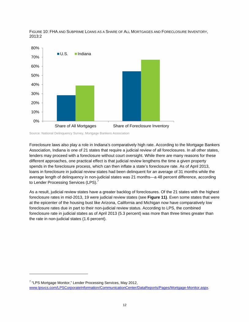
Another factor in Indiana’s high foreclosure rate is that Hoosiers are more reliant on high-risk mortgages. In the second quarter of 2013, 27 percent of Indiana’s outstanding mortgages were so-called FHA loans.6 An additional 12 percent of the state’s mortgages were subprime. When combined together, Indiana had the nation’s second-largest share (behind Oklahoma) of these types of loans at 39 percent of all mortgages. By contrast, FHA loans (18 percent) and subprime loans (10 percent) combine to account for 28 percent of all U.S. mortgages, according to the Mortgage Bankers Association.
In Indiana, 4.5 percent of FHA loans were in foreclosure in early 2013 compared to 1.8 percent of the state’s prime mortgages. The state’s foreclosure rate for subprime loans stands at 9.4 percent, which is lower than the U.S. mark of 11 percent. So while these types of loans account for a little more than one-third of Indiana’s home loans, they represent approximately 67 percent of Indiana’s foreclosure inventory due to their comparatively high default rates (see Figure 10). These higher-risk loans account for roughly 55 percent of the foreclosure inventory nationwide.
5 It’s important to note that Indiana was not alone in its high foreclosure rate before the recession. Michigan, Ohio and Illinois joined Indiana to form a distinct block of high foreclosure states through much of the 2000s. 6 FHA loans are loans from private lenders that are insured by the Federal Housing Administration. These loans typically feature low down payment requirements and are intended for borrowers who would likely not qualify for a mortgage without the insurance.
0%
1%
2%
3%
4%
5%
6%19
79
1981
1983
1985
1987
1989
1991
1993
1995
1997
1999
2001
2003
2005
2007
2009
2011
2013
U.S.
Indiana
12
FIGURE 10: FHA AND SUBPRIME LOANS AS A SHARE OF ALL MORTGAGES AND FORECLOSURE INVENTORY, 2013:2
Source: National Delinquency Survey, Mortgage Bankers Association
Foreclosure laws also play a role in Indiana’s comparatively high rate. According to the Mortgage Bankers Association, Indiana is one of 21 states that require a judicial review of all foreclosures. In all other states, lenders may proceed with a foreclosure without court oversight. While there are many reasons for these different approaches, one practical effect is that judicial review lengthens the time a given property spends in the foreclosure process, which can then inflate a state’s foreclosure rate. As of April 2013, loans in foreclosure in judicial review states had been delinquent for an average of 31 months while the average length of delinquency in non-judicial states was 21 months—a 48 percent difference, according to Lender Processing Services (LPS).7
As a result, judicial review states have a greater backlog of foreclosures. Of the 21 states with the highest foreclosure rates in mid-2013, 19 were judicial review states (see Figure 11). Even some states that were at the epicenter of the housing bust like Arizona, California and Michigan now have comparatively low foreclosure rates due in part to their non-judicial review status. According to LPS, the combined foreclosure rate in judicial states as of April 2013 (5.3 percent) was more than three times greater than the rate in non-judicial states (1.6 percent).
7 “LPS Mortgage Monitor,” Lender Processing Services, May 2012, www.lpsvcs.com/LPSCorporateInformation/CommunicationCenter/DataReports/Pages/Mortgage-Monitor.aspx.
0%
10%
20%
30%
40%
50%
60%
70%
80%
Share of All Mortgages Share of Foreclosure Inventory
U.S. Indiana

13
FIGURE 11: SHARE OF MORTGAGES IN FORECLOSURE BY STATE, 2013:2
Note: Green bars indicate judicial review states. Source: National Delinquency Survey, Mortgage Bankers Association
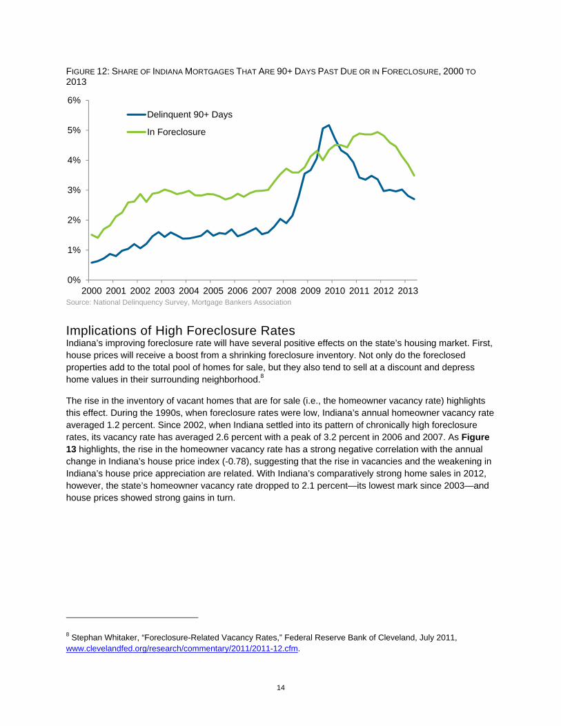
Given the collateral effect of these laws on foreclosure inventory, the current situation in Indiana—while still a major problem—is somewhat better than the foreclosure rate suggests. While Indiana’s foreclosure rate has remained high, the flow of properties into foreclosure has declined sharply since peaking in late 2009 (see Figure 12).
In the second quarter of 2013, the share of the state’s mortgages that are at least three months past due was slightly more than two-thirds of the way back to its average rate between 2003 and 2007. The pace of decline has slowed since early 2011 but Indiana’s trend in this pre-foreclosure category has been nearly identical to the U.S. trend over the last three years.
0
2
4
6
8
10
12Fl
orid
aN
ew J
erse
yN
ew Y
ork
Mai
neIll
inoi
sN
evad
aC
onne
ctic
utH
awai
iM
aryl
and
Ohi
oVe
rmon
tN
ew M
exic
oO
rego
nIn
dian
aS
outh
Car
olin
aR
hode
Isla
ndP
enns
ylva
nia
Uni
ted
Stat
esD
elaw
are
Okl
ahom
aKe
ntuc
kyLo
uisi
ana
Was
hing
ton
Dis
trict
of C
olum
bia
Mas
sach
uset
tsW
isco
nsin
Arka
nsas
Mis
siss
ippi
Iow
aG
eorg
iaId
aho
Nor
th C
arol
ina
Kans
asM
ichi
gan
New
Ham
pshi
reAl
abam
aTe
nnes
see
Uta
hC
alifo
rnia
Min
neso
taAr
izon
aW
est V
irgin
iaM
isso
uri
Texa
sSo
uth
Dak
ota
Col
orad
oVi
rgin
iaM
onta
naA
lask
aN
ebra
ska
Nor
th D
akot
aW
yom
ing
14
FIGURE 12: SHARE OF INDIANA MORTGAGES THAT ARE 90+ DAYS PAST DUE OR IN FORECLOSURE, 2000 TO 2013
Source: National Delinquency Survey, Mortgage Bankers Association
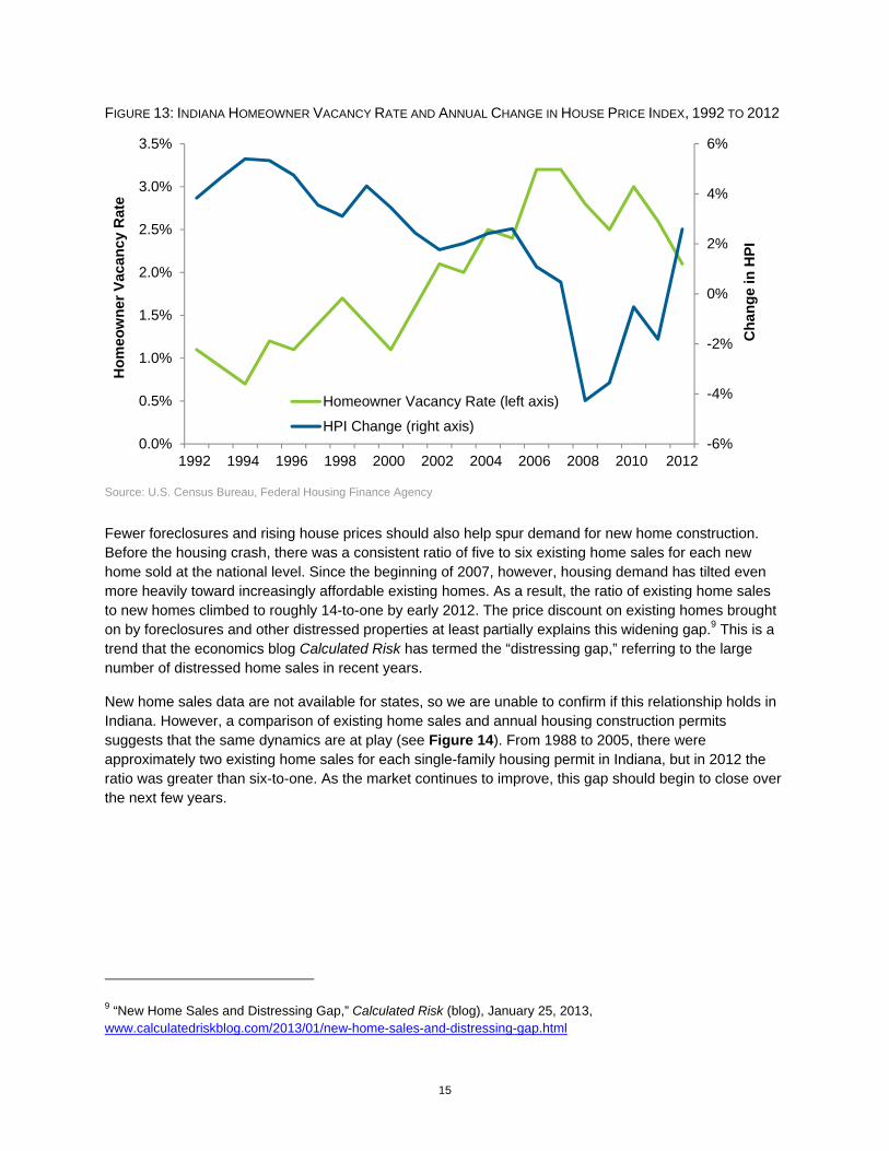
Implications of High Foreclosure Rates Indiana’s improving foreclosure rate will have several positive effects on the state’s housing market. First, house prices will receive a boost from a shrinking foreclosure inventory. Not only do the foreclosed properties add to the total pool of homes for sale, but they also tend to sell at a discount and depress home values in their surrounding neighborhood.8
The rise in the inventory of vacant homes that are for sale (i.e., the homeowner vacancy rate) highlights this effect. During the 1990s, when foreclosure rates were low, Indiana’s annual homeowner vacancy rate averaged 1.2 percent. Since 2002, when Indiana settled into its pattern of chronically high foreclosure rates, its vacancy rate has averaged 2.6 percent with a peak of 3.2 percent in 2006 and 2007. As Figure 13 highlights, the rise in the homeowner vacancy rate has a strong negative correlation with the annual change in Indiana’s house price index (-0.78), suggesting that the rise in vacancies and the weakening in Indiana’s house price appreciation are related. With Indiana’s comparatively strong home sales in 2012, however, the state’s homeowner vacancy rate dropped to 2.1 percent—its lowest mark since 2003—and house prices showed strong gains in turn.
8 Stephan Whitaker, “Foreclosure-Related Vacancy Rates,” Federal Reserve Bank of Cleveland, July 2011, www.clevelandfed.org/research/commentary/2011/2011-12.cfm.
0%
1%
2%
3%
4%
5%
6%
2000 2001 2002 2003 2004 2005 2006 2007 2008 2009 2010 2011 2012 2013
Delinquent 90+ Days
In Foreclosure
15
FIGURE 13: INDIANA HOMEOWNER VACANCY RATE AND ANNUAL CHANGE IN HOUSE PRICE INDEX, 1992 TO 2012
Source: U.S. Census Bureau, Federal Housing Finance Agency
Fewer foreclosures and rising house prices should also help spur demand for new home construction. Before the housing crash, there was a consistent ratio of five to six existing home sales for each new home sold at the national level. Since the beginning of 2007, however, housing demand has tilted even more heavily toward increasingly affordable existing homes. As a result, the ratio of existing home sales to new homes climbed to roughly 14-to-one by early 2012. The price discount on existing homes brought on by foreclosures and other distressed properties at least partially explains this widening gap.9 This is a trend that the economics blog Calculated Risk has termed the “distressing gap,” referring to the large number of distressed home sales in recent years.
New home sales data are not available for states, so we are unable to confirm if this relationship holds in Indiana. However, a comparison of existing home sales and annual housing construction permits suggests that the same dynamics are at play (see Figure 14). From 1988 to 2005, there were approximately two existing home sales for each single-family housing permit in Indiana, but in 2012 the ratio was greater than six-to-one. As the market continues to improve, this gap should begin to close over the next few years.
9 “New Home Sales and Distressing Gap,” Calculated Risk (blog), January 25, 2013, www.calculatedriskblog.com/2013/01/new-home-sales-and-distressing-gap.html
-6%
-4%
-2%
0%
2%
4%
6%
0.0%
0.5%
1.0%
1.5%
2.0%
2.5%
3.0%
3.5%
1992 1994 1996 1998 2000 2002 2004 2006 2008 2010 2012
Cha
nge
in H
PI
Hom
eow
ner V
acan
cy R
ate
Homeowner Vacancy Rate (left axis)
HPI Change (right axis)

16
FIGURE 14: INDIANA EXISTING HOME SALES AND SINGLE-FAMILY HOUSING PERMITS, 1988 TO 2012
Source: U.S. Census Bureau, Moody’s Economy.com
Looking Ahead The Indiana housing market still has a long way to go, but it is clearly on the path to recovery. In terms of foreclosures, both time and tighter lending standards are helping to reduce the problem. That is, with respect to the risky mortgages issued before the crash, many of those that were destined to default have likely already done so. Meanwhile, at the national level at least, mortgages originated after 2008 have proven far less likely to fall into serious delinquency.10 So here in Indiana, the flow of mortgages into foreclosure, which has been on the decline since 2010, should continue to fall.
The trend toward rising house prices will also help alleviate the foreclosure problem. According to CoreLogic, nearly 12 percent of Indiana homeowners with a mortgage had negative equity as of the first quarter of 2013.11 However, slightly more than one-quarter were close to getting into an equity position (i.e., within 5 percent of home value). So as prices rise, more and more of these (currently) underwater homeowners will be in a better position to avoid foreclosure in the event they fall behind on their payments. As a point of comparison, 19.8 percent of all U.S. mortgages have negative equity.
Newly expanded government programs at both the federal and the state levels will also help more homeowners escape foreclosure. At the national level, changes to the Home Affordable Refinance Program (HARP) in late 2011 triggered a dramatic increase in mortgage refinancing through this program. Here in Indiana, more than 15,000 homeowners refinanced through HARP over a 15-month period ending
10 “LPS Mortgage Monitor,” Lender Processing Services, March 2013, www.lpsvcs.com/LPSCorporateInformation/CommunicationCenter/DataReports/Pages/Mortgage-Monitor.aspx. 11 “CoreLogic Equity Report,” CoreLogic, First Quarter 2013, www.corelogic.com/about-us/researchtrends/asset_upload_file866_14435.pdf.
0
10
20
30
40
50
0
20
40
60
80
100
1988
1990
1992
1994
1996
1998
2000
2002
2004
2006
2008
2010
2012
Hou
sing
Per
mits
(tho
usan
ds)
Exis
ting
Hom
e Sa
les
(thou
sand
s)
Home Sales (left axis)
Housing Permits (right axis)

17
in March 2013.12 Additionally, in April 2013, the State of Indiana announced a significant expansion of its Hardest Hit Fund program, which helps Hoosier facing economic hardship to remain in their home.13
Another positive sign for the market is a relatively strong rebound in housing demand. As discussed earlier, existing home sales in Indiana increased by 15 percent in 2012 and sales through the first half of 2013 are up 18 percent year-over-year. This development reflects both modest improvements in the economy and unprecedented housing affordability (see Figure 15). In fact, according to Moody’s Economy.com, Indiana enjoyed the fifth-best housing affordability conditions among states in 2012.
FIGURE 15: MORTGAGE INTEREST RATES AND INDIANA HOUSING AFFORDABILITY INDEX, JANUARY 1979 TO JUNE 2013
Note: An index value of 100 means that a state’s median household income is exactly enough to qualify for a mortgage on a median-priced home. Values above 100 indicate that the median income is more than enough to qualify. Indiana’s index value was 281 in May 2013, meaning that the state’s median household income was 281 percent of the income needed for a mortgage on the median-priced house. See the appendix for the index methodology. Monthly affordability values are interpolated from annual data. The 2013 index values are a forecast. Source: Freddie Mac and Moody’s Economy.com
Now that the housing market is beginning to stabilize, however, affordability is bound to come back to earth a bit. Not only are house prices on the rise again, but mortgage rates are climbing too. According to Freddie Mac, the 30-year fixed mortgage rate jumped from 3.35 percent in the first week of May to 4.39 percent at the beginning of August. In their July forecasts, both the Mortgage Bankers Association and Freddie Mac predict the rate will climb above the 5 percent mark in the second half of 2014.
It seems unlikely that a rise in rates will have too much of a negative impact on demand here in Indiana, at least not in the short run. In these current conditions, there is quite a bit of room to maneuver before affordability truly becomes a concern. A recent analysis by Freddie Mac indicates that housing would remain affordable in metro areas throughout the Midwest with mortgage rates as high as 8 percent, and
12 “Refinance Report,” Federal Housing Finance Authority, December 2012 and March 2013, www.fhfa.gov/Default.aspx?page=172. 13 “State Details Foreclosure Assistance Expansion,” Inside Indiana Business, April 18, 2013.
0
2
4
6
8
10
12
14
16
18
20
0
50
100
150
200
250
300
350
1979 1981 1983 1985 1987 1989 1991 1993 1995 1997 1999 2001 2003 2005 2007 2009 2011 2013
Mor
tgag
e R
ate
Affo
rdab
ility
Inde
x
Affordability Index (left axis)
30-Year Fixed Mortgage Rate (right axis)

18
they could probably go even higher before housing is considered unaffordable (8 percent is the highest level in their analysis).14
While housing will likely remain affordable for some time, there is an ongoing concern among some officials that many creditworthy households are being locked out of the market by tight lending standards. As Federal Reserve Chairman Bernanke indicated in a November 2012 speech, lenders appropriately tightened standards after the housing bust, but those standards may now be too conservative and an impediment to a full economic recovery.15 An improving economy will be the key driver in a housing rebound, but once more potential buyers have the confidence and means to purchase a home, the availability of affordable financing for creditworthy borrowers will be important to boosting the market.
14 “What Happens When Interest Rates Rise?,” U.S. Economic & Housing Market Outlook, Freddie Mac, June 2013, www.freddiemac.com/news/finance/docs/Jun_2013_public_outlook.pdf. 15 “Challenges in Housing and Mortgage Markets,” Federal Reserve Chairman Ben S. Bernanke, November 15, 2012, www.federalreserve.gov/newsevents/speech/bernanke20121115a.htm.

19
Demographic Fundamentals Sluggish Population Growth in Indiana Indiana’s recent housing revival has occurred despite a continued slowdown in population growth. Indiana added an estimated 21,000 residents between mid-2011 and mid-2012, which marks the state’s smallest annual increase since 1988 (see Figure 16). What’s more, all of the state’s population growth occurred in age groups not usually associated with a lot of net home purchases. Indiana’s population age 65 or older and those age 18 to 24 both increased, but the 25-to-44 and 45-to-64 age groups declined by roughly 4,500 residents each.
FIGURE 16: INDIANA ANNUAL POPULATION CHANGE, 1982 TO 2012
Source: U.S. Census Bureau population estimates
The primary cause of Indiana’s sluggish population growth has been the dramatic decline in migration in the wake of the recession. According to Census Bureau estimates, Indiana had a net out-migration of nearly 4,600 residents between July 2011 and July 2012. This is the third consecutive year that Indiana had an estimated one-year net outflow of population, but only the fourth annual net-outmigration since 1990.
Movement within the state is also down, particularly among homeowners. Data from the American Community Survey (ACS) show that the share of Hoosier homeowners who reported moving within the state over the previous year declined from 7.4 percent in 2006 to 5.3 percent in 2011. This trend means
-20
-10
0
10
20
30
40
50
60
70
1982
1984
1986
1988
1990
1992
1994
1996
1998
2000
2002
2004
2006
2008
2010
2012
Ann
ual C
hang
e (th
ousa
nds)

20
that many fast-growing communities have seen far fewer new residents in recent years, especially in the suburbs of large metro areas.
Figure 17 compares the 2012 net migration estimates for the suburban counties of the Indianapolis metro area along with the large metros that border the state against their average annual levels before the recession. The 10 suburban counties of the Indianapolis area averaged a net in-migration of nearly 15,100 residents a year between 2003 and 2007.16 However, the net influx dropped to 6,000 in 2012—a 60 percent decrease. Within the area, Hamilton County had the largest drop—going from an annual average of 7,600 net in-migrants between 2003 and 2007 to 3,800 in 2012.
FIGURE 17: COMPARISON OF NET MIGRATION ESTIMATES FOR SUBURBAN COUNTIES OF SELECT METRO AREAS
Source: U.S. Census Bureau population estimates
The 14 outlying counties of the Chicago metro area (which include Lake, Porter, Jasper and Newton counties in Indiana) have shown an even more dramatic fall in migration. Among Indiana counties in this metro, Lake County had the largest 2012 net out-migration at roughly 3,200 residents. In all, 67 of Indiana’s 92 counties had a net out-migration of residents in 2012.
So how is it that Indiana’s housing market has begun to rebound if there is net out-migration and population decline in key age groups? One factor may be that the increasing number of households “doubling up” during the recession is beginning to subside. That is, with unemployment so high in recent years, many adults were forced to move in with family or friends. As a result, Indiana’s headship rate (the
16 In the case of the Indianapolis metro area, the suburban counties are Boone, Brown, Hamilton, Hancock, Hendricks, Johnson, Madison, Morgan, Putnam and Shelby. Marion County is the metro area's core county and is excluded from these numbers. Many of the Midwest's core metro counties—Marion County included—have seen marked improvements in their net migration figures through the downturn as the flow of residents to suburban areas or to other fast-growing regions of the country has slowed.
-20
-10
0
10
20
30
40
Chicago Indianapolis Cincinnati Louisville
Net
Mig
ratio
n (th
ousa
nds)
2003 to 2007 Average 2012
21
number of households divided by population age 18 or older), has been on the decline, particularly among young adults. That trend, however, appears to have reached a turning point in 2012.
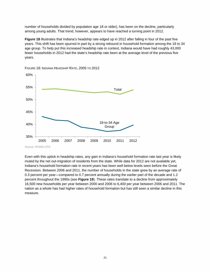
Figure 18 illustrates that Indiana’s headship rate edged up in 2012 after falling in four of the past five years. This shift has been spurred in part by a strong rebound in household formation among the 18 to 34 age group. To help put this increased headship rate in context, Indiana would have had roughly 43,000 fewer households in 2012 had the state’s headship rate been at the average level of the previous five years.
FIGURE 18: INDIANA HEADSHIP RATE, 2005 TO 2012
Source: IPUMS-CPS
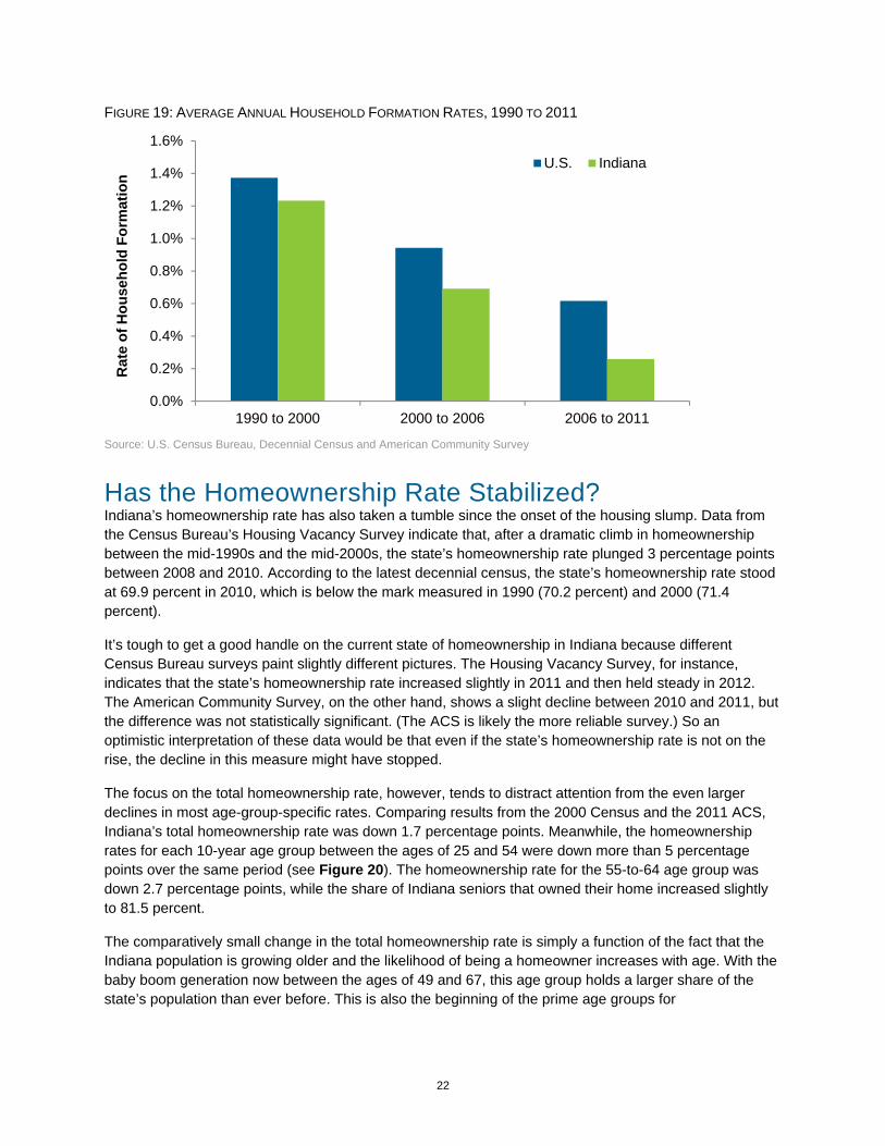
Even with this uptick in headship rates, any gain in Indiana’s household formation rate last year is likely muted by the net out-migration of residents from the state. While data for 2012 are not available yet, Indiana’s household formation rate in recent years has been well below levels seen before the Great Recession. Between 2006 and 2011, the number of households in the state grew by an average rate of 0.3 percent per year—compared to 0.7 percent annually during the earlier part of the decade and 1.2 percent throughout the 1990s (see Figure 19). These rates translate to a decline from approximately 16,500 new households per year between 2000 and 2006 to 6,400 per year between 2006 and 2011. The nation as a whole has had higher rates of household formation but has still seen a similar decline in this measure.
18-to-34 Age Group
Total
35%
40%
45%
50%
55%
60%
2005 2006 2007 2008 2009 2010 2011 2012
22
FIGURE 19: AVERAGE ANNUAL HOUSEHOLD FORMATION RATES, 1990 TO 2011
Source: U.S. Census Bureau, Decennial Census and American Community Survey
Has the Homeownership Rate Stabilized? Indiana’s homeownership rate has also taken a tumble since the onset of the housing slump. Data from the Census Bureau’s Housing Vacancy Survey indicate that, after a dramatic climb in homeownership between the mid-1990s and the mid-2000s, the state’s homeownership rate plunged 3 percentage points between 2008 and 2010. According to the latest decennial census, the state’s homeownership rate stood at 69.9 percent in 2010, which is below the mark measured in 1990 (70.2 percent) and 2000 (71.4 percent).
It’s tough to get a good handle on the current state of homeownership in Indiana because different Census Bureau surveys paint slightly different pictures. The Housing Vacancy Survey, for instance, indicates that the state’s homeownership rate increased slightly in 2011 and then held steady in 2012. The American Community Survey, on the other hand, shows a slight decline between 2010 and 2011, but the difference was not statistically significant. (The ACS is likely the more reliable survey.) So an optimistic interpretation of these data would be that even if the state’s homeownership rate is not on the rise, the decline in this measure might have stopped.
The focus on the total homeownership rate, however, tends to distract attention from the even larger declines in most age-group-specific rates. Comparing results from the 2000 Census and the 2011 ACS, Indiana’s total homeownership rate was down 1.7 percentage points. Meanwhile, the homeownership rates for each 10-year age group between the ages of 25 and 54 were down more than 5 percentage points over the same period (see Figure 20). The homeownership rate for the 55-to-64 age group was down 2.7 percentage points, while the share of Indiana seniors that owned their home increased slightly to 81.5 percent.
The comparatively small change in the total homeownership rate is simply a function of the fact that the Indiana population is growing older and the likelihood of being a homeowner increases with age. With the baby boom generation now between the ages of 49 and 67, this age group holds a larger share of the state’s population than ever before. This is also the beginning of the prime age groups for
0.0%
0.2%
0.4%
0.6%
0.8%
1.0%
1.2%
1.4%
1.6%
1990 to 2000 2000 to 2006 2006 to 2011
Rat
e of
Hou
seho
ld F
orm
atio
n
U.S. Indiana

23
homeownership. So the continued aging of this outsized cohort will boost the state’s total homeownership rate, even if age-specific rates only hold constant.
FIGURE 20: INDIANA HOMEOWNERSHIP RATES BY AGE, 1990 TO 2011
Source: U.S. Census Bureau, Decennial Census and American Community Survey
Looking Ahead The pace of household formation in Indiana should begin to increase from the very low levels seen in recent years. The state’s headship rate appears to have ticked up in 2012, and—if Indiana is like the nation as a whole—this measure should continue to climb over the next few years. Recent projections from analysts at the Federal Reserve indicate that the U.S. headship rate should improve by roughly 2 percentage points by the end of this decade.17 The increase reflects both the effect of an aging population and more young adults starting households as unemployment improves.
The other key driver of household formation is migration. Indiana is currently enduring an extended period of net out-migration, but this trend should improve along with the economy. The state has had periods of strong net in-migration following the previous two recessions and population projections from the IBRC and Moody’s Economy.com both suggest that Indiana should start to attract more residents for the remainder of this decade. However, only time will tell whether migration to Indiana bounces back as it has in the past.
Once household formation does pick up, will age-specific homeownership rates begin to rebound too? Research indicates that the housing crash has done little to diminish the desire for homeownership among most Americans, even young adults. According to a recent Fannie Mae survey, 71 percent of current renters feel that owning a home makes more financial sense than renting does.18 Furthermore,
17 Andrew D. Paciorek, “The Long and the Short of Household Formation,” Federal Reserve Board, April 2013, www.federalreserve.gov/pubs/feds/2013/201326/201326pap.pdf. 18 “Renters: Satisfied, but Reaching for Homeownership,” Fannie Mae National Housing Survey, June 2013, www.fanniemae.com/resources/file/research/housingsurvey/pdf/nhsq32012presentation.pdf.
20%
30%
40%
50%
60%
70%
80%
90%
25 to 34 35 to 44 45 to 54 55 to 64 65 and older
1990 2000 2011
24
analysis of National Housing Survey data by Harvard researchers shows that approximately 95 percent of respondents between the ages of 25 and 44 expect to buy a home sometime in the future.19
While the desire to buy a home may be there, the means may not. As discussed earlier, the unemployment rate is still too high and lending standards remain tight. However, as the economy improves and house prices rise at sustainable rates, financing should be available to more and more prospective buyers.
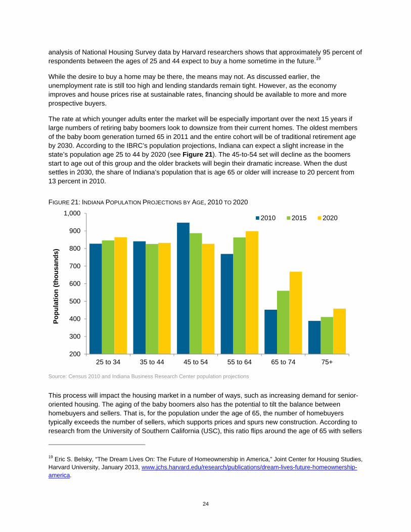
The rate at which younger adults enter the market will be especially important over the next 15 years if large numbers of retiring baby boomers look to downsize from their current homes. The oldest members of the baby boom generation turned 65 in 2011 and the entire cohort will be of traditional retirement age by 2030. According to the IBRC’s population projections, Indiana can expect a slight increase in the state’s population age 25 to 44 by 2020 (see Figure 21). The 45-to-54 set will decline as the boomers start to age out of this group and the older brackets will begin their dramatic increase. When the dust settles in 2030, the share of Indiana’s population that is age 65 or older will increase to 20 percent from 13 percent in 2010.
FIGURE 21: INDIANA POPULATION PROJECTIONS BY AGE, 2010 TO 2020
Source: Census 2010 and Indiana Business Research Center population projections
This process will impact the housing market in a number of ways, such as increasing demand for senior-oriented housing. The aging of the baby boomers also has the potential to tilt the balance between homebuyers and sellers. That is, for the population under the age of 65, the number of homebuyers typically exceeds the number of sellers, which supports prices and spurs new construction. According to research from the University of Southern California (USC), this ratio flips around the age of 65 with sellers
19 Eric S. Belsky, “The Dream Lives On: The Future of Homeownership in America,” Joint Center for Housing Studies, Harvard University, January 2013, www.jchs.harvard.edu/research/publications/dream-lives-future-homeownership-america.
200
300
400
500
600
700
800
900
1,000
25 to 34 35 to 44 45 to 54 55 to 64 65 to 74 75+
Popu
latio
n (th
ousa
nds)
2010 2015 2020
25
outnumbering buyers. The gap between the two begins to widen dramatically after the age of 70. In most states, this has been manageable because the senior population holds a small share of the total, but this will change. Over the next 10 years, Indiana’s senior population will boom while the working age population (i.e., age 25 to 54) is projected to decline slightly.
Because of this dynamic, the USC researchers predict that there is a generational housing bubble on the horizon.20 Their analysis indicates that only six other states (all in the Midwest or Northeast) have a higher ratio of sellers to buyers in the 65-to-69 age group than Indiana does. If this trend plays out as this study anticipates, Indiana’s boomers would add more homes to the market without a corresponding increase in buyers to absorb them. The fact that homeownership rates among younger age groups have declined only exacerbates this situation. The most likely effect of this shift is that house prices will increase more slowly in some areas, or maybe even decline, in order to draw more young buyers to the market. This scenario could also hinder residential construction in some areas.
Some communities will feel the effects of this generational shift more than others will. Fast-growing suburban counties in the Indianapolis and Louisville metro areas will likely be able to absorb this supply of homes as younger families continue to move to these communities. Other areas of the state will age more rapidly, however, as young adults and families move elsewhere. Madison, LaPorte, Howard, Grant and Wayne counties are examples of larger Indiana communities that could feel the effects of a generational housing bubble.
20 Dowell Myers and SungHo Ryu, “Aging Baby Boomers and the Generational Housing Bubble: Foresight and Mitigation of an Epic Transition,” Journal of the American Planning Association, December 2007.

26
Housing and the Economy Residential Construction Improving, but Still Weak Residential Fixed Investment (RFI)—a component of GDP that includes investment in new construction and home improvements—is the most commonly watched indicator of housing’s contribution to the economy.21 One reason that RFI is widely followed is that it tends to be a leading indicator of economic activity.22 That is, RFI typically peaks before the start of a recession and it tends to rebound before a downturn ends, helping to pull the country out of its slump. However, given housing’s central role in this most recent economic downturn, RFI has yet to provide much of a boost to the recovery.
As with other areas of the housing market, residential investment is beginning to show signs of life but remains very low by historical standards. Between 1950 and 2007, RFI accounted for 4.9 percent of annual U.S. GDP on average. As the demand for new homes nosedived, however, RFI’s share of economic activity bottomed out at 2.5 percent in 2011 and stood at just 2.7 percent in 2012—the third-lowest annual mark since the end of World War II. That said, housing is beginning to make a sustained contribution to economic growth. As of the second quarter of 2013, RFI has improved for 11 consecutive quarters and now represents 3.1 percent of GDP.
There is no measure of RFI at the state level, but other indicators such as the value of annual building permits tend to follow the same path. Figure 22 compares the change in national RFI to Indiana’s annual value of building permits. Both indicators peaked in 2005 and have fallen dramatically since. The total dollar value of Indiana’s housing permits hit bottom in 2009 and climbed slowly for the next two years before posting a more impressive 19 percent increase in 2012. Even with this improvement, the value of construction has fallen to an extent that the dollar total for permits in 2012, even when measured in nominal terms (i.e., not adjusted for inflation), was a shade below the level seen in 1992.
21 According to the U.S. Bureau of Economic Analysis, RFI consists of the purchase of residential structures and the residential equipment that is owned by landlords and rented to tenants. Investment in residential structures includes the new construction of housing units, improvements to existing housing units, the purchase of manufactured homes and brokers’ commissions on sales. 22 Kathryn Byun, “The U.S. Housing Bubble and Bust: Impacts on Employment,” Monthly Labor Review, December 2010.

27
FIGURE 22: U.S. RESIDENTIAL FIXED INVESTMENT AND INDIANA VALUE OF BUILDING PERMITS, 1990 TO 2012
Source: U.S. Bureau of Economic Analysis and U.S. Census Bureau
Indiana is off to a much stronger start in 2013 with respect to the value of housing permits. Through June 2013, the total value of permits issued in the state is up 31 percent over the same period in 2012. This increase is even more impressive considering that the winter weather in early 2012 was far milder than it was in the early part of this year.
Housing’s Impact on Employment The trend in the number of permitted units has been even more dramatic than the value of permits. The number of units permitted in Indiana in 2012 was less than one-third of the peak level seen in 1999 and was the fifth-lowest mark since 1960. However, the number of units last year was up 9 percent over 2011. The rebound has been even stronger so far this year, as the number of units through the first half of 2013 is 20 percent greater than for the same period in 2012.
Of course, this decline has had a serious effect on employment in residential construction. Compared to 2005, Indiana had 7,900 fewer residential construction jobs in 2012—a 41 percent decline. By comparison, the state’s total employment was off by 2 percent over the same period.
The employment impacts don’t end with the construction industry. With fewer houses built, there is a reduced demand for other goods and services related to the industry such as architecture and design, building materials, and home furnishings. According to the IMPLAN economic modeling software, residential construction has an employment multiplier of 2.1 in Indiana, meaning that each job in this industry supports an additional 1.1 jobs in other industries throughout the state. If this multiplier holds, the decline of 7,900 construction jobs between 2005 and 2012 translates to a loss of an estimated 8,690 jobs in other industries in the state.
The Economic Impact of Home Sales The sale of existing homes also has an impact on the state’s economy. The National Association of Realtors estimates that each sale of an existing home generates a shot of direct economic activity that is
$0
$1
$2
$3
$4
$5
$6
$7
$100
$200
$300
$400
$500
$600
$700
$800
$900
1990 1992 1994 1996 1998 2000 2002 2004 2006 2008 2010 2012
Indi
ana
Perm
it Va
lue
(bill
ions
)
U.S
. Res
iden
tial F
ixed
Inve
stm
ent
(bill
ions
)
U.S. Residential Fixed Investment (left axis)
Indiana Value of Building Permits (right axis)

28
equal to 16 percent of the sale price. Borrowing this approach, a home selling at Indiana’s 2012 median price of $118,000 injects roughly $18,900 into the state’s economy through broker’s commissions, mortgage fees, remodeling, furniture purchases and the like. According to the IMPLAN model, these combined transactions have an economic multiplier of 1.5 meaning that each dollar generated by an existing home sale spurs another $0.50 in economic activity in the state. These ripple effects bring the total economic impact of a median-priced home sale to an estimated $28,350.
In terms of employment, Indiana’s total value of existing home sales in 2012 supported an estimated 12,200 jobs in industries directly related to these transactions. With a multiplier of 1.6, the total employment impact jumps to an estimated 19,100 jobs in the state. Of course, the dramatic decline in home sales since 2006 has had a negative impact on employment. Figure 23 illustrates the estimated direct employment impact, along with the ripple effects, associated with the total value of existing home sales from 2006 to 2012. The decline in home sales over this period has cost the state an estimated 5,200 jobs.
FIGURE 23: ESTIMATES OF THE IMPACT OF EXISTING HOME SALES ON INDIANA EMPLOYMENT, 2006 TO 2012
Source: IBRC, using Indiana Association of Realtors data and the IMPLAN economic model
Looking Ahead Clearly, continued improvements in residential construction and home sales would be a shot in the arm for the Indiana economy. Fortunately, several industry forecasts predict that housing activity will pick up some steam in 2013. Freddie Mac’s recent forecast, for instance, predicts that housing starts at the national level will increase 28 percent in 2013 and home sales will be up 10 percent.23 For 2014, they forecast annual gains in these same indicators at 20 percent and 7 percent, respectively. If these forecasts prove to be in the ballpark, then housing will start to play a larger role in the economic recovery.
The housing market’s influence on the economy extends beyond these core activities, however. Most notably, changes in home values can influence consumer spending. This was especially true during the bubble era when many homeowners reduced savings in response to what they viewed as permanent and
23 "July 2013 Economic and Housing Market Outlook," Freddie Mac, July 2012, www.freddiemac.com/news/finance/.
0
5,000
10,000
15,000
20,000
25,000
30,000
2006 2007 2008 2009 2010 2011 2012
Empl
oym
ent E
stim
ates
Ripple Effects Direct Employment

29
ever-growing gains in the value of their homes.24 Indeed, during the housing bubble, the nation’s personal savings rate dropped to its lowest levels on record, according to the Bureau of Economic Analysis. This lower level of savings freed up more money for consumer spending throughout much of the last decade. The personal savings rate climbed swiftly after the housing bust, but it remains low by historic standards (the savings rate averaged 10 percent between 1950 and 1998) and has been slowly declining of late to a mark of 5 percent in the second quarter of 2013.
Additionally, during the bubble years, more and more homeowners took advantage of price gains to draw equity out of their homes through cash-out refinancing (i.e., borrowing more than is needed to pay off the original mortgage). To demonstrate this trend, data from Freddie Mac shows that homeowners with prime mortgages cashed out an average of $23 billion in home equity per year between 1993 and 2000. As Figure 24 shows, this number spiked between 2004 and 2007, averaging $241 billion a year over that period. At the 2006 peak, cash-out transactions accounted for 87 percent of all refinancing originations.
FIGURE 24: U.S. TOTAL HOME EQUITY CASHED OUT AND PERSONAL SAVINGS RATE, 1993:1 TO 2013:1
Note: Freddie Mac defines cash-out refinance as a loan amount that is at least 5 percent greater than the unpaid principle balance of the original loan. The cash-out numbers refer to the refinancing of prime conventional mortgages only. The personal savings rate numbers are a four-quarter moving average. Source: Freddie Mac and U.S. Bureau of Economic Analysis
Like the reduced savings rate, the cash-out refinancing boom likely helped to spur some additional consumer spending. A 2007 Federal Reserve study estimated that homeowners use more than half of their cashed-out equity on home improvements and other consumer spending.25 Also like the reduced savings rate, this trend proved short-lived. Even as historically low interest rates have spurred a recent surge in refinancing, the cash-out option has fallen to a 25-year low of 14 percent of all refinancing transactions in 2012.
24 “Housing Wealth and Consumer Spending,” Congressional Budget Office, January 2007. 25 Alan Greenspan and James Kennedy, “Sources and Uses of Equity Extracted from Homes,” Federal Reserve Board, March 2007.
0%
1%
2%
3%
4%
5%
6%
7%
8%
9%
$0
$10
$20
$30
$40
$50
$60
$70
$80
$90
1993
1995
1997
1999
2001
2003
2005
2007
2009
2011
2013
Pers
onal
Sav
ings
Rat
e
Tota
l Hom
e Eq
uity
Cas
hed
Out
(b
illio
ns)
Total Home Equity Cashed Out (left axis)Personal Savings Rate (right axis)

30
Both the decline in personal savings and the increase in cash-out refinancing amounted to more spending money on hand at a time when real household incomes were stagnant. Given Indiana’s manufacturing focus—specializing in high-ticket goods like cars, RVs and home furnishings—the state was likely one of the larger beneficiaries of housing-induced spending. Starting in 2008, however, this spring began to run dry.
The role of housing wealth as a source of consumer spending will likely never return to bubble-era levels. For Indiana’s economy to flourish in the next decade, improved income gains here at home and growth in exports abroad will have to offset this lost demand.

31
Conclusion Indiana has seen dramatic improvement in some areas of its housing market. Most notably, between mid-2012 and mid-2013, existing homes sales increased roughly 17 percent and the median sales price was up 4 percent. The sharp decline in the state’s foreclosure rate over the past year and a half is another important development. Among Indiana’s key housing indicators, residential construction still has the most ground to recover, but sustained improvements in other areas of the market should help lift this industry.
In order to maintain this momentum, however, Indiana will need to see stronger progress in the broader economy. The state is adding jobs, but its unemployment rate in July 2013 is one percentage point higher than the national average and this measure has hardly improved since late 2011. A stronger labor market should help Indiana attract residents again after three consecutive years of net out-migration. Many of the other pieces needed for a strong housing market are already in place. For instance, even with somewhat higher mortgage rates, Indiana has some of the most affordable housing in the country. Once Indiana’s economy is back on solid footing, its housing market should return to form too.

32
Appendix Home Sales and Median Sales Price by County, Year-over-Year Change, July 2011 to June 2013
County
Sales, July 2011 to June 2012
Sales, July 2012 to June 2013
Percent Change
Median Price, July
2011 to June 2012
Median Price, July
2012 to June 2013
Percent Change
Indiana Total 61,860 72,080 16.5% $115,000 $120,000 4.3%Adams 230 241 4.8% $76,000 $83,000 9.2%Allen 4,167 4,672 12.1% $105,000 $112,000 6.7%Bartholomew 842 877 4.2% $147,925 $143,500 -3.0%Benton 53 67 26.4% $65,000 $55,000 -15.4%Blackford 73 93 27.4% $55,750 $53,500 -4.0%Boone 835 1,040 24.6% $185,000 $193,950 4.8%Brown 150 162 8.0% $144,500 $144,900 0.3%Carroll 150 161 7.3% $78,250 $98,450 25.8%Cass 281 353 25.6% $52,500 $63,000 20.0%Clark 1,133 1,450 28.0% $121,950 $121,000 -0.8%Clay 169 206 21.9% $80,950 $76,000 -6.1%Clinton 239 205 -14.2% $80,000 $80,000 0.0%Crawford 43 56 30.2% $75,000 $65,000 -13.3%Daviess 188 201 6.9% $81,750 $95,000 16.2%Dearborn 416 446 7.2% $130,000 $133,940 3.0%Decatur 212 216 1.9% $100,000 $107,000 7.0%DeKalb 323 317 -1.9% $85,500 $90,057 5.3%Delaware 882 987 11.9% $76,900 $81,750 6.3%Dubois 318 404 27.0% $125,111 $124,800 -0.2%Elkhart 1,711 1,744 1.9% $96,500 $107,900 11.8%Fayette 120 148 23.3% $67,900 $60,000 -11.6%Floyd 812 1,016 25.1% $130,991 $135,500 3.4%Fountain 40 50 25.0% $48,000 $86,000 79.2%Franklin 18 30 66.7% $90,000 $85,000 -5.6%Fulton 186 164 -11.8% $79,000 $72,500 -8.2%Gibson 251 300 19.5% $99,750 $94,900 -4.9%Grant 507 579 14.2% $66,250 $65,000 -1.9%Greene 114 82 -28.1% $75,000 $71,500 -4.7%Hamilton 4,634 6,017 29.8% $196,875 $197,000 0.1%Hancock 888 1,056 18.9% $126,000 $137,000 8.7%Harrison 261 342 31.0% $112,700 $127,300 13.0%Hendricks 2,062 2,542 23.3% $140,000 $141,000 0.7%

33
County
Sales, July 2011 to June 2012
Sales, July 2012 to June 2013
Percent Change
Median Price, July
2011 to June 2012
Median Price, July
2012 to June 2013
Percent Change
Henry 276 350 26.8% $55,000 $61,000 10.9%Howard 986 1,074 8.9% $72,250 $77,000 6.6%Huntington 399 416 4.3% $70,000 $82,950 18.5%Jackson 322 421 30.7% $99,750 $97,305 -2.5%Jasper 234 287 22.6% $120,500 $133,750 11.0%Jay 88 75 -14.8% $46,000 $55,000 19.6%Jefferson 248 281 13.3% $106,000 $100,500 -5.2%Jennings 143 120 -16.1% $85,000 $87,000 2.4%Johnson 1,827 2,318 26.9% $125,000 $127,000 1.6%Knox 283 244 -13.8% $88,000 $79,900 -9.2%Kosciusko 807 889 10.2% $121,500 $128,700 5.9%LaGrange 241 278 15.4% $104,000 $105,000 1.0%Lake 4,032 5,026 24.7% $125,000 $125,000 0.0%LaPorte 892 1,072 20.2% $99,057 $111,270 12.3%Lawrence 343 375 9.3% $75,625 $80,000 5.8%Madison 1,146 1,441 25.7% $75,600 $81,300 7.5%Marion 9,926 11,481 15.7% $103,000 $108,000 4.9%Marshall 333 366 9.9% $100,000 $112,900 12.9%Martin 32 30 -6.3% $108,000 $92,000 -14.8%Miami 272 283 4.0% $43,488 $43,250 -0.5%Monroe 1,289 1,509 17.1% $150,000 $153,500 2.3%Montgomery 396 412 4.0% $90,500 $92,000 1.7%Morgan 707 878 24.2% $125,750 $130,500 3.8%Newton 108 124 14.8% $80,500 $97,900 21.6%Noble 509 486 -4.5% $88,000 $88,950 1.1%Ohio 32 39 21.9% $93,500 $132,500 41.7%Orange 31 37 19.4% $51,250 $64,500 25.9%Owen 126 131 4.0% $74,900 $79,950 6.7%Parke 37 51 37.8% $62,000 $71,450 15.2%Perry 67 87 29.9% $78,500 $70,000 -10.8%Pike 78 76 -2.6% $76,500 $74,900 -2.1%Porter 1,645 1,985 20.7% $157,000 $166,900 6.3%Posey 193 169 -12.4% $108,600 $104,950 -3.4%Pulaski 27 46 70.4% $69,950 $64,010 -8.5%Putnam 328 430 31.1% $97,000 $109,000 12.4%Randolph 105 126 20.0% $49,450 $60,000 21.3%Ripley 163 221 35.6% $123,500 $104,900 -15.1%Rush 7 10 42.9% $27,000 $38,500 42.6%Scott 138 166 20.3% $75,000 $65,000 -13.3%Shelby 442 524 18.6% $88,300 $99,900 13.1%Spencer 131 164 25.2% $94,000 $116,200 23.6%

34
County
Sales, July 2011 to June 2012
Sales, July 2012 to June 2013
Percent Change
Median Price, July
2011 to June 2012
Median Price, July
2012 to June 2013
Percent Change
St. Joseph 2,635 2,815 6.8% $98,975 $106,000 7.1%Starke 174 190 9.2% $72,250 $76,250 5.5%Steuben 397 488 22.9% $110,000 $118,000 7.3%Sullivan 83 105 26.5% $62,500 $64,000 2.4%Switzerland 57 49 -14.0% $81,900 $80,000 -2.3%Tippecanoe 1,767 2,046 15.8% $125,000 $129,000 3.2%Tipton 94 137 45.7% $92,500 $79,250 -14.3%Union 9 12 33.3% $123,500 $52,500 -57.5%Vanderburgh 1,961 2,181 11.2% $109,950 $113,500 3.2%Vermillion 84 88 4.8% $47,500 $59,950 26.2%Vigo 966 996 3.1% $85,000 $87,400 2.8%Wabash 238 262 10.1% $67,250 $65,000 -3.3%Warren 44 43 -2.3% $84,500 $89,500 5.9%Warrick 693 849 22.5% $150,000 $150,000 0.0%Washington 155 179 15.5% $55,000 $75,000 36.4%Wells 260 266 2.3% $87,500 $94,000 7.4%White 235 228 -3.0% $85,000 $115,000 35.3%Whitley 311 424 36.3% $112,000 $107,000 -4.5%
Note: Home sales data are not available for Wayne County. Source: Indiana Association of Realtors
Number of Units and Value of Residential Building Permits by County, 2011 to 2012
Number of Units,
2011
Number of Units,
2012
Percent Change, 2011 to
2012
Value of Permits (in thousands),
2011
Value of Permits (in thousands),
2012
Percent Change, 2011 to
2012 Indiana Total 12,618 13,781 9.2% $1,975,558 $2,349,906 18.9%Adams 38 66 73.7% $5,937 $10,798 81.9%Allen 657 1,152 75.3% $116,691 $168,216 44.2%Bartholomew 178 200 12.4% $36,630 $45,969 25.5%Benton 7 1 -85.7% $1,499 $592 -60.5%Blackford 5 4 -20.0% $600 $363 -39.5%Boone 530 498 -6.0% $71,194 $91,801 28.9%Brown 39 36 -7.7% $7,343 $7,394 0.7%Carroll 39 0 -100.0% $5,397 $0 -100.0%Cass 16 9 -43.8% $1,716 $1,505 -12.3%Clark 271 499 84.1% $40,339 $67,709 67.8%Clay 60 15 -75.0% $3,757 $1,733 -53.9%Clinton 33 0 -100.0% $4,955 $0 -100.0%Crawford 0 0 n/a $0 $0 n/aDaviess 41 15 -63.4% $4,151 $1,794 -56.8%
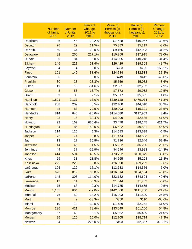
35
Number of Units,
2011
Number of Units,
2012
Percent Change, 2011 to
2012
Value of Permits (in thousands),
2011
Value of Permits (in thousands),
2012
Percent Change, 2011 to
2012 Dearborn 36 44 22.2% $7,528 $10,057 33.6%Decatur 26 29 11.5% $5,383 $5,219 -3.0%DeKalb 50 64 28.0% $9,166 $12,023 31.2%Delaware 82 260 217.1% $10,358 $17,915 73.0%Dubois 80 84 5.0% $14,905 $10,218 -31.4%Elkhart 146 221 51.4% $26,429 $39,308 48.7%Fayette 4 4 0.0% $283 $725 156.2%Floyd 101 140 38.6% $24,784 $32,534 31.3%Fountain 6 6 0.0% $749 $412 -45.0%Franklin 30 23 -23.3% $5,559 $5,082 -8.6%Fulton 19 13 -31.6% $2,561 $2,763 7.9%Gibson 48 56 16.7% $7,573 $9,052 19.5%Grant 33 36 9.1% $5,017 $5,065 1.0%Hamilton 1,891 2,137 13.0% $339,128 $479,074 41.3%Hancock 208 209 0.5% $32,400 $44,018 35.9%Harrison 48 83 72.9% $20,003 $15,301 -23.5%Hendricks 814 646 -20.6% $114,080 $117,959 3.4%Henry 23 16 -30.4% $4,299 $2,535 -41.0%Howard 22 162 636.4% $3,478 $18,145 421.7%Huntington 34 85 150.0% $6,522 $9,581 46.9%Jackson 114 120 5.3% $14,583 $13,638 -6.5%Jasper 72 74 2.8% $11,474 $13,593 18.5%Jay 13 17 30.8% $1,736 $2,646 52.4%Jefferson 44 46 4.5% $5,222 $6,290 20.5%Jennings 44 37 -15.9% $4,646 $3,983 -14.3%Johnson 414 594 43.5% $73,722 $100,879 36.8%Knox 29 33 13.8% $4,565 $5,104 11.8%Kosciusko 225 225 0.0% $26,690 $29,239 9.6%LaGrange 106 122 15.1% $13,733 $14,556 6.0%Lake 626 819 30.8% $116,514 $164,104 40.8%LaPorte 143 306 114.0% $23,132 $34,604 49.6%Lawrence 12 11 -8.3% $1,844 $1,733 -6.0%Madison 75 68 -9.3% $14,735 $14,665 -0.5%Marion 1,185 604 -49.0% $142,560 $111,730 -21.6%Marshall 76 50 -34.2% $15,903 $11,800 -25.8%Martin 3 2 -33.3% $350 $110 -68.6%Miami 10 13 30.0% $1,489 $2,262 51.9%Monroe 236 421 78.4% $33,049 $51,156 54.8%Montgomery 37 40 8.1% $5,362 $6,489 21.0%Morgan 96 120 25.0% $12,705 $18,714 47.3%Newton 4 13 225.0% $493 $2,357 378.1%

36
Number of Units,
2011
Number of Units,
2012
Percent Change, 2011 to
2012
Value of Permits (in thousands),
2011
Value of Permits (in thousands),
2012
Percent Change, 2011 to
2012 Noble 75 67 -10.7% $11,285 $11,127 -1.4%Ohio 11 11 0.0% $1,482 $1,470 -0.8%Orange 4 4 0.0% $604 $596 -1.3%Owen 0 0 $0 $0 Parke 28 2 -92.9% $3,556 $261 -92.7%Perry 18 23 27.8% $2,819 $2,988 6.0%Pike 26 19 -26.9% $3,037 $3,432 13.0%Porter 237 398 67.9% $56,576 $83,628 47.8%Posey 36 98 172.2% $5,962 $12,389 107.8%Pulaski 15 18 20.0% $1,998 $3,507 75.5%Putnam 34 100 194.1% $5,598 $12,538 124.0%Randolph 7 15 114.3% $1,556 $2,458 58.0%Ripley 71 79 11.3% $10,505 $11,535 9.8%Rush 13 11 -15.4% $2,375 $1,858 -21.8%St. Joseph 392 582 48.5% $55,746 $71,941 29.1%Scott 27 28 3.7% $2,484 $4,356 75.4%Shelby 48 50 4.2% $5,646 $5,999 6.3%Spencer 36 42 16.7% $5,135 $8,001 55.8%Starke 33 45 36.4% $5,403 $7,502 38.8%Steuben 92 107 16.3% $22,917 $23,983 4.7%Sullivan 4 1 -75.0% $375 $95 -74.7%Switzerland 41 49 19.5% $2,389 $2,855 19.5%Tippecanoe 1,198 542 -54.8% $169,022 $100,979 -40.3%Tipton 17 15 -11.8% $2,144 $2,932 36.8%Union 9 7 -22.2% $895 $670 -25.1%Vanderburgh 226 303 34.1% $27,698 $32,538 17.5%Vermillion 10 1 -90.0% $1,782 $70 -96.1%Vigo 349 223 -36.1% $26,675 $25,222 -5.4%Wabash 23 20 -13.0% $3,369 $3,557 5.6%Warren 14 0 -100.0% $1,960 $0 -100.0%Warrick 183 201 9.8% $40,681 $32,885 -19.2%Washington 26 46 76.9% $3,583 $7,710 115.2%Wayne 33 24 -27.3% $5,061 $4,470 -11.7%Wells 29 25 -13.8% $5,828 $5,293 -9.2%White 17 24 41.2% $3,893 $5,276 35.5%
Note: Residential permit data are not available for Greene County. Source: U.S. Census Bureau

37
Housing Affordability Index Methodology The housing affordability index is designed to measure the degree to which a “typical” middle income family can afford the mortgage payments on the typical home. To interpret the index, a value of 100 means that the typical family has just enough income to qualify for an 80 percent mortgage on a median-priced home. The higher the index, the more affordable the housing.
Calculation of affordability indices is dependent on several published data sources and assumptions. The primary building block is the median existing house sales price published by the National Association of Realtors (NAR). The NAR price estimates are available for the nation, Census regions and approximately 132 metropolitan areas. Economy.com estimates home prices for counties and states, in addition to the metropolitan areas not published by the NAR.
Published median family income data for the United States, regions, states, metropolitan and county areas are used to determine the income available for a home purchase. Since the Census Bureau publishes median family income for metropolitan and county areas on a decennial basis, Economy.com estimates the intercensal years.
The affordability indices use the state-level “effective” interest rates released on an annual basis by the Federal Housing Finance Board. Effective rates are higher than contract rates because they include fees and charges (points) amortized over the typical seven-year life of a mortgage.
A 20 percent down payment is assumed, being a standard of the housing industry. This implies a loan amount of 80 percent of the median sales price. Economy.com assumes a maturity of 30 years. Economy.com assumes a 25 percent coverage ratio, which is the proportion of minimum qualifying family income allocated to the monthly payment.
Source: Moody’s Economy.com