in what ways does your media product use, develop or challenge forms and conventions of real media...
TRANSCRIPT
Foundation Portfolio – In what ways does your media product use, develop or challenge forms
and conventions of real media products?
Done by Eman Shah

I think that my media product (music magazine) uses, develops and challenges forms and conventions of real media products. This is because firstly it challenges one of the conventions of most of the photographs that I have taken for the music magazine which is of the rock genre and photos of Asian girls. I did this because I wanted to make my magazine to look different to other rock magazines because I am targeting a different audience. Whereas when you look at a rock magazine front cover you would mainly see a man with dark hair which will make you automatically think that it is a rock magazine. So this challenges one of the conventions of real media products. However I have kept the rest of the conventions the same which is the large bold masthead to capture attention, dark colours used to connote violence and aggression, serious facial expressions to define their overall behaviour. These conventions are always in a rock magazine. I made sure that I used the main components such as the date, price and the barcode which I personally think that it follows all magazine conventions.
You can easily tell that this is a rock magazine because the male featured has dark hair and also he has a electric guitar in this hand which again indicates that this is a rock magazine.
This is my rock magazine that I created on Photoshop. The female featured has long hair which is also dark. This breaks the rock convention because as you can see an Asian girl is featured whereas normally when you look at a rock magazine you would always see a male featured.

I think that my media product (music magazine) uses develops and challenges forms and conventions of real media products. The masthead on my magazine is placed at the top of my page where it is in clear view for the reader to look at. The name is ‘FIERCE’ which relates to the rock genre of music. I wanted my masthead to look similar to Kerrnangs masthead. This is because their masthead looks as if it has got cracks in it, and by me editing in crack into my masthead it will make my media product look hardcore.
(My Masthead) (Kerrang’s Masthead)
Above you can see my masthead which is called ‘FIERCE’ and also ‘KERRANG’S masthead. In my
opinion I think that my masthead is similar to the Kerrang's masthead. This is because they both seem as if they have got cracks in. This challenges real media products as my masthead and Kerrang's masthead are similar. But however my masthead is dark purple. I chose a dark colour because it emphasises a dark atmosphere which relates to the rock genre of music.
I also created a tagline at the top of the front cover, which says ‘THE WORLD’S LOUDEST ROCK
MAGAZINE’.
I created this because it will make my magazine seem independent and unique which can also challenge some of the real media products, as some music magazines do not have a tagline. This will create a selling line for my media product.
I

On the front cover there are also cover lines, some which are bold, to show the importance of them. On one of the cover lines, I have made is an advertisement which is about rock bands. I did this because it would then look more appealing and professional. This uses conventions of real media products.
This is another cover line, which again is an advertisment. It says ‘WHO IS BACK? THE BEST ROCK GOD OF ALL TIME’. The readers will find this intriguing because they may want to find out about the rock god.
The barcode is an essential convention on a magazine as it is a practical source so the product can be bought and sold.
On my magazine I have placed the barcode in the bottom right hand corner so that it is out of the way and not noticeable like real professional magazines, I have also included the date, price and website with the barcode, so they are also out of the way. I have done these in a minute font so they are not evident to the reader, also if the price was larger this might put them off however if they were to pick up the magazine and not see the price and get engrossed into it, the price wouldn’t matter. As well as I have included the issue and volume number as these are also essential conventions and make it look more realistic.
I made sure that I included the barcode because its is a important convention, that is in all types of magazines. On my magazine I have placed the barcode on the bottom right corner so that it is out of the way and not noticeable like professional magazines. I also included the date, price and the website. I made sure that the price was small. This is because if the price was big, it would put off the reader. This shows that I have used a form of a convention of real media products. I included a website because if the reader does not want to buy the magazine, then they can read it online. This develops forms of real media conventions.

My contents page uses forms of real media conventions. This is because the masthead is still the same as to the front cover, but this time is in a different colour. The continuous style shows the brands identity which will help stick into the readers mind and make it more recognisable.
Here you can see the masthead which is ‘FIERCE’, I have also creates the word ‘contents’ there, I did this because so then the reader will know that they are reading the contents page.
Real magazines are always organised into categories. This allows the reader to find what they are looking for and makes it easy. I have stuck with this convention and set my contents page in categories going down.
Here you can see the headings of the categories. They are all in the same size, colour and style. This makes it look more professional. This uses real media conventions. I have made the headings orange because it is then in the same style of the masthead on the page. I made sure that I included headings because they are a very vital part in a contents page because the reader will want to be ale to look quickly and easily to want they are wanting to view, and therefore they are bold, which will get to the point.

On my double page spread the title is really catchy which says ‘WILD CHILD’. This is a good title, as it makes you wonder who is the wild child. Real media products (magazines) use attractive titles, in order to address their target audience.
For the main image on my double page spread, I used the same model who was on the contents page. I used her because she is one of the main stories in the magazine. I saw a pose that Taylor Momsen was doing in a photograph, I really liked it so I made my model do it, as it would stand out on the dark background. Her facial expression shows the audience that she is into rock. Her facial expression also shows that she has attitude because she is looking very serious. I made sure that she had dark makeup on. This is because when women are featured in rock magazines they are always wearing dark makeup which connotes rock. This uses and develops real media products.
The first picture shows Taylor Momsen’s pose, which I have made my model do to make the rock look.
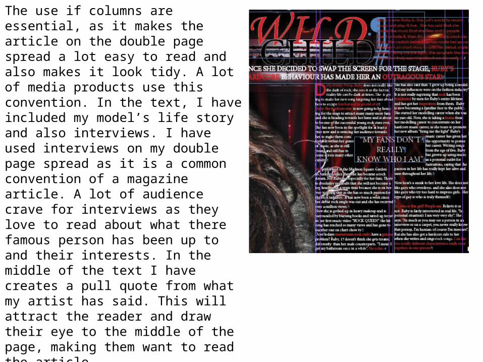
The use if columns are essential, as it makes the article on the double page spread a lot easy to read and also makes it look tidy. A lot of media products use this convention. In the text, I have included my model’s life story and also interviews. I have used interviews on my double page spread as it is a common convention of a magazine article. A lot of audience crave for interviews as they love to read about what there famous person has been up to and their interests. In the middle of the text I have creates a pull quote from what my artist has said. This will attract the reader and draw their eye to the middle of the page, making them want to read the article.