highline class, bi 348 basic business analytics using excel chapter 03: data visualization: tables...
TRANSCRIPT
Highline Class, BI 348Basic Business Analytics using Excel
Chapter 03: Data Visualization: Tables & Charts 1
Topics
1. Data Visualization2. Data Visualization Golden Rules: Low Data/Ink Ratio and
“No Chart Junk”3. Tables
1. Proper Data Sets2. Cross Tabulation3. PivotTables
2
Topics1. Charts
1. Column and Bar Charts2. Stacked Column or Bar Chart3. Clustered column or Bar Chart4. Line Charts5. X-Y Scatter Charts6. Bubble Charts
2. Conditional Formatting3. Geographical Information System4. Data Dashboards
3
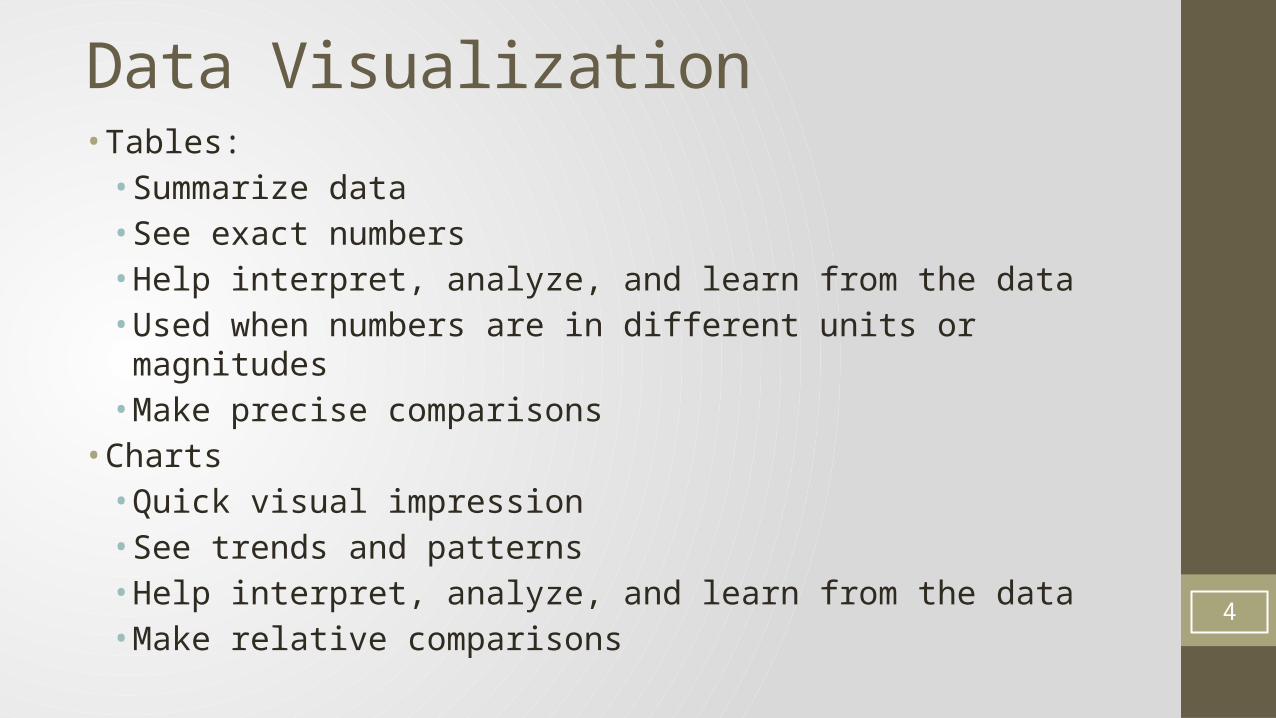
Data Visualization• Tables:• Summarize data• See exact numbers• Help interpret, analyze, and learn from the data• Used when numbers are in different units or magnitudes • Make precise comparisons
• Charts• Quick visual impression• See trends and patterns• Help interpret, analyze, and learn from the data• Make relative comparisons
4
Data Visualization• Conditional Formatting• Some examples:• Mark numbers over a hurdle• Heat Maps
• Geographical Information System• Dashboards• Important metrics presented visually and connected to an
updateable data source
5
Effective Data VisualizationAllows You To Take Raw Data And:
• See patterns and trends• Analyze data• Convey your analysis to others• Make your analysis easier for others to “see” and understand• Learn from data• Find errors
6
Visualization
• Research shows that humans can process visual images (like charts) faster than they can process rows of numbers• Research shows that column and bar charts can convey differences
more easily than pie charts
7
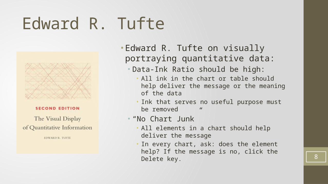
Edward R. Tufte• Edward R. Tufte on visually portraying
quantitative data:• Data-Ink Ratio should be high:• All ink in the chart or table should help deliver the
message or the meaning of the data• Ink that serves no useful purpose must be removed
• “No Chart Junk”• All elements in a chart should help deliver the
message• In every chart, ask: does the element help? If the
message is no, click the Delete key.8
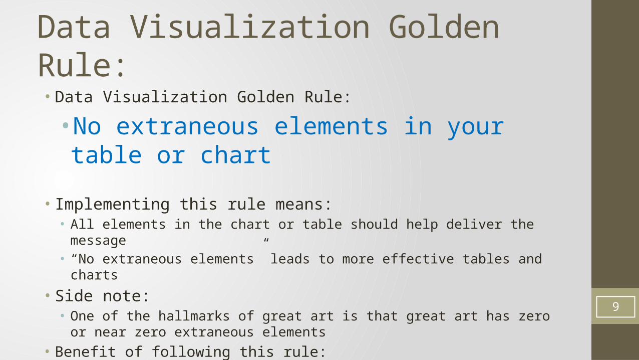
Data Visualization Golden Rule:• Data Visualization Golden Rule:
•No extraneous elements in your table or chart
• Implementing this rule means:• All elements in the chart or table should help deliver the message• “No extraneous elements” leads to more effective tables and charts
• Side note:• One of the hallmarks of great art is that great art has zero or near zero extraneous
elements• Benefit of following this rule:• Effective tables and charts allows you to better communicate your analysis to others 9
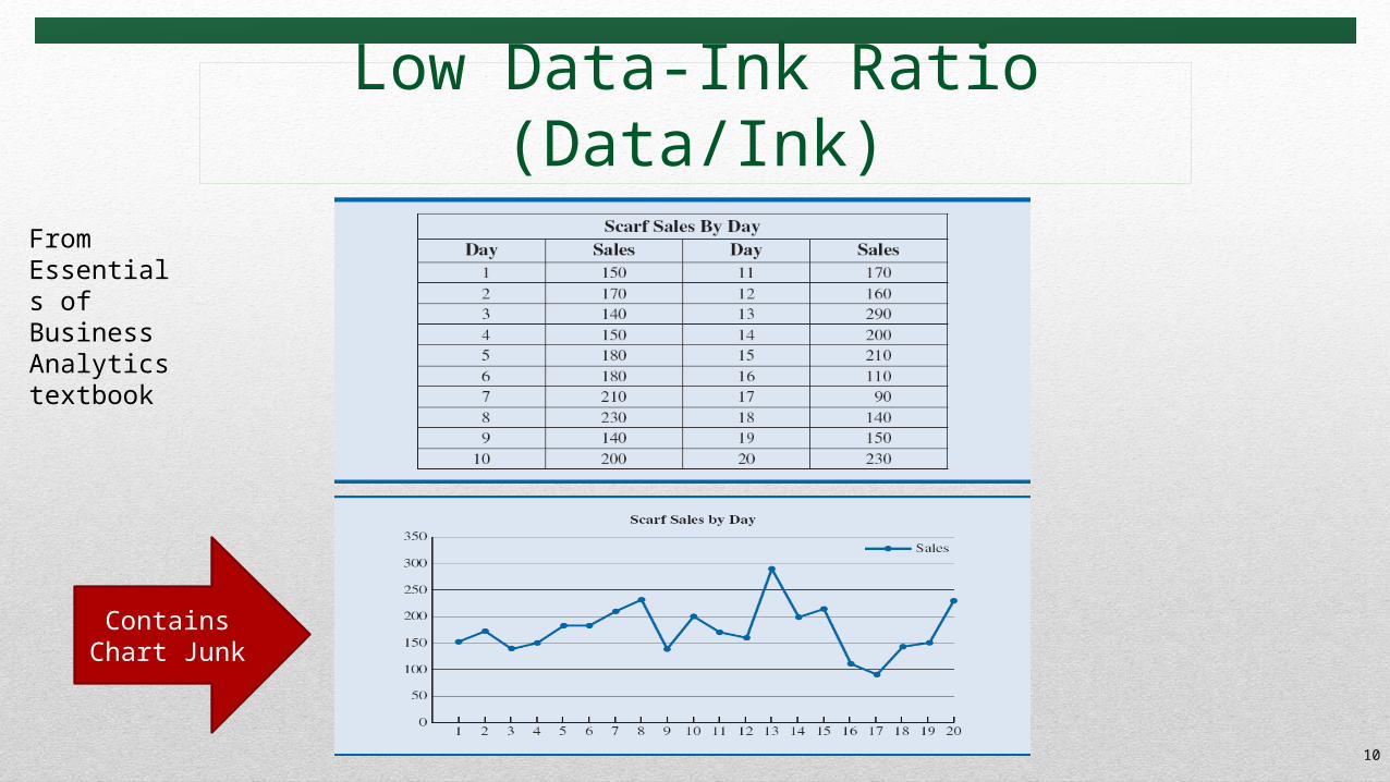
Low Data-Ink Ratio (Data/Ink)
10
From Essentials of Business Analytics textbook
Contains Chart Junk
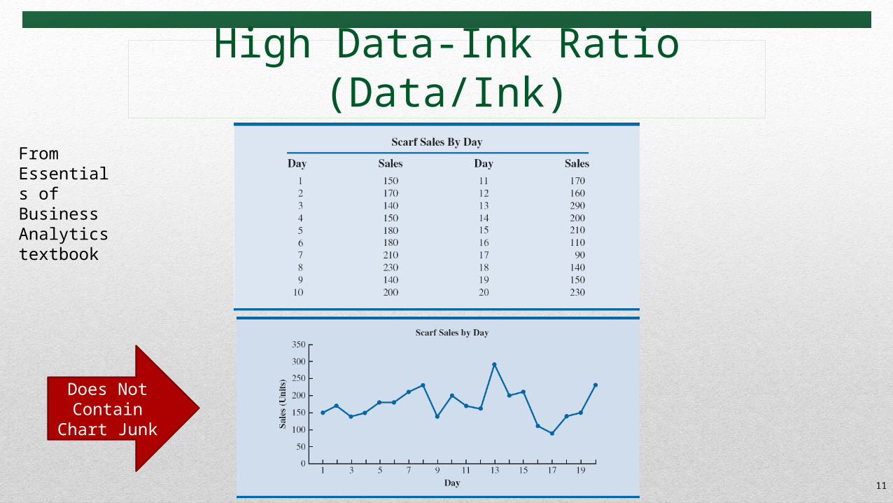
High Data-Ink Ratio (Data/Ink)
11
From Essentials of Business Analytics textbook
Does Not Contain Chart
Junk
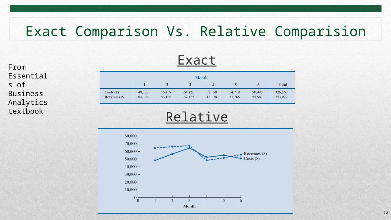
Exact Comparison Vs. Relative Comparision
12
Exact
Relative
From Essentials of Business Analytics textbook
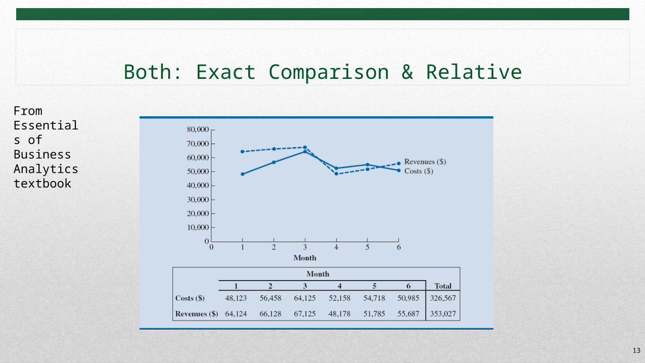
Both: Exact Comparison & Relative
13
From Essentials of Business Analytics textbook
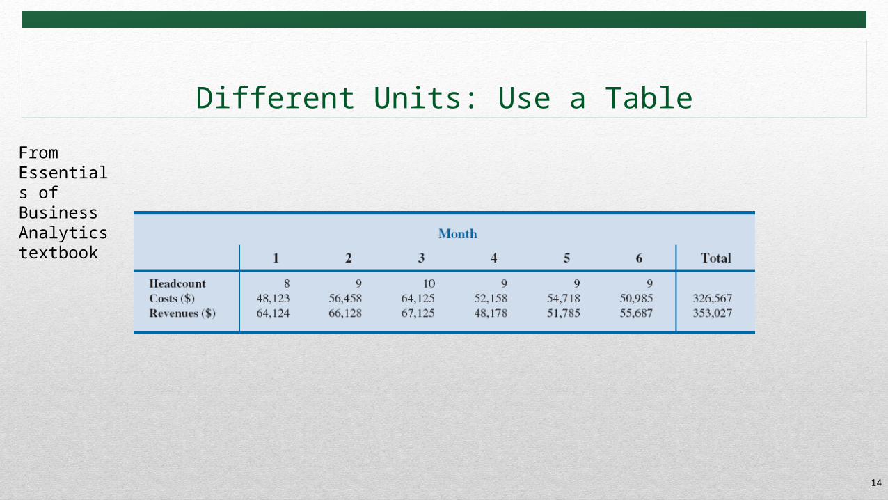
Different Units: Use a Table
14
From Essentials of Business Analytics textbook
Tables
Proper Data SetsCross TabulationPivotTables
15
Tables Design Principles• Data-Ink Ratio should be high• Textbook suggests:
• Avoid using vertical lines in a table unless they are necessary for clarity.• Horizontal lines are generally necessary only for separating column titles from data
values or when indicating that a calculation has taken place.• In large tables, light shading can be used to differentiate columns• Numbers should be right aligned (Right is the visual cue that it is a number)• Text should be left aligned (Left is the visual cue that it is a text)• All numbers should have same number of digits• Units must be indicated either with Number Formatting or Labels• Large numbers may be rounded to dollar or thousands or millions and so on
16
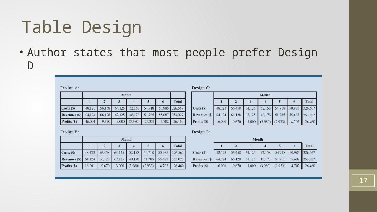
Table Design
17
• Author states that most people prefer Design D
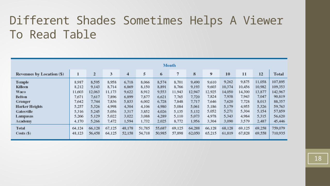
Different Shades Sometimes Helps A Viewer To Read Table
18
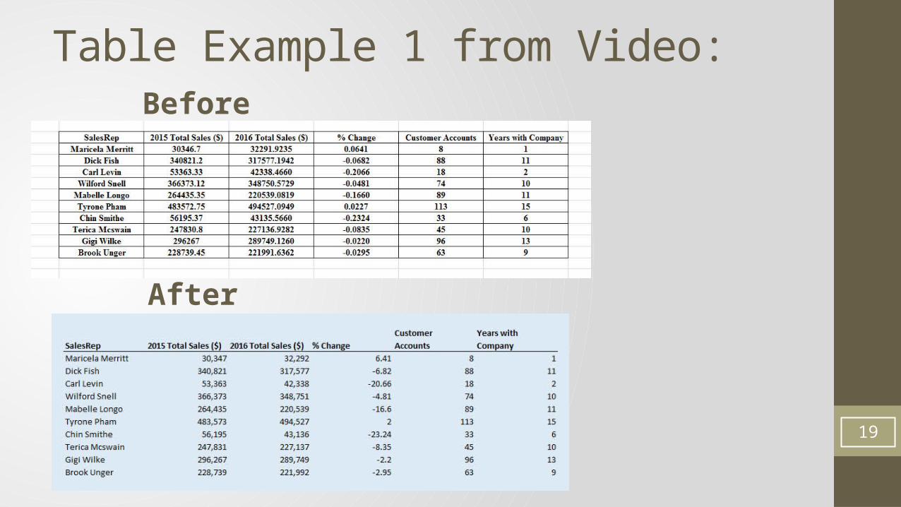
Table Example 1 from Video:Before
After
19
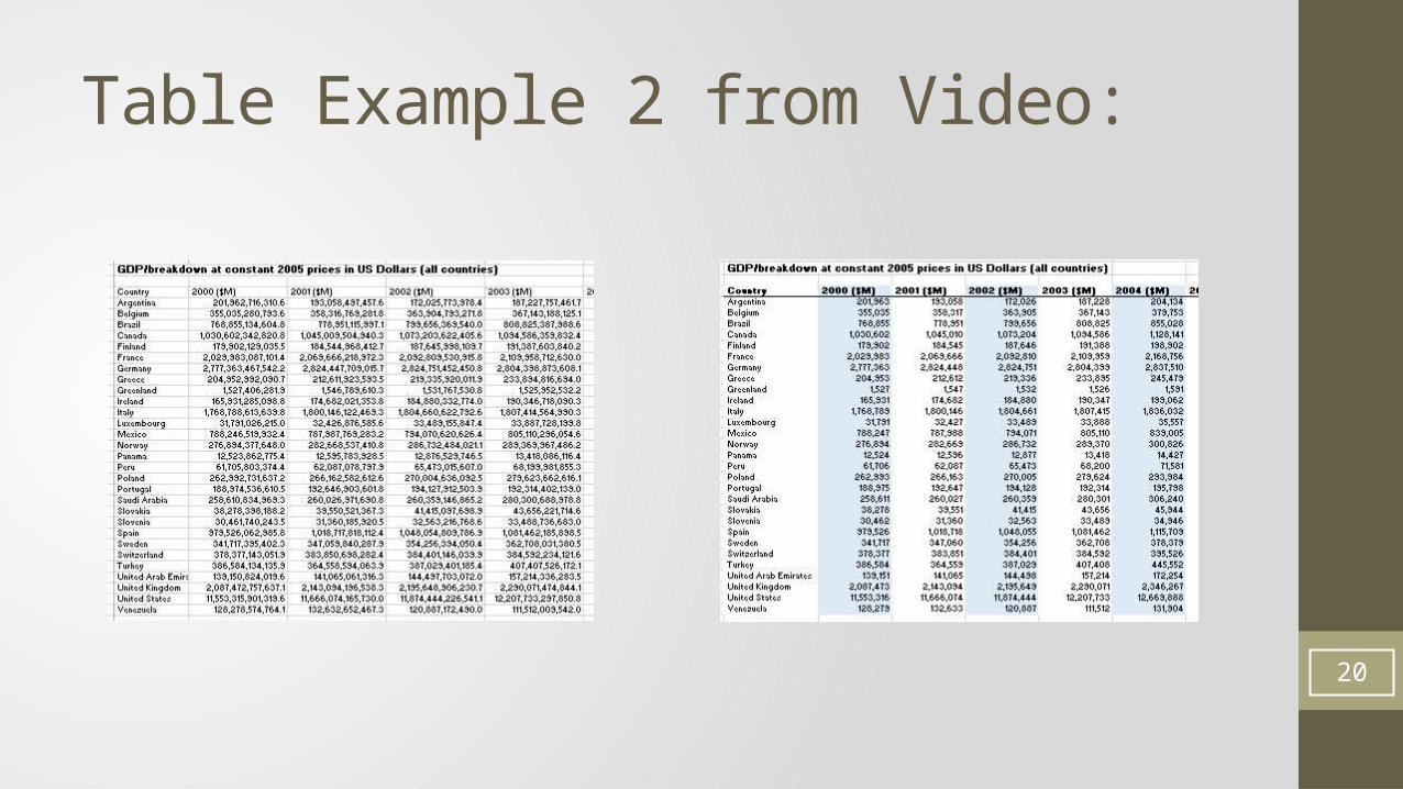
Table Example 2 from Video:
20
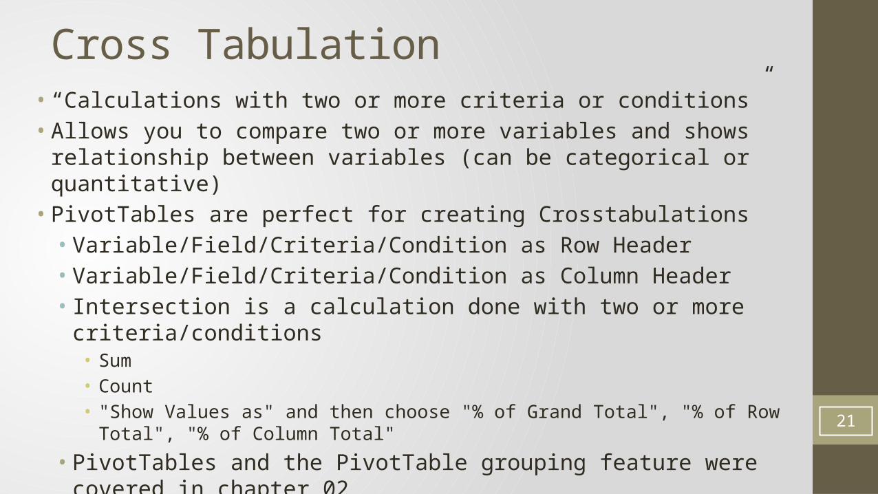
Cross Tabulation• “Calculations with two or more criteria or conditions”• Allows you to compare two or more variables and shows relationship between
variables (can be categorical or quantitative)• PivotTables are perfect for creating Crosstabulations• Variable/Field/Criteria/Condition as Row Header• Variable/Field/Criteria/Condition as Column Header• Intersection is a calculation done with two or more criteria/conditions• Sum• Count• "Show Values as" and then choose "% of Grand Total", "% of Row Total", "% of Column Total"
• PivotTables and the PivotTable grouping feature were covered in chapter 0221
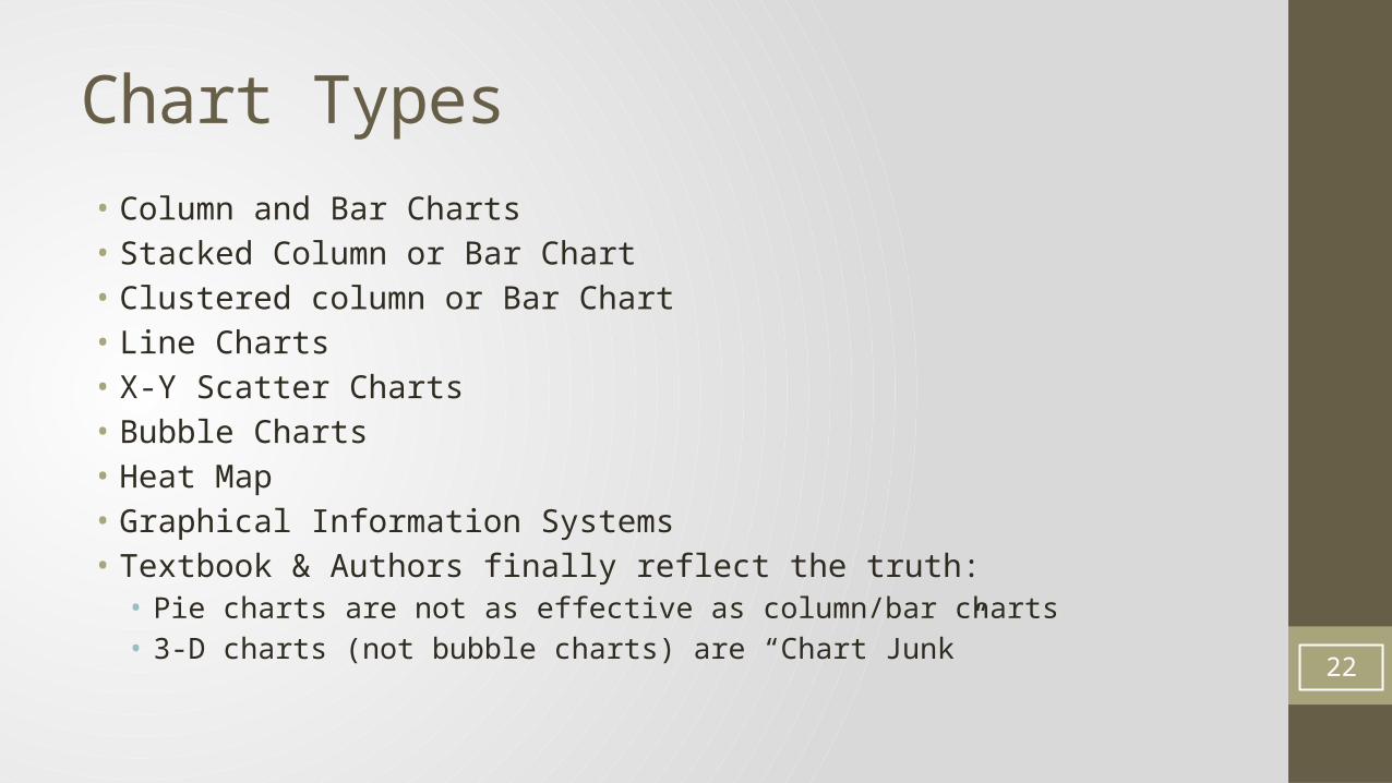
Chart Types• Column and Bar Charts• Stacked Column or Bar Chart• Clustered column or Bar Chart• Line Charts• X-Y Scatter Charts• Bubble Charts• Heat Map• Graphical Information Systems• Textbook & Authors finally reflect the truth:• Pie charts are not as effective as column/bar charts• 3-D charts (not bubble charts) are “Chart Junk”
22
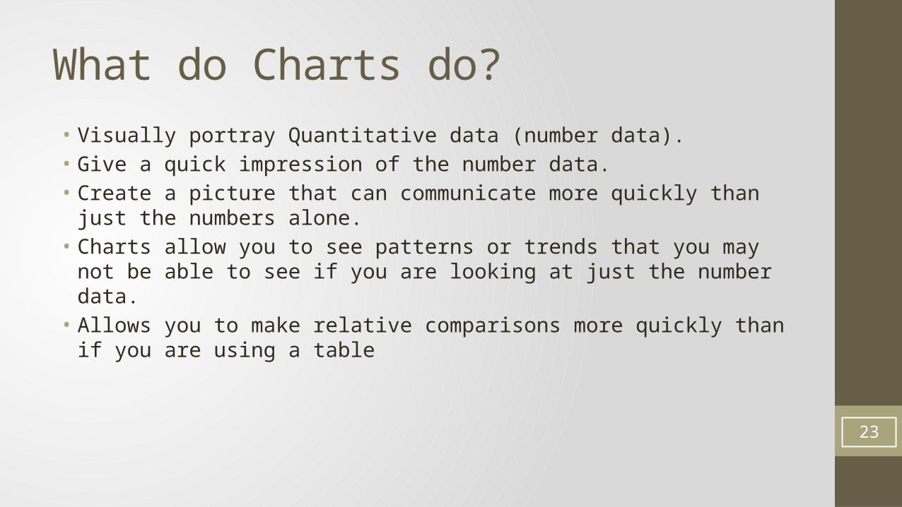
What do Charts do?• Visually portray Quantitative data (number data).• Give a quick impression of the number data.• Create a picture that can communicate more quickly than just the numbers alone.• Charts allow you to see patterns or trends that you may not be able to see if you are
looking at just the number data.• Allows you to make relative comparisons more quickly than if you are using a table
23
Effective charts:
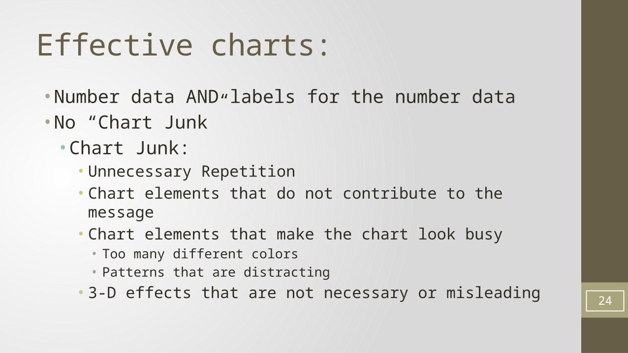
• Number data AND labels for the number data• No “Chart Junk”• Chart Junk:• Unnecessary Repetition• Chart elements that do not contribute to the message• Chart elements that make the chart look busy• Too many different colors• Patterns that are distracting
• 3-D effects that are not necessary or misleading
24
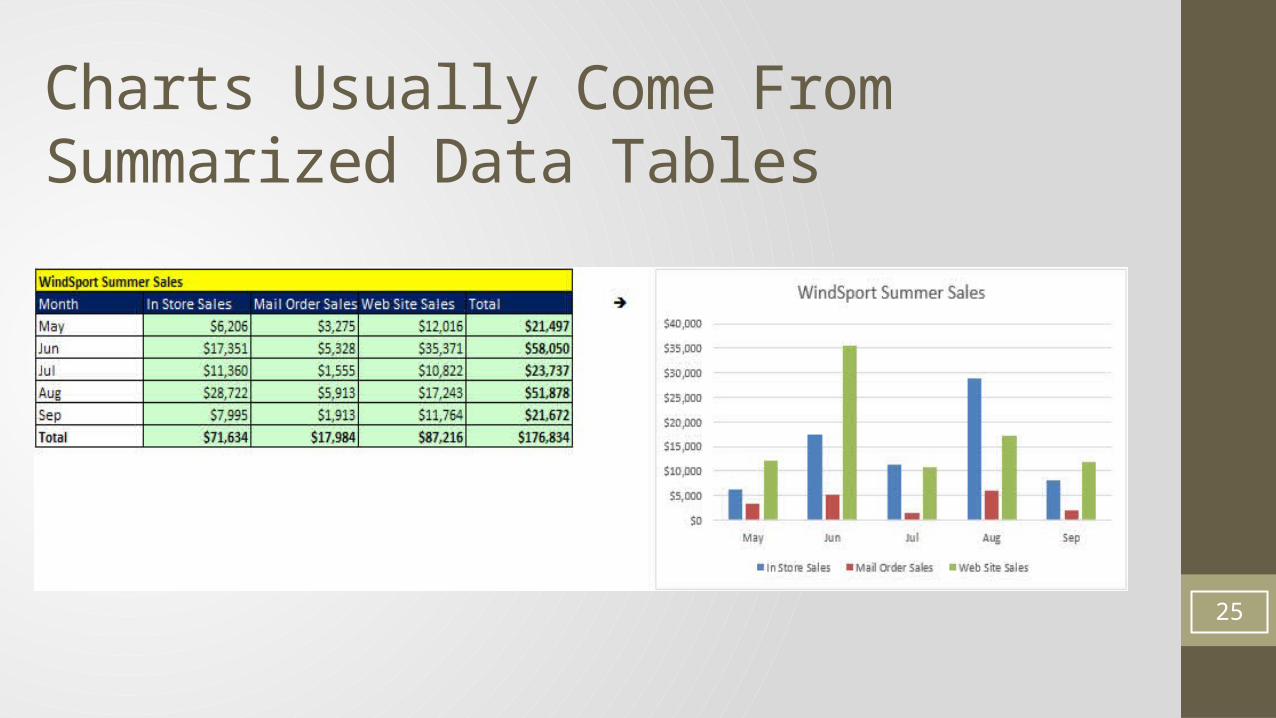
Charts Usually Come FromSummarized Data Tables
25
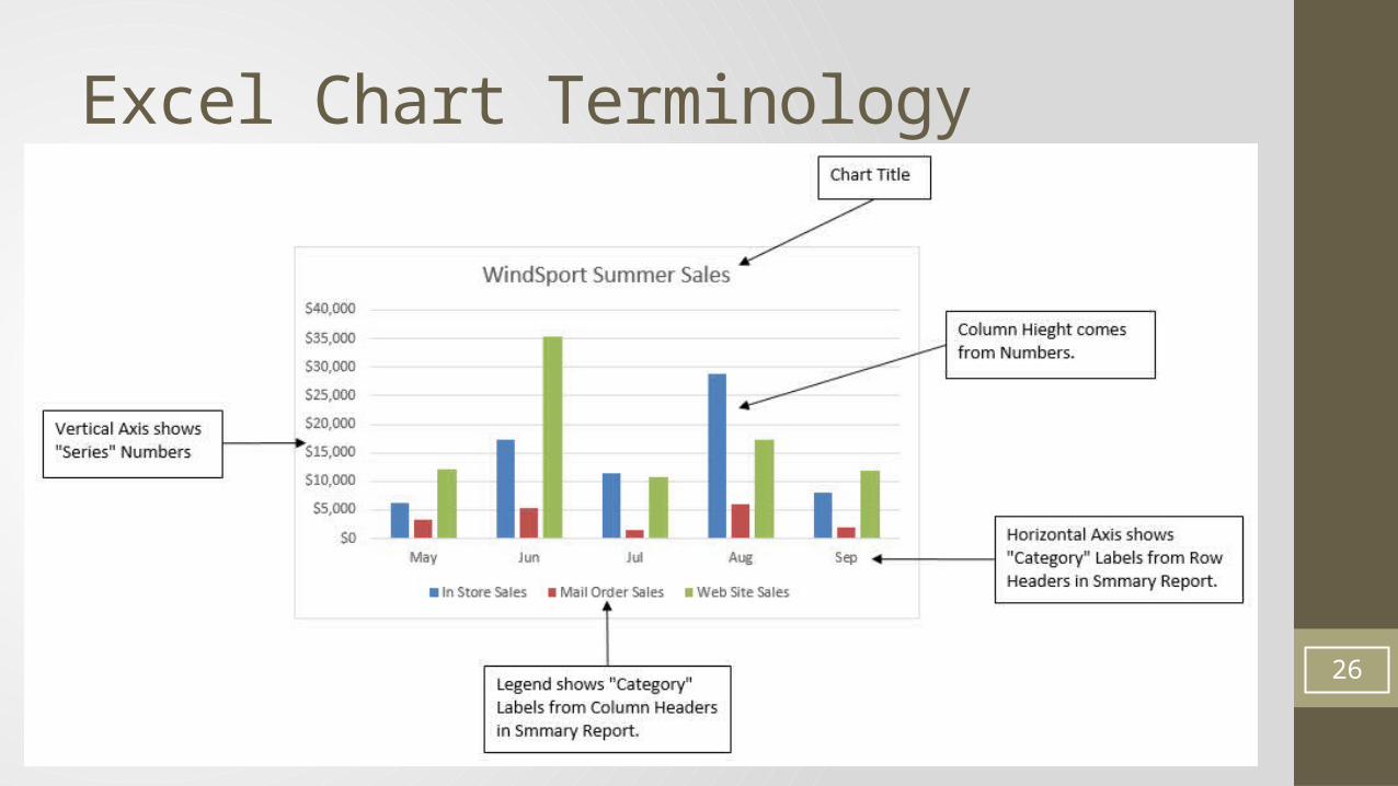
Excel Chart Terminology
26
Column and Bar Charts• Show differences (in numbers) across categories (labels)• Height of columns convey number• Good for Categorical Data:• Count (Frequency) by category• Used to show Frequency Distribution or Relative/Percent Frequency Distribution for
Categorical Data• For categorical data, order of categories conveys no info• There are "gaps" between columns to indicate that the data is categorical or a discrete
quantitative variable. Columns do not touch.• Research shows that Column or Bar Charts convey relative differences more
effectively than Pie Charts• In recent years data analysis practitioners tend to use Column or Bar Charts rather
than Pie Charts27
Stacked Column or Bar Chart• Good for displaying crosstabulation.• Great chart for cross tabulated data from PivotTable
• Emphasis is on comparing the categories listed in the horizontal axis• Excel:• If the number of row headers are equal or greater than to the number of column headers, row
headers show up on horizontal axis and column headers in legend. If not, they are reversed. (You can switch this with the Switch button in the Chart Tools Design Ribbon Tab)
28
Clustered Column or Bar Chart• Good for displaying crosstabulation.• Great chart for cross tabulated data from PivotTable
• Emphasis is on comparing the categories listed in the legend• Excel:• If the number of row headers are equal or greater than to the number of column headers, row
headers show up on horizontal axis and column headers in legend. If not, they are reversed. (You can switch this with the Switch button in the Chart Tools Design Ribbon Tab)
29
Multiple Charts• An alternative to Stacked or Clustered Column/Bar Charts that breaks the variables in
the legend into separate charts• Important to have consistent axes units and/or categories• May make the data less cluttered• Takes more space• When you have many variables or categories, multiple charts may be cleaner and
easier to read• Both column/bar and scatter charts can be effective used for multiple charts• Scatter charts matrix• Useful or analyzing relationships among variables
30
Line Charts• One number on vertical axis, category on horizontal axis• Great for show trends over time
31
X-Y Scatter Charts• Chart that shows the relationship between two quantitative variables• One number on vertical axis, one number on horizontal axis• Horizontal Axis = Independent Variable = x.• Vertical Axis = Dependent Variable = f(x) = y
• Always put X values in Left Most Column in the Table of Data• Add Regression Line and Equation and R Square:• Right-click plotted scatter markers• Add Trendline• Select Linear• Check check box for Show Equation• Check check box for R Square
• Overcome a common mistake by Excel users:• Use X-Y Scatter Plot Chart, not Line Chart when plotting X-Y Scatter Data
32
Bubble Charts (3-D Graph)• Method of visualizing 3 variables in a 2-dimentional chart• First column of table = horizontal axis• Second column in table = vertical axis• Third column = size of bubble (marker of the intersection of the horizontal and
vertical axis numbers.
33
Conditional Formatting• Examples:• Highlight value over a hurdle• Heat Map
• Conditional Formatting to visualize data into thirds or quartiles by using a certain color for each section of the sorted data.
• To create a Heat Map use: Conditional Formatting, “Color Scales”• Examples given in chapter 2 in the video at YouTube:• Basic Excel Business Analytics #14: Logical Formulas & Conditional Formatting to Visualizin
g Data
34
Geographical Information System• Maps that present data and statistics• Excel 2016: Insert Ribbon Tab, 3-D Maps
35
Data Dashboard
• Data Dashboard• Data Visualization Tool that illustrates multiple metrics or KPIs
(Key Performance Indicators) and automatically updates as new data becomes available
• Effective Dashboards:• Presents timely summary data or metrics/KPIs• Metrics/KPIs should be useful for the user/decision maker• Dashboard should inform rather than overwhelm• Should call attention to unusual metrics/KPIs that require
attention or are of interest36
Histograms• Used to show frequency distribution of continuous quantitative data over a set of
class intervals (lower and upper limit for each category)• Column or Bar Charts where columns are touching to indicate that the variable is
continuous• Columns touch to indicate that no numbers can fit between classes. "No numbers
can fit between columns - no gaps"• Height of columns convey count• Order of classes is important to help reveal shape of data, or distribution of data• Skew of Histograms• What does the distribution of Histogram Columns look like?• Skew Left or Negative means a few short Histogram Columns are on the low end (pull
mean down)• Skew Right or Positive means a few short Histogram Columns are on the high end (pull
mean up)• No Skew means the distribution is bell shaped or nearly bell shaped
37
Charts to show Distribution of Data:• Column/Bar/Pie: Used to show Frequency Distribution or Relative/Percent Frequency
Distribution for Categorical Data or Discrete Quantitative Data• Dot Plot: Used to show distribution of quantitative data over entire range of data• Histogram: Used to show frequency distribution of continuous quantitative data over
a set of class intervals (lower and upper limit categories)• Stem and Leaf: Allows you to see the shape of distribution for a quantitative variable
without losing the identity of each value
38
Charts to show comparisons:• Clustered Colum: Emphasis is on comparing the categories listed in the legend• Stacked Column: Emphasis is on comparing the categories listed in the horizontal axis• 100% Stacked Column: Each column is Similar to a pie chart. Emphasis is on
comparing percentages for categories in Legend
39