heather's finished photoraphy book
DESCRIPTION
Newest BookTRANSCRIPT

This is a 4 week brief with 2 workshops which is designed to give you the opportunity to explore the different ways of photographing architecture. The way an architectural struc-ture is perceived can be changed byt he way it is recorded. This is especially true in pho-tography, where composition and view- point can affect the appearance of the subject.
Make your own investigations into the aspect of photography and produce a personal re-sponse which demonstrates your inderstanding of this idea. Think carefully about the subject and how it can be represented in different ways, looking closely at interesting aspects of pho-tography. Use the key structual materials of the building(s) to explore areas of pattern for in-stance, or isolate the building from its surroundings through the technique of negative space.
You will then be expected to apply your knowledge of Adobe Photoshop CS6, and ex-plore manipulation techniques like cropping and colour/ tone enhancement, which al-lows your work to develop alongside that of your chosen architectural photographer.
ResearchYou will need to research the owrk of a given photographer(s) and investigate their approach to capturing architectural forms. This will aid your own development and allow you too see firsthand which techniques benifit this genre of photography.
OutcomeWork is to be completed in your sketchbook, and must be accompanied with annotat-ed research. Present a minimum of 2 final images no smaller than A5 in your books.
Artists
Michael BettsKevin Saint Grey

Architecture
Dawn
Dusk
Time of dayScale Camera settings
Colour
Close/near
Location
City
Leeds
Manchester
HalifaxHuddersfield
Modern buildings
ShadowsHeight
ArtistsKevin Saint Grey
Black and white
Michael BettsColour
Blue
Angles
Perspectve
Exageration
Over powering Abstract
Texture
Protrait/Lanscape
Rule of thirds
Strong focal point
Structure
Lighting
Brighter
Darker
Weather
Lighting/Thunder Snow
Sun Rain
Image in a image
SymmetryReflection
Second focal point
Composition
Negative space
Stong focal point
No distractions
Isolates focal point
Symmetry
Patterns
Shape
Dynamic lines
Diagonals
Size/Scale
Creates perspective
Lead eye
Creates Sections

By analysing Bett’s strong use of compositions i will be ablle to use colour and negative space and filter these into my work. I particually like how he uses the colour blue throughout his images and how it contrasts with other colours, including in the reflec-tion in the buildings. The negative space works well together, linking with the bold blue sky.
Genre - Architecture ini-tially difficult to reconise and work out what it is.
Negatice space creates no distractions and an ab-stract image.
Rule of thirds splits the im-age in to sections.
The curve creates a focal point and brings your eye down to the bottom sec-tion, which the curve is at odds with.
The main colour is blue, which contrasts with the white building. The blue sky complements the building. The blue is reaccuring throughout Bett’s work. The blue tinit is clinical and it has a mini-malist modern feel to it.

The picture is taken from the bottom of the building making it look overpowering and giving it a enormous sense of scale.
The circles create an interesting texture and an abstract feature.
The bright bold colour of the sky is reflected in the building com-plementing the white/grey of the circles.
The curve of the building catches the eye and drags it down to the outside of the building.
The negative space draws the eye to the building creating no dis-tractions. Using the rule of thirds a strong focal point is created and the image is split up.
Diagonals drag your eye down across the image to the bottom left corner, giving perspective creating the illi-sion that the building gets smaller. The colour is con-tiued throughout Bett’s work, here the different shades contrasts with the white and steel. Abstract is created by the colour as it is all similar colours masking the identity of the building, helped by the reflection of the blue in the windows. The camera angle makes the building look overpowering.

This image and the one below have diagonals making the building look like it’s getting smaller.
The blocks on this image and the curve on the image before catch the eye and draw your attention to the building.
Although this image isn’t negative space it has a lot of sky, which contrasts well and makes the building stand out well.
The image below and the one on the left both have reflection in them showing the bright green grass.
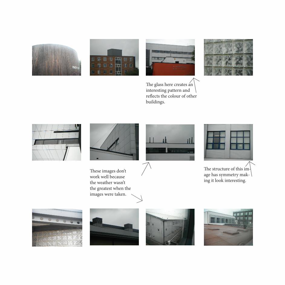
The glass here creates an interesting pattern and reflects the colour of other buildings.
The structure of this im-age has symmetry mak-ing it look interesting.
These images don’t work well because the weather wasn’t the greatest when the images were taken.

This image creates an in-teresting composition, with the different angles and shapes of the building.
This image didn’t work well because it was taken from too far away.

This is my original image. When cropping this image i will pick out the most unusual parts of the building.
Crop 1 has diagonals and perspective, making the building look like it gets smaller. he crop declutterd the image, which doesn’t cause a distraction.
Crop 2 is abstract. I cropped it here because it makes it unusual.
Crop 3 is also abstract, this creates unusual image.
I chose this crop because it is the most interesting and unique.
Crop 4 is also abstract. The crop emphasis the edge of the building making it look like two buildings.

This is my chosen crop. It is the most inter-esting crop. Image 1 over exsposed from the curves, losing the texture of the building. Im-age 2 is still over exsposed miking the image look flat. Image 3 is the best image because; of the curves, you can see the curves and it looks 3D. You can also see the different colours of the building. Image 4 is under exsposed mak-ing one side of the building dark. Image 5 is too dark and under exsposed.
Image 1 Image 2 Image 3 Image 4 Image 5
The curves change th colour of the image. When you move this point from here it makes the image lighter and more exsposed. If you move the point from here it makes the image darker. I chose image 4 because it shows the detail of the building and isn’t over or under exsposed.

These images don’t work becasuse the buildings and sky are too dark.
Negative space. The curve on this building makes an interesting image.
This image doesn’t work that well because it looks a mess.
The sky or reflection in theses images is blue, which works well and is in the style of Bett’s.

The shape of the building creates an interesting image.
This image does’t work too well because the sky isn’t blue but it would if the weather had been better.
This image is taken from ground level, which gives it an enormous sense of scale.
These two images have great reflection of the sky and building opposite.
Crop here to make the image abstract.

Symmetry.
This image follows Bett’s work well as it has reflected the colour blue.
These images don’t work because it is too dark.
This image is good for sym-metry and the red makes the building stand out.

This image doesn’t work as most of the architechture is too old.
This curve is a great at-traction to the building as it is different.
Skewed this image and has symmetry.
This is a great image with the curve of the building and the differ-ent coloured sky.

These images haven’t worked because the build-ing is too dark so you can’t see any detail or texture.
This image has worked quite well, the sky is reflected in the windows and taken from the bottom gives it an over powering feel.
These images could be abstract as they have dif-ferent parts sticking out and the same window, which catch the eye.

I chose this image because it has good negative space an abstract in it.
Image 1 is over exsposed, which meas it has lost tex-ture to the building.
Image 2 has the clearest building, which stands out more in this image than others.
Image 3 the buildind is too dark and you can’t see the details of the building.
Image 4 is under exsposed losing the details of the building.
Image 5 is under exsposed too much, the image is too dark and the sky adn build-ing are merging into one, so you lose the edge of the building.
I chose image 2 because it has the most defini-tion in the building and stands out the most.
Image 1
Image 2
Image 3
Image 4
Image 5
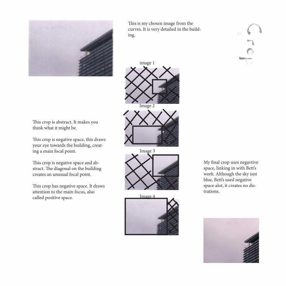
image 1
Image 2
Image 3
Image 4
This is my chosen image from the curves. It is very detailed in the build-ing.
My final crop uses negavtive space, linking in with Bett’s work. Although the sky isnt blue, Bett’s used negative space alot, it creates no dis-trations.
This crop is abstract. It makes you think what it might be.
This crop is negative space, this draws your eye towards the building, creat-ing a main focal point.
This crop is negative space and ab-stract. The diagonal on the building creates an unusual focal point.
This crop has negative space. It draws attention to the main focus, also called positive space.

I am going to skew this image to make it taller and more over powering.
The building is tall-er, straighter and is more over powering.
The reflection in the windows is good as it show the clouds, where you can’t see them above the building.

This is my image from the skew page before.
Image 1 is overexsposed and the building fades out and you can’t see where the building ends.
Image 2 is the most clear-est image, showing the most definition in the building.
image 3 is dark and it’s starting to lose definition.
Image 4 is under exs-posed and very dark you can’t see much of the building.
Image 5 is extreamly un-der exsposed and nearly all black. You can’t see much of the building at all.
i chose image 2 because it’s the brightest and clearest image, you can see the details of the building and the reflec-tions of the clouds.
image 1
Image 2
Image 3
Image 4
Image 5

I changed these images after getting a new priter as they came out pink. These images look a lot more like Michael Bett’s work. I have change the sky and used colour balance to make them bluer.


The sharp dynamic lines of the building help the building look dominant and over powering as does the angle that the image has been taken from.
It also has symmetry which creates a strong image.
The sky also makes it look over powering as around the building the sky is lighter giving it a halo effect.
The negative draws your eye down to the building due to the direction of the sky making the building the main focal point of the image.
Kevin Saint Grey uses black and white photography, which creates a dark mysterious atomsphere in his images.

The image has symmetry, which make the building look larger than it actually is.
The ligher sky around the building makes it stand out more, create a happy feeling and a focal point. The dark sky createss a dark feeling.
the reflection creates an interesting image.
Negative space isolates the building, drawing attention to it. Diagonal lines show a sense of scale and make the building look longer and further away.
The light sky around the building creates a halo effect creating a main focal point. The dynamic lines make the building stand out.
Negative space drags your eye down to the building.
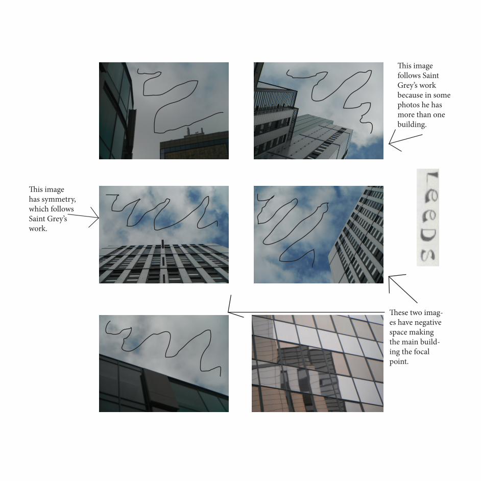
This image follows Saint Grey’s work because in some photos he has more than one building.
This image has symmetry, which follows Saint Grey’s work.
These two imag-es have negative space making the main build-ing the focal point.
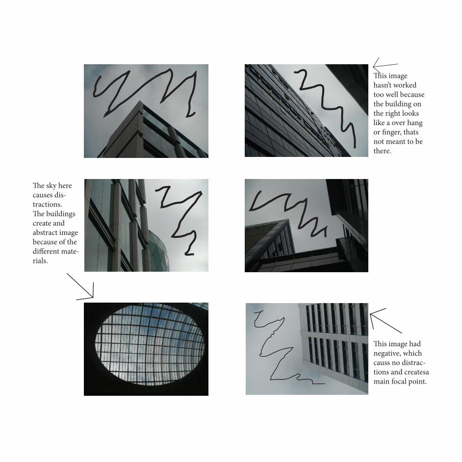
This image hasn’t worked too well because the building on the right looks like a over hang or finger, thats not meant to be there.
The sky here causes dis-tractions. The buildings create and abstract image because of the different mate-rials.
This image has negative space, which causes no distractions and creates a main focal point.
This image had negative, which causs no distrac-tions and createsa main focal point.

The curve on this building drags your eye round the building.
This image doesn’t work because the buildings are too dark.
To make this image tie in with Saint Grey’s work i could desatu-rate the image.

This image has reflec-tions, which ties in with Saint Grey’s work.
This image ties in with Saint Grey’s work because it has more than one image.
The image on the left has good dynam-nic lines mak-ing the build-ing the main focal point.
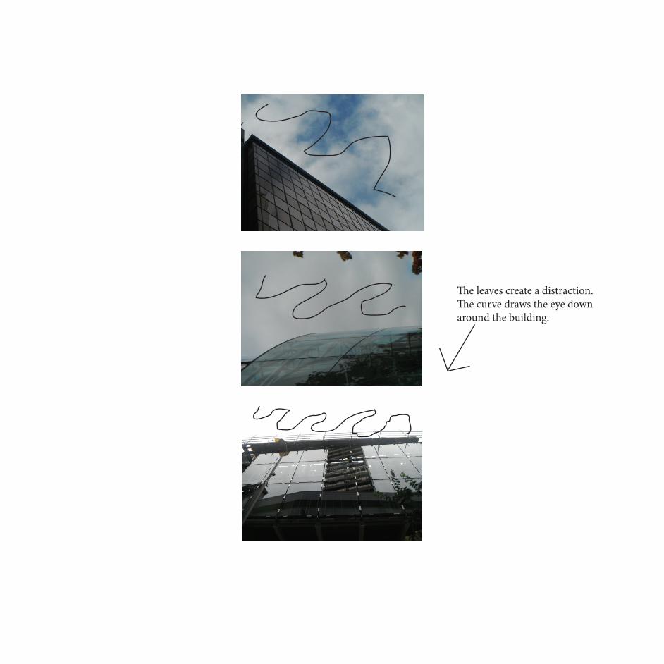
The leaves create a distraction. The curve draws the eye down around the building.

Image 1 is too bright and the building and sky have blured together.
Image 2 is over exsposed and has lost pattern and texture.
Image 3 is the one you can see the most of the building and it doesn’t merge in with the sky.
I chose image 3 because it shows the most detail of the building and hasn’t merged with the sky.
This is my original image. I will change the sky to fit in with Greys’s work.
I destaurated the image so it’s black and white like Grey’s work.
Image 4 is under exs-posed and too dark .
Image 5 is too dark and so loses the edge of the builiding in the sky.
Image 1
Image 2
Image 3
Image 4
Image 5

This is image 3 after curves. The build-ing shows detail but the sky needs bluring to look like Grey’s work.
I have motion blurred the sky and it now looks like Grey’s work.

I desaturated the first image to tie in with saint grey’s work.I used curves to get a better quality image.
Image 1 is over exsposed and has lost the sky, the sharp edges of the building make it look fake.
Image 3 has texture in the clouds so the building doesn’t look fake.
Image 5 is too under exsposed and the sky and building has merged into one.
Image 2 is still over ex-sposed and there is no texture in the clouds.
Image 4 is under exsposed and has lost texture and detail.
I chose imge 3 as my final im-age because it is the clearest and demonstrates Saint Grey’s work well.
Image 1 Image 2 Image 3 Image 4 Image 5

I used motion blur on the sky to look more like Kevin Saint Greys work.
This is the image with the blured sky.
I cropped part of the image to get rid of the distraction at the bottom of the image.
This is the image after curves. I am going to pur ithe sky into.

The sky in this image is too light for the artist.
This image is exposed too much, so some of the build-ing has no detail.
This image has detail and pattern in the image.
This image is too dark and the building has no texture.
I chose this image because it is like some of Kevin Saint Grey’s work.
Is desaturated the image to look more like his work.
I chose image 3 because it has the most detail and the closest to Saint Grey’s work.
The image is under es-posed and the building is like a shadow.

This is my image after curves. The sky is to light and plain.
This is my final image after i used motion blur on the sky. It now looks more like Grey’s work as the sky is dark.


The Negative spacedraws the eye down to the curve of the building making it the main focal point and creates no distractions.
The sky is light-er nearest the building, which draws the eye down towards the building.
The reflection of the dark sky in the building con-trasts well with the edge of the building where it is lighter and it is seen throughout Bett’s work.
The image uses the rule of thirds spliting the image up.

Use of negative space isolates the building
Cloud removal for no distractions
Structure dominates the images
High camera angleCrop image for no distractions
Negative space
Crop for unusual images and patterns
This side could be flipped to remove the sign and create symmetry

Negative space
Diagonal lines create per-spective
The building is the main focal point
Cloud removal for a better image Cloud removal
I would use curves to lighten the building to show more texture
The buildings are too dark
Negative space Negative space draws eye down to spiral staircase
Cloud removal

Cloud Removal The sky is too light I would remove this tree to remove the distraction
Cloud removal
Negative Space
The building is black and the sky is too dull
This tree causes distractions
Diagonal lines make the building look larger

Curve draws the eye along the building
The building can be lightened to work
Reflection creates distraction
Crop to create unusual image
Remove the tree
Diagonal lines

Tree Removal
Tree Removal Building too dark
Too much going on
Blue sky like Bett’s
Negative Space
Structure is the main focal point

This is my original image. it was taken to emphasis the negative space and the curve of the building.
I split the image into two, putting the sky and the building on seperate layers. I then selected a sky from one of my other images to put in my edit.
The building is too dark so i used curves on the whole image.
Image 1 is over exsposed, so it is too light.The building is better in image 2 but the sky is too light.The sky is still abit light in image 3 but the building has texture.Image 4 is under exsposed and has lost the pattern around the edges of the image.Image 5 is too under exsposed and the build-ing has lost all texture and the sky is too dark.
Image 1 Image 2 Image 3 Image 4 Image 5

I chose image 3 from the curves on the page before because the building kept the texture.
I used curves on the building to lighten it up further.
I then used colour balance to make the image bluer to tie in with Bett’s work.
This is my final image, it looks like Bett’s work because he uses negative space and reflection of the sky.

This is my original image.The blue sky goes well with Michael Bett’s work. The tree cause distractions, so i am going to remove it.
This is my image after i removed the tree. i used the clone stamp and selected the sky close to the tree to make it look like i havent edited it.

This is the image with the tree removed. The building is a bit too dark so i used curves to lighten it up.
This image doesn’t show enough, there is too much sky and not enough building.
This crop also has distractions in it and doesn’t use the rule of thirds.
This crop has distrac-tion in the corner.
This image has the right amount of sky and build-ings.
This si my final image, there is no distractions. The sky is perfect and you can see the detail of the building.

Tree removal
The building is too dark so i would use curves to lighten it.
I would use cloud removal on these images to get a blue sky.
The curve on these build-ings drag your eye round the edge.
The reflection causes too much distraction.

Remove the lamp. Negative space.
Cloud removal and replace with a bluer sky.
The building is too dark, you can’t see any detail of the building.
I would use cloud removal.
The image is taken from too far away and has dis-tration.
Tree removal

I would lightne the build-ing to show pattern in the building.
Remove this as it creates distraction.
Diagonal linesI would skew this to get it symmetrical. Cloud removal
Creates distraction
Negative space

Negative space
Cloud removal to get a bluer sky.
I would crop this to get a better picture.
This doesn’t have any sky so dosent tie in with Bett’s work.

This is my chosen image. The building is too dark and the sky has clouds in it.
I painted the sky red to se-lect the building to put them on different layers.
I used colour balance but the final image looked fake.
I started again and copyed the image, putting it on two layers. I then used threshold in invert the image.

I deleted the cloud and then select-ed the back-ground and deleted it.
I selected this sky and put it in.
This is the image with the sky put in.
I used curves and colour balance to make the image bluer.
This is my final image the sky is perfect and blue like Bett’s work.

This is my original image, there is too much cloud so i will put a new sky in and the building is too dark.
I put this sky in and used curves to get the right balance.
This is the image after curves and the sky put in.

This is the image from the page before. I am going to use crops too make an unusual image.
This crop has too much distraction at the bottom.
This crop uses neg-ative space to draw your eye down.
This image has too much much building in it.
This crop doesn’t have enough building in it.
This is my final image. I chose this because its similar to Bett’s work and the curve leads your eye down to the building at the bottom.

I would crop this image because it is too far away.
I would crop it here for a unusual image.
I would lighten these images to show more texture.
I would crop here to male an inter-esting image.
The tall building gives it an enormous sense of scale.

Cloud Removal
The reflection causes distractions
Add another sky to look like Bett’s work. Cloud removal Negative space

Cloud removal for a better sky.
The curve draws your eye down.
The sky can be changed to a lighter sky. Negative Space
The image can be cropped to make a better image.
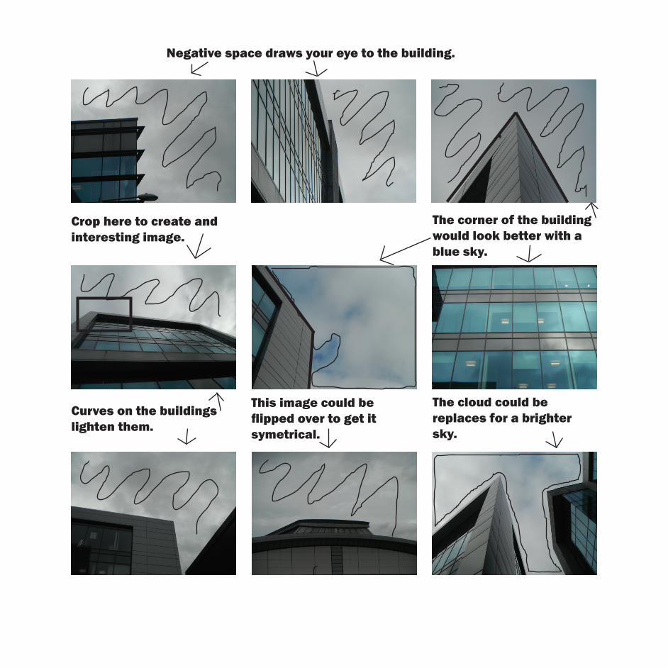
Negative space draws your eye to the building.
Crop here to create and interesting image.
The corner of the building would look better with a blue sky.
Curves on the buildings lighten them.
This image could be flipped over to get it symetrical.
The cloud could be replaces for a brighter sky.

Cloud removal.
The letters cause distractions.
The crop here would make an interesting image.
Negative space draws the eye to the corner of the building.
The negative space draws the eye to the curve.

This is my image i have chosen to edit. I will replace the sky and flip one side to make it symetrical.
I selected this half of the image to flip over as it doesnt have the black part in it.
I put this sky in and used curves to get it to the right shade. This is the
image with the sky placed in it.
This is the image af-ter i flipped one side over.
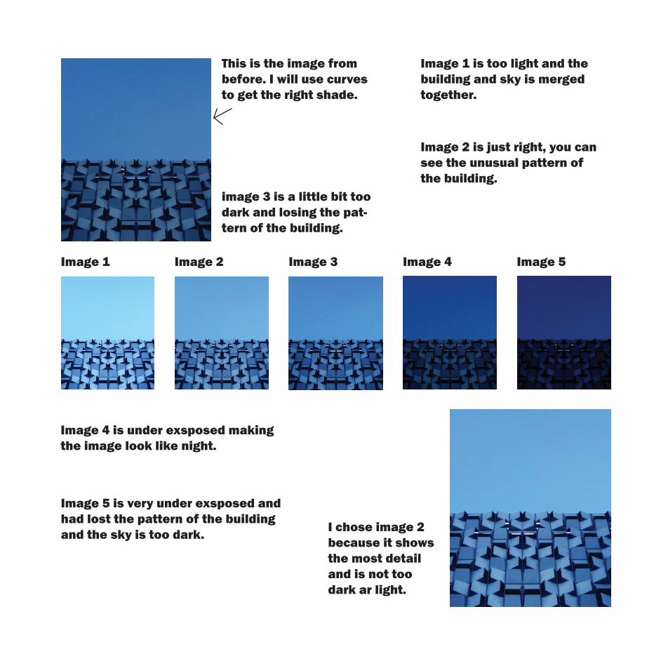
This is the image from before. I will use curves to get the right shade.
Image 1 is too light and the building and sky is merged together.
image 3 is a little bit too dark and losing the pat-tern of the building.
Image 2 is just right, you can see the unusual pattern of the building.
Image 1 Image 2 Image 3 Image 4 Image 5
Image 4 is under exsposed making the image look like night.
Image 5 is very under exsposed and had lost the pattern of the building and the sky is too dark. I chose image 2
because it shows the most detail and is not too dark ar light.

This is my chosen image. It is too dark and doesnt have blue sky.
I chose to put this sky in as it is brighter and lightens the mood of the image.
I used curves to lighten the building and show more texture in the building.
This is the image after curves, you can see more detail.

This is the image from the page before, the sky has been replaced and curves have been used.
The crop has too much building in it.
This image doesnt have enought in it.
This crop uses neg-ative space to draw attention to the building.
The dark patch caus-es a distraction.
This is my final image, the negative space draws the eye to the building making it the focal point.

This is my chosen image, the sky and building are too dark and lack pattern.
I selected this side of the image to reflect.
Here is the image after i reflected it.
I chose this sky to put in.
I used curves on the building to lighten it.

This is the image with the sky put in.
This crop has too much distractions in it.
This crop uses the rule of thirds.
This crop doesn’t have enough in it.
This crop uses neg-ative space to draw the eye to the build-ing.
This is my chosen crop, the negative space draws the eye to the building making it the main focal point. It also uses the rule of thirds; two thirds sky and one third building.