gui design by schematic visualization
TRANSCRIPT

Designing a user interface based on the calm technology paradigm and schematic visualization, and its evaluation from a communicability and rhetoric standpoint
Omar Sosa Tzec1
Samuel Cortina Arteaga2
Roberto Holguín Molina3
calm technology, schematic visualization, interface design, visual rhetoric, semiotic engineering
The information design, regarded as the act of creating usable messages, has a direct application on designing graphic user interfaces. In this regard, it is possible to consider schematic visualization as an option for users to unload cognitively through more stress on the visual characteristics of the interface. This represents a way to apply the Calm Technology paradigm proposed by Mark Weiser. By considering the level of iconicity conveyed into an interface of this nature, the understanding of how schematics works on the interface should be evaluated under a different approach rather than a traditional usability evaluation, for example by doing a communicability test (from the Semiotic Engineering theory). Thus, this paper describes the overall process to design and evaluation of an instant messaging client under these considerations and it also introduces a standpoint for interface design based on the three rhetorical appealing modes.
1 Universidad de las Américas Puebla, México. [email protected] Universidad de las Américas Puebla, México. [email protected] InSitum, México. [email protected]
Anais do4° Congresso Internacional de Design da Informação / 3° InfoDesign Brasil / 4° CongicCarla G. Spinillo, Priscila L. Farias & Romero Tori (orgs.)Sociedade Brasileira de Design da Informação – SBDIRio de Janeiro | Brazil | 2009ISBN
Proceedings of the4th Information Design International Conference/ 3rd InfoDesign Brazil / 3rd CongicCarla G. Spinillo, Priscila L. Farias & Romero Tori (orgs.)Sociedade Brasileira de Design da Informação – SBDIRio de Janeiro | Brazil | 2009ISBN

O. Sosa Tzec, S. Cortina Arteaga & R. Holguín Molina | Designing a user interface based on the calm technology paradigm and schematic visualization…| 2
1 Introduction
Nowadays, communication and technology are two intertwined concepts. Effective communication between two people is possible due to current information technologies, supported by portable communication devices such as laptops, PDA’s, cell phones, and smart phones. Instant Messaging (IM) can be considered one of the most representative ways for collaborating and communicating (AOL, 2006).
A common characteristic these devices share, aside from laptops, is the fact that they have small displays. This can affect the user experience when using an IM client. Handling a large amount of chat windows turns out to be an issue where laptops are concerned. On the other hand, on PDA’s, cell phones, and Smart Phones, the amount of information conveyed is a determining factor in order to avoid overwhelming the user. This paper explains our approach for designing a graphic user interface (GUI) for an IM client. The aim was to stress visual features in order to show the users with as much possible information on small displays, such as the ones in smart phones.
The paper is organized as follows; in the 2nd section the Calm Technology (CT) concept and its connection with schematic information visualization are introduced. Its application to user interfaces and previous work on interfaces for mobile devices is mentioned at the end of this section. The 3rd section is divided in two parts, at first the background for an initial proposal of an interface that applies the CT in combination with schematic visualization is explained; secondly, the process of gathering data from users is described. Section 4 outlines the developed low fidelity prototype for a mobile device IM client. Section 5 explains the prototype evaluation, while the next section discusses the results from that evaluation. Finally, section 7 provides the conclusions of this work.
2 Calm Technology, Information Visualization and GUI Design
CT is a viewpoint for non-intrusive technologies introduced by Mark Weiser et al. (1995), who state that the most relevant technologies will be those that “disappear” in front of humans. This viewpoint, or design paradigm, seeks to reduce the excitement generated by the information overload by allowing users to select what information will be at the center of his/her attention and what at the periphery (whatis.com, 2006).
The term periphery is employed to indicate what is taken into consideration without placing explicit attention to it, in other words anything unimportant. Everything in the periphery can be placed at the center of the user’s attention at some point. Thus, calm technology allows easily shifting attention from the periphery and back, which turns out to be encalming (Weiser et al., 1995). The relevance of this paradigm is to think what information and how it can be allocated in the user’s periphery. It is not only about having a large amount of information chunks available, but also about letting users choose which information is necessary (to place at the center) in order to accomplish a task. The latter is a form of information design closely related to the interface design process (Thissen, 2003). Even more, it is clearly evident that the CT paradigm is relevant to both information and interaction design.
As for information visualization, which is a derivate of information design, this involves a cognitive activity that leads to construct inner mental models (Spence, 2001). According to Costa (1998) and Fry (2000), the relevance of information visualization relies on allowing people to see and understand phenomena that was previously unreachable in the form of abstract data. Well-established criteria exist to visualize information, which usually involves the adequate selection, sorting and representation of data (Costa, 1998, Fry, 2000; Mijksenaar, 2001; Spence, 2001). More specifically, for the representation phase some of the well-known visual tools are applied, such as Bertin’s visual variables, Gestalt laws, and Mole’s laws (Costa, 1998).
The phenomena previously mentioned is not only concerned to physical aspects of the world but also with social relationships that can manifest on virtual environments (Xiong, 1999). A possibility exists that some schematic visualization features can be used to shape the information presented on a GUI. For example, Chat Circles (Viegas et al., 1999) introduces a
Anais do 4° Congresso Internacional de Design da Informação / 3° InfoDesign Brasil / 4° Congic Proceedings of the 4th Information Design International Conference/ 3rd InfoDesign Brazil / 3rd Congic

O. Sosa Tzec, S. Cortina Arteaga & R. Holguín Molina | Designing a user interface based on the calm technology paradigm and schematic visualization…| 3
schematic interface for synchronized conversations. In this chat client the user’s presence and activities are manifested by changes in the shape and color of a circle. These changes have the purpose of projecting conversation dynamics and revealing activity patterns emerging from the users’ interactions.
Aside from chat or IM clients, the design of GUIs for small displays has challenges of its own and these involve a particular approach for determining how to propose an interface as well as the aspects that should be considered guidelines inside the design process. The Mobi-i project (Marcus et al., 2002) is a clear example of a user centered design process that identifies users’ needs underlying in a context of mobile devices. In this project the users, social and business contexts, technological opportunities and advanced user interfaces were studied in order to conclude which usage spaces characterized mobile devices.
Berg et al. (2003) conducted an ethnographic study on teenagers and the relationship with their cell phones. This study showed that teenagers use cell phones to practice social exchange. In the resulting prototype they grouped interface functions in four categories:
1. Contacts – how to manage them.2. Communication tools.3. Creation tools.4. File system and memory vessel.
Holtzblatt (2005) observed that users are not willing to take time to learn how to use mobile applications. She also observed that mobile devices do not encourage the use of help systems, and that these devices have limited interfaces. Specifically, she faced three challenges on designing a GUI for cell phones:
1. The familiarity with the device.2. The information where needed.3. The shape factor (how to deploy information on a small display to make it available and
instantly readable).4. The amount of time for browsing, which is minimal.
Beyond the mobile devices’ context, other issues about IM clients could be equally important, such as modelling and representing emotions (Sanchez et al., 2005), taking advantage physical properties of interfaces like handwriting (Fabersjö et al., 2003) and data sharing while chatting (Quian et al., 2004).
3 Design methodology
3.1 Preliminary Work
We started with the question of how to handle a large amount of chat windows in a small display, as it is for laptops (Sosa-Tzec et al., 2005). In order to answer this, the construction of hybrid methods to detect users’ needs was necessary. The experience sampling method (Hurlburt, 2006) was adopted from psychology, and the participative observation (Robson, 2002), from ethnography. With this in mind, we proposed:
1. A usage log2. A record of activities
The usage log’s objective is to find a pattern on a user’s behavior through visual and written records. A record of activities consists on randomly asking to the members of a contact list their current activities. For both, written records were mapped into experience categories (Hurlburt, 2006) in order to identify which of them stood out. Additionally, a user satisfaction survey (Schneiderman, 1987) was applied. Data gathered from these three methods was considered an input for a needfinding exercise (Patnaik et al., 1999).
Consequently, eight basic activities carried out on a computer with Internet access were identified (Sosa-Tzec et al., 2005):
1. Chatting.
Anais do 4° Congresso Internacional de Design da Informação / 3° InfoDesign Brasil / 4° Congic Proceedings of the 4th Information Design International Conference/ 3rd InfoDesign Brazil / 3rd Congic

O. Sosa Tzec, S. Cortina Arteaga & R. Holguín Molina | Designing a user interface based on the calm technology paradigm and schematic visualization…| 4
2. Working on a PC (e.g. word processing).3. Web browsing.4. Leisure activities using a PC (e.g. on-line and off-line gamming).5. E-mail (i.e. checking, composing, and sending).6. Working (i.e. the PC as an auxiliary tool for the “physical work”).7. Searching for information (e.g. to Google something).8. Environment (e.g. listening to music while not necessarily working on the PC).
After these activities were identified, GUI interface proposals were introduced. A weight value was assigned to each basic activity, and they considered how to balance it in order to respect the CT paradigm. The contacts list was presented in a schematic form. Members of the list were represented as bubbles that rise and group together depending on their chatting frequency and current status. Transparencies and drawers’ implementation were thought of as a solution for sending information to the periphery.
Figure 1: GUI proposals to balance the 8 basic activities
3.2 IM Client Interface Design for Mobile Devices
Sanders (1999) explains that knowing about users’ experiences can be of utter importance to the design process. She mentions seven ways to access people’s inner experiences. As a result, we decided to add live profiles from potential users rather than an abstract development of Personas (Thissen, 2003). Therefore, we applied a participative design exercise that had the objective of reshaping previous results, and that was then used to feed a new iteration in the needfinding method. The participative design exercise was based on the ideas from Rettig (1994) and Gaffney (1999).
At first, we introduced the original problem and the resulting interface to the participants. At this point, we explained the need to transfer the solution to a mobile device context. Participants played the role of a given Persona. One by one we introduced scenarios, and for each participant listed ideas that were later discussed. When one of scenario was finished Personas were exchanged between participants. With all the scenarios covered, a plenary session was had, in which project ideas were discussed, ranked and grouped by functionality.
Anais do 4° Congresso Internacional de Design da Informação / 3° InfoDesign Brasil / 4° Congic Proceedings of the 4th Information Design International Conference/ 3rd InfoDesign Brazil / 3rd Congic

O. Sosa Tzec, S. Cortina Arteaga & R. Holguín Molina | Designing a user interface based on the calm technology paradigm and schematic visualization…| 5
Figure 2: Participative design session.
Afterwards, each participant had the freedom of sketching a prototype that took results from the previous exercise into consideration. All designs were contrasted with the original proposal, and individual perceptions about fulfilment of the Personas’ needs were discussed.
With the obtained results, the next step was to continue with the needfinding process, which not only included ideas from the sketches but also commentaries and criticism from group discussions. Sketches determined that conversations should cover as much screen space as possible. The contacts list was established as a radial graph. Additionally, other functionality features were detected, such as a walkie-talkie mode, video reproduction, appointments scheduling, ToDos list, and Bluetooth connection. In order to retain the CT paradigm in the design process ideas were presented either on a conventional or unconventional way. The sketch that resulted took back the idea of using bubbles for the contact list. This allows better space management, than that proposed by the graph solution. Furthermore, it is better for handling system behaviours such as clicks or double clicks.
Figure 3: Sketching possible solutions for the contacts list management
Anais do 4° Congresso Internacional de Design da Informação / 3° InfoDesign Brasil / 4° Congic Proceedings of the 4th Information Design International Conference/ 3rd InfoDesign Brazil / 3rd Congic

O. Sosa Tzec, S. Cortina Arteaga & R. Holguín Molina | Designing a user interface based on the calm technology paradigm and schematic visualization…| 6
New sketches were presented to Human Computer Interaction students to find out if the design ideas were comprehensible. The session with the students was a combination of a focus group with an informal implementation of the think aloud protocol (Dumas et al., 1999). The latter was a result of never formally asking them to complete a task in any given scenario. Comments received on the sketches by the students were informative even though concerns about implementation issues were expressed.
Figure 4: HCI students analyzing the sketches
4 Design Results
Once the feedback from some potential users was received about the sketches on paper, we built a low fidelity prototype on screen. The interface obtained as a result was named MoviTalk, and it was thought out for use on smart phones with stylus capability for direct manipulation on a touch screen. The components of the low fidelity prototype and its functionalities will be explained as follows.
The login screen requires a username and password; they can both be by using the device’s keyboard or a voice interface. The contacts list is presented on an unconventional manner, where a bubble represents each member. The main screen is divided into three larger regions (Fig.5). The first one constitutes the area where the application and connection statuses will be identified; as well as the setup options’ access. The second region corresponds to the minidesk, which has the user’s avatar on the left side. Through clicking on a tab located on the right side of the avatar, the user can change his/her connection status and emoticker (i.e. an emotional sticker for his/her bubble). On the right side of the avatar in the remaining space of the minidesk, the user can allocate a duplicate of his/her top five friends’ bubbles. The third and last region corresponds to a menu with the main functions and the contacts list placed below. The available menu options are: send voice message, email, send file, vibrate, record video, and ToDos list.
The contacts list is divided into two columns, where the column on the left shows the five groups only available in MoviTalk. It is not possible to configure more than five groups at a time for two main reasons: it was assumed that the interface is for providing quick access, and it should only support the amount of objects that can be stored in the short term memory (Thissen, 2003). Each group is matched to a row in the column on the right. All online members appear as a bubble in their corresponding row. The names of online members will appear only when the user clicks on an empty area. The reason for this is that we considered users for MoviTalk would only give a quick scan of their contacts list once a in a while. Users can distinguish each group by its assigned color and maybe an emoticker as well.
Anais do 4° Congresso Internacional de Design da Informação / 3° InfoDesign Brasil / 4° Congic Proceedings of the 4th Information Design International Conference/ 3rd InfoDesign Brazil / 3rd Congic

O. Sosa Tzec, S. Cortina Arteaga & R. Holguín Molina | Designing a user interface based on the calm technology paradigm and schematic visualization…| 7
Figure 5: Screen for contacts management.
If a contact is sending an IM to the user, but s/he just does not respond the bubble size will increase (based on “Viegas et al., 1999” idea). If there is no response after a considerable amount of time, the contact’s bubble will start vibrating. Other behaviors include bubbles surrounded by a halo of light, either green or blue, depending on whether the user is sending or receiving files to/from that contact. In addition, bubbles can show a little bump that indicates that an entry from the ToDo list of the user is related with this contact.
The connection frequency is reflected on the bubbles’ placement. The bubble of a contact with a greater number of logins and conversations with the user will be placed closer to the left (Fig. 6). Bubbles are organized in rows according to their group association unless the user clicks directly on the group’s label (Fig. 7a).
Figure 6: Bubbles placement according to historical records
At the bottom of the interface there will be the link to access for offline members inside the contacts list screen. When a user blocks one of his/her contacts, it remains active in the other users’ screen. Thus, a warning message should be displayed to the remaining contacts to keep them aware, in order to maintain the blocked status as a “secret” (Fig. 7b).
Due to space limitations on the display, users can first browse all of their conversations without losing the focus of attention on the current conversation. A semitransparent drawer that shows the last conversation lines and other features, like a progress bar for files being sent / received, were proposed (Fig. 7c). When a file download is completed the user will see the icon associated with the file extension (Fig. 7d).
Anais do 4° Congresso Internacional de Design da Informação / 3° InfoDesign Brasil / 4° Congic Proceedings of the 4th Information Design International Conference/ 3rd InfoDesign Brazil / 3rd Congic

O. Sosa Tzec, S. Cortina Arteaga & R. Holguín Molina | Designing a user interface based on the calm technology paradigm and schematic visualization…| 8
Figure 7: Browse by group, conversations, and file transfer windows
A collaborative and interactive scheme for video reproduction in the MoviTalk was also proposed. The idea is such that the user can access this feature while having a conversation. When the user visualizes videos from the camera, s/he can click over the video image to display the available options. Furthermore, users in a conversation can make annotations while the video is being recorded or played (Fig. 8a).
Figure 8: Video reproduction screen and ToDos list
Anais do 4° Congresso Internacional de Design da Informação / 3° InfoDesign Brasil / 4° Congic Proceedings of the 4th Information Design International Conference/ 3rd InfoDesign Brazil / 3rd Congic

O. Sosa Tzec, S. Cortina Arteaga & R. Holguín Molina | Designing a user interface based on the calm technology paradigm and schematic visualization…| 9
5 Application of the Combined Evaluation
5.1 Semiotic Engineering and Communicability
Semiotic engineering was introduced as an approach to interface design (de Souza, 1993), which has evolved to become a Human-Computer Interaction theory (de Souza, 2005). The development of the semiotic approach for designing interfaces arose from the need to provide a theoretical framework that completely supported communication codes between humans and computer systems (de Souza, 1993), since the main approaches built were based on cognitive perspectives (de Souza et al., 2001). Semiotic engineering studies software design as a communication issue where the interface is the message and the designer is an agent creating it all (Leite, 2002).
The semiotic engineering method to evaluate the communicability of an interface is based on observing a number of specific experiences about the user and the (software) application. From this theory viewpoint, these experiences are closely related with the user’s semiosis generated during interaction, so that this semiosis can be interrupted as a result of a communication breakdown. Users’ behavior during interaction is analyzed and interpreted according to one of the categories related to communication breakdowns. A set of thirteen utterances is used to tag communication breakdowns during interaction with the application (de Souza, 2005).
Figure 9: The think aloud protocol was used to find communicability and usability issues.
The evaluation of MoviTalk was intended to measure communicability, but also to detect usability issues. Task-explicit scenarios were developed for the evaluation of this low fidelity prototype. The evaluation process was based on the think-aloud protocol (Dumas et al., 1999).
5.2 The Rhetoric Space Characterization
Ehses et al. (1996) sate that there are three rhetoric appealing modes: logos, ethos and pathos. Even though the metonymy and metaphor are considered the most used rhetoric figures in interface design (de Souza, 2005), the appealing modes are not explicitly considered in the design process. By making an analogy with some Semiotic Engineering concepts, we believe that the GUI can be regarded as the speech from a rhetorical point of view. From this viewpoint, the GUI is the designer’s speech to persuade the users’ task completion. Hence, this speech includes the three rhetoric appealing modes.
A tridimensional model could represent the latter idea by matching each one of the rhetoric appealing modes to one of the Cartesian axis. In the design process, a weight is assigned to each appealing mode depending on the focus that the designer is giving to his/her speech. This implies that each axis allows the appealing modes to go from zero to any given maximum value. Consequently, a design product (such as an interface) can be qualitatively characterized according to the triangle outlined by the coordinates represented in the graphic for each given numerical value (Fig. 10). Logos is associated with the functional and informational features that the designer perceives; ethos is associated with particular skills and life experiences the
Anais do 4° Congresso Internacional de Design da Informação / 3° InfoDesign Brasil / 4° Congic Proceedings of the 4th Information Design International Conference/ 3rd InfoDesign Brazil / 3rd Congic
O. Sosa Tzec, S. Cortina Arteaga & R. Holguín Molina | Designing a user interface based on the calm technology paradigm and schematic visualization…| 10
designer has as a communication professional; and pathos is associated with everything that arise users’ feelings while interacting with the product (as induced by the designer).
Figure 10: The rhetorical triangle model.
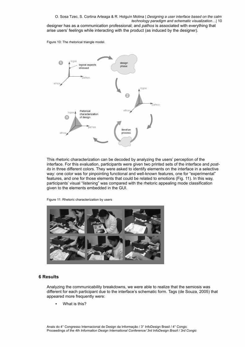
This rhetoric characterization can be decoded by analyzing the users’ perception of the interface. For this evaluation, participants were given two printed sets of the interface and post-its in three different colors. They were asked to identify elements on the interface in a selective way: one color was for pinpointing functional and well-known features, one for “experimental” features, and one for those elements that could be related to emotions (Fig. 11). In this way, participants’ visual “listening” was compared with the rhetoric appealing mode classification given to the elements embedded in the GUI.
Figure 11: Rhetoric characterization by users
6 Results
Analyzing the communicability breakdowns, we were able to realize that the semiosis was different for each participant due to the interface’s schematic form. Tags (de Souza, 2005) that appeared more frequently were:
• What is this?
Anais do 4° Congresso Internacional de Design da Informação / 3° InfoDesign Brasil / 4° Congic Proceedings of the 4th Information Design International Conference/ 3rd InfoDesign Brazil / 3rd Congic

O. Sosa Tzec, S. Cortina Arteaga & R. Holguín Molina | Designing a user interface based on the calm technology paradigm and schematic visualization…| 11
• Where is it?
• I can do it other way.
• Looks fine for me.
A clear breakdown in the participants’ semiosis was indicated by the Where is it? and What is this? tags, we believe that maybe this was a consequence of giving participants a different type of interface. The Looks fine for me tag was considered a stronger indicator of misunderstanding the interface elements. It was used to spot situations where participants wrongly believed that their reasoning during the interaction was appropriate. This was frequently found while interacting with the menu bar. The I can do other way tag identified the misperception resulting from users getting used to the direct manipulation of software. Users proposed different ways to interact with the interface, which were not expected. Instances of Looks fine for me and I can do it other way tags were regarded as confrontations with something new. Change of connection status and blocking contacts were the most complicated tasks for the users to complete. Interface signs in these cases did not seem to be clear enough. It was concluded that some results were a direct consequence of basing our evaluation on still screens, which did not aid participants to complete their conceptual model of MoviTalk. Detected usability issues were compatible with communicability results. Nevertheless, participants were able to figure out the application’s interface, including aspects such as the bubbles’ behavior, the overlapping layers and the general schematic features.
Results were positive for the rhetorical characterization of MoviTalk. This evaluation demonstrated that rhetoric features can be related to the interface. Participants pinpointed similar areas on the printed mockup for identifying each rhetoric appealing mode, which later helped us to determine that participants listened to the designer’s speech in similar ways. When the rhetoric appealing approach was proposed, we thought logos would be more related to the functional elements of the interface. The participants’ tagging over the printed interface supported this belief. Their choices on what could be a “design” feature were appropriate (ethos tags). It came as a surprise that there were only a few tags corresponding to pathos. Most participants, however, tagged the avatar’s zone as pathos. From this, we can determine that emotion, as part of an interface, is closely related to personalization features.
7 Conclusions
Translate interface features into schematic forms allows the user to decode a considerable amount of information at one glance due to the schematic visualization’s graphic nature. The user can determine what is the status of the system giving a visual scan all over the interface. By applying visual variables in combination with other characteristics such as layering and easy-to-learn visual signs, the user can focus on what s/he needs to. This unloads the user cognitively so s/he can “displace” interface elements not relevant to accomplish a particular task. Therefore, schematic visualization of information inside a GUI is a form to support the Calm Technology paradigm.
The needfinding method is convenient in the interface design process due to it involves iterative stages where the design product is constantly reviewed by the potential users. It is remarkable that valuable information can be obtained from showing early stages of design; it doesn’t matter if it is about interfaces or not. This method can also be feed with other analysis tools such as Participative observation, and Experience Sampling. Moreover, it results convenient to introduce a participative design exercise at some point so that is important to take into account the way of accessing to people’s experiences in order to enrich further stages of design.
Communicability testing can be used as an alternative to evaluate interfaces (and other design products) due to its semiotic approach. Especially when the proposals seem to be unconventional. It is important to consider the level of fidelity on a prototype when evaluating unconventional features. Movements and diverse responses through interacting time can reinforce the user’s semiosis during an evaluation.
The design process can be qualitatively characterized by each of rhetorical appealing modes: logos, ethos, and pathos. The logos appealing mode can be considered close with the rational aspects of design and instances of well-known interface elements. On the contrary, pathos
Anais do 4° Congresso Internacional de Design da Informação / 3° InfoDesign Brasil / 4° Congic Proceedings of the 4th Information Design International Conference/ 3rd InfoDesign Brazil / 3rd Congic

O. Sosa Tzec, S. Cortina Arteaga & R. Holguín Molina | Designing a user interface based on the calm technology paradigm and schematic visualization…| 12
appealing mode can be considered close with direct transformation from the users onto the design, such as the personalization features included in an interface.
Acknowledgement
Thanks to Rosa Paredes and Liliana Rojas, from the Universidad de las Américas Puebla, for giving their time to make the style correction on this work.
8 References
Articles in journal/chapters in book
Berg, Sara et al. 2003. Mobile Phoes for the Next Generation: Device Designs for Teenagers. Proc. of SIGCHI Conference on Human Factors in Computing Systems. pp. 433-440. USA.
de Souza, Clarisse S. 1993. The Semiotic Engineering of User Interface Languages. International Journal of Man-Machine Studies. No. 39. pp. 753-773. Academic Press Ltd.
de Souza, Clarisse S. 2001. Semiotic approaches to user interface design”. Editorial. Knowledge-Based Systems. No. 14. pp. 415-418. Elsevier.
Ehses, Hanno 1989. Design and Rhetoric: An Analysis of Theatre Posters. Design Papers 4. 2nd printing. Canada.
Fabersjö, Helena et al. 2003. Amigo – Wireless Image Based Instant Messaging for Handheld Computers. CHI ’03 extended abstracts on Human Factors in Computing Systems. pp. 910-911. USA.
Holtzblatt, Karen. 2005. Customer-centered design for mobile applications. Personal Ubiquitous Comput., Vol. 9, No. 4., pp. 227-237.
Leite, Jair C. 2002. A Semiotic-based Framework to User Interface Design. Proc. Second Nordic Conference on Human-Computer Interaction. pp. 263-266. Denmark.
Marcus, Aaron, et al. 2002. Designing the PDA of the Future. Interactions. Vol. 9, No. 4., pp. 34-45.
Patnaik, Dev et al. 1999. Needfinding: The Why and How Uncovering People’s Needs”. Design Management Journal. Vol. 10, No. 2., pp. 38-43. USA.
Quian, Yuechen et al. 2004. Exploring the Potentials of Combining Photo Annotating Tasks with Instant Messaging Fun. Proc. of the 3d International Conference on Mobile and Ubuiquitous Multimedia. pp. 11-17. USA.
Rettig, Marc. 1994. Prototyping for Tiny Fingers. Communications of ACM. Vol. 37, No. 4. pp. 21-27.
Sánchez, J. Alfredo et al. 2005. Towards mood-oriented interfaces for synchronous interaction. Proc. of the 2005 Latin American Conference on Human-Computer Interaction. pp. 1-7. México.
Sanders, E. B. N. 1999. Postdesign and Participatory Culture. Proc. of the International Conference “Useful and Critical: The Position of Research in Design”. Finland.
Sosa-Tzec, Omar et al. 2005. Herramientas etnográficas y una variante del muestreo de experiencias para el rediseño de la GUI de un cliente de mensajes instantáneos por Internet. Proc. of the 2005 Latin American Conference on Human-Computer Interaction. p. 344. México.
Anais do 4° Congresso Internacional de Design da Informação / 3° InfoDesign Brasil / 4° Congic Proceedings of the 4th Information Design International Conference/ 3rd InfoDesign Brazil / 3rd Congic

O. Sosa Tzec, S. Cortina Arteaga & R. Holguín Molina | Designing a user interface based on the calm technology paradigm and schematic visualization…| 13
Viegas Fernanda B. et al. 1999. Chat Circles. Proc. of the SIGCHI conference on Human Factors in Computing Systems: the CHI is the Limit. pp. 9-16. USA.
Books and unpublished material
Costa, Joan. 1998. La Esquemática. Ediciones Paidós Ibérica. Buenos Aires.
de Souza, Clarisse S. 2005. The Semiotic Engineering of Human-Computer Interaction. MIT Press. USA.
Dumas, Joseph et al. 1999. A Practical Guide for Usability Testing. Intellect Books. USA.
Fry, Benjamin. 2000. Computational Information Design. Ph.D. Thesis. MIT Media Lab.
Mijksenaar, Paul .2001. Una introducción al diseño de información. Ediciones G. Gili. México.
Robson, Colin. 2002. Real World Research: A Resource for Social Scientists and Practitioner -Researchers. 2nd Edition. Blackwell Publishers. UK.
Schneiderman, Ben. 1987. Shneiderman, Ben. Designing the User Interface: Strategies for Effective Human-Computer Interaction. Addison-Wesley. USA.
Spence, Robert. 2001. Information Visualization. ACM Press. Addison-Wesley. USA.
Thissen, Frank. 2003. Screen Design Manual: Communicating Effectively through Multimedia. First Edition. Spring. Germany.
References from the Internet
AOL 2006. Annual Instant Messenger Trend Survey. <http://www.aim.com/survey>, 01/11/2006.
Gaffney, Gerry. 1999. Participatory Design (Design Usability Resources). Information & Design. <http://www.infodesign.com.au/usabilityresources/design/parti-cipatorydesign.asp.>, 01/11/2006.
Hurlburt, Russel T. 2006. Descriptive Experience Sampling. <http://www.nevada.edu/~russ/sampling.html>, 01/11/2006.
Weiser, Mark et al. 1995. “Designing Calm Technology”. Xeroc PARC Online paper. <http://nano.xerox.com/weiser/calmtech/calmtech.htm >, 22/04/2009.
Whatis.com 2006. <http://whatis.techtarget.com/definition/0,,sid9_gci211737,00.html>, 01/11/2006.
Xiong, Rebeca , et al. 1999. People Garden: Creating Data Portraits for Users. MIT Media Lab. <http://infosthetics.com/archives/2006/01/people_garden_social_communication_data_visualization.html>. 01/11/2006.
Anais do 4° Congresso Internacional de Design da Informação / 3° InfoDesign Brasil / 4° Congic Proceedings of the 4th Information Design International Conference/ 3rd InfoDesign Brazil / 3rd Congic