graphic design portfolio of chelsea alford
DESCRIPTION
Crosstep CreativeTRANSCRIPT


Oh good, I’m glad you made it past the first page!
Now we can get to the fun part.
I’m Chelsea Alford. A graphic designer, print maker, fine artist, illustrator,
taco connoisseur, occasional swearer (O.K., not so occasional),
cat adorer, messy cooker, and hammock sleeper. The name Crosstep came from a joke about not being able
to walk in a straight line to save my life. It’s true, I can’t. (I’m a tiny bit of a klutz)
But, it’s also a pretty decent metaphor for life. No one wants to walk a boring, straight line forever. The little crossteps we take to maintain our balance are what
ultimately will get us to the nose of the proverbial surfboard.
It also goes for how I work as a designer, sometimes a crosstep in the creative process can lead to a solution you
wouldn’t have seen otherwise.
(Did I mention I also ramble?)
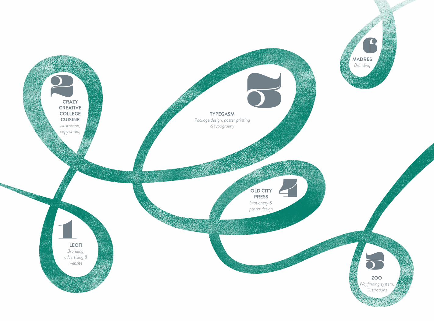
LEOTIBranding,
advertising,& website
CRAZY CREATIVE COLLEGE CUISINEIllustration, copywriting
OLD CITY PRESS
Stationery & poster design
MADRESBranding
TYPEGASMPackage design, poster printing
& typography
ZOOWayfinding system,
illustrations
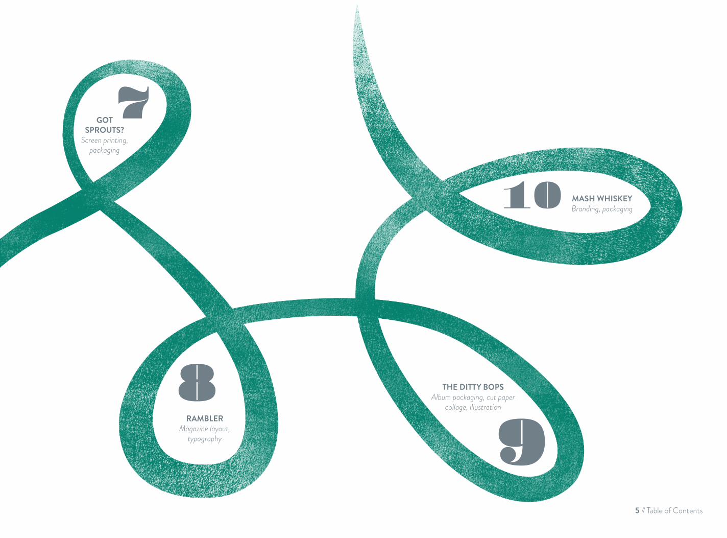
GOTSPROUTS?
Screen printing, packaging
RAMBLERMagazine layout,
typography
THE DITTY BOPSAlbum packaging, cut paper
collage, illustration
MASH WHISKEYBranding, packaging
5 // Table of Contents
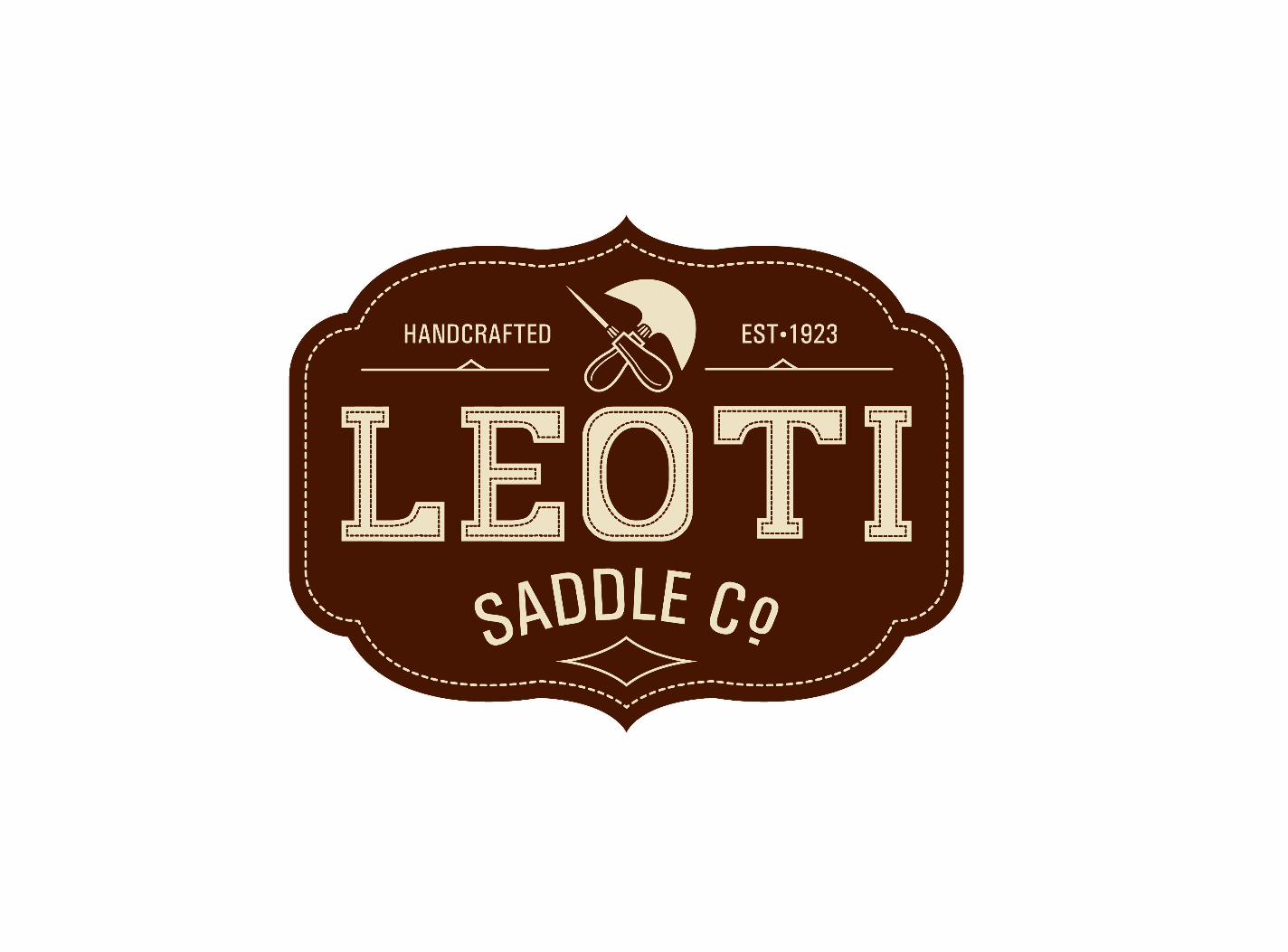

Leoti is a fictional western saddle company based in the United States that produces custom, handmade, and one of a kind
saddles for their clients using techniques that are entirely handmade without the aid of modern machinery. The saddles are
considered by their owners to be just as much a work of art as any piece of tack. The client has the option to pick every aspect
of the material used to build the saddle. The result is a one of a kind piece of craftsmanship that can outlast it’s owner. The company produces three styles of saddles for the three most
popular disciplines in western riding; barrel, trail, and roping.
Brand a unique saddlery that prides itself in its craftsmanship and one of a kind products that are produced the same way
they would have been 150 years ago. Leoti is a company made up of artisans whose skills at leather working are surpassed by few. The main element that needed to be highlighted was the
customization the client can get with Leoti that cannot be obtained with other saddleries.
Visually, the branding embodies both the spirit of the American western style of riding and it’s culture, as well as calling
attention to the hand crafted, customized product. The logo features a hand drawn typeface that is inspired by woodblock
text from the old west. I choose to illustrate the two tools that are indicative of leather working by hand; the awl, and the half-
moon knife. A stitch-like detail is used to accentuate the logo design much like it is used on the saddles. The advertisements
created for the brand draw inspiration from letterpresses rodeo posters, paired with phrases that describe the discipline of riding
the company is creating the saddle for.
OVERVIEW PROBLEM SOLUTION
LEOTI SADDLE COMPANYBranding // Advertising // Website
7 // Chapter 1: Leoti
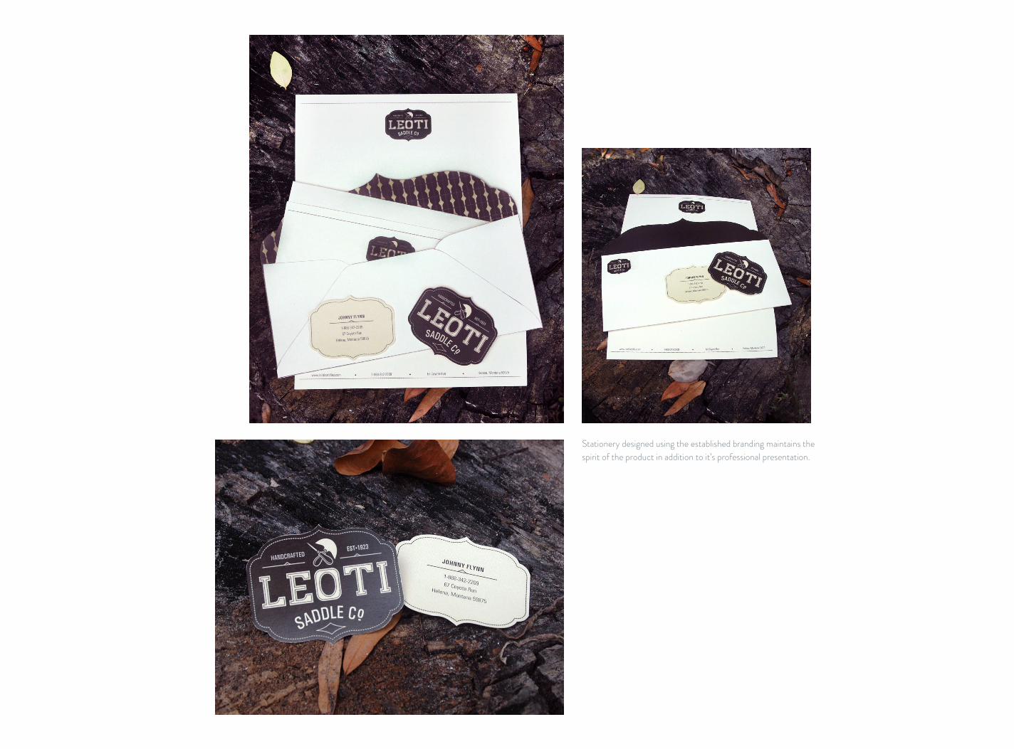
Stationery designed using the established branding maintains the spirit of the product in addition to it’s professional presentation.

A three page magazine advertisement campaign features verbage that is descriptive of the three main disciplines of riding the company caters to. Designed in the style of old letterpressed rodeo
posters, the ads tie in perfectly with the old west and Handmade aspect of the brand.
9 // Chapter 1: Leoti
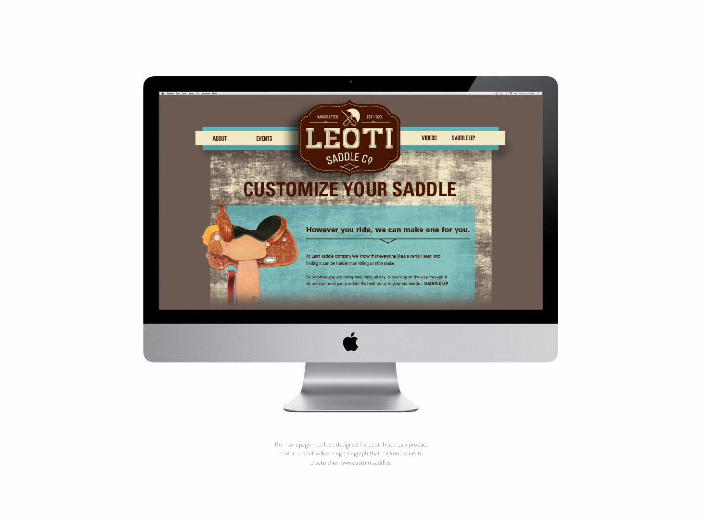
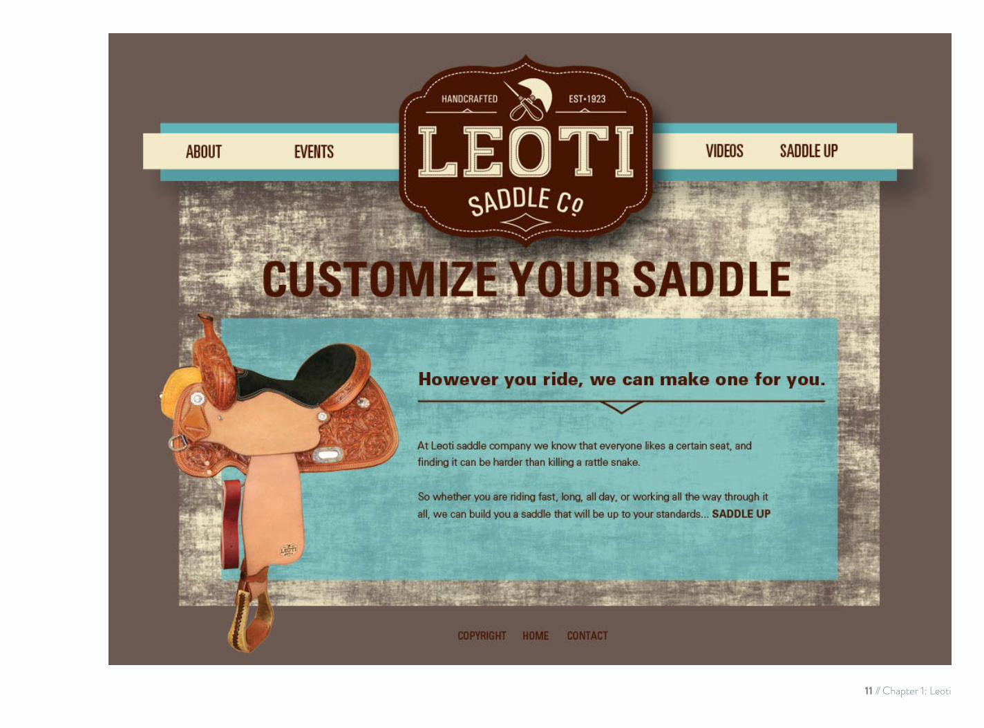
The homepage interface designed for Leot features a product shot and brief welcoming paragraph that beckons users to
create thier own custom saddles.
11 // Chapter 1: Leoti


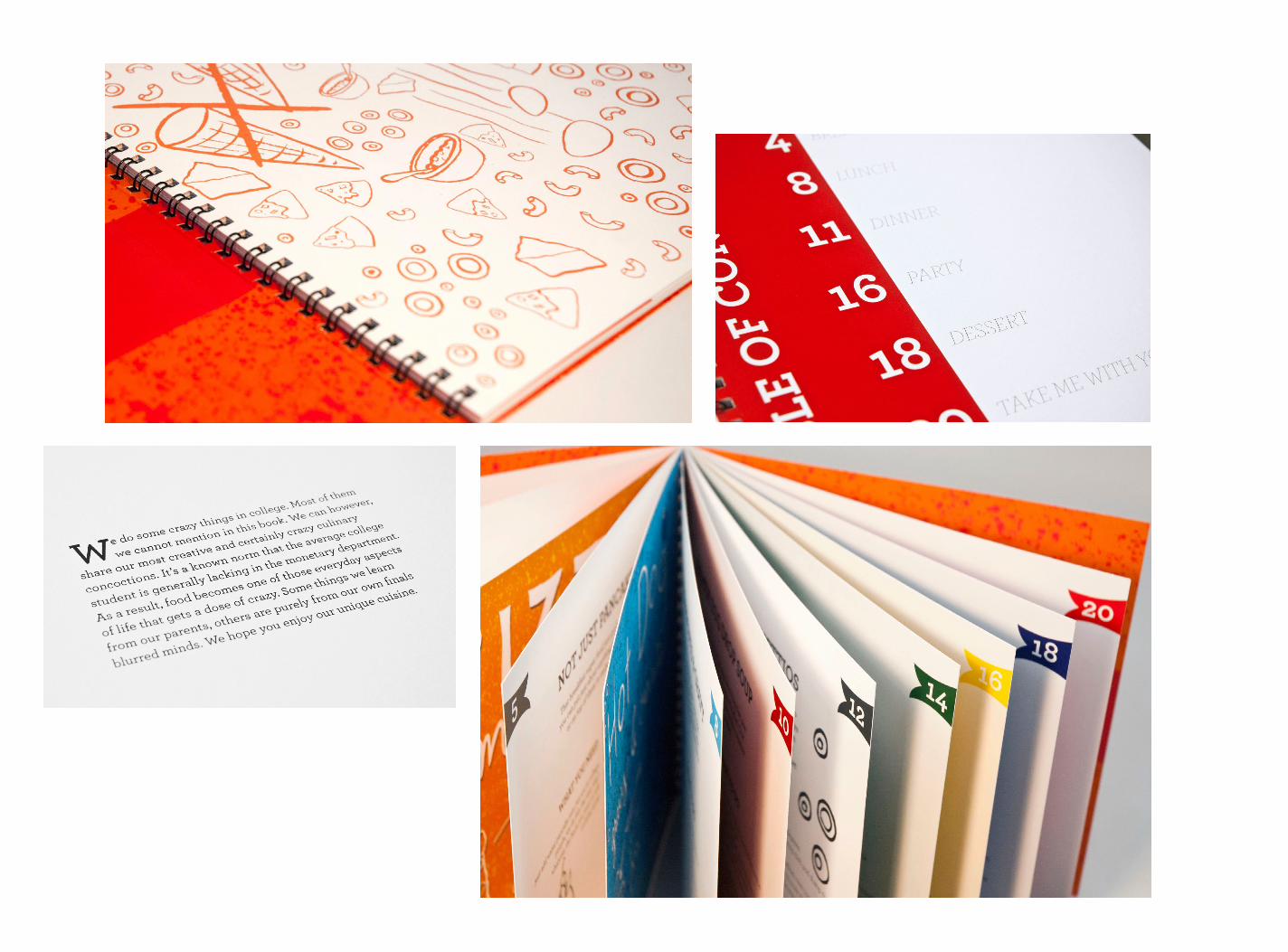
Dreamt up from spending many a night staring into a fridge of horribly mismatched food items and wondering what could possibly
make some semblance of a meal. This is the college kid’s ultimate kitchen companion. Crazy Creative College Cuisine features
recipes that can be a bit out of the ordinary but totally make sense at four in the morning after an all nighter.
Create an illustration and writing style that accompanies the humorous aspects of the cookbook and that appeals to the target
audience of young, hip students, who can appreciate the humor.
The splatter effects throughout the book relates to the horrible state our kitchens can be found in after an impromptu cooking
session. The illustration style is a tribute to all those years of doodling through endless, boring, lectures and to the fact that
most of the time, the only thing we hungry students could afford was a modest pen and paper. No fancy food photography
will be found here, just humorous images demonstrating how to cook the meal. Each recipe is begun with an opening
paragraph explaining the unusual meal in a quipping way.
OVERVIEW PROBLEM SOLUTION
CRAZY CREATIVE COLLEGE CUISINE Illustration // Copywriting
2
13 // Chapter 2: Crazy Creative College Cuisine
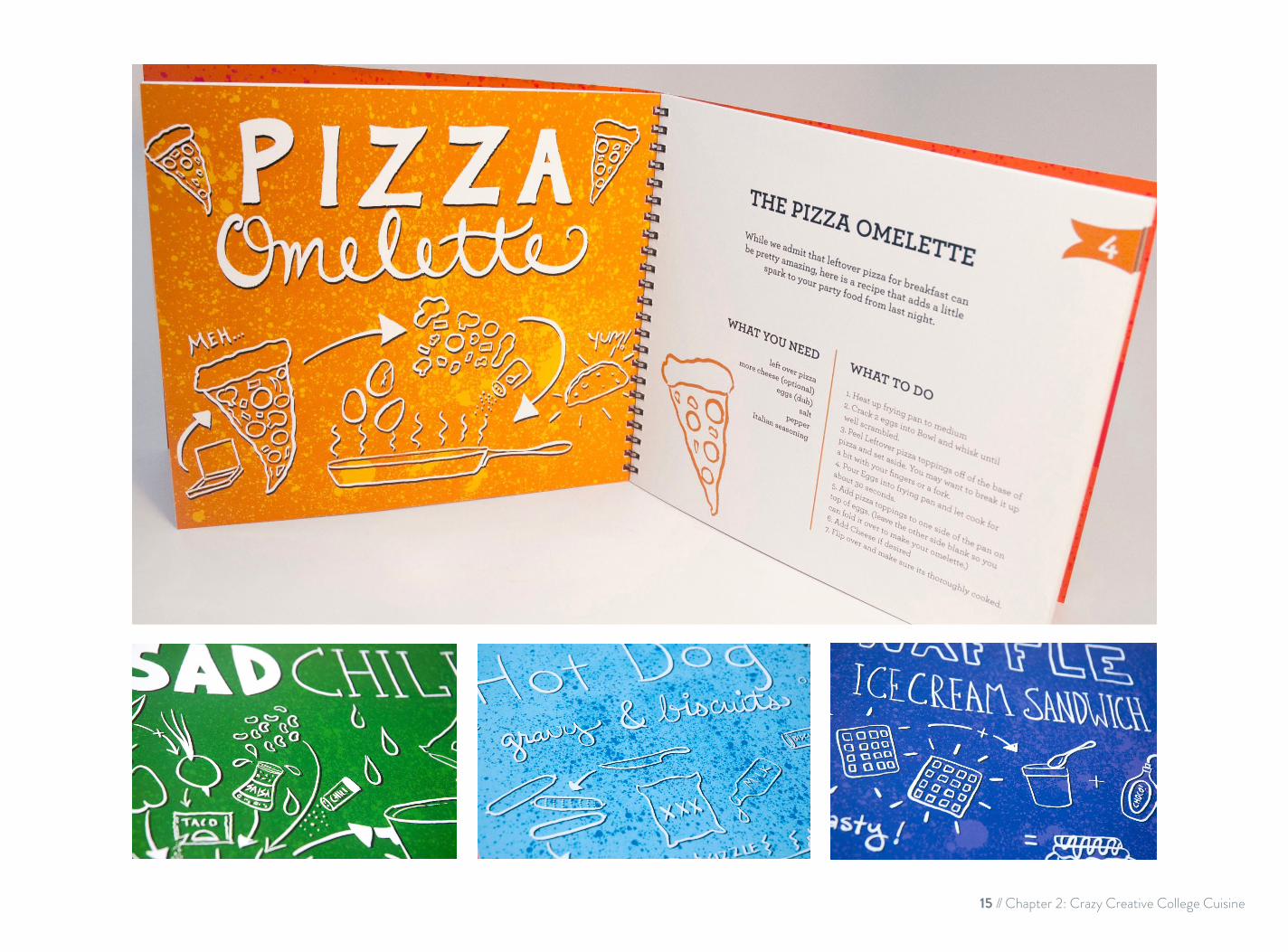
15 // Chapter 2: Crazy Creative College Cuisine

App menu features a chefs hat on bright orange textured background that matches the book.
The Loading screen shares similarities to the book cover with hand-drawn type and illustrations.
Main menu shows two buttons directing you to the recipe menu, and the other to a short paragraph that explains how the cookbook started.

APP GOES HERE!!!
The recipe menu shows all the recipes found in the book in a scrolling list.
A second loading screen features the illustrations for the recipe.
The recipe is presented in an easy to read format that is also capable of copy and paste to
the phone for added convenience.
17 // Chapter 2: Crazy Creative College Cuisine


The Typgasm Traveling Typographic Exhibit is a fictional nationwide museum tour that displays typographic works while educating individuals on the history of typography and its importance in
our communication. To raise funds for the travel expenses, the project has created two museum gift shop items that appeals to
the average type nerd that would be attending the event.
Create two items of merchandise to be sold in the museum gift shop at the Typegasm Traveling Typographic Exhibit that appeals
to the sometimes naughty sense of humor designers and typographers possess. In addition to these, a more child friendly
piece should also be created.
The items created for the event include a Mini Movable Type Printing Kit and a series of Typographic posters with a
dirty twist. Both are created for a niche target audience of designers, typographers, and individuals who simply have a passion for type. The mini printing kit was designed to both educate about movable type printing and also as a novelty.
It contains four hand carved rubber block stamps painted to appear like metal type and a brayer. It is packaged in a slide top box inspired by old wooden type cases. The box was made with various “do it yourself” elements to give customers a sense of the hands on feel. The posters all feature a different typeface
and design individualistic to the phrase. The seven phrases use typographic terminology in a provocative, humorous way that
would appeal to the target audience.
OVERVIEW PROBLEM SOLUTION
TYPEGASM TRAVELING TYPOGRAPHIC EXHIBITPackage Design // Poster Printing // Typography
3
19 // Chapter 3: Typegasm Traveling Typographic Exhibit

Multiple views of the packaging and interior.
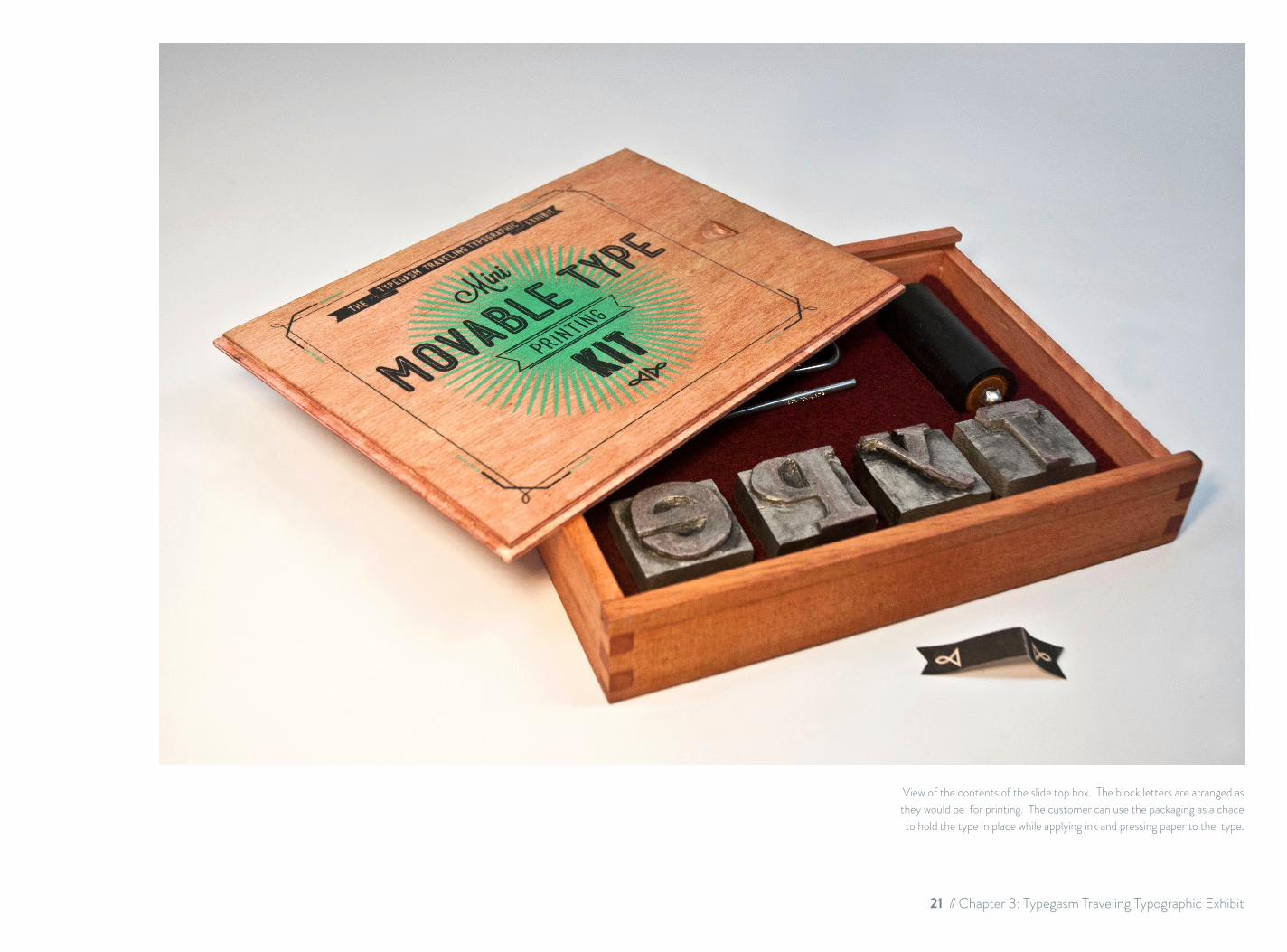
View of the contents of the slide top box. The block letters are arranged as they would be for printing. The customer can use the packaging as a chace to hold the type in place while applying ink and pressing paper to the type.
21 // Chapter 3: Typegasm Traveling Typographic Exhibit

Dirty Typographic Posters: featuring terminology indicative to typography spun with a dirty twist. This series of seven feature typefaces and designs individualistic to each phrase.


Old CIty Press is a fictional letterpress company originating in Saint Augustine, Fl. The logo and stationery was created with the “Ancient City” in mind, and is reflected through the use of an old
spanish-styled shield detail and scripted lettering. In addition to this, advertising posters were created to raise awareness of the
2012 summer internship program OCP is conducting.
Because OCP is a letterpress company, it only made sense to create print related materials for the stationery and the intern
search poster. The feel of the old city needed to be kept up throughout the different pieces for this project.
The logo and stationery is reflected through the use of old spanish-styled shield and scripted lettering for the adjoining
business card. The brick color that is used for both the stationery and the intern search poster is indicative to the
brick architecture that is found throughout Saint Augustine. The basis for the brand is a seal that was created by block
printing a Spanish style shield and blind embossing using a press over the top to add a unique detail. For the intern search poster, the block printing and letterpress combination used to
create the design relates back to the individualistic qualities of hand pressed lettering and styling that would be used at Old City Press. The subject matter of the poster is a block print
illustration of the various things print intern would be expected to perform. The humorous approach plays off the fact that the
press is run by witty people who enjoy what they do.
OVERVIEW PROBLEM SOLUTION
OLD CITY PRESSStationery // Poster Design
4
27 // Chapter 4: Old City Press

Left: Stationery set including handstamped and letterpressed details on archer paper. Right: Intern search poster and detail of the block used to create the imagery.


This page shows all of the vector signs numbered in the order they would be seen as visitors move through the park.
1
2
3
4
5
6
7
ENTRANCE DIRECTORY
AFRICA
CHINA
SOUTH AMERICA
THEOUTBACK
WILD
FLORIDA
The Gulf Breeze Zoo is a facility located in Gulf Breeze , FL. This wayfinding system is shown as a way to present material to a
client for review.
The zoo lacked a defined wayfinding system and organization for navigating the facility. The challenge was to create a wayfinding
system that could be used by everyone equally and still had a colorful, youthful appearance that would appeal to children and
the young at heart. Since building scale mock-ups for signage is both time consuming and expensive, another way of presenting
ideas to the client needed to be devised.
The wayfinding system is illustrated through a series of vector images set on hand painted backgrounds. In this way the
location of the sign can be seen and the client can see how the sinage would interact with its surroundings. By using simple illustrations as well as copy the system can be navigated by foreign guests and by children who have not yet mastered
reading. The structure was inspired by materials that are native to the area. The color pallet stands out against the landscaping
of the zoo without appearing too gaudy.
OVERVIEW PROBLEM SOLUTION
GULF BREEZE ZOO Wayfinding system // Illustrations
5
31 // Chapter 5: Gulf Breeze Zoo Wayfinding

Roadside Entrance: The Zoo is set back from the main road making it necessary to guide in motorist from the road

33 // Chapter 5: Gulf Breeze Zoo Wayfinding
Once on the driveway to the zoo, motorist would drive under a large sign welcoming them and reassuring them that they
are going the correct way.
The Parking lot sign uses simple images and directional arrows to tell motorist where to park upon entering.
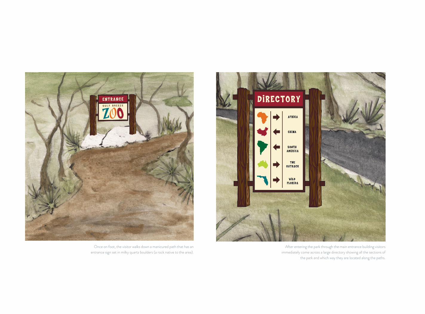
Once on foot, the visitor walks down a manicured path that has an entrance sign set in milky quartz boulders (a rock native to the area).
After entering the park through the main entrance building visitors immediately come across a large directory showing all the sections of
the park and which way they are located along the paths.

35 // Chapter 5: Gulf Breeze Zoo Wayfinding
Once visitors arrive to a section of the zoo they are once again guided with simple images to different animal exhibits. All of the sections are color coded.
Finally, the visitor arrives at the exhibit sign for the animal and see an illustration and a descriptive passage.


Madres Baja & Brews is a fictional restaurant based off a local Saint Augustine restaurant of a similar name. The styling of the
restaurant is what I like to call “Baja Modern”. Much of the inspiration was taken from the culture and art of the Baja peninsula
and combined with clean, modern aspects that lend a higher quality feel to the restaurants branding.
Combining the two elements of Baja and Brews into a cohesive branding system was the main challenge. The branding needed
to maintain the clean and modern aspects while still embodying the handmade feel that fuels the style that is Baja.
The Baja modern styling of the restaurant reflects into the logo and various elements of the brand through the use of
color; earth tones, materials, and hand-styled details. Screen printing was done by hand to give each piece an individualized feel, and is also a reflection on the artistic stylings of painted
signage throughout the Baja peninsula. The menu is constructed using wood and canvas, both of which are materials that could
be found commonly in Baja construction. I designed the menu inserts to be adhered with a simple Velcro backing giving the
restaurant the option of easily replacing and updating the menu. The typefaces for the logo were chosen to reflect again
upon hand painted signage as well as bringing sophisticated style to the brand. The images were chosen to represent the
Baja and brews respectively. A cactus for Baja and a bottle for brews. Promotional coasters and to-go bags were created to
accompany the menu as part of the branding as a whole.
OVERVIEW PROBLEM SOLUTION
MADRES BAJA & BREWS Branding
6
37 // Chapter 6: Madres Baja & Brews


Left: Detail shots of the coasters and screen printing done on recycled paper to-go bags. Below: View of the method used for binding the wooden pieces of the menu together with a strip of canvas.

41 // Chapter 6: Madres Baja & Brews


Got Sprouts? is a small company in West Palm Beach, Florida. It was founded after the owners began growing organic sprouts
for their personal use, and quickly realized their mission was to share the benefits of sprouting to the world. The company
sells seeds, mature sprouts, and juicers to both commercial and personal clients. Got sprouts? is also dedicated to providing educational resources to those wanting to learn more about
growing, sprouting, and juicing.
The logo for Got Sprouts? needed to be fun have a folk-y feel to it. The main goal for this project is to create packaging that is environmentally friendly and embodies the feel of the brand
while still being eye-catching to shoppers.
The logo was created using a typeface that reflects a folk-like feel and combining it with an illustration of a sprout seedling
coming up out of the ‘O’. The packaging was created by screen printing on 100% organic cotton bags with environmentally
friendly, water based inks and recycled paper. The bags used for the packaging were designed to be reminiscent of old canvas
seed bags from long ago. The design is composed of simple illustrations and text that describes the contents of the kit.
OVERVIEW PROBLEM SOLUTION
GOT SPROUTSScreen Printing // Packaging
7
43 // Chapter 7: Got Sprouts
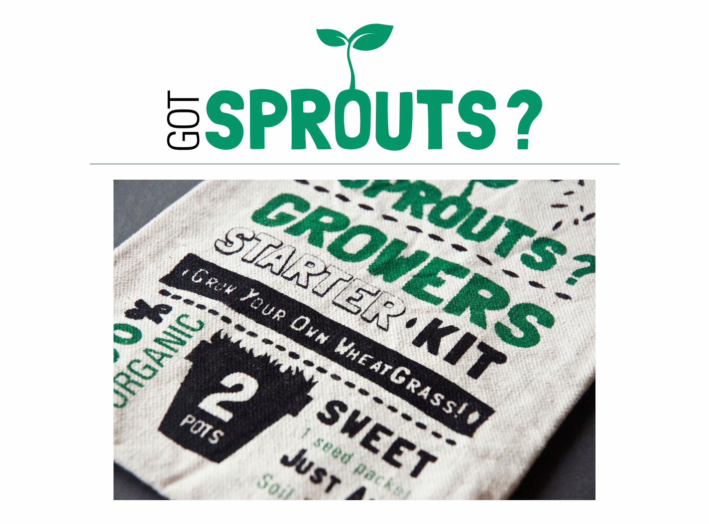

Here you can see all the contents of the kit laid out. Easy to follow instructions are printed right on the back
of the seed packet, saving paper and ink.


Rambler is a fictional magazine targeted towards individuals who have a passion for folk music. The magazine focuses
on the musicians who play folk music and the culture that surrounds the genre. In addition, the magazine also
features articles that detail the history of the genre and it’s instruments, as well as the influences they have in todays
music. The name Rambler is indicative of folk lyrics that have a tendency to “ramble on”. Rambler would be mainly sold in
record stores, music shops, and at festivals.
Create a magazine that appeals to the wide variety of individuals who are passionate about folk music and the culture that
surrounds it. Visually, the cover needed to have a masthead that was eye-catching and imagery that relates to the magazine
as a whole, but also references what the issue has in store.
The masthead for Rambler is made up of various typefaces that are blended together and all connect in one way or another.
Much like genres of music blended together to create folk music. This particular issue is the festival goers guide, and throughout the issue there are articles and features that
relate back to this.
OVERVIEW PROBLEM SOLUTION
RAMBLERMagazine Layout // Typography
8
47 // Chapter 8: Rambler Magazine

Front cover with scanned screen printed background and custom masthead. Right: Inside cover features a check list for items to
bring to a music festival.

49 // Chapter 8: Rambler Magazine


51 // Chapter 8: Rambler Magazine
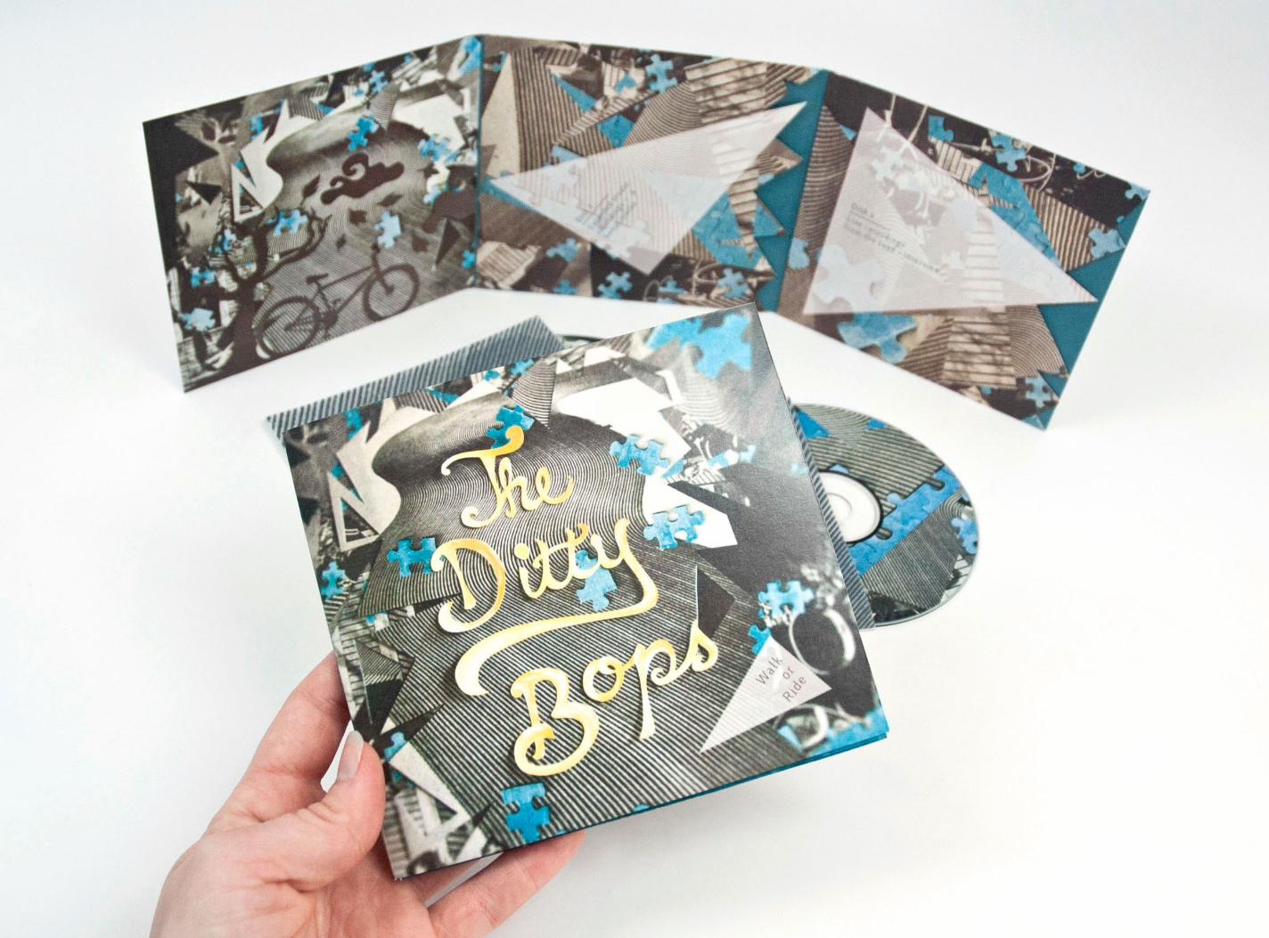

The Ditty Bops are a band from Los Angeles, California who’s soft harmonies and catchy instrumentals have rocketed them to the top of the charts. Fresh from their Walk or Ride tour where
they bicycled cross country promoting their latest album and playing shows, they have released a 2 disk special edition set.
The package features a live studio version of Walk or Ride and live recordings and interviews from the road.
Create a unique packaging that fits the musical style of the Ditty Bops while illustrating their cross country trip by bike in an
interesting and unconventional way.
This two disk set features die cut slips to protect the CDs that are included in the package. One disk features the studio
recordings from their Walk or Ride album, while another features recordings from performances on the Walk or Ride
tour across America plus interviews from the road. Both disks are protected by a transparent printed sleeve that slides into the die cut pockets on the interior of the folded piece. Hand cut lettering titles the cover photographed on a background
of scanned and manipulated images. Other hand cut elements illustrate the story of their cross country trip in bicycles. The
design reflects the theatrical aspects of a Ditty Bops show drawing inspiration from shadow puppets hand cut from paper.
The background of the cover appears to be a road or field stretching off into the distance, reminding the viewer of the
band’s cross country feat of peddling.
OVERVIEW PROBLEM SOLUTION
THE DITTY BOPSAlbum Packing // Cut Paper Collage // Illustration
9
53 // Chapter 9: The Ditty Bops

Multiple detail shots of the package design showing the construction and contents.

A view of what the consumer would see upon opening the packaging and pulling out the first disk.
55 // Chapter 9: The Ditty Bops
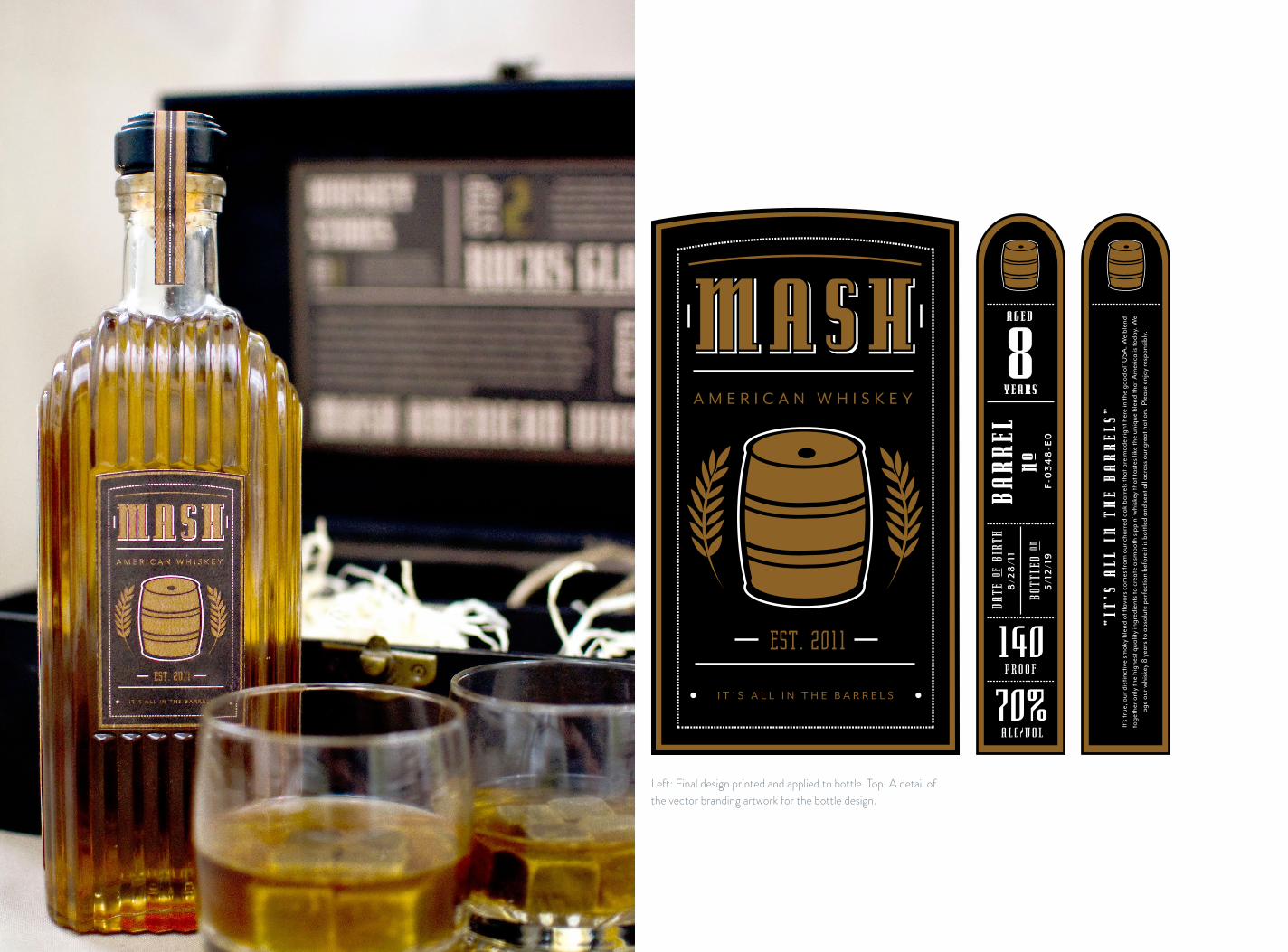
Left: Final design printed and applied to bottle. Top: A detail of the vector branding artwork for the bottle design.

Mash American Whiskey started as a collaborative project between myself and my fellow classmates. However, I stripped
the project down and reconstructed it with an new look and feel completely from my own imagination.
After solidifying the branding, create a promotional gift set whose design and contents appeal to the experienced
fine whiskey drinker.
The bottle label features an illustration of a barrel, reflecting the fact that Mash ages its whiskey in unique charred American
oak barrels. Their tag line is after all, is “It’s all in the barrels”. Typefaces were chosen to lend themselves to the old style American feel of the brand. On the side of the bottle the
vintage, barrel No., and proof can be found. On the other side a short paragraph explaining about the whiskey. The gift set
was designed to appeal to an older, more sophisticated whiskey drinker. The result was a fine-crafted wooden gift box that
contains whiskey stones, two rocks glasses, and a bottle of Mash Whiskey. A guide on the inside of the lid explains the contents
to the patron. Removable dividers make the box versatile for re-use and recycled wood shavings from retired whiskey barrels
add unique details to the packaging.
OVERVIEW PROBLEM SOLUTION
MASH WHISKEYBranding // Packaging
2012 Silver Student ADDY Award
10
57 // Chapter 10: Mash Whiskey

This page: View of the outside of the box and of the guide to what the contents are and their location. Note how the grooves in the
top of the box relate to the grooves found on the bottle. Right page: View of the contents packed into place in the sections.

59 // Chapter 10: Mash Whiskey


Thanks for taking a look at my work! Feel free to hire me immediately... No really, go ahead!
