grade level/course: grade 8 and algebra 1 · 2014-03-12 · grade level/course: grade 8 and algebra...
TRANSCRIPT

Page 1 of 23 MCC@WCCUSD 03/11/14
Grade Level/Course: Grade 8 and Algebra 1
Lesson/Unit Plan Name: Correlation and Line of Best Fit
Rationale/Lesson Abstract: For data the represents a linear pattern, 8th grade students informally draw the line of best fit through the cloud of points that captures the essential nature of the trend. In Algebra, students interpret the parameters of a linear model in the context of data that it represents. They also compute correlation coefficients using technology and interpret the value of the coefficient. This lesson aims to help students understand correlation and line of best fit. It starts by having students approximate/estimate the correlation and the line of best fit informally. Then it has students input data into Microsoft Excel and calculate the measures formally.
Timeframe: 2 days (The second day will be most effective if the days are consecutive so plan accordingly to reserve a computer lab)
Common Core Standard(s): 8.SP.2 - Know that straight lines are widely used to model relationships between two quantitative
variables. For scatter plots that suggest a linear association, informally fit a straight line, and informally assess the model fit by judging the closeness of the data points to the line.
S.ID.6 - Represent data on two quantitative variables on a scatter plot, and describe how the variables
are related.
c. Fit a linear function for a scatter plot that suggests a linear association.
Instructional Resources/Materials: Warm up, student note-taking guide, graph paper and pencil, access to computers with Microsoft Excel. Warm Up Solutions:
Graph B and Graph C have positive slopes.
2 1
2 1
7 2
7 1
9
6
3
2
y ym
x x
m
m
m
25
3
y mx b
y x
2
43
y mx b
y x
Page 2 of 23 MCC@WCCUSD 03/11/14
Activity/Lesson:
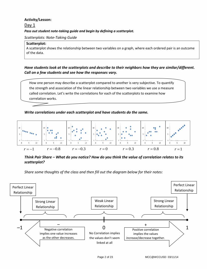
Day 1 Pass out student note-taking guide and begin by defining a scatterplot.
Scatterplots: Note-Taking Guide
Scatterplot: A scatterplot shows the relationship between two variables on a graph, where each ordered pair is an outcome of the data.
Have students look at the scatterplots and describe to their neighbors how they are similar/different. Call on a few students and see how the responses vary. Write correlations under each scatterplot and have students do the same. Think Pair Share – What do you notice? How do you think the value of correlation relates to its scatterplot? Share some thoughts of the class and then fill out the diagram below for their notes:
0.3r 0.8r 1r 1r 0.8r 0r 0.3r
How one person may describe a scatterplot compared to another is very subjective. To quantify
the strength and association of the linear relationship between two variables we use a measure
called correlation. Let’s write the correlations for each of the scatterplots to examine how
correlation works.
1 –1 0
Strong Linear
Relationship
Weak Linear
Relationship
Strong Linear
Relationship
Perfect Linear
Relationship
Perfect Linear
Relationship
No Correlation implies
the values don’t seem
linked at all
+ Positive correlation implies the values
increase/decrease together.
– Negative correlation
implies one value increases as the other decreases.

Page 3 of 23 MCC@WCCUSD 03/11/14
Example 1: Look at the two scatterplots and answer the questions below.
Choral response for questions a) and b) below, but make sure to follow up the response by asking a random student for their reasoning (why?) regardless if they are right or wrong. With your guidance, this should help clear up any misconceptions amongst the students whom didn’t understand.
a) Which scatterplot has a negative correlation?
Scatterplot B has a negative correlation since one value increases as the other value decreases.
b) Which scatterplot has a stronger linear relationship?
Scatterplot A appears to have a stronger linear relationship since the points appear to be more linear.
For question c) have some students share their predictions and reasoning, then reveal the actual correlations.
c) Estimate the correlation for the two scatterplots.
Scatterplot A: 0.84r
Scatterplot B: 0.51r
You Try: A scatterplot has a correlation of 0.95r .
a) What does that tell us about the scatterplot?
The scatterplot has a negative association. As one variable increases the other decreases.
The scatterplot has a strong linear relationship. The data isn’t a perfect line, but close. Scatterplot A appears to have a stronger linear relationship since the points appear to be more linear.
b) Draw a scatterplot that may represent a correlation of 0.95r .
During the “you try, find a student’s work where the graph shows a negative association and shows a strong linear relationship. Then display their scatterplot under the document camera. (Example 2 has a correlation of -0.95 which you can use to help you transition to example 2).
Scatterplot A Scatterplot B

Page 4 of 23 MCC@WCCUSD 03/11/14
Example 2: Fit a linear model for the scatterplot and write the equation of the linear model.
Use a straight edge and a pencil to draw a linear model that represents the data. With your pencil, draw some lines that don’t fit the data (perhaps with a positive slope) and ask the students if that is a good model. Erase and draw more linear models that have a negative slope but don’t necessarily depict the data. Then draw a line that represents the data as best as possible, similar to the one above. Then go about finding the equation of the linear model by finding the y-intercept and slope of the line: Equation of the Linear Model:
Linear Model
It appears the linear model goes through the points
7, 10 and 8,30 .
40
15
8 5
3 5
8
3
riseslope
run
m
m
m
It appears the linear model
intersects the y axis at 0,9
9b
-40
+15
89
3
y mx b
y x

Page 5 of 23 MCC@WCCUSD 03/11/14
Example 3: The following scatterplot displays the days present at school and the G.P.A. of 50 students. Answer the following questions regarding the scatterplot.
a) Estimate the correlation.
0.87r
b) Draw and write the equation of a linear model that represents the data.
Since the y-intercept doesn’t appear in the window we can find it by substituting the point 110,1 and solving
for b.
c) If a student was present at school for 150 days, what would you predict their G.P.A. to be?
0.043 3.73
0.043 150 3.73
2.72
y x
y
y
The line appears to go through 110,1
and 180, 4
2 1
2 1
4 1
180 110
3
70
0.043
y ym
x x
m
m
m
0.043
1 0.043 110
1 4.73
3.73
y mx b
y x b
b
b
b
Equation of the Linear Model: 0.043 3.73y x
** Point out that the model doesn’t make sense for certain values of x value as it is impossible to earn a negative G.P.A.**
Based on this linear model, we would expect the student’s G.P.A. to be 2.72.

Page 6 of 23 MCC@WCCUSD 03/11/14
You Try: The following scatterplot displays the hours playing video games per week and the G.P.A. of
33 students. Answer the following questions regarding the scatterplot.
a) Estimate the correlation.
0.95r
b) Draw and write the equation of a linear model that represents the data.
Since the y-intercept does appear in the window we can see that it is approximately 0, 4 and 4b .
c) If a student plays 10 hours of video games per week, what would you predict their G.P.A. to be?
0.089 4
0.089 10 4
3.11
y x
y
y
The line appears to go through 30,1.3
and 2,3.8
2 1
2 1
3.8 1.3
2 30
2.5
28
0.089
y ym
x x
m
m
m
Equation of the Linear Model: 0.089 4y x
** Point out that the model doesn’t make sense for certain values of x as it is impossible to earn a negative G.P.A.**
Based on this linear model, we would expect the student’s G.P.A. to be 3.11.

Page 7 of 23 MCC@WCCUSD 03/11/14
Day 2 The focus of this day is using Microsoft Excel to find the exact measures of correlation and the line of best fit. It is
imperative that you familiarize yourself with the program ahead of time. I have included some screen shots to help
you through the process:
Using Excel to Display a Scatter Plot: Open up Microsoft Excel and
input the following data into
the spreadsheet:
Click on cell A11 and hold down the mouse button and drag the mouse to cell B12 and let go, It should highlight the data like this:
Click on the icon to the right of the window Array 1
While keeping the data highlighted, click the insert tab on the top, click the scatter plot, and then select the first scatter plot option
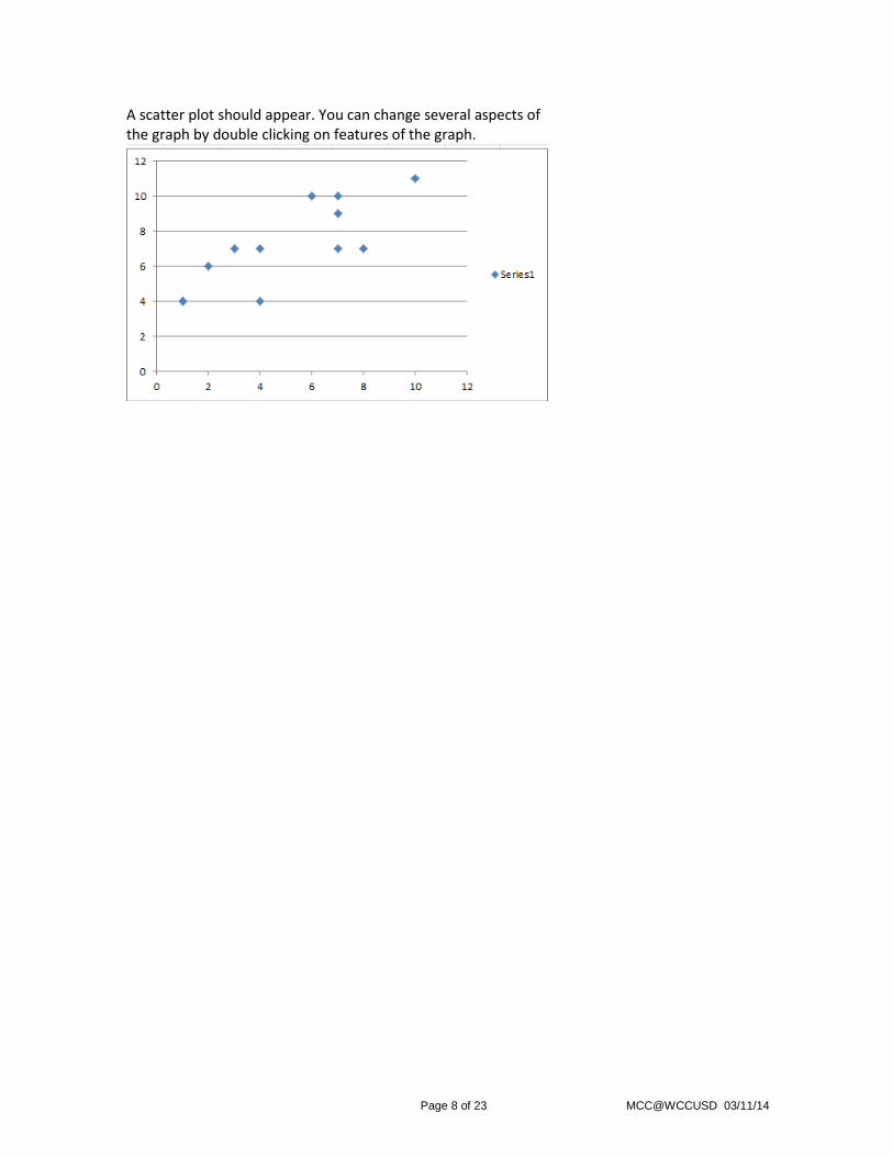
Page 8 of 23 MCC@WCCUSD 03/11/14
A scatter plot should appear. You can change several aspects of the graph by double clicking on features of the graph.

Page 9 of 23 MCC@WCCUSD 03/11/14
Using Excel to Find correlation: Open up Microsoft Excel and
input the following data into
the spreadsheet:
Click on cell B13:
Click on the formulas tab. Then click on Insert Function.
Type in correlation in the search window and hit Go. Then make sure the “Correl” function is highlighted and hit ok. This function will calculate the correlation of our data

Page 10 of 23 MCC@WCCUSD 03/11/14
Click on the icon to the right of the window Array 1
Click here to accept those values as the x-values.
Highlight the x-values by clicking and holding the mouse button on cell A1 and drag the mouse down until you reach cell A12, then let go of the button.
The correlation should appear in cell B13 and it should be equal to 0.80187.
Click on the icon to the right of the window Array 2. Select the y-values just like you selected the x-values. Then click ok.

Page 11 of 23 MCC@WCCUSD 03/11/14
Using Excel to Find the Line of Best Fit: Open up Microsoft Excel and
input the following data into
the spreadsheet and type “Slope”
in cell A13 and “y-int” in cell A14:
Click on cell B13:
Click on the formulas tab. Then click on Insert Function.
Type in slope in the search window and hit Go. Then make sure the “Slope” function is highlighted and hit ok. This function will calculate the Slope of the line of best fit for our data.

Page 12 of 23 MCC@WCCUSD 03/11/14
Click on the icon to the right of the window Known_y’s:
Click here to accept those values as the y-values.
Highlight the y-values by clicking and holding the mouse button on cell B1 and drag the mouse down until you reach cell B12, then let go of the button.
Click on the icon to the right of the window Known_x’s. Select the x-values just like you selected the y-values. Then click ok.

Page 13 of 23 MCC@WCCUSD 03/11/14
Click on cell B14 and follow the same steps as the slope, except when you search for a function, type “intercept” instead of slope. This function will calculate the y-intercept of the line of best fit for our data
The y-intercept should appear in cell B14 and it should be equal to 3.815603.
Therefore, the line of best fit to the nearest thousandth is:
0.670 3.816y x
The slope should appear in cell B13 and it should be equal to 0.670213.
Page 14 of 23 MCC@WCCUSD 03/11/14
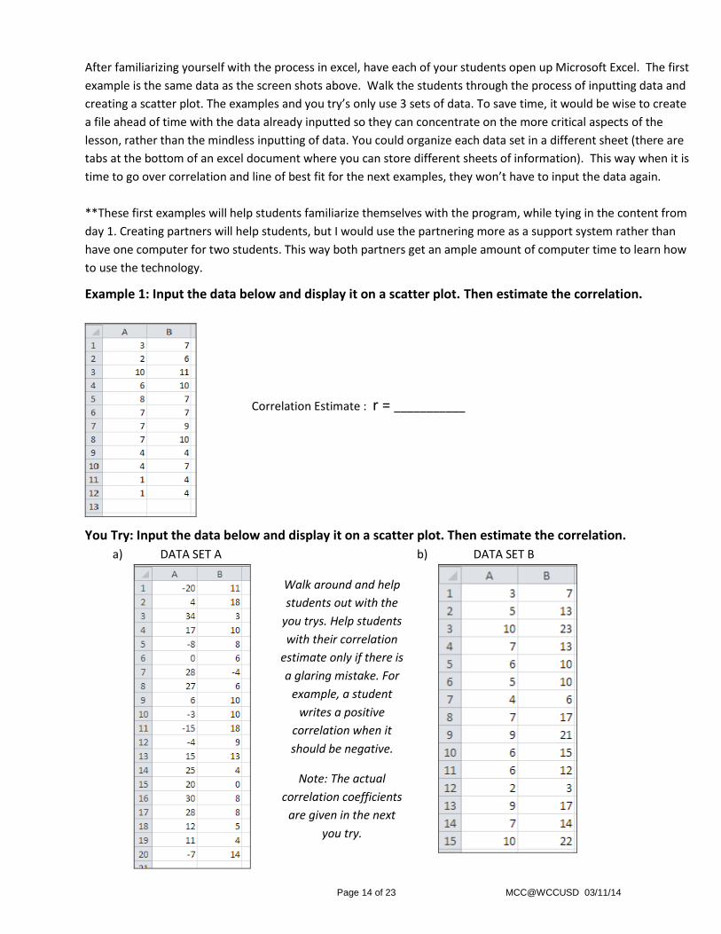
After familiarizing yourself with the process in excel, have each of your students open up Microsoft Excel. The first
example is the same data as the screen shots above. Walk the students through the process of inputting data and
creating a scatter plot. The examples and you try’s only use 3 sets of data. To save time, it would be wise to create
a file ahead of time with the data already inputted so they can concentrate on the more critical aspects of the
lesson, rather than the mindless inputting of data. You could organize each data set in a different sheet (there are
tabs at the bottom of an excel document where you can store different sheets of information). This way when it is
time to go over correlation and line of best fit for the next examples, they won’t have to input the data again.
**These first examples will help students familiarize themselves with the program, while tying in the content from
day 1. Creating partners will help students, but I would use the partnering more as a support system rather than
have one computer for two students. This way both partners get an ample amount of computer time to learn how
to use the technology.
Example 1: Input the data below and display it on a scatter plot. Then estimate the correlation.
You Try: Input the data below and display it on a scatter plot. Then estimate the correlation.
a) DATA SET A
b) DATA SET B
Correlation Estimate : r = ___________
Walk around and help
students out with the
you trys. Help students
with their correlation
estimate only if there is
a glaring mistake. For
example, a student
writes a positive
correlation when it
should be negative.
Note: The actual
correlation coefficients
are given in the next
you try.

Page 15 of 23 MCC@WCCUSD 03/11/14
Example 2: Find the correlation of the data below. Then compare the result with your estimation from
the first example.
You Try: Find the correlation of DATA SET A and B. Then compare the result with your estimations from
the previous you try’s.
Example 3: Find the line of best fit for the data below. Does the line of best fit look reasonable based
on your scatter plot from example 1.
You Try: Find the line of best fit for the DATA SET A and B. Does the line of best fit look reasonable
based on the scatter plots from the first you try’s.
Think Pair Share: What advantages does technology give us when given a bivariate data set?
Efficiency
Accuracy
Organization
DATA SET A : ( 0.603r ) DATA SET B : ( 0.952r )
Walk the students through the process of finding correlation.
( 0.802r )
Walk the students through the process of finding the line of best fit.
( 0.670 3.816y x )
DATA SET A : ( 0.203 10.083y x ) DATA SET B : ( 2.314 1.275y x )

Page 16 of 23 MCC@WCCUSD 03/11/14
Exit Ticket: Use the data below to answer the following questions.
a) Find the correlation and describe what that tells
you about the scatter plot.
0.792r
b) Find the Line of Best Fit.
0.745 9.223y x
c) Use the Line of Best Fit to predict the y-value
when 5x .
5.498y
Page 17 of 23 MCC@WCCUSD 03/11/14
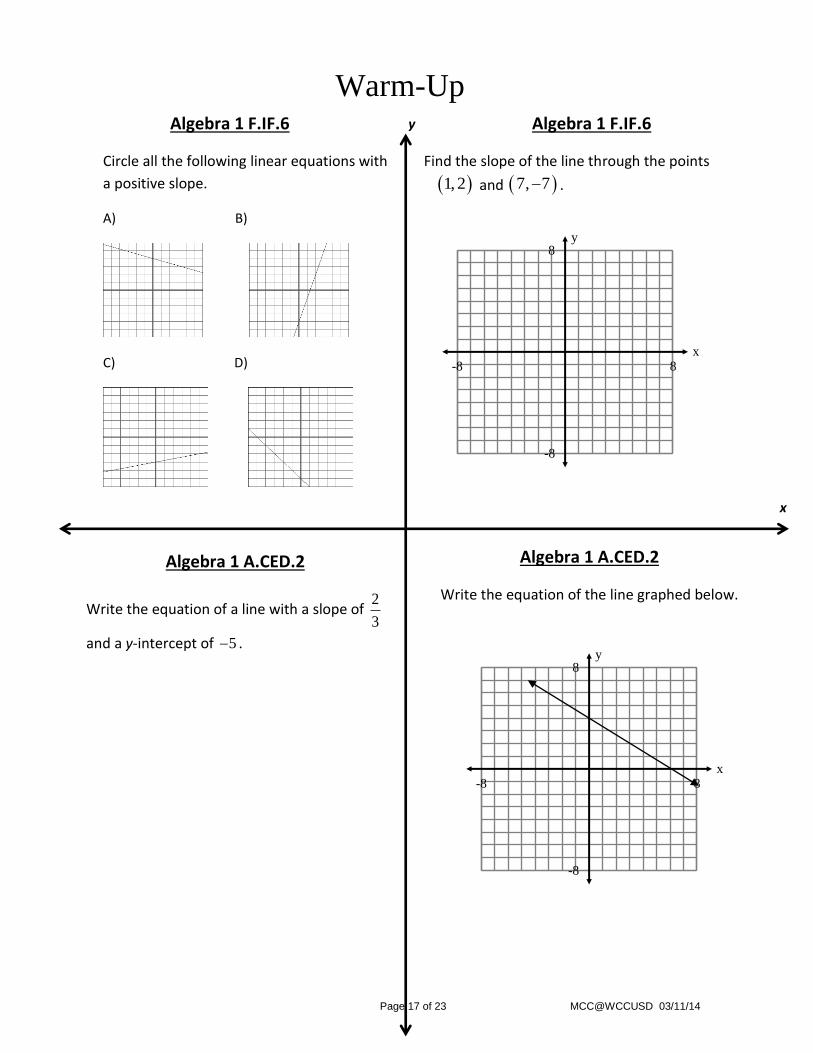
Warm-Up Algebra 1 F.IF.6 Algebra 1 F.IF.6
Circle all the following linear equations with
a positive slope.
A) B)
C) D)
Find the slope of the line through the points
1, 2 and 7, 7 .
y
y
x 8
8
-8
-8
y
x 8
8
-8
-8
x
Algebra 1 A.CED.2
Write the equation of the line graphed below.
Algebra 1 A.CED.2
Write the equation of a line with a slope of 2
3
and a y-intercept of 5 .

Page 18 of 23 MCC@WCCUSD 03/11/14
Scatterplots: Note-Taking Guide (Day 1)
Scatter Plot:
Correlation
Example 1: Look at the two scatterplots and answer the questions below.
a) Which scatterplot has a negative correlation?
b) Which scatterplot has a strong linear relationship?
c) Estimate the correlation for the two scatterplots.
Scatterplot A Scatterplot B
No Correlation implies
the values don’t seem
linked at all
1 –1 0 +
Positive correlation implies the values
increase/decrease together.
– Negative correlation
implies one value increases as the other decreases.

Page 19 of 23 MCC@WCCUSD 03/11/14
Scatterplots: Note-Taking Guide (Day 1)
You Try: A scatterplot has a correlation of 0.95r . a) What does that tell us about the scatterplot?
b) Draw a scatterplot that may represent a correlation of 0.95r .
Example 2: Fit a linear model for the scatterplot and write the equation of the linear model.

Page 20 of 23 MCC@WCCUSD 03/11/14
Scatterplots: Note-Taking Guide (Day 1)
Example 3: The following scatterplot displays the days present at school and the G.P.A. of 50 students. Answer the following questions regarding the scatterplot.
a) Estimate the correlation.
b) Draw and write an equation of a linear model that represents the data.
c) If a student was present at school for 150 days, what would you predict their G.P.A. to be?

Page 21 of 23 MCC@WCCUSD 03/11/14
Scatterplots: Note-Taking Guide (Day 1)
You Try: The following scatterplot displays the hours playing video games per week and the G.P.A. of
33 students. Answer the following questions regarding the scatterplot.
a) Estimate the correlation.
b) Draw and write the equation of a linear model that represents the data.
c) If a student plays 10 hours of video games per week, what would you predict their G.P.A. to be?

Page 22 of 23 MCC@WCCUSD 03/11/14
Scatterplots: Note-Taking Guide (Day 2)
Example 1: Input the data below and display it on a scatter plot. Then estimate the correlation.
You Try: Input the data below and display it on a scatter plot. Then estimate the correlation.
a) DATA SET A
b) DATA SET B
Correlation Estimate : r = ___________
Correlation Estimate :
r = ___________
Correlation Estimate :
r = ___________

Page 23 of 23 MCC@WCCUSD 03/11/14
Example 2: Find the correlation of the data in example 1. Then compare the result with your
estimation from the first example.
You Try: Find the correlation of DATA SET A and B. Then compare the result with your
estimations from the previous you try’s.
DATA SET A : __________r DATA SET B : __________r
Example 3: Find the line of best fit for the data from example 1. Does the line of best fit look
reasonable based on the scatter plot.
Slope: __________m Intercept: __________b
Line of Best Fit: _______________________________
You Try: Find the line of best fit for the DATA SET A and B. Does the line of best fit look
reasonable based on the scatter plots from the first you try’s.
Exit Ticket: Use the data below to answer the following questions.
DATA SET A : DATA SET B :
a) Find the correlation and describe what that
tells you about the scatter plot.
b) Find the Line of Best Fit.
c) Use the Line of Best Fit to predict the y-value
when 5x .