good enough to great - tableau software enough to great in today’s world, successful...
TRANSCRIPT

A quick guide for better data visualizations
Good enough to great:

Contents
Charts ........................................................4
Color .......................................................... 11
Size............................................................ 16
Text ...........................................................20
Dashboard layout .................................24
Conclusion ..............................................30
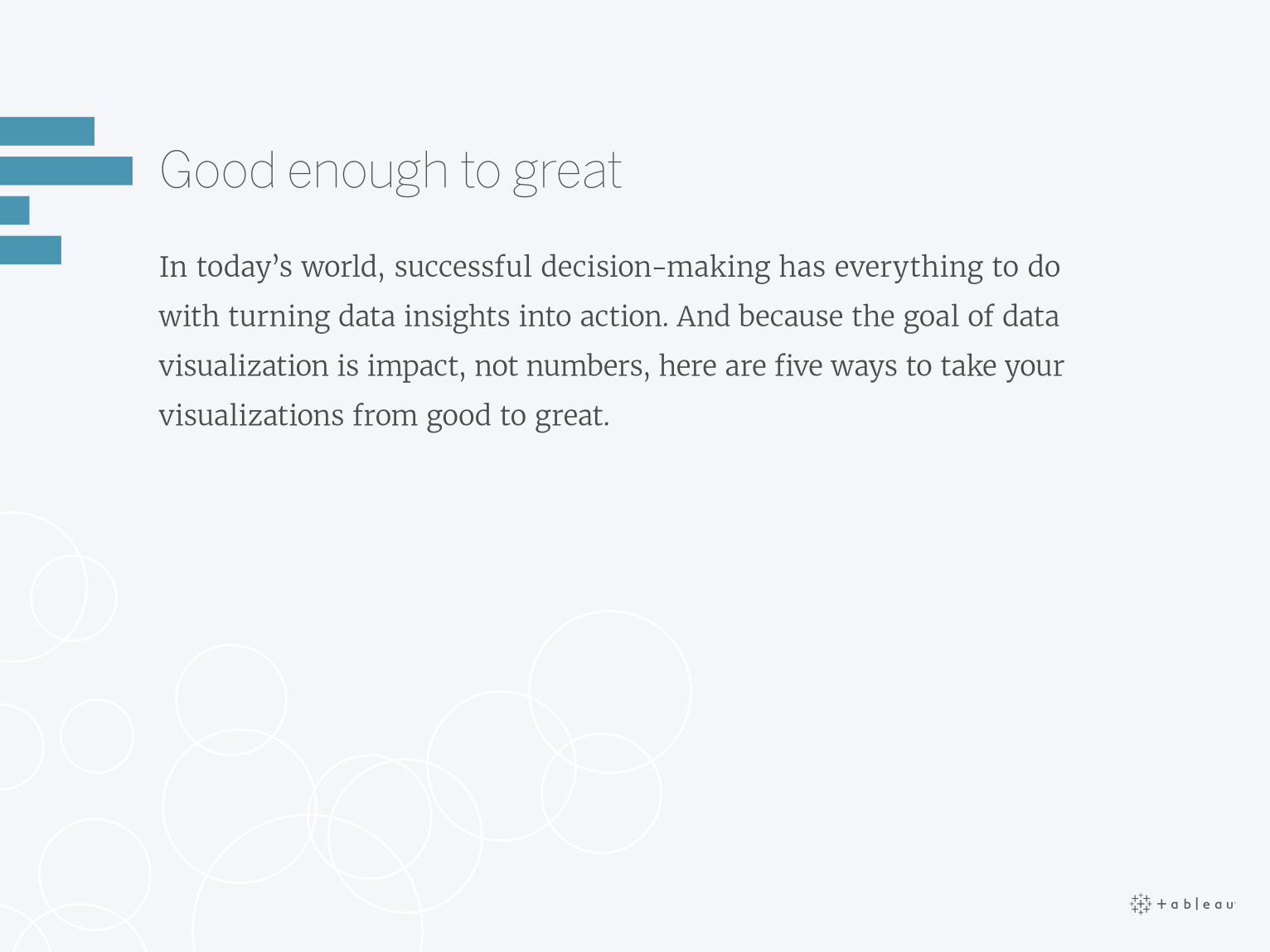
Good enough to great
In today’s world, successful decision-making has everything to do
with turning data insights into action. And because the goal of data
visualization is impact, not numbers, here are five ways to take your
visualizations from good to great.

1Charts • Color • Size • Text • Dashboard layout • Conclusion
Charts
Don’t get boxed in with chart wizards or just-add-data pre-fab visuals.
For great data visualizations, one size does not fit all. Ask yourself:
what different kind of visualizations will tell the most truthful story,
and best answer the questions at hand?
Charts

Comparing categories
Bar charts are best utilized when you have a single
measure, and want to compare categories.
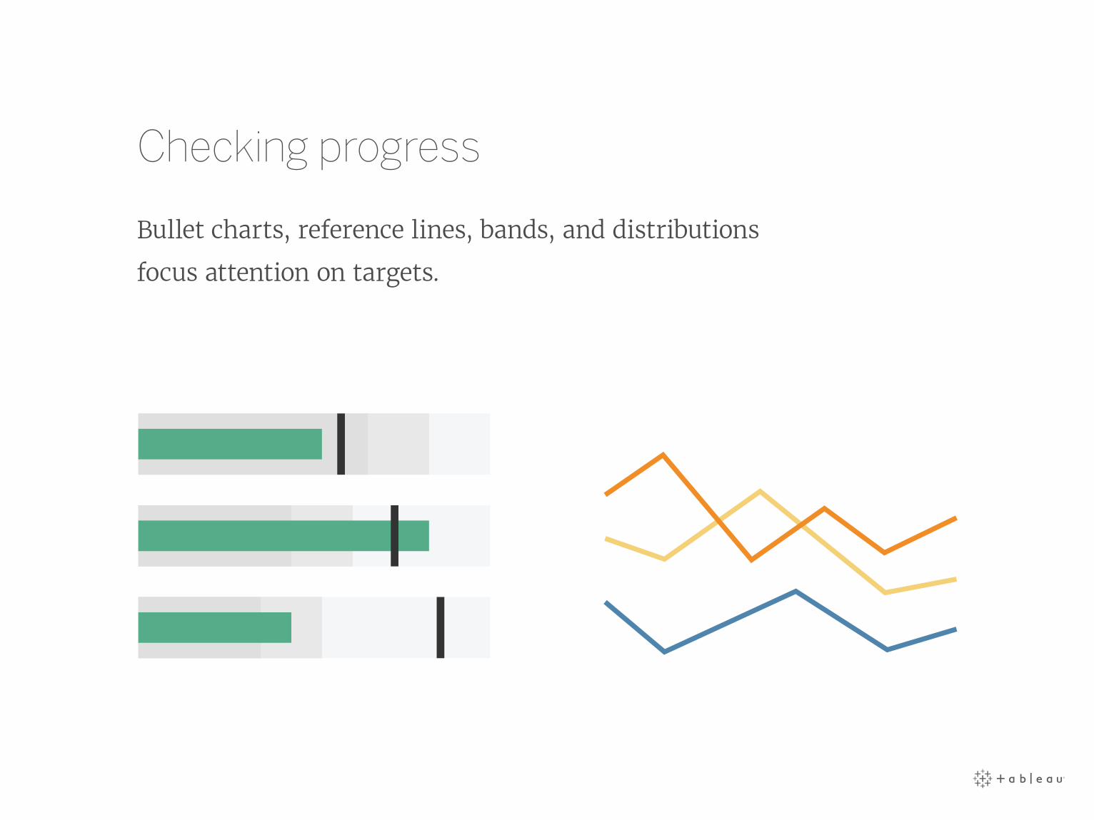
Checking progress
Bullet charts, reference lines, bands, and distributions
focus attention on targets.
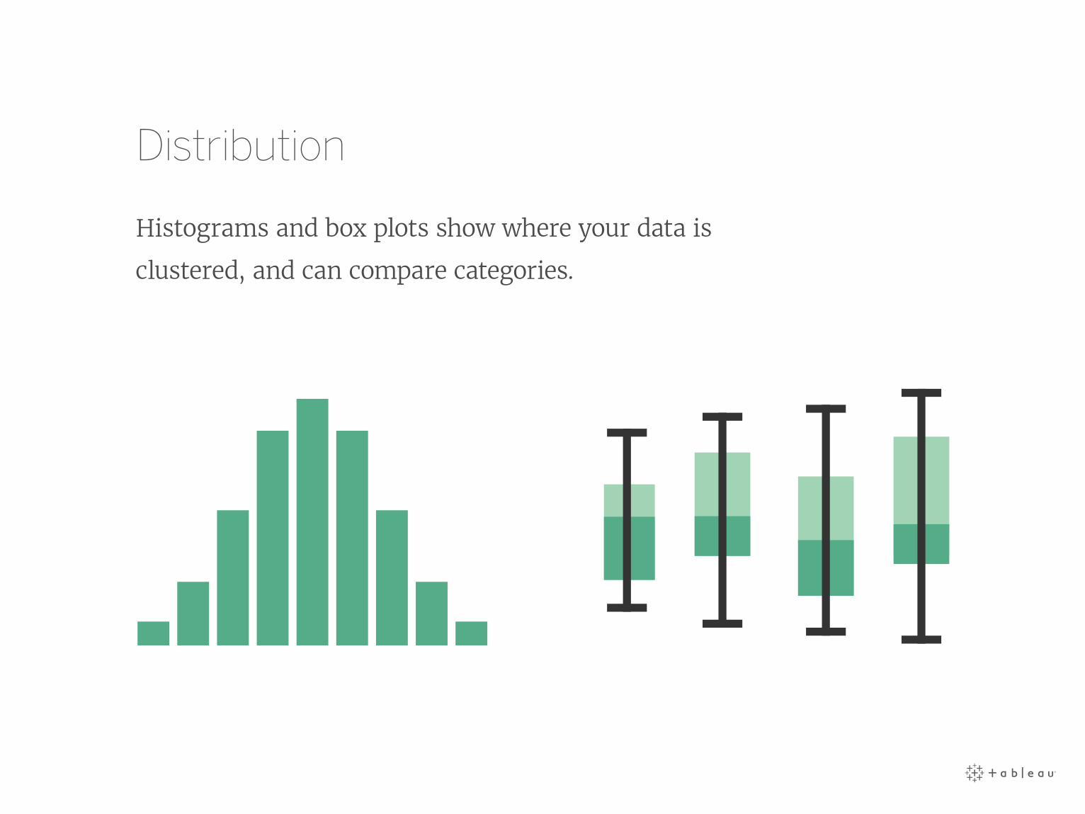
Distribution
Histograms and box plots show where your data is
clustered, and can compare categories.

Regional analysis
Visualize data on geographical maps to answer locational specific
questions, or aid geographical exploration, not just because it looks nice.

Custom shapes
Use subject matter shapes to tell a more compelling story.
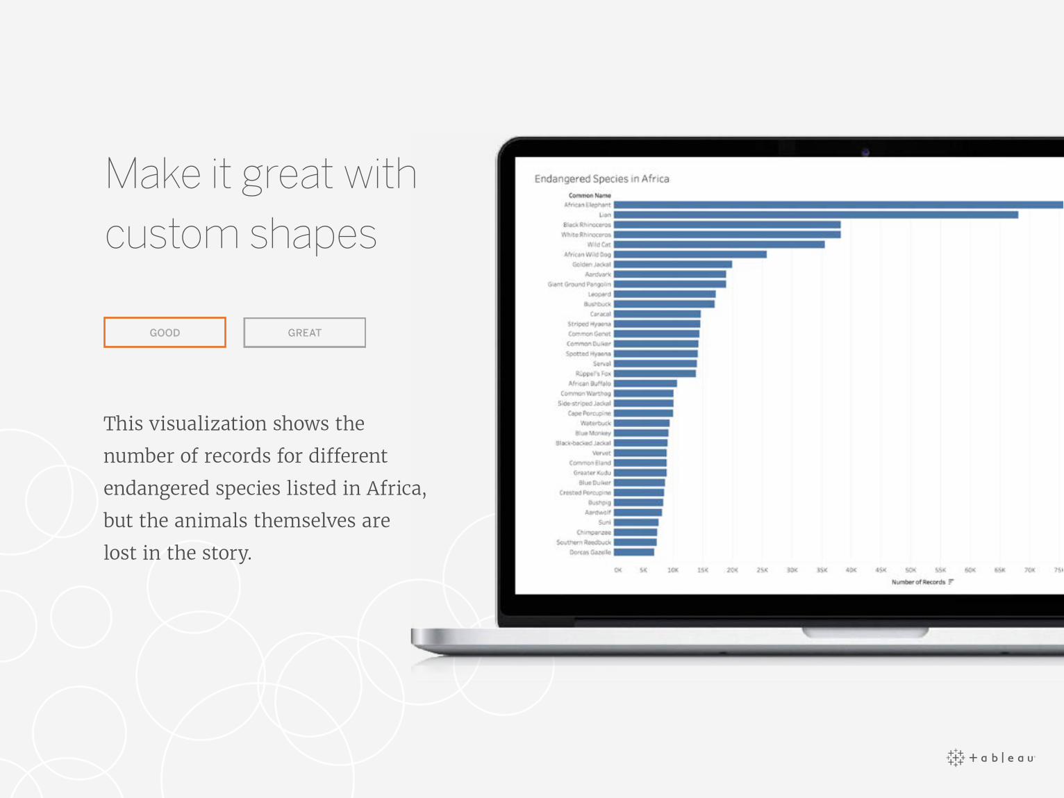
This visualization shows the
number of records for different
endangered species listed in Africa,
but the animals themselves are
lost in the story.
GOOD
Make it great with custom shapes

See this dashboard in action on Tableau Public.
By adding custom shapes to the
same data, this visualization
suddenly brings the endangered
species to life.
GREAT
Make it great with custom shapes

2
Color
Color is one of the most powerful aesthetic
features because it’s an attention-grabber.
It’s the first thing we notice, and it can
immediately highlight specific insights or
identify outliers. The data, not personal
favorites or brand colors, should drive the
use of color to make a point.
Charts • Color • Size • Text • Dashboard layout • Conclusion

Differentiation
Don’t use similar colors, or too many colors.
Don’t re-use colors for different dimensions
or measures on the same dashboard.

Measurable
Does the color scale match my data? Does the color move from
light to dark, or is it stepped to best represent what you’re measuring?

Relatable
Semantically-resonant colors help people process information faster.
So use yellow to depict bananas, red to represent heat.

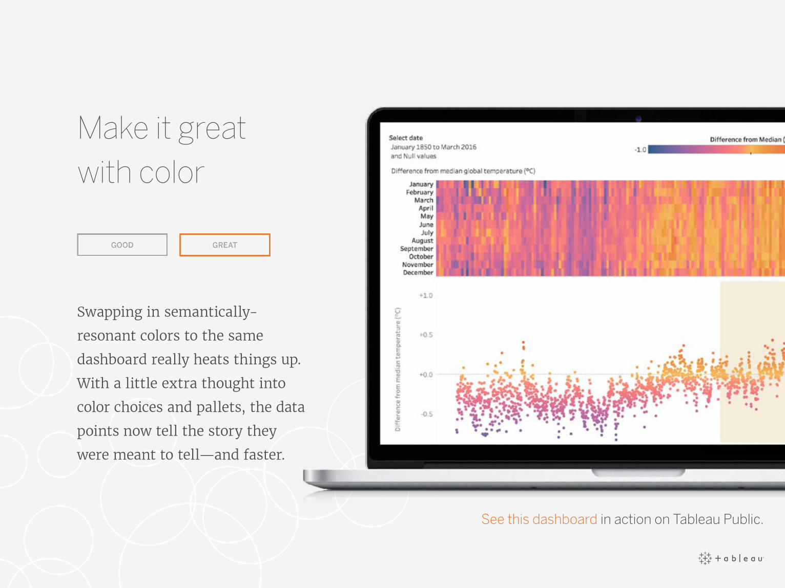
This dashboard contains data
from 100 observations of global
surface temperatures (°C) around
the world from 1961- 1990.
While these visualizations are
accurate, the color red represents
cooler temperatures, and doesn’t
resonate with the information
the data is trying to portray.
GOOD
Make it great with color
GREAT
Swapping in semantically-
resonant colors to the same
dashboard really heats things up.
With a little extra thought into
color choices and pallets, the data
points now tell the story they
were meant to tell—and faster.
Make it great with color
See this dashboard in action on Tableau Public.

3Charts • Color • Size • Text • Dashboard layout • Conclusion
Size
The bigger the object, the bolder it looks. Bold shapes and colors
might work well with bar charts and area charts, but they may also
look gaudy and garish when used in a different chart, like a treemap.
Use size to draw emphasis to your key message, not obscure it.
Size
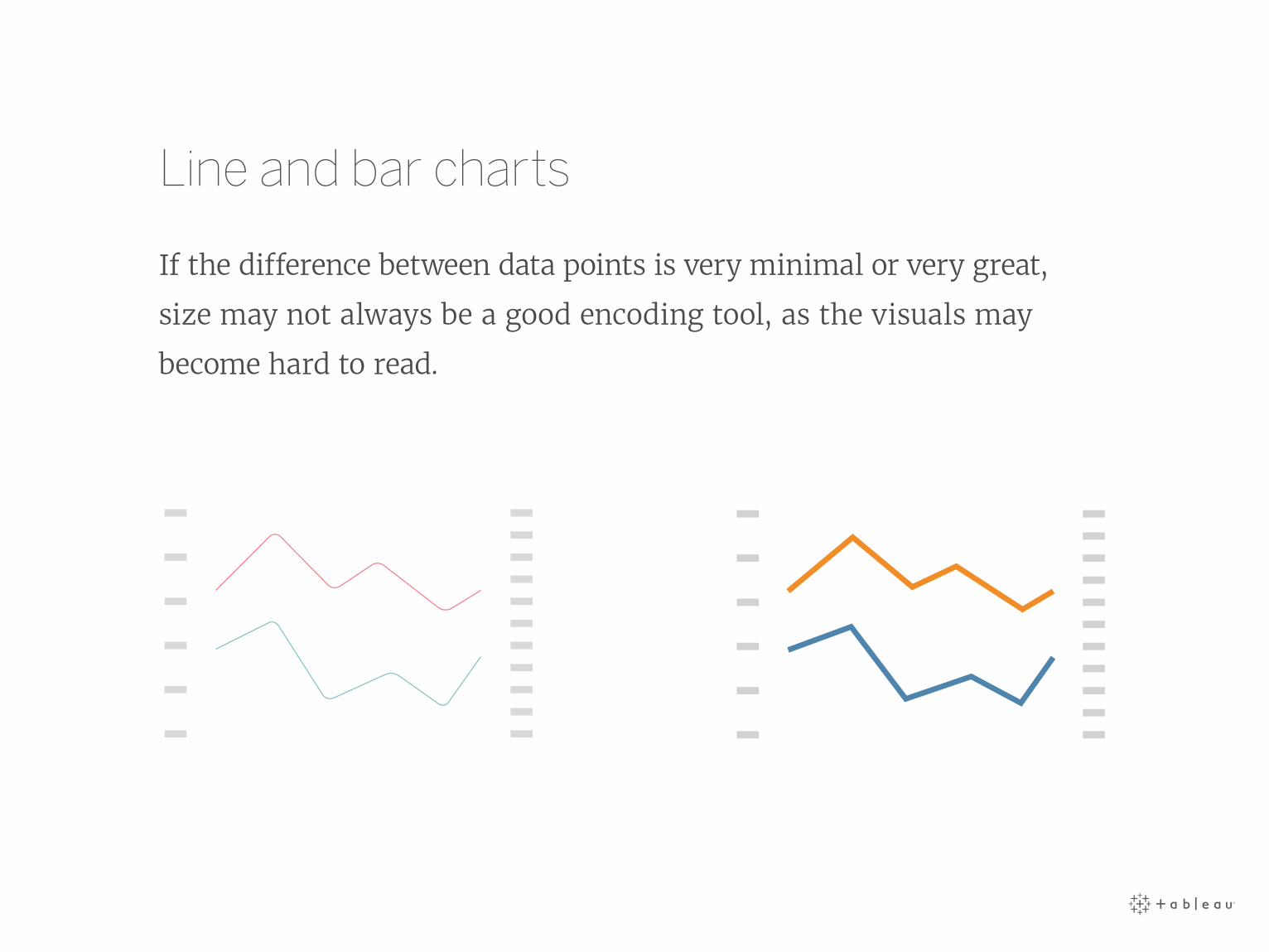
Line and bar charts
If the difference between data points is very minimal or very great,
size may not always be a good encoding tool, as the visuals may
become hard to read.

Map charts
Mark size should be based on the range of values on the map.
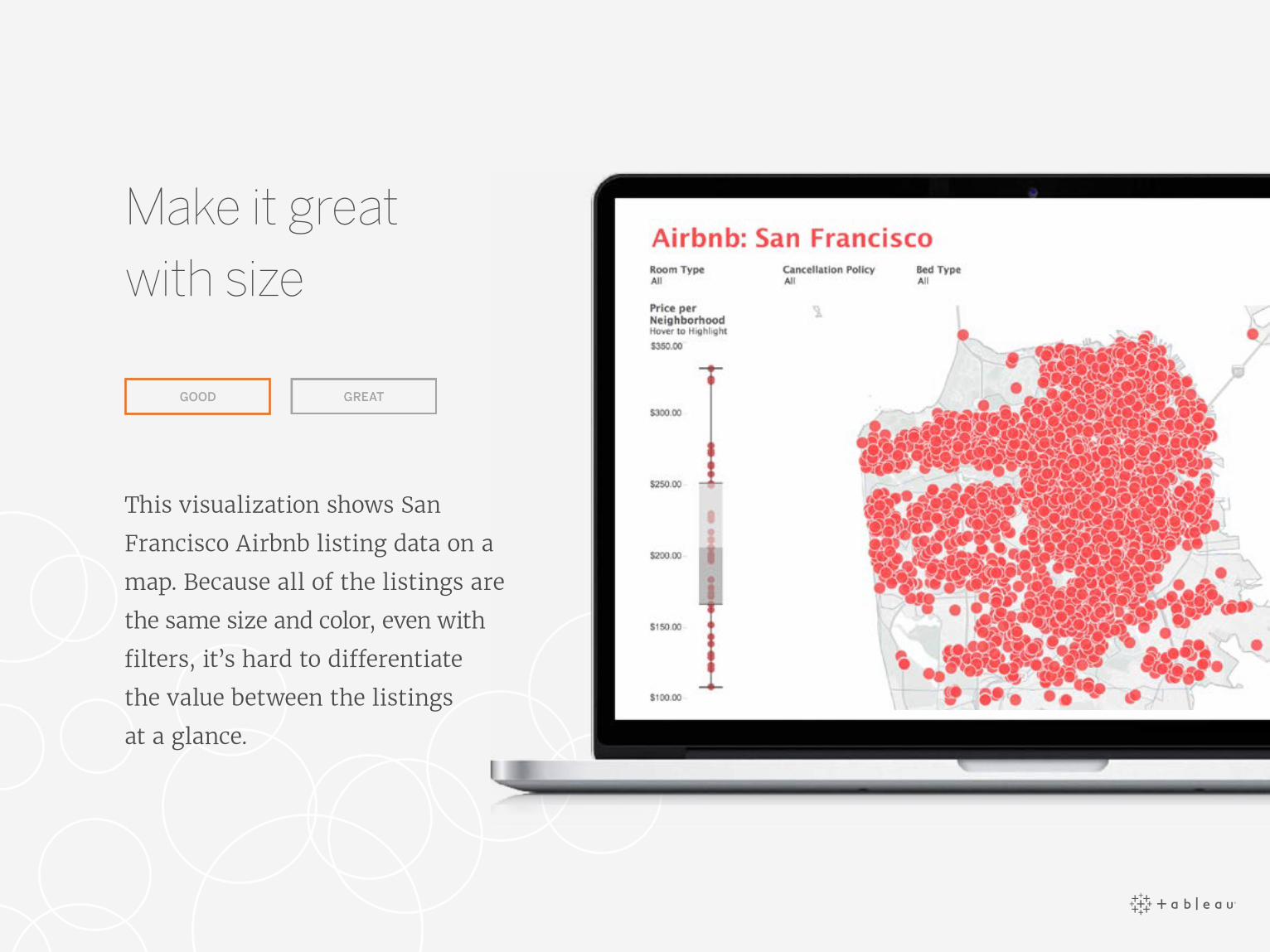
This visualization shows San
Francisco Airbnb listing data on a
map. Because all of the listings are
the same size and color, even with
filters, it’s hard to differentiate
the value between the listings
at a glance.
GOOD
Make it great with size
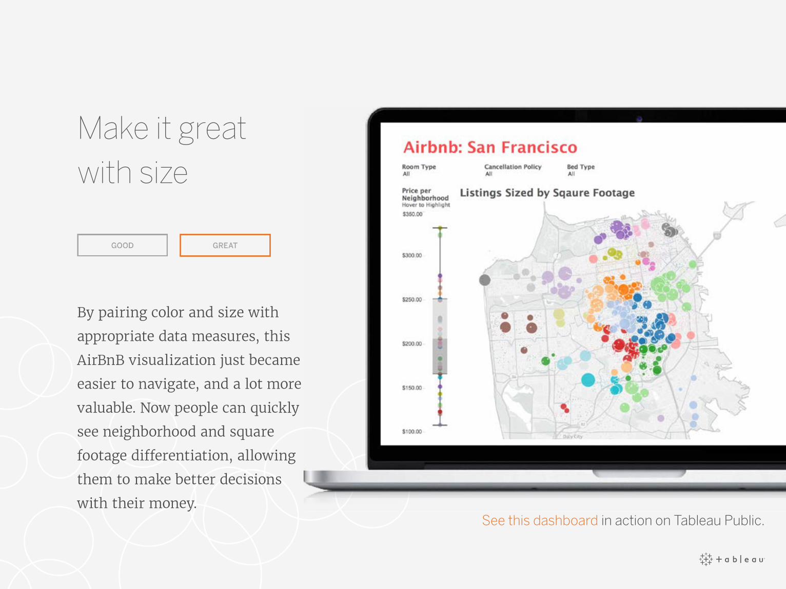
By pairing color and size with
appropriate data measures, this
AirBnB visualization just became
easier to navigate, and a lot more
valuable. Now people can quickly
see neighborhood and square
footage differentiation, allowing
them to make better decisions
with their money.
GREAT
Make it great with size
See this dashboard in action on Tableau Public.
4
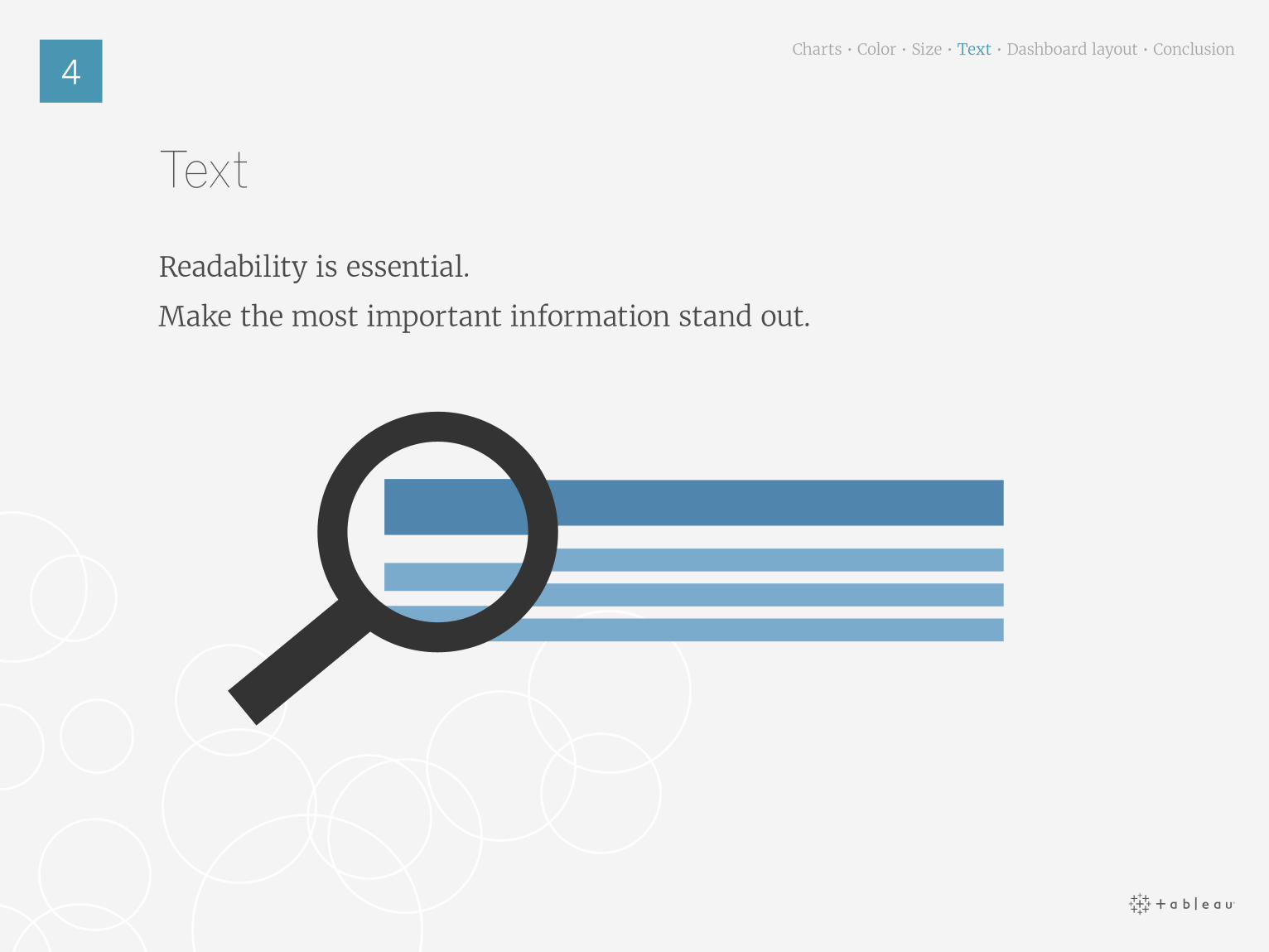
Text
Readability is essential.
Make the most important information stand out.
Charts • Color • Size • Text • Dashboard layout • Conclusion
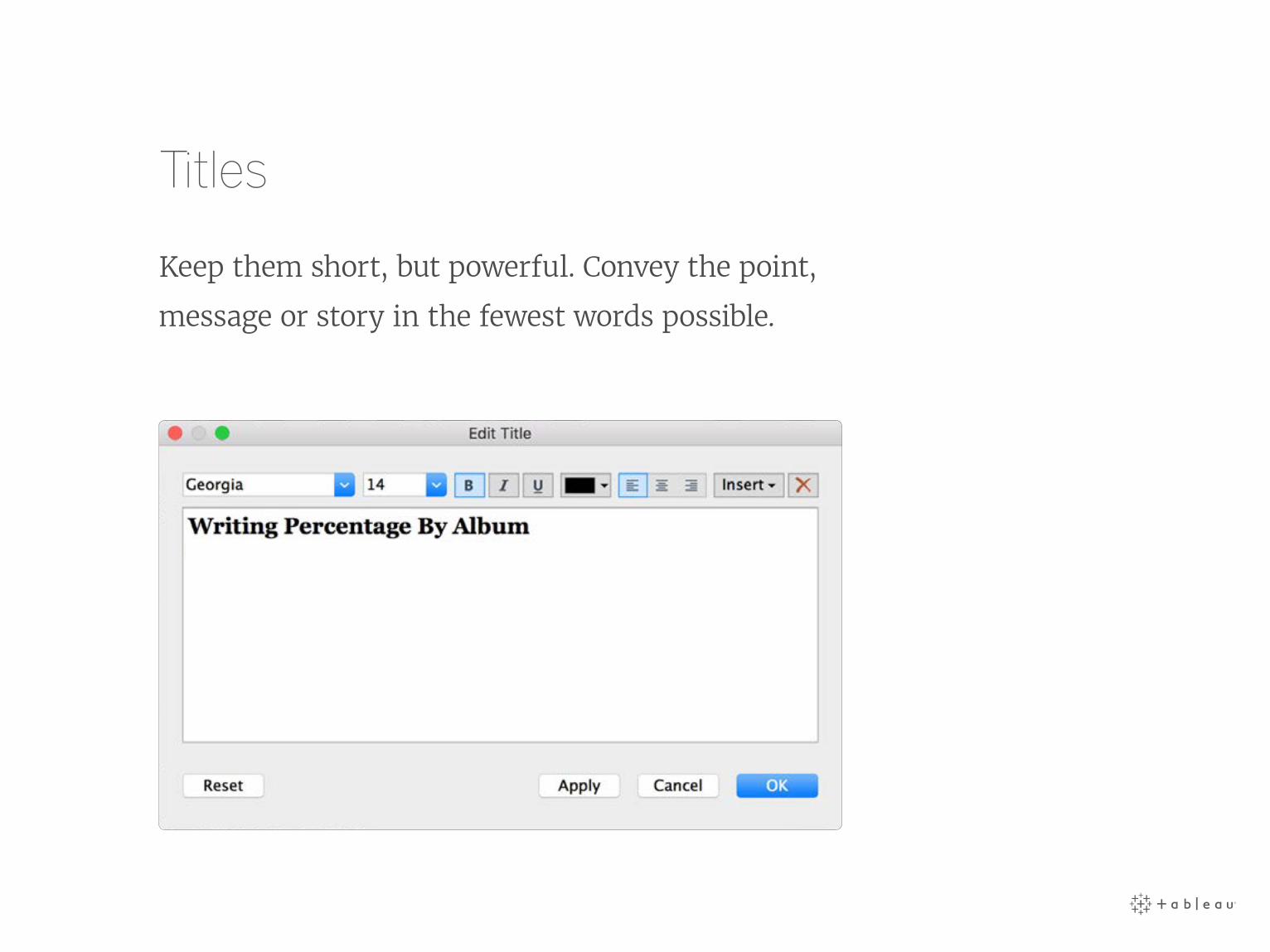
Titles
Keep them short, but powerful. Convey the point,
message or story in the fewest words possible.
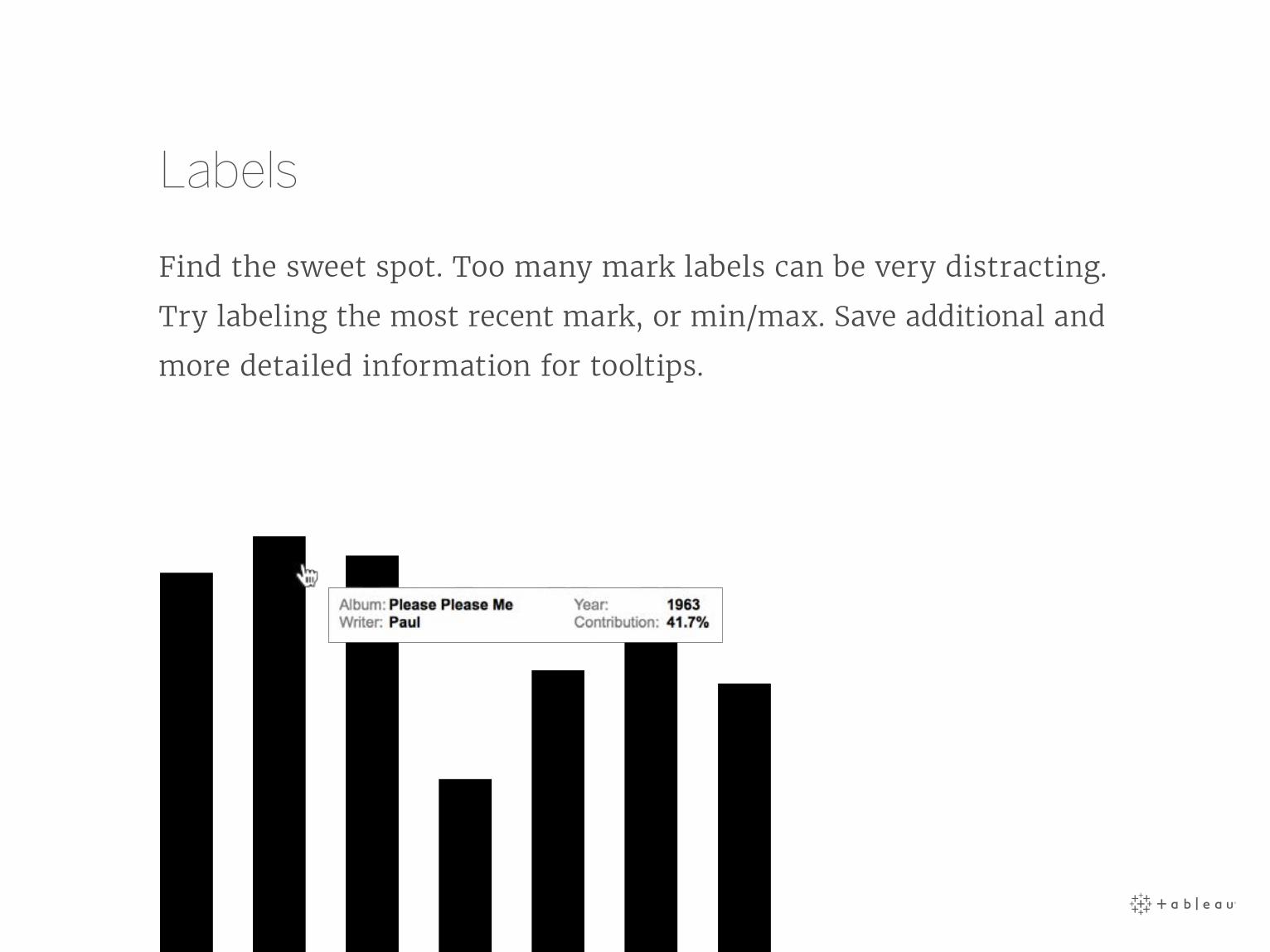
Labels
Find the sweet spot. Too many mark labels can be very distracting.
Try labeling the most recent mark, or min/max. Save additional and
more detailed information for tooltips.
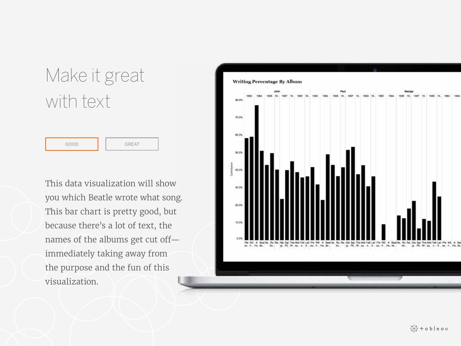
This data visualization will show
you which Beatle wrote what song.
This bar chart is pretty good, but
because there’s a lot of text, the
names of the albums get cut off—
immediately taking away from
the purpose and the fun of this
visualization.
GOOD
Make it great with text

Make it great with text
Because readability is this
dashboard’s first priority, we
rearranged the bar chart so that
the labels are complete. We also
added hover highlighting for
extra clarity.
GREAT
See this dashboard in action on Tableau Public.

5
Dashboard layout
Your dashboard’s purpose is to help guide the reader’s eye through
more than one visualization, tell the story of each insight, and reveal
how they’re connected.
The more you employ better dashboard design, your users will discover
what’s happening, why and what’s most important. Take into account
how you’re guiding their eyes across the dashboard. Are you showing
the user where to look next?
Charts • Color • Size • Text • Dashboard layout • ConclusionDashboard layout

Guide the user
Don’t leave people high and
dry without guidance on how
to use a visualization. Try
swapping a filter title with
explicit language directions
about how to navigate.
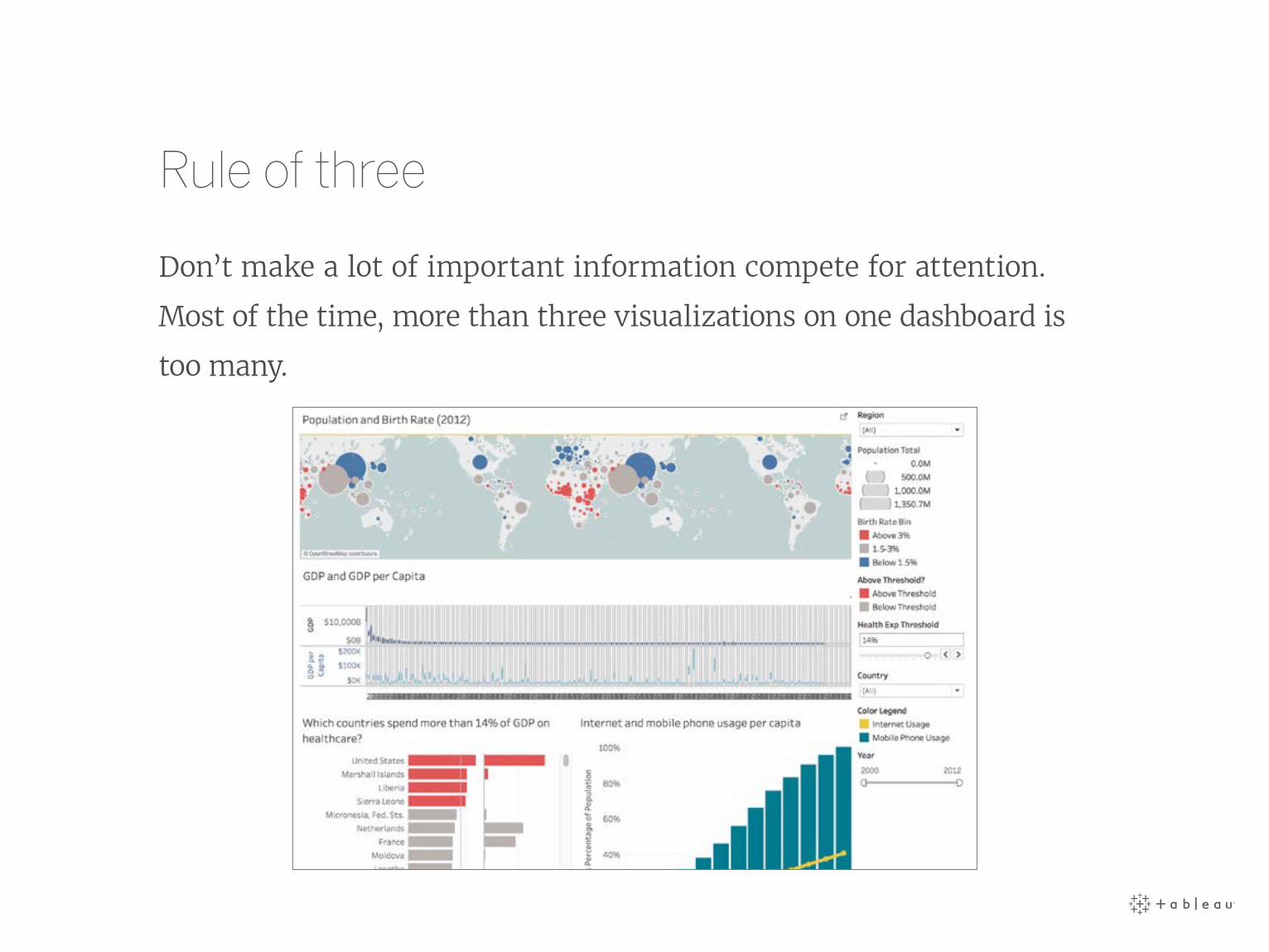
Rule of three
Don’t make a lot of important information compete for attention.
Most of the time, more than three visualizations on one dashboard is
too many.

Tell a story
If you need more than one dashboard, or are preparing for a
presentation, connect the different visualizations with story points.
Tell the narrative of your data with visuals that build on each other,
highlight specific insights, and provide additional context, all in one
seamless presentation. It sure beats cutting and pasting static images
into a power point.
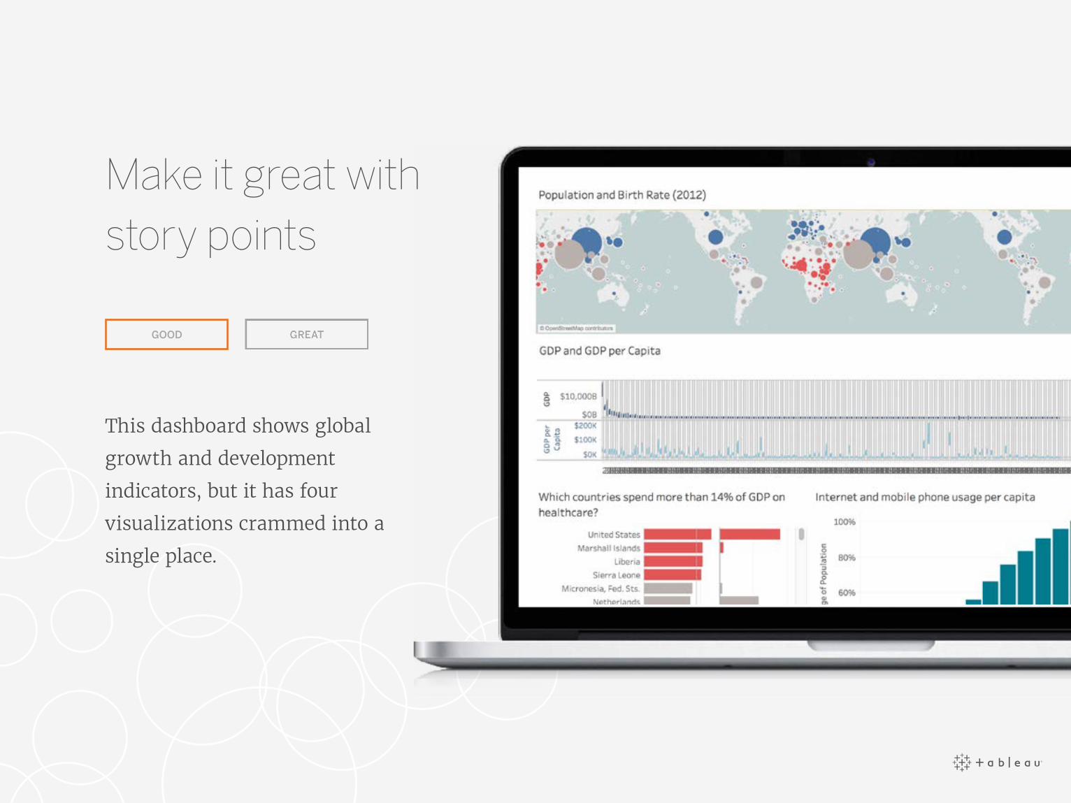
This dashboard shows global
growth and development
indicators, but it has four
visualizations crammed into a
single place.
GOOD
Make it great with story points

This is a collection of dashboards
about global growth and
development, arranged in a
sequence; each individual view is
called a story point.
GREAT
Make it great with story points
See this dashboard in action on Tableau Public.

These story points allow for indicators and insights to be explored
in depth for each visualization in a more organized way. Click on the
dashboard to see story points in action.

Conclusion
Great visualizations will not only help you understand more about
your data, they’ll offer faster, more meaningful answers, and even
inspire others to ask and answer new questions.
Charts • Color • Size • Text • Dashboard layout • ConclusionConclusion
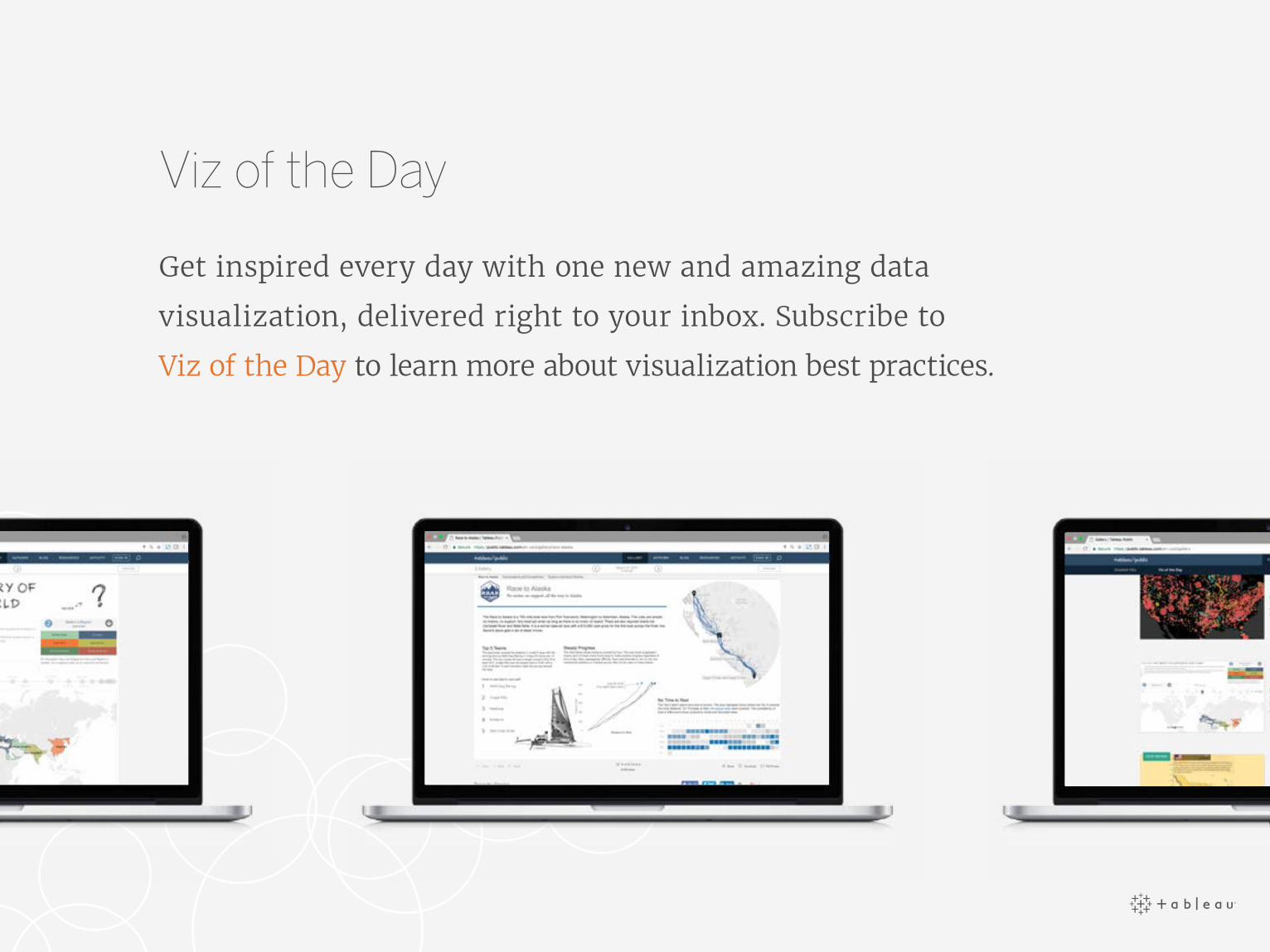
Viz of the Day
Get inspired every day with one new and amazing data
visualization, delivered right to your inbox. Subscribe to
Viz of the Day to learn more about visualization best practices.
About Tableau
Tableau helps people see and understand their data. Expressive
visualization enables people to go beyond static charts to
quickly analyze, interact with, and share massive amounts
of information with each other. With a seamless experience
from the PC to the iPad, ask and answer deeper questions, no
programming skills required.
Start your free trial today.