gis 249 final heath dilley (1)

1
Twenty Years in Eugene 1994 2014 0 5 2.5 Miles ¯ 5 2.5 Miles ¯ Elevation Slope Elevation (Ft.) High : 2041 Low : 345 Slope (%) High : 58 Low : 0 1994 2014 0 5 2.5 Miles ¯ 1994 2014 0 5 2.5 Miles ¯ 1994 2014 0 5 2.5 Miles ¯ With this map, the objective will be to show the changes that has happened to the city of Eugene, OR over the course of 20 years. Above you will see a standard satellite image of Eugene then (left) and Eugene now (right) and it’s city limits (illustrated with the black outline). Already we can see there are some differences between the two images, but by changing the filters on the infrared bands used for the images, we can easily discern and present more noticable differences. These maps display the surface area that Eugene rests on. The map on the left shows the elevation, where you can see a majority of the city is positioned at less than 500 feet in elevation. The on the right shows the slope, or how steep, the area is. Again, here we see that a majority of the city is relatively flat. We still see city development though higher up and around the steep areas that surround the city. In this image, we have taken the RGB bands (red, green, and blue) and switched their order, making a BGR image. Because of this band alignment, we have changed the display of the image, giving what feels like more of a night time setting. This actually helps us locate differences in inorganic objects, or concrete in this instance. Notice how the buildings and the roads are more pronounced and visually stimulating in these images. We can tell that urban growth has changed drastically in the last twenty years. A more dense buildup in the northern area shows that development there is cramping up as it hits the city limits, while the western area is slowly creeping towards the edge. To the north east we can see development spreading out, and even centrally we can see a difference in the years. While not a predominantly noticeable change, we can see that there are some newer, large buildlings making their home in the downtown area. The only area we don’t see any significant change really is in the southern area. Here we also notice that there is not a substantial amount of urban development, due in part to its steep terrain. RGB > Blue, Green, Red RGB > Mid-Infrared 1 & 2, Red In this map, we have taken the RGB band configuration and replaced them with a heavy dose of infrared bands. For the red band, we put in the Mid-Infrared 1 band, Mid-Infrared 2 for the green band, and Red for the blue band. The resulting combination gives us this, where heavy vegetation is represented on the map as a vibrant red. Trees, bushes, and dense foliage can be identified very easily with this map. Small, thin, or sparse vegetation however, such as grass, don’t show up very well. With this in mind, we can see that again, there is a noticeable difference between the two images. The foliage density in the southern area of 1994 is very sparse in comparison to the coverage in 2014. The area may have just been cleared out of brush to make way for development plans, or roads, or even logging purposes. After twenty years, it appears to be expanding it’s growth, making a dense pocket of vegetation. We see the same occurance in the north east area, where it appears sparse, then grows in over time. We also notice the whole city appears more red in 2014 than in 1994, giving the notion that inner city foliage has grown up a bit. RGB > Mid-Infrared 1, Red, Green For this final representation, we configured the RGB bands to Mid- Infrared 1, Red, and Green. This layout helps us see differences in two things: Agricultural land development, and water. Did you notice how the previous two layouts didn’t display water very well? It’s because it is very difficult to accurately gather data because of its reflective properties with light. Using this band combination though, we get to see water as a deep, navy blue. Follow along the Willamette river and you can tell the differences occuring between the two images on this ever dynamic current. Just as it crosses the northern border, you can see it’s starting to develop an oxbow lake. Even further along, you can find where the turns and straightaways are changing shape, along with new pockets of water showing up along the way. It also helps pick up plots of agriculture growth, making them a vibrant, orange color. You can see that a lot of the farmland is further north of Eugene, primarily in the flat land. The differences are a bit trickier to pick up, as there are not that drastic of changes, just some expansion along the north edge. With this map, it’s clear that big change between the years, is the water. by Heath Dilley Source: USGS Bulk Download; Oregon Geospatial Data Clearing House 2012 UGB; University of Oregon Libraries Made 12/8/14 Projection: WGS 1984 UTM zone 10N

Upload: heath-dilley

Post on 21-Feb-2017

78 views

Category:

Documents


0 download

TRANSCRIPT

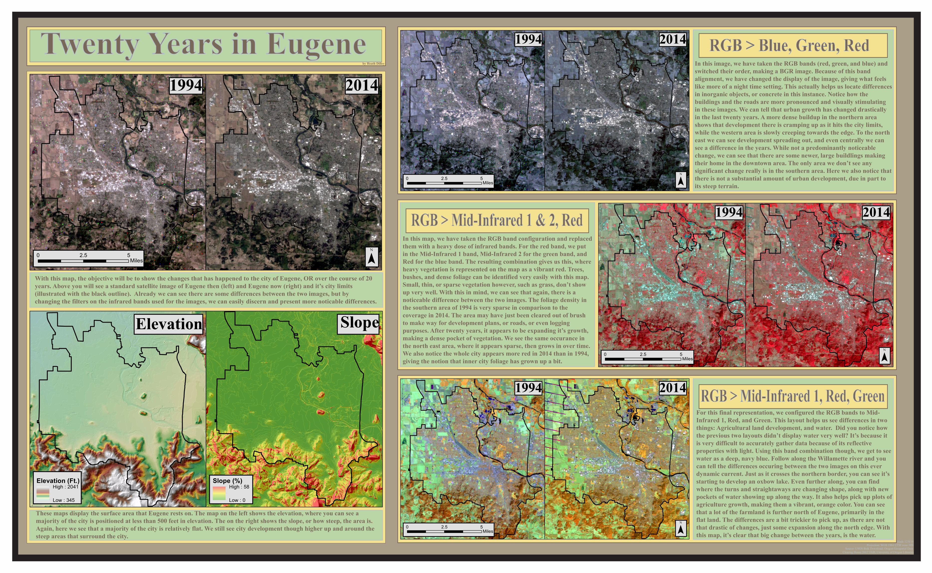
Twenty Years in Eugene1994 2014

0 52.5Miles ¯

0 52.5Miles ¯

Elevation Slope

Elevation (Ft.)High : 2041

Low : 345

Slope (%)High : 58

Low : 0

1994 2014

0 52.5Miles ¯

1994 2014

0 52.5Miles ¯

1994 2014

0 52.5Miles ¯

With this map, the objective will be to show the changes that has happened to the city of Eugene, OR over the course of 20 years. Above you will see a standard satellite image of Eugene then (left) and Eugene now (right) and it’s city limits (illustrated with the black outline). Already we can see there are some differences between the two images, but by changing the filters on the infrared bands used for the images, we can easily discern and present more noticable differences.

These maps display the surface area that Eugene rests on. The map on the left shows the elevation, where you can see a majority of the city is positioned at less than 500 feet in elevation. The on the right shows the slope, or how steep, the area is. Again, here we see that a majority of the city is relatively flat. We still see city development though higher up and around thesteep areas that surround the city.

In this image, we have taken the RGB bands (red, green, and blue) and switched their order, making a BGR image. Because of this band alignment, we have changed the display of the image, giving what feelslike more of a night time setting. This actually helps us locate differencesin inorganic objects, or concrete in this instance. Notice how the buildings and the roads are more pronounced and visually stimulatingin these images. We can tell that urban growth has changed drastically in the last twenty years. A more dense buildup in the northern area shows that development there is cramping up as it hits the city limits,while the western area is slowly creeping towards the edge. To the northeast we can see development spreading out, and even centrally we can see a difference in the years. While not a predominantly noticeable change, we can see that there are some newer, large buildlings makingtheir home in the downtown area. The only area we don’t see any significant change really is in the southern area. Here we also notice thatthere is not a substantial amount of urban development, due in part toits steep terrain.

RGB > Blue, Green, Red

RGB > Mid-Infrared 1 & 2, RedIn this map, we have taken the RGB band configuration and replacedthem with a heavy dose of infrared bands. For the red band, we put in the Mid-Infrared 1 band, Mid-Infrared 2 for the green band, andRed for the blue band. The resulting combination gives us this, whereheavy vegetation is represented on the map as a vibrant red. Trees, bushes, and dense foliage can be identified very easily with this map.Small, thin, or sparse vegetation however, such as grass, don’t show up very well. With this in mind, we can see that again, there is a noticeable difference between the two images. The foliage density inthe southern area of 1994 is very sparse in comparison to the coverage in 2014. The area may have just been cleared out of brushto make way for development plans, or roads, or even loggingpurposes. After twenty years, it appears to be expanding it’s growth,making a dense pocket of vegetation. We see the same occurance in the north east area, where it appears sparse, then grows in over time.We also notice the whole city appears more red in 2014 than in 1994, giving the notion that inner city foliage has grown up a bit.

RGB > Mid-Infrared 1, Red, GreenFor this final representation, we configured the RGB bands to Mid-Infrared 1, Red, and Green. This layout helps us see differences in twothings: Agricultural land development, and water. Did you notice howthe previous two layouts didn’t display water very well? It’s because itis very difficult to accurately gather data because of its reflective properties with light. Using this band combination though, we get to seewater as a deep, navy blue. Follow along the Willamette river and you can tell the differences occuring between the two images on this everdynamic current. Just as it crosses the northern border, you can see it’s starting to develop an oxbow lake. Even further along, you can find where the turns and straightaways are changing shape, along with newpockets of water showing up along the way. It also helps pick up plots of agriculture growth, making them a vibrant, orange color. You can seethat a lot of the farmland is further north of Eugene, primarily in the flat land. The differences are a bit trickier to pick up, as there are not that drastic of changes, just some expansion along the north edge. With this map, it’s clear that big change between the years, is the water.

by Heath Dilley

Source: USGS Bulk Download; Oregon Geospatial Data Clearing House 2012 UGB; University of Oregon Libraries

Made 12/8/14Projection: WGS 1984 UTM zone 10N