gdp bd 00000253504
DESCRIPTION
bdTRANSCRIPT

Deutsche Bank Markets Research
Global
Cross-Discipline
Date 12 September 2013
A Nominal Problem
Long-Term Asset Return Study
Jim Reid
Strategist
(+44) 20 754-72943
Nick Burns, CFA
Strategist
(+44) 20 754-71970
Seb Barker
Strategist
(+44) 20 754-71344
________________________________________________________________________________________________________________
Deutsche Bank AG/London
DISCLOSURES AND ANALYST CERTIFICATIONS ARE LOCATED IN APPENDIX 1. MICA(P) 054/04/2013.


Deutsche Bank Markets Research
Global
Cross-Discipline
Date 12 September 2013
Long-Term Asset Return Study
A Nominal Problem
________________________________________________________________________________________________________________
Deutsche Bank AG/London
DISCLOSURES AND ANALYST CERTIFICATIONS ARE LOCATED IN APPENDIX 1. MICA(P) 054/04/2013.
Jim Reid
Strategist
(+44) 20 754-72943
Nick Burns, CFA
Strategist
(+44) 20 754-71970
Seb Barker
Strategist
(+44) 20 754-71344
As we publish this annual report, optimism on global growth is rising and there is also much discussion on the Fed’s plan to taper unconventional monetary policy. However, as we highlight, the 5-year moving average of global nominal GDP growth is now at its lowest rate since the 1930s. In the US, which is one of the bright spots globally, nominal GDP growth has been at 3.1%, 3.1% and 3.8% in Q2 ‘13, Q1 ‘13 and Q4 ‘12 respectively. These numbers are lower than where they were in the prior two quarters (4.8% and 4.5%) when ‘QE infinity’ was being formulated and announced. If we had a nominal GDP target we may now be discussing increasing QE and not tapering.
Any recovery should be seen in this context. Given the structural issues that we think will continue to hold back growth, unconventional monetary policy may actually need to increase in the years ahead. However, given the far superior performance of asset prices relative to economic activity since QE started, perhaps how monetary policy is distilled through the economy needs to be improved.
Expanding ‘traditional’ QE might not be the answer. We think that more debate is needed on policies that directly target nominal GDP and not just asset prices. Perhaps the groundwork is currently being laid for this by the blurring of lines between governments and central banks. In Japan ‘Abenomics’ is fostering a deeper partnership between the two. In the UK, the government specifically headhunted new BoE Governor Mark Carney and altered the BoE’s remit, and in the US President Obama is about to hand-pick Bernanke’s successor. The ECB is institutionally an outlier but even Draghi has stepped beyond his inflation remit with his ‘whatever it takes’ speech last summer. Globally the next few years may bring politicians and central bankers closer together and monetary policy that directly targets growth over financial assets.
We’ve previously been of the opinion that the end-game to the 2008 financial crisis is notably higher inflation at some point in the second half of this decade. We still think this is likely but only if unorthodox monetary policy continues over the next few years.
In terms of preferred assets for the long-term investor, while we don’t expand on work done in earlier studies our bias remains for “Investment Grade Dividends” – i.e. IG-type companies but owning their equities over their debt on a valuation basis. The cheaper names are in Europe rather than the US. The overall US equity market looks stretched relative to history. Whilst fixed income markets also offer little long-term value, we think that central banks will still be forced to keep yields artificially low for as long as they can. Credit is a fairly low beta but unexciting asset class at the moment – worth the incremental pick-up over government bonds in a low default environment, but not one likely to see exciting returns.
Overall we think many global assets have been inflated by QE and central banks may need to spend the next few years engineering higher nominal GDP to justify such valuations.

12 September 2013
Long-Term Asset Return Study: A Nominal Problem
Page 2 Deutsche Bank AG/London
Table Of Contents
Interesting Stats on a Page ................................................. 3
Executive Summary ............................................................. 4
A Nominal Problem ........................................................... 11 Global nominal slowdown led by DM ............................................................... 11 Why is nominal GDP so important? .................................................................. 14
Why is Nominal Growth so Low? ...................................... 17 (I) Are demographics lowering potential growth? ............................................ 17 (II) Has growing state involvement slowed growth? ........................................ 20
What Drives Real and Nominal Growth? .......................... 26 Real GDP Growth, Revolution Ending? ............................................................. 26 Nominal GDP Growth, Impossible without Money Creation/Innovation ........... 31
Putting Recent Central Bank Action in Context ................ 39 QE not enough to offset financial crisis is inflation terms ? .............................. 43
The Monetary Playbook ..................................................... 45 Is Nominal GDP Targeting the Answer? ........................................................... 45 Are the Helicopters Coming? ............................................................................ 51 NGDPT and Helicopter Money pose Deeper Questions then Any Framework and Policy Yet Used .......................................................................................... 54 “Capitalism on Hold”: Japan ............................................................................ 55
100 Years of the FED ......................................................... 59
Mean Reversion ................................................................. 61 Assessing the mean reversion model through time .......................................... 61 Mean reversion across asset classes ................................................................ 66 Mean Reversion Assumptions .......................................................................... 70
Historical US Asset Returns .............................................. 72
Historical International Asset Returns ............................... 76 International equity return charts ..................................................................... 76 International 10 year government bond return charts ...................................... 77 International Equity minus Bond return charts ................................................. 78 International return tables ................................................................................ 79
All data in this report is up to the end of August 2013 where possible.

12 September 2013
Long-Term Asset Return Study: A Nominal Problem
Deutsche Bank AG/London Page 3
Interesting Stats on a Page
In spite of recent positive growth indicators, any recovery should be seen in the context of nominal GDP growth that has been trending lower across the globe. The 5-year moving average (MA) growth rate of our global nominal GDP series is currently at the lowest it’s been since the 1930s.
DM growth has been progressively slowing for more than a decade but EM has until now been the global engine. At the extremes, since the end of 2004, our EM universe has grown nearly 210% (BRICs 267%) in nominal GDP terms (converted into dollars) with the Eurozone only 13.5% bigger. Since 1995, the EM number is 482% (BRICs 691%) with the Eurozone only 54% larger.
However, EM nominal growth is now slowing with the 5-year MA at the lower end of an albeit healthy 50-year range. China is starting to see a rare period (for the last 35 years) of sub-10% nominal GDP growth.
Since the end of 2007, we estimate that the global economy has potentially lost around $41tn of cumulative nominal GDP against the prior trend (relative to around $64tn size of our global economy sample at end-2012). DM and the Eurozone have lost up to $33tn and $13tn respectively over the same period.
The annual output of the world, DM and Eurozone economies would now be $13.2tn, $10.5tn and $3.9tn bigger if nominal growth had been 7%, 5% and 4% respectively since the end of 2007.
Perhaps the $7.5tn expansion of the six major global central banks since the Lehman default looks less aggressive when seen in this context.
Given the $13tn of lost Eurozone output, it’s interesting that the ECB balance sheet has only expanded by about $1tn over the past 5 years. Over this period combined European bank balance sheets are flat at around $32tn after having increased by $13.5tn in the prior 5 years.
It’s not just the 5-year MA that’s weak. H1 ‘13 has seen low nominal activity. Indeed in the US (one of the brighter spots), nominal GDP growth has been 3.1%, 3.1% and 3.8% in Q2 ‘13, Q1 ‘13 and Q4 ‘12 - lower than where they were in the prior 2 quarters (4.8% and 4.5%) when QE infinity was being formulated and announced. If we had a nominal GDP target we may be discussing increasing QE at this juncture and not tapering.
Growth is a modern phenomenon, nominal growth even more so. Before 1750 there was hardly any of either and before the 20th century nominal growth often lagged real growth as real growth led to price falls in a broadly fixed hard metal currency system. This perhaps helps prove that money creation/innovation remain key to nominal growth.
In a US 60/40 equity/bond portfolio our mean reversion model suggests 10-year annualised returns of only 2.77% p.a. – the fourth-lowest in the 143 years since 1871. The only years with a lower 10-year prediction were in 1998, 1999 and 2000.

12 September 2013
Long-Term Asset Return Study: A Nominal Problem
Page 4 Deutsche Bank AG/London
Executive Summary
As we compile this report, which looks at longer-term themes in financial markets, there is optimism that recent data is suggesting an imminent rebound in growth, particularly in the developed world. Also, as has been well flagged and debated all summer, this month will likely mark the point where the Fed starts to taper their $85bn per month bond-buying program. They seem confident that stronger activity is just around the corner. However, what concerns us is how low nominal GDP growth has been in recent quarters across the globe and indeed how weak the post financial crisis nominal recovery has been in spite of seemingly aggressive monetary policy. So any recovery should be seen in this context. This piece argues that unconventional monetary policy may actually need to increase over the years ahead. However, given the far superior performance of asset prices relative to economic activity since QE started, perhaps how it is distilled through the global economy needs to be enhanced.
A nominal problem… H1 2013 saw weak nominal activity across the world. Indeed in the US, which is one of the bright spots globally, nominal GDP growth has been at 3.1%, 3.1% and 3.8% in Q2 ‘13, Q1 ‘13 and Q4 ‘12. These numbers are lower than where they were in the prior two quarters (4.8% and 4.5%) when QE infinity was being formulated and announced. If we currently had a nominal GDP target we may be discussing increasing QE at this juncture and not tapering.
Figure 1: Nominal US GDP Growth At Lowest Since QE1 & Lower Than Start
of QE Infinity
0.0
0.5
1.0
1.5
2.0
2.5
3.0
3.5
4.0
-4%
-3%
-2%
-1%
0%
1%
2%
3%
4%
5%
6%
2007 2008 2009 2010 2011 2012 2013
YoY Nominal GDP Growth (LHS)
Fed Balance Sheet ($tn, RHS)
QE
3
Op
era
tio
n T
wis
tb
eco
me o
utr
ight
purc
hases
QE
2
QE
1
Op
era
tio
n T
wis
t
Source: Deutsche Bank, Bloomberg Finance LP
This report argues that nominal GDP is important as we live in a nominal world. We receive wages, pay our debts and manage our savings in nominal terms. In the current environment, we continue to believe that nominal GDP is more crucial than normal as we have record and climbing levels of global debt which is virtually all nominal. Asset prices are also tied to nominal activity over the medium-long run. It’s impossible to get revenue growth detaching from nominal activity over any sustainable period and as such the valuations of assets like equities will be heavily influenced by nominal GDP.
In this piece we construct a comprehensive nominal global GDP series (split by regions) back to the late 1920s and find that the 5-year moving average global nominal growth rate is now at its lowest level since the 1930s. This has been driven by the developed world. But even in EM, growth in many countries/regions is flirting with the lower end of the most recent decade range.

12 September 2013
Long-Term Asset Return Study: A Nominal Problem
Deutsche Bank AG/London Page 5
In Figure 2 and Figure 3 we show the data back 50 years (the period where our data is most comprehensive). In the main report we extend back to 1928 where possible.
Figure 2: Nominal GDP Growth – World (left, Log Scale), G7 (middle), DM (right)
1%
10%
100%
1954 1964 1974 1984 1994 2004
World 5yr MA
-5%
0%
5%
10%
15%
20%
1954 1964 1974 1984 1994 2004
G7 5yr MA
-5%
0%
5%
10%
15%
20%
1954 1964 1974 1984 1994 2004
DM 5yr MA
Note: 5yr MA is 5 year moving average Source: Deutsche Bank, GFD
Figure 3: Nominal GDP Growth – Eurozone (left), EM (middle, Log Scale), BRIC (right, Log Scale)
-5%
0%
5%
10%
15%
20%
25%
1954 1964 1974 1984 1994 2004
Eurozone 5yr MA
1%
10%
100%
1000%
1954 1964 1974 1984 1994 2004
EM 5yr MA
1%
10%
100%
1000%
10000%
1954 1964 1974 1984 1994 2004
BRIC 5yr MA
Note: 5yr MA is 5 year moving average Source: Deutsche Bank, GFD
Why has growth been so weak in this recovery? This question has vexed the greatest minds in economics and the financial industry but one would have to say that too much debt has been a hindrance to many whereas trying to reduce it too quickly (austerity) has been an issue for others. The problem may actually be that growth was too high in the leverage bubble of the decade that preceded the financial crisis. As such we are flat-lining until we ‘catch-down’ with the appropriate new trend rate of growth. Perhaps this trend rate of growth has been declining due to demographics and this is now slowly being exposed post crisis. This is more true of the developed world but even in EM many countries are either past or are fast approaching their demographic peak.
Figure 4: Working Age Population
Growth
Figure 5: Working Age / Total
Population
Figure 6: Productivity Ratio (35-54yr
vs. <24yr & >65yr)
-5%
0%
5%
10%
15%
1955
1965
1975
1985
1995
2005
2015
2025
2035
2045
World
G7
BRIC
DM
EM
Europe
50%
55%
60%
65%
70%
1955
1965
1975
1985
1995
2005
2015
2025
2035
2045
World G7
BRIC DM
EM Europe
0.2
0.3
0.4
0.5
0.6
0.7
1950
1960
1970
1980
1990
2000
2010
2020
2030
2040
2050
World G7
BRIC DM
EM Eurozone
Source: Deutsche Bank, UN Population Database Source: Deutsche Bank, UN Population Database Source: Deutsche Bank, UN Population Database

12 September 2013
Long-Term Asset Return Study: A Nominal Problem
Page 6 Deutsche Bank AG/London
We also argue that the DM and EM world has interfered with the forces of creative destruction and capitalism post crisis which has structurally lowered trend growth even if such policies prevented an even deeper crisis post 2008.
Do we have a divine right to growth? Economic history tells us that growth is a modern phenomenon, only emerging on a consistent basis from the middle of the eighteenth century.
Figure 7: Annual Global Real GDP Growth
-1%
0%
1%
2%
3%
4%
5%
6%
-1000000
-25000
-8000
-4000
-2000
-1000
-500
-200
14
350
500
700
900
1100
1250
1340
1500
1650
1750
1850
1900
1925
1940
1955
1965
1975
1985
1995
2011
Year Source: Deutsche Bank, Delong, World Bank
The economic literature suggests that long-term growth derives from improvements in technology and in economic organization to deploy that technology, from capital intensity and also increasing labour input. Over the long run and on a per-capita basis the first factor, technological improvement, is king. An influential 2012 paper by Robert Gordon suggests that the easy growth era could be over and that the growth seen over the last two or three centuries has been driven by three industrial revolutions which have dramatically changed the economic landscape. He argues most of the innovations in the last decade or so have been based on communications and entertainment which are less growth-enhancing than prior leaps forward. Indeed he contrasts the invention of running tap water and flushing toilets with the modern day Facebook era of inventions and argues the former is considerably more growth-enhancing.
Regardless of the outlook for real GDP, it’s fair to say that nominal GDP can be manipulated and that in an economy with no monetary or velocity expansion, nominal GDP growth will always be zero whatever the value of real GDP growth. This is based on the MV=PY identity. So if real GDP (Y) increases due to productivity gains, whilst the money supply (M) and velocity (V) remain constant then prices (P) will have to fall to offset increased real activity. Nominal GDP (PY) remains constant.
If one believes this narrative then nominal GDP growth is, “always and everywhere a monetary phenomenon” and central banks and financial institutions have the ability to heavily influence nominal GDP regardless of the real level of activity. To see the importance of today’s monetary system for nominal GDP growth, we note how during the nineteenth century the real GDP of both the US and the UK regularly grew at a faster rate than nominal GDP. This suggests that the authorities didn’t have the ability or the willingness to expand/manipulate the money base enough to keep up with real GDP growth. As such there was constant downward pressure on prices.

12 September 2013
Long-Term Asset Return Study: A Nominal Problem
Deutsche Bank AG/London Page 7
Figure 8: US (left) and UK (right) 5-Year Moving Average of YoY Real and Nominal GDP Growth
-15%
-10%
-5%
0%
5%
10%
15%
20%
25%
1789 1829 1869 1909 1949 1989
Real GDP Nominal GDP
1900
-15%
-10%
-5%
0%
5%
10%
15%
20%
25%
1831 1851 1871 1891 1911 1931 1951 1971 1991 2011
Real GDP Nominal GDP
1900
Source: Deutsche Bank, GFD
In fact it’s useful to remember that inflation is largely a modern day phenomenon and economic progress prior to the twentieth century was often met with positive deflation. In the last century, central banks and credit-creating institutions have basically ensured that nominal GDP growth is now above real GDP growth everywhere. This is an entirely artificial and manipulated construct but one that encourages us to believe there is a way of elevating nominal GDP if there was the appetite.
Central banks have been seen to be aggressive post 2009 – but have they actually been too timid? Or perhaps pursuing the wrong target? If we look at the main six central banks that have actively expanded their balance sheets post crisis, the aggregated dollar value of their holdings have doubled to over $14.5tn since the Lehman default. In trying to put this in perspective, the left-hand chart of Figure 9 adds the annual flow of their balance sheets to the annual nominal GDP of these countries (all converted to USD). The right-hand chart of Figure 9 then looks at this on a YoY basis.
Figure 9: Nominal GDP Plus Central Bank Flows of Six Key Global Central Bank Countries – Levels ($tn, left) YoY (right)
20
25
30
35
40
45
50
Mar 02 Mar 04 Mar 06 Mar 08 Mar 10 Mar 12
Nom GDP (Annual) CB Balance Sheet
-15%
-10%
-5%
0%
5%
10%
15%
20%
Dec 00 Dec 03 Dec 06 Dec 09 Dec 12
Nom GDP Nom GDP + CB BS
Source: Deutsche Bank, Bloomberg Finance LP
This is highly simplistic and ignores multipliers (albeit ones that are currently low) but puts the monetary expansion seen so far in some context. Although central banks have generally been seen to have been aggressive over the last 5 years, the sizes of their interventions are not substantial versus the annual size of their respective economies. We also calculate that the global and G7 economies have potentially lost around $41tn and $25tn of cumulative output relative to what trend growth might have been expected to be from the end of 2007 up to June 2013. Again this puts the scale of recent central bank actions in context.

12 September 2013
Long-Term Asset Return Study: A Nominal Problem
Page 8 Deutsche Bank AG/London
Figure 10: Global Annual Increase in CB Balance Sheets ($tn) vs. Annual
Nominal Loss of Output Relative to LT Trend
0
2
4
6
8
10
12
14
2008 2009 2010 2011 2012 2013 (LTM)
Annual Global Increase in CB Balance Sheets ($tn)
Annual Nominal Loss of Output Relative to LT Trend ($tn)
Source: Deutsche Bank, GFD, Bloomberg Finance LP
So there’s perhaps a debate to be had that monetary policy needs to expand still further globally to ignite nominal GDP. However maybe there is an argument here for broader and better targeted policy, directed more towards the economy rather than the current situation where asset prices appear to be the main beneficiary. Contrast Figure 11 below with Figure 1 that showed the Fed’s balance sheet and nominal GDP.
Figure 11: Have Asset Prices Benefited Most from QE To Date?
0.0
0.5
1.0
1.5
2.0
2.5
3.0
3.5
4.0
0
200
400
600
800
1,000
1,200
1,400
1,600
1,800
2000 2001 2002 2003 2004 2005 2006 2007 2008 2009 2010 2011 2012 2013
S&P 500 (LHS) Federal Reserve Balance Sheet (RHS, $tn)
QE
3
Op
. Tw
ist
->o
utr
ight
purc
hases
QE
1
QE
2
Op
era
tio
n T
wis
t
Source: Deutsche Bank, Bloomberg Finance LP
In this note we discuss the pros and cons of nominal GDP (NGDP) targeting and how helicopter money is potentially the final untried monetary policy left post-crisis and one that might be directed more towards the economy rather than financial assets.
We think nominal GDP is crucial in this cycle as the debt burden remains incredibly high relative to history. The sooner we can start to meaningfully erode it, the sooner we can reduce its inherent systemic risks and potentially free up animal spirits. Nominal GDP is also important to revenues and with it equity prices. One concern is that QE has to date brought forward tomorrow’s equity returns today.
Indeed our mean reversion exercise suggests that projected 10-year US equity returns are back down to an annualized 3.3% over the next 10 years. Back-testing this model, the predicted 10-year annualized return didn’t fall below 5% in any year between 1871 and 1997 (Figure 12). So this shows that we still live

12 September 2013
Long-Term Asset Return Study: A Nominal Problem
Deutsche Bank AG/London Page 9
in a world of elevated equity valuations relative to history using our preferred long-term valuation techniques. It doesn’t mean that positive returns won’t be seen but it perhaps shows the impact of central bank liquidity in bringing future returns forward. Can the US afford to reverse course aggressively at this stage? Do they need to try to increase nominal activity to allow markets to ‘catch-up’ with the valuations they’ve helped engineer? Maybe QE isn’t the most effective way of achieving this which brings us back to the debate about the possibility of helicopter money in future years.
Figure 12: S&P 500 Mean Reversion Expected 10yr
Annualised Returns vs. Actual (1958 Method)
Figure 13: Mean Reversion Expected 10yr Annualised
Returns vs. Actual for a 60/40 US Equity/Bond Portfolio
-5%
0%
5%
10%
15%
20%
25%
30%
1871 1886 1901 1916 1931 1946 1961 1976 1991 2006
Mean Reversion Actual
0%
2%
4%
6%
8%
10%
12%
14%
16%
18%
20%
1871 1886 1901 1916 1931 1946 1961 1976 1991 2006
Mean Reversion Actual
Source: Deutsche Bank, GFD
Source: Deutsche Bank, GFD
Figure 13 expands the exercise to show the annualized 10 year mean reversion returns of a portfolio weighted 60/40 US equity/bonds. This chart again highlights what a low return world we’re potentially in and how careful central banks might need to be. The trick is to increase nominal activity to allow equities to grow into their valuations whilst also ensuring that bond yields don’t rise dramatically thus hurting the typical equity/bond portfolio. Before 1997 the model never dipped below a projected 4% p.a. return over 10 years. Since 1997 the only years the model went slightly back above it were in 2002 and 2008-2009. The realised annualized 10 year returns of this portfolio since the late 1990s have generally been as low as the model suggested they would be. The current prediction of 2.77% p.a. return is the fourth-lowest in the over 140 years since 1871. The only years with a lower 10-year prediction were in 1998, 1999 and in 2000.
So the model suggests it’s going to be very difficult to generate real returns from this starting point. The long-run average inflation rate of the US since 1871 is 2.4% which if repeated would imply a negative real return from this starting point.
Such an exercise is not easy to repeat across the globe as the US is one of the few countries that have long histories of growth, inflation, earnings, PE ratios, and bond yields without going through huge permanent structural change (through politics, war etc). However we do argue in the report that European equities are cheaper than those in the US on a mean reversion basis.

12 September 2013
Long-Term Asset Return Study: A Nominal Problem
Page 10 Deutsche Bank AG/London
Conclusions There are many reasons why nominal growth has disappointed since the crisis. Deteriorating demographics are likely now becoming increasingly important after being swamped in the pre-2008 leverage boom. Also not allowing more creative destruction post the financial crisis is perhaps contributing to weak growth performance relative to the previous trend. Propping up bubble-era debt with ultra low interest rates and QE has arguably locked in an inefficient allocation of resources throughout the developed world. EM have also been increasingly guilty of such activity post 2008. In an ideal world we would have liked to see more cleansing of debt over the last 5 years which would have helped eventually free up animal spirits, encouraged a more efficient resource allocation and allowed for more new entrepreneurial activity to prosper. However this would have likely had a dramatically negative short-term impact on the economy and possibly on social cohesion. Politicians needing to be elected would also have been unlikely to sign off on such policy. As such we have to be realistic enough to assume that this path is now unlikely to materialize. The authorities therefore have two options if growth continues to be so moribund. They can either continue with the just-in-time management of the problem that has existed since 2008 or they can start to be more radical and consider options that look a lot more like helicopter money. Given the worsening demographic outlook and the still systemically high debt levels such a bold approach might eventually be needed.
Expanding ‘traditional’ QE might not be the answer. We think that more debate is needed on policies that directly target nominal GDP and not just asset prices. Perhaps the groundwork is currently being laid for this by the blurring of lines between governments and central banks. In Japan ‘Abenomics’ is fostering a deeper partnership between the two. In the UK, the government specifically headhunted new BoE Governor Mark Carney and altered the BoE’s remit and in the US, President Obama is about to hand-pick Bernanke’s successor. The ECB is institutionally an outlier but even Draghi has stepped beyond his inflation remit with his ‘whatever it takes’ speech last summer. Globally the next few years may bring politicians and central bankers closer together and monetary policy that directly targets growth over financial assets.
We’ve previously been of the opinion that the end game to the 2008- financial crisis is notably higher inflation at some point in the second half of this decade. While we continue to expect such an outcome, it has always been predicated on liberal money printing by central banks over the coming years. If Fed tapering marks the beginning of the end to this policy globally then it’s unlikely that inflation will be a big issue in the years ahead. However we think that the reduction of global central bank liquidity in a high debt, poor demographic, lower real growth world will eventually expose the globe’s economic problems again which will inevitably lead to more monetary activism. So we don’t see the expected imminent US tapering as the end of unorthodox monetary policy.
In terms of preferred assets, while we don’t expand on work done in earlier studies our bias remains for “Investment Grade Dividends” – i.e. IG companies but owning their equities over their debt on a valuation basis. The cheaper names are in Europe rather than the US. The overall US equity market looks stretched relative to history. Whilst fixed income markets also offer little long-term value, we think that central banks will still be forced to keep yields artificially low for as long as they can. Credit is a fairly low beta but unexciting asset class at the moment – worth the incremental pick-up over Government bonds in a low default environment, but not one likely to see exciting returns. Overall we think many global assets have been inflated by QE and central banks may need to spend the next few years engineering higher nominal GDP to justify such valuations.

12 September 2013
Long-Term Asset Return Study: A Nominal Problem
Deutsche Bank AG/London Page 11
A Nominal Problem
We live in a nominal world. We receive wages, pay our debts and manage our savings in nominal terms. While measuring all this in real terms may well be a better measure of our changing relative financial position, the reality is that money in day-to-day life is largely measured in absolute terms. In the current environment, we continue to believe that nominal GDP is more crucial than normal as we have record and climbing levels of global debt which is measured in nominal terms.
What worries us today is that global nominal GDP growth has been trending lower over the last year after what was a very subdued rebound post 2009. Globally we have failed to return to the trend seen over the last several decades, in spite of still strong EM growth in recent years. Will current depressed levels be sustained or will we return to something approaching previous trends? Also are we set up for this slower growth rate? The answers will have a major impact on the ability to manage the excessive debt loads most DM economies are still carrying and also be a huge influence on the returns of all major asset-classes going forward.
Global nominal slowdown led by DM
Figure 14 and Figure 15 looks at our newly created long-term series of World Nominal GDP (denominated in USD). We’ve shown it on a log scale to visualise the rate of change and this helps highlight the slowing pace of activity over the past 5 years. In the left-hand chart we have constructed a data set that aggregates activity in 39 of the largest 50 economies in the world (back to 1953), with Saudi Arabia the only G20 country missing from the sample. The total GDP of our sample was $63.6tn as at YE 2012. The IMF suggests total global GDP was just under $72tn at the same point. So our 39-country sample covers around 89% of global activity. Figure 15 on the right extends the series back to 1928 but prior to 1953 gaps appear in the data (only 24 countries are therefore included). Of the top 20 by size, China (#2), Korea (#15) and Switzerland (#20) are missing. The data around WWII is also missing for some countries. Nevertheless the data again shows the recent slow-down in activity in a wider historic context. The gap between current and prior trend nominal GDP perhaps holds the key to many of the world’s recent troubles and potential future problems.
Figure 14: World Nominal GDP Level and LT Trend ($tn,
Log Scale) since 1953
Figure 15: World Nominal GDP Level and LT Trend ($tn,
Log Scale) since 1928
0
1
10
100
1953 1960 1967 1974 1981 1988 1995 2002 2009
World LT Trend
0
1
10
100
1928 1938 1948 1958 1968 1978 1988 1998 2008
World LT Trend
Source: Deutsche Bank, GFD
Source: Deutsche Bank, GFD

12 September 2013
Long-Term Asset Return Study: A Nominal Problem
Page 12 Deutsche Bank AG/London
In the charts that follow we’ll concentrate on breaking down the global data by region to highlight the evolving trends. We’ll mainly use the 1953 data set given its higher level of completeness.
Developed market (DM) nominal GDP trending down Most of the slowdown in global activity has been occurring in the developed world. Figure 16 shows the same data but broken down for the G7 and DM overall.
Figure 16: G7 (left) and DM (right) Nominal GDP Level and LT Trend ($tn, Log Scale) since 1953
0
1
10
100
1953 1960 1967 1974 1981 1988 1995 2002 2009
G7 LT Trend
0
1
10
100
1953 1960 1967 1974 1981 1988 1995 2002 2009
DM LT Trend
Source: Deutsche Bank, GFD
The contrast is perhaps most sharp between the Eurozone and EM (Figure 17).
Figure 17: Eurozone (left) and EM (right) Nominal GDP Level and LT Trend ($tn, Log Scale) since 1953
0
1
10
100
1953 1960 1967 1974 1981 1988 1995 2002 2009
Eurozone LT Trend
0
1
10
100
1953 1960 1967 1974 1981 1988 1995 2002 2009
EM LT Trend
Source: Deutsche Bank, GFD
Indeed in dollar terms the Eurozone economy is only 13.5% bigger than it was at the end of 2004 whereas the collective EM universe is 210% bigger (BRICs 267%). The world economy is 54% larger over the same period. Indeed in the 18 years since Q1 1995, the Eurozone economy is only 60% larger in nominal dollar terms, as compared to 482% in the EM universe (BRICs 691%).
Looking at these growth rates graphically and in more detail, Figure 18 shows the downtrend in the G7, DMs and in the Eurozone countries over the past 60 years culminating in the very weak post 2009 recovery. Here the growth numbers for each country are calculated in local currency and then weighted by their USD nominal GDP to calculate aggregated growth rates. In each of these regions (obviously with some countries being a member of more than one group), the 5-year moving average is the lowest over the 60-year period.

12 September 2013
Long-Term Asset Return Study: A Nominal Problem
Deutsche Bank AG/London Page 13
The recovery since the perilous 2009 lows has been anaemic and in the Eurozone current nominal growth is still less 1% YoY and close to zero on a rolling 5-year basis. This will likely pick up from these depressed levels but the charts put the overall level of recent activity in some historical context.
Figure 18: Nominal GDP Growth since 1953 – G7 (left), DM (middle), Eurozone (right)
-5%
0%
5%
10%
15%
20%
1954 1964 1974 1984 1994 2004
G7 5yr MA
-5%
0%
5%
10%
15%
20%
1954 1964 1974 1984 1994 2004
DM 5yr MA
-5%
0%
5%
10%
15%
20%
25%
1954 1964 1974 1984 1994 2004
Eurozone 5yr MA
Note: 5yr MA is 5 year moving average Source: Deutsche Bank, GFD
Indeed if we stretch the chart for the Eurozone countries back to 1928, Figure 19 shows that European growth is now at levels not seen since the 1930s, apart from the obvious spike down in 2009. The 5-year moving average is certainly now well below anything seen for over 7 decades. We should note that there are data gaps during WWII but it shouldn’t change the overall message.
Before we dismiss this lower growth environment as a purely DM trend, Figure 20 show that the EM (including the BRICs) world has recently reverted back closer to the lower trend rate of growth seen post WWII. After this 25-year period there is evidence to suggest that from the late 1960s to the late 1990s, EM/BRICs saw a uniquely high level of nominal growth. Over the past two years there has been a dip down in growth to the lower end of the range of the last 15 years.
Figure 20: Nominal GDP Growth since 1928 (Log Scale) – BRIC (left), EM (middle), World (right)
0%
1%
10%
100%
1000%
10000%
1929 1944 1959 1974 1989 2004
BRIC 5yr MA
0%
1%
10%
100%
1000%
1929 1944 1959 1974 1989 2004
EM 5yr MA
0%
1%
10%
100%
1929 1944 1959 1974 1989 2004
World 5yr MA
Note: 5yr MA is 5 year moving average Source: Deutsche Bank, GFD
So nominal GDP growth seems to be slowing everywhere. In the graphs above, that stretch back to 1928, we only include countries with data over the whole period. So a country like China, where our data only starts in 1953, is completely excluded. To finish off this section we simply splice together the growth rate of our 1954- series with the data from 1928-1953. This allows us to look at the longer history whilst including the more complete data set of the last 60 years. The conclusion remains the same with DM and world growth trending lower and having just experienced their lowest 5 year nominal growth rates since the 1930s (Figure 21 and Figure 22).
Figure 19: Eurozone Nominal GDP
Growth since 1928
-20%
-10%
0%
10%
20%
30%
40%
50%
1929 1944 1959 1974 1989 2004
Eurozone
5yr MA
Note: 5yr MA is 5 year moving average Source: Deutsche Bank, GFD

12 September 2013
Long-Term Asset Return Study: A Nominal Problem
Page 14 Deutsche Bank AG/London
Figure 21: World Nominal GDP Growth Based on 1928-
and 1953- Data
Figure 22: DM Nominal GDP Growth Based on 1928- and
1953- Data
-20%
-10%
0%
10%
20%
30%
40%
50%
1929 1939 1948 1957 1967 1976 1985 1995 2004
World 5yr MA
-30%
-20%
-10%
0%
10%
20%
30%
40%
1929 1939 1948 1957 1967 1976 1985 1995 2004
DM 5yr MA
Note: 5yr MA is 5 year moving average Source: Deutsche Bank, GFD
Note: 5yr MA is 5 year moving average Source: Deutsche Bank, GFD
Why is nominal GDP so important?
Figure 23 shows the total amount of G7 debt (public plus private) relative to nominal GDP in these countries. It also shows the Debt/GDP ratio. Post the financial crisis, the ratio remains stubbornly high. Without nominal GDP growth it is very difficult to erode the debt burden at a rate quick enough to remove the systemic dangers.
Figure 23: G7 Debt and Nominal GDP
300%
320%
340%
360%
380%
400%
420%
440%
460%
0
20
40
60
80
100
120
140
160
1998
1999
2000
2001
2002
2003
2004
2005
2006
2007
2008
2009
2010
2011
2012
Total G7 Debt ($tn, LHS)
G7 GDP ($tn, LHS)
Debt/GDP (RHS)
Source: Deutsche Bank, Haver
Putting the increases in debt in some perspective relative to growth and central bank expansion, since the end of 2007 the G7 have added around $18tn of debt, relative to only around $1tn of nominal GDP activity and nearly $5tn of G7 central bank balance sheet expansion (Fed+BoJ+BoE+ECB). So in the G7, which is a good proxy for the developed world, debt continues to increase whilst nominal growth remains extremely low thus ensuring that the deleveraging process has yet to start. At best we’re stabilising the ratio at or around record highs.
In an ultra low interest rate environment (short and long-term rates), it’s possible to carry this debt in a low growth environment but with little deleveraging taking place it creates a fragile environment that leaves these economies vulnerable to shocks and policy errors.

12 September 2013
Long-Term Asset Return Study: A Nominal Problem
Deutsche Bank AG/London Page 15
If rates were to rise notably from these ultra low levels, this could be just such a shock. This is why in spite of the recent sell-off, rates are likely to stay lower for longer as the alternative could be highly destabilising given the extreme debt burden being carried across large parts of the world.
Nominal GDP is also important for asset returns Nominal GDP tends to drive many variables that contribute to the long-run performance of various asset classes. Pension funds are an example of an industry relying on past nominal GDP performance to justify future return prospects.
Highlighting one fairly significant example, the Boston College’s Centre for Retirement Research who looked at 126 US state plans’ pension funding status using the states own calculations found their total funding ratio at the end of 2012 stood at 73%. However between these plans was a large amount of variation in funding levels driven at least in part by variation in discount (i.e. expected return) rates from a high of 8.5% in Minnesota to a low of 6.25% in Vermont. The report goes on to argue that using a baseline assumption that equity returns will be 7.75% (on the Dow Jones Wilshire 5000 Index) which would give a 2013 funding level of 78.8%, rising to 83.4% in 2016.
So really there’s not much to worry about? Maybe. Though it’s probably worth having a quick look how they got to the rather confident 7.75% figure first. They assumed (all YoY) 3.5% real output growth plus 2.25% inflation giving nominal growth of 5.75%. Then they argued that profit growth will match output growth and the p/e ratio would be 17 giving stock price increases of 5.75%. Add on a 2% dividend yield and you get the 7.75% number (see Figure 24 for the Baseline, Pessimistic and Optimistic forecast breakdown).
Figure 24: Centre for Research Retirement YoY Equity Return Assumptions
Underlying Baseline Pessimistic Optimistic
Real Output Growth 3.50% 2.00% 4.00%
Inflation 2.25% 1.50% 2.50%
Output Growth 5.75% 3.50% 6.50%
Profit Growth 5.75% 2.00% 8.00%
P/E End 2016 17 14 18
Stock Price Increase 5.75% -2.50% 9.50%
Dividend Yield 2.00% 2.50% 1.50%
Equity Return 7.75% 0.00% 11.00%
Source: Deutsche Bank, CRR
As we’ve argued throughout this report, the growth numbers are pretty out of step with recent trends. Looking at Figure 25 and Figure 26 it becomes clear that the US economy hasn’t sustained (here looking at 5-year averages) a 3.5% YoY real GDP growth rate nor a 5.75% nominal growth rate since 1999 (i.e. 1995-1999).

12 September 2013
Long-Term Asset Return Study: A Nominal Problem
Page 16 Deutsche Bank AG/London
Figure 25: US 5Y Rolling Real GDP Growth vs. Baseline
Assumption
Figure 26: US 5Y Rolling Nominal GDP Growth vs.
Baseline Assumption
-10%
-5%
0%
5%
10%
15%
1805 1830 1855 1880 1905 1930 1955 1980 2005
RGDP 5Y Rolling YoY Average
RGDP Growth Baseline
-15%
-10%
-5%
0%
5%
10%
15%
20%
25%
1805 1830 1855 1880 1905 1930 1955 1980 2005
NGDP 5Y Rolling YoY Average
NGDP Growth Baseline
Source: Deutsche Bank, GFD
Source: Deutsche Bank, GFD
Such optimistic assumptions of pension fund investment returns are again not just a US public pension problem. A recent KPMG report found that 350 of its UK clients with defined benefit obligation pensions were expecting a 6.8% return on equity and a 4.1% return on corporate bonds. An Aon Hewitt report found that S&P 500 companies were expecting a long-term total return on plan assets of 7.15% from 2012 onwards.
So a world with high debts and high expectations of future returns needs nominal growth. The crucial and troubling question is why has it been so low over the last few years?

12 September 2013
Long-Term Asset Return Study: A Nominal Problem
Deutsche Bank AG/London Page 17
Why is Nominal Growth so Low?
This subject has been a major topic of debate post the financial crisis and there is still no universal agreement on the exact reasons. The factors discussed have included there being too much debt, broken banking systems, too much austerity/fiscal retrenchment, maybe too much intervention interfering with capitalism, pre-2008 artificially high growth and that demographic factors have peaked.
Of all these factors the one that perhaps is most worrying over the medium- to longer-term is demographics as it’s the most clear-cut in terms of hard numbers and perhaps the hardest to influence. Following on from this we look at the role growing state involvement in economies in both the developed and developing world have played in reducing nominal growth rates through a weakening of “creative destruction” and market pricing discipline.
(I) Are demographics lowering potential growth?
One of the problems that may have helped to slow down growth has been demographics – a well-worn topic in earlier editions of this note. This is not a trend that changes overnight but perhaps the rolling bubbles in the decade prior to the financial crisis helped mask the deteriorating demographics. Perhaps these are now being exposed.
In previous editions we’ve tied demographics more to its impact on asset prices but here we correlate it more with growth. Figure 27-Figure 29 look at aggregated G7 numbers. For these countries we have actual labour force participation numbers back to 1970. This allows us to enhance any analysis that simply looks at raw population numbers. The G7 should act as a very good proxy for the entire DM universe. The LHS chart of Figure 27 starts by looking at the overall size of the G7 working age population, the size of the labour force and the actual total employment numbers. The middle chart shows the 5 year rolling change in the sizes of these groups whilst the RHS chart looks at the percentage of the labour force and working age population actually employed.
Figure 27: G7 Working Age, Labour Force and Employment – Levels (mn, left), 5yr Change (middle), Employment as a
Percentage of Working Age and Labour Force (right)
200
300
400
500
600
700
1971 1981 1991 2001 2011
Employment
Labour Force
Working-Age Pop
-2%
0%
2%
4%
6%
8%
10%
12%
1976 1986 1996 2006
Employment
Labour Force
Working-Age Pop
0.54
0.56
0.58
0.60
0.62
0.64
1971 1981 1991 2001 2011
% of WkAgePop Employed
% of LabFor Employed
Source: Deutsche Bank, BLS
One of the problems for the G7 (which represents 51% of global growth) is that the growth rate of the working age population has been slowing but that the growth of those in the labour force and those actually employed are falling at a faster rate. This is probably both structural and cyclical. The structural issues could be due to the population spending longer in education (hopefully a positive longer-term), earlier voluntary retirement (perhaps a waste of resources) and maybe increased disincentives to work (too generous benefits

12 September 2013
Long-Term Asset Return Study: A Nominal Problem
Page 18 Deutsche Bank AG/London
or lack of perceived opportunities). The cyclical is clearly more economically sensitive and this last cycle has been particularly damaging on this front to employment, especially for the young where there are astonishingly high rates of unemployment.
An additional and very important structural issue is that the rise in women working in the population seems to have plateaued after strong increases up to the turn of the millennium. Figure 28 and Figure 29 demonstrate this by showing the percentage of each sex working in the G7 relative to the total population. We then also show this as a rolling 5 year percentage change.
Figure 28: G7 Employment to Population Ratio Weighted
by Working Age Population (%)
Figure 29: 5 Year Rolling Change of the G7 Employment
to Population Ratio
30
35
40
45
50
55
60
65
70
75
80
1971 1976 1981 1986 1991 1996 2001 2006 2011
Women Men Total
-8%
-6%
-4%
-2%
0%
2%
4%
6%
8%
10%
1976 1980 1984 1988 1992 1996 2000 2004 2008 2012
Women Men Total
Source: Deutsche Bank, BLS
Source: Deutsche Bank, BLS
The percentage of men working has been declining since 1970 but the rise in women had previously offset this. The percentage of women working in the G7 rose from 40% to 50% from 1970 to 2000 but has flat-lined since. So since 2000, the percentage of the G7 working has actually edged lower.
Unfortunately we don’t have labour participation numbers beyond the G7 and a handful of other mostly DM countries. So in Figure 30-Figure 32 we look at the overall working age population split by the same regions we looked at in compiling our GDP numbers. As a reminder this took the top 50 countries by economic size and spilt them by region. So the numbers cover approximately 89% of global economic activity. The data starts at 1950 and includes the UN’s medium projections out to 2050. The line in each graph shows the 2015 estimate.
Figure 30: Working Age Population
(bn)
Figure 31: Working Age Population
(bn)
Figure 32: Working Age Growth
0
1
2
3
4
1950 1970 1990 2010 2030 2050
World
BRIC
DM
EM
0.0
0.1
0.2
0.3
0.4
0.5
0.6
0.7
1950 1970 1990 2010 2030 2050
G7
DM
Eurozone
-5%
0%
5%
10%
15%
1955
1965
1975
1985
1995
2005
2015
2025
2035
2045
World
G7
BRIC
DM
EM
Europe
Source: Deutsche Bank, UN Population Database Source: Deutsche Bank, UN Population Database Source: Deutsche Bank, UN Population Database
Figure 30 shows the most populous regions (mostly EM) and the overall world and Figure 31 the smaller regions (the DM world). Figure 32 combines the regions and shows the data as a percentage change over each 5 year period.

12 September 2013
Long-Term Asset Return Study: A Nominal Problem
Deutsche Bank AG/London Page 19
It’s quite clear that the working age population in the DM world saw consistent strong growth in the 3-4 decades up to the end of the 1980s. The growth rate then took a step down for the next 15 years and has migrated towards zero growth over the last 5-10 years. Without significant changes in retirement ages across the globe, by 2015 the G7 and the DM will be facing up to at least 4 decades of steady declines in the total working age population. The Eurozone sees a steeper decline in the working age population but the deterioration starts later, nearer the end of this decade.
Figure 33 and Figure 34 then look at the demographics data in terms of important ratios. Figure 33 looks at those of working age relative to the total population and Figure 34 looks at those that are expected to be at their economic peak (35-54 years) relative to those that in theory they may have to economically support in the population (under 24 and over 65 year olds).
Figure 33: Working Age / Total Population Figure 34: Productivity Ratio (35-54yr vs. <24yr & >65yr)
50%
55%
60%
65%
70%
1955 1965 1975 1985 1995 2005 2015 2025 2035 2045
World G7
BRIC DM
EM Europe
0.2
0.3
0.4
0.5
0.6
0.7
1950 1960 1970 1980 1990 2000 2010 2020 2030 2040 2050
World G7
BRIC DM
EM Eurozone
Source: Deutsche Bank, UN Population Database
Source: Deutsche Bank, UN Population Database
In terms of the proportion of working age relative to the total population we again see the ratio for the G7, DM and the Eurozone increase up to the mid-1980s. We then see 20 years of stability, followed by a subsequent decline that continues beyond 2015. In terms of the 35-54 year olds relative to the under 24 year olds and over 65s, for the G7 and the DM world the ratio peaked and levelled off in the decade after 2000 and then started to decline post 2010, a decline that will continue over the next few decades. It’s a similar story of decline in Europe albeit from a higher base.
Interestingly the EM world sees the working age / total population ratio rise from 1965 to 2015 before steadily declining to 2030 and then seeing this decline accelerate thereafter. In terms of the 35-54 year olds relative to the under 24 year olds and over 65s, the EM world sees the ratio increase from 1975 out to around 2030 before steadily declining.
So it’s clear that the developed world has a problem with demographics and perhaps the recent weak recovery is being influenced by this. The pre-crisis growth rates could have been artificially elevated by the debt bubble and it’s only now that the weakening demographics of the last couple of decades are becoming more obvious. The end game is likely to be that we will all be forced to work much longer which will be eventually a great boost to economic activity. However forcing people to retire later will be political suicide and as such will only be implemented gradually and possibly only fully when funding crises arise.

12 September 2013
Long-Term Asset Return Study: A Nominal Problem
Page 20 Deutsche Bank AG/London
(II) Has growing state involvement slowed growth?
The Wealth of Nations: Interaction of the State and private sector Throughout history the interaction of the state and markets has been a major driver of economic outcomes and growth. As we have argued nominal GDP growth has been at historic lows across most of the developed world and has fallen sharply across many EM nations. Now we pose the question of whether the step up in state involvement post-GFC (Global Financial Crisis) may be one of the causes of this.
The interaction between the state and the private sector has been of unique economic importance from the very birth of civilisation. Whilst the interactions today may be more complex, convoluted or concealed this basic fact of economics hasn’t changed. Time and again history has highlighted the role of the state in promoting or holding back economies. From the Glorious Revolution in 17th century Britain and the subsequent Industrial Revolution, through the collapse of the USSR at the close of the 20th century, onto the divergence in economic fortunes between Asia and Africa as the 20th century ended and the 21st began and into the pre-crisis growth of the US real estate bubble and the Chinese economic miracle the evolution of the state and its interaction with the private sector has played a major role.
So too today. Across the developed and developing world since the GFC the state has intervened ever more heavily in economies. In the developed world this has chiefly taken the form of fiscal and especially monetary intervention to support economies experiencing major trauma. In the developing world the growth of intervention has been more direct, with the state using direct control over key industries to influence the broader economy.
Developed Markets: Capitalism on Hold With the onset of the GFC in late 2008 governments and central banks across the developed world stepped in to support their economies on an unprecedented scale. Governments blew their fiscal deficits to levels previously seen only during world wars (Figure 35) and central banks cut interest rates to all-time lows (Figure 36) and began unorthodox expansionary policies such as QE. On top of this Developed World Government’s took large stakes in a number of fragile financial institutions to bail them out as they flirted with bankruptcy in the midst of the GFC. They also increased the power and scope of regulation.
Figure 35: US Government Surplus/Deficit (% of GDP) Figure 36: Central Bank Rates at the ZLB
2009
-30
-25
-20
-15
-10
-5
0
5
10
1929 1939 1949 1959 1969 1979 1989 1999 2009
0
5
10
15
20
25
1694 1744 1794 1844 1894 1944 1994
Bank of Japan Discount Rate
Bank of England Base Lending Rate
USA Federal Funds Rate Market Rate
Europe Central Bank Deposit Rate
Source: Deutsche Bank, FRED
Source: Deutsche Bank, GFD

12 September 2013
Long-Term Asset Return Study: A Nominal Problem
Deutsche Bank AG/London Page 21
At a corporate level, the net result of all this intervention was a sharp falling off in bankruptcies in most core countries. The Moody’s global default rate after spiking in 2009 at 5.9% for all rated and 13.2% for high-yield, fell away sharply through 2010/11 (Figure 37 and Figure 38).
Figure 37: Moody’s Global Default Rate, by Rating
0%
2%
4%
6%
8%
10%
12%
14%
16%
18%
1920 1930 1940 1950 1960 1970 1980 1990 2000 2010
Inv Grade Spec Grade All rated
Source: Deutsche Bank, Moody’s // Note: pre-1980s “all rated” and “speculative grade” calculations should be viewed with caution due to the un-developed nature of the HY market before the 1980s.
Figure 38: Creative Destruction Cut Short?
Default Cycle Length (Years) All Rated Default Rate Cumulative Default (Cohort)
Cycle Start Year Peak Year Trough Year Total Length Start to Peak Peak to Trough Prior Peak Trough All HY
1928-1942 1928 1933 1942 14 5 9 0.36% 8.49% 0.46% 32% 50%
1969-1971 1969 1970 1971 2 1 1 0.00% 2.63% 0.29% 3% 10%
1981-1994 1981 1990 1994 13 9 4 0.16% 3.75% 0.66% 13% 40%
1996-2005 1996 2001 2005 9 5 4 0.59% 4.33% 0.73% 12% 34%
2007-2011 2007 2009 2011 4 2 2 0.40% 5.93% 0.86% 10% 22%
Source: Deutsche Bank, Moody’s
What is clear from Figure 37 is that whilst the initial force of the GFC and Great Recession did cause default rates to shoot up to levels not seen since the Great Depression, these elevated levels collapsed unusually swiftly. In the final column of Figure 38 we have calculated a simple estimate of the cumulative default pain felt trough-to-trough through each of the past 5 default spikes (see final column). The chart gives a rough empiric estimate of how for all-rated the default intensity of the post-2007 default cycle was just 83% of the far less economically devastating dotcom and telecoms bust of the early 2000s (65% of HY defaults) and only 31% of the size of that during the Great Depression (44% of HY defaults).
The huge amount of government intervention during the GFC successfully helped reduce the number and proportion of companies going bust. But as Joseph Schumpeter wrote over half a century ago, whilst one half of capitalism’s success is creation, the other is its brother destruction. “The fundamental impulse that sets and keeps the capitalist engine in motion comes from the new … goods, … new methods of production or transportation, … new markets, … new forms of industrial organization … that incessantly revolutionizes the economic structure from within, incessantly destroying the old one, incessantly creating a new one. This process of Creative Destruction is the essential fact about capitalism. It is what capitalism consists in and what every capitalist concern has got to live in.” So is there any evidence in a slowdown in creation in the developed world’s capitalist economies after government intervention cut short the destruction cycle and put capitalism on hold?

12 September 2013
Long-Term Asset Return Study: A Nominal Problem
Page 22 Deutsche Bank AG/London
One of the most direct ways to get an insight into this is to see whether productivity growth has fallen in the aftermath of the GFC and crisis response. Taking a quick look at the US, it’s clear that since late 2010 productivity growth in the US has been very low compared to its historic mean and in recent quarters has been falling even further (see Figure 39 and Figure 40). This has been the case across much of the rest of the developed world too (Figure 41).
Figure 39: US Productivity Growth 1947-Present Figure 40: US Productivity Growth 2000-Present
0.0%
0.5%
1.0%
1.5%
2.0%
2.5%
3.0%
3.5%
4.0%
4.5%
1950 1960 1970 1980 1990 2000 2010
3Y Average YoY Labour Productivity Growth
Post-1950 Average
-1%
0%
1%
2%
3%
4%
5%
6%
7%
8%
2000 2002 2004 2006 2008 2010 2012
YoY Growth of Labour Productivity
Source: Deutsche Bank, FRED
Source: Deutsche Bank, FRED
Figure 41: Other Developed World Output Per Employed Person YoY Growth Rate
-6%
-4%
-2%
0%
2%
4%
1996 1999 2002 2005 2008 2011
EA17
-10%
-5%
0%
5%
10%
1981 1986 1991 1996 2001 2006 2011
Japan
-8%
-4%
0%
4%
8%
1976 1983 1990 1997 2004 2011
UK
Source: Deutsche Bank, Haver
From this it seems reasonable to argue that government’s and central bank’s interventions during the GFC to help their economies weather the crisis may well, for better or worse, have put capitalism on hold across much of the developed world. This may help explain why real growth post-GFC has been so low compared to other post-recession recoveries.
Emerging Markets: Beijing Consensus State intervention in the GFC and its aftermath was not limited to the developed world. Indeed since the GFC there has been a notable turning of much of the developing world away from the kind of free market policies of the Washington Consensus which seemed so indomitable in the late 20th and early 21st century towards a model of “State Capitalism”. As the Developed World fell into the global financial crisis much of the Developing World turned to China, which had continued to power ahead, as a new model for economic success based on a far greater involvement of the state in the economy. The result was an increase in both direct and indirect state influence in economies through control of firms and their business decisions (such as the pricing of crucial commodities like electricity and credit) and via fiscal and monetary macro policy.

12 September 2013
Long-Term Asset Return Study: A Nominal Problem
Deutsche Bank AG/London Page 23
First it’s important to point out that state control over the EM market is high. Using calculations by our EM equity strategist John-Paul Smith and his team (Figure 42), the level of state ownership of listed GEM equities is 30%, ranging from lows of 0% in Chile, Mexico, Egypt and Peru to highs in Poland (86%), China (78%) and Russia (55%).
Figure 42: Areas of Significant State Control over the Corporate Sector
GEM country
Total weighting in MSCI EM top 500 (%)
Weighting of state-controlled subset in MSCI
EM top 500 (%)
% of listed market under state control
Poland 1.1 0.9 85.8%
China 16.4 12.8 78.1%
Russia 5.8 3.2 55.0%
Indonesia 2.7 1.4 52.7%
Czech 0.3 0.1 49.5%
Malaysia 2.9 1.3 44.4%
Thailand 2.4 1.1 43.8%
Colombia 1.0 0.4 40.8%
Hungary 0.2 0.1 40.8%
Brazil 11.8 3.6 30.4%
Taiwan 9.2 1.1 12.3%
Philippines 0.8 0.1 10.0%
Turkey 1.7 0.2 9.5%
India 5.5 0.4 8.0%
South Korea 14.2 0.6 3.9%
South Africa 6.8 0.1 0.9%
Chile 1.9 0.0 0.0%
Egypt 0.2 0.0 0.0%
Mexico 5.1 0.0 0.0%
Peru 0.6 0.0 0.0%
Total GEM 90.6 27.4 30.3%
Source: Deutsche Bank “The Month in GEM Equities June 2013 Chart Book”, MSCI, Thomson Reuters, Company reports
Moreover these numbers may understate the true impact these governments have over their nations’ companies. Indeed whilst states’ direct control over EM corporate sectors hasn’t necessarily increased greatly in recent years, its indirect influence has. In China for example state-owned banks are directed in where and at what interest rate to allocate capital. State-owned utilities provide power under the same kinds of state guidance. The result is that state control over “key industries” (which in general are the types of industries states have a greater hand in anyway) has led to increased indirect control and influence over the entire spectrum of the nation’s public and private businesses. Whilst China is taking steps to liberalise parts of its financial system, these changes will likely be difficult (on both political and economic fronts) and lengthy to implement.
At a very basic level when the state overrules the market (through, for example, direct control of businesses) this leads to the mispricing of the goods, services and resources. This in turn leads to their misallocation across the economy which ultimately results in inefficient economic outcomes. So for example when China’s state-controlled banks are told to lend cheaply to the state’s favoured companies, this leads to too cheap capital in these industries and too much investment, at the expense of companies/industries not favoured by the government and consumers. The result is inefficient investment and over-investment to the extent that in China investment as a % of GDP has rocketed since 2008 from 41% to almost 50% (see Figure 43). Sustained periods of overinvestment ultimately lead to overproduction and overcapacity, an economically inefficient outcome.

12 September 2013
Long-Term Asset Return Study: A Nominal Problem
Page 24 Deutsche Bank AG/London
Figure 43: China Investment as % GDP
30%
32%
34%
36%
38%
40%
42%
44%
46%
48%
50%
1980 1982 1984 1986 1988 1990 1992 1994 1996 1998 2000 2002 2004 2006 2008 2010 2012
Source: Deutsche Bank, Haver
So at a macro level, how would we expect these micro inefficiencies to show up? Well first in slowing productivity growth. As Figure 44 shows this has indeed been the case across a number of important EM nations. And ultimately lower labour productivity growth will result in the type of falling real GDP growth we have already seen is occurring in EM.
Figure 44: Annual Growth of Labour Productivity
-10%
-5%
0%
5%
10%
15%
2000 2002 2004 2006 2008 2010 2012
Brazil China Russia
-10%
-5%
0%
5%
10%
15%
1996 1998 2000 2002 2004 2006 2008 2010 2012
Czech Poland Russia
Source: Deutsche Bank, Haver
Source: Deutsche Bank, Haver
Going forward the concern is that the type of inefficiencies which come from sustained state influence and control over the corporate sector can be very hard to leave behind or grow out of and indeed as the recent series of mini-crises events in China, India and a host of other EM nations shows inefficient resource allocations are always susceptible to periods of panic and fears of collapse. All of this is not to say that the age of strong EM growth is necessarily over. However it strikes us as reasonable to assume that the rate of sustainable growth across EM is now structurally lower then has been the case for at least the past decade.

12 September 2013
Long-Term Asset Return Study: A Nominal Problem
Deutsche Bank AG/London Page 25
World sustainable growth rate has fallen on all fronts On top of reasons for lower nominal growth we’ve discussed elsewhere in this piece, the elevated level of state involvement in the developed and emerging worlds corporate sector’s (both direct and indirect) post-GFC has likely reduced the sustainable rate of world real growth. Whilst over the long-run these issues of developed world “capitalism on hold” and emerging world state-led resource misallocation may be wrung out of the system, either through crises or policy change, the short- and medium-term outlook is likely to be one of continued sub standard growth.
Now we’ve looked at two factors working to undermine post-crisis GDP growth. Next we look more deeply into what growth is and what drives it. This is split into real and nominal drivers.

12 September 2013
Long-Term Asset Return Study: A Nominal Problem
Page 26 Deutsche Bank AG/London
What Drives Real and Nominal Growth?
Real GDP Growth, Revolution Ending?
In the previous chapter we looked at what has been a clear global trend towards slower growth over the past few years. However in the grand scope of human history we continue to live in a golden age of growth, even if it shines somewhat less brightly than it used to. Even in its current straits the world economy’s real output per person is growing 5 times faster each year than at the height of the first Industrial Revolution, 13 times faster than the Renaissance economy of DaVinci and Medici and infinitely faster than the world economy at the apex of the great Roman, Parthian and Han empires of 100AD (see Figure 46 and Figure 47).
Figure 45: Epochal Economic Events
Point Event Point Event
1 The “Black Death” 7 1st Industrial Revolution Ends
2 The Beginning of the Renaissance 8 2nd Industrial Revolution Begins
3 America Discovered 9 2nd Industrial Revolution Ends
4 The Beginning of the Enlightenment 10 “Green” Agricultural Revolution Begins
5 British Agricultural Revolution Begins 11 3rd Industrial Revolution Begins
6 1st Industrial Revolution Begins 12 3rd Industrial Revolution Ends Source: Deutsche Bank
Figure 46: Annual Global Real GDP Growth
12
3 4
5
6
7
8
9 10
11 12
-1%
0%
1%
2%
3%
4%
5%
6%
-1000000
-25000
-8000
-4000
-2000
-1000
-500
-200
14
350
500
700
900
1100
1250
1340
1500
1650
1750
1850
1900
1925
1940
1955
1965
1975
1985
1995
2011
Year
Source: Deutsche Bank, Delong, World Bank
Figure 47: Annual Global Real GDP per Capita Growth
1 2
3 4
5
6
7
89
10
11 12
-1%
0%
1%
2%
3%
4%
5%
-1000000
-25000
-8000
-4000
-2000
-1000
-500
-200
14
350
500
700
900
1100
1250
1340
1500
1650
1750
1850
1900
1925
1940
1955
1965
1975
1985
1995
2011
Year
Source: Deutsche Bank, Delong, World Bank

12 September 2013
Long-Term Asset Return Study: A Nominal Problem
Deutsche Bank AG/London Page 27
Do we take growth for granted today after 250 years of continuous growth? The reality as Figure 46 and Figure 47 show is that this has been a unique period in human history. In the centuries before 1750 there are a handful of examples of economies where growth flourished and then collapsed. Examples include the great North Italian City-States in the first half of the 2nd millennium, Portugal and Spain in the 16th century and Holland in the 17th. All grew but then faltered.
The uniqueness of post-1750 growth raises an important question – will continuous growth continue? Do we have a divine right to growth? Or have we simply gone through a Golden Age which is fading as it did in Middle Ages Venice, 16th century Lisbon and 17th century Amsterdam?
This question is extremely contentious given that it challenges one of the fundamental foundations of modern economics and society. In light of this we will first overview the academic literature on what drives long-run economic growth before diving into Robert Gordon’s controversial 2012 thesis, “Is US economic growth over?”. We will then critique this question by bringing economic history and long-term data to bear on the debate and journey back to the very roots of economic growth.
What determines long-run real economic growth? Robert Solow’s Standard Growth Model states that long-run per capita economic growth it is determined by the efficiency of labour and capital intensity of the economy.
The efficiency of labour refers to the level of a nation’s technology and how it is deployed to increase the output each worker can produce for a given level of capital. Capital intensity refers to how much capital (i.e. machines, buildings, infrastructure etc) has been set aside for use to increase the output of workers for a given level of technology.
Therefore at a very basic level long-run real economic growth is driven by improvements in technology, improvements in economic organization to deploy that technology and increases in capital intensity. Importantly one of Solow’s (1957) core findings was that technological improvement was the dominating factor in economic growth. Specifically his study of US growth from 1909-1949 found that 87.5% of the increase in output per hour worked was attributable to technological progress and only 12.5% to capital increases. Later work (for example Galor (2005)) added to the model by arguing for the importance of the growth of human capital, though its importance is largely derived from its role in the creation and application of technology.
A host of models have expanded, bolted-on, modified, augmented, embellished and magnified this basic thesis. Nevertheless the model’s central conclusions have remained constant – long-run economic growth is chiefly determined by applied advancements in technology. So maybe instead of asking whether world growth will continue at the same pace as it has for two and a half centuries previously, the better question is to ask whether technology will continue to advance at a similar pace?
Gordon and the “End of Growth” Robert Gordon published his controversial paper on this subject in 2012 and his conclusion was that the easy growth era could well be over. His paper comes in two parts – the first (and most significant) part argues that innovation (i.e. technological advancement) is faltering in the US and the second part that six growth headwinds (bad demographics, growing inequality, globalization driven factor price equalisation, worsening education standards, environmental regulation and high debt) will suppress US growth even further.

12 September 2013
Long-Term Asset Return Study: A Nominal Problem
Page 28 Deutsche Bank AG/London
Focusing on the first part of his thesis, he argues that modern day growth has been driven by three industrial revolutions, each of which has been implemented faster than its predecessor. The first industrial revolution ran from 1750-1830 and involved the technological advancements of steam engines, cotton spinning and railroads. The second industrial revolution ran from 1870-1900 and included the invention of electricity, the internal combustion engine and running water with indoor plumbing. Both of these revolutions took around 100 years for their full effects to be felt (for example the invention of air conditioning and home appliances from 1950-70 were by-products of the second industrial revolution). The third industrial revolution was, Gordon argues, the most short-lived and involved the computer and internet revolution, which began around 1960 and peaked in the dotcom era of the late 1990s. Since then technological advancements have mainly been focused on communication and entertainment devices which in Gordon’s view do not fundamentally change the amount each worker is able to produce.
To sum up his argument – innovation isn’t what it used to be and that’s going to be reflected in lower growth via lower labour productivity growth. Data from the G7 does show a steady decline in productivity from the 1960s to the 2010s (see Figure 48).
Figure 48: Average Annual G7 Productivity Growth by Decade
0.0%
0.5%
1.0%
1.5%
2.0%
2.5%
3.0%
3.5%
4.0%
4.5%
5.0%
US (1960) UK (1970) Italy (1980) Germany
(1970)
France
(1970)
Canada
(1980)
Japan (1970)
1960s 1970s 1980s 1990s 2000s 2010s
0%
Note: Start date for each country’s data in brackets. Source: Deutsche Bank, Haver
Looking back further, real GDP growth in the US through the latter half of the 2000s and the 2010s has been at the lowest levels since the cyclically scarred decades of the Great Depression and the First World War (see Figure 49).
It is hard to argue with the evidence that real GDP/capita growth has been exceptionally low so far in the 21st century. Indeed since 1800 the USA’s average annual per capita growth rate has only been lower than the 2000s 0.8% in the decades of the 1800s, 1860s and 1930s. Whilst this alone is insufficient to argue that world growth as we knew it has ended, it is valid to ask whether it could ever ascertain the higher levels we came to expect in the 20th century. In order to answer this question it’s important to get to the very roots of what has driven economic growth since 1750.

12 September 2013
Long-Term Asset Return Study: A Nominal Problem
Deutsche Bank AG/London Page 29
Figure 49: US Real GDP per Capita Average Annual Growth Rate by Decade
-2%
-1%
0%
1%
2%
3%
4%
5%
1800s
1810s
1820s
1830s
1840s
1850s
1860s
1870s
1880s
1890s
1900s
1910s
1920s
1930s
1940s
1950s
1960s
1970s
1980s
1990s
2000s
2010s
Source: Deutsche Bank, GFD
The roots of economic growth As discussed above, long-term economic growth (both in general and specifically in per capita terms) post-1750 has been driven chiefly by technological advances and supplemented with capital accumulation. But this doesn’t really uncover the roots of growth, i.e. where it came from in the first place. As Nobel Prize-winning economic historian Douglas North and co-author Robert Thomas wrote in 1973, “the factors we have listed (innovation, economies of scale, education, capital accumulation, etc.) are not causes of growth; they are growth.” We have seen that technological advancement drives economic growth. But what drove continuous technological advancement post-1750 after being absent for so many centuries?
There have been three broad academic approaches to answering the question of where continuous technological advancement (and so growth) came from. First Unified Growth Theory highlights the linkages between population growth, real wages and human capital. Second is New Institutional Economics which focuses on the interaction of institutions, markets and technology. Finally within the Schumpeterian Growth framework is a theory which looks at the special role of “General Purpose Technologies” in sustaining growth beyond the one-off advances seen in earlier ages.
The Unified Growth Theory developed by Galor (2005) has been used by a number of economists (see DeLong 2002) to argue that the one-off inventions of the centuries preceding 1750 allowed for steady (but still exceptionally slow) population growth (Figure 50). Between the year 0 and 1750 the world population grew by 163% (which works out at an annual rate of 0.06%). As the population grew so too did the rate of invention (two heads are better than one) which then increased the level of real wages as technology began to increase faster than the population could grow, boosting labour productivity and the returns to acquiring human capital so as to use these new technologies, one example would be learning to read following the invention and spread of the printing press after 1450, which in turn raise output per worker further.
As people grew richer economies then went through a demographic transition, as first death rates and later birth rates fell, further boosting output per worker and settling us into modern economic growth. Thus Galor and Weil (1998) argued that it wasn’t a single shock which created continuous economic growth but rather long periods of gradual change which in the mid-18th began to translate into sustained economic growth. Britnell and Campbell (1995) for example pointed to a long-period of commercialization (which can be viewed through the lens of urbanization levels) of the British economy in the centuries before the Industrial Revolution.
Figure 50: World Population (bn)
0
2
4
6
8
0 400 800 1200 1600 2000
Source: Deutsche Bank, UN

12 September 2013
Long-Term Asset Return Study: A Nominal Problem
Page 30 Deutsche Bank AG/London
Whilst New Institutional Economics does not directly disagree with the above theory, it does argue that the Industrial Revolution beginning in 1750 was a unique and pivotal event in bringing about continuing economic growth, and that this revolution was the result of significant developments in the institutions of Northern Europe and Great Britain in particular. This school of development, laid out in North (1990), Acemoglu, Johnson and Robinson (2005) and Grief (2006), defines institutions as the “rules of the game” which determine the incentives and constraints facing economic agents. A particular stress is put on the development of property rights, without which agents have little incentive to invent or innovate for fear that the all-powerful Monarch will simply steal any resulting profits.
Within this school North and Weingast (1989) argued that the stand-out event in the build up to the Industrial Revolution was Britain’s Glorious Revolution of 1688 which created the necessary institutional environment for what was to come. It irrecoverably proved the power of Parliament and the Law (including private ownership of property) over the Monarch. It was this institutional environment which would foster the Industrial Revolution and sustain it well beyond the life of previous technological advances. There is one final arrow in the institutional quiver. Institutional developments such as Francis Bacon’s Enlightenment scientific “empirical method” and the development of financial markets to allow for credit and investment meant that the 18th and 19th centuries saw not only a revolution in industry but also a revolution in the process of invention. The initial breakthroughs of the first industrial revolution were continually adapted and improved which eventually allowed for the second and third industrial revolutions to continue the transformation of the world economy.
Finally the “General Purpose Technologies” theory from the Schumpeterian framework doesn’t attempt to explain where the first and most important innovation of the Industrial Revolution, the steam engine, came through but rather why this innovation was “special” in allowing for continuous technological progress afterwards. Previous inventions had always run into diminishing returns and their growth effects soon petered out. The steam engine on the other hand was an invention which (a) could be improved dramatically from its early forms, (b) could be applied across an entire range of industries from textiles to transport and (c) freed the world from the age-old energy and power constraint of burning wood and straining oxen (Wrigley (2004)). These three factors marked the steam engine out from the breakthroughs of previous ages. Some mixture of the three of these also mark out the other great “General Purpose Technologies” of world history - electricity, the internal combustion engine and computing to name a key few.
So why does all this matter today? Chiefly because it provides a guide to what drives long-run economic growth and so provides us with a guide to analyse growth going forward. Economic theory tells us that technological advance is the key to long-run growth. Economic history tells us that there are 3 fundamental determinants of technological progress – (1) Population size and human capital, (2) Institutional Developments and (3) the invention in particular of “General Purpose Technology”.
Looking into the future, on the one hand there are more people on the planet than ever before who are on aggregate investing more than ever before in human capital. One worry on this front might be the DM and some EM demographic trends we have already highlighted –ageing and (over longer horizons) shrinking populations. The picture for institutional development and new ground-breaking technology is more clouded. Do we understand the problems inherent in our current institutional set-ups? And if so do we have

12 September 2013
Long-Term Asset Return Study: A Nominal Problem
Deutsche Bank AG/London Page 31
the political will to resolve them? Also is there a technology with the revolutionary power of the steam engine or the internet on the horizon? The answers to these questions are beyond the scope of this report but it is interesting reading Gordon’s assertion that the invention of the flushing toilet was infinitely more important than the advance of social media inventions such as Facebook. In his influential paper he offers the hypothetical choice between option A and option B. “With option A you are allowed to keep 2002 electronic technology, including your Windows 98 laptop accessing Amazon, and you can keep running water and indoor toilets; but you can’t use anything invented since 2002. Option B is that you get everything invented in the past decade right up to Facebook, Twitter, and the iPad, but you have to give up running water and indoor toilets. You have to haul the water into your dwelling and carry out the waste. Even at 3am on a rainy night, your only toilet option is a wet and perhaps muddy walk to the outhouse. Which option do you choose?” It’s certainly food for thought and perhaps puts recent technological advances into some kind of growth perspective.
Furthermore it is important to note that from the long-run growth perspective laid out above, the prospects for the world economy as a whole may be brighter than for the world’s leading economies given that huge parts of the world are still yet to have developed the institutions which allow for human and physical capital accumulation, or for the use of all of the modern world’s technological breakthroughs. Many of these countries also have superior demographics to the developed world. The rise of China in the past few decades in the wake of Deng Xiaoping’s “Reform and Opening Up” reforms and the dynamism this has brought to the world economy is evidence of the possible revolutionary power of institutional development. If everyone on the planet had the same PPP USD income (the current world average of $12,700) as the average American ($50,700), the world economy would be 4 times the size.
So we would be very hesitant to give up on the concept of global growth but it is worth remembering that measurable economic growth has occurred for only a very small percentage of the planet’s history.
Nominal GDP Growth, Impossible without Money Creation/Innovation
MV = PY – Nominal GDP growth requires MV growth As we’ve discussed throughout this piece, real and nominal GDP growth are not one and the same. In the previous chapter we discussed why and how technological development drives real economic growth. In this chapter we will look at what else we need to consider when analysing the basis for nominal GDP growth. And rather interestingly, the answer is monetary development.
We get to this answer through a basic economic identity, MV=PY. That is, the money supply (M) multiplied by the velocity of money (V, a measure of the rate at which money in circulation is spent on goods and services) equals the price level (P) multiplied by the level of real GDP (Y). PY is also known as nominal GDP. Intuitively this makes sense – the monetary value of the economy (nominal GDP) can only be worth the total amount of money in the economy multiplied by how many times each unit of money is used.
Real GDP growth is possible without a corresponding growth in MV. Without monetary growth/innovation, any increases in real GDP would simply be offset in nominal terms by productivity-driven deflation – the “value” of money relative to goods would increase as technological advances increased the supply of goods whilst the money supply remained constant (i.e. money would

12 September 2013
Long-Term Asset Return Study: A Nominal Problem
Page 32 Deutsche Bank AG/London
become relatively more scarce in comparison to goods). Indeed this pattern of real GDP growth and price level deflation was common before the twentieth century, a period dominated by the hard metal currency system of the Classical Gold Standard.
The US provides us with compelling evidence that without monetary expansion, nominal GDP growth can and will lag real GDP growth. Figure 51 shows us that prior to the 20th century the US saw very strong real GDP but lower nominal GDP. Indeed between 1800-1900, real GDP increased by 6368% (4.26% p.a.). However over the same period nominal GDP growth only increased by 3826% (3.74% p.a.). Whilst our long-term CPI index rose 12% over this hundred year period, producer prices fell 40% showing the deflationary aspect of 19th century real growth. So there is evidence to suggest that in a world without an organized central bank and without the ability to create money as can occur today, real GDP growth has deflationary tendencies. Clearly in the US there was likely some monetary expansion in the 19th century (through new gold supply and more importantly increasing credit in the form of banknote issuance) but nowhere near enough to keep nominal activity growth above real.
Figure 51: 5 Year Moving Average US Real and Nominal
GDP Growth
Figure 52: US YoY CPI and 5 Year Moving Average
-15%
-10%
-5%
0%
5%
10%
15%
20%
25%
1789 1829 1869 1909 1949 1989
Real GDP Nominal GDP
1900
-15%
-10%
-5%
0%
5%
10%
15%
20%
25%
1789 1829 1869 1909 1949 1989
CPI 5yr MA
1900
Source: Deutsche Bank, GFD
Source: Deutsche Bank, GFD
In the UK the comparison between nominal and real GDP growth in the 19th century are slightly different, however the big picture remains the same. From 1830-1900 (our data doesn’t start until 1830 for the UK) real GDP growth was 314% whilst nominal GDP growth was only slightly higher at 369% , an annual difference of just 0.2%, extremely small in comparison to the 20th century nominal v real divergence (see Figure 53). Whilst over this entire 70 year period RPI prices fell -7% and wholesale prices fell -28%. This restates the point that prior to a world of free money creation/innovation, real growth exhibited deflationary pressures.

12 September 2013
Long-Term Asset Return Study: A Nominal Problem
Deutsche Bank AG/London Page 33
Figure 53: 5 Year Moving Average UK Real and Nominal
GDP Growth
Figure 54: UK YoY RPI and 5 Year Moving Average
-15%
-10%
-5%
0%
5%
10%
15%
20%
25%
1831 1851 1871 1891 1911 1931 1951 1971 1991 2011
Real GDP Nominal GDP
1900
-15%
-10%
-5%
0%
5%
10%
15%
20%
25%
1831 1861 1891 1921 1951 1981 2011
CPI 5yr MA
1900
Source: Deutsche Bank, GFD
Source: Deutsche Bank, GFD
Indeed looking across the globe, it is clear that even leaving aside swings in velocity, money supply growth has a very close relationship with NGDP growth (Figure 55). As can be seen from the chart below the relationship between M2 growth and NGDP growth over time has held up extremely well across countries over the past century. Figure 55 looks at the average annual NGDP and M2 Growth rate for 18 different nations using all available data whilst the smaller chart within Figure 55 excludes the extreme point of Argentina. The result is almost a 1-for-1 relationship and in general we have a very confident estimate that a 10% annual growth rate of M2 would be associated with around a 9.9% nominal GDP growth rate.
Figure 55: By Nation: NGDP Annual Growth (y) v M2 Annual Growth (x)
y = 1.01x - 0.02
R² = 0.99
0%
20%
40%
60%
80%
100%
120%
140%
160%
0% 20% 40% 60% 80% 100% 120% 140% 160%
y = 0.87x - 0.00
R² = 0.96
0%
20%
40%
60%
0% 20% 40% 60%
Source: Deutsche Bank, GFD
This goes to show the potential power central banks have to influence nominal GDP growth through money supply growth. Let’s break this chart down into a few of the major component nations with longer time series to see how well the NGDP v M2 growth relationship holds over time (Figure 56-Figure 64):
Data M2 Growth
(Ann, av) NGDP Growth
(Ann, av)
Argentina (1941-2009) 145% 146%
Turkey (1987-2011) 56% 52%
Russia (1997-2012) 34% 25%
Korea (1961-2012) 25% 18%
China (2010-2012) 17% 16%
Hong Kong (1970-2012) 17% 12%
Spain (1963-1998) 14% 14%
Greece (1981-2012) 14% 13%
France (1921-1998) 12% 13%
Italy (1949-2012) 11% 10%
UK (1987-2012) 11% 6%
Japan (1958-2012) 10% 7%
Germany (1970-1998) 8% 7%
Sweden (1962-2012) 8% 8%
Norway (1914-2012) 7% 8%
USA (1949-2012) 7% 7%
New Zealand (1989-2012) 7% 5%
Denmark (1993-2012) 5% 4%
Source: Deutsche Bank, GFD

12 September 2013
Long-Term Asset Return Study: A Nominal Problem
Page 34 Deutsche Bank AG/London
Figure 56: US M2 v NGDP Growth Figure 57: Japan M2 v NGDP
Growth
Figure 58: Norway M2 v NGDP
Growth
-5%
0%
5%
10%
15%
20%
1949 1959 1969 1979 1989 1999 2009
M2 NGDP
-10%
0%
10%
20%
30%
1958 1968 1978 1988 1998 2008
M2 NGDP
-40%
-20%
0%
20%
40%
60%
1914 1934 1954 1974 1994
M2 NGDP
Source: Deutsche Bank, GFD Source: Deutsche Bank, GFD Source: Deutsche Bank, GFD
Figure 59: France M2 v NGDP
Growth
Figure 60: Italy M2 v NGDP Growth Figure 61: Germany M2 v NGDP
Growth
-40%
-20%
0%
20%
40%
1921 1936 1951 1966 1981 1996
M2 NGDP
-10%
0%
10%
20%
30%
40%
1949 1959 1969 1979 1989 1999 2009
M2 NGDP
0%
5%
10%
15%
20%
25%
30%
1970 1975 1980 1985 1990 1995
M2 NGDP
Source: Deutsche Bank, GFD Source: Deutsche Bank, GFD Source: Deutsche Bank, GFD
Figure 62: Korea M2 v NGDP Growth Figure 63: HK M2 v NGDP Growth Figure 64: Argentina M2 v NGDP
Growth
-20%
0%
20%
40%
60%
80%
1961 1971 1981 1991 2001 2011
M2 NGDP
-20%
0%
20%
40%
60%
80%
100%
1970 1980 1990 2000 2010
M2 NGDP
-50%
150%
350%
550%
750%
950%
1941 1956 1971 1986 2001
M2 NGDP
Source: Deutsche Bank, GFD Source: Deutsche Bank, GFD Source: Deutsche Bank, GFD
It seems fair to conclude that with the exception of data issues surrounding major wars, M2 and NGDP generally have closely interrelated rates of growth across a whole spectrum of countries and time periods. For nominal GDP growth to occur, the monetary system needs to grow and innovate to accommodate real GDP progress. So how can the monetary system (made up of M and V) grow? Given that M and V have in fact got very separate drivers we analyse each independently here.
How can M grow? The money supply (M) is equal to the monetary base (currency plus bank reserves) multiplied by the “money multiplier” (the ratio of currency + deposits to the monetary base). This multiplier reflects the rate at which banks increase the central bank’s monetary base in the economy. Therefore money supply growth can be driven either by an increase in the monetary base via the central bank creating money or via the banking system increasing the amount of money available by greater deposit creating (i.e. lending) activity for a given unit of central bank money. One way in which nominal GDP growth can be

12 September 2013
Long-Term Asset Return Study: A Nominal Problem
Deutsche Bank AG/London Page 35
achieved is through central bank activity or higher lending in the banking system. Looking at US monthly data from 1959 to 2013 in Figure 65 it can be seen that historically the banking sector worked to increase the central bank's balance sheet (monetary base) by a multiple of around 9, however today this ratio has fallen below 4.
Figure 65: The Components of US Money Supply Growth
0
2
4
6
8
10
12
14
0
2,000
4,000
6,000
8,000
10,000
12,000
1959 1964 1969 1974 1979 1984 1989 1994 1999 2004 2009
Monetary Base ($bn, LHS) M2 Money Supply ($bn, LHS)
Money Multiplier (RHS)
Source: Deutsche Bank, FRED
Through history there have been three important determinants of money supply growth which have worked through these two channels of monetary base and money multiplier growth. The first is the role of exchange rate policy in determining changes in the monetary base. The second and third are financial innovation and financial instability and its effects on the money multiplier.
To quickly cover these three points. First, if a nation fixes its exchange rate (say to Gold) then the central bank has extremely limited ability to increase or decrease the monetary base as its monetary policy is determined solely by the needs to fix the exchange rate in world FX markets. Second, financial innovation is a major positive driver of the money multiplier as it determines, among other things, the amount of leverage the banking system runs. Finally financial instability plays a major negative role in the money multiplier as periods of financial stress (for example bank runs) can significantly reduce and reverse the amount of deposit creation and lending done by the banking system.
How can V grow? In economic terminology velocity (V) is the inverse of the desire to hold money (money being cash and cash-like assets). However fundamentally what velocity reflects is the rate at which money in circulation is spent on goods and services. It is a window on the “animal spirits” of the economy’s households and businesses.
As such velocity growth can be extremely volatile often swinging away for lengthy periods of time from its long-term mean, despite the fact that it does display mean reversion (see Figure 66) within a given financial system or era. Thus the question to be asked is not what causes velocity to grow, but rather what causes it to diverge from its long term mean. The answer is the variability of “animal spirits.”

12 September 2013
Long-Term Asset Return Study: A Nominal Problem
Page 36 Deutsche Bank AG/London
Figure 66: History of US Velocity
1.1
1.3
1.5
1.7
1.9
2.1
2.3
1900
1904
1908
1912
1916
1920
1924
1928
1932
1936
1940
1944
1948
1952
1956
1960
1964
1968
1972
1976
1980
1984
1988
1992
1996
2000
2004
2008
2012
US M2 Velocity Post-1900 Velocity Average
Source: Deutsche Bank, GFD, FRED, BEA, Robert Gordon
Here event analysis may help shed some light. During two of the great economic events of the 20th century, velocity seems to have reflected and amplified the crises of the periods. In the German Hyperinflation of June 1921 to January 1924 velocity began to speed up as inflation expectations increased, driven by what was seen to be politically impossible demands made on the German budget. During the US Great Depression the huge declines in consumer and businesses confidence in the face of mass unemployment can be seen in the extremely and persistently low level of velocity. Velocity also moved during the recovery from the Great Depression as the US war machine swung into action in the early 1940s.
Figure 67: Hyperinflation V Figure 68: Depression V
1.E+00
1.E+02
1.E+04
1.E+06
1.E+08
1.E+10
1.E+12
1.E+14
1851 1871 1891 1911 1931 1951 1971 1991 2011
German Banknote Velocity (log scale)
1.1
1.2
1.3
1.4
1.5
1.6
1.7
1921 1924 1927 1930 1933 1936 1939 1942
US M2 Velocity
Source: Deutsche Bank, GFD
Source: Deutsche Bank, GFD, BEA, Robert Gordon
Moving to the present day, velocity has also been incredibly low since the onset of the GFC (and interestingly, incredibly high in the high-debt, high-leverage boom of the preceding decade). Running a quick comparison it’s possible to see evidence that one negative driver of animal spirits (financial stress) played an important role in determining velocity growth during the GFC (see Figure 69). Here the measure of “financial stress” is the St Louis Fed’s Financial Stress Index which measures a number of interest rate and yield spreads series as well as a number of other indicators, each of the variables measures provides a gauge of financial stress and the average value of the series is designed to be zero. Any positive increase represents an increase in stress and vice versa.

12 September 2013
Long-Term Asset Return Study: A Nominal Problem
Deutsche Bank AG/London Page 37
Figure 69: Previous period change in financial stress (absolute, x) vs. this
Period Velocity Change (%, y) (2007-Present)
R² = 18%
-6%
-5%
-4%
-3%
-2%
-1%
0%
1%
2%
-2.0 -1.5 -1.0 -0.5 0.0 0.5 1.0 1.5 2.0 2.5
Source: Deutsche Bank, FRED
Summary of how MV and thus Nominal GDP can grow Throughout history nominal GDP growth has been dependent upon monetary development to support increases in real GDP. Such development has been felt through the channels of central bank and exchange rate policy, banking system innovation and stability and economic “animal spirits”.
As can be seen in Figure 70, there have been important and incremental advances in the world’s monetary system throughout history. Indeed from this timeline two things stand out. First that major monetary developments seem to have coincided with the real economic rise of various powers through history – be it the Qin dynasty of 200s BC China, the North Italian City States of the Middle Ages, the Spanish Empire of the 16th century, the commercial hub of 17th century Amsterdam or the Industrial Revolution of 18th century Britain.
The second point of interest is the clear long-term accumulation of financial sophistication in the build-up to the industrial revolution and the subsequent initiation of nominal GDP growth. It certainly seems fair to argue that at the dawn of the Industrial Revolution there were the financial building blocks in place, such as a central bank, bond market and fractional reserve banking for MV to expand and so allow nominal GDP growth. Nevertheless this financial architecture was not put to use for long periods of time (perhaps mainly due to a gold standard type monetary policy) meaning real growth generally outstripped nominal growth.

12 September 2013
Long-Term Asset Return Study: A Nominal Problem
Page 38 Deutsche Bank AG/London
Figure 70: Financial Innovations and Monetary Developments Through History
Year Monetary Development
600 BC Early evidence of coinage in Ephesus (Modern Turkey)
221 BC China introduces standardised coinage
1255 First historical mention of bills of exchange in Sienna and Florence - early form of credit
1397 Founding of the Medici Bank - further developed double entry book-keeping and dealt in foreign exchange via bills of exchange
1519-1521 Spain conquers the precious metal rich Aztec Empire
1602 The joint-stock Dutch East India Company formed, shares were tradable
1609 Amsterdam Exchange Bank set up - created system of cheques and direct debits, had around a 100% ratio of deposits to reserves
1668 Swedish Riksbank set up - beginning of credit creation and fractional reserve banking with a >100% lending to reserve ratio
1694 Bank of England set up - purpose was to help the British government with war finance, had partial monopoly on bank note creation, first British government bonds issued
1744 First insurance fund, The Scottish Ministers’ Widows Fund, formed
1858 Join-stock banking restrictions lifted in UK
1870s-1913 Period of Classical Gold Standard
1913 Federal Reserve System set up in the US
1919-1926 Floating exchange rate system with moves back towards the Gold Standard
1925-1931 Gold Standard restored in a altered form of the Gold Exchange Standard
1939 Introduction of deposit insurance in the US
1945-1971 Bretton Woods System - USD pegged to gold, rest of world tied to USD
1970 US Department of Housing and Development creates first modern residential mortgage-backed security
1971 US stops conversion to Gold
1973 World’s major currencies begin to float against one another
1973 Black-Scholes model published
1978 401(k) plan begins
1982 First stock index futures introduced
1987 First CDO issued
1994 First modern credit default swap developed in the wake of the Exxon Valdez tanker spill
1999 Eurozone established
1999 Repeal of 1933 Glass-Steagall Act which prohibited commercial banks from participating in investment banking activities
2006 ABX sub-prime mortgage backed credit derivate index on home equity loans as assets launched
2010 Dodd-Frank Act passed in the US, codifying the new regulatory framework
2010-11 New Basel III Regulatory Standard Agreed Source: Deutsche Bank
MV and Nominal GDP growth going forward For nominal GDP growth to expand at its historical long-term average rate, the monetary system will again have to develop and expand to allow for this. Persistent growth of nominal GDP today, as always through history, will require higher M and/or higher V. Historically sustained growth of M and V has required a healthy, stable and innovative financial system as well as a certain level of consumer and business confidence. Whether these building blocks will fall into place is another question for today’s world economy. We have increased regulation and capital requirements for banks and an uncertain economic outlook which seems to have played a part in reining in animal spirits whilst demographics may continue to chip away at growth.
Following on from examining what drives nominal GDP growth through time, we now look at recent global central bank activity in the context of the last 5 years of growth.

12 September 2013
Long-Term Asset Return Study: A Nominal Problem
Deutsche Bank AG/London Page 39
Putting Recent Central Bank Action in Context
In the last section we discussed how real growth without MV growth should lead to downward pressure on prices at the expense of nominal GDP growth. This indicates that monetary manipulation is needed to create higher nominal activity. In attempting to place this theory in the context of current activity, it’s fair to say that since the financial crisis, global central banks have generally been deemed to have been highly accommodative, especially in terms of balance sheet expansion. So why haven’t we seen much higher nominal GDP as a result? To help answer this, Figure 71 looks at the growth of the balance sheets of six of the key global central banks, indexed at 100 in May 2006. Figure 72 then looks at the aggregated dollar value of these six central banks balance sheets.
Figure 71: Big 6 Central Bank Balance Sheets Rebased to
100 May06
Figure 72: Total of Big 6 Central Bank Balance Sheets
($tn)
0
100
200
300
400
500
600
700
Dec 98 Dec 01 Dec 04 Dec 07 Dec 10
Fed ECB BoE
SNB BoJ PBOC
4
6
8
10
12
14
16
May 06 May 08 May 10 May 12
Source: Deutsche Bank, Bloomberg Finance LP
Source: Deutsche Bank, Bloomberg Finance LP
On an aggregated basis the dollar value of these six central banks’ balance sheets has doubled to over $14.5tn since the Lehman default. In trying to put this in perspective the left hand chart of Figure 73 adds on the flow of this balance sheet size to the annual nominal GDP of these countries (all converted to USD) and then on the right hand chart looks at this on a YoY growth basis.
Figure 73: Nominal GDP + Central Bank Flows of Six Key Global Central Bank Countries – Levels ($tn, left) YoY (right)
20
25
30
35
40
45
50
Mar 02 Mar 04 Mar 06 Mar 08 Mar 10 Mar 12
Nom GDP (Annual) CB Balance Sheet
-15%
-10%
-5%
0%
5%
10%
15%
20%
Dec 00 Dec 03 Dec 06 Dec 09 Dec 12
Nom GDP Nom GDP + CB BS
Source: Deutsche Bank, Bloomberg Finance LP

12 September 2013
Long-Term Asset Return Study: A Nominal Problem
Page 40 Deutsche Bank AG/London
Although central banks have generally been seen to have been aggressive over the last 5 years, the sizes of their interventions are not substantial versus the annual size of their respective economies. Figure 74-Figure 77 breaks down this data by these six central banks/economies individually. This continues to be all in dollar terms and the percentage changes are YoY.
Figure 74: US (left), Eurozone (middle) and UK (right) Nominal GDP Plus Central Bank Flows – Levels ($tn)
8
10
12
14
16
18
Dec 98 Dec 01 Dec 04 Dec 07 Dec 10
Nom GDP (Annual)
CB Balance Sheet
5
7
9
11
13
15
Sep 99 Sep 02 Sep 05 Sep 08 Sep 11
Nom GDP (Annual)
CB Balance Sheet
1.0
1.5
2.0
2.5
3.0
Sep 99 Sep 02 Sep 05 Sep 08 Sep 11
Nom GDP (Annual) CB Balance Sheet
Source: Deutsche Bank, Bloomberg Finance LP
Figure 75: US (left), Eurozone (middle) and UK (right) Nominal GDP Plus Central Bank Flows – YoY Growth
-10%
-5%
0%
5%
10%
Sep 00 Sep 03 Sep 06 Sep 09 Sep 12
Nom GDP
Nom GDP + CB BS
-20%
-10%
0%
10%
20%
30%
Sep 00 Sep 03 Sep 06 Sep 09 Sep 12
Nom GDP
Nom GDP + CB BS
-40%
-30%
-20%
-10%
0%
10%
20%
30%
Sep 00 Sep 03 Sep 06 Sep 09 Sep 12
Nom GDP
Nom GDP + CB BS
Source: Deutsche Bank, Bloomberg Finance LP
Figure 76: Japan (left), China (middle) and Switzerland (right) Nominal GDP Plus Central Bank Flows – Levels ($tn)
3.0
4.0
5.0
6.0
7.0
Sep 99 Sep 02 Sep 05 Sep 08 Sep 11
Nom GDP (Annual)
CB Balance Sheet
1
3
5
7
9
11
Mar 02 Mar 05 Mar 08 Mar 11
Nom GDP (Annual)
CB Balance Sheet
0.2
0.3
0.4
0.5
0.6
0.7
0.8
0.9
Sep 99 Sep 02 Sep 05 Sep 08 Sep 11
Nom GDP (Annual)
CB Balance Sheet
Source: Deutsche Bank, Bloomberg Finance LP
Figure 77: Japan (left), China (middle) and Switzerland (right) Nominal GDP Plus Central Bank Flows – YoY Growth
-30%
-20%
-10%
0%
10%
20%
30%
40%
Sep 00 Sep 03 Sep 06 Sep 09 Sep 12
Nom GDP
Nom GDP + CB BS
-10%
0%
10%
20%
30%
40%
50%
Mar 03 Mar 06 Mar 09 Mar 12
Nom GDP
Nom GDP + CB BS
-20%
-10%
0%
10%
20%
30%
40%
50%
Sep 00 Sep 03 Sep 06 Sep 09 Sep 12
Nom GDP
Nom GDP + CB BS
Source: Deutsche Bank, Bloomberg Finance LP

12 September 2013
Long-Term Asset Return Study: A Nominal Problem
Deutsche Bank AG/London Page 41
Although this exercise is highly simplistic and ignores any multiplier, the graphs above confirm that balance sheet expansion has not been of a size that is radical relative to the loss of output seen since the financial crisis began.
We can look at this a slightly different way. Figure 14-Figure 17 showed how nominal GDP growth has been slowing relative to its long-term trend since the financial crisis struck in 2007. So, how much nominal output have we lost since. In Figure 78 we calculate this annually based on two different realistic growth rates that markets may have thought as possible long-term targets on the eve of the financial crisis. These are still lower than the long-term trend (included in the table) and not too far off what economists would feel comfortable predicting today. For the world we use 6% and 5%, for the G7 and DM we use 5% and 4% and for the Eurozone we use 4% and 3%. For each region we then aggregate these numbers and work out a cumulative loss of output relative to expectations from the start of 2008 to the end of 2013.
Figure 78: Actual Nominal GDP vs. Projected Level for a Given Trend Growth Rate by Region
Nominal GDP Growth Trend
1954-2007 1990-2007 1999-2007 Dec 07 Dec 08 Dec 09 Dec 10 Dec 11 Dec 12 Jun 13* Cumulative
World 7.8% 6.0% 6.6% Actual 52.7 52.2 53.8 58.6 61.4 64.1 63.2
@ Chosen Growth (7.0%) 52.7 56.4 60.4 64.6 69.1 74.0 76.5
Difference 4.2 6.5 6.0 7.7 9.8 13.3 40.8
@ Chosen Growth (6.0%) 52.7 55.9 59.2 62.8 66.6 70.6 72.7
Difference 3.6 5.4 4.2 5.2 6.4 9.4 29.5
G7 7.8% 5.0% 4.6% Actual 30.7 30.6 30.2 31.5 32.3 32.7 32.1
@ Chosen Growth (5.0%) 30.7 32.2 33.8 35.5 37.3 39.2 40.1
Difference 1.7 3.6 4.0 5.0 6.5 8.1 24.8
@ Chosen Growth (4.0%) 30.7 31.9 33.2 34.5 35.9 37.3 38.1
Difference 1.3 3.0 3.0 3.6 4.6 6.0 18.6
DM 8.0% 5.3% 5.4% Actual 40.9 40.0 40.3 42.2 43.1 44.1 43.0
@ Chosen Growth (5.0%) 40.9 43.0 45.1 47.4 49.7 52.2 53.5
Difference 2.9 4.8 5.2 6.6 8.2 10.5 33.0
@ Chosen Growth (4.0%) 40.9 42.6 44.3 46.0 47.9 49.8 50.8
Difference 2.5 4.0 3.9 4.8 5.7 7.8 24.7
Eurozone 9.0% 5.6% 6.2% Actual 12.9 12.7 12.5 12.0 12.0 12.3 12.1
@ Chosen Growth (4.0%) 12.9 13.5 14.0 14.6 15.1 15.7 16.1
Difference 0.8 1.5 2.5 3.2 3.5 3.9 13.4
@ Chosen Growth (3.0%) 12.9 13.3 13.7 14.1 14.6 15.0 15.2
Difference 0.6 1.2 2.1 2.6 2.7 3.1 10.8
Note: * - June 2013 levels are calculated on a LTM basis. The cumulative total includes just 50% of the June 2013 difference. Source: Deutsche Bank, GFD
In the 5½ years from the end of 2007 to the middle of 2013, the world economy has potentially lost up to $41tn worth of cumulative income/activity relative to a reasonable pre-crisis expectation of growth. To put this in context, our annual global GDP figure at the end of 2012 (covering 89% of the world) was $64.1tn. It’s fair to say that the DM makes up the lion’s share of this potential loss of output. The DM, G7 and Eurozone have potentially lost up to $33tn, $25tn and $13tn of cumulative output in the 5½ years up to mid-2013. This is relative to end 2012 GDP of $44.1tn, $32.7tn and $12.3tn respectively. For LTM ending June 2013 alone, output for the World, the DM, G7 and Eurozone would now be $13.3tn, $10.5tn, $8.1tn and $3.9tn higher if annual growth had been 7%, 5%, 5% and 4% respectively over this six year period.

12 September 2013
Long-Term Asset Return Study: A Nominal Problem
Page 42 Deutsche Bank AG/London
So the $7.5tn expansion since the Lehman default in the balance sheets of the six central banks discussed earlier should be seen in this context. Figure 79 looks at this in terms of the annual lost potential global output since 2008 against the annual change in the size of the six key global central banks. Both are in dollar terms.
Figure 79: Global Annual Increase in CB Balance Sheets vs. Annual Nominal
Loss of Output Relative to LT Trend
0
2
4
6
8
10
12
14
2008 2009 2010 2011 2012 2013 (LTM)
Annual Global Increase in CB Balance Sheets ($tn)
Annual Nominal Loss of Output Relative to LT Trend ($tn)
Source: Deutsche Bank, GFD, Bloomberg Finance LP
We can graphically see that the global increase in balance sheet expansion has been small relative to the loss of output compared to what could be regarded as a reasonable pre-crisis trend rate of growth. 2008 saw a huge initial response which could have been why growth bounced back reasonably strongly after the trough in 2009. However subsequent years have not seen as large a liquidity injection in dollar terms and recent activity has been light in terms of the potential lost output.
Clearly this is a simplistic exercise aimed at putting the liquidity numbers in context. The discussion ignores multipliers (probably quite low still though) and ignores the potential huge negative impact had central banks been less aggressive. It also assumes that the old trend was a reasonable assumption about what was sustainable. The reality is however that growth pre-crisis may have been artificially too high for a period of time due to excessive leverage driving activity beyond its natural level.
Talking of leverage, when you put the central bank action discussed above in context to the debt accumulation in recent years then it’s worth pointing out that G7 total debt increased from $79.75 trillion at the end of 2002 to $130 trillion at the end of 2008 and around $142 trillion at the end of 2012. So with GDP fairly flat in this period, perhaps central bank balance sheet expansion has not been as large as the raw numbers suggest. Clearly the debt has shifted more from the private to the public sector and has generally been financed at lower yields but balance sheets haven’t grown at a faster pace than overall debt accumulation over the past 5 years.
Central Bank balance sheet growth small relative to lost banking system growth As Figure 80 shows, the size of the European Banking system balance sheet has been oscillating around €32tn in the 5 years since September 2008. To put this stagnation in context, in the proceeding 5 years it increased by around €13.5tn, a rate of around 10% growth per year.

12 September 2013
Long-Term Asset Return Study: A Nominal Problem
Deutsche Bank AG/London Page 43
Figure 80: Size and Growth of the Eurozone Banking System
-4%
-2%
0%
2%
4%
6%
8%
10%
12%
14%
16%
10
15
20
25
30
35
40
Sep 97 Sep 99 Sep 01 Sep 03 Sep 05 Sep 07 Sep 09 Sep 11
Eurozone Bank Balance Sheet (€tn,LHS) Annual % Change (RHS)
Source: Deutsche Bank, ECB
In the 5 years between September 2008 and now, the ECB has expanded its balance sheet by less than €1tn. While the numbers are by no means directly comparable, the point we are trying to make is that one can continue to argue that the size of central bank activity so far has been dwarfed by the scale of the financial crisis.
Importantly even this small expansion overstates the true impact of the bank’s balance sheet growth as the rate at which this money is being used in the economy (the money velocity) has fallen sharply (more on this later, see Figure 97).
QE not enough to offset financial crisis in inflation terms?
So nominal growth has been subdued since the crisis with aggregate debt levels notably higher. Central bank balance sheet expansion has been sizeable but not of a level that competes with the loss of output, the drop in velocity, or the accumulation of debt. This is perhaps one reason why the perceived ‘explosion’ in central bank balance sheets has had little impact on inflation since the initial response to the crisis.
Figure 81: World YoY CPI (Log Scale) Figure 82: EM YoY CPI (Log Scale) Figure 83: BRIC YoY CPI (Log Scale)
0%
1%
10%
100%
1000%
1954 1964 1974 1984 1994 2004
World
1%
10%
100%
1000%
10000%
1955 1965 1975 1985 1995 2005
EM
1%
10%
100%
1000%
10000%
1955 1965 1975 1985 1995 2005
BRIC
Source: Deutsche Bank, GFD Source: Deutsche Bank, GFD Source: Deutsche Bank, GFD

12 September 2013
Long-Term Asset Return Study: A Nominal Problem
Page 44 Deutsche Bank AG/London
Figure 84: DM YoY CPI Figure 85: G7 YoY CPI Figure 86: Eurozone YoY CPI
-5%
0%
5%
10%
15%
20%
1955 1965 1975 1985 1995 2005
DM
-5%
0%
5%
10%
15%
20%
1954 1964 1974 1984 1994 2004
G7
-5%
0%
5%
10%
15%
20%
1955 1965 1975 1985 1995 2005
Eurozone
Source: Deutsche Bank, GFD Source: Deutsche Bank, GFD Source: Deutsche Bank, GFD
Figure 81 to Figure 86 show that across the globe, inflation has generally been trending back down since its post-crisis rebound in 2011. While low inflation is often a cause to celebrate economically, in this environment of low real growth and high debt it helps show how delicately balanced the global economy is. Even China is seeing nominal activity at the lower end of its range of its now 3 and a half decade transition into a global superpower (Figure 87). Indeed it looks set to extend a rare period of sub-10% activity over the next few quarters.
On top of this below capacity demand, it could also be argued that the world has experienced continued overcapacity supply from China. As we argued in greater depth earlier, state influence over businesses and in particular banks in China has led to sustained underpricing of capital for key industries. The result has been massive investment and the creation of major over-capacity across a host of Chinese industries. The result has been serious producer price deflation since early 2012 (see Figure 88). This overcapacity has been exported around the world, in dollar terms China’s goods trade surplus is again approaching its 2008 all-time high, see Figure 89). The net result is that China has arguably been exporting deflation around the globe.
Figure 88: China Producer Price Inflation (YoY, %) Figure 89: China Balance of Trade in Goods ($m)
-10%
-5%
0%
5%
10%
15%
1997 1999 2001 2003 2005 2007 2009 2011 2013
-50,000
0
50,000
100,000
150,000
200,000
250,000
300,000
350,000
400,000
1982 1986 1990 1994 1998 2002 2006 2010
Source: Deutsche Bank, Haver
Source: Deutsche Bank, Haver
It seems reasonable to argue that below capacity levels of demand in the world’s economies as well as continued exports of overcapacity supply from China have suppressed inflationary pressure significantly in the post-crisis world’s economies, leaving room for money growth to generate non-inflationary demand growth. Central bank asset growth in the developed world has indeed been huge relative to history since the crisis started but perhaps not relative to the lost output, the loss of velocity (animal spirits), the impaired financial system and the natural deteriorating impacts of demographics. Perhaps monetary policy needs to be even larger or perhaps better channelled?
Figure 87: China Nominal GDP
0%
10%
20%
30%
40%
1978 1984 1990 1996 2001 2007
Nominal GDP Growth
Source: Deutsche Bank, GFD

12 September 2013
Long-Term Asset Return Study: A Nominal Problem
Deutsche Bank AG/London Page 45
The Monetary Playbook
Is Nominal GDP Targeting the Answer?
Monetary policy and human history – Tales of Change Monetary policy has evolved through the economic history of the world and economists and historians have found it at the root of crises and in the green tips of recovery. John Law’s creation of bank notes in the build-up to the Mississippi Bubble of 1718-1720 has been blamed for laying the groundwork for the French Revolution later that century. Red-hot money printing by the Reichsbank has been singled out for causing the German Hyperinflation of 1921-24 and sowing the seeds of WWII. Monetary policy was there when the US fell into the Great Depression and when it began its long recovery from it:
President Roosevelt’s Second Fireside Chat on 7 May 1933 detailed how “We do not seek to let them [borrowers] get such a cheap dollar that they will be able to pay back a great deal less than they borrowed. In other words, we seek to correct a wrong and not to create another wrong in the opposite direction. That is why powers are being given to the Administration to provide, if necessary, for an enlargement of credit, in order to correct the existing wrong. These powers will be used when, as, and if it may be necessary to accomplish the purpose.”
Roosevelt made this speech to signal a shift in US monetary policy towards a policy to return the US to the pre-Depression price level. With it the President of the United States threw away a decade long adherence to gold-standard, low-inflation money and accepted the need for the US economy and price level to catch up with its pre-crisis level.
A question which has been posed often in the past few years is whether or not such a paradigm shift in monetary policy is required today in the wake of the worst financial crisis and recession since those dark days of the 1930s. As discussed throughout this piece, nominal activity continues to be extremely low globally in spite of 4-5 years of zero-interest rate policies (ZIRP) and QE. So do we need to fundamentally change the way monetary policy is enacted? And if so, how? We would argue there should be more debate around the idea of a Nominal GDP Target (NGDPT). This could be the next big theme if nominal activity remains as stubbornly low as it has been so far post-crisis.
What is NGDPT? Nominal GDP is the dollar value of everything produced in an economy in a given year and has two components – total output (real GDP) multiplied by the price level. The current monetary policy framework across much of the world seeks to keep the price level increasing at (give or take a percentage point) 2% a year1. The objective is to ensure low and stable inflation which is thought to be conducive to stable economic growth. It is a clear and simple framework whilst at the same time allowing for policy flexibility in the face of economic slowdown as rising unemployment should reduce inflationary pressures and so give the central bank room to manoeuvre.
During the pre-2007 Great Moderation period, this monetary policy framework was perceived to be working, at least on the surface. Inflation and unemployment were low and stable and real GDP expanded at a steady rate.
* Different nation’s central banks have marginally different inflation targets and relative unemployment vs. inflation rate
stresses; however this framework is a broadly fair reflection of the current legislated central bank framework.

12 September 2013
Long-Term Asset Return Study: A Nominal Problem
Page 46 Deutsche Bank AG/London
The result was steady nominal GDP expansion. However with nominal activity now dramatically lagging behind all long-term trends, especially in the developed world, do central banks need to have a big rethink?
There has been some debate about possibly targeting the level of NGDP and perhaps such a policy should get more airtime. Such a policy was first mooted in the late 1970s and by the late 1980s was offered as a possible successor to the money targeting of that decade. A NGDPT would embody two major changes from current policy. First the central bank would act to stabilise nominal GDP, rather than inflation, at some constantly increasing level. Second it would target the level of nominal GDP rather than its rate of change.
How would NGDPT work? The special feature of NGDPT is this second distinction. Currently if a central bank aiming to hit a 2% annual inflation target were to undershoot and achieve only a 1% rate then when the next year came around, the central bank would have to enact monetary policy still with the aim of hitting a 2% inflation rate. It’s 1% miss the previous year is forgotten. With a level target if the central bank’s objective is to hit a level of NGDP 2% higher at the end of the year then at the start, and it achieved only a 1% increase, then in the next year it has to make up for lost ground and put in place expansionary policies to grow the nominal economy by an extra 1% on top of the +2% it would have been expected to hit anyway.
This demand to correct for past mistakes can have big implications down the road. Let’s continue with the above example of the central bank who undershoots by 1%. After 5 years (see Figure 90) the central bank would have to try to generate 7% nominal growth in the next year. After 10 years it would need 13% nominal growth. After 100 years the hapless undershooter would need to almost treble (x2.7 or +170%) the size of the nominal economy.
This last and rather extreme figure isn’t far away from where a nominal GDP targeting Fed would have found itself in 1933 (see Figure 91, LHS). If the Fed had been told to achieve a level of nominal GDP consistent with a 5%-a-year growth rate (the 1790-1929 average) after 1929 then by 1933, after 3 years of Depression, the Fed would have had to have generated 135% growth in 1934 to get back on “target”. As it turned out, the US economy managed to grow at an average of 13.5% a year over the next 10 years and was back on ‘target’ by 1944.
Figure 91: US NGDP ($bn) vs. “Target” through Great Depression and Great Recession
50
70
90
110
130
150
170
190
210
230
1919 1922 1925 1928 1931 1934 1937 1940 1943
US Post-1929 NGDP with 1790-
1929 Growth Average
US Actual NGDP
10,000
11,000
12,000
13,000
14,000
15,000
16,000
17,000
18,000
19,000
2000 2002 2004 2006 2008 2010 2012
US Post-2007 NGDP with 1990-
2007 Growth Average
US Actual NGDP
Source: Deutsche Bank, GFD
Figure 90: Nominal GDP with (1) 1%
and (2) 2% Per Period Growth Rate
2
1
100
200
300
400
500
600
700
800
0 10 20 30 40 50 60 70 80 90 100
No
min
al G
DP
Period
170%
Source: Deutsche Bank

12 September 2013
Long-Term Asset Return Study: A Nominal Problem
Deutsche Bank AG/London Page 47
Fast forward to the end of 2012 and assuming the central bank was targeting a level of NGDP consistent with an increase post-2007 at its NGDP 1990-2007 average growth rate of 4.7% (see Figure 91, RHS) then the central bank would need to ensure a 2013 growth rate of 18%. Assuming a more spaced out catch up rate of reducing the gap by 2% a year then the US economy would be back on track by 2019 (see Figure 92), requiring an average growth rate of 6.7% a year.
Figure 92: US NGDP Catch-Up ($bn)
10,000
12,000
14,000
16,000
18,000
20,000
22,000
24,000
26,000
2000 2002 2004 2006 2008 2010 2012 2014 2016 2018
US Post-2007 NGDP with 1990-2007 Growth Average
US Actual NGDP with NGDPT Catch-up
Source: Deutsche Bank, GFD
The key difference between a nominal GDP target and an inflation target is that central banks would, after a period of economic slowdown, be ready to accept a higher inflation level and/or (ideally) above-trend real GDP growth for a time to get the economy back on track. Inflation picking up to 3%, 4% or even 5% a year would no longer be viewed as a failure of the central bank. Indeed it would likely be a central aim of its policy as it seeks to eliminate the nominal GDP “gap”. For this reason adopting a Nominal GDP target would mark a fundamental change in monetary policy, far beyond what has so far been seen. Would it be a change for the better or for the worse?
The Pro’s for NGDPT We’ve already covered one of the proposed “advantages” of NGDPT over inflation targeting – increased flexibility of monetary policy in the face of (recently rediscovered) economic volatility. So in an economy which has just experienced a severe demand slowdown, monetary policy would be allowed to be far more expansionary then would be possible under a fixed 2% inflation target. Using the US economy as an example, assuming a targeted increase in NGDP of 4.7% a year (the 1990-2007 average) then at the end of 2008 the Fed would have had a end-of-2009 targeted nominal GDP level 10.6% higher than at the end of 2008 (targeted increase 2008 growth of 4.7% + targeted 2009 growth of 4.7% + 1.2% 2008 actual decline). Given realized real GDP growth of -0.1% in 2009, this would have given the Fed 10.7% of inflation flexibility through 2009. The theory is that this inflation ‘space’ would have given central banks more swinging room when it comes to cycle fighting policy responses. On the other side, if inflation had picked up due to a sharp negative supply shock (say an oil price spike) then the central bank would have more room to accommodate this ‘non-core’ price rise as the impact of the supply spike would fall on both real GDP and inflation, thus the change in nominal GDP would demand less dramatic inflation-busting action.
The increased flexibility of monetary policy with a NGDPT and in particular NGDP targeting’s allowance for a period of higher inflation rates in the face of economic weakness is actually even more powerful then it may initially appear

12 September 2013
Long-Term Asset Return Study: A Nominal Problem
Page 48 Deutsche Bank AG/London
to be, especially after severe economic shocks which have stuck economies interest rates at the “zero lower bound” (ZLB). By allowing for a higher inflation rate in the face of a weak economy, NGDPT allows for lower real interest rates (that is the nominal interest rate minus the inflation rate) which are crucial for investment and other borrowing decisions. As economist Robert Hall noted in a paper presented at Jackson Hole in August 2013, with nominal interest rates stuck at the zero lower bound and inflation low and stable the real interest rate is also constrained at a lower bound equal to minus the inflation rate. In his calculations this has resulted in a far too high real interest rate. “In the United States today, with a policy rate of about 10 basis points and an inflation rate around 180 basis points, the safe short real interest rate is minus 170 basis points, well above the level of around minus 400 basis points that would generate output demand equal to normal levels of output supply.” So in his analysis, Hall argues that if the Fed were able to allow and generate an inflation rate of 4.1% (and by committing to such a rate implicitly in a NGDPT the Fed would find it far easier to achieve it) then the US economy would return to full capacity (assuming rates held at 0.1%).
A second hypothesized advantage of NGDPT over inflation targeting flows from the reasoning laid out above. Not only would a NGDPT allow for more expansionary policy in busts, it would demand contractionary policy in booms. From the end of 1996 to Q1 2000 US nominal GDP growth averaged 6.1%, notwithstanding the Asian and LTCM crises. Perhaps a NGDP target closer to 5% would have demanded more aggressive contractionary policy than actually seen. So there is a case to be made that a NGDP target might help central banks fight asset bubbles which are generally positively related to a booming nominal economy.
The third argued for advantage is that a NGDPT would ensure greater nominal GDP growth stability and stronger real GDP growth via a stronger communications channel. Christina Romer (a leading advocate of NGDPT and former Chair of President Obama’s Council of Economic Advisers) argues that a NGDPT would have the same impact on moving NGDP back to target that Fed Chairman Volcker’s monetary targets had in getting US inflation under control in the 1980s. By committing to return nominal GDP back to target consumers would regain confidence in their economic future, driving up consumption, and businesses would note that the central bank has promised to ensure that the market’s for their products continue to grow, and so invest more. There would be a second-round impact as people begin to expect higher inflation (given the nominal GDP chasm) and so lowering real interest rates (nominal rates – expected inflation rate) and boosting borrowing and investment.
Scott Sumner, an economics professor and NGDPT blog-supporter-in-chief, adds a fourth advantage. He argues that an NGDPT is actually simpler than current monetary policy frameworks (especially in the US) as it combines the two current objectives of (1) the need to control inflation and (2) the need to support the real economy into one objective of a nominal GDP level. Simplicity is crucial for any central bank framework to be understood by the public at large and so have the type of expectation effects discussed above.
A fifth major advantage already alluded to and perhaps most relevant today is that a nominal GDP target would help reduce debt burdens. As we have shown elsewhere in this report, developed economies have either barely reduced or increased their debt burdens since the onset of the GFC (as a percent of nominal GDP). A nominal GDP target could potentially have eased this burden by increased the nominal incomes which are used to pay these nominal debts.

12 September 2013
Long-Term Asset Return Study: A Nominal Problem
Deutsche Bank AG/London Page 49
One final and fundamental advantage of NGDPT is that it should allow for and promote more radical and direct monetary policy options to be considered. These policy options are discussed in the next section (“Are the Helicopters Coming?” and particularly, “Route One Policy – Helicopter Money vs. QE”). Despite these proposed advantages, there are many who argue that NGDPT would be ineffective or downright dangerous.
Disadvantage of NGDPT One major disadvantage, as was illustrated by our example of the serial underperforming central bank 173%-required-NGDP-boost discussed above, is that a NGDPT could allow for dangerously high levels of inflation and an unanchoring of inflation expectations in a deeply depressed economy. If the US economy’s real GDP had grown by its 1800-1929 average of 4.2% each year from 1934 then the Fed would have needed to have generated 9.3% inflation a year for 10 years to get the country back to its post-1929 trend target by 1944. What actually happened was that real US GDP grew at an average rate of 10.1% a year from 1934-1944 due to the ultra-low starting point of the Depression economy and growing US war production, meaning inflation only had to average 3.4% to get the US back on track by 1944. Might the Fed have over-reacted had they had a specific target? Adding today’s numbers to this concern is informative. As of the end of 2012 (as we’ve already discussed above) US NGDP could be argued to be around 13% below its pre-2007 track. Given average US real GDP growth of 2% a year (2009-2012) then to get NGDP back on track by 2019 (again using the earlier example) would require an annual inflation rate of 4.7% a year. Whether this level of inflation is ‘dangerous’ in and of itself is debatable, however it seems fair to argue that once NGDP was back on target in 2019 even if the central bank announced it would then reduce inflation so as to keep to its target (now without any catch-up required) there is a danger that inflation might ‘stick’ at its 4.7% rate. If this were the case (and assuming a steady 2009-2012 average 2% real GDP expansion) then a decade after the NGDP target had been hit the central bank would be faced with the task of deflating nominal GDP by 15%, a decline similar to that seen in 1931 (-16%) and far in excess of the -1.2% seen in 2008.
Figure 93: NGDP with a “sticky” high inflation rate post catch-up ($bn)
10,000
15,000
20,000
25,000
30,000
35,000
40,000
45,000
50,000
55,000
2000 2002 2004 2006 2008 2010 2012 2014 2016 2018 2020 2022 2024 2026 2028 2030
US Post-2007 NGDP with 1990-2007 Growth Average
"Actual" Nominal GDP Path
Source: Deutsche Bank
This again is a rather extreme example and assumes that monetary policy changes won’t shift real GDP growth. Nevertheless these numbers reflect real concerns. After three decades fighting to be credible inflation tamers, could central banks really risk losing that credibility?
The second major disadvantage flows straight from the first – even a successful NGDPT in the face of a fluctuating economy will likely demand

12 September 2013
Long-Term Asset Return Study: A Nominal Problem
Page 50 Deutsche Bank AG/London
much greater volatility in inflation than under an inflation targeting system to offset swings in real GDP. Such volatility in inflation has its own costs and so the advantages of reducing the volatility of nominal GDP via NGDPT have to be weighed vs. the costs of higher volatility in inflation. Such costs include great uncertainty over real interest rates when signing long-term contracts and the eponymous menu cost problem to name a few. There is also a question as to whether central banks being obliged to boost NGDP to catch up on lost growth could lead to asset bubbles.
A third disadvantage is that targeting NGDP is not as simple as targeting the rate of inflation so is harder to communicate to the public and thus weaker at controlling inflation expectations.
A fourth argument against might be that it is very difficult to pick the correct NGDP target. Is it based on a previous trend or is it based on perception of what’s realistic going forward. In a world of declining productivity and weaker demographics, policymakers might have to be realistic above the potential growth rate. However who makes such a judgment as to the appropriate rate could become highly politicised.
The final issue is how nominal GDP targeting would be implemented and how it would work alongside fiscal objectives? Given that even the world’s independent central banks receive their mandates on their objectives and institutional framework from the government, getting a nominal GDP target monetary policy system up and running would require running the gauntlet of national politics. Such issues are magnified at least 17-fold when we look at the ECB and changing Eurozone monetary policy. Given the Eurozone’s torrid performance since the global financial crisis, would a nominal GDP target demand too expansionary a policy for Germany’s tastes? Given Germany’s long and successful history of inflation targeting, would they truly be willing to give this up? Furthermore they may have issue with the second political economy issue of nominal GDP targeting. Would it encourage governments to be weak in the face of difficult economic decision-making? Would they try to rely on central bankers to do the difficult heavy lifting, ignoring much needed structural and/or budgetary reforms?
These are the major disadvantages of NGDPT. One can also add that monetary policy has long lags before it affects the economy and expectations can shift rapidly, ruining careful central bank planning. However such drawbacks are not unique to NGDPT, indeed the current global policy bias towards inflation targeting has similar problems. We should also ask whether central banks alone could truly hit nominal GDP level targets? Would they have the armoury?
This brings us onto our second point of discussion. There are two parts to a central bank. The first is its policy objective, however it is highly unlikely that simply announcing a NGDP target and a schedule for hitting it would, alone, be enough for nominal GDP to actually hit the targeted levels. If central bank’s objective framework was to be changed to NGDP targeting then the central bank would then have to decide how to enact it. Specifically it would have to introduce policies which would make hitting the new target credible, a particularly tough task in the current environment given the large post-2007 NGDP “gap”.
So what policies are left in the monetary policy playbook?

12 September 2013
Long-Term Asset Return Study: A Nominal Problem
Deutsche Bank AG/London Page 51
Are the Helicopters Coming?
What monetary policy has done so far The old unorthodoxy is now orthodoxy. Central banks have sent interest rates to lows never seen in centuries of existence (see Figure 94). Once they hit these zero-lower bounds central banks embarked on programmes of quantitative easing, expanding their balance sheets (see Figure 95) by multiples of their pre-GFC levels and via purchases of assets previously seen as beyond the spectrum of viable central bank assets (for example MBS and long-term government bonds). As we write the US and Japanese central banks continue to expand their balance sheets by enormous quantities, even if the former seems close to paring some of this back.
So on many historical measures monetary policy is already extremely and aggressively accommodative. However the world’s economies are not running at what is deemed to be a sufficiently high nominal rate. And as we’ve discussed above, if central banks objective frameworks are changed to allow them to be more accommodative in the face of continued economic disappointment, greater policy activism will be demanded of them.
Throughout the modern history of monetary economics one policy has been put forward as a monetary “super drug” (or deadly poison depending on your view). That is “helicopter money”. It has long been seen as being too powerful to control and thus beyond the scope of contemplation. However in the past decade such policy has slowly emerged from the shadow of heterodoxy.
So what is helicopter money? What are the dangers? And could it really be put into action, possibly as the policy to make central bank nominal GDP targets credible.
Helicopter Money To explain what helicopter money is we first turn to two heavy-weights of the monetary policy world – Milton Friedman, a giant of 20th century economic and monetary thinking, and Fed Chairman Ben Bernanke, one of the most powerful and influential central bankers in world history.
Friedman proffered helicopter money as a once and for all change in the nominal quantity of money. He gave the policy its “helicopter” moniker through a now famous example where he asked what the impact would be if the government sent out helicopters which dropped a $1000 in bills from the sky. Given that the drop doesn’t change economic agent’s desires to hold cash, each agent will try and spend their excess real cash holdings. Given that no one wants to accept more cash at the current price level (each agent is trying to reduce their cash holdings), prices are bid up until a new equilibrium is found. The result is a jump in prices and nominal GDP.
In the early 2000s Ben Bernanke discussed how such a helicopter drop might be enacted in reality, specifically in reference to the zero-lower-bound deflation-ridden “Lost Decade” Japanese economy. Bernanke argued that the most effective policy for the Japanese economy was helicopter money, or what he called a “money financed tax cut” and suggested channels through which it could increase prices and real GDP. He argued in a 2002 speech (Deflation: Making Sure “It” Doesn’t Happen Here) that fiscal and monetary (central bank) authorities should co-ordinate through a broad-based tax cut accommodated by a programme of open market purchases to alleviate any tendency for interest rates to increase stimulating consumption and prices. Even if it didn’t help consumption it would boost asset prices as households rebalanced portfolios.
Figure 94: Rates at the Zero Lower
Bound
0
5
10
15
20
25
1694 1744 1794 1844 1894 1944 1994
Bank of Japan Discount Rate
Bank of England Base Lending Rate
USA Federal Funds Rate Market Rate
Europe Central Bank Deposit Rate
Source: Deutsche Bank, FRED, GFD
Figure 95: Balance Sheet Expansions
0
1
2
3
4
5
1999 2001 2003 2005 2007 2009 2011 2013
ECB ($tn, Aug'13 ER)
BoJ ($tn, Aug'13 ER)
BoE ($tn, Aug'13 ER)
Fed ($tn, Aug'13 ER)
Source: Deutsche Bank, FRED, GFD

12 September 2013
Long-Term Asset Return Study: A Nominal Problem
Page 52 Deutsche Bank AG/London
Also relevant to today is comments made by Bernanke in 2003 on the likely effectiveness of helicopter money in Japan when he stresses that with such a policy, “The health of the banking sector is irrelevant to this means of transmitting the expansionary effect of monetary policy, addressing the concern of BOJ officials about ‘broken’ channels of monetary transmission.”
The message is clear – if done on an adequate scale helicopter money has the power to raise prices and nominal GDP even in the face of the severe economic headwinds and dislocations (such as a badly damaged banking system) seen post-2008. It flows naturally from Friedman’s famous statement that “inflation is always and everywhere a monetary phenomenon.” If a central bank really wants inflation-driven nominal GDP growth, it can have it. Indeed the combination of NGDPT and Helicopter Money appears to be a potent potential policy package for today’s moribund economies.
Route One Policy – Helicopter Money vs. QE A major benefit of a policy of helicopter money over current quantitative easing policies is its greater potential directness. Quantitative Easing is reliant upon second-round effects to affect the real economy. When the Fed purchases government securities it hopes that its purchases will (a) force investors and financial institutions to rebalance their portfolios towards riskier assets (such as loans to businesses or corporate bonds) by driving treasury yields lower and (b) it will raise financial asset prices increasing wealth. It is hoped that once the Fed has lowered borrowing costs and raised financial asset prices these first round effects will feed into second round effects of greater consumer spending and business investment, only then boosting economic activity. From this two points stand out to us about QE. First its economic effects are secondary to its financial asset effects. Second it is reliant upon the financial and more specifically the banking system to act as the transmission mechanism for its economic impact. If banks, when the Fed purchases government securities off of them and credits them with reserves, simply hold onto these reserves instead of lending them out much of the impact of QE will never survive to the desired “second round” economic effects.
This is exactly what has happened. As the Fed has expanded its asset purchase programme, banks have held onto their reserves. In a much talked about paper presented by economist Robert Hall at the August 2013 Jackson Hole get together, “These countries [US and other advanced economies] have been in liquidity traps, where monetary policies that normally expand the economy by enlarging the monetary base are ineffectual. Reserves have become near-perfect substitutes for government debt, so open-market policies of funding purchases of debt with reserves have essentially no effect”. This followed from Michael Woodford’s 2012 paper, also presented at a Jackson Hole meet in 2012, that, “once the interest-rate lower bound is reached, bank reserves and other very short-term riskless claims should become essentially perfect substitutes, so that increases in reserves that come about through central-bank purchases of riskless short-term assets should have no effect.”
What these papers are saying is that at the zero-lower bound (ZLB) QE’s main effect will be to increase banks reserve holdings and so will have little actual economic effect. All of the impact of QE will be lost in the first-round financial effects. Figure 96 and Figure 97 show that this has been the case. Fed asset purchases have increased the monetary base, however most of the increase has remained stuck in excess reserves. Figure 96 shows that the rate at which the Fed’s (and other major central banks) monetary base has been turned into actual money supply through bank lending activity has collapsed (lower money multiplier) and Figure 97 shows how any increases in the money supply which have been achieved have had an incredibly dampened effect on actual nominal activity (lower money velocity).

12 September 2013
Long-Term Asset Return Study: A Nominal Problem
Deutsche Bank AG/London Page 53
Figure 96: Money Multiplier (June 2006=100) Figure 97: Money Velocity (June 2006=100)
20
40
60
80
100
120
Jun 06 Jun 07 Jun 08 Jun 09 Jun 10 Jun 11 Jun 12 Jun 13
EA Japan UK US
65
70
75
80
85
90
95
100
105
Jun 06 Jun 07 Jun 08 Jun 09 Jun 10 Jun 11 Jun 12 Jun 13
EA Japan UK US
Source: Deutsche Bank, Haver
Source: Deutsche Bank, Haver
From these charts it seems fair to argue that much of the impact of QE has indeed been lost in the financial and banking system, distorted as it is by post-crisis balance sheet rebuilding, adaptation to new regulations and rates at the zero lower bound and so never making it to the actual economy.
For helicopter money on the other hand, as we’ve already highlighted via Ben Bernanke’s own words, “the health of the banking sector is irrelevant to this means of transmitting the expansionary effect of monetary policy.” The reason is simple – helicopter money bypasses the banking system and puts money straight into consumers’ and businesses’ pockets. Where the first round effects of quantitative easing hit the financial system and then through the financial system the second round effects reach consumers and businesses, helicopter money first hits consumers/businesses and then through them the financial system.
Helicopter money achieves this direct impact by directly increasing the cash of consumers and businesses through (say) a money-financed tax cut. Importantly this money has very high “economic power” as it is very likely it will be spent (on consumption or investment) because the central bank has purchased permanently the debt created to finance the tax cut meaning no current or future debt liability has been incurred and so higher taxes in the future shouldn’t be expected. As Bernanke stated in 2003, after a helicopter money policy, “essentially, monetary and fiscal policies together have increased the nominal wealth of the household sector, which will increase nominal spending and hence prices.” All of this is achieved without any involvement of the banking sector, which is “irrelevant”.
All the data we have points to the developed world’s financial and banking system unable and/or unwilling to put their grown central bank reserves to work in the real economy. All unconventional monetary policy to date has fallen foul of this fact. Helicopter money won’t.
Indeed to our eyes this debate gets to the heart of what central banks fundamentally can and cannot do, chiefly that they seem to have the ability to control only one economic variable at a time. During the 1970s central banks successfully supported high nominal growth at the cost of runaway inflation. In the 1980s they successfully strangled inflation at the cost of sharp falls in real economic activity. In the Great Moderation of the 1990s and early 2000s they kept a lid on inflation and inflation expectations at the expense of a series of asset bubbles. Post-2009 central banks have successfully avoided deflation and kept inflation around their targeted levels, but allowed continuing slack and unemployment in their economies. Maybe helicopter money and a

12 September 2013
Long-Term Asset Return Study: A Nominal Problem
Page 54 Deutsche Bank AG/London
combined nominal GDP target might allow for stable, slack eliminating, nominal GDP growth. Of course there is a question of what it might leave uncontrolled…
A double-edged sword? In spite of the theoretical power of helicopter money it has and continues to face strong opposition. Indeed, fast-forward 9 years from 2002’s Professor Bernanke to 2011’s Chairman Bernanke and we see the quote, “monetary policy can be a powerful tool, but it is not a panacea for the problems currently faced by the US economy.” This reasoning can be seen as coming straight out of a 2003 Fed Policy Paper presented to the FOMC (which by then included Bernanke among its numbers) by Vincent Reinhart which concluded on money-financed tax cuts and other “extreme” policy measures that, “You can see why I put this list last. These options would change how we are viewed in financial markets, involve credit judgments of a form we are not used to, perhaps smack of desperation, and pulls us into a tighter relationship with other parts of the government.”
The message is simple – helicopter money is a step too far for central bank policy. It risks creating unintended consequences (“change how we are viewed in financial markets”) and asset market mispricing (“involve credit judgments of a form we are not used to”) as well as possibility abandoning the independence of the Fed (“a tighter relationship with other parts of the government”).
As with all economic decisions, there is a trade-off. And as with all trade-offs, priorities and preferences change. There is an argument that helicopter money could put the world’s economies back on a stronger nominal GDP growth track, boost spending, increase confidence and reduce debt burdens. But it could well do so at the risk of financial market mispricing (i.e. asset bubbles) and letting the inflation genie out of its bottle after three decades ensuring it stayed in it.
NGDPT and Helicopter Money pose Deeper Questions then Any Framework and Policy Yet Used
In a world which, to our eyes, continues to be weighed down by uneroded debt burdens; nominal GDP targeting and helicopter money could be the logical next step in today’s monetary-stimulus heavy economies. More than that, it could be successful in a way that its less radical predecessors have not been.
However the decision to go down the path of helicopter money would pose deeper questions and possibly far greater risks then any policy enacted so far. It is still our view that aggressive expansionary monetary policy post-2008 put “capitalism on hold”, saving the economy from undergoing the type of creative destruction debt liquidation and businesses failure Schumpeter pointed out as being at the very core of capitalism. In turn this has prevented the type of rejuvenation that might have been expected “post-crisis”. Maybe the scale of the GFC meant such activism was a necessary and unavoidable response as the alternative would likely have been a socially divisive depression.
With so much previously unforeseen unorthodox monetary policy conducted since 2008, it’s impossible to rule out NGDP targeting or even helicopter money. Perhaps the closest thing we have to this at the moment is in Japan. Perhaps this will be a test case for such policy that might herald its global adoption or consignment to the economic graveyard.

12 September 2013
Long-Term Asset Return Study: A Nominal Problem
Deutsche Bank AG/London Page 55
“Capitalism on Hold”: Japan
Abenomics and Helicopter Money The Lost Decades of Japan could be seen as evidence that QE and greater monetary policy activism in the face of structural issues does not generate significant nominal or real growth. This would support our earlier remarks on the possibility that aggressive monetary policy can “put capitalism on hold” and so create the conditions for continued stagnation.
Of course the counter to this would be that to date policy has not been aggressive enough. Abenomics, with its combination of aggressive monetary policy expansion and stimulus spending, is a very close cousin to Helicopter Money and if the BoJ decided never to sell the assets it purchased during the programme it could be argued they may be one and the same.
So how does Abenomics compare to Japan’s last two decades of fiscal and monetary activism? Whilst on the fiscal side Abenomics doesn’t represent a major policy shift with its extra government public works spending worth ¥10.3tr (around just 2% of GDP), on the monetary side Abenomics is truly radical in its scale. The magnitude of Abenomics monetary policy elements is unique in comparison to both Japan’s long history of monetary easing programmes and to the rest of the world’s financial crisis and aftermath responses.
First looking at Abenomics in contrast to Japan’s asset purchase programmes of previous years it’s clear the sheer scale of purchases is on an entirely new level. When the BoJ first launched QE in Q1 2001 it expanded its balance sheet by a total of 40.5 trillion yen, with the balance sheet peaking in Q4 2005. At the time this asset expansion, averaging 675bn yen a month (or around $6bn at the March 1st 2001 USDYEN exchange rate of 117) was unprecedented in terms of scale. Abenomics monetary policies are in an entirely different stratosphere, amounting to balance sheet expansion of around 5.4 trillion yen a month or around $55bn a month (using current exchange rate of 97.49). So simply in terms of monthly yen purchases, Abenomics is bigger by a factor of 8. Figure 98 shows how at the BoJ’s own forecast rate of purchases, Abenomics monetary expansion dominates anything seen before in Japan. On top of this is the fact that the BoJ is more than doubling the average maturity of the assets it is purchasing, meaning every yen it spends today has much greater economic traction than in its previous shorter term purchases. The relative scale of Abenomics purchases in contrast to prior expansion policies remains even when scaled for nominal GDP (Figure 99, for forward nominal GDP predictions we use DB’s official forecasts out the 2014 and continue the 2014 rate for 2015).
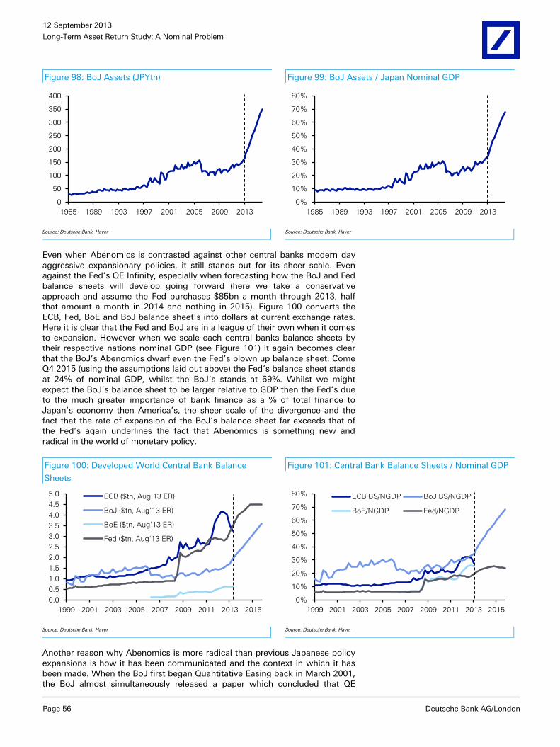
12 September 2013
Long-Term Asset Return Study: A Nominal Problem
Page 56 Deutsche Bank AG/London
Figure 98: BoJ Assets (JPYtn) Figure 99: BoJ Assets / Japan Nominal GDP
0
50
100
150
200
250
300
350
400
1985 1989 1993 1997 2001 2005 2009 2013
0%
10%
20%
30%
40%
50%
60%
70%
80%
1985 1989 1993 1997 2001 2005 2009 2013
Source: Deutsche Bank, Haver
Source: Deutsche Bank, Haver
Even when Abenomics is contrasted against other central banks modern day aggressive expansionary policies, it still stands out for its sheer scale. Even against the Fed’s QE Infinity, especially when forecasting how the BoJ and Fed balance sheets will develop going forward (here we take a conservative approach and assume the Fed purchases $85bn a month through 2013, half that amount a month in 2014 and nothing in 2015). Figure 100 converts the ECB, Fed, BoE and BoJ balance sheet’s into dollars at current exchange rates. Here it is clear that the Fed and BoJ are in a league of their own when it comes to expansion. However when we scale each central banks balance sheets by their respective nations nominal GDP (see Figure 101) it again becomes clear that the BoJ’s Abenomics dwarf even the Fed’s blown up balance sheet. Come Q4 2015 (using the assumptions laid out above) the Fed’s balance sheet stands at 24% of nominal GDP, whilst the BoJ’s stands at 69%. Whilst we might expect the BoJ’s balance sheet to be larger relative to GDP then the Fed’s due to the much greater importance of bank finance as a % of total finance to Japan’s economy then America’s, the sheer scale of the divergence and the fact that the rate of expansion of the BoJ’s balance sheet far exceeds that of the Fed’s again underlines the fact that Abenomics is something new and radical in the world of monetary policy.
Figure 100: Developed World Central Bank Balance
Sheets
Figure 101: Central Bank Balance Sheets / Nominal GDP
0.0
0.5
1.0
1.5
2.0
2.5
3.0
3.5
4.0
4.5
5.0
1999 2001 2003 2005 2007 2009 2011 2013 2015
ECB ($tn, Aug'13 ER)
BoJ ($tn, Aug'13 ER)
BoE ($tn, Aug'13 ER)
Fed ($tn, Aug'13 ER)
0%
10%
20%
30%
40%
50%
60%
70%
80%
1999 2001 2003 2005 2007 2009 2011 2013 2015
ECB BS/NGDP BoJ BS/NGDP
BoE/NGDP Fed/NGDP
Source: Deutsche Bank, Haver
Source: Deutsche Bank, Haver
Another reason why Abenomics is more radical than previous Japanese policy expansions is how it has been communicated and the context in which it has been made. When the BoJ first began Quantitative Easing back in March 2001, the BoJ almost simultaneously released a paper which concluded that QE

12 September 2013
Long-Term Asset Return Study: A Nominal Problem
Deutsche Bank AG/London Page 57
would likely be ineffective. Over the next decade the BoJ persistently sought to exit both from its QE purchases and its ZIRP policy. This desire to end expansionary monetary policy even in the face of a weak economy was exemplified by Governor Hayami who argued that if monetary policy was too loose for too long then a strong economy and higher inflation would allow “zombie” firms to survive longer and so delay structural reform. Therefore all Japanese monetary policy pre-2013 needs to be viewed through this prism of such seemingly half-hearted commitments.
Abenomics on the other hand has been launched by a new Japanese government, under a newly returned Prime Minister Abe and a new BoJ governor Kuroda chosen for his expansionist tendencies. Furthermore the fact that so far Abe and Kuroda have been positive about their policies and haven’t over-stressed the possible inflation risks has created a context within which the new policy can have the greatest potential impact. This communication effect is important. Fiscal expansion is more likely to improve consumption if consumers don’t believe it will be succeeded with higher taxes down the road. Monetary expansion is more likely to improve borrowing, investment and spending if households and businesses believe low rates will be around to stay.
Indeed as we highlighted earlier, it is possible for Abenomics (and other QE programmes in general) to become helicopter money further down the road. As the UK’s Lord Turner pointed out in an important speech and paper last year, the difference between QE and Outright Monetary Financing (i.e. helicopter money), “resides only in the expectations that exist as to future policy.” As can be seen below in Figure 102 and Figure 103 it is inarguable that government deficits and debt creation have gone hand-in-hand with greater BoJ purchases much as a policy of helicopter money would call for. So what is the difference? What Turner means by the above quote is that at present the only thing separating QE from helicopter money is the belief that eventually central banks will dispose of their purchased assets on the market. If central banks decided not to sell those assets and to continue sending interest payments on these assets back to the Treasury (as they already do), or they roll them over into continuous non-interest bearing debt then QE (after the fact) would be helicopter money, a direct monetary financing of governments’ fiscal deficits.
Figure 102: Deficits v BoJ Bond Buying (JPYtn) Figure 103: Total Debt vs. Total Monetary Base (JPYtn)
-120
-100
-80
-60
-40
-20
00
20
40
60
80
100
120
1988 1992 1996 2000 2004 2008 2012
BoJ Assets: Government Securities (LHS)
Gen Gov Budget Deficit (RHS, Inv.)
0
20
40
60
80
100
120
140
0
200
400
600
800
1,000
1,200
1,400
1988 1992 1996 2000 2004 2008 2012
National Government Debt (LHS)
Monetary Base (RHS)
Source: Deutsche Bank, Haver
Source: Deutsche Bank, Haver
Perhaps a reason that QE has arguably not had a big impact on growth to date is that most people believe (and indeed Ben Bernanke keeps telling them) that central banks will eventually reduce and then sell down their government debt purchases. Therefore there is an expectation that at some later date interest rates will rise and government debt will remain at highly elevated levels. If it came to be expected that QE purchases would never be sold down this could

12 September 2013
Long-Term Asset Return Study: A Nominal Problem
Page 58 Deutsche Bank AG/London
(theoretically) increase consumption and investment directly no longer relying for much of its impact as current policy does on higher asset prices working their way through the impaired banking system into lower lending rates and then into growth as highlighted in the earlier helicopter money section.
Monetary policy and growth It is an open question whether pushing monetary policy aggression to a whole new stratosphere can generate sustainable real growth. The evidence from Japanese monetary policy in the 1990s and 2000s and US/UK/EA policy post-2008 certainly points to aggressive monetary policy putting capitalism on hold and embedding deep-set structural problems, and not generating growth. If dropping interest rates to zero was Unorthodox Policy #1 and QE was Unorthodox Policy #2 then it seems very possible Helicopter Money will be Unorthodox Policy #3. Whether this new level of expansionism, with all the hopes and theoretic power it is supposed to hold, can generate growth of the red-hot rather than lukewarm kind remains to be seen.
However in so much as it could potentially raise nominal GDP, it may become an increasingly more attractive policy option around a global economy (especially DM) economy that faces many natural and structural growth concerns in the year ahead. Forcing the nominal economy to grow into the problems of the bubble era could be the most realistic policy choice over the remainder of the decade.
Before we move to looking at historical returns across asset classes and our annual mean reversion exercise, we end the ‘wordy’ part of the report with a short two-page chapter marking the 100th birthday of the Fed that will arrive this December. Given that we think central banks continue to hold the key for economies and asset prices, it is interesting to see the impact that the most powerful central bank in the world has had since its inception.

12 September 2013
Long-Term Asset Return Study: A Nominal Problem
Deutsche Bank AG/London Page 59
100 Years of the Fed
In December of this year the Federal Reserve will be 100 years old after having been created on 23 December 1913. Their creation stemmed from a desire to end a series of damaging bank runs that culminated in the extreme 1907 banking crisis. Although other central banks existed prior to the Fed, the Fed soon became the dominant global central bank given that their emergence coincided with the US becoming the largest and most powerful economy in the world.
As the anniversary approaches we thought it would be interesting to look at what impact their creation had on the economy and on asset prices by looking at the world pre and post the Fed. It also serves as a useful reminder of their ability to impact the financial world which remains especially relevant today.
Nominal growth and inflation higher, real growth lower Figure 104 looks at the 100 years before and after the Fed’s creation in terms of nominal and real GDP and then in Figure 105 we look at the two periods’ average inflation.
Figure 104: Average Annual GDP Figure 105: Average Annual CPI
0%
1%
2%
3%
4%
5%
6%
7%
1814-1913 1914-2013
Nominal Real
0.0%
0.5%
1.0%
1.5%
2.0%
2.5%
3.0%
3.5%
1814-1913 1914-2013
CPI
Source: Deutsche Bank, GFD
Source: Deutsche Bank, GFD
What’s striking is that annual real GDP growth was notably higher pre-Fed but that nominal GDP was a full 2% p.a. lower. The Fed appear to have had a fairly large influence on the price level which is supported by the fact that CPI has been 3% p.a. higher in the Fed era than it was in the 100 years before. The “Fed Era” coincided with the US moving from a rapidly growing economy to one that was both more mature and the largest in the world. This helps explain the lower real growth post the Fed but their influence has been firmly felt in the nominal growth numbers.
The Fed have supported riskier assets more than bonds In terms of asset prices, given what we’ve seen above it’s no surprise to learn that nominal returns have seen a bigger improvement than real returns in the post Fed era. Figure 106-Figure 108 look at the two periods for equities, treasuries and gold in both real and nominal terms.

12 September 2013
Long-Term Asset Return Study: A Nominal Problem
Page 60 Deutsche Bank AG/London
Figure 106: Annualised Equity Total
Return (S&P 500)
Figure 107: Annualised Treasury
Total Return (10yr)
Figure 108: Annualised Gold
Performance
0%
2%
4%
6%
8%
10%
12%
1814-1913 1914-2013
Nominal Real
0%
1%
2%
3%
4%
5%
6%
1814-1913 1914-2013
Nominal Real
-1%
0%
1%
2%
3%
4%
5%
1814-1913 1914-2013
Nominal Real
Source: Deutsche Bank, GFD Source: Deutsche Bank, GFD Source: Deutsche Bank, GFD
Interestingly the real returns on equities have been fairly consistent over the two periods but nominal returns in the modern era have been nearly 3% p.a. higher. In terms of bonds, real returns dropped by more than 2.5% p.a. to under 2% in the post-Fed era.
The returns on gold are interesting as prior to the Fed, the price of gold was largely fixed hence the near zero real and nominal returns. However in the world post-Fed we’ve seen a nominal return of above 4% p.a. and real returns at around 1% p.a.. Virtually all of this growth has occurred in the periods where the dollar has been free floating rather than on some kind of metal-based currency system.
This analysis fits in with what we discussed in an earlier chapter where we argued that without money creation (by central or commercial banks) or a change in money velocity, it is impossible to grow nominal GDP. In an economy with a fixed money supply, all real GDP growth will be deflationary. While there was some money creation in the pre-Fed era we can see evidence that nominal GDP struggled to outpace real GDP. Such an environment may have contributed to the banking crises that the US more frequently experienced as recessions quickly saw negative nominal GDP. Debt and negative nominal GDP growth are a lethal combination, which we’ve had to reacquaint ourselves with over the last 5 years.
So the Fed appears to have made a significant difference to nominal GDP and inflation in their 100 year existence. This has had a positive impact on nominal asset price returns without impacting real returns that significantly. The clear exception is bonds where the Fed’s creation seemingly changed their return outlook.
Looking forward, this section can be used as evidence that while central banks conduct policy in a fiat currency world they have the ability to manipulate the nominal economy and nominal asset prices. Given the current high levels of debt and lacklustre global nominal growth we think they may have more heavy lifting to do. The early years of the Fed’s second century may start more actively than the market currently expects with its eye fixed on tapering and the ending of QE.

12 September 2013
Long-Term Asset Return Study: A Nominal Problem
Deutsche Bank AG/London Page 61
Mean Reversion
Assessing the mean reversion model through time
We now move to the part of the report that looks at historic asset prices across the globe and how current valuations compare to long-term trends. One of the original motivations for first compiling this report back in 2005 was the belief that traditional developed world asset classes exhibited a rhythm of returns through time that were subject to clear mean reversion tendencies. In every edition of this report we’ve updated what we consider to be the potential future returns of various asset classes based on them mean reverting over different time horizons.
In this year’s study we again update our analysis but enhance it by looking back through history to assess what our mean reversion models would have suggested for future returns at different points in history. Clearly the analysis is purely hypothetical, with the major weakness being that we use assumptions for modelling past returns based on what we know now. So our 1900 forecasts are based on what we now think to be the long-run factors that we need to mean revert. Nevertheless it does show where valuations are today relative to where they’ve been in the past.
In Figure 109 we show the results of this through time for the S&P 500 and US Treasuries (10yr). We also show what 10 year returns are likely to be from this starting point based on our mean reversion methodology (**).
Figure 109: Mean Reversion Expected 10 Year Annualised Returns vs. Actual for the S&P 500 (left, based on 1958
method) and 10yr Treasuries (right)
-5%
0%
5%
10%
15%
20%
25%
30%
1871 1886 1901 1916 1931 1946 1961 1976 1991 2006
Mean Reversion Actual
0%
2%
4%
6%
8%
10%
12%
14%
16%
18%
1871 1886 1901 1916 1931 1946 1961 1976 1991 2006
Mean Reversion Actual
Source: Deutsche Bank, GFD
For the S&P 500 the mean reversion model has been a good predictor of annualized returns over the next 10 years. Interestingly the only year where future decade returns were expected to be negative was 1999, just before the equity collapse of 2000. After the Lehman collapse in 2008, the predicted returns increased to just under 7% p.a. which was the highest since the late 1990s but actually still below the long-term average. The current prediction is back down to an annualized return of 3.24% over the next 10 years. The predicted 10 year annualized return was only once below 5% in any year between 1871 and 1996. So this shows that we still live in a world of elevated equity valuations relative to history. It doesn’t mean that positive returns won’t be seen but it perhaps shows the impact of central bank liquidity in bringing future returns forward.

12 September 2013
Long-Term Asset Return Study: A Nominal Problem
Page 62 Deutsche Bank AG/London
In terms of bonds, future 10 year annualized returns seem a bit more mechanical and track the starting yield much more closely than equities where valuations can swing more violently. As such actual returns track the mean reversion model quite closely. At the moment, expected nominal returns are 2.06% annualized over the next 10 years. In 2011 and 2012, this number dipped below 2% for the first time since the early-mid 1950s. The still low prediction indicates the obvious limitation of returns in the asset class going forward.
In Figure 110 we combine the two charts and show the annualized 10 year mean reversion returns of a portfolio weighted 60/40 equity/bonds.
Figure 110: Mean Reversion Expected 10 Year Annualised Returns vs. Actual
for a 60/40 US Equity/Bond Portfolio
0%
2%
4%
6%
8%
10%
12%
14%
16%
18%
20%
1871 1886 1901 1916 1931 1946 1961 1976 1991 2006
Mean Reversion Actual
Source: Deutsche Bank, GFD
This chart again highlights what a low return world we’re potentially in. Before 1997 the model never dipped below a 4% p.a. annualized return. Since 1997 the only years the model went slightly back above it were in 2002 and 2008-2009. The actual annualised 10 years returns of this portfolio since the late 1990s has generally been as low as the model suggested it would be. The current prediction of 2.77% p.a. return is the 4th lowest in the 143 years since 1871. The only years with a lower 10 year prediction were in 1998, 1999 and in 2000.
So the model suggests it’s going to be very difficult to generate real returns from this starting point. The long-run average inflation rate of the US since 1900 is 3.2% which if repeated would imply a negative real return from this starting point for a US based 60/40 equity/bond portfolio.
Such an exercise is not easy to repeat across the globe as the US is one of the few countries that has long histories of growth, inflation, earnings, PE ratios, and bond yields without going through huge permanent structural change (politics, war etc).
We can repeat the exercise for the UK, using full data back around 80-90 years. Figure 111 and Figure 112 show the results.

12 September 2013
Long-Term Asset Return Study: A Nominal Problem
Deutsche Bank AG/London Page 63
Figure 111: Mean Reversion Expected 10 Year Annualised Returns vs. Actual for the FTSE All Share (left) and 10yr Gilts
(right)
-5%
0%
5%
10%
15%
20%
25%
30%
35%
40%
1927 1942 1957 1972 1987 2002
Mean Reversion Actual
0%
2%
4%
6%
8%
10%
12%
14%
16%
18%
1958 1973 1988 2003
Mean Reversion Actual
Source: Deutsche Bank, GFD
The results are fairly similar in the UK market to that seen for the US. The projected returns are perhaps slightly higher, largely reflecting lower current valuations in the UK equity market and also a higher historic rate of inflation that the UK mean reversion model uses and assumes to be the future trend.
Figure 112: Mean Reversion Expected 10 Year Annualised Returns vs. Actual
for a 60/40 UK Equity/Bond Portfolio
0%
5%
10%
15%
20%
25%
30%
1958 1963 1968 1973 1978 1983 1988 1993 1998 2003 2008 2013
Mean Reversion Actual
Source: Deutsche Bank
As already mentioned doing the same analysis for equities in Euroland countries is more difficult owing to a lack of historic earnings data. However we can look at the bond data. Owing to the fact that core European bond yields are also very low in an historical context it’s no surprise to see that mean reversion expected returns going forward are likely to be some of the weakest through time. In Figure 113 we start with German and French government bonds. For Germany we track the data back to the end of WWII and we can see that returns going forward are expected to be lower than anything we’ve seen since 1946 and are actually very unlikely to be much above 0.5% p.a. over the next 10 years. Looking now at France where we can extend the data back further (here we look at the data since 1900), we can see that expected returns are just below 1.7%, which is a slight improvement from what mean reversion would have suggested at the end of 2012. Additionally with the exception of the 10 year periods starting in 1941 and 1942 as well as the early years of the 20th century this would be the lowest 10 year annualised returns we would have ever seen. So certainly the picture for core European bonds is not too different from what we have shown for the US and UK.

12 September 2013
Long-Term Asset Return Study: A Nominal Problem
Page 64 Deutsche Bank AG/London
Figure 113: Mean Reversion Expected 10 Year Annualised Returns vs. Actual for 10yr German (left) and French (right)
Government Bonds
-2%
0%
2%
4%
6%
8%
10%
12%
1946 1956 1966 1976 1986 1996 2006
Mean Reversion Actual
-5%
0%
5%
10%
15%
20%
1900 1920 1940 1960 1980 2000
Mean Reversion Actual
Source: Deutsche Bank, GFD
Focusing now of the periphery, in Figure 114 we provide the same analysis for Italy and Spain. However the conclusion is clearly going to be slightly different. Although the mean reversion expected returns for the next 10 years are not likely to be particularly high by historical standards they are broadly in line with what we have seen over the last 10 years. Obviously the current yield starting point for peripheral government bonds (above 4%) is notably higher than current 10 year Bund yields (hovering around 2%).
Figure 114: Mean Reversion Expected 10 Year Annualised Returns vs. Actual for 10yr Italian (left) and Spanish (right)
Government Bonds
0%
5%
10%
15%
20%
25%
1900 1920 1940 1960 1980 2000
Mean Reversion Actual
0%
2%
4%
6%
8%
10%
12%
14%
16%
18%
20%
1946 1956 1966 1976 1986 1996 2006
Mean Reversion Actual
Source: Deutsche Bank, GFD
Despite the potentially better returns expected for peripherals the general conclusion for mean reversion expected Eurozone bond returns is that they are likely to be low by historical standards, similar to what we have already shown for 10 year Treasuries and Gilts.
European equities appear cheaper than US but earnings will be important To get an assessment of potential value in Euroland equities we can’t use the same mean reversion exercise as we have a lack of historic European earnings data. However we can update our analysis from last year’s study (“A Journey into the unknown”, 03 Sep 2012) where we looked at current PE’s and ERP’s for the various country’s equity markets and examined where they stood relative to history. In Figure 115 we aggregate all the results with each country’s data starting from the first available point (which we detail in the table). We show the current PE, the average, median, low and high. We then

12 September 2013
Long-Term Asset Return Study: A Nominal Problem
Deutsche Bank AG/London Page 65
repeat this for the rolling 5yr and 10yr ‘Shiller’ PE ratio which looks at average earnings over these periods rather than spot. We do the same calculations for the ERP and then rank the current points for each indicator relative to each country’s own history. A reading closer to 0% indicates that a market is cheap relative to its own history and a reading closer to 100% shows that it’s expensive. To make the table easier to read we’ve added a colour coded heat map. For those observations in the top 10% of ‘cheapness’ we’ve shaded them darker blue and for those between 10-25% we’ve used a slightly lighter blue. At the other end of the scale those shaded darker grey are in the bottom 10% on a valuation basis and those in the bottom 25% are shaded a slightly lighter grey. Please see last year’s study for further details on the methodology.
Figure 115: Current PE Ratios and ERP Relative to Average, Median, High and Low
France France (EUR Yield)
Germany Germany (EUR Yield)
Italy Italy (EUR Yield)
Spain Spain (EUR Yield)
UK US
Spot PE Current 17.51 13.10 19.25 15.80 15.66 17.62
Current Rank 85.2% 34.0% 75.8% 63.0% 78.6% 70.6%
Average 13.31 15.12 17.36 14.49 12.14 16.01
Median 12.75 14.33 16.40 13.39 11.81 14.96
Low 5.79 8.43 5.79 6.94 3.96 5.21
High 28.20 26.82 43.95 25.34 28.64 122.41
Start Date Jan 73 Jan 73 Jan 86 Mar 87 Mar 27 Mar 1871
Shiller PE (5yr) Current 14.72 15.21 10.73 9.07 13.77 24.87
Current Rank 61.8% 45.6% 25.0% 13.2% 66.2% 91.6%
Average 14.71 16.89 17.55 16.44 12.43 15.96
Median 13.09 15.91 16.28 14.61 11.58 15.74
Low 5.48 8.10 6.54 5.62 4.33 4.26
High 34.34 34.51 41.43 33.16 26.56 37.04
Start Date Jan 78 Jan 78 Jan 91 Mar 92 Mar 32 Mar 1876
Shiller PE (10yr) Current 13.24 14.20 8.94 9.68 13.81 22.93
Current Rank 25.8% 20.4% 12.3% 8.6% 63.0% 87.0%
Average 17.12 19.38 19.57 19.54 12.64 16.62
Median 16.32 18.59 19.20 19.99 11.75 16.29
Low 6.76 9.09 6.72 6.90 4.38 4.69
High 37.64 40.98 44.12 32.53 28.63 45.52
Start Date Jan 83 Jan 83 Jan 96 Mar 97 Mar 37 Mar 1881
ERP (Spot PE) Current 4.43 4.06 7.73 5.99 1.98 3.55 3.67 4.68 6.25 4.95
Current Rank 47.3% 52.4% 8.1% 24.5% 48.7% 37.2% 51.8% 31.6% 47.4% 41.1%
Average 5.20 5.23 3.55 3.60 2.16 2.30 4.02 3.86 7.87 5.28
Median 4.27 4.25 3.56 3.60 1.79 1.76 3.83 3.41 6.05 4.15
Low -0.34 -0.34 -2.01 -2.01 -4.18 -4.18 -3.18 -3.18 -1.80 -16.52
High 15.38 15.38 11.41 10.18 14.09 14.57 11.98 12.21 31.41 33.44
Start Date Jan 73 Jan 73 Jan 73 Jan 73 Jan 86 Jan 86 Mar 87 Mar 87 Mar 27 Mar 1871
ERP (Shiller PE (5yr)) Current 5.51 5.15 6.67 4.93 6.10 7.67 8.37 9.37 7.12 3.29
Current Rank 36.6% 39.4% 16.7% 36.3% 23.3% 20.0% 9.4% 9.8% 46.1% 54.9%
Average 4.31 4.35 3.10 3.15 3.32 3.49 4.47 4.27 7.97 5.35
Median 3.56 3.58 3.22 3.39 2.22 2.24 4.52 3.81 6.66 3.92
Low -2.21 -2.21 -3.37 -3.37 -3.08 -3.08 -0.69 -0.69 -1.92 -6.96
High 14.56 14.56 9.99 9.67 12.77 14.35 13.13 16.86 30.29 41.28
Start Date Jan 78 Jan 78 Jan 78 Jan 78 Jan 91 Jan 91 Mar 92 Mar 92 Mar 32 Mar 1876
ERP (Shiller PE (10yr)) Current 6.27 5.91 7.14 5.39 7.96 9.53 7.67 8.68 7.10 3.63
Current Rank 15.3% 18.3% 6.6% 14.8% 15.7% 11.9% 8.2% 11.7% 48.1% 50.3%
Average 2.69 2.73 2.11 2.18 3.79 4.00 3.92 3.67 7.82 5.32
Median 1.97 2.09 1.69 1.85 2.96 2.91 4.21 3.28 6.82 3.69
Low -1.97 -1.97 -3.24 -3.24 -1.17 -1.48 -0.30 -0.65 -1.81 -7.02
High 9.78 9.40 9.63 8.41 12.34 13.92 9.82 13.54 30.58 38.50
Start Date Jan 83 Jan 83 Jan 83 Jan 83 Jan 96 Jan 96 Mar 97 Mar 97 Mar 37 Mar 1881
Note: Data to .... Blue shading indicates current point amongst 25% of cheapest valuations with darker blue shading indicating amongst 10% cheapest valuations. Grey shading indicates current point amongst 25% of richest valuations with darker grey shading indicating amongst 10% richest valuations. Source: Deutsche Bank, Bloomberg Finance LP, Datastream, GFD

12 September 2013
Long-Term Asset Return Study: A Nominal Problem
Page 66 Deutsche Bank AG/London
As already highlighted from our mean reversion exercise US and UK are not cheap from this starting point, and there’s certainly nothing in this analysis that completely contradicts that view. While UK equities may sit within the central 50 percentile across all the various measures (except spot PE), US equities look rich based on the Shiller PE valuations and with the exception of the Spot PE, ERP valuations are above the 50th percentile.
Moving to Europe and the picture is arguably more attractive for equities. With the exception of French and to a lesser extent Italian and Spanish equities on a spot PE basis, current valuations are generally on the cheap side of median with many reading below the 25th percentile. Across the board European equities look notably cheaper than US and UK equities relative to their domestic bond markets. They also look cheaper when earnings are adjusted over the cycle.
That said there are probably a couple of points that are worth considering. First of all they certainly don’t appear to be quite as cheap as when we did this analysis a year ago. Secondly, we are still hugely dependent on future earnings growth. Despite the recent improvement in European macro economic data there has been little evidence of this pushing through to earnings. It’s possible that earnings struggle to mean revert back to their pre-crisis trend in some growth impaired European countries. However if you believe in mean reversion the trade is definitely to be short US equities against being long Europe.
Mean reversion across asset classes
Having highlighted how potentially important mean reversion has been as a tool for assessing longer-term return potential (with a certain amount of hindsight) we now provide our usual analysis across the various different assets.
In Figure 116 we show what nominal and real returns could be over the next decade if assets revert back to their long-term average valuations. A brief appendix is posted at the end of this section that takes us through our methodology for the mean reversion exercise. It basically assumes that earnings, PE valuations, inflation, real yields and economic growth return to their long-run averages/trend. As well as US based assets we have also looked at European credit markets in this exercise.
The results are only meant to be a relative value guide and work best on a relative basis across asset classes and the longer the time horizon you view them over. As discussed earlier, we have mainly concentrated on USD assets in this section. This enables us to delve deeper into history to analyse the long-term rhythm of returns. In reading the results, hopefully one will be able to understand the type of returns that a sophisticated Developed Market sees through time.

12 September 2013
Long-Term Asset Return Study: A Nominal Problem
Deutsche Bank AG/London Page 67
Figure 116: Potential Annualised Returns Based on Full Mean Reversion over Different Time Horizons
Actual LT Annualised Return* Mean Reversion Expected Nominal Returns
Mean Reversion Expected Real Returns
Nominal Real 3yr 5yr 10yr 3yr 5yr 10yr
US Assets Equity (Trend Earnings/Average PE) 8.5% 6.7% -11.4% -4.6% 0.8% -13.8% -7.1% -1.8%
Equity (Trend Earnings/Average PE since 1958) 8.5% 6.7% -3.7% 0.2% 3.2% -6.3% -2.4% 0.6%
Treasury (10yr) 5.1% 3.3% -2.3% 0.2% 2.1% -5.0% -2.5% -0.6%
Treasury (30yr) 4.6% 1.5% -2.1% 0.4% 2.3% -4.7% -2.2% -0.3%
IG Corporate Bond 5.7% 2.5% -0.8% 1.5% 3.3% -3.5% -1.1% 0.7%
BBB Bond 6.6% 3.8% -0.6% 1.8% 3.7% -3.3% -0.9% 1.0%
Property 3.4% 0.3% -5.7% -2.5% 0.0% -8.3% -5.0% -2.6%
Gold 2.0% 0.3% -23.7% -14.1% -6.1% -25.7% -16.3% -8.5%
Oil 2.2% -0.1% -24.9% -15.0% -6.6% -27.0% -17.2% -9.0%
All Commodities (1919 Reversion) 1.5% -0.9% 3.7% 3.3% 2.9% 0.9% 0.5% 0.3%
High Yield USD High Yield 8.5% 5.6% -0.1% 2.3% 4.2% -2.8% -0.4% 1.5%
Treasury (Duration Matched) 6.4% 3.6% -1.9% 0.4% 2.1% -4.6% -2.3% -0.5%
EUR High Yield -0.7% 1.9% 3.8% -3.2% -0.7% 1.3%
Treasury (Duration Matched) -2.5% -0.3% 1.4% -5.1% -2.9% -1.2%
iBoxx EUR Corporate Bond -1.4% 0.8% 2.4% -3.9% -1.7% 0.0%
BBB Bond -0.2% 1.6% 2.9% -2.8% -0.9% 0.4%
Non-Financial Bond -1.9% 0.4% 2.2% -4.4% -2.0% -0.2%
Non-Financial BBB Bond -0.9% 1.1% 2.5% -3.4% -1.4% 0.1%
Bund (Duration Matched) -3.2% -0.7% 1.2% -5.7% -3.2% -1.2%
iBoxx GBP Corporate Bond -1.5% 1.3% 3.4% -4.4% -1.7% 0.4%
BBB Bond 1.8% 3.4% 4.5% -1.2% 0.3% 1.5%
Non-Financial Bond -3.0% 0.2% 2.7% -5.9% -2.7% -0.3%
Non-Financial BBB Bond -0.3% 1.9% 3.6% -3.2% -1.1% 0.6%
Gilt (Duration Matched) -3.3% -0.3% 1.9% -6.1% -3.2% -1.0%
iBoxx USD Corporate Bond -0.2% 1.9% 3.5% -2.9% -0.8% 0.8%
BBB Bond 1.6% 3.0% 4.0% -1.2% 0.3% 1.4%
Non-Financial Bond -1.1% 1.3% 3.2% -3.8% -1.4% 0.5%
Non-Financial BBB Bond 0.7% 2.4% 3.7% -2.0% -0.3% 1.1%
Treasury (Duration Matched) -2.3% 0.2% 2.1% -5.0% -2.5% -0.6%
Note: * - Based on longest available series in our historical returns analysis. Source: Deutsche Bank, GFD
For equities we use two slightly different methods. Method 1 simply looks at mean reverting earnings back to their long-term trend and PE ratios back to their long-term average. Method 2 recognises that earnings growth may have increased (albeit slightly) post 1958 and uses the trend line of earnings seen since then and the (again slightly higher) average PE ratio seen since. We have noted in previous studies, including the 2011 version, that up until 1958, dividend yields were always above bond yields. This situation reversed for the next 50 years when in November 2008 S&P 500 dividends briefly crossed above bond yields again. Since this point the two have crossed a few times. The recent move higher in 10 year Treasury yields following heightened expectations of Tapering has seen them briefly trade above 3%, which is once again higher than the c.2.0% dividend yield currently offered by the S&P 500.
The jury is still out however as to whether the post 1958 move to lower dividends and perhaps higher earnings growth has actually been positive or negative for equity returns. We think it’s actually been negative as there is no conclusive evidence that earnings have broken permanently higher (and not just cyclically) from their long-term trend post-1958. Basically returns seem to be higher when investors receive dividends rather than when companies retain

12 September 2013
Long-Term Asset Return Study: A Nominal Problem
Page 68 Deutsche Bank AG/London
dividends and attempt to expand their businesses. We’ve written about this in length in previous studies for those that want to explore the arguments further.
Overall this leaves us preferring method 1 but we’ve included both results in the exercise for those that think it’s a slightly different market now to that seen prior to 1958 and the great dividend crossover.
If we use method 1, annualised real returns on this method show a negative trend over the next decade. The returns are slightly better if you use method 2 as we reach positive territory 10 years out but they are still sub-standard relative to long-term history. Furthermore unlike last year when yields were close to their all-time lows Treasuries, potentially offer slightly more attractive mean reversion returns than equities depending which equity mean reversion method is preferred.
Before we move on from equities we should stress that the biggest problem with valuations today is that earnings/profits are at a very high share of GDP relative to history. If this does eventually mean revert, our low future return numbers are absolutely justifiable. If however we’ve moved to a permanent new plateau of higher earnings relative to the size of the economy then our numbers are too low. Again there is an argument that higher nominal GDP is needed for equities to ‘grow-in’ to their current valuations.
Despite the fact the potential Treasury returns look more attractive than they did in last year’s report, helped in no small part by the more than 100bps rise in yields we’ve seen since early May, the mean reversion results suggest that real returns are still likely to be negative. This exercise suggests that in nominal terms returns could be in the 2% p.a. region if we mean revert over the next decade.
Credit still arguably provides some protection from future mean reversion in government yields. However expected returns are well below the long-term average levels. In terms of total returns the LT IG corporate and BBB indices provide a nominal 3.31% and 3.7% annual return respectively on a mean reversion basis over 10 years (LT average around 6%p.a.), with returns also positive in real terms (+0.7% and +1.0% respectively p.a.). Expanding this out to the iBoxx indices (with shorter durations) we see a broadly similar outcome for the USD market but a somewhat less impressive result for EUR and GBP credit where real total returns are generally negative, particularly with mean reversion over shorter horizons. That said EUR and GBP would still be expected to outperform appropriate government bonds.
Like IG, the extra yield in HY also more than offsets any likely future rises in government bond yields. However, as we also saw with IG, the very low underlying yield environment suggests that mean reversion produces future HY total returns some way below their long-term averages. Interestingly with spreads now actually tighter than their long-term averages mean reversion excess returns do not look that much more attractive than the levels we have shown for IG credit. Given that expected excess returns are less generous than they were when we conducted this exercise a year ago we also have to be mindful of default expectations, which tend to have more of a direct impact on HY than IG.
For property, using Robert Shiller’s long-term data back to 1900, the asset class still appears slightly expensive on a mean reversion basis. In nominal terms our mean reversion suggests house prices could be flat over the next decade. However this means that in real terms our analysis is still suggesting negative returns. What’s interesting is that this is the first year since 2005 where valuations on this basis actually look worse than they did a year ago. Clearly affected by what has been a general improvement in US real estate over the past year, with most key indicators showing a strong pick-up from where they were 12 months ago.

12 September 2013
Long-Term Asset Return Study: A Nominal Problem
Deutsche Bank AG/London Page 69
Overall, the asset class that continues to stand out in this exercise is Commodities. If mean reversion of long-term data back over the last century was your only guide then Oil and Gold are likely to have poor decades in nominal (-6.6% to -6.1% p.a.) and real (-9.0% to -8.5% p.a.) terms. The negative expectations for gold exist despite that fact we’ve seen a notable decline over the past 12 months as talk has moved from further money printing to potential QE tapering and ultimately monetary tightening at some point. This time last year gold was close to $1,800 whilst today we are around the $1,300 level having fallen to as low as $1,200 as recently as late June.
It’s worth noting however that whilst oil and gold are likely to have poor decades if mean reversion is our only guide, the overall commodity index is showing positive returns on both a nominal and real basis and irrespective of the mean reversion horizon. Figure 118-Figure 120 show the reasons for these discrepancies within commodities. Gold and oil are still at the upper end of their historic long-term range in real terms whereas the overall index and copper are not as excessively rich relative to history. Clearly this observation ignores any structural changes that may have occurred.
Figure 117: All Commodities Real Adjusted Figure 118: Gold Real Adjusted
0
50
100
150
200
250
300
350
400
1871 1886 1901 1916 1931 1946 1961 1976 1991 2006
All Commodities
0
200
400
600
800
1,000
1,200
1,400
1,600
1,800
1871 1886 1901 1916 1931 1946 1961 1976 1991 2006
Gold
Source: Deutsche Bank, GFD
Source: Deutsche Bank, GFD
Figure 119: Oil Real Adjusted Figure 120: Copper Real Adjusted
0
20
40
60
80
100
120
140
1871 1886 1901 1916 1931 1946 1961 1976 1991 2006
Oil
0
200
400
600
800
1,000
1,200
1,400
1871 1886 1901 1916 1931 1946 1961 1976 1991 2006
Copper
Source: Deutsche Bank, GFD
Source: Deutsche Bank, GFD
Mean reversion conclusion

12 September 2013
Long-Term Asset Return Study: A Nominal Problem
Page 70 Deutsche Bank AG/London
As ever, the results from this section should be used as a valuation tool and not a forecast. That being said mean reversion is one of the most useful investment tools for long-term investors. The caveat would be that this cycle continues to be unique relative to history and there are risks that some countries/assets could permanent move away from their long-term trend path. So some caution is required in what is nevertheless a technique that is a key influence when we consider future asset price performance.
Mean Reversion Assumptions
As an appendix to this section we outline the methodology and the variables that we have mean reverted in order to calculate potential returns for the various asset classes discussed in this study.
Inflation The starting point, which is essential for calculating possible future returns across all asset classes (including equities), is to get a future CPI time series. For this we have just reverted the YoY growth in CPI to its long-term average (around 3.2%).
Equities For equities although we have used slightly different methodologies the broad principles were the same. Essentially we first calculate a mean reverted price series. We do this by first reverting real earnings back to their long-term trend line. We mean revert the current PE ratio back to its long-term average. Combining the reverted earnings and PE ratios we then calculate a price. In order to calculate total returns we have assumed real dividends revert back to their long-term trend line. By combining the prices and the dividends we calculate total returns. As already mentioned we used two slightly different methodologies the specific of which are outlined in the bullets below.
Method 1: We revert earnings, PE ratios and dividends back to their long-term trend/averages using all available data back to 1871.
Method 2: We revert earnings, PE ratios and dividends back to their long-term trend/averages based on data since 1958. As already mentioned this recognises that earnings growth may have increased (albeit slightly) post 1958 and the previously discussed dividend crossover.
Treasury/Government bond mean reversion For Treasuries and other Government bond series we have reverted to the long-term average real yield which has been calculated by subtracting YoY CPI from the nominal bond yield. We can then use these yields to calculate prospective returns.
Corporate bond mean reversion (IG and HY) For corporate bonds we mean revert credit spreads to their long-term average level. These spreads coupled with the already calculated Treasury/Government bond yields give us an overall corporate bond yield that can be used to calculate possible future returns. We have used appropriate duration matched Treasury/Government yields for the various different corporate bond series.
For the iBoxx indices, which only have data back to 1999, we have created a longer-term spread series by regressing the iBoxx spread data against the Moody’s long-term spread series. The results of the regression can be used to calculate a longer-term spread series, which can be used to calculate the long-term average level that is then used for mean reversion purposes.

12 September 2013
Long-Term Asset Return Study: A Nominal Problem
Deutsche Bank AG/London Page 71
For further details on how we have calculated bond returns (both Government and corporate) please refer to a previous version of this report (‘100 Years of Corporate Bond Returns Revisited’, 5 November 2008).
US property and commodity mean reversion For both US property and the various commodity series we have calculated a real adjusted price series and simply mean reverted to the long-term average level of this series.

12 September 2013
Long-Term Asset Return Study: A Nominal Problem
Page 72 Deutsche Bank AG/London
Historical US Asset Returns
We now look at long-term US returns going back to the start of the 19th century (where possible). Figure 121 and Figure 122 show why we invest in assets over the medium to long term. Using data going back over 200 years, it is quite clear that history tells us that holding cash on deposit has been a recipe for wealth erosion. We split the data up by nominal and real returns through different time periods. We also show returns annualised within each decade and also by 50 year buckets. This hopefully helps us see both cyclical and secular trends.
Over the entire sample period, Equities outperform Corporate Bonds, which outperform Government Bonds, which outperform Cash, which interestingly has outperformed Commodities. Since 1900, where we have data for the widest selection of assets, Equities outperform 30yr Governments by 4.83% p.a., Corporates by 3.78% p.a., Cash by 5.90% p.a., and Commodities by 6.69% p.a. (on a nominal basis).
In this year’s study there seem to be more assets that have seen their recent performance (particularly the last 5 years) diverge from the longer-term trend. Commodities probably continue to exhibit the greatest divergence between recent and long-term performance. Over the last 5 and 10 year periods Copper and Oil have actually provided the largest returns across the assets analysed in this study, more than 15% p.a. for both assets over the last 5 years (real adjusted). However their long-term performance has actually struggled to exceed inflation as can be seen in Figure 121 and Figure 122 later in this section.
The last 5 years for equities have shown a huge swing from where we were last year, owing to the fact that this period now starts at the beginning of 2009 (close to the trough for equities). Therefore the 12.5% p.a. return for the last 5 years is comfortably higher than the c.6.7% p.a. long-term average. We’ve seen the opposite move for Treasuries. The back-up in yield during Q2 this year has seen both 10yr and 30yr yields rise above where they were at the beginning of 2009 and have ultimately seen real returns move into negative territory for the past 5 years. The longer-term average sits in the 3-3.5% p.a. range (real adjusted) for 10yr Treasuries.
Property (US) is an asset class that has only just outpaced inflation (0.29% p.a. real) over the long term. We would stress that this is a price-only series and doesn’t include potential rental yields but it’s a reminder that real adjusted capital returns in the asset class can be minimal over longer time periods, especially in markets like the US where overall ample space and a lack of restrictive planning prevents their being a national supply shortage relative to demand.
Non-financial IG Corporate Bonds have steadily out-performed Government Bonds over all medium-term time periods. The levels of defaults historically seen in IG very rarely erode the additional spread the asset class provides. Periods of under-performance are much more likely to be driven by temporary spread widening. These spread changes tend to be highly cyclical whereas equity and Treasury valuations tend to exhibit a more secular pattern.
HY is still a fairly new market in the context of this study, with new issuance (rather than simply fallen angels) only existing from the mid 1980s. In this time, we’ve been through longer and less frequent business cycles than long-term history, but also through two deep default cycles (2000-2003 and 2007-2009), with the former far worse for HY (especially in Europe) than it was for the overall economy. So we would argue that we don’t have enough data yet to assess what a likely long-term return number for HY should be. However the

12 September 2013
Long-Term Asset Return Study: A Nominal Problem
Deutsche Bank AG/London Page 73
excess return of 2.12% p.a. over Government Bonds since 1989 (2.32% p.a. since 1986) might be argued to be disappointing relative to the lower risk returns seen in IG credit. Much of this ‘disappointment’ has been obscured by the high total returns in fixed income which has given the asset class a healthy 8.48% p.a. nominal return over the last 25 years (since 1989) and 8.79% p.a. since 1986. This is relevant as HY investors are more total return biased than the more excess return biased IG investors.
In the following section (starting on page 76) we extend the analysis of historical asset returns to equity and bond markets around the world.

Lo
ng
-Term
Asse
t Retu
rn S
tud
y: A
No
min
al P
rob
lem
12
Sep
tem
ber 2
01
3
Pag
e 7
4
Deu
tsch
e B
an
k A
G/L
on
do
n
Figure 121: Nominal Returns for US Assets over Different Time Horizons
Equity Corp Bond AAA Bond BBB Bond
Treasury (10yr)
Treasury (30yr) HY Bond
Treasury (HY Matched) Treasury Bill
House Prices (Price Only) Gold Copper Oil Wheat
Commodities (Economist)
last 5yrs (2009-2013) 14.89% 9.06% 4.63% 12.28% 1.58% -1.25% 15.97% 1.32% 0.09% 0.97% 9.71% 19.38% 22.43% 5.46% 7.73%
last 10yrs (2004-2013) 6.01% 7.12% 6.40% 7.36% 4.71% 5.68% 7.86% 3.76% 1.58% 0.28% 12.90% 11.84% 12.75% 5.37% 6.22%
last 15yrs (1999-2013) 3.77% 7.53% 7.04% 7.79% 5.07% 5.57% 6.91% 4.44% 2.16% 3.23% 11.09% 10.62% 15.68% 6.42% 5.51%
last 25yrs (1989-2013) 9.69% 9.22% 8.89% 9.52% 7.26% 8.12% 8.48% 6.36% 3.41% 2.92% 4.72% 3.03% 7.61% 1.48% 1.67%
last 50yrs (1964-2013) 9.64% 7.73% 7.37% 8.12% 7.14% 6.65% 5.22% 4.58% 7.63% 4.85% 7.45% 2.13% 4.26%
last 75yrs (1939-2013) 10.62% 6.03% 5.57% 6.62% 5.48% 4.94% 3.95% 4.54% 5.04% 4.61% 5.71% 2.99% 3.83%
last 100yrs (1914-2013) 9.84% 5.88% 5.15% 5.00% 3.61% 3.57% 4.30% 3.12% 3.84% 1.90% 2.89%
last 125yrs (1889-2013) 9.09% 4.66% 3.44% 3.43% 2.04% 3.93% 1.48% 2.47%
last 150yrs (1864-2013) 8.78% 4.74% 3.53% 2.56% 1.38% 2.23% 1.18% 1.45%
last 175yrs (1839-2013) 8.72% 4.78% 3.74% 2.43% 1.48%
last 200yrs (1814-2013) 8.41% 4.92% 2.16% 0.82%
since 1800 8.48% 5.07% 2.02% 0.86%
since 1900 9.44% 5.65% 4.75% 4.61% 3.54% 3.38% 3.76% 2.52% 3.74% 1.98% 2.75%
since 1920 9.94% 6.12% 5.87% 6.60% 5.33% 5.10% 3.62% 3.56% 4.58% 3.10% 3.32% 1.01% 2.22%
since 1930 9.38% 6.05% 5.79% 6.52% 5.31% 4.98% 3.59% 3.91% 5.14% 3.54% 4.36% 1.91% 3.12%
since 1971 10.18% 9.25% 8.75% 9.74% 7.75% 7.68% 5.24% 4.79% 8.77% 4.35% 8.37% 3.06% 5.05%
RETURNS BY DECADE
1800-1809 11.09% 9.12% 0.00% -1.62%
1810-1819 4.91% 6.23% 0.00% -4.63%
1820-1829 6.94% 5.53% 0.00% -1.63%
1830-1839 5.34% 2.75% 0.67% 1.38%
1840-1849 7.83% 7.47% 5.02% -0.03% -2.57%
1850-1859 1.62% 3.98% 5.08% 0.00% 2.35% 5.70%
1860-1869 18.34% 6.30% 5.04% 1.81% 1.90% -12.73% -1.80% 2.91%
1870-1879 7.73% 3.67% 4.11% -1.78% -2.05% -14.26% 5.23% -3.89%
1880-1889 5.68% 5.48% 3.04% 0.00% -1.66% -0.70% -5.09% -0.63%
1890-1899 5.37% 3.93% 2.33% 0.00% -1.26% 4.88% -1.21% -0.54%
1900-1909 9.92% 4.37% 1.63% 2.17% 3.04% 1.97% 0.00% -3.55% -1.43% 6.06% 1.56%
1910-1919 4.35% 2.60% 2.52% 2.52% 3.28% 3.15% 0.00% 3.34% 13.33% 7.19% 9.09%
1920-1929 14.78% 6.71% 6.52% 7.25% 5.48% 6.05% 3.88% 0.65% 0.00% -0.48% -4.98% -6.18% -4.99%
1930-1939 -0.47% 6.41% 7.48% 6.27% 3.95% 5.49% 0.58% -1.21% 5.41% -3.51% -1.81% -2.22% -1.25%
1940-1949 8.99% 3.92% 2.92% 5.42% 2.70% 2.42% 0.48% 8.12% 1.47% 4.00% 0.28% 7.64% 5.17%
1950-1959 19.26% 0.16% -0.08% 0.59% 0.39% -0.50% 2.02% 2.97% -1.38% 5.96% 1.46% -0.69% -0.02%
1960-1969 7.76% 0.57% 0.42% 0.89% 2.76% 0.51% 4.06% 1.85% 0.04% 5.43% 0.78% -2.96% 1.09%
1970-1979 5.77% 5.34% 5.02% 5.83% 6.08% 3.71% 6.48% 7.99% 32.23% 6.28% 28.04% 11.43% 15.61%
1980-1989 17.47% 13.72% 13.03% 14.42% 12.78% 12.64% 9.13% 6.78% -2.85% 0.57% -5.40% -0.74% -0.28%
1990-1999 18.21% 9.31% 8.84% 9.99% 7.98% 8.40% 10.59% 7.27% 4.95% 2.69% -4.02% -2.12% 1.67% -6.31% -1.15%
2000-2009 -0.95% 8.89% 8.91% 8.66% 6.63% 7.03% 6.57% 6.04% 2.74% 3.30% 14.32% 13.96% 11.91% 6.67% 7.75%
2010-2013 12.17% 8.03% 7.04% 8.55% 4.55% 6.99% 9.14% 2.73% 0.08% 1.85% 6.24% 0.44% 7.99% 11.69% 1.06%
RETURNS BY HALF CENTURY
1800-1849 7.20% 6.20% 0.13% -1.83%
1850-1899 7.61% 4.67% 3.91% 0.00% -0.16% 0.48%
1900-1949 7.39% 4.79% 3.25% 3.72% 2.24% 2.49% 1.35% -0.09% 0.89% 2.34% 1.80%
1950-1999 13.55% 5.69% 5.33% 6.21% 5.91% 4.84% 5.30% 4.43% 4.00% 3.17% 4.72% -0.03% 2.87%
2000-2013 2.63% 8.64% 8.37% 8.63% 6.04% 7.02% 7.30% 5.08% 1.97% 2.88% 11.95% 9.92% 10.78% 8.08% 5.79%
Note: 2013 Returns are calculated up to 31August. So for example the last 5 years data is actually for 4 years and 8 months, 10 years for 9 years and 8 months. Source: Deutsche Bank

Lo
ng
-Term
Asse
t Retu
rn S
tud
y: A
No
min
al P
rob
lem
12
Sep
tem
ber 2
01
3
Deu
tsch
e B
an
k A
G/L
on
do
n
Pag
e 7
5
Figure 122: Real Returns for US Assets over Different Time Horizons
Equity Corp Bond AAA Bond BBB Bond
Treasury (10yr)
Treasury (30yr) HY Bond
Treasury (HY Matched) Treasury Bill
House Prices (Price Only) Gold Copper Oil Wheat
Commodities (Economist)
last 5yrs (2009-2013) 12.53% 6.82% 2.48% 9.98% -0.51% -3.27% 13.59% -0.76% -1.96% -1.10% 7.45% 16.93% 19.92% 3.30% 5.52%
last 10yrs (2004-2013) 3.55% 4.63% 3.94% 4.87% 2.28% 3.23% 5.36% 1.36% -0.78% -2.04% 10.28% 9.25% 10.14% 2.93% 3.76%
last 15yrs (1999-2013) 1.34% 5.01% 4.53% 5.26% 2.61% 3.10% 4.40% 2.00% -0.23% 0.81% 8.49% 8.03% 12.98% 3.93% 3.04%
last 25yrs (1989-2013) 6.81% 6.36% 6.03% 6.65% 4.45% 5.28% 5.63% 3.57% 0.70% 0.22% 1.97% 0.33% 4.79% -1.18% -0.99%
last 50yrs (1964-2013) 5.28% 3.45% 3.10% 3.83% 2.88% 2.41% 1.04% 0.42% 3.36% 0.68% 3.18% -1.93% 0.12%
last 75yrs (1939-2013) 6.54% 2.12% 1.68% 2.69% 1.59% 1.07% 0.12% 0.69% 1.16% 0.75% 1.81% -0.81% 0.00%
last 100yrs (1914-2013) 6.43% 2.59% 1.89% 1.74% 0.39% 0.35% 1.06% -0.09% 0.61% -1.27% -0.31%
last 125yrs (1889-2013) 6.11% 1.81% 0.61% 0.60% -0.75% 1.09% -1.29% -0.33%
last 150yrs (1864-2013) 6.31% 2.36% 1.17% 0.23% -0.93% -0.09% -1.11% -0.86%
last 175yrs (1839-2013) 6.54% 2.68% 1.66% 0.38% -0.55%
last 200yrs (1814-2013) 6.62% 3.19% 0.48% -0.84%
since 1800 6.68% 3.32% 0.33% -0.81%
since 1900 6.16% 2.49% 1.62% 1.48% 0.44% 0.29% 0.66% -0.55% 0.63% -1.07% -0.32%
since 1920 7.04% 3.32% 3.07% 3.78% 2.54% 2.32% 0.88% 0.82% 1.82% 0.38% 0.59% -1.66% -0.48%
since 1930 6.03% 2.80% 2.55% 3.26% 2.09% 1.77% 0.42% 0.73% 1.92% 0.37% 1.16% -1.21% -0.04%
since 1971 5.73% 4.84% 4.35% 5.30% 3.39% 3.33% 0.99% 0.55% 4.37% 0.13% 3.99% -1.10% 0.80%
RETURNS BY DECADE
1800-1809 11.09% 9.12% 0.00% -1.62%
1810-1819 4.56% 5.87% -0.34% -4.96%
1820-1829 9.05% 7.62% 1.98% 0.31%
1830-1839 3.23% 0.70% -1.35% -0.65%
1840-1849 10.82% 10.45% 7.94% 2.75% 0.13%
1850-1859 0.07% 2.39% 3.47% -1.53% 0.79% 4.08%
1860-1869 13.58% 2.02% 0.81% -2.29% -2.20% -16.24% -5.75% -1.24%
1870-1879 10.20% 6.04% 6.50% 0.47% 0.19% -12.30% 7.64% -1.69%
1880-1889 5.68% 5.48% 3.04% 0.00% -1.66% -0.70% -5.09% -0.63%
1890-1899 5.23% 3.79% 2.19% -0.13% -1.39% 4.74% -1.34% -0.67%
1900-1909 7.36% 1.93% -0.74% -0.22% 0.63% -0.41% -2.34% -5.80% -3.73% 3.58% -0.81%
1910-1919 -2.78% -4.41% -4.48% -4.49% -3.78% -3.90% -6.84% -3.72% 5.59% -0.14% 1.64%
1920-1929 15.87% 7.72% 7.53% 8.27% 6.48% 7.06% 4.87% 1.61% 0.95% 0.46% -4.08% -5.29% -4.09%
1930-1939 1.60% 8.62% 9.72% 8.48% 6.11% 7.69% 2.67% 0.85% 7.60% -1.50% 0.24% -0.19% 0.81%
1940-1949 3.45% -1.37% -2.31% 0.05% -2.52% -2.79% -4.63% 2.62% -3.69% -1.29% -4.83% 2.17% -0.18%
1950-1959 16.67% -2.02% -2.25% -1.60% -1.80% -2.67% -0.20% 0.74% -3.52% 3.66% -0.75% -2.84% -2.19%
1960-1969 5.11% -1.89% -2.05% -1.59% 0.23% -1.96% 1.51% -0.65% -2.41% 2.84% -1.69% -5.34% -1.39%
1970-1979 -1.51% -1.91% -2.20% -1.45% -1.21% -3.43% -0.85% 0.56% 23.14% -1.03% 19.23% 3.76% 7.65%
1980-1989 11.78% 8.21% 7.56% 8.88% 7.32% 7.19% 3.84% 1.61% -7.55% -4.30% -9.98% -5.54% -5.10%
1990-1999 14.83% 6.19% 5.73% 6.85% 4.90% 5.30% 7.43% 4.20% 1.95% -0.25% -6.77% -4.92% -1.23% -8.99% -3.97%
2000-2009 -3.42% 6.17% 6.19% 5.95% 3.97% 4.36% 3.91% 3.39% 0.17% 0.72% 11.46% 11.11% 9.12% 4.00% 5.06%
2010-2013 10.06% 6.00% 5.03% 6.51% 2.59% 4.97% 7.08% 0.80% -1.80% -0.07% 4.24% -1.45% 5.96% 9.59% -0.85%
RETURNS BY HALF CENTURY
1800-1849 7.70% 6.70% 0.60% -1.37%
1850-1899 6.85% 3.93% 3.19% -0.70% -0.86% -0.23%
1900-1949 4.91% 2.37% 0.87% 1.33% -0.11% 0.13% -0.98% -2.40% -1.44% -0.02% -0.55%
1950-1999 9.17% 1.62% 1.27% 2.11% 1.83% 0.79% 1.24% 0.40% -0.01% -0.81% 0.68% -3.88% -1.10%
2000-2013 0.25% 6.12% 5.86% 6.11% 3.57% 4.53% 4.81% 2.64% -0.39% 0.49% 9.35% 7.37% 8.21% 5.57% 3.33%
Note: 2013 Returns are calculated up to 31August. So for example the last 5 years data is actually for 4 years and 8 months, 10 years for 9 years and 8 months. Source: Deutsche Bank

12 September 2013
Long-Term Asset Return Study: A Nominal Problem
Page 76 Deutsche Bank AG/London
Historical International Asset Returns
International equity return charts
Figure 123: Last 5 Years Annualised Equity Returns – Nominal (left), Real (middle), USD (right)
-15%
-10%
-5%
0%
5%
10%
15%
20%
25%
30%
-15%
-10%
-5%
0%
5%
10%
15%
20%
25%
30%
Phili
pp
ines
Thaila
nd
No
rway
Mala
ysia
Denm
ark
Sw
ed
en
Ind
iaS
outh
Afr
ica
Irela
nd
US
Taiw
an
Ko
rea
Mexic
oN
eth
erland
sU
KG
erm
any
Austr
alia
Belg
ium
Austr
iaC
anad
aS
witze
rland
Fra
nce
Jap
an
Po
rtug
al
Italy
Sp
ain
Gre
ece
DM EM
-15%
-10%
-5%
0%
5%
10%
15%
20%
25%
30%
-15%
-10%
-5%
0%
5%
10%
15%
20%
25%
30%
Thaila
nd
Phili
pp
ines
No
rway
Sw
ed
en
Mala
ysia
Denm
ark
Irela
nd
Taiw
an
US
Ko
rea
Neth
erland
sS
outh
Afr
ica
Germ
any
Sw
itze
rland
Mexic
oU
KA
ustr
alia
Belg
ium
Canad
aA
ustr
iaFra
nce
Jap
an
Ind
iaP
ort
ug
al
Italy
Sp
ain
Gre
ece
DM EM
-15%
-10%
-5%
0%
5%
10%
15%
20%
25%
30%
-15%
-10%
-5%
0%
5%
10%
15%
20%
25%
30%
Phili
pp
ines
Thaila
nd
No
rway
Sw
ed
en
Mala
ysia
Ko
rea
Taiw
an
Austr
alia
Denm
ark
US
UK
Mexic
oIr
ela
nd
So
uth
Afr
ica
Canad
aS
witze
rland
Neth
erland
sG
erm
any
Belg
ium
Ind
iaA
ustr
iaFra
nce
Jap
an
Po
rtug
al
Italy
Sp
ain
Gre
ece
DM EM
Source: Deutsche Bank, GFD
Figure 124: Last 10 Years Annualised Equity Returns – Nominal (left), Real (middle), USD (right)
-5%
0%
5%
10%
15%
20%
25%
30%
-5%
0%
5%
10%
15%
20%
25%
30%
Mexic
oIn
dia
So
uth
Afr
ica
Phili
pp
ines
Denm
ark
Sw
ed
en
Gre
ece
US
Austr
alia UK
Neth
erland
sM
ala
ysia
Sp
ain
Sw
itze
rland
Canad
aThaila
nd
Fra
nce
Irela
nd
Germ
any
Belg
ium
Austr
iaK
ore
aP
ort
ug
al
Italy
Taiw
an
Jap
an
DM EM
-4%
-2%
0%
2%
4%
6%
8%
10%
12%
14%
16%
-4%
-2%
0%
2%
4%
6%
8%
10%
12%
14%
16%
Mexic
oD
enm
ark
Sw
ed
en
Ind
iaS
outh
Afr
ica
Sw
itze
rland
US
Neth
erland
sA
ustr
alia UK
Mala
ysia
Canad
aFra
nce
Sp
ain
Germ
any
Irela
nd
Thaila
nd
Belg
ium
Austr
iaP
hili
pp
ines
Gre
ece
Taiw
an
Ko
rea
Italy
Po
rtug
al
Jap
an
DM EM
-2%
0%
2%
4%
6%
8%
10%
12%
14%
16%
18%
20%
-2%
0%
2%
4%
6%
8%
10%
12%
14%
16%
18%
20%
Mexic
oD
enm
ark
Sw
itze
rland
Sw
ed
en
Neth
erland
sA
ustr
alia US
Ind
iaS
outh
Afr
ica
UK
Canad
aFra
nce
Sp
ain
Mala
ysia
Germ
any
Belg
ium
Irela
nd
Gre
ece
Phili
pp
ines
Austr
iaThaila
nd
Po
rtug
al
Ko
rea
Taiw
an
Italy
Jap
an
DM EM
Source: Deutsche Bank, GFD
Figure 125: Last 50 Years Annualised Equity Returns – Nominal (left), Real (middle), USD (right)
0%
5%
10%
15%
20%
25%
0%
5%
10%
15%
20%
25%
Ko
rea
So
uth
Afr
ica
Sw
ed
en
UK
Austr
alia
Sp
ain
Neth
erland
s
US
Canad
a
Fra
nce
Belg
ium
Germ
any
Italy
Jap
an
DM EM
0%
2%
4%
6%
8%
10%
12%
14%
0%
2%
4%
6%
8%
10%
12%
14%
Ko
rea
Sw
ed
en
So
uth
Afr
ica
Neth
erland
s
Austr
alia UK
US
Canad
a
Belg
ium
Fra
nce
Germ
any
Sp
ain
Jap
an
Italy
DM EM
0%
2%
4%
6%
8%
10%
12%
14%
16%
18%
0%
2%
4%
6%
8%
10%
12%
14%
16%
18%
Ko
rea
Sw
ed
en
Neth
erland
s
Austr
alia
So
uth
Afr
ica
UK
Belg
ium
Sp
ain
Jap
an
US
Germ
any
Canad
a
Fra
nce
Italy
DM EM
Source: Deutsche Bank, GFD
Figure 126: Last 100 Years Annualised Equity Returns – Nominal (left), Real (middle), USD (right)
0%
2%
4%
6%
8%
10%
12%
14%
0%
2%
4%
6%
8%
10%
12%
14%
Austr
alia
Fra
nce
UK
US
Germ
any
DM EM
-26%
-21%
-16%
-11%
-6%
-1%
4%
9%
14%
-26%
-21%
-16%
-11%
-6%
-1%
4%
9%
14%
Austr
alia US
UK
Fra
nce
Germ
any
DM EM
-25%
-20%
-15%
-10%
-5%
0%
5%
10%
15%
-25%
-20%
-15%
-10%
-5%
0%
5%
10%
15%
Austr
alia US
UK
Fra
nce
Germ
any
DM EM
Source: Deutsche Bank, GFD

12 September 2013
Long-Term Asset Return Study: A Nominal Problem
Deutsche Bank AG/London Page 77
International 10 year government bond return charts
Figure 127: Last 5 Years Annualised 10 Year Government Bond Returns – Nominal (left), Real (middle), USD (right)
-2%
0%
2%
4%
6%
8%
10%
12%
14%
-2%
0%
2%
4%
6%
8%
10%
12%
14%
Phili
pp
ines
Mexic
oS
outh
Afr
ica
Irela
nd
Gre
ece
Austr
iaB
elg
ium
Sp
ain
Denm
ark
Neth
erland
sK
ore
aFra
nce
Austr
alia
Italy
No
rway
Germ
any
UK
Sw
itze
rland
Po
rtug
al
Canad
aS
wed
en
Mala
ysia
Jap
an
US
Thaila
nd
Taiw
an
Ind
ia
DM EM
-12%
-10%
-8%
-6%
-4%
-2%
0%
2%
4%
6%
8%
10%
-12%
-10%
-8%
-6%
-4%
-2%
0%
2%
4%
6%
8%
10%
Phili
pp
ines
Irela
nd
Mexic
oG
reece
Austr
iaS
pain
Sw
itze
rland
Denm
ark
Belg
ium
No
rway
Fra
nce
Italy
Neth
erland
sG
erm
any
Austr
alia
Jap
an
So
uth
Afr
ica
Ko
rea
Sw
ed
en
Po
rtug
al
Canad
aM
ala
ysia
Thaila
nd
UK
Taiw
an
US
Ind
ia
DM EM
-5%
0%
5%
10%
15%
-5%
0%
5%
10%
15%
Phili
pp
ines
Austr
alia
Mexic
oIr
ela
nd
No
rway
Ko
rea
So
uth
Afr
ica
Canad
aS
wed
en
Sw
itze
rland
Mala
ysia
Gre
ece
Austr
iaU
KB
elg
ium
Sp
ain
Neth
erland
sD
enm
ark
Thaila
nd
Fra
nce
Italy
Germ
any
Taiw
an
US
Po
rtug
al
Jap
an
Ind
ia
DM EM
Source: Deutsche Bank, GFD
Figure 128: Last 10 Years Annualised 10 Year Government Bond Returns – Nominal (left), Real (middle), USD (right)
0%
2%
4%
6%
8%
10%
12%
14%
16%
0%
2%
4%
6%
8%
10%
12%
14%
16%
So
uth
Afr
ica
Ko
rea
Austr
alia
Ind
ia
Thaila
nd
Italy
Sp
ain
Canad
a
Denm
ark
Po
rtug
al
No
rway
Irela
nd
Fra
nce
Sw
ed
en
Belg
ium US
UK
Austr
ia
Neth
erland
s
Mala
ysia
Germ
any
Sw
itzerl
and
Jap
an
DM EM
0%
1%
2%
3%
4%
5%
6%
7%
8%
0%
1%
2%
3%
4%
5%
6%
7%
Austr
alia
So
uth
Afr
ica
Ko
rea
Canad
a
Denm
ark
Fra
nce
Thaila
nd
Italy
No
rway
Irela
nd
Belg
ium
Sw
ed
en
Sp
ain
US
Austr
ia
Neth
erland
s
UK
Germ
any
Po
rtug
al
Mala
ysia
Jap
an
Sw
itzerl
and
Ind
ia
DM EM
0%
2%
4%
6%
8%
10%
12%
0%
2%
4%
6%
8%
10%
12%
Austr
alia
Canad
a
Denm
ark
Fra
nce
Ko
rea
Italy
Belg
ium
No
rway
Thaila
nd
So
uth
Afr
ica
Sp
ain
Po
rtug
al
Austr
ia
Neth
erland
s
US
Sw
ed
en
Germ
any
UK
Sw
itzerl
and
Mala
ysia
Jap
an
Ind
ia
Irela
nd
DM EM
Source: Deutsche Bank, GFD
Figure 129: Last 50 Years Annualised 10 Year Government Bond Returns – Nominal (left), Real (middle), USD (right)
0%
2%
4%
6%
8%
10%
12%
14%
16%
18%
20%
0%
2%
4%
6%
8%
10%
12%
14%
16%
18%
20%
Ko
rea
So
uth
Afr
ica
Denm
ark
Italy
Sp
ain
Austr
alia
Irela
nd
UK
Fra
nce
Canad
a
Belg
ium
No
rway
Sw
ed
en
Austr
ia
US
Ind
ia
Neth
erland
s
Germ
any
Mala
ysia
Jap
an
Sw
itze
rland
DM EM
-2%
0%
2%
4%
6%
8%
10%
-2%
0%
2%
4%
6%
8%
10%
Ko
rea
Denm
ark
Germ
any
Belg
ium
Austr
ia
Canad
a
Fra
nce
Mala
ysia
Jap
an
Austr
alia
Neth
erland
s
Italy
No
rway
US
Sw
ed
en
UK
So
uth
Afr
ica
Irela
nd
Sw
itze
rland
Sp
ain
Ind
ia
DM EM
-15%
-10%
-5%
0%
5%
10%
15%
-15%
-10%
-5%
0%
5%
10%
15%
Ko
rea
Denm
ark
Austr
ia
Jap
an
Germ
any
Belg
ium
Neth
erland
s
Austr
alia
No
rway
Fra
nce
Canad
a
Italy
Sw
itze
rland
UK
Sp
ain
US
Sw
ed
en
Mala
ysia
So
uth
Afr
ica
Ind
ia
Irela
nd
DM EM
Source: Deutsche Bank, GFD
Figure 130: Last 100 Years Annualised 10 Year Government Bond Returns – Nominal (left), Real (middle), USD (right)
0%
1%
2%
3%
4%
5%
6%
7%
8%
9%
0%
1%
2%
3%
4%
5%
6%
7%
8%
9%
So
uth
Afr
ica
Denm
ark
Italy
Austr
alia
Jap
an
Fra
nce
Canad
a
Belg
ium
Neth
erland
s
Ind
ia
No
rway
US
DM EM
-3%
-2%
-1%
0%
1%
2%
3%
4%
-3%
-2%
-1%
0%
1%
2%
3%
4%
Denm
ark
Canad
a
So
uth
Afr
ica
Neth
erland
s
Austr
alia US
No
rway
Belg
ium
Ind
ia
Jap
an
Fra
nce
Italy
DM EM
0%
1%
2%
3%
4%
5%
6%
7%
8%
0%
1%
2%
3%
4%
5%
6%
7%
8%
Denm
ark
Neth
erland
s
Canad
a
Austr
alia US
No
rway
So
uth
Afr
ica
Belg
ium
Ind
ia
Jap
an
Fra
nce
Italy
DM EM
Source: Deutsche Bank, GFD

12 September 2013
Long-Term Asset Return Study: A Nominal Problem
Page 78 Deutsche Bank AG/London
International Equity minus Bond return charts
Figure 131: Last 5 Yrs Annualised Equity-Bond Return Figure 132: Last 25 Yrs Annualised Equity-Bond Return
-20%
-15%
-10%
-5%
0%
5%
10%
15%
20%
25%
30%
-20%
-15%
-10%
-5%
0%
5%
10%
15%
20%
25%
30%
Thaila
nd
Ind
iaM
ala
ysia
Sw
ed
en
Taiw
an
No
rway
Phili
pp
ines
US
Den
mark
UK
Ko
rea
Neth
erland
sS
outh
Afr
ica
Irela
nd
Germ
any
Canad
aS
witze
rland
Austr
alia
Belg
ium
Jap
an
Fra
nce
Mexic
oA
ustr
iaP
ort
ug
al
Italy
Sp
ain
Gre
ece
DM EM
-8%
-6%
-4%
-2%
0%
2%
4%
6%
8%
-8%
-6%
-4%
-2%
0%
2%
4%
6%
8%
Ind
ia
Sw
itze
rland
Sw
ed
en
Denm
ark
Neth
erland
s
US
Mala
ysia
UK
So
uth
Afr
ica
Germ
any
Sp
ain
Austr
ia
Austr
alia
Fra
nce
Canad
a
Irela
nd
Belg
ium
Thaila
nd
Po
rtug
al
Ko
rea
Italy
Jap
an
DM EM
Source: Deutsche Bank, GFD
Source: Deutsche Bank, GFD
Figure 133: Last 50 Yrs Annualised Equity-Bond Return Figure 134: Last 100 Yrs Annualised Equity-Bond Return
-4%
-3%
-2%
-1%
0%
1%
2%
3%
4%
5%
6%
-4%
-3%
-2%
-1%
0%
1%
2%
3%
4%
5%
6%
Sw
ed
en
So
uth
Afr
ica
UK
Ko
rea
Neth
erland
s
Austr
alia
Sp
ain
US
Canad
a
Fra
nce
Belg
ium
Germ
any
Jap
an
Italy
DM EM
0%
1%
2%
3%
4%
5%
6%
0%
1%
2%
3%
4%
5%
6%
Austr
alia
Fra
nce
US
DM EM
Source: Deutsche Bank, GFD
Source: Deutsche Bank, GFD

Lo
ng
-Term
Asse
t Retu
rn S
tud
y: A
No
min
al P
rob
lem
12
Sep
tem
ber 2
01
3
Deu
tsch
e B
an
k A
G/L
on
do
n
Pag
e 7
9
International return tables
Figure 135: Developed Market Nominal Annualised Equity and Bond Returns RETURNS BY DECADE
Last
5yrs
Last
10yrs
Last
25yrs
Last
50yrs
Last
100yrs
Sin
ce 1
900
Sin
ce 1
800
1800-1
80
9
1810-1
81
9
1820-1
82
9
1830-1
83
9
1840-1
84
9
1850-1
85
9
1860-1
86
9
1870-1
87
9
1880-1
88
9
1890-1
89
9
1900-1
90
9
1910-1
91
9
1920-1
92
9
1930-1
93
9
1940-1
94
9
1950-1
95
9
1960-1
96
9
1970-1
97
9
1980-1
98
9
1990-1
99
9
2000-2
00
9
2010-2
01
3
EQUITY
Australia 11.2% 9.0% 9.5% 11.6% 11.8% 11.9% 7.9% 13.6% 9.7% 15.4% 10.2% 10.1% 15.3% 14.0% 8.6% 17.7% 11.0% 8.9% 5.6%
Austria 10.2% 5.4% 6.6% 6.5% 16.3% 1.4% 7.4% 2.2%
Belgium 10.9% 6.8% 7.0% 8.8% 3.4% 7.2% 20.6% 11.4% 1.8% 7.0%
Canada 10.1% 7.1% 8.0% 9.3% 8.4% 13.3% 10.0% 10.4% 12.2% 10.6% 5.6% 4.6%
Denmark 17.1% 10.3% 10.5% 7.9% 23.8% 11.1% 6.7% 12.9%
France 9.8% 5.6% 7.4% 9.3% 11.2% 10.5% 5.6% 8.1% 16.9% -1.5% 20.7% 24.0% 4.5% 6.8% 21.9% 14.3% -0.3% 5.4%
Germany 12.1% 7.8% 7.1% 7.4% 5.4% 5.3% 7.7% 10.0% 5.1% 5.6% -18.7% 18.1% 4.5% -6.0% 25.8% 6.0% 2.2% 15.9% 12.1% -0.9% 9.0%
Greece -10.6% -6.3% 10.1% 36.2% 38.3% -7.2% -18.1%
Ireland 15.0% 0.8% 7.3% 14.4% -2.8% 11.5%
Italy 3.0% 0.6% 4.7% 7.0% 6.5% 30.4% 23.5% 3.7% -3.0% 28.0% 12.6% -1.5% -1.7%
Japan 7.2% 2.2% -1.8% 6.9% 14.2% 15.9% 33.9% 13.0% 12.3% 21.3% -4.3% -5.0% 7.1%
Netherlands 13.6% 6.5% 9.1% 10.0% 6.1% 4.4% 21.5% 19.4% -1.6% 8.1%
Norway 18.1% 12.3% 7.7%
Portugal 3.7% 2.8% 5.1% 11.1% 0.6% -3.8%
Spain 1.3% 3.5% 8.7% 11.4% 13.3% 19.1% -1.2% 27.4% 18.7% 4.3% -3.1%
Sweden 16.8% 10.4% 10.5% 13.3% 3.5% -0.2% 10.5% 16.3% 8.1% 6.7% 32.4% 19.0% 1.3% 9.9%
Switzerland 10.0% 6.4% 8.6% 2.0% 10.6% 16.0% 1.1% 6.9%
UK 12.8% 8.1% 9.2% 11.8% 9.9% 8.7% 6.9% 8.1% 5.4% 4.8% 4.3% 4.8% 3.8% 4.4% 4.9% 5.5% 3.0% 0.6% 1.5% 9.5% 1.9% 8.9% 17.2% 8.3% 10.2% 23.9% 14.9% 1.6% 8.9%
US 14.9% 6.0% 9.7% 9.6% 9.8% 9.4% 8.5% 11.1% 4.9% 6.9% 5.3% 7.8% 1.6% 18.3% 7.7% 5.7% 5.4% 9.9% 4.3% 14.8% -0.5% 9.0% 19.3% 7.8% 5.8% 17.5% 18.2% -0.9% 12.2%
BOND
Australia 4.5% 6.4% 9.7% 8.7% 6.5% 5.9% 5.3% 5.6% 6.2% 5.2% 1.6% 0.7% 6.1% 5.9% 3.9% 3.1% 4.2% 6.9% 12.4% 12.9% 6.7% 7.8%
Austria 5.5% 5.2% 6.6% 7.4% 8.1% 4.6% 8.1% 8.7% 8.5% 5.8% 6.0%
Belgium 5.0% 5.0% 7.3% 7.9% 6.0% 5.5% 3.3% 6.2% 5.6% 4.6% 5.3% 3.5% 2.8% 0.4% 5.4% 3.6% 4.9% 4.3% 4.4% 6.3% 12.0% 10.4% 6.0% 5.2%
Canada 2.6% 5.1% 8.2% 8.1% 6.1% 5.5% 5.2% 7.2% 6.9% 3.4% 2.2% 2.2% 5.8% 5.2% 3.5% 1.5% 3.7% 6.8% 13.4% 10.7% 6.8% 4.4%
Denmark 4.8% 5.3% 7.8% 10.0% 7.7% 7.1% 4.0% 3.6% 31.5% -19.8% 6.0% 5.8% 3.2% 3.7% 0.7% 6.2% 5.4% 8.3% 4.5% 4.1% 10.1% 18.9% 11.2% 6.1% 5.6%
France 4.5% 5.0% 7.5% 8.2% 6.1% 5.6% 6.2% 19.8% 6.4% 12.9% 1.8% 2.9% 6.7% 4.9% 6.0% 4.6% 4.3% 3.1% -0.6% 6.6% 3.8% 2.8% 4.8% 4.3% 6.1% 14.9% 10.7% 5.9% 5.1%
Germany 4.2% 5.2% 5.9% 6.9% 7.5% -17.3% 5.9% 5.8% 8.1% 8.2% 6.9% 5.8% 5.4%
Greece 5.6% 4.4% 5.3% 6.9%
Ireland 6.4% 5.1% 7.6% 8.6% 4.4% 6.3% 4.9% 3.4% 5.5% 18.4% 10.6% 5.1% 7.7%
Italy 4.5% 4.4% 8.7% 9.7% 7.0% 6.0% 11.4% 12.6% 5.1% -1.4% 1.5% 4.2% 5.3% 4.7% 5.3% 5.0% 6.5% 17.3% 14.3% 5.8% 4.0%
Japan 1.8% 1.9% 3.9% 6.4% 6.4% 6.2% 7.0% 5.7% 6.1% 2.9% 6.2% 5.7% 5.5% 6.0% 12.3% 6.8% 9.2% 7.2% 1.8% 2.2%
Netherlands 4.7% 5.0% 6.6% 7.0% 5.7% 5.2% 8.8% 3.2% 5.4% 5.6% 2.4% 6.3% 6.2% 2.6% 2.6% -1.2% 7.1% 3.9% 7.8% 2.6% 3.0% 7.5% 9.6% 8.7% 5.9% 5.0%
Norway 4.2% 4.1% 7.6% 7.8% 5.6% 5.1% 6.5% 5.0% 5.0% 2.6% 2.0% 3.3% 3.9% 4.1% 2.5% 3.7% 6.2% 11.9% 11.7% 5.4% 5.0%
Portugal 2.7% 3.8% 7.8% 19.5% 10.9% 6.7% 2.5%
Spain 4.9% 4.9% 8.3% 8.8% 5.1% 4.8% 6.0% 16.3% 12.1% 5.6% 5.1%
Sweden 2.4% 4.3% 7.4% 7.7% 4.7% 6.2% 2.6% 3.8% 5.9% 11.7% 11.8% 5.6% 3.3%
Switzerland 2.9% 3.3% 4.4% 4.6% 6.0% 4.2% 4.1% 2.7% 2.9% 5.8% 3.9% 5.9% 4.3% 2.6%
UK 2.9% 4.6% 7.2% 8.6% 3.3% 3.4% 5.0% 9.4% 14.0% 10.2% 5.4% 3.9%
US 1.6% 4.7% 7.3% 7.1% 5.2% 4.8% 5.1% 9.1% 6.2% 5.5% 2.8% 7.5% 4.0% 6.3% 3.7% 5.5% 3.9% 1.6% 2.5% 5.5% 4.0% 2.7% 0.4% 2.8% 6.1% 12.8% 8.0% 6.6% 4.6%
Source: Deutsche Bank, GFD

Lo
ng
-Term
Asse
t Retu
rn S
tud
y: A
No
min
al P
rob
lem
12
Sep
tem
ber 2
01
3
Pag
e 8
0
Deu
tsch
e B
an
k A
G/L
on
do
n
Figure 136: Developed Market Real Annualised Equity and Bond Returns RETURNS BY DECADE
Last
5yrs
Last
10yrs
Last
25yrs
Last
50yrs
Last
100yrs
Sin
ce 1
900
Sin
ce 1
800
1800-1
80
9
1810-1
81
9
1820-1
82
9
1830-1
83
9
1840-1
84
9
1850-1
85
9
1860-1
86
9
1870-1
87
9
1880-1
88
9
1890-1
89
9
1900-1
90
9
1910-1
91
9
1920-1
92
9
1930-1
93
9
1940-1
94
9
1950-1
95
9
1960-1
96
9
1970-1
97
9
1980-1
98
9
1990-1
99
9
2000-2
00
9
2010-2
01
3
EQUITY
Australia 8.9% 6.3% 6.5% 6.0% 7.3% 7.7% 9.5% 12.3% 4.2% 14.6% 11.3% 4.5% 8.4% 11.2% -1.4% 8.6% 8.6% 5.6% 3.3%
Austria 8.1% 3.3% 4.4% 0.5% 12.2% -1.0% 5.5% 0.0%
Belgium 8.7% 4.4% 4.7% 4.8% 0.6% 0.1% 15.2% 9.1% -0.3% 4.4%
Canada 8.2% 5.2% 5.7% 5.0% 3.7% 10.6% 7.1% 2.7% 5.6% 8.3% 3.5% 2.7%
Denmark 15.1% 8.3% 8.3% -1.6% 16.3% 8.8% 4.7% 10.8%
France 8.0% 3.7% 5.4% 4.6% 2.8% 3.1% 5.3% -3.3% 8.3% -4.3% -8.8% 17.4% 0.6% -2.2% 14.1% 12.2% -2.1% 3.5%
Germany 10.3% 5.8% 5.0% 4.5% -20.1% -17.6% 6.1% 9.6% 5.2% 3.6% -32.6% -89.3% 6.5% -9.5% 23.1% 3.5% -2.6% 12.8% 9.6% -2.5% 7.1%
Greece -11.9% -8.4% 3.8% 14.3% 25.4% -10.1% -19.0%
Ireland 14.6% -0.5% 4.9% 11.8% -5.2% 10.3%
Italy 1.3% -1.4% 1.6% 0.6% 6.1% -12.8% 19.9% 0.2% -14.3% 15.7% 8.3% -3.7% -3.5%
Japan 7.5% 2.2% -2.3% 3.8% 10.4% -25.1% 30.2% 7.1% 3.1% 18.5% -5.3% -4.7% 7.0%
Netherlands 11.2% 4.5% 6.7% 6.1% 2.0% -2.6% 18.3% 16.6% -3.7% 5.4%
Norway 16.5% 10.4% 6.5%
Portugal 2.0% 0.8% 1.0% 5.3% -1.9% -5.8%
Spain -0.5% 1.1% 5.1% 4.0% 7.1% 12.6% -13.9% 16.0% 14.1% 1.3% -5.0%
Sweden 15.3% 8.8% 7.9% 8.1% 8.4% -0.9% 6.5% 11.3% 4.1% -2.0% 23.0% 15.6% -0.6% 9.0%
Switzerland 10.1% 5.8% 7.1% -2.8% 7.0% 13.6% 0.2% 7.1%
UK 9.7% 5.3% 6.1% 5.7% 5.5% 4.8% 4.9% 4.6% 6.3% 7.2% 3.7% 6.9% 3.7% 3.9% 5.4% 5.9% 3.0% -0.2% -5.8% 12.9% 1.4% 5.9% 12.5% 4.5% -2.6% 15.9% 11.0% -0.3% 5.8%
US 12.5% 3.5% 6.8% 5.3% 6.4% 6.2% 6.7% 11.1% 4.6% 9.1% 3.2% 10.8% 0.1% 13.6% 10.2% 5.7% 5.2% 7.4% -2.8% 15.9% 1.6% 3.4% 16.7% 5.1% -1.5% 11.8% 14.8% -3.4% 10.1%
BOND
Australia 2.3% 3.7% 6.7% 3.3% 2.2% 1.9% 5.5% 5.9% 6.8% 0.5% -4.3% 5.3% 7.0% -1.4% -3.1% 1.7% -2.9% 3.8% 10.4% 3.5% 5.6%
Austria 3.5% 3.1% 4.3% 3.9% 3.2% 1.2% 2.0% 4.8% 5.9% 3.9% 3.7%
Belgium 2.9% 2.6% 5.0% 3.9% 0.3% 0.3% 4.4% 5.9% 4.1% 0.8% 4.4% 0.2% -0.2% 4.3% -6.9% 2.2% 1.6% -0.8% 6.9% 8.2% 3.9% 2.6%
Canada 0.9% 3.2% 6.0% 3.8% 2.9% 6.7% 7.1% -1.0% -0.9% 1.0% -0.7% 6.8% 8.4% 4.6% 2.6%
Denmark 2.9% 3.4% 5.6% 4.9% 3.2% 3.0% 4.3% 3.9% 29.7% -20.2% 6.2% 6.4% 3.3% 2.6% -7.7% 7.3% 3.4% 3.7% 0.6% -1.4% 0.5% 11.7% 9.0% 4.1% 3.6%
France 2.8% 3.2% 5.5% 3.6% -1.9% -1.5% 6.2% 4.2% 5.5% 4.7% 4.5% 2.7% -11.1% -1.3% 0.8% -22.4% -0.8% 0.4% -2.8% 7.5% 8.7% 4.0% 3.2%
Germany 2.5% 3.3% 3.9% 4.0% 9.5% -20.4% 3.6% 3.4% 3.0% 5.3% 4.5% 4.0% 3.5%
Greece 4.1% 2.1% 2.0% 5.7%
Ireland 6.0% 3.7% 5.1% 2.5% 3.7% 1.0% 1.2% -0.9% -6.7% 8.8% 8.0% 2.5% 6.6%
Italy 2.8% 2.4% 5.5% 3.2% -2.7% -2.5% 9.8% 13.4% 5.3% -2.1% -8.7% -4.0% 4.9% -30.0% 2.1% 1.5% -5.8% 6.1% 9.9% 3.4% 2.2%
Japan 2.1% 1.9% 3.4% 3.3% -0.9% -0.6% 10.5% -0.9% 2.6% -5.8% 10.3% 2.1% -31.8% 3.0% 6.4% -2.0% 6.7% 6.1% 2.1% 2.1%
Netherlands 2.5% 3.0% 4.2% 3.2% 2.2% 1.9% 10.6% 3.0% 6.7% 5.4% 2.5% 6.1% 8.1% 3.4% 0.7% -7.7% 9.2% 5.3% 0.0% -1.2% -0.9% 0.3% 6.7% 6.2% 3.6% 2.4%
Norway 2.8% 2.4% 5.4% 2.9% 1.5% 1.4% 6.7% 5.3% 4.2% 1.7% -8.6% 7.9% 2.8% 0.0% -2.4% 0.1% -2.1% 3.4% 9.0% 3.4% 3.8%
Portugal 1.0% 1.8% 3.6% 2.2% 5.1% 4.1% 0.4%
Spain 3.1% 2.4% 4.7% 1.5% -0.7% -0.9% -7.6% 5.9% 7.8% 2.6% 3.1%
Sweden 1.1% 2.8% 4.9% 2.7% 4.0% 2.4% -1.8% -0.1% -2.7% 3.8% 8.5% 3.7% 2.4%
Switzerland 3.0% 2.7% 3.0% 1.9% 9.5% 5.5% -0.4% 1.5% -0.3% 0.8% 0.6% 3.7% 3.3% 2.8%
UK 0.0% 1.9% 4.1% 2.7% 0.5% -0.7% 1.3% -3.2% 6.6% 6.5% 3.4% 0.9%
US -0.6% 2.2% 4.4% 2.9% 1.9% 1.6% 3.3% 9.1% 5.9% 7.6% 0.7% 10.5% 2.4% 2.0% 6.0% 5.5% 3.8% -0.7% -4.5% 6.5% 6.1% -2.5% -1.8% 0.2% -1.2% 7.3% 4.9% 4.0% 2.4%
Source: Deutsche Bank, GFD

Lo
ng
-Term
Asse
t Retu
rn S
tud
y: A
No
min
al P
rob
lem
12
Sep
tem
ber 2
01
3
Deu
tsch
e B
an
k A
G/L
on
do
n
Pag
e 8
1
Figure 137: Developed Market USD Annualised Equity and Bond Returns RETURNS BY DECADE
Last
5yrs
Last
10yrs
Last
25yrs
Last
50yrs
Last
100yrs
Sin
ce 1
900
Sin
ce 1
800
1800-1
80
9
1810-1
81
9
1820-1
82
9
1830-1
83
9
1840-1
84
9
1850-1
85
9
1860-1
86
9
1870-1
87
9
1880-1
88
9
1890-1
89
9
1900-1
90
9
1910-1
91
9
1920-1
92
9
1930-1
93
9
1940-1
94
9
1950-1
95
9
1960-1
96
9
1970-1
97
9
1980-1
98
9
1990-1
99
9
2000-2
00
9
2010-2
01
3
EQUITY
Australia 16.5% 10.9% 9.7% 11.1% 10.7% 11.0% 8.0% 13.6% 7.0% 18.2% 5.6% 6.4% 15.3% 14.0% 8.5% 13.8% 9.0% 12.4% 5.4%
Austria 9.0% 6.0% 7.4% 14.6% 16.8% 0.0% 11.3% 0.2%
Belgium 9.7% 7.3% 7.8% 9.9% 3.4% 13.5% 17.8% 10.1% 5.4% 4.9%
Canada 13.3% 9.3% 8.5% 9.4% 8.5% 15.1% 8.7% 9.5% 12.3% 8.1% 9.0% 4.5%
Denmark 15.8% 10.9% 11.4% 11.5% 21.3% 9.8% 10.5% 10.6%
France 8.5% 6.1% 8.3% 9.3% 6.3% 6.2% 5.7% 0.3% 7.5% -6.9% -1.7% 19.9% 3.2% 10.3% 17.6% 12.9% 3.3% 3.3%
Germany 10.9% 8.3% 7.8% 9.5% -21.1% -18.2% 7.6% 10.0% 5.1% 5.6% -36.5% -90.5% 10.0% -29.1% 25.9% 7.3% 10.3% 16.1% 10.5% 2.7% 6.9%
Greece -11.6% -5.8% 7.7% 17.5% 28.5% -4.2% -19.7%
Ireland 13.7% 1.3% 7.8% 12.2% 0.7% 9.3%
Italy 1.8% 1.1% 4.2% 5.2% 6.1% -7.6% 23.6% 3.6% -5.4% 22.3% 8.0% 2.1% -3.7%
Japan 5.5% 3.1% -0.9% 9.7% 6.1% -25.6% 33.9% 13.0% 16.9% 27.7% -0.9% -4.1% 5.7%
Netherlands 12.3% 7.0% 9.9% 11.7% 6.5% 11.3% 21.4% 17.7% 1.9% 5.9%
Norway 21.1% 13.3% 6.3%
Portugal 2.5% 3.3% 4.9% 7.9% 4.2% -5.7%
Spain 0.1% 4.0% 8.2% 9.8% 3.8% 17.3% -0.7% 21.2% 13.9% 8.0% -5.0%
Sweden 20.7% 11.3% 10.1% 12.7% 6.0% -1.5% 8.2% 16.3% 8.1% 9.1% 27.2% 15.4% 3.0% 12.1%
Switzerland 13.1% 9.5% 10.7% 12.7% 11.0% 15.6% 5.6% 9.8%
UK 14.2% 6.5% 8.5% 10.5% 8.6% 7.6% 6.4% 8.1% 5.6% 5.5% 4.3% 4.8% 3.9% 6.4% 2.9% 5.5% 3.1% 0.6% -1.1% 12.4% -0.2% 5.2% 17.2% 6.7% 9.3% 20.0% 14.9% 1.6% 7.8%
US 14.9% 6.0% 9.7% 9.6% 9.8% 9.4% 8.5% 11.1% 4.9% 6.9% 5.3% 7.8% 1.6% 18.3% 7.7% 5.7% 5.4% 9.9% 4.3% 14.8% -0.5% 9.0% 19.3% 7.8% 5.8% 17.5% 18.2% -0.9% 12.2%
BOND
Australia 10.0% 8.5% 10.0% 8.3% 5.4% 5.0% 5.2% 5.6% 6.3% 5.3% 1.6% -1.8% 8.6% 1.5% 0.3% 3.1% 4.2% 6.8% 8.7% 10.9% 10.1% 8.4%
Austria 4.0% 5.6% 7.3% 9.3% 8.1% 4.7% 16.3% 9.2% 7.0% 9.6% 3.5%
Belgium 3.5% 5.3% 8.1% 8.9% 4.2% 3.8% 3.2% 6.3% 5.5% 4.6% 5.3% 3.6% 2.8% -6.8% -6.4% 5.5% -0.3% 4.3% 4.5% 12.6% 9.4% 9.2% 9.8% 2.7%
Canada 5.7% 7.3% 8.8% 8.2% 6.0% 5.5% 8.3% 4.2% 7.0% 3.3% 2.0% 1.4% 6.5% 4.1% 3.6% 3.2% 2.4% 5.9% 13.5% 8.2% 10.2% 4.4%
Denmark 3.2% 5.7% 8.6% 10.4% 7.2% 6.7% 6.0% 5.8% 3.2% 3.7% -2.6% 9.9% 2.0% 5.2% 4.5% 3.2% 13.9% 16.5% 10.0% 9.9% 3.1%
France 3.0% 5.4% 8.3% 8.2% 1.3% 1.4% 4.1% 13.3% 1.8% 2.8% 7.0% 4.9% 6.0% 4.6% 4.3% 3.1% -7.8% -2.0% -1.9% -16.3% 1.3% 3.0% 9.6% 10.8% 9.4% 9.7% 2.6%
Germany 2.7% 5.6% 6.6% 9.0% 13.2% -37.6% 5.9% 7.1% 16.7% 8.4% 5.4% 9.6% 2.9%
Greece 4.1% 4.7% 8.7% 4.3%
Ireland 8.3% 3.4% 0.3% -11.7% 7.5% -1.0% -18.1% -57.5% -1.2% 6.4% -3.4% 2.0% 6.3%
Italy 3.0% 4.8% 8.1% 7.8% 1.1% 1.0% 10.6% 14.0% 4.5% -0.7% -7.5% 0.5% 4.9% -25.8% 5.3% 4.9% 3.9% 12.1% 9.6% 9.6% 1.6%
Japan 0.0% 2.7% 4.9% 9.2% 2.3% 2.6% 5.4% 0.9% 6.1% 2.9% 6.1% -1.9% -32.3% 6.0% 12.3% 11.2% 14.9% 11.0% 2.8% 0.6%
Netherlands 3.2% 5.3% 7.3% 8.6% 6.1% 5.5% 9.1% 3.2% 5.3% 6.0% 2.2% 6.1% 6.2% 2.6% 2.6% -2.0% 7.9% 6.8% 0.5% 2.7% 3.4% 14.7% 9.6% 7.3% 9.6% 2.5%
Norway 7.1% 5.1% 8.0% 8.2% 5.1% 4.7% 4.5% 5.0% 5.1% 2.6% -0.8% 6.2% 2.2% -0.9% 2.5% 3.7% 10.2% 8.7% 9.5% 8.9% 3.8%
Portugal 1.2% 4.1% 7.5% 7.2% 7.7% 10.5% 0.1%
Spain 3.4% 5.2% 7.8% 7.2% -3.7% 3.2% 6.6% 10.6% 7.6% 9.4% 2.6%
Sweden 5.6% 5.1% 7.0% 7.1% 3.3% 4.0% 2.6% 3.8% 8.3% 7.3% 8.3% 7.5% 5.0%
Switzerland 5.4% 6.1% 6.4% 7.8% 6.9% 5.7% 4.5% 2.7% 2.9% 16.9% 4.3% 5.6% 8.9% 5.0%
UK 3.7% 3.0% 6.4% 7.3% -0.2% 3.4% 3.4% 8.6% 10.4% 10.2% 5.4% 2.3%
US 1.6% 4.7% 7.3% 7.1% 5.2% 4.8% 5.1% 9.1% 6.2% 5.5% 2.8% 7.5% 4.0% 6.3% 3.7% 5.5% 3.9% 1.6% 2.5% 5.5% 4.0% 2.7% 0.4% 2.8% 6.1% 12.8% 8.0% 6.6% 4.6%
Source: Deutsche Bank, GFD

Lo
ng
-Term
Asse
t Retu
rn S
tud
y: A
No
min
al P
rob
lem
12
Sep
tem
ber 2
01
3
Pag
e 8
2
Deu
tsch
e B
an
k A
G/L
on
do
n
Figure 138: Emerging Market Nominal Annualised Equity and Bond Returns RETURNS BY DECADE
Last
5yrs
Last
10yrs
Last
25yrs
Last
50yrs
Last
100yrs
Sin
ce 1
900
Sin
ce 1
800
1800-1
80
9
1810-1
81
9
1820-1
82
9
1830-1
83
9
1840-1
84
9
1850-1
85
9
1860-1
86
9
1870-1
87
9
1880-1
88
9
1890-1
89
9
1900-1
90
9
1910-1
91
9
1920-1
92
9
1930-1
93
9
1940-1
94
9
1950-1
95
9
1960-1
96
9
1970-1
97
9
1980-1
98
9
1990-1
99
9
2000-2
00
9
2010-2
01
3
EQUITY
India 16.0% 13.0% 16.1% 23.3% 14.9% 2.1%
Korea 14.2% 10.4% 6.6% 21.1% 40.7% 29.2% 4.6% 9.9% 5.1%
Malaysia 17.3% 10.9% 8.9% 12.8% 5.6% 7.8% 10.3%
Mexico 13.7% 18.3% 26.1% 35.9% 18.3% 6.8%
Philippines 25.4% 16.3% 10.7% 9.3% 5.1% 17.4%
South Africa 15.4% 16.6% 15.5% 16.7% 16.0% 24.1% 13.9% 14.7% 12.9%
Taiwan 14.4% 5.8% 4.6% 3.9% 0.9% 3.0%
Thailand 24.0% 9.0% 8.0% 27.3% -2.4% 8.7% 14.6%
BOND
India -0.3% 2.6% 9.5% 7.1% 5.7% 5.3% 5.0% 5.7% 6.3% 5.3% 5.5% 4.6% 3.0% 5.1% 4.2% 4.1% 3.1% 2.3% 0.5% 5.9% 8.0% 4.2% 3.0% 4.2% 4.9% 4.4% 14.1% 8.5% 3.0%
Korea 4.5% 5.2% 10.4% 17.9% 28.5% 27.2% 22.1% 15.6% 7.7% 5.6%
Malaysia 2.3% 4.7% 6.5% 6.8% 6.8% 9.0% 7.6% 6.1% 4.1%
Mexico 8.7% 9.4% 14.5% 8.5%
Philippines 11.9% 13.3% 16.3% 13.9%
South Africa 6.7% 8.5% 14.1% 11.5% 7.9% 7.4% 4.6% 5.6% 3.7% 4.8% 2.0% 4.8% 4.8% 3.5% 5.3% 4.9% 7.4% 15.2% 17.5% 12.1% 8.7%
Taiwan 0.6% 2.7% 6.9% -0.1%
Thailand 0.8% 6.0% 8.8% 13.6% 13.7% 7.9% 3.4%
Source: Deutsche Bank, GFD
Figure 139: Emerging Market Real Annualised Equity and Bond Returns RETURNS BY DECADE
Last
5yrs
Last
10yrs
Last
25yrs
Last
50yrs
Last
100yrs
Sin
ce 1
900
Sin
ce 1
800
1800-1
80
9
1810-1
81
9
1820-1
82
9
1830-1
83
9
1840-1
84
9
1850-1
85
9
1860-1
86
9
1870-1
87
9
1880-1
88
9
1890-1
89
9
1900-1
90
9
1910-1
91
9
1920-1
92
9
1930-1
93
9
1940-1
94
9
1950-1
95
9
1960-1
96
9
1970-1
97
9
1980-1
98
9
1990-1
99
9
2000-2
00
9
2010-2
01
3
EQUITY
India 5.4% 4.5% 7.7% 12.7% 8.2% -6.3%
Korea 11.4% 7.4% 2.4% 12.2% 22.3% 20.3% -0.9% 6.5% 2.6%
Malaysia 15.3% 8.2% 5.9% 9.0% 1.7% 5.5% 8.1%
Mexico 10.0% 13.8% 13.8% 13.7% 12.7% 3.4%
Philippines 21.3% 11.0% 4.1% 0.5% -0.2% 13.9%
South Africa 10.4% 10.7% 7.6% 7.4% 5.4% 8.3% 4.2% 8.1% 8.6%
Taiwan 13.1% 4.3% 2.7% 1.0% 0.0% 1.5%
Thailand 23.2% 6.9% 4.7% 21.1% -6.9% 6.1% 14.7%
BOND
India -9.4% -5.1% 1.6% -0.8% 0.2% 0.4% 3.1% 3.5% 1.3% -4.5% 5.3% 11.4% -5.2% 1.6% -1.6% -2.6% -4.0% 4.2% 2.3% -5.4%
Korea 2.0% 2.4% 6.1% 9.2% 13.4% 10.5% 13.6% 9.5% 4.5% 3.1%
Malaysia 0.5% 2.2% 3.6% 3.4% 1.2% 5.4% 3.6% 3.9% 2.0%
Mexico 5.2% 5.2% 9.1% 5.0%
Philippines 8.3% 8.1% 10.5% 10.5%
South Africa 2.0% 3.0% 6.3% 2.6% 2.3% 2.4% 6.0% -3.0% 4.4% 5.3% -1.2% 1.6% 2.2% -2.4% 0.5% 7.5% 5.7% 4.5%
Taiwan -0.5% 1.2% 5.9% -1.5%
Thailand 0.1% 4.0% 5.5% 8.1% 8.5% 5.3% 3.5%
Source: Deutsche Bank, GFD

Lo
ng
-Term
Asse
t Retu
rn S
tud
y: A
No
min
al P
rob
lem
12
Sep
tem
ber 2
01
3
Deu
tsch
e B
an
k A
G/L
on
do
n
Pag
e 8
3
Figure 140: Emerging Market USD Annualised Equity and Bond Returns RETURNS BY DECADE
Last
5yrs
Last
10yrs
Last
25yrs
Last
50yrs
Last
100yrs
Sin
ce 1
900
Sin
ce 1
800
1800-1
80
9
1810-1
81
9
1820-1
82
9
1830-1
83
9
1840-1
84
9
1850-1
85
9
1860-1
86
9
1870-1
87
9
1880-1
88
9
1890-1
89
9
1900-1
90
9
1910-1
91
9
1920-1
92
9
1930-1
93
9
1940-1
94
9
1950-1
95
9
1960-1
96
9
1970-1
97
9
1980-1
98
9
1990-1
99
9
2000-2
00
9
2010-2
01
3
EQUITY
India 9.2% 9.0% 9.5% 12.2% 14.1%
Korea 17.1% 11.2% 4.5% 16.0% 34.3% 24.9% -0.7% 9.6%
Malaysia 18.5% 12.5% 8.0% 10.4% 2.1% 8.9%
Mexico 14.2% 16.2% 17.5% 19.8% 14.5%
Philippines 27.0% 18.9% 7.5% 2.3% 3.6%
South Africa 13.5% 11.7% 8.9% 10.6% 14.3% 11.0% 4.2% 12.6%
Taiwan 16.5% 7.2% 4.4% 2.0% 0.7%
Thailand 25.9% 11.3% 6.9% 24.3% -6.0% 10.0%
BOND
India -4.2% -0.1% 3.7% 1.9% 2.6% 2.6% 6.8% 3.7% 3.3% 4.7% 2.1% 2.7% 2.6% 2.3% 3.7% 3.8% 6.0% 0.5% 2.9% -0.5% 4.3% -3.2% 3.8% 7.8%
Korea 6.6% 5.7% 8.1% 12.9% 7.3% 21.4% 18.0% 9.8% 7.5%
Malaysia 4.1% 6.6% 5.8% 6.7% 10.5% 6.7% 3.9% 7.3%
Mexico 9.9% 7.8% 10.9%
Philippines 14.1% 16.2% 14.6%
South Africa 5.8% 4.4% 7.8% 5.8% 4.5% 4.5% 2.6% 5.6% 3.8% 4.8% -0.6% 7.6% 2.6% 0.0% 5.3% 4.9% 5.9% 3.0% 7.6% 10.1%
Taiwan 2.4% 4.0% 6.7%
Thailand 3.0% 8.6% 7.9% 10.9% 9.5% 9.1%
Source: Deutsche Bank, GFD

12 September 2013
Long-Term Asset Return Study: A Nominal Problem
Page 84 Deutsche Bank AG/London
Appendix 1
Important Disclosures
Additional information available upon request
For disclosures pertaining to recommendations or estimates made on securities other than the primary subject of this research, please see the most recently published company report or visit our global disclosure look-up page on our website at http://gm.db.com/ger/disclosure/DisclosureDirectory.eqsr
Analyst Certification
The views expressed in this report accurately reflect the personal views of the undersigned lead analyst(s). In addition, the undersigned lead analyst(s) has not and will not receive any compensation for providing a specific recommendation or view in this report. Jim Reid/Nick Burns/Seb Barker

12 September 2013
Long-Term Asset Return Study: A Nominal Problem
Deutsche Bank AG/London Page 85
(a) Regulatory Disclosures
(b) 1. Important Additional Conflict Disclosures
Aside from within this report, important conflict disclosures can also be found at https://gm.db.com/equities under the “Disclosures Lookup” and “Legal” tabs. Investors are strongly encouraged to review this information before investing.
(c) 2. Short-Term Trade Ideas
Deutsche Bank equity research analysts sometimes have shorter-term trade ideas (known as SOLAR ideas) that are consistent or inconsistent with Deutsche Bank’s existing longer term ratings. These trade ideas can be found at the SOLAR link at http://gm.db.com.
(d) 3. Country-Specific Disclosures
Australia and New Zealand: This research, and any access to it, is intended only for “wholesale clients” within the meaning of the Australian Corporations Act and New Zealand Financial Advisors Act respectively. Brazil: The views expressed above accurately reflect personal views of the authors about the subject company(ies) and its(their) securities, including in relation to Deutsche Bank. The compensation of the equity research analyst(s) is indirectly affected by revenues deriving from the business and financial transactions of Deutsche Bank. In cases where at least one Brazil based analyst (identified by a phone number starting with +55 country code) has taken part in the preparation of this research report, the Brazil based analyst whose name appears first assumes primary responsibility for its content from a Brazilian regulatory perspective and for its compliance with CVM Instruction # 483. EU countries: Disclosures relating to our obligations under MiFiD can be found at http://www.globalmarkets.db.com/riskdisclosures. Japan: Disclosures under the Financial Instruments and Exchange Law: Company name - Deutsche Securities Inc. Registration number - Registered as a financial instruments dealer by the Head of the Kanto Local Finance Bureau (Kinsho) No. 117. Member of associations: JSDA, Type II Financial Instruments Firms Association, The Financial Futures Association of Japan, Japan Investment Advisers Association. This report is not meant to solicit the purchase of specific financial instruments or related services. We may charge commissions and fees for certain categories of investment advice, products and services. Recommended investment strategies, products and services carry the risk of losses to principal and other losses as a result of changes in market and/or economic trends, and/or fluctuations in market value. Before deciding on the purchase of financial products and/or services, customers should carefully read the relevant disclosures, prospectuses and other documentation. “Moody’s”, “Standard & Poor’s”, and “Fitch” mentioned in this report are not registered credit rating agencies in Japan unless “Japan” or “Nippon” is specifically designated in the name of the entity. Malaysia: Deutsche Bank AG and/or its affiliate(s) may maintain positions in the securities referred to herein and may from time to time offer those securities for purchase or may have an interest to purchase such securities. Deutsche Bank may engage in transactions in a manner inconsistent with the views discussed herein. Russia: This information, interpretation and opinions submitted herein are not in the context of, and do not constitute, any appraisal or evaluation activity requiring a license in the Russian Federation.
(e) Risks to Fixed Income Positions
Macroeconomic fluctuations often account for most of the risks associated with exposures to instruments that promise to pay fixed or variable interest rates. For an investor that is long fixed rate instruments (thus receiving these cash flows), increases in interest rates naturally lift the discount factors applied to the expected cash flows and thus cause a loss. The longer the maturity of a certain cash flow and the higher the move in the discount factor, the higher will be the loss. Upside surprises in inflation, fiscal funding needs, and FX depreciation rates are among the most common adverse macroeconomic shocks to receivers. But counterparty exposure, issuer creditworthiness, client segmentation, regulation (including changes in assets holding limits for different types of investors), changes in tax policies, currency convertibility (which may constrain currency conversion, repatriation of profits and/or the liquidation of positions), and settlement issues related to local clearing houses are also important risk factors to be considered. The sensitivity of fixed income instruments to macroeconomic shocks may be mitigated by indexing the contracted cash flows to inflation, to FX depreciation, or to specified interest rates - these are common in emerging markets. It is important to note that the index fixings may – by construction – lag or mis-measure the actual move in the underlying variables they are intended to track. The choice of the proper fixing (or metric) is particularly important in swaps markets, where floating coupon rates (i.e., coupons indexed to a typically short-dated interest rate reference index) are exchanged for fixed coupons. It is also important to acknowledge that funding in a currency that differs from the currency in which the coupons to be received are denominated carries FX risk. Naturally, options on swaps (swaptions) also bear the risks typical to options in addition to the risks related to rates movements.

GRCM2013PROD030218
David Folkerts-Landau Global Head of Research
Marcel Cassard Global Head
CB&S Research
Ralf Hoffmann & Bernhard Speyer Co-Heads
DB Research
Guy Ashton Chief Operating Officer
Research
Richard Smith Associate Director Equity Research
Asia-Pacific
Michael Spencer Regional Head
Germany
Andreas Neubauer Regional Head
North America
Steve Pollard Regional Head
International Locations
Deutsche Bank AG
Deutsche Bank Place
Level 16
Corner of Hunter & Phillip Streets
Sydney, NSW 2000
Australia
Tel: (61) 2 8258 1234
Deutsche Bank AG
Große Gallusstraße 10-14
60272 Frankfurt am Main
Germany
Tel: (49) 69 910 00
Deutsche Bank AG
Filiale Hongkong
International Commerce Centre,
1 Austin Road West,Kowloon,
Hong Kong
Tel: (852) 2203 8888
Deutsche Securities Inc.
2-11-1 Nagatacho
Sanno Park Tower
Chiyoda-ku, Tokyo 100-6171
Japan
Tel: (81) 3 5156 6770
Deutsche Bank AG London
1 Great Winchester Street
London EC2N 2EQ
United Kingdom
Tel: (44) 20 7545 8000
Deutsche Bank Securities Inc.
60 Wall Street
New York, NY 10005
United States of America
Tel: (1) 212 250 2500
Global Disclaimer
The information and opinions in this report were prepared by Deutsche Bank AG or one of its affiliates (collectively “Deutsche Bank”). The information herein is believed to be reliable and has been obtained from public sources believed to be reliable. Deutsche Bank makes no representation as to the accuracy or completeness of such information.
Deutsche Bank may engage in securities transactions, on a proprietary basis or otherwise, in a manner inconsistent with the view taken in this research report. In addition, others within Deutsche Bank, including strategists and sales staff, may take a view that is inconsistent with that taken in this research report.
Opinions, estimates and projections in this report constitute the current judgement of the author as of the date of this report. They do not necessarily reflect the opinions of Deutsche Bank and are subject to change without notice. Deutsche Bank has no obligation to update, modify or amend this report or to otherwise notify a recipient thereof in the event that any opinion, forecast or estimate set forth herein, changes or subsequently becomes inaccurate. Prices and availability of financial instruments are subject to change without notice. This report is provided for informational purposes only. It is not an offer or a solicitation of an offer to buy or sell any financial instruments or to participate in any particular trading strategy. Target prices are inherently imprecise and a product of the analyst judgement. As a result of Deutsche Bank’s March 2010 acquisition of BHF-Bank AG, a security may be covered by more than one analyst within the Deutsche Bank group. Each of these analysts may use differing methodologies to value the security; as a result, the recommendations may differ and the price targets and estimates of each may vary widely. The financial instruments discussed in this report may not be suitable for all investors and investors must make their own informed investment decisions. Stock transactions can lead to losses as a result of price fluctuations and other factors. If a financial instrument is denominated in a currency other than an investor’s currency, a change in exchange rates may adversely affect the investment. Past performance is not necessarily indicative of future results. Deutsche Bank may with respect to securities covered by this report, sell to or buy from customers on a principal basis, and consider this report in deciding to trade on a proprietary basis.
Derivative transactions involve numerous risks including, among others, market, counterparty default and illiquidity risk. The appropriateness or otherwise of these products for use by investors is dependent on the investors’ own circumstances including their tax position, their regulatory environment and the nature of their other assets and liabilities and as such investors should take expert legal and financial advice before entering into any transaction similar to or inspired by the contents of this publication. Trading in options involves risk and is not suitable for all investors. Prior to buying or selling an option investors must review the “Characteristics and Risks of Standardized Options,” at http://www.theocc.com/components/docs/riskstoc.pdf . If you are unable to access the website please contact Deutsche Bank AG at +1 (212) 250-7994, for a copy of this important document.
The risk of loss in futures trading, foreign or domestic, can be substantial. As a result of the high degree of leverage obtainable in futures trading, losses may be incurred that are greater than the amount of funds initially deposited.
Unless governing law provides otherwise, all transactions should be executed through the Deutsche Bank entity in the investor’s home jurisdiction. In the U.S. this report is approved and/or distributed by Deutsche Bank Securities Inc., a member of the NYSE, the NASD, NFA and SIPC. In Germany this report is approved and/or communicated by Deutsche Bank AG Frankfurt authorized by the BaFin. In the United Kingdom this report is approved and/or communicated by Deutsche Bank AG London, a member of the London Stock Exchange and regulated by the Financial Services Authority for the conduct of investment business in the UK and authorized by the BaFin. This report is distributed in Hong Kong by Deutsche Bank AG, Hong Kong Branch, in Korea by Deutsche Securities Korea Co. This report is distributed in Singapore by Deutsche Bank AG, Singapore Branch or Deutsche Securities Asia Limited, Singapore Branch, and recipients in Singapore of this report are to contact Deutsche Bank AG, Singapore Branch or Deutsche Securities Asia Limited, Singapore Branch in respect of any matters arising from, or in connection with, this report. Where this report is issued or promulgated in Singapore to a person who is not an accredited investor, expert investor or institutional investor (as defined in the applicable Singapore laws and regulations), Deutsche Bank AG, Singapore Branch or Deutsche Securities Asia Limited, Singapore Branch accepts legal responsibility to such person for the contents of this report. In Japan this report is approved and/or distributed by Deutsche Securities Inc. The information contained in this report does not constitute the provision of investment advice. In Australia, retail clients should obtain a copy of a Product Disclosure Statement (PDS) relating to any financial product referred to in this report and consider the PDS before making any decision about whether to acquire the product. Deutsche Bank AG Johannesburg is incorporated in the Federal Republic of Germany (Branch Register Number in South Africa: 1998/003298/10). Additional information relative to securities, other financial products or issuers discussed in this report is available upon request. This report may not be reproduced, distributed or published by any person for any purpose without Deutsche Bank’s prior written consent. Please cite source when quoting.
Copyright © 2013 Deutsche Bank AG