gcse skills booklet name: - oaklands catholic school ... · task 33: pie charts complete the two...
TRANSCRIPT

GCSE Skills Booklet Name: _____________________________
Part A: Atlas maps
1a). Suggest why Switzerland is popular for Winter sports ________________________________________________
_______________________________________________________________________________________________
_______________________________________________________________________________________________
_______________________________________________________________________________________________
_______________________________________________________________________________________________
_______________________________________________________________________________________________
_______________________________________________________________________________________________
1b). What is the name and height of the highest mountain on this map? _________________________________
1c). What is the distance from Milan to Turin? _______________________
1d). In which square would you find Basel? __________________________
1e). How high above sea level is Zurich? _____________________________
1f). What mountain range is shown on this map? ______________________
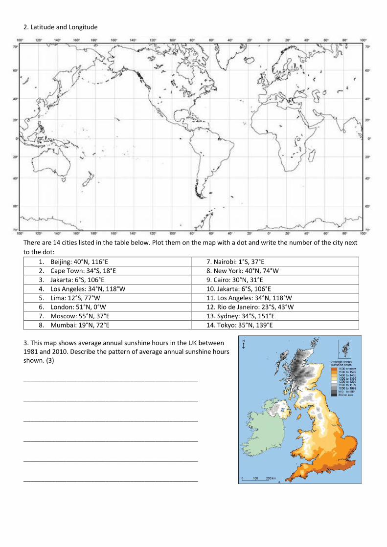
2. Latitude and Longitude
There are 14 cities listed in the table below. Plot them on the map with a dot and write the number of the city next
to the dot:
1. Beijing: 40°N, 116°E 7. Nairobi: 1°S, 37°E
2. Cape Town: 34°S, 18°E 8. New York: 40°N, 74°W
3. Jakarta: 6°S, 106°E 9. Cairo: 30°N, 31°E
4. Los Angeles: 34°N, 118°W 10. Jakarta: 6°S, 106°E
5. Lima: 12°S, 77°W 11. Los Angeles: 34°N, 118°W
6. London: 51°N, 0°W 12. Rio de Janeiro: 23°S, 43°W
7. Moscow: 55°N, 37°E 13. Sydney: 34°S, 151°E
8. Mumbai: 19°N, 72°E 14. Tokyo: 35°N, 139°E
3. This map shows average annual sunshine hours in the UK between 1981 and 2010. Describe the pattern of average annual sunshine hours shown. (3) _________________________________________________
_________________________________________________
_________________________________________________
_________________________________________________
_________________________________________________
_________________________________________________

Part B: Ordnance Survey Maps
1. What is the 4 figure reference for Kettle
Hill? _______________
2. What is the 4 figure reference for Bayfield
Hall? _____________
3. What is the 4 figure reference for
Glandford Ford? ___________
4. Find the 6 figure references for:
a). Windmill at Blakeney _____________
b). The car park near Wiveton Downs
__________________________
c. The church at Langham ___________
5. What can be found at:
a). 009439 _________________________
b). 044438 _________________________
c). 012412 _________________________
6. What direction is Blakeney from Langham?
__________________________________
7. What direction is Glandford Ford from Morston? ____________________________
8. What is the highest height displayed on the map? ___________________________
9. What is the lowest height shown on the map? ______________________________
10. Name one tourist attraction on this map __________________________________
The scale on the map above is 2cm=1km
Given this, can you calculate these straight-line distances?:
11. Langham church (008413) to Blakeney church (033436) _____________________
12. The distance between the bridges in grid squares 0443 and 0442 _____________________
13. The distance between the two car parks ___________________________
14. You may need a piece of string for this, but can you calculate the distance along the road from Blakeney church
to Morston church? _____________________________
15. If you were to walk around the roads that appear to make a square around ‘Langham Glass’, how far would you
go? ___________________________
Task 16: Transect production
If you look at the diagram on the
right, the red line has been drawn
from one side of the valley to the
other and then I have made the
program display the elevation profile
of this transect. You can see that
there is a large hill to the west, it
then flattens in the valley floor (no
contours) and then increases in
height to the eastern side of the
transect. On the next page you will
be shown how to draw one of these.
1km
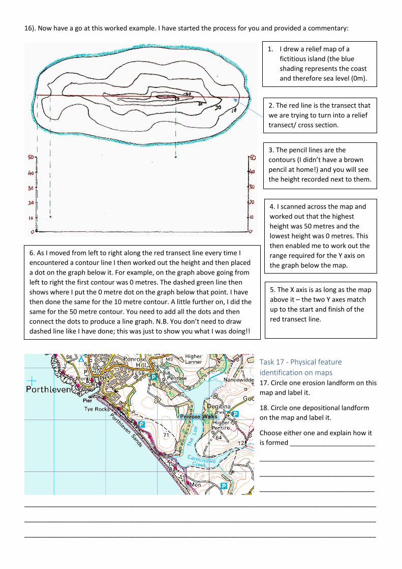
16). Now have a go at this worked example. I have started the process for you and provided a commentary:
Task 17 - Physical feature
identification on maps 17. Circle one erosion landform on this
map and label it.
18. Circle one depositional landform
on the map and label it.
Choose either one and explain how it
is formed _______________________
_______________________________
_______________________________
_______________________________
_______________________________________________________________________________________________
_______________________________________________________________________________________________
_______________________________________________________________________________________________
1. I drew a relief map of a
fictitious island (the blue
shading represents the coast
and therefore sea level (0m).
2. The red line is the transect that
we are trying to turn into a relief
transect/ cross section.
3. The pencil lines are the
contours (I didn’t have a brown
pencil at home!) and you will see
the height recorded next to them.
4. I scanned across the map and
worked out that the highest
height was 50 metres and the
lowest height was 0 metres. This
then enabled me to work out the
range required for the Y axis on
the graph below the map.
5. The X axis is as long as the map
above it – the two Y axes match
up to the start and finish of the
red transect line.
6. As I moved from left to right along the red transect line every time I
encountered a contour line I then worked out the height and then placed
a dot on the graph below it. For example, on the graph above going from
left to right the first contour was 0 metres. The dashed green line then
shows where I put the 0 metre dot on the graph below that point. I have
then done the same for the 10 metre contour. A little further on, I did the
same for the 50 metre contour. You need to add all the dots and then
connect the dots to produce a line graph. N.B. You don’t need to draw
dashed line like I have done; this was just to show you what I was doing!!

20. Which square – A or B – is steeper? _______
Explain your decision _____________________________________________________________________________
_______________________________________________________________________________________________
_______________________________________________________________________________________________
_______________________________________________________________________________________________
A
B
+
19. Fill in the boxes to identify glacial features on this OS
map
21. Infer human activity from
maps Coastlines offer opportunities
for tourism. List 5 things from
the map to suggest that
tourists go there:
1.
2.
3.
4.
5.

Part C: maps in association with photographs
Task 22. Linking photos and maps. Study the photograph above of Bolt Tail shown in grid square 6639 on the map on the left. Which direction was the photographer facing when she took the photo? _______________________________________
Task 23. Sketch maps -The photo below shows East Head spit in West Sussex. You need to produce a sketch map (i.e. draw the main features in the space on the right. Label the key features, which would be: Groynes, spit, salt marsh, beach, estuary.
You also need to be able to interpret photos. Therefore, some key questions for this photo. Why are groynes used in
this photo? What impact could they have on the future of the spit? Why has a salt marsh developed behind the spit?
_______________________________________________________________________________________________
_______________________________________________________________________________________________
_______________________________________________________________________________________________
_______________________________________________________________________________________________
_______________________________________________________________________________________________
_______________________________________________________________________________________________
_______________________________________________________________________________________________
_______________________________________________________________________________________________
_______________________________________________________________________________________________

_______________________________________________________________________________________________
_______________________________________________________________________________________________
_______________________________________________________________________________________________
Task 24. Interpreting Satellite photos Label some glacial features that you can see on this image of part of the Lake District (dark areas are often bodies of
water)
Task 25. Mount Saint
Helens – interpret
satellite image task
_______________________________________________________________________________________________
_______________________________________________________________________________________________
_______________________________________________________________________________________________
A huge eruption here occurred in 1980.
Describe the distribution of the impacts on
the area surrounding the volcano.
____________________________________
___________________________________
___________________________________
___________________________________
___________________________________
___________________________________
___________________________________
N
2km
Task 26. Describing physical landscapes Examine the photo on the left, which is a
rainforest in Central Africa.
On the next page, describe and explain the main
features shown

_______________________________________________________________________________________________
_______________________________________________________________________________________________
_______________________________________________________________________________________________
_______________________________________________________________________________________________
_______________________________________________________________________________________________
_______________________________________________________________________________________________
_______________________________________________________________________________________________
_______________________________________________________________________________________________
_______________________________________________________________________________________________
_______________________________________________________________________________________________
_______________________________________________________________________________________________
_______________________________________________________________________________________________
Task 27. Identification of land use from photos. Examine the aerial photo. Can you identify the city? __________
Your task is to annotate the photo to describe the land-use present.

Task 28. Sketching from a photo. Produce a sketch of this photo on the right. Label the following: wave cut platform,
arch, stack, wave cut notch
Part D. Graphical skills
Task 29: Bar Graphs These are commonly used in exam papers. They can be simple, compound (stacked bar chart)
or you could see one that shows positive and negative values. Examples are shown below:
29). What was the % population change in 1960 _____, 1970 ______, 1980 ________, 1990 _____ & 2000 _______?
Line Graphs
0%
10%
20%
30%
40%
50%
60%
70%
80%
90%
100%
1970 1980 1990 2000 2005
% Change in total LEDC manufacturing for selected ares/countries 1970-2005
Sub-Saharan Africa
E Asia (incl. China)
S Asia
N Africa & W Asia
Latin America
-15
-10
-5
0
5
10
15
20
25
1960 1970 1980 1990 2000
% Population Change for the UK 1960-2000 (not real figures!)
-80
-60
-40
-20
0
20
40
60
80
100
0
5
10
15
20
25
30
35
40
45
50
1970 1980 1990 2000 2005
% T
ota
l Wo
rld
Ind
ust
ry L
EDC
/MED
C
% g
row
th f
or
the
co
nst
itu
en
t co
un
trie
s in
LE
DC
Percentage change in World Industry 1970-2005
Sub-Saharan Africa
E Asia (incl. China)
S Asia
N Africa & W Asia
Latin America
MEDC
LEDC
This is a mixture of graph
types! The MEDC/LEDC is
plotted as a line graph and the
value is plotted on the vertical
axis (secondary axis). However,
there is another type of graph
plotted here called a
compound line graph- this is
where the differences
between the points on the
adjacent lines give the actual
values- compound bar graphs
are also common (see above)

30a). What was the percentage of LEDC industry in 1970? ______________________
b). What was the percentage of MEDC industry in 2005? _____________________
c). What percentage of LEDC industry did East Asia account for in 2005? ____________________
d). What percentage of LEDC industry did South Asia account for in 1990? ___________________
e). Describe the changes shown in the graph __________________________________________________________
_______________________________________________________________________________________________
_______________________________________________________________________________________________
_______________________________________________________________________________________________
_______________________________________________________________________________________________
_______________________________________________________________________________________________
_______________________________________________________________________________________________
Task 31: Scatter graphs – these have the potential to allow you to investigate the relationship between two sets of
data. I have asked the computer to produce a ‘line of
best fit’, which it has done with a black line. However, is
there a result that looks particularly odd? This is called a
‘residual’ or ‘anomaly’ and these are identified as points
that lie some distance away from the line.
These can be useful as they can give you an idea of a
further area for investigation (i.e. go back and sample
again).
a). Which point is a residual (circle it) and why do you
think it might be there?
b). Pretend the point was not there- draw another line of
best fit.
Task 32: Population pyramids Describe the age structure of this country (i.e. does it
have a predominately young population? Do people
live a long time etc.?)
____________________________________________
____________________________________________
____________________________________________
____________________________________________
_____________________________________________
_______________________________________________________________________________________________
_______________________________________________________________________________________________
1.5
2
2.5
3
3.5
4
0 10 20 30 40
Ro
un
dn
ess
(P
ow
ers
' Sca
le)
Distance west along the beach (m)
Scattergraph to show Mean Pebble Roundness (higher number =smoother) as
you walk west at West Wittering beach

Task 33: Pie charts Complete the two pie charts based on the data
given in the table.
34. Examine the pie chart below, which shows the
contribution of food to the UK carbon footprint:
a). What percentage of the UK’s carbon footprint
comes from food? ___________________
b). What proportion of the UK’s ‘food’ carbon footprint comes from agriculture? _______________
c) Which aspect of ‘food’ in the UK is responsible for the least proportion of its carbon footprint? ________________
Task 35: Histograms A student conducted a study at East
Wittering to see if tourism was important
to the economy. One of the questions
was, ‘How long do you spend in East
Wittering?’
The data is shown in the table below. You
need to complete the histogram on the
right using the data in the table.
Time spent in East Wittering (minutes)
Frequency
0 to 5 4
6 to 10 4
11 to 15 4
16 to 20 6
21-25 15
26-30 15
31-35 14
36-40 10
41-45 5
Describe the trends shown in the histogram ________________________
____________________________________________________________
____________________________________________________________
____________________________________________________________
____________________________________________________________
____________________________________________________________
____________________________________________________________
____________________________________________________________

Task 36. Choosing an appropriate graphical technique to display data
Part E: Graphical skills – but specifically these are called
cartographic skills because you are putting data on to a
map/photo etc. directly.
Task 37 – Dot Maps Examine the map of Brazil on the right. This is where the
distribution of a geographical variable is plotted on a map
using dots of equal size. Each dot has the same value and is
plotted where that variable occurs. The value should be
high enough to prevent overcrowding, but too large and
some places will not reach the level required to gain a ‘dot’!
The question and map (right) comes from a real exam
paper. Using the map on the right:
a). Describe the population distribution of Brazil
b). Outline one strength and two weaknesses of this method of data presentation
_______________________________________________________________________________________________
_______________________________________________________________________________________________
_______________________________________________________________________________________________
______________________________________________________________________________________________
_______________________________________________________________________________________________
Make sure that
you add a title,
axis titles and a
scale

Task 38 - Desire Lines These are lines drawn directly from the point of origin to the final destination (unlike the flow line shown above on
the A3 where the line actually represents the route taken. You need to produce a desire line map to show the origin
of visitors to East Wittering (the red dot) on the map below using the figures in the table.
Task 39 - Choropleth
shading (note no ‘l’
after the h) The lines are good, but do
not show patterns. Have
a go at a choropleth map
by shading in the
counties of origin to
represent the number of
people using the same
figures as the desire line.
I would use 4 categories
and complete the table
below:
N.B. choose the colours wisely- don’t just put any old colours down. Perhaps green,
yellow, orange red or an increasingly dark shade of one colour. Exam papers may already
provide the shading- you must stick to them.
County Number
Norfolk 1
Berkshire 3
Kent 5
Wiltshire 6
Staffs 1
Shrops 1
Devon 1
Cornwall 1
Essex 2
Northants 1
West Sussex 20
Hampshire 12
Range Colour
0-
>
N.B. Add N arrow, scale and
vary the width of the lines

Task 40: Isoline maps These can be quite hard, but don’t panic! The weather map
above has used a type of isoline (called isobars). They simply
join up areas of equal value. Don’t worry about the
coloured symbols – these are showing types of
weather fronts; you simply need to look at the black
lines. In fact, you have already come across
something similar earlier in this booklet – contours
serve exactly the same purpose.
40a). Have a go at completing the isoline
maps from the past exam question above
left. The 5 cm isoline is missing. Label it as
they have done the other lines.
40b). Identify and label the fastest part of
the river on the diagram on the right and
Extension – is there a link between the two
photos?
Task 41 - Cartographic skills - flow lines
etc. Sometimes a simple pie chart or bar chart doesn’t
really tell the whole story. It is far better to
actually place the data on to a map to provide the
spatial dimension. That is what has been started
here. A traffic count has taken place on the
Denmead Road and also on the A3 (the pink dots).
Using the scale for the width of the arrow of 1cm
=10 cars add the following on to the graph:
N.B. The same technique could be applied but in slightly
different ways. For example, you could actually draw over the
roads to represent the volume of traffic going along it. I have
shown this on the A3 going NE towards Cowplain. Equally, you
could use proportional circles, squares etc. to show data on
maps.
A3 Going NE A3 Going SW
Traffic Count 15 20
Denmead Road Going
NW
Denmead Road Going
SE
Traffic Count 32 14
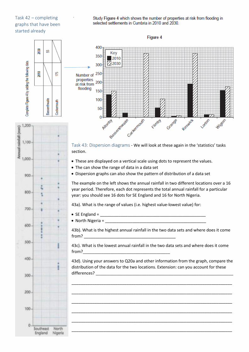
Task 42 – completing
graphs that have been
started already
Task 43: Dispersion diagrams - We will look at these again in the ‘statistics’ tasks
section.
These are displayed on a vertical scale using dots to represent the values.
The can show the range of data in a data set
Dispersion graphs can also show the pattern of distribution of a data set
The example on the left shows the annual rainfall in two different locations over a 16
year period. Therefore, each dot represents the total annual rainfall for a particular
year: you should see 16 dots for SE England and 16 for North Nigeria.
43a). What is the range of values (i.e. highest value-lowest value) for:
SE England = ______________________________________________
North Nigeria = ____________________________________________
43b). What is the highest annual rainfall in the two data sets and where does it come
from? ________________________________________
43c). What is the lowest annual rainfall in the two data sets and where does it come
from?______________________________________
43d). Using your answers to Q20a and other information from the graph, compare the
distribution of the data for the two locations. Extension: can you account for these
differences? ____________________________________________________________
______________________________________________________________________
______________________________________________________________________
______________________________________________________________________
______________________________________________________________________
______________________________________________________________________
______________________________________________________________________

Part F: Numerical skills Task 44: Area. You could be asked to calculate the area (space) that something
takes up on a map. This can be difficult as things are seldom a uniform shape on a
map. An example of an easy shape has been provided on the left from our local area
– Portchester Castle. The scale is 4cm = 1km. So, as the castle perimeter walls are
roughly square/rectangular, you need to measure the length and height (see red
lines on map).
Once you have calculated these, you need to multiply them together to get the area.
However, this figure is in centimetres – you need to convert it to km. To do this
divide your result by 4 (remember that 4cm = 1km?!). Write your answer below (km²):
__________________________________
Task 45: Calculating area when there are irregular
shapes Look at the Queens’ Inclosure on the right
If you were trying to calculate
the area of this it would be
very difficult as it is not a
square/ rectangle. Therefore,
you can split the area in to
various shapes to allow you to calculate the area. If you look on the left, can you see
that I have split the area into a rectangle (width x height) and a triangle (base/2 x
height). Using the map above right, can you estimate the area of the Queen’s Incloure? Don’t forget to divide your
final figure by 4 as the scale is 4cm = 1km!!). Show your workings in the space below:
Final answer: ______________
Task 46: As above, but this time calculate the area of this
greenhouse near Tangmere (Resources topic: growing
peppers – all year seasonal demand? Reduce food miles?)?
Final answer: ______________________
1KM
1KM

Task 47: Ratios/Scale Ratios are when you compare two different things. For example, in a class you could have 10 girls and 20 boys. This
would give a ratio of 1:2. You are most likely to come across ratios when looking at maps. For example, OS maps
such as this one is 1:50 000. This means that for every 1cm on the map, there are 50 000 cm on the ground.
This map looks slightly different and is an OS 1:25 000 map – i.e. 1cm on the map is 25 000 cm on the ground!
Task 48: Ratio (continued) – In the previous task, we found that ratios can be linked to scale in maps.
Country Population Number of doctors Ratio – doctors per 1000
Example - UK 66 500 000 186 200 2.8: 1000
a. Greece 10 750 000 66 650
b. Italy 60 600 000 236 340
c. Austria 8 700 000 42 630
In this instance, we want to find the number of doctors per 1000 of the population. The first country in the table is
the UK and I will through this one as an example.
Step 1: divide the number of doctors by the number of people – 186 200/ 66 500 000 = 0.0028
Step 2: turn into a ratio per 1000 – multiply the answer by 1000. So, 0.0028 x 1000 = 2.8 doctors per 1000
Use the space below to calculate the number of doctors/1000 for Greece, Italy & Austria. Write your answers here.
Task 49: Proportion This is relatively easy. If 10% of the population in a country is suffering from undernourishment, then when
expressed as a proportion, this would be 1 in 10 are suffering from undernourishment.

49a). There are 25 people in a Geography class. Only 5 can
name the capital of Mali (Bamako). What proportion can
name the capital of Mali?
_______________________________
49b). 20% of people in the Geography class can name an
actual Arete in the Lake District (can you?!). What
proportion of students can do this?
__________________________
49c). In 1911, there 20% of people worked in primary
industries in the UK. What proportion of people working
primary industry? ___________________________
Task 50: Magnitude You are most likely to encounter this when examining
earthquakes. Examine the graph on the right. The numbers
along the X axis represent the size an earthquake on the
Richter scale. The numbers on the Y axis show the amount
of shaking. This is a LOGARITHMIC scale, which means that
every unit you go up on the scale is 10 x more powerful than
the previous.
So, a Richter scale 2 is 10 times more powerful (in terms of shaking) than a 1. A Richter Scale 3
is 100 times more powerful than a 1 (10x10x10).
50a). How much more powerful is a Richter Scale 5 than a 4? _____________________
50b). How much more powerful is a Richter Scale 6 than a 4? _____________________
50c). How much more powerful is a 8 than a 5? ________________________________
Task 51: Frequency This is how often something occurs. You are likely to encounter this when examining earthquakes and volcanic
eruptions. If you examine the table below, you will see how many earthquakes of different size classes that you can
expect to measure in a year.
51a). On average you will get a 7-7.9 earthquake in the World, once every ________________ days.
51b). What is the relationship between the magnitude of an earthquake and the frequency? ___________________
_______________________________________________________________________________________________
_______________________________________________________________________________________________
_______________________________________________________________________________________________
_______________________________________________________________________________________________

Part G: Statistical skills In Geography, we like to find measures of central tendency. You need to know about:
Arithmetic Mean
Mode
Median
Task 52: Arithmetic mean To calculate the mean, you need to add up all of the values in the data set and then divide by the numbers of values
in that data set - the formula top right shows this
52a). Calculate the mean discharge of this river taken over a 7 year period: 650, 467, 632, 711, 589, 494, 467 =
_______________________________________________________________________________________________
52b). What is the mean population increase for these groups of countries (all per 1000 per year):
23, 11, 34, 26, 31, 8, 31, 24, 9 = _____________________________________________________________________
Task 53: Mode This is the most frequent number that occurs in the data set. Using the data sets given in Q22a and Q22b, calculate
the mode for each and record in the spaces below. N.B. when you have a large data set, you can
put figures into modal classes, rather than just using every number in a data set.
53a). Mode of Q52a = ________ 53b). Mode of Q52b = ___________
Task 54: Median The median is the middle value in a data set when the data has been arranged in rank order. To calculate the median
is quite easy. If there is an odd number, the formula on the right can be used. For example, if there are 15 values, the
formula would be (15+1)/2 = the 8th number in the sequence. If there is an even number of values in the data set,
then the median is the average of the two middle values. For example, look at the following two data sets:
2, 3, 3, 4, 5, 6 = There is an even number of values in this data set, so the median is the average of the middle two
values (3+4)/2 = 3.5
7, 9, 10, 14, 16 = There is an odd number of values, so the median is the middle value = 10 (if you wanted to use the
formula, (5+1)/2 = 3rd number in the data set, which is 10.
54a). Calculate the median for this data set: 3, 22, 5, 32, 21, 2, 54, 34, 9, 42, 31 (TIP: YOU WILL NEED TO OUT THE
NUMBERS INTO RANK ORDER FIRST IN THE SPACE BELOW – Rank order means smallest to largest:
54b). Calculate the median for this data set: 459, 321, 632, 234, 127, 265, 205, 322 (TIP: AGAIN, ARRANGE THE
NUMBERS INTO RANK ORDER FIRST BELOW):

Task 55 – mean, median and mode in one task! This table on the left shows the results from a questionnaire survey,
where people were asked how far they had travelled to reach the beach
at West Wittering.
55a). Calculate the mean distance travelled. (2 x 8 + 5 x 6 + 10 x 4 etc…)
and then divide by how many people were surveyed.
Mean distance travelled: ___________________________________
55b). What is the median distanced travelled? Hint – there are 19 people surveyed. I would write the numbers out in
rank order and work out the median distance.
Median distance travelled: __________________________________
55c). What is the modal class of distance travelled? _____________________
Task 56: Measures of dispersion – Range This is a natural progression from the calculation of the median. If you just take the mean, median and mode of data
sets then all the results could be the same, but they do not give an indication of how the data set has been
distributed. This is why geographers look at measuring the level of dispersion. Take the smallest number away from
the largest number in the data set.
56a). Measure the range of this data set (and write your calculations too): 3, 22, 5, 32, 21, 2, 54, 34, 9, 42, 31, 24
_______________________________________________________________________________________________
56b). Measure the range of this data set: 459, 321, 632, 234, 127, 265, 205, 322, 284
_______________________________________________________________________________________________
Task 57: Measures of dispersion - Interquartile range The measurement of the range in task 56 is quite a crude figure. The measurement of the
interquartile range provides a more detailed look at the level of dispersion. It ignores the
extremities of data and indicates the spread of the middle 50% of data around the MEDIAN value.
Essentially, interquartile range requires you to rank the data in order and then split the data into 4
equal groups/ quartiles. The boundary between the first and second quartiles is called the ‘upper
quartile’ and the boundary between the third and fourth quartiles is called the ‘lower quartile’.
To calculate the upper quartile (UQ) you use the formula top right
To calculate the lower quartile (LQ) you use this formula
The interquartile range (IQR) is calculated as follows:
IQR = UQ – LQ
Approximate distance travelled to reach West Wittering
Number of people
2 miles 8
5 miles 6
10 miles 4
20 miles 1

Worked Example for this data set: 3, 22, 5, 32, 21, 2, 54, 34, 9, 42, 31,
Step 1 – rank the data set in order (highest to lowest):
54, 42, 34, 32, 31, 22, 21, 9, 5, 3, 2
There are 11 numbers so the median is the 6th value (11+1)/2, which is 22.
Step 2 – calculate Lower Quartile (LQ): 3(11+1)/4 = 9th number in the data set, which is 5
Step 3 – calculate Upper Quartile (UQ): (11+1)/4= 3rd number in the data set, which is 34
Therefore, the interquartile range (IQR) is 34-5 = 29
57a). Calculate the IQR for the following data (clearly, rank them in order first highest to
lowest, calculate the UQ figure and the LQ figure and then calculate the IQR).
23, 24, 12, 43, 25, 32, 27
57b). As in Q57a – find the IQR of this data set: 4, 3, 1, 15, 13, 2, 16, 12, 18, 21, 5
Remember – take an average of two numbers for UQ and LQ here as there will be not one
number for the lower and upper quartile.
Task 58 – Dispersion graphs linked to IQR. Earlier on in this booklet, I introduced you
to dispersion diagrams. However, they can be employed with interquartile range. The
dispersion diagram on the right shows the amount of rainfall at various weather stations
in Pakistan between 27-30 July 2010. 58a). Plot the data in the table below on to the
dispersion graph.
59b). With the graph now complete, calculate the following:
i). Range _______________________________________
ii). Median _____________________________________
iii). IQR – use the space below

Task 59: Interquartile
range and display of
this information on
‘Box-and-whisker
plots’.
The IQR can be
displayed on a graph
like the one shown
above. If you look
closely, the ‘whiskers’
represent the highest
and lowest value in the
data set. The ‘box’
represents the IQR (the
middle 50% of the
values) – the central line is the median value.
In the space below, construct a box and whisker plot diagram for the following data sets (I have been nice and put
the data sets in order for you already!) Clearly, you need to identify the highest and lowest figures, calculate the
median and UQ and LQ. I have left space at the bottom of the sheet to complete your calculations:
Data Set A Data Set B
1 5
1 5
2 6
3 7
4 8
4 10
5 11
5 11
7 11
9 12
13 12
14 12
14 13
16 13
18 14

Task 60: Percentage increase or decrease in data This is relatively simple. Take these steps:
Step 1 – calculate the difference (increase or decrease) between the two numbers you are trying to compare
Step 2 – Divide the increase by the original number
Step 3 – Multiply the answer by 100 to give a percentage (a negative number means a decrease)
Examine the table below – Afghanistan has been done for you. It shows the % of the population that were
undernourished in a 1991 and 2015.
Country 1991 2015 Workings out and final answer
Afghanistan 29.5% 26.8% Step 1: 26.8-29.5= 2.7 (difference) Step 2: 2.7/29.5 = 0.092 Step 3: 0.092 x 100 = 9.2% increase
60a). Ethiopia
74.8% 32%
60b). Cote D’Ivoire
10.7% 13.3%
60c). China 23.9% 9.3%
Task 61: Cumulative frequency (just read this!) Using cumulative frequencies and quartiles allows Geographers to
compare the spread of data. Cumulative frequency is calculated first and
is essentially a running total of the data that you have. In task 55a, you
had this data table on the right.
I have added an extra column in the table below to show the cumulative
frequency of this data:
v
Approximate distance travelled to reach West Wittering
Number of people
2 miles 8
5 miles 6
10 miles 4
20 miles 1
Approximate distance travelled to reach West Wittering
Number of people
Cumulative frequency
2 miles 8 8
5 miles 6 14
10 miles 4 18
20 miles 1 19
8
8+6
8+6+4
8+6+4+1
The data in this table can be
plotted on to a line graph
I have split the Y axis into 4
equal intervals (19/4 = 4.75)
Where the line from the Y axis
intersects with the line graph,
you can read down to the x
axis and find the upper
quartile, lower quartile and
median values.
The interquartile range is the
difference between the upper
and lower quartiles. 0
8
14
1819
0
2
4
6
8
10
12
14
16
18
20
0 1 2 3 4 5 6 7 8 9 10 11 12 13 14 15 16 17 18 19 20
Cu
mu
lati
ve f
req
uen
cy (
peo
ple
)
Distance travelled to West Wittering (miles)
Cumulative frequency - distance travelled to West Wittering

Task 62: Percentiles (again, just read) A percentile is used to indicate the value below which a given percentage of observations fall. For example, the 90th
percentile is the value in a data set below which 90% of the observations occur and above which 10% of values
occur.
Linking back to previous tasks, the lower quartile is the 25th percentile and the upper quartile is the 75th percentile.
The median value is located at the 50th percentile.
Task 63: Relationships between Bivariate
data Bivariate data means data for two variables
that may be considered to be related. For
example, GDP and % of people
undernourished in a country. In this instance,
GDP should influence % undernourished
(more GDP = less undernourished). You can
plot data such as this on scatter graphs. Look
at the scatter graphs on the right under them
write ‘NO’, ‘POSITIVE’ or ‘NEGATIVE’ depending
on which type of correlation you think they
exhibit.
Task 64: Best fit lines on bivariate
data/scatter graphs As discussed above (and in task 31),
you can plot bivariate data on a scatter
graph. In this question, you need to
plot 2 more data points (‘x’) on the
scatter graph.
You then need to draw a Iine of best fit
(equal numbers of points above and
below the lines; try and get the line to
go through points if possible.
Task 65: Interpolate and Extrapolate data This is when you estimate an unknown value. You use a line of best fit for this purpose:
Extrapolation is when you estimate an unknown value that is OUTSIDE the data set
Interpolation is when you estimate an unknown value that is WITHIN the data set
Examine the graph on the following page for the questions on this.

Interpolate (i.e. the missing value is within the existing data set) the following:
65a). How large are the pebbles likely to be 275 metres along the beach? ______________________
65b). How large are the pebbles likely to be 170 metres along the beach? ______________________
65c). How large are the pebbles likely to be 120 metres along the beach? ______________________
65d). How far along the beach are you likely to be to find a stone that is 3.33 cm long? ________________________
65e). How far along the beach are you likely to be to find a stone that is 3.8 cm long? _________________________
Extrapolate (i.e. the missing value is outside the existing data set – the trend line is being used as a predictive tool)
the following:
65f). How large are the pebbles likely to be 30 metres along the beach? ______________________
65g). How large are the pebbles likely to be 405 metres along the beach? _____________________
65h). How far along the beach are you likely to be to find a stone that is 2.9 cm long? ________________________
65i). How far along the beach are you likely to be to find a stone that is 4.3 cm long? _________________________
A word of caution about all of the statistics bits that you have done. Beware of small data sets! Scatter graphs
with just 3 or 4 points will not be enough to draw lines of best fit, and therefore to assess levels of correlation.
GOOD LUCK – I THINK I HAVE GONE THROUGH ALL OF THE SKILLS THAT THE EXAM BOARD WANT YOU TO KNOW. IF
YOU NEED ANY FURTHER HELP, SEE YOUR GEOGRAPHY TEACHERS!
Mr. Bamford.
3.1
3.5 3.53.6
3.8
4.2
2.02.12.22.32.42.52.62.72.82.93.03.13.23.33.43.53.63.73.83.94.04.14.24.34.4
0 25 50 75 100 125 150 175 200 225 250 275 300 325 350 375 400 425 450
Peb
ble
Lo
ng
Axi
s (c
m)
Distance along beach metres (east)
Pebble long axis v Distance along West Wittering beach