further dimensions: text, typography and play in the...
TRANSCRIPT

Further Dimensions: Text, Typography and Play in the Metaverse
Elif Ayiter
Sabanci University
Istanbul, Turkey
Abstract — In this text I wish to delve into the creation of
textual content as well as its visualization through typographic
design mechanisms inside three dimensional virtual worlds,
which are known as the metaverse. I am particularly focused
upon the way in which such virtually three dimensional
environments may place the usage of text within a context that
stands in contradiction to its traditional one by creating an
unexpected novel purpose which takes a marked departure
from the intrinsic attribute with which text has inherently been
associated – namely the attribute of readability. In such
environments readability, or indeed even legibility, may often
be displaced through the usage of text and typography as a
playful device, as artifacts which may manifest in puzzle%like
configurations, or as visual structures the contents of which are
meant to be understood through means other than
straightforward reading; thus bringing about states of
heightened engagement, wonder and ‘play’ through their
manipulation or indeed simply by being immersed within the
spaces which are brought about through their very agency. I
also wish to expand upon this subject by talking about my own
experiments with this material and will conclude by positing
that further virtual dimensions can be instrumental in eliciting
exciting alternative usages of text and typography which bring
to the fore the allographic properties of text as an
artistic/creative expressive media that may well bear further
scrutiny and exploration.
Keywords � 3D; Allographic; Deconstruction; Legibility;
Metaverse; Readability; Play; Text; Typography; Virtual worlds;
I. INTRODUCTION
Metaverse are collective, online, persistent, three dimensional virtual worlds in which (unlike their gaming counterparts) all content is user)created. Thus, a further name by which these worlds can appropriately be called is the term ‘builders’ worlds’, since an important attribute of these spaces is the condition that not only is their content user)defined and created, but also the purpose of residing in these worlds is entirely up to and decided upon by their users since the developers of these platforms provide no narrative which is to be followed, and there are no system defined goals or quests. Instead metaverse residents are expected to formulate the raison d’être for their virtual sojourn out of a self)motivated inquiry. From this it may follow that one of the most widely embraced reasons to stay in the metaverse is to be creatively active [1]. Consequently, these worlds possess attributes which are grounded in creative endeavor to the point where the best developed of them to date, namely
Second Life®, has been defined as “a wildly provocative experiment in user generated content.” [2]
Much of this creative activity comes about through terraforming (the shaping of virtual geography), through virtual architecture and vehicles, and most importantly as a stunningly rich proliferation of design artifacts and apparel with which avatars are adorned and which are sold on the open market economy of the metaverse. A further display of creativity also comes about in the shape of art works which are either exhibited in virtual galleries that are very similar in concept to their virtual counterparts. Beyond these however, art projects or installations which spread themselves out over entire simulated islands as fully immersive spaces are also undertaken.
Within this conglomeration of output typography is mostly used either as a part of the architecture, as signage or as logotypes for virtual stores and institutions. Another widely spread usage of text and type is as parts of product packages and display systems. Art works which are based upon typography or in which typography and text have been used as prominent elements however, are still relatively rare occurrences, the usage of text being mostly limited to informational content in these as well. Thus, it appears that in the metaverse text and typography are predominantly used as instructive devices, much akin to their counterparts in the physical world.
As a graphic designer I have always had a particularly strong affinity to text and typography. It was therefore a foregone conclusion that I would carry my fascination with this subject into my creative explorations in virtual 3D as well, where it has disclosed itself through several art projects in which text and typography have been used at center stage, as the main protagonists – albeit, embedded into an altogether different format than their innate one which is as informational devices. The following is an expose of the challenges which I faced, and the means and concepts through which I placed text and typography within a context of ‘play’ in the metaverse.
II. CONCEPTS
Before I go into a description of my own creative investigations with regards to this topic I believe that an overview of the concepts and terms which I have woven together to provide a framework for my output is called for, and that a look at the general field of text, typography and 3D computation is also in order.

Figure 1. “Are u looking for meaning?” A floating, self�replicating, physics enabled cube system which displays deconstructed text at alpha.tribe island.
Elif Ayiter/aka. Alpha Auer, Second Life, 2010�2012.
A. Virtual 3D and Text
A usage of typography for artistic purposes in virtual 3D has its precedents in artworks such as Jeffrey Shaw’s ‘Legible City’ from 1989 [3], in which the work was accessed through a stationary bicycle which was physically placed inside a virtual reality environment, and by a riding of which the viewer could navigate a city constructed out of type. Further examples of art projects in which text has been made prominent in virtual 3D are also works such as ‘Screen: Bodily Interaction with Text in Immersive VR’ by Carroll and associates from 2003 [4], or ‘Cave Writing’ by Sascha Becker et al [5]. The commonality between all of these works is that immersion is achieved through the corporeal body of the viewer who is placed directly inside a physical virtual reality environment such as a CAVE, or other such hardware systems, which enable perceptions that are simulated to resemble Real Life interaction with tangible objects. When it comes to the screen however, displaying text in 3D has noteworthy issues that are related to legibility, which according to Kevin Lynch can be defined as the ease with which the parts of a construct or system can be recognized and be organized into coherent patterns. “Just as this printed page, if it is legible, it can be visually grasped as a related pattern of recognizable symbols.” [6]
David Small has drawn attention to the fact that letters were designed to be viewed directly on a flat 2D surface. When it comes to 3D however, brought about through the existence of uncounted numbers of uncontrollable
viewpoints, a continuous perspective distortion which is less than ideal for reading is created since it is almost impossible to guarantee the point of view of the reader in relation to the angle of the text. Therefore one cannot be certain of maintaining the integrity of the letterform in screen based 3D environments in which each new angle will result in a differently shaped letter and at extreme angles this shape can be even reduced to a line. Furthermore, when the camera moves behind the text, it looks reversed as though seen in a mirror. While certain word shapes can still be recognized in less than ideal circumstances, in general there are few viewpoints from which text holds its legibility [7].
A further issue in terms of legibility also addresses size: “A graphic designer can use size differences to visually distinguish certain elements in a text. In a (virtual) 3D space however, you cannot always resolve the relative size of two objects. If one object appears smaller in the picture plane, it could actually be smaller, or it could be the same size and farther away, or it could even be much larger and very far away. So, in the design of an information space, one must be careful about using size as a differentiating variable.” [ibid]
Following from this it very quickly become clear to me that attempting to engage in creative activity involving text as informational content was not an easy option. Equally strong however was my understanding of the metaverse as a playful environment which resided more upon tenets that were closely related to make�belief, indeed to absurdity, the solving of puzzles, to bisociative modes of thinking rather than to a utilitarian conveyance of essential content. This led

me to the idea that it might be wise to look for textual sources that would address a need for play, for personal readings and interpretations; in other words, text that is meant to be ‘felt’ as an artwork, rather than to be ‘read’ as informational content. This led me to asemic/aleatoric writing, and to generative text as a device for providing the material for such non traditional usages of type.
B. Asemic Writing and Aleatoric Texts
Asemic writing is a wordless form of writing, deriving from the Greek word ‘asemic’ which means ‘having no specific semantic content’. Through this nonspecificity comes a vacuum of meaning which is left for the reader to fill in and to interpret since asemic writing has no inherent verbal sense. Nonetheless, asemic writing artifacts may have a clear textual sense which is brought about through formatting and structure, and as such they may visually suggest ‘real’ documents. Drawing meaning from these depends upon the reader's overall sense and knowledge of writing systems, or alternatively such meaning can also be understood or felt through sole aesthetic intuition.
A wide spread manifestation of asemic writing seems to materialize not through typographic means, but instead as a hybrid form of output which resides somewhere between drawing, doodles, signs or icons which are arranged and aligned in such a way that they resemble text, such as seen in the work of poets Henri Michaux and Christian Dotremont which is discussed in Nina Parish’s 2008 article [8]. A very good visual collection of this genre can also be found in Michael Jacobson blog ‘thenewpostliterate’, which explores asemic writing in relation to post literate culture.
Although these artistic explorations which are engaged in creating literature out of visual form are highly compelling; my personal preoccupations, which ultimately reside in my background in graphic design, lead me in a direction in which I do not wish to forsake the aesthetic refinement which I find in typographic forms as well as in the overall structural beauty of textual output. Thus, I will take my quest in a different direction by bringing together the concept of asemic writing and that of aleatoric poetry, which resides upon the chance encounters of words. Within this context Christian Bök, refers to Gilles Deleuze by saying that “writing by means of an aleatory protocol almost fulfills the dream of Deleuze, who imagines an ideal game of chance, one whose rules are themselves subject repeatedly to chance, resulting in an aimless outcome so futile that we have no choice but to dismiss the game as a nonsensical dissipation of time itself.” [9] However, Bök takes the notion of chance altogether beyond nonsense when he further quotes Deleuze who tells us that “if one tries to play this game other than in thought, nothing happens, and if one tries to produce a result other than the work of art, nothing is produced.” [ibid]
A very effective way of evoking chance encounters with text is through the usage of generative text, which can be produced through computational text generators. In a collaborative project entitled LPDT2, which I will be describing later in this text, we put this principle into good usage. However, another way in which chance meetings between texts can come about is through the natural and
spontaneous layering of type through virtual 3D, through the sheer ambiguity which perspective distortions and the effects which space brings to bear upon the size and hierarchy of any aggregated textual display when traversing the metaverse. Thus, the shortcomings described by Small, which I have delved into earlier on in this text, actually become major advantages when it comes to creating artistic aleatoric textual encounters in 3D virtual worlds, which are viewed and interacted with through a screen based medium.
C. Typographic Deconstruction as a Playful Strategy
In the early 1990’s the potential unleashed by desktop publishing and graphics software, allied with the methodological potential offered by deconstructionist philosophy, produced a style of graphic design and typography known sometimes as deconstructionist graphic design, and sometimes as ‘The New Typography’.
Graphic design theorist Ellen Lupton sees deconstruction in graphic design as a process an act of questioning typographic practice. In Derrida’s original theory deconstruction asks several questions which are crucial to typographic design as well: How does representation inhabit reality? How does the external appearance of a thing get inside its internal essence? How does the surface get under the skin?
An important opposition in Derrida’s theory of deconstruction, and one which is also highly pertinent in terms of typographic design, is speech versus writing. The Western philosophical tradition has denigrated writing as an inferior, dead copy of the living, spoken word. When we speak, we draw on our inner consciousness, but when we write, our words are inert and abstract. The written word loses its connection to our inner selves. Language is set adrift.
Thus, a typographic work can be called ‘deconstructed’ when it exposes and transforms the established rules of writing, interrupting the sacred ‘inside’ of content with the profane ‘outside’ of form. [10]
More often than not, deconstructionist typography exhibits a fascination with contemporary technology, adopting strategies of appropriation, juxtaposition, détournement, montage and collage, as well as repetition, which is facilitated by or reflects upon the capabilities of the digital technologies which are often used when creating such work. It is thus of no surprise that the outcome oftentimes resonates upon a world of diffused and distributed communication mediated through networks of powerful information technologies. Even when the artifact itself is presented as a static printed page the reference to a cyberspace driven by hypertext is very often implicit, underscoring that “communication for the deconstructivist is no longer linear, but involves instead the provision of many entry and exit points for the increasingly over stimulated reader.” [11] Thus the page is no longer to be just ‘read’ but also to be ‘perceived’, beyond the pure textual content, into all of its associative conjunctions: We are therefore meant to ‘feel’ rather than just to ‘read’ a page.
Based upon my own typographic experimentations with deconstruction, which I undertook both in 2D media and 3D
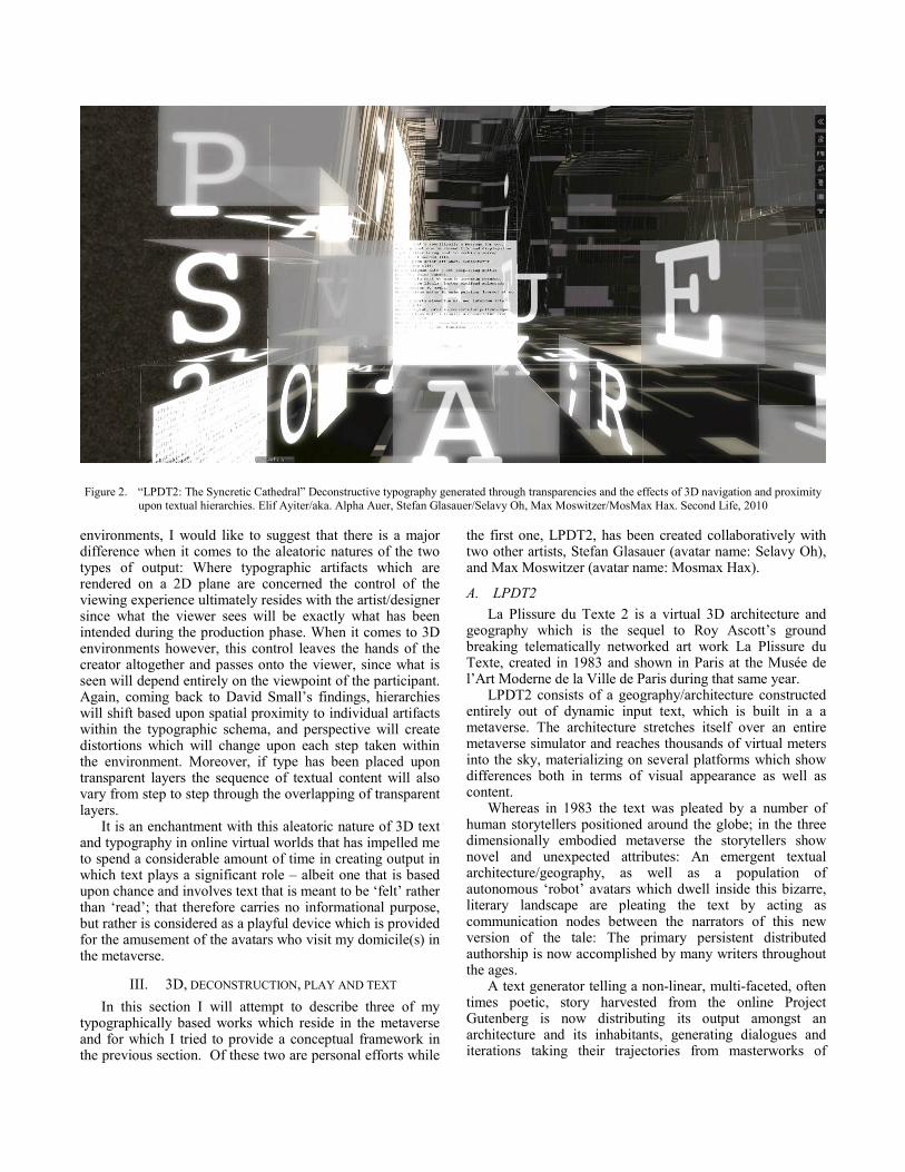
Figure 2. “LPDT2: The Syncretic Cathedral” Deconstructive typography generated through transparencies and the effects of 3D navigation and proximity
upon textual hierarchies. Elif Ayiter/aka. Alpha Auer, Stefan Glasauer/Selavy Oh, Max Moswitzer/MosMax Hax. Second Life, 2010
environments, I would like to suggest that there is a major difference when it comes to the aleatoric natures of the two types of output: Where typographic artifacts which are rendered on a 2D plane are concerned the control of the viewing experience ultimately resides with the artist/designer since what the viewer sees will be exactly what has been intended during the production phase. When it comes to 3D environments however, this control leaves the hands of the creator altogether and passes onto the viewer, since what is seen will depend entirely on the viewpoint of the participant. Again, coming back to David Small’s findings, hierarchies will shift based upon spatial proximity to individual artifacts within the typographic schema, and perspective will create distortions which will change upon each step taken within the environment. Moreover, if type has been placed upon transparent layers the sequence of textual content will also vary from step to step through the overlapping of transparent layers.
It is an enchantment with this aleatoric nature of 3D text and typography in online virtual worlds that has impelled me to spend a considerable amount of time in creating output in which text plays a significant role – albeit one that is based upon chance and involves text that is meant to be ‘felt’ rather than ‘read’; that therefore carries no informational purpose, but rather is considered as a playful device which is provided for the amusement of the avatars who visit my domicile(s) in the metaverse.
III. 3D, DECONSTRUCTION, PLAY AND TEXT
In this section I will attempt to describe three of my typographically based works which reside in the metaverse and for which I tried to provide a conceptual framework in the previous section. Of these two are personal efforts while
the first one, LPDT2, has been created collaboratively with two other artists, Stefan Glasauer (avatar name: Selavy Oh), and Max Moswitzer (avatar name: Mosmax Hax).
A. LPDT2
La Plissure du Texte 2 is a virtual 3D architecture and geography which is the sequel to Roy Ascott’s ground breaking telematically networked art work La Plissure du Texte, created in 1983 and shown in Paris at the Musée de l’Art Moderne de la Ville de Paris during that same year.
LPDT2 consists of a geography/architecture constructed entirely out of dynamic input text, which is built in a a metaverse. The architecture stretches itself over an entire metaverse simulator and reaches thousands of virtual meters into the sky, materializing on several platforms which show differences both in terms of visual appearance as well as content.
Whereas in 1983 the text was pleated by a number of human storytellers positioned around the globe; in the three dimensionally embodied metaverse the storytellers show novel and unexpected attributes: An emergent textual architecture/geography, as well as a population of autonomous ‘robot’ avatars which dwell inside this bizarre, literary landscape are pleating the text by acting as communication nodes between the narrators of this new version of the tale: The primary persistent distributed authorship is now accomplished by many writers throughout the ages.
A text generator telling a nonDlinear, multiDfaceted, often times poetic, story harvested from the online Project Gutenberg is now distributing its output amongst an architecture and its inhabitants, generating dialogues and iterations taking their trajectories from masterworks of

classical literature. The pleating resembles musical sampling, the connection between the sentences fades, text becomes noise, from which the audience generates meaning.
This brings about an installation in which the generated text is mapped onto architectural components such as floors, walls, as well as spaces which are more difficult to make sense of, such as a strangely configured cube upon which an continuously changing text flow is mapped, or an ever changing labyrinth of sentences and letters of the alphabet. While the text can be read as full stand�alone sentences on the individual planes onto which it has been mapped, oftentimes the layering of the planes as well as the juxtaposition of typographic elements results in typographic deconstruction. This dissection is mirrored by interspersed streams of floating characters forming sentences, which vanish into the sky or crash into the virtual ground, dissolving into flocks of slowly tumbling letters. Thus, just like the ASCII letter which were used in the original La Plissure du Texte from 1983 became a pictorial element forming images, which nowadays are called ASCII art in LPDT2 the letter as carrier of information becomes a sculptural element.
In LPDT2 typographic deconstruction is mostly achieved through space; that is the Z axis of virtual 3D. As one wanders through the conglomeration the text planes containing their individually coherent sentences will inevitably fall upon one another, creating overlapping layers and presenting the visitor with configurations which will juxtapose as well as superimpose different sizes and angles comprised of many different sentences, enabling readings which may present many entry and exit points. However, since the input text not only manifests upon two dimensional planes but also materializes as three dimensional objects, another juxtaposition which deconstructs the typography is the perception of two dimensional and three dimensional text simultaneously, often one blending into the other, falling upon each other, creating waterfalls and cascades of words, which are indeed meant to be ‘felt’, as well as ‘read’. The ‘conversations’ held by the robotic avatars add further layers to this deconstructive process, while the entire typographic system is in an ever changing state of flux depending upon the motion and view point of the avatar that traverses it.
This visual deconstruction enhances the transmission of Ascott’s fundamental key phrases: Textual mobility, distributed authorship, emergent semiosis, multiple identity, and participatory poesis. These are augmented not only through the contributions of the countless historic authors whose words reside inside Project Gutenberg, but additionally through the layers of deconstruction which brings these words and sentences together in ever changing novel visual expositions. [12]
B. alpha.tribe island
The virtual island alpha.tribe is located in the metaverse of Second Life and is the seat of a fashion emporium that goes by the same name, and which is my virtual business that I operate through 5 discrete designer identities. Although the concept of alpha.tribe started out as the framework for a theoretical investigation on multiple creative selves, the
output which I generated as a part of this study very soon acquired a life of its own by materializing as the merchandise of an eccentric design business, which, to my utter delight, has become a something of a success in the virtual world. [13]
Figure 3. ‘Res ipsa loquitur’ � Typographic plants. Elif Ayiter/aka. Alpha
Auer, Second Life, 2011�2012.
Since the output of the store itself is pronouncedly idiosyncratic, and since I assume through their purchases that the avatars who frequent the place as its customers are individuals who take delight in the playful and the absurd, the island has been created as a playground for them to enjoy as such and to frequently come back to.

I did not want to create the expectedly colorful and nostalgically childlike/whimsical virtual playground, but instead decided to employ a grown�up approach which comes about through a modernist/minimalist design scheme that is constructed out of simple cubes, which are all colored in either off�white or off�black, and a lot of which are also submerged under virtual water. Upon these cubes, or in their vicinity are placed the play artifacts, which include multiple ponds, a beaver sanctuary, a virtual spa and cardio center, a gym, a relaxation area, a playground which comes complete with a merry�go�round, a functional baby grand piano, and indeed even a psychiatric wellness center.
Figure 4. ‘My Funny Valentine’. Song lyrics are animated through a
particle system. Elif Ayiter/aka. Alpha Auer, Second Life, 2011�2012.
At this point I would like to bring into this text what has always been one of my biggest visual concerns when it comes to virtual 3D, which is that simulated virtual artifacts are usually made to very closely represent their physical counterparts. While this tends to work quite well in cases where the virtual artifact is the replication of, or improvises upon, or takes its conceptual trajectory from a man�made object, I have always been rather dubious about the effect of objects which are meant to emulate natural things, such as plants or ground textures, by attempting to look like natural grass, sand, rocks and so forth. This is actually an intriguing subject in and of itself, since landscape painters throughout the ages have made a very satisfactory job of representing nature. However, when it comes to virtual 3D, for the largest part these efforts fall short – possibly also due to the lack of detail which would be needed to bring about a satisfactory rendition of a natural object. Such lack however is mostly inevitable, given that one of the major issues of designing in 3D online environments is a consideration for efficient usage of computational and network resources. Nevertheless, I did want to have plants – and that is where typography and text first came into effect during the design of the island.
I will now take a vastly bold step and reinterpret a phrase which is native to Roman Law and its contemporary application in the common law of negligence to fit my own purposes: ‘Res ipsa loquitur’, i.e. ‘the thing speaks for itself’. I am coining a novel usage for this term in order to describe a typographic play in which I use text to tell us what it represents, what it has become a signifier of. I implemented this strategy by having the leaves of trees manifest
themselves as particles of text which endlessly proclaim themselves as ‘leaf leaf leaf’ by rapidly floating outwards from the branches, or as grass declaring itself through an animated texture that spells out the word ‘grass grass grass’ on a perpetually upward shooting cycle (Figure 3).
Once having embarked upon this game I quickly took the concept further and started playing with text and type which I embedded into the many toys scattered all over the island. Thus, as an example, my rather ostentatious pink crystal piano spews forth the lyrics of the song which visitors can play on it (Figure 4), or a color coordinated assembly of cubes collaboratively write out the words ‘are u looking for meaning?’, while a hollowed out ellipse which is placed in their vicinity responds to them by saying ‘nonsense’. Both question and answer occur on an endless cycle which is animated through a particle system whose direction, motion and velocity alters depending on the direction and strength of the virtual wind of the metaverse.
My proudest accomplishment however, is a system of physics enabled textual cubes which rain down from the sky when an avatars clicks upon a trigger cube (Figure 1). After crashing onto the ground they will slowly start floating upwards again. These cubes are sized according to avatar ergonomics and can thus be used as seats which will allow avatars to sit on them for the homeward ride which goes back several thousand meters into the virtual sky. The texts embedded onto their surfaces are a continuation of the ‘nonsense’ theme of the island, and their sentences will display themselves in different relationships to one another depending on how the cubes may fall upon one another.
While the text used in the first work (LPDT2) which I described earlier is fully aleatoric through its usage of a text generator as the provider of textual content, I am well aware that the text which I used at alpha.tribe island stands at almost the exact opposite corner of this concept: Rather than play with chance encounters between dissociated textual content which would inevitably create semantic discontinuities I chose to use text which relied heavily on its semantic properties, since my aim was to use text in such a way that ‘the thing would speak for itself’. However, the deconstructive properties remain as a core component of the typographic system since all of the text fragments are superimposed upon one another due to their transparent backgrounds. Beyond this effect of layering, David Small’s observations regarding space and the vagaries that it plays upon the perception of size and hierarchy are very much in evidence at alpha.tribe island as well.
C. Uranometria
Uranometria was an installation which I was commissioned to do as part of a major group exhibit that took place in the Second Life region Aire Ville Spatiale, which is sponsored by the French National Costume Museum in Moulins, France. The exhibition was curated by Marc Blieux (avatar name: Marc Moana) and was developed around the concept of synchronicity, which also gave the show its name: SynchroniCity
1.
1 http://aire�ville�spatiale.org/blog/expositions�exhibitions/synchronicity/

Figure 5. “Uranometria” Elif Ayiter/aka. Alpha Auer, Second Life, 2011.
The term synchronicity brings us back to the jurisdiction of the aleatoric, since the whole concept resides upon the experience of two or more events that are apparently causally unrelated, and are yet observed to occur together in a meaningful manner. Therefore, just as events may be grouped by cause, they may also be grouped by meanings that are structured in their own logical way and thus give rise to relationships that are not causal in nature. These relationships can manifest themselves as simultaneous occurrences that are related to one another through their meanings.
Uranometria brings together two unrelated subjects: Excerpts from Carl Jung’s introduction to Richard Wilhelm’s translation of the I Ching [14] and the astronomical maps from Johan Bayer’s Uranometria, which is the first Western celestial atlas, created in 1603. Although the Age of the Enlightenment was still centuries away, I think that Uranometria is an early harbinger of it, presaging a mindset which is grounded in causality and reason. And then I am also thinking of the whole nature of western astrology with its mechanistic, clockwork universe in which the rigidly structured and predetermined sojourn of the planets chart out seemingly immutable patterns of influence upon human life � which is so very different from the fluid, ever changing universe of the I Ching which instigated Jung to coin the term ‘synchronicity.’
Visitors of the installation can become a part of it by putting on a custom designed avatar costume which dresses them up as Uranometric zodiac signs that are held captive by their star bound fate which is represented by the similarly attired and caged humanoid objects that revolve around
them. In their vicinity however Jung’s words float and twirl, tossed hither and thither by virtual winds.
Given that I have used huge chunks out of Jung’s foreword, the text used on these huge panels is not aleatoric in nature in and of itself. Nevertheless the layering and overlapping which comes about due to the fact that all of the type is displayed at an equal size, and placed upon transparent backgrounds does provide for a certain amount of chance encounters: Since different parts of the treatise continuously come together and float apart, ever novel configurations of readings (as well as non�readings) of it can be gleaned from the emerging typographic construct in which sequence and hierarchy changes depending upon where the 3D viewpoint is located.
IV. CONCLUSION
When thinking about typography in the virtual realm, it may be of value to note Goodman’s global definitions of creative output through which he distinguishes between what he calls ‘autographic’ works, in which case there exists only one original artifact which is based upon intrinsic human gestures and hand strokes and as such is hard to replicate; and ‘allographic’ artifacts in which a symbol system (notation) carries the work and multiple instances of the original work are therefore possible. The second category is abstract and the route to such a state of abstraction is to incorporate formal notation [15].
Taking Goodman’s definitions into the digital realm however, McCullough notes that computing is an abstract medium which is based upon symbol notation. Significant

however, is that through their data structures computers provide the capability to operate on abstractions as if they were tangible objects. A reverse procedure is that computing introduces formal notation into media where formerly there were none, thereby making autographic media allographic, in effect transforming ‘things’ into abstractions [16].
For me McCullough’s application of Goodman’s definitions are particularly compelling when it comes to text and typography since I have always been intrigued by the very nature and function of text which is that it essentially visualizes the spoken word through means which almost appear to me to be transfer stations upon a complex sojourn: This is initiated by the sounds which our human voice brings forth in order to create words and meanings, which are translated into an allographic medium (i.e., text which is based upon notation), and then from there may re-transform themselves into a quasi-autographic medium through their display as typographic artworks in the physical realm.
Although typography does of course base itself in the allographic properties of the text which it manipulates, in many cases this basal medium (particularly in the case of deconstructive typography) is re-worked and re-interpreted in such a way that the boundaries between what is notational and what is gestural can become blurred in an attempt to overcome the boundaries between the ‘alive’ nature of speech and the ‘dead’ nature of text which were noted upon by Derrida, as mentioned earlier in this text. While they may, and almost always are, copied through printing, nevertheless it seems to me that when they are brought about in the physical realm these original artifacts do possess autographic as well as allographic properties.
Thus, certain types of typographic output (such as deconstructive typography), would appear to be fields of endeavor which carry inherent dichotomies in their manifestations. In regards to these, computational creativity may well be bringing further ingredients into what is already a rich conceptual mix between allographic and autographic characteristics - to which virtual 3D may be contributing additional properties that may be worth further investigation from a creative as well as a design theoretical perspective.
REFERENCES
[1] T. Boellstorff, “Coming of Age in Second life,” Princeton University
Press, Princeton, NJ, pp: 96-101, 206-211, 2008.
[2] M. Cervieri, “User Generated Content in Second Life with Cory Ondrejka,” scribemedia.org, (2007) http://www.scribemedia.org/2007/03/20/2nd-life/ Read on 14/01/2012.
[3] S. Penny, “From A to D and back again: The emerging aesthetics of Interactive Art”, Leonardo Electronic Almanac, Volume 4, No. 4, April 1996
[4] J. Carroll, R. Coover, S. Greenlee, A. McClain, N. Wardrip-Fruin, Screen: Bodily Interaction with Text in Immersive VR, Proc. Siggraph 2003 Sketches and Applications, ACM Press, NYC, 2003.
[5] S. Becker, S. Greenlee, D. Lemmerman, M. McGuire, N. Musurca, N. Wardrip-Fruin, “Cave writing: toward a platform for literary immersive VR”, Proc. Siggraph 2005 Sketches and Applications, ACM Press, NYC, 2005..
[6] K. Lynch, The Image of the City, MIT Press, Cambridge, MA, 1960.
[7] D. Small, “Navigating large bodies of text”, IBM Systems Journal, VOL 35, No 3/4, 1996, pp: 514 - 525.
[8] N. Parish, “Between Text and Image, East and West: Henri Michaux’s Signs and Christian Dotremont’s ‘Logogrammes’”, RiLUnE, n. 8, 2008, pp. 67-80.
[9] C. Bök, “Aleatory Writing: Notes Toward a Poetics of Chance”, Public: Art | Culture | Ideas, Vol 33, 2006, pp: 24 - 33.
[10] E. Lupton, A Post-Mortem on Deconstruction? AIGA Journal of Graphic Design 12, no. 2, 1994, pp: 45 – 47.
[11] J. M. Cahalan, “The guilty forgiving the innocent: Stanislaus, Shaun, and Shem in Finnegans Wake”, Notes on Modern Irish Literature 6, 1994, pp: 5-11.
[12] E. Ayiter, S. Glasauer, M. Moswitzer, “LPDT2: La Plissure du Texte 2”, Digital Media and Technologies for Virtual Artistic Spaces, D. Harrison (ed). IGI-Global, Pennsylvania, USA. in press.
[13] E. Ayiter, “alpha.tribe”, Journal of Consciousness Studies, C. Whitehead, (ed), Volume 17 Number 7-8, 2010, Imprint Academic, UK, pp: 119-138.
[14] C. G. Jung, “Foreword to Richard Wilhelm’s translation of the I Ching”, Routledge & Kegan Paul, UK, 1951.
[15] Goodman, N.: (1976). “The Language of Art”, Hackett, Indianapolis, USA. 1976.
[16] McCullough, M.: “Abstracting Craft: The Practiced Digital Hand”, MIT Press, Boston. 1996. pp: 91 - 94, 214.