front cover development
TRANSCRIPT

Front Cover DevelopmentSHARNEL MEHMI

To begin creating my front cover I had duplicated the close up image so that changes can be made to it. I had done this by dragging the background layer down to create a new layer.
I had then added an overlay to the layer, which had caused the image to have a filter on there.

Then I added a high pass filter to the whole of the image with the radius set at 10.0 Pixels. Applying this filter has allowed the image to appear that it has a blur over it.
I had then inverted the layer by pressing “ctrl” + “I”. After this I added a “Gaussian Blur” filter to the image.
I then clicked “Alt” and layer mask option to add a layer mask

Using the brush tool and changing the foreground colour of the layer mask to white, I brushed over the skin to give it an airbrushed effect.

As I wanted to change the colour of the mask, using the quick selection tool I selected the whole of the mask area.
Using the Hue/Saturation tool, I had adjusted the colour scales until the mask changed to the desired colour I wanted. Within the layers I was able to see the area where I was changing the colour.

As I wanted the image to be in black and white with splashes of gold I had had added a black and white layer mask which made the whole image black and white.
After this I had used the paint brush tool and a painted over the areas where I wanted there to be colour, which was the mask and the patterned background.

As the loose strands of hair made the magazine look messy, using the patch tool I selected the area of pixels which where hair that I wanted to be replaced and a dragged the selection to a desired area of pixels to eliminate the hair.

After I had eliminated as many strands of hair that I could, using the crop tool and holding the shift key, I cropped the image to the desired size I wished for my cover to be.

FEEDBACK – Improvements Try and get rid of some more of the hair that is not necessary.
After receiving feedback I continued to get rid of as much hair as I possibly could.

I then placed the logo of my cover on the page and like the front covers which I had analysed I partially covered the masthead with the main image. To do this I placed the masthead where I wanted it and seen where it’ll be covered by the image.
I had then added a layer mask to the masthead and using the paint brush tool, I marked over the area which I wished to be ‘behind the mask’.
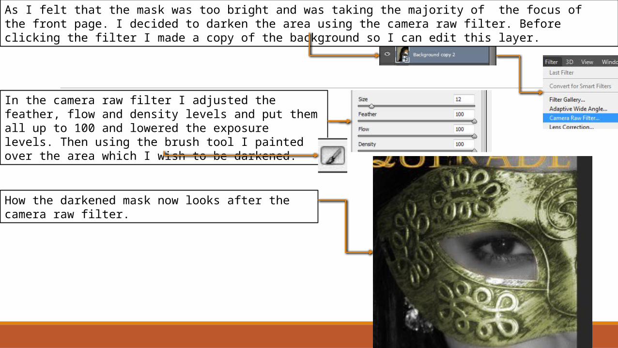
As I felt that the mask was too bright and was taking the majority of the focus of the front page. I decided to darken the area using the camera raw filter. Before clicking the filter I made a copy of the background so I can edit this layer.
In the camera raw filter I adjusted the feather, flow and density levels and put them all up to 100 and lowered the exposure levels. Then using the brush tool I painted over the area which I wish to be darkened.
How the darkened mask now looks after the camera raw filter.

To create the banner at the top of the page I used the rectangle shape tool and drew the rectangle at the top.
As I wanted this banner to be transparent I had to rasterize the layer first by right clicking on the layer and then clicking rasterize layer style. I then adjusted the opacity levels to make it transparent.

After creating the banner I duplicated it so that I can use it as a footer for the bottom of my page.
How my draft of my magazine looked before applying my feedback which I received to it.
FEEDBACK – improvements As the top area of the magazine looks empty add some cover lines or slogans to fill up the empty space

As I wanted my magazine to be as simplistic as possible, instead of adding cover lines to the top of the page I had instead added a slogan above my masthead.
How my cover looked after the changes made.
FEEDBACK – improvements the cover lines of the magazine look messy as they all have different alignments, align them all a certain way

After receiving my feedback I had aligned all the cover lines besides the main cover line to the left. This is because the main cover line is the most important news and is exclusive to the magazine so it deserves to be different from the rest of the articles.

The final look of my front cover.