for the 2017 annual meeting - wvagp · pam hoskins, gisp (harrisville) - contract mapper; under...
TRANSCRIPT

Page 1 | WVAGP May 2017
The Mountain State Geospatial Journal The Official Newsletter for
West Virginia Association of Geospatial Professionals
Annual Meeting Details: Page 1
Board of Directors Election: Page 2
Board of Directors Nominee Profiles:
Pages 2-3
Senate Bill 588: Pages 3, 6
Levering Perception to Promote Under-
standing: Page 4-5
Legislative GIS Day: Pages 7-10
Newsletter Contributors: Page 12
In this Issue
Join Us for the
2017 Annual Meeting at
Stonewall Jackson Resort—Roanoke, WV
June 1st, 2017
9:00am—5:00pm
Registration is FREE!!! Board of Director Elections
ESRI ArcGIS Pro Presentation
Collaboration & Networking Opportunities

Page 2 | WVAGP May 2017
Board of Directors Election
June 1st, 2017
It’s that time of year again! The past few years
election participation by members has been
low, and we’re hoping that this year we’ll be
able to bring those numbers up. WVAGP mem-
bers having voting rights in all Board of Direc-
tor elections, so use your voice and vote for
who you would like to see on the Board. To
vote, select your top five candidates among
those listed below. You can vote for multiple
candidates from the same constituency group,
and your are not required to select a candidate
from each constituency group. For full election
packets visit the WVAGP Website.
Voting is EASY!!!!
1. Fill out your ballot— In the election pack-
et, select Five candidates for the Board of
Directors. Preferential voting method will be
used, so rank your candidates accordingly.
2. Print and Sign your ballot— Be sure to
sign your name at the bottom of the ballot.
Your ballot is not valid unless you print and
sign your name. This is used to ensure only
current WVAGP members are voting.
3. Submit your ballot—There are multiple
ways you can submit your ballot! You can
mail your ballot in a sealed envelope, on or
before, May 30th, 2017 to the following ad-
dress: WVAGP c/o Jennings Starcher, PO
Box 3903, Charleston, WV 25339. Alterna-
tively, you can deposit your ballot directly
with the treasurer or his/her designee be-
fore the annual meeting begins on June 1st,
2017.
2017 Candidates
State
Justin Adams (Charleston) - GIS Analyst II for
WVDOH.
Steve Harouff (Morgantown) - GIS Manager for
WV Division of Forestry.
Regional/Local Government
JD Adkins (Huntington) - GIS Coordinator/IT
Administrator at Cabell County Assessor’s Of-
fice.
John Barth (Charleston) - GIS Supervisor at
Kanawha County Assessor’s Office .
Marvin Davis (Oak Hill) - GIS Coordinator for
the City of Oak Hill.
Nate Davis (Charleston) - GIS Manager for the
City of Charleston Sanitary Board.
Pam Hoskins, GISP (Harrisville) - Contract
Mapper; under sub-contract with Ritchie County
Assessor’s Office.
at Pocahontas Land Corporation
Education & Research
Kevin Kuhn, GISP (Morgantown) - GIS Analyst
and Instructor at the WV GIS Tech Center.
Barbara MacLennan (Morgantown) - Doctoral
Candidate at WVU. -Continued on Page 3-

Page 3 | WVAGP May 2017
-Continued from Page 2– Board of Directors Candidates
Private Sector
James Taylor (Pittsburgh, PA) - GIS Technician
for The Gateway Engineers, Inc.
Chelsea White (Burton) - GIS Analyst at Blue
Mountain, Inc.
Harold Yancy, GISP (Bluefield) - GIS Technician
Senate Bill 588—Tax Map Sales & Funding of County Assessor
Mapping Departments
Chris Chrzanowski
SB 588 was originally written by Doug McElwee a lawyer in Charleston, WV who felt the cost of
purchasing an entire county’s tax maps was prohibitive to economic growth and unfairly made
this data unobtainable to the general public. He felt that electronic maps (i.e. shapefiles) were
especially so, for example in Kanawha County the cost of the entire county dataset is almost
$12,000. McElwee believed that since this data is created with taxpayer dollars, it should be
more readily available for use by the public. The trick was to maintain the funding that map sales
provided to county assessors, as well as the courthouse improvement fund.
The bill was introduced to the Senate by Senator Sypolt in March 2017. The bill had overwhelm-
ing support in both the House and the Senate. While the bill was in the House there was only
one minor amendment, and the Bill was signed by the Governor in April 2017. Some major
changes in the law states: The paper and electronic tax maps including mineral boundary maps shall be made
available for sale by the assessor and the map sales unit of the Property Tax Division of the Department of Revenue.
In connection with these sales the assessor and map sales unit of the Property Tax Division of the Department of
Revenue shall offer the electronic tax maps in all available formats and with all underlying map data, including that
necessary to tie electronic parcel data to associated land book ownership and related data. Sales of paper and elec-
tronic tax maps shall be without limitation as to the reproduction or disclosure of information contained therein or
thereon by the purchaser.
The fees charged for the sale or reproduction of paper and electronic tax maps by the assessor or the map sales
until of the property Tax Division of the Department of Revenue shall be limited to those reasonably calculated to
reimburse it for its actual cost in making reproductions of the records (i.e. the charge shall be no more than what is
reasonable for disclosure of the information under a Freedom of Information Act request under article one, chapter
twenty-nine-b of this code). Tax maps are prepared for taxation purposes only and the assessor and map sales unit
of the property Tax Division of the Department of Revenue may have no liability to any third party for any errors or
omissions associated therewith or in connection with the use of tax maps for any other purpose.
-Continued from Page 6-

Page 4 | WVAGP May 2017
Leveraging Perception to Promote Understanding Michael H. Duminiak, GISP (2/8/17)
Visualization of data is a key component of GIS. All the fantastic analysis in the world is wasted if
the target audience can’t fundamentally grasp the results. We often take for granted the symbol-
ogy we see daily. We don’t give much thought to precipitation color coding because it has been
standardized for so long that a simple glance tells anyone the type and intensity. Yet, it wasn’t so
long ago that we saw catastrophes in cartography created by using the default “fruits and vegeta-
bles” palette in the old Arc products. While default symbology has improved, we have all seen
plenty of maps, websites and other presentations that hurt the eyes and confound comprehen-
sion. As we add layer upon layer to complex interactions, that which we hope to distill becomes
lost in a jumble.
When I was in college, I participated in research that sought to determine how people perceive
visual representations of geographic data. Various types of data were symbolized in various ways
and the perception and comprehension of them was measured. Cultures have embedded de-
faults when it comes to colors and the relationships between them. The research done in the ear-
ly 90s helped to identify them and also the average ability to distinguish between shades. The
result (always being refined) was a lot of interesting papers and ColorBrewer.1
ColorBrewer is an online tool that applies some of the research to help pick color schemes and
includes the ability to pick schemes that are colorblind safe, print friendly and/or photocopy safe.
It distinguishes between diverging, qualitative and sequential data sets and adjusts the colors to
best fit those data types. Certain color combinations are inherently associated with sequences or
divergences in our culture and are best for those applications and, conversely, bad for use in oth-
ers. The goal is to produce a visual that is not misunderstood at a glance. The tool is a great
start, but there is more to great visualization.
In my first job doing GIS, I had a project manager come to me and say, “Just don’t make any of
the contamination areas red.” He gave good advice. While red is a great color for maps because
it isn’t found in most base layer features and it draws the eye, it also has connotations in our cul-
ture which come into play with certain data like temperature and bad things in general. People
don’t look at the totality of your presentation and just jump to a conclusion based on seeing a
trigger color. Making those contamination sites red would have caused people to assume horri-
ble things. Making them blue would have confused people. They ended up an earthy orange, i.e.
dirt that wasn’t quite right. The point being that we, who are overly close to our data, need to
consider how those who are seeing it from a different perspective will perceive it.
As the number of layers increases and we struggle to find colors and symbols that are unique, tell
a story and don’t confuse, we sometimes find that we’ve made a monstrosity. I don’t want to pro-
vide any examples and call out anyone (myself included), but I think we’ve all see some. Web ap-
plications are the worst offenders. Not knowing which layers a person will activate and having to
make them all unique has resulted in some of the ugliest, most confusing and generally repulsive
things ever to curse the history of cartography. The solution to the problem is a little more cod-
ing and the increased use of story maps.
- Continued on Page 5 -

Page 5 | WVAGP May 2017
- Continued from Page 4 - Levering Perception to Promote Understanding
Research has shown that people retain the original presentation of data.2 What does that mean?
If you present a layer with a set color scheme, the viewer will continue to see it in that scheme. If
you modify the ranges, the viewer will still perceive it under the old ranges and misinterpret your
data. But, if you mute all the features in an equal proportion, the viewer will perceive them the
same way. Ok. That’s interesting, but how is it useful? It solves your complexity problem.
The most important features should be the ones that stand out most.3 This is common practice
for labeling, color coding, etc. Yet, it often isn’t applied to the interaction between increasingly
complex data layers. When a new layer is added, it should be at 100% of its palette. Then, when
another is added, the previous one should be muted so that the new stands out while the per-
ception of the first remains despite it taking a step down in intensity. This process of introduc-
ing new layers allows the viewer to imprint them and retain that impression as new layers are
added and to help the viewer focus on the new features even while the map may be loaded with
a dozen other layers. It builds the story of the map without overwhelming the viewer. In short,
it trains the viewer’s mind to see the data the way you see it.
This is easily done in story maps where you can control the presentation of layers. It is harder in
interactive web applications. For those you have to consider the ‘active layer’ as the most re-
cently added and each time a new layer is activated, the previous ‘active layer’ needs to be re-
turned to a muted version such that no layer is at full intensity except the one most recently tog-
gled. When a layer is turned off and then turned on again, it would go to full intensity again.
That extra work in coding gives the user the experience we all strive to create. It shows interac-
tions while highlighting the key features intended (in this case intent being determined by the
user selection).
The technology we have today is so much better than that which I started with in the early 90s.
So much of the research that was incredibly difficult to apply then can be relatively easily applied
now. It just takes a desire to go a little further on our part. Are we going to be considerate of
colorblindness? Are we going to help tell a story with our data so that those who are seeing it
for the first time can become familiar with it in a meaningful way? Are we going to avoid trig-
gering wrong perceptions and embrace the simplicity of leveraging common ones?
The wealth of research in this area runs from the psychology of color, to advertising, to fonts,
through to cockpit design and everything in between. The human mind is an amazing thing, but
the cultural conditioning it encounters during childhood greatly affects the way perceptions are
formed. We jump to conclusions all the time. A good map helps the viewer jump to the right
ones.
See:
1. www.colorbrewer2.org
2. Aesthetic response to color combinations: preference, harmony, and similarity http://link.springer.com/
article/10.3758%2Fs13414-010-0027-0
3. Guidelines for Consistently Readable Topographic Vectors and Labels with Toggling Backgrounds http://
icaci.org/files/documents/ICC_proceedings/ICC2013/_extendedAbstract/349_proceeding.pdf

Page 6 | WVAGP May 2017
With this new language Assessors will be able to make tax maps and shapefiles more accessible to
the public for little to no cost. Our plan in Kanawha County is to not charge at all for shapefiles,
and only charge if a person requests a large number of printed maps. The Kanawha County Asses-
sor’s Office is looking into creating an FTP site where shapefile and PDF copies of tax maps can be
downloaded.
The section of the bill that seemed to cause the most angst among Assessor’s Offices is “Sales of
paper and electronic tax maps shall be without limitation…” However, the more I thought about
this the less it bothered me. Prior to SB 588 there is nothing we could do short of ensuing a
lengthy and costly court battle. This bill allows us to offer the most up to date data for free, which
will ideally cut down on private companies illegally selling subscription services to tax map data,
and protects the state and assessors from any errors in the data made by third parties.
Another highlight of SB 588 involves funding for Assessor’s Mapping Departments:
Twenty-five dollars for a deed of conveyance (with or without a plat), trust deed, fixture filing or
security agreement concerning real estate leases.
This is a ten dollar increase of the current cost for filing. Of the ten dollars, the assessor will get five
dollars dedicated to the operation of their mapping departments. Three dollars will go to the
courthouse improvement fund, one dollar will go to county’s 911 centers and the last dollar will go
to the county clerk’s office. The money dedicated to the mapping departments will great benefit
us at the county level. Many of the smaller counties will now have a source of funding that can be
used to start a GIS department if they desire, or even help pay an outside contractor to set one up.
Even if a county does not wish to go into GIS, they can use the funds to help maintain their paper
maps. Overall, this bill is a positive change for the future of mapping at the county level.
-Continued from Page 3– SB 588

Page 7 | WVAGP May 2017
On April 4th, 2017 geospatial professionals from around the state exhibited their capabilities and
projects in the State Capitol. This event seemed to be well received by the general public, govern-
ment officials, and exhibitors. The Association would like to acknowledge Jessica Perkins and Tony
Simental for organizing the event. Exhibitors included:
-Continued on Page 8-
State & Local Government
City of Charleston
Kanawha County Assessor Office
Monongalia County GIS
WV Department of Transportation
WV DHHR—Office of Environmental Health
Services, Source Water Assessment Program
WV Division of Homeland Security and
Emergency Management
WV Division of Natural Resources
WV Geological & Economic Survey
WV State Historic Preservation Office
WV DEP—Technical Applications & GIS
WV DEP—Water Use Section
WV Property Tax
WV State GIS Coordinator’s Office
Non-Profit Organizations
WV Association of Geospatial Professions
WV Association of Metropolitan Planning
Organizations
WV Association of Regional Planning &
Development Councils
WV Society of Professional Surveyors
Research & Education Organizations
WV GIS Technical Center
Mountwest Community & Technical College—
Geospatial Science & Technology Program
Private
Atlas Geographic Data, Inc.
Blue Mountain, Inc.
ESRI
GRW, Inc.
SURDEX Corporation
Woolpert, Inc.
Photo Credit: John Bocan

Page 8 | WVAGP May 2017
-Continued from Page 7 – Legislative GIS Day
Photo Credit: John Bocan
Photo Credit: John Bocan
Photo Credit: Kevin Kuhn
Adam Cottrell, GIS Manager for the
City of Charleston knocked it out of
the park with his Augmented Reality
Sandbox Display.
Photo Credit: Jessica Perkins
-Continued on Page 9-

Page 9 | WVAGP May 2017
-Continued from Page 8 – Legislative GIS Day
Richard Binns, John Bocan, Tony Simental, James Britton
Sam Moffat Photo Credit: Will Price
-Continued on Page 10 –
Page 10 | WVAGP May 2017
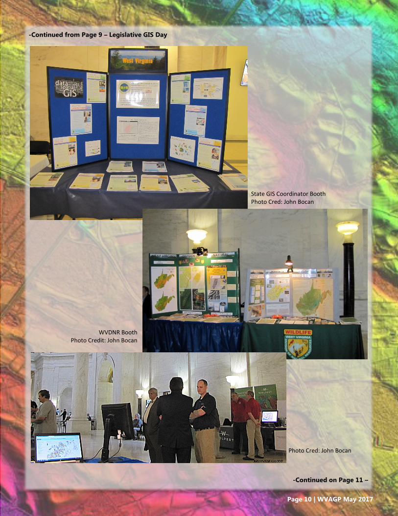
-Continued from Page 9 – Legislative GIS Day
State GIS Coordinator Booth Photo Cred: John Bocan
WVDNR Booth Photo Credit: John Bocan
-Continued on Page 11 –
Photo Cred: John Bocan

Page 11 | WVAGP May 2017
-Continued from Page 9 – Legislative GIS Day
GIS Day Exhibitors Photo Credit: Kevin Kuhn
Colleen Lemasters, GISP
(Editor)
John Bocan, GISP
Chris Chrzanowski, GISP
Michael Duminiak, GISP
Kevin Kuhn, GISP
Jennings Starcher, GISP
Newsletter Contributors
Thank you to all of our Exhibitors who helped make GIS Legis-
lative Day a huge success!
Keep an eye out for details on next year’s event in the coming
months.