fmtoc.qxd 4/18/12 6:12 pm page iv
TRANSCRIPT


FMTOC.qxd 4/18/12 6:12 PM Page iv
This page is intentionally left blank

Other Wiley books by Douglas C. MontgomeryWebsite: www.wiley.com/college/montgomery
Engineering Statistics, Fifth Editionby D. C. Montgomery, G. C. Runger, and N. F. HubeleIntroduction to engineering statistics, with topical coverage appropriate for a one-semester course.
A modest mathematical level and an applied approach.
Applied Statistics and Probability for Engineers, Fifth Editionby D. C. Montgomery and G. C. RungerIntroduction to engineering statistics, with topical coverage appropriate for either a one- or two-
semester course. An applied approach to solving real-world engineering problems.
Probability and Statistics in Engineering, Fourth Editionby W. W. Hines, D. C. Montgomery, D. M. Goldsman, and C. M. BorrorWebsite: www.wiley.com/college/hines
For a first two-semester course in applied probability and statistics for undergraduate students, or
a one-semester refresher for graduate students, covering probability from the start.
Design and Analysis of Experiments, Seventh Editionby Douglas C. MontgomeryAn introduction to the design and analysis of experiments, with the modest prerequisite of a first
course in statistical methods.
Introduction to Linear Regression Analysis, Fifth Editionby D. C. Montgomery, E. A. Peck, and G. G. ViningA comprehensive and thoroughly up-to-date look at regression analysis, still the most widely used
technique in statistics today.
Response Surface Methodology: Process and Product Optimization Using DesignedExperiments, Third Editionby R. H. Myers, D. C. Montgomery, and C. M. Anderson-CookWebsite: www.wiley.com/college/myers
The exploration and optimization of response surfaces for graduate courses in experimental design
and for applied statisticians, engineers, and chemical and physical scientists.
Generalized Linear Models: With Applications in Engineering and the Sciences,Second Editionby R. H. Myers, D. C. Montgomery, G. G. Vining, and T. J. RobinsonAn introductory text or reference on Generalized Linear Models (GLMs). The range of theoretical
topics and applications appeals both to students and practicing professionals.
Introduction to Time Series Analysis and Forecastingby Douglas C. Montgomery, Cheryl L. Jennings, Murat KulahciMethods for modeling and analyzing time series data, to draw inferences about the data and generate
forecasts useful to the decision maker. Minitab and SAS are used to illustrate how the methods are
implemented in practice. For advanced undergrad/first-year graduate, with a prerequisite of basic
statistical methods. Portions of the book require calculus and matrix algebra.
Frontendsheet.qxd 4/24/12 8:13 PM Page F2
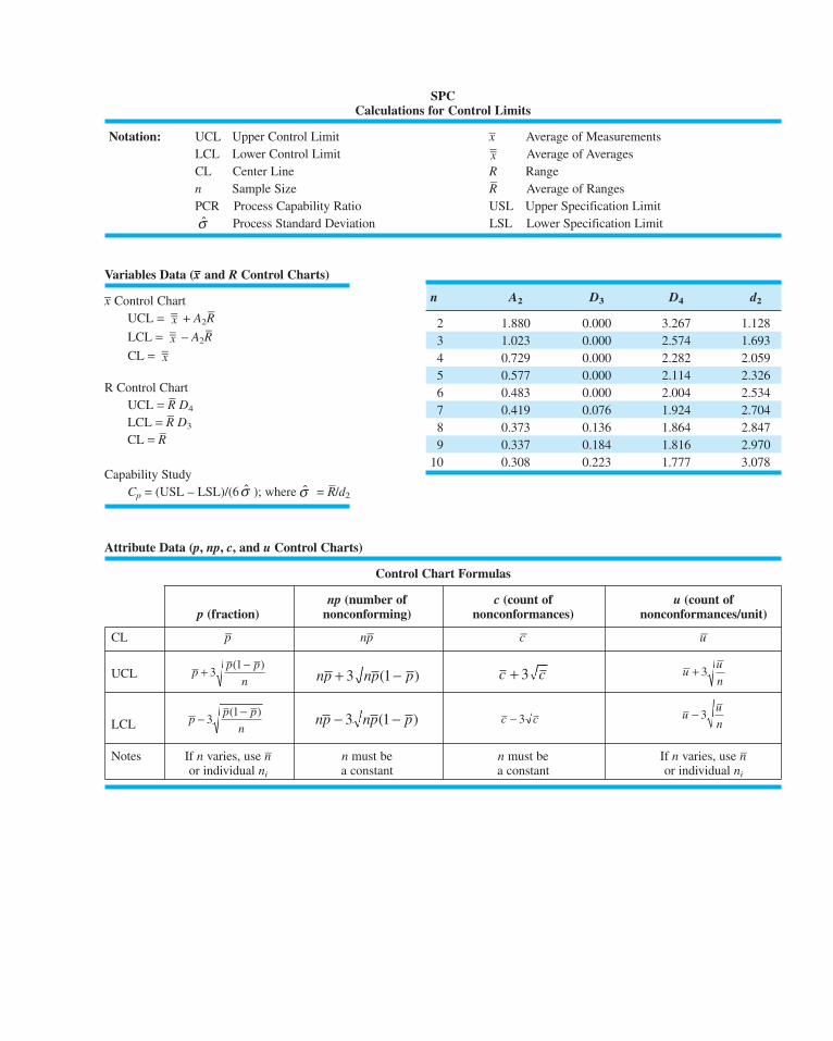
SPCCalculations for Control Limits
Notation: UCL Upper Control Limit x– Average of Measurements
LCL Lower Control Limit Average of Averages
CL Center Line R Range
n Sample Size R–
Average of Ranges
PCR Process Capability Ratio USL Upper Specification Limit
Process Standard Deviation LSL Lower Specification Limit
Variables Data (x– and R Control Charts)
x– Control Chart
UCL = + A2R–
LCL = – A2R–
CL =
R Control Chart
UCL = R–
D4
LCL = R–
D3
CL = R–
Capability Study
Cp = (USL – LSL)/(6 ); where = R–/d2σσ
x=x=x=
σ
x=
Control Chart Formulas
np (number of c (count of u (count ofp (fraction) nonconforming) nonconformances) nonconformances/unit)
CL p– np– c– u–
UCL
LCL
Notes If n varies, use n– n must be n must be If n varies, use n–
or individual ni a constant a constant or individual ni
uu
n− 3c c− 3np np p− −3 1( )p
p p
n− −
31( )
uu
n+ 3c c+ 3np np p+ −3 1( )p
p p
n+ −
31( )
Attribute Data (p, np, c, and u Control Charts)
n A2 D3 D4 d2
2 1.880 0.000 3.267 1.128
3 1.023 0.000 2.574 1.693
4 0.729 0.000 2.282 2.059
5 0.577 0.000 2.114 2.326
6 0.483 0.000 2.004 2.534
7 0.419 0.076 1.924 2.704
8 0.373 0.136 1.864 2.847
9 0.337 0.184 1.816 2.970
10 0.308 0.223 1.777 3.078
Frontendsheet.qxd 4/24/12 8:13 PM Page F3

Seventh Edition
Introduction toStatisticalQuality Control
DOUGLAS C. MONTGOMERYArizona State University
John Wiley & Sons, Inc.
FMTOC.qxd 4/18/12 6:12 PM Page i

Executive Publisher: Don Fowley
Associate Publisher: Daniel Sayer
Acquisitions Editor: Jennifer Welter
Marketing Manager: Christopher Ruel
Production Manager: Lucille Buonocore
Production Editor: Sujin Hong
Design Director: Harry Nolan
Senior Designer: Maureen Eide
Cover Design: Wendy Lai
Cover Illustration: Norm Christiansen
New Media Editor: Lauren Sapira
Editorial Assistant: Christopher Teja
Production Management Services: Aptara, Inc.
This book was typeset in 10/12 Times by Aptara®, Inc., and printed and bound by RRD Von Hoffmann. The cover
was printed by RRD Von Hoffmann.
This book is printed on acid-free paper.
Founded in 1807, John Wiley & Sons, Inc. has been a valued source of knowledge and understanding for more than
200 years, helping people around the world meet their needs and fulfill their aspirations. Our company is built on a
foundation of principles that include responsibility to the communities we serve and where we live and work. In
2008, we launched a Corporate Citizenship Initiative, a global effort to address the environmental, social, economic,
and ethical challenges we face in our business. Among the issues we are addressing are carbon impact, paper
specifications and procurement, ethical conduct within our business and among our vendors, and community and
charitable support. For more information, please visit our website: www.wiley.com/go/citizenship.
Copyright © 2013, 2008, 2004, 2000 by John Wiley & Sons, Inc. All rights reserved.
No part of this publication may be reproduced, stored in a retrieval system or transmitted in any form or by any
means, electronic, mechanical, photocopying, recording, scanning or otherwise, except as permitted under Section
107 or 108 of the 1976 United States Copyright Act, without either the prior written permission of the Publisher or
authorization through payment of the appropriate per-copy fee to the Copyright Clearance Center, Inc., 222
Rosewood Drive, Danvers, MA 01923, website www.copyright.com. Requests to the Publisher for permission
should be addressed to the Permission Department, John Wiley & Sons, Inc., 111 River Street, Hoboken,
NJ 07030-5774, (201) 748-6011, fax (201) 748-6008, website: www.wiley.com/go/permissions.
Evaluation copies are provided to qualified academics and professionals for review purposes only, for use in their
courses during the next academic year. These copies are licensed and may not be sold or transferred to a third party.
Upon completion of the review period, please return the evaluation copy to Wiley. Return instructions and a free-of-
charge return mailing label are available at www.wiley.com/go/returnlabel. If you have chosen to adopt this textbook
for use in your course, please accept this book as your complimentary desk copy. Outside of the United States,
please contact your local sales representative.
ISBN: 978-1-118-14681-1
Printed in the United States of America.
10 9 8 7 6 5 4 3 2 1
FMTOC.qxd 4/23/12 9:14 PM Page ii

About the Author
Douglas C. Montgomery is Regents’ Professor of Industrial Engineering and Statistics and
the Arizona State University Foundation Professor of Engineering. He received his B.S.,
M.S., and Ph.D. degrees from Virginia Polytechnic Institute, all in engineering. From 1969 to
1984, he was a faculty member of the School of Industrial & Systems Engineering at the
Georgia Institute of Technology; from 1984 to 1988, he was at the University of Washington,
where he held the John M. Fluke Distinguished Chair of Manufacturing Engineering, was
Professor of Mechanical Engineering, and was Director of the Program in Industrial
Engineering.
Dr. Montgomery has research and teaching interests in engineering statistics including
statistical quality-control techniques, design of experiments, regression analysis and empirical
model building, and the application of operations research methodology to problems in man-
ufacturing systems. He has authored and coauthored more than 250 technical papers in these
fields and is the author of twelve other books. Dr. Montgomery is a Fellow of the American
Society for Quality, a Fellow of the American Statistical Association, a Fellow of the Royal
Statistical Society, a Fellow of the Institute of Industrial Engineers, an elected member of the
International Statistical Institute, and an elected Academician of the International Academy of
Quality. He is a Shewhart Medalist of the American Society for Quality, and he also has
received the Brumbaugh Award, the Lloyd S. Nelson Award, the William G. Hunter Award, and
two Shewell Awards from the ASQ. He has also received the Deming Lecture Award from the
American Statistical Association, the George Box Medal from the European Network for
Business and Industrial statistics (ENBIS), the Greenfield Medal from the Royal Statistical
Society, and the Ellis R. Ott Award. He is a former editor of the Journal of Quality Technology,
is one of the current chief editors of Quality and Reliability Engineering International, and
serves on the editorial boards of several journals.
iii
FMTOC.qxd 4/18/12 6:12 PM Page iii

FMTOC.qxd 4/18/12 6:12 PM Page iv
This page is intentionally left blank

PrefaceIntroduction
This book is about the use of modern statistical methods for quality control and improvement. It
provides comprehensive coverage of the subject from basic principles to state-of-the-art concepts
and applications. The objective is to give the reader a sound understanding of the principles and the
basis for applying them in a variety of situations. Although statistical techniques are emphasized
throughout, the book has a strong engineering and management orientation. Extensive knowledge
of statistics is not a prerequisite for using this book. Readers whose background includes a basic
course in statistical methods will find much of the material in this book easily accessible.
Audience
The book is an outgrowth of more than 40 years of teaching, research, and consulting in the appli-
cation of statistical methods for industrial problems. It is designed as a textbook for students enrolled
in colleges and universities who are studying engineering, statistics, management, and related fields
and are taking a first course in statistical quality control. The basic quality-control course is often
taught at the junior or senior level. All of the standard topics for this course are covered in detail.
Some more advanced material is also available in the book, and this could be used with advanced
undergraduates who have had some previous exposure to the basics or in a course aimed at gradu-
ate students. I have also used the text materials extensively in programs for professional practition-
ers, including quality and reliability engineers, manufacturing and development engineers, product
designers, managers, procurement specialists, marketing personnel, technicians and laboratory ana-
lysts, inspectors, and operators. Many professionals have also used the material for self-study.
Chapter Organization and Topical Coverage
The book contains five parts. Part 1 is introductory. The first chapter is an introduction to the
philosophy and basic concepts of quality improvement. It notes that quality has become a major
business strategy and that organizations that successfully improve quality can increase their pro-
ductivity, enhance their market penetration, and achieve greater profitability and a strong compet-
itive advantage. Some of the managerial and implementation aspects of quality improvement are
included. Chapter 2 describes DMAIC, an acronym for Define, Measure, Analyze, Improve, and
Control. The DMAIC process is an excellent framework to use in conducting quality-improvement
projects. DMAIC often is associated with Six Sigma, but regardless of the approach taken by an
organization strategically, DMAIC is an excellent tactical tool for quality professionals to employ.
Part 2 is a description of statistical methods useful in quality improvement. Topics include
sampling and descriptive statistics, the basic notions of probability and probability distributions,
point and interval estimation of parameters, and statistical hypothesis testing. These topics are
usually covered in a basic course in statistical methods; however, their presentation in this text
is from the quality-engineering viewpoint. My experience has been that even readers with a
strong statistical background will find the approach to this material useful and somewhat different
from a standard statistics textbook.
v
FMTOC.qxd 4/23/12 10:14 PM Page v

Part 3 contains four chapters covering the basic methods of statistical process control
(SPC) and methods for process capability analysis. Even though several SPC problem-solving
tools are discussed (including Pareto charts and cause-and-effect diagrams, for example), the
primary focus in this section is on the Shewhart control chart. The Shewhart control chart cer-
tainly is not new, but its use in modern-day business and industry is of tremendous value.
There are four chapters in Part 4 that present more advanced SPC methods. Included are
the cumulative sum and exponentially weighted moving average control charts (Chapter 9), sev-
eral important univariate control charts such as procedures for short production runs, autocorre-
lated data, and multiple stream processes (Chapter 10), multivariate process monitoring and
control (Chapter 11), and feedback adjustment techniques (Chapter 12). Some of this material
is at a higher level than Part 3, but much of it is accessible by advanced undergraduates or first-
year graduate students. This material forms the basis of a second course in statistical quality
control and improvement for this audience.
Part 5 contains two chapters that show how statistically designed experiments can be used
for process design, development, and improvement. Chapter 13 presents the fundamental con-
cepts of designed experiments and introduces factorial and fractional factorial designs, with par-
ticular emphasis on the two-level system of designs. These designs are used extensively in the
industry for factor screening and process characterization. Although the treatment of the subject
is not extensive and is no substitute for a formal course in experimental design, it will enable the
reader to appreciate more sophisticated examples of experimental design. Chapter 14 introduces
response surface methods and designs, illustrates evolutionary operation (EVOP) for process
monitoring, and shows how statistically designed experiments can be used for process robust-
ness studies. Chapters 13 and 14 emphasize the important interrelationship between statistical
process control and experimental design for process improvement.
Two chapters deal with acceptance sampling in Part 6. The focus is on lot-by-lot accep-
tance sampling, although there is some discussion of continuous sampling and MIL STD 1235C
in Chapter 14. Other sampling topics presented include various aspects of the design of
acceptance-sampling plans, a discussion of MIL STD 105E, and MIL STD 414 (and their civil-
ian counterparts: ANSI/ASQC ZI.4 and ANSI/ASQC ZI.9), and other techniques such as chain
sampling and skip-lot sampling.
Throughout the book, guidelines are given for selecting the proper type of statistical tech-
nique to use in a wide variety of situations. In addition, extensive references to journal articles
and other technical literature should assist the reader in applying the methods described. I also
have shown how the different techniques presented are used in the DMAIC process.
New To This Edition
The 8th edition of the book has new material on several topics, including implementing quality
improvement, applying quality tools in nonmanufacturing settings, monitoring Bernoulli
processes, monitoring processes with low defect levels, and designing experiments for process
and product improvement. In addition, I have rewritten and updated many sections of the book.
This is reflected in over two dozen new references that have been added to the bibliography.
I think that has led to a clearer and more current exposition of many topics. I have also added
over 80 new exercises to the end-of-chapter problem sets.
Supporting Text Materials
Computer Software
The computer plays an important role in a modern quality-control course. This edition of the
book uses Minitab as the primary illustrative software package. I strongly recommend that the
course have a meaningful computing component. To request this book with a student version of
vi Preface
FMTOC.qxd 4/23/12 10:14 PM Page vi

Minitab included, contact your local Wiley representative. The student version of Minitab has
limited functionality and does not include DOE capability. If your students will need DOE capa-
bility, they can download the fully functional 30-day trial at www.minitab.com or purchase a fully
functional time-limited version from e-academy.com.
Supplemental Text Material
I have written a set of supplemental materials to augment many of the chapters in the book. The
supplemental material contains topics that could not easily fit into a chapter without seriously
disrupting the flow. The topics are shown in the Table of Contents for the book and in the indi-
vidual chapter outlines. Some of this material consists of proofs or derivations, new topics of a
(sometimes) more advanced nature, supporting details concerning remarks or concepts presented
in the text, and answers to frequently asked questions. The supplemental material provides an
interesting set of accompanying readings for anyone curious about the field. It is available at
www.wiley.com/college/montgomery.
Student Resource Manual
The text contains answers to most of the odd-numbered exercises. A Student Resource Manual
is available from John Wiley & Sons that presents comprehensive annotated solutions to these
same odd-numbered problems. This is an excellent study aid that many text users will find
extremely helpful. The Student Resource Manual may be ordered in a set with the text or pur-
chased separately. Contact your local Wiley representative to request the set for your bookstore
or purchase the Student Resource Manual from the Wiley Web site.
Instructor’s Materials
The instructor’s section of the textbook Website contains the following:
1. Solutions to the text problems
2. The supplemental text material described above
3. A set of Microsoft PowerPoint slides for the basic SPC course
4. Data sets from the book, in electronic form
5. Image Gallery illustrations from the book in electronic format
The instructor’s section is for instructor use only and is password protected. Visit the Instructor
Companion Site portion of the Web site, located at www.wiley.com/college/montgomery, to reg-
ister for a password.
The World Wide Web Page
The Web page for the book is accessible through the Wiley home page. It contains the
supplemental text material and the data sets in electronic form. It will also be used to post items
of interest to text users. The Web site address is www.wiley.com/college/montgomery. Click on
the cover of the text you are using.
ACKNOWLEDGMENTS
Many people have generously contributed their time and knowledge of statistics and quality improve-
ment to this book. I would like to thank Dr. Bill Woodall, Dr. Doug Hawkins, Dr. Joe Sullivan,
Dr. George Runger, Dr. Bert Keats, Dr. Bob Hogg, Mr. Eric Ziegel, Dr. Joe Pignatiello, Dr. John
Ramberg, Dr. Ernie Saniga, Dr. Enrique Del Castillo, Dr. Sarah Streett, and Dr. Jim Alloway for their
thorough and insightful comments on this and previous editions. They generously shared many of
their ideas and teaching experiences with me, leading to substantial improvements in the book.
Preface vii
FMTOC.qxd 4/23/12 10:14 PM Page vii

Over the years since the first edition was published, I have received assistance and ideas
from a great many other people. A complete list of colleagues with whom I have interacted
would be impossible to enumerate. However, some of the major contributors and their profes-
sional affiliations are as follows: Dr. Mary R. Anderson-Rowland, Dr. Dwayne A. Rollier, and
Dr. Norma F. Hubele, Arizona State University; Dr. Murat Kulahci, Technical University of
Denmark; Mr. Seymour M. Selig, formerly of the Office of Naval Research; Dr. Lynwood A.
Johnson, Dr. Russell G. Heikes, Dr. David E. Fyffe, and Dr. H. M. Wadsworth, Jr., Georgia
Institute of Technology; Dr. Sharad Prabhu, Dr. Bradley Jones, and Dr. Robert Rodriguez, SAS
Institute; Dr. Scott Kowalski, Minitab; Dr. Richard L. Storch and Dr. Christina M. Mastrangelo,
University of Washington; Dr. Cynthia A. Lowry, formerly of Texas Christian University; Dr.
Smiley Cheng, Dr. John Brewster, Dr. Brian Macpherson, and Dr. Fred Spiring, University of
Manitoba; Dr. Joseph D. Moder, University of Miami; Dr. Frank B. Alt, University of Maryland;
Dr. Kenneth E. Case, Oklahoma State University; Dr. Daniel R. McCarville, Dr. Lisa Custer, Dr.
Pat Spagon, and Mr. Robert Stuart, all formerly of Motorola; Dr. Richard Post, Intel
Corporation; Dr. Dale Sevier, San Diego State University; Mr. John A. Butora, Mr. Leon V.
Mason, Mr. Lloyd K. Collins, Mr. Dana D. Lesher, Mr. Roy E. Dent, Mr. Mark Fazey, Ms. Kathy
Schuster, Mr. Dan Fritze, Dr. J. S. Gardiner, Mr. Ariel Rosentrater, Mr. Lolly Marwah, Mr. Ed
Schleicher, Mr. Amiin Weiner, and Ms. Elaine Baechtle, IBM; Mr. Thomas C. Bingham, Mr. K.
Dick Vaughn, Mr. Robert LeDoux, Mr. John Black, Mr. Jack Wires, Dr. Julian Anderson, Mr.
Richard Alkire, and Mr. Chase Nielsen, Boeing Company; Ms. Karen Madison, Mr. Don Walton,
and Mr. Mike Goza, Alcoa; Mr. Harry Peterson-Nedry, Ridgecrest Vineyards and The Chehalem
Group; Dr. Russell A. Boyles, formerly of Precision Castparts Corporation; Dr. Sadre Khalessi and
Mr. Franz Wagner, Signetics Corporation; Mr. Larry Newton and Mr. C. T. Howlett, Georgia
Pacific Corporation; Mr. Robert V. Baxley, Monsanto Chemicals; Dr. Craig Fox, Dr. Thomas L.
Sadosky, Mr. James F. Walker, and Mr. John Belvins, Coca-Cola Company; Mr. Bill Wagner and
Mr. Al Pariseau, Litton Industries; Mr. John M. Fluke, Jr., John Fluke Manufacturing Company;
Dr. Paul Tobias, formerly of IBM and Semitech; Dr. William DuMouchel and Ms. Janet Olson,
BBN Software Products Corporation. I would also like to acknowledge the many contributions of my
late partner in Statistical Productivity Consultants, Mr. Sumner S. Averett. All of these individuals
and many others have contributed to my knowledge of the quality-improvement field.
Other acknowledgments go to the editorial and production staff at Wiley, particularly Ms.
Charity Robey and Mr. Wayne Anderson, with whom I worked for many years, and my current
editor, Ms. Jenny Welter; they have had much patience with me over the years and have con-
tributed greatly toward the success of this book. Dr. Cheryl L. Jennings made many valuable
contributions by her careful checking of the manuscript and proof materials. I also thank Dr.
Gary Hogg and Dr. Ron Askin, former and current chairs of the Department of Industrial
Engineering at Arizona State University, for their support and for providing a terrific environment
in which to teach and conduct research.
I thank the various professional societies and publishers who have given permission to repro-
duce their materials in my text. Permission credit is acknowledged at appropriate places in this book.
I am also indebted to the many organizations that have sponsored my research and my
graduate students for a number of years, including the member companies of the National
Science Foundation/Industry/University Cooperative Research Center in Quality and Reliability
Engineering at Arizona State University, the Office of Naval Research, the National Science
Foundation, Semiconductor Research Corporation, Aluminum Company of America, and IBM
Corporation. Finally, I thank the many users of the previous editions of this book, including stu-
dents, practicing professionals, and my academic colleagues. Many of the changes and improve-
ments in this edition of the book are the direct result of your feedback.
DOUGLAS C. MONTGOMERY
Tempe, Arizona
viii Preface
FMTOC.qxd 4/18/12 6:12 PM Page viii

Contents
PART 1INTRODUCTION 1
1QUALITY IMPROVEMENT IN THE MODERN BUSINESSENVIRONMENT 3
Chapter Overview and Learning Objectives 3
1.1 The Meaning of Quality and
Quality Improvement 4
1.1.1 Dimensions of Quality 4
1.1.2 Quality Engineering Terminology 8
1.2 A Brief History of Quality Control
and Improvement 9
1.3 Statistical Methods for Quality Control
and Improvement 13
1.4 Management Aspects of
Quality Improvement 16
1.4.1 Quality Philosophy and
Management Strategies 17
1.4.2 The Link Between Quality
and Productivity 35
1.4.3 Supply Chain Quality
Management 36
1.4.4 Quality Costs 38
1.4.5 Legal Aspects of Quality 44
1.4.6 Implementing Quality Improvement 45
2THE DMAIC PROCESS 48
Chapter Overview and Learning Objectives 48
2.1 Overview of DMAIC 49
2.2 The Define Step 52
2.3 The Measure Step 54
2.4 The Analyze Step 55
2.5 The Improve Step 56
2.6 The Control Step 57
2.7 Examples of DMAIC 57
2.7.1 Litigation Documents 57
2.7.2 Improving On-Time Delivery 59
2.7.3 Improving Service Quality
in a Bank 62
PART 2STATISTICAL METHODS USEFUL IN QUALITY CONTROLAND IMPROVEMENT 65
3MODELING PROCESS QUALITY 67
Chapter Overview and Learning Objectives 68
3.1 Describing Variation 68
3.1.1 The Stem-and-Leaf Plot 68
3.1.2 The Histogram 70
3.1.3 Numerical Summary of Data 73
3.1.4 The Box Plot 75
3.1.5 Probability Distributions 76
3.2 Important Discrete Distributions 80
3.2.1 The Hypergeometric Distribution 80
3.2.2 The Binomial Distribution 81
3.2.3 The Poisson Distribution 83
3.2.4 The Negative Binomial and
Geometric Distributions 86
3.3 Important Continuous Distributions 88
3.3.1 The Normal Distribution 88
3.3.2 The Lognormal Distribution 90
3.3.3 The Exponential Distribution 92
3.3.4 The Gamma Distribution 93
3.3.5 The Weibull Distribution 95
3.4 Probability Plots 97
3.4.1 Normal Probability Plots 97
3.4.2 Other Probability Plots 99
ix
FMTOC.qxd 4/18/12 6:12 PM Page ix

x Contents
3.5 Some Useful Approximations 100
3.5.1 The Binomial Approximation to
the Hypergeometric 100
3.5.2 The Poisson Approximation to
the Binomial 100
3.5.3 The Normal Approximation to
the Binomial 101
3.5.4 Comments on Approximations 102
4INFERENCES ABOUTPROCESS QUALITY 108
Chapter Overview and Learning Objectives 109
4.1 Statistics and Sampling Distributions 110
4.1.1 Sampling from a Normal
Distribution 111
4.1.2 Sampling from a Bernoulli
Distribution 113
4.1.3 Sampling from a Poisson
Distribution 114
4.2 Point Estimation of Process Parameters 115
4.3 Statistical Inference for a Single Sample 117
4.3.1 Inference on the Mean of a
Population, Variance Known 118
4.3.2 The Use of P-Values for
Hypothesis Testing 121
4.3.3 Inference on the Mean of a Normal
Distribution, Variance Unknown 122
4.3.4 Inference on the Variance of
a Normal Distribution 126
4.3.5 Inference on a Population
Proportion 128
4.3.6 The Probability of Type II Error
and Sample Size Decisions 130
4.4 Statistical Inference for Two Samples 133
4.4.1 Inference for a Difference in
Means, Variances Known 134
4.4.2 Inference for a Difference in Means
of Two Normal Distributions,
Variances Unknown 136
4.4.3 Inference on the Variances of Two
Normal Distributions 143
4.4.4 Inference on Two
Population Proportions 145
4.5 What If There Are More Than Two
Populations? The Analysis of
Variance 146
4.5.1 An Example 146
4.5.2 The Analysis of Variance 148
4.5.3 Checking Assumptions:
Residual Analysis 154
4.6 Linear Regression Models 156
4.6.1 Estimation of the Parameters
in Linear Regression Models 157
4.6.2 Hypothesis Testing in Multiple
Regression 163
4.6.3 Confidance Intervals in Multiple
Regression 169
4.6.4 Prediction of New Observations 170
4.6.5 Regression Model Diagnostics 171
PART 3BASIC METHODS OF STATISTICALPROCESS CONTROL AND CAPABILITY ANALYSIS 185
5METHODS AND PHILOSOPHY OFSTATISTICAL PROCESS CONTROL 187
Chapter Overview and Learning Objectives 187
5.1 Introduction 188
5.2 Chance and Assignable Causes of
Quality Variation 189
5.3 Statistical Basis of the Control Chart 190
5.3.1 Basic Principles 190
5.3.2 Choice of Control Limits 197
5.3.3 Sample Size and Sampling
Frequency 199
5.3.4 Rational Subgroups 201
5.3.5 Analysis of Patterns on Control
Charts 203
5.3.6 Discussion of Sensitizing Rules
for Control Charts 205
5.3.7 Phase I and Phase II of Control
Chart Application 206
5.4 The Rest of the Magnificent Seven 207
5.5 Implementing SPC in a Quality
Improvement Program 213
5.6 An Application of SPC 214
5.7 Applications of Statistical Process
Control and Quality Improvement Tools
in Transactional and Service
Businesses 221
FMTOC.qxd 4/18/12 6:12 PM Page x

6CONTROL CHARTSFOR VARIABLES 234
Chapter Overview and Learning Objectives 235
6.1 Introduction 235
6.2 Control Charts for –x and R 236
6.2.1 Statistical Basis of the Charts 236
6.2.2 Development and Use of –x and
R Charts 239
6.2.3 Charts Based on Standard Values 250
6.2.4 Interpretation of –x and R Charts 251
6.2.5 The Effect of Nonnormality on –xand R Charts 254
6.2.6 The Operating-Characteristic
Function 254
6.2.7 The Average Run Length for
the –x Chart 257
6.3 Control Charts for –x and s 259
6.3.1 Construction and Operation of –xand s Charts 259
6.3.2 The –x and s Control Charts with
Variable Sample Size 263
6.3.3 The s2 Control Chart 267
6.4 The Shewhart Control Chart for Individual
Measurements 267
6.5 Summary of Procedures for –x , R,
and s Charts 276
6.6 Applications of Variables Control Charts 276
7CONTROL CHARTS FOR ATTRIBUTES 297
Chapter Overview and Learning Objectives 297
7.1 Introduction 298
7.2 The Control Chart for Fraction
Nonconforming 299
7.2.1 Development and Operation of
the Control Chart 299
7.2.2 Variable Sample Size 310
7.2.3 Applications in Transactional
and Service Businesses 315
7.2.4 The Operating-Characteristic
Function and Average Run Length
Calculations 315
7.3 Control Charts for Nonconformities
(Defects) 317
7.3.1 Procedures with Constant Sample
Size 318
Contents xi
7.3.2 Procedures with Variable Sample
Size 328
7.3.3 Demerit Systems 330
7.3.4 The Operating-Characteristic
Function 331
7.3.5 Dealing with Low Defect Levels 332
7.3.6 Nonmanufacturing Applications 335
7.4 Choice Between Attributes and Variables
Control Charts 335
7.5 Guidelines for Implementing Control
Charts 339
8PROCESS AND MEASUREMENTSYSTEM CAPABILITY ANALYSIS 355
Chapter Overview and Learning Objectives 356
8.1 Introduction 356
8.2 Process Capability Analysis Using a
Histogram or a Probability Plot 358
8.2.1 Using the Histogram 358
8.2.2 Probability Plotting 360
8.3 Process Capability Ratios 362
8.3.1 Use and Interpretation of Cp 362
8.3.2 Process Capability Ratio for an
Off-Center Process 365
8.3.3 Normality and the Process
Capability Ratio 367
8.3.4 More about Process Centering 368
8.3.5 Confidence Intervals and
Tests on Process Capability Ratios 370
8.4 Process Capability Analysis Using a
Control Chart 375
8.5 Process Capability Analysis Using
Designed Experiments 377
8.6 Process Capability Analysis with Attribute
Data 378
8.7 Gauge and Measurement System
Capability Studies 379
8.7.1 Basic Concepts of Gauge
Capability 379
8.7.2 The Analysis of Variance
Method 384
8.7.3 Confidence Intervals in Gauge
R & R Studies 387
8.7.4 False Defectives and Passed
Defectives 388
8.7.5 Attribute Gauge Capability 392
8.7.6 Comparing Customer and Supplier
Measurement Systems 394
FMTOC.qxd 4/18/12 6:12 PM Page xi

xii Contents
8.8 Setting Specification Limits on Discrete
Components 396
8.8.1 Linear Combinations 397
8.8.2 Nonlinear Combinations 400
8.9 Estimating the Natural Tolerance Limits
of a Process 401
8.9.1 Tolerance Limits Based on the
Normal Distribution 402
8.9.2 Nonparametric Tolerance Limits 403
PART 4OTHER STATISTICAL PROCESS-MONITORING AND CONTROLTECHNIQUES 411
9CUMULATIVE SUM ANDEXPONENTIALLY WEIGHTED MOVING AVERAGE CONTROL CHARTS 413
Chapter Overview and Learning Objectives 414
9.1 The Cumulative Sum Control Chart 414
9.1.1 Basic Principles: The CUSUM
Control Chart for Monitoring the
Process Mean 414
9.1.2 The Tabular or Algorithmic
CUSUM for Monitoring the
Process Mean 417
9.1.3 Recommendations for CUSUM
Design 422
9.1.4 The Standardized CUSUM 424
9.1.5 Improving CUSUM
Responsiveness for Large
Shifts 424
9.1.6 The Fast Initial Response or
Headstart Feature 424
9.1.7 One-Sided CUSUMs 427
9.1.8 A CUSUM for Monitoring
Process Variability 427
9.1.9 Rational Subgroups 428
9.1.10 CUSUMs for Other Sample
Statistics 428
9.1.11 The V-Mask Procedure 429
9.1.12 The Self-Starting CUSUM 431
9.2 The Exponentially Weighted Moving
Average Control Chart 433
9.2.1 The Exponentially Weighted
Moving Average Control Chart
for Monitoring the Process Mean 433
9.2.2 Design of an EWMA Control
Chart 436
9.2.3 Robustness of the EWMA to Non-
normality 438
9.2.4 Rational Subgroups 439
9.2.5 Extensions of the EWMA 439
9.3 The Moving Average Control Chart 442
10OTHER UNIVARIATE STATISTICALPROCESS-MONITORING ANDCONTROL TECHNIQUES 448
Chapter Overview and Learning Objectives 449
10.1 Statistical Process Control for Short
Production Runs 450
10.1.1 –x and R Charts for Short
Production Runs 450
10.1.2 Attributes Control Charts for
Short Production Runs 452
10.1.3 Other Methods 452
10.2 Modified and Acceptance Control Charts 454
10.2.1 Modified Control Limits for
the –x Chart 454
10.2.2 Acceptance Control Charts 457
10.3 Control Charts for Multiple-Stream
Processes 458
10.3.1 Multiple-Stream Processes 458
10.3.2 Group Control Charts 458
10.3.3 Other Approaches 460
10.4 SPC With Autocorrelated Process Data 461
10.4.1 Sources and Effects of
Autocorrelation in Process Data 461
10.4.2 Model-Based Approaches 465
10.4.3 A Model-Free Approach 473
10.5 Adaptive Sampling Procedures 477
10.6 Economic Design of Control Charts 478
10.6.1 Designing a Control Chart 478
10.6.2 Process Characteristics 479
10.6.3 Cost Parameters 479
10.6.4 Early Work and Semieconomic
Designs 481
10.6.5 An Economic Model of the ––xControl Chart 482
10.6.6 Other Work 487
10.7 Cuscore Charts 488
FMTOC.qxd 4/18/12 6:12 PM Page xii

Contents xiii
10.8 The Changepoint Model for Process
Monitoring 490
10.9 Profile Monitoring 491
10.10 Control Charts in Health Care Monitoring
and Public Health Surveillance 496
10.11 Overview of Other Procedures 497
10.11.1 Tool Wear 497
10.11.2 Control Charts Based on Other
Sample Statistics 498
10.11.3 Fill Control Problems 498
10.11.4 Precontrol 499
10.11.5 Tolerance Interval Control Charts 500
10.11.6 Monitoring Processes with
Censored Data 501
10.11.7 Monitoring Bernoulli Processes 501
10.11.8 Nonparametric Control Charts 502
11MULTIVARIATE PROCESS MONITORING AND CONTROL 509
Chapter Overview and Learning Objectives 509
11.1 The Multivariate Quality-Control Problem 510
11.2 Description of Multivariate Data 512
11.2.1 The Multivariate Normal
Distribution 512
11.2.2 The Sample Mean Vector and
Covariance Matrix 513
11.3 The Hotelling T2 Control Chart 514
11.3.1 Subgrouped Data 514
11.3.2 Individual Observations 521
11.4 The Multivariate EWMA Control Chart 524
11.5 Regression Adjustment 528
11.6 Control Charts for Monitoring Variability 531
11.7 Latent Structure Methods 533
11.7.1 Principal Components 533
11.7.2 Partial Least Squares 538
12ENGINEERING PROCESS CONTROL AND SPC 542
Chapter Overview and Learning Objectives 542
12.1 Process Monitoring and Process
Regulation 543
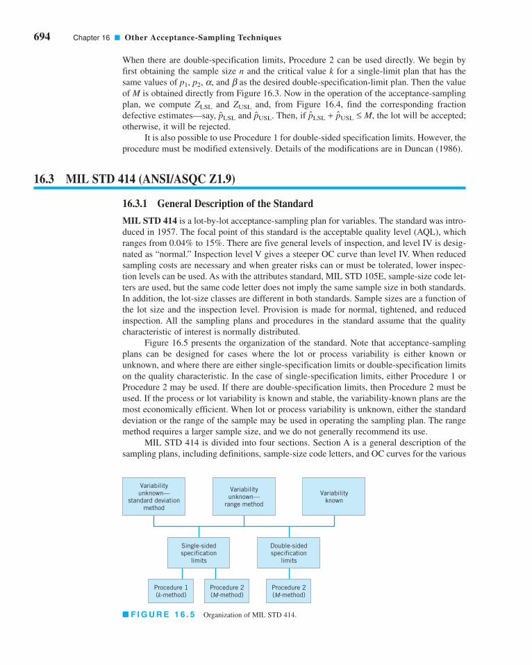
12.2 Process Control by Feedback Adjustment 544
12.2.1 A Simple Adjustment Scheme:
Integral Control 544
12.2.2 The Adjustment Chart 549
12.2.3 Variations of the Adjustment
Chart 551
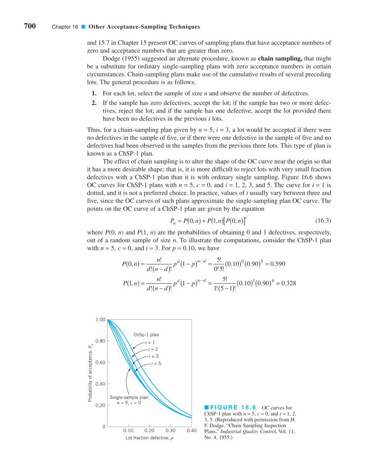
12.2.4 Other Types of Feedback
Controllers 554
12.3 Combining SPC and EPC 555
PART 5PROCESS DESIGN AND IMPROVEMENT WITH DESIGNEDEXPERIMENTS 561
13FACTORIAL AND FRACTIONALFACTORIAL EXPERIMENTS FORPROCESS DESIGN AND IMPROVEMENT 563
Chapter Overview and Learning Objectives 564
13.1 What is Experimental Design? 564
13.2 Examples of Designed Experiments
In Process and Product Improvement 566
13.3 Guidelines for Designing Experiments 568
13.4 Factorial Experiments 570
13.4.1 An Example 572
13.4.2 Statistical Analysis 572
13.4.3 Residual Analysis 577
13.5 The 2k Factorial Design 578
13.5.1 The 22 Design 578
13.5.2 The 2k Design for k ≥ 3 Factors 583
13.5.3 A Single Replicate of the 2k
Design 593
13.5.4 Addition of Center Points to
the 2k Design 596
13.5.5 Blocking and Confounding in
the 2k Design 599
13.6 Fractional Replication of the 2k Design 601
13.6.1 The One-Half Fraction of the
2k Design 601
13.6.2 Smaller Fractions: The 2k–p
Fractional Factorial Design 606
14PROCESS OPTIMIZATION WITHDESIGNED EXPERIMENTS 617
Chapter Overview and Learning Objectives 617
14.1 Response Surface Methods and Designs 618
14.1.1 The Method of Steepest Ascent 620
FMTOC.qxd 4/18/12 6:12 PM Page xiii

xiv Contents
14.1.2 Analysis of a Second-Order
Response Surface 622
14.2 Process Robustness Studies 626
14.2.1 Background 626
14.2.2 The Response Surface
Approach to Process
Robustness Studies 628
14.3 Evolutionary Operation 634
PART 6ACCEPTANCE SAMPLING 647
15LOT-BY-LOT ACCEPTANCE SAMPLING FOR ATTRIBUTES 649
Chapter Overview and Learning Objectives 649
15.1 The Acceptance-Sampling Problem 650
15.1.1 Advantages and Disadvantages
of Sampling 651
15.1.2 Types of Sampling Plans 652
15.1.3 Lot Formation 653
15.1.4 Random Sampling 653
15.1.5 Guidelines for Using Acceptance
Sampling 654
15.2 Single-Sampling Plans for Attributes 655
15.2.1 Definition of a Single-Sampling
Plan 655
15.2.2 The OC Curve 655
15.2.3 Designing a Single-Sampling
Plan with a Specified OC Curve 660
15.2.4 Rectifying Inspection 661
15.3 Double, Multiple, and Sequential
Sampling 664
15.3.1 Double-Sampling Plans 665
15.3.2 Multiple-Sampling Plans 669
15.3.3 Sequential-Sampling Plans 670
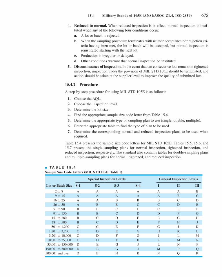
15.4 Military Standard 105E (ANSI/
ASQC Z1.4, ISO 2859) 673
15.4.1 Description of the Standard 673
15.4.2 Procedure 675
15.4.3 Discussion 679
15.5 The Dodge–Romig Sampling Plans 681
15.5.1 AOQL Plans 682
15.5.2 LTPD Plans 685
15.5.3 Estimation of Process
Average 685
16OTHER ACCEPTANCE-SAMPLINGTECHNIQUES 688
Chapter Overview and Learning Objectives 688
16.1 Acceptance Sampling by Variables 689
16.1.1 Advantages and Disadvantages of
Variables Sampling 689
16.1.2 Types of Sampling Plans Available 690
16.1.3 Caution in the Use of Variables
Sampling 691
16.2 Designing a Variables Sampling Plan
with a Specified OC Curve 691
16.3 MIL STD 414 (ANSI/ASQC Z1.9) 694
16.3.1 General Description of the Standard 694
16.3.2 Use of the Tables 695
16.3.3 Discussion of MIL STD 414 and
ANSI/ASQC Z1.9 697
16.4 Other Variables Sampling Procedures 698
16.4.1 Sampling by Variables to Give
Assurance Regarding the Lot or
Process Mean 698
16.4.2 Sequential Sampling by Variables 699
16.5 Chain Sampling 699
16.6 Continuous Sampling 701
16.6.1 CSP-1 701
16.6.2 Other Continuous-Sampling Plans 704
16.7 Skip-Lot Sampling Plans 704
APPENDIX 709
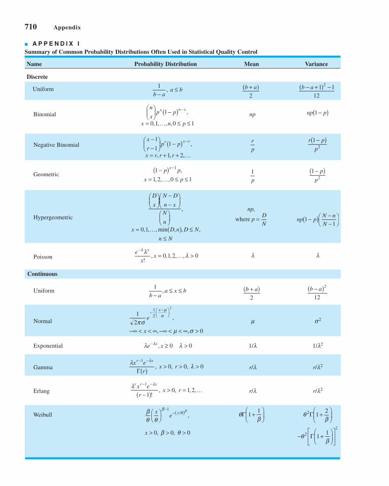
I. Summary of Common Probability
Distributions Often Used in Statistical
Quality Control 710
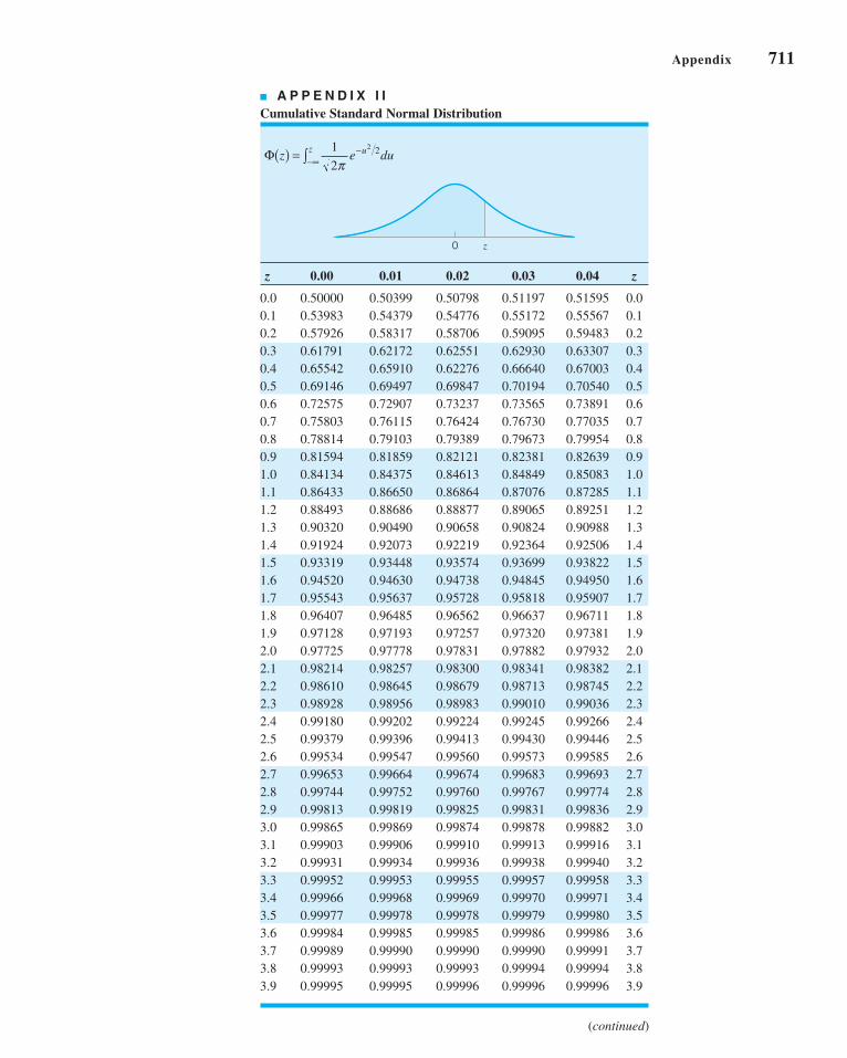
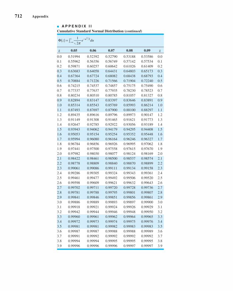
II. Cumulative Standard Normal Distribution 711
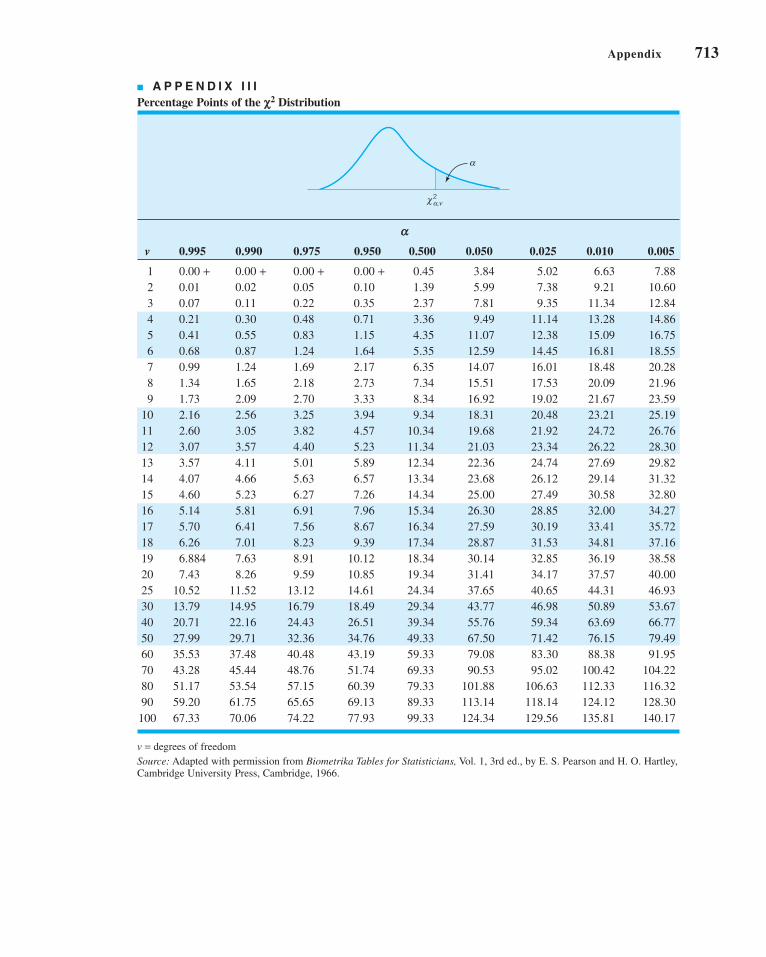
III. Percentage Points of the χ2 Distribution 713
IV. Percentage Points of the t Distribution 714
V. Percentage Points of the F Distribution 715
VI. Factors for Constructing Variables
Control Charts 720
VII. Factors for Two-Sided Normal
Tolerance Limits 721
VIII. Factors for One-Sided Normal
Tolerance Limits 722
BIBLIOGRAPHY 723
ANSWERS TO SELECTED EXERCISES 739
INDEX 749
FMTOC.qxd 4/18/12 6:12 PM Page xiv

Controlling and improving quality has become an important business strat-egy for many organizations: manufacturers, distributors, transportationcompanies, financial services organizations, health care providers, and gov-ernment agencies. Maintaining a high level of product or service quality pro-vides a competitive advantage. A business that can delight customers byimproving and controlling quality can dominate its competitors. This book isabout the technical methods for achieving success in quality control andimprovement, and offers guidance on how to successfully implement thesemethods.
Part 1 contains two chapters. Chapter 1 contains the basic definitions of qual-ity and quality improvement, provides a brief overview of the tools and meth-ods discussed in greater detail in subsequent parts of the book, and discussesthe management systems for quality improvement. Chapter 2 is devoted tothe DMAIC (define, measure, analyze, improve, and control) problem-solving process, which is an excellent framework for implementing qualityand process improvement. We also show how the methods discussed in thebook are used in DMAIC.
PART 1PART 1IntroductionIntroduction
c01QualityImprovementintheModernBusinessEnvironment.qxd 3/22/12 7:58 PM Page 1

c01QualityImprovementintheModernBusinessEnvironment.qxd 3/22/12 7:58 PM Page 2
This page is intentionally left blank

1.1 THE MEANING OF QUALITY ANDQUALITY IMPROVEMENT
1.1.1 Dimensions of Quality1.1.2 Quality Engineering
Terminology1.2 A BRIEF HISTORY OF QUALITY
CONTROL AND IMPROVEMENT1.3 STATISTICAL METHODS FOR
QUALITY CONTROL ANDIMPROVEMENT
11CHAPTER OUTLINE
1.4 MANAGEMENT ASPECTS OFQUALITY IMPROVEMENT
1.4.1 Quality Philosophy andManagement Strategies
1.4.2 The Link Between Qualityand Productivity
1.4.3 Supply Chain QualityManagement
1.4.4 Quality Costs1.4.5 Legal Aspects of Quality1.4.6 Implementing Quality
Improvement
CHAPTER OVERVIEW AND LEARNING OBJECTIVES
This book is about the use of statistical methods and other problem-solving techniques
to improve the quality of the products used by our society. These products consist of
manufactured goods such as automobiles, computers, and clothing, as well as servicessuch as the generation and distribution of electrical energy, public transportation, bank-
ing, retailing, and health care. Quality improvement methods can be applied to any area
within a company or organization, including manufacturing, process development, engi-
neering design, finance and accounting, marketing, distribution and logistics, customer
service, and field service of products. This text presents the technical tools that are
needed to achieve quality improvement in these organizations.
In this chapter we give the basic definitions of quality, quality improvement, and
other quality engineering terminology. We also discuss the historical development of qual-
ity improvement methodology and provide an overview of the statistical tools essential for
modern professional practice. A brief discussion of some management and business
aspects for implementing quality improvement is also given.
Quality Improvement inthe Modern BusinessEnvironment
3
c01QualityImprovementintheModernBusinessEnvironment.qxd 4/23/12 4:40 PM Page 3

After careful study of this chapter, you should be able to do the following:
1. Define and discuss quality and quality improvement
2. Discuss the different dimensions of quality
3. Discuss the evolution of modern quality improvement methods
4. Discuss the role that variability and statistical methods play in controlling and
improving quality
5. Describe the quality management philosophies of W. Edwards Deming, Joseph
M. Juran, and Armand V. Feigenbaum
6. Discuss total quality management, the Malcolm Baldrige National Quality
Award, Six Sigma, and quality systems and standards
7. Explain the links between quality and productivity and between quality and
cost
8. Discuss product liability
9. Discuss the three functions: quality planning, quality assurance, and quality control
and improvement
1.1 The Meaning of Quality and Quality Improvement
We may define quality in many ways. Most people have a conceptual understanding of qual-
ity as relating to one or more desirable characteristics that a product or service should pos-
sess. Although this conceptual understanding is certainly a useful starting point, we prefer a
more precise and useful definition.
Quality has become one of the most important consumer decision factors in the selec-
tion among competing products and services. The phenomenon is widespread, regardless of
whether the consumer is an individual, an industrial organization, a retail store, a bank or
financial institution, or a military defense program. Consequently, understanding and improv-
ing quality are key factors leading to business success, growth, and enhanced competitive-
ness. There is a substantial return on investment from improved quality and from successfully
employing quality as an integral part of overall business strategy. In this section, we provide
operational definitions of quality and quality improvement. We begin with a brief discussion
of the different dimensions of quality and some basic terminology.
1.1.1 Dimensions of Quality
The quality of a product can be described and evaluated in several ways. It is often very
important to differentiate these different dimensions of quality. Garvin (1987) provides an
excellent discussion of eight components or dimensions of quality. We summarize his key
points concerning these dimensions of quality as follows:
1. Performance (Will the product do the intended job?) Potential customers usually eval-
uate a product to determine if it will perform certain specific functions and determine
how well it performs them. For example, you could evaluate spreadsheet software pack-
ages for a PC to determine which data manipulation operations they perform. You may
discover that one outperforms another with respect to the execution speed.
2. Reliability (How often does the product fail?) Complex products, such as many appli-
ances, automobiles, or airplanes, will usually require some repair over their service life.
4 Chapter 1 ■ Quality Improvement in the Modern Business Environment
c01QualityImprovementintheModernBusinessEnvironment.qxd 3/22/12 7:58 PM Page 4

For example, you should expect that an automobile will require occasional repair, but
if the car requires frequent repair, we say that it is unreliable. There are many indus-
tries in which the customer’s view of quality is greatly impacted by the reliability
dimension of quality.
3. Durability (How long does the product last?) This is the effective service life of the prod-
uct. Customers obviously want products that perform satisfactorily over a long period of
time. The automobile and major appliance industries are examples of businesses where
this dimension of quality is very important to most customers.
4. Serviceability (How easy is it to repair the product?) There are many industries in which
the customer’s view of quality is directly influenced by how quickly and economically a
repair or routine maintenance activity can be accomplished. Examples include the appli-
ance and automobile industries and many types of service industries (how long did it take
a credit card company to correct an error in your bill?).
5. Aesthetics (What does the product look like?) This is the visual appeal of the product,
often taking into account factors such as style, color, shape, packaging alternatives, tactile
characteristics, and other sensory features. For example, soft-drink beverage manufactur-
ers rely on the visual appeal of their packaging to differentiate their product from other
competitors.
6. Features (What does the product do?) Usually, customers associate high quality with
products that have added features—that is, those that have features beyond the basic
performance of the competition. For example, you might consider a spreadsheet soft-
ware package to be of superior quality if it had built-in statistical analysis features
while its competitors did not.
7. Perceived Quality (What is the reputation of the company or its product?) In many
cases, customers rely on the past reputation of the company concerning quality of its
products. This reputation is directly influenced by failures of the product that are highly
visible to the public or that require product recalls, and by how the customer is treated
when a quality-related problem with the product is reported. Perceived quality, cus-
tomer loyalty, and repeated business are closely interconnected. For example, if you
make regular business trips using a particular airline, and the flight almost always
arrives on time and the airline company does not lose or damage your luggage, you will
probably prefer to fly on that carrier instead of its competitors.
8. Conformance to Standards (Is the product made exactly as the designer intended?)
We usually think of a high-quality product as one that exactly meets the requirements
placed on it. For example, how well does the hood fit on a new car? Is it perfectly flush
with the fender height, and is the gap exactly the same on all sides? Manufactured parts
that do not exactly meet the designer’s requirements can cause significant quality prob-
lems when they are used as the components of a more complex assembly. An automo-
bile consists of several thousand parts. If each one is just slightly too big or too small,
many of the components will not fit together properly, and the vehicle (or its major sub-
systems) may not perform as the designer intended.
These eight dimensions are usually adequate to describe quality in most industrial and
many business situations. However, in service and transactional business organizations (such
as banking and finance, health care, and customer service organizations) we can add the fol-
lowing three dimensions:
1. Responsiveness. How long they did it take the service provider to reply to your request
for service? How willing to be helpful was the service provider? How promptly was
your request handled?
1.1 The Meaning of Quality and Quality Improvement 5
c01QualityImprovementintheModernBusinessEnvironment.qxd 3/22/12 7:58 PM Page 5

2. Professionalism. This is the knowledge and skills of the service provider, and relates
to the competency of the organization to provide the required services.
3. Attentiveness. Customers generally want caring and personalized attention from their
service providers. Customers want to feel that their needs and concerns are important
and are being carefully addressed.
We see from the foregoing discussion that quality is indeed a multifaceted entity.
Consequently, a simple answer to questions such as “What is quality?” or “What is quality
improvement?” is not easy. The traditional definition of quality is based on the viewpoint
that products and services must meet the requirements of those who use them.
6 Chapter 1 ■ Quality Improvement in the Modern Business Environment
Definition
Quality means fitness for use.
Definition
Quality is inversely proportional to variability.
Note that this definition implies that if variability1 in the important characteristics of a prod-
uct decreases, the quality of the product increases.
1We are referring to unwanted or harmful variability. There are situations in which variability is actually good. As
my good friend Bob Hogg has pointed out, “I really like Chinese food, but I don’t want to eat it every night.”
There are two general aspects of fitness for use: quality of design and quality of con-formance. All goods and services are produced in various grades or levels of quality. These vari-
ations in grades or levels of quality are intentional, and, consequently, the appropriate technical
term is quality of design. For example, all automobiles have as their basic objective providing
safe transportation for the consumer. However, automobiles differ with respect to size, appoint-
ments, appearance, and performance. These differences are the result of intentional design
differences among the types of automobiles. These design differences include the types of
materials used in construction, specifications on the components, reliability obtained through
engineering development of engines and drive trains, and other accessories or equipment.
The quality of conformance is how well the product conforms to the specifications
required by the design. Quality of conformance is influenced by a number of factors, includ-
ing the choice of manufacturing processes; the training and supervision of the workforce; the
types of process controls, tests, and inspection activities that are employed; the extent to
which these procedures are followed; and the motivation of the workforce to achieve quality.
Unfortunately, this definition has become associated more with the conformance aspect
of quality than with design. This is in part due to the lack of formal education most design-
ers and engineers receive in quality engineering methodology. This also leads to much less
focus on the customer and more of a “conformance-to-specifications” approach to quality,
regardless of whether the product, even when produced to standards, was actually “fit-for-
use” by the customer. Also, there is still a widespread belief that quality is a problem that can
be dealt with solely in manufacturing, or that the only way quality can be improved is by
“gold-plating” the product.
We prefer a modern definition of quality.
c01QualityImprovementintheModernBusinessEnvironment.qxd 3/22/12 7:58 PM Page 6

As an example of the operational effectiveness of this definition, a few years ago, one
of the automobile companies in the United States performed a comparative study of a trans-
mission that was manufactured in a domestic plant and by a Japanese supplier. An analysis of
warranty claims and repair costs indicated that there was a striking difference between the two
sources of production, with the Japanese-produced transmission having much lower costs, as
shown in Figure 1.1. As part of the study to discover the cause of this difference in cost and
performance, the company selected random samples of transmissions from each plant, disas-
sembled them, and measured several critical quality characteristics.
Figure 1.2 is generally representative of the results of this study. Note that both distribu-
tions of critical dimensions are centered at the desired or target value. However, the distribution
of the critical characteristics for the transmissions manufactured in the United States takes up
about 75% of the width of the specifications, implying that very few nonconforming units would
be produced. In fact, the plant was producing at a quality level that was quite good, based on the
generally accepted view of quality within the company. In contrast, the Japanese plant produced
transmissions for which the same critical characteristics take up only about 25% of the specifi-
cation band. As a result, there is considerably less variability in the critical quality characteris-
tics of the Japanese-built transmissions in comparison to those built in the United States.
This is a very important finding. Jack Welch, the retired chief executive officer of
General Electric, has observed that your customers don’t see the mean of your process (the
target in Fig. 1.2), they only see the variability around that target that you have not removed.
In almost all cases, this variability has significant customer impact.
There are two obvious questions here: Why did the Japanese do this? How did they do
this? The answer to the “why” question is obvious from examination of Figure 1.1. Reduced
variability has directly translated into lower costs (the Japanese fully understood the point
made by Welch). Furthermore, the Japanese-built transmissions shifted gears more smoothly,
ran more quietly, and were generally perceived by the customer as superior to those built
domestically. Fewer repairs and warranty claims means less rework and the reduction of
wasted time, effort, and money. Thus, quality truly is inversely proportional to variability.
Furthermore, it can be communicated very precisely in a language that everyone (particularly
managers and executives) understands—namely, money.
How did the Japanese do this? The answer lies in the systematic and effective use of
the methods described in this book. It also leads to the following definition of qualityimprovement.
1.1 The Meaning of Quality and Quality Improvement 7
Definition
Quality improvement is the reduction of variability in processes and products.
0
$
UnitedStates
JapanLSL
Japan
UnitedStates
Target USL
■ F I G U R E 1 . 1 Warranty costs for
transmissions.
■ F I G U R E 1 . 2 Distributions of critical
dimensions for transmissions.
c01QualityImprovementintheModernBusinessEnvironment.qxd 3/22/12 7:58 PM Page 7
Excessive variability in process performance often results in waste. For example, consider the
wasted money, time, and effort that are associated with the repairs represented in Figure 1.1.
Therefore, an alternate and frequently very useful definition is that quality improvement is the
reduction of waste. This definition is particularly effective in service industries, where there
may not be as many things that can be directly measured (like the transmission critical dimen-
sions in Fig. 1.2). In service industries, a quality problem may be an error or a mistake, the
correction of which requires effort and expense. By improving the service process, this
wasted effort and expense can be avoided.
We now present some quality engineering terminology that is used throughout the book.
1.1.2 Quality Engineering Terminology
Every product possesses a number of elements that jointly describe what the user or consumer
thinks of as quality. These parameters are often called quality characteristics. Sometimes
these are called critical-to-quality (CTQ) characteristics. Quality characteristics may be of
several types:
1. Physical: length, weight, voltage, viscosity
2. Sensory: taste, appearance, color
3. Time orientation: reliability, durability, serviceability
Note that the different types of quality characteristics can relate directly or indirectly to the
dimensions of quality discussed in the previous section.
Quality engineering is the set of operational, managerial, and engineering activities
that a company uses to ensure that the quality characteristics of a product are at the nominal
or required levels and that the variability around these desired levels is minimum. The tech-
niques discussed in this book form much of the basic methodology used by engineers and
other technical professionals to achieve these goals.
Most organizations find it difficult (and expensive) to provide the customer with prod-
ucts that have quality characteristics that are always identical from unit to unit, or are at
levels that match customer expectations. A major reason for this is variability. There is a cer-
tain amount of variability in every product; consequently, no two products are ever identical.
For example, the thickness of the blades on a jet turbine engine impeller is not identical even
on the same impeller. Blade thickness will also differ between impellers. If this variation in
blade thickness is small, then it may have no impact on the customer. However, if the varia-
tion is large, then the customer may perceive the unit to be undesirable and unacceptable.
Sources of this variability include differences in materials, differences in the performance and
operation of the manufacturing equipment, and differences in the way the operators perform
their tasks. This line of thinking led to the previous definition of quality improvement.
Since variability can only be described in statistical terms, statistical methods play a
central role in quality improvement efforts. In the application of statistical methods to qual-
ity engineering, it is fairly typical to classify data on quality characteristics as either attrib-utes or variables data. Variables data are usually continuous measurements, such as length,
voltage, or viscosity. Attributes data, on the other hand, are usually discrete data, often taking
the form of counts, such as the number of loan applications that could not be properly
processed because of missing required information, or the number of emergency room
arrivals that have to wait more than 30 minutes to receive medical attention. We will describe
statistical-based quality engineering tools for dealing with both types of data.
Quality characteristics are often evaluated relative to specifications. For a manufac-
tured product, the specifications are the desired measurements for the quality characteristics
of the components and subassemblies that make up the product, as well as the desired values
for the quality characteristics in the final product. For example, the diameter of a shaft used
in an automobile transmission cannot be too large or it will not fit into the mating bearing,
8 Chapter 1 ■ Quality Improvement in the Modern Business Environment
c01QualityImprovementintheModernBusinessEnvironment.qxd 3/22/12 7:58 PM Page 8

nor can it be too small, resulting in a loose fit, causing vibration, wear, and early failure of
the assembly. In the service industries, specifications are typically expressed in terms of the
maximum amount of time to process an order or to provide a particular service.
A value of a measurement that corresponds to the desired value for that quality charac-
teristic is called the nominal or target value for that characteristic. These target values are
usually bounded by a range of values that, most typically, we believe will be sufficiently close
to the target so as to not impact the function or performance of the product if the quality char-
acteristic is in that range. The largest allowable value for a quality characteristic is called the
upper specification limit (USL), and the smallest allowable value for a quality characteris-
tic is called the lower specification limit (LSL). Some quality characteristics have specifi-
cation limits on only one side of the target. For example, the compressive strength of a com-
ponent used in an automobile bumper likely has a target value and a lower specification limit,
but not an upper specification limit.
Specifications are usually the result of the engineering design process for the product.
Traditionally, design engineers have arrived at a product design configuration through the use of
engineering science principles, which often results in the designer specifying the target values for
the critical design parameters. Then prototype construction and testing follow. This testing is often
done in a very unstructured manner, without the use of statistically based experimental design
procedures, and without much interaction with or knowledge of the manufacturing processes that
must produce the component parts and final product. However, through this general procedure,
the specification limits are usually determined by the design engineer. Then the final product is
released to manufacturing. We refer to this as the over-the-wall approach to design.
Problems in product quality usually are greater when the over-the-wall approach to design
is used. In this approach, specifications are often set without regard to the inherent variability that
exists in materials, processes, and other parts of the system, which results in components or prod-
ucts that are nonconforming; that is, nonconforming products are those that fail to meet one or
more of their specifications. A specific type of failure is called a nonconformity. A noncon-
forming product is not necessarily unfit for use; for example, a detergent may have a concentra-
tion of active ingredients that is below the lower specification limit, but it may still perform
acceptably if the customer uses a greater amount of the product. A nonconforming product is con-
sidered defective if it has one or more defects, which are nonconformities that are serious enough
to significantly affect the safe or effective use of the product. Obviously, failure on the part of a
company to improve its manufacturing processes can also cause nonconformities and defects.
The over-the-wall design process has been the subject of much attention in the past 25
years. CAD/CAM systems have done much to automate the design process and to more
effectively translate specifications into manufacturing activities and processes. Design for
manufacturability and assembly has emerged as an important part of overcoming the inher-
ent problems with the over-the-wall approach to design, and most engineers receive some
background on those areas today as part of their formal education. The recent emphasis on
concurrent engineering has stressed a team approach to design, with specialists in manufac-
turing, quality engineering, and other disciplines working together with the product designer
at the earliest stages of the product design process. Furthermore, the effective use of the qual-
ity improvement methodology in this book, at all levels of the process used in technology com-
mercialization and product realization, including product design, development, manufacturing,
distribution, and customer support, plays a crucial role in quality improvement.
1.2 A Brief History of Quality Control and Improvement
Quality always has been an integral part of virtually all products and services. However, our
awareness of its importance and the introduction of formal methods for quality control and
improvement have been an evolutionary development. Table 1.1 presents a timeline of some
1.2 A Brief History of Quality Control and Improvement 9
c01QualityImprovementintheModernBusinessEnvironment.qxd 3/22/12 7:58 PM Page 9

■ TA B L E 1 . 1
A Timeline of Quality Methods
1700–1900 Quality is largely determined by the efforts of an individual craftsman.
Eli Whitney introduces standardized, interchangeable parts to simplify assembly.
1875 Frederick W. Taylor introduces “Scientific Management” principles to divide work into smaller, more easilyaccomplished units—the first approach to dealing with more complex products and processes. The focus wason productivity. Later contributors were Frank Gilbreth and Henry Gantt.
1900–1930 Henry Ford—the assembly line—further refinement of work methods to improve productivity and quality;Ford developed mistake-proof assembly concepts, self-checking, and in-process inspection.
1901 First standards laboratories established in Great Britain.
1907–1908 AT&T begins systematic inspection and testing of products and materials.
1908 W. S. Gosset (writing as “Student”) introduces the t-distribution—results from his work on quality control at Guinness Brewery.
1915–1919 WWI—British government begins a supplier certification program.
1919 Technical Inspection Association is formed in England; this later becomes the Institute of Quality Assurance.
1920s AT&T Bell Laboratories forms a quality department—emphasizing quality, inspection and test, and product reliability.
B. P. Dudding at General Electric in England uses statistical methods to control the quality of electric lamps.
1922 Henry Ford writes (with Samuel Crowtha) and publishes My Life and Work, which focused on elimination ofwaste and improving process efficiency. Many Ford concepts and ideas are the basis of lean principles used today.
1922–1923 R. A. Fisher publishes series of fundamental papers on designed experiments and their application to the agricultural sciences.
1924 W. A. Shewhart introduces the control chart concept in a Bell Laboratories technical memorandum.
1928 Acceptance sampling methodology is developed and refined by H. F. Dodge and H. G. Romig at Bell Labs.
1931 W. A. Shewhart publishes Economic Control of Quality of Manufactured Product—outlining statistical methods for use in production and control chart methods.
1932 W. A. Shewhart gives lectures on statistical methods in production and control charts at the University of London.
1932–1933 British textile and woolen industry and German chemical industry begin use of designed experiments for product/process development.
1933 The Royal Statistical Society forms the Industrial and Agricultural Research Section.
1938 W. E. Deming invites Shewhart to present seminars on control charts at the U.S. Department of AgricultureGraduate School.
1940 The U.S. War Department publishes a guide for using control charts to analyze process data.
1940–1943 Bell Labs develop the forerunners of the military standard sampling plans for the U.S. Army.
1942 In Great Britain, the Ministry of Supply Advising Service on Statistical Methods and Quality Control is formed.
1942–1946 Training courses on statistical quality control are given to industry; more than 15 quality societies are formedin North America.
1944 Industrial Quality Control begins publication.
1946 The American Society for Quality Control (ASQC) is formed as the merger of various quality societies.
The International Standards Organization (ISO) is founded.
Deming is invited to Japan by the Economic and Scientific Services Section of the U.S. War Department tohelp occupation forces in rebuilding Japanese industry.
The Japanese Union of Scientists and Engineers (JUSE) is formed.
1946–1949 Deming is invited to give statistical quality control seminars to Japanese industry.
1948 G. Taguchi begins study and application of experimental design.
1950 Deming begins education of Japanese industrial managers; statistical quality control methods begin to bewidely taught in Japan.
1950–1975 Taiichi Ohno, Shigeo Shingo, and Eiji Toyoda develops the Toyota Production System an integratedtechnical/social system that defined and developed many lean principles such as just-in-time production andrapid setup of tools and equipment.
K. Ishikawa introduces the cause-and-effect diagram.
10 (continued)
c01QualityImprovementintheModernBusinessEnvironment.qxd 3/22/12 7:58 PM Page 10

1.2 A Brief History of Quality Control and Improvement 11
1950s Classic texts on statistical quality control by Eugene Grant and A. J. Duncan appear.
1951 A. V. Feigenbaum publishes the first edition of his book Total Quality Control.JUSE establishes the Deming Prize for significant achievement in quality control and quality methodology.
1951+ G. E. P. Box and K. B. Wilson publish fundamental work on using designed experiments and response surfacemethodology for process optimization; focus is on chemical industry. Applications of designed experiments inthe chemical industry grow steadily after this.
1954 Joseph M. Juran is invited by the Japanese to lecture on quality management and improvement.
British statistician E. S. Page introduces the cumulative sum (CUSUM) control chart.
1957 J. M. Juran and F. M. Gryna’s Quality Control Handbook is first published.
1959 Technometrics (a journal of statistics for the physical, chemical, and engineering sciences) is established; J. Stuart Hunter is the founding editor.
S. Roberts introduces the exponentially weighted moving average (EWMA) control chart. The U.S. mannedspaceflight program makes industry aware of the need for reliable products; the field of reliability engineeringgrows from this starting point.
1960 G. E. P. Box and J. S. Hunter write fundamental papers on 2k−p factorial designs.
The quality control circle concept is introduced in Japan by K. Ishikawa.
1961 National Council for Quality and Productivity is formed in Great Britain as part of the British Productivity Council.
1960s Courses in statistical quality control become widespread in industrial engineering academic programs.
Zero defects (ZD) programs are introduced in certain U.S. industries.
1969 Industrial Quality Control ceases publication, replaced by Quality Progress and the Journal of QualityTechnology (Lloyd S. Nelson is the founding editor of JQT ).
1970s In Great Britain, the NCQP and the Institute of Quality Assurance merge to form the British Quality Association.
1975–1978 Books on designed experiments oriented toward engineers and scientists begin to appear.
Interest in quality circles begins in North America—this grows into the total quality management (TQM) movement.
1980s Experimental design methods are introduced to and adopted by a wider group of organizations, including the electronics, aerospace, semiconductor, and automotive industries.
The works of Taguchi on designed experiments first appear in the United States.
1984 The American Statistical Association (ASA) establishes the Ad Hoc Committee on Quality and Productivity;this later becomes a full section of the ASA.
The journal Quality and Reliability Engineering International appears.
1986 Box and others visit Japan, noting the extensive use of designed experiments and other statistical methods.
1987 ISO publishes the first quality systems standard.
Motorola’s Six Sigma initiative begins.
1988 The Malcolm Baldrige National Quality Award is established by the U.S. Congress.
The European Foundation for Quality Management is founded; this organization administers the EuropeanQuality Award.
1989 The journal Quality Engineering appears.
1990s ISO 9000 certification activities increase in U.S. industry; applicants for the Baldrige award grow steadily;many states sponsor quality awards based on the Baldrige criteria.
1995 Many undergraduate engineering programs require formal courses in statistical techniques, focusing on basicmethods for process characterization and improvement.
1997 Motorola’s Six Sigma approach spreads to other industries.
1998 The American Society for Quality Control becomes the American Society for Quality (see www.asq.org),attempting to indicate the broader aspects of the quality improvement field.
2000s ISO 9000:2000 standard is issued. Supply-chain management and supplier quality become even more criticalfactors in business success. Quality improvement activities expand beyond the traditional industrial setting intomany other areas, including financial services, health care, insurance, and utilities.
Organizations begin to integrate lean principles into their Six Sigma initiatives, and lean Six Sigma becomes awidespread approach to business improvement.
c01QualityImprovementintheModernBusinessEnvironment.qxd 3/22/12 7:58 PM Page 11
of the important milestones in this evolutionary process. We will briefly discuss some of the
events on this timeline.
Frederick W. Taylor introduced some principles of scientific management as mass
production industries began to develop prior to 1900. Taylor pioneered dividing work into
tasks so that the product could be manufactured and assembled more easily. His work led
to substantial improvements in productivity. Also, because of standardized production and
assembly methods, the quality of manufactured goods was positively impacted as well.
However, along with the standardization of work methods came the concept of work standards—
a standard time to accomplish the work, or a specified number of units that must be pro-
duced per period. Frank Gilbreth and others extended this concept to the study of motion
and work design. Much of this had a positive impact on productivity, but it often did not
sufficiently emphasize the quality aspect of work. Furthermore, if carried to extremes, work
standards have the risk of halting innovation and continuous improvement, which we rec-
ognize today as being a vital aspect of all work activities.
Statistical methods and their application in quality improvement have had a long his-
tory. In 1924, Walter A. Shewhart of the Bell Telephone Laboratories developed the statisti-
cal control chart concept, which is often considered the formal beginning of statistical quality
control. Toward the end of the 1920s, Harold F. Dodge and Harry G. Romig, both of Bell
Telephone Laboratories, developed statistically based acceptance sampling as an alternative
to 100% inspection. By the middle of the 1930s, statistical quality-control methods were in
wide use at Western Electric, the manufacturing arm of the Bell System. However, the value
of statistical quality control was not widely recognized by industry.
World War II saw a greatly expanded use and acceptance of statistical quality-control
concepts in manufacturing industries. Wartime experience made it apparent that statistical
techniques were necessary to control and improve product quality. The American Society for
Quality Control was formed in 1946. This organization promotes the use of quality improve-
ment techniques for all types of products and services. It offers a number of conferences, tech-
nical publications, and training programs in quality assurance. The 1950s and 1960s saw the
emergence of reliability engineering, the introduction of several important textbooks on sta-
tistical quality control, and the viewpoint that quality is a way of managing the organization.
In the 1950s, designed experiments for product and process improvement were first
introduced in the United States. The initial applications were in the chemical industry. These
methods were widely exploited in the chemical industry, and they are often cited as one of the
primary reasons that the U.S. chemical industry is one of the most competitive in the world
and has lost little business to foreign companies. The spread of these methods outside the
chemical industry was relatively slow until the late 1970s or early 1980s, when many Western
companies discovered that their Japanese competitors had been systematically using designed
experiments since the 1960s for process improvement, new process development, evaluation
of new product designs, improvement of reliability and field performance of products, and
many other aspects of product design, including selection of component and system toler-
ances. This discovery sparked further interest in statistically designed experiments and
resulted in extensive efforts to introduce the methodology in engineering and development
organizations in industry, as well as in academic engineering curricula.
Since 1980, there has been a profound growth in the use of statistical methods for qual-
ity and overall business improvement in the United States. This has been motivated, in part,
by the widespread loss of business and markets suffered by many domestic companies that
began during the 1970s. For example, the U.S. automobile industry was nearly destroyed by
foreign competition during this period. One domestic automobile company estimated its oper-
ating losses at nearly $1 million per hour in 1980. The adoption and use of statistical methods
have played a central role in the re-emergence of U.S. industry. Various management systems
have also emerged as frameworks in which to implement quality improvement. In the next
12 Chapter 1 ■ Quality Improvement in the Modern Business Environment
c01QualityImprovementintheModernBusinessEnvironment.qxd 3/22/12 7:58 PM Page 12

two sections we briefly discuss the statistical methods that are the central focus of this book
and give an overview of some key aspects of quality management.
1.3 Statistical Methods for Quality Control and Improvement
This textbook concentrates on statistical and engineering technology useful in quality improve-
ment. Specifically, we focus on three major areas: statistical process control, design ofexperiments, and (to a lesser extent) acceptance sampling. In addition to these techniques, a
number of other statistical and analytical tools are useful in analyzing quality problems and
improving the performance of processes. The role of some of these tools is illustrated in
Figure 1.3, which presents a process as a system with a set of inputs and an output. In the case
of a manufacturing process, the controllable input factors x1, x2, . . . , xp are process variables
such as temperatures, pressures, and feed rates. The inputs z1, z2, . . . , zq are uncontrollable (or
difficult to control) inputs, such as environmental factors or properties of raw materials provided
by an external supplier. The production process transforms the input raw materials, component
parts, and subassemblies into a finished product that has several quality characteristics. The
output variable y is a quality characteristic—that is, a measure of process and product quality.
This model can also be used to represent non-manufacturing or service processes. For exam-
ple, consider a process in a financial institution that processes automobile loan applications.
The inputs are the loan applications, which contain information about the customer and his/her
credit history, the type of car to be purchased, its price, and the loan amount. The controllable
factors are the type of training that the loan officer receives, the specific rules and policies that
the bank imposed on these loans, and the number of people working as loan officers at each
time period. The uncontrollable factors include prevailing interest rates, the amount of capital
available for these types of loans in each time period, and the number of loan applications that
require processing each period. The output quality characteristics include whether or not the
loan is funded, the number of funded loans that are actually accepted by the applicant, and the
cycle time—that is, the length of time that the customer waits until a decision on his/her loan
application is made. In service systems, cycle time is often a very important CTQ.
A control chart is one of the primary techniques of statistical process control (SPC).A typical control chart is shown in Figure 1.4. This chart plots the averages of measurements
of a quality characteristic in samples taken from the process versus time (or the sample num-
ber). The chart has a center line (CL) and upper and lower control limits (UCL and LCL in
Fig. 1.4). The center line represents where this process characteristic should fall if there are
1.3 Statistical Methods for Quality Control and Improvement 13
Process
Inputraw materials,components,
subassemblies,and/or
information
z1 z2 zq
Uncontrollable inputs
Controllable inputsx1 x2 xp
y = Quality characteristic,(CTQs)
MeasurementEvaluationMonitoring
andControl
Output Product
■ F I G U R E 1 . 3 Production process inputs and outputs.
c01QualityImprovementintheModernBusinessEnvironment.qxd 3/22/12 7:58 PM Page 13

no unusual sources of variability present. The control limits are determined from some sim-
ple statistical considerations that we will discuss in Chapters 4, 5, and 6. Classically, control
charts are applied to the output variable(s) in a system such as in Figure 1.4. However, in
some cases they can be usefully applied to the inputs as well.
The control chart is a very useful process monitoring technique; when unusual
sources of variability are present, sample averages will plot outside the control limits. This is
a signal that some investigation of the process should be made and corrective action taken to
remove these unusual sources of variability. Systematic use of a control chart is an excellent
way to reduce variability.
A designed experiment is extremely helpful in discovering the key variables influencing
the quality characteristics of interest in the process. A designed experiment is an approach to
systematically varying the controllable input factors in the process and determining the effect
these factors have on the output product parameters. Statistically designed experiments are
invaluable in reducing the variability in the quality characteristics and in determining the levels
of the controllable variables that optimize process performance. Often significant breakthroughs
in process performance and product quality also result from using designed experiments.
One major type of designed experiment is the factorial design, in which factors are var-
ied together in such a way that all possible combinations of factor levels are tested. Figure 1.5
shows two possible factorial designs for the process in Figure 1.3, for the cases of p = 2 and
p = 3 controllable factors. In Figure 1.5a, the factors have two levels, low and high, and the
four possible test combinations in this factorial experiment form the corners of a square. In
Figure 1.5b, there are three factors each at two levels, giving an experiment with eight test
combinations arranged at the corners of a cube. The distributions at the corners of the cube
represent the process performance at each combination of the controllable factors x1, x2, and x3.
It is clear that some combinations of factor levels produce better results than others. For
14 Chapter 1 ■ Quality Improvement in the Modern Business Environment
UCL
CL
LCL
Sam
ple
aver
age
Time (or sample number)■ F I G U R E 1 . 4 A typical control
chart.
High
Low High
Low
(a) Two factors, x1 and x2
x1
x 2
T
T
T
TT
T
T
(b) Three factors, x1, x2, and x3
x3
x2
x1
T
■ F I G U R E 1 . 5 Factorial designs for the process in Figure 1.3.
c01QualityImprovementintheModernBusinessEnvironment.qxd 3/22/12 7:58 PM Page 14

example, increasing x1 from low to high increases the average level of the process output and
could shift it off the target value (T ). Furthermore, process variability seems to be substan-
tially reduced when we operate the process along the back edge of the cube, where x2 and x3
are at their high levels.
Designed experiments are a major off-line quality-control tool, because they are often
used during development activities and the early stages of manufacturing, rather than as a rou-
tine on-line or in-process procedure. They play a crucial role in reducing variability.
Once we have identified a list of important variables that affect the process output, it is
usually necessary to model the relationship between the influential input variables and the out-
put quality characteristics. Statistical techniques useful in constructing such models include
regression analysis and time series analysis. Detailed discussions of designed experiments,
regression analysis, and time series modeling are in Montgomery (2009), Montgomery, Peck,
and Vining (2006), and Box, Jenkins, and Reinsel (1994).
When the important variables have been identified and the nature of the relationship
between the important variables and the process output has been quantified, then an on-line sta-
tistical process-control technique for monitoring and surveillance of the process can be employed
with considerable effectiveness. Techniques such as control charts can be used to monitor the
process output and detect when changes in the inputs are required to bring the process back to an
in-control state. The models that relate the influential inputs to process outputs help determine
the nature and magnitude of the adjustments required. In many processes, once the dynamic
nature of the relationships between the inputs and the outputs are understood, it may be possible
to routinely adjust the process so that future values of the product characteristics will be approx-
imately on target. This routine adjustment is often called engineering control, automatic con-trol, or feedback control. We will briefly discuss these types of process control schemes in
Chapter 11 and illustrate how statistical process control (or SPC) methods can be successfully
integrated into a manufacturing system in which engineering control is in use.
The third area of quality control and improvement that we discuss is acceptance sam-pling. This is closely connected with inspection and testing of product, which is one of the ear-
liest aspects of quality control, dating back to long before statistical methodology was devel-
oped for quality improvement. Inspection can occur at many points in a process. Acceptance
sampling, defined as the inspection and classification of a sample of units selected at random
from a larger batch or lot and the ultimate decision about disposition of the lot, usually occurs
at two points: incoming raw materials or components, or final production.
Several different variations of acceptance sampling are shown in Figure 1.6. In
Figure 1.6a, the inspection operation is performed immediately following production, before
the product is shipped to the customer. This is usually called outgoing inspection. Figure 1.6billustrates incoming inspection—that is, a situation in which lots of batches of product are
sampled as they are received from the supplier. Various lot-dispositioning decisions are illustrated
1.3 Statistical Methods for Quality Control and Improvement 15
Ship
Accept Ship
Ship
Reject
Process
Process
Process
Inspection
Inspection
Inspection
Customer
Customer
Customer
Scrap Rework
(a) Outgoing inspection
(b) Receiving/incoming inspection
(c) Disposition of lots■ F I G U R E 1 . 6 Variations of
acceptance sampling.
c01QualityImprovementintheModernBusinessEnvironment.qxd 3/22/12 7:58 PM Page 15

in Figure 1.6c. Sampled lots may either be accepted or rejected. Items in a rejected lot are
typically either scrapped or recycled, or they may be reworked or replaced with good units.
This latter case is often called rectifying inspection.Modern quality assurance systems usually place less emphasis on acceptance sampling
and attempt to make statistical process control and designed experiments the focus of their
efforts. Acceptance sampling tends to reinforce the conformance-to-specification view of
quality and does not have any feedback into either the production process or engineering
design or development that would necessarily lead to quality improvement.
Figure 1.7 shows the typical evolution in the use of these techniques in most organiza-
tions. At the lowest level of maturity, management may be completely unaware of quality
issues, and there is likely to be no effective organized quality improvement effort. Frequently
there will be some modest applications of acceptance-sampling and inspection methods, usu-
ally for incoming parts and materials. The first activity as maturity increases is to intensify
the use of sampling inspection. The use of sampling will increase until it is realized that qual-
ity cannot be inspected or tested into the product.
At that point, the organization usually begins to focus on process improvement. Statistical
process control and experimental design potentially have major impacts on manufacturing, prod-
uct design activities, and process development. The systematic introduction of these methods
usually marks the start of substantial quality, cost, and productivity improvements in the organi-
zation. At the highest levels of maturity, companies use designed experiments and statistical
process control methods intensively and make relatively modest use of acceptance sampling.
The primary objective of quality engineering efforts is the systematic reduction ofvariability in the key quality characteristics of the product. Figure 1.8 shows how this happens
over time. In the early stages, when acceptance sampling is the major technique in use, process
“fallout,” or units that do not conform to the specifications, constitute a high percentage of the
process output. The introduction of statistical process control will stabilize the process and
reduce the variability. However, it is not satisfactory just to meet requirements—further reduc-
tion of variability usually leads to better product performance and enhanced competitive posi-
tion, as was vividly demonstrated in the automobile transmission example discussed earlier.
Statistically designed experiments can be employed in conjunction with statistical process
monitoring and control to minimize process variability in nearly all industrial settings.
1.4 Management Aspects of Quality Improvement
Statistical techniques, including SPC and designed experiments, along with other problem-
solving tools, are the technical basis for quality control and improvement. However, to be used
most effectively, these techniques must be implemented within and be part of a management
16 Chapter 1 ■ Quality Improvement in the Modern Business Environment
0
100
Per
cent
age
of a
pplic
atio
n
Time
Acceptancesampling
Processcontrol
Designof
experiments
Upperspecification
limit
Process mean, μ
Lowerspecification
limit
Acceptancesampling
Statisticalprocess control
Design ofexperiments
■ F I G U R E 1 . 7 Phase diagram of
the use of quality-engineering methods.■ F I G U R E 1 . 8 Application of quality-engineering tech-
niques and the systematic reduction of process variability.
c01QualityImprovementintheModernBusinessEnvironment.qxd 3/22/12 7:58 PM Page 16

system that is focused on quality improvement. The management system of an organization
must be organized to properly direct the overall quality improvement philosophy and ensure
its deployment in all aspects of the business. The effective management of quality involves suc-
cessful execution of three activities: quality planning, quality assurance, and quality control
and improvement.
Quality planning is a strategic activity, and it is just as vital to an organization’s long-
term business success as the product development plan, the financial plan, the marketing plan,
and plans for the utilization of human resources. Without a strategic quality plan, an enormous
amount of time, money, and effort will be wasted by the organization dealing with faulty
designs, manufacturing defects, field failures, and customer complaints. Quality planning
involves identifying customers, both external and those that operate internal to the business, and
identifying their needs [this is sometimes called listening to the voice of the customer (VOC)].Then products or services that meet or exceed customer expectations must be developed. The
eight dimensions of quality discussed in Section 1.1.1 are an important part of this effort. The
organization must then determine how these products and services will be realized. Planning for
quality improvement on a specific, systematic basis is also a vital part of this process.
Quality assurance is the set of activities that ensures the quality levels of products and
services are properly maintained and that supplier and customer quality issues are properly
resolved. Documentation of the quality system is an important component. Quality system
documentation involves four components: policy, procedures, work instructions and specifi-
cations, and records. Policy generally deals with what is to be done and why, while proce-
dures focus on the methods and personnel that will implement policy. Work instructions and
specifications are usually product-, department-, tool-, or machine-oriented. Records are a
way of documenting the policies, procedures, and work instructions that have been followed.
Records are also used to track specific units or batches of product, so that it can be determined
exactly how they were produced. Records are often vital in providing data for dealing with
customer complaints, corrective actions, and, if necessary, product recalls. Development,
maintenance, and control of documentation are important quality assurance functions. One
example of document control is ensuring that specifications and work instructions developed
for operating personnel reflect the latest design and engineering changes.
Quality control and improvement involve the set of activities used to ensure that the
products and services meet requirements and are improved on a continuous basis. Since vari-
ability is often a major source of poor quality, statistical techniques, including SPC and
designed experiments, are the major tools of quality control and improvement. Quality
improvement is often done on a project-by-project basis and involves teams led by personnel
with specialized knowledge of statistical methods and experience in applying them. Projects
should be selected so that they have significant business impact and are linked with the over-
all business goals for quality identified during the planning process. The techniques in this
book are integral to successful quality control and improvement.
The next section provides a brief overview of some of the key elements of quality man-
agement. We discuss some of the important quality philosophies; quality systems and standards;
the link between quality and productivity and quality and cost; economic and legal implications
of quality; and some aspects of implementation. The three aspects of quality planning, quality
assurance, and quality control and improvement are woven into the discussion.
1.4.1 Quality Philosophy and Management Strategies
Many people have contributed to the statistical methodology of quality improvement.
However, in terms of implementation and management philosophy, three individuals emerge
as the leaders: W. E. Deming, J. M. Juran, and A. V. Feigenbaum. We now briefly discuss the
approaches and philosophy of those leaders in quality management.
1.4 Management Aspects of Quality Improvement 17
c01QualityImprovementintheModernBusinessEnvironment.qxd 3/22/12 7:58 PM Page 17

W. Edwards Deming. W. Edwards Deming was educated in engineering and
physics at the University of Wyoming and Yale University. He worked for Western Electric
and was influenced greatly by Walter A. Shewhart, the developer of the control chart. After
leaving Western Electric, Deming held government jobs with the U.S. Department of
Agriculture and the Bureau of the Census. During World War II, Deming worked for the
War Department and the Census Bureau. Following the war, he became a consultant to
Japanese industries and convinced their top management of the power of statistical methods
and the importance of quality as a competitive weapon. This commitment to and use of sta-
tistical methods has been a key element in the expansion of Japan’s industry and economy. The
Japanese Union of Scientists and Engineers created the Deming Prize for quality improvement
in his honor. Until his death in 1993, Deming was an active consultant and speaker; he was an
inspirational force for quality improvement in the United States and around the world. He
firmly believed that the responsibility for quality rests with management—that is, most of the
opportunities for quality improvement require management action, and very few opportu-
nities lie at the workforce or operator level. Deming was a harsh critic of many American
management practices.
The Deming philosophy is an important framework for implementing quality and pro-
ductivity improvement. This philosophy is summarized in his 14 points for management. We
now give a brief statement and discussion of Deming’s 14 points:
1. Create a constancy of purpose focused on the improvement of products and ser-vices. Deming was very critical of the short-term thinking of American management,
which tends to be driven by quarterly business results and doesn’t always focus on
strategies that benefit the organization in the long run. Management should con-
stantly try to improve product design and performance. This must include invest-
ment in research, development, and innovation, which will have long-term payback
to the organization.
2. Adopt a new philosophy that recognizes we are in a different economic era. Reject
poor workmanship, defective products, or bad service. It costs as much to produce a
defective unit as it does to produce a good one (and sometimes more). The cost of deal-
ing with scrap, rework, and other losses created by defectives is an enormous drain on
company resources.
3. Do not rely on mass inspection to “control” quality. All inspection can do is sort out
defectives, and at that point it is too late—the organization already has paid to produce
those defectives. Inspection typically occurs too late in the process, it is expensive, and
it is often ineffective. Quality results from prevention of defectives through process
improvement, not inspection.
4. Do not award business to suppliers on the basis of price alone, but also considerquality. Price is a meaningful measure of a supplier’s product only if it is considered in
relation to a measure of quality. In other words, the total cost of the item must be consid-
ered, not just the purchase price. When quality is considered, the lowest bidder frequently
is not the low-cost supplier. Preference should be given to suppliers who use modern
methods of quality improvement in their business and who can demonstrate process con-
trol and capability. An adversarial relationship with suppliers is harmful. It is important to
build effective, long-term relationships.
5. Focus on continuous improvement. Constantly try to improve the production and ser-
vice system. Involve the workforce in these activities and make use of statistical meth-
ods, particularly the statistically based problem-solving tools discussed in this book.
6. Practice modern training methods and invest in on-the-job training for all employ-ees. Everyone should be trained in the technical aspects of their job, and in modern
18 Chapter 1 ■ Quality Improvement in the Modern Business Environment
c01QualityImprovementintheModernBusinessEnvironment.qxd 3/22/12 7:58 PM Page 18

quality- and productivity-improvement methods as well. The training should encourage
all employees to practice these methods every day. Too often, employees are not
encouraged to use the results of training, and management often believes employees do
not need training or already should be able to practice the methods. Many organizations
devote little or no effort to training.
7. Improve leadership, and practice modern supervision methods. Supervision should
not consist merely of passive surveillance of workers but should be focused on helping
the employees improve the system in which they work. The number-one goal of super-
vision should be to improve the work system and the product.
8. Drive out fear. Many workers are afraid to ask questions, report problems, or point
out conditions that are barriers to quality and effective production. In many organi-
zations the economic loss associated with fear is large; only management can elimi-
nate fear.
9. Break down the barriers between functional areas of the business. Teamwork
among different organizational units is essential for effective quality and productivity
improvement to take place.
10. Eliminate targets, slogans, and numerical goals for the workforce. A target such as
“zero defects” is useless without a plan for the achievement of this objective. In fact,
these slogans and “programs” are usually counterproductive. Work to improve the sys-
tem and provide information on that.
11. Eliminate numerical quotas and work standards. These standards have historically
been set without regard to quality. Work standards are often symptoms of manage-
ment’s inability to understand the work process and to provide an effective management
system focused on improving this process.
12. Remove the barriers that discourage employees from doing their jobs.Management must listen to employee suggestions, comments, and complaints. The per-
son who is doing the job knows the most about it and usually has valuable ideas about
how to make the process work more effectively. The workforce is an important partic-
ipant in the business, and not just an opponent in collective bargaining.
13. Institute an ongoing program of education for all employees. Education in simple,
powerful statistical techniques should be mandatory for all employees. Use of the basic
SPC problem-solving tools, particularly the control chart, should become widespread in
the business. As these charts become widespread and as employees understand their
uses, they will be more likely to look for the causes of poor quality and to identify
process improvements. Education is a way of making everyone partners in the quality
improvement process.
14. Create a structure in top management that will vigorously advocate the first 13points. This structure must be driven from the very top of the organization. It must also
include concurrent education/training activities and expedite application of the training
to achieve improved business results. Everyone in the organization must know that con-
tinuous improvement is a common goal.
As we read Deming’s 14 points we notice a strong emphasis on organizational change.Also, the role of management in guiding this change process is of dominating importance.
However, what should be changed, and how should this change process be started? For
example, if we want to improve the yield of a semiconductor manufacturing process, what
should we do? It is in this area that statistical methods come into play most frequently. To
improve the semiconductor process, we must determine which controllable factors in the
process influence the number of defective units produced. To answer this question, we
must collect data on the process and see how the system reacts to change in the process
1.4 Management Aspects of Quality Improvement 19
c01QualityImprovementintheModernBusinessEnvironment.qxd 3/22/12 7:58 PM Page 19

variables. Then actions to improve the process can be designed and implemented.
Statistical methods, such as designed experiments and control charts, can contribute to
these activities.
Deming frequently wrote and spoke about the seven deadly diseases of management,listed in Table 1.2. He believed that each disease was a barrier to the effective implementa-
tion of his philosophy. The first, lack of constancy of purpose, relates to the first of Deming’s
14 points. Continuous improvement of products, processes, and services gives assurance to
all stakeholders in the enterprise (employees, executives, investors, suppliers) that dividends
and increases in the value of the business will continue to grow.
The second disease, too much emphasis on short-term profits, might make the “numbers”
look good, but if this is achieved by reducing research and development investment, by elim-
inating employees’ training, and by not deploying quality and other business improvement
activities, then potentially irreparable long-term damage to the business is the ultimate result.
Concerning the third disease, Deming believed that performance evaluation encouraged
short-term performance, rivalries and fear, and discouraged effective teamwork. Performance
reviews can leave employees bitter and discouraged, and they may feel unfairly treated, espe-
cially if they are working in an organization where their performance is impacted by system
forces that are flawed and out of their control.
The fourth disease, management mobility, refers to the widespread practice of job-
hopping—that is, a manger spending very little time in the business function for which he or
she is responsible. This often results in key decisions being made by someone who really
doesn’t understand the business. Managers often spend more time thinking about their next
career move than about their current job and how to do it better. Frequent reorganizing and
shifting management responsibilities are barriers to constancy of purpose and often a waste
of resources that should be devoted to improving products and services. Bringing in a new
chief executive officer to improve quarterly profits often leads to a business strategy that
leaves a path of destruction throughout the business.
The fifth disease, management by visible figures alone (such as the number of
defects, customer complaints, and quarterly profits), suggests that the really important fac-
tors that determine long-term organizational success are unknown and unknowable. As
some evidence of this, of the 100 largest companies in 1900, only 16 still exist today, and
of the 25 largest companies in 1900, only 2 are still among the top 25. Obviously, some
visible figures are important; for example, suppliers and employees must be paid on time
and the bank accounts must be managed. However, if visible figures alone were key deter-
minants of success, it’s likely that many more of the companies of 1900 still would be in
business.
Deming’s cautions about excessive medical expenses—his sixth deadly disease—are
certainly prophetic: Health care costs may be the most important issue facing many sectors
of business in the United States today. For example, the medical costs for current and
20 Chapter 1 ■ Quality Improvement in the Modern Business Environment
■ TA B L E 1 . 2
Deming’s Seven Deadly Diseases of Management
1. Lack of constancy of purpose
2. Emphasis on short-term profits
3. Evaluation of performance, merit rating, and annual reviews of performance
4. Mobility of top management
5. Running a company on visible figures alone
6. Excessive medical costs
7. Excessive legal damage awards
c01QualityImprovementintheModernBusinessEnvironment.qxd 3/22/12 7:58 PM Page 20

retired employees of United States automobile manufacturers General Motors, Ford, and
Chrysler currently are estimated to be between $1200 and $1600 per vehicle, contrasted
with $250 to $350 per vehicle for Toyota and Honda, two Japanese automobile manufac-
turers with extensive North American manufacturing and assembly operations. The seventh
disease, liability and excessive damage awards, is also a major issue facing many organi-
zations. Deming was fond of observing that the United States had more lawyers per capita
than any other nation. He believed that government intervention likely would be necessary
to provide effective long-term solutions to the medical cost and excessive liability awards
problems.
Deming recommended the Shewhart cycle, shown in Figure 1.9, as a model to guide
improvement. The four steps, Plan-Do-Check-Act, are often called the PDCA cycle.Sometimes the Check step is called Study, and the cycle becomes the PDSA cycle. In Plan, we
propose a change in the system that is aimed at improvement. In Do, we carry out the change,
usually on a small or pilot scale, to ensure that the results that are desired will be obtained.
Check consists of analyzing the results of the change to determine what has been learned about
the changes that were carried out. In Act, we either adopt the change or, if it was unsuccess-
ful, abandon it. The process is almost always iterative, and may require several cycles for solv-
ing complex problems.
In addition to Deming’s 14 points and the his seven deadly diseases of management,
Deming wrote and lectured about an extensive collection of obstacles to success. Some of
these include:
1. The belief that automation, computers, and new machinery will solve problems.
2. Searching for examples—trying to copy existing solutions.
3. The “our problems are different” excuse and not realizing that the principles that will
solve them are universal.
4. Obsolete schools, particularly business schools, where graduates have not been taught
how to successfully run businesses.
5. Poor teaching of statistical methods in industry: Teaching tools without a framework for
using them is going to be unsuccessful.
6. Reliance on inspection to produce quality.
7. Reliance on the “quality control department” to take care of all quality problems.
8. Blaming the workforce for problems.
9. False starts, such as broad teaching of statistical methods without a plan as to how to
use them, quality circles, employee suggestion systems, and other forms of “instant
pudding.”
1.4 Management Aspects of Quality Improvement 21
Act
Adopt the change orabandon it. If adopted,
make sure that it leads topermanent improvement.
Plan a change oran experiment
aimed at systemimprovement.
Study and analyzethe resultsobtained.
What was learned?
Carry out thechange (often a
pilot study).
Plan
DoCheck
■ F I G U R E 1 . 9 The Shewhart cycle.
c01QualityImprovementintheModernBusinessEnvironment.qxd 3/22/12 7:58 PM Page 21

10. The fallacy of zero defects: Companies fail even though they produce products and
services without defects. Meeting the specifications isn’t the complete story in any
business.
11. Inadequate testing of prototypes: A prototype may be a one-off article, with artificially
good dimensions, but without knowledge of variability, testing a prototype tells very lit-
tle. This is a symptom of inadequate understanding of product design, development, and
the overall activity of technology commercialization.
12. “Anyone that comes to help us must understand all about our business.” This is bizarre
thinking: There already are competent people in the organization who know everything
about the business—except how to improve it. New knowledge and ideas (often from
the outside) must be fused with existing business expertise to bring about change and
improvement.
Joseph M. Juran. Juran was born in 1904 and died in 2008. He was one of the found-
ing fathers of the quality-control and improvement field. He worked for Walter A. Shewhart at
AT&T Bell Laboratories and was at the leading edge of quality improvement throughout his
career. Juran became the chief industrial engineer at Western Electric (part of the Bell System).
He was an assistant administrator for the Lend-Lease Administration during World War II and
played an important role in simplifying the administrative and paper work processes of that
agency. After the war, he became the head of the Department of Administrative Engineering at
New York University. He was invited to speak to Japanese industry leaders as they began their
industrial transformation in the early 1950s. He also created an active consulting practice (the
Juran Institute) and lectured widely through the American Management Association. He was
the co-author (with Frank M. Gryna) of the Quality Control Handbook, a standard reference
for quality methods and improvement since its initial publication in 1957.
The Juran quality management philosophy focuses on three components: planning, con-trol, and improvement. These are known as the Juran Trilogy. As we have noted previously,
planning involves identifying external customers and determining their needs. Then products
or services that meet these customer needs are designed and/or developed, and the processes
for producing these products or services are then developed. The planning process should also
involve planning for quality improvement on a regular (typically annual) basis. Control is
employed by the operating forces of the business to ensure that the product or service meets
the requirements. SPC is one of the primary tools of control. Improvement aims to achieve per-
formance and quality levels that are higher than current levels. Juran emphasizes that improve-
ment must be on a project-by-project basis. These projects are typically identified at the planning
stage of the trilogy. Improvement can either be continuous (or incremental) or by breakthrough.
Typically, a breakthrough improvement is the result of studying the process and identifying a set
of changes that result in a large, relatively rapid improvement in performance. Designed exper-
iments are an important tool that can be used to achieve breakthrough.
Armand V. Feigenbaum. Feigenbaum was born in 1922. He first introduced the
concept of companywide quality control in his historic book Total Quality Control (first pub-
lished in 1951). This book influenced much of the early philosophy of quality management
in Japan in the early 1950s. In fact, many Japanese companies used the term “total quality
control” to describe their efforts. He proposed a three-step approach to improving quality:
quality leadership, quality technology, and organizational commitment. By quality technol-ogy, Feigenbaum means statistical methods and other technical and engineering methods,
such as the ones discussed in this book.
Feigenbaum is concerned with organizational structure and a systems approach to
improving quality. He proposed a 19-step improvement process, of which use of statistical meth-
ods was step 17. He initially suggested that much of the technical capability be concentrated in
22 Chapter 1 ■ Quality Improvement in the Modern Business Environment
c01QualityImprovementintheModernBusinessEnvironment.qxd 3/22/12 7:58 PM Page 22
a specialized department. This is in contrast to the more modern view that knowledge and use
of statistical tools need to be widespread. However, the organizational aspects of Feigenbaum’s
work are important, as quality improvement does not usually spring forth as a “grass roots”
activity; it requires a lot of management commitment to make it work.
The brief descriptions of the philosophies of Deming, Juran, and Feigenbaum have
highlighted both the common aspects and differences among their viewpoints. In this author’s
opinion, there are more similarities than differences among them, and the similarities are what
are important. All three of these pioneers stress the importance of quality as an essential com-
petitive weapon, the important role that management must play in implementing quality
improvement, and the importance of statistical methods and techniques in the “quality trans-
formation” of an organization.
Total Quality Management. Total quality management (TQM) is a strategy for
implementing and managing quality improvement activities on an organizationwide basis.
TQM began in the early 1980s, with the philosophies of Deming and Juran as the focal point.
It evolved into a broader spectrum of concepts and ideas, involving participative organizations
and work culture, customer focus, supplier quality improvement, integration of the quality
system with business goals, and many other activities to focus all elements of the organization
around the quality improvement goal. Typically, organizations that have implemented a TQM
approach to quality improvement have quality councils or high-level teams that deal with
strategic quality initiatives, workforce-level teams that focus on routine production or business
activities, and cross-functional teams that address specific quality improvement issues.
TQM has only had moderate success for a variety of reasons, but frequently because
there is insufficient effort devoted to widespread utilization of the technical tools of variabil-
ity reduction. Many organizations saw the mission of TQM as one of training. Consequently,
many TQM efforts engaged in widespread training of the workforce in the philosophy of
quality improvement and a few basic methods. This training was usually placed in the hands
of human resources departments, and much of it was ineffective. The trainers often had no
real idea about what methods should be taught, or how the methods should be used, and
success was usually measured by the percentage of the workforce that had been “trained,” not
by whether any measurable impact on business results had been achieved. Some general rea-
sons for the lack of conspicuous success of TQM include (1) lack of topdown, high-level
management commitment and involvement; (2) inadequate use of statistical methods and
insufficient recognition of variability reduction as a prime objective; (3) general as opposed
to specific business-results-oriented objectives; and (4) too much emphasis on widespread
training as opposed to focused technical education.Another reason for the erratic success of TQM is that many managers and executives
have regarded it as just another “program” to improve quality. During the 1950s and 1960s,
programs such as Zero Defects and Value Engineering abounded, but they had little real
impact on quality and productivity improvement. During the heyday of TQM in the 1980s,
another popular program was the Quality is Free initiative, in which management worked on
identifying the cost of quality (or the cost of nonquality, as the Quality is Free devotees so
cleverly put it). Indeed, identification of quality costs can be very useful (we discuss quality
costs in Section 1.4.3), but the Quality is Free practitioners often had no idea about what to
do to actually improve many types of complex industrial processes. In fact, the leaders of this
initiative had no knowledge about statistical methodology and completely failed to under-
stand its role in quality improvement. When TQM is wrapped around an ineffective program
such as this, disaster is often the result.
Quality Systems and Standards. The International Standards Organization
(founded in 1946 in Geneva, Switzerland), known as ISO, has developed a series of stan-
dards for quality systems. The first standards were issued in 1987. The current version of
1.4 Management Aspects of Quality Improvement 23
c01QualityImprovementintheModernBusinessEnvironment.qxd 3/22/12 7:58 PM Page 23
the standard is known as the ISO 9000 series. It is a generic standard, broadly applicable to
any type of organization, and it is often used to demonstrate a supplier’s ability to control its
processes. The three standards of ISO 9000 are:
ISO 9000:2005 Quality Management System—Fundamentals and Vocabulary
ISO 9001:2008 Quality Management System—Requirements
ISO 9004:2009 Quality Management System—Guidelines for Performance
Improvement
ISO 9000 is also an American National Standards Institute and an ASQ standard.
The ISO 9001:2008 standard has eight clauses: (1) Scope, (2) Normative References,
(3) Definitions, (4) Quality Management Systems, (5) Management Responsibility,
(6) Resource Management, (7) Product (or Service) Realization, and (8) Measurement,
Analysis, and Improvement. Clauses 4 through 8 are the most important, and their key com-
ponents and requirements are shown in Table 1.3. To become certified under the ISO standard,
a company must select a registrar and prepare for a certification audit by this registrar.
There is no single independent authority that licenses, regulates, monitors, or qualifies regis-
trars. As we will discuss later, this is a serious problem with the ISO system. Preparing for
the certification audit involves many activities, including (usually) an initial or phase I audit
that checks the present quality management system against the standard. This is usually fol-
lowed by establishing teams to ensure that all components of the key clause are developed and
implemented, training personnel, developing applicable documentation, and developing and
installing all new components of the quality system that may be required. Then the certifica-
tion audit takes place. If the company is certified, then periodic surveillance audits by the
registrar continue, usually on an annual (or perhaps six-month) schedule.
Many organizations have required their suppliers to become certified under ISO 9000,
or one of the standards that are more industry-specific. Examples of these industry-specific
quality system standards are AS 9100 for the aerospace industry; ISO/TS 16949 and QS 9000
for the automotive industry; and TL 9000 for the telecommunications industry. Many com-
ponents of these standards are very similar to those of ISO 9000.
Much of the focus of ISO 9000 (and of the industry-specific standards) is on formal
documentation of the quality system—that is, on quality assurance activities. Organizations
usually must make extensive efforts to bring their documentation into line with the require-
ments of the standards; this is the Achilles’ heel of ISO 9000 and other related or derivative
standards. There is far too much effort devoted to documentation, paperwork, and bookkeep-
ing and not nearly enough to actually reducing variability and improving processes and prod-
ucts. Furthermore, many of the third-party registrars, auditors, and consultants that work in
this area are not sufficiently educated or experienced enough in the technical tools required
for quality improvement or how these tools should be deployed. They are all too often
unaware of what constitutes modern engineering and statistical practice, and usually are
familiar with only the most elementary techniques. Therefore, they concentrate largely on the
documentation, record keeping, and paperwork aspects of certification.
There is also evidence that ISO certification or certification under one of the other
industry-specific standards does little to prevent poor quality products from being designed, man-
ufactured, and delivered to the customer. For example, in 1999–2000, there were numerous inci-
dents of rollover accidents involving Ford Explorer vehicles equipped with Bridgestone/Firestone
tires. There were nearly 300 deaths in the United States alone attributed to these accidents, which
led to a recall by Bridgestone/Firestone of approximately 6.5 million tires. Apparently, many of
the tires involved in these incidents were manufactured at the Bridgestone/Firestone plant in
Decatur, Illinois. In an article on this story in Time magazine (September 18, 2000), there was a
photograph (p. 38) of the sign at the entrance of the Decatur plant which stated that the plant was
“QS 9000 Certified” and “ISO 14001 Certified” (ISO 14001 is an environmental standard).
24 Chapter 1 ■ Quality Improvement in the Modern Business Environment
c01QualityImprovementintheModernBusinessEnvironment.qxd 3/22/12 7:58 PM Page 24

1.4 Management Aspects of Quality Improvement 25
■ TA B L E 1 . 3
ISO 9001:2008 Requirements
4.0 Quality Management System4.1 General Requirements
The organization shall establish, document, implement, and maintain a quality management system and continuallyimprove its effectiveness in accordance with the requirements of the international standard.
4.2 Documentation Requirements
Quality management system documentation will include a quality policy and quality objectives; a quality manual;documented procedures; documents to ensure effective planning, operation, and control of processes; and recordsrequired by the international standard.
5.0 Management System5.1 Management Commitment
a. Communication of meeting customer, statutory, and regulatory requirements
b. Establishing a quality policy
c. Establishing quality objectives
d. Conducting management reviews
e. Ensuring that resources are available
5.2 Top management shall ensure that customer requirements are determined and are met with the aim of enhancingcustomer satisfaction.
5.3 Management shall establish a quality policy.
5.4 Management shall ensure that quality objectives shall be established. Management shall ensure that planning occurs forthe quality management system.
5.5 Management shall ensure that responsibilities and authorities are defined and communicated.
5.6 Management shall review the quality management system at regular intervals.
6.0 Resource Management6.1 The organization shall determine and provide needed resources.
6.2 Workers will be provided necessary education, training, skills, and experience.
6.3 The organization shall determine, provide, and maintain the infrastructure needed to achieve conformity to productrequirements.
6.4 The organization shall determine and manage the work environment needed to achieve conformity to product requirements.
7.0 Product or Service Realization7.1 The organization shall plan and develop processes needed for product or service realization.
7.2 The organization shall determine requirements as specified by customers.
7.3 The organization shall plan and control the design and development for its products or services.
7.4 The organization shall ensure that purchased material or product conforms to specified purchase requirements.
7.5 The organization shall plan and carry out production and service under controlled conditions.
7.6 The organization shall determine the monitoring and measurements to be undertaken and the monitoring and measuringdevices needed to provide evidence of conformity of products or services to determined requirements.
8.0 Measurement, Analysis, and Improvement8.1 The organization shall plan and implement the monitoring, measurement, analysis, and improvement process for
continual improvement and conformity to requirements.
8.2 The organization shall monitor information relating to customer perceptions.
8.3 The organization shall ensure that product that does not conform to requirements is identified and controlled to preventits unintended use or delivery.
8.4 The organization shall determine, collect, and analyze data to demonstrate the suitability and effectiveness of the qualitymanagement system, including
a. Customer satisfaction
b. Conformance data
c. Trend data
d. Supplier data
8.5 The organization shall continually improve the effectiveness of the quality management system.
Adapted from the ISO 9001:2008 Standard, International Standards Organization, Geneva, Switzerland.
c01QualityImprovementintheModernBusinessEnvironment.qxd 3/22/12 7:58 PM Page 25

Although the assignable causes underlying these incidents have not been fully discovered, there
are clear indicators that despite quality systems certification, Bridgestone/Firestone experienced
significant quality problems. ISO certification alone is no guarantee that good quality products
are being designed, manufactured, and delivered to the customer. Relying on ISO certification is
a strategic management mistake.
It has been estimated that ISO certification activities are approximately a $40 billionannual business, worldwide. Much of this money flows to the registrars, auditors, and consul-
tants. This amount does not include all of the internal costs incurred by organizations to achieve
registration, such as the thousands of hours of engineering and management effort, travel, inter-
nal training, and internal auditing. It is not clear whether any significant fraction of this expendi-
ture has made its way to the bottom line of the registered organizations. Furthermore, there is no
assurance that certification has any real impact on quality (as in the Bridgestone/
Firestone tire incidents). Many quality engineering authorities believe that ISO certification is
largely a waste of effort. Often, organizations would be far better off to “just say no to ISO” and
spend a small fraction of that $40 billion on their quality systems and another larger fraction on
meaningful variability reduction efforts, develop their own internal (or perhaps industry-based)
quality standards, rigorously enforce them, and pocket the difference.
The Malcolm Baldrige National Quality Award. The Malcolm Baldrige National
Quality Award (MBNQA) was created by the U.S. Congress in 1987. It is given annually to
recognize U.S. organizations for performance excellence. Awards are given to organizations
in five categories: manufacturing, service, small business, health care, and education. Three
awards may be given each year in each category. Many organizations compete for the awards,
and many companies use the performance excellence criteria for self-assessment. The award
is administered by NIST (the National Institute of Standards and Technology).
The performance excellence criteria and their interrelationships are shown in Figure 1.10.
The point values for these criteria in the MBNQA are shown in Table 1.4. The criteria are directed
towards results, where results are a composite of customer satisfaction and retention, market share
and new market development, product/service quality, productivity and operational effectiveness,
human resources development, supplier performance, and public/corporate citizenship. The crite-
ria are nonprescriptive—that is, the focus is on results, not the use of specific procedures or tools.
The MBNQA process is shown in Figure 1.11. An applicant sends the completed appli-
cation to NIST. This application is then subjected to a first-round review by a team of Baldrige
26 Chapter 1 ■ Quality Improvement in the Modern Business Environment
2Strategicplanning
5Human
resources
6Process
management
Organizational ProfileEnvironment, Relationships, and Challenges
1Leadership
7Businessresults
3Customer andmarket focus
4Information and analysis
■ F I G U R E 1 . 1 0 The
structure of the MBNQA perfor-
mance excellence criteria.(Source: Foundation for the
Malcolm Baldrige National Quality
Award, 2002 Criteria for
Performance Excellence.)
c01QualityImprovementintheModernBusinessEnvironment.qxd 3/22/12 7:58 PM Page 26

1.4 Management Aspects of Quality Improvement 27
■ TA B L E 1 . 4
Performance Excellence Categories and Point Values
1 Leadership 1201.1 Leadership System 80
1.2 Company Responsibility and Citizenship 40
2 Strategic Planning 852.1 Strategy Development Process 40
2.2 Company Strategy 45
3 Customer and Market Focus 853.1 Customer and Market Knowledge 40
3.2 Customer Satisfaction and Relationship Enhancement 45
4 Information and Analysis 904.1 Measurement and Analysis of Performance 50
4.2 Information Management 40
5 Human Resource Focus 855.1 Work Systems 35
5.2 Employee Education, Training, and Development 25
5.3 Employee Well-Being and Satisfaction 25
6 Process Management 856.1 Management of Product and Service Processes 45
6.2 Management of Business Processes 25
6.3 Management of Support Processes 15
7 Business Results 4507.1 Customer Results 125
7.2 Financial and Market Results 125
7.3 Human Resource Results 80
7.4 Organizational Results 120
Total Points 1,000
Stage 1IndependentReview byExaminers
Stage 2ConsensusReview byExaminers
ApplicationReceived
byNIST
JudgesSelect forConsensus
Review
FeedbackReport toApplicant
Yes
No
A
Stage 3Site Visit
JudgesSelect forSite Visit
FeedbackReport toApplicant
Yes
No
AJudges
RecommendWinner
FeedbackReport toApplicant
FeedbackReport
Yes
No
■ F I G U R E 1 . 1 1 MBNQA process.(Source: Foundation for the Malcolm Baldrige National Quality Award, 2002 Criteria for Performance
Excellence.)
c01QualityImprovementintheModernBusinessEnvironment.qxd 3/22/12 7:58 PM Page 27

examiners. The board of Baldrige examiners consists of highly qualified volunteers from a vari-
ety of fields. Judges evaluate the scoring on the application to determine if the applicant will
continue to consensus. During the consensus phase, a group of examiners who scored the orig-
inal application determines a consensus score for each of the items. Once consensus is reached
and a consensus report written, judges then make a site-visit determination. A site visit typically
is a one-week visit by a team of four to six examiners who produce a site-visit report. The site-
visit reports are used by the judges as the basis of determining the final MBNQA winners.
As shown in Figure 1.10, feedback reports are provided to the applicant at up to three
stages of the MBNQA process. Many organizations have found these reports very helpful and
use them as the basis of planning for overall improvement of the organization and for driving
improvement in business results.
Six Sigma. Products with many components typically have many opportunities for
failure or defects to occur. Motorola developed the Six Sigma program in the late 1980s as a
response to the demand for its products. The focus of Six Sigma is reducing variability in key
product quality characteristics to the level at which failure or defects are extremely unlikely.
Figure 1.12a shows a normal probability distribution as a model for a quality charac-
teristic with the specification limits at three standard deviations on either side of the mean.
28 Chapter 1 ■ Quality Improvement in the Modern Business Environment
LSL USL
–6σ –5σ –4σ –3σ –2σ –1σ μ +1σ +2σ +3σ +4σ +5σ +6σ
±3 99.73%
±1 Sigma±2 Sigma±3 Sigma±4 Sigma±5 Sigma±6 Sigma
σ
Spec. Limit68.2795.4599.7399.993799.99994399.9999998
Percentage Inside Specs317300455002700
630.570.002
ppm Defective
(a) Normal distribution centered at the target (T)
LSL
–6σ –5σ –4σ –3σ –2σ –1σ +1σ +2σ +3σ +4σ +5σ +6σT
1.5
±1 Sigma±2 Sigma±3 Sigma±4 Sigma±5 Sigma±6 Sigma
σ 1.5σ
Spec. Limit30.2369.1393.3299.379099.9767099.999660
Percentage inside specs697700608700668106210233
3.4
ppm Defective
(b) Normal distribution with the mean shifted by ±1.5 from the target
USL
σ
= T
■ F I G U R E 1 . 1 2 The Motorola Six Sigma concept.
c01QualityImprovementintheModernBusinessEnvironment.qxd 3/22/12 7:58 PM Page 28

Now it turns out that in this situation the probability of producing a product within these spec-
ifications is 0.9973, which corresponds to 2,700 parts per million (ppm) defective. This is
referred to as Three Sigma quality performance, and it actually sounds pretty good.
However, suppose we have a product that consists of an assembly of 100 independent com-
ponents or parts and all 100 of these parts must be nondefective for the product to function
satisfactorily. The probability that any specific unit of product is nondefective is
That is, about 23.7% of the products produced under Three Sigma quality will be defec-
tive. This is not an acceptable situation, because many products used by today’s society are made
up of many components. Even a relatively simple service activity, such as a visit by a family of
four to a fast-food restaurant, can involve the assembly of several dozen components. A typical
automobile has about 100,000 components and an airplane has between one and two million!
The Motorola Six Sigma concept is to reduce the variability in the process so that the
specification limits are at least six standard deviations from the mean. Then, as shown in
Figure 1.12a, there will only be about 2 parts per billion defective. Under Six Sigma quality,the probability that any specific unit of the hypothetical product above is nondefective is
0.9999998, or 0.2 ppm, a much better situation.
When the Six Sigma concept was initially developed, an assumption was made that
when the process reached the Six Sigma quality level, the process mean was still subject to
disturbances that could cause it to shift by as much as 1.5 standard deviations off target. This
situation is shown in Figure 1.12b. Under this scenario, a Six Sigma process would produce
about 3.4 ppm defective.
There is an apparent inconsistency in this. As we will discuss in Chapter 8 on process
capability, we can only make predictions about process performance when the process is
stable—that is, when the mean (and standard deviation, too) is constant. If the mean is
drifting around, and ends up as much as 1.5 standard deviations off target, a prediction of
3.4 ppm defective may not be very reliable, because the mean might shift by more than the
“allowed” 1.5 standard deviations. Process performance isn’t predictable unless the process
behavior is stable.
However, no process or system is ever truly stable, and even in the best of situations,
disturbances occur. These disturbances can result in the process mean shifting off-target, an
increase in the process standard deviation, or both. The concept of a Six Sigma process is one
way to model this behavior. Like all models, it’s probably not exactly right, but it has proven
to be a useful way to think about process performance and improvement.
Motorola established Six Sigma as both an objective for the corporation and as a focal
point for process and product quality improvement efforts. In recent years, Six Sigma has
spread beyond Motorola and has come to encompass much more. It has become a program
for improving corporate business performance by both improving quality and paying atten-
tion to reducing costs. Companies involved in a Six Sigma effort utilize specially trained indi-
viduals, called Green Belts (GBs), Black Belts (BBs), and Master Black Belts (MBBs) to lead
teams focused on projects that have both quality and business (economic) impacts for the
organization. The “belts” have specialized training and education on statistical methods and
the quality and process improvement tools in this textbook that equip them to function as team
leaders, facilitators, and problem solvers. Typical Six Sigma projects are four to six months in
duration and are selected for their potential impact on the business. The paper by Hoerl (2001)
describes the components of a typical BB education program. Six Sigma uses a specific five-
step problem-solving approach: Define, Measure, Analyze, Improve, and Control (DMAIC).
The DMAIC framework utilizes control charts, designed experiments, process capability
analysis, measurement systems capability studies, and many other basic statistical tools. The
DMAIC approach is an extremely effective framework for improving processes. While it is
0.9973 × 0.9973 × . . . × 0.9973 = (0.9973)100 = 0.7631
1.4 Management Aspects of Quality Improvement 29
c01QualityImprovementintheModernBusinessEnvironment.qxd 3/22/12 7:58 PM Page 29

usually associated with Six Sigma deployments, it is a very effective work to organize and
manage any improvement effort. In Chapter 2, we will give a fuller presentation of DMAIC.
The goals of Six Sigma, a 3.4 ppm defect level, may seem artificially or arbitrarily high,
but it is easy to demonstrate that even the delivery of relatively simple products or services at
high levels of quality can lead to the need for Six Sigma thinking. For example, consider the
visit to a fast-food restaurant mentioned above. The customer orders a typical meal: a ham-
burger (bun, meat, special sauce, cheese, pickle, onion, lettuce, and tomato), fries, and a soft
drink. This product has ten components. Is 99% good quality satisfactory? If we assume that
all ten components are independent, the probability of a good meal is
which looks pretty good. There is better than a 90% chance that the customer experience will
be satisfactory. Now suppose that the customer is a family of four. Again, assuming indepen-
dence, the probability that all four meals are good is
This isn’t so nice. The chances are only about two out of three that all of the family meals are
good. Now suppose that this hypothetical family of four visits this restaurant once a month
(this is about all their cardiovascular systems can stand!). The probability that all visits result
in good meals for everybody is
This is obviously unacceptable. So, even in a very simple service system involving a relatively
simple product, very high levels of quality and service are required to produce the desired
high-quality experience for the customer.
Business organizations have been very quick to understand the potential benefits of Six
Sigma and to adopt the principles and methods. Between 1987 and 1993, Motorola reduced defec-
tivity on its products by approximately, 1,300%. This success led to many organizations adopting
the approach. Since its origins, there have been three generations of Six Sigma implementations.
Generation I Six Sigma focused on defect elimination and basic variability reduction. Motorola
is often held up as an exemplar of Generation I Six Sigma. In Generation II Six Sigma, the
emphasis on variability and defect reduction remained, but now there was a strong effort to tie
these efforts to projects and activities that improved business performance through cost reduction.
General Electric is often cited as the leader of the Generation II phase of Six Sigma.
In Generation III, Six Sigma has the additional focus of creating value throughout the
organization and for its stakeholders (owners, employees, customers, suppliers, and society at
large). Creating value can take many forms: increasing stock prices and dividends, job retention
or expansion, expanding markets for company products/services, developing new products/
services that reach new and broader markets, and increasing the levels of customer satisfac-
tion throughout the range of products and services offered.
Many different kinds of businesses have embraced Six Sigma and made it part of the cul-
ture of doing business. Consider the following statement from Jim Owens, chairman of heavy
equipment manufacturer Caterpillar, Inc., who wrote in the 2005 annual company report:
I believe that our people and world-class six-sigma deployment distinguish Caterpillar
from the crowd. What an incredible success story six-sigma has been for Caterpillar! It is
the way we do business—how we manage quality, eliminate waste, reduce costs, create new
products and services, develop future leaders, and help the company grow profitably. We
continue to find new ways to apply the methodology to tackle business challenges. Our
leadership team is committed to encoding six-sigma into Caterpillar’s “DNA” and extend-
ing its deployment to our dealers and suppliers—more than 500 of whom have already
embraced the six-sigma way of doing business.
P5All visits during the year good6 = (0.6690)12 = 0.0080
P5All meals good6 = (0.9044)4 = 0.6690
P5Single meal good6 = (0.99)10 = 0.9044
30 Chapter 1 ■ Quality Improvement in the Modern Business Environment
c01QualityImprovementintheModernBusinessEnvironment.qxd 3/22/12 7:58 PM Page 30

At the annual meeting of Bank of America in 2004, then–chief executive officer Kenneth
D. Lewis told the attendees that the company had record earnings in 2003, had significantly
improved the customer experience, and had raised its community development funding target
to $750 billion over ten years. “Simply put, Bank of America has been making it happen,”
Lewis said. “And we’ve been doing it by following a disciplined, customer-focused and
organic growth strategy.” Citing the companywide use of Six Sigma techniques for process
improvement, he noted that in fewer than three years, Bank of America had “saved millions
of dollars in expenses, cut cycle times in numerous areas of the company by half or more, and
reduced the number of processing errors.”
These are strong endorsements of Six Sigma from two highly recognized business lead-
ers that lead two very different types of organizations: manufacturing and financial services.
Caterpillar and Bank of America are good examples of Generation III Six Sigma companies,
because their implementations are focused on value creation for all stakeholders in the broad
sense. Note Lewis’s emphasis on reducing cycle times and reducing processing errors (items
that will greatly improve customer satisfaction), and Owens’s remarks on extending Six
Sigma to suppliers and dealers—the entire supply chain. Six Sigma has spread well beyond
its manufacturing origins into areas including health care, many types of service business, and
government/public service (the U.S. Navy has a strong and very successful Six Sigma
program). The reason for the success of Six Sigma in organizations outside the traditional
manufacturing sphere is that variability is everywhere, and where there is variability, there is
an opportunity to improve business results. Some examples of situations where a Six Sigma
program can be applied to reduce variability, eliminate defects, and improve business perfor-
mance include:
■ Meeting delivery schedule and delivery accuracy targets
■ Eliminating rework in preparing budgets and other financial documents
■ Proportion of repeat visitors to an e-commerce Website, or proportion of visitors that
make a purchase
■ Minimizing cycle time or reducing customer waiting time in any service system
■ Reducing average and variability in days outstanding of accounts receivable
■ Optimizing payment of outstanding accounts
■ Minimizing stock-out or lost sales in supply chain management
■ Minimizing costs of public accountants, legal services, and other consultants
■ Inventory management (both finished goods and work-in-process)
■ Improving forecasting accuracy and timing
■ Improving audit processes
■ Closing financial books, improving accuracy of journal entry and posting (a 3% to 4%
error rate is fairly typical)
■ Reducing variability in cash flow
■ Improving payroll accuracy
■ Improving purchase order accuracy and reducing rework of purchase orders
The structure of a Six Sigma organization is shown in Figure 1.13. The lines in this
figure identify the key links among the functional units. The leadership team is the execu-
tive responsible for that business unit and appropriate members of his/her staff and direct
reports. This person has overall responsibility for approving the improvement projects
undertaken by the Six Sigma teams. Each project has a champion, a business leader whose
job is to facilitate project identification and selection, identify Black Belts and other team
members who are necessary for successful project completion, remove barriers to project
1.4 Management Aspects of Quality Improvement 31
c01QualityImprovementintheModernBusinessEnvironment.qxd 3/22/12 7:58 PM Page 31

completion, make sure that the resources required for project completion are available, and con-
duct regular meetings with the team or the Black Belts to ensure that progress is being made
and the project is on schedule. The champion role is not full time, and champions often have
several projects under their supervision. Black Belts are team leaders who are involved in the
actual project completion activities. Team members often spend 25% of their time on the pro-
ject, and may be drawn from different areas of the business, depending on project requirements.
Green Belts typically have less training and experience in Six Sigma tools and approaches than
the Black Belts, and may lead projects of their own under the direction of a champion or Black
Belt, or they may be part of a Black Belt–led team. A Master Black Belt is a technical leader,
and may work with the champion and the leadership team in project identification and selec-
tion, project reviews, consulting with Black Belts on technical issues, and training of Green
Belts and Black Belts. Typically, the Black Belt and Master Black Belt roles are full time.
In recent years, two other tool sets have become identified with Six Sigma: lean sys-tems and design for Six Sigma (DFSS). Many organizations regularly use one or both of
these approaches as an integral part of their Six Sigma implementation.
Design for Six Sigma is an approach for taking the variability reduction and process
improvement philosophy of Six Sigma upstream from manufacturing or production into the
design process, where new products (or services or service processes) are designed and
developed. Broadly speaking, DFSS is a structured and disciplined methodology for the effi-
cient commercialization of technology that results in new products, services, or processes.
By a product, we mean anything that is sold to a consumer for use; by a service, we mean
an activity that provides value or benefit to the consumer. DFSS spans the entire develop-
ment process from the identification of customer needs to the final launch of the new prod-
uct or service. Customer input is obtained through voice of the customer (VOC) activities
designed to determine what the customer really wants, to set priorities based on actual cus-
tomer wants, and to determine if the business can meet those needs at a competitive price
that will enable it to make a profit. VOC data is usually obtained by customer interviews, by
a direct interaction with and observation of the customer, through focus groups, by surveys,
and by analysis of customer satisfaction data. The purpose is to develop a set of critical to
quality requirements for the product or service. Traditionally, Six Sigma is used to achieve
32 Chapter 1 ■ Quality Improvement in the Modern Business Environment
■ F I G U R E 1 . 1 3 The structure
of a Six Sigma organization.(Adapted from R. D. Snee and R. W. Hoerl,
Six Sigma Beyond the Factory Floor, Upper
Saddle River, NJ: Pearson Prentice Hall,
2005.)
Functional businessgroups
Structure of a typical Six Sigma organization
Human resources, information technology, legal, logistics,finance, manufacturing, engineering/design
MBBs
GBs
BBs + teammembers
Champion,project sponsors
Leadership team
c01QualityImprovementintheModernBusinessEnvironment.qxd 3/22/12 7:58 PM Page 32

operational excellence, while DFSS is focused on improving business results by increasing
the sales revenue generated from new products and services and finding new applications or
opportunities for existing ones. In many cases, an important gain from DFSS is the reduc-
tion of development lead time—that is, the cycle time to commercialize new technology and
get the resulting new products to market. DFSS is directly focused on increasing value in the
organization. Many of the tools that are used in operational Six Sigma are also used in
DFSS. The DMAIC process is also applicable, although some organizations and practition-
ers have slightly different approaches (DMADV, or Define, Measure, Analyze, Design, and
Verify, is a popular variation).
DFSS makes specific the recognition that every design decision is a business decision,
and that the cost, manufacturability, and performance of the product are determined during
design. Once a product is designed and released to manufacturing, it is almost impossible for
the manufacturing organization to make it better. Furthermore, overall business improvement
cannot be achieved by focusing on reducing variability in manufacturing alone (operational
Six Sigma), and DFSS is required to focus on customer requirements while simultaneously
keeping process capability in mind. Specifically, matching the capability of the production
system and the requirements at each stage or level of the design process (refer to Figure 1.14)
is essential. When mismatches between process capabilities and design requirements are dis-
covered, either design changes or different production alternatives are considered to resolve
the conflicts. Throughout the DFSS process, it is important that the following points be kept
in mind:
■ Is the product concept well identified?
■ Are customers real?
■ Will customers buy this product?
■ Can the company make this product at competitive cost?
■ Are the financial returns acceptable?
■ Does this product fit with the overall business strategy?
■ Is the risk assessment acceptable?
■ Can the company make this product better than the competition can?
■ Can product reliability, maintainability goals be met?
■ Has a plan for transfer to manufacturing been developed and verified?
Lean principles are designed to eliminate waste. By waste, we mean unnecessarily long
cycle times, or waiting times between value-added work activities. Waste can also include
rework (doing something over again to eliminate defects introduced the first time) or scrap.
1.4 Management Aspects of Quality Improvement 33
■ F I G U R E 1 . 1 4 Matching
product requirements and production
capability in DFSS.
DFSS exposes the differencesbetween capability and requirements
Capability
Requirements
• Permits focusing of efforts• Permits global optimization• Explicitly shows the customer the cost of requirements• Shows the specific areas where process improvement is needed
PartCharacteristics
ComponentParameters
SubsystemParameters
SystemParameters
CustomerCTQs
c01QualityImprovementintheModernBusinessEnvironment.qxd 3/22/12 7:58 PM Page 33

Rework and scarp are often the result of excess variability, so there is an obvious connec-
tion between Six Sigma and lean. An important metric in lean is the process cycle effi-
ciency (PCE) defined as
where the value-add time is the amount of time actually spent in the process that transforms the
form, fit, or function of the product or service that results in something for which the customer
is willing to pay. PCE is a direct measure of how efficiently the process is converting the work
that is in-process into completed products or services. In typical processed, including manufac-
turing and transactional businesses, PCE varies between 1% and 10%. The ideal or world-class
PCE varies by the specific application, but achieving a PCE of 25% or higher is often possible.
Process cycle time is also related to the amount of work that is in-process through
Little’s Law:
The average completion rate is a measure of capacity; that is, it is the output of a process over
a defined time period. For example, consider a mortgage refinance operation at a bank. If the
average completion rate for submitted applications is 100 completions per day, and there are
1,500 applications waiting for processing, the process cycle time is
Often the cycle time can be reduced by eliminating waste and inefficiency in the process,
resulting in an increase in the completion rate.
Lean also makes use of many tools of industrial engineering and operations research.
One of the most important of these is discrete-event simulation, in which a computer model
of the system is built and used to quantify the impact of changes to the system that improve
its performance. Simulation models are often very good predictors of the performance of a
new or redesigned system. Both manufacturing and service organizations can greatly benefit
by using simulation models to study the performance of their processes.
Ideally, Six Sigma/DMAIC, DFSS, and lean tools are used simultaneously and harmo-
niously in an organization to achieve high levels of process performance and significant busi-
ness improvement. Figure 1.15 highlights many of the important complimentary aspects of
these three sets of tools.
Six Sigma (often combined with DFSS and lean) has been much more successful than
its predecessors, notably TQM. The project-by-project approach the analytical focus, and the
emphasis on obtaining improvement in bottom-line business results have been instrumental
in obtaining management commitment to Six Sigma. Another major component in obtaining
success is driving the proper deployment of statistical methods into the right places in the
organization. The DMAIC problem-solving framework is an important part of this. For more
information on Six Sigma, the applications of statistical methods in the solution of business
and industrial problems, and related topics, see Hahn, Doganaksoy, and Hoerl (2000); Hoerl
and Snee (2010); Montgomery and Woodall (2008); and Steinberg et al. (2008).
Just-in-Time, Poka-Yoke, and Others. There have been many initiatives devoted to
improving the production system. These are often grouped into the lean toolkit. Some of these
include the Just-in-Time approach emphasizing in-process inventory reduction, rapid setup,
and a pull-type production system; Poka-Yoke or mistake-proofing of processes; the Toyota
production system and other Japanese manufacturing techniques (with once-popular
Process cycle time =1500
100= 15 days
Process cycle time =Work-in-process
Average completion rate
Process cycle efficiency =Value-add time
Process cycle time
34 Chapter 1 ■ Quality Improvement in the Modern Business Environment
c01QualityImprovementintheModernBusinessEnvironment.qxd 3/22/12 7:58 PM Page 34

management books by those names); reengineering; theory of constraints; agile manufacturing;
and so on. Most of these programs devote far too little attention to variability reduction. It’s vir-
tually impossible to reduce the in-process inventory or operate a pull-type or agile production
system when a large and unpredictable fraction of the process output is defective and where
there are significant uncontrolled sources of variability. Such efforts will not achieve their full
potential without a major focus on statistical methods for process improvement and variability
reduction to accompany them. It is important to deploy Six Sigma jointly with the lean tools.
1.4.2 The Link Between Quality and Productivity
Producing high-quality products in the modern industrial environment is not easy. A significant
aspect of the problem is the rapid evolution of technology. The past 20 years have seen an explo-
sion of technology in such diverse fields as electronics, metallurgy, ceramics, composite mate-
rials, biotechnology, and the chemical and pharmaceutical sciences, which has resulted in many
new products and services. For example, in the electronics field the development of the inte-
grated circuit has revolutionized the design and manufacture of computers and many electronic
office products. Basic integrated circuit technology has been supplanted by large-scale integra-
tion (LSI) and very large-scale integration (VLSI) technology, with corresponding develop-
ments in semiconductor design and manufacturing. When technological advances occur rapidly
and when the new technologies are used quickly to exploit competitive advantages, the prob-
lems of designing and manufacturing products of superior quality are greatly complicated.
Often, too little attention is paid to achieving all dimensions of an optimal process:
economy, efficiency, productivity, and quality. Effective quality improvement can be instru-
mental in increasing productivity and reducing cost. To illustrate, consider the manufacture
of a mechanical component used in a copier machine. The parts are manufactured in a
machining process at a rate of approximately 100 parts per day. For various reasons, the
process is operating at a first-pass yield of about 75%. (That is, about 75% of the process
output conforms to specifications, and about 25% of the output is nonconforming.) About
60% of the fallout (the 25% nonconforming) can be reworked into an acceptable product,
and the rest must be scrapped. The direct manufacturing cost through this stage of production
1.4 Management Aspects of Quality Improvement 35
■ F I G U R E 1 . 1 5 Six Sigma/DMAIC, lean, and DFSS: how they fit together.
The process improvement triad: DFSS, lean,and Six Sigma / DMAIC
Overall Programs
Six Sigma/DMAIC*
Eliminatedefects,reduce
variability
Capable
Eliminatewaste,
improvecycle time
Lean
Lead-time
Designpredictive
quality intoproducts
DFSS
Robust
• Requirements allocation• Capability assessment• Robust design• Predictable product quality
• Flow mapping• Waste elimination• Cycle time• Work-in-process reduction• Operations and design
• Predictability• Feasibility• Efficiency• Capability• Accuracy
Variation ReductionLeanDesign for Six Sigma
The “I” in DMAIC may become DFSS.*
c01QualityImprovementintheModernBusinessEnvironment.qxd 3/22/12 7:58 PM Page 35

per part is approximately $20. Parts that can be reworked incur an additional processing
charge of $4. Therefore, the manufacturing cost per good part produced is
Note that the total yield from this process, after reworking, is 90 good parts per day.
An engineering study of this process reveals that excessive process variability is respon-
sible for the extremely high fallout. A new statistical process-control procedure is implemented
that reduces variability, and consequently the process fallout decreases from 25% to 5%. Of
the 5% fallout produced, about 60% can be reworked, and 40% are scrapped. After the process-
control program is implemented, the manufacturing cost per good part produced is
Note that the installation of statistical process control and the reduction of variability
that follows result in a 10.3% reduction in manufacturing costs. Furthermore, productivity is
up by almost 10%; 98 good parts are produced each day as opposed to 90 good parts previ-
ously. This amounts to an increase in production capacity of almost 10%, without any addi-
tional investment in equipment, workforce, or overhead. Efforts to improve this process by
other methods (such as Just-in-Time, lean manufacturing) are likely to be completely inef-
fective until the basic problem of excessive variability is solved.
1.4.3 Supply Chain Quality Management
Most companies and business organizations rely on suppliers to provide at least some of the
materials and components used in their products. Almost all of these businesses rely on exter-
nal organizations to distribute and deliver their products to distribution centers and ultimately
to the end customers. A supply chain is the network of facilities that accomplishes these tasks.
There is usually an internal component of the supply chain as well, because many design
activities, development, and production operations for components and subassemblies are
performed by different groups within the parent organization. Supply chain management(SCM) deals with designing, planning, executing, controlling, and monitoring all supply
chain activities with the objective of optimizing system performance. Changes in the business
environment over the last 25 years, including globalization, the proliferation of multinational
companies, joint ventures, strategic alliances, and business partnerships, have contributed to
the development and expansion of supply chain networks.
The supply chain often provides a significant component of the value or content to many
products or services. Consequently, there is considerable dependence on the supply chain
regarding product quality and safety. Failures in the supply chain have significant conse-
quences for the parent company and for consumers. For example, in recent years there have
been instances of lead in paint on toys and lead in toothpaste, as well as recalls of food and
pharmaceutical products because of contamination problems. Even in situations where product
quality or safety is not an issue, the labor practices and lack of social responsibility of organi-
zations in the supply chain have negatively impacted the reputation of the parent company.
Successful SCM requires integrating activities into key supply chain processes. This
requires collaboration between buyers and suppliers, joint product development, common
systems, and shared information. Some key supply chain processes are:
■ Service management
■ Demand management
■ Order fulfillment
Cost/good part =$20(100) + $4(3)
98= $20.53
Cost/good part =$20(100) + $4(15)
90= $22.89
36 Chapter 1 ■ Quality Improvement in the Modern Business Environment
c01QualityImprovementintheModernBusinessEnvironment.qxd 3/22/12 7:58 PM Page 36

■ Quality
■ Manufacturing flow management
■ Supplier relationship management
■ Logistics and distribution
■ Returns management
Sometimes the management of these processes can be simplified by single-sourcing or
dual-sourcing—that is, having only one or at most two suppliers for critical components.
Deming argued for this type of strategic relationship with suppliers. The danger, of course,
is interruption of supply due to quality problems, labor disputes and strikes, transportation
disruptions, pricing disagreements, global security problems, and natural phenomena such
as earthquakes.
SCM consists of three major activities:
1. Supplier qualification or certification. This can involve visits to suppliers and inspec-
tion of their facilities along with evaluation of the capability of their production systems
to deliver adequate quantities of product, their quality systems, and their overall busi-
ness operations. The purpose of supplier qualification is to provide an analytical basis
for supplier selection.
2. Supplier development. These are the activities that the company undertakes to
improve the performance of its suppliers. Some common supplier development activi-
ties include supplier evaluation, supplier training, data and process information sharing,
and consulting services. Many times these activities are performed in teams composed
of representatives of both the parent company and the supplier. These teams are formed
to address specific projects. Often the goals of these projects are quality improvement,
capacity expansion, or cost reduction. As an example of a supplier development activ-
ity, the company may help a supplier initiate a Six Sigma deployment. Many compa-
nies provide awards to suppliers as a component of the development process. These
awards may be based on criteria similar to the Baldrige criteria and may provide an
awardee preferred supplier status with some advantages in obtaining future business.
3. Supplier audits. This activity consists of regular periodic visits to the supplier to
ensure that product quality, standards, and other operational objectives are being met.
Supplier audits are a way to gain insight into supplier processes and reduce supplier
risk. Quality audits are frequently used to ensure that supplier have processes in place
to deliver quality products. Audits are an effective way to ensure that the supplier is fol-
lowing the processes and procedures that were agreed to during the selection processes.
The supplier audit identifies nonconformances in manufacturing processes, shipment
and logistics operations, engineering and engineering change processes, and invoicing
and billing. After the audit, the supplier and parent company jointly identify corrective
actions that must be implemented by the supplier within an agreed-upon timeframe. A
future audit ensures that these corrective actions have been successfully implemented.
In addition, as regulatory and market pressures related to environmental compliance
and social and ethical responsibility increase, audits often include environmental and
social and ethical responsibility components. Sometimes companies engage third par-
ties to conduct these audits.
Returns management is a critical SCM process. Many companies have found that a cost-
recovery system, where suppliers are charged back for providing poor-quality materials or
components, is an effective way to introduce business discipline and accountability into the
supply chain. However, relatively few companies pursue full cost recovery with their suppli-
ers. The majority of the companies that do practice cost recovery only recover material costs
1.4 Management Aspects of Quality Improvement 37
c01QualityImprovementintheModernBusinessEnvironment.qxd 3/22/12 7:58 PM Page 37

from their suppliers. Many of the costs attributed to poor supplier quality are non–material
related. For example, some of these non-material costs include:
1. Operator handling
2. Disassembly of the product
3. Administrative work to remove the part from stock
4. Quality engineering time
5. Planning/buyer activities to get new parts
6. Transportation back to receiving/shipping
7. Communications with the supplier
8. Issuing new purchase orders/instructions
9. Other engineering time
10. Packing and arranging transportation to the supplier
11. Invoicing
12. Costs associated with product recall
These costs can be substantial, and are often well in excess of the material cost of the part. If a
company institutes a process to aggregate these costs and use it for charge-backs, they would be
able to fully recover the costs of poor quality from their suppliers, and they would institute a dis-
cipline that strongly encourages their suppliers to quickly improve their product quality.
1.4.4 Quality Costs
Financial controls are an important part of business management. These financial controls
involve a comparison of actual and budgeted costs, along with analysis and action on the
differences between actual and budget. It is customary to apply these financial controls on
a department or functional level. For many years, there was no direct effort to measure or
account for the costs of the quality function. However, many organizations now formally
evaluate the cost associated with quality. There are several reasons why the cost of quality
should be explicitly considered in an organization. These include the following:
1. The increase in the cost of quality because of the increase in the complexity of manu-
factured products associated with advances in technology
2. Increasing awareness of life-cycle costs, including maintenance, spare parts, and the
cost of field failures
3. Quality engineers and managers being able to most effectively communicate quality
issues in a way that management understands
As a result, quality costs have emerged as a financial control tool for management and as an
aid in identifying opportunities for reducing quality costs.
Generally speaking, quality costs are those categories of costs that are associated with
producing, identifying, avoiding, or repairing products that do not meet requirements. Many
manufacturing and service organizations use four categories of quality costs: prevention
costs, appraisal costs, internal failure costs, and external failure costs. Some quality authori-
ties feel that these categories define the Cost of Poor Quality (COPQ). These cost categories
are shown in Table 1.5. We now discuss these categories in more detail.
Prevention Costs. Prevention costs are those costs associated with efforts in design
and manufacturing that are directed toward the prevention of nonconformance. Broadly
speaking, prevention costs are all costs incurred in an effort to “make it right the first time.”
The important subcategories of prevention costs follow.
38 Chapter 1 ■ Quality Improvement in the Modern Business Environment
c01QualityImprovementintheModernBusinessEnvironment.qxd 3/22/12 7:58 PM Page 38

Quality planning and engineering. Costs associated with the creation of the overall qual-
ity plan, the inspection plan, the reliability plan, the data system, and all specialized plans
and activities of the quality-assurance function; the preparation of manuals and procedures
used to communicate the quality plan; and the costs of auditing the system.
New products review. Costs of the preparation of bid proposals, the evaluation of new
designs from a quality viewpoint, the preparation of tests and experimental programs to
evaluate the performance of new products, and other quality activities during the develop-
ment and preproduction stages of new products or designs.
Product/process design. Costs incurred during the design of the product or the selection of
the production processes that are intended to improve the overall quality of the product. For
example, an organization may decide to make a particular circuit component redundant
because this will increase the reliability of the product by increasing the mean time between
failures. Alternatively, it may decide to manufacture a component using process A rather
than process B, because process A is capable of producing the product at tighter tolerances,
which will result in fewer assembly and manufacturing problems. This may include a ven-
dor’s process, so the cost of dealing with other than the lowest bidder may also be a pre-
vention cost.
Process control. The cost of process-control techniques, such as control charts, that monitor
the manufacturing process in an effort to reduce variation and build quality into the product.
Burn-in. The cost of preshipment operation of the product to prevent early-life failures in
the field.
Training. The cost of developing, preparing, implementing, operating, and maintaining for-
mal training programs for quality.
Quality data acquisition and analysis. The cost of running the quality data system to
acquire data on product and process performance; also the cost of analyzing these data to
identify problems. It includes the work of summarizing and publishing quality information
for management.
Appraisal Costs. Appraisal costs are those costs associated with measuring, evalu-
ating, or auditing products, components, and purchased materials to ensure conformance to
the standards that have been imposed. These costs are incurred to determine the condition of
1.4 Management Aspects of Quality Improvement 39
■ TA B L E 1 . 5
Quality Costs
Prevention Costs Internal Failure CostsQuality planning and engineering Scrap
New products review Rework
Product/process design Retest
Process control Failure analysis
Burn-in Downtime
Training Yield losses
Quality data acquisition and analysis Downgrading (off-specing)
Appraisal Costs External Failure CostsInspection and test of incoming material Complaint adjustment
Product inspection and test Returned product/material
Materials and services consumed Warranty charges
Maintaining accuracy of test equipment Liability costs
Indirect costs
c01QualityImprovementintheModernBusinessEnvironment.qxd 3/22/12 7:58 PM Page 39

the product from a quality viewpoint and ensure that it conforms to specifications. The major
subcategories follow.
Inspection and test of incoming material. Costs associated with the inspection and test-
ing of all material. This subcategory includes receiving inspection and test; inspection, test,
and evaluation at the vendor’s facility; and a periodic audit of the quality-assurance system.
This could also include intraplant vendors.
Product inspection and test. The cost of checking the conformance of the product
throughout its various stages of manufacturing, including final acceptance testing, packing
and shipping checks, and any test done at the customer’s facilities prior to turning the prod-
uct over to the customer. This also includes life testing, environmental testing, and reliabil-
ity testing.
Materials and services consumed. The cost of material and products consumed in a
destructive test or devalued by reliability tests.
Maintaining accuracy of test equipment. The cost of operating a system that keeps the
measuring instruments and equipment in calibration.
Internal Failure Costs. Internal failure costs are incurred when products, compo-
nents, materials, and services fail to meet quality requirements, and this failure is discovered
prior to delivery of the product to the customer. These costs would disappear if there were no
defects in the product. The major subcategories of internal failure costs follow.
Scrap. The net loss of labor, material, and overhead resulting from defective product that
cannot economically be repaired or used.
Rework. The cost of correcting nonconforming units so that they meet specifications. In
some manufacturing operations rework costs include additional operations or steps in the
manufacturing process that are created to solve either chronic defects or sporadic defects.
Retest. The cost of reinspection and retesting of products that have undergone rework or
other modifications.
Failure analysis. The cost incurred to determine the causes of product failures.
Downtime. The cost of idle production facilities that results from nonconformance to
requirements. The production line may be down because of nonconforming raw materials
supplied by a supplier, which went undiscovered in receiving inspection.
Yield losses. The cost of process yields that are lower than might be attainable by improved
controls (for example, soft-drink containers that are overfilled because of excessive vari-
ability in the filling equipment).
Downgrading/off-specing. The price differential between the normal selling price and any
selling price that might be obtained for a product that does not meet the customer’s require-
ments. Downgrading is a common practice in the textile, apparel goods, and electronics indus-
tries. The problem with downgrading is that products sold do not recover the full contribution
margin to profit and overhead as do products that conform to the usual specifications.
External Failure Costs. External failure costs occur when the product does not
perform satisfactorily after it is delivered to the customer. These costs would also disappear
if every unit of product conformed to requirements. Subcategories of external failure costs
follow.
Complaint adjustment. All costs of investigation and adjustment of justified complaints
attributable to the nonconforming product.
40 Chapter 1 ■ Quality Improvement in the Modern Business Environment
c01QualityImprovementintheModernBusinessEnvironment.qxd 3/22/12 7:58 PM Page 40

Returned product/material. All costs associated with receipt, handling, and replacement
of the nonconforming product or material that is returned from the field.
Warranty charges. All costs involved in service to customers under warranty contracts.
Liability costs. Costs or awards incurred from product liability litigation.
Indirect costs. In addition to direct operating costs of external failures, there are a significant
number of indirect costs. These are incurred because of customer dissatisfaction with the level
of quality of the delivered product. Indirect costs may reflect the customer’s attitude toward
the company. They include the costs of loss of business reputation, loss of future business,
and loss of market share that inevitably results from delivering products and services that
do not conform to the customer’s expectations regarding fitness for use.
The Analysis and Use of Quality Costs. How large are quality costs? The answer,
of course, depends on the type of organization and the success of their quality improvement
effort. In some organizations quality costs are 4% or 5% of sales, whereas in others they can
be as high as 35% or 40% of sales. Obviously, the cost of quality will be very different for a
high-technology computer manufacturer than for a typical service industry, such as a depart-
ment store or hotel chain. In most organizations, however, quality costs are higher than nec-
essary, and management should make continuing efforts to appraise, analyze, and reduce
these costs.
The usefulness of quality costs stems from the leverage effect; that is, dollars
invested in prevention and appraisal have a payoff in reducing dollars incurred in internal
and external failures that exceeds the original investment. For example, a dollar invested in
prevention may return $10 or $100 (or more) in savings from reduced internal and external
failures.
Quality-cost analyses have as their principal objective cost reduction through identifi-
cation of improvement opportunities. This is often done with a Pareto analysis. The Pareto
analysis consists of identifying quality costs by category, or by product, or by type of defect
or nonconformity. For example, inspection of the quality-cost information in Table 1.6 con-
cerning defects or nonconformities in the assembly of electronic components onto printed
circuit boards reveals that insufficient solder is the highest quality cost incurred in this oper-
ation. Insufficient solder accounts for 42% of the total defects in this particular type of board
and for almost 52% of the total scrap and rework costs. If the wave solder process can be
improved, then there will be dramatic reductions in the cost of quality.
1.4 Management Aspects of Quality Improvement 41
■ TA B L E 1 . 6
Monthly Quality-Costs Information for Assembly of PrintedCircuit Boards
Percentage of Scrap and Type of Defect Total Defects Rework Costs
Insufficient solder 42% $37,500.00 (52%)
Misaligned components 21 12,000.00
Defective components 15 8,000.00
Missing components 10 5,100.00
Cold solder joints 7 5,000.00
All other causes 5 4,600.00
Totals 100% $72,200.00
c01QualityImprovementintheModernBusinessEnvironment.qxd 3/22/12 7:58 PM Page 41

How much reduction in quality costs is possible? Although the cost of quality in many
organizations can be significantly reduced, it is unrealistic to expect it can be reduced to
zero. Before that level of performance is reached, the incremental costs of prevention and
appraisal will rise more rapidly than the resulting cost reductions. However, paying attention
to quality costs in conjunction with a focused effort on variability reduction has the capabil-
ity of reducing quality costs by 50% or 60% provided that no organized effort has previously
existed. This cost reduction also follows the Pareto principle; that is, most of the cost reduc-
tions will come from attacking the few problems that are responsible for the majority of
quality costs.
In analyzing quality costs and in formulating plans for reducing the cost of quality, it is
important to note the role of prevention and appraisal. Many organizations devote far too
much effort to appraisal and not enough to prevention. This is an easy mistake for an organi-
zation to make, because appraisal costs are often budget line items in manufacturing. On the
other hand, prevention costs may not be routinely budgeted items. It is not unusual to find in
the early stages of a quality-cost program that appraisal costs are eight or ten times the mag-
nitude of prevention costs. This is probably an unreasonable ratio, as dollars spent in prevention
have a much greater payback than do dollars spent in appraisal.
When Six Sigma and lean are deployed together there is usually a simultaneous
reduction in quality costs and an increase in process cycle efficiency. Processes with low
PCE are slow processes, and slow-moving processes are expensive and wasteful. Work-in-
process inventory that moves slowly often has to be handled, counted, moved, stored,
retrieved, and often moved again. Handling and storage can lead to damage or other quality
problems. Inventoried items may become obsolete because of design changes and improve-
ments to the product. Quality problems in the production of a component can lead to many
in-process items being in danger of having to be reworked or scrapped. Quality costs are
often a direct result of the hidden factory—that is, the portion of the business that deals
with waste, scrap, rework, work-in-process inventories, delays, and other business ineffi-
ciencies. Figure 1.16 shows a distribution of costs as a percentage of revenue for a typical
manufacturing organization. Deploying quality improvement tools such as Six Sigma and
lean can often reduce manufacturing overhead and quality costs by 20% within one to two
years. This can lead to a 5% to 10% of revenue increase in operating profit. These numbers
are business specific. But the techniques can be applied anywhere: service industries, trans-
actional operations, creative processes such as design and development, order entry, and
fulfillment.
42 Chapter 1 ■ Quality Improvement in the Modern Business Environment
■ F I G U R E 1 . 1 6 The distribution of total revenue by percentage in a typical
manufacturing organization.
Distribution of Total Revenue by Percentage
Category
Profit = 8
Material = 35
Labor = 10
Manufacturing Overhead and Quality = 25
Operating Expense = 22
c01QualityImprovementintheModernBusinessEnvironment.qxd 3/22/12 7:58 PM Page 42

Generating the quality-cost figures is not always easy, because most quality-cost cate-
gories are not a direct component in the accounting records of the organization. Consequently,
it may be difficult to obtain extremely accurate information on the costs incurred with respect
to the various categories. The organization’s accounting system can provide information on
those quality-cost categories that coincide with the usual business accounts, such as, for
example, product testing and evaluation. In addition, many companies will have detailed
information on various categories of failure cost. The information for cost categories for
which exact accounting information is not available should be generated by using estimates,
or, in some cases, by creating special monitoring and surveillance procedures to accumulate
those costs over the study period.
The reporting of quality costs is usually done on a basis that permits straightforward
evaluation by management. Managers want quality costs expressed in an index that compares
quality cost with the opportunity for quality cost. Consequently, the usual method of report-
ing quality costs is in the form of a ratio, where the numerator is quality-cost dollars and the
denominator is some measure of activity, such as (1) hours of direct production labor, (2) dol-
lars of direct production labor, (3) dollars of processing costs, (4) dollars of manufacturing
cost, (5) dollars of sales, or (6) units of product.
Upper management may want a standard against which to compare the current quality-
cost figures. It is difficult to obtain absolute standards and almost as difficult to obtain quality-
cost levels of other companies in the same industry. Therefore, the usual approach is to com-
pare current performance with past performance so that, in effect, quality-cost programs
report variances from past performance. These trend analyses are primarily a device for
detecting departures from standard and for bringing them to the attention of the appropriate
managers. They are not necessarily in and of themselves a device for ensuring quality
improvements.
This brings us to an interesting observation: Some quality-cost collection and analysis
efforts fail; that is, a number of companies have started quality-cost analysis activities, used
them for some time, and then abandoned the programs as ineffective. There are several rea-
sons why this occurs. Chief among these is failure to use quality-cost information as a mech-
anism for generating improvement opportunities. If we use quality cost information as a
scorekeeping tool only, and do not make conscious efforts to identify problem areas and
develop improved operating procedures and processes, then the programs will not be totally
successful.
Another reason why quality-cost collection and analysis don’t lead to useful results is
that managers become preoccupied with perfection in the cost figures. Overemphasis in treat-
ing quality costs as part of the accounting systems rather than as a management control tool
is a serious mistake. This approach greatly increases the amount of time required to develop
the cost data, analyze them, and identify opportunities for quality improvements. As the time
required to generate and analyze the data increases, management becomes more impatient
and less convinced of the effectiveness of the activity. Any program that appears to management
as going nowhere is likely to be abandoned.
A final reason for the failure of a quality-cost program is that management often under-
estimates the depth and extent of the commitment to prevention that must be made. The author
has had numerous opportunities to examine quality cost data in many companies. In compa-
nies without effective quality improvement programs, the dollars allocated to prevention rarely
exceed 1% to 2% of revenue. This must be increased to a threshold of about 5% to 6% of rev-
enue, and these additional prevention dollars must be spent largely on the technical methods
of quality improvement, and not on establishing programs such as TQM, Zero Defects, or other
similar activities. If management is persistent in this effort, then the cost of quality will
decrease substantially. These cost savings will typically begin to occur in one to two years,
although it could be longer in some companies.
1.4 Management Aspects of Quality Improvement 43
c01QualityImprovementintheModernBusinessEnvironment.qxd 3/22/12 7:58 PM Page 43

44 Chapter 1 ■ Quality Improvement in the Modern Business Environment
1.4.5 Legal Aspects of Quality
Consumerism and product liability are important reasons why quality assurance is an impor-
tant business strategy. Consumerism is in part due to the seemingly large number of failures
in the field of consumer products and the perception that service quality is declining. Highly
visible field failures often prompt the questions of whether today’s products are as good as
their predecessors and whether manufacturers are really interested in quality. The answer to
both of these questions is yes. Manufacturers are always vitally concerned about field failures
because of heavy external failure costs and the related threat to their competitive position.
Consequently, most producers have made product improvements directed toward reducing
field failures. For example, solid-state and integrated-circuit technologies have greatly reduced
the failure of electronic equipment that once depended on the electron tube. Virtually every
product line of today is superior to that of yesterday.
Consumer dissatisfaction and the general feeling that today’s products are inferior to
their predecessors arise from other phenomena. One of these is the explosion in the number
of products. For example, a 1% field-failure rate for a consumer appliance with a production
volume of 50,000 units per year means 500 field failures. However, if the production rate is
500,000 units per year and the field-failure rate remains the same, then 5,000 units will fail
in the field. This is equivalent, in the total number of dissatisfied customers, to a 10% failure
rate at the lower production level. Increasing production volume increases the liability exposureof the manufacturer. Even in situations in which the failure rate declines, if the production
volume increases more rapidly than the decrease in failure rate, the total number of customers
who experience failures will still increase.
A second aspect of the problem is that consumer tolerance for minor defects and aes-
thetic problems has decreased considerably, so that blemishes, surface-finish defects, noises,
and appearance problems that were once tolerated now attract attention and result in adverse
consumer reaction. Finally, the competitiveness of the marketplace forces many manufacturers
to introduce new designs before they are fully evaluated and tested in order to remain compet-
itive. These “early releases” of unproved designs are a major reason for new product quality
failures. Eventually, these design problems are corrected, but the high failure rate connected
with new products often supports the belief that today’s quality is inferior to that of yesterday.
Product liability is a major social, market, and economic force. The legal obligation of
manufacturers and sellers to compensate for injury or damage caused by defective products is
not a recent phenomenon. The concept of product liability has been in existence for many
years, but its emphasis has changed recently. The first major product liability case occurred in
1916 and was tried before the New York Court of Appeals. The court held that an automobile
manufacturer had a product liability obligation to a car buyer, even though the sales contract
was between the buyer and a third party—namely, a car dealer. The direction of the law has
always been that manufacturers or sellers are likely to incur a liability when they have been
unreasonably careless or negligent in what they have designed, or produced, or how they have
produced it. In recent years, the courts have placed a more stringent rule in effect called strictliability. Two principles are characteristic of strict liability. The first is a strong responsibility
for both manufacturer and merchandiser, requiring immediate responsiveness to unsatisfactory
quality through product service, repair, or replacement of defective product. This extends into
the period of actual use by the consumer. By producing a product, the manufacturer and seller
must accept responsibility for the ultimate use of that product—not only for its performance,
but also for its environmental effects, the safety aspects of its use, and so forth.
The second principle involves advertising and promotion of the product. Under strict
product liability all advertising statements must be supportable by valid company quality or
certification data, comparable to that now maintained for product identification under regula-
tions for such products as automobiles.
c01QualityImprovementintheModernBusinessEnvironment.qxd 3/22/12 7:58 PM Page 44

These two strict product liability principles result in strong pressure on manufacturers,
distributors, and merchants to develop and maintain a high degree of factually based evidence
concerning the performance and safety of their products. This evidence must cover not only
the quality of the product as it is delivered to the consumer, but also its durability or reliability,
its protection from possible side effects or environmental hazards, and its safety aspects in
actual use. A strong quality-assurance program can help management in ensuring that this
information will be available, if needed.
1.4.6 Implementing Quality Improvement
In the past few sections we have discussed the philosophy of quality improvement, the link
between quality and productivity, and both economic and legal implications of quality. These
are important aspects of the management of quality within an organization. There are certain
other aspects of the overall management of quality that warrant some attention.
Management must recognize that quality is a multifaceted entity, incorporating the
eight dimensions we discussed in Section 1.1.1. For convenient reference, Table 1.7 summa-
rizes these quality dimensions.
A critical part of the strategic management of quality within any business is the
recognition of these dimensions by management and the selection of dimensions along which
the business will compete. It will be very difficult to compete against companies that can suc-
cessfully accomplish this part of the strategy.
A good example is the Japanese dominance of the videocassette recorder (VCR) market.
The Japanese did not invent the VCR; the first units for home use were designed and produced
in Europe and North America. However, the early VCRs produced by these companies were
very unreliable and frequently had high levels of manufacturing defects. When the Japanese
entered the market, they elected to compete along the dimensions of reliability and confor-
mance to standards (no defects). This strategy allowed them to quickly dominate the market.
In subsequent years, they expanded the dimensions of quality to include added features,
improved performance, easier serviceability, improved aesthetics, and so forth. They have
used total quality as a competitive weapon to raise the entry barrier to this market so high that
it is virtually impossible for a new competitor to enter.
Management must do this type of strategic thinking about quality. It is not necessary
that the product be superior in all dimensions of quality, but management must select anddevelop the “niches” of quality along which the company can successfully compete.
Typically, these dimensions will be those that the competition has forgotten or ignored. The
American automobile industry has been severely impacted by foreign competitors who
expertly practiced this strategy.
The critical role of suppliers in quality management must not be forgotten. In fact, sup-
plier selection and supply chain management may be the most critical aspects of successful
quality management in industries such as automotive, aerospace, and electronics, where a
very high percentage of the parts in the end item are manufactured by outside suppliers. Many
companies have instituted formal supplier quality-improvement programs as part of their own
internal quality-improvement efforts. Selection of suppliers based on quality, schedule, and
1.4 Management Aspects of Quality Improvement 45
■ TA B L E 1 . 7
The Eight Dimensions of Quality from Section 1.1.1
1. Performance 5. Aesthetics
2. Reliability 6. Features
3. Durability 7. Perceived quality
4. Serviceability 8. Conformance to standards
c01QualityImprovementintheModernBusinessEnvironment.qxd 3/22/12 7:58 PM Page 45

46 Chapter 1 ■ Quality Improvement in the Modern Business Environment
cost, rather than on cost alone, is also a vital strategic management decision that can have a
long-term significant impact on overall competitiveness.
It is also critical that management recognize that quality improvement must be a total,
companywide activity, and that every organizational unit must actively participate. Obtaining
this participation is the responsibility of (and a significant challenge to) senior management.
What is the role of the quality-assurance organization in this effect? The responsibility of
quality assurance is to assist management in providing quality assurance for the companies’
products. Specifically, the quality-assurance function is a technology warehouse that contains
the skills and resources necessary to generate products of acceptable quality in the market-
place. Quality management also has the responsibility for evaluating and using quality-cost
information for identifying improvement opportunities in the system, and for making these
opportunities known to higher management. It is important to note, however, that the qualityfunction is not responsible for quality. After all, the quality organization does not design,
manufacture, distribute, or service the product. Thus, the responsibility for quality is distrib-
uted throughout the entire organization.
The philosophies of Deming, Juran, and Feigenbaum imply that responsibility for qual-
ity spans the entire organization. However, there is a danger that if we adopt the philosophy
that “quality is everybody’s job,” then quality will become nobody’s job. This is why quality
planning and analysis are important. Because quality improvement activities are so broad, suc-
cessful efforts require, as an initial step, top management commitment. This commitment
involves emphasis on the importance of quality, identification of the respective quality respon-
sibilities of the various organizational units, and explicit accountability for quality improve-
ment of all managers and employees in the company.
Finally, strategic management of quality in an organization must involve all three com-
ponents discussed earlier: quality planning, quality assurance, and quality control andimprovement. Furthermore, all of the individuals in the organization must have an under-
standing of the basic tools of quality improvement. Central among these tools are the ele-
mentary statistical concepts that form the basis of process control and that are used for the
analysis of process data. It is increasingly important that everyone in an organization, from
top management to operating personnel, have an awareness of basic statistical methods and
of how these methods are useful in manufacturing, engineering design and development, and
in the general business environment. Certain individuals must have higher levels of skills; for
example, those engineers and managers in the quality-assurance function would generally be
experts in one or more areas of process control, reliability engineering, design of experiments,
or engineering data analysis. However, the key point is the philosophy that statistical method-
ology is a language of communication about problems that enables management to mobilize
resources rapidly and to efficiently develop solutions to such problems. Because Six Sigma
or lean Six Sigma incorporates most of the elements for success that we have identified, it has
proven to be a very effective framework for implementing quality improvement.
Acceptance sampling
Appraisal costs
Critical-to-quality (CTQ)
Deming’s 14 points
Designed experiments
Dimensions of quality
Fitness for use
Internal and external failure costs
ISI 9000:2005
The Juran Trilogy
Lean
The Malcolm Baldrige National Quality Award
Nonconforming product or service
Prevention costs
Product liability
Quality assurance
Important Terms and Concepts
c01QualityImprovementintheModernBusinessEnvironment.qxd 3/22/12 7:58 PM Page 46

Discussion Questions and Exercises 47
Quality characteristics
Quality control and improvement
Quality engineering
Quality of conformance
Quality of design
Quality planning
Quality systems and standards
Six Sigma
Specifications
Statistical process control (SPC)
Total quality management (TQM)
Variability
1.1. Why is it difficult to define quality?
1.2. Briefly discuss the eight dimensions of quality. Does
this improve our understanding of quality?
1.3. Select a specific product or service, and discuss how
the eight dimensions of quality impact its overall
acceptance by consumers.
1.4. Is there a difference between quality for a manufac-
tured product and quality for a service? Give some
specific examples.
1.5. Can an understanding of the multidimensional nature
of quality lead to improved product design or better
service?
1.6. What are the internal customers of a business? Why
are they important from a quality perspective?
1.7. Is the Deming philosophy more or less focused on
statistical methods than Juran?
1.8. What is the Juran Trilogy?
1.9. What are the three primary technical tools used for
quality control and improvement?
1.10. Distinguish among quality planning, quality assur-
ance, and quality control and improvement.
1.11. What is the Malcolm Baldrige National Quality
Award? Who is eligible for the award?
1.12. Who was Walter A. Shewhart?
1.13. What is meant by the cost of quality?
1.14. Are internal failure costs more or less important than
external failure costs?
1.15. What is a Six Sigma process?
1.16. Discuss the statement “Quality is the responsibility
of the quality assurance organization.”
1.17. Compare and contrast Deming’s and Juran’s philoso-
phies of quality.
1.18. What would motivate a business to compete for the
Malcolm Baldrige National Quality Award?
1.19. Most of the quality management literature states that
without top management leadership, quality improve-
ment will not occur. Do you agree or disagree with
this statement? Discuss why.
1.20. What are the three components of the ISO 9000:2005
standard?
1.21. Explain why it is necessary to consider variability
around the mean or nominal dimension as a measure
of quality.
1.22. Hundreds of companies and organizations have won
the Baldrige Award. Collect information on at least
two winners. What success have they had since receiv-
ing the award?
1.23. Reconsider the fast-food restaurant visit discussed in
the chapter. What would be the results for the family
of four on each visit and annually if the probability of
good quality on each meal component was increased
to 0.999?
1.24. Reconsider the fast-food restaurant visit discussed in
the chapter. What levels of quality would you con-
sider acceptable for the family of four on each visit
and annually? What probability of good quality on
each meal component would be required in order to
achieve these targets?
1.25. Suppose you had the opportunity to improve qual-
ity in a hospital. Which areas of the hospital would
you look to as opportunities for quality improve-
ment? What metrics would you use as measures of
quality?
1.26. How can lean and Six Sigma work together to elim-
inate waste?
1.27. What is the Toyota Production System?
1.28. What were Henry Ford’s contributions to quality?
1.29. How could reducing the mean delivery time of a
product from ten days to two days result in quality
improvement?
1.30. What are the objectives of a supplier development
program?
1.31. We identified reliability as a dimension of quality.
Can reliability be a dimension of service quality?
How?
Discussion Questions and Exercises
c01QualityImprovementintheModernBusinessEnvironment.qxd 3/22/12 7:58 PM Page 47

The DMAIC Process
2.1 OVERVIEW OF DMAIC2.2 THE DEFINE STEP2.3 THE MEASURE STEP2.4 THE ANALYZE STEP2.5 THE IMPROVE STEP2.6 THE CONTROL STEP
2.7 EXAMPLES OF DMAIC2.7.1 Litigation Documents2.7.2 Improving On-Time Delivery2.7.3 Improving Service Quality
in a Bank
22CHAPTER OUTLINE
CHAPTER OVERVIEW AND LEARNING OBJECTIVES
Quality and process improvement occurs most effectively on a project-by-project basis.
DMAIC (typically pronounced “duh-MAY-ick”) is a structured five-step problem-solving
procedure that can be used to successfully complete projects by proceeding through and
implementing solutions that are designed to solve root causes of quality and process
problems, and to establish best practices to ensure that the solutions are permanent and
can be replicated in other relevant business operations. This chapter explains the DMAIC
procedure and introduces many of the tools used in each step. Many of the DMAIC tools
are discussed in greater detail in subsequent textbook chapters, and references to those
chapters are provided. Examples of projects that utilize DMAIC also are presented.
After careful study of this chapter, you should be able to do the following:
1. Understand the importance of selecting good projects for improvement activities
2. Explain the five steps of DMAIC: Define, Measure, Analyze, Improve, and
Control
3. Explain the purpose of tollgate reviews
4. Understand the decision-making requirements of the tollgate review for
each DMAIC step
5. Know when and when not to use DMAIC
6. Understand how DMAIC fits into the framework of the Six Sigma philosophy
48
2.1 Overview of DMAIC
DMAIC is a structured problem-solving procedure widely used in quality and process
improvement. It is often associated with Six Sigma activities, and almost all implementations
of Six Sigma use the DMAIC process for project management and completion. However,
c02TheDMAICProcess.qxd 4/23/12 5:06 PM Page 48

DMAIC is not necessarily formally tied to Six Sigma, and can be used regardless of an organi-
zation’s use of Six Sigma. It is a very general procedure. For example, lean projects that focus
on cycle time reduction, throughput improvement, and waste elimination can be easily and effi-
ciently conducted using DMAIC.
The letters DMAIC form an acronym for the five steps; Define, Measure, Analyze,Improve, and Control. These steps are illustrated graphically in Figure 2.1. Notice that there
are tollgates between each of the major steps in DMAIC. At a tollgate, a project team pre-
sents its work to managers and “owners” of the process. In a Six Sigma organization, the toll-
gate participants also would include the project champion, Master Black Belts, and other
Black Belts not working directly on the project. Tollgates are where the project is reviewed
to ensure that it is on track, and they provide a continuing opportunity to evaluate whether the
team can successfully complete the project on schedule. Tollgates also present an opportunity
to provide guidance regarding the use of specific technical tools and other information about
the problem. Organization problems and other barriers to success—and strategies for dealing
with them—also often are identified during tollgate reviews. Tollgates are critical to the over-
all problem-solving process; It is important that these reviews be conducted very soon after
the team completes each step.
The DMAIC structure encourages creative thinking about the problem and its solution
within the definition of the original product, process, or service. When the process is operat-
ing so badly that it is necessary to abandon the original process and start over, or if it is deter-
mined that a new product or service is required, then the Improve step of DMAIC actually
becomes a Design step. In a Six Sigma organization, that probably means that a Design for
Six Sigma (DFSS) effort is required. (See Chapter 1 for a discussion of DFSS.)
One of the reasons that DMAIC is so successful is that it focuses on the effective use
of a relatively small set of tools. Table 2.1 shows the tools, along with the DMAIC steps
where they are most likely to be used, and where the tools are discussed and or illustrated in
this textbook. [Other tools, or variations of the ones shown here, are used occasionally in
DMAIC. Some books on Six Sigma give useful overviews of many of these other tools; for
example, see George (2002) and Snee and Hoerl (2005).]
Projects are an essential aspect of quality and process improvement. Projects are an
integral component of Six Sigma, but quality and business improvement via projects traces its
origins back to Juran, who always urged a project-by-project approach to improving quality.
■ F I G U R E 2 . 1 The DMAIC process.
• Identify and/or validate the business improvement opportunity• Define critical customer requirements• Document (map) processes• Establish project charter, build team
Objectives
DefineOpportunities
Define
MeasurePerformance
Measure
AnalyzeOpportunity
Analyze
ImprovePerformance
Improve
ControlPerformance
Control
Objectives
• Determine what to measure• Manage measurement data collection• Develop and validate measurement systems• Determine Sigma performance level
Objectives
• Analyze data to understand reasons for variation and identify potential root causes• Determine process capability, throughput, cycle time• Formulate, investigate, and verify root cause hypotheses
Objectives
• Generate and quantify potential solutions• Evaluate and select final solution• Verify and gain approval for final solution
Objectives
• Develop ongoing process management plans• Mistake-proof process• Monitor and control critical process characteristics• Develop out-of- control action plans
2.1 Overview of DMAIC 49
c02TheDMAICProcess.qxd 3/16/12 11:48 AM Page 49

Selecting, managing, and completing projects successfully is critical in deploying any sys-
tematic business improvement effort, not just Six Sigma.
A project should represent a potential breakthrough in the sense that it will result in a
major improvement in the product or service. Project impact should be evaluated in terms of
its financial benefit to the business, as measured and evaluated by the finance or accounting
unit; this helps ensure more objective project evaluations. Obviously, projects with high
potential impact are most desirable. This financial systems integration is standard practice
in Six Sigma and should be a part of any DMAIC project, even if the organization isn’t cur-
rently engaged in a Six Sigma deployment.
The value opportunity of projects must be clearly identified and projects must be well
aligned with corporate business objectives at all levels. At the highest (corporate) level, the
stockholders, top executives, members of the board of directors, and business analysts who
guide investors typically are interested in return on equity, return on invested capital, stock
price, dividends, earnings, earnings per share of stock, growth in operating income, sales
growth, generation of new designs, products and patents, and development of future business
leaders. At the business unit or operations level, managers and executives are interested in fac-
tory metrics such as yield, cycle time and throughput, profit and loss optimization, customer
satisfaction, delivery and due-date performance, cost reduction, safety of employees and cus-
tomers, efficient use of assets, new product introduction, sales and marketing effectiveness,
development of people, and supply chain performance (cost, quality, service). Aligning
projects with both business-unit goals and corporate-level metrics helps ensure that the best
projects are considered for selection.
The first types of projects that companies usually undertake are designed to demon-
strate the potential success of an overall improvement effort. These projects often focus on
50 Chapter 2 ■ The DMAIC Process
■ TA B L E 2 . 1
Tools Used in DMAIC
Tool Define Measure Analyze Improve Control
Project charter Chapter 2
Process maps & Chapter 2 Chapter 5flow charts
Cause-and-effect Chapter 5analysis
Process capability Chapters 6, 8analysis
Hypothesis tests, Chapter 4confidence intervals
Regression analysis, Chapter 4other multivariate methods
Gauge R&R Chapter 8
Failure mode & Chapter 2effects analysis
Designed Chapters Chapters experiments 13, 14 13, 14
SPC and process Chapters 5, 6, Chapters 5, Chapters 5,control plans 7, 9, 10, 11, 6, 7, 9, 10, 6, 7, 9, 10,
12 11, 12 11, 12
c02TheDMAICProcess.qxd 3/16/12 11:48 AM Page 50

2.1 Overview of DMAIC 51
the areas of the business that are full of opportunities, but they also often are driven by
current problems. Issues that are identified by customers or from customer satisfaction (or
dissatisfaction) feedback, such as analysis of field failures and customer returns, sometimes
are the source of these projects.
Such initial opportunistic projects often are successful, but they typically are not the
basis for long-term success; most easy opportunities soon are exhausted. A different approach
to project definition and selection needs to evolve. One widely used approach is basing projects
on strategic business objectives. In this approach, defining the key set of critical business
processes and the metrics that drive them is the first step toward successful project develop-
ment. Linking those processes together to form an integrated view of the business then fol-
lows. Projects that focus on the key business metrics and strategic objectives, as well as the
interfaces among critical business processes, are likely to have significant value to the com-
pany. The only risks here are that the projects may be very large, and still may focus only on
some narrow aspect of the business, which may reduce the organization’s overall exposure to
the improvement process and reduce or delay its impact. A good project selection and man-
agement system prevents such problems from occurring. Many companies have set up formal
project selection committees and conducted regular meetings between customers and the pro-
ject selection committees to help meet that goal. Ideally, projects are strategic and well
aligned with corporate metrics, and are not local (tactical). Local projects often are reduced
to firefighting, their solutions rarely are broadly implemented in other parts of the business,
and too often the solutions aren’t permanent; within a year or two, the same old problems
reoccur. Some companies use a dashboard system—which graphically tracks trends and
results—to effectively facilitate the project selection and management process.
Project selection is probably the most important part of any business improvement
process. Projects should be able to be completed within a reasonable time frame and should
have real impact on key business metrics. This means that a lot of thought must go into defin-
ing the organization’s key business processes, understanding their interrelationships, and
developing appropriate performance measures.
What should be considered when evaluating proposed projects? Suppose that a com-
pany is operating at the 4s level (that is, about 6,210 ppm defective, assuming the 1.5s shift
in the mean that is customary with Six Sigma applications). This is actually reasonably good
performance, and many of today’s organizations have achieved the 4–4.5s level of perfor-
mance for many of their key business processes. The objective is to achieve the 6s perfor-
mance level (3.4 ppm). What implications does this have for project selection criteria?
Suppose that the criterion is a 25% annual improvement in quality level. Then to reach the
Six Sigma performance level, it will take x years, where x is the solution to this:
3.4 = 6210(1 − 0.25)x
It turns out that x is about 26 years. Clearly, a goal of improving performance by 25% annu-
ally isn’t going to work—no organization will wait for 26 years to achieve its goal. Quality
improvement is a never-ending process, but no management team that understands how to do
the above arithmetic will support such a program.
Raising the annual project goal to 50% helps a lot, reducing x to about 11 years, a
somewhat more realistic time frame. If the business objective is to be a Six Sigma organi-
zation in 5 years, then the annual project improvement goal should be about 75%.
These calculations are the reasons why many quality-improvement authorities urge
organizations to concentrate their efforts on projects that have real impact and high payback
to the organization. By that they usually mean projects that achieve at least a 50% annual
return in terms of quality improvement.
Is this level of improvement possible? The answer is yes, and many companies have
achieved this rate of improvement. For example, Motorola’s annual improvement rate exceeded
c02TheDMAICProcess.qxd 3/16/12 11:48 AM Page 51

52 Chapter 2 ■ The DMAIC Process
65% during the first few years of its Six Sigma initiative. To do this consistently, however,
companies must devote considerable effort to project definition, management, execution, and
implementation. It’s also why the best possible people in the organization should be involved in
these activities.
2.2 The Define Step
The objective of the Define step of DMAIC is to identify the project opportunity and to
verify or validate that it represents legitimate breakthrough potential. A project must be
important to customers (voice of the customer) and important to the business. Stakeholders
who work in the process and its downstream customers need to agree on the potential useful-
ness of the project.
One of the first items that must be completed in the Define step is a project charter. This
is a short document (typically up to two pages) that contains a description of the project and its
scope, the start and the anticipated completion dates, an initial description of both primary and
secondary metrics that will be used to measure success and how those metrics align with busi-
ness unit and corporate goals, the potential benefits to the customer, the potential financial ben-
efits to the organization, milestones that should be accomplished during the project, the team
members and their roles, and any additional resources that are likely to be needed to complete
the project. Figure 2.2 shows a project charter for a customer product return process. Typically,
the project sponsor (or champion in a Six Sigma implementation) plays a significant role in
developing the project charter, and may use a draft charter as a basis for organizing the team and
assigning responsibility for project completion. Generally, a team should be able to complete a
project charter in two to four working days; if it takes longer, the scope of the project may be
too big. The charter should also identify the customer’s critical-to-quality characteristics(CTQs) that are impacted by the project.
Graphic aids are also useful in the Define step; The most common ones used include
process maps and flow charts, value stream maps (see Chapter 5), and the SIPOC diagram. Flow
Business Case
• This project supports the business quality goals, namely (a) reduce customer resolution cycle time by x% and (b) improve customer satisfaction by y%.
Goal Statement
• Reduce the overall response cycle time for returned product from our customers by x% year to year.
Project Plan
• Activity Start EndDefine 6/04 6/30Measure 6/18 7/30Analyze 7/15 8/30Improve 8/15 9/30Control 9/15 10/30
Track Benefits 11/01
Opportunity Statement
• An opportunity exists to close the gap between our customer expectations and our actual performance by reducing the cycle time of the customer return process.
Project Scope
• Overall response cycle time is measured from the receipt of a product return to the time thateither the customer has the product replaced orthe customer is reimbursed.
Team
• Team Sponsor
• Team Leader
• Team Members
■ F I G U R E 2 . 2 A project charter for a customer returns process.
c02TheDMAICProcess.qxd 3/16/12 11:48 AM Page 52

2.2 The Define Step 53
charts and value stream maps provide much visual detail and facilitate understanding about
what needs to be changed in a process. The SIPOC diagram is a high-level map of a process.
SIPOC is an acronym for Suppliers, Input, Process, Output, and Customers, defined as:
1. The Suppliers are those who provide the information, material, or other items that are
worked on in the process.
2. The Input is the information or material provided.
3. The Process is the set of steps actually required to do the work.
4. The Output is the product, service, or information sent to the customer.
5. The Customer is either the external customer or the next step in the internal business.
SIPOC diagrams give a simple overview of a process and are useful for understanding
and visualizing basic process elements. They are especially useful in the nonmanufacturing
setting and in service systems in general, where the idea of a process or process thinking is
often hard to understand. That is, people who work in banks, financial institutions, hospitals,
accounting firms, e-commerce, government agencies, and most transactional/service organi-
zations don’t always see what they do as being part of a process. Constructing a process map
can be an eye-opening experience, as it often reveals aspects of the process that people were
not aware of or didn’t fully understand.
Figure 2.3 is a SIPOC diagram developed by a company for its internal coffee service
process. The team was asked to reduce the number of defects and errors in the process and the
cycle time to prepare the coffee. The first step performed was to create the SIPOC diagram to
identify the basic elements of the process that the team was planning to improve.
The team also will need to prepare an action plan for moving forward to the other
DMAIC steps. This will include individual work assignments and tentative completion dates.
Particular attention should be paid to the Measure step as it will be performed next.
Finally, the team should prepare for the Define step tollgate review, which should focus
on the following:
1. Does the problem statement focus on symptoms, and not on possible causes or
solutions?
2. Are all the key stakeholders identified?
3. What evidence is there to confirm the value opportunity represented by this project?
4. Has the scope of the project been verified to ensure that it is neither too small nor too
large?
5. Has a SIPOC diagram or other high-level process map been completed?
6. Have any obvious barriers or obstacles to successful completion of the project been
ignored?
7. Is the team’s action plan for the Measure step of DMAIC reasonable?
■ F I G U R E 2 . 3 A SIPOC diagram.
StarbucksPurifierUtility company
Suppliers
Ground coffeeWater filterElectricity
Inputs
HotTasteCorrect strengthCorrect volume
Output
Consumer
Customer
Collectmaterials
Brewcoffee
Pour coffeefrom pot
Process
c02TheDMAICProcess.qxd 3/23/12 9:07 PM Page 53

2.3 The Measure Step
The purpose of the Measure step is to evaluate and understand the current state of the process.
This involves collecting data on measures of quality, cost, and throughput/cycle time. It is impor-
tant to develop a list of all of the key process input variables (sometimes abbreviated KPIV)
and the key process output variables (KPOV). The KPIV and KPOV may have been identified
at least tentatively during the Define step, but they must be completely defined and measured dur-
ing the Measure step. Important factors may be the time spent to perform various work activities
and the time that work spends waiting for additional processing. Deciding what and how much
data to collect are important tasks; there must be sufficient data to allow for a thorough analysis
and understanding of current process performance with respect to the key metrics.
Data may be collected by examining historical records, but this may not always be sat-
isfactory, as the history may be incomplete, the methods of record keeping may have changed
over time, and, in many cases, the desired information never may have been retained.
Consequently, it is often necessary to collect current data through an observational study. This
may be done by collecting process data over a continuous period of time (such as every hour
for two weeks) or it may be done by sampling from the relevant data streams. When there are
many human elements in the system, work sampling may be useful. This form of sampling
involves observing workers at random times and classifying their activity at that time into
appropriate categories. In transactional and service businesses, it may be necessary to develop
appropriate measurements and a measurement system for recording the information that are
specific to the organization. This again points out a major difference between manufacturing
and services: Measurement systems and data on system performance often exist in manufac-
turing, as the necessity for the data is usually more obvious in manufacturing than in services.
The data that are collected are used as the basis for determining the current state or
baseline performance of the process. Additionally, the capability of the measurement system
should be evaluated. This may be done using a formal gauge capability study (called gaugerepeatability and reproducibility, or gauge R&R, discussed in Chapter 8). At this point, it is
also a good idea to begin to divide the process cycle time into value-added and non-value-
added activities and to calculate estimates of process cycle efficiency and process cycle time,
if appropriate (see Chapter 1).
The data collected during the Measure step may be displayed in various ways such as
histograms, stem-and-leaf diagrams, run charts, scatter diagrams, and Pareto charts. Chapters
3 and 4 provide information on these techniques.
At the end of the Measure step, the team should update the project charter (if neces-
sary), reexamine the project goals and scope, and reevaluate team makeup. They may con-
sider expanding the team to include members of downstream or upstream business units if the
Measure activities indicate that these individuals will be valuable in subsequent DMAIC
steps. Any issues or concerns that may impact project success need to be documented and
shared with the process owner or project sponsor. In some cases, the team may be able to
make quick, immediate recommendations for improvement, such as eliminating an obvious
non-value-added step or removing a source of unwanted variability.
Finally, it is necessary to prepare for the Measure step tollgate review. Issues and expec-
tations that will be addressed during this tollgate include the following:
1. There must be a comprehensive process flow chart or value stream map. All major
process steps and activities must be identified, along with suppliers and customers. If
appropriate, areas where queues and work-in-process accumulate should be identified
and queue lengths, waiting times, and work-in-process levels reported.
2. A list of KPIVs and KPOVs must be provided, along with identification of how the
KPOVs related to customer satisfaction or the customers CTQs.
54 Chapter 2 ■ The DMAIC Process
c02TheDMAICProcess.qxd 3/16/12 11:48 AM Page 54
2.4 The Analyze Step 55
3. Measurement systems capability must be documented.
4. Any assumptions that were made during data collection must be noted.
5. The team should be able to respond to requests such as, “Explain where that data came
from,” and questions such as, “How did you decide what data to collect?” “How valid is
your measurement system?” and “Did you collect enough data to provide a reasonable
picture of process performance?”
2.4 The Analyze Step
In the Analyze step, the objective is to use the data from the Measure step to begin to deter-
mine the cause-and-effect relationships in the process and to understand the different sources
of variability. In other words, in the Analyze step we want to determine the potential causes
of the defects, quality problems, customer issues, cycle time and throughput problems, or
waste and inefficiency that motivated the project. It is important to separate the sources of
variability into common causes and assignable causes. We discuss these sources of vari-
ability in Chapter 4 but, generally speaking, common causes are sources of variability that are
embedded in the system or process itself, while assignable causes usually arise from an exter-
nal source. Removing a common cause of variability usually means changing the process,
while removing an assignable cause usually involves eliminating that specific problem. A
common cause of variability might be inadequate training of personnel processing insurance
claims, while an assignable cause might be a tool failure on a machine.
There are many tools that are potentially useful in the Analyze step. Among these are
control charts, which are useful in separating common cause variability from assignable
cause variability; statistical hypothesis testing and confidence interval estimation, which
can be used to determine if different conditions of operation produce statistically significantly
different results and to provide information about the accuracy with which parameters of
interest have been estimated; and regression analysis, which allows models relating outcome
variables of interest to independent input variables to be built. (Chapter 4 contains a discus-
sion of hypothesis tests, confidence intervals, and regression. Chapter 5 introduces control
charts, which are very powerful tools with many applications. Many chapters in Parts III and
IV of the book discuss different types and applications of control charts.)
Discrete-event computer simulation is another powerful tool useful in the Analyze step.
It is particularly useful in service and transactional businesses, although its use is not confined
to those types of operations. For example, there have been many successful applications of
discrete-event simulation in studying scheduling problems in factories to improve cycle time
and throughput performance. In a discrete-event simulation model, a computer model simulates
a process in an organization. For example, a computer model could simulate what happens
when a home mortgage loan application enters a bank. Each loan application is a discrete
event. The arrival rates, processing times, and even the routing of the applications through the
bank’s process are random variables. The specific realizations of these random variables influ-
ence the backlogs or queues of applications that accumulate at the different processing steps.
Other random variables can be defined to model the effect of incomplete applications, erro-
neous information and other types of errors and defects, and delays in obtaining information from
outside sources, such as credit histories. By running the simulation model for many loans, reli-
able estimates of cycle time, throughput, and other quantities of interest can be obtained.
Failure modes and effects analysis (FMEA) is another useful tool during the Analyze
stage. FMEA is used to prioritize the different potential sources of variability, failures, errors,
or defects in a product or process relative to three criteria:
1. The likelihood that something will go wrong (ranked on a 1 to 10 scale, with 1 = not
likely and 10 = almost certain)
c02TheDMAICProcess.qxd 3/23/12 9:08 PM Page 55

2. The ability to detect a failure, defect, or error (ranked on a 1 to 10 scale, with 1 = very
likely to detect and 10 = very unlikely to detect)
3. The severity of a failure, defect, or error (ranked on a 1 to 10 scale, with 1 = little impact
and 10 = extreme impact, including extreme financial loss, injury, or loss of life)
The three scores for each potential source of variability, failure, error, or defect are multiplied
together to obtain a risk priority number (RPN). Sources of variability or failures with the
highest RPNs are the focus for further process improvement or redesign efforts.
The analyze tools are used with historical data or data that was collected in the Measure
step. This data is often very useful in providing clues about potential causes of the problems
that the process is experiencing. Sometimes these clues can lead to breakthroughs and actu-
ally identify specific improvements. In most cases, however, the purpose of the Analyze step
is to explore and understand tentative relationships between and among process variables and
to develop insight about potential process improvements. A list of specific opportunities and
root causes that are targeted for action in the Improve step should be developed. Improvement
strategies will be further developed and actually tested in the Improve step.
In preparing for the analyze tollgate review, the team should consider the following
issues and potential questions:
1. What opportunities are going to be targeted for investigation in the Improve step?
2. What data and analysis support that investigating the targeted opportunities and
improving/eliminating them will have the desired outcome on the KPOVs and customer
CTQs that were the original focus of the project?
3. Are there other opportunities that are not going to be further evaluated? If so, why?
4. Is the project still on track with respect to time and anticipated outcomes? Are any addi-
tional resources required at this time?
2.5 The Improve Step
In the Measure and Analyze steps, the team focused on deciding which KPIVs and KPOVs
to study, what data to collect, how to analyze and display the data, potential sources of
variability, and how to interpret the data they obtained. In the Improve step, they turn to
creative thinking about the specific changes that can be made in the process and other
things that can be done to have the desired impact on process performance.
A broad range of tools can be used in the Improve step. Redesigning the process to
improve work flow and reduce bottlenecks and work-in-process will make extensive use of
flow charts and/or value stream maps. Sometimes mistake-proofing (designing an operation
so that it can be done only one way—the right way) an operation will be useful. Designed
experiments are probably the most important statistical tool in the Improve step. Designed
experiments can be applied either to an actual physical process or to a computer simulation
model of that process, and can be used both for determining which factors influence the out-
come of a process and for determining the optimal combination of factor settings. (Designed
experiments are discussed in detail in Part V.)
The objectives of the Improve step are to develop a solution to the problem and to pilottest the solution. The pilot test is a form of confirmation experiment: It evaluates and doc-
uments the solution and confirms that the solution attains the project goals. This may be an
iterative activity, with the original solution being refined, revised, and improved several times
as a result of the pilot test’s outcome.
The tollgate review for the Improve step should involve the following:
1. Adequate documentation of how the problem solution was obtained
2. Documentation on alternative solutions that were considered
56 Chapter 2 ■ The DMAIC Process
c02TheDMAICProcess.qxd 3/16/12 11:48 AM Page 56

2.7 Examples of DMAIC 57
3. Complete results of the pilot test, including data displays, analysis, experiments, and
simulation analyses
4. Plans to implement the pilot test results on a full-scale basis [This should include dealing
with any regulatory requirements (FDA, OSHA, legal, for example), personnel concerns
(such as additional training requirements), or impact on other business standard practices.]
5. Analysis of any risks of implementing the solution, and appropriate risk-management plans
2.6 The Control Step
The objectives of the Control step are to complete all remaining work on the project and to
hand off the improved process to the process owner along with a process control plan and
other necessary procedures to ensure that the gains from the project will be institutionalized.
That is, the goal is to ensure that the gains are of help in the process and, if possible, the
improvements will be implemented in other similar processes in the business.
The process owner should be provided with before and after data on key process met-
rics, operations and training documents, and updated current process maps. The process con-
trol plan should be a system for monitoring the solution that has been implemented, includ-
ing methods and metrics for periodic auditing. Control charts are an important statistical tool
used in the Control step of DMAIC; many process control plans involve control charts on crit-
ical process metrics.
The transition plan for the process owner should include a validation check several
months after project completion. It is important to ensure that the original results are still in
place and stable so that the positive financial impact will be sustained. It is not unusual to find
that something has gone wrong in the transition to the improved process. The ability to
respond rapidly to unanticipated failures should be factored into the plan.
The tollgate review for the Control step typically includes the following issues:
1. Data illustrating that the before and after results are in line with the project charter
should be available. (Were the original objectives accomplished?)
2. Is the process control plan complete? Are procedures to monitor the process, such as
control charts, in place?
3. Is all essential documentation for the process owner complete?
4. A summary of lessons learned from the project should be available.
5. A list of opportunities that were not pursued in the project should be prepared. This can
be used to develop future projects; it is very important to maintain an inventory of good
potential projects to keep the improvement process going.
6. A list of opportunities to use the results of the project in other parts of the business
should be prepared.
2.7 Examples of DMAIC
2.7.1 Litigation Documents
Litigation usually creates a very large number of documents. These can be internal work
papers, consultants’ reports, affidavits, court filings, documents obtained via subpoena, and
papers from many other sources. In some cases, there can be hundreds of thousands of docu-
ments and millions of pages. DMAIC was applied in the corporate legal department of
DuPont, led by DuPont lawyer Julie Mazza, who spoke about the project at an American
Society for Quality meeting [Mazza (2000)]. The case is also discussed in Snee and Hoerl
(2005). The objective was to develop an efficient process to allow timely access to needed
documents with minimal errors. Document management is extremely important in litigation;
c02TheDMAICProcess.qxd 3/16/12 11:48 AM Page 57
it also can be time-consuming and expensive. The process was usually manual, so it was sub-
ject to human error, with lost or incorrect documents fairly common problems. In the specific
case presented by Mazza, there was an electronic database that listed and classified all of the
documents, but the documents themselves were in hard copy form.
Define. The DuPont legal function and the specific legal team involved in this spe-
cific litigation were the customers for this process. Rapid and error-free access to needed doc-
uments was essential. For example, if a request for a document could not be answered in 30
days, the legal team would have to file a request for an extension with the court. Such exten-
sions add cost and time, and detract from the credibility of the legal team. A project team
consisting of process owners, legal subject-matter experts, clerks, an information systems
specialist, and Mazza (who was also a Black Belt in Dupont’s Six Sigma program) was
formed. The team decided to focus on CTQs involving reduction of cycle time, reduction of
errors, elimination of non-value-added process activities, and reduction of costs. They began
by mapping the entire document-production process, including defining the steps performed
by DuPont legal, outside counsel, and the outside documents-management company. This
process map was instrumental in identifying non-value-added activities.
Measure. In the Measure step, the team formally measured the degree to which the
CTQs were being met by reviewing data in the electronic database; obtaining actual invoices;
reviewing copying and other labor charges, the costs of data entry, the charges for shipping,
and court fees for filing for extensions; and studying how frequently individual documents
in the database were being handled. It was difficult to accurately measure the frequency of
handling. Many of the cost categories contained non-value-added costs because of errors,
such as having to copy a different document because the wrong document had been pulled
and copied. Another error was allowing a confidential document to be copied.
Analyze. The team worked with the data obtained during the Measure step and the
knowledge of team members to identify many of the underlying causes and cost exposures.
A failure modes and effects analysis highlighted many of the most important issues that
needed to be addressed to improve the system. The team also interviewed many of the people
who worked in the process to better understand how they actually did the work and the problems
they encountered. This is often very important in nonmanufacturing and service organizations
because these types of operations can have a much greater human factor. Some of the root causes
of problems they uncovered were:
1. A high turnover rate for the contractor’s clerks
2. Inadequate training
3. Inattention to the job, causes by clerks feeling they had no ownership in the process
4. The large volume of documents
The team concluded that many of the problems in the system were the result of a manual
document-handling system.
Improve. To improve the process, the team proposed a digital scanning system for
the documents. This solution had been considered previously, but always had been discarded
because of cost. However, the team had done a very thorough job of identifying the real costs
of the manual system and the inability of a manual system to ever really improve the situa-
tion. The better information produced during the Measure and Analyze steps allowed the team
to successfully propose a digital scanning system that the company accepted.
The team worked with DuPont’s information technology group to identify an appropriate
system, get the system in place, and scan all of the documents. They remapped the new
process and, on the basis of a pilot study, estimated that the unit cost of processing a page of
58 Chapter 2 ■ The DMAIC Process
c02TheDMAICProcess.qxd 3/16/12 11:48 AM Page 58

2.7 Examples of DMAIC 59
a document would be reduced by about 50%, which would result in about $1.13 million in
savings. About 70% of the non-value-added activities in the process were eliminated. After
the new system was implemented, it was proposed for use in all of the DuPont legal functions;
the total savings were estimated at about $10 million.
Control. The Control plan involved designing the new system to automatically track
and report the estimated costs per document. The system also tracked performance on other
critical CTQs and reported the information to users of the process. Invoices from contactors
also were forwarded to the process owners as a mechanism for monitoring ongoing costs.
Explanations about how the new system worked and necessary training were provided for all
those who used the system. Extremely successful, the new system provided significant cost
savings, improvement in cycle time, and reduction of many frequently occurring errors.
2.7.2 Improving On-Time Delivery
A key customer contacted a machine tool manufacturer about poor recent performance it
had experienced regarding on-time delivery of the product. On-time deliveries were at 85%,
instead of the desired target value of 100%, and the customer could choose to exercise a
penalty clause to reduce the price by up to 15% of each tool, or about a $60,000 loss for the
manufacturer. The customer was also concerned about the manufacturer’s factory capacity
and its capability to meet its production schedule in the future. The customer represented
about $8 million of business volume for the immediate future—the manufacturer needed a
revised business process to resolve the problem or the customer might consider seeking a second
source supplier for the critical tool.
A team was formed to determine the root causes of the delivery problem and implement
a solution. One team member was a project engineer who was sent to a supplier factory, with
the purpose to work closely with the supplier, to examine all the processes used in manufac-
turing of the tool, and to identify any gaps in the processes that affected delivery. Some of the
supplier’s processes might need improvement.
Define. The objective of the project was to achieve 100% on-time delivery. The cus-
tomer had a concern regarding on-time delivery capability, and a late deliveries penalty clause
could be applied to current and future shipments at a cost to the manufacturer. Late deliveries
also would jeopardize the customer’s production schedule, and without an improved process
to eliminate the on-time delivery issue, the customer might consider finding a second source
for the tool. The manufacturer could potentially lose as much as half of the business from the
customer, in addition to incurring the 15% penalty costs. The manufacturer also would expe-
rience a delay in collecting the 80% equipment payment customarily made upon shipment.
The potential savings for meeting the on-time delivery requirement was $300,000 per
quarter. Maintaining a satisfied customer also was critical.
Measure. The contractual lead time for delivery of the tool was eight weeks. That is,
the tool must be ready for shipment eight weeks from receipt of the purchase order. The CTQ
for this process was to meet the target contractual lead time. Figure 2.4 shows the process map
for the existing process, from purchase order receipt to shipment. The contractual lead time
could be met only when there was no excursion or variation in the process. Some historical
data on this process was available, and additional data was collected over approximately a
two-month period.
Analyze. Based on the data collected from the Measure step, the team concluded that
problems areas came from:
1. Supplier quality issues: Parts failed prematurely. This caused delay in equipment final
testing due to troubleshooting or waiting for replacement parts.
c02TheDMAICProcess.qxd 3/16/12 11:48 AM Page 59

60 Chapter 2 ■ The DMAIC Process
2. Purchase order process delay: Purchase orders were not processed promptly, resulting
in delayed internal project start dates.
3. Delay in customer confirmation: It took up to three days to confirm the final equipment
configuration with the customer. This delayed most of the early manufacturing steps
and complicated production scheduling.
4. Incorrect tool configuration orders: There were many processes on the customer side,
leading to frequent confusion when the customer placed the order and often resulting in
an incorrect tool configuration. This caused rework at the midstream of the manufac-
turing cycle, and contributed greatly to the delivery delay problem.
Improve. In order to meet the eight-week contractual lead time, the team knew that
it was necessary to eliminate any possible process variation, starting from receipt of the pur-
chase order to shipment of the equipment. Three major corrective actions were taken:
1. Supplier Quality Control and Improvement: An internal buy-off checklist for the sup-
plier was implemented that contained all required testing of components and subsys-
tems that had to be completed prior to shipment. This action was taken to minimize part
failures both in manufacturing and final test as well as in the field. The supplier agreed
to provide consigned critical spare parts to the manufacturer so that it could save on
shipping time for replacement parts if part failures were encountered during manufac-
turing and final testing.
2. Improve the Internal Purchase Order Process: A common e-mail address was estab-
lished to receive all purchase order notifications. Three people (a sales support engineer,
■ F I G U R E 2 . 4 The original process map.
Sales retrieves PO from thecustomer Website uponreceipt of e-mail notification.
Project engineer fills out internalorder form for the supplier withdelivery date information.
Project engineer confirms orderconfigurations with thecustomer.
Sales opens sales order, andforwards order informationto corresponding project engineerto verify system configuration.
Sales processes the internalorder form and completes theinternal sales order entry.
Sales seeks signature approvalfrom the account manager.
Sales forwards the signed salesorder to purchasing to initiateinternal purchase orders to thesupplier.
Project engineer updates saleswith scheduled tool ship date.
Purchasing updates the projectengineer with delivery dateconfirmation from the supplier.
Purchasing receives orderacknowledgments from thesupplier.
Sales generates orderacknowledgment letter withconfirmed 8-week ship dateto the customer.
Project engineer opens newGantt chart with key milestonecheckpoints.
Project engineer receives weeklyupdates from the supplier.
Upon receipt of shipmentapproval from the customer,project engineer instructs thesupplier for crating preparation.
After shipments are picked upby freight forwarder at supplierlocation, the supplier forwardsshipping document to projectengineer.
Project engineer forwardsshipping document to AccountsReceivable, and copy to Salesand Service Departments.
Accounts Receivable generatesinvoice to customer to collect80% payment. Remaining 20%will be collected uponinstallation.
Project engineer verifies internalequipment buy-off report prior toshipment.
Project engineer forwards buy-offreport to the customer to reviewand await for shipment approval.
c02TheDMAICProcess.qxd 3/16/12 11:48 AM Page 60

2.7 Examples of DMAIC 61
a project engineer, and an account manager) were to have access to the e-mail account.
Previously, only one person checked purchase order status. This step enhanced the trans-
parency of purchase order arrival and allowed the company to act promptly when a new
order was received.
3. Improve the Ordering Process with the Customer: The team realized that various tool
configurations were generated over the years due to new process requirements from the
customer. In order to ensure accuracy of tool configurations in a purchase order, a cus-
tomized spreadsheet was designed together with the customer to identify the key data
for the tool on order. The spreadsheet was saved under a purchase order number and
stored in a predefined Web location. The tool owner also was to take ownership of what
he/she ordered to help to eliminate the confirmation step with the customer and to
ensure accuracy in the final order.
Figure 2.5 shows a process map of the new, improved system. The steps in the original
process that were eliminated are shown as shaded boxes in this figure.
Control. To ensure that the new process is in control, the team revised the production
tracking spreadsheet with firm milestone dates and provided a more visual format. An updating
Sales retrieves PO fromcustomer website upon receiptof e-mail notification.
Sales forwards the signed salesorder to Purchasing to initiateinternal purchase orders to thesupplier.
Project engineer fills out internalorder form for the supplier withdelivery date information.
Project engineer confirms orderconfiguration with customer.
Project engineer retrieves purchase order from customer website upon receipt of e-mail notification delivered to company- specified new e-mail address.
Sales processes the internalorder form and completes theinternal sales order entry.
Sales seeks signature approvalfrom the account manager orgeneral manager if accountmanager is not available.
Sales opens sales order andforwards order information tocorresponding project engineerto verify system configuration.
Project engineer verifies toolconfiguration checklist thatcame with PO.
Note: A mutually agreed upon tool configuration checklist hasbeen defined together with thecustomer. A new PO must comewith this document to avoidtool delivery delay.
Purchasing updates the projectengineer with delivery dateconfirmation from the supplier.
Project engineer updates Saleswith scheduled tool ship date.
Purchasing receives orderacknowledgments from thesupplier.
Sales generates orderacknowledgment letter withconfirmed eight-week ship dateto the customer.
Project engineer opens newGantt chart with key milestonecheckpoints.
Project engineer receives biweeklyupdates from the supplier.
Project engineer forwards buy-offreport to the customer to reviewand wait for shipment approval.
After shipments are picked upby forwarder at the supplier, thesupplier forwards shippingdocument to project engineer.
Upon receipt of shipmentapproval from the customer,project engineer instructs thesupplier for crating preparation.
Accounts Receivable generatesinvoice to customer to collect80% payment. Remaining 20%will be collected upon toolinstallation.
Project engineer verifies internalequipment buy-off report priorto shipment.
Project engineer forwardsshipping document to AccountsReceivable with copy to Salesand Service Departments.
■ F I G U R E 2 . 5 The improved process.
c02TheDMAICProcess.qxd 3/16/12 11:48 AM Page 61

62 Chapter 2 ■ The DMAIC Process
procedure was provided on a biweekly basis by the factory to reflect up-to-date information.
The project engineer would be able to monitor the progress of each tool on order and take action
accordingly should any unplanned deviation from the schedule occur.
After implementing the new process, including the new production tracking procedure,
the manufacturer was able to ship tools with 100% on-time delivery. The cost savings were
more than $300,000 each quarter. Equally important, the customer was satisfied and contin-
ued to remain confident in the manufacturer’s capability and capacity.
2.7.3 Improving Service Quality in a Bank
Kovach (2007) describes how the DMAIC process can be used to improve service quality for
a banking process. During the define and measure phases of this project, the team identified
several CTQs to be improved:
1. Speed of service
2. Consistent service
3. An easy-to-use process
4. A pleasant environment
5. Knowledgeable staff
There were many factors that could be investigated to improve these CTQs. The team decided
to focus on two areas of improvement: improved teller and customer work stations and new
training for the staff. In the Improve stage, they decided to use a designed experiment to inves-
tigate the effects of these two factors on the CTQs. Four different branches were selected in
which to conduct the experiment. Notice that this is a physical experiment, not an experiment
with a computer simulation model of the branch operations. New teller and customer work sta-
tions were designed and installed in two of the branches. The team designed a new training
program and delivered it to the staff at two of the branches: one with the new work stations and
one without the new facilities. (This was a two-factor factorial experiment, with each of the
two factors having two levels. We discuss these types of experiments extensively in this book.)
The team decided to conduct the experiment for 30 working days. Each day was con-
sidered to be a block (as we will discuss in later chapters, blocking is a design technique for
eliminating the effects of nuisance factors on the experimental results; here the nuisance fac-
tors were transaction types, volumes, and different customers at each of the four branches).
The response data was obtained by asking customers to complete a survey instrument that
registered their degree of satisfaction with the previously identified CTQs.
The results of the experiment demonstrated that there was a statistically significant dif-
ference in the CTQs resulting from both the new work stations and the new training, with the
best results obtained from the combination of the new work stations and the new training.
Implementation of the new stations and training was expected to significantly improve customer
satisfaction with the banking process across the bank’s branches.
Analyze step
Control step
Define step
Design for Six Sigma (DFSS)
DMAIC
Failure modes and effects analysis (FMEA)
Improve step
Key process input variables (KPIV)
Key process output variables (KPOV)
Measure step
Project charter
SIPOC diagram
Six Sigma
Tollgate
Important Terms and Concepts
c02TheDMAICProcess.qxd 3/16/12 11:48 AM Page 62

Discussion Questions and Exercises 63
Discussion Questions and Exercises
2.1. Discuss the similarities between the Shewhart cycle
and DMAIC.
2.2. What role does risk play in project selection and the
Define step of DMAIC?
2.3. Suppose that a project will generate $A per year. In
savings or increased profit for a period of x years.
The projected cost of project completion is $C. What
methods would be appropriate to justify this project
on economic terms?
2.4. Describe a service system that you use. What are the
CTQs that are important to you? How do you think
that DMAIC could be applied to this process?
2.5. One of the objectives of the control plan in DMAIC
is to “hold the gain.” What does this mean?
2.6. Is there a point at which seeking further improve-
ment in quality and productivity isn’t economically
advisable? Discuss your answer.
2.7. Explain the importance of tollgates in the DMAIC
process.
2.8. An important part of a project is to identify the key
process input variables (KPIV) and key process
output variables (KPOV). Suppose that you are the
owner/manager of a small business that provides
mailboxes, copy services, and mailing services.
Discuss the KPIVs and KPOVs for this business.
How do they relate to possible customer CTQs?
2.9. An important part of a project is to identify the key
process input variables (KPIV) and key process out-
put variables (KPOV). Suppose that you are in
charge of a hospital emergency room. Discuss the
KPIVs and KPOVs for this business. How do they
relate to possible customer CTQs?
2.10. Why are designed experiments most useful in the
Improve step of DMAIC?
2.11. Suppose that your business is operating at the Three
Sigma quality level. If projects have an average
improvement rate of 50% annually, how many years
will it take to achieve Six Sigma quality?
2.12. Suppose that your business is operating at the
4.5-Sigma quality level. If projects have an average
improvement rate of 50% annually, how many years
will it take to achieve Six Sigma quality?
2.13. Explain why it is important to separate sources of
variability into special or assignable causes and com-
mon or chance causes.
2.14. Consider improving service quality in a restaurant.
What are the KPIVs and KPOVs that you should
consider? How do these relate to likely customer
CTQs?
2.15. Suppose that during the analyze phase an obvious
solution is discovered. Should that solution be imme-
diately implemented and the remaining steps of
DMAIC abandoned? Discuss your answer.
2.16. What information would you have to collect in order
to build a discrete-event simulation model of a retail
branch-banking operation? Discuss how this model
could be used to determine appropriate staffing levels
for the bank.
2.17. Suppose that you manage an airline reservation sys-
tem and want to improve service quality. What are
the important CTQs for this process? What are the
KPIVs and KPOVs? How do these relate to the cus-
tomer CTQs that you have identified?
2.18. It has been estimated that safe aircraft carrier land-
ings operate at about the 5s level. What level of ppm
defective does this imply?
2.19. Discuss why, in general, determining what to mea-
sure and how to make measurements is more difficult
in service processes and transactional businesses
than in manufacturing.
2.20. Suppose that you want to improve the process of
loading passengers onto an airplane. Would a discrete-
event simulation model of this process be useful?
What data would have to be collected to build this
model?
c02TheDMAICProcess.qxd 3/16/12 11:48 AM Page 63

c02TheDMAICProcess.qxd 3/16/12 11:48 AM Page 64
This page is intentionally left blank

Statistical MethodsUseful in QualityControl andImprovement
Statistics is a collection of techniques useful for making decisions about aprocess or population based on an analysis of the information contained ina sample from that population. Statistical methods play a vital role in qualitycontrol and improvement. They provide the principal means by which a prod-uct is sampled, tested, and evaluated, and the information in those data isused to control and improve the process and the product. Furthermore, sta-tistics is the language in which development engineers, manufacturing, pro-curement, management, and other functional components of the businesscommunicate about quality.
This part contains two chapters. Chapter 3 gives a brief introduction todescriptive statistics, showing how simple graphical and numerical tech-niques can be used to summarize the information in sample data. The useof probability distributions to model the behavior of product parame-ters in a process or lot is then discussed. Chapter 4 presents techniques ofstatistical inference—that is, how the information contained in a samplecan be used to draw conclusions about the population from which the samplewas drawn.
Statistical MethodsUseful in QualityControl andImprovement
PART 2PART 2
c03ModelingProcessQuality.qxd 3/24/12 3:11 PM Page 65

c03ModelingProcessQuality.qxd 3/16/12 12:10 PM Page 66
This page is intentionally left blank
333.1 DESCRIBING VARIATION
3.1.1 The Stem-and-Leaf Plot3.1.2 The Histogram3.1.3 Numerical Summary of Data3.1.4 The Box Plot3.1.5 Probability Distributions
3.2 IMPORTANT DISCRETEDISTRIBUTIONS
3.2.1 The HypergeometricDistribution
3.2.2 The Binomial Distribution3.2.3 The Poisson Distribution3.2.4 The Negative Binomial and
Geometric Distributions3.3 IMPORTANT CONTINUOUS
DISTRIBUTIONS3.3.1 The Normal Distribution3.3.2 The Lognormal Distribution3.3.3 The Exponential Distribution3.3.4 The Gamma Distribution3.3.5 The Weibull Distribution
3.4 PROBABILITY PLOTS3.4.1 Normal Probability Plots3.4.2 Other Probability Plots
CHAPTER OUTLINE
The supplemental material is on the textbook Website, www.wiley.com/college/montgomery.
3.5 SOME USEFUL APPROXIMATIONS3.5.1 The Binomial Approximation
to the Hypergeometric3.5.2 The Poisson Approximation
to the Binomial3.5.3 The Normal Approximation
to the Binomial3.5.4 Comments on
Approximations
Supplemental Material for Chapter 3
S3.1 Independent RandomVariables
S3.2 Development of the PoissonDistribution
S3.3 The Mean and Variance ofthe Normal Distribution
S3.4 More about the LognormalDistribution
S3.5 More about the GammaDistribution
S3.6 The Failure Rate for theExponential Distribution
S3.7 The Failure Rate for theWeibull Distribution
67
CHAPTER OVERVIEW AND LEARNING OBJECTIVES
This textbook is about the use of statistical methodology in quality control and improvement.
This chapter has two objectives. First, we show how simple tools of descriptive statistics can
be used to express variation quantitatively in a quality characteristic when a sample of data
Modeling Process Quality
c03ModelingProcessQuality.qxd 4/23/12 5:20 PM Page 67

on this characteristic is available. Generally, the sample is just a subset of data taken from
some larger population or process. The second objective is to introduce probability distrib-utions and show how they provide a tool for modeling or describing the quality characteristics
of a process.
After careful study of this chapter, you should be able to do the following:
1. Construct and interpret visual data displays, including the stem-and-leaf plot, the
histogram, and the box plot
2. Compute and interpret the sample mean, the sample variance, the sample stan-
dard deviation, and the sample range
3. Explain the concepts of a random variable and a probability distribution
4. Understand and interpret the mean, variance, and standard deviation of a proba-
bility distribution
5. Determine probabilities from probability distributions
6. Understand the assumptions for each of the discrete probability distributions
presented
7. Understand the assumptions for each of the continuous probability distributions
presented
8. Select an appropriate probability distribution for use in specific applications
9. Use probability plots
10. Use approximations for some hypergeometric and binomial distributions
3.1 Describing Variation
3.1.1 The Stem-and-Leaf Plot
No two units of product produced by a process are identical. Some variation is inevitable. As
examples, the net content of a can of soft drink varies slightly from can to can, and the output
voltage of a power supply is not exactly the same from one unit to the next. Similarly, no two
service activities are ever identical. There will be differences in performance from customer to
customer, and variability in important characteristics that are important to the customer over
time. Statistics is the science of analyzing data and drawing conclusions, taking variation in
the data into account.
There are several graphical methods that are very useful for summarizing and present-
ing data. One of the most useful graphical techniques is the stem-and-leaf display.Suppose that the data are represented by x1, x2, . . . , xn and that each number xi consists
of at least two digits. To construct a stem-and-leaf plot, we divide each number xi into two
parts: a stem, consisting of one or more of the leading digits; and a leaf, consisting of the
remaining digits. For example, if the data consists of percent defective information between
0 and 100 on lots of semiconductor wafers, then we can divide the value 76 into the stem 7
and the leaf 6. In general, we should choose relatively few stems in comparison with the
number of observations. It is usually best to choose between 5 and 20 stems. Once a set of
stems has been chosen, they are listed along the left-hand margin of the display, and beside
each stem all leaves corresponding to the observed data values are listed in the order in which
they are encountered in the data set.
The version of the stem-and-leaf plot produced by Minitab is sometimes called an
ordered stem-and-leaf plot, because the leaves are arranged by magnitude. This version of
68 Chapter 3 ■ Modeling Process Quality
c03ModelingProcessQuality.qxd 3/16/12 12:10 PM Page 68

3.1 Describing Variation 69
SOLUTION
To construct the stem-and-leaf plot, we could select the values
1, 2, 3, 4, and 5 as the stems. However, this would result in all
40 data values being compacted into only five stems, the min-
imum number that is usually recommended. An alternative
would be to split each stem into a lower and an upper half, with
the leaves 0–4 being assigned to the lower portion of the stem
and the leaves 5–9 being assigned to the upper portion. Figure
3.1 is the stem-and-leaf plot generated by Minitab, and it uses
the stem-splitting strategy. The column to the left of the stems
gives a cumulative count of the number of observations that are
at or below that stem for the smaller stems, and at or above that
EXAMPLE 3.1
The data in Table 3.1 provides a sample of the cycle time in days to process and pay employee health insurance claims in a large
company. Construct a stem-and-leaf plot for the data.
Health Insurance Claims
stem for the larger stems. For the middle stem, the number in
parentheses indicates the number of observations included in
that stem. Inspection of the plot reveals that the distribution of
the number of days to process and pay an employee health
insurance claim has an approximately symmetric shape, with a
single peak. The stem-and-leaf display allows us to quickly
determine some important features of the data that are not obvi-
ous from the data table. For example, Figure 3.1 gives a visual
impression of shape, spread or variability, and the central ten-
dency or middle of the data (which is close to 35).
the display makes it very easy to find percentiles of the data. Generally, the 100 kth percentile
is a value such that at least 100 k% of the data values are at or below this value and at least
100 (1 − k)% of the data values are at or above this value.
The fiftieth percentile of the data distribution is called the sample median . The
median can be thought of as the data value that exactly divides the sample in half, with half
of the observations smaller than the median and half of them larger.
If n, the number of observations, is odd, finding the median is easy. First, sort the obser-
vations in ascending order (or rank the data from smallest observation to largest observation).
Then the median will be the observation in rank position [(n − 1)/2 + 1] on this list. If n is
even, the median is the average of the (n/2)st and (n/2 + 1)st ranked observations. Since in our
example n = 40 is an even number, the median is the average of the two observations with
rank 20 and 21, or
¯ .x = + =33 34
233 5
x
Stem-and-Leaf Display: Days
Stem-and-leaf of DaysN = 40Leaf Unit = 1.03 1 6778 2 2223413 2 66778(8) 3 0001233419 3 55566667710 4 12336 4 566781 51 5 6
■ F I G U R E 3 . 1 Stem-and-left plot
for the health insurance claim data.
■ TA B L E 3 . 1
Cycle Time in Days to Pay Employee Health Insurance Claims
Claim Days Claim Days Claim Days Claim Days
1 48 11 35 21 37 31 16
2 41 12 34 22 43 32 22
3 35 13 36 23 17 33 33
4 36 14 42 24 26 34 30
5 37 15 43 25 28 35 24
6 26 16 36 26 27 36 23
7 36 17 56 27 45 37 22
8 46 18 32 28 33 38 30
9 35 19 46 29 22 39 31
10 47 20 30 30 27 40 17
c03ModelingProcessQuality.qxd 3/16/12 12:10 PM Page 69

70 Chapter 3 ■ Modeling Process Quality
The tenth percentile is the observation with rank (0.1)(40) + 0.5 = 4.5 (halfway between
the fourth and fifth observations), or (22 + 22)/2 = 22. The first quartile is the observation
with rank (0.25)(40) + 0.5 = 10.5 (halfway between the tenth and eleventh observation) or
(26 + 27)/2 = 26.5, and the third quartile is the observation with rank (0.75)(40) + 0.5 =30.5 (halfway between the thirtieth and thirty-first observation), or (37 + 41) = 39. The first
and third quartiles are occasionally denoted by the symbols Q1 and Q3, respectively, and the
interquartile range IQR = Q3 − Q1 is occasionally used as a measure of variability. For the
insurance claim data, the interquartile range is IQR = Q3 − Q1 = 39 − 26.5 = 12.5.
Finally, although the stem-and-leaf display is an excellent way to visually show the
variability in data, it does not take the time order of the observations into account. Time is
often a very important factor that contributes to variability in quality improvement problems.
We could, of course, simply plot the data values versus time; such a graph is called a timeseries plot or a run chart.
Suppose that the cycle time to process and pay employee health insurance claims in
Table 3.1 are shown in time sequence. Figure 3.2 shows the time series plot of the data. We
used Minitab to construct this plot (called a marginal plot) and requested a dot plot of the
data to be constructed in the y-axis margin. This display clearly indicates that time is an
important source of variability in this process. More specifically, the processing cycle time for
the first 20 claims is substantially longer than the cycle time for the last 20 claims. Something
may have changed in the process (or have been deliberately changed by operating personnel)
that is responsible for the apparant cycle time improvement. Later in this book we formally
introduce the control chart as a graphical technique for monitoring processes such as this one,
and for producing a statistically based signal when a process change occurs.
3.1.2 The Histogram
A histogram is a more compact summary of data than a stem-and-leaf plot. To construct a
histogram for continuous data, we must divide the range of the data into intervals, which are
usually called class intervals, cells, or bins. If possible, the bins should be of equal width to
enhance the visual information in the histogram. Some judgment must be used in selecting
the number of bins so that a reasonable display can be developed. The number of bins depends
on the number of observations and the amount of scatter or dispersion in the data. A histogram
that uses either too few or too many bins will not be informative. We usually find that between
5 and 20 bins is satisfactory in most cases and that the number of bins should increase with
n. Choosing the number of bins approximately equal to the square root of the number of
observations often works well in practice.1
■ F I G U R E 3 . 2 A time series
plot of the health insurance data in
Table 3.1.
403020
Time
100
65
55
45
35
25
15
Day
s
1There is no universal agreement about how to select the number of bins for a histogram. Some basic statistics text-
books suggest using Sturges’s rule, which sets the number of bins h = 1 + log2n, where n is the sample size. There
are many variations of Sturges’s rule. Computer software packages use many different algorithms to determine the
number and width of bins, and some of them may not be based on Sturges’s rule.
c03ModelingProcessQuality.qxd 4/23/12 5:24 PM Page 70

Once the number of bins and the lower and upper boundaries of each bin has been
determined, the data are sorted into the bins and a count is made of the number of observa-
tions in each bin. To construct the histogram, use the horizontal axis to represent the mea-
surement scale for the data and the vertical scale to represent the counts, or frequencies.Sometimes the frequencies in each bin are divided by the total number of observations (n),
and then the vertical scale of the histogram represents relative frequencies. Rectangles are
drawn over each bin, and the height of each rectangle is proportional to frequency (or relative
frequency). Most statistics packages construct histograms.
3.1 Describing Variation 71
SOLUTION
Because the data set contains 100 observations and
we suspect that about 10 bins will provide a
satisfactory histogram. We constructed the histogram using
the Minitab option that allows the user to specify the number
of bins. The resulting Minitab histogram is shown in Figure
3.3. Notice that the midpoint of the first bin is 415Å, and that
the histogram only has eight bins that contain a nonzero
frequency. A histogram, like a stem-and-leaf plot, gives a
visual impression of the shape of the distribution of the mea-
surements, as well as some information about the inherent
variability in the data. Note the reasonably symmetric or
bell-shaped distribution of the metal thickness data.
2100 = 10,
process in a semiconductor plant. Construct a histogram for
these data.
EXAMPLE 3.2
Table 3.2 presents the thickness of a metal layer on 100 sili-
con wafers resulting from a chemical vapor deposition (CVD)
Metal Thickness in Silicon Wafers
30
Freq
uenc
y
405 425 445 465 485415 435 455 475 495
Metal thickness
20
10
0
■ F I G U R E 3 . 3 Minitab histogram for the
metal layer thickness data in Table 3.2.
Most computer packages have a default setting for the number of bins. Figure 3.4 is the
Minitab histogram obtained with the default setting, which leads to a histogram with 15 bins.
Histograms can be relatively sensitive to the choice of the number and width of the bins. For
small data sets, histograms may change dramatically in appearance if the number and/or
width of the bins changes. For this reason, we prefer to think of the histogram as a technique best
suited for larger data sets containing, say, 75 to 100 or more observations. Because the
number of observations on layer thickness is moderately large (n = 100), the choice of the
■ TA B L E 3 . 2
Layer Thickness (Å) on Semiconductor Wafers
438 450 487 451 452 441 444 461 432 471
413 450 430 437 465 444 471 453 431 458
444 450 446 444 466 458 471 452 455 445
468 459 450 453 473 454 458 438 447 463
445 466 456 434 471 437 459 445 454 423
472 470 433 454 464 443 449 435 435 451
474 457 455 448 478 465 462 454 425 440
454 441 459 435 446 435 460 428 449 442
455 450 423 432 459 444 445 454 449 441
449 445 455 441 464 457 437 434 452 439
c03ModelingProcessQuality.qxd 3/16/12 12:10 PM Page 71
EXAMPLE 3.3
Table 3.3 presents the number of surface finish defects in the
primer paint found by visual inspection of automobile hoods
72 Chapter 3 ■ Modeling Process Quality
100
Freq
uenc
y
410 430 450 470 490420 440 460 480
Metal thickness
50
0
■ F I G U R E 3 . 5 A cumulative frequency
plot of the metal thickness data from Minitab.
15
Freq
uenc
y
410 430 450 470 490420 440 460 480
Metal thickness
10
5
0
■ F I G U R E 3 . 4 Minitab histogram with
15 bins for the metal layer thickness data.
Defects in Automobile Hoods
that were painted by a new experimental painting process.
Construct a histogram for these data.
number of bins is not especially important, and the histograms in Figures 3.3 and 3.4 convey
very similar information.
Notice that in passing from the original data or a stem-and-leaf plot to a histogram, we
have in a sense lost some information because the original observations are not preserved on
the display. However, this loss in information is usually small compared with the conciseness
and ease of interpretation of the histogram, particularly in large samples.
Histograms are always easier to interpret if the bins are of equal width. If the bins are
of unequal width, it is customary to draw rectangles whose areas (as opposed to heights) are
proportional to the number of observations in the bins.
Figure 3.5 shows a variation of the histogram available in Minitab (i.e., the cumula-tive frequency plot). In this plot, the height of each bar represents the number of observa-
tions that are less than or equal to the upper limit of the bin. Cumulative frequencies are
often very useful in data interpretation. For example, we can read directly from Figure 3.5
that about 75 of the 100 wafers have a metal layer thickness that is less than 460Å.
Frequency distributions and histograms can also be used with qualitative, categorical,
or count (discrete) data. In some applications, there will be a natural ordering of the categories
(such as freshman, sophomore, junior, and senior), whereas in others the order of the cate-
gories will be arbitrary (such as male and female). When using categorical data, the bars
should be drawn to have equal width.
To construct a histogram for discrete or count data, first determine the frequency (or rel-
ative frequency) for each value of x. Each of the x values corresponds to a bin. The histogram
is drawn by plotting the frequencies (or relative frequencies) on the vertical scale and the val-
ues of x on the horizontal scale. Then above each value of x, draw a rectangle whose height
is the frequency (or relative frequency) corresponding to that value.
■ TA B L E 3 . 3
Surface Finish Defects in Painted Automobile Hoods
6 1 5 7 8 6 0 2 4 2
5 2 4 4 1 4 1 7 2 3
4 3 3 3 6 3 2 3 4 5
5 2 3 4 4 4 2 3 5 7
5 4 5 5 4 5 3 3 3 12
c03ModelingProcessQuality.qxd 3/16/12 12:10 PM Page 72
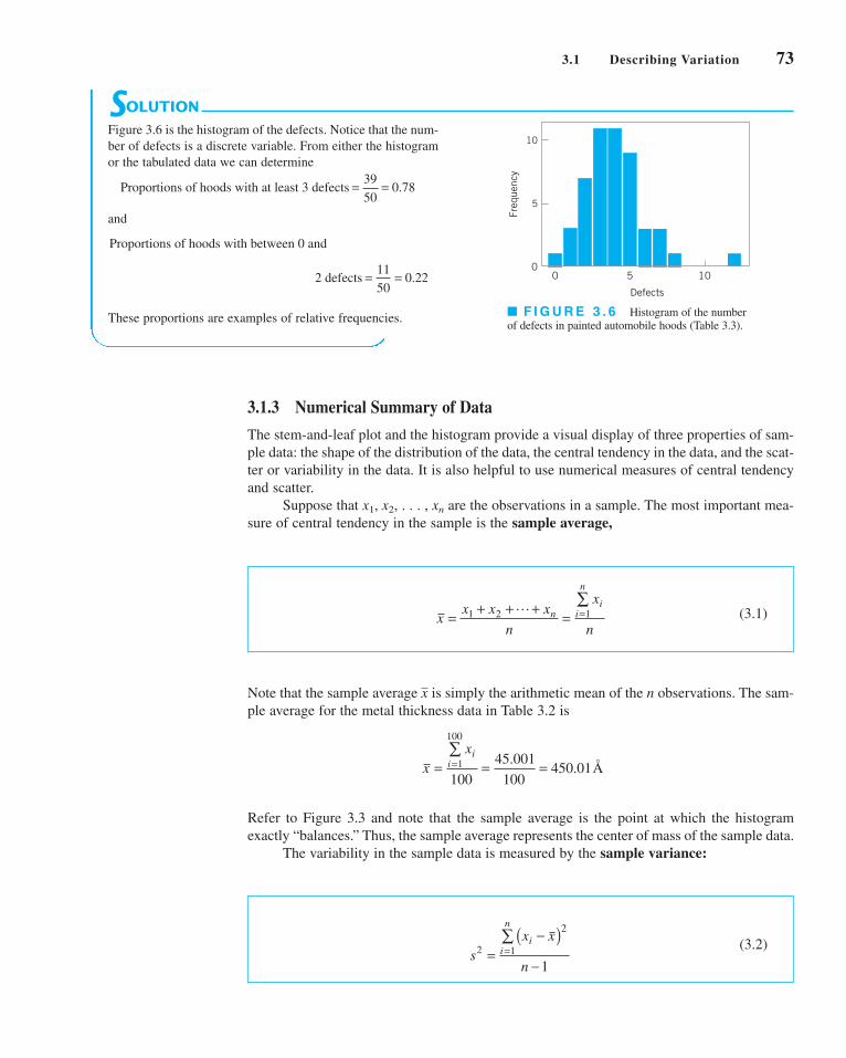
(3.1)
Note that the sample average is simply the arithmetic mean of the n observations. The sam-
ple average for the metal thickness data in Table 3.2 is
Refer to Figure 3.3 and note that the sample average is the point at which the histogram
exactly “balances.” Thus, the sample average represents the center of mass of the sample data.
The variability in the sample data is measured by the sample variance:
(3.2)s
x x
n
ii
n
2
2
1
1=
−( )−
=∑
xxi
i= = ==∑
1
100
100
45 001
100450 01
.. A
o
x
xx x x
n
x
nn
ii
n
= + + + = =∑
1 2 1L
3.1 Describing Variation 73
■ F I G U R E 3 . 6 Histogram of the number
of defects in painted automobile hoods (Table 3.3).
SOLUTION
Figure 3.6 is the histogram of the defects. Notice that the num-
ber of defects is a discrete variable. From either the histogram
or the tabulated data we can determine
and
These proportions are examples of relative frequencies.
d 2 defects = =11
500 22.
Proportions of hoods with between 0 and
Proportions of hoods with at least 3 defects = =39
500 78.
10
Freq
uenc
y
0 105
Defects
5
0
3.1.3 Numerical Summary of Data
The stem-and-leaf plot and the histogram provide a visual display of three properties of sam-
ple data: the shape of the distribution of the data, the central tendency in the data, and the scat-
ter or variability in the data. It is also helpful to use numerical measures of central tendency
and scatter.
Suppose that x1, x2, . . . , xn are the observations in a sample. The most important mea-
sure of central tendency in the sample is the sample average,
c03ModelingProcessQuality.qxd 3/16/12 12:10 PM Page 73

74 Chapter 3 ■ Modeling Process Quality
Note that the sample variance is simply the sum of the squared deviations of each obser-
vation from the sample average divided by the sample size minus 1. If there is no vari-
ability in the sample, then each sample observation and the sample variance s2 = 0.
Generally, the larger the sample variance s2 is, the greater is the variability in the sample data.
The units of the sample variance s2 are the square of the original units of the data. This
is often inconvenient and awkward to interpret, and so we usually prefer to use the square root
of s2, called the sample standard deviation s, as a measure of variability.
It follows that
(3.3)
The primary advantage of the sample standard deviation is that it is expressed in the original
units of measurement. For the metal thickness data, we find that
and
To more easily see how the standard deviation describes variability, consider the two
samples shown here:
Sample 1 Sample 2
Obviously, sample 2 has greater variability than sample 1. This is reflected in the standard
deviation, which for sample 1 is
and for sample 2 is
Thus, the larger variability in sample 2 is reflected by its larger standard deviation. Now
consider a third sample, say
Sample 3
x = 103
x3 = 105
x2 = 103
x1 = 101
sx xi
i=−( )
= −( ) + −( ) + −( ) = ==∑ 2
1
3
2 2 2
2
1 5 5 5 9 5
216 4
sx xi
i=−( )
= −( ) + −( ) + −( ) = ==∑ 2
1
3
2 2 2
2
1 3 3 3 5 3
24 2
x = 5x = 3
x3 = 9x3 = 5
x2 = 5x2 = 3
x1 = 1x1 = 1
s = 13 43. Ao
s2 2180 2928= . A
o
sx x
n
ii
n
=−( )
−=∑ 2
1
1
xi = x,
x,
c03ModelingProcessQuality.qxd 3/16/12 12:10 PM Page 74

3.1 Describing Variation 75
EXAMPLE 3.4
The data in Table 3.4 are diameters (in mm) of holes in a group
of 12 wing leading edge ribs for a commercial transport air-
plane. Construct and interpret a box plot of those data.
Hole Diameter
Notice that sample 3 was obtained from sample 1 by adding 100 to each observation. The
standard deviation for this third sample is s = 2, which is identical to the standard deviation
of sample 1. Comparing the two samples, we see that both samples have identical variability
or scatter about the average, and this is why they have the same standard deviations. This
leads to an important point: The standard deviation does not reflect the magnitude of thesample data, only the scatter about the average.
Handheld calculators are frequently used for calculating the sample average and stan-
dard deviation. Note that equations 3.2 and 3.3 are not very efficient computationally, because
every number must be entered into the calculator twice. A more efficient formula is
(3.4)
In using equation 3.4, each number would only have to be entered once, provided that
Σni=1xi and Σn
i=1x2i could be simultaneously accumulated in the calculator. Many inexpensive
handheld calculators perform this function and provide automatic calculation of and s.
3.1.4 The Box Plot
The stem-and-leaf display and the histogram provide a visual impression about a data set,
whereas the sample average and standard deviation provide quantitative information about
specific features of the data. The box plot is a graphical display that simultaneously displays
several important features of the data, such as location or central tendency, spread or vari-
ability, departure from symmetry, and identification of observations that lie unusually far
from the bulk of the data (these observations are often called “outliers”).
A box plot displays the three quartiles, the minimum, and the maximum of the data on
a rectangular box, aligned either horizontally or vertically. The box encloses the interquar-
tile range with the left (or lower) line at the first quartile Q1 and the right (or upper) line at
the third quartile Q3. A line is drawn through the box at the second quartile (which is the
fiftieth percentile or the median) A line at either end extends to the extreme values.
These lines are usually called whiskers. Some authors refer to the box plot as the box andwhisker plot. In some computer programs, the whiskers only extend a distance of 1.5
(Q3 − Q1) from the ends of the box, at most, and observations beyond these limits are flagged
as potential outliers. This variation of the basic procedure is called a modified box plot.
Q2 = x.
x
sx
x
nn
i
ii
n
i
n
=−
⎛⎝⎜
⎞⎠⎟
−
=
=
∑∑ 2 1
2
1
1
(continued)
■ TA B L E 3 . 4
Hole Diameters (in mm) in WingLeading Edge Ribs
120.5 120.4 120.7
120.9 120.2 121.1
120.3 120.1 120.9
121.3 120.5 120.8
c03ModelingProcessQuality.qxd 3/16/12 12:10 PM Page 75

76 Chapter 3 ■ Modeling Process Quality
Box plots are very useful in graphical comparisons among data sets, because they have
visual impact and are easy to understand. For example, Figure 3.8 shows the comparative box
plots for a manufacturing quality index on products at three manufacturing plants. Inspection
of this display reveals that there is too much variability at plant 2, and that plants 2 and 3 need
to raise their quality index performance.
3.1.5 Probability Distributions
The histogram (or stem-and-leaf plot, or box plot) is used to describe sample data. A sampleis a collection of measurements selected from some larger source or population. For exam-
ple, the measurements on layer thickness in Table 3.2 are obtained from a sample of wafers
selected from the manufacturing process. The population in this example is the collection of
all layer thicknesses produced by that process. By using statistical methods, we may be able
to analyze the sample layer thickness data and draw certain conclusions about the process that
manufactures the wafers.
A probability distribution is a mathematical model that relates the value of the vari-
able with the probability of occurrence of that value in the population. In other words, we
might visualize layer thickness as a random variable because it takes on different values in
the population according to some random mechanism, and then the probability distribution of
layer thickness describes the probability of occurrence of any value of layer thickness in the
population. There are two types of probability distributions.
1 2 3Plant
70
80
90
100
110
120
Qua
lity
inde
x
■ F I G U R E 3 . 8 Comparative box plots of a
quality index for products produced at three plants.
SOLUTION
The box plot is shown in Figure 3.7. Note that the median of
the sample is halfway between the sixth and seventh rank-
ordered observation, or (120.5 + 120.7)/2 = 120.6, and that
the quartiles are Q1 = 120.35 and Q3 = 120.9. The box plot
indicates that the hole diameter distribution is not exactly
symmetric around a central value, because the left and right
whiskers and the left and right boxes around the median are
not the same lengths.
■ F I G U R E 3 . 7 Box plot for the aircraft wing
leading edge hole diameter data in Table 3.4.
121.3
120.9120.6120.35
120.1
c03ModelingProcessQuality.qxd 3/16/12 12:10 PM Page 76

3.1 Describing Variation 77
Definition
1. Continuous distributions. When the variable being measured is expressed on a
continuous scale, its probability distribution is called a continuous distribution.The probability distribution of metal layer thickness is continuous.
2. Discrete distributions. When the parameter being measured can only take on cer-
tain values, such as the integers 0, 1, 2, . . . , the probability distribution is called
a discrete distribution. For example, the distribution of the number of nonconfor-
mities or defects in printed circuit boards would be a discrete distribution.
Examples of discrete and continuous probability distributions are shown in Figures 3.9aand 3.9b, respectively. The appearance of a discrete distribution is that of a series of vertical
“spikes,” with the height of each spike proportional to the probability. We write the probabil-
ity that the random variable x takes on the specific value xi as
The appearance of a continuous distribution is that of a smooth curve, with the area under the curve
equal to probability, so that the probability that x lies in the interval from a to b is written as
P a x b f x dxab≤ ≤{ } = ( )∫
P x x p xi i={ } = ( )
random variable representing the number of nonconforming
chips in the sample, then the probability distribution of x is
p xx
xx x( ) = ⎛⎝⎜
⎞⎠⎟( ) ( ) =−250 01 0 99 25
25. . ,0,1,2,K
EXAMPLE 3.5
A manufacturing process produces thousands of semiconduc-
tor chips per day. On the average, 1% of these chips do not
conform to specifications. Every hour, an inspector selects a
random sample of 25 chips and classifies each chip in the
sample as conforming or nonconforming. If we let x be the
A Discrete Distribution
p(xi)
p(x1)
p(x2)
p(x3)
p(x4)
p(x5)
x1 x2 x3 x4 x5x
(a)
a bx
f (x)
(b)
■ F I G U R E 3 . 9 Probability distributions. (a) Discrete case. (b) Continuous case.
(continued)
c03ModelingProcessQuality.qxd 3/16/12 12:10 PM Page 77

78 Chapter 3 ■ Modeling Process Quality
In Sections 3.2 and 3.3 we present several useful discrete and continuous distributions.
The mean m of a probability distribution is a measure of the central tendency in the
distribution, or its location. The mean is defined as
(3.5a)
(3.5b)
For the case of a discrete random variable with exactly N equally likely values [that is, p(xi) =1/N], then equation 3.5b reduces to
Note the similarity of this last expression to the sample average defined in equation 3.1. The
mean is the point at which the distribution exactly “balances” (see Fig. 3.11). Thus, the mean
x
μ = =∑ x
N
ii
N
1
μ =( )
( )
⎧⎨⎪
⎩⎪
−∞∞
=
∞∫
∑
xf x dx x
x p x xi ii
continuous
discrete
,
,1
15.5 16.0 16.5 17.0
1__15
x
f (x)
■ F I G U R E 3 . 1 0 The uniform distribu-
tion for Example 3.6.
EXAMPLE 3.6
Suppose that x is a random variable that represents the actual
contents in ounces of a 1-pound bag of coffee beans. The
probability distribution of x is assumed to be
This is a continuous distribution, since the range of x is the
interval [15.5, 17.0]. This distribution is called the uniformdistribution, and it is shown graphically in Figure 3.10. Note
that the area under the function f(x) corresponds to probability,
so that the probability of a bag containing less than 16.0 oz is
This follows intuitively from inspection of Figure 3.9.
x= = − =1 5
16 0 15 5
1 50 3333
15 5
16 0
.
. .
..
.
.
P x f x dx dx≤{ } = ( ) =∫ ∫16 01
1 515 5
16 0
15 5
16 0.
..
.
.
.
f x x( ) = ≤ ≤1
1 515 5 17 0
.. .
A Continuous Distribution
P x P x P x
p p
xx
x x
≤( ) = =( ) + =( )= ( ) + ( )
= ⎛⎝⎜
⎞⎠⎟( ) ( )
= ( ) ( ) + ( ) ( )
= + =
=
−∑
1 0 1
0 1
250 01 0 99
25
0 250 99 0 01
25
1 240 99 0 01
0 7778 0 1964 0 9742
0
125
25 0 24 1
. .
!
! !. .
!
! !. .
. . .
where = . This is a discrete distribution,25!>3x! 125 - x2!4125x 2
since the observed number of nonconformances is x = 0, 1,
2, . . . , 25, and is called the binomial distribution. We may
calculate the probability of finding one or fewer nonconforming
parts in the sample as
c03ModelingProcessQuality.qxd 3/16/12 12:10 PM Page 78

is simply the center of mass of the probability distribution. Note from Figure 3.11b that the
mean is not necessarily the fiftieth percentile of the distribution (which is the median), and
from Figure 3.11c that it is not necessarily the most likely value of the variable (which is
called the mode). The mean simply determines the location of the distribution, as shown in
Figure 3.12.
The scatter, spread, or variability in a distribution is expressed by the variance The
definition of the variance is
(3.6a)
(3.6b)
when the random variable is discrete with N equally likely values, then equation 3.6b becomes
and we observe that in this case the variance is the average squared distance of each member of
the population from the mean. Note the similarity to the sample variance s2, defined in equation
3.2. If there is no variability in the population. As the variability increases, the variance
increases. The variance is expressed in the square of the units of the original variable. For
example, if we are measuring voltages, the units of the variance are (volts)2. Thus, it is custom-
ary to work with the square root of the variance, called the standard deviation It follows that
(3.7)
The standard deviation is a measure of spread or scatter in the population expressed in the
original units. Two distributions with the same mean but different standard deviations are
shown in Figure 3.13.
σ σμ
= =−( )
=∑
2
2
1
x
N
ii
N
s.
s2
s2 = 0,
σμ
2
2
1=−( )
=∑ x
N
ii
N
σμ
μ2
2
2
1
=−( ) ( )−( ) ( )
⎧⎨⎪
⎩⎪
−∞∞
=
∞∫
∑
x f x dx x
x p x xi ii
,
,
continuous
discrete
s2.
3.1 Describing Variation 79
μ = 10 μ = 20
■ F I G U R E 3 . 1 1 The mean of a distribution.
■ F I G U R E 3 . 1 2 Two probability distribu-
tions with different means.
= 2σ
= 4σ
= 10μ
■ F I G U R E 3 . 1 3 Two probability distributions
with the same mean but different standard deviations.
μ
(a)
μ
(b)
Median μ
(c)
Mode Mode
c03ModelingProcessQuality.qxd 3/16/12 12:10 PM Page 79

80 Chapter 3 ■ Modeling Process Quality
3.2 Important Discrete Distributions
Several discrete probability distributions arise frequently in statistical quality control. In this
section, we discuss the hypergeometric distribution, the binomial distribution, the Poisson
distribution, and the negative binomial and geometric distributions.
3.2.1 The Hypergeometric Distribution
Suppose that there is a finite population consisting of N items. Some number—say,
—of these items fall into a class of interest. A random sample of n items is selected
from the population without replacement, and the number of items in the sample that fall into
the class of interest—say, x—is observed. Then x is a hypergeometric random variable with
the probability distribution defined as follows.
D(D ≤ N)
In the above definition, the quantity
is the number of combinations of a items taken b at a time.
The hypergeometric distribution is the appropriate probability model for selecting a
random sample of n items without replacement from a lot of N items of which D are non-
conforming or defective. By a random sample, we mean a sample that has been selected in
such a way that all possible samples have an equal chance of being chosen. In these applica-
tions, x usually represents the number of nonconforming items found in the sample. For
example, suppose that a lot contains 100 items, 5 of which do not conform to requirements.
If 10 items are selected at random without replacement, then the probability of finding one or
fewer nonconforming items in the sample is
a
ba
b a�b
⎛⎝⎜
⎞⎠⎟
=( )
!
! !
Definition
The hypergeometric probability distribution is
(3.8)
The mean and variance of the distribution are
(3.9)
and
(3.10)σ 2 11
= −⎛⎝
⎞⎠
−−
⎛⎝
⎞⎠
nD
N
D
N
N n
N
μ = nD
N
p x
D
x
N D
n xN
n
x( ) =
⎛⎝⎜
⎞⎠⎟
−−
⎛⎝⎜
⎞⎠⎟
⎛⎝⎜
⎞⎠⎟
= 0,1,2, . . . , min (n,D)
c03ModelingProcessQuality.qxd 3/16/12 12:10 PM Page 80

In Chapter 15, we show how probability models such as this can be used to design acceptance-
sampling procedures.
Some computer programs can perform these calculations. The display below is the out-
put from Minitab for calculating cumulative hypergeometric probabilities with N = 100,
D = 5 (note that Minitab uses the symbol M instead of D and n = 10). Minitab will also cal-
culate the individual probabilities for each value of x.
P x P x P x≤{ } = ={ } + ={ }
=
⎛⎝⎜
⎞⎠⎟⎛⎝⎜
⎞⎠⎟
⎛⎝⎜
⎞⎠⎟
+
⎛⎝⎜
⎞⎠⎟⎛⎝⎜
⎞⎠⎟
⎛⎝⎜
⎞⎠⎟
=
1 0 1
5
0
95
10
100
10
5
1
95
9
100
10
0 92314.
3.2 Important Discrete Distributions 81
Cumulative Distribution Function
Hypergeometric with N = 100, M = 5, and n = 10
3.2.2 The Binomial Distribution
Consider a process that consists of a sequence of n independent trials. By independent trials,
we mean that the outcome of each trial does not depend in any way on the outcome of previ-
ous trials. When the outcome of each trial is either a “success” or a “failure,” the trials are
called Bernoulli trials. If the probability of “success” on any trial—say, p—is constant, then
the number of “successes” x in n Bernoulli trials has the binomial distribution with para-
meters n and p, defined as follows:
x P(X < = x)
0 0.58375
1 0.92314
2 0.99336
3 0.99975
4 1.00000
5 1.00000
x P(X < = x)
6 1.00000
7 1.00000
8 1.00000
9 1.00000
10 1.00000
Definition
The binomial distribution with parameters and is
(3.11)
The mean and variance of the binomial distribution are
(3.12)
and
(3.13)σ 21= −( )np p
μ = np
p xn
xp p xx n x( ) = ⎛
⎝⎜⎞⎠⎟
−( ) =−1 0,1, . . . , n
0 < p < 1n ≥ 0
c03ModelingProcessQuality.qxd 3/16/12 12:10 PM Page 81

82 Chapter 3 ■ Modeling Process Quality
The binomial distribution is used frequently in quality engineering. It is the appropriate
probability model for sampling from an infinitely large population, where p represents the
fraction of defective or nonconforming items in the population. In these applications, x usu-
ally represents the number of nonconforming items found in a random sample of n items. For
example, if p = 0.10 and n = 15, then the probability of obtaining x nonconforming items is
computed from equation 3.11 as follows:
Probability Density Function
Binomial with n = 15 and p = 0.1
x P(X = x)0 0.205891
1 0.343152
2 0.266896
3 0.128505
4 0.042835
5 0.010471
x P(X = x)6 0.001939
7 0.000277
8 0.000031
9 0.000003
10 0.000000
Minitab was used to perform these calculations. Notice that for all values of x that lie between
the probability of finding x “successes” in 15 trials is zero.
Several binomial distributions are shown graphically in Figure 3.14. The shape of those
examples is typical of all binomial distributions. For a fixed n, the distribution becomes more
symmetric as p increases from 0 to 0.5 or decreases from 1 to 0.5. For a fixed p, the distrib-
ution becomes more symmetric as n increases.
A random variable that arises frequently in statistical quality control is
(3.14)
where x has a binomial distribution with parameters n and p. Often is the ratio of the
observed number of defective or nonconforming items in a sample (x) to the sample size (n),
p
px
n=
10 ≤ x ≤ 15
0.4
0.3
0.2
0.1
00 6 9 12 15
x
f(x)
0.3
0.2
0.15
0.1
00 5 10 20 25 30
p(x)
0.25
0.05
x
(a) Binomial distributions for different valuesof p with n = 15.
(b) Binomial distributions for different valuesof n with p = 0.25.
n = 15, p = 0.1n = 15, p = 0.5n = 15, p = 0.9
n = 10, p = 0.25n = 20, p = 0.25n = 40, p = 0.25
3
■ F I G U R E 3 . 1 4 Binomial distributions for selected values of n and p.
c03ModelingProcessQuality.qxd 3/16/12 12:10 PM Page 82

and this is usually called the sample fraction defective or sample fraction nonconform-ing. The “ ˆ ” symbol is used to indicate that is an estimate of the true, unknown value
of the binomial parameter p. The probability distribution of is obtained from the bino-
mial, since
where [na] denotes the largest integer less than or equal to na. It is easy to show that the mean
of is p and that the variance of is
3.2.3 The Poisson Distribution
A useful discrete distribution in statistical quality control is the Poisson distribution, defined
as follows:
σ pp p
n2 1
=−( )
pp
P p a Px
na p x na
n
xp p
x
nax n x
ˆ ≤{ } = ≤⎧⎨⎩
⎫⎬⎭
= ≤{ } = ⎛⎝⎜
⎞⎠⎟
−( )=
[ ] −∑0
1
pp
3.2 Important Discrete Distributions 83
Definition
The Poisson distribution is
(3.15)
where the parameter The mean and variance of the Poisson distribution
are
(3.16)
and
(3.17)σ λ2 =
μ λ=
l > 0.
p xe
xx
x
( ) = =−λλ
!, . . .0,1
Note that the mean and variance of the Poisson distribution are both equal to the para-
meter l.
A typical application of the Poisson distribution in quality control is as a model of the
number of defects or nonconformities that occur in a unit of product. In fact, any random phe-
nomenon that occurs on a per unit (or per unit area, per unit volume, per unit time, etc.) basis
is often well approximated by the Poisson distribution. As an example, suppose that the num-
ber of wire-bonding defects per unit that occur in a semiconductor device is Poisson distrib-
uted with parameter l � 4. Then the probability that a randomly selected semiconductor device
will contain two or fewer wire-bonding defects is
P xe
x
x
x≤{ } = =
−
=∑2
40.018316 � 0.073263 � 0.146525 � 0.238104
4
0
2
!
c03ModelingProcessQuality.qxd 3/16/12 12:10 PM Page 83

84 Chapter 3 ■ Modeling Process Quality
Several Poisson distributions are shown in Figure 3.15. Note that the distribution is
skewed; that is, it has a long tail to the right. As the parameter becomes larger, the Poisson
distribution becomes symmetric in appearance.
It is possible to derive the Poisson distribution as a limiting form of the binomial dis-
tribution. That is, in a binomial distribution with parameters n and p, if we let n approach
infinity and p approach zero in such a way that np = l is a constant, then the Poisson distrib-
ution results. It is also possible to derive the Poisson distribution using a pure probability
argument. [For more information about the Poisson distribution, see Hines, Montgomery,
Goldsman, and Borror (2004); Montgomery and Runger (2011); and the supplemental text
material.]
3.2.4 The Negative Binomial and Geometric Distributions
The negative binomial distribution, like the binomial distribution, has its basis in Bernoulli
trials. Consider a sequence of independent trials, each with probability of success p, and let xdenote the trial on which the r th success occurs. Then x is a negative binomial random vari-
able with probability distribution defined as follows.
l
Probability Density Function
Poisson with mean = 4
x P(X = x)0 0.018316
1 0.073263
2 0.146525
0.2
0.16
0.12
0.08
0.04
00 10 20 30 40
x
p(x)
= 4 = 8 = 12 = 16
λλλλ
■ F I G U R E 3 . 1 5 Poisson probability distributions for selected values of l.
Minitab can perform these calculations. Using the Poisson distribution with the mean = 4
results in:
c03ModelingProcessQuality.qxd 3/16/12 12:10 PM Page 84

The negative binomial distribution, like the Poisson distribution, is sometimes useful as
the underlying statistical model for various types of “count” data, such as the occurrence of
nonconformities in a unit of product (see Section 7.3.1). There is an important duality between
the binomial and negative binomial distributions. In the binomial distribution, we fix the sample
size (number of Bernoulli trials) and observe the number of successes; in the negative binomial
distribution, we fix the number of successes and observe the sample size (number of Bernoulli
trials) required to achieve them. This concept is particularly important in various kinds of sam-
pling problems. The negative binomial distribution is also called the Pascal distribution (after
Blaise Pascal, the 17th-century French mathematician and physicist. There is a variation of the
negative binomial for real values of that is called the Polya distribution.
A useful special case of the negative binomial distribution is if r = 1, in which case we
have the geometric distribution. It is the distribution of the number of Bernoulli trials until
the first success. The geometric distribution is
The mean and variance of the geometric distribution are
respectively. Because the sequence of Bernoulli trials are independent, the count of the number
of trials until the next success can be started from anywhere without changing the probability
distribution. For example, suppose we are examining a series of medical records searching for
missing information. If, for example, 100 records have been examined, the probability that the
first error occurs on record number 105 is just the probability that the next five records are
GGGGB, where G denotes good and B denotes an error. If the probability of finding a bad
record is 0.05, the probability of finding a bad record on the fifth record examined is
. This is identical to the probability that the first bad record
occurs on record 5. This is called the lack of memory property of the geometric distribution.
This property implies that the system being modeled does not fail because it is wearing out due
to fatigue or accumulated stress.
P5x = 56 = (0.95)4(0.05) = 0.0407
σ 22andμ =
1p p
=1 − p
p(x) = (1 − p)x – 1p, x = 1, 2,...
l
3.2 Important Discrete Distributions 85
Definition
The negative binomial distribution is
(3.18)
where is an integer. The mean and variance of the negative binomial distri-
bution are
(3.19)
and
(3.20)
respectively.
σ 22
1=
−( )r p
p
μ = r
p
r ≥ 1
p xx
rp p x r r rr x r( ) =
−−
⎛⎝⎜
⎞⎠⎟
−( ) = + +−1
11 1 2, , , . . .
c03ModelingProcessQuality.qxd 3/16/12 12:10 PM Page 85

– 1 μμ σ – 2 μ σ – 3 μ σ + 1 μ σ + 2 μ σ + 3 μ σ
68.26%
95.46%
99.73%
86 Chapter 3 ■ Modeling Process Quality
The normal distribution is used so much that we frequently employ a special notation,
x − N , to imply that x is normally distributed with mean and variance . The visual
appearance of the normal distribution is a symmetric, unimodal or bell-shaped curve and is
shown in Figure 3.16.
There is a simple interpretation of the standard deviation of a normal distribution,
which is illustrated in Figure 3.17. Note that 68.26% of the population values fall between the
limits defined by the mean plus and minus one standard deviation 95.46% of
the values fall between the limits defined by the mean plus and minus two standard deviations
and 99.73% of the population values fall within the limits defined by the mean(m ± 2s );
(m ± 1s );
s
s 2m(m, s 2)
Definition
The normal distribution is
(3.21)
The mean of the normal distribution is and the variance is
s2 > 0.
m (−q < m < q)
f x e x
x
( ) = − ∞ < < ∞− −⎛
⎝⎞⎠1
2
1
2
2
σ π
μσ
f (x)
xμ
σ 2
■ F I G U R E 3 . 1 6 The normal distribution. ■ F I G U R E 3 . 1 7 Areas under the normal distribution.
The negative binomial random variable can be defined as the sum of geometric random
variables. That is, the sum of r geometric random variables each with parameter p is a nega-
tive binomial random variable with parameters p and r.
3.3 Important Continuous Distributions
In this section we discuss several continuous distributions that are important in statistical
quality control. These include the normal distribution, the lognormal distribution, the expo-
nential distribution, the gamma distribution, and the Weibull distribution.
3.3.1 The Normal Distribution
The normal distribution is probably the most important distribution in both the theory and
application of statistics. If x is a normal random variable, then the probability distribution of
x is defined as follows:
c03ModelingProcessQuality.qxd 3/16/12 12:10 PM Page 86

plus and minus three standard deviations Thus, the standard deviation measures
the distance on the horizontal scale associated with the 68.26%, 95.46%, and 99.73% con-
tainment limits. It is common practice to round these percentages to 68%, 95%, and 99.7%.
The cumulative normal distribution is defined as the probability that the normal random
variable x is less than or equal to some value a, or
(3.22)
This integral cannot be evaluated in closed form. However, by using the change of variable
(3.23)
the evaluation can be made independent of and That is,
where is the cumulative distribution function of the standard normal distribution(mean = 0, standard deviation = 1). A table of the cumulative standard normal distribution is
given in Appendix Table II. The transformation (3.23) is usually called standardization,because it converts a random variable into an N(0, 1) random variable. N(m, s2)
Φ ( � )
P x a P za a≤{ } = ≤ −⎧⎨
⎩⎫⎬⎭
≡ −⎛⎝
⎞⎠
μσ
μσ
Φ
s2.m
zx= − μ
σ
P x a F a e dxx
a≤{ } = ( ) =− −⎛
⎝⎞⎠
−∞∫1
2
1
2
2
σ π
μσ
(m ± 3s).
3.3 Important Continuous Distributions 87
mean and standard deviation
denoted What is the probability that a customer
complaint will be resolved in less than 35 hours?
x ∼ N(40, 22).s = 2 hoursm = 40 hours
EXAMPLE 3.7
The time to resolve customer complaints is a critical quality
characteristic for many organizations. Suppose that this time in
a financial organization, say, x—is normally distributed with
Tensile Strength of Paper
SOLUTION
The desired probability is
To evaluate this probability from the standard normal tables,
we standardize the point 35 and find
Consequently, the desired probability is
Figure 3.18 shows the tabulated probability for both the N(40,
22) distribution and the standard normal distribution. Note that
the shaded area to the left of 35 hr in Figure 3.18 represents
the fraction of customer complaints resolved in less than or
equal to 35 hours.
p{x ≥ 35} = 0.0062
P z ≤ −{ } = −( ) =2 5 2 5 0 0062. . .Φ
P x P z≤{ } = ≤ −⎧⎨⎩
⎫⎬⎭
=3535 40
2
P{x ≤ 35}
35
0.0062
40
= 2σ
x
■ F I G U R E 3 . 1 8 Calculation of in
Example 3.7.
P5x ≤ 356
–2.5 0z
= 1σ
0.0062
c03ModelingProcessQuality.qxd 3/16/12 12:10 PM Page 87

88 Chapter 3 ■ Modeling Process Quality
SOLUTION
EXAMPLE 3.8 Shaft Diameters
lished as 0.2500 ± 0.0015 in. What fraction of the shafts pro-
duced conform to specifications?
The diameter of a metal shaft used in a disk-drive unit is nor-
mally distributed with mean 0.2508 in. and standard deviation
0.0005 in. The specifications on the shaft have been estab-
Thus, we would expect the process yield to be approximately
91.92%; that is, about 91.92% of the shafts produced conform
to specifications.
Note that almost all of the nonconforming shafts are too
large, because the process mean is located very near to the
P x P x P x0 2485 0 2515 0 2515 0 2485
0 2515 0 2500
0 0005
0 2485 0 2500
0 0005
3 00 3 00
0 99865 0 00135
0 9973
. . . .
. .
.
. .
.
. .
. .
.
≤ ≤{ } = ≤{ } − ≤{ }
= −⎛⎝
⎞⎠ − −⎛
⎝⎞⎠
= ( ) − −( )= −=
Φ Φ
Φ Φ
The appropriate normal distribution is shown in Figure 3.19.
Note that
In addition to the appendix table, many computer programs can calculate normal proba-
bilities. Minitab has this capability.
Appendix Table II gives only probabilities to the left of positive values of z. We will
need to utilize the symmetry property of the normal distribution to evaluate probabilities.
Specifically, note that
(3.24)
(3.25)and
(3.26)
It is helpful in problem solution to draw a graph of the distribution, as in Figure 3.18.
P x a P x a≥ −{ } = ≤{ }
P x a P x a≤ −{ } = ≤{ }
P x a P x a≥{ } = − ≤{ }1
■ F I G U R E 3 . 1 9 Distribution of shaft diameters,
Example 3.8.
0.2485 0.2508 0.2515
= 0.0005σ
Lowerspecification
limit(LSL)
Upperspecification
limit(USL)
upper specification limit. Suppose that we can recenter the
manufacturing process, perhaps by adjusting the machine, so
that the process mean is exactly equal to the nominal value of
0.2500. Then we have
By recentering the process we have increased the yield of the
process to approximately 99.73%.
P x P x P x0 2485 0 2515 0 2515 0 2485
0 2515 0 2508
0 0005
0 2485 0 2508
0 0005
1 40 4 60
0 9192 0 0000
0 9192
. . . .
. .
.
. .
.
. .
. .
.
≤ ≤{ } = ≤{ } − ≤{ }
= −⎛⎝
⎞⎠ − −⎛
⎝⎞⎠
= ( ) − −( )= −=
Φ Φ
Φ Φ
c03ModelingProcessQuality.qxd 3/16/12 12:10 PM Page 88

3.3 Important Continuous Distributions 89
SOLUTION
EXAMPLE 3.9 Another Use of the Standard Normal Table
random variable that results in a given probability. For exam-
ple, suppose that Find the value of x—say, a—
such that P 5x > a6 = 0.05.
x ∼ N(10, 9).Sometimes instead of finding the probability associated with a
particular value of a normal random variable, we find it neces-
sary to do the opposite—find a particular value of a normal
From the problem statement, we have
or
P za≤ −⎧⎨
⎩⎫⎬⎭
=10
30 95.
P x a P za>{ } = > −⎧⎨
⎩⎫⎬⎭
=10
30 05.
From Appendix Table II, we have so
or
a = + ( ) =10 3 1 645 14 935. .
a − =10
31 645.
P5z ≤ 1.6456 = 0.95,
The normal distribution has many useful properties. One of these is relative to linearcombinations of normally and independently distributed random variables. If x1, x2 . . . , xn
are normally and independently distributed random variables with means and
variances respectively, then the distribution of the linear combination
is normal with mean
(3.27)
and variance
(3.28)
where a1, a2, . . . , an are constants.
The Central Limit Theorem. The normal distribution is often assumed as the
appropriate probability model for a random variable. Later on, we will discuss how to check
the validity of this assumption; however, the central limit theorem is often a justification of
approximate normality.
σ σ σ σy n na a a212
12
22
22 2 2= + + +L
μ μ μ μy n na a a= + + +1 1 2 2 L
y a x a x a xn n= + + +1 1 2 2 L
s21, s2
2, . . . , s2n,
m1, m2, . . . , mn
Definition
The Central Limit Theorem If x1, x2, . . . , xn are independent random variables with
mean and variance and if y = x1 + x2 + . . . + xn, then the distribution of
approaches the N(0, 1) distribution as n approaches infinity.
y ii
n
ii
n
−=
=
∑
∑
μ
σ
1
2
1
s2i ,mi
c03ModelingProcessQuality.qxd 3/16/12 12:10 PM Page 89

90 Chapter 3 ■ Modeling Process Quality
The central limit theorem implies that the sum of n independently distributed random vari-
ables is approximately normal, regardless of the distributions of the individual variables. The
approximation improves as n increases. In many cases the approximation will be good for small
n—say, —whereas in some cases we may require very large n—say, —for the
approximation to be satisfactory. In general, if the xi are identically distributed, and the distribu-
tion of each xi does not depart radically from the normal, then the central limit theorem works
quite well for or 4. These conditions are met frequently in quality-engineering problems.
3.3.2 The Lognormal Distribution
Variables in a system sometimes follow an exponential relationship, say x = exp(w). If the
exponent w is a random variable, then x = exp(w) is a random variable and the distribution of
x is of interest. An important special case occurs when w has a normal distribution. In that
case, the distribution of x is called a lognormal distribution. The name follows from the
transformation ln (x) = w. That is, the natural logarithm of x is normally distributed.
Probabilities for x are obtained from the transformation to w, but we need to recognize
that the range of x is Suppose that w is normally distributed with mean and vari-
ance then the cumulative distribution function for x is
for where z is a standard normal random variable. Therefore, Appendix Table II can be
used to determine the probability. Also, f (x) = 0, for The lognormal random variable is
always nonnegative.
The lognormal distribution is defined as follows:
x ≤ 0.
x > 0,
F a P x a P w a P w a
P za a
( ) = ≤[ ] = ( ) ≤[ ] = ≤ ( )[ ]= ≤ ( ) −⎡
⎣⎢⎤⎦⎥
= ( ) −⎡⎣⎢
⎤⎦⎥
exp ln
ln lnθω
θω
Φ
�2;
q(0, q ).
n ≥ 3
n > 100n < 10
Definition
Let w have a normal distribution mean and variance then x = exp(w) is a
lognormal random variable, and the lognormal distribution is
(3.29)
The mean and variance of x are
(3.30)μ σθ ω θ ω ω= −( )+ +e e e2 2 2
2 2 1 and =2
f x xx x( ) = −( ) −( )⎡
⎣⎢⎢
⎤
⎦⎥⎥
∞1
2 22
2ω π
θ
ω 0 < <exp ln
�2;u
The parameters of a lognormal distribution are and but care is needed to interpret that
these are the mean and variance of the normal random variable w. The mean and variance of
x are the functions of these parameters shown in equation 3.30. Figure 3.20 illustrates log-
normal distributions for selected values of the parameters.
The lifetime of a product that degrades over time is often modeled by a lognormal ran-
dom variable. For example, this is a common distribution for the lifetime of a semiconductor
laser. Other continuous distributions can also be used in this type of application. However,
because the lognormal distribution is derived from a simple exponential function of a normal
random variable, it is easy to understand and easy to evaluate probabilities.
�2,u
c03ModelingProcessQuality.qxd 3/16/12 12:10 PM Page 90

3.3 Important Continuous Distributions 91
■ F I G U R E 3 . 2 0 Lognormal probability density functions
with for selected values of w2.q = 0
1
0.9
0.8
0.7
0.6
0.5
0.4
0.3
0.2
0.1
0
–0.10 1 2 3
x4 5 6
f(x)
ωωω
2 = 0.25 2 = 1 2 = 2.25
SOLUTION
EXAMPLE 3.10 Medical Laser Lifetime
The lifetime of a medical laser used in ophthalmic surgery has
a lognormal distribution with and w = 1.2 hours What is
the probability that the lifetime exceeds 500 hours?
q = 6
What lifetime is exceeded by 99% of lasers? Now the question
is to determine a such that Therefore,P(x > a) = 0.99.
so the standard deviation of the lifetime is 1487.42 hours.
Notice that the standard deviation of the lifetime is large
relative to the mean.
From Appendix Table II, when a = −2.33.
Therefore,
1 − Φ (a) = 0.99
ln
.. exp . .
aa
( ) − = − = ( ) =6
1 22 33 3 204 24 63 and hours
μ θ ω= = +( ) =+e2 2
6 0 72 828 82exp . . hours
σ θ ω ω2 22 2
1 12 1 44 1 44 1= −( ) = +( ) ( ) −[ ]+e e exp . exp .
2 212 419 85= , , .
From the cumulative distribution function for the lognormal
random variable
P x P w P w>( ) = − ( ) ≤[ ] = − ≤ ( )[ ]
= ( ) −⎛⎝⎜
⎞⎠⎟
= − ( ) = −
500 1 500 1 500
500 6
1 21 0 1788 1 0 5
exp ln
ln
.. .Φ Φ
= − =1 0 5710 0 4290. .
a= − ( ) −⎛⎝⎜
⎞⎠⎟
=ln
..1
6
1 20 99Φ
P x a P w a P w a>( ) = ( ) >[ ] = > ( )[ ]exp ln
Determine the mean and standard deviation of the lifetime. Now,
c03ModelingProcessQuality.qxd 3/16/12 12:10 PM Page 91

92 Chapter 3 ■ Modeling Process Quality
3.3.3 The Exponential Distribution
The probability distribution of the exponential random variable is defined as follows:
■ F I G U R E 3 . 2 1 Exponential distributions for selected
values of l.
■ F I G U R E 3 . 2 2 The cumulative
exponential distribution function.
0.2
0.16
0.12
0.08
0.04
00 20 40 60 80 100
x
f(x)
λ = 0.2( = 5) = 0.1( = 10) = 0.0667( = 15)λλ
μμ
μ
F(a
)
a0
Definition
The exponential distribution is
(3.31)
where is a constant. The mean and variance of the exponential distribu-
tion are
(3.32)
and
(3.33)
respectively.
σλ
22
1=
μλ
= 1
l > 0
f x e xx( ) = ≥−λ λ 0
Several exponential distributions are shown in Figure 3.21.
The cumulative exponential distribution is
(3.34)
Figure 3.22 illustrates the exponential cumulative distribution function.
The exponential distribution is widely used in the field of reliability engineering as a
model of the time to failure of a component or system. In these applications, the parameter
is called the failure rate of the system, and the mean of the distribution is called the1/ll
= − ≥−1 e aaλ
0
F a P x a
e dtta
( ) = ≤{ }= −∫ λ λ
0
c03ModelingProcessQuality.qxd 3/16/12 12:10 PM Page 92

3.3 Important Continuous Distributions 93
2See the supplemental text material for more information.
mean time to failure.2 For example, suppose that an electronic component in an airborne
radar system has a useful life described by an exponential distribution with failure
rate 10−4/h; that is, The mean time to failure for this component is
If we wanted to determine the probability that this component would
fail before its expected life, we would evaluate
This result holds regardless of the value of that is, the probability that a value of an expo-
nential random variable will be less than its mean is 0.63212. This happens, of course,
because the distribution is not symmetric.
There is an important relationship between the exponential and Poisson distributions. If
we consider the Poisson distribution as a model of the number of occurrences of some event
in the interval (0, t], then from equation 3.15 we have
Now x = 0 implies that there are no occurrences of the event in (0, t], and
We may think of p(0) as the probability that the interval to the first
occurrence is greater than t, or
where y is the random variable denoting the interval to the first occurrence. Since
and using the fact that f (y) = dF(y)/dy, we have
(3.35)
as the distribution of the interval to the first occurrence. We recognize equation 3.35 as an
exponential distribution with parameter Therefore, we see that if the number of occurrences
of an event has a Poisson distribution with parameter then the distribution of the interval
between occurrences is exponential with parameter
The exponential distribution has a lack of memory property. To illustrate, suppose that
the exponential random variable x is used to model the time to the occurrence of some event.
Consider two points in time t1 and . Then the probability that the event occurs at a time
that is less than but greater than time t2 is just the probability that the event occurs at
time less than t1. This is the same lack of memory property that we observed earlier for the
geometric distribution. The exponential distribution is the only continuous distribution that
has this property.
3.3.4 The Gamma Distribution
The probability distribution of the gamma random variable is defined as follows:
t1 + t2
t2 > t1
l.
l,
l.
f y e y( ) = −λ λ
F t P y t e t( ) = ≤{ } = − −1
λ
P y t p e t>{ } = ( ) = −0
λ
P5x = 06 = p(0) = e−lt.
p xe t
x
t x
( ) = ( )−λ λ!
l;
P x e dt et≤⎧⎨⎩
⎫⎬⎭
= = − =− −∫1
1 0 632120
1 1
λλ λλ
.
1/l = 104 = 10,000 h.
l = 10−4.
c03ModelingProcessQuality.qxd 3/16/12 12:10 PM Page 93

94 Chapter 3 ■ Modeling Process Quality
3 in the denominator of equation 3.36 is the gamma function, defined as If r is a
positive integer, then ≠1r2 = 1r - 12!�(r) = �q
0xr−1e�xdx, r > 0.�(r)
Definition
The gamma distribution is
(3.36)
with shape parameter and scale parameter The mean and varianceof the gamma distribution are
(3.37)
and
(3.38)
respectively.3
σλ
22
= r
μλ
= r
l > 0.r > 0
f xr
x e xr x( ) =
( ) ( ) ≥− −λ λ λ
Γ1
0
Several gamma distributions are shown in Figure 3.23. Note that if r = 1, the gamma distrib-
ution reduces to the exponential distribution with parameter (Section 3.3.3). The gamma
distribution can assume many different shapes, depending on the values chosen for r and
This makes it useful as a model for a wide variety of continuous random variables.
If the parameter r is an integer, then the gamma distribution is the sum of r indepen-
dently and identically distributed exponential distributions, each with parameter That is, if
x1, x2, . . . , xr are exponential with parameter and independent, then
is distributed as gamma with parameters r and There are a number of important applica-
tions of this result.
l.
y x x xr= + + +1 2 L
ll.
l.
l
■ F I G U R E 3 . 2 3 Gamma distributions
for selected values or r and l = 1.
r = 1, = 1r = 2, = 1r = 3, = 1
1
0.8
0.6
0.4
0.2
00 2 4 6 8 10 12
x
f(x)
λλλ
c03ModelingProcessQuality.qxd 3/16/12 12:10 PM Page 94

3.3 Important Continuous Distributions 95
■ F I G U R E 3 . 2 4 The standby redun-
dant system for Example 3.11.
Component 2
Component 1
Switch
EXAMPLE 3.11 A Standby Redundant System
Consider the system shown in Figure 3.24. This is called a
standby redundant system, because while component 1 is on,
component 2 is off, and when component 1 fails, the switch
automatically turns component 2 on. If each component has a
life described by an exponential distribution with ,
say, then the system life is gamma distributed with parameters
r = 2 and Thus, the mean time to failure is
.m = r/l = 2/10−4 = 2 × 10⁴ h
l = 10−4.
l = 10−4/h
Definition
The Weibull distribution is
(3.41)
where is the scale parameter and is the shape parameter. The meanand variance of the Weibull distribution are
(3.42)
and
(3.43)
respectively.
σ θβ β
2 2
2
12
11= +
⎛⎝⎜
⎞⎠⎟
− +⎛⎝⎜
⎞⎠⎟
⎧⎨⎩
⎫⎬⎭
⎡
⎣⎢⎢
⎤
⎦⎥⎥
Γ Γ
μ θβ
= +⎛⎝⎜
⎞⎠⎟
Γ 11
b > 0q > 0
f xx x
x( ) = ⎛⎝
⎞⎠ −⎛
⎝⎞⎠
⎡
⎣⎢⎢
⎤
⎦⎥⎥
≥−β
θ θ θ
β β1
0exp
The cumulative gamma distribution is
(3.39)
If r is an integer, then equation 3.39 becomes
(3.40)
Consequently, the cumulative gamma distribution can be evaluated as the sum of r Poisson terms
with parameter This result is not too surprising, if we consider the Poisson distribution as a
model of the number of occurrences of an event in a fixed interval, and the gamma distribution
as the model of the portion of the interval required to obtain a specific number of occurrences.
3.3.5 The Weibull Distribution
The Weibull distribution is defined as follows:
la.
F a ea
ka
k
k
r( ) = − ( )−
=
−∑1
0
1λ λ
!
F ar
t e dta
r t( ) = −( )( )∞ − −∫1
1λ λ λ
Γ
c03ModelingProcessQuality.qxd 3/16/12 12:10 PM Page 95

96 Chapter 3 ■ Modeling Process Quality
■ F I G U R E 3 . 2 5 Weibull dis-
tributions for selected values of the shape
parameter and scale parameter q = 1.�
= , = 1 = 1, = 1 = 2, = 1 = 4, = 1
5
4
3
2
1
00 1 2 3 4
x
f(x)
βββ
θθθ
β θ
1_2
SOLUTION
EXAMPLE 3.12 Time to Failure for Electronic Components
failure and the fraction of components that are expected to
survive beyond 20,000 hours.
The time to failure for an electronic component used in a flat
panel display unit is satisfactorily modeled by a Weibull distri-
bution with and Find the mean time to q = 5000.b = 12
The mean time to failure is
The fraction of components expected to survive a = 20,000
hours is
1− ( ) = −⎛⎝
⎞⎠
⎡
⎣⎢⎢
⎤
⎦⎥⎥
F aa
expθ
β
μ θβ
= +⎛⎝⎜
⎞⎠⎟
= +⎛
⎝
⎜⎜⎜
⎞
⎠
⎟⎟⎟
= ( ) =
Γ Γ
Γ
11
5000 11
1
2
5000 3 10 000, hours
or
That is, all but about 13.53% of the subassemblies will fail by
20,000 hours.
1 20 00020 000
5 000
0 1353
1
2
2
− ( ) = −⎛⎝⎜
⎞⎠⎟
⎡
⎣
⎢⎢⎢
⎤
⎦
⎥⎥⎥
==
−
F
e
, exp,
,
.
4See the supplemental text material for more information.
The Weibull distribution is very flexible, and by appropriate selection of the parameters and
the distribution can assume a wide variety of shapes. Several Weibull distributions are shown in
Figure 3.25 for and and 4. Note that when the Weibull distribution
reduces to the exponential distribution with mean The cumulative Weibull distribution is
(3.44)
The Weibull distribution has been used extensively in reliability engineering as a model of time
to failure for electrical and mechanical components and systems. Examples of situations in which
the Weibull distribution has been used include electronic devices such as memory elements,
mechanical components such as bearings, and structural elements in aircraft and automobiles.4
F aa( ) = − −⎛
⎝⎞⎠
⎡
⎣⎢⎢
⎤
⎦⎥⎥
1 expθ
β
1/q.
b = 1,b = 1/2, 1, 2,q = 1
b,q
c03ModelingProcessQuality.qxd 3/16/12 12:10 PM Page 96

3.4 Probability Plots 97
3.4 Probability Plots
3.4.1 Normal Probability Plots
How do we know whether a particular probability distribution is a reasonable model for data?
Probability plotting is a graphical method for determining whether sample data conform to a
hypothesized distribution based on a subjective visual examination of the data. The general
procedure is very simple and can be performed quickly. Probability plotting typically uses spe-
cial graph paper, known as probability paper, that has been designed for the hypothesized dis-
tribution. Probability paper is widely available for the normal, lognormal, Weibull, and various
chi-square and gamma distributions. In this section we illustrate the normal probability plot.Section 3.4.2 discusses probability plots for some other continuous distributions.
To construct a probability plot, the observations in the sample are first ranked from
smallest to largest. That is, the sample x1, x2, . . . , xn is arranged as x(1), x(2), . . . , x(n), where
x(1) is the smallest observation, x(2) is the second smallest observation, and so forth, with x(n)
the largest. The ordered observations x( j) are then plotted against their observed cumulative
frequency ( j − 0.5)/n [or 100 ( j − 0.5)/n] on the appropriate probability paper. If the hypoth-
esized distribution adequately describes the data, the plotted points will fall approximately
along a straight line; if the plotted points deviate significantly and systematically from a
straight line, the hypothesized model is not appropriate. Usually, the determination of
whether or not the data plot as a straight line is subjective. The procedure is illustrated in the
following example.
SOLUTION
EXAMPLE 3.13 A Normal Probability Plot
adequately modeled by a normal distribution. Is this a reason-
able assumption?
Observations on the road octane number of ten gasoline blends
are as follows: 88.9, 87.0, 90.0, 88.2, 87.2, 87.4, 87.8, 89.7,
86.0, and 89.6. We hypothesize that the octane number is
To use probability plotting to investigate this hypothesis, first
arrange the observations in ascending order and calculate their
cumulative frequencies ( j − 0.5)/10 as shown in the following
table.
The pairs of values x(j) and ( j − 0.5)/10 are now plotted on nor-
mal probability paper. This plot is shown in Figure 3.26. Most
normal probability paper plots 100( j − 0.5)/n on the left verti-
cal scale (and some also plot 100[1 − ( j − 0.5)/n] on the right
vertical scale), with the variable value plotted on the horizon-
tal scale. A straight line, chosen subjectively as a “best fit” line,
has been drawn through the plotted points. In drawing the
straight line, you should be influenced more by the points near
the middle of the plot than by the extreme points. A good rule
of thumb is to draw the line approximately between the twenty-
fifth and seventy-fifth percentile points. This is how the line in
Figure 3.26 was determined. In assessing the systematic devi-
ation of the points from the straight line, imagine a fat pencil
lying along the line. If all the points are covered by this imag-
inary pencil, a normal distribution adequately describes the
data. Because the points in Figure 3.26 would pass the fat pen-
cil test, we conclude that the normal distribution is an appro-
priate model for the road octane number data.
j x(j) ( j - 0.5)/10
1 86.0 0.05
2 87.0 0.15
3 87.2 0.25
4 87.4 0.35
5 87.8 0.45
6 88.2 0.55
7 88.9 0.65
8 89.6 0.75
9 89.7 0.85
10 90.0 0.95
(continued)
c03ModelingProcessQuality.qxd 3/16/12 12:10 PM Page 97

98 Chapter 3 ■ Modeling Process Quality
–3.30
–1.64
–0.67
0
0.67
1.64
3.30
85.2 86.2 87.2 88.2
x(j)
89.2 90.2 91.2
z j
■ F I G U R E 3 . 2 7 Normal probability plot of the road
octane number data with standardized scores.
j x( j) ( j - 0.5)/10 zj
1 86.0 0.05 –1.64
2 87.0 0.15 –1.04
3 87.2 0.25 –0.67
4 87.4 0.35 –0.39
5 87.8 0.45 –0.13
6 88.2 0.55 0.13
7 88.9 0.65 0.39
8 89.6 0.75 0.67
9 89.7 0.85 1.04
10 90.0 0.95 1.64
A normal probability plot can also be constructed on ordinary graph paper by plotting
the standardized normal scores zj against x( j), where the standardized normal scores satisfy
For example, if ( j − 0.5)/n = 0.05, implies that zj = −1.64. To illustrate, consider
the data from the previous example. In the following table we show the standardized normal
scores in the last column.
Figure 3.27 presents the plot of zj versus x( j). This normal probability plot is equivalent
to the one in Figure 3.26. We can obtain an estimate of the mean and standard deviation
directly from a normal probability plot. The mean is estimated as the fiftieth percentile. From
Figure 3.25, we would estimate the mean road octane number as 88.2. The standard deviation
is proportional to the slope of the straight line on the plot, and one standard deviation is the
difference between the eighty-fourth and fiftieth percentiles. In Figure 3.26, the eighty-fourth
percentile is about 90, and the estimate of the standard deviation is 90 − 88.2 = 1.8.
A very important application of normal probability plotting is in verification ofassumptions when using statistical inference procedures that require the normality assump-
tion. This will be illustrated subsequently.
Φ (zj) = 0.05
j
nP Z z zj j
− = ≤( ) = ( )0 5. Φ
■ F I G U R E 3 . 2 6 Normal probability
plot of the road octane number data.
99
9590
80706050403020
105
1
85.2 86.2 87.2 88.2
x
89.2 90.2 91.2
Per
cent
age
[10
0(j
– 0
.5)/
n]
( j )
c03ModelingProcessQuality.qxd 3/16/12 12:10 PM Page 98

3.4 Probability Plots 99
3.4.2 Other Probability Plots
Probability plots are extremely useful and are often the first technique used when we need to
determine which probability distribution is likely to provide a reasonable model for data. In
using probability plots, usually the distribution is chosen by subjective assessment of the
probability plot. More formal statistical goodness-of-fit tests can also be used in conjunction
with probability plotting.
To illustrate how probability plotting can be useful in determining the appropriate dis-
tribution for data, consider the data on aluminum contamination (ppm) in plastic shown in
Table 3.5. Figure 3.28 presents several probability plots of this data, constructed using
Minitab. Figure 3.28a is a normal probability plot. Notice how the data in the tails of the plot
■ TA B L E 3 . 5
Aluminum Contamination (ppm)
30 30 60 63 70 79 87
90 101 102 115 118 119 119
120 125 140 145 172 182
183 191 222 244 291 511
From “The Lognormal Distribution for Modeling Quality Data When the Mean Is Near Zero,”
Journal of Quality Technology, 1990, pp. 105–110.
99
95908070605040302010
5
1
0 100 200 300
Aluminum contamination (ppm)
400 500
Per
cent
age
(a)
99
95908070605040302010
5
1
100
Aluminum contamination (ppm)
1000
Per
cent
age
(b)
99
235
10
9095
1
10
Aluminum contamination (ppm)
1000
Per
cent
age
100
(c)
80706050403020
99
9897
95
90
80706050
1030
0 100 200 300
Aluminum contamination (ppm)
400 500 600
Per
cent
age
(d)
■ F I G U R E 3 . 2 8 Probability plots of the aluminum contamination data in Table 3.5. (a) Normal.
(b) Lognormal. (c) Weibull. (d ) Exponential.
c03ModelingProcessQuality.qxd 3/16/12 12:10 PM Page 99

100 Chapter 3 ■ Modeling Process Quality
bend away from the straight line; This is an indication that the normal distribution is not a
good model for the data. Figure 3.28b is a lognormal probability plot of the data. The data fall
much closer to the straight line in this plot, particularly the observations in the tails, suggest-
ing that the lognormal distribution is more likely to provide a reasonable model for the data
than is the normal distribution.
Finally, Figures 3.28c and 3.28d are Weibull and exponential probability plots for the
data. The observations in these plots are not very close to the straight line, suggesting that
neither the Weibull nor the exponential is a very good model for the data. Therefore, based on
the four probability plots that we have constructed, the lognormal distribution appears to be
the most appropriate choice as a model for the aluminum contamination data.
3.5 Some Useful Approximations
In certain quality control problems, it is sometimes useful to approximate one probability dis-
tribution with another. This is particularly helpful in situations where the original distribution
is difficult to manipulate analytically. In this section, we present three such approximations:
(1) the binomial approximation to the hypergeometric, (2) the Poisson approximation to the
binomial, and (3) the normal approximation to the binomial.
3.5.1 The Binomial Approximation to the Hypergeometric
Consider the hypergeometric distribution in equation 3.8. If the ratio n/N (often called the
sampling fraction) is small—say, n/N ≤ 0.1—then the binomial distribution with parameters
p = D/N and n is a good approximation to the hypergeometric. The approximation is better
for small values of n/N.This approximation is useful in the design of acceptance-sampling plans. Recall that the
hypergeometric distribution is the appropriate model for the number of nonconforming items
obtained in a random sample of n items from a lot of finite size N. Thus, if the sample size nis small relative to the lot size N, the binomial approximation may be employed, which usu-
ally simplifies the calculations considerably.
As an example, suppose that a group of 200 automobile loan applications contains
5 applications that have incomplete customer information. Those could be called noncon-forming applications. The probability that a random sample of 10 applications will contain
no nonconforming applications is, from equation 3.8,
Note that since n/N = 10/200 = 0.05 is relatively small, we could use the binomial approxi-
mation with p = D/N = 5/200 = 0.025 and n = 10 to calculate
3.5.2 The Poisson Approximation to the Binomial
It was noted in Section 3.2.3 that the Poisson distribution could be obtained as a limiting form
of the binomial distribution for the case where p approaches zero and n approaches infinity
p 05
00 025 0 975 0 7763
0 10( ) = ⎛⎝⎜
⎞⎠⎟( ) ( ) =. . .
p 0
5
0
195
10
200
10
0 7717( ) =
⎛⎝⎜
⎞⎠⎟⎛⎝⎜
⎞⎠⎟
⎛⎝⎜
⎞⎠⎟
= .
c03ModelingProcessQuality.qxd 3/16/12 12:10 PM Page 100

with � np constant. This implies that, for small p and large n, the Poisson distribution with
� np may be used to approximate the binomial distribution. The approximation is usually
good for large n and if The larger the value of n and the smaller the value of p, the
better is the approximation.
3.5.3 The Normal Approximation to the Binomial
In Section 3.2.2 we defined the binomial distribution as the sum of a sequence of n Bernoulli
trials, each with probability of success p. If the number of trials n is large, then we may use
the central limit theorem to justify the normal distribution with mean np and variance np(1 − p)
as an approximation to the binomial. That is,
Since the binomial distribution is discrete and the normal distribution is continuous, it is com-
mon practice to use continuity corrections in the approximation, so that
where denotes the standard normal cumulative distribution function. Other types of prob-
ability statements are evaluated similarly, such as
The normal approximation to the binomial is known to be satisfactory for p of approximately
1/2 and For other values of p, larger values of n are required. In general, the approxi-
mation is not adequate for or or for values of the random vari-
able outside an interval six standard deviations wide centered about the mean (i.e., the interval
.
We may also use the normal approximation for the random variable —that is,
the sample fraction defective of Section 3.2.2. The random variable is approximately nor-
mally distributed with mean p and variance p(1 − p)/n, so that
Since the normal will serve as an approximation to the binomial, and since the binomial and
Poisson distributions are closely connected, it seems logical that the normal may serve to
approximate the Poisson. This is indeed the case, and if the mean of the Poisson distribu-
tion is large—say, at least 15—then the normal distribution with and is a
satisfactory approximation.
s2 = lm = ll
P u p v v pp p n
u pp p n
≤ ≤{ } ≅ −
−( )⎛
⎝⎜
⎞
⎠⎟ −
−
−( )⎛
⎝⎜
⎞
⎠⎟ˆ Φ Φ
1 1
pp = x/n
np ± 32(np(1 − p))
p > n/(n + 1),p < 1/ (n + 1)
n > 10.
P a x bb np
np p
a np
np p≤ ≤{ } ≅
+ −
−( )
⎛
⎝
⎜⎜⎜
⎞
⎠
⎟⎟⎟
−− −
−( )
⎛
⎝
⎜⎜⎜
⎞
⎠
⎟⎟⎟
Φ Φ
1
2
1
1
2
1
£
P x aa np
np p
a np
np p={ } ≅
+ −
−( )
⎛
⎝
⎜⎜⎜
⎞
⎠
⎟⎟⎟
−− −
−( )
⎛
⎝
⎜⎜⎜
⎞
⎠
⎟⎟⎟
Φ Φ
1
2
1
1
2
1
P x an
ap p
np pe
a n a
a np np p
={ } = ⎛⎝⎜
⎞⎠⎟
−( )
=−( )
−
− −( ) −( )[ ]
1
1
2 1
1
21
2
π
p < 0.1.
ll
3.5 Some Useful Approximations 101
c03ModelingProcessQuality.qxd 3/16/12 12:10 PM Page 101

102 Chapter 3 ■ Modeling Process Quality
3.5.4 Comments on Approximations
A summary of the approximations discussed above is presented in Figure 3.29. In this figure,
H, B, P, and N represent the hypergeometric, binomial, Poisson, and normal distributions,
respectively. The widespread availability of modern microcomputers, good statistics software
packages, and handheld calculators has made reliance on these approximations largely unnec-
essary, but there are situations in which they are useful, particularly in the application of the
popular three-sigma limit control charts.
Approximations to probability distributions
Binomial distribution
Box plot
Central limit theorem
Continuous distribution
Control limit theorem
Descriptive statistics
Discrete distribution
Exponential distribution
Gamma distribution
Geometric distribution
Histogram
Hypergeometric probability distribution
Interquartile range
Lognormal distribution
Mean of a distribution
Median
Negative binomial distribution
Normal distribution
Normal probability plot
Pascal distribution
Percentile
Poisson distribution
Population
Probability distribution
Probability plotting
Quartile
Random variable
Run chart
Sample
Sample average
Sample standard deviation
Sample variance
Standard deviation
Standard normal distribution
Statistics
Stem-and-leaf display
Time series plot
Uniform distribution
Variance of a distribution
Weibull distribution
Important Terms and Concepts
H
B
< 0.1n__N
P
N
p < 0.1 p > 0.9The smaller p andlarger n the better)( (
Let p' = 1 – p. Thesmaller p' and largern the better( (
>_ 15 (The larger the better)λ
np > 10
0.1 ≤ p ≤ 0.9
■ F I G U R E 3 . 2 9 Approximations to probability distributions.
c03ModelingProcessQuality.qxd 3/16/12 12:10 PM Page 102
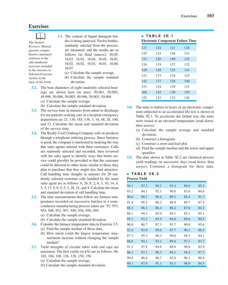
Exercises 103
Exercises
■ TA B L E 3 E . 1
Electronic Component Failure Time
127 124 121 118
125 123 136 131
131 120 140 125
124 119 137 133
129 128 125 141
121 133 124 125
142 137 128 140
151 124 129 131
160 142 130 129
125 123 122 126
■ TA B L E 3 E . 2
Process Yield
94.1 87.3 94.1 92.4 84.6 85.4
93.2 84.1 92.1 90.6 83.6 86.6
90.6 90.1 96.4 89.1 85.4 91.7
91.4 95.2 88.2 88.8 89.7 87.5
88.2 86.1 86.4 86.4 87.6 84.2
86.1 94.3 85.0 85.1 85.1 85.1
95.1 93.2 84.9 84.0 89.6 90.5
90.0 86.7 87.3 93.7 90.0 95.6
92.4 83.0 89.6 87.7 90.1 88.3
87.3 95.3 90.3 90.6 94.3 84.1
86.6 94.1 93.1 89.4 97.3 83.7
91.2 97.8 94.6 88.6 96.8 82.9
86.1 93.1 96.3 84.1 94.4 87.3
90.4 86.4 94.7 82.6 96.1 86.4
89.1 87.6 91.1 83.1 98.0 84.5
3.8. The time to failure in hours of an electronic compo-
nent subjected to an accelerated life test is shown in
Table 3E.1. To accelerate the failure test, the units
were tested at an elevated temperature (read down,
then across).
(a) Calculate the sample average and standard
deviation.
(b) Construct a histogram.
(c) Construct a stem-and-leaf plot.
(d) Find the sample median and the lower and upper
quartiles.
3.9. The data shown in Table 3E.2 are chemical process
yield readings on successive days (read down, then
across). Construct a histogram for these data.
3.1. The content of liquid detergent bot-
tles is being analyzed. Twelve bottles,
randomly selected from the process,
are measured, and the results are as
follows (in fluid ounces): 16.05,
16.03, 16.02, 16.04, 16.05, 16.01,
16.02, 16.02, 16.03, 16.01, 16.00,
16.07
(a) Calculate the sample average.
(b) Calculate the sample standard
deviation.
3.2. The bore diameters of eight randomly selected bear-
ings are shown here (in mm): 50.001, 50.002,
49.998, 50.006, 50.005, 49.996, 50.003, 50.004
(a) Calculate the sample average.
(b) Calculate the sample standard deviation.
3.3. The service time in minutes from admit to discharge
for ten patients seeking care in a hospital emergency
department are 21, 136, 185, 156, 3, 16, 48, 28, 100,
and 12. Calculate the mean and standard deviation
of the service time.
3.4. The Really Cool Clothing Company sells its products
through a telephone ordering process. Since business
is good, the company is interested in studying the way
that sales agents interact with their customers. Calls
are randomly selected and recorded, then reviewed
with the sales agent to identify ways that better ser-
vice could possibly be provided or that the customer
could be directed to other items similar to those they
plan to purchase that they might also find attractive.
Call handling time (length) in minutes for 20 ran-
domly selected customer calls handled by the same
sales agent are as follows: 6, 26, 8, 2, 6, 3, 10, 14, 4,
5, 3, 17, 9, 8, 9, 5, 3, 28, 21, and 4. Calculate the mean
and standard deviation of call handling time.
3.5. The nine measurements that follow are furnace tem-
peratures recorded on successive batches in a semi-
conductor manufacturing process (units are °F): 953,
955, 948, 951, 957, 949, 954, 950, 959
(a) Calculate the sample average.
(b) Calculate the sample standard deviation.
3.6. Consider the furnace temperature data in Exercise 3.5.
(a) Find the sample median of these data.
(b) How much could the largest temperature mea-
surement increase without changing the sample
median?
3.7. Yield strengths of circular tubes with end caps are
measured. The first yields (in kN) are as follows: 96,
102, 104, 108, 126, 128, 150, 156
(a) Calculate the sample average.
(b) Calculate the sample standard deviation.
The StudentResource Manualpresents compre-
hensive annotated
solutions to the
odd-numbered
exercises included
in the Answers to
Selected Exercises
section in the
back of this book.
c03ModelingProcessQuality.qxd 3/16/12 12:10 PM Page 103
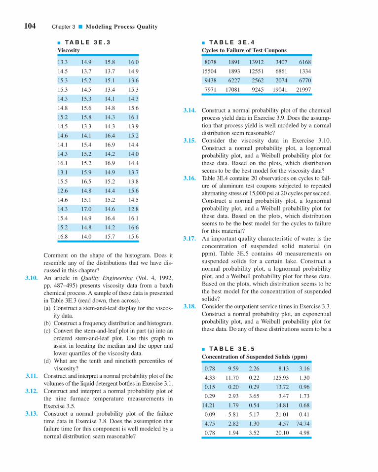
104 Chapter 3 ■ Modeling Process Quality
Comment on the shape of the histogram. Does it
resemble any of the distributions that we have dis-
cussed in this chapter?
3.10. An article in Quality Engineering (Vol. 4, 1992,
pp. 487–495) presents viscosity data from a batch
chemical process. A sample of these data is presented
in Table 3E.3 (read down, then across).
(a) Construct a stem-and-leaf display for the viscos-
ity data.
(b) Construct a frequency distribution and histogram.
(c) Convert the stem-and-leaf plot in part (a) into an
ordered stem-and-leaf plot. Use this graph to
assist in locating the median and the upper and
lower quartiles of the viscosity data.
(d) What are the tenth and ninetieth percentiles of
viscosity?
3.11. Construct and interpret a normal probability plot of the
volumes of the liquid detergent bottles in Exercise 3.1.
3.12. Construct and interpret a normal probability plot of
the nine furnace temperature measurements in
Exercise 3.5.
3.13. Construct a normal probability plot of the failure
time data in Exercise 3.8. Does the assumption that
failure time for this component is well modeled by a
normal distribution seem reasonable?
3.14. Construct a normal probability plot of the chemical
process yield data in Exercise 3.9. Does the assump-
tion that process yield is well modeled by a normal
distribution seem reasonable?
3.15. Consider the viscosity data in Exercise 3.10.
Construct a normal probability plot, a lognormal
probability plot, and a Weibull probability plot for
these data. Based on the plots, which distribution
seems to be the best model for the viscosity data?
3.16. Table 3E.4 contains 20 observations on cycles to fail-
ure of aluminum test coupons subjected to repeated
alternating stress of 15,000 psi at 20 cycles per second.
Construct a normal probability plot, a lognormal
probability plot, and a Weibull probability plot for
these data. Based on the plots, which distribution
seems to be the best model for the cycles to failure
for this material?
3.17. An important quality characteristic of water is the
concentration of suspended solid material (in
ppm). Table 3E.5 contains 40 measurements on
suspended solids for a certain lake. Construct a
normal probability plot, a lognormal probability
plot, and a Weibull probability plot for these data.
Based on the plots, which distribution seems to be
the best model for the concentration of suspended
solids?
3.18. Consider the outpatient service times in Exercise 3.3.
Construct a normal probability plot, an exponential
probability plot, and a Weibull probability plot for
these data. Do any of these distributions seem to be a
■ TA B L E 3 E . 3
Viscosity
13.3 14.9 15.8 16.0
14.5 13.7 13.7 14.9
15.3 15.2 15.1 13.6
15.3 14.5 13.4 15.3
14.3 15.3 14.1 14.3
14.8 15.6 14.8 15.6
15.2 15.8 14.3 16.1
14.5 13.3 14.3 13.9
14.6 14.1 16.4 15.2
14.1 15.4 16.9 14.4
14.3 15.2 14.2 14.0
16.1 15.2 16.9 14.4
13.1 15.9 14.9 13.7
15.5 16.5 15.2 13.8
12.6 14.8 14.4 15.6
14.6 15.1 15.2 14.5
14.3 17.0 14.6 12.8
15.4 14.9 16.4 16.1
15.2 14.8 14.2 16.6
16.8 14.0 15.7 15.6
■ TA B L E 3 E . 4
Cycles to Failure of Test Coupons
8078 1891 13912 3407 6168
15504 1893 12551 6861 1334
9438 6227 2562 2074 6770
7971 17081 9245 19041 21997
■ TA B L E 3 E . 5
Concentration of Suspended Solids (ppm)
0.78 9.59 2.26 8.13 3.16
4.33 11.70 0.22 125.93 1.30
0.15 0.20 0.29 13.72 0.96
0.29 2.93 3.65 3.47 1.73
14.21 1.79 0.54 14.81 0.68
0.09 5.81 5.17 21.01 0.41
4.75 2.82 1.30 4.57 74.74
0.78 1.94 3.52 20.10 4.98
c03ModelingProcessQuality.qxd 3/16/12 12:10 PM Page 104

Exercises 105
reasonable probability model for the data? Based
on the plots, which distribution is the best one to
describe the outpatient service time?
3.19. Consider the call handling times in Exercise 3.4.
Construct a normal probability plot, an exponential
probability plot, and a gamma probability plot for
these data. Do any of these distributions seem to be a
reasonable probability model for the data? Based
on the plots, which distribution is the best one to
describe the call handling time?
3.20. Consider the viscosity data in Exercise 3.10. Assume
that reading down, then across, gives the data in time
order. Construct and interpret a time-series plot.
3.21. Reconsider the yield data in Exercise 3.9. Construct
a time-series plot for these data. Interpret the plot.
3.22. Consider the concentration of suspended solids from
Exercise 3.17. Assume that reading across, then down,
gives the data in time order. Construct and interpret a
time-series plot.
3.23. Consider the chemical process yield data in
Exercise 3.9. Calculate the sample average and stan-
dard deviation.
3.24. Consider the chemical process yield data in
Exercise 3.9. Construct a stem-and-leaf plot for the
data and compare it with the histogram from
Exercise 3.9. Which display provides more infor-
mation about the process?
3.25. Construct a box plot for the data in Exercise 3.1.
3.26. Construct a box plot for the data in Exercise 3.2.
3.27. Suppose that two fair dice are tossed and the
random variable observed—say, x—is the sum of
the two up faces. Describe the sample space of
this experiment, and determine the probability
distribution of x.3.28. Find the mean and variance of the random variable in
Exercise 3.27.
3.29. A mechatronic assembly is subjected to a final
functional test. Suppose that defects occur at ran-
dom in these assemblies, and that defects occur
according to a Poisson distribution with parameter
(a) What is the probability that an assembly will
have exactly one defect?
(b) What is the probability that an assembly will
have one or more defects?
(c) Suppose that you improve the process so that the
occurrence rate of defects is cut in half to
What effect does this have on the prob-
ability that an assembly will have one or more
defects?
3.30. The probability distribution of x is
Find the appropriate value of k. Find the
mean and variance of x.0 ≤ x ≤ q.
f1x2 = ke-x,
l = 0.01.
l = 0.02.
3.31. The random variable x takes on the values 1, 2, or 3
with probabilities (1 + 3k)/3, (1 + 2k)/3, and (0.5 +5k)/3, respectively.
(a) Find the appropriate value of k.(b) Find the mean and variance of x.(c) Find the cumulative distribution function.
3.32. The probability distribution of the discrete random
variable x is p(x) = kr x, 0 < r < 1. Find the appropri-
ate value for k if x = 0, 1, . . . .
3.33. A manufacturer of electronic calculators offers a
one-year warranty. If the calculator fails for any
reason during this period, it is replaced. The time to
failure is well modeled by the following probability
distribution:
(a) What percentage of the calculators will fail
within the warranty period?
(b) The manufacturing cost of a calculator is $50,
and the profit per sale is $25. What is the effect
of warranty replacement on profit?
3.34. The net contents in ounces of canned soup is a ran-
dom variable with probability distribution
Find the probability that a can contains less than
12 ounces of product.
3.35. A production process operates with 1% nonconform-
ing output. Every hour a sample of 25 units of prod-
uct is taken, and the number of nonconforming units
counted. If one or more nonconforming units are
found, the process is stopped and the quality control
technician must search for the cause of nonconform-
ing production. Evaluate the performance of this
decision rule.
3.36. Continuation of Exercise 3.35. Consider the deci-
sion rule described in Exercise 3.35. Suppose that the
process suddenly deteriorates to 4% nonconforming
output. How many samples, on average, will be
required to detect this?
3.37. A random sample of 50 units is drawn from a pro-
duction process every half hour. The fraction of non-
conforming product manufactured is 0.02. What is
the probability that if the fraction noncon-
forming really is 0.02?
3.38. A sample of 100 units is selected from a production
process that is 1% nonconforming. What is the proba-
bility that will exceed the true fraction nonconform-
ing by k standard deviations, where k = 1, 2, and 3?
3.39. Suppose that 10% of the adult population has blood
chemistry parameters consistent with a diagnosis of
pN
p ≤ 0.04
f xx x
x x( ) =
−( ) ≤ ≤−( ) ≤ ≤
⎧⎨⎩
4 11 75 11 75 12 25
4 12 75 12 25 12 75
. . .
. . .
f x e x > 0x( ) = −0 125 0 125. .
c03ModelingProcessQuality.qxd 3/16/12 12:10 PM Page 105

106 Chapter 3 ■ Modeling Process Quality
a pre-diabetic condition. Of four volunteer partici-
pants in a health screening study, what is the proba-
bility that one of them is pre-diabetic?
3.40. Patients arriving at an outpatient clinic are routinely
screened for high blood pressure. Assume that this
condition occurs in 15% of the population.
(a) What is the probability that the third patient of
the day has high blood pressure?
(b) What is the average number of patients that
must be seen to find the first patient with high
blood pressure?
(c) If the clinic typically sees 50 patients each day,
what is the probability of finding 10 patients
with high blood pressure?
3.41. A stock brokerage has four computers that are used
for making trades on the New York Stock Exchange.
The probability that a computer fails on any single
day is 0.005. Failures occur independently. Any
failed computers are repaired after the exchange
closes, so each day can be considered an indepen-
dent trial.
(a) What is the probability that all four computers
fail on one day?
(b) What is the probability that at least one com-
puter fails on a day?
(c) What is the mean number of days until a spe-
cific computer fails?
3.42. A computer system uses passwords consisting of
the lowercase letters (a–z) and the integers (0–9).
There are 10,000 users with unique passwords. A
hacker randomly selects (with replacement) pass-
words in an attempt to break into the system.
(a) Suppose that 8000 of the users have six-character
passwords. What is the mean and standard devi-
ation of the number of attempts required before
the hacker selects a legitimate password?
(b) Suppose that 2000 of the users have three-character
passwords. What is the mean and standard devi-
ation of the number of attempts required before
the hacker selects a legitimate password?
3.43. An electronic component for a medical X-ray unit is
produced in lots of size N = 25. An acceptance test-
ing procedure is used by the purchaser to protect
against lots that contain too many nonconforming
components. The procedure consists of selecting five
components at random from the lot (without replace-
ment) and testing them. If none of the components is
nonconforming, the lot is accepted.
(a) If the lot contains two nonconforming compo-
nents, what is the probability of lot acceptance?
(b) Calculate the desired probability in (a) using the
binomial approximation. Is this approximation
satisfactory? Why or why not?
(c) Suppose the lot size was N = 150. Would the
binomial approximation be satisfactory in this
case?
(d) Suppose that the purchaser will reject the lot
with the decision rule of finding one or more
nonconforming components in a sample of size
n, and wants the lot to be rejected with probabil-
ity at least 0.95 if the lot contains five or more
nonconforming components. How large should
the sample size n be?
3.44. A lot of size N = 30 contains three nonconforming
units. What is the probability that a sample of five
units selected at random contains exactly one non-
conforming unit? What is the probability that it con-
tains one or more nonconformances?
3.45. A textbook has 500 pages on which typographical
errors could occur. Suppose that there are exactly 10
such errors randomly located on those pages. Find the
probability that a random selection of 50 pages will
contain no errors. Find the probability that 50 ran-
domly selected pages will contain at least two errors.
3.46. Surface-finish defects in a small electric appliance
occur at random with a mean rate of 0.1 defects per
unit. Find the probability that a randomly selected
unit will contain at least one surface-finish defect.
3.47. Glass bottles are formed by pouring molten glass
into a mold. The molten glass is prepared in a furnace
lined with firebrick. As the firebrick wears, small
pieces of brick are mixed into the molten glass and
finally appear as defects (called “stones”) in the bot-
tle. If we can assume that stones occur randomly at
the rate of 0.00001 per bottle, what is the probability
that a bottle selected at random will contain at least
one such defect?
3.48. The billing department of a major credit card com-
pany attempts to control errors (clerical, data trans-
mission, etc.) on customers’ bills. Suppose that errors
occur according to a Poisson distribution with para-
meter What is the probability that a cus-
tomer’s bill selected at random will contain one error?
3.49. A production process operates in one of two states:
the in-control state, in which most of the units pro-
duced conform to specifications, and an out-of-
control state, in which most of the units produced are
defective. The process will shift from the in-control
to the out-of-control state at random. Every hour, a
quality control technician checks the process, and if
it is in the out-of-control state, the technician detects
this with probability p. Assume that when the process
shifts out of control it does so immediately following
a check by the inspector, and once a shift has
occurred, the process cannot automatically correct
itself. If t denotes the number of periods the process
l = 0.01.
c03ModelingProcessQuality.qxd 3/16/12 12:10 PM Page 106

remains out of control following a shift before detec-
tion, find the probability distribution of t. Find the
mean number of periods the process will remain in
the out-of-control state.
3.50. An inspector is looking for nonconforming welds in
the gasoline pipeline between Phoenix and Tucson.
The probability that any particular weld will be
defective is 0.01. The inspector is determined to keep
working until finding three defective welds. If the
welds are located 100 feet apart, what is the proba-
bility that the inspector will have to walk 5000 feet?
What is the probability that the inspector will have to
walk more than 5000 feet?
3.51. The tensile strength of a metal part is normally dis-
tributed with mean 40 pounds and standard deviation
5 pounds. If 50,000 parts are produced, how many
would you expect to fail to meet a minimum specifi-
cation limit of 35-pounds tensile strength? How many
would have a tensile strength in excess of 48 pounds?
3.52. The output voltage of a power supply is normally
distributed with mean 5 V and standard deviation
0.02 V. If the lower and upper specifications for volt-
age are 4.95 V and 5.05 V, respectively, what is the
probability that a power supply selected at random
will conform to the specifications on voltage?
3.53. Continuation of Exercise 3.52. Reconsider the
power supply manufacturing process in Exercise
3.52. Suppose we wanted to improve the process. Can
shifting the mean reduce the number of nonconform-
ing units produced? How much would the process
variability need to be reduced in order to have all but
one out of 1000 units conform to the specifications?
3.54. If x is normally distributed with mean and standard
deviation , and given that the probability that xis less than 32 is 0.0228, find the value of
3.55. The life of an automotive battery is normally distrib-
uted with mean 900 days and standard deviation
m.
s = 4
m
35 days. What fraction of these batteries would be
expected to survive beyond 1000 days?
3.56. A lightbulb has a normally distributed light output
with mean 5000 end foot-candles and standard devi-
ation of 50 end foot-candles. Find a lower specifica-
tion limit such that only 0.5% of the bulbs will not
exceed this limit.
3.57. The specifications on an electronic component in a
target-acquisition system are that its life must be
between 5000 and 10,000 h. The life is normally
distributed with mean 7500 h. The manufacturer
realizes a price of $10 per unit produced; however,
defective units must be replaced at a cost of $5
to the manufacturer. Two different manufacturing
processes can be used, both of which have the same
mean life. However, the standard deviation of life
for process 1 is 1000 h, whereas for process 2 it is
only 500 h. Production costs for process 2 are twice
those for process 1. What value of production costs
will determine the selection between processes 1
and 2?
3.58. A quality characteristic of a product is normally dis-
tributed with mean and standard deviation .
Specifications on the characteristic are A
unit that falls within specifications on this quality
characteristic results in a profit of C0. However, if
the profit is whereas if the profit is
Find the value of that maximizes the expected
profit.
3.59. Derive the mean and variance of the binomial
distribution.
3.60. Derive the mean and variance of the Poisson
distribution.
3.61. Derive the mean and variance of the exponential
distribution.
3.62. Derive the mean and variance of the geometric
distribution.
m−C2.
x > 8,−C1,x < 6,
6 ≤ x ≤ 8.
s = 1m
Exercises 107
c03ModelingProcessQuality.qxd 3/16/12 12:10 PM Page 107

4.1 STATISTICS AND SAMPLINGDISTRIBUTIONS
4.1.1 Sampling from a NormalDistribution
4.1.2 Sampling from a BernoulliDistribution
4.1.3 Sampling from a PoissonDistribution
4.2 POINT ESTIMATION OF PROCESSPARAMETERS
4.3 STATISTICAL INFERENCE FOR ASINGLE SAMPLE
4.3.1 Inference on the Mean of aPopulation, Variance Known
4.3.2 The Use of P-Values forHypothesis Testing
4.3.3 Inference on the Mean of aNormal Distribution,Variance Unknown
4.3.4 Inference on the Variance ofa Normal Distribution
4.3.5 Inference on a PopulationProportion
4.3.6 The Probability of Type II Errorand Sample Size Decisions
4.4 STATISTICAL INFERENCE FOR TWO SAMPLES
4.4.1 Inference for a Difference in Means, Variances Known
4.4.2 Inference for a Difference inMeans of Two Normal Distri-butions, Variances Unknown
4.4.3 Inference on the Variances of Two Normal Distributions
4.4.4 Inference on Two PopulationProportions
4.5 WHAT IF THERE ARE MORE THANTWO POPULATIONS? THE ANALYSISOF VARIANCE
4.5.1 An Example4.5.2 The Analysis of Variance4.5.3 Checking Assumptions:
Residual Analysis4.6 LINEAR REGRESSION MODELS
4.6.1 Estimation of the Parametersin Linear Regression Models
4.6.2 Hypothesis Testing inMultiple Regression
4.6.3 Confidence Intervals inMultiple Regression
4.6.4 Prediction of New ResponseObservations
4.6.5 Regression Model Diagnostics
Supplemental Material for Chapter 4
S4.1 Random SamplesS4.2 Expected Value and Variance
OperatorsS4.3 Proof that E( ) � m and
E(s2) � s2
S4.4 More about ParameterEstimation
S4.5 Proof that E(s) � sS4.6 More about Checking
Assumptions in the t-testS4.7 Expected Mean Squares in
the Single-Factor Analysis ofVariance
x
44CHAPTER OUTLINE
Inferences AboutProcess Quality
The supplemental material is on the textbook website www.wiley.com/college/montgomery.
108
c04InferencesaboutProcessQuality.qxd 4/23/12 5:53 PM Page 108

CHAPTER OVERVIEW AND LEARNING OBJECTIVES
In the previous chapter we discussed the use of probability distributions in modeling or
describing the output of a process. In all the examples presented, we assumed that the para-
meters of the probability distribution, and, hence, the parameters of the process, were
known. This is usually a very unrealistic assumption. For example, in using the binomial dis-
tribution to model the number of nonconforming units found in sampling from a production
process we assumed that the parameter p of the binomial distribution was known. The phys-
ical interpretation of p is that it is the true fraction of nonconforming units produced by the
process. It is impossible to know this exactly in a real production process. Furthermore, if
we did know the true value of p and it was relatively constant over time, we could argue that
formal process monitoring and control procedures were unnecessary, provided p was
“acceptably” small.
In general, the parameters of a process are unknown; furthermore, they will usually
change over time. Therefore, we need to develop procedures to estimate the parameters of
probability distributions and solve other inference or decision-oriented problems relative to
them. The standard statistical techniques of parameter estimation and hypothesis testing are
useful in this respect. These techniques are the underlying basis for much of the methodology
of statistical quality control. In this chapter, we present some of the elementary results of sta-
tistical inference, indicating its usefulness in quality improvement problems. Key topics
include point and confidence interval estimation of means, variances, and binomial parame-
ters, hypothesis testing on means, variances, and binomial parameters, and the use of normal
probability plots.
After careful study of this chapter, you should be able to do the following:
1. Explain the concept of random sampling
2. Explain the concept of a sampling distribution
3. Explain the general concept of estimating the parameters of a population or prob-
ability distribution
4. Know how to explain the precision with which a parameter is estimated
5. Construct and interpret confidence intervals on a single mean and on the differ-
ence in two means
6. Construct and interpret confidence intervals on a single variance or the ratio of
two variances
7. Construct and interpret confidence intervals on a single proportion and on the
difference in two proportions
8. Test hypotheses on a single mean and on the difference in two means
9. Test hypotheses on a single variance and on the ratio of two variances
10. Test hypotheses on a single proportion and on the difference in two proportions
11. Use the P-value approach for hypothesis testing
12. Understand how the analysis of variance (ANOVA) is used to test hypotheses
about the equality of more than two means
13. Understand how to fit and interpret linear regression models.
4.1 Statistics and Sampling Distributions
The objective of statistical inference is to draw conclusions or make decisions about a popu-
lation based on a sample selected from the population. Frequently, we will assume that
random samples are used in the analysis. The word “random” is often applied to any method
4.1 Statistics and Sampling Distributions 109
c04InferencesaboutProcessQuality.qxd 3/24/12 7:11 PM Page 109

110 Chapter 4 ■ Inferences About Process Quality
or sample selection that lacks systematic direction. We will define a sample—say,
—as a random sample of size n if it is selected so that the observations {xi} are
independently and identically distributed. This definition is suitable for random samples
drawn from infinite populations or from finite populations where sampling is performed with
replacement. In sampling without replacement from a finite population of N items we say that
a sample of n items is a random sample if each of the possible samples has an equal prob-
ability of being chosen. Figure 4.1 illustrates the relationship between the population and the
sample.
Although most of the methods we will study assume that random sampling has been
used, there are several other sampling strategies that are occasionally useful in quality con-
trol. Care must be exercised to use a method of analysis that is consistent with the sampling
design; inference techniques intended for random samples can lead to serious errors when
applied to data obtained from other sampling techniques.
Statistical inference uses quantities computed from the observations in the sample. A sta-tistic is defined as any function of the sample data that does not contain unknown parameters.
For example, let represent the observations in a sample. Then the sample average
or sample mean
(4.1)
the sample variance
(4.2)
and the sample standard deviation
(4.3)
are statistics. The statistics and s (or describe the central tendency and variability, respec-
tively, of the sample.
If we know the probability distribution of the population from which the sample was
taken, we can often determine the probability distribution of various statistics computed
from the sample data. The probability distribution of a statistic is called a sampling distri-bution. We now present the sampling distributions associated with three common sampling
situations.
s2)x
sx x
n
ii
n
=−( )
−=∑ 2
1
1
sx x
n
ii
n
2
2
1
1=
−( )−
=∑
xx
n
ii
n
= =∑
1
x1, x2, . . . , xn
(Nn )
x1, x2, . . . , xn
■ F I G U R E 4 . 1 Relationship between a population and a sample.
μ
σ
xx x
x, sample averages, sample standarddeviation
, population mean , population
standarddeviation
Histogram
Sample (x1, x2, x3,..., xn)
Populationμσ
s
c04InferencesaboutProcessQuality.qxd 3/24/12 7:11 PM Page 110

4.1 Statistics and Sampling Distributions 111
4.1.1 Sampling from a Normal Distribution
Suppose that x is a normally distributed random variable with mean and variance If
is a random sample of size n from this process, then the distribution of the
sample mean is This follows directly from the results on the distribution of
linear combinations of normal random variables in Section 3.3.1.
This property of the sample mean is not restricted exclusively to the case of sampling
from normal populations. Note that we may write
From the central limit theorem we know that, regardless of the distribution of the population,
the distribution of is approximately normal with mean and variance Therefore,
regardless of the distribution of the population, the sampling distribution of the sample mean
is approximately
An important sampling distribution defined in terms of the normal distribution is the chi-square or distribution. If are normally and independently distributed ran-
dom variables with mean zero and variance one, then the random variable
is distributed as chi-square with n degrees of freedom. The chi-square probability distribution
with n degrees of freedom is
(4.4)
Several chi-square distributions are shown in Figure 4.2. The distribution is skewed with
mean and variance A table of the percentage points of the chi-square distrib-
ution is given in Appendix Table III.
To illustrate the use of the chi-square distribution, suppose that is a ran-
dom sample from an distribution. Then the random variable
(4.5)
has a chi-square distribution with degrees of freedom. However, using equation 4.2,
which defines the sample variance, we may rewrite equation 4.5 as
—that is, the sampling distribution of is when sampling from a normal
distribution.
c2n−1(n − 1)s2/s2
yn s= −( )1
2
2σ
n − 1
yx x
i
n
=−( )
=∑ 1
2
12σ
N(m, s2)
x1, x2, . . . , xn
s2 = 2n.m = n
f yn
y e yn
n y( ) =⎛⎝
⎞⎠
>( )− −1
22
02
2 1 2
Γ
y x x xn= + + +12
22 2L
x1, x2, . . . , xnχ2
x Nn
~ ,μ σ 2⎛⎝⎜
⎞⎠⎟
ns2.nmΣ ui=1 xi
xn
x n
n
ii
n
−⎛⎝
⎞⎠ =
−=∑μ
σ
μ
σ1
N(m, s2/n).xx1, x2, . . . , xn
s2.m
c04InferencesaboutProcessQuality.qxd 3/24/12 7:11 PM Page 111

112 Chapter 4 ■ Inferences About Process Quality
Another useful sampling distribution is the t distribution. If x is a standard normal ran-
dom variable and if y is a chi-square random variable with k degrees of freedom, and if x and
y are independent, then the random variable
(4.6)
is distributed as t with k degrees of freedom. The probability distribution of t is
(4.7)
and the mean and variance of t are and for respectively. The
degrees of freedom for t are the degrees of freedom associated with the chi-square random
variable in the denominator of equation 4.6. Several t distributions are shown in Figure 4.3.
Note that if the t distribution reduces to the standard normal distribution, however, the
number of degree of freedom exceeds about 30, the t distribution is closely approximate by
the standard normal distribution. A table of percentage points of the t distribution is given in
Appendix Table IV.
As an example of a random variable that is distributed as t, suppose that
is a random sample from the distribution. If and are computed from this sample,
then
using the fact that Now, and are independent, so the random variable
(4.8)
has a t distribution with degrees of freedom.
The last sampling distribution based on the normal process that we will consider is the
F distribution. If w and y are two independent chi-square random variables with u and vdegrees of freedom, respectively, then the ratio
(4.9)Fw uy vu v, =
n − 1
xs n
− μ
s2x(n − 1)s2/s2 ~ χ2n−1.
xs n
xn
sN
nn
−=
−( )
−( )−
μμ
σσ χ
~ ,0 111
2
s2xN(m, s2)
x1, x2, . . . , xn
k = •,
k > 2,s2 = k/ (k − 2)m = 0
f t kk k
tk t
k( ) =
+( )[ ]( )
+⎛
⎝⎜
⎞
⎠⎟ − ∞ ∞− +( )
Γ
Γ
1 22 1
2 1 2
π < <
txy k
=
■ F I G U R E 4 . 3 The t distribution for
selected values of k (number of degrees of freedom).
0.4
0.3
0.2
0.1
00–2–4–6 2 4 6t
f(t)
k = 5k = 10k = ∞ (normal)
■ F I G U R E 4 . 2 Chi-square distribution for
selected values of n (number of degrees of freedom).
n = 5n = 10n = 20
0.16
0.12
0.08
0.04
00 10 20 30 40 50 60
y
f (y)
c04InferencesaboutProcessQuality.qxd 3/24/12 7:11 PM Page 112

4.1 Statistics and Sampling Distributions 113
is distributed as F with u numerator degrees of freedom and v denominator degrees of free-
dom. If x is an F random variable with u numerator and v denominator degrees of freedom,
then the distribution is
(4.10)
Several F distributions are shown in Figure 4.4. A table of percentage points of the F distribu-
tion is given in Appendix Table V.
As an example of a random variable that is distributed as F, suppose we have two inde-
pendent normal processes—say, x1 ~ N and x2 ~ N Let
be a random sample of n1 observations from the first normal process and x21, x22, . . . , x2n2be
a random sample of size from the second. If and are the sample variances, then the ratio
This follows directly from the sampling distribution of discussed previously. The F distri-
bution will be used in making inferences about the variances of two normal distributions.
4.1.2 Sampling from a Bernoulli Distribution
In this section, we discuss the sampling distributions of statistics associated with the
Bernoulli distribution. The random variable x with probability function
is called a Bernoulli random variable. That is, x takes on the value 1 with probability p and
the value 0 with probability A realization of this random variable is often called a
Bernoulli trial. The sequence of Bernoulli trials is a Bernoulli process. The
outcome is often called “success,” and the outcome is often called “failure.”
Suppose that a random sample of n observations—say, —is taken from a
Bernoulli process with constant probability of success p. Then the sum of the sample observations
(4.11)x x x xn= + + +1 2 L
x1, x2, . . . , xn
x = 0x = 1
x1, x2, . . . ,
1 − p = q.
p xp
p qx
x( ) =
−( ) =⎧⎨⎩ 1
= 1
= 0
s2
ss
Fn n12
12
22
22 1 11 2
σσ
~ ,− −
s22s2
1n2
x11, x12, . . . , x1n1(m2, s2
2).(m1, s21),
f x
u v uv
u vx
uv
x
x
u
u
u v( ) =
+⎛⎝
⎞⎠⎛⎝
⎞⎠
⎛⎝
⎞⎠
⎛⎝
⎞⎠
⎛⎝
⎞⎠ +⎡
⎣⎢⎤⎦⎥
∞( )−
+( )
Γ
Γ Γ
2
2 2 1
2
2 1
2 0 < <
■ F I G U R E 4 . 4 The F distribution for selected values of u (numerator degrees of freedom)
and v (denominator degrees of freedom).
1
0.8
0.6
0.4
0.2
00 2 4 6 8 10 12
x
u = 10, v = 5u = 10, v = 10u = 10, v = 20
u = 5, v = 10u = 10, v = 10u = 20, v = 10
f(x)
1
0.8
0.6
0.4
0.2
0
f(x)
0 2 4x
6 8
c04InferencesaboutProcessQuality.qxd 3/24/12 7:11 PM Page 113
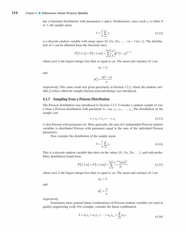
114 Chapter 4 ■ Inferences About Process Quality
has a binomial distribution with parameters n and p. Furthermore, since each is either 0
or 1, the sample mean
(4.12)
is a discrete random variable with range space The distribu-
tion of can be obtained from the binomial since
where [an] is the largest integer less than or equal to an. The mean and variance of are
and
respectively. This same result was given previously in Section 3.2.2, where the random vari-
able (often called the sample fraction nonconforming) was introduced.
4.1.3 Sampling from a Poisson Distribution
The Poisson distribution was introduced in Section 3.2.3. Consider a random sample of size
n from a Poisson distribution with parameter —say, . The distribution of the
sample sum
(4.13)
is also Poisson with parameter . More generally, the sum of n independent Poisson random
variables is distributed Poisson with parameter equal to the sum of the individual Poisson
parameters.
Now consider the distribution of the sample mean
(4.14)
This is a discrete random variable that takes on the values {0, 1/n, 2/n, . . .}, and with proba-
bility distribution found from
(4.15)
where [an] is the largest integer less than or equal to an. The mean and variance of are
and
respectively.
Sometimes more general linear combinations of Poisson random variables are used in
quality-engineering work. For example, consider the linear combination
(4.16)L a x a x a x a xm m i i
i
m= + + + =
=∑1 1 2 2
1
L
σ λx n2 =
μ λx =
x
P x a P x ane n
k
n k
k
an≤{ } = ≤{ } = ( )−
=
[ ]∑
λ λ!0
xn
xii
n=
=∑1
1
nl
x x x xn= + + +1 2 L
x1, x2, . . . , xnl
p
σ xp p
n2 1
=−( )
μx p=
x
P x a P x ann
kp p
k
ank n k≤{ } = ≤{ } = ⎛
⎝⎜⎞⎠⎟
−( )=
[ ] −∑0
1
x50, 1/n, 2/n, . . . , (n − 1)/n, 16.
xn
xii
n=
=∑1
1
xi
c04InferencesaboutProcessQuality.qxd 3/24/12 7:11 PM Page 114

4.2 Point Estimation of Process Parameters 115
where the { } are independent Poisson random variables each having parameter { } respec-
tively, and the { } are constants. This type of function occurs in situations where a unit of
product can have m different types of defects or nonconformities (each modeled with a
Poisson distribution with parameter and the function used for quality monitoring purposes
is a linear combination of the number of observed nonconformities of each type. The con-
stants { } in equation 4.16 might be chosen to weight some types of nonconformities more
heavily than others. For example, functional defects on a unit would receive heavier weight than
appearance flaws. These schemes are sometimes called demerit procedures (see Section 7.3.3).
In general, the distribution of L is not Poisson unless all in equation (4.16); that is, sums
of independent Poisson random variables are Poisson distributed, but more general linear
combinations are not.
4.2 Point Estimation of Process Parameters
A random variable is characterized or described by its probability distribution. This distribu-
tion is described by its parameters. For example, the mean and variance of the normal
distribution (equation 3.21) are its parameters, whereas is the parameter of the Poisson dis-
tribution (equation 3.15). In statistical quality control, the probability distribution is used to
describe or model some critical-to-quality characteristic, such as a critical dimension of a
product or the fraction defective of a process. Therefore, we are interested in making infer-
ences about the parameters of probability distributions. Since the parameters are generally
unknown, we require procedures to estimate them from sample data.
We may define an estimator of an unknown parameter as a statistic that corresponds to
the parameter. A particular numerical value of an estimator, computed from sample data, is
called an estimate. A point estimator is a statistic that produces a single numerical value as
the estimate of the unknown parameter. To illustrate, consider the random variable x with prob-
ability distribution f(x) shown in Figure 4.1 on p. 105. Suppose that the mean and variance
of this distribution are both unknown. If a random sample of n observations is taken, then
the sample mean and sample variance s2 are point estimators of the population meanand population variance respectively. Suppose that this distribution represents a process
producing bearings and the random variable x is the inside diameter. We want to obtain point
estimates of the mean and variance of the inside diameter of bearings produced by this process.
We could measure the inside diameters of a random sample of bearings (say). Then the
sample mean and sample variance could be computed. If this yields and
then the point estimate of is and the point estimate of is
Recall that the “ˆ” symbol is used to denote an estimate of a parameter.
The mean and variance of a distribution are not necessarily the parameters of the dis-
tribution. For example, the parameter of the Poisson distribution is while its mean and vari-
ance are and (both the mean and variance are and the parameters of the
binomial distribution are n and p, while its mean and variance are and
respectively. We may show that a good point estimator of the parameter of a Poisson dis-
tribution is
and that a good point estimator of the parameter p of a binomial distribution is
for fixed n. In the binomial distribution the observations in the random sample {xi} are either
1 or 0, corresponding to “success” and “failure,” respectively.
pn
x xii
n= =
=∑1
1
λ = ==∑1
1nx xi
i
n
ls2 = np(1 − p),m = np
l),s2 = lm = ll,
s2 = s2 = 0.001.s2m = x = 1.495ms2 = 0.001,x = 1.495
n = 20
s2,
mxs2
m
ls2m
ai = 1
ai
li)
ai
li,xi
c04InferencesaboutProcessQuality.qxd 3/24/12 7:11 PM Page 115
116 Chapter 4 ■ Inferences About Process Quality
A number of important properties are required of good point estimators. Two of the
most important of these properties are the following:
1. The point estimator should be unbiased. That is, the expected value of the point esti-
mator should be the parameter being estimated.
2. The point estimator should have minimum variance. Any point estimator is a random
variable. Thus, a minimum variance point estimator should have a variance that is
smaller than the variance of any other point estimator of that parameter.
The sample mean and variance and s2 are unbiased estimators of the population mean and
variance and , respectively. That is,
where the operator E is simply the expected value operator, a shorthand way of writing the
process of finding the mean of a random variable. (See the supplemental material for this
chapter for more information about mathematical expectation.)
The sample standard deviation s is not an unbiased estimator of the population standard
deviation It can be shown that
(4.17)
Appendix Table VI gives values of c4 for sample sizes 2 ≤ n ≤ 25. We can obtain an unbiased
estimate of the standard deviation from
(4.18)
In many applications of statistics to quality and process improvement problems, it is conve-
nient to estimate the standard deviation by the range method. Let be a random
sample of n observations from a normal distribution with mean and variance The rangeof the sample is
(4.19)
That is, the range R is simply the difference between the largest and smallest sample observations.
The random variable is called the relative range. The distribution of W has been well
studied. The mean of W is a constant d2 that depends on the size of the sample; that is,
Therefore, an unbiased estimator of the standard deviation of a normal distribution is
(4.20)
Values of d2 for sample sizes 2 ≤ n ≤ 25 are given in Appendix Table VI.
Using the range to estimate dates from the earliest days of statistical quality control, and
it was popular because it is very simple to calculate. With modern calculators and computers, this
s
σ = Rd2
sE(W) = d2.
W = R/s
R x xx x
i i= ( ) − ( )= −
max min
max min
s2.mx1, x2, . . . , xn
σ = sc4
E sn
nn
c
( ) =−
⎛⎝
⎞⎠
( )−( )[ ]
=
2
1
2
1 2
1 2
4
ΓΓ
σ
σ
s.
E x E s( ) = ( ) =μ σ and 2 2
s2mx
c04InferencesaboutProcessQuality.qxd 3/24/12 7:11 PM Page 116
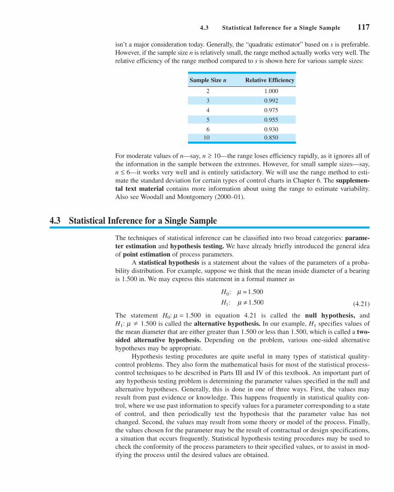
4.3 Statistical Inference for a Single Sample 117
isn’t a major consideration today. Generally, the “quadratic estimator” based on s is preferable.
However, if the sample size n is relatively small, the range method actually works very well. The
relative efficiency of the range method compared to s is shown here for various sample sizes:
Sample Size n Relative Efficiency
2 1.000
3 0.992
4 0.975
5 0.955
6 0.930
10 0.850
For moderate values of n—say, —the range loses efficiency rapidly, as it ignores all of
the information in the sample between the extremes. However, for small sample sizes—say,
n ≤ 6—it works very well and is entirely satisfactory. We will use the range method to esti-
mate the standard deviation for certain types of control charts in Chapter 6. The supplemen-tal text material contains more information about using the range to estimate variability.
Also see Woodall and Montgomery (2000–01).
4.3 Statistical Inference for a Single Sample
The techniques of statistical inference can be classified into two broad categories: parame-ter estimation and hypothesis testing. We have already briefly introduced the general idea
of point estimation of process parameters.
A statistical hypothesis is a statement about the values of the parameters of a proba-
bility distribution. For example, suppose we think that the mean inside diameter of a bearing
is 1.500 in. We may express this statement in a formal manner as
(4.21)
H
H0
1
:
:
= 1.500
1.500
μμ ≠
n ≥ 10
The statement in equation 4.21 is called the null hypothesis, and
H1: m � 1.500 is called the alternative hypothesis. In our example, specifies values of
the mean diameter that are either greater than 1.500 or less than 1.500, which is called a two-sided alternative hypothesis. Depending on the problem, various one-sided alternative
hypotheses may be appropriate.
Hypothesis testing procedures are quite useful in many types of statistical quality-
control problems. They also form the mathematical basis for most of the statistical process-
control techniques to be described in Parts III and IV of this textbook. An important part of
any hypothesis testing problem is determining the parameter values specified in the null and
alternative hypotheses. Generally, this is done in one of three ways. First, the values may
result from past evidence or knowledge. This happens frequently in statistical quality con-
trol, where we use past information to specify values for a parameter corresponding to a state
of control, and then periodically test the hypothesis that the parameter value has not
changed. Second, the values may result from some theory or model of the process. Finally,
the values chosen for the parameter may be the result of contractual or design specifications,
a situation that occurs frequently. Statistical hypothesis testing procedures may be used to
check the conformity of the process parameters to their specified values, or to assist in mod-
ifying the process until the desired values are obtained.
H1
H0: m = 1.500
c04InferencesaboutProcessQuality.qxd 3/24/12 7:11 PM Page 117

118 Chapter 4 ■ Inferences About Process Quality
To test a hypothesis, we take a random sample from the population under study, com-
pute an appropriate test statistic, and then either reject or fail to reject the null hypothesis
The set of values of the test statistic leading to rejection of is called the critical region or
rejection region for the test.
Two kinds of errors may be committed when testing hypotheses. If the null hypothesis
is rejected when it is true, then a type I error has occurred. If the null hypothesis is not
rejected when it is false, then a type II error has been made. The probabilities of these two
types of errors are denoted as
Sometimes it is more convenient to work with the power of a statistical test, where
Thus, the power is the probability of correctly rejecting In quality control work, is
sometimes called the producer’s risk because it denotes the probability that a good lot will
be rejected, or the probability that a process producing acceptable values of a particular qual-
ity characteristic will be rejected as performing unsatisfactorily. In addition, is sometimes
called the consumer’s risk because it denotes the probability of accepting a lot of poor
quality, or allowing a process that is operating in an unsatisfactory manner relative to some
quality characteristic to continue in operation.
The general procedure in hypothesis testing is to specify a value of the probability of
type I error and then to design a test procedure so that a small value of the probability of
type II error is obtained. Thus, we can directly control or choose the risk. Because we can
control the probability of making a type I error, rejecting the null hypothesis is considered to
be a strong conclusion. The risk is generally a function of sample size and how different
the true value of the parameter (such as in the above example) is from the hypothesized value,
so it is controlled indirectly. The larger is the sample size(s) used in the test, the smaller is the
risk. The probability of type II error is often difficult to control because of lack of flexibil-
ity in choosing sample size and because the difference between the true parameter value and
the hypothesized value is unknown in most cases, so failing to reject H0 is a weak conclusion.In this section we will review hypothesis testing procedures when a single sample of n
observations has been taken from the process. We will also show how the information about
the values of the process parameters that is in this sample can be expressed in terms of an
interval estimate called a confidence interval. In Section 4.4 we will consider statistical
inference for two samples from two possibly different processes.
4.3.1 Inference on the Mean of a Population, Variance Known
Hypothesis Testing. Suppose that x is a random variable with unknown mean and
known variance We wish to test the hypothesis that the mean is equal to a standard
value—say, 0. The hypothesis may be formally stated as
(4.22)
The procedure for testing this hypothesis is to take a random sample of n observations on the
random variable x, compute the test statistic
(4.23)Zx
n00= − μ
σ
H
H0
1
:
:
=
0
0
μ μμ μ≠
ms2.
m
b
mb
aba,
b
aH0.
Power = 1 − b = P5reject H0|H0 is false6
b = P5type II error6 = P5fail to reject H0|H0 is false6
a = P5type I error6 = P5reject H0|H0 is true6
H0
H0.
c04InferencesaboutProcessQuality.qxd 3/24/12 7:11 PM Page 118
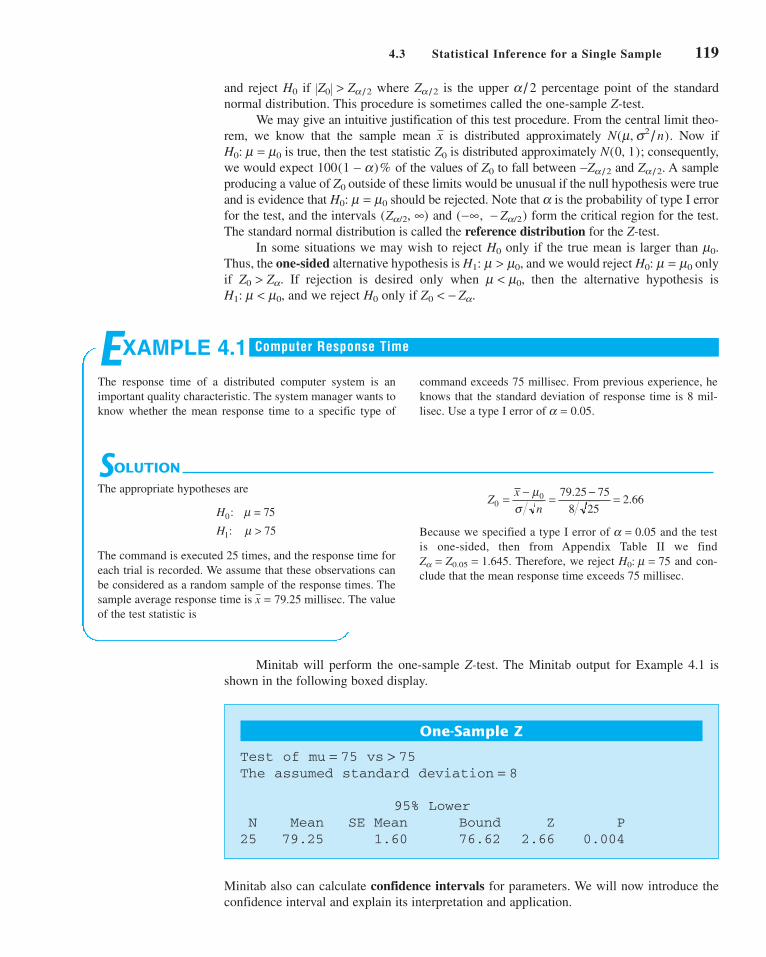
4.3 Statistical Inference for a Single Sample 119
and reject if where is the upper percentage point of the standard
normal distribution. This procedure is sometimes called the one-sample Z-test.
We may give an intuitive justification of this test procedure. From the central limit theo-
rem, we know that the sample mean is distributed approximately Now if
is true, then the test statistic is distributed approximately consequently,
we would expect of the values of to fall between and A sample
producing a value of outside of these limits would be unusual if the null hypothesis were true
and is evidence that should be rejected. Note that is the probability of type I error
for the test, and the intervals and form the critical region for the test.
The standard normal distribution is called the reference distribution for the Z-test.
In some situations we may wish to reject only if the true mean is larger than
Thus, the one-sided alternative hypothesis is and we would reject only
if If rejection is desired only when then the alternative hypothesis is
and we reject only if Z0 < − Za.H0H1: m < m0,
m < m0,Z0 > Za.
H0: m = m0H1: m > m0,
m0.H0
(−•, − Za/2)(Za/2, •)
aH0: m = m0
Z0
Za/2.−Za/2Z0100(1 − a)%
N(0, 1);Z0H0: m = m0
N(m, s2/n).x
a/2Za/2�Z0� > Za/2H0
SOLUTION
The appropriate hypotheses are
The command is executed 25 times, and the response time for
each trial is recorded. We assume that these observations can
be considered as a random sample of the response times. The
sample average response time is The value
of the test statistic is
Because we specified a type I error of and the test
is one-sided, then from Appendix Table II we find
Therefore, we reject and con-
clude that the mean response time exceeds 75 millisec.
H0: m = 75Za = Z0.05 = 1.645.
a = 0.05
Zx
n00 79 25 75
8 252 66= − = − =μ
σ.
.
x = 79.25 millisec.
H
H0
1
7
75
:
:
= 5μμ >
EXAMPLE 4.1
The response time of a distributed computer system is an
important quality characteristic. The system manager wants to
know whether the mean response time to a specific type of
command exceeds 75 millisec. From previous experience, he
knows that the standard deviation of response time is 8 mil-
lisec. Use a type I error of a = 0.05.
Computer Response Time
One-Sample Z
Test of mu = 75 vs > 75The assumed standard deviation = 8
95% LowerN Mean SE Mean Bound Z P
25 79.25 1.60 76.62 2.66 0.004
Minitab also can calculate confidence intervals for parameters. We will now introduce the
confidence interval and explain its interpretation and application.
Minitab will perform the one-sample Z-test. The Minitab output for Example 4.1 is
shown in the following boxed display.
c04InferencesaboutProcessQuality.qxd 4/23/12 6:12 PM Page 119

120 Chapter 4 ■ Inferences About Process Quality
Confidence Intervals. An interval estimate of a parameter is the interval between
two statistics that includes the true value of the parameter with some probability. For example,
to construct an interval estimator of the mean , we must find two statistics L and U such that
(4.24)
The resulting interval
is called a 100(1 − a)% confidence interval (CI) for the unknown mean L and U are
called the lower and upper confidence limits, respectively, and is called the confidencecoefficient. Sometimes the half-interval width or is called the accuracy of
the confidence interval. The interpretation of a CI is that if a large number of such intervals
are constructed, each resulting from a random sample, then of these intervals
will contain the true value of . Thus, confidence intervals have a frequency interpretation.
The CI (4.24) might be more properly called a two-sided confidence interval, as it spec-
ifies both a lower and an upper bound on . Sometimes in quality-control applications, a one-sided confidence bound might be more appropriate. A one-sided lower confi-
dence bound on would be given by
(4.25)
where L, the lower confidence bound, is chosen so that
(4.26)
A one-sided upper confidence bound on would be
(4.27)
where U, the upper confidence bound, is chosen so that
(4.28)
Confidence Interval on the Mean with Variance Known. Consider the random
variable x, with unknown mean and known variance Suppose a random sample of nobservations is taken—say, —and is computed. Then the two-
sided CI on is
(4.29)
where is the percentage point of the N(0, 1) distribution such that
Note that x is distributed approximately regardless of the distribution of x,
from the central limit theorem. Consequently, equation 4.29 is an approximate
confidence interval for regardless of the distribution of x. If x is distributed then
equation (4.29) is an exact CI. Furthermore, a upper confidence
bound on is
(4.30)μ σα≤ +x Z
n
m100(1 − a)%100(1 − a)%
N(m, s2),m100(1 − a)%
N(m, s2/n)
P5z ≥ Za/26 = a/2.Za/2
x Zn
x Zn
− ≤ ≤ +α ασ μ σ
2 2
m100(1 − a)%xx1, x2, . . . , xn
s2.m
P Uμ α≤{ } = −1
μ ≤ U
m100(1 − a)%
P L ≤{ } = −μ α1
L ≤ μ
m100(1 − a)%
m
m100(1 − a)%
m − LU − m1 − a
m.
L U≤ ≤μ
P L U≤ ≤{ } = −μ α1
m
c04InferencesaboutProcessQuality.qxd 3/24/12 7:11 PM Page 120

4.3 Statistical Inference for a Single Sample 121
whereas a lower confidence bound on is
(4.31)x Zn
− ≤ασ μ
m100(1 − a)%
SOLUTION
From equation 4.29 we can compute
Another way to express this result is that our estimate of mean
response time is 79.25 millisec millisec with 95%
confidence.
In the original Example 4.1, the alternative hypothesis was
one-sided. In these situations, some analysts prefer to calculate
a one-sided confidence bound. The Minitab output for
Example 4.1 on p. 119 providers a 95% lower confidencebound on which is computed from equation 4.31 as 76.62.
Notice that the CI from Minitab does not include the value
Furthermore, in Example 4.1 the hypothesis
was rejected at This is not a coincidence.
In general, the test of significance for a parameter at level of
significance a will lead to rejection of if, and only if, the
parameter value specific in is not included in the
% confidence interval.100(1 − a)
H0
H0
a = 0.05.H0: m = 75
m = 75.
m,
± 3.136
76 114 82 386. .≤ ≤μ
79 25 1 968
2579 25 1 96
8
25. . . .− ≤ ≤ +μ
x Zn
x Zn
− ≤ ≤ +α ασ μ σ
2 2
EXAMPLE 4.2
Reconsider the computer response time scenario from
Example 4.1. Since millisec, we know that a rea-
sonable point estimate of the mean response time is
millisec. Find a 95% two-sided confidence
interval.
m = x = 79.25
x = 79.25
Computer Response Time
4.3.2 The Use of P-Values for Hypothesis Testing
The traditional way to report the results of a hypothesis test is to state that the null hypoth-
esis was or was not rejected at a specified -value or level of significance. This is often
called fixed significance level testing. For example, in the previous computer response
time problem, we can say that was rejected at the 0.05 level of significance.
This statement of conclusions is often inadequate, because it gives the analyst no idea
about whether the computed value of the test statistic was just barely in the rejection
region or very far into this region. Furthermore, stating the results this way imposes the
predefined level of significance on other users of the information. This approach may be
unsatisfactory, as some decision makers might be uncomfortable with the risks implied by
To avoid these difficulties the P-value approach has been adopted widely in practice.
The P-value is the probability that the test statistic will take on a value that is at least as
extreme as the observed value of the statistic when the null hypothesis is true. Thus, a
P-value conveys much information about the weight of evidence against and so a deci-
sion maker can draw a conclusion at any specified level of significance. We now give a
formal definition of a P-value.
H0,
H0
a = 0.05.
H0: m = 75
a
c04InferencesaboutProcessQuality.qxd 3/24/12 7:11 PM Page 121

122 Chapter 4 ■ Inferences About Process Quality
It is customary to call the test statistic (and the data) significant when the null hypothesis
is rejected; therefore, we may think of the P-value as the smallest level at which the data
are significant. Once the P-value is known, the decision maker can determine for himself or
herself how significant the data are without the data analyst formally imposing a preselected
level of significance.
For the normal distribution tests discussed above, it is relatively easy to compute the
P-value. If is the computed value of the test statistic, then the P-value is
Here, is the standard normal cumulative distribution function defined in Chapter 3. To
illustrate this, consider the computer response time problem in Example 4.1. The computed
value of the test statistic is and since the alternative hypothesis is one-tailed, the
P-value is
Thus, would be rejected at any level of significance For example,
would be rejected if but it would not be rejected if
It is not always easy to compute the exact P-value for a test. However, most modern
computer programs for statistical analysis report P-values, and they can be obtained using
some handheld calculators. Notice that Minitab reported a P-value for Example 4.1 (the
reported value was 0.004). It is also possible to use the statistical tables in the Appendix to
approximate the P-value in some cases.
4.3.3 Inference on the Mean of a Normal Distribution, Variance Unknown
Hypothesis Testing. Suppose that x is a normal random variable with unknown
mean and unknown variance We wish to test the hypothesis that the mean equals a stan-
dard value —that is,
(4.32)
Note that this problem is similar to that of Section 4.3.1, except that now the variance is
unknown. Because the variance is unknown, we must make the additional assumption that the
random variable is normally distributed. The normality assumption is needed to formally
develop the statistical test, but moderate departures from normality will not seriously affect
the results.
H
H0
1
:
:
μ μμ μ
=≠
0
0
m0
s2.m
a = 0.001.a = 0.01,H0
a ≥ P = 0.0039.H0: m = 75
P = − ( ) =1 2 66 0 0039Φ . .
Z0 = 2.66
Φ (Z)
P
Z H H
Z H H
Z H
=−[ ] = ≠
− ( )( )
= >( ) = <
⎧
⎨⎪
⎩⎪
2 1 0 0 0
0 0
0 0
ΦΦ
Φ
for a two-tailed test:
1 for an upper-tailed test:
for a lower-tailed test:
0 1
0 0
H00
1
1
: :
: :
: :
μ μ μ μμ μ μ μμ μ μ μ
Z0
aH0
Definition
The P-value is the smallest level of significance that would lead to rejection of the
null hypothesis H0.
c04InferencesaboutProcessQuality.qxd 3/24/12 7:11 PM Page 122

4.3 Statistical Inference for a Single Sample 123
As is unknown, it may be estimated by s2. If we replace in equation 4.23 by s, we
have the test statistic
(4.33)
The reference distribution for this test statistic is the t distribution with degrees
of freedom. For a fixed significance level test, the null hypothesis will be rejected
if where denotes the upper percentage point of the t distribu-
tion with degrees of freedom. The critical regions for the one-sided alternative
hypotheses are as follows: if reject if and if
reject if One could also compute the P-value for a t-test. Most computer
software packages report the P-value along with the computed value of t0.
t0 < −ta,n−1.H0
H1: m1 < m0,t0 > ta,n−1,H0H1: m1 > m0,
n − 1
a/2ta/2,n−1�(t0)� > ta/2,n−1,
H0: m = m0
n − 1
txs n0
0= − μ
ss2
SOLUTION
The appropriate hypotheses are
The sample mean and sample standard deviation are
and the test statistic is
=− ( )
=
2
154 825 78348 161
15
14117 61
, ,,
.
sx
x
i
ii
i=−
⎛⎝⎜
⎞⎠⎟
−
=
=
∑∑ 2 1
152
1
15
15
15 1
x xii
= = ==∑1
15
48 161
153,210.73
1
15 ,
H
H0
1
:
:
μμ
=≠
3,200
3,200
tx
s n00 3,210.73 3,200
117 61 150 35= − = − =
μ.
.
EXAMPLE 4.3
Rubber can be added to asphalt to reduce road noise when the
material is used as pavement. Table 4.1 shows the stabilized
viscosity (cP) of 15 specimens of asphalt paving material. To
be suitable for the intended pavement application, the mean
stabilized viscosity should be equal to 32,00. Test this
hypothesis using Based on experience we are will-
ing to initially assume that stabilized viscosity is normally
distributed.
a = 0.05.
Rubberized Asphalt
■ TA B L E 4 . 1
Stabilized Viscosity of Rubberized Asphalt
Specimen Stabilized Viscosity
1 3,193
2 3,124
3 3,153
4 3,145
5 3,093
6 3,466
7 3,355
8 2,979
9 3,182
10 3,227
11 3,256
12 3,332
13 3,204
14 3,282
15 3,170
c04InferencesaboutProcessQuality.qxd 3/24/12 7:11 PM Page 123

■ F I G U R E 4 . 5 Normal probability plot of
the stabilized viscosity data.
99
95908070605040302010
5
1
2950 3050 3150 3250
Stabilized viscosity
3350 3450
Per
cent
age
Since the calculated value of the test statistic does not exceed
or we cannot reject the
null hypothesis. Therefore, there is no strong evidence to
conclude that the mean stabilized viscosity is different from
3200 cP.
The assumption of normality for the t-test can be checked
by constructing a normal probability plot of the stabilized
viscosity data. Figure 4.5 shows the normal probability plot.
Because the observations lie along the straight line, there is no
problem with the normality assumption.
−t0.025, 14 = −2.145,t0.025, 14 = 2.145
124 Chapter 4 ■ Inferences About Process Quality
One-Sample T: Example 4.3
Test of mu = 3,200 vs mu not = 3,200
Variable N Mean StDev SE MeanExample 4.3 15 3,210.7 117.6 30.4
Variable 95.0% CI T PExample 4.3 (3,145.6, 3,275.9) 0.35 0.729
Notice that Minitab computes both the test statistic and a 95% confidence interval for the
mean stabilized viscosity. We will give the confidence interval formula below; however,
recalling the discussion about the connection between hypothesis tests and confidence inter-
vals at the conclusion of Example 4.3, we observe that because the 95% confidence interval
includes the value 3,200, we would be unable to reject the null hypothesis
Note that Minitab also reports a P-value for the t-test.
Tables of the standard normal distribution can be used to obtain P-values for a Z-test,
so long as the computed value of the test statistic Z0 is in the body of the table. For example,
Appendix Table II contains values of Z from −3.99 to +3.99 (to two decimal places), so if Z0
is in this interval the P-value can be read directly from the table. However, the table of the
t-distribution, Appendix Table IV, only contains values of the t random variable that corre-
sponds to ten specific percentage points (or tail areas), 0.40, 0.25, 0.10, 0.05, 0.025, 0.01,
0.005, 0.0025, 0.001, and 0.0005. So unless the value of the test statistic t0 happens to corre-
spond exactly to one of these percentage points, we cannot find an exact P-value from the
t-table. It is possible to use the table to obtain bounds on the P-value. To illustrate, consider
the t-test in Example 4.3. The value of the test statistic is t0 = 0.35, and there are 14 degrees
of freedom. In the t-table of Appendix Table IV search the 14 degrees of freedom row for the
value 0.35. There is not a value equal to 0.35, but there is a value below it, 0.258, and a value
above it, 0.692. The probabilities above these two values are 0.40 and 0.25, respectively.
Since this is a two-sided alternative hypothesis, double these probabilities, and we now have
an upper and a lower bound on the P-value—specifically, 0.50 < P-value < 0.80. The Minitab
H0: m = 3,200.
Minitab can conduct the one-sample t-test. The output from this software package is
shown in the following display:
c04InferencesaboutProcessQuality.qxd 4/23/12 6:13 PM Page 124

4.3 Statistical Inference for a Single Sample 125
one-sample t-test routine reports the exact P-value to be 0.729. Minitab can also be used to
calculate P-values from the Probability Distribution function on the CALC menu.
Confidence Interval on the Mean of a Normal Distribution with VarianceUnknown. Suppose that x is a normal random variable with unknown mean and unknown
variance From a random sample of n observations the sample mean and sample variance
s2 are computed. Then a two-sided CI on the true mean is
(4.34)
where denotes the percentage point of the t distribution with degrees of free-
dom such that The corresponding upper and lower
confidence bounds are
(4.35)
and
(4.36)
respectively.
x tsnn− ≤−α μ, 1
μ α≤ + −x tsnn, 1
100(1 − a)%P5tn−1 ≥ ta/2, n−16 = a/2.
n − 1ta/2,n−1
x tsn
x tsnn n− ≤ ≤ +− −α αμ2 1 2 1, ,
100(1 − a)%
xs2.
m
SOLUTION
Using equation 4.34, we can find the 95% CI on the mean sta-
bilized viscosity as follows:
Another way to express this result is that our estimate of the
mean stabilized viscosity is with 95%
confidence. This confidence interval was reported by Minitab
in the box on page 118.
The manufacturer may only be concerned about stabilized
viscosity values that are too low and consequently may be
interested in a one-sided confidence bound. The 95% lower
confidence bound on mean stabilized viscosity is found from
equation 4.36, using as
or
3,15725. ≤ μ
3,210 73 1 761117 61
15. .
.− ≤ μ
t0.05, 14 = 1.761
3,210.73 ± 65.14 cP
3,145.59 3,275.87≤ ≤μ
3,210 73 2 145117 61
153,210 73 2 145
117 61
15. .
.. .
.− ≤ ≤ +μ
x t sn
x t snn n− ≤ ≤ +− −α αμ2 1 2 1, ,
EXAMPLE 4.4
Reconsider the stabilized viscosity data from Example 4.3. Find
a 95% confidence interval on the mean stabilized viscosity.
Rubberized Viscosity
c04InferencesaboutProcessQuality.qxd 3/24/12 7:11 PM Page 125
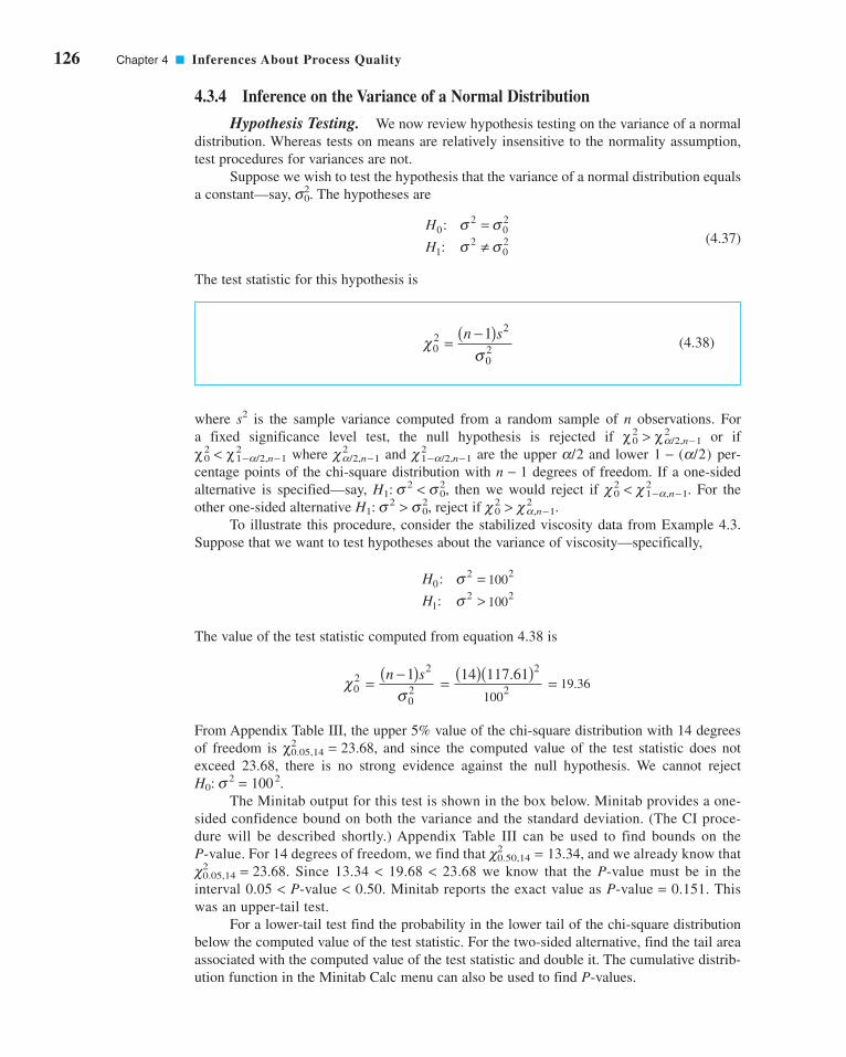
126 Chapter 4 ■ Inferences About Process Quality
4.3.4 Inference on the Variance of a Normal Distribution
Hypothesis Testing. We now review hypothesis testing on the variance of a normal
distribution. Whereas tests on means are relatively insensitive to the normality assumption,
test procedures for variances are not.
Suppose we wish to test the hypothesis that the variance of a normal distribution equals
a constant—say, The hypotheses are
(4.37)
The test statistic for this hypothesis is
(4.38)
where s2 is the sample variance computed from a random sample of n observations. For
a fixed significance level test, the null hypothesis is rejected if or if
where and are the upper and lower per-
centage points of the chi-square distribution with degrees of freedom. If a one-sided
alternative is specified—say, then we would reject if For the
other one-sided alternative reject if
To illustrate this procedure, consider the stabilized viscosity data from Example 4.3.
Suppose that we want to test hypotheses about the variance of viscosity—specifically,
The value of the test statistic computed from equation 4.38 is
From Appendix Table III, the upper 5% value of the chi-square distribution with 14 degrees
of freedom is and since the computed value of the test statistic does not
exceed 23.68, there is no strong evidence against the null hypothesis. We cannot reject
.
The Minitab output for this test is shown in the box below. Minitab provides a one-
sided confidence bound on both the variance and the standard deviation. (The CI proce-
dure will be described shortly.) Appendix Table III can be used to find bounds on the
P-value. For 14 degrees of freedom, we find that and we already know that
. Since 13.34 < 19.68 < 23.68 we know that the P-value must be in the
interval 0.05 < P-value < 0.50. Minitab reports the exact value as P-value = 0.151. This
was an upper-tail test.
For a lower-tail test find the probability in the lower tail of the chi-square distribution
below the computed value of the test statistic. For the two-sided alternative, find the tail area
associated with the computed value of the test statistic and double it. The cumulative distrib-
ution function in the Minitab Calc menu can also be used to find P-values.
c20.05,14 = 23.68
c20.50,14 = 13.34,
H0: s2 = 1002
χ20.05,14 = 23.68,
2100
(14)(117.61)19.36χ
σ02
2
021= = =−( )n s 2
H
H0
2
12 2
:
:
σσ
=> 100
2100
c20 > c2
a,n−1.H1: s2 > s20,
c20 < c2
1−a,n−1.H1: s2 < s20,
n − 1
1 − (a/2)a/2c21−a/2,n−1c2
a/2,n−1χ20 < χ2
1−a/2,n−1
χ20 > χ2
a/2,n−1
χσ0
22
02
1= −( )n s
H
H0
202
12
02
:
:
σ σσ σ
=≠
s20.
c04InferencesaboutProcessQuality.qxd 3/24/12 7:11 PM Page 126

4.3 Statistical Inference for a Single Sample 127
This test is very useful in many quality and process improvement applications. For exam-
ple, consider a normal random variable with mean and variance If is less than or equal
to some value—say, —then the natural inherent variability of the process will be well within
the design requirements, and, consequently, almost all of the production will conform to spec-
ifications. However, if exceeds then the natural variability in the process will exceed the
specification limits, resulting in a high percentage of nonconforming production or “fallout.” In
other words, process capability is directly related to process variability. Equations 4.37 and
4.38 may be used to analyze various other similar situations, and as we will see subsequently,
they form the basis for a monitoring or control procedure for process variability.
Confidence Interval on the Variance of a Normal Distribution. Suppose that
x is a normal random variable with unknown mean and unknown variance Let the sam-
ple variance s2 be computed from a random sample of n observations. Then a
two-sided CI on the variance is
(4.39)
where denotes the percentage point of the chi-square distribution such that
A CI or the standard deviation can be found by taking the square
root throughout in equation (4.39).
If one-sided confidence bounds are desired, they may be obtained from equation 4.39
by using only the upper (or lower) limit with the probability level increased from to
That is, the upper and lower confidence bounds are
(4.40)σχ α
22
1 12
1≤ −( )− −
n s
n,
100(1 − a)%
a.a/2
P5c2n−1 ≥ c2
a/2,n−16 = a/2.
c2a/2,n−1
n s n s
n n
−( ) ≤ ≤ −( )− − −
1 12
2 12
22
1 2 12χ
σχα α, ,
100(1 − a)%
s2.m
s20,s2
s20
s2s2.m
Statistics
Variable N StDev VarianceViscosity 15 118 13,832
95% One-Sided Confidence Intervals
LowerBound
for Lower BoundVariable StDev for VarianceViscosity 90 8,176
Tests
Variable Chi-Square DF P-ValueViscosity 19.37 14.00 0.151
c04InferencesaboutProcessQuality.qxd 3/24/12 7:11 PM Page 127

128 Chapter 4 ■ Inferences About Process Quality
and
(4.41)
respectively.
We may use the stabilized viscosity data from Example 4.3 to demonstrate the compu-
tation of a 95% (say) confidence interval on Note that for the data in Table 4.1, we have
and From Appendix Table III, we find that and
Therefore, from equation 4.39, we find the 95% two-sided confidence inter-
val on as
which reduces to 74,13.84 ≤ s2 ≤ 34,396.01. The confidence interval on the standard deviation is
Notice that Minitab reported a one-sided lower bound.
4.3.5 Inference on a Population Proportion
Hypothesis Testing. Suppose we wish to test the hypothesis that the proportion p of
a population equals a standard value—say, The test we will describe is based on the nor-
mal approximation to the binomial. If a random sample of n items is taken from the popula-
tion and x items in the sample belong to the class associated with p, then to test
(4.42)
we use the statistic
(4.43)
For a fixed significance level test, the null hypothesis is rejected if The
one-sided alternative hypotheses are treated similarly. A P-value approach also can be used.
Since this is a Z-test, the P-values are calculated just as in the Z-test for the mean.
�Z0� > Za/2.H0: p = p0
Z
x np
np px np
x np
np px np
0
0
0 0
0
0
0 0
0
0 5
1
0 5
1
=
+( ) −−( )
<
−( ) −−( )
>
⎧
⎨⎪⎪
⎩⎪⎪
.
.
if
if
H p p
H p p0 0
1 0
:
:
=≠
p0.
86 10 185 46. .≤ ≤σ
14 13 832 11
26 12
14 13 832 11
5 63
2( ) ≤ ≤ ( ), .
.
, .
.σ
s2
c20.975,14 = 5.63.
c20.025,14 = 26.12s2 = 13,832.11.s = 117.61
s2.
n s
n
−( ) ≤−
1 2
12
2
χσ
α ,
EXAMPLE 4.5
A foundry produces steel forgings used in automobile manu-
facturing. We wish to test the hypothesis that the fraction
conforming or fallout from this process is 10%. In a random
sample of 250 forgings, 41 were found to be nonconforming.
What are your conclusions using a = 0.05?
A Forging Process
c04InferencesaboutProcessQuality.qxd 4/25/12 7:47 PM Page 128

4.3 Statistical Inference for a Single Sample 129
As noted above, this test is based as the normal approximation to the binomial. When
this is not appropriate, there is an exact test available. For details, see Montgomery and
Runger (2011).
Confidence Intervals on a Population Proportion. It is frequently necessary to
construct CIs on a population proportion p. This parameter frequently corre-
sponds to a lot or process fraction nonconforming. Now p is only one of the parameters of a
binomial distribution, and we usually assume that the other binomial parameter n is known. If
a random sample of n observations from the population has been taken, and x “nonconforming”
observations have been found in this sample, then the unbiased point estimator of p is
There are several approaches to constructing the CI on p. If n is large and (say),
then the normal approximation to the binomial can be used, resulting in the
confidence interval:
(4.44)
If n is small, then the binomial distribution should be used to establish the confidence
interval on p. If n is large but p is small, then the Poisson approximation to the binomial is
useful in constructing confidence intervals. Examples of these latter two procedures are given
by Duncan (1986).
ˆˆ ˆ
ˆˆ ˆ
p Zp p
np p Z
p pna−
−( ) ≤ ≤ +−( )
α 2 2
1 1
100(1 − a)%
p ≥ 0.1
p = x/n.
100(1 − a)%
SOLUTION
To test
we calculate the test statistic
Using we find and therefore
is rejected (the P-value here is
That is, the process fraction nonconforming or fallout is not
equal to 10%.
P = 0.00108).H0: p = 0.1
Z0.025 = 1.96,a = 0.05
Zx np
np p0
0
0 0
0 5
1
41 0 5 250 0 1
250 0 1 1 0 13 27= −( ) −
−( )= −( ) − ( )( )
( ) −( )=. . .
. ..
H p
H p0
1
0 1
0 1
: .
: .
=≠
EXAMPLE 4.6
In a random sample of 80 home mortgage applications
processed by an automated decision system, 15 of the applica-
tions were not approved. The point estimate of the fraction that
was not approved is
Assuming that the normal approximation to the binomial is
appropriate, find a 95% confidence interval on the fraction of
nonconforming mortgage applications in the process.
ˆ .p = =15
800 1875
Mortgage Applications
(continued)
c04InferencesaboutProcessQuality.qxd 3/24/12 7:11 PM Page 129
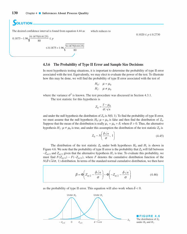
130 Chapter 4 ■ Inferences About Process Quality
4.3.6 The Probability of Type II Error and Sample Size Decisions
In most hypothesis testing situations, it is important to determine the probability of type II error
associated with the test. Equivalently, we may elect to evaluate the power of the test. To illustrate
how this may be done, we will find the probability of type II error associated with the test of
where the variance is known. The test procedure was discussed in Section 4.3.1.
The test statistic for this hypothesis is
and under the null hypothesis the distribution of is N(0, 1). To find the probability of type II error,
we must assume that the null hypothesis is false and then find the distribution of
Suppose that the mean of the distribution is really where Thus, the alternatived > 0.m1 = m0 + d,
Z0.H0: m = m0
Z0
Zx
n00= − μ
σ
s2
H
H0 0
1 0
:
:
μ μμ μ
=≠
■ F I G U R E 4 . 6The distribution of
under and H1.H0
Z0
– Z /2 0
Under H0 Under H1
Z0δα Z /2α σn/
SOLUTION
The desired confidence interval is found from equation 4.44 as which reduces to
0 1020 0 2730. .≤ ≤p
0 1875 1 960 1875 0 8125
80. .
. .≤ + ( )
0 1875 1 960 1875 0 8125
80. .
. .− ( ) ≤ p
hypothesis � m0 is true, and under this assumption the distribution of the test statistic is
(4.45)
The distribution of the test statistic under both hypotheses and is shown in
Figure 4.6. We note that the probability of type II error is the probability that will fall between
and given that the alternative hypothesis is true. To evaluate this probability, we
must find where F denotes the cumulative distribution function of the
distribution. In terms of the standard normal cumulative distribution, we then have
(4.46)
as the probability of type II error. This equation will also work when d < 0.
β δσ
δσα α= −
⎛⎝⎜
⎞⎠⎟
− − −⎛⎝⎜
⎞⎠⎟
Φ ΦZn
Zn
2 2
N(d1n/s, 1)
F(Za/2) − F(−Za/2),
H1Za/2−Za/2
Z0
H1H0Z0
Z Nn
0 1~ ,δ
σ
⎛⎝⎜
⎞⎠⎟
Z0H1: m
c04InferencesaboutProcessQuality.qxd 3/24/12 7:11 PM Page 130
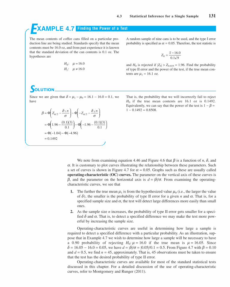
4.3 Statistical Inference for a Single Sample 131
We note from examining equation 4.46 and Figure 4.6 that is a function of n, and
It is customary to plot curves illustrating the relationship between these parameters. Such
a set of curves is shown in Figure 4.7 for Graphs such as these are usually called
operating-characteristic (OC) curves. The parameter on the vertical axis of these curves is
and the parameter on the horizontal axis is From examining the operating-
characteristic curves, we see that
1. The further the true mean is from the hypothesized value (i.e., the larger the value
of the smaller is the probability of type II error for a given n and That is, for a
specified sample size and the test will detect large differences more easily than small
ones.
2. As the sample size n increases, the probability of type II error gets smaller for a speci-
fied and That is, to detect a specified difference we may make the test more pow-
erful by increasing the sample size.
Operating-characteristic curves are useful in determining how large a sample is
required to detect a specified difference with a particular probability. As an illustration, sup-
pose that in Example 4.7 we wish to determine how large a sample will be necessary to have
a 0.90 probability of rejecting if the true mean is Since
we have From Figure 4.7 with
and we find approximately. That is, 45 observations must be taken to ensure
that the test has the desired probability of type II error.
Operating-characteristic curves are available for most of the standard statistical tests
discussed in this chapter. For a detailed discussion of the use of operating-characteristic
curves, refer to Montgomery and Runger (2011).
n = 45,d = 0.5,
b = 0.10d = �d�/s = �0.05�/0.1 = 0.5.d = 16.05 − 16.0 = 0.05,
m = 16.05.H0: m = 16.0
a.d
a,
a.d),
m0m1
d = �d�/s.b,
a = 0.05.
a.
d,b
SOLUTION
Since we are given that we
have
That is, the probability that we will incorrectly fail to reject
if the true mean contents are 16.1 oz is 0.1492.
Equivalently, we can say that the power of the test is
1 − 0.1492 = 0.8508.
1 − b =H0
β δσ
δσα α= −
⎛⎝⎜
⎞⎠⎟
− − −⎛⎝⎜
⎞⎠⎟
= − ( )( )⎛⎝⎜
⎞⎠⎟
− − − ( )( )⎛⎝⎜
⎞⎠⎟
= −( ) − −( )=
Φ Φ
Φ Φ
Φ Φ
Zn
Zn
2 2
1 960 1 3
0 11 96
0 1 3
0 1
1 04 4 96
0 1492
..
..
.
.
. .
.
d = m1 − m0 = 16.1 − 16.0 = 0.1,
EXAMPLE 4.7
The mean contents of coffee cans filled on a particular pro-
duction line are being studied. Standards specify that the mean
contents must be 16.0 oz, and from past experience it is known
that the standard deviation of the can contents is 0.1 oz. The
hypotheses are
A random sample of nine cans is to be used, and the type I error
probability is specified as Therefore, the test statistic is
and is rejected if Find the probability
of type II error and the power of the test, if the true mean con-
tents are m1 = 16.1 oz.
�Z0� > Z0.025 = 1.96.H0
Zx
0
16 0
0 1 9= − .
.
a = 0.05.
H
H0
1
16 0
16 0
: .
: .
μμ
=≠
Finding the Power of a Test
c04InferencesaboutProcessQuality.qxd 3/24/12 7:11 PM Page 131

132 Chapter 4 ■ Inferences About Process Quality
Minitab can also perform power and sample size calculations for several hypothesis
testing problems. The following Minitab display reproduces the power calculations from the
coffee can–filling problem in Example 4.7.
■ F I G U R E 4 . 7 Operating-characteristic curves for the two-sided normal test with a = 0.05.(Reproduced with permission from C. L. Ferris, F. E. Grubbs, and C. L. Weaver, “Operating Characteristic Curves
for the Common Statistical Tests of Significance,” Annals of Mathematical Statistics, June 1946.)
Power and Sample Size
1-Sample Z Test
Testing mean = null (versus not = null)Calculating power for mean � null + differenceAlpha = 0.05 Sigma = 0.1
Sample Difference Size Power
0.1 9 0.8508
Power and Sample Size
1-Sample t Test
Testing mean = null (versus not = null)Calculating power for mean = null + differenceAlpha = 0.05 Sigma = 117.61
Sample Difference Size Power
50 15 0.3354
The following display shows several sample size and power calculations based on the rub-
berized asphalt problem in Example 4.3.
0.2
0.4
0.6
0.8
1.0
00 21 3 4 5
75
100
15
50
40
30
20
1
10
8
7
6
5
4
2
3
n
β
d
c04InferencesaboutProcessQuality.qxd 3/24/12 7:11 PM Page 132
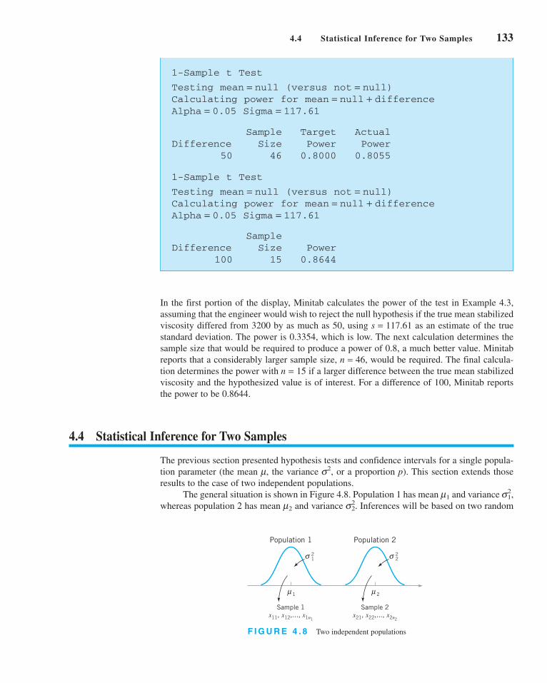
4.4 Statistical Inference for Two Samples 133
In the first portion of the display, Minitab calculates the power of the test in Example 4.3,
assuming that the engineer would wish to reject the null hypothesis if the true mean stabilized
viscosity differed from 3200 by as much as 50, using as an estimate of the true
standard deviation. The power is 0.3354, which is low. The next calculation determines the
sample size that would be required to produce a power of 0.8, a much better value. Minitab
reports that a considerably larger sample size, would be required. The final calcula-
tion determines the power with if a larger difference between the true mean stabilized
viscosity and the hypothesized value is of interest. For a difference of 100, Minitab reports
the power to be 0.8644.
4.4 Statistical Inference for Two Samples
The previous section presented hypothesis tests and confidence intervals for a single popula-
tion parameter (the mean the variance or a proportion p). This section extends those
results to the case of two independent populations.
The general situation is shown in Figure 4.8. Population 1 has mean and variance
whereas population 2 has mean and variance Inferences will be based on two randoms22.m2
s21,m1
s2,m,
n = 15
n = 46,
s = 117.61
1-Sample t Test
Testing mean = null (versus not = null)Calculating power for mean = null + differenceAlpha = 0.05 Sigma = 117.61
Sample Target ActualDifference Size Power Power
50 46 0.8000 0.8055
1-Sample t Test
Testing mean = null (versus not = null)Calculating power for mean = null + differenceAlpha = 0.05 Sigma = 117.61
Sample Difference Size Power
100 15 0.8644
F I G U R E 4 . 8 Two independent populations
Population 1
Sample 1x11, x12,..., x1n1
σ
μ
21
1
Population 2
Sample 2x21, x22,..., x2n2
σ
μ
22
2
c04InferencesaboutProcessQuality.qxd 3/24/12 7:11 PM Page 133

134 Chapter 4 ■ Inferences About Process Quality
A logical point estimator of is the difference in sample means Based
on the properties of expected values, we have
and the variance of is
Based on the assumptions and the preceding results, we may state the following.
The quantity
(4.47)
has an N(0, 1) distribution.
This result will be used to form tests of hypotheses and confidence intervals on
Essentially, we may think of as a parameter and its estimator is
with variance If is the null hypothesis value specified for then the
test statistic will be Note how similar this is to the test statistic for a single mean
used in the previous section.
Hypothesis Tests for a Difference in Means, Variances Known. We now con-
sider hypothesis testing on the difference in the means of the two populations inm1 − m2
(q − q0)/sq .q,q0s2
q = s21/n1 + s2
2/n2.
q = x1 − x2q,m1 − m2m1 − m2.
Zx x
n n
=− − −( )
+
1 2 1 2
12
1
22
2
μ μ
σ σ
V x x V x V xn n1 2 1 2
12
1
22
2
−( ) = ( ) + ( ) = +σ σ
x1 − x2
E x x E x E x1 2 1 2 1 2−( ) = ( ) − ( ) = −μ μ
x1 − x2.m1 − m2
Assumptions
1. is a random sample from population 1.
2. is a random sample from population 2.
3. The two populations represented by and are independent.
4. Both populations are normal, or if they are not normal, the conditions of the
central limit theorem apply.
x2x1
x21, x22, . . . , x2n2
x11, x12, . . . , x1n1
samples of sizes and respectively. That is, is a random sample of
observations from population 1, and is a random sample of observations
from population 2.
4.4.1 Inference for a Difference in Means, Variances Known
In this section we consider statistical inferences on the difference in means of the
populations shown in Figure 4.8, where the variances and are known. The assumptions
for this section are summarized here.
s22s2
1
m1 − m2
n2x21, x22, . . . , x2n2
n1x11, x12, . . . , x1n1n2,n1
c04InferencesaboutProcessQuality.qxd 3/24/12 7:11 PM Page 134

4.4 Statistical Inference for Two Samples 135
Figure 4.8. Suppose we are interested in testing that the difference in means is equal to
a specified value Thus, the null hypothesis will be stated as Obviously,
in many cases, we will specify so that we are testing the equality of two means (i.e.,
The appropriate test statistic would be found by replacing in equation
4.47 with and this test statistic would have a standard normal distribution under Suppose
that the alternative hypothesis is � Δ0. Now, a sample value of that is con-
siderably different from is evidence that is true. Because Z has the N(0, 1) distribution
when is true, we would take and as the boundaries of the critical region just as
we did in the single sample hypothesis testing problem of Section 4.3.1. This would give a test
with level of significance Critical regions for the one-sided alternatives would be located sim-
ilarly. A P-value approach can also be used. Formally, we summarize these results here.
a.
Za/2−Za/2H0
H1¢0
x1 − x2H1: m1 − m2
H0.¢0,
m1 − m2H0: m1 = m2).
¢0 = 0
H0: m1 − m2 = ¢0.¢0.
m1 − m2
Testing Hypotheses on �1 � �2, Variances Known
Null hypothesis:
Null hypothesis: (4.48)
Fixed Significance LevelAlternative Hypotheses Rejection Criterion P-value
� Δ0 or
P = Φ (Z0)Z0 < − ZaH1: m1 − m2 < ¢0
P = 1 − Φ (Z0)Z0 > ZaH1: m1 − m2 > ¢0
P = Z 31 − (Φ�Z0�) 4Z0 > Za/2Z0 < − Za/2H1: m1 − m2
Z0 =x1 − x2 − ¢0
B
s12
n1
+s2
2
n2
H0: m1 − m2 = ¢0
SOLUTION
The hypotheses of interest here are or equivalently,
H
H0 1 2
1 1 2
:
:
μ μμ μ
=>
H
H0 1 2
1 1 2
0
0
:
:
μ μμ μ
− =− >
EXAMPLE 4.8
A product developer is interested in reducing the drying time
of a primer paint. Two formulations of the paint are tested; for-
mulation 1 is the standard chemistry, and formulation 2 has a
new drying ingredient that should reduce the drying time.
From experience, it is known that the standard deviation of
drying time is eight minutes, and this inherent variability
should be unaffected by the addition of the new ingredient.
Ten specimens are painted with formulation 1, and another
ten specimens are painted with formulation 2; the 20 speci-
mens are painted in random order. The two sample average
drying times are min and min, respectively.
What conclusions can the product developer draw about the
effectiveness of the new ingredient, using a = 0.05?
x2 = 112x1 = 121
Comparing Paint Formulations
(continued)
c04InferencesaboutProcessQuality.qxd 3/24/12 7:11 PM Page 135

136 Chapter 4 ■ Inferences About Process Quality
Confidence Interval on a Difference in Means, Variances Known. The
CI on the difference in two means when the variances are known can
be found directly from results given previously in this section. Recall that
is a random sample of observations from the first population and is a ran-
dom sample of observations from the second population. If and are the means of these
two samples, then a confidence interval on the difference in means is
given by the following.
(4.49)
This is a two-sided CI. One-sided confidence bounds can be obtained by using the approach
illustrated in Section 4.3 for the single-sample case.
4.4.2 Inference for a Difference in Means of Two Normal Distributions, Variances Unknown
We now extend the results of the previous section to the difference in means of the two distrib-
utions in Figure 4.8 when the variances of both distributions and are unknown. If the sam-
ple sizes and exceed 30, then the normal distribution procedures in Section 4.4.1 could be
used. However, when small samples are taken, we will assume that the populations are normally
distributed and base our hypotheses tests and confidence intervals on the t distribution. This
nicely parallels the case of inference on the mean of a single sample with unknown variance.
Hypotheses Tests for the Difference in Means. We now consider tests of hypothe-
ses on the difference in means of two normal distributions where the variances and
are unknown. A t-statistic will be used to test these hypotheses. As noted above, the normal-
ity assumption is required to develop the test procedure, but moderate departures from normality
do not adversely affect the procedure. Two different situations must be treated. In the first case,
we assume that the variances of the two normal distributions are unknown but equal—that is,
In the second, we assume that and are unknown and not necessarily equal.
Case 1: s 21 = s 2
2 = s 2. Suppose we have two independent normal populations with
unknown means and and unknown but equal variances, We wish to test
(4.50)H
H0 1 2 0
1 1 2 0
:
:
μ μμ μ
− =− ≠
ΔΔ
s21 = s2
2 = s2.m2,m1
s22s2
1s21 = s2
2 = s2.
s22
s21m1 − m2
n2n1
s22s2
1
x x Zn n
x x Zn n1 2 2
12
1
22
21 2 1 2 2
12
1
22
2
− − + ≤ − ≤ − + +α ασ σ μ μ σ σ
m1 − m2100(1 − a)%
x2x1n2
x21, x22, . . . , x2n2n1
x11, x12, . . . , x1n1,
m1 − m2100(1 − a)%
Now since min and min, the test statistic is
Because the test statistic we reject
at the level and conclude that adding the
new ingredient to the paint significantly reduces the drying
time. Alternatively, we can find the P-value for this test as
Therefore, would be rejected at any signifi-
cance level a ≥ 0.0059.
H0: m1 = m2
P-value = 1 − Φ (2.52) = 0.0059
a = 0.05H0: m1 = m2
Z0 = 2.52 > Z0.05 = 1.645,
Z02 2
121 112
8
10
8
10
2 52= −
( ) + ( )= .
x2 = 112x1 = 121
c04InferencesaboutProcessQuality.qxd 3/24/12 7:11 PM Page 136

4.4 Statistical Inference for Two Samples 137
Let be a random sample of n1 observations from the first population and
be a random sample of n2 observations from the second population. Letx21, x22, . . . , x2n2
x11, x12, . . . , x1n1
be the sample means and sample variances, respectively. Now the expected value
of the difference in sample means is so is an unbiased
estimator of the difference in means. The variance of is
It seems reasonable to combine the two sample variances and to form an estimator of
The pooled estimator of is defined as follows.
The pooled estimator of denoted by is defined by
(4.51)
It is easy to see that the pooled estimator can be written as
where ≤ 1. Thus is a weighted average of the two sample variances and
where the weights w and depend on the two sample sizes and Obviously, if
then and is simply the arithmetic average of and If
and (say), then and The first sample contributes
degrees of freedom to , and the second sample contributes degrees of freedom.
Therefore, has degrees of freedom.
Now we know that
has a N(0, 1) distribution. Replacing by gives the following.
Given the assumptions of this section, the quantity
(4.52)
has a t distribution with degrees of freedom.
The use of this information to test the hypotheses in equation 4.50 is now straightfor-
ward: Simply replace by and the resulting test statistic has a t distribution with
degrees of freedom under The location of the critical region for
both two-sided and one-sided alternatives parallels those in the one-sample case. This proce-
dure is usually called the pooled t-test.
H0: m1 − m2 = ¢0.n1 + n2 − 2
¢0,m1 − m2
n1 + n2 − 2
tx x
sn np
=− − −( )
+
1 2 1 2
1 2
1 1
μ μ
sps
zx x
n n
=− − −( )
+
1 2 1 2
1 2
1 1
μ μ
σ
n1 + n2 − 2s2p
n2 − 1s2p
n1 − 11 − w = 0.68.w = 0.32n2 = 20
n1 = 10s22.s2
1s2pw = 0.5n1 = n2 = n,
n2.n11 − ws2
2,s21s2
p0 < w
sn
n ns
nn n
s
ws w s
p2 1
1 212 2
1 222
12
22
1
2
1
2
1
= −+ −
+ −+ −
= + −( )
s2p
sn s n s
n np2 1 1
22 2
2
1 2
1 1
2=
−( ) + −( )+ −
s2p,s2,
s2s2.
s22s2
1
V x xn n n n1 2
2
1
2
2
2
1 2
1 1−( ) = + = +⎛⎝⎜
⎞⎠⎟
σ σ σ
x1 − x2
x1 − x2E(x1 − x2) = m1 − m2,x1 − x2
x1, x2, s21, s2
2
c04InferencesaboutProcessQuality.qxd 3/24/12 7:11 PM Page 137

138 Chapter 4 ■ Inferences About Process Quality
The Two-Sample Pooled t-Test1
(4.53)
Alternative Fixed Significance LevelHypotheses Rejection Criterion P-Value
� Δ0 or Sum of the probability
above | | and below −| |
P = Probability below t0t0 < − ta,n1+n2− 2H1: m1 − m2 < ¢0
P = Probability above t0t0 > ta,n1+n2− 2H1: m1 − m2 > ¢0
t0t0t0 < − ta/2,n1+n2− 2
P =t0 > ta/2,n1+n2− 2H1: m1 − m2
Null hypothesis: Test statistic:
Ht x x
s n np
0 1 2 0
01 2 0
1 2
1 1
: μ μ− =
=− −
+
ΔΔ
SOLUTION
The hypotheses are
From Table 4.2, we have
and Therefore,s
n s n s
n n
s
p
p
2 1 12
2 22
1 2
2 21 1
2
7 2 39 7 2 98
8 8 27 30
7 30 2 70
=−( ) + −( )
+ −= ( )( ) + ( )( )
+ −=
= =
. ..
. .
n2 = 8.x2 = 92.733, s2 = 2.98,
n1 = 8,x1 = 92.255, s1 = 2.39,
H
H0 1 2
1 1 2
:
:
μ μμ μ
=≠
EXAMPLE 4.9
Two catalysts are being analyzed to determine how they affect
the mean yield of a chemical process. Specifically, catalyst 1 is
currently in use, but catalyst 2 is acceptable. Since catalyst 2 is
cheaper, it should be adopted, providing it does not change the
process yield. An experiment is run in the pilot plant and results
in the data shown in Table 4.2. Is there any difference between
the mean yields? Use and assume equal variances.a = 0.05
Comparing Mean Yields
1Although we have given the development of this procedure for the case where the sample sizes could be different,
there is an advantage to using equal sample sizes When the sample sizes are the same from both popula-
tions, the t-test is very robust to the assumption of equal variances.
n1 = n2 = n.
■ TA B L E 4 . 2
Catalyst Yield Data, Example 4.9
Observation Number Catalyst 1 Catalyst 2
1 91.50 89.19
2 94.18 90.95
3 92.18 90.46
4 95.39 93.21
5 91.79 97.19
6 89.07 97.04
7 94.72 91.07
8 89.21 92.75
s2 = 2.98s1 = 2.39
x2 = 92.733x1 = 92.255
c04InferencesaboutProcessQuality.qxd 3/24/12 7:11 PM Page 138

4.4 Statistical Inference for Two Samples 139
A P-value could also be used for decision making in this example. The actual value is
(This value was obtained from a handheld calculator.) Therefore, since the
P-value exceeds the null hypothesis cannot be rejected. The t-table in Appendix
Table IV can also be used to find bounds on the P-value.
Case 2: s 21 s 2
2 . In some situations, we cannot reasonably assume that the
unknown variances and are equal. There is not an exact t-statistic available for testing
in this case. However, if is true, then the statistic
(4.54)t x x
sn
sn
01 2 0
12
122
2
* =− −
+
Δ
H0: m1 − m2 = ¢0H0: m1 − m2 = ¢0
s22s2
1
�
a = 0.05,
P = 0.7289.
and
Because and
the null hypothesis cannot be rejected. That is, at the 0.05 level
of significance, we do not have strong evidence to conclude
that catalyst 2 results in a mean yield that differs from the
mean yield when catalyst 1 is used.
Figure 4.9 shows comparative box plots for the yield data
for the two types of catalysts. These comparative box plots
indicate that there is no obvious difference in the median of the
two samples, although the second sample has a slightly larger
sample dispersion or variance. There are no exact rules for
comparing two samples with box plots; their primary value is
in the visual impression they provide as a tool for explaining
the results of a hypothesis test, as well as in verification of
assumptions.
Figure 4.10 presents a Minitab normal probability plot of
the two samples of yield data. Note that both samples plot
approximately along straight lines, and the straight lines for
each sample have similar slopes. (Recall that the slope of the
line is proportional to the standard deviation.) Therefore, we
conclude that the normality and equal variances assumptions
are reasonable.
−2.145 < − 0.35 < 2.145,t0.025,14 = −2.145,
tx x
n n
01 2
1 2
2 701 1
92 255 92 733
2 701
8
1
8
0 35= −
+= −
+= −
.
. .
.
.
98
96
94
92
90
88
Yiel
d
1
Catalyst type
2
■ F I G U R E 4 . 9 Comparative box
plots for the catalyst yield data.
■ F I G U R E 4 . 1 0 Minitab normal probability plot of the
catalyst yield-data.
99
9590
80706050403020
105
1
88 93
Data
98
Per
cent
age
c04InferencesaboutProcessQuality.qxd 3/24/12 7:11 PM Page 139

140 Chapter 4 ■ Inferences About Process Quality
is distributed approximately as t with degrees of freedom given by
(4.55)
Therefore, if � the hypotheses on differences in the means of two normal distributions
are tested as in the equal variances case, except that is used as the test statistic and
is replaced by v in determining the degrees of freedom for the test.
Confidence Interval on the Difference on Means, Variances Unknown
Case 1: s 21 � s 2
2 � s 2. If and are the means and variances of two
random samples of sizes and respectively, from two independent normal populations
with unknown but equal variances, then a CI on the difference in means
is
(4.56)
where is the pooled estimate of the common
population standard deviation, and is the upper percentage point of the t dis-
tribution with degrees of freedom.
Case 2: s 21 s 2
2. If and are the means and variances of two random
samples of sizes n1 and n2, respectively, from two independent normal populations with
unknown and unequal variances, then an approximate CI on the difference in
means is
(4.57)
where v is given by equation 4.55 and is the upper percentage point of the t distri-
bution with v degrees of freedom.
a/2ta/2,v
x x ts
n
s
nx x t
s
n
s
nv v1 2 212
1
22
21 2 1 2 2
12
1
22
2
− − + ≤ − ≤ − + +α αμ μ, ,
m1 − m2
100(1 − a)%
s22x1, x2, s2
1,�
n1 + n2 − 2
a/2ta/2,n1+n2−2
sp = 2 3 (n1 − 1)s21 + (n2 − 1)s2
2 4/ (n1 + n2 − 2)
x x t sn n
x x t sn n
n n p
n n p
1 2 2 21 2
1 2 1 2 2 21 2
1 2
1 2
1 1
1 1
− − +
≤ − ≤ − + +
+ −
+ −
α
αμ μ
,
,
m1 − m2
100(1 − a)%
n2,n1
s22x1, x2, s2
1,
n1 + n2 − 2
t*0
s22,s2
1
v
sn
sn
s nn
s nn
=
+⎛
⎝⎜
⎞
⎠⎟
( )−
+( )
−
−
12
122
2
2
12
12
1
22
22
21 1
2
c04InferencesaboutProcessQuality.qxd 3/24/12 7:11 PM Page 140

4.4 Statistical Inference for Two Samples 141
SOLUTION
We will assume that weight percent calcium is normally dis-
tributed and find a 95% confidence interval on the difference
in means, for the two types of cement. Furthermore,
we will assume that both normal populations have the same
standard deviation.
The pooled estimate of the common standard deviation is
found using equation 4.51 as follows:
Therefore, the pooled standard deviation estimate is
The 95% CI is found using equation 4.56:
or upon substituting the sample values and using
which reduces to
Note that the 95% CI includes zero; therefore, at this level of
confidence we cannot conclude that there is a difference in the
means. Put another way, there is no evidence that doping the
cement with lead affected the mean weight percent of cal-
cium; therefore, we cannot claim that the presence of lead
affects this aspect of the hydration mechanism at the 95%
level of confidence.
− ≤ − ≤0 72 6 721 2. .μ μ
t0.025,23 = 2.069,
x x t sn np1 2 1 2 0 025 23
1 2
1 1≤ − ≤ − + +. ,μ μ
x x t sn np1 2 0 025 23
1 2
1 1− − +. ,
sp = 119.52 = 4.4.
sn s n s
n np2 1 1
22 2
2
1 2
2 21 1
2
9 5 0 14 4 0
10 15 219 52=
−( ) + −( )+ −
= ( )( ) + ( )+ −
=. ..
m1 − m2,
EXAMPLE 4.10
An article in the journal Hazardous Waste and HazardousMaterials (Vol. 6, 1989) reported the results of an analysis of
the weight of calcium in standard cement and cement doped
with lead. Reduced levels of calcium would indicate that the
hydration mechanism in the cement is blocked and would
allow water to attack various locations in the cement structure.
Ten samples of standard cement had an average weight percent
calcium of with a sample standard deviation of
and 15 samples of the lead-doped cement had an
average weight percent calcium of with a sample
standard deviation of Is there evidence to support a
claim that doping the cement with lead changes the mean
weight of calcium in the cement?
s2 = 4.0.
x2 = 87.0,
s1 = 5.0,
x1 = 90.0,
Doped Versus Undoped Cement
Two-Sample t-test and Cl: Catalyst 1, Catalyst 2
Two-sample T for Catalyst 1 vs Catalyst 2
N Mean StDev SE MeanCatalyst 1 8 92.26 2.39 0.84Catalyst 2 8 92.73 2.98 1.1
Difference = mu Catalyst 1 − mu Catalyst 2Estimate for difference: −0.4895% CI for difference: −(3.39, 2.44)t-test of difference = 0 (vs not = ): T-value = −0.35 P-Value = 0.729 DF = 14
90 0 87 0 2 069 4 41
10
1
151 2. . . .− − ( ) + ≤ −μ μ
90 0 87 0 2 069 4 41
10
1
15. . . .≤ − + ( ) +
Computer Solution. Two-sample statistical tests can be performed using most sta-
tistics software packages. The following display presents the output from the Minitab two-
sample t-test routine for the catalyst yield data in Example 4.9.
c04InferencesaboutProcessQuality.qxd 3/24/12 7:11 PM Page 141
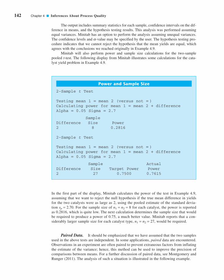
142 Chapter 4 ■ Inferences About Process Quality
The output includes summary statistics for each sample, confidence intervals on the dif-
ference in means, and the hypothesis testing results. This analysis was performed assuming
equal variances. Minitab has an option to perform the analysis assuming unequal variances.
The confidence levels and -value may be specified by the user. The hypothesis testing pro-
cedure indicates that we cannot reject the hypothesis that the mean yields are equal, which
agrees with the conclusions we reached originally in Example 4.9.
Minitab will also perform power and sample size calculations for the two-sample
pooled t-test. The following display from Minitab illustrates some calculations for the cata-
lyst yield problem in Example 4.9.
a
Power and Sample Size
2-Sample t Test
Testing mean 1 = mean 2 (versus not = )Calculating power for mean 1 = mean 2 + differenceAlpha = 0.05 Sigma = 2.7
Sample Difference Size Power2 8 0.2816
2-Sample t Test
Testing mean 1 = mean 2 (versus not = )Calculating power for mean 1 = mean 2 + differenceAlpha = 0.05 Sigma = 2.7
Sample ActualDifference Size Target Power Power2 27 0.7500 0.7615
In the first part of the display, Minitab calculates the power of the test in Example 4.9,
assuming that we want to reject the null hypothesis if the true mean difference in yields
for the two catalysts were as large as 2, using the pooled estimate of the standard devia-
tion For the sample size of for each catalyst, the power is reported
as 0.2816, which is quite low. The next calculation determines the sample size that would
be required to produce a power of 0.75, a much better value. Minitab reports that a con-
siderably larger sample size for each catalyst type, would be required.
Paired Data. It should be emphasized that we have assumed that the two samples
used in the above tests are independent. In some applications, paired data are encountered.
Observations in an experiment are often paired to prevent extraneous factors from inflating
the estimate of the variance; hence, this method can be used to improve the precision of
comparisons between means. For a further discussion of paired data, see Montgomery and
Runger (2011). The analysis of such a situation is illustrated in the following example.
n1 = n2 = 27,
n1 = n2 = 8sp = 2.70.
c04InferencesaboutProcessQuality.qxd 3/24/12 7:11 PM Page 142

4.4 Statistical Inference for Two Samples 143
4.4.3 Inference on the Variances of Two Normal Distributions
Hypothesis Testing. Consider testing the hypothesis that the variances of two inde-
pendent normal distributions are equal. If random samples of sizes and are taken from
populations 1 and 2, respectively, then the test statistic for
is simply the ratio of the two sample variances,
(4.58)Fs
s012
22
=
H
H0 1
222
1 12
22
:
:
σ σσ σ
=≠
n2n1
EXAMPLE 4.11
Two different types of machines are used to measure the tensile
strength of synthetic fiber. We wish to determine whether or not
the two machines yield the same average tensile strength val-
ues. Eight specimens of fiber are randomly selected, and one
strength measurement is made using each machine on each
specimen. The coded data are shown in Table 4.3.
The data in this experiment have been paired to prevent the
difference between fiber specimens (which could be substan-
tial) from affecting the test on the difference between
machines. The test procedure consists of obtaining the differ-
ences of the pair of observations on each of the n specimens—
say, —and then testing the
hypothesis that the mean of the difference is zero. Note that
testing is equivalent to testing further-
more, the test on is simply the one-sample t-test discussed
in Section 4.3.3. The test statistic is
where
and
and is rejected if
In our example, we find that
Therefore, the test statistic is
Choosing results in and we conclude
that there is no strong evidence to indicate that the two
machines differ in their mean tensile strength measurements
(the P-value is P = 0.18).
t0.025,7 = 2.365,a = 0.05
t ds nd
01 38
2 67 8 1 46= =−
= −.
. .
s
d
d
n
nd
j
jj
n
j
n
2
2 1
2
1
2
1
6511
8
77 13=
−
⎛
⎝⎜⎞
⎠⎟
−=
− −( )=
=
=
∑∑
.
dn
d jj
n= = −( ) = −
=∑1 1
811 1 38
1
.
�t0� > ta/2,n−1.H0: md = 0
s
d d
n
d
d
n
nd
jj
n
j
jj
n
j
n
2
2
1
2 1
2
1
1 1=
−( )−
=−
⎛
⎝⎜⎞
⎠⎟
−=
=
=∑
∑∑
dn
djj
n=
=∑1
1
td
s nd0 =
md
H0: m1 = m2;H0: md = 0
md
dj = x1j − x2j, j = 1, 2, . . . , n
■ TA B L E 4 . 3
Paired Tensile Strength Data for Example 4.11
Specimen Machine 1 Machine 2 Difference
1 74 78
2 76 79
3 74 75
4 69 66 3
5 58 63
6 71 70 1
7 66 66 0
8 65 67 −2
−5
−1
−3
−4
The Paired t-Test
c04InferencesaboutProcessQuality.qxd 3/24/12 7:11 PM Page 143

144 Chapter 4 ■ Inferences About Process Quality
We would reject if or if where
and denote the upper and lower percentage points of the Fdistribution with and degrees of freedom, respectively. The following display
summarizes the test procedures for the one-sided alternative hypotheses.
n2 − 1n1 − 1
1 − (a/2)a/2F1−(a/2),n1−1,n2−1
F(a/2),n1−1,n2−1F0 < F1−(a/2),n1−1,n2−1,F0 > Fa/2,n1−1,n2−1H0
Testing Hypotheses on s12 = s2
2 from Normal Distributions
Null hypothesis:
Alternative Hypotheses Test Statistics Rejection Criterion
F F n n0 1 11 2> − −α , ,F
s
s012
22
=H1: s2
1 > s22
F F n n0 1 12 1> − −α , ,F
s
s022
12
=H1: s21 < s2
2
H0: s21 = s2
2
Confidence Interval on the Ratio of the Variances of Two Normal Distributions.Suppose that and where and are unknown, and we wish to
construct a confidence interval on If and are the sample variances,
computed from random samples of and observations, respectively, then the
two-sided CI is
(4.59)
where is the percentage point of the F distribution with u and v degrees of freedom such
that The corresponding upper and lower confidence bounds are
(4.60)
and
(4.61)
respectively.2
s
sF n n
12
22 1 1 1
12
222 1− − − ≤α
σσ, ,
σσ α
12
22
12
22 1 12 1
≤ − −s
sF n n, ,
P5Fu,v ≥ Fa/2,u,v6 = a/2.
Fa/2,u,v
s
sF
s
sFn n n n
12
22 1 2 1 1
12
22
12
22 2 1 12 1 2 1− − − − −≤ ≤α α
σσ, , , ,
100(1 − a)%n2n1
s22s2
1s21/s2
2.100(1 − a)%
s22m1,x2 ~ N(m2, s2
2,x1 ~ N(m1, s21)
2Appendix Table V gives only upper tail points of F; that is, . Lower tail points may be found using the
relationship .F1−a,u,v = 1/Fa,u,v.
F1−a,u,vFa,u,v
c04InferencesaboutProcessQuality.qxd 3/24/12 7:11 PM Page 144

4.4 Statistical Inference for Two Samples 145
4.4.4 Inference on Two Population Proportions
We now consider the case where there are two binomial parameters of interest—say, and —
and we wish to draw inferences about these proportions. We will present large-sample hypothesis
testing and confidence interval procedures based on the normal approximation to the binomial.
Large-Sample Test for H0: p1 � p2. Suppose that the two independent random sam-
ples of sizes and are taken from two populations, and let and represent the num-
ber of observations that belong to the class of interest in samples 1 and 2, respectively.
Furthermore, suppose that the normal approximation to the binomial is applied to each pop-
ulation, so that the estimators of the population proportions and have
approximate normal distributions. We are interested in testing the hypotheses
The statistic
(4.62)
is distributed approximately as standard normal and is the basis of a test for
Specifically, if the null hypothesis is true, then using the fact that the
random variable
is distributed approximately N(0, 1). An estimator of the common parameter p is
The test statistic for is then
This leads to the test procedures described here.
Zp p
p pn n
01 2
1 2
11 1
= −
−( ) +⎛⎝⎜
⎞⎠⎟
ˆ ˆ
ˆ ˆ
H0: p1 = p2
px x
n n= +
+1 2
1 2
Zp p
p pn n
= −
−( ) +⎛⎝⎜
⎞⎠⎟
ˆ ˆ1 2
1 2
11 1
p1 = p2 = p,H0: p1 = p2
H0: p1 = p2.
Zp p p p
p p
n
p p
n
=− − −( )−( ) +
−( )ˆ ˆ1 2 1 2
1 1
1
2 2
2
1 1
H p p
H p p0 1 2
1 1 2
:
:
=≠
p2 = x2/n2p1 = x1/n1
x2x1n2n1
p2p1
(4.63)
Null hypothesis:
Test statistic:
1H p p
Zp p
p pn n
0 2
01 2
1 2
11 1
:ˆ ˆ
ˆ ˆ
=
= −
−( ) +⎛⎝⎜
⎞⎠⎟
Testing Hypothesis on Two Population Proportions
c04InferencesaboutProcessQuality.qxd 3/24/12 7:11 PM Page 145

146 Chapter 4 ■ Inferences About Process Quality
Confidence Interval on the Difference in Two Population Proportions. If
there are two population proportions of interest—say, and —it is possible to construct a
CI on their difference. The CI is as follows.
This result is based on the normal approximation to the binomial distribution.
4.5 What if There Are More than Two Populations? The Analysis of Variance
As this chapter has illustrated, testing and experimentation are a natural part of the engineer-
ing analysis process and arise often in quality control and improvement problems. Suppose,
for example, that an engineer is investigating the effect of different heat-treating methods on
the mean hardness of a steel alloy. The experiment would consist of testing several specimens
of alloy using each of the proposed heat-treating methods and then measuring the hardness of
each specimen. The data from this experiment could be used to determine which heat-treating
method should be used to provide maximum mean hardness.
If there are only two heat-treating methods of interest, this experiment could be
designed and analyzed using the two-sample t-test presented in this chapter. That is, the
experimenter has a single factor of interest—heat-treating methods—and there are only two
levels of the factor.
Many single-factor experiments require that more than two levels of the factor be
considered. For example, the engineer may want to investigate five different heat-treating
methods. In this section we show how the analysis of variance (ANOVA) can be used for
comparing means when there are more than two levels of a single factor. We will also discuss
randomization of the experimental runs and the important role this concept plays in the over-
all experimentation strategy. In Part IV, we will discuss how to design and analyze experi-
ments with several factors.
4.5.1 An Example
A manufacturer of paper used for making grocery bags is interested in improving the tensile
strength of the product. Product engineering thinks that tensile strength is a function of the hard-
wood concentration in the pulp and that the range of hardwood concentrations of practical
ˆ ˆˆ ˆ ˆ ˆ
ˆ ˆˆ ˆ ˆ ˆ
p p Zp p
n
p p
np p
p p Zp p
n
p p
n
1 2 21 1
1
2 2
21 2
1 2 21 1
1
2 2
2
1 1
1 1
− −−( ) +
−( ) ≤ −
≤ − +−( ) +
−( )
α
α
100(1 − a)%
p2p1
Fixed Significance Level Alternative Hypotheses Rejection Criterion P-value
� p2 or
P = Φ (Z0)Z0 < −ZaH1: p1 < p2
P = 1 − Φ (Z0)Z0 > ZaH1: p1 > p2
P = 2 31 − Φ (�Z0�) 4Z0 < −Za/2Z0 > Za/2H1: p1
(4.64)
c04InferencesaboutProcessQuality.qxd 4/23/12 6:13 PM Page 146
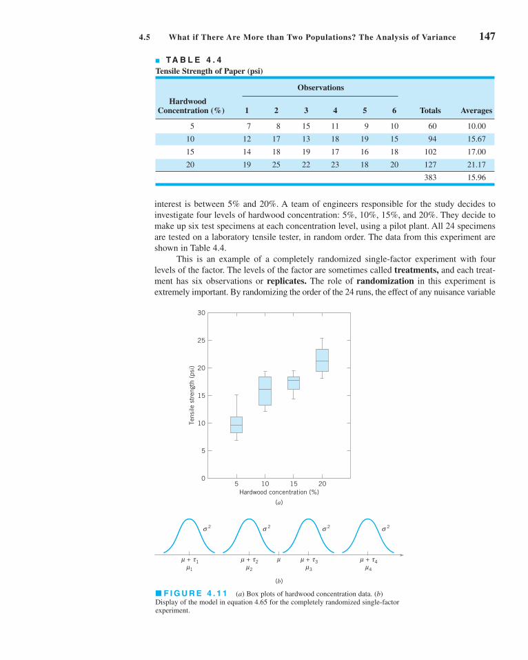
4.5 What if There Are More than Two Populations? The Analysis of Variance 147
interest is between 5% and 20%. A team of engineers responsible for the study decides to
investigate four levels of hardwood concentration: 5%, 10%, 15%, and 20%. They decide to
make up six test specimens at each concentration level, using a pilot plant. All 24 specimens
are tested on a laboratory tensile tester, in random order. The data from this experiment are
shown in Table 4.4.
This is an example of a completely randomized single-factor experiment with four
levels of the factor. The levels of the factor are sometimes called treatments, and each treat-
ment has six observations or replicates. The role of randomization in this experiment is
extremely important. By randomizing the order of the 24 runs, the effect of any nuisance variable
■ F I G U R E 4 . 1 1 (a) Box plots of hardwood concentration data. (b)
Display of the model in equation 4.65 for the completely randomized single-factor
experiment.
30
25
20
15
10
5
05
Hardwood concentration (%)10 15 20
Tens
ile s
tren
gth
(psi
)
(a)
(b)
σ 2
+ 1μ1μτ
σ 2
+ 2μ μ2μτ
σ 2
+ 3μ3μτ
σ 2
+ 4μ4μτ
■ TA B L E 4 . 4
Tensile Strength of Paper (psi)
Observations
Hardwood Concentration (%) 1 2 3 4 5 6 Totals Averages
5 7 8 15 11 9 10 60 10.00
10 12 17 13 18 19 15 94 15.67
15 14 18 19 17 16 18 102 17.00
20 19 25 22 23 18 20 127 21.17
383 15.96
c04InferencesaboutProcessQuality.qxd 3/24/12 7:11 PM Page 147

148 Chapter 4 ■ Inferences About Process Quality
that may influence the observed tensile strength is approximately balanced out. For example,
suppose that there is a warm-up effect on the tensile testing machine; that is, the longer the
machine is on, the greater the observed tensile strength. If all 24 runs are made in order of
increasing hardwood concentration (that is, all six 5% concentration specimens are tested
first, followed by all six 10% concentration specimens, etc.), then any observed differences in
tensile strength could also be due to the warm-up effect.
It is important to graphically analyze the data from a designed experiment. Figure 4.11apresents box plots of tensile strength at the four hardwood concentration levels. This figure indi-
cates that changing the hardwood concentration has an effect on tensile strength; specifically,
higher hardwood concentrations produce higher observed tensile strength. Furthermore, the dis-
tribution of tensile strength at a particular hardwood level is reasonably symmetric, and the vari-
ability in tensile strength does not change dramatically as the hardwood concentration changes.
Graphical interpretation of the data is always useful. Box plots show the variability of
the observations within a treatment (factor level) and the variability between treatments. We
now discuss how the data from a single-factor randomized experiment can be analyzed sta-
tistically.
4.5.2 The Analysis of Variance
Suppose we have a different levels of a single factor that we wish to compare. Sometimes,
each factor level is called a treatment, a very general term that can be traced to the early appli-
cations of experimental design methodology in the agricultural sciences. The response for
each of the a treatments is a random variable. The observed data would appear as shown in
Table 4.5. An entry in Table 4.5—say, —represents the jth observation taken under treat-
ment i. We initially consider the case in which there are an equal number of observations, n,
on each treatment.
We may describe the observations in Table 4.5 by the linear statistical model
(4.65)
where is a random variable denoting the (ij)th observation, is a parameter common to all
treatments called the overall mean, is a parameter associated with the ith treatment called
the ith treatment effect, and is a random error component. Note that the model could have
been written as
yi a
j nij i ij= +==
⎧⎨⎩
μ ε1,2, ,
1,2, ,
K
K
eij
ti
myij
yi a
j nij i ij= + +==
⎧⎨⎩
μ τ ε1,2, ,
1,2, ,
K
K
yij
■ TA B L E 4 . 5
Typical Data for a Single-Factor Experiment
Treatment Observations Totals Averages
1 ... . .
2 ... . .
. . . ... . . .
. . . ... . . .
. . . ... . . .
a ... . .
y.. ..y
yayayanya2ya1
y2y2y2ny22y21
y1y1y1ny12y11
c04InferencesaboutProcessQuality.qxd 4/23/12 6:13 PM Page 148
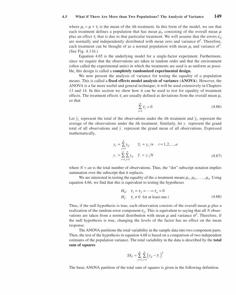
4.5 What if There Are More than Two Populations? The Analysis of Variance 149
where is the mean of the ith treatment. In this form of the model, we see that
each treatment defines a population that has mean consisting of the overall mean
plus an effect ti that is due to that particular treatment. We will assume that the errors
are normally and independently distributed with mean zero and variance Therefore,
each treatment can be thought of as a normal population with mean and variance
(See Fig. 4.11b.)
Equation 4.65 is the underlying model for a single-factor experiment. Furthermore,
since we require that the observations are taken in random order and that the environment
(often called the experimental units) in which the treatments are used is as uniform as possi-
ble, this design is called a completely randomized experimental design.We now present the analysis of variance for testing the equality of a population
means. This is called a fixed effects model analysis of variance (ANOVA). However, the
ANOVA is a far more useful and general technique; it will be used extensively in Chapters
13 and 14. In this section we show how it can be used to test for equality of treatment
effects. The treatment effects ti are usually defined as deviations from the overall mean
so that
(4.66)
Let represent the total of the observations under the ith treatment and represent the
average of the observations under the ith treatment. Similarly, let y.. represent the grand
total of all observations and represent the grand mean of all observations. Expressed
mathematically,
(4.67)
where is the total number of observations. Thus, the “dot” subscript notation implies
summation over the subscript that it replaces.
We are interested in testing the equality of the a treatment means Using
equation 4.66, we find that this is equivalent to testing the hypotheses
(4.68)
Thus, if the null hypothesis is true, each observation consists of the overall mean plus a
realization of the random error component This is equivalent to saying that all N obser-
vations are taken from a normal distribution with mean and variance Therefore, if
the null hypothesis is true, changing the levels of the factor has no effect on the mean
response.
The ANOVA partitions the total variability in the sample data into two component parts.
Then, the test of the hypothesis in equation 4.68 is based on a comparison of two independent
estimates of the population variance. The total variability in the data is described by the totalsum of squares
The basic ANOVA partition of the total sum of squares is given in the following definition.
SS y yT ijj
n
i
a= −( )⋅⋅
==∑∑
2
11
s2.meij.
m
H
H ia
i
0 1 2
1
0
0
:
:
τ τ ττ
= = = =≠
L
for at least one
m1, m2, . . . , ma.
N = an
y y y y n i a
y y y N
i ijj
n
i i
ijj
n
i
a
⋅=
⋅ ⋅
⋅⋅==
⋅⋅ ⋅⋅
= = =
= =
∑
∑∑1
11
1,2, ,
y
K
y..
yi.yi.
τ ii
a=
=∑ 0
1
m,
s2.mi
s2.
eij
mmi,
mi = m + ti
c04InferencesaboutProcessQuality.qxd 3/24/12 7:11 PM Page 149

150 Chapter 4 ■ Inferences About Process Quality
The proof of this identity is straightforward. Note that we may write
or
(4.70)
Note that the cross-product term in equation 4.70 is zero, since
Therefore, we have shown that equation 4.70 will reduce to equation 4.69.
The identity in equation 4.69 shows that the total variability in the data, measured by
the total sum of squares, can be partitioned into a sum of squares of differences between treat-
ment means and the grand mean and a sum of squares of differences of observations within a
treatment from the treatment mean. Differences between observed treatment means and the
grand mean measure the differences between treatments, whereas differences of observations
within a treatment from the treatment mean can be due only to random error. Therefore, we
write equation 4.69 symbolically as
(4.71)
where
and
We can gain considerable insight into how the ANOVA works by examining the
expected values of and This will lead us to an appropriate statistic for testing
the hypothesis of no differences among treatment means (or ti = 0).
SSE.SSTreatments
SS y yE ij ij
n
i
a= −( ) =⋅
==∑∑
2
11error sum of squares
total sum of squares
treatment sum of squaresTreatments
SS y y
SS n y y
T ijj
n
i
a
ii
a
= −( ) =
= −( ) =
⋅⋅==
⋅ ⋅⋅=
∑∑
∑
2
11
2
1
SS SS SST E= +Treatments
y y y ny y n y nij i i i i ij
n−( ) = − = − ( ) =⋅ ⋅ ⋅ ⋅ ⋅
=∑ 0
1
y y n y y y y
y y y y
ijj
n
i
a
i ij ij
n
i
a
i
a
i ij ij
n
i
a
−( ) = −( ) + −( )
+ −( ) −( )
⋅⋅==
⋅ ⋅⋅ ⋅===
⋅ ⋅⋅ ⋅==
∑∑ ∑∑∑
∑∑
2
11
2 2
111
11
2
y y y y y yijj
n
i
a
i ij ij
n
i
a−( ) = −( ) + −( )[ ]⋅⋅
==⋅ ⋅⋅ ⋅
==∑∑ ∑∑
2
11
2
11
The ANOVA sum of squares identity is
(4.69)y y n y y y yijj
n
i
a
ii
a
ij ij
n
i
a−( ) = −( ) + −( )⋅⋅
==⋅ ⋅⋅
=⋅
==∑∑ ∑ ∑∑
2
11
2
1
2
11
c04InferencesaboutProcessQuality.qxd 4/23/12 8:32 PM Page 150

4.5 What if There Are More than Two Populations? The Analysis of Variance 151
Now if the null hypothesis in equation 4.68 is true, each is equal to zero and
If the alternative hypothesis is true, then
The ratio is called the mean square for treatments. Thus,
if is true, is an unbiased estimator of , whereas if is true,
estimates plus a positive term that incorporates variation due to the systematic difference
in treatment means. (Refer to the supplemental material for this chapter for the proofs of these
two statements.)
We can also show that the expected value of the error sum of squares is
Therefore, the error mean square is an unbiased
estimator of regardless of whether or not is true.H0s2
MSE = SSE/ 3a(n − 1) 4E(SSE) = a(n − 1)s2.
s2
MSTreatmentsH1s2MSTreatmentsH0
MSTreatments = SSTreatments/(a − 1)
ESS
a
n
a
ii
a
Treatments
−⎛⎝
⎞⎠ = +
−=∑
1 1
2
2
1στ
ESS
aTreatments
−⎛⎝
⎞⎠ =
1
2σ
ti
The error mean square
is an unbiased estimator of s2.
MSSS
a nEE=−( )1
The expected value of the treatment sum of squares is
E SS a n ii
a
Treatments( ) = −( ) +=∑1 2 2
1
σ τ
There is also a partition of the number of degrees of freedom that corresponds to the sum
of squares identity in equation 4.69. That is, there are observations; thus, has
degrees of freedom. There are a levels of the factor, so has degrees of
freedom. Finally, within any treatment there are n replicates providing degrees of free-
dom with which to estimate the experimental error. Since there are a treatments, we have
degrees of freedom for error. Therefore, the degrees of freedom partition is
Now assume that each of the a populations can be modeled as a normal distribution.
Using this assumption we can show that if the null hypothesis is true, the ratio
(4.72)FSS a
SS a n
MS
MSE E0
1
1= −( )
−( )[ ] =Treatments Treatments
H0
an a a n− = − + −( )1 1 1
a(n − 1)
n − 1
a − 1SSTreatmentsan − 1
SSTan = N
c04InferencesaboutProcessQuality.qxd 3/24/12 7:12 PM Page 151

152 Chapter 4 ■ Inferences About Process Quality
has an F distribution with and degrees of freedom. Furthermore, from the
expected mean squares, we know that is an unbiased estimator of Also, under the
null hypothesis, is an unbiased estimator of However, if the null hypothesis
is false, then the expected value of is greater than Therefore, under the alter-
native hypothesis, the expected value of the numerator of the test statistic (equation 4.72) is
greater than the expected value of the denominator. Consequently, we should reject if the
statistic is large. This implies an upper-tail, one-tail critical region. Therefore, we would
reject if where is computed from equation 4.72. A P-value
approach can also be used, with the P-value equal to the probability above in the
distribution. Often we can only find bounds on the P-value when we only have
access to tables of the F-distribution, such as Appendix Table V. Computer software will
usually provide an exact P-value.
Efficient computational formulas for the sums of squares may be obtained by
expanding and simplifying the definitions of and This yields the follow-
ing results.
SST.SSTreatments
Fa−1,a(n−1)
F0
F0F0 > Fa,a−1,a(n−1)H0
H0
s2.MSTreatments
s2.MSTreatments
s2.MSE
a(n − 1)a − 1
Definition
The sums of squares computing formulas for the analysis of variance with equal
sample sizes in each treatment are
(4.73)
and
(4.74)
The error sum of squares is obtained by subtraction as
(4.75)SS SS SSE T= − Treatments
SSy
n
y
Ni
i
a
Treatments = −⋅ ⋅⋅
=∑
2 2
1
SS yy
NT ijj
n
i
a= −
==
⋅⋅∑∑ 2
11
2
The computations for this test procedure are usually summarized in tabular form as shown in
Table 4.6. This is called an analysis of variance (or ANOVA) table.
■ TA B L E 4 . 6
The Analysis of Variance for a Single-Factor Experiment
Source of Degrees ofVariation Sum of Squares Freedom Mean Square F0
Treatments
Error
Total an − 1SST
MSEa(n − 1)SSE
MSTreatments
MSEMSTreatmentsa − 1SSTreatments
c04InferencesaboutProcessQuality.qxd 3/24/12 7:12 PM Page 152

4.5 What if There Are More than Two Populations? The Analysis of Variance 153
SOLUTION
The hypotheses are
H
H ii
0 1 2 3 4
1
0
0
:
:
τ τ τ ττ
= = = =≠ for at least one
sis that different hardwood concentrations do not affect the
mean tensile strength of the paper.
Consider the paper tensile strength experiment described in
Section 4.5.1. Use the analysis of variance to test the hypothe-
We will use The sums of squares for the ANOVA are
computed from equations 4.73, 4.74, and 4.75 as follows:
a = 0.01.
so clearly the P-value is smaller than 0.01. The actual P-value
is However, since the P-value is consider-
ably smaller than we have strong evidence to con-
clude that is not true. Note that Minitab also provides
some summary information about each level of hardwood
concentration, including the confidence interval on each mean.
H0
a = 0.01,
P = 3.59 × 10⁻⁶.
SS yy
N
SSy
n
y
N
SS SS SS
T ijji
i
i
E T
= −
= ( ) + ( ) + + ( ) − ( ) =
= −
= ( ) + ( ) + ( ) + ( ) − ( ) =
= −= −
=
⋅⋅
=
⋅ ⋅⋅
=
∑∑
∑
2
1
6 2
1
4
2 2 22
2 2
1
4
2 2 2 2 2
7 8 20383
24512 96
60 94 102 127
6
383
24382 79
512 96 382
K .
.
. .
Treatments
Treatments
7979 130 17= .
We usually do not perform these calculations by hand. The
ANOVA from Minitab is presented in Table 4.7. Since
we reject and conclude that hardwood
concentration in the pulp significantly affects the strength of
the paper. Note that the computer output reports a P-value for
the test statistic in Table 4.7 of zero. This is a trun-
cated value. Appendix Table V reports that F0.01,3,20 = 4.94,
F = 19.61
H0F0.01,3,20 = 4.94,
EXAMPLE 4.12 The Paper Tensile Strength Experiment
■ TA B L E 4 . 7
Minitab Analysis of Variance Output for the Paper Tensile Strength Experiment
One-Way Analysis of Variance
Analysis of Variance
Source DF SS MS F P
Factor 3 382.79 127.60 19.61 0.000
Error 20 130.17 6.51
Total 23 512.96
Level N Mean StDev
5 6 10.000 2.828
10 6 15.667 2.805
15 6 17.000 1.789
20 6 21.167 2.639
Individual 95% Cls For MeanBased on Pooled StDev
— —–— —–— —–—
(—*—)
(—*—)
(—*—)
(—*—)
— —–— —–— —–—����
����
Pooled StDev = 2.551 10.0 15.0 20.0 25.0
c04InferencesaboutProcessQuality.qxd 3/24/12 7:12 PM Page 153
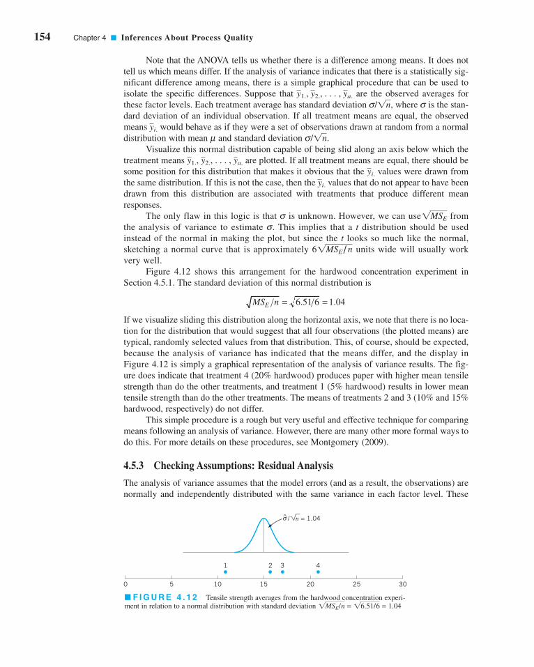
154 Chapter 4 ■ Inferences About Process Quality
Note that the ANOVA tells us whether there is a difference among means. It does not
tell us which means differ. If the analysis of variance indicates that there is a statistically sig-
nificant difference among means, there is a simple graphical procedure that can be used to
isolate the specific differences. Suppose that are the observed averages for
these factor levels. Each treatment average has standard deviation where is the stan-
dard deviation of an individual observation. If all treatment means are equal, the observed
means would behave as if they were a set of observations drawn at random from a normal
distribution with mean and standard deviation
Visualize this normal distribution capable of being slid along an axis below which the
treatment means are plotted. If all treatment means are equal, there should be
some position for this distribution that makes it obvious that the values were drawn from
the same distribution. If this is not the case, then the values that do not appear to have been
drawn from this distribution are associated with treatments that produce different mean
responses.
The only flaw in this logic is that is unknown. However, we can use from
the analysis of variance to estimate This implies that a t distribution should be used
instead of the normal in making the plot, but since the t looks so much like the normal,
sketching a normal curve that is approximately units wide will usually work
very well.
Figure 4.12 shows this arrangement for the hardwood concentration experiment in
Section 4.5.1. The standard deviation of this normal distribution is
If we visualize sliding this distribution along the horizontal axis, we note that there is no loca-
tion for the distribution that would suggest that all four observations (the plotted means) are
typical, randomly selected values from that distribution. This, of course, should be expected,
because the analysis of variance has indicated that the means differ, and the display in
Figure 4.12 is simply a graphical representation of the analysis of variance results. The fig-
ure does indicate that treatment 4 (20% hardwood) produces paper with higher mean tensile
strength than do the other treatments, and treatment 1 (5% hardwood) results in lower mean
tensile strength than do the other treatments. The means of treatments 2 and 3 (10% and 15%
hardwood, respectively) do not differ.
This simple procedure is a rough but very useful and effective technique for comparing
means following an analysis of variance. However, there are many other more formal ways to
do this. For more details on these procedures, see Montgomery (2009).
4.5.3 Checking Assumptions: Residual Analysis
The analysis of variance assumes that the model errors (and as a result, the observations) are
normally and independently distributed with the same variance in each factor level. These
MS nE = =6 51 6 1 04. .
61MSE/n
s.
1MSEs
yi.
yi.
y1., y2., . . . , ya.
s/1n.myi.
ss/1n,
y1., y2., . . . , ya.
^
0 5 10
1 2 3
15 20 25 30
4
/ n = 1.04σ
■ F I G U R E 4 . 1 2 Tensile strength averages from the hardwood concentration experi-
ment in relation to a normal distribution with standard deviation 1MSE/n = 16.51/6 = 1.04
c04InferencesaboutProcessQuality.qxd 3/24/12 7:12 PM Page 154
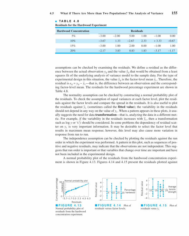
4.5 What if There Are More than Two Populations? The Analysis of Variance 155
assumptions can be checked by examining the residuals. We define a residual as the differ-
ence between the actual observation and the value that would be obtained from a least
squares fit of the underlying analysis of variance model to the sample data. For the type of
experimental design in this situation, the value is the factor-level mean Therefore, the
residual is —that is, the difference between an observation and the correspond-
ing factor-level mean. The residuals for the hardwood percentage experiment are shown in
Table 4.8.
The normality assumption can be checked by constructing a normal probability plot of
the residuals. To check the assumption of equal variances at each factor level, plot the resid-
uals against the factor levels and compare the spread in the residuals. It is also useful to plot
the residuals against (sometimes called the fitted value); the variability in the residuals
should not depend in any way on the value of When a pattern appears in these plots, it usu-
ally suggests the need for data transformation—that is, analyzing the data in a different met-
ric. For example, if the variability in the residuals increases with then a transformation
such as log y or should be considered. In some problems the dependency of residual scat-
ter on is very important information. It may be desirable to select the factor level that
results in maximum mean response; however, this level may also cause more variation in
response from run to run.
The independence assumption can be checked by plotting the residuals against the run
order in which the experiment was performed. A pattern in this plot, such as sequences of pos-
itive and negative residuals, may indicate that the observations are not independent. This sug-
gests that run order is important or that variables that change over time are important and have
not been included in the experimental design.
A normal probability plot of the residuals from the hardwood concentration experi-
ment is shown in Figure 4.13. Figures 4.14 and 4.15 present the residuals plotted against
yi.
1yyi.,
yi..
yi.
eij = yij − yi.
yi..yij
yijyij
99.99995805020
51
0.1
Cum
ulat
ive
perc
enta
ge
–3.7–1.7 0.3 2.3 4.3 6.3
Residuals
Normal probability plot4
2
0
–2
–4
Res
idua
l val
ue
5 10 15 20Percentage hardwood
4
2
0
–2
–4
Res
idua
l val
ue
10 15 20 25
Averagetensile
strength
■ F I G U R E 4 . 1 3Normal probability plot of
residuals from the hardwood
concentration experiment.
■ F I G U R E 4 . 1 4 Plot of
residuals versus factor levels.■ F I G U R E 4 . 1 5 Plot of
residuals verus yi.
■ TA B L E 4 . 8
Residuals for the Hardwood Experiment
Hardwood Concentration Residuals
5% 5.00 1.00 0.00
10% 1.33 2.33 +
15% 1.00 2.00 0.00 1.00
20% 3.83 0.83 1.83 −1.17−3.17−2.17
−1.00−3.00
−0.673.33−2.67−3.67
−1.00−2.00−3.00
c04InferencesaboutProcessQuality.qxd 3/24/12 7:12 PM Page 155

156 Chapter 4 ■ Inferences About Process Quality
the factor levels and the fitted value These plots do not reveal any model inadequacy or
unusual problem with the assumptions.
4.6 Linear Regression Models
In many problems, two or more variables are related and it is of interest to model and
explore this relationship. For example, in a chemical process the yield of product is related
to the operating temperature. The chemical engineer may want to build a model relating
yield to temperature and then use the model for prediction, process optimization, or process
control.
In general, suppose that there is a single dependent variable or response y that
depends on k independent or repressor variables, for example, The relation-
ship between these variables is characterized by a mathematical model called a regressionmodel. The regression model is fit to a set of sample data. In some instances, the experimenter
knows the exact form of the true functional relationship between y and
However, in most cases, the true functional relationship is unknown, and the experimenter
chooses an appropriate function to approximate the true model. Low-order polynomial mod-
els are widely used as approximating functions.
There are many applications of regression models in quality and process improvement.
In this section, we present some aspects of fitting these models. More complete presentations
of regression are available in Montgomery, Peck, and Vining (2006).
As an example of a linear regression model, suppose that we wish to develop an empir-
ical model relating the viscosity of a polymer to the temperature and the catalyst feed rate. A
model that might describe this relationship is
(4.76)
where y represents the viscosity, represents the temperature, and represents the cata-
lyst feed rate. This is a multiple linear regression model with two independent variables.
We often call the independent variables predictor variables or regressors. The term “linear”
is used because equation 4.76 is a linear function of the unknown parameter and
The model describes a plane in the two-dimensional space. The parameter
defines the intercept of the plane. We sometimes call and partial regression coeffi-cients because measures the expected change in y per unit change in when is held
constant and measures the expected change in y per unit change in when is held
constant.
In general, the response variable y may be related to k regressor variables. The
model
(4.77)
is called a multiple linear regression model with k regressor variables. The parameters
are called the regression coefficients. This model describes a hyper plane
in the k-dimensional space of the regressor variables The parameter represents the
expected change in response y per unit change in when all the remaining independent vari-
ables xi (i � j) are held constant.
Models that are more complex in appearance than equation 4.77 may often still be ana-
lyzed by multiple linear regression techniques. For example, consider adding an interaction
term to the first-order model in two variables, say
(4.78)y = b0 + b1x1 + b2x2 + b12x1x2 + e
xj
bj5xj6.bj, j = 0,1, p , k,
y = b0 + b1x1 + b2x2 + � � � + bkxk + e
x1x2b2
x2x1b1
b2b1
b0x1, x2
b2.b0, b1,
x2x1
y = b0 + b1x1 + b2x2 + e
x1, x2, . . . , xk.
x1, x2, p , xk
yi.
c04InferencesaboutProcessQuality.qxd 3/24/12 7:12 PM Page 156

4.6 Linear Regression Models 157
If we let and , then equation 4.78 can be written as
(4.79)
which is a standard multiple linear regression model with three regressors. As another exam-
ple, consider the second-order response surface model in two variables:
(4.80)
If we let and then this becomes
(4.81)
which is a linear regression model. In general, any regression model that is linear in the para-
meters is a linear regression model, regardless of the shape of the response surface
that it generates.
In this section, we will summarize methods for estimating the parameters in multiple
linear regression models. This is often called model fitting. We will also discuss methods for
testing hypotheses and constructing confidence intervals for these models as well as for
checking the adequacy of the model fit. For more complete presentations of regression, refer
to Montgomery, Peck, and Vining (2006).
4.6.1 Estimation of the Parameters in Linear Regression Models
The method of least squares is typically used to estimate the regression coefficients in a mul-
tiple linear regression model. Suppose that observations on the response variable are
available, say Along with each observed response we will have an observa-
tion on each regressor variable and let denote the ith observation or level of variable The
date will appear as in Table 4.9. We assume that the error term in the model has
and and that the are uncorrelated random variables.
We may write the model equation [equation 4.77] in terms of the observations in
Table 4.9 as
(4.82) = b0 + ak
j=1
bjxij + ei i = 1, 2, p , n
yi = b0 + b1xi1 + b2xi2 + p + bkxik + ei
5ei6V(e) = s2
E(e) = 0exj.xij
yi,y1, y2, . . . , yn.
n > k
(the bs)
y = b0 + b1x1 + b2x2 + b3x3 + b4x4 + b5x5 = e
b5 = b12,x3 = x21, x4 = x2
2, x5 = x1x2, b3 = b11, b4 = b22,
y = b0 + b1x1 + b2xx + b11x21 + b22x2
2 + b12x1x2 + e
y = b0 + b1x1 + b2x2 + b3x3 + e
b3 = b12x3 = x1x2
■ TA B L E 4 . 9
Data for Multiple Linear Regression
y x1 x2 . . . xk
xnkpxn2xn1yn
oooox2k
px22x21y2
x1kpx12x11y1
c04InferencesaboutProcessQuality.qxd 3/24/12 7:12 PM Page 157

158 Chapter 4 ■ Inferences About Process Quality
The method of least squares chooses the in equation 4.82 so that the sum of the squares of
the errors, is minimized. The least squares function is
(4.83)
The function L is to be minimized with respect to The least squares estimators,
say must satisfy
(4.84a)
and
(4.84b)
Simplifying equation 4.84, we obtain
(4.85)
These equations are called the least squares normal equations. Note that there are
normal equations, one for each of the unknown regression coefficients. The solution to
the normal equations will be the least squares estimators of the regression coefficients
It is simpler to solve the normal equations if they are expressed in matrix notation. We
now give a matrix development of the normal equations that parallels the development of
equation 4.85. The model in terms of the observations, equation 4.82 may be written in matrix
notation as
where
In general, y is an vector of the observations, X is an matrix of the lev-
els of the independent variables, is a vector of the regression coefficients, and is
an vector of random errors.(n × 1)
e(p × 1)b(n × p)(n × 1)
y = ≥
y1
y2
oyn
¥ , � = ≥
1 x11 x12 . . . x1k
1 x21 x22 . . . x2k
o o o o1 xn1 xn2 . . . xnk
¥ , b = ≥
b0
b1
obk
¥ , and e = ≥
e1
e2
oen
¥
y = Xb + e
b0, b1, p , bk.
p = k + 1
b0an
i=1
xik + b1an
i=1
xik xi1 + b2an
i=1
xik xi2 + . . . + bkan
i=1
x2ik = a
n
i=1
xikyi
ooooo
b0an
i=1
xi1 + b1an
i=1
x2i1 + b2a
n
i=1
xi1xi2 + . . . + bkan
i=1
xi1xik = an
i=1
xi1yi
n b0 + bian
i=1
xi1 + b2an
i=1
xi2 + . . . + bkan
i=1
xik = an
i=1
yi
0L
0bj`b0, b1, . . . , bk
= −2an
i=1°yi − b0 − a
k
j=1
bj xij¢ xij = 0 j = 1, 2, . . . , k
0L
0b0
`b0, b1, . . . , bk
= −2an
i=1°yi − b0 − a
k
j=1
bj x ij¢ = 0
b0, b1, p , bk,
b0, b1, p , bk.
L = an
i=1
e2i = a
n
i=1
°yi − b0 − ak
j=1
bjxijb2
ei,
bs
c04InferencesaboutProcessQuality.qxd 3/24/12 7:12 PM Page 158

4.6 Linear Regression Models 159
We wish to find the vector of least squares estimators, that minimizes
Note that L may be expressed as
(4.86)
because is a matrix, or a scalar, and its transpose is the same
scalar. The least squares estimators must satisfy
which simplifies to
(4.87)
Equation 4.87 is the matrix form of the least squares normal equations. It is identical to equa-
tion 4.85. To solve the normal equations, multiply both sides of equation 4.87 by the inverse
of Thus, the least squares estimator of is
(4.88)
It is easy to see that the matrix form for the normal equations is identical to the scalar
form. Writing out equation 4.87 in detail, we obtain
=
If the indicated matrix multiplication is performed, the scalar form of the normal equations
[i.e., equation 4.85] will result. In this form it is easy to see that is a sym-
metric matrix and is a column vector. Note the special structure of the
matrix. The diagonal elements of are the sums of squares of the elements in the columns
of X, and the off-diagonal elements are the sums of cross-products of the elements in the
columns of X. Furthermore, note that the elements of are the sums of cross-products of
the columns of X and the observations
The fitted regression model is
(4.89)y = Xb
5yi6.X¿y
X¿XX¿X(p × 1)X¿y
(p × p)X¿X
an
i=1
yi
an
i=1
xi1yi
o
an
i=1
xikyi
b0
b1
o
bk
n an
i=1
xi1 an
i=1
xi2 p an
i=1
xik
a xi1
n
i=1a x2
i1
n
i=1an
i=1
xi1xi2 p an
i=1
xi1xik
o o o o
an
i=1
xik an
i=1
xikxi1 an
i=1
xikxi2 p an
i=1
x2ik
b = (X¿X)−1X¿y
bX¿X.
X¿Xb = X¿y
0L
0b`b
= −2X¿y + 2X¿Xb = 0
(b¿X¿y) ¿ = y¿Xb(1 × 1)b¿X¿y
= y¿y − 2b¿X¿y + b¿X¿Xb L = y¿y − b¿X¿y − y¿X b + b¿X¿X b
L = an
i=1
e2i = e¿e = (y − Xb) ¿ (y − Xb)
�,
lppp
j
lppp
j
lppp
j
lppp
j
lppp
j
lppp
j
c04InferencesaboutProcessQuality.qxd 3/24/12 7:12 PM Page 159

160 Chapter 4 ■ Inferences About Process Quality
In scalar notation, the fitted model is
The difference between the actual observation and the corresponding fitted value is the
residual, say The vector of residuals is denoted by
(4.90)
Estimating . It is also usually necessary to estimate To develop an estimator
of this parameter, consider the sum of squares of the residuals, say
Substituting we have
Because this last equation becomes
(4.91)
Equation (4.91) is called the error or residual sum of squares, and it has degrees of
freedom associated with it. It can be shown that
so an unbiased estimator of is given by
(4.92)
Properties of the Estimators. The method of least squares produces an unbiased
estimator of the parameter in the linear regression model. This may be easily demonstrated
by taking the expected value of as follows:
because and Thus, is an unbiased estimator of
The variance property of is expressed in the covariance matrix:
(4.93)
which is just a symmetric matrix whose ith main diagonal element is the variance of the indi-
vidual regression coefficient and whose (ij)th element is the covariance between and
The covariance matrix of is
(4.94)Cov(b) = s2(X¿X)−1
bbj.bibi
Cov(b) � E5 3 b − E(b) 4 3 b − E(b) 4 ¿6
bb.b(X�X)−1X�X = I.E(e) = 0
= E 3 (X¿X)−1X¿Xb + (X¿X)−1X¿e 4 = b E(b) = E 3 (X¿X)−1X¿y 4 = E 3 (X¿X)−1X¿ (Xb + e) 4
bb
s2 =SSE
n − p
s2
E(SSE) = s2(n − p)
n − p
SSE = y¿y − b¿X¿y
X¿Xb = X¿y,
= y¿y − 2b¿X¿y + b¿X¿Xb = y¿y � b¿X¿y − y¿Xb + b¿X¿Xb
SSE = (y − Xb) ¿ (y − Xb)
e = y − y = y − Xb,
SSE = an
i=1
(yi − yi)2 = a
n
i=1
e2i = e¿e
s2.s 2
e = y − y
(n × 1)ei = yi − yi.
yiyi
yi = b0 + ak
j=1
bj xij i = 1, 2, p , n
c04InferencesaboutProcessQuality.qxd 3/24/12 7:12 PM Page 160

4.6 Linear Regression Models 161
SOLUTION
The X matrix and y vector are
1 80 8
1 93 9
1 100 10
1 82 12
1 90 11
1 99 8
1 81 8
X = 1 96 10
1 94 12
1 93 11
1 97 13
1 95 11
1 100 8
1 85 12
1 86 9
1 87 12
EXAMPLE 4.13 Fitting a Linear Regression Model
■ TA B L E 4 . 1 0
Consumers Finance Data for Example 4.13
New Number of LoansApplications Outstanding
Observation (x1) (x2) Cost ($)
1 80 8 2,256
2 93 9 2,340
3 100 10 2,426
4 82 12 2,293
5 90 11 2,330
6 99 8 2,368
7 81 8 2,250
8 96 10 2,409
9 94 12 2,364
10 93 11 2,379
11 97 13 2,440
12 95 11 2,364
13 100 8 2,404
14 85 12 2,317
15 86 9 2,309
16 87 12 2,328
—are shown in Table 4.10. Fit a multiple linear regression
model
to these data.
y = b0 + b1x1 + b2x2 + e
(x2)Sixteen observations on the operating cost of a branch office of
a finance company (y) and two predictor variables—number
of new loan applications and number of loans outstanding(x1)
2,256
2,340
2,426
2,293
2,330
2,368
2,250
y = 2,409
2,364
2,379
2,440
2,364
2,404
2,317
2,309
2,328
lppp
ppppp
j
lppp
ppppp
jlppp
ppppp
j
lppp
ppppp
j
The matrix is
and the vector is
The least squares estimate of is
b = (X¿X)−1X¿y
b
1 1 . . . 1
£80 93 . . . 87
8 9 . . . 12
§ ≥
2,256
2,340
o2,328
¥ = £37,577
3,429,550
385,562
§X¿y =
X¿y
1 1 . . . 1
£80 93 . . . 87
8 9 . . . 12
§ ≥
1 80 8
1 93 9
o o o1 87 12
¥ = £16 1,458 164
1,458 133,560 14,946
164 14,946 1,726
§X¿X =
X¿X
(continued)
c04InferencesaboutProcessQuality.qxd 3/24/12 7:12 PM Page 161

162 Chapter 4 ■ Inferences About Process Quality
■ F I G U R E 4 . 1 7 Plot of residuals versus
predicted cost, Example 4.13.
25.43
17.61
9.79
1.97
–5.85
–13.68
–21.502244 2273 2302 2331
Predicted cost
Res
idua
l
2359 2388 2417
■ TA B L E 4 . 1 1
Predicted Values, Residuals, and Other Diagnostics from Example 4.13
Observation Predicted Residual Studentizedi yi Value ei hii Residual Di R-Student
1 2,256 2,244.5 11.5 0.350 0.87 0.137 0.87
2 2,340 2,352.1 −12.1 0.102 −0.78 0.023 −0.77
3 2,426 2,414.1 11.9 0.177 0.80 0.046 0.79
4 2,293 2,294.0 −1.0 0.251 −0.07 0.001 −0.07
5 2,330 2,346.4 −16.4 0.077 −1.05 0.030 −1.05
6 2,368 2,389.3 −21.3 0.265 −1.52 0.277 −1.61
7 2,250 2,252.1 −2.1 0.319 −0.15 0.004 −0.15
8 2,409 2,383.6 25.4 0.098 1.64 0.097 1.76
9 2,364 2,385.5 −21.5 0.142 −1.42 0.111 −1.48
10 2,379 2,369.3 9.7 0.080 0.62 0.011 0.60
11 2,440 2,416.9 23.1 0.278 1.66 0.354 1.80
12 2,364 2,384.5 −20.5 0.096 −1.32 0.062 −1.36
13 2,404 2,396.9 7.1 0.289 0.52 0.036 0.50
14 2,317 2,316.9 0.1 0.185 0.01 0.000 <0.01
15 2,309 2,298.8 10.2 0.134 0.67 0.023 0.66
16 2,328 2,332.1 −4.1 0.156 −0.28 0.005 −0.27
yyi
or
= £1,566.07777
7.62129
8.58485
§
£
37,577
3,429,550
385,562
§£
14.176004 −0.129746 −0.223453
−0.129746 1.429184 × 10⁻³ −4.763947 × 10⁻⁵
−0.223453 −4,763947 × 10⁻⁵ 2.222381 × 10⁻²
§b =
■ F I G U R E 4 . 1 6 Normal probability
plot of residuals, Example 4.13.
99
9590
8070
50
3020
105
1
–21.50 –13.68 –5.85 1.97
Residual
Nor
mal
per
cent
age
prob
abili
ty
9.79 17.61 25.43
c04InferencesaboutProcessQuality.qxd 3/24/12 7:12 PM Page 162

4.6 Linear Regression Models 163
Using the Computer. Regression model fitting is almost always done using a sta-
tistical software package. Table 4.12 shows some of the output obtained when Minitab is used
to fit the consumer finance regression model in Example 4.13. In subsequent sections, we will
discuss the analysis of variance and t-test information in Table 4.12 and will show how these
quantities were computed.
4.6.2 Hypothesis Testing in Multiple Regression
In multiple linear regression problems, certain tests of hypotheses about the model parame-
ters are helpful in measuring the usefulness of the model. In this section, we describe several
important hypothesis-testing procedures. These procedures require that the errors in the
model be normally and independently distributed with mean zero and variance abbrevi-
ated As a result of this assumption, the observations are normally and
independently distributed with mean and variance
Test for Significance of Regression. The test for significance of regression is a
test to determine whether a linear relationship exists between the response variable y and a
subset of the regressor variables The appropriate hypotheses are
� 0 (4.95)for at least one j H1: bj
H0: b1 = b2 = p = bk = 0
x1, x2, p , xk.
s2.b0 + Σ kj=1bj xij
yie ∼ NID(0, s2).
s2,
ei
■ F I G U R E 4 . 1 9 Plot of residuals versus
(outstanding loan), Example 4.13.
x2
x2, outstanding loan
8.00 13.0012.1711.3310.509.678.33
25.43
17.61
9.79
1.97
–5.85
–13.68
–21.50
Res
idua
l
Plots of the residuals versus the predicted values and versus
the two variables x1 and x2 are shown in Figures 4.17, 4.18, and
4.19, respectively. Just as in ANOVA, residual plotting is an
integral part of regression model building. These plots indi-
cate that variance of the observed cost tends to increase with
the magnitude of cost. Figure 4.18 suggests that the variabil-
ity in cost may be increasing as the number of new applica-
tions increases.
yiThe least squares fit, with the regression coefficients reported
to two decimal places, is
The first three columns of Table 4.11 present the actual
observations the predicted or fitted values and the resid-
uals. Figure 4.16 is a normal probability plot of the residuals.
yi,yi,
y = 1,566.08 + 7.62x1 + 8.58x2
■ F I G U R E 4 . 1 8 Plot of residuals versus
(new applications), Example 4.13.
x1
x1, new application
80.0 100.096.793.390.086.783.3
25.43
17.61
9.79
1.97
–5.85
–13.68
–21.50
Res
idua
l
c04InferencesaboutProcessQuality.qxd 3/24/12 7:12 PM Page 163
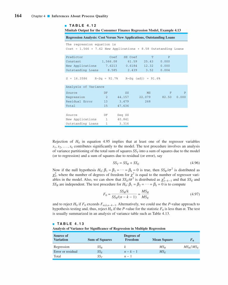
164 Chapter 4 ■ Inferences About Process Quality
Rejection of in equation 4.95 implies that at least one of the regressor variables
contributes significantly to the model. The test procedure involves an analysis
of variance partitioning of the total sum of squares into a sum of squares due to the model
(or to regression) and a sum of squares due to residual (or error), say
(4.96)
Now if the null hypothesis is true, then is distributed as
where the number of degrees of freedom for is equal to the number of regressor vari-
ables in the model. Also, we can show that is distributed as and that and
are independent. The test procedure for is to compute
(4.97)
and to reject if exceeds Alternatively, we could use the P-value approach to
hypothesis testing and, thus, reject if the P-value for the statistic is less than The test
is usually summarized in an analysis of variance table such as Table 4.13.
a.F0H0
Fa,k,n−k−1.F0H0
F0 =SSR/k
SSE/(n − k − 1)=
MSR
MSE
H0: b1 = b2 = p = bk = 0SSR
SSEc2n−k−1SSE /s2
c2c2k,
SSR /s2H0: b1 = b2 = p = bk = 0
SST = SSR + SSE
SST
x1, x2, p , xk
H0
■ TA B L E 4 . 1 2
Minitab Output for the Consumer Finance Regression Model, Example 4.13
Regression Analysis: Cost Versus New Applications, Outstanding Loans
The regression equation is
Cost = 1,566 + 7.62 New Applications + 8.58 Outstanding Loans
Predictor Coef SE Coef T P
Constant 1,566.08 61.59 25.43 0.000
New Applications 7.6213 0.6184 12.32 0.000
Outstanding Loans 8.585 2.439 3.52 0.004
S = 16.3586 R–Sq = 92.7% R—Sq (adj) = 91.6%
Analysis of Variance
Source DF SS MS F P
Regression 2 44,157 22,079 82.50 0.000
Residual Error 13 3,479 268
Total 15 47,636
Source DF Seq SS
New Applications 1 40,841
Outstanding Loans 1 3,316
■ TA B L E 4 . 1 3
Analysis of Variance for Significance of Regression in Multiple Regression
Source of Degrees ofVariation Sum of Squares Freedom Mean Square F0
Regression kError or residual
Total n − 1SST
MSEn − k − 1SSE
MSR/MSEMSRSSR
c04InferencesaboutProcessQuality.qxd 3/24/12 7:12 PM Page 164

4.6 Linear Regression Models 165
A computational formula for may be found easily. We have derived a computational
formula for in equation 4.91—that is,
Now, because we may rewrite the
foregoing equation as
or
Therefore, the regression sum of squares is
(4.98)
and the error sum of squares is
(4.99)
and the total sum of squares is
(4.100)
These computations are almost always performed with regression software. For
instance, Table 4.12 shows some of the output from Minitab for the consumer finance
regression model in Example 4.13. The lower portion in this display is the analysis of vari-
ance for the model. The test of significance of regression in this example involves the
hypotheses
� 0
The P-value in Table 4.13 for the F statistic [equation 4.97] is very small, so we would conclude
that at least one of the two variables—new applications and outstanding loans —has a
nonzero regression coefficient.
Table 4.13 also reports the coefficient to multiple determination where
(4.101)
The statistic is a measure of the amount of reduction in the variability of y obtained by
using the regressor variables in the model. However, a large value of does not
necessarily imply that the regression model is a good one. Adding a variable to the model will
always increase regardless of whether the additional variable is statistically significant or
not. Thus, it is possible for models that have large values of to yield poor predictions of
new observations or estimates of the mean response.
R2
R2,
R2x1, x2, p , xk
R2
R2 =SSR
SST= 1 −
SSE
SST
R2,
(x2)(x1)
for at least one jH1: bj
H0 : b1 = b2 = 0
SST = y¿y −aa
n
i=1
yib2
n
SSE = y¿y − b¿X¿y
SSR = b¿X¿y −aa
n
i=1
yib2
n
SSE = SST − SSR
SSE = y¿y −aa
n
i=1
yib2
n− £
b¿X¿y −aa
n
i=1
yib2
n
§
SST � gni�1 y2
i � (gni�1yi)
2/n � y¿y � (gni�1 yi)
2/n,
SSE = y¿y − b¿X¿y
SSE
SSR
c04InferencesaboutProcessQuality.qxd 3/24/12 7:52 PM Page 165

166 Chapter 4 ■ Inferences About Process Quality
Because always increases as we add terms to the model, some regression model
builders prefer to use an adjusted R2 statistic defined as
(4.102)
In general, the adjusted statistic will not always increase as variables are added to the
model. In fact, if unnecessary terms are added, the value of will often decrease.
For example, consider the consumer finance regression model. The adjusted for the
model is shown in Table 4.12. It is computed as
which is very close to the ordinary When and differ dramatically, there is a good
chance that nonsignificant terms have been included in the model.
Tests on Individual Regression Coefficients and Groups of Coefficients. We
are frequently interested in testing hypotheses on the individual regression coefficients. Such
tests would be useful in determining the value of each regressor variable in the regression
model. For example, the model might be more effective with the inclusion of additional vari-
ables or perhaps with the deletion of one or more of the variables already in the model.
Adding a variable to the regression model always causes the sum of squares for regres-
sion to increase and the error sum of squares to decrease. We must decide whether the increase
in the regression sum of squares is sufficient to warrant using the additional variable in the model.
Furthermore, adding an unimportant variable to the model can actually increase the mean
square error, thereby decreasing the usefulness of the model.
The hypotheses for testing the significance of any individual regression coefficient,
say are
H0: bj = 0
bj,
R2adjR2R2.
= 1 − a15
13b(1 − 0.92697) = 0.915735
R2adj = 1 − a
n − 1
n − pb(1 − R2)
R2
R2adj
R2
R2ad j = 1 −
SSE/(n − p)
SST/(n − 1)= 1 − a
n − 1
n − pb(1 − R2)
R2
because the regression coefficient depends on all the other regressor variables xi (i � j) that
are in the model.
The denominator of equation 4.103, is often called the standard error of the
regression coefficient —that is,
(4.104)
Therefore, an equivalent way to write the test statistic in equation 4.103 is
(4.105)t0 =bj
se(bj)
se(bj) = 2s2Cjj
bj
2s2Cjj,
bj
H1: bj � 0
If is not rejected, then this indicates that can be deleted from the model. The test
statistic for this hypothesis is
(4.103)
where is the diagonal element of corresponding to The null hypothesis
is rejected if Note that this is really a partial or marginal test|t0| > ta/2,n−k−1.H0: bj = 0
bj.(X¿X)−1Cjj
t0 =bj
2s2Cjj
xjH0 : bj = 0
c04InferencesaboutProcessQuality.qxd 3/24/12 7:13 PM Page 166

4.6 Linear Regression Models 167
Most regression computer programs provide the t-test for each model parameter. For
example, consider Table 4.12, which contains the Minitab output for Example 4.13. The
upper portion of this table gives the least squares estimate of each parameter, the standard
error, the t-statistic, and the corresponding P-value. We would conclude that both variables—
new applications and outstanding loans—contribute significantly to the model.
We may also directly examine the contribution to the regression sum of squares for a
particular variable, say given that other variables xi (i � j) are included in the model. The
procedure for doing this is the general regression significance test or, as it is often called, the
extra sum of squares method. This procedure can also be used to investigate the contribu-
tion of a subset of the regressor variables to the model. Consider the regression model with kregressor variables:
where y is is is and We would like
to determine if the subset of regressor variables contributes signifi-
cantly to the regression model. Let the vector of regression coefficients be partitioned as
follows:
where is and is We wish to test the hypotheses
H0: b1 = 0
3 (p − r) × 1 4 .b2(r × 1)b1
b = cb1
b2
d
x1, x2, . . . , xr(r < k)
p = k + 1.e is (n × 1),(p × 1),(n × p), b(n × 1), X
y = Xb + e
xj,
H1: b1 � 0 (4.106)
The model may be written as
(4.107)
where represents the columns of X associated with and represents the columns of
X associated with b2.
For the full model (including both and ), we know that Also,
the regression sum of squares for all variables including the intercept is
( p degrees of freedom)
and
is called the regression sum of squares due to To find the contribution of the terms
in to the regression, we fit the model assuming the null hypothesis to be true.
The reduced model is found from equation 4.107 with
(4.108)
The least squares estimator of is and
(4.109)
The regression sum of squares due to given that is already in the model is
(4.110)
This sum of squares has r degrees of freedom. It is the “extra sum of squares” due to Note
that is the increase in the regression sum of squares due to including the variables
in the model.x1, x2, . . . , xr
SSR(b1|b2)
b1.
SSR(b1|b2) = SSR(b) − SSR(b2)
b2b1
(p − r degrees of freedom)SSR(b2) = b¿2X¿2y
b2 = (X¿2X2)−1X¿2y,b2
y = X2b2 + e
b1 = 0:
H0 : b1 = 0b1
b.SSR(b)
MSE =y¿y − bX¿y
n − p
SSR(b) = b¿X¿y
b = (X¿X)�1 X¿y. b2b1
X2b1X1
y = Xb + e = X1b1 + X2b2 + e
c04InferencesaboutProcessQuality.qxd 3/24/12 7:13 PM Page 167
168 Chapter 4 ■ Inferences About Process Quality
SOLUTION
The hypotheses we wish to test are
H0: b2 = 0
EXAMPLE 4.14 The Extra Sum of Squares Method
Note that is shown at the bottom of the Minitab
output in Table 4.12 under the heading “Seq SS.” Therefore,
With degree of freedom. This is the increase in the
regression sum of squares that results from adding to model
already containing and it is shown at the bottom of the
Minitab output in Table 4.12. To test from the test
statistic we obtain
Note that from the full model (Table 4.12) is used in the
denominator of Now, because we would
reject and conclude that (outstanding loans) con-
tributes significantly to the model.
Because this partial F-test involves only a single regressor,
it is equivalent to the t-test because the square of a t random
variable with v degrees of freedom is an F random variable
with 1 and v degrees of freedom. To see this, note from Table
4.12 that the t-statistic for resulted in
and that t20 = (3.5203)2 = 12.3925 � F0.
t0 = 3.5203H0 : b2 = 0
x2H0: b2 = 0
F0.05,1,13 = 4.67,F0.
MSE
F0 =SsR(b2|b0, b1)/1
MSE=
3,316.3/1
267.604= 12.3926
H0: b2 = 0,
x1,
x2
2 − 1 = 1
= 3,316.3
SSR(b2|b0, b1) = 44,157.1 − 40,840.8
SSR(b1|b0)
Consider the consumer finance data in Example 4.13. Evaluate
the contribution of (outstanding loans) to the model.x2
H1: b2 � 0
This will require the extra sum of squares due to or
Now from Table 4.12, where we tested for significance of
regression, we have
which was called the model sum of squares in the table. This
sum of squares has two degrees of freedom.
The reduced model is
The least squares fit for this model is
and the regression sum of squares for this model (with one
degree of freedom) is
SSR(b1|b0) = 40,840.8
y = 1,652.3955 + 7.6397x1
y = b0 + b1x1 + e
SSR(b1,b2|b0) = 44,157.1
= SsR(b1, b2|b0) − SSR(b2|b0)
SSR(b2|b1, b0) = SSR(b0, b1, b2) − SSR(b0, b1)
b2,
Now, is independent of and the null hypothesis may be tested
by the statistic
(4.111)
If we reject concluding that at least one of the parameters in is not zero,
and, consequently, at least one of the variables in contributes significantly
to the regression model. Some authors call the test in equation 4.111 a partial F-test.The partial F-test is very useful. We can use it to measure the contribution of as if it
were the last variable added to the model by computing
This is the increase in the regression sum of squares due to adding to a model that already
includes Note that the partial F-test on a single variable is equiv-
alent to the t-test in equation 4.103. However, the partial F-test is a more general procedure
in that we can measure the effect of sets of variables.
xjx1, . . . , xj−1, xj+1, . . . , xk.
xj
SSR(bj|b0, b1, p , bj−1, bj+1, p , bk)
xj
X1x1, x2, . . . , xr
b1H0,F0 > Fa,r,n−p,
F0 =SsR(b1|b2)/r
MSE
b1 = 0MSE,SSR(b1|b2)
c04InferencesaboutProcessQuality.qxd 3/24/12 7:13 PM Page 168

4.6 Linear Regression Models 169
SOLUTION
The estimate of is and because and we find thatC11 = 1.429184 × 10⁻³,s 2 = 267.604b1 = 7.62129,b1
EXAMPLE 4.15 A Confidence Interval on a Regression Coefficient
Construct a 95% confidence interval for the parameter in Example 4.13.b1
≤ b1 ≤≤ b1
≤ ≤ b1 ≤
and the 95% confidence interval on is
6.2855 ≤ b1 ≤ 8.9570
b1
7.62129 + 2.16(0.6184)7.62129 − 2.16(0.6184)7.62129 + 2.162(267.604) (1.429184 × 10⁻³)
7.62129 − 2.162(267.604)(1.429184 × 10⁻³)
b1 + t0.025,132s 2C11b1 − t0.025,132s2C11
Confidence Interval on the Mean Response. We may also obtain a confidence inter-
val on the mean response at a particular point, say, We first define the vectorx01, x02, p , x0k.
4.6.3 Confidence Intervals in Multiple Regression
It is often necessary to construct confidence interval estimates for the regression coefficients
and for other quantities of interest from the regression model. The development of a pro-
cedure for obtaining these CIs requires that we assume the errors to be normally and inde-
pendently distributed with mean zero and variance the same assumption made in the section
on hypothesis testing in Section 4.6.2
Confidence Intervals on the Individual Regression Coefficients. Because the
least squares estimator is a linear combination of the observations, it follows that is normally
distributed with mean vector and covariance matrix Then each of the statistics
(4.112)
is distributed as t with degrees of freedom, where is the th element of the
matrix, and is the estimate of the error variance, obtained from equation 4.92.
Therefore, a % CI for the regression coefficient is
≤ bj ≤ (4.113)
Note that this CI could also be written as
≤ bj ≤
because se(bj) = 2s2Cjj.
bj + ta/2,n−pse(bj)bj − ta/2,n−pse(bj)
bj + ta/2,n−p2s2Cjjbj − ta/2,n−p2s2Cjj
bj, j = 0, 1, p , k,100(1 − a)
s2(X¿X)−1
( jj)Cjjn − p
bj − bj
2s2Cjj
j = 0, 1, p , k
s2(X¿X)−1.bbb
s2,
5ei65bj6
lp
j
lp
j
x0 =
1
x01
x02
o x0k
c04InferencesaboutProcessQuality.qxd 3/24/12 7:13 PM Page 169
170 Chapter 4 ■ Inferences About Process Quality
The mean response at this point is
The estimated mean response at this point is
(4.114)
This estimator is unbiased because and the variance of
is
(4.115)
Therefore, a % CI on the mean response at the point is
≤ ≤ (4.116)
Minitab will calculate the CI in equation 4.116 for points of interest. For example,
suppose that for the consumer finance regression model we are interested in finding an esti-
mate of the mean cost and the associated 95% CI at two points: (1) New Applications
and Outstanding Loans and (2) New Applications and Outstanding Loans
Minitab reports the point estimates and the 95% CI calculated from equation 4.116 in
Table 4.14.
When there are 85 new applications and 10 outstanding loans, the point estimate of cost
is 2,299.74, and the 95% CI is (2,287.63, 2,311.84), and when there are 95 new applications
and 12 outstanding loans, the point estimate of cost is 2,293.12, and the 95% CI is (2,379.37,
2,406.87). Notice that the lengths of the two confidence intervals are different. The length of
the CI on the mean response depends on not only the level of confidence that is specified and
the estimate of but on the location of the point of interest. As the distance of the point
from the center of the region of the predictor variables increases, the length of the confidence
interval increases. Because the second point is further from the center of the region of the pre-
dictors, the second CI is longer than the first.
4.6.4 Prediction of New Response Observations
A regression model can be used to predict future observations on the response y cor-
responding to particular values of the regressor variables, say If
then a point estimate for the future observation at the point
is computed from equation 4.114:
y(x0) = x¿0 b
x01, x02, . . . , x0k
y0x¿0 = 31, x01, x02, . . . , x0k 4 ,x01, x02, . . . , x0k.
s2,
= 12.= 95= 10,
= 85
y(x0) + ta/2, n−p2s2x¿0(X¿X)−1x0my |x0y(x0) − ta/2,n−p2s2x¿0(X¿X)−1x0
x01, x02, . . . , x0k100(1 − a)
V 3 y(x0) 4 = s2x¿0 (X¿X)−1 x0
y(x0)
E 3 y(x0) 4 = E(x¿0 b) = x¿0 b = my |X0,
y(x0) = x¿0 b
my |x0= b0 + b1 x01 + b2x02 + . . . + bkx0k = x¿0 b
■ TA B L E 4 . 1 4
Minitab Output
Predicted Values for New Observations
NewObs Fit SE Fit 95% CI 95% PI
1 2,299.74 5.60 (2,287.63, 2,311.84) (2,262.38, 2,337.09)
2 2,393.12 6.36 (2,379.37, 2,406.87) (2,355.20, 2,431.04)
Values of Predictors for New Observations
New New OutstandingObs Applications Loans
1 85.0 10.0
2 95.0 12.0
c04InferencesaboutProcessQuality.qxd 3/24/12 7:13 PM Page 170

4.6 Linear Regression Models 171
A % prediction interval (PI) for this future observation is
≤ y0
≤ (4.117)
In predicting new observations and in estimating the mean response at a given point
we must be careful about extrapolating beyond the region containing the
original observations. It is very possible that a model that fits well in the region of the origi-
nal data will no longer fit well outside of that region.
The Minitab output in Table 4.14 shows the 95% prediction intervals on cost for the
consumer finance regression model at the two points considered previously: (1) New
Applications and Outstanding Loans and (2) New Applications and
Outstanding Loans The predicted value of the future observation is exactly equal to the
estimate of the mean at the point of interest. Notice that the prediction intervals are longer
than the corresponding confidence intervals. You should be able to see why this happens from
examining equations 4.116 and 4.117. The prediction intervals also get longer as the point
where the prediction is made moves further away from the center of the predictor variable
region.
4.6.5 Regression Model Diagnostics
As we emphasized in analysis of variance, model adequacy checking is an important part
of the data analysis procedure. This is equally important in building regression models, and
as we illustrated in Example 4.13, residual plots should always be examined for a regres-
sion model. In general, it is always necessary (1) to examine the fitted model to ensure that
it provides an adequate approximation to the true system, and (2) to verify that none of the
least squares regression assumptions are violated. The regression model will probably give
poor or misleading results unless it is an adequate fit.
In addition to residual plots, other model diagnostics are frequently useful in regression.
This section briefly summarizes some of these procedures. For more complete presentations,
see Montgomery, Peck, and Vining (2006) and Myers (1990).
Scaled Residuals and PRESS. Many model builders prefer to work with scaledresiduals in contrast to the ordinary least squares residuals. These scaled residuals often con-
vey more information than do the ordinary residuals.
One type of scaled residual is the standardized residual:
(4.118)
where we generally use in the computation. These standardized residuals have
mean zero and approximately unit variance; consequently, they are useful in looking for out-liers. Most of the standardized residuals should lie in the interval −3 ≤ di ≤ 3, and any obser-
vation with a standardized residual outside of this interval is potentially unusual with respect
to its observed response. These outliers should be carefully examined because they may rep-
resent something as simple as a data-recording error or something of more serious concern,
such as a region of the regressor variable space where the fitted model is a poor approxima-
tion to the true response surface.
The standardizing process in equation 4.118 scales the residuals by dividing them by
their approximate average standard deviation. In some data sets, residuals may have standard
deviations that differ greatly. We now present a scaling that takes this into account.
s = 2MSE
di =ei
s i = 1, 2, . . . , n
= 12.
= 95= 10,= 85
x01, x02, p , x0k,
y(x0) + ta/2, n−p2s2(1 + x�0(X�X)−1x0)
y(x0) = ta/2,n−p2s2(1 + x�0(X¿X)−1x0)
100(1 − a)
c04InferencesaboutProcessQuality.qxd 3/24/12 7:13 PM Page 171

172 Chapter 4 ■ Inferences About Process Quality
The vector of fitted values corresponding to the observed values is
(4.119)
The matrix is usually called the “hat” matrix because it maps the vec-
tor of observed values into a vector of fitted values. The hat matrix and its properties play a
central role in regression analysis.
The residuals from the fitted model may be conveniently written in matrix notation as
and it turns out that the covariance matrix of the residuals is
(I – H) (4.120)
The matrix (I – H) is generally not diagonal, so the residuals have different variances and are
correlated.
Thus, the variance of the ith residual is
(4.121)
where is the ith diagonal element of H. Because 0 ≤ hii ≤ 1, using the residual mean square
to estimate the variance of the residuals actually overestimates Furthermore,
because is a measure of the location of the ith point in x space, the variance of depends
on where the point lies. Generally, residuals near the center of the x space have larger vari-
ance than do residuals at more remote locations. Violations of model assumptions are more
likely at remote points, and these violations may be hard to detect from inspection of (or )
because their residuals will usually be smaller.
We recommend taking this inequality of variance into account when scaling the resid-
uals. We suggest plotting the studentized residuals:
(4.122)
with instead of (or ). The studentized residuals have constant variance
regardless of the location of when the form of the model is correct. In many sit-
uations the variance of the residuals stabilizes, particularly for large data sets. In these cases,
there may be little difference between the standardized and studentized residuals. Thus stan-
dardized and studentized residuals often convey equivalent information. However, because
any point with a large residual and a large is potentially highly influential on the least
squares fit, examination of the studentized residuals is generally recommended. Table 4.11
displays the hat diagonals and the studentized residuals for the consumer finance regres-
sion model in Example 4.13.
The prediction error sum of squares (PRESS) provides a useful residual scaling. To
calculate PRESS, we select an observation—for example, i. We fit the regression model to
the remaining observations and use this equation to predict the withheld observation
Denoting this predicted value we may find the prediction error for point i as
The prediction error is often called the ith PRESS residual. This procedure is
repeated for each observation producing a set of n PRESS residuals
Then the PRESS statistic is defined as the sum of squares of the n PRESS
residuals as in
(4.123)PRESS = an
i=1
e2(i) = a
n
i=1
3yi − y(i) 42
e(1), e(2), p , e(n).
i = 1, 2, p , n,
e(i) = yi − y(i).
y(i),yi.
n − 1
hii
hii
xiV(ri) = 1
dieis2 = MSE
ri =ei
2s2(1 − hii) i = 1, 2, . . . , n
diei
xi
eihii
V(ei).MSE
hii
V(ei) = s2(1 − hii)
Cov(e) = s2
e = yy � y
H = X(X�X)−1X�n × n
= Hy = X(X�X)−1X�y
y = Xb
yiyi
c04InferencesaboutProcessQuality.qxd 3/24/12 7:13 PM Page 172
4.6 Linear Regression Models 173
Thus, PRESS uses each possible subset of observations as an estimation data set, and
every observation in turn is used to form a prediction data set.
It would initially seem that calculating PRESS requires fitting n different regressions.
However, it is possible to calculate PRESS from the results of a single least squares fit to all
n observations. It turns out that the ith PRESS residual is
(4.124)
Thus, because PRESS is just the sum of the squares of the PRESS residuals, a simple com-
puting formula is
(4.125)
From equation 4.124 it is easy to see that the PRESS residual is just the ordinary residual
weighted according to the diagonal elements of the hat matrix Data points for which
are large will have large PRESS residuals. These observations will generally be high influ-ence points. Generally, a large difference between the ordinary residual and the PRESS resid-
uals will indicate a point where the model fits the data well, but a model built without that
point predicts poorly. In the next section we will discuss some other measures of influence.
Finally, we note that PRESS can be used to compute an approximate for prediction, say
(4.126)
This statistic gives some indication of the predictive capability of the regression model. For
the consumer finance regression model from Example 4.13, we can compute the PRESS
residuals using the ordinary residuals and the values of found in Table 4.11. The corre-
sponding value of the PRESS statistic is Then
Therefore, we could expect this model to “explain” about 89% of the variability in predicting
new observations, as compared to the approximately 93% of the variability in the original data
explained by the least squares fit. The overall predictive capability of the model based on this
criterion seems very satisfactory.
The studentized residual discussed above is often considered an outlier diagnostic. It
is customary to use as an estimate of in computing This is referred to as internal
scaling of the residual because is an internally generated estimate of obtained from
fitting the model to all n observations. Another approach would be to use an estimate of
based on a data set with the ith observation removed. We denote the estimate of so
obtained by We can show that
(4.127)
The estimate of in equation 4.127 is used instead of to produce an externally studen-
tized residual, usually called R-student, given by
(4.128)ti =ei
2S2(i)(1 − hii)
i = 1, 2, . . . , n
MSEs2
S2(i) =
(n − p)MSE − e2i /(1 − hii)
n − p − 1
S2(i).
s2
s2
s2MSE
ri.s2MSE
ri
= 1 −5,207.7
47,635.9= 0.8907
R2Prediction = 1 −
PRESS
SST
PRESS = 5,207.7.
hii
R2Prediction = 1 −
PRESS
SST
R2
hiihii.
PRESS = an
i=1
aei
1 − hiib
2
e(i) =ei
1 − hii
n − 1
c04InferencesaboutProcessQuality.qxd 3/24/12 7:13 PM Page 173

174 Chapter 4 ■ Inferences About Process Quality
In many situations, will differ little from the studentized residual However, if the ithobservation is influential, then can differ significantly from and thus the R-student
will be more sensitive to this point. Furthermore, under the standard assumptions, has a
distribution. Thus R-student offers a more formal procedure for outlier detection via
hypothesis testing. Table 4.11 displays the values of R-student for the consumer finance
regression model in Example 4.13. None of those values is unusually large.
Influence Diagnostics. We occasionally find that a small subset of the data exerts
a disproportionate influence on the fitted regression model. That is, parameter estimates or
predictions may depend more on the influential subset than on the majority of the data. We
would like to locate these influential points and assess their impact on the model. If these
influential points are “bad” values, they should be eliminated. On the other hand, there may
be nothing wrong with these points. But if they control key model properties, we would like
to know it because it could affect the use of the model. In this section, we describe and illus-
trate some useful measures of influence.
The disposition of points in x space is important in determining model properties. In
particular, remote observations potentially have disproportionate leverage on the parameter
estimates, predicted values, and the usual summary statistics.
The hat matrix is very useful in identifying influential observations.
As noted earlier, H determines the variances and covariances of and e because
and The elements of H may be interpreted as the amount of leverage
exerted by on Thus, inspection of the elements of H can reveal points that are potentially
influential by virtue of their location in x space. Attention is usually focused on the diagonal
elements Because the average size of the diagonal
element of the H matrix is As a rough guideline, then, if a diagonal element is greater
than observation i is a high leverage point. To apply this to the consumer finance regres-
sion model in Example 4.13, note that Table 4.11 gives the hat diag-
onals for the first-order model; because none of the exceeds 0.375, we would conclude
that there are no leverage points in these data.
The hat diagonals will identify points that are potentially influential due to their loca-
tion in x space. It is desirable to consider both the location of the point and the response vari-
able in measuring influence. Cook (1977, 1979) has suggested using a measure of the squared
distance between the least squares estimate based on all n points and the estimate obtained
by deleting the i point, say This distance measure can be expressed as
(4.129)
A reasonable cutoff for is unity. That is, we usually consider observations for which
to be influential.
The statistic is actually calculated from
(4.130)
Note that, apart from the constant p, is the product of the square of the ith studentized resid-
ual and This ratio can be shown to be the distance from the vector to the cen-
troid of the remaining data. Thus, is made up of a component that reflects how well the model
fits the ith observation and a component that measures how far that point is from the rest
of the data. Either component (or both) may contribute to a large value of .
Table 4.11 presents the values of for the regression model fit to the consumer finance
data in Example 4.13. None of these values of exceeds 1, so there is no strong evidence of
influential observations in these data.
Di
Di
Di
yi
Di
xihii/ (1 − hii).
Di
Di =r2
i
P V 3 y(xi) 4
V(ei)=
r2i
p
hii
(1 − hii) i = 1, 2, . . . , n
Di
Di > 1Di
D1 =(b(i) − b) ¿X¿X(b(i) − b)
pMSE i = 1, 2, . . . , n
b(i).
b
hiihii
2p/n = 2(3)/16 = 0.375.
2p/n,
hiip/n.
Σ ni=1 hii = rank(H) = rank(X) = p,hii.
yi.yj
hijV(e) = s2(I − H).
V(y) = s2HyH = X(X� X)−1X�
tn−p−1
ti
MSE,S2(i)
ri.ti
c04InferencesaboutProcessQuality.qxd 3/24/12 7:14 PM Page 174

Exercises 175
Alternative hypothesis
Analysis of variance (ANOVA)
Binomial distribution
Checking assumptions for statistical inference procedures
Chi-square distribution
Confidence interval
Confidence intervals on means, known variance(s)
Confidence intervals on means, unknown variance(s)
Confidence intervals on proportions
Confidence intervals on the variance of a normal
distribution
Confidence intervals on the variances of two normal
distributions
Critical region for a test statistic
F-distribution
Hypothesis testing
Least squares estimator
Linear statistical model
Minimum variance estimator
Null hypothesis
P-value
P-value approach
Parameters of a distribution
Point estimator
Poisson distribution
Pooled estimator
Power of a statistical test
Random sample
Regression model
Residual analysis
Sampling distribution
Scaled residuals
Statistic
t-distribution
Test statistic
Tests of hypotheses on means, known variance(s)
Tests of hypotheses on means, unknown variance(s)
Tests of hypotheses on proportions
Tests of hypotheses on the variance of a normal
distribution
Tests of hypotheses on the variances of two normal
distributions
Type I error
Type II error
Unbiased estimator
Important Terms and Concepts
Exercises
4.3. Suppose that you are testing the following hypothe-
ses where the variance is known:
Find the P-value for the following values of the test
statistic.
(a) Z0 = −2.35
(b) Z0 = −1.99
(c) Z0 = −2.18
(d) Z0 = −1.85
4.4. Suppose that you are testing the following hypothe-
ses where the variance is unknown:
The sample size is n = 20. Find bounds on the
P-value for the following values of the test statistic.
(a) t0 = 2.75
(b) t0 = 1.86
(c) t0 = −2.05
(d) t0 = −1.86
H1: m � 100
H0: m = 100
H1: m < 100
H0: m = 100
4.1. Suppose that you are testing the
following hypotheses where the
variance is known:
Find the P-value for the following
values of the test statistic.
(a) Z0 = 2.75
(b) Z0 = 1.86
(c) Z0 = −2.05
(d) Z0 = −1.86
4.2. Suppose that you are testing the following hypothe-
ses where the variance is known:
Find the P-value for the following values of the test
statistic.
(a) Z0 = 2.50
(b) Z0 = 1.95
(c) Z0 = 2.05
(d) Z0 = 2.36
H1: m > 100
H0: m = 100
H1: m � 100
H0: m = 100
The Student
Resource Manual
presents compre-
hensive annotated
solutions to the
odd-numbered
exercises included
in the Answers to
Selected Exercises
section in the
back of this book.
c04InferencesaboutProcessQuality.qxd 3/24/12 7:14 PM Page 175

176 Chapter 4 ■ Inferences About Process Quality
4.5. Suppose that you are testing the following hypothe-
ses where the variance is unknown:
The sample size is n = 12. Find bounds on the
P-value for the following values of the test statistic.
(a) t0 = 2.55
(b) t0 = 1.87
(c) t0 = 2.05
(d) t0 = 2.80
4.6. Suppose that you are testing the following hypothe-
ses where the variance is unknown:
The sample size is n = 25. Find bounds on the
P-value for the following values of the test statistic.
(a) t0 = −2.80
(b) t0 = −1.75
(c) t0 = −2.54
(d) t0 = −2.05
4.7. The inside diameters of bearings used in an aircraft
landing gear assembly are known to have a standard
deviation of A random sample of 15
bearings has an average inside diameter of 8.2535 cm.
(a) Test the hypothesis that the mean inside bearing
diameter is 8.25 cm. Use a two-sided alternative
and
(b) Find the P-value for this test.
(c) Construct a 95% two-sided confidence interval
on the mean bearing diameter.
4.8. The tensile strength of a fiber used in manufacturing
cloth is of interest to the purchaser. Previous experi-
ence indicates that the standard deviation of tensile
strength is 2 psi. A random sample of eight fiber
specimens is selected, and the average tensile
strength is found to be 127 psi.
(a) Test the hypothesis that the mean tensile strength
equals 125 psi versus the alternative that the
mean exceeds 125 psi. Use
(b) What is the P-value for this test?
(c) Discuss why a one-sided alternative was chosen
in part (a).
(d) Construct a 95% lower confidence interval on
the mean tensile strength.
4.9. The service life of a battery used in a cardiac pace-
maker is assumed to be normally distributed. A ran-
dom sample of ten batteries is subjected to an accel-
erated life test by running them continuously at an
elevated temperature until failure, and the following
a = 0.05.
a = 0.05.
s = 0.002 cm.
H1: m < 100
H0: m = 100
H1: m > 100
H0: m = 100
lifetimes (in hours) are obtained: 25.5, 26.1, 26.8,
23.2, 24.2, 28.4, 25.0, 27.8, 27.3, and 25.7.
(a) The manufacturer wants to be certain that the
mean battery life exceeds 25 h. What conclusions
can be drawn from these data (use
(b) Construct a 90% two-sided confidence interval
on mean life in the accelerated test.
(c) Construct a normal probability plot of the battery
life data. What conclusions can you draw?
4.10. Using the data from Exercise 4.7, construct a 95%
lower confidence interval on mean battery life. Why
would the manufacturer be interested in a one-sided
confidence interval?
4.11. A new process has been developed for applying
photoresist to 125-mm silicon wafers used in
manufacturing integrated circuits. Ten wafers were
tested, and the following photoresist thickness mea-
surements were observed:
13.3987, 13.3957, 13.3902, 13.4015, 13.4001,
13.3918, 13.3965, 13.3925, 13.3946, and 13.4002.
(a) Test the hypothesis that mean thickness is
Å. Use and assume a two-
sided alternative.
(b) Find a 99% two-sided confidence interval on
mean photoresist thickness. Assume that thick-
ness is normally distributed.
(c) Does the normality assumption seem reasonable
for these data?
4.12. A machine is used to fill containers with a liquid
product. Fill volume can be assumed to be normally
distributed. A random sample of ten containers is
selected, and the net contents (oz) are as follows:
12.03, 12.01, 12.04, 12.02, 12.05, 11.98, 11.96,
12.02, 12.05, and 11.99.
(a) Suppose that the manufacturer wants to be sure
that the mean net contents exceeds 12 oz. What
conclusions can be drawn from the data (use
(b) Construct a 95% two-sided confidence interval
on the mean fill volume.
(c) Does the assumption of normality seem appro-
priate for the fill volume data?
4.13. Ferric chloride is used as a flux in some types
of extraction metallurgy processes. This material is
shipped in containers, and the container weight
varies. It is important to obtain an accurate estimate
of mean container weight. Suppose that from long
experience a reliable value for the standard deviation
of flux container weight is determined to be 4 lb.
How large a sample would be required to construct a
95% two-sided confidence interval on the mean that
has a total width of 1 lb?
a = 0.01)?
a = 0.0513.4 × 1000
(in angstroms × 1000)
a = 0.05)?
c04InferencesaboutProcessQuality.qxd 3/24/12 7:14 PM Page 176

Exercises 177
4.14. The diameters of aluminum alloy rods produced on
an extrusion machine are known to have a standard
deviation of 0.0001 in. A random sample of 25 rods
has an average diameter of 0.5046 in.
(a) Test the hypothesis that mean rod diameter is
0.5025 in. Assume a two-sided alternative and
use
(b) Find the P-value for this test.
(c) Construct a 95% two-sided confidence interval
on the mean rod diameter.
4.15. The output voltage of a power supply is assumed to
be normally distributed. Sixteen observations taken
at random on voltage are as follows: 10.35, 9.30,
10.00, 9.96, 11.65, 12.00, 11.25, 9.58, 11.54, 9.95,
10.28, 8.37, 10.44, 9.25, 9.38, and 10.85.
(a) Test the hypothesis that the mean voltage
equals 12 V against a two-sided alternative
using
(b) Construct a 95% two-sided confidence interval
on
(c) Test the hypothesis that using
(d) Construct a 95% two-sided confidence interval
on
(e) Construct a 95% upper confidence interval on
(f) Does the assumption of normality seem reason-
able for the output voltage?
4.16. Two machines are used for filling glass bottles with
a soft-drink beverage. The filling processes have
known standard deviations liter and
liter, respectively. A random sample of
bottles from machine 1 and bottles
from machine 2 results in average net contents of
liters and liters.
(a) Test the hypothesis that both machines fill to the
same net contents, using What are
your conclusions?
(b) Find the P-value for this test.
(c) Construct a 95% confidence interval on the dif-
ference in mean fill volume.
4.17. Two quality control technicians measured the sur-
face finish of a metal part, obtaining the data in
Table 4E.1. Assume that the measurements are nor-
mally distributed.
(a) Test the hypothesis that the mean surface finish
measurements made by the two technicians are
equal. Use and assume equal variances.
(b) What are the practical implications of the test in
part (a)? Discuss what practical conclusions you
would draw if the null hypothesis were rejected.
(c) Assuming that the variances are equal, construct
a 95% confidence interval on the mean differ-
ence in surface-finish measurements.
a = 0.05,
a = 0.05.
x2 = 2.07x1 = 2.04
n2 = 20n1 = 25
s2 = 0.015
s1 = 0.010
s.
s.
a = 0.05.s2 = 11
m.
a = 0.05.
a = 0.05.
(d) Test the hypothesis that the variances of the
measurements made by the two technicians are
equal. Use What are the practical
implications if the null hypothesis is rejected?
(e) Construct a 95% confidence interval estimate of
the ratio of the variances of technician measure-
ment error.
(f) Construct a 95% confidence interval on the vari-
ance of measurement error for technician 2.
(g) Does the normality assumption seem reasonable
for the data?
4.18. Suppose that and and
that and are independent. Develop a procedure
for constructing a confidence interval
on assuming that and are unknown
and cannot be assumed equal.
4.19. Two different hardening processes—(1) saltwater
quenching and (2) oil quenching—are used on sam-
ples of a particular type of metal alloy. The results
are shown in Table 4E.2. Assume that hardness is
normally distributed.
(a) Test the hypothesis that the mean hardness for
the saltwater quenching process equals the mean
s22s2
1m1 − m2,
100(1 − a)%
x2x1
x2 �N(m2, s22),x1�N(m1, s2
1)
a = 0.05.
■ TA B L E 4 E . 1
Surface Finish Data for Exercise 4.17
Technician 1 Technician 2
1.45 1.54
1.37 1.41
1.21 1.56
1.54 1.37
1.48 1.20
1.29 1.31
1.34 1.27
1.35
■ TA B L E 4 E . 2
Hardness Data for Exercise 4.19
Saltwater Quench Oil Quench
145 152
150 150
153 147
148 155
141 140
152 146
146 158
154 152
139 151
148 143
c04InferencesaboutProcessQuality.qxd 3/24/12 7:14 PM Page 177

178 Chapter 4 ■ Inferences About Process Quality
hardness for the oil quenching process. Use
and assume equal variances.
(b) Assuming that the variances and are equal,
construct a 95% confidence interval on the dif-
ference in mean hardness.
(c) Construct a 95% confidence interval on the ratio
Does the assumption made earlier of
equal variances seem reasonable?
(d) Does the assumption of normality seem appro-
priate for these data?
4.20. A random sample of 200 printed circuit boards con-
tains 18 defective or nonconforming units. Estimate
the process fraction nonconforming.
(a) Test the hypothesis that the true fraction noncon-
forming in this process is 0.10. Use
Find the P-value.
(b) Construct a 90% two-sided confidence interval
on the true fraction nonconforming in the pro-
duction process.
4.21. A random sample of 500 connecting rod pins con-
tains 65 nonconforming units. Estimate the process
fraction nonconforming.
(a) Test the hypothesis that the true fraction defec-
tive in this process is 0.08. Use
(b) Find the P-value for this test.
(c) Construct a 95% upper confidence interval on
the true process fraction nonconforming.
4.22. Two processes are used to produce forgings used in
an aircraft wing assembly. Of 200 forgings selected
from process 1, 10 do not conform to the strength
specifications, whereas of 300 forgings selected from
process 2, 20 are nonconforming.
(a) Estimate the fraction nonconforming for each
process.
(b) Test the hypothesis that the two processes
have identical fractions nonconforming. Use
(c) Construct a 90% confidence interval on the dif-
ference in fraction nonconforming between the
two processes.
4.23. A new purification unit is installed in a chemical
process. Before its installation, a random sample
yielded the following data about the percentage of
impurity: and After
installation, a random sample resulted in
and
(a) Can you conclude that the two variances are
equal? Use
(b) Can you conclude that the new purification
device has reduced the mean percentage of
impurity? Use
4.24. Two different types of glass bottles are suitable for use
by a soft-drink beverage bottler. The internal pressure
a = 0.05.
a = 0.05.
n2 = 8.x2 = 8.08, s22 = 6.18,
n1 = 10.x1 = 9.85, s21 = 6.79,
a = 0.05.
a = 0.05.
a = 0.05.
s21/s2
2.
s22s2
1
a = 0.05
■ TA B L E 4 E . 3
Measurements Made by the Inspectors forExercise 4.25
Inspector Micrometer Caliper Vernier Caliper
1 0.150 0.151
2 0.151 0.150
3 0.151 0.151
4 0.152 0.150
5 0.151 0.151
6 0.150 0.151
7 0.151 0.153
8 0.153 0.155
9 0.152 0.154
10 0.151 0.151
11 0.151 0.150
12 0.151 0.152
strength of the bottle is an important quality charac-
teristic. It is known that psi. From a
random sample of bottles, the mean
pressure strengths are observed to be psi
and psi. The company will not use bottle
design 2 unless its pressure strength exceeds that of
bottle design 1 by at least 5 psi. Based on the sample
data, should they use bottle design 2 if we use
What is the P-value for this test?
4.25. The diameter of a metal rod is measured by 12 inspec-
tors, each using both a micrometer caliper and a
vernier caliper. The results are shown in Table 4E.3. Is
there a difference between the mean measurements
produced by the two types of caliper? Use
4.26. The cooling system in a nuclear submarine consists
of an assembly pipe through which a coolant is cir-
culated. Specifications require that weld strength
must meet or exceed 150 psi.
(a) Suppose the designers decide to test the hypoth-
esis versus Explain
why this choice of alternative is preferable to
(b) A random sample of 20 welds results in
psi and psi. What conclusions
can you draw about the hypothesis in part (a)?
Use
4.27. An experiment was conducted to investigate the fill-
ing capability of packaging equipment at a winery
in Newberg, Oregon. Twenty bottles of Pinot Gris
were randomly selected and the fill volume (in ml)
measured. Assume that fill volume has a normal
distribution. The data are as follows: 753, 751, 752,
753, 753, 753, 752, 753, 754, 754, 752, 751, 752,
750, 753, 755, 753, 756, 751, and 750.
a = 0.05.
s = 11.5x = 153.7
H1: m < 150.
H1: m > 150.H0: m = 150
a = 0.01.
a = 0.05?
x2 = 181.3
x1 = 175.8
n1 = n2 = 16
s1 = s2 = 3.0
c04InferencesaboutProcessQuality.qxd 3/24/12 7:14 PM Page 178

Exercises 179
(a) Do the data support the claim that the standard
deviation of fill volume is less than 1 ml? Use
(b) Find a 95% two-sided confidence interval on the
standard deviation of fill volume.
(c) Does it seem reasonable to assume that fill vol-
ume has a normal distribution?
4.28. Suppose we wish to test the hypotheses
where we know that If the true mean is
really 20, what sample size must be used to ensure
that the probability of type II error is no greater than
0.10? Assume that
4.29. Consider the hypotheses
where is known. Derive a general expression for
determining the sample size for detecting a true
mean of m0 with probability if the type I
error is
4.30. Sample size allocation. Suppose we are testing the
hypotheses
m2
where and are known. Resources are limited,
and consequently the total sample size
How should we allocate the N observations between
the two populations to obtain the most powerful test?
4.31. Develop a test for the hypotheses
where and are known.
4.32. Nonconformities occur in glass bottles according to
a Poisson distribution. A random sample of 100 bot-
tles contains a total of 11 nonconformities.
(a) Develop a procedure for testing the hypothesis
that the mean of a Poisson distribution equals a
specified value Hint: Use the normal approx-
imation to the Poisson.
(b) Use the results of part (a) to test the hypothesis
that the mean occurrence rate of nonconformities
is Use
4.33. An inspector counts the surface-finish defects in
dishwashers. A random sample of five dishwashers
contains three such defects. Is there reason to con-
clude that the mean occurrence rate of surface-finish
a = 0.01.l = 0.15.
l0.
l
s22s2
1
H
H0 1 2
1 1 2
:
:
μ μμ μ
=≠
n1 + n2 = N.
s22s2
1
≠H1: m1
H0: m1 = m2
a.
1 − b≠m1
s2
H
H0 0
1 0
:
:
μ μμ μ
=≠
a = 0.05.
s2 = 9.0.
H
H0
1
15
15
:
:
μμ
=≠
a = 0.05.
defects per dishwasher exceeds 0.5? Use the results
of part (a) of Exercise 4.32 and assume that
4.34. An in-line tester is used to evaluate the electrical
function of printed circuit boards. This machine
counts the number of defects observed on each
board. A random sample of 1,000 boards contains a
total of 688 defects. Is it reasonable to conclude that
the mean occurrence rate of defects is Use the
results of part (a) of Exercise 4.26 and assume that
4.35. An article in Solid State Technology (May 1987)
describes an experiment to determine the effect of
flow rate on etch uniformity on a silicon wafer
used in integrated-circuit manufacturing. Three flow
rates are tested, and the resulting uniformity (in per-
cent) is observed for six test units at each flow rate.
The data are shown in Table 4E.4.
(a) Does flow rate affect etch uniformity?
Answer this question by using an analysis of
variance with
(b) Construct a box plot of the etch uniformity data.
Use this plot, together with the analysis of vari-
ance results, to determine which gas flow rate
would be best in terms of etch uniformity (a
small percentage is best).
(c) Plot the residuals versus predicted flow.
Interpret this plot.
(d) Does the normality assumption seem reasonable
in this problem?
4.36. Compare the mean etch uniformity values at each of
the flow rates from Exercise 4.33 with a scaled
t distribution. Does this analysis indicate that there
are differences in mean etch uniformity at the differ-
ent flow rates? Which flows produce different
results?
4.37. An article in the ACI Materials Journal (Vol. 84,
1987, pp. 213–216) describes several experiments
investigating the rodding of concrete to remove
entrapped air. A 3-in.-diameter cylinder was used,
and the number of times this rod was used is the
design variable. The resulting compressive strength
of the concrete specimen is the response. The data
are shown in Table 4E.5.
C2F6
C2F6
a = 0.05.
C2F6
C2F6
a = 0.05.
l = 1?
a = 0.05.
■ TA B L E 4 E . 4
Uniformity Data for Exercise 4.35
Observations
1 2 3 4 5 6
125 2.7 2.6 4.6 3.2 3.0 3.8
160 4.6 4.9 5.0 4.2 3.6 4.2
200 4.6 2.9 3.4 3.5 4.1 5.1
C2 F6 Flow(SCCM)
c04InferencesaboutProcessQuality.qxd 3/24/12 7:14 PM Page 179

180 Chapter 4 ■ Inferences About Process Quality
(a) Is there any difference in compressive strength
due to the rodding level? Answer this question by
using the analysis of variance with
(b) Construct box plots of compressive strength by
rodding level. Provide a practical interpretation
of these plots.
(c) Construct a normal probability plot of the resid-
uals from this experiment. Does the assumption
of a normal distribution for compressive strength
seem reasonable?
4.38. Compare the mean compressive strength at each rod-
ding level from Exercise 4.37 with a scaled t distribu-
tion. What conclusions would you draw from this plot?
4.39. An aluminum producer manufactures carbon anodes
and bakes them in a ring furnace prior to use in the
smelting operation. The baked density of the anode is
an important quality characteristic, as it may affect
anode life. One of the process engineers suspects that
firing temperature in the ring furnace affects baked
anode density. An experiment was run at four differ-
ent temperature levels, and six anodes were baked at
each temperature level. The data from the experiment
are shown in Table 4E.6.
(a) Does firing temperature in the ring furnace affect
mean baked anode density?
(b) Find the residuals for this experiment and plot
them on a normal probability scale. Comment on
the plot.
(c) What firing temperature would you recommend
using?
4.40. Plot the residuals from Exercise 4.36 against the fir-
ing temperatures. Is there any indication that vari-
ability in baked anode density depends on the firing
temperature? What firing temperature would you
recommend using?
a = 0.05. 4.41. An article in Environmental International (Vol. 18,
No. 4, 1992) describes an experiment in which the
amount of radon released in showers was investi-
gated. Radon-enriched water was used in the experi-
ment, and six different orifice diameters were tested
in showerheads. The data from the experiment are
shown in Table 4E.7.
(a) Does the size of the orifice affect the mean per-
centage of radon released? Use the analysis of
variance and
(b) Analyze the residuals from this experiment.
4.42. An article in the Journal of the ElectrochemicalSociety (Vol. 139, No. 2, 1992, pp. 524–532) describes
an experiment to investigate the low-pressure vapor
deposition of polysilicon. The experiment was carried
out in a large-capacity reactor at SEMATECH in
Austin, Texas. The reactor has several wafer positions,
and four of these positions are selected at random. The
response variable is film thickness uniformity. Three
replicates of the experiment were run, and the data are
shown in Table 4E.8.
(a) Is there a difference in the wafer positions? Use
the analysis of variance and
(b) Estimate the variability due to wafer positions.
(c) Estimate the random error component.
(d) Analyze the residuals from this experiment and
comment on model adequacy.
4.43 The tensile strength of a paper product is related to
the amount of hardwood in the pulp. Ten samples are
produced in the pilot plant, and the data obtained are
shown in Table 4E.9.
(a) Fit a linear regression model relating strength to
percentage hardwood.
a = 0.05.
a = 0.05.
■ TA B L E 4 E . 7
Radon Data for the Experiment in Exercise 4.41
Orifice Diameter Radon Released (%)
0.37 80 83 83 85
0.51 75 75 79 79
0.71 74 73 76 77
1.02 67 72 74 74
1.40 62 62 67 69
1.99 60 61 64 66
■ TA B L E 4 E . 8
Uniformity Data for the Experiment in Exercise 4.42
Wafer Position Uniformity
1 2.76 5.67 4.49
2 1.43 1.70 2.19
3 2.34 1.97 1.47
4 0.94 1.36 1.65
■ TA B L E 4 E . 5
Compressive Strength Data for Exercise 4.37
Rodding Level Compressive Strength
10 1,530 1,530 1,440
15 1,610 1,650 1,500
20 1,560 1,730 1,530
25 1,500 1,490 1,510
■ TA B L E 4 E . 6
Baked Density Data for Exercise 4.39
Temperature (ºC) Density
500 41.8 41.9 41.7 41.6 41.5 41.7
525 41.4 41.3 41.7 41.6 41.7 41.8
550 41.2 41.0 41.6 41.9 41.7 41.3
575 41.0 40.6 41.8 41.2 41.9 41.5
c04InferencesaboutProcessQuality.qxd 3/24/12 7:14 PM Page 180

Exercises 181
(b) Test the model in part (a) for significance of
regression.
(c) Find a 95% confidence interval on the parame-
ter
4.44. A plant distills liquid air to produce oxygen, nitrogen,
and argon. The percentage of impurity in the oxygen
is thought to be linearly related to the amount of
impurities in the air as measured by the “pollution
count” in parts per million (ppm). A sample of plant
operating data is shown below:
Purity (%) 93.3 92.0 92.4 91.7 94.0 94.6 93.6
Pollution
count (ppm) 1.10 1.45 1.36 1.59 1.08 0.75 1.20
Purity (%) 93.1 93.2 92.9 92.2 91.3 90.1 91.6 91.9
Pollution
count (ppm) 0.99 0.83 1.22 1.47 1.81 2.03 1.75 1.68
(a) Fit a linear regression model to the data.
(b) Test for significance of regression.
(c) Find a 95% confidence interval on
4.45. Plot the residuals from Exercise 4.43 and comment
on model adequacy.
4.46. Plot the residuals from Exercise 4.44 and comment
on model adequacy.
4.47. The brake horsepower developed by an automobile
engine on a dynamometer is thought to be a function
of the engine speed in revolutions per minute (rpm),
the road octane number of the fuel, and the engine
compression. An experiment is run in the laboratory
and the data are drawn in Table 4E.10:
(a) Fit a multiple regression model to these data.
(b) Test for significance of regression. What con-
clusions can you draw?
(c) Based on t-tests, do you need all three regressor
variables in the model?
4.48. Analyze the residuals from the regression model in
Exercise 4.47. Comment on model adequacy.
4.49. Table 4E.11 contains the data from a patient satisfac-
tion survey for a group of 25 randomly selected
b1.
b1.
patients at a hospital. In addition to satisfaction, data
were collected on patient age and an index that mea-
sured the severity of illness.
(a) Fit a linear regression model relating satisfaction
to patient age.
(b) Test for significance of regression.
(c) What portion of the total variability is accounted
for by the regressor variable age?
4.50. Analyze the residuals from the regression model on
the patient satisfaction data from Exercise 4.49.
Comment on the adequacy of the regression model.
4.51. Reconsider the patient satisfaction data in Table 4E.11.
Fit a multiple regression model using both patient
age and severity as the regressors.
(a) Test for significance of regression.
(b) Test for the individual contribution of the two
regressors. Are both regressor variables needed
in the model?
(c) Has adding severity to the model improved the
quality of the model fit? Explain your answer.
4.52. Analyze the residuals from the multiple regression
model on the patient satisfaction data from Exercise
4.51. Comment on the adequacy of the regression
model.
4.53. Consider the Minitab output below.
■ TA B L E 4 E . 1 0
Automobile Engine Data for Exercise 4.47
Brake Road OctaneHorsepower rpm Number Compression
225 2,000 90 100
212 1,800 94 95
229 2,400 88 110
222 1,900 91 96
219 1,600 86 100
278 2,500 96 110
246 3,000 94 98
237 3,200 90 100
233 2,800 88 105
224 3,400 86 97
223 1,800 90 100
230 2,500 89 104
■ TA B L E 4 E . 9
Tensile Strength Data for Exercise 4.43
Percentage PercentageStrength Hardwood Strength Hardwood
160 10 181 20
171 15 188 25
175 15 193 25
182 20 195 28
184 20 200 30
One-Sample Z
Test of mu = 30 vs not = 30The assumed standard deviation = 1.3
N Mean SE Mean 95% CI Z P15 31.400 0.336 (30.742, 32.058) ? ?
c04InferencesaboutProcessQuality.qxd 5/1/12 7:33 AM Page 181

182 Chapter 4 ■ Inferences About Process Quality
Test and CI for One Proportion
Test of p = 0.3 vs p not = 0.3
Sample X N Sample p 95% CI Z-Value P-Value1 98 300 0.326667 (0.273596, 0.379737) 1.01 0.313
upper bounds on the P-value for the following
observed values of the test statistic:
(a) (b)
(c) (d)
4.55. Suppose that you are testing versus
m0 with a n1 = n2 = 10. Use the table of the
t distribution percentage points of find lower and
upper bounds on the P-value of the following
observed values of the test statistic:
(a) (b)
(c) (d)
4.56. Consider the Minitab output below.
t0 = 1.89t0 = 2.98
t0 = −2.41t0 = 2.48
≠H1: mH0: m = m2
t0 = 1.55t0 = 1.98
t0 = 3.41t0 = 2.30
One-Sample T
Test of mu = 95 vs not = 95
N Mean StDev SE Mean 95% CI T P
20 94.580 ? 0.671 (93.176, 95.984) ? 0.539
(a) Fill in the missing values. Can the null hypothe-
sis be rejected at the 0.05 level? Why?
(b) Is this a one-sided or two-sided test?
(c) How many degrees of freedom are there on the
t-test statistic?
(d) Use the output and a normal table to find a 95%
CI on the mean.
(e) Suppose that the hypotheses had been
versus What conclusions
would you have drawn?
4.57. Consider the Minitab output shown below.
H1: m > 90.H1: m = 90
■ TA B L E 4 E . 1 1
Patient Satisfaction Data
Observation Age (x1) Severity (x2) Satisfaction (y)
1 55 50 68
2 46 24 77
3 30 46 96
4 35 48 80
5 59 58 43
6 61 60 44
7 74 65 26
8 38 42 88
9 27 42 75
10 51 50 57
11 53 38 56
12 41 30 88
13 37 31 88
14 24 34 102
15 42 30 88
16 50 48 70
17 58 61 52
18 60 71 43
19 62 62 46
20 68 38 56
21 70 41 59
22 79 66 26
23 63 31 52
24 39 42 83
25 49 40 75
(a) Fill in the missing values. What conclusions
would you draw?
(b) Is this a one-sided or two-sided test?
(c) Use the output and a normal table to find a 95%
CI on the mean.
(d) How was the SE mean calculated?
(e) What is the P-value if the alternative hypothesis
is
4.54. Suppose that you are testing versus
with a n1 = n2 = 15. Use the table of the
t distribution percentage points to find lower and
H1: m > m2
H0: m1 = m2
H1: m > 30?
(a) Is this a one-sided or two-sided test?
(b) Can the null hypothesis be rejected at the 0.05
level?
(c) Construct an approximate 90% CI for p.
(d) What is the P-value if the alternative hypothesis
is
4.58. Consider the Minitab output shown below.
(a) Fill in the missing values.
(b) Can the null hypothesis be rejected at the 0.05
level? Why?
H1: p > 0.3?
c04InferencesaboutProcessQuality.qxd 3/24/12 7:14 PM Page 182

Exercises 183
(c) Use the output and the t-table to find a 99% CI
on the difference in means.
(d) Suppose that the alternative hypothesis was
versus What is the H1: m1 > m2.H1: m1 = m2
P-value? What conclusions would you
draw?
4.59. Consider the Minitab output below.
upper bounds on the P-value for the following
observed values of the test statistic:
(a) (b)
(c) (d)
4.61. Consider the Minitab ANOVA output below. Fill in
the blanks. You may give bounds on the P-value.
What conclusions can you draw based on the infor-
mation in this display?
F0 = 1.90F0 = 5.98
F0 = 3.75F0 = 2.50
(a) Fill in the missing values.
(b) Is this a one-sided or two-sided test?
(c) What is the P-value if the alternative hypothesis
is versus
(d) Construct an approximate 90% CI for the differ-
ence in the two proportions.
4.60. Consider a one-way or single-factor ANOVA with
four treatments and five replications. Use the table of
the F distribution percentage points to find lower and
H1: p1 > p2?H1: p1 = p2
Two-Sample T-Test and CI
Sample N Mean StDev SE Mean1 15 50.20 1.75 0.452 15 51.98 2.15 0.56
Difference = mu (1) − mu (2) Estimate for difference: ?95% CI for difference: (−3.246, −0.314)T-Test of difference = 0 (vs not =): T-Value = −2.49 P-Value = 0.019 DF = ?Both use Pooled StDev = 1.9602
Test and CI for Two Proportions
Sample X N Sample p1 185 300 0.6166672 301 ? 0.602000
Difference = p (1) - p (2)Estimate for difference: ?95% CI for difference: (-0.0551024, 0.0844357)Test for difference = 0 (vs not = 0): Z = ? P-value = 0.680
One-Way ANOVA
Source DF SS MS F PFactor 3 54.91 ? ? ?Error ? 19.77 ?Total 15 74.67
S = 1.283 R-Sq = 73.53% R-Sq(adj) = 66.91%
c04InferencesaboutProcessQuality.qxd 3/24/12 7:14 PM Page 183

c04InferencesaboutProcessQuality.qxd 3/24/12 7:14 PM Page 184
This page is intentionally left blank

It is impossible to inspect or test quality into a product; the product must bebuilt right the first time. This implies that the manufacturing process mustbe stable and that all individuals involved with the process (including oper-ators, engineers, quality-assurance personnel, and management) must con-tinuously seek to improve process performance and reduce variability in keyparameters. On-line statistical process control (SPC) is a primary tool forachieving this objective. Control charts are the simplest type of on-line sta-tistical process-control procedure. Chapters 5 through 8 present many of thebasic SPC techniques, concentrating primarily on the type of control chartproposed by Walter A. Shewhart and called the Shewhart control chart.
Chapter 5 is an introduction to the general methodology of statisticalprocess control. This chapter describes several fundamental SPC problem-solving tools, including an introduction to the Shewhart control chart. A dis-cussion of how to implement SPC is given, along with some comments ondeploying SPC in nonmanufacturing environments. Chapter 6 introducesShewhart control charts for measurement data, sometimes called variablescontrol charts. The and R control charts are discussed in detail, alongwith several important variations of these charts. Chapter 7 presentsShewhart control charts for attribute data, such as a fraction defective ornonconforming, nonconformities (defects), or nonconformities per unit of
x
PART 3PART 3Basic Methods
of StatisticalProcess Controland CapabilityAnalysis
Basic Methods of StatisticalProcess Controland CapabilityAnalysis
c05MethodsAndPhilosophyOfStatisticalProcessControl.qxd 3/24/12 5:42 PM Page 185

product. Chapter 8 explores process capability analysis—that is, howcontrol charts and other statistical techniques can be used to estimate thenatural capability of a process and to determine how it will perform relativeto specifications on the product. Some aspects of setting specifications andtolerances, including the tolerance “stack-up” problem, are also presented.
Throughout this section we stress the three fundamental uses of a controlchart:
1. Reduction of process variability2. Monitoring and surveillance of a process3. Estimation of product or process parameters
186 Part 3 ■ Basic Methods of Statistical Process Control and Capability Analysis
c05MethodsAndPhilosophyOfStatisticalProcessControl.qxd 4/2/12 9:16 PM Page 186

5.1 INTRODUCTION5.2 CHANCE AND ASSIGNABLE CAUSES
OF QUALITY VARIATION5.3 STATISTICAL BASIS OF THE
CONTROL CHART5.3.1 Basic Principles5.3.2 Choice of Control Limits5.3.3 Sample Size and Sampling
Frequency5.3.4 Rational Subgroups5.3.5 Analysis of Patterns on
Control Charts5.3.6 Discussion of Sensitizing
Rules for Control Charts5.3.7 Phase I and Phase II Control
Chart Application
5.4 THE REST OF THE MAGNIFICENTSEVEN
5.5 IMPLEMENTING SPC IN A QUALITY IMPROVEMENT PROGRAM
5.6 AN APPLICATION OF SPC5.7 APPLICATIONS OF STATISTICAL
PROCESS CONTROL AND QUALITYIMPROVEMENT TOOLS INTRANSACTIONAL AND SERVICEBUSINESSES
Supplemental Material for Chapter 5
S5.1 A SIMPLE ALTERNATIVE TO RUNSRULES ON THE CHARTx
55CHAPTER OUTLINE
The supplemental material is on the textbook Website www.wiley.com/college/montgomery.
Methods and Philosophy of Statistical Process Control
187
CHAPTER OVERVIEW AND LEARNING OBJECTIVES
This chapter has three objectives. The first is to present the basic statistical process control
(SPC) problem-solving tools, called the magnificent seven, and to illustrate how these tools
form a cohesive, practical framework for quality improvement. These tools form an impor-
tant basic approach to both reducing variability and monitoring the performance of a
process, and are widely used in both the Analyze and Control steps of DMAIC. The second
objective is to describe the statistical basis of the Shewhart control chart. The reader will see
how decisions about sample size, sampling interval, and placement of control limits affect
the performance of a control chart. Other key concepts include the idea of rational sub-
groups, interpretation of control chart signals and patterns, and the average run length as
c05MethodsAndPhilosophyOfStatisticalProcessControl.qxd 4/23/12 6:09 PM Page 187

188 Chapter 5 ■ Methods and Philosophy of Statistical Process Control
a measure of control chart performance. The third objective is to discuss and illustrate some
practical issues in the implementation of SPC.
After careful study of this chapter, you should be able to do the following:
1. Understand chance and assignable causes of variability in a process
2. Explain the statistical basis of the Shewhart control chart, including choice of
sample size, control limits, and sampling interval
3. Explain the rational subgroup concept
4. Understand the basic tools of SPC: the histogram or stem-and-leaf plot, the
check sheet, the Pareto chart, the cause-and-effect diagram, the defect concentra-
tion diagram, the scatter diagram, and the control chart
5. Explain phase I and phase II use of control charts
6. Explain how average run length is used as a performance measure for a con-
trol chart
7. Explain how sensitizing rules and pattern recognition are used in conjunction
with control charts
5.1 Introduction
If a product is to meet or exceed customer expectations, generally it should be produced by a
process that is stable or repeatable. More precisely, the process must be capable of operating
with little variability around the target or nominal dimensions of the product’s quality char-
acteristics. Statistical process control (SPC) is a powerful collection of problem-solving
tools useful in achieving process stability and improving capability through the reduction of
variability.
SPC is one of the greatest technological developments of the twentieth century because
it is based on sound underlying principles, is easy to use, has significant impact, and can be
applied to any process. Its seven major tools are these:
1. Histogram or stem-and-leaf plot
2. Check sheet
3. Pareto chart
4. Cause-and-effect diagram
5. Defect concentration diagram
6. Scatter diagram
7. Control chart
Although these tools—often called the magnificent seven—are an important part of SPC,
they comprise only its technical aspects. The proper deployment of SPC helps create an envi-
ronment in which all individuals in an organization seek continuous improvement in quality
and productivity. This environment is best developed when management becomes involved in
the process. Once this environment is established, routine application of the magnificent
seven becomes part of the usual manner of doing business, and the organization is well on its
way to achieving its business improvement objectives.
Of the seven tools, the Shewhart control chart is probably the most technically
sophisticated. It was developed in the 1920s by Walter A. Shewhart of the Bell Telephone
Laboratories. To understand the statistical concepts that form the basis of SPC, we must first
describe Shewhart’s theory of variability.
c05MethodsAndPhilosophyOfStatisticalProcessControl.qxd 4/23/12 6:09 PM Page 188

5.2 Chance and Assignable Causes of Quality Variation
In any production process, regardless of how well designed or carefully maintained it is, a
certain amount of inherent or natural variability will always exist. This natural variability or
“background noise” is the cumulative effect of many small, essentially unavoidable causes. In
the framework of statistical quality control, this natural variability is often called a “stable
system of chance causes.” A process that is operating with only chance causes of variationpresent is said to be in statistical control. In other words, the chance causes are an inherent
part of the process.
Other kinds of variability may occasionally be present in the output of a process. This
variability in key quality characteristics usually arises from three sources: improperly
adjusted or controlled machines, operator errors, or defective raw material. Such variability is
generally large when compared to the background noise, and it usually represents an unac-
ceptable level of process performance. We refer to these sources of variability that are not part
of the chance cause pattern as assignable causes of variation. A process that is operating in
the presence of assignable causes is said to be an out-of-control process.1
These chance and assignable causes of variation are illustrated in Figure 5.1. Until time
t1 the process shown in this figure is in control; that is, only chance causes of variation are
present. As a result, both the mean and standard deviation of the process are at their in-
control values (say, m0 and s0). At time t1, an assignable cause occurs. As shown in Figure 5.1,
the effect of this assignable cause is to shift the process mean to a new value m1 > m0. At
time t2, another assignable cause occurs, resulting in m = m0, but now the process standard
deviation has shifted to a larger value s1 > s0. At time t3 there is another assignable cause pre-
sent, resulting in both the process mean and standard deviation taking on out-of-control
values. From time t1 forward, the presence of assignable causes has resulted in an out-of-control
process.
Processes will often operate in the in-control state for relatively long periods of time.
However, no process is truly stable forever, and, eventually, assignable causes will occur,
seemingly at random, resulting in a shift to an out-of-control state where a larger proportion
of the process output does not conform to requirements. For example, note from Figure 5.1
that when the process is in control, most of the production will fall between the lower and
upper specification limits (LSL and USL, respectively). When the process is out of control, a
higher proportion of the process lies outside of these specifications.
A major objective of statistical process control is to quickly detect the occurrence of
assignable causes of process shifts so that investigation of the process and corrective action
may be undertaken before many nonconforming units are manufactured. The control chartis an on-line process-monitoring technique widely used for this purpose. Control charts may
also be used to estimate the parameters of a production process, and, through this informa-
tion, to determine process capability. The control chart may also provide information useful
in improving the process. Finally, remember that the eventual goal of statistical process con-
trol is the elimination of variability in the process. It may not be possible to completely
eliminate variability, but the control chart is an effective tool in reducing variability as much
as possible.
We now present the statistical concepts that form the basis of control charts.
Chapters 6 and 7 develop the details of construction and use of the standard types of con-
trol charts.
5.2 Chance and Assignable Causes of Quality Variation 189
1The terminology chance and assignable causes was developed by Shewhart. Today, some writers use the termi-
nology common cause instead of chance cause and special cause instead of assignable cause.
c05MethodsAndPhilosophyOfStatisticalProcessControl.qxd 3/24/12 5:42 PM Page 189

190 Chapter 5 ■ Methods and Philosophy of Statistical Process Control
5.3 Statistical Basis of the Control Chart
5.3.1 Basic Principles
A typical control chart is shown in Figure 5.2. The control chart is a graphical display of
a quality characteristic that has been measured or computed from a sample versus the sam-
ple number or time. The chart contains a center line that represents the average value of
the quality characteristic corresponding to the in-control state. (That is, only chance
causes are present.) Two other horizontal lines, called the upper control limit (UCL) and
the lower control limit (LCL), are also shown on the chart. These control limits are cho-
sen so that if the process is in control, nearly all of the sample points will fall between
them. As long as the points plot within the control limits, the process is assumed to be in
control, and no action is necessary. However, a point that plots outside of the control limits
is interpreted as evidence that the process is out of control, and investigation and correc-
tive action are required to find and eliminate the assignable cause or causes responsible
for this behavior. It is customary to connect the sample points on the control chart with
LSL μ0 USL
Process quality characteristic, x
σ0
σ0
σ0
σ1 > 0σ
σ1 > 0σ
t1
t2
t3
Time, t
Only chance causes ofvariation present;process is incontrol.
Assignable cause oneis present; process isout of control.
Assignable cause twois present; process isout of control.
Assignable cause threeis present; process isout of control.
μ2 < 0μ
μ1 > 0μ
■ F I G U R E 5 . 2 A typical control chart.
■ F I G U R E 5 . 1 Chance and assignable causes of variation.
Upper control limit
Center line
Lower control limit
Sam
ple
qual
ity
char
acte
rist
ic
Sample number or time
c05MethodsAndPhilosophyOfStatisticalProcessControl.qxd 3/24/12 5:42 PM Page 190

straight-line segments, so that it is easier to visualize how the sequence of points has
evolved over time.
Even if all the points plot inside the control limits, if they behave in a systematic or non-
random manner, then this could be an indication that the process is out of control. For exam-
ple, if 18 of the last 20 points plotted above the center line but below the upper control limit
and only two of these points plotted below the center line but above the lower control limit,
we would be very suspicious that something was wrong. If the process is in control, all the
plotted points should have an essentially random pattern. Methods for looking for sequences
or nonrandom patterns can be applied to control charts as an aid in detecting out-of-control
conditions. Usually, there is a reason why a particular nonrandom pattern appears on a con-
trol chart, and if it can be found and eliminated, process performance can be improved. This
topic is discussed further in Sections 5.3.5 and 6.2.4.
There is a close connection between control charts and hypothesis testing. To illustrate
this connection, suppose that the vertical axis in Figure 5.2 is the sample average . Now, if
the current value of plots between the control limits, we conclude that the process mean is
in control; that is, it is equal to the value m0. On the other hand, if exceeds either control
limit, we conclude that the process mean is out of control; that is, it is equal to some value
. In a sense, then, the control chart is a test of the hypothesis that the process is in a
state of statistical control. A point plotting within the control limits is equivalent to failing to
reject the hypothesis of statistical control, and a point plotting outside the control limits is
equivalent to rejecting the hypothesis of statistical control.
The hypothesis testing framework is useful in many ways, but there are some differences
in viewpoint between control charts and hypothesis tests. For example, when testing statistical
hypotheses, we usually check the validity of assumptions, whereas control charts are used to
detect departures from an assumed state of statistical control. In general, we should not worry
too much about assumptions such as the form of the distribution or independence when we are
applying control charts to a process to reduce variability and achieve statistical control.
Furthermore, an assignable cause can result in many different types of shifts in the process
parameters. For example, the mean could shift instantaneously to a new value and remain there
(this is sometimes called a sustained shift); or it could shift abruptly; but the assignable cause
could be short-lived and the mean could then return to its nominal or in-control value; or the
assignable cause could result in a steady drift or trend in the value of the mean. Only the sus-
tained shift fits nicely within the usual statistical hypothesis testing model.
One place where the hypothesis testing framework is useful is in analyzing the perfor-mance of a control chart. For example, we may think of the probability of type I error of the
control chart (concluding the process is out of control when it is really in control) and the
probability of type II error of the control chart (concluding the process is in control when it
is really out of control). It is occasionally helpful to use the operating-characteristic curve of
a control chart to display its probability of type II error. This would be an indication of the
ability of the control chart to detect process shifts of different magnitudes. This can be of
value in determining which type of control chart to apply in certain situations. For more dis-
cussion of hypothesis testing, the role of statistical theory, and control charts, see Woodall
(2000).
To illustrate the preceding ideas, we give an example of a control chart. In semiconduc-
tor manufacturing, an important fabrication step is photolithography, in which a light-sensitive
photoresist material is applied to the silicon wafer, the circuit pattern is exposed on the resist
typically through the use of high-intensity UV light, and the unwanted resist material is
removed through a developing process. After the resist pattern is defined, the underlying
material is removed by either wet chemical or plasma etching. It is fairly typical to follow
development with a hard-bake process to increase resist adherence and etch resistance. An
important quality characteristic in hard bake is the flow width of the resist, a measure of how
m1 � m0
xx
x
5.3 Statistical Basis of the Control Chart 191
c05MethodsAndPhilosophyOfStatisticalProcessControl.qxd 3/24/12 5:42 PM Page 191

192 Chapter 5 ■ Methods and Philosophy of Statistical Process Control
much it expands due to the baking process. Suppose that flow width can be controlled at a
mean of 1.5 microns, and it is known that the standard deviation of flow width is 0.15 microns.
A control chart for the average flow width is shown in Figure 5.3. Every hour, a sample of
five wafers is taken, the average flow width computed, and plotted on the chart. Because
this control chart utilizes the sample average to monitor the process mean, it is usually
called an control chart. Note that all of the plotted points fall inside the control limits, so the
chart indicates that the process is considered to be in statistical control.
To assist in understanding the statistical basis of this control chart, consider how the
control limits were determined. The process mean is 1.5 microns, and the process standard
deviation is s = 0.15 microns. Now if samples of size n = 5 are taken, the standard deviation
of the sample average is
Therefore, if the process is in control with a mean flow width of 1.5 microns, then by using
the central limit theorem to assume that is approximately normally distributed, we would
expect 100(1 − a )% of the sample means to fall between 1.5 + Za/2(0.0671) and 1.5 − Za/2
(0.0671). We will arbitrarily choose the constant Za/2 to be 3, so that the upper and lower con-
trol limits become
and
as shown on the control chart. These are typically called three-sigma control limits.2 The
width of the control limits is inversely proportional to the sample size n for a given multiple
of sigma. Note that choosing the control limits is equivalent to setting up the critical region
for testing the hypothesis
where s = 0.15 is known. Essentially, the control chart tests this hypothesis repeatedly at dif-
ferent points in time. The situation is illustrated graphically in Figure 5.4.
H
H0
1
1 5
1 5
: .
: .
μμ
=≠
LCL = − ( ) =1 5 3 0 0671 1 2987. . .
UCL = + ( ) =1 5 3 0 0671 1 7013. . .
xx
σ σx n
= = =0 15
50 0671
..
x
xx
x(x)
2Note that “sigma” refers to the standard deviation of the statistic plotted on the chart (i.e., ), not the standard devi-
ation of the quality characteristic.
sx
1 2 3 4 5 6 7 8 9 1011121314 161718192015
Sample number
Ave
rage
flo
w w
idth
, x
LCL = 1.2987
UCL = 1.7013
1.8
1.7
1.6
1.5
1.4
1.3
1.2
■ F I G U R E 5 . 3 control chart for
flow width.
x
c05MethodsAndPhilosophyOfStatisticalProcessControl.qxd 3/24/12 5:42 PM Page 192

We may give a general model for a control chart. Let w be a sample statistic that mea-
sures some quality characteristic of interest, and suppose that the mean of w is mw and the
standard deviation of w is sw. Then the center line, the upper control limit, and the lower con-
trol limit become
(5.1)
where L is the “distance” of the control limits from the center line, expressed in standard devia-
tion units. This general theory of control charts was first proposed by Walter A. Shewhart, and
control charts developed according to these principles are often called Shewhart control charts.The control chart is a device for describing in a precise manner exactly what is meant
by statistical control; as such, it may be used in a variety of ways. In many applications, it is
used for on-line process monitoring or surveillance. That is, sample data are collected and
used to construct the control chart, and if the sample values of (say) fall within the control
limits and do not exhibit any systematic pattern, we say the process is in control at the level
indicated by the chart. Note that we may be interested here in determining both whether the
past data came from a process that was in control and whether future samples from this
process indicate statistical control.
The most important use of a control chart is to improve the process. We have found
that, generally,
1. Most processes do not operate in a state of statistical control, and
2. Consequently, the routine and attentive use of control charts will assist in identifying
assignable causes. If these causes can be eliminated from the process, variability will
be reduced and the process will be improved.
This process improvement activity using the control chart is illustrated in Figure 5.5. Note that
3. The control chart will only detect assignable causes. Management, operator, and engi-
neering action will usually be necessary to eliminate the assignable causes.
x
UCL
Center line =
LCL
= +
= −
μ σμμ σ
w w
w
w w
L
L
5.3 Statistical Basis of the Control Chart 193
Distribution ofindividual
measurements x:Normal
with mean = 1.5 and
= 0.15μ
σ
Distributionof x:
Normal withmean = 1.5
and x = 0.0671
μ
σ
Sample:n = 5
UCL = 1.7013
CenterLine
= 1.5
LCL = 1.2987
■ F I G U R E 5 . 4 How the control chart works.
c05MethodsAndPhilosophyOfStatisticalProcessControl.qxd 3/24/12 5:42 PM Page 193

194 Chapter 5 ■ Methods and Philosophy of Statistical Process Control
In identifying and eliminating assignable causes, it is important to find the root cause of the
problem and to attack it. A cosmetic solution will not result in any real, long-term process
improvement. Developing an effective system for corrective action is an essential component
of an effective SPC implementation.
A very important part of the corrective action process associated with control chart
usage is the out-of-control-action plan (OCAP). An OCAP is a flowchart or text-based
description of the sequence of activities that must take place following the occurrence of an
activating event. These are usually out-of-control signals from the control chart. The OCAP
consists of checkpoints, which are potential assignable causes, and terminators, which are
actions taken to resolve the out-of-control condition, preferably by eliminating the assignable
cause. It is very important that the OCAP specify as complete a set as possible of checkpoints
and terminators, and that these be arranged in an order that facilitates process diagnostic
activities. Often, analysis of prior failure modes of the process and/or product can be helpful
in designing this aspect of the OCAP. Furthermore, an OCAP is a living document in the sense
that it will be modified over time as more knowledge and understanding of the process are
gained. Consequently, when a control chart is introduced, an initial OCAP should accompany
it. Control charts without an OCAP are not likely to be useful as a process improvement tool.
The OCAP for the hard-bake process is shown in Figure 5.6. This process has two con-
trollable variables: temperature and time. In this process, the mean flow width is monitored
with an control chart, and the process variability is monitored with a control chart for the
range, or an R chart. Notice that if the R chart exhibits an out-of-control signal, operating per-
sonnel are directed to contact process engineering immediately. If the control chart exhibits
an out-of-control signal, operators are directed to check process settings and calibration and
then make adjustments to temperature in an effort to bring the process back into a state of con-
trol. If these adjustments are unsuccessful, process engineering personnel are contacted.
We may also use the control chart as an estimating device. That is, from a control chart
that exhibits statistical control, we may estimate certain process parameters, such as the mean,
standard deviation, fraction nonconforming or fallout, and so forth. These estimates may then
be used to determine the capability of the process to produce acceptable products. Such
process-capability studies have considerable impact on many management decision prob-
lems that occur over the product cycle, including make or buy decisions, plant and process
improvements that reduce process variability, and contractual agreements with customers or
vendors regarding product quality.
Control charts may be classified into two general types. If the quality characteristic can
be measured and expressed as a number on some continuous scale of measurement, it is usu-
ally called a variable. In such cases, it is convenient to describe the quality characteristic with
a measure of central tendency and a measure of variability. Control charts for central tendency
x
x
Process
Measurement System
Output
Detectassignable
cause
Verify andfollow up
Implementcorrective
action
Identify rootcause of problem
Input
■ F I G U R E 5 . 5 Process improvement
using the control chart.
c05MethodsAndPhilosophyOfStatisticalProcessControl.qxd 3/24/12 5:42 PM Page 194

and variability are collectively called variables control charts. The chart is the most widely
used chart for controlling central tendency, whereas charts based on either the sample range
or the sample standard deviation are used to control process variability. Control charts for
variables are discussed in Chapter 6. Many quality characteristics are not measured on a con-
tinuous scale or even a quantitative scale. In these cases, we may judge each unit of product
as either conforming or nonconforming on the basis of whether or not it possesses certain
attributes, or we may count the number of nonconformities (defects) appearing on a unit of
product. Control charts for such quality characteristics are called attributes control chartsand are discussed in Chapter 7.
An important factor in control chart use is the design of the control chart. By this we
mean the selection of the sample size, control limits, and frequency of sampling. For exam-
ple, in the chart of Figure 5.3, we specified a sample size of five measurements, three-sigma
control limits, and the sampling frequency to be every hour. In most quality-control problems,
it is customary to design the control chart using primarily statistical considerations. For exam-
ple, we know that increasing the sample size will decrease the probability of type II error, thus
enhancing the chart’s ability to detect an out-of-control state, and so forth. The use of statis-
tical criteria such as these along with industrial experience have led to general guidelines and
x
x
5.3 Statistical Basis of the Control Chart 195
Out-of-control signal onx–R chart for flow width
Enter comments inlog describing actions.
Are dataentered
correctly?
No
Yes
Edit data to correct entry.
Whichtest
failed?
RangeContact process engineering.
Yes
Ishotplate incalibration?
NoContact process engineering.
Yes
Isthis the thirdadjustment?
No
YesContact process engineering.
Average
Are temperatureand time settings
correct?
No Reset temperature and/or time.Retest and enter new data.
Adjust temperature perspecification table.
Retest and enter new data.
■ F I G U R E 5 . 6 The out-
of-control-action plan (OCAP) for
the hard-bake process.
c05MethodsAndPhilosophyOfStatisticalProcessControl.qxd 3/24/12 5:42 PM Page 195

196 Chapter 5 ■ Methods and Philosophy of Statistical Process Control
procedures for designing control charts. These procedures usually consider cost factors only
in an implicit manner. Recently, however, we have begun to examine control chart design
from an economic point of view, considering explicitly the cost of sampling, losses from
allowing defective product to be produced, and the costs of investigating out-of-control sig-
nals that are really false alarms.
Another important consideration in control chart usage is the type of variability exhib-
ited by the process. Figure 5.7 presents data from three different processes. Figures 5.7a and
5.7b illustrate stationary behavior. By this we mean that the process data vary around a fixed
mean in a stable or predictable manner. This is the type of behavior that Shewhart implied was
produced by an in-control process.Even a cursory examination of Figures 5.7a and 5.7b reveals some important differ-
ences. The data in Figure 5.7a are uncorrelated; that is, the observations give the appearance
of having been drawn at random from a stable population, perhaps a normal distribution. This
type of data is referred to by time series analysts as white noise. (Time-series analysis is a
field of statistics devoted exclusively to studying and modeling time-oriented data.) In this
type of process, the order in which the data occur does not tell us much that is useful to analyze
the process. In other words, the past values of the data are of no help in predicting any of the
future values.
Figure 5.7b illustrates stationary but autocorrelated process data. Notice that succes-
sive observations in these data are dependent; that is, a value above the mean tends to be fol-
lowed by another value above the mean, whereas a value below the mean is usually followed
by another such value. This produces a data series that has a tendency to move in moderately
long “runs” on either side of the mean.
Figure 5.7c illustrates nonstationary variation. This type of process data occurs fre-
quently in the chemical and process industries. Note that the process is very unstable in that
it drifts or “wanders about” without any sense of a stable or fixed mean. In many industrial
settings, we stabilize this type of behavior by using engineering process control (such as
feedback control). This approach to process control is required when there are factors that
affect the process that cannot be stabilized, such as environmental variables or properties of
raw materials. When the control scheme is effective, the process output will not look like
Figure 5.7c, but will resemble either Figure 5.7a or 5.7b.Shewhart control charts are most effective when the in-control process data look like
Figure 5.7a. By this we mean that the charts can be designed so that their performance is pre-
dictable and reasonable to the user, and that they are effective in reliably detecting out-of-control
conditions. Most of our discussion of control charts in this chapter and in Chapters 6 and 7
will assume that the in-control process data are stationary and uncorrelated.
With some modifications, Shewhart control charts and other types of control charts can
be applied to autocorrelated data. We discuss this in more detail in Part IV of the book. We
also discuss feedback control and the use of SPC in systems where feedback control is
employed in Part IV.
25
20
1550 100
(a)
150 200
xt
30
20
050 100
(b)
150 200
10
xt
40
20
050 100
(c)
150 200
30
10
xt
■ F I G U R E 5 . 7 Data from three different processes. (a) Stationary and uncorrelated (white noise).
(b) Stationary and autocorrelated. (c) Nonstationary.
c05MethodsAndPhilosophyOfStatisticalProcessControl.qxd 3/24/12 5:42 PM Page 196
Control charts have had a long history of use in U.S. industries and in many offshore
industries as well. There are at least five reasons for their popularity.
1. Control charts are a proven technique for improving productivity. A successful
control chart program will reduce scrap and rework, which are the primary productiv-
ity killers in any operation. If you reduce scrap and rework, then productivity increases,
cost decreases, and production capacity (measured in the number of good parts per
hour) increases.
2. Control charts are effective in defect prevention. The control chart helps keep the
process in control, which is consistent with the “Do it right the first time” philosophy. It
is never cheaper to sort out “good” units from “bad” units later on than it is to build it
right initially. If you do not have effective process control, you are paying someone to
make a nonconforming product.
3. Control charts prevent unnecessary process adjustment. A control chart can dis-
tinguish between background noise and abnormal variation; no other device including a
human operator is as effective in making this distinction. If process operators adjust the
process based on periodic tests unrelated to a control chart program, they will often over-
react to the background noise and make unneeded adjustments. Such unnecessary adjust-
ments can actually result in a deterioration of process performance. In other words, the
control chart is consistent with the “If it isn’t broken, don’t fix it” philosophy.
4. Control charts provide diagnostic information. Frequently, the pattern of points on
the control chart will contain information of diagnostic value to an experienced opera-
tor or engineer. This information allows the implementation of a change in the process
that improves its performance.
5. Control charts provide information about process capability. The control chart
provides information about the value of important process parameters and their stabil-
ity over time. This allows an estimate of process capability to be made. This informa-
tion is of tremendous use to product and process designers.
Control charts are among the most important management control tools; they are as
important as cost controls and material controls. Modern computer technology has made it
easy to implement control charts in any type of process, as data collection and analysis can
be performed on a microcomputer or a local area network terminal in real time on-line at the
work center. Some additional guidelines for implementing a control chart program are given
at the end of Chapter 7.
5.3.2 Choice of Control Limits
Specifying the control limits is one of the critical decisions that must be made in designing
a control chart. By moving the control limits farther from the center line, we decrease the risk
of a type I error—that is, the risk of a point falling beyond the control limits, indicating an
out-of-control condition when no assignable cause is present. However, widening the control
limits will also increase the risk of a type II error—that is, the risk of a point falling between
the control limits when the process is really out of control. If we move the control limits
closer to the center line, the opposite effect is obtained: The risk of type I error is increased,
while the risk of type II error is decreased.
For the chart shown in Figure 5.3, where three-sigma control limits were used, if we
assume that the flow width is normally distributed, we find from the standard normal table
that the probability of type I error is 0.0027. That is, an incorrect out-of-control signal or false
alarm will be generated in only 27 out of 10,000 points. Furthermore, the probability that a
point taken when the process is in control will exceed the three-sigma limits in one direction
x
5.3 Statistical Basis of the Control Chart 197
c05MethodsAndPhilosophyOfStatisticalProcessControl.qxd 3/24/12 5:42 PM Page 197
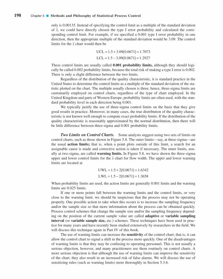
198 Chapter 5 ■ Methods and Philosophy of Statistical Process Control
only is 0.00135. Instead of specifying the control limit as a multiple of the standard deviation
of , we could have directly chosen the type I error probability and calculated the corre-
sponding control limit. For example, if we specified a 0.001 type I error probability in one
direction, then the appropriate multiple of the standard deviation would be 3.09. The control
limits for the chart would then be
These control limits are usually called 0.001 probability limits, although they should logi-
cally be called 0.002 probability limits, because the total risk of making a type I error is 0.002.
There is only a slight difference between the two limits.
Regardless of the distribution of the quality characteristic, it is standard practice in the
United States to determine the control limits as a multiple of the standard deviation of the sta-
tistic plotted on the chart. The multiple usually chosen is three; hence, three-sigma limits are
customarily employed on control charts, regardless of the type of chart employed. In the
United Kingdom and parts of Western Europe, probability limits are often used, with the stan-
dard probability level in each direction being 0.001.
We typically justify the use of three-sigma control limits on the basis that they give
good results in practice. Moreover, in many cases, the true distribution of the quality charac-
teristic is not known well enough to compute exact probability limits. If the distribution of the
quality characteristic is reasonably approximated by the normal distribution, then there will
be little difference between three-sigma and 0.001 probability limits.
Two Limits on Control Charts. Some analysts suggest using two sets of limits on
control charts, such as those shown in Figure 5.8. The outer limits—say, at three-sigma—are
the usual action limits; that is, when a point plots outside of this limit, a search for an
assignable cause is made and corrective action is taken if necessary. The inner limits, usu-
ally at two-sigma, are called warning limits. In Figure 5.8, we have shown the three-sigma
upper and lower control limits for the chart for flow width. The upper and lower warning
limits are located at
When probability limits are used, the action limits are generally 0.001 limits and the warning
limits are 0.025 limits.
If one or more points fall between the warning limits and the control limits, or very
close to the warning limit, we should be suspicious that the process may not be operating
properly. One possible action to take when this occurs is to increase the sampling frequency
and/or the sample size so that more information about the process can be obtained quickly.
Process control schemes that change the sample size and/or the sampling frequency depend-
ing on the position of the current sample value are called adaptive or variable samplinginterval (or variable sample size, etc.) schemes. These techniques have been used in prac-
tice for many years and have recently been studied extensively by researchers in the field. We
will discuss this technique again in Part IV of this book.
The use of warning limits can increase the sensitivity of the control chart; that is, it can
allow the control chart to signal a shift in the process more quickly. One of the disadvantages
of warning limits is that they may be confusing to operating personnel. This is not usually a
serious objection, however, and many practitioners use them routinely on control charts. A
more serious objection is that although the use of warning limits can improve the sensitivity
of the chart, they also result in an increased risk of false alarms. We will discuss the use of
sensitizing rules (such as warning limits) more thoroughly in Section 5.3.6.
LWL = − ( ) =1 5 2 0 0671 1 3658. . .
UWL = + ( ) =1 5 2 0 0671 1 6342. . .
x
LCL = − ( ) =1 5 3 09 0 0671 1 2927. . . .
UCL = + ( ) =1 5 3 09 0 0671 1 7073. . . .
x
x
c05MethodsAndPhilosophyOfStatisticalProcessControl.qxd 3/24/12 5:42 PM Page 198

5.3.3 Sample Size and Sampling Frequency
In designing a control chart, we must specify both the sample size and the frequency of sam-pling. In general, larger samples will make it easier to detect small shifts in the process. This
is demonstrated in Figure 5.9, where we have plotted the operating-characteristic curve for
the chart in Figure 5.3 for various sample sizes. Note that the probability of detecting a shift
from 1.500 microns to 1.650 microns (for example) increases as the sample size n increases.
When choosing the sample size, we must keep in mind the size of the shift that we are trying
to detect. If the process shift is relatively large, then we use smaller sample sizes than those
that would be employed if the shift of interest were relatively small.
We must also determine the frequency of sampling. The most desirable situation from the
point of view of detecting shifts would be to take large samples very frequently; however, this is
usually not economically feasible. The general problem is one of allocating sampling effort. That
is, either we take small samples at short intervals or larger samples at longer intervals. Current
industry practice tends to favor smaller, more frequent samples, particularly in high-volume man-
ufacturing processes, or where a great many types of assignable causes can occur. Furthermore, as
automatic sensing and measurement technology develops, it is becoming possible to greatly
increase sampling frequencies. Ultimately, every unit can be tested as it is manufactured.
Automatic measurement systems and microcomputers with SPC software applied at the work cen-
ter for real-time, on-line process control is an effective way to apply statistical process control.
Another way to evaluate the decisions regarding sample size and sampling frequency is
through the average run length (ARL) of the control chart. Essentially, the ARL is the aver-
age number of points that must be plotted before a point indicates an out-of-control condition.
If the process observations are uncorrelated, then for any Shewhart control chart, the ARL can
be calculated easily from
(5.2)
where p is the probability that any point exceeds the control limits. This equation can be used
to evaluate the performance of the control chart.
To illustrate, for the chart with three-sigma limits, p = 0.0027 is the probability that a
single point falls outside the limits when the process is in control. Therefore, the average run
length of the chart when the process is in control (called ARL0) is
ARL0
1 1
0 0027370= = =
p .
x
x
ARL = 1
p
x
5.3 Statistical Basis of the Control Chart 199
1.8
1.7
1.6
1.5
1.4
1.3
1.2
Sample number
LCL = 1.2487LWL = 1.3658
Center line = 1.5
UCL = 1.7013UWL = 1.6342
2 x
σ 3 x
σ
1.00.90.80.70.60.50.40.30.20.1
1.500 1.575 1.650 1.725 1.800 1.875
Process mean (microns)
Pro
babi
lity
of x
fal
ling
betw
een
the
cont
rol l
imit
s
n = 10
n = 5
n = 15
■ F I G U R E 5 . 8 An chart
with two-sigma and three-sigma
warning limits.
x ■ F I G U R E 5 . 9 Operating-characteristic curves
for an chart.x
c05MethodsAndPhilosophyOfStatisticalProcessControl.qxd 3/24/12 5:42 PM Page 199

200 Chapter 5 ■ Methods and Philosophy of Statistical Process Control
That is, even if the process remains in control, an out-of-control signal will be generated every
370 samples, on the average.
The use of average run lengths to describe the performance of control charts has been
subjected to criticism in recent years. The reasons for this arise because the distribution of run
length for a Shewhart control chart is a geometric distribution (refer to Section 3.2.4).
Consequently, there are two concerns with ARL: (1) the standard deviation of the run length
is very large, and (2) the geometric distribution is very skewed, so the mean of the distribu-
tion (the ARL) is not necessarily a very typical value of the run length.
For example, consider the Shewhart control chart with three-sigma limits. When the
process is in control, we have noted that p = 0.0027 and the in-control ARL0 is ARL0 =1/p = 1/0.0027 = 370. This is the mean of the geometric distribution. Now the standard devi-
ation of the geometric distribution is
That is, the standard deviation of the geometric distribution in this case is approximately equal
to its mean. As a result, the actual ARL0 observed in practice for the Shewhart control chart
will likely vary considerably. Furthermore, for the geometric distribution with p = 0.0027, the
tenth and fiftieth percentiles of the distribution are 38 and 256, respectively. This means that
approximately 10% of the time the in-control run length will be less than or equal to 38 sam-
ples and 50% of the time it will be less than or equal to 256 samples. This occurs because the
geometric distribution with p = 0.0027 is quite skewed to the right. For this reason, some ana-
lysts like to report percentiles of the run-length distribution instead of just the ARL.
It is also occasionally convenient to express the performance of the control chart in
terms of its average time to signal (ATS). If samples are taken at fixed intervals of time that
are h hours apart, then
(5.3)
Consider the hard-bake process discussed earlier, and suppose we are sampling every hour.
Equation 5.3 indicates that we will have a false alarm about every 370 hours on the average.
Now consider how the control chart performs in detecting shifts in the mean. Suppose we
are using a sample size of n = 5 and that when the process goes out of control the mean shifts
to 1.725 microns. From the operating characteristic curve in Figure 5.9 we find that if the
process mean is 1.725 microns, the probability of falling between the control limits is approx-
imately 0.35. Therefore, p in equation 5.2 is 0.35, and the out-of-control ARL (called ARL1) is
That is, the control chart will require 2.86 samples to detect the process shift, on the average,
and since the time interval between samples is h = 1 hour, the average time required to detect
this shift is
Suppose that this is unacceptable, because production of wafers with mean flow width of
1.725 microns results in excessive scrap costs and can result in further upstream manufac-
turing problems. How can we reduce the time needed to detect the out-of-control condition?
One method is to sample more frequently. For example, if we sample every half hour, then
the average time to signal for this scheme is ; that is, onlyATS = ARL1 h = 2.86(12) = 1.43
ATS ARL1= =h 2.86 (1) = 2.86 hours
ARL1
1 1
0.352.86= = =
p .
x
ATS ARL= h
x
1 1 0 0027 0 0027 370−( ) = −( ) ≅p p . .
x
c05MethodsAndPhilosophyOfStatisticalProcessControl.qxd 3/24/12 5:42 PM Page 200

1.43 hours will elapse (on the average) between the shift and its detection. The second pos-
sibility is to increase the sample size. For example, if we use n = 10, then Figure 5.9 shows
that the probability of falling between the control limits when the process mean is 1.725
microns is approximately 0.1, so that p = 0.9, and from equation 5.2 the out-of-control ARL
or ARL1 is
and, if we sample every hour, the average time to signal is
Thus, the larger sample size would allow the shift to be detected more quickly than with the
smaller one.
To answer the question of sampling frequency more precisely, we must take several fac-
tors into account, including the cost of sampling, the losses associated with allowing the
process to operate out of control, the rate of production, and the probabilities with which var-
ious types of process shifts occur. We discuss various methods for selecting an appropriate
sample size and sampling frequency for a control chart in the next four chapters.
5.3.4 Rational Subgroups
A fundamental idea in the use of control charts is the collection of sample data according to
what Shewhart called the rational subgroup concept. To illustrate this concept, suppose that
we are using an control chart to detect changes in the process mean. Then the rational sub-
group concept means that subgroups or samples should be selected so that if assignable causes
are present, the chance for differences between subgroups will be maximized, while the chance
for differences due to these assignable causes within a subgroup will be minimized.
When control charts are applied to production processes, the time order of production
is a logical basis for rational subgrouping. Even though time order is preserved, it is still
possible to form subgroups erroneously. If some of the observations in the sample are taken
at the end of one shift and the remaining observations are taken at the start of the next shift,
then any differences between shifts might not be detected. Time order is frequently a good
basis for forming subgroups because it allows us to detect assignable causes that occur over
time.
Two general approaches to constructing rational subgroups are used. In the first
approach, each sample consists of units that were produced at the same time (or as closely
together as possible). Ideally, we would like to take consecutive units of production. This
approach is used when the primary purpose of the control chart is to detect process shifts. It
minimizes the chance of variability due to assignable causes within a sample, and it maxi-
mizes the chance of variability between samples if assignable causes are present. It also pro-
vides a better estimate of the standard deviation of the process in the case of variables control
charts. This approach to rational subgrouping essentially gives a snapshot of the process at
each point in time where a sample is collected.
Figure 5.10 illustrates this type of sampling strategy. In Figure 5.10a we show a process
for which the mean experiences a series of sustained shifts, and the corresponding observa-
tions obtained from this process at the points in time along the horizontal axis, assuming that
five consecutive units are selected. Figure 5.10b shows the control chart and an R chart(or range chart) for these data. The center line and control limits on the R chart are con-
structed using the range of each sample in the upper part of the figure (details will be given in
Chapter 6). Note that although the process mean is shifting, the process variability is stable.
Furthermore, the within-sample measure of variability is used to construct the control limits
x
x
ATS ARL hours1= = ( ) =h 1 11 1 1 11. .
ARL1
1 1
0 91 11= = =
p ..
x
5.3 Statistical Basis of the Control Chart 201
c05MethodsAndPhilosophyOfStatisticalProcessControl.qxd 3/24/12 5:42 PM Page 201

202 Chapter 5 ■ Methods and Philosophy of Statistical Process Control
on the chart. Note that the chart in Figure 5.10b has points out of control corresponding
to the shifts in the process mean.
In the second approach, each sample consists of units of product that are representative
of all units that have been produced since the last sample was taken. Essentially, each sub-
group is a random sample of all process output over the sampling interval. This method
of rational subgrouping is often used when the control chart is employed to make decisions
about the acceptance of all units of product that have been produced since the last sample. In
fact, if the process shifts to an out-of-control state and then back in control again betweensamples, it is sometimes argued that the snapshot method of rational subgrouping will be inef-
fective against these types of shifts, and so the random sample method must be used.
When the rational subgroup is a random sample of all units produced over the sampling
interval, considerable care must be taken in interpreting the control charts. If the process mean
drifts between several levels during the interval between samples, this may cause the range of
the observations within the sample to be relatively large, resulting in wider limits on the
chart. This scenario is illustrated in Figure 5.11. In fact, we can often make any processappear to be in statistical control just by stretching out the interval between observa-tions in the sample. It is also possible for shifts in the process average to cause points on a
control chart for the range or standard deviation to plot out of control, even though there has
been no shift in process variability.
There are other bases for forming rational subgroups. For example, suppose a process
consists of several machines that pool their output into a common stream. If we sample from
this common stream of output, it will be very difficult to detect whether any of the machines
are out of control. A logical approach to rational subgrouping here is to apply control chart
techniques to the output for each individual machine. Sometimes this concept needs to be
applied to different heads on the same machine, different work stations, different operators,
and so forth. In many situations, the rational subgroup will consist of a single observation.
This situation occurs frequently in the chemical and process industries where the quality
x
xx
x
Processmean
μ
1 2 3 4 5 6 7 8 9 10 11 12
Time
(a)
UCLx
LCLx
CLx ( )μ
1 2 3 4 5 6 7 8 9 10 11 12
Time
(b)
UCLR
CLR
Processmean
x
μ
1 2 3 4 5 6 7 8 9 101112
Time
CLx ( )μ
UCLx
LCLx
UCLR
CLR
1 2 3 4 5 6 7 8 9 101112
Time
(a)
(b)
■ F I G U R E 5 . 1 0 The snapshot approach to
rational subgroups. (a) Behavior of the process mean.
(b) Corresponding and R control charts.x
■ F I G U R E 5 . 1 1 The random sample
approach to rational subgroups. (a) Behavior of
the process mean. (b) Corresponding and Rcontrol charts.
x
c05MethodsAndPhilosophyOfStatisticalProcessControl.qxd 3/24/12 5:42 PM Page 202

characteristic of the product changes relatively slowly and samples taken very close together
in time are virtually identical, apart from measurement or analytical error.
The rational subgroup concept is very important. The proper selection of samples
requires careful consideration of the process, with the objective of obtaining as much useful
information as possible from the control chart analysis.
5.3.5 Analysis of Patterns on Control Charts
Patterns on control charts must be assessed. A control chart may indicate an out-of-control
condition when one or more points fall beyond the control limits or when the plotted points
exhibit some nonrandom pattern of behavior. For example, consider the chart shown in
Figure 5.12. Although all 25 points fall within the control limits, the points do not indicate
statistical control because their pattern is very nonrandom in appearance. Specifically, we
note that 19 of 25 points plot below the center line, while only 6 of them plot above. If the points
truly are random, we should expect a more even distribution above and below the center line.
We also observe that following the fourth point, five points in a row increase in magnitude.
This arrangement of points is called a run. Since the observations are increasing, we could
call this a run up. Similarly, a sequence of decreasing points is called a run down. This con-
trol chart has an unusually long run up (beginning with the fourth point) and an unusually
long run down (beginning with the eighteenth point).
In general, we define a run as a sequence of observations of the same type. In addition
to runs up and runs down, we could define the types of observations as those above and below
the center line, respectively, so that two points in a row above the center line would be a run
of length 2.
A run of length 8 or more points has a very low probability of occurrence in a random
sample of points. Consequently, any type of run of length 8 or more is often taken as a signal
of an out-of-control condition. For example, eight consecutive points on one side of the cen-
ter line may indicate that the process is out of control.
Although runs are an important measure of nonrandom behavior on a control chart,
other types of patterns may also indicate an out-of-control condition. For example, consider
the chart in Figure 5.13. Note that the plotted sample averages exhibit a cyclic behavior, yet
they all fall within the control limits. Such a pattern may indicate a problem with the process
such as operator fatigue, raw material deliveries, heat or stress buildup, and so forth. Although
the process is not really out of control, the yield may be improved by elimination or reduc-
tion of the sources of variability causing this cyclic behavior (see Fig. 5.14).
The problem is one of pattern recognition—that is, recognizing systematic or nonran-
dom patterns on the control chart and identifying the reason for this behavior. The ability to
interpret a particular pattern in terms of assignable causes requires experience and knowledge
x
x
5.3 Statistical Basis of the Control Chart 203
UCL
Centerline
LCL
x
1 3 5 7 9 11 13 15 17 19 21 23 25
Sample number
UCL
Centerline
LCL
1 2 3 4 5 6 7 8 9 10111213 14 15
Sample number
x
■ F I G U R E 5 . 1 2 An control chart.x ■ F I G U R E 5 . 1 3 An chart with a cyclic
pattern.
x
c05MethodsAndPhilosophyOfStatisticalProcessControl.qxd 3/24/12 5:42 PM Page 203
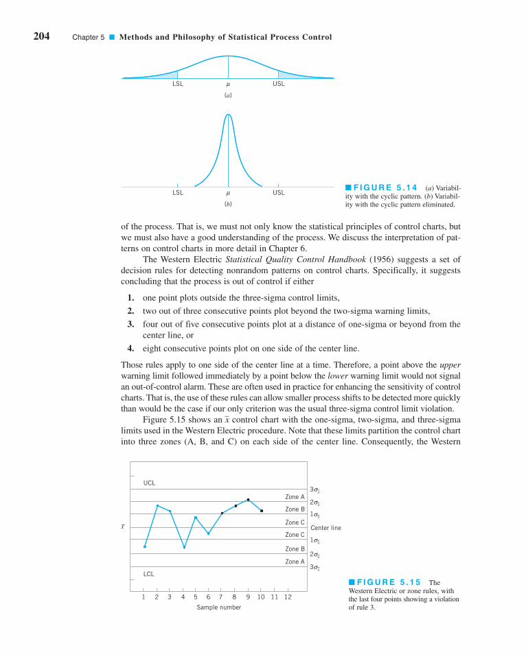
204 Chapter 5 ■ Methods and Philosophy of Statistical Process Control
of the process. That is, we must not only know the statistical principles of control charts, but
we must also have a good understanding of the process. We discuss the interpretation of pat-
terns on control charts in more detail in Chapter 6.
The Western Electric Statistical Quality Control Handbook (1956) suggests a set of
decision rules for detecting nonrandom patterns on control charts. Specifically, it suggests
concluding that the process is out of control if either
1. one point plots outside the three-sigma control limits,
2. two out of three consecutive points plot beyond the two-sigma warning limits,
3. four out of five consecutive points plot at a distance of one-sigma or beyond from the
center line, or
4. eight consecutive points plot on one side of the center line.
Those rules apply to one side of the center line at a time. Therefore, a point above the upperwarning limit followed immediately by a point below the lower warning limit would not signal
an out-of-control alarm. These are often used in practice for enhancing the sensitivity of control
charts. That is, the use of these rules can allow smaller process shifts to be detected more quickly
than would be the case if our only criterion was the usual three-sigma control limit violation.
Figure 5.15 shows an control chart with the one-sigma, two-sigma, and three-sigma
limits used in the Western Electric procedure. Note that these limits partition the control chart
into three zones (A, B, and C) on each side of the center line. Consequently, the Western
x
LSL USLμ
(b)
LSL USLμ
(a)
■ F I G U R E 5 . 1 4 (a) Variabil-
ity with the cyclic pattern. (b) Variabil-
ity with the cyclic pattern eliminated.
11 1210987654321
UCL
LCL
Zone A
Zone B
Zone CCenter line
Zone C
Zone A
Zone B
3 xσ
2 xσ
1 xσ
1 xσ
2 xσ
3 xσ
Sample number
x
■ F I G U R E 5 . 1 5 The
Western Electric or zone rules, with
the last four points showing a violation
of rule 3.
c05MethodsAndPhilosophyOfStatisticalProcessControl.qxd 3/24/12 5:42 PM Page 204

Electric rules are sometimes called the zone rules for control charts. Note that the last four
points fall in zone B or beyond. Thus, since four of five consecutive points exceed the one-
sigma limit, the Western Electric procedure will conclude that the pattern is nonrandom and
the process is out of control.
5.3.6 Discussion of Sensitizing Rules for Control Charts
As may be gathered from earlier sections, several criteria may be applied simultaneously to a
control chart to determine whether the process is out of control. The basic criterion is one or
more points outside of the control limits. The supplementary criteria are sometimes used to
increase the sensitivity of the control charts to a small process shift so that we may respond
more quickly to the assignable cause. Some of the sensitizing rules for control charts that
are widely used in practice are shown in Table 5.1. For a good discussion of some of these
rules, see Nelson (1984). Frequently, we will inspect the control chart and conclude that the
process is out of control if any one or more of the criteria in Table 5.1 are met.
When several of these sensitizing rules are applied simultaneously, we often use a grad-uated response to out-of-control signals. For example, if a point exceeded a control limit, we
would immediately begin to search for the assignable cause, but if one or two consecutive
points exceeded only the two-sigma warning limit, we might increase the frequency of sam-
pling from every hour to say, every ten minutes. This adaptive sampling response might not
be as severe as a complete search for an assignable cause, but if the process were really out
of control, it would give us a high probability of detecting this situation more quickly than we
would by maintaining the longer sampling interval.
In general, care should be exercised when using several decision rules simultaneously.
Suppose that the analyst uses k decision rules and that criterion i has type I error probability ai.
Then the overall type I error or false alarm probability for the decision based on all k tests is
(5.4)α α= − −( )=∏1 1
1i
i
k
5.3 Statistical Basis of the Control Chart 205
■ TA B L E 5 . 1
Some Sensitizing Rules for Shewhart Control Charts
Standard Action Signal: 1. One or more points outside of the control limits
2. Two of three consecutive points outside the two-sigma warning limits but still inside the control limits
3. Four of five consecutive points beyond the one-sigma limits
4. A run of eight consecutive points on one side of thecenter line
5. Six points in a row steadily increasing or decreasing
6. Fifteen points in a row in zone C (both above andbelow the center line)
7. Fourteen points in a row alternating up and down
8. Eight points in a row on both sides of the centerline with none in zone C
9. An unusual or nonrandom pattern in the data
10. One or more points near a warning or control limit
WesternElectricRules
c05MethodsAndPhilosophyOfStatisticalProcessControl.qxd 3/24/12 5:42 PM Page 205

206 Chapter 5 ■ Methods and Philosophy of Statistical Process Control
provided that all k decision rules are independent. However, the independence assumption is
not valid with the usual sensitizing rules. Furthermore, the value of ai is not always clearly
defined for the sensitizing rules, because these rules involve several observations.
Champ and Woodall (1987) investigated the average run length performance for the
Shewhart control chart with various sensitizing rules. They found that the use of these rules
does improve the ability of the control chart to detect smaller shifts, but the in-control aver-
age run length can be substantially degraded. For example, assuming independent process data
and using a Shewhart control chart with the Western Electric rules results in an in-control ARL
of 91.25, in contrast to 370 for the Shewhart control chart alone.
Some of the individual Western Electric rules are particularly troublesome. An illustra-
tion is the rule of several (usually seven or eight) consecutive points that either increase or
decrease. This rule is very ineffective in detecting a trend, the situation for which it was
designed. It does, however, greatly increase the false alarm rate. See Davis and Woodall (1988)
for more details.
5.3.7 Phase I and Phase II of Control Chart Application
Standard control chart usage involves phase I and phase II applications, with two different
and distinct objectives. In phase I, a set of process data is gathered and analyzed all at once
in a retrospective analysis, constructing trial control limits to determine if the process has
been in control over the period of time during which the data were collected, and to see if reli-
able control limits can be established to monitor future production. This is typically the first
thing that is done when control charts are applied to any process. Control charts in phase I
primarily assist operating personnel in bringing the process into a state of statistical control.
Phase II begins after we have a “clean” set of process data gathered under stable conditions
and representative of in-control process performance. In phase II, we use the control chart to
monitor the process by comparing the sample statistic for each successive sample as it is
drawn from the process to the control limits.
Thus, in phase I we are comparing a collection of, say, m points to a set of control lim-
its computed from those points. Typically m = 20 or 25 subgroups are used in phase I. It is
fairly typical in phase I to assume that the process is initially out of control, so the objective
of the analyst is to bring the process into a state of statistical control. Control limits are cal-
culated based on the m subgroups and the data plotted on the control charts. Points that are
outside the control limits are investigated, looking for potential assignable causes. Any
assignable causes that are identified are worked on by engineering and operating personnel in
an effort to eliminate them. Points outside the control limits are then excluded and a new set
of revised control limits are calculated. Then new data are collected and compared to these
revised limits. Sometimes this type of analysis will require several cycles in which the con-
trol chart is employed, assignable causes are detected and corrected, revised control limits are
calculated, and the out-of-control action plan is updated and expanded. Eventually the process
is stabilized, and a clean set of data that represents in-control process performance is obtained
for use in phase II.
Generally, Shewhart control charts are very effective in phase I because they are easy to
construct and interpret, and because they are effective in detecting both large, sustained shifts
in the process parameters and outliers (single excursions that may have resulted from assigna-
ble causes of short duration), measurement errors, data recording and/or transmission errors,
and the like. Furthermore, patterns on Shewhart control charts often are easy to interpret and
have direct physical meaning. The sensitizing rules discussed in the previous sections are also
easy to apply to Shewhart charts. (This is an optional feature in most SPC software.) The types
of assignable causes that usually occur in phase I result in fairly large process shifts—exactly
c05MethodsAndPhilosophyOfStatisticalProcessControl.qxd 3/24/12 5:42 PM Page 206
the scenario in which the Shewhart control chart is most effective. Average run length is not
usually a reasonable performance measure for phase I; we are typically more interested in the
probability that an assignable cause will be detected than in the occurrence of false alarms. For
good discussions of phase I control chart usage and related matters, see the papers by Woodall
(2000), Borror and Champ (2001), Boyles (2000), and Champ and Chou (2003), and the stan-
dard ANSI/ASQC B1–133–1996 Quality Control Chart Methodologies.
In phase II, we usually assume that the process is reasonably stable. Often, the assign-
able causes that occur in phase II result in smaller process shifts, because (it is hoped) most
of the really ugly sources of variability have been systematically removed during phase I. Our
emphasis is now on process monitoring, not on bringing an unruly process under control.
Average run length is a valid basis for evaluating the performance of a control chart in phase II.
Shewhart control charts are much less likely to be effective in phase II because they are not
very sensitive to small to moderate size process shifts; that is, their ARL performance is relatively
poor. Attempts to solve this problem by employing sensitizing rules such as those discussed in
the previous section are likely to be unsatisfactory, because the use of these supplemental sensi-
tizing rules increases the false alarm rate of the Shewhart control chart. [Recall the discussion of
the Champ and Woodall (1987) paper in the previous section.] The routine use of sensitizing rules
to detect small shifts or to react more quickly to assignable causes in phase II should be discour-
aged. The cumulative sum and EWMA control charts discussed in Chapter 9 are much more
likely to be effective in phase II.
5.4 The Rest of the Magnificent Seven
Although the control chart is a very powerful problem-solving and process-improvement tool,
it is most effective when its use is fully integrated into a comprehensive SPC program. The
seven major SPC problem-solving tools should be widely taught throughout the organization
and used routinely to identify improvement opportunities and to assist in reducing variability
and eliminating waste. They can be used in several ways throughout the DMAIC problem-
solving process. The magnificent seven, introduced in Section 5.1, are listed again here for
convenience:
1. Histogram or stem-and-leaf plot
2. Check sheet
3. Pareto chart
4. Cause-and-effect diagram
5. Defect concentration diagram
6. Scatter diagram
7. Control chart
We introduced the histogram and the stem-and-leaf plot in Chapter 3 and discussed the con-
trol chart in Section 5.3. In this section, we illustrate the rest of the tools.
Check Sheet. In the early stages of process improvement, it will often become
necessary to collect either historical or current operating data about the process under
investigation. This is a common activity in the measure step of DMAIC. A check sheetcan be very useful in this data collection activity. The check sheet shown in Figure 5.16
was developed by an aerospace firm engineer who was investigating defects that occurred
on one of the firm’s tanks. The engineer designed the check sheet to help summarize all
5.4 The Rest of the Magnificent Seven 207
c05MethodsAndPhilosophyOfStatisticalProcessControl.qxd 3/24/12 5:42 PM Page 207

208 Chapter 5 ■ Methods and Philosophy of Statistical Process Control
the historical defect data available on the tanks. Because only a few tanks were manufac-
tured each month, it seemed appropriate to summarize the data monthly and to identify as
many different types of defects as possible. The time-oriented summary is particularly
valuable in looking for trends or other meaningful patterns. For example, if many defects
occur during the summer, one possible cause might be the use of temporary workers dur-
ing a heavy vacation period.
When designing a check sheet, it is important to clearly specify the type of data to be
collected, the part or operation number, the date, the analyst, and any other information use-
ful in diagnosing the cause of poor performance. If the check sheet is the basis for perform-
ing further calculations or is used as a worksheet for data entry into a computer, then it is
important to be sure that the check sheet will be adequate for this purpose. In some cases, a
trial run to validate the check sheet layout and design may be helpful.
Pareto Chart. The Pareto chart is simply a frequency distribution (or his-
togram) of attribute data arranged by category. Pareto charts are often used in both the
■ F I G U R E 5 . 1 6 A check sheet to record defects on a tank used in an aerospace application.
CHECK SHEETDEFECT DATA FOR 2002–2003 YTD
Part No.: TAX-41Location: BellevueStudy Date: 6/5/03Analyst: TCB
2002 2003
Defect 1 2 3 4 5 6 7 8 9 10 11 12 1 2 3 4 5 Total
Parts damaged 1 3 1 2 1 10 3 2 2 7 2 34
Machining problems 3 3 1 8 3 8 3 29
Supplied parts rusted 1 1 2 9 13
Masking insufficient 3 6 4 3 1 17
Misaligned weld 2 2
Processing out of order 2 2 4
Wrong part issued 1 2 3
Unfinished fairing 3 3
Adhesive failure 1 1 2 1 1 6
Powdery alodine 1 1
Paint out of limits 1 1 2
Paint damaged by etching 1 1
Film on parts 3 1 1 5
Primer cans damaged 1 1
Voids in casting 1 1 2
Delaminated composite 2 2
Incorrect dimensions 13 7 13 1 1 1 36
Improper test procedure 1 1
Salt-spray failure 4 2 4
TOTAL 4 5 14 12 5 9 9 6 10 14 20 7 29 7 7 6 2 166
c05MethodsAndPhilosophyOfStatisticalProcessControl.qxd 3/24/12 5:42 PM Page 208

Measure and Analyze steps of DMAIC. To illustrate a Pareto chart, consider the tank
defect data presented in Figure 5.16. Plotting the total frequency of occurrence of each
defect type (the last column of the table in Fig. 5.16) against the various defect types will
produce Figure 5.17, which is called a Pareto chart.3 Through this chart, the user can
quickly and visually identify the most frequently occurring types of defects. For example,
Figure 5.17 indicates that incorrect dimensions, parts damaged, and machining are the
most commonly encountered defects. Thus the causes of these defect types probably
should be identified and attacked first.
Note that the Pareto chart does not automatically identify the most important defects,
but only the most frequent. For example, in Figure 5.17 casting voids occur very infre-
quently (2 of 166 defects, or 1.2%). However, voids could result in scrapping the tank, a
potentially large cost exposure—perhaps so large that casting voids should be elevated to a
major defect category. When the list of defects contains a mixture of defects that might have
extremely serious consequences and others of much less importance, one of two methods
can be used:
1. Use a weighting scheme to modify the frequency counts. Weighting schemes for defects
are discussed in Chapter 7.
2. Accompany the frequency Pareto chart analysis with a cost or exposure Pareto chart.
There are many variations of the basic Pareto chart. Figure 5.18a shows a Pareto chart
applied to an electronics assembly process using surface-mount components. The vertical
axis is the percentage of components incorrectly located, and the horizontal axis is the com-
ponent number, a code that locates the device on the printed circuit board. Note that loca-
tions 27 and 39 account for 70% of the errors. This may be the result of the type or size of
components at these locations, or of where these locations are on the board layout. Figure
5.18b presents another Pareto chart from the electronics industry. The vertical axis is the
number of defective components, and the horizontal axis is the component number. Note that
each vertical bar has been broken down by supplier to produce a stacked Pareto chart. This
5.4 The Rest of the Magnificent Seven 209
Inco
rr d
imen
sion
s
36
Par
ts d
amag
ed
34
Mac
hini
ng
29
Insu
ff m
aski
ng
17
Adh
esiv
e fa
ilure
13
Film
on
part
s
6
Sal
t sp
ray
failu
re
5
Out
of
orde
r
4
Unf
inis
hed
fair
ing
4
Wro
ng p
art
issu
ed
3
Wel
d m
isal
igne
d
3
Pai
nt o
ut o
f sp
ec
2
Del
am c
ompo
site
2
Void
s in
cas
ting
2
Pai
nt d
amag
ed
2
Pri
mer
dam
aged
1
Impr
oper
pro
cedu
re
1
Pow
dery
alo
dine
1 1
Par
ts r
uste
d0
10
20
30
40
3The name Pareto chart is derived from Italian economist Vilfredo Pareto (1848–1923), who theorized that in cer-
tain economies the majority of the wealth was held by a disproportionately small segment of the population. Quality
engineers have observed that defects usually follow a similar Pareto distribution.
■ F I G U R E 5 . 1 7 Pareto chart of
the tank defect data.
c05MethodsAndPhilosophyOfStatisticalProcessControl.qxd 3/24/12 5:42 PM Page 209

210 Chapter 5 ■ Methods and Philosophy of Statistical Process Control
analysis clearly indicates that supplier A provides a disproportionately large share of the
defective components.
Pareto charts are widely used in nonmanufacturing applications of quality improve-
ment methods. A Pareto chart used by a quality improvement team in a procurement organi-
zation is shown in Figure 5.18c. The team was investigating errors on purchase orders in an
effort to reduce the organization’s number of purchase order changes. (Each change typically
cost between $100 and $500, and the organization issued several hundred purchase order
changes each month.) This Pareto chart has two scales: one for the actual error frequency and
another for the percentage of errors. Figure 5.18d presents a Pareto chart constructed by a
quality improvement team in a hospital to reflect the reasons for cancellation of scheduled
outpatient surgery.
In general, the Pareto chart is one of the most useful of the magnificent seven. Its appli-
cations to quality improvement are limited only by the ingenuity of the analyst.
Cause-and-Effect Diagram. Once a defect, error, or problem has been identified
and isolated for further study, we must begin to analyze potential causes of this undesirable
effect. In situations where causes are not obvious (sometimes they are), the cause-and-effectdiagram is a formal tool frequently useful in unlayering potential causes. The cause-and-effect
diagram is very useful in the Analyze and Improve steps of DMAIC. The cause-and-effect dia-
gram constructed by a quality improvement team assigned to identify potential problem areas
42
27
28
39
10
3
9
68
5
139
4
19
2
46
Per
cent
age
of c
ompo
nent
sin
corr
ectl
y lo
cate
d
Component number
(a)
16 8 39 64 2 118
Num
ber
of d
efec
tive
com
pone
nts
Component number
(b)
(d)
= Supplier A
= Supplier B
94
Wrongcontractnumber
80
Wrongpro-
cedure
66
Wrongsupplier
code
33
Wrongpart
number
27
Wrongschedule
data
300
200
100
0
100
90
80
70
60
50
40
30
20
10
Err
or f
requ
ency
Per
cent
age
of e
rror
s
(c)
31.3
58.0
80.0
91.0
CompletedHistory,Physical,and Lab
37
MedicalClearance
14
Miscel-laneous
10
Resched-uled
6
Anesthesia
3
Finan-cial
40
30
20
10
0 0
20
40
60
80
100
Cum
ulat
ive
perc
enta
ge
Num
ber
of o
ccur
renc
es
38
■ F I G U R E 5 . 1 8 Examples of Pareto charts.
c05MethodsAndPhilosophyOfStatisticalProcessControl.qxd 3/24/12 5:42 PM Page 210

In analyzing the tank defect problem, the team elected to lay out the major categories of
tank defects as machines, materials, methods, personnel, measurement, and environment. A
brainstorming session ensued to identify the various subcauses in each of these major categories
and to prepare the diagram in Figure 5.19. Then through discussion and the process of elimina-
tion, the group decided that materials and methods contained the most likely cause categories.
5.4 The Rest of the Magnificent Seven 211
How to Construct a Cause-and-Effect Diagram
1. Define the problem or effect to be analyzed.
2. Form the team to perform the analysis. Often the team will uncover potential
causes through brainstorming.
3. Draw the effect box and the center line.
4. Specify the major potential cause categories and join them as boxes connected to
the center line.
5. Identify the possible causes and classify them into the categories in step 4. Create
new categories, if necessary.
6. Rank order the causes to identify those that seem most likely to impact the problem.
7. Take corrective action.
Paint spray
speedWorn
tool Wrong
toolToo much
play
Surface
finishPaint flow
rate
Incorrect
specifications
Faulty
gauge
Inspectors don't
understandspecification
Defective from
supplier
Poor
attitude
Damaged in
handling
Paint
viscosity
Primer
type
Primer
viscosity
Inadequate
supervision
Insufficient
training
Wrong work
sequence
Planning
Materials
handling
Ambient
temperaturetoo high
Dust
Defects ontanks
Measurement Personnel
Machines Materials Methods
■ F I G U R E 5 . 1 9 Cause-and-effect diagram for the tank defect problem.
in the tank manufacturing process mentioned earlier is shown in Figure 5.19. The steps in con-
structing the cause-and-effect diagram are as follows:
c05MethodsAndPhilosophyOfStatisticalProcessControl.qxd 3/24/12 5:42 PM Page 211

212 Chapter 5 ■ Methods and Philosophy of Statistical Process Control
Cause-and-effect analysis is an extremely powerful tool. A highly detailed cause-and-
effect diagram can serve as an effective troubleshooting aid. Furthermore, the construction of
a cause-and-effect diagram as a team experience tends to get people involved in attacking a
problem rather than in affixing blame.
Defect Concentration Diagram. A defect concentration diagram is a picture of
the unit, showing all relevant views. Then the various types of defects are drawn on the pic-
ture, and the diagram is analyzed to determine whether the location of the defects on the unit
conveys any useful information about the potential causes of the defects. Defect concentra-
tion diagrams are very useful in the analyze step of DMAIC.
Figure 5.20 presents a defect concentration diagram for the final assembly stage of a
refrigerator manufacturing process. Surface-finish defects are identified by the dark shaded
areas on the refrigerator. From inspection of the diagram it seems clear that materials han-
dling is responsible for the majority of these defects. The unit is being moved by securing a
belt around the middle, and this belt is either too loose or tight, worn out, made of abrasive
material, or too narrow. Furthermore, when the unit is moved the corners are being damaged.
It is possible that worker fatigue is a factor. In any event, proper work methods and improved
materials handling will likely improve this process dramatically.
Figure 5.21 shows the defect concentration diagram for the tank problem mentioned
earlier. Note that this diagram shows several different broad categories of defects, each iden-
tified with a specific code. Often different colors are used to indicate different types of
defects.
When defect data are portrayed on a defect concentration diagram over a sufficient
number of units, patterns frequently emerge, and the location of these patterns often contains
much information about the causes of the defects. We have found defect concentration dia-
grams to be important problem-solving tools in many industries, including plating, painting
and coating, casting and foundry operations, machining, and electronics assembly.
Scatter Diagram. The scatter diagram is a useful plot for identifying a potential
relationship between two variables. Data are collected in pairs on the two variables—say,
(yi, xi)—for i = 1, 2, . . . , n. Then yi is plotted against the corresponding xi. The shape of the
scatter diagram often indicates what type of relationship may exist between the two variables.
Scatter diagrams are very useful in regression modeling, introduced in Chapter 3. Regression
is a very useful technique in the analyze step of DMAIC.
Figure 5.22 shows a scatter diagram relating metal recovery (in percent) from a mag-
nathermic smelting process for magnesium against corresponding values of the amount of
Top
Bottom
Leftside
Front Back Rightside
Left-handside
Bottom Right-handside
Topend
Bottomend
Tank numberSerial number
Defect CodesA = ScratchB = NickC = ScuffD = Moon
■ F I G U R E 5 . 2 0 Surface-finish
defects on a refrigerator.
■ F I G U R E 5 . 2 1 Defect concentration diagram
for the tank.
c05MethodsAndPhilosophyOfStatisticalProcessControl.qxd 3/24/12 5:42 PM Page 212

reclaim flux added to the crucible. The scatter diagram indicates a strong positive correla-tion between metal recovery and flux amount; that is, as the amount of flux added is increased,
the metal recovery also increases. It is tempting to conclude that the relationship is one based
on cause and effect: By increasing the amount of reclaim flux used, we can always ensure
high metal recovery. This thinking is potentially dangerous, because correlation does not nec-essarily imply causality. This apparent relationship could be caused by something quite dif-
ferent. For example, both variables could be related to a third one, such as the temperature of
the metal prior to the reclaim pouring operation, and this relationship could be responsible for
what we see in Figure 5.22. If higher temperatures lead to higher metal recovery and the prac-
tice is to add reclaim flux in proportion to temperature, adding more flux when the process is
running at low temperature will do nothing to enhance yield. The scatter diagram is useful for
identifying potential relationships. Designed experiments [see Montgomery (2009)] mustbe used to verify causality.
5.5 Implementing SPC in a Quality Improvement Program
The methods of statistical process control can provide significant payback to those compa-
nies that can successfully implement them. Although SPC seems to be a collection of sta-
tistically based problem-solving tools, there is more to the successful use of SPC than
learning and using these tools. SPC is most effective when it is integrated into an overall,
companywide quality improvement program. It can be implemented using the DMAIC
approach. Indeed, the basic SPC tools are an integral part of DMAIC. Managementinvolvement and commitment to the quality improvement process are the most vital com-
ponents of SPC’s potential success. Management is a role model, and others in the orga-
nization look to management for guidance and as an example. A team approach is also
important, as it is usually difficult for one person alone to introduce process improvements.
Many of the magnificent seven are helpful in building an improvement team, including
cause-and-effect diagrams, Pareto charts, and defect concentration diagrams. This team
approach also fits well with DMAIC. The basic SPC problem-solving tools must become
widely known and widely used throughout the organization. Ongoing education of person-
nel about SPC and other methods for reducing variability are necessary to achieve this
widespread knowledge of the tools.
The objective of an SPC-based variability reduction program is continuous improve-
ment on a weekly, quarterly, and annual basis. SPC is not a one-time program to be applied
when the business is in trouble and later abandoned. Quality improvement that is focused on
reduction of variability must become part of the culture of the organization.
5.5 Implementing SPC in a Quality Improvement Program 213
100
90
80
70
0 5 10 15 20 25 30 35Reclaim flux (lb)
Met
al r
ecov
ery
(%)
■ F I G U R E 5 . 2 2 A scatter diagram.
c05MethodsAndPhilosophyOfStatisticalProcessControl.qxd 3/24/12 5:42 PM Page 213
214 Chapter 5 ■ Methods and Philosophy of Statistical Process Control
The control chart is an important tool for process improvement. Processes do not natu-
rally operate in an in-control state, and the use of control charts is an important step that must
be taken early in an SPC program to eliminate assignable causes, reduce process variability,
and stabilize process performance. To improve quality and productivity, we must begin to
manage with facts and data, and not simply rely on judgment. Control charts are an important
part of this change in management approach.
In implementing a companywide effort to reduce variability and improve quality, we
have found that several elements are usually present in all successful efforts. These elements
are as follows:
Elements of a Successful SPC Program
1. Management leadership
2. A team approach, focusing on project-oriented applications
3. Education of employees at all levels
4. Emphasis on reducing variability
5. Measuring success in quantitative (economic) terms
6. A mechanism for communicating successful results throughout the organization
We cannot overemphasize the importance of management leadership and the team/projectapproach. Successful quality improvement is a “top-down” management-driven activity. It is
also important to measure progress and success in quantitative (economic) terms and to
spread knowledge of this success throughout the organization. When successful improve-
ments are communicated throughout the company, this can provide motivation and incentive
to improve other processes and to make continuous improvement a usual part of the way of
doing business.
5.6 An Application of SPC
In this section, we give an account of how SPC methods were used to improve quality and
productivity in a copper plating operation at a printed circuit board fabrication facility. This
process was characterized by high levels of defects such as brittle copper and copper voids
and by long cycle time. The long cycle time was particularly troublesome, as it had led to an
extensive work backlog and was a major contributor to poor conformance to the factory pro-
duction schedule.
Management chose this process area for an initial implementation of SPC. The DMAIC
approach was used. An improvement team was formed, consisting of the plating tank opera-
tor, the manufacturing engineer responsible for the process, and a quality engineer. All members
of the team had been exposed to DMAIC and the magnificent seven in a company-sponsored
seminar. During the define step, it was decided to concentrate on reducing the flow time
through the process, as the missed delivery targets were considered to be the most serious
obstacle to improving productivity. The team quickly determined (during the Measure step)
c05MethodsAndPhilosophyOfStatisticalProcessControl.qxd 3/24/12 5:42 PM Page 214

that excessive downtime on the controller that regulated the copper concentration in the plat-
ing tank was a major factor in the excessive flow time; controller downtime translated directly
into lost production.
As part of the Analyze step, the team decided to use a cause-and-effect analysis to begin
to isolate the potential causes of controller downtime. Figure 5.23 shows the cause-and-effect
diagram that was produced during a brainstorming session. The team was able to quickly
identify 11 major potential causes of controller downtime. However, when they examined the
equipment logbook to make a more definitive diagnosis of the causes of downtime based on
actual process performance, the results were disappointing. The logbook contained little use-
ful information about causes of downtime; instead, it contained only a chronological record
of when the machine was up and when it was down.
The team then decided that it would be necessary to collect valid data about the causes
of controller downtime. They designed the check sheet shown in Figure 5.24 as a supple-
mental page for the logbook. The team agreed that whenever the equipment was down, one
team member would assume responsibility for filling out the check sheet. Note that the major
causes of controller downtime identified on the cause-and-effect diagram were used to struc-
ture the headings and subheadings on the check sheet. The team agreed that data would be
collected over a four- to six-week period.
As more reliable data concerning the causes of controller downtime became avail-
able, the team was able to analyze it using other SPC techniques. Figure 5.25 presents the
Pareto analysis of the controller failure data produced during the six-week study of the
process. Note that concentration variation is a major cause of downtime. Actually, the sit-
uation is probably more complex than it appears. The third largest category of downtime
causes is reagent replenishment. Frequently, the reagent in the colorimeter on the controller
is replenished because concentration has varied so far outside the process specifications
that reagent replenishment and colorimeter recalibration constitute the only step that can
be used to bring the process back on-line. Therefore, it is possible that up to 50% of the
downtime associated with controller failures can be attributed to concentration variation.
5.6 An Application of SPC 215
New
reagent
Electrode
drift
Controllerdowntime
PV circuit
card
Power
supply CL
Mother
board
Buildup
in joints
Burned out
heater
Bad
thermistors
Electrode
replacement
Weekly
maintenance
Emergency
Routine
PMC down
Lockout
Air lock
Motor
failure
Colorimeter
CL
ImpellerPlates
out
Deformed
tubes
Reagents
Oper/Error/unauthorized
Colorimeter
drift
Parastolicpumpfailure
Reagentreplenishing
Electricalfailure
Temperaturecontroller
Tubingmaintenance
Alarmsystemfailure
Concentrationvariation
Plate-outrecirculating
system
Oxygencontroller
Electrodereplacement
Recirculatingpumpfailure
maintenance
maintenance
■ F I G U R E 5 . 2 3 Cause-and-effect diagram for controller downtime.
c05MethodsAndPhilosophyOfStatisticalProcessControl.qxd 3/24/12 5:42 PM Page 215

216 Chapter 5 ■ Methods and Philosophy of Statistical Process Control
Figure 5.26 presents a Pareto analysis of only the concentration variation data. From this
diagram we know that colorimeter drift and problems with reagents are major causes of
concentration variation. This information led the manufacturing engineer on the team to
conclude that rebuilding the colorimeter would be an important step in improving the
process.
During the time that these process data were collected, the team decided to set up sta-
tistical control charts on the process. The information collected to this point about process
performance was the basis for constructing the initial OCAPs (out-of-control-action plans)
for these control charts. These control charts and their OCAP would also be useful in the
WEEKLY TALLY OPERATOR
WEEK ENDING ERRORS DESCRIPTION ACTION
1. CONCENTRATION VARIATION
a. Colorimeter drift
b. Electrode failure
c. Reagents
d. Deformed tubes
e. Oper/error/unauthorized
2. ALARM SYSTEM FAILURE
a. PMC down
b. Lockout
3. RECIRCULATING PUMP FAILURE
a. Air lock
b. Impeller
4. REAGENT REPLENISHING
a. New reagent
5. TUBING MAINTENANCE
a. Weekly maintenance
b. Emergency maintenance
6. ELECTRODE REPLACEMENT
a. Routine maintenance
7. TEMPERATURE CONTROLLER
a. Burned out heater
b. Bad thermistors
8. OXYGEN CONTROLLER
a. Plates out
b. Electrode replacement
9. PARASTOLIC PUMP FAILURE
a. Motor failure
10. ELECTRICAL FAILURE
a. PV circuit card
b. Power supply CL
c. Colorimeter CL
d. Motherboard
11. PLATE-OUT RECIRCULATING
a. Buildup at joints
TOTAL COUNT
■ F I G U R E 5 . 2 4 Check sheet for logbook.
c05MethodsAndPhilosophyOfStatisticalProcessControl.qxd 3/24/12 5:42 PM Page 216
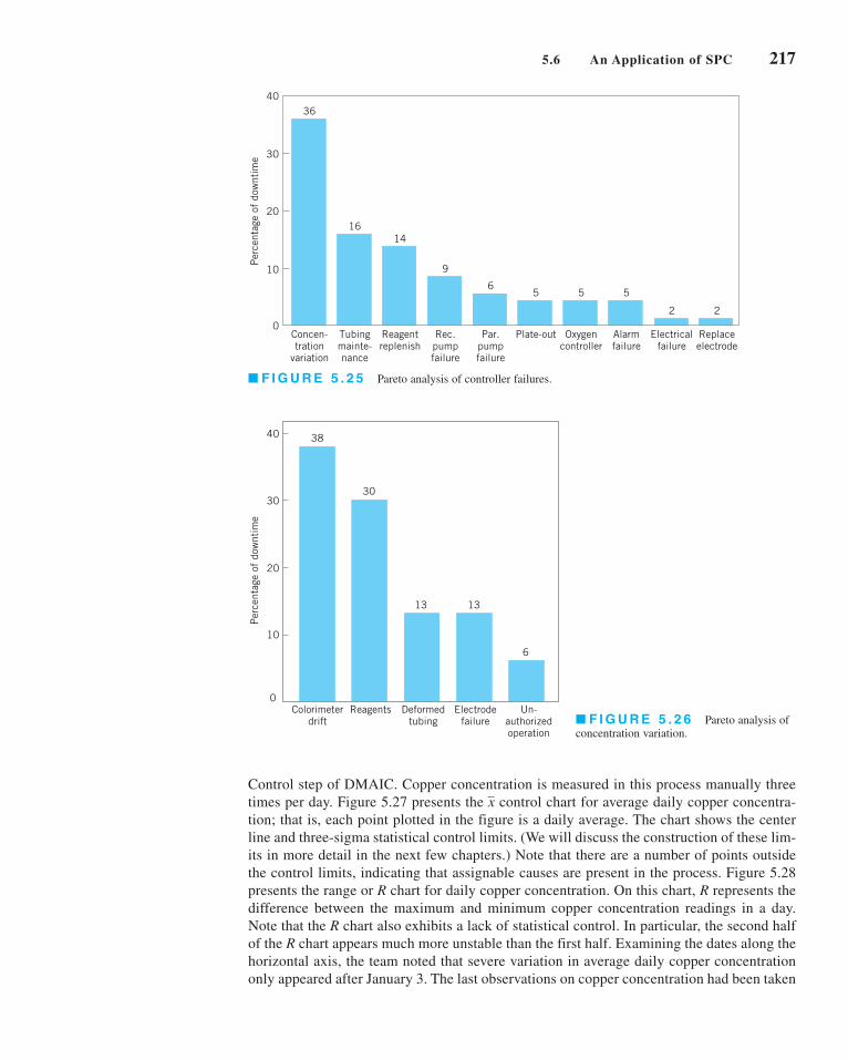
Control step of DMAIC. Copper concentration is measured in this process manually three
times per day. Figure 5.27 presents the control chart for average daily copper concentra-
tion; that is, each point plotted in the figure is a daily average. The chart shows the center
line and three-sigma statistical control limits. (We will discuss the construction of these lim-
its in more detail in the next few chapters.) Note that there are a number of points outside
the control limits, indicating that assignable causes are present in the process. Figure 5.28
presents the range or R chart for daily copper concentration. On this chart, R represents the
difference between the maximum and minimum copper concentration readings in a day.
Note that the R chart also exhibits a lack of statistical control. In particular, the second half
of the R chart appears much more unstable than the first half. Examining the dates along the
horizontal axis, the team noted that severe variation in average daily copper concentration
only appeared after January 3. The last observations on copper concentration had been taken
x
5.6 An Application of SPC 217
36
Concen-tration
variation
16
Tubingmainte-nance
14
Reagentreplenish
9
Rec.pumpfailure
6
Par.pumpfailure
5
Plate-out
5
Oxygencontroller
5
Alarmfailure
2
Electricalfailure
2
Replaceelectrode
40
30
20
10
0
Per
cent
age
of d
ownt
ime
Colorimeterdrift
Deformedtubing
Un-authorizedoperation
Reagents Electrodefailure
0
10
20
30
40
Per
cent
age
of d
ownt
ime
30
38
13 13
6
■ F I G U R E 5 . 2 5 Pareto analysis of controller failures.
■ F I G U R E 5 . 2 6 Pareto analysis of
concentration variation.
c05MethodsAndPhilosophyOfStatisticalProcessControl.qxd 3/24/12 5:42 PM Page 217

218 Chapter 5 ■ Methods and Philosophy of Statistical Process Control
on November 22. From November 23 until January 3, the process had been in a shutdown
mode because of holidays. Apparently, when the process was restarted, substantial deterio-
ration in controller/colorimeter performance had occurred. This hastened engineering’s
decision to rebuild the colorimeter.
Figure 5.29 presents a tolerance diagram of daily copper concentration readings. In this
figure, each day’s copper concentration readings are plotted, and the extremes are connected
with a vertical line. In some cases, more than one observation is plotted at a single position, so
a numeral is used to indicate the number of observations plotted at each particular point. The
center line on this chart is the process average over the time period studied, and the upper and
lower limits are the specification limits on copper concentration. Every instance in which a
point is outside the specification limits would correspond to nonscheduled downtime on the
process. Several things are evident from examining the tolerance diagram. First, the process
average is significantly different from the nominal specification on copper concentration (the
midpoint of the upper and lower tolerance band). This implies that the calibration of the col-
orimeter may be inadequate. That is, we are literally aiming at the wrong target. Second, we
3.3667
3.1933
3.0200
2.8467
2.6733
2.5000
Ave
rage
cop
per
conc
entr
atio
n
10
-19
10
-20
10
-21
10
-22
10
-23
10
-24
10
-25
10
-26
10
-27
10
-28
10
-29
10
-30
10
-31
11
-11
1-2
11
-31
1-4
11
-51
1-6
11
-71
1-8
11
-91
1-1
01
1-1
11
1-1
21
1-1
41
1-1
51
1-1
61
1-1
81
1-1
91
1-2
01
1-2
21
-31
-41
-51
-61
-71
-81
-91
-10
1-1
11
-12
1-1
31
-14
1-1
51
-16
1-1
71
-18
1-2
31
-24
1-2
71
-28
1-2
91
-30
1-3
12
-32
-42
-52
-6
Sample date
10-1
910
-20
10-2
110
-22
10-2
310
-24
10-2
510
-26
10-2
710
-28
10-2
910
-30
10-3
111
-111
-211
-311
-411
-511
-611
-711
-811
-911
-10
11-1
111
-12
11-1
411
-15
11-1
611
-18
11-1
911
-20
11-2
21-
31-
41-
51-
61-
71-
81-
91-
101-
111-
121-
131-
141-
151-
161-
171-
181-
231-
241-
271-
281-
291-
301-
312-
32-
42-
52-
6
Sample date
1.2000
0.9600
0.7200
0.4800
0.2400
0.0000
Ran
ge o
f co
pper
con
cent
rati
on
■ F I G U R E 5 . 2 7 chart for the average daily copper concentration.x
■ F I G U R E 5 . 2 8 R chart for daily copper concentration.
c05MethodsAndPhilosophyOfStatisticalProcessControl.qxd 3/24/12 5:42 PM Page 218

note that there is considerably more variation in the daily copper concentration readings after
January 3 than there was prior to shutdown. Finally, if we could reduce variation in the
process to a level roughly consistent with that observed prior to shutdown and correct the
process centering, many of the points outside specifications would not have occurred, and
downtime on the process should be reduced.
To initiate the Improve step, the team first decided to rebuild the colorimeter and con-
troller. This was done in early February. The result of this maintenance activity was to restore
the variability in daily copper concentration readings to the pre-shutdown level. The rebuilt
colorimeter was recalibrated and subsequently was able to hold the correct target. This recen-
tering and recalibration of the process reduced the downtime on the controller from approxi-
mately 60% to less than 20%. At this point, the process was capable of meeting the required
production rate.
Once this aspect of process performance was improved, the team directed its efforts to
reducing the number of defective units produced by the process. Generally, as noted earlier,
defects fell into two major categories: brittle copper and copper voids. The team decided that,
although control charts and statistical process-control techniques could be applied to this
problem, the use of a designed experiment might lead to a more rapid solution. As noted in
Chapter 1, the objective of a designed experiment is to generate information that will allow
us to understand and model the relationship between the process variables and measures of
the process performance.
The designed experiment for the plating process is shown in Table 5.2 and Figure 5.30.
The objective of this experiment was to provide information that would be useful in mini-
mizing plating defects. The process variables considered in the experiment were copper con-
centration, sodium hydroxide concentration, formaldehyde concentration, temperature, and
oxygen. A low level and high level, represented symbolically by the minus and plus signs in
Table 5.2, were chosen for each process variable. The team initially considered a factorialexperiment—that is, an experimental design in which all possible combinations of these factor
levels would be run. This design would have required 32 runs—that is, a run at each of the
32 corners of the cubes in Figure 5.30. Since this is too many runs, a fractional factorialdesign that used only 16 runs was ultimately selected. This fractional factorial design is
shown in the bottom half of Table 5.2 and geometrically in Figure 5.30. In this experimental
design, each row of the table is a run on the process. The combination of minus and plus signs
in each column of that row determines the low and high levels of the five process variables
5.6 An Application of SPC 219
10
-19
10
-20
10
-21
10
-22
10
-23
10
-24
10
-25
10
-26
10
-27
10
-28
10
-29
10
-30
10
-31
11
-11
1-2
11
-31
1-4
11
-51
1-6
11
-71
1-8
11
-91
1-1
01
1-1
11
1-1
21
1-1
41
1-1
51
1-1
61
1-1
81
1-1
91
1-2
01
1-2
21
-31
-41
-51
-61
-71
-81
-91
-10
1-1
11
-12
1-1
31
-14
1-1
51
-16
1-1
71
-18
1-2
31
-24
1-2
71
-28
1-2
91
-30
1-3
12
-32
-42
-52
-6
Sample date
1.2000
0.9600
0.7200
0.4800
0.2400
0.0000
Cop
per
conc
entr
atio
n
2 2 2 2 3332 2 333 2 2 32 2 2
2
2
22322
2 2
22
22
2222222
2
■ F I G U R E 5 . 2 9 Tolerance diagram of daily copper concentration.
c05MethodsAndPhilosophyOfStatisticalProcessControl.qxd 3/24/12 5:42 PM Page 219

220 Chapter 5 ■ Methods and Philosophy of Statistical Process Control
to be used during that run. For example, in run 1 copper concentration, sodium hydroxide
concentration, formaldehyde concentration, and temperature are run at the low level and
oxygen is run at the high level. The process would be run at each of the 16 sets of conditions
described by the design (for reasons to be discussed later, the runs would not be made in the
order shown in Table 5.2), and a response variable—an observed number of plating defects—
would be recorded for each run. Then these data could be analyzed using simple statistical
techniques to determine which factors have a significant influence on plating defects,
whether or not any of the factors jointly influence the occurrence of defects, and whether it
is possible to adjust these variables to new levels that will reduce plating defects below their
current level. Although a complete discussion of design of experiments is beyond the scope
of this text, we will present examples of designed experiments for improving process perfor-
mance in Part V.
After the team conducted the experiment shown in Table 5.2 and analyzed the result-
ing process data, they determined that several of the process variables that they identified
for the study were important and had significant impact on the occurrence of plating
defects. They were able to adjust these factors to new levels, and as a result, plating
defects were reduced by approximately a factor of 10. Therefore, at the conclusion of the
team’s initial effort at applying SPC to the plating process, it had made substantial
■ TA B L E 5 . 2
A Designed Experiment for the Plating Process
Objective: Minimize Plating Defects
Process Variables Low Level High Level
A = Copper concentration − +B = Sodium hydroxide concentration − +C = Formaldehyde concentration − +D = Temperature − +E = Oxygen − +
Experimental Design
Variables
ResponseRun A B C D E (Defects)
1 − − − − +2 + − − − −3 − + − − −4 + + − − +5 − − + − −6 + − + − +7 − + + − +8 + + + − −9 − − − + −
10 + − − + +11 − + − + +12 + + − + −13 − − + + +14 + − + + −15 − + + + −16 + + + + +
A B
C– +
++
E
–
+
D– +
46
7
1
10
16
11
1312
14
15
95
3
82
■ F I G U R E 5 . 3 0 A geometric view
of the fractional factorial design for the plat-
ing process experiment.
c05MethodsAndPhilosophyOfStatisticalProcessControl.qxd 3/24/12 5:42 PM Page 220

improvements in product cycle time through the process and had taken a major step in
improving the process capability.
5.7 Applications of Statistical Process Control and Quality Improvement Tools in Transactional and Service Businesses
This book presents the underlying principles of SPC. Many of the examples used to reinforce
these principles are in an industrial, product-oriented framework. There have been many suc-
cessful applications of SPC methods in the manufacturing environment. However, the princi-
ples themselves are general; there are many applications of SPC techniques and other quality
engineering and statistical tools in nonmanufacturing settings, including transactional and
service businesses.
These nonmanufacturing applications do not differ substantially from the more usual
industrial applications. As an example, the control chart for fraction nonconforming (which is
discussed in Chapter 7) could be applied to reducing billing errors in a bank credit card opera-
tion as easily as it could be used to reduce the fraction of nonconforming printed circuit boards
produced in an electronics plant. The and R charts discussed in this chapter and applied to the
hard-bake process could be used to monitor and control the flow time of accounts payable
through a finance function. Transactional and service industry applications of SPC and related
methodology sometimes require ingenuity beyond that normally required for the more typical
manufacturing applications. There seem to be three primary reasons for this difference:
1. Most transactional and service businesses do not have a natural measurement system
that allows the analyst to easily define quality.
2. The system that is to be improved is usually fairly obvious in a manufacturing setting,
whereas the observability of the process in a nonmanufacturing setting may be fairly low.
3. Many service processes involve people to a high degree, and people are often highly
variable in their work activities. Service systems often have to deal with customers that
have unusual and very different requirements.
For example, if we are trying to improve the performance of a personal computer assembly
line, then it is likely that the line will be contained within one facility and the activities of the
system will be readily observable. However, if we are trying to improve the business perfor-
mance of a financial services organization, then the observability of the process may be low.
The actual activities of the process may be performed by a group of people who work in dif-
ferent locations, and the operation steps or workflow sequence may be difficult to observe.
Furthermore, the lack of a quantitative and objective measurement system in most nonmanu-
facturing processes complicates the problem.
The key to applying statistical process-control and other related methods in service systems
and transactional business environments is to focus initial efforts on resolving these three
issues. We have found that once the system is adequately defined and a valid measurement
system has been developed, most of the SPC tools discussed in this chapter can easily be
applied to a wide variety of nonmanufacturing operations including finance, marketing, mate-
rial and procurement, customer support, field service, engineering development and design,
and software development and programming.
Flowcharts, operation process charts, and value stream mapping are particularly
useful in developing process definition and process understanding. A flowchart is simply a
chronological sequence of process steps or work flow. Sometimes flowcharting is called
process mapping. Flowcharts or process maps must be constructed in sufficient detail to
identify value-added versus non-value-added work activity in the process.
x
5.7 Applications of Statistical Process Control and Quality Improvement Tools 221
c05MethodsAndPhilosophyOfStatisticalProcessControl.qxd 3/24/12 5:42 PM Page 221

222 Chapter 5 ■ Methods and Philosophy of Statistical Process Control
Most nonmanufacturing processes have scrap, rework, and other non-value-addedoperations, such as unnecessary work steps and choke points or bottlenecks. A systematic
analysis of these processes can often eliminate many of these non-value-added activities. The
flowchart is helpful in visualizing and defining the process so that non-value-added activities
can be identified. Some ways to remove non-value-added activities and simplify the process
are summarized in the following box.
Ways to Eliminate Non-Value-Added Activities
1. Rearrange the sequence of worksteps.
2. Rearrange the physical location of the operator in the system.
3. Change work methods.
4. Change the type of equipment used in the process.
5. Redesign forms and documents for more efficient use.
6. Improve operator training.
7. Improve supervision.
8. Identify more clearly the function of the process to all employees.
9. Try to eliminate unnecessary steps.
10. Try to consolidate process steps.
Figure 5.31 is an example of a flowchart for a process in a service industry. It was con-
structed by a process improvement team in an accounting firm that was studying the process of
preparing Form 1040 income tax returns; this particular flowchart documents only one partic-
ular subprocess: that of assembling final tax documents. This flowchart was constructed as part
of the Define step of DMAIC. Note the high level of detail in the flowchart to assist the team
find waste or non-value-added activities. In this example, the team used special symbols in their
flowchart. Specifically, they used the operation process chart symbols shown as follows:
Operation Process Chart Symbols
= operation
= movement or transportation
= delay
= storage
= inspection
c05MethodsAndPhilosophyOfStatisticalProcessControl.qxd 3/24/12 5:42 PM Page 222

We have found that these symbols are very useful in helping team members identify improve-
ment opportunities. For example, delays, most inspections, and many movements usually rep-
resent non-value-added activities. The accounting firm was able to use quality improvement
methods and the DMAIC approach successfully in their Form 1040 process, reducing the tax
document preparation cycle time (and work content) by about 25%, and reducing the cycle
time for preparing the client bill from over 60 days to zero (that’s right, zero!). The client’s
bill is now included with his or her tax return.
As another illustration, consider an example of applying quality improvement methods
in a planning organization. This planning organization, part of a large aerospace manufactur-
ing concern, produces the plans and documents that accompany each job to the factory floor.
The plans are quite extensive, often several hundred pages long. Errors in the planning
process can have a major impact on the factory floor, contributing to scrap and rework, lost
production time, overtime, missed delivery schedules, and many other problems.
Figure 5.32 presents a high-level flowchart of this planning process. After plans are
produced, they are sent to a checker who tries to identify obvious errors and defects in the
plans. The plans are also reviewed by a quality-assurance organization to ensure that process
specifications are being met and that the final product will conform to engineering standards.
Then the plans are sent to the shop, where a liaison engineering organization deals with any
5.7 Applications of Statistical Process Control and Quality Improvement Tools 223
To copier
Sort by# copies
Make 3copies
To desk Depositcopies
To wordprocessing
Copyfiles
Sortcopies
Cutvouchers
Staple& cover
Straight?
Mailinglabels
available?
Type labels
Take labels
Typing box
Todesk
Get transmittaland/or request labels
File firmcopySort/
discardcopies
Staplereturns
Cutvouchers
Labels onenvelopes
To word processing
Returncover
CoverO.K.?
To desk
Retrieve transmittal
C
Attachenvelopes
Revisetransmittal
TransmittalO.K.?
Anyopen
items?
Tofix
Putcopy in
fileReturn
sequence?
Tosigner
B
B
C
■ F I G U R E 5 . 3 1 Flowchart of the assembly portion of the Form 1040 tax return process.
c05MethodsAndPhilosophyOfStatisticalProcessControl.qxd 3/24/12 5:42 PM Page 223
224 Chapter 5 ■ Methods and Philosophy of Statistical Process Control
errors in the plan encountered by manufacturing. This flowchart is useful in presenting an
overall picture of the planning system, but it is not particularly helpful in uncovering non-
value-added activities, as there is insufficient detail in each of the major blocks. However, each
block, such as the planner, checker, and quality-assurance block, could be broken down into
a more detailed sequence of work activities and steps. The step-down approach is frequently
helpful in constructing flowcharts for complex processes. However, even at the relatively high
level shown, it is possible to identify at least three areas in which SPC methods could be use-
fully applied in the planning process.
The managers of the planning organization decided to use the reduction of planning
errors as a quality improvement project for their organization. A team of managers, plan-
ners, and checkers was chosen to begin this implementation. During the Measure step, the
team decided that each week three plans would be selected at random from the week’s out-
put of plans to be analyzed extensively to record all planning errors that could be found.
The check sheet shown in Figure 5.33 was used to record the errors found in each plan.
These weekly data were summarized monthly, using the summary check sheet presented in
Figure 5.34. After several weeks, the team was able to summarize the planning error data
obtained using the Pareto analysis in Figure 5.35. The Pareto chart implies that errors in the
operations section of the plan are predominant, with 65% of the planning errors in the oper-
ations section. Figure 5.36 presents a further Pareto analysis of the operations section
errors, showing that omitted operations and process specifications are the major contribu-
tors to the problem.
The team decided that many of the operations errors were occurring because planners
were not sufficiently familiar with the manufacturing operations and the process specifica-
tions that were currently in place. To improve the process, a program was undertaken to refa-
miliarize planners with the details of factory floor operations and to provide more feedback
on the type of planning errors actually experienced. Figure 5.37 presents a run chart of the
planning errors per operation for 25 consecutive weeks. Note that there is a general tendency
for the planning errors per operation to decline over the first half of the study period. This
decline may be due partly to the increased training and supervision activities for the planners
and partly to the additional feedback given regarding the types of planning errors that were
occurring. The team also recommended that substantial changes be made in the work methods
used to prepare plans. Rather than having an individual planner with overall responsibility for
the operations section, it recommended that this task become a team activity so that knowl-
edge and experience regarding the interface between factor and planning operations could be
shared in an effort to further improve the process.
The planning organization began to use other SPC tools as part of their quality improve-
ment effort. For example, note that the run chart in Figure 5.37 could be converted to a Shewhart
control chart with the addition of a center line and appropriate control limits. Once the planners
Planner CheckerQuality
assurance Shop
Liaisonengineering
SPC
SPC
SPC
■ F I G U R E 5 . 3 2 A
high-level flowchart of the
planning process.
c05MethodsAndPhilosophyOfStatisticalProcessControl.qxd 3/24/12 5:42 PM Page 224
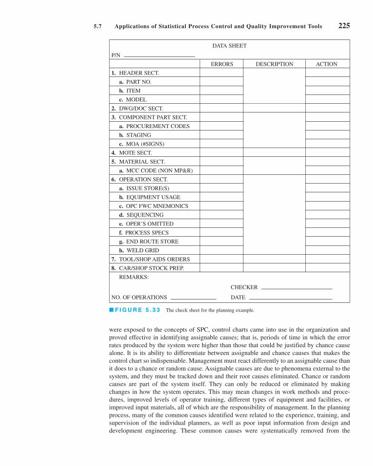
were exposed to the concepts of SPC, control charts came into use in the organization and
proved effective in identifying assignable causes; that is, periods of time in which the error
rates produced by the system were higher than those that could be justified by chance cause
alone. It is its ability to differentiate between assignable and chance causes that makes the
control chart so indispensable. Management must react differently to an assignable cause than
it does to a chance or random cause. Assignable causes are due to phenomena external to the
system, and they must be tracked down and their root causes eliminated. Chance or random
causes are part of the system itself. They can only be reduced or eliminated by making
changes in how the system operates. This may mean changes in work methods and proce-
dures, improved levels of operator training, different types of equipment and facilities, or
improved input materials, all of which are the responsibility of management. In the planning
process, many of the common causes identified were related to the experience, training, and
supervision of the individual planners, as well as poor input information from design and
development engineering. These common causes were systematically removed from the
5.7 Applications of Statistical Process Control and Quality Improvement Tools 225
DATA SHEET
P/N
ERRORS DESCRIPTION ACTION
1. HEADER SECT.
a. PART NO.
b. ITEM
c. MODEL
2. DWG/DOC SECT.
3. COMPONENT PART SECT.
a. PROCUREMENT CODES
b. STAGING
c. MOA (#SIGNS)
4. MOTE SECT.
5. MATERIAL SECT.
a. MCC CODE (NON MP&R)
6. OPERATION SECT.
a. ISSUE STORE(S)
b. EQUIPMENT USAGE
c. OPC FWC MNEMONICS
d. SEQUENCING
e. OPER’S OMITTED
f. PROCESS SPECS
g. END ROUTE STORE
h. WELD GRID
7. TOOL/SHOP AIDS ORDERS
8. CAR/SHOP STOCK PREP.
REMARKS:
CHECKER
NO. OF OPERATIONS DATE
■ F I G U R E 5 . 3 3 The check sheet for the planning example.
c05MethodsAndPhilosophyOfStatisticalProcessControl.qxd 3/24/12 5:42 PM Page 225

226 Chapter 5 ■ Methods and Philosophy of Statistical Process Control
Monthly Data Summary
1. HEADER SECT.
a. PART NO.
b. ITEM
c. MODEL
2. DWG/DOC SECT.
3. COMPONENT PART SECT.
a. PROCUREMENT CODES
b. STAGING
c. MOA (#SIGNS)
4. MOTE SECT.
5. MATERIAL SECT.
a. MCC CODE (NON MP&R)
6. OPERATION SECT.
a. ISSUE STORE(S)
b. EQUIPMENT USAGE
c. OPC FWC MNEMONICS
d. SEQUENCING
e. OPER’S OMITTED
f. PROCESS SPECS
g. END ROUTE STORE
h. WELD GRID
7. TOOL/SHOP AIDS ORDERS
TOTAL NUMBER ERRORS
TOTAL OPERATIONS CHECKED
WEEK ENDING
■ F I G U R E 5 . 3 4 The summary check sheet.
■ F I G U R E 5 . 3 5 Pareto analysis of planning
errors.
■ F I G U R E 5 . 3 6 Pareto analysis of opera-
tions section errors.
70605040302010 0
Per
cent
age
11 8 7 4 3 1 1
Operat
ions
secti
on
Materia
l sec
tion
Dwg doc
secti
on
Planning errors
Parts
secti
on
Heade
r sec
tion
Stoc
k prep
Notes s
ectio
n
Aids
orde
rs se
ction
6530
20
10
0
Per
cent
age
Operat
ions
omitt
ed
Proc
ess s
pecs
Mnemon
ics
Sequ
encin
g
Issue
store
s
Equip
ment
usag
eWeld
grid
2826
16 15
10
41
Operations section errors
c05MethodsAndPhilosophyOfStatisticalProcessControl.qxd 3/24/12 9:18 PM Page 226

process, and the long-term impact of the SPC implementation in this organization was to
reduce planning errors to a level of less than one planning error per 1,000 operations.
Value stream mapping is another way to see the flow of material and information in a
process. A value stream map is much like a flowchart, but it usually incorporates other infor-
mation about the activities that are occurring at each step in the process and the information
that is required or generated. It is a big picture tool that helps an improvement team focus on
optimizing the entire process, without focusing too narrowly on only one process activity or
step, which could lead to suboptimal solutions.
Like a flowchart or operations process chart, a value stream map usually is constructed
using special symbols. The box below presents the symbols usually employed on value
stream maps.
5.7 Applications of Statistical Process Control and Quality Improvement Tools 227
■ F I G U R E 5 . 3 7 A run chart
of planning errors.
0.20
0.15
0.10
0.05
05 10 15 20 25
Sequential weeks
Pla
nnin
g er
rors
per
ope
rati
on
A Value Stream Map
SupplierInformation
Manual Information
Electronic Information
Push movement
Inventorytime
Processingtime Total lead time
Processing time
Movement
InventoryProcess Process data
Shipment
People
Customer
c05MethodsAndPhilosophyOfStatisticalProcessControl.qxd 3/24/12 5:42 PM Page 227

228 Chapter 5 ■ Methods and Philosophy of Statistical Process Control
The value stream map presents a picture of the value stream from the product’s viewpoint: It
is not a flowchart of what people do, but what actually happens to the product. It is necessary
to collect process data to construct a value stream map. Some of the data typically collected
includes:
1. Lead time (LT)—the elapsed time it takes one unit of product to move through the entire
value stream from beginning to end.
2. Processing time (PT)—the elapsed time from the time the product enters a process until
it leaves that process.
3. Cycle time (CT)—how often a product is completed by a process. Cycle time is a rate,
calculated by dividing the processing time by the number of people or machines doing
the work.
4. Setup time (ST)—these are activities such as loading/unloading, machine preparation,
testing, and trial runs. In other words, all activities that take place between completing
a good product until starting to work on the next unit or batch of product.
5. Available time (AT)—the time each day that the value stream can operate if there is
product to work on.
6. Uptime (UT)—the percentage of time the process actually operates as compared to the
available time or planned operating time.
7. Pack size—the quantity of product required by the customer for shipment.
8. Batch size—the quantity of product worked on and moved at one time.
9. Queue time—the time a product spends waiting for processing.
10. Work-in-process (WIP)—product that is being processed but is not yet complete.
11. Information flows—schedules, forecasts, and other information that tells each process
what to do next.
Figure 5.38 shows an example of a value stream map that could be almost anything
from a manufactured product (receive parts, preprocess parts, assemble the product, pack and
ship the product to the customer) to a transaction (receive information, preprocess informa-
tion, make calculations and decision, inform customer of decision or results). Notice that in
the example we have allocated the setup time on a per-piece basis and included that in the
timeline. This is an example of a current-state value stream map. That is, it shows what is
happening in the process as it is now defined. The DMAIC process can be useful in elimi-
nating waste and inefficiencies in the process, eliminating defects and rework, reducing
delays, eliminating non-value-added activities, reducing inventory (WIP, unnecessary back-
logs), reducing inspections, and reducing unnecessary product movement. There is a lot of
opportunity for improvement in this process, because the process cycle efficiency isn’t very
good. Specifically,
Reducing the amount of work-in-process inventory is one approach that would improve the
process cycle efficiency. As a team works on improving a process, often a future-state valuestream map is constructed to show what a redefined process should look like.
Finally, there are often questions about how the technical quality improvement tools in this
book can be applied in service and transactional businesses. In practice, almost all of the tech-
niques translate directly to these types of businesses. For example, designed experiments have
been applied in banking, finance, marketing, health care, and many other service/transactional
businesses. Designed experiments can be used in any application where we can manipulate the
Process cycle efficiency = Value-add time
Process cycle time= = 0.0617
35.5
575.5
c05MethodsAndPhilosophyOfStatisticalProcessControl.qxd 3/24/12 5:42 PM Page 228

decision variables in the process. Sometimes we will use a simulation model of the
process to facilitate conducting the experiment. Similarly, control charts have many appli-
cations in the service economy, as will be illustrated in this book. It is a big mistake to
assume that these techniques are not applicable just because you are not working in a man-
ufacturing environment.
Still, one difference in the service economy is that you are more likely to encounter
attribute data. Manufacturing often has lots of continuous measurement data, and it is often
safe to assume that these data are at least approximately normally distributed. However, in ser-
vice and transactional processes, more of the data that you will use in quality improvement pro-
jects is either proportion defective, percentage good, or counts of errors or defects. In Chapter 7,
we discuss control charting procedures for dealing with attribute data. These control charts
have many applications in the service economy. However, even some of the continuous data
encountered in service and transactional businesses, such as cycle time, may not be normally
distributed.
Let’s talk about the normality assumption. It turns out that many statistical procedures
(such as the t-tests and ANOVA from Chapter 4) are very insensitive to the normality assump-
tion. That is, moderate departures from normality have little impact on their effectiveness.
There are some procedures that are fairly sensitive to normality, such as tests on variances,
and this book carefully identifies such procedures. One alternative to dealing with moderate
to severe non-normality is to transform the original data (say, by taking logarithms) to pro-
duce a new set of data whose distribution is closer to normal. A disadvantage of this is that
nontechnical people often don’t understand data transformation and are not comfortable with
data presented in an unfamiliar scale. One way to deal with this is to perform the statistical
analysis using the transformed data, but to present results (graphs, for example) with the data
in the original units.
5.7 Applications of Statistical Process Control and Quality Improvement Tools 229
CustomerSupplierScheduling
Forecasts
Orders
50 units
Forecasts
Orders
25 units 25 units 10 units 50 units
Pre-process
2
Receive
1
AT = 400 mCT = 5 mPT = 5 m
AT = 400 mCT = 8 mPT = 10 m
AT = 400 mCT = 5 mST = 5 mPT = 10 mBatch = 10
AT = 400 mCT = 4 mPT = 10 m
Assemble
2
Pack/ship
2
200 m
5 m
50 m
10 m
Total LT = 575.5 m
Total PT = 35.5 m
40 m
10.5 m
50 m 200 m
10 m
Sche
dule
Ship information
Schedule
■ F I G U R E 5 . 3 8 A value stream map.
c05MethodsAndPhilosophyOfStatisticalProcessControl.qxd 3/24/12 5:42 PM Page 229

230 Chapter 5 ■ Methods and Philosophy of Statistical Process Control
In extreme cases, there are nonparametric statistical procedures that don’t have an
underlying assumption of normality and can be used as alternatives to procedures such as
t-tests and ANOVA. Refer to Montgomery and Runger (2011) for an introduction to many of
these techniques. Many computer software packages such as Minitab have nonparametric
methods included in their libraries of procedures. There are also special statistical tests for
binomial parameters and Poisson parameters. (Some of these tests were discussed in Chapter 4;
Minitab, for example, incorporates many of these procedures.) It also is important to be clear
about to what the normality assumption applies. For example, suppose that you are fitting a
linear regression model to cycle time to process a claim in an insurance company. The cycle
time is y, and the predictors are different descriptors of the customer and what type of claim
is being processed. The model is
The data on y, the cycle time, isn’t normally distributed. Part of the reason for this is that the
observations on y are impacted by the values of the predictor variables, x1, x2, and x3. It is
the errors in this model that need to be approximately normal, not the observations on y. That
is why we analyze the residuals from regression and ANOVA models. If the residuals are
approximately normal, there are no problems. Transformations are a standard procedure that
can often be used successfully when the residuals indicate moderate to severe departures from
normality.
There are situations in transactional and service businesses where we are using regres-
sion and ANOVA and the response variable y may be an attribute. For example, a bank may
want to predict the proportion of mortgage applications that are actually funded. This is a
measure of yield in their process. Yield probably follows a binomial distribution. Most likely,
yield isn’t well approximated by a normal distribution, and a standard linear regression model
wouldn’t be satisfactory. However, there are modeling techniques based on generalizedlinear models that handle many of these cases. For example, logistic regression can be used
with binomial data and Poisson regression can be used with many kinds of count data.
Montgomery, Peck, and Vining (2006) contains information on applying these techniques.
Logistic regression is available in Minitab, and JMP software provides routines for both logistic
and Poisson regressions.
y = b0 + b1x1 + b2x2 + b3x3 + e
Action limits
Assignable causes of variation
Average run length (ARL)
Average time to signal
Cause-and-effect diagram
Chance causes of variation
Check sheet
Control chart
Control limits
Defect concentration diagram
Designed experiments
Flowcharts, operations process charts, and
value stream mapping
Factorial experiment
In-control process
Magnificent seven
Out-of-control-action plan (OCAP)
Out-of-control process
Pareto chart
Patterns on control charts
Phase I and phase II applications
Rational subgroups
Sample size for control charts
Sampling frequency for control charts
Scatter diagram
Sensitizing rules for control charts
Shewhart control charts
Statistical control of a process
Statistical process control (SPC)
Three-sigma control limits
Warning limits
Important Terms and Concepts
c05MethodsAndPhilosophyOfStatisticalProcessControl.qxd 3/24/12 5:42 PM Page 230

Exercises 231
Exercises
5.1. What are chance and assignable
causes of variability? What part do
they play in the operation and inter-
pretation of a Shewhart control
chart?
5.2. Discuss the relationship between a
control chart and statistical hypothe-
sis testing.
5.3. Discuss type I and type II errors rel-
ative to the control chart. What prac-
tical implication in terms of process
operation do these two types of
errors have?
5.4. What is meant by a process that is in a state of statis-
tical control?
5.5. If a process is in a state of statistical control, does it
necessarily follow that all or nearly all of the units of
product produced will be within the specification
limits?
5.6. Discuss the logic underlying the use of three-sigma
limits on Shewhart control charts. How will the chart
respond if narrower limits are chosen? How will it
respond if wider limits are chosen?
5.7. What are warning limits on a control chart? How can
they be used?
5.8. Discuss the rational subgroup concept. What part
does it play in control chart analysis?
5.9. When taking samples or subgroups from a process, do
you want assignable causes occurring within the sub-
groups or between them? Fully explain your answer.
5.10. A molding process uses a five-cavity mold for a part
used in an automotive assembly. The wall thickness
of the part is the critical quality characteristic. It has
been suggested to use and R charts to monitor this
process, and to use as the subgroup or sample all five
parts that result from a single “shot” of the machine.
What do you think of this sampling strategy? What
impact does it have on the ability of the charts to
detect assignable causes?
5.11. A manufacturing process produces 500 parts per
hour. A sample part is selected about every half hour,
and after five parts are obtained, the average of these
five measurements is plotted on an control chart.
(a) Is this an appropriate sampling scheme if the
assignable cause in the process results in an
instantaneous upward shift in the mean that is of
very short duration?
(b) If your answer is no, propose an alternative pro-
cedure.
5.12. Consider the sampling scheme proposed in Exercise
5.11. Is this scheme appropriate if the assignable cause
results in a slow, prolonged upward drift in the mean?
If your answer is no, propose an alternative procedure.
5.13. If the time order of production has not been recorded
in a set of data from a process, is it possible to detect
the presence of assignable causes?
5.14. What information is provided by the operating char-
acteristic curve of a control chart?
5.15. How do the costs of sampling, the costs of producing
an excessive number of defective units, and the costs
of searching for assignable causes impact on the
choice of parameters of a control chart?
5.16. Is the average run length performance of a control
chart a more meaningful measure of performance
than the type I and type II error probabilities? What
information does ARL convey that the statistical
error probabilities do not?
5.17. Consider the control chart shown here. Does the pat-
tern appear random?
5.18. Consider the control chart shown here. Does the pat-
tern appear random?
5.19. Consider the control chart shown here. Does the pat-
tern appear random?x
x
UCL
Centerline
LCL
2 4 6 8 10 12 14 16 18 20
UCL
Centerline
LCL
1 173 5 7 9 11 13 15
UCL
Centerline
LCL
5 10 15 20
The Student
Resource Manual
presents compre-
hensive annotated
solutions to the
odd-numbered
exercises included
in the Answers to
Selected Exercises
section in the
back of this book.
c05MethodsAndPhilosophyOfStatisticalProcessControl.qxd 3/24/12 5:42 PM Page 231

232 Chapter 5 ■ Methods and Philosophy of Statistical Process Control
Time
(c)
Time
(d)
x
x
x
Time
(e)
Time
(a)
Time
(b)
x x
5.20. Consider the control chart shown in Exercise 5.17.
Would the use of warning limits reveal any potential
out-of-control conditions?
5.21. Apply the Western Electric rules to the control chart
in Exercise 5.17. Are any of the criteria for declaring
the process out of control satisfied?
5.22. Sketch warning limits on the control chart in Exercise
5.19. Do these limits indicate any potential out-of-
control conditions?
5.23. Apply the Western Electric rules to the control chart
presented in Exercise 5.19. Would these rules result
in any out-of-control signals?
5.24. Consider the time-varying process behavior shown
below and on the next page. Match each of these
several patterns of process performance to the corre-
sponding and R charts shown in figures (a) to (e)
below.
x
x x
UCL
LCL
UCL
LCL
RR
(2)
x x
UCL
LCL
R
(4)
UCL
LCL
R
x x
R
UCL
LCL
UCL
LCL
R
(1)
x x
UCL
LCL
R
(3)
UCL
LCL
R
c05MethodsAndPhilosophyOfStatisticalProcessControl.qxd 3/24/12 5:42 PM Page 232

5.25. You consistently arrive at your office about one-half
hour later than you would like. Develop a cause-and-
effect diagram that identifies and outlines the possi-
ble causes of this event.
5.26. A car has gone out of control during a snowstorm and
struck a tree. Construct a cause-and-effect diagram
that identifies and outlines the possible causes of the
accident.
5.27. Laboratory glassware shipped from the manufacturer
to your plant via an overnight package service has
arrived damaged. Develop a cause-and-effect dia-
gram that identifies and outlines the possible causes
of this event.
5.28. Construct a cause-and-effect diagram that identifies
the possible causes of consistently bad coffee from a
large-capacity office coffee pot.
5.29. Develop a flowchart for the process that you follow
every morning from the time you awake until you
Exercises 233
arrive at your workplace (or school). Identify the
value-added and non-value-added activities.
5.30. Develop a flowchart for the pre-registration process
at your university. Identify the value-added and non-
value-added activities.
5.31. The magnificent seven can be used in our personal
lives. Develop a check sheet to record “defects” you
have in your personal life (such as overeating, being
rude, not meeting commitments, missing class, etc.).
Use the check sheet to keep a record of these
“defects” for one month. Use a Pareto chart to ana-
lyze these data. What are the underlying causes of
these “defects”?
5.32. A process is normally distributed and in control, with
known mean and variance, and the usual three-sigma
limits are used on the control chart, so that the prob-
ability of a single point plotting outside the control
limits when the process is in control is 0.0027.
Suppose that this chart is being used in phase I and
the averages from a set of m samples or subgroups
from this process are plotted on this chart. What is the
probability that at least one of the averages will plot
outside the control limits when m = 5? Repeat these
calculations for the cases where m = 10, m = 20,
m = 30, and m = 50. Discuss the results that you have
obtained.
5.33. Reconsider the situation in Exercise 5.32. Suppose
that the process mean and variance were unknown
and had to be estimated from the data available from
the m subgroups. What complications would this
introduce in the calculations that you performed in
Exercise 5.32?
x
x x
UCL
LCL
R
UCL
LCL
R
(5)
c05MethodsAndPhilosophyOfStatisticalProcessControl.qxd 3/24/12 5:42 PM Page 233

Control Charts forVariables
6.1 INTRODUCTION
6.2 CONTROL CHARTS FORAND R
6.2.1 Statistical Basis of the Charts
6.2.2 Development and Use ofand R Charts
6.2.3 Charts Based on StandardValues
6.2.4 Interpretation of and RCharts
6.2.5 The Effect of Non-normalityon and R Charts
6.2.6 The Operating-CharacteristicFunction
6.2.7 The Average Run Length forthe Chart
6.3 CONTROL CHARTS FOR AND s
6.3.1 Construction and Operation of and s Charts
6.3.2 The and s Control Charts with Variable SampleSize
6.3.3 The s2 Control Chart
x
x
x
x
x
x
x
x
6.4 THE SHEWHART CONTROL CHART FOR INDIVIDUALMEASUREMENTS
6.5 SUMMARY OF PROCEDURES FOR ,R, AND s CHARTS
6.6 APPLICATIONS OF VARIABLESCONTROL CHARTS
Supplemental Material for Chapter 6
S6.1 s2 IS NOT ALWAYS AN UNBIASEDESTIMATOR OF 2
S6.2 SHOULD WE USE d2 OR d*2 IN
ESTIMATING VIA THE RANGEMETHOD?
S6.3 DETERMINING WHEN THE PROCESSHAS SHIFTED
S6.4 MORE ABOUT MONITORINGVARIABILITY WITH INDIVIDUALOBSERVATIONS
S6.5 DETECTING DRIFTS VERSUS SHIFTSIN THE PROCESS MEAN
S6.6 THE MEAN SQUARE SUCCESSIVEDIFFERENCE AS AN ESTIMATOR OF 2s
s
s
x
66CHAPTER OUTLINE
The supplemental material is on the textbook Website www.wiley.com/college/montgomery.
CHAPTER OVERVIEW AND LEARNING OBJECTIVES
A quality characteristic that is measured on a numerical scale is called a variable. Examples
include dimensions such as length or width, temperature, and volume. This chapter presents
Shewhart control charts for these types of quality characteristics. The and R control charts
are widely used to monitor the mean and variability of variables. Several variations of the xx
234
c06ControlChartsForVariables.qxd 4/25/12 4:55 PM Page 234

6.1 Introduction 235
and R charts are also given, including a procedure to adapt them to individual measurements.
The chapter concludes with typical applications of variables control charts.
After careful study of this chapter, you should be able to do the following:
1. Understand the statistical basis of Shewhart control charts for variables
2. Know how to design variables control charts
3. Know how to set up and use and R control charts
4. Know how to estimate process capability from the control chart information
5. Know how to interpret patterns on and R control charts
6. Know how to set up and use and s or s2 control charts
7. Know how to set up and use control charts for individual measurements
8. Understand the importance of the normality assumption for individuals control
charts and know how to check this assumption
9. Understand the rational subgroup concept for variables control charts
10. Determine the average run length for variables control charts
6.1 Introduction
Many quality characteristics can be expressed in terms of a numerical measurement. As
examples, the diameter of a bearing could be measured with a micrometer and expressed in
millimeters or the time to process an insurance claim can be expressed in hours. A single
measurable quality characteristic, such as a dimension, weight, or volume, is called a vari-able. Control charts for variables are used extensively. Control charts are one of the primary
tools used in the Analyze and Control steps of DMAIC.
When dealing with a quality characteristic that is a variable, it is usually necessary to
monitor both the mean value of the quality characteristic and its variability. Control of the
process average or mean quality level is usually done with the control chart for means, or the
control chart. Process variability can be monitored with either a control chart for the stan-
dard deviation, called the s control chart, or a control chart for the range, called an R con-trol chart. The R chart is more widely used. Usually, separate and R charts are maintained
for each quality characteristic of interest. (However, if the quality characteristics are closely
related, this can sometimes cause misleading results; refer to Chapter 12 of Part IV.) The
and R (or s) charts are among the most important and useful on-line statistical process moni-
toring and control techniques.
It is important to maintain control over both the process mean and process variability.
Figure 6.1 illustrates the output of a production process. In Figure 6.1a, both the mean m and
standard deviation s are in control at their nominal values (say, m0 and s0); consequently,
most of the process output falls within the specification limits. However, in Figure 6.1b the
x
x
xx
x
x
x
Lowerspecification
limit
Upperspecification
limit
μ0
σ0~
(a)
Lowerspecification
limit
Upperspecification
limit
μ0 μ1
σ0~
(b)
Lowerspecification
limit
Upperspecification
limit
μ0
σ1~
(c)
■ F I G U R E 6 . 1 The need for controlling both process mean and process variability. (a) Mean and
standard deviation at nominal levels. (b) Process mean m1 > m0. (c) Process standard deviation s1 > s0.
c06ControlChartsForVariables.qxd 3/28/12 5:20 PM Page 235

236 Chapter 6 ■ Control Charts for Variables
mean has shifted to a value m1 > m0, resulting in a higher fraction of nonconforming prod-
uct. In Figure 6.1c the process standard deviation has shifted to a value s1 > s0. This
also results in higher process fallout, even though the process mean is still at the nominal
value.
6.2 Control Charts for and R
6.2.1 Statistical Basis of the Charts
Suppose that a quality characteristic is normally distributed with mean m and standard devia-
tion s, where both m and s are known. If x1, x2, . . . , xn is a sample of size n, then the average
of this sample is
and we know that is normally distributed with mean m and standard deviation .
Furthermore, the probability is 1 − a that any sample mean will fall between
(6.1)
Therefore, if m and s are known, equation 6.1 could be used as upper and lower control lim-
its on a control chart for sample means. As noted in Chapter 5, it is customary to replace Za/2
by 3, so that three-sigma limits are employed. If a sample mean falls outside of these limits,
it is an indication that the process mean is no longer equal to m.
We have assumed that the distribution of the quality characteristic is normal. However,
the above results are still approximately correct even if the underlying distribution is non-
normal, because of the central limit theorem. We discuss the effect of the normality assump-
tion on variables control charts in Section 6.2.5.
In practice, we usually will not know m and s. Therefore, they must be estimated from
preliminary samples or subgroups taken when the process is thought to be in control. These
estimates should usually be based on at least 20 to 25 samples. Suppose that m samples are
available, each containing n observations on the quality characteristic. Typically, n will
be small, often either 4, 5, or 6. These small sample sizes usually result from the construction
of rational subgroups and from the fact that the sampling and inspection costs associated with
variables measurements are usually relatively large. Let be the average of each
sample. Then the best estimator of m, the process average, is the grand average—say,
(6.2)
Thus, would be used as the center line on the chart.
To construct the control limits, we need an estimate of the standard deviation s. Recall
from Chapter 4 (Section 4.2) that we may estimate s from either the standard deviations or
the ranges of the m samples. For the present, we will use the range method. If x1, x2, . . . , xn
is a sample of size n, then the range of the sample is the difference between the largest and
smallest observations—that is,
R x x= −max min
xx
xx x x
mm= + + +1 2 L
x1, x2, . . . , xm
μ σ μ σ μ σ μ σα α α α+ = + − = −Z Z
nZ Z
nx x2 2 2 2 and
sx = s/1nx
xx x x
nn= + + +1 2 L
x
c06ControlChartsForVariables.qxd 3/28/12 5:20 PM Page 236

Let R1, R2, . . . , Rm be the ranges of the m samples. The average range is
(6.3)
We may now give the formulas for constructing the control limits on the chart. They
are as follows:
x
RR R R
mm= + + +1 2 L
Control Limits for the Chart
(6.4)
The constant A2 is tabulated for various sample sizes in Appendix Table VI.
UCL
Center line =
LCL
= +
= −
x A R
x
x A R
2
2
x
Control Limits for the R Chart
(6.5)
The constants D3 and D4 are tabulated for various values of n in Appendix Table VI.
UCL
Center line =
LCL
=
=
D R
R
D R
4
3
Process variability may be monitored by plotting values of the sample range R on a con-
trol chart. The center line and control limits of the R chart are as follows:
Development of Equations 6.4 and 6.5. The development of the equations for
computing the control limits on the and R control charts is relatively easy. In Chapter 4
(Section 4.2) we observed that there is a well-known relationship between the range of a
sample from a normal distribution and the standard deviation of that distribution. The random
variable W = R/s is called the relative range. The parameters of the distribution of W are a
function of the sample size n. The mean of W is d2. Consequently, an estimator of s is
. Values of d2 for various sample sizes are given in Appendix Table VI. Therefore, if
is the average range of the m preliminary samples, we may use
(6.6)
to estimate s. This is an unbiased estimator of s.
σ = R
d2
Rs = R/d2
x
6.2 Control Charts for and R 237xx
c06ControlChartsForVariables.qxd 3/28/12 9:21 PM Page 237

238 Chapter 6 ■ Control Charts for Variables
If we use as an estimator of m and as an estimator of s, then the parameters of
the chart are
(6.7)
If we define
(6.8)
then equation 6.7 reduces to equation 6.4.
Now consider the R chart. The center line will be . To determine the control limits, we
need an estimate of . Assuming that the quality characteristic is normally distributed, sR
can be found from the distribution of the relative range W = R/s. The standard deviation of
W, say d3, is a known function of n. Thus, since
the standard deviation of R is
Since s is unknown, we may estimate sR by
(6.9)
Consequently, the parameters of the R chart with the usual three-sigma control limits are
(6.10)
If we let
equation 6.10 reduces to equation 6.5.
Phase I Application of and R Charts. In phase I control chart usage, when
preliminary samples are used to construct and R control charts, it is customary to treat the
control limits obtained from equations 6.4 and 6.5 as trial control limits. They allow us to
determine whether the process was in control when the m initial samples were selected. To
determine whether the process was in control when the preliminary samples were collected,
plot the values of and R from each sample on the charts and analyze the resulting display.
If all points plot inside the control limits and no systematic behavior is evident, we conclude
that the process was in control in the past, and the trial control limits are suitable for controlling
x
xx
Dd
dD
d
d33
24
3
2
1 3 1 3= − = + and
UCL
Center line =
LCL
= + = +
= − = −
R R dR
d
R
R R dR
d
R
R
3 3
3 3
32
32
ˆ
ˆ
σ
σ
σ R dR
d= 3
2
σ σR d= 3
R W= σ
sR
R
Ad n2
2
3=
UCL
Center line =
LCL
= +
= −
xd n
R
x
xd n
R
3
3
2
2
xR/d2x
c06ControlChartsForVariables.qxd 3/28/12 5:20 PM Page 238

6.2 Control Charts for and R 239xx
current or future production. It is highly desirable to have 20–25 samples or subgroups of size
n (typically n is between 3 and 5) to compute the trial control limits. We can, of course, work
with fewer data, but the control limits are not as reliable.
Suppose that one or more of the values of either or R plot out of control when com-
pared to the trial control limits. Clearly, if control limits for current or future production are to
be meaningful, they must be based on data from a process that is in control. Therefore, when
the hypothesis of past control is rejected, it is necessary to revise the trial control limits. This
is done by examining each of the out-of-control points, looking for an assignable cause. If an
assignable cause is found, the point is discarded and the trial control limits are recalculated,
using only the remaining points. Then these remaining points are reexamined for control. (Note
that points that were in control initially may now be out of control, because the new trial con-
trol limits will generally be tighter than the old ones.) This process is continued until all points
plot in control, at which point the trial control limits are adopted for current use.
In some cases, it may not be possible to find an assignable cause for a point that plots
out of control. There are two courses of action open to us. The first of these is to eliminate
the point, just as if an assignable cause had been found. There is no analytical justification for
choosing this action, other than that points that are outside of the control limits are likely to
have been drawn from a probability distribution characteristic of an out-of-control state. The
alternative is to retain the point (or points) considering the trial control limits as appropriate for
current control. Of course, if the point really does represent an out-of-control condition, the
resulting control limits will be too wide. However, if there are only one or two such points, this
will not distort the control chart significantly. If future samples still indicate control, then the
unexplained points can probably be safely dropped. Generally, if both charts initially exhibit
out-of-control points it is a good strategy to establish control on the R chart as soon as possi-
ble. If the R chart is out of control, this means that process variability is unstable, and the con-
trol limits on the chart (which require an estimate of process variability) are unreliable.
Occasionally, when the initial sample values of and R are plotted against the trial con-
trol limits, many points will plot out of control. Clearly, if we arbitrarily drop the out-of-
control points, we will have an unsatisfactory situation, as few data will remain with which
we can recompute reliable control limits. We also suspect that this approach would ignore
much useful information in the data. On the other hand, searching for an assignable cause for
each out-of-control point is unlikely to be successful. We have found that when many of the
initial samples plot out of control against the trial limits, it is better to concentrate on the pat-terns on control charts formed by these points. Such a pattern will almost always exist.
Usually, the assignable cause associated with the pattern of out-of-control points is fairly easy
to identify. Removal of this process problem usually results in a major process improvement.
6.2.2 Development and Use of and R Charts
In the previous section we presented the statistical background for and R control charts. We
now illustrate the construction and application of these charts. We also discuss some guide-
lines for using these charts in practice.
x
x
xx
x
EXAMPLE 6.1
A hard-bake process (see Section 5.3.1) is used in conjunction
with photolithography in semiconductor manufacturing. We
wish to establish statistical control of the flow width of the
resist in this process using and R charts. Twenty-five samples,
each of size five wafers, have been taken when we think the
process is in control. The interval of time between samples or
subgroups is one hour. The flow width measurement data (in
microns) from these samples are shown in Table 6.1.x
and R Charts for a Manufacturing Process x
(continued)
c06ControlChartsForVariables.qxd 3/28/12 5:20 PM Page 239

240 Chapter 6 ■ Control Charts for Variables
SOLUTION
When setting up and R control charts, it is best to begin
with the R chart. Because the control limits on the chart
depend on the process variability, unless process variability
is in control, these limits will not have much meaning. Using
the data in Table 6.1, we find that the center line for the Rchart is
For samples of n = 5, we find from Appendix Table VI that
D3 = 0 and D4 = 2.114. Therefore, the control limits for the
R chart are, using equation 6.5,
The R chart is shown in Figure 6.2b. Both control charts in
Figure 6.2 were constructed by Minitab. Note that the UCL for
the R chart is reported as 0.6876, because Minitab uses more
LCL
UCL
= = ( ) =
= = ( ) =
RD
RD
3
4
0 32521 0 0
0 32521 2 114 0 68749
.
. . .
RRi
i= = ==∑
1
25
25
8 1302
250 32521
..
xx
■ TA B L E 6 . 1
Flow Width Measurements (microns) for the Hard-Bake Process
WafersSample Number 1 2 3 4 5 xi Ri
1 1.3235 1.4128 1.6744 1.4573 1.6914 1.5119 0.3679
2 1.4314 1.3592 1.6075 1.4666 1.6109 1.4951 0.2517
3 1.4284 1.4871 1.4932 1.4324 1.5674 1.4817 0.1390
4 1.5028 1.6352 1.3841 1.2831 1.5507 1.4712 0.3521
5 1.5604 1.2735 1.5265 1.4363 1.6441 1.4882 0.3706
6 1.5955 1.5451 1.3574 1.3281 1.4198 1.4492 0.2674
7 1.6274 1.5064 1.8366 1.4177 1.5144 1.5805 0.4189
8 1.4190 1.4303 1.6637 1.6067 1.5519 1.5343 0.2447
9 1.3884 1.7277 1.5355 1.5176 1.3688 1.5076 0.3589
10 1.4039 1.6697 1.5089 1.4627 1.5220 1.5134 0.2658
11 1.4158 1.7667 1.4278 1.5928 1.4181 1.5242 0.3509
12 1.5821 1.3355 1.5777 1.3908 1.7559 1.5284 0.4204
13 1.2856 1.4106 1.4447 1.6398 1.1928 1.3947 0.4470
14 1.4951 1.4036 1.5893 1.6458 1.4969 1.5261 0.2422
15 1.3589 1.2863 1.5996 1.2497 1.5471 1.4083 0.3499
16 1.5747 1.5301 1.5171 1.1839 1.8662 1.5344 0.6823
17 1.3680 1.7269 1.3957 1.5014 1.4449 1.4874 0.3589
18 1.4163 1.3864 1.3057 1.6210 1.5573 1.4573 0.3153
19 1.5796 1.4185 1.6541 1.5116 1.7247 1.5777 0.3062
20 1.7106 1.4412 1.2361 1.3820 1.7601 1.5060 0.5240
21 1.4371 1.5051 1.3485 1.5670 1.4880 1.4691 0.2185
22 1.4738 1.5936 1.6583 1.4973 1.4720 1.5390 0.1863
23 1.5917 1.4333 1.5551 1.5295 1.6866 1.5592 0.2533
24 1.6399 1.5243 1.5705 1.5563 1.5530 1.5688 0.1156
25 1.5797 1.3663 1.6240 1.3732 1.6887 1.5264 0.3224
Σ xi = 37.6400 ΣRi = 8.1302=x = 1.5056
–R = 0.32521
c06ControlChartsForVariables.qxd 3/28/12 5:20 PM Page 240

6.2 Control Charts for and R 241xx
Estimating Process Capability. The and R charts provide information about the
performance or process capability of the process. From the chart, we may estimate the
mean flow width of the resist in the hard-bake process as microns. The process
standard deviation may be estimated using equation 6.6—that is,
where the value of d2 for samples of size five is found in Appendix Table VI. The specifica-
tion limits on flow width are 1.50 ± 0.50 microns. The control chart data may be used to
describe the capability of the process to produce wafers relative to these specifications.
Assuming that flow width is a normally distributed random variable, with mean 1.5056 and
ˆ.
..σ = = =R
d2
0 32521
2 3260 1398 microns
= 1.5056xx
x
Sam
ple
rang
e
UCL = 0.6876
R = 0.3252
LCL = 0
(b)
0.70.60.5
0.30.20.10.0
0.4
Sam
ple
mea
n
0Subgroup 5 10 15 20 25
UCL = 1.693
Mean = 1.506
LCL = 1.318
(a)
1.3
1.4
1.5
1.6
1.7
■ F I G U R E 6 . 2 and R charts (from Minitab) for flow width in the hard-bake
process.
x
decimal places in the calculation than we did. When the 25
sample ranges are plotted on the R chart in Figure 6.2b there is
no indication of an out-of-control condition.
Since the R chart indicates that process variability is in con-
trol, we may now construct the chart. The center line is
To find the control limits on the chart, we use A2 = 0.577
from Appendix Table VI for samples of size n = 5 and equa-
tion 6.4 to find
and
The chart is shown in Figure 6.2a. When the preliminary
sample averages are plotted on this chart, no indication of an
out-of-control condition is observed. Therefore, since both
the and R charts exhibit control, we would conclude that the
process is in control at the stated levels and adopt the trial
control limits for use in phase II, where monitoring of future
production is of interest.
x
x
LCL = − = − ( )( ) =x A R2 1 5056 0 577 0 32521 1 31795. . . .
UCL = + = + ( )( ) =x A R2 1 5056 0 577 0 32521 1 69325. . . .
x
xxi
i= = ==∑
1
25
25
37 6400
251 5056
..
x
c06ControlChartsForVariables.qxd 3/28/12 5:20 PM Page 241

242 Chapter 6 ■ Control Charts for Variables
standard deviation 0.1398, we may estimate the fraction of nonconforming wafers pro-
duced as
That is, about 0.035% [350 parts per million (ppm)] of the wafers produced will be outside
of the specifications.
Another way to express process capability is in terms of the process capability ratio(PCR) Cp, which for a quality characteristic with both upper and lower specification limits
(USL and LSL, respectively) is
(6.11)
Note that the 6s spread of the process is the basic definition of process capability. Since sis usually unknown, we must replace it with an estimate. We frequently use as ans = R/d2
Cp = −USL LSL
6σ
p P x P x= <{ } + >{ }
= −⎛⎝
⎞⎠ + − −⎛
⎝⎞⎠
= −( ) + − ( )− + −−
1 00 2 00
1 00 1 5056
0 13981
2 00 1 5056
0 1398
3 61660 1 3 53648
0 00015 1 0 99980
0 00035
. .
. .
.
. .
.
. .
. .
.
~
~
Φ Φ
Φ Φ
LSL LNTL μ UNTL USL LNTLLSL
μ UNTLUSLσ3 σ3
σ3 σ3σ3 σ3
LNTL LSL μ USL UNTL
(a) (b) (c)
Cp < 1Cp = 1Cp > 1
■ F I G U R E 6 . 3 Process fallout and the process capability ratio Cp.
estimate of s, resulting in an estimate of Cp. For the hard-bake process, since
, we find that
This implies that the “natural” tolerance limits in the process (three-sigma above and below the
mean) are inside the lower and upper specification limits. Consequently, a moderately small
number of nonconforming wafers will be produced. The PCR Cp may be interpreted another
way. The quantity
is simply the percentage of the specification band that the process uses up. For the hard-bake
process an estimate of P is
That is, the process uses up about 84% of the specification band.
Figure 6.3 illustrates three cases of interest relative to the PCR Cp and process specifi-
cations. In Figure 6.3a the PCR Cp is greater than unity. This means that the process uses up
much less than 100% of the tolerance band. Consequently, relatively few nonconforming units
ˆˆ
%.
% .PCp
=⎛
⎝⎜
⎞
⎠⎟ = ⎛
⎝⎞⎠ =1
1001
1 192100 83 89
PCp
=⎛
⎝⎜⎞
⎠⎟1
100%
ˆ . .
.
.
..Cp = −
( )= =2 00 1 00
6 0 1398
1 00
0 83881 192
R/d2 = s = 0.1398
Cp
c06ControlChartsForVariables.qxd 3/28/12 5:20 PM Page 242

will be produced by this process. Figure 6.3b shows a process for which the PCR Cp = 1; that
is, the process uses up all the tolerance band. For a normal distribution this would imply
about 0.27% (or 2,700 ppm) nonconforming units. Finally, Figure 6.3c presents a process for
which the PCR Cp < 1; that is, the process uses up more than 100% of the tolerance band.
In this case, the process is very yield-sensitive, and a large number of nonconforming units
will be produced.
Note that all the cases in Figure 6.3 assume that the process is centered at the midpoint
of the specification band. In many situations this will not be the case, and as we will see in
Chapter 8 (which is devoted to a more extensive treatment of process capability analysis),
some modification of the PCR Cp is necessary to describe this situation adequately.
Revision of Control Limits and Center Lines. The effective use of any control
chart will require periodic revision of the control limits and center lines. Some practitioners
establish regular periods for review and revision of control chart limits, such as every week,
every month, or every 25, 50, or 100 samples. When revising control limits, remember that it
is highly desirable to use at least 25 samples or subgroups (some authorities recommend
200–300 individual observations) in computing control limits.
Sometimes the user will replace the center line of the chart with a target value, say .
If the R chart exhibits control, this can be helpful in shifting the process average to the desired
value, particularly in processes where the mean may be changed by a fairly simple adjustment
of a manipulatable variable in the process. If the mean is not easily influenced by a simple
process adjustment, then it is likely to be a complex and unknown function of several process
variables and a target value may not be helpful, as use of that value could result in many
points outside the control limits. In such cases, we would not necessarily know whether the
point was really associated with an assignable cause or whether it plotted outside the limits
because of a poor choice for the center line. Designed experiments can be very helpful in
determining which process variable adjustments lead to a desired value of the process mean.
When the R chart is out of control, we often eliminate the out-of-control points and
recompute a revised value of . This value is then used to determine new limits and center
line on the R chart and new limits on the chart. This will usually tighten the limits on both
charts, making them consistent with a process standard deviation s that reflects use of the
revised in the relationship . This estimate of s could be used as the basis of a prelimi-
nary analysis of process capability.
Phase II Operation of the and R Charts. Once a set of reliable control limits
is established, we use the control chart for monitoring future production. This is called phaseII control chart usage.
Twenty additional samples of wafers from the hard-bake process were collected after the
control charts were established and the sample values of and R plotted on the control charts
immediately after each sample was taken. The data from these new samples are shown in
Table 6.2, and the continuations of the and R charts are shown in Figure 6.4. The control charts
indicate that the process is in control, until the -value from the 43rd sample is plotted. Since
this point (as well as the -value from sample 45) plots above the upper control limit, we would
suspect that an assignable cause has occurred at or before that time. The general pattern of points
on the chart from about subgroup 38 onward is indicative of a shift in the process mean.
Once the control chart is established and is being used in on-line process monitoring, one
is often tempted to use the sensitizing rules (or Western Electric rules) discussed in Chapter 5
(Section 5.3.6) to speed up shift detection. Here, for example, the use of such rules would
likely result in the shift being detected around sample 40. However, recall the discussion from
Section 5.3.3 in which we discouraged the routine use of these sensitizing rules for on-line
monitoring of a stable process because they greatly increase the occurrence of false alarms.
x
xx
x
x
x
R/d2R
xR
x0
x0x
6.2 Control Charts for and R 243xx
c06ControlChartsForVariables.qxd 3/28/12 5:20 PM Page 243

244 Chapter 6 ■ Control Charts for Variables
■ TA B L E 6 . 2
Additional Samples for Example 6.1
WafersSampleNumber 1 2 3 4 5 x i Ri
26 1.4483 1.5458 1.4538 1.4303 1.6206 1.4998 0.1903
27 1.5435 1.6899 1.5830 1.3358 1.4187 1.5142 0.3541
28 1.5175 1.3446 1.4723 1.6657 1.6661 1.5332 0.3215
29 1.5454 1.0931 1.4072 1.5039 1.5264 1.4152 0.4523
30 1.4418 1.5059 1.5124 1.4620 1.6263 1.5097 0.1845
31 1.4301 1.2725 1.5945 1.5397 1.5252 1.4724 0.3220
32 1.4981 1.4506 1.6174 1.5837 1.4962 1.5292 0.1668
33 1.3009 1.5060 1.6231 1.5831 1.6454 1.5317 0.3445
34 1.4132 1.4603 1.5808 1.7111 1.7313 1.5793 0.3181
35 1.3817 1.3135 1.4953 1.4894 1.4596 1.4279 0.1818
36 1.5765 1.7014 1.4026 1.2773 1.4541 1.4824 0.4241
37 1.4936 1.4373 1.5139 1.4808 1.5293 1.4910 0.0920
38 1.5729 1.6738 1.5048 1.5651 1.7473 1.6128 0.2425
39 1.8089 1.5513 1.8250 1.4389 1.6558 1.6560 0.3861
40 1.6236 1.5393 1.6738 1.8698 1.5036 1.6420 0.3662
41 1.4120 1.7931 1.7345 1.6391 1.7791 1.6716 0.3811
42 1.7372 1.5663 1.4910 1.7809 1.5504 1.6252 0.2899
43 1.5971 1.7394 1.6832 1.6677 1.7974 1.6970 0.2003
44 1.4295 1.6536 1.9134 1.7272 1.4370 1.6321 0.4839
45 1.6217 1.8220 1.7915 1.6744 1.9404 1.7700 0.3187
■ F I G U R E 6 . 4 Continuation of the and R charts in Example 6.1.x
Sam
ple
rang
e
0 10 20 30 40 50
UCL = 0.6876
R = 0.3252
LCL = 0
(b)
0.70.60.5
0.30.20.10.0
0.4
Sam
ple
mea
n
0Subgroup 10 20 30 40 50
UCL = 1.693
Mean = 1.506
LCL = 1.318
(a)
1.3
1.4
1.5
1.6
1.8
1.7
11
c06ControlChartsForVariables.qxd 3/28/12 5:20 PM Page 244

In examining control chart data, it is sometimes helpful to construct a run chart of the
individual observations in each sample. This chart is sometimes called a tier chart or
tolerance diagram. This may reveal some pattern in the data, or it may show that a particular
value of or R was produced by one or two unusual observations in the sample. A series of
box plots is usually a very simple way to construct the tier diagram.
A tier chart of the flow width data observations is shown in Figure 6.5. This chart does
not indicate that the out-of-control signals were generated by unusual individual observations,
but instead they probably resulted from a shift in the mean around the time that sample 38 was
taken. The average of the averages of samples 38 through 45 is 1.6633 microns. The specifica-
tion limits of 1.50 ± 0.50 microns are plotted in Figure 6.5, along with a sketch of the normal
distribution that represents process output when the process mean equals the in-control value
1.5056 microns. A sketch of the normal distribution representing process output at the new
apparent mean diameter of 1.6633 microns is also shown in Figure 6.5. It is obvious that a much
higher percentage of nonconforming wafers will be produced at this new mean flow rate. Since
the process is out of control, a search for the cause of this shift in the mean must be conducted.
The out-of-control-action plan (OCAP) for this control chart, shown in Figure 5.6, would play
a key role in these activities by directing operating personnel through a series of sequential
activities to find the assignable cause. Often additional input and support from engineers, man-
agement, and the quality engineering staff are necessary to find and eliminate assignable causes.
Control Limits, Specification Limits, and Natural Tolerance Limits. A point
that should be emphasized is that there is no connection or relationship between the controllimits on the and R charts and the specification limits on the process. The control limits are
driven by the natural variability of the process (measured by the process standard deviation
s)—that is, by the natural tolerance limits of the process. It is customary to define the upper
and lower natural tolerance limits, say UNTL and LNTL, as 3s above and below the process
mean. The specification limits, on the other hand, are determined externally. They may be set by
management, the manufacturing engineers, the customer, or by product developers/designers.
One should have knowledge of inherent process variability when setting specifications, but
remember that there is no mathematical or statistical relationship between the controllimits and specification limits. The situation is summarized in Figure 6.6. We have encoun-
tered practitioners who have plotted specification limits on the control chart. This practice is
completely incorrect and should not be done. When dealing with plots of individual observa-
tions (not averages), as in Figure 6.5, it is helpful to plot the specification limits on that chart.
x
x
x
■ F I G U R E 6 . 5 Tier chart constructed using the Minitab box plot procedure for the
flow width data.
2.0
Flow
wid
th
1.9
1.8
1.7
1.6
1.5
1.4
1.3
1.2
1.1
1.0
μ = 1.6633 microns
μ = 1.5056 microns
45
Sample number
4035302015105 25
Lower specification limit 1.00 microns
Upper specification limit 2.00 microns
6.2 Control Charts for and R 245xx
c06ControlChartsForVariables.qxd 3/28/12 5:20 PM Page 245

246 Chapter 6 ■ Control Charts for Variables
Rational Subgroups. Rational subgroups play an important role in the use of and
R control charts. Defining a rational subgroup in practice may be easier with a clear under-
standing of the functions of the two types of control charts. The chart monitors the average
quality level in the process. Therefore, samples should be selected in such a way that maxi-
mizes the chances for shifts in the process average to occur between samples, and thus to show
up as out-of-control points on the chart. The R chart, on the other hand, measures the vari-
ability within a sample. Therefore, samples should be selected so that variability within sam-
ples measures only chance or random causes. Another way of saying this is that the chart
monitors between-sample variability (variability in the process over time), and the R chart
measures within-sample variability (the instantaneous process variability at a given time).
An important aspect of this is evident from carefully examining how the control limits
for the and R charts are determined from past data. The estimate of the process standard
deviation s used in constructing the control limits is calculated from the variability withineach sample (i.e., from the individual sample ranges). Consequently, the estimate of s reflects
only within-sample variability. It is not correct to estimate s based on the usual quadratic
estimator—say,
where xij is the jth observation in the ith sample, because if the sample means differ, then this
will cause s to be too large. Consequently, s will be overestimated. Pooling all of the prelimi-
nary data in this manner to estimate s is not a good practice because it potentially combines
both between-sample and within-sample variability. The control limits must be based on only
within-sample variability. Refer to the supplemental text material for more details.
Guidelines for the Design of the Control Chart. To design the and R charts,
we must specify the sample size, control limit width, and frequency of sampling to be used.
It is not possible to give an exact solution to the problem of control chart design, unless the
analyst has detailed information about both the statistical characteristics of the control chart
x
s
x x
mn
ijj
n
i
m
=−( )
−==∑∑
2
11
1
x
x
x
x
x
■ F I G U R E 6 . 6 Relationship of natural tolerance limits, control limits,
and specification limits.
3σ
3σ
μ
LNTL
UNTL
LSL(Externally determined)
USL(Externally determined)
Distribution ofindividual processmeasurements, xLCL
UCL
Center lineon x chart
3σ x = 3___√ nσ Distribution
of x values
c06ControlChartsForVariables.qxd 3/28/12 5:20 PM Page 246
tests and the economic factors that affect the problem. A complete solution of the problem
requires knowledge of the cost of sampling, the costs of investigating and possibly correcting
the process in response to out-of-control signals, and the costs associated with producing a
product that does not meet specifications. Given this kind of information, an economic deci-
sion model could be constructed to allow economically optimum control chart design. In
Chapter 10 (Section 10.6) we briefly discuss this approach to the problem. However, it is pos-
sible to give some general guidelines now that will aid in control chart design.
If the chart is being used primarily to detect moderate to large process shifts—say, on
the order of 2s or larger—then relatively small samples of size n = 4, 5, or 6 are reasonably
effective. On the other hand, if we are trying to detect small shifts, then larger sample sizes
of possibly n = 15 to n = 25 are needed. When smaller samples are used, there is less risk of
a process shift occurring while a sample is taken. If a shift does occur while a sample is taken,
the sample average can obscure this effect. Consequently, this is an argument for using as
small a sample size as is consistent with the magnitude of the process shift that one is trying
to detect. An alternative to increasing the sample size is to use warning limits and other sen-
sitizing procedures to enhance the ability of the control chart to detect small process shifts.
However, as we discussed in Chapter 5, we do not favor the routine use of these sensitizing
rules. If you are interested in small shifts, use the CUSUM or EWMA charts in Chapter 9.
The R chart is relatively insensitive to shifts in the process standard deviation for small
samples. For example, samples of size n = 5 have only about a 40% chance of detecting on
the first sample a shift in the process standard deviation from s to 2s. Larger samples would
seem to be more effective, but we also know that the range method for estimating the stan-
dard deviation drops dramatically in efficiency as n increases. Consequently, for large n—say,
n > 10 or 12—it is probably best to use a control chart for s or s2 instead of the R chart. Details
of the construction of these charts are shown in Sections 6.3.1 and 6.3.2.
From a statistical point of view, the operating-characteristic curves of the and R charts
can be helpful in choosing the sample size. They provide a feel for the magnitude of process
shift that will be detected with a stated probability for any sample size n. These operating-
characteristic curves are discussed in Section 6.2.6.
The problem of choosing the sample size and the frequency of sampling is one of allo-cating sampling effort. Generally, the decision maker will have only a limited number of
resources to allocate to the inspection process. The available strategies will usually be either to
take small, frequent samples or to take larger samples less frequently. For example, the choice
may be between samples of size 5 every half hour or samples of size 20 every two hours. It is
impossible to say which strategy is best in all cases, but current industry practice favors small,
frequent samples. The general belief is that if the interval between samples is too great, too
much defective product will be produced before another opportunity to detect the process shift
occurs. From economic considerations, if the cost associated with producing defective items is
high, smaller, more frequent samples are better than larger, less frequent ones. Variable sam-
ple interval and variable sample size schemes could, of course, be used. Refer to Chapter 10.
The rate of production also influences the choice of sample size and sampling fre-
quency. If the rate of production is high—say, 50,000 units per hour—then more frequent
sampling is called for than if the production rate is extremely slow. At high rates of produc-
tion, many nonconforming units of product will be produced in a very short time when
process shifts occur. Furthermore, at high production rates, it is sometimes possible to obtain
fairly large samples economically. For example, if we produce 50,000 units per hour, it does
not take an appreciable difference in time to collect a sample of size 20 compared to a sam-
ple of size 5. If per unit inspection and testing costs are not excessive, high-speed production
processes are often monitored with moderately large sample sizes.
The use of three-sigma control limits on the and R control charts is a widespread prac-
tice. There are situations, however, when departures from this customary choice of control
x
x
x
6.2 Control Charts for and R 247xx
c06ControlChartsForVariables.qxd 3/28/12 5:20 PM Page 247

248 Chapter 6 ■ Control Charts for Variables
limits are helpful. For example, if false alarms or type I errors (when an out-of-control signal is
generated when the process is really in control) are very expensive to investigate, then it may be
best to use wider control limits than three-sigma—perhaps as wide as 3.5-sigma. However, if
the process is such that out-of-control signals are quickly and easily investigated with a mini-
mum of lost time and cost, then narrower control limits—perhaps at 2.5-sigma of 2.75-sigma—
may be of appropriate.
Changing Sample Size on the and R Charts. We have presented the develop-
ment of and R charts assuming that the sample size n is constant from sample to sample.
However, there are situations in which the sample size n is not constant. One situation is that
of variable sample size on control charts; that is, each sample may consist of a different
number of observations. The and R charts are generally not used in this case because they
lead to a changing center line on the R chart, which is difficult to interpret for many users.
The and s charts in Section 6.3.2 would be preferable in this case.
Another situation is that of making a permanent (or semipermanent) change in the
sample size because of cost or because the process has exhibited good stability and fewer
resources are being allocated for process monitoring. In this case, it is easy to recompute the
new control limits directly from the old ones without collecting additional samples based on
the new sample size. Let
For the chart the new control limits arex
d2(new) = factor d2 for the new sample size
d2(old) = factor d2 for the old sample size
nnew = new sample size
nold = old sample size
Rnew = average range for the new sample size
Rold = average range for the old sample size
x
x
xx
(6.12)
UCLnew
old
LCLnew
old
old
old
= + ( )( )
⎡
⎣⎢
⎤
⎦⎥
= − ( )( )
⎡
⎣⎢
⎤
⎦⎥
x Ad
dR
x Ad
dR
22
2
22
2
where the center line is unchanged and the factor A2 is selected for the new sample size. For
the R chart, the new parameters are
x
(6.13)
UCLnew
old
CL =new
old
LCLnew
old
old
new old
old
= ( )( )
⎡
⎣⎢
⎤
⎦⎥
= ( )( )
⎡
⎣⎢
⎤
⎦⎥
= ( )( )
⎡
⎣⎢
⎤
⎦⎥
⎧⎨⎪
⎩⎪
⎫⎬⎪
⎭⎪
Dd
dR
Rd
dR
Dd
dR
42
2
2
2
32
2
0max ,
where D3 and D4 are selected for the new sample size.
c06ControlChartsForVariables.qxd 3/28/12 5:20 PM Page 248

that since the process exhibits good control, the process engi-
neering personnel want to reduce the sample size to three
wafers. Set up the new control charts.
EXAMPLE 6.2
To illustrate the above procedure, consider the and R charts
developed for the hard-bake process in Example 6.1. These
charts were based on a sample size of five wafers. Suppose
x
Changing Sample Size
SOLUTION
From Example 6.1, we know that
and from Appendix Table VI we have
Therefore, the new control limits on the chart are found from
equation 6.12 as
and
LCLnew
oldold= − ( )
( )⎡
⎣⎢
⎤
⎦⎥
= − ( )⎡⎣⎢
⎤⎦⎥( )
= − =
x Ad
dR2
2
2
1 5056 1 0231 693
2 3260 32521
1 5056 0 2422 1 2634
. ..
..
. . .
UCLnew
oldold= + ( )
( )⎡
⎣⎢
⎤
⎦⎥
= + ( )⎡⎣⎢
⎤⎦⎥( )
= + =
x Ad
dR2
2
2
1 5056 1 0231 693
2 3260 32521
1 5056 0 2422 1 7478
. ..
..
. . .
x
d d2 22 326 1 693old new( ) = ( ) =. .
n Rold old = =5 0 32521.
For the R chart, the new parameters are given by equation 6.13:
Figure 6.7 shows the new control limits. Note that the effect of
reducing the sample size is to increase the width of the limits
on the chart (because is smaller when n = 5 than when
n = 3) and to lower the center line and the upper control limit
on the R chart (because the expected range from a sample of
n = 3 is smaller than the expected range from a sample of n = 5).
s/1nx
LCLnew
oldold= ( )
( )⎡
⎣⎢
⎤
⎦⎥
⎧⎨⎪
⎩⎪
⎫⎬⎪
⎭⎪
=
max ,0
0
32
2
Dd
dR
CL =new
oldnew oldR
d
dR= ( )
( )⎡
⎣⎢
⎤
⎦⎥
= ⎡⎣⎢
⎤⎦⎥( )
=
2
2
1 693
2 3260 32521
0 2367
.
..
.
UCLnew
oldold= ( )
( )⎡
⎣⎢
⎤
⎦⎥
= ( )⎡⎣⎢
⎤⎦⎥( )
=
Dd
dR4
2
2
2 5741 693
2 3260 32521
0 6093
..
..
.
Sam
ple
rang
e
0 5 10
Limits based on n = 5 Limits based on n = 3
Limits based on n = 5 Limits based on n = 3
15 20 25
UCL = 0.6876
CL = 0.3252
LCL = 0
UCL = 0.6093
CL = 0.2367
LCL = 0
0.70.60.5
0.30.20.10.0
0.4
Sam
ple
mea
n
0Subgroup 5 10 15 20 25
UCL = 1.7978
LCL = 1.2634
UCL = 1.693
CL = 1.506
LCL = 1.3181.3
1.2
1.4
1.5
1.6
1.7
1.8
■ F i g u r e 6 . 7Recalculated control lim-
its for the hard-bake
process in Example 6.1 to
reflect changing the sam-
ple size from n = 5 to
n = 3.
6.2 Control Charts for and R 249xx
c06ControlChartsForVariables.qxd 3/28/12 5:20 PM Page 249

(6.15)
UCL
Center line =
LCL
= +
= −
μ σμμ σ
A
A
250 Chapter 6 ■ Control Charts for Variables
Probability Limits on the and R Charts. It is customary to express the control
limits on the and R charts as a multiple of the standard deviation of the statistic plotted on
the charts. If the multiple chosen is k, then the limits are referred to as k-sigma limits, the
usual choice being k = 3. As mentioned in Chapter 5, however, it is also possible to define the
control limits by specifying the type I error level for the test. These are called probabilitylimits for control charts and are used extensively in the United Kingdom and some parts of
Western Europe.
It is easy to choose probability limits for the chart. Since is approximately normally
distributed, we may obtain a desired type I error of a by choosing the multiple of sigma for
the control limit as k = Za/2, where Za/2 is the upper a/2 percentage point of the standard nor-
mal distribution. Note that the usual three-sigma control limits imply that the type I error
probability is a = 0.0027. If we choose a = 0.002, for example, as most writers who recom-
mend probability limits do, then Za/2 = Z0.001 = 3.09. Consequently, there is very little differ-
ence between such control limits and three-sigma control limits.
We may also construct R charts using probability limits. If a = 0.002, the 0.001 and 0.999
percentage points of the distribution of the relative range W = R/s are required. These points
obviously depend on the subgroup size n. Denoting these points by W0.001(n) and W0.999(n), and
estimating s by , we would have the 0.001 and 0.999 limits for R as W0.001(n)( ) and
W0.999(n)( ). If we let D0.001 = W0.001(n)/d2 and D0.999 = W0.999(n)/d2, then the probability
limits for the R chart are
Tables of pairs of values (D0.001, D0.999), (D0.005, D0.995), and (D0.025, D0.975) for 2 ≤ n ≤ 10
are in Grant and Leavenworth (1980). These control limits will not differ substantially from
the customary three-sigma limits. However, for sample sizes 3 ≤ n ≤ 6, they will produce a pos-
itive lower control limit for the R chart whereas the conventional three-sigma limits do not.
6.2.3 Charts Based on Standard Values
When it is possible to specify standard values for the process mean and standard deviation,
we may use these standards to establish the control charts for and R without analysis of past
data. Suppose that the standards given are m and s. Then the parameters of the chart arexx
UCL =
LCL =
0.999
0.001
D R
D R
R /d2
R /d2R /d2
xx
xx
(6.14)
UCL
Center line =
LCL
= +
= −
μ σ
μ
μ σ
3
3
n
n
The quantity , say, is a constant that depends on n, which has been tabulated in
Appendix Table VI. Consequently, we could write the parameters of the chart asx3/1n = A
c06ControlChartsForVariables.qxd 3/28/12 5:20 PM Page 250
(6.16)
UCL
Center line =
LCL
= +
= −
d d
d
d d
2 3
2
2 3
3
3
σ σσσ σ
(6.17)
UCL
Center line =
LCL
=
=
D
d
D
2
2
1
σσσ
To construct the R chart with a standard value of s, recall that s = R/d2, where d2 is the
mean of the distribution of the relative range. Furthermore, the standard deviation of R is sR =d3s, where d3 is the standard deviation of the distribution of the relative range. Therefore, the
parameters of the control chart are
It is customary to define the constants
These constants are tabulated in Appendix Table VI. Thus, the parameters of the R chart with
standard s given are
D d d
D d d1 2 3
2 2 3
3
3
= −= +
One must exercise considerable care when standard values of m and s are given. It
may be that these standards are not really applicable to the process, and as a result, the
and R charts will produce many out-of-control signals relative to the specified standards. If
the process is really in control at some other mean and standard deviation, then the analyst
may spend considerable effort looking for assignable causes that do not exist. Standard val-
ues of s seem to give more trouble than standard values of m. In processes where the mean
of the quality characteristic is controlled by adjustments to the machine, standard or target
values of m are sometimes helpful in achieving operational goals with respect to process
performance.
6.2.4 Interpretation of and R Charts
We have noted previously that a control chart can indicate an out-of-control condition
even though no single point plots outside the control limits, if the pattern of the plotted
points exhibits nonrandom or systematic behavior. In many cases, the pattern of the
plotted points will provide useful diagnostic information on the process, and this infor-
mation can be used to make process modifications that reduce variability (the goal of
statistical process control). Furthermore, these patterns occur fairly often in phase I (ret-
rospective study of past data), and their elimination is frequently crucial in bringing a
process into control.
In this section, we briefly discuss interpretation of control charts, focusing on some of
the more common patterns that appear on and R charts and some of the process characteristicsx
xx
x
6.2 Control Charts for and R 251xx
c06ControlChartsForVariables.qxd 4/23/12 6:17 PM Page 251

UCL
LCL
Sample number
■ F I G U R E 6 . 8 Cycles on a control
chart.
UCL
LCL
Sample number
■ F I G U R E 6 . 9 A mixture pattern.
252 Chapter 6 ■ Control Charts for Variables
that may produce the patterns. To effectively interpret and R charts, the analyst must be famil-
iar with both the statistical principles underlying the control chart and the process itself.
Additional information on the interpretation of patterns on control charts is in the Western
Electric Statistical Quality Control Handbook (1956, pp. 149–183).
In interpreting patterns on the chart, we must first determine whether or not the Rchart is in control. Some assignable causes show up on both the and R charts. If both the
and R charts exhibit a nonrandom pattern, the best strategy is to eliminate the R chart assign-
able causes first. In many cases, this will automatically eliminate the nonrandom pattern on
the chart. Never attempt to interpret the chart when the R chart indicates an out-of-control
condition.
Cyclic patterns occasionally appear on the control chart. A typical example is shown in
Figure 6.8. Such a pattern on the chart may result from systematic environmental changes
such as temperature, operator fatigue, regular rotation of operators and/or machines, or fluc-
tuation in voltage or pressure or some other variable in the production equipment. R charts
will sometimes reveal cycles because of maintenance schedules, operator fatigue, or tool wear
resulting in excessive variability. In one study in which this author was involved, systematic
variability in the fill volume of a metal container was caused by the on–off cycle of a com-
pressor in the filling machine.
A mixture is indicated when the plotted points tend to fall near or slightly outside the
control limits, with relatively few points near the center line, as shown in Figure 6.9. A mix-
ture pattern is generated by two (or more) overlapping distributions generating the process
output. The probability distributions that could be associated with the mixture pattern in
Figure 6.9 are shown on the right-hand side of that figure. The severity of the mixture pattern
depends on the extent to which the distributions overlap. Sometimes mixtures result from
“overcontrol,” where the operators make process adjustments too often, responding to random
variation in the output rather than systematic causes. A mixture pattern can also occur when
output product from several sources (such as parallel machines) is fed into a common stream
that is then sampled for process monitoring purposes.
A shift in process level is illustrated in Figure 6.10. These shifts may result from the
introduction of new workers; changes in methods, raw materials, or machines; a change in the
inspection method or standards; or a change in either the skill, attentiveness, or motivation of
the operators. Sometimes an improvement in process performance is noted following intro-
duction of a control chart program, simply because of motivational factors influencing the
workers.
A trend, or continuous movement in one direction, is shown on the control chart in
Figure 6.11. Trends are usually due to a gradual wearing out or deterioration of a tool or
some other critical process component. In chemical processes they often occur because of
x
xx
xxx
x
c06ControlChartsForVariables.qxd 3/28/12 5:20 PM Page 252

settling or separation of the components of a mixture. They can also result from human
causes, such as operator fatigue or the presence of supervision. Finally, trends can result
from seasonal influences, such as temperature. When trends are due to tool wear or other
systematic causes of deterioration, this may be directly incorporated into the control chart
model. A device useful for monitoring and analyzing processes with trends is the regressioncontrol chart [see Mandel (1969)]. The modified control chart, discussed in Chapter 9, is
also used when the process exhibits tool wear.
Stratification, or a tendency for the points to cluster artificially around the center
line, is illustrated in Figure 6.12. We note that there is a marked lack of natural variability
in the observed pattern. One potential cause of stratification is incorrect calculation of con-
trol limits. This pattern may also result when the sampling process collects one or more
units from several different underlying distributions within each subgroup. For example,
suppose that a sample of size 5 is obtained by taking one observation from each of five par-
allel processes. If the largest and smallest units in each sample are relatively far apart
because they come from two different distributions, then R will be incorrectly inflated,
causing the limits on the chart to be too wide. In this case R incorrectly measures the vari-
ability between the different underlying distributions, in addition to the chance cause vari-
ation that it is intended to measure.
In interpreting patterns on the and R charts, one should consider the two charts jointly.
If the underlying distribution is normal, then the random variables and R computed from the
same sample are statistically independent. Therefore, and R should behave independently
on the control chart. If there is correlation between the and R values—that is, if the points
on the two charts “follow” each other—then this indicates that the underlying distribution is
skewed. If specifications have been determined assuming normality, then those analyses may
be in error.
xx
xx
x
6.2 Control Charts for and R 253xx
Sample number
UCL
LCL
UCL
LCL
Sample number
■ F I G U R E 6 . 1 0 A shift in process level. ■ F I G U R E 6 . 1 1 A trend in process
level.
Sample number
LCL
UCL
■ F I G U R E 6 . 1 2 A stratification pattern.
c06ControlChartsForVariables.qxd 3/28/12 5:20 PM Page 253

254 Chapter 6 ■ Control Charts for Variables
6.2.5 The Effect of Non-normality on and R Charts
There often is an assumption that links normality and control charts in the development of
the performance properties of and R control charts; that is, that the underlying distribution
of the quality characteristic is normal. In many situations, we may have reason to doubt the
validity of this assumption. For example, we may know that the underlying distribution is not
normal, because we have collected extensive data that indicate the normality assumption is
inappropriate. Now if we know the form of the underlying distribution, it is possible to derive
the sampling distributions of and R (or some other measure of process variability) and to
obtain exact probability limits for the control charts. This approach could be difficult in some
cases, and most analysts would probably prefer to use the standard approach based on the nor-
mality assumption if they believed that the effect of departure from this assumption was not
serious. However, we may know nothing about the form of the underlying distribution, and
then our only choice may be to use the normal theory results. Obviously, in either case, we
would be interested in knowing the effect of departures from normality on the usual control
charts for and R.Several authors have investigated the effect of departures from normality on control
charts. Burr (1967) notes that the usual normal theory control limit constants are very robust
to the normality assumption and can be employed unless the population is extremely non-
normal. Schilling and Nelson (1976), Chan, Hapuarachchi, and Macpherson (1988), and
Yourstone and Zimmer (1992) have also studied the effect of non-normality on the control
limits of the chart. Schilling and Nelson investigated the uniform, right triangular, gamma
(with l = 1 and , 1, 2, 3, and 4), and two bimodal distributions formed as mixtures of two
normal distributions. Their study indicates that, in most cases, samples of size 4 or 5 are suf-
ficient to ensure reasonable robustness to the normality assumption.
The worst cases observed were for small values of r in the gamma distribution [r =and r = 1 (the exponential distribution)]. For example, they report the actual a-risk to be 0.014
or less if n ≥ 4 for the gamma distribution with , as opposed to a theoretical value of
0.0027 for the normal distribution.
While the use of three-sigma control limits on the chart will produce an a-risk of
0.0027 if the underlying distribution is normal, the same is not true for the R chart. The sam-
pling distribution of R is not symmetric, even when sampling from the normal distribution,
and the long tail of the distribution is on the high or positive side. Thus, symmetric three-
sigma limits are only an approximation, and the a-risk on such an R chart is not 0.0027. (In
fact, for n = 4, it is a = 0.00461.) Furthermore, the R chart is more sensitive to departures from
normality than the chart.
Once again, it is important to remember the role of theory and assumptions such as nor-
mality and independence. These are fundamental to the study of the performance of the con-
trol chart, which is very useful for assessing its suitability for phase II but plays a much less
important role in phase I. In fact, these considerations are not a primary concern in phase I.
6.2.6 The Operating-Characteristic Function
The ability of the and R charts to detect shifts in process quality is described by their operating-
characteristic (OC) curves. In this section, we present these OC curves for charts used for
phase II monitoring of a process.
Consider the operating-characteristic (OC) curve for an control chart. The stan-
dard deviation s is assumed known and constant. If the mean shifts from the in-control
value—say, m0—to another value m1 = m0 + ks, the probability of not detecting this shift on
the first subsequent sample or the b-risk is
(6.18)β μ μ μ σ= ≤ ≤ = +{ }P kLCL UCL = 1x 0
x
x
x
x
x
r = 12
12
r = 12
x
x
x
x
x
c06ControlChartsForVariables.qxd 3/28/12 5:20 PM Page 254

Since , and the upper and lower control limits are and
, we may write equation 6.18 as
where Φ denotes the standard normal cumulative distribution function. This reduces to
βμ σ
σμ σ
σ
μ σ μ σσ
μ σ μ σσ
=− +( )⎡
⎣⎢
⎤
⎦⎥ −
− +( )⎡
⎣⎢
⎤
⎦⎥
=+ − +( )⎡
⎣⎢⎢
⎤
⎦⎥⎥
−− − +( )⎡
⎣⎢⎢
⎤
⎦⎥⎥
Φ Φ
Φ Φ
UCL LCL0 0
0 0 0 0
k
n
k
n
L n k
n
L n k
n
LCL = m0 − Ls/1nUCL = m0 + Ls/1nx ∼ N(m, s2/n)
(6.19)β = −( ) − − −( )Φ ΦL k n L k n
To illustrate the use of equation 6.19, suppose that we are using an chart with L = 3
(the usual three-sigma limits), the sample size n = 5, and we wish to determine the probabil-
ity of detecting a shift to m1 = m0 + 2s on the first sample following the shift. Then, since
L = 3, k = 2, and n = 5, we have
This is the b-risk, or the probability of not detecting such a shift. The probability that such a
shift will be detected on the first subsequent sample is 1 − b = 1 − 0.0708 = 0.9292.
To construct the OC curve for the chart, plot the b-risk against the magnitude of the
shift we wish to detect expressed in standard deviation units for various sample sizes n.These probabilities may be evaluated directly from equation 6.19. This OC curve is shown
in Figure 6.13 for the case of three-sigma limits (L = 3).
Figure 6.13 indicates that for the typical sample sizes 4, 5, and 6, the chart is not par-
ticularly effective in detecting a small shift—say, those on the order of 1.5s or less—on the first
sample following the shift. For example, if the shift is 1.0s and n = 5, then from Figure 6.13,
we have b = 0.75, approximately. Thus, the probability that the shift will be detected on the first
sample is only 1 − b = 0.25. However, the probability that the shift is detected on the second
x
x
β = −[ ] − − −[ ]= −( ) − −( )≅
Φ Φ
Φ Φ
3 2 5 3 2 5
1 47 7 37
0 0708
. .
.
x
1.0
0.9
0.8
0.7
0.6
0.5
0.4
0.3
0.2
0.1
0
β
0.5 5.04.54.03.53.02.52.01.51.0k
n = 20n = 15
n = 10
n = 5n = 4
n = 3n = 2
n = 1
■ F I G U R E 6 . 1 3 Operating-characteristic
curves for the chart with three-sigma limits. b = P(not detecting a shift of kσ in the mean on the first sample
following the shift).
x
6.2 Control Charts for and R 255xx
c06ControlChartsForVariables.qxd 3/28/12 5:20 PM Page 255
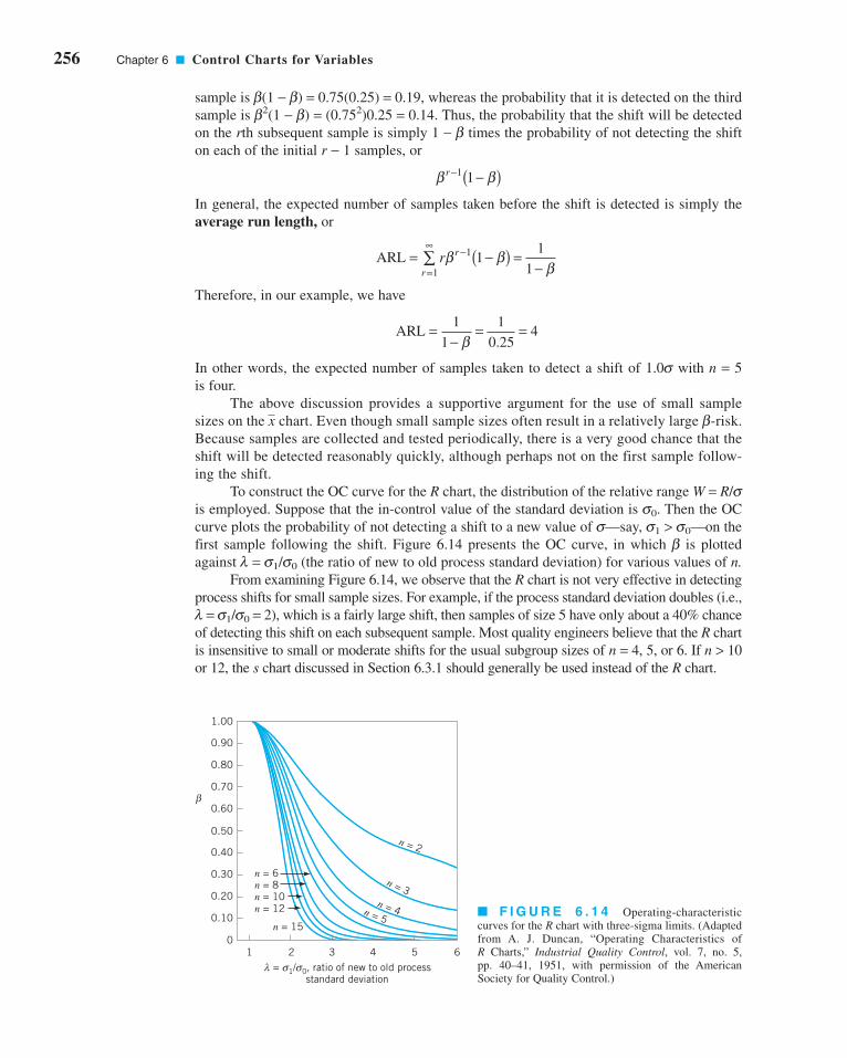
256 Chapter 6 ■ Control Charts for Variables
sample is b(1 − b) = 0.75(0.25) = 0.19, whereas the probability that it is detected on the third
sample is b2(1 − b) = (0.752)0.25 = 0.14. Thus, the probability that the shift will be detected
on the rth subsequent sample is simply 1 − b times the probability of not detecting the shift
on each of the initial r − 1 samples, or
In general, the expected number of samples taken before the shift is detected is simply the
average run length, or
Therefore, in our example, we have
In other words, the expected number of samples taken to detect a shift of 1.0s with n = 5
is four.
The above discussion provides a supportive argument for the use of small sample
sizes on the chart. Even though small sample sizes often result in a relatively large b-risk.
Because samples are collected and tested periodically, there is a very good chance that the
shift will be detected reasonably quickly, although perhaps not on the first sample follow-
ing the shift.
To construct the OC curve for the R chart, the distribution of the relative range W = R/sis employed. Suppose that the in-control value of the standard deviation is s0. Then the OC
curve plots the probability of not detecting a shift to a new value of s—say, s1 > s0—on the
first sample following the shift. Figure 6.14 presents the OC curve, in which b is plotted
against l = s1/s0 (the ratio of new to old process standard deviation) for various values of n.From examining Figure 6.14, we observe that the R chart is not very effective in detecting
process shifts for small sample sizes. For example, if the process standard deviation doubles (i.e.,
l = s1/s0 = 2), which is a fairly large shift, then samples of size 5 have only about a 40% chance
of detecting this shift on each subsequent sample. Most quality engineers believe that the R chart
is insensitive to small or moderate shifts for the usual subgroup sizes of n = 4, 5, or 6. If n > 10
or 12, the s chart discussed in Section 6.3.1 should generally be used instead of the R chart.
x
ARL =−
= =1
1
1
0 254
β .
ARL = −( ) =−
−
=
∞∑ r r
rβ β
β1
1
11
1
β βr − −( )11
1.00
0.90
0.80
0.70
0.60
0.50
0.40
0.30
0.20
0.10
0
β
1 2 3 4 5 6 = 1/ 0, ratio of new to old process
standard deviationλ σσ
n = 6n = 8n = 10n = 12
n = 15
n = 5n = 4
n = 3
n = 2
■ F I G U R E 6 . 1 4 Operating-characteristic
curves for the R chart with three-sigma limits. (Adapted
from A. J. Duncan, “Operating Characteristics of
R Charts,” Industrial Quality Control, vol. 7, no. 5,
pp. 40–41, 1951, with permission of the American
Society for Quality Control.)
c06ControlChartsForVariables.qxd 3/28/12 5:20 PM Page 256

The OC curves in Figures. 6.13 and 6.14 assume that the and R charts are used for
on-line process monitoring—that is, phase II process monitoring. It is occasionally useful to
study the statistical performance of a chart used to analyze past data (phase I). This can give
some indication of how the number of preliminary subgroups used to establish the control
chart affects the chart’s ability to detect out-of-control conditions that existed when the data
were collected. It is from such analytical studies, as well as practical experience, that the rec-
ommendation to use at least 20 to 25 preliminary subgroups in establishing and R charts
has evolved.
6.2.7 The Average Run Length for the Chart
For any Shewhart control chart, we have noted previously that the ARL can be expressed as
or
ARLone point plots out of control
= ( )1
P
x
x
x
(6.20)ARL0 = 1
α
(6.21)ARL1 =−1
1 β
for the in-control ARL and
for the out-of-control ARL. These results are actually rather intuitive. If the observations
plotted on the control chart are independent, then the number of points that must be plot-
ted until the first point exceeds a control limit is a geometric random variable with parame-
ter p (see Chapter 3). The mean of this geometric distribution is simply 1/p, the average run
length.
Since it is relatively easy to develop a general expression for b for the control chart to
detect a shift in the mean of ks [see equation 6.19], then it is not difficult to construct a set of
ARL curves for the chart. Figure 6.15 presents these ARL curves for sample sizes of n =1, 2, 3, 4, 5, 7, 9, and 16 for the control chart, where the ARL is in terms of the expected
number of samples taken in order to detect the shift. To illustrate the use of Figure 6.15, note
that if we wish to detect a shift of 1.5s using a sample size of n = 3, then the average num-
ber of samples required will be ARL1 = 3. Note also that we could reduce the ARL1 to approx-
imately 1 if we increased the sample size to n = 16.
Recall our discussion in Chapter 5 (Section 5.3.3) indicating that ARLs are subject to
some criticism as performance measures for control charts. We noted there (and above as
well) that the distribution of run length for a Shewhart control chart is geometric and that
this can be a very skewed distribution, so the average (that is, the ARL) may not be the best
measure of a typical run length. Another issue concerning ARL relates to the fact that the
computations for a specific control chart are usually based on estimates of the process
xx
x
6.2 Control Charts for and R 257xx
c06ControlChartsForVariables.qxd 3/28/12 5:20 PM Page 257

258 Chapter 6 ■ Control Charts for Variables
parameters. This results in inflation of both ARL0 and ARL1. For example, suppose that the
center line of the chart is estimated perfectly, but the process standard deviation is overes-
timated by 10%. This would result in ARL0 = 517, considerably longer than the nominal or
“theoretical” value of 370. With a normally distributed process, we are just as likely to
underestimate the process standard deviation by 10%, and this would result in ARL0 = 268,
a value considerably shorter than 370. The average is (268 + 517)/2 = 392.5, suggesting that
errors in estimating the process standard deviation result in ARLs that are overestimated.
There is a very comprehensive literature review and discussion of this topic in the paper by
Jensen et al. (2006).
Two other performance measures based on ARL are sometimes of interest. The average
time to signal is the number of time periods that occur until a signal is generated on the con-
trol chart. If samples are taken at equally spaced intervals of time h, then the average time tosignal or the ATS is
(6.22)ATS ARL = h
(6.23)I n= ARL
It may also be useful to express the ARL in terms of the expected number of individual
units sampled—say, I—rather than the number of samples taken to detect a shift. If the sam-
ple size is n, the relationship between I and ARL is
Figure 6.16 presents a set of curves that plot the expected number of individual units Ithat must be sampled for the chart to detect a shift of ks. To illustrate the use of the curve,
note that to detect a shift of 1.5s, an chart with n = 16 will require that approximately 16
units be sampled, whereas if the sample size is n = 3, only about 9 units will be required, on
the average.
xx
0123456789
10111213141516
Ave
rage
run
leng
th (
sam
ples
) to
det
ect
shif
t, A
RL
0 0.5 1.0 1.5 2.0 2.5 3.0
n = 16
579
4 3 2 1
k
■ F I G U R E 6 . 1 5 Average run length (sam-
ples) for the chart with three-sigma limits, where the
process mean shifts by ks. (Adapted from ModernMethods for Quality Control and Improvement, by
H. M. Wadsworth, K. S. Stephens, and A. B. Godfrey,
2nd edition, John Wiley & Sons, 2002.)
x
c06ControlChartsForVariables.qxd 3/28/12 5:20 PM Page 258

40
35
30
25
20
15
10
5
0.5 1.0 1.5 2.0 2.5 3.0 3.5
Exp
ecte
d in
divi
dual
uni
ts t
o de
fect
shi
ft,
I
k
n = 16
n = 9n = 7n = 5
n = 4
n = 3n = 2
n = 1
■ F I G U R E 6 . 1 6 Average run length
(individual units) for the chart with three-
sigma limits, where the process mean shifts by
ks. (Adapted from Modern Methods for QualityControl and Improvement, by H. M. Wadsworth,
K. S. Stephens, and A. B. Godfrey, 2nd edition,
John Wiley & Sons, 2002.)
x
6.3 Control Charts for and s 259xx
1Some authors refer to the s chart as the s chart.
6.3 Control Charts for and s
Although and R charts are widely used, it is occasionally desirable to estimate the
process standard deviation directly instead of indirectly through the use of the range R.This leads to control charts for and s, where s is the sample standard deviation.1
Generally, and s charts are preferable to their more familiar counterparts, and R charts,
when either
1. the sample size n is moderately large—say, n > 10 or 12 (recall that the range method
for estimating s loses statistical efficiency for moderate to large samples), or
2. the sample size n is variable.
In this section, we illustrate the construction and operation of and s control charts. We also
show how to deal with variable sample size and discuss an alternative to the s chart.
6.3.1 Construction and Operation of and s Charts
Setting up and operating control charts for and s requires about the same sequence of steps
as those for and R charts, except that for each sample we must calculate the sample average
and the sample standard deviation s. Table 6.3 presents the inside diameter measurements of
forged automobile engine piston rings. Each sample or subgroup consists of five piston rings.
We have calculated the sample average and sample standard deviation for each of the 25 sam-
ples. We will use these data to illustrate the construction and operation of and s charts.
If s 2 is the unknown variance of a probability distribution, then an unbiased estimator
of s2 is the sample variance
sx x
n
ii
n
2
2
1
1=
−( )−
=∑
x
xx
x
x
x
xxx
x
x
c06ControlChartsForVariables.qxd 3/28/12 5:20 PM Page 259

260 Chapter 6 ■ Control Charts for Variables
However, the sample standard deviation s is not an unbiased estimator of s. In Chapter 4
(Section 4.2) we observed that if the underlying distribution is normal, then s actually estimates
c4s, where c4 is a constant that depends on the sample size n. Furthermore, the standard devi-
ation of s is . This information can be used to establish control charts on and s.Consider the case where a standard value is given for s. Since E(s) = c4s, the center
line for the chart is c4s. The three-sigma control limits for s are then
It is customary to define the two constants
(6.24)B c c B c c5 4 42
6 4 423 1 3 1= − − = + − and
UCL
LCL
= + −
= − −
c c
c c
4 42
4 42
3 1
3 1
σ σ
σ σ
xs21 − c24
■ TA B L E 6 . 3
Inside Diameter Measurements (mm) for Automobile Engine Piston Rings
Sample Number Observations xi si
1 74.030 74.002 74.019 73.992 74.008 74.010 0.0148
2 73.995 73.992 74.001 74.011 74.004 74.001 0.0075
3 73.988 74.024 74.021 74.005 74.002 74.008 0.0147
4 74.002 73.996 73.993 74.015 74.009 74.003 0.0091
5 73.992 74.007 74.015 73.989 74.014 74.003 0.0122
6 74.009 73.994 73.997 73.985 73.993 73.996 0.0087
7 73.995 74.006 73.994 74.000 74.005 74.000 0.0055
8 73.985 74.003 73.993 74.015 73.988 73.997 0.0123
9 74.008 73.995 74.009 74.005 74.004 74.004 0.0055
10 73.998 74.000 73.990 74.007 73.995 73.998 0.0063
11 73.994 73.998 73.994 73.995 73.990 73.994 0.0029
12 74.004 74.000 74.007 74.000 73.996 74.001 0.0042
13 73.983 74.002 73.998 73.997 74.012 73.998 0.0105
14 74.006 73.967 73.994 74.000 73.984 73.990 0.0153
15 74.012 74.014 73.998 73.999 74.007 74.006 0.0073
16 74.000 73.984 74.005 73.998 73.996 73.997 0.0078
17 73.994 74.012 73.986 74.005 74.007 74.001 0.0106
18 74.006 74.010 74.018 74.003 74.000 74.007 0.0070
19 73.984 74.002 74.003 74.005 73.997 73.998 0.0085
20 74.000 74.010 74.013 74.020 74.003 74.009 0.0080
21 73.982 74.001 74.015 74.005 73.996 74.000 0.0122
22 74.004 73.999 73.990 74.006 74.009 74.002 0.0074
23 74.010 73.989 73.990 74.009 74.014 74.002 0.0119
24 74.015 74.008 73.993 74.000 74.010 74.005 0.0087
25 73.982 73.984 73.995 74.017 74.013 73.998 0.0162
Σ = 1,850.028 0.2351=x = 74.001 s = 0.0094
c06ControlChartsForVariables.qxd 3/28/12 5:20 PM Page 260

Values of B5 and B6 are tabulated for various sample sizes in Appendix Table VI. The para-
meters of the corresponding chart are given in equation 6.15, Section 6.2.3.
If no standard is given for s, then it must be estimated by analyzing past data. Suppose
that m preliminary samples are available, each of size n, and let si be the standard deviation
of the ith sample. The average of the m standard deviations is
The statistic is an unbiased estimator of s. Therefore, the parameters of the s chart
would be
We usually define the constants
(6.26)
Consequently, we may write the parameters of the s chart as
Bc
c Bc
c34
42
44
42
13
1 13
1= − − = + − and
UCL
Center line =
LCL
= + −
= − −
ss
cc
s
ss
cc
3 1
3 1
442
442
s/c4
sm
sii
m=
=∑1
1
x
(6.27)
UCL
Center line =
LCL
=
=
B s
s
B s
4
3
Note that B4 = B6/c4 and B3 = B5/c4.
When is used to estimate s, we may define the control limits on the correspond-
ing chart as
UCL
Center line =
LCL
= +
= −
xs
c n
x
xs
c n
3
3
4
4
xs/c4
6.3 Control Charts for and s 261xx
(6.25)
UCL
Center line =
LCL
4
=
=
B
c
B
6
5
σσσ
Consequently, the parameters of the s chart with a standard value for s given become
c06ControlChartsForVariables.qxd 3/28/12 5:21 PM Page 261

262 Chapter 6 ■ Control Charts for Variables
The constants B3, B4, and A3 for construction of and s charts from past data are listed in
Appendix Table VI for various sample sizes.
Note that we have assumed that the sample standard deviation is defined as
(6.29)
Some authors define s with n in the denominator of equation 6.29 instead of n − 1. When this
is the case, the definitions of the constants c4, B3, B4, and A3 are altered. The corresponding
constants based on the use of n in calculating s are called c2, B1, B2, and A1, respectively. See
Bowker and Lieberman (1972) for their definitions.
Traditionally, quality engineers have preferred the R chart to the s chart because of the
simplicity of calculating R from each sample. The availability of handheld calculators with
automatic calculation of s and computers at workstations to implement control charts on site
have eliminated any computational difficulty.
sx x
n
ii
n
=−( )
−=∑ 2
1
1
x
EXAMPLE 6.3 and s Charts for the Piston Ring Datax
and for the s chart
The control charts are shown in Figure 6.17. There is no indi-
cation that the process is out of control, so those limits could
be adopted for phase II monitoring of the process.
UCL
CL =
LCL
= = ( )( ) ==
= = ( )( ) =
B s
s
B s
4
3
2 089 0 0094 0 0196
0 0094
0 0 0094 0
. . .
.
.
Construct and interpret and s charts using the piston ring
inside diameter measurements in Table 6.3.
x
SOLUTION
The grand average and the average standard deviation are
and
respectively. Consequently, the parameters for the chart
are
UCL
CL =
LCL
= + = + ( )( ) =
=
= − = − ( )( ) =
x A s
x
x A s
3
3
74 001 1 427 0 0094 74 014
74 001
74 001 1 427 0 0094 73 988
. . . .
.
. . . .
x
s sii
= = ( ) ==∑1
25
1
250 2351 0 0094
1
25
. .
x xii
= = ( ) ==∑1
25
1
251,850.028 74.001
1
25
(6.28)
UCL
Center line =
LCL
= +
= −
x A s
x
x A s
3
3
Let the constant . Then the chart parameters becomexA3 = 3/(c41n)
c06ControlChartsForVariables.qxd 3/28/12 5:21 PM Page 262
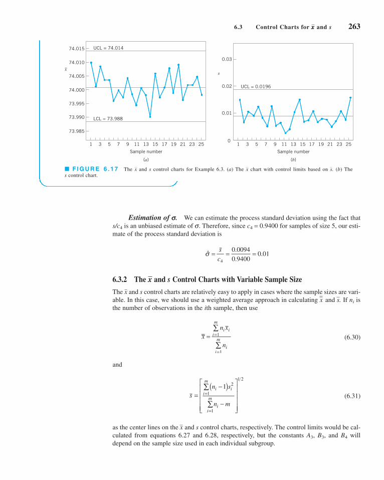
74.015
74.010
74.005
74.000
73.995
73.990
73.985
UCL = 74.014
LCL = 73.988
1 3 5 7 9 11 13 15 17 19 21 23 25
Sample number
x
(a)
0.03
0.02
0.01
0 1 3 5 7 9 11 13 15 17 19 21 23 25
Sample number
UCL = 0.0196
s
(b)
■ F I G U R E 6 . 1 7 The and s control charts for Example 6.3. (a) The chart with control limits based on . (b) The
s control chart.
sxx
Estimation of s. We can estimate the process standard deviation using the fact that
s/c4 is an unbiased estimate of s. Therefore, since c4 = 0.9400 for samples of size 5, our esti-
mate of the process standard deviation is
6.3.2 The and s Control Charts with Variable Sample Size
The and s control charts are relatively easy to apply in cases where the sample sizes are vari-
able. In this case, we should use a weighted average approach in calculating and . If ni is
the number of observations in the ith sample, then use
(6.30)
and
(6.31)
as the center lines on the and s control charts, respectively. The control limits would be cal-
culated from equations 6.27 and 6.28, respectively, but the constants A3, B3, and B4 will
depend on the sample size used in each individual subgroup.
x
sn s
n m
i ii
m
ii
m=−( )
−
⎡
⎣
⎢⎢⎢⎢
⎤
⎦
⎥⎥⎥⎥
=
=
∑
∑
12
1
1
1 2
xn x
n
i ii
m
ii
m= =
=
∑
∑1
1
sxx
x
ˆ.
..σ = = =s
c4
0 0094
0 94000 01
6.3 Control Charts for and s 263xx
c06ControlChartsForVariables.qxd 3/28/12 5:21 PM Page 263

264 Chapter 6 ■ Control Charts for Variables
sizes vary from n = 3 to n = 5. Use the procedure described on
page 255 to set up the and s control charts.x
EXAMPLE 6.4
Consider the data in Table 6.4, which is a modification of the
piston-ring data used in Example 6.3. Note that the sample
x_
and s Chart for the Piston Rings, Variable Sample Size
SOLUTION
The weighted grand mean and weighted average standard
deviation are computed from equations 6.30 and 6.31 as
follows:
xn x
n
i ii
ii
= = ( ) + ( ) + + ( )+ + +
=
=
=
∑
∑1
25
1
255 74 010 3 73 996 5 73 998
5 3 5
113= 74.001
. . .
8,362.075
L
L
■ TA B L E 6 . 4
Inside Diameter Measurements (mm) on Automobile Engine Piston Rings
Sample Number Observations xi si
1 74.030 74.002 74.019 73.992 74.008 74.010 0.0148
2 73.995 73.992 74.001 73.996 0.0046
3 73.988 74.024 74.021 74.005 74.002 74.008 0.0147
4 74.002 73.996 73.993 74.015 74.009 74.003 0.0091
5 73.992 74.007 74.015 73.989 74.014 74.003 0.0122
6 74.009 73.994 73.997 73.985 73.996 0.0099
7 73.995 74.006 73.994 74.000 73.999 0.0055
8 73.985 74.003 73.993 74.015 73.988 73.997 0.0123
9 74.008 73.995 74.009 74.005 74.004 0.0064
10 73.998 74.000 73.990 74.007 73.995 73.998 0.0063
11 73.994 73.998 73.994 73.995 73.990 73.994 0.0029
12 74.004 74.000 74.007 74.000 73.996 74.001 0.0042
13 73.983 74.002 73.998 73.994 0.0100
14 74.006 73.967 73.994 74.000 73.984 73.990 0.0153
15 74.012 74.014 73.998 74.008 0.0087
16 74.000 73.984 74.005 73.998 73.996 73.997 0.0078
17 73.994 74.012 73.986 74.005 73.999 0.0115
18 74.006 74.010 74.018 74.003 74.000 74.007 0.0070
19 73.984 74.002 74.003 74.005 73.997 73.998 0.0085
20 74.000 74.010 74.013 74.008 0.0068
21 73.982 74.001 74.015 74.005 73.996 74.000 0.0122
22 74.004 73.999 73.990 74.006 74.009 74.002 0.0074
23 74.010 73.989 73.990 74.009 74.014 74.002 0.0119
24 74.015 74.008 73.993 74.000 74.010 74.005 0.0087
25 73.982 73.984 73.995 74.017 74.013 73.998 0.0162
c06ControlChartsForVariables.qxd 3/28/12 5:21 PM Page 264
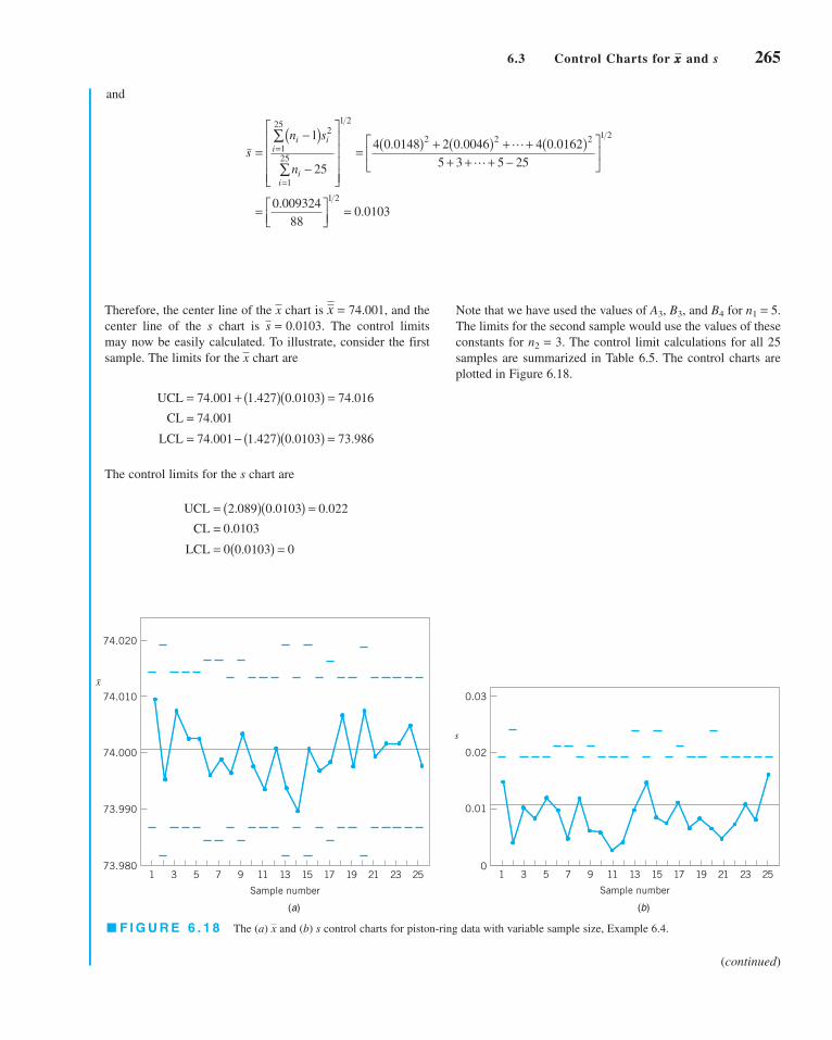
Note that we have used the values of A3, B3, and B4 for n1 = 5.
The limits for the second sample would use the values of these
constants for n2 = 3. The control limit calculations for all 25
samples are summarized in Table 6.5. The control charts are
plotted in Figure 6.18.
(continued)
1 3 5 7 9 11 13 15 17 19 21 23 25
0.03
0.02
0.01
0
s
Sample number
74.020
74.010
74.000
73.990
73.980
x
1 3 5 7 9 11 13 15 17 19 21 23 25
Sample number
■ F I G U R E 6 . 1 8 The (a) and (b) s control charts for piston-ring data with variable sample size, Example 6.4.x
(a) (b)
Therefore, the center line of the chart is and the
center line of the s chart is The control limits
may now be easily calculated. To illustrate, consider the first
sample. The limits for the chart are
The control limits for the s chart are
UCLCL = .0103
LCL
= ( )( ) =
= ( ) =
2 089 0 0103 0 02200 0 0103 0
. . .
.
UCL
CL =
LCL
= + ( )( ) =
= − ( )( ) =
74 001 1 427 0 0103 74 016
74 001
74 001 1 427 0 0103 73 986
. . . .
.
. . . .
x
s = 0.0103.
= 74.001,xx
and
sn s
n
i ii
ii
=−( )
−
⎡
⎣
⎢⎢⎢⎢
⎤
⎦
⎥⎥⎥⎥
= ( ) + ( ) + + ( )+ + + −
⎡
⎣⎢
⎤
⎦⎥
= ⎡⎣⎢
⎤⎦⎥
=
=
=
∑
∑
1
25
4 0 0148 2 0 0046 4 0 0162
5 3 5 25
0 009324
880 0103
2
1
25
1
25
1 2
2 2 2 1 2
1 2
. . .
..
L
L
6.3 Control Charts for and s 265xx
c06ControlChartsForVariables.qxd 3/28/12 5:21 PM Page 265

266 Chapter 6 ■ Control Charts for Variables
An alternative to using variable-width control limits on the and s control charts is to
base the control limit calculations on an average sample size . If the ni are not very differ-
ent, this approach may be satisfactory in some situations; it is particularly helpful if the charts
are to be used in a presentation to management. Since the average sample size ni may not be
an integer, a useful alternative is to base these approximate control limits on a modal (most
common) sample size.
Estimation of s. We may estimate the process standard deviation, s, from the indi-
vidual sample values si. First, average all the values of si for which ni = 5 (the most frequently
occurring value of ni). This gives
s = =0 1715
170 0101
..
nx
■ TA B L E 6 . 5
Computation of Control Limits for x– and s Charts with Variable Sample Size
x Chart s Chart
Sample n x s A3 LCL UCL B3 B4 LCL UCL
1 5 74.010 0.0148 1.427 73.986 74.016 0 2.089 0 0.022
2 3 73.996 0.0046 1.954 73.981 74.021 0 2.568 0 0.026
3 5 74.008 0.0147 1.427 73.986 74.016 0 2.089 0 0.022
4 5 74.003 0.0091 1.427 73.986 74.016 0 2.089 0 0.022
5 5 74.003 0.0122 1.427 73.986 74.016 0 2.089 0 0.022
6 4 73.996 0.0099 1.628 73.984 74.018 0 2.266 0 0.023
7 4 73.999 0.0055 1.628 73.984 74.018 0 2.266 0 0.023
8 5 73.997 0.0123 1.427 73.986 74.016 0 2.089 0 0.022
9 4 74.004 0.0064 1.628 73.984 74.018 0 2.266 0 0.023
10 5 73.998 0.0063 1.427 73.986 74.016 0 2.089 0 0.022
11 5 73.994 0.0029 1.427 73.986 74.016 0 2.089 0 0.022
12 5 74.001 0.0042 1.427 73.986 74.016 0 2.089 0 0.022
13 3 73.994 0.0100 1.954 73.981 74.021 0 2.568 0 0.026
14 5 73.990 0.0153 1.427 73.986 74.016 0 2.089 0 0.022
15 3 74.008 0.0087 1.954 73.981 74.021 0 2.568 0 0.026
16 5 73.997 0.0078 1.427 73.986 74.016 0 2.089 0 0.022
17 4 73.999 0.0115 1.628 73.984 74.018 0 2.226 0 0.023
18 5 74.007 0.0070 1.427 73.986 74.016 0 2.089 0 0.022
19 5 73.998 0.0085 1.427 73.986 74.016 0 2.089 0 0.022
20 3 74.008 0.0068 1.954 73.981 74.021 0 2.568 0 0.026
21 5 74.000 0.0122 1.427 73.986 74.016 0 2.089 0 0.022
22 5 74.002 0.0074 1.427 73.986 74.016 0 2.089 0 0.022
23 5 74.002 0.0119 1.427 73.986 74.016 0 2.089 0 0.022
24 5 74.005 0.0087 1.427 73.986 74.016 0 2.089 0 0.022
25 5 73.998 0.0162 1.427 73.986 74.016 0 2.089 0 0.022
c06ControlChartsForVariables.qxd 3/28/12 5:21 PM Page 266

The estimate of the process s is then
where the value of c4 used is for samples of size n = 5.
6.3.3 The s2 Control Chart
Most quality engineers use either the R chart or the s chart to monitor process variability, with
s preferable to R for moderate to large sample sizes. Some practitioners recommend a control
chart based directly on the sample variance s2, the s2 control chart. The parameters for the
s2 control chart are
(6.32)
where c2a/2, and c2
(a/2),n−1 denote the upper and lower a/2 percentage points of the chi-square
distribution with n − 1 degrees of freedom, and is an average sample variance obtained from
the analysis of preliminary data. A standard value s2 could be used in equation 6.32 instead of
if one were available. Note that this control chart is defined with probability limits.
6.4 The Shewhart Control Chart for Individual Measurements
There are many situations in which the sample size used for process monitoring is n = 1; that
is, the sample consists of an individual unit. Some examples of these situations are as follows:
1. Automated inspection and measurement technology is used, and every unit manufac-
tured is analyzed so there is no basis for rational subgrouping.
2. Data become available relatively slowly, and it is inconvenient to allow sample sizes of
n > 1 to accumulate before analysis. The long interval between observations will cause
problems with rational subgrouping. This occurs frequently in both manufacturing and
nonmanufacturing situations.
3. Repeat measurements on the process differ only because of laboratory or analysis error,
as in many chemical processes.
4. Multiple measurements are taken on the same unit of product, such as measuring oxide
thickness at several different locations on a wafer in semiconductor manufacturing.
5. In process plants, such as papermaking, measurements on some parameters, such as
coating thickness across the roll, will differ very little and produce a standard deviation
that is much too small if the objective is to control coating thickness along the roll.
6. Individual measurements are very common in many transactional, business, and service
processes because there is no basis for rational subgrouping. Sometimes this happens
because there are large time gaps between service activities.
s 2
s 2
UCL
Center line =
LCL
2
2
=−
=−
−
−( ) −
s
n
s
s
n
n
n
2
2 12
1 2 12
1
1
χ
χ
α
α
,
,
ˆ.
..σ = = =s
c4
0 0101
0 94000 01
6.4 The Shewhart Control Chart for Individual Measurements 267
c06ControlChartsForVariables.qxd 3/28/12 5:21 PM Page 267

268 Chapter 6 ■ Control Charts for Variables
In such situations, the control chart for individual units is useful. (The cumulative sum and
exponentially weighted moving-average control charts discussed in Chapter 9 will be a better
alternative in phase II or when the magnitude of the shift in process mean that is of interest is
small.) In many applications of the individuals control chart, we use the moving range of two
successive observations as the basis of estimating the process variability. The moving range
is defined as
It is also possible to establish a moving range control chart. The procedure is illustrated in
the following example.
MRi i ix x= − −1
EXAMPLE 6.5
The mortgage loan processing unit of a bank monitors the
costs of processing loan applications. The quantity tracked is
the average weekly processing costs, obtained by dividing
total weekly costs by the number of loans processed during
the week. The processing costs for the most recent 20 weeks
are shown in Table 6.6. Set up individual and moving range
control charts for these data.
Loan Processing Costs
SOLUTION
To set up the control chart for individual observations, note
that the sample average cost of the 20 observations is
and that the average of the moving ranges of two
observations is . To set up the moving range chart,
we use D3 = 0 and D4 = 3.267 for n = 2. Therefore, the
moving range chart has center line LCL = 0, and
UCL = D4 The control chart
(from Minitab) is shown in Figure 6.19b. Notice that no points
are out of control.
For the control chart for individual measurements, the
parameters are
(6.33)
If a moving range of n = 2 observations is used, then d2 =1.128. For the data in Table 6.6, we have
UCLMR
Center line =
LCLMR
= +
= −
xd
x
xd
3
3
2
2
MR = (3.267)7.79 = 25.45.
MR = 7.79,
MR = 7.79
x = 300.5
■ TA B L E 6 . 6
Costs of Processing Mortgage Loan Applications
Weeks Cost x Moving Range MR
1 310
2 288 22
3 297 9
4 298 1
5 307 9
6 303 4
7 294 9
8 297 3
9 308 11
10 306 2
11 294 12
12 299 5
13 297 2
14 299 2
15 314 15
16 295 19
17 293 2
18 306 13
19 301 5
20 304 3
x = 300.5—MR = 7.79
c06ControlChartsForVariables.qxd 3/28/12 5:21 PM Page 268

Phase II Operation and Interpretation of the Charts. Table 6.7 contains data on
mortgage application processing costs for weeks 21–40. These data are plotted in Figure 6.20
on the continuation of the control chart for individuals and the moving range control chart
developed in Example 6.5. As this figure makes clear, an upward shift in cost has occurred
around week 39, since there is an obvious “shift in process level” pattern on the chart for indi-
viduals followed by another out-of-control signal at week 40. Note that the moving range
chart also reacts to this level shift with a single large spike at week 39. This spike on the moving
range chart is sometimes helpful in identifying exactly where a process shift in the mean has
occurred. Clearly one should look for possible assignable causes around weeks 39. Possible
causes could include an unusual number of applications requiring additional manual under-
writing work, or possibly new underwriters working in the process, or possibly temporary
underwriters replacing regular employees taking vacations.
Some care should be exercised in interpreting patterns on the moving range chart.
The moving ranges are correlated, and this correlation may often induce a pattern of runs
or cycles on the chart. Such a pattern is evident on the moving range chart in Figure 6.21.
The individual measurements on the x chart are assumed to be uncorrelated, however, and
any apparent pattern on this chart should be carefully investigated.
shift in the process mean will result in a single point or a
series of points that plot outside the control limits on the
control chart for individuals. Sometimes a point will plot
outside the control limits on both the individuals chart and
the moving range chart. This will often occur because a large
value of x will also lead to a large value of the moving range
for that sample. This is very typical behavior for the individ-
uals and moving range control charts. It is most likely an
indication that the mean is out of control and not an indica-
tion that both the mean and the variance of the process are
out of control.
The control chart for individual cost values is shown in
Figure 6.19a. There are no out-of-control observations on
the individuals control chart.
The interpretation of the individuals control chart is very
similar to the interpretation of the ordinary control chart. Ax
UCLMR
Center line = 4.088
LCLMR
= + = + =
=
= − = − =
xd
x
xd
3 300.5 37.79
1 128321.22
3
3 300.5 3 279.78
2
2
.
7.79
1 128.
320
310
300
290
280
Indi
vidu
al v
alue
UCL = 321.22
LCL = 279.78
X = 300.5
2 4 6 8 10 12 14 16 18 20
Observation(a)
Observation(b)
24
18
12
6
0
Mov
ing
rang
e
UCL = 25.45
LCL = 0
MR = 7.79
2 4 6 8 10 12 14 16 18 20
■ F I G U R E 6 . 1 9 Control charts for (a) individual observations on cost and for (b) the moving range.
6.4 The Shewhart Control Chart for Individual Measurements 269
c06ControlChartsForVariables.qxd 3/28/12 5:21 PM Page 269

270 Chapter 6 ■ Control Charts for Variables
Some authorities have recommended not constructing and plotting the moving range
chart. They point out (correctly, we add) that the moving range chart cannot really provide
useful information about a shift in process variability. For example, see Rigdon, Cruthis, and
Champ (1994). In effect, shifts in the process mean also show up on the moving range chart.
Our feeling is that as long as the analyst is careful in interpretation and relies primarily on the
individuals chart, little trouble will ensue from plotting both charts.
Average Run Lengths. Crowder (1987b) has studied the average run length of the
combined control chart for individuals and moving range chart. He produces ARLs for various
settings of the control limits and shifts in the process mean and standard deviation. In general, his
work shows that the ARL0 of the combined procedure will generally be much less than the ARL0
of a standard Shewhart control chart when the process is in control (recall that ARL0 for a
Shewhart chart is 370 samples), if we use the conventional three-sigma limits on the charts. In
UCL = 25.45
LCL = 0
MR = 7.79
Observation
40
10
20
30
8 12 16 20 24 28 32 36 40
Mov
ing
rang
e
UCL = 321.22
11
1
LCL = 279.78
X = 300.5
Observation
4280
300
320
340
8 12 16 20 24 28 32 36 40
Indi
vidu
al v
alue
Individuals and Moving Range Charts of Cost
■ F I G U R E 6 . 2 0 Continuation of the control chart for individuals and the moving range using the
additional data in Table 6.7.
■ TA B L E 6 . 7
Costs of Processing Mortgage Loan Applications, Weeks 21–40
Week Cost x Week Cost x
21 305
22 282
23 305
24 296
25 314
26 295
27 287
28 301
29 298
30 311
31 310
32 292
33 305
34 299
35 304
36 310
37 304
38 305
39 333
40 328
c06ControlChartsForVariables.qxd 3/28/12 5:21 PM Page 270

general, results closer to the Shewhart in-control ARL are obtained if we use three-sigma limits
on the chart for individuals and compute the upper control limit on the moving range chart from
where the constant D should be chosen such that 4 ≤ D ≤ 5.
One can get a very good idea about the ability of the individuals control chart to detect
process shifts by looking at the OC curves in Figure 6.13 or the ARL curves in Figure 6.15.
For an individuals control chart with three-sigma limits, we can compute the following:
Size of Shift b ARL1
1s 0.9772 43.96
2s 0.8413 6.30
3s 0.5000 2.00
Note that the ability of the individuals control chart to detect small shifts is very poor. For
instance, consider a continuous chemical process in which samples are taken every hour. If a
shift in the process mean of about one standard deviation occurs, the information above tells
us that it will take about 44 samples, on the average, to detect the shift. This is nearly two full
days of continuous production in the out-of-control state, a situation that has potentially dev-
astating economic consequences. This limits the usefulness of the individuals control chart in
phase II process monitoring.
Some individuals have suggested that control limits narrower than three-sigma be used
on the chart for individuals to enhance the ability to detect small process shifts. This is a dan-
gerous suggestion, as narrower limits will dramatically reduce the value of ARL0 and increase
the occurrence of false alarms to the point where the charts are ignored and hence become
useless. If we are interested in detecting small shifts in phase II, then the correct approach is
to use either the cumulative sum control chart or the exponentially weighted moving average
control chart (see Chapter 9).
Normality. Our discussion in this section has made an assumption that the observations
follow a normal distribution. Borror, Montgomery, and Runger (1999) have studied the phase II
performance of the Shewhart control chart for individuals when the process data are not normal.
They investigated various gamma distributions to represent skewed process data and t distribu-
tions to represent symmetric normal-like data. They found that the in-control ARL is dramatically
affected by non-normal data. For example, if the individuals chart has three-sigma limits so that
UCL MR= D
6.4 The Shewhart Control Chart for Individual Measurements 271
2851
5
10
20304050607080
90
95
99
290 295 300 305 310 315 320
Cost
Per
cent
age
■ F I G U R E 6 . 2 1Normal probability plot of the
mortgage application processing
cost data from Table 6.6,
Example 6.5.
c06ControlChartsForVariables.qxd 3/28/12 5:21 PM Page 271

272 Chapter 6 ■ Control Charts for Variables
a single-wafer deposition process. Construct an individuals
control chart for this process.
EXAMPLE 6.6
Table 6.8 presents consecutive measurements on the resistiv-
ity of 25 silicon wafers after an epitaxial layer is deposited in
The Use of Transformations
for normal data ARL0 = 370, the actual ARL0 for gamma-distributed data is between 45 and 97,
depending on the shape of the gamma distribution (more highly skewed distributions yield poorer
performance). For the t distribution, the ARL0 values range from 76 to 283 as the degrees of free-
dom increase from 4 to 50 (that is, as the t becomes more like the normal distribution).
In the face of these results, we conclude that if the process shows evidence of even mod-
erate departure from normality, the control limits given here may be entirely inappropriate for
phase II process monitoring. One approach to dealing with the problem of non-normality
would be to determine the control limits for the individuals control chart based on the per-
centiles of the correct underlying distribution. These percentiles could be obtained from a his-
togram if a large sample (at least 100 but preferably 200 observations) were available, or from
a probability distribution fit to the data. See Willemain and Runger (1996) for details on
designing control charts from empirical reference distributions. Another approach would be
to transform the original variable to a new variable that is approximately normally distributed,
and then apply control charts to the new variable. Borror, Montgomery, and Runger (1999)
show how a properly designed EWMA control chart is very insensitive to the normality
assumption. This approach will be discussed in Chapter 9.
It is important to check the normality assumption when using the control chart for indi-
viduals. A simple way to do this is with the normal probability plot. Figure 6.21 is the nor-
mal probability plot for the mortgage application processing cost data in Table 6.6. There is
no obvious problem with the normality assumption in these data. However, remember that the
normal probability plot is but a crude check of the normality assumption and the individuals
control chart is very sensitive to non-normality. Furthermore, mean shifts could show up as a
problem with normality on the normal probability plot. Process stability is needed to properly
interpret the plot. We suggest that the Shewhart individuals chart be used with extreme cau-
tion, particularly in phase II process monitoring.
■ TA B L E 6 . 8
Resistivity Data for Example 6.6
Sample, i Resistivity (xi) ln (xi) MR
1 216 5.37528
2 290 5.66988 0.29460
3 236 5.46383 0.20605
4 228 5.42935 0.03448
5 244 5.49717 0.06782
6 210 5.34711 0.15006
7 139 4.93447 0.41264
8 310 5.73657 0.80210
9 240 5.48064 0.25593
10 211 5.35186 0.12878
11 175 5.16479 0.18707
12 447 6.10256 0.93777
13 307 5.72685 0.37571
Sample, i Resistivity (xi) ln (xi) MR
14 242 5.48894 0.23791
15 168 5.12396 0.36498
16 360 5.88610 0.76214
17 226 5.42053 0.46557
18 253 5.53339 0.11286
19 380 5.94017 0.40678
20 131 4.87520 1.06497
21 173 5.15329 0.27809
22 224 5.41165 0.25836
23 195 5.27300 0.13865
24 199 5.29330 0.02030
25 226 5.42053 0.12723
——ln (xi) = 5.44402
—MR = 0.33712
c06ControlChartsForVariables.qxd 3/28/12 5:21 PM Page 272

6.4 The Shewhart Control Chart for Individual Measurements 273
SOLUTION
A normal probability plot of the resistivity measurements is
shown in Figure 6.22. This plot was constructed by Minitab,
which fits the line to the points by least squares (not the best
method). It is clear from inspection of the normal probability
plot that the normality assumption for resistivity is at best
questionable, so it would be dangerous to apply an individuals
control chart to the original process data.
Figure 6.22 indicates that the distribution of resistivity
has a long tail to the right, and consequently we would
expect the log transformation (or a similar transformation)
to produce a distribution that is closer to normal. The nat-
130 230 330 430 530
Resistivity
0.1
1
5
20
50
80
95
99
99.9
Cum
ulat
ive
perc
enta
ge
■ F I G U R E 6 . 2 2 Normal probability plot of
resistivity.
99
99.9
95
80
50
20
51
0.14.8 5.1 5.4 5.7 6 6.3
ln (Resistivity)
Cum
ulat
ive
perc
enta
ge
■ F I G U R E 6 . 2 3 Normal probability plot of
ln (resistivity).
ural log of resistivity is shown in column three of Table 6.8,
and the normal probability plot of the natural log of resistiv-
ity is shown in Figure 6.23. Clearly the log transformation
has resulted in a new variable that is more nearly approxi-
mated by a normal distribution than were the original resis-
tivity measurements.
The last column of Table 6.8 shows the moving ranges of
the natural log of resistivity. Figure 6.24 presents the individ-
uals and moving range control charts for the natural log of
resistivity. Note that there is no indication of an out-of-control
process.
6.5
6.1
5.7
5.3
4.9
4.5
In(x
i)
0 5 10 15 20 254.54743
5.44402
6.34061
1.10137
0 5 10 15 20 25
0.33712
0
1.2
1
0.8
0.6
0.4
0.2
0
MR
i
■ F I G U R E 6 . 2 4 Individuals and moving range control charts on ln (resistivity),
Example 6.6
c06ControlChartsForVariables.qxd 3/28/12 5:21 PM Page 273

274 Chapter 6 ■ Control Charts for Variables
More about Estimating s . Very often in practice we use moving ranges in
estimating s for the individuals control chart. Recall that moving ranges are defined as
MRi = (xi − xi−1) , i = 2, 3 . . . , m. More properly, this statistic should be called a moving
range of span two since the number of observations used to calculate the range in the
moving window could be increased. The most common estimator is the one we used in
Example 6.5, based on the average moving range and can be
written as
where the constant 0.8865 is the reciprocal of d2 for samples of size 2. For in-control
processes, Cryer and Ryan (1990), among others, have pointed out that a more efficient esti-
mator is one based on the sample standard deviation
Both of these estimators are unbiased, assuming that no assignable causes are present in the
sequence of m individual observations.
If assignable causes are present, then both and result in biased estimates of
the process standard deviation. To illustrate, suppose that in the sequence of individual
observations
the process is in control with mean m0 and standard deviation s for the first t observations, but
between xt and xt +1 an assignable cause occurs that results in a sustained shift in the process
mean to a new level m = m0 + ds and the mean remains at this new level for the remaining sam-
ple observations xt + 1, . . . , xm. Under these conditions, Woodall and Montgomery (2000–2001)
show that
In fact, this result holds for any case in which the mean of t of the observations is m0 and the
mean of the remaining observations is m0 + ds, since the order of the observations is not rel-
evant in computing s2. Therefore, s2 is biased upward, and consequently will tend
to overestimate s. Note that the extent of the bias in depends on the magnitude of the shift
in the mean (ds), the time period following which the shift occurs (t), and the number of
available observations (m). Now the moving range is only impacted by the shift in the mean
during one period (t + 1), so the bias in depends only on the shift magnitude and m. If
1 < t < m − 1, the bias in will always be smaller than the bias in . Cruthis and Rigdon
(1992–1993) show how the ratio
can be used to determine whether the process was in control when both estimates were cal-
culated. They use simulation to obtain the approximate 90th, 95th, 99th, and 99.9th per-
centiles of the distribution of F* for sample sizes m = 10(5)100, assuming that the process is
in control. Since this is an empirical reference distribution, observed values of F* that exceed
one of these percentiles is an indication that the process was not in control over the time
period during which the m observations were collected.
F* ˆ
ˆ=
⎛⎝⎜
⎞⎠⎟
σσ
1
2
2
s2s1
s1
s2
s2 = S/c4
E st m
m m2 2 21
1( ) = + −( )
−( ) ( )σ δσ
x x x x xt t m1 2 1, , . , , , . , . . . . +
s2s1
σ24
= s
c
ˆ .σ1 0 8865= MR
MR = am
i =2MRi/(m− 1)
��
c06ControlChartsForVariables.qxd 3/28/12 5:21 PM Page 274

One way to reduce or possibly eliminate the bias in estimating s when a sustained shift
in the mean is present is to base the estimator on the median of the moving ranges of span
two, as suggested by Clifford (1959) and Bryce, Gaudard, and Joiner (1997–1998). This esti-
mator is
where is the median of the span-two moving ranges, and 1.047 is the reciprocal of the
control chart constant d4 for subgroups of size two defined such that and is the
median range. A table of d4 values is in Wadsworth, Stephens, and Godfrey (2002).
Essentially, only one of the span-two moving ranges should be affected by the sustained shift,
and this single large moving range will have little impact on the value of the median moving
range, certainly much less impact than it will have on the average moving range. Constructing
an individuals control chart using the median moving range to estimate s is an option in
Minitab.
Now suppose that the assignable cause affects a single observation rather than causing
a sustained shift in the mean. If there is a single observation that has mean m0 + ds, then
and this observation will affect two of the span-two moving ranges. If there are two adjacent
such observations, then
and two of the span-two moving ranges will be affected by the out-of-control observations.
Thus, when the assignable cause affects one or only a few adjacent observations, we expect
the bias in s2 to be smaller than when a sustained shift occurs. However, if an assignable cause
producing a sustained shift in the mean occurs either very early in the sequence of observa-
tions or very late, it will produce much the same effect as an assignable cause affecting only
one or a few adjacent points.
Some authors have suggested basing the estimate of s on moving ranges of span
greater than two, and some computer programs for control charts offer this as an option. It
is easy to show that this will always lead to potentially increased bias in the estimate of swhen assignable causes are present. Note that if one uses a span-three moving range and
there is a single observation whose mean is affected by the assignable cause, then this sin-
gle observation will affect up to three of the moving ranges. Thus, a span-three moving
range will result in more bias in the estimate of s than will the moving range of span two.
Furthermore, two span-three moving ranges will be affected by a sustained shift. In gen-
eral, if one uses a span-w moving range and there is a single observation whose mean is
affected by the assignable cause, up to w of these moving ranges will be impacted by this
observation. Furthermore, if there is a sustained shift in the mean, up to w – 1 of the mov-
ing ranges will be affected by the shift in the mean. Consequently, increasing the span of a
moving average beyond two results in increasing the bias in the estimate of s if assignable
causes that either produce sustained shifts in the process mean or that affect the mean of a
single observation (or a few adjacent ones) are present. In fact, Wetherill and Brown (1991)
advise plotting the estimate of s versus the span of the moving average used to obtain the
estimate. A sharply rising curve indicates the presence of assignable causes. For more dis-
cussion of using ranges to estimate process variability, see Woodall and Montgomery
(2000–2001).
E sm
m m2 2 22 2
1( ) = + −( )
−( ) ( )σ δσ
E sm
2 2 21( ) = + ( )σ δσ
R~E(R~
) = d4sMR
σ3 1.047MR=
6.4 The Shewhart Control Chart for Individual Measurements 275
c06ControlChartsForVariables.qxd 3/28/12 5:21 PM Page 275
276 Chapter 6 ■ Control Charts for Variables
6.5 Summary of Procedures for x– , R, and s Charts
It is convenient to summarize in one place the various computational formulas for the major types
of variables control charts discussed in this chapter. Table 6.9 summarizes the formulas for , R,
and s charts when standard values for m and s are given. Table 6.10 provides the corresponding
summary when no standard values are given and trial control limits must be established from
analysis of past data. The constants given for the s chart assume that n – 1 is used in the denom-
inator of s. All constants are tabulated for various sample sizes in Appendix Table VI.
6.6 Applications of Variables Control Charts
There are many interesting applications of variables control charts. In this section, a few of
them will be described to give additional insights into how the control chart works, as well as
ideas for further applications.
x
■ TA B L E 6 . 9
Formulas for Control Charts, Standards Given
Chart Center Line Control Limits
(m and s given) m m ± AsR (s given) d2s UCL = D2s, LCL = D1ss (s given) c4s UCL = B6s, LCL = B5s
x
■ TA B L E 6 . 1 0
Formulas for Control Charts, Control Limits Based on Past Data(No Standards Given)
Chart Center Line Control Limits
(using R)=x
=x ± A2
(using s)=x
=x ± A3 S
R UCL = D4 , LCL = D3
s s UCL = B4s, LCL = B3s
RRR
x
Rx
and, in general, produced a part that exhibited considerably
less variability than parts from supplier A, but its process was
centered so far off the nominal required dimension that many
parts were out of specification.
This situation convinced the procurement organization to
work with both suppliers, persuading supplier A to imple-
ment SPC and to begin working at continuous improvement,
and assisting supplier B to find out why its process was
consistently centered incorrectly. Supplier B’s problem was
ultimately tracked to some incorrect code in an NC (numerical-
controlled) machine, and the use of SPC at supplier A resulted
in considerable reduction in variability over a six-month
period. As a result of these actions, the problem with these
parts was essentially eliminated.
EXAMPLE 6.7
A large aerospace manufacturer purchased an aircraft compo-
nent from two suppliers. These components frequently exhib-
ited excessive variability on a key dimension that made it
impossible to assemble them into the final product. This prob-
lem always resulted in expensive rework costs and occasion-
ally caused delays in finishing the assembly of an airplane.
The materials receiving group performed 100% inspection
of these parts in an effort to improve the situation. They main-
tained and R charts on the dimension of interest for both sup-
pliers. They found that the fraction of nonconforming units
was about the same for both suppliers, but for very different
reasons. Supplier A could produce parts with mean dimension
equal to the required value, but the process was out of statisti-
cal control. Supplier B could maintain good statistical control
x
Using Control Charts to Improve Suppliers’ Processes
c06ControlChartsForVariables.qxd 3/28/12 5:21 PM Page 276

6.6 Applications of Variables Control Charts 277
saw supplier cut 45 pieces that were analyzed using and Rcharts to demonstrate statistical control and to provide the
basis for process capability analysis. The saw proved capable,
and the supplier learned many useful things about the perfor-
mance of his equipment. Control and capability tests such as
this one are a basic part of the equipment selection and acqui-
sition process in many companies.
x
EXAMPLE 6.8
An article in Manufacturing Engineering (“Picking a Marvel
at Deere,” January 1989, pp. 74–77) describes how the John
Deere Company uses SPC methods to help choose production
equipment. When a machine tool is purchased, it must go
through the company capability demonstration prior to ship-
ment to demonstrate that the tool has the ability to meet or
exceed the established performance criteria. The procedure
was applied to a programmable controlled bandsaw. The band-
Using SPC to Purchase a Machine Tool
impossible to construct an and R chart on hole diameter,
since each part is potentially different. The correct approach is
to focus on the characteristic of interest in the process. In this
case, the manufacturer is interested in drilling holes that have
the correct diameter, and therefore wants to reduce the vari-
ability in hole diameter as much as possible. This may be
accomplished by control charting the deviation of the actual
hole diameter from the nominal diameter. Depending on the
process production rate and the mix of parts produced, either
a control chart for individuals with a moving range control
chart or a conventional and R chart can be used. In these
applications, it is usually important to mark the start of each
lot or to batch carefully on the control chart, so that if chang-
ing the size, position, or number of holes drilled on each part
affects the process, the resulting pattern on the control charts
will be easy to interpret.
x
x
EXAMPLE 6.9
One of the more interesting aspects of SPC is the successful
implementation of control charts in a job-shop manufacturing
environment. Most job-shops are characterized by short pro-
duction runs, and many of these shops produce parts on pro-
duction runs of fewer than 50 units. This situation can make
the routine use of control charts appear to be somewhat of a
challenge, as not enough units are produced in any one batch
to establish the control limits.
This problem can usually be easily solved. Since statistical
process-control methods are most frequently applied to a char-
acteristic of a product, we can extend SPC to the job-shop
environment by focusing on the process characteristic in each
unit of product. To illustrate, consider a drilling operation in a
job-shop. The operator drills holes of various sizes in each part
passing through the machine center. Some parts require one
hole, and others several holes of different sizes. It is almost
SPC Implementation in a Short-Run Job-Shop
recently experienced a considerable increase in business vol-
ume, and along with this expansion came a gradual lengthen-
ing of the time the finance department needed to process check
requests. As a result, many suppliers were being paid beyond
the normal 30-day period, and the company was failing to cap-
ture the discounts available from its suppliers for prompt pay-
ment. The quality-improvement team assigned to this project
used the flow time through the finance department as the vari-
able for control chart analysis. Five completed check requests
were selected each day, and the average and range of flow time
were plotted on and R charts. Although management and
operating personnel had addressed this problem before, the use
of and R charts was responsible for substantial improve-
ments. Within nine months, the finance department had
reduced the percentage of invoices paid late from over 90% to
under 3%, resulting in an annual savings of several hundred
thousand dollars in realized discounts to the company.
x
x
EXAMPLE 6.10
Variables control charts have found frequent application in
both manufacturing and nonmanufacturing settings. A fairly
widespread but erroneous notion about these charts is that they
do not apply to the nonmanufacturing environment because
the “product is different.” Actually, if we can make measure-
ments on the product that are reflective of quality, function, or
performance, then the nature of the product has no bearing on
the general applicability of control charts. There are, however,
two commonly encountered differences between manufactur-
ing and transactional/service business situations: (1) In the
nonmanufacturing environment, specification limits rarely
apply to the product, so the notion of process capability is
often undefined; and (2) more imagination may be required to
select the proper variable or variables for measurement.
One application of and R control charts in a transactional
business environment involved the efforts of a finance group to
reduce the time required to process its accounts payable. The
division of the company in which the problem occurred had
x
Use of x– and R Charts in Transactional and Service Businesses
c06ControlChartsForVariables.qxd 3/28/12 5:21 PM Page 277

278 Chapter 6 ■ Control Charts for Variables
revealed that the chief problem was the use of the five mea-
surements on a single part as a rational subgroup, and that the
out-of-control conditions on the chart did not provide a valid
basis for corrective action.
Remember that the control chart for deals with the issue
of whether or not the between-sample variability is consistent
with the within-sample variability. In this case it is not: The
vanes on a single casting are formed together in a common
wax mold assembly. It is likely that the vane heights on a spe-
cific casting will be very similar, and it is reasonable to believe
that there will be more variation in average vane height
between the castings.
This situation was handled by using the s chart in the ordi-
nary way to measure variation in vane height. However, as this
x
x
EXAMPLE 6.11
Figure 6.25a shows a casting used in a gas turbine jet aircraft
engine. This part is typical of those produced by both casting
and machining processes for use in gas turbine engines and
auxiliary power units in the aerospace industry—cylindrical
parts created by rotating the cross-section around a central
axis. The vane height on this part is a critical quality charac-
teristic.
Data on vane heights are collected by randomly selecting
five vanes on each casting produced. Initially, the company
constructed and s control charts on these data to control and
improve the process. This usually produced many out-of-control
points on the chart, with an occasional out-of-control point on
the s chart. Figure 6.26 shows typical and s charts for 20 cast-
ings. A more careful analysis of the control-charting procedure
xx
x
The Need for Care in Selecting Rational Subgroups
■ F I G U R E 6 . 2 5 An aerospace casting.
Vane height
(a) (b)
Vaneopening
UCL = 0.02752
S = 0.01317
LCL = 0
0.03
0.02
0.01
0.00
sS
ampl
e S
tDev
UCL = 5.775
Mean = 5.757
LCL = 5.738
5.80
5.75
5.70Subgroup 0 10 20
xS
ampl
e m
ean
1
1
11
1
1
1
11
1
■ F I G U R E 6 . 2 6 Typical and s control charts (from Minitab) for the vane heights of the
castings in Figure 6.26.
x
c06ControlChartsForVariables.qxd 3/28/12 5:21 PM Page 278

Situations such as the one described in Example 6.11 occur frequently in the application
of control charts. For example, there are many similar problems in the semiconductor indus-
try. In such cases, it is important to study carefully the behavior of the variables being mea-
sured and to have a clear understanding of the purpose of the control charts. For instance, if the
variation in vane height on a specific casting were completely unrelated, using the average
height as an individual measurement could be very inappropriate. It would be necessary to
(1) use a control chart on each individual vane included in the sample, (2) investigate the use
of a control chart technique for multistream processes, or (3) use some multivariate control
chart technique. Some of these possibilities are discussed in the chapters in Part IV of the text.
Average run length
Control chart for individuals units
Control limits
Interpretation of control charts
Moving-range control chart
Natural tolerance limits of a process
Normality and control charts
Operating-characteristic (OC) curve for the control chart
Patterns on control charts
Phase I control chart usage
Phase II control chart usage
Probability limits for control charts
x
Important Terms and Concepts
standard deviation is clearly too small to provide a valid basis
for control of , the quality engineer at the company decided to
treat the average vane height on each casting as an individualmeasurement and to control average vane height by using a
control chart for individuals with a moving range chart. This
solution worked extremely well in practice, and the group of
three control charts provided an excellent basis for process
improvement.
Figure 6.27 shows this set of three control charts as gener-
ated by Minitab. The Minitab package generates these charts
xautomatically, referring to them as “between/within” control
charts. Note that the individuals chart exhibits control, whereas
the chart in Figure 6.26 did not. Essentially, the moving
range of the average vane heights provides a much more rea-
sonable estimate of the variability in height between parts.The s chart can be thought of as a measure of the variability in
vane height on a single casting. We want this variability to be
as small as possible, so that all vanes on the same part will be
nearly identical. The paper by Woodall and Thomas (1995) is
a good reference on this general subject.
x
■ F I G U R E 6 . 2 7 Individuals, moving-range, and s control charts for the vane heights of the
castings in Figure 6.25.
UCL = 0.02752
S = 0.01317
LCL = 0
0.01
0.00
0.02
0.03
Sam
ple
StD
ev
2010
s Chart of All Data
0Subgroup
UCL = 0.1233
R = 0.03773
LCL = 0
0.05
0.00
0.10
Mov
ing
rang
e
Moving-Range Chart of Subgroup Means
UCL = 5.857
Mean = 5.757
LCL = 5.656
5.75
5.65
5.85
Indi
vidu
al v
alue
Individuals Chart of Subgroup Means
Important Terms and Concepts 279
c06ControlChartsForVariables.qxd 3/28/12 5:21 PM Page 279

280 Chapter 6 ■ Control Charts for Variables
Process capability
Process capability ratio (PCR) Cp
R control chart
Rational subgroups
s control chart
s2 control chart
Shewhart control charts
Specification limits
Three-sigma control limits
Tier chart or tolerance diagram
Trial control limits
Variable sample size on control charts
Variables control charts
control chartx
Exercises
6.1. A manufacturer of components for
automobile transmissions wants to
use control charts to monitor a
process producing a shaft. The
resulting data from 20 samples of 4
shaft diameters that have been
measured are:
(a) Find the control limits that
should be used on the and Rcontrol charts.
(b) Assume that the 20 preliminary samples plot in
control on both charts. Estimate the process
mean and standard deviation.
6.2. A company manufacturing oil seals wants to establish
and R control charts on the process. There are 25
preliminary samples of size 5 on the internal diameter
of the seal. The summary data (in mm) are as follows:
(a) Find the control limits that should be used on the
x and R control charts.
(b) Assume that the 25 preliminary samples plot in
control on both charts. Estimate the process
mean and standard deviation.
6.3. Reconsider the situation described in Exercise 6.1.
Suppose that several of the preliminary 20 samples
plot out of control on the R chart. Does this have any
impact on the reliability of the control limits on the
chart?
6.4. Discuss why it is important to establish control on
the R chart first when using and R control charts to
bring a process into statistical control.
6.5. A hospital emergency department is monitoring the
time required to admit a patient using and R charts.
Table 6E.1 presents summary data for 20 subgroups
of two patients each (time is in minutes).
(a) Use these data to determine the control limits
for the and R control charts for this patient
admitting process.
x
x
x
x
Rx ii
i = =∑∑=
1,253.75, 14.081 i=1
25 25
x
x
Rxi
ii
i = =∑∑=
10.275, 1.01211
20
=
20
The Student
Resource Manual
presents compre-
hensive annotated
solutions to the
odd-numbered
exercises included
in the Answers to
Selected Exercises
section in the
back of this book.
■ TA B L E 6 E . 1
Hospital Admission Time Data for Exercise 6.5
Subgroup R Subgroup R
1 8.3 2 11 8.8 3
2 8.1 3 12 9.1 5
3 7.9 1 13 5.9 3
4 6.3 5 14 9.0 6
5 8.5 3 15 6.4 3
6 7.5 4 16 7.3 3
7 8.0 3 17 5.3 2
8 7.4 2 18 7.6 4
9 6.4 2 19 8.1 3
10 7.5 4 20 8.0 2
xxx
(b) Plot the preliminary data from the first 20 samples
on the control charts that you set up in part (a).
Is this process in statistical control?
6.6. Components used in a cellular telephone are manu-
factured with nominal dimension of 0.3 mm and
lower and upper specification limits of 0.295 mm
and 0.305 mm respectively. The and R control
charts for this process are based on subgroups of
size 3 and they exhibit statistical control, with the
center line on the chart at 0.3015 mm and the cen-
ter line on the R chart at 0.00154 mm.
(a) Estimate the mean and standard deviation of
this process.
(b) Suppose that parts below the lower specifica-
tion limits can be reworked, but parts above the
upper specification limit must be scrapped.
Estimate the proportion of scrap and rework
produced by this process.
(c) Suppose that the mean of this process can be
reset by fairly simple adjustments. What value
of the process mean would you recommend?
Estimate the proportion of scrap and rework
produced by the process at this new mean.
6.7. The data shown in Table 6E.2 are and R values for
24 samples of size n = 5 taken from a process produc-
ing bearings. The measurements are made on the
x
x
x
c06ControlChartsForVariables.qxd 3/28/12 5:21 PM Page 280

Exercises 281
■ TA B L E 6 E . 2
Bearing Diameter Data
Sample Sample Number R Number R
1 34.5 3 13 35.4 8
2 34.2 4 14 34.0 6
3 31.6 4 15 37.1 5
4 31.5 4 16 34.9 7
5 35.0 5 17 33.5 4
6 34.1 6 18 31.7 3
7 32.6 4 19 34.0 8
8 33.8 3 20 35.1 4
9 34.8 7 21 33.7 2
10 33.6 8 22 32.8 1
11 31.9 3 23 33.5 3
12 38.6 9 24 34.2 2
xxx
■ TA B L E 6 E . 3
Voltage Data for Exercise 6.8
Sample Number x1 x2 x3 x4
1 6 9 10 15
2 10 4 6 11
3 7 8 10 5
4 8 9 6 13
5 9 10 7 13
6 12 11 10 10
7 16 10 8 9
8 7 5 10 4
9 9 7 8 12
10 15 16 10 13
11 8 12 14 16
12 6 13 9 11
13 16 9 13 15
14 7 13 10 12
15 11 7 10 16
16 15 10 11 14
17 9 8 12 10
18 15 7 10 11
19 8 6 9 12
20 13 14 11 15
inside diameter of the bearing, with only the last three
decimals recorded (i.e., 34.5 should be 0.50345).
(a) Set up and R charts on this process. Does the
process seem to be in statistical control? If nec-
essary, revise the trial control limits.
(b) If specifications on this diameter are 0.5030 ±0.0010, find the percentage of nonconforming
bearings produced by this process. Assume that
diameter is normally distributed.
6.8. A high-voltage power supply should have a nominal
output voltage of 350 V. A sample of four units is
selected each day and tested for process-control pur-
poses. The data shown in Table 6E.3 give the differ-
ence between the observed reading on each unit and
the nominal voltage times ten; that is,
xi = (observed voltage on unit i - 350)10
(a) Set up and R charts on this process. Is the
process in statistical control?
(b) If specifications are at 350 V ± 5 V, what can you
say about process capability?
(c) Is there evidence to support the claim that volt-
age is normally distributed?
6.9. The data shown in Table 6E.4 are the deviations from
nominal diameter for holes drilled in a carbon-fiber
composite material used in aerospace manufacturing.
The values reported are deviations from nominal in
ten-thousandths of an inch.
(a) Set up and R charts on the process. Is the
process in statistical control?
(b) Estimate the process standard deviation using
the range method.
(c) If specifications are at nominal ±100, what can
you say about the capability of this process?
Calculate the PCR Cp.
x
x
x
■ TA B L E 6 E . 4
Hole Diameter Data for Exercise 6.9
Sample Number x1 x2 x3 x4 x5
1 −30 +50 −20 +10 +30
2 0 +50 −60 −20 +30
3 −50 +10 +20 +30 +20
4 −10 −10 +30 −20 +50
5 +20 −40 +50 +20 +10
6 0 0 +40 −40 +20
7 0 0 +20 −20 −10
8 +70 −30 +30 −10 0
9 0 0 +20 −20 +10
10 +10 +20 +30 +10 +50
11 +40 0 +20 0 +20
12 +30 +20 +30 +10 +40
13 +30 −30 0 +10 +10
14 +30 −10 +50 −10 −30
15 +10 −10 +50 +40 0
16 0 0 +30 −10 0
17 +20 +20 +30 +30 −20
18 +10 −20 +50 +30 +10
19 +50 −10 +40 +20 0
20 +50 0 0 +30 +10
c06ControlChartsForVariables.qxd 3/28/12 5:21 PM Page 281

282 Chapter 6 ■ Control Charts for Variables
■ TA B L E 6 E . 6
Fill Height Data for Exercise 6.11
Sample Number x1 x2 x3 x4 x5 x6 x7 x8 x9 x10
1 2.5 0.5 2.0 −1.0 1.0 −1.0 0.5 1.5 0.5 −1.5
2 0.0 0.0 0.5 1.0 1.5 1.0 −1.0 1.0 1.5 −1.0
3 1.5 1.0 1.0 −1.0 0.0 −1.5 −1.0 −1.0 1.0 −1.0
4 0.0 0.5 −2.0 0.0 −1.0 1.5 −1.5 0.0 −2.0 −1.5
5 0.0 0.0 0.0 −0.5 0.5 1.0 −0.5 −0.5 0.0 0.0
6 1.0 −0.5 0.0 0.0 0.0 0.5 −1.0 1.0 −2.0 1.0
7 1.0 −1.0 −1.0 −1.0 0.0 1.5 0.0 1.0 0.0 0.0
8 0.0 −1.5 −0.5 1.5 0.0 0.0 0.0 −1.0 0.5 −0.5
9 −2.0 −1.5 1.5 1.5 0.0 0.0 0.5 1.0 0.0 1.0
10 −0.5 3.5 0.0 −1.0 −1.5 −1.5 −1.0 −1.0 1.0 0.5
11 0.0 1.5 0.0 0.0 2.0 −1.5 0.5 −0.5 2.0 −1.0
12 0.0 −2.0 −0.5 0.0 −0.5 2.0 1.5 0.0 0.5 −1.0
13 −1.0 −0.5 −0.5 −1.0 0.0 0.5 0.5 −1.5 −1.0 −1.0
14 0.5 1.0 −1.0 −0.5 −2.0 −1.0 −1.5 0.0 1.5 1.5
15 1.0 0.0 1.5 1.5 1.0 −1.0 0.0 1.0 −2.0 −1.5
6.10. The thickness of a printed circuit board is an impor-
tant quality parameter. Data on board thickness (in
inches) are given in Table 6E.5 for 25 samples of
three boards each.
(a) Set up and R control charts. Is the process in
statistical control?
(b) Estimate the process standard deviation.
(c) What are the limits that you would expect to con-
tain nearly all the process measurements?
(d) If the specifications are at 0.0630 in. ± 0.0015 in.,
what is the value of the PCR Cp?
6.11. The fill volume of soft-drink beverage bottles is an
important quality characteristic. The volume is mea-
sured (approximately) by placing a gauge over the
crown and comparing the height of the liquid in the
neck of the bottle against a coded scale. On this
scale, a reading of zero corresponds to the correct fill
height. Fifteen samples of size n = 10 have been ana-
lyzed, and the fill heights are shown in Table 6E.6.
x
■ TA B L E 6 E . 5
Printed Circuit Board Thickness forExercise 6.10
Sample Number x1 x2 x3
1 0.0629 0.0636 0.0640
2 0.0630 0.0631 0.0622
3 0.0628 0.0631 0.0633
4 0.0634 0.0630 0.0631
5 0.0619 0.0628 0.0630
6 0.0613 0.0629 0.0634
7 0.0630 0.0639 0.0625
8 0.0628 0.0627 0.0622
9 0.0623 0.0626 0.0633
10 0.0631 0.0631 0.0633
11 0.0635 0.0630 0.0638
12 0.0623 0.0630 0.0630
13 0.0635 0.0631 0.0630
14 0.0645 0.0640 0.0631
15 0.0619 0.0644 0.0632
16 0.0631 0.0627 0.0630
17 0.0616 0.0623 0.0631
18 0.0630 0.0630 0.0626
19 0.0636 0.0631 0.0629
20 0.0640 0.0635 0.0629
21 0.0628 0.0625 0.0616
22 0.0615 0.0625 0.0619
23 0.0630 0.0632 0.0630
24 0.0635 0.0629 0.0635
25 0.0623 0.0629 0.0630
(a) Set up and s control charts on this process.
Does the process exhibit statistical control? If
necessary, construct revised control limits.
(b) Set up an R chart, and compare it with the schart in part (a).
(c) Set up an s2 chart and compare it with the schart in part (a).
6.12. The net weight (in oz) of a dry bleach product is to
be monitored by and R control charts using a sam-
ple size of n = 5. Data for 20 preliminary samples
are shown in Table 6E.7.
(a) Set up and R control charts using these data.
Does the process exhibit statistical control?
(b) Estimate the process mean and standard deviation.
(c) Does fill weight seem to follow a normal distri-
bution?
(d) If the specifications are at 16.2 ± 0.5, what
conclusions would you draw about process
capability?
(e) What fraction of containers produced by this
process is likely to be below the lower specifi-
cation limit of 15.7 oz?
6.13. Rework Exercise 6.8 using the s chart.
6.14. Rework Exercise 6.9 using the s chart.
6.15. Consider the piston ring data shown in Table 6.3.
Assume that the specifications on this component
are 74.000 + 0.05 mm.
(a) Set up and R control charts on this process. Is
the process in statistical control?
(b) Note that the control limits on the chart in part
(a) are identical to the control limits on the xx
x
x
x
x
c06ControlChartsForVariables.qxd 3/28/12 5:21 PM Page 282

chart in Example 6.3, where the limits were
based on s. Will this always happen?
(c) Estimate process capability for the piston-ring
process. Estimate the percentage of piston rings
produced that will be outside of the specification.
6.16. Table 6E.8 shows 15 additional samples for the piston
ring process (Table 6.3), taken after the initial control
charts were established. Plot these data on the and Rchart developed in Exercise 6.15. Is the process in
control?
6.17. Control charts on and s are to be maintained on
the torque readings of a bearing used in a wingflap
actuator assembly. Samples of size n = 10 are to
be used, and we know from past experience that
when the process is in control, bearing torque has
a normal distribution with mean m = 80 inch-
pounds and standard deviation s = 10 inch-
pounds. Find the center line and control limits for
these control charts.
6.18. Samples of n = 6 items each are taken from a process
at regular intervals. A quality characteristic is mea-
sured, and and R values are calculated for each
sample. After 50 samples, we have
x Ri iii
= =∑∑=
2,000 20011
50 and
=
50
x
x
x
Exercises 283
■ TA B L E 6 E . 8
Piston Ring Diameter Data for Exercise 6.16
Sample Number, i Observations x i Ri
26 74.012 74.015 74.030 73.986 74.000 74.009 0.044
27 73.995 74.010 73.990 74.015 74.001 74.002 0.025
28 73.987 73.999 73.985 74.000 73.990 73.992 0.015
29 74.008 74.010 74.003 73.991 74.006 74.004 0.019
30 74.003 74.000 74.001 73.986 73.997 73.997 0.017
31 73.994 74.003 74.015 74.020 74.004 74.007 0.026
32 74.008 74.002 74.018 73.995 74.005 74.006 0.023
33 74.001 74.004 73.990 73.996 73.998 73.998 0.014
34 74.015 74.000 74.016 74.025 74.000 74.011 0.025
35 74.030 74.005 74.000 74.016 74.012 74.013 0.030
36 74.001 73.990 73.995 74.010 74.024 74.004 0.034
37 74.015 74.020 74.024 74.005 74.019 74.017 0.019
38 74.035 74.010 74.012 74.015 74.026 74.020 0.025
39 74.017 74.013 74.036 74.025 74.026 74.023 0.023
40 74.010 74.005 74.029 74.000 74.020 74.013 0.029
■ TA B L E 6 E . 7
Data for Exercise 6.12
Sample Number x1 x2 x3 x4 x5
1 15.8 16.3 16.2 16.1 16.6
2 16.3 15.9 15.9 16.2 16.4
3 16.1 16.2 16.5 16.4 16.3
4 16.3 16.2 15.9 16.4 16.2
5 16.1 16.1 16.4 16.5 16.0
6 16.1 15.8 16.7 16.6 16.4
7 16.1 16.3 16.5 16.1 16.5
8 16.2 16.1 16.2 16.1 16.3
9 16.3 16.2 16.4 16.3 16.5
10 16.6 16.3 16.4 16.1 16.5
11 16.2 16.4 15.9 16.3 16.4
12 15.9 16.6 16.7 16.2 16.5
13 16.4 16.1 16.6 16.4 16.1
14 16.5 16.3 16.2 16.3 16.4
15 16.4 16.1 16.3 16.2 16.2
16 16.0 16.2 16.3 16.3 16.2
17 16.4 16.2 16.4 16.3 16.2
18 16.0 16.2 16.4 16.5 16.1
19 16.4 16.0 16.3 16.4 16.4
20 16.4 16.4 16.5 16.0 15.8
Assume that the quality characteristic is normally
distributed.
(a) Compute control limits for the and R control
charts.
(b) All points on both control charts fall between the
control limits computed in part (a). What are the
natural tolerance limits of the process?
(c) If the specification limits are 41 ± 5.0, what
are your conclusions regarding the ability of
the process to produce items within these speci-
fications?
(d) Assuming that if an item exceeds the upper spec-
ification limit it can be reworked, and if it is
below the lower specification limit it must be
scrapped, what percentage scrap and rework is
the process producing?
(e) Make suggestions as to how the process perfor-
mance could be improved.
6.19. Samples of n = 4 items are taken from a process at
regular intervals. A normally distributed quality char-
acteristic is measured and and s values are calcu-
lated for each sample. After 50 subgroups have been
analyzed, we have
(a) Compute the control limit for the and s control
charts.
(b) Assume that all points on both charts plot within
the control limits. What are the natural tolerance
limits of the process?
x
x si iii
= =∑∑=
1,000 7211
50 and
=
50
x
x
c06ControlChartsForVariables.qxd 3/28/12 5:21 PM Page 283

284 Chapter 6 ■ Control Charts for Variables
(c) If the specification limits are 19 ± 4.0, what are
your conclusions regarding the ability of the
process to produce items conforming to specifi-
cations?
(d) Assuming that if an item exceeds the upper spec-
ification limit it can be reworked, and if it is
below the lower specification limit it must be
scrapped, what percentage scrap and rework is
the process now producing?
(e) If the process were centered at m = 19.0, what
would be the effect on percentage scrap and
rework?
6.20. Table 6E.9 presents 20 subgroups of five measure-
ments on the critical dimension of a part produced by
a machining process.
(a) Set up and R control charts on this process.
Verify that the process is in statistical control.
(b) Following the establishment of control charts in
part (a) above, 10 new samples in Table 6E.10
were collected. Plot the and R values on the
control chart you established in part (a) and draw
conclusions.
(c) Suppose that the assignable cause responsible for
the action signals generated in part (b) has been
identified and adjustments made to the process to
correct its performance. Plot the and R values
from the new subgroups shown in Table 6E.11
x
x
x
■ TA B L E 6 E . 1 1
New Data for Exercise 6.20, part (c)
Sample Number x1 x2 x3 x4 x5 x R
1 131.5 143.1 118.5 103.2 121.6 123.6 39.8
2 111.0 127.3 110.4 91.0 143.9 116.7 52.8
3 129.8 98.3 134.0 105.1 133.1 120.1 35.7
4 145.2 132.8 106.1 131.0 99.2 122.8 46.0
5 114.6 111.0 108.8 177.5 121.6 126.7 68.7
6 125.2 86.4 64.4 137.1 117.5 106.1 72.6
7 145.9 109.5 84.9 129.8 110.6 116.1 61.0
8 123.6 114.0 135.4 83.2 107.6 112.8 52.2
9 85.8 156.3 119.7 96.2 153.0 122.2 70.6
10 107.4 148.7 127.4 125.0 127.5 127.2 41.3
■ TA B L E 6 E . 9
Data for Exercise 6.20
Sample Number x1 x2 x3 x4 x5 x R
1 138.1 110.8 138.7 137.4 125.4 130.1 27.9
2 149.3 142.1 105.0 134.0 92.3 124.5 57.0
3 115.9 135.6 124.2 155.0 117.4 129.6 39.1
4 118.5 116.5 130.2 122.6 100.2 117.6 30.0
5 108.2 123.8 117.1 142.4 150.9 128.5 42.7
6 102.8 112.0 135.0 135.0 145.8 126.1 43.0
7 120.4 84.3 112.8 118.5 119.3 111.0 36.1
8 132.7 151.1 124.0 123.9 105.1 127.4 46.0
9 136.4 126.2 154.7 127.1 173.2 143.5 46.9
10 135.0 115.4 149.1 138.3 130.4 133.6 33.7
11 139.6 127.9 151.1 143.7 110.5 134.6 40.6
12 125.3 160.2 130.4 152.4 165.1 146.7 39.8
13 145.7 101.8 149.5 113.3 151.8 132.4 50.0
14 138.6 139.0 131.9 140.2 141.1 138.1 9.2
15 110.1 114.6 165.1 113.8 139.6 128.7 54.8
16 145.2 101.0 154.6 120.2 117.3 127.6 53.3
17 125.9 135.3 121.5 147.9 105.0 127.1 42.9
18 129.7 97.3 130.5 109.0 150.5 123.4 53.2
19 123.4 150.0 161.6 148.4 154.2 147.5 38.3
20 144.8 138.3 119.6 151.8 142.7 139.4 32.2
■ TA B L E 6 E . 1 0
Additional Data for Exercise 6.20, part (b)
Sample Number x1 x2 x3 x4 x5 x R
1 131.0 184.8 182.2 143.3 212.8 170.8 81.8
2 181.3 193.2 180.7 169.1 174.3 179.7 24.0
3 154.8 170.2 168.4 202.7 174.4 174.1 48.0
4 157.5 154.2 169.1 142.2 161.9 157.0 26.9
5 216.3 174.3 166.2 155.5 184.3 179.3 60.8
6 186.9 180.2 149.2 175.2 185.0 175.3 37.8
7 167.8 143.9 157.5 171.8 194.9 167.2 51.0
8 178.2 186.7 142.4 159.4 167.6 166.9 44.2
9 162.6 143.6 132.8 168.9 177.2 157.0 44.5
10 172.1 191.7 203.4 150.4 196.3 182.8 53.0
which were taken following the adjustment,
against the control chart limits established in
part (a). What are your conclusions?
6.21. Parts manufactured by an injection molding
process are subjected to a compressive strength
test. Twenty samples of five parts each are col-
lected, and the compressive strengths (in psi) are
shown in Table 6E.12.
(a) Establish and R control charts for compressive
strength using these data. Is the process in statis-
tical control?
(b) After establishing the control charts in part (a),
15 new subgroups were collected and the com-
pressive strengths are shown in Table 6E.13. Plot
the and R values against the control units from
part (a) and draw conclusions.
6.22. Reconsider the data presented in Exercise 6.21.
(a) Rework both parts (a) and (b) of Exercise 6.21
using the and s charts.x
x
x
c06ControlChartsForVariables.qxd 3/28/12 9:22 PM Page 284

(a) Suppose that you wished to continue charting
this quality characteristic using and R charts
based on a sample size of n = 3. What limits
would be used on the and R charts?
(b) What would be the impact of the decision you
made in part (a) on the ability of the chart to
detect a 2s shift in the mean?
(c) Suppose you wished to continue charting this
quality characteristic using and R charts based
on a sample size of n = 8. What limits would be
used on the and R charts?
(d) What is the impact of using n = 8 on the ability
of the chart to detect a 2s shift in the mean?
6.24. Consider the and R chart that you established in
Exercise 6.15 for the piston ring process. Suppose
that you want to continue control charting piston ring
diameter using n = 3. What limits would be used on
the and R chart?
6.25. Control charts for and R are maintained for an
important quality characteristic. The sample size is
n = 7; and R are computed for each sample. After
35 samples, we have found that
(a) Set up and R charts using these data.
(b) Assuming that both charts exhibit control, esti-
mate the process mean and standard deviation.
(c) If the quality characteristic is normally distrib-
uted and if the specifications are 220 ± 35, can
the process meet the specifications? Estimate the
fraction nonconforming.
(d) Assuming the variance to remain constant,
state where the process mean should be located
to minimize the fraction nonconforming. What
would be the value of the fraction nonconform-
ing under these conditions?
6.26. Samples of size n = 5 are taken from a manufactur-
ing process every hour. A quality characteristic is
measured, and and R are computed for each sam-
ple. After 25 samples have been analyzed, we have
The quality characteristic is normally distributed.
(a) Find the control limits for the and R charts.
(b) Assume that both charts exhibit control. If the
specifications are 26.40 ± 0.50, estimate the frac-
tion nonconforming.
(c) If the mean of the process were 26.40, what frac-
tion nonconforming would result?
6.27. Samples of size n = 5 are collected from a process
every half hour. After 50 samples have been collected,
x
x Ri iii
= =∑∑=
662 50 9 0011
25
. . and =
25
x
x
x Ri iii
= =∑∑=
7,805 1,20011
35 and
=
35
x
xx
xx
x
x
x
x
x
(b) Does the s chart detect the shift in process vari-
ability more quickly than the R chart did origi-
nally in part (b) of Exercise 6.21?
6.23. Consider the and R charts you established in
Exercise 6.7 using n = 5.
x
Exercises 285
■ TA B L E 6 E . 1 2
Strength Data for Exercise 6.21
Sample Number x1 x2 x3 x4 x5 x R
1 83.0 81.2 78.7 75.7 77.0 79.1 7.3
2 88.6 78.3 78.8 71.0 84.2 80.2 17.6
3 85.7 75.8 84.3 75.2 81.0 80.4 10.4
4 80.8 74.4 82.5 74.1 75.7 77.5 8.4
5 83.4 78.4 82.6 78.2 78.9 80.3 5.2
6 75.3 79.9 87.3 89.7 81.8 82.8 14.5
7 74.5 78.0 80.8 73.4 79.7 77.3 7.4
8 79.2 84.4 81.5 86.0 74.5 81.1 11.4
9 80.5 86.2 76.2 64.1 80.2 81.4 9.9
10 75.7 75.2 71.1 82.1 74.3 75.7 10.9
11 80.0 81.5 78.4 73.8 78.1 78.4 7.7
12 80.6 81.8 79.3 73.8 81.7 79.4 8.0
13 82.7 81.3 79.1 82.0 79.5 80.9 3.6
14 79.2 74.9 78.6 77.7 75.3 77.1 4.3
15 85.5 82.1 82.8 73.4 71.7 79.1 13.8
16 78.8 79.6 80.2 79.1 80.8 79.7 2.0
17 82.1 78.2 75.5 78.2 82.1 79.2 6.6
18 84.5 76.9 83.5 81.2 79.2 81.1 7.6
19 79.0 77.8 81.2 84.4 81.6 80.8 6.6
20 84.5 73.1 78.6 78.7 80.6 79.1 11.4
■ TA B L E 6 E . 1 3
New Data for Exercise 6.21, part (b)
Sample Number x1 x2 x3 x4 x5 x R
1 68.9 81.5 78.2 80.8 81.5 78.2 12.6
2 69.8 68.6 80.4 84.3 83.9 77.4 15.7
3 78.5 85.2 78.4 80.3 81.7 80.8 6.8
4 76.9 86.1 86.9 94.4 83.9 85.6 17.5
5 93.6 81.6 87.8 79.6 71.0 82.7 22.5
6 65.5 86.8 72.4 82.6 71.4 75.9 21.3
7 78.1 65.7 83.7 93.7 93.4 82.9 27.9
8 74.9 72.6 81.6 87.2 72.7 77.8 14.6
9 78.1 77.1 67.0 75.7 76.8 74.9 11.0
10 78.7 85.4 77.7 90.7 76.7 81.9 14.0
11 85.0 60.2 68.5 71.1 82.4 73.4 24.9
12 86.4 79.2 79.8 86.0 75.4 81.3 10.9
13 78.5 99.0 78.3 71.4 81.8 81.7 27.6
14 68.8 62.0 82.0 77.5 76.1 73.3 19.9
15 83.0 83.7 73.1 82.2 95.3 83.5 22.2
c06ControlChartsForVariables.qxd 3/28/12 5:21 PM Page 285

286 Chapter 6 ■ Control Charts for Variables
we calculate = 20.0 and s = 1.5. Assume that both
charts exhibit control and that the quality character-
istic is normally distributed.
(a) Estimate the process standard deviation.
(b) Find the control limits on the and s charts.
(c) If the process mean shifts to 22, what is the prob-
ability of concluding that the process is still in
control?
6.28. Control charts for and R are maintained on a
process. After 20 preliminary subgroups each of size
3 are evaluated, you have the following data:
(a) Set up the control charts using these data.
(b) Assume that the process exhibits statistical con-
trol. Estimate the process mean and standard
deviation.
(c) Suppose that the quality characteristic is nor-
mally distributed with specifications at .
Estimate the fraction nonconforming produced
by this process.
(d) How much reduction in process variability would
be required to make this a Six Sigma process?
6.29. Control charts for and s are maintained on a
process. After 25 preliminary subgroups each of size
3 are evaluated, you have the following data:
(a) Set up the control charts using these data.
(b) Assume that the process exhibits statistical con-
trol. Estimate the process mean and standard
deviation.
(c) Suppose that the quality characteristic is nor-
mally distributed with specifications at
Estimate the fraction nonconforming produced
by this process.
(d) How much reduction in process variability
would be required to make this a Six Sigma
process?
6.30. An chart is used to control the mean of a normally
distributed quality characteristic. It is known that
s = 6.0 and n = 4. The center line = 200, UCL = 209,
and LCL = 191. If the process mean shifts to 188,
find the probability that this shift is detected on the
first subsequent sample.
6.31. A critical dimension of a machined part has specifi-
cations 100 ± 10. Control chart analysis indicates
that the process is in control with and
. The control charts use samples of size
n = 5. If we assume that the characteristic is normally
distributed, can the mean be located (by adjusting the
R = 9.30
x = 104
x
2.25 ± 4.
xii
i si= =∑∑=
55.45 28.6711
25
=
25
x
275 ± 6
Rxi
ii
i = =∑∑=
5,502 6011
20
=
20
x
x
x tool position) so that all output meets specifications?
What is the present capability of the process?
6.32. A process is to be monitored with standard values
m = 10 and s = 2.5. The sample size is n = 2.
(a) Find the center line and control limits for the
chart.
(b) Find the center line and control limits for the Rchart.
(c) Find the center line and control limits for the schart.
6.33. Samples of n = 5 units are taken from a process every
hour. The and values for a particular quality char-
acteristic are determined. After 25 samples have been
collected, we calculate = 20 and –R = 4.56.
(a) What are the three-sigma control limits for
and R?
(b) Both charts exhibit control. Estimate the process
standard deviation.
(c) Assume that the process output is normally distrib-
uted. If the specifications are 19 ± 5, what are your
conclusions regarding the process capability?
(d) If the process mean shifts to 24, what is the prob-
ability of not detecting this shift on the first sub-
sequent sample?
6.34. A TiW layer is deposited on a substrate using a sput-
tering tool. Table 6E.14 contains layer thickness
xx
Rx
x
■ TA B L E 6 E . 1 4
Layer Thickness Data for Exercise 6.34
Subgroup x1 x2 x3 x4
1 459 449 435 450
2 443 440 442 442
3 457 444 449 444
4 469 463 453 438
5 443 457 445 454
6 444 456 456 457
7 445 449 450 445
8 446 455 449 452
9 444 452 457 440
10 432 463 463 443
11 445 452 453 438
12 456 457 436 457
13 459 445 441 447
14 441 465 438 450
15 460 453 457 438
16 453 444 451 435
17 451 460 450 457
18 422 431 437 429
19 444 446 448 467
20 450 450 454 454
c06ControlChartsForVariables.qxd 3/28/12 5:21 PM Page 286

measurements (in angstroms) on 20 subgroups of
four substrates.
(a) Set up and R control charts on this process. Is
the process in control? Revise the control limits
as necessary.
(b) Estimate the mean and standard deviation of the
process.
(c) Is the layer thickness normally distributed?
(d) If the specifications are at 450 ± 30, estimate the
process capability.
6.35. Continuation of Exercise 6.34. Table 6E.15 con-
tains 10 new subgroups of thickness data. Plot this
data on the control charts constructed in Exercise
6.26 (a). Is the process in statistical control?
6.36. Continuation of Exercise 6.34. Suppose that fol-
lowing the construction of the and R control charts
in Exercise 6.34, the process engineers decided to
change the subgroup size to n = 2. Table 6E.16 con-
tains 10 new subgroups of thickness data. Plot this
x
x
data on the control charts from Exercise 6.34 (a)
based on the new subgroup size. Is the process in sta-
tistical control?
6.37. Rework Exercises 6.34 and 6.35 using and s con-
trol charts.
6.38. Control charts for and R are to be established to
control the tensile strength of a metal part. Assume
that tensile strength is normally distributed. Thirty
samples of size n = 6 parts are collected over a period
of time with the following results:
(a) Calculate control limits for and R.(b) Both charts exhibit control. The specifications on
tensile strength are 200 ± 5. What are your con-
clusions regarding process capability?
(c) For the above chart, find the b-risk when the
true process mean is 199.
6.39. An chart has a center line of 100, uses three-sigma
control limits, and is based on a sample size of four.
The process standard deviation is known to be six. If
the process mean shifts from 100 to 92, what is the
probability of detecting this shift on the first sample
following the shift?
6.40. The data in Table 6E.17 were collected from a
process manufacturing power supplies. The variable
of interest is output voltage, and n = 5.
(a) Compute center lines and control limits suitable
for controlling future production.
(b) Assume that the quality characteristic is nor-
mally distributed. Estimate the process standard
deviation.
(c) What are the apparent three-sigma natural toler-
ance limits of the process?
x
x
x
x Ri iii
= =∑∑=
6,000 15011
30 and
=
30
x
x
■ TA B L E 6 E . 1 7
Voltage Data for Exercise 6.40
Sample Sample Number x R Number x R
1 103 4 11 105 4
2 102 5 12 103 2
3 104 2 13 102 3
4 105 11 14 105 4
5 104 4 15 104 5
6 106 3 16 105 3
7 102 7 17 106 5
8 105 2 18 102 2
9 106 4 19 105 4
10 104 3 20 103 2
Exercises 287
■ TA B L E 6 E . 1 5
Additional Thickness Data for Exercise 6.35.
Subgroup x1 x2 x3 x4
21 454 449 443 461
22 449 441 444 455
23 442 442 442 450
24 443 452 438 430
25 446 459 457 457
26 454 448 445 462
27 458 449 453 438
28 450 449 445 451
29 443 440 443 451
30 457 450 452 437
■ TA B L E 6 E . 1 6
Additional Thickness Data forExercise 6.36
Subgroup x1 x2
21 454 449
22 449 441
23 442 442
24 443 452
25 446 459
26 454 448
27 458 449
28 450 449
29 443 440
30 457 450
c06ControlChartsForVariables.qxd 3/28/12 5:21 PM Page 287

288 Chapter 6 ■ Control Charts for Variables
6.43. Continuation of Exercise 6.42. Reconsider the data
from Exercise 6.42 and establish and R charts with
appropriate trial control limits. Revise these trial lim-
its as necessary to produce a set of control charts for
monitoring future production. Suppose that the new
data in Table 6E.19 are observed.
(a) Plot these new observations on the control chart.
What conclusions can you draw about process
stability?
(b) Use all 25 observations to revise the control lim-
its for the and R charts. What conclusions can
you draw now about the process?
6.44. Two parts are assembled as shown in Figure 6.28.
Assume that the dimensions x and y are normally dis-
tributed with means mx and my and standard devia-
tions sx and sy, respectively. The parts are produced
on different machines and are assembled at random.
Control charts are maintained on each dimension for
the range of each sample (n = 5). Both range charts
are in control.
(a) Given that for 20 samples on the range chart con-
trolling x and 10 samples on the range chart con-
trolling y, we have
Estimate sx and sy.
(b) If it is desired that the probability of a smaller
clearance (i.e., x − y) than 0.09 should be 0.006,
R Rx yii
i i= =∑∑
=18 608 6 978
11
20
. . and =
10
x
x
x y
■ F I G U R E 6.28 Parts for Exercise 6.44.
(d) What would be your estimate of the process frac-
tion nonconforming if the specifications on the
characteristic were 103 ± 4?
(e) What approaches to reducing the fraction non-
conforming can you suggest?
6.41. Control charts on and R for samples of size n = 5
are to be maintained on the tensile strength in pounds
of a yarn. To start the charts, 30 samples were
selected, and the mean and range of each computed.
This yields
(a) Compute the center line and control limits for the
and R control charts.
(b) Suppose both charts exhibit control. There is a sin-
gle lower specification limit of 16 lb. If strength is
normally distributed, what fraction of yarn would
fail to meet specifications?
6.42. Specifications on a cigar lighter detent are 0.3220
and 0.3200 in. Samples of size 5 are taken every
45 min with the results shown in Table 6E.18 (mea-
sured as deviations from 0.3210 in 0.0001 in.).
(a) Set up an R chart and examine the process for
statistical control.
(b) What parameters would you recommend for an
R chart for on-line control?
(c) Estimate the standard deviation of the process.
(d) What is the process capability?
x
x Ri iii
= =∑∑=
607 8 14411
30
. and =
30
x
■ TA B L E 6 E . 1 8
Data for Exercise 6.42
Sample Number x1 x2 x3 x4 x5
1 1 9 6 9 6
2 9 4 3 0 3
3 0 9 0 3 2
4 1 1 0 2 1
5 −3 0 −1 0 −4
6 −7 2 0 0 2
7 −3 −1 −1 0 −2
8 0 −2 −3 −3 −2
9 2 0 −1 −3 −1
10 0 2 −1 −1 2
11 −3 −2 −1 −1 2
12 −16 2 0 −4 −1
13 −6 −3 0 0 −8
14 −3 −5 5 0 5
15 −1 −1 −1 −2 −1
■ TA B L E 6 E . 1 9
New Data for Exercise 6.43
Sample Number x1 x2 x3 x4 x5
16 2 10 9 6 5
17 1 9 5 9 4
18 0 9 8 2 5
19 −3 0 5 1 4
20 2 10 9 3 1
21 −5 4 0 6 −1
22 0 2 −5 4 6
23 10 0 3 1 5
24 −1 2 5 6 −3
25 0 −1 2 5 −2
c06ControlChartsForVariables.qxd 3/28/12 5:21 PM Page 288

what distance between the average dimensions
(i.e., mx – my) should be specified?
6.45. Control charts for and R are maintained on the ten-
sile strength of a metal fastener. After 30 samples of
size n = 6 are analyzed, we find that
(a) Compute control limits on the R chart.
(b) Assuming that the R chart exhibits control, esti-
mate the parameters m and s.
(c) If the process output is normally distributed, and
if the specifications are 440 ± 40, can the process
meet the specifications? Estimate the fraction
nonconforming.
(d) If the variance remains constant, where should
the mean be located to minimize the fraction
nonconforming?
6.46. Control charts for and s are maintained on a qual-
ity characteristic. The sample size is n = 4. After 30
samples, we obtain
(a) Find the three-sigma limits for the s chart.
(b) Assuming that both charts exhibit control, esti-
mate the parameters m and s.
6.47. An chart on a normally distributed quality charac-
teristic is to be established with the standard values
m = 100, s = 8, and n = 4. Find the following:
(a) The two-sigma control limits
(b) The 0.005 probability limits
6.48. An chart with three-sigma limits has parameters as
follows:
Suppose the process quality characteristic being con-
trolled is normally distributed with a true mean of 98
and a standard deviation of 8. What is the probability
that the control chart would exhibit lack of control by
at least the third point plotted?
6.49. Consider the chart defined in Exercise 6.48. Find
the ARL1 for the chart.
6.50. Control charts for and s with n = 4 are maintained
on a quality characteristic. The parameters of these
charts are as follows:
x
x
n = 5
LCL = 96
Center line = 100
UCL = 104
x
x
x si iii
= =∑∑=
12 870 41011
30
, and =
30
x
x Ri iii
= =∑∑=
12 870 1,35011
30, and
=
30
x
Chart s Chart
UCL = 201.88 UCL = 2.266
Center line = 200.00 Center line = 1.000
LCL = 198.12 LCL = 0
Both charts exhibit control. Specifications on the
quality characteristic are 197.50 and 202.50. What
can be said about the ability of the process to produce
product that conforms to specifications?
6.51. Statistical monitoring of a quality characteristic
uses both an and an s chart. The charts are to be
based on the standard values m = 200 and s = 10,
with n = 4.
(a) Find three-sigma control limits for the s chart.
(b) Find a center line and control limits for the
chart such that the probability of a type I error is
0.05.
6.52. Specifications on a normally distributed dimension
are 600 ± 20. and R charts are maintained on this
dimension and have been in control over a long
period of time. The parameters of these control
charts are as follows (n = 9).
Chart s Chart
UCL = 616 UCL = 32.36
Center line = 610 Center line = 17.82
LCL = 604 LCL = 3.28
(a) What are your conclusions regarding the capabil-
ity of the process to produce items within speci-
fications?
(b) Construct an OC curve for the chart assuming
that s is constant.
6.53. Thirty samples each of size 7 have been collected to
establish control over a process. The following data
were collected:
(a) Calculate trial control limits for the two charts.
(b) On the assumption that the R chart is in control,
estimate the process standard deviation.
(c) Suppose an s chart were desired. What would be
the appropriate control limits and center line?
6.54. An chart is to be established based on the standard
values m = 600 and s = 12, with n = 9. The control
limits are to be based on an a-risk of 0.01. What are
the appropriate control limits?
x
x Ri iii
= =∑∑=
2,700 12011
30 and
=
30
x
x
x
x
x
x
Exercises 289
c06ControlChartsForVariables.qxd 3/28/12 5:21 PM Page 289

290 Chapter 6 ■ Control Charts for Variables
6.55. and R charts with n = 4 are used to monitor a nor-
mally distributed quality characteristic. The control
chart parameters are
Chart R Chart
UCL = 815 UCL = 46.98
Center line = 800 Center line = 20.59
LCL = 785 LCL = 0
Both charts exhibit control. What is the probability
that a shift in the process mean to 790 will be
detected on the first sample following the shift?
6.56. Consider the chart in Exercise 6.55. Find the aver-
age run length for the chart.
6.57. Control charts for and R are in use with the follow-
ing parameters:
Chart R Chart
UCL = 363.0 UCL = 16.18
Center line = 360.0 Center line = 8.91
LCL = 357.0 LCL = 1.64
The sample size is n = 9. Both charts exhibit control.
The quality characteristic is normally distributed.
(a) What is the a-risk associated with the chart?
(b) Specifications on this quality characteristic are
358 ± 6. What are your conclusions regarding the
ability of the process to produce items within
specifications?
(c) Suppose the mean shifts to 357. What is the
probability that the shift will not be detected on
the first sample following the shift?
(d) What would be the appropriate control limits for
the chart if the type I error probability were to
be 0.01?
6.58. A normally distributed quality characteristic is mon-
itored through use of an and an R chart. These
charts have the following parameters (n = 4):
Chart R Chart
UCL = 626.0 UCL = 18.795
Center line = 620.0 Center line = 8.236
LCL = 614.0 LCL = 0
Both charts exhibit control.
(a) What is the estimated standard deviation of the
process?
x
x
x
x
x
x
x
x
x (b) Suppose an s chart were to be substituted for the
R chart. What would be the appropriate parame-
ters of the s chart?
(c) If specifications on the product were 610 ± 15,
what would be your estimate of the process frac-
tion nonconforming?
(d) What could be done to reduce this fraction non-
conforming?
(e) What is the probability of detecting a shift in the
process mean to 610 on the first sample follow-
ing the shift (s remains constant)?
(f) What is the probability of detecting the shift in
part (e) by at least the third sample after the shift
occurs?
6.59. Control charts for and s have been maintained on a
process and have exhibited statistical control. The
sample size is n = 6. The control chart parameters are
as follows:
Chart s Chart
UCL = 708.20 UCL = 3.420
Center line = 706.00 Center line = 1.738
LCL = 703.80 LCL = 0.052
(a) Estimate the mean and standard deviation of the
process.
(b) Estimate the natural tolerance limits for the
process.
(c) Assume that the process output is well modeled
by a normal distribution. If specifications are 703
and 709, estimate the fraction nonconforming.
(d) Suppose the process mean shifts to 702.00 while
the standard deviation remains constant. What is
the probability of an out-of-control signal occur-
ring on the first sample following the shift?
(e) For the shift in part (d), what is the probability of
detecting the shift by at least the third subsequent
sample?
6.60. The following and s charts based on n = 4 have
shown statistical control:
Chart s Chart
UCL = 710 UCL = 18.08
Center line = 700 Center line = 7.979
LCL = 690 LCL = 0
(a) Estimate the process parameters m and s.
(b) If the specifications are at 705 ± 15, and the
process output is normally distributed, estimate
the fraction nonconforming.
x
x
x
x
c06ControlChartsForVariables.qxd 3/28/12 5:21 PM Page 290

(c) For the chart, find the probability of a type I
error, assuming s is constant.
(d) Suppose the process mean shifts to 693 and the
standard deviation simultaneously shifts to 12.
Find the probability of detecting this shift on the
chart on the first subsequent sample.
(e) For the shift of part (d), find the average run
length.
6.61. One-pound coffee cans are filled by a machine,
sealed, and then weighed automatically. After adjust-
ing for the weight of the can, any package that weighs
less than 16 oz is cut out of the conveyor. The weights
of 25 successive cans are shown in Table 6E.20. Set
up a moving range control chart and a control chart
for individuals. Estimate the mean and standard devi-
ation of the amount of coffee packed in each can. Is
it reasonable to assume that can weight is normally
distributed? If the process remains in control at this
level, what percentage of cans will be underfilled?
6.62. Fifteen successive heats of a steel alloy are tested for
hardness. The resulting data are shown in Table
6E.21. Set up a control chart for the moving range
and a control chart for individual hardness measure-
ments. Is it reasonable to assume that hardness is
normally distributed?
6.63. The viscosity of a polymer is measured hourly.
Measurements for the last 20 hours are shown in
Table 6E.22.
(a) Does viscosity follow a normal distribution?
(b) Set up a control chart on viscosity and a moving
range chart. Does the process exhibit statistical
control?
(c) Estimate the process mean and standard deviation.
x
x
6.64. Continuation of Exercise 6.63. The next five mea-
surements on viscosity are 3,163, 3,199, 3,054, 3,147,
and 3,156. Do these measurements indicate that the
process is in statistical control?
6.65. (a) Thirty observations on the oxide thickness of
individual silicon wafers are shown in Table
6E.23. Use these data to set up a control chart on
oxide thickness and a moving range chart. Does
the process exhibit statistical control? Does oxide
thickness follow a normal distribution?
(b) Following the establishment of the control charts
in part (a), 10 new wafers were observed. The
oxide thickness measurements are as follows:
Oxide Oxide Wafer Thickness Wafer Thickness
1 54.3 6 51.5
2 57.5 7 58.4
3 64.8 8 67.5
4 62.1 9 61.1
5 59.6 10 63.3
Exercises 291
■ TA B L E 6 E . 2 0
Can Weight Data for Exercise 6.61
Can Can Number Weight Number Weight
1 16.11 14 16.12
2 16.08 15 16.10
3 16.12 16 16.08
4 16.10 17 16.13
5 16.10 18 16.15
6 16.11 19 16.12
7 16.12 20 16.10
8 16.09 21 16.08
9 16.12 22 16.07
10 16.10 23 16.11
11 16.09 24 16.13
12 16.07 25 16.10
13 16.13
■ TA B L E 6 E . 2 1
Hardness Data for Exercise 6.62
Hardness Hardness Heat (coded) Heat (coded)
1 52 9 58
2 51 10 51
3 54 11 54
4 55 12 59
5 50 13 53
6 52 14 54
7 50 15 55
8 51
■ TA B L E 6 E . 2 2
Viscosity Data for Exercise 6.63
Test Viscosity Test Viscosity
1 2838 11 3174
2 2785 12 3102
3 3058 13 2762
4 3064 14 2975
5 2996 15 2719
6 2882 16 2861
7 2878 17 2797
8 2920 18 3078
9 3050 19 2964
10 2870 20 2805
c06ControlChartsForVariables.qxd 3/28/12 5:21 PM Page 291

292 Chapter 6 ■ Control Charts for Variables
Plot these observations against the control limits
determined in part (a). Is the process in control?
(c) Suppose the assignable cause responsible for the
out-of-control signal in part (b) is discovered and
removed from the process. Twenty additional
wafers are subsequently sampled. Plot the oxide
thickness against the part (a) control limits. What
conclusions can you draw? The new data are
shown in Table 6E.25.
6.66. The waiting time for treatment in a “minute-clinic”
located in a drugstore is monitored using control
charts for individuals and the moving range. Table
6E.24 contains 30 successive measurements on
waiting time.
(a) Set up individual and moving range control
charts using this data.
(b) Plot these observations on the charts constructed
in part (a). Interpret the results. Does the process
seem to be in statistical control?
(c) Plot the waiting time data on a normal probabil-
ity plot. Is it reasonable to assume normality for
these data? Wouldn’t a variable like waiting time
often tend to have a distribution with a long tail
(skewed) to the right? Why?
6.67. Continuation of Exercise 6.66. The waiting time
data in Exercise 6.66 may not be normally distrib-
uted. Transform these data using a natural log trans-
formation. Plot the transformed data on a normal
probability plot and discuss your findings. Set up
individual and moving range control charts using the
transformed data. Plot the natural log of the waiting
time data on these control charts. Compare your
results with those from Exercise 6.66.
6.68. Thirty observations on concentration (in g/l) of
the active ingredient in a liquid cleaner produced
in a continuous chemical process are shown in
Table 6E.26.
(a) A normal probability plot of the concentration
data is shown in Figure 6.29. The straight line
was fit by eye to pass approximately through the
20th and 80th percentiles. Does the normality
assumption seem reasonable here?
(b) Set up individuals and moving range control
charts for the concentration data. Interpret the
charts.
(c) Construct a normal probability plot for the nat-
ural log of concentration. Is the transformed vari-
able normally distributed?
■ TA B L E 6 E . 2 3
Data. for Exercise 6.65
Oxide Oxide Wafer Thickness Wafer Thickness
1 45.4 16 58.4
2 48.6 17 51.0
3 49.5 18 41.2
4 44.0 19 47.1
5 50.9 20 45.7
6 55.2 21 60.6
7 45.5 22 51.0
8 52.8 23 53.0
9 45.3 24 56.0
10 46.3 25 47.2
11 53.9 26 48.0
12 49.8 27 55.9
13 46.9 28 50.0
14 49.8 29 47.9
15 45.1 30 53.4
■ TA B L E 6 E . 2 5
Additional Data for Exercise 6.65,part (c)
Oxide Oxide Wafer Thickness Wafer Thickness
1 43.4 11 50.0
2 46.7 12 61.2
3 44.8 13 46.9
4 51.3 14 44.9
5 49.2 15 46.2
6 46.5 16 53.3
7 48.4 17 44.1
8 50.1 18 47.4
9 53.7 19 51.3
10 45.6 20 42.5
■ TA B L E 6 E . 2 4
Clinic Waiting Time for Exercise 6.66
Waiting Waiting Waiting Observation Time Observation Time Observation Time
1 2.49 11 1.34 21 1.14
2 3.39 12 0.50 22 2.66
3 7.41 13 4.35 23 4.67
4 2.88 14 1.67 24 1.54
5 0.76 15 1.63 25 5.06
6 1.32 16 4.88 26 3.40
7 7.05 17 15.19 27 1.39
8 1.37 18 0.67 28 1.11
9 6.17 18 4.14 29 6.92
10 5.12 20 2.16 30 36.99
c06ControlChartsForVariables.qxd 3/28/12 9:22 PM Page 292

(d) Repeat part (b), using the natural log of concen-
tration as the charted variable. Comment on any
differences in the charts you note in comparison
to those constructed in part (b).
6.69. In 1879, A. A. Michelson measured the velocity of
light in air using a modification of a method pro-
posed by the French physicist Foucault. Twenty of
these measurements are in Table 6E.27 (the value
reported is in kilometers per second and has 299,000
subtracted from it). Use these data to set up individ-
uals and moving range control charts. Is there some
evidence that the measurements of the velocity of
light are normally distributed? Do the measurements
exhibit statistical control? Revise the control limits if
necessary.
6.70. Continuation of Exercise 6.69. Michelson actually
made 100 measurements on the velocity of light in
five trials of 20 observations each. The second set of
20 measurements is shown in Table 6E.28.
(a) Plot these new measurements on the control
charts constructed in Exercise 6.69. Are these
new measurements in statistical control? Give a
practical interpretation of the control charts.
(b) Is there evidence that the variability in the mea-
surements has decreased between trial 1 and
trial 2?
6.71. The uniformity of a silicon wafer following an etch-
ing process is determined by measuring the layer
thickness at several locations and expressing unifor-
mity as the range of the thicknesses. Table 6E.29 pre-
sents uniformity determinations for 30 consecutive
wafers processed through the etching tool.
(a) Is there evidence that uniformity is normally dis-
tributed? If not, find a suitable transformation for
the data.
(b) Construct a control chart for individuals and a
moving range control chart for uniformity for the
etching process. Is the process in statistical control?
Exercises 293
■ TA B L E 6 E . 2 7
Velocity of Light Data for Exercise 6.69
Measurement Velocity Measurement Velocity
1 850 11 850
2 1000 12 810
3 740 13 950
4 980 14 1000
5 900 15 980
6 930 16 1000
7 1070 17 980
8 650 18 960
9 930 19 880
10 760 20 960
■ TA B L E 6 E . 2 6
Data for Exercise 6.68
Observation Concentration Observation Concentration
1 60.4 16 99.9
2 69.5 17 59.3
3 78.4 18 60.0
4 72.8 19 74.7
5 78.2 20 75.8
6 78.7 21 76.6
7 56.9 22 68.4
8 78.4 23 83.1
9 79.6 24 61.1
10 100.8 25 54.9
11 99.6 26 69.1
12 64.9 27 67.5
13 75.5 28 69.2
14 70.4 29 87.2
15 68.1 30 73.0
99.9
9995
805020
Cum
ulat
ive
perc
enta
ge
5
10.1
1049484
Concentration
746454
■ F I G U R E 6 . 2 9 Normal Probability Plot
of the Concentration Data for Exercise 6.68
■ TA B L E 6 E . 2 8
Additional Velocity of Light Data for Exercise 6.70
Measurement Velocity Measurement Velocity
21 960 31 800
22 830 32 830
23 940 33 850
24 790 34 800
25 960 35 880
26 810 36 790
27 940 37 900
28 880 38 760
29 880 39 840
30 880 40 800
c06ControlChartsForVariables.qxd 3/28/12 5:21 PM Page 293

294 Chapter 6 ■ Control Charts for Variables
6.72. The purity of a chemical product is measured on
each batch. Purity determinations for 20 successive
batches are shown in Table 6E.30.
(a) Is purity normally distributed?
(b) Is the process in statistical control?
(c) Estimate the process mean and standard deviation.
6.73. Reconsider the situation in Exercise 6.61. Construct
an individuals control chart using the median of the
span-two moving ranges to estimate variability.
Compare this control chart to the one constructed in
Exercise 6.61 and discuss.
6.74. Reconsider the hardness measurements in Exercise
6.62. Construct an individuals control chart using the
median of the span-two moving ranges to estimate
variability. Compare this control chart to the one con-
structed in Exercise 6.62 and discuss.
6.75. Reconsider the polymer viscosity data in Exercise
6.63. Use the median of the span-two moving
ranges to estimate s and set up the individuals con-
trol chart. Compare this chart to the one originally
constructed using the average moving range method
to estimate s.
6.76. Continuation of Exercise 6.65. Use all 60 observa-
tions on oxide thickness.
(a) Set up an individuals control chart with s esti-
mated by the average moving range method.
(b) Set up an individuals control chart with s esti-
mated by the median moving range method.
(c) Compare and discuss the two control charts.
6.77. Consider the individuals measurement data shown in
Table 6E.31.
(a) Estimate s using the average of the moving
ranges of span two.
(b) Estimate s using s/c4.
(c) Estimate s using the median of the span-two
moving ranges.
(d) Estimate s using the average of the moving
ranges of span 3, 4, . . . , 20.
(e) Discuss the results you have obtained.
6.78. The vane heights for 20 of the castings from Figure
6.25 are shown in Table 6E.32. Construct the
“between/within” control charts for these process data
using a range chart to monitor the within-castings
vane height. Compare these to the control charts
shown in Figure 6.27.
6.79. The diameter of the casting in Figure 6.25 is also an
important quality characteristic. A coordinate mea-
suring machine is used to measure the diameter of
each casting at five different locations. Data for 20
castings are shown in the Table 6E.33.
■ TA B L E 6 E . 3 0
Purity Data for Exercise 6.72
Batch Purity Batch Purity
1 0.81 11 0.81
2 0.82 12 0.83
3 0.81 13 0.81
4 0.82 14 0.82
5 0.82 15 0.81
6 0.83 16 0.85
7 0.81 17 0.83
8 0.80 18 0.87
9 0.81 19 0.86
10 0.82 20 0.84
■ TA B L E 6 E . 3 1
Data for Exercise 6.77
Observation x Observation x
1 10.07 14 9.58
2 10.47 15 8.80
3 9.45 16 12.94
4 9.44 17 10.78
5 8.99 18 11.26
6 7.74 19 9.48
7 10.63 20 11.28
8 9.78 21 12.54
9 9.37 22 11.48
10 9.95 23 13.26
11 12.04 24 11.10
12 10.93 25 10.82
13 11.54
■ TA B L E 6 E . 2 9
Uniformity Data for Exercise 6.71
Wafer Uniformity Wafer Uniformity
1 11 16 15
2 16 17 16
3 22 18 12
4 14 19 11
5 34 20 18
6 22 21 14
7 13 22 13
8 11 23 18
9 6 24 12
10 11 25 13
11 11 26 12
12 23 27 15
13 14 28 21
14 12 29 21
15 7 30 14
c06ControlChartsForVariables.qxd 3/28/12 5:21 PM Page 294

Exercises 295
■ TA B L E 6 E . 3 3
Diameter Data for Exercise 6.79
DiameterCasting 1 2 3 4 5
1 11.7629 11.7403 11.7511 11.7474 11.7374
2 11.8122 11.7506 11.7787 11.7736 11.8412
3 11.7742 11.7114 11.7530 11.7532 11.7773
4 11.7833 11.7311 11.7777 11.8108 11.7804
5 11.7134 11.6870 11.7305 11.7419 11.6642
6 11.7925 11.7611 11.7588 11.7012 11.7611
7 11.6916 11.7205 11.6958 11.7440 11.7062
8 11.7109 11.7832 11.7496 11.7496 11.7318
9 11.7984 11.8887 11.7729 11.8485 11.8416
10 11.7914 11.7613 11.7356 11.7628 11.7070
11 11.7260 11.7329 11.7424 11.7645 11.7571
12 11.7202 11.7537 11.7328 11.7582 11.7265
13 11.8356 11.7971 11.8023 11.7802 11.7903
14 11.7069 11.7112 11.7492 11.7329 11.7289
15 11.7116 11.7978 11.7982 11.7429 11.7154
16 11.7165 11.7284 11.7571 11.7597 11.7317
17 11.8022 11.8127 11.7864 11.7917 11.8167
18 11.7775 11.7372 11.7241 11.7773 11.7543
19 11.7753 11.7870 11.7574 11.7620 11.7673
20 11.7572 11.7626 11.7523 11.7395 11.7884
■ TA B L E 6 E . 3 2
Vane Heights for Exercise 6.78
Casting Vane 1 Vane 2 Vane 3 Vane 4 Vane 5
1 5.77799 5.74907 5.76672 5.74836 5.74122
2 5.79090 5.78043 5.79163 5.79393 5.81158
3 5.77314 5.71216 5.74810 5.77292 5.75591
4 5.77030 5.75903 5.77157 5.79687 5.78063
5 5.72047 5.68587 5.73302 5.70472 5.68116
6 5.77265 5.76426 5.74373 5.71338 5.74765
7 5.70581 5.70835 5.71866 5.71252 5.72089
8 5.76466 5.78766 5.76115 5.77523 5.75590
9 5.79397 5.83308 5.77902 5.81122 5.82335
10 5.78671 5.76411 5.75941 5.75619 5.71787
11 5.75352 5.74144 5.74109 5.76817 5.75019
12 5.72787 5.70716 5.75349 5.72389 5.73488
13 5.79707 5.79231 5.79022 5.79694 5.79805
14 5.73765 5.73615 5.73249 5.74006 5.73265
15 5.72477 5.76565 5.76963 5.74993 5.75196
16 5.73199 5.72926 5.72963 5.72259 5.73513
17 5.79166 5.79516 5.79903 5.78548 5.79826
18 5.74973 5.74863 5.73994 5.74405 5.74682
19 5.76449 5.75632 5.76197 5.76684 5.75474
20 5.75168 5.75579 5.73979 5.77963 5.76933
(a) Set up and R charts for this process, assuming
the measurements on each casting form a ratio-
nal subgroup.
(b) Discuss the charts you have constructed in part (a).
(c) Construct “between/within” charts for this
process.
(d) Do you believe that the charts in part (c) are more
informative than those in part (a)? Discuss why.
(e) Provide a practical interpretation of the “within”
chart.
6.80. In the semiconductor industry, the production of
microcircuits involves many steps. The wafer
fabrication process typically builds these microcir-
cuits on silicon wafers, and there are many micro-
circuits per wafer. Each production lot consists of
between 16 and 48 wafers. Some processing steps
treat each wafer separately, so that the batch size
for that step is one wafer. It is usually necessary to
estimate several components of variation: within-
wafer, between-wafer, between-lot, and the total
variation.
(a) Suppose that one wafer is randomly selected
from each lot and that a single measurement on a
critical dimension of interest is taken. Which
components of variation could be estimated with
these data? What type of control charts would
you recommend?
(b) Suppose that each wafer is tested at five fixed
locations (say, the center and four points at the
circumference). The average and range of these
within-wafer measurements are ww and Rww,
respectively. What components of variability are
estimated using control charts based on these
data?
(c) Suppose that one measurement point on each
wafer is selected and that this measurement is
recorded for five consecutive wafers. The average
and range of these between-wafer measure-
ments are BW and RBW, respectively. What com-
ponents of variability are estimated using control
charts based on these data? Would it be neces-
sary to run separate and R charts for all five
locations on the wafer?
(d) Consider the question in part (c). How would
your answer change if the test sites on each
wafer were randomly selected and varied from
wafer to wafer?
(e) What type of control charts and rational sub-
group scheme would you recommend to control
the batch-to-batch variability?
6.81. Consider the situation described in Exercise 6.80. A
critical dimension (measured in mm) is of interest to
the process engineer. Suppose that five fixed positions
are used on each wafer (position 1 is the center) and
x
x
x
x
c06ControlChartsForVariables.qxd 3/28/12 5:21 PM Page 295

296 Chapter 6 ■ Control Charts for Variables
that two consecutive wafers are selected from each
batch. The data that result from several batches are
shown in Table 6E.34.
(a) What can you say about overall process capa-
bility?
(b) Can you construct control charts that allow within-
wafer variability to be evaluated?
(c) What control charts would you establish to eval-
uate variability between wafers? Set up these
charts and use them to draw conclusions about
the process.
(d) What control charts would you use to evaluate lot-
to-lot variability? Set up these charts and use them
to draw conclusions about lot-to-lot variability.
■ TA B L E 6 E . 3 4
Data for Exercise 6.81
Lot WaferPosition
Lot WaferPosition
Number Number 1 2 3 4 5 Number Number 1 2 3 4 5
1 1 2.15 2.13 2.08 2.12 2.10 11 1 2.15 2.13 2.14 2.09 2.08
2 2.13 2.10 2.04 2.08 2.05 2 2.11 2.13 2.10 2.14 2.10
2 1 2.02 2.01 2.06 2.05 2.08 12 1 2.03 2.06 2.05 2.01 2.00
2 2.03 2.09 2.07 2.06 2.04 2 2.04 2.08 2.03 2.10 2.07
3 1 2.13 2.12 2.10 2.11 2.08 13 1 2.05 2.03 2.05 2.09 2.08
2 2.03 2.08 2.03 2.09 2.07 2 2.08 2.01 2.03 2.04 2.10
4 1 2.04 2.01 2.10 2.11 2.09 14 1 2.08 2.04 2.05 2.01 2.08
2 2.07 2.14 2.12 2.08 2.09 2 2.09 2.11 2.06 2.04 2.05
5 1 2.16 2.17 2.13 2.18 2.10 15 1 2.14 2.13 2.10 2.10 2.08
2 2.17 2.13 2.10 2.09 2.13 2 2.13 2.10 2.09 2.13 2.15
6 1 2.04 2.06 1.97 2.10 2.08 16 1 2.06 2.08 2.05 2.03 2.09
2 2.03 2.10 2.05 2.07 2.04 2 2.03 2.01 1.99 2.06 2.05
7 1 2.04 2.02 2.01 2.00 2.05 17 1 2.05 2.03 2.08 2.01 2.04
2 2.06 2.04 2.03 2.08 2.10 2 2.06 2.05 2.03 2.05 2.00
8 1 2.13 2.10 2.10 2.15 2.13 18 1 2.03 2.08 2.04 2.00 2.03
2 2.10 2.09 2.13 2.14 2.11 2 2.04 2.03 2.05 2.01 2.04
9 1 1.95 2.03 2.08 2.07 2.08 19 1 2.16 2.13 2.10 2.13 2.12
2 2.01 2.03 2.06 2.05 2.04 2 2.13 2.15 2.18 2.19 2.13
10 1 2.04 2.08 2.09 2.10 2.01 20 1 2.06 2.03 2.04 2.09 2.10
2 2.06 2.04 2.07 2.04 2.01 2 2.01 1.98 2.05 2.08 2.06
c06ControlChartsForVariables.qxd 3/28/12 5:21 PM Page 296

The supplemental material is on the textbook Website, www.wiley.com/college/montgomery.
7.1 INTRODUCTION7.2 THE CONTROL CHART FOR
FRACTION NONCONFORMING7.2.1 Development and Operation
of the Control Chart7.2.2 Variable Sample Size7.2.3 Applications in Transactional
and Service Businesses7.2.4 The Operating-Characteristic
Function and Average RunLength Calculations
7.3 CONTROL CHARTS FORNONCONFORMITIES (DEFECTS)
7.3.1 Procedures with ConstantSample Size
7.3.2 Procedures with VariableSample Size
7.3.3 Demerit Systems7.3.4 The Operating-Characteristic
Function7.3.5 Dealing with Low Defect
Levels7.3.6 Nonmanufacturing
Applications7.4 CHOICE BETWEEN ATTRIBUTES AND
VARIABLES CONTROL CHARTS7.5 GUIDELINES FOR IMPLEMENTING
CONTROL CHARTS
Supplemental Material for Chapter 7
S7.1 Probability Limits on ControlCharts
CHAPTER OUTLINE
CHAPTER OVERVIEW AND LEARNING OBJECTIVES
Many quality characteristics cannot be conveniently represented numerically. In such cases,
we usually classify each item inspected as either conforming or nonconforming to the spec-
ifications on that quality characteristic. The terminology defective or nondefective is often
used to identify these two classifications of product. More recently, the terminology con-forming and nonconforming has become relatively standard. Quality characteristics of this
type are called attributes. Some examples of quality characteristics that are attributes are
the proportion of warped automobile engine connecting rods in a day’s production, the num-
ber of nonfunctional semiconductor chips on a wafer, the number of errors or mistakes made
in completing a loan application, and the number of medical errors made in a hospital.
This chapter presents three widely used attributes control charts. The first of these
relates to the fraction of nonconforming or defective product produced by a manufacturing
process, and is called the control chart for fraction nonconforming, or p chart. In some
77
297
Control Charts forAttributes
c07ControlChartsforAttributes.qxd 4/23/12 7:12 PM Page 297

298 Chapter 7 ■ Control Charts for Attributes
situations it is more convenient to deal with the number of defects or nonconformities observed
rather than the fraction nonconforming. The second type of control chart that we study, called
the control chart for nonconformities, or the c chart, is designed to deal with this case. Finally,
we present a control chart for nonconformities per unit, or the u chart, which is useful in
situations where the average number of nonconformities per unit is a more convenient basis for
process control. An excellent supplement to this chapter is the paper by Woodall (1997) that
summarizes over 250 papers on attributes control charts and provides a comprehensive bibliog-
raphy. The chapter concludes with some guidelines for implementing control charts.
After careful study of this chapter, you should be able to do the following:
1. Understand the statistical basis of attributes control charts
2. Know how to design attributes control charts
3. Know how to set up and use the p chart for fraction nonconforming
4. Know how to set up and use the np control chart for the number of noncon-
forming items
5. Know how to set up and use the c control chart for defects
6. Know how to set up and use the u control chart for defects per unit
7. Use attributes control charts with variable sample size
8. Understand the advantages and disadvantages of attributes versus variables con-
trol charts
9. Understand the rational subgroup concept for attributes control charts
10. Determine the average run length for attributes control charts
7.1 Introduction
In Chapter 6, we introduced control charts for quality characteristics that are expressed as vari-
ables. Although these control charts enjoy widespread application, they are not universally
applicable, because not all quality characteristics can be expressed with variables data. For
example, consider a glass container for a liquid product. Suppose we examine a container and
classify it into one of the two categories called conforming or nonconforming, depending on
whether the container meets the requirements on one or more quality characteristics. This is an
example of attributes data, and a control chart for the fraction of nonconforming containers
could be established (we show how to do this in Section 7.2). Alternatively, in some processes
we may examine a unit of product and count defects or nonconformities on the unit. These types
of data are widely encountered in the semiconductor industry, for example. In Section 7.3, we
show how to establish control charts for counts, or for the average number of counts per unit.
Attributes charts are generally not as informative as variables charts because there is
typically more information in a numerical measurement than in merely classifying a unit as
conforming or nonconforming. However, attributes charts do have important applications.
They are particularly useful in service industries and in nonmanufacturing or transactional
business process and quality improvement efforts because so many of the quality characteristics
found in these environments are not easily measured on a numerical scale.
7.2 The Control Chart for Fraction Nonconforming
The fraction nonconforming is defined as the ratio of the number of nonconforming items
in a population to the total number of items in that population. The items may have severalquality characteristics that are examined simultaneously by the inspector. If the item does
c07ControlChartsforAttributes.qxd 3/28/12 3:26 PM Page 298

not conform to standard on one or more of these characteristics, it is classified as noncon-
forming. We usually express the fraction nonconforming as a decimal, although occasionally
the percentage nonconforming (which is simply 100% times the fraction nonconforming) is
used. When demonstrating or displaying the control chart to production personnel or pre-
senting results to management, the percentage nonconforming is often used, as it has more
intuitive appeal. Although it is customary to work with fraction nonconforming, we could
also analyze the fraction conforming just as easily, resulting in a control chart on processyield. For example, many organizations operate a yield-management system at each stage of
their manufacturing or fulfillment process, with the first-pass yield tracked on a control
chart.
The statistical principles underlying the control chart for fraction nonconforming are
based on the binomial distribution. Suppose the production process is operating in a stable
manner, such that the probability that any unit will not conform to specifications is p, and that
successive units produced are independent. Then each unit produced is a realization of a
Bernoulli random variable with parameter p. If a random sample of n units of product is
selected, and if D is the number of units of product that are nonconforming, then D has a bino-
mial distribution with parameters n and p; that is,
(7.1)
From Section 3.2.2 we know that the mean and variance of the random variable D are np and
np(1 − p), respectively.
The sample fraction nonconforming is defined as the ratio of the number of non-
conforming units in the sample D to the sample size n—that is,
(7.2)
As noted in Section 3.2.2, the distribution of the random variable can be obtained from the
binomial. Furthermore, the mean and variance of are
(7.3)
and
(7.4)
respectively. We will now see how this theory can be applied to the development of a control chart
for fraction nonconforming. Because the chart monitors the process fraction nonconforming p, it
is also called the p chart.
7.2.1 Development and Operation of the Control Chart
In Chapter 5, we discussed the general statistical principles on which the Shewhart control
chart is based. If w is a statistic that measures a quality characteristic, and if the mean of w is
mw and the variance of w is s2w, then the general model for the Shewhart control chart is as
follows:
(7.5)
UCL
Center line
LCL
= +== −
μ σμμ σ
w w
w
w w
L
L
σ pp p
n2 1
=−( )
μ = pp
pp
pD
n=
P D xn
xp p x nx n x={ } = ⎛
⎝⎜⎞⎠⎟
−( ) =−1 0, 1, . . . ,
7.2 The Control Chart for Fraction Nonconforming 299
c07ControlChartsforAttributes.qxd 3/28/12 3:26 PM Page 299

300 Chapter 7 ■ Control Charts for Attributes
where L is the distance of the control limits from the center line, in multiples of the standard
deviation of w. It is customary to choose L = 3.
Suppose that the true fraction nonconforming p in the production process is known or
is a specified standard value. Then from equation 7.5, the center line and control limits of
the fraction nonconforming control chart would be as follows:
Fraction Nonconforming Control Chart: Standard Given
(7.6)
UCL
Center line
LCL
= +−( )
=
= −−( )
pp p
n
p
pp p
n
31
31
Depending on the values of p and n, sometimes the lower control limit LCL < 0. In these cases,
we customarily set LCL = 0 and assume that the control chart only has an upper control limit.
The actual operation of this chart would consist of taking subsequent samples of n units, com-
puting the sample fraction nonconforming , and plotting the statistic on the chart. As long
as remains within the control limits and the sequence of plotted points does not exhibit any
systematic nonrandom pattern, we can conclude that the process is in control at the level p. If
a point plots outside of the control limits, or if a nonrandom pattern in the plotted points is
observed, we can conclude that the process fraction nonconforming has most likely shifted to
a new level and the process is out of control.
When the process fraction nonconforming p is not known, then it must be estimated from
observed data. The usual procedure is to select m preliminary samples, each of size n. As a gen-
eral rule, m should be at least 20 or 25. Then if there are Di nonconforming units in sample i, we
compute the fraction nonconforming in the ith sample as
and the average of these individual sample fractions nonconforming is
(7.7)
The statistic estimates the unknown fraction nonconforming p. The center line and control
limits of the control chart for fraction nonconforming are computed as follows:
p
pD
mn
p
m
ii
m
ii
m
= == =∑ ∑
1 1
ˆ
pD
ni mi
i= = 1, 2, . . . ,
ppp
Fraction Nonconforming Control Chart: No Standard Given
(7.8)
UCL
Center line
LCL
= +−( )
=
= −−( )
pp p
n
p
pp p
n
31
31
As noted previously, this control chart is also often called the p-chart.
c07ControlChartsforAttributes.qxd 3/28/12 3:26 PM Page 300

7.2 The Control Chart for Fraction Nonconforming 301
EXAMPLE 7.1
Frozen orange juice concentrate is packed in 6-oz cardboard
cans. These cans are formed on a machine by spinning them
from cardboard stock and attaching a metal bottom panel.
By inspection of a can, we may determine whether, when
filled, it could possibly leak either on the side seam or
around the bottom joint. Such a nonconforming can has an
improper seal on either the side seam or the bottom panel.
Set up a control chart to improve the fraction of noncon-
forming cans produced by this machine.
Construction and Operation of a Fraction Nonconforming Control Chart
The control limits defined in equation 7.8 should be regarded as trial control limits.The sample values of i from the preliminary subgroups should be plotted against the trial
limits to test whether the process was in control when the preliminary data were collected.
This is the usual phase I aspect of control chart usage. Any points that exceed the trial con-
trol limits should be investigated. If assignable causes for these points are discovered, they
should be discarded and new trial control limits determined. Refer to the discussion of trial
control limits for the and R charts in Chapter 6.
If the control chart is based on a known or standard value for the fraction nonconform-
ing p, then the calculation of trial control limits is generally unnecessary. However, one
should be cautious when working with a standard value for p. Since in practice the true value
of p would rarely be known with certainty, we would usually be given a standard value of pthat represents a desired or target value for the process fraction nonconforming. If this is the
case, and future samples indicate an out-of-control condition, we must determine whether the
process is out of control at the target p but in control at some other value of p. For example,
suppose we specify a target value of p = 0.01, but the process is really in control at a larger
value of fraction nonconforming—say, p = 0.05. Using the control chart based on p = 0.01,
we see that many of the points will plot above the upper control limit, indicating an out-of-
control condition. However, the process is really out of control only with respect to the target
p = 0.01. Sometimes it may be possible to “improve” the level of quality by using target values,
or to bring a process into control at a particular level of quality performance. In processes
where the fraction nonconforming can be controlled by relatively simple process adjustments,
target values of p may be useful.
x
p
SOLUTIONTo establish the control chart, 30 samples of n = 50 cans each
were selected at half-hour intervals over a three-shift period in
which the machine was in continuous operation. The data are
shown in Table 7.1.
We construct a phase I control chart using this preliminary
data to determine if the process was in control when these data
were collected. Since the 30 samples contain 347
nonconforming cans, we find from equation 7.7,
Using as an estimate of the true process fraction nonconform-
ing, we can now calculate the upper and lower control limits as
Therefore,
and
LCL = −−( ) = − =p
p p
n3
10 2313 0 1789 0 0524. . .
UCL = +−( ) = + =p
p p
n3
10 2313 0 1789 0 4102. . .
pp p
n±
−( ) = ± ( )
= ± ( )= ±
31
0 2313 30 2313 0 7687
50
0 2313 3 0 0596
0 2313 0 1789
.. .
. .
. .
p
pD
mn
ii
m
= =( )( )
==∑
1 347
30 500 2313.
a30
i=1Di =
(continued)
c07ControlChartsforAttributes.qxd 3/28/12 3:26 PM Page 301

302 Chapter 7 ■ Control Charts for Attributes
those from samples 15 and 23, plot above the upper control
limit, so the process is not in control. These points must be
investigated to see whether an assignable cause can be
determined.
The control chart with center line at and the
above upper and lower control limits is shown in Figure 7.1.
The sample fraction nonconforming from each preliminary
sample is plotted on this chart. We note that two points,
p = 0.2313
■ F I G U R E 7 . 1 Initial phase I fraction nonconforming control chart
for the data in Table 7.1.
0.00
0.05
0.10
0.15
0.20
0.25
0.30
0.35
0.40
0.45
0.50
0.55
Trial UCL = 0.4102
Trial LCL = 0.0524
Sam
ple
frac
tion
non
conf
orm
ing,
p^
2 4 6 8 10 12 14 16 18 20 22 24 26 28 30
Sample number
■ TA B L E 7 . 1
Data for Trial Control Limits, Example 7.1, Sample Size n = 50
Number of Number ofSample Nonconforming Sample Fraction Sample Nonconforming Sample FractionNumber Cans, Di Nonconforming, i Number Cans, Di Nonconforming, i
1 12 0.24 17 10 0.20
2 15 0.30 18 5 0.10
3 8 0.16 19 13 0.26
4 10 0.20 20 11 0.22
5 4 0.08 21 20 0.40
6 7 0.14 22 18 0.36
7 16 0.32 23 24 0.48
8 9 0.18 24 15 0.30
9 14 0.28 25 9 0.18
10 10 0.20 26 12 0.24
11 5 0.10 27 7 0.14
12 6 0.12 28 13 0.26
13 17 0.34 29 9 0.18
14 12 0.24 30 6 0.12
15 22 0.44 347
16 8 0.16
p = 0.2313
pp
c07ControlChartsforAttributes.qxd 3/28/12 3:27 PM Page 302

7.2 The Control Chart for Fraction Nonconforming 303
sample 23 was obtained, a relatively inexperienced operator
had been temporarily assigned to the machine, and this could
account for the high fraction nonconforming obtained from
that sample. Consequently, samples 15 and 23 are elimi-
nated, and the new center line and revised control limits are
calculated as
Analysis of the data from sample 15 indicates that a new
batch of cardboard stock was put into production during that
half-hour period. The introduction of new batches of raw
material sometimes causes irregular production perfor-
mance, and it is reasonable to believe that this has occurred
here. Furthermore, during the half-hour period in which
Note also that the fraction nonconforming from sample
21 now exceeds the upper control limit. However, analysis of
the data does not produce any reasonable or logical assigna-
ble cause for this, and we decide to retain the point.
Therefore, we conclude that the new control limits in
Figure 7.2 can be used for future samples. Thus, we have
concluded the control limit estimation phase (phase I) of
control chart usage.
The revised center line and control limits are shown on the
control chart in Figure 7.2. Note that we have not dropped
samples 15 and 23 from the chart, but they have been excluded
from the control limit calculations, and we have noted this
directly on the control chart. This annotation of the control
chart to indicate unusual points, process adjustments, or the
type of investigation made at a particular point in time forms a
useful record for future process analysis and should become a
standard practice in control chart usage.
p
pp p
n
pp p
n
=( )( )
=
= +−( ) = + ( ) =
= −−( ) = − ( ) =
301
28 500 2150
31
0 2150 30 2150 0 7850
500 3893
31
0 2150 30 2150 0 7850
500 0407
.
.. .
.
.. .
.
UCL
LCL
0.00
0.05
0.10
0.15
0.20
0.25
0.30
0.35
0.40
0.45
0.50
0.55
Sam
ple
frac
tion
non
conf
orm
ing,
p^
2 4 6 8 10 12 14 16 18 20 22 24 26 28 30
Sample number
Control limit estimation
Revised UCL =0.3893
Newmaterial
Newoperator
Revised LCL = 0.0407
■ F I G U R E 7 . 2 Revised control limits for the data in Table 7.1.(continued)
c07ControlChartsforAttributes.qxd 3/28/12 3:27 PM Page 303

304 Chapter 7 ■ Control Charts for Attributes
performance. Plant management agrees with this observation
and directs that, in addition to implementing the control chart
program, the engineering staff should analyze the process in an
effort to improve the process yield. This study indicates that
several adjustments can be made on the machine that should
improve its performance.
During the next three shifts following the machine adjust-
ments and the introduction of the control chart, an additional
24 samples of n = 50 observations each are collected. These
data are shown in Table 7.2, and the sample fractions noncon-
forming are plotted on the control chart in Figure 7.3.
From an examination of Figure 7.3, our immediate
impression is that the process is now operating at a new
quality level that is substantially better than the center line
level of . One point, that from sample 41, is below
the lower control limit. No assignable cause for this out-of-
control signal can be determined. The only logical reasons
for this ostensible change in process performance are the
machine adjustments made by the engineering staff and,
possibly, the operators themselves. It is not unusual to find
that process performance improves following the introduc-
tion of formal statistical process-control procedures, often
because the operators are more aware of process quality and
because the control chart provides a continuing visual dis-
play of process performance.
We may formally test the hypothesis that the process frac-
tion nonconforming in this current three-shift period differs
p = 0.2150
Sometimes examination of control chart data reveals infor-
mation that affects other points that are not necessarily outside
the control limits. For example, if we had found that the tem-
porary operator working when sample 23 was obtained was
actually working during the entire two-hour period in which
samples 21–24 were obtained, then we should discard all four
samples, even if only sample 21 exceeded the control limits, on
the grounds that this inexperienced operator probably had
some adverse influence on the fraction nonconforming during
the entire period.
Before we conclude that the process is in control at this
level, we could examine the remaining 28 samples for runs
and other nonrandom patterns. The largest run is one of
length 5 above the center line, and there are no obvious pat-
terns present in the data. There is no strong evidence of any-
thing other than a random pattern of variation about the center
line.
We conclude that the process is in control at the level p =0.2150 and that the revised control limits should be adopted
for monitoring current production. However, we note that
although the process is in control, the fraction nonconforming
is much too high. That is, the process is operating in a stable
manner, and no unusual operator-controllable problems are
present. It is unlikely that the process quality can be improved
by action at the workforce level. The nonconforming cans pro-
duced are management controllable because an intervention
by management in the process will be required to improve
■ TA B L E 7 . 2
Orange Juice Concentrate Can Data in Samples of Size n = 50
Number of Number ofSample Nonconforming Sample Fraction Sample Nonconforming Sample Fraction
Number Cans, Di Nonconforming, i Number Cans, Di Nonconforming, i
31 9 0.18 44 6 0.12
32 6 0.12 45 5 0.10
33 12 0.24 46 4 0.08
34 5 0.10 47 8 0.16
35 6 0.12 48 5 0.10
36 4 0.08 49 6 0.12
37 6 0.12 50 7 0.14
38 3 0.06 51 5 0.10
39 7 0.14 52 6 0.12
40 6 0.12 53 3 0.06
41 2 0.04 54 5 0.10
42 4 0.08 133
43 3 0.06
p = 0.1108
pp
c07ControlChartsforAttributes.qxd 3/28/12 3:27 PM Page 304

7.2 The Control Chart for Fraction Nonconforming 305
where
In our example, we have
and
Comparing this to the upper 0.05 point of the standard nor-
mal distribution, we find that Z0 = 7.10 > Z0.05 = 1.645.
Consequently, we reject H0 and conclude that there has been a
significant decrease in the process fallout.
Based on the apparently successful process adjustments, it
seems logical to revise the control limits again, using only the
most recent samples (numbers 31–54). This results in the new
control chart parameters:
Z00 2150 0 1108
0 1669 0 83311
1,400
1
1,200
7 10= −
( )( ) +⎛⎝
⎞⎠
=. .
. .
.
ˆ .p = ( )( ) + ( )( )0.1108
+=0.
1,400 1,2000 1669
1,400 2150 1,200
ˆˆ ˆ
pn p n p
n n= +
+1 1 2 2
1 2
from the process fraction nonconforming in the preliminary
data, using the procedure given in Section 4.3.4. The hypothe-
ses are
where p1 is the process fraction nonconforming from the pre-
liminary data and p2 is the process fraction nonconforming in
the current period. We may estimate p1 by , and
p2 by
The (approximate) test statistic for the above hypothesis is,
from equation 4.63,
Zp p
p pn n
01 2
1 2
11 1
= −
−( ) +⎛⎝⎜
⎞⎠⎟
ˆ ˆ
ˆ ˆ
ˆ .pDi
i2
31
54
50 24
133
1,2000 1108=
( )( )= ==
∑
p1 = p = 0.2150
H p p
H p p0 1 2
1 1 2
:
:
=>
0.550.500.450.400.350.300.250.200.150.100.050.00S
ampl
e fr
acti
on n
onco
nfor
min
g, p^
2 4 6 8 1012141618202224262830323436384042444648505254
Sample number
Control limit estimation
Revised LCL = 0.0407
Revised UCL= 0.3893
Newmaterial
Newoperator
= Points not included in control limit calculations
Machine adjustments
■ F I G U R E 7 . 3 Continuation of the fraction nonconforming control chart,
Example 7.1.
Center line
UCL
LCL
= =
= +−( ) = + ( )( ) =
= −−( ) = − ( )( ) = − =
p
pp p
n
pp p
n
0 1108
31
0 1108 30 1108 0 8892
500 2440
31
0 1108 30 1108 0 8892
500 0224 0
.
.. .
.
.. .
.
(continued)
c07ControlChartsforAttributes.qxd 3/28/12 3:27 PM Page 305

306 Chapter 7 ■ Control Charts for Attributes
2 4 6 8 1012141618202224262830323436384042444648505254
Sample number
Control limit estimation New control limits calculated
0.550.500.450.400.350.300.250.200.150.100.050.00S
ampl
e fr
acti
on n
onco
nfor
min
g, p^
Revised LCL = 0.0407
Revised UCL =0.3893
Newmaterial
Newoperator
= Points not included in control limit calculations
Machine adjustments
UCL = 0.2440
CL = 0.1108
■ F I G U R E 7 . 4 New control limits on the fraction nonconforming control
chart, Example 7.1.
Figure 7.4 shows the control chart with these new parameters.
Note that since the calculated lower control limit is less than
zero, we have set LCL = 0. Therefore, the new control chart
will have only an upper control limit. From inspection of
Figure 7.4, we see that all the points would fall inside the
revised upper control limit; therefore, we conclude that the
process is in control at this new level.
The continued operation of this control chart for the next
five shifts is shown in Figure 7.5. Data for the process during
this period are shown in Table 7.3. The control chart does not
indicate lack of control. Despite the improvement in yield fol-
lowing the engineering changes in the process and the intro-
duction of the control chart, the process fallout of isp = 0.1108
still too high. Further analysis and action will be required to
improve the yield. These management interventions may be
further adjustments to the machine. Statistically designedexperiments (see Part IV) are an appropriate way to determine
which machine adjustments are critical to further process
improvement, and the appropriate magnitude and direction of
these adjustments. The control chart should be continued dur-
ing the period in which the adjustments are made. By marking
the time scale of the control chart when a process change is
made, the control chart becomes a logbook in which the timing
of process interventions and their subsequent effect on process
performance are easily seen. This logbook aspect of control
chart usage is extremely important.
0.550.500.450.400.350.300.250.200.150.100.050.00S
ampl
e fr
acti
on n
onco
nfor
min
g, p^
2 4 6 810 14 18 22 26 30 34 38 42 46 50 54
Sample number
Initial controllimit estimation
New controllimits calculated
58 62 66 70 74 78 82 86 90 94
= Points not included in control limit calculations
Revised UCL= 0.3893
Newmaterial
Newoperator
Revised LCL = 0.0407
UCL = 0.2440
Machine adjustment
LCL = 0.1108
■ F I G U R E 7 . 5 Completed fraction nonconforming control chart, Example 7.1.
c07ControlChartsforAttributes.qxd 3/28/12 3:27 PM Page 306

Design of the Fraction Nonconforming Control Chart. The fraction noncon-
forming control chart has three parameters that must be specified: the sample size, the
frequency of sampling, and the width of the control limits. Ideally, we should have some gen-
eral guidelines for selecting those parameters.
It is relatively common to base a control chart for fraction nonconforming on 100%
inspection of all process output over some convenient period of time, such as a shift or a day.
In this case, both sample size and sampling frequency are interrelated. We would generally
select a sampling frequency appropriate for the production rate, and this fixes the sample size.
Rational subgrouping may also play a role in determining the sampling frequency. For exam-
ple, if there are three shifts, and we suspect that shifts differ in their general quality level, then
we should use the output of each shift as a subgroup rather than pooling the output of all three
shifts together to obtain a daily fraction defective.
If we are to select a sample of process output, then we must choose the sample size n.Various rules have been suggested for the choice of n. If p is very small, we should choose nsufficiently large so that we have a high probability of finding at least one nonconforming unit
in the sample. Otherwise, we might find that the control limits are such that the presence of
only one nonconforming unit in the sample would indicate an out-of-control condition. For
example, if p = 0.01 and n = 8, we find that the upper control limit is
UCL = +−( ) = + ( )( ) =p
p p
n3
10 01 3
0 01 0 99
80 1155.
. ..
7.2 The Control Chart for Fraction Nonconforming 307
■ TA B L E 7 . 3
New Data for the Fraction Nonconforming Control Chart in Figure 7.5, n = 50
Number of Number ofSample Nonconforming Sample Fraction Sample Nonconforming Sample FractionNumber Cans, Di Nonconforming, i Number Cans, Di Nonconforming, i
55 8 0.16 75 5 0.10
56 7 0.14 76 8 0.16
57 5 0.10 77 11 0.22
58 6 0.12 78 9 0.18
59 4 0.08 79 7 0.14
60 5 0.10 80 3 0.06
61 2 0.04 81 5 0.10
62 3 0.06 82 2 0.04
63 4 0.08 83 1 0.02
64 7 0.14 84 4 0.08
65 6 0.12 85 5 0.10
66 5 0.10 86 3 0.06
67 5 0.10 87 7 0.14
68 3 0.06 88 6 0.12
69 7 0.14 89 4 0.08
70 9 0.18 90 4 0.08
71 6 0.12 91 6 0.12
72 10 0.20 92 8 0.16
73 4 0.08 93 5 0.10
74 3 0.06 94 6 0.12
pp
c07ControlChartsforAttributes.qxd 3/28/12 3:27 PM Page 307

308 Chapter 7 ■ Control Charts for Attributes
If there is one nonconforming unit in the sample, then , and we can con-
clude that the process is out of control. Since for any p > 0 there is a positive probability
of producing some defectives, it is unreasonable in many cases to conclude that the process
is out of control on observing a single nonconforming item.
To avoid this pitfall, we can choose the sample size n so that the probability of finding at
least one nonconforming unit per sample is at least g. For example, suppose that p = 0.01, and
we want the probability of at least one nonconforming unit in the sample to be at least 0.95. If
D denotes the number of nonconforming items in the sample, then we want to find n such that
P{D > 1} > 0.95, or equivalently, . From the binomial distribution we have
Solving this last equation gives the sample size as n = 298. We could also solve for the sam-
ple size using the Poisson approximation to the binomial distribution. Using this approach,
we find from the cumulative Poisson table that l = np must exceed 3.00. Consequently, since
p = 0.01, this implies that the sample size should be 300.
Duncan (1986) has suggested that the sample size should be large enough that we have
approximately a 50% chance of detecting a process shift of some specified amount. For exam-
ple, suppose that p = 0.01, and we want the probability of detecting a shift to p = 0.05 to be
0.50. Assuming that the normal approximation to the binomial applies, we should choose nso that the upper control limit exactly coincides with the fraction nonconforming in the out-
of-control state.1 If d is the magnitude of the process shift, then n must satisfy
(7.9)
Therefore,
(7.10)
In our example, p = 0.01, d = 0.05 − 0.01 = 0.04, and if three-sigma limits are used, then from
equation 7.10,
If the in-control value of the fraction nonconforming is small, another useful criterion is to
choose n large enough so that the control chart will have a positive lower control limit. This
ensures that we will have a mechanism to force us to investigate one or more samples that
contain an unusually small number of nonconforming items. Since we wish to have
(7.11)LCL = −−( ) >p L
p p
n
10
n = ⎛⎝
⎞⎠ ( )( ) =3
0 040 01 0 99 56
2
.. .
nL
p p= ⎛⎝
⎞⎠ −( )
δ
2
1
δ =−( )
Lp p
n
1
0.05 = 0.99n
P5D = 06 =n!
0!(n − 0)! (0.01)0 (1 − 0.01)n−0
P5D = x6 =n!
x!(n − x)! px(1 − p)n−x
P5D = 06 = 0.05
p = 18 = 0.1250
1If is approximately normal, then the probability that exceeds the UCL is 0.50 if the UCL equals the out-of-
control fraction nonconforming p, due to the symmetry of the normal distribution. See Section 3.4.3 for a discussion
of the normal approximation to the binomial.
pp
c07ControlChartsforAttributes.qxd 3/28/12 3:27 PM Page 308

7.2 The Control Chart for Fraction Nonconforming 309
this implies that
(7.12)
For example, if p = 0.05 and three-sigma limits are used, the sample size must be
Thus, if n ≥ 172 units, the control chart will have a positive lower control limit.
Another method for monitoring process improvements in the case where the LCL = 0
is to use a method proposed by Lucas, Davis, and Saniga (2006) where one first counts the
number of samples in a row where zero counts of defectives occur and signals a process
improvement if one observes k in a row samples or 2 in t samples with zero defectives. This
method is superior to the standard fraction nonconforming control chart because its average
run length properties compare favorably to the cumulative sum (CUSUM) control chart pro-
cedure (which will be discussed in Chapter 9) and the method is equivalent to the CUSUM
chart for larger shifts. ARL calculations for the standard fraction nonconforming control chart
are discussed in Section 7.2.4. One can find k or t and determine which is appropriate by using
a simple table and graph given in Lucas et al. This method can also be applied to the design
of a lower control limit for the control chart for defects when the lower limit is zero. A case
study illustrating the use of np charts with this method as well as CUSUM charts is given by
Saniga, Davis, and Lucas (2009).
Three-sigma control limits are usually employed on the control chart for fraction noncon-
forming on the grounds that they have worked well in practice. As discussed in Section 5.3.2, nar-
rower control limits would make the control chart more sensitive to small shifts in p but at the
expense of more frequent “false alarms.” Occasionally, we have seen narrower limits used in an
effort to force improvement in process quality. Care must be exercised in this, however, as too
many false alarms will destroy the operating personnel’s confidence in the control chart program.
We should note that the fraction nonconforming control chart is not a universal model
for all data on fraction nonconforming. It is based on the binomial probability model; that is,
the probability of occurrence of a nonconforming unit is constant, and successive units of pro-
duction are independent. In processes where nonconforming units are clustered together, or
where the probability of a unit being nonconforming depends on whether or not previous
units were nonconforming, the fraction nonconforming control chart is often of little use. In
such cases, it is necessary to develop a control chart based on the correct probability model.
Interpretation of Points on the Control Chart for Fraction Nonconforming.Example 7.1 illustrates how points that plot beyond the control limits are treated, both in
establishing the control chart and during its routine operation. Care must be exercised in
interpreting points that plot below the lower control limit. These points often do not rep-
resent a real improvement in process quality. Frequently, they are caused by errors in the
inspection process resulting from inadequately trained or inexperienced inspectors or from
improperly calibrated test and inspection equipment. We have also seen cases in which
inspectors deliberately passed nonconforming units or reported fictitious data. The analyst
must keep these warnings in mind when looking for assignable causes if points plot below
the lower control limits. Not all downward shifts in p are attributable to improved quality.
The np Control Chart. It is also possible to base a control chart on the number non-
conforming rather than the fraction nonconforming. This is often called an number noncon-forming (np) control chart. The parameters of this chart are as follows.
n > ( ) =0 95
0 053 171
2.
.
np
pL>
−( )1 2
c07ControlChartsforAttributes.qxd 4/23/12 7:12 PM Page 309

310 Chapter 7 ■ Control Charts for Attributes
7.2.2 Variable Sample Size
In some applications of the control chart for fraction nonconforming, the sample is a 100%
inspection of process output over some period of time. Since different numbers of units
could be produced in each period, the control chart would then have a variable sample size.
There are three approaches to constructing and operating a control chart with a variable
sample size.
Variable-Width Control Limits. The first and perhaps the most simple approach is
to determine control limits for each individual sample that are based on the specific sample
size. That is, if the ith sample is of size ni, then the upper and lower control limits are
. Note that the width of the control limits is inversely proportional to the
square root of the sample size.
To illustrate this approach, consider the data in Table 7.4. These data came from the
purchasing group of a large aerospace company. This group issues purchase orders to the
p ± 32p(1 − p)/ni
The np Control Chart
(7.13)
UCL
Center line
LCL
= + −( )=
= − −( )
np np p
np
np np p
3 1
3 1
EXAMPLE 7.2 An np Control Chart
Using the data in Table 7.1, we found that
p n= =0 2313 50.
Set up an np control chart for the orange juice concentrate can
process in Example 7.1.
If a standard value for p is unavailable, then can be used to estimate p. Many nonstatisti-
cally trained personnel find the np chart easier to interpret than the usual fraction noncon-
forming control chart.
p
SOLUTION
Therefore, the parameters of the np control chart would be
UCL
Center line
LCL
= + −( )= ( ) + ( )( )( )== = ( ) =
= − −( )= ( ) − ( )( )( )=
np np p
np
np np p
3 1
50 0 2313 3 50 0 2313 0 7687
20 510
50 0 2313 11 565
3 1
50 0 2313 3 50 0 2313 0 7687
2 620
. . .
.
. .
. . .
.
Now in practice, the number of nonconforming units in each
sample is plotted on the np control chart, and the number of
nonconforming units is an integer. Thus, if 20 units are non-
conforming the process is in control, but if 21 occur the process
is out of control. Similarly, there are three nonconforming units
in the sample and the process is in control, but two noncon-
forming units would imply an out-of-control process. Some
practitioners prefer to use integer values for control limits on
the np chart instead of their decimal fraction counterparts. In
this example we could choose 2 and 21 as the LCL and UCL,
respectively, and the process would be considered out of control
if a sample value of np plotted at or beyond the control limits.
c07ControlChartsforAttributes.qxd 3/28/12 3:27 PM Page 310

company’s suppliers. The sample sizes in Table 7.4 are the total number of purchase orders
issued each week. Obviously, this is not constant. A nonconforming unit is a purchase order
with an error. Among the most common errors are specifying incorrect part numbers, wrong
delivery dates, and wrong supplier information. Any of these mistakes can result in a pur-
chase order change, which takes time and resources and may result in delayed delivery of
material.
For the 25 samples, we calculate
Consequently, the center line is at 0.096, and the control limits are
UCL = + = + ( )( )p
npi
3 0 096 30 096 0 904
ˆ .. .
ˆσ
pD
n
ii
ii
= = ==
=
∑
∑1
25
1
25234
2,4500 096.
7.2 The Control Chart for Fraction Nonconforming 311
■ TA B L E 7 . 4
Purchase Order Data for a Control Chart for Fraction Nonconforming with Variable Sample Size
Standard DeviationNumber of Sample Fraction
Control LimitsSample Sample Nonconforming Nonconforming,Number, i Size, ni Units, Di
1 100 12 0.120 0.029 0.009 0.183
2 80 8 0.100 0.033 0 0.195
3 80 6 0.075 0.033 0 0.195
4 100 9 0.090 0.029 0.009 0.183
5 110 10 0.091 0.028 0.012 0.180
6 110 12 0.109 0.028 0.012 0.180
7 100 11 0.110 0.029 0.009 0.183
8 100 16 0.160 0.029 0.009 0.183
9 90 10 0.110 0.031 0.003 0.189
10 90 6 0.067 0.031 0.003 0.189
11 110 20 0.182 0.028 0.012 0.180
12 120 15 0.125 0.027 0.015 0.177
13 120 9 0.075 0.027 0.015 0.177
14 120 8 0.067 0.027 0.015 0.177
15 110 6 0.055 0.028 0.012 0.180
16 80 8 0.100 0.033 0 0.195
17 80 10 0.125 0.033 0 0.195
18 80 7 0.088 0.033 0 0.195
19 90 5 0.056 0.031 0.003 0.189
20 100 8 0.080 0.029 0.009 0.183
21 100 5 0.050 0.029 0.009 0.183
22 100 8 0.080 0.029 0.009 0.183
23 100 10 0.100 0.029 0.009 0.183
24 90 6 0.067 0.031 0.003 0.189
25 90 9 0.100 0.031 0.003 0.189
2,450 234 2.383
pi � Di/ni
sp �A
(0.096)(0.904)
ni LCL UCL
c07ControlChartsforAttributes.qxd 3/28/12 3:27 PM Page 311

312 Chapter 7 ■ Control Charts for Attributes
and
where is the estimate of the standard deviation of the sample fraction nonconforming .The calculations to determine the control limits are displayed in the last three columns of
Table 7.4. The manually constructed control chart is plotted in Figure 7.6.
Many popular quality control computer programs will handle the variable sample size
case. Figure 7.7 presents the computer-generated control chart corresponding to Figure 7.6.
This control chart was obtained using Minitab.
Control Limits Based on an Average Sample Size. The second approach is to
base the control chart on an average sample size, resulting in an approximate set of controllimits. This assumes that future sample sizes will not differ greatly from those previously
observed. If this approach is used, the control limits will be constant, and the resulting con-
trol chart will not look as formidable to operating personnel as the control chart with variable
limits. However, if there is an unusually large variation in the size of a particular sample or if
a point plots near the approximate control limits, then the exact control limits for that point
should be determined and the point examined relative to that value. For the purchase order
data in Table 7.4, we find that the average sample size is
Therefore, the approximate control limits are
and
LCL = −−( ) = − ( )( ) =p
p p
n
10 096 3
0 096 0 904
980 007.
. ..
UCL = +−( ) = + ( )( ) =p
p p
n3
10 096 3
0 096 0 904
980 185.
. ..
nni
i= = ==∑
1
25
25
2,450
2598
psp
LCL = − = − ( )( )p
npi
3 0 096 30 096 0 904
ˆ .. .
ˆσ
0.25
0.20
0.15
0.10
0.05
0.002 4 6 8 10 12 14 16 18 20 22 24
Sample number
Sam
ple
frac
tion
non
conf
orm
ing,
p^0.2
0.16
0.12
0.08
0.04
00 5 10 15 20 25
Subgroup
0.0955102p^
■ F I G U R E 7 . 6 Control chart for fraction
nonconforming with variable sample size.
■ F I G U R E 7 . 7 Control chart for fraction noncon-
forming with variable sample size using Minitab.
c07ControlChartsforAttributes.qxd 3/28/12 3:27 PM Page 312

The resulting control chart is shown in Figure 7.8. Note that for sample 11 plots close to the
approximate upper control limit, yet it appears to be in control. However, when compared to
its exact upper control limit (0.180, from Table 7.4), the point indicates an out-of-control con-
dition. Similarly, points that are outside the approximate control limits may be inside their
exact control limits. In general, care must be taken in the interpretation of points near the
approximate control limits.
We must also be careful in analyzing runs or other apparently abnormal patterns on con-
trol charts with variable sample sizes. The problem is that a change in the sample fraction
nonconforming must be interpreted relative to the sample size. For example, suppose that
p = 0.20 and that two successive sample fractions nonconforming are andpt = 0.28
p
p
7.2 The Control Chart for Fraction Nonconforming 313
0.00
0.05
0.10
0.15
0.20
0.25
LCL = 0.007
UCL = 0.185
Sam
ple
frac
tion
non
conf
orm
ing,
p^
2 4 6 8 10 12 14 16 18 20 22 24
Sample number
Exact UCL forsample
11
■ F I G U R E 7 . 8 Control chart for
fraction nonconforming based on average
sample size.
. The first observation seems to indicate poorer quality than the second, sincepi+1 = 0.24
. However, suppose that the sample sizes are ni = 50 and ni + 1 = 250. In standard devi-ation units, the first point is 1.41 units above average and the second point is 1.58 units above
average. That is, the second point actually represents a greater deviation from the standard of
p = 0.20 than does the first, even though the second point is the smaller of the two. Clearly,
looking for runs or other nonrandom patterns is virtually meaningless here.
The Standardized Control Chart. The third approach to dealing with variable
sample size is to use a standardized control chart, where the points are plotted in standard
deviation units. Such a control chart has the center line at zero, and upper and lower control
limits of +3 and −3, respectively. The variable plotted on the chart is
(7.14)
where p (or if no standard is given) is the process fraction nonconforming in the in-control state.
The standardized control chart for the purchase order data in Table 7.4 is shown in Figure 7.9.
The calculations associated with this control chart are shown in Table 7.5. Tests for runs and
pattern-recognition methods could safely be applied to this chart, because the relative changes
from one point to another are all expressed in terms of the same units of measurement.
The standardized control chart is no more difficult to construct or maintain than either of
the other two procedures discussed in this section. In fact, many quality control software pack-
ages either automatically execute this as a standard feature or can be programmed to plot a stan-
dardized control chart. For example, the version of Figure 7.9 shown in Figure 7.10 was created
p
Zp p
p p
n
ii
i
= −−( )
ˆ
1
pi > pi+1
c07ControlChartsforAttributes.qxd 3/28/12 5:53 PM Page 313

314 Chapter 7 ■ Control Charts for Attributes
–3
–2
–1
0
1
2
3
Zi
LCL = –3.00
UCL = 3.00
2 4 6 8 10 12 14 16 18 20 22 24
Sample number0 5 10 15 20 25
Subgroup
0
–3s
+3s
–3
–1
1
3
5
z-sc
ore
■ F I G U R E 7 . 9 Standardized control chart
for fraction nonconforming.
■ F I G U R E 7 . 1 0 Standardized control chart from
Minitab for fraction nonconforming, Table 7.4.
■ TA B L E 7 . 5
Calculations for the Standardized Control Chart in Figure 7.9,
Sample Number of Fraction Standard Deviation
Noncon- Noncon-Sample Sample forming forming,Number, i Size, ni Units, Di
1 100 12 0.120 0.029 0.83
2 80 8 0.100 0.033 0.12
3 80 6 0.075 0.033 −0.64
4 100 9 0.090 0.029 −0.21
5 110 10 0.091 0.028 −0.18
6 110 12 0.109 0.028 0.46
7 100 11 0.110 0.029 0.48
8 100 16 0.160 0.029 2.21
9 90 10 0.110 0.031 0.45
10 90 6 0.067 0.031 −0.94
11 110 20 0.182 0.028 3.07
12 120 15 0.125 0.027 1.07
13 120 9 0.075 0.027 −0.78
14 120 8 0.067 0.027 −1.07
15 110 6 0.055 0.028 −1.46
16 80 8 0.100 0.033 0.12
17 80 10 0.125 0.033 0.88
18 80 7 0.088 0.033 −0.24
19 90 5 0.056 0.031 −1.29
20 100 8 0.080 0.029 −0.55
21 100 5 0.050 0.029 −1.59
22 100 8 0.080 0.029 −0.55
23 100 10 0.100 0.029 0.14
24 90 6 0.067 0.031 −0.94
25 90 9 0.100 0.031 0.13
pi � Di/ni
p � 0.096
sp �A
(0.096)(0.904)ni
zi �pi � p
A(0.096)(0.904)
ni
c07ControlChartsforAttributes.qxd 3/28/12 3:27 PM Page 314
using Minitab. Conceptually, however, it may be more difficult for operating personnel to under-
stand and interpret, because reference to the actual process fraction defective has been “lost.”
However, if there is large variation in sample size, then runs and pattern-recognition methods
can only be safely applied to the standardized control chart. In such a case, it might be advis-
able to maintain a control chart with individual control limits for each sample (as in Fig. 7.6)
for the operating personnel, while simultaneously maintaining a standardized control chart for
engineering use.
The standardized control chart is also recommended when the length of the production
run is short, as in many job-shop settings. Control charts for short production runs are dis-
cussed in Chapter 9.
7.2.3 Applications in Transactional and Service Businesses
The control chart for fraction nonconforming is widely used in transactional businesses
and service industry applications of statistical process control. In the nonmanufacturing
environment, many quality characteristics can be observed on a conforming or noncon-
forming basis. Examples would include the number of employee paychecks that are in
error or distributed late during a pay period, the number of check requests that are not paid
within the standard accounting cycle, and the number of deliveries made by a supplier that
are not on time.
Many nonmanufacturing applications of the fraction nonconforming control chart will
involve the variable sample size case. For example, the total number of check requests during
an accounting cycle is most likely not constant, and since information about the timeliness of
processing for all check requests is generally available, we would calculate as the ratio of
all late checks to the total number of checks processed during the period.
As an illustration consider the purchase order data in Table 7.4. The sample sizes in
Table 7.4 are the actual number of purchase orders issued each week. It would be very
unusual for this to be exactly the same from week to week. Consequently, a fraction non-
conforming control chart with variable sample size was an ideal approach for this situation.
The use of this control chart was a key initial step in identifying many of the root causes of
the errors on purchase orders and in developing the corrective actions necessary to improve
the process.
7.2.4 The Operating-Characteristic Function and Average Run Length Calculations
The operating-characteristic (or OC) function of the fraction nonconforming control chart is a
graphical display of the probability of incorrectly accepting the hypothesis of statistical control
(i.e., a type II or b-error) against the process fraction nonconforming. The OC curve provides a
measure of the sensitivity of the control chart—that is, its ability to detect a shift in the process
fraction nonconforming from the nominal value to some other value p. The probability of type
II error for the fraction nonconforming control chart may be computed from
(7.15)
Since D is a binomial random variable with parameters n and p, the b-error defined in equa-
tion 7.15 can be obtained from the cumulative binomial distribution. Note that when the LCL
is negative, the second term on the right-hand side of equation 7.15 should be dropped.
β = <{ } − ≤{ }= <{ } − ≤{ }
P p p P p pP D n p P D p
ˆ ˆUCL LCLUCL nLCL
p
p
7.2 The Control Chart for Fraction Nonconforming 315
c07ControlChartsforAttributes.qxd 3/28/12 5:54 PM Page 315
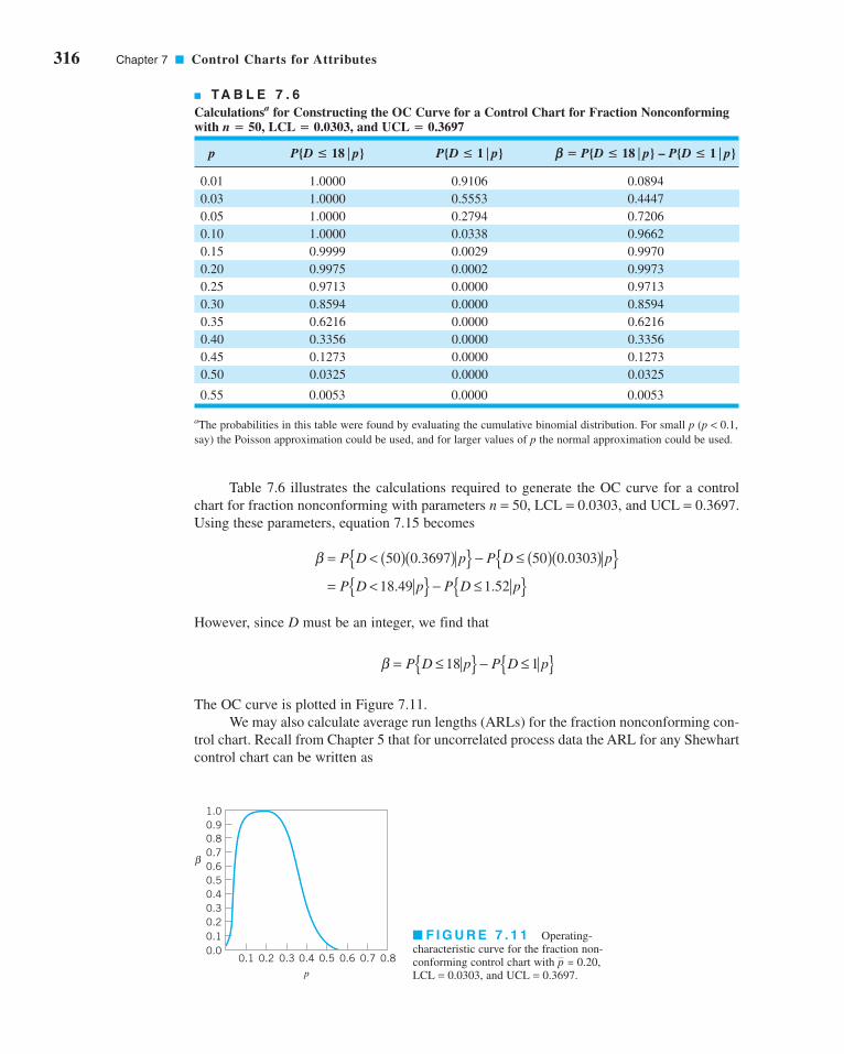
316 Chapter 7 ■ Control Charts for Attributes
Table 7.6 illustrates the calculations required to generate the OC curve for a control
chart for fraction nonconforming with parameters n = 50, LCL = 0.0303, and UCL = 0.3697.
Using these parameters, equation 7.15 becomes
However, since D must be an integer, we find that
The OC curve is plotted in Figure 7.11.
We may also calculate average run lengths (ARLs) for the fraction nonconforming con-
trol chart. Recall from Chapter 5 that for uncorrelated process data the ARL for any Shewhart
control chart can be written as
β = ≤{ } − ≤{ }P D p P D p18 1
β = < ( )( ){ } − ≤ ( )( ){ }= <{ } − ≤{ }
P D p P D p
P D p P D p
50 0 3697 50 0 0303
18 49 52
. .
. .1
■ F I G U R E 7 . 1 1 Operating-
characteristic curve for the fraction non-
conforming control chart with ,
LCL = 0.0303, and UCL = 0.3697.
p = 0.20
■ TA B L E 7 . 6
Calculationsa for Constructing the OC Curve for a Control Chart for Fraction Nonconformingwith n = 50, LCL = 0.0303, and UCL = 0.3697
p P{D ≤ 18⎪p} P{D ≤ 1⎪p} b = P{D ≤ 18⎪p} – P{D ≤ 1⎪p}
0.01 1.0000 0.9106 0.0894
0.03 1.0000 0.5553 0.4447
0.05 1.0000 0.2794 0.7206
0.10 1.0000 0.0338 0.9662
0.15 0.9999 0.0029 0.9970
0.20 0.9975 0.0002 0.9973
0.25 0.9713 0.0000 0.9713
0.30 0.8594 0.0000 0.8594
0.35 0.6216 0.0000 0.6216
0.40 0.3356 0.0000 0.3356
0.45 0.1273 0.0000 0.1273
0.50 0.0325 0.0000 0.0325
0.55 0.0053 0.0000 0.0053
aThe probabilities in this table were found by evaluating the cumulative binomial distribution. For small p (p < 0.1,
say) the Poisson approximation could be used, and for larger values of p the normal approximation could be used.
0.00.10.20.30.40.50.60.70.80.91.0
β
0.1 0.2 0.3 0.4 0.5 0.6 0.7 0.8p
c07ControlChartsforAttributes.qxd 3/28/12 3:27 PM Page 316

Thus, if the process is in control, ARL0 is
and if it is out of control, then
These probabilities (a, b) can be calculated directly from the binomial distribution or read
from an OC curve.
To illustrate, consider the control chart for fraction nonconforming used in the OC
curve calculations in Table 7.6. This chart has parameters n = 50, UCL = 0.3697, LCL =0.0303, and the center line is . From Table 7.6 (or the OC curve in Fig. 7.11) we find
that if the process is in control with p = , the probability of a point plotting in control is
0.9973. Thus, in this case a = 1 − b = 0.0027, and the value of ARL0 is
Therefore, if the process is really in control, we will experience a false out-of-control signal
about every 370 samples. (This will be approximately true, in general, for any Shewhart
control chart with three-sigma limits.) This in-control ARL0 is generally considered to be
satisfactorily large. Now suppose that the process shifts out of control to p = 0.3. Table 7.6
indicates that if p = 0.3, then b = 0.8594. Therefore, the value of ARL1 is
and it will take about seven samples, on the average, to detect this shift with a point outside
of the control limits. If this is unsatisfactory, then action must be taken to reduce the out-of-
control ARL1. Increasing the sample size would result in a smaller value of b and a shorter
out-of-control ARL1. Another approach would be to reduce the interval between samples.
That is, if we are currently sampling every hour, it will take about seven hours, on the aver-
age, to detect the shift. If we take the sample every half hour, it will require only three and a
half hours, on the average, to detect the shift. Another approach is to use a control chart that
is more responsive to small shifts, such as the cumulative sum charts in Chapter 9.
7.3 Control Charts for Nonconformities (Defects)
A nonconforming item is a unit of product that does not satisfy one or more of the specifications
for that product. Each specific point at which a specification is not satisfied results in a defect or
nonconformity. Consequently, a nonconforming item will contain at least one nonconformity.
However, depending on their nature and severity, it is quite possible for a unit to contain several
ARL1 =−
=−
−1
1
1
1 0 85947
β .~
ARL0 = = −1 1
0 0027370
α .~
pp = 0.20
ARL1 =−1
1 β
ARL0 = 1
α
ARLsample point plots out of control
= ( )1
P
7.3 Control Charts for Nonconformities (Defects) 317
c07ControlChartsforAttributes.qxd 3/28/12 3:27 PM Page 317

318 Chapter 7 ■ Control Charts for Attributes
2The a-risk for three-sigma limits is not equally allocated above the UCL and below the LCL, because the Poisson dis-
tribution is asymmetric. Some authors recommend the use of probability limits for this chart, particularly when c is small.
Control Chart for Nonconformities: Standard Given
(7.16)
UCL
Center line
LCL
= +=
= −
c c
c
c c
3
3
nonconformities and not be classified as nonconforming. As an example, suppose we are man-
ufacturing personal computers. Each unit could have one or more very minor flaws in the cabi-
net finish, and since these flaws do not seriously affect the unit’s functional operation, it could be
classified as conforming. However, if there are too many of these flaws, the personal computer
should be classified as nonconforming, since the flaws would be very noticeable to the customer
and might affect the sale of the unit. There are many practical situations in which we prefer to
work directly with the number of defects or nonconformities rather than the fraction noncon-
forming. These include the number of defective welds in 100 m of oil pipeline, the number of
broken rivets in an aircraft wing, the number of functional defects in an electronic logic device,
the number of errors on a document, the number of customers who elect to leave a service sys-
tem without completing their service request, and so forth.
It is possible to develop control charts for either the total number of nonconformities in
a unit or the average number of nonconformities per unit. These control charts usually assume
that the occurrence of nonconformities in samples of constant size is well modeled by the Poisson
distribution. Essentially, this requires that the number of opportunities or potential locations for
nonconformities be infinitely large and that the probability of occurrence of a nonconformity at
any location be small and constant. Furthermore, the inspection unit must be the same for each
sample. That is, each inspection unit must always represent an identical area of opportunity for
the occurrence of nonconformities. In addition, we can count nonconformities of several different
types on one unit, as long as the above conditions are satisfied for each class of nonconformity.
In most practical situations, these conditions will not be satisfied exactly. The number
of opportunities for the occurrence of nonconformities may be finite, or the probability of
occurrence of nonconformities may not be constant. As long as these departures from the
assumptions are not severe, the Poisson model will usually work reasonably well. There are
cases, however, in which the Poisson model is completely inappropriate. These situations
are discussed in more detail at the end of Section 7.3.1.
7.3.1 Procedures with Constant Sample Size
Consider the occurrence of nonconformities in an inspection unit of product. In most cases,
the inspection unit will be a single unit of product, although this is not necessarily always so.
The inspection unit is simply an entity for which it is convenient to keep records. It could be
a group of 5 units of product, 10 units of product, and so on. Suppose that defects or non-
conformities occur in this inspection unit according to the Poisson distribution; that is,
where x is the number of nonconformities and c > 0 is the parameter of the Poisson distribu-
tion. From Section 3.2.3 we recall that both the mean and variance of the Poisson distribution
are the parameter c. Therefore, a control chart for defects or nonconformities, or c chartwith three-sigma limits would be defined as follows,2
p xe c
xx
c x
( ) = =−
!.0, 1, 2 , . .
c07ControlChartsforAttributes.qxd 4/23/12 7:12 PM Page 318
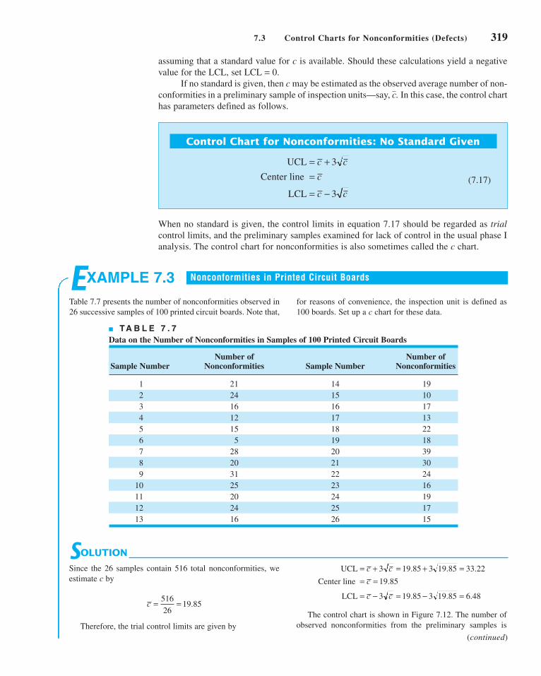
■ TA B L E 7 . 7
Data on the Number of Nonconformities in Samples of 100 Printed Circuit Boards
Number of Number of Sample Number Nonconformities Sample Number Nonconformities
1 21 14 19
2 24 15 10
3 16 16 17
4 12 17 13
5 15 18 22
6 5 19 18
7 28 20 39
8 20 21 30
9 31 22 24
10 25 23 16
11 20 24 19
12 24 25 17
13 16 26 15
7.3 Control Charts for Nonconformities (Defects) 319
Control Chart for Nonconformities: No Standard Given
(7.17)
UCL
Center line
LCL
= +=
= −
c c
c
c c
3
3
SOLUTION
Since the 26 samples contain 516 total nonconformities, we
estimate c by
Therefore, the trial control limits are given by
The control chart is shown in Figure 7.12. The number of
observed nonconformities from the preliminary samples is
UCL
Center line
LCL
= + = + == =
= − = − =
c c
c
c c
3 19 85 3 19 85 33 22
19 85
3 19 85 3 19 85 6 48
. . .
.
. . .c = =516
2619 85.
EXAMPLE 7.3
Table 7.7 presents the number of nonconformities observed in
26 successive samples of 100 printed circuit boards. Note that,
for reasons of convenience, the inspection unit is defined as
100 boards. Set up a c chart for these data.
Nonconformities in Printed Circuit Boards
assuming that a standard value for c is available. Should these calculations yield a negative
value for the LCL, set LCL = 0.
If no standard is given, then c may be estimated as the observed average number of non-
conformities in a preliminary sample of inspection units—say, . In this case, the control chart
has parameters defined as follows.
c
When no standard is given, the control limits in equation 7.17 should be regarded as trialcontrol limits, and the preliminary samples examined for lack of control in the usual phase I
analysis. The control chart for nonconformities is also sometimes called the c chart.
(continued)
c07ControlChartsforAttributes.qxd 3/28/12 3:27 PM Page 319

320 Chapter 7 ■ Control Charts for Attributes
0
5
10
15
20
25
30
35
40
45
Num
ber
of n
onco
nfor
mit
ies
2 4 6 8 10 12 14 16 18 20 22 24 26
Sample number
LCL = 6.48
UCL = 33.22
Temperaturecontrol
Inspectionerror
■ F I G U R E 7 . 1 2 Control chart for nonconformities for
Example 7.3.
■ TA B L E 7 . 8
Additional Data for the Control Chart for Nonconformities, Example 7.3
Number of Number of Sample Number Nonconformities Sample Number Nonconformities
27 16 37 18
28 18 38 21
29 12 39 16
30 15 40 22
31 24 41 19
32 21 42 12
33 28 43 14
34 20 44 9
35 25 45 16
36 19 46 21
28 30 32 34 36 38 40 42 44 46Sample number
0
5
10
15
20
25
30
35
40
Num
ber
of n
onco
nfor
mit
ies UCL = 32.97
LCL = 6.36
■ F I G U R E 7 . 1 3 Continuation of the control
chart for nonconformities. Example 7.3.
number of nonconformities in sample 20 resulted from a temper-
ature control problem in the wave soldering machine, which was
subsequently repaired. Therefore, it seems reasonable to exclude
these two samples and revise the trial control limits. The estimate
of c is now computed as
and the revised control limits are
These become the standard values against which production in
the next period can be compared.
Twenty new samples, each consisting of one inspection
unit (i.e., 100 boards), are subsequently collected. The number
of nonconformities in each sample is noted and recorded
in Table 7.8. These points are plotted on the control chart in
Figure 7.13. No lack of control is indicated; however, the number
of nonconformities per board is still unacceptably high.
Further action is necessary to improve the process.
UCL
Center line
LCL
= + = + == =
= − = − =
c c
c
c c
3 19 67 3 19 67 32 97
19 67
3 19 67 3 19 67 6 36
. . .
.
. . .
c = =472
2419 67.
plotted on this chart. Two points plot outside the control limits:
samples 6 and 20. Investigation of sample 6 revealed that a
new inspector had examined the boards in this sample and that
he did not recognize several of the types of nonconformities
that could have been present. Furthermore, the unusually large
c07ControlChartsforAttributes.qxd 3/28/12 3:27 PM Page 320

7.3 Control Charts for Nonconformities (Defects) 321
Further Analysis of Nonconformities. Defect or nonconformity data are always
more informative than fraction nonconforming, because there will usually be several differ-
ent types of nonconformities. By analyzing the nonconformities by type, we can often gain
considerable insight into their cause. This can be of considerable assistance in developing the
out-of-control-action plans (OCAPs) that must accompany control charts.
For example, in the printed circuit board process, there are sixteen different types of
defects. Defect data for 500 boards are plotted on a Pareto chart in Figure 7.14. Note that over
60% of the total number of defects is due to two defect types: solder insufficiency and solder
cold joints. This points to further problems with the wave soldering process. If these problems
can be isolated and eliminated, there will be a dramatic increase in process yield. Notice that
the nonconformities follow the Pareto distribution; that is, most of the defects are attributable
to a few (in this case, two) defect types.
This process manufactures several different types of printed circuit boards.
Therefore, it may be helpful to examine the occurrence of defect type by type of printed
circuit board (part number). Table 7.9 presents this information. Note that all 40 solder
insufficiencies and all 20 solder cold joints occurred on the same part number: 0001285.
This implies that this particular type of board is very susceptible to problems in wave sol-
dering, and special attention must be directed toward improving this step of the process
for this part number.
Another useful technique for further analysis of nonconformities is the cause-and-effect diagram discussed in Chapter 5. The cause-and-effect diagram is used to illustrate the
various sources of nonconformities in products and their interrelationships. It is useful in
focusing the attention of operators, manufacturing engineers, and managers on quality prob-
lems. Developing a good cause-and-effect diagram usually advances the level of technologi-
cal understanding of the process.
A cause-and-effect diagram for the printed circuit board assembly process is shown in
Figure 7.15. Since most of the defects in this example were solder related, the cause-and-
effect diagram could help choose the variables for a designed experiment to optimize the
Cum. Cum.Freq. freq. Percentage percentage
Defect code
Sold. Insufficie **************************************** 40 40 40.82 40.82Sold.cold joint ******************** 20 60 20.41 61.23Sold. opens/dewe ******* 7 67 7.14 68.37Comp. improper 1 ****** 6 73 6.12 74.49Sold. splatter/w ***** 5 78 5.10 79.59Tst. mark ec mark *** 3 81 3.06 82.65Tst. mark white m *** 3 84 3.06 85.71Raw cd shroud re *** 3 87 3.06 88.78Comp. extra part ** 2 89 2.04 90.82Comp. damaged ** 2 91 2.04 92.86Comp. missing ** 2 93 2.04 94.90Wire incorrect s * 1 94 1.02 95.92Stamping oper id * 1 95 1.02 96.94Stamping missing * 1 96 1.02 97.96Sold. short * 1 97 1.02 98.98Raw cd damaged * 1 98 1.02 100.00
1 10 20 30 40
Number of defects
■ F I G U R E 7 . 1 4 Pareto analysis of nonconformities for the printed circuit board process.
c07ControlChartsforAttributes.qxd 3/28/12 3:27 PM Page 321
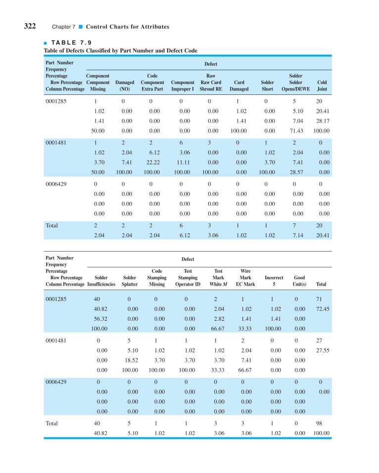
322 Chapter 7 ■ Control Charts for Attributes
■ TA B L E 7 . 9
Table of Defects Classified by Part Number and Defect Code
Part Number DefectFrequency Percentage Component Code Raw Solder
Row Percentage Component Damaged Component Component Raw Card Card Solder Solder ColdColumn Percentage Missing (NO) Extra Part Improper I Shroud RE Damaged Short Opens/DEWE Joint
0001285 1 0 0 0 0 1 0 5 20
1.02 0.00 0.00 0.00 0.00 1.02 0.00 5.10 20.41
1.41 0.00 0.00 0.00 0.00 1.41 0.00 7.04 28.17
50.00 0.00 0.00 0.00 0.00 100.00 0.00 71.43 100.00
0001481 1 2 2 6 3 0 1 2 0
1.02 2.04 6.12 3.06 0.00 0.00 1.02 2.04 0.00
3.70 7.41 22.22 11.11 0.00 0.00 3.70 7.41 0.00
50.00 100.00 100.00 100.00 100.00 0.00 100.00 28.57 0.00
0006429 0 0 0 0 0 0 0 0 0
0.00 0.00 0.00 0.00 0.00 0.00 0.00 0.00 0.00
0.00 0.00 0.00 0.00 0.00 0.00 0.00 0.00 0.00
0.00 0.00 0.00 0.00 0.00 0.00 0.00 0.00 0.00
Total 2 2 2 6 3 1 1 7 20
2.04 2.04 2.04 6.12 3.06 1.02 1.02 7.14 20.41
Part Number DefectFrequency Percentage Code Test Test Wire
Row Percentage Solder Solder Stamping Stamping Mark Mark Incorrect GoodColumn Percentage Insufficiencies Splatter Missing Operator ID White M EC Mark 5 Unit(s) Total
0001285 40 0 0 0 2 1 1 0 71
40.82 0.00 0.00 0.00 2.04 1.02 1.02 0.00 72.45
56.32 0.00 0.00 0.00 2.82 1.41 1.41 0.00
100.00 0.00 0.00 0.00 66.67 33.33 100.00 0.00
0001481 0 5 1 1 1 2 0 0 27
0.00 5.10 1.02 1.02 1.02 2.04 0.00 0.00 27.55
0.00 18.52 3.70 3.70 3.70 7.41 0.00 0.00
0.00 100.00 100.00 100.00 33.33 66.67 0.00 0.00
0006429 0 0 0 0 0 0 0 0 0
0.00 0.00 0.00 0.00 0.00 0.00 0.00 0.00 0.00
0.00 0.00 0.00 0.00 0.00 0.00 0.00 0.00
0.00 0.00 0.00 0.00 0.00 0.00 0.00 0.00
Total 40 5 1 1 3 3 1 0 98
40.82 5.10 1.02 1.02 3.06 3.06 1.02 0.00 100.00
c07ControlChartsforAttributes.qxd 3/28/12 3:27 PM Page 322
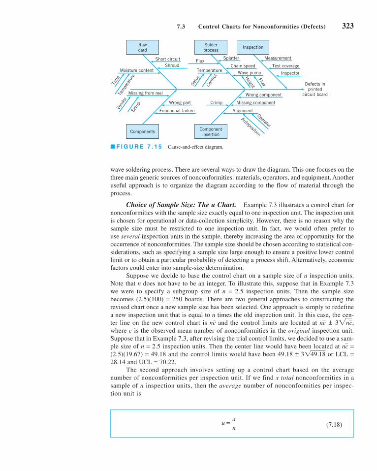
7.3 Control Charts for Nonconformities (Defects) 323
wave soldering process. There are several ways to draw the diagram. This one focuses on the
three main generic sources of nonconformities: materials, operators, and equipment. Another
useful approach is to organize the diagram according to the flow of material through the
process.
Choice of Sample Size: The u Chart. Example 7.3 illustrates a control chart for
nonconformities with the sample size exactly equal to one inspection unit. The inspection unit
is chosen for operational or data-collection simplicity. However, there is no reason why the
sample size must be restricted to one inspection unit. In fact, we would often prefer to
use several inspection units in the sample, thereby increasing the area of opportunity for the
occurrence of nonconformities. The sample size should be chosen according to statistical con-
siderations, such as specifying a sample size large enough to ensure a positive lower control
limit or to obtain a particular probability of detecting a process shift. Alternatively, economic
factors could enter into sample-size determination.
Suppose we decide to base the control chart on a sample size of n inspection units.
Note that n does not have to be an integer. To illustrate this, suppose that in Example 7.3
we were to specify a subgroup size of n = 2.5 inspection units. Then the sample size
becomes (2.5)(100) = 250 boards. There are two general approaches to constructing the
revised chart once a new sample size has been selected. One approach is simply to redefine
a new inspection unit that is equal to n times the old inspection unit. In this case, the cen-
ter line on the new control chart is and the control limits are located at ,
where is the observed mean number of nonconformities in the original inspection unit.
Suppose that in Example 7.3, after revising the trial control limits, we decided to use a sam-
ple size of n = 2.5 inspection units. Then the center line would have been located at =(2.5)(19.67) = 49.18 and the control limits would have been 49.18 ± or LCL =28.14 and UCL = 70.22.
The second approach involves setting up a control chart based on the average
number of nonconformities per inspection unit. If we find x total nonconformities in a
sample of n inspection units, then the average number of nonconformities per inspec-
tion unit is
3149.18
nc
cnc ± 32ncnc
Rawcard
Solderprocess
Inspection
Components Componentinsertion
Defects inprinted
circuit board
Cont
rol
Setu
p
Temperature
Flux
Tem
pera
ture
Tim
e
Moisture contentShroud
Short circuit Splatter
Chain speed
Wave pump
HeightFlow
Measurement
Test coverage
Inspector
Crimp
Wrong component
Missing component
Alignment
Autoposition
Operator
Missing from reel
Vend
or
Setu
p Wrong part
Functional failure
■ F I G U R E 7 . 1 5 Cause-and-effect diagram.
(7.18)ux
n=
c07ControlChartsforAttributes.qxd 3/28/12 3:27 PM Page 323

324 Chapter 7 ■ Control Charts for Attributes
where represents the observed average number of nonconformities per unit in a pre-
liminary set of data. Control limits found from equation 7.19 would be regarded as trial
control limits. This per-unit chart often is called the control chart for nonconformities,or u chart.
u
Note that x is a Poisson random variable; consequently, the parameters of the control chart for
the average number of nonconformities per unit are as follows,
Control Chart for Average Number of Nonconformities per Unit
(7.19)
UCL
Center line
LCL
= +
=
= −
uu
n
u
uu
n
3
3
SOLUTION
EXAMPLE 7.4 Control Charts in Supply Chain Operations
selected shipments are examined and the errors recorded. Data
for twenty weeks are shown in Table 7.10. Set up a u control
chart to monitor this process.
A supply chain engineering group monitors shipments of
materials through the company distribution network. Errors on
either the delivered material or the accompanying documenta-
tion are tracked on a weekly basis. Each week 50 randomly
Since the LCL < 0, we would set LCL = 0 for the u chart. The
control chart is shown in Figure 7.16. The preliminary data do
not exhibit lack of statistical control; therefore, the trial control
limits given here would be adopted for phase II monitoring of
future operations. Once again, note that, although the process
is in control, the average number of errors per shipment is
high. Action should be taken to improve the supply chain
system.
From the data in Table 7.10, we estimate the number of errors
(nonconformities) per unit (shipment) to be:
Therefore, the parameters of the control chart are
UCL
Center line
LCL
= + = + =
= =
= − = − = −
uu
n
u
uu
n
3 0 0740 30 0740
500 1894
1 93
3 0 0740 30 0740
500 0414
..
.
.
..
.
uui
i= = ==∑
1
20
20
1 48
200 0740
..
c07ControlChartsforAttributes.qxd 3/28/12 3:27 PM Page 324

7.3 Control Charts for Nonconformities (Defects) 325
0.2
0.1
0.0Err
ors
(non
conf
orm
itie
s)/u
nit,
u
0 10 20
Sample number
LCL = 0
UCL = 0.1894
u = 0.074
■ F I G U R E 7 . 1 6 The control chart for nonconformi-
ties per unit from Minitab for Example 7.4.
Alternative Probability Models for Count Data. Most applications of the cchart assume that the Poisson distribution is the correct probability model underlying the
process. However, it is not the only distribution that could be utilized as a model of “count”
or nonconformities per unit-type data. Various types of phenomena can produce distribu-
tions of defects that are not well modeled by the Poisson distribution. In the Poisson
■ TA B L E 7 . 1 0
Data on Number of Shipping Errors in a Supply Chain Network
Average Number of Sample Sample Total Number of Errors Errors (Nonconformities)
Number (week), i Size, n (Nonconformities), xi per Unit, ui = xi/n
1 50 2 0.04
2 50 3 0.06
3 50 8 0.16
4 50 1 0.02
5 50 1 0.02
6 50 4 0.08
7 50 1 0.02
8 50 4 0.08
9 50 5 0.10
10 50 1 0.02
11 50 8 0.16
12 50 2 0.04
13 50 4 0.08
14 50 3 0.06
15 50 4 0.08
16 50 1 0.02
17 50 8 0.16
18 50 3 0.06
19 50 7 0.14
20 50 4 0.08
74 1.48
c07ControlChartsforAttributes.qxd 3/28/12 3:27 PM Page 325

326 Chapter 7 ■ Control Charts for Attributes
distribution, the mean and the variance are equal. When the sample data indicate that the
sample variance is substantially different from the mean, the Poisson assumption is likely
to be inappropriate.
The situation where the Poisson assumption is likely to be inappropriate is when non-
conformities tend to occur in clusters; that is, if there is one nonconformity in some part of
a product, then it is likely that there will be others. Note that there are at least two random
processes at work here: one generating the number and location of clusters, and the second
generating the number of nonconformities within each cluster. If the number of clusters has
a Poisson distribution and the number of nonconformities within each cluster has a common
distribution (say, f ), then the total number of nonconformities has a compound Poisson dis-tribution. Many types of compound or generalized distributions could be used as a model for
count-type data. As an illustration, if the number of clusters has a Poisson distribution and the
number of nonconformities within each cluster is also Poisson, then Neyman’s type-A distri-
bution models the total number of nonconformities. Alternatively, if the cluster distribution is
gamma and the number of nonconformities within each cluster is Poisson, the negative bino-
mial distribution results. Johnson and Kotz (1969) give a good summary of these and also dis-
cuss other discrete distributions that could be useful in modeling count-type data.
Mixtures of various types of nonconformities can lead to situations in which the total
number of nonconformities is not adequately modeled by the Poisson distribution. Similar
situations occur when the count data have either too many or too few zeros. A good discus-
sion of this general problem is the paper by Jackson (1972). The use of the negative bino-
mial distribution to model count data in inspection units of varying size has been studied by
Sheaffer and Leavenworth (1976). The dissertation by Gardiner (1987) describes the use of
various discrete distributions to model the occurrence of defects in integrated circuits.
As we noted in Section 3.2.4, the geometric distribution can also be useful as a model for
count or “event” data. Kaminsky et al. (1992) have proposed control charts for counts based on
the geometric distribution. The probability model that they use for the geometric distribution is
where a is the known minimum possible number of events. Suppose that the data from the
process are available as a subgroup of size n, say x1, x2, . . . . xn. These observations are inde-
pendently and identically distributed observations from a geometric distribution when the
process is stable (in control). The two statistics that can be used to form a control chart are
the total number of events
and the average number of events
From Chapter 3, we know that the sum of independently and identically distributed geomet-
ric random variables is a negative binomial random variable. This would be useful informa-
tion in constructing OC curves or calculating ARLs for the control charts for T or .
The mean and variance of the total number of events T are
and
sT2 =
n(1 − p)
p2
mT = n a1 − p
p+ ab
x
x =x1 + x2 + . . . + xn
n
T = x1 + x2 + . . . + xn
p(x) = p(1 − p)x−a for x = a, a + 1, a + 2, . . .
c07ControlChartsforAttributes.qxd 3/28/12 3:27 PM Page 326

7.3 Control Charts for Nonconformities (Defects) 327
and the mean and variance of the average number of events are
and
Consequently, the control charts can be constructed in the usual manner for Shewhart charts.
Kaminsky et al. (1992) refer to the control chart for the total number of events as a “g chart”
and the control chart for the average number of events as an “h chart.” The center lines and
control limits for each chart are shown in the following display.
sx2 =
1 − p
np2
mx =1 − p
p+ a
g and h Control Charts, Standards Given
Total number of events chart, Average number of events chart,
g chart h chart
Upper control limit (UCL)
Center line (CL)
Lower control limit (LCL)1 − p
p+ a − L
B
1 − p
np2na
1 − pp
+ ab − LB
n(1 − p)
p2
1 − pp
+ ana1 − p
p+ ab
1 − pp
+ a + LB
1 − p
np2na
1 − pp
+ ab + LB
n(1 − p)
p2
While we have assumed that a is known, in most situations the parameter p will likely be
unknown. The estimator for p is
where is the average of all of the count data. Suppose that there are m subgroups available,
each of size n, and let the total number of events in each subgroup be t1, t2, . . . , tm. The aver-
age number of events per subgroup is
Therefore,
and
1 − p
p2= a
t
n− ab a
t
n− a + 1b
x =t
n=
1 − p
p+ a
t =t1 + t2 + . . . + tm
m
x
p =1
x − a + 1
c07ControlChartsforAttributes.qxd 3/28/12 3:27 PM Page 327

328 Chapter 7 ■ Control Charts for Attributes
The center line and control limits for the g chart and the h chart based on an estimate of p are
shown below.
g and h Control Charts, No Standards Given
Total number of events chart, Average number of events chart,
g chart h chart
Upper control limit (UCL)
Center line (CL)
Lower control limit (LCL)t
n−
L
1nBa
tn
− abat
n− a + 1b t − L
Bna
tn
− aba tn
− a + 1b
tn
t
tn
+L
2nBa
tn
− aba tn
− a + 1bt + LB
nat n
− abat n
− a + 1b
rolls of cloth are shown in Table 7.11. Use these data to set up
a control chart for nonconformities per unit.
EXAMPLE 7.5
In a textile finishing plant, dyed cloth is inspected for the
occurrence of defects per 50 square meters. The data on ten
Constructing a u chart
7.3.2 Procedures with Variable Sample Size
Control charts for nonconformities are occasionally formed using 100% inspection of the
product. When this method of sampling is used, the number of inspection units in a sample
will usually not be constant. For example, the inspection of rolls of cloth or paper often leads
to a situation in which the size of the sample varies, because not all rolls are exactly the same
length or width. If a control chart for nonconformities (c chart) is used in this situation, both
the center line and the control limits will vary with the sample size. Such a control chart
would be very difficult to interpret. The correct procedure is to use a control chart for non-
conformities per unit (u chart). This chart will have a constant center line; however, the width
of the control limits will vary inversely with the square root of the sample size n.
■ TA B L E 7 . 1 1
Occurrence of Nonconformities in Dyed Cloth
Number of Number ofRoll Number of Total Number Inspection Nonconformities
Number Square Meters of Nonconformities Units in Roll, n per Inspection Unit
1 500 14 10.0 1.40
2 400 12 8.0 1.50
3 650 20 13.0 1.54
4 500 11 10.0 1.10
5 475 7 9.5 0.74
6 500 10 10.0 1.00
7 600 21 12.0 1.75
8 525 16 10.5 1.52
9 600 19 12.0 1.58
10 625 23 12.5 1.84
153 107.50
c07ControlChartsforAttributes.qxd 3/28/12 3:27 PM Page 328

7.3 Control Charts for Nonconformities (Defects) 329
3.0
2.5
2.0
1.5
1.0
0.5
0.00
u
2 4 6 8 10
Subgroup
1.42326
■ F I G U R E 7 . 1 7 Computer-generated
(Minitab) control chart for Example 7.5.
SOLUTION
The center line of the chart should be the average number of
nonconformities per inspection unit—that is, the average
number of nonconformities per 50 square meters, computed as
Note that is the ratio of the total number of observed non-
conformities to the total number of inspection units.
u
u = =153
107 51 42
..
The control limits on this chart are computed from equa-
tion 7.19 with n replaced by ni. The width of the control lim-
its will vary inversely with ni, the number of inspection units
in the roll. The calculations for the control limits are displayed
in Table 7.12. Figure 7.17 plots the control chart constructed
by Minitab.
■ TA B L E 7 . 1 2
Calculation of Control Limits, Example 7.5
Roll Number, i ni UCL = u + LCL = u −
1 10.0 2.55 0.29
2 8.0 2.68 0.16
3 13.0 2.41 0.43
4 10.0 2.55 0.29
5 9.5 2.58 0.26
6 10.0 2.55 0.29
7 12.0 2.45 0.39
8 10.5 2.52 0.32
9 12.0 2.45 0.39
10 12.5 2.43 0.41
31u/ni31u/ni
As noted previously, the u chart should always be used when the sample size is vari-
able. The most common implementation involves variable control limits, as illustrated in
Example 7.5. There are, however, two other possible approaches:
1. Use control limits based on an average sample size.
n n mii
m=
=∑
1
c07ControlChartsforAttributes.qxd 3/28/12 3:27 PM Page 329

330 Chapter 7 ■ Control Charts for Attributes
■ F I G U R E 7 . 1 8 Standardized control
chart for nonconformities per unit, Example 7.5.
3
2
1
0
–1
–2
–30 2 4 6 8 10
Subgroup
z-sc
ore
–3s
0
+3s
Class A Defects—Very Serious. The unit is either completely unfit for service, or
will fail in service in such a manner that cannot be easily corrected in the field, or
will cause personal injury or property damage.
Class B Defects—Serious. The unit will possibly suffer a Class A operating fail-
ure, or will certainly cause somewhat less serious operating problems, or will cer-
tainly have reduced life or increased maintenance cost.
Class C Defects—Moderately Serious. The unit will possibly fail in service, or
cause trouble that is less serious than operating failure, or possibly have reduced
life or increased maintenance costs, or have a major defect in finish, appearance, or
quality of work.
Class D Defects—Minor. The unit will not fail in service but has minor defects in
finish, appearance, or quality of work.
2. Use a standardized control chart (this is the preferred option). This second alternative
would involve plotting a standardized statistic
(7.20)
on a control chart with LCL = −3 and UCL = +3 and the center line at zero. This chart is appro-
priate if tests for runs and other pattern-recognition methods are to be used in conjunction with
the chart. Figure 7.18 shows the standardized version of the control chart in Example 7.5. This
standardized control chart could also be useful in the short production run situation (see
Chapter 10, Section 10.1).
7.3.3 Demerit Systems
With complex products such as automobiles, computers, or major appliances, we usually find
that many different types of nonconformities or defects can occur. Not all of these types of
defects are equally important. A unit of product having one very serious defect would proba-
bly be classified as nonconforming to requirements, but a unit having several minor defects
might not necessarily be nonconforming. In such situations, we need a method to classify
nonconformities or defects according to severity and to weight the various types of defects in
a reasonable manner. Demerit systems for attribute data can be of value in these situations.
One possible demerit scheme is defined as follows.
Zu u
u
n
ii
i
= −
c07ControlChartsforAttributes.qxd 3/28/12 3:27 PM Page 330

7.3 Control Charts for Nonconformities (Defects) 331
Let ciA, ciB, ciC, and ciD represent the number of Class A, Class B, Class C, and Class D
defects, respectively, in the ith inspection unit. We assume that each class of defect is inde-
pendent, and the occurrence of defects in each class is well modeled by a Poisson distribu-
tion. Then we define the number of demerits in the inspection unit as
(7.21)
The demerit weights of Class A—100, Class B—50, Class C—10, and Class D—1 are used
fairly widely in practice. However, any reasonable set of weights appropriate for a specific
problem may also be used.
Suppose that a sample of n inspection units is used. Then the number of demerits per unit is
(7.22)
where is the total number of demerits in all n inspection units. Since ui is a linear
combination of independent Poisson random variables, the statistics ui could be plotted on a
control chart with the following parameters:
(7.23)
where
(7.24)
and
(7.25)
In the preceding equations, , , , and represent the average number of Class A, Class
B, Class C, and Class D defects per unit. The values of , , , and are obtained from
the analysis of preliminary data, taken when the process is supposedly operating in control.
Standard values for uA, uB, uC, and uD may also be used, if they are available.
Jones, Woodall, and Conerly (1999) provide a very thorough discussion of demerit-
based control charts. They show how probability-based limits can be computed as alternatives
to the traditional three-sigma limits used above. They also show that, in general, the proba-
bility limits give superior performance; they are, however, more complicated to compute.
Many variations of this idea are possible. For example, we can classify nonconformi-
ties as either functional defects or appearance defects if a two-class system is preferred. It
is also fairly common practice to maintain separate control charts on each defect class rather
than combining them into one chart.
7.3.4 The Operating-Characteristic Function
The operating-characteristic (OC) curves for both the c chart and the u chart can be obtained
from the Poisson distribution. For the c chart, the OC curve plots the probability of type II
error b against the true mean number of defects c. The expression for b is
(7.26)β = <{ } − ≤{ }P x c P x cUCL LCL
uDuCuBuA
uDuCuBuA
σuu u u u
n= ( ) + ( ) + ( ) +⎡
⎣⎢⎢
⎤
⎦⎥⎥
100 50 102 2 2 1 2
A B C D
u u u u u= + + +100 50 10A B C D
UCL
Center line
LCL
= +== −
u
u
u
u
u
3
3
ˆ
ˆ
σ
σ
D = an
i=1di
uD
ni =
d c c c ci i i i i= + + +100 50 10A B C D
c07ControlChartsforAttributes.qxd 3/28/12 3:27 PM Page 331

332 Chapter 7 ■ Control Charts for Attributes
where x is a Poisson random variable with parameter c. Note that if the LCL < 0 the second
term on the right-hand side of equation 7.26 should be dropped.
We will generate the OC curve for the c chart in Example 7.3. For this example, since
the LCL = 6.48 and the UCL = 33.22, equation 7.26 becomes
Since the number of nonconformities must be integer, this is equivalent to
These probabilities are evaluated in Table 7.13. The OC curve is shown in Figure 7.19.
For the u chart, we may generate the OC curve from
(7.27)
where �nLCL� denotes the smallest integer greater than or equal to nLCL and [nUCL] denotes
the largest integer less than or equal to nUCL. The limits on the summation in equation 7.26
follow from the fact that the total number of nonconformities observed in a sample of ninspection units must be an integer. Note that n need not be an integer.
7.3.5 Dealing with Low Defect Levels
When defect levels or in general, count rates, in a process become very low—say, under 1,000
occurrences per million—there will be very long periods of time between the occurrence of
a nonconforming unit. In these situations, many samples will have zero defects, and a control
chart with the statistic consistently plotting at zero will be relatively uninformative. Thus,
β = <{ } − ≤{ }= <{ } − ≤{ }= ≤{ }
= ( )−
=
[ ]∑
P x u P x u
P c n u P c n u
P n x n u
e nu
x
nu x
x n
n
UCL LCL
UCL LCL
LCL < UCL
LCL
UCL
!
β = ≤{ } − ≤{ }P x c P x c3 63
β = <{ } − ≤{ }P x c P x c3 63 22 48. .
1.000.900.800.700.600.500.400.300.200.100.00
β
5 10 15 20 25 30 35 40 45 50c
■ F I G U R E 7 . 1 9 OC curve of a c chart
with LCL = 6.48 and UCL = 33.22.
■ TA B L E 7 . 1 3
Calculation of the OC Curve for a c Chart with UCL = 33.22 andLCL = 6.48
c P {x ≤ 33|c} P {x ≤ 6|c} b = P{x ≤ 33|c} − P{x ≤ 6|c}
1 1.000 0.999 0.001
3 1.000 0.966 0.034
5 1.000 0.762 0.238
7 1.000 0.450 0.550
10 1.000 0.130 0.870
15 0.999 0.008 0.991
20 0.997 0.000 0.997
25 0.950 0.000 0.950
30 0.744 0.000 0.744
33 0.546 0.000 0.546
35 0.410 0.000 0.410
40 0.151 0.000 0.151
45 0.038 0.000 0.038
c07ControlChartsforAttributes.qxd 3/28/12 3:27 PM Page 332

7.3 Control Charts for Nonconformities (Defects) 333
conventional c and u charts become ineffective as count rates are driven into the low parts per
million (ppm) range.
One way to deal with this problem is adopt a time between occurrence control chart,which charts a new variable: the time between the successive occurrences of the count. The
time-between-events control chart has been very effective as a process-control procedure for
processes with low defect levels.
Suppose that defects or counts or “events” of interest occur according to a Poisson dis-
tribution. Then the probability distribution of the time between events is the exponential
distribution. Therefore, constructing a time-between-events control chart is essentially equiv-
alent to control charting an exponentially distributed variable. However, the exponential dis-
tribution is highly skewed, and as a result, the corresponding control chart would be very
asymmetric. Such a control chart would certainly look unusual, and might present some dif-
ficulties in interpretation for operating personnel.
Nelson (1994) has suggested solving this problem by transforming the exponential ran-
dom variable to a Weibull random variable such that the resulting Weibull distribution is well
approximated by the normal distribution. If y represents the original exponential random vari-
able, the appropriate transformation is
(7.28)
One would now construct a control chart on x, assuming that x follows a normal distribution.
x y y= =1 3 6 0 2777. .
SOLUTION
Set up a time-between-events control chart for this process.
Clearly, time between failures is not normally distributed.
Table 7.14 also shows the values of the transformed time
between events, computed from equation 7.27. Figure 7.21
EXAMPLE 7.6
able to monitor. Table 7.14 shows the number of hours between
failures for the last twenty failures of this valve. Figure 7.20 is
a normal probability plot of the time between failures.
A chemical engineer wants to set up a control chart for moni-
toring the occurrence of failures of an important valve. She has
decided to use the number of hours between failures as the vari-
■ F I G U R E 7 . 2 0 Normal probability plot of
time between failures, Example 7.6.
99.99995
80
50
20
51
0.10.50 1.0 1.5 2.0 2.5 3.0
(× 1000)Time between failures
Cum
ulat
ive
perc
enta
ge
Normal probability plot
■ F I G U R E 7 . 2 1 Normal probability plot
for the transformed failure data.
99.99995
80
50
20
51
0.10 2 4 6 8 10
Transformed time between failures
Normal probability plot
Cum
ulat
ive
perc
enta
ge
is a normal probability plot of the transformed time between
failures. Note that the plot indicates that the distribution
of this transformed variable is well approximated by the
normal.
(continued)
c07ControlChartsforAttributes.qxd 3/28/12 3:27 PM Page 333

334 Chapter 7 ■ Control Charts for Attributes
a different type of maintenance action), then we would expect
to see the mean time between failures get longer. This would
result in points plotting above the upper control limit on the
individuals control chart in Figure 7.22.
Figure 7.22 is a control chart for individuals and a moving
range control chart for the transformed time between failures.
Note that the control charts indicate a state of control, imply-
ing that the failure mechanism for this valve is constant. If a
process change is made that improves the failure rate (such as
14
11
8
5
2
–1
8
6
4
2
0
Ind.
xM
R(2
)
0 4 8 12 16 20
0 4 8 12 16 20
Subgroup
0
2.35921
7.71135
–0.88787
5.38662
11.6611
■ F I G U R E 7 . 2 2 Control charts for individuals and moving-range control chart for
the transformed time between failures, Example 7.6.
■ TA B L E 7 . 1 4
Time Between Failure Data, Example 7.6
Time Between Transformed Value of TimeFailure Failures, y (hr) Between Failures, x = y0.2777
1 286 4.80986
2 948 6.70903
3 536 5.72650
4 124 3.81367
5 816 6.43541
6 729 6.23705
7 4 1.46958
8 143 3.96768
9 431 5.39007
10 8 1.78151
11 2,837 9.09619
12 596 5.89774
13 81 3.38833
14 227 4.51095
15 603 5.91690
16 492 5.59189
17 1,199 7.16124
18 1,214 7.18601
19 2,831 9.09083
20 96 3.55203
c07ControlChartsforAttributes.qxd 3/28/12 3:27 PM Page 334

7.4 Choice Between Attributes and Variables Control Charts 335
The previous example illustrated the use of the individuals control chart with time-
between-events data. In many cases, the CUSUM and EWMA control charts in Chapter 4
would be better alternatives, because they are more effective in detecting small shifts in
the mean.
Kittlitz (1999) has also investigated transforming the exponential distribution for
control charting purposes. He notes that a log transformation will stabilize the variance of
the exponential distribution, but produces a rather negatively skewed distribution. Kittlitz
suggests using the transformation x = y 0.25, noting that it is very similar to Nelson’s rec-
ommendation and it is also very easy to compute (simply push the square root key on the
calculator twice!).
7.3.6 Nonmanufacturing Applications
The c chart and u chart are widely used in transactional and service business applications of
statistical process control. In effect, we can treat errors in those environments the same as we
treat defects or nonconformities in the manufacturing world. To give just a few examples,
we can plot errors on engineering drawings, errors on plans and documents, errors on med-
ical records, errors on insurance claims, errors on loan applications and errors in computer
software as c or u charts. An example using u charts to monitor errors in computer software
during product development is given in Gardiner and Montgomery (1987).
7.4 Choice Between Attributes and Variables Control Charts
In many applications, the analyst will have to choose between using a variables control chart,
such as the and R charts, and an attributes control chart, such as the p chart. In some cases,
the choice will be clear-cut. For example, if the quality characteristic is the color of the item,
such as might be the case in carpet or cloth production, then attributes inspection would often
be preferred over an attempt to quantify the quality characteristic “color.” In other cases, the
choice will not be obvious, and the analyst must take several factors into account in choosing
between attributes and variables control charts.
Attributes control charts have the advantage that several quality characteristics can be
considered jointly and the unit classified as nonconforming if it fails to meet the specification
on any one characteristic. On the other hand, if the several quality characteristics are treated
as variables, then each one must be measured, and either a separate and R chart must be
maintained on each or some multivariate control technique that considers all the characteris-
tics must simultaneously be employed. There is an obvious simplicity associated with the
attributes chart in this case. Furthermore, expensive and time-consuming measurements may
sometimes be avoided by attributes inspection.
Variables control charts, in contrast, provide much more useful information about
process performance than do attributes control charts. Specific information about the process
mean and variability is obtained directly. In addition, when points plot out of control on vari-
ables control charts, usually much more information is provided relative to the potential causeof that out-of-control signal. For a process capability study, variables control charts are almost
always preferable to attributes control charts. The exceptions to this are studies relative to non-
conformities produced by machines or operators in which there are a very limited number of
sources of nonconformities, or studies directly concerned with process yields and fallouts.
Perhaps the most important advantage of the and R control charts is that they often pro-
vide an indication of impending trouble and allow operating personnel to take corrective action
before any defectives are actually produced. Thus, and R charts are leading indicators of trou-
ble, whereas p charts (or c and u charts) will not react unless the process has already changed
x
x
x
x
c07ControlChartsforAttributes.qxd 3/28/12 3:27 PM Page 335

336 Chapter 7 ■ Control Charts for Attributes
so that more nonconforming units are being produced. This increased efficiency of the and Rcharts is much more pronounced when p is small, but less so when p is close to 0.5.
To illustrate, consider the production process depicted in Figure 7.23. When the process
mean is at m1, few nonconforming units are produced. Suppose the process mean begins to
shift upward. By the time it has reached m2, the and R charts will have reacted to the change
in the mean by generating a strong nonrandom pattern and possibly several out-of-control
points. However, a p chart would not react until the mean had shifted all the way to m3, or
until the actual number of nonconforming units produced had increased. Thus, the and Rcharts are more powerful control tools than the p chart.
For a specified level of protection against process shifts, variables control charts usually
require a much smaller sample size than does the corresponding attributes control chart. Thus,
although variables-type inspection is usually more expensive and time-consuming on a per unit
basis than attributes inspection, many fewer units must be examined. This is an important con-
sideration, particularly in cases where inspection is destructive (such as opening a can to mea-
sure the volume of product within or to test chemical properties of the product). The following
example demonstrates the economic advantage of variables control charts.
x
x
x
LSL 1µ 2µ 3µ USL
p chart reactsx, R chart reacts
■ F I G U R E 7 . 2 3 Why the
and R charts can warn of impend-
ing trouble.
x
SOLUTION
The sample size on the chart must be large enough for the
upper three-sigma control limit to be 52. This implies that
or n = 9. If a p chart is used, then we may find the required
sample size to give the same probability of detecting the shift
from equation 7.10—that is,
n = aL
d b 2
p(1 − p)
50 +3(2)
1n= 52
x
EXAMPLE 7.7
The nominal value of the mean of a quality characteristic is 50,
and the standard deviation is 2. The process is controlled by an
chart. Specification limits on the process are established at
± three-sigma, such that the lower specification limit is 44 and
the upper specification limit is 56. When the process is in con-
trol at the nominal level of 50, the fraction of nonconforming
product produced, assuming that the quality characteristic is
x
The Advantage of Variables Control Chart
normally distributed, is 0.0027. Suppose that the process mean
were to shift to 52. The fraction of nonconforming product pro-
duced following the shift is approximately 0.0228. Suppose that
we want the probability of detecting this shift on the first sub-
sequent sample to be 0.50. Find the appropriate sample size for
the chart and compare it to the sample size for a p chart that
has the same probability of detecting the shift.
x
where L = 3 is the width of the control limits, p = 0.0027 is the
in-control fraction nonconforming, and d = 0.0228 − 0.0027 =0.0201 is the magnitude of the shift. Consequently, we find
or would be required for the p chart. Unless the cost
of measurements inspection is more than seven times as
costly as attributes inspection, the chart is less expensive to
operate.
x
n � 60
n = (3/0.0201)2(0.0027)(0.9973) = 59.98
Generally speaking, variables control charts are preferable to attributes. However, this
logic can be carried to an illogical extreme, as shown in Example 7.8.
c07ControlChartsforAttributes.qxd 3/28/12 3:27 PM Page 336

7.4 Choice Between Attributes and Variables Control Charts 337
EXAMPLE 7.8
This example illustrates a misapplication of and R charts that
the author encountered in the electronics industry. A company
manufacturing a box-level product inspected a sample of the
production units several times each shift using attributes
x
A Misapplication of and R Chartsx
inspection. The output of each sample inspection was an esti-
mate of the process fraction nonconforming . The company
personnel were well aware that attributes data did not contain
as much information about the process as variables data, and
pi
0.20
0.1333
0.0667
0.005 10 15 20 25 30 35 40 45 50 55 60 65 70 75 80 85 90 95100
105110115120125130135140145150155160165170175180185190195200
205210215220225230235240245250255260265270275280285290295300
0.20
0.1333
0.0667
0.00
0.20
0.1333
0.0667
0.00
Frac
tion
non
conf
orm
ing
Frac
tion
non
conf
orm
ing
Frac
tion
non
conf
orm
ing
UCL
UCL
UCL
Defect rate: 5% Defect rate: 6%
Defect rate: 7% Defect rate: 8%
Defect rate: 5%
305310315320325330335340345350355360365370375380385390395400
0.20
0.1333
0.0667
0.00
Frac
tion
non
conf
orm
ing
UCL
Defect rate: 9% Defect rate: 10%
■ F I G U R E 7 . 2 4 Fraction nonconforming control chart for Example 7.8.
(continued)
c07ControlChartsforAttributes.qxd 3/28/12 3:27 PM Page 337

338 Chapter 7 ■ Control Charts for Attributes
were exploring ways to get more useful information about
their process. A consultant to the company (not the author)
had suggested that they could achieve this objective by con-
verting their fraction nonconforming data into and R charts.
To do so, each group of five successive values of was
treated as if it were a sample of five variables measurements;
then the average and range were computed as
and
and these values were plotted on and R charts. The consul-
tant claimed that this procedure would provide more informa-
tion than the fraction nonconforming control chart.
This suggestion was incorrect. If the inspection process
actually produces attributes data governed by the binomial
distribution with fixed n, then the sample fraction noncon-
forming contains all the information in the sample (this is an
application of the concept of minimal sufficient statistics) and
forming two new functions of will not provide any addi-
tional information.
To illustrate this idea, consider the control chart for frac-
tion nonconforming in Figure 7.24. This chart was produced
by drawing 100 samples (each of size 200) from a process for
which p = 0.05 and by using these data to compute the con-
trol limits. Then the sample draws were continued until sam-
ple 150, where the population fraction nonconforming was
pi
x
R = max(pi) − min(pi)
x =1
5a5
i=1
pi
pi
x
increased to p = 0.06. At each subsequent 50-sample interval,
the value of p was increased by 0.01. Note that the control
chart reacts to the shift in p at sample number 196. Figures
7.25 and 7.26 present the and R charts obtained by sub-
grouping the sample values of as suggested above. The first
twenty of those subgroups were used to compute the center
line and control limits on the and R charts. Note that the
chart reacts to the shift in at about subgroup number 40.
(This would correspond to original samples 196–200.) This
result is to be expected, as the chart is really monitoring the
fraction nonconforming p. The R chart in Figure 7.26 is mis-
leading, however. One subgroup within the original set used to
construct the control limits is out of control. (This is a false
alarm, since p = 0.05 for all 100 original samples.)
Furthermore, the out-of-control points beginning at about sub-
group 40 do not contribute any additional useful information
about the process because when shifts from 0.05 to 0.06
(say), the standard deviation of p will automatically increase.
Therefore, in this case there is no added benefit to the user
from and R charts.
This is not to say that the conventional fraction noncon-
forming control chart based on the binomial probability distri-
bution is the right control chart for all fraction nonconforming
data, just as the c chart (based on the Poisson distribution) is
not always the right control chart for defect data. If the vari-
ability in from sample to sample is greater than that which
could plausibly be explained by the binomial model, then the
analyst should determine the correct underlying probability
model and base the control chart on that distribution.
pi
x
p
x
pxx
pi
x
4 8 12 16 20 24 28 32 36 40 44 48 52 56 60 64 68 72 76 80
0.15
0.10
0.05
0.00
x
UCL
LCL
4 8 12 16 20 24 28 32 36 40 44 48 52 56 60 64 68 72 76 80
0.13
0.08
0.04
0.00
RUCL
■ F I G U R E 7 - 2 5 chart for Example 7.8.x
■ F I G U R E 7 . 2 6 R chart for Example 7.8.
c07ControlChartsforAttributes.qxd 3/28/12 3:27 PM Page 338

7.5 Guidelines for Implementing Control Charts 339
7.5 Guidelines for Implementing Control Charts
Almost any process will benefit from SPC, including the use of control charts. In this section,
we present some general guidelines helpful in implementing control charts. Specifically, we
deal with the following:
1. Determining which process characteristics to control
2. Determining where the charts should be implemented in the process
3. Choosing the proper type of control charts
4. Taking actions to improve processes as the result of SPC/control chart analysis
5. Selecting data-collection systems and computer software
The guidelines are applicable to both variables and attributes control charts. Remember, con-
trol charts are not only for process surveillance; they should be used as an active, on-line
method for reduction of process variability.
Determining Which Characteristics to Control and Where to Put the ControlCharts. At the start of a control chart program, it is usually difficult to determine which
product or process characteristics should be controlled and at which points in the process to
apply control charts. Some useful guidelines follow.
1. At the beginning, control charts should be applied to any product characteristics or
manufacturing operations believed to be important. The charts will provide immediate
feedback as to whether they are actually needed.
2. The control charts found to be unnecessary should be removed, and others that engi-
neering and operator judgment indicates may be required should be added. More con-
trol charts will usually be employed until the process has stabilized.
3. Information on the number and types of control charts on the process should be kept
current. It is best to keep separate records on the variables and attributes charts. In gen-
eral, after the control charts are first installed, the number of control charts tends to
increase rather steadily. After that, the number will usually decrease. When the process
stabilizes, we typically find that it has the same number of charts from one year to the
next; however, they are not necessarily the same charts.
4. If control charts are being used effectively and if new knowledge is being gained about
the key process variables, we should find that the number of and R charts increases
and the number of attributes control charts decreases.
5. At the beginning of a control chart program there will usually be more attributes
control charts, which are applied to semifinished or finished units near the end of the
manufacturing process. As we learn more about the process, these charts will be
replaced with and R charts applied earlier in the process to the critical parameters
and operations that result in nonconformities in the finished product. Generally, theearlier that process control can be established, the better. In a complex assembly
process, this may imply that process controls need to be implemented at the vendor
or supplier level.
6. Control charts are an on-line, process-monitoring procedure. They should be imple-
mented and maintained as close to the work center as possible, so that feedback will be
rapid. Furthermore, the process operators and process engineers should have direct
responsibility for collecting the process data, maintaining the charts, and interpreting the
results. The operators and engineers have the detailed knowledge of the process required
to correct process upsets and use the control charts to improve process performance.
x
x
c07ControlChartsforAttributes.qxd 3/28/12 3:27 PM Page 339

340 Chapter 7 ■ Control Charts for Attributes
Microcomputers can speed up the feedback and should be an integral part of any mod-
ern, on-line, process-control procedure.
7. The out-of-control-action plan (OCAP) is a vital part of the control chart. Operating and
engineering personnel should strive to keep OCAPs up to date and valid.
Choosing the Proper Type of Control Chart.
A. and R (or and s) charts. Consider using variables control charts in these situations:
1. A new process is coming on stream, or a new product is being manufactured by an
existing process.
2. The process has been in operation for some time, but it is chronically in trouble or
unable to hold the specified tolerances.
3. The process is in trouble, and the control chart can be useful for diagnostic purposes
(troubleshooting).
4. Destructive testing (or other expensive testing procedures) is required.
5. It is desirable to reduce acceptance-sampling or other downstream testing to a min-
imum when the process can be operated in control.
6. Attributes control charts have been used, but the process is either out of control or in
control but the yield is unacceptable.
7. There are very tight specifications, overlapping assembly tolerances, or other diffi-
cult manufacturing problems.
8. The operator must decide whether or not to adjust the process, or when a setup must
be evaluated.
9. A change in product specifications is desired.
10. Process stability and capability must be continually demonstrated, such as in regu-
lated industries.
B. Attributes Charts ( p charts, c charts, and u charts). Consider using attributes control
charts in these situations:
1. Operators control the assignable causes, and it is necessary to reduce process fallout.
2. The process is a complex assembly operation, and product quality is measured in
terms of the occurrence of nonconformities, successful or unsuccessful product
function, and so forth. (Examples include computers, office automation equipment,
automobiles, and the major subsystems of these products.)
3. Process control is necessary, but measurement data cannot be obtained.
4. A historical summary of process performance is necessary. Attributes control charts,
such as p charts, c charts, and u charts, are very effective for summarizing informa-
tion about the process for management review.
5. Remember that attributes charts are generally inferior to charts for variables. Always
use and R or and s charts whenever possible.
C. Control Charts for Individuals. Consider using the control chart for individuals in con-
junction with a moving-range chart in these situations:
1. It is inconvenient or impossible to obtain more than one measurement per sample, or
repeat measurements will only differ by laboratory or analysis error. Examples often
occur in chemical processes.
xx
xx
c07ControlChartsforAttributes.qxd 3/28/12 3:27 PM Page 340

7.5 Guidelines for Implementing Control Charts 341
2. Automated testing and inspection technology allow measurement of every unit pro-
duced. In these cases, also consider the cumulative sum control chart and the expo-
nentially weighted moving average control chart discussed in Chapter 9.
3. The data become available very slowly, and waiting for a larger sample will be
impractical or make the control procedure too slow to react to problems. This often
happens in nonproduct situations; for example, accounting data may become avail-
able only monthly.
4. Generally, once we are in phase II, individuals charts have poor performance in shift
detection and can be very sensitive to departures from normality. Always use the
EWMA and CUSUM charts of Chapter 9 in phase II instead of individuals charts
whenever possible.
Actions Taken to Improve the Process. Process improvement is the primary
objective of statistical process control. The application of control charts will give infor-
mation on two key aspects of the process: statistical control and capability. Figure 7.27
shows the possible states in which the process may exist with respect to these two issues.
Technically speaking, the capability of a process cannot be adequately assessed until
statistical control has been established, but we will use a less precise definition of capa-
bility that is just a qualitative assessment of whether or not the level of nonconforming
units produced is low enough to warrant no immediate additional effort to further improve
the process.
Figure 7.27 gives the answers to two questions: “Is the process in control?” and “Is the
process capable?” (in the sense of the previous paragraph). Each of the four cells in the fig-
ure contains some recommended courses of action that depend on the answers to these two
questions. The box in the upper-left corner is the ideal state: The process is in statistical con-
trol and exhibits adequate capability for present business objectives. In this case, SPC meth-
ods are valuable for process monitoring and for warning against the occurrence of any new
assignable causes that could cause slippage in performance. The upper-right corner implies
that the process exhibits statistical control but has poor capability. Perhaps the PCR is lower
than the value required by the customer, or there is sufficient variability remaining to result
in excessive scrap or rework. In this case, SPC methods may be useful for process diagno-
sis and improvement, primarily through the recognition of patterns on the control chart, but
the control charts will not produce very many out-of-control signals. It will usually be nec-
essary to intervene actively in the process to improve it. Experimental design methods are
helpful in this regard [see Montgomery (2009)]. Usually, it is also helpful to reconsider the
SPC
SPC
YesISTHEPROCESSINCONTROL?
No
SPC
Yes NoIS THE PROCESS CAPABLE?
SPC
Experimental designInvestigate specificationsChange process
Experimental designInvestigate specificationsChange process
■ F I G U R E 7 . 2 7 Actions taken to improve a process.
c07ControlChartsforAttributes.qxd 3/28/12 3:27 PM Page 341

342 Chapter 7 ■ Control Charts for Attributes
specifications: They may have been set at levels tighter than necessary to achieve function or
performance from the part. As a last resort, we may have to consider changing the process—that
is, investigating or developing new technology that has less variability with respect to this qual-
ity characteristic than the existing process.
The lower two boxes in Figure 7.27 deal with the case of an out-of-control process. The
lower-right corner presents the case of a process that is out of control and not capable.
(Remember our nontechnical use of the term “capability.”) The actions recommended here
are identical to those for the box in the upper-right corner, except that SPC would be expected
to yield fairly rapid results now, because the control charts should be identifying the presence
of assignable causes. The other methods of attack will warrant consideration and use in many
cases, however. Finally, the lower-left corner treats the case of a process that exhibits lack of
statistical control but does not produce a meaningful number of defectives because the spec-
ifications are very wide. SPC methods should still be used to establish control and reduce
variability in this case, for the following reasons:
1. Specifications can change without notice.
2. The customer may require both control and capability.
3. The fact that the process experiences assignable causes implies that unknown forces are
at work; these unknown forces could result in poor capability in the near future.
Selection of Data-Collection Systems and Computer Software. The past
few years have produced an explosion of quality control software and electronic data-
collection devices. Some SPC consultants have historically recommended against using
the computer, noting that it is unnecessary, since most applications of SPC in Japan
emphasized the manual use of control charts. If the Japanese were successful in the 1960s
and 1970s using manual control charting methods, then does the computer truly have a
useful role in SPC?
The answer to this question is yes, for several reasons:
1. Although it can be helpful to begin with manual methods of control charting at the
start of an SPC implementation, it is necessary to move successful applications to the
computer very soon. The computer is a great productivity improvement device. We
don’t drive cars with the passenger safety systems of the 1960s, and we don’t fly air-
planes with 1960s avionics technology. We shouldn’t use 1960s technology with con-
trol charts either.
2. The computer will make it possible for the SPC data to become part of the company-
wide enterprise databases, and in that form the data will be useful (and hence more
likely to be used) to everyone.
3. A computer-based SPC system can provide more information than any manual system.
It permits the user to monitor many quality characteristics and to provide automatic sig-
naling of assignable causes.
What type of software should be used? That is a difficult question to answer, because all
applications have unique requirements and the capability of the software is constantly chang-
ing. However, several features are necessary for successful results:
1. The software should be capable of stand-alone operation on a personal computer or on
a multiterminal local area network. SPC packages that are exclusively tied to a large
mainframe system may not be very useful because they often cannot produce control
charts and other routine reports in a timely manner.
c07ControlChartsforAttributes.qxd 3/28/12 3:27 PM Page 342

Important Terms and Concepts 343
2. The system must be user friendly. If operating personnel are to use the system, it must
have limited options, be easy to use, provide adequate error correction opportunities,
and contain many on-line help features. It should ideally be possible to tailor or cus-
tomize the system for each application, although this installation activity may have to
be carried out by engineering/technical personnel.
3. The system should provide display of control charts for at least the last 25 samples.
Ideally, the length of record displayed should be controlled by the user. Printed output
should be immediately available on either a line printer or a plotter.
4. File storage should be sufficient to accommodate a reasonable amount of process
history. Editing and updating of files should be straightforward. Provisions to transfer
data to other storage media or to transfer the data to a master manufacturing data-
base are critical.
5. The system should be able to handle multiple files simultaneously. Only rarely does a
process have only one quality characteristic that needs to be examined.
6. The user should be able to calculate control limits from any subset of the data on the
file. The user should have the capability to input center lines and control limits
directly.
7. The system should be able to accept a variety of inputs, including manual data entry,
input from an electronic data-capture instrument, or input from another computer or
instrument controller. It is important to have the capability for real-time process moni-
toring, or to be able to transfer data from a real-time data acquisition system.
8. The system should support other statistical applications, including as a minimum his-
tograms and computation of process capability indices.
9. Service and support from the software supplier after purchase are always important
factors in deciding which software package to use.
The purchase price of commercially available software varies widely. Obviously, the total
cost of software is very different from the purchase price. In many cases, a $500 SPC
package is really a $10,000 package when we take into account the total costs of making
the package work correctly in the intended application. It is also relatively easy to estab-
lish control charts with most of the popular spreadsheet software packages. However, it
may be difficult to integrate those spreadsheet control charts into the overall manufactur-
ing database or other business systems.
Important Terms and Concepts
Attribute data
Average run length for attribute control charts
Cause-and-effect diagram
Choice between attributes and variables data
Control chart for defects or nonconformities per
unit or u chart
Control chart for fraction nonconforming or p chart
Control chart for nonconformities or c chart
Control chart for number nonconforming or np chart
Defect
Defective
Demerit systems for attribute data
Design of attributes control charts
Fraction defective
Fraction nonconforming
Nonconformity
Operating characteristic curve for the c and u charts
Operating characteristic curve for the p chart
Pareto chart
Standardized control charts
Time between occurrence control charts
Variable sample size for attributes control chart
c07ControlChartsforAttributes.qxd 3/28/12 3:27 PM Page 343

344 Chapter 7 ■ Control Charts for Attributes
Exercises
7.1. A financial services company mon-
itors loan applications. Every day
50 applications are assessed for the
accuracy of the information on the
form. Results for 20 days are
, where Di is the number
of loans on the ith day that are
determined to have at least one
error. What are the center line and
control limits on the fraction non-
conforming control chart?
7.2. Do points that plot below the lower control limit on
a fraction nonconforming control chart (assuming
that the LCL > 0) always mean that there has been
an improvement in process quality? Discuss your
answer in the context of a specific situation.
7.3. Table 7E.1 Contains data on examination of med-
ical insurance claims. Every day 50 claims were
examined.
(a) Set up the fraction nonconforming control chart
for this process. Plot the preliminary data in
Table 7E.1 on the chart. Is the process in statisti-
cal control?
(b) Assume that assignable causes can be found for
any out-of-control points on this chart. What
center line and control limits should be used for
process monitoring in the next period?
7.4. The fraction nonconforming control chart in
Exercise 7.3 has an LCL of zero. Assume that the
revised control chart in part (b) of that exercise has a
reliable estimate of the process fraction nonconform-
ing. What sample size should be used if you want to
ensure that the LCL > 0?
a20
i=1
Di = 46
The Student Resource
Manual presents
comprehensive anno-
tated solutions to the
odd-numbered exer-
cises included in the
Answers to Selected
Exercises section in
the back of this book.
■ TA B L E 7 E . 1
Medical Insurance Claim Data for Exercise 7.3
Number Number Day Nonconforming Day Nonconforming
1 0 11 6
2 3 12 4
3 4 13 8
4 6 14 0
5 5 15 7
6 2 16 20
7 8 17 6
8 9 18 1
9 4 19 5
10 2 20 7
■ TA B L E 7 E . 2
Loan Application Data for Exercise 7.5
Number of Number Number of Number Day Applications Late Day Applications Late
1 200 3 11 219 0
2 250 4 12 238 10
3 240 2 13 250 4
4 300 5 14 302 6
5 200 2 15 219 20
6 250 4 16 246 3
7 246 3 17 251 6
8 258 5 18 273 7
9 275 2 19 245 3
10 274 1 20 260 1
7.5. The commercial loan operation of a financial institu-
tion has a standard for processing new loan applica-
tions in 24 hours. Table 7E.2 shows the number of
applications processed each day for the last 20 days
and the number of applications that required more
than 24 hours to complete.
(a) Set up the fraction nonconforming control chart
for this process. Use the variable-width control
limit approach. Plot the preliminary data in
Table 7E.2 on the chart. Is the process in statistical
control?
(b) Assume that assignable causes can be found for
any out-of-control points on this chart. What
center line should be used for process monitor-
ing in the next period, and how should the con-
trol limits be calculated?
7.6. Reconsider the loan application data in Table 7E.2.
Set up the fraction nonconforming control chart for
this process. Use the average sample size control limit
approach. Plot the preliminary data in Table 7E.2 on
the chart. Is the process in statistical control?
Compare this control chart to the one based on
variable-width control limits in Exercise 7.5.
7.7. Reconsider the loan application data in Table 7E.2.
Set up the fraction nonconforming control chart
for this process. Use the standardized control chart
approach. Plot the preliminary data in Table 7E.2
on the chart. Is the process in statistical control?
Compare this control chart to the one based on
variable-width control limits in Exercise 7.5.
7.8. Reconsider the insurance claim data in Table 7E.1. Set
up an np control chart for this data and plot the data
from Table 7E.1 on this chart. Compare this to the
fraction nonconforming control chart in Exercise 7.3.
c07ControlChartsforAttributes.qxd 3/28/12 3:27 PM Page 344

Exercises 345
■ TA B L E 7 E . 3
Data for Exercise 7.9
Number of Number ofSample Nonconforming Sample NonconformingNumber Assemblies Number Assemblies
1 7 11 6
2 4 12 15
3 1 13 0
4 3 14 9
5 6 15 5
6 8 16 1
7 10 17 4
8 5 18 5
9 2 19 7
10 7 20 12
■ TA B L E 7 E . 4
Number of Nonconforming Switches for Exercise 7.10
Number of Number ofSample Nonconforming Sample NonconformingNumber Switches Number Switches
1 8 11 6
2 1 12 0
3 3 13 4
4 0 14 0
5 2 15 3
6 4 16 1
7 0 17 15
8 1 18 2
9 10 19 3
10 6 20 0
■ TA B L E 7 E . 5
Personal Computer Inspecting Results for Exercise 7.11
Units Nonconforming FractionDay Inspected Units Nonconforming
1 80 4 0.050
2 110 7 0.064
3 90 5 0.056
4 75 8 0.107
5 130 6 0.046
6 120 6 0.050
7 70 4 0.057
8 125 5 0.040
9 105 8 0.076
10 95 7 0.074
7.12. A process that produces titanium forgings for auto-
mobile turbocharger wheels is to be controlled
through use of a fraction nonconforming chart.
Initially, one sample of size 150 is taken each day
for 20 days, and the results shown in Table 7E.6
are observed.
(a) Establish a control chart to monitor future pro-
duction.
(b) What is the smallest sample size that could be
used for this process and still give a positive
lower control limit on the chart?
7.13. A process produces rubber belts in lots of size 2,500.
Inspection records on the last 20 lots reveal the data
in Table 7E.7.
(a) Compute trial control limits for a fraction non-
conforming control chart.
(b) If you wanted to set up a control chart for con-
trolling future production, how would you use
these data to obtain the center line and control
limits for the chart?
■ TA B L E 7 E . 6
Nonconforming Unit Data for Exercise 7.12
Nonconforming NonconformingDay Units Day Units
1 3 11 2
2 2 12 4
3 4 13 1
4 2 14 3
5 5 15 6
6 2 16 0
7 1 17 1
8 2 18 2
9 0 19 3
10 5 20 2
7.9. The data in Table 7E.3 give the number of noncon-
forming bearing and seal assemblies in samples of
size 100. Construct a fraction nonconforming control
chart for these data. If any points plot out of control,
assume that assignable causes can be found and
determine the revised control limits.
7.10. The number of nonconforming switches in samples
of size 150 are shown in Table 7E.4. Construct a
fraction nonconforming control chart for these data.
Does the process appear to be in control? If not,
assume that assignable causes can be found for all
points outside the control limits and calculate the
revised control limits.
7.11. The data in Table 7E.5 represent the results of
inspecting all units of a personal computer produced
for the past ten days. Does the process appear to be
in control?
c07ControlChartsforAttributes.qxd 3/28/12 3:27 PM Page 345

346 Chapter 7 ■ Control Charts for Attributes
producing these diodes by taking samples of size 64
from each lot. If the nominal value of the fraction
nonconforming is p = 0.10, determine the parameters
of the appropriate control chart. To what level must
the fraction nonconforming increase to make the
b-risk equal to 0.50? What is the minimum sample
size that would give a positive lower control limit for
this chart?
7.18. A control chart for the number of nonconforming
piston rings is maintained on a forging process with
np = 16.0. A sample of size 100 is taken each day and
analyzed.
(a) What is the probability that a shift in the process
average to np = 20.0 will be detected on the first
day following the shift? What is the probability
that the shift will be detected by at least the end
of the third day?
(b) Find the smallest sample size that will give a
positive lower control limit.
7.19. A control chart for the fraction nonconforming is to
be established using a center line of p = 0.10. What
sample size is required if we wish to detect a shift in
the process fraction nonconforming to 0.20 with
probability 0.50?
7.20. A process is controlled with a fraction nonconform-
ing control chart with three-sigma limits, n = 100,
UCL = 0.161, center line = 0.080, and LCL = 0.
(a) Find the equivalent control chart for the number
nonconforming.
(b) Use the Poisson approximation to the binomial
to find the probability of a type I error.
(c) Use the correct approximation to find the proba-
bility of a type II error if the process fraction
nonconforming shifts to 0.2.
(d) What is the probability of detecting the shift in
part (c) by at most the fourth sample after the
shift?
7.21. A process is being controlled with a fraction non-
conforming control chart. The process average has
been shown to be 0.07. Three-sigma control limits
are used, and the procedure calls for taking daily
samples of 400 items.
(a) Calculate the upper and lower control limits.
(b) If the process average should suddenly shift to
0.10, what is the probability that the shift would
be detected on the first subsequent sample?
(c) What is the probability that the shift in part (b)
would be detected on the first or second sample
taken after the shift?
7.22. In designing a fraction nonconforming chart with
center line at p = 0.20 and three-sigma control limits,
what is the sample size required to yield a positive
lower control limit? What is the value of n necessary
■ TA B L E 7 E . 7
Inspection Data for Exercise 7.13
Number of Number of Lot Nonconforming Lot Nonconforming
Number Belts Number Belts
1 230 11 456
2 435 12 394
3 221 13 285
4 346 14 331
5 230 15 198
6 327 16 414
7 285 17 131
8 311 18 269
9 342 19 221
10 308 20 407
7.14. Based on the data in Table 7E.8 if an np chart is to
be established, what would you recommend as the
center line and control limits? Assume that n = 500.
7.15. A control chart indicates that the current process
fraction nonconforming is 0.02. If 50 items are
inspected each day, what is the probability of detect-
ing a shift in the fraction nonconforming to 0.04 on
the first day after the shift? By the end of the third
day following the shift?
7.16. A company purchases a small metal bracket in con-
tainers of 5,000 each. Ten containers have arrived at
the unloading facility, and 250 brackets are selected
at random from each container. The fraction noncon-
forming in each sample are 0, 0, 0, 0.004, 0.008,
0.020, 0.004, 0, 0, and 0.008. Do the data from this
shipment indicate statistical control?
7.17. Diodes used on printed circuit boards are produced
in lots of size 1,000. We wish to control the process
■ TA B L E 7 E . 8
Data for Exercise 7.14
Number of Day Nonconforming Units
1 3
2 4
3 3
4 2
5 6
6 12
7 5
8 1
9 2
10 2
c07ControlChartsforAttributes.qxd 3/28/12 3:27 PM Page 346

(a) If three-sigma limits are used, find the sample
size for the control chart.
(b) Use the Poisson approximation to the binomial
to find the probability of type I error.
(c) Use the Poisson approximation to the binomial
to find the probability of type II error if the
process fraction defective is actually p = 0.20.
7.27. Consider the control chart designed in Exercise 7.25.
Find the average run length to detect a shift to a frac-
tion nonconforming of 0.15.
7.28. Consider the control chart in Exercise 7.26. Find the
average run length if the process fraction noncon-
forming shifts to 0.20.
7.29. A maintenance group improves the effectiveness
of its repair work by monitoring the number of main-
tenance requests that require a second call to com-
plete the repair. Twenty weeks of data are shown in
Table 7E.10.
(a) Find trial control limits for this process.
(b) Design a control chart for controlling future
production.
7.30. Analyze the data in Exercise 7.29 using an average
sample size.
7.31. Construct a standardized control chart for the data in
Exercise 7.29.
7.32. Continuation of Exercise 7.29. Note that in Exercise
7.29 there are only four different sample sizes; n = 100,
150, 200, and 250. Prepare a control chart that has a set
of limits for each possible sample size and show how
it could be used as an alternative to the variable-width
control limit method used in Exercise 7.29. How easy
would this method be to use in practice?
7.33. A process has an in-control fraction nonconform-
ing of p = 0.02. What sample size would be
required for the fraction nonconforming control
■ TA B L E 7 E . 9
Nonconforming Unit Data for Exercise 7.23
Sample Sample NumberNumber Size Nonconforming
1 100 10
2 100 15
3 100 31
4 100 18
5 100 24
6 100 12
7 100 23
8 100 15
9 100 8
10 100 8
to give a probability of 0.50 of detecting a shift in the
process to 0.26?
7.23. A control chart is used to control the fraction non-
conforming for a plastic part manufactured in an
injection molding process. Ten subgroups yield the
data in Table 7E.9.
(a) Set up a control chart for the number noncon-
forming in samples of n = 100.
(b) For the chart established in part (a), what is the
probability of detecting a shift in the process
fraction nonconforming to 0.30 on the first
sample after the shift has occurred?
7.24. A control chart for fraction nonconforming indicates
that the current process average is 0.03. The sample
size is constant at 200 units.
(a) Find the three-sigma control limits for the con-
trol chart.
(b) What is the probability that a shift in the process
average to 0.08 will be detected on the first sub-
sequent sample? What is the probability that this
shift will be detected at least by the fourth sam-
ple following the shift?
7.25. (a) A control chart for the number nonconforming is
to be established, based on samples of size 400.
To start the control chart, 30 samples were
selected and the number nonconforming in each
sample determined, yielding .
What are the parameters of the np chart?
(b) Suppose the process average fraction noncon-
forming shifted to 0.15. What is the probability
that the shift would be detected on the first sub-
sequent sample?
7.26. A fraction nonconforming control chart with center
line 0.10, UCL = 0.19, and LCL = 0.01 is used to
control a process.
Σ 30
i=1Di = 1,200
■ TA B L E 7 E . 1 0
Data for Exercise 7.29
Second SecondTotal Visit Total Visit
Week Requests Required Week Requests Required
1 200 6 11 100 1
2 250 8 12 100 0
3 250 9 13 100 1
4 250 7 14 200 4
5 200 3 15 200 5
6 200 4 16 200 3
7 150 2 17 200 10
8 150 1 18 200 4
9 150 0 19 250 7
10 150 2 20 250 6
Exercises 347
c07ControlChartsforAttributes.qxd 3/28/12 3:27 PM Page 347
348 Chapter 7 ■ Control Charts for Attributes
chart if it is desired to have a probability of at least
one nonconforming unit in the sample to be at
least 0.95?
7.34. A process has an in-control fraction nonconforming
of p = 0.01. What sample size would be required for
the fraction nonconforming control chart if it is
desired to have a probability of at least one noncon-
forming unit in the sample to be at least 0.9?
7.35. A process has an in-control fraction nonconforming
of p = 0.01. The sample size is n = 300. What is the
probability of detecting a shift to an out-of-control
fraction nonconforming of p = 0.05 on the first
sample following the shift?
7.36. A banking center has instituted a process improve-
ment program to reduce and hopefully eliminate
errors in their check processing operations. The cur-
rent error rate is 0.01. The initial objective is to cut
the current error rate in half. What sample size would
be necessary to monitor this process with a fraction
nonconforming control chart that has a non-zero
LCL? If the error rate is reduced to the desired initial
target of 0.005, what is the probability of a sample
nonconforming from this improved process falling
below the LCL?
7.37. A fraction nonconforming control chart has center
line 0.01, UCL = 0.0399, LCL = 0, and n = 100. If
three-sigma limits are used, find the smallest sam-
ple size that would yield a positive lower control
limit.
7.38. Why is the np chart not appropriate with variable
sample size?
7.39. A fraction nonconforming control chart with n = 400
has the following parameters:
(a) Find the width of the control limits in standard
deviation units.
(b) What would be the corresponding parameters for
an equivalent control chart based on the number
nonconforming?
(c) What is the probability that a shift in the
process fraction nonconforming to 0.0300 will
be detected on the first sample following the
shift?
7.40. A fraction nonconforming control chart with n = 400
has the following parameters:
(a) Find the width of the control limits in standard
deviation units.
LCL = 0.0038
Center line = 0.0500
UCL = 0.0962
LCL = 0.0191
Center line = 0.0500
UCL = 0.0809
(b) Suppose the process fraction nonconforming
shifts to 0.15. What is the probability of detect-
ing the shift on the first subsequent sample?
7.41. A fraction nonconforming control chart is to be
established with a center line of 0.01 and two-sigma
control limits.
(a) How large should the sample size be if the lower
control limit is to be nonzero?
(b) How large should the sample size be if we wish
the probability of detecting a shift to 0.04 to be
0.50?
7.42. The following fraction nonconforming control chart
with n = 100 is used to control a process:
(a) Use the Poisson approximation to the binomial
to find the probability of a type I error.
(b) Use the Poisson approximation to the binomial
to find the probability of a type II error, if the
true process fraction nonconforming is 0.0600.
(c) Draw the OC curve for this control chart.
(d) Find the ARL when the process is in control and
the ARL when the process fraction nonconform-
ing is 0.0600.
7.43. A process that produces bearing housings is con-
trolled with a fraction nonconforming control chart,
using sample size n = 100 and a center line
(a) Find the three-sigma limits for this chart.
(b) Analyze the ten new samples (n = 100) shown in
Table 7E.11 for statistical control. What conclu-
sions can you draw about the process now?
7.44. Consider an np chart with k-sigma control limits.
Derive a general formula for determining the mini-
mum sample size to ensure that the chart has a posi-
tive lower control limit.
7.45. Consider the fraction nonconforming control chart in
Exercise 7.12. Find the equivalent np chart.
7.46. Consider the fraction nonconforming control chart in
Exercise 7.13. Find the equivalent np chart.
7.47. Construct a standardized control chart for the data in
Exercise 7.11.
p = 0.02.
LCL = 0.0050
Center line = 0.0400
UCL = 0.0750
■ TA B L E 7 E . 1 1
Data for Exercise 7.43, part (b)
Sample Number Sample NumberNumber Nonconforming Number Nonconforming
1 5 6 1
2 2 7 2
3 3 8 6
4 8 9 3
5 4 10 4
c07ControlChartsforAttributes.qxd 3/28/12 3:27 PM Page 348

■ TA B L E 7 E . 1 2
Data for Exercise 7.48
Plate Number of Plate Number ofNumber Nonconformities Number Nonconformities
1 1 14 0
2 0 15 2
3 4 16 1
4 3 17 3
5 1 18 5
6 2 19 4
7 5 20 6
8 0 21 3
9 2 22 1
10 1 23 0
11 1 24 2
12 0 25 4
13 8
■ TA B L E 7 E . 1 3
Data on Imperfections in Rolls of Paper
Total TotalNumber Number of Number Number ofof Rolls Imper- of Rolls Imper-
Day Produced fections Day Produced fections
1 18 12 11 18 18
2 18 14 12 18 14
3 24 20 13 18 9
4 22 18 14 20 10
5 22 15 15 20 14
6 22 12 16 20 13
7 20 11 17 24 16
8 20 15 18 24 18
9 20 12 19 22 20
10 20 10 20 21 17
■ TA B L E 7 E . 1 4
Data on Nonconformities in Tape Decks
Deck Number of Deck Number ofNumber Nonconformities Number Nonconformities
2412 0 2421 1
2413 1 2422 0
2414 1 2423 3
2415 0 2424 2
2416 2 2425 5
2417 1 2426 1
2418 1 2427 2
2419 3 2428 1
2420 2 2429 1
Exercises 349
7.48. Surface defects have been counted on 25 rectangular
steel plates, and the data are shown in Table 7E.12.
Set up a control chart for nonconformities using
these data. Does the process producing the plates
appear to be in statistical control?
7.49. A paper mill uses a control chart to monitor the
imperfection in finished rolls of paper. Production
output is inspected for 20 days, and the resulting data
are shown in Table 7E.13. Use these data to set up a
control chart for nonconformities per roll of paper.
Does the process appear to be in statistical control?
What center line and control limits would you rec-
ommend for controlling current production?
7.50. Continuation of Exercise 7.49. Consider the paper-
making process in Exercise 7.49. Set up a u chart
based on an average sample size to control this
process.
7.51. Continuation of Exercise 7.49. Consider the paper-
making process in Exercise 7.49. Set up a standard-
ized u chart for this process.
7.52. The number of nonconformities found on final
inspection of a tape deck is shown in Table 7E.14.
Can you conclude that the process is in statistical
control? What center line and control limits would
you recommend for controlling future production?
7.53. The data in Table 7E.15 represent the number of non-
conformities per 1,000 meters in telephone cable.
From analysis of these data, would you conclude that
the process is in statistical control? What control pro-
cedure would you recommend for future production?
7.54. Consider the data in Exercise 7.52. Suppose we wish
to define a new inspection unit of four tape decks.
(a) What are the center line and control limits for a
control chart for monitoring future production
based on the total number of defects in the new
inspection unit?
■ TA B L E 7 E . 1 5
Telephone Cable Data for Exercise 7.53
Sample Number of Sample Number ofNumber Nonconformities Number Nonconformities
1 1 12 6
2 1 13 9
3 3 14 11
4 7 15 15
5 8 16 8
6 10 17 3
7 5 18 6
8 13 19 7
9 0 20 4
10 19 21 9
11 24 22 20
c07ControlChartsforAttributes.qxd 3/28/12 3:27 PM Page 349
350 Chapter 7 ■ Control Charts for Attributes
■ TA B L E 7 E . 1 8
Audit Sampling Data for Exercise 7.64
Number of Number ofAccount Posting Errors Account Posting Errors
1 0 14 0
2 2 15 2
3 1 16 1
4 4 17 4
5 0 18 6
6 1 19 1
7 3 20 1
8 2 21 3
9 0 22 4
10 1 23 1
11 0 24 0
12 0 25 1
13 2
(b) What are the center line and control limits for a
control chart for nonconformities per unit used
to monitor future production?
7.55. Consider the data in Exercise 7.53. Suppose a new
inspection unit is defined as 2,500 m of wire.
(a) What are the center line and control limits for a
control chart for monitoring future production
based on the total number of nonconformities in
the new inspection unit?
(b) What are the center line and control limits for a
control chart for average nonconformities per
unit used to monitor future production?
7.56. An automobile manufacturer wishes to control the
number of nonconformities in a subassembly area
producing manual transmissions. The inspection unit
is defined as four transmissions, and data from 16
samples (each of size 4) are shown in Table 7E.16.
(a) Set up a control chart for nonconformities per
unit.
(b) Do these data come from a controlled process? If
not, assume that assignable causes can be found
for all out-of-control points and calculate the
revised control chart parameters.
(c) Suppose the inspection unit is redefined as eight
transmissions. Design an appropriate control chart
for monitoring future production.
7.57. Find the three-sigma control limits for
(a) a c chart with process average equal to four non-
conformities.
(b) a u chart with c = 4 and n = 4.
7.58. Find 0.900 and 0.100 probability limits for a c chart
when the process average is equal to 16 nonconfor-
mities.
7.59. Find the three-sigma control limits for
(a) a c chart with process average equal to nine non-
conformities.
(b) a u chart with c = 16 and n = 4.
7.60. Find 0.980 and 0.020 probability limits for a control
chart for nonconformities per unit when u = 6.0 and
n = 3.
7.61. Find 0.975 and 0.025 probability limits for a control
chart for nonconformities when c = 7.6.
7.62. A control chart for nonconformities per unit uses
0.95 and 0.05 probability limits. The center line is at
u = 1.4. Determine the control limits if the sample
size is n = 10.
7.63. The number of workmanship nonconformities
observed in the final inspection of disk-drive assem-
blies has been tabulated as shown in Table 7E.17.
Does the process appear to be in control?
7.64. Most corporations use external accounting and audit-
ing firms for performing audits on their financial
records. In medium to large businesses there may be
a very large number of accounts to audit, so auditors
often use a technique called audit sampling, in which
a random sample of accounts are selected for auditing
and the results used to draw conclusions about the
organization’s accounting practices. Table 7E.18 pre-
sents the results of an audit sampling process, in
which 25 accounts were randomly selected and the
■ TA B L E 7 E . 1 6
Data for Exercise 7.56
Sample Number of Sample Number ofNumber Nonconformities Number Nonconformities
1 1 9 2
2 3 10 1
3 2 11 0
4 1 12 2
5 0 13 1
6 2 14 1
7 1 15 2
8 5 16 3
■ TA B L E 7 E . 1 7
Data for Exercise 7.63
Total TotalNumber of Number of Number of Number ofAssemblies Imper- Assemblies Imper-
Day Inspected fections Day Inspected fections
1 2 10 6 4 24
2 4 30 7 2 15
3 2 18 8 4 26
4 1 10 9 3 21
5 3 20 10 1 8
c07ControlChartsforAttributes.qxd 3/28/12 3:27 PM Page 350
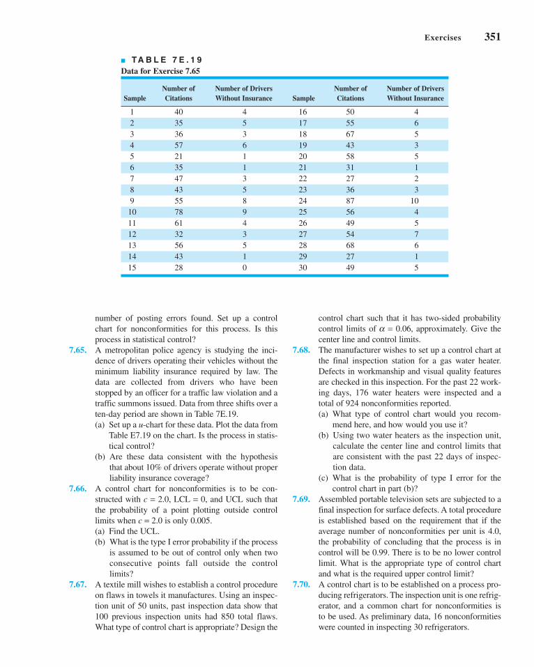
Exercises 351
number of posting errors found. Set up a control
chart for nonconformities for this process. Is this
process in statistical control?
7.65. A metropolitan police agency is studying the inci-
dence of drivers operating their vehicles without the
minimum liability insurance required by law. The
data are collected from drivers who have been
stopped by an officer for a traffic law violation and a
traffic summons issued. Data from three shifts over a
ten-day period are shown in Table 7E.19.
(a) Set up a u-chart for these data. Plot the data from
Table E7.19 on the chart. Is the process in statis-
tical control?
(b) Are these data consistent with the hypothesis
that about 10% of drivers operate without proper
liability insurance coverage?
7.66. A control chart for nonconformities is to be con-
structed with c = 2.0, LCL = 0, and UCL such that
the probability of a point plotting outside control
limits when c = 2.0 is only 0.005.
(a) Find the UCL.
(b) What is the type I error probability if the process
is assumed to be out of control only when two
consecutive points fall outside the control
limits?
7.67. A textile mill wishes to establish a control procedure
on flaws in towels it manufactures. Using an inspec-
tion unit of 50 units, past inspection data show that
100 previous inspection units had 850 total flaws.
What type of control chart is appropriate? Design the
control chart such that it has two-sided probability
control limits of a = 0.06, approximately. Give the
center line and control limits.
7.68. The manufacturer wishes to set up a control chart at
the final inspection station for a gas water heater.
Defects in workmanship and visual quality features
are checked in this inspection. For the past 22 work-
ing days, 176 water heaters were inspected and a
total of 924 nonconformities reported.
(a) What type of control chart would you recom-
mend here, and how would you use it?
(b) Using two water heaters as the inspection unit,
calculate the center line and control limits that
are consistent with the past 22 days of inspec-
tion data.
(c) What is the probability of type I error for the
control chart in part (b)?
7.69. Assembled portable television sets are subjected to a
final inspection for surface defects. A total procedure
is established based on the requirement that if the
average number of nonconformities per unit is 4.0,
the probability of concluding that the process is in
control will be 0.99. There is to be no lower control
limit. What is the appropriate type of control chart
and what is the required upper control limit?
7.70. A control chart is to be established on a process pro-
ducing refrigerators. The inspection unit is one refrig-
erator, and a common chart for nonconformities is
to be used. As preliminary data, 16 nonconformities
were counted in inspecting 30 refrigerators.
■ TA B L E 7 E . 1 9
Data for Exercise 7.65
Number of Number of Drivers Number of Number of DriversSample Citations Without Insurance Sample Citations Without Insurance
1 40 4 16 50 4
2 35 5 17 55 6
3 36 3 18 67 5
4 57 6 19 43 3
5 21 1 20 58 5
6 35 1 21 31 1
7 47 3 22 27 2
8 43 5 23 36 3
9 55 8 24 87 10
10 78 9 25 56 4
11 61 4 26 49 5
12 32 3 27 54 7
13 56 5 28 68 6
14 43 1 29 27 1
15 28 0 30 49 5
c07ControlChartsforAttributes.qxd 5/1/12 7:39 AM Page 351

352 Chapter 7 ■ Control Charts for Attributes
(a) What are the three-sigma control limits?
(b) What is the a-risk for this control chart?
(c) What is the b-risk if the average number of
defects is actually 2 (i.e., if c = 2.0)?
(d) Find the average run length if the average num-
ber of defects is actually 2.
7.71. Consider the situation described in Exercise 7.70.
(a) Find two-sigma control limits and compare these
with the control limits found in part (a) of
Exercise 7.70.
(b) Find the a-risk for the control chart with two-
sigma control limits and compare with the
results of part (b) of Exercise 7.70.
(c) Find the b-risk for c = 2.0 for the chart with two-
sigma control limits and compare with the results
of part (c) of Exercise 7.70.
(d) Find the ARL if c = 2.0 and compare with the
ARL found in part (d) of Exercise 7.70.
7.72. A control chart for nonconformities is to be estab-
lished in conjunction with final inspection of a radio.
The inspection unit is to be a group of ten radios.
The average number of nonconformities per radio
has, in the past, been 0.5. Find three-sigma control
limits for a c chart based on this size inspection unit.
7.73. A control chart for nonconformities is maintained on
a process producing desk calculators. The inspection
unit is defined as two calculators. The average num-
ber of nonconformities per machine when the
process is in control is estimated to be two.
(a) Find the appropriate three-sigma control limits
for this size inspection unit.
(b) What is the probability of type I error for this
control chart?
7.74. A production line assembles electric clocks. The
average number of nonconformities per clock is esti-
mated to be 0.75. The quality engineer wishes to
establish a c chart for this operation, using an inspec-
tion unit of six clocks. Find the three-sigma limits for
this chart.
7.75. Suppose that we wish to design a control chart for
nonconformities per unit with L-sigma limits. Find
the minimum sample size that would result in a pos-
itive lower control limit for this chart.
7.76. Kittlitz (1999) presents data on homicides in Waco,
Texas, for the years 1980–1989 (data taken from the
Waco Tribune-Herald, December 29, 1989). There
were 29 homicides in 1989. Table 7E.20 gives the
dates of the 1989 homicides and the number of days
between each homicide.
The * refers to the fact that two homicides occurred
on June 16 and were determined to have occurred
12 hours apart.
(a) Plot the days-between-homicides data on a normal
probability plot. Does the assumption of a normal
distribution seem reasonable for these data?
(b) Transform the data using the 0.2777 root of the
data. Plot the transformed data on a normal prob-
ability plot. Does this plot indicate that the trans-
formation has been successful in making the new
data more closely resemble data from a normal
distribution?
(c) Transform the data using the fourth root (0.25) of
the data. Plot the transformed data on a normal
probability plot. Does this plot indicate that the
transformation has been successful in making the
new data more closely resemble data from a nor-
mal distribution? Is the plot very different from
the one in part (b)?
(d) Construct an individuals control chart using the
transformed data from part (b).
(e) Construct an individuals control chart using the
transformed data from part (c). How similar is it
to the one you constructed in part (d)?
(f) Is the process stable? Provide a practical inter-
pretation of the control chart.
7.77. Suggest at least two nonmanufacturing scenarios in
which attributes control charts could be useful for
process monitoring.
7.78. What practical difficulties could be encountered in
monitoring time-between-events data?
7.79. A paper by R. N. Rodriguez (“Health Care
Applications of Statistical Process Control:
■ TA B L E 7 E . 2 0
Homicide Data from Waco, Texas, for Exercise 7.76
Days DaysMonth Date Between Month Date Between
Jan. 20 July 8 2
Feb. 23 34 July 9 1
Feb. 25 2 July 26 17
March 5 8 Sep. 9 45
March 10 5 Sep. 22 13
April 4 25 Sep. 24 2
May 7 33 Oct. 1 7
May 24 17 Oct. 4 3
May 28 4 Oct. 8 4
June 7 10 Oct. 19 11
June 16* 9.25 Nov. 2 14
June 16* 0.50 Nov. 25 23
June 22* 5.25 Dec. 28 33
June 25 3 Dec. 29 1
July 6 11
c07ControlChartsforAttributes.qxd 3/28/12 3:27 PM Page 352

Exercises 353
Examples Using the SAS® System,” SAS UsersGroup International: Proceedings of the 21stAnnual Conference, 1996) illustrated several infor-
mative applications of control charts to the health
care environment. One of these showed how a con-
trol chart was employed to analyze the rate of CAT
scans performed each month at a clinic. The data
used in this example are shown in Table 7E.21.
NSCANB is the number of CAT scans performed
each month and MMSB is the number of members
enrolled in the health care plan each month, in units
of member months. DAYS is the number of days in
each month. The variable NYRSB converts MMSB
to units of thousand members per year, and is com-
puted as follows: NYRSB = MMSB(Days/30)/
12000. NYRSB represents the “area of opportu-
nity.” Construct an appropriate control chart to mon-
itor the rate at which CAT scans are performed at
this clinic.
7.80. A paper by R. N. Rodriguez (“Health Care
Applications of Statistical Process Control:
Examples Using the SAS® System,” SAS UsersGroup International: Proceedings of the 21st AnnualConference, 1996) illustrated several informative
applications of control charts to the health care envi-
ronment. One of these showed how a control chart
was employed to analyze the number of office visits
by health care plan members. The data for clinic E
are shown in Table 7E.22.
The variable NVISITE is the number of visits to
clinic E each month, and MMSE is the number of
members enrolled in the health care plan each month,
in units of member months. DAYS is the number of
days in each month. The variable NYRSE converts
MMSE to units of thousand members per year, and is
computed as follows: NYRSE = MMSE(Days/30)/
12000. NYRSE represents the “area of opportunity.”
The variable PHASE separates the data into two time
periods.
(a) Use the data from Phase 1 to construct a control
chart for monitoring the rate of office visits per-
formed at clinic E. Does this chart exhibit control?
(b) Plot the data from Phase 2 on the chart constructed
in part (a). Is there a difference in the two phases?
(c) Consider only the Phase 2 data. Do these data
exhibit control?
7.81. The data in Table 7E.23 are the number of information
errors found in customer records in a marketing com-
pany database. Five records were sampled each day.
(a) Set up a c chart for the total number of errors. Is
the process in control?
(b) Set up a t chart for the total number of errors,
assuming a geometric distribution with a = 1. Is
the process in control?
(c) Discuss the findings from parts (a) and (b). Is
the Poisson distribution a good model for the
customer error data? Is there evidence of this in
the data?
■ TA B L E 7 E . 2 1
Data for Exercise 7.79
Month NSCANB MMSB Days NYRSB
Jan. 94 50 26,838 31 2.31105
Feb. 94 44 26,903 28 2.09246
March 94 71 26,895 31 2.31596
Apr. 94 53 26,289 30 2.19075
May 94 53 26,149 31 2.25172
Jun. 94 40 26,185 30 2.18208
July 94 41 26,142 31 2.25112
Aug. 94 57 26,092 31 2.24681
Sept. 94 49 25,958 30 2.16317
Oct. 94 63 25,957 31 2.23519
Nov. 94 64 25,920 30 2.16000
Dec. 94 62 25,907 31 2.23088
Jan. 95 67 26,754 31 2.30382
Feb. 95 58 26,696 28 2.07636
March 95 89 26,565 31 2.28754
■ TA B L E 7 E . 2 2
Data for Exercise 7.80
Month Phase NVISITE NYRSE Days MMSE
Jan. 94 1 1,421 0.66099 31 7,676
Feb. 94 1 1,303 0.59718 28 7,678
Mar. 94 1 1,569 0.66219 31 7,690
Apr. 94 1 1,576 0.64608 30 7,753
May 94 1 1,567 0.66779 31 7,755
Jun. 94 1 1,450 0.65575 30 7,869
July 94 1 1,532 0.68105 31 7,909
Aug. 94 1 1,694 0.68820 31 7,992
Sep. 94 2 1,721 0.66717 30 8,006
Oct. 94 2 1,762 0.69612 31 8,084
Nov. 94 2 1,853 0.68233 30 8,188
Dec. 94 2 1,770 0.70809 31 8,223
Jan. 95 2 2,024 0.78215 31 9,083
Feb. 95 2 1,975 0.70684 28 9,088
Mar. 95 2 2,097 0.78947 31 9,168
c07ControlChartsforAttributes.qxd 3/28/12 3:27 PM Page 353

354 Chapter 7 ■ Control Charts for Attributes
7.82. Kaminsky et al. (1992) present data on the number of
orders per truck at a distribution center. Some of
these data are shown in Table 7E.24.
(a) Set up a c chart for the number of orders per
truck. Is the process in control?
(b) Set up a t chart for the number of orders per
truck, assuming a geometric distribution with
a = 1. Is the process in control?
(c) Discuss the findings from parts (a) and (b). Is the
Poisson distribution a good model for these data?
Is there evidence of this in the data?
■ TA B L E 7 E . 2 3
Customer Error Data for Exercise 7.81
Day Record 1 Record 2 Record 3 Record 4 Record 5
1 8 7 1 11 17
2 11 1 11 2 9
3 1 1 8 2 5
4 3 2 5 1 4
5 3 2 13 6 5
6 6 3 3 3 1
7 8 8 2 1 5
8 4 10 2 6 4
9 1 6 1 3 2
10 15 1 3 2 8
11 1 7 13 5 1
12 6 7 9 3 1
13 7 6 3 3 1
14 2 9 3 8 7
15 6 14 7 1 8
16 2 9 4 2 1
17 11 1 1 3 2
18 5 5 19 1 3
19 6 15 5 6 6
20 2 7 9 2 8
21 7 5 6 14 10
22 4 3 8 1 2
23 4 1 4 20 5
24 15 2 7 10 17
25 2 15 3 11 2
■ TA B L E 7 E . 2 4
Number of Orders per Truck for Exercise 7.82
No. of No. of No. of No. of Truck Orders Truck Orders Truck Orders Truck Orders
1 22 9 5 17 6 25 6
2 58 10 26 18 35 26 13
3 7 11 12 19 6 27 9
4 39 12 26 20 23 28 21
5 7 13 10 21 10 29 8
6 33 14 30 22 17 30 12
7 8 15 5 23 7 31 4
8 23 16 24 24 10 32 18
c07ControlChartsforAttributes.qxd 3/28/12 3:27 PM Page 354

8.1 INTRODUCTION8.2 PROCESS CAPABILITY ANALYSIS
USING A HISTOGRAM OR APROBABILITY PLOT
8.2.1 Using the Histogram8.2.2 Probability Plotting
8.3 PROCESS CAPABILITY RATIOS8.3.1 Use and Interpretation of Cp
8.3.2 Process Capability Ratio foran Off-Center Process
8.3.3 Normality and the ProcessCapability Ratio
8.3.4 More about ProcessCentering
8.3.5 Confidence Intervals andTests on Process CapabilityRatios
8.4 PROCESS CAPABILITY ANALYSISUSING A CONTROL CHART
8.5 PROCESS CAPABILITY ANALYSISUSING DESIGNED EXPERIMENTS
8.6 PROCESS CAPABILITY ANALYSISWITH ATTRIBUTE DATA
8.7 GAUGE AND MEASUREMENTSYSTEM CAPABILITY STUDIES
8.7.1 Basic Concepts of GaugeCapability
CHAPTER OUTLINE
8.7.2 The Analysis of VarianceMethod
8.7.3 Confidence Intervals inGauge R & R Studies
8.7.4 False Defectives and PassedDefectives
8.7.5 Attribute Gauge Capability8.7.6 Comparing Customer and
Supplier MeasurementSystems
8.8 SETTING SPECIFICATION LIMITS ONDISCRETE COMPONENTS
8.8.1 Linear Combinations8.8.2 Nonlinear Combinations
8.9 ESTIMATING THE NATURALTOLERANCE LIMITS OF A PROCESS
8.9.1 Tolerance Limits Based onthe Normal Distribution
8.9.2 Nonparametric ToleranceLimits
Supplemental Material for Chapter 8
S8.1 Fixed Versus Random Factorsin the Analysis of Variance
S8.2 More About Analysis ofVariance Methods forMeasurement SystemsCapability Studies
Process andMeasurement SystemCapability Analysis
88
355
The supplemental material is on the textbook Website www.wiley.com/college/montgomery.
c08ProcessandMeasurementSystemCapabilityAnalysis.qxd 4/23/12 7:22 PM Page 355

356 Chapter 8 ■ Process and Measurement System Capability Analysis
CHAPTER OVERVIEW AND LEARNING OBJECTIVES
In Chapter 6, we formally introduced the concept of process capability, or how the inherent
variability in a process compares with the specifications or requirements for the product.
Process capability analysis is an important tool in the DMAIC process, with application in
both the Analyze and Improve steps. This chapter provides more extensive discussion of
process capability, including several ways to study or analyze the capability of a process. We
believe that the control chart is a simple and effective process capability analysis technique.
We also extend the presentation of process capability ratios that we began in Chapter 6, show-
ing how to interpret these ratios and discussing their potential dangers. The chapter also con-
tains information on evaluating measurement system performance, illustrating graphical
methods, as well as techniques based on the analysis of variance. Measurement systems analysis
is used extensively in DMAIC, principally during the Measure step. We also discuss setting
specifications on individual discrete parts or components and estimating the natural tolerance
limits of a process.
After careful study of this chapter, you should be able to do the following:
1. Investigate and analyze process capability using control charts, histograms, and
probability plots
2. Understand the difference between process capability and process potential
3. Calculate and properly interpret process capability ratios
4. Understand the role of the normal distribution in interpreting most process capa-
bility ratios
5. Calculate confidence intervals on process capability ratios
6. Conduct and analyze a measurement systems capability (or gauge R & R)
experiment
7. Estimate the components of variability in a measurement system
8. Set specifications on components in a system involving interaction components
to ensure that overall system requirements are met
9. Estimate the natural limits of a process from a sample of data from that
process
8.1 Introduction
Statistical techniques can be helpful throughout the product cycle, including development
activities prior to manufacturing, in quantifying process variability, in analyzing this variabil-
ity relative to product requirements or specifications, and in assisting development and man-
ufacturing in eliminating or greatly reducing this variability. This general activity is called
process capability analysis.Process capability refers to the uniformity of the process. Obviously, the variability of
critical-to-quality characteristics in the process is a measure of the uniformity of output. There
are two ways to think of this variability:
1. The natural or inherent variability in a critical-to-quality characteristic at a specified
time—that is, “instantaneous” variability
2. The variability in a critical-to-quality characteristic over time
We present methods for investigating and assessing both aspects of process capability.
Determining process capability is an important part of the DMAIC process. It is used pri-
marily in the Analyze step, but it also can be useful in other steps, such as Improve.
c08ProcessandMeasurementSystemCapabilityAnalysis.qxd 3/28/12 8:14 PM Page 356
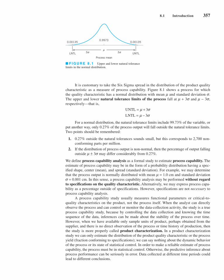
It is customary to take the Six Sigma spread in the distribution of the product quality
characteristic as a measure of process capability. Figure 8.1 shows a process for which
the quality characteristic has a normal distribution with mean m and standard deviation s.
The upper and lower natural tolerance limits of the process fall at m + 3s and m − 3s,
respectively—that is,
For a normal distribution, the natural tolerance limits include 99.73% of the variable, or
put another way, only 0.27% of the process output will fall outside the natural tolerance limits.
Two points should be remembered:
1. 0.27% outside the natural tolerances sounds small, but this corresponds to 2,700 non-
conforming parts per million.
2. If the distribution of process output is non-normal, then the percentage of output falling
outside m ± 3s may differ considerably from 0.27%.
We define process capability analysis as a formal study to estimate process capability. The
estimate of process capability may be in the form of a probability distribution having a spec-
ified shape, center (mean), and spread (standard deviation). For example, we may determine
that the process output is normally distributed with mean m = 1.0 cm and standard deviation
s = 0.001 cm. In this sense, a process capability analysis may be performed without regardto specifications on the quality characteristic. Alternatively, we may express process capa-
bility as a percentage outside of specifications. However, specifications are not necessary to
process capability analysis.
A process capability study usually measures functional parameters or critical-to-
quality characteristics on the product, not the process itself. When the analyst can directly
observe the process and can control or monitor the data-collection activity, the study is a true
process capability study, because by controlling the data collection and knowing the time
sequence of the data, inferences can be made about the stability of the process over time.
However, when we have available only sample units of product, perhaps obtained from the
supplier, and there is no direct observation of the process or time history of production, then
the study is more properly called product characterization. In a product characterization
study we can only estimate the distribution of the product quality characteristic or the process
yield (fraction conforming to specifications); we can say nothing about the dynamic behavior
of the process or its state of statistical control. In order to make a reliable estimate of process
capability, the process must be in statistical control. Otherwise, the predictive inference about
process performance can be seriously in error. Data collected at different time periods could
lead to different conclusions.
UNTL
LNTL
= += −
μ σμ σ
3
3
0.00135 0.001350.9973
LNTL UNTL
Process mean
σμ
3 σ3
■ F I G U R E 8 . 1 Upper and lower natural tolerance
limits in the normal distribution.
8.1 Introduction 357
c08ProcessandMeasurementSystemCapabilityAnalysis.qxd 3/28/12 8:14 PM Page 357

358 Chapter 8 ■ Process and Measurement System Capability Analysis
Process capability analysis is a vital part of an overall quality-improvement program.
Among the major uses of data from a process capability analysis are the following:
1. Predicting how well the process will hold the tolerances
2. Assisting product developers/designers in selecting or modifying a process
3. Assisting in establishing an interval between sampling for process monitoring
4. Specifying performance requirements for new equipment
5. Selecting between competing suppliers and other aspects of supply chain management
6. Planning the sequence of production processes when there is an interactive effect of
processes on tolerances
7. Reducing the variability in a process
Thus, process capability analysis is a technique that has application in many segments of the
product cycle, including product and process design, supply chain management, production
or manufacturing planning, and manufacturing.
Three primary techniques are used in process capability analysis: histograms or prob-ability plots, control charts, and designed experiments. We will discuss and illustrate each
of these methods in the next three sections. We will also discuss the process capability ratio
(PCR) introduced in Chapter 6 and some useful variations of this ratio.
8.2 Process Capability Analysis Using a Histogram or a Probability Plot
8.2.1 Using the Histogram
The histogram can be helpful in estimating process capability. Alternatively, a stem-and-leaf
plot may be substituted for the histogram. At least 100 or more observations should be avail-
able for the histogram (or the stem-and-leaf plot) to be moderately stable so that a reasonably
reliable estimate of process capability may be obtained. If the quality engineer has access to
the process and can control the data-collection effort, the following steps should be followed
prior to data collection:
1. Choose the machine or machines to be used. If the results based on one (or a few)
machines are to be extended to a larger population of machines, the machine selected
should be representative of those in the population. Furthermore, if the machine has
multiple workstations or heads, it may be important to collect the data so that head-
to-head variability can be isolated. This may imply that designed experiments should be
used.
2. Select the process operating conditions. Carefully define conditions, such as cutting
speeds, feed rates, and temperatures, for future reference. It may be important to study
the effects of varying these factors on process capability.
3. Select a representative operator. In some studies, it may be important to estimate oper-ator variability. In these cases, the operators should be selected at random from the pop-
ulation of operators.
4. Carefully monitor the data-collection process, and record the time order in which each
unit is produced.
The histogram, along with the sample average and sample standard deviation s,
provides information about process capability. You may wish to review the guidelines for
constructing histograms in Chapter 3.
x
c08ProcessandMeasurementSystemCapabilityAnalysis.qxd 3/28/12 8:14 PM Page 358

Furthermore, the shape of the histogram implies that the
distribution of bursting strength is approximately normal.
Thus, we can estimate that approximately 99.73% of the bot-
tles manufactured by this process will burst between 168 and
360 psi. Note that we can estimate process capability indepen-dently of the specifications on bursting strength.
EXAMPLE 8.1
Figure 8.2 presents a histogram of the bursting strength of 100
glass containers. The data are shown in Table 8.1. What is the
capability of the process?
SOLUTION
Analysis of the 100 observations gives
Consequently, the process capability would be estimated as
or
264 06 3 32 02 264 96. . ~± ( ) − ± psi
x s± 3
x s= =264 06 32 02. .
Estimating Process Capability with a Histogram
An advantage of using the histogram to estimate process capability is that it gives an
immediate, visual impression of process performance. It may also immediately show the rea-
son for poor process performance. For example, Figure 8.3a shows a process with adequate
potential capability, but the process target is poorly located, whereas Figure 8.3b shows a
process with poor capability resulting from excess variability. Histograms do not provide any
information about the state of statistical control of the process. So conclusions about capability
based on the histogram depend on the assumption that the process is in control.
40
30
20
10
Freq
uenc
y
170 190 210 230 250 270 290 310 330 350Bursting strength (psi)
■ F I G U R E 8 . 2 Histogram for the bursting-
strength data.
■ TA B L E 8 . 1
Bursting Strengths for 100 Glass Containers
265 197 346 280 265 200 221 265 261 278
205 286 317 242 254 235 176 262 248 250
263 274 242 260 281 246 248 271 260 265
307 243 258 321 294 328 263 245 274 270
220 231 276 228 223 296 231 301 337 298
268 267 300 250 260 276 334 280 250 257
260 281 208 299 308 264 280 274 278 210
234 265 187 258 235 269 265 253 254 280
299 214 264 267 283 235 272 287 274 269
215 318 271 293 277 290 283 258 275 251
σ
μμ
σ
LSL USL(a) (b)
LSL USL
■ F I G U R E 8 . 3 Some reasons for poor process capability. (a) Poor process centering. (b) Excess process
variability.
8.2 Process Capability Analysis Using a Histogram or a Probability Plot 359
c08ProcessandMeasurementSystemCapabilityAnalysis.qxd 3/28/12 8:14 PM Page 359
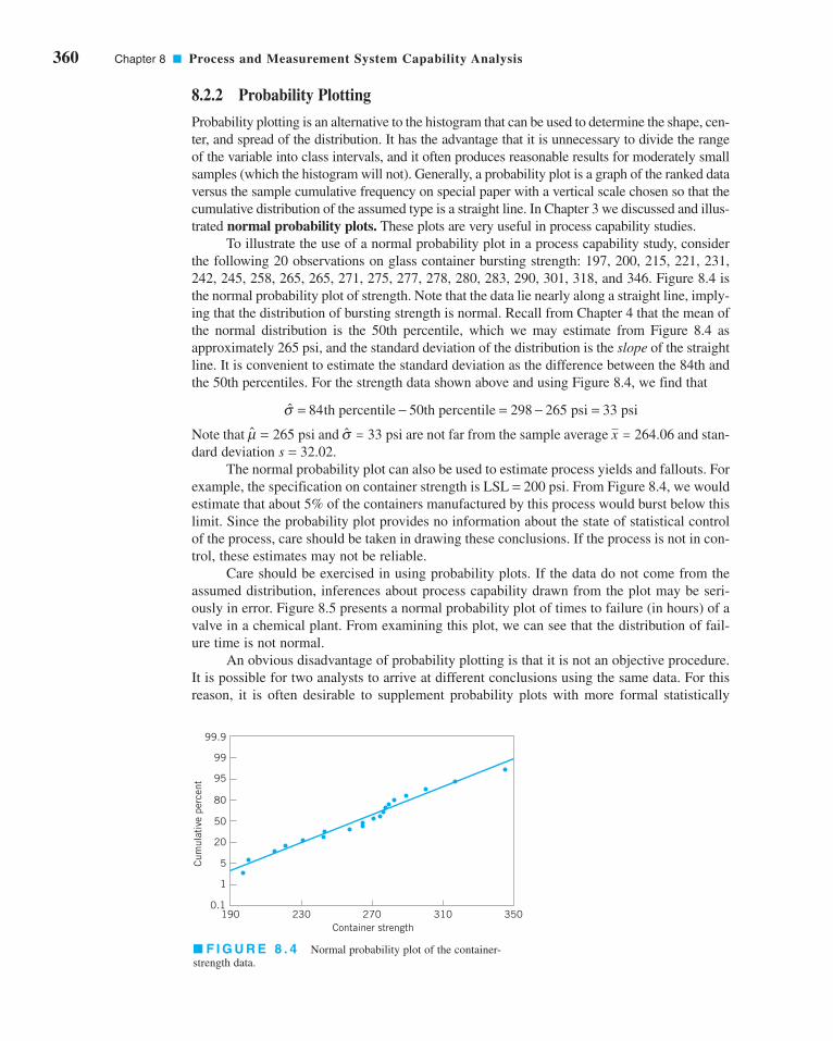
360 Chapter 8 ■ Process and Measurement System Capability Analysis
8.2.2 Probability Plotting
Probability plotting is an alternative to the histogram that can be used to determine the shape, cen-
ter, and spread of the distribution. It has the advantage that it is unnecessary to divide the range
of the variable into class intervals, and it often produces reasonable results for moderately small
samples (which the histogram will not). Generally, a probability plot is a graph of the ranked data
versus the sample cumulative frequency on special paper with a vertical scale chosen so that the
cumulative distribution of the assumed type is a straight line. In Chapter 3 we discussed and illus-
trated normal probability plots. These plots are very useful in process capability studies.
To illustrate the use of a normal probability plot in a process capability study, consider
the following 20 observations on glass container bursting strength: 197, 200, 215, 221, 231,
242, 245, 258, 265, 265, 271, 275, 277, 278, 280, 283, 290, 301, 318, and 346. Figure 8.4 is
the normal probability plot of strength. Note that the data lie nearly along a straight line, imply-
ing that the distribution of bursting strength is normal. Recall from Chapter 4 that the mean of
the normal distribution is the 50th percentile, which we may estimate from Figure 8.4 as
approximately 265 psi, and the standard deviation of the distribution is the slope of the straight
line. It is convenient to estimate the standard deviation as the difference between the 84th and
the 50th percentiles. For the strength data shown above and using Figure 8.4, we find that
Note that and are not far from the sample average and stan-
dard deviation s = 32.02.
The normal probability plot can also be used to estimate process yields and fallouts. For
example, the specification on container strength is LSL = 200 psi. From Figure 8.4, we would
estimate that about 5% of the containers manufactured by this process would burst below this
limit. Since the probability plot provides no information about the state of statistical control
of the process, care should be taken in drawing these conclusions. If the process is not in con-
trol, these estimates may not be reliable.
Care should be exercised in using probability plots. If the data do not come from the
assumed distribution, inferences about process capability drawn from the plot may be seri-
ously in error. Figure 8.5 presents a normal probability plot of times to failure (in hours) of a
valve in a chemical plant. From examining this plot, we can see that the distribution of fail-
ure time is not normal.
An obvious disadvantage of probability plotting is that it is not an objective procedure.
It is possible for two analysts to arrive at different conclusions using the same data. For this
reason, it is often desirable to supplement probability plots with more formal statistically
x = 264.06s = 33 psim = 265 psi
σ = − = − =84 298 265 33th percentile 50th percentile psi psi
■ F I G U R E 8 . 4 Normal probability plot of the container-
strength data.
99.9
99
95
80
50
20
5
1
0.1190 230 270 310 350
Container strength
Cum
ulat
ive
perc
ent
c08ProcessandMeasurementSystemCapabilityAnalysis.qxd 3/28/12 8:14 PM Page 360

based goodness-of-fit tests. A good introduction to these tests is in Shapiro (1980). Augmenting
the interpretation of a normal probability plot with the Shapiro–Wilk test for normality can
make the procedure much more powerful and objective.
Choosing the distribution to fit the data is also an important step in probability plotting.
Sometimes we can use our knowledge of the physical phenomena or past experience to sug-
gest the choice of distribution. In other situations, the display in Figure 8.6 may be useful in
selecting a distribution that describes the data. This figure shows the regions in the b1, b2
plane for several standard probability distributions, where b1 and b2 are the measures of
skewness and kurtosis, respectively. To use Figure 8.6, calculate estimates of skewness and
kurtosis from the sample—say,
(8.1)
and
(8.2)
where
(8.3)
and plot the point ( ) on the graph. If the plotted point falls close to a point, line, or
region that corresponds to one of the distributions in the figure, then this distribution is a log-
ical choice to use as a model for the data. If the point falls in regions of the b1, b2 plane where
none of the distributions seems appropriate, other, more general probability distributions,
such as the Johnson or Pearson families of distributions, may be required. A note of caution
b1, b2
Mx x
njj
ij
i
n
=−( )
==∑
1 1, 2, 3, 4
β24
22
= M
M
β13
2
3 2=
( )M
M
99.9
99
95
80
50
20
5
1
0.10 200 400 600 800 1000 1200
Time to failure
Cum
ulat
ive
perc
ent
■ F I G U R E 8 . 5 Normal probability plot of time to failure of a
valve.
1
2
3
4
5
6
7
8
9
0 41 2 3
t dis
trib
utio
n
Uniform distributionNormal distribution
Gamma distribution
Lognormal distribution
Beta (J-shaped)
distribution region
Beta (U-shaped)
distribution region
Impossible area
Beta distribution region
Exponential
distribution
β1
β2
■ F I G U R E 8 . 6 Regions in the b1, b2 plane for various
distributions. (From Statistical Models in Engineering by G. J. Hahn
and S. S. Shapiro, John Wiley: New York, 1967.)
8.2 Process Capability Analysis Using a Histogram or a Probability Plot 361
c08ProcessandMeasurementSystemCapabilityAnalysis.qxd 3/28/12 8:14 PM Page 361

362 Chapter 8 ■ Process and Measurement System Capability Analysis
should be sounded here: The skewness and kurtosis statistics are not reliable unless they are
computed from very large samples. Procedures similar to that in Figure 8.6 for fitting these
distributions and graphs are in Hahn and Shapiro (1967).
8.3 Process Capability Ratios
8.3.1 Use and Interpretation of Cp
It is frequently convenient to have a simple, quantitative way to express process capability.
One way to do so is through the process capability ratio (PCR) Cp first introduced in
Chapter 6. Recall that
(8.4)
where USL and LSL are the upper and lower specification limits, respectively. Cp and other
process capability ratios are used extensively in industry. They are also widely misused. We
will point out some of the more common abuses of process capability ratios. An excellent
recent book on process capability ratios that is highly recommended is Kotz and Lovelace
(1998). There is also extensive technical literature on process capability analysis and process
capability ratios. The review paper by Kotz and Johnson (2002) and the bibliography (papers)
by Spiring, Leong, Cheng, and Yeung (2003) and Yum and Kim (2011) are excellent sources.
In a practical application, the process standard deviation s is almost always unknown
and must be replaced by an estimate s. To estimate s we typically use either the sample stan-dard deviation s or (when variables control charts are used in the capability study). This
results in an estimate of Cp—say,
(8.5)
To illustrate the calculation of Cp, recall the semiconductor hard-bake process first ana-
lyzed in Example 6.1 using and R charts. The specifications on flow width are USL = 1.00
microns and LSL = 2.00 microns, and from the R chart we estimated . Thus,
our estimate of the PCR Cp is
In Chapter 6, we assumed that flow width is approximately normally distributed (a rea-
sonable assumption, based on the histogram in Fig. 8.7) and the cumulative normal distribution
table in the Appendix was used to estimate that the process produces approximately 350 ppm
(parts per million) defective. Please note that this conclusion depends on the assumption that the
process is in statistical control.
The PCR Cp in equation 8.4 has a useful practical interpretation—namely,
(8.6)PCp
=⎛
⎝⎜⎞
⎠⎟1
100
ˆˆ
. .
..Cp = − = −
( )=USL LSL
6
2 00 1 00
6 0 13981 192
σ
s = R/d2 = 0.1398
x
ˆˆ
Cp = −USL LSL
6σ
R/d2
Cp = −USL LSL
6σ
c08ProcessandMeasurementSystemCapabilityAnalysis.qxd 3/28/12 8:14 PM Page 362

0
5
10
15
Freq
uenc
y1.2
Flow width (microns)
1.3 1.4 1.5 1.6 1.7 1.8 1.9
■ F I G U R E 8 . 7 Histogram of flow width from
Example 6.1.
(LSL − m)/s = (200 − 264)/32 = −2 under the standard normal
distribution. The estimated fallout is about 2.28% defective, or
about 22,800 nonconforming containers per million. Note that
if the normal distribution were an inappropriate model for
strength, then this last calculation would have to be performed
using the appropriate probability distribution. This calculation
also assumes an in-control process.
EXAMPLE 8.2
Construct a one-sided process-capability ratio for the container
bursting-strength data in Example 8.1. Suppose that the lower
specification limit on bursting strength is 200 psi.
SOLUTION
We will use and s = 32 as estimates of m and s,
respectively, and the resulting estimate of the one-sided lower
process-capability ratio is
The fraction of defective containers produced by this
process is estimated by finding the area to the left of Z =
ˆˆ
ˆ.Cpl = − = −
( )=μ
σLSL
3
264 200
3 320 67
x = 264
One-Sided Process-Capability Ratios
is the percentage of the specification band used up by the process. The hard-bake process uses
percent of the specification band.
Equations 8.4 and 8.5 assume that the process has both upper and lower specification
limits. For one-sided specifications, one-sided process-capability ratios are used. One-sided
PCRs are defined as follows.
(8.7)
(8.8)
Estimates and would be obtained by replacing m and s in equations 8.7 and 8.8
by estimates and , respectively.smCplCpu
Cpl = − ( )LSLlower specification only
μσ3
Cpu = − ( )USLupper specification only
μσ3
P = ⎛⎝
⎞⎠ =1
1 192100 83 89
..
8.3 Process Capability Ratios 363
c08ProcessandMeasurementSystemCapabilityAnalysis.qxd 3/28/12 8:14 PM Page 363
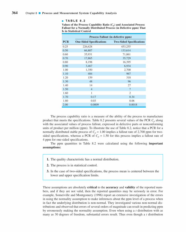
364 Chapter 8 ■ Process and Measurement System Capability Analysis
The process capability ratio is a measure of the ability of the process to manufacture
product that meets the specifications. Table 8.2 presents several values of the PCR Cp along
with the associated values of process fallout, expressed in defective parts or nonconforming
units of product per million (ppm). To illustrate the use of Table 8.2, notice that a PCR for a
normally distributed stable process of Cp = 1.00 implies a fallout rate of 2,700 ppm for two-
sided specifications, whereas a PCR of Cp = 1.50 for this process implies a fallout rate of
4 ppm for one-sided specifications.
The ppm quantities in Table 8.2 were calculated using the following importantassumptions:
1. The quality characteristic has a normal distribution.
2. The process is in statistical control.
3. In the case of two-sided specifications, the process mean is centered between the
lower and upper specification limits.
These assumptions are absolutely critical to the accuracy and validity of the reported num-
bers, and if they are not valid, then the reported quantities may be seriously in error. For
example, Somerville and Montgomery (1996) report an extensive investigation of the errors
in using the normality assumption to make inferences about the ppm level of a process when
in fact the underlying distribution is non-normal. They investigated various non-normal dis-
tributions and observed that errors of several orders of magnitude can result in predicting ppm
by erroneously making the normality assumption. Even when using a t distribution with as
many as 30 degrees of freedom, substantial errors result. Thus even though a t distribution
■ TA B L E 8 . 2
Values of the Process Capability Ratio (Cp) and Associated ProcessFallout for a Normally Distributed Process (in Defective ppm) ThatIs in Statistical Control
Process Fallout (in defective ppm)
PCR One-Sided Specifications Two-Sided Specifications
0.25 226,628 453,255
0.50 66,807 133,614
0.60 35,931 71,861
0.70 17,865 35,729
0.80 8,198 16,395
0.90 3,467 6,934
1.00 1,350 2,700
1.10 484 967
1.20 159 318
1.30 48 96
1.40 14 27
1.50 4 7
1.60 1 2
1.70 0.17 0.34
1.80 0.03 0.06
2.00 0.0009 0.0018
c08ProcessandMeasurementSystemCapabilityAnalysis.qxd 3/28/12 8:14 PM Page 364

with 30 degrees of freedom is symmetrical and almost visually indistinguishable from the
normal, the longer and heavier tails of the t distribution make a significant difference when
estimating the ppm. Consequently, symmetry in the distribution of process output alone is
insufficient to ensure that any PCR will provide a reliable prediction of process ppm. We will
discuss the non-normality issue in more detail in Section 8.3.3.
Stability or statistical control of the process is also essential to the correct interpretation
of any PCR. Unfortunately, it is fairly common practice to compute a PCR from a sample of
historical process data without any consideration of whether or not the process is in statistical
control. If the process is not in control, then of course its parameters are unstable, and the value
of these parameters in the future is uncertain. Thus the predictive aspects of the PCR regarding
process ppm performance are lost.
Finally, remember that what we actually observe in practice is an estimate of the PCR.
This estimate is subject to error in estimation, since it depends on sample statistics. English
and Taylor (1993) report that large errors in estimating PCRs from sample data can occur,
so the estimate one actually has at hand may not be very reliable. It is always a good idea to
report the estimate of any PCR in terms of a confidence interval. We will show how to do
this for some of the commonly used PCRs in Section 8.3.5.
Table 8.3 presents some recommended guidelines for minimum values of the PCR.
The bottle-strength characteristic is a parameter closely related to the safety of the prod-
uct; bottles with inadequate pressure strength may fail and injure consumers. This implies
that the PCR should be at least 1.45. Perhaps one way the PCR could be improved would
be by increasing the mean strength of the containers—say, by pouring more glass in the
mold.
We point out that the values in Table 8.3 are only minimums. In recent years, many com-
panies have adopted criteria for evaluating their processes that include process capability
objectives that are more stringent than those of Table 8.3. For example, a Six Sigma company
would require that when the process mean is in control, it will not be closer than six standard
deviations from the nearest specification limit. This, in effect, requires that the minimum
acceptable value of the process capability ratio will be at least 2.0.
8.3.2 Process Capability Ratio for an Off-Center Process
The process capability ratio Cp does not take into account where the process mean is located
relative to the specifications. Cp simply measures the spread of the specifications relative to
the Six Sigma spread in the process. For example, the top two normal distributions in Figure 8.8
both have Cp = 2.0, but the process in panel (b) of the figure clearly has lower capability than
the process in panel (a) because it is not operating at the midpoint of the interval between the
specifications.
■ TA B L E 8 . 3
Recommended Minimum Values of the Process Capability Ratio
Two-Sided One-SidedSpecifications Specifications
Existing processes 1.33 1.25
New processes 1.50 1.45
Safety, strength, or critical 1.50 1.45parameter, existing process
Safety, strength, or critical 1.67 1.60parameter, new process
8.3 Process Capability Ratios 365
c08ProcessandMeasurementSystemCapabilityAnalysis.qxd 3/28/12 8:14 PM Page 365

366 Chapter 8 ■ Process and Measurement System Capability Analysis
This situation may be more accurately reflected by defining a new process capability
ratio (PCR)—Cpk—that takes process centering into account. This quantity is
(8.9)
Note that Cpk is simply the one-sided PCR for the specification limit nearest to the process
average. For the process shown in Figure 8.8b, we would have
Generally, if Cp = Cpk, the process is centered at the midpoint of the specifications, and when
Cpk < Cp the process is off center.
The magnitude of Cpk relative to Cp is a direct measure of how off center the process is
operating. Several commonly encountered cases are illustrated in Figure 8.8. Note in panel
(c) of Figure 8.8 that Cpk = 1.0 while Cp = 2.0. One can use Table 8.2 to get a quick estimate
of potential improvement that would be possible by centering the process. If we take Cp = 1.0
in Table 8.2 and read the fallout from the one-sided specifications column, we can estimate
the actual fallout as 1,350 ppm. However, if we can center the process, then Cp = 2.0 can be
achieved, and Table 8.2 (using Cp = 2.0 and two-sided specifications) suggests that the potential
C C C
C C
C C
pk pu pl
pu pl
pu pl
= ( )= = − = −⎛
⎝⎞⎠
= = −( )
= = −( )
=⎛⎝⎜
⎞⎠⎟
=
min ,
min ,
min . , .
.
USL LSL
6 3
μσ
μσ3 3
2 53
3 21 5
53 8
3 22 5
1 5
C C Cpk pu pl= ( )min ,
σ
(a)
(b)
(c)
(d)
(e) = 2
σ = 2
σ = 2
σ = 2
σ = 2LSL USL
38 44 50 56 62
38 44 50 56 62
38 44 50 56 62
38 44 50 56 62
38 44 50 56 62
Cp = 2.0Cpk = 0
Cp = 2.0Cpk = -0.5
Cp = 2.0Cpk = 1.0
Cp = 2.0Cpk = 1.5
Cp = 2.0Cpk = 2.0
65
■ F I G U R E 8 . 8 Relationship of Cp and Cpk.
c08ProcessandMeasurementSystemCapabilityAnalysis.qxd 3/28/12 8:14 PM Page 366

fallout is 0.0018 ppm, an improvement of several orders of magnitude in process perfor-
mance. Thus, we usually say that Cp measures potential capability in the process, whereas
Cpk measures actual capability.Panel (d ) of Figure 8.8 illustrates the case in which the process mean is exactly equal
to one of the specification limits, leading to Cpk = 0. As panel (e) illustrates, when Cpk < 0 the
implication is that the process mean lies outside the specifications. Clearly, if Cpk < −1, the
entire process lies outside the specification limits. Some authors define Cpk to be nonnegative,
so that values less than zero are defined as zero.
Many quality-engineering authorities have advised against the routine use of process
capability ratios such as Cp and Cpk (or the others discussed later in this section) on the
grounds that they are an oversimplification of a complex phenomenon. Certainly, any statis-
tic that combines information about both location (the mean and process centering) and vari-
ability and that requires the assumption of normality for its meaningful interpretation is likely
to be misused (or abused). Furthermore, as we will see, point estimates of process capability
ratios are virtually useless if they are computed from small samples. Clearly, these ratios need
to be used and interpreted very carefully.
8.3.3 Normality and the Process Capability Ratio
An important assumption underlying our discussion of process capability and the ratios Cp
and Cpk is that their usual interpretation is based on a normal distribution of process output.
If the underlying distribution is non-normal, then as we previously cautioned, the statements
about expected process fallout attributed to a particular value of Cp or Cpk may be in error.
To illustrate this point, consider the data in Figure 8.9, which is a histogram of 80 mea-
surements of surface roughness on a machined part (measured in microinches). The upper
specification limit is at USL = 32 microinches. The sample average and standard deviation
are and S = 3.053, implying that , and Table 8.2 would suggest that the
fallout is less than one part per billion. However, since the histogram is highly skewed, we are
fairly certain that the distribution is non-normal. Thus, this estimate of capability is unlikely
to be correct.
One approach to dealing with this situation is to transform the data so that in the new,
transformed metric the data have a normal distribution appearance. There are various graph-
ical and analytical approaches to selecting a transformation. In this example, a reciprocal
transformation was used. Figure 8.10 presents a histogram of the reciprocal values x* = 1/x.
In the transformed scale, and s* = 0.0244, and the original upper specification
limit becomes 1/32 = 0.03125. This results in a value of , which implies that about
1,350 ppm are outside of specifications. This estimate of process performance is clearly much
more realistic than the one resulting from the usual “normal theory” assumption.
Cpl = 0.97
x* = 0.1025
Cpu = 2.35x = 10.44
30
20
10
06 10 14 18 22
Freq
uenc
y
Cell midpoints
0.0
5
0.0
6
0.0
7
0.0
8
0.0
9
0.1
0
0.1
1
0.1
2
0.1
3
0.1
4
0.1
5
Cell midpoints
20
10
0
Freq
uenc
y
■ F I G U R E 8 . 9 Surface
roughness in microinches for a
machined part.
■ F I G U R E 8 . 1 0 Reciprocals of
surface roughness. (Adapted from data in
the “Statistics Corner” column in QualityProgress, March 1989, with permission of
the American Society for Quality.)
8.3 Process Capability Ratios 367
c08ProcessandMeasurementSystemCapabilityAnalysis.qxd 3/28/12 8:14 PM Page 367

368 Chapter 8 ■ Process and Measurement System Capability Analysis
Other approaches have been considered in dealing with non-normal data. There have
been various attempts to extend the definitions of the standard capability indices to the case
of non-normal distributions. Luceño (1996) introduced the index Cpc, defined as
(8.10)
where the process target value . Luceño uses the second subscript in Cpc
to stand for confidence, and he stresses that the confidence intervals based on Cpc are reliable;
of course, this statement should be interpreted cautiously. The author has also used the con-
stant in the denominator, to make it equal to 6s when the underlying distrib-
ution is normal. We will give the confidence interval for Cpc in Section 8.3.5.
There have also been attempts to modify the usual capability indices so that they are
appropriate for two general families of distributions: the Pearson and Johnson families.
This would make PCRs broadly applicable for both normal and non-normal distributions.
Good discussions of these approaches are in Rodriguez (1992) and Kotz and Lovelace
(1998).
The general idea is to use appropriate quantiles of the process distribution—say,
x0.00135 and x0.99865—to define a quantile-based PCR—say,
(8.11)
Now since in the normal distribution x0.00135 = m − 3s and x0.99865 = m + 3s, we see that in
the case of a normal distribution Cp(q) reduces to Cp. Clements (1989) proposed a method
for determining the quantiles based on the Pearson family of distributions. In general, how-
ever, we could fit any distribution to the process data, determine its quantiles x0.99865 and
x0.00135, and apply equation 8.11. Refer to Kotz and Lovelace (1998) for more information.
8.3.4 More about Process Centering
The process capability ratio Cpk was initially developed because Cp does not adequately deal
with the case of a process with mean m that is not centered between the specification limits.
However, Cpk alone is still an inadequate measure of process centering. For example, consider
the two processes shown in Figure 8.11. Both processes A and B have Cpk = 1.0, yet their cen-
tering is clearly different. To characterize process centering satisfactorily, Cpk must be com-
pared to Cp. For process A, Cpk = Cp = 1.0, implying that the process is centered, whereas for
process B, Cp = 2.0 > Cpk = 1.0, implying that the process is off center. For any fixed value
of m in the interval from LSL to USL, Cpk depends inversely on s and becomes large as s
C qx xp( ) = −
−USL LSL
0 99865 0 00135. .
61�/2 = 7.52
T = 12(USL + LSL)
C
E X Tpc = −
−
USL LSL
62
π
σ
μLSL USL
A = 5
σB = 2.5
A = 50
μB = 57.5
AB
30 40 T = 50 60 70■ F I G U R E 8 . 1 1 Two
processes with Cpk = 1.0.
c08ProcessandMeasurementSystemCapabilityAnalysis.qxd 3/28/12 8:14 PM Page 368

approaches zero. This characteristic can make Cpk unsuitable as a measure of centering. That
is, a large value of Cpk does not really tell us anything about the location of the mean in the
interval from LSL to USL.
One way to address this difficulty is to use a process capability ratio that is a better indi-
cator of centering. PCR Cpm is one such ratio, where
(8.12)
and t is the square root of expected squared deviation from target ,
Thus, equation 8.12 can be written as
(8.13)
where
(8.14)
A logical way to estimate Cpm is by
(8.15)
where
(8.16)
Chan, Cheng, and Spiring (1988) discussed this ratio, various estimators of Cpm, and
their sampling properties. Boyles (1991) has provided a definitive analysis of Cpm and its use-
fulness in measuring process centering. He notes that both Cpk and Cpm coincide with Cp
when m = T and decrease as m moves away from T. However, Cpk < 0 for m > USL or m < LSL,
whereas Cpm approaches zero asymptotically as . Boyles also shows that the
Cpm of a process with is strictly bounded above by the Cp value of a process
with s = Δ. That is,
(8.17)
Thus, a necessary condition for Cpm ≥ 1 is
This statistic says that if the target value T is the midpoint of the specifications, a Cpm of one
or greater implies that the mean m lies within the middle third of the specification band. A
similar statement can be made for any value of Cpm. For instance, implies that
. Thus, a given value of Cpm places a constraint on the difference
between m and the target value T.
�(m − T)� < 18(USL − LSL)
Cpm ≥ 43
μ − < −( )T 16
USL LSL
Cpm <USL − LSL
6�m − T�
�(m − T)� = ¢ > 0
�(m − T)� S q
Vx T
s= −
ˆˆ
CC
Vpm
p=+1
2
ξ μσ
= − T
Cp=+1 2ξ
CT
pm = −
+ −( )USL LSL
62 2σ μ
τ
μ μ
σ μ
2 2
2 2
2 2
= −( )[ ]= −( )[ ] + −( )
= + −( )
E x T
E x T
T
T = 12(USL + LSL)
Cpm = −USL LSL
6τ
8.3 Process Capability Ratios 369
c08ProcessandMeasurementSystemCapabilityAnalysis.qxd 3/28/12 8:14 PM Page 369

370 Chapter 8 ■ Process and Measurement System Capability Analysis
Pearn et al. (1992) proposed the process capability ratio
(8.18)
This is sometimes called a “third generation” process capability ratio, since it is constructed
from the “second generation” ratios Cpk and Cpm in the same way that they were generated
from the “first generation” ratio Cp. The motivation of this new ratio is increased sensitivity
to departures of the process mean m from the desired target T. For more details, see Kotz and
Lovelace (1998).
8.3.5 Confidence Intervals and Tests on Process Capability Ratios
Confidence Intervals on Process Capability Ratios. Much of the industrial use
of process capability ratios focuses on computing and interpreting the point estimate of the
desired quantity. It is easy to forget that or (for examples) are simply point estimates,
and, as such, are subject to statistical fluctuation. An alternative that should become standard
practice is to report confidence intervals for process capability ratios.It is easy to find a confidence interval for the “first generation” ratio Cp. If we replace
s by s in the equation for Cp, we produce the usual point estimator . If the quality charac-
teristic follows a normal distribution, then a 100(1 − a)% CI on Cp is obtained from
(8.19)
or
(8.20)
where c21 − a/2,n − 1 and c2
a/2,n − 1 are the lower a/2 and upper a/2 percentage points of the
chi-square distribution with n − 1 degrees of freedom. These percentage points are tabulated
in Appendix Table III.
ˆ ˆ, ,Cn
C Cnp
np p
nχ χα α1 2 12
2 12
1 1
− − −
−≤ ≤
−
USL LSL USL LSL−−
≤ ≤−
−− − −
6 1 6 11 2 12
2 12
s n C s nn
pnχ χα α, ,
Cp
CpkCp
CC
Tpkm
pk=
+ −⎛⎝
⎞⎠1
2μσ
Cpk=+1 2ξ
If we use equation 8.17, this is equivalent to saying that the
process mean lies approximately within the middle half of the
specification range. Visual examination of Figure 8.11 reveals
this to be the case.
EXAMPLE 8.3
To illustrate the use of Cpm, consider the two processes A and B
in Figure 8.11. For process A we find that
since process A is centered at the target value T = 50. Note that
Cpm = Cpk for process A. Now consider process B:
CC
pmp=
+=
+ ( )=
1
2
1 30 63
2 2ξ.
CC
pmp=
+=
+=
1
1 0
1 01 0
2ξ.
.
Process Centering
c08ProcessandMeasurementSystemCapabilityAnalysis.qxd 3/28/12 8:14 PM Page 370

approximately at the midpoint of the specification interval and
that the sample standard deviation s = 1.75. Find a 95% CI on Cp.
EXAMPLE 8.4
Suppose that a stable process has upper and lower specifica-
tions at USL = 62 and LSL = 38. A sample of size n = 20
from this process reveals that the process mean is centered
A Confidence Interval in Cp
The confidence interval on Cp in Example 8.4 is relatively wide because the sample
standard deviation s exhibits considerable fluctuation in small to moderately large sam-
ples. This means, in effect, that confidence intervals on Cp based on small samples will be
wide.
Note also that the confidence interval uses s rather than to estimate s. This further
emphasizes that the process must be in statistical control for PCRs to have any real meaning.
If the process is not in control, s and could be very different, leading to very different
values of the PCR.
For more complicated ratios such as Cpk and Cpm, various authors have developed
approximate confidence intervals; for example, see Zhang, Stenback, and Wardrop (1990),
Bissell (1990), Kushler and Hurley (1992), and Pearn et al. (1992). If the quality charac-
teristic is normally distributed, then an approximate 100(1 − a)% CI on Cpk is given as
follows.
(8.21)
R/d2
R/d2
ˆˆ
ˆˆ
C ZnC n
C
C ZnC n
pkpk
pk
pkpk
11
9
1
2 1
11
9
1
2 1
2 2
2 2
− +−( )
⎡
⎣⎢⎢
⎤
⎦⎥⎥
≤
≤ + +−( )
⎡
⎣⎢⎢
⎤
⎦⎥⎥
α
α
SOLUTION
A point estimate of Cp is
The 95% confidence interval on Cp is found from equation
8.20 as follows:
ˆ ˆ
..
..
. .
. , . ,Cn
C Cn
C
C
pn
p pn
p
p
χ χ1 0 025 12
0 025 12
1 1
2 298 91
192 29
32 85
19
1 57 3 01
− − −
−≤ ≤
−
≤ ≤
≤ ≤
ˆ.
.Csp = − = −
( )=USL LSL
6
62 38
6 1 752 29
where c20.975,19 = 8.91 and c2
0.025,19 = 32.85 were taken from
Appendix Table III.
Kotz and Lovelace (1998) give an extensive summary of confidence intervals for various
PCRs.
8.3 Process Capability Ratios 371
c08ProcessandMeasurementSystemCapabilityAnalysis.qxd 3/28/12 8:14 PM Page 371

372 Chapter 8 ■ Process and Measurement System Capability Analysis
EXAMPLE 8.5
A sample of size n = 20 from a stable process is used to esti-
mate Cpk, with the result that . Find an approximate
95% CI on Cpk.
Cpk = 1.33
A Confidence Interval on Cpk
SOLUTION
Using equation 8.21, an approximate 95% CI on Cpk is
This is an extremely wide confidence interval. Based on the
sample data, the ratio Cpk could be less than 1 (a very bad situa-
tion), or it could be as large as 1.78 (a reasonably good situation).
Thus, we have learned very little about actual process capability,
because Cpk is very imprecisely estimated. The reason for this, of
course, is that a very small sample (n = 20) has been used.
or
ˆˆ
ˆˆ
. ..
. .
C ZnC n
C C ZnC n
C
pkpk
pk pkpk
pk
11
9
1
2 1
11
9
1
2 1
1 33 1 1 961
9 20 1 33
1
2 19
1 33 1 1 961
9 20
2 2
2 2
2
− +−( )
⎡
⎣⎢⎢
⎤
⎦⎥⎥
≤ ≤ + +−( )
⎡
⎣⎢⎢
⎤
⎦⎥⎥
−( )( )
+( )
⎡
⎣⎢⎢
⎤
⎦⎥⎥
≤ ≤ +( )
α
α
11 33
1
2 192.( )
+( )
⎡
⎣⎢⎢
⎤
⎦⎥⎥
0 88 1 78. .≤ ≤Cpk
For non-normal data, the PCR Cpc developed by Luceño (1996) can be employed.
Recall that Cpc was defined in equation 8.10. Luceño developed the confidence interval for
Cpc as follows: First, evaluate , whose expected value is estimated by
leading to the estimator
A 100(1 − a)% CI for is given as
where
s n x T c n x T ncc ii
ni
i
n2 2
1
2 21
11
11=
−− −( ) =
−− −
⎛
⎝⎜
⎞
⎠⎟
= =∑ ∑
c ts
nnc± −α 2 1,
E |(x − T )|
C
cpc = −USL LSL
62
π
cn
x Tii
n= −
=∑1
1
|(x − T)|
c08ProcessandMeasurementSystemCapabilityAnalysis.qxd 3/28/12 8:14 PM Page 372

■ TA B L E 8 . 4
Sample Size and Critical Value Determination for Testing H0: Cp = Cp0
(a) (b)a = b = 0.10 a = b = 0.05
Sample Cp(High)/ Cp(High)/Size, n Cp(Low) C/Cp(Low) Cp(Low) C/Cp(Low)
10 1.88 1.27 2.26 1.37
20 1.53 1.20 1.73 1.26
30 1.41 1.16 1.55 1.21
40 1.34 1.14 1.46 1.18
50 1.30 1.13 1.40 1.16
60 1.27 1.11 1.36 1.15
70 1.25 1.10 1.33 1.14
80 1.23 1.10 1.30 1.13
90 1.21 1.10 1.28 1.12
100 1.20 1.09 1.26 1.11
Source: Adapted from Kane (1986), with permission of the American Society for
Quality Control.
Therefore, a 100(1 − a)% confidence interval for Cpc is given by
(8.22)
ˆ ˆ
, ,
C
t s c nC
C
t s c n
pc
n cpc
pc
n c1 12 1 2 1+ ( )[ ] ≤ ≤− ( )[ ]− −α α
Testing Hypotheses about PCRs. A practice that is becoming increasingly com-
mon in industry is to require a supplier to demonstrate process capability as part of the con-
tractual agreement. Thus, it is frequently necessary to demonstrate that the process capability
ratio Cp meets or exceeds some particular target value—say, Cp0. This problem may be for-
mulated as a hypothesis testing problem:
H C C
H C C
p p
p p
0 0
1 0
:
:
= ( )≥ ( )
or the process is not capable
or the process is capable
EXAMPLE 8.6
A customer has told his supplier that, in order to qualify for
business with his company, the supplier must demonstrate
that his process capability exceeds Cp = 1.33. Thus, the sup-
plier is interested in establishing a procedure to test the
hypotheses
The supplier wants to be sure that if the process capability is
below 1.33 there will be a high probability of detecting this
(say, 0.90), whereas if the process capability exceeds 1.66
there will be a high probability of judging the process capable
(again, say, 0.90). This would imply that Cp(Low) = 1.33,
Cp(High) = 1.66, and a = b = 0.10. To find the sample size and
critical value for C from Table 8.4, compute
C
Cp
p
High
Low
( )( )
= =1 66
1 331 25
.
..
H C
H C
p
p
0
1
1 33
1 33
: .
: .
=
>
Supplier Qualification
We would like to reject H0 (recall that in statistical hypothesis testing rejection of H0 is always
a strong conclusion), thereby demonstrating that the process is capable. We can formulate the
statistical test in terms of , so that we will reject H0 if exceeds a critical value C.
Kane (1986) has investigated this test, and provides a table of sample sizes and critical
values for C to assist in testing process capability. We may define Cp(High) as a process capa-
bility that we would like to accept with probability 1 − a and Cp(Low) as a process capa-
bility that we would like to reject with probability 1 − b. Table 8.4 gives values of
Cp(High)/Cp(Low) and C/Cp(Low) for varying sample sizes and a = b = 0.05 or a = b = 0.10.
Example 8.6 illustrates the use of this table.
CpCp
8.3 Process Capability Ratios 373
(continued)
c08ProcessandMeasurementSystemCapabilityAnalysis.qxd 3/28/12 8:14 PM Page 373

374 Chapter 8 ■ Process and Measurement System Capability Analysis
This example shows that, in order to demonstrate that process capability is at least equal
to 1.33, the observed sample will have to exceed 1.33 by a considerable amount. This illus-
trates that some common industrial practices may be questionable statistically. For example,
it is fairly common practice to accept the process as capable at the level Cp ≥ 1.33 if the sam-ple based on a sample size of 30 ≤ n ≤ 50 parts. Clearly, this procedure does not
account for sampling variation in the estimate of s, and larger values of n and/or higher
acceptable values of may be necessary in practice.
Process Performance Indices. In 1991, the Automotive Industry Action Group
(AIAG) was formed and consists of representatives of the “big three” (Ford, General Motors,
and Chrysler) and the American Society for Quality Control (now the American Society for
Quality). One of their objectives was to standardize the reporting requirements from suppliers
and in general of their industry. The AIAG recommends using the process capability indices Cp
and Cpk when the process is in control, with the process standard deviation estimated by
. When the process is not in control, the AIAG recommends using process perfor-mance indices Pp and Ppk, where, for example,
and s is the usual sample standard deviation . Even the
American National Standards Institute in ANSI Standard Z1 on Process Capability Analysis
(1996) states that Pp and Ppk should be used when the process is not in control.
Now it is clear that when the process is normally distributed and in control, is essentially
and is essentially because for a stable process the difference between s and
is minimal. However, please note that if the process is not in control, the indices Pp
and Ppk have no meaningful interpretation relative to process capability, because they cannot
predict process performance. Furthermore, their statistical properties are not determinable,
and so no valid inference can be made regarding their true (or population) values. Also, Pp and
Ppk provide no motivation or incentive to the companies that use them to bring their processes
into control.
Kotz and Lovelace (1998) strongly recommend against the use of Pp and Ppk, indicat-
ing that these indices are actually a step backward in quantifying process capability. They
refer to the mandated use of Pp and Ppk through quality standards or industry guidelines as
undiluted “statistical terrorism” (i.e., the use or misuse of statistical methods along with
threats and/or intimidation to achieve a business objective).
This author agrees completely with Kotz and Lovelace. The process performance
indices Pp and Ppk are actually more than a step backward. They are a waste of engineeringand management effort—they tell you nothing. Unless the process is stable (in control), no
index is going to carry useful predictive information about process capability or convey any
s = R/d2
CpkPpkCp
Pp
s = 2 Σni=1(xi − x)2/ (n − 1)
Psp = −USL LSL
6
s = R/d2
Cp
Cp ≥ 1.33
Cp
from which we calculate
Thus, to demonstrate capability, the supplier must take a sam-
ple of n = 70 parts, and the sample process capability ratio
must exceed C ≤ 1.46.
Cp
C Cp= ( ) = ( ) =Low 1 10 1 33 1 10 1 46. . . .
and enter the table value in panel (a) where a = b = 0.10. This
yields
and
C Cp Low( ) = 1 10.
n = 70
c08ProcessandMeasurementSystemCapabilityAnalysis.qxd 3/28/12 8:15 PM Page 374

information about future performance. Instead of imposing the use of meaningless indices,
organizations should devote effort to developing and implementing an effective process char-
acterization, control, and improvement plan. This is a much more reasonable and effective
approach to process improvement.
8.4 Process Capability Analysis Using a Control Chart
Histograms, probability plots, and process capability ratios summarize the performance of the
process. They do not necessarily display the potential capability of the process because they
do not address the issue of statistical control, or show systematic patterns in process output
that, if eliminated, would reduce the variability in the quality characteristic. Control charts are
very effective in this regard. The control chart should be regarded as the primary technique of
process capability analysis.
Both attributes and variables control charts can be used in process capability analysis.
The and R charts should be used whenever possible, because of the greater power and bet-
ter information they provide relative to attributes charts. However, both p charts and c (or u)
charts are useful in analyzing process capability. Techniques for constructing and using these
charts are given in Chapters 6 and 7. Remember that to use the p chart there must be specifi-
cations on the product characteristics. The and R charts allow us to study processes without
regard to specifications.
The and R control charts allow both the instantaneous variability (short-term process
capability) and variability across time (long-term process capability) to be analyzed. It is
particularly helpful if the data for a process capability study are collected in two to three
different time periods (such as different shifts, different days, etc.).
Table 8.5 presents the container bursting-strength data in 20 samples of five observa-
tions each. The calculations for the and R charts are summarized here:x
x
x
x
R Chart
Center line
UCL
LCL
= == = ( )( ) =
= = ( )( ) =
R
D R
D R
77 3
2 115 77 3 163 49
0 7 73 0
4
3
.
. . .
.
Figure 8.12 presents the and R charts for the 20 samples in Table 8.5. Both charts exhibit
statistical control. The process parameters may be estimated from the control chart as
ˆ .
ˆ.
..
μ
σ
= =
= = =
x
R
d
264 06
77 3
2 32633 23
2
x
Chartx
Center line
UCL
LCL
= =
= + = + ( )( ) =
= − = − ( )( ) =
x
x A R
x A R
264 06
264 06 0 577 77 3 308 66
264 06 0 577 77 3 219 46
2
2
.
. . . .
. . . .
8.4 Process Capability Analysis Using a Control Chart 375
c08ProcessandMeasurementSystemCapabilityAnalysis.qxd 3/28/12 8:15 PM Page 375

376 Chapter 8 ■ Process and Measurement System Capability Analysis
■ F I G U R E 8 . 1 2 and R charts for the bottle-strength
data.
x
Sample number
Sample number
200
160
120
80
40
0
UCL
CL
5 10 15 20
R
320310300290280270260250240230220210200
5 10 15 20
UCL
CL
LCL
x
■ TA B L E 8 . 5
Glass Container Strength Data (psi)
Sample Data R
1 265 205 263 307 220 252.0 102
2 268 260 234 299 215 255.2 84
3 197 286 274 243 231 246.2 89
4 267 281 265 214 318 269.0 104
5 346 317 242 258 276 287.8 104
6 300 208 187 264 271 246.0 113
7 280 242 260 321 228 266.2 93
8 250 299 258 267 293 273.4 49
9 265 254 281 294 223 263.4 71
10 260 308 235 283 277 272.6 73
11 200 235 246 328 296 261.0 128
12 276 264 269 235 290 266.8 55
13 221 176 248 263 231 227.8 87
14 334 280 265 272 283 286.8 69
15 265 262 271 245 301 268.8 56
16 280 274 253 287 258 270.4 34
17 261 248 260 274 337 276.0 89
18 250 278 254 274 275 266.2 28
19 278 250 265 270 298 272.2 48
20 257 210 280 269 251 253.4 70
R = 77.3x = 264.06
x
c08ProcessandMeasurementSystemCapabilityAnalysis.qxd 3/28/12 8:15 PM Page 376
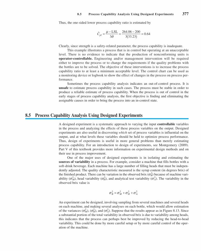
Thus, the one-sided lower process capability ratio is estimated by
Clearly, since strength is a safety-related parameter, the process capability is inadequate.
This example illustrates a process that is in control but operating at an unacceptable
level. There is no evidence to indicate that the production of nonconforming units is
operator-controllable. Engineering and/or management intervention will be required
either to improve the process or to change the requirements if the quality problems with
the bottles are to be solved. The objective of these interventions is to increase the process
capability ratio to at least a minimum acceptable level. The control chart can be used as
a monitoring device or logbook to show the effect of changes in the process on process per-
formance.
Sometimes the process capability analysis indicates an out-of-control process. It is
unsafe to estimate process capability in such cases. The process must be stable in order to
produce a reliable estimate of process capability. When the process is out of control in the
early stages of process capability analysis, the first objective is finding and eliminating the
assignable causes in order to bring the process into an in-control state.
8.5 Process Capability Analysis Using Designed Experiments
A designed experiment is a systematic approach to varying the input controllable variables
in the process and analyzing the effects of these process variables on the output. Designed
experiments are also useful in discovering which set of process variables is influential on the
output, and at what levels these variables should be held to optimize process performance.
Thus, design of experiments is useful in more general problems than merely estimating
process capability. For an introduction to design of experiments, see Montgomery (2009).
Part V of this textbook provides more information on experimental design methods and on
their use in process improvement.
One of the major uses of designed experiments is in isolating and estimating the
sources of variability in a process. For example, consider a machine that fills bottles with a
soft-drink beverage. Each machine has a large number of filling heads that must be indepen-
dently adjusted. The quality characteristic measured is the syrup content (in degrees brix) of
the finished product. There can be variation in the observed brix (s2B) because of machine vari-
ability (s2M), head variability (s2
H), and analytical test variability (s2A). The variability in the
observed brix value is
An experiment can be designed, involving sampling from several machines and several heads
on each machine, and making several analyses on each bottle, which would allow estimation
of the variances (s2M), (s2
H), and (s2A). Suppose that the results appear as in Figure 8.13. Since
a substantial portion of the total variability in observed brix is due to variability among heads,
this indicates that the process can perhaps best be improved by reducing the head-to-head
variability. This could be done by more careful setup or by more careful control of the oper-
ation of the machine.
σ σ σ σB M H A2 2 2 2= + +
ˆˆ
.
..Cpl = − = −
( )=μ
σLSL
3
264 06 200
3 33 230 64
8.5 Process Capability Analysis Using Designed Experiments 377
c08ProcessandMeasurementSystemCapabilityAnalysis.qxd 3/28/12 8:15 PM Page 377

378 Chapter 8 ■ Process and Measurement System Capability Analysis
8.6 Process Capability Analysis with Attribute Data
Often process performance is measured in terms of attribute data—that is, nonconforming
units or defectives, or nonconformities or defects. When a fraction nonconforming is the mea-
sure of performance, it is typical to use the parts per million (ppm) defective as a measure of
process capability. In some organizations, this ppm defective is converted to an equivalent
sigma level. For example, a process producing 2,700 ppm defective would be equivalent to a
three-sigma process (without the “usual” 1.5 s shift in the mean that many Six Sigma orga-
nizations employ in the calculations taken into account).
When dealing with nonconformities or defects, a defects per unit (DPU) statistic is
often used as a measure of capability, where
Here the unit is something that is delivered to a customer and can be evaluated or judged as
to its suitability. Some examples include:
1. An invoice
2. A shipment
3. A customer order
4. An enquiry or call
The defects or nonconformities are anything that does not meet the customer requirements,
such as:
1. An error on an invoice
2. An incorrect or incomplete shipment
3. An incorrect or incomplete customer order
4. A call that is not satisfactorily completed
DPU =Total number of defects
Total number of units
■ F I G U R E 8 . 1 3 Sources of variability in
the bottling line example.
σ 2M
σ 2H
σ 2A
Analytical testvariability
Observedbrix
Meanbrix
Head-to-head variability
Machine variability
c08ProcessandMeasurementSystemCapabilityAnalysis.qxd 3/28/12 8:15 PM Page 378

Obviously, these quantities are estimated from sample data. Large samples need to be used to
obtain reliable estimates.
The DPU measure does not directly take the complexity of the unit into account. A
widely used way to do this is the defect per million opportunities (DPMO) measure
Opportunities are the number of potential chances within a unit for a defect to occur. For
example, on a purchase order, the number of opportunities would be the number of fields in
which information is recorded times two, because each field can either be filled out incor-
rectly or blank (information is missing). It is important to be consistent about how opportu-
nities are defined, as a process may be artificially improved simply by increasing the number
of opportunities over time.
8.7 Gauge and Measurement System Capability Studies
8.7.1 Basic Concepts of Gauge Capability
Determining the capability of the measurement system is an important aspect of many quality
and process improvement activities. Generally, in any activity involving measurements, some
of the observed variability will be inherent in the units or items that are being measured, and
some of the variability will result from the measurement system that is used. The measure-
ment system will consist (minimally) of an instrument or gauge, and it often has other com-
ponents, such as the operator(s) that uses it and the conditions or different points in time under
which the instrument is used. There may also be other factors that impact measurement system
performance, such as setup or calibration activities. The purpose of most measurement systems
capability studies is to:
1. Determine how much of the total observed variability is due to the gauge or instrument
2. Isolate the components of variability in the measurement system
3. Assess whether the instrument or gauge is capable (that is, is it suitable for the intended
application)
Measurements are a significant component of any quality system. Measurement is an
integral component of the DMAIC problem-solving process, but it’s even more important
than that. An ineffective measurement system can dramatically impact business performance
because it leads to uninformed (and usually bad) decision making.
In this section we will introduce the two R’s of measurement systems capability:
repeatability (Do we get the same observed value if we measure the same unit several times
under identical conditions?), and reproducibility (How much difference in observed values
do we experience when units are measured under different conditions, such as different opera-
tors, time periods, and so forth?).
These quantities answer only indirectly the fundamental question: Is the system able to
distinguish between good and bad units? That is, what is the probability that a good unit is
judged to be defective and, conversely, that a bad unit is passed along to the customer as good?
These misclassification probabilities are fairly easy to calculate from the results of a standard
measurement systems capability study, and give reliable, useful, and easy-to-understand infor-
mation about measurement systems performance.
In addition to repeatability and reproducibility, there are other important aspects of
measurement systems capability. The linearity of a measurement system reflects the differ-
ences in observed accuracy and/or precision experienced over the range of measurements
made by the system. A simple linear regression model is often used to describe this feature.
DPMO =Total number of defects
Number of units × Number of opportunities
8.7 Gauge and Measurement System Capability Studies 379
c08ProcessandMeasurementSystemCapabilityAnalysis.qxd 3/28/12 8:15 PM Page 379

380 Chapter 8 ■ Process and Measurement System Capability Analysis
process operator who will actually take the measurements for
the control chart uses the instrument to measure each unit of
product twice. The data are shown in Table 8.6.
having no difficulty in making consistent measurements. Out-of-
control points on the R chart could indicate that the operator is
having difficulty using the instrument.
The standard deviation of measurement error, sGauge, can
be estimated as follows:
The distribution of measurement error is usually well approxi-
mated by the normal. Thus, is a good estimate of gauge
capability.
sGuage
ˆ.
..σ Gauge = = =R
d2
1 0
1 1280 887
EXAMPLE 8.7
An instrument is to be used as part of a proposed SPC imple-
mentation. The quality-improvement team involved in design-
ing the SPC system would like to get an assessment of gauge
capability. Twenty units of the product are obtained, and the
Measuring Gauge Capability
Problems with linearity are often the result of calibration and maintenance issues. Stability,or different levels of variability in different operating regimes, can result from warm-up
effects, environmental factors, inconsistent operator performance, and inadequate standard
operating procedure. Bias reflects the difference between observed measurements and a
“true” value obtained from a master or gold standard, or from a different measurement tech-
nique known to produce accurate values.
It is very difficult to monitor, control, improve, or effectively manage a process with an
inadequate measurement system. It’s somewhat analogous to navigating a ship through fog
without radar—eventually you are going to hit the iceberg! Even if no catastrophe occurs, you
always are going to be wasting time and money looking for problems where none exist and
dealing with unhappy customers who received defective product. Because excessive mea-
surement variability becomes part of overall product variability, it also negatively impacts
many other process improvement activities, such as leading to larger sample sizes in com-
parative or observational studies, more replication in designed experiments aimed at process
improvement, and more extensive product testing.
To introduce some of the basic ideas of measurement systems analysis (MSA), consider
a simple but reasonable model for measurement system capability studies
(8.23)
where y is the total observed measurement, x is the true value of the measurement on a unit
of product, and e is the measurement error. We will assume that x and e are normally and inde-
pendently distributed random variables with means m and 0 and variances (s2P) and (s2
Gauge),
respectively. The variance of the total observed measurement, y, is then
(8.24)
Control charts and other statistical methods can be used to separate these components of vari-
ance, as well as to give an assessment of gauge capability.
σ σ σTotal Gauge2 2 2= +P
y x= + ε
SOLUTION
Figure 8.14 shows the and R charts for these data. Note that
the chart exhibits many out-of-control points. This is to be
expected, because in this situation the chart has an interpre-
tation that is somewhat different from the usual interpretation.
The chart in this example shows the discriminating powerof the instrument—literally, the ability of the gauge to distin-
guish between units of product. The R chart directly shows
the magnitude of measurement error, or the gauge capability.
The R values represent the difference between measurements
made on the same unit using the same instrument. In this exam-
ple, the R chart is in control. This indicates that the operator is
x
xx
x
c08ProcessandMeasurementSystemCapabilityAnalysis.qxd 3/28/12 8:15 PM Page 380

30
25
20
155 10 15 20
x
x
LCL = 20.42
UCL = 24.2
UCL = 3.2674
2
0
R
R
5 10 15 20
■ F I G U R E 8 . 1 4 Control
charts for the gauge capability analysis
in Example 8.7.
It is a fairly common (but not necessarily good) practice to compare the estimate of
gauge capability to the width of the specifications or the tolerance band (USL − LSL) for the
part that is being measured. The ratio of to the total tolerance band is often called the
precision-to-tolerance (P/T) ratio:
(8.25)
In equation 8.25, popular choices for the constant k are k = 5.15 and k = 6. The value k = 5.15
corresponds to the limiting value of the number of standard deviations between bounds of a
95% tolerance interval that contains at least 99% of a normal population, and k = 6 corre-
sponds to the number of standard deviations between the usual natural tolerance limits of a
normal population.
The part used in Example 8.7 has USL = 60 and LSL = 5. Therefore, taking k = 6 in
equation 8.25, an estimate of the P/T ratio is
P/T =6(0.887)
60 − 5=
5.32
55= 0.097
P/T =ksGuage
USL − LSL
ksGauge
■ TA B L E 8 . 6
Parts Measurement Data
MeasurementsPart Number 1 2 x R
1 21 20 20.5 1
2 24 23 23.5 1
3 20 21 20.5 1
4 27 27 27.0 0
5 19 18 18.5 1
6 23 21 22.0 2
7 22 21 21.5 1
8 19 17 18.0 2
9 24 23 23.5 1
10 25 23 24.0 2
11 21 20 20.5 1
12 18 19 18.5 1
13 23 25 24.0 2
14 24 24 24.0 0
15 29 30 29.5 1
16 26 26 26.0 0
17 20 20 20.0 0
18 19 21 20.0 2
19 25 26 25.5 1
20 19 19 19.0 0
=x = 22.3
–R = 1.0
8.7 Gauge and Measurement System Capability Studies 381
c08ProcessandMeasurementSystemCapabilityAnalysis.qxd 3/28/12 8:15 PM Page 381

382 Chapter 8 ■ Process and Measurement System Capability Analysis
Values of the estimated ratio P/T of 0.1 or less often are taken to imply adequate gauge capa-
bility. This is based on the generally used rule that requires a measurement device to be cali-
brated in units one-tenth as large as the accuracy required in the final measurement. However,
we should use caution in accepting this general rule of thumb in all cases. A gauge must be
sufficiently capable of measuring product accurately enough and precisely enough so that the
analyst can make the correct decision. This may not necessarily require that P/T ≤ 0.1.
We can use the data from the gauge capability experiment in Example 8.7 to estimate
the variance components in equation 8.24 associated with total observed variability. From
the actual sample measurements in Table 8.6, we can calculate s = 3.17. This is an estimate
of the standard deviation of total variability, including both product variability and gaugevariability. Therefore,
Since from equation 8.24 we have
and because we have an estimate of , we can obtain an estimate of
s2P as
Therefore, an estimate of the standard deviation of the product characteristic is
There are other measures of gauge capability that have been proposed. One of these is the
ratio of process (part) variability to total variability:
(8.26)
and another is the ratio of measurement system variability to total variability:
(8.27)
Obviously, rP = 1 − rM. For the situation in Example 8.7 we can calculate an estimate of rM
as follows:
Thus the variance of the measuring instrument contributes about 7.86% of the total observed
variance of the measurements.
Another measure of measurement system adequacy is defined by the AIAG (1995)
[note that there is also on updated edition of this manual, AIAG (2002)] as the signal-to-noiseratio (SNR):
(8.28)SNR P
P
=−2
1
ρρ
ˆˆ
ˆ
.
..ρ
σσM = = =Gauge
Total
2
2
0 79
10 050 0786
ρσσM = Gauge
Total
2
2
ρ σσP
P=2
2Total
ˆ . .σ P = =9 26 3 04
ˆ ˆ ˆ . . .σ σ σP2 2 2
10 05 0 79 9 26= − = − =Total Gauge
s2Gauge = (0.887)2 = 0.79
σ σ σTotal Gauge2 2 2= +P
ˆ . .σ Total2 = = ( ) =s2 2
3 17 10 05
c08ProcessandMeasurementSystemCapabilityAnalysis.qxd 3/28/12 8:15 PM Page 382

AIAG defined the SNR as the number of distinct levels or categories that can be reli-
ably obtained from the measurements. A value of 5 or greater is recommended, and a value
of less than 2 indicates inadequate gauge capability. For Example 8.7 we have , and
using we find that , so an estimate of the SNRin equation 8.28 is
Therefore, the gauge in Example 8.7 would not meet the suggested requirement of an SNR of
at least 5. However, this requirement on the SNR is somewhat arbitrary. Another measure of
gauge capability is the discrimination ratio (DR)
(8.29)
Some authors have suggested that for a gauge to be capable the DR must exceed 4. This
is a very arbitrary requirement. For the situation in Example 8.7, we would calculate an estimate
of the discrimination ratio as
DR
Clearly by this measure, the gauge is capable.
Finally, in this section we have focused primarily on instrument or gauge precision, not
gauge accuracy. These two concepts are illustrated in Figure 8.15. In this figure, the bull’s-eye
of the target is considered to be the true value of the measured characteristic, or m the mean of
=1 + �P
1 − �P=
1 + 0.9214
1 − 0.9214= 24.45
DR P
P
= +−
1
1
ρρ
SNR =B
2�P
1 − �P
=B
2(0.9214)
1 − 0.9214= 4.84
�P = 1 − �M = 1 − 0.0786 = 0.9214�P = 1 − �M
�M = 0.0786
(a) (b)
(d)(c)
Accuracy
high
low
Precisionhigh low
■ F I G U R E 8 . 1 5 The concepts of accuracy and precision.
(a) The gauge is accurate and precise. (b) The gauge is accurate but not
precise. (c) The gauge is not accurate but it is precise. (d) The gauge is
neither accurate nor precise.
8.7 Gauge and Measurement System Capability Studies 383
c08ProcessandMeasurementSystemCapabilityAnalysis.qxd 3/28/12 8:15 PM Page 383
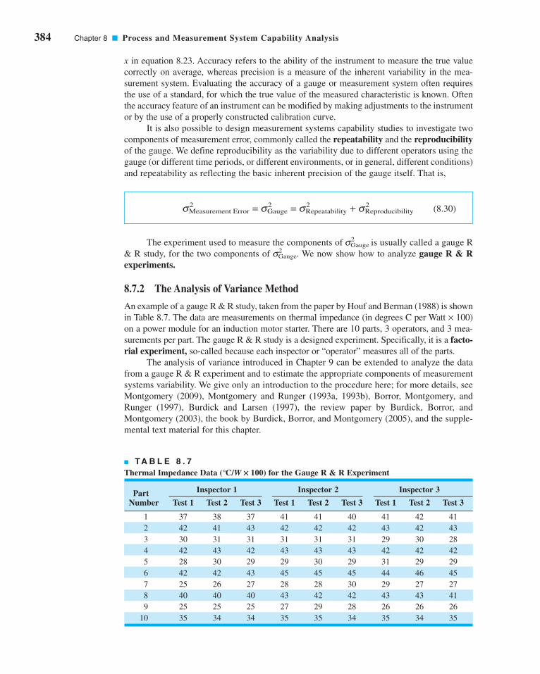
384 Chapter 8 ■ Process and Measurement System Capability Analysis
x in equation 8.23. Accuracy refers to the ability of the instrument to measure the true value
correctly on average, whereas precision is a measure of the inherent variability in the mea-
surement system. Evaluating the accuracy of a gauge or measurement system often requires
the use of a standard, for which the true value of the measured characteristic is known. Often
the accuracy feature of an instrument can be modified by making adjustments to the instrument
or by the use of a properly constructed calibration curve.
It is also possible to design measurement systems capability studies to investigate two
components of measurement error, commonly called the repeatability and the reproducibilityof the gauge. We define reproducibility as the variability due to different operators using the
gauge (or different time periods, or different environments, or in general, different conditions)
and repeatability as reflecting the basic inherent precision of the gauge itself. That is,
(8.30)
The experiment used to measure the components of s2Gauge is usually called a gauge R
& R study, for the two components of s2Gauge. We now show how to analyze gauge R & R
experiments.
8.7.2 The Analysis of Variance Method
An example of a gauge R & R study, taken from the paper by Houf and Berman (1988) is shown
in Table 8.7. The data are measurements on thermal impedance (in degrees C per Watt × 100)
on a power module for an induction motor starter. There are 10 parts, 3 operators, and 3 mea-
surements per part. The gauge R & R study is a designed experiment. Specifically, it is a facto-rial experiment, so-called because each inspector or “operator” measures all of the parts.
The analysis of variance introduced in Chapter 9 can be extended to analyze the data
from a gauge R & R experiment and to estimate the appropriate components of measurement
systems variability. We give only an introduction to the procedure here; for more details, see
Montgomery (2009), Montgomery and Runger (1993a, 1993b), Borror, Montgomery, and
Runger (1997), Burdick and Larsen (1997), the review paper by Burdick, Borror, and
Montgomery (2003), the book by Burdick, Borror, and Montgomery (2005), and the supple-
mental text material for this chapter.
s2Measurement Error = s2
Gauge = s2Repeatability + s2
Reproducibility
■ TA B L E 8 . 7
Thermal Impedance Data (°C/W ¥ 100) for the Gauge R & R Experiment
Inspector 1 Inspector 2 Inspector 3PartNumber Test 1 Test 2 Test 3 Test 1 Test 2 Test 3 Test 1 Test 2 Test 3
1 37 38 37 41 41 40 41 42 41
2 42 41 43 42 42 42 43 42 43
3 30 31 31 31 31 31 29 30 28
4 42 43 42 43 43 43 42 42 42
5 28 30 29 29 30 29 31 29 29
6 42 42 43 45 45 45 44 46 45
7 25 26 27 28 28 30 29 27 27
8 40 40 40 43 42 42 43 43 41
9 25 25 25 27 29 28 26 26 26
10 35 34 34 35 35 34 35 34 35
c08ProcessandMeasurementSystemCapabilityAnalysis.qxd 3/28/12 8:15 PM Page 384

If there are a randomly selected parts and b randomly selected operators, and each oper-
ator measures every part n times, then the measurements (i = part, j = operator, k = measure-
ment) could be represented by the model
where the model parameters Pi, Oj, (PO)ij, and eijk are all independent random variables that
represent the effects of parts, operators, the interaction or joint effects of parts and operators,
and random error. This is a random effects model analysis of variance (ANOVA). It is also
sometimes called the standard model for a gauge R & R experiment. We assume that the ran-
dom variables Pi, Oj, (PO)ij, and eijk are normally distributed with mean zero and variances
given by V(Pi) = s2P, V(Oj) = s2
O, V[(PO)ij] = s2PO, and V(eijk) = s2. Therefore, the variance of
any observation is
(8.31)
and s2P, s2
O, s2PO, and s2 are the variance components. We want to estimate the variance
components.
Analysis of variance methods can be used to estimate the variance components. The
procedure involves partitioning the total variability in the measurements into the following
component parts:
(8.32)
where, as in Chapter 4, the notation SS represents a sum of squares. Although these sums of
squares could be computed manually,1 in practice we always use a computer software pack-
age to perform this task. Each sum of squares on the right-hand side of equation 8.32 is
divided by its degrees of freedom to produce mean squares:
We can show that the expected values of the mean squares are as follows:
E MS n bn
E MS n an
E MS n
P PO P
O PO O
PO PO
( ) = + +
( ) = + +
( ) = +
σ σ σ
σ σ σ
σ σ
2 2 2
2 2 2
2 2
MSSS
p
MSSS
o
MSSS
p o
MSSS
po n
P
O
POP O
E
=−
=−
=−( ) −( )
=−( )
×
Parts
Operators
Error
1
1
1 1
1
SS SS SS SS SSP OTotal Parts Operators Error= + + +×
V yijk P O PO( ) = + + +σ σ σ σ2 2 2 2
y P O PO
i p
j o
k nijk i j ij ijk= + + + ( ) +
===
⎧⎨⎪
⎩⎪μ ε
1, 2, . . . ,
1, 2, . . . ,
1, 2, . . . ,
1The experimental structure here is that of a factorial design. See Chapter 13 and the supplemental text material for
more details about the analysis of variance, including computing.
8.7 Gauge and Measurement System Capability Studies 385
c08ProcessandMeasurementSystemCapabilityAnalysis.qxd 3/28/12 8:15 PM Page 385

386 Chapter 8 ■ Process and Measurement System Capability Analysis
and
The variance components may be estimated by equating the calculated numerical values of
the mean squares from an analysis of the variance computer program to their expected values
and solving for the variance components. This yields
(8.33)
Table 8.8 shows the analysis of variance for this experiment. The computations were performed
using the Balanced ANOVA routine in Minitab. Based on the P-values, we conclude that the
effect of parts is large, operators may have a small effect, and there is no significant part-operator
interaction. We may use equation 8.33 to estimate the variance components as follows:
s2PO =
2.70 − 0.51
3= 0.73
s2O =
19.63 − 2.70
(10)(3)= 0.56
s2P =
437.33 − 2.70
(3)(3)= 48.29
ˆ
ˆ
ˆ
ˆ
σ
σ
σ
σ
2
2
2
2
=
= −
= −
= −
MS
MS MS
nMS MS
pn
MS MS
on
E
POPO E
OO PO
PP PO
E MSE( ) = σ 2
■ TA B L E 8 . 8
ANOVA: Thermal Impedance versus Part Number, Operator
Factor Type Levels Values
Part Num random 10 1 2 3 4 5 6 7
8 9 10
Operator random 3 1 2 3
Analysis of Variance for Thermal
Source DF SS MS F P
Part Num 9 3,935.96 437.33 162.27 0.000
Operator 2 39.27 19.63 7.28 0.005
Part Num*Operator 18 48.51 2.70 5.27 0.000
Error 60 30.67 0.51
Total 89 4,054.40
Source Variance Error Expected Mean Square for Each component term Term (using unrestricted model)
1 Part Num 48.2926 3 (4) + 3(3) + 9(1)
2 Operator 0.5646 3 (4) + 3(3) + 30(2)
3 Part Num*Operator 0.7280 4 (4) + 3(3)
4 Error 0.5111 (4)
c08ProcessandMeasurementSystemCapabilityAnalysis.qxd 3/28/12 8:15 PM Page 386

and
Note that these estimates also appear at the bottom of the Minitab output.
Occasionally we will find that the estimate of one of the variance components will be
negative. This is certainly not reasonable, since by definition variances are nonnegative.
Unfortunately, negative estimates of variance components can result when we use the analysis
of variance method of estimation (this is considered one of its drawbacks). There are a variety
of ways to deal with this. One possibility is to assume that the negative estimate means that
the variance component is really zero and just set it to zero, leaving the other nonnegative esti-
mates unchanged. Another approach is to estimate the variance components with a method
that ensures nonnegative estimates. Finally, when negative estimates of variance components
occur, they are usually accompanied by nonsignificant model sources of variability. For
example, if is negative, it will usually be because the interaction source of variability is
nonsignificant. We should take this as evidence that s2PO really is zero, that there is no inter-
action effect, and fit a reduced model of the form
that does not include the interaction term. This is a relatively easy approach and one that often
works nearly as well as more sophisticated methods.
Typically we think of s2 as the repeatability variance component, and the gauge repro-ducibility as the sum of the operator and the part × operator variance components,
Therefore
and the estimate for our example is
The lower and upper specifications on this power module are LSL = 18 and USL = 58.
Therefore the P/T ratio for the gauge is estimated as
By the standard measures of gauge capability, this gauge would not be considered capable
because the estimate of the P/T ratio exceeds 0.10.
8.7.3 Confidence Intervals in Gauge R & R Studies
The gauge R & R study and the ANOVA procedure described in the previous section resulted
in point estimates of the experimental model variance components and for s2Gauge,
s2Repeatability, and s2
Reproducibility. It can be very informative to obtain confidence intervals
P/T =6sGauge
USL − LSL=
6(1.34)
58 − 18= 0.27
ˆ ˆ ˆ ˆ
. . .
.
σ σ σ σGauge2 2 2= + +
= + +=
2
0 51 0 56 0 73
1 80
O PO
σ σ σGauge2
Reproducibility2
Repeatability2= +
σ σ σReproducibility2 2 2= +O PO
y P Oijk i j ijk= + + +μ ε
sPO
s2 = 0.51
8.7 Gauge and Measurement System Capability Studies 387
c08ProcessandMeasurementSystemCapabilityAnalysis.qxd 3/28/12 8:15 PM Page 387

388 Chapter 8 ■ Process and Measurement System Capability Analysis
for gauge R & R studies. Confidence intervals in measurement systems capability studies
are discussed in Montgomery (2001), Montgomery and Runger (1993a, 1993b), Borror,
Montgomery, and Runger (1997), Burdick and Larsen (1997), the review paper by Burdick,
Borror, and Montgomery (2003) and the book by Burdick, Borror, and Montgomery (2005).
Among the different methods for obtaining these confidence intervals, the modified large
sample (MLS) method produces good results and is relatively easy to implement for the stan-
dard gauge capability experiment described in Section 8.7.2, where both parts and operators are
considered to be random factors. Other methods for constructing confidence intervals and com-
puter programs to implement these methods are in Burdick, Borror, and Montgomery (2005).
Table 8.9 contains the MLS confidence interval equations for the parameters that are
usually of interest in a measurement systems capability study. Definitions of the quantities
used in Table 8.9 are in Table 8.10. References for all of the confidence interval equations in
Table 8.9 are in Burdick, Borror, and Montgomery (2003). Note that the percentage point of
the F distribution defined in Table 8.10 as Fa,df,• = c2a,df.
The last column in Table 8.9 contains the 95% confidence intervals for each parameter,
and the last column of Table 8.10 shows the numerical values of the quantities used in com-
puting the 95% confidence intervals. All of the confidence intervals in Table 8.9 are fairly
wide because there are only three operators, and this results in only two degrees of freedom
to estimate the operator effect. Therefore, this will have an impact on length of any confidence
interval for any parameter that is a function of s2o. This suggests that to obtain narrower con-
fidence intervals in a gauge R & R study, it will be necessary to increase the number of oper-
ators. Since it is fairly standard practice to use only two or three operators in these studies,
this implies that one needs to carefully consider the consequences of applying a standard
design to estimate gauge capability.
8.7.4 False Defectives and Passed Defectives
In previous sections we have introduced several ways to summarize the capability of a gauge or
instrument, including the P/T ratio (equation 8.25), the signal-to-noise ratio SNR (equation 8.28),
■ TA B L E 8 . 9
100(1 - a)% MLS Confidence Intervals for the Standard Gauge R & R Experiment
Parameter Lower Bound Upper Bound Example 95% Interval
[22.69; 161.64]
[1.20; 27.02]
[24.48; 166.23]
[0.628; 0.991]
[0.009; 0.372]1− LP1− UPρm
UpU
pU oP =+
∗
∗LpL
pL oP =+
∗
∗ρp
σ Total2 +
V
ponUTσ Total
2 −V
ponLTσ Total
2
σ Gauge2 +
V
pnUMσ Gauge
2 −V
pnLMσ Gauge
2
σ PUPV
on2 +σ P
LPV
on2 −σ p
2
c08ProcessandMeasurementSystemCapabilityAnalysis.qxd 3/28/12 8:15 PM Page 388

■ TA B L E 8 . 1 0
Definition of Terms in Table 8.9
Term Definition Value in Example
VLP 53,076.17
VUP 1,040,643.4
VLM 321.282
VUM 572,150.12
VLT 5,311,676.7
VUT 109,230,276
G1 0.5269
G2 0.7289
G3 0.4290
G4 0.2797
H1 2.3329
H2 38.4979
H3 1.1869
H4 0.4821
G13 −0.0236
H13 −0.1800
L* 0.5075
U* 31.6827
MS F MS
p n F MS F MS p F MS
P p p o PO
p E p o O p PO
−
−( ) + + −( )− −( ) −( )
− ∞ − − − ∞
α
α α α
2 1 1 1
2 1 2 1 1 2 11 1
: ,
: , : , : ,
MS F MS
p n F MS F MS p F MS
P p p o PO
p E p o O p PO
−
−( ) + + −( )− − −( ) −( )
− − ∞ − − − − − ∞
1 2 1 1 1
1 2 1 1 2 1 1 1 2 11 1
α
α α α
: ,
: , : , : ,
12 1 1 1
2
12
2 1 1 12
32
2 1 1 1
−( ) − −− −( ) −( ) − −( ) −( )
− −( ) −( )
F H F G
F
p p o p p o
p p o
α α
α
: , : ,
: ,
F G F H
F
p p o p p o
p p o
1 2 1 1 1
2
12
1 2 1 1 12
32
1 2 1 1 1
1− − −( ) −( ) − − −( ) −( )
− − −( ) −( )
−( ) − −α α
α
: , : ,
: ,
1 12 1F po nα : ,−( ) ∞ −
1 12 1 1
F p oα : ,−( ) −( ) ∞ −
1 12 1F oα : ,− ∞ −
1 12 1F pα : ,− ∞ −
1 1 1 2 1− − −( ) ∞F po nα : ,
1 11 2 1 1
− − −( ) −( ) ∞F p oα : ,
1 1 1 2 1− − − ∞F oα : ,
1 1 1 2 1− − − ∞F pα : ,
H p MS H o MS H po p o MS H po n MSP O PO E12 2 2
22 2 2
32 2
42 2 2
1+ + − −( ) + ( ) −( )2 2
G p MS G o MS G po p o MS G po n MSP O PO E12 2 2
22 2 2
32 2
42 2 2
1+ + − −( ) + ( ) −( )2 2
H MS H p MS H p n MSO PO E22 2
32 2 2
42 2 2
1 1+ −( ) + −( ) 2
G MS G p MS G p n MSO PO E22 2
32 2 2
42 2 2
1 1+ −( ) + −( ) 2
H MS G MS H MS MSP PO P PO12 2
32 2
132+ +
G MS H MS G MSP PO P12 2
32 2
13+ +
8.7 Gauge and Measurement System Capability Studies 389
c08ProcessandMeasurementSystemCapabilityAnalysis.qxd 3/28/12 8:15 PM Page 389

390 Chapter 8 ■ Process and Measurement System Capability Analysis
the discrimination ratio DR (equation 8.29), and rP and rM (equations 8.26 and 8.27). None of
these quantities really describe the capability of the gauge in any sense that is directly interpretable.
The effective capability of a measuring system is best described in terms of how well it discrimi-
nates between good and bad parts. Consider the model first proposed in equation 8.23:
where y is the total observed measurement, x is the true value of the measurement, and e is
the measurement error. The random variables x and e are normally and independently dis-
tributed random variables with means m and 0 and variances s2P and s2
Gauge, respectively. The
joint probability density function of y and x, say f (y, x), is bivariate normal with mean vector
[m, m]′ and covariance matrix
A unit of product or part is in conformance to the specifications if
(8.34)
and the measurement system will “pass” a unit as a nondefective if
(8.35)
If equation 8.34 is true but equation 8.35 is false, a conforming part has been incorrectly
failed. Alternatively, if equation 8.34 is false but equation 8.35 is true, a nonconforming part
has been incorrectly passed. Sometimes this is called a missed fault. A very useful way to
describe the capability of a measurement system is in terms of producer’s risk and con-sumer’s risk. The producer’s risk d is defined as the conditional probability that a measure-
ment system will fail a part when the part conforms to the specifications (this is also called a
false failure). The consumer’s risk b is defined as the conditional probability that a measure-
ment system will pass a part when the part does not conform to the specifications (this is the
missed fault described above).
Expressions are available for computing the two conditional probabilities:
(8.36)
and
(8.37)
where f (x) represents the marginal probability density function for x which is normal with
mean m and variance s2p. Figure 8.16 shows the regions of false failures (FF) and missed faults
b =
�LSL
−•
�USL
LSL
f(y, x)dydx + �•
USL
�USL
LSL
f(y, x)dydx
1 − �USL
LSL
f(x)dx
d =
�USL
LSL
�LSL
−•
f(y, x)dydx + �USL
LSL
�•
USL
f(y, x)dydx
�USL
LSL
f(x)dx
LSL £ y £ USL
LSL £ x £ USL
σ σσ σTotal2 2
2 2P
P P
⎡
⎣⎢
⎤
⎦⎥
y = x + e
c08ProcessandMeasurementSystemCapabilityAnalysis.qxd 4/23/12 7:15 PM Page 390
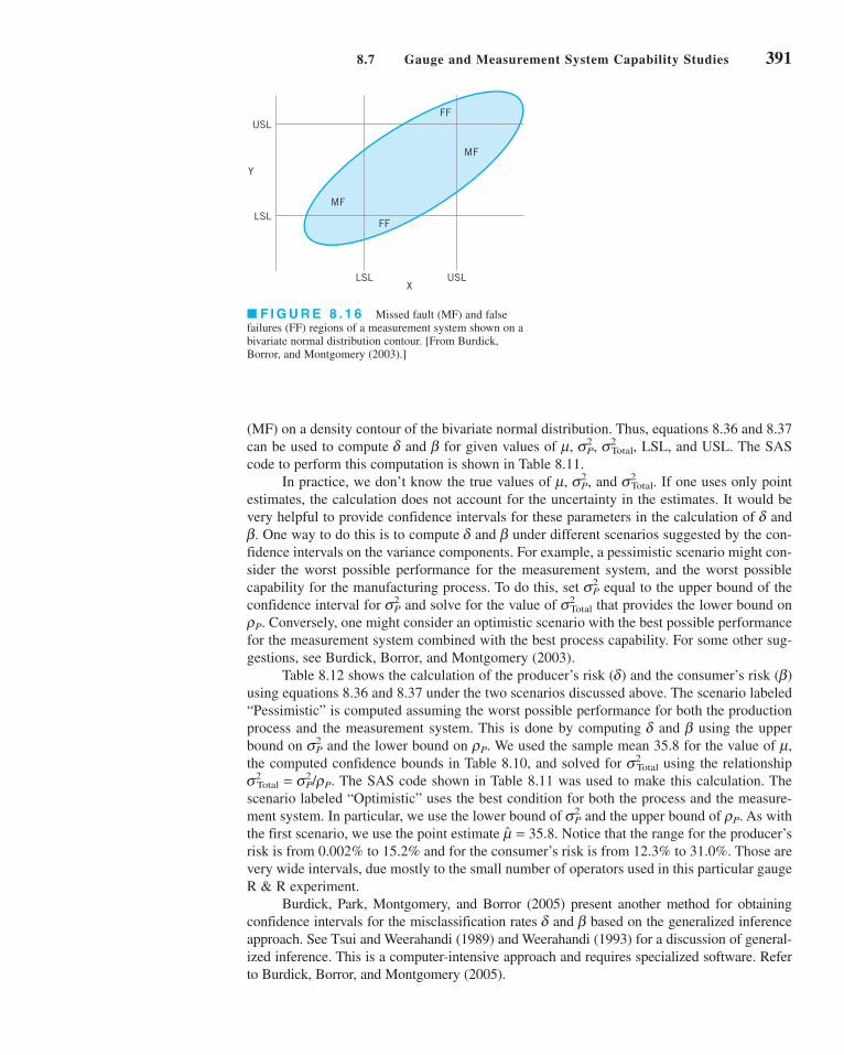
USLX
LSL
USL
LSL
Y
MF
FF
FF
MF
■ F I G U R E 8 . 1 6 Missed fault (MF) and false
failures (FF) regions of a measurement system shown on a
bivariate normal distribution contour. [From Burdick,
Borror, and Montgomery (2003).]
(MF) on a density contour of the bivariate normal distribution. Thus, equations 8.36 and 8.37
can be used to compute d and b for given values of m, s2P, s2
Total, LSL, and USL. The SAS
code to perform this computation is shown in Table 8.11.
In practice, we don’t know the true values of m, s2P, and s2
Total. If one uses only point
estimates, the calculation does not account for the uncertainty in the estimates. It would be
very helpful to provide confidence intervals for these parameters in the calculation of d and
b. One way to do this is to compute d and b under different scenarios suggested by the con-
fidence intervals on the variance components. For example, a pessimistic scenario might con-
sider the worst possible performance for the measurement system, and the worst possible
capability for the manufacturing process. To do this, set s2P equal to the upper bound of the
confidence interval for s2P and solve for the value of s2
Total that provides the lower bound on
rP. Conversely, one might consider an optimistic scenario with the best possible performance
for the measurement system combined with the best process capability. For some other sug-
gestions, see Burdick, Borror, and Montgomery (2003).
Table 8.12 shows the calculation of the producer’s risk (d) and the consumer’s risk (b)
using equations 8.36 and 8.37 under the two scenarios discussed above. The scenario labeled
“Pessimistic” is computed assuming the worst possible performance for both the production
process and the measurement system. This is done by computing d and b using the upper
bound on s2P and the lower bound on rP. We used the sample mean 35.8 for the value of m,
the computed confidence bounds in Table 8.10, and solved for s2Total using the relationship
s2Total = s2
P/rP. The SAS code shown in Table 8.11 was used to make this calculation. The
scenario labeled “Optimistic” uses the best condition for both the process and the measure-
ment system. In particular, we use the lower bound of s2P and the upper bound of rP. As with
the first scenario, we use the point estimate . Notice that the range for the producer’s
risk is from 0.002% to 15.2% and for the consumer’s risk is from 12.3% to 31.0%. Those are
very wide intervals, due mostly to the small number of operators used in this particular gauge
R & R experiment.
Burdick, Park, Montgomery, and Borror (2005) present another method for obtaining
confidence intervals for the misclassification rates d and b based on the generalized inference
approach. See Tsui and Weerahandi (1989) and Weerahandi (1993) for a discussion of general-
ized inference. This is a computer-intensive approach and requires specialized software. Refer
to Burdick, Borror, and Montgomery (2005).
m = 35.8
8.7 Gauge and Measurement System Capability Studies 391
c08ProcessandMeasurementSystemCapabilityAnalysis.qxd 3/28/12 8:15 PM Page 391

392 Chapter 8 ■ Process and Measurement System Capability Analysis
8.7.5 Attribute Gauge Capability
In previous sections we have assumed that the measurements are numerical, such as phy-
sical dimensions, or properties that can be expressed on a numerical scale. There are many
situations where the output of a gauge is an attribute, such as pass/fail. Nominal or ordinal
data are also relatively common. Attribute gauge capabilities can be conducted in many of
these situations.
■ TA B L E 8 . 1 2
Measurement System Error Rates for Two Scenarios
Scenario s2P rP d b
Pessimistic 161.64 0.628 15.2% 31.0%
Optimistic 22.69 0.991 0.002% 12.3%
■ TA B L E 8 . 1 1
SAS Code for Computing Measurement System Misclassification Probabilities d and b [FromBurdick, Borror, and Montgomery (2003)]
data misclass;input mu lsl usl rhop gammap;gammat=gammap/rhop;cov=gammap;corr=cov/(sqrt(gammap)*sqrt(gammat));uslstdy=(usl-mu)/sqrt(gammat);uslstdx=(usl-mu)/sqrt(gammap);lslstdy=(lsl-mu)/sqrt(gammat);lslstdx=(lsl-mu)/sqrt(gammap);
ff1=probbnrm(uslstdx, lslstdy, corr)-probbnrm (lslstdx, lslstdy, corr);ff2=probnorm(uslstdx)-probbnrm(uslstdx, uslstdy, corr);mf1=probbnrm(lslstdx, uslstdy, corr)-probbnrm(lslstdx, lslstdy, corr);
mf2=probnorm(uslstdy)-probbnrm(uslstdx, uslstdy, corr);delta=(ff1+ff2)/(probnorm(uslstdx)-probnorm(lslstdx));beta=(mf1+mf2)/(1-(probnorm(uslstdx)-probnorm(lslstdx));
keep mu lsl usl rhop gammap gammat delta beta;datalines;35.8 18 58 .628 161.64;proc print data=misclass;run;
Note: In the input statement, rhop is rP and gammap is s2P.
c08ProcessandMeasurementSystemCapabilityAnalysis.qxd 4/23/12 7:26 PM Page 392

A very common situation is to determine if operating personnel consistently make
the same decisions regarding the units that they are inspecting or analyzing. For example,
consider a bank that uses manual underwriting to analyze mortgage loan applications. Each
underwriter must use the information supplied by the applicant and other external information
such as credit history to classify the application into one of four categories; decline or do not
fund, fund-1, fund-2, and fund-3. The fund-2 and fund-3 categories are applicants who are con-
sidered low-risk loans while fund-1 is a higher-risk applicant. Suppose that 30 applications are
selected and evaluated by a panel of senior underwriters who arrive at a consensus evaluation
for each application, then three different underwriters (Sue, Fred, and John) are asked to eval-
uate each application twice. The applications are “blinded” (customer names, addresses, and
other identifying information removed) and the two evaluations are performed several days
apart. The data are shown in Table 8.13. The column labeled “classification” in this table is the
consensus decision reached by the panel of senior underwriters.
■ TA B L E 8 . 1 3
Loan Evaluation Data for Attribute Gauge Capability Analysis
Application Classification Sue1 Sue2 Fred1 Fred2 John1 John2
1 Fund-1 Fund-3 Fund-3 Fund-2 Fund-2 Fund-1 Fund-3
2 Fund-3 Fund-3 Fund-3 Fund-3 Fund-3 Fund-3 Fund-1
3 Fund-1 Fund-3 Fund-3 Fund-2 Fund-2 Fund-1 Fund-1
4 Fund-1 Fund-1 Fund-1 Fund-2 Fund-1 Fund-1 Fund-1
5 Fund-2 Fund-1 Fund-2 Fund-2 Fund-2 Fund-2 Fund-1
6 Fund-3 Fund-3 Fund-3 Fund-1 Fund-3 Fund-3 Fund-1
7 Fund-3 Fund-3 Fund-3 Fund-3 Fund-3 Fund-3 Fund-3
8 Fund-3 Fund-3 Fund-3 Fund-1 Fund-3 Fund-3 Fund-3
9 Fund-1 Fund-3 Fund-3 Fund-1 Fund-1 Fund-1 Fund-1
10 Fund-2 Fund-1 Fund-2 Fund-2 Fund-2 Fund-2 Fund-1
11 Decline Decline Decline Fund-3 Fund-3 Decline Decline
12 Fund-2 Fund-3 Fund-1 Fund-2 Fund-2 Fund-2 Fund-2
13 Fund-2 Fund-2 Fund-2 Fund-2 Fund-2 Fund-2 Fund-1
14 Fund-2 Fund-2 Fund-2 Fund-2 Fund-2 Fund-2 Fund-2
15 Fund-1 Fund-1 Fund-1 Fund-1 Fund-1 Fund-1 Fund-1
16 Fund-2 Fund-2 Fund-2 Fund-2 Fund-2 Fund-2 Fund-1
17 Fund-3 Decline Fund-3 Fund-1 Fund-1 Fund-3 Fund-3
18 Fund-3 Fund-3 Fund-1 Fund-3 Fund-3 Fund-3 Fund-1
19 Decline Fund-3 Fund-3 Fund-3 Decline Decline Decline
20 Fund-1 Fund-1 Fund-1 Fund-1 Fund-1 Fund-1 Fund-1
21 Fund-2 Fund-2 Fund-2 Fund-1 Fund-2 Fund-2 Fund-1
22 Fund-2 Fund-1 Fund-2 Fund-2 Fund-2 Fund-2 Fund-2
23 Fund-1 Fund-1 Fund-1 Fund-1 Fund-1 Fund-1 Fund-1
24 Fund-3 Decline Fund-3 Fund-1 Fund-2 Fund-3 Fund-1
25 Fund-3 Fund-3 Fund-3 Fund-3 Fund-3 Fund-3 Fund-3
26 Fund-3 Fund-3 Fund-3 Fund-3 Fund-3 Fund-3 Fund-1
27 Fund-2 Fund-2 Fund-2 Fund-2 Fund-1 Fund-2 Fund-2
28 Decline Decline Decline Fund-3 Decline Decline Decline
29 Decline Decline Decline Fund-3 Decline Decline Fund-3
30 Fund-2 Fund-2 Fund-2 Fund-2 Fund-2 Fund-2 Fund-2
8.7 Gauge and Measurement System Capability Studies 393
c08ProcessandMeasurementSystemCapabilityAnalysis.qxd 3/28/12 8:15 PM Page 393

394 Chapter 8 ■ Process and Measurement System Capability Analysis
The attribute gauge capability analysis in this situation would determine the proportion
of time that the underwriter agrees with him/herself in evaluating the loan application. This is
a measure of repeatability. We would also be interested in the proportion of time that the
underwriter agrees with the correct classification. This is a measure of bias.
Using Minitab to calculate the percentages of agreement (the Attribute Agreement
Analysis routine in Minitab v15) results in the output shown in Table 8.14. Notice that
Minitab also calculates and displays confidence intervals on the percent match. Figure 8.17
presents graphs of the confidence intervals for the percentages within underwriters (a mea-
sure of how well the underwriters agree with themselves across trials) and for the percentage
of times the underwriters agree with the standard (correct) answer. Generally, while there is
considerable subjectivity in interpreting the results of attribute gauge capability studies, there
is not great agreement in this study. More training may be needed to ensure that underwriters
produce more consistent and correct decision for mortgage loan applications.
Good references to other approaches for conducting attribute gauge capability stud-
ies are Boyles (2001), De Mast and Van Wieringen (2004, 2007), and Van Wieringen
(2003).
■ TA B L E 8 . 1 4
Minitab Attribute Agreement Analysis for the Loan Evaluation Data in Table 8.13
Attribute Agreement Analysis for Sue1, Sue2, Fred1, Fred2, John1, John2
Within Appraisers
Assessment AgreementAppraiser # Inspected # Matched Percent 95% CISue 30 23 76.67 (57.72, 90.07)Fred 30 21 70.00 (50.60, 85.27)John 30 18 60.00 (40.60, 77.34)
# Matched: Appraiser agrees with him/herself across trials.
Each Appraiser vs Standard
Assessment AgreementAppraiser # Inspected # Matched Percent 95% CISue 30 19 63.33 (43.86, 80.07)Fred 30 17 56.67 (37.43, 74.54)John 30 18 60.00 (40.60, 77.34)
# Matched: Appraiser’s assessment across trials agrees with the known standard.
Between Appraisers
Assessment Agreement# Inspected # Matched Percent 95% CI
30 7 23.33 (9.93, 42.28)# Matched: All appraisers’ assessments agree with each other.
All Appraisers vs Standard
Assessment Agreement# Inspected # Matched Percent 95% CI
30 7 23.33 (9.93, 42.28)
# Matched: All appraisers’ assessments agree with the known standard.
c08ProcessandMeasurementSystemCapabilityAnalysis.qxd 3/29/12 4:46 PM Page 394

8.7.6 Comparing Customer and Supplier Measurement Systems
In customer–supplier relationships it is often very important for the two parties to be able to
reliably determine that the supplier’s product is within customer specifications. For the sup-
plier, its internal measurement systems are essential to effective process control and/or final
test and shipment. The customer must be able to verify the supplier’s claims regarding product
quality. An essential component of the business relationship is the conformance of the two
measurement systems. If the customer and supplier measurement systems are not in agree-
ment, then differences in opinion about product quality can occur and the decision to accept
or reject a shipment may become a basis for dispute between the two parties. This endangers
the business relationship.
In many supply chains, it is common practice to compare the supplier and customer
measurements of a given quantitative product characteristic in a shipment of product using a
linear regression analysis technique. The general procedure is as follows. Suppose that the
shipment consists of n units of product. The supplier measurements of the n units, say y1,
y2 . . . , yn, are regressed on the corresponding n customer measurements, x1,x2, . . . ,xn (or
vice versa), and then the usual R2 statistic is computed. This is interpreted as the percentage
of variation in the supplier’s measurements that is explained by the variation in the cus-
tomer’s measurement. It is used as a measure of the degree of conformance between the two
measurement systems. Frequently, a rule of thumb is that if the value of R2 is less than some
arbitrary value (say 80%), it is concluded that the two measurement systems are not in con-
formance. Nachtsheim and Becker (2011) show that the R2 statistic is never an appropriate
statistic for making this decision. They demonstrate that the R2 statistic can be arbitrarily
8.7 Gauge and Measurement System Capability Studies 395
Within appraisers
Assessment Agreement
40
50
60
70
80
90
Perc
ent
Sue Fred John
Date of study:Reported by:Name of productMisc:
Appraiser
95.0% CI Percent
40
50
60
70
80
90
Perc
ent
Sue Fred John
Appraiser
Appraiser vs. standard
■ F I G U R E 8 . 1 7 Confidence intervals for the attribute agreement analysis.
c08ProcessandMeasurementSystemCapabilityAnalysis.qxd 3/28/12 8:15 PM Page 395

396 Chapter 8 ■ Process and Measurement System Capability Analysis
small, even when the two measurement systems are in complete conformance. They provide
an example in which by changing the capability of the supplier’s production process, the R2
statistic will change from 19% to 98% even though the two measurement systems are exactly
the same (and therefore in complete conformance).
Nachtsheim and Becker (2011) show through a series of examples that:
1. The value of R2 depends directly on the standard deviation of the distribution of the
true product characteristics, the standard deviation of the supplier’s measurement
error distribution, and the standard deviation of the customer’s measurement error
distribution.
2. As the standard deviation of the supplier’s product quality characteristic approaches
zero, the value of R2 will approach the squared correlation between the supplier and
customer measurement errors. This means that if the supplier’s process distribution is
very tightly controlled (which is a good thing), R2 will approach the squared correla-
tion between the supplier and customer errors—which will generally be near zero. So
if a supplier’s process standard deviation is small (relative to the measurement error
distributions), the use of R2 as a guide to performance of the two measurement systems
will often lead to the erroneous conclusion that the measurement systems are not in
conformity.
3. As the standard deviation of the supplier’s product quality characteristic approaches
infinity (becomes very large, indicating a poorly controlled process with lots of
variability), the value of R2 will approach unity. So if the supplier’s process distribution
is not tightly controlled, one may conclude that the two measurement systems are in
conformance.
4. As either measurement error standard deviation increases (relative to the process distri-
bution), the value of R2 decreases.
5. As both measurement error standard deviations approach zero, the value of R2 will
approach unity.
Nachtsheim and Becker (2011) suggest that an appropriate approach for comparing measure-
ment systems can be based on one described by Hawkins (2002). The procedure they recom-
mend is as follows. Assume as we did previously that the n customer measurements are
x1, x2, . . . , xn and the corresponding n supplier measurements are y1, y2 . . . , yn. Then
1. Compute the n sums and n differences:
Si = yi + xi, i = 1, 2, . . . , n
Di = yi − xi, i = 1, 2, . . . , n
2. Plot the values of Di on the y-axis versus the values of Si on the x axis. When the two
measurement systems are in conformance, this plot will be similar to the standard plot
of residuals against predicted values in a regression problem where the basic assump-
tions are met—that is, constant error variance, no outliers, no evidence of curvature,
and no slope. If this is the case, conformity of the measurement systems can be deter-
mined by using a paired t-test of the hypothesis H0: mD = 0; that is, the mean of the
differences is zero. If the differences are not approximately normally distributed,
either transformations or the sign test could be used instead of the t-test. Linear
regression methods can be used to check for each type of non-conformity and are
described in the next steps.
3. Check for non-constant variance. If the variances of x and y are constant, the vertical
range of the differences will be approximately constant for all values of the sum. If this
c08ProcessandMeasurementSystemCapabilityAnalysis.qxd 3/28/12 8:15 PM Page 396

is not the case, then unequal variance is indicated for at least one of the measurements.
A right-opening megaphone shape is frequently an indication that the variance of the
differences is increasing with the sum of the measurements.
4. Check for outliers. This is indicated by a large vertical deviation on the plot.
5. Check for linear trend: Regress the values of Di versus the values of Si and test for a
zero slope. If the slope is significantly different than zero, this suggests that the slope
between y and x is not equal to unity, so there is a relative bias between the two mea-
surement systems. The presence of bias would need to be resolved through linear
calibration.
6. Check for curvature. The presence of curvature can usually be assessed visually.
The presence of curvature implies bias that can only be resolved through nonlinear
calibration.
8.8 Setting Specification Limits on Discrete Components
It is often necessary to use information from a process capability study to set specifications
on discrete parts or components that interact with other components to form the final prod-
uct. This is particularly important in complex assemblies to prevent tolerance stack-up prob-lems where there are many interacting dimensions. This section discusses some aspects of
setting specifications on components to ensure that the final product meets specifications.
Some of these concepts are an integral part of design for Six Sigma (DFSS).
8.8.1 Linear Combinations
In many cases, the dimension of an item is a linear combination of the dimensions of the
component parts. That is, if the dimensions of the components are x1, x2, . . . , xn, then the
dimension of the final assembly is
(8.38)
where the ac are constants.
If the xi are normally and independently distributed with mean mi and variance
s2i, then y is normally distributed with mean and variance .
Therefore, if mi and s2i are known for each component, the fraction of assembled items falling
outside the specifications can be determined.
s2y = Σ i
n=1 a2i s2
imy = Σ in=1 aimi
y a x a x a xn n= + + +1 1 2 2 L
assumed independent, because they are produced on different
machines. All lengths are in inches. Determine the proportion
of linkages that meet the customer specification on overall
length of 12 ± 0.10.
EXAMPLE 8.8
A linkage consists of four components as shown in Figure 8.18.
The lengths of x1, x2, x3, and x4 are known to be x1 ∼ N(2.0,
0.0004), x2 ∼ N(4.5, 0.0009), x3 ∼ N(3.0, 0.0004), and
x4 ∼ N(2.5, 0.0001). The lengths of the components can be
Meeting Customer Specifications
8.8 Setting Specification Limits on Discrete Components 397
(continued)
c08ProcessandMeasurementSystemCapabilityAnalysis.qxd 3/28/12 8:15 PM Page 397

398 Chapter 8 ■ Process and Measurement System Capability Analysis
To find the fraction of linkages that are within specification,
we must evaluate
Therefore, we conclude that 98.172% of the assembled
linkages will fall within the specification limits. This is not a
Six Sigma product.
P y P y P y11 90 12 10 12 10 11 90
12 10 12 00
0 0018
11 90 12 00
0 0018
2 36 2 36
0 99086 0 00914
0 98172
. . . .
. .
.
. .
.
. .
. .
.
≤ ≤{ } = ≤{ } − ≤{ }
= −⎛⎝⎜
⎞⎠⎟
− −⎛⎝⎜
⎞⎠⎟
= ( ) − −( )= −=
Φ Φ
Φ Φ
SOLUTION
To find the fraction of linkages that fall within design specifi-
cation limits, note that y is normally distributed with mean
and variance
σ y2
0 0004 0 0009 0 0004 0 0001 0 0018= + + + =. . . . .
μy = + + + =2 0 4 5 3 0 2 5 12 0. . . . .
x1 x2 x3 x4
y
■ F I G U R E 8 . 1 8 A linkage assembly
with four components.
assembly is
Suppose that the variances of the component lengths are all
equal—that is, s21 = s2
2 = s23 = s2 (say). Then
and the maximum possible value for the variance of the length
of any component is
Effectively, if s2 ≤ 0.000033 for each component, then the nat-
ural tolerance limits for the final assembly will be inside the
specification limits such that Cp = 2.0.
σσ
22
3
0 0001
30 000033= = =y ..
σ σy2 2
3=
20.0001=σ σ σ σy
212
22
32= + + ≤ (0.010)
1 = 1.00
x1 x2 x3
y
μ μ2 = 3.00 μ3 = 2.00
■ F I G U R E 8 . 1 9 Assembly for Example 8.9.
Sometimes it is necessary to determine specification limits on the individual compo-
nents of an assembly so that specification limits on the final assembly will be satisfied. This
is demonstrated in Example 8.9.
EXAMPLE 8.9
Consider the assembly shown in Figure 8.19. Suppose that the
specifications on this assembly are 6.00 ± 0.06 in. Let each
component x1, x2, and x3 be normally and independently dis-
tributed with means m1 = 1.00 in., m2 = 3.00 in., and m3 = 2.00 in.,
respectively. Suppose that we want the specification limits to
fall inside the natural tolerance limits of the process for the
final assembly so that Cp = 2.0, approximately, for the final
assembly. This is a Six Sigma product, resulting in about 3.4
defective assemblies per million.
The length of the final assembly is normally distributed.
Furthermore, if as a Six Sigma product, this implies that
the natural tolerance limits must be located at m ± 6sy.
Now my = m1 + m2 + m3 = 1.00 + 3.00 + 2.00 = 6.00, so the
process is centered at the nominal value. Therefore, the
maximum possible value of sy that would yield an accept-
able product is
That is, if sy ≤ 0.010, then the number of nonconforming
assemblies produced will be acceptable.
Now let us see how this affects the specifications on the
individual components. The variance of the length of the final
σ y = =0 06 0 010.6 .
Designing a Six Sigma Product
c08ProcessandMeasurementSystemCapabilityAnalysis.qxd 3/28/12 8:15 PM Page 398

x
x
x
1
2
3
1 00 3 00 (0.000033 1 00 0 01732
3 00 3 00 (0.000033 3 00 0 01732
2 00 3 00 (0.000033 2 00 0 01732
: . . . .
: . . . .
: . . . .
± ±
± ±
± ±
± =
± =
± =
This can be translated into specification limits on the
individual components. If we assume that the natural toler-
ance limits and the specification limits for the components
are to coincide exactly, then the specification limits for each
component are as follows:
which indicates that very few assemblies will have interfer-
ence. This is essentially a Six Sigma design.
In problems of this type, we occasionally define a mini-
mum clearance—say, C—such that
Thus, C becomes the natural tolerance for the assembly and
can be compared with the design specification. In our example,
if we establish a = 0.0001 (i.e., only 1 out of 10,000 assem-
blies or 100 ppm will have clearance less than or equal to C ),
then we have
CZy
y
−= −
μσ 0 0001.
P Cclearance <{ } = α
EXAMPLE 8.10
A shaft is to be assembled into a bearing. The internal diame-
ter of the bearing is a normal random variable—say, x1—with
mean m1 = 1.500 in. and standard deviation s1 = 0.0020 in. The
external diameter of the shaft—say, x2—is normally distributed
with mean m2 = 1.480 in. and standard deviation s2 = 0.0040 in.
The assembly is shown in Figure 8.20.
When the two parts are assembled, interference will occur
if the shaft diameter is larger than the bearing diameter—that
is, if
Note that the distribution of y is normal with mean
and variance
Therefore, the probability of interference is
4 ppm−( ) = ( )4 47 0 000004Φ . .
P P yinterference{ } = <{ } = −⎛⎝⎜
⎞⎠⎟
=00 0 020
0 00002Φ .
.
σ σ σy2
12
22 2 2
0 0020 0 0040 0 00002= + = ( ) + ( ) =. . .
μ μ μy = − = − =1 2 1 500 1 480 0 020. . .
y x x= − <1 2 0
Assembly of a Shaft and a Bearing
It is possible to give a general solution to the problem in Example 8.9. Let the assem-
bly consist of n components having common variance s2. If the natural tolerances of the
assembly are defined so that no more than a% of the assemblies will fall outside these lim-
its, and 2W is the width of the specification limits, then
(8.39)
is the maximum possible value for the variance of the final assembly that will permit the nat-
ural tolerance limits and the specification limits to coincide. Consequently, the maximum per-
missible value of the variance for the individual components is
(8.40)σσ
22
∗∗
= y
n
σα
yW
Z2
2
2
∗ =⎛
⎝⎜
⎞
⎠⎟
■ F I G U R E 8 . 2 0 Assembly of a shaft and
a bearing.
x2 x1
8.8 Setting Specification Limits on Discrete Components 399
(continued)
c08ProcessandMeasurementSystemCapabilityAnalysis.qxd 3/28/12 8:15 PM Page 399

400 Chapter 8 ■ Process and Measurement System Capability Analysis
8.8.2 Nonlinear Combinations
In some problems, the dimension of interest may be a nonlinear function of the n compo-
nent dimensions x1, x2, . . . xn—say,
(8.41)
In problems of this type, the usual approach is to approximate the nonlinear function g by a
linear function of the xi in the region of interest. If m1, m2, . . . mn are the nominal dimensions
associated with the components x1, x2, . . . xn, then by expanding the right-hand side of equa-
tion 8.41 in a Taylor series about m1, m2, . . . mn, we obtain
(8.42)
where R represents the higher-order terms. Neglecting the terms of higher order, we can apply
the expected value and variance operators to obtain
(8.43)
and
(8.44)
This procedure to find an approximate mean and variance of a nonlinear combination of ran-
dom variables is sometimes called the delta method. Equation 8.44 is often called the trans-mission of error formula.
The following example illustrates how these results are useful in tolerance problems.
σ σμ μ μ
yii
n
ig
xn
2
2
1
2
1 2
− ∂∂
⎛
⎝⎜⎜
⎞
⎠⎟⎟=
∑~
, , . . . ,
μ μ μ μy ng− ( )~ , ,1 2 . . . ,
y g x x x
g xg
xR
n
n i iii
n
n
= ( )
= ( ) + −( ) ∂∂
+=∑
1 2
1 21
1 2
, ,
, ,
, ,
. . . ,
. . . ,
. . . ,
μ μ μ μμ μ μ
y g x x xn= ( )1 2, , . . . ,
or
C − = −0 020
0 000023 71
.
..
which implies that .
That is, only 1 out of 10,000 assemblies will have clearance
less than 0.0034 in.
C = 0.020 − (3.71)20.00002 = 0.0034
independently distributed with means equal to their nominal
values.
From Ohm’s law, we know that the voltage is
V IR=
EXAMPLE 8.11
Consider the simple DC circuit components shown in Fig-
ure 8.21. Suppose that the voltage across the points (a, b) is
required to be 100 ± 2 V. The specifications on the current and
the resistance in the circuit are shown in Figure 8.21. We assume
that the component random variables I and R are normally and
A Product with Nonlinear Dimensions
c08ProcessandMeasurementSystemCapabilityAnalysis.qxd 3/28/12 8:15 PM Page 400

and sR = 0.02. Note that sI and sR are the largest possible val-
ues of the component standard deviations consistent with the
natural tolerance limits falling inside or equal to the specifica-
tion limits.
Using these results, and if we assume that the voltage V is
approximately normally distributed, then
and
approximately. Thus . Therefore, the proba-
bility that the voltage will fall within the design specifications is
That is, only 84% of the observed output voltages will fall
within the design specifications. Note that the natural tolerance
limits or process capability for the output voltage is
or
In this problem the process capability ratio is
Note that, although the individual current and resistance
variations are not excessive relative to their specifications,
because of tolerance stack-up problems, they interact to produce
a circuit whose performance relative to the voltage specifica-
tions is very poor.
Cp = − = −( )
=USL LSL
6
102 98
6 1 410 47
σ ..
100 4 23± . V
μ σV V± 3 00.
P V P V P V98 102 102 98
102 100
1 41
98 100
1 41
1 42 1 42
0 92219 0 07781
0 84438
≤ ≤{ } = ≤{ } − ≤{ }
= −⎛⎝
⎞⎠ − −⎛
⎝⎞⎠
= ( ) − −( )= −=
Φ Φ
Φ Φ. .
. .
. .
.
sV = 21.99 = 1.41
σ μ σ μ σV R I I R2 2 2 2 2 2 2 2 2
4 0 33 25 0 02 1 99− + = ( ) ( ) + ( ) ( ) =~ . . .
μ μ μV I R− = ( )( ) =~ 25 4 100 V
Since this involves a nonlinear combination, we expand V in a
Taylor series about mean current mI and mean resistance mR,
yielding
neglecting the terms of higher order. Now the mean and vari-
ance of voltage are
and
approximately, where and are the variances of I and R,
respectively.
Now suppose that I and R are centered at their nominal
values and that the natural tolerance limits are defined so that
a = 0.0027 is the fraction of values of each component falling
outside these limits. Assume also that the specification limits
are exactly equal to the natural tolerance limits. For the cur-
rent I we have I = 25 ± 1 A. That is, 24 ≤ I ≤ 26 A correspond
to the natural tolerance limits and the specifications. Since
I ∼ N(25, s2I), and since Za/2 = Z0.00135 = 3.00, we have
or sI = 0.33. For the resistance, we have R = 4 ± 0.06 ohm as
the specification limits and the natural tolerance limits. Thus,
4 06 4 003 00
. ..
− =σ R
26 253 00
− =σ I
.
s2Rs2
I
σ μ σ μ σV R I I R2 2 2 2 2− +~
μ μ μV I R−~
V I RI R I R R I− + −( ) + −( )~ μ μ μ μ μ μ
8.9 Estimating the Natural Tolerance Limits of a Process
In many types of production processes, it is customary to think of the natural tolerance
limits as those limits that contain a certain fraction—say, 1 − a—of the distribution. In
this section we present some approaches to estimating the natural tolerance limits of a
process.
If the underlying distribution of the quality characteristic and its parameters are known—
say, on the basis of long experience—then the tolerance limits may be readily established. For
example, in Section 8.7, we studied several problems involving tolerances where the quality
characteristic was normally distributed with known mean m and known variance s2. If in this
■ F I G U R E 8 . 2 1Electrical circuit for
Example 8.11.
I
I = 25 ± 1R = 4 ± 0.06
a R b
8.9 Estimating the Natural Tolerance Limits of a Process 401
c08ProcessandMeasurementSystemCapabilityAnalysis.qxd 3/28/12 8:15 PM Page 401

402 Chapter 8 ■ Process and Measurement System Capability Analysis
case we define the tolerance limits as those limits that contain 100(1 − a)% of the distribu-
tion of this quality characteristic, then these limits are simply m ± Za/2s. If a = 0.05 (say),
then the tolerance limits are given by m ± 1.96s.
In most practical problems, both the form of the distribution and its parameters will be
unknown. However, the parameters may usually be estimated from sample data. In certain
cases, then, it is possible to estimate the tolerance limits of the process by use of these sam-
ple statistics. We will discuss two procedures for estimating natural tolerance limits, one for
those situations in which the normality assumption is reasonable, and a nonparametric
approach useful in cases where the normality assumption is inappropriate.
The estimation of the natural tolerance limits of a process is an important problem with
many significant practical implications. As noted previously, unless the product specifications
exactly coincide with or exceed the natural tolerance limits of the process (PCR ≥ 1), an
extremely high percentage of the production will be outside specifications, resulting in a high
loss or rework rate.
8.9.1 Tolerance Limits Based on the Normal Distribution
Suppose a random variable x is normally distributed with mean m and variance s2, both
unknown. From a random sample of n observations, the sample mean and sample variance
s2 may be computed. A logical procedure for estimating the natural tolerance limits m ± Za/2sis to replace m by and s by s, yielding
(8.45)
Since and s are only estimates and not the true parameter values, we cannot say that the
above interval always contains 100(1 − a)% of the distribution. However, one may determine
a constant K, such that in a large number of samples a fraction g of the intervals ± Ks will
include at least 100(1 − a)% of the distribution. Values of K for 2 ≤ n ≤ 1000, g = 0.90, 0.95,
0.99, and a = 0.10, 0.05, and 0.01 are given in Appendix Table VII.
x
x
x
x
The manufacturer of a solid-fuel rocket propellant is interested
in finding the tolerance limits of the process such that 95% of
the burning rates will lie within these limits with probability
0.99. It is known from previous experience that the burning
rate is normally distributed. A random sample of 25 observa-
tions shows that the sample mean and variance of burning rate
are = 40.75 and s2 = 1.87, respectively. Since a = 0.05,
g = 0.99, and n = 25, we find K = 2.972 from Appendix Table VII.
Therefore, the required tolerance limits are found as ±2.972s = 40.75 ± (2.972)(1.37) = 40.75 ± 4.07 = [36.68, 44.82].
x
x
EXAMPLE 8.12 Constructing a Tolerance Interval
x Z s± α 2
We note that there is a fundamental difference between confidence limits and tolerance
limits. Confidence limits are used to provide an interval estimate of the parameter of a dis-
tribution, whereas tolerance limits are used to indicate the limits between which we can
expect to find a specified proportion of a population. Note that as n approaches infinity, the
length of a confidence interval approaches zero, while the tolerance limits approach the cor-
responding value for the population. Thus, in Appendix Table VII, as n approaches infinity for
a = 0.05, say, K approaches 1.96.
c08ProcessandMeasurementSystemCapabilityAnalysis.qxd 3/28/12 8:15 PM Page 402
It is also possible to specify one-sided tolerance limits based on the normal distribution.
That is, we may wish to state that with probability g at least 100(1 − a)% of the distribution
is greater than the lower tolerance limit − Ks or less than the upper tolerance limit + Ks.
Values of K for these one-sided tolerance limits for 2 ≤ n ≤ 1000, g = 0.90, 0.95, 0.99, and
a = 0.10, 0.05, and 0.01 are given in Appendix Table VIII.
8.9.2 Nonparametric Tolerance Limits
It is possible to construct nonparametric (or distribution-free) tolerance limits that are valid
for any continuous probability distribution. These intervals are based on the distribution of the
extreme values (largest and smallest sample observation) in a sample from an arbitrary con-
tinuous distribution. For two-sided tolerance limits, the number of observations that must be
taken to ensure that with probability g at least 100(1 − a)% of the distribution will lie between
the largest and smallest observations obtained in the sample is
approximately. Thus, to be 99% certain that at least 95% of the population will be included
between the sample extreme values, we have a = 0.05, g = 0.99, and consequently,
For one-sided nonparametric tolerance limits such that with probability g at least
100(1 − a)% of the population exceeds the smallest sample value (or is less than the largest
sample value), we must take a sample of
observations. Thus, the upper nonparametric tolerance limit that contains at least 90% of the
population with probability at least 0.95 (a = 0.10 and g = 0.95) is the largest observation in
a sample of
observations.
In general, nonparametric tolerance limits have limited practical value, because to con-
struct suitable intervals that contain a relatively large fraction of the distribution with high
probability, large samples are required. In some cases, the sample sizes required may be so
large as to prohibit their use. If one can specify the form of the distribution, it is possible for
a given sample size to construct tolerance intervals that are narrower than those obtained from
the nonparametric approach.
Important Terms and Concepts
n =−( )−( )
= ( )( )
=log
log
log .
log .
1
1
0 05
0 9028
γα
n =−( )−( )
log
log
1
1
γα
n − + ⎛⎝
⎞⎠ =~ .
.
.1
2
1 95
0 05
13 28
4130
n − + −⎛⎝
⎞⎠
−~ ,1
2
2
4
1 42α
αχ γ
xx
ANOVA approach to a gauge R & R experiment
Components of gauge error
Components of measurement error
Confidence intervals for gauge R & R studies
Confidence intervals on process capability ratios
Consumer’s risk or missed fault for a gauge
Control charts and process capability analysis
Delta method
Important Terms and Concepts 403
c08ProcessandMeasurementSystemCapabilityAnalysis.qxd 3/28/12 8:15 PM Page 403

404 Chapter 8 ■ Process and Measurement System Capability Analysis
Discrimination ratio (DR) for a gauge
Estimating variance components
Factorial experiment
Gauge R & R experiment
Graphical methods for process capability analysis
Measurement systems capability analysis
Natural tolerance limits for a normal distribution
Natural tolerance limits of a process
Nonparametric tolerance limits
Normal distribution and process capability ratios
One-sided process-capability ratios
PCR Cp
PCR Cpk
PCR Cpm
Precision and accuracy of a gauge
Precision-to-tolerance (P/T) ratio
Process capability
Process capability analysis
Process performance indices Pp and Ppk
Producer’s risk or false failure for a gauge
Product characterization
Random effects model ANOVA
Signal-to-noise ratio (SNR) for a gauge
Tolerance stack-up problems
Transmission of error formula
Exercises
8.1. A process is in statistical control with
. Specifications
are at LSL = 16 and USL = 24.
(a) Estimate the process capability
with an appropriate process
capability ratio.
(b) Items that are produced below
the lower specification limit
must be scrapped, while items
that are above the upper speci-
fication limit can be reworked.
What proportion of the process
output is scrap, and what pro-
portion is rework?
(c) Suppose that scrap is four times as expensive as
rework. Does this suggest that moving the process
center could reduce overall costs? What value of
the process target would you recommend?
8.2. A process is in statistical control with
. Specifications are at LSL = 196 and
USL = 206.
(a) Estimate the process capability with an appro-
priate process capability ratio.
(b) What is the potential capability of this process?
(c) Items that are produced below the lower specifi-
cation limit must be scrapped, while items that
are above the upper specification limit can be
reworked. What proportion of the process output
is scrap and what proportion is rework?
(d) Because scrap is more expensive than rework,
the process has been centered closer to the upper
specification limit. If scrap is twice as expensive
as rework, is the process mean at the best possible
location? What value of the process target would
you recommend?
and s = 2.0
x = 202.5
x = 20 and s = 1.2
8.3. Consider the piston ring data in Table 6.3. Estimate
the process capability assuming that specifications
are 74.00 ± 0.035 mm.
8.4. Perform a process capability analysis using and
R charts for the data in Exercise 6.7.
8.5. Estimate process capability using and R charts for
the power supply voltage data in Exercise 6.8. If
specifications are at 350 ± 5 V, calculate Cp, Cpk, and
Cpkm. Interpret these capability ratios.
8.6. Consider the hole diameter data in Exercise 6.9.
Estimate process capability using and R charts. If
specifications are at 0 ± 0.01, calculate Cp, Cpk, and
Cpkm. Interpret these ratios.
8.7. A process is in control with , and
n = 5. The process specifications are at 95 ± 10. The
quality characteristic has a normal distribution.
(a) Estimate the potential capability.
(b) Estimate the actual capability.
(c) How much could the fallout in the process be
reduced if the process were corrected to operate
at the nominal specification?
8.8. A process is in statistical control with and
. The control chart uses a sample size of
n = 4. Specifications are at 200 ± 8. The quality char-
acteristic is normally distributed.
(a) Estimate the potential capability of the process.
(b) Estimate the actual process capability.
(c) How much improvement could be made in
process performance if the mean could be cen-
tered at the nominal value?
8.9. A process is in statistical control with and
. The control chart uses a sample size of
n = 2. Specifications are at 40 ± 5. The quality char-
acteristic is normally distributed.
R = 2.5
x = 39.7
R = 3.5
x = 199
x = 100, s = 1.05
x
x
x
The Student
Resource Manual
presents compre-
hensive annotated
solutions to the
odd-numbered
exercises included
in the Answers to
Selected Exercises
section in the
back of this book.
c08ProcessandMeasurementSystemCapabilityAnalysis.qxd 5/1/12 7:46 AM Page 404
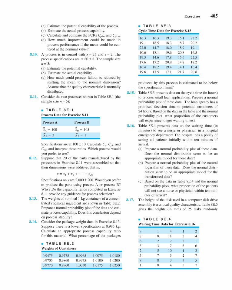
Specifications are at 100 ± 10. Calculate Cp, Cpk, and
Cpm and interpret these ratios. Which process would
you prefer to use?
8.12. Suppose that 20 of the parts manufactured by the
processes in Exercise 8.11 were assembled so that
their dimensions were additive; that is,
x = x1 + x2 + . . . + x20
Specifications on x are 2,000 ± 200. Would you prefer
to produce the parts using process A or process B?
Why? Do the capability ratios computed in Exercise
8.11 provide any guidance for process selection?
8.13. The weights of nominal 1-kg containers of a concen-
trated chemical ingredient are shown in Table 8E.2.
Prepare a normal probability plot of the data and esti-
mate process capability. Does this conclusion depend
on process stability?
8.14. Consider the package weight data in Exercise 8.13.
Suppose there is a lower specification at 0.985 kg.
Calculate an appropriate process capability ratio
for this material. What percentage of the packages
■ TA B L E 8 E . 2
Weights of Containers
0.9475 0.9775 0.9965 1.0075 1.0180
0.9705 0.9860 0.9975 1.0100 1.0200
0.9770 0.9960 1.0050 1.0175 1.0250
■ TA B L E 8 E . 1
Process Data for Exercise 8.11
Process A Process B
=xA = 100
=xB = 105
–S A = 3
–S B = 1
■ TA B L E 8 E . 3
Cycle Time Data for Exercise 8.15
16.3 16.3 19.3 15.1 22.2
19.1 18.5 18.3 18.7 20.2
22.0 14.7 18.0 18.9 19.1
10.6 18.1 19.6 20.8 16.5
19.3 14.6 17.8 15.6 22.5
17.6 17.2 20.9 14.8 18.2
16.4 18.2 19.4 14.1 16.4
19.6 17.5 17.1 21.7 20.8
■ TA B L E 8 E . 4
Waiting Time Data for Exercise 8.16
9 1 4 1 2
8 8 11 2 4
6 2 2 2 1
3 3 7 3 6
2 5 10 1 3
5 7 3 2 7
8 8 3 3 5
1 8 4 5 7
produced by this process is estimated to be below
the specification limit?
8.15. Table 8E.3 presents data on the cycle time (in hours)
to process small loan applications. Prepare a normal
probability plot of these data. The loan agency has a
promised decision time to potential customers of
24 hours. Based on the data in the table and the normal
probability plot, what proportion of the customers
will experience longer waiting times?
8.16. Table 8E.4 presents data on the waiting time (in
minutes) to see a nurse or physician in a hospital
emergency department.The hospital has a policy of
seeing all patients initially within ten minutes of
arrival.
(a) Prepare a normal probability plot of these data.
Does the normal distribution seem to be an
appropriate model for these data?
(b) Prepare a normal probability plot of the natural
logarithm of these data. Does the normal distri-
bution seem to be an appropriate model for the
transformed data?
(c) Based on the data in Table 8E.4 and the normal
probability plots, what proportion of the patients
will not see a nurse or physician within ten min-
utes of arrival?
8.17. The height of the disk used in a computer disk drive
assembly is a critical quality characteristic. Table 8E.5
gives the heights (in mm) of 25 disks randomly
Exercises 405
(a) Estimate the potential capability of the process.
(b) Estimate the actual process capability.
(c) Calculate and compare the PCRs Cpkm and Cpkm.
(d) How much improvement could be made in
process performance if the mean could be cen-
tered at the nominal value?
8.10. A process is in control with and . The
process specifications are at 80 ± 8. The sample size
n = 5.
(a) Estimate the potential capability.
(b) Estimate the actual capability.
(c) How much could process fallout be reduced by
shifting the mean to the nominal dimension?
Assume that the quality characteristic is normally
distributed.
8.11. Consider the two processes shown in Table 8E.1 (the
sample size n = 5):
s = 2x = 75
c08ProcessandMeasurementSystemCapabilityAnalysis.qxd 5/1/12 7:46 AM Page 405

406 Chapter 8 ■ Process and Measurement System Capability Analysis
selected from the manufacturing process. Assume that
the process is in statistical control. Prepare a normal
probability plot of the disk height data and estimate
process capability.
8.18. The length of time required to reimburse employee
expense claims is a characteristic that can be used to
describe the performance of the process. Table 8E.6
gives the cycle times (in days) of 30 randomly
selected employee expense claims. Estimate the capa-
bility of this process. Do your conclusions depend on
statistical control of the process?
8.19. An electric utility tracks the response time to customer-
reported outages. The data in Table 8E.7 are a random
sample of 40 of the response times (in minutes) for one
operating division of this utility during a single month.
(a) Estimate the capability of the utility’s process for
responding to customer-reported outages.
(b) The utility wants to achieve a 90% response rate
in under two hours, as response to emergency
outages is an important measure of customer sat-
isfaction. What is the capability of the process
with respect to this objective?
8.20. Consider the hardness data in Exercise 6.62. Use a
probability plot to assess normality. Estimate process
capability.
8.21. The failure time in hours of ten LSI memory devices
follows: 1210, 1275, 1400, 1695, 1900, 2105, 2230,
2250, 2500, and 2625. Plot the data on normal prob-
ability paper and, if appropriate, estimate process
capability. Is it safe to estimate the proportion of cir-
cuits that fail below 1,200 h?
8.22. A normally distributed process has specifications of
LSL = 75 and USL = 85 on the output. A random
sample of 25 parts indicates that the process is cen-
tered at the middle of the specification band, and the
standard deviation is s = 1.5.
(a) Find a point estimate of Cp.
(b) Find a 95% confidence interval on Cp. Comment
on the width of this interval.
8.23. A company has been asked by an important customer
to demonstrate that its process capability ratio Cp
exceeds 1.33. It has taken a sample of 50 parts and
obtained the point estimate . Assume that the
quality characteristic follows a normal distribution.
Can the company demonstrate that Cp exceeds 1.33
at the 95% level of confidence? What level of confi-
dence would give a one-sided lower confidence limit
on Cp that exceeds 1.33?
8.24. Suppose that a quality characteristic has a normal
distribution with specification limits at USL = 100
and LSL = 90. A random sample of 30 parts results
in and s = 1.6.
(a) Calculate a point estimate of Cpk.
(b) Find a 95% confidence interval on Cpk.
8.25. The molecular weight of a particular polymer should
fall between 2,100 and 2,350. Fifty samples of this
material were analyzed with the results
and s = 60. Assume that molecular weight is nor-
mally distributed.
(a) Calculate a point estimate of Cpk.
(b) Find a 95% confidence interval on Cpk.
8.26. A normally distributed quality characteristic has spec-
ification limits at LSL = 10 and USL = 20. A random
sample of size 50 results in and .
(a) Calculate a point estimate of .
(b) Find a 95% confidence interval on .
8.27. A normally distributed quality characteristic has
specification limits at LSL = 50 and USL = 60. A ran-
dom sample of size 35 results in and s = 0.9.
(a) Calculate a point estimate of .
(b) Find a 95% confidence interval on .
(c) Is this a -process?
8.28. Consider a simplified version of equation 8.19:
ˆ
ˆ
C Zn
C
C Zn
pk
pk
pk
11
2 1
11
2 1
2
2
−−( )
⎡
⎣⎢⎢
⎤
⎦⎥⎥
≤
≤ +−( )
⎡
⎣⎢⎢
⎤
⎦⎥⎥
α
α
6sCpk
Cpk
x = 55.5
Cpk
Cpk
s = 1.2x = 16
x = 2,275
x = 97
Cp = 1.52
■ TA B L E 8 E . 6
Days to Par Expense Claims
5 5 16 17 14 12
8 13 6 12 11 10
18 18 13 12 19 14
17 16 11 22 13 16
10 18 12 12 12 14
■ TA B L E 8 E . 7
Response Time Data for Exercise 8.19
80 102 86 94 86 106 105 110 127 97
110 104 97 128 98 84 97 87 99 94
105 104 84 77 125 85 80 104 103 109
115 89 100 96 96 87 106 100 102 93
■ TA B L E 8 E . 5
Disk Height Data for Exercise 8.17
20.0106 20.0090 20.0067 19.9772 20.0001
19.9940 19.9876 20.0042 19.9986 19.9958
20.0075 20.0018 20.0059 19.9975 20.0089
20.0045 19.9891 19.9956 19.9884 20.0154
20.0056 19.9831 20.0040 20.0006 20.0047
c08ProcessandMeasurementSystemCapabilityAnalysis.qxd 5/1/12 7:47 AM Page 406

Note that this was obtained by assuming that the term
9n in equation 8.19 will probably be large. Rework
Exercise 8.24 using this equation and compare your
answer to the original answer obtained from equation
8.19. How good is the approximation suggested in
this problem?
8.29. An operator–instrument combination is known to
test parts with an average error of zero; however, the
standard deviation of measurement error is esti-
mated to be 3. Samples from a controlled process
were analyzed, and the total variability was esti-
mated to be . What is the true process standard
deviation?
8.30. Consider the situation in Example 8.7. A new gauge
is being evaluated for this process. The same opera-
tor measures the same 20 parts twice using the new
gauge and obtains the data shown in Table 8E.8.
(a) What can you say about the performance of the
new gauge relative to the old one?
(b) If specifications are at 25 ± 15, what is the P/Tratio for the new gauge?
8.31. Ten parts are measured three times by the same oper-
ator in a gauge capability study. The data are shown
in Table 8E.9.
(a) Describe the measurement error that results from
the use of this gauge.
(b) Estimate total variability and product variability.
(c) What percentage of total variability is due to the
gauge?
(d) If specifications on the part are at 100 ± 15, find
the P/T ratio for this gauge. Comment on the
adequacy of the gauge.
8.32. In a study to isolate both gauge repeatability and
gauge reproducibility, two operators use the same
s = 5
gauge to measure ten parts three times each. The data
are shown in Table 8E.10.
(a) Estimate gauge repeatability and reproducibility.
(b) Estimate the standard deviation of measurement
error.
(c) If the specifications are at 50 ± 10, what can you
say about gauge capability?
8.33. The data in Table 8E.11 were taken by one operator
during a gauge capability study.
(a) Estimate gauge capability.
(b) Does the control chart analysis of these data
indicate any potential problem in using the
gauge?
■ TA B L E 8 E . 1 0
Measurement Data for Exercise 8.32
Operator 1 Operator 2Part Measurements Measurements
Number 1 2 3 1 2 3
1 50 49 50 50 48 51
2 52 52 51 51 51 51
3 53 50 50 54 52 51
4 49 51 50 48 50 51
5 48 49 48 48 49 48
6 52 50 50 52 50 50
7 51 51 51 51 50 50
8 52 50 49 53 48 50
9 50 51 50 51 48 49
10 47 46 49 46 47 48
■ TA B L E 8 E . 8
Measurement Data for Exercise 8.30
Part Measurements Part MeasurementsNumber 1 2 Number 1 2
1 19 23 11 20 25
2 22 28 12 16 15
3 19 24 13 25 24
4 28 23 14 24 22
5 16 19 15 31 27
6 20 19 16 24 23
7 21 24 17 20 24
8 17 15 18 17 19
9 24 26 19 25 23
10 25 23 20 17 16
■ TA B L E 8 E . 9
Measurement Data for Exercise 8.31
Part MeasurementsNumber 1 2 3
1 100 101 100
2 95 93 97
3 101 103 100
4 96 95 97
5 98 98 96
6 99 98 98
7 95 97 98
8 100 99 98
9 100 100 97
10 100 98 99
Exercises 407
c08ProcessandMeasurementSystemCapabilityAnalysis.qxd 3/28/12 8:15 PM Page 407

408 Chapter 8 ■ Process and Measurement System Capability Analysis
8.34. A measurement systems experiment involving 20
parts, three operators, and two measurements per part
is shown in Table 8E.12.
(a) Estimate the repeatability and reproducibility of
the gauge.
(b) What is the estimate of total gauge variability?
(c) If the product specifications are at LSL = 6 and
USL = 60, what can you say about gauge capa-
bility?
8.35. Reconsider the gauge R & R experiment in Exercise
8.34. Calculate the quantities SNR and DR for this
gauge. Discuss what information these measures
provide about the capability of the gauge.
8.36. Three parts are assembled in series so that their crit-
ical dimensions x1, x2, and x3 add. The dimensions of
each part are normally distributed with the following
parameters: m1 = 100, s1 = 4, m2 = 75, s2 = 4, m3 = 75,
and s3 = 2. What is the probability that an assembly
chosen at random will have a combined dimension in
excess of 262?
8.37. Two parts are assembled as shown in the figure. The
distributions of x1 and x2 are normal, with m1 = 20,
s1 = 0.3, m2 = 19.6, and s2 = 0.4. The specifications
of the clearance between the mating parts are 0.5 ± 0.4.
What fraction of assemblies will fail to meet specifi-
cations if assembly is at random?
8.38. A product is packaged by filling a container com-
pletely full. This container is shaped as shown in the
figure. The process that produces these containers is
examined, and the following information collected
on the three critical dimensions:
Variable Mean Variance
L—Length 6.0 0.01
H—Height 3.0 0.01
W—Width 4.0 0.01
Assuming the variables to be independent, what are
approximate values for the mean and variance of
container volume?
8.39. A rectangular piece of metal of width W and length
L is cut from a plate of thickness T. If W, L, and T are
independent random variables with means and stan-
dard deviations as given here and the density of the
metal is 0.08 g/cm3, what would be the estimated
mean and standard deviation of the weights of pieces
produced by this process?
H
W
L
x1 x2
■ TA B L E 8 E . 1 2
Measurement Data for Exercise 8.34
Operator 1 Operator 2 Operator 3
Part Measurements Measurements Measurements
Number 1 2 1 2 1 2
1 21 20 20 20 19 21
2 24 23 24 24 23 24
3 20 21 19 21 20 22
4 27 27 28 26 27 28
5 19 18 19 18 18 21
6 23 21 24 21 23 22
7 22 21 22 24 22 20
8 19 17 18 20 19 18
9 24 23 25 23 24 24
10 25 23 26 25 24 25
11 21 20 20 20 21 20
12 18 19 17 19 18 19
13 23 25 25 25 25 25
14 24 24 23 25 24 25
15 29 30 30 28 31 30
16 26 26 25 26 25 27
17 20 20 19 20 20 20
18 19 21 19 19 21 23
19 25 26 25 24 25 25
20 19 19 18 17 19 17
■ TA B L E 8 E . 1 1
Measurement Data for Exercise 8.33
Part Measurements Part Measurements
Number 1 2 Number 1 2
1 20 20 9 20 20
2 19 20 10 23 22
3 21 21 11 28 22
4 24 20 12 19 25
5 21 21 13 21 20
6 25 26 14 20 21
7 18 17 15 18 18
8 16 15
c08ProcessandMeasurementSystemCapabilityAnalysis.qxd 3/28/12 8:15 PM Page 408

Standard Variable Mean Deviation
W 10 cm 0.2 cm
L 20 cm 0.3 cm
T 3 cm 0.1 cm
8.40. The surface tension of a chemical product, measured
on a coded scale, is given by the relationship
where x is a component of the product with proba-
bility distribution
Find the mean and variance of s.
8.41. Two resistors are connected to a battery as shown in
the figure. Find approximate expressions for the
mean and variance of the resulting current (I ). E, R1,
and R2 are random variables with means mE, mR1,
mR2, and variances s2E, s2
R1, and s2R2, respectively.
8.42. Two mating parts have critical dimensions x1 and x2
as shown in the figure. Assume that x1 and x2 are nor-
mally distributed with means m1 and m2 and standard
deviations s1 = 0.400 and s2 = 0.300. If it is desired
that the probability of a smaller clearance (i.e., x1 − x2)
than 0.09 should be 0.006, what distance between the
average dimension of the two parts (i.e., m1 − m2)
should be specified by the designer?
8.43. An assembly of two parts is formed by fitting a shaft
into a bearing. It is known that the inside diameters of
bearings are normally distributed with mean 2.010 cm
x1 x2
E
R2R1
f x x x( ) = −( ) ≤ ≤126
5 2 2 4
s x= +( )3 0 052
.
and standard deviation 0.002 cm, and that the outside
diameters of the shafts are normally distributed with
mean 2.004 cm and standard deviation 0.001 cm.
Determine the distribution of clearance between the
parts if random assembly is used. What is the proba-
bility that the clearance is positive?
8.44. We wish to estimate a two-sided natural tolerance
interval that will include 99% of the values of a ran-
dom variable with probability 0.80. If nothing is
known about the distribution of the random variable,
how large should the sample be?
8.45. A sample of ten items from a normal population had a
meanof300andastandarddeviationof10.Using these
data, estimate a value for the random variable such that
the probability is 0.95 that 90% of the measurements on
this random variable will lie below the value.
8.46. A sample of 25 measurements on a normally distrib-
uted quality characteristic has a mean of 85 and a stan-
dard deviation of 1. Using a confidence probability of
0.95, find a value such that 90% of the future measure-
ments on this quality characteristic will lie above it.
8.47. A sample of 20 measurements on a normally distrib-
uted quality characteristic had and s = 10.
Find an upper natural tolerance limit that has proba-
bility 0.90 of containing 95% of the distribution of
this quality characteristic.
8.48. How large a sample is required to obtain a natural
tolerance interval that has probability 0.90 of con-
taining 95% of the distribution? After the data are
collected, how would you construct the interval?
8.49. A random sample of n = 40 pipe sections resulted in
a mean wall thickness of 0.1264 in. and a standard
deviation of 0.0003 in. We assume that wall thick-
ness is normally distributed.
(a) Between what limits can we say with 95% confi-
dence that 95% of the wall thicknesses should fall?
(b) Construct a 95% confidence interval on the true
mean thickness. Explain the difference between
this interval and the one constructed in part (a).
8.50. Find the sample size required to construct an upper
nonparametric tolerance limit that contains at least
95% of the population with probability at least 0.95.
How would this limit actually be computed from
sample data?
x = 350
Exercises 409
c08ProcessandMeasurementSystemCapabilityAnalysis.qxd 3/28/12 8:15 PM Page 409

c08ProcessandMeasurementSystemCapabilityAnalysis.qxd 3/28/12 8:15 PM Page 410
This page is intentionally left blank
Other StatisticalProcess-Monitoringand ControlTechniques
Part 3 focused on the basic methods of statistical process control and capa-bility analysis. Many of these techniques, such as the Shewhart controlcharts, have been in use for well over 75 years. However, the increasingemphasis on variability reduction, yield enhancement, and process improve-ment along with the success of the basic methods has led to the develop-ment of many new techniques for statistical process monitoring and control.This part contains four chapters describing some of these techniques. Chapter 9presents the cumulative sum (CUSUM) control chart and the exponentiallyweighted moving average (EWMA) control chart. These procedures are notreally new, since they date from the 1950s, but they are generally consid-ered somewhat more advanced techniques than the Shewhart charts. As wewill see, the CUSUM and the EWMA offer considerable performance improve-ment relative to Shewhart charts. CUSUM and EWMA control charts are veryuseful in phase II process-monitoring situations. Chapter 10 is a survey ofseveral univariate process control techniques, including methods for shortproduction runs and monitoring techniques suitable for processes in whichthe data are autocorrelated. Chapter 11 is an introduction to multivariateprocess monitoring and control, techniques that are applicable when two or more related process variables are of interest. Chapter 12 presents tech-niques for process control by feedback adjustment. In these systems theoutput quality characteristic of interest is influenced by a manipulatableprocess variable, and we use the deviation of the current output from itsdesired or target value to determine how much adjustment to make so thatthe next observation will be on target. These feedback control schemes are
Other StatisticalProcess-Monitoringand ControlTechniques
PART 4PART 4
c09CumulativeSumandExponentiallyWeightedMovingAverageControlCharts.qxd 4/2/12 4:06 PM Page 411

also called engineering process control, and they are widely used in thechemical and process industries.
Some of the topics presented in this part may require more statistical andmathematical background than the material in Part 3. Two very useful refer-ences to accompany this section are the panel discussion on statisticalprocess monitoring and control that appeared in the Journal of QualityTechnology in 1997 [see Montgomery and Woodall (1997)] and the paper onresearch issues in SPC in the Journal of Quality Technology in 1999 [seeWoodall and Montgomery (1999)].
412 Part 4 ■ Other Statistical Process-Monitoring and Control Techniques
c09CumulativeSumandExponentiallyWeightedMovingAverageControlCharts.qxd 4/2/12 4:06 PM Page 412

9.1 THE CUMULATIVE SUM CONTROL CHART
9.1.1 Basic Principles: The CUSUMControl Chart for Monitoringthe Process Mean
9.1.2 The Tabular or AlgorithmicCUSUM for Monitoring theProcess Mean
9.1.3 Recommendations forCUSUM Design
9.1.4 The Standardized CUSUM9.1.5 Improving CUSUM
Responsiveness for LargeShifts
9.1.6 The Fast Initial Response orHeadstart Feature
9.1.7 One-Sided CUSUMs9.1.8 A CUSUM for Monitoring
Process Variability9.1.9 Rational Subgroups9.1.10 CUSUMs for Other Sample
Statistics9.1.11 The V-Mask Procedure9.1.12 The Self-Starting CUSUM
9.2 THE EXPONENTIALLY WEIGHTEDMOVING AVERAGE CONTROLCHART
9.2.1 The Exponentially WeightedMoving Average ControlChart for Monitoring theProcess Mean
9.2.2 Design of an EWMA ControlChart
9.2.3 Robustness of the EWMA toNon-normality
9.2.4 Rational Subgroups9.2.5 Extensions of the EWMA
9.3 THE MOVING AVERAGE CONTROL CHART
Supplemental Material for Chapter 9
S9.1 The Markov Chain Approachfor Finding the ARL forCUSUM and EWMA ControlCharts
S9.2 Integral Equation versusMarkov Chains for Findingthe ARL
99
CHAPTER OUTLINE
The supplemental material is on the textbook Website www.wiley.com/college/montgomery.
413
Cumulative Sum andExponentially WeightedMoving Average ControlCharts
c09CumulativeSumandExponentiallyWeightedMovingAverageControlCharts.qxd 4/23/12 7:31 PM Page 413

414 Chapter 9 ■ Cumulative Sum and Exponentially Weighted Moving Average Control Charts
CHAPTER OVERVIEW AND LEARNING OBJECTIVES
Chapters 5, 6, and 7 have concentrated on basic SPC methods. The control charts featured in
these chapters are predominantly Shewhart control charts. These charts are extremely use-
ful in phase I implementation of SPC, where the process is likely to be out of control and
experiencing assignable causes that result in large shifts in the monitored parameters.
Shewhart charts are also very useful in the diagnostic aspects of bringing an unruly process
into statistical control, because the patterns on these charts often provide guidance regarding
the nature of the assignable cause.
A major disadvantage of a Shewhart control chart is that it uses only the information
about the process contained in the last sample observation and it ignores any information
given by the entire sequence of points. This feature makes the Shewhart control chart rela-
tively insensitive to small process shifts, say, on the order of about 1.5s or less. This poten-
tially makes Shewhart control charts less useful in phase II monitoring problems, where the
process tends to operate in control, reliable estimates of the process parameters (such as the
mean and standard deviation) are available, and assignable causes do not typically result in
large process upsets or disturbances. Of course, other criteria, such as warning limits and
other sensitizing rules, can be applied to Shewhart control charts in phase II to improve
their performance against small shifts. However, the use of these procedures reduces the
simplicity and ease of interpretation of the Shewhart control chart, and as we have previ-
ously observed, they also dramatically reduce the average run length of the chart when the
process is actually in control. This can be very undesirable in phase II process monitoring.
Two very effective alternatives to the Shewhart control chart may be used when small
process shifts are of interest: the cumulative sum (CUSUM) control chart, and the expo-nentially weighted moving average (EWMA) control chart. CUSUM and EWMA control
charts are excellent alternatives to the Shewhart control chart for phase II process monitoring
situations. Collectively, the CUSUM and EWMA control chart are sometimes called time-weighted control charts. These control charts are the subject of this chapter.
After careful study of this chapter, you should be able to do the following:
1. Set up and use CUSUM control charts for monitoring the process mean
2. Design a CUSUM control chart for the mean to obtain specific ARL performance
3. Incorporate a fast initial response feature into the CUSUM control chart
4. Use a combined Shewhart–CUSUM monitoring scheme
5. Set up and use EWMA control charts for monitoring the process mean
6. Design an EWMA control chart for the mean to obtain specific ARL performance
7. Understand why the EWMA control chart is robust to the assumption of normality
8. Understand the performance advantage of CUSUM and EWMA control charts
relative to Shewhart control charts
9. Set up and use a control chart based on an ordinary (unweighted) moving average
9.1 The Cumulative Sum Control Chart
9.1.1 Basic Principles: The CUSUM Control Chart for Monitoring the Process Mean
Consider the data in Table 9.1, column (a). The first 20 of these observations were drawn at
random from a normal distribution with mean m = 10 and standard deviation s = 1. These
observations have been plotted on a Shewhart control chart in Figure 9.1. The center line and
c09CumulativeSumandExponentiallyWeightedMovingAverageControlCharts.qxd 4/2/12 4:06 PM Page 414

9.1 The Cumulative Sum Control Chart 415
■ TA B L E 9 . 1
Data for the CUSUM Example
Sample, i (a) xi (b) xi − 10 (c) Ci = (xi − 10) + Ci−1
1 9.45 −0.55 −0.55
2 7.99 −2.01 −2.56
3 9.29 −0.71 −3.27
4 11.66 1.66 −1.61
5 12.16 2.16 0.55
6 10.18 0.18 0.73
7 8.04 −1.96 −1.23
8 11.46 1.46 0.23
9 9.20 −0.80 −0.57
10 10.34 0.34 −0.23
11 9.03 −0.97 −1.20
12 11.47 1.47 0.27
13 10.51 0.51 0.78
14 9.40 −0.60 0.18
15 10.08 0.08 0.26
16 9.37 −0.63 −0.37
17 10.62 0.62 0.25
18 10.31 0.31 0.56
19 8.52 −1.48 −0.92
20 10.84 0.84 −0.08
21 10.90 0.90 0.82
22 9.33 −0.67 0.15
23 12.29 2.29 2.44
24 11.50 1.50 3.94
25 10.60 0.60 4.54
26 11.08 1.08 5.62
27 10.38 0.38 6.00
28 11.62 1.62 7.62
29 11.31 1.31 8.93
30 10.52 0.52 9.45
20
15
10
5
02 4 6 8 10 12 14 16 18 20 22 24 26 28 30
Sample number
x
UCL = 13
LCL = 7
= 10μ = 11μ
CL =10
■ F I G U R E 9 . 1 A Shewhart control chart for the
data in Table 9.1.
c09CumulativeSumandExponentiallyWeightedMovingAverageControlCharts.qxd 4/2/12 4:06 PM Page 415

416 Chapter 9 ■ Cumulative Sum and Exponentially Weighted Moving Average Control Charts
three-sigma control limits on this chart are at
Note that all 20 observations plot in control.
The last 10 observations in column (a) of Table 9.1 were drawn from a normal distri-
bution with mean m = 11 and standard deviation s = 1. Consequently, we can think of these
last 10 observations as having been drawn from the process when it is out of control—that is,
after the process has experienced a shift in the mean of 1s. These last 10 observations are also
plotted on the control chart in Figure 9.1. None of these points plots outside the control
limits, so we have no strong evidence that the process is out of control. Note that there is an
indication of a shift in process level for the last 10 points, because all but one of the points
plot above the center line. However, if we rely on the traditional signal of an out-of-control
process, one or more points beyond a three-sigma control limit, then the Shewhart control
chart has failed to detect the shift.
The reason for this failure, of course, is the relatively small magnitude of the shift. The
Shewhart chart for averages is very effective if the magnitude of the shift is 1.5s to 2s or
larger. For smaller shifts, it is not as effective. The cumulative sum (or CUSUM) control chart
is a good alternative when small shifts are important.
The CUSUM chart directly incorporates all the information in the sequence of sample
values by plotting the cumulative sums of the deviations of the sample values from a target
value. For example, suppose that samples of size n ≥ 1 are collected, and is the average of
the jth sample. Then if m0 is the target for the process mean, the cumulative sum control chart
is formed by plotting the quantity
(9.1)
against the sample number i. Ci is called the cumulative sum up to and including the ithsample. Because they combine information from several samples, cumulative sum charts are
more effective than Shewhart charts for detecting small process shifts. Furthermore, they are
particularly effective with samples of size n = 1. This makes the cumulative sum control chart
a good candidate for use in the chemical and process industries where rational subgroups are
frequently of size 1, and in discrete parts manufacturing with automatic measurement of each
part and on-line process monitoring directly at the work center.
Cumulative sum control charts were first proposed by Page (1954) and have been studied
by many authors; in particular, see Ewan (1963), Page (1961), Gan (1991), Lucas (1976, 1982),
Hawkins (1981, 1993a), and Woodall and Adams (1993). The book by Hawkins and Olwell
(1998) is highly recommended. In this section, we concentrate on the cumulative sum chart for
the process mean. It is possible to devise cumulative sum procedures for other variables, such
as Poisson and binomial variables for modeling nonconformities and fraction nonconforming.
We will show subsequently how the CUSUM can be used for monitoring process variability.
We note that if the process remains in control at the target value m0, the cumulative sum
defined in equation 9.1 is a random walk with mean zero. However, if the mean shifts upward
to some value m1 > m0, say, then an upward or positive drift will develop in the cumulative
sum Ci. Conversely, if the mean shifts downward to some m1 < m0, then a downward or neg-
ative drift in Ci will develop. Therefore, if a significant trend develops in the plotted points
either upward or downward, we should consider this as evidence that the process mean has
shifted, and a search for some assignable cause should be performed.
C xi jj
i= −( )
=∑ μ0
1
xj
UCL
Center line
LCL
===
13
10
7
c09CumulativeSumandExponentiallyWeightedMovingAverageControlCharts.qxd 4/2/12 4:06 PM Page 416

This theory can be easily demonstrated by using the data in column (a) of Table 9.1
again. To apply the CUSUM in equation 9.1 to these observations, we would take = xi (since
our sample size is n = 1) and let the target value m0 = 10. Therefore, the CUSUM becomes
Column (b) of Table 9.1 contains the differences xi − 10, and the cumulative sums are computed
in column (c). The starting value for the CUSUM, C0, is taken to be zero. Figure 9.2 plots the
CUSUM from column (c) of Table 9.1. Note that for the first 20 observations where m = 10, the
CUSUM tends to drift slowly, in this case maintaining values near zero. However, in the last
10 observations, where the mean has shifted to m = 11, a strong upward trend develops.
Of course, the CUSUM plot in Figure 9.2 is not a control chart because it lacks statis-
tical control limits. There are two ways to represent CUSUMs: the tabular (or algorithmic)
CUSUM, and the V-mask form of the CUSUM. Of the two representations, the tabular
CUSUM is preferable. We now present the construction and use of the tabular CUSUM. We
will also briefly discuss the V-mask procedure and indicate why it is not the best representa-
tion of a CUSUM.
9.1.2 The Tabular or Algorithmic CUSUM for Monitoring the Process Mean
We now show how a tabular CUSUM may be constructed for monitoring the mean of a process.
CUSUMs may be constructed both for individual observations and for the averages of rational
subgroups. The case of individual observations occurs very often in practice, so that situation
will be treated first. Later we will see how to modify these results for rational subgroups.
Let xi be the ith observation on the process. When the process is in control, xi has a
normal distribution with mean m0 and standard deviation s. We assume that either s is
C x
x x
x C
i jj
i
i jj
i
i i
= −( )
= −( ) + −( )= −( ) +
=
=
−
−
∑
∑
10
10 10
10
1
1
1
1
x
9.1 The Cumulative Sum Control Chart 417
2 4 6 8 10 12 14 16 18 20 22 24 26 28 30–4
–2
0
2
4
6
8
10
Ci
Sample number
= 10μ = 11μ
■ F I G U R E 9 . 2 Plot of the cumulative sum from
column (c) of Table 9.1.
c09CumulativeSumandExponentiallyWeightedMovingAverageControlCharts.qxd 4/2/12 4:06 PM Page 417

418 Chapter 9 ■ Cumulative Sum and Exponentially Weighted Moving Average Control Charts
known or that a reliable estimate is available. These assumptions are very consistent with
phase II applications of SPC, the situation in which the CUSUM is most useful. Later we will
discuss monitoring s with a CUSUM.
Sometimes we think of m0 as a target value for the quality characteristic x. This view-
point is often taken in the chemical and process industries when the objective is to control x(viscosity, say) to a particular target value (such as 2,000 centistokes at 100°C). If the process
drifts or shifts off this target value, the CUSUM will signal, and an adjustment is made to
some manipulatable variable (such as the catalyst feed rate) to bring the process back on tar-
get. Also, in some cases a signal from a CUSUM indicates the presence of an assignable cause
that must be investigated just as in the Shewhart chart case.
The tabular CUSUM works by accumulating derivations from m0 that are above target
with one statistic C+ and accumulating derivations from m0 that are below target with another
statistic C−. The statistics C+ and C− are called one-sided upper and lower CUSUMs,respectively. They are computed as follows:
The Tabular CUSUM
(9.3)
C C+ −= = 0.0 0where the starting values are
C x K C
C K x C
i i i
i i i
+−+
−−−
= − +( ) +[ ]= −( ) − +[ ]
max ,
max ,
0
0
0 1
0 1
μ
μ
(9.2)
In equations 9.2 and 9.3, K is usually called the reference value (or the allowance, or
the slack value), and it is often chosen about halfway between the target m0 and the out-of-
control value of the mean m1 that we are interested in detecting quickly.
Thus, if the shift is expressed in standard deviation units as m1 = m0 + ds (or d = |m1 −m0|/s), then K is one-half the magnitude of the shift or
(9.4)
Note that C+i and C−
i accumulate deviations from the target value m0 that are greater than K,
with both quantities reset to zero on becoming negative. If either C+i or C−
i exceeds the deci-sion interval H, the process is considered to be out of control.
We have briefly mentioned how to choose K, but how does one choose H? Actually, the
proper selection of these two parameters is quite important, as it has substantial impact on the
performance of the CUSUM. We will talk more about this later, but a reasonable value for His five times the process standard deviation s.
K = =−δ σ
μ μ2 2
1 0
EXAMPLE 9.1
Set up the tabular CUSUM using the data from Table 9.1.
A Tabular CUSUM
1.0s = 1.0(1.0) = 1.0. Therefore, the out-of-control value of the
process mean is m1 = 10 + 1 = 11. We will use a tabular
CUSUM with K = 1–2 (because the shift size is 1.0s and s = 1)
SOLUTION
Recall that the target value is m0 = 10, the subgroup size is
n = 1, the process standard deviation is s = 1, and suppose that
the magnitude of the shift we are interested in detecting is
c09CumulativeSumandExponentiallyWeightedMovingAverageControlCharts.qxd 4/2/12 4:06 PM Page 418

9.1 The Cumulative Sum Control Chart 419
and
For period 2, we would use
and
Since x2 = 7.99, we obtain
C2 0 7 99 10 5 0 0+ = − +[ ] =max , . .
C x C
x
2 2 1
2
0 9 5
0 9 5 0 05
− −= − +[ ]= − +[ ]
max , .
max , . .
C x C
x
2 2 1
2
0 10 5
0 10 5 0
+ += − +[ ]= − +[ ]
max , .
max , .
C1 0 9 5 9 45 0 0 05− = − +[ ] =max , . . .
and H = 5 (because the recommended value of the decision
interval is H = 5s = 5(1) = 5).
Table 9.2 presents the tabular CUSUM scheme. To illus-
trate the calculations, consider period 1. The equations for C+i
and C−i are
and
since K = 0.5 and m0 = 10. Now x1 = 9.45, so since C+0 =
C−0 = 0,
C1 0 9 45 10 5 0 0+ = − +[ ] =max , . .
C x C1 1 00 9 5− −= − +[ ]max , .
C x C1 1 00 10 5+ += − +[ ]max , .
(continued)
■ TA B L E 9 . 2
The Tabular CUSUM for Example 9.1
(a) (b)
Period i xi xi − 10.5 C+i N+ 9.5 − xi C−
i N−
1 9.45 −1.05 0 0 0.05 0.05 1
2 7.99 −2.51 0 0 1.51 1.56 2
3 9.29 −1.21 0 0 0.21 1.77 3
4 11.66 1.16 1.16 1 −2.16 0 0
5 12.16 1.66 2.82 2 −2.66 0 0
6 10.18 −0.32 2.50 3 −0.68 0 0
7 8.04 −2.46 0.04 4 1.46 1.46 1
8 11.46 0.96 1.00 5 −1.96 0 0
9 9.20 −1.3 0 0 0.30 0.30 1
10 10.34 −0.16 0 0 −0.84 0 0
11 9.03 −1.47 0 0 0.47 0.47 1
12 11.47 0.97 0.97 1 −1.97 0 0
13 10.51 0.01 0.98 2 −1.01 0 0
14 9.40 −1.10 0 0 0.10 0.10 1
15 10.08 −0.42 0 0 −0.58 0 0
16 9.37 −1.13 0 0 0.13 0.13 1
17 10.62 0.12 0.12 1 −1.12 0 0
18 10.31 −0.19 0 0 −0.81 0 0
19 8.52 −1.98 0 0 0.98 0.98 1
20 10.84 0.34 0.34 1 −1.34 0 0
21 10.90 0.40 0.74 2 −1.40 0 0
22 9.33 −1.17 0 0 0.17 0.17 1
23 12.29 1.79 1.79 1 −2.79 0 0
24 11.50 1.00 2.79 2 −2.00 0 0
25 10.60 0.10 2.89 3 −1.10 0 0
26 11.08 0.58 3.47 4 −1.58 0 0
27 10.38 −0.12 3.35 5 −0.88 0 0
28 11.62 1.12 4.47 6 −2.12 0 0
29 11.31 0.81 5.28 7 −1.81 0 0
30 10.52 0.02 5.30 8 −1.02 0 0
c09CumulativeSumandExponentiallyWeightedMovingAverageControlCharts.qxd 4/2/12 4:06 PM Page 419

420 Chapter 9 ■ Cumulative Sum and Exponentially Weighted Moving Average Control Charts
It is useful to present a graphical display for the tabular CUSUM. These charts are some-
times called CUSUM status charts. They are constructed by plotting C+i and C−
i versus the
sample number. Figure 9.3a shows the CUSUM status chart for the data in Example 9.1. Each
vertical bar represents the value of C+i and C−
i in period i. With the decision interval plotted on
the chart, the CUSUM status chart resembles a Shewhart control chart. We have also plotted
the observations xi for each period on the CUSUM status chart as the solid dots. This fre-
quently helps the user of the control chart to visualize the actual process performance that has
led to a particular value of the CUSUM. Some computer software packages have implemented
the CUSUM status chart. Figure 9.3b shows the Minitab version. In Minitab, the lower
CUSUM is defined as
This results in a lower CUSUM that is always ≤ 0 (it is the negative of the lower CUSUM value
from equation 9.3). Note in Figure 9.3b that the values of the lower CUSUM range from 0 to −5.
The action taken following an out-of-control signal on a CUSUM control scheme is
identical to that with any control chart; one should search for the assignable cause, take any
corrective action required, and then reinitialize the CUSUM at zero. The CUSUM is partic-
ularly helpful in determining when the assignable cause has occurred; as we noted in the pre-
vious example, just count backward from the out-of-control signal to the time period when
the CUSUM lifted above zero to find the first period following the process shift. The coun-
ters N+ and N− are used in this capacity.
In situations where an adjustment to some manipulatable variable is required in order
to bring the process back to the target value m0, it may be helpful to have an estimate of the
new process mean following the shift. This can be computed from
C x k Ci i i−
−−= − + +( )min ,0 0 1μ
(9.5)ˆ,
,
μμ
μ=
+ + >
− − >
⎧
⎨⎪⎪
⎩⎪⎪
+
++
−
−−
0
0
KC
NC H
KC
NC H
ii
ii
if
if
To illustrate the use of equation 9.5, consider the CUSUM in period 29 with C+29 = 5.28. From
equation 9.5, we would estimate the new process average as
ˆ
. ..
.
μ μ= + +
= + +
=
+
+029
10 0 0 55 28
7
11 25
KC
N
period at which C+i > H = 5, we would conclude that the
process is out of control at that point. The tabular CUSUM also
indicates when the shift probably occurred. The counter N+
records the number of consecutive periods since the upper-side
CUSUM C+i rose above the value of zero. Since N+ = 7 at
period 29, we would conclude that the process was last in con-
trol at period 29 − 7 = 22, so the shift likely occurred between
periods 22 and 23.
and
Panels (a) and (b) of Table 9.2 summarize the remaining cal-
culations. The quantities N+ and N− in Table 9.2 indicate the
number of consecutive periods that the CUSUMs C+i or C−
i
have been nonzero.
The CUSUM calculations in Table 9.2 show that the upper-
side CUSUM at period 29 is C+29 = 5.28. Since this is the first
C2 0 9 5 7 99 0 05 1 56− = − +[ ] =max , . . . .
c09CumulativeSumandExponentiallyWeightedMovingAverageControlCharts.qxd 4/2/12 4:06 PM Page 420

So, for example, if the process characteristic is viscosity, then we would conclude that mean
viscosity has shifted from 10 to 11.25, and if the manipulatable variable that affects viscosity
is catalyst feed rate, then we would need to make an adjustment in catalyst feed rate that
would result in moving the viscosity down by 1.25 units.
Finally, we should note that runs tests, and other sensitizing rules such as the zone rules,
cannot be safely applied to the CUSUM, because successive values of C+i and C−
i are not inde-
pendent. In fact, the CUSUM can be thought of as a weighted average, where the weights are
stochastic or random. For example, consider the CUSUM shown in Table 9.2. The CUSUM
at period 30 is C+30 = 5.30. This can be thought of as a weighted average in which we give
equal weight to the last N+ = 8 observations and weight zero to all other observations.
9.1 The Cumulative Sum Control Chart 421
x
16
C +i
6
C –i
14 4
12 2
10 0
8 2
6 4
4 6
5
3
1
1
3
5H = 5
H = 5
1 2 3
4 5 6
7
8
9
10
11
12 13
14
15
16
17 18
19
20 21
22
23 24 25 26 27 28 29 30
(a)
(b)
–5
5Upper CUSUM
Lower CUSUM
0
Cum
ulat
ive
sum
0 10 20 30
Subgroup number
5
–5
■ F I G U R E 9 . 3 CUSUM status charts for Example 9.1. (a) Manual chart. (b) Minitab chart.
c09CumulativeSumandExponentiallyWeightedMovingAverageControlCharts.qxd 4/2/12 4:06 PM Page 421
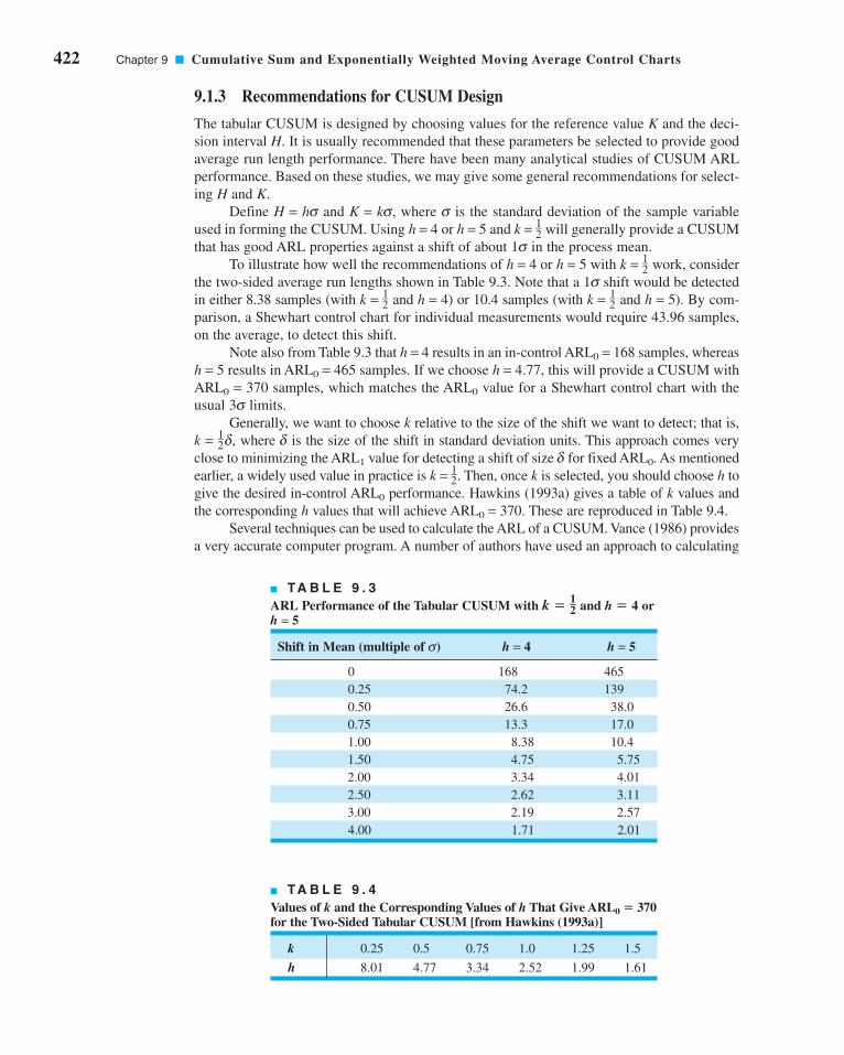
422 Chapter 9 ■ Cumulative Sum and Exponentially Weighted Moving Average Control Charts
9.1.3 Recommendations for CUSUM Design
The tabular CUSUM is designed by choosing values for the reference value K and the deci-
sion interval H. It is usually recommended that these parameters be selected to provide good
average run length performance. There have been many analytical studies of CUSUM ARL
performance. Based on these studies, we may give some general recommendations for select-
ing H and K.
Define H = hs and K = ks, where s is the standard deviation of the sample variable
used in forming the CUSUM. Using h = 4 or h = 5 and k = 1–2 will generally provide a CUSUM
that has good ARL properties against a shift of about 1s in the process mean.
To illustrate how well the recommendations of h = 4 or h = 5 with k = 1–2 work, consider
the two-sided average run lengths shown in Table 9.3. Note that a 1s shift would be detected
in either 8.38 samples (with k = 1–2 and h = 4) or 10.4 samples (with k = 1–
2 and h = 5). By com-
parison, a Shewhart control chart for individual measurements would require 43.96 samples,
on the average, to detect this shift.
Note also from Table 9.3 that h = 4 results in an in-control ARL0 = 168 samples, whereas
h = 5 results in ARL0 = 465 samples. If we choose h = 4.77, this will provide a CUSUM with
ARL0 = 370 samples, which matches the ARL0 value for a Shewhart control chart with the
usual 3s limits.
Generally, we want to choose k relative to the size of the shift we want to detect; that is,
k = 1–2d, where d is the size of the shift in standard deviation units. This approach comes very
close to minimizing the ARL1 value for detecting a shift of size d for fixed ARL0. As mentioned
earlier, a widely used value in practice is k = 1–2. Then, once k is selected, you should choose h to
give the desired in-control ARL0 performance. Hawkins (1993a) gives a table of k values and
the corresponding h values that will achieve ARL0 = 370. These are reproduced in Table 9.4.
Several techniques can be used to calculate the ARL of a CUSUM. Vance (1986) provides
a very accurate computer program. A number of authors have used an approach to calculating
■ TA B L E 9 . 3
ARL Performance of the Tabular CUSUM with k = 1–2 and h = 4 or
h = 5
Shift in Mean (multiple of s) h = 4 h = 5
0 168 465
0.25 74.2 139
0.50 26.6 38.0
0.75 13.3 17.0
1.00 8.38 10.4
1.50 4.75 5.75
2.00 3.34 4.01
2.50 2.62 3.11
3.00 2.19 2.57
4.00 1.71 2.01
■ TA B L E 9 . 4
Values of k and the Corresponding Values of h That Give ARL0 = 370for the Two-Sided Tabular CUSUM [from Hawkins (1993a)]
k 0.25 0.5 0.75 1.0 1.25 1.5
h 8.01 4.77 3.34 2.52 1.99 1.61
c09CumulativeSumandExponentiallyWeightedMovingAverageControlCharts.qxd 4/2/12 4:06 PM Page 422

ARLs due to Brook and Evans (1972) that is based on approximating transitions from the
in-control to the out-of-control state with a Markov chain.1 Hawkins (1992) has provided a
simple but very accurate ARL calculation procedure based on an approximating equation. His
approximation requires a table of constants to apply and is accurate to within 1%–3% of the
true ARL value. Woodall and Adams (1993) recommend the ARL approximation given by
Siegmund (1985) because of its simplicity. For a one-sided CUSUM (that is, C +i or C −
i ) with
parameters h and k, Siegmund’s approximation is
(9.6)
for , where Δ = d* − k for the upper one-sided CUSUM C+i , Δ = −d* − k for the lower
one-sided CUSUM C−i , b = h + 1.166, and d* = (m1 − m0)/s. If Δ = 0, one can use ARL = b2.
The quantity d* represents the shift in the mean, in the units of s, for which the ARL
is to be calculated. Therefore, if d* = 0, we would calculate ARL0 from equation 9.6, whereas
if , we would calculate the value of ARL1 corresponding to a shift of size d*. To obtain
the ARL of the two-sided CUSUM from the ARLs of the two one-sided statistics—say, ARL+
and ARL−—use
(9.7)
To illustrate, consider the two-sided CUSUM with and h = 5. To find ARL0 we
would first calculate the ARL0 values for the two-sided schemes—say, ARL+0 and ARL−
0. Set
d* = 0; then , b = h + 1.166 = 5 + 1.166 = 6.166, and from equa-
tion 9.6
By symmetry, we have ARL−0 = ARL+
0 , and so from equation 9.7, the in-control ARL for the
two-sided CUSUM is
or
This is very close to the true ARL0 value of 465 shown in Table 9.3. If the mean shifts by 2s,
then d* = 2, Δ = 1.5 for the upper one-sided CUSUM, Δ = −2.5 for the lower one-sided
CUSUM, and from equations 9.6 and 9.7 we can calculate the approximate ARL1 of the two-
sided CUSUM as ARL1 = 3.89. The exact value shown in Table 9.3 is 4.01.
ARL0 = 469 1.
1 1
938 2
1
938 2ARL0
= +. .
ARL0+ −
− −⎛⎝
⎞⎠( )⎡
⎣⎢⎤⎦⎥
+ −⎛⎝
⎞⎠( ) −
−⎛⎝
⎞⎠
=~exp . .
.
21
26 166 2
1
26 166 1
21
2
938 22
¢ = d* − k = 0 − 12 = −1
2
k = 12
1 1 1
ARL ARL ARL+ –= +
d* � 0
¢ � 0
ARL = −( ) + −exp 2 2 1
2 2
Δ ΔΔ
b b
9.1 The Cumulative Sum Control Chart 423
1The Brook and Evans Markov chain approach is discussed in the supplemental text material for this chapter.
CUSUM ARLs can also be determined from integral equations. This approach is also discussed in the supplemental
material for this chapter.
c09CumulativeSumandExponentiallyWeightedMovingAverageControlCharts.qxd 4/2/12 4:06 PM Page 423

424 Chapter 9 ■ Cumulative Sum and Exponentially Weighted Moving Average Control Charts
One could use Siegmund’s (1985) approximation and trial-and-error arithmetic to give a
control limit that would have any desired ARL. Alternatively, numerical root-finding methods
would also work well. Woodall and Adams (1993) give an excellent discussion of this approach.
9.1.4 The Standardized CUSUM
Many users of the CUSUM prefer to standardize the variable xi before performing the calcu-
lations. Let
(9.8)
be the standardized value of xi. Then the standardized CUSUMs are defined as follows.
yx
ii= − μ
σ0
The Standardized Two-Sided CUSUM
(9.10)
C y k C
C k y C
i i i
i i i
+−+
−−−
= − +[ ]= − − +[ ]
max ,
max ,
0
0
1
1
(9.9)
There are two advantages to standardizing the CUSUM. First, many CUSUM charts can now
have the same values of k and h, and the choices of these parameters are not scale dependent
(that is, they do not depend on s). Second, a standardized CUSUM leads naturally to a
CUSUM for controlling variability, as we will see in Section 9.1.8.
9.1.5 Improving CUSUM Responsiveness for Large Shifts
We have observed that the CUSUM control chart is very effective in detecting small shifts.
However, the CUSUM control chart is not as effective as the Shewhart chart in detecting large
shifts. An approach to improving the ability of the CUSUM control chart to detect large process
shifts is to use a combined CUSUM–Shewhart procedure for on-line control. Adding the
Shewhart control is a very simple modification of the cumulative sum control procedure. The
Shewhart control limits should be located approximately 3.5 standard deviations from the center
line or target value m0. An out-of-control signal on either (or both) charts constitutes an action
signal. Lucas (1982) gives a good discussion of this technique. Column (a) of Table 9.5 presents
the ARLs of the basic CUSUM with and h = 5. Column (b) of Table 9.5 presents the ARLs
of the CUSUM with Shewhart limits added to the individual measurements. As suggested
above, the Shewhart limits are at 3.5s. Note from examining these ARL values that the addition
of the Shewhart limits has improved the ability of the procedure to detect larger shifts and has
only slightly decreased the in-control ARL0. We conclude that a combined CUSUM–Shewhart
procedure is an effective way to improve CUSUM responsiveness to large shifts.
9.1.6 The Fast Initial Response or Headstart Feature
This procedure was devised by Lucas and Crosier (1982) to improve the sensitivity of a
CUSUM at process start-up. Increased sensitivity at process start-up would be desirable if the
corrective action did not reset the mean to the target value. The fast initial response (FIR)or headstart essentially just sets the starting values C+
0 and C−0 equal to some nonzero value,
typically H/2. This is called a 50% headstart.
To illustrate the headstart procedure, consider the data in Table 9.6. These data have
a target value of 100, K = 3, and H = 12. We will use a 50% headstart value of C +0 = C −
0 =
k = 12
c09CumulativeSumandExponentiallyWeightedMovingAverageControlCharts.qxd 4/2/12 4:06 PM Page 424

H/2 = 6. The first ten samples are in control with mean equal to the target value of 100.
Since x1 = 102, the CUSUMs for the first period will be
Note that the starting CUSUM value is the headstart H/2 = 6. In addition, we see from panels
(a) and (b) of Table 9.6 that both CUSUMs decline rapidly to zero from the starting value.
In fact, from period 2 onward C+1 is unaffected by the headstart, and from period 3 onward
C−1 is unaffected by the headstart. This has occurred because the process is in control at the
target value of 100, and several consecutive observations near the target value were observed.
C x C
C
i
i
+ += − +[ ]= − +[ ] =
=
= − +[ ] =
max ,
max ,
max ,
max
0 103
0 102 103 6 5
0 97 102 6 1
1 0
x C−− +[ ],0 97 1 0
9.1 The Cumulative Sum Control Chart 425
■ TA B L E 9 . 5
ARL Values for Some Modifications of the Basic CUSUM with k = 1–2 and h = 5 (If subgroups of
size n > 1 are used, then )
(a) (b) (c) (d)Shift in Mean Basic CUSUM–Shewhart CUSUM FIR CUSUM–Shewhart (multiple of s) CUSUM (Shewhart limits at 3.5s) with FIR (Shewhart limits at 3.5s)
0 465 391 430 360
0.25 139 130.9 122 113.9
0.50 38.0 37.20 28.7 28.1
0.75 17.0 16.80 11.2 11.2
1.00 10.4 10.20 6.35 6.32
1.50 5.75 5.58 3.37 3.37
2.00 4.01 3.77 2.36 2.36
2.50 3.11 2.77 1.86 1.86
3.00 2.57 2.10 1.54 1.54
4.00 2.01 1.34 1.16 1.16
s � s x � s/1n
■ TA B L E 9 . 6
A CUSUM with a Headstart, Process Mean Equal to 100
(a) (b)
Period i xi xi − 103 C+i N+ 97 − xi C−
i N−
1 102 −1 5 1 −5 1 1
2 97 −6 0 0 0 1 2
3 104 1 1 1 −7 0 0
4 93 −6 0 0 4 4 1
5 100 −3 0 0 −3 1 2
6 105 2 2 1 −8 0 0
7 96 −7 0 0 1 1 1
8 98 −5 0 0 −1 0 0
9 105 2 2 1 −8 0 0
10 99 −4 0 0 −2 0 0
c09CumulativeSumandExponentiallyWeightedMovingAverageControlCharts.qxd 4/2/12 4:06 PM Page 425

426 Chapter 9 ■ Cumulative Sum and Exponentially Weighted Moving Average Control Charts
Now suppose the process had been out of control at process start-up, with mean 105.
Table 9.7 presents the data that would have been produced by this process and the resulting
CUSUMs. Note that the third sample causes C+3 to exceed the limit H = 12. If no headstart
had been used, we would have started with C +0 = 0, and the CUSUM would not exceed H until
sample number 6.
This example demonstrates the benefits of a headstart. If the process starts in control at
the target value, the CUSUMs will quickly drop to zero and the headstart will have little effect
on the performance of the CUSUM procedure. Figure 9.4 illustrates this property of the head-
start using the data from Table 9.1. The CUSUM chart was produced using Minitab. However,
if the process starts at some level different from the target value, the headstart will allow the
CUSUM to detect it more quickly, resulting in shorter out-of-control ARL values.
Column (c) of Table 9.5 presents the ARL performance of the basic CUSUM with the
headstart or FIR feature. The ARLs were calculated using a 50% headstart. Note that the ARL
values for the FIR CUSUM are valid for the case when the process is out of control at the
time the CUSUMs are reset. When the process is in control, the headstart value quickly drops
■ TA B L E 9 . 7
A CUSUM with a Headstart, Process Mean Equal to 105
(a) (b)
Period i xi xi − 103 C+i N+ 97 − xi C−
i N−
1 107 4 10 1 −10 0 0
2 102 −1 9 2 −5 0 0
3 109 6 15 3 −12 0 0
4 98 −5 10 4 −1 0 0
5 105 2 12 5 −8 0 0
6 110 7 19 6 −13 0 0
7 101 −2 17 7 −4 0 0
8 103 0 17 8 −6 0 0
9 110 7 24 9 −13 0 0
10 104 1 25 10 −7 0 0
–5
5Upper CUSUM
Lower CUSUM
0
Cum
ulat
ive
sum
0 10 20 30
Subgroup number
5
–5
■ F I G U R E 9 . 4 A Minitab CUSUM status chart for the data in Table 9.1 illustrating the fast
initial response or headstart feature.
c09CumulativeSumandExponentiallyWeightedMovingAverageControlCharts.qxd 4/2/12 4:06 PM Page 426

to zero. Thus, if the process is in control when the CUSUM is reset but shifts out of control
later, the more appropriate ARL for such a case should be read from column (a)—that is, the
CUSUM without the FIR feature.
9.1.7 One-Sided CUSUMs
We have focused primarily on the two-sided CUSUM. Note that the tabular procedure is con-
structed by running two one-sided procedures, C+i and C−
i . There are situations in which only
a single one-sided CUSUM procedure is useful.
For example, consider a chemical process for which the critical quality characteristic is
the product viscosity. If viscosity drops below the target (m0 = 2,000 centistokes at 100°C,
say), there is no significant problem, but any increase in viscosity should be detected quickly.
A one-sided upper CUSUM would be an ideal process-monitoring scheme. Siegmund’s pro-
cedure (equation 9.6) could be used to calculate the ARLs for the one-sided scheme.
It is also possible to design CUSUMs that have different sensitivity on the upper and
lower side. This could be useful in situations where shifts in either direction are of interest,
but shifts above the target (say) are more critical than shifts below the target.
9.1.8 A CUSUM for Monitoring Process Variability
It is possible to construct CUSUM control charts for monitoring process variability. Since
CUSUMs are usually employed with individual observations, the procedure due to Hawkins
(1981) is potentially useful. As before, let xi be the normally distributed process measurement
with mean or target value m0 and standard deviation s. The standardized value of xi is yi =(xi − m0)/s. Hawkins (1981, 1993a) suggests creating a new standardized quantity
9.1 The Cumulative Sum Control Chart 427
The Scale CUSUM
(9.13)
S v k S
S k v S
i i i
i i i
+−+
−−−
= − +[ ]= − − +[ ]
max ,
max ,
0
0
1
1
(9.12)
where S +0 = S−
0 = 0 (unless a FIR feature is used) and the values of k and h are selected as in
the CUSUM for controlling the process mean.
The interpretation of the scale CUSUM is similar to the interpretation of the CUSUM
for the mean. If the process standard deviation increases, the values of S +i will increase and
eventually exceed h, whereas if the standard deviation decreases, the values of S−i will increase
and eventually exceed h.
(9.11)vy
ii=
− 0 822
0 349
.
.
He suggests that the vi are sensitive to variance changes rather than mean changes. In fact, the
statistic vi is sensitive to both mean and variance changes. Since the in-control distribution of
vi is approximately N(0, 1), two one-sided standardized scale (i.e., standard deviation)
CUSUMs can be established as follows.
c09CumulativeSumandExponentiallyWeightedMovingAverageControlCharts.qxd 4/2/12 4:06 PM Page 427

428 Chapter 9 ■ Cumulative Sum and Exponentially Weighted Moving Average Control Charts
Although one could maintain separate CUSUM status charts for the mean and stan-
dard deviation, Hawkins (1993a) suggests plotting them on the same graph. He also pro-
vides several excellent examples and further discussion of this procedure. Study of his exam-
ples will be of value in improving your ability to detect changes in process variability from
the scale CUSUM. If the scale CUSUM signals, one would suspect a change in variance, but
if both CUSUMs signal, one would suspect a shift in the mean.
9.1.9 Rational Subgroups
Although we have given the development of the tabular CUSUM for the case of individual
observations (n = 1), it is easily extended to the case of averages of rational subgroups where
the sample size n > 1. Simply replace xi by xi (the sample or subgroup average) in the above
formulas, and replace s with .
With Shewhart charts, the use of averages of rational subgroups substantially improves
control chart performance. However, this does not always happen with the CUSUM. If, for
example, you have a choice of taking a sample of size n = 1 every half hour or a sample con-
sisting of a rational subgroup of size n = 5 every 2.5 hours (not that both choices have the
same sampling intensity), the CUSUM will often work best with the choice of n = 1 every
half hour. For more discussion of this, see Hawkins and Olwell (1998). Only if there is some
significant economy of scale or some other valid reason for taking samples of size greater
than unity should one consider using n > 1 with the CUSUM.
One practical reason for using rational subgroups of size n > 1 is that we could now set
up a CUSUM on the sample variance and use it to monitor process variability. CUSUMs
for variances are discussed in detail by Hawkins and Olwell (1998); the paper by Chang and
Gan (1995) is also recommended. We assume that the observations are normally distributed
and that the in-control and out-of-control values are s 20 and s 2
1, respectively.
Let S2i be the sample variance of the ith subgroup. The CUSUM for a normal variance is
(9.14)
where k = [2ln(s0/s1)s 20s 2
1/(s 20 − s 2
1)] with C−0 = C+
0 = 0. A headstart or FIR feature can also
be used with this CUSUM. Hawkins and Olwell (1998) have a Website with software that
supports their book [(the CUSUM Website of the School of Statistics at the University of
Minnesota (www.stat.umn.edu)]. The software provided at this Website can be used for
designing this CUSUM—that is, obtaining the required value of H for a specified target value
of ARL0.
9.1.10 CUSUMs for Other Sample Statistics
We have concentrated on CUSUMs for sample averages. However, it is possible to develop
CUSUMs for other sample statistics such as the ranges and standard deviations of rational
subgroups, fractions nonconforming, and defects. These are well-developed procedures and
have proven optimality properties for detecting step changes in the parameters. Some of these
CUSUMs are discussed in the papers by Lowry, Champ, and Woodall (1995), Gan (1993),
Lucas (1985), and White, Keats, and Stanley (1997). The book by Hawkins and Olwell (1998)
is an excellent reference.
One variation of the CUSUM is extremely useful when working with count data and the
count rate is very low. In this case, it is frequently more effective to form a CUSUM using
the time between events (TBE). The most common situation encountered in practice is to use
the TBE CUSUM to detect an increase in the count rate. This is equivalent to detecting a
decrease in the time between these events. When the number of counts is generated from a
C C S k
C C S k
i i i
i i i
−−−
+−+
= + −( )= + +( )
max ,
max ,
0
0
12
12
sx = s/1n
(9.15)
c09CumulativeSumandExponentiallyWeightedMovingAverageControlCharts.qxd 4/2/12 4:06 PM Page 428
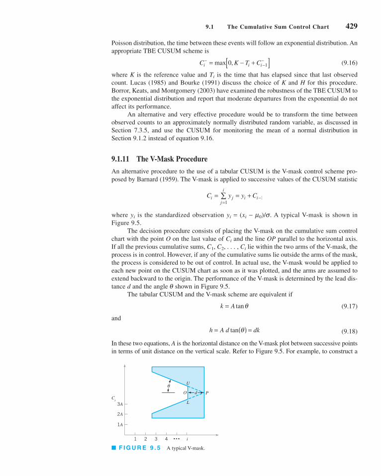
Poisson distribution, the time between these events will follow an exponential distribution. An
appropriate TBE CUSUM scheme is
(9.16)
where K is the reference value and Ti is the time that has elapsed since that last observed
count. Lucas (1985) and Bourke (1991) discuss the choice of K and H for this procedure.
Borror, Keats, and Montgomery (2003) have examined the robustness of the TBE CUSUM to
the exponential distribution and report that moderate departures from the exponential do not
affect its performance.
An alternative and very effective procedure would be to transform the time between
observed counts to an approximately normally distributed random variable, as discussed in
Section 7.3.5, and use the CUSUM for monitoring the mean of a normal distribution in
Section 9.1.2 instead of equation 9.16.
9.1.11 The V-Mask Procedure
An alternative procedure to the use of a tabular CUSUM is the V-mask control scheme pro-
posed by Barnard (1959). The V-mask is applied to successive values of the CUSUM statistic
where yi is the standardized observation yi = (xi − m0)/s. A typical V-mask is shown in
Figure 9.5.
The decision procedure consists of placing the V-mask on the cumulative sum control
chart with the point O on the last value of Ci and the line OP parallel to the horizontal axis.
If all the previous cumulative sums, C1, C2, . . . , Ci lie within the two arms of the V-mask, the
process is in control. However, if any of the cumulative sums lie outside the arms of the mask,
the process is considered to be out of control. In actual use, the V-mask would be applied to
each new point on the CUSUM chart as soon as it was plotted, and the arms are assumed to
extend backward to the origin. The performance of the V-mask is determined by the lead dis-
tance d and the angle q shown in Figure 9.5.
The tabular CUSUM and the V-mask scheme are equivalent if
(9.17)
and
(9.18)
In these two equations, A is the horizontal distance on the V-mask plot between successive points
in terms of unit distance on the vertical scale. Refer to Figure 9.5. For example, to construct a
h A d dk= ( ) = tan θ
k A= tanθ
C y y Ci jj
i
i i= = +=
−∑1
1
C K T Ci i i−
−−= − +[ ]max ,0 1
9.1 The Cumulative Sum Control Chart 429
3A
2A
1A
1 2 3 4 i
Ci
dO
U
L
P
θ
■ F I G U R E 9 . 5 A typical V-mask.
c09CumulativeSumandExponentiallyWeightedMovingAverageControlCharts.qxd 4/2/12 4:06 PM Page 429

430 Chapter 9 ■ Cumulative Sum and Exponentially Weighted Moving Average Control Charts
V-mask equivalent to the tabular CUSUM scheme used in Example 9.1, where and h = 5,
we would select A = 1 (say), and then equations 9.17 and 9.18 would be solved as follows:
or
and
or
That is, the lead distance of the V-mask would be 10 horizontal plotting positions, and the
angle opening on the V-mask would be 26.57°.
Johnson (1961) [also see Johnson and Leone 1962a, 1962b, 1962c] has suggested a
method for designing the V-mask—that is, selecting d and q. He recommends the V-mask
parameters
(9.19)
and
(9.20)
where 2a is the greatest allowable probability of a signal when the process mean is on target
(a false alarm) and b is the probability of not detecting a shift of size d. If b is small, which
is usually the case, then
(9.21)
We strongly advise against using the V-mask procedure. Some of the disadvantages and
problems associated with this scheme are as follows:
1. The headstart feature, which is very useful in practice, cannot be implemented with the
V-mask.
2. It is sometimes difficult to determine how far backward the arms of the V-mask should
extend, thereby making interpretation difficult for the practitioner.
3. Perhaps the biggest problem with the V-mask is the ambiguity associated with a and bin the Johnson design procedure.
Adams, Lowry, and Woodall (1992) point out that defining 2a as the probability of a false
alarm is incorrect. Essentially, 2a cannot be the probability of a false alarm on any single
sample, because this probability changes over time on the CUSUM, nor can 2a be the prob-
ability of eventually obtaining a false alarm (this probability is, of course, 1). In fact, 2a must
be the long-run proportion of observations resulting in false alarms. If this is so, then the in-
control ARL should be ARL0 = 1/(2a). However, Johnson’s design method produces values
of ARL0 that are substantially larger than 1/(2a).
d − − ( )~ ln2
αδ
d = ⎛⎝
⎞⎠
−⎛⎝⎜
⎞⎠⎟
2 12δ
βα
ln
θ δ= ⎛⎝⎜
⎞⎠⎟
−tan
1
2A
d = 10
h dk
d
=
= ⎛⎝
⎞⎠5
1
2
θ = °26 57.
k A= tanθ
= ( ) tanθ1
21
k = 12
c09CumulativeSumandExponentiallyWeightedMovingAverageControlCharts.qxd 4/2/12 4:06 PM Page 430

Table 9.8 shows values of ARL0 for a V-mask scheme designed using Johnson’s
method. Note that the actual values of ARL0 are about five times the desired value used in the
design procedure. The schemes will also be much less sensitive to shifts in the process mean.
Consequently, the use of the V-mask scheme is not a good idea. Unfortunately, it is the default
CUSUM in some SPC software packages.
9.1.12 The Self-Starting CUSUM
The CUSUM is typically used as a phase II procedure; that is, it is applied to monitor a
process that has already been through the phase I process and most of the large assignable
causes have been removed. In phase II, we typically assume that the process parameters are
reasonably well estimated. In practice, this turns out to be a fairly important assumption, as
using estimates of the parameters instead of the true values has an effect on the average run
length performance of the control chart [this was discussed in Chapter 4; also see the review
paper by Jensen et al. (2006)]. Control charts that are designed to detect small shifts are par-
ticularly sensitive to this assumption, including the CUSUM. A Shewhart control chart with
the Western Electric rules also would be very sensitive to the estimates of the process parame-
ters. One solution to this is to use a large sample of phase I data to estimate the parameters.
An alternative approach for the CUSUM is to use a self-starting CUSUM procedure due
to Hawkins (1987). The self-starting CUSUM for the mean of a normally distributed random
variable is easy to implement. It can be applied immediately without any need for a phase I
sample to estimate the process parameters, in this case the mean m and the variance s2.
Let be the average of the first n observations and let
be the sum of squared deviations from the average of those observations. Convenient comput-
ing formulas to update these quantities after each new observation are
The sample variance of the first n observations is s2n = wn/(n − 1). Standardize each succes-
sive new process observation using
Tn =xn − xn−1
sn−1
wn = wn−1 +(n − 1)(xn − xn−1)2
n
xn = xn−1 +xn − xn−1
n
wn = an
i=1
(xi − xn)2
xn
9.1 The Cumulative Sum Control Chart 431
■ TA B L E 9 . 8
Actual Values of ARL0 for a V-Mask Scheme Designed UsingJohnson’s Method [Adapted from Table 2 in Woodall and Adams(1993)]
Values of a [Desired Value of ARL0 = 1/(2a)]
Shift to Be Detected, d 0.00135 (370) 0.001 (500)
1.0 2,350.6 3,184.5
2.0 1,804.5 2,435.8
3.0 2,194.8 2,975.4
c09CumulativeSumandExponentiallyWeightedMovingAverageControlCharts.qxd 4/2/12 4:06 PM Page 431

432 Chapter 9 ■ Cumulative Sum and Exponentially Weighted Moving Average Control Charts
for the case where n is greater than or equal to 3. If the observations are normally distributed,
the distribution of is a t distribution with n − 1 degrees of freedom. The cumula-
tive distribution of Tn is
where Fn is the cumulative t distribution with n − 1 degrees of freedom. It turns out that if the
tail area for any continuous random variable is converted to a normal ordinate, we obtain a
new random variable that is distributed exactly as a standard normal random variable. That is,
if Φ−1 is the inverse normal cumulative distribution, then the transformation
converts the CUSUM quantity Tn into a standard normal random variable. It turns out that the
values of Un are statistically independent (this isn’t obvious, because successive values of Un
share the same data points), so one can plot all values of Un for n ≥ 3 on a N(0, 1) CUSUM.
This nicely avoids the problem of using a large sample of phase I data to estimate the process
parameters for a conventional CUSUM.
To illustrate the procedure, consider the data from Table 9.1. The first eight of these
observations are shown in Table 9.9. The columns to the right of the data are the running aver-
age, the running sum of squared deviations from the average, the running standard deviation,
the standardized value of each observation, the t distribution value that corresponds to it, the
t distribution tail area, and finally the equivalent inverse normal value. The values of Un can
be handled as any data for a CUSUM. For example, they could be entered into a tabular
CUSUM and plotted on a CUSUM status chart.
There is a difference in practical usage of a self-starting CUSUM in comparison to an
ordinary CUSUM surrounding the out-of-control situation. In a standard or ordinary CUSUM,
the CUSUM moves upward indefinitely following an upward shift in the mean until the assign-
able cause is discovered. However, in a self-starting CUSUM the plotted statistic will begin
moving upward following the shift, but as the shifted values are entered into the calculations of
the running average and running standard deviation, they move the running mean closer to the
new shifted value of the mean and the running standard deviation gets larger. Consequently, if
the process is not adjusted and the CUSUM reset, the self-starting CUSUM will turn back
downward. Therefore, the users of a self-starting CUSUM should take investigative and correc-
tive action immediately following an out-of-control signal. When restarting, it is also necessary
to remove the out-of-control data from the running average and running standard deviation.
Outliers can also impact the self-starting CUSUM, principally by inflating the running standard
Un = Φ−1 3Fn−2(anTn) 4 where an =A
n − 1
n
P(Tn £ t) = Fn−2 atA
n − 1
nb
A
n − 1
nTn
■ TA B L E 9 . 9
Calculations for a Self-Starting CUSUM
n xn xn– wn Sn Tn anTn Fn−2 (anTn) Un
1 9.45 9.45 0 — — — — —
2 7.99 8.72 1.07 1.03 — — — —
3 9.29 8.91 1.25 0.80 0.55 0.45 0.6346 0.34406
4 11.66 9.60 6.92 1.52 3.44 2.98 0.9517 1.66157
5 12.16 10.11 12.16 1.75 1.68 1.50 0.8847 1.19881
6 10.18 10.12 12.16 1.56 0.04 0.04 0.5152 0.03811
7 8.04 9.82 15.87 1.63 −1.33 −1.23 0.1324 −1.11512
8 11.46 10.03 18.22 1.62 1.01 0.94 0.8107 0.88048
c09CumulativeSumandExponentiallyWeightedMovingAverageControlCharts.qxd 4/2/12 4:06 PM Page 432

deviation. Maintaining a Shewhart control chart on the observations can give protection against
this problem. Refer to Hawkins and Olwell (1998) for more suggestions and discussion.
9.2 The Exponentially Weighted Moving Average Control Chart
The exponentially weighted moving average (EWMA) control chart is also a good alternative
to the Shewhart control chart when we are interested in detecting small shifts. The perfor-
mance of the EWMA control chart is approximately equivalent to that of the cumulative sum
control chart, and in some ways it is easier to set up and operate. As with the CUSUM, the
EWMA is typically used with individual observations, and so, consequently, we will discuss
that case first. We will also give the results for rational subgroups of size n > 1.
9.2.1 The Exponentially Weighted Moving Average Control Chart for Monitoring the Process Mean
The EWMA control chart was introduced by Roberts (1959). See also Crowder (1987a, 1989)
and Lucas and Saccucci (1990) for good discussions of the EWMA. The exponentially
weighted moving average is defined as
(9.22)
where 0 < l ≤ 1 is a constant and the starting value (required with the first sample at i = 1) is
the process target, so that
Sometimes the average of preliminary data is used as the starting value of the EWMA, so that
.
To demonstrate that the EWMA zi is a weighted average of all previous sample means,
we may substitute for zi–1 on the right-hand side of equation 9.22 to obtain
Continuing to substitute recursively for zi − j, j = 2, 3, . . . , t, we obtain
(9.23)
The weights l(1 − l) j decrease geometrically with the age of the sample mean. Furthermore,
the weights sum to unity, since
If l = 0.2, then the weight assigned to the current sample mean is 0.2 and the weights given
to the preceding means are 0.16, 0.128, 0.1024, and so forth. A comparison of these weights
with those of a five-period moving average is shown in Figure 9.6. Because these weights
decline geometrically when connected by a smooth curve, the EWMA is sometimes called a
geometric moving average (GMA). The EWMA is used extensively in time series modeling
and in forecasting [see Box, Jenkins, and Reinsel (1994) and Montgomery, Jennings, and
Kulachi (2008)]. Since the EWMA can be viewed as a weighted average of all past and current
λ λ λλλ
λ11 1
1 11 1
0
1
−( ) =− −( )− −( )
⎡
⎣⎢⎢
⎤
⎦⎥⎥
= − −( )=
−∑ j
j
i ii
z x zij
i ji
j
i= −( ) + −( )−
=
−∑λ λ λ1 1 0
0
1
z x x z
x x z
i i i i
i i i
= + −( ) + −( )[ ]= + −( ) + −( )
− −
− −
λ λ λ λ
λ λ λ λ
1 1
1 1
1 2
12
2
z0 = x
z0 0= μ
z x zi i i= + −( ) −λ λ1 1
9.2 The Exponentially Weighted Moving Average Control Chart 433
c09CumulativeSumandExponentiallyWeightedMovingAverageControlCharts.qxd 4/2/12 4:06 PM Page 433

434 Chapter 9 ■ Cumulative Sum and Exponentially Weighted Moving Average Control Charts
observations, it is very insensitive to the normality assumption. It is therefore an ideal control
chart to use with individual observations.
If the observations xi are independent random variables with variance s 2, then the vari-
ance of zi is
(9.24)
Therefore, the EWMA control chart would be constructed by plotting zi versus the sample num-
ber i (or time). The center line and control limits for the EWMA control chart are as follows.
σ σ λλ
λzi
i
2 2 2
21 1=
−⎛⎝⎜
⎞⎠⎟
− −( )[ ]
0
0.1
0.2
0.3
0.4
0.5
0.6
Wei
ght
0 1 2 3 4 5 6 7 8 9 10Age of sample mean
Five-period moving average
EWMA, = 0.2λ
■ F I G U R E 9 . 6 Weights of past sample means.
The EWMA Control Chart
(9.26)
UCL
Center line
LCL
= +−( ) − −( )[ ]
=
= −−( ) − −( )[ ]
μ σ λλ
λ
μ
μ σ λλ
λ
02
0
02
21 1
21 1
L
L
i
i
(9.25)
In equations 9.25 and 9.26, the factor L is the width of the control limits. We will discuss the
choice of the parameters L and l shortly.
Note that the term [1 − (1 − l)2i] in equations 9.25 and 9.26 approaches unity as i gets
larger. This means that after the EWMA control chart has been running for several time
periods, the control limits will approach steady-state values given by
(9.27)
and
(9.28)
However, we strongly recommend using the exact control limits in equations 9.25 and 9.26
for small values of i. This will greatly improve the performance of the control chart in detect-
ing an off-target process immediately after the EWMA is started up.
LCL = −−( )μ σ λ
λ02
L
UCL = +−( )μ σ λ
λ02
L
c09CumulativeSumandExponentiallyWeightedMovingAverageControlCharts.qxd 4/2/12 4:06 PM Page 434

9.2 The Exponentially Weighted Moving Average Control Chart 435
SOLUTION
Recall that the target value of the mean is m0 = 10 and the stan-
dard deviation is s = 1. The calculations for the EWMA con-
trol chart are summarized in Table 9.10, and the control chart
(from Minitab) is shown in Figure 9.7.
EXAMPLE 9.2
Set up an EWMA control chart with l = 0.10 and L = 2.7 to the data in Table 9.1.
Constructing an EWMA Control Chart
To illustrate the calculations, consider the first observation,
x1 = 9.45. The first value of the EWMA is
z x z1 1 01
0 1 9 45 0 9 10
9 945
= + −( )= ( ) + ( )=
λ λ. . .
.
9.50
9.75
10.00
10.25
10.50
10.75
EW
MA
3 6 9 12 15 18 21 24 27 30
Observation
9.38
10
10.62
■ F I G U R E 9 . 7 The EWMA control
chart for Example 9.2.(continued)
■ TA B L E 9 . 1 0
EWMA Calculations for Example 9.2
Subgroup, i * = Beyond Limits xi EWMA, zi
1 9.45 9.945
2 7.99 9.7495
3 9.29 9.70355
4 11.66 9.8992
5 12.16 10.1253
6 10.18 10.1307
7 8.04 9.92167
8 11.46 10.0755
9 9.2 9.98796
10 10.34 10.0232
11 9.03 9.92384
12 11.47 10.0785
13 10.51 10.1216
14 9.4 10.0495
15 10.08 10.0525
Subgroup, i * = Beyond Limits xi EWMA, zi
16 9.37 9.98426
17 10.62 10.0478
18 10.31 10.074
19 8.52 9.91864
20 10.84 10.0108
21 10.9 10.0997
22 9.33 10.0227
23 12.29 10.2495
24 11.5 10.3745
25 10.6 10.3971
26 11.08 10.4654
27 10.38 10.4568
28 11.62 10.5731
29 11.31 10.6468*
30 10.52 10.6341*
c09CumulativeSumandExponentiallyWeightedMovingAverageControlCharts.qxd 4/2/12 4:06 PM Page 435

436 Chapter 9 ■ Cumulative Sum and Exponentially Weighted Moving Average Control Charts
9.2.2 Design of an EWMA Control Chart
The EWMA control chart is very effective against small process shifts. The design parame-
ters of the chart are the multiple of sigma used in the control limits (L) and the value of l. It
is possible to choose these parameters to give ARL performance for the EWMA control chart
that closely approximates CUSUM ARL performance for detecting small shifts.
There have been several theoretical studies of the average run length properties of the
EWMA control chart. For example, see the papers by Crowder (1987a, 1989) and Lucas and
Saccucci (1990). These studies provide average run length tables or graphs for a range of values
of l and L. The average run length performance for several EWMA control schemes is shown in
Table 9.11. The optimal design procedure would consist of specifying the desired in-control and
out-of-control average run lengths and the magnitude of the process shift that is anticipated, and
then to select the combination of l and L that provide the desired ARL performance.
In general, we have found that values of l in the interval 0.05 ≤ l ≤ 0.25 work well in
practice, with l = 0.05, l = 0.10, and l = 0.20 being popular choices. A good rule of thumb
and
Note from Figure 9.7 that the control limits increase in width
as i increases from i = 1, 2, . . . , until they stabilize at the
steady-state values given by equations 9.27 and 9.28
and
The EWMA control chart in Figure 9.7 signals at observation
28, so we would conclude that the process is out of control.
LCL = −−( )
= − ( )−( )
=
μ σ λλ0
2
10 2 7 10 1
2 0 1
9 38
L
..
.
.
UCL = +−( )
= + ( )−( )
=
μ σ λλ0
2
10 2 7 10 1
2 0 1
10 62
L
..
.
.
LCL = −−( ) − −( )[ ]
= − ( )−( )
− −( )[ ]=
( )
μ σ λλ
λ02
2 2
21 1
10 2 7 10 1
2 0 11 1 0 1
9 64
L i
..
..
.
Therefore, z1 = 9.945 is the first value plotted on the control
chart in Figure 9.7. The second value of the EWMA is
The other values of the EWMA statistic are computed similarly.
The control limits in Figure 9.7 are found using equations
9.25 and 9.26. For period i = 1,
and
For period 2, the limits are
UCL = +−( ) − −( )[ ]
= + ( )−( )
− −( )[ ]=
( )
μ σ λλ
λ02
2 2
21 1
10 2 7 10 1
2 0 11 1 0 1
10 36
L i
..
..
.
LCL = −−( ) − −( )[ ]
= − ( )−( )
− −( )[ ]=
( )
μ σ λλ
λ02
2 1
21 1
10 2 7 10 1
2 0 11 1 0 1
9 73
L i
..
..
.
UCL = +−( ) − −( )[ ]
= + ( )−( )
− −( )[ ]=
( )
μ σ λλ
λ02
2 1
21 1
10 2 7 10 1
2 0 11 1 0 1
10 27
L i
..
..
.
z x z2 2 11
0 1 7 99 0 9 9 945
9 7495
= + −( )= ( ) + ( )=
λ λ. . . .
.
c09CumulativeSumandExponentiallyWeightedMovingAverageControlCharts.qxd 4/2/12 4:06 PM Page 436

is to use smaller values of l to detect smaller shifts. We have also found that L = 3 (the usual
three-sigma limits) works reasonably well, particularly with the larger value of l, although
when l is small—say, l ≤ 0.1—there is an advantage in reducing the width of the limits by
using a value of L between about 2.6 and 2.8. Recall that in Example 9.2, we used l = 0.1 and
L = 2.7. We would expect this choice of parameters to result in an in-control ARL of
ARL0 � 500 and an ARL for detecting a shift of one standard deviation in the mean of
ARL1 = 10.3. Thus this design is approximately equivalent to the CUSUM with h = 5 and k = 1–2.
Hunter (1989) has also studied the EWMA and suggested choosing l so that the weight
given to current and previous observations matches as closely as possible the weights given
to these observations by a Shewhart chart with the Western Electric rules. This results in a
recommended value of l = 0.4. If L = 3.054, then Table 9.11 indicates that this chart would
have ARL0 = 500 and for detecting a shift of one standard deviation in the process mean, the
ARL1 = 14.3.
There is one potential concern about an EWMA with a small value of l. If the value of
the EWMA is on one side of the center line when a shift in the mean in the opposite direc-
tion occurs, it could take the EWMA several periods to react to the shift, because the small ldoes not weight the new data very heavily. This is called the inertia effect. It can reduce the
effectiveness of the EWMA in shift detection.
Woodall and Mahmoud (2005) have investigated the inertial properties of several dif-
ferent types of control charts. They define the signal resistance of a control chart to be the
largest standardized deviation of the sample mean from the target or in-control value not lead-
ing to an immediate out-of-control signal. For a Shewhart chart, the signal resistance is
, the multiplier used to obtain the control limits. Thus the signal resistance is con-
stant. For the EWMA control chart, the signal resistance is
where w is the value of the EWMA statistic. For the EWMA, the maximum value of the sig-
nal resistance averaged over all values of the EWMA statistic is , if the chart
has the asymptotic limits. These results apply for any sample size, as they are given in terms
of shifts expressed as multiples of the standard error.
L1(2 − l)/l
SR(EWMA) =L A
l2 − l − (1 − l)w
l
SR(x) = Lx
9.2 The Exponentially Weighted Moving Average Control Chart 437
■ TA B L E 9 . 1 1
Average Run Lengths for Several EWMA Control Schemes[Adapted from Lucas and Saccucci (1990)]
Shift in Mean L = 3.054 2.998 2.962 2.814 2.615(multiple of s) l = 0.40 0.25 0.20 0.10 0.05
0 500 500 500 500 500
0.25 224 170 150 106 84.1
0.50 71.2 48.2 41.8 31.3 28.8
0.75 28.4 20.1 18.2 15.9 16.4
1.00 14.3 11.1 10.5 10.3 11.4
1.50 5.9 5.5 5.5 6.1 7.1
2.00 3.5 3.6 3.7 4.4 5.2
2.50 2.5 2.7 2.9 3.4 4.2
3.00 2.0 2.3 2.4 2.9 3.5
4.00 1.4 1.7 1.9 2.2 2.7
c09CumulativeSumandExponentiallyWeightedMovingAverageControlCharts.qxd 4/2/12 4:06 PM Page 437

438 Chapter 9 ■ Cumulative Sum and Exponentially Weighted Moving Average Control Charts
Clearly, the signal resistance of the EWMA control chart depends on the value chosen
for l, with smaller values leading to larger values of the maximum signal resistance. This is
in a sense unfortunate, because we almost always want to use the EWMA with a small value
of l as this results in good ARL performance in detecting small shifts. As we will see in
Section 9.2.3, small values of l are also desirable because they make the EWMA chart quite
insensitive to normality of the process data. Woodall and Mahmoud (2005) recommend
always using a Shewhart chart in conjunction with an EWMA (especially if l is small) as one
way to counteract the signal resistance.
Like the CUSUM, the EWMA performs well against small shifts but does not react to
large shifts as quickly as the Shewhart chart. A good way to further improve the sensitivity of
the procedure to large shifts without sacrificing the ability to detect small shifts quickly is to
combine a Shewhart chart with the EWMA. These combined Shewhart–EWMA control pro-
cedures are effective against both large and small shifts. When using such schemes, we have
found it helpful to use slightly wider than usual limits on the Shewhart chart (say, 3.25-sigma,
or even 3.5-sigma). It is also possible to plot both xi (or ) and the EWMA statistic zi on the
same control chart along with both the Shewhart and EWMA limits. This produces one chart
for the combined control procedure that operators quickly become adept at interpreting. When
the plots are computer generated, different colors or plotting symbols can be used for the two
sets of control limits and statistics.
9.2.3 Robustness of the EWMA to Non-normality
When discussing the Shewhart control chart for individuals in Chapter 6, we observed that
the individuals chart was very sensitive to non-normality in the sense that the actual in-
control ARL (ARL0) would be considerably less than the “advertised” or expected value
based on the assumption of a normal distribution. Borror, Montgomery, and Runger (1999)
compared the ARL performance of the Shewhart individuals chart and the EWMA control
chart for the case of non-normal distributions. Specifically, they used the gamma distribu-
tion to represent the case of skewed distributions and the t distribution to represent symmet-
ric distributions with heavier tails than the normal.
The ARL0 of the Shewhart individuals chart and several EWMA control charts for these
non-normal distributions are given in Tables 9.12 and 9.13. Two aspects of the information in
these tables are very striking. First, even moderately non-normal distributions have the effect
of greatly reducing the in-control ARL of the Shewhart individuals chart. This will, of course,
dramatically increase the rate of false alarms. Second, an EWMA with l = 0.05 or l = 0.10
and an appropriately chosen control limit will perform very well against both normal and
nonnormal distributions. With l = 0.05 and L = 2.492 the ARL0 for the EWMA is within
xi
■ TA B L E 9 . 1 2
In-Control ARLs for the EWMA and the Individuals ControlCharts for Various Gamma Distributions
EWMA Shewhart
l 0.05 0.1 0.2 1L 2.492 2.703 2.86 3.00
Normal 370.4 370.8 370.5 370.4
Gam(4, 1) 372 341 259 97
Gam(3, 1) 372 332 238 85
Gam(2, 1) 372 315 208 71
Gam(1, 1) 369 274 163 55
Gam(0.5, 1) 357 229 131 45
c09CumulativeSumandExponentiallyWeightedMovingAverageControlCharts.qxd 4/2/12 4:06 PM Page 438
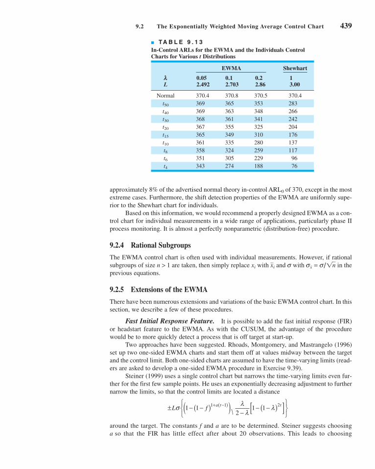
approximately 8% of the advertised normal theory in-control ARL0 of 370, except in the most
extreme cases. Furthermore, the shift detection properties of the EWMA are uniformly supe-
rior to the Shewhart chart for individuals.
Based on this information, we would recommend a properly designed EWMA as a con-
trol chart for individual measurements in a wide range of applications, particularly phase II
process monitoring. It is almost a perfectly nonparametric (distribution-free) procedure.
9.2.4 Rational Subgroups
The EWMA control chart is often used with individual measurements. However, if rational
subgroups of size n > 1 are taken, then simply replace xi with and s with in the
previous equations.
9.2.5 Extensions of the EWMA
There have been numerous extensions and variations of the basic EWMA control chart. In this
section, we describe a few of these procedures.
Fast Initial Response Feature. It is possible to add the fast initial response (FIR)
or headstart feature to the EWMA. As with the CUSUM, the advantage of the procedure
would be to more quickly detect a process that is off target at start-up.
Two approaches have been suggested. Rhoads, Montgomery, and Mastrangelo (1996)
set up two one-sided EWMA charts and start them off at values midway between the target
and the control limit. Both one-sided charts are assumed to have the time-varying limits (read-
ers are asked to develop a one-sided EWMA procedure in Exercise 9.39).
Steiner (1999) uses a single control chart but narrows the time-varying limits even fur-
ther for the first few sample points. He uses an exponentially decreasing adjustment to further
narrow the limits, so that the control limits are located a distance
around the target. The constants f and a are to be determined. Steiner suggests choosing
a so that the FIR has little effect after about 20 observations. This leads to choosing
± − −( )( ) −− −( )[ ]⎧
⎨⎩
⎫⎬⎭
+ −( )L f a t tσ λλ
λ1 12
1 11 1 2
sx = s/1nxi
9.2 The Exponentially Weighted Moving Average Control Chart 439
■ TA B L E 9 . 1 3
In-Control ARLs for the EWMA and the Individuals ControlCharts for Various t Distributions
EWMA Shewhart
l 0.05 0.1 0.2 1L 2.492 2.703 2.86 3.00
Normal 370.4 370.8 370.5 370.4
t50 369 365 353 283
t40 369 363 348 266
t30 368 361 341 242
t20 367 355 325 204
t15 365 349 310 176
t10 361 335 280 137
t8 358 324 259 117
t6 351 305 229 96
t4 343 274 188 76
c09CumulativeSumandExponentiallyWeightedMovingAverageControlCharts.qxd 4/2/12 4:06 PM Page 439

440 Chapter 9 ■ Cumulative Sum and Exponentially Weighted Moving Average Control Charts
a = [−2/log(1 − f) − 1]/19. For example, if f = 0.5, then a = 0.3. The choice of f = 0.5 is
attractive because it mimics the 50% headstart often used with CUSUMs.
Both of these procedures perform very well in reducing the ARL to detect an off-target
process at start-up. The Steiner procedure is easier to implement in practice.
Monitoring Variability. MacGregor and Harris (1993) discuss the use of EWMA-
based statistics for monitoring the process standard deviation. Let xi be normally distributed
with mean m and standard deviation s. The exponentially weighted mean square error(EWMS) is defined as
(9.29)
It can be shown that E(S2i ) = s 2 (for large i) and if the observations are independent and nor-
mally distributed, then S2i /s 2 has an approximate chi-square distribution with v = (2 − l)/l
degrees of freedom. Therefore, if s0 represents the in-control or target value of the process stan-
dard deviation, we could plot on an exponentially weighted root mean square (EWRMS)
control chart with control limits given by
(9.30)
and
(9.31)
MacGregor and Harris (1993) point out that the EWMS statistic can be sensitive to
shifts in both the process mean and the standard deviation. They suggest replacing m in equa-
tion 9.27 with an estimate at each point in time. A logical estimate of m turns out to be
the ordinary EWMA zi. They derive control limits for the resulting exponentially weighted
moving variance (EWMV)
(9.32)
Another approach to monitoring the process standard deviation with an EWMA is in Crowder
and Hamilton (1992).
The EWMA for Poisson Data. Just as the CUSUM can be used as the basis of an
effective control chart for Poisson counts, so can a suitably designed EWMA. Borror, Champ,
and Rigdon (1998) describe the procedure, show how to design the control chart, and provide
an example. If xi is a count, then the basic EWMA recursion remains unchanged:
with z0 = m0 the in-control or target count rate. The control chart parameters are as follows:
(9.33)
where AU and AL are the upper and lower control limit factors. In many applications we would
choose AU = AL = A. Borror, Champ, and Rigdon (1998) give graphs of the ARL performance
UCL
Center line
LCL
= +−
− −( )[ ]=
= −−
− −( )[ ]
μ λμλ
λ
μ
μ λμλ
λ
00 2
0
00 2
21 1
21 1
A
A
Ui
Li
z x zi i i= + −( ) −λ λ1 1
S x z Si i i i2 2
121= −( ) + −( ) −λ λ
mi
LCL = −( )σχ α
01 2
2v
v,
UCL = σχ α
02
2v
v,
2S2i
S x Si i i2 2
121= −( ) + −( ) −λ μ λ
c09CumulativeSumandExponentiallyWeightedMovingAverageControlCharts.qxd 4/2/12 4:06 PM Page 440

of the Poisson EWMA control chart as a function of l and A and for various in-control or
target count rates m0. Once m0 is determined and a value is specified for l, these charts can be
used to select the value of A that results in the desired in-control ARL0. The authors also show
that this control chart has considerably better ability to detect assignable causes than the
Shewhart c chart. The Poisson EWMA should be used much more widely in practice.
The EWMA as a Predictor of Process Level. Although we have discussed the
EWMA primarily as a statistical process-monitoring tool, it actually has a much broader inter-
pretation. From an SPC viewpoint, the EWMA is roughly equivalent to the CUSUM in its abil-
ity to monitor a process and detect the presence of assignable causes that result in a process
shift. However, the EWMA provides a forecast of where the process mean will be at the next
time period. That is, zi is actually a forecast of the value of the process mean m at time i + 1.
Thus, the EWMA could be used as the basis for a dynamic process-control algorithm.
In computer-integrated manufacturing where sensors are used to measure every unit
manufactured, a forecast of the process mean based on previous behavior would be very use-
ful. If the forecast of the mean is different from target by a critical amount, then either the
operator or some electromechanical control system can make the necessary process adjust-
ment. If the operator makes the adjustment, then he or she must exercise caution and not make
adjustments too frequently because this will actually cause process variability to increase. The
control limits on the EWMA chart can be used to signal when an adjustment is necessary, and
the difference between the target and the forecast of the mean mi+1 can be used to determine
how much adjustment is necessary.
The EWMA can be modified to enhance its ability to forecast the mean. Suppose that
the process mean trends or drifts steadily away from the target. The forecasting perfor-
mance of the EWMA can be improved in this case. First, note that the usual EWMA can be
written as
and if we view zi−1 as a forecast of the process mean in period i, we can think of xi − zi−1 as
the forecast error ei for period i. Therefore,
(9.34)
Thus, the EWMA for period i is equal to the EWMA for period i − 1 plus a fraction l of the
forecast error for the mean in period i. Now add a second term to this last equation to give
(9.35)
where l1 and l2 are constants that weight the error at time i and the sum of the errors accu-
mulated to time i. If we let ∇ei = ei − ei−1 be the first difference of the errors, then we can
arrive at a final modification of the EWMA:
(9.36)
Note that in this empirical control equation the EWMA in period i (which is the forecast of
the process mean in period i + 1) equals the current estimate of the mean (zi−1 estimates mi),
plus a term proportional to the error, plus a term related to the sum of the errors, plus a term
related to the first difference of the errors. These three terms can be thought of as propor-tional, integral, and differential adjustments. The parameters l1, l2, and l3 would be cho-
sen to give the best forecasting performance.
z z e e ei i i jj
i
i= + + + ∇−=∑1 1 2
13λ λ λ
z z e ei i i jj
i= + +−
=∑1 1 2
1
λ λ
z z ei i i= +−1 λ
z x z
z x z
i i i
i i i
= + −( )= + −( )
−
− −
λ λ
λ
1 1
1 1
9.2 The Exponentially Weighted Moving Average Control Chart 441
c09CumulativeSumandExponentiallyWeightedMovingAverageControlCharts.qxd 4/2/12 4:06 PM Page 441

442 Chapter 9 ■ Cumulative Sum and Exponentially Weighted Moving Average Control Charts
Because the EWMA statistic zi can be viewed as a forecast of the mean of the process
at time i + 1, we often plot the EWMA statistic one time period ahead. That is, we actually
plot zi at time period i + 1 on the control chart. This allows the analyst to visually see how
much difference there is between the current observation and the estimate of the current mean
of the process. In statistical process-control applications where the mean may “wander” over
time, this approach has considerable appeal.
9.3 The Moving Average Control Chart
Both the CUSUM and the EWMA are time-weighted control charts. The EWMA chart uses
a weighted average as the chart statistic. Occasionally, another type of time-weighted control
chart based on a simple, unweighted moving average may be of interest.
Suppose that individual observations have been collected, and let x1, x2, . . . denote
these observations. The moving average of span w at time i is defined as
(9.37)
That is, at time period i, the oldest observation in the moving average set is dropped and the
newest one added to the set. The variance of the moving average Mi is
(9.38)
Therefore, if m0 denotes the target value of the mean used as the center line of the control
chart, then the three-sigma control limits for Mi are
(9.39)
and
(9.40)
The control procedure would consist of calculating the new moving average Mi as each obser-
vation xi becomes available, plotting Mi on a control chart with upper and lower control lim-
its given by equations 9.39 and 9.40, and concluding that the process is out of control if Mi
exceeds the control limits. In general, the magnitude of the shift of interest and w are inversely
related; smaller shifts would be guarded against more effectively by longer-span moving aver-
ages, at the expense of quick response to large shifts.
LCL = −μ σ0
3
w
UCL = +μ σ0
3
w
V Mw
V xw wi j
j i w
i
j i w
i
( ) = ( ) = == − + = − +
∑ ∑1 12
12
2
1
2
σ σ
Mx x x
wii i i w= + + +− − +1 1L
SOLUTION
EXAMPLE 9.3 A Moving Average Control Chart
Set up a moving average control chart for the data in Table 9.1, using w = 5.
for periods i ≥ 5. For time periods i < 5 the average of the
observations for periods 1, 2, . . . , i is plotted. The values of
these moving averages are shown in Table 9.14.
The observations xi for periods 1 ≤ i ≤ 30 are shown in Table 9.14.
The statistic plotted on the moving average control chart will be
Mx x x
ii i i= + + +− −1 4
5
L
c09CumulativeSumandExponentiallyWeightedMovingAverageControlCharts.qxd 4/2/12 4:06 PM Page 442

The control limits for the moving average control chart may
be easily obtained from equations 9.39 and 9.40. Since we
know that s = 1.0, then
and
LCL = − = − ( ) =μ σ0
310
3 1 0
58 66
w
..
UCL = + = + ( ) =μ σ0
310
3 1 0
511 34
w
..
The control limits for Mi apply for periods i ≥ 5. For peri-
ods 0 < i < 5, the control limits are given by . An
alternative procedure that avoids using special control limits
for periods i < w is to use an ordinary Shewhart chart until at
least w sample means have been obtained.
The moving average control chart is shown in Figure 9.8.
No points exceed the control limits. Note that for the initial
periods i < w the control limits are wider than their final steady-
state value. Moving averages that are less than w periods apart
are highly correlated, which often complicates interpreting pat-
terns on the control chart. This is easily seen by examining
Figure 9.8.
m0 ± 3s/1i
0 5 10 15 20 25 30
Observation
8.65836
10
11.3416
7
8
9
10
11
12
13
MA
■ F I G U R E 9 . 8 Moving average control
chart with w = 5, Example 9.3.
9.3 The Moving Average Control Chart 443
■ TA B L E 9 . 1 4
Moving Average Chart for Example 9.3
Observation, i xi Mi
1 9.45 9.45
2 7.99 8.72
3 9.29 8.91
4 11.66 9.5975
5 12.16 10.11
6 10.18 10.256
7 8.04 10.266
8 11.46 10.7
9 9.2 10.208
10 10.34 9.844
11 9.03 9.614
12 11.47 10.3
13 10.51 10.11
14 9.4 10.15
15 10.08 10.098
Observation, i xi Mi
16 9.37 10.166
17 10.62 9.996
18 10.31 9.956
19 8.52 9.78
20 10.84 9.932
21 10.9 10.238
22 9.33 9.98
23 12.29 10.376
24 11.5 10.972
25 10.6 10.924
26 11.08 10.96
27 10.38 11.17
28 11.62 11.036
29 11.31 10.998
30 10.52 10.982
c09CumulativeSumandExponentiallyWeightedMovingAverageControlCharts.qxd 4/2/12 4:06 PM Page 443

444 Chapter 9 ■ Cumulative Sum and Exponentially Weighted Moving Average Control Charts
The moving average control chart is more effective than the Shewhart chart in detecting
small process shifts. However, it is generally not as effective against small shifts as either the
CUSUM or the EWMA. The moving average control chart is considered by some to be sim-
pler to implement than the CUSUM. This author prefers the EWMA to the moving average
control chart.
ARL calculations for the CUSUM
Average run length
Combined CUSUM–Shewhart procedures
CUSUM control chart
CUSUM status chart
Decision interval
Design of a CUSUM
Design of an EWMA control chart
EWMA control chart
Fast initial response (FIR) or headstart feature for a CUSUM
Fast initial response (FIR) or headstart feature for an
EWMA
Moving average control chart
One-sided CUSUMs
Poisson EWMA
Reference value
Robustness of the EWMA to normality
Scale CUSUM
Self-starting CUSUM
Signal resistance of a control chart
Standardized CUSUM
Tabular or algorithmic CUSUM
V-mask form of the CUSUM
Exercises
9.1. The data in Table 9E.1 represent
individual observations on molecu-
lar weight taken hourly from a
chemical process.
The target value of molecular
weight is 1,050 and the process
standard deviation is thought to
be about s = 25.
(a) Set up a tabular CUSUM for
the mean of this process.
Design the CUSUM to quickly
detect a shift of about 1.0s in
the process mean.
(b) Is the estimate of s used in part (a) of this prob-
lem reasonable?
9.2. Rework Exercise 9.1 using a standardized CUSUM.
9.3. (a) Add a headstart feature to the CUSUM in
Exercise 9.1.
(b) Use a combined Shewhart–CUSUM scheme on
the data in Exercise 9.1. Interpret the results of
both charts.
9.4. A machine is used to fill cans with motor oil additive.
A single sample can is selected every hour, and the
weight of the can is obtained. Since the filling process
is automated, it has very stable variability, and long
experience indicates that s = 0.05 oz. The individual
observations for 24 hours of operation are shown in
Table 9E.2.
(a) Assuming that the process target is 8.02 oz, set
up a tabular CUSUM for this process. Design the
CUSUM using the standardized values h = 4.77
and k = 1–2.
(b) Does the value of s = 0.05 seem reasonable for
this process?
9.5. Rework Exercise 9.4 using the standardized CUSUM
parameters of h = 8.01 and k = 0.25. Compare the
results with those obtained previously in Exercise 9.4.
What can you say about the theoretical performance
of those two CUSUM schemes?
9.6. Reconsider the data in Exercise 9.4. Suppose the
data there represent observations taken immediately
after a process adjustment that was intended to reset
The Student
Resource Manual
presents compre-
hensive annotated
solutions to the
odd-numbered
exercises included
in the Answers to
Selected Exercises
section in the
back of this book.
■ TA B L E 9 E . 1
Molecular Weight
Observation Observation Number x Number x
1 1,045 11 1,139
2 1,055 12 1,169
3 1,037 13 1,151
4 1,064 14 1,128
5 1,095 15 1,238
6 1,008 16 1,125
7 1,050 17 1,163
8 1,087 18 1,188
9 1,125 19 1,146
10 1,146 20 1,167
Important Terms and Concepts
c09CumulativeSumandExponentiallyWeightedMovingAverageControlCharts.qxd 4/2/12 4:06 PM Page 444

the process to a target of m0 = 8.00. Set up and apply
an FIR CUSUM to monitor this process.
9.7. The data in Table 9E.3 are temperature readings from
a chemical process in °C, taken every two minutes.
(Read the observations down, from left.)
The target value for the mean is m0 = 950.
(a) Estimate the process standard deviation.
(b) Set up and apply a tabular CUSUM for this
process, using standardized values h = 5 and k = 1–2.
Interpret this chart.
9.8. Bath concentrations are measured hourly in a chem-
ical process. Data (in ppm) for the last 32 hours are
shown in Table 9E.4 (read down from left).
The process target is m0 = 175 ppm.
(a) Estimate the process standard deviation.
(b) Construct a tabular CUSUM for this process
using standardized values of h = 5 and k = 1–2.
9.9. Viscosity measurements on a polymer are made every
10 minutes by an on-line viscometer. Thirty-six obser-
Exercises 445
■ TA B L E 9 E . 2
Fill Data for Exercise 9.4
Sample Sample Number x Number x
1 8.00 13 8.05
2 8.01 14 8.04
3 8.02 15 8.03
4 8.01 16 8.05
5 8.00 17 8.06
6 8.01 18 8.04
7 8.06 19 8.05
8 8.07 20 8.06
9 8.01 21 8.04
10 8.04 22 8.02
11 8.02 23 8.03
12 8.01 24 8.05
■ TA B L E 9 E . 4
Bath Concentration
160 186 190 206
158 195 189 210
150 179 185 216
151 184 182 212
153 175 181 211
154 192 180 202
158 186 183 205
162 197 186 197
■ TA B L E 9 E . 3
Chemical Process Temperature Data
953 985 949 937 959 948 958 952
945 973 941 946 939 937 955 931
972 955 966 954 948 955 947 928
945 950 966 935 958 927 941 937
975 948 934 941 963 940 938 950
970 957 937 933 973 962 945 970
959 940 946 960 949 963 963 933
973 933 952 968 942 943 967 960
940 965 935 959 965 950 969 934
936 973 941 956 962 938 981 927
vations are shown in Table 9E.5 (read down from left).
The target viscosity for this process is m0 = 3,200.
(a) Estimate the process standard deviation.
(b) Construct a tabular CUSUM for this process using
standardized values of h = 8.01 and k = 0.25.
(c) Discuss the choice of h and k in part (b) of this
problem on CUSUM performance.
9.10. Set up a tabular CUSUM scheme for the flow width
data used in Example 6.1 (see Tables 6.1 and 6.2).
When the procedure is applied to all 45 samples,
does the CUSUM react more quickly than the chart
to the shift in the process mean? Use s = 0.14 in set-
ting up the CUSUM, and design the procedure to
quickly detect a shift of about 1s.
9.11. Consider the loan processing cycle time data in
Exercise 8.15. Set up a CUSUM chart for monitoring
this process. Does the process seem to be in statisti-
cal control?
9.12. Consider the loan processing cycle time data in
Exercise 8.15. Set up an EWMA control chart for
monitoring this process using l = 0.1. Does the
process seem to be in statistical control?
9.13. Consider the hospital emergency room waiting time
data in Exercise 8.16. Set up a CUSUM chart for
monitoring this process. Does the process seem to be
in statistical control?
x
■ TA B L E 9 E . 5
Polymer Viscosity
3,169 3,205 3,185 3,188
3,173 3,203 3,187 3,183
3,162 3,209 3,192 3,175
3,154 3,208 3,199 3,174
3,139 3,211 3,197 3,171
3,145 3,214 3,193 3,180
3,160 3,215 3,190 3,179
3,172 3,209 3,183 3,175
3,175 3,203 3,197 3,174
c09CumulativeSumandExponentiallyWeightedMovingAverageControlCharts.qxd 4/2/12 4:06 PM Page 445

446 Chapter 9 ■ Cumulative Sum and Exponentially Weighted Moving Average Control Charts
9.14. Consider the hospital emergency room waiting time
data in Exercise 8.16. Set up an EWMA control chart
using l = 0.2 for monitoring this process. Does the
process seem to be in statistical control?
9.15. Consider the “minute clinic” waiting time data in
Exercise 6.66. These data may not be normally dis-
tributed. Set up a CUSUM chart for monitoring this
process. Does the process seem to be in statistical
control?
9.16. Consider the “minute clinic” waiting time data in
Exercise 6.66. These data may not be normally dis-
tributed. Set up an EWMA control chart using l = 0.1
for monitoring this process. Does the process seem to
be in statistical control?
9.17. Consider the hospital emergency room waiting time
data in Exercise 8.16. Set up an EWMA control chart
using l = 0.1 for monitoring this process. Compare
this EWMA chart to the one from Exercise 9.14.
9.18. Consider the “minute clinic” waiting time data in
Exercise 6.66. Set up an EWMA control chart using
l = 0.4 for monitoring this process. Compare this
EWMA chart to the one from Exercise 9.16.
9.19. Apply the scale CUSUM discussed in Section 9.1.8
to the data in Exercise 9.1.
9.20. Apply the scale CUSUM discussed in Section 9.1.8
to the concentration data in Exercise 9.8.
9.21. Consider a standardized two-sided CUSUM with k =0.2 and h = 8. Use Siegmund’s procedure to evaluate
the in-control ARL performance of this scheme. Find
ARL1 for d* = 0.5.
9.22. Consider the viscosity data in Exercise 9.9. Suppose
that the target value of viscosity is m0 = 3,150 and that
it is only important to detect disturbances in the process
that result in increased viscosity. Set up and apply an
appropriate one-sided CUSUM for this process.
9.23. Consider the velocity of light data introduced in
Exercises 6.59 and 6.60. Use only the 20 observa-
tions in Exercise 6.59 to set up a CUSUM with
target value 734.5. Plot all 40 observations from both
Exercises 6.59 and 6.60 on this CUSUM. What con-
clusions can you draw?
9.24. Rework Exercise 9.23 using an EWMA with l =0.10.
9.25. Rework Exercise 9.1 using an EWMA control chart
with l = 0.1 and L = 2.7. Compare your results to
those obtained with the CUSUM.
9.26. Consider a process with m0 = 10 and s = 1. Set up the
following EWMA control charts:
(a) l = 0.1, L = 3
(b) l = 0.2, L = 3
(c) l = 0.4, L = 3
Discuss the effect of l on the behavior of the control
limits.
9.27. Reconsider the data in Exercise 9.4. Set up an
EWMA control chart with l = 0.2 and L = 3 for this
process. Interpret the results.
9.28. Reconstruct the control chart in Exercise 9.27 using
l = 0.1 and L = 2.7. Compare this chart with the one
constructed in Exercise 9.27.
9.29. Reconsider the data in Exercise 9.7. Apply an EWMA
control chart to these data using l = 0.1 and L = 2.7.
9.30. Reconstruct the control chart in Exercise 9.29 using
l = 0.4 and L = 3. Compare this chart to the one con-
structed in Exercise 9.21.
9.31. Reconsider the data in Exercise 9.8. Set up and apply
an EWMA control chart to these data using l = 0.05
and L = 2.6.
9.32. Reconsider the homicide data in Exercise 7.76. Set
up an EWMA control chart for this process with l =0.1 and L = 2.7. Does potential non-normality in the
data pose a concern here?
9.33. Reconsider the data in Exercise 9.9. Set up and apply
an EWMA control chart to these data using l = 0.1
and L = 2.7.
9.34. Analyze the data in Exercise 9.1 using a moving aver-
age control chart with w = 6. Compare the results
obtained with the cumulative sum control chart in
Exercise 9.1.
9.35. Analyze the data in Exercise 9.4 using a moving aver-
age control chart with w = 5. Compare the results
obtained with the cumulative sum control chart in
Exercise 9.4.
9.36. Analyze the homicide data in Exercise 7.76 using a
moving average control chart with w = 5. Does poten-
tial non-normality in the data pose a concern here?
9.37. Show that if the process is in control at the level m, the
exponentially weighted moving average is an unbi-
ased estimator of the process mean.
9.38. Derive the variance of the exponentially weighted
moving average zi.
9.39. Equivalence of moving average and exponentiallyweighted moving average control charts. Show
that if l = 2/(w + 1) for the EWMA control chart,
then this chart is equivalent to a w-period moving
average control chart in the sense that the control
limits are identical in the steady state.
9.40. Continuation of Exercise 9.39. Show that if l =2/(w + 1), then the average “ages” of the data used in
computing the statistics zi and Mi are identical.
9.41. Show how to modify the control limits for the mov-
ing average control chart if rational subgroups of size
n > 1 are observed every period, and the objective of
the control chart is to monitor the process mean.
9.42. A Shewhart chart has center line at 10 with UCL =16 and LCL = 4. Suppose you wish to supplement
this chart with an EWMA control chart using l = 0.1
x
c09CumulativeSumandExponentiallyWeightedMovingAverageControlCharts.qxd 4/2/12 4:06 PM Page 446

and the same control limit width in s-units as
employed on the chart. What are the values of the
steady-state upper and lower control limits on the
EWMA chart?
9.43. An EWMA control chart uses l = 0.4. How wide will
the limits be on the Shewhart control chart, expressed
as a multiple of the width of the steady-state EWMA
limits?
9.44. Consider the valve failure data in Example 7.6. Set
up a CUSUM chart for monitoring the time between
events using the transformed variable approach illus-
trated in that example. Use standardized values of
h = 5 and k = 1–2.
x9.45. Consider the valve failure data in Example 7.6. Set up
a one-sided CUSUM chart for monitoring and detect-
ing an increase in failure rate of the valve. Assume
that the target value of the mean time between failures
is 700 hr.
9.46. Set up an appropriate EWMA control chart for the
valve failure data in Example 7.6. Use the trans-
formed variable approach illustrated in that example.
9.47. Discuss how you could set up one-sided EWMA
control charts.
Exercises 447
c09CumulativeSumandExponentiallyWeightedMovingAverageControlCharts.qxd 4/2/12 4:06 PM Page 447

10
10.1 STATISTICAL PROCESS CONTROLFOR SHORT PRODUCTION RUNS
10.1.1 –x and R Charts for ShortProduction Runs
10.1.2 Attributes Control Chartsfor Short Production Runs
10.1.3 Other Methods
10.2 MODIFIED AND ACCEPTANCECONTROL CHARTS
10.2.1 Modified Control Limits forthe –x Chart
10.2.2 Acceptance Control Charts
10.3 CONTROL CHARTS FOR MULTIPLE-STREAM PROCESSES
10.3.1 Multiple-Stream Processes
10.3.2 Group Control Charts
10.3.3 Other Approaches
10.4 SPC WITH AUTOCORRELATEDPROCESS DATA
10.4.1 Sources and Effects ofAutocorrelation in ProcessData
10.4.2 Model-Based Approaches10.4.3 A Model-Free Approach
10.5 ADAPTIVE SAMPLING PROCEDURES10.6 ECONOMIC DESIGN OF CONTROL
CHARTS10.6.1 Designing a Control Chart10.6.2 Process Characteristics10.6.3 Cost Parameters10.6.4 Early Work and
Semieconomic Designs10.6.5 An Economic Model of the
–x Control Chart10.6.6 Other Work
10.7 CUSCORE CHARTS10.8 THE CHANGEPOINT MODEL FOR
PROCESS MONITORING10.9 PROFILE MONITORING
CHAPTER OUTLINE
10Other UnivariateStatisticalProcess-Monitoring and ControlTechniques
448
c10OtherUnivariateStatisticalProcess-MonitoringandControlTechniques.qxd 4/23/12 7:36 PM Page 448

Chapter Overview and Learning Objectives 449
CHAPTER OVERVIEW AND LEARNING OBJECTIVES
The widespread successful use of the basic SPC methods described in Part 3 and the CUSUM
and EWMA control charts in the previous chapter have led to the development of many new
techniques and procedures over the past 20 years. This chapter is an overview of some of
the more useful recent developments. We begin with a discussion of SPC methods for short
production runs and concentrate on how conventional control charts can be modified for this
situation. Although there are other techniques that can be applied to the short-run scenario,
this approach seems to be most widely used in practice. We then discuss modified and accep-
tance control charts. These techniques find some application in situations where process capa-
bility is high, such as the Six Sigma manufacturing environment. Multiple-stream processes
are encountered in many industries. An example is container filling on a multiple-head
machine. We present the group control chart (a classical method for the multiple-stream
process) and another procedure based on control charts for monitoring the specific types of
assignable causes associated with these systems. We also discuss techniques for monitoring
processes with autocorrelated data, a topic of considerable importance in the chemical and
process industries. Other chapter topics include a discussion of formal consideration of
process economics in designing a monitoring scheme, adaptive control charts in which the
sample size or time between samples (or both) may be modified based on the current value
of the sample statistic, the Cuscore monitoring procedure, changepoints as the framework for
a process-monitoring procedure, profile monitoring, the use of control charts in health care,
methods for tool wear, fill control problems, and control charts for sample statistics other than
the conventional ones considered in previous chapters. In many cases we give only a brief
summary of the topic and provide references to more complete descriptions.
After careful study of this chapter, you should be able to do the following:
1. Set up and use and R control charts for short production runs
2. Know how to calculate modified limits for the Shewhart control chart
3. Know how to set up and use an acceptance control chart
4. Use group control charts for multiple-stream processes, and understand the alter-
native procedures that are available
5. Understand the sources and effects of autocorrelation on standard control charts
6. Know how to use model-based residuals control charts for autocorrelated data
7. Know how to use the batch means control chart for autocorrelated data
x
x
10.10 CONTROL CHARTS IN HEALTH CAREMONITORING AND PUBLIC HEALTHSURVEILLANCE
10.11 OVERVIEW OF OTHER PROCEDURES10.11.1 Tool Wear10.11.2 Control Charts Based on
Other Sample Statistics10.11.3 Fill Control Problems10.11.4 Precontrol10.11.5 Tolerance Interval Control
Charts10.11.6 Monitoring Processes with
Censored Data
10.11.7 Monitoring BernoulliProcesses
10.11.8 Nonparametric ControlCharts
Supplemental Material for Chapter 10
S10.1. Difference Control ChartsS10.2. Control Charts for ContrastsS10.3. Run Sum and Zone Control
ChartsS10.4. More about Adaptive Control
Charts
The supplemental material is on the textbook Web site www.wiley.com/college/montgomery.
c10OtherUnivariateStatisticalProcess-MonitoringandControlTechniques.qxd 3/30/12 8:21 PM Page 449

8. Know what the Cuscore control chart can be used for
9. Know how changepoint methods relate to statistical process monitoring techniques
10. Understand the practical reason behind the use of adaptive control charts
11. Understand the basis of economic principles of control chart design
12. Know how control charts can be used for monitoring processes whose output is
a profile
10.1 Statistical Process Control for Short Production Runs
Statistical process-control methods have found wide application in almost every type of busi-
ness. Some of the most interesting applications occur in job-shop manufacturing systems, or
generally in any type of system characterized by short production runs. Some of the SPC
methods for these situations are straightforward adaptations of the standard concepts and
require no new methodology. In fact, Example 6.8 illustrated one of the basic techniques of
control charting used in the short-run environment—using deviation from the nominal dimen-
sion as the variable on the control chart. In this section, we present a summary of several tech-
niques that have proven successful in the short production run situation.
10.1.1 and R Charts for Short Production Runs
The simplest technique for using and R charts in the short production run situation was
introduced previously in Example 6.8; namely, use deviation from nominal instead of the
measured variable control chart. This is sometimes called the deviation from normal(DNOM) control chart. To illustrate the procedure, consider the data in Table 10.1. The first
four samples represent hole diameters in a particular part (say, part A). Panel (a) of this table
shows the actual diameters in millimeters. For this part, the nominal diameter is TA = 50 mm.
Thus, if Mi represents the ith actual sample measurement in millimeters, then
would be the deviation from nominal. Panel (b) of Table 10.1 shows the deviations from nom-
inal xi, as well as the and R values for each sample. Now consider the last six samples inx
x M Ti i= − A
x
x
■ TA B L E 1 0 . 1
Data for Short-Run and R Charts (deviation from nominal approach)
(a) (b) Measurements Deviation from Nominal
Sample Part Number Number M1 M2 M3 x1 x2 x3 R
1 A 50 51 52 0 1 2 1.00 2
2 A 49 50 51 −1 0 1 0.00 2
3 A 48 49 52 −2 −1 2 −0.33 4
4 A 49 53 51 −1 3 1 1.00 4
5 B 24 27 26 −1 2 1 0.67 3
6 B 25 27 24 0 2 −1 0.33 3
7 B 27 26 23 2 1 −2 0.33 4
8 B 25 24 23 0 −1 −2 −1.00 2
9 B 24 25 25 −1 0 0 −0.33 1
10 B 26 24 25 1 −1 0 0.00 2
=x = 0.17–R = 2.7
x
x
450 Chapter 10 ■ Other Univariate Statistical Process-Monitoring and Control Techniques
c10OtherUnivariateStatisticalProcess-MonitoringandControlTechniques.qxd 4/2/12 7:35 PM Page 450

10.1 Statistical Process Control for Short Production Runs 451
Table 10.1. These hole diameters are from a different part number, B, for which the nominal
dimension is TB = 25 mm. Panel (b) of Table 10.1 presents the deviations from nominal and
the averages and ranges of the deviations from nominal for the part B data.
The control charts for and R using deviation from nominal are shown in Figure 10.1.
Note that control limits have been calculated using the data from all 10 samples. In practice,
we would recommend waiting until approximately 20 samples are available before calculat-
ing control limits. However, for purposes of illustration we have calculated the limits based
on 10 samples to show that, when using deviation from nominal as the variable on the chart,
it is not necessary to have a long production run for each part number. It is also customary to
use a dashed vertical line to separate different products or part numbers and to identify clearly
which section of the chart pertains to each part number, as shown in Figure 10.1.
Three important points should be made relative to the DNOM approach:
1. An assumption is that the process standard deviation is approximately the same for
all parts. If this assumption is invalid, use a standardized and R chart (see the next
subsection).
2. This procedure works best when the sample size is constant for all part numbers.
3. Deviation from nominal control charts have intuitive appeal when the nominal specifi-
cation is the desired target value for the process.
This last point deserves some additional discussion. In some situations the process should not
(or cannot) be centered at the nominal dimension. For example, when the part has one-sided
specifications, frequently a nominal dimension will not be specified. (For an example, see the
data on bottle bursting strength in Chapter 8.) In cases where either no nominal is given or a
nominal is not the desired process target, then in constructing the control chart, use the his-
torical process average ( ) instead of the nominal dimension. In some cases it will be neces-
sary to compare the historical average to a desired process target to determine whether the
x
x
x
–3
–2
–1
0
1
2
3
Dev
iati
on f
rom
nom
inal
, x
1 2 3 4 5 6 7 8 9 10
1 2 3 4 5 6 7 8 9 10
Sample number
Sample number
0
5
10
Sam
ple
rang
e, R UCL = 6.95
CL = 2.7
Part A Part B
UCL = 2.93
LCL = –2.59
Part A Part B
CL = 0.17
■ F I G U R E 1 0 . 1 Deviation from nominal
and R charts.
x
c10OtherUnivariateStatisticalProcess-MonitoringandControlTechniques.qxd 3/30/12 8:21 PM Page 451

true process mean is different from the target. Standard hypothesis testing procedures can be
used to perform this task.
Standardized and R Charts. If the process standard deviations are different for
different part numbers, the deviation from nominal (or the deviation from process target) con-
trol charts described above will not work effectively. However, standardized and R chartswill handle this situation easily. Consider the jth part number. Let and Tj be the average
range and nominal value of x for this part number. Then for all the samples from this part
number, plot
(10.1)
on a standardized R chart with control limits at LCL = D3 and UCL = D4, and plot
(10.2)
on a standardized chart with control limits at LCL = − A2 and UCL = + A2. Note that the
center line of the standardized chart is zero because is the average of the original mea-
surements for subgroups of the jth part number. We point out that for this to be meaningful,
there must be some logical justification for “pooling” parts on the same chart.
The target values –Rj and Tj for each part number can be determined by using specifica-
tions for Tj and taking –Rj from prior history (often in the form of a control chart, or by con-
verting an estimate of s into –Rj by the relationship
–Rj
∼− Sd2/c4). For new parts, it is a common
practice to utilize prior experience on similar parts to set the targets.
Farnum (1992) has presented a generalized approach to the DNOM procedure that can
incorporate a variety of assumptions about process variability. The standardized control chart
approach discussed above is a special case of his method. His method would allow construc-
tion of DNOM charts in the case where the coefficient of variation (s/m) is approximately
constant. This situation probably occurs fairly often in practice.
10.1.2 Attributes Control Charts for Short Production Runs
Dealing with attributes data in the short production run environment is extremely simple; the
proper method is to use a standardized control chart for the attribute of interest. This method
will allow different part numbers to be plotted on the same chart and will automatically com-
pensate for variable sample size.
Standardized control charts for attributes were discussed in Chapter 7. For convenience,
the relevant formulas are presented in Table 10.2. All standardized attributes control charts have
the center line at zero, and the upper and lower control limits are at +3 and −3, respectively.
10.1.3 Other Methods
A variety of other approaches can be applied to the short-run production environment. For
example, the CUSUM and EWMA control charts discussed in Chapter 9 have potential appli-
cation to short production runs, because they have shorter average run-length performance
than Shewhart-type charts, particularly in detecting small shifts. Since most production runs
in the short-run environment will not, by definition, consist of many units, the rapid shift
Mixx
xM T
Ris i j
j
=−
RR
Ris i
j
=
Rj
x
x
452 Chapter 10 ■ Other Univariate Statistical Process-Monitoring and Control Techniques
c10OtherUnivariateStatisticalProcess-MonitoringandControlTechniques.qxd 4/23/12 7:37 PM Page 452

10.1 Statistical Process Control for Short Production Runs 453
detection capability of those charts would be useful. Furthermore, CUSUM and EWMA con-
trol charts are very effective with subgroups of size 1, another potential advantage in the
short-run situation.
The “self-starting” version of the CUSUM [see Hawkins and Olwell, Chapter 9 (1998)]
is also a useful procedure for the short-run environment. The self-starting approach uses reg-
ular process measurements for both establishing or calibrating the CUSUM and for process
monitoring. Thus it avoids the phase I parameter estimation phase. It also produces the
Shewhart control statistics as a by-product of the process.
The number of subgroups used in calculating the trial control limits for Shewhart charts
impacts the false alarm rate of the chart; in particular, when a small number of subgroups are
used, the false alarm rate is inflated. Hillier (1969) studied this problem and presented a table
of factors to use in setting limits for and R charts based on a small number of subgroups for
the case of n = 5 [see also Wang and Hillier (1970)]. Quesenberry (1993) has investigated a
similar problem for both and individuals control charts. Since control limits in the short-run
environment will typically be calculated from a relatively small number of subgroups, these
papers present techniques of some interest.
Quesenberry (1991a, 1991b, 1991c) has presented procedures for short-run SPC using
a transformation that is different from the standardization approach discussed above. He
refers to these as Q-charts, and notes that they can be used for both short or long produc-
tion runs. The Q-chart idea was first suggested by Hawkins (1987). Del Castillo and
Montgomery (1994) have investigated the average run-length performance of the Q-chart for
variables and show that in some cases the average run length (ARL) performance is inade-
quate. They suggest some modifications to the Q-chart procedure and some alternate methods
based on the EWMA and a related technique called the Kalman filter that have better ARL
performance than the Q-chart. Crowder (1992) has also reported a short-run procedure based
on the Kalman filter. In a subsequent series of papers, Quesenberry (1995a, 1995b, 1995c)
reports some refinements to the use of Q-charts that also enhance their performance in detecting
process shifts. He also suggests that the probability that a shift is detected within a specified
number of samples following its occurrence is a more appropriate measure of the perfor-
mance of a short-run SPC procedure than its average run length. The interested reader should
refer to the July and October 1995 issues of the Journal of Quality Technology that contain
these papers and a discussion of Q-charts by several authorities. These papers and the discussion
include a number of useful additional references.
x
x
■ TA B L E 1 0 . 2
Standardized Attributes Control Charts Suitable for Short Production Runs
Target Standard Statistic to Plot Attribute Value Deviation on the Control Chart
pi p Zp p
p p ni
i= −−( )
ˆ
1
p p
n
1−( )
npi n ¯p Znp np
np pi
i= −−( )
ˆ
1np p1−( )
ci ¯c Zc c
cii= −
c
ui ¯u Zu u
u nii= −
u n
c10OtherUnivariateStatisticalProcess-MonitoringandControlTechniques.qxd 3/30/12 8:21 PM Page 453

10.2 Modified and Acceptance Control Charts
In most situations in which control charts are used, the focus is on statistical monitoring or
control of the process, reduction of variability, and continuous process improvement. When
a high level of process capability has been achieved, it is sometimes useful to relax the level
of surveillance provided by the standard control chart. One method for doing this with
charts uses modified (or reject) control limits, and the second uses the acceptance control chart.
10.2.1 Modified Control Limits for the Chart
Modified control limits are generally used in situations where the natural variability or
“spread” of the process is considerably smaller than the spread in the specification limits; that
is, Cp or Cpk is much greater than 1. This situation occurs occasionally in practice. In fact, this
should be the natural eventual result of a successful variability reduction effort—reduction of
process variability with a corresponding increase in the process capability ratio. The Six
Sigma approach to variability reduction focuses on improving processes until the minimum
value of Cpk is 2.0.
Suppose, for example, that the specification limits on the fill volume of a carbonated
beverage container are LSL = 10.00 oz and USL = 10.20 oz, but as the result of a program of
engineering and operating refinements, the filling machine can operate with a standard devi-
ation of fill volume of approximately s = 0.01 oz. Therefore, the distance USL − LSL is
approximately 20-sigma, or much greater than the Six Sigma natural tolerance limits on the
process, and the process capability ratio is PCR = (USL − LSL)/6s = 0.20/[6(0.01)] = 3.33.
This is clearly a Six Sigma process.
In situations where six sigma is much smaller than the spread in the specifications
(USL–LSL), the process mean can sometimes be allowed to vary over an interval without
appreciably affecting the overall performance of the process.1 For example, see Figure 10.2.
When this situation occurs, we can use a modified control chart for instead of the usual
chart. The modified control chart is concerned only with detecting whether the true process
mean m is located such that the process is producing a fraction nonconforming in excess of
some specified value d. In effect, m is allowed to vary over an interval—say, mL ≤ m ≤ mU—
where mL and mU are chosen as the smallest and largest permissible values of m, respectively,
consistent with producing a fraction nonconforming of at most d. We will assume that the
process variability s is in control. Good general discussions of the modified control chart are
in Hill (1956) and Duncan (1986). As noted in Duncan (1986), the procedure is sometimes
used when a process is subject to tool wear (see Section 10.7.1).
To specify the control limits for a modified chart, we will assume that the process out-
put is normally distributed. For the process fraction nonconforming to be less than d, we must
require that the true process mean is in the interval. Consequently, we see from Figure 10.3athat we must have
and
μ σδU Z= −USL
μ σδL Z= +LSL
x
xxx
x
x
1In the original Motorola definition of a Six Sigma process, the process mean was assumed to drift about, wander-
ing as far as 1.5s from the desired target. If this is the actual behavior of the process and this type of behavior is
acceptable, then modified control charts are a useful alternative to standard charts. There are also many cases where
the mean should not be allowed to vary even if Cp or Cpk is large. The conventional control charts should be used in
such situations.
454 Chapter 10 ■ Other Univariate Statistical Process-Monitoring and Control Techniques
c10OtherUnivariateStatisticalProcess-MonitoringandControlTechniques.qxd 3/30/12 8:21 PM Page 454

10.2 Modified and Acceptance Control Charts 455
where Zδ is the upper 100(1 − d ) percentage point of the standard normal distribution. Now
if we specify a type I error of a, the upper and lower control limits are
(10.3a)
and
(10.3b)
respectively. The control limits are shown on the distribution of in Figure 10.3b. Instead of
specifying a type I error, one may use the following:
(10.4a)
and
(10.4b)
Two-sigma limits are sometimes recommended for the modified control chart, based on an
argument that the tighter control limits afford better protection (smaller b-risk) against critical
shifts in the mean at little loss in the a-risk. A discussion of this subject is in Freund (1957).
Note that the modified control chart is equivalent to testing the hypothesis that the process
mean lies in the interval mL ≤ m ≤ mU.
LCL LSL= + −⎛⎝⎜
⎞⎠⎟
Znδ σ3
UCL USL= − −⎛⎝⎜
⎞⎠⎟
Znδ σ3
x
LCL =
LSL
LSL
μ σ
σ σ
σ
α
δα
δα
LZ
n
ZZ
n
ZZ
n
−
= + −
= + −⎛⎝⎜
⎞⎠⎟
UCL =
USL
USL
μ σ
σ σ
σ
α
δα
δα
UZ
n
ZZ
n
ZZ
n
+
= − +
= − −⎛⎝⎜
⎞⎠⎟
δ δ
σ
μU
δσZUSL
xμL
δσZLSL
(a)
δ δxμUμL
α ZLSL LCL UCL USLα Z
σx = σ/ n
(b)
σ/ n σ/ n
σx = σ/ n
6σLSL = Lowerspecification
limit
USL = Upperspecification
limit
μ
■ F I G U R E 1 0 . 2 A process with the spread
of the natural tolerance limits less than the spread of
the specification limits, or 6s < USL − LSL.
■ F I G U R E 1 0 . 3 Control limits on a modified
control chart. (a) Distribution of process output.
(b) Distribution of the sample mean .x
c10OtherUnivariateStatisticalProcess-MonitoringandControlTechniques.qxd 3/30/12 8:21 PM Page 455

To design a modified control chart, we must have a good estimate of s available. If the
process variability shifts, then the modified control limits are not appropriate. Consequently,
an R or an s chart should always be used in conjunction with the modified control chart.
Furthermore, the initial estimate of s required to set up the modified control chart would
usually be obtained from an R or an s chart.
SOLUTION
Figure 10.4a shows this Six Sigma process and Figure 10.4billustrates the control limit calculation. Notice that we can use
equation (10.4) with Zd replaced by 4.5. Therefore, the upper
and lower control limits become
UCL USL= − −⎛⎝⎜
⎞⎠⎟
= − −( )=
4 53
4
32 4 5 1 5 2
26
.
. .
σ
EXAMPLE 10.1 A Control Chart for a Six Sigma Process
and
LCL LSL= + −⎛⎝⎜
⎞⎠⎟
= + −( )=
4 53
4
8 4 5 1 5 2
14
.
. .
σ
Consider a normally distributed process with a target value of
the mean of 20 and standard deviation s = 2. The upper and
lower process specifications are at LSL = 8 and USL = 32, so
that if the process is centered at the target, Cp = Cpk = 2.0. This
is a process with Six Sigma capability. In a Six Sigma process
it is assumed that the mean may drift as much as 1.5 standard
deviations off target without causing serious problems. Set up
a control chart for monitoring the mean of this Six Sigma
process with a sample size of n = 4.
Process withmean shifted
Process withmean shifted
Process withmean on target
(a) The “Six Sigma” process
σ
μ
= 2
L = 17LSL = 8 USL = 32μU = 23μ
σ
= 20(TARGET)
4.5 σ4.5σ1.5σ1.5
(b) Location of control limits
μL = 17LSL = 8 LCL = 14 USL = 32UCL = 26μU = 23μ = 20(TARGET)
σ3 /√n = 3
σ σx = /√n = 2/√4 = 1
σ3 /√n = 3 ■ F I G U R E 1 0 . 4 Control limits for a
Six Sigma process.
456 Chapter 10 ■ Other Univariate Statistical Process-Monitoring and Control Techniques
c10OtherUnivariateStatisticalProcess-MonitoringandControlTechniques.qxd 3/30/12 8:21 PM Page 456

10.2 Modified and Acceptance Control Charts 457
10.2.2 Acceptance Control Charts
The second approach to using an chart to monitor the fraction of nonconforming units, or
the fraction of units exceeding specifications, is called the acceptance control chart. In the
modified control chart design of Section 10.2.1, the chart was based on a specified sample
size n, a process fraction nonconforming d, and type I error probability a. Thus, we inter-
pret d as a process fraction nonconforming that we will accept with probability 1 − a.
Freund (1957) developed the acceptance control chart to take into account both the risk
of rejecting a process operating at a satisfactory level (type I error or a-risk) and the risk
of accepting a process that is operating at an unsatisfactory level (type II error or b-risk).
There are two ways to design the control chart. In the first approach, we design the con-
trol chart based on a specified n and a process fraction nonconforming g that we would like
to reject with probability 1 − b. In this case, the control limits for the chart are
(10.5a)
and
(10.5b)
Note that when n, g, and 1 − b (or b) are specified, the control limits are inside the mL and mU
values that produce the fraction nonconforming g. In contrast, when n, d, and a are specified,
the lower control limit falls between mL and LSL and the upper control limit falls between mU
and USL.
It is also possible to choose a sample size for an acceptance control chart so that spec-
ified values of d, a, g, and b are obtained. By equating the upper control limits (say) for a
specified d and a (equation 10.3a) and a specified g and b (equation 10.5a), we obtain
Therefore, a sample size of
will yield the required values of d, a, g, and b. For example, if d = 0.01, a = 0.00135, g = 0.05,
and b = 0.20, we must use a sample of size
nZ Z
Z Z= +
−⎛⎝⎜
⎞⎠⎟
= +−
⎛⎝
⎞⎠ = −0 00135 0 20
0 01 0 05
2 23 00 0 84
2 33 1 64531 43 32. .
. .
. .
. .. ~
nZ Z
Z Z=
+−
⎛
⎝⎜
⎞
⎠⎟
α β
δ γ
2
USL USL− −⎛⎝⎜
⎞⎠⎟
= − +⎛⎝⎜
⎞⎠⎟
ZZ
nZ
Z
nδα
γβσ σ
LCL =
LSL
LSL
μσ
σσ
σ
β
γβ
γβ
L
Z
n
ZZ
n
ZZ
n
+
= + +
= + +⎛⎝⎜
⎞⎠⎟
UCL =
USL
USL
μσ
σσ
σ
β
γβ
γβ
U
Z
n
ZZ
n
ZZ
n
−
= − −
= − +⎛⎝⎜
⎞⎠⎟
x
c10OtherUnivariateStatisticalProcess-MonitoringandControlTechniques.qxd 3/30/12 8:21 PM Page 457

on the acceptance control chart. Obviously, to use this approach, n must not be seriously
restricted by cost or other factors such as rational subgrouping considerations.
10.3 Control Charts for Multiple-Stream Processes
10.3.1 Multiple-Stream Processes
A multiple-stream process (MSP) is a process with data at a point in time consisting of mea-
surements from several individual sources or streams. When the process is in control, the
sources or streams are assumed to be identical. Another characteristic of the MSP is that we
can monitor and adjust each of the streams individually or in small groups.
The MSP occurs often in practice. For example, a machine may have several heads, with
each head producing (we hope) identical units of product. In such situations several possible
control procedures may be followed. One possibility is to use separate control charts on each
stream. This approach usually results in a prohibitively large number of control charts. If the
output streams are highly correlated—say, nearly perfectly correlated—then control charts on
only one stream may be adequate. The most common situation is that the streams are only
moderately correlated, so monitoring only one of the streams is not appropriate. There are at
least two types of situations involving the occurrence of assignable causes in the MSP.
1. The output of one stream (or a few streams) has shifted off target.
2. The output of all streams has shifted off target.
In the first case, we are trying to detect an assignable cause that affects only one stream (or
at most a few streams), whereas in the second, we are looking for an assignable cause that
impacts all streams (such as would result from a change in raw materials).
The standard control chart for the MSP is the group control chart, introduced by Boyd
(1950). We will also discuss other approaches to monitoring the MSP. Throughout this sec-
tion we assume that the process has s streams and that the output quality characteristic from
each stream is normally distributed.
10.3.2 Group Control Charts
The group control chart (GCC) was introduced by Boyd (1950) and remains the basic proce-
dure for monitoring an MSP. To illustrate the methods of construction and use, suppose that the
process has s = 6 streams and that each stream has the same target value and inherent variability.
Variables measurement is made on the items produced, and the distribution of the measurement
is well approximated by the normal. To establish a group control chart, the sampling is performed
as if separate control charts were to be set up on each stream. Suppose, for purposes of illustra-
tion, that a sample size of n = 4 is used. This means that 4 units will be taken from each of the
s = 6 streams over a short period of time. This will be repeated until about 20 such groups of sam-
ples have been taken. At this point we would have 20 6 = 120 averages of n = 4 observations
each and 120 corresponding ranges. These averages and ranges would be averaged to produce a
grand average and an average range . The limits on the group control charts would be at
for the chart and at
UCL
LCL
=
=
D R
D R
4
3
x
UCL
LCL
= +
= −
x A R
x A R
2
2
Rx
×
458 Chapter 10 ■ Other Univariate Statistical Process-Monitoring and Control Techniques
c10OtherUnivariateStatisticalProcess-MonitoringandControlTechniques.qxd 3/30/12 8:21 PM Page 458
10.3 Control Charts for Multiple-Stream Processes 459
for the R chart, with A2 = 0.729, D3 = 0, and D4 = 2.282. Note that the sample size n = 4 deter-
mines the control chart constants.
When the group control chart is used to monitor the process, we plot only the largest
and smallest of the s = 6 means observed at any time period on the chart. If these means are
inside the control limits, then all other means will also lie inside the limits. Similarly, only the
largest range will be plotted on the range chart. Each plotted point is identified on the chart
by the number of the stream that produced it. The process is out of control if a point exceeds
a three-sigma limit. Runs tests cannot be applied to these charts, because the conventional
runs tests were not developed to test averages or ranges that are the extremes of a group of
averages or ranges.
It is useful to examine the stream numbers on the chart. In general, if a stream consis-
tently gives the largest (or smallest) value several times in a row, that may constitute evidence
that this stream is different from the others. If the process has s streams and if r is the num-
ber of consecutive times that a particular stream is the largest (or smallest) value, then the
one-sided in-control average run length for this event is given by Nelson (1986) as
(10.6)
if all streams are identical. To illustrate the use of this equation, if s = 6 and r = 4, then
That is, if the process is in control, we will expect to see the same stream producing an
extreme value on the group control chart four times in a row only once every 259 samples.
One way to select the value of r to detect the presence of one stream that is different
from the others is to use equation 10.6 to find an ARL that is roughly consistent with the ARL
of a conventional control chart. The ARL for an in-control process for a single point beyond
the upper control limit (say) is 740. Thus, using r = 4 for a six-stream process results in an
ARL that is too short and that will give too many false alarms. A better choice is r = 5, since
Thus, if we have six streams and if the same stream produces an extreme value on the control
chart in five consecutive samples, then we have strong evidence that this stream is different
from the others.
Using equation 10.6, we can generate some general guidelines for choosing r given the
number of streams s. Suitable pairs (s, r) would include (3, 7), (4, 6), (5–6, 5), and (7–10, 4).
All of these combinations would give reasonable values of the one-sided ARL when the
process is in control.
The two-sided in-control average run length ARL(2)0 is defined as the expected number
of trials until r consecutive largest or r consecutive smallest means come from the same
stream while the MSP is in control. Mortell and Runger (1995) and Nelson and Stephenson
(1996) used the Markov chain approach of Brook and Evans (1972) to compute ARL(2)0
numerically. A closed-form expression is not possible for ARL(2)0, but Nelson and Stephenson
(1996) give a lower bound on ARL(2)0 as
(10.7)
This approximation agrees closely with the numerical computations from the Markov chain
approach.
ARL 21
2 10( ) = −−( )
s
r
r
ARL 16 1
6 1555
0
5
( ) = −−
= 1,
ARL 16 1
6 1259
0
4
( ) = −−
=
ARL 11
10( ) = −−
s
s
r
x
c10OtherUnivariateStatisticalProcess-MonitoringandControlTechniques.qxd 3/30/12 8:21 PM Page 459

There are some drawbacks connected with the GCC. These may be summarized as
follows:
1. At each point in time where samples are taken, all s streams must be sampled. When sis small, this may be a satisfactory approach. However, some high-speed filling and
packaging machines may have 100 ≤ s ≤ 200 streams. The GCC is not practical for
these situations.
2. There is no information about nonextreme streams at each trial; thus, we cannot
utilize past values to form an EWMA or a CUSUM statistic to improve on the GCC
performance.
3. The supplementary run tests fail if more than one stream shifts simultaneously (all up
or all down) to the same off-target level, because the shifted streams will most likely
alternate having the extreme value, and no single stream shift can be identified.
4. The selection of the run or pattern length r for a specific problem with s streams is a
discrete process, and the difference in ARL0 for r = r* or r = r* + 1 choice can be sub-
stantial, as observed by Mortell and Runger (1995). This problem is evident in the orig-
inal run rule devised by Nelson (1986), but can be alleviated somewhat by using the
modified run rules in Nelson and Stephenson (1996), which are based on an r − 1 out
of r in a row approach. In fact, it can be easily shown that the difference in the ARL0
between r = r* and r = r* + 1 choices equals sr*, which becomes very large for prob-
lems with large numbers of streams.
5. Although using an r − 1 out of r in a row run rule allows some flexibility in the choice
of the critical value r = r* and ARL0, it adds some complexity since it is no longer a
simple counting procedure.
10.3.3 Other Approaches
Mortell and Runger (1995) proposed the following model for the MSP to accommodate the
practical case of dependent (cross-correlated) streams:
(10.8)
where xtjk is the kth measurement on the jth stream at time t, At ~ N(0,s2a) represents the dif-
ference of the mean over all the streams at time t from the MSP target m, and etjk is a N(0, s2) ran-
dom variable that represents the difference of the kth measurements on the jth stream from
the process mean over all streams at time t. In this representation of MSP data, the total vari-
ation is allocated into two sources: s2a accounting for the variation over time common to all
streams, and s2 accounting for the variation between the streams at specific time t. From this
model, the cross-correlation between any pair of streams is given by r = s2a/(s2
a + s2).
Mortell and Runger (1995) proposed monitoring the average at time t of the means across
all streams with an individuals control chart to detect an overall assignable cause. Also, they pro-
posed monitoring the range of the stream’s means at time t denoted by
or the maximum residual at time t given by , with any individuals control chart to
detect a relative assignable cause affecting one or a few streams. These proposed controlcharts on residuals are better than the GCC, especially when the variation in the process
means over time is greater than the between-stream variability (i.e., when sa > s). Mortell and
Runger compared the performance of these proposed charts with the runs test of the GCC by
Nelson (1986) using simulations of various MSPs and concluded that the CUSUM chart on the
range outperforms the Shewhart and EWMA on either the range or the maximum residual. On
the other hand, little difference in performance exists between the runs test of Nelson (1986)
and the proposed CUSUM chart, but it is preferred because of the flexibility in the choice of
in-control ARL.
max(xij) − xt
Rt = max(xtj) − min(xtj)
x Atjk t tjk= + +μ ε
460 Chapter 10 ■ Other Univariate Statistical Process-Monitoring and Control Techniques
c10OtherUnivariateStatisticalProcess-MonitoringandControlTechniques.qxd 3/30/12 8:21 PM Page 460
10.4 SPC with Autocorrelated Process Data 461
Runger, Alt, and Montgomery (1996a) related control charts for the MSP with corre-
lated data to principal components analysis. (See Chapter 11 for information on principal
components.) The first control chart monitors the major principal component variable, which
equals the mean of the streams at any time t. The second control chart is based on the
Hotelling T2 statistic (see Chapter 11) of the last p − 1 principal components, which is shown
to be equivalent to the s2 chart; thus it is sensitive to relative assignable causes that affect the
uniformity across the streams.
Lanning (1998) studied the use of “fractional” and “adaptive” sampling in the multiple-
stream process with a large number of identical and independent streams, where simultaneous
monitoring of all streams is impractical. In his procedures, only a fraction of the s streams is
sampled at each time period, and this fraction is increased when there are indications that an
out-of-control condition may be present. (Adaptive sampling schemes are introduced in
Section 10.5.) He used the average time to signal (ATS) to compare performance of the com-
peting charts, and focused on the scenarios where assignable causes tend to impact all or
most of the process streams together. He concluded that the adaptive fraction approach gives
better ATS results than the fixed fraction scheme, and often yields satisfactory results com-
pared to a complete sampling situation. An application of his methodology to a multiple-head
filling machine with many filling valves is described in Lanning, Montgomery, and Runger
(2002–2003).
10.4 SPC with Autocorrelated Process Data
10.4.1 Sources and Effects of Autocorrelation in Process Data
The standard assumptions that are usually cited in justifying the use of control charts are that
the data generated by the process when it is in control are normally and independently dis-
tributed with mean m and standard deviation s. Both m and s are considered fixed and
unknown. An out-of-control condition is a change or shift in m or s (or both) to some different
value. Therefore, we could say that when the process is in control the quality characteristic at
time t, xt, is represented by the model
(10.9)
where et is normally and independently distributed with mean zero and standard deviation s.
This is often called the Shewhart process model.When these assumptions are satisfied, one may apply conventional control charts and
draw conclusions about the state of statistical control of the process. Furthermore, the statis-
tical properties of the control chart, such as the false alarm rate with three-sigma control limits,
or the average run length, can be easily determined and used to provide guidance for chart
interpretation. Even in situations in which the normality assumption is violated to a slight or
moderate degree, these control charts will still work reasonably well.
The most important of the assumptions made concerning control charts is that of indepen-
dence of the observations, for conventional control charts do not work well if the quality char-
acteristic exhibits even low levels of correlation over time. Specifically, these control charts will
give misleading results in the form of too many false alarms if the data are positively correlated.
This point has been made by numerous authors, including Berthouex, Hunter, and Pallesen
(1978), Alwan and Roberts (1988), Montgomery and Friedman (1989), Alwan (1992), Harris
and Ross (1991), Montgomery and Mastrangelo (1991), and Maragah and Woodall (1992).
Unfortunately, the assumption of uncorrelated or independent observations is not even
approximately satisfied in some manufacturing processes. Examples include chemical processes
x tt t= + =μ ε 1 2, ,K
c10OtherUnivariateStatisticalProcess-MonitoringandControlTechniques.qxd 3/30/12 8:21 PM Page 461
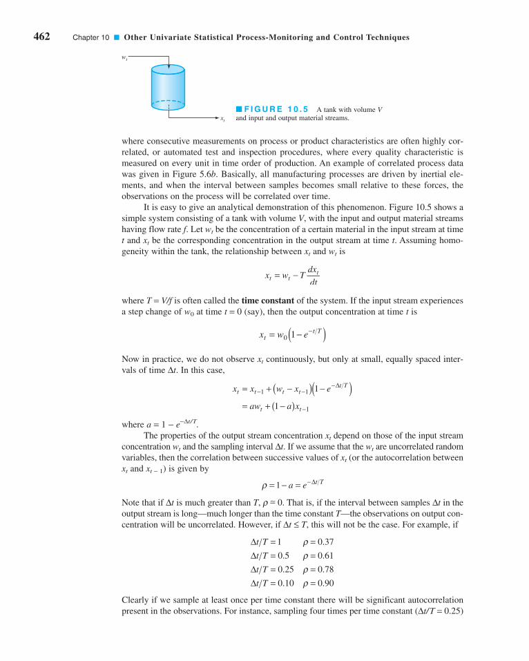
where consecutive measurements on process or product characteristics are often highly cor-
related, or automated test and inspection procedures, where every quality characteristic is
measured on every unit in time order of production. An example of correlated process data
was given in Figure 5.6b. Basically, all manufacturing processes are driven by inertial ele-
ments, and when the interval between samples becomes small relative to these forces, the
observations on the process will be correlated over time.
It is easy to give an analytical demonstration of this phenomenon. Figure 10.5 shows a
simple system consisting of a tank with volume V, with the input and output material streams
having flow rate f. Let wt be the concentration of a certain material in the input stream at time
t and xt be the corresponding concentration in the output stream at time t. Assuming homo-
geneity within the tank, the relationship between xt and wt is
where T = V/f is often called the time constant of the system. If the input stream experiences
a step change of w0 at time t = 0 (say), then the output concentration at time t is
Now in practice, we do not observe xt continuously, but only at small, equally spaced inter-
vals of time Δt. In this case,
where a = 1 − e−Δt/T.The properties of the output stream concentration xt depend on those of the input stream
concentration wt and the sampling interval Δt. If we assume that the wt are uncorrelated random
variables, then the correlation between successive values of xt (or the autocorrelation between
xt and xt − 1) is given by
Note that if Δt is much greater than T, r ∼− 0. That is, if the interval between samples Δt in the
output stream is long—much longer than the time constant T—the observations on output con-
centration will be uncorrelated. However, if Δt ≤ T, this will not be the case. For example, if
Clearly if we sample at least once per time constant there will be significant autocorrelation
present in the observations. For instance, sampling four times per time constant (Δt/T = 0.25)
ΔΔΔΔ
t T
t T
t T
t T
= == == == =
1 0 37
0 5 0 61
0 25 0 78
0 10 0 90
ρρρρ
.
. .
. .
. .
ρ = − = −1 a e t TΔ
x x w x e
aw a x
t t t tt T
t t
= + −( ) −( )= + −( )
− −−
−
1 1
1
1
1
Δ
x w ett T= −( )−
0 1
x w Tdx
dtt tt= −
wt
xt
■ F I G U R E 1 0 . 5 A tank with volume Vand input and output material streams.
462 Chapter 10 ■ Other Univariate Statistical Process-Monitoring and Control Techniques
c10OtherUnivariateStatisticalProcess-MonitoringandControlTechniques.qxd 3/30/12 8:21 PM Page 462

10.4 SPC with Autocorrelated Process Data 463
results in autocorrelation between xt and xt − 1 of r = 0.78. Autocorrelation between suc-
cessive observations as small as 0.25 can cause a substantial increase in the false alarm
rate of a control chart, so clearly this is an important issue to consider in control chart
implementation.
We can also give an empirical demonstration of this phenomena. Figure 10.6 is a plot of
1,000 observations on a process quality characteristic xt. Close examination of this plot will reveal
that the behavior of the variable is nonrandom in the sense that a value of xt that is above the
long-term average (about 66) tends to be followed by other values above the average, whereas
a value below the average tends to be followed by other similar values. This is also reflected in
Figure 10.7, a scatter plot of xt (the observation at time t) versus xt-1 (the observation one period
earlier). Note that the observations cluster around a straight line with a positive slope. That is, a
relatively low observation on x at time t − 1 tends to be followed by another low value at time t,whereas a relatively large observation at time t − 1 tends to be followed by another large value at
time t. This type of behavior is indicative of positive autocorrelation in the observations.
It is also possible to measure the level of autocorrelation analytically. The autocorrela-
tion over a series of time-oriented observations (called a time series) is measured by the auto-correlation function
where Cov(xt, xt-k) is the covariance of observations that are k time periods apart, and we have
assumed that the observations have constant variance given by V(xt). We usually estimate the
values of rk with the sample autocorrelation function:
(10.10)
As a general rule, we usually need to compute values of rk for a few values of k, k ≤ n/4. Many
software programs for statistical data analysis can perform these calculations.
The sample autocorrelation function for the data in Figure 10.6 is shown in Figure 10.8.
This sample autocorrelation function was constructed using Minitab. The dashed lines on the
graph are two standard deviation limits on the autocorrelation parameter rk at lag k. They are
useful in detecting non-zero autocorrelations; in effect, if a sample autocorrelation exceeds its
rx x x x
x xk Kk
t t kt
n k
tt
n=−( ) −( )
−( )=
−=
−
=
∑
∑1
2
1
0 1, , ,K
ρkt t k
t
x x
V xk= ( )
( ) =−Cov ,, ,0 1 K
xt
71
70
69
67
66
65
64
63
62200 400 600 800 1000
t
68
71
70
69
68
67
66
65
64
63
6271
xt – 1
706968676665646362
xt
■ F I G U R E 1 0 . 6 A process variable with
autocorrelation.■ F I G U R E 1 0 . 7 Scatter plot of xt versus xt−1.
c10OtherUnivariateStatisticalProcess-MonitoringandControlTechniques.qxd 3/30/12 8:21 PM Page 463

two standard deviations limit, the corresponding autocorrelation parameter rk is likely non-
zero. Note that the autocorrelation at lag 1 is r1∼− 0.7. This is certainly large enough to
severely distort control chart performance.
Figure 10.9 presents control charts for the data in Figure 10.6, constructed by Minitab.
Note that both the individuals chart and the EWMA exhibit many out-of-control points.
25Lag, k
155
–1.0–0.8–0.6–0.4–0.20.00.20.40.60.81.0
rk
0Subgroup62636465666768697071
500 1000
LCL = 64.35
Mean = 66.74
UCL = 69.141
1111111 1
1 111 1 11
111
1111 1 11 1
1111 11 111111
1 1111 111 11 1
1111 11 1 11
11 1
1111111
111
111
1
11 1
1 1 11
Indi
vidu
al v
alue
0
1
2
3
4
LCL = 0
R = 0.9007
UCL = 2.943
Mov
ing
rang
e
UCL = 67.29
LCL = 66.20
Mean = 66.74
69
68
67
66
65
EW
MA
1000500Sample number
0
(a) Individuals and moving range control charts
(b) EWMA control chart
■ F I G U R E 1 0 . 8 Sample autocorrelation function for the data in Figure 10.6.
■ F I G U R E 1 0 . 9 Control
charts (Minitab) for the data in
Figure 10.6.
464 Chapter 10 ■ Other Univariate Statistical Process-Monitoring and Control Techniques
c10OtherUnivariateStatisticalProcess-MonitoringandControlTechniques.qxd 3/30/12 8:21 PM Page 464

10.4 SPC with Autocorrelated Process Data 465
Based on our previous discussion, we know that less frequent sampling can break up
the autocorrelation in process data. To illustrate, consider Figure 10.10a, which is a plot of
every tenth observation from Figure 10.6. The sample autocorrelation function, shown in
Figure 10.10b, indicates that there is very little autocorrelation at low lag. The control charts
in Figure 10.11 now indicate that the process is essentially stable. Clearly, then, one
approach to dealing with autocorrelation is simply to sample from the process data stream
less frequently. Although this seems to be an easy solution, on reconsideration it has some
disadvantages. For example, we are making very inefficient use of the available data.
Literally, in the above example, we are discarding 90% of the information! Also, since we
are only using every tenth observation, it may take much longer to detect a real process shift
than if we used all of the data.
Clearly, a better approach is needed. In the next two sections we present several
approaches to monitoring autocorrelated process data.
10.4.2 Model-Based Approaches
Time Series Models. An approach that has proved useful in dealing with auto-
correlated data is to directly model the correlative structure with an appropriate timeseries model, use that model to remove the autocorrelation from the data, and apply con-
trol charts to the residuals. For example, suppose that we could model the quality charac-
teristic xt as
(10.11)
where x and f (− 1 < f < 1) are unknown constants, and et is normally and independently
distributed with mean zero and standard deviation s. Note how intuitive this model is from
x xt t t= + +−ξ φ ε1
20105 15
–1.0–0.8–0.6–0.4–0.20.00.20.40.60.81.0
Aut
ocor
rela
tion
(b) Sample autocorrelation function
(a) Data
70
69
68
67
66
65
64
6310 20 30 40 50 60 70 80 90 100
xt
t
■ F I G U R E 1 0 . 1 0 Plots for every tenth observation from Figure 10.6.
c10OtherUnivariateStatisticalProcess-MonitoringandControlTechniques.qxd 3/30/12 8:21 PM Page 465
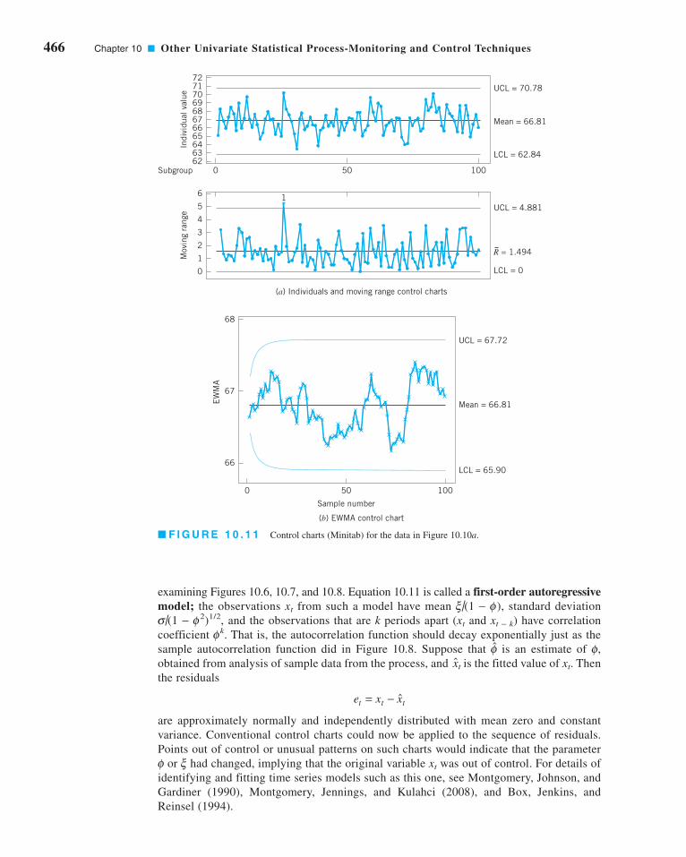
466 Chapter 10 ■ Other Univariate Statistical Process-Monitoring and Control Techniques
examining Figures 10.6, 10.7, and 10.8. Equation 10.11 is called a first-order autoregressivemodel; the observations xt from such a model have mean x/(1 − f), standard deviation
s/(1 − f2)1/2, and the observations that are k periods apart (xt and xt − k) have correlation
coefficient fk. That is, the autocorrelation function should decay exponentially just as the
sample autocorrelation function did in Figure 10.8. Suppose that f is an estimate of f,
obtained from analysis of sample data from the process, and xt is the fitted value of xt. Then
the residuals
are approximately normally and independently distributed with mean zero and constant
variance. Conventional control charts could now be applied to the sequence of residuals.
Points out of control or unusual patterns on such charts would indicate that the parameter
f or x had changed, implying that the original variable xt was out of control. For details of
identifying and fitting time series models such as this one, see Montgomery, Johnson, and
Gardiner (1990), Montgomery, Jennings, and Kulahci (2008), and Box, Jenkins, and
Reinsel (1994).
e x xt t t= − ˆ
100500Subgroup
6362
646566676869707172
Indi
vidu
al v
alue
UCL = 70.78
Mean = 66.81
LCL = 62.84
6
5
4
3
2
1
0
Mov
ing
rang
e UCL = 4.881
R = 1.494
LCL = 0
1
(a) Individuals and moving range control charts
68
67
66
EW
MA
0 50
Sample number
100
LCL = 65.90
Mean = 66.81
UCL = 67.72
(b) EWMA control chart
■ F I G U R E 1 0 . 1 1 Control charts (Minitab) for the data in Figure 10.10a.
c10OtherUnivariateStatisticalProcess-MonitoringandControlTechniques.qxd 3/30/12 8:21 PM Page 466
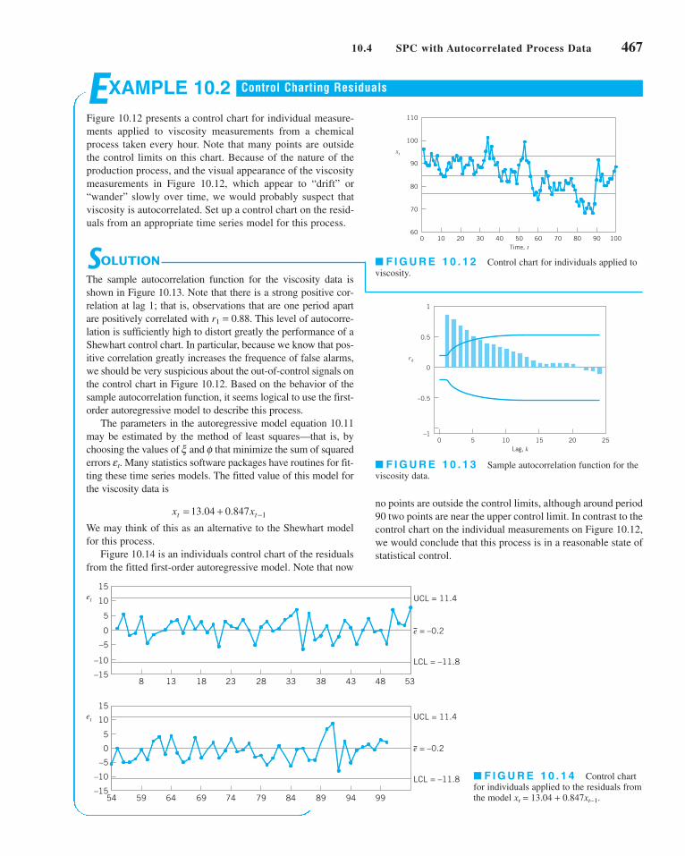
10.4 SPC with Autocorrelated Process Data 467
EXAMPLE 10.2
Figure 10.12 presents a control chart for individual measure-
ments applied to viscosity measurements from a chemical
process taken every hour. Note that many points are outside
the control limits on this chart. Because of the nature of the
production process, and the visual appearance of the viscosity
measurements in Figure 10.12, which appear to “drift” or
“wander” slowly over time, we would probably suspect that
viscosity is autocorrelated. Set up a control chart on the resid-
uals from an appropriate time series model for this process.
Control Charting Residuals
SOLUTION
The sample autocorrelation function for the viscosity data is
shown in Figure 10.13. Note that there is a strong positive cor-
relation at lag 1; that is, observations that are one period apart
are positively correlated with r1 = 0.88. This level of autocorre-
lation is sufficiently high to distort greatly the performance of a
Shewhart control chart. In particular, because we know that pos-
itive correlation greatly increases the frequence of false alarms,
we should be very suspicious about the out-of-control signals on
the control chart in Figure 10.12. Based on the behavior of the
sample autocorrelation function, it seems logical to use the first-
order autoregressive model to describe this process.
The parameters in the autoregressive model equation 10.11
may be estimated by the method of least squares—that is, by
choosing the values of x and f that minimize the sum of squared
errors et. Many statistics software packages have routines for fit-
ting these time series models. The fitted value of this model for
the viscosity data is
We may think of this as an alternative to the Shewhart model
for this process.
Figure 10.14 is an individuals control chart of the residuals
from the fitted first-order autoregressive model. Note that now
x xt t= + −13 04 0 847 1. .
110
100
90
80
70
600 10 20 30 40 50 60 70 80 90 100
Time, t
xt
–1
–0.5
0
0.5
1
0 5 10 15 20 25Lag, k
rk
15
10
5
0
–5
–10
–15
15
10
5
0
–5
–10
–15
et
et
8 13 18 23 28 33 38 43 48 53
59 64 69 74 79 84 89 94 99
LCL = –11.8
e = –0.2
UCL = 11.4
LCL = –11.8
e = –0.2
UCL = 11.4
54
■ F I G U R E 1 0 . 1 3 Sample autocorrelation function for the
viscosity data.
■ F I G U R E 1 0 . 1 2 Control chart for individuals applied to
viscosity.
no points are outside the control limits, although around period
90 two points are near the upper control limit. In contrast to the
control chart on the individual measurements on Figure 10.12,
we would conclude that this process is in a reasonable state of
statistical control.
■ F I G U R E 1 0 . 1 4 Control chart
for individuals applied to the residuals from
the model xt = 13.04 + 0.847xt−1.
c10OtherUnivariateStatisticalProcess-MonitoringandControlTechniques.qxd 3/30/12 8:21 PM Page 467
468 Chapter 10 ■ Other Univariate Statistical Process-Monitoring and Control Techniques
Other Time Series Models. The first-order autoregressive model used in the vis-
cosity example (equation 10.11) is not the only possible model for time-oriented data that
exhibit correlative structure. An obvious extension to equation 10.11 is
(10.12)
which is a second-order autoregressive model. In general, in autoregressive-type models, the
variable xt is directly dependent on previous observations xt − 1, xt − 2, and so forth. Another pos-
sibility is to model the dependency through the random component et. A simple way to do this is
(10.13)
This is called a first-order moving average model. In this model, the correlation between xt
and xt − 1 is r1 = − q/(1 + q2) and is zero at all other lags. Thus, the correlative structure in xt
only extends backward one time period.
Sometimes combinations of autoregressive and moving average terms are useful. A
first-order mixed model is
(10.14)
This model often occurs in the chemical and process industries. The reason is that if the
underlying process variable xt is first-order autoregressive and a random error component is
added to xt, the result is the mixed model in equation 10.14. In the chemical and process
industries first-order autoregressive process behavior is fairly common. Furthermore, the
quality characteristic is often measured in a laboratory (or by an on-line instrument) that has
measurement error, which we can usually think of as random or uncorrelated. The reported or
observed measurement then consists of an autoregressive component plus random variation,
so the mixed model in equation 10.14 is required as the process model.
We also encounter the first-order integrated moving average model
(10.15)
in some applications. Whereas the previous models are used to describe stationary behav-
ior (that is, xt wanders around a “fixed” mean), the model in equation 10.15 describes non-
stationary behavior (the variable xt “drifts” as if there is no fixed value of the process
mean). This model often arises in chemical and process plants when xt is an “uncontrolled”
process output—that is, when no control actions are taken to keep the variable close to a
target value.
The models we have been discussing in equations 10.11 through 10.15 are members
of a class of time series models called autoregressive integrated moving average(ARIMA) models. Montgomery, Johnson, and Gardiner (1990), Montgomery, Jennings
and Kulahci (2008), and Box, Jenkins, and Reinsel (1994) discuss these models in detail.
Although these models appear very different than the Shewhart model (equation 9.9), they
are actually relatively similar and include the Shewhart model as a special case. Note that
if we let f = 0 in equation 10.11, the Shewhart model results. Similarly, if we let q = 0 in
equation 10.13, the Shewhart model results.
An Approximate EWMA Procedure for Correlated Data. The time series mod-
eling approach illustrated in the viscosity example can be awkward in practice. Typically, we
apply control charts to several process variables, and developing an explicit time series model
for each variable of interest is potentially time-consuming. Some authors have developed
automatic time series model building to partially alleviate this difficulty. [See Yourstone and
Montgomery (1989) and the references therein.] However, unless the time series model itself
is of intrinsic value in explaining process dynamics (as it sometimes is), this approach will
frequently require more effort than may be justified in practice.
x xt t t t= + −− −1 1ε θε
x xt t t t= + + −− −ξ φ ε θε1 1
xt t t= + − −μ ε θε 1
x x xt t t t= + + +− −ξ φ φ ε1 1 2 2
c10OtherUnivariateStatisticalProcess-MonitoringandControlTechniques.qxd 3/30/12 8:21 PM Page 468

10.4 SPC with Autocorrelated Process Data 469
Montgomery and Mastrangelo (1991) have suggested an approximate procedure based
on the EWMA. They utilize the fact that the EWMA can be used in certain situations where
the data are autocorrelated. Suppose that the process can be modeled by the integrated mov-
ing average model in equation 10.15. It can be easily shown that the EWMA with l = 1 − q is
the optimal one-step-ahead forecast for this process. That is, if xt+1 (t) is the forecast for the
observation in period t + 1 made at the end of period t, then
where zt = lxt + (1 − l)zt − 1 is the EWMA. The sequence of one-step-ahead prediction
errors
(10.16)
is independently and identically distributed with mean zero. Therefore, control charts could
be applied to these one-step-ahead prediction errors. The parameter l (or equivalently, q)
would be found by minimizing the sum of squares of the errors et.
Now suppose that the process is not modeled exactly by equation 10.15. In general, if
the observations from the process are positively autocorrelated and the process mean does not
drift too quickly, the EWMA with an appropriate value for l will provide an excellent one-
step-ahead predictor. The forecasting and time series analysis field has used this result for
many years; for examples, see Montgomery, Jennings, and Kulahci (2008). Consequently, we
would expect many processes that obey first-order dynamics (that is, they follow a slow
“drift”) to be well represented by the EWMA.
Consequently, under the conditions just described, we may use the EWMA as the
basis of a statistical process-monitoring procedure that is an approximation of the exact
time-series model approach. The procedure would consist of plotting one-step-ahead
EWMA prediction errors (or model residuals) on a control chart. This chart could be
accompanied by a run chart of the original observations on which the EWMA forecast is
superimposed. Our experience indicates that both charts are usually necessary, as opera-
tional personnel feel that the control chart of residuals sometimes does not provide a direct
frame of reference to the process. The run chart of original observations allows process
dynamics to be visualized.
Figure 10.15 is a graph of the sum of squares of the EWMA prediction errors versus l for
the viscosity data. The minimum squared prediction error occurs at l = 0.825. Figure 10.16 pre-
sents a control chart for individuals applied to the EWMA prediction errors. This chart is
slightly different from the control chart of the exact autoregressive model residuals shown in
e x x tt t t= − −( )ˆ 1
x t zt t+ ( ) =1
1.41.51.61.71.81.92.02.12.22.32.42.52.62.72.82.93.03.13.23.3
0 0.1 0.2 0.3 0.4 0.5 0.6 0.7 0.8 0.9 1.0
λ
Res
idua
l sum
of
squa
res
■ F I G U R E 1 0 . 1 5 Residual sum of squares versus l.
c10OtherUnivariateStatisticalProcess-MonitoringandControlTechniques.qxd 3/30/12 8:21 PM Page 469

470 Chapter 10 ■ Other Univariate Statistical Process-Monitoring and Control Techniques
Figure 10.14, but not significantly so. Both indicate a process that is reasonably stable, with a
period around t = 90 where an assignable cause may be present.
Montgomery and Mastrangelo (1991) point out that it is possible to combine informa-
tion about the state of statistical control and process dynamics on a single control chart.
Assume that the one-step-ahead prediction errors (or model residuals) et are normally distrib-
uted. Then the usual three-sigma control limits on the control chart on these errors satisfy the
following probability statement,
where s is the standard deviation of the errors or residuals et. We may rewrite this as
or
(10.17)
Equation 10.17 suggests that if the EWMA is a suitable one-step-ahead predictor, then one
could use zt as the center line on a control chart for period t + 1 with upper and lower control
limits at
(10.18a)
and
(10.18b)
and the observation xt + 1 would be compared to these limits to test for statistical control. We
can think of this as a moving center-line EWMA control chart. As mentioned above, in
many cases this would be preferable from an interpretation standpoint to a control chart of
residuals and a separate chart of the EWMA as it combines information about process dynamics
and statistical control on one chart.
Figure 10.17 is the moving center-line EWMA control chart for the viscosity data, with
l = 0.825. It conveys the same information about statistical control as the residual or EWMA
prediction error control chart in Figure 10.16, but operating personnel often feel more com-
fortable with this display.
LCLt tz+ = −1 3σ
UCLt tz+ = +1 3σ
P x t x x tt t tˆ ˆ .−( ) − ≤ ≤ −( ) +[ ] =1 3 1 3 0 9973σ σ
P x x tt t− ≤ − −( ) ≤[ ] =3 1 3 0 9973σ σˆ .
P et− ≤ ≤[ ] =3 3 0 9973σ σ .
15
10
5
0
–5
–10
–15
15
10
5
0
–5
–10
–15
et
et
0 5 10 15 20 25 30 35 40 45 50
51 56 61 66 71 76 81 86 91 96 101
LCL = –11.5
e = 0
UCL = 11.5
LCL = –11.5
e = 0
UCL = 11.5
■ F I G U R E 1 0 . 1 6 EWMA prediction errors with l = 0.825 and Shewhart limits.
c10OtherUnivariateStatisticalProcess-MonitoringandControlTechniques.qxd 3/30/12 8:21 PM Page 470

10.4 SPC with Autocorrelated Process Data 471
Estimation and Monitoring of s . The standard deviation of the one-step-ahead
errors or model residuals s may be estimated in several ways. If l is chosen as suggested
above over a record of n observations, then dividing the sum of squared prediction errors for
the optimal l by n will produce an estimate of s2. This is the method used in many time-series
analysis computer programs.
Another approach is to compute the estimate of s as typically done in forecasting sys-
tems. The mean absolute deviation (MAD) could be used in this regard. The MAD is com-
puted by applying an EWMA to the absolute value of the prediction error
Since the MAD of a normal distribution is related to the standard deviation by s = 1.25D [see
Montgomery, Johnson, and Gardiner (1990)], we could estimate the standard deviation of the
prediction errors at time t by
(10.19)
Another approach is to directly calculate a smoothed variance
(10.20)
MacGregor and Harris (1993) discuss the use of exponentially weighted moving variance
estimates in monitoring the variability of a process. They show how to find control limits for
these quantities for both correlated and uncorrelated data.
The Sensitivity of Residual Control Charts. Several authors have pointed out
that residual control charts are not sensitive to small process shifts [see Wardell, Moskowitz,
and Plante (1994)]. To improve sensitivity, we would recommend using CUSUM or EWMA
control charts on residuals instead of Shewhart charts. Tseng and Adams (1994) note that
because the EWMA is not an optimal forecasting scheme for most processes [except the
model in equation 10.15, it will not completely account for the autocorrelation, and this
can affect the statistical performance of control charts based on EWMA residuals or pre-
diction errors. Montgomery and Mastrangelo (1991) suggest the use of supplementary
procedures called tracking signals combined with the control chart for residuals. There is
ˆ ˆσ α α σ αt t te2 21
21 0 1= + −( ) < ≤−
ˆ .~σ t t− 1 25Δ
Δ Δt t te= + −( ) < ≤−α α α1 0 11
110
100
90
80
70
60
50
xt
0 10 20 30 40 50 60 70 80 90 100Time, t
EWMAViscosity
■ F I G U R E 1 0 . 1 7 Moving center-line EWMA control chart applied to the viscosity data (l = 0.825).
c10OtherUnivariateStatisticalProcess-MonitoringandControlTechniques.qxd 3/30/12 8:21 PM Page 471

472 Chapter 10 ■ Other Univariate Statistical Process-Monitoring and Control Techniques
evidence that these supplementary procedures enhance considerably the performance of
residual control charts. Furthermore, Mastrangelo and Montgomery (1995) show that if an
appropriately designed tracking signal scheme is combined with the EWMA-based proce-
dure we have described, good in-control performance and adequate shift detection can be
achieved.
Other EWMA Control Charts for Autocorrelated Data. Lu and Reynolds
(1999a) give a very thorough study of applying the EWMA control chart to monitoring the
mean of an autocorrelated process. They consider the process to be modeled by a first-order
autoregressive process with added white noise (uncorrelated error). This is equivalent to the
first-order mixed model in equation 10.13. They provide charts for designing EWMA con-
trol charts for direct monitoring of the process variable that will give an in-control ARL
value of ARL0 = 370. They also present an extensive study of both the EWMA applied
directly to the data and the EWMA of the residuals. Some of their findings may be summa-
rized as follows:
1. When there is significant autocorrelation in process data and this autocorrelation is an
inherent part of the process, traditional methods of estimating process parameters and
constructing control charts should not be used. Instead, one should model the autocor-
relation so that reliable control charts can be constructed.
2. A large data set should be used in the process of fitting a model for the process obser-
vations and estimating the parameters of this model. If a control chart must be con-
structed using a small data set, then signals from this chart should be interpreted with
caution and the process of model fitting and parameter estimation should be repeated as
soon as additional data become available. That is, the control limits for the chart are rel-
atively sensitive to poor estimates of the process parameters.
3. For the low to moderate levels of correlation, a Shewhart chart of the observations will
be much better at detecting a shift in the process mean than a Shewhart chart of the
residuals. Unless interest is only in detecting large shifts, an EWMA chart will be better
than a Shewhart chart. An EWMA chart of the residuals will be better than an EWMA
chart of the observations for large shifts, and the EWMA of the observations will be a
little better for small shifts.
In a subsequent paper, Lu and Reynolds (1999b) present control charts for monitoring
both the mean and variance of autocorrelated process data. Several types of control charts and
combinations of control charts are studied. Some of these are control charts of the original
observations with control limits that are adjusted to account for the autocorrelation, and others
are control charts of residuals from a time-series model. Although there is no combination
that emerges as best overall, an EWMA control chart of the observations and a Shewhart chart
of residuals is a good combination for many practical situations.
Know Your Process! When autocorrelation is observed, we must be careful to
ensure that the autocorrelation is really an inherent part of the process and not the result of
some assignable cause. For example, consider the data in Figure 10.18a for which the sam-
ple autocorrelation function is shown in Figure 10.18b. The sample autocorrelation function
gives a clear indication of positive autocorrelation in the data. Closer inspection of the data,
however, reveals that there may have been an assignable cause around time t = 50 that resulted
in a shift in the mean from 100 to about 105, and another shift may have occurred around time
t = 100 resulting in a shift in the mean to about 95.
When these potential shifts are accounted for, the apparent autocorrelation may vanish.
For example, Figure 10.19 presents the sample autocorrelation functions for observations
c10OtherUnivariateStatisticalProcess-MonitoringandControlTechniques.qxd 3/30/12 8:21 PM Page 472

10.4 SPC with Autocorrelated Process Data 473
x1 − x50, x51 − x100, and x101 − x150. There is no evidence of autocorrelation in any of the three
groups of data. Therefore, the autocorrelation in the original data is likely due to assignable
causes and is not an inherent characteristic of the process.
10.4.3 A Model-Free Approach
The Batch Means Control Chart. Runger and Willemain (1996) proposed a con-
trol chart based on unweighted batch means for monitoring autocorrelated process data. The
batch means approach has been used extensively in the analysis of the output from computer
simulation models, another area where highly autocorrelated data often occur. The
unweighted batch means (UBM) control chart breaks successive groups of sequential
observations into batches, with equal weights assigned to every point in the batch. Let the jthunweighted batch mean be
(10.21)
The important implication of equation 10.21 is that although one has to determine an
appropriate batch size b, it is not necessary to construct an ARIMA model of the data. This
approach is quite standard in simulation output analysis, which also focuses on inference for
long time series with high autocorrelation.
Runger and Willemain (1996) showed that the batch means can be plotted and analyzed
on a standard individuals control chart. Distinct from residuals plots, UBM charts retain the
xb
x jj j b ii
b= =−( ) +
=∑1
1 21
1
, ,K
20105Lag 15–1.0–0.8–0.6–0.4–0.20.00.20.40.60.81.0
Aut
ocor
rela
tion
(b) Sample autocorrelation function
(a) Data
110
100
9015010050
xt
t
20105Lag 15–1.0–0.8–0.6–0.4–0.20.00.20.40.60.81.0
Aut
ocor
rela
tion
(a) Observations x1–x50
20105Lag 15–1.0–0.8–0.6–0.4–0.20.00.20.40.60.81.0
Aut
ocor
rela
tion
(b) Observations x51–x100
20105Lag 15–1.0–0.8–0.6–0.4–0.20.00.20.40.60.81.0
Aut
ocor
rela
tion
(c) Observations x101–x150
■ F I G U R E 1 0 . 1 8 Data with apparent posi-
tive autocorrelation.■ F I G U R E 1 0 . 1 9 Sample autocorrelation
functions after the process shifts are removed.
c10OtherUnivariateStatisticalProcess-MonitoringandControlTechniques.qxd 3/30/12 8:21 PM Page 473

474 Chapter 10 ■ Other Univariate Statistical Process-Monitoring and Control Techniques
reduced dramatically by the batch means approach. The
control charts for the batch means are shown in Figure 10.21.
The general indication is that the process is stable.
EXAMPLE 10.3
Construct a batch means control chart using the data in Figure 10.6.
SOLUTION
In Figure 10.20a we give a plot of batch means computed
using b = 10. The sample autocorrelation function in
Figure 10.20b indicates that the autocorrelation has been
A Batch Means Control Chart
basic simplicity of averaging observations to form a point in a control chart. With UBMs, the
control chart averaging is used to dilute the autocorrelation of the data.
Procedures for determining an appropriate batch size have been developed by
researchers in the simulation area. These procedures are empirical and do not depend on iden-
tifying and estimating a time series model. Of course, a time series model can guide the
process of selecting the batch size and also provide analytical insights.
Runger and Willemain (1996) provided a detailed analysis of batch sizes for AR(1)
models. They recommend that the batch size be selected so as to reduce the lag 1 autocorre-
lation of the batch means to approximately 0.10. They suggest starting with b = 1 and dou-
bling b until the lag 1 autocorrelation of the batch means is sufficiently small. This parallels
the logic of the Shewhart chart in that larger batches are more effective for detecting smaller
shifts; smaller batches respond more quickly to larger shifts.
20105Lag 15
–1.0–0.8–0.6–0.4–0.20.00.20.40.60.81.0
Aut
ocor
rela
tion
(b) Sample autocorrelation function
(a) Plot of batch means using batch size b = 10
69.5
68.5
67.5
66.5
65.5
64.51009010 8020 7030 50 6040
t
Bat
ch m
eans
■ F I G U R E 1 0 . 2 0 The batch means procedure applied to the data from
Figure 10.6.
c10OtherUnivariateStatisticalProcess-MonitoringandControlTechniques.qxd 3/30/12 8:21 PM Page 474

10.4 SPC with Autocorrelated Process Data 475
The batch means procedure is extremely useful when data become available very often.
In many chemical and process plants, some process data are observed every few seconds.
Batch means clearly have great potential application in these situations. Also, note that batch
means are not the same as sampling periodically from the process, because the averaging pro-
cedure uses information from all observations in the batch.
Summary. Figure 10.22 presents some guidelines for using univariate control
charts to monitor processes with both correlated and uncorrelated data. The correlated data
branch of the flow chart assumes that the sample size is n = 1. Note that one of the options
in the autocorrelated data branch of the flow chart is a suggestion to eliminate the autocor-
relation by using an engineering controller. This option exists frequently in the process
industries, where the monitored output may be related to a manipulatable input variable,
and by making a series of adjustments to this input variable, we may be able to consistently
keep the output close to a desired target. These adjustments are usually made by some type
of engineering process-control system. We will briefly discuss these types of controllers in
100500Subgroup
70
69
68
67
66
65
64
Indi
vidu
al v
alue
UCL = 69.15
Mean = 66.74
LCL = 64.34
(a) Individuals and moving range control charts
67.4
67.2
67.0
66.8
66.6
66.4
66.2
66.0
EW
MA
0 50
Sample number
100
LCL = 66.19
Mean = 66.74
UCL = 67.30
(b) EWMA control chart
3
2
1
0
Mov
ing
rang
eUCL = 2.949
R = 0.9027
LCL = 0
1
■ F I G U R E 1 0 . 2 1 Batch means control charts.
c10OtherUnivariateStatisticalProcess-MonitoringandControlTechniques.qxd 3/30/12 8:21 PM Page 475

476 Chapter 10 ■ Other Univariate Statistical Process-Monitoring and Control Techniques
Chapter 12. In cases where they can be successfully employed, the effect of keeping the
output at the desired target is often to eliminate (or greatly reduce) the autocorrelation in
the output.
Figure 10.23 summarizes some situations in which various procedures are useful for
process monitoring. On the left axis we find that as the interval between samples increases,
the Shewhart control chart becomes an appropriate choice because the larger sampling
interval usually negates the effects of autocorrelation. As the interval between samples gets
smaller, autocorrelation plays a much more important role, which leads to the ARIMA or
EWMA approach. On the right axis we find that as the cost of process adjustment increases,
we are driven to the Shewhart chart for process monitoring. On the other hand, if adjust-
ment cost is low, we are driven to some type of engineering process-control system, which
we will discuss in the next section. Finally, on the vertical axis, we see that as the variability
due to random causes or noise dominates any motion in the mean, the Shewhart chart
becomes more appropriate. However, if the motion in the mean is large relative to random
Large Small
cu
CUSUM,EWMA using
c, u; timebetween events
Large Small
pnp
CUSUMEWMAusing p
Large Small
x (Individuals)MR
CUSUMEWMA
Large Small
x, Rx, S
CUSUMEWMA
Variables Attributes
Are the dataautocorrelated?
NO YES
n > 1 n = 1 Fraction Defects (counts)
Shift size Shift size Shift size Shift size
Variables or attributes?
Sample size Data type
Fit ARIMA model; applystandard control charts to
either the original data or theresiduals (such as
x, MR, CUSUM, EWMA),
or
use moving center-line EWMAwith control limits based onprediction error variance,
or
use a model-free approach,
or
use anengineering controller.
■ F I G U R E 1 0 . 2 2 Some guidelines for univariate control chart selection.
Variability from random causesVariability from motion in
the mean
ARIMA, EWMA, Engineering control
Cost of processadjustments
ShewhartShewhart
Interval betweensamples
Shewhart
■ F I G U R E 1 0 . 2 3 The situations where various
types of control charts are useful.
c10OtherUnivariateStatisticalProcess-MonitoringandControlTechniques.qxd 3/30/12 8:21 PM Page 476

10.5 Adaptive Sampling Procedures 477
noise, we are driven once again to ARIMA- or EWMA-type procedures, or an engineering
controller.
10.5 Adaptive Sampling Procedures
Traditional SPC techniques usually employ samples of fixed size taken at a fixed sampling
interval. In practice, however, it is not uncommon to vary these design parameters on occa-
sion. For example, if the sample average i falls sufficiently close to the upper control limit
(say) on an chart, the control chart analyst may decide to take the next sample sooner than
he or she would ordinarily have, because the location of i on the chart could be an indication
of potential trouble with the process. In fact, some practitioners use warning limits in this
manner routinely.
A control chart in which either the sampling interval or the sample size (or both) can be
changed depending on the value of the sample statistic is called an adaptive SPC controlchart. The formal study of these procedures is fairly recent. For example, see Reynolds et al.
(1988) and Runger and Pignatiello (1991), who studied the variable sampling interval strategy
applied to the chart, and Prabhu, Montgomery, and Runger (1994), who evaluated the per-
formance of a combined adaptive procedure for the chart in which both the sampling interval
and the sample size depend on the current value of the sample average. These papers contain
many other useful references on the subject.
The general approach used by these authors is to divide the region between the upper
and lower control limits into zones, such that
If the sample statistic falls between − w and w, then the standard sampling interval (and pos-
sibly sample size) is used for the next sample. However, if w < i < UCL or if LCL < i < −wb,
then a shorter sampling interval (and possibly a larger sample size) is used for the next sam-
ple. It can be shown that these procedures greatly enhance control chart performance in that
they reduce the average time to signal (ATS) particularly for small process shifts, when com-
pared to an ordinary nonadaptive control chart that has a sample size and sampling interval
equal to the average of those quantities for the adaptive chart when the process is in control.
Prabhu, Montgomery, and Runger (1995) have given a FORTRAN program for evaluating the
ATS for several different adaptive versions of the chart.x
xx
LCL CL UCL≤ − ≤ ≤ ≤w w
xx
xx
x
ing this shift is 4.5 samples. Therefore, if samples are taken
every hour, it will take about 4.5 h to detect this shift on the
average. Can we improve the performance by using an adap-
tive control chart?
EXAMPLE 10.4
An engineer is currently monitoring a process with an chart
using a sample size of five, with samples taken every hour. He
is interested in detecting a shift of one standard deviation in the
mean. It is easy to show that the average run length for detect-
x
An x_
Control Chart with a Variable Sampling Interval
SOLUTION
Suppose that we try to improve this performance with an adap-
tive control chart. We still want the sample size to be n = 5, but
the time between samples could be variable. Suppose that the
shortest time allowable between samples is 0.25 h to allow
time for analysis and charting, but we want the average time
between samples when the process is in control to still be one
hour. Then it can be shown [see Prabhu, Montgomery, and
Runger (1994), Table 7] that if we set the warning limit
(continued)
c10OtherUnivariateStatisticalProcess-MonitoringandControlTechniques.qxd 3/30/12 8:21 PM Page 477

478 Chapter 10 ■ Other Univariate Statistical Process-Monitoring and Control Techniques
Adaptive sampling procedures have considerable potential for application, if some
flexibility exists with respect to the frequency and size of samples. If only one chart param-
eter can be adapted, we have found that more improvement in performance usually results
from varying the sample size than from varying the sampling interval. The Supplemental
Text Material contains more information about adaptive control charting methods.
10.6 Economic Design of Control Charts
10.6.1 Designing a Control Chart
Control charts are widely used to establish and maintain statistical control of a process.
They are also effective devices for estimating process parameters, particularly in process
capability studies. The use of a control chart requires that the engineer or analyst select a
sample size, a sampling frequency or interval between samples, and the control limits for
the chart. Selection of these three parameters is usually called the design of the control
chart.
Traditionally, control charts have been designed with respect to statistical criteria only.
This usually involves selecting the sample size and control limits such that the average run
length of the chart to detect a particular shift in the quality characteristic and the average run
length of the procedure when the process is in control are equal to specified values. The
frequency of sampling is rarely treated analytically, and usually the practitioner is advised
to consider such factors as the production rate, the expected frequency of shifts to an out-of-
control state, and the possible consequences of such process shifts in selecting the sampling
interval. The use of statistical criteria and practical experience has led, in many cases, to gen-
eral guidelines for the design of control charts. Many of these guidelines, as well as the
approach used in developing them, have been discussed for specific types of control charts in
previous chapters.
The design of a control chart has economic consequences in that the costs of sampling
and testing, costs associated with investigating out-of-control signals and possibly correcting
assignable causes, and costs of allowing nonconforming units to reach the consumer are all
affected by the choice of the control chart parameters. Therefore, it is logical to consider the
design of a control chart from an economic viewpoint. In recent years, considerable research
has been devoted to economic models of control charts. This section will present several
and choose the shortest and longest times between
samples as t1 = 0.25 h and t2 = 1.75 h, respectively, the average
time to signal can be reduced to 2.26 h. In this scheme, if
−0.67s ≤ ≤ 0.67s , the time until the next sample is 1.75 h,
whereas if the sample average 0.67s < < UCL = 3s or
LCL = −3s < < −0.67 s , the next sample is taken at 0.25 h.
This adaptive scheme essentially reduces the ATS by 50%.
It is possible to do even better if one is willing to adapt both
the sample size and the sampling interval. This chart will
require that we plot a standardized value
zx
n ii
i= −( )
μσ
0
0
xxx
xxx
xxx
w = 0.67sx where m0 and s0 are the in-control values of m and s, and n(i)is the sample size taken at the ith sample. Now if we want the
average sample size to be five and the average interval between
samples to be 1 h when the process is in control but both
chart parameters can be variable, we have what Prabhu,
Montgomery, and Runger (1994) called the combined adap-
tive chart. If we use n1 = 3, n2 = 8, t1 = 0.25, t2 = 1.50, and
w = 0.84, then the average time to signal for a one-sigma shift
in the mean is 1.72 h [see Prabhu, Montgomery, and Runger
(1994), Table 7]. In this scheme, if − 0.84 ≤ zi ≤ 0.84, use n1 = 3
and t2 = 1.5 h for the next sample, whereas if 0.84 < zi < 3 or if
− 3 < zi < − 0.84, use n2 = 8 and t1 = 0.25 h for the next sample.
x
c10OtherUnivariateStatisticalProcess-MonitoringandControlTechniques.qxd 3/30/12 8:21 PM Page 478

10.6 Economic Design of Control Charts 479
models for the optimal economic design of control charts. Some of the practical implications
of these models will also be discussed.
10.6.2 Process Characteristics
To formulate an economic model for the design of a control chart, it is necessary to make
certain assumptions about the behavior of the process. The assumptions summarized next are
relatively standard in that most economic models incorporate them to some degree. In later
sections we see how these assumptions are used in building specific models, and we discuss
their relative importance.
The process is assumed to be characterized by a single in-control state. For example, if
the process has one measurable quality characteristic, then the in-control state will correspond
to the mean of this quality characteristic when no assignable causes are present. Similarly,
when the quality characteristic is an attribute, the in-control state will be represented by the
fraction nonconforming (say) produced by the process when no assignable causes are present.
The process may have, in general, s ≥ 1 out-of-control states. Each out-of-control state is usually
associated with a particular type of assignable cause.
Determining the nature of the transitions between the in-control and out-of-control
states requires certain assumptions. It is customary to assume that assignable causes occur
during an interval of time according to a Poisson process. This implies that the length of time
the process remains in the in-control state, given that it begins in control, is an exponential
random variable. This assumption allows considerable simplification in the development of
economic models, and in some situations results in a Markov chain model structure. The
nature in which process shifts occur is sometimes called the process-failure mechanism.This can be a very critical assumption. We also observe that the assumption of discrete states
and the nature of the failure mechanism imply that process transitions between states are
instantaneous. Processes that “drift” slowly from an in-control state—as, for example, in the
case of tool wear—have received little analytical attention.
It is also usually assumed that the process is not self-correcting. That is, once a
transition to an out-of-control state has occurred, the process can be returned to the
in-control condition only by management intervention following an appropriate out-of-
control signal on the control chart. In some cases, however, transitions between different
out-of-control states are allowed, provided the transitions are always consistent with further
quality deterioration.
10.6.3 Cost Parameters
Three categories of costs are customarily considered in the economic design of control charts:
the costs of sampling and testing, the costs associated with investigating an out-of-control
signal and with the repair or correction of any assignable causes found, and the costs associ-
ated with the production of nonconforming items.
The costs of sampling and testing include the out-of-pocket expenses of inspectors’ and
technicians’ salaries and wages, the costs of any necessary test equipment, and, in the case of
destructive testing, the unit costs of the items sampled. Usually, the cost of sampling and test-
ing is assumed to consist of both fixed and variable components—say, a1 and a2, respectively—
such that the total cost of sampling and testing is
a a n1 2+
c10OtherUnivariateStatisticalProcess-MonitoringandControlTechniques.qxd 4/2/12 7:35 PM Page 479
480 Chapter 10 ■ Other Univariate Statistical Process-Monitoring and Control Techniques
Because of the difficulty of obtaining and evaluating cost information, use of more complex
relationships is probably inappropriate.
The costs of investigating and possibly correcting the process following an out-of-
control signal have been treated in several ways. Some authors have suggested that the costs
of investigating false alarms will differ from the costs of correcting assignable causes; conse-
quently, these two situations must be represented in the model by different cost coefficients.
Furthermore, the cost of repairing or correcting the process could depend on the type of
assignable cause present. Thus, in models having s out-of-control states, s + 1 cost coeffi-
cients might be necessary to model the search and adjustment procedures associated with out-
of-control signals. Usually, these cost coefficients would be chosen so that larger process
shifts incurred larger costs of repair or adjustment. Other authors have argued that this level
of modeling detail is unnecessary because in many cases small shifts are difficult to find but
easy to correct, whereas large shifts are easy to find but difficult to correct. Hence, one loses
little accuracy by using a single cost coefficient to represent the average costs of investigat-
ing and possibly correcting out-of-control signals.
The costs associated with producing nonconforming items consist of typical failurecosts—that is, the costs of rework or scrap for internal failures, or replacement or repair
costs for units covered by warranties in the case of external failures. With external fail-
ures, there may also be secondary effects from the production of nonconforming items if
the customer’s dissatisfaction with the product causes an alteration in future purchases of
the product or other products manufactured by the company. Finally, there may be losses
resulting from product liability claims against the company. Most authors model these
costs with a single, average cost coefficient, expressed on either a per unit time or per item
basis.
Economic models are generally formulated using a total cost function, which expresses
the relationships between the control chart design parameters and the three types of costs dis-
cussed above. The production, monitoring, and adjustment process may be thought of as a
series of independent cycles over time. Each cycle begins with the production process in the
in-control state and continues until process monitoring via the control chart results in an out-
of-control signal. Following an adjustment in which the process is returned to the in-control
state, a new cycle begins. Let E(T) be the expected length (that is, the long-term averagelength, or mean length) of a cycle, and let E(C) be the expected total cost incurred during a
cycle. Then the expected cost per unit time is
(10.22)
Optimization techniques are then applied to equation 10.22 to determine the economically
optimal control chart design. Minor variations in equation 10.22 have appeared in the litera-
ture. For example, some authors have elected to replace E(T) in equation 10.22 by the
expected number of units produced during the cycle, resulting in the expected cost expressed
on a per item rather than a per unit time basis. In other studies, a somewhat different defini-
tion of a cycle is used, depending on whether the process is shut down or allowed to continue
operation while out-of-control signals are investigated.
The general model structure in equation 10.22 has a disturbing appearance. Note that
C and T are dependent random variables, yet we have represented the expected value of their
ratio E(A) by the ratio of expectations E(C)/E(T). Now it is well known that the expected
value of a ratio is not equal to the ratio of expected values (even for independent random
variables), so some further explanation of the structure of equation 10.22 seems warranted.
The sequence of production–monitoring–adjustment, with accumulation of costs over the
cycle, can be represented by a particular type of stochastic process called a renewal reward
E AE C
E T( ) = ( )
( )
c10OtherUnivariateStatisticalProcess-MonitoringandControlTechniques.qxd 4/2/12 7:35 PM Page 480

10.6 Economic Design of Control Charts 481
process. Stochastic processes of this type have the property that their average time cost is
given by the ratio of the expected reward per cycle to the expected cycle length, as shown in
equation 10.22.
10.6.4 Early Work and Semieconomic Designs
A fundamental paper in the area of cost modeling of quality control systems was published
by Girshick and Rubin (1952). They consider a process model in which a machine produc-
ing items characterized by a measurable quality characteristic x can be in one of four
states. States 1 and 2 are production states, and, in state i, the output quality characteristic
is described by the probability density function fi(x), i = 1, 2. State 1 is the “in-control”
state. While in state 1, there is a constant probability of a shift state 2. The process is not
self-correcting; repair is necessary to return the process to state 1. States j = 3 and j = 4
are repair states, if we assume that the machine was previously in state j − 2. In state
j = 3, 4, nj units of time are required for repair, where a time unit is defined as the time to
produce one unit of product. Girshick and Rubin treat both 100% inspection and periodic
inspection rules. The economic criterion is to maximize the expected income from the
process. The optimal control rules are difficult to derive, as they depend on the solution to
complex integral equations. Consequently, the model’s use in practice has been very
limited.
Although it has had little or no practical application, Girshick and Rubin’s (1952) work
is of significant theoretical value. They were the first researchers to propose the expected cost
(or income) per unit time criterion (equation 10.22), and rigorously show its appropriateness
for this problem. Later analysts’ use of this criterion (equation 10.22) rests directly on its
development by Girshick and Rubin. Other researchers have investigated generalized formu-
lations of the Girshick–Rubin model, including Bather (1963), Ross (1971), Savage (1962),
and White (1974). Again, their results are primarily of theoretical interest, as they do not lead
to process control rules easily implemented by practitioners.
Economic design of conventional Shewhart control charts was investigated by several
early researchers. Most of their work could be classified as semieconomic design procedures,
in that either the proposed model did not consider all relevant costs or no formal optimization
techniques were applied to the cost function. Weiler (1952) suggested that for an chart, the
optimum sample size should minimize the total amount of inspection required to detect a
specified shift. If the shift is from an in-control state m0 to an out-of-control state m1 = m0 + ds,
then Weiler shows that the optimal sample size is
Note that Weiler did not formally consider costs; the implication is that minimizing total
inspection will minimize total costs.
Taylor (1965) has shown that control procedures based on taking a sample of constant size
at fixed intervals of time is nonoptimal. He suggests that sample size and sampling frequency
should be determined at each point in time based on the posterior probability that the process
n
n
n
n
= ±
= ±
= ±
= ±
12 0
11 1
6 6558
4 433
2
2
2
2
.
.
..
..
δ
δ
δ
δ
when 3.09-sigma control limits are used
when 3-sigma control limits are used
when 2 -sigma control limits are used
when 2 - sigma control limits are used
x
c10OtherUnivariateStatisticalProcess-MonitoringandControlTechniques.qxd 4/2/12 7:35 PM Page 481

482 Chapter 10 ■ Other Univariate Statistical Process-Monitoring and Control Techniques
is in an out-of-control state. Dynamic programming-type methods are utilized extensively
in the development. In a subsequent paper, Taylor (1967) derives the optimal control rule
for a two-state process with a normally distributed quality characteristic. Although
Taylor’s work has indicated their nonoptimality, fixed sample size–fixed sampling interval
control rules are widely used in practice because of their administrative simplicity.
Consequently, most researchers have concentrated on the optimal economic design of such
procedures.
10.6.5 An Economic Model of the Control Chart
Much of the research in the development of economic models of control charts has been
devoted to the chart. The interest of analysts in this control chart follows directly from its
widespread use in practice. In this section, we discuss one of the economic models that has
been widely studied.
In 1956, Duncan proposed an economic model for the optimum economic design of the
control chart. His paper was the first to deal with a fully economic model of a Shewhart-
type control chart and to incorporate formal optimization methodology into determining the
control chart parameters. Duncan’s paper was the stimulus for much of the subsequent
research in this area.
Duncan drew on the earlier work of Girshick and Rubin (1952) in that he utilized a
design criterion that maximized the expected net income per unit of time from the process.
In the development of the cost model, Duncan assumed that the process is characterized by
an in-control state m0 and that a single assignable cause of magnitude d, which occurs at
random, results in a shift in the mean from m0 to either m0 + ds or m0 − ds. The process
is monitored by an chart with center line m0 and upper and lower control limits
). Samples are to be taken at intervals of h hours. When one point exceeds the
control limits, a search for the assignable cause is initiated. During the search for the assign-
able cause, the process is allowed to continue in operation. Furthermore, it is assumed that
the cost of adjustment or repairs (if necessary) is not charged against the net income from
the process. The parameters m0, d, and s are assumed known, whereas n, k, and h are to be
determined.
The assignable cause is assumed to occur according to a Poisson process with an inten-
sity of l occurrences per hour. That is, assuming that the process begins in the in-control state,
the time interval that the process remains in control is an exponential random variable with
mean 1/l h. Therefore, given the occurrence of the assignable cause between the jth and ( j + 1)st
samples, the expected time of occurrence within this interval is
(10.23)
When the assignable cause occurs, the probability that it will be detected on any subsequent
sample is
(10.24)
where f(z) = (2p)−1/2 exp(−z2/2) is the standard normal density. The quantity 1 − b is the
power of the test, and b is the type II error probability. The probability of a false alarm is
(10.25)
A production cycle is defined as the interval of time from the start of production (the
process is assumed to start in the in-control state) following an adjustment to the detection
α φ= ( )∞∫2 z dzk
1− = ( ) + ( )−∞− −
−∞
∫ ∫β φ φδδz dz z dz
k nk n
τλ
λ
λλ
λ
λ
λ
λ=
−( )=
− +( )−( )
−+( )
−+( )
−
−
∫
∫
e t jh dt
e dt
h e
e
tjh
j h
tjh
j h
h
h
1
1
1 1
1
m0 ± k(s/2nx
x
x
x
c10OtherUnivariateStatisticalProcess-MonitoringandControlTechniques.qxd 4/2/12 7:35 PM Page 482

10.6 Economic Design of Control Charts 483
and elimination of the assignable cause. The cycle consists of four periods: (1) the in-
control period, (2) the out-of-control period, (3) the time to take a sample and interpret the
results, and (4) the time to find the assignable cause. The expected length of the in-control
period is 1/l. Noting the number of samples required to produce an out-of-control signal
given that the process is actually out of control is a geometric random variable with mean
1/(1 − b), we conclude that the expected length of the out-of-control period is h/(1 − b) − τ.
The time required to take a sample and interpret the results is a constant g proportional to
the sample size, so that gn is the length of this segment of the cycle. The time required to
find the assignable cause following an action signal is a constant D. Therefore, the expected
length of a cycle is
(10.26)
The net income per hour of operation in the in-control state is V0, and the net income
per hour of operation in the out-of-control state is V1. The cost of taking a sample of size n is
assumed to be of the form a1 + a2n; that is, a1 and a2 represent, respectively, the fixed and
variable components of sampling cost. The expected number of samples taken within a cycle
is the expected cycle length divided by the interval between samples, or E(T)/h. The cost of
finding an assignable cause is a3, and the cost of investigating a false alarm is a′3. The
expected number of false alarms generated during a cycle is a times the expected number of
samples taken before the shift, or
(10.27)
Therefore, the expected net income per cycle is
(10.28)
The expected net income per hour is found by dividing the expected net income per cycle
(equation 10.28) by the expected cycle length (equation 10.26), resulting in
(10.29)
Let a4 = V0 − V1; that is, a4 represents the hourly penalty cost associated with production in
the out-of-control state. Then equation 10.29 may be rewritten as
(10.30)
E A Va a n
h
a h gn D a a e e
h gn D
h h
( ) = − +
−−( ) − + +[ ] + + ′ −( )
+ −( ) − + +
− −
01 2
4 3 31 1
1 1
β τ α
λ β τ
λ λ
E AE C
E T
V V h gn D a a e e
h gn D
a a n
h
h h
( ) = ( )( )
=( ) + −( ) − + +[ ] − − ′ −( )
+ −( ) − + +
− +
− −0 1 3 3
1 2
1 1 1
1 1
λ β τ α
λ β τ
λ λ
E C V Vh
gn D aa e
e
a a nE T
h
h
h( ) = +−
− + +⎛⎝⎜
⎞⎠⎟
− − ′−
− +( ) ( )
−
−0 1 33
1 2
1
1 1λ βτ
λ
λ
α αλλ
λje dte
et
h
hjhj h
j
−−
−+( )
=
∞=
−∫∑1
1
0
E Th
gn D( ) = +−
− + +1
1λ βτ
c10OtherUnivariateStatisticalProcess-MonitoringandControlTechniques.qxd 4/2/12 7:35 PM Page 483

484 Chapter 10 ■ Other Univariate Statistical Process-Monitoring and Control Techniques
or
where
(10.31)
The expression E(L) represents the expected loss per hour incurred by the process. E(L) is a
function of the control chart parameters n, k, and h. Clearly, maximizing the expected net
income per hour is equivalent to minimizing E(L).
Duncan introduces several approximations to develop an optimization procedure for
this model.2 The optimization procedure suggested is based on solving numerical approxima-
tions to the system for first partial derivatives of E(L) with respect to n, k, and h. An iterative
procedure is required to solve for the optimal n and k. A closed-form solution for h is given
using the optimal values of n and k.
Several authors have reported optimization methods for Duncan’s model. Chiu and
Wetherill (1974) have developed a simple, approximate procedure for optimizing Duncan’s
model. Their procedure utilizes a constraint on the power of the test (1 − b). The recom-
mended values are either 1 − b = 0.90 or 1 − b = 0.95. Tables are provided to generate the
optimum design subject to this constraint. This procedure usually produces a design close to
the true optimum. We also note that E(L) could be easily minimized by using an uncon-
strained optimization or search technique coupled with a digital computer program for
repeated evaluations of the cost function. This is the approach to optimization most fre-
quently used. Montgomery (1982) has given an algorithm and a FORTRAN program for the
optimization of Duncan’s model.
E La a n
h
a h gn D a a e e
h gn D
h h
( ) = +
+−( ) − + +[ ] + + ′ −( )
+ −( ) − + +
− −
1 2
4 3 31 1
1 1
β τ α
λ β τ
λ λ
E A V E L( ) = − ( )0
2Several numerical approximations are also introduced in the actual structure of the model. Approximations used are
for , and for the expected number of false alarms .ae−lh/(1 − e−lh) = a/lht = h/2 − lh2/12
EXAMPLE 10.5
A manufacturer produces nonreturnable glass bottles for pack-
aging a carbonated soft-drink beverage. The wall thickness of
the bottles is an important quality characteristic. If the wall is
too thin, internal pressure generated during filling will cause
the bottle to burst. The manufacturer has used and R charts
for process surveillance for some time. These control charts
have been designed with respect to statistical criteria.
However, in an effort to reduce costs, the manufacturer wishes
to design an economically optimum chart for the process.
Analyze the situation and set up the control chart.
xx
Economically Optimal Chartsx
estimated to be $0.10 per bottle, and it takes approximately
1 min (0.0167h) to measure and record the wall thickness of a
bottle.
SOLUTION
Based on an analysis of quality control technicians’ salaries
and the costs of test equipment, it is estimated that the fixed
cost of taking a sample is $1. The variable cost of sampling is
c10OtherUnivariateStatisticalProcess-MonitoringandControlTechniques.qxd 3/30/12 8:21 PM Page 484

10.6 Economic Design of Control Charts 485
value of the cost function equation 10.31. The corresponding
a-risk and power for each combination of n, k, and h are also
provided. The optimal control chart design may be found by
inspecting the values of the cost function to find the mini-
mum. From Figure 10.24, we note that the minimum cost is
$10.38 per hour, and the economically optimal chart would
use samples of size n = 5, the control limits would be located
at ± ks, with k = 2.99, and samples would be taken at inter-
vals of h = 0.76 h (approximately every 45 min). The a risk
for this control chart is a = 0.0028, and the power of the test
is 1 − b = 0.9308.
After studying the optimal chart design, the bottle manu-
facturer suspects that the penalty cost of operating out of con-
trol (a4) may not have been precisely estimated. At worst, a4
may have been underestimated by about 50%. Therefore, they
decide to rerun the computer program with a4 = $150 to inves-
tigate the effect of misspecifying this parameter. The results of
this additional run are shown in Figure 10.25. We see that the
optimal solution is now n = 5, k = 2.99, and h = 0.62, and the
cost per hour is $13.88. Note that the optimal sample size and
control limit width are unchanged. The primary effect of
increasing a4 by 50% is to reduce the optimal sampling fre-
quency from 0.76 h to 0.62 h (i.e., from 45 min to 37 min).
Based on this analysis, the manufacturer decides to adopt a
sampling frequency of 45 min because of its administrative
convenience.
x
x
n Optimum k Optimum h Alpha Power Cost1 2.30 .45 .0214 .3821 14.71
2 2.51 .57 .0117 .6211 11.91
3 2.68 .66 .0074 .7835 10.90
4 2.84 .71 .0045 .8770 10.51
5 2.99 .76 .0028 .9308 10.38
6 3.13 .79 .0017 .9616 10.39
7 3.27 .82 .0011 .9784 10.48
8 3.40 .85 .0007 .9880 10.60
9 3.53 .87 .0004 .9932 10.75
10 3.66 .89 .0003 .9961 10.90
11 3.78 .92 .0002 .9978 11.06
12 3.90 .94 .0001 .9988 11.23
13 4.02 .96 .0001 .9993 11.39
14 4.14 .98 .0000 .9996 11.56
15 4.25 1.00 .0000 .9998 11.72
■ F I G U R E 1 0 . 2 4 Optimum solution to Example 10.5.
The process is subject to several different types of assign-
able causes. However, on the average, when the process goes
out of control, the magnitude of the shift is approximately two
standard deviations. Process shifts occur at random with a
frequency of about one every 20 h of operation. Thus, the
exponential distribution with parameter l = 0.05 is a reason-
able model of the run length in control. The average time
required to investigate an out-of-control signal is 1 h. The cost
of investigating an action signal that results in the elimination
of an assignable cause is $25, whereas the cost of investigating
a false alarm is $50.
The bottles are sold to a soft-drink bottler. If the walls are
too thin, an excessive number of bottles will burst when they
are filled. When this happens, the bottler’s standard practice is
to backcharge the manufacturer for the costs of cleanup and
lost production. Based on this practice, the manufacturer esti-
mates that the penalty cost of operating in the out-of-control
state for one hour is $100.
The expected cost per hour associated with the use of an
chart for this process is given by equation 10.31, with
a1 = $1, a2 = $0.10, a3 = $25, a′3 = $50, a4 = $100, l = 0.05,
d = 2.0, g = 0.0167, and D = 1.0. Montgomery’s computer
program referenced earlier is used to optimize this problem.
The output from this program, using the values of the model
parameters given above, is shown in Figure 10.24. The pro-
gram calculates the optimal control limit width k and sam-
pling frequency h for several values of n and computes the
x
(continued)
c10OtherUnivariateStatisticalProcess-MonitoringandControlTechniques.qxd 3/30/12 8:21 PM Page 485

486 Chapter 10 ■ Other Univariate Statistical Process-Monitoring and Control Techniques
From analysis of numerical problems such as those in Example 10.5, it is possible to
draw several general conclusions about the optimum economic design of the control chart.
Some of these conclusions are illustrated next.
1. The optimum sample size is largely determined by the magnitude of the shift d. In gen-
eral, relatively large shifts—say, d ≥ 2—often result in relatively small optimum sam-
ple size—say, 2 ≤ n ≤ 10. Smaller shifts require much larger samples, with 1 ≤ d ≤ 2
frequently producing optimum sample sizes in the range 10 ≤ n ≤ 20. Very small
shifts—say, d ≤ 0.5—may require sample sizes as large as n ≥ 40.
2. The hourly penalty cost for production in the out-of-control state a4 mainly affects the
interval between samples h. Larger values of a4 imply smaller values of h (more fre-
quent sampling), and smaller values of a4 imply larger values of h (less frequent sam-
pling). The effect of increasing a4 is illustrated in Figures 10.24 and 10.25 for the data
in Example 10.5.
3. The costs associated with looking for assignable causes (a3 and a′3) mainly affect the
width of the control limits. They also have a slight effect on the sample size n.
Generally, as the cost of investigating action signals increases, the incidence of false
alarms is decreased (i.e., reduce a).
4. Variation in the costs of sampling affects all three design parameters. Increasing the
fixed cost of sampling increases the interval between samples. It also usually results in
slightly larger samples.
5. Changes in the mean number of occurrences of the assignable cause per hour primarily
affect the interval between samples.
6. The optimum economic design is relatively insensitive to errors in estimating the cost
coefficients. That is, the cost surface is relatively flat in the vicinity of the optimum. We
typically find that the cost surface is steeper near the origin, so that it would be prefer-
able to overestimate the optimum n slightly rather than underestimate it. The optimum
economic design is relatively sensitive to errors in estimating the magnitude of the shift
(d), the in-control state (m0), and the process standard deviation (s).
x
n Optimum k Optimum h Alpha Power Cost1 2.31 .37 .0209 .3783 19.172 2.52 .46 .0117 .6211 15.713 2.68 .54 .0074 .7835 14.484 2.84 .58 .0045 .8770 14.015 2.99 .62 .0028 .9308 13.886 3.13 .65 .0017 .9616 13.917 3.27 .67 .0011 .9784 14.048 3.40 .69 .0007 .9880 14.219 3.53 .71 .0004 .9932 14.41
10 3.66 .73 .0003 .9961 14.6211 3.78 .75 .0002 .9978 14.8412 3.90 .77 .0001 .9988 15.0613 4.02 .78 .0001 .9993 15.2814 4.14 .80 .0000 .9996 15.50
■ F I G U R E 1 0 . 2 5 Optimum chart design for Example 10.5 with a4 = $150.x
c10OtherUnivariateStatisticalProcess-MonitoringandControlTechniques.qxd 3/30/12 8:21 PM Page 486

10.6 Economic Design of Control Charts 487
7. One should exercise caution in using arbitrarily designed control charts. Duncan
(1956) has compared the optimum economic design with the arbitrary design n = 5,
k = 3.00, and h = 1 for several sets of system parameters. Depending on the values of
the system parameters, very large economic penalties may result from the use of the
arbitrary design.
10.6.6 Other Work
The economic design of control charts is a rich area for research into the performance of con-
trol charts. Essentially, cost is simply another metric in which we can evaluate the performance
of a control scheme. There is substantial literature in this field; see the review papers by
Montgomery (1980), Svoboda (1991), Ho and Case (1994), and Keats et al. (1997) for discus-
sion of most of the key work. A particularly useful paper by Lorenzen and Vance (1986) gener-
alized Duncan’s original model so that it was directly applicable to most types of control charts.
Woodall (1986, 1987) has criticized the economic design of control charts, noting that
in many economic designs the type I error of the control chart is considerably higher than it
usually would be in a statistical design, and that this will lead to more false alarms—an unde-
sirable situation. The occurrence of excessive false alarms is always a problem, as managers
will be reluctant to shut down a process if the control scheme has a history of many false
alarms. Furthermore, if the type I error is high, then this could lead to excessive process
adjustment, which often increases the variability of the quality characteristic. Woodall also
notes that economic models assign a cost to passing defective items, which would include lia-
bility claims and customer dissatisfaction costs, among other components, and this is counter
to Deming’s philosophy that these costs cannot be measured and that customer satisfaction is
necessary to staying in business.
Some of these concerns can be overcome. An economic design should always be eval-
uated for statistical properties, such as type I and type II error probabilities, average run
lengths, and so forth. If any of these properties are at undesirable levels, this may indicate that
inappropriate costs have been assigned, or that a constrained solution is necessary. It is rec-
ommended to optimize the cost function with suitable constraints on type I error, type II error,
average run length, or other statistical properties. Saniga (1989) has reported such a study
relating to the joint economic statistical design of and R charts. Saniga uses constraints on
type I error, power, and the average time to signal for the charts. His economic statistical
designs have higher costs than the pure economic designs, but give superior protection over
a wider range of process shifts and also have statistical properties that are as good as control
charts designed entirely from statistical considerations. We strongly recommend that Saniga’s
approach be used in practice.
Saniga and Shirland (1977) and Chiu and Wetherill (1975) report that very few practi-
tioners have implemented economic models for the design of control charts. This is somewhat
surprising, as most quality engineers claim that a major objective in the use of statistical
process-control procedures is to reduce costs. There are at least two reasons for the lack of
practical implementation of this methodology. First, the mathematical models and their asso-
ciated optimization schemes are relatively complex and are often presented in a manner that is
difficult for the practitioner to understand and use. The availability of computer programs for
these models and the development of simplified optimization procedures and methods for han-
dling constraints is increasing. The availability of microcomputers and the ease with which
these applications may be implemented on them should alleviate this problem. A second problem
is the difficulty in estimating costs and other model parameters. Fortunately, costs do not have
to be estimated with high precision, although other model components, such as the magnitude
of the shift, require relatively accurate determination. Sensitivity analysis of the specific model
could help the practitioner decide which parameters are critical in the problem.
x
x
c10OtherUnivariateStatisticalProcess-MonitoringandControlTechniques.qxd 3/30/12 8:21 PM Page 487

488 Chapter 10 ■ Other Univariate Statistical Process-Monitoring and Control Techniques
10.7 Cuscore Charts
This book has focused on Shewhart control charts because of their widespread usefulness
in process monitoring (particularly in phase I), and other techniques such as the CUSUM
and EWMA control charts that also find important applications. The statistics plotted on
these control charts can all be developed from a very general procedure based on efficient
score statistics [due to Fisher (1925)]. This process results in what are called Cuscore sta-tistics, and the corresponding control charts are called Cuscore control charts. A Cuscore
control chart can be devised to be sensitive to very specific types of departures from the
standard operating conditions for the process, or the in-control state. In this section, we
give an overview of Cuscore charts; for more details and some applications, see Box and
Ramirez (1992), Box and Luceño (1997), Ramirez (1998), Luceño (1999), and Runger and
Testik (2003).
The general form of the Cuscore statistic is
(10.32)Q e rt t= ∑ 0
(10.35)r
e et
t t= −0
δ
re e x x
tt t t t= − =
− − − −( ) =0 1δ
μ μ δδ
where et0 are the residuals from an in-control model for the process and rt is a detector that
measures the rate of change of the in-control residuals when the process goes out of con-
trol. To illustrate the terminology, consider the Shewhart process model first given in
equation 10.9:
(10.33)
Assume that the process is in control. Once we observe the data for a particular period the
model error term et becomes a residual, say
The zero in the residual subscript indicates that it is a residual from the in-control process.
Now suppose that when the assignable cause occurs, it results in a step change of magnitude
d in the mean. Therefore, the new model is
(10.34)
and the new residuals are
In this example, the introduction of d into the signal produces a linear change in the residu-
als, and for linear models like this the detector is always of the form
e xt t= − −μ δ
xt t= + +μ δ ε
e xt t0 = − μ
xt t= +μ ε
Therefore, for the step change, the detector is
c10OtherUnivariateStatisticalProcess-MonitoringandControlTechniques.qxd 3/30/12 8:21 PM Page 488

10.7 Cuscore Charts 489
and the Cuscore statistic in equation 10.32 is
This is the familiar CUSUM statistic from Chapter 9. That is, the Cuscore chart for detecting
a step change in the process is the cumulative sum control chart.
It can be shown that if the assignable cause results in a single spike of magnitude d in
the process, the Cuscore control chart reduces to the Shewhart control chart. Furthermore, if
the assignable cause results in a level change that only lasts w periods, the Cuscore procedure
is the ordinary moving average control chart of span w described in Section 9.3. Finally, if the
assignable cause results in an exponential increase in the signal, the EWMA control chart
(with smoothing parameter exactly equal to the parameter in the exponential function) is the
Cuscore control chart.
Because they can be tuned to detect specific signals, Cuscore charts are most effec-
tively used as supplementary process monitoring devices in processes where, in addition to
the usual nonspecific types of disturbances, it is feared that a very specific type of problem
occasionally occurs. For example, consider a process in which a certain catalyst is employed.
Because the catalyst depletes with time, periodically new catalyst must be added to the
process. Let’s say this is usually done every week. However, in addition to the usual assign-
able causes that may occur, process engineering personnel are concerned that the catalyst
may begin to wear out earlier than expected. As the catalyst depletes, a very slow linear trend
will be observed in the process output, but if the catalyst is wearing out too soon, the slope
of this trend line will increase quickly. Now a drift or trend can be detected by the EWMA
chart that is used for general process monitoring, but a Cuscore designed to detect this
change in trend can be designed to augment the EWMA. The process model for the in-
control process is
and the residuals are
If the catalyst begins to wear out too soon, the slope changes, as in
and the new residuals are
The detector portion of the Cuscore is
Therefore, the Cuscore statistic for monitoring this process is
It is possible to obtain Cuscore statistics for monitoring processes and detecting almost any
type of signal in almost any type of noise (not just white noise, or uncorrelated observations,
as we have been illustrating here). For additional details and examples, see Box and Luceño
(1997).
Runger and Testik (2003) observe that a more familiar way to write the Cuscore sta-
tistic is
C C x k f t tt t t t= + − +( ) ( )[ ] =−max , , ; , , ,1 0 1 2μ δ τ K
Q e r x t tt t t= = − −( )∑ ∑0 μ β
re e x t x t t
ttt t t t= − =
− − − − − −( ) =0
δμ β μ β δ
δ
e x t tt t= − − −μ β δ
x t tt t= + + +μ β δ ε
e x tt t0 = − −μ β
x tt t= + +μ β ε
Q e r x xt t t t= = −( ) = −( )∑ ∑ ∑0 1μ μ
c10OtherUnivariateStatisticalProcess-MonitoringandControlTechniques.qxd 3/30/12 8:21 PM Page 489

490 Chapter 10 ■ Other Univariate Statistical Process-Monitoring and Control Techniques
where now m is the in-control mean of the observations, f(t,d,t) is the specific signal gener-
ated by the assignable cause which occurs at time t, d is a parameter that reflects the nature
and magnitude of the process shift, and kt is a reference value or handicap. The control chart
is obtained by plotting Ct versus t. A decision interval H is used to test for the presence of the
out-of-control signal in the data. Specifically, if Ct exceeds H the Cuscore chart signals. One
must specify H and kt to operationalize the chart. Usually the reference value is chosen pro-
portional to the signal value f(t,d,t), such as 0.5 f(t,d,t). To obtain the best performance with
a Cuscore control chart, the time that the assignable cause occurs, t, must be known. Luceño
(1999) used reinitialization and restart procedures with the Cuscore chart to overcome this
problem. He also studied the ARL and run-length distribution for a number of different forms
of the Cuscore chart.
Runger and Testik (2003) also discuss a competitor to the Cuscore chart based on a
generalized likelihood ratio (GLR) approach. This procedure is closely related to the
changepoint model discussed in the next section. The advantage of their GLR control chart
is that the procedure is very robust to the time that the assignable cause occurs. It also gen-
erally outperforms the Cuscore chart in detecting assignable causes. GLR control charts are
very computationally intensive because there are no simple recursive formulations available;
however, the increasing capability of desktop computers and the development of windowing
algorithms that work with a moving window of the most recent w observations will certainly
lead to increasing use of GLR-based process monitoring procedures.
10.8 The Changepoint Model for Process Monitoring
Control charts are used to monitor processes looking for assignable causes that result in
changes in the process output, such as sustained shifts in parameter values. Shewhart control
charts and EWMA and CUSUM control charts are widely used in practice for these types of
problems. There is another approach that can be useful for detecting process upsets: the
changepoint model. This approach focuses on finding the point in time where the underlying
model generating a series of observations has changed in some fashion. Most of the work on
changepoints has concentrated on detecting a sustained shift in the mean of the process, and
that is the case that we will discuss here.
Suppose that the output of a process is modeled by two normal distributions with the
same variance, say
(10.36)
The in-control distribution is N(m0,s2) up to a point in time t (called the changepoint),
beyond which the mean shifts to a new level m1 m0, and in subsequent periods the process
follows the N(m1,s2) distribution. There are two aspects of the changepoint approach to
process monitoring; determining if there has been a change in the process, and estimating t,
the time of the change. Hawkins, Qiu, and Kang (2003) is a very readable introduction to the
changepoint model, and they provide a list of useful references.
There are several important variations of the changepoint model for detecting sustained
shifts in the mean. The first of these is the case where all of the parameters in equation 10.36—
m0, m1, and s2—are known. The CUSUM chart is the appropriate procedure for this setting.
An EWMA would also be appropriate, as it can be designed to be approximately equivalent in
performance to the CUSUM. Another situation would be the case in which only some of the
parameters are known. Typically, we assume that m0 and s2 are known, but the out-of-control
value of the mean m1 is unknown. Our usual approach to this case is to design the CUSUM for a
Z
x N t
x N t n
t
t
~ , , , , ,
~ , , , , ,
μ σ τ
μ σ τ τ
02
12
1 2
1 2
( ) =
( ) = + +
K
K
c10OtherUnivariateStatisticalProcess-MonitoringandControlTechniques.qxd 3/30/12 8:21 PM Page 490

10.9 Profile Monitoring 491
value of m1 that reflects the smallest value of the out-of-control mean that is thought to be likely
to occur. Likelihood ratio methods can also be used to address this case. Hawkins, Qiu, and
Kang (2003) point out that the “known” values of m0 and s2 are typically estimated from a
sequence of observations taken when the process is thought to be in control, or from a phase I
study. Errors in estimating these parameters are reflected in distortions in the average run
lengths of the control charts. Even relatively modest errors in estimating the unknown param-
eters (on the order of one standard error) can significantly impact the ARLs of the CUSUM and
EWMA control charts. Now this does not prevent the control chart from being useful, but it is
a cause of concern that the performance of the procedure cannot be characterized accurately.
The most interesting variation of the changepoint model occurs when none of the param-
eters is known. If there is a single changepoint, it turns out that the appropriate statistic for
this problem is the familiar two-sample t statistic for comparing two means, which can be
written as
(10.37)tj n j
n
x xjn
jn jn
jn
=−( ) − *
σ
where is the average of the first j observations, is the average of the last n − j observations,
is the usual pooled estimate of variance, and 1 ≤ j ≤ n − 1. To test for a changepoint,
calculate the maximum absolute value of tjn over all 1 ≤ j ≤ n − 1 and compare to a critical
value, say hn. If the critical value is exceeded, then there has been a change in the process.
The j giving the maximum is the estimate of the changepoint t, and and are the esti-
mates of m0 and m1, respectively. Finding the appropriate critical value for this procedure hn
is not easy. Hawkins, Qiu, and Kang (2003) provide some references and guidance for the
phase I case (the length of the data is fixed at n). They also report the results of a study to
determine critical values appropriate for phase II (where n would increase without bound).
The critical values can be found from a table in their paper or computed from numerical
approximations that they provide.
The performance of the changepoint procedure is very good, comparing favorably to
the CUSUM. Specifically, it is slightly inferior to a CUSUM that is tuned perfectly to the
exact shift in mean that actually occurs, but nearly optimal for a wide range of shifts.
Because of this good performance, changepoint methods should be given wider attention in
process monitoring problems.
10.9 Profile Monitoring
A recent development of considerable practical value is methodology for profile monitoring.Profiles occur when a critical-to-quality characteristic is functionally dependent on one or
more explanatory, or independent, variables. Thus, instead of observing a single measurement
on each unit or product, we observe a set of values over a range which, when plotted, takes the
shape of a curve. That is, there is a response variable y and one or more explanatory variables
x1, x2, . . . , xk and the situation is like regression analysis (refer to Chapter 3). Figure 10.26
provides three illustrations. In Figure 10.26a the torque produced by an automobile engine is
related to the engine speed in rpm. In Figure 10.26b the measured pressure for a mass flow
controller is expressed as a function of the set point x for flow. In Figure 10.26c the vertical
density of particle board is shown as a function of depth [from Walker and Wright (2002)].
x*jnxjn
s2ˆ jn
x*jnxjn
c10OtherUnivariateStatisticalProcess-MonitoringandControlTechniques.qxd 3/30/12 8:21 PM Page 491
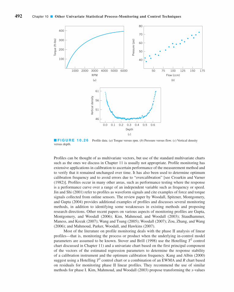
492 Chapter 10 ■ Other Univariate Statistical Process-Monitoring and Control Techniques
Profiles can be thought of as multivariate vectors, but use of the standard multivariate charts
such as the ones we discuss in Chapter 11 is usually not appropriate. Profile monitoring has
extensive applications in calibration to ascertain performance of the measurement method and
to verify that it remained unchanged over time. It has also been used to determine optimum
calibration frequency and to avoid errors due to “overcalibration” [see Croarkin and Varner
(1982)]. Profiles occur in many other areas, such as performance testing where the response
is a performance curve over a range of an independent variable such as frequency or speed.
Jin and Shi (2001) refer to profiles as waveform signals and cite examples of force and torque
signals collected from online sensors. The review paper by Woodall, Spitzner, Montgomery,
and Gupta (2004) provides additional examples of profiles and discusses several monitoring
methods, in addition to identifying some weaknesses in existing methods and proposing
research directions. Other recent papers on various aspects of monitoring profiles are Gupta,
Montgomery, and Woodall (2006); Kim, Mahmoud, and Woodall (2003); Staudhammer,
Maness, and Kozak (2007); Wang and Tsung (2005); Woodall (2007); Zou, Zhang, and Wang
(2006); and Mahmoud, Parker, Woodall, and Hawkins (2007).
Most of the literature on profile monitoring deals with the phase II analysis of linear
profiles—that is, monitoring the process or product when the underlying in-control model
parameters are assumed to be known. Stover and Brill (1998) use the Hotelling T2 control
chart discussed in Chapter 11) and a univariate chart based on the first principal component
of the vectors of the estimated regression parameters to determine the response stability
of a calibration instrument and the optimum calibration frequency. Kang and Albin (2000)
suggest using a Hotelling T2 control chart or a combination of an EWMA and R chart based
on residuals for monitoring phase II linear profiles. They recommend the use of similar
methods for phase I. Kim, Mahmoud, and Woodall (2003) propose transforming the x-values
400
300
200
100
Torq
ue (
ft-l
bs)
1000 2000 3000
RPM
4000 5000 6000
(a)
80
70
60
50
40
Pre
ssur
e (p
si)
50 75 100
Flow (ccm)
125 150 175
(b)
0.0 0.1 0.2
Depth
0.3 0.4 0.5 0.6
(c)
61
56
51
46
Vert
ical
den
sity
■ F I G U R E 1 0 . 2 6 Profile data. (a) Torque versus rpm. (b) Pressure versus flow. (c) Vertical density
versus depth.
c10OtherUnivariateStatisticalProcess-MonitoringandControlTechniques.qxd 3/30/12 8:21 PM Page 492

10.9 Profile Monitoring 493
to achieve an average coded value of zero and then monitoring the intercept, slope, and
process standard deviation using three separate EWMA charts They conduct performance
studies and show their method to be superior to the multivariate T2 and EWMA–R charts of
Kang and Albin (2000).
For phase I analysis, Kim, Mahmoud, and Woodall (2003) suggest replacing the
EWMA charts with Shewhart charts. Mahmoud and Woodall (2004) propose the use of a
global F statistic based on an indicator variable technique to compare k regression lines in
conjunction with a control chart to monitor the error variance term. They compare various
phase I methods with their procedure based on the probability of a signal under various shifts
in the process parameters, and show that their method generally performs better than the T2
control chart of Stover and Brill (1998), the T 2 control chart of Kang and Albin (2000), and
the three Shewhart control charts of Kim, Mahmoud, and Woodall (2003).
We will show how simple Shewhart control charts can be used to conduct phase II mon-
itoring for a linear profile. The in-control model for the ith observation within the jth random
sample is assumed to be a simple linear regression model
where the errors eij are independent and identically distributed normal random variables with
mean zero and known variance s2. The regression coefficients, b0 and b1 and the error variance
s2 are assumed to be known. Notice that in the regression model the independent variable has
been subtracted from its mean—that is, . This technique makes the least squares
estimates of the regression coefficients independent so that they more easily can be monitored
individually using separate control charts. As new samples come available, the regression
model is fit to the data producing estimates of the model parameters for that sample. The con-
trol limits for the intercept, slope, and error variance computed from new samples of data are
as follows:
(10.38)
.
The control limits for monitoring the slope are
(10.39)
where Sxx is defined as [refer to Montgomery et al. (2001), pp. 15–17]. Finally,
the control limits for monitoring the error variance are
(10.40)
LCL =s2
n − 2 c2
(1−a/2), (n−2),
Center line = s2
UCL =s2
n − 2 c2
a/2, (n−2)
Σni=1(xi − x)2
LCL = b1 − Za/2B
s2
Sxx,
Center line = b1
UCL = b1 + Za/2B
s2
Sxx
LCL = b0 − Za/2B
s2
n
Center line = b0
UCL = b0 + Za/2B
s2
n
x¿i = xi − x
= b0 + b1x¿i i = 1, 2, p , n
yij = b0 + b1(x1 − x ) + eij,
c10OtherUnivariateStatisticalProcess-MonitoringandControlTechniques.qxd 3/30/12 8:21 PM Page 493

494 Chapter 10 ■ Other Univariate Statistical Process-Monitoring and Control Techniques
where c2a/2, (n − 2) and c2
(1 − a/2), (n − 2) are the upper and lower a/2 percentage points of the chi-
square distribution with n − 2 degrees of freedom [see Montgomery, Peck, and Vining (2006)
for details]. The value of aoverall is calculated using the equation aoverall = 1 − (1 − a)3 and the
in-control ARL is computed by taking the reciprocal of aoverall. The value of a can be chosen to
obtain a desired ARL value.
We will use the data presented in the NIST/SEMATECH e-Handbook of StatisticalMethods to illustrate the method. The dataset consists of line widths of photo masks ref-
erence standards on 10 units (40 measurements) used for monitoring linear calibration
profiles of an optical imaging system. The line widths are used to estimate the parame-
ters of the linear calibration profile, with a residual standard
deviation of 0.06826 micrometers. This is the phase I profile. A monitoring scheme is
established to monitor measurements on units for upper, middle, and lower end of the rel-
evant measurement range from the estimated phase I profile. The dataset is provided in
Table 10.3 and plotted in Figure 10.27. In the plot, the in-control line is the established
phase I profile. On careful observation of the measurements for the fourth sample,
the plotted values seem to be slightly offset from the in-control line. We employ both the
Shewhart control charts defined in equations 10.38, 10.39, and 10.40 to monitor the
phase II line-width data. The control charts are as shown in Figure 10.28. In the control
charts, the three horizontal lines indicate the upper control limit, the center line, and the
lower control limit, respectively. The numerical values for these quantities are (4.62,
4.49, 4.37), (1.01, 0.98, 0.94), and (0.0087, 0.0046, 0.002), respectively. To achieve the
overall in-control ARL of 200, the value of a for the control charts was adjusted to be
0.00167. Note that the measurements on the fourth day are out of control. The error vari-
ance values on the fifth and sixth days are below the lower control limit with the values
0.0018 and 0.0000, respectively.
yijˆ = 0.2817 + +0.9767x¿i
■ TA B L E 1 0 . 3
Line-Width Measurements
Day Position x y
1 L 0.76 1.12
1 M 3.29 3.49
1 U 8.89 9.11
2 L 0.76 0.99
2 M 3.29 3.53
2 U 8.89 8.89
3 L 0.76 1.05
3 M 3.29 3.46
3 U 8.89 9.02
4 L 0.76 0.76
4 M 3.29 3.75
4 U 8.89 9.3
5 L 0.76 0.96
5 M 3.29 3.53
5 U 8.89 9.05
6 L 0.76 1.03
6 M 3.29 3.52
6 U 8.89 9.02
c10OtherUnivariateStatisticalProcess-MonitoringandControlTechniques.qxd 3/30/12 8:21 PM Page 494

10.9 Profile Monitoring 495
Line
-wid
th m
easu
rem
ents
10Sample 1
5
00.76 3.29 8.89
10Sample 3
5
00.76 3.29 8.89
10Sample 5
5
00.76 3.29
Positions corresponding to Lower, Middle, and Upper values of the calibration range
8.89
10Sample 4
5
00.76 3.29 8.89
10Sample 6
5
00.76 3.29 8.89
10Sample 2
5
00.76 3.29 8.89
In-controlSample
■ F I G U R E 1 0 . 2 7 Plot of the line-
width measurements.
4.8
4.6
Inte
rcep
t
4.4
4.21 2 3 4
Shewhart control chart for monitoring the intercept
5 6
1.1
Slo
pe 1
0.91 2 3 4
Shewhart control chart for monitoring the slope
5 6
0.08
0.06
MS
E
0.02
0.04
01 2 3 4
Shewhart control chart for monitoring the error variance
Time in days
5 6■ F I G U R E 1 0 . 2 8 Shewhart
control charts for monitoring the param-
eters of the calibration line.
c10OtherUnivariateStatisticalProcess-MonitoringandControlTechniques.qxd 3/30/12 8:21 PM Page 495

496 Chapter 10 ■ Other Univariate Statistical Process-Monitoring and Control Techniques
10.10 Control Charts in Health Care Monitoring and Public Health Surveillance
Control charts have many applications in health care and public health monitoring and sur-
veillance. Control charts can be used for monitoring hospital performance with respect to
patient infection rates, patient falls or accidents, emergency room waiting times, or surgical
outcomes for various types of procedures. There are also applications for monitoring poten-
tial outbreaks of infectious diseases, and even bioterrorism events. This is often called syn-dromic surveillance, in which data are obtained from sources such as emergency room
records, over-the-counter drug and prescription sales, visits to physicians, and other sources,
in an attempt to supplement traditional sentinel surveillance for natural disease outbreaks or
bioterrorist attacks. An excellent review paper on control chart applications in public health
surveillance and health care monitoring is Woodall (2006). The book by Winkel and Zhang
(2007) is also recommended. The papers by Fienberg and Shmueli (2005), Buckeridge et al.
(2005), Fricker (2007), and Rolka et al. (2007) offer useful insight on syndromic surveillance.
Health Care Applications of Control Charts. There are some important differences
between the industrial and business settings where statistical process control and control charts
are traditionally applied and the health care and disease-monitoring environments. One of these
is data. Attribute data are much more widely encountered in the health care environment than in
the industrial and business world. For example, in surveillance for outbreaks of a particular
disease, the incidence rate, or number of cases in the population of interest per unit of time, is
typically monitored. Furthermore, disease outbreaks are very likely to be transitory, with more
gradual increases and decreases as opposed to the distinct shifts usually encountered in indus-
trial applications. In the health care and public health environment, one-sided methods tend to
be employed to allow a focus on detecting increases in rates, which are of primary concern. Two-
sided methods are more typically used in business and industry. Some of the techniques used in
health care monitoring and disease surveillance were developed independently of the industrial
statistical process-control field. There have been few comparative studies of the methods unique
to health care monitoring and disease surveillance and often the performance measures used are
different from those employed in industrial SPC. Often the data monitored in these environments
are nonstationary, or have some built-in patterns that are part of the process. An example would
be influenza outbreaks, which are largely confined to the winter and late spring months. In some
public health surveillance applications, the parameter estimates and measures of uncertainty
are updated as new observations become available or the baseline performance is adjusted. These
are methods to account for the nonstationary nature of the monitored data.
Scan Methods. The public health surveillance community often uses scan statistic
methods instead of more conventional control charting methods such as the cumulative sum
or EWMA control chart. A scan statistic is a moving window approach that is similar to the
moving average control chart, discussed in Chapter 9 (see Section 9.3). A scan method sig-
nals an increase in a rate if the count of events in the most recent specified number of time
periods is unusually large. For example, a scan method would signal an increased rate at a
given time if m or more events of interest have occurred in the most recent n trials. A plot of the
scan statistic over time with an upper control limit could be considered as a control charting
technique, but this viewpoint is not usually taken in the health care or the disease surveillance
field. In general, there are no specific guidelines on the design of a scan method.
Scan methods were first applied to the surveillance of chronic diseases by the cancer sur-
veillance community and have more recently been adapted to the surveillance of infectious
diseases. Scan methods can be applied in either the temporal case, where only the times of inci-
dences are known, or in the spatial–temporal case, where both the times and locations of
incidences are known. Most of the work on scan-based methods has been for the phase I situation
in which a set of historical data is analyzed. Comprehensive reviews of many scan-based
c10OtherUnivariateStatisticalProcess-MonitoringandControlTechniques.qxd 3/30/12 8:21 PM Page 496

10.11 Overview of Other Procedures 497
procedures are in Balakrishnan and Koutras (2002) and Glaz et al. (2001). Also see Kulldorff
(1997, 2001, 2003, 2005), Sonesson and Bock (2003), and Naus and Wallenstein (2006).
An important feature of health care monitoring is the human element of the process.
Differences among the people in the system are likely to be great, and these differences have
great potential impact on the outcomes. For example, when evaluating hospital performance
and physician care, we have to take into account that the patients will vary (from patient to
patient, from hospital to hospital, from physician to physician) with regard to their general
state of health and other demographics and factors. Risk-adjusted control charts can be
devised to deal with this situation. Grigg and Farewell (2004) give a review of risk-adjusted
monitoring. Grigg and Spiegelhalter (2007) recently proposed a risk-adjusted EWMA
method. Risk-adjusted control charts are also discussed by Winkel and Zhang (2007).
10.11 Overview of Other Procedures
There are many other process monitoring and control techniques in addition to those pre-
sented previously. This section gives a brief overview of some of these methods, along with
some basic references. The selection of topics is far from exhaustive but does reflect a collec-
tion of ideas that have found practical application.
10.11.1 Tool Wear
Many production processes are subject to tool wear. When tool wear occurs, we usually find
that the process variability at any one point in time is considerably less than the allowable
variability over the entire life of the tool. Furthermore, as the tool wears out, there will gen-
erally be an upward drift or trend in the mean caused by the worn tool producing larger
dimensions. In such cases, the distance between specification limits is generally much greater
than, say, 6s. Consequently, the modified control chart concept can be applied to the tool-
wear problem. The procedure is illustrated in Figure 10.29.
The initial setting for the tool is at some multiple of sx above the lower specification
limit—say, 3sx—and the maximum permissible process average is at the same multiple of sx
below the upper specification limit. If the rate of wear is known or can be estimated from the
data, we can construct a set of slanting control limits about the tool-wear trend line. If the
sample values of fall within these limits, the tool wear is in control. When the trend line exceeds
the maximum permissible process average, the process should be reset or the tool replaced.
x
Sample number
Lowerspecification
limit
Upperspecification
limit
x
σ
σ
3 xσ
Distributionof x
3 xσ
6 x
3 x
σ3 x
■ F I G U R E 1 0 . 2 9 Control chart for tool wear.
c10OtherUnivariateStatisticalProcess-MonitoringandControlTechniques.qxd 3/30/12 8:21 PM Page 497

498 Chapter 10 ■ Other Univariate Statistical Process-Monitoring and Control Techniques
Control charts for tool wear are discussed in more detail by Duncan (1986) and
Manuele (1945). The regression control chart [see Mandel (1969)] can also be adapted to the
tool-wear problem. Quesenberry (1988) points out that these approaches essentially assume
that resetting the process is expensive and that they attempt to minimize the number of adjust-
ments made to keep the parts within specifications rather than reducing overall variability.
Quesenberry develops a two-part tool-wear compensator that centers the process periodically
and protects against assignable causes, as well as adjusting for the estimated mean tool wear
since the previous adjustment.
10.11.2 Control Charts Based on Other Sample Statistics
Some authors have suggested the use of sample statistics other than the average and range (or
standard deviation) for construction of control charts. For example, Ferrell (1953) proposed that
subgroup midranges and ranges be used, with control limits determined by the median
midrange and the median range. The author noted that ease of computation would be a feature
of such control charts and that they would do a better job of detecting “outlier” points than con-
ventional control charts. The median has been used frequently instead of as a center line on
charts of individuals when the underlying distribution is skewed. Similarly, medians of R and shave been proposed as the center lines of those charts so that the asymmetrical distribution of
these statistics will not influence the number of runs above and below the center line.
The recent interest in robust statistical methods has generated some application of these
ideas to control charts. Generally speaking, the presence of assignable causes produces out-
lier values that stretch or extend the control limits, thereby reducing the sensitivity of the con-
trol chart. One approach to this problem has been to develop control charts using statistics that
are themselves outlier-resistant. Examples include the median and midrange control charts
[see Clifford (1959)] and plotting subgroup boxplots [(see Iglewicz and Hoaglin (1987) and
White and Schroeder (1987)]. These procedures are typically not as effective in assignable-
cause or outlier detection as are conventional and R (or S) charts.
A better approach is to plot a sample statistic that is sensitive to assignable causes ( and
R or s), but to base the control limits on some outlier-resistant method. The paper by Ferrell
(1953) mentioned above is an example of this approach, as is plotting and R on charts with
control limits determined by the trimmed mean of the sample means and the trimmed mean
of the ranges, as suggested by Langenberg and Iglewicz (1986).
Rocke (1989) has reported that plotting an outlier-sensitive statistic on a control chart
with control limits determined using an outlier-resistant method works well in practice. The
suggested procedures in Ferrell (1953), Langenberg and Iglewicz (1986), and his own method
are very effective in detecting assignable causes. Interestingly enough, Rocke also notes that
the widely used two-stage method of setting control limits—wherein the initial limits are
treated as trial control limits, samples that plot outside these trial limits are then removed, and
a final set of limits is then calculated—performs nearly as well as the more complex robust
methods. In other words, the use of this two-stage method creates a robust control chart.
In addition to issues of robustness, other authors have suggested control charts for other
sample statistics for process-specific reasons. For example, when pairs of measurements are
made on each unit or when comparison with a standard unit is desired, one may plot the dif-
ference x1j − x2j on a difference control chart [see Grubbs (1946) and the supplemental text
material]. In some cases, the largest and smallest sample values may be of interest. These
charts have been developed by Howell (1949).
10.11.3 Fill Control Problems
Many products are filled on a high-speed, multiple-head circular filling machine that operates
continuously. It is not unusual to find machines in the beverage industry that have from 40 to
72 heads and operate at speeds of from 800 to 1,000 bottles per minute. In such cases, it is
x
xx
x
c10OtherUnivariateStatisticalProcess-MonitoringandControlTechniques.qxd 3/30/12 8:21 PM Page 498

10.11 Overview of Other Procedures 499
difficult to sample products from specific heads because there is no automatic method of iden-
tifying a filled container with its filling head. Furthermore, in addition to assignable causes
that affect all filling heads simultaneously, some assignable causes affect only certain heads.
Special sampling and control charting methods are needed for these types of fill control prob-
lems. Ott and Snee (1973) present some techniques useful for this problem, particularly for
filling machines with a moderate number of heads. Many of the methods described in Section
10.3 for multiple-stream processes are also useful in fill control problems.
10.11.4 Precontrol
Precontrol is a technique that is used to detect shifts or upsets in the process that may result
in the production of nonconforming units. The technique differs from statistical process con-
trol in that conventional control charts are designed to detect shifts in process parameters that
are statistically significant, and precontrol requires no plotting of graphs and no computa-
tions. Precontrol uses the normal distribution in determining changes in the process mean or
standard deviation that could result in increased production of nonconforming units. Only
three units are required to give control information.
To demonstrate the procedure, suppose that the quality characteristic is normally distrib-
uted and that the natural tolerance limits (m ± 3s) exactly coincide with the specification lim-
its. Furthermore, the process average m is halfway between the specifications, so that the
process is producing 0.27% fallout. Construct two precontrol limits (called upper and lower PC
lines), each of which is one-fourth the distance in from the modified limit, as in Figure 10.30.
Since the distribution of the quality characteristic is normal, approximately 86% of the process
output will lie inside the PC lines, and approximately 7% will lie in each of the regions
between the PC line and specification limit. This means that only about 1 item in 14 will fall
outside a PC line if the process mean and standard deviation are on the target values.
If the probability is 1 in 14 that one unit falls outside a PC line, the probability that two
consecutive units fall outside a PC line is . That is, if the
process is operating correctly, the probability of finding two consecutive units outside of a
given PC line is only about . When two such consecutive units are found, it is likely that
the process has shifted to an out-of-control state. Similarly, it is unlikely to find the first unit
beyond one PC line and the next beyond the other PC line. In this case, we suspect that
process variability has increased.
A set of rules follow that describe the operation of precontrol. These rules assume that
1% to 3% nonconforming production is acceptable and that the process capability ratio is at
least 1.15.
1. Start the process. If the first item is outside specifications, reset and start again.
2. If an item is inside specifications but outside a PC line, check the next item.
3. If the second item is outside the same PC line, reset the process.
1200
a1
14b a
1
14b =
1
196=
1
200
μ UPCL3_4
USL1
LPCL1_4
LSL0
86% 7%7%
x
■ F I G U R E 1 0 . 3 0 Location of precontrol lines.
c10OtherUnivariateStatisticalProcess-MonitoringandControlTechniques.qxd 3/30/12 8:21 PM Page 499

500 Chapter 10 ■ Other Univariate Statistical Process-Monitoring and Control Techniques
4. If the second item is inside the PC line, continue. The process is reset only when two
consecutive items are outside a given PC line.
5. If one item is outside a PC line and the next item is outside the other PC line, the
process variability is out of control.
6. When five consecutive units are inside the PC lines, shift to frequency gauging.
7. When frequency gauging, do not adjust process until an item exceeds a PC line. Then
examine the next consecutive item, and proceed as in step 4.
8. When the process is reset, five consecutive items must fall inside the PC lines before
frequency gauging can be resumed.
9. If the operator samples from the process more than 25 times without having to reset the
process, reduce the gauging frequency so that more units are manufactured between
samples. If you must reset before 25 samples are taken, increase the gauging frequency.
An average of 25 samples to a reset indicates that the sampling frequency is satisfactory.
Precontrol is closely related to a technique called narrow-limit gauging (or compressed-limit gauging), in which inspection procedures are determined using tightened limits located
so as to meet established risks of accepting nonconforming product. Narrow-limit gauging is
discussed in more general terms by Ott (1975).
Although precontrol has the advantage of simplicity, it should not be used indiscrimi-
nately. The procedure has serious drawbacks. First, because no control chart is usually con-
structed, all the aspects of pattern recognition associated with the control chart cannot be used.
Thus, the diagnostic information about the process contained in the pattern of points on the
control chart, along with the logbook aspect of the chart, is lost. Second, the small sample sizes
greatly reduce the ability of the procedure to detect even moderate-to-large shifts. Third, pre-
control does not provide information that is helpful in bringing the process into control or that
would be helpful in reducing variability (which is the goal of statistical process control).
Finally, the assumption of an in-control process and adequate process capability is extremely
important. Precontrol should only be considered in manufacturing processes where the process
capability ratio is much greater than one (perhaps at least two or three), and where a near-zero
defects environment has been achieved. Ledolter and Swersey (1997) in a comprehensive
analysis of precontrol also observe that its use will likely lead to unnecessary tampering with
the process; this can actually increase variability. This author believes that precontrol is a poor
substitute for standard control charts and would never recommend it in practice.
10.11.5 Tolerance Interval Control Charts
The usual intent of standard control limits for phase II control charts based on normal distri-
bution is that they contain six standard deviations of the distribution of the statistic that is
plotted on the chart. For the normal distribution, this is the familiar quantity 0.9973 =1 − 2(0.00135), where 0.00135 is the probability outside each control limit or the area in the
tail of the distribution of the plotted statistic. Standard control limits do not satisfy this,
because while a normal distribution is assumed, many plotted statistics do not follow the normal
distribution. The sample range R and sample standard deviation s are good examples. The random
variables R and s have skewed distributions that lead to zero lower control limits when the
subgroup size is six or less for the R chart and five or less for the s chart. Using probability
limits would avoid this problem. However, there is another problem. The phase II control limits
also depend on the parameters of the distribution that are estimated using the data that was
collected and analyzed in phase I.
Hamada (2003) proposes the use of beta-content tolerance intervals as the basis for con-
trol limits to more precisely control the probability content of the control limits. He develops
these control limits for the , R, and s charts, and he provides tables of the constants necessaryx
c10OtherUnivariateStatisticalProcess-MonitoringandControlTechniques.qxd 3/30/12 8:21 PM Page 500

10.11 Overview of Other Procedures 501
for their construction and use. His constants control the probability content in each tail at
0.000135, but the formulas provided allow different probability values and potentially differ-
ent probability contents in each tail. A useful benefit of his approach is that nonzero lower
control limits arise naturally for the R and s charts, affording an opportunity to detect down-
ward shifts in process variability more easily.
10.11.6 Monitoring Processes with Censored Data
There are many situations where a process is monitored and the data that are collected are
censored. For example, Steiner and MacKay (2000) describe manufacturing material used in
making automobile interiors. In this process, a vinyl outer layer is bonded to a foam backing;
to check the bond strength, a sample of the material is cut, and the force required to break the
bond is measured. A predetermined maximum force is applied, and most samples do not fail.
Therefore, the bond strength measurements are censored data.
When the censoring proportion is not large, say under 50%, it is fairly standard prac-
tice to ignore the censoring. When the censoring proportion is high, say above 95%, it is often
possible to use an np control chart to monitor the number of censored observations. However,
there are many situations where the proportion of censored observations is between 50% and
95% and these conventional approaches do not apply. Steiner and MacKay (2000) develop
conditional expected value (CEV) weight control charts for this problem. To develop the
charts, they assume that the measured quantity x is normally distributed with mean and stan-
dard deviation m and s, respectively. The censoring level is C; that is, the measurement value
is not observed exactly if x exceeds C. The probability of censoring is
where Φ is the standard normal cumulative distribution function and Q(C) is called the sur-vivor function of the distribution. Their CEV control charts simply replace each censored
observation with its conditional expected value. Then the subgroup averages and standard
deviations are calculated and plotted in the usual manner. The conditional expected value of
a censored observation is
where f(zc) is the standard normal density function, and zc = (C − m)/s. Therefore, the actual
data used to construct the control charts is
The control limits for the CEV control charts depend on the sample size and the censoring pro-
portion pc. The relationship is complex, and does not lead to a simple rule such as the use of
three-sigma limits. Instead, graphs provided by Steiner and Mackay (2000) that are based on sim-
ulation must be used to determine the control limits. Furthermore, in application the mean and
standard deviation m and s must be estimated. This is done in phase I using preliminary process
data. An iterative maximum likelihood procedure is provided by the authors for doing this.
10.11.7 Monitoring Bernoulli Processes
In this section we consider monitoring a sequence of independent Bernoulli random variables—
. . . —where each observation is considered to be conforming or nonconforming and
can be coded as either 0 or 1. This is usually referred to as Bernoulli data. Monitoring and
xi, i = 1, 2,
wx x C
w x Cc=
≤>
⎧⎨⎩
,
,
if
if
w E x x Cz
zcc
c
= >( ) = + ( )( )
⎛
⎝⎜⎞
⎠⎟μ σ
φΦ
pC
Q Cc = − −⎛⎝
⎞⎠ = ( )1 Φ μ
σ
c10OtherUnivariateStatisticalProcess-MonitoringandControlTechniques.qxd 3/30/12 8:21 PM Page 501

502 Chapter 10 ■ Other Univariate Statistical Process-Monitoring and Control Techniques
analysis of Bernoulli data are often performed using 100% inspection, where all units are con-
sidered, but that also occurs in interval sampling, where the units are inspected at scheduled
periods. When the process is in control, there is a constant probability p of a nonconforming
item occurring. In most situations we are interested in detecting a sustained increase in p from
an in-control nonconforming rate, p0, to an out-of-control rate p1 that is greater than p0.
However, there are applications where one is interested in detecting decreases in p0. Szarka and
Woodall (2011) provide an in-depth review of methods for monitoring Bernoulli data, focus-
ing on the “high quality process” situation, where p0 is very small. They cite 112 references.
Typical “high quality” processes have rates of 1,000 ppm nonconforming to under 100 ppm
nonconforming (a Six Sigma process would have no more that 3.4 ppm nonconforming
according to the Motorola definition of a Six Sigma process), but in some applications a value
of p0 = 0.05 could be considered a small value. See Goh and Xie (1994).
Szarka and Woodall (2011) observe that the traditional Shewhart chart for fraction non-
conforming (the p chart or the np chart) are unlikely to be satisfactory. One significant prob-
lem is that the aggregation of data over time required for obtaining a subgroup of n > 1 items
results in a loss of information and unnecessary delays in detecting changes in the underlying
proportion. Calvin (1991) suggested control charting the number of conforming items that
were inspected between successive nonconforming items. This type of control chart is usu-
ally called the cumulative count of conforming (or CCC) control chart. Cumulative sum con-
trol charts or EWMA control charts could also be used with very high-quality Bernoulli data.
However, very large sample sizes may be necessary to estimate the in-control state p0 accu-
rately. Steiner and MacKay (2004) recommend identifying a continuous process or product
variable that is related to the production of nonconforming items and monitoring that variable
instead. Szarka and Woodall (2011) recommend this approach as well, providing such a con-
tinuous variable can be identified.
10.11.8 Nonparametric Control Charts
The performance of most control charts depends on the assumption of a particular probability
distribution, as a model for the process data. The normal distribution is usually assumed, and
almost all of the performance analysis reported in the literature assumes that the observations
are drawn from a normal distribution. However, much process data is not normally distrib-
uted, and so the robustness of control charts to this assumption has long been an issue in SPC.
The robustness of the Shewhart chart to normality has been studied very thoroughly (refer
to Section 6.2.5). Researchers have found that some control charts are significantly affected
by non-normality—for example, the Shewhart control chart for individuals.
Because non-normality can affect control chart performance, some authors have devel-
oped nonparametric control charts that do not depend on normality or any other specific dis-
tributional assumption. Most nonparametric statistical process-control (NSPC) techniques
depend on ranks. Procedures have been developed that are alternatives to many of the stan-
dard Shewhart charts, the CUSUM, and the EWMA. The empirical reference distribution
control charts of Willemain and Runger (1996), which are based on order statistics from a
large reference sample, are also a form of nonparametric control chart. There has also been
some work done on multivariate NSPC. A good review of much of the literature in this area
is in Chakraborti, Van Der Laan, and Bakir (2001). There is little evidence that these NSPC
techniques have gained any real acceptance in practice. As we have noted previously, a prop-
erly designed univariate (and as we will subsequently see, a multivariate) EWMA control
chart is very robust to the assumption of normality, and performs quite well for both heavy-
tailed symmetric distributions and skewed distributions. Because the univariate EWMA is
widely available in standard statistics packages, and the multivariate EWMA discussed in
Chapter 11 is also very easy to implement, these charts would seem to be good alternatives to
NSPC in many situations.
x
c10OtherUnivariateStatisticalProcess-MonitoringandControlTechniques.qxd 3/30/12 8:21 PM Page 502

Exercises 503
Acceptance control charts
Adaptive (SPC) control charts
Autocorrelation function
Autoregressive integrated moving average (ARIMA)
models
Autocorrelated process data
Average run length
Bernoulli processes
Changepoint model for process monitoring
Control charts on residuals
Cuscore statistics and control charts
Deviation from nominal (DNOM) control charts
Economic models of control charts
First-order autoregressive model
First-order integrated moving average model
First-order mixed model
First-order moving average model
Group control charts (GCC)
Health care applications of control charts
Impact of autocorrelation on control charts
Modified control charts
Multiple-stream processes
Positive autocorrelation
Profile monitoring
Sample autocorrelation function
Second-order autoregressive model
Shewhart process model
Standardized and R control charts
Time-series model
Unweighted batch means (UBM) control charts
x
Important Terms and Concepts
Exercises
10.1. Use the data in Table 10E.1 to set
up short-run and R charts using
the DNOM approach. The nominal
dimensions for each part are TA =100, TB = 60, TC = 75, and TD = 50.
10.2. Use the data in Table 10E.2 to set
up appropriate short-run and Rcharts, assuming that the standard
deviations of the measured charac-
teristic for each part type are not the
same. The normal dimensions for
each part are TA = 100, TB = 200,
and TC = 2000.
x
xThe Student
Resource Manual
presents compre-
hensive annotated
solutions to the
odd-numbered
exercises included
in the Answers to
Selected Exercises
section in the
back of this book.
■ TA B L E 1 0 E . 1
Data for Exercise 10.1
Sample PartNumber Type M1 M2 M3
1 A 105 102 103
2 A 101 98 100
3 A 103 100 99
4 A 101 104 97
5 A 106 102 100
6 B 57 60 59
7 B 61 64 63
8 B 60 58 62
9 C 73 75 77
10 C 78 75 76
11 C 77 75 74
12 C 75 72 79
13 C 74 75 77
14 C 73 76 75
15 D 50 51 49
16 D 46 50 50
17 D 51 46 50
18 D 49 50 53
19 D 50 52 51
20 D 53 51 50
■ TA B L E 1 0 E . 2
Data for Exercise 10.2
Sample PartNumber Type M1 M2 M3 M3
1 A 120 95 100 110
2 A 115 123 99 102
3 A 116 105 114 108
4 A 120 116 100 96
5 A 112 100 98 107
6 A 98 110 116 105
7 B 230 210 190 216
8 B 225 198 236 190
9 B 218 230 199 195
10 B 210 225 200 215
11 B 190 218 212 225
12 C 2,150 2,230 1,900 1,925
13 C 2,200 2,116 2,000 1,950
14 C 1,900 2,000 2,115 1,990
15 C 1,968 2,250 2,160 2,100
16 C 2,500 2,225 2,475 2,390
17 C 2,000 1,900 2,230 1,960
18 C 1,960 1,980 2,100 2,150
19 C 2,320 2,150 1,900 1,940
20 C 2,162 1,950 2,050 2,125
c10OtherUnivariateStatisticalProcess-MonitoringandControlTechniques.qxd 3/30/12 8:21 PM Page 503

504 Chapter 10 ■ Other Univariate Statistical Process-Monitoring and Control Techniques
■ TA B L E 1 0 E . 4
Data for Exercise 10.5
Head
Sample 1 2 3 4Number R R R R
1 53 2 54 1 56 2 55 3
2 51 1 55 2 54 4 54 4
3 54 2 52 5 53 3 57 2
4 55 3 54 3 52 1 51 5
5 54 1 50 2 51 2 53 1
6 53 2 51 1 54 2 52 2
7 51 1 53 2 58 5 54 1
8 52 2 54 4 51 2 55 2
9 50 2 52 3 52 1 51 3
10 51 1 55 1 53 3 53 5
11 52 3 57 2 52 4 55 1
12 51 2 55 1 54 2 58 2
13 54 4 58 2 51 1 53 1
14 53 1 54 4 50 3 54 2
15 55 2 52 3 54 2 52 6
16 54 4 51 1 53 2 58 5
17 53 3 50 2 57 1 53 1
18 52 1 49 1 52 1 49 2
19 51 2 53 3 51 2 50 3
20 52 4 52 2 50 3 52 2
xxxx
■ TA B L E 1 0 E . 5
Data for Exercise 10.6
Head
Sample 1 2 3 4Number R R R R
21 50 3 54 1 57 2 55 5
22 51 1 53 2 54 4 54 3
23 53 2 52 4 55 3 57 1
24 54 4 54 3 53 1 56 2
25 50 2 51 1 52 2 58 4
26 51 2 55 5 54 5 54 3
27 53 1 50 2 51 4 60 1
28 54 3 51 4 54 3 61 4
29 52 2 52 1 53 2 62 3
30 52 1 53 3 50 4 60 1
xxxx
■ TA B L E 1 0 E . 3
Defect Data for Exercise 10.4
Total TotalProduction Part Number Production Part Number
Day Number of Defects Day Number of Defects
245 1,261 16 251 4,610 10
1,261 10 4,610 0
1,261 15 1,261 20
246 1,261 8 1,261 21
1,261 11 252 1,261 15
1,385 24 1,261 8
1,385 21 1,261 10
247 1,385 28 1,130 64
1,385 35 1,130 75
1,261 10 1,130 53
248 1,261 8 253 1,055 16
8,611 47 1,055 15
8,611 45 1,055 10
249 8,611 53 254 1,055 12
8,611 41 8,611 47
1,385 21 8,611 60
250 1,385 25 255 8,611 51
1,385 29 8,611 57
1,385 30 4,610 0
4,610 6 4,610 4
4,610 8
10.3. Discuss how you would use a CUSUM in the short
production-run situation. What advantages would it
have relative to a Shewhart chart, such as a DNOM
version of the chart?
10.4. Printed circuit boards used in several different avion-
ics devices are 100% tested for defects. The batch
size for each board type is relatively small, and man-
agement wishes to establish SPC using a short-run
version of the c chart. Defect data from the last two
weeks of production are shown in Table 10E.3. What
chart would you recommend? Set up the chart and
examine the process for control.
10.5. A machine has four heads. Samples of n = 3 units are
selected from each head, and the and R values for
an important quality characteristic are computed. The
data are shown in Table 10E.4. Set up group control
charts for this process.
10.6. Consider the group control charts constructed in
Exercise 10.5. Suppose the next ten samples are in
Table 10E.5. Plot the new data on the control charts
and discuss your findings.
10.7. Reconsider the data in Exercises 10.5 and 10.6.
Suppose the process measurements are individual
data values, not subgroup averages.
(a) Use observations 1–20 in Exercise 10.5 to con-
struct appropriate group control charts.
x
x
(b) Plot observations 21–30 from Exercise 10.6 on
the charts from part (a). Discuss your findings.
(c) Using observations 1–20, construct an individ-
uals control chart using the average of the
readings on all four heads as an individual
measurement and an s control chart using the
individual measurements on each head.
c10OtherUnivariateStatisticalProcess-MonitoringandControlTechniques.qxd 3/30/12 8:21 PM Page 504
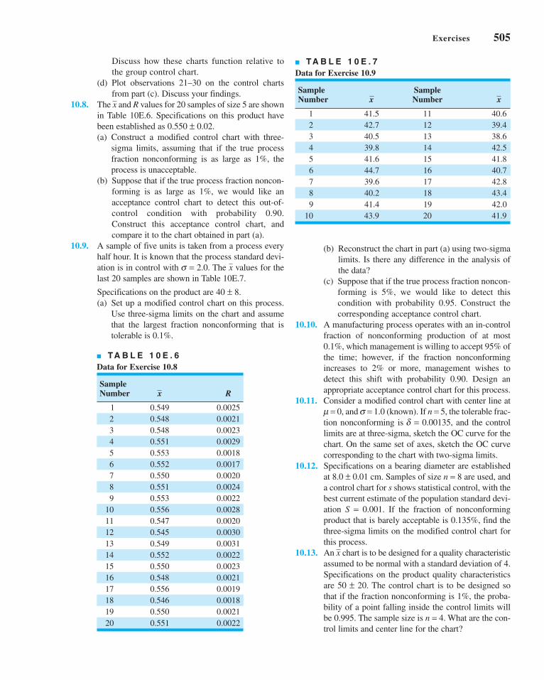
Exercises 505
Discuss how these charts function relative to
the group control chart.
(d) Plot observations 21–30 on the control charts
from part (c). Discuss your findings.
10.8. The and R values for 20 samples of size 5 are shown
in Table 10E.6. Specifications on this product have
been established as 0.550 ± 0.02.
(a) Construct a modified control chart with three-
sigma limits, assuming that if the true process
fraction nonconforming is as large as 1%, the
process is unacceptable.
(b) Suppose that if the true process fraction noncon-
forming is as large as 1%, we would like an
acceptance control chart to detect this out-of-
control condition with probability 0.90.
Construct this acceptance control chart, and
compare it to the chart obtained in part (a).
10.9. A sample of five units is taken from a process every
half hour. It is known that the process standard devi-
ation is in control with s = 2.0. The values for the
last 20 samples are shown in Table 10E.7.
Specifications on the product are 40 ± 8.
(a) Set up a modified control chart on this process.
Use three-sigma limits on the chart and assume
that the largest fraction nonconforming that is
tolerable is 0.1%.
x
x
(b) Reconstruct the chart in part (a) using two-sigma
limits. Is there any difference in the analysis of
the data?
(c) Suppose that if the true process fraction noncon-
forming is 5%, we would like to detect this
condition with probability 0.95. Construct the
corresponding acceptance control chart.
10.10. A manufacturing process operates with an in-control
fraction of nonconforming production of at most
0.1%, which management is willing to accept 95% of
the time; however, if the fraction nonconforming
increases to 2% or more, management wishes to
detect this shift with probability 0.90. Design an
appropriate acceptance control chart for this process.
10.11. Consider a modified control chart with center line at
m = 0, and s = 1.0 (known). If n = 5, the tolerable frac-
tion nonconforming is d = 0.00135, and the control
limits are at three-sigma, sketch the OC curve for the
chart. On the same set of axes, sketch the OC curve
corresponding to the chart with two-sigma limits.
10.12. Specifications on a bearing diameter are established
at 8.0 ± 0.01 cm. Samples of size n = 8 are used, and
a control chart for s shows statistical control, with the
best current estimate of the population standard devi-
ation S = 0.001. If the fraction of nonconforming
product that is barely acceptable is 0.135%, find the
three-sigma limits on the modified control chart for
this process.
10.13. An chart is to be designed for a quality characteristic
assumed to be normal with a standard deviation of 4.
Specifications on the product quality characteristics
are 50 ± 20. The control chart is to be designed so
that if the fraction nonconforming is 1%, the proba-
bility of a point falling inside the control limits will
be 0.995. The sample size is n = 4. What are the con-
trol limits and center line for the chart?
x
■ TA B L E 1 0 E . 6
Data for Exercise 10.8
Sample Number R
1 0.549 0.0025
2 0.548 0.0021
3 0.548 0.0023
4 0.551 0.0029
5 0.553 0.0018
6 0.552 0.0017
7 0.550 0.0020
8 0.551 0.0024
9 0.553 0.0022
10 0.556 0.0028
11 0.547 0.0020
12 0.545 0.0030
13 0.549 0.0031
14 0.552 0.0022
15 0.550 0.0023
16 0.548 0.0021
17 0.556 0.0019
18 0.546 0.0018
19 0.550 0.0021
20 0.551 0.0022
x
■ TA B L E 1 0 E . 7
Data for Exercise 10.9
Sample SampleNumber Number
1 41.5 11 40.6
2 42.7 12 39.4
3 40.5 13 38.6
4 39.8 14 42.5
5 41.6 15 41.8
6 44.7 16 40.7
7 39.6 17 42.8
8 40.2 18 43.4
9 41.4 19 42.0
10 43.9 20 41.9
xx
c10OtherUnivariateStatisticalProcess-MonitoringandControlTechniques.qxd 3/30/12 8:21 PM Page 505

506 Chapter 10 ■ Other Univariate Statistical Process-Monitoring and Control Techniques
■ TA B L E 1 0 E . 8
Molecular Weight Measurements on a Polymer
2,048 2,039 2,051 2,002 2,029
2,025 2,015 2,056 1,967 2,019
2,017 2,021 2,018 1,994 2,016
1,995 2,010 2,030 2,001 2,010
1,983 2,012 2,023 2,013 2,000
1,943 2,003 2,036 2,016 2,009
1,940 1,979 2,019 2,019 1,990
1,947 2,006 2,000 2,036 1,986
1,972 2,042 1,986 2,015 1,947
1,983 2,000 1,952 2,032 1,958
1,935 2,002 1,988 2,016 1,983
1,948 2,010 2,016 2,000 2,010
1,966 1,975 2,002 1,988 2,000
1,954 1,983 2,004 2,010 2,015
1,970 2,021 2,018 2,015 2,032
■ TA B L E 1 0 E . 9
Chemical Process Concentration Readings
204 190 208 207 200
202 196 209 204 202
201 199 209 201 202
202 203 206 197 207
197 199 200 189 206
201 207 203 189 211
198 204 202 196 205
188 207 195 193 210
195 209 196 193 210
189 205 203 198 198
195 202 196 194 194
192 200 197 198 192
196 208 197 199 189
194 214 203 204 188
196 205 205 200 189
199 211 194 203 194
197 212 199 200 194
197 214 201 197 198
192 210 198 196 196
195 208 202 202 200
10.14. An chart is to be established to control a quality
characteristic assumed to be normally distributed with
a standard deviation of 4. Specifications on the quality
characteristic are 800 ± 20. The control chart is to be
designed so that if the fraction nonconforming is 1%,
the probability of a point falling inside the control lim-
its will be 0.90. The sample size is n = 4. What are the
control limits and center line for the chart?
10.15. A normally distributed quality characteristic is con-
trolled by and R charts having the following para-
meters (n = 4, both charts are in control):
R Chart Chart
UCL = 18.795 UCL = 626.00
Center line = 8.236 Center line = 620.00
LCL = 0 LCL = 614.00
(a) What is the estimated standard deviation of the
quality characteristic x?
(b) If specifications are 610 ± 15, what is your esti-
mate of the fraction of nonconforming material
produced by this process when it is in control at
the given level?
(c) Suppose you wish to establish a modified chart
to substitute for the original chart. The process
mean is to be controlled so that the fraction non-
conforming is less than 0.005. The probability of
type I error is to be 0.01. What control limits do
you recommend?
10.16. The data in Table 10E.8 are molecular weight mea-
surements made every two hours on a polymer (read
down, then across from left to right).
xx
x
x
x (a) Calculate the sample autocorrelation function
and provide an interpretation.
(b) Construct an individuals control chart with the
standard deviation estimated using the moving
range method. How would you interpret the
chart? Are you comfortable with this interpreta-
tion?
(c) Fit a first-order autoregressive model xt = x +fxt−1 + et to the molecular weight data. Set up an
individuals control chart on the residuals from
this model. Interpret this control chart.
10.17. Consider the molecular weight data in Exercise 10.16.
Construct a CUSUM control chart on the residuals
from the model you fit to the data in part (c) of that
exercise.
10.18. Consider the molecular weight data in Exercise 10.16.
Construct an EWMA control chart on the residuals
from the model you fit to the data in part (c) of that
exercise.
10.19. Set up a moving center-line EWMA control chart for
the molecular weight data in Exercise 10.16.
Compare it to the residual control chart in Exercise
10.16, part (c).
10.20. The data shown in Table 10E.9 are concentration
readings from a chemical process, made every 30
minutes (read down, then across from left to right).
(a) Calculate the sample autocorrelation function
and provide an interpretation.
c10OtherUnivariateStatisticalProcess-MonitoringandControlTechniques.qxd 3/30/12 8:21 PM Page 506

Exercises 507
(b) Construct an individuals control chart with the
standard deviation estimated using the moving
range method. Provide an interpretation of this
control chart.
(c) Fit a first-order autoregressive model xt = x +fxt−1 + et to the data. Set up an individuals con-
trol chart on the residuals from this model.
Interpret this chart.
(d) Are the residuals from the model in part (c)
uncorrelated? Does this have any impact on
your interpretation of the control chart from
part (c)?
10.21. Consider the concentration data in Exercise 10.20.
Construct a CUSUM chart on the residuals from the
model you fit in part (c) of that exercise.
10.22. Consider the concentration data in Exercise 10.20.
Construct an EWMA control chart in the residuals
from the model you fit in part (c) of that exercise.
10.23. Set up a moving center line EWMA control chart
for the concentration data in Exercise 10.20.
Compare it to the residuals control chart in Exercise
10.20, part (c).
10.24. The data shown in Table 10E.10 are temperature
measurements made every 2 minutes on an interme-
diate chemical product (read down, then across from
left to right).
(a) Calculate the sample autocorrelation function.
Interpret the results that you have obtained.
(b) Construct an individuals control chart, using the
moving range method to estimate the standard
deviation. Interpret the results you have obtained.
(c) Fit a first-order autoregressive model xt = x +fxt−1 + et to the temperature data. Set up an indi-
viduals control chart on the residuals from this
model. Compare this chart to the individuals
chart in the original data in part (a).
10.25. Consider the temperature data in Exercise 10.24. Set
up a CUSUM control chart on the residuals from the
model you fit to the data in part (c) of that exercise.
Compare it to the individuals chart you constructed
using the residuals.
10.26. Consider the temperature data in Exercise 10.24. Set
up an EWMA control chart on the residuals from the
model you fit to the data in part (c) of that exercise.
Compare it to the individuals chart you constructed
using the residuals.
10.27. Set up a moving center line EWMA control chart for
the temperature data in Exercise 10.24. Compare it to
the residuals control chart in Exercise 10.24, part (c).
10.28. (a) Discuss the use of the moving range method to
estimate the process standard deviation when the
data are positively autocorrelated.
(b) Discuss the use of the sample variance s2 with
positively autocorrelated data. Specifically, if the
observations at lag ri have autocorrelation ri, is
s2 still an unbiased estimator for s2?
(c) Does your answer in part (b) imply that s2 would
really be a good way (in practice) to estimate s2 in
constructing a control chart for autocorrelated data?
10.29. The viscosity of a chemical product is read every two
minutes. Some data from this process are shown in
Table 10E.11 (read down, then across from left to right).
(a) Is there a serious problem with autocorrelation in
these data?
(b) Set up a control chart for individuals with a mov-
ing range used to estimate process variability.
What conclusion can you draw from this chart?
(c) Design a CUSUM control scheme for this
process, assuming that the observations are
uncorrelated. How does the CUSUM perform?
(d) Set up an EWMA control chart with l = 0.15 for
the process. How does this chart perform?
(e) Set up a moving center line EWMA scheme for
these data.
(f) Suppose that a reasonable model for the viscosity
data is an AR (2) model. How could this model be
used to assist in the development of a statistical
process-control procedure for viscosity? Set up
an appropriate control chart, and use it to assess
the current state of statistical control.
10.30. An chart is used to maintain current control of a
process. A single assignable cause of magnitude 2sx
■ TA B L E 1 0 E . 1 0
Temperature Measurements for Exercise 10.24
491 526 489 502 528
482 533 496 494 513
490 533 489 492 511
495 527 494 490 512
499 520 496 489 522
499 514 514 495 523
507 517 505 498 517
503 508 511 501 522
510 515 513 518 518
509 501 508 521 505
510 497 498 535 510
510 483 500 533 508
515 491 502 524 510
513 489 506 515 487
520 496 500 529 481
518 501 495 525 483
517 496 489 526 473
526 495 509 528 479
525 488 511 534 475
519 491 508 530 484
c10OtherUnivariateStatisticalProcess-MonitoringandControlTechniques.qxd 3/30/12 8:21 PM Page 507

508 Chapter 10 ■ Other Univariate Statistical Process-Monitoring and Control Techniques
■ TA B L E 1 0 E . 1 2
Tool Wear Data
Sample Number R
1 1.0020 0.0008
2 1.0022 0.0009
3 1.0025 0.0006
4 1.0028 0.0007
5 1.0029 0.0005
6 1.0032 0.0006
Tool Reset
7 1.0018 0.0005
8 1.0021 0.0006
9 1.0024 0.0005
10 1.0026 0.0008
11 1.0029 0.0005
12 1.0031 0.0007
x
occurs, and the time that the process remains in con-
trol is an exponential random variable with mean
100 h. Suppose that sampling costs are $0.50 per
sample and $0.10 per unit, it costs $5 to investigate a
false alarm, $2.50 to find the assignable cause, and
$100 is the penalty cost per hour to operate in the out-
of-control state. The time required to collect and
evaluate a sample is 0.05 h, and it takes 2 h to locate
the assignable cause. Assume that the process is
allowed to continue operating during searches for the
assignable cause.
(a) What is the cost associated with the arbitrary
control chart design n = 5, k = 3, and h = 1?
(b) Find the control chart design that minimizes the
cost function given by equation 10.31.
10.31. An chart is used to maintain current control of a
process. The cost parameters are a1 = $0.50, a2 =$0.10, a3 = $25, a¢3 = $50, and a4 = $100. A single
assignable cause of magnitude d = 2 occurs, and the
duration of the process in control is an exponential
random variable with mean 100 h. Sampling and test-
ing require 0.05 h, and it takes 2 h to locate the
x
assignable cause. Assume that equation 10.31 is the
appropriate process model.
(a) Evaluate the cost of the arbitrary control chart
design n = 5, k = 3, and h = 1.
(b) Evaluate the cost of the arbitrary control chart
design n = 5, k = 3, and h = 0.5.
(c) Determine the economically optimum design.
10.32. Consider the cost information given in Exercise
10.30. Suppose that the process model represented by
equation 10.31 is appropriate. It requires 2 h to inves-
tigate a false alarm, the profit per hour of operating in
the in-control state is $500, and it costs $25 to elimi-
nate the assignable cause. Evaluate the cost of the
arbitrary control chart design n = 5, k = 3, and h = 1.
10.33. An chart is used to maintain current control of a
process. The cost parameters are a1 = $2, a2 = $0.50,
a3 = $50, a′3 = $75, and a4 = $200. A single assignable
cause occurs, with magnitude d = 1, and the run length
of the process in control is exponentially distributed
with mean 100 h. It requires 0.05 h to sample and test,
and 1 h to locate the assignable cause.
(a) Evaluate the cost of the arbitrary chart design
n = 5, k = 3, and h = 0.5.
(b) Find the economically optimum design.
10.34. A control chart for tool wear. A sample of five units
of product is taken from a production process every
hour. The results in Table 10E.12 are obtained.
Assume that the specifications on this quality charac-
teristic are at 1.0015 and 1.0035. Set up the R chart
on this process. Set up a control chart to monitor the
tool wear.
x
x
■ TA B L E 1 0 E . 1 1
Chemical Product Viscosity
29.330 33.220 27.990 24.280
19.980 30.150 24.130 22.690
25.760 27.080 29.200 26.600
29.000 33.660 34.300 28.860
31.030 36.580 26.410 28.270
32.680 29.040 28.780 28.170
33.560 28.080 21.280 28.580
27.500 30.280 21.710 30.760
26.750 29.350 21.470 30.620
30.550 33.600 24.710 20.840
28.940 30.290 33.610 16.560
28.500 20.110 36.540 25.230
28.190 17.510 35.700 31.790
26.130 23.710 33.680 32.520
27.790 24.220 29.290 30.280
27.630 32.430 25.120 26.140
29.890 32.440 27.230 19.030
28.180 29.390 30.610 24.340
26.650 23.450 29.060 31.530
30.010 23.620 28.480 31.950
30.800 28.120 32.010 31.680
30.450 29.940 31.890 29.100
36.610 30.560 31.720 23.150
31.400 32.300 29.090 26.740
30.830 31.580 31.920 32.440
c10OtherUnivariateStatisticalProcess-MonitoringandControlTechniques.qxd 3/30/12 8:21 PM Page 508

11.1 THE MULTIVARIATE QUALITY-CONTROL PROBLEM
11.2 DESCRIPTION OF MULTIVARIATEDATA
11.2.1 The Multivariate NormalDistribution
11.2.2 The Sample Mean Vectorand Covariance Matrix
11.3 THE HOTELLING T2 CONTROLCHART
11.3.1 Subgrouped Data11.3.2 Individual Observations
1111CHAPTER OUTLINE
11.4 THE MULTIVARIATE EWMA CONTROL CHART
11.5 REGRESSION ADJUSTMENT11.6 CONTROL CHARTS FOR
MONITORING VARIABILITY11.7 LATENT STRUCTURE METHODS
11.7.1 Principal Components11.7.2 Partial Least Squares
Supplemental Material for Chapter 11
S11.1 Multivariate CUSUM ControlCharts.
The supplemental material is on the textbook Website www.wiley.com/college/montgomery.
Multivariate ProcessMonitoring and Control
509
CHAPTER OVERVIEW AND LEARNING OBJECTIVES
In previous chapters we have addressed process monitoring and control primarily from the
univariate perspective; that is, we have assumed that there is only one process output vari-
able or quality characteristic of interest. In practice, however, many if not most process
monitoring and control scenarios involve several related variables. Although applying uni-
variate control charts to each individual variable is a possible solution, we will see that this
is inefficient and can lead to erroneous conclusions. Multivariate methods that consider the
variables jointly are required.
This chapter presents control charts that can be regarded as the multivariate exten-
sions of some of the univariate charts of previous chapters. The Hotelling T2 chart is the
analog of the Shewhart chart. We will also discuss a multivariate version of the EWMA
control chart, and some methods for monitoring variability in the multivariate case. These
multivariate control charts work well when the number of process variables is not too
x
c11MultivariateProcessMonitoringandControl.qxd 4/23/12 8:01 PM Page 509

510 Chapter 11 ■ Multivariate Process Monitoring and Control
large—say, ten or fewer. As the number of variables grows, however, traditional multivariate
control charts lose efficiency with regard to shift detection. A popular approach in these situ-
ations is to reduce the dimensionality of the problem. We show how this can be done with
principal components.
After careful study of this chapter, you should be able to do the following:
1. Understand why applying several univariate control charts simultaneously to
a set of related quality characteristics may be an unsatisfactory monitoring
procedure
2. Understand how the multivariate normal distribution is used as a model for mul-
tivariate process data
3. Know how to estimate the mean vector and covariance matrix from a sample of
multivariate observations
4. Know how to set up and use a chi-square control chart
5. Know how to set up and use the Hotelling T 2 control chart
6. Know how to set up and use the multivariate exponentially weighted moving
average (MEWMA) control chart
7. Know how to use multivariate control charts for individual observations
8. Know how to find the phase I and phase II limits for multivariate control
charts
9. Use control charts for monitoring multivariate variability
10. Understand the basis of the regression adjustment procedure and be able to apply
regression adjustment in process monitoring
11. Understand the basis of principal components and how to apply principal com-
ponents in process monitoring
11.1 The Multivariate Quality-Control Problem
There are many situations in which the simultaneous monitoring or control of two or more
related quality characteristics is necessary. For example, suppose that a bearing has both an
inner diameter (x1) and an outer diameter (x2) that together determine the usefulness of the
part. Suppose that x1 and x2 have independent normal distributions. Because both quality
characteristics are measurements, they could be monitored by applying the usual chart to
each characteristic, as illustrated in Figure 11.1. The process is considered to be in control
only if the sample means and fall within their respective control limits. This is equiva-
lent to the pair of means ( , ) plotting within the shaded region in Figure 11.2.
Monitoring these two quality characteristics independently can be very misleading. For
example, note from Figure 11.2 that one observation appears somewhat unusual with respect
to the others. That point would be inside the control limits on both of the univariate charts
for x1 and x2, yet when we examine the two variables simultaneously, the unusual behavior
of the point is fairly obvious. Furthermore, note that the probability that either or
exceeds three-sigma control limits is 0.0027. However, the joint probability that both vari-
ables exceed their control limits simultaneously when they are both in control is
(0.0027)(0.0027) = 0.00000729, which is considerably smaller than 0.0027. Furthermore, the
probability that both and will simultaneously plot inside the control limits when the
process is really in control is (0.9973)(0.9973) = 0.99460729. Therefore, the use of two inde-
pendent charts has distorted the simultaneous monitoring of and , in that the type I error
and the probability of a point correctly plotting in control are not equal to their advertised
x2x1x
x2x1
x2x1
x
x2x1
x2x1
x
c11MultivariateProcessMonitoringandControl.qxd 3/30/12 9:27 PM Page 510

UCLx1
LCLx1
x1
1 2 3 4 5 6 7 8 9 10 11 12 13 14 15 16
1 2 3 4 5 6 7 8 9 10 11 12 13 14 15 16
UCLx2
LCLx2
x2
Sample number
Sample number
x2
x1
■ F I G U R E 1 1 . 1 Control charts for inner
( ) and outer ( ) bearing diameters.x2x1
12
34
56
78
910
1112
1314
1516
1 2 3 4 5 6 7 8 9 10 11 12 13 14 15 16
LCL
x2
UC
Lx
2
x2
LCLx1
UCLx1
x1
Joint control regionfor x1 and x2
■ F I G U R E 1 1 . 2 Control region using independent control limits for
and .x2x1
levels for the individual control charts. However, note that because the variables are indepen-
dent the univariate control chart limits could be adjusted to account for this.
This distortion in the process-monitoring procedure increases as the number of quality
characteristics increases. In general, if there are p statistically independent quality character-
istics for a particular product and if an chart with P{type I error} = a is maintained on each,
then the true probability of type I error for the joint control procedure is
(11.1)′ = − −( )α α1 1p
x
11.1 The Multivariate Quality-Control Problem 511
c11MultivariateProcessMonitoringandControl.qxd 3/30/12 9:27 PM Page 511

512 Chapter 11 ■ Multivariate Process Monitoring and Control
and the probability that all p means will simultaneously plot inside their control limits when
the process is in control is
(11.2)
Clearly, the distortion in the joint control procedure can be severe, even for moderate values
of p. Furthermore, if the p quality characteristics are not independent, which usually would
be the case if they relate to the same product, then equations 11.1 and 11.2 do not hold, and
we have no easy way even to measure the distortion in the joint control procedure.
Process-monitoring problems in which several related variables are of interest are
sometimes called multivariate quality-control (or process-monitoring) problems. The
original work in multivariate quality control was done by Hotelling (1947), who applied his
procedures to bombsight data during World War II. Subsequent papers dealing with control
procedures for several related variables include Hicks (1955), Jackson (1956, 1959, 1985),
Crosier (1988), Hawkins (1991, 1993b), Lowry et al. (1992), Lowry and Montgomery
(1995), Pignatiello and Runger (1990), Tracy, Young, and Mason (1992), Montgomery and
Wadsworth (1972), and Alt (1985). This subject is particularly important today, as auto-
matic inspection procedures make it relatively easy to measure many parameters on each
unit of product manufactured. For example, many chemical and process plants and semi-
conductor manufacturers routinely maintain manufacturing databases with process and
quality data on hundreds of variables. Often the total size of these databases is measured in
millions of individual records. Monitoring or analysis of these data with univariate SPC
procedures is often ineffective. The use of multivariate methods has increased greatly in
recent years for this reason.
11.2 Description of Multivariate Data
11.2.1 The Multivariate Normal Distribution
In univariate statistical quality control, we generally use the normal distribution to describe
the behavior of a continuous quality characteristic. The univariate normal probability density
function is
(11.3)
The mean of the normal distribution is m and the variance is s2. Note that (apart from the
minus sign) the term in the exponent of the normal distribution can be written as follows:
(11.4)
This quantity measures the squared standardized distance from x to the mean m, where by the
term “standardized” we mean that the distance is expressed in standard deviation units.
This same approach can be used in the multivariate normal distribution case. Suppose
that we have p variables, given by x1, x2, . . . , xp. Arrange these variables in a p-component
vector x′ = [x1, x2, . . . , xp]. Let m′ = [m1, m2, . . . , mp] be the vector of the means of the x’s, and
let the variances and covariances of the random variables in x be contained in a p × p covari-ance matrix S. The main diagonal elements of Σ are the variances of the x’s, and the off-
diagonal elements are the covariances. Now the squared standardized (generalized) distance
from x to m is
(11.5)x x−( )′ −( )−∑ 1l l
x x−( )( ) −( )−μ σ μ2 1
f x e x
x
( ) = −∞ < < ∞− −⎛
⎝⎞⎠1
22
1
2
2
πσ
μσ
P p pall means plot in control{ } = −( )1 α
c11MultivariateProcessMonitoringandControl.qxd 3/30/12 9:27 PM Page 512

The multivariate normal density function is obtained simply by replacing the standardized
distance in equation 11.4 by the multivariate generalized distance in equation 11.5 and
changing the constant term to a more general form that makes the area under the
probability density function unity regardless of the value of p. Therefore, the multivariatenormal probability density function is
(11.6)
where − < xj < , j = 1, 2, . . . , p.
A multivariate normal distribution for p = 2 variables (called a bivariate normal) isshown in Figure 11.3. Note that the density function is a surface. The correlation coefficient
between the two variables in this example is 0.8, and this causes the probability to concen-
trate closely along a line.
11.2.2 The Sample Mean Vector and Covariance Matrix
Suppose that we have a random sample from a multivariate normal distribution—say,
where the ith sample vector contains observations on each of the p variables xi1, xi2, . . . , xip.
Then the sample mean vector is
(11.7)
and the sample covariance matrix is
(11.8)
That is, the sample variances on the main diagonal of the matrix S are computed as
(11.9)
and the sample covariances are
(11.10)sn
x x x xjk ij j ik ki
n=
−−( ) −( )
=∑1
1 1
sn
x xj ij ji
n2 2
1
1
1=
−−( )
=∑
S x x x x=−
−( ) −( )′=∑1
1 1n i ii
n
x x==∑1
n ii
n
1
x x x1 2, , ,K n
••
f epxx M x M
( ) =( )
− −( )′ −( )−1
22 1 2
1
2
1
π
S
S
1/22�s2
f (x)
x2 x1
7.80
7.70
7.602.95
3.0
3.05■ F I G U R E 1 1 . 3 A multivariate
normal distribution with p = 2 variables
(bivariate normal).
11.2 Description of Multivariate Data 513
c11MultivariateProcessMonitoringandControl.qxd 3/30/12 9:27 PM Page 513

514 Chapter 11 ■ Multivariate Process Monitoring and Control
We can show that the sample mean vector and sample covariance matrix are unbiased esti-
mators of the corresponding population quantities; that is,
11.3 The Hotelling T2 Control Chart
The most familiar multivariate process-monitoring and control procedure is the Hotelling T2
control chart for monitoring the mean vector of the process. It is a direct analog of the uni-
variate Shewhart chart. We present two versions of the Hotelling T2 chart: one for sub-
grouped data, and another for individual observations.
11.3.1 Subgrouped Data
Suppose that two quality characteristics x1 and x2 are jointly distributed according to the
bivariate normal distribution (see Fig. 11.3). Let m1 and m2 be the mean values of the quality
characteristics, and let s1 and s2 be the standard deviations of x1 and x2, respectively. The
covariance between x1 and x2 is denoted by s12. We assume that s1, s2, and s12 are known.
If and are the sample averages of the two quality characteristics computed from a sam-
ple of size n, then the statistic
x2x1
x
E Ex S( ) = ( ) = and l S
χσ σ σ
σ μ σ μ
σ μ μ
02
12
22
122 2
21 1
2
12
2 2
2
12 1 1 2 22
=−
−( ) + −( )[− −( ) −( )]
nx x
x x
will have a chi-square distribution with 2 degrees of freedom. This equation can be used as the
basis of a control chart for the process means m1 and m2. If the process means remain at the val-
ues m1 and m2, then values of c20 should be less than the upper control limit UCL = c2
a, 2 where
c2a, 2 is the upper a percentage point of the chi-square distribution with 2 degrees of freedom.
If at least one of the means shifts to some new (out-of-control) value, then the probability that
the statistic c20 exceeds the upper control limit increases.
The process-monitoring procedure may be represented graphically. Consider the case
in which the two random variables x1 and x2 are independent; that is, s12 = 0. If s12 = 0, then
equation 11.11 defines an ellipse centered at (m1, m2) with principal axes parallel to the ,
axes, as shown in Figure 11.4. Taking c20 in equation 11.11 equal to c2
a, 2 implies that
a pair of sample averages ( , ) yielding a value of c20 plotting inside the ellipse indicates
that the process is in control, whereas if the corresponding value of c20 plots outside the ellipse
the process is out of control. Figure 11.4 is often called a control ellipse.In the case where the two quality characteristics are dependent, then , and the
corresponding control ellipse is shown in Figure 11.5. When the two variables are dependent,
the principal axes of the ellipse are no longer parallel to the , axes. Also, note that sam-
ple point number 11 plots outside the control ellipse, indicating that an assignable cause is
present, yet point 11 is inside the control limits on both of the individual control charts for
and . Thus there is nothing apparently unusual about point 11 when the variables are viewed
individually, yet the customer who received that shipment of material would quite likely
observe very different performance in the product. It is nearly impossible to detect an assign-
able cause resulting in a point such as this one by maintaining individual control charts.
x2
x1
x2x1
s12 � 0
x1x2
x2x1
(11.11)
c11MultivariateProcessMonitoringandControl.qxd 4/2/12 8:42 PM Page 514

12
34
56
78
910
1112
1314
1516
1 2 3 4 5 6 7 8 9 10 11 12 13 14 15 16
LCL
x2
UC
Lx
2
x2
LCLx1
UCLx1
x1
Joint control regionfor x1 and x2
■ F I G U R E 1 1 . 4 A control ellipse for two independent variables.
12
34
56
78
910
1112
1314
1516
1 2 3 4 5 6 7 8 9 10 11 12 13 14 15 16
LCL
x2
UC
Lx
2
x2
LCLx1
UCLx1
x1
Joint control regionfor x1 and x2
■ F I G U R E 1 1 . 5 A control ellipse for two dependent variables.
11.3 The Hotelling T2 Control Chart 515
c11MultivariateProcessMonitoringandControl.qxd 3/30/12 9:27 PM Page 515

516 Chapter 11 ■ Multivariate Process Monitoring and Control
Two disadvantages are associated with the control ellipse. The first is that the time
sequence of the plotted points is lost. This could be overcome by numbering the plotted points
or by using special plotting symbols to represent the most recent observations. The second
and more serious disadvantage is that it is difficult to construct the ellipse for more than two
quality characteristics. To avoid these difficulties, it is customary to plot the values of c20 com-
puted from equation 11.11 for each sample on a control chart with only an upper control limit
at c2a,2, as shown in Figure 11.6. This control chart is usually called the chi-square control
chart. Note that the time sequence of the data is preserved by this control chart, so that runs or
other nonrandom patterns can be investigated. Furthermore, it has the additional advantage that
the “state” of the process is characterized by a single number (the value of the statistic c20). This
is particularly helpful when there are two or more quality characteristics of interest.
It is possible to extend these results to the case where p-related quality characteristics
are controlled jointly. It is assumed that the joint probability distribution of the p quality char-
acteristics is the p-variate normal distribution. The procedure requires computing the sample
mean for each of the p quality characteristics from a sample of size n. This set of quality char-
acteristic means is represented by the p × 1 vector
x =
⎡
⎣
⎢⎢⎢⎢⎢
⎤
⎦
⎥⎥⎥⎥⎥
x
x
xp
1
2
M
UCL = χα2,2
χ 02
0 1 2 3 4 5 6 7 8 9 10 11 12 13 14 15 16 17 18
Sample number■ F I G U R E 1 1 . 6 A chi-square
control chart for p = 2 quality characteristics.
UCL = χα ,p2
(11.13)
χ02 1= −( )′ −( )−n x x ll S (11.12)
where m′ = [m1, m2, . . . , mp] is the vector of in-control means for each quality characteristic
and S is the covariance matrix. The upper limit on the control chart is
Estimating m and S. In practice, it is usually necessary to estimate m and S from the
analysis of preliminary samples of size n, taken when the process is assumed to be in control.
The test statistic plotted on the chi-square control chart for each sample is
c11MultivariateProcessMonitoringandControl.qxd 3/30/12 9:27 PM Page 516

Suppose that m such samples are available. The sample means and variances are calculated
from each sample as usual—that is,
(11.14)
(11.15)
where xijk is the ith observation on the jth quality characteristic in the kth sample. The covari-
ance between quality characteristic j and quality characteristic h in the kth sample is
(11.16)
The statistics , s2jk, and sjhk are then averaged over all m samples to obtain
(11.17a)
(11.17b)
and
(11.17c)
The { j} are the elements of the vector , and the p × p average of sample covariance matri-
ces S is formed as
(11.18)
The average of the sample covariance matrices S is an unbiased estimate of S when the
process is in control.
The T2 Control Chart. Now suppose that S from equation 11.18 is used to estimate
Σ and that the vector is taken as the in-control value of the mean vector of the process. Ifx
S =
⎡
⎣
⎢⎢⎢⎢⎢
⎤
⎦
⎥⎥⎥⎥⎥
s s s s
s s s
s
s
p
p
p
12
12 13 1
22
23 2
32
2
L
L
M
O
xx
sm
s j hjh jhkk
m= ≠
=∑1
1
sm
s j pj jkk
m= =
=∑1
1 22 2
1
, , ,K
xm
x j pj jkk
m= =
=∑1
1 21
, , ,K
xjk
sn
x x x xk m
j hjhk ijk jk ihk hki
n=
−−( ) −( ) =
≠⎧⎨⎩=
∑1
1
1 2
1
, , ,K
sn
x xj p
k mjk ijk jki
n=
−−( ) =
=⎧⎨⎩=
∑1
1
1 2
1 2
2 2
1
, , ,
, , ,
K
K
xn
xj p
k mjk ijki
n=
==
⎧⎨⎩=
∑1 1 2
1 21
, , ,
, , ,
K
K
T n2 1= −( )ʹ −( )−x x S x x (11.19)
In this form, the procedure is usually called the Hotelling T2 control chart. This is a direc-tionally invariant control chart; that is, its ability to detect a shift in the mean vector only
depends on the magnitude of the shift, and not in its direction.
Alt (1985) has pointed out that in multivariate quality-control applications one must be
careful to select the control limits for Hotelling’s T2 statistic (equation 11.19) based on how
the chart is being used. Recall that there are two distinct phases of control chart usage. Phase Iis the use of the charts for establishing control—that is, testing whether the process was in
we replace m with and S with S in equation 11.12, the test statistic now becomesx
11.3 The Hotelling T2 Control Chart 517
c11MultivariateProcessMonitoringandControl.qxd 3/30/12 9:27 PM Page 517

518 Chapter 11 ■ Multivariate Process Monitoring and Control
control when the m preliminary subgroups were drawn and the sample statistics and Scomputed. The objective in phase I is to obtain an in-control set of observations so that con-
trol limits can be established for phase II, which is the monitoring of future production. Phase
I analysis is sometimes called a retrospective analysis.The phase I control limits for the T2 control chart are given by
x
In phase II, when the chart is used for monitoring future production, the control limits
are as follows:
Note that the UCL in equation 11.21 is just the UCL in equation 11.20 multiplied by
(m + 1)/(m − 1).
When m and S are estimated from a large number of preliminary samples, it is custom-
ary to use UCL = c2a, p as the upper control limit in both phase I and phase II. Retrospective
analysis of the preliminary samples to test for statistical control and establish control limits
also occurs in the univariate control chart setting. For the chart, it is typically assumed that
if we use m ≥ 20 or 25 preliminary samples, the distinction between phase I and phase II lim-
its is usually unnecessary, because the phase I and phase II limits will nearly coincide. In a
recent review paper, Jensen et al. (2006) point out that even larger sample sizes are required
to ensure that the phase II average run length (ARL) performance will actually be close to
the anticipated values. They recommend using as many phase I samples as possible to estimate
the phase II limits. With multivariate control charts, we must be very careful.
Lowry and Montgomery (1995) show that in many situations a large number of prelimi-
nary samples would be required before the exact phase II control limits are well approximated by
the chi-square limits. These authors present tables indicating the recommended minimum value
of m for sample sizes of n = 3, 5, and 10 and for p = 2, 3, 4, 5, 10, and 20 quality characteristics.
The recommended values of m are always greater than 20 preliminary samples, and often more
than 50 samples. Jensen et al. (2006) observe that these recommended sample sizes are probably
too small. Sample sizes of at least 200 are desirable when estimating the phase II limits.
x
UCL
LCL
= +( ) −( )− − +
=
− − +p m n
mn m pF p mn m p
1 1
1
0
1α , ,
(11.21)
UCL
LCL
= −( ) −( )− − +
=
− − +p m n
mn m pF p mn m p
1 1
1
0
1α , ,
(11.20)
ples, and on the basis of these data he concludes that
. Set up the T2 control chart.and s12 = 0.79
x1 = 115.59 psi, x2 = 1.06 (× 10−2) inch, s21 = 1.23, s2
2 = 0.83,
EXAMPLE 11.1 The T 2 Control Chart
The tensile strength and diameter of a textile fiber are two
important quality characteristics that are to be jointly con-
trolled. The quality engineer has decided to use n = 10 fiber
specimens in each sample. He has taken 20 preliminary sam- (continued)
c11MultivariateProcessMonitoringandControl.qxd 3/30/12 9:27 PM Page 518

SOLUTION
T x x
x x
22 1
2
2
2
1 2
10
1 23 0 83 0 790 83 115 59 1 23 1 06
2 0 79 115 59 1 06
=( )( ) − ( )
−( ) + −( )[− ( ) −( ) −( )]
. . .. . . .
. . .
UCL = −( ) −( )− − +
= ( )( )( ) − − +
=
= ( )=
− − +
( )− − +
p m n
mn m pF
F
F
p mn m p1 1
1
2 19 9
20 10 20 2 1
342
179
1 91 7 18
13 72
1
0 001 2 20 10 20 2 1
0 001 2 179
α , ,
. , ,
. , ,
. .
.
The statistic he will use for process-control purposes is The data used in this analysis and the summary statistics are in
Table 11.1, panels (a) and (b).
Figure 11.7 presents the Hotelling T2 control chart for this
example. We will consider this to be phase I, establishing sta-
tistical control in the preliminary samples, and calculate the
upper control limit from equation 11.20. If a = 0.001, then the
UCL is15
10
5
01 2 3 4 5 6 7 8 910 12 14 16 18 20
T2
Sample number
UCL = 13.72
■ F I G U R E 1 1 . 7 The Hotelling T 2 control
chart for tensile strength and diameter, Example 11.1.
This control limit is shown on the chart in Figure 11.7.
Notice that no points exceed this limit, so we would conclude
that the process is in control. Phase II control limits could be
11.3 The Hotelling T2 Control Chart 519
■ TA B L E 1 1 . 1
Data for Example 11.1
(c)Control
(a) (b) Chart
Sample Means Variances and Covariances Statistics
Number k Tensile Strength (–x1k) Diameter (–x2k) s21k s2
2k s12k T2k ⎪Sk⎪
1 115.25 1.04 1.25 0.87 0.80 2.16 0.45
2 115.91 1.06 1.26 0.85 0.81 2.14 0.41
3 115.05 1.09 1.30 0.90 0.82 6.77 0.50
4 116.21 1.05 1.02 0.85 0.81 8.29 0.21
5 115.90 1.07 1.16 0.73 0.80 1.89 0.21
6 115.55 1.06 1.01 0.80 0.76 0.03 0.23
7 114.98 1.05 1.25 0.78 0.75 7.54 0.41
8 115.25 1.10 1.40 0.83 0.80 3.01 0.52
9 116.15 1.09 1.19 0.87 0.83 5.92 0.35
10 115.92 1.05 1.17 0.86 0.95 2.41 0.10
11 115.75 0.99 1.45 0.79 0.78 1.13 0.54
12 114.90 1.06 1.24 0.82 0.81 9.96 0.36
13 116.01 1.05 1.26 0.55 0.72 3.86 0.17
14 115.83 1.07 1.17 0.76 0.75 1.11 0.33
15 115.29 1.11 1.23 0.89 0.82 2.56 0.42
16 115.63 1.04 1.24 0.91 0.83 0.08 0.44
17 115.47 1.03 1.20 0.95 0.70 0.19 0.65
18 115.58 1.05 1.18 0.83 0.79 0.00 0.36
19 115.72 1.06 1.31 0.89 0.76 0.35 0.59
20 115.40 1.04 1.29 0.85 0.68 0.62 0.63
Averages =x1 = 115.59 =x2 = 1.06 –s 21 = 1.23 –s 2
2 = 0.83 –s12 = 0.79
c11MultivariateProcessMonitoringandControl.qxd 3/30/12 9:27 PM Page 519

520 Chapter 11 ■ Multivariate Process Monitoring and Control
The widespread interest in multivariate quality control has led to including the
Hotelling T2 control chart in some software packages. These programs should be used care-
fully, as they sometimes use an incorrect formula for calculating the control limit.
Specifically, some packages use:
This control limit is obviously incorrect. This is the correct critical region to use in multi-
variate statistical hypothesis testing on the mean vector m, where a sample of size m is taken
at random from a p-dimensional normal distribution, but it is not directly applicable to the
control chart for either phase I or phase II problems.
Interpretation of Out-of-Control Signals. One difficulty encountered with any
multivariate control chart is practical interpretation of an out-of-control signal. Specifically,
which of the p variables (or which subset of them) is responsible for the signal? This ques-
tion is not always easy to answer. The standard practice is to plot univariate charts on
the individual variables , , . . . , . However, this approach may not be successful, for rea-
sons discussed previously. Alt (1985) suggests using charts with Bonferroni-type control
limits [i.e., replace Za/2 in the chart control limit calculation with Za/(2p)]. This approach
reduces the number of false alarms associated with using many simultaneous univariate con-
trol charts. Hayter and Tsui (1994) extend this idea by giving a procedure for exact simulta-
neous confidence intervals. Their procedure can also be used in situations where the normal-
ity assumption is not valid. Jackson (1980) recommends using control charts based on the pprincipal components (which are linear combinations of the original variables). Principal
components are discussed in Section 11.7. The disadvantage of this approach is that the prin-
cipal components do not always provide a clear interpretation of the situation with respect to
the original variables. However, they are often effective in diagnosing an out-of-control sig-
nal, particularly in cases where the principal components do have an interpretation in terms
of the original variables.
Another very useful approach to diagnosis of an out-of-control signal is to decompose
the T2 statistic into components that reflect the contribution of each individual variable. If T2
is the current value of the statistic, and T2(i) is the value of the statistic for all process variables
except the ith one, then Runger, Alt, and Montgomery (1996b) show that
xx
xpx2x1
x
UCL = −( )− −
p m
m pF p m p
1α , ,
somewhat too small for phase II. The amount of data used here
to estimate the phase II limits is very small, and if subsequent
samples continue to exhibit control, the new data should be
used to revise the control limits.
calculated from equation 11.21. If a = 0.001, the upper control
limit is UCL = 15.16. If we had used the approximate chi-
square control limit, we would have obtained c20.001,2 = 13.816,
which is reasonably close to the correct limit for phase I but
d T Ti i= − ( )2 2
(11.22)
is an indicator of the relative contribution of the ith variable to the overall statistic. When an
out-of-control signal is generated, we recommend computing the values of di (i = 1, 2, . . . , p)
and focusing attention on the variables for which di are relatively large. This procedure has
an additional advantage in that the calculations can be performed using standard software
packages.
c11MultivariateProcessMonitoringandControl.qxd 3/30/12 9:27 PM Page 520

To illustrate this procedure, consider the following example from Runger, Alt, and
Montgomery (1996a). There are p = 3 quality characteristics, and the covariance matrix is
known. Assume that all three variables have been scaled as follows:
This scaling results in each process variable having mean zero and variance one. Therefore,
the covariance matrix S is in correlation form; that is, the main diagonal elements are all one
and the off-diagonal elements are the pairwise correlation between the process variables (the
x’s). In our example,
The in-control value of the process mean is m′ = [0, 0, 0]. Consider the following display:
Σ =⎡
⎣
⎢⎢⎢
⎤
⎦
⎥⎥⎥
1 0 9 0 9
0 9 1 0 9
0 9 0 9 1
. .
. .
. .
yx
mij
ij j
j
=−
−( )μ
σ12
Control Chart Observation Vector Statistic di = T2
- T2(i)
y′ T20(= c2
0) d1 d2 d3
(2, 0, 0) 27.14 27.14 6.09 6.09
(1, 1, −1) 26.79 6.79 6.79 25.73
(1, −1, 0) 20.00 14.74 14.74 0
(0.5, 0.5, 1) 15.00 3.69 3.68 14.74
Since S is known, we can calculate the upper control limit for the chart from a chi-square dis-
tribution. We will choose c20.005,3 = 12.84 as the upper control limit. Clearly all four observa-
tion vectors in the above display would generate an out-of-control signal. Runger, Alt, and
Montgomery (1996b) suggest that an approximate cutoff for the magnitude of an individual
di is c2a,1. Selecting a = 0.01, we would find c2
0.01,1 = 6.63, so any di exceeding this value
would be considered a large contributor. The decomposition statistics di computed above give
clear guidance regarding which variables in the observation vector have shifted.
Other diagnostics have been suggested in the literature. For example, Murphy (1987)
and Chua and Montgomery (1992) have developed procedures based on discriminant analy-
sis, a statistical procedure for classifying observations into groups. Tracy, Mason, and Young
(1996) also use decompositions of T 2 for diagnostic purposes, but their procedure requires
more extensive computations and uses more elaborate decompositions than equation 11.22.
11.3.2 Individual Observations
In some industrial settings the subgroup size is naturally n = 1. This situation occurs fre-
quently in the chemical and process industries. Since these industries frequently have multi-
ple quality characteristics that must be monitored, multivariate control charts with n = 1
would be of interest there.
Suppose that m samples, each of size n = 1, are available and that p is the number of
quality characteristics observed in each sample. Let and S be the sample mean vector and
covariance matrix, respectively, of these observations. The Hotelling T2 statistic in equation
11.19 becomes
x
(11.23)T 2 1= −( )′ −( )−x x S x x
11.3 The Hotelling T2 Control Chart 521
c11MultivariateProcessMonitoringandControl.qxd 3/30/12 9:27 PM Page 521

522 Chapter 11 ■ Multivariate Process Monitoring and Control
The phase II control limits for this statistic are
When the number of preliminary samples m is large—say, m > 100—many practitioners use
an approximate control limit, either
(11.25)
or
(11.26)
For m > 100, equation 11.25 is a reasonable approximation. The chi-square limit in equation
11.26 is only appropriate if the covariance matrix is known, but it is widely used as an approx-
imation. Lowry and Montgomery (1995) show that the chi-square limit should be used with
caution. If p is large—say, p ≥ 10—then at least 250 samples must be taken (m ≥ 250) before
the chi-square upper control limit is a reasonable approximation to the correct value.
Tracy, Young, and Mason (1992) point out that if n = 1, the phase I limits should be
based on a beta distribution. This would lead to phase I limits defined as
UCL = χα ,p2
UCL = −( )− −
p m
m pF p m p
1α , ,
(11.27)
UCL
LCL
= −( )
=
− −( )m
m p m p1
0
2
2 1 2βα , ,
where ba,p/2,(m − p −1)/2 is the upper a percentage point of a beta distribution with parameters
p/2 and (m − p − 1)/2. Approximations to the phase I limits based on the F and chi-square dis-
tributions are likely to be inaccurate.
A significant issue in the case of individual observations is estimating the covariance
matrix S. Sullivan and Woodall (1995) give an excellent discussion and analysis of this prob-
lem, and compare several estimators. Also see Vargas (2003) and Williams, Woodall, Birch,
and Sullivan (2006). One of these is the “usual” estimator obtained by simply pooling all mobservations—say,
Just as in the univariate case with n = 1, we would expect that S1 would be sensitive to outliers
or out-of-control observations in the original sample of n observations. The second estimator
[originally suggested by Holmes and Mergen (1993)] uses the difference between successive
pairs of observations:
(11.28)v x xi i i i m= − = −+1 1 2 1, , ,K
S x x xx1 =−
−( ) −( )′=∑1
1 1m i ii
m
(11.24)
UCL
LCL
= +( ) −( )−
=
−p m m
m mpF p m p
1 1
0
2 α , ,
c11MultivariateProcessMonitoringandControl.qxd 3/30/12 9:27 PM Page 522

Now arrange these vectors into a matrix V, where
The estimator for S is one-half the sample covariance matrix of these differences:
(11.29)
[Sullivan and Woodall (1995) originally denoted this estimator S5.]
Table 11.2 shows the example from Sullivan and Woodall (1995), in which they apply
the T2 chart procedure to the Holmes and Mergen (1993) data. There are 56 observations on
the composition of “grit,” where L, M, and S denote the percentages classified as large,
medium, and small, respectively. Only the first two components were used because all those
SV V
2
1
2 1= ′
−( )m
V
v
v
v
=
′′
′
⎡
⎣
⎢⎢⎢⎢
⎤
⎦
⎥⎥⎥⎥
−
1
2
1
M
m
11.3 The Hotelling T2 Control Chart 523
■ TA B L E 1 1 . 2
Example from Sullivan and Woodall (1995) Using the Data from Holmes and Mergen (1993) and the T2
Statistics Using Estimators S1 and S2
i L = xi,1 M = xi,2 S = xi,3 T 21,i T 2
2,i i L = xi,1 M = xi,2 S = xi,3 T 21,i T 2
2,i
1 5.4 93.6 1.0 4.496 6.439 29 7.4 83.6 9.0 1.594 3.261
2 3.2 92.6 4.2 1.739 4.227 30 6.8 84.8 8.4 0.912 1.743
3 5.2 91.7 3.1 1.460 2.200 31 6.3 87.1 6.6 0.110 0.266
4 3.5 86.9 9.6 4.933 7.643 32 6.1 87.2 6.7 0.077 0.166
5 2.9 90.4 6.7 2.690 5.565 33 6.6 87.3 6.1 0.255 0.564
6 4.6 92.1 3.3 1.272 2.258 34 6.2 84.8 9.0 1.358 2.069
7 4.4 91.5 4.1 0.797 1.676 35 6.5 87.4 6.1 0.203 0.448
8 5.0 90.3 4.7 0.337 0.645 36 6.0 86.8 7.2 0.193 0.317
9 8.4 85.1 6.5 2.088 4.797 37 4.8 88.8 6.4 0.297 0.590
10 4.2 89.7 6.1 0.666 1.471 38 4.9 89.8 5.3 0.197 0.464
11 3.8 92.5 3.7 1.368 3.057 39 5.8 86.9 7.3 0.242 0.353
12 4.3 91.8 3.9 0.951 1.986 40 7.2 83.8 9.0 1.494 2.928
13 3.7 91.7 4.6 1.105 2.688 41 5.6 89.2 5.2 0.136 0.198
14 3.8 90.3 5.9 1.019 2.317 42 6.9 84.5 8.6 1.079 2.062
15 2.6 94.5 2.9 3.099 7.262 43 7.4 84.4 8.2 1.096 2.477
16 2.7 94.5 2.8 3.036 7.025 44 8.9 84.3 6.8 2.854 6.666
17 7.9 88.7 3.4 3.803 6.189 45 10.9 82.2 6.9 7.677 17.666
18 6.6 84.6 8.8 1.167 1.997 46 8.2 89.8 2.0 6.677 10.321
19 4.0 90.7 5.3 0.751 1.824 47 6.7 90.4 2.9 2.708 3.869
20 2.5 90.2 7.3 3.966 7.811 48 5.9 90.1 4.0 0.888 1.235
21 3.8 92.7 3.5 1.486 3.247 49 8.7 83.6 7.7 2.424 5.914
22 2.8 91.5 5.7 2.357 5.403 50 6.4 88.0 5.6 0.261 0.470
23 2.9 91.8 5.3 2.094 4.959 51 8.4 84.7 6.9 1.995 4.731
24 3.3 90.6 6.1 1.721 3.800 52 9.6 80.6 9.8 4.732 11.259
25 7.2 87.3 5.5 0.914 1.791 53 5.1 93.0 1.9 2.891 4.303
26 7.3 79.0 13.7 9.226 14.372 54 5.0 91.4 3.6 0.989 1.609
27 7.0 82.6 10.4 2.940 4.904 55 5.0 86.2 8.8 1.770 2.495
28 6.0 83.5 10.5 3.310 4.771 56 5.9 87.2 6.9 0.102 0.166
c11MultivariateProcessMonitoringandControl.qxd 3/30/12 9:27 PM Page 523

524 Chapter 11 ■ Multivariate Process Monitoring and Control
17.5
15.0
12.5
10.0
7.5
5.0
2.5
00 10 20 30 40 50
UCL = 10.55
(a) T2 control chart using S1
17.5
15.0
12.5
10.0
7.5
5.0
2.5
00 10 20 30 40 50
UCL = 11.35
(b) T2 control chart using S2
T22T 2
1
■ F I G U R E 1 1 . 8 T 2 control charts for the data in Table 11.2.
percentages add to 100%. The mean vector for these data is . The two sam-
ple covariance matrices are
Figure 11.8 shows the T2 control charts from this example. Sullivan and Woodall (1995) used
simulation methods to find exact control limits for this data set (the false alarm probability is
0.155). Williams et al. (2006) observe that the asymptotic (large-sample) distribution of the
T 2 statistic using S2 is c2p. They also discuss approximating distributions. However, using
simulation to find control limits is a reasonable approach. Note that only the control chart in
Figure 11.8b is based on S2 signals. It turns out that if we consider only samples 1–24, the
sample mean vector is
and if we consider only the last 32 observations the sample mean vector is
These are statistically significantly different, whereas the “within” covariance matrices are
not significantly different. There is an apparent shift in the mean vector following sample 24,
and this was correctly detected by the control chart based on S2.
11.4 The Multivariate EWMA Control Chart
The chi-square and T 2 charts described in the previous section are Shewhart-type control
charts. That is, they use information only from the current sample, so consequently they are
relatively insensitive to small and moderate shifts in the mean vector. As we noted, the T 2
chart can be used in both phase I and phase II situations. Cumulative sum (CUSUM) and
EWMA control charts were developed to provide more sensitivity to small shifts in the uni-
variate case, and they can be extended to multivariate quality control problems.1 As in the uni-
variate case, the multivariate version of these charts are a phase II procedure.
Crosier (1988) and Pignatiello and Runger (1990) have proposed several multivariate
CUSUM procedures. Lowry et al. (1992) have developed a multivariate EWMA (MEWMA)
′ = [ ]−x25 56 6 77 86 3. , .
′ = [ ]x1-24 4 23 90 8. , .
S S1 2
3 770 5 495
5 495 13 53
1 562 2 093
2 093 6 721=
−−
⎡⎣⎢
⎤⎦⎥
=−
−⎡⎣⎢
⎤⎦⎥
. .
. .
. .
. . and
x¿ = �5.682, 88.22�
1The supplementary material for this chapter discusses the multivariate CUSUM control chart.
c11MultivariateProcessMonitoringandControl.qxd 3/30/12 9:27 PM Page 524

control chart. The MEWMA is a logical extension of the univariate EWMA and is defined as
follows:
■ TA B L E 1 1 . 3
Average Run Lengths (zero state) for the MEWMA Control Chart [from Prabhu and Runger (1997)]
l
p d 0.05 0.10 0.20 0.30 0.40 0.50 0.60 0.80
H = 7.35 8.64 9.65 10.08 10.31 10.44 10.52 10.58
2 0.0 199.93 199.98 199.91 199.82 199.83 200.16 200.04 200.20
0.5 26.61 28.07 35.17 44.10 53.82 64.07 74.50 95.88
1.0 11.23 10.15 10.20 11.36 13.26 15.88 19.24 28.65
1.5 7.14 6.11 5.49 5.48 5.78 6.36 7.25 10.28
2.0 5.28 4.42 3.78 3.56 3.53 3.62 3.84 4.79
3.0 3.56 2.93 2.42 2.20 2.05 1.95 1.90 1.91
H = 11.22 12.73 13.87 14.34 14.58 14.71 14.78 14.85
4 0.0 199.84 200.12 199.94 199.91 199.96 200.05 199.99 200.05
0.5 32.29 35.11 46.30 59.28 72.43 85.28 97.56 120.27
1.0 13.48 12.17 12.67 14.81 18.12 22.54 28.06 42.58
1.5 8.54 7.22 6.53 6.68 7.31 8.40 10.03 15.40
2.0 6.31 5.19 4.41 4.20 4.24 4.48 4.93 6.75
3.0 4.23 3.41 2.77 2.50 2.36 2.27 2.24 2.37
H = 14.60 16.27 17.51 18.01 18.26 18.39 18.47 18.54
6 0.0 200.11 200.03 200.11 200.18 199.81 200.01 199.87 200.17
0.5 36.39 40.38 54.71 70.30 85.10 99.01 111.65 133.91
1.0 15.08 13.66 14.63 17.71 22.27 28.22 35.44 53.51
1.5 9.54 8.01 7.32 7.65 8.60 10.20 12.53 20.05
2.0 7.05 5.74 4.88 4.68 4.80 5.20 5.89 8.60
3.0 4.72 3.76 3.03 2.72 2.58 2.51 2.51 2.77
H = 20.72 22.67 24.07 24.62 24.89 25.03 25.11 25.17
10 0.0 199.91 199.95 200.08 200.01 199.98 199.84 200.12 200.00
0.5 42.49 48.52 67.25 85.68 102.05 116.25 128.82 148.96
1.0 17.48 15.98 17.92 22.72 29.47 37.81 47.54 69.71
1.5 11.04 9.23 8.58 9.28 10.91 13.49 17.17 28.33
2.0 8.15 6.57 5.60 5.47 5.77 6.48 7.68 12.15
3.0 5.45 4.28 3.43 3.07 2.93 2.90 2.97 3.54
H = 27.82 30.03 31.59 32.19 32.48 32.63 32.71 32.79
15 0.0 199.95 199.89 200.08 200.03 199.96 199.91 199.93 200.16
0.5 48.20 56.19 78.41 98.54 115.36 129.36 141.10 159.55
1.0 19.77 18.28 21.40 28.06 36.96 47.44 59.03 83.86
1.5 12.46 10.41 9.89 11.08 13.53 17.26 22.38 37.07
2.0 9.20 7.36 6.32 6.30 6.84 7.97 9.80 16.36
3.0 6.16 4.78 3.80 3.43 3.29 3.31 3.49 4.49
Z x Zi i i= + −( ) −λ λ1 1 (11.30)
11.4 The Multivariate EWMA Control Chart 525
c11MultivariateProcessMonitoringandControl.qxd 3/30/12 9:27 PM Page 525

526 Chapter 11 ■ Multivariate Process Monitoring and Control
where the covariance matrix is
(11.32)
which is analogous to the variance of the univariate EWMA.
Prabhu and Runger (1997) have provided a thorough analysis of the average run length
performance of the MEWMA control chart, using a modification of the Brook and Evans
(1972) Markov chain approach. They give tables and charts to guide selection of the upper
control limit—say, UCL = H—for the MEWMA. Tables 11.3 and 11.4 contain this informa-
tion. Table 11.3 contains ARL performance for MEWMA for various values of l for p = 2, 4,
6, 10, and 15 quality characteristics. The control limit H was chosen to give an in-control ARL0 =200. The ARLs in this table are all zero-state ARLs; that is, we assume that the process is in con-
trol when the chart is initiated. The shift size is reported in terms of a quantity
(11.33)
usually called the noncentrality parameter. Basically, large values of d correspond to big-
ger shifts in the mean. The value d = 0 is the in-control state (this is true because the control
chart can be constructed using “standardized” data). Note that for a given shift size, ARLs
generally tend to increase as l increases, except for very large values of d (or large shifts).
δ = ′( )−1 1 2Sl l
Zi
i=−
− −( )[ ]λλ
λ2
1 12 SS
Ti i ii
2 1= ′ −Z ZZS (11.31)
where 0 ≤ l ≤ 1 and Z0 = 0. The quantity plotted on the control chart is
■ TA B L E 1 1 . 4
Optimal MEWMA Control Charts [From Prabhu and Runger (1997)]
p = 4 p = 10 p = 20
d ARL0 = 500 1000 500 1000 500 1000
0.5 l 0.04 0.03 0.03 0.025 0.03 0.025
H 13.37 14.68 22.69 24.70 37.09 39.63
ARLmin 42.22 49.86 55.94 66.15 70.20 83.77
1.0 l 0.105 0.09 0.085 0.075 0.075 0.065
H 15.26 16.79 25.42 27.38 40.09 42.47
ARLmin 14.60 16.52 19.29 21.74 24.51 27.65
1.5 l 0.18 0.18 0.16 0.14 0.14 0.12
H 16.03 17.71 26.58 28.46 41.54 43.80
ARLmin 7.65 8.50 10.01 11.07 12.70 14.01
2.0 l 0.28 0.26 0.24 0.22 0.20 0.18
H 16.49 18.06 27.11 29.02 42.15 44.45
ARLmin 4.82 5.30 6.25 6.84 7.88 8.60
3.0 l 0.52 0.46 0.42 0.40 0.36 0.34
H 16.84 18.37 27.55 29.45 42.80 45.08
ARLmin 2.55 2.77 3.24 3.50 4.04 4.35
Note: ARL0 and ARLmin are zero-state average run lengths.
c11MultivariateProcessMonitoringandControl.qxd 3/30/12 9:27 PM Page 526

Since the MEWMA with l = 1 is equivalent to the T 2 (or chi-square) control chart, the
MEWMA is more sensitive to smaller shifts. This is analogous to the univariate case. Because
the MEWMA is a directionally invariant procedure, all that we need to characterize its per-
formance for any shift in the mean vector is the corresponding value of d.
Table 11.4 presents “optimum” MEWMA chart designs for various shifts (d) and in-
control target values of ARL0 of either 500 or 1,000. ARLmin is the minimum value of ARL1
achieved for the value of l specified.
To illustrate the design of a MEWMA control chart, suppose that p = 6 and the covari-
ance matrix is
Note that S is in correlation form. Suppose that we are interested in a process shift from
m′ = 0 to
This is essentially a one-sigma upward shift in all p = 6 variables. For this shift, d =(m′S−1m)1/2 = 1.86. Table 11.3 suggests that l = 0.2 and H = 17.51 would give an in-control
ARL0 = 200 and the ARL1 would be between 4.88 and 7.32. It turns out that if the mean shifts
by any constant multiple—say, k—of the original vector m, then d changes to kd. Therefore,
ARL performance is easy to evaluate. For example, if k = 1.5, then the new d is d = 1.5(1.86) =2.79, and the ARL1 would be between 3.03 and 4.88.
MEWMA control charts provide a very useful procedure. They are relatively easy to
apply and design rules for the chart are well documented. Molnau, Runger, Montgomery, et al.
(2001) give a computer program for calculating ARLs for the MEWMA. This could be a
useful way to supplement the design information in the paper by Prabhu and Runger (1997).
Scranton et al. (1996) show how the ARL performance of the MEWMA control chart can be
further improved by applying it to only the important principal components of the monitored
variables. (Principal components are discussed in Section 11.7.1.) Reynolds and Cho (2006)
develop MEWMA procedures for simultaneous monitoring of the mean vector and covari-
ance matrix. Economic models of the MEWMA are discussed by Linderman and Love
(2000a, 2000b) and Molnau, Montgomery, and Runger (2001). MEWMA control charts, like
their univariate counterparts, are robust to the assumption of normality, if properly designed.
Stoumbos and Sullivan (2002) and Testik, Runger, and Borror (2003) report that small val-
ues of the parameter l result in a MEWMA that is very insensitive to the form of the under-
lying multivariate distribution of the process data. Small values of l also provide very good
performance in detecting small shifts, and they would seem to be a good general choice for
the MEWMA. A comprehensive discussion of design strategies for the MEWMA control
chart is in Testik and Borror (2004).
Hawkins, Choi, and Lee (2007) have recently proposed a modification of the MEWMA
control chart in which the use of a single smoothing constant l is generalized to a smooth-ing matrix that has non-zero diagonal elements. The MEWMA scheme in equation 11.30
becomes
Zi = Rxi + (I − R)Zi−1
′ = [ ]1,1,1,1,1,1l
=
⎡
⎣
⎢⎢⎢⎢⎢⎢⎢
⎤
⎦
⎥⎥⎥⎥⎥⎥⎥
1 0 7 0 9 0 3 0 2 0 3
0 7 1 0 8 0 1 0 4 0 2
0 9 0 8 1 0 1 0 2 0 1
0 3 0 1 0 1 1 0 2 0 1
0 2 0 4 0 2 0 2 1 0 1
0 3 0 2 0 1 0 1 0 1 1
. . . . .
. . . . .
. . . . .
. . . . .
. . . . .
. . . . .
S
11.4 The Multivariate EWMA Control Chart 527
c11MultivariateProcessMonitoringandControl.qxd 3/30/12 9:27 PM Page 527

528 Chapter 11 ■ Multivariate Process Monitoring and Control
The authors restrict the elements of R so that the diagonal elements are equal, and they also
suggest that the off-diagonals (say roff) be equal and smaller in magnitude than the diagonal
elements (say ron). They propose choosing roff = cron, with |c| < 1. Then the full smoothingmatrix MEWMA or FEWMA is characterized by the parameters l and c with the diagonal and
off-diagonal elements defined as
The FEWMA is not a directionally invariant procedure, as are the Hotelling T2 and MEWMA
control charts. That is, they are more sensitive to shifts in certain directions than in others.
The exact performance of the FEWMA depends on the covariance matrix of the process data
and the direction of the shift in the mean vector. There is a computer program to assist in
designing the FEWMA to obtain specific ARL performance (see www.stat.umn.edu/hawkins).
The authors show that the FEWMA can improve MEWMA performance particularly in cases
where the process starts up in an out-of-control state.
11.5 Regression Adjustment
The Hotelling T 2 (and chi-square) control chart is based on the general idea of testing the
hypothesis that the mean vector of a multivariate normal distribution is equal to a constant
vector against the alternative hypothesis that the mean vector is not equal to that constant. In
fact, it is an optimal test statistic for that hypothesis. However, it is not necessarily an optimal
control-charting procedure for detecting mean shifts. The MEWMA can be designed to have
faster detection capability (smaller values of the ARL1). Furthermore, the Hotelling T 2 is not
optimal for more structured shifts in the mean, such as shifts in only a few of the process vari-
ables. It also turns out that the Hotelling T 2, and any method that uses the quadratic formstructure of the Hotelling T 2 test statistic (such as the MEWMA), will be sensitive to shifts
in the variance as well as to shifts in the mean. Consequently, various researchers have
developed methods to monitor multivariate processes that do not depend on the Hotelling T 2
statistic.
Hawkins (1991) has developed a procedure called regression adjustment that is poten-
tially very useful. The scheme essentially consists of plotting univariate control charts of the
residuals from each variable obtained when that variable is regressed on all the others. Residualcontrol charts are very applicable to individual measurements, which occurs frequently in prac-
tice with multivariate data. Implementation is straightforward, since it requires only a least
squares regression computer program to process the data prior to constructing the control charts.
Hawkins shows that the ARL performance of this scheme is very competitive with other meth-
ods, but depends on the types of control charts applied to the residuals.
A very important application of regression adjustment occurs when the process has a dis-
tinct hierarchy of variables, such as a set of input process variables (say, the x’s) and a set of out-put variables (say, the y’s). Sometimes we call this situation a cascade process [Hawkins
(1993b)]. Table 11.5 shows 40 observations from a cascade process, where there are nine input
variables and two output variables. We will demonstrate the regression adjustment approach using
only one of the output variables, y1. Figure 11.9 is a control chart for individuals and a moving
range control chart for the 40 observations on the output variable y1. Note that there are seven out-
of-control points on the individuals control chart. Using standard least squares regression tech-
niques, we can fit the following regression model for y1 to the process variables x1, x2, . . . , x9:
ˆ . . . . . . .
.
y x x x x x x x
x x1 1 2 3 4 5 6 7
8 9
826 0 474 1 41 0 117 0 0824 2 39 1 30 2 18
2 98 113
= + + − − − − ++ +
ron =l
1 + (p + 1)c and roff =
cl1 + (p − 1)c
c11MultivariateProcessMonitoringandControl.qxd 3/30/12 9:27 PM Page 528

■ TA B L E 1 1 . 5
Cascade Process Data
Observation x1 x2 x3 x4 x5 x6 x7 x8 x9 y1 Residuals y2
1 12.78 0.15 91 56 1.54 7.38 1.75 5.89 1.11 951.5 0.81498 87
2 14.97 0.1 90 49 1.54 7.14 1.71 5.91 1.109 952.2 −0.31685 88
3 15.43 0.07 90 41 1.47 7.33 1.64 5.92 1.104 952.3 −0.28369 86
4 14.95 0.12 89 43 1.54 7.21 1.93 5.71 1.103 951.8 −0.45924 89
5 16.17 0.1 83 42 1.67 7.23 1.86 5.63 1.103 952.3 −0.56512 86
6 17.25 0.07 84 54 1.49 7.15 1.68 5.8 1.099 952.2 −0.22592 91
7 16.57 0.12 89 61 1.64 7.23 1.82 5.88 1.096 950.2 −0.55431 99
8 19.31 0.08 99 60 1.46 7.74 1.69 6.13 1.092 950.5 −0.18874 100
9 18.75 0.04 99 52 1.89 7.57 2.02 6.27 1.084 950.6 0.15245 103
10 16.99 0.09 98 57 1.66 7.51 1.82 6.38 1.086 949.8 −0.33580 107
11 18.2 0.13 98 49 1.66 7.27 1.92 6.3 1.089 951.2 −0.85525 98
12 16.2 0.16 97 52 2.16 7.21 2.34 6.07 1.089 950.6 0.47027 96
13 14.72 0.12 82 61 1.49 7.33 1.72 6.01 1.092 948.9 −1.74107 93
14 14.42 0.13 81 63 1.16 7.5 1.5 6.11 1.094 951.7 0.62057 91
15 11.02 0.1 83 56 1.56 7.14 1.73 6.14 1.102 951.5 0.72583 91
16 9.82 0.1 86 53 1.26 7.32 1.54 6.15 1.112 951.3 −0.03421 93
17 11.41 0.12 87 49 1.29 7.22 1.57 6.13 1.114 952.9 0.28093 91
18 14.74 0.1 81 42 1.55 7.17 1.77 6.28 1.114 953.9 −1.87257 94
19 14.5 0.08 84 53 1.57 7.23 1.69 6.28 1.109 953.3 −0.20805 96
20 14.71 0.09 89 46 1.45 7.23 1.67 6.12 1.108 952.6 −0.66749 94
21 15.26 0.13 91 47 1.74 7.28 1.98 6.19 1.105 952.3 −0.75390 99
22 17.3 0.12 95 47 1.57 7.18 1.86 6.06 1.098 952.6 −0.03479 95
23 17.62 0.06 95 42 2.05 7.15 2.14 6.15 1.096 952.9 0.24439 92
24 18.21 0.06 93 41 1.46 7.28 1.61 6.11 1.096 953.9 0.67889 87
25 14.38 0.1 90 46 1.42 7.29 1.73 6.13 1.1 954.2 1.94313 89
26 12.13 0.14 87 50 1.76 7.21 1.9 6.31 1.112 951.9 −0.92344 98
27 12.72 0.1 90 47 1.52 7.25 1.79 6.25 1.112 952.3 −0.74707 95
28 17.42 0.1 89 51 1.33 7.38 1.51 6.01 1.111 953.7 −0.21053 88
29 17.63 0.11 87 45 1.51 7.42 1.68 6.11 1.103 954.7 0.66802 86
30 16.17 0.05 83 57 1.41 7.35 1.62 6.14 1.105 954.6 1.35076 84
31 16.88 0.16 86 58 2.1 7.15 2.28 6.42 1.105 954.8 0.61137 91
32 13.87 0.16 85 46 2.1 7.11 2.16 6.44 1.106 954.4 0.56960 92
33 14.56 0.05 84 41 1.34 7.14 1.51 6.24 1.113 955 −0.09131 88
34 15.35 0.12 83 40 1.52 7.08 1.81 6 1.114 956.5 1.03785 83
35 15.91 0.12 81 45 1.76 7.26 1.9 6.07 1.116 955.3 −0.07282 83
36 14.32 0.11 85 47 1.58 7.15 1.72 6.02 1.113 954.2 0.53440 86
37 15.43 0.13 86 43 1.46 7.15 1.73 6.11 1.115 955.4 0.16379 85
38 14.47 0.08 85 54 1.62 7.1 1.78 6.15 1.118 953.8 −0.37110 88
39 14.74 0.07 84 52 1.47 7.24 1.66 5.89 1.112 953.2 0.17177 83
40 16.28 0.13 86 49 1.72 7.05 1.89 5.91 1.109 954.2 0.47427 85
The residuals are found simply by subtracting the fitted value from this equation from each cor-
responding observation on y1. These residuals are shown in the next-to-last column of Table 11.5.
Figure 11.10 shows a control chart for individuals and a moving range control chart for
the 40 residuals from this procedure. Note that there is now only one out-of-control point on the
moving range chart, and the overall impression of process stability is rather different than was
11.5 Regression Adjustment 529
c11MultivariateProcessMonitoringandControl.qxd 3/30/12 9:27 PM Page 529

530 Chapter 11 ■ Multivariate Process Monitoring and Control
obtained from the control charts for y1 alone, without the effects of the process variables taken
into account.
Regression adjustment has another nice feature. If the proper set of variables is included
in the regression model, the residuals from the model will typically be uncorrelated, even
though the original variable of interest y1 exhibited correlation. To illustrate, Figure 11.11 is
the sample autocorrelation function for y1. Note that there is considerable autocorrelation at
low lags in this variable. This is very typical behavior for data from a chemical or process
plant. The sample autocorrelation function for the residuals is shown in Figure 11.12. There
is no evidence of autocorrelation in the residuals. Because of this nice feature, the regression
0Subgroup 10 20 30 40
UCL = 955.0
LCL = 950.6
Mean = 952.8
957
955
953
951
949Indi
vidu
al v
alue 1 1
1
1111
UCL = 2.739
LCL = 0
R = 0.8385
0
1
2
3
Mov
ing
rang
e
1
■ F I G U R E 1 1 . 9 Individuals and moving range control charts for y1
from Table 11.5.
0Subgroup 10 20 30 40
UCL = 1.988
LCL = –1.988
Mean = 7.8E-13
2
1
0
–1
–2Indi
vidu
al v
alue
UCL = 2.442
LCL = 0
R = 0.7474
0
1
2
3
Mov
ing
rang
e
1
■ F I G U R E 1 1 . 1 0 Individuals and moving range control charts for the
residuals of the regression on y1, Table 11.5.
1272Lag
–1.0–0.8–0.6–0.4–0.20.00.20.40.60.81.0
Aut
ocor
rela
tion
■ F I G U R E 1 1 . 1 1 Sample autocorrelation function for y1 from Table 11.5.
c11MultivariateProcessMonitoringandControl.qxd 3/30/12 9:27 PM Page 530

adjustment procedure has many possible applications in chemical and process plants where
there are often cascade processes with several inputs but only a few outputs, and where many
of the variables are highly autocorrelated.
11.6 Control Charts for Monitoring Variability
Monitoring multivariate processes requires attention on two levels. It is important to monitor
the process mean vector m, and it is important to monitor process variability. Process variability
is summarized by the p × p covariance matrix S. The main diagonal elements of this matrix are
the variances of the individual process variables, and the off-diagonal elements are the covari-
ances. Alt (1985) gives a nice introduction to the problem and presents two useful procedures.
The first procedure is a direct extension of the univariate s2 control chart. The proce-
dure is equivalent to repeated tests of significance of the hypothesis that the process covari-
ance matrix is equal to a particular matrix of constants S. If this approach is used, the statis-
tic plotted on the control chart for the ith sample is
1272Lag
–1.0–0.8–0.6–0.4–0.20.00.20.40.60.81.0
Aut
ocor
rela
tion
■ F I G U R E 1 1 . 1 2 Sample autocorrelation function for the residuals
from the regression on y1, Table 11.5.
W pn pn n ni i i= − + ( ) − ( ) + ( )−ln ln A Atr
1S S (11.34)
where Ai = (n − 1)Si, Si is the sample covariance matrix for sample i, and tr is the trace oper-
ator. (The trace of a matrix is the sum of the main diagonal elements.) If the value of Wi plots
above the upper control limit UCL = c2a,p(p + 1)/2, the process is out of control.
The second approach is based on the sample generalized variance, | S |. This statistic,
which is the determinant of the sample covariance matrix, is a widely used measure of
multivariate dispersion. Montgomery and Wadsworth (1972) used an asymptotic normal
approximation to develop a control chart for | S |. Another method would be to use the mean and
variance of | S |—that is, E(| S |) and V(| S |)—and the property that most of the probability dis-
tribution of | S | is contained in the interval . It can be shown that
(11.35)
and
where
bn
n ipi
p
11
1
1=
−( )−( )
=∏
V b S( ) = 22S
E b S( ) = 1 S
E| S | ± 32V(| S |)
11.6 Control Charts for Monitoring Variability 531
c11MultivariateProcessMonitoringandControl.qxd 3/30/12 9:27 PM Page 531

532 Chapter 11 ■ Multivariate Process Monitoring and Control
Therefore, the parameters of the control chart for | S | would be
UCL
CL
LCL
= +( )=
= −( )
b b
b
b b
1 21 2
1
1 21 2
3
3
S
S
S(11.36)
SOLUTION
Based on the 20 preliminary samples in Table 11.1, the sample
covariance matrix is
so
The constants b1 and b2 are (recall that n = 10)
Therefore, replacing | S | in equation 11.36 by | S |/b1 =0.3968/0.8889 = 0.4464, we find that the control chart param-
eters are
Figure 11.13 presents the control chart. The values of | Si | for
each sample are shown in the last column of panel (c) of
Table 11.1.
b
b
1
2
1
819 8 0 8889
1
65619 8 11 10 9 8 0 4170
= ( )( ) =
= ( )( ) ( )( ) − ( )( )[ ] =
.
.
S = 0 3968.
S = ⎡⎣⎢
⎤⎦⎥
1 23 0 79
0 79 0 83
. .
. .
EXAMPLE 11.2 Monitoring Variability
1.5
1.0
0.5
0
S
1 2 3 4 5 6 7 8 9 10 12 14 16 18 20Sample number
UCL = 1.26
■ F I G U R E 1 1 . 1 3 A control chart for the sample
generalized variance, Example 11.2.
− ( ) ] = − =1 23 0 4170 0 47 0. .
CL = =S 0 3968.
LCL = ( ) −( ) = [S b b b1 1 21 2
3 0 4464 0 8889. .
UCL = ( ) +( ) = [S b b b1 1 21 2
3 0 4464 0 8889. .
The lower control limit in equation 11.36 is replaced with zero if the calculated value is less
than zero.
In practice, S usually will be estimated by a sample covariance matrix S, based on the
analysis of preliminary samples. If this is the case, we should replace | S | in equation 11.36
by | S |/b1, since equation 11.35 has shown that | S |/b1 is an unbiased estimator of | S |.
Use the data in Example 11.1 and construct a control chart for the generalized variance.
+ ( ) ] =1 23 0 4170 1 26. .
and
bn
n i n j n jpi
p
j
p
j
p
2 21 11
1
12=
−( )−( ) − +( ) − −( )⎡
⎣⎢
⎤
⎦⎥
= ==∏ ∏∏
c11MultivariateProcessMonitoringandControl.qxd 3/30/12 9:27 PM Page 532

Although the sample generalized variance is a widely used measure of multivariate dis-
persion, remember that it is a relatively simplistic scalar representation of a complex multi-
variable problem, and it is easy to be fooled if all we look at is | S |. For example, consider
the three covariance matrices:
Now | S1 | = | S2 | = | S3 | = 1, yet the three matrices convey considerably different informa-
tion about process variability and the correlation between the two variables. It is probably a
good idea to use univariate control charts for variability in conjunction with the control chart
for | S |.
11.7 Latent Structure Methods
Conventional multivariate control-charting procedures are reasonably effective as long as p(the number of process variables to be monitored) is not very large. However, as p increases,
the average run-length performance to detect a specified shift in the mean of these variables
for multivariate control charts also increases, because the shift is “diluted” in the p-dimensional
space of the process variables. To illustrate this, consider the ARLs of the MEWMA control
chart in Table 11.3. Suppose we choose l = 0.1 and the magnitude of the shift is d = 1.0. Now
in this table ARL0 = 200 regardless of p, the number of parameters. However, note that as pincreases, ARL1 also increases. For p = 2, ARL1 = 10.15; for p = 6, ARL1 = 13.66; and for
p = 15, ARL1 = 18.28. Consequently, other methods are sometimes useful for process moni-
toring, particularly in situations where it is suspected that the variability in the process is not
equally distributed among all p variables. That is, most of the “motion” of the process is in a
relatively small subset of the original process variables.
Methods for discovering the subdimensions in which the process moves about are
sometimes called latent structure methods because of the analogy with photographic film
on which a hidden or latent image is stored as a result of light interacting with the chemical
surface of the film. We will discuss two of these methods, devoting most of our attention to
the first one, called the method of principal components. We will also briefly discuss a sec-
ond method called partial least squares.
11.7.1 Principal Components
The principal components of a set of process variables x1, x2, . . . , xp are just a particular set
of linear combinations of these variables—say,
(11.37)
where the cij’s are constants to be determined. Geometrically, the principal component vari-
ables z1, z2, . . . , zp are the axes of a new coordinate system obtained by rotating the axes of
the original system (the x’s). The new axes represent the directions of maximum variability.
To illustrate, consider the two situations shown in Figure 11.14. In Figure 11.14a, there
are two original variables x1 and x2, and two principal components z1 and z2. Note that the
z c x c x c x
z c x c x c x
z c x c x c x
p p
p p
p p p pp p
1 11 1 12 2 1
2 21 1 22 2 2
1 1 2 2
= + + += + + +
= + + +
L
L
M
L
S S S1 2 3
1 0
0 1
2 32 0 40
0 40 0 50
1 68 0 40
0 40 0 50= ⎡
⎣⎢⎤⎦⎥
= ⎡⎣⎢
⎤⎦⎥
=−
−⎡⎣⎢
⎤⎦⎥
,. .
. .,
. .
. . and
11.7 Latent Structure Methods 533
c11MultivariateProcessMonitoringandControl.qxd 3/30/12 9:27 PM Page 533

534 Chapter 11 ■ Multivariate Process Monitoring and Control
first principal component z1 accounts for most of the variability in the two original variables.
Figure 11.14b illustrates three original process variables. Most of the variability or “motion”
in these two variables is in a plane, so only two principal components have been used to
describe them. In this picture, once again z1 accounts for most of the variability, but a non-
trivial amount is also accounted for by the second principal component z2. This is, in fact, the
basic intent of principal components: Find the new set of orthogonal directions that define the
maximum variability in the original data, and, hopefully, this will lead to a description of the
process requiring considerably fewer than the original p variables. The information contained
in the complete set of all p principal components is exactly equivalent to the information in
the complete set of all original process variables, but hopefully we can use far fewer than pprincipal components to obtain a satisfactory description.
It turns out that finding the cij’s that define the principal components is fairly easy. Let
the random variables x1, x2, . . . , xp be represented by a vector x with covariance matrix S,
and let the eigenvalues of S be l1 ≥ l2 ≥ . . . ≥ lp ≥ 0. Then the constants cij are simply the
elements of the ith eigenvector associated with the eigenvalue li. Basically, if we let C be the
matrix whose columns are the eigenvectors, then
where Λ is a p × p diagonal matrix with main diagonal elements equal to the eigenvalues
l1 ≥ l2 ≥ . . . ≥ lp ≥ 0. Many software packages will compute eigenvalues and eigenvectors
and perform the principal components analysis.
The variance of the ith principal component is the ith eigenvalue li. Consequently, the
proportion of variability in the original data explained by the ith principal component is given
by the ratio
Therefore, one can easily see how much variability is explained by retaining just a few (say, r)
of the p principal components simply by computing the sum of the eigenvalues for those rcomponents and comparing that total to the sum of all p eigenvalues. It is a fairly typical
practice to compute principal components using variables that have been standardized so
that they have mean zero and unit variance. Then the covariance matrix S is in the form of
a correlation matrix. The reason for this is that the original process variables are often
expressed in different scales and as a result they can have very different magnitudes.
Consequently, a variable may seem to contribute a lot to the total variability of the system
just because its scale of measurement has larger magnitudes than the other variables.
Standardization solves this problem nicely.
λλ λ λ
i
p1 2+ + +L
′ =C CΣ L
x2
x1
x1
z1
z2
z2
z1
(a) p = 2 (b) p = 3
x2
x3
■ F I G U R E 1 1 . 1 4 Principal components for p = 2 and p = 3 process variables.
c11MultivariateProcessMonitoringandControl.qxd 3/30/12 9:27 PM Page 534

Once the principal components have been calculated and a subset of them selected, we
can obtain new principal component observations zij simply by substituting the original obser-
vations xij into the set of retained principal components. This gives, for example,
(11.38)
where we have retained the first r of the original p principal components. The zij’s are some-
times called the principal component scores.We will illustrate this procedure by performing a principal components analysis (PCA)
using the data on the p = 4 variables x1, x2, x3, and x4 in Table 11.6, which are process variables
from a chemical process. The first 20 observations in the upper panel of this table are first
z c x c x c x
z c x c x c x
z c x c x c x
i i i p ip
i i i p ip
ir r i r i rp ip
1 11 1 12 2 1
2 21 1 22 2 2
1 1 2 2
= + + += + + +
= + + +
L
L
M
L
■ TA B L E 1 1 . 6
Chemical Process Data
Original Data
Observation x1 x2 x3 x4 z1 z2
1 10 20.7 13.6 15.5 0.291681 −0.6034
2 10.5 19.9 18.1 14.8 0.294281 0.491533
3 9.7 20 16.1 16.5 0.197337 0.640937
4 9.8 20.2 19.1 17.1 0.839022 1.469579
5 11.7 21.5 19.8 18.3 3.204876 0.879172
6 11 20.9 10.3 13.8 0.203271 −2.29514
7 8.7 18.8 16.9 16.8 −0.99211 1.670464
8 9.5 19.3 15.3 12.2 −1.70241 −0.36089
9 10.1 19.4 16.2 15.8 −0.14246 0.560808
10 9.5 19.6 13.6 14.5 −0.99498 −0.31493
11 10.5 20.3 17 16.5 0.944697 0.504711
12 9.2 19 11.5 16.3 −1.2195 −0.09129
13 11.3 21.6 14 18.7 2.608666 −0.42176
14 10 19.8 14 15.9 −0.12378 −0.08767
15 8.5 19.2 17.4 15.8 −1.10423 1.472593
16 9.7 20.1 10 16.6 −0.27825 −0.94763
17 8.3 18.4 12.5 14.2 −2.65608 0.135288
18 11.9 21.8 14.1 16.2 2.36528 −1.30494
19 10.3 20.5 15.6 15.1 0.411311 −0.21893
20 8.9 19 8.5 14.7 −2.14662 −1.17849
New Data
Observation x1 x2 x3 x4 z1 z2
21 9.9 20 15.4 15.9 0.074196 0.239359
22 8.7 19 9.9 16.8 −1.51756 −0.21121
23 11.5 21.8 19.3 12.1 1.408476 −0.87591
24 15.9 24.6 14.7 15.3 6.298001 −3.67398
25 12.6 23.9 17.1 14.2 3.802025 −1.99584
26 14.9 25 16.3 16.6 6.490673 −2.73143
27 9.9 23.7 11.9 18.1 2.738829 −1.37617
28 12.8 26.3 13.5 13.7 4.958747 −3.94851
29 13.1 26.1 10.9 16.8 5.678092 −3.85838
30 9.8 25.8 14.8 15 3.369657 −2.10878
11.7 Latent Structure Methods 535
c11MultivariateProcessMonitoringandControl.qxd 3/30/12 9:27 PM Page 535
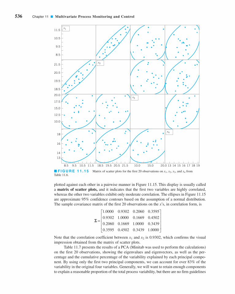
536 Chapter 11 ■ Multivariate Process Monitoring and Control
plotted against each other in a pairwise manner in Figure 11.15. This display is usually called
a matrix of scatter plots, and it indicates that the first two variables are highly correlated,
whereas the other two variables exhibit only moderate correlation. The ellipses in Figure 11.15
are approximate 95% confidence contours based on the assumption of a normal distribution.
The sample covariance matrix of the first 20 observations on the x’s, in correlation form, is
Note that the correlation coefficient between x1 and x2 is 0.9302, which confirms the visual
impression obtained from the matrix of scatter plots.
Table 11.7 presents the results of a PCA (Minitab was used to perform the calculations)
on the first 20 observations, showing the eigenvalues and eigenvectors, as well as the per-
centage and the cumulative percentage of the variability explained by each principal compo-
nent. By using only the first two principal components, we can account for over 83% of the
variability in the original four variables. Generally, we will want to retain enough components
to explain a reasonable proportion of the total process variability, but there are no firm guidelines
=
⎡
⎣
⎢⎢⎢⎢
⎤
⎦
⎥⎥⎥⎥
1 0000 0 9302 0 2060 0 3595
0 9302 1 0000 0 1669 0 4502
0 2060 0 1669 1 0000 0 3439
0 3595 0 4502 0 3439 1 0000
. . . .
. . . .
. . . .
. . . .
S
x1
x2
x3
x4
8.5 9.5 10.5 11.5 18.5 19.5 20.5 21.5 10.0 15.0 20.0 13 14 15 16 17 18 19
13
14
16
18
10.0
12.5
15.0
17.5
20.0
18.5
19.5
20.5
21.5
8.5
9.5
10.5
11.5
■ F I G U R E 1 1 . 1 5 Matrix of scatter plots for the first 20 observations on x1, x2, x3, and x4 from
Table 11.6.
c11MultivariateProcessMonitoringandControl.qxd 3/30/12 9:27 PM Page 536

■ TA B L E 1 1 . 7
PCA for the First 20 Observations on x1, x2, x3, and x4 fromTable 11.6
Eigenvalue: 2.3181 1.0118 0.6088 0.0613
Percentage: 57.9516 25.2951 15.2206 1.5328
Cumulative Percentage: 57.9516 83.2466 98.4672 100.0000
Eigenvectors
x1 0.59410 −0.33393 0.25699 0.68519
x2 0.60704 −0.32960 0.08341 −0.71826
x3 0.28553 0.79369 0.53368 −0.06092
x4 0.44386 0.38717 −0.80137 0.10440
about how much variability needs to be explained in order to produce an effective process-
monitoring procedure.
The last two columns in Table 11.6 contain the calculated values of the principal com-
ponent scores zi1 and zi2 for the first 20 observations. Figure 11.16 is a scatter plot of these
20 principal component scores, along with the approximate 95% confidence contour. Note
that all 20 scores for zi1 and zi2 are inside the ellipse. We typically regard this display as a
monitoring device or control chart for the principal component variables, and the ellipse is an
approximate control limit (obviously higher confidence level contours could be selected).
Generally, we are using the scores as an empirical reference distribution to establish a con-
trol region for the process. When future values of the variables x1, x2, . . . , xp are observed,
the scores would be computed for the two principal components z1 and z2 and these scores
plotted on the graph in Figure 11.16. As long as the scores remain inside the ellipse, there is
no evidence that the process mean has shifted. If subsequent scores plot outside the ellipse,
then there is some evidence that the process is out of control.
The lower panel of Table 11.6 contains 10 new observations on the process variables x1,
x2, . . . , xp that were not used in computing the principal components. The principal com-ponent scores for these new observations are also shown in the table, and the scores are plot-
ted on the control chart in Figure 11.17. A different plotting symbol (×) has been used to assist
3.0
2.5
2.0
1.5
1.0
0.5
0.0
–0.5
–1.0
–1.5
–2.0
–2.5
zi2
–3 –2 –1 0
zi1
1 2 3 4
–3.5–3.0–2.5–2.0–1.5–1.0–0.50.00.51.01.52.02.53.03.54.0
zi2
zi1
–3 –2 –1 0 1 2 3 4 5 6 7
■ F I G U R E 1 1 . 1 6 Scatter plot of the first
20 principal component scores zi1 and zi2 from Table
11.6, with 95% confidence ellipse.
■ F I G U R E 1 1 . 1 7 Principal components
trajectory chart, showing the last 10 observations from
Table 11.6.
11.7 Latent Structure Methods 537
c11MultivariateProcessMonitoringandControl.qxd 3/30/12 9:27 PM Page 537

538 Chapter 11 ■ Multivariate Process Monitoring and Control
in identifying the scores from the new points. Although the first few new scores are inside the
ellipse, it is clear that beginning with observation 24 or 25, there has been a shift in the
process. Control charts such as Figure 11.17 based on principal component scores are often
called principal component trajectory plots. Mastrangelo, Runger, and Montgomery (1996)
also give an example of this procedure.
If more than two principal components need to be retained, then pairwise scatter plots
of the principal component scores would be used analogously to Figure 11.17. However, if
more than r = 3 or 4 components are retained, interpretation and use of the charts becomes
cumbersome. Furthermore, interpretation of the principal components can be difficult,
because they are not the original set of process variables but instead linear combinations of
them. Sometimes principal components have a relatively simple interpretation, and that can
assist the analyst in using the trajectory chart. For instance, in our example the constants in
the first principal component are all about the same size and have the same sign, so the first
principal component can be thought of as an analog of the average of all p = 4 original vari-
ables. Similarly, the second component is roughly equivalent to the difference between the
averages of the first two and the last two process variables. It’s not always that easy.
A potentially useful alternative to the trajectory plot is to collect the r retained princi-
pal component scores into a vector and apply the MEWMA control chart to them. Practical
experience with this approach has been very promising, and the ARL of the MEWMA con-
trol chart to detect a shift will be much less using the set of retained principal components
than it would have been if all p original process variables were used. Scranton et al. (1996)
give more details of this technique.
Finally, note that control charts and trajectory plots based on PCA will be most effec-
tive in detecting shifts in the directions defined by the principal components. Shifts in other
directions, particularly directions orthogonal to the retained principal component directions,
may be very hard to detect. One possible solution to this would be to use a MEWMA control
chart to monitor all the remaining principal components zr+1, zr+2, . . . , zp.
11.7.2 Partial Least Squares
The method of partial least squares (PLS) is somewhat related to PCS, except that, like the
regression adjustment procedure, it classifies the variables into x’s (or inputs) and y’s (or out-
puts). The goal is to create a set of weighted averages of the x’s and y’s that can be used for
prediction of the y’s or linear combinations of the y’s. The procedure maximizes covariance
in the same fashion that the principal component directions maximize variance. Minitab has
some PLS capability.
The most common applications of partial least squares today are in the chemometricsfield, where there are often many variables, both process and response. Frank and Friedman
(1993) is a good survey of this field, written for statisticians and engineers. A potential con-
cern about applying PLS is that there has not been any extensive performance comparison of
PLS to other multivariate procedures. There is only anecdotal evidence about its performance
and its ability to detect process upsets relative to other approaches.
Important Terms and Concepts
Average run length (ARL)
Cascade process
Chi-square control chart
Control ellipse
Covariance matrix
Hotelling T2 control chart
Hotelling T2 subgrouped data control chart
Hotelling T2 individuals control chart
Latent structure methods
Matrix of scatter plots
Monitoring multivariate variability
Multivariate EWMA control chart
c11MultivariateProcessMonitoringandControl.qxd 3/30/12 9:27 PM Page 538

Exercises
11.1. The data shown in Table 11E.1
come from a production process
with two observable quality
characteristics: x1 and x2. The
data are sample means of each
quality characteristic, based on
samples of size n = 25. Assume
that mean values of the quality
characteristics and the covari-
ance matrix were computed from
50 preliminary samples:
Construct a T 2 control chart
using these data. Use the phase II
limits.
11.2. A product has three quality characteristics. The nom-
inal values of these quality characteristics and their
x S= = ⎡⎣⎢
⎤⎦⎥
= ⎡⎣⎢
⎤⎦⎥
55
30
200 130
130 120
sample covariance matrix have been determined
from the analysis of 30 preliminary samples of size
n = 10 as follows:
The sample means for each quality characteristic for
15 additional samples of size n = 10 are shown in
Table 11E.2. Is the process in statistical control?
11.3. Reconsider the situation in Exercise 11.1. Suppose that
the sample mean vector and sample covariance matrix
provided were the actual population parameters. What
control limit would be appropriate for phase II for the
control chart? Apply this limit to the data and discuss
any differences in results that you find in comparison
to the original choice of control limit.
x S= =⎡
⎣
⎢⎢⎢
⎤
⎦
⎥⎥⎥
=⎡
⎣
⎢⎢⎢
⎤
⎦
⎥⎥⎥
3 0
3 5
2 8
1 40 1 02 1 05
1 02 1 35 0 98
1 05 0 98 1 20
.
.
.
. . .
. . .
. . .
The Student
Resource Manual
presents compre-
hensive annotated
solutions to the
odd-numbered
exercises included
in the Answers to
Selected Exercises
section in the
back of this book.
■ TA B L E 1 1 E . 1
Data for Exercise 11.1
SampleNumber x1
_x2_
1 58 32
2 60 33
3 50 27
4 54 31
5 63 38
6 53 30
7 42 20
8 55 31
9 46 25
10 50 29
11 49 27
12 57 30
13 58 33
14 75 45
15 55 27
■ TA B L E 1 1 E . 2
Data for Exercise 11.2
SampleNumber x1
_x2_
x3_
1 3.1 3.7 3.0
2 3.3 3.9 3.1
3 2.6 3.0 2.4
4 2.8 3.0 2.5
5 3.0 3.3 2.8
6 4.0 4.6 3.5
7 3.8 4.2 3.0
8 3.0 3.3 2.7
9 2.4 3.0 2.2
10 2.0 2.6 1.8
11 3.2 3.9 3.0
12 3.7 4.0 3.0
13 4.1 4.7 3.2
14 3.8 4.0 2.9
15 3.2 3.6 2.8
Multivariate normal distribution
Multivariate quality control process monitoring
Partial least squares (PLS)
Phase I control limits
Phase II control limits
Principal component scores
Principal components
Principal components analysis (PCA)
Regression adjustment
Residual control chart
Sample covariance matrix
Sample mean vector
Trajectory plots
Exercises 539
c11MultivariateProcessMonitoringandControl.qxd 3/30/12 9:27 PM Page 539
540 Chapter 11 ■ Multivariate Process Monitoring and Control
11.4. Reconsider the situation in Exercise 11.2. Suppose that
the sample mean vector and sample covariance matrix
provided were the actual population parameters. What
control limit would be appropriate for phase II of the
control chart? Apply this limit to the data and discuss
any differences in results that you find in comparison
to the original choice of control limit.
11.5. Consider a T2 control chart for monitoring p = 6
quality characteristics. Suppose that the subgroup
size is n = 3 and there are 30 preliminary samples
available to estimate the sample covariance matrix.
(a) Find the phase II control limits assuming that a =0.005.
(b) Compare the control limits from part (a) to the
chi-square control limit. What is the magnitude
of the difference in the two control limits?
(c) How many preliminary samples would have to be
taken to ensure that the exact phase II control
limit is within 1% of the chi-square control limit?
11.6. Rework Exercise 11.5, assuming that the subgroup
size is n = 5.
11.7. Consider a T 2 control chart for monitoring p = 10
quality characteristics. Suppose that the subgroup
size is n = 3 and there are 25 preliminary samples
available to estimate the sample covariance matrix.
(a) Find the phase II control limits assuming that a =0.005.
(b) Compare the control limits from part (a) to the
chi-square control limit. What is the magnitude
of the difference in the two control limits?
(c) How many preliminary samples would have to be
taken to ensure that the chi-square control limit is
within 1% of the exact phase II control limit?
11.8. Rework Exercise 11.7, assuming that the subgroup
size is n = 5.
11.9. Consider a T 2 control chart for monitoring p = 10
quality characteristics. Suppose that the subgroup
size is n = 3 and there are 25 preliminary samples
available to estimate the sample covariance matrix.
Calculate both the phase I and the phase II control
limits (use a = 0.01).
11.10. Suppose that we have p = 4 quality characteristics,
and in correlation form all four variables have variance
unity and all pairwise correlation coefficients are 0.7.
The in-control value of the process mean vector is
m′ = [0, 0, 0, 0].
(a) Write out the covariance matrix Σ.
(b) What is the chi-square control limit for the chart,
assuming that a = 0.01?
(c) Suppose that a sample of observations results in
the standardized observation vector y′ = [3.5, 3.5,
3.5, 3.5]. Calculate the value of the T2 statistic. Is
an out-of-control signal generated?
(d) Calculate the diagnostic quantities di, i = 1, 2, 3, 4
from equation 11.22. Does this information assist in
identifying which process variables have shifted?
(e) Suppose that a sample of observations results in
the standardized observation vector y′ = [2.5, 2, −1, 0]. Calculate the value of the T2 statistic. Is an
out-of-control signal generated?
(f) For the case in (e), calculate the diagnostic quan-
tities di, i = 1, 2, 3, 4 from equation 11.22. Does
this information assist in identifying which
process variables have shifted?
11.11. Suppose that we have p = 3 quality characteristics,
and in correlation form all three variables have vari-
ance unity and all pairwise correlation coefficients
are 0.8. The in-control value of the process mean vec-
tor is m′ = [0, 0, 0].
(a) Write out the covariance matrix S.
(b) What is the chi-square control limit for the chart,
assuming that a = 0.05?
(c) Suppose that a sample of observations results in
the standardized observation vector y′ = [1, 2, 0].
Calculate the value of the T2 statistic. Is an out-
of-control signal generated?
(d) Calculate the diagnostic quantities di, i = 1, 2, 3
from equation 11.22. Does this information assist
in identifying which process variables have shifted?
(e) Suppose that a sample of observations results in
the standardized observation vector y′ = [2, 2, 1].
Calculate the value of the T2 statistic. Is an out-
of-control signal generated?
(f) For the case in (e), calculate the diagnostic quan-
tities di, i = 1, 2, 3 from equation 11.22. Does this
information assist in identifying which process
variables have shifted?
11.12. Consider the first two process variables in Table 11.5.
Calculate an estimate of the sample covariance matrix
using both estimators S1 and S2 discussed in Section
11.3.2.
11.13. Consider the first three process variables in Table 11.5.
Calculate an estimate of the sample covariance matrix
using both estimators S1 and S2 discussed in Section
11.3.2.
11.14. Consider all 30 observations on the first two process
variables in Table 11.6. Calculate an estimate of the
sample covariance matrix using both estimators S1
and S2 discussed in Section 11.3.2. Are the estimates
very different? Discuss your findings.
11.15. Suppose that there are p = 4 quality characteristics,
and in correlation form all four variables have vari-
ance unity and all pairwise correlation coefficients
are 0.75. The in-control value of the process mean
vector is m′ = [0, 0, 0, 0], and we want to design a
MEWMA control chart to provide good protection
c11MultivariateProcessMonitoringandControl.qxd 3/30/12 9:27 PM Page 540

against a shift to a new mean vector of y′ = [1, 1, 1, 1].
If an in-control ARL0 of 200 is satisfactory, what value
of l and what upper control limit should be used?
Approximately, what is the ARL1 for detecting the
shift in the mean vector?
11.16. Suppose that there are p = 4 quality characteristics,
and in correlation form all four variables have vari-
ance unity and that all pairwise correlation coeffi-
cients are 0.9. The in-control value of the process
mean vector is m′ = [0, 0, 0, 0], and we want to design
a MEWMA control chart to provide good protection
against a shift to a new mean vector of y′ = [1, 1, 1, 1].
Suppose that an in-control ARL0 of 500 is desired.
What value of l and what upper control limit would
you recommend? Approximately, what is the ARL1
for detecting the shift in the mean vector?
11.17. Suppose that there are p = 2 quality characteristics,
and in correlation form both variables have variance
unity and the correlation coefficient is 0.8. The in-
control value of the process mean vector is m′ = [0, 0],
and we want to design a MEWMA control chart to
provide good protection against a shift to a new mean
vector of y′ = [1, 1]. If an in-control ARL0 of 200 is
satisfactory, what value of l and what upper control
limit should be used? Approximately, what is the
ARL1 for detecting the shift in the mean vector?
11.18. Consider the cascade process data in Table 11.5.
(a) Set up an individuals control chart on y2.
(b) Fit a regression model to y2, and set up an indi-
viduals control chart on the residuals. Comment
on the differences between this chart and the one
in part (a).
(c) Calculate the sample autocorrelation functions
on y2 and on the residuals from the regression
model in part (b). Discuss your findings.
11.19. Consider the cascade process data in Table 11.5. In
fitting regression models to both y1 and y2 you will
find that not all of the process variables are required
to obtain a satisfactory regression model for the out-
put variables. Remove the nonsignificant variables
from these equations and obtain subset regression
models for both y1 and y2. Then construct individuals
control charts for both sets of residuals. Compare them
to the residual control charts in the text (Fig. 11.11)
and from Exercise 11.18. Are there any substantial
differences between the charts from the two different
approaches to fitting the regression models?
11.20. Continuation of Exercise 11.19. Using the residuals
from the regression models in Exercise 11.19, set up
EWMA control charts. Compare these EWMA con-
trol charts to the Shewhart charts for individuals con-
structed previously. What are the potential advantages
of the EWMA control chart in this situation?
11.21. Consider the p = 4 process variables in Table 11.6.
After applying the PCA procedure to the first 20
observations data (see Table 11.7), suppose that the
first three principal components are retained.
(a) Obtain the principal component scores. (Hint:
Remember that you must work in standardized
variables.)
(b) Construct an appropriate set of pairwise plots of
the principal component scores.
(c) Calculate the principal component scores for the
last 10 observations. Plot the scores on the charts
from part (b) and interpret the results.
11.22. Consider the p = 9 process variables in Table 11.5.
(a) Perform a PCA on the first 30 observations. Be
sure to work with the standardized variables.
(b) How much variability is explained if only the
first r = 3 principal components are retained?
(c) Construct an appropriate set of pairwise plots of
the first r = 3 principal component scores.
(d) Now consider the last 10 observations. Obtain
the principal component scores and plot them on
the chart in part (c). Does the process seem to be
in control?
Exercises 541
c11MultivariateProcessMonitoringandControl.qxd 3/30/12 9:27 PM Page 541

EngineeringProcess Control and SPC
12.1 PROCESS MONITORING ANDPROCESS REGULATION
12.2 PROCESS CONTROL BY FEEDBACKADJUSTMENT
12.2.1 A Simple AdjustmentScheme: Integral Control
12.2.2 The Adjustment Chart12.2.3 Variations of the Adjustment
Chart12.2.4 Other Types of Feedback
Controllers12.3 COMBINING SPC AND EPC
1212CHAPTER OUTLINE
CHAPTER OVERVIEW AND LEARNING OBJECTIVES
Throughout this book we have stressed the importance of process control and variability
reduction as essential ingredients of modern business strategy. There are two statistically
based approaches for addressing this problem. The first of these is statistical process
monitoring by control charts, or statistical process control (SPC). The focus of SPC is on
identifying assignable causes so that they can be removed, thereby leading to permanent
process improvement or reduction in variability. The second approach is based on adjust-
ing the process using information about its current level or deviation from a desired target.
This approach is often called feedback adjustment, and it is a form of engineeringprocess control or EPC. Feedback adjustment regulates the process to account for sources
of variability that cannot be removed by the SPC approach.
This chapter introduces simple methods of feedback adjustment and shows how
these techniques can be easily implemented in processes where there is a manipulatable
variable that affects the process output. We also show how simple SPC schemes can be
combined or integrated with EPC.
After careful study of this chapter, you should be able to do the following:
1. Explain the origins of process monitoring and process adjustment
2. Explain the different statistical frameworks of SPC and EPC
3. Explain how an integral controller works
4. Understand how EPC transfers variability from the process output into a
manipulatable variable
542
c12EngineeringProcessControlandSPC.qxd 4/23/12 8:06 PM Page 542

5. Set up and use a manual adjustment chart
6. Understand the basis of the bounded adjustment chart
7. Understand the basis of proportional integral (PI) and proportional integral
derivative (PID) controllers
8. Know how to combine SPC and EPC by applying a control chart to the output
quality characteristic
12.1 Process Monitoring and Process Regulation
Reduction of variability is an important part of improving process performance in all indus-
tries. Statistical process control is an effective tool for reduction of variability through the
ability of the control chart to detect assignable causes. When the assignable causes are
removed, process variability is reduced and process performance is improved.
SPC has had a long history of successful use in discrete parts manufacturing. In con-
tinuous processes, such as those found in the chemical and process industries, another
approach is often used to reduce variability. This approach is based on process compensa-tion and regulation, in which some manipulatable process variable is adjusted with the
objective of keeping the process output on target (or equivalently, minimizing the variability
of the output around this target). These process compensation or regulation schemes are
widely known as engineering process control (EPC), stochastic control, or feedback or
feedforward control, depending on the nature of the adjustments.
SPC is always applied in a situation where we assume that it is possible to bring the
process into a state of statistical control. By “statistical control,” we mean that we observe
only stable random variation around the process target. Furthermore, SPC also assumes that
once the process is in this in-control state, it will tend to stay there for a relatively long
period of time without continual ongoing adjustment. Now certainly if we eliminate assign-
able causes, such as differences due to operators and variations in raw materials, it is often
possible to obtain this in-control state. However, in some industrial settings, despite our best
effort, the process may still have a tendency to drift or wander away from the target. This
may occur because of phenomena such as continuous variation in input materials or effects
of environmental or process variables, or it may be due entirely to unknown forces that
impact the process. Process regulation through EPC assumes that there is another variable
that can be adjusted to compensate for the drift in process output, and that a series of regular
adjustments to this manipulatable variable will keep the process output close to the desired
target.
There is considerable interest in combining or integrating SPC and EPC in an effort
to provide an improved procedure—that is, an enhancement to EPC that would enable
assignable-cause-type disturbances to be detected. For additional background and discus-
sion, see Box and Kramer (1992); MacGregor (1987); Vander Weil, Tucker, Faltin, and
Doganaksoy (1992); MacGregor and Harris (1990); Montgomery, Keats, Runger, and
Messina (1994); Box, Jenkins, and Reinsel (1994); Box and Luceño (1997); and Del Castillo
(2002).
It is natural to question the need for integrating EPC and SPC. Historically, these tech-
niques have developed in somewhat different environments. SPC is often part of an organiza-
tion’s strategic thrust to improve quality, and it is usually a top-down, management-driven,
high-visibility activity, with emphasis on people, methods, and procedures. EPC, on the other
hand, is more tactical in nature with its origins in the process-engineering organization, and
its primary focus is on the process. The statistical framework of SPC is similar to that of
hypothesis testing, whereas the statistical framework of EPC is parameter estimation—that
12.1 Process Monitoring and Process Regulation 543
c12EngineeringProcessControlandSPC.qxd 4/3/12 4:05 PM Page 543

is, estimating how much disturbance there is in the system forcing the process off target and
then making an adjustment to cancel its effect. What these two procedures share is a common
objective: reduction of variability. EPC assumes that there is a specific dynamic model that
links the process input and output. If that model is correct, then the EPC process adjustment
rules will minimize variation around the output target. However, when certain types of exter-
nal disturbances or assignable causes occur that are outside the framework of this dynamic
model, then the compensation rules will not completely account for this upset. As a result,
variability will be increased. By applying SPC in a specific way, these assignable causes can
be detected and the combined EPC/SPC procedure will be more effective than EPC alone.
12.2 Process Control by Feedback Adjustment
12.2.1 A Simple Adjustment Scheme: Integral Control
In this section we consider a simple situation involving a process in which feedback adjustment
is appropriate and highly effective. The process output characteristic of interest at time period tis yt, and we wish to keep yt as close as possible to a target T. This process has a manipulatable
variable x, and a change in x will produce all of its effect on y within one period—that is,
(12.1)
where g is a constant usually called the process gain. The gain is like a regression coefficient,
in that it relates the magnitude of a change in xt to a change in yt. Now, if no adjustment is
made, the process drifts away from the target according to
(12.2)
where Nt + 1 is a disturbance. The disturbance in equation 12.2 is usually represented by an
appropriate time-series model, often an autoregressive integrated moving average (ARIMA)
model of the type discussed in Chapter 10, Section 10.4. Such a model is required because
the uncontrolled output is usually autocorrelated (see the material in Section 10.4 about SPC
with autocorrelated data).
Suppose that the disturbance can be predicted adequately using an EWMA:
(12.3)
where et = Nt − Nt is the prediction error at time period t and 0 < l ≤ 1 is the weighting factor
for the EWMA. This assumption is equivalent to assuming that the uncontrolled process is
drifting according to the integrated moving average model in equation 10.15 with parameter
q = 1 − l. At time t, the adjusted process is
This equation says that at time t + 1 the output deviation from target will depend on the dis-
turbance in period t + 1 plus the level xt to which we set the manipulatable variable in period t,or the setpoint in period t. Obviously, we should set xt so as to exactly cancel out the disturbance.
However, we can’t do this, because Nt + 1 is unknown in period t. We can, however, forecast
Nt + 1 by Nt + 1 using equation 12.3. Then we obtain
(12.4)
since et + 1 = Nt + 1 − Nt + 1.
From equation 12.4, it is clear that if we set gxt = −Nt + 1 or the setpoint xt = −(1/g) Nt + 1,
then the adjustment should cancel out the disturbance, and in period t + 1 the output deviation
y T e N gxt t t t+ + +− = + +1 1 1ˆ
y T N gxt t t+ +− = +1 1
ˆ ˆ ˆ
ˆ
N N N N
N e
t t t t
t t
+ = + −( )= +
1 λ
λ
y T Nt t+ +− =1 1
y T gxt t+ − =1
544 Chapter 12 ■ Engineering Process Control and SPC
c12EngineeringProcessControlandSPC.qxd 4/3/12 4:05 PM Page 544

12.2 Process Control by Feedback Adjustment 545
from target should be yt + 1 − T = et + 1, where et + 1 is the prediction error in period t; that is,
et + 1 = Nt + 1 − Nt + 1. The actual adjustment to the manipulatable variable made at time t is
(12.5)
Now the difference in the two EWMA predictions can be rewritten as
and since the actual error at time t, et, is simply the difference between the output and the target,
we can write
Therefore, the adjustment to be made to the manipulatable variable at time period t (equation
12.5) becomes
(12.6)
The actual setpoint for the manipulatable variable at the end of period t is simply the sum of
all the adjustments through time t, or
(12.7)
This type of process adjustment scheme is called integral control. It is a pure feed-
back control scheme that sets the level of the manipulatable variable equal to a weighted sum
of all current and previous process deviations from target. It can be shown that if the deter-
ministic part of the process model (equation 12.1) is correct, and if the disturbance Nt is pre-
dicted perfectly apart from random error by an EWMA, then this is an optimal control rule in
the sense that it minimizes the mean-square error of the process output deviations from the
target T. For an excellent discussion of this procedure, see Box (1991–1992) and Box and
Luceño (1997).
x x xg
et j jj
t
jj
t= −( ) = −−
= =∑ ∑1
1 1
λ
x xg
y Tg
et t t t− = − −( ) = −−1λ λ
ˆ ˆN N y Tt t t+ − = −( )1 λ
ˆ ˆ ˆ ˆ
ˆ
ˆ
N N N N N
N N
N N
e
t t t t t
t t
t t
t
+ − = + −( ) −
= −
= −( )=
1 1λ λ
λ λ
λ
λ
Nt+1 − Nt
x xg
N Nt t t t− = − −( )− +1 11 ˆ ˆ
and standard deviation of molecular weight for these 100
observations is and s = 19.4.
In this process, the drifting behavior of the molecular
weight is likely caused by unknown and uncontrollable distur-
bances in the incoming material feedstock and other inertial
forces, but it can be compensated for by making adjustments
to the setpoint of the catalyst feed rate x. A change in the set-
point of the feed rate will have all of its effect on molecular
weight within one period, so an integral control procedure
such as the one discussed previously will be appropriate.
x = 2,008
EXAMPLE 12.1
Figure 12.1 shows 100 observations on the number average
molecular weight of a polymer, taken every four hours. It is
desired to maintain the molecular weight as close as possible
to the target value T = 2,000. Note that, despite our best efforts
to bring the process into a state of statistical control, the molec-
ular weight tends to wander away from the target. Individuals
and moving range control charts are shown in Figure 12.2,
indicating the lack of statistical stability in the process. Note
that the engineers have used the target value T = 2,000 as the
center line for the individuals chart. The actual sample average
An Example of Integral Control
(continued)
c12EngineeringProcessControlandSPC.qxd 4/3/12 4:05 PM Page 545
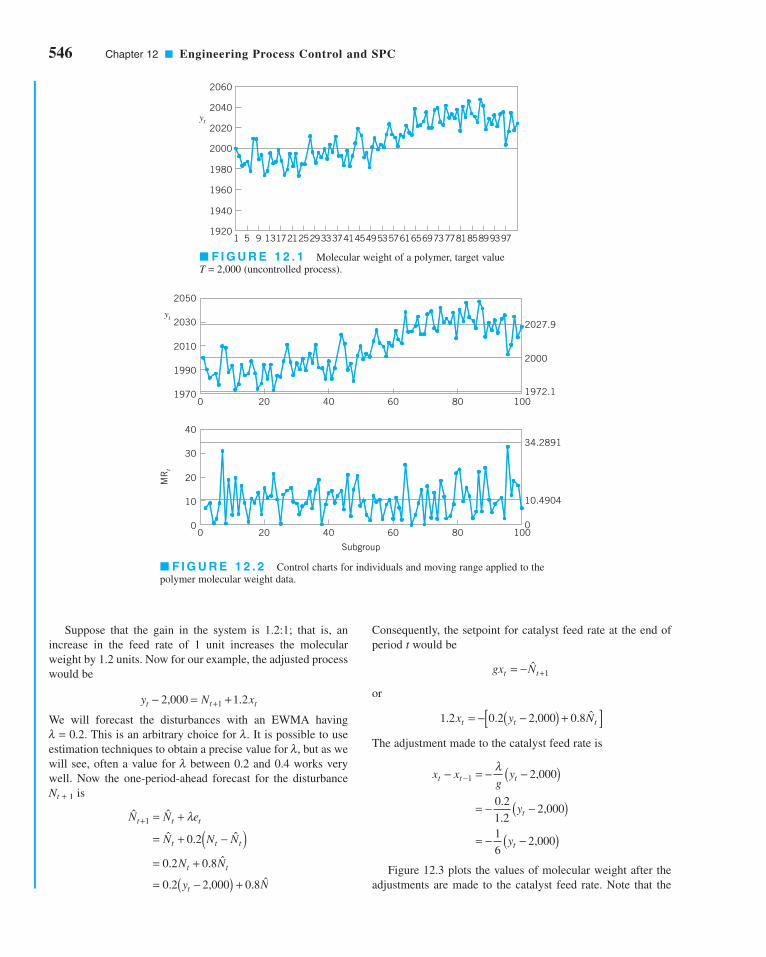
546 Chapter 12 ■ Engineering Process Control and SPC
Consequently, the setpoint for catalyst feed rate at the end of
period t would be
or
The adjustment made to the catalyst feed rate is
Figure 12.3 plots the values of molecular weight after the
adjustments are made to the catalyst feed rate. Note that the
x xg
y
y
y
t t t
t
t
− = − −
= − −( )
( )
( )
= − −
−1 2,000
0 21 2
2,000
16
2,000
λ
.
.
1 2 0 2 2,000 0 8. . . ˆx y Nt t t= − −( ) +[ ]
gx Nt t= − +ˆ
1
1920
1940
1960
1980
2000
2020
2040
2060
yt
1 5 9 13172125293337414549535761656973778185899397
2050
2030
2010
1990
1970
40
30
20
10
00 20 40 60 80 100
0 20 40 60 80 100
Subgroup
0
10.4904
34.2891
1972.1
2000
2027.9
MR
t
yt
■ F I G U R E 1 2 . 1 Molecular weight of a polymer, target value
T = 2,000 (uncontrolled process).
■ F I G U R E 1 2 . 2 Control charts for individuals and moving range applied to the
polymer molecular weight data.
Suppose that the gain in the system is 1.2:1; that is, an
increase in the feed rate of 1 unit increases the molecular
weight by 1.2 units. Now for our example, the adjusted process
would be
We will forecast the disturbances with an EWMA having
l = 0.2. This is an arbitrary choice for l. It is possible to use
estimation techniques to obtain a precise value for l, but as we
will see, often a value for l between 0.2 and 0.4 works very
well. Now the one-period-ahead forecast for the disturbance
Nt + 1 is
ˆ ˆ
ˆ . ˆ
. . ˆ
. . ˆ
N N e
N N N
N N
y N
t t t
t t t
t t
t
+ = +
= + −( )= +
= −( ) +
1
0 2
0 2 0 8
0 2 2,000 0 8
λ
Ny xt t t− = ++2,000 1 21 .
c12EngineeringProcessControlandSPC.qxd 4/3/12 4:05 PM Page 546

12.2 Process Control by Feedback Adjustment 547
Figure 12.5 shows individuals and moving range control
charts applied to the output deviation of the molecular weight
from the target value of 2,000. Note that now the process
appears to be in a state of statistical control. Figure 12.6 is a set
of similar control charts applied to the sequence of process
adjustments (that is, the change in the setpoint value for feed
rate).
process is much closer to the target value of 2,000. In fact, the
sample average molecular weight for the 100 observations is
now 2,001, and the sample standard deviation is 10.35. Thus,
the use of integral control has reduced process variability by
nearly 50%. Figure 12.4 shows the setpoint for the catalyst
feed rate used in each time period to keep the process close to
the target value of T = 2,000.
1940
1950
1970
2000
2010
2020
2030
yt
1 5 9 13172125293337414549535761656973778185899397
1990
1980
1960
■ F I G U R E 1 2 . 3 Values of molecular weight after adjustment.
–6–5
–3
012
xt
1 5 9 13172125293337414549535761656973778185899397
–1–2
–4
3
■ F I G U R E 1 2 . 4 The setpoint for catalyst feed rate.
48
28
8
–12
–320 20 40 60 80 100
–31.05
0
31.05
38.1605
11.6748
00 20 40 60 80 100
0
10
20
30
40
MR
ty t
– 2
00
0
Subgroup
■ F I G U R E 1 2 . 5 Individuals and moving range control charts applied to the
output deviation of molecular weight from target, after integral control.
(continued)
c12EngineeringProcessControlandSPC.qxd 4/3/12 4:05 PM Page 547

In the foregoing example, the value of l used in the EWMA was l = 0.2. An “optimal”
value for l could be obtained by finding the value of l that minimizes the sum of the squared
forecast errors for the process disturbance. To perform this calculation, you will need a record
of the process disturbances. Usually, you will have to construct this from past history. That is,
you will typically have a history of the actual output and a history of whatever adjustments
were made. The disturbance would be back-calculated from the historical deviation from
target taken together with the adjustments. This will usually give you a disturbance series of
sufficient accuracy to calculate the correct value for l.
In some cases you may not be able to do this easily, and it may be necessary to choose
l arbitrarily. Figure 12.7 shows the effect of choosing l arbitrarily when the true optimum
value of l is l0. The vertical scale (s2l /s2
l0) shows how much the variance of the output is
inflated by choosing the arbitrary l instead of l0.
Consider the case in Figure 12.7 where l0 = 0. Now, since l in the EWMA is equal
to zero, this means that the process is in statistical control and it will not drift off target.
548 Chapter 12 ■ Engineering Process Control and SPC
2.0
1.8
1.6
1.4
1.2
1.00.1 0.2 0.3 0.4 0.5 0.6 0.7 0.8 0.9 1.0
λ0 = 0.2
λ0 = 0.0
λ0 = 0.4
___ = (1.05)2 = 1.1025σλσλ( )
λ
___σλ2
σλ2
0
0
■ F I G U R E 1 2 . 7 Inflation in the variance of the adjusted
process arising from an arbitrary choice of l when the true value of l in
the disturbance is l0. [Adapted from Box (1991–1992), with permission.]
■ F I G U R E 1 2 . 6 Individuals and moving range control charts for the sequence of
adjustments to the catalyst feed rate.
0
0.3
0.6
0.9
1.2
1.5
MR
t
0 20 40 60 80 100
0 20 40 60 80 100
Subgroup
0.385529
1.26015
–1.06462
–0.0392786
0.986066
–1.1
–0.7
–0.3
0.1
0.5
0.9
1.3
x t –
xt –
1
c12EngineeringProcessControlandSPC.qxd 4/3/12 4:05 PM Page 548

12.2 Process Control by Feedback Adjustment 549
Therefore, no adjustment to feed rate is necessary; see equation 12.6. Figure 12.7 shows very
clearly that in this case any adjustments to the catalyst feed rate would increase the variance
of the output. This is what Deming means by “tampering with the process.” The worst case
would occur with l = 1, where the output variance would be doubled. Of course, l = 1 implies
that we are making an adjustment that (apart from the gain g) is exactly equal to the current
deviation from target, something no rational control engineer would contemplate. Note, how-
ever, that a smaller value of l (l ≤ 0.2, say) would not inflate the variance very much.
Alternatively, if the true value of l0 driving the disturbance is not zero, meaning that the
process drifts off target yet no adjustment is made, the output process variance will increase
a lot. From the figure, we see that if you use a value of l in the 0.2–0.4 range, that almost no
matter what the true value of l0 is that drives the disturbances, the increase in output variance
will be at most about 5% over what the true minimum variance would be if l0 were known
exactly. Therefore, an educated guess about the value of l in the 0.2–0.4 range will often work
very well in practice.
We noted in Section 10.4 that one possible way to deal with autocorrelated data was to
use an engineering controller to remove the autocorrelation. We can demonstrate that in the
previous example.
Figure 12.8 is the sample autocorrelation function of the uncontrolled molecular weight
measurements from Figure 12.1. Obviously, the original unadjusted process observations
exhibit strong autocorrelation. Figure 12.9 is the sample autocorrelation function of the out-
put molecular weight deviations from target after the integral control adjustments. Note that
the output deviations from target are now uncorrelated.
Engineering controllers cannot always be used to eliminate autocorrelation. For exam-
ple, the process dynamics may not be understood well enough to implement an effective con-
troller. Also note that any engineering controller essentially transfers variability from one
part of the process to another. In our example, the integral controller transfers variability from
molecular weight into the catalyst feed rate. To see this, examine Figures 12.1, 12.3, and 12.4,
and note that the reduction in variability in the output molecular weight was achieved by
increasing the variability of the feed rate. There may be processes in which this is not always
an acceptable alternative.
12.2.2 The Adjustment Chart
The feedback adjustment scheme based on integral control that we described in the previous
section can be implemented so that the adjustments are made automatically. Usually this
involves some combination of sensors or measuring devices, a logic device or computer, and
actuators to physically make the adjustments to the manipulatable variable x. When EPC or
–1.0
–0.5
0
0.5
1.0
rk
0 5 10 15 20 25
Lag, k
–1.0
–0.5
0
0.5
1.0
0 5 10 15 20 25
Lag, k
rk
■ F I G U R E 1 2 . 8 The sample autocorrelation
function for the uncontrolled molecular weight obser-
vations from Figure 12.1.
■ F I G U R E 1 2 . 9 The sample autocorrelation
function for the molecular weight variable after integral
control.
c12EngineeringProcessControlandSPC.qxd 4/3/12 4:05 PM Page 549

feedback adjustment is implemented in this manner, it is often called automatic process control (APC).
In many processes, feedback adjustments can be made manually. Operating personnel
routinely observe the current output deviation from target, compute the amount of adjustment
to apply using equation 12.6, and then bring xt to its new setpoint. When adjustments are
made manually by operating personnel, a variation of Figure 12.3 called the manual adjust-ment chart is very useful.
Figure 12.10 is the manual adjustment chart corresponding to Figure 12.3. Note that
there is now a second scale, called the adjustment scale, on the vertical axis. Note also that
the divisions on the adjustment scale are arranged so that one unit of adjustment exactly
equals six units on the molecular weight scale. Furthermore, the units on the adjustment scale
that correspond to molecular weight values above the target of 2,000 are negative, whereas the
units on the adjustment scale that correspond to molecular weight values below the target of
2,000 are positive. The reason for this is that the specific adjustment equation that is used for
the molecular weight variable is
or
That is, a six-unit change in molecular weight from its target of 2,000 corresponds to a one-unit change in the catalyst feed rate. Furthermore, if the molecular weight is above the
target, the catalyst feed rate must be reduced to drive molecular weight toward the target
value, whereas if the molecular weight is below the target, the catalyst feed rate must be
increased to drive molecular weight toward the target.
The adjustment chart is extremely easy for operating personnel to use. For example,
consider Figure 12.10 and, specifically, observation y13 as molecular weight. As soon as
y13 = 2,006 is observed and plotted on the chart, the operator simply reads off the correspond-
ing value of −1 on the adjustment scale. This is the amount by which the operator should
change the current setting of the catalyst feed rate. That is, the operator should reduce the
adjustment to catalyst feed rate (deviation of molecular weight from 2,000)= − 16
x x yt t t− = − −( )−116
2,000
550 Chapter 12 ■ Engineering Process Control and SPC
1940
1950
1960
1970
1980
1990
2000
2010
2020
2030
2040
2050
2060
1940
1950
1960
1970
1980
1990
2000
2010
2020
2030
2040
2050
2060
1 5 9 13 17 21 25 29 33 37 41 45 49 53 57 61 65 69 73 77 81 85 89 93 97
Molecularweightscale
Adjustmentscale for
catalyst feed rate–10
–9–8–7–6–5–4–3–2–10123456789
10
■ F I G U R E 1 2 . 1 0 The adjustment chart for molecular weight.
c12EngineeringProcessControlandSPC.qxd 4/3/12 4:05 PM Page 550

12.2 Process Control by Feedback Adjustment 551
catalyst feed rate by one unit. Now the next observation is y14 = 1,997. The operator plots this
point and observes that 1,997 on the molecular weight scale corresponds to +0.5 on the
adjustment scale. Thus, catalyst feed rate could now be increased by 0.5 unit.
This is a very simple and highly effective procedure. Manual adjustment charts were
first proposed by George Box and G. M. Jenkins [see Box, Jenkins, and Reinsel (1994);
Box (1991); and Box and Luceño (1997) for more background]. They are often called
Box–Jenkins adjustment charts.
12.2.3 Variations of the Adjustment Chart
The adjustment procedures in Sections 12.2.1 and 12.2.2 are very straightforward to imple-
ment, but they require that an adjustment be made to the process after each observation. In
feedback adjustment applications in the chemical and process industries, this is not usually a
serious issue because the major cost that must be managed is the cost of being off target, and
the adjustments themselves are made with either no or very little cost. Indeed, they are often
made automatically. However, situations can arise in which the cost or convenience of making
an adjustment is a concern. For example, in discrete parts manufacturing it may be necessary
to actually stop the process to make an adjustment. Consequently, it may be of interest to make
some modification to the feedback adjustment procedure so that less frequent adjustments
will be made.
There are several ways to do this. One of the simplest is the bounded adjustment chart,a variation of the procedure in Section 12.2.2 in which an adjustment will be made only in peri-
ods for which the EWMA forecast is outside one of the bounds given by ±L. The boundary
value L is usually determined from engineering judgment, taking the costs of being off target
and the cost of making the adjustment into account. Box and Luceño (1997) discuss this situ-
ation in detail and, in particular, how costs can be used specifically for determining L.
We will use the data in Table 12.1 to illustrate the bounded adjustment chart. Column
1 of this table presents the unadjusted values of an important output characteristic from a
chemical process. The values are reported as deviations from the actual target, so the target
for this variable—say, yt—is zero. Figure 12.11 plots these output data, along with an EWMA
prediction made using l = 0.2. Note that the variable does not stay very close to the desired
target. The average of these 50 observations is 17.2, and the sum of the squared deviations
from target is 21,468. The standard deviation of these observations is approximately 11.6.
There is a manipulatable variable in this process, and the relationship between the out-
put and this variable is given by
That is, the process gain g = 0.8. The EWMA in Figure 12.11 uses l = 0.2. This value was
chosen arbitrarily, but remember from our discussion in Section 12.2.1 that the procedure is
relatively insensitive to this parameter.
Suppose that we decide to set L = 10. This means that we will only make an adjustment
to the process when the EWMA exceeds L = 10 or −L = −10. Economics and the ease of mak-
ing adjustments are typically factors in selecting L, but here we did it a slightly different way.
Note that the standard deviation of the unadjusted process is approximately 11.6, so the stan-
dard deviation of the EWMA in Figure 12.11 is approximately
Therefore, using L = 10 is roughly equivalent to using control limits on the EWMA that are
about 2.6sEWMA in width. (Recall from Chapter 9 that we often use control limits on an
EWMA that are slightly less than three-sigma.)
ˆ ˆ ..
. .σ λλ
σEWMA unadjusted process=−
=−
=2
0 22 0 2
11 6 3 87.−
=
y T xt t− = 0 8.
c12EngineeringProcessControlandSPC.qxd 4/3/12 4:06 PM Page 551

552 Chapter 12 ■ Engineering Process Control and SPC
■ TA B L E 1 2 . 1
Chemical Process Data for the Bounded Adjustment Chart in Figure 12.12
Original Adjusted Cumulative Process Process Adjustment
Observation Output Output EWMA Adjustment or Setpoint
1 0 0 0 0
2 16 16 3.200 0
3 24 24 7.360 0
4 29 29 11.688 −7.250 −7.250
5 34 26.750 5.350 −7.250
6 24 16.750 7.630 −7.250
7 31 23.750 10.854 −5.938 −13.188
8 26 12.812 2.562 −13.188
9 38 24.812 7.013 −13.188
10 29 15.812 8.773 −13.188
11 25 11.812 9.381 −13.188
12 26 12.812 10.067 −3.203 −16.391
13 23 6.609 1.322 −16.391
14 34 17.609 4.579 −16.391
15 24 7.609 5.185 −16.391
16 14 −2.391 3.670 −16.391
17 41 24.609 7.858 −16.391
18 36 19.609 10.208 −4.904 −21.293
19 29 7.707 1.541 −21.293
20 13 −8.293 −0.425 −21.293
21 26 4.707 0.601 −21.293
22 12 −9.293 −1.378 −21.293
23 15 −6.293 −2.361 −21.293
24 34 12.707 0.653 −21.293
25 7 −14.293 −2.336 −21.293
26 20 −1.293 −2.128 −21.293
27 16 −5.293 −2.761 −21.293
28 7 −14.293 −5.067 −21.293
29 0 −21.293 −8.312 −21.293
30 8 −13.293 −9.308 −21.293
31 23 1.707 −7.105 −21.293
32 10 −11.293 −7.943 −21.293
33 12 −9.293 −8.213 −21.293
34 −2 −23.293 −11.229 5.823 −15.470
35 10 −5.470 −1.094 −15.470
36 28 12.530 1.631 −15.470
37 12 −3.470 0.611 −15.470
38 8 −7.470 −1.005 −15.470
39 11 −4.470 −1.698 −15.470
40 4 −11.470 −3.653 −15.470
41 9 −6.470 −4.216 − 15.470
42 15 −0.470 −3.467 −15.470
43 5 −10.470 −4.867 −15.470
44 13 −2.470 −4.388 −15.470
45 22 6.530 −2.204 −15.470
46 −9 −24.470 −6.657 −15.470
47 3 −12.470 −7.820 −15.470
48 12 −3.470 −6.950 −15.470
49 3 −12.470 −8.054 −15.470
50 12 −3.470 −7.137 −15.470
c12EngineeringProcessControlandSPC.qxd 4/3/12 4:06 PM Page 552

12.2 Process Control by Feedback Adjustment 553
The computations for the EWMA are given in Table 12.1. Note that the EWMA is
started off at zero, and the first period in which it exceeds L = 10 is period 4. The output devi-
ation from target in period 4 is +29, so the adjustment would be calculated as usual in inte-
gral control as
or
That is, we would change the manipulatable variable from its previous setting in period 3 by
−7.250 units. The full effect of this adjustment then would be felt in the next period, 5. The
EWMA would be reset to zero at the end of period 4 and the forecasting procedure started
afresh. The next adjustment occurs in period 7, where an additional −5.938 units of adjust-
ment are made. The last column records the cumulative effect of all adjustments.
Note that only five adjustments are made over the 50 observations. Figure 12.12 is a
plot of the original unadjusted output variable, the adjusted output, the EWMA forecasts, and
the actual process adjustments. The variability in the adjusted output around the target has
been reduced considerably; the sum of squared deviations from target is 9,780, and the aver-
age deviation from target is 1.76. This is a reduction of over 50% in the output deviation from
the target, achieved with only five adjustments to the process.
Bounded adjustment charts are often very good substitutes for making an adjustment
every period. They usually result in slightly degraded performance when compared to the
“always adjust” scheme, but usually the degradation is small.
Another variation of the adjustment chart encountered in practice is the roundedadjustment chart. This procedure is sometimes used to assist operating personnel in mak-
ing simple adjustments. The adjustment scale is “rounded” to perhaps four or five zones
on either side of the target, with each zone corresponding to adjustments that are easy to
make (such as change the manipulatable variable by 1 unit, 2 units, and so forth). Often
the central zone corresponds to making no adjustment. In this case, adjustments would not
necessarily be made every period. See Box and Luceño (1997) for more discussion of
these charts.
x x y4 3 40 20 8
014
29 7 250− = − −( ) = − ( ) = −..
.
x xg
y Tt t t− = − −( )−1λ
1 4 7 10 13 16 19 22 25 28 31 34 37 40 43 46 49
50
40
30
20
10
0
–10
–20
Unadjusted outputEWMA
■ F I G U R E 1 2 . 1 1 The unadjusted process data from Table 12.1 and an
EWMA with l = 0.2.
c12EngineeringProcessControlandSPC.qxd 4/3/12 4:06 PM Page 553

12.2.4 Other Types of Feedback Controllers
We have considered a feedback controller for which the process adjustment rule is
(12.8)
where et is the output deviation from target and l is the EWMA parameter. By summing this
equation we arrived at
(12.9)
where xt is the level or setpoint of the manipulatable variable at time t. This is, of course, an
integral control adjustment rule.
Now suppose that to make reasonable adjustments to the process we feel it is necessary
to consider the last two errors, et and et −1. Suppose we write the adjustment equation in terms
of two constants, c1 and c2,
(12.10)
If this expression is summed, the setpoint becomes
(12.11)
where kP = −(c2/g) and kI = (c1 + c2)/g. Note that the setpoint control equation contains a term
calling for “proportional” control actions as well as the familiar integral action term. The two
constants kP and kI are the proportional and integral action parameters, respectively. This is a
discrete proportional integral (PI) control equation.
Now suppose that the adjustment depends on the last three errors:
(12.12)g x x c e c e c et t t t t−( ) = + +− − −1 1 2 1 3 2
x k e k et P t I ii
t= +
=∑
1
g x x c e c et t t t−( ) = +− −1 1 2 1
xg
et ii
t= −
=∑λ
1
g x x et t t−( ) = −−1 λ
554 Chapter 12 ■ Engineering Process Control and SPC
50
40
30
20
10
0
–10
–20
–30
–50
–40
46121110
9876543210
–1–2–3–4–5–6–7–8–9
–10–11–12
4136312621161161
L = +10
L = –10
Unadjusted output
EWMAAdjusted output
Process adjustments
Adj
ustm
ent
scal
e
■ F I G U R E 1 2 . 1 2 Bounded adjustment chart showing the original unadjusted output, the adjusted
output, the EWMA, and the actual process adjustments. The circled EWMAs indicate points where adjust-
ments are made.
c12EngineeringProcessControlandSPC.qxd 4/3/12 4:06 PM Page 554

Summing this up leads to the discrete proportional integral derivative (PID) controlequation
(12.13)
These models are widely used in practice, particularly in the chemical and process industries.
Often two of the three terms will be used, such as PI or PID control. Choosing the constants
(the k’s or the c’s) is usually called tuning the controller.
12.3 Combining SPC and EPC
There is considerable confusion about process adjustment versus process monitoring.Process adjustment or regulation has an important role in reduction of variability; the con-
trol chart is not always the best method for reducing variability around a target. In the chem-
ical and process industries, techniques such as the simple integral control rule illustrated in
Section 12.2.1 have been very effectively used for this purpose. In general, engineering con-
trol theory is based on the idea that if we can (1) predict the next observation on the process,
(2) have some other variable that we can manipulate in order to affect the process output, and
(3) know the effect of this manipulated variable so that we can determine how much control
action to apply, then we can make the adjustment in the manipulated variable at time t that
is most likely to produce an on-target value of the process output in period t + 1. Clearly, this
requires good knowledge of the relationship between the output or controlled variable and
the manipulated variable, as well as an understanding of process dynamics. We must also be
able to easily change the manipulated variable. In fact, if the cost of taking control action is
negligible, then the variability in the process output is minimized by taking control action
every period. Note that this is in sharp contrast with SPC, where “control action” or a
process adjustment is taken only when there is statistical evidence that the process is out of
control. This statistical evidence is usually a point outside the limits of a control chart.
There are many processes where some type of feedback-control scheme would be
preferable to a control chart. For example, consider the process of driving a car, with the
objective of keeping it in the center of the right-hand lane (or equivalently, minimizing vari-
ation around the center of the right-hand lane). The driver can easily see the road ahead, and
process adjustments (corrections to the steering wheel position) can be made at any time at
negligible cost. Consequently, if the driver knew the relationship between the output variable
(car position) and the manipulated variable (steering wheel adjustment), he would likely prefer
to use a feedback-control scheme to control car position, rather than a statistical control chart.
(Driving a car with a Shewhart control chart may be an interesting idea, but the author doesn’t
want to be in the car during the experiment.)
On the other hand, EPC makes no attempt to identify an assignable cause that may
impact the process. The elimination of assignable causes can result in significant process
improvement. All EPC schemes do is react to process upsets; they do not make any effort to
remove the assignable causes. Consequently, in processes where feedback control is used
there may be substantial improvement if control charts are also used for statistical processmonitoring (as opposed to control; the control actions are based on the engineering scheme).
Some authors refer to systems where both EPC and an SPC system for process monitoring
have been implemented as algorithmic SPC; see Vander Weil et al. (1992).
The control chart should be applied either to the control error (the difference between
the controlled variable and the target) or to the sequence of adjustments to the manipulated
variable. Combinations of these two basic approaches are also possible. For example, the
control error and the adjustments (or the output characteristic and the adjustable variable)
x k e k e k e et P t I ii
t
D t t= + + −( )=
−∑1
1
12.3 Combining SPC and EPC 555
c12EngineeringProcessControlandSPC.qxd 4/3/12 4:06 PM Page 555

could be jointly monitored using a multivariate control chart. Points that lie outside the con-
trol limits on these charts would identify periods during which the control errors are large or
during which large changes to the manipulated variable are being made. These periods
would likely be good opportunities to search for assignable causes. Montgomery et al.
(1994) have demonstrated the effectiveness of such a system. Other very useful references
and discussion are in Del Castillo (2002). Figure 12.13 illustrates how such a combination
of EPC and statistical process monitoring might be employed.
556 Chapter 12 ■ Engineering Process Control and SPC
Modify control scheme
Engineering controlscheme
Process
Statistical processmonitoring
Make adjustmentto manipulated variablext so that yt + 1 willbe on the target valueT.
Compute y^t+1 andobserve differencebetween yt+1 and thedesired targetfor process output, T.
Observe differencebetween yt and the desired target forprocess output, T.
Removeassignablecause
Output variable, yt
If the control erroryt – T is outside controllimits, then look for assignablecause.
■ F I G U R E 1 2 . 1 3 Engineering process control and statistical
process monitoring.
Figure 12.17 presents individuals and moving range con-
trol charts applied to the output molecular weight deviation
from the target value T = 2,000, after the integral control
adjustments. An out-of-control signal is generated at period
t = 80, indicating that an assignable cause is present. An
EWMA or CUSUM control chart on the output deviation from
target would generally detect the assignable cause more
quickly. Figure 12.18 is an EWMA with l = 0.1, and it signals
the assignable cause at period t = 70.
Suppose that we detected and eliminated the assignable
cause at period t = 70. Figure 12.19 is the resulting sequence
of output molecular weight values. The sample average and
standard deviation are now and s = 10.8, so we see
that coupling a control chart on the output deviation from target
with the integral controller has improved the performance of
the process when assignable causes are present.
x = 1,998
EXAMPLE 12.2
Figure 12.14 shows the molecular weight measurements from
Figure 12.1 in Example 12.1, except that now an assignable
cause has impacted the process starting at period t = 60. The
effect of this assignable cause is to increase the molecular
weight by 25 units, and this results in adding variability to the
process; the sample average and standard deviation of molec-
ular weight are and s = 30.4 (compared to
and s = 19.4 when there was no assignable cause present).
Figure 12.15 shows the molecular weight after adjustments to
the catalyst feed rate by the integral control rule in Example
12.1 are applied. Figure 12.16 shows the setpoints for feed
rate. Process performance has improved, as the sample aver-
age and standard deviation are now and s = 15.4.
Clearly the assignable cause is still adding to process vari-
ability, because when there was no assignable cause in the
system, and s = 10.35 after the adjustments.x = 2,001
x = 1,992
x = 2,008x = 2,019
Integrating SPC and EPC
c12EngineeringProcessControlandSPC.qxd 4/3/12 4:06 PM Page 556

12.3 Combining SPC and EPC 557
(continued)
1920
1940
2020
2040
2060
yt
1 5 9 13172125293337414549535761656973778185899397
2000
1980
1960
2080
yt
1900
1940
2000
2020
1 5 9 13172125293337414549535761656973778185899397
1980
1960
1920
2040
–12
–10
–6
–2
0
2
xt
1 5 9 13172125293337414549535761656973778185899397
–4
–8
4
0
10
20
30
40
MR
t
0 20 40 60 80 100
Subgroup
0
11.6748
38.1605
–31.05
31.05
0
0 20 40 60 80 100–52
–32
–12
8
48
y t –
20
00
28
■ F I G U R E 1 2 . 1 4 Molecular
weight, with an assignable cause of
magnitude 25 at t = 60.
■ F I G U R E 1 2 . 1 5 Molecular
weight after integral control adjustments
to catalyst feed rate.
■ F I G U R E 1 2 . 1 6 Setpoint
values for catalyst feed rate, Example 12.2.
■ F I G U R E 1 2 . 1 7 Individuals and moving range control charts applied to the
output deviation from target, Example 12.2.
c12EngineeringProcessControlandSPC.qxd 4/3/12 4:06 PM Page 557

558 Chapter 12 ■ Engineering Process Control and SPC
Automatic process control (APC)
Bounded adjustment chart
Engineering process control (EPC)
Exponentially weighted moving average (EWMA)
Integral control
Integrating SPC and EPC
Manipulatable process variable
Manual adjustment chart
Process adjustment versus process monitoring
Process gain
Proportional integral (PI) control
Proportional integral (PID) derivative control
Setpoint
Statistical process control (SPC)
Statistical process monitoring
Important Terms and Concepts
Exercises
12.3. Consider the data in Table 12.1. Construct a bounded
adjustment chart using l = 0.4 and L = 10. Compare
the performance of this chart to the one in Table 12.1
and Figure 12.12.
12.4. Consider the data in Table 12.1. Suppose that an
adjustment is made to the output variable after every
observation. Compare the performance of this chart
to the one in Table 12.1 and Figure 12.12.
12.5. The Variogram. Consider the variance of observa-
tions that are m periods apart; that is, Vm = V(yt+m − yt).
A graph of Vm/V1 versus m is called a variogram.
12.1. If yt are the observations and zt is
the EWMA, show that the follow-
ing relationships are true.
(a) zt − zt−1 = l(yt − zt−1)
(b) et − (1 − l)et−1 = yt − yt−1
12.2. Consider the data in Table 12.1.
Construct a bounded adjustment
chart using l = 0.3 and L = 10.
Compare the performance of this
chart to the one in Table 12.1 and
Figure 12.12.
The Student
Resource Manual
presents compre-
hensive annotated
solutions to the
odd-numbered
exercises included
in the Answers to
Selected Exercises
section in the
back of this book.
–28
–18
–8
2
12
0
–6.41102
6.41102
100806040200
Observation
zt
■ F I G U R E 1 2 . 1 8 EWMA
control chart with l = 0.1 applied to
the output deviation from target,
Example 12.2.
19401950
1970
200020102020
yt
1 5 9 13172125293337414549535761656973778185899397
19901980
1960
2030
■ F I G U R E 1 2 . 1 9 Molecular
weight after adjustments to catalyst feed
rate with the assignable cause removed
following period t = 70.
c12EngineeringProcessControlandSPC.qxd 4/3/12 4:06 PM Page 558
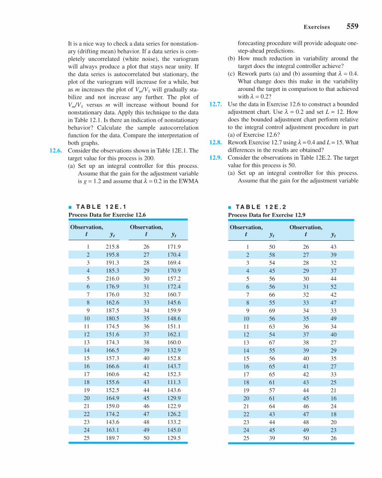
Exercises 559
forecasting procedure will provide adequate one-
step-ahead predictions.
(b) How much reduction in variability around the
target does the integral controller achieve?
(c) Rework parts (a) and (b) assuming that l = 0.4.
What change does this make in the variability
around the target in comparison to that achieved
with l = 0.2?
12.7. Use the data in Exercise 12.6 to construct a bounded
adjustment chart. Use l = 0.2 and set L = 12. How
does the bounded adjustment chart perform relative
to the integral control adjustment procedure in part
(a) of Exercise 12.6?
12.8. Rework Exercise 12.7 using l = 0.4 and L = 15. What
differences in the results are obtained?
12.9. Consider the observations in Table 12E.2. The target
value for this process is 50.
(a) Set up an integral controller for this process.
Assume that the gain for the adjustment variable
It is a nice way to check a data series for nonstation-
ary (drifting mean) behavior. If a data series is com-
pletely uncorrelated (white noise), the variogram
will always produce a plot that stays near unity. If
the data series is autocorrelated but stationary, the
plot of the variogram will increase for a while, but
as m increases the plot of Vm/V1 will gradually sta-
bilize and not increase any further. The plot of
Vm/V1 versus m will increase without bound for
nonstationary data. Apply this technique to the data
in Table 12.1. Is there an indication of nonstationary
behavior? Calculate the sample autocorrelation
function for the data. Compare the interpretation of
both graphs.
12.6. Consider the observations shown in Table 12E.1. The
target value for this process is 200.
(a) Set up an integral controller for this process.
Assume that the gain for the adjustment variable
is g = 1.2 and assume that l = 0.2 in the EWMA
■ TA B L E 1 2 E . 1
Process Data for Exercise 12.6
Observation, Observation,t yt t yt
1 215.8 26 171.9
2 195.8 27 170.4
3 191.3 28 169.4
4 185.3 29 170.9
5 216.0 30 157.2
6 176.9 31 172.4
7 176.0 32 160.7
8 162.6 33 145.6
9 187.5 34 159.9
10 180.5 35 148.6
11 174.5 36 151.1
12 151.6 37 162.1
13 174.3 38 160.0
14 166.5 39 132.9
15 157.3 40 152.8
16 166.6 41 143.7
17 160.6 42 152.3
18 155.6 43 111.3
19 152.5 44 143.6
20 164.9 45 129.9
21 159.0 46 122.9
22 174.2 47 126.2
23 143.6 48 133.2
24 163.1 49 145.0
25 189.7 50 129.5
■ TA B L E 1 2 E . 2
Process Data for Exercise 12.9
Observation, Observation,t yt t yt
1 50 26 43
2 58 27 39
3 54 28 32
4 45 29 37
5 56 30 44
6 56 31 52
7 66 32 42
8 55 33 47
9 69 34 33
10 56 35 49
11 63 36 34
12 54 37 40
13 67 38 27
14 55 39 29
15 56 40 35
16 65 41 27
17 65 42 33
18 61 43 25
19 57 44 21
20 61 45 16
21 64 46 24
22 43 47 18
23 44 48 20
24 45 49 23
25 39 50 26
c12EngineeringProcessControlandSPC.qxd 4/3/12 4:06 PM Page 559

560 Chapter 12 ■ Engineering Process Control and SPC
is g = 1.6, and assume that l = 0.2 in the EWMA
forecasting procedure will provide adequate one-
step-ahead predictions.
(b) How much reduction in variability around the
target does the integral controller achieve?
(c) Rework parts (a) and (b) assuming that l = 0.4.
What change does this make in the variability
around the target in comparison to that achieved
with l = 0.2?
12.10. Use the data in Exercise 12.9 to construct a bounded
adjustment chart. Use l = 0.2 and set L = 4. How
does the bounded adjustment chart perform relative
to the integral control adjustment procedure in part
(a) of Exercise 12.9?
c12EngineeringProcessControlandSPC.qxd 4/3/12 4:06 PM Page 560

Process Design and Improvementwith DesignedExperiments
Quality and productivity improvement are most effective when they are anintegral part of the product realization process. In particular, the formal intro-duction of experimental design methodology at the earliest stage of thedevelopment cycle, where new products are designed, existing productdesigns improved, and manufacturing processes optimized, is often the key tooverall product success. This principle has been established in many differentindustries, including electronics and semiconductors, aerospace, automotive,medical devices, food and pharmaceuticals, and the chemical and processindustries. Designed experiments play a crucial role in the DMAIC process,mostly in the improve step. Statistical design of experiments often is cited asthe most important of the Six Sigma tool kit, and it is a critical part of designfor Six Sigma (DFSS). The effective use of sound statistical experimental designmethodology can lead to products that are easier to manufacture, have higherreliability, and have enhanced field performance. Experimental design can alsogreatly enhance process development and improvements activities. Designedexperiments, and how to use them in these types of applications, are the pri-mary focus of this section.
Factorial and fractional factorial designs are introduced in Chapter 13with particular emphasis on the two-level design system—that is, the 2k fac-torial design and the fractions thereof. These designs are particularly usefulfor screening the variables in a process to determine those that are mostimportant. Chapter 14 introduces response surface methods, a collectionof techniques useful for process and system optimization. This chapter alsodiscusses process robustness studies, an approach to reducing the
Process Design and Improvementwith DesignedExperiments
PART 5PART 5
c13FactorialAndFractionalFactorialExperimentsForProcessDesignand Improvement.qxd 3/31/12 5:27 PM Page 561

variability in process or product performance by minimizing the effects onthe output transmitted by variables that are difficult to control during routineprocess operation. Finally, we present an overview of evolutionary operation,an experimental-design–based process-monitoring scheme.
Throughout Part 5 we use the analysis of variance as the basis for analyzingdata from designed experiments. It is possible to introduce experimentaldesign without using analysis of variance methods, but this author believesthat it is a mistake to do so, primarily because students will encounter theanalysis of variance in virtually every computer program they use, either inthe classroom, or in professional practice. We also illustrate software pack-ages supporting designed experiments.
The material in this section is not a substitute for a full course in experimen-tal design. Those interested in applying experimental design to processimprovement will need additional background, but this presentation illus-trates some of the many applications of this powerful tool. In many industries,the effective use of statistical experimental design is the key to higher yields,reduced variability, reduced development lead times, better products, andsatisfied customers.
562 Part 5 ■ Process Design and Improvement with Designed Experiments
c13FactorialAndFractionalFactorialExperimentsForProcessDesignand Improvement.qxd 3/31/12 5:27 PM Page 562

563
Factorial andFractional FactorialExperiments forProcess Design andImprovement
13.1 WHAT IS EXPERIMENTAL DESIGN?13.2 EXAMPLES OF DESIGNED
EXPERIMENTS IN PROCESS ANDPRODUCT IMPROVEMENT
13.3 GUIDELINES FOR DESIGNINGEXPERIMENTS
13.4 FACTORIAL EXPERIMENTS13.4.1 An Example13.4.2 Statistical Analysis13.4.3 Residual Analysis
13.5 THE 2k FACTORIAL DESIGN13.5.1 The 22 Design13.5.2 The 2k Design for k ≥ 3
Factors13.5.3 A Single Replicate of the 2k
Design13.5.4 Addition of Center Points to
the 2k Design13.5.5 Blocking and Confounding
in the 2k Design
13.6 FRACTIONAL REPLICATION OF THE 2k DESIGN
13.6.1 The One-Half Fraction ofthe 2k Design
13.6.2 Smaller Fractions: The 2k-p
Fractional Factorial Design
Supplemental Material for Chapter 13
S13.1 Additional Discussion ofGuidelines for PlanningExperiments
S13.2 Using a t-Test for DetectingCurvature
S13.3 Blocking in DesignedExperiments
S13.4 More about Expected MeanSquares in the Analysis ofVariance
1313
CHAPTER OUTLINE
The supplemental material is on the textbook Website www.wiley.com/college/montgomery.
c13FactorialAndFractionalFactorialExperimentsForProcessDesignand Improvement.qxd 4/23/12 7:51 PM Page 563

564 Chapter 13 ■ Factorial and Fractional Factorial Experiments for Process Design and Improvement
CHAPTER OVERVIEW AND LEARNING OBJECTIVES
Most experiments for process design and improvement involve several variables. Factorial
experimental designs, and their variations, are used in such situations. This chapter gives an
introduction to factorial designs, emphasizing their applications for process and quality
improvement. Designed experiments are widely used in the DMAIC process, and are an
extremely important in the improve step. They also play a leading role in design for Six Sigma
(DFSS). We concentrate on experimental designs where all the factors have two levels, and
show how fractional versions of these designs can be used with great effectiveness in indus-
trial experimentation. Important topics include the analysis of factorial experimental designs
and the use of graphical methods in interpretation of the results. Both the interaction graph
and a response surface plot are shown to be very useful in interpretation of results.
After careful study of this chapter, you should be able to do the following:
1. Explain how designed experiments can be used to improve product design and
improve process performance
2. Explain how designed experiments can be used to reduce the cycle time required
to develop new products and processes
3. Understand how main effects and interactions of factors can be estimated
4. Understand the factorial design concept
5. Know how to use the analysis of variance (ANOVA) to analyze data from facto-
rial designs
6. Know how residuals are used for model adequacy checking for factorial designs
7. Know how to use the 2k system of factorial designs
8. Know how to construct and interpret contour plots and response surface plots
9. Know how to add center points to a 2k factorial design to test for curvature and
provide an estimate of pure experimental error
10. Understand how the blocking principle can be used in a factorial design to elim-
inate the effects of a nuisance factor
11. Know how to use the 2k−p system of fractional factorial designs
13.1 What Is Experimental Design?
As indicated in Chapter 1, a designed experiment is a test or series of tests in which purpose-
ful changes are made to the input variables of a process so that we may observe and identify
corresponding changes in the output response. The process, as shown in Figure 13.1, can be
visualized as some combination of machines, methods, and people that transforms an input
material into an output product. This output product has one or more observable quality char-
acteristics or responses. Some of the process variables x1, x2, . . . , xp are controllable,whereas others z1, z2, . . . , zq are uncontrollable (although they may be controllable for pur-
poses of the test). Sometimes these uncontrollable factors are called noise factors. The objec-
tives of the experiment may include
1. Determining which variables are most influential on the response, y.
2. Determining where to set the influential x’s so that y is near the nominal requirement.
3. Determining where to set the influential x’s so that variability in y is small.
4. Determining where to set the influential x’s so that the effects of the uncontrollable vari-
ables z are minimized.
Thus, experimental design methods may be used either in process development or process
troubleshooting to improve process performance or to obtain a process that is robust or
insensitive to external sources of variability.
c13FactorialAndFractionalFactorialExperimentsForProcessDesignand Improvement.qxd 3/31/12 5:27 PM Page 564

13.1 What Is Experimental Design? 565
Input Output
z1
Process y
Controllable inputfactors
Uncontrollable inputfactors
z2 zq
x1 x2 xp
Statistical process-control methods and experimental design, two very powerful tools for
the improvement and optimization of processes, are closely interrelated. For example, if a
process is in statistical control but still has poor capability, then to improve process capability it
will be necessary to reduce variability. Designed experiments may offer a more effective way to
do this than SPC. Essentially, SPC is a passive statistical method: We watch the process and wait
for some information that will lead to a useful change. However, if the process is in control, pas-
sive observation may not produce much useful information. On the other hand, experimental
design is an active statistical method: We will actually perform a series of tests on the process
or system, making changes in the inputs and observing the corresponding changes in the outputs,
and this will produce information that can lead to process improvement.
Experimental design methods can also be very useful in establishing statistical control
of a process. For example, suppose that a control chart indicates that the process is out of con-
trol, and the process has many controllable input variables. Unless we know which input vari-
ables are the important ones, it may be very difficult to bring the process under control.
Experimental design methods can be used to identify these influential process variables.
Experimental design is a critically important engineering tool for improving a manufac-
turing process. It also has extensive application in the development of new processes.
Application of these techniques early in process development can result in
1. Improved yield
2. Reduced variability and closer conformance to the nominal
3. Reduced development time
4. Reduced overall costs
Experimental design methods can also play a major role in engineering design activi-
ties, where new products are developed and existing ones improved. Designed experiments
are widely used in design for Six Sigma (DFSS) activities. Some applications of statistical
experimental design in engineering design include:
1. Evaluation and comparison of basic design configurations.
2. Evaluation of material alternatives.
3. Determination of key product design parameters that impact performance.
Use of experimental design in these areas can result in improved manufacturability of the
product, enhanced field performance and reliability, lower product cost, and shorter product
development time.
In recent years, designed experiments have found extensive application in transactional
and service businesses, including e-commerce. Applications include Web page design, testing
for consumer preferences, and designing/improving service systems. Sometimes a computer
simulation model of the service system is developed and experiments are conducted on the
simulation model.
■ F I G U R E 1 3 . 1 General model of a process.
c13FactorialAndFractionalFactorialExperimentsForProcessDesignand Improvement.qxd 3/31/12 5:27 PM Page 565

566 Chapter 13 ■ Factorial and Fractional Factorial Experiments for Process Design and Improvement
13.2 Examples of Designed Experiments in Process and Product Improvement
In this section, we present several examples that illustrate the application of designed experiments
in improving process and product quality. In subsequent sections, we will demonstrate the statis-
tical methods used to analyze the data and draw conclusions from experiments such as these.
EXAMPLE 13.1 Characterizing a Process
An engineer has applied SPC to a process for soldering elec-
tronic components to printed circuit boards. Through the use of
u charts and Pareto analysis, he has established statistical control
of the flow solder process and has reduced the average number
of defective solder joints per board to around 1%. However,
since the average board contains over 2,000 solder joints, even
1% defective presents far too many solder joints requiring
rework. The engineer would like to reduce defect levels even
further; however, since the process is in statistical control, it is
not obvious what machine adjustments will be necessary.
The flow solder machine has several variables that can be
controlled. They include:
1. Solder temperature
2. Preheat temperature
3. Conveyor speed
4. Flux type
5. Flux specific gravity
6. Solder wave depth
7. Conveyor angle
In addition to these controllable factors, several others cannot
be easily controlled during routine manufacturing, although
they could be controlled for purposes of a test. They are:
1. Thickness of the printed circuit board
2. Types of components used on the board
3. Layout of the components on the board
4. Operator
5. Production rate
In this situation, the engineer is interested in characteriz-ing the flow solder machine; that is, he wants to determine
which factors (both controllable and uncontrollable) affect the
occurrence of defects on the printed circuit boards. To accom-
plish this task he can design an experiment that will enable him
to estimate the magnitude and direction of the factor effects.
That is, how much does the response variable (defects per unit)
change when each factor is changed, and does changing the
factors together produce different results than are obtained
from individual factor adjustments? A factorial experiment
will be required to do this. Sometimes we call this kind of fac-
torial experiment a screening experiment.The information from this screening or characterization
experiment will be used to identify the critical process fac-
tors and to determine the direction of adjustment for these
factors to further reduce the number of defects per unit. The
experiment may also provide information about which fac-
tors should be more carefully controlled during routine man-
ufacturing to prevent high defect levels and erratic process
performance. Thus, one result of the experiment could be the
application of control charts to one or more process vari-
ables (such as solder temperature) in addition to the u chart
on process output. Over time, if the process is sufficiently
improved, it may be possible to base most of the process-
control plan on controlling process input variables instead of
control charting the output.
EXAMPLE 13.2 Optimizing a Process
characterization experiment that the two most important
process variables that influence yield are operating temperature
and reaction time. The process currently runs at 155 F and 1.7 h
of reaction time, producing yields around 75%. Figure 13.2
shows a view of the time-temperature region from above. In this
graph the lines of constant yield are connected to form
response contours, and we have shown the contour lines for
60%, 70%, 80%, 90%, and 95% yield.
To locate the optimum, it is necessary to perform an exper-
iment that varies time and temperature together. This type of
°
In a characterization experiment, we are usually interested in
determining which process variables affect the response. A
logical next step is to optimize—that is, to determine the
region in the important factors that lead to the best possible
response. For example, if the response is yield, we will look for
a region of maximum yield, and if the response is variability in
a critical product dimension, we will look for a region of min-
imum variability.
Suppose we are interested in improving the yield of a
chemical process. Let’s say that we know from the results of a
c13FactorialAndFractionalFactorialExperimentsForProcessDesignand Improvement.qxd 3/31/12 5:27 PM Page 566

13.2 Examples of Designed Experiments in Process and Product Improvement 567
EXAMPLE 13.3 A Product Design Example
Designed experiments can often be applied in the product
design process. To illustrate, suppose that a group of engineers
is designing a door hinge for an automobile. The quality char-
acteristic of interest is the check effort, or the holding ability of
the door latch that prevents the door from swinging closed
when the vehicle is parked on a hill. The check mechanism
consists of a spring and a roller. When the door is opened, the
roller travels through an arc causing the leaf spring to be com-
pressed. To close the door, the spring must be forced aside,
which creates the check effort. The engineering team believes
the check effort is a function of the following factors:
1. Roller travel distance
2. Spring height pivot to base
3. Horizontal distance from pivot to spring
4. Free height of the reinforcement spring
5. Free height of the main spring
The engineers build a prototype hinge mechanism in which
all these factors can be varied over certain ranges. Once
appropriate levels for these five factors are identified, an
experiment can be designed consisting of various combina-
tions of the factor levels, and the prototype hinge can be
tested at these combinations. This will produce information
concerning which factors are most influential on latch check
effort, and through use of this information the design can be
improved.
EXAMPLE 13.4 Determining System and Component Tolerances
The Wheatstone bridge shown in Figure 13.3 is a device used
for measuring an unknown resistance, Y. The adjustable resis-
tor B is manipulated until a particular current flow is obtained
through the ammeter (usually X = 0). Then the unknown resis-
tance is calculated as
(13.1)
YBD
C
X
C EA D C D B C B C D F B C= − +( ) + +( )[ ] +( ) + +( )[ ]
2
2
The engineer wants to design the circuit so that overall
gauge capability is good; that is, he would like the standard
deviation of measurement error to be small. He has decided
that A = 20 Ω, C = 2 Ω, D = 50 Ω, E = 1.5 Ω, and F = 2 Ω is
the best choice of the design parameters as far as gauge
capability is concerned, but the overall measurement error is
still too high. This is likely due to the tolerances that have
been specified on the circuit components. These tolerances
are ±1% for each resistor A, B, C, D, and F, and ±5% for the
experiment is called a factorial experiment; an example of a
factorial experiment with both time and temperature run at two
levels is shown in Figure 13.2. The responses observed at the
four corners of the square indicate that we should move in the
general direction of increased temperature and decreased reac-
tion time to increase yield. A few additional runs could be per-
formed in this direction, which would be sufficient to locate
the region of maximum yield. Once we are in the region of the
optimum, a more elaborate experiment could be performed to
give a very precise estimate of the optimum operating condi-
tion. This type of experiment, called a response surface exper-iment, is discussed in Chapter 14.
200
190
180
170
160
150
140
Tem
pera
ture
(°F)
0.5 1.0 1.5 2.0 2.5
Time (hours)
56% 69%
75%
58%82%
90%
80%
60%
70%
95%
Path leading to regionof higher yield
Current operatingconditions
■ F I G U R E 1 3 . 2 Contour plot of yield as a function of reaction time
and reaction temperature, illustrating an optimization experiment.
(continued )
c13FactorialAndFractionalFactorialExperimentsForProcessDesignand Improvement.qxd 3/31/12 5:27 PM Page 567

568 Chapter 13 ■ Factorial and Fractional Factorial Experiments for Process Design and Improvement
13.3 Guidelines for Designing Experiments
Designed experiments are a powerful approach to improving a process. To use this approach,
it is necessary that everyone involved in the experiment have a clear idea in advance of the
objective of the experiment, exactly what factors are to be studied, how the experiment is to
be conducted, and at least a qualitative understanding of how the data will be analyzed.
Montgomery (2009) gives an outline of the recommended procedure, reproduced in Figure 13.4.
We now briefly amplify each point in this checklist.
1. Recognition of and statement of the problem. In practice, it is often difficult to
realize that a problem requiring formal designed experiments exists, so it may not be easy to
develop a clear and generally accepted statement of the problem. However, it is absolutely
essential to fully develop all ideas about the problem and about the specific objectives of the
experiment. Usually, it is important to solicit input from all concerned parties—engineering,
quality, marketing, customers, management, and operators (who usually have much insight
that is all too often ignored). A clear statement of the problem and the objectives of the exper-
iment often contributes substantially to better process understanding and eventual solution of
the problem.
power supply E. These tolerance bands can be used to define
appropriate factor levels, and an experiment can be per-
formed to determine which circuit components have the
most critical tolerances and how much they must be tight-
ened to produce adequate gauge capability. The information
from this experiment will result in a design specification that
tightens only the most critical tolerances the minimum
amount possible consistent with desired measurement capa-
bility. Consequently, a lower-cost design that is easier to
manufacture will be possible.
Notice that in this experiment it is unnecessary actually to
build hardware, since the response from the circuit can be cal-
culated via equation 13.1. The actual response variable for the
experiment should be the standard deviation of Y. However, an
equation for the transmitted variation in Y from the circuit can
be found using the methods of Section 8.6.2. Therefore, the
entire experiment can be performed using a computer model of
the Wheatstone bridge.
■ F I G U R E 1 3 . 3A Wheatstone bridge.
Y A B
X
CD
FE
Pre-experimental 1. Recognition of and statement of the problem
planning 2. Choice of factors and levels
3. Selection of the response variable
4. Choice of experimental design
5. Performing the experiment
6. Data analysis
7. Conclusions and recommendations
often done simultaneously,
or in reverse order[ ]
■ F I G U R E 1 3 . 4 Procedure for designing an experiment.
c13FactorialAndFractionalFactorialExperimentsForProcessDesignand Improvement.qxd 3/31/12 5:27 PM Page 568

2. Choice of factors and levels. The experimenter must choose the factors to be varied
in the experiment, the ranges over which these factors will be varied, and the specific levels at
which runs will be made. Process knowledge is required to do this. This process knowledge is
usually a combination of practical experience and theoretical understanding. It is important to
investigate all factors that may be of importance and to avoid being overly influenced by past
experience, particularly when we are in the early stages of experimentation or when the
process is not very mature. When the objective is factor screening or process characterization,
it is usually best to keep the number of factor levels low. (Most often two levels are used.) As
noted in Figure 13.4, steps 2 and 3 are often carried out simultaneously, or step 3 may be done
first in some applications.
3. Selection of the response variable. In selecting the response variable, the
experimenter should be certain that the variable really provides useful information about
the process under study. Most often the average or standard deviation (or both) of the mea-
sured characteristic will be the response variable. Multiple responses are not unusual.
Gauge capability is also an important factor. If gauge capability is poor, then only rela-
tively large factor effects will be detected by the experiment, or additional replication
will be required.
4. Choice of experimental design. If the first three steps are done correctly, this step
is relatively easy. Choice of design involves consideration of sample size (number of repli-
cates), selection of a suitable run order for the experimental trials, and whether or not block-
ing or other randomization restrictions are involved. This chapter and Chapter 14 illustrate
some of the more important types of experimental designs.
5. Performing the experiment. When running the experiment, it is vital to carefully
monitor the process to ensure that everything is being done according to plan. Errors in exper-
imental procedure at this stage will usually destroy experimental validity. Up-front planning is
crucial to success. It is easy to underestimate the logistical and planning aspects of running a
designed experiment in a complex manufacturing environment.
6. Data analysis. Statistical methods should be used to analyze the data so that results
and conclusions are objective rather than judgmental. If the experiment has been designed
correctly and if it has been performed according to the design, then the type of statistical
method required is not elaborate. Many excellent software packages are available to assist in
the data analysis, and simple graphical methods play an important role in data interpretation.
Residual analysis and model validity checking are also important.
7. Conclusions and recommendations. Once the data have been analyzed, the exper-
iment must draw practical conclusions about the results and recommend a course of action.
Graphical methods are often useful in this stage, particularly in presenting the results to oth-
ers. Follow-up runs and confirmation testing should also be performed to validate the conclu-
sions from the experiment.
Steps 1 to 3 are usually called pre-experimental planning. It is vital that these steps
be performed as well as possible if the experiment is to be successful. Coleman and
Montgomery (1993) discuss this in detail and offer more guidance in pre-experimental plan-
ning, including worksheets to assist the experimenter in obtaining and documenting the
required information. Section S13.1 of the supplemental text material contains additional use-
ful material on planning experiments.
Throughout this entire process, it is important to keep in mind that experimentation is
an important part of the learning process, where we tentatively formulate hypotheses about a
system, perform experiments to investigate these hypotheses, and on the basis of the results
formulate new hypotheses, and so on. This suggests that experimentation is iterative. It is
usually a major mistake to design a single, large comprehensive experiment at the start of a
13.3 Guidelines for Designing Experiments 569
c13FactorialAndFractionalFactorialExperimentsForProcessDesignand Improvement.qxd 3/31/12 5:27 PM Page 569
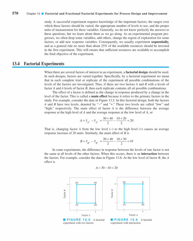
570 Chapter 13 ■ Factorial and Fractional Factorial Experiments for Process Design and Improvement
study. A successful experiment requires knowledge of the important factors, the ranges over
which these factors should be varied, the appropriate number of levels to use, and the proper
units of measurement for these variables. Generally, we do not know perfectly the answers to
these questions, but we learn about them as we go along. As an experimental program pro-
gresses, we often drop some variables, add others, change the region of exploration for some
factors, or add new response variables. Consequently, we usually experiment sequentially,and as a general rule no more than about 25% of the available resources should be invested
in the first experiment. This will ensure that sufficient resources are available to accomplish
the final objective of the experiment.
13.4 Factorial Experiments
When there are several factors of interest in an experiment, a factorial design should be used.
In such designs, factors are varied together. Specifically, by a factorial experiment we mean
that in each complete trial or replicate of the experiment all possible combinations of the
levels of the factors are investigated. Thus, if there are two factors A and B with a levels of
factor A and b levels of factor B, then each replicate contains all ab possible combinations.
The effect of a factor is defined as the change in response produced by a change in the
level of the factor. This is called a main effect because it refers to the primary factors in the
study. For example, consider the data in Figure 13.5. In this factorial design, both the factors
A and B have two levels, denoted by “−” and “+.” These two levels are called “low” and
“high,” respectively. The main effect of factor A is the difference between the average
response at the high level of A and the average response at the low level of A, or
That is, changing factor A from the low level (−) to the high level (+) causes an average
response increase of 20 units. Similarly, the main effect of B is
In some experiments, the difference in response between the levels of one factor is not
the same at all levels of the other factors. When this occurs, there is an interaction between
the factors. For example, consider the data in Figure 13.6. At the low level of factor B, the Aeffect is
A = − =30 10 20
B y yB B
= − = + − + =+ −20 40
2
10 30
210
A y yA A
= − = + − + =+ −30 40
2
10 20
220
–
+
– +
Factor A
Fact
or B
10 30
20 0
–
+
– +
Factor A
Fact
or B
10 30
20 40
■ F I G U R E 1 3 . 5 A factorial
experiment with two factors.
■ F I G U R E 1 3 . 6 A factorial
experiment with interaction.
c13FactorialAndFractionalFactorialExperimentsForProcessDesignand Improvement.qxd 3/31/12 5:27 PM Page 570

and at the high level of factor B, the A effect is
Since the effect of A depends on the level chosen for factor B, there is interaction between Aand B.
When an interaction is large, the corresponding main effects have little meaning. For
example, by using the data in Figure 13.6, we find the main effect of A as
and we would be tempted to conclude that there is no A effect. However, when we examine the
main effect of A at different levels of factor B, we see that this is not the case. The effect of fac-
tor A depends on the levels of factor B. Thus, knowledge of the AB interaction is more useful than
knowledge of the main effect. A significant interaction can mask the significance of main effects.
The concept of interaction can be illustrated graphically. Figure 13.7 plots the data in
Figure 13.5 against the levels of A for both levels of B. Note that the B− and B+ lines are roughly
parallel, indicating that factors A and B do not interact. Figure 13.8 plots the data in Figure 13.6.
In Figure 13.8, the B− and B+ lines are not parallel, indicating the interaction between factors Aand B. Such graphical displays are often useful in presenting the results of experiments.
An alternative to the factorial design that is (unfortunately) used in practice is to change
the factors one at a time rather than to vary them simultaneously. To illustrate the one-factor-
at-a-time procedure, consider the optimization experiment described earlier in Example 13.2.
The engineer is interested in finding the values of temperature and time that maximize yield.
Suppose that we fix temperature at 155°F (the current operating level) and perform five runs
at different levels of time—say, 0.5 h, 1.0 h, 1.5 h, 2.0 h, and 2.5 h. The results of this series
of runs are shown in Figure 13.9. This figure indicates that maximum yield is achieved at
about 1.7 h of reaction time. To optimize temperature, the engineer fixes time at 1.7 h (the
apparent optimum) and performs five runs at different temperatures—say, 140°F, 150°F, 160°F,
170°F, and 180°F. The results of this set of runs are plotted in Figure 13.10. Maximum yield
occurs at about 155°F. Therefore, we would conclude that running the process at 155°F and
1.7 h is the best set of operating conditions, resulting in yields around 75%.
Figure 13.11 displays the contour plot of yield as a function of temperature and time with
the one-factor-at-a-time experiment shown on the contours. Clearly, the one-factor-at-a-time
design has failed dramatically here, as the true optimum is at least 20 yield points higher and
occurs at much lower reaction times and higher temperatures. The failure to discover the
shorter reaction times is particularly important because it could have significant impact on pro-
duction volume or capacity, production planning, manufacturing cost, and total productivity.
The one-factor-at-a-time method has failed here because it fails to detect the interaction
between temperature and time. Factorial experiments are the only way to detect interactions.
A = + − + =30 0
2
10 20
20
A = − = −0 20 20
13.4 Factorial Experiments 571
0
10
20
30
40
50
Res
pons
e
– +
Factor A
B–
B+ B–
B+
0
10
20
30
40
50
Res
pons
e
– +
Factor A
B–
B+B–
B+
■ F I G U R E 1 3 . 7 Factorial experiment,
no interaction.
■ F I G U R E 1 3 . 8 Factorial experiment
with interaction.
c13FactorialAndFractionalFactorialExperimentsForProcessDesignand Improvement.qxd 3/31/12 5:27 PM Page 571

572 Chapter 13 ■ Factorial and Fractional Factorial Experiments for Process Design and Improvement
Furthermore, the one-factor-at-a-time method is inefficient; it will require more experimenta-
tion than a factorial, and as we have just seen, there is no assurance that it will produce the
correct results. The experiment shown in Figure 13.2 (p. 563) that produced the information
pointing to the region of the optimum is a simple example of a factorial experiment.
13.4.1 An Example
Aircraft primer paints are applied to aluminum surfaces by two methods—dipping and spray-
ing. The purpose of the primer is to improve paint adhesion; some parts can be primed using
either application method. A team using the DMAIC approach has identified three different
primers that can be used with both application methods. Three specimens were painted with
each primer using each application method, a finish paint was applied, and the adhesion force
was measured. The 18 runs from this experiment were run in random order. The resulting data
are shown in Table 13.1. The circled numbers in the cells are the cell totals. The objective of
the experiment was to determine which combination of primer paint and application method
produced the highest adhesion force. It would be desirable if at least one of the primers pro-
duced high adhesion force regardless of application method, as this would add some flexibil-
ity to the manufacturing process.
13.4.2 Statistical Analysis
The analysis of variance (ANOVA) described in Chapter 4 can be extended to handle the two-
factor factorial experiment. Let the two factors be denoted A and B, with a levels of factor A and
50
60
70
80
Yiel
d (%
)
140 150 160 170 180
Temperature (°F)
■ F I G U R E 1 3 . 1 0Yield versus temperature with
reaction time constant at 1.7 h.
■ F I G U R E 1 3 . 1 1Optimization experiment using the
one-factor-at-a-time method.
140
150
160
170
180
190
200
Tem
pera
ture
(°F
)
0.5 1.0 1.5 2.0 2.5
Time (h)
70%
60%80%
90%
95%
■ TA B L E 1 3 . 1
Adhesion Force Data
Application Method
Primer Type Dipping Spraying yi..
1 4.0, 4.5, 4.3 5.4, 4.9, 5.6 28.7
2 5.6, 4.9, 5.4 5.8, 6.1, 6.3 34.1
3 3.8, 3.7, 4.0 5.5, 5.0, 5.0 27.0
y.j. 40.2 49.6 89.8 = y…
12.8
15.9
11.5
15.9
18.2
15.5
50
60
70
80Yi
eld
(%)
0.5 1.0 1.5 2.0 2.5
Time (hours)
■ F I G U R E 1 3 . 9 Yield
versus reaction time with temper-
ature constant at 155°F.
c13FactorialAndFractionalFactorialExperimentsForProcessDesignand Improvement.qxd 4/3/12 5:18 PM Page 572

■ TA B L E 1 3 . 2
Data for a Two-Factor Factorial Design
Factor B
1 2 … b
1 y111, y112, y121, y122, y1b1, y1b2,
… , y11n … , y12n … … , y1bn
2 y211, y212, y221, y222, y2b1, y2b2,
Factor A … , y21n … , y22n … … , y2bn
o o o o o
ya11, ya12, ya21, ya22, yab1, yab2,
a … , ya1n … , ya2n … … , yabn
b levels of B. If the experiment is replicated n times, the data layout will look like Table 13.2.
In general, the observation in the ijth cell in the kth replicate is yijk. In collecting the data, the
abn observations would be run in random order. Thus, like the single-factor experiment stud-
ied in Chapter 4, the two-factor factorial is a completely randomized design. Both factors
are assumed to be fixed effects.
The observations from a two-factor factorial experiment may be described by the
model
(13.2)
where m is the overall mean effect, ti is the effect of the ith level of factor A, bj is the effect
of the jth level of factor B, (tb )ij is the effect of the interaction between A and B, and eijk is
an NID(0, s 2) random error component. We are interested in testing the hypotheses of no sig-
nificant factor A effect, no significant factor B effect, and no significant AB interaction.
Let yi.. denote the total of the observations at the ith level of factor A, y.j. denote the total
of the observations at the jth level of factor B, yij. denote the total of the observations in the
ijth cell of Table 13.2, and denote the grand total of all the observations.
Define and as the corresponding row, column, cell, and grand averages—
that is,
(13.3)
y y yy
bni a
y y yy
anj b
y y yy
ni aj b
y y
i ijkk
n
j
b
ii
j ijkk
n
i
a
jj
ij ijkk
n
ijij
ijkk
n
.. ....
. . . .. .
. ..
...
, , ,
, , ,
, , ,, , ,
= = =
= = =
= = ==
=
==
==
=
=
∑∑
∑∑
∑
∑
11
11
1
1
1 2
1 2
1 21 2
K
K
KK
jj
b
i
ay
y
abn==∑∑ =
11...
...
y...yi.., y.j., yij.,
y...
y
i a
j b
k nijk i j ij ijk= + + + ( ) +
===
⎧⎨⎪
⎩⎪μ τ β τβ ε
1 2
1 2
1 2
, , ,
, , ,
, , ,
K
K
K
13.4 Factorial Experiments 573
c13FactorialAndFractionalFactorialExperimentsForProcessDesignand Improvement.qxd 4/3/12 5:19 PM Page 573

574 Chapter 13 ■ Factorial and Fractional Factorial Experiments for Process Design and Improvement
The analysis of variance decomposes the total corrected sum of squares
as follows:
SS y yT ijkk
n
j
b
i
a= −( )
===∑∑∑ ...
2
111
y y bn y y an y y
n y y y y
y y
ijkk
n
j
b
i
a
ii
a
jj
b
ij i jj
b
i
a
ijk ijk
n
j
b
i
a
−( ) = −( ) + −( )
+ − − +( )
+ −( )
=== = =
==
===
∑∑∑ ∑ ∑
∑∑
∑∑∑
... .. ... . . ...
. .. . . ...
.
2
111
2
1
2
1
2
11
2
111
The corresponding degree of freedom decomposition is
(13.5)
This decomposition is usually summarized in an analysis of variance table such as the one
shown in Table 13.3.
To test for no row factor effects, no column factor effects, and no interaction effects, we
would divide the corresponding mean square by mean square error. Each of these ratios will
follow an F distribution, with numerator degrees of freedom equal to the number of degrees
of freedom for the numerator mean square and ab(n − 1) denominator degrees of freedom,
when the null hypothesis of no factor effect is true. We would reject the corresponding
abn a b a b ab n− = −( ) + −( ) + −( ) −( ) + −( )1 1 1 1 1 1
■ TA B L E 1 3 . 3
The ANOVA Table for a Two-Factor Factorial, Fixed Effects Model
Source of Degrees of Variation Sum of Squares Freedom Mean Square F0
A SSA FMS
MSA
E0 =MS
SS
aAA=
−1a −1
B SSBF
MS
MSB
E0 =MS
SS
bBB=
−1b −1
Interaction SSABF
MS
MSAB
E0 =MS
SS
a bABAB=
−( ) −( )1 1a b−( ) −( )1 1
Error SSEMS
SS
ab nEE=−( )1
ab n −( )1
Total SST abn −1
(13.4)SS SS SS SS SST A B AB E= + + +
or symbolically,
c13FactorialAndFractionalFactorialExperimentsForProcessDesignand Improvement.qxd 3/31/12 5:27 PM Page 574

hypothesis if the computed F exceeded the tabular value at an appropriate significance level,
or alternatively if the P-value were smaller than the specified significance level.
The ANOVA is usually performed with computer software, although simple computing
formulas for the sums of squares may be obtained easily. The computing formulas for these
sums of squares follow.
(13.6)
Main effects
(13.7)
(13.8)
Interaction
(13.9)
Error
(13.10)SS SS SS SS SSE T A B AB= − − −
SSy
n
y
abnSS SSAB
ij
j
b
i
a
A B= − − −==∑∑ . ...
2
11
2
SSy
an
y
abnBj
j
b= −
=∑ . . ...
2
1
2
SSy
bn
y
abnAi
i
a= −
=∑ .. ...
2
1
2
SS yy
abnT ijkk
n
j
b
i
a= −
===∑∑∑ 2
111
2...
13.4 Factorial Experiments 575
and
The P-values in this table were obtained from a calculator
(they can also be found using the Probability Distribution
function in the Calc menu in Minitab).
The ANOVA is summarized in Table 13.4. Note that the
P-values for both main effects are very small, indicating that
SS SS SS SS SSE T= − − −
= − − − =primers methods interaction
10 72 4 58 4 91 0 24 0 99. . . . .
EXAMPLE 13.5
Use the ANOVA described above to analyze the aircraft primer paint experiment described in Section 13.4.1.
The Aircraft Primer Paint Problem
SOLUTION
The sums of squares required are
SS yy
abn
SSy
bn
y
abn
SS
T ijkk
n
j
b
i
a
i
i
a
= −
= ( ) + ( ) + + ( ) − ( ) =
= −
= ( ) + ( ) + ( ) − ( ) =
===
=
∑∑∑
∑
2
111
2
2 2 22
2
1
2
2 2 2 2
4 0 4 5 5 089 8
1810 72
28 7 34 1 27 0
6
89 8
184 58
...
.. ...
. . ..
.
. . . ..
K
primers
methods == −
= ( ) + ( ) − ( ) =
=∑
y
an
y
abnj
j
b. . ...
. . ..
2
1
2
2 2 240 2 49 6
9
89 8
184 91
= − − −
= ( ) + ( ) + ( ) + ( ) + ( ) + (==∑∑SS
y
n
y
abnSS SSij
j
b
i
a. ...
. . . . . .
2
11
2
2 2 2 2 212 8 15 9 11 5 15 9 18 2 15 5
interaction primers methods
))
− ( ) − − =
2
2
3
89 8
184 58 4 91 0 24
.. . .
(continued )
c13FactorialAndFractionalFactorialExperimentsForProcessDesignand Improvement.qxd 3/31/12 5:27 PM Page 575
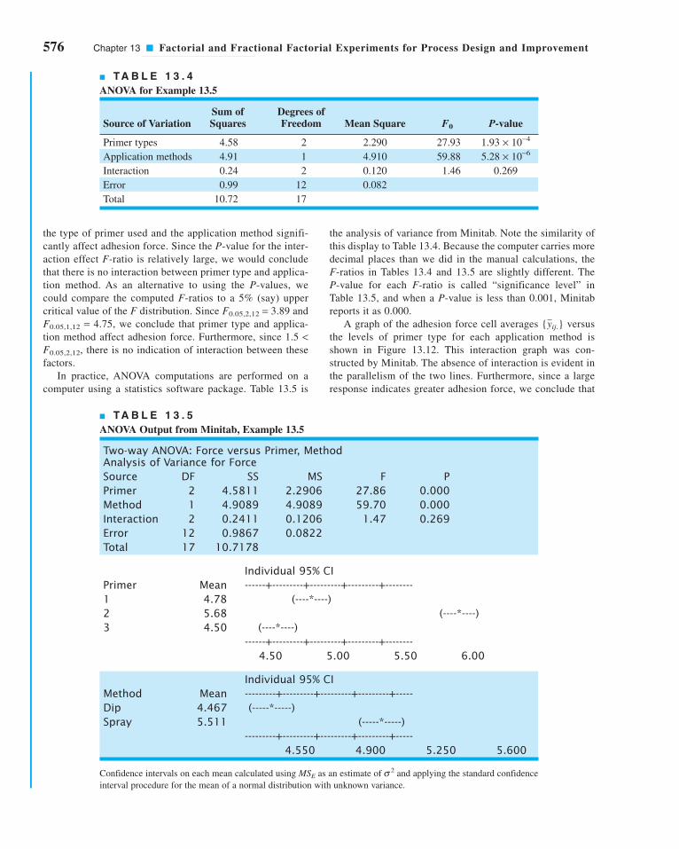
576 Chapter 13 ■ Factorial and Fractional Factorial Experiments for Process Design and Improvement
the analysis of variance from Minitab. Note the similarity of
this display to Table 13.4. Because the computer carries more
decimal places than we did in the manual calculations, the
F-ratios in Tables 13.4 and 13.5 are slightly different. The
P-value for each F-ratio is called “significance level” in
Table 13.5, and when a P-value is less than 0.001, Minitab
reports it as 0.000.
A graph of the adhesion force cell averages { } versus
the levels of primer type for each application method is
shown in Figure 13.12. This interaction graph was con-
structed by Minitab. The absence of interaction is evident in
the parallelism of the two lines. Furthermore, since a large
response indicates greater adhesion force, we conclude that
yij.
the type of primer used and the application method signifi-
cantly affect adhesion force. Since the P-value for the inter-
action effect F-ratio is relatively large, we would conclude
that there is no interaction between primer type and applica-
tion method. As an alternative to using the P-values, we
could compare the computed F-ratios to a 5% (say) upper
critical value of the F distribution. Since F0.05,2,12 = 3.89 and
F0.05,1,12 = 4.75, we conclude that primer type and applica-
tion method affect adhesion force. Furthermore, since 1.5 <F0.05,2,12, there is no indication of interaction between these
factors.
In practice, ANOVA computations are performed on a
computer using a statistics software package. Table 13.5 is
■ TA B L E 1 3 . 4
ANOVA for Example 13.5
Sum of Degrees of Source of Variation Squares Freedom Mean Square F0 P-value
Primer types 4.58 2 2.290 27.93 1.93 × 10⁻⁴
Application methods 4.91 1 4.910 59.88 5.28 × 10⁻⁶
Interaction 0.24 2 0.120 1.46 0.269
Error 0.99 12 0.082
Total 10.72 17
■ TA B L E 1 3 . 5
ANOVA Output from Minitab, Example 13.5
Two-way ANOVA: Force versus Primer, Method Analysis of Variance for ForceSource DF SS MS F PPrimer 2 4.5811 2.2906 27.86 0.000Method 1 4.9089 4.9089 59.70 0.000Interaction 2 0.2411 0.1206 1.47 0.269Error 12 0.9867 0.0822Total 17 10.7178
Individual 95% CIPrimer Mean ------+---------+---------+---------+--------1 4.78 (----*----)2 5.68 (----*----)3 4.50 (----*----)
------+---------+---------+---------+--------4.50 5.00 5.50 6.00
Individual 95% CIMethod Mean ---------+---------+---------+---------+-----Dip 4.467 (-----*-----)Spray 5.511 (-----*-----)
---------+---------+---------+---------+-----4.550 4.900 5.250 5.600
Confidence intervals on each mean calculated using MSE as an estimate of s 2 and applying the standard confidence
interval procedure for the mean of a normal distribution with unknown variance.
c13FactorialAndFractionalFactorialExperimentsForProcessDesignand Improvement.qxd 3/31/12 5:27 PM Page 576

13.4.3 Residual Analysis
Just as in the single-factor experiments discussed in Chapter 4, the residuals from a factorial
experiment play an important role in assessing model adequacy. The residuals from a two-
factor factorial are
That is, the residuals are simply the difference between the observations and the correspond-
ing cell averages.
Table 13.6 presents the residuals for the aircraft primer paint data in Example 13.5. The
normal probability plot of these residuals is shown in Figure 13.13. This plot has tails that do
not fall exactly along a straight line passing through the center of the plot, indicating that
there may be some small problems with the normality assumption, but the departure from
normality is not serious. Figures 13.14 and 13.15 plot the residuals versus the levels of primer
types and application methods, respectively. There is some indication that primer type 3
e y y
y y
ijk ijk ijk
ijk ij
= −
= −
ˆ
.
13.4 Factorial Experiments 577
spraying is a superior application method and that primer
type 2 is most effective. Therefore, if we wish to operate the
process so as to attain maximum adhesion force, we should
use primer type 2 and spray all parts.
3.8
4.2
4.6
5.0
5.4
5.8
6.2R
espo
nse
1 2 3
Primer type
dip
sprayspray
dip
■ F I G U R E 1 3 . 1 2 Graph of average adhe-
sion force versus primer types for Example 13.5.
■ TA B L E 1 3 . 6
Residuals for the Aircraft Primer Paint Experiment
Primer Type Application Method
Dipping Spraying
1 −0.26, 0.23, 0.03 0.10, −0.40, 0.30
2 0.30, −0.40, 0.10 −0.26, 0.03, 0.23
3 −0.03, −0.13, 0.16 0.34, −0.17, −0.17
■ F I G U R E 1 3 . 1 4 Plot of residuals versus
primer type.
■ F I G U R E 1 3 . 1 3 Normal probability plot
of the residuals from Example 13.5.
0.1
15
20
50
80
9599
99.9
Cum
ulat
ive
perc
enta
ge
–0.4 –0.2 0 0.2 0.4
Residuals
–0.4
–0.2
0
0.2
0.4
Res
idua
ls
1 2 3
Primer type
c13FactorialAndFractionalFactorialExperimentsForProcessDesignand Improvement.qxd 4/3/12 5:22 PM Page 577

578 Chapter 13 ■ Factorial and Fractional Factorial Experiments for Process Design and Improvement
results in slightly lower variability in adhesion force than the other two primers. The graph of
residuals versus fitted values in Figure 13.16 does not reveal any unusual or diagnostic pattern.
13.5 The 2k Factorial Design
Certain special types of factorial designs are very useful in process development and improve-
ment. One of these is a factorial design with k factors, each at two levels. Because each com-
plete replicate of the design has 2k runs, the arrangement is called a 2k factorial design. These
designs have a greatly simplified analysis, and they also form the basis of many other useful
designs.
13.5.1 The 22 Design
The simplest type of 2k design is the 22—that is, two factors A and B, each at two levels. We
usually think of these levels as the “low” or “−” and “high” or “+” levels of the factor. The
geometry of the 22 design is shown in Figure 13.17a. Note that the design can be represented
geometrically as a square with the 22 = 4 runs forming the corners of the square. Figure
13.17b shows the four runs in a tabular format often called the test matrix or the designmatrix. Each run of the test matrix is on the corners of the square and the − and + signs in
each row show the settings for the variables A and B for that run.
Another notation is used to represent the runs. In general, a run is represented by a
series of lowercase letters. If a letter is present, then the corresponding factor is set at the high
level in that run; if it is absent, the factor is run at its low level. For example, run a indicates
–0.4
–0.2
0
0.2
0.4
Res
idua
ls
dip spray
Application method
–0.4
–0.2
0
0.2
0.4
Res
idua
ls
3.8 4.2 4.6 5.0 5.4 5.8 6.2
Predicted values
■ F I G U R E 1 3 . 1 5 Plot of residuals versus
application method.
■ F I G U R E 1 3 . 1 6 Plot of residuals versus
predicted values.
■ F I G U R E 1 3 . 1 7 The 22 factorial
design.
(1) a
b abHigh(+)
Low(–)
B
Low(–)
High(+)
A
(a) Design geometry
A B
–
+
–
+
–
–
+
+
(b) Test matrix
c13FactorialAndFractionalFactorialExperimentsForProcessDesignand Improvement.qxd 3/31/12 5:27 PM Page 578

that factor A is at the high level and factor B is at the low level. The run with both factors at
the low level is represented by (1). This notation is used throughout the family of 2k designs.
For example, the run in a 24 with A and C at the high level and B and D at the low level is
denoted by ac.
The effects of interest in the 22 design are the main effects A and B and the two-factor
interaction AB. Let the letters (1), a, b, and ab also represent the totals of all n observations
taken at these design points. It is easy to estimate the effects of these factors. To estimate the
main effect of A, we would average the observations on the right side of the square when A isat the high level and subtract from this the average of the observations on the left side of the
square where A is at the low level, or
(13.11)
Similarly, the main effect of B is found by averaging the observations on the top of the square
where B is at the high level and subtracting the average of the observations on the bottom of
the square where B is at the low level:
(13.12)
Finally, the AB interaction is estimated by taking the difference in the diagonal averages in
Figure 13.17, or
(13.13)
The quantities in brackets in equations 13.11, 13.12, and 13.13 are called contrasts. For
example, the A contrast is
In these equations, the contrast coefficients are always either + 1 or − 1. A table of plus and
minus signs, such as Table 13.7, can be used to determine the sign on each run for a particular
Contrast A a ab b= + − − ( )1
ABab
n
a b
n
nab a b
= + ( ) − +
= + ( ) − −[ ]
1
2 2
1
21
B y y
b ab
n
a
n
nb ab a
B B= −
= + − + ( )
= + − − ( )[ ]
+ −
2
1
2
1
21
A y y
a ab
n
b
n
na ab b
A A= −
= + − + ( )
= + − − ( )[ ]
+ −
2
1
2
1
21
13.5 The 2k Factorial Design 579
c13FactorialAndFractionalFactorialExperimentsForProcessDesignand Improvement.qxd 3/31/12 5:27 PM Page 579

580 Chapter 13 ■ Factorial and Fractional Factorial Experiments for Process Design and Improvement
contrast. The column headings for the table are the main effects A and B, the AB interaction, and
I, which represents the total. The row headings are the runs. Note that the signs in the AB col-
umn are the product of signs from columns A and B. To generate a contrast from this table, mul-
tiply the signs in the appropriate column of Table 13.7 by the runs listed in the rows and add.
To obtain the sums of squares for A, B, and AB, we use the following result.
■ TA B L E 1 3 . 7
Signs for Effects in the 22 Design
Factorial Effect
Run I A B AB
1 (1) + − − +2 a + + − −3 b + − + −4 ab + + + +
(13.14)SSn
= ( )( )∑
contrast
contrast coefficients
2
2
SSa ab b
n
SSb ab a
n
SSab a b
n
A
B
AB
=+ − − ( )[ ]
=+ − − ( )[ ]
=+ ( ) − −[ ]
1
4
1
4
1
4
2
2
2
Therefore, the sums of squares for A, B, and AB are
The analysis of variance is completed by computing the total sum of squares SST (with 4n − 1
degrees of freedom) as usual, and obtaining the error sum of squares SSE [with 4(n − 1) degrees
of freedom] by subtraction.
EXAMPLE 13.6 The Router Experiment
assembly. The components are inserted into the board using
automatic equipment, and the variability in notch dimension
causes improper board registration. As a result, the auto-
insertion equipment does not work properly. How would you
improve this process?
A router is used to cut registration notches in printed circuit
boards. The average notch dimension is satisfactory, and the
process is in statistical control (see the and R control charts
in Figure 13.18), but there is too much variability in the
process. This excess variability leads to problems in board
x
(13.15)
c13FactorialAndFractionalFactorialExperimentsForProcessDesignand Improvement.qxd 3/31/12 5:27 PM Page 580

13.5 The 2k Factorial Design 581
0
0.02
0.04
0.06
0.23
0.24
0.25
0.26
0.27
Sample number Sample number
UCL
UCL
LCL
xR
■ F I G U R E 1 3 . 1 8 and R control
charts on notch dimension, Example 13.6.
x
Using equations 13.11, 13.12, and 13.13, we can compute the
factor effect estimates as follows:
All the numerical effect estimates seem large. For example,
when we change factor A from the low level to the high level
(bit size from � to �), the average vibration level increases
by 16.64 cps.
The magnitude of these effects may be confirmed with the
analysis of variance, which is summarized in Table 13.9. The
sums of squares in this table for main effects and interaction
were computed using equation 13.15. The analysis of variance
confirms our conclusions that were obtained by initially exam-
ining the magnitude and direction of the factor effects; both bit
size and speed are important, and there is interaction between
two variables.
18
116
An
a ab b
Bn
b ab a
ABn
ab a b
= + − − ( )[ ]
=( )
+ − −[ ] = =
= + − − ( )[ ]
=( )
+ − −[ ] = =
= + ( ) − −[ ]
=
1
21
1
2 496 1 161 1 59 7 64 4
133 1
816 64
1
21
1
2 459 7 161 1 96 1 64 4
60 3
87 54
1
21
1
2 4
. . . ..
.
. . . ..
.
(( )+ − −[ ] = =161 1 64 4 96 1 59 7
69 7
88 71. . . .
..
SOLUTION
Since the process is in statistical control, the quality improve-
ment team assigned to this project decided to use a designed
experiment to study the process. The team considered two
factors: bit size (A) and speed (B). Two levels were chosen for
each factor (bit size A at � and � and speed B at 40 rpm and
80 rpm), and a 22 design was set up. Since variation in notch
dimension was difficult to measure directly, the team decided
to measure it indirectly. Sixteen test boards were instru-
mented with accelerometers that allowed vibration on the
(X, Y, Z) coordinate axes to be measured. The resultant vec-
tor of these three components was used as the response vari-
able. Since vibration at the surface of the board when it is cut
is directly related to variability in notch dimension, reducing
vibration levels will also reduce the variability in notch
dimension.
Four boards were tested at each of the four runs in the
experiment, and the resulting data are shown in Table 13.8.
18
116
■ TA B L E 1 3 . 9
Analysis of Variance for the Router Experiment
Source of Sum of Degrees ofVariation Squares Freedom Mean Square F0 P-value
Bit size (A) 1,107.226 1 1,107.226 185.25 1.17 × 10⁻⁸
Speed (B) 227.256 1 227.256 38.03 4.82 × 10⁻⁵
AB 303.631 1 303.631 50.80 1.20 × 10⁻⁵
Error 71.723 12 5.977
Total 1,709.836 15
■ TA B L E 1 3 . 8
Data from the Router Experiment
Factors
Run A B Vibration Total
1 (1) − − 18.2 18.9 12.9 14.4 64.4
2 a + − 27.2 24.0 22.4 22.5 96.1
3 b − + 15.9 14.5 15.1 14.2 59.7
4 ab + + 41.0 43.9 36.3 39.9 161.1
c13FactorialAndFractionalFactorialExperimentsForProcessDesignand Improvement.qxd 4/3/12 5:26 PM Page 581
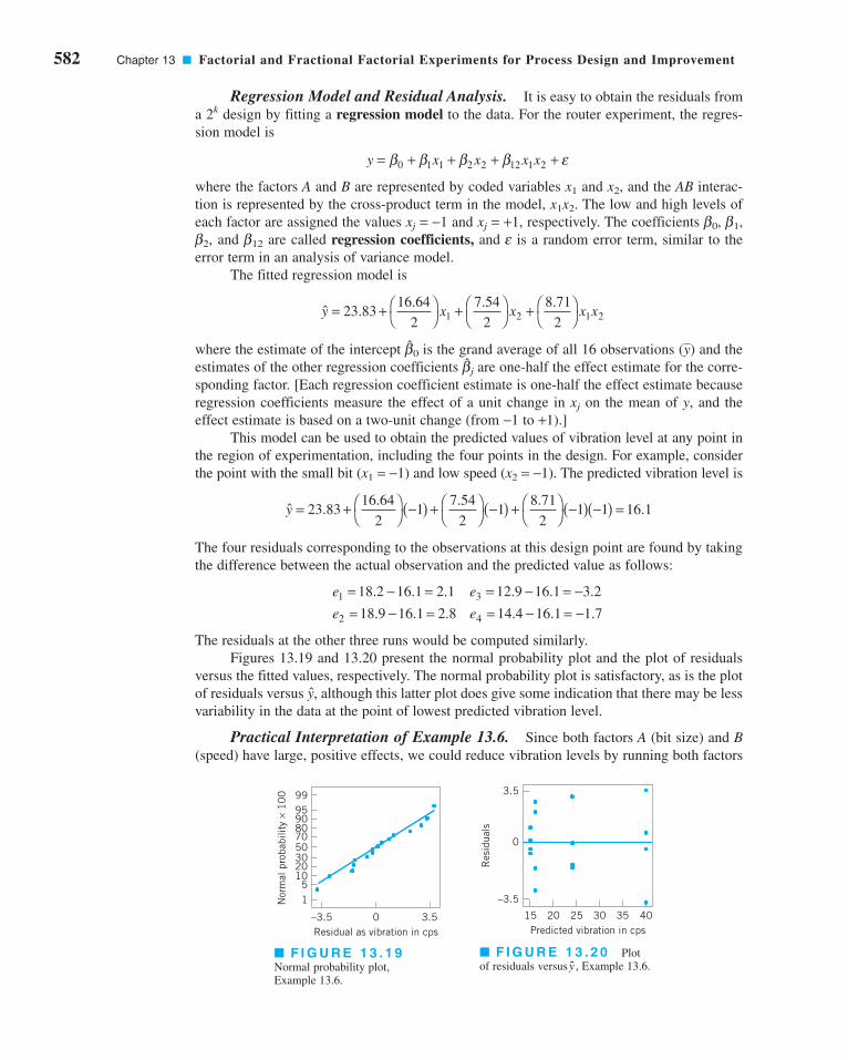
582 Chapter 13 ■ Factorial and Fractional Factorial Experiments for Process Design and Improvement
Regression Model and Residual Analysis. It is easy to obtain the residuals from
a 2k design by fitting a regression model to the data. For the router experiment, the regres-
sion model is
where the factors A and B are represented by coded variables x1 and x2, and the AB interac-
tion is represented by the cross-product term in the model, x1x2. The low and high levels of
each factor are assigned the values xj = −1 and xj = +1, respectively. The coefficients b0, b1,
b2, and b12 are called regression coefficients, and e is a random error term, similar to the
error term in an analysis of variance model.
The fitted regression model is
where the estimate of the intercept is the grand average of all 16 observations ( ) and the
estimates of the other regression coefficients are one-half the effect estimate for the corre-
sponding factor. [Each regression coefficient estimate is one-half the effect estimate because
regression coefficients measure the effect of a unit change in xj on the mean of y, and the
effect estimate is based on a two-unit change (from −1 to +1).]
This model can be used to obtain the predicted values of vibration level at any point in
the region of experimentation, including the four points in the design. For example, consider
the point with the small bit (x1 = −1) and low speed (x2 = −1). The predicted vibration level is
The four residuals corresponding to the observations at this design point are found by taking
the difference between the actual observation and the predicted value as follows:
The residuals at the other three runs would be computed similarly.
Figures 13.19 and 13.20 present the normal probability plot and the plot of residuals
versus the fitted values, respectively. The normal probability plot is satisfactory, as is the plot
of residuals versus , although this latter plot does give some indication that there may be less
variability in the data at the point of lowest predicted vibration level.
Practical Interpretation of Example 13.6. Since both factors A (bit size) and B(speed) have large, positive effects, we could reduce vibration levels by running both factors
y
e e
e e1 3
2 4
18 2 16 1 2 1 12 9 16 1 3 2
18 9 16 1 2 8 14 4 16 1 1 7
= − = = − = −= − = = − = −
. . . . . .
. . . . . .
ˆ .. . .
.y = + ⎛⎝
⎞⎠ −( ) + ⎛
⎝⎞⎠ −( ) + ⎛
⎝⎞⎠ −( ) −( ) =23 83
16 64
21
7 54
21
8 71
21 1 16 1
bj
yb0
ˆ .. . .
y x x x x= + ⎛⎝
⎞⎠ + ⎛
⎝⎞⎠ + ⎛
⎝⎞⎠23 83
16 64
2
7 54
2
8 71
21 2 1 2
y x x x x= + + + +β β β β ε0 1 1 2 2 12 1 2
15
102030507080909599
Nor
mal
pro
babi
lity
× 1
00
–3.5 0 3.5Residual as vibration in cps
■ F I G U R E 1 3 . 1 9Normal probability plot,
Example 13.6.
■ F I G U R E 1 3 . 2 0 Plot
of residuals versus , Example 13.6.y
15 20 25 30 35 40Predicted vibration in cps
–3.5
0
3.5
Res
idua
ls
c13FactorialAndFractionalFactorialExperimentsForProcessDesignand Improvement.qxd 3/31/12 5:27 PM Page 582

at the low level. However, with both bit size and speed at low level, the production rate could
be unacceptably low. The AB interaction provides a solution to this potential dilemma. Fig-
ure 13.21 presents the two-factor AB interaction plot. Note that the large positive effect of
speed occurs primarily when bit size is at the high level. If we use the small bit, then either
speed level will provide lower vibration levels. If we run with speed high and use the small
bit, the production rate will be satisfactory.
When manufacturing implemented this set of operating conditions, the result was a dra-
matic reduction in variability in the registration notch dimension. The process remained
in statistical control, as the control charts in Figure 13.22 imply, and the reduced variability
dramatically improved the performance of the auto-insertion process.
Analysis Procedure for Factorial Experiments. Table 13.10 summarizes the
sequence of steps that is usually employed to analyze factorial experiments. These steps were
followed in the analysis of the router experiment in Example 13.6. Recall that our first activ-
ity, after the experiment was run, was to estimate the effect of the factors bit size, speed, and
the two-factor interaction. The preliminary model that we used in the analysis was the two-
factor factorial model with interaction. Generally, in any factorial experiment with replica-
tion, we will almost always use the full factorial model as the preliminary model. We tested
for significance of factor effects by using the analysis of variance. Since the residual analysis
was satisfactory, and both main effects and the interaction term were significant, there was no
need to refine the model. Therefore, we were able to interpret the results in terms of the orig-
inal full factorial model, using the two-factor interaction graph in Figure 13.21. Sometimes
refining the model includes deleting terms from the final model that are not significant, or tak-
ing other actions that may be indicated from the residual analysis.
Several statistics software packages include special routines for the analysis of two-level
factorial designs. Many of these packages follow an analysis process similar to the one we have
outlined. We will illustrate this analysis procedure again several times in this chapter.
13.5.2 The 2k Design for k ≥≥ 3 Factors
The methods presented in the previous section for factorial designs with k = 2 factors each
at two levels can be easily extended to more than two factors. For example, consider k = 3
13.5 The 2k Factorial Design 583
■ F I G U R E 1 3 . 2 1 ABinteraction plot.
■ F I G U R E 1 3 . 2 2 and R charts for the router process after the experiment.x
13
44
– +
Bit size, A
Vibr
atio
n cp
s
B–
B+
B–
B+
0.24
0.25
0.26
0.27
UCL
LCL
UCL
0.06
0.04
0.02
Sample number Sample number
x
R
■ TA B L E 1 3 . 1 0
Analysis Procedure for Factorial Designs
1. Estimate the factor effects 4. Analyze residuals
2. Form preliminary model 5. Refine model, if necessary
3. Test for significance of factor effects 6. Interpret results
c13FactorialAndFractionalFactorialExperimentsForProcessDesignand Improvement.qxd 3/31/12 5:27 PM Page 583

584 Chapter 13 ■ Factorial and Fractional Factorial Experiments for Process Design and Improvement
factors, each at two levels. This design is a 23 factorial design, and it has eight factor-level
combinations. Geometrically, the design is a cube as shown in Figure 13.23a, with the eight
runs forming the corners of the cube. Figure 13.23b shows the test or design matrix. This
design allows three main effects to be estimated (A, B, and C) along with three two-factor
interactions (AB, AC, and BC) and a three-factor interaction (ABC). Thus, the full factorial
model could be written symbolically as
where m is an overall mean, e is a random error term assumed to be NID(0, s2), and
the uppercase letters represent the main effects and interactions of the factors (note
that we could have used Greek letters for the main effects and interactions, as in equa-
tion 13.2).
The main effects can be estimated easily. Remember that the lowercase letters (1), a, b,
ab, c, ac, bc, and abc represent the total of all n replicates at each of the eight runs in the design.
Referring to the cube in Figure 13.23, we would estimate the main effect of A by averaging the
four runs on the right side of the cube where A is at the high level and subtracting from that
quantity the average of the four runs on the left side of the cube where A is at the low level.
This gives
y A B C AB AC BC ABC= + + + + + + + +μ ε
+
–
C
c
bc abc
abb
a(1)
ac
A
B
– +
–
+
A B–
+
–
+
–
+
–
+
–
–
+
+
–
–
+
+
(b) Test matrix(a) Design geometry
C–
–
–
–
+
+
+
+
■ F I G U R E 1 3 . 2 3 The 23 factorial design.
(13.16)A y yn
a ab ac abc b c bcA A
= − = + + + − − − − ( )[ ]+ −1
41
(13.17)B y yn
b ab bc abc a c acB B
= − = + + + − − − − ( )[ ]+ −1
41
In a similar manner, the effect of B is the average difference of the four runs in the back face
of the cube and the four in the front, or
and the effect of C is the average difference between the four runs in the top face of the cube
and the four in the bottom, or
c13FactorialAndFractionalFactorialExperimentsForProcessDesignand Improvement.qxd 4/23/12 7:43 PM Page 584

The top row of Figure 13.24 shows how the main effects of the three factors are computed.
Now consider the two-factor interaction AB. When C is at the low level, AB is simply
the average difference in the A effect at the two levels of B, or
Similarly, when C is at the high level, the AB interaction is
The AB interaction is the average of these two components, or
AB Cn
abc bcn
ac c high( ) = −[ ] − −[ ]1
2
1
2
AB Cn
ab bn
a low( ) = −[ ] − − ( )[ ]1
2
1
21
13.5 The 2k Factorial Design 585
■ F I G U R E 1 3 . 2 4 Geometric presentation of contrasts corresponding
to the main effects and interaction in the 23 design.
(13.18)C y yn
c ac bc abc a b abC C
= − = + + + − − − − ( )[ ]+ −1
41
(13.19)ABn
ab abc c b a bc ac= + ( ) + + − − − −[ ]1
41
– +–
+
–
+
–+
–
–
+–
+–
+–
= +runs= –runs
B
A
C
ABC
ACAB BC
BA C
(a) Main effects
(b) Two-factor interactions
(c) Three-factor interaction
c13FactorialAndFractionalFactorialExperimentsForProcessDesignand Improvement.qxd 3/31/12 5:27 PM Page 585
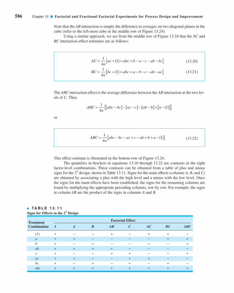
586 Chapter 13 ■ Factorial and Fractional Factorial Experiments for Process Design and Improvement
Note that the AB interaction is simply the difference in averages on two diagonal planes in the
cube (refer to the left-most cube in the middle row of Figure 13.24).
Using a similar approach, we see from the middle row of Figure 13.24 that the AC and
BC interaction effect estimates are as follows:
ACn
ac abc b a c ab bc
BCn
bc abc a b c ab ac
= + ( ) + + − − − −[ ]
= + ( ) + + − − − −[ ]
1
41
1
41
(13.20)
(13.21)
The ABC interaction effect is the average difference between the AB interaction at the two lev-
els of C. Thus
or
ABCn
abc bc ac c ab b a= −[ ] − −[ ] − −[ ] + − ( )[ ]{ }1
41
(13.22)ABCn
abc bc ac c ab b a= − − + − + + − ( )[ ]1
41
This effect estimate is illustrated in the bottom row of Figure 13.24.
The quantities in brackets in equations 13.16 through 13.22 are contrasts in the eight
factor-level combinations. These contrasts can be obtained from a table of plus and minus
signs for the 23 design, shown in Table 13.11. Signs for the main effects (columns A, B, and C)
are obtained by associating a plus with the high level and a minus with the low level. Once
the signs for the main effects have been established, the signs for the remaining columns are
found by multiplying the appropriate preceding columns, row by row. For example, the signs
in column AB are the product of the signs in columns A and B.
■ TA B L E 1 3 . 1 1
Signs for Effects in the 23 Design
Treatment Factorial Effect
Combination I A B AB C AC BC ABC
(1) + − − + − + + −a + + − − − − + +b + − + − − + − +ab + + + + − − − −c + − − + + − − +ac + + − − + + − −bc + − + − + − + −abc + + + + + + + +
c13FactorialAndFractionalFactorialExperimentsForProcessDesignand Improvement.qxd 3/31/12 5:27 PM Page 586

Table 13.11 has several interesting properties:
1. Except for the identity column I, each column has an equal number of plus and minus
signs.
2. The sum of products of signs in any two columns is zero; that is, the columns in the
table are orthogonal.
3. Multiplying any column by column I leaves the column unchanged; that is, I is an iden-tity element.
4. The product of any two columns yields a column in the table; for example, A × B = AB,
and AB × ABC = A2B2C = C, since any column multiplied by itself is the identity column.
The estimate of any main effect or interaction is determined by multiplying the factor-
level combinations in the first column of the table by the signs in the corresponding main
effect or interaction column, adding the result to produce a contrast, and then dividing the
contrast by one-half the total number of runs in the experiment. Expressed mathematically,
13.5 The 2k Factorial Design 587
(13.23)EffectContrast= −n k
21
(13.24)SSn k= ( )Contrast
2
2
The sum of squares for any effect is
EXAMPLE 13.7 A 23 Factorial Design
cates. Table 13.12 presents the observed surface-finish data
for this experiment, and the design is shown graphically in
Figure 13.25. Analyze and interpret the data from this experiment.
An experiment was performed to investigate the surface finish of
a metal part. The experiment is a 23 factorial design in the factors
feed rate (A), depth of cut (B), and tool angle (C), with n = 2 repli-
(continued )
■ TA B L E 1 3 . 1 2
Surface-Finish Data for Example 13.7
Design Factors
Run A B C Surface Finish Totals
1 (1) −1 −1 −1 9, 7 16
2 a 1 −1 −1 10, 12 22
3 b −1 1 −1 9, 11 20
4 ab 1 1 −1 12, 15 27
5 c −1 −1 1 11, 10 21
6 ac 1 −1 1 10, 13 23
7 bc −1 1 1 10, 8 18
8 abc 1 1 1 16, 14 30
c13FactorialAndFractionalFactorialExperimentsForProcessDesignand Improvement.qxd 3/31/12 5:27 PM Page 587

588 Chapter 13 ■ Factorial and Fractional Factorial Experiments for Process Design and Improvement
It is easy to verify that the other effect estimates and sums of
squares are
From examining the magnitude of the effects, feed rate (factor
A) is clearly dominant, followed by depth of cut (B) and the ABinteraction, although the interaction effect is relatively small.
The analysis of variance for the full factorial model is summa-
rized in Table 13.13. Based on the P-values, it is clear that the
feed rate (A) is highly significant.
B
C
AB
AC
BC
ABC
SS
SS
SS
SS
SS
SS
B
C
AB
AC
BC
ABC
===== −=
======
1 625
0 875
1 375
0 125
0 625
1 125
10 5625
3 0625
7 5625
0 0625
1 5625
5 0625
.
.
.
.
.
.
.
.
.
.
.
.
SOLUTION
The main effects may be estimated using equations 13.16
through 13.22. The effect of A, for example, is
and the sum of squares for A is found using equation 13.24:
SSn
AA
k= ( )
= ( )( )
=
Contrast2
2
2
27
2 845 5625.
An
a ab ac abc b c bc= + + + − − − − ( )[ ]
=( )
+ + + − − − −[ ]
= [ ] =
1
41
1
4 222 27 23 30 20 21 18 16
1
827 3 375.
■ TA B L E 1 3 . 1 3
Analysis of Variance for the Surface-Finish Experiment
Source of Sum of Degrees ofVariation Squares Freedom Mean Square F0 P-value
A 45.5625 1 45.5625 18.69 2.54 × 10⁻³
B 10.5625 1 10.5625 4.33 0.07
C 3.0625 1 3.0625 1.26 0.29
AB 7.5625 1 7.5625 3.10 0.12
AC 0.0625 1 0.0625 0.03 0.88
BC 1.5625 1 1.5625 0.64 0.45
ABC 5.0625 1 5.0625 2.08 0.19
Error 19.5000 8 2.4375
Total 92.9375 15
■ F I G U R E 1 3 . 2 5 23 design for the surface-finish experiment
in Example 13.7 (the numbers in parentheses are the average responses at
each design point).
8, 10 (9)
9, 11 (10)
7, 9 (8)
10, 11 (10.5)10, 13 (11.5)
10, 12 (11)+– Feed rate
A
14, 16 (15)
12, 15 (13.5)
Dep
th
B
CTool
angle
c13FactorialAndFractionalFactorialExperimentsForProcessDesignand Improvement.qxd 3/31/12 5:27 PM Page 588

13.5 The 2k Factorial Design 589
where is the coefficient estimate and s.e. ( ) is the estimated
standard error of the coefficient. For a 2k factorial design, the
estimated standard error of the coefficient is
We use the error or residual mean square from the analysis of
variance as the estimate . In our example,
as shown in Table 13.14. It is easy to verify that dividing any
coefficient estimate by its estimated standard error produces
the t-value for testing whether the corresponding regression
coefficient is zero.
The t-tests in Table 13.14 are equivalent to the ANOVA F-
tests in Table 13.13. You may have suspected this already, since
the P-values in the two tables are identical to two decimal
places. Furthermore, note that the square of any t-value in Table
13.14 produces the corresponding F-ratio value in Table 13.13.
s e. . ˆ .. β( ) = ( ) =2 4375
2 20 390312
3
s2
s en k. . ˆ ˆ
β σ( ) =2
2
bbMany computer programs analyze the 2k factorial design.
Table 13.14 is the output from Minitab. Although at first
glance the two tables seem somewhat different, they actually
provide the same information. The analysis of variance dis-
played in the lower portion of Table 13.14 presents F-ratios
computed on important groups of model terms: main effects,
two-way interactions, and the three-way interaction. The mean
square for each group of model terms was obtained by combin-
ing the sums of squares for each model component and divid-
ing by the number of degrees of freedom associated with that
group of model terms.
A t-test is used to test the significance of each individual
term in the model. These t-tests are shown in the upper portion
of Table 13.14. Note that a “coefficient estimate” is given for
each variable in the full factorial model. These are actually the
estimates of the coefficients in the regression model that would
be used to predict surface finish in terms of the variables in the
full factorial model. Each t-value is computed according to
ts e
0 = ( )ˆ
. . ˆ
ββ
(continued )
■ TA B L E 1 3 . 1 4
Analysis of Variance from Minitab for the Surface-Finish Experiment
Factorial Design
Full Factorial DesignFactors: 3 Base Design: 3, 8Runs: 16 Replicates: 2Blocks: none Center pts (total): 0All terms are free from aliasing
Fractional Factorial Fit: Finish versus A, B, C
Estimated Effects and Coefficients for Finish (coded units)Term Effect Coef SE Coef T PConstant 11.0625 0.3903 28.34 0.000A 3.3750 1.6875 0.3903 4.32 0.003B 1.6250 0.8125 0.3903 2.08 0.071C 0.8750 0.4375 0.3903 1.12 0.295A*B 1.3750 0.6875 0.3903 1.76 0.116A*C 0.1250 0.0625 0.3903 0.16 0.877B*C −0.6250 −0.3125 0.3903 −0.80 0.446A*B*C 1.1250 0.5625 0.3903 1.44 0.188
Analysis of Variance for Finish (coded units)Source DF Seq SS Adj SS Adj MS F PMain Effects 3 59.187 59.187 19.729 8.09 0.0082-Way Interactions 3 9.187 9.187 3.062 1.26 0.3523-Way Interactions 1 5.062 5.062 5.062 2.08 0.188Residual Error 8 19.500 19.500 2.437Pure Error 8 19.500 19.500 2.438Total 15 92.937
c13FactorialAndFractionalFactorialExperimentsForProcessDesignand Improvement.qxd 3/31/12 5:27 PM Page 589

590 Chapter 13 ■ Factorial and Fractional Factorial Experiments for Process Design and Improvement
Finally, we can provide a practical interpretation of the
results of our experiment. Both main effects A and B are posi-
tive, and since small values of the surface finish response are
desirable, this would suggest that both A (feed rate) and B (depth
of cut) should be run at the low level. However, the model has
an interaction term, and the effect of this interaction should be
taken into account when drawing conclusions. We could do
this by examining an interaction plot, as in Example 13.6 (see
Figure 13.21). Alternatively, the cube plot of predicted
responses in Figure 13.26 can also be used for model interpreta-
tion. This figure indicates that the lowest values of predicted sur-
face finish will be obtained when A and B are at the low level.
Figure 13.26 shows the predicted values at each point in the
original experimental design.
The residuals can be obtained as the difference between the
observed and predicted values of surface finish at each design
point. For the point where all three factors A, B, and C are at
the low level, the observed values of surface finish are 9 and 7,
so the residuals are 9 − 9.25 = −0.25 and 7 − 9.25 = −2.25.
A normal probability plot of the residuals is shown in
Figure 13.27. Since the residuals lie approximately along a
straight line, we do not suspect any severe nonnormality in the
data. There are also no indications of outliers. It would also be
helpful to plot the residuals versus the predicted values and
against each of the factors A, B, and C. These plots do not indi-
cate any potential model problems.
In general, the square of a t random variable with v degrees of
freedom results in an F random variable with one numerator
degree of freedom and v denominator degrees of freedom. This
explains the equivalence of the two procedures used to conduct
the analysis of variance for the surface-finish experiment data.
Based on the ANOVA results, we conclude that the full fac-
torial model in all these factors is unnecessary, and that a
reduced model including fewer variables is more appropriate.
The main effects of A and B both have relatively small P-values
(< 0.10), and this AB interaction is the next most important
effect (P-value 0.12). The regression model that we would
use to represent this process is
where x1 represents factor A, x2 represents factor B, and x1x2
represents the AB interaction. The regression coefficients
1, 2, and 12 are one-half the corresponding effect esti-
mates and 0 is the grand average. Thus
Note that we can read the values of 0, 1, 2, and 12 directly
from the “coefficient” column of Table 13.14.
This regression model can be used to predict surface finish
at any point in the original experimental region. For example,
consider the point where all three variables are at the low level.
At this point, x1 = x2 = −1, and the predicted value is
bbbb
ˆ .. . .
. . . .
y x x x x
x x x x
= + ⎛⎝
⎞⎠ + ⎛
⎝⎞⎠ + ⎛
⎝⎞⎠
= + + +
11 06253 375
2
1 625
2
1 375
2
11 0625 1 6875 0 8125 0 6875
1 2 1 2
1 2 1 2
bbbb
y x x x x= + + + +β β β β ε0 1 1 2 2 12 1 2
�
ˆ . . . . .y = + −( ) + −( ) + −( ) −( ) =11 0625 1 6875 1 0 8125 1 0 6875 1 1 9 25
9.500
9.500
9.250
9.25011.25
11.25+– Feed rate
A
14.25
14.25
Dep
th
B
–
+
+
–CTool
angle
1
51020305070809095
99
Nor
mal
pro
babi
lity
× 1
00
–1.5 0 1.5
Residual
■ F I G U R E 1 3 . 2 6 Predicted values of surface finish at
each point in the original design, Example 13.7.
■ F I G U R E 1 3 . 2 7 Normal prob-
ability plot of residuals, Example 13.7.
Some Comments on the Regression Model. In the two previous examples, we
used a regression model to summarize the results of the experiment. In general, a regression
model is an equation of the form
(13.25)
where y is the response variable, the x’s are a set of regressor or predictor variables, the b’s are
the regression coefficients, and e is an error term, assumed to be NID(0, s2). In our examples,
y = b0 + b1x1 + b2x2 + . . . bkxk + e
c13FactorialAndFractionalFactorialExperimentsForProcessDesignand Improvement.qxd 3/31/12 5:27 PM Page 590

we had k = 2 factors and the models had an interaction term, so the specific form of the regres-
sion model that we fit was
In general, the regression coefficients in these models are estimated using the method of leastsquares; that is, the ’s are chosen so as to minimize the sum of the squares of the errors (the
e’s). Refer to Chapter 4 for an introduction to least squares regression. However, in the special
case of a 2k design, it is extremely easy to find the least squares estimates of the b’s. The least
squares estimate of any regression coefficient b is simply one-half of the corresponding fac-
tor effect estimate. Recall that we have used this result to obtain the regression models in
Examples 13.6 and 13.7. Also, please remember that this result only works for a 2k factorial
design, and it assumes that the x’s are coded variables over the range −1 ≤ x ≤ +1 that repre-
sent the design factors.
It is very useful to express the results of a designed experiment in terms of a model, which
will be a valuable aid in interpreting the experiment. Recall that we used the cube plot of predicted
values from the model in Figure 13.26 to find appropriate settings for feed rate and depth of cut in
Example 13.7. More general graphical displays can also be useful. For example, consider the
model for surface finish in terms of feed rate (x1) and depth of cut (x2) without the interaction term
Note that the model was obtained simply by deleting the interaction term from the original model.
This can only be done if the variables in the experimental design are orthogonal, as they are in a
2k design. Figure 13.28 plots the predicted value of surface finish ( ) in terms of the two process
variables x1 and x2. Figure 13.28a is a three-dimensional plot showing the plane of predicted
response values generated by the regression model. This type of display is called a response sur-face plot, and the regression model used to generate the graph is often called a first-orderresponse surface model. The graph in Figure 13.28b is a two-dimensional contour plot obtained
by looking down on the three-dimensional response surface plot and connecting points of constant
surface finish (response) in the x1–x2 plane. The lines of constant response are straight lines
because the response surface is first order; that is, it contains only the main effects x1 and x2.
In Example 13.7, we actually fit a first-order model with interaction:
Figure 13.29a is the three-dimensional response surface plot for this model and Figure 13.29b is
the contour plot. Note that the effect of adding the interaction term to the model is to introduce
curvature into the response surface; in effect, the plane is “twisted” by the interaction effect.
Inspection of a response surface makes interpretation of the results of an experiment very
simple. For example, note from Figure 13.29 that if we wish to minimize the surface-finish
response, we need to run x1 and x2 at (or near) their low levels. We reached the same conclusion
by inspection of the cube plot in Figure 13.26. However, suppose we needed to obtain a particu-
lar value of surface finish, say 10.25 (the surface might need to be this rough so that a coating
will adhere properly). Figure 13.29b indicates that there are many combinations of x1 and x2 that
will allow the process to operate on the contour line . The experimenter might select a
set of operating conditions that maximized x1 subject to x1 and x2 giving a predicted response on
or near to the contour , as this would satisfy the surface-finish objective while simulta-
neously making the feed rate as large as possible, which would maximize the production rate.
Response surface models have many uses. In Chapter 14, we will give an overview of
some aspects of response surfaces and how they can be used for process improvement and
optimization. However, note how useful the response surface was, even in this simple example.
This is why we tell experimenters that the objective of every designed experiment is aquantitative model of the process.
y = 10.25
y = 10.25
ˆ . . . .y x x x x= + + +11 0625 1 6875 0 8125 0 68751 2 1 2
y
ˆ . . .y x x= + +11 0625 1 6875 0 81251 2
b
y x x x x= + + + +β β β β ε0 1 1 2 2 12 1 2
13.5 The 2k Factorial Design 591
c13FactorialAndFractionalFactorialExperimentsForProcessDesignand Improvement.qxd 3/31/12 5:27 PM Page 591

592 Chapter 13 ■ Factorial and Fractional Factorial Experiments for Process Design and Improvement
Projection of 2k Designs. Any 2k design will collapse or project into another two-
level factorial design in fewer variables if one or more of the original factors are dropped.
Usually this will provide additional insight into the remaining factors. For example, consider
the surface-finish experiment. Since factor C and all its interactions are negligible, we could
eliminate factor C from the design. The result is to collapse the cube in Figure 13.25 into a
square in the A-B plane; however, each of the four runs in the new design has four replicates.
In general, if we delete h factors so that r = k − h factors remain, the original 2k design with
n replicates will project into a 2r design with n2h replicates.
Other Methods for Judging the Significance of Effects. The analysis of vari-
ance is a formal way to determine which effects are nonzero. Two other methods are useful.
In the first method, we can calculate the standard errors of the effects and compare the mag-
nitude of the effects to their standard errors. The second method uses normal probability plots
to assess the importance of the effects.
The standard error of any effect estimate in a 2k design is given by
(13.26)
where is an estimate of the experimental error variance s2. We usually take the error (or
residual) mean square from the analysis of variance as the estimate of s2.
As an illustration for the surface-finish experiment, we find that MSE = ,
and the standard error of each effect is
s en k. .
ˆ
.
.
Effect( ) =
=( )
=
−
−
σ 2
2
3 2
2
2 4375
2 2
0 78
s2 = 2.4375
s2
s2
s en k. .
ˆ Effect( ) = −
σ 2
22
14.513.512.511.510.5
9.58.5
y1 –0.6 –0.2 0.2 0.6 1 –1
–0.6–0.2
0.20.6
1
x 2, D
epth
–1
–0.6
–0.2
0.2
0.6
1
x1, Feed rate
x 2,
Dep
th
–1 –0.6 –0.2 0.2 0.6 112
12.5
13
13.5
(a)
(b)
x1, Feed rate
14.513.512.511.510.5
9.58.5
y
1 –0.6 –0.2 0.2 0.6 1 –1–0.6
–0.20.2
0.61
x 2, D
epth
x1, Feed rate
–1
–0.6
–0.2
0.2
0.6
1
x1, Feed rate
x 2,
Dep
th
–1 –0.6 –0.2 0.2 0.6 111.25
11.75
12.75
(a)
(b)
12.5
13.25
13.75
9.75 10.25 10.759.25
■ F I G U R E 1 3 . 2 9 (a) Response surface for
the model = 11.0625 + 1.6875x1 + 0.8125x2 +0.6875x1x2. (b) The contour plot.
y■ F I G U R E 1 3 . 2 8 (a) Response surface
for the model = 11.0625 + 1.6875x1 + 0.8125x2.
(b) The contour plot.
y
c13FactorialAndFractionalFactorialExperimentsForProcessDesignand Improvement.qxd 3/31/12 5:27 PM Page 592

Therefore, two standard deviation limits on the effect estimates are
These intervals are approximate 95% confidence intervals. They indicate that the two main
effects A and B are important but that the other effects are not, since the intervals for all
effects except A and B include zero. These conclusions are similar to those found in
Example 13.7.
Normal probability plots can also be used to judge the significance of effects. We will
illustrate that method in the next section.
13.5.3 A Single Replicate of the 2k Design
As the number of factors in a factorial experiment grows, the number of effects that can be
estimated also grows. For example, a 24 experiment has 4 main effects, 6 two-factor interac-
tions, 4 three-factor interactions, and 1 four-factor interaction, whereas a 26 experiment has 6
main effects, 15 two-factor interactions, 20 three-factor interactions, 15 four-factor interac-
tions, 6 five-factor interactions, and 1 six-factor interaction. In most situations the sparsity ofeffects principle applies; that is, the system is usually dominated by the main effects and low-
order interactions. Three-factor and higher interactions are usually negligible. Therefore,
when the number of factors is moderately large—say, k ≥ 4 or 5—a common practice is to
run only a single replicate of the 2k design and then pool or combine the higher-order inter-
actions as an estimate of error.
A: 3.375 ± 1.56
B: 1.625 ± 1.56
C: 0.875 ± 1.56
AB: 1.375 ± 1.56
AC: 0.125 ± 1.56
BC: −0.625 ± 1.56
ABC: 1.125 ± 1.56
13.5 The 2k Factorial Design 593
EXAMPLE 13.8 Characterizing a Plasma Etching Process
An article in Solid State Technology (“Orthogonal Design for
Process Optimization and Its Application in Plasma Etching,”
May 1987, pp. 127–132) describes the application of factorial
designs in developing a nitride etch process on a single-wafer
plasma etcher. The process uses C2F6 as the reactant gas. It is
possible to vary the gas flow, the power applied to the cathode,
the pressure in the reactor chamber, and the spacing between
the anode and the cathode (gap). Several response variables
would usually be of interest in this process, but in this exam-
ple we will concentrate on etch rate for silicon nitride. Perform
an appropriate experiment to characterize the performance of
this etching process with respect to the four process variables.
SOLUTION
The authors used a single replicate of a 24 design to investigate
this process. Since it is unlikely that the three-factor and four-
factor interactions are significant, we will tentatively plan to
combine them as an estimate of error. The factor levels used in
the design are shown here:
Table 13.15 presents the data from the 16 runs of the
24 design. The design is shown geometrically in Figure 13.30.
Table 13.16 is the table of plus and minus signs for the
24 design. The signs in the columns of this table can be used to
Design Gap Pressure C2F6 Flow PowerFactor A B C DLevel (cm) (m Torr) (SCCM) (W)
Low (−) 0.80 450 125 275
High (+) 1.20 550 200 325
(continued)
c13FactorialAndFractionalFactorialExperimentsForProcessDesignand Improvement.qxd 3/31/12 5:27 PM Page 593

594 Chapter 13 ■ Factorial and Fractional Factorial Experiments for Process Design and Improvement
rate by 101.625 angstroms per minute. It is easy to verify that
the complete set of effect estimates is
A very helpful method in judging the significance of factors
in a 2k experiment is to construct a normal probability plot of
the effect estimates. If none of the effects is significant, then
the estimates will behave like a random sample drawn from a
normal distribution with zero mean, and the plotted effects will
lie approximately along a straight line. Those effects that do
not plot on the line are significant factors.
The normal probability plot of effect estimates from the
plasma etch experiment is shown in Figure 13.31. Clearly, the
main effects of A and D and the AD interaction are significant,
as they fall far from the line passing through the other points.
The analysis of variance summarized in Table 13.17 confirms
A
B
AB
AD
BD
ABD
C
AC
BC
ABC
D
CD
ACD
BCD
ABCD
===
−−−
===
−−
=====
−−−
====
−
−−
101 625
1 625
7 875
153 625
0 625
4 125
7 375
24 875
43 875
15 625
306 125
2 125
5 625
25 375
40 125
.
.
.
.
.
.
.
.
.
.
.
.
.
.
.
15
102030507080909599
Nor
mal
pro
babi
lity
× 1
00
–150 0 150 300
D
AAD
Effect as etch rate in Å/min
■ F I G U R E 1 3 . 3 1Normal probability plot of
effects, Example 13.8.
■ TA B L E 1 3 . 1 5
The 24 Design for the Plasma Etch Experiment
A B C D Etch RateRun (Gap) (Pressure) (C2F6 flow) (Power) (Å/min)
1 −1 −1 −1 −1 550
2 1 −1 −1 −1 669
3 −1 1 −1 −1 604
4 1 1 −1 −1 650
5 −1 −1 1 −1 633
6 1 −1 1 −1 642
7 −1 1 1 −1 601
8 1 1 1 −1 635
9 −1 −1 −1 1 1,037
10 1 −1 −1 1 749
11 −1 1 −1 1 1,052
12 1 1 −1 1 868
13 −1 −1 1 1 1,075
14 1 −1 1 1 860
15 −1 1 1 1 1,063
16 1 1 1 1 729
estimate the factor effects. To illustrate, the estimate of the
effect of gap on factor A is
Thus, the effect of increasing the gap between the anode and
the cathode from 0.80 cm to 1.20 cm is to decrease the etch
A a ab ac abc ad abd acd abcd b
c d bc bd cd bcd
= + + + + + + + − ( ) −[− − − − − − ]
= + + + + + + + −[
− − − − − − − ]= −
1
81
1
8669 650 642 635 749 868 860 729 550
604 633 601 1,037 1,052 1,075 1,063
101 625.
601
633
550 669
650604
642
635 1063
1075
1037 749
8681052
860
729
+–
D
C
B
A
■ F I G U R E 1 3 . 3 0 The 24 design for Example 13.8. The etch rate response is shown at
the corners of the cubes.
c13FactorialAndFractionalFactorialExperimentsForProcessDesignand Improvement.qxd 3/31/12 5:27 PM Page 594

550
1075
Etc
h ra
te (
Å/m
in)
D–D–
D+
D+
–
Gap, A
+
■ F I G U R E 1 3 . 3 2 ADinteraction in the plasma etch
experiment.
these findings. Note that in the analysis of variance we have
pooled the three- and four-factor interactions to form the error
mean square. If the normal probability plot had indicated that
any of these interactions were important, they would not be
included in the error term.
Since A = −101.625, the effect of increasing the gap between
the cathode and anode is to decrease the etch rate. However,
D = 306.125, so applying higher power levels will increase the
etch rate. Figure 13.32 is a plot of the AD interaction. This plot
indicates that the effect of changing the gap width at low power
settings is small, but that increasing the gap at high power set-
tings dramatically reduces the etch rate. High etch rates are
obtained at high power settings and narrow gap widths.
(continued)
13.5 The 2k Factorial Design 595
■ TA B L E 1 3 . 1 7
Analysis of Variance for the Plasma Etch Experiment
Source of Variation Sum of Squares Degrees of Freedom Mean Square F0
A 41,310.563 1 41,310.563 20.28
B 10.563 1 10.563 < 1
C 217.563 1 217.563 < 1
D 374,850.063 1 374,850.063 183.99
AB 248.063 1 248.063 < 1
AC 2,475.063 1 2,475.063 1.21
AD 94,402.563 1 99,402.563 46.34
BC 7,700.063 1 7,700.063 3.78
BD 1.563 1 1.563 < 1
CD 18.063 1 18.063 < 1
Error 10,186.815 5 2,037.363
Total 531,420.938 15
■ TA B L E 1 3 . 1 6
Contrast Constants for the 24 Design
Run A B AB C AC BC ABC D AD BD ABD CD ACD BCD ABCD
1 (1) − − + − + + − − + + − + − − +2 a + − − − − + + − − + + + + − −3 b − + − − + − + − + − + + − + −4 ab + + + − − − − − − − − + + + +5 c − − + + − − + − + + − − + + −6 ac + − − + + − − − − + + − − + +7 bc − + − + − + − − + − + − + − +8 abc + + + + + + + − − − − − − − −9 d − − + − + + − + − − + − + + −
10 ad + − − − − + + + + − − − − + +11 bd − + − − + − + + − + − − + − +12 abd + + + − − − − + + + + − − − −13 cd − − + + − − + + − − + + − − +14 acd + − − + + − − + + − − + + − −15 bcd − + − + − + − + − + − + − + −16 abcd + + + + + + + + + + + + + + +
c13FactorialAndFractionalFactorialExperimentsForProcessDesignand Improvement.qxd 3/31/12 5:27 PM Page 595

596 Chapter 13 ■ Factorial and Fractional Factorial Experiments for Process Design and Improvement
13.5.4 Addition of Center Points to the 2k Design
A potential concern in the use of two-level factorial designs is the assumption of linearity in
the factor effects. Of course, perfect linearity is unnecessary, and the 2k system will work
quite well even when the linearity assumption holds only approximately. In fact, we have
already observed that when an interaction term is added to a main-effects model, curvature is
introduced into the response surface. Since a 2k design will support a main effects plus inter-
actions model, some protection against curvature is already inherent in the design.
In some systems or processes, it will be necessary to incorporate second-order effectsto obtain an adequate model. Consider the case of k = 2 factors. A model that includes second-
order effects is
The residuals at the other three runs—(A high, D low), (A low,
D high), and (A high, D high)—are obtained similarly. A nor-
mal probability plot of the residuals is shown in Figure 13.33.
The plot is satisfactory.
The regression model for this experiment is
For example, when both A and D are at the low level, the pre-
dicted value from this model is
ˆ .. . .
y x x x x= − ⎛⎝
⎞⎠ + ⎛
⎝⎞⎠ − ⎛
⎝⎞⎠776 0625
101 625
2
306 125
2
153 625
21 4 1 4
ˆ .. .
y = − ⎛⎝
⎞⎠ −( ) + ⎛
⎝⎞⎠ −( )776 0625
101 625
21
306 125
21
.− ⎛⎝
⎞⎠ −( ) −( )153 625
21 1
= 59715
102030507080909599
Nor
mal
pro
babi
lity
× 1
00
–50 0 50
Residual
■ F I G U R E 1 3 . 3 3Normal probability plot of residu-
als, Example 13.8.
The four residuals at this run are
e
e
e
e
1
2
3
4
550 597
604 597
633 597
601 597
47
7
36
4
= − == − == − == − =
−
(13.27)y x x x x x x= + + + + + +β β β β β β ε0 1 1 2 2 12 1 2 11 12
22 22
where the coefficients b11 and b22 measure pure quadratic effects. Equation 13.27 is a
second-order response surface model. This model cannot be fitted using a 22 design, because
to fit a quadratic model all factors must be run at at least three levels. It is important, however,
to be able to determine whether the pure quadratic terms in equation 13.27 are needed.
There is a method of adding one point to a 2k factorial design that will provide some
protection against pure quadratic effects (in the sense that one can test to determine if the
quadratic terms are necessary). Furthermore, if this point is replicated, then an independent
estimate of experimental error can be obtained. The method consists of adding centerpoints to the 2k design. These center points consist of nC replicates run at the point xi = 0
(i = 1, 2, . . . , k). One important reason for adding the replicate runs at the design center
is that center points do not impact the usual effect estimates in a 2k design. We assume
that the k factors are quantitative; otherwise, a “middle” or center level of the factor would
not exist.
To illustrate the approach, consider a 22 design with one observation at each of the
factorial points (−, −), (+, −), (−, +), and (+, +) and nC observations at the center points
c13FactorialAndFractionalFactorialExperimentsForProcessDesignand Improvement.qxd 3/31/12 5:27 PM Page 596

(0, 0). Figure 13.34 illustrates the situation. Let be the average of the four runs at the
four factorial points, and let be the average of the nC runs at the center point. If the dif-
ference − is small, then the center points lie on or near the plane passing through the
factorial points, and there is no curvature. On the other hand, if − is large, then cur-
vature is present. A single-degree-of-freedom sum of squares for pure quadratic curvature
is given by
(13.28)
where, in general, nF is the number of factorial design points. This quantity may be compared
to the error mean square to test for curvature.1 More specifically, when points are added to
the center of the 2k design, then the model we may entertain is
where the bjj are pure quadratic effects. The test for curvature actually tests the hypotheses
Furthermore, if the factorial points in the design are unreplicated, we may use the nC center
points to construct an estimate of error with nC − 1 degrees of freedom.
H
H
jjj
k
jjj
k
01
11
0
0
:
:
β
β
=
≠
=
=
∑
∑
y x x x xj jj
k
ij i ji j
jj jj
k= + + + +
= < =∑ ∑∑ ∑β β β β ε0
1
2
1
SSn n y y
n nF C F C
F Cpure quadratic =
−( )+
2
yCyF
yCyF
yC
yF
13.5 The 2k Factorial Design 597
1A t-test can also be used; see Section S13.2 of the supplemental text material for this chapter.
2.00
1.00
0.00
–1.00
–2.00 –2.00–1.00
0.001.00
2.00
BA
yC
yF
y
■ F I G U R E 1 3 . 3 4 A 22 design with center points.
c13FactorialAndFractionalFactorialExperimentsForProcessDesignand Improvement.qxd 3/31/12 5:27 PM Page 597

598 Chapter 13 ■ Factorial and Fractional Factorial Experiments for Process Design and Improvement
center points have been added. Analyze the data and draw
conclusions.
■ TA B L E 1 3 . 1 8
The 24 Design for the Plasma Etch Experiment
A B C D Etch RateRun (Gap) (Pressure) (C2F6 flow) (Power) (Å/min)
1 −1 −1 −1 −1 550
2 1 −1 −1 −1 669
3 −1 1 −1 −1 604
4 1 1 −1 −1 650
5 −1 −1 1 −1 633
6 1 −1 1 −1 642
7 −1 1 1 −1 601
8 1 1 1 −1 635
9 −1 −1 −1 1 1,037
10 1 −1 −1 1 749
11 −1 1 −1 1 1,052
12 1 1 −1 1 868
13 −1 −1 1 1 1,075
14 1 −1 1 1 860
15 −1 1 1 1 1,063
16 1 1 1 1 729
17 0 0 0 0 706
18 0 0 0 0 764
19 0 0 0 0 780
20 0 0 0 0 761
SOLUTION
The average of the center points is and the aver-
age of the 16 factorial points is . The curvature
sum of squares is computed from equation 13.28 as
yF = 776.0625
yC = 752.75 This estimate of error has nC − 1 = 4 − 1 = 3 degrees of
freedom.
The pure quadratic sum of squares and the estimate of error
may be incorporated into the analysis of variance for this
experimental design. We would still use a normal probability
plot of the effect estimates to preliminarily identify the impor-
tant factors. The construction of this plot would not be affected
by the addition of center points in the design, we would still
identify A (Gap), D (Power), and the AD interaction as the
most important effect.
Table 13.19 is the analysis of variance for this experiment
obtained from Minitab. In the analysis, we included all four
main effects and all six two-factor interactions in the model
(just as we did in Example 13.8; see also Table 13.17). Note
also that the pure quadratic sum of squares from equation 13.28
SSn n y y
n nF C F C
F Cpure quadratic =
−( )+
= ( ) −( )+
2 216 4 776 0625 752 75
16 4
. .
= 1,739.1
Furthermore, an estimate of experimental error can be obtained
by simply calculating the sample variance of the four center
points as follows:
ˆ
.
σ 2
2
17
20
752 75
3
3,122.7
31,040.92=
−( )= ==
∑ yii
Table 13.18 presents a modified version of the original
unreplicated 24 design in Example 13.8 to which nC = 4
EXAMPLE 13.9 Adding Center Points to a 2k Design
c13FactorialAndFractionalFactorialExperimentsForProcessDesignand Improvement.qxd 3/31/12 5:27 PM Page 598

13.5.5 Blocking and Confounding in the 2k Design
It is often impossible to run all of the observations in a 2k factorial design under constant or
homogeneous conditions. For example, it might not be possible to conduct all the tests on one
shift or use material from a single batch. When this problem occurs, blocking is an excellent
technique for eliminating the unwanted variation that could be caused by the nonhomogeneous
conditions. If the design is replicated, and if the block is of sufficient size, then one approach
13.5 The 2k Factorial Design 599
form a residual sum of squares with 8 degrees of freedom. This
residual sum of squares is used to test for pure quadratic cur-
vature with
The P-value in Table 13.19 associated with this F-ratio indi-
cates that there is no evidence of pure quadratic curvature.
The upper portion of Table 13.19 shows the regression
coefficient for each model effect, the corresponding t-value,
and the P-value. Clearly the main effects of A and D and the
AD interaction are the three largest effects.
FMS
MS0
1,739
1,6641 05= = =curvature
residual
.
is called the “curvature” sum of squares, and the estimate of
error calculated from the nC = 4 center points is called the
“pure error” sum of squares in Table 13.19. The “lack-of-fit”
sum of squares in Table 13.19 is actually the total of the sums
of squares for the three-factor and four-factor interactions. The
F-test for lack of fit is computed as
and is not significant, indicating that none of the higher-order
interaction terms is important. This computer program
combines the pure error and lack-of-fit sum of squares to
FMS
MS0
2,037
1,0411 96= = =lack of fit
pure error
.
■ TA B L E 1 3 . 1 9
Analysis of Variance Output from Minitab for Example 13.9
Estimated Effects and Coefficients for Etch Rate (coded units)Term Effect Coef SE Coef T PConstant 776.06 10.20 76.11 0.000A -101.62 -50.81 10.20 -4.98 0.001B -1.63 -0.81 10.20 -0.08 0.938C 7.37 3.69 10.20 0.36 0.727D 306.12 153.06 10.20 15.01 0.000A*B -7.88 -3.94 10.20 -0.39 0.709A*C -24.88 -12.44 10.20 -1.22 0.257A*D -153.63 -76.81 10.20 -7.53 0.000B*C -43.87 -21.94 10.20 -2.15 0.064B*D -0.63 -0.31 10.20 -0.03 0.976C*D -2.13 -1.06 10.20 -0.10 0.920Ct Pt -23.31 22.80 -1.02 0.337
Analysis of Variance for Etch (coded units)Source DF Seq SS Adj SS Adj MS F PMain Effects 4 416,389 416,389 104,097 62.57 0.0002-Way Interactions 6 104,845 104,845 17,474 10.50 0.002Curvature 1 1,739 1,739 1,739 1.05 0.337Residual Error 8 13,310 13,310 1,664
Lack of Fit 5 10,187 10,187 2,037 1.96 0.308Pure Error 3 3,123 3,123 1,041
Total 19 536,283
c13FactorialAndFractionalFactorialExperimentsForProcessDesignand Improvement.qxd 3/31/12 5:27 PM Page 599
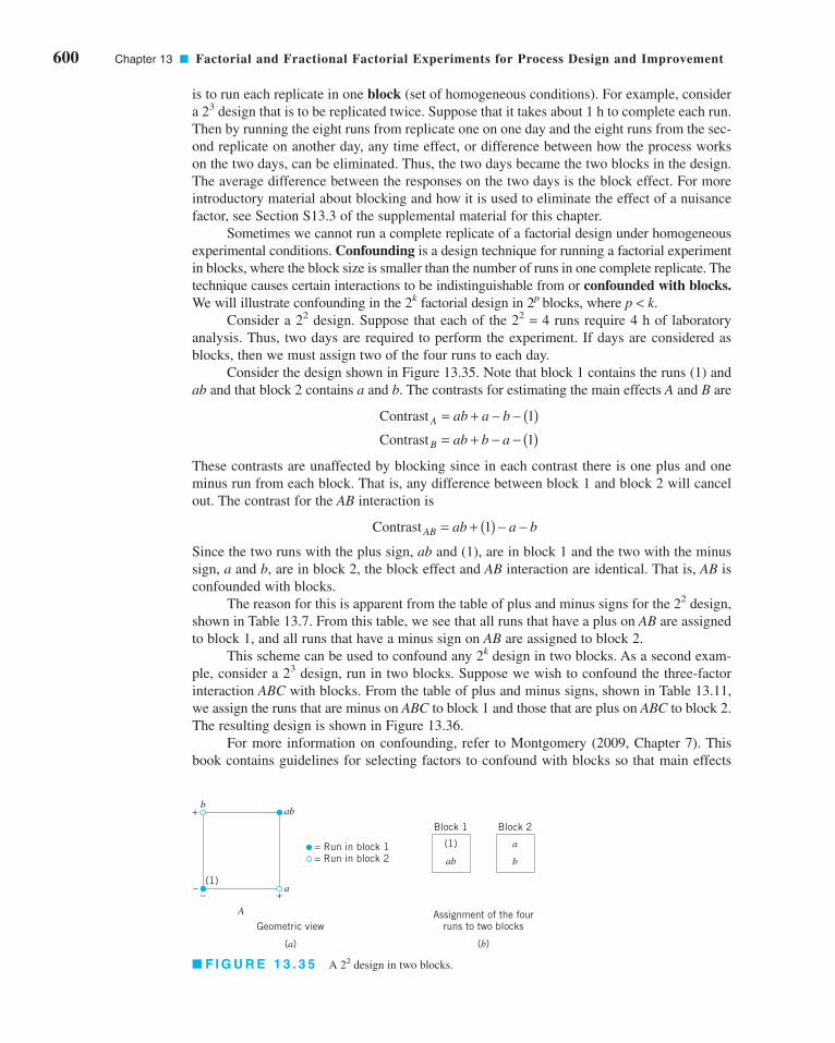
600 Chapter 13 ■ Factorial and Fractional Factorial Experiments for Process Design and Improvement
is to run each replicate in one block (set of homogeneous conditions). For example, consider
a 23 design that is to be replicated twice. Suppose that it takes about 1 h to complete each run.
Then by running the eight runs from replicate one on one day and the eight runs from the sec-
ond replicate on another day, any time effect, or difference between how the process works
on the two days, can be eliminated. Thus, the two days became the two blocks in the design.
The average difference between the responses on the two days is the block effect. For more
introductory material about blocking and how it is used to eliminate the effect of a nuisance
factor, see Section S13.3 of the supplemental material for this chapter.
Sometimes we cannot run a complete replicate of a factorial design under homogeneous
experimental conditions. Confounding is a design technique for running a factorial experiment
in blocks, where the block size is smaller than the number of runs in one complete replicate. The
technique causes certain interactions to be indistinguishable from or confounded with blocks.We will illustrate confounding in the 2k factorial design in 2p blocks, where p < k.
Consider a 22 design. Suppose that each of the 22 = 4 runs require 4 h of laboratory
analysis. Thus, two days are required to perform the experiment. If days are considered as
blocks, then we must assign two of the four runs to each day.
Consider the design shown in Figure 13.35. Note that block 1 contains the runs (1) and
ab and that block 2 contains a and b. The contrasts for estimating the main effects A and B are
These contrasts are unaffected by blocking since in each contrast there is one plus and one
minus run from each block. That is, any difference between block 1 and block 2 will cancel
out. The contrast for the AB interaction is
Since the two runs with the plus sign, ab and (1), are in block 1 and the two with the minus
sign, a and b, are in block 2, the block effect and AB interaction are identical. That is, AB isconfounded with blocks.
The reason for this is apparent from the table of plus and minus signs for the 22 design,
shown in Table 13.7. From this table, we see that all runs that have a plus on AB are assigned
to block 1, and all runs that have a minus sign on AB are assigned to block 2.
This scheme can be used to confound any 2k design in two blocks. As a second exam-
ple, consider a 23 design, run in two blocks. Suppose we wish to confound the three-factor
interaction ABC with blocks. From the table of plus and minus signs, shown in Table 13.11,
we assign the runs that are minus on ABC to block 1 and those that are plus on ABC to block 2.
The resulting design is shown in Figure 13.36.
For more information on confounding, refer to Montgomery (2009, Chapter 7). This
book contains guidelines for selecting factors to confound with blocks so that main effects
Contrast AB ab a b= + ( ) − −1
Contrast
Contrast
A
B
ab a b
ab b a
= + − − ( )= + − − ( )
1
1
+
–– +(1)
A
a
abb
= Run in block 1= Run in block 2
Geometric view
(a)
(1)
Assignment of the fourruns to two blocks
(b)
ab
Block 1
a
b
Block 2
■ F I G U R E 1 3 . 3 5 A 22 design in two blocks.
c13FactorialAndFractionalFactorialExperimentsForProcessDesignand Improvement.qxd 3/31/12 5:27 PM Page 600

and low-order interactions are not confounded. In particular, the book contains a table of sug-
gested confounding schemes for designs with up to seven factors and a range of block sizes,
some as small as two runs.
13.6 Fractional Replication of the 2k Design
As the number of factors in a 2k design increases, the number of runs required increases
rapidly. For example, a 25 requires 32 runs. In this design, only 5 degrees of freedom corre-
spond to main effects and 10 degrees of freedom correspond to two-factor interactions. If we
can assume that certain high-order interactions are negligible, then a fractional factorial
design involving fewer than the complete set of 2k runs can be used to obtain information on
the main effects and low-order interactions. In this section, we will introduce fractional repli-
cation of the 2k design. For a more complete treatment, see Montgomery (2009, Chapter 8).
13.6.1 The One-Half Fraction of the 2k Design
A one-half fraction of the 2k design contains 2k−1 runs and is often called a 2k−1 fractional fac-
torial design. As an example, consider the 23−1 design—that is, a one-half fraction of the 23.
The table of plus and minus signs for the 23 design is shown in Table 13.20. Suppose we select
the four runs a, b, c, and abc as our one-half fraction. These runs are shown in the top half of
Table 13.20. The design is shown geometrically in Figure 13.37a.
Note that the 23−1 design is formed by selecting only those runs that yield a plus on the
ABC effect. Thus, ABC is called the generator of this particular fraction. Furthermore, the
identity element I is also plus for the four runs, so we call
the defining relation for the design.
I ABC=
13.6 Fractional Replication of the 2k Design 601
Geometric view
(a)
(1)
Assignment of the eightruns to two blocks
(b)
ab
ac
bc
Block 1
a
b
c
abc
Block 2= Run in block 1= Run in block 2
(1) a
b ab
abcbc
c ac
C
B
A
■ F I G U R E 1 3 . 3 6 The 23 design in two blocks with ABC confounded.
C
B
A
The principal fraction, I = +ABC
(a)
a
b
abc
c
The alternate fraction, I = –ABC
(b)
ab
ac
bc
(1)
■ F I G U R E 1 3 . 3 7 The one-half fractions of the 23 design.
c13FactorialAndFractionalFactorialExperimentsForProcessDesignand Improvement.qxd 3/31/12 5:27 PM Page 601

602 Chapter 13 ■ Factorial and Fractional Factorial Experiments for Process Design and Improvement
The runs in the 23−1 designs yield 3 degrees of freedom associated with the main
effects. From Table 13.20, we obtain the estimates of the main effects as
It is also easy to verify that the estimates of the two-factor interactions are
Thus, the linear combination of observations in column A—say, [A]—estimates A +BC. Similarly, [B] estimates B + AC, and [C] estimates C + AB. Two or more effects that have
this property are called aliases. In our 23−1 design, A and BC are aliases, B and AC are
aliases, and C and AB are aliases. Aliasing is the direct result of fractional replication. In
many practical situations, it will be possible to select the fraction so that the main effects and
low-order interactions of interest will be aliased with high-order interactions (which are
probably negligible).
The alias structure for this design is found by using the defining relation I = ABC.
Multiplying any effect by the defining relation yields the aliases for that effect. In our exam-
ple, the alias of A is
since A � I = A and A2 = I. The aliases of B and C are
B B ABC AB C AC= ⋅ = =2
A A ABC A BC BC= ⋅ = =2
BC a b c abc
AC a b c abc
AB a b c abc
= − − +[ ]
= − + − +[ ]
= − − + +[ ]
1
2
1
2
1
2
A a b c abc
B a b c abc
C a b c abc
= − − +[ ]
= − + − +[ ]
= − − + +[ ]
1
2
1
2
1
2
■ TA B L E 1 3 . 2 0
Plus and Minus Signs for the 23 Factorial Design
Factorial Effect
Run I A B C AB AC BC ABC
a + + − − − − + +b + − + − − + − +c + − − + + − − +abc + + + + + + + +
ab + + + − + − − −ac + + − + − + − −bc + − + + − − + −(1) + − − − + + + −
c13FactorialAndFractionalFactorialExperimentsForProcessDesignand Improvement.qxd 3/31/12 5:27 PM Page 602

and
Now suppose that we had chosen the other one-half fraction, that is, the runs in Table
13.20 associated with minus on ABC. This design is shown geometrically in Figure 13.37b.
The defining relation for this design is I = −ABC. The aliases are A = −BC, B = −AC, and
C = −AB. Thus, the effects A, B, and C with this particular fraction really estimate A − BC,
B − AC, and C − AB. In practice, it usually does not matter which one-half fraction we select.
The fraction with the plus sign in the defining relation is usually called the principal frac-tion; the other fraction is usually called the alternate fraction.
Sometimes we use sequences of fractional factorial designs to estimate effects. For
example, suppose we had run the principal fraction of the 23−1 design. From this design we
have the following effect estimates:
Suppose we are willing to assume at this point that the two-factor interactions are negligible.
If they are, then the 23−1 design has produced estimates of the three main effects A, B, and C.
However, if after running the principal fraction we are uncertain about the interactions, it is
possible to estimate them by running the alternate fraction. The alternate fraction produces
the following effect estimates:
If we combine the estimates from the two fractions, we obtain the following:
A A BC
B B AC
C C AC
[ ]′ = −
[ ]′ = −
[ ]′ = −
A A BC
B B AC
C C AB
[ ] = +
[ ] = +
[ ] = +
C C ABC ABC AB.= ⋅ = =2
13.6 Fractional Replication of the 2k Design 603
12
[ ] [ ]i i− ′⎛⎝
⎞⎠
12
[ ] [ ]i i+ ′⎛⎝
⎞⎠
1
2
1
2
1
2
A BC A BC A
B AC B AC B
C AB C AB C
+ + −( ) =
+ + −( ) =
+ + −( ) =
Thus, by combining a sequence of two fractional factorial designs, we can isolate both the
main effects and the two-factor interactions. This property makes the fractional factorial
design highly useful in experimental problems because we can run sequences of small, effi-
cient experiments, combine information across several experiments, and take advantage of
learning about the process we are experimenting with as we go along.
A 2k−1 design may be constructed by writing down the treatment combinations for a full
factorial in k − 1 factors and then adding the kth factor by identifying its plus and minus lev-
els with the plus and minus signs of the highest-order interaction ± ABC . . . (K – 1).
Therefore, a 23−1 fractional factorial is obtained by writing down the full 22 factorial and then
i A= 1
2
1
2
1
2
A BC A BC BC
B AC B AC AC
C AB C AB AB
+ − −( )[ ] =
+ − −( )[ ] =
+ − −( )[ ] =
Effect, i
i B=
i C=
c13FactorialAndFractionalFactorialExperimentsForProcessDesignand Improvement.qxd 3/31/12 5:27 PM Page 603

604 Chapter 13 ■ Factorial and Fractional Factorial Experiments for Process Design and Improvement
equating factor C to the ± AB interaction. Thus, to generate the principal fraction, we would
use C = + AB as follows:
Full 22 23−1, I = ABC
A B A B C = AB
− − − − ++ − + − −− + − + −+ + + + +
To generate the alternate fraction, we would equate the last column to C = −AB.
SOLUTION
This design would be constructed by writing down a 23 in the
factors A, B, and C and then setting D = ABC. The design and
the resulting etch rates are shown in Table 13.21. The design is
shown geometrically in Figure 13.38.
In this design, the main effects are aliased with the three-
factor interactions; note that the alias of A is
Similarly,
B ACD
C ABD
D ABC
===
A I A ABCD
A A BCD
A BCD
⋅ = ⋅
==
2
EXAMPLE 13.10
To illustrate the use of a one-half fraction, consider the plasma
etch experiment described in Example 13.8. Suppose we had
decided to use a 24−1 design with I = ABCD to investigate the
four factors gap (A), pressure (B), C2F6 flow rate (C), and power
setting (D). Set up this design and analyze it using only the data
from the full factorial that corresponds to the runs in the fraction.
A One-Half Fraction for the Plasma Etch Experiment
bc = 601
(1) = 550
ab = 650
ac = 642
cd = 1075
ad = 749
bd = 1052
abcd = 729
+–D
C
B
A
■ F I G U R E 1 3 . 3 8 The 24−1 design
for Example 13.10.
■ TA B L E 1 3 . 2 1
The 24−1 Design with Defining Relation I � ABCD
Run A B C D � ABC Etch Rate
1 (1) − − − − 550
2 ad + − − + 749
3 bd − + − + 1,052
4 ab + + − − 650
5 cd − − + + 1,075
6 ac + − + − 642
7 bc − + + − 601
8 abcd + + + + 729
c13FactorialAndFractionalFactorialExperimentsForProcessDesignand Improvement.qxd 3/31/12 5:27 PM Page 604

Normal Probability Plots and Residuals. The normal probability plot is very useful
in assessing the significance of effects from a fractional factorial, especially when many effects
are to be estimated. Residuals can be obtained from a fractional factorial by the regression model
method shown previously. These residuals should be plotted against the predicted values, against
the levels of the factors, and on normal probability paper as we have discussed before, both to
assess the validity of the underlying model assumptions and to gain additional insight into the
experimental situation.
Projection of the 2k−1 Design. If one or more factors from a one-half fraction of a 2k
can be dropped, the design will project into a full factorial design. For example, Figure 13.39 pre-
sents a 23−1 design. Note that this design will project into a full factorial in any two of the three
original factors. Thus, if we think that at most two of the three factors are important, the 23−1 design
is an excellent design for identifying the significant factors. Sometimes experiments that seek to
identify a relatively few significant factors from a larger number of factors are called screeningexperiments. This projection property is highly useful in factor screening because it allows negli-
gible factors to be eliminated, resulting in a stronger experiment in the active factors that remain.
In the 24−1 design used in the plasma etch experiment in Example 13.10, we found that
two of the four factors (B and C) could be dropped. If we eliminate these two factors, the
remaining columns in Table 13.21 form a 22 design in the factors A and D, with two replicates.
This design is shown in Figure 13.40.
Design Resolution. The concept of design resolution is a useful way to catalog fractional
factorial designs according to the alias patterns they produce. Designs of resolution III, IV, and V
are particularly important. The definitions of these terms and an example of each follow.
1. Resolution III designs. In these designs, no main effects are aliased with any other main
effect, but main effects are aliased with two-factor interactions and two-factor interactions
13.6 Fractional Replication of the 2k Design 605
and
Clearly, [A] and [D] are large, and if we believe that the three-
factor interactions are negligible, then the main effects A (gap)
and D (power setting) significantly affect the etch rate.
The interactions are estimated by forming the AB, AC, and
AD columns and adding them to the table. The signs in the ABcolumn are +, −, −, +, +, −, −, +, and this column produces the
estimate
D D ABC[ ] = + = 290 5.
The other columns produce
B B ACD
C C ABD
[ ] = + =
[ ] = + =
4 00
11 50
.
.
The two-factor interactions are aliased with each other. For
example, the alias of AB is CD:
The other aliases are
The estimates of the main effects (and their aliases) are found
using the four columns of signs in Table 13.21. For example,
from column A we obtain
AC BD
AD BC
==
AB I AB ABCD
AB A B CD
AB CD
⋅ = ⋅
==
2 2
A A BCD[ ] = + = − + −( 1
4550 749 1,052
= −4
127 00.
+ − + − + )650 1,075 642 601 729
AB AB CD[ ] = + = − −( 1
4550 749 1,052
+ −+ − + )650 1,075 642 601 729
= −10 00.
From the AC and AD columns we find
The [AD] estimate is large; the most straightforward interpre-
tation of the results is that this is the A and D interaction. Thus,
the results obtained from the 24−1 design agree with the full
factorial results in Example 13.8.
AC AC BD
AD AD BD
[ ] = + = −
[ ] = + = −
25 50
197 50
.
.
c13FactorialAndFractionalFactorialExperimentsForProcessDesignand Improvement.qxd 3/31/12 5:27 PM Page 605