finding the right tool for your purpose
TRANSCRIPT

Finding the Right Tool
for your Purpose Using Data to Show Improvement and the Need for
Improvement

Data Why does it matter?
Why do we use it?
Why don’t we use it?
How can we make the most of it?

What is the story that you want to
tell? What kind of data do you need to tell that story?
Incremental data over time
Point-in-time snapshot
Exact measures or averages or ranges

Using data to drive improvement What is the problem?
How do you know that it’s a problem?
Is the problem obvious to everyone?
Is the problem important and relevant?
Can you prove that it’s a problem?
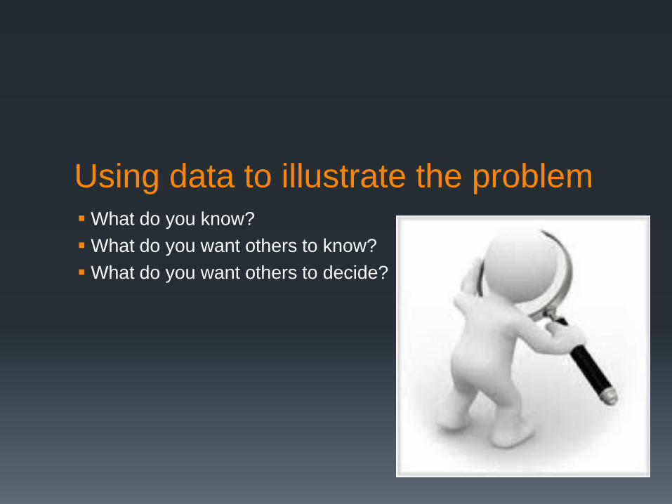
Using data to illustrate the problem What do you know?
What do you want others to know?
What do you want others to decide?

Selecting the right tool Radar Charts
Pareto Diagrams
Histograms

A1 BA2 B
A3 B
A4 B
1.1 B
1.2 B
1.3 B
2.1 B
2.2 B
2.3 B
2.4 B
3.1 B
3.2 B
4.1 B4.2 B
5.1 B5.2 B
5.3 B
5.4 B
6.1 B
6.2 B
6.3 B
7.1 B
7.2 B
8.1 B
8.2 B
9.1 B
9.2 B
10.1 B10.2 B
The Measures Capture the Important Components of the Standards
Radar Chart
8
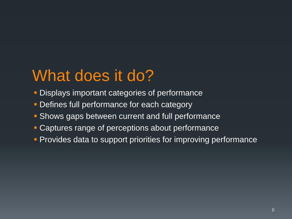
What does it do? Displays important categories of performance
Defines full performance for each category
Shows gaps between current and full performance
Captures range of perceptions about performance
Provides data to support priorities for improving performance
9
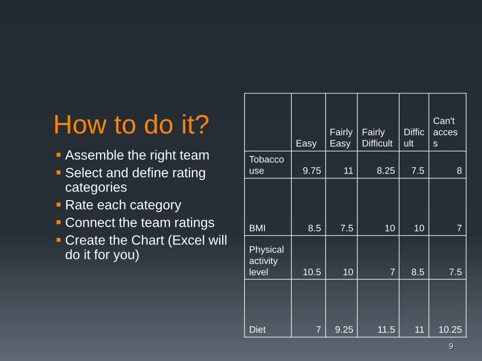
How to do it? Assemble the right team
Select and define rating categories
Rate each category
Connect the team ratings
Create the Chart (Excel will do it for you)
Easy Fairly
Easy Fairly
Difficult Diffic
ult
Can't
acces
s
Tobacco
use 9.75 11 8.25 7.5 8
BMI 8.5 7.5 10 10 7
Physical
activity
level 10.5 10 7 8.5 7.5
Diet 7 9.25 11.5 11 10.25

0
2
4
6
8
10
12
Easy
FairlyEasy
FairlyDifficult
Difficult
Can'taccess
During routine clinical or home visits, how easy is it to access the following patient information
Tobacco use
BMI
Physical activity level
Diet

Interpretation Identify the biggest gaps in
performance
Identify the most critical
categories of performance
Focus on the biggest gaps in
the most critical categories
11
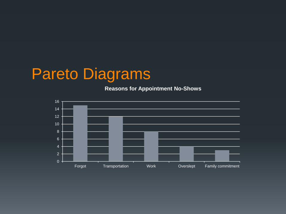
Pareto Diagrams
0
2
4
6
8
10
12
14
16
Forgot Transportation Work Overslept Family commitment
Reasons for Appointment No-Shows

Pareto Diagrams
0
0.02
0.04
0.06
0.08
0.1
0.12
0.14
0.16
May September August July June October
Rate of Appointment No-Shows

What does it do? Focuses attention on most significant causes
Displays relative importance of different causes
Prevents shifting the problem to other causes
Allows for ongoing measurement of progress

How to do it? Identify the problem
Select the aspect of the problem that will be reviewed
Choose the most meaningful unit of measurement
Decide on the time period for the measurement
Compile the data
Create the chart (Excel will do it for you)
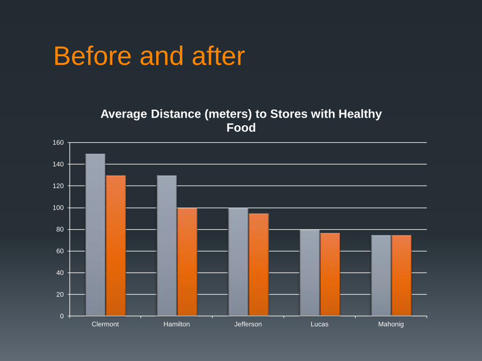
Average Distance (meters) to Stores with Healthy Food
Clermont 150
Hamilton 130
Jefferson 100
Lucas 80
Mahonig 75

0
20
40
60
80
100
120
140
160
Clermont Hamilton Jefferson Lucas Mahonig
Average Distance (meters) to Stores with Healthy Food
0
20
40
60
80
100
120
140
160
Clermont Hamilton Jefferson Lucas Mahonig
Average Distance (meters) to Stores with Healthy Food
Before and after

Interpretation Tallest bars indicate the biggest contributors to the overall
problem (as a general rule)
Focus your improvement strategy on what will make the
biggest difference to your audience or stakeholders
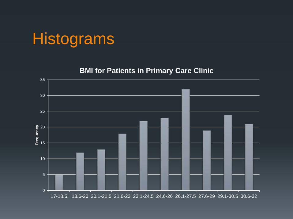
Histograms
0
5
10
15
20
25
30
35
17-18.5 18.6-20 20.1-21.5 21.6-23 23.1-24.5 24.6-26 26.1-27.5 27.6-29 29.1-30.5 30.6-32
Fre
qu
en
cy
BMI for Patients in Primary Care Clinic

What does it do? Displays large amounts of data in visual format
Shows relative frequency of various data values
Illustrates underlying distribution of the data
Provides information for predicting future performance
Reveals the shape and variation of the data
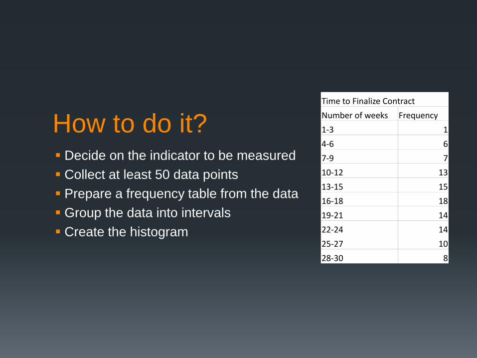
How to do it? Decide on the indicator to be measured
Collect at least 50 data points
Prepare a frequency table from the data
Group the data into intervals
Create the histogram
Time to Finalize Contract
Number of weeks Frequency
1-3 1
4-6 6
7-9 7
10-12 13
13-15 15
16-18 18
19-21 14
22-24 14
25-27 10
28-30 8

0
2
4
6
8
10
12
14
16
18
20
1-3 4-6 7-9 10-12 13-15 16-18 19-21 22-24 25-27 28-30
Fre
qu
en
cy
Number of Weeks
Time to Finalize Contract

Interpretation Consider where the distribution is centered
Analyze the variation and spread of the data
Look at the shape of the distribution
Consider these factors in the context of targets

Using data to measure
improvement How will you know that change is
improvement?
When will you know that the
improvement is real?

Selecting the right tool Run Charts
Control Charts
Histograms
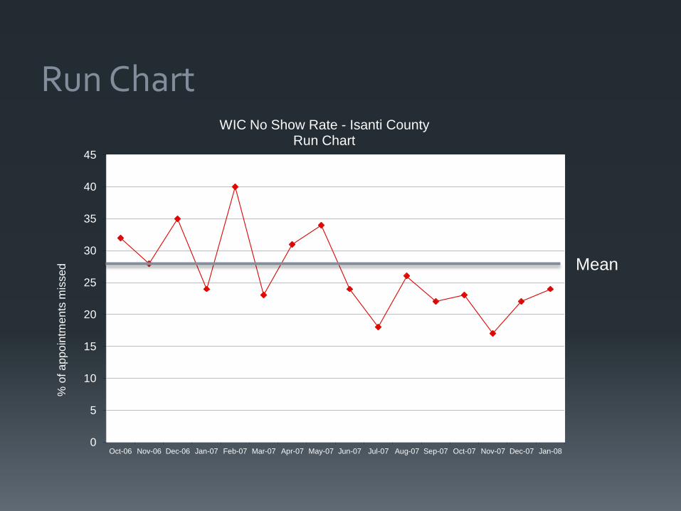
Run Chart
0
5
10
15
20
25
30
35
40
45
Oct-06 Nov-06 Dec-06 Jan-07 Feb-07 Mar-07 Apr-07 May-07 Jun-07 Jul-07 Aug-07 Sep-07 Oct-07 Nov-07 Dec-07 Jan-08
% o
f a
pp
oin
tme
nts
mis
sed
WIC No Show Rate - Isanti County Run Chart
Mean

What does it do? Monitors performance over time
Allows for comparison of measurement before and after
implementation of an intervention
Tracks information for predicting trends

How to do it? Select the indicator to be measured
Collect the data
Create the graph
Plot the data

29
0
10
20
30
40
50
60
70
80
90
100
Jan Feb Mar April May June July Aug Sept Oct Nov Dec
Pa
rtic
ipa
tio
n
Month
Participation in Employer Sponsored Physical Activity Programs
Number of employees participating in two sessions
Percent of employees participating in two sessions

Interpretation Look for obvious patterns or trends
Consider the position of the average value
Do not assume that all variation is important

31
Control Charts
0
5
10
15
20
25
30
35
40
45
Oct-06 Nov-06 Dec-06 Jan-07 Feb-07 Mar-07 Apr-07 May-07 Jun-07 Jul-07 Aug-07 Sep-07 Oct-07 Nov-07 Dec-07 Jan-08
% o
f a
pp
oin
tme
nts
mis
se
d
WIC No Show Rates - Isanti County Public Health
UCL = 36
LCL = 19
Mean = 28
Control limits,
along with the
centerline
(mean),
describe the
capability of a
common cause
system
One point above
UCL
Two points below
LCL

What does it do? Detect and monitor process variation over time
Distinguish between special and common cause of variation
Serves as a tool for ongoing control of a process
Helps improve a process to perform consistently and
predictably

How to do it? Select the process to be charted
Determine sampling method and plan
Initiate data collection
Calculate the appropriate statistics (standard deviation,
mean, median)
Calculate the control limits
Construct the Control Chart

Ogrinc G et al. Qual Saf Health Care 2008;17:i13-i32
©2008 by BMJ Publishing Group Ltd
Infection Number
Days b
etw
een infe
ctions

35
Interpretation
Analyze the data relative to the control limits
Distinguish between Common causes and Special causes of variation.
Common cause: variation results from factors inherent to the
process. This variation can only be affected by changing that
process.
Special cause: variation caused by external influences such as
human errors, unplanned events, or unusual occurrences. Special
causes should be eliminated.
The amount of variation from special causes is usually much greater
than it is for common causes.

Average time: 14 minutes
Common causes of variation:
Miss or make the traffic lights
Amount of traffic on the road
Weather – wind, sun, rain
Driving to work each day

Driving to work each day Special causes of variation:
Flat tire
Parade or protest on your route
Speeding ticket

A special cause is indicated when
One or more points are outside the UCL or LCL
Two out of three successive values are: a) on the same side of
the centerline, and b) more than two standard deviations from
the centerline.
Eight or more successive values fall on the same side of the
centerline.
Six or more values in a row are steadily increasing or
decreasing.
Interpretation

Data Tracking and Display Integrate data collection into daily routine whenever possible
Simple graphs and charts can help tell your story - a picture can
be worth a thousand words
Keep your audience in mind
Consider your message
Label clearly
39

Questions? Kim McCoy
Office of Performance Improvement
Minnesota Department of Health
651-201-3877