final report - university at buffalo
TRANSCRIPT

Final Report
2012 Student IT Experience Survey
UB IT Policy & Communications
Office of the CIO

Introduction............................................................................................................................. 1
Survey Highlights ..................................................................................................................... 1
Demographics ......................................................................................................................... 2 Figure 1: Class Standing of Respondents .............................................................................................................. 2
Table 1: Number of Survey Respondents ............................................................................................................. 2
Table 2: Survey Participation as Percentage of Enrollment .................................................................................. 3
Figure 2: Primary Residence at UB ........................................................................................................................ 4
Students’ Choice of Hardware, Mobile Device(s) and OS .......................................................... 4 Figure 3: Comparative Ownership of Laptop and Desktop Computers (2003‐2011)............................................ 4
Figure 4: Types of Hardware Students Own vs. Bring to Class.............................................................................. 5
Table 3 A/B/C: Device Use by School .................................................................................................................... 6
A. Computer Use Percentage by School ............................................................................................................... 6
B. Tablet Use Percentage by School ...................................................................................................................... 7
C. Smartphone Use Percentage by School. ........................................................................................................... 8
Figure 5: Operating Systems Used on Primary Computers ................................................................................... 9
Table 4: Comparative Operating Systems from 2010‐2012 .................................................................................. 9
Students Continue Mobile Migration ..................................................................................... 10 Figure 6: Mobile Device Carrier by Class Standing‐ Two Year Comparison ........................................................ 10
Table 5: Use of Mobile OS ................................................................................................................................... 11
Figure 7: 2012 UB Web Services Access by Smartphone or Tablet ..................................................................... 12
Table 6: Level of Interest in Mobile Apps for UB Services .................................................................................. 12
Figure 8: Use of VoIP or “Softphones” ................................................................................................................ 13
Security Awareness and Practices .......................................................................................... 13 Table 7: Preferred Method for Accessing Media (music, videos, games, etc.) Online ....................................... 13
Table 8: Students Wi‐Fi network usage ............................................................................................................. 14
Table 9: Resident students use of UB Wi‐Fi options .......................................................................................... 14
Table 10: How Students Keep Systems “Patched & Secure” .............................................................................. 15
Students’ Use and Preferences for Software .......................................................................... 15 Table 11: Browsers used by Students ................................................................................................................ 15
IT in Residence Halls and Apartments .................................................................................... 16 Table 12: UB Residences ..................................................................................................................................... 16
Table 13: Overall Strength of Cell Phone Signal in Residence Hall Rooms or Apartments ................................. 16
Table 14: Strength of Cell Phone Signal in Specific Locations ............................................................................. 17
Table 15: How Residential Students Receive a Wireless Connection ................................................................. 18
Table 16: Residence Hall Devices Accessing the Network by Class Standing ..................................................... 18
Learning Resources ................................................................................................................ 19
Table 17: Level of Satisfaction with Learning Technologies Supported by IT ..................................................... 19
Table 18: Devices Most Used to Read E‐books ................................................................................................... 19
Qualitative Responses –Suggestions and Critical Feedback ................................................... 20 Table 19: Technology Resources to Assist Study and Research Needs ............................................................... 20
Getting Started with IT at UB ................................................................................................ 21
Acknowledgements ............................................................................................................... 22

1 | P a g e
IntroductionThe sixteenth “Student Information Technology Experience Survey” was made available October 15‐29,
2012. Data were collected using Vovici™ software and further analyzed using SPSS™. The instrument
contained 30 questions (a significant reduction from previous years) and was designed in consultation
with Instructional and IT support staff in each technology area surveyed, as well as the University
Libraries, University Campus Living staff and other campus stakeholders. There were a total of 2,914
valid unique responses. Only one question was coded to require a response, providing participants with
the opportunity to skip a question if they so chose, and several questions enabled multiple responses
(“check all that apply”), the response rate however, was fairly consistent across all questions (with the
exception of open‐ended responses). To assist with general readability of many graphics, the
percentages were rounded to the nearest whole percent. With a 95% confidence level, we can assert a
confidence interval of 1.7 percentage points for most questions answered by the total valid responses.
This report is available at: http://www.buffalo.edu/ubit/services/scoreboard/surveys.html
The purpose of this survey is to re‐examine students’ technology experiences and validate observed or
reported trends, particularly with respect to the introduction of new (or modification of existing)
technology services. Students were encouraged to participate in the survey through the University web
portal (MyUB), and by screen “pop‐up” invitations in the CIO/University Libraries public computing sites,
School of Management, and Law School computing labs. Only one response was allowed per student
using UBITName authentication. Several academic units also supported this effort by marketing the
survey link on departmental websites. A random drawing with the prize of a $200 shopping spree at the
UB Campus Tees store was offered to students to encourage participation in this year’s survey.
This report is organized into eight themes:
Demographics
Students’ choice of hardware, device(s) and OS
Continued migration to mobile devices
Security awareness and practices
Software and application preferences
IT in Residence Halls and Apartments
Learning Spaces, and academic technology resources
Satisfaction with IT services and recommendations
SurveyHighlights The overall level of satisfaction of IT services rose slightly, and dissatisfaction with IT services
dropped from the previous survey.
More students are using multiple devices, and increasingly reliant on mobile devices (including
laptops) as primary in‐class resources, although overall use of laptops have decreased slightly.
Adoption of Apple™ devices continues to rise slightly, along with non‐Apple mobile tablets and
smartphones.

2 | P a g e
Verizon is the mobile carrier of choice for students; Apple™ OS use has risen slightly more than
Android™ – and when combined represent over 90% of the OS reported by students.
Students have strong interest in increased mobile apps to access UB services.
68.7% of students select security settings to automatically patch and update their personal
machine.
UB is not yet experiencing widespread adoption of any particular E‐book reader, with nearly
one‐third of students reporting use of a laptop to access e‐books. Kindle and iPad did have a
significant showing at just under 10% each.
Students continue to express desire for expanded public site and printing services, in addition to
places where they can charge their devices.
There were increased calls for easier connectivity to UB_Secure, UB’s secure Wi‐Fi.
Students offered a number of helpful suggestions for how to improve “getting started with IT at
UB” services, which can be found at the end of this report.
DemographicsThe total number of respondents (n=2914) increased slightly from last year (Table 1), attributed to
offering a participation incentive (shopping spree at Campus Tees) and by continuing marketing efforts
with distributed IT partners (Figure 1).
Though students self‐select whether to participate, the sample is fairly consistent and valid. Table 2 first
examines the number of survey responses received by school, followed by the percentage of those
responses (n=2914). This was compared with UB’s Institutional Analysis enrollment figures. When
compared with the actual campus population, survey responses fell within or close to the percentage of
confidence overall; exceptions include the College of Arts & Sciences, which was over‐represented by
Figure 1: Class Standing of Respondents Table 1: Number of Survey Respondents
Year N 2012-2013 2,9142011-2012 2,4212010-2011 9962009-2010 8162008-2009 3,2212007-2008 3,4342006-2007 1,9432005-2006 5,548
Freshman, 17%
Sophomore, 16.7%
Junior, 18.8%
Senior, 21.5%
Graduate‐Year 1, 13.9%
Graduate‐Year 2+, 10.3%
Non‐Matriculated
, 0.6%
Not Sure, 1.2%

3 | P a g e
18.9%, and the School of Social Work, who was under‐represented by 10.8%. The responses were also
examined over the past three years, which indicate relative consistency across schools over time (Table
2).
Table 2: Survey Participation as Percentage of Enrollment
With UB’s “Finish in Four” initiative, students are being reported differently. “Intended” majors are no
longer captured, which accounts for some of the percentage changes from 2011 in Table 2.
School
2012 Survey Response Count by School
% 2012 Response (n=2914)
% Valid Campus Population Sample by School
% 2011 Response (n=2391)
% 2010 Response (n=996)
% 2009 Response (n=838)
Architecture & Planning
52 1.8% 7.8% (-6) 1.9% 1.9% 1.8%
Arts & Sciences 784 26.9% 8% (+18.9) 28.7% 31.8% 30.7%
Dental Medicine 17 .6% 3.5% .5% 3% .8%
Education 94 3.2% 3.3% 4.0% 4.7% 4.3% Engineering & Applied Sciences
602 20.7% 13% (+7.7) 20.5% 18.9% 18.2%
Law 47 1.6% 7.5% (-5.9) 3.0% 2.1% 2.2%
Management 356 12.2% 10.2% 12.3% 13.8% 14.6%
Medicine & Biomedical Sciences
202 6.9% 11.6% 5.4% 5.9% 5.6%
Nursing 111 3.8% 12.4% (-8.6) 2.9% 2.4% 2.3% Pharmacy & Pharmaceutical Sciences
168 5.8% 12.1% (-6.3) 6.2% 4.2% 4.6%
Public Health & Health Professions
232 8% 15.9% (-7.9) 6.5% 5.1% 6.9%
Social Work 58 2% 12.8% (-10.8) 2.3% 2.7% 2.4%
Undecided 138 4.7% 5.1% 5.7% 6.1% 5.6%
A student’s choice of residence may impact his or her access to quality resources, as on‐campus housing
has direct access to the UB network and robust bandwidth. This survey included several questions that
were exposed only to students who live in UB housing to explore the role of residential network
support, and how future services may be considered and configured (Figure 2).
4 | P a g e
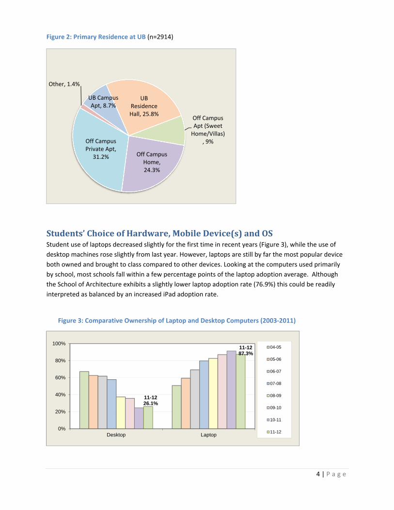
Figure 2: Primary Residence at UB (n=2914)
Students’ChoiceofHardware,MobileDevice(s)andOSStudent use of laptops decreased slightly for the first time in recent years (Figure 3), while the use of
desktop machines rose slightly from last year. However, laptops are still by far the most popular device
both owned and brought to class compared to other devices. Looking at the computers used primarily
by school, most schools fall within a few percentage points of the laptop adoption average. Although
the School of Architecture exhibits a slightly lower laptop adoption rate (76.9%) this could be readily
interpreted as balanced by an increased iPad adoption rate.
Figure 3: Comparative Ownership of Laptop and Desktop Computers (2003‐2011)
Off Campus Apt (Sweet Home/Villas)
, 9%
Off Campus Home, 24.3%
Off Campus Private Apt,
31.2%
Other, 1.4%
UB Campus Apt, 8.7%
UB Residence Hall, 25.8%
11-1226.1%
11-1287.3%
0%
20%
40%
60%
80%
100%
Desktop Laptop
04-05
05-06
06-07
07-08
08-09
09-10
10-11
11-12

5 | P a g e
UB’s students are tracking very similarly with national trends that suggest that students are arriving on
campus with a greater diversity and combination of mobile devices that require access to the campus
network and services. Although more students now rely on laptops as their primary computing device,
roughly half decline to bring them to class, relying instead on public computing sites and mobile devices
when outside of their residence (Figure 4).
Figure 4: Types of Hardware Students Own vs. Bring to Class
When examined at the school level (Table 3), both the School of Medicine and Biomedical Science and
Public Health and Health Professions (SPHHP) students report the greatest laptop ownership with over
90%, though no school reports less than 76%. The School of Nursing reported the greatest density of
iPad and iPhone devices. Education, Pharmacy and Management also indicate significant use of Apple
products. Android smartphones are also most used by Engineering students.
0
0.1
0.2
0.3
0.4
0.5
0.6
0.7
0.8
0.9
1
Owned
Bring to Class

6 | P a g e
Table 3 A/B/C: Device Use by School (Check all that Apply) n= 2914
A. Computer Use Percentage by School
Computers
School % Desktop
2011 2012
% Laptop
2011 2012
% Netbook
2011 2012
Architecture (52) 1.8%
13.3 21.2 88.9 76.9 6.7 11.5
CAS (784) 26.9% 25.9 28.4 90.8 88.4 11.6 8.5
Dental (17) 0.6% 16.7 29.4 91.7 82.4 8.3 11.8
Education (94) 3.2%
33.3 34.0 83.3 78.7 24.0 14.9
Engineering (602) 20.7%
25.5 24.9 91.4 86.5 10.0 7.8
Law (47) 1.6% 16.7 34.0 97.2 80.9 16.7 14.9
Management (356) 12.2%
27.9 25.8 93.2 87.4 7.5 7.0
Med & Bio Sci (202) 6.9%
16.2 27.7 94.6 90.6 6.9 9.9
Nursing (111) 3.8% 15.7 27.9 92.9 86.5 8.6 6.3
Pharmacy (168) 5.8%
21.5 25.0 91.9 89.9 13.4 11.3
SPHHP (232) 8.0% 21.9 13.8 87.7 90.9 9.0 6.5
Social Work (58) 2.0%
31.5 36.2 94.4 84.5 5.6 10.3
Undecided (138) 4.7%
27.2 29.7 91.2 85.5 6.6 10.1
7 | P a g e
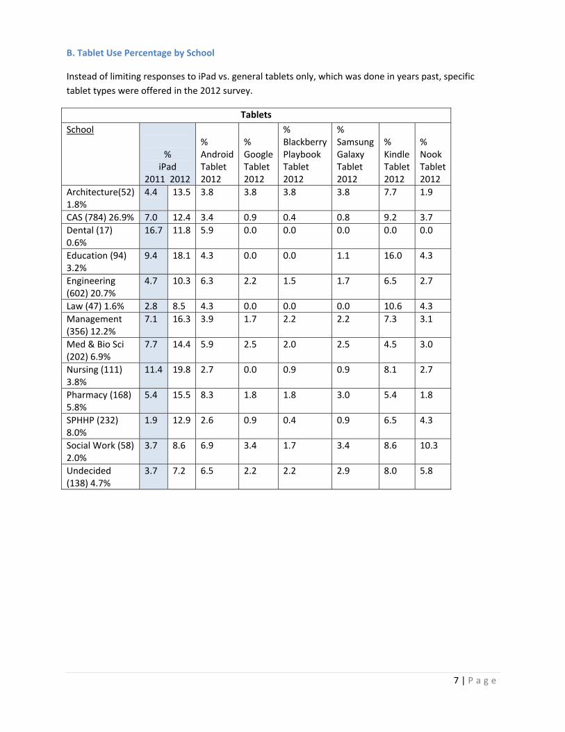
B. Tablet Use Percentage by School
Instead of limiting responses to iPad vs. general tablets only, which was done in years past, specific
tablet types were offered in the 2012 survey.
Tablets
School %
iPad 2011 2012
% Android Tablet 2012
% Google Tablet 2012
% Blackberry Playbook Tablet 2012
% Samsung Galaxy Tablet 2012
% Kindle Tablet 2012
% Nook Tablet 2012
Architecture(52) 1.8%
4.4 13.5 3.8 3.8 3.8 3.8 7.7 1.9
CAS (784) 26.9% 7.0 12.4 3.4 0.9 0.4 0.8 9.2 3.7
Dental (17) 0.6%
16.7 11.8 5.9 0.0 0.0 0.0 0.0 0.0
Education (94) 3.2%
9.4 18.1 4.3 0.0 0.0 1.1 16.0 4.3
Engineering (602) 20.7%
4.7 10.3 6.3 2.2 1.5 1.7 6.5 2.7
Law (47) 1.6% 2.8 8.5 4.3 0.0 0.0 0.0 10.6 4.3
Management (356) 12.2%
7.1 16.3 3.9 1.7 2.2 2.2 7.3 3.1
Med & Bio Sci (202) 6.9%
7.7 14.4 5.9 2.5 2.0 2.5 4.5 3.0
Nursing (111) 3.8%
11.4 19.8 2.7 0.0 0.9 0.9 8.1 2.7
Pharmacy (168) 5.8%
5.4 15.5 8.3 1.8 1.8 3.0 5.4 1.8
SPHHP (232) 8.0%
1.9 12.9 2.6 0.9 0.4 0.9 6.5 4.3
Social Work (58) 2.0%
3.7 8.6 6.9 3.4 1.7 3.4 8.6 10.3
Undecided (138) 4.7%
3.7 7.2 6.5 2.2 2.2 2.9 8.0 5.8

8 | P a g e
C. Smartphone Use Percentage by School
Smartphones
School %
IPhone smartphone 2011 2012
% Android smartphone2012
% Windows smartphone2012
% Other smartphone 2012
Architecture (52) 1.8%
15.6 36.5 25 9.6 11.5
CAS (784) 26.9%
14.0 35.2 26.1 1.4 7.1
Dental (17) 0.6%
33.3 41.2 29.4 5.9 0.0
Education (94) 3.2%
10.4 31.9 20.2 4.3 3.2
Engineering (602) 20.7%
15.3 29.6 35.5 1.7 6.6
Law (47) 1.6%
13.9 38.3 21.3 0.0 8.5
Management (356) 12.2%
22.1 38.2 32.6 2.5 6.7
Med & Bio Sci (202) 6.9%
13.8 36.1 29.2 1.5 5.4
Nursing (111) 3.8%
18.6 45.9 22.5 0.0 5.4
Pharmacy (168) 5.8%
14.8 37.5 32.7 1.8 4.2
SPHHP (232) 8.0%
11.6 41.4 18.1 1.3 4.7
Social Work (58) 2.0%
14.8 41.4 32.8 3.4 6.9
Undecided (138) 4.7%
14.0 37.0 29.7 3.6 5.8

9 | P a g e
Windows 7 continues to lead as the most popular personal computer operating system. From
information about operating systems on primary computers, we can infer hardware choices:
73.1% are Windows
22.7% are Macs
1% are Linux variants
This represents a three percentage self‐reported increase in Macs from last year.
Figure 5: Operating Systems Used on Primary Computers (Fall 2012)
Students were slightly less aware of the 32 vs. 64 Bit version of Windows OS they are using. Last year,
10% were not sure of this detail, while this year 14.2% reported not being sure of the version. Use of
Vista has again fallen by more than half (6.8%) and only 3.1% remain on Windows XP or an earlier
version (Table 4).
Table 4: Comparative Operating Systems from 2010‐2012
Operating System 2012 2011 2010
Windows 7 (64 Bit) 40.5% 38% 26%
Windows 7 (32 Bit) 8.5% 11% 15%
Windows 7 (not sure of Bit version) 14.2% 10% 19%
Windows Vista 6.8% 14% 24%
Windows XP or earlier 3.1% 6% 11%
Mac OS X (Mountain Lion) (10.8) 10% N/A N/A
Mac OS X (Lion) (10.7) 6.5% 8% N/A
Mac OS X (Snow Leopard) 10.6 (or earlier) 6.2% 11% 10%
Linux or other Unix‐based OS 1.1% 1% 1.6%
Don’t Know 2.5% 1.5% 1.2%
Other .6% 0.5% 1.3%
Windows 7 (64 bit), 41%Windows 7
(32 bit), 9%
Windows 7 (not sure),
14%
Vista, 6.8%
Windows XP or earlier, 3.1%
Mac 10.8, 10.0%
Mac 10.7, 6.5%
Mac 10.6 or earlier, 6.2%
Linux or Unix‐based OS, 1.1%
Don't know, 2.5%Other, 0.6%
10 | P a g e
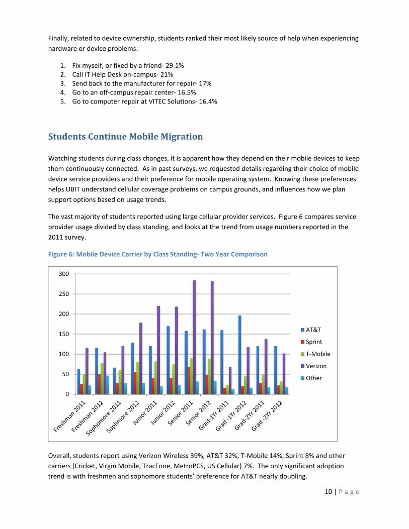
Finally, related to device ownership, students ranked their most likely source of help when experiencing
hardware or device problems:
1. Fix myself, or fixed by a friend‐ 29.1% 2. Call IT Help Desk on‐campus‐ 21% 3. Send back to the manufacturer for repair‐ 17% 4. Go to an off‐campus repair center‐ 16.5% 5. Go to computer repair at VITEC Solutions‐ 16.4%
StudentsContinueMobileMigration
Watching students during class changes, it is apparent how they depend on their mobile devices to keep
them continuously connected. As in past surveys, we requested details regarding their choice of mobile
device service providers and their preference for mobile operating system. Knowing these preferences
helps UBIT understand cellular coverage problems on campus grounds, and influences how we plan
support options based on usage trends.
The vast majority of students reported using large cellular provider services. Figure 6 compares service
provider usage divided by class standing, and looks at the trend from usage numbers reported in the
2011 survey.
Figure 6: Mobile Device Carrier by Class Standing‐ Two Year Comparison
Overall, students report using Verizon Wireless 39%, AT&T 32%, T‐Mobile 14%, Sprint 8% and other
carriers (Cricket, Virgin Mobile, TracFone, MetroPCS, US Cellular) 7%. The only significant adoption
trend is with freshmen and sophomore students’ preference for AT&T nearly doubling.
0
50
100
150
200
250
300
AT&T
Sprint
T‐Mobile
Verizon
Other

11 | P a g e
Figure 6 is a two‐year comparison of students’ preference for smartphone operating system. A major
gain of 12% for iOS comes at a loss for the BlackBerry OS (‐8%) further underlying the popularity of
Apple mobile devices. Android usage also continues to grow, but at a slower rate.
Table 5: Use of Mobile OS
Which Operating System do you have on your Smartphone? 2012 2011
Apple IOS 50% 38%
Android 41% 37%
BlackBerry 6% 14%
Windows Phone 3% 4%
Palm Web <1% 2%
Symbian <1% 1%
Other <1% 4%
Students were asked to identify locations around campus where they are having difficulty receiving a
reliable cellular telephone signal. 2,233 suggestions were received, with 891 requesting the reception in
Knox Hall be improved. The next three locations most often identified were Capen Hall (185
suggestions), Natural Sciences Complex (119 suggestions) and the Student Union (118 suggestions). The
next tier included The Ellicott Food Court, Baldy, Clemens, Alumni and Ellicott. Some suggestions
covered broad areas such as “all of North Campus” or named a variety of locations categorized as
“basement, tunnels and walkways.” A detailed analysis has been provided to the teams working on
signal quality and service expansion.
In this year’s survey, students were asked for their feedback of the UBlearns mobile app. This app has
been in service for one year. Out of the 800 comments, 322 were positive (40%). Some sample comment
excerpts included:
It works on any product I use
It was very easy to navigate and worked just like on a computer
It’s easy to use on a mobile device
Time saving and efficient
Less favorable comments focused on log‐in problems and general dysfunction:
I have trouble logging into MyUB through my smartphone browser
Sometimes it crashes at the login screen
It’s not very mobile friendly and it takes a long time to load
You can’t watch the online videos of lectures
Students were asked to identify the UB services they access with their mobile device or tablet. UBlearns
was second only to Email in frequency of mobile access (Figure 7).

12 | P a g e
Figure 7: 2012 UB Web Services Access by Smartphone or Tablet
Between 2009‐2011, Email remained the highest ranked UB service accessed through mobile devices.
After that, the priorities clearly shifted as the result of implementation of the UBlearns mobile app pilot
and introduction of HUB, the student information services system that students access via MyUB. In
2012, students ranked UBlearns just slightly higher than UBmail, followed closely by MyUB and HUB.
Use of HUB has greatly increased in the past year, from just 15% in 2011 to more than 92% in 2012.
When asked about the level of interest in future mobile apps, students selected whether they were
currently using an app, interested in using a specific app, or were non‐committal (“don’t know” or “does
not apply”) (Table 6).
Table 6: Level of Interest in Mobile Apps for UB Services
App Function Currently
Using Interested
Don’t Know, Does not apply
Read my UBmail 72.2% 18.4% 9.4%
Use UBlearns 64.2% 24.6% 11.2%
Use MyUB 62.8% 25.8% 11.4%
Search UB’s web 45.5% 27.6% 26.8%
Look up UB events 38.5% 36.5% 25%
Find information from the Library website 38.5% 42.5% 18.9%
MyUBCard 38.2% 36.5% 25.3%
Find shuttle information/alerts 36.3% 23% 40.8%
Check shuttle schedules 33.9% 28.2% 37.9%
Maps (campus buildings/bus stops) 31.6% 38.8% 29.5%
Emergency.buffalo.edu 25.8% 44.6% 29.6%
Use Directory to find people 18.8% 34.5% 46.7%
Traffic and parking alerts 18.1% 43.3% 38.5%
Transportation tracker 13.4% 43.1% 43.5%
Ask a librarian for help with research 9.1% 40.8% 50.1%
0%10%20%30%40%50%60%70%80%90%
100%
2012
2011

13 | P a g e
Figure 8 illustrates student selection from a list of popular “softphone” or VoIP software (if any). Skype
remains the clear choice, followed by Google. Nearly one‐quarter (21.4%) indicated they did not use any
VoIP services on their mobile devices.
Figure 8: Use of VoIP or “Softphones”
SecurityAwarenessandPracticesSecurity and privacy continue to be a challenge in the university environment. October 2012 was
National Cyber Security Month and UB’s information campaign was centered on Keep It Legal: staying
out of trouble with illegal downloading of media. This effort, combined with raising awareness of UB’s
secure Wi‐Fi network, UB_Secure, help to emphasis safe computing practices for UB students.
As a gauge to measure the effectiveness of our copyright awareness campaigns, we asked students
again to tell us their preferred method for accessing media (music, videos, games, etc.) from the
Internet. Table 7 reveals a trend towards use of streaming services as the most preferred method,
away from use of subscription download services, such as iTunes, and peer‐to‐peer (essentially illegal)
downloading apps. This trend is a significant change from past years and represents safer computing
choices by students.
Table 7: Preferred Method for Accessing Media (music, videos, games, etc.) Online
What’s your preferred method for accessing media (music, videos, games) online?
2012 2011
Streaming services (e.g. Stitcher, YouTube, Pandora, Spotify) 72% 56%
Download sites (e.g. iTunes, Amazon, Rhapsody) 15% 24%
I don’t use any of these services 6% 8%
Peer‐to‐peer download apps (e.g. BitTorrent…) 5% 10%
Other <1% 2%
0%
10%
20%
30%
40%
50%
60%
70%
Skype Google Vonage Lingo Other None
2012
2011

14 | P a g e
UB_Secure is UB’s secure, encrypted wireless network. Table 8 reports the percent of students
reporting use of UB_Secure compared over the past three years. Adoption of UB_Secure remains
steady, improving from 2011. The usage rates of the other UB Wi‐Fi networks were not collected in 2010
or 2011. Students continue to use UB_Wireless at a high rate (49%), although this network does not
provide the level of protection afforded by UB_Secure.
Table 8: Students Wi‐Fi network usage
What Wi‐Fi network are you using? 2012 2011 2010
UB_Secure 74% 67% 75%
UB_Wireless 49% ‐ ‐
UB_Guest 17% ‐ ‐
Other 3% ‐ ‐
As in past years, we asked students who reside on campus to indicate how they get a Wi‐Fi connection
in their residence hall or campus apartment (Table 9). UB_Secure continues to be the most popular Wi‐
Fi network in use, but significant usage of UB_Wireless continues.
Table 9: Resident Students Use of UB Wi‐Fi options
How do you get a Wi‐Fi (wireless) connection in your residence hall room or apartment?
2012
UB_Secure 27%
UB_Wireless 18%
UB_Guest 7%
My own wireless router 3%
I can’t get a Wi‐Fi connection 2%
Someone else’s router 1%
I don’t need a Wi‐Fi connection 1%
Other 1%
We asked students why they are not using UB_Secure for their on‐campus Wi‐Fi connectivity. Students
(n=512) told us they:
Had problems using the service (coverage, drops, difficult to setup) (45%)
Had no specific reason (16%)
Didn’t know how (14%)
Had no knowledge of UB_Secure and that they could use it (13%)
Were already using UB_Wireless or UB_Guest successfully (10%)
On average, three‐quarters of students indicated they set their machine to automatically accept
updates. Less than a third manually download and install updates.
15 | P a g e
Table 10: How Students Keep Systems “Patched & Secure”
Patched & Secure Method 2012 2011 2010 2009
Automatic Updates Enabled 69% 73% 73% 72% Manually Download/Install Updates 29% 27% 24% 24% Install Additional Security Software 17% 17% 17% 9% Don’t Regularly Patch or Update 6% 5% 6% 4% Not Sure 6% 6% 7% 5% Other <1% <1% N/A N/A
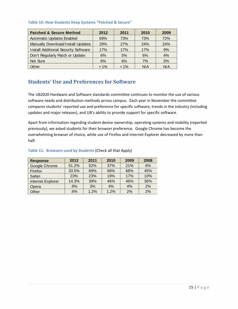
Students’UseandPreferencesforSoftware
The UB2020 Hardware and Software standards committee continues to monitor the use of various
software needs and distribution methods across campus. Each year in November the committee
compares students’ reported use and preference for specific software, trends in the industry (including
updates and major releases), and UB’s ability to provide support for specific software.
Apart from information regarding student device ownership, operating systems and mobility (reported
previously), we asked students for their browser preference. Google Chrome has become the
overwhelming browser of choice, while use of Firefox and Internet Explorer decreased by more than
half.
Table 11: Browsers used by Students (Check all that Apply)
Response 2012 2011 2010 2009 2008 Google Chrome 51.2% 52% 37% 21% 6% Firefox 33.5% 69% 68% 68% 45% Safari 23% 23% 19% 17% 10% Internet Explorer 14.3% 39% 46% 46% 36% Opera .9% 3% 4% 4% 2% Other .6% 1.2% 1.2% 2% 2%

16 | P a g e
ITinResidenceHallsandApartmentsSome questions were asked only of residential students within the survey (n=1005, 34.7% of the
respondents after combining UB Residence Halls with On Campus Apartments.)
Table 12: UB Residences (n=1005)
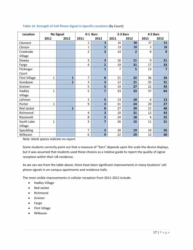
The first issue probed was the strength and quality of the cell phone signal received within these
locations. Students were asked “how many bars” they received on their device (Tables 13, 14).
Table 13: Overall Strength of Cell Phone Signal in Residence Hall Rooms or Apartments (n=1005)
Signal Strength Percent I don’t get a signal .3%
0‐1 bars 7.6%
2‐3 bars 39.3%
4‐5 bars 51.7%
Response Count Percent Response Count Percent Clement 66 6.6% Hadley Village 104 10.3% Clinton 30 3% Lehman 36 3.6% Creekside Village 14 6.8% Porter 55 5.5% Dewey 35 3.5% Red Jacket 97 9.6% Fargo 66 6.6% Richmond 78 7.8% Flickinger Court 15 1.5% Roosevelt 42 4.2% Flint Village 75 7.5% South Lake Village 45 4.5% Goodyear 56 5.6% Spaulding 49 4.9% Greiner 75 7.5% Wilkeson 68 6.8%
17 | P a g e
Table 14: Strength of Cell Phone Signal in Specific Locations (By Count)
Location
No Signal 2011 2012
0‐1 Bars 2011 2012
2‐3 Bars 2011 2012
4‐5 Bars 2011 2012
Clement 2 3 26 30 37 31
Clinton 1 2 13 10 5 18
Creekside Village
2 3 14 2 8 9
Dewey 3 3 16 11 9 21
Fargo 4 2 19 31 17 33
Flickinger Court
1 7 5 13 7
Flint Village 1 1 7 8 21 32 36 34
Goodyear 1 3 3 12 21 35 31
Greiner 5 5 19 27 22 43
Hadley Village
1 5 7 33 33 37 64
Lehman 1 5 13 18 6 13
Porter 1 9 3 31 24 20 27
Red Jacket 1 8 27 39 21 48
Richmond 4 3 10 31 12 43
Roosevelt 8 2 24 18 4 22
South Lake Village
1 3 7 26 15 11 21
Spaulding 7 3 20 19 10 26
Wilkeson 6 9 22 29 12 30
Note: blank spaces indicate no report.
Some students correctly point out that a measure of “bars” depends upon the scale the device displays,
but it was assumed that students used these choices as a relative guide to report the quality of signal
reception within their UB residence.
As we can see from the table above, there have been significant improvements in many locations’ cell
phone signals in on‐campus apartments and residence halls.
The most visible improvements in cellular reception from 2011‐2012 include:
Hadley Village
Red Jacket
Richmond
Greiner
Fargo
Flint Village
Wilkeson

18 | P a g e
Comments received regarding signal quality were:
My room in Goodyear has really bad service. Everywhere else is good.
All locations indoors except my dorm room at the Richmond Quad.
In the Wilkeson laundry room; in the tunnel with the vending machines near Perks, and in the
dining area near Sizzles and Hubies. Also in the bus tunnel.
Next, students were asked how they received and accessed a wireless signal. Anecdotal evidence
suggests that as UB wireless access has expanded, the need for students to personally own and share
wireless routers has decreased (Table 15).
Table 15: How Residential Students Receive a Wireless Connection (Check all that Apply)
Response Count Percent UB_Secure 787 27% UB_Wireless 474 16.3%
UB_Guest 193 6.6%
Personally owned wireless router 84 2.9%
Someone else's router 34 1.2%
Can’t get a wireless connection 43 1.5%
I don’t need a wireless connection 17 .6%
Some residence hall students clearly have a number of devices attached to the University network. It
appears that freshman, followed by sophomores and seniors have the most devices accessing services
(Table 16), whereas last year, sophomores had the most devices.
Table 16: Residence Hall Devices Accessing the Network by Class Standing
Number of Devices Fresh Soph Junior Senior Grad
year 1 Grad
year 2
0-1 12.9% 12.3% 8.9% 6.9% 2.2% 2.3% 2-4 58% 42% 21.3% 15.7% 9.2% 3.4% 5+ 1.6% 1.0% 0.2% 1% 0% 0.7% Other 0% 0% 0% 0% 0% 0% Total Count 354 266 164 146 46 19

19 | P a g e
LearningResourcesAlthough this survey is primarily concerned with the hardware and systems that support Information
technology (infrastructure), it is important to understand how this infrastructure supports academic
technologies, and the level of satisfaction students report around IT services (Table 17).
Table 17: Level of Satisfaction with Learning Technologies Supported by IT
Level of Support
Very Satisfied
Somewhat Satisfied Neutral Somewhat
Dissatisfied Very
Dissatisfied DK/NA
UBlearns 44.9% 38.8% 10.4% 3.6% 1.1% 1.2% Public Printing (iPrint) 38.6% 39.1% 6.9% 4.8% 3.2% 7.4% Public Workstations 33.4% 42.2% 11.3% 4.8% 1.2% 7.1% HUB Student Center 28.2% 31.5% 14.7% 13.7% 10% 1.8% Library Website 25.1% 28.6% 22.3% 3% .9% 20% Laptop Support (e.g. adequate space/power) 23.2% 28.4% 18.5% 8.1% 4.3% 17.4% Mobile Device Support 17.5% 26.8% 23.1% 7.6% 3.9% 21.2% Course Capture/Recording 15.5% 19.5% 20.1% 4.9% 2.5% 37.5%
Library E-books 15.2% 18.2% 22.6% 3.6% .8% 39.6% UBclicks 12.1% 15% 21.5% 2.5% 1.7% 47.2% iTunesU 11% 11.3% 22.6% 1.9% .9% 52.2%
Over three‐quarters of students report being very or somewhat satisfied with UBlearns, public
workstations, and iPrint – which are very high volume and high profile services. Satisfaction with HUB
has greatly increased –in 2011, the majority of students reported being somewhat or very dissatisfied,
but more than half now report being very or somewhat satisfied with the service.
There is increasing awareness and interest in e‐books to both contain textbook cost and provide
enhanced convenience. In order to assist with planning, students were asked which type of device they
most used to access e‐books. Though over a quarter reported not accessing e‐books (34.9%) and just
under one‐third (27.6%) reported using a laptop, it is significant that 651 students reported using an
iPad, Kindle or Nook as text readers, which is double the amount from last year (Table 18).
Table 18: Devices Most Used to Read E‐books (n=2878)
Response PercentI do not read e-books 34.9% Personal Laptop or Notebook 27.6% Amazon Kindle 9.8% iPad 9.5% iPhone or other smartphone 8.3% Barnes & Noble Nook 3.4% Desktop computer 2.9% Android Tablet 2.6% Other (please specify) .9%

20 | P a g e
When reviewing the “other – please specify” comments, 21 students (.7%) responded indicated use of
another tablet (Samsung or Sony) or iPod to access e‐books. Only .2% of students use Kobo.
QualitativeResponses–SuggestionsandCriticalFeedbackIn order to reduce the overall instrument length and time required to complete this year’s survey, the
qualitative questions were reduced to probe just two major themes:
Technology Resources to Assist Study and Research Needs
What would have made it easier for you to get started with IT at UB?
Emerging Theme Analysis based on key words was used to identify service themes. In many cases, more
than one comment was provided by a respondent regarding different services. After coding each
response into five different categories (see Table 19), each category was counted and reflected below.
The major themes identified were largely consistent with those expressed in past surveys.
Table 19: Technology Resources to Assist Study and Research Needs (n= 1042)
The majority of the comments were requesting more technology, and more technology resources
available to students. Some of the major themes regarding these two categories are reflected in the
comments below:
I wish there were more places to charge your devices on campus. Also if the computers were updated more regularly. Last year for example Flash wasn't updated which was annoying since some websites wouldn't open up. Also, since I didn't find somewhere to post this, but the Wi‐Fi isn't always working especially in the SU. I find this annoying, especially since I was told this has been looked into for “weeks.”
More express computing sites, especially in Norton & Knox.
Theme Analysis
Count
Availability of Technology (i.e. software, computers, power outlet)
341
Technology Resources (i.e. recorded lectures, e‐books, e‐journals)
333
Connectivity Issues: (Need for better/stronger connection; better wireless internet availability and connection on campus, etc.)
163
N/A 130
Satisfied in General; positive 75

21 | P a g e
More public printing stations.
I am still discovering more resources offered within the information technology at UB. It would be great if there was a HUB app for android or an app for UB learns on android. A UB Learns app would definably be helpful for studying since my professors’ use it frequently.
Wireless that works more than 75% of the time. More mobile‐friendly campus resources.
Stronger service allover campus for Wi‐Fi and cell phones.
E‐textbooks made available from the University.
I think north campus needs more supply of computers because when it's busy hour it's hard to find a computer to print out stuff.
Some positive comments that reflect satisfaction with the services IT at UB provides:
Nothing more, so far I'm very impressed with what is offered.
It’s already very helpful.
They provide everything that I need.
I feel like UB provides adequate technology resources. However, I feel that students are not taught or given enough opportunities to utilize these resources to their maximum potential.
GettingStartedwithITatUB The second question focused on how students “get started” with IT at UB, to help ascertain how
incoming students may be better served in the future. Many students also interpreted the question
more broadly, offering comments regarding current improvement needs. The three themes below
represent the majority of the comments that were received.
1. Connecting to the Internet: ( i.e. UB_Secure, UB_ Wireless)
Make it easier to set up UB_Secure on your computer.
Connecting to the network.
It was difficult connecting to Internet for the first time; it was just assumed everyone
knew how it worked.
I had a difficult time hooking up my smartphone to UB webmail and initially putting my
computer on UB secure. Took some elbow grease.
UB_Secure instructions in orientation.

22 | P a g e
2. Accessing UBmail
Comments reflecting this:
I never received any literature in the mail outlining a step‐by‐step process of how to get
set up with UBmail.
Clearer directions on how to set up Mail on iPad/iPhone. Mine still doesn't work.
Accessing UBmail & sending from email software (Outlook, iPhone/iPad) as opposed to
using Gmail.
I was never made aware of UB mail until classes started. The main website is not user
friendly.
3. More information (i.e. seminars, written materials, tutorials, emails) on how to use all of UB
IT’s services
Comments reflecting this:
A better introduction to these services during orientation.
A detailed info page given to me on the first day outlining important resources.
A tour of the website that is mandatory for all freshmen before the semester starts.
If I had an intro session UB IT. Especially confused about wireless printing
More in depth instructions on help websites.
To read additional unedited comments on getting started with IT at UB, please visit
http://www.buffalo.edu/content/dam/www/ubit/pdfs/Reports/GettingStartedwithUBIT‐2012survey.pdf
AcknowledgementsThis UB IT Policy and Communications report was made possible with significant help from the Office of
the CIO collaborators: Departmental IT Node directors and staff, University Libraries, University
Communications, and the UB Office of University Life and Services.